2 VISUAL DEVELOPMENT GUIDE


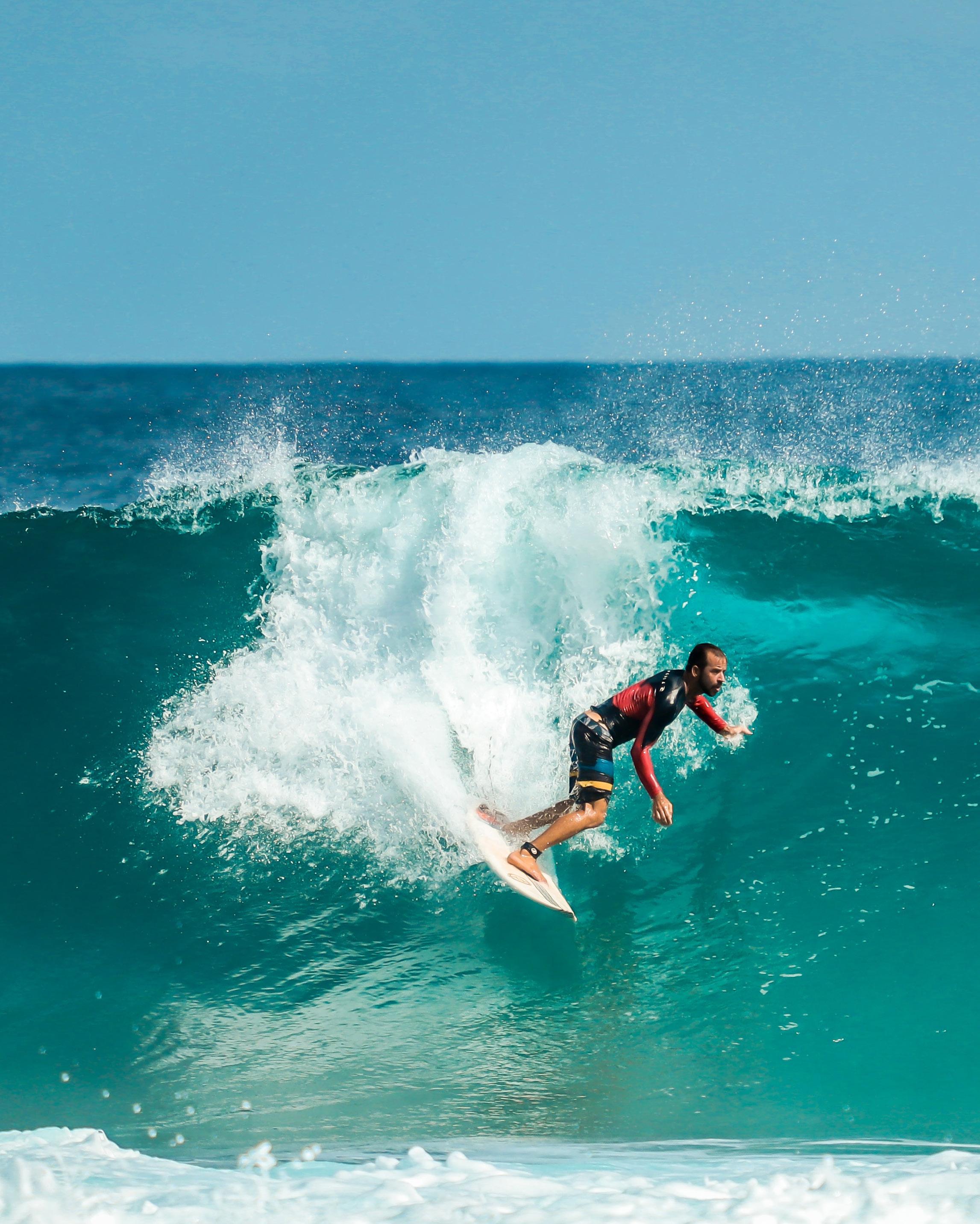
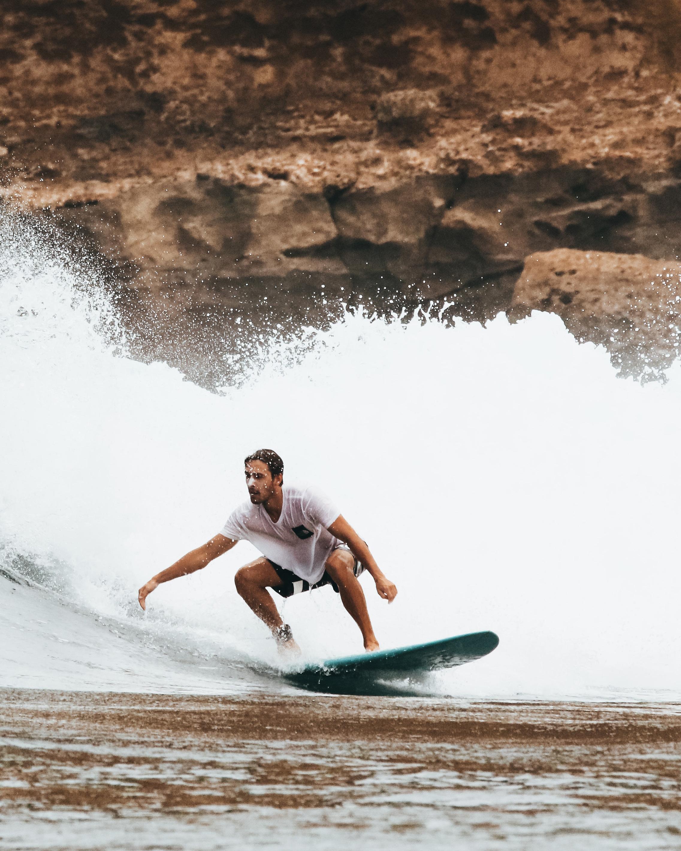
Billabong International Limited was founded in 1973 by Gordon and Rena Merchant. The location is Gold Coast, Queensland, Australia. “Billabong” means “a brook that only flows during the rainy season” and is derived from the Wiradjuri word bilabaŋ.
At first Billabong focused on surfing. It produces skateboards and snowboards, as well as outdoor sports clothing, watches, backpacks and other accessories. Later the business expanded to cover more areas of outdoor sports.
Billabong was first listed on the Australian Stock Exchange in August 2000. The first decade of the 21st century was a period of expansion of the Billabong brand, with the acquisition of many brands. Until 2011, Billabong began to decline in net profit until it lost money. In 2018, Billabong International Limited was acquired by Boardriders, Inc.
Billabong was established by Gordon and Rena Merchant.

Billabong acquired the Element and Von Zipper.
Billabong acquired the retailer Surfection which is headquartered in Sydney.
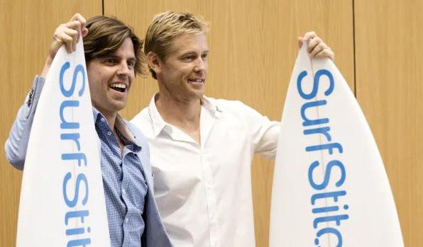
Billabong was listed on the Australian Stock Exchange (ASX).
The company acquired swell.com and surfstitch. com online businesses.
Billabong and TCP decided to establish a joint venture to help the Nixon brand globally faster.
Billabong was named both Men’s and Women’s Brand at the Australian Surf Industry Awards.

Billabong sold 51% of SurfStitch and full ownership of Swell.com.
Billabong's long-term partnership with SurfAid has been renewed.
Billabong has undergone a rebranding and opened up many new areas.
Billabong: was bought by Quicksilver.
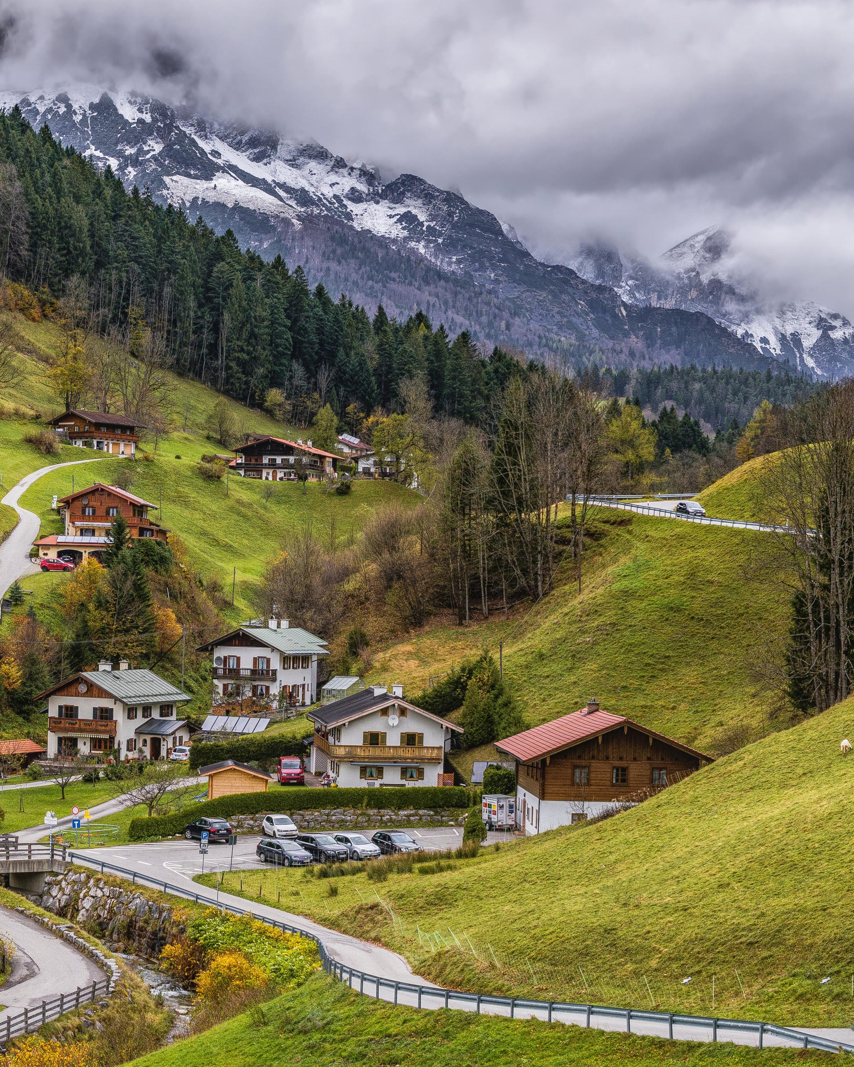
Billabong hopes to help people find more possibilities in nature. We used to only provide a wide range of products for outdoor sports, but now we are expanding our mission, We help adventurous travelers enjoy exploring nature and inspire them to protect it. The new Billabong will integrate products and services. We hope to provide comprehensive fashionable products and excellent service for outdoor sports enthusiasts who are eager for passion, safety, and joy. At the same time, Billabong will vigorously support the environmental protection industry and protect nature.
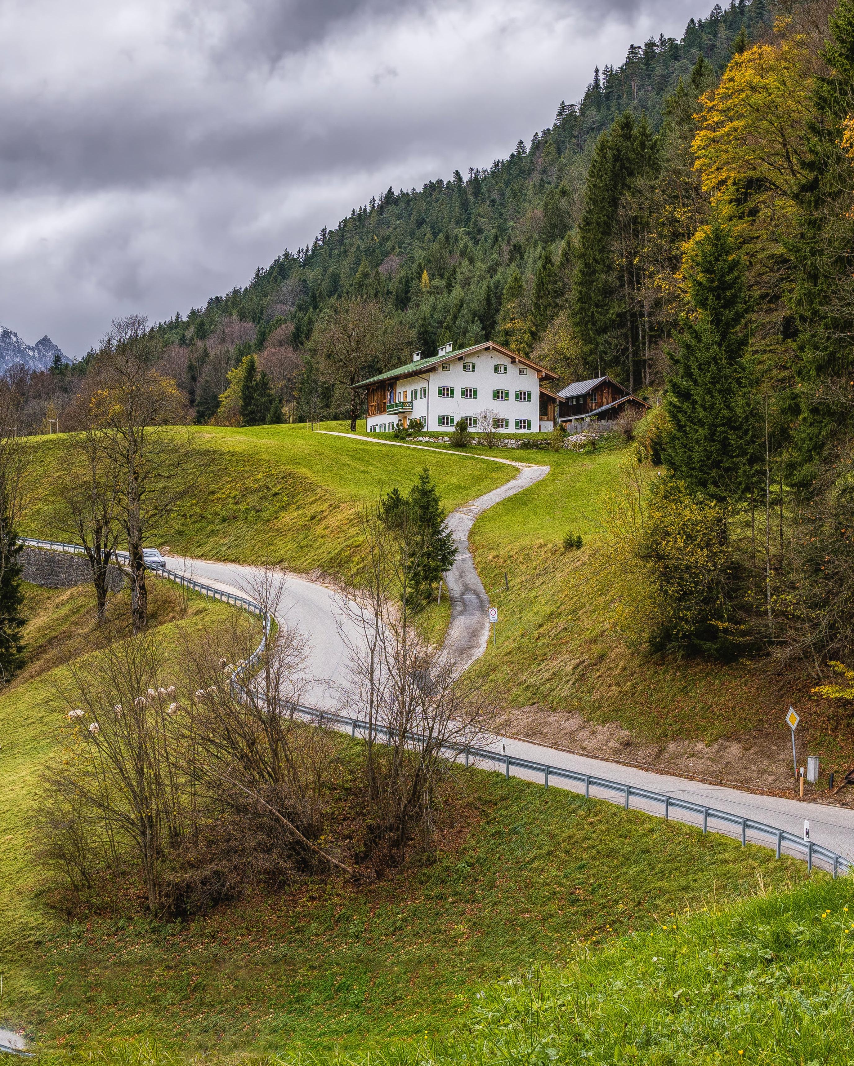
WE INSPIRE ADVENTURE SEEKERS TO EXPERIENCE AND PROTECT NATURE, SO THAT THEY CAN ENJOY THE PASSION AND JOY OF EXPLORATION.
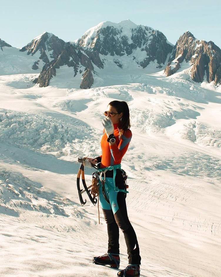
EXPLORE
We encourage our customers to explore nature and our brands are constantly exploring.
Focus on the experience, the experience of nature, adventure, new things, and strange things.
Protecting the natural environment is one of our missions.
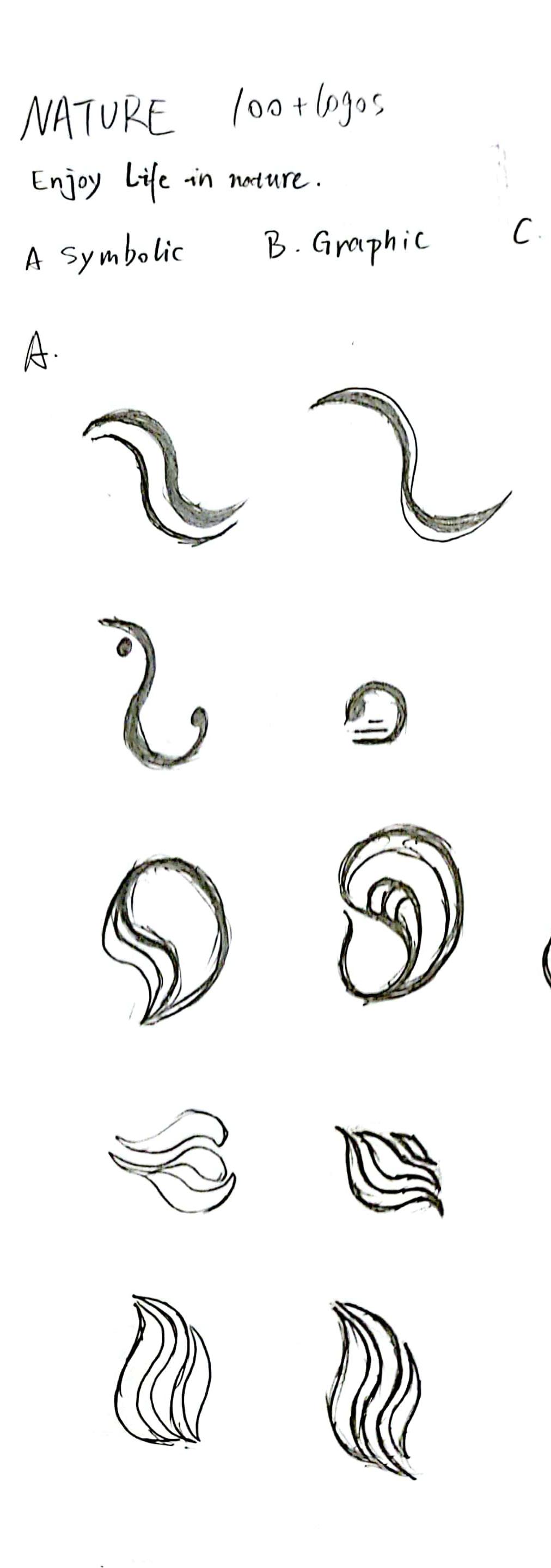
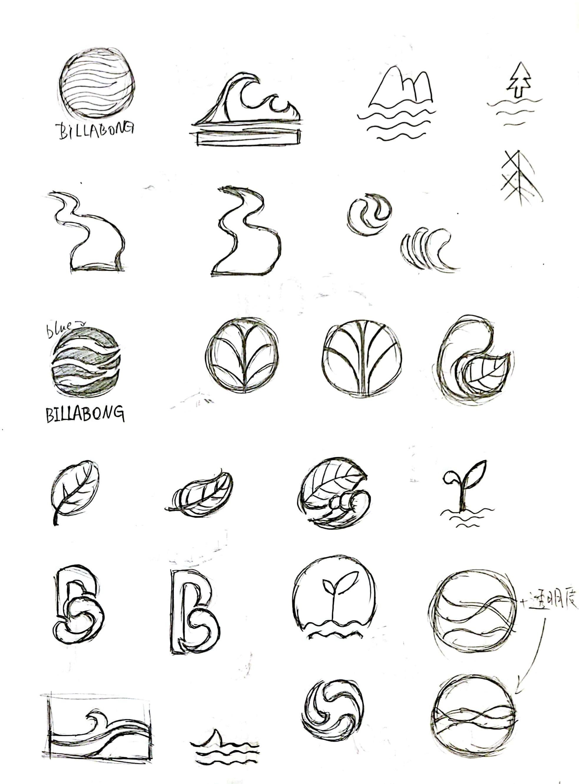
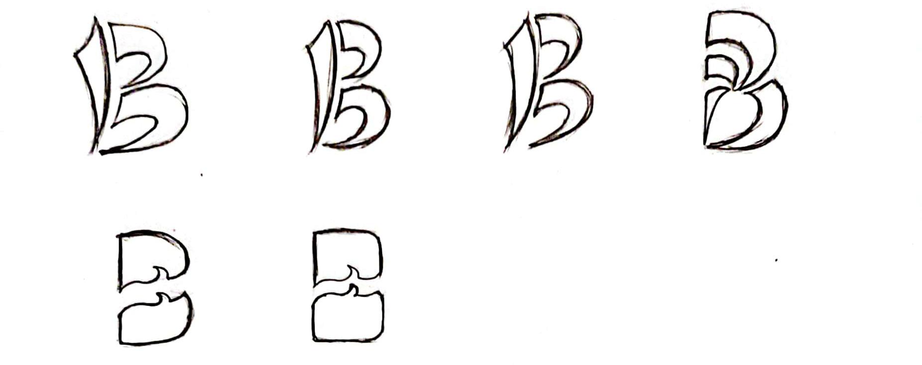
In the first round of sketches, three more specific key phrases were first expanded on the basis of keywords. Then design as many logos as possible based on these three phrases, trying every possible direction. Finally, the ten most promising logos in each field were selected and perfected.
Three key phrases evolved from keywords.
Enjoy life in nature.
Find a better outdoor adventure experience.
Passionate and fun.

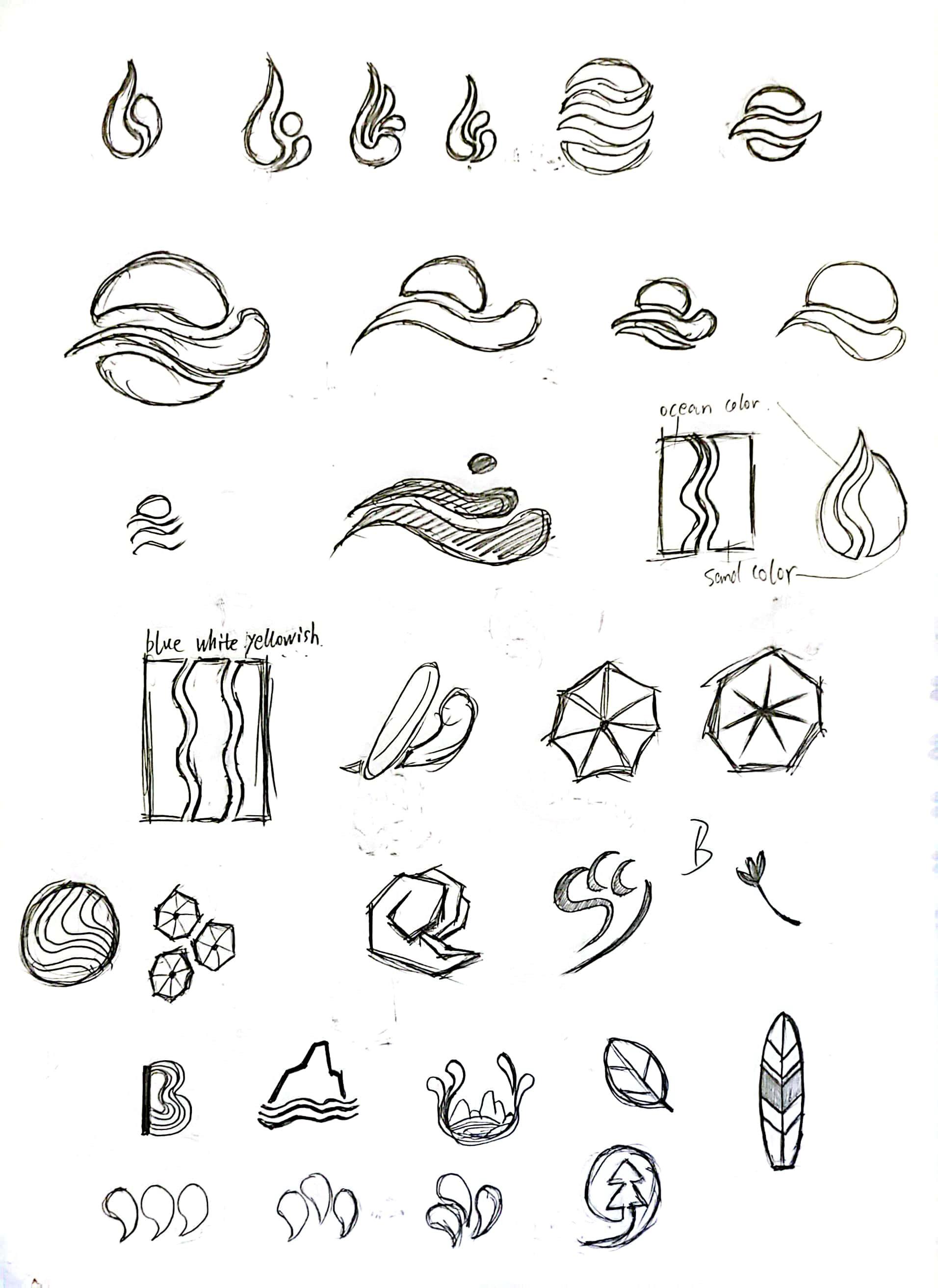
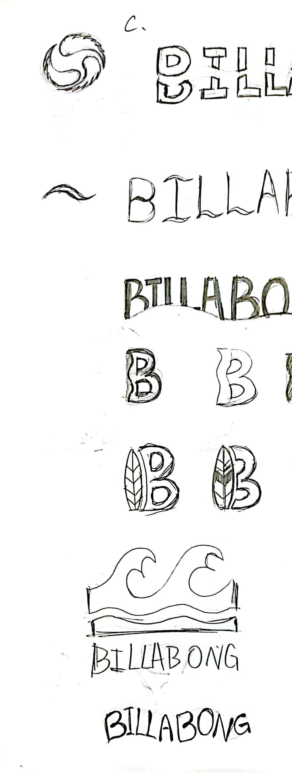

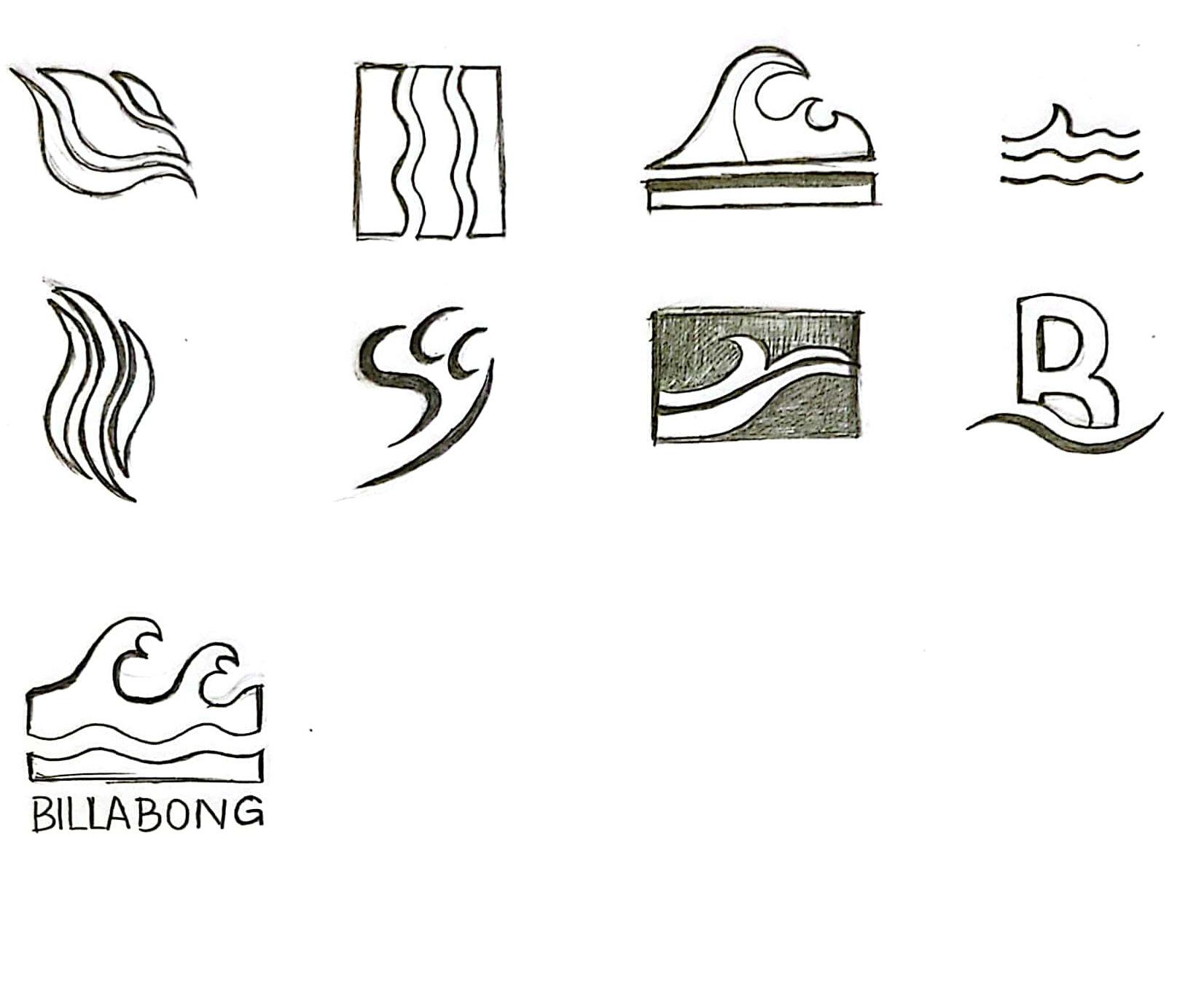
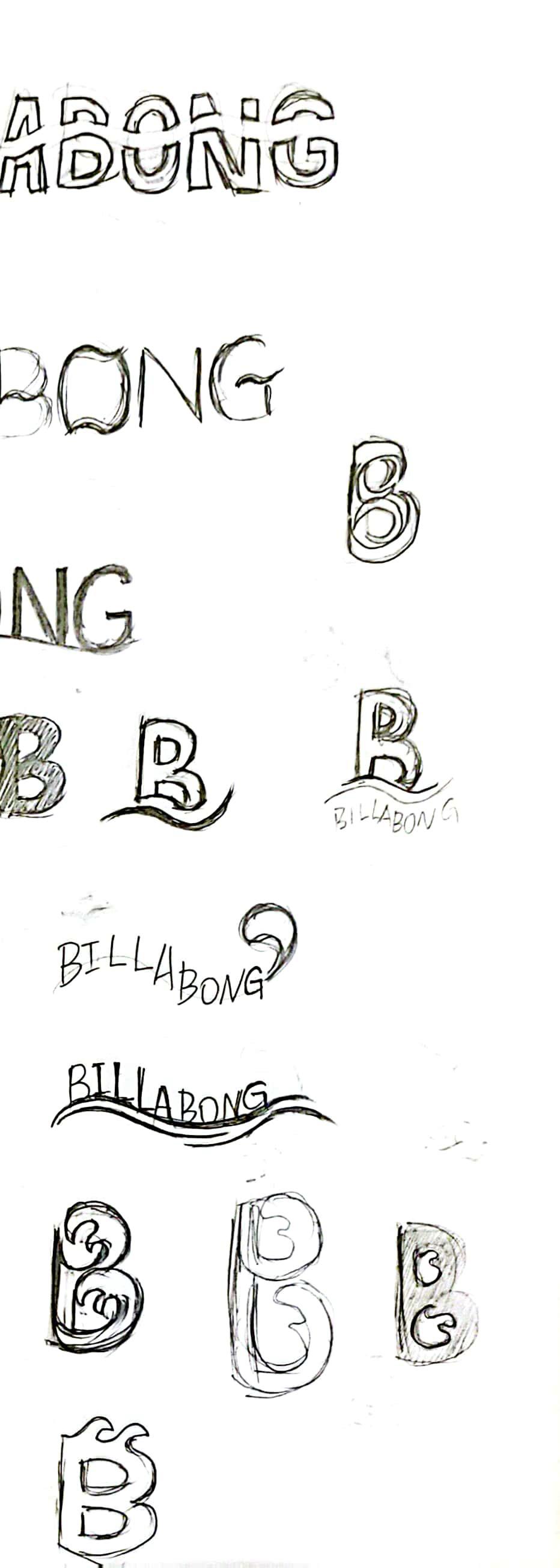
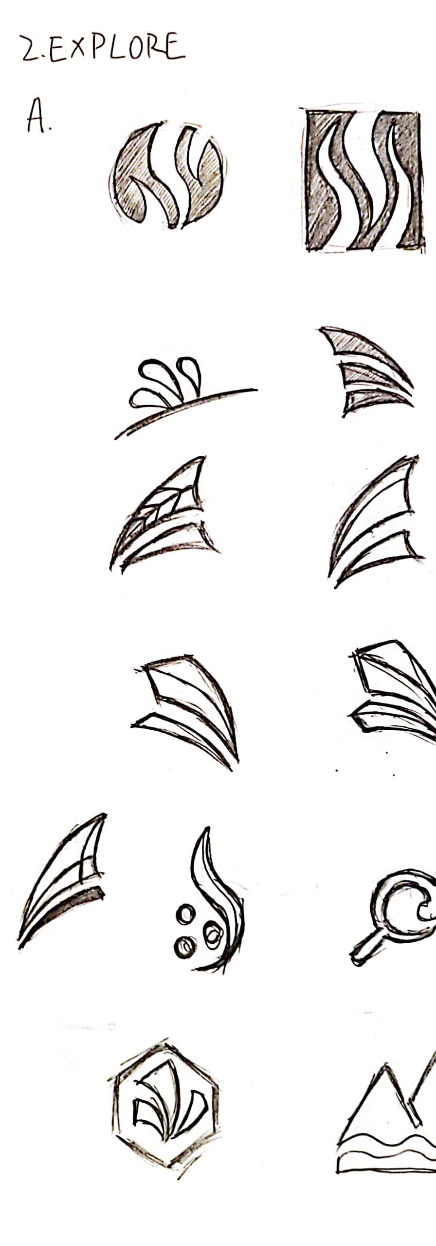
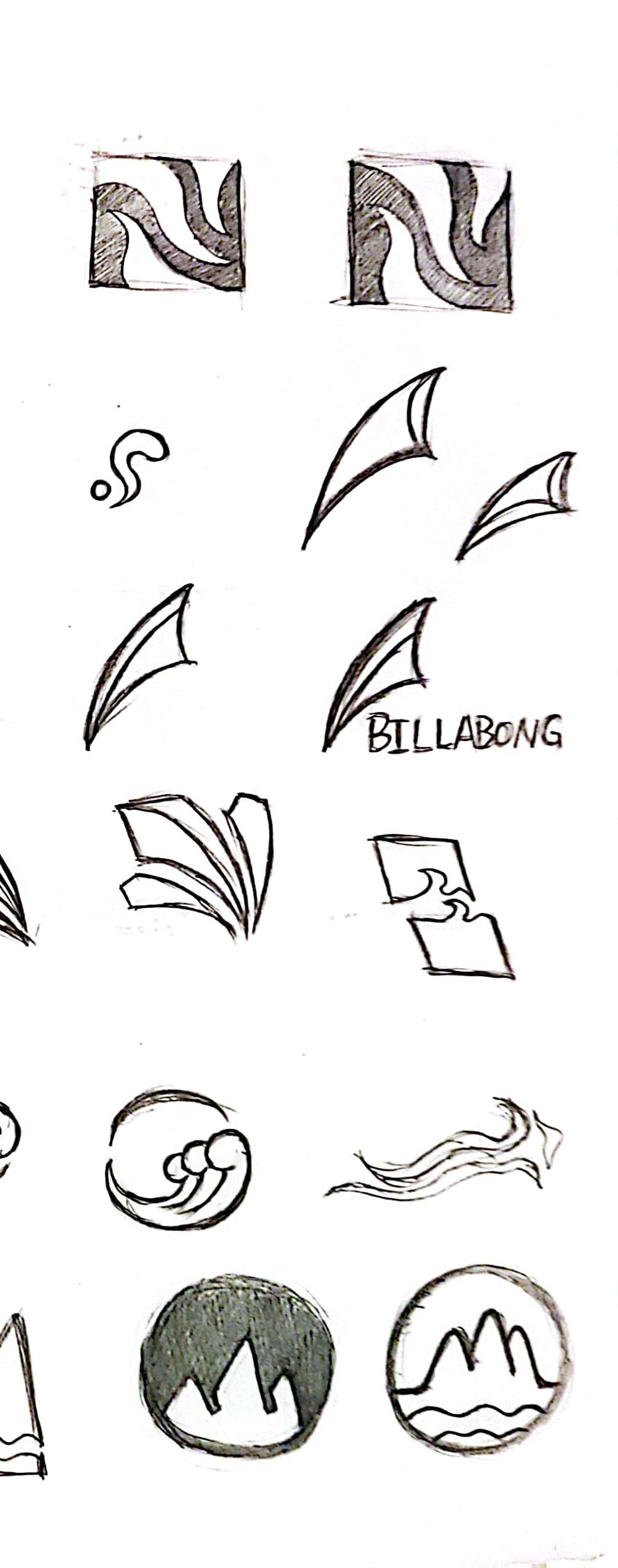
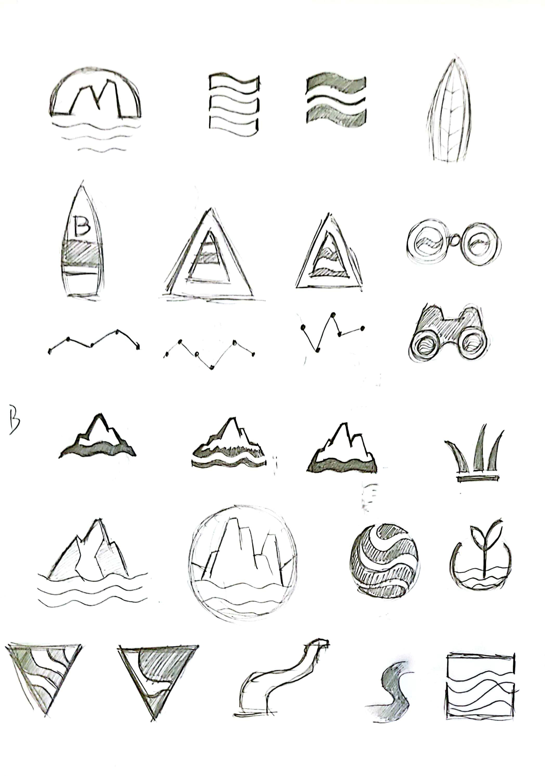
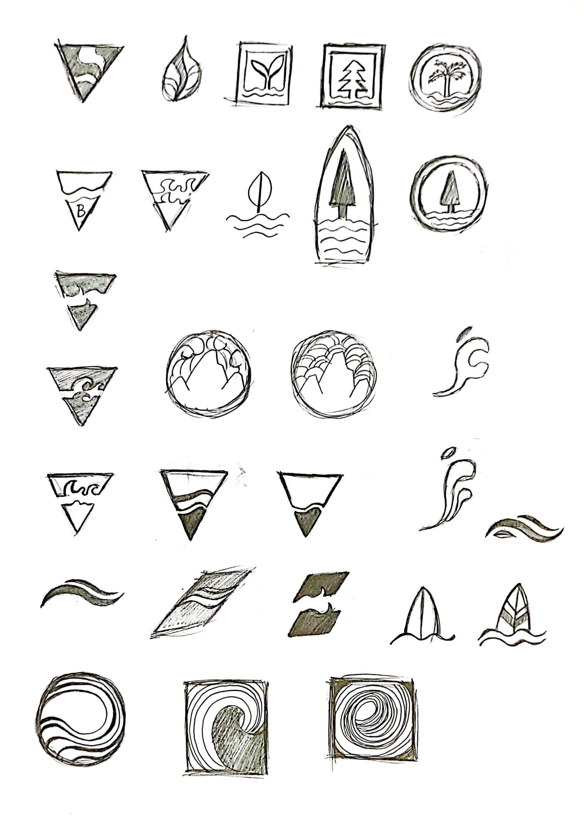
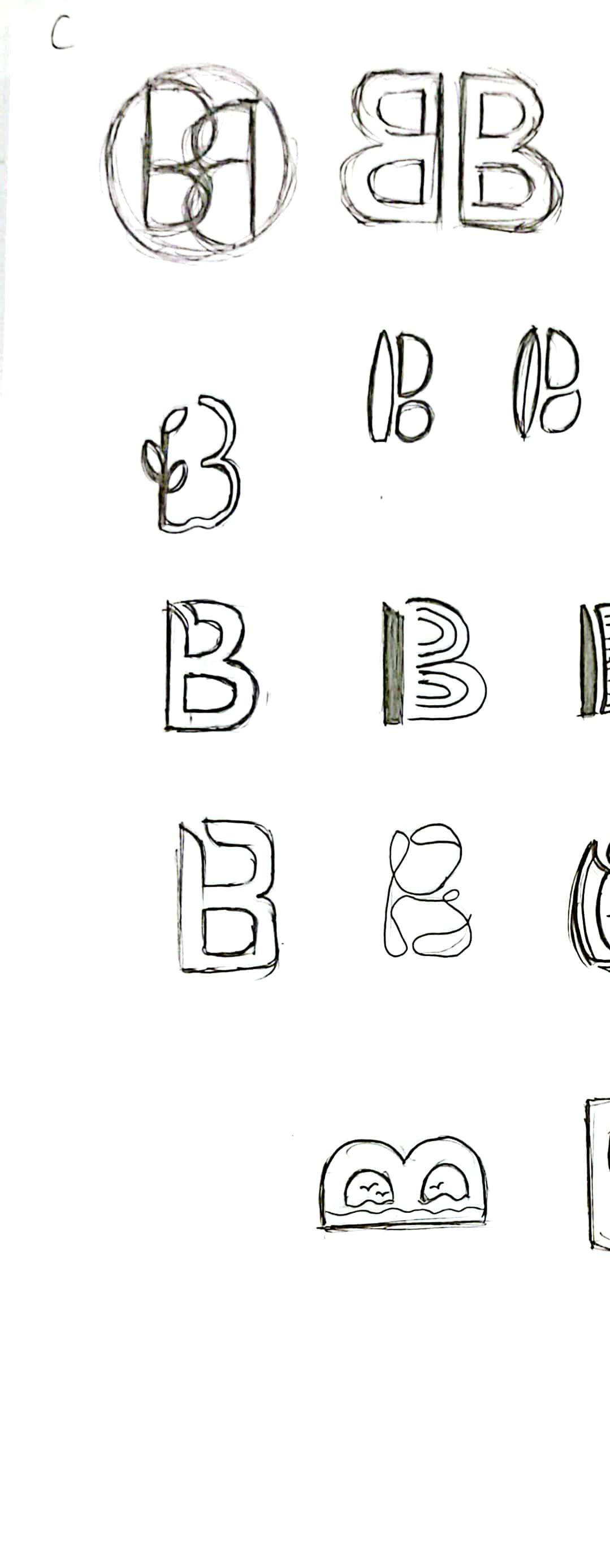
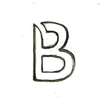
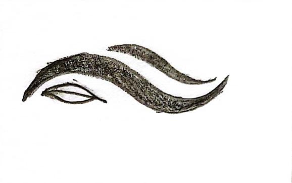
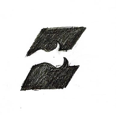
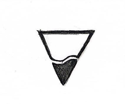
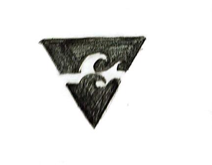
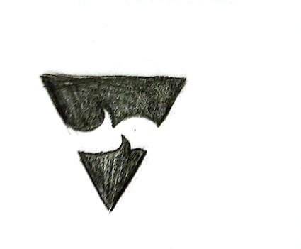
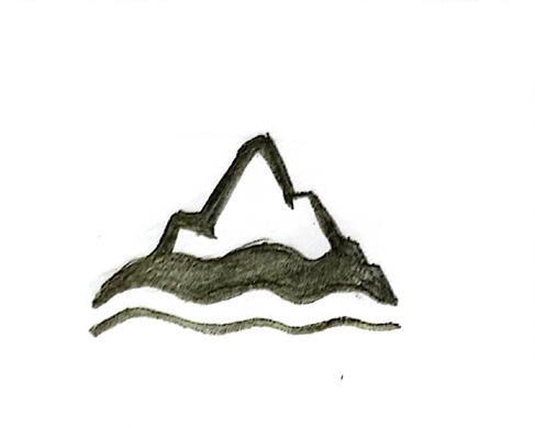
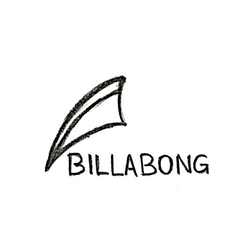
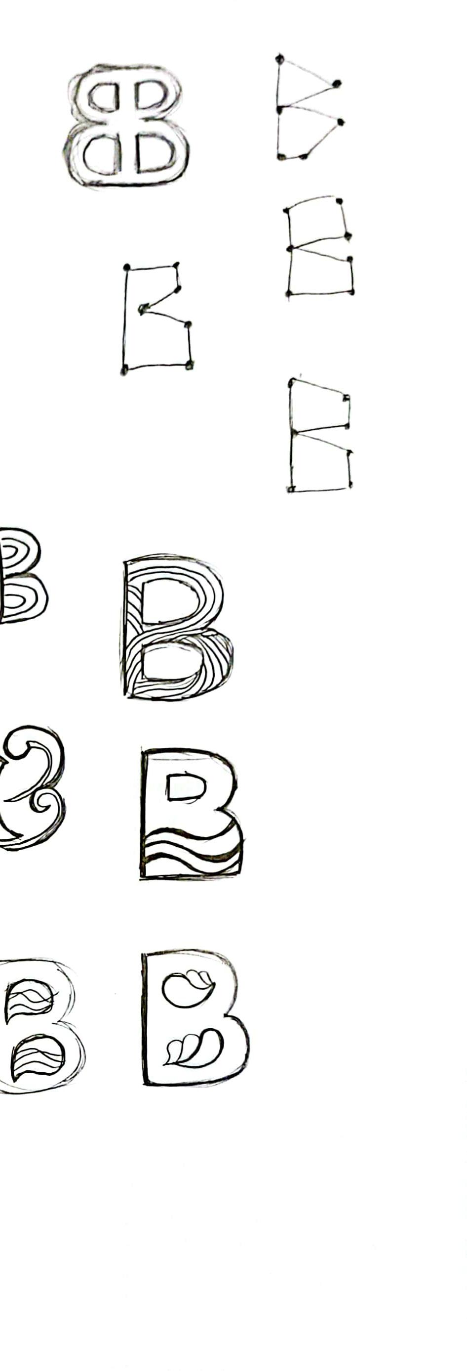
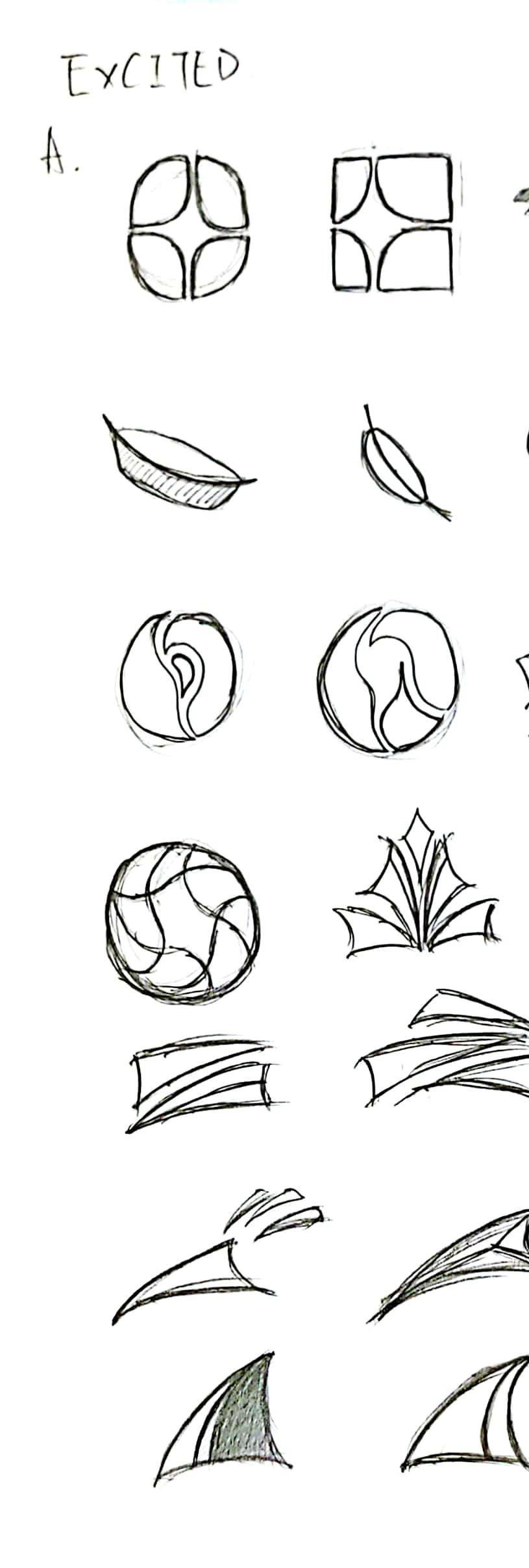
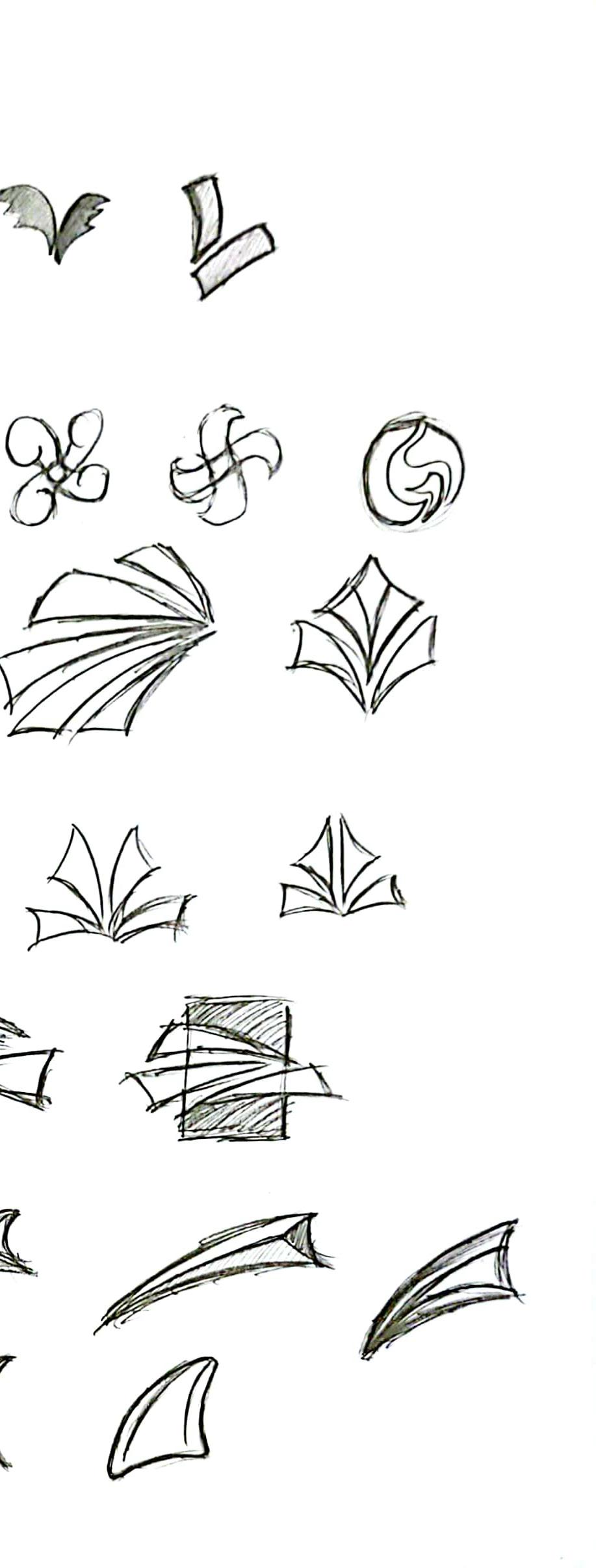
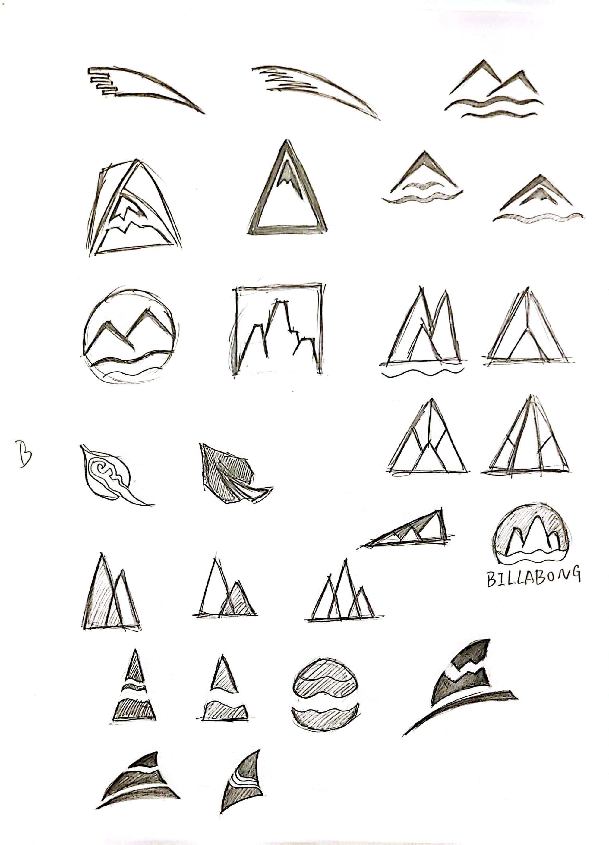
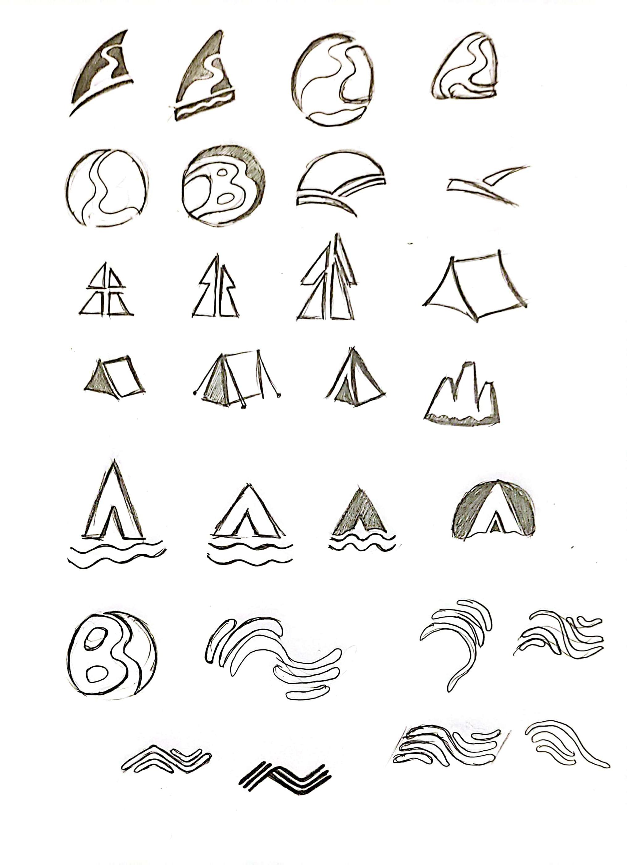

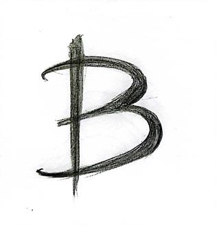
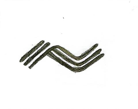
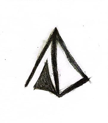
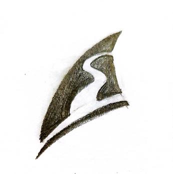


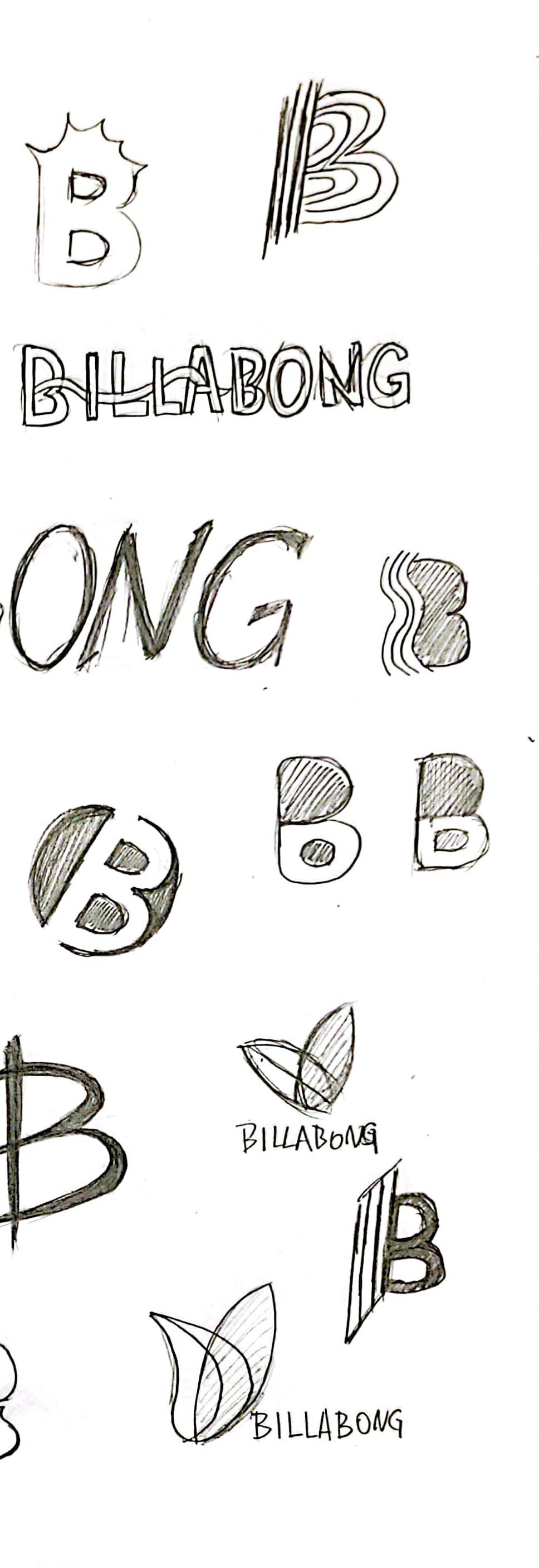

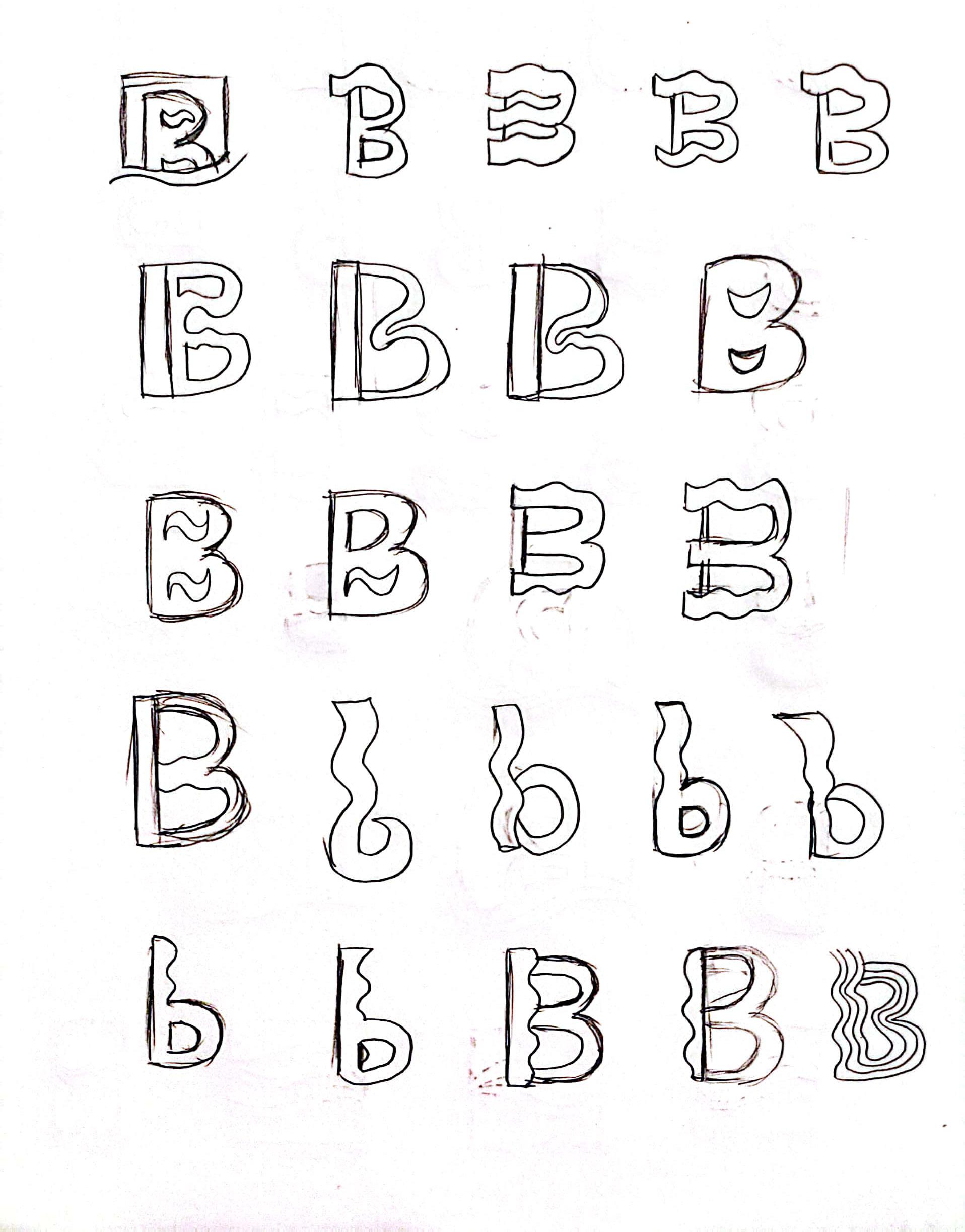
In the second round of sketching, the phrase “Passionate and fun” was first selected from the three phrases identified in the first round. The design will then be based on this theme, and the first round of sketches will have some new explorations and iterations.
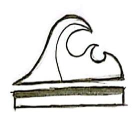
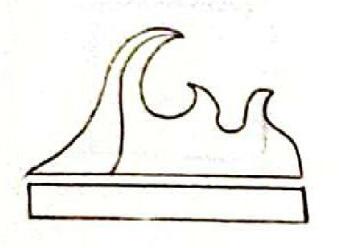
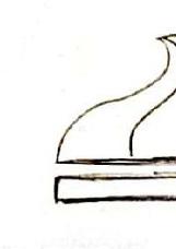


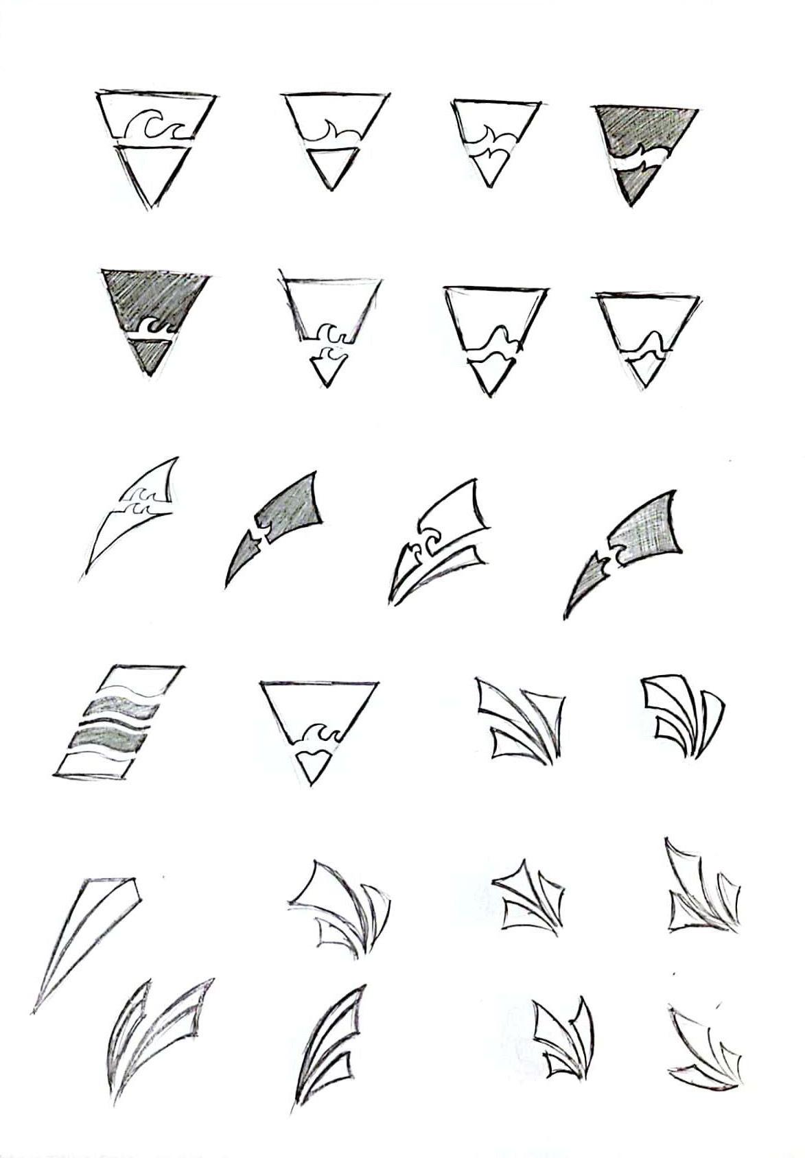
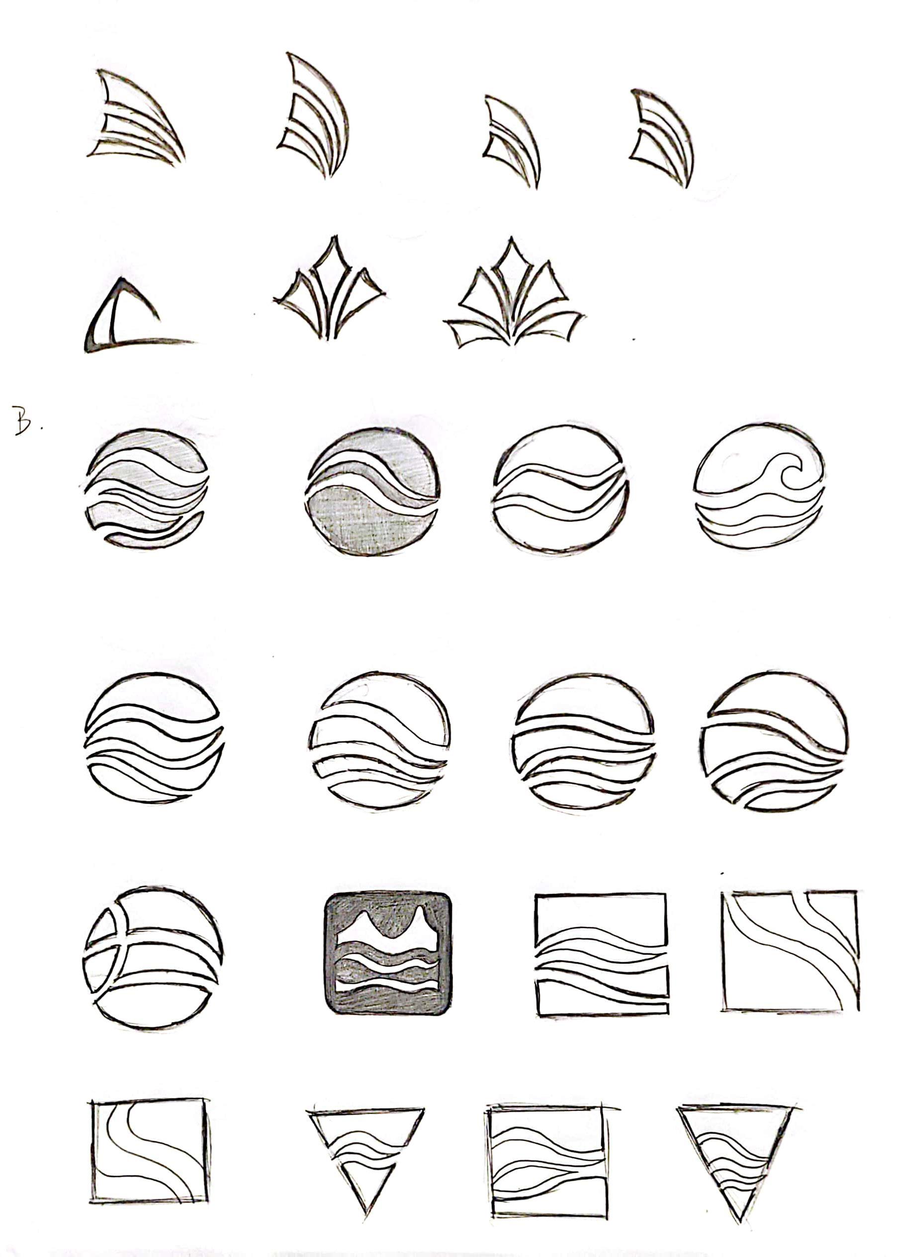
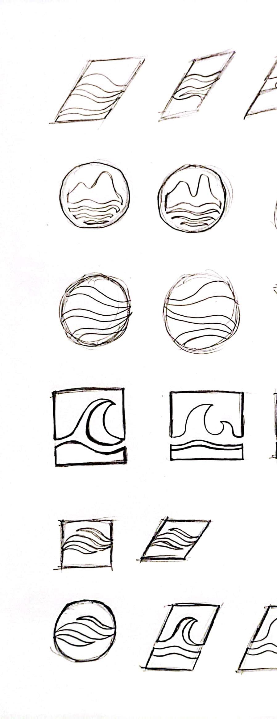
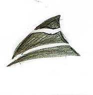
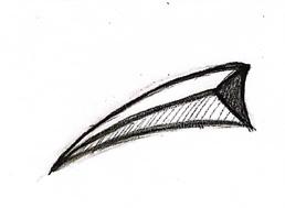
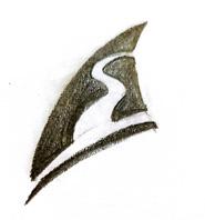
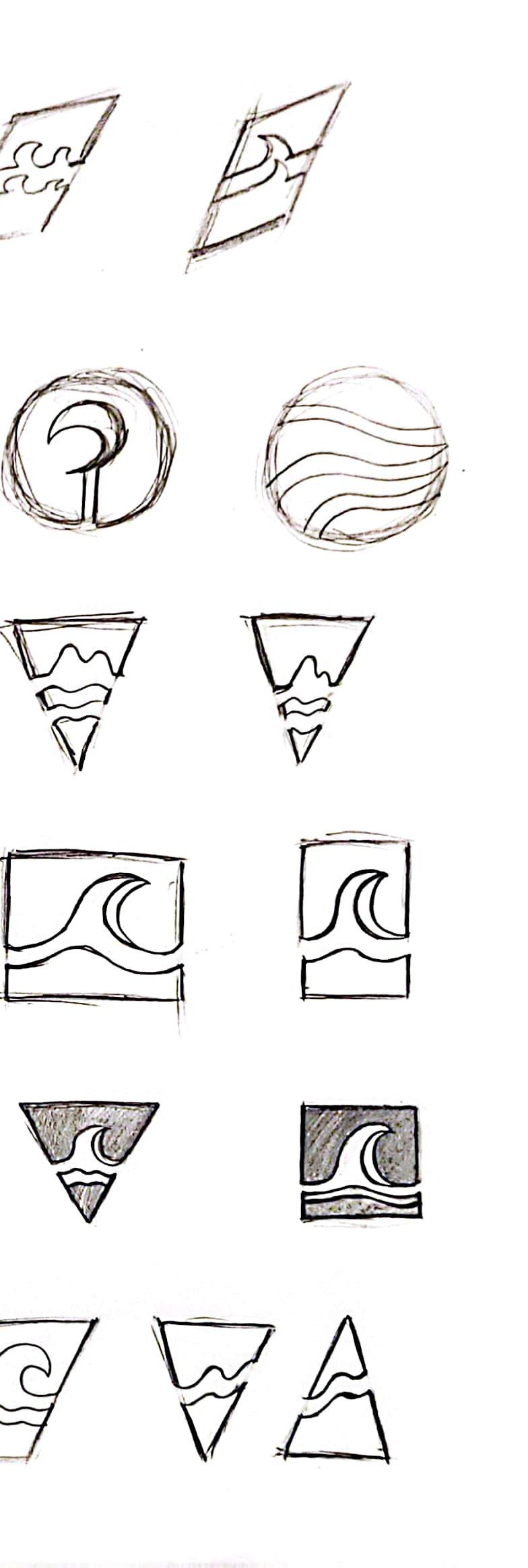
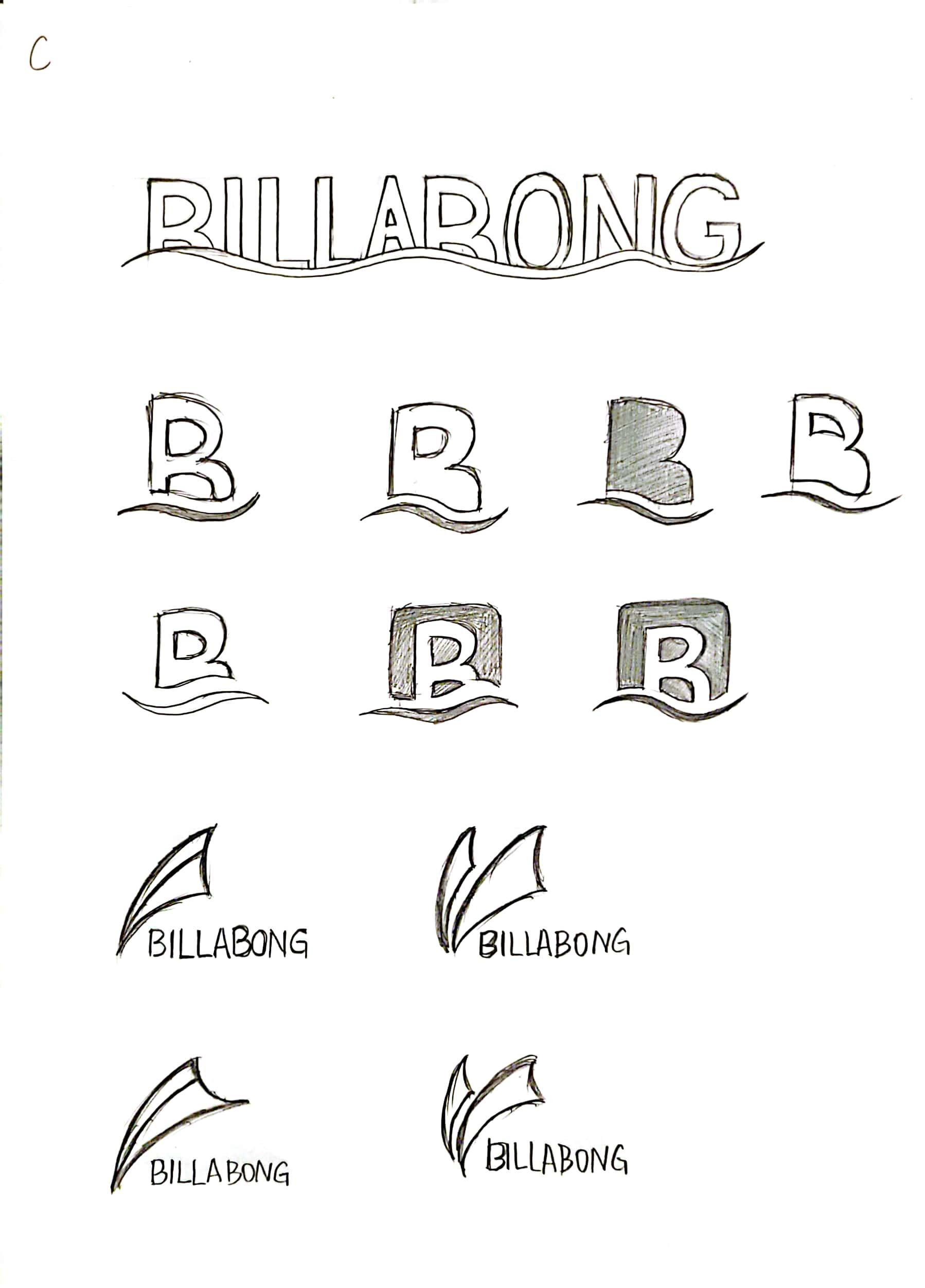
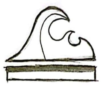

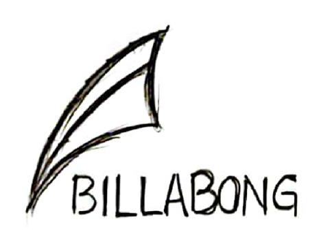
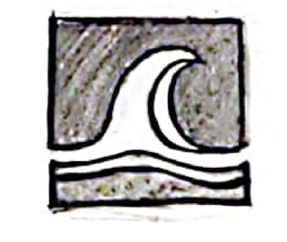

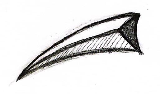
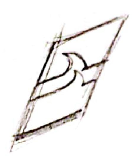
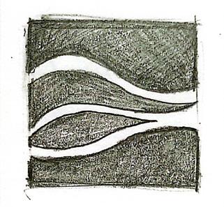
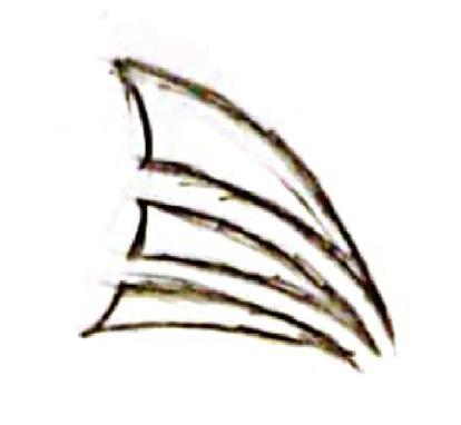
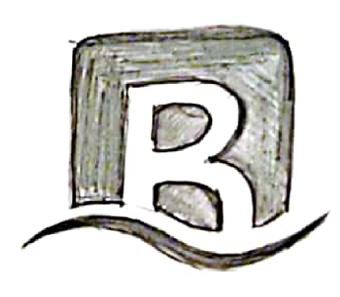

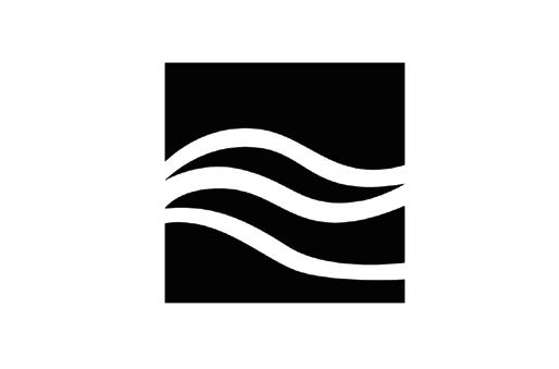
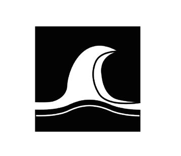

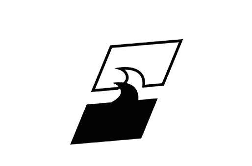





The third round of sketches continued for a creation and iteration based on the results of the first and second rounds. Make computer sketches and finally generate the three most potential logos.
The logo sketches with the green frame around them are the ones selected to go forward with and refine.

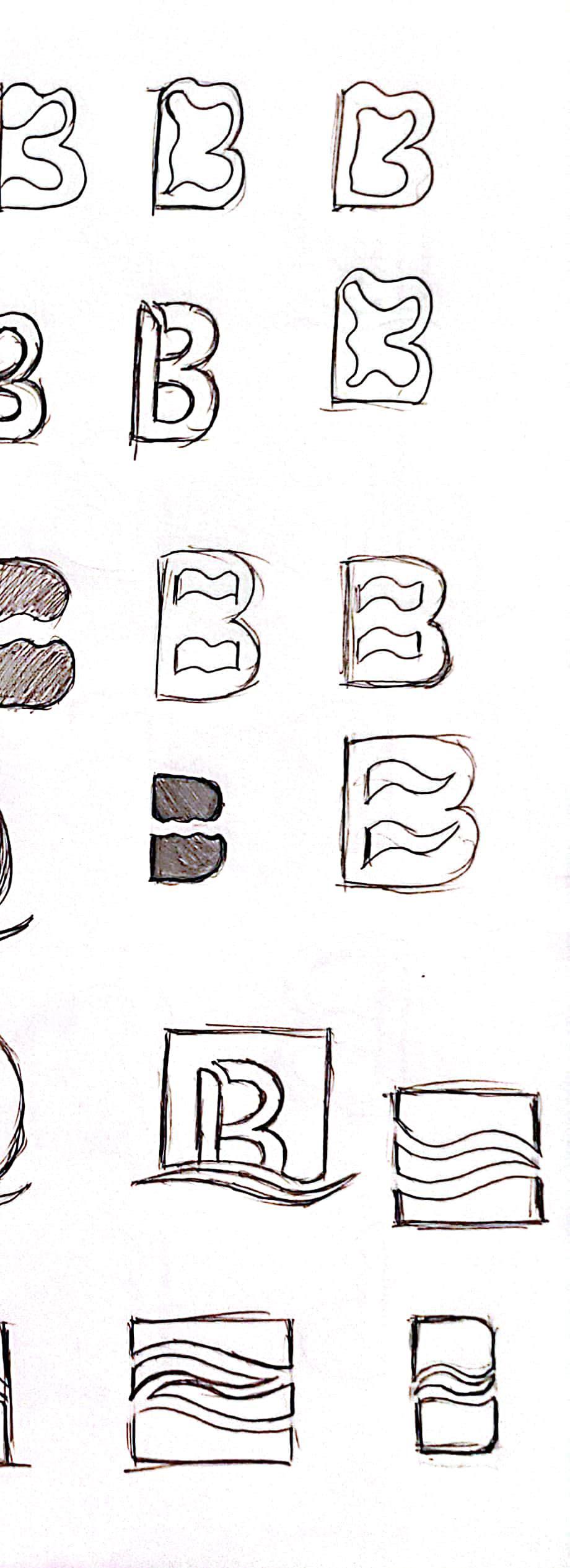



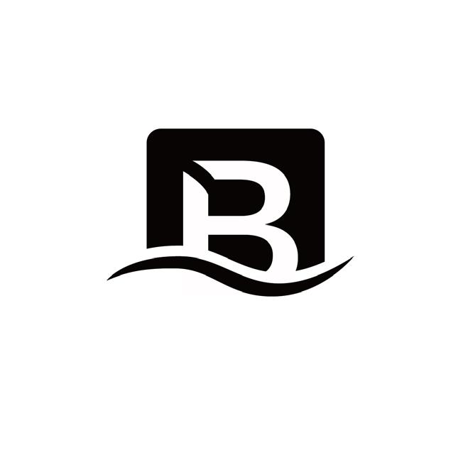

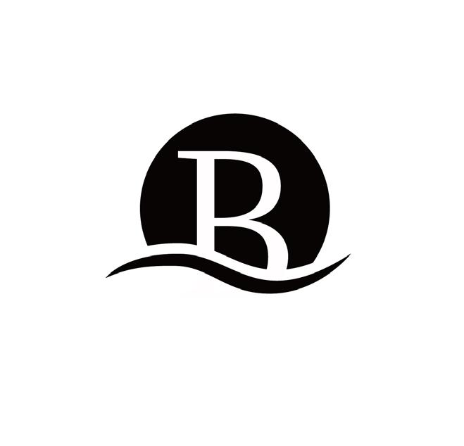
Represents the logos selected in this round.
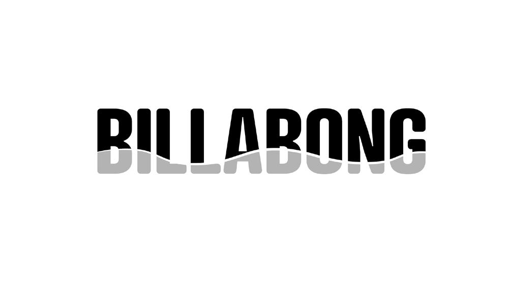
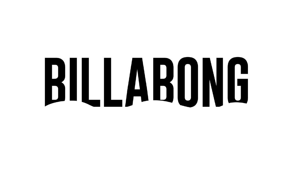

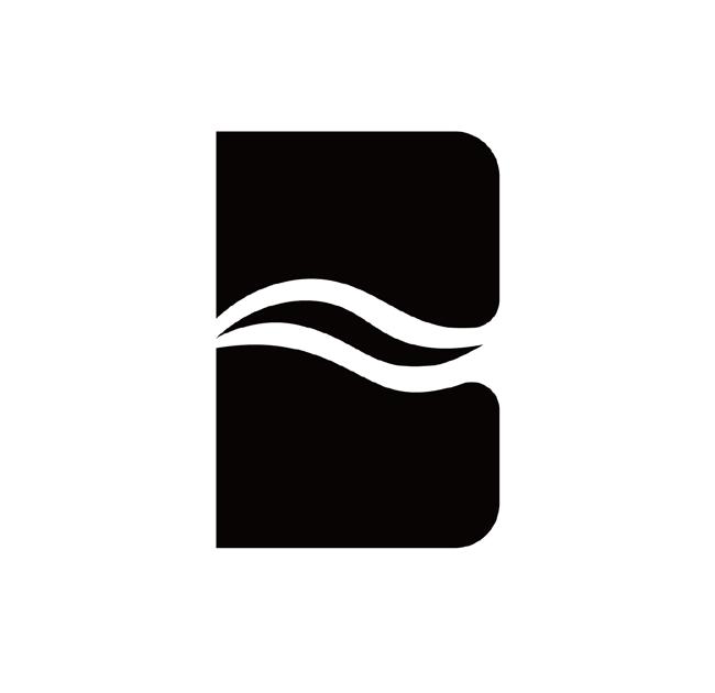
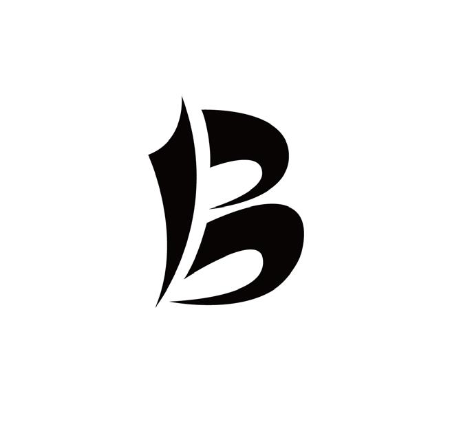

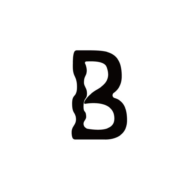
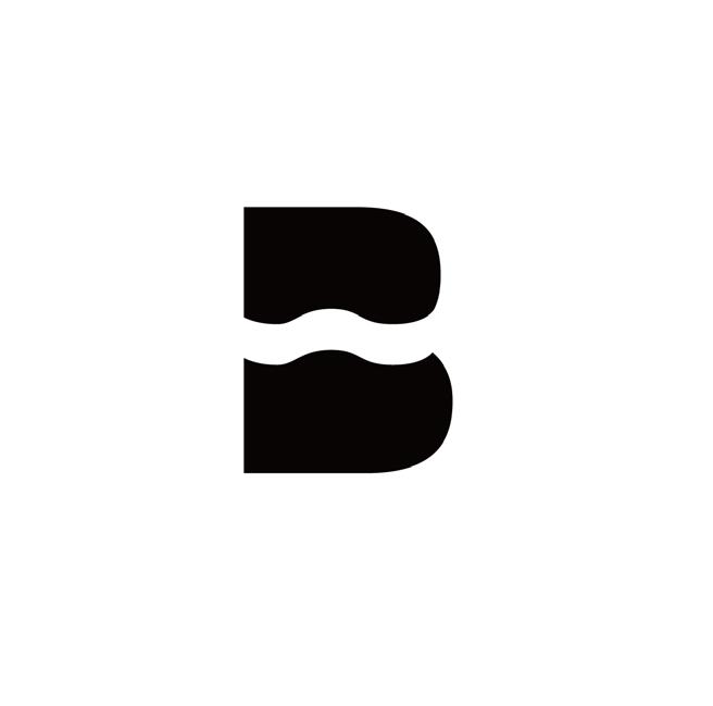



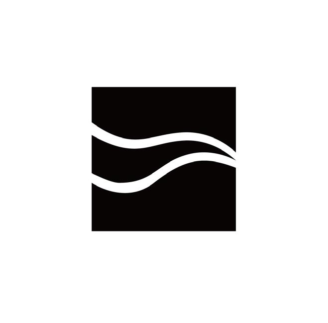

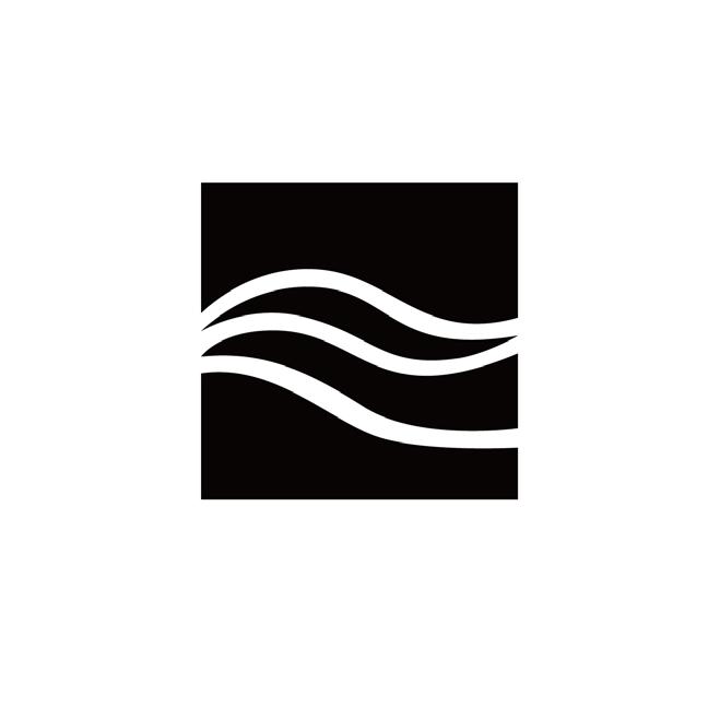
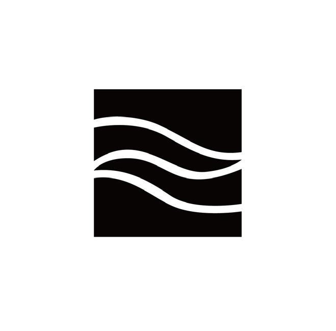

Passionate and fun.

Refined Sketches Color Attempt


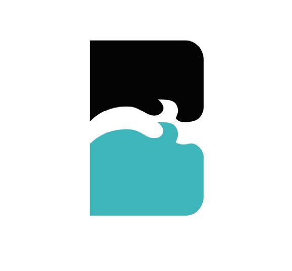

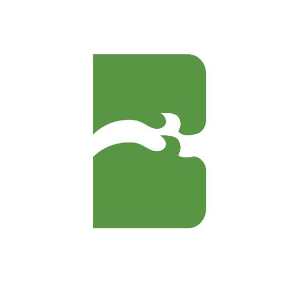
The logo is designed with the full name of BILLABONG. The ripples at the bottom of the letters represent ocean waves and rolling hills. At the same time can convey a kind of passion and joy. Align with the brand mission.
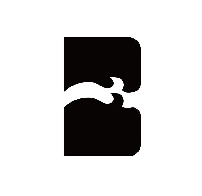
This logo is designed with the initial B of the brand name. Hope conveys the feeling of riding the wind and waves, representing the spirit of adventure and exploration. Match the brand mission.
The logo is designed with the letter B as an outline. The big wave in the middle represents exploration, adventure and nature. Match the brand mission.



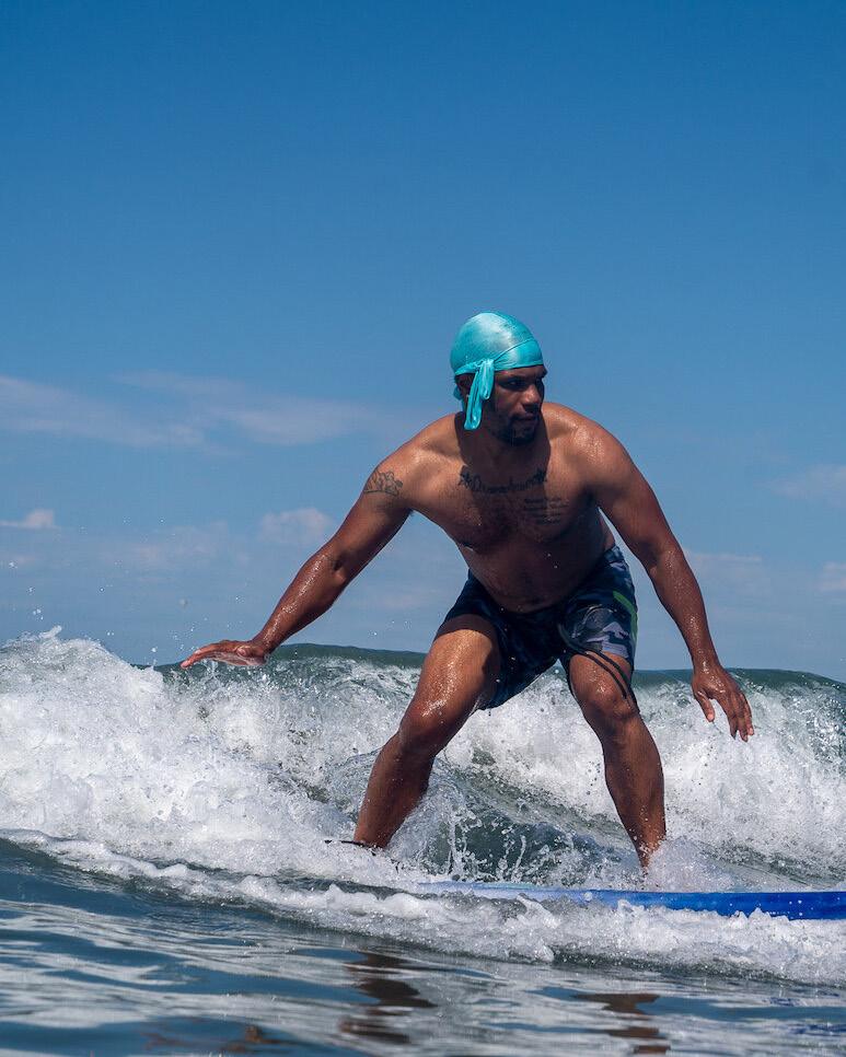
-Letter Related
-Graphic Related
-Inspiration
DESCRIPTION
This section contains the search and analysis of similar logos in various fields. To prevent possible future allegations of plagiarism.

These are all existing designs using letters. These include designs using the outlines of letters, or designs related to ocean waves.
The inspiration for the design of this part of the logos is related to the waves, the sea, and nature, and uses lines to express.


This section is devoted to analyzing other brands' Visual Standards Guides. This will help Billabong develop a good, standards compliant brand framework.
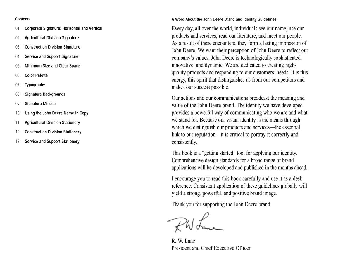
The brand introduced the mission and core parts of the brand through a letter from the President and Chief Executive Officer, and introduced the brand's new identity.
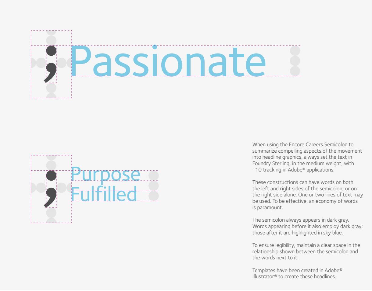
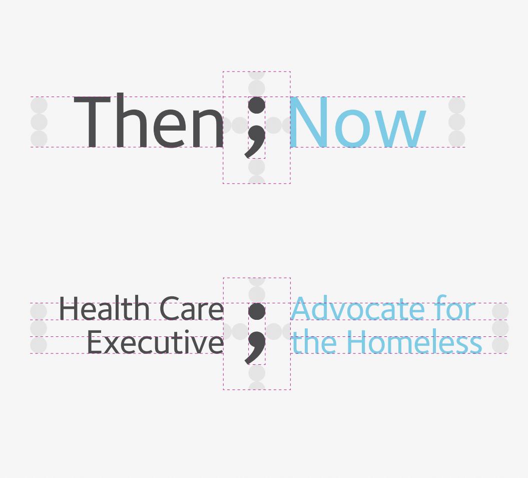
The brand illustrates the proportions and specifications of the logo with a circle which is the same size as the circle in the semicolon. At the same time, they stipulated many situations of using semicolons, and also attached the detailed text descriptions. This can help the brand to be visually unified.
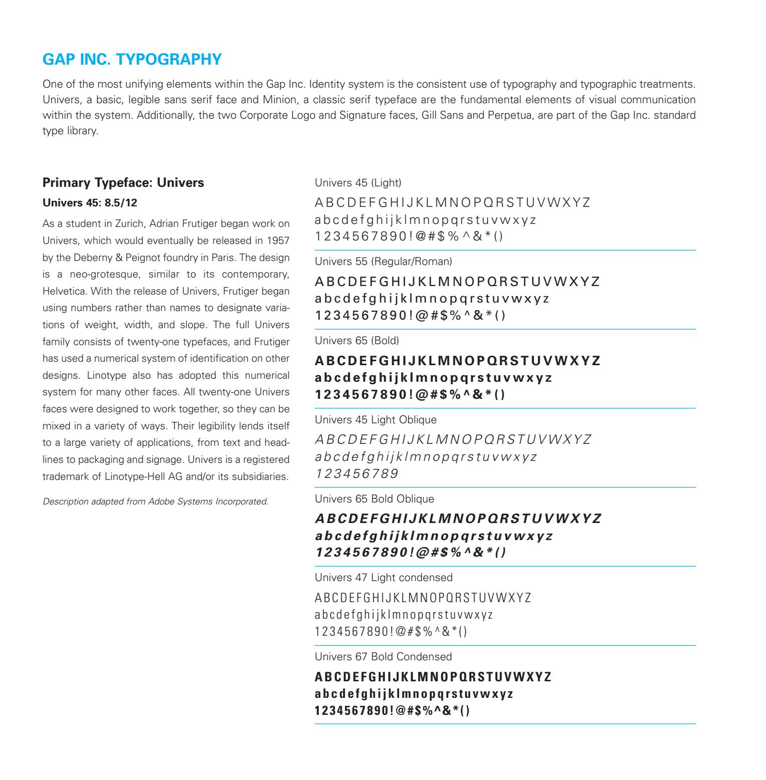
This contains all the weights and types of fonts that the brand will use. It also includes the font introduction and the relevance of the font to the brand, that is, what attributes of the brand are hoped to express through this font.
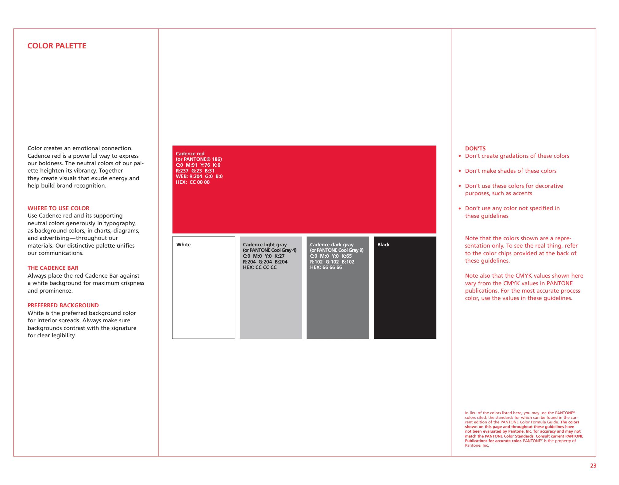
Here is a list of all the colors that the brand stipulates to use and the specific parameters for each color. At the same time, the requirements for the use of color are clearly stated: the do's and don'ts.
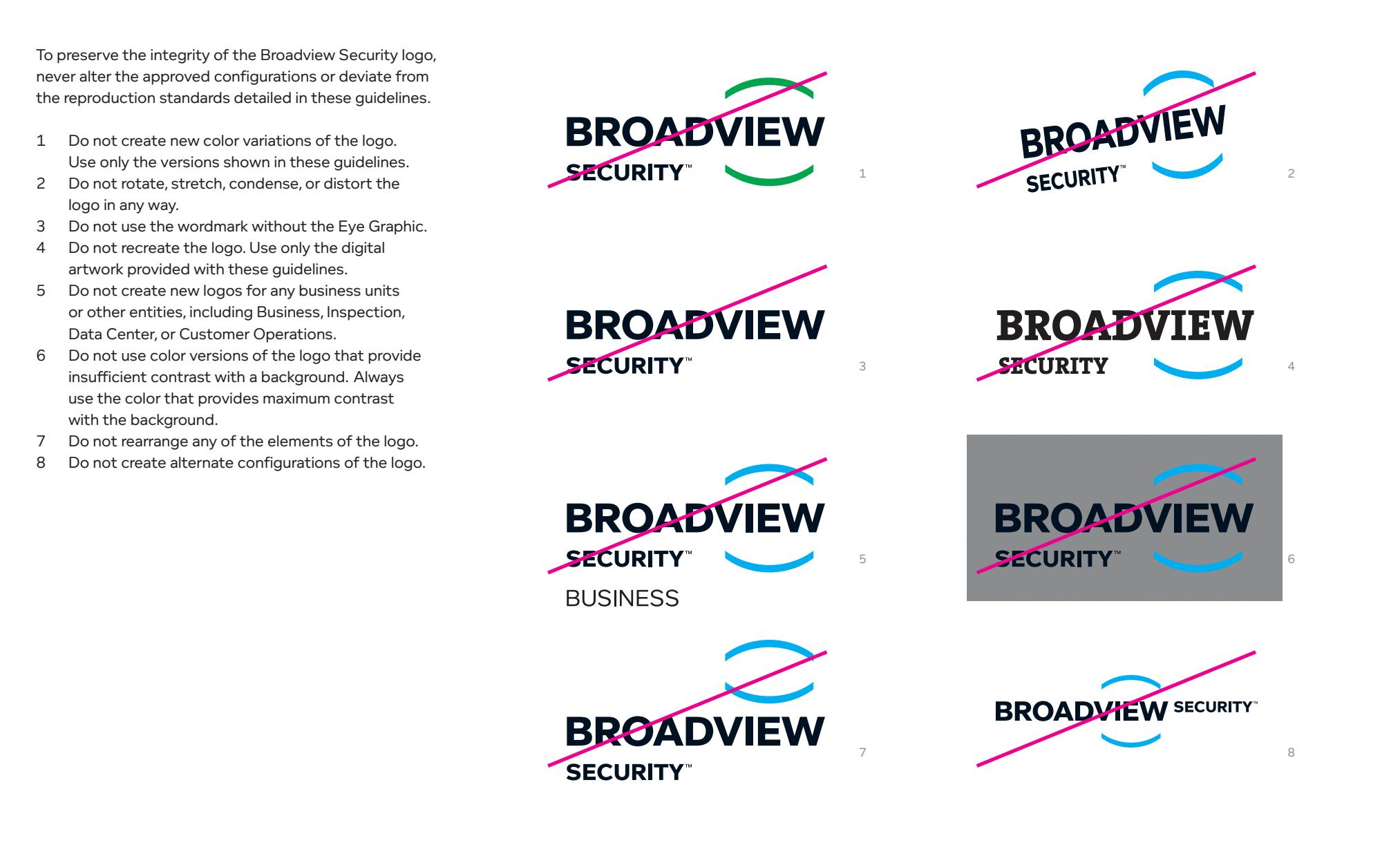
The brand gives detailed illustrations and corresponding detailed text descriptions. This can help brands prevent possible problems with logo usage in various aspects of future design.
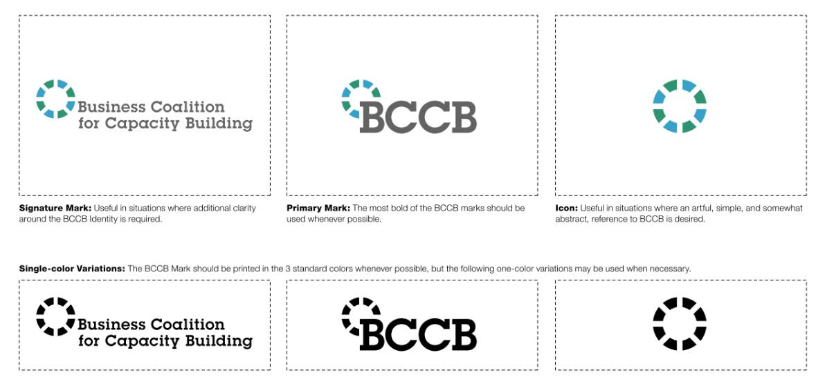
BCCB provides signature mark, primary mark and icon in this page. And it states when to use the design. A black and white version was also produced for use if necessary.
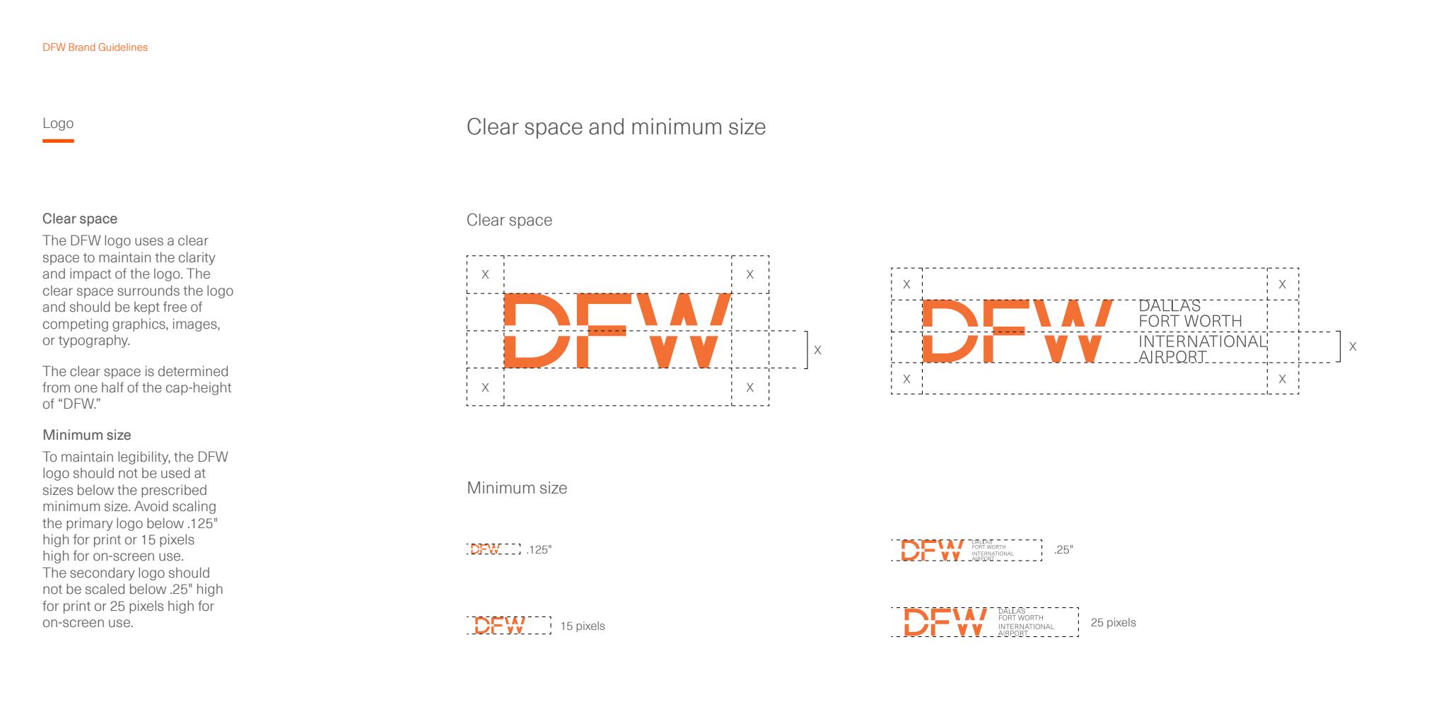
On this page, the brand explains the range of space that must be left around when using the logo.It also states the minimum size the logo can use in print and on screen. This ensures the legibility of the logo.

-Process
-Logo In Different Color
-Final Logo
-Logo Anatomy And Minimum Size
This part will show process and the final logo.
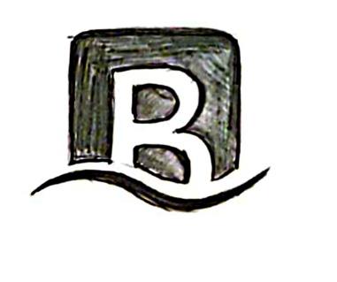
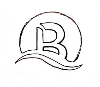
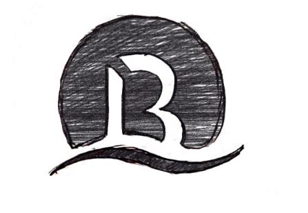
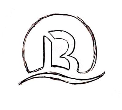
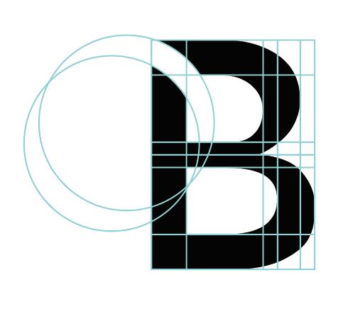
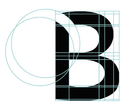
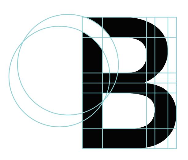
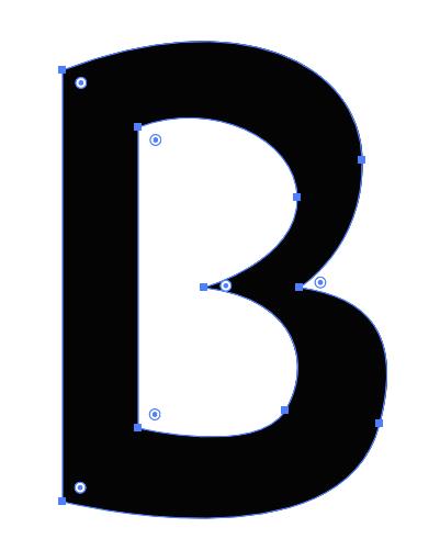
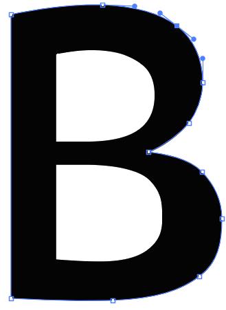
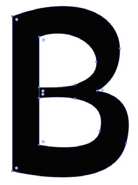

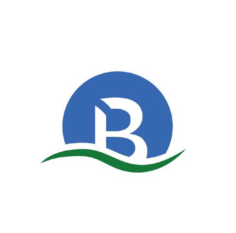

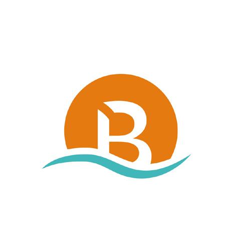
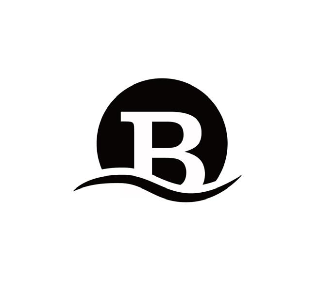
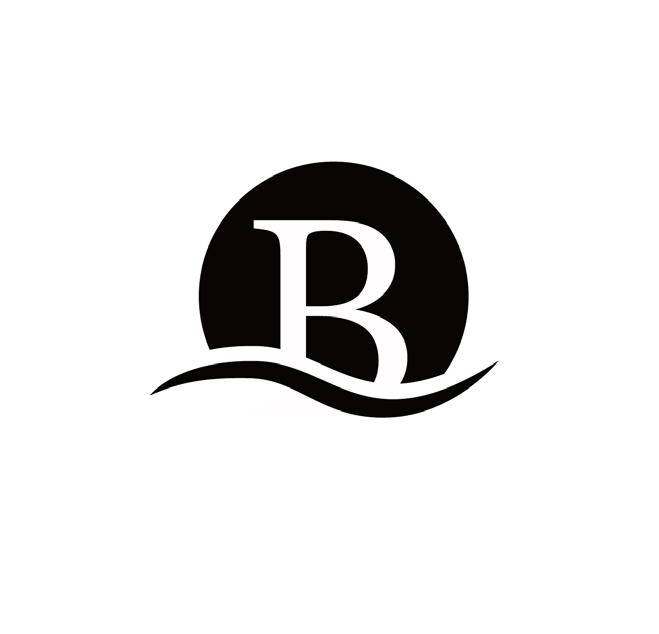
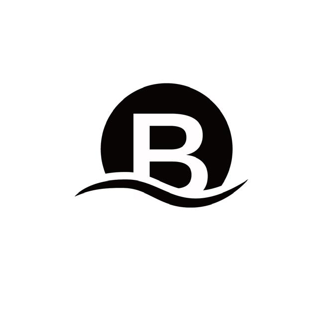
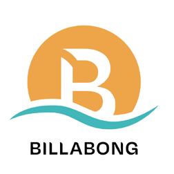
The logo is linked to the brand mission. The wavy lines at the bottom represent natural features such as ocean waves and rolling hills. The letter B above is the initials of the brand BILLABONG. A curved opening in the upper left corner of the letter B represents exploration, passion and joy. Because the brand originated from the story of surfing by the sea and the brand is closely related to nature, I chose blue and orange as the color scheme. It means the sun rising from the sea.
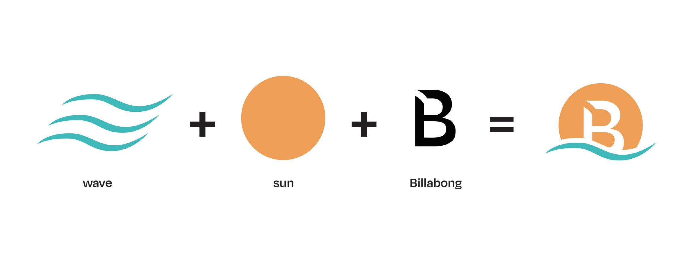
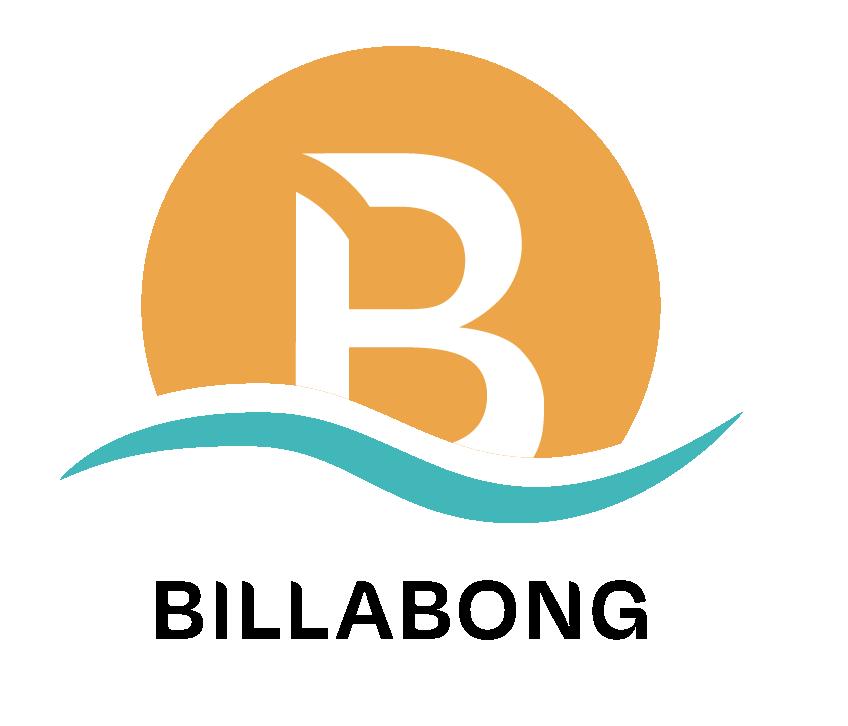
The space around the Billabong logo needs to be kept free at all times. This ensures that the logo is clear and readable.
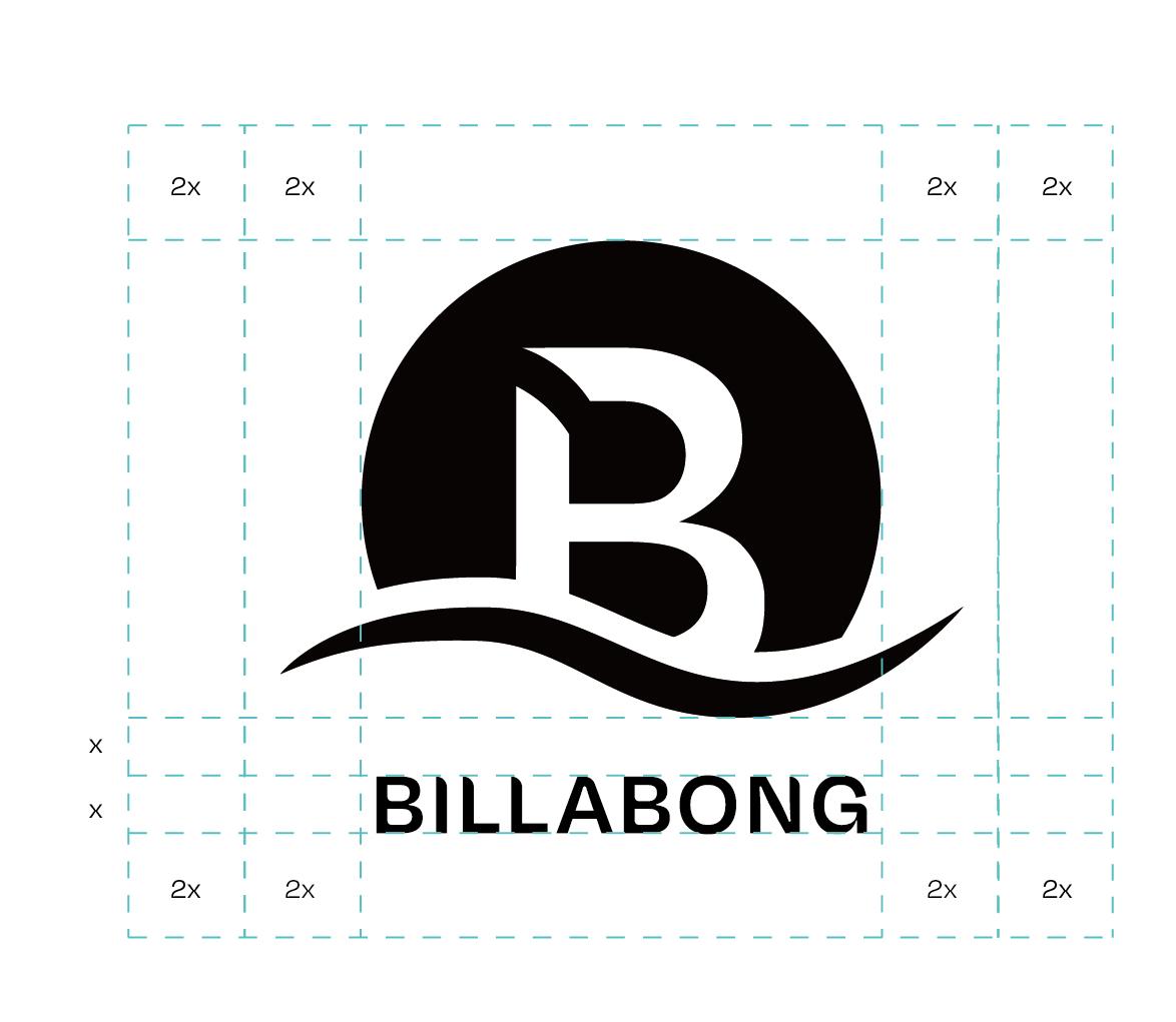
The size and minimum size used for each version of the logo are specified here. This ensures the readability and recognizability of the logo.


Below 5mm, do not print // minimum logo size 5mm
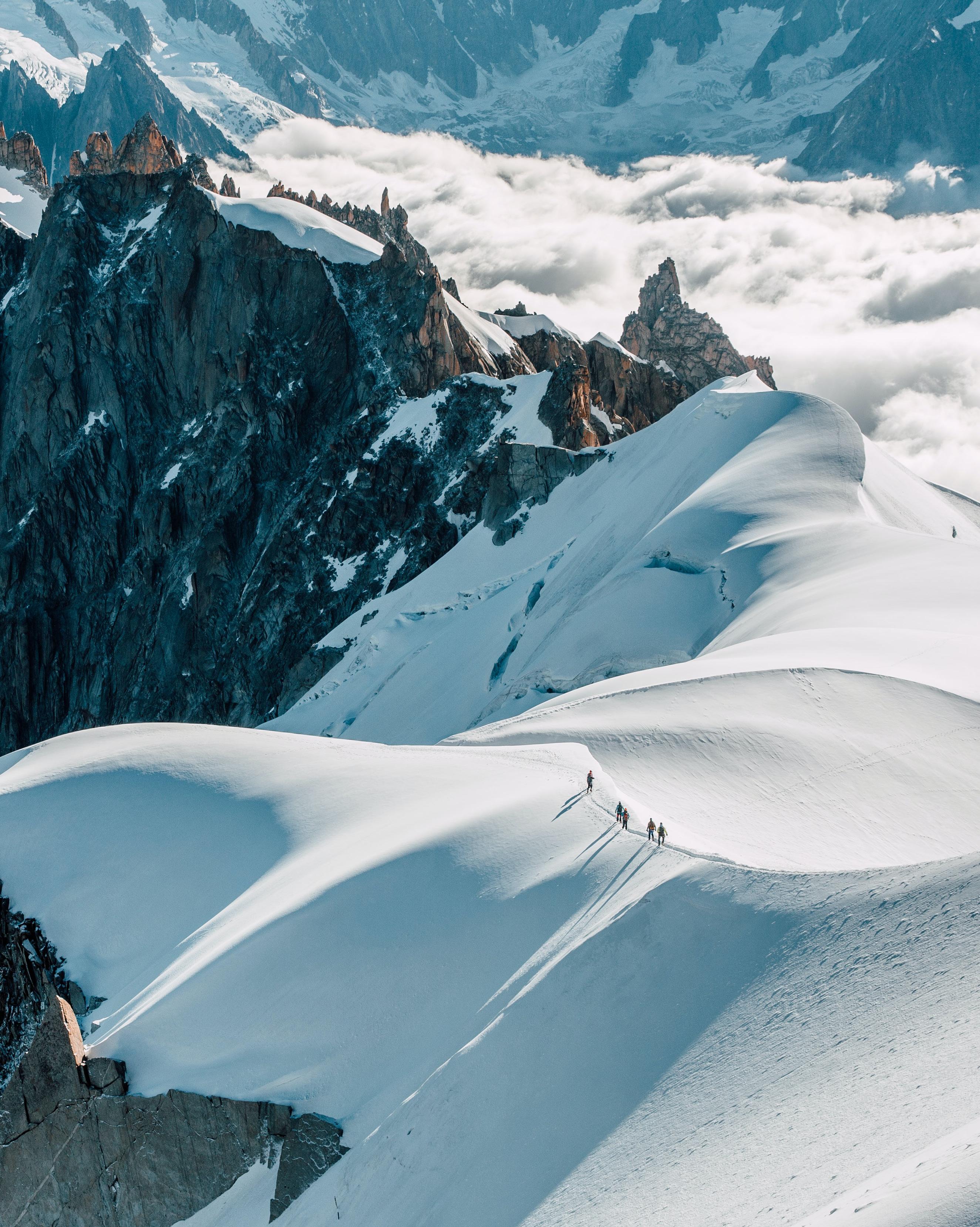
Thanks to these sites for the resources.
billabong-store.ie pexels.com/zh-cn gopro.com
www.pinterest.com
createthegood.aarp.org
tvrcamp.org
oceanicsociety.org
insider.com
theculturetrip.com
medium.com
comparethesurfbrand.wordpress.com
surfd.com
talkwalker.com
directory.goodonyou.eco
wikipedia
