[2022 - Present]

[2022 - Present]
Tempe, Arizona
EGA5235@YAHOO.COM
(702)-821-5235
ARIZONA STATE UNIVERSITY
Masters of Architecture
Expected Graduation: May 2024
[2018 - 2021]
Bachelors of Science in Architecture
Participating member of AIAS for numerous events
[Fall 2022]
Collaborative ASU Design Excellence Award for the Fall Expansion design of the University of Arizona Mathematics Building (Project 01)
[Summer 2020]
Worked in a two person team to design a visitor center in Abu Dhabi lead by mentors Kevin Ward and Travis Allen from Carpenter Sellers Del Gatto Architects. Required a deep study on traditional materials and practices of Abu Dhabi.
[Summer 2017]
Volunteered to help a team with the construction of a tiny home in a Las Vegas for a small family. Construction included installing roof components, windows, steel frame, and minor design decisions such as window and furniture placements.
TECHNICAL
Rhino V-Ray
Grasshopper
Revit (Intermediate)
Premier Pro
Ilustrator Photoshop Indesign Excel
LANGUAGES
English Spanish

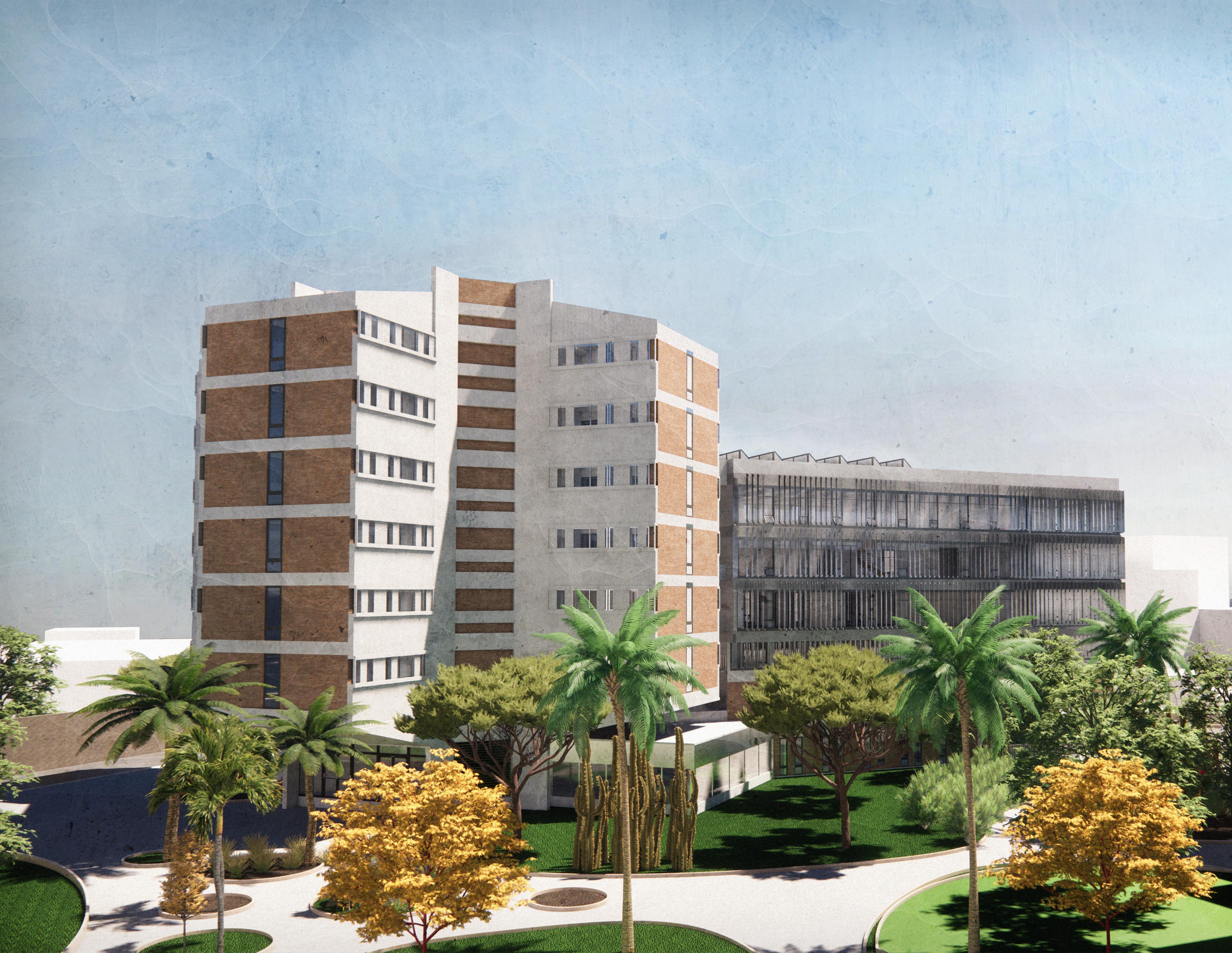
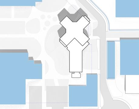
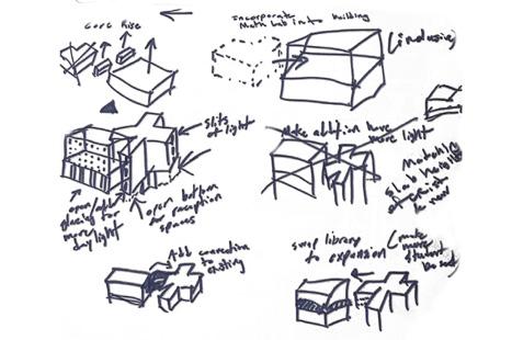
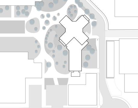
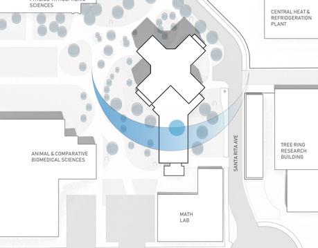
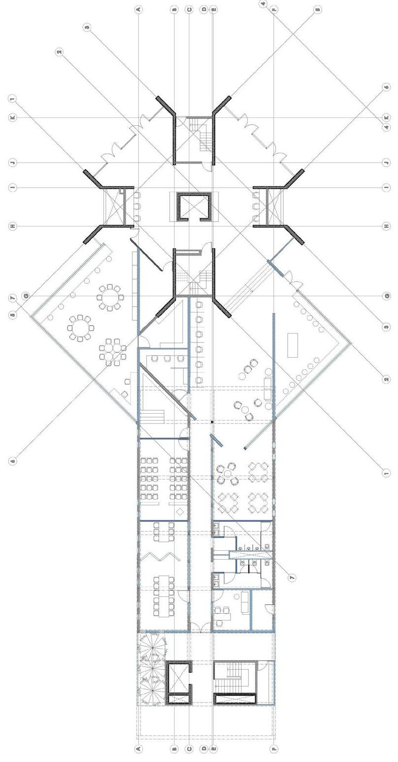
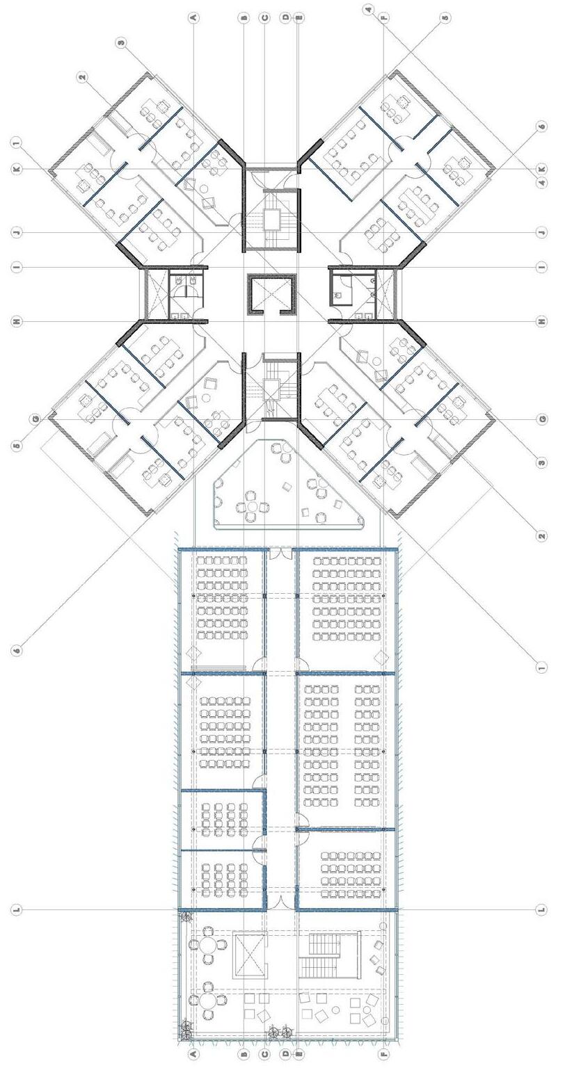
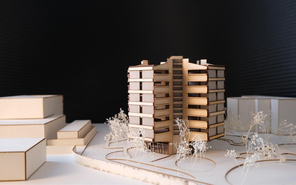
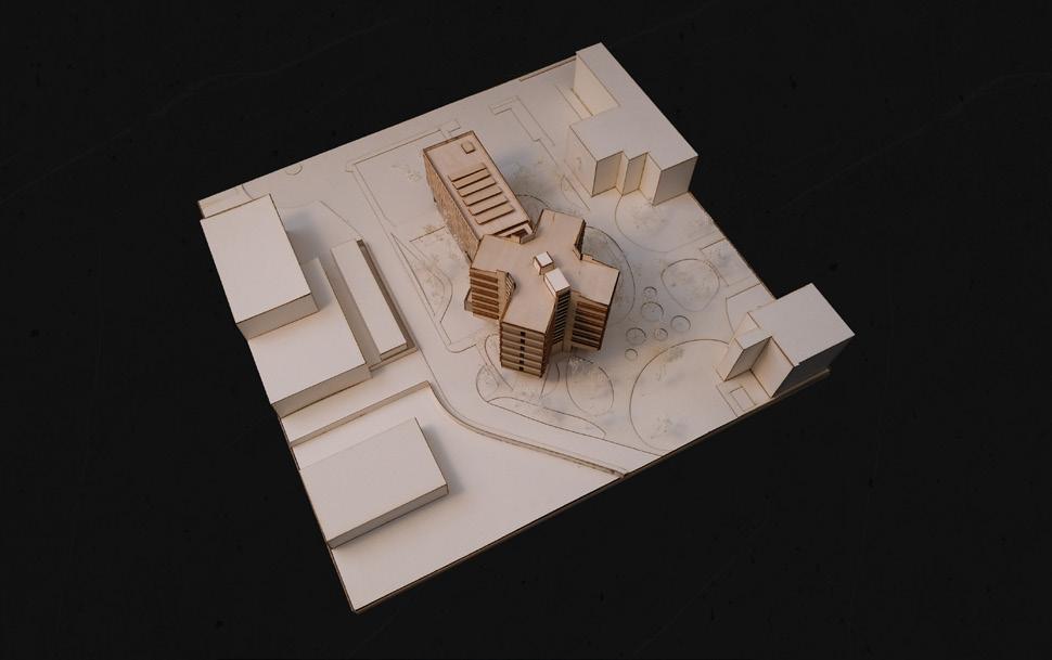
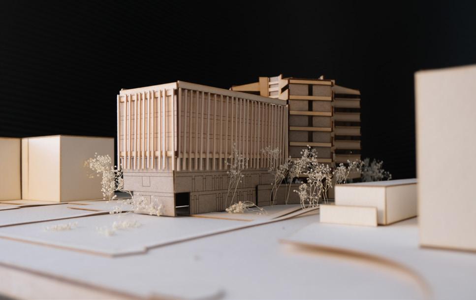
The existing mathematics building in the University of Arizona campus hosts a wide range of students with additional small departments such as linguistics. The goal of the project was to add an expansion to the existing building and make the experiences of mathematics students more inclusive while still preserving most of the existing building due to its historical relavance on the campus. The expansion was created to host more space for the existing small departments and more space for the mathematics department with an emphasis on open spaces and more research oppertunities.
TYPE:
EDUCATIONAL (EXPANSION)
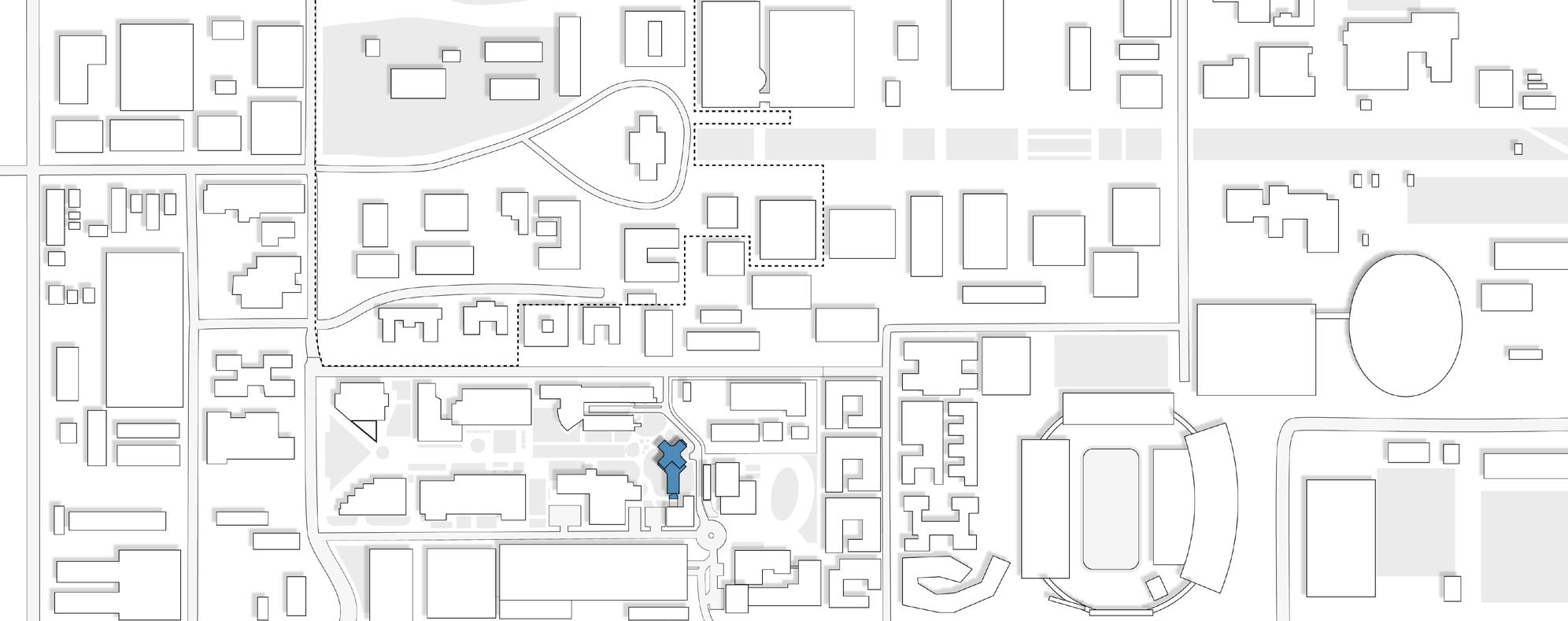
LOCATION: TUCSON, AZ
YEAR: 2022
COLLABORATOR: JAYANI MEHTA
MENTOR: ELIZABETH MCLEAN
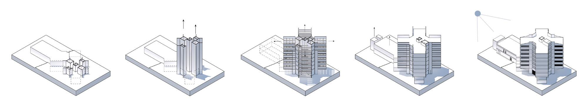
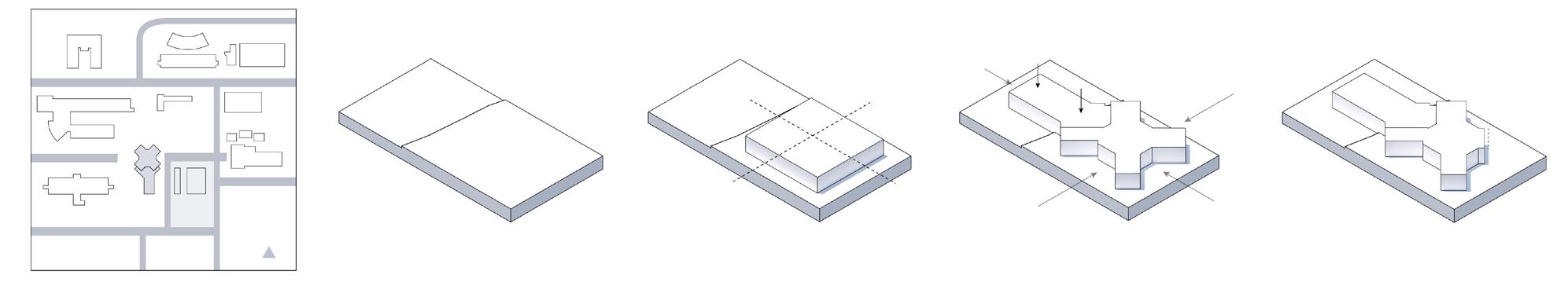
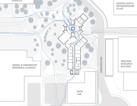
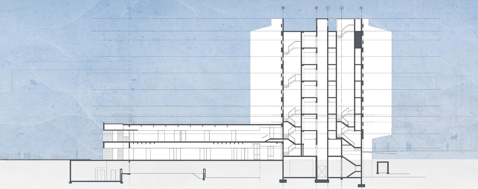
The building in the University of Arizona campus is located in the bottom core of the newer areas. Much of the existing building was built from brick and concrete with a 1970’s style as this was a rising style in the time of construction. It derived from the physics building and was made to be an intersection of students on a more central portion of the science concourse. Overtime however, the surrounding buildings changed and so did the roads. This created new issues on the building site as well and its location. This created its presence as a building on the edge rather than a central one. The concrete cores of the main x-like portion were raised up vertically to create the original circulation followed by the idea of the concrete structure to hold up the exposed slabs. In a second phase, there was another floor and exterior elevator added to the south wing of the building similar to the vertical aspect of the x portion.
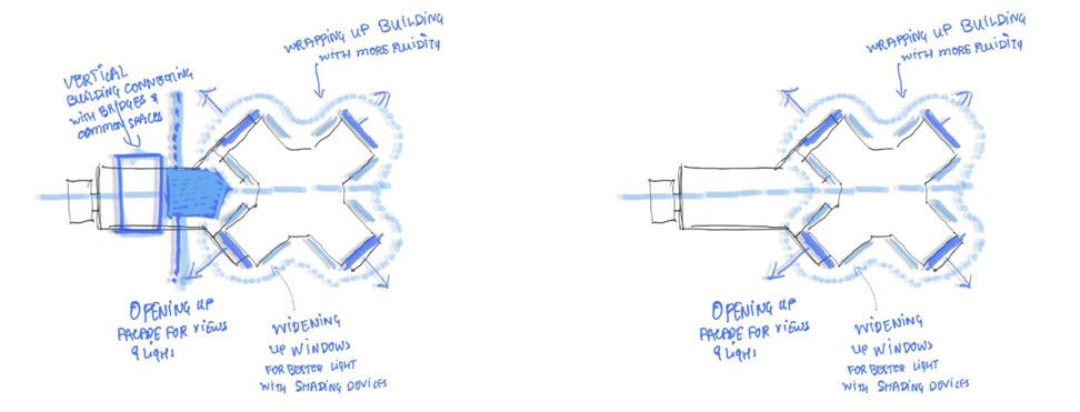
The existing building created a number of problematic areas such as connection to the second floor of the south wing. It created multiple level changes that had a confusing path to the south wing. This was one of the first problems identified that could be resolved in a different way so that the expansion on the south wing could have a better connection to the existing building. The decision to build vertically was a challenge but welcomed other ideas such as providing more open spaces for more natural daylight since daylight was very minimal in the existing building. The site also suffered from poor circulation due to its changes over the years since the 1970s.
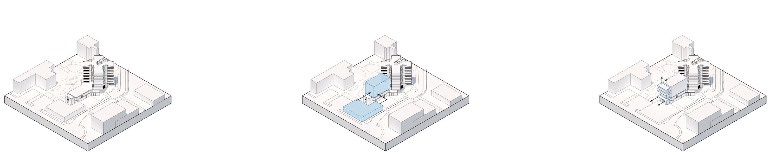
 Existing site
Integration of math research lab into the expansion
Raise the existing cores vertically
Integrate the existing small library to the main research/library floor of the expansion
Create daylight openings to the existing and expansion. Remove the bottom portion of the north wing for more circulation space
Create exterior circulation between the main building and the expansion
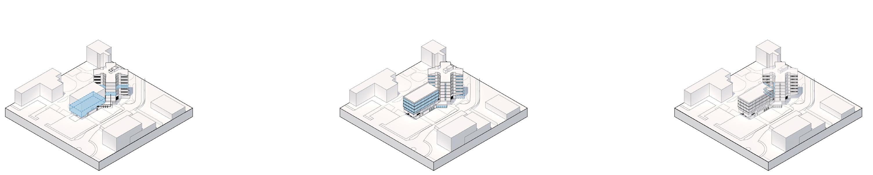
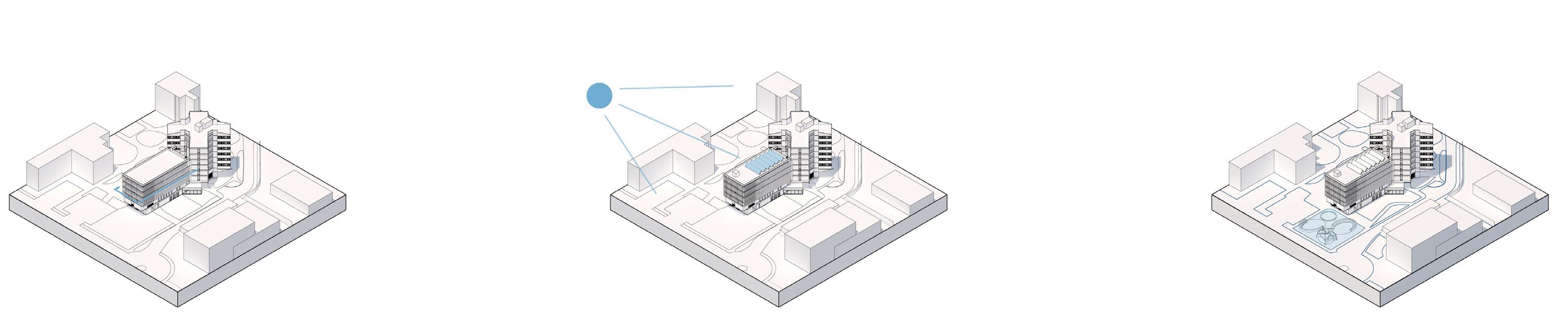
Control natural daylight with a louver facade system Add solar panels on the roof to take advantage of the high roof area
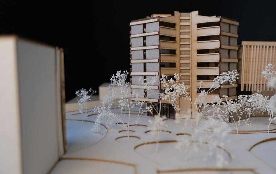
Add more landscape oppertunites on the site for better visibility to the science concourse
Existing site
Integration of math research lab into the expansion
Raise the existing cores vertically
Integrate the existing small library to the main research/library floor of the expansion
Create daylight openings to the existing and expansion. Remove the bottom portion of the north wing for more circulation space
Create exterior circulation between the main building and the expansion
Control natural daylight with a louver facade system Add solar panels on the roof to take advantage of the high roof area
Add more landscape oppertunites on the site for better visibility to the science concourse
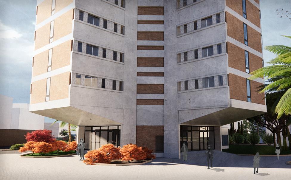
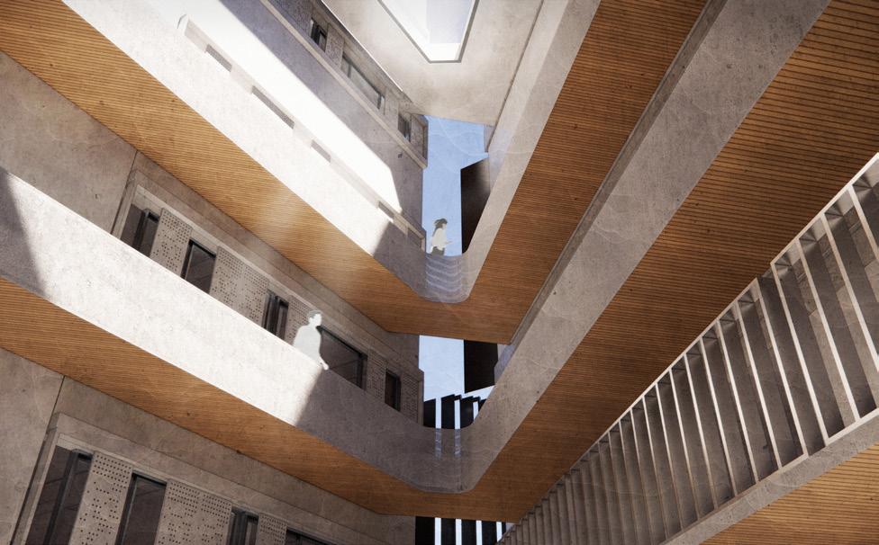
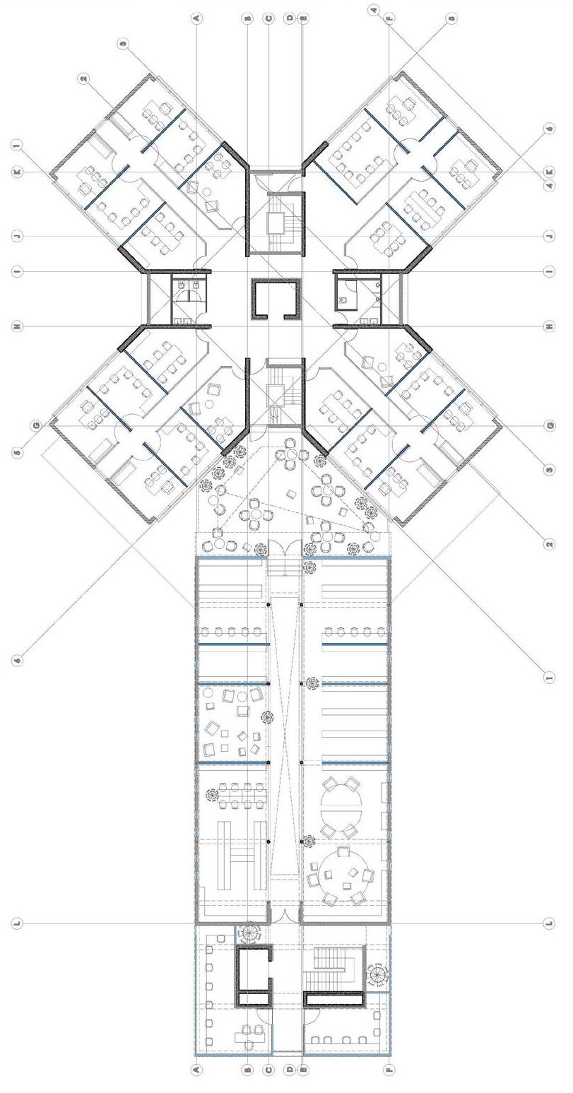
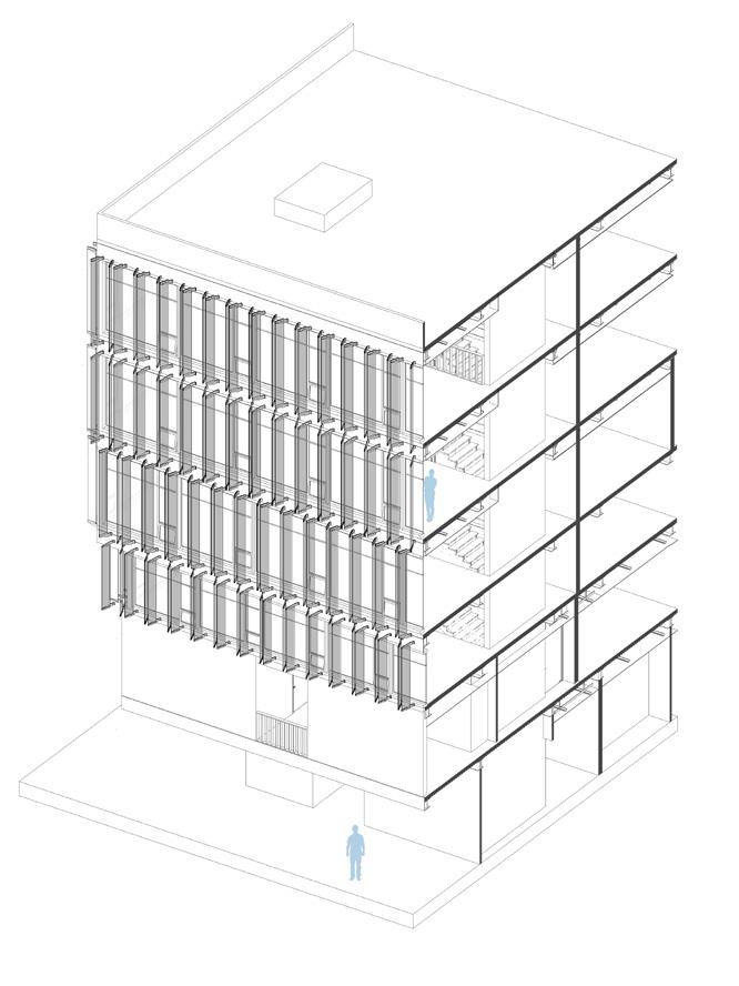
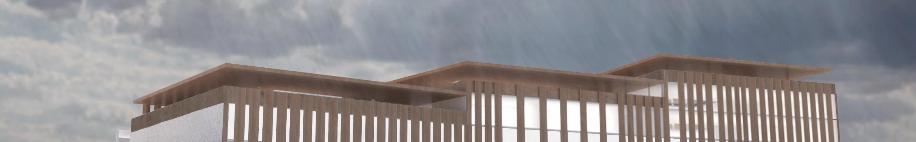
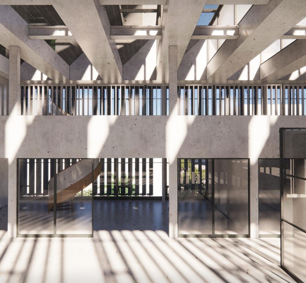
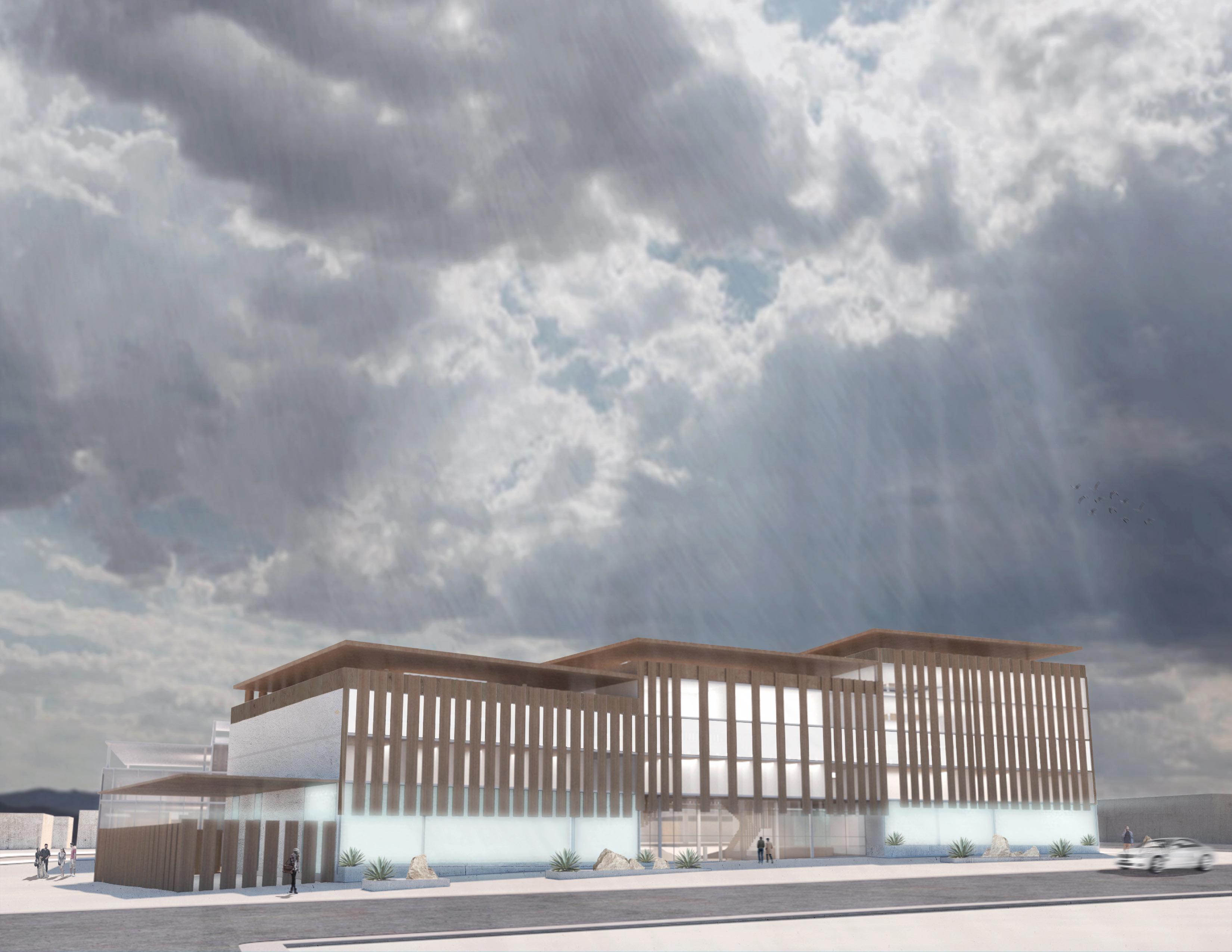
The angled louver facade system wraps around the expansion in a way that allows for a lot of natural daylight to enter. The core areas of the expansion contain even more daylight for a better atmosphere full of light. The perforated aluminum louvers provide sufficient light even in main areas such as the research library on the third and fourth floor as seen in the section and render. The idea of an open feeling is granted with such ways of the glazing and louvers. This was to also seperate from the high usage of artificial light in the existing building.
45 Degree Angled Supports
Glass curtain wall W/thermal insulation
Aluminum perforated louvers
Exposed Structure Between Louvers
Existing Brick Facade
Existing 2nd Floor
Core circulation
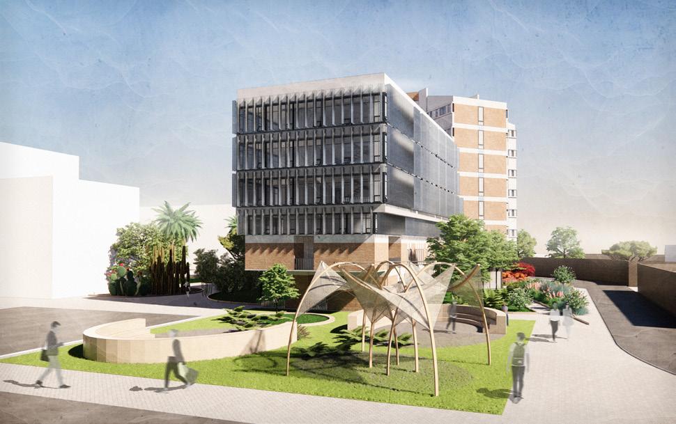
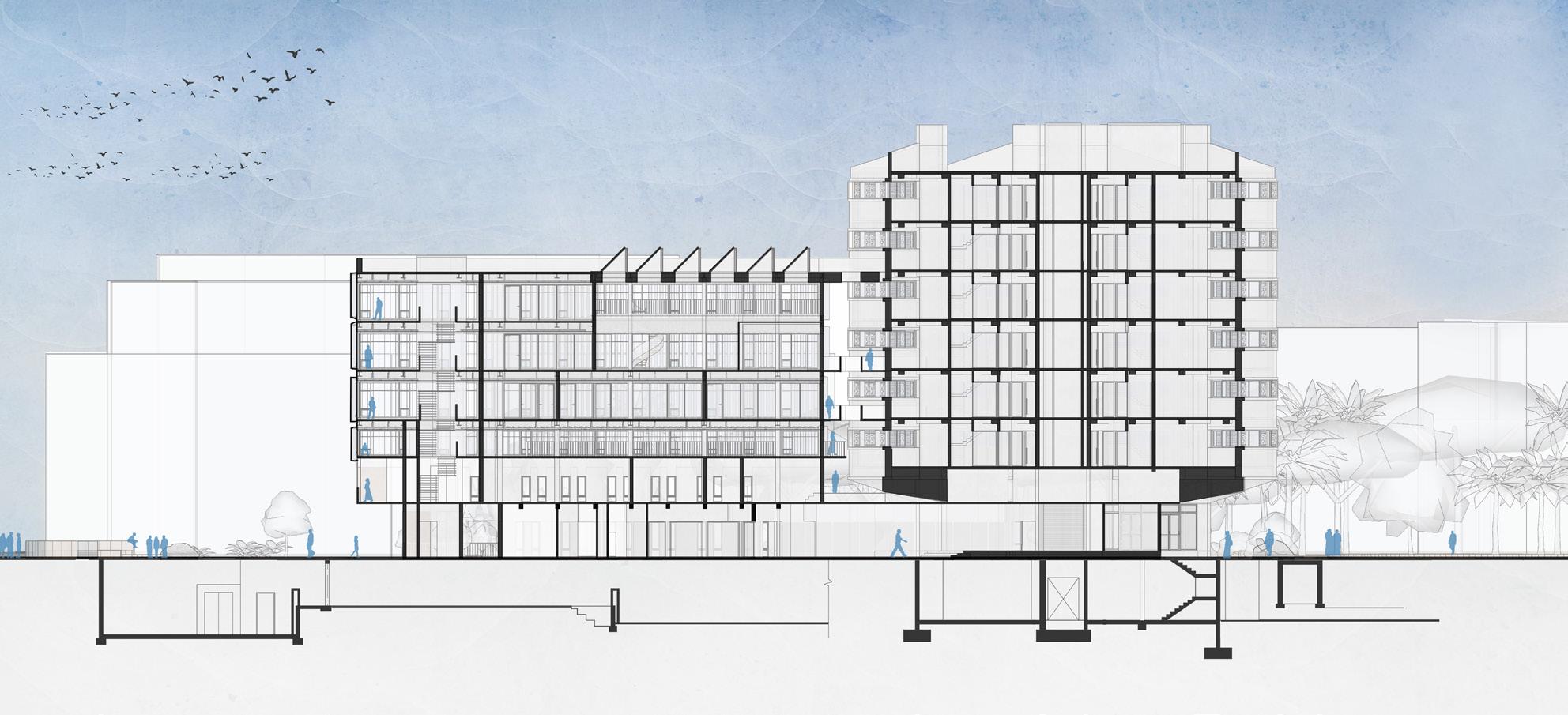
The site model shows the overall new conditions of the final design iteration. This includes the new vertical glazing featured on the plain sides of the building that included brick. This expression was created to allow more natural daylight which the existing suffered a lack of. It also expresses the newer and more open areas on the ground floor with the integration of the math lab.
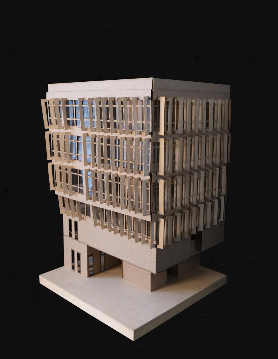
In the model below, a section of the corner of the south wing/expansion was modeled in a bigger scale to study the daylight conditions more and how each louver is angled more openly to the expanded core areas.
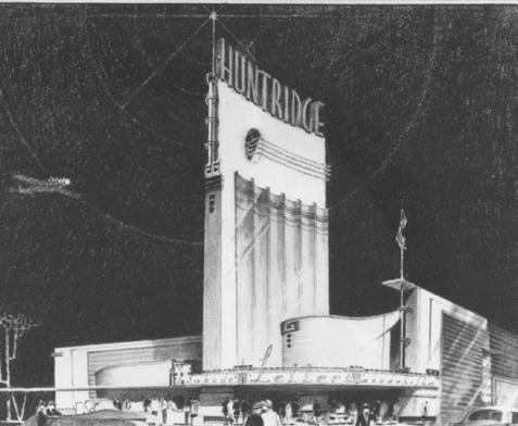
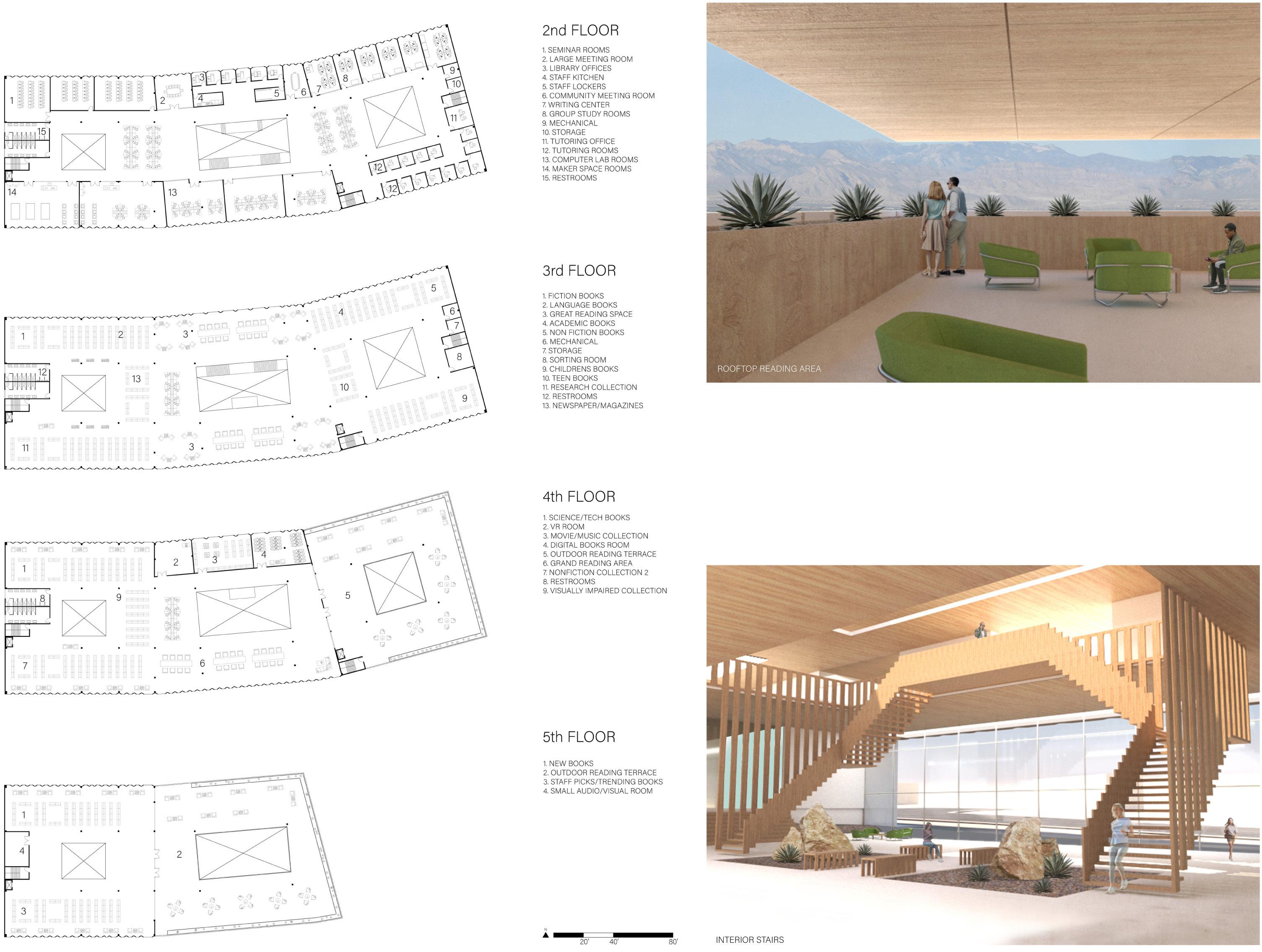
The Huntridge was a famous theater from the mid 1940’s with a lot of history in the building. The goal for this project was to create an entirely different building that still included some of the historical preservation of the site. The site itself was designed to be built in three stages; the library, housing, and retail areas. The goal of the project was to create more flexible spaces for the future possibilities of the library. The addition of current practices in the area were carefully considered and integrated rather than rejected. The ideas was for a more inclusive and comfortable environment.
TYPE:
MIXED USE LIBRARY
LOCATION: LAS VEGAS, NV YEAR: 2021
MENTOR: STEFFEN LEHMANN
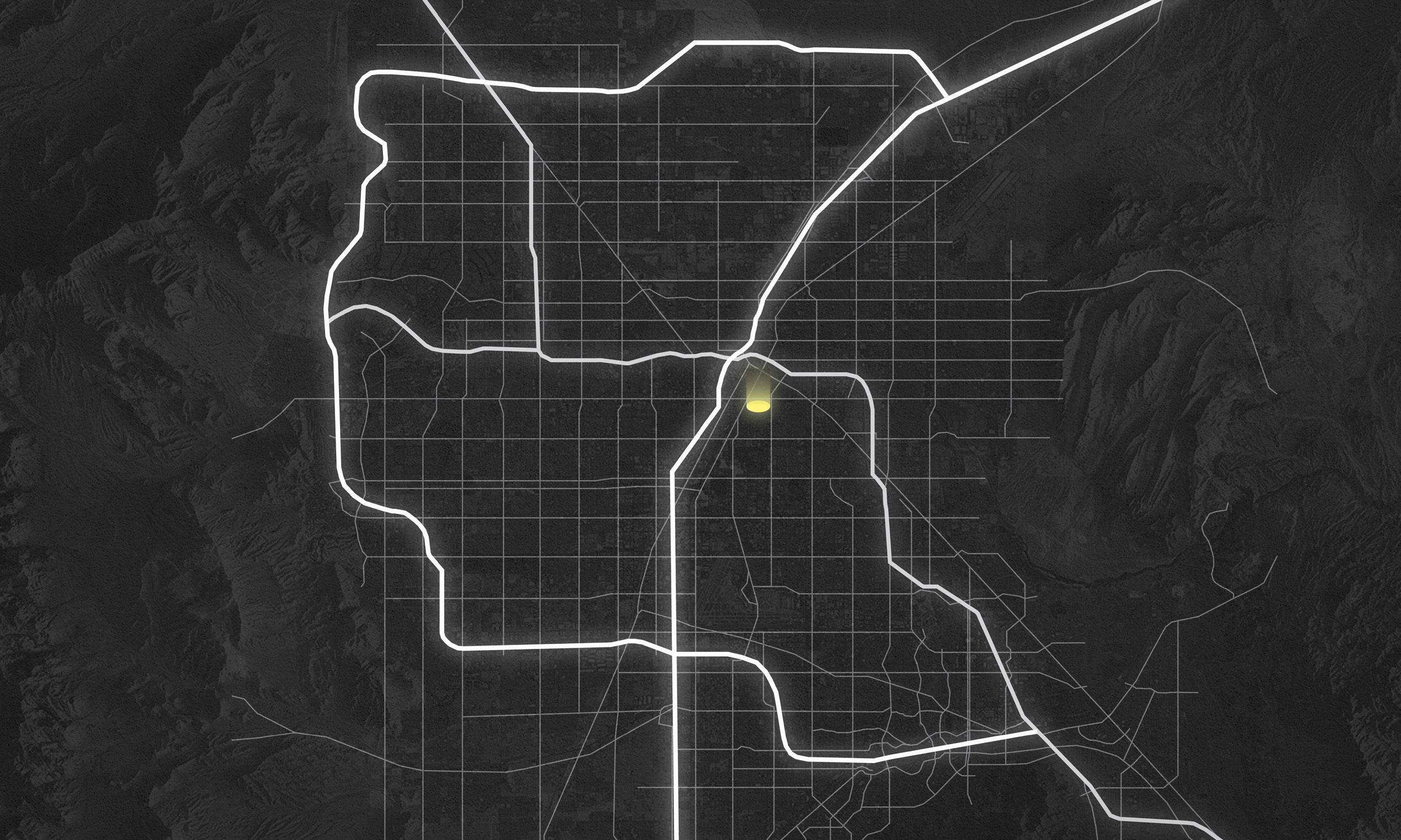
The Huntridge is located in the central part of Las Vegas, Nevada being one of the oldest buildings in the area. Many of the surrounding buildings have changed since the beginning as the times called for different uses and newer and bigger populations. Its close vicinity to major projects make it a primary area for downtown events. Unfortunetly, the building has come to be an abandoned building for more than 15 years and has been subject to lots of damage. It now stands as more of a historical marker than a useable building. This began the process to create a library that was needed in the area with the addition of housing and retail oppertunities.
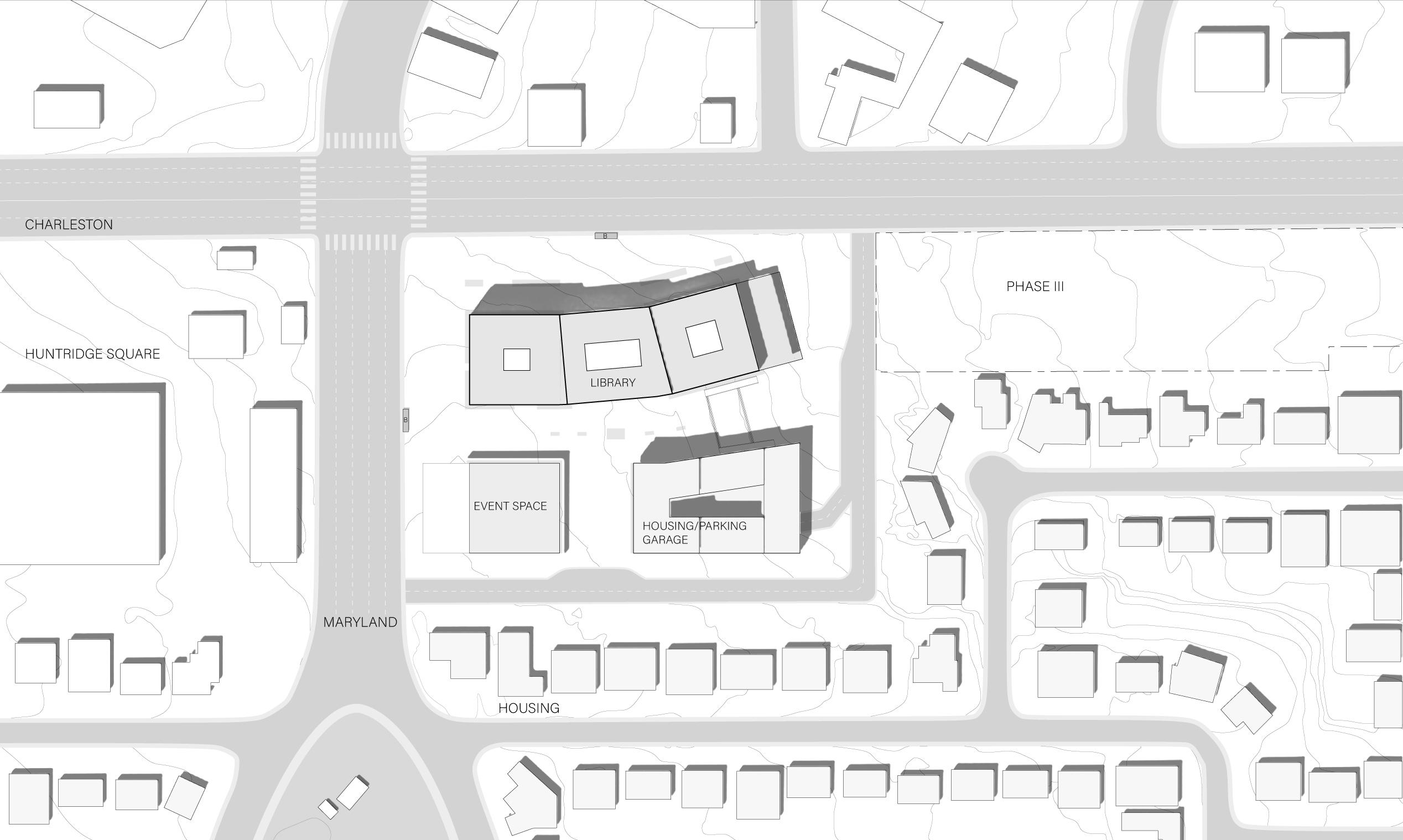
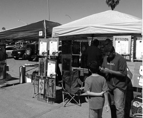
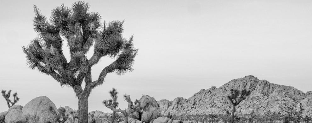
One of the big design drivers was its relation to the mojave desert and embracing the land’s qualities as well to give the building a strong identity in the area of town. Features such as indoor plants and rocks were used to bring in the desert to the design. The other major criteria was incorporating the existing vendor culture that existed in the old parking lot. The idea was to also feature this in the site by providing a lot of space in the east-west direction between the library and housing. A public event space was also created to honor the original Huntridge into a building that all the public could use. The big Huntridge sign was to be preserved in this event space as well.
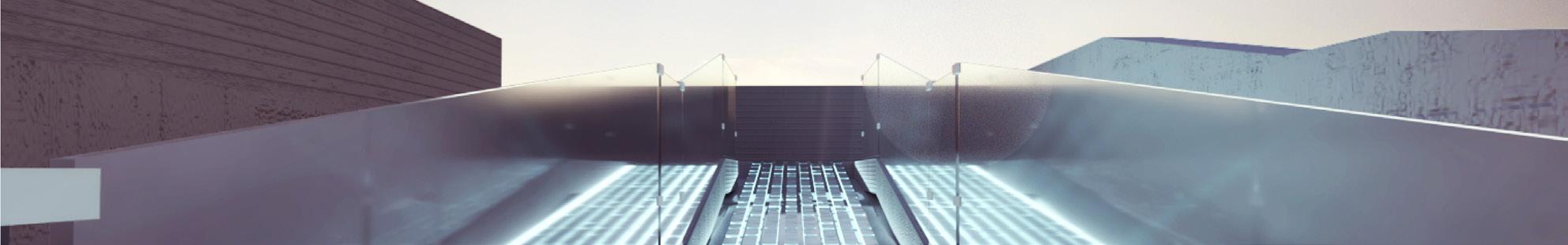
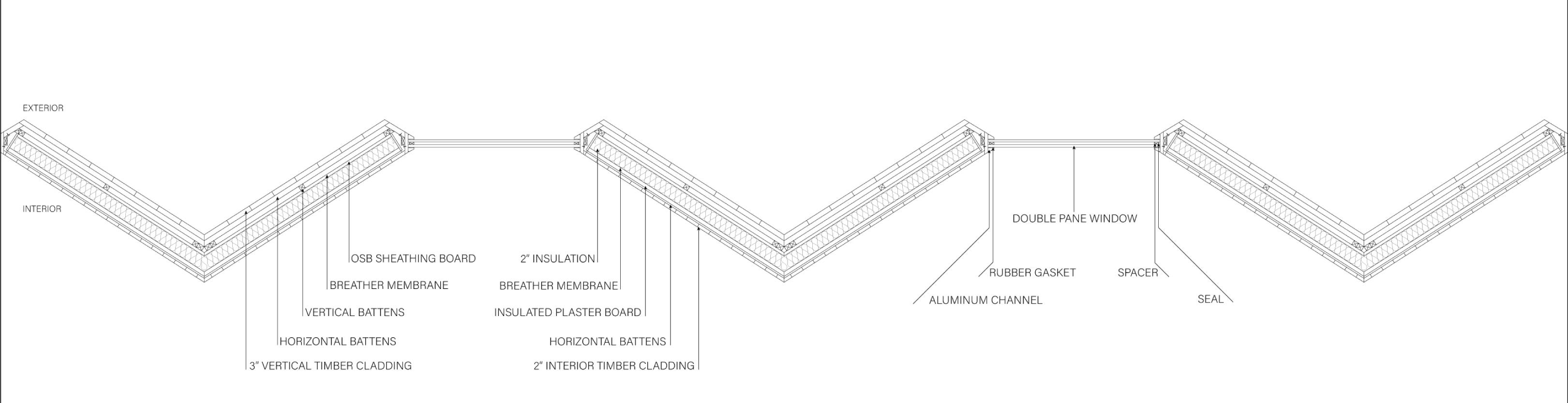
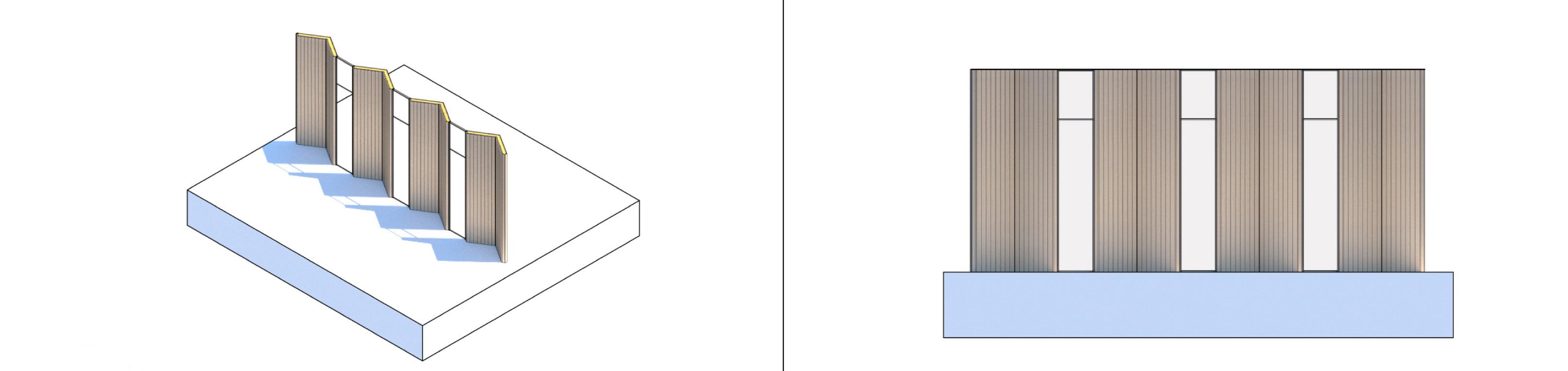
The inspiration for the facade was the simple action of opening up a book. In the facade system, this acts as a way of opening up to the sun with each spine containing glazing for the interior of the library and its bookshelves. The usage of timber cladding aids in creating a more comfortable environment to read and study.
Splaying of the timber walls help reduce glare and make for a better reading experience. These in combination with the wood create a warm atmosphere so that readers will want to actively use the building more.
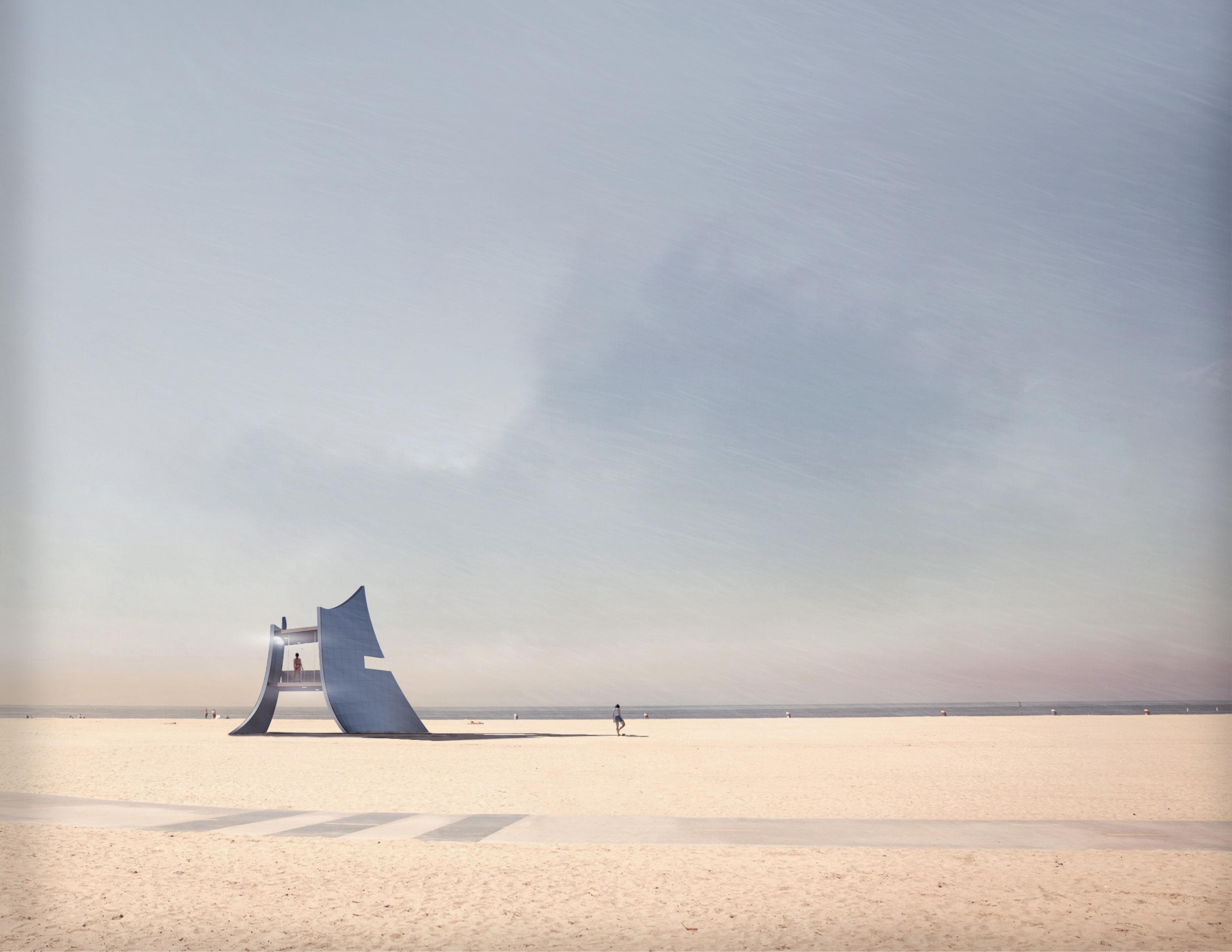
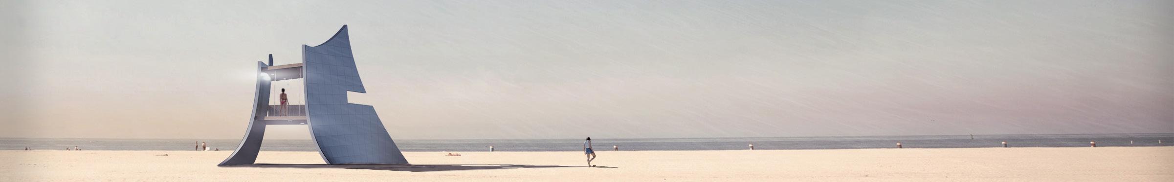
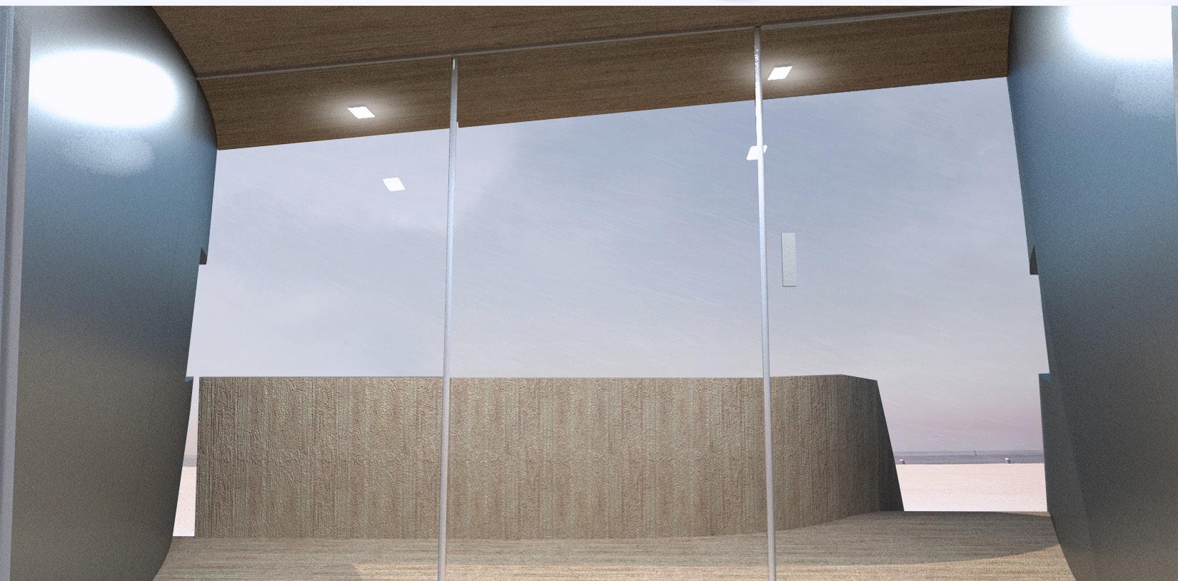
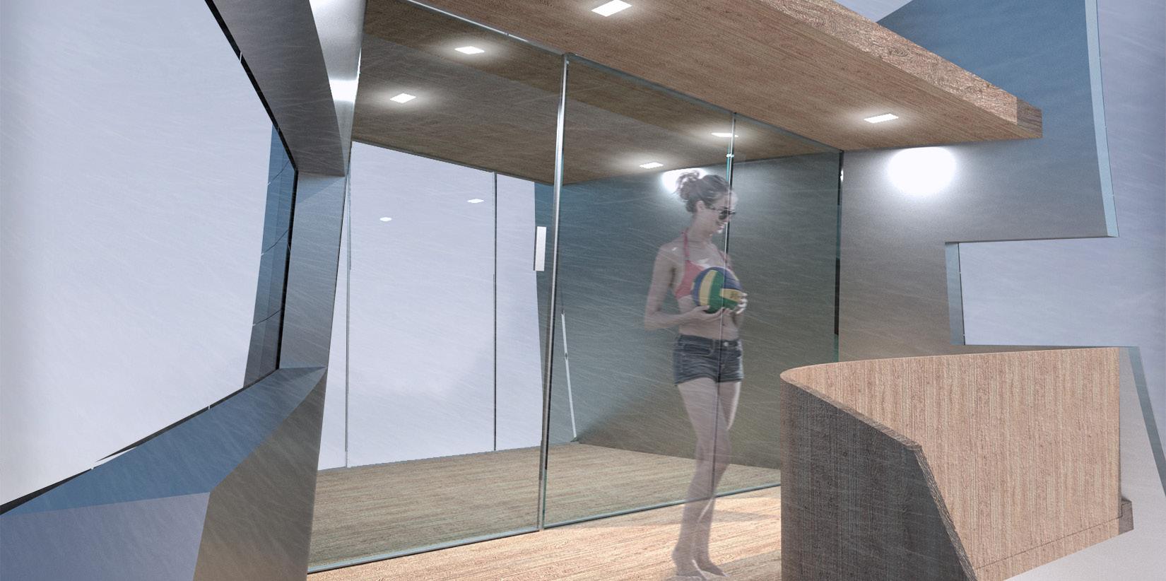
Challenging the basic form of the lifeguard tower into a more organic form was the main goal of this project. Considering the basic functions of the ordinary lifeguard tower in Venice Beach, California, the inspiration for such a monolithic creation could be achieved with the inspiration of the artistic spirit of the surrounding beach and lifestyle. With these factors in mind, the process for the design began with the natural phenomenas of the beach and ocean.
TYPE:
LIFEGUARD TOWER
LOCATION: VENICE, CA
YEAR: 2021
MENTOR: STEFFEN LEHMANN
Orient towards the ocean. Minimalistic form for tower identification
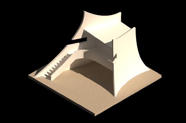
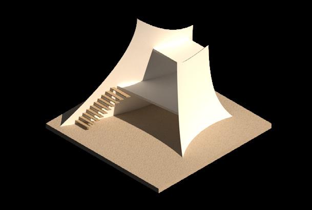
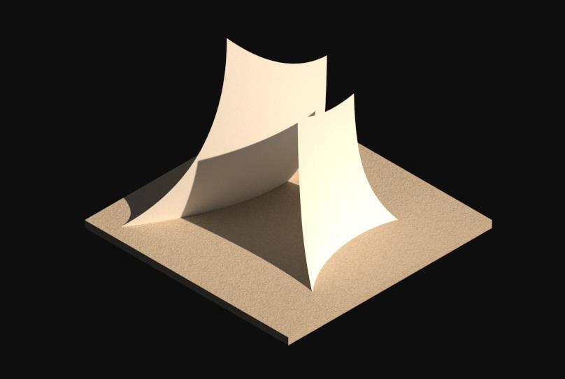
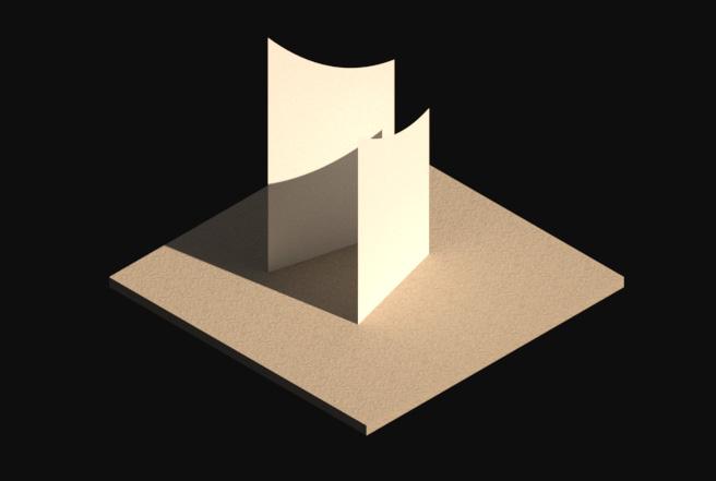
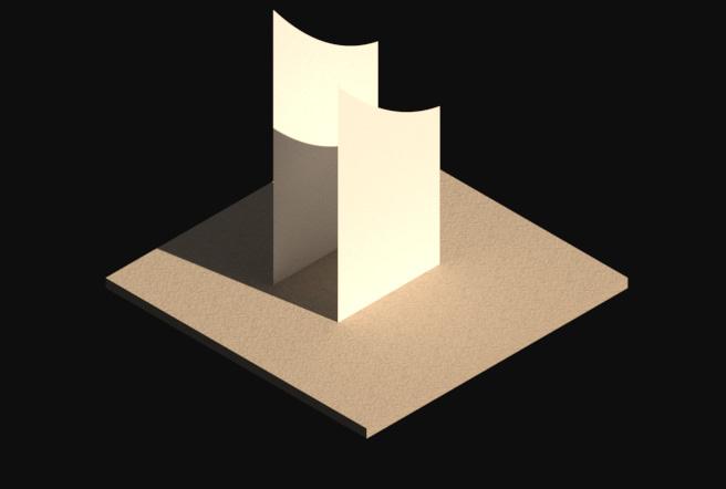
Splay open for more views Identify with the basic curling of a wave Add the hut and stairs for access. Keeping transparency on the top and bottom levels
Minor cuts on the walls for near 360 degree views of the beach/ocean
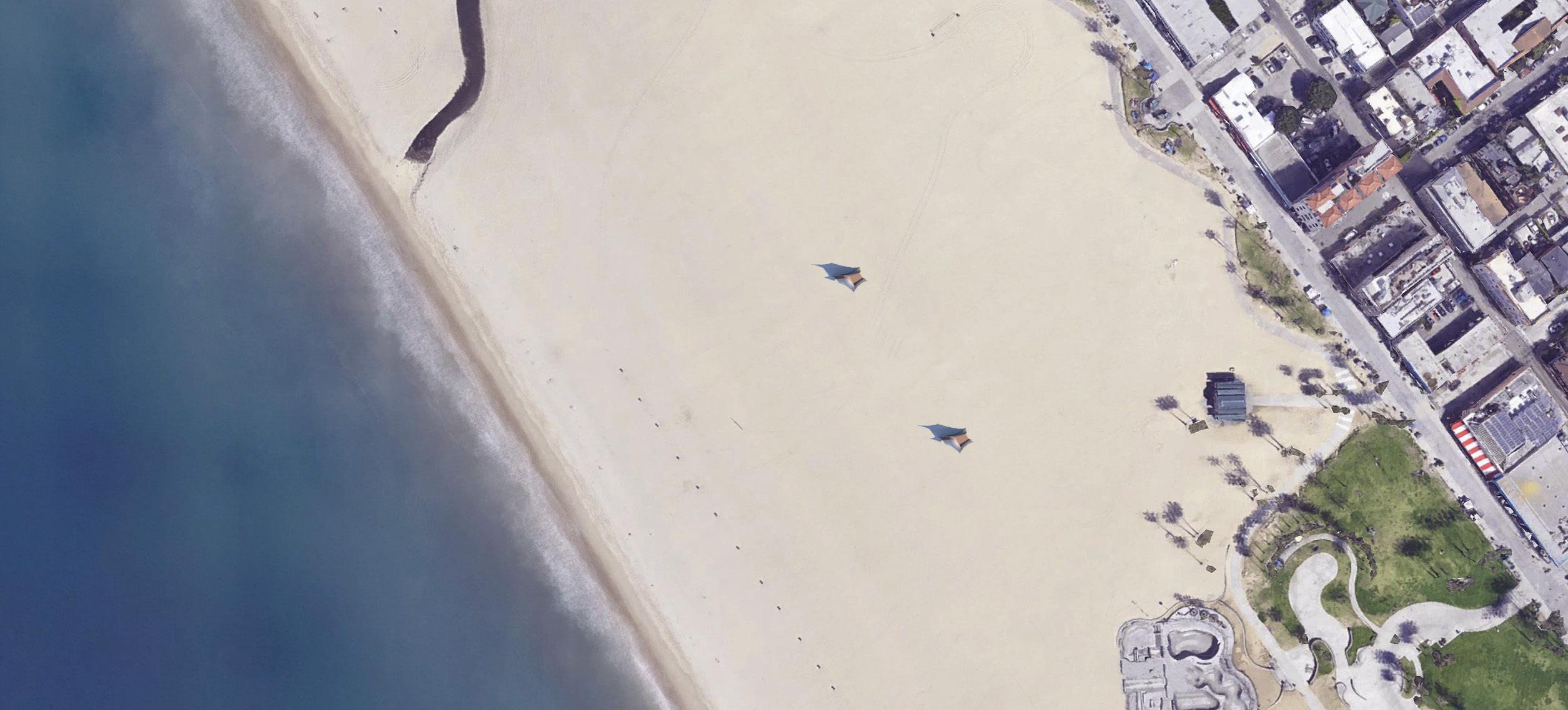
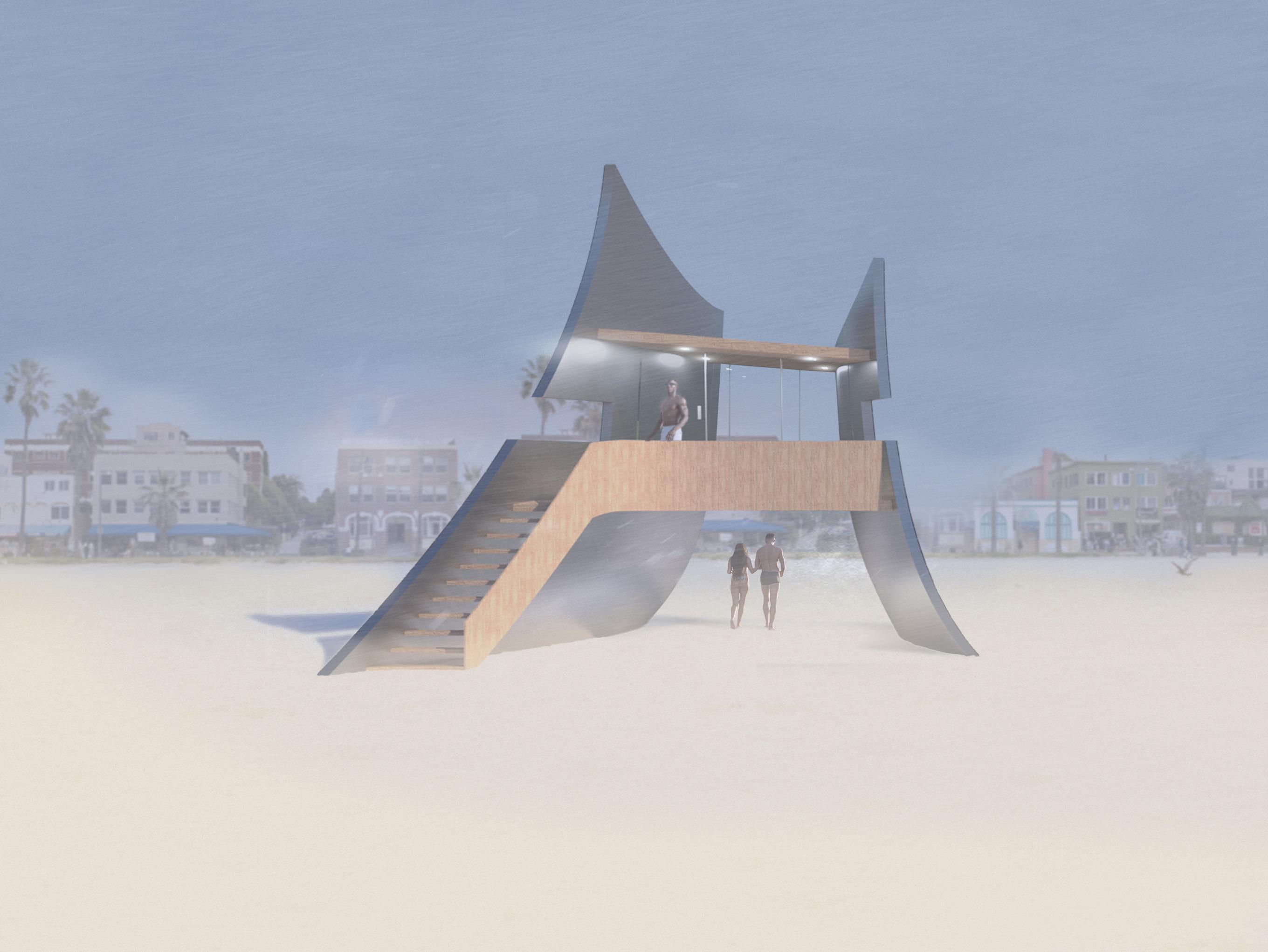
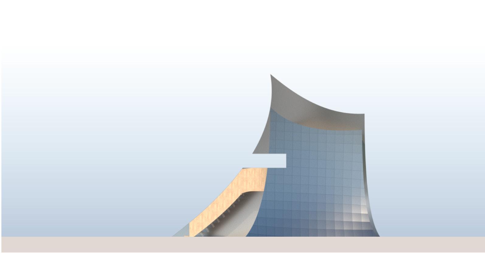
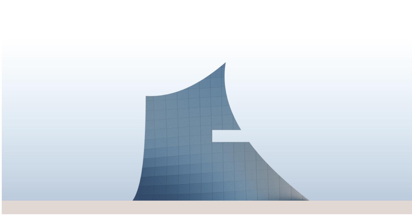
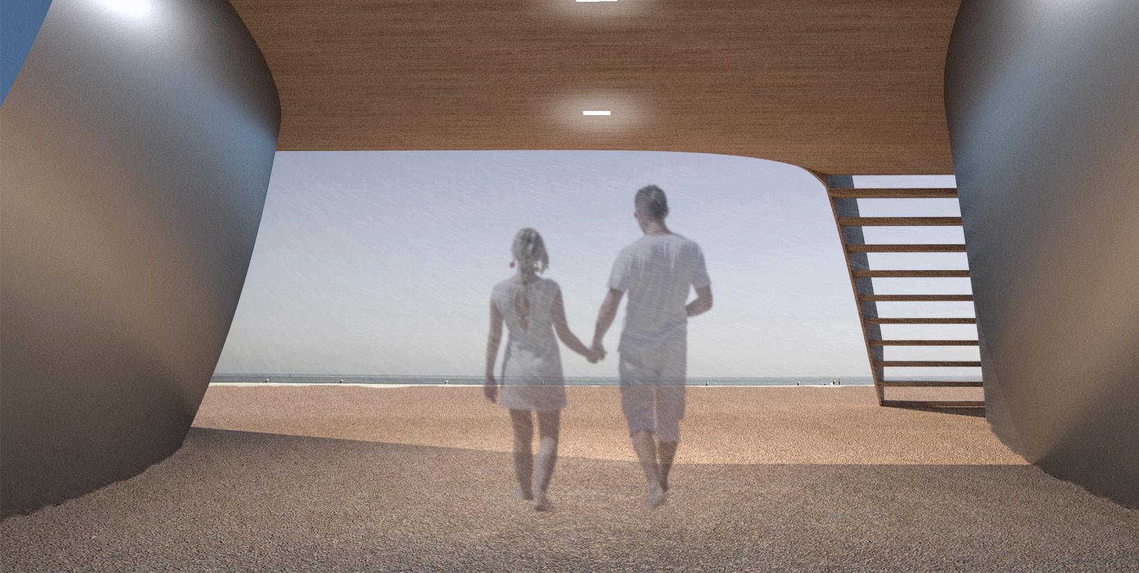
The lifeguard tower gives access to beach goers on the journey towards the ocean. This allows for even more access on the entire beach area as well as being able to go under the hut portion of the tower for extended storage or shelter from the sun. It essentially creates the view towards the ocean completly visible. This plays with the idea that it is almost invisible yet so monolithic on the sand.
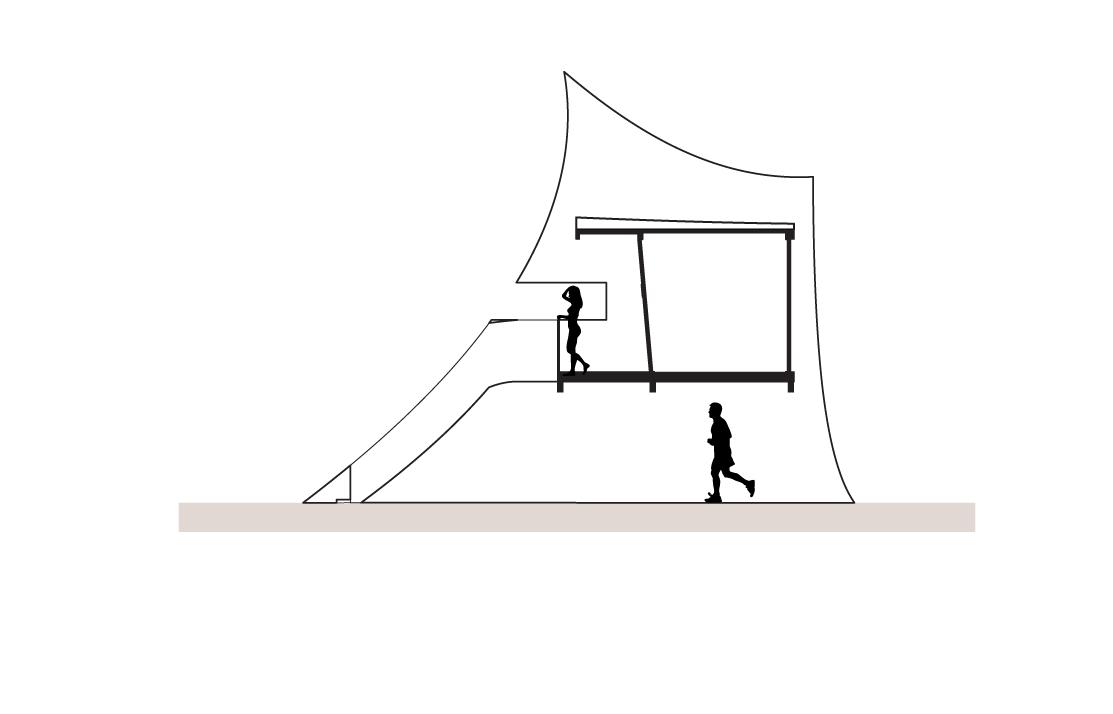
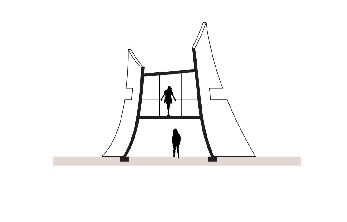
On the second level, access is given to the lifeguards by the small stairs following the curl of the facade. The top level has enough space for lifeguards to go on the small balcony or the interior of the tower. In the elevations below, the steel panels mimic the beach sky colors showcasing each unique color of the sky and surrounding site. It stands like a sculpture-like piece inspired from the art culture of Venice while still maintaining its function to serve the lifeguards and hide fluidly into the beach sky.
The lifeguard tower mostly consists of steel and wood for its construction. Wood was utilized for the hut portion construction and for a slight callback to original materials used in ordinary lifeguard towers. The interior is the area mostly using the wood features with minimal finishes and soft lighting.

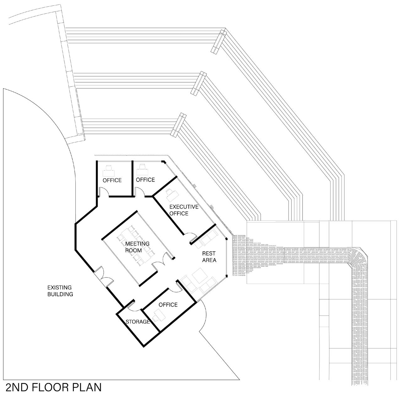
Henderson City Hall is becoming a more public event destination for sports and other social gatherings. The office expansion was a primary source for providing visual interest to the site for events. The other big factor on the site is the Veteran’s Memorial which the city was looking to redesign. The idea to merge an office building and a memorial to provide visual interest was a challenge. Now visitors could experience the memorial in a deeper way unlike anything created on the site before.
TYPE:
OFFICE/MEMORIAL (EXPANSION)
LOCATION: HENDERSON, NV
YEAR: 2019
MENTOR: JORGE HERNANDEZ
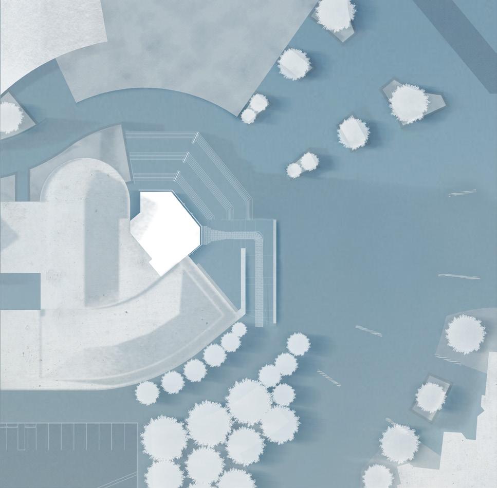
Located at the southern part of the city, the city hall is a major government building. The design of the office expansion on the northeast side of the building creates a few challenges. The sunlight had to be a part of the facade to ensure that the sunlight coming in is not too harsh. A meaningful connection from the memorial and the building had to be created. This was done by emphasizing the idea that due to the sacrifices of veterans, we are able to construct future buildings due to the freedom they protect. The memorial connects from the southern parking lot to the forest-like area, and then to the old ADA ramp that was revamped for a more ADA accessible memorial and experience. This created a powerful connection to the memorial to the office in a way that flows up.
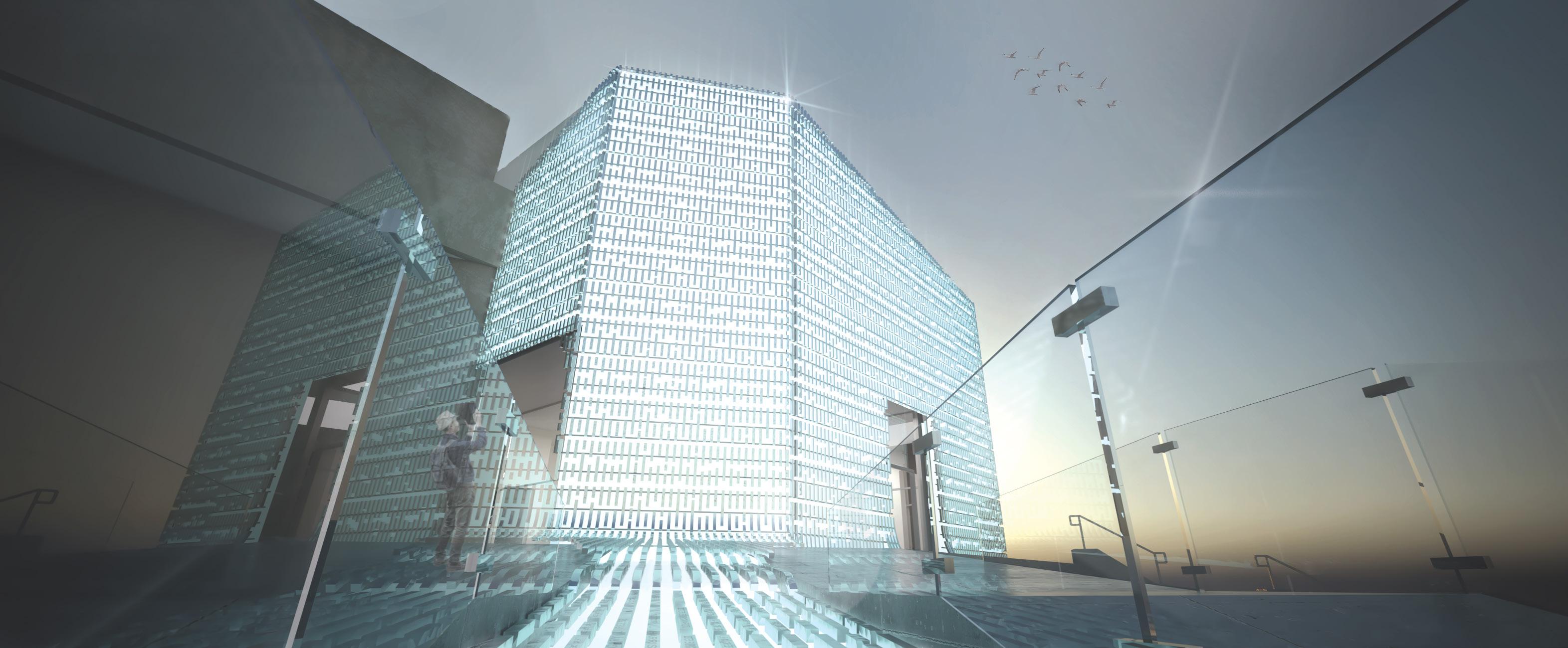
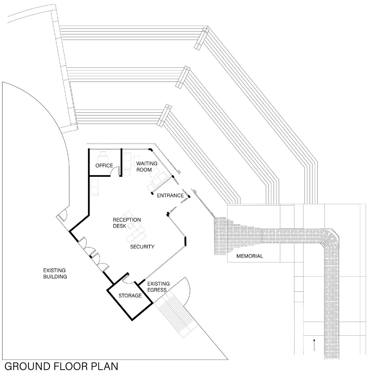
On the ground floor, the ADA ramp is moved to a more meaningful area on the east. It flows into the office building facade and thus creates the whole system. Engraved hollow aluminum tubing contains the names of each and every Las Vegas veteran that passed away in the Vietnam war. On the interior, a circular-like path leads to each office and meeting room for the city hall building. The small addition did not require services such as restrooms because of their proximity to the city hall services. The grand stairs on the northeast mark the main entrance for guests coming in. Their attention is caught by the blue lights illuminating the facade/memorial all around the building.
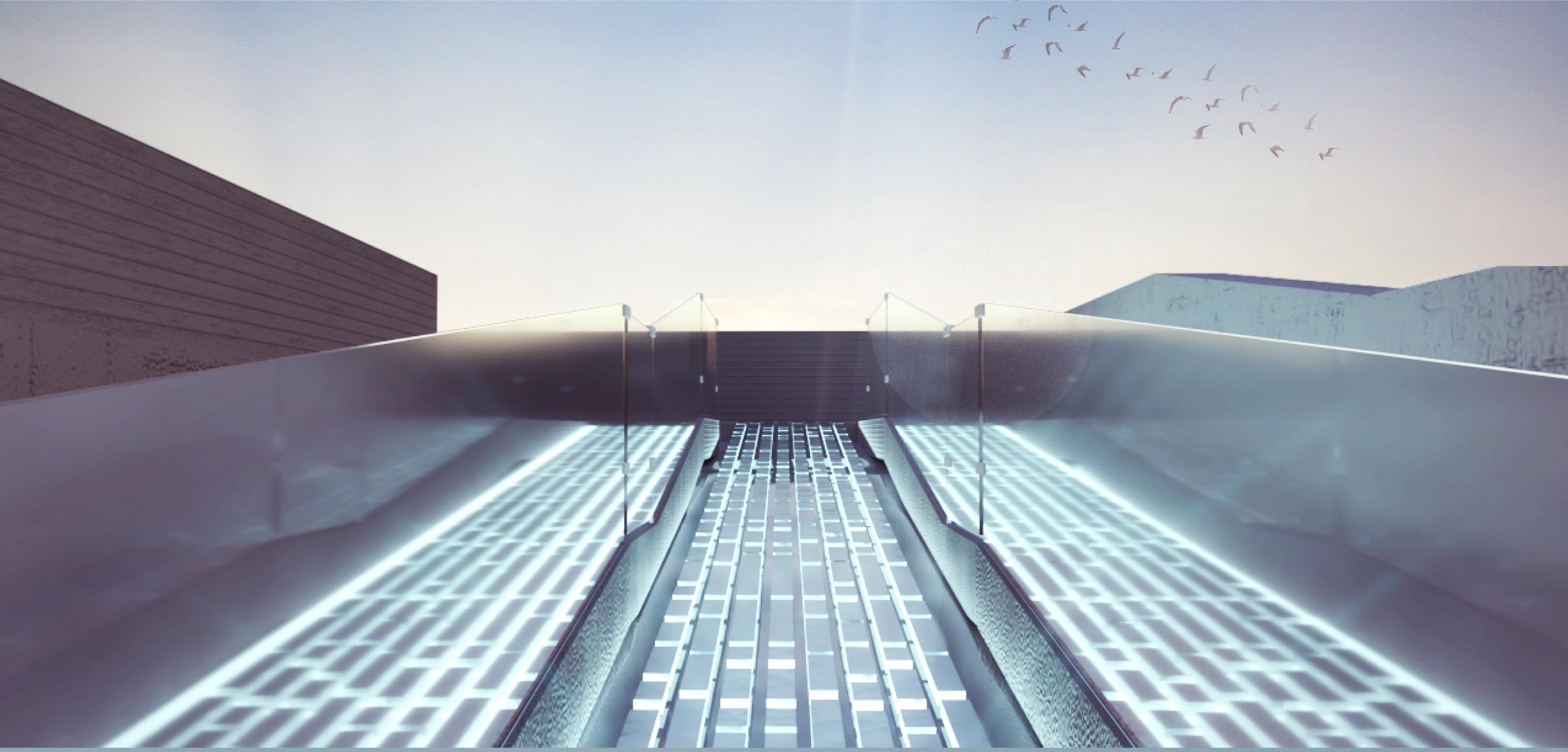
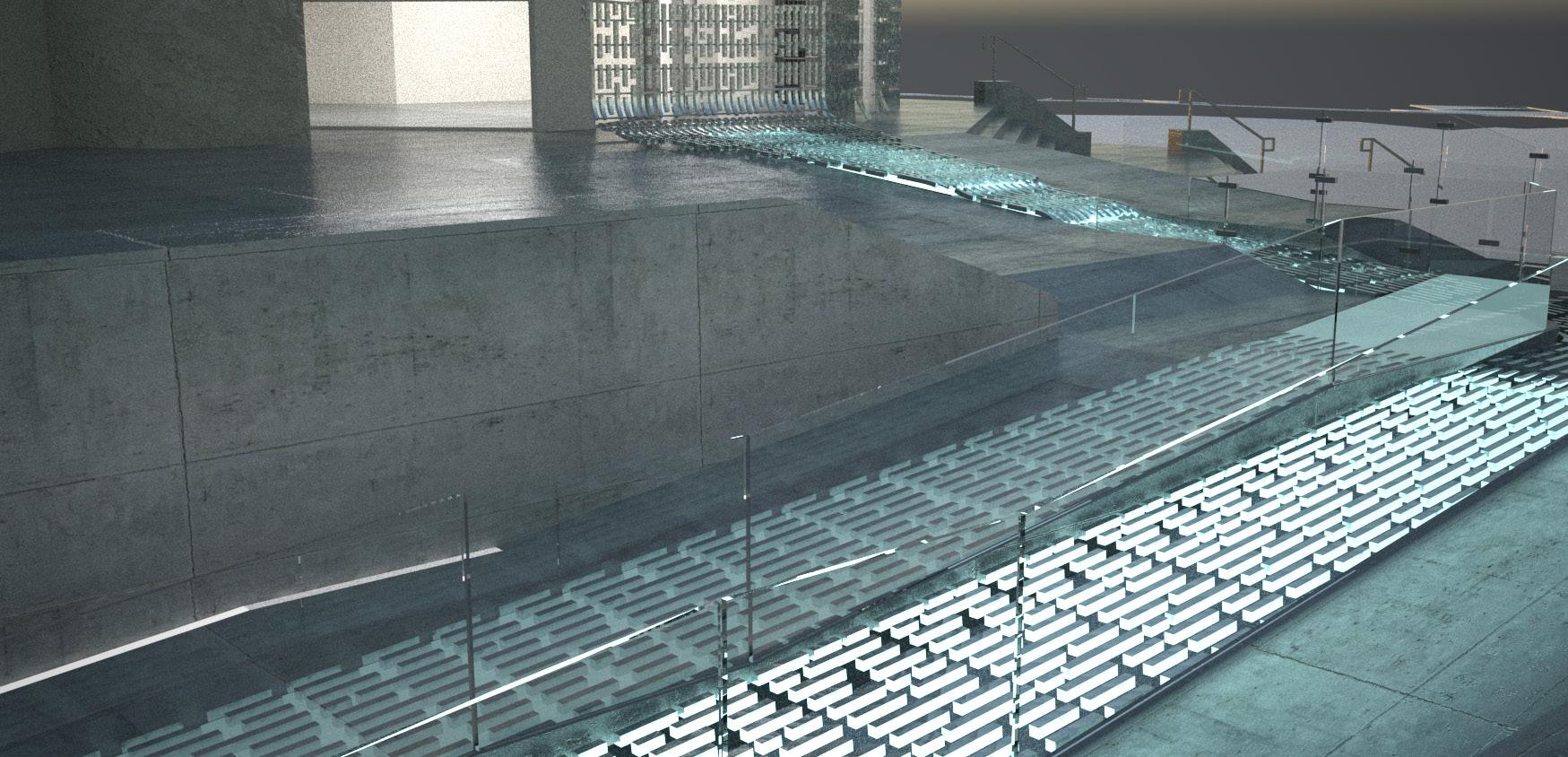
Glass railing to for clarity while viewing the names

Blue lights underneath the shiny aluminum tubing for a more interactive and spiritual experience. Creates caustic lighting on the concrete.
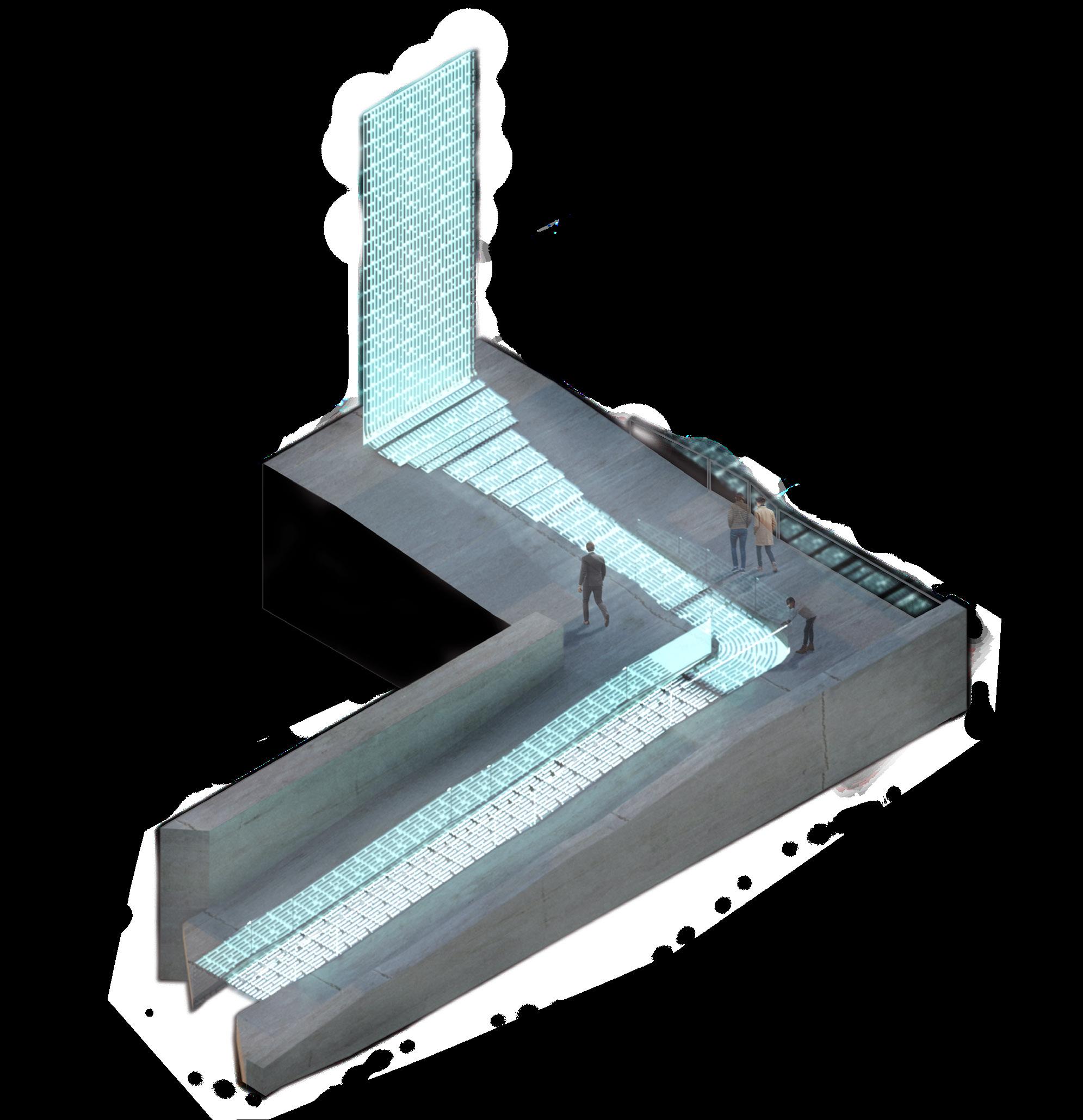 Aluminum square tubes containing the engraved names of the veterans from the Vietnam War. All leading up to the facade of the building.
Raw cast in place concrete
Aluminum square tubes containing the engraved names of the veterans from the Vietnam War. All leading up to the facade of the building.
Raw cast in place concrete
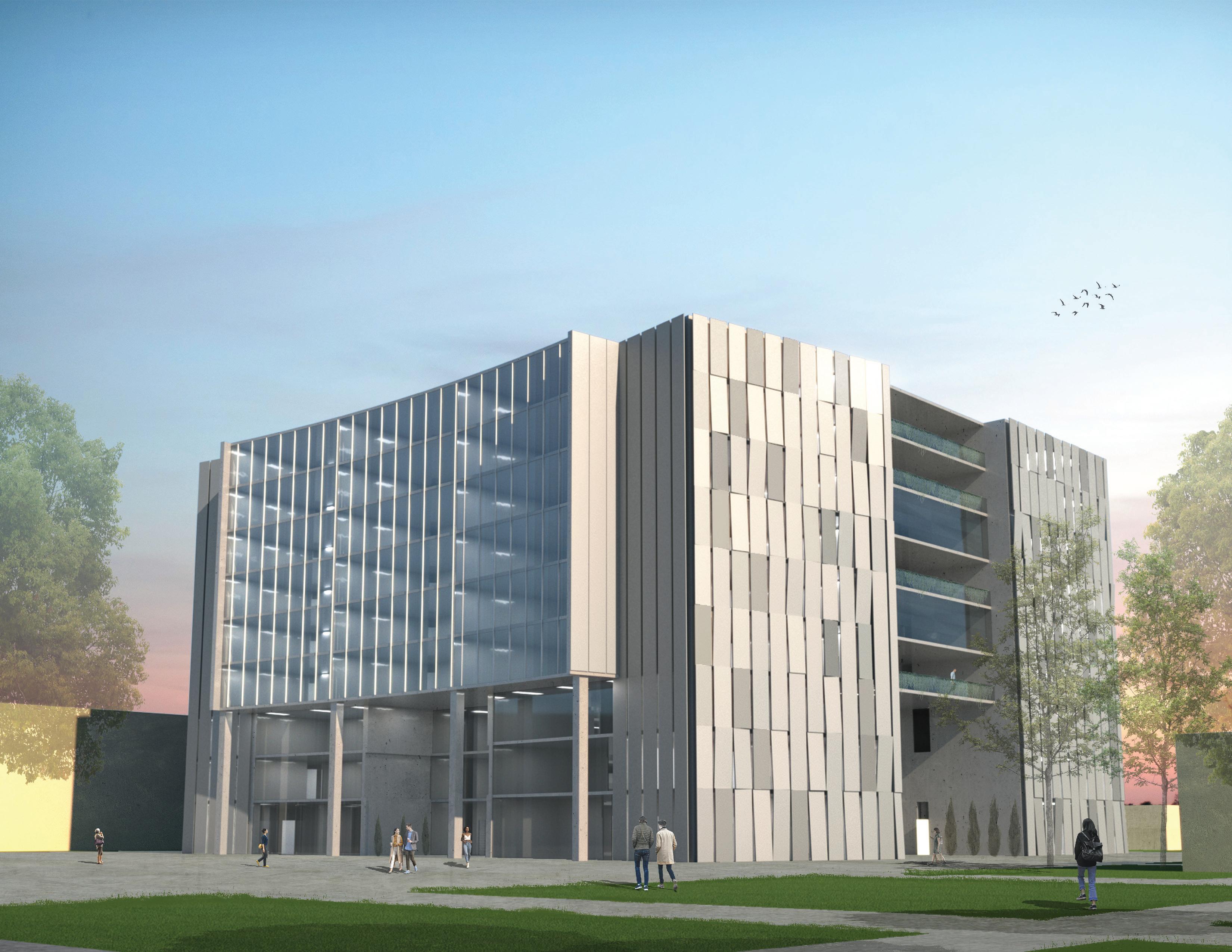
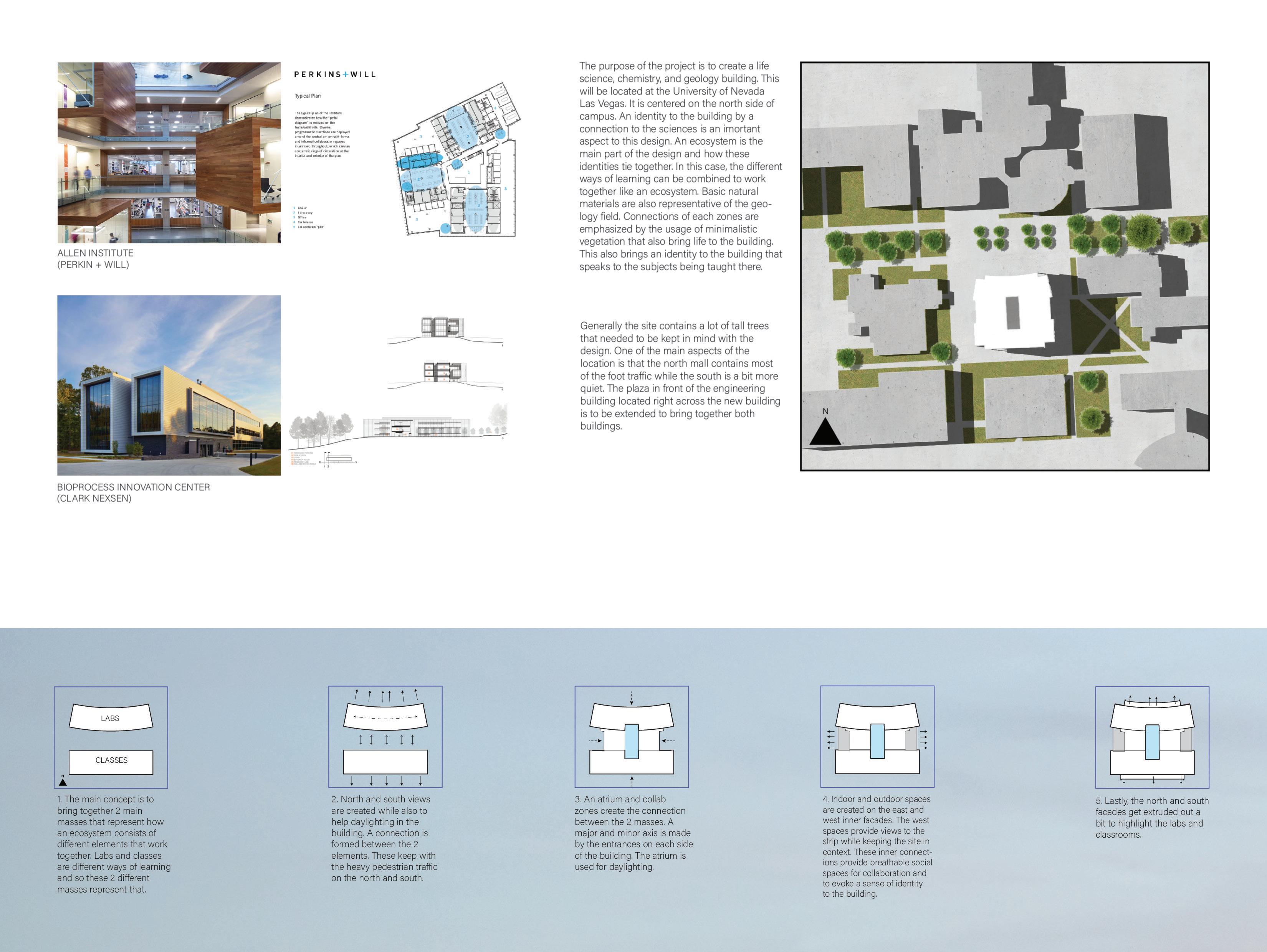
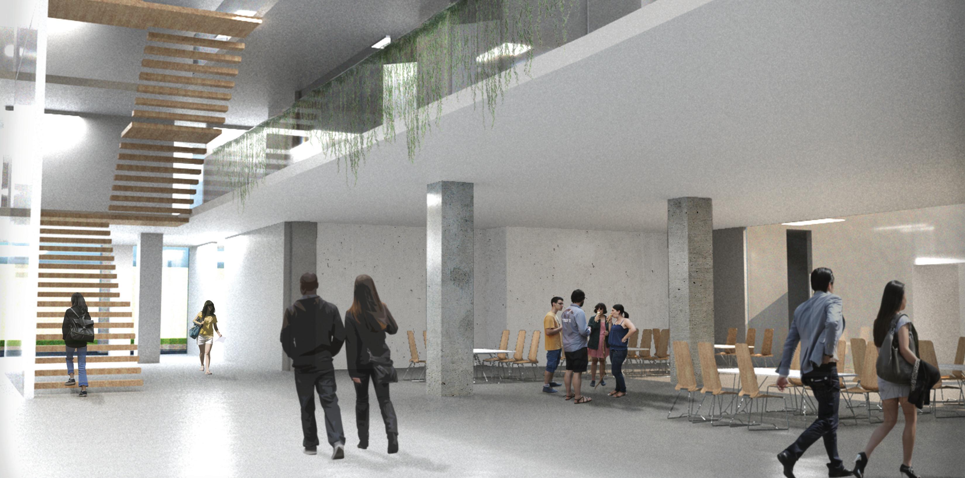
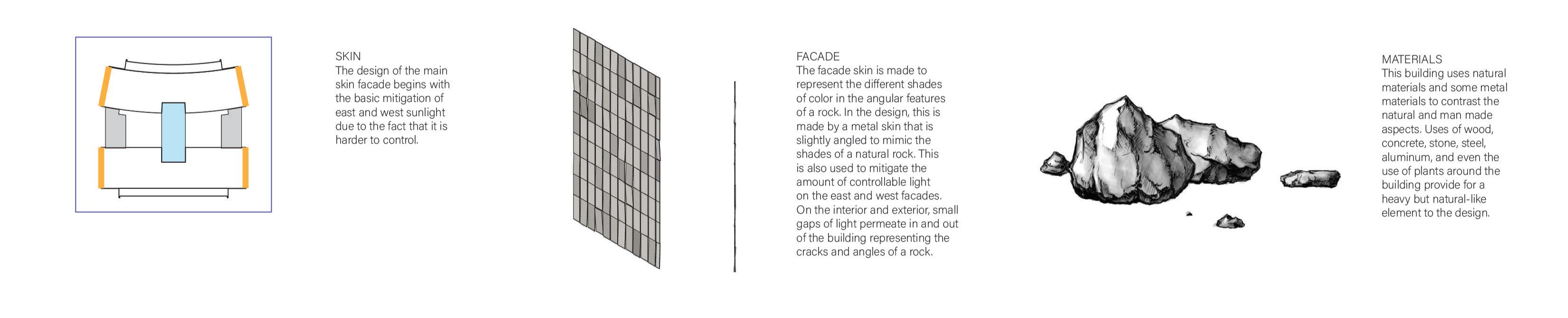
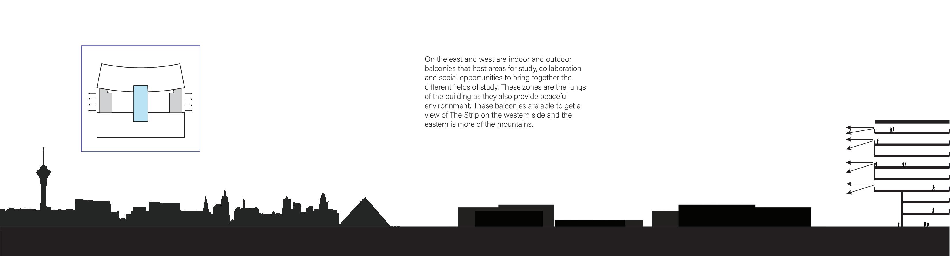
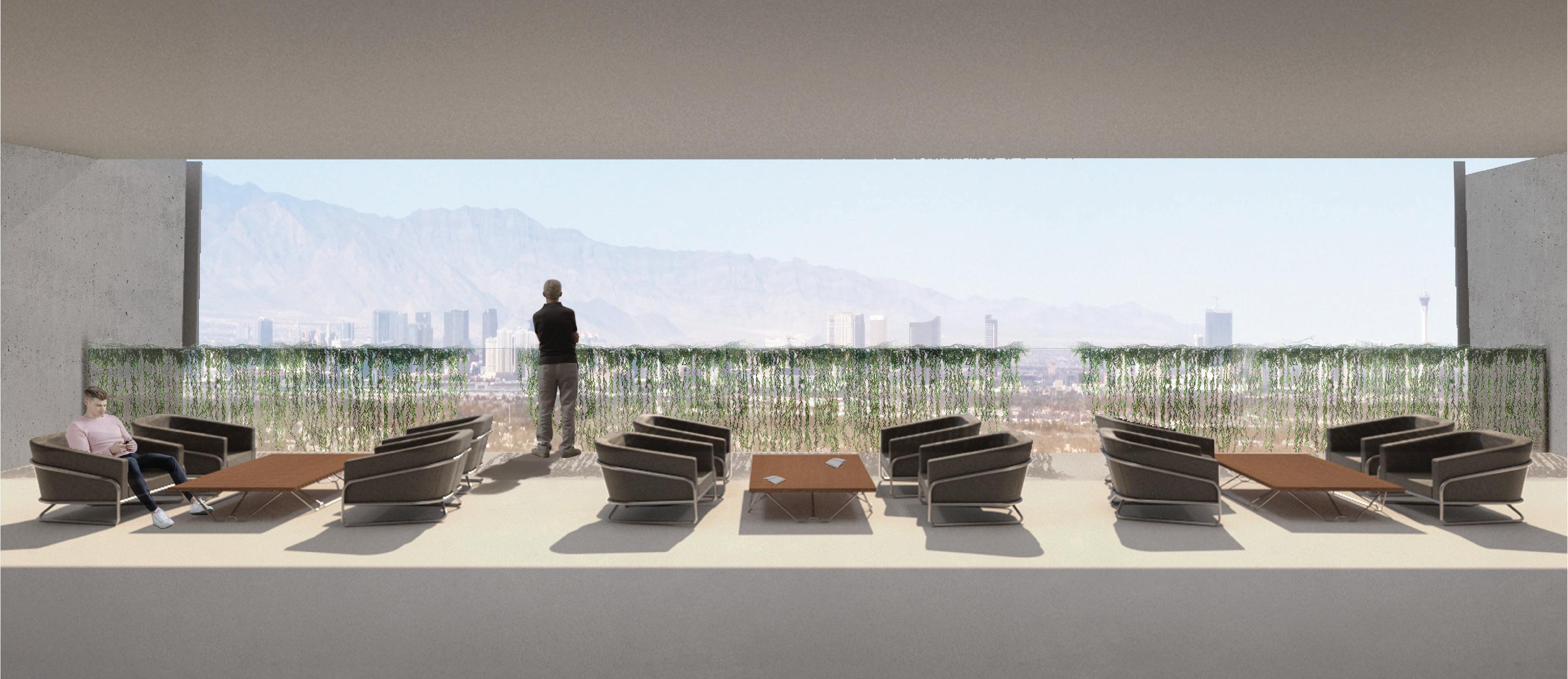
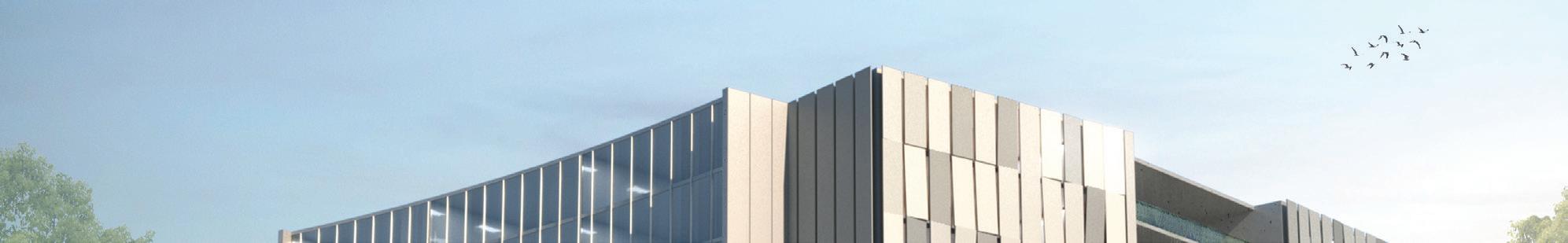
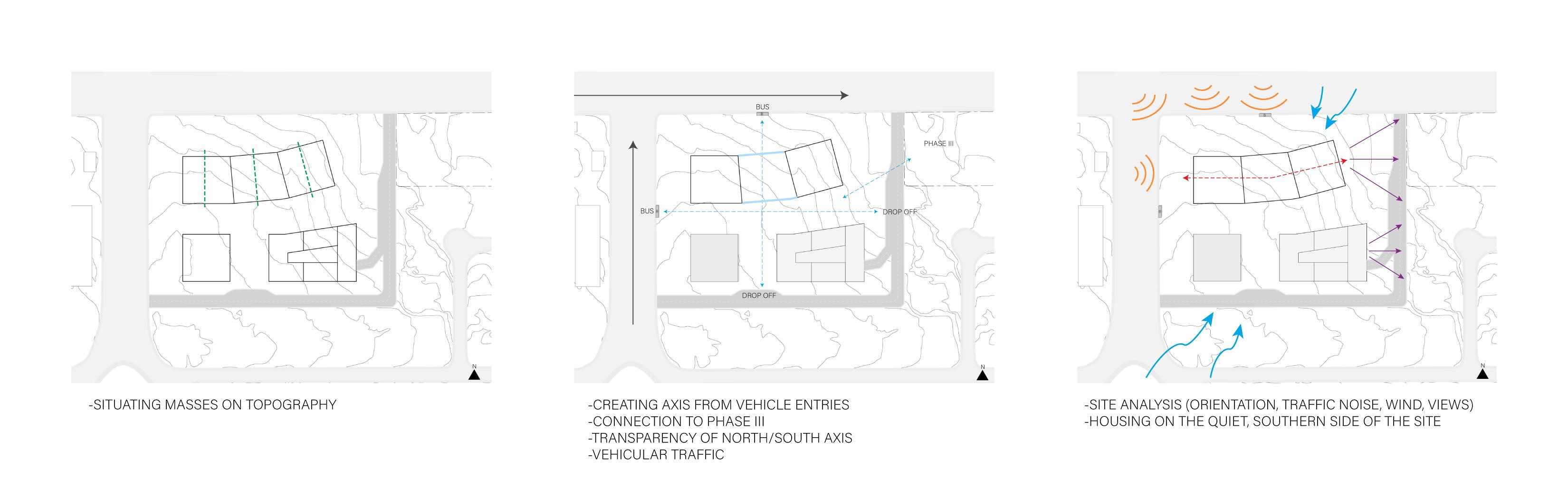
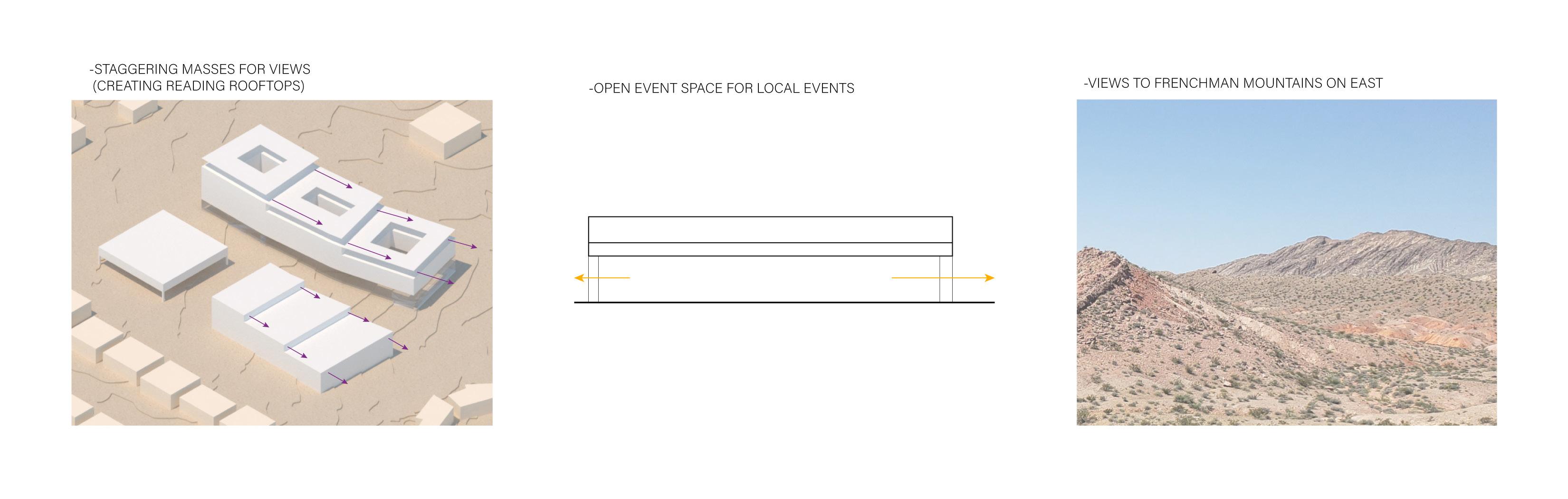
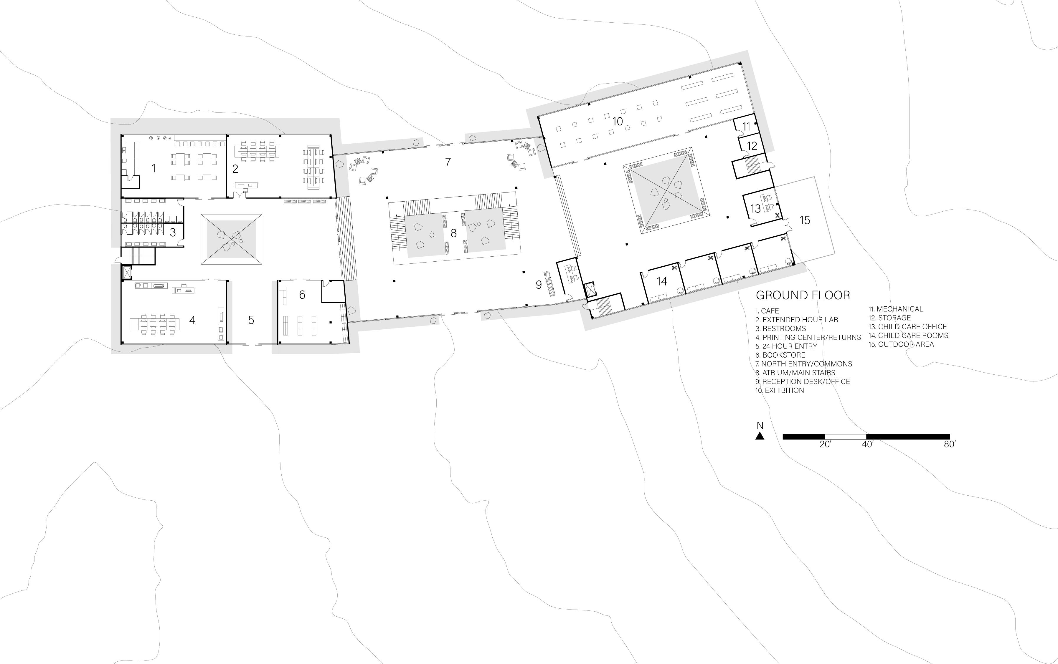
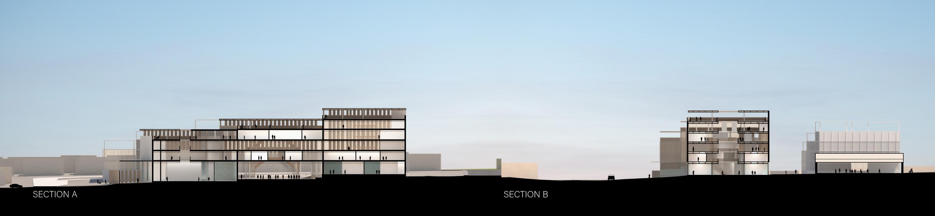
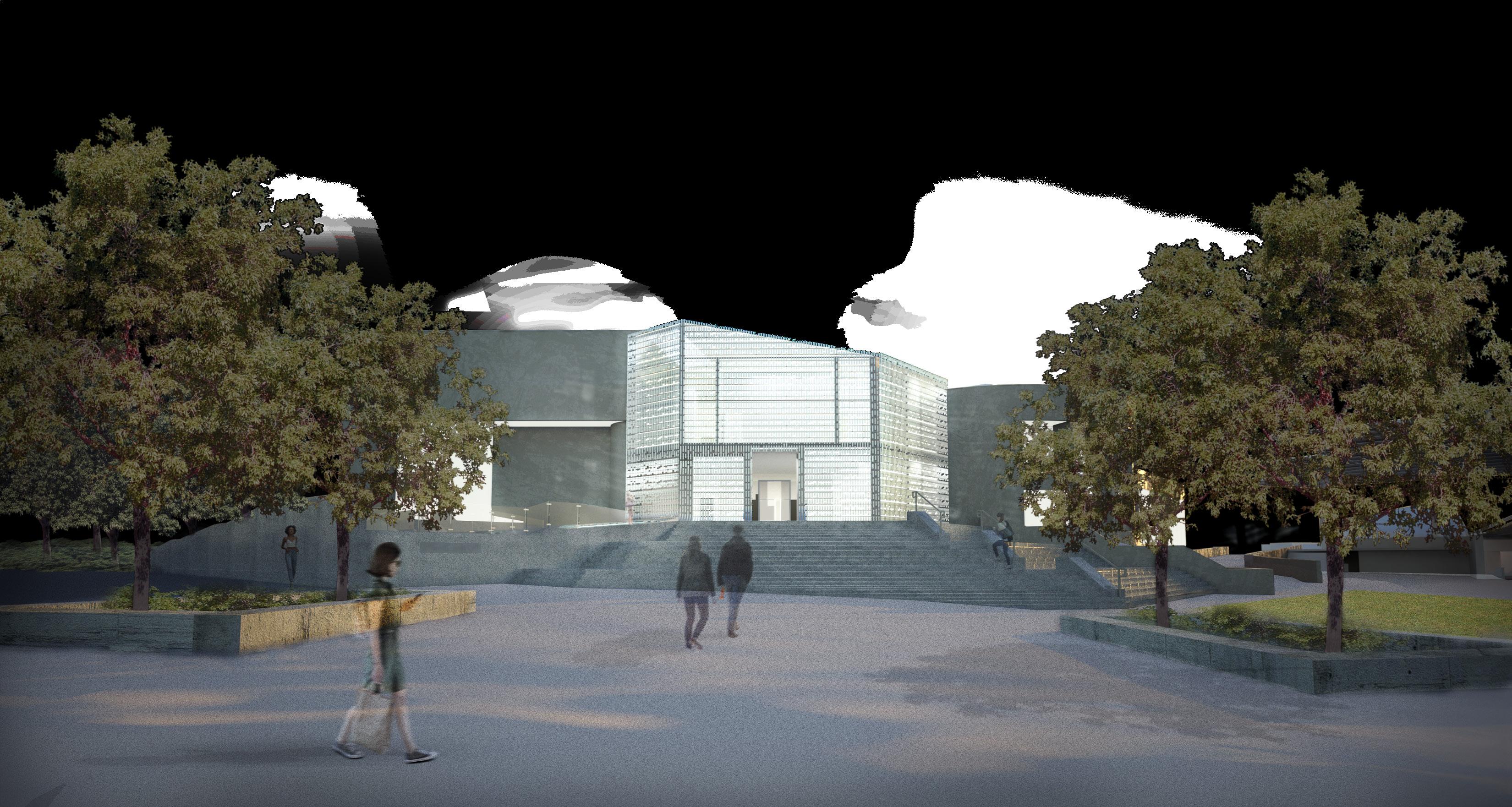
The science building in the University of Nevada Las Vegas campus was created to house the chemistry, geoscience, and lifescience departments together. This integration on the edge of campus created many oppertunities for group collaboration among different areas of the building. The design yielded inspiration from each of those departments. Chemistry blended with the idea of bonding students together in spaces that influence further research and learning. Geoscience for the project’s facade design and lifescience for the open areas of collaboration and overall community of the departments. These sciences together create a dynamic experience for students to learn in a number of ways.
TYPE:
EDUCATIONAL LOCATION: LAS VEGAS, NV (UNLV)
YEAR: 2020
MENTOR: FIRAS AL-DOURI