CANADA’S
inside:
DESIGNERS SHARE THEIR
SMALL SPACE SECRETS
make a
BIG IMPACT DESIGN DRAMA FOR
EVERY ROOM
seating,
STORAGE & style!
^
WE WINDOW SEATS
HOW TO GET
ORGANIZED! tips FROM THE pros
styleathome.com
PAX/HASVIK wardrobe combination
1450
$
Show your neat-freaky side. We’re for storage solutions that make you look good. You can custom design the PAX wardrobe system so it’s tailored to fit your space, your budget, and your radiant lifestyle. Accessorize your new closet with KOMPLEMENT interior fittings, so that every earring and beautiful bracelet has a perfect place to call home. Start designing yours at IKEA.ca/PAXplanner
MARCH 2017 72 Styling tip: Class up a vignette with artful glass accents and then add one jet-black piece for impact.
60
CHECK OUT THIS MAKEOVER
CONTEST WINNER!
52
HOMES 60 A TALE OF TWO SISTERS
Sisters with different spins on style showcase their condos across the hall from each other
72 ALL IN ORDER
You can still have it all in 1,000 square feet of space – and we’re here to tell you how
80 BEAUTY CONTEST
One Calgary homeowner wins her way to the comfy living room she always wanted
86
HOME AWAY FROM HOME A jewellery designer crafts a versatile workspace featuring every domestic comfort
COLUMNS 13
STYLE NEWS Clever home products every small-space dweller needs
18 DESSERT OF
THE MONTH This banana tarte tatin is simply scrumptious
22 INSIDE DESIGN
Find out why British designer and illustrator Luke Edward Hall is one to watch
26
HIGH OR LOW A chic workstation designed on two different budgets. Can you tell the difference?
STYLEATHOME.COM MARCH 2017
|5
46
DECORATING 34 OPEN INVITE
Five ways to create a statement-making entryway without sacrificing functionality
36
JUDGE A BOOKCASE BY ITS COLOUR Does your shelf display need a decor overhaul? We’ve got you covered
92
40 OFFICE ETIQUETTE
Decorator Cynthia Weber shares her secrets to creating a stylish and orderly home office
46 TWIST OF FATE
How a random Internet connection led to the creation of one family’s perfect home
52
WHAT DREAMS MAY COME A chic bedroom makeover brings sweet serenity to a young couple
FOOD 92 ALL HAIL KALE
REGULARS 11 WORKBOOK 96 SPOTLIGHT 98 GET SOCIAL
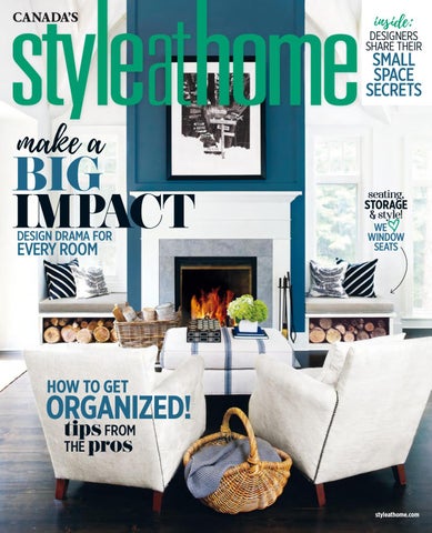
ON THE COVER With a vaulted ceiling, bold blue feature wall and stylish firewood storage, this modern lodge makes its mark. COVER PHOTOGRAPHY
In our third excerpt from Donna Hay’s new cookbook, Life in Balance, we pay homage to kale, the king of greens
FROM OUR EDITOR
TABLET EDITION Get Style at Home for your iPad, with additional how-to video content, bonus image galleries and more. Download it on the App Store today.
Michael Graydon CANADA’S
inside
DESIGNERS SHARE THEIR
SMALL SPACE SECRETS
make a
BIG IMPACT DESIGN DRAMA FOR
EVERY ROOM
8 HOW TO GET
ORGANIZED! tips FROM THE pros
seating,
STORAGE & style!
^
WE WINDOW SEATS
the woodcraftwinter sale!
everything
an extra % d speckle y r r e ch
5 off
Toll-free from outside Toronto 1-866-475-2488
Mississauga 2111 Dunwin Ave. at Dundas (905) 607-2247
Workshop and Showroom 370 Denison St. E. (905) 475-2488
Whitby 111 Dunlop Street W. (905) 668-2770
FROM OUR EDITOR
THE GREAT
We’re always thrilled when we receive letters from you telling us how much you love our content, and how it inspires you. The fact is, we’re inspired, too. And I think this issue – with its annual themes of small-space living and organizing – is my favourite to put together. Phrases like “tips from the pros” and “small-space secrets” get me every time. Now, I can’t pretend I live in a tiny house, but the idea of using what you have efficiently is one that makes total sense to me. For example, Vancouver designer Peter Wilds is an expert in making a space work hard, noting in our story on the 922-square-foot house he designed (“All in Order,” page 72) that each piece of furniture and accent has to “earn its place.” Exactly. I’m in. The problem is, I have a lot of stuff. I mean, A LOT. And when I read about people like 27-year-old British design sensation Luke Edward Hall (Inside Design, page 22) who subscribes to a different theory (“Buy the things you instantly fall in love with,” he advises. “It doesn’t matter if you don’t know where they would go. If you love something, get it.”), those ideas makes sense to me, too. It’s like he’s reading my mind! And that makes me feel better about having all the stuff I really don’t know where to put. This all brings me to the point where I decide I need to do a makeover. Luckily, this issue has inspiration for that as well – and a solution to my conundrum. From a pair of office spaces that embrace their owners’ creativity (“Office Etiquette,” page 40, and “Home Away From Home,” page 86) to sisters who live in mirror-image condos that reflect their individuality (“A Tale of Two Sisters,” page 60) to both winners of our Style at Home Makeover Contest presented by IKEA Canada (“What Dreams May Come,” page 52, and “Beauty Contest,” page 80), these pages are filled with homes that stylishly bridge the gap between minimal serenity and maximal coziness. In other words, I’ve found proof that with a few minor tweaks to arrange my belongings – a corkboard here, a new sideboard there – I can have my decorating cake and eat it, too.
Erin McLaughlin erin@styleathome.com @erinmclaughlin1 instagram.com/styleathomeeditor
8|
STYLEATHOME.COM MARCH 2017
PHOTOGRAPHY, DONNA GRIFFITH; BLOUSE, SÉZANE, SEZANE.COM; BOOTS, POPPYBARLEY, POPPYBARLEY.COM; COSMETICS, BOBBI BROWN, BOBBIBROWNCOSMETICS.CA
debate
WELL- EQUIPPED FROM $25,995*
†
The new 2017 Subaru Forester with Reverse Automatic Braking. Reverse Automatic Braking detects obstructions behind your vehicle and can automatically apply the brakes – to help you avoid running into problems during your drive. That’s safety you can bet the farm on. To learn more about the 2017 Subaru Forester, visit subaru.ca/forester.
BEST NEW SMALL UTILITY VEHICLE
*MSRP of $25,995 on 2017 Forester 2.5i Base Model. MSRP excludes Freight & PDI of $1,675. Taxes, license, registration and insurance are extra. $0 security deposit. Model shown is 2017 Forester 2.0XT Limited with technology package with an MSRP of $39,495. Dealers may sell for less or may have to order or trade. Prices may vary in Quebec. Purchase price in Quebec from $27,785 (taxes extra) for the 2017 Forester 4dr Wgn 2.5iMT (HJ1XO) with manual transmission. Freight and preparation ($1,675), air conditioning surcharge ($100) and specific duty on new tires ($15) are included. Vehicle shown solely for purposes of illustration, and may not be equipped exactly as shown. Reverse Automatic Braking feature availability varies by trim level. †See Owner’s Manual for complete details on system operation and limitations. See your local Subaru dealer for complete details. Forester and Subaru are registered trademarks.
VOLUME 20 ISSUE 3
Vice-President and Group Publisher Lucie Dumas Group Publisher, Toronto Sandra E. Martin Editor-in-Chief Erin McLaughlin Executive Editor Suzanne Moutis Art Director Karen Paddon ONE EASY WAY TO REACH US: FIRSTNAME.LASTNAME@TVA.CA DESIGN & STYLE Home & Style Director Ann Marie Favot Associate Design Editor Morgan Lindsay Contributing Design Editor Christine Hanlon EDITORIAL Features Editor Sara Cation Associate Editor Amanda Etty (on leave) Contributing Editors Lisa Fielding, Fina Scroppo Contributing Food Editor Jennifer Bartoli Researcher Rhiannon Russell ART Deputy Art Director Florence Kwok Associate Art Director Sarah Big Canoe Contributing Production Specialist Jan Coles STYLEATHOME.COM Interim Digital Director Renée Reardin Assistant Digital Editor Brittany Devenyi DIGITAL EDITIONS Content Director, Multi-Platform Editions, Books & Special Issues Jessica Ross Creative Director Chris Bond Designer Andrew Tran PRINTING Printed at Transcontinental RBW Graphics, a division of Transcontinental Printing 2005 G.P., 2049 20th St. E., Owen Sound, ON N4K 5R2. All reproduction requests must be made to COPIBEC (paper reproductions at 800-717-2022), or CEDROM-SNi (electronic reproductions at reproduction@cedrom-sni.com). ISSN: 1915-8998.
at your service As a Style at Home subscriber, you can expect the best in subscription service. If you have any questions about your subscription, please get in touch with us at the website, phone number or address listed below. In order to help us locate your file, please provide your current mailing label or the information on it. SUBSCRIPTION EXPIRY To find out when your current subscription expires, check the mailing label. The labels are printed several weeks before the issue is mailed, so please give us six to eight weeks’ advance notice for renewals and changes of address in order to avoid missing an issue.
our invoice or renewal notice. If you receive yet another invoice or notice, please contact us immediately. WRAPPER/PERFUME STRIP We occasionally mail your issue in a protective wrapper and/or insert a perfume strip in the magazine. If you’d rather receive the magazine without a wrapper or a strip, please let us know. PRIVACY POLICY On occasion, we make our subscriber list available to carefully screened organizations whose products or services might be of interest to you. If you prefer to have your name and postal address removed from this list, please contact us. For the complete privacy policy, please view Privacy Policy on styleathome.com.
MAIL STYLE AT HOME, P.O. Box 814, Markham Station,
BILLING & RENEWAL NOTICES Invoice and renewal notices are printed one week before they’re mailed to you. With delivery time, it’s possible that your payment or renewal order will cross in the mail with
10 |
STYLEATHOME.COM MARCH 2017
Markham, ON L3P 7Z6 CALL 905-946-0910 Complete subscriber services are available online at styleathome.com.
DISTRIBUTION Distributed by Coast to Coast. SUBSCRIPTIONS: 905-946-0910, STYLEATHOME.COM STYLE AT HOME, Sub. Dept., P.O. Box 814, Markham Station, Markham, ON L3P 7Z6. Send address changes to the post office box address above, including the mailing label from your latest issue. Allow eight weeks for changes. SUBSCRIPTION PRICES Canadian subscriptions: 1 year = $29.95 (plus taxes). U.S. subscriptions: 1 year = $67.95 (payable in advance). International subscriptions: 1 year = $177.95 (payable in advance). We occasionally use our subscriber list for marketing purposes, or share it with carefully selected companies whose products may be of interest to you. If you do not want your name to appear on this list, please notify us in writing. Canadian Postmaster: Return undeliverable Canadian addresses to Style at Home, 25 Sheppard Ave. W., Ste. 100, Toronto, ON M2N 6S7. Publications Mail Agreement 41557548, PAP Registration 08282. Postage paid at Gateway in Mississauga, ON. U.S. Postmaster: Send address changes to Style at Home, P.O. Box 766, Buffalo, NY 14240-0766. Periodicals postage paid at Buffalo, NY USPS731-350. Download the Style at Home app for iPad on the App Store. Digital editions are also available on Molto, Zinio, Kobo, Press Reader and Google Play. OUR PRIVACY POLICY The reproduction of written material, illustrations or photographs from this magazine is prohibited. Although all possible precaution has been taken to ensure that the information contained in Style at Home is accurate, it is understood that the magazine cannot be held responsible for errors or omissions that may occur in relation to the use or presentation of this information. The articles in this magazine are the exclusive responsibility of their authors. Style at Home is published 12 times a year (except for occasional combined, expanded or premium issues) by TVA Publications Inc., 25 Sheppard Ave. W., Toronto, ON M2N 6S7; 416-733-7600; groupetva.ca. In the U.S.: TVA Group c/o Media-Corps, Attn.: Michelle Gross, 2706 Gateway Rd., Carlsbad, CA 92009. We acknowledge the financial support of the Government of Canada through the Canada Periodical Fund of the Department of Canadian Heritage. For any comments, please email letters@styleathome.com. ©2017 TVA Publications Inc. All rights reserved.
GET SOCIAL
SMALL WONDER
DESIGN PALATE
CONSUMER MARKETING GROUP Group Circulation Director Doris Chan Product Marketing Managers Yen Duong, Amanda Stone Digital Marketing Manager Jason Patterson Fulfillment Specialist Angela Gresseau-Okalow Director, Newsstand Sales Pat Strangis
I am not building a tiny home exactly, but at 700 square feet, it’s definitely a close cousin! Everything is at a premium – space, money and time – but there is something I have plenty of: decisions to make. Each issue of Style at Home makes my design choices easier and more fun. The magazine showcases great ideas, products and interiors that inspire me to play my own version of High or Low. Sometimes I’ll splurge to achieve that exact look. Other times, I scour the Internet and local vintage shops for gently used pieces. Thanks for the inspiration – 700 square feet has never looked so good!
As a homeowner, I’m constantly seeking new ways to improve my living space. I’ve been saving pictures from Style at Home for years now, but the January 2017 issue delivered what I’ve been hoping to find all this time. The article “Above & Beyond” (page 62) shows off the kitchen I’ve envisioned for myself for more than a decade. Thank you for truly knocking it out of the park. My husband and I are officially ready to proceed with our renovation.
BUSINESS Associate Business Managers Vincent Cheung, Robert McAleese
JULIE SCHELL, VIA EMAIL
PRODUCTION Director of Operations Johanne Perron Production Team Leader Luc Gauvin Production Coordinator Linda Desjardins RESEARCH Senior Research Analyst Eva Chau MARKETING, COMMUNICATIONS & EVENTS Director, Marketing, Communications and Events Silvana Sciortino Marketing Coordinator Angela Valentini Senior Designer Colin Elliott
DIANE DIMAURIZIO, ST. CATHARINES, ON
TORONTO ADVERTISING SALES 416-227-8248 (patricia.mixemong@quebecormedia.com) Key Account Directors, National Advertising Sales Andrea McBride, Akta Sharma Directors, Media Solutions Anna Vecera Marto, Melissa Prospero Advertising Coordination Team Leader Maddie Belanger Advertising and Traffic Coordinator Yvonne Peden National Account Managers Jillian Dann-Macerollo (on leave), Cathy Ellis, Gary Forshaw, Joanne Landry, Delainie Marin, Vanessa Watson, Lindsay Weir (on leave) Senior Director, Media Solutions Transactional Jerome Leys Digital Campaign Manager Grace Ganan Digital National Sales Representatives Crystal Falls (on leave), Gwen O’Toole, Alex Vaccher, Tony Vigario, Joanne Woodman Sales Associate Patricia Mixemong MONTREAL ADVERTISING SALES 514-598-2880 (ventespublicitaires@tva.ca) Senior Director, Media Solutions, Transactional Patricia Heckmann Sales Director, Magazine & OOH Anne Scheffer Senior Directors, Media Solutions Karl Berthome, Caroline Gagnon National Sales Representatives Stéphanie Mercier, Sophie Rémillard Local Sales Consultants Vickie Bouthillier, Stéphanie Cusson, Brigitte Fortier, Francine Lanthier, Kathy Marquis, Natalia Tavares Coordinators Mélina Delorme (on leave), Ingrid Martinez, Marie-Laurence Miron, Maria Perrotti QUEBEC CITY AND REST OF QUEBEC 418-688-9330 ext. 7516 Product Manager Sylvie Bruneau U.S. ADVERTISING SALES Michelle Gross, Media-Corps, 310-919-4801 (mgross@media-corps.com) MEDIA CREATIVITY Director, Media Creativity Solutions, English Market Randy Mauskopf Project Management Director Jocelyne Morissette Strategist Mieka Jansen Art Director Suzanne LaCorte Client Delivery Managers Ritu Dhaliwal, Rob Stephenson, Inga Terzopoulos SENIOR MANAGEMENT, MEDIA GROUP AND TVA GROUP INC. President and CEO of Media Group and TVA Group Inc. Julie Tremblay Vice-President and Director of Finances Denis Rozon President of Human Resources Jean-François Reid Executive Vice-President of Advertising Donald Lizotte Vice-President of Communications Véronique Mercier
CANADIAN APPEAL
NEW CONSTRUCT
Just like every other issue I’ve been collecting since 2012, Style at Home’s January 2017 edition is a keeper. I thoroughly enjoyed the Colour Trends report in Style News (page 16) and found it to be one of the best articles. I also loved reading about designer Christiane Lemieux, who’s such an intelligent, trendsetting and successful Canadian woman. The feature (Inside Design, page 28) proves we have amazingly talented people in our own backyard. Keep the issues coming!
I subscribed to Style at Home this summer while moving out of our family home of 22 years and waiting for our new space to be built. We have been in temporary housing (camping, house-sitting and renting short term) for seven months, and the magazine has been a lifeline for me. I have been able to get beautiful design ideas, learn about current trends and explore gorgeous kitchens, which has helped in the planning of our dream home. Thank you.
MARY ANN COUSINS, WATERFORD, ON
LISA STEPHENS, ABBOTSFORD, BC
WE LOVE TO HEAR FROM YOU! Email us at letters@styleathome.com or write to us at Letters, Style at Home, 25 Sheppard Ave. W., Suite 100, Toronto, ON M2N 6S7.
facebook.com/ styleathome
@StyleAtHome
instagram.com/ styleathome
pinterest.com/ styleathome
STYLEATHOME.COM MARCH 2017
| 11
Romance throws modern a beautiful curve. The Colette Bed. Now in navy (and seven more colours) with signature nailhead trim.
Toronto • Mississauga • Calgary • Edmonton • Laval • Vancouver | 888.657.4108
style news PRODUCER MORGAN LINDSAY | TEXT BRITTANY DEVENYI
nightly musings
Sumptuous shades of purple and blue with subtle grey undertones give this bedroom a stately and serene presence that’s also dreamy enough to put anyone’s head in the clouds.
PAINT ETTE PAL OF TH E MON T H
HID Beauti-Tone ICED ORC e Hardware, A42-3-1304-4, Hom homehardware.ca.
MELODY Beauti-Tone OCEAN Hardware, C6-3-0499-0, Home homehardware.ca.
PHOTOGRAPHY, DONNA GRIFFITH
ULA Beauti-Tone PENINS e Hardware, C18-2-0654-4, Hom homehardware.ca.
S TUNE Beauti-Tone ORLEAN e Hardware, C17-5-0658-0, Hom homehardware.ca.
STYLEATHOME.COM MARCH 2017
| 13
STYLE NEWS
Handcrafted in Montreal from eco-friendly materials and available in an assortment of colour combos, this expertly made piece is a stylish storage staple.
TAPPED POTENTIAL WITH DELUXE MARBLE BASES AND GLOSSY METALLIC FINISHES, THESE SLEEK FAUCETS ARE SPILLING OVER WITH STYLE.
Marmo Bianco Carrara marble and brass singlehole lavatory FAUCETS in Black Nickel, Rose Gold and Gold, 8", $995 each, Aquabrass, aquabrass.com.
HIGH
Cherry Kornai SHELVING UNIT with painted steel frame in White, 54" x 15" x 46", $1,089, Mobilier de Gaspé, degaspe.ca.
STORE IN STYLE THERE’S NO DENYING OUR DEEP AFFECTION FOR MINIMALIST MODERN DESIGN – AND THESE STRIKING SHELVING UNITS VALIDATE OUR LOVE. The captivating combination of white and wood brings forth an understated warmth best suited to compact quarters, where order and airiness are forever on trend.
14 |
STYLEATHOME.COM MARCH 2017
LOW
PS 2017 powder-coated steel SHELVING UNIT with lacquered beech frame, 35" x 12" x 29", $99, IKEA, ikea.ca.
Integrated lighting!
MAGIC MIRROR
Lend your poorly lit powder room a helping hand with Kohler’s new mirrored medicine cabinet. The cutting-edge piece is equipped with built-in LED lighting (along with an extendable magnifying mirror and interior outlets) ideal for all your pampering needs. Verdera MEDICINE CABINET with integrated LED lighting, 20" x 30", $1,194, Kohler, kohler.ca.
EXCLUSIVELY AT
*Some colours may not cover in one coat; look for the one-coat colour icon for the most suitable colours. †Visit canadiantire.ca/premier for warranty terms, restrictions and more details. Canadian Tire name, logos and trademarks are owned by Canadian Tire Corporation, Limited. Š 2017 Canadian Tire Corporation, Limited. All rights reserved.
STYLE NEWS
Elizabeth Salonen standard Tartan WALLPAPER in Snow & Navy, $4 US per sq. ft., The Detroit Wallpaper Co., detroitwallpaper.com.
If you’re already MAD ABOUT PLAID, WE’RE HERE TO HELP FEED THAT OBSESSION. Canadian-born designer Elizabeth Salonen gives traditional tartan a delightfully modern update with this graphic wallpaper. As if shown through a magnifying glass, the oversized pattern’s every marking is emphasized to add beautiful texture to a space.
FASHIONED INTO FOCUS PILED HIGH
What’s better than stylish seats that can be stacked for easy storage? When said chairs are also outdoor-friendly and affordable. Inspired by the classic Windsor chair, these understated pieces will feel just as at home on your patio as they will around your dining table. Polypropylene stackable Windsor CHAIR in Black, $50, Sears, sears.ca.
Navy blue is the new black, bringing a playful sophistication to any space. cka Sta COASTAL COMFORT TAKE THE COLOUR PLUNGE WITH A RICH-HUED SOFA LIKE THIS BEACHY BLUE BEAUTY. THE VIBRANT ADDITION WILL WAKE UP YOUR SPACE IN A WAY NO TOSS CUSHION EVER COULD. Feather-filled polyester Constance SECTIONAL in Teal with wooden legs, $1,199, Structube, structube.com.
16 |
STYLEATHOME.COM MARCH 2017
b le!
NVUJLC DPN
DESSERT OF THE MONTH
Something magical happens when swirls of caramel and slices of perfectly baked fruit mingle in a dessert. Easy to make and gorgeous to display, this upside-down golden beauty will no doubt have you hailed as the new pastry wizard. RECIPE JENNIFER BARTOLI PHOTOGRAPHY MAYA VISNYEI FOOD STYLING CLAIRE STUBBS PROP STYLING ANN MARIE FAVOT
18 |
STYLEATHOME.COM MARCH 2017
banana
tarte tatin
Poise
Vata
Centring tea with natural ingredients.
COOL
PITTA
Cooling tea with natural ingredients.
Vigour
Kapha
Uplifting tea with natural ingredients.
FIND YOUR BAL ANCE Tetley Ayurvedic Balance teas are inspired by Ayurveda, a system of knowledge written down 5,000 years ago, which emphasizes that balancing of the mind, body and spirit is essential for holistic well-being. Working with Ayurvedic experts, our herbal blends were lovingly crafted to address the need for balance during all stages of our lives. Learn more at Tetley.ca/ďŹ ndyourbalance
DESSERT OF THE MONTH
INGREDIENTS SERVES 8
½ cup granulated sugar ¼ cup water 2 tbsp butter 3 to 4 firm bananas, sliced into 3/4" rounds Pinch cinnamon 1 sheet (half 450-g pkg) frozen puff pastry, thawed Vanilla ice cream 3 tbsp chopped salted pistachios
DIRECTIONS Preheat the oven to 400°F. In a small heavy saucepan, cook the sugar and water together over medium heat, swirling the pan occasionally until the sugar is completely dissolved and the mixture is a light amber colour, about 7 minutes; remove from the heat. Being careful to avoid any splatter, add the butter, stirring until it’s melted. Pour the mixture into a lightly greased 9" round cake pan, swirling to coat the bottom of the pan. Layer the banana slices in concentric circles overtop of the sugar mixture, being careful not to touch it. Sprinkle the bananas with the cinnamon.
While chopped pistachios add a hint of colour to this dessert,
PECANS OR WALNUTS
would also give it added crunch.
tip IF BANANAS AREN’T YOUR FRUIT OF CHOICE, THIS TARTE TATIN CAN BE MODIFIED WITH OTHER FRUIT, SUCH AS APPLES, PEACHES OR PEARS.
20 |
STYLEATHOME.COM MARCH 2017
Gently place the sheet of pastry over the bananas, tucking the edges between the pan and the filling; cut four vents in the centre of the pastry to let steam escape. Place the cake pan on a rimmed baking sheet and bake the tarte until the crust is golden and the filling is bubbly, 30 to 35 minutes. Let the tarte cool in the pan for 10 minutes before carefully inverting it onto a heatproof platter. Serve with the ice cream and the pistachios.
INDULGE IN ELEGANT ALCAZAR BEDDING WITH ITS HAND-PAINTED MOSAIC LOOK
DREAM IN A FIELD OF FLOWERS WITH DELICATE DELPHINE BEDDING
See more of the Style at Home Collection, available exclusively at Sears Canada and online at sears.ca
INSIDE DESIGN
international bright young thing Designer Luke Edward Hall stands outside his Bloomsbury, London, pop-up shop, which features his drawings, paintings, toss cushions, fabrics and ceramics.
PRODUCER SARA CATION
luke edward hall
At just 27 years old, British designer Luke Edward Hall is a proven visionary. His inimitable take on interior design, art, fashion and home accents ranks him among the artistic change-makers to watch...and believe it – we can’t take our eyes off him! 22 |
STYLEATHOME.COM MARCH 2017
When he studied menswear at Central Saint Martins, a college at the University of the Arts in London, England, Luke Edward Hall hadn’t really envisioned becoming a decorator. But then he, his boyfriend and a friend began an online antiques store that led to pop-up shops in London and New York City. Among their first customers was interior designer Ben Pentreath. Known for his playful, colourful work, Ben took a liking to Luke and later hired him at his firm. While learning the ins and outs of interior design, Luke fashioned his own fabric range and illustrations, creating enough of a following in just a few years to branch out on his own in 2015. Since then, Luke has become an in-demand decor darling, with Vogue dubbing him “the interior design world’s 26-year-old wunderkind.” (Note: He’s since turned 27.)
PHOTOGRAPHY, JASON INGRAM
MEET THE WUNDERKIND
YOUR STYLE ON YOUR WALLS Beauti-Tone Paint and Canadian Fashion Designer Simon Chang bring the colours of the runway to your home with this year’s 35 exclusive trend colours.
2017 COLOUR OF THE YEAR
You Look Mauve-lous SC169-0
COLLEC TION NOW AVAILABLE
EXCLUSIVELY AT HOME HARDWARE
INSIDE DESIGN
COLLECTED WITS From a young age, Luke cultivated his collector’s eye. “I always had lots of stuff on display, lots of bits and pieces,” he says. “I would perfectly arrange whatever I was collecting – be it Lego or shells from the beach – on my bedroom shelves, which is basically what I still do now.” He has since traded the toys and shells for ceramics, glassware, old books, minerals (like chunks of malachite and fool’s gold) and eclectic vintage objets from antiques stores and eBay. His advice for unearthing gems: “Trust your instincts and buy the things you instantly fall in love with. Don’t fret too much. It doesn’t matter if they’re valuable or not, or if you don’t know where they would go. If you love something, get it.”
into the green It took a considerable search and many, many samples, but Luke finally found the perfect envy-worthy emerald shade he desired for the walls of his flat. Forest Storm UC53 LRV 13 WALL PAINT, Leyland Trade, leylandtrade.com.
THE ITTY-BITTY EMERALD CITY In the small one-bedroom flat Luke shares with his boyfriend in North London, clashing patterns and unexpected colour combos mingle with an eclectic mix of art, antiques and curios from varying eras – a composition that’s reflective of Luke’s signature style. How does he make this fanciful mélange look so fantastic? Trial and error. “It’s difficult to blend so many styles, so I end up buying and returning a lot,” he explains. One of the designer’s favourite finds is the malachite-inlaid cabinet pictured above. “My boyfriend and I saw it at an antiques fair but didn’t buy it,” says Luke. Regretting the decision, the couple eventually tracked down the piece and bought it on the spot. “It was the first proper piece of furniture we purchased from a proper shop. And it has pink lights inside it!”
24 |
STYLEATHOME.COM MARCH 2017
PHOTOGRAPHY, REBECCA REID (LUKE’S FLAT)
tickled pink After living with green for several years, Luke is now ready to splash into a new shade: “Dusty rose – but not too dusty,” he says. “More like a punchy rose pink.” We envision something akin to his Two Olives Please giclée print...and we’d like a sip of that martini, too!
LUKE’S WORLD OF WHIMSY Collections for chic British retailers, Burberry store installations, pop-up shops, illustrations adorning a Palm Springs hotel, a range of stationery at Papier, limited-edition pocket squares for a luxury tailor, a specially curated exhibition for British auction house Christie’s and a new collaboration with Anthropologie – oh my! The in-demand designer has tons of notable projects on the go in addition to creating the unique pieces he sells on his website, lukeedwardhall.com. Here, a sampling of just a few of our favourites.
STATE OF THE ART
David Hockney, Henri Matisse, Jean Cocteau and Pablo Picasso are among the avant-garde artists who have compelled Luke to embrace colour and break the rules, and this is evidenced in his illustrations and products below.
Sketched Safari LAMPSHADES in Indigo Tiger and Fern Flamingo, $68 US each, Anthropologie, anthropologie.com.
ON SAFARI Inspired by the very first fabric Luke created (itself an iteration of one of his original charcoal illustrations), the Sketched Safari collection for Anthropologie features juicy jewel tones and eclectic illustrations.
BACK TO BEFORE Ancient Greece and Rome are huge inspirations for Luke, who puts a fresh spin on iconic images like a Greek key motif or Ionic columns (shown at right). His Feast of Heroes plate and platter collection (see the green plate shown above), inspired by Greek myths, ranks among the designer’s favourite pieces.
Sketched Safari Tillie CHAIR in Citrus Elephant, $1,298 US, Anthropologie, anthropologie.com.
STYLEATHOME.COM MARCH 2017
| 25
HIGH OR LOW
high OR low?
This dreamy workstation is just as fashionable as it is functional – and we’ve tailored it to opposing budgets. Can you tell the difference?
PRODUCER ANDREA MCCRINDLE TEXT BRITTANY DEVENYI PHOTOGRAPHY MICHAEL NANGREAVES
STYLEATHOME.COM MARCH 2017
| 27
HIGH OR LOW
HIGH $
2
$3,000
19,568
1
$4,998
1 Oil on canvas Silver Lining ARTWORK by Joseph Romantini, 30" x 48", PI Fine Art, pifineart.com.
$1,670
7 Painted walnut-veneered mahogany Harlowe DESK in Washed Linen with painted steel base and antique brass hardware, Art Shoppe, theartshoppe.com.
3
$1,075
2 Hudson Valley Lighting brass and acrylic 8-light Lyons PENDANT LIGHT in Aged Brass, 33" x 24", Universal Lamp, greatlighting.com.
8 Made Goods large Nero marble Harold BOX with brass trim, per 2-piece set, South Hill Home, southhillhome.com.
$197
$770
3 Custom pencil-pleated Dupioni silk DRAPERY PANEL in Champagne with muslin lining, 93" x 25", Tonic Living, tonicliving.com.
9
$2,846
4
12 8
4 Mitchell Gold + Bob Williams lambswool and brass-finished stainless steel Ansel ARMCHAIR, Elte, elte.com.
11
10
$88
7
10 Acrylic Format Memo TRAY, $28, gilded steel Pilar Letter TRAY, $60, CB2, cb2.com.
$1,865
$599
5 Beni M’rirt hand-knotted wool BMR003 RUG, 5' x 9', Mellah, mellah.ca.
$365
11 Smoked glass DECANTER, per set of 3, Art Shoppe, theartshoppe.com.
6
$2,395 6 Oly resin Twilite STOOL with mother of pearl inlay, South Hill Home, southhillhome.com.
$65
5 HIGH & LOW Cloud Cover OC-25 WALL PAINT, Black Satin 2131-10 DOOR PAINT, Rose Blush 037 CEILING PAINT, Benjamin Moore, benjaminmoore.ca; MOULDING, Metrie, metrie.com; ceiling MEDALLION, Lowe’s, lowes.ca; round MIRROR, white VASE, marbled pink and gold TRAY, HomeSense, homesense.ca; DRAPERY HARDWARE, Tonic Living, tonicliving.com; brass DOORKNOB, The Door Store, thedoorstore.ca.
1 Giclée on canvas World of Grey #9 PRINT by Joseph Romantini, 38" x 48", PI Fine Art, pifineart.com.
2
1
LOW $
3,046
$440 2 Dainolite electroplated steel and acrylic 5-light PENDANT LIGHT in Vintage Bronze, 23" x 20", Universal Lamp, greatlighting.com.
3
$150
$500
8 Smoked glass BOX with brass trim, HomeSense, homesense.ca.
$17 9 Plastic faux marble BOX, HomeSense, homesense.ca.
9
12 10
4
11
8 7
$15 11 Mouth-blown glass Åtgång VASE, 10", IKEA, ikea.ca.
$249 STYLEATHOME.COM MARCH 2017
$56 10 Kate Spade New York acrylic Gold Letter TRAY, Indigo, indigo.ca.
5 Viscose blend Contemporary RUG, 5' x 8', HomeSense, homesense.ca.
6 Electroplated reclaimed aluminum Hector STOOL, Urban Barn, urbanbarn.com.
$281
$40
$929 4 Leather and vacuum-plated stainless steel Halcyon ARMCHAIR, $899, Art Shoppe, theartshoppe. com; faux sheepskin THROW, $30, HomeSense, homesense.ca.
12 Resin Berry BOWL in Pink, Pimlico Design Gallery, pimlicogallery.com.
7 Painted particleboard Alex DESK in White, $169, IKEA, ikea.ca; metal Contemporary PULLS in Burnished Brass, $46 each, through designers, Richelieu Hardware, richelieu.com; Rust-Oleum Metallic Gloss SPRAY PAINT, $10 each, Lowe’s, lowes.ca.
3 Custom pinch-pleated linen Tuscany DRAPERY PANEL in Altpink with muslin lining, 93" x 25", Tonic Living, tonicliving.com.
28 |
9 R&Y Augousti shagreen and bronze BOX, South Hill Home, southhillhome.com.
$4
6
12 Painted glass pink and gold BOWL, HomeSense, homesense.ca.
5
HIGH OR LOW Hudson Valley Lighting brass and acrylic 8-light Lyons PENDANT LIGHT in Aged Brass, 33" x 24", $1,670, Dainolite electroplated steel and acrylic 5-light PENDANT LIGHT in Vintage Bronze, 23" x 20", $440, Universal Lamp, greatlighting.com.
in vogue
If light fixtures are the jewellery of a room, these mid-century-style beauties are head-turning statement necklaces. Though both pendants are equally radiant, with acrylic arms and gold features, the High option (left) boasts eight lights and solid brass pieces, while the Low flaunts five bulbs and electroplated steel details. Consider us bedazzled.
SOFT SPOT
Sink your toes into an authentic Berber-style rug and you’ll understand what divine comfort feels like. These four handmade options are not only soft underfoot, but their creamy tones and graphic diamond patterns make them stylish additions to traditional and modern spaces alike.
DI Y desk
A healthy dose of gold spray paint (we used two cans) takes this desk from restrained to ravishing.
Stylish brass-look pulls glam up this big-box-store desk in a f lash.
3
4
LOW
1 Hand-knotted wool Beni 1316, 6' x 10', $4,195, Elte, elte.com; 2 Beni M’rirt handknotted wool BMR001, 5' x 8', $1,575, Mellah, mellah.ca; 3 hand-knotted wool Mourad, 5' x 8', $1,000, EQ3, eq3.com; 4 Surya Sherpa handwoven wool SHP8001, 5' x 8', $654, RugsUSA.com, rugsusa.com.
glamour shot
2
HIGH
1
Give IKEA’s classic Alex desk a low-cost makeover by adding stylish hardware to its drawers and spray-painting the legs gold. Whether you’re a DIY newbie or an accomplished crafter, this simple project is sure to suit you. The end result speaks for itself. Painted particleboard Alex DESK in White, $169, IKEA, ikea.ca; metal Contemporary PULLS in Burnished Brass, $46 each, through designers, Richelieu Hardware, richelieu.com; Rust-Oleum Metallic Gloss SPRAY PAINT, $10 each, Lowe’s, lowes.ca.
HIGH OR LOW
17
$
88
$
desk duties
It’s easy to be productive when your work area is stocked with organizing essentials as pretty as those featured in our High and Low vignettes. Whether you splurge on a Nero marble box with brass trim or save by opting for a painted pink and gold glass bowl, enviable style doesn’t rely on the price tag.
65
40
$
$
4
$
770
$
56
$
1,075
$
lady in black Once reserved for
1
the glossy pages of high-fashion
2
magazines, black and white couture illustrations are now having a moment in the art world. Taking after models strutting down a runway,
3
these four works will incite a roaring round of applause.
BEAUTY MARK
Introduced in the mid-18th century, ornate ceiling medallions were a favoured flourish at a time when Neoclassical architecture was all the rage. Often crafted from plaster or papier mâché and used to lend architectural interest to a room, the intricate adornments became more prevalent during the Victorian era, when status reigned supreme. While highly regarded for aesthetic reasons alone, ceiling medallions also hold a more practical purpose: to conceal a light fixture’s unsightly hooks and electrical wires. Replicate the storied style with an easy-toinstall version like this gorgeous plastic model. Portfolio plastic ceiling fan MEDALLION, $40, Lowe’s, lowes.ca.
32 |
STYLEATHOME.COM MARCH 2017
1 Giclée on canvas World of Grey #9 PRINT by Joseph Romantini, 38" x 48", $365, 2 oil on canvas Silver Lining ARTWORK by Joseph Romantini, 30" x 48", $3,000, PI Fine Art, pifineart.com; 3 watercolour Taylor ARTWORK, 19" x 27", $250, Hobbry, hobbry.etsy.com; 4 watercolour Transfusion PRINT, 36" x 48", $225 US, Jessica Illustration, jessicaillustration.etsy.com.
4
For more ideas and inspiration, visit canadiantire.ca/canvas.
Canadian Tire name, logos and trademarks are owned by Canadian Tire Corporation, Limited. Š 2017 Canadian Tire Corporation, Limited. All rights reserved.
YOUR HOME. YOUR CANVAS.
open INVITE Five ways to make a spotlight-worthy entry(way) – without sacrificing functionality. TEXT SARA CATION | PHOTOGRAPHY TRACEY AYTON
1. Set Expectations
1
Your entryway is your home’s first impression: Like a book cover, it hints at what’s inside. So make it deliver a snapshot of your style, employing the palettes and patterns that adorn the rest of your abode.
SASHAY ONTO AN EMPTY STAGE, strike a pose in your favourite clothes and make a statement that reflects who you are: That’s how to make a strong first impression, which is exactly what an entryway does for your home. It hints at the personality inside while beckoning guests to learn more. No one knows this better than designer Chrissy Cottrell. When hired to decorate this Vancouver home for a mother and her 20-something daughter, Chrissy envisioned a high-fashion hybrid of Coco Chanel and Audrey Hepburn – a feminine take on French Modern style. And that is what’s immediately apparent when you step through the front
WITH FILES FROM KATHLEEN DORE
DECORATING
door, from the pale pink upholstery to the Art Deco details, not to mention the pretty Parisian streetscape artwork and chic designer purses on display. Plus, the space is functional and hard-working, with ample storage for the fashionable accessories two style-loving women are bound to accumulate. Keeping style and function at the forefront, here are five ways to make your entryway more memorable.
2
3
2. Introduce Drama A bold front door is an easy way to make a statement from the start. “An entryway has to have presence,” says Vancouver designer Chrissy Cottrell of her decision to paint the door a dramatic black.
3. Add Stylish Storage Custom-fitted with pretty hardware, a big-box-store shoe cabinet delivers sleek style and function to boot (pun intended). The fashionable piece is a must-have for any entryway because, let’s face it, most front hall closets just aren’t big enough to hold all of our favourite footwear.
5
4. Take a Seat By turns a spot for pulling on shoes and setting down the things you need on your way out the door, simple seating like this pair of pink upholstered benches will definitely come in handy. Even better? These double-duty beauties can be moved to the living room for extra seating when company comes over.
4
5. Find the Hook Bright brushed brass hooks deliver unexpected shine in the otherwise muted space. Simple and unobtrusive, they’re perfect for putting designer purses and pretty scarves on display. DESIGN, Chrissy & Co. Design Savvy, chrissyco.com; Chantilly Lace OC-65 WALL PAINT, Onyx 2133-10 DOOR PAINT, Benjamin Moore; BENCHES, RUG, Curated Home by Chrissy & Co.; SHOE CABINET (customized), IKEA; SHOE CABINET HARDWARE, Anthropologie.
FOR SOURCES, SEE OUR WORKBOOK
STYLEATHOME.COM MARCH 2017
| 35
DECORATING
E
A BOOKC E G AS D JU
BY ITS COLOUR Sometimes even shelves have a shelf life. If your bookcase display needs a decor overhaul, we’ve got the inspiration – whether you fancy a muted look or a colour-happy scheme.
PRODUCERS STACY BEGG & MORGAN LINDSAY | TEXT SUZANNE MOUTIS | PHOTOGRAPHY JOE KIM
4 THE FIRST
1
LOOK
2
Pale and pretty, an all-white bookcase gives an air of serenity to any room. When working with a monochromatic palette, include lots of texture so the arrangement doesn’t seem stark and onenote. You want to achieve a lovely layered feeling.
WHITE ON
WHITE
1. Delicately patterned vintage porcelain pieces work well when juxtaposed with newer, glossier vessels.
2.
3
Make sure to balance the sizes of your objects, and avoid placing too many small items in one spot.
3. Try including a stack of linens to lend a soft, organic touch.
4.
Not everything displayed has to be precious. Simple items like white magazine holders maintain the colour scheme without breaking the bank.
5
5.
Books are always the start of something beautiful. Here, they’re stacked horizontally to create a pedestal for a fluted marble bowl. BOOKCASE, BASKETS, MAGAZINE HOLDERS, IKEA; diamond-shaped PAPERWEIGHT, glass knot OBJET, West Elm; ceramic BOWL (top shelf), CANISTERS, HomeSense; fluted marble BOWLS, Elte.
STYLEATHOME.COM MARCH 2017
| 37
THE SECOND
LOOK
This inviting bookcase is calm and comforting. Perfect for a transitional space, subtle colour introduced in touches of blue and brass gives off a sophisticated contemporary vibe. Because the bookcase itself is white, including a few white pieces in the display keeps the scene light and fresh.
1 2
1. Fresh-cut flowers add an organic touch and a sweet scent. Change the blooms every couple of days, as light can be scarce on a shelf and the blossoms will quickly wither.
2. Catching a glimpse of a diminutive piece of art is like discovering a miniature treasure.
4
BRASS &
BLUE
3. Look for book covers in varying tones that match your colour palette.
4. Get creative with your display. Jewellery, sewing notions, kitchenware – anything goes!
5. The tiniest objet that incorpor-
3
ates your favourite shades can be the jumping-off point for a great decorating scheme. BOOKCASE, IKEA; Cloud Series, October 2012 ARTWORK by A. Pell, Great Lakes ARTWORK by Amy Friend, Untitled (Blue Pants) ARTWORK by Emma Hesse, Art Interiors; cream TOSS CUSHION, Crate and Barrel; RUG, HOURGLASS, glass VASES, PLANTER, wooden PICTURE FRAME, glass BOWL, white BOWL (second to bottom shelf), HomeSense; glass knot OBJET, cream VASE, diamond-shaped PAPERWEIGHT, brass SPHERE, West Elm; brass leaf DISH, fluted marble BOWLS, brass leaf TRAY, Elte; NOTECARD BOX, Indigo.
FOR SOURCES, SEE OUR WORKBOOK
5
DECORATING
office
ETIQUETTE Decorator Cynthia Weber shares her ямБve secrets to creating an office as big on style as it is on function. TEXT SARA CATION | PHOTOGRAPHY ROBIN STUBBERT
40 |
STYLEATHOME.COM MARCH 2017
Set on the top floor of her 1878 stone home boasting
sweeping views of Ontario’s Huron County, decorator Cynthia Weber’s quaint office is downright pastoral. The 225-square-foot space, with its formal farmhouse aesthetic, serves as the ideal spot for Cynthia to meet clients and plan projects – many of which are cottages or historic restorations, such as The Little Inn of Bayfield (featured in Style at Home’s December 2016 issue). “My clients are drawn to the look and lifestyle I’ve created. It makes perfect sense to meet with them here,” says Cynthia, who mixed library-style shelving and beloved vintage furnishings with portable pieces that offer smart storage yet deliver quintessential charm. “I can’t imagine any other setting being more conducive to creativity,” she says, noting that she simply looks out the huge windows to the pretty pasture below when she needs a pick-me-up. “This space makes me happy and therefore productive.” Here’s how the decorator made it work.
1. USE WHAT YOU LOVE The key to creating a workspace where you don’t mind logging long hours? Appoint it with meaningful pieces, such as this desk and the dining chairs (page 42), which all came from Cynthia’s aunt and uncle. “They’re very special to me,” she says. “Although sometimes I wish the desk were bigger, nostalgia keeps me using it.”
2
1
STYLEATHOME.COM MARCH 2017
| 41
DECORATING
2. PUT A CORK(BOARD) IN IT “I love corkboards,” says Cynthia, who has two in her office and uses them to corral inspiration and materials for ongoing projects. “The boards don’t always look this pretty,” she admits, but their designer edge keeps them worth admiring. Cynthia’s husband fashioned the frames from mouldings, and she painted them black to match her desk and added a pretty ribbon detail.
3. OPT FOR THE UNEXPECTED A chic custom carpet tile adorned with the Cynthia Weber Design logo serves as simple one-of-a-kind artwork that speaks to the space’s style and purpose.
4. CONSIDER THE DETAILS “Think about the tasks you do throughout your day, making a list of what you
need regularly and what you require only once in a while,” advises Cynthia. “Then ask yourself what you’ll need in terms of surfaces and storage.” To that end, she designed custom tray tables that can be easily collapsed when not in use, and opted for baskets to stow the materials for current projects.
5
5. TAKE BACK THE FLOOR Maximize floor space by building up. This wall of shelving stretches to the ceiling and stores fabric and wallpaper books as well as design catalogues. The ladder, which can be pushed flat to the shelves, adds a lovely library-like feel. Cynthia cleverly had wall hooks installed so she could hang the books retrieved from up high instead of struggling down the ladder with them.
3
4
DESIGN, Cynthia Weber Design, cynthiaweber.com; Distant Gray OC-68 WALL PAINT, Benjamin Moore; custom BUILTIN SHELVING, custom TRAY TABLE, CHAIR SEAT UPHOLSTERY, ROMAN SHADE SEWING, Cynthia Weber Design; CHAIR SEAT FABRIC, JF Fabrics; LADDER, Richelieu Hardware; ROMAN SHADE FABRIC, Kravet Canada; BeautiTone Velvet Elvis FO43-3 CORKBOARD FRAME PAINT, Home Hardware.
FOR SOURCES, SEE OUR WORKBOOK
TURN THE PAGE FOR THREE MORE OFFICE LOOKS THAT ARE SURE TO INSPIRE. 42 |
STYLEATHOME.COM MARCH 2017
THIS TEENY, TINY CUP WILL PUT DOWN YOUR BIG, BAD COUGH FOR A LONG, LONG TIME.* DAYQUIL COUGH. FOR LONG-LASTING COUGH RELIEF. *For up to 8 hours. To ensure this product is right for you always read and follow the label. Keep all medicines out of the reach of children. © Procter & Gamble, Inc., 2017
DECORATING
youthful glam
get the look
Playful pieces combined with touches of glitz, bright colour and texture make for a fresh, eclectic office that calls to the young at heart.
Birch-veneered plywood Fjällberget DESK CHAIR with powdercoated steel frame and wool seat, $229, IKEA, ikea.ca.
Medium cotton canvas Static Stripe STORAGE BOX in Persimmon, $48, Pehr, pehrdesigns.com.
industrial rustic This mix of metal and wood strikes a subtly masculine chord that’s refined yet rustic with an industrial edge.
EDITORS’ PICK Canvas steel Abby TABLE LAMP with linen shade, $90, Canadian Tire, canadiantire.ca.
Printer’s Home Office pine and stainless steel spinning DESK CADDY, $59 US, Pottery Barn, potterybarn.com.
simple modern
get the look
Clean-lined statement pieces in luxe materials plus a minimalist palette amount to a Scandi-style space for modernists.
Powder-coated iron Copper Wire STORAGE BASKET, $30, CB2, cb2.com.
Lacquered engineered wood 51 DESK in White, with powder-coated steel legs, 56" x 32" x 25", $1,039, Urban Mode, urbanmode.com.
44 |
STYLEATHOME.COM MARCH 2017
PRODUCER, MORGAN LINDSAY; ROOM PHOTOGRAPHY, MICHAEL NANGREAVES, TRACEY AYTON, VIRGINIA MACDONALD
get the look
Molded plastic swingtop Mini CAN in White Onyx, 8" x 13", $5, Umbra, umbra.com. Oak-veneered rubberwood Gwen DESK with painted rubberwood legs, 40" x 20" x 30", $399, EQ3, eq3.com.
EDITORS’ PICK
Steel and brass Cylinder Task DESK LAMP in Antique Brass & White, $179 US, Rejuvenation, rejuvenation.com.
Birch-veneered plywood Kullaberg DESK CHAIR in Black, with powdercoated steel frame, $70, IKEA, ikea.ca.
Lacquered walnut and iron Knox Executive DESK, 67" x 30" x 30", $2,999, Crate and Barrel, crateandbarrel.com.
Linen MAGAZINE BOX in Sand, $39 US, Restoration Hardware, rh.com.
Polypropylene Master DINING CHAIR in Black, $59, Structube, structube.com.
EDITORS’ PICK Demetra aluminum and steel DESK LAMP in Anthracite Grey, $730, Artemide, artemide.net.
Cloudnola faux marble CLOCK, $80, Indigo, indigo.ca.
STYLEATHOME.COM MARCH 2017
| 45
DECORATING
Removing the fireplace from this Toronto house’s living room allowed designer Orsi Panos to incorporate ample seating for the homeowners, who enjoy entertaining. DESIGN, Orsi Panos Interiors, orsipanosinteriors.ca; CONTRACTING, Lyons Construction; Eider White SW7014 WALL PAINT, Sherwin-Williams; SOFAS, STOOLS, blue velvet TOSS CUSHION SEWING, Gresham House Furniture; RUG, CB2; PRINTS (top and bottom left), Tony Koukos; MIRROR, TABLE LAMP, Elte; leaf-patterned TOSS CUSHION, pom-pom trimmed TOSS CUSHION, H&M Home; blue velvet TOSS CUSHION FABRIC, Threadcount Textile & Design.
46 |
STYLEATHOME.COM MARCH 2017
BEFORE
How a random Internet connection resulted in a cozy and luxuriously layered design for one family’s dream home.
twist of fate
TEXT ERYN CHESNEY | PHOTOGRAPHY STEPHANI BUCHMAN
Wall panelling lends the entryway design prestige when little else would fit in the petite space save for a narrow console that serves as a drop-off spot for keys and mail. Eider White SW7014 WALL PAINT, Sherwin-Williams; MILLWORK, Lyons Construction; custom CONSOLE, Marble View; RUG, H&M Home; LIGHT FIXTURE, Osso City Lighting.
Sometimes the perfect match comes at the most serendipitous time. Years ago, homeowners Peter Riggin and Alex Luby were searching for a sectional for their family room. They visited a store in Whitby, Ont., where Orsi Panos happened to be working as a designer, and she effortlessly connected them with exactly what they needed. Fast-forward a few years, and the homeowners were now ready to overhaul their whole home. Orsi’s name popped up on a friend’s social media profile; she now had her own design firm. It felt like fate. The couple’s 2,800-squarefoot home in Toronto’s Beaches neighbourhood had served the family (which includes daughters Mackenzie, 20, and Cassandra, 17) well for the past 16 years, but they were tired of the impractical design and outdated builderbasic finishes. So, with a function-focused wish list in hand, Peter and Alex tasked Orsi with creating a fresh interior vision. On the top of the to-do list was the cramped, storagechallenged kitchen. While they initially debated removing the peninsula to open
DECORATING The dining area adjacent to the kitchen provides maximum seating thanks to the bench and extendable dining table. An openframed glass and metal shelving unit along the back wall provides not only a great spot to display decorative pieces but also plenty of storage for cookbooks and a mini-bar to serve guests. On the Rocks SW7671 WALL PAINT, Sherwin-Williams; custom DINING TABLE, Design Republic; DINING CHAIRS, Crate and Barrel; BENCH, Camlen Furniture; SHELVING UNIT, IKEA; hardwood FLOORING (throughout), Summit International Canada; Untitled ARTWORK by Lizzie Vickery, Art Interiors; LIGHT FIXTURE, Osso City Lighting.
BEFORE
ABOVE & BELOW The bright and eclectic living room is a lesson in layering done right. Crisp white walls are warmed by rich hits of blue, lush greenery and a whimsical collection of artwork and objets like homeowner Alex Luby’s exquisite vintage oil lamps. The family piano was a must-keep item for the homeowners – their daughters love to play. ARMCHAIRS, Statum Designs; SIDE TABLE, Penney & Company; PRINTS (above sofa, top and bottom right, and above piano, top), Tony Koukos; Those Were Hard but Happy Times ARTWORK (above piano), Peter Shostak; MIRROR, IKEA; LUMBAR CUSHIONS, H&M Home; sheepskin THROW, HomeSense.
FLOOR PLAN MAIN FLOOR | 760 SQ. FT.
up the space, Orsi and the homeowners ultimately decided to maintain the layout, providing more dining space so the couple can host company. Ductwork was strategically hidden behind panelling made to look like cabinetry and the cabinets were reconfigured to make it easy to access hidden space. Another priority was addressing the living room’s functionality. A fireplace taking up most of one wall meant a lack of seating options. By removing the fireplace and instead adding one in the upstairs family room (not shown), Orsi could incorporate a slim sofa, a loveseat, armchairs and stools, creating the perfect place for larger gatherings and book club meetings (Alex is an avid reader). STYLEATHOME.COM MARCH 2017
| 49
DECORATING
BEFORE
Choosing neutral furnishings meant cherished family items, such as the piano, oil lamp collection and artwork, could still take centre stage in the revamped space. “Mixing meaningful pieces with new ones creates the perfect balance for a soulful home,” says Orsi, who personalized even the colour palette. Using a rich shade of blue (inspired by one of Alex’s purses) as a jumpingoff point, Orsi worked her magic to imbue the entire home with a fresh and modern look that still feels warm, inviting and livable. Her effortless mix of recent purchases and old favourites, as well as her expert layering of textures, finishes and hues, add up to a functional and fashionable interior that’s big on character.
50 |
STYLEATHOME.COM MARCH 2017
ABOVE & LEFT With its crisp white cabinetry, warm walnut accents and quartz countertops, the chic kitchen now boasts a fresh look within the original layout. The bottom of the peninsula – painted rich blue – grounds the room and keeps it from feeling too uniform. Because the family spends much of its time in the kitchen, Orsi decided to keep the pre-existing TV, but installed it in a dark-hued hutch to minimize its presence. On the Rocks SW7671 WALL PAINT, Sherwin-Williams; Lead Gray 2131-30 PENINSULA BASE & HUTCH PAINT, Simply White OC-117 CABINETRY PAINT, Benjamin Moore; CABINETRY, HUTCH, custom RANGE HOOD, Olympic Kitchens; COUNTERTOPS, Caesarstone Canada; BACKSPLASH TILES, Olympia Tile + Stone; FAUCET, Plumbing and Parts Home Centre; STOOLS, Shelter; RUNNER, H&M Home; PENDANT LIGHTS, Union Lighting and Furnishings; PRINTS, Tony Koukos; HUTCH HARDWARE, Upper Canada Specialty Hardware.
LEFT & BELOW A bank of custom built-in closets was painted the same colour as the walls for a clean look. “We didn’t want them to attract much attention,” says Orsi. Instead, an inky blue accent wall draws attention to the luxurious upholstered bed frame. Articulating sconces installed above the bed in lieu of table lamps on the nightstands leave more room for personal items. Knoxville Gray HC-160 ACCENT WALL PAINT, Silver Satin OC-26 CABINETRY PAINT, Benjamin Moore; HEADBOARD, Statum Designs; custom CABINETRY, Lyons Construction; NIGHTSTAND, SCONCE, Restoration Hardware; BEDDING, TOSS CUSHIONS, West Elm; CARPET, Summit International Canada; BENCH, Gresham House Furniture; CABINETRY HARDWARE, The Home Depot.
“When you’re redesigning a small house, plan carefully and personalize the process, and you’ll end up with your dream home,” says Orsi. It’s good advice, because it landed these homeowners in their perfect abode – and it’s all thanks to a random reconnection and being in the right place at the right time.
FLOOR PLAN THIRD FLOOR | 400 SQ. FT.
FOR SOURCES, SEE OUR WORKBOOK
RIGHT Updated finishes give the ensuite bathroom a spa-like feel. Turquoise tiling in the shower echoes the touches of blue featured throughout the house. Silver Satin OC-26 WALL PAINT, Benjamin Moore; VANITY, COUNTERTOP, FAUCET, Plumbing and Parts Home Centre; MIRROR, SCONCES, Restoration Hardware; CABINETRY HARDWARE, Anthropologie.
STYLEATHOME.COM MARCH 2017
| 51
DECORATING TEXT LAURA MUIR PHOTOGRAPHY DONNA GRIFFITH
what dreams
STYLING CHRISTINE HANLON
MAY COME 1
A chic bedroom makeover brings sweet serenity to a young couple.
52 |
STYLEATHOME.COM MARCH 2017
THE MASTER BEDROOM IN ANTHONY AND ANGELA MAIO’S NEWMARKET, ONT., HOME HAD ALWAYS CONVEYED MORE of a “bachelor pad” sensibility than a “married couple” one. “Even the bedroom in our last home looked more masculine than feminine, with its big dark furniture and lack of accessories,” says Anthony. “So I decided to do something about it.” In hopes of surprising his wife with the bedroom transformation of her dreams, Anthony entered the Style at Home Makeover Contest presented by IKEA Canada by submitting images of their existing uninspired space through Instagram. “And when I finally told her we won, she was ecstatic – she didn’t even believe it at first,” he says.
Angela knew exactly what she wanted: a light colour scheme and contemporary furnishings for a subtly Scandinavian look. With the conventional wisdom of modern neutral decor in mind, she sought a look for the 11-by-13-foot space that would be easy to update with her own quirky accessories. Her request was right in line with the vision of Style at Home contributing design editor Christine Hanlon, who’s known for her pretty, layered Scandichic style. “I wanted to give the couple a fresh, bright and airy space,” says Christine.
2
BEFORE
DECORATING
The designer started by removing the seafoam green carpet to expose the parquet floor underneath and then installed moulding to lend character. The walls – previously a pale green – were painted a more versatile light grey, while small hits of soft blue-greys (delivered via low-commitment accents like artwork and toss cushions) enhance the serene vibe, and black elements add contrast to ground the airy look. Since functionality and storage were high priorities, Christine incorporated a bed with drawers and side tables that have shelves. She also used a long low dresser, which left space for open shelves to be installed above it. A vanity table, placed between the bath-
3
room and closet doors, offers a spot for getting ready for the day. Sharing the house with their sons, Aiden, 5, and Axel, 2, as well as three Jack Russell Terriers (Pickles, Taters and Olives), the couple is happy with the dreamy results. “It’s a little bit surreal,” says Anthony. “When I’m in there, it’s like I’m in a different place, like I’m at someone’s cottage or at a resort.” It’s what a master bedroom should be – a true escape.
5 4
6 1. DREAM TEAM A serene colour scheme of white, pale grey, soft blue and black lends a calming feel to the bedroom, while an oversized print adds a whimsical note to inspire visions of vacations abroad. 2. STORAGE SMARTS “The couple wanted lots of storage and a king-size bed,” says Style at Home contributing design editor Christine Hanlon. “So this big bed frame, with its built-in drawers for stowing away out-of-season clothing, was a happy discovery.”
3. BREAKING CONVENTION
Coat racks aren’t just
for entryways! In the bedroom, they can be used to hang robes, bath towels and even a favourite cozy shirt to change into after work.
4. FAMILY TIES In their dreamy new bedroom, homeowners Anthony and Angela Maio snag a snuggle from their boys, Aiden (standing) and Axel.
5. PRINT-STAGRAM “Angela creates little photo books from her Instagram images of the family,” says Anthony of the collection on display here
6. LOVELY LAYERS Adding texture through a mix of toss cushions in different materi-
(and stacked under the clock). “We have one for every month.”
als, such as wool, linen and faux fur, creates a comfy, inviting look. “Because the king-size bed takes up so much space, adding more pillows and ruffling up the linens make it a relaxed and welcoming focal point,” says Christine. “It doesn’t have to be all stiff and rigid. Imperfection has appeal – especially in a Scandi-inspired space.”
STYLEATHOME.COM MARCH 2017
| 55
DECORATING
7
9
8
7. DOUBLE DUTY A dressing table with a mirror hung above it allows for an easier morning routine. “It’s a place to do makeup, or even hair if the bathroom’s in use,” says Christine. “And it can double as a little workspace to check emails or write a thank-you card.”
8. UNEXPECTED ELEMENTS Lining
the drawers with polka-dot gift wrap is an effortless way to add a graphic hit. “I just trimmed it to perfectly fit the bottom and simply laid it down,” says Christine.
9. OPEN CONCEPT Floating shelves offer spots
to display artwork, accessories, books and collectibles, such as Angela’s vintage camera.
10. FABULOUS FUNCTION The storage-savvy
dresser, with its wide drawers, doubles as display space for a vignette of favourite pieces. The bonus? There’s still room for open shelving above. The black woven laundry basket provides texture and complements the colour scheme.
WHICH IS YOUR FAVOURITE? Do you like the Calgary living room (featured on page 80) or this bedroom makeover best? Cast your vote at styleathome.com/choosetheroom for a chance to win a $1,000 gift card from IKEA Canada to start your own room transformation.
56 |
STYLEATHOME.COM MARCH 2017
10
Stone White WALL PAINT 30GY 76/017, Crystal Clear White 50BG 83/009 TRIM PAINT, CIL Paint; MOULDING, Metrie; Malm BED FRAME, Haugsvär spring MATTRESS, Luröy slatted BED BASE, Nordli DRESSER, Fyresdal NIGHTSTANDS, Malm DRESSING TABLE, Lack SHELVES, Bravas LAUNDRY BASKET, Sanela DRAPERY, Skogsklöver SHADE, Hemnes COAT RACK, Sötvedel DUVET, Linblomma DUVET COVER, Alina COVERLET, Skogsnarv SHEETS, Pärlmalva MATTRESS COVER, Knavel PILLOWS, Ristinge RUG, PRINTS, Ribba FRAMES, Hemnes MIRROR, Älvsbyn LED CHANDELIER, Ranarp SCONCES, Varv TABLE LAMP, Ursula TOSS CUSHION COVER (with ties), faux fur Gullviva TOSS CUSHION COVERS, Vitfjäril LUMBAR CUSHION COVERS, Fjädrar TOSS & LUMBAR CUSHION INSERTS, Portion DRAPERY HARDWARE, Vinter GIFT WRAP (in dressing table drawer), IKEA; PHOTO BOOKS, Chatbooks.
FOR SOURCES, SEE OUR WORKBOOK
STYLEATHOME.COM MARCH 2017
| 57
Hiring an electrician? In Ontario, they must be a Licensed Electrical Contractor. It’s the law.
If you’re thinking of renovating, don’t assume your old wiring can handle your new kitchen. Your dream kitchen no doubt includes hot trends like a super pantry, freestanding islands or an appliance garage. But if the electrical work powering all that magic isn’t considered early on, getting it right later could be expensive and complicated. With the latest kitchen ideas from superstar designer Kimberley Seldon and illuminating electrical advice from the Electrical Safety Authority, Power Your Reno will help you make sure that the features you want get the safe electrical work they need. Get inspired at poweryourreno.ca
PHOTOGRAPHY, TRACEY AYTON
MARCH 2017
FRESH TAKES It’s here – that time of year when we see the light of spring at the end of the seemingly interminable winter tunnel. To celebrate that sense of something new in the air, we’re embracing bright shades and bold choices, and definitely bidding goodbye to all things boring.
MODERN FEMININE
A TALE OF TWO SISTERS A pair of sisters with different spins on style bought condos across the hall from each other – and it was the best of times. TEXT BETHANY LYTTLE PHOTOGRAPHY TRACEY AYTON
60 |
STYLEATHOME.COM MARCH 2017
WHEN THEY WERE LITTLE GIRLS, Lauren and Mariel Armstrong shared everything: secrets, clothing and the flair for style they inherited from their mother. “We ended up working together in fashion,” says Mariel, referring to PartySkirts, an online shop full of fun and flirty clothes she coowns with her sister. “But we had no idea that we’d also end
up buying condos in the same city, let alone in the same building and across the hall from each other!” They both hired designer Gillian Segal to imbue their homes with styles that reflect their fashion savvy and personal tastes. The result? Striking spaces that are as similar as they are different: the yin and yang that only the closest of sisters can achieve.
P L AY F U L R O MAN C E Bright and sparkly, Mariel’s 1,100-square-foot home is all about fun, with cool tones, shiny objects and bursts of girly colour everywhere. She’s the little sister – and her playful personality shines through. “I live in a state of organized chaos,” says Mariel with a laugh. “One minute, it’s fine. The next, it looks like a bomb went off.” Having few furnishings and accessories helps her keep clutter at bay, creating a stylish Parisian-chic aesthetic that feels refined and romantic.
1 MARIEL’S CONDO
62 |
STYLEATHOME.COM MARCH 2017
2
DRAMATIC GLAM Dark and moody, Lauren’s 1,100-square-foot home is the epitome of sophistication and the yin to Mariel’s yang. “I wanted this place to be stylish, but not overly feminine,” she explains of her penchant for polished style. Rich deep hues provide the perfect backdrop for elegant and edgy furnishings. “I love mixing high with low,” says Lauren. She mixes big-box-store finds with custom pieces for an unabashedly glam look.
COMPANY ’S COM ING Whether Mariel is hosting friends for cocktails or simply enjoying snacks with her pooch, Herb, the living room is party central. The condo is small, so designer Gillian Segal chose flexible furnishings. The tête-à-tête can be accessed from both the living and dining areas. Meanwhile, the airy sidechairs keep sightlines open and can be moved around as needed. The look is girly modern: sleek and simple but still oh-so ooh-la-la.
PICTURE TH IS “I love photography and fashion,” says Mariel. “A shot taken backstage at a fashion show seemed perfectly fitting for me to hang over the fireplace.” The blue jacket in the photo became the inspiration for the living room accents – Gillian had the toss cushions made out of a velvet the exact same shade.
LIGH T S, CAMERA... Nothing says movie star like a pink telephone and a faux fur scarf. But the sculptural spokebacked sidechairs, with their polished chrome bases, are the real stars of the show, picking up on the shimmery details deployed throughout the rest of the condo – even in the bedroom, where the tufted headboard’s trim and toss cushion beading shines.
1 MARIEL’S CONDO
STYLEATHOME.COM MARCH 2017
| 65
“EVEN MY DOG SEES THE CONNECTION BETWEEN OUR HOMES – HE OFTEN RUNS ACROSS THE HALL TO MY SISTER’S!”
DESIGN, Gillian Segal Design, gilliansegaldesign.com. LIVING ROOM: Custom SOFA, TOSS CUSHIONS, Gillian Segal Design; SIDECHAIRS, Rove Concepts; COFFEE TABLE, The Cross Decor & Design; FLUSH MOUNT, Inform Interiors; CIGAR TABLE, Peridot Decorative Homewear; RUG, Crate and Barrel; Trenched Glam ARTWORK (above fireplace) by Ulrich Knoblauch, TheseFineWalls; Kadozia ARTWORK by Kristen Giorgi, NG Collective Studio.
DINING ROOM: SIDEBOARD, The Cross Decor & Design; custom Life is a PartySkirt NEON SIGN, Endeavour Neon. BEDROOM: BED FRAME, Jonathan Adler; PENDANT LIGHT, Robinson Lighting & Bath Centre; TABLE LAMPS, The Cross Decor & Design; TOSS CUSHIONS, Peridot Decorative Homewear.
FOR SOURCES, SEE OUR WORKBOOK
M IN I M A L M OMEN T S Since Mariel dines, lounges, entertains and daydreams all in one open-concept space, she wanted it to be refined and adaptable. Gillian paired a neon PartySkirts sign with no-nonsense minimalist pieces, such as a sleek white Saarinen-style dining table (the counterpart to her sister’s black one) and sculptural dining chairs.
P E T SM A RT The apartment is as much Herb’s place as it is Mariel’s, so the sofa needed to be practical. Gillian opted for a washable slipcover for the seat cushion and suggested an inexpensive rug for the room in case the dog is naughty.
STYLEATHOME.COM MARCH 2017
| 67
2
DINING DARE Bold oversized artwork defines the dining room, at once standing out and blending in with the blue undertone of the grey walls. The high-gloss black dining table was another daring move. The reward? A reflective surface that “doubles” everything that’s set on top.
BY E-BY E B O RING “Great design is about taking risks,” says Gillian. Lauren agrees. Together they defied convention by using deep hues, though the condo is small, and mixing metals like brass, chrome and bronze (rather than keeping the accents uniform). The result is a space that looks layered, collected – and stylish.
B REAKING RAD Luxe adornments, such as the neon Love sign (a birthday gift), framed vintage Hermès scarf (used as artwork in the entryway) and crystal and cut-glass collection (displayed on one of the Alexandra von Furstenberg trays that the sisters collect) amp up this condo’s cool factor.
STYLEATHOME.COM MARCH 2017
| 69
PHOTOGRAPHY XXXXXXXXXX
“MARIEL AND I HAVE VERY SIMILAR STYLES. WE JUST EXPRESS THEM DIFFERENTLY.”
BEDROOM BLISS Glimmering gold-leaf heart artwork over the bed reflects Lauren’s romantic nature, while the soft velvet-upholstered headboard from her childhood speaks to her nostalgic side. The bedding’s varied textures lend a luxurious look, as does the warm linen drapery.
C H A I R C H O IC ES There’s at least one unexpected element in every room of Lauren’s condo, but in the living room, the über-angular mid-centurystyle lounger is one of several eclectic pieces. “The chair was Gillian’s idea,” says Lauren, who was thrilled with how well the designer understood her aesthetic. “Working with a professional lets you be you…but better.”
DESIGN, Gillian Segal Design, gilliansegaldesign.com; Trout Gray 2124-20 WALL PAINT (throughout main living area), Benjamin Moore. LIVING ROOM: SOFA, The Cross Decor & Design; LOUNGER, Rove Concepts; COFFEE TABLE, West Elm; white SIDE TABLE, CB2; custom DRAPERY & TOSS CUSHIONS, Gillian Segal Design; Designers Guild RUG, tassel TABLE LAMP, Kelly Wearstler lips SCULPTURE, Peridot Decorative Homewear; POUFFE, Da Vinci’s Home; Konfiguration VI ARTWORK by Kristen Giorgi, NG Collective Studio. DINING ROOM: Saarinen DINING TABLE, Arper DINING CHAIRS, Livingspace; Maria Tallchief in Turquoise ARTWORK by Dana Claxton, Winsor Gallery; PENDANT LIGHT, West Elm.
ENTRYWAY: Zebraprint BENCH, Da Vinci’s Home. BATHROOM: Pigeon Gray 2133-50 WALL PAINT, Benjamin Moore; PRINT, Ashley Woodson Bailey. BEDROOM: Dior Gray 2133-40 WALL PAINT, Benjamin Moore; BED FRAME, white and gold NIGHTSTAND, The Cross Decor & Design; custom DRAPERY, Gillian Segal Design; RUG, Burritt Bros. Carpet & Floors; PRINT, PENDANT LIGHT, SCONCES, Peridot Decorative Homewear; custom Love NEON SIGN, Endeavour Neon.
FOR SOURCES, SEE OUR WORKBOOK
STYLEATHOME.COM MARCH 2017
| 71
MINIMALIST MODERN
ORDER
“The furniture you choose must be both functional and comfortable,” says designer Peter Wilds (pictured) of his approach to decorating a small space. One of homeowner Nicole Dennis Durnin’s favourite pieces? The harvest table, which bridges the 1940s bungalow’s modern interior and historic past. Its unobstructed base keeps sightlines open, and the plush benches, with their turned-wood legs, can be easily tucked underneath. DESIGN, Peter Wilds Design, peterwildsdesign.com; CONTRACTING, Left Coast Services; Chantilly Lace OC-65 WALL PAINT (throughout), Benjamin Moore; FLOORING (throughout), Burritt Bros. Carpet & Floors; DINING TABLE, Union Wood Co.; custom BENCHES, Peter Wilds Design; custom-framed PRINT (leaning on wall), Vancouver Special; PRINT (on wall behind table), Kiaco Ltd.; PENDANT LIGHTS, Schoolhouse Electric & Supply Co.
You can have it all in 1,000 square feet – yes, even parties and play dates – and we’re here to tell you how. TEXT IRIS BENAROIA | PHOTOGRAPHY JANIS NICOLAY
S
mall houses get a bad rep, what with their owners forever planning to tack on another floor or a fat addition out back. But Nicole Dennis Durnin loves her pint-sized place just the way it is. “My husband and I are over the moon with it,” she says. “Cozy spaces bring you closer as a family.” The object of her and husband Andrew’s affection? A 922-squarefoot bungalow at the foot of a mountain in North Vancouver. With its stunning setting and gardens in both front and back, the property is the picture of domestic bliss. STYLEATHOME.COM MARCH 2017
| 73
The ethereal kitchen gets its good looks from Peter’s extreme attention to detail: A lean half-inch-thick Corian countertop appears almost perfectly flush with the lower cabinetry and also makes up the backsplash. Going fullheight with the backsplash creates a luxurious, seamless look. “Material lines can break up a space,” explains the designer. Custom CABINETRY, Fullbore Design; Corian COUNTERTOP & BACKSPLASH, Paragon Surfacing; APPLIANCES, Midland Appliance; FAUCET, Cantu Bathrooms & Hardware; custom ROMAN SHADE, Peter Wilds Design.
LEFT Don’t let this stunningly pristine space fool you. The minimalistic floor-toceiling cabinetry blends into the background, but offers ample storage space for the couple’s young daughter to stash toys and art supplies.
Until early 2015, the pair and their three-and-a-half-year-old daughter, Evelyn, had actually thrived in less space – a 630-square-foot condo. But, ready to depart the downtown core, they asked Nicole’s mom to sell them the 1940s bungalow she used as a rental property. Having gained much more space, the couple set about making it their own. While the larger footprint was welcome, the bungalow’s layout and aesthetics needed improving. A labyrinthine layout and hodgepodge of hues – maroon and mustard walls were in play – established the opposite of the soothing monochromatic look the couple craved. “My husband and I are drawn to bright white spaces,” says Nicole, the proprietor of LynnSteven, a women’s boutique (Andrew works for the municipal government). “Our condo was all white, down to the hardwood floors.” To institute their coveted aesthetic, the couple turned to the same local designer who had lightened the look of their previous home. “I am known as the guy who works with white,” says designer Peter Wilds with a laugh. He’s also known for his Scandinavian sensibility – think simple forms in tone-on-tone rooms. Like Nicole and Andrew,
BELOW A matte black faucet and plus-signpatterned print lend graphic interest to the all-white room. The parsley plant adds a functional pop of texture and colour. PRINT, Örling & Wu; TABLE LAMP (in front of print), Vancouver Special.
kitchen/living room
315 sq. ft.
“People underestimate
THE VALUE OF NEGATIVE SPACE.” Peter is part of the small-space fan club. “I think people live in homes that are too large for them, and often they don’t know what to do with the extra space,” he says. Working within limited square footage, however, calls for a rigorous plan. “I treated this project like a London laneway house where you open the front door and the living room and kitchen are right there in front of you,” says Peter. The six-month reno entailed reconfiguring the bedrooms and blowing out the wall between the kitchen and living room to create a continuous look with better functionality and flow. Such seamlessness was vital in the kitchen, since you see it as soon as you enter the house...or maybe you don’t. An uninterrupted bank of flawless cabinetry looks like a plain white wall but provides storage for dishes, small appliances and pantry goods. Peter purposely chose furnishings that would disappear into the background to keep the space light, airy and unified.
FLOOR PLAN 922 SQ. FT.
LEFT Mirrors are essential to Peter’s approach to decorating small spaces. “They blow open a wall and make the room look twice as big,” he says. “The mirror hung above the living room sofa reflects an adjacent window, bouncing the light around in amazing ways.” Custom SOFA, ARMCHAIR, DRAPERY & MIRROR, Peter Wilds Design; wire basket COFFEE TABLE, FLOOR LAMP, STOOL, dark grey TOSS CUSHION, light grey TOSS CUSHION, LUMBAR CUSHIONS, Vancouver Special; white SIDE TABLE, West Elm; TOSS CUSHION (on armchair), BASKET (beside sofa), VASES (on side table), The Cross Decor & Design.
OPPOSITE Busy patterns and too many colours can complicate tight quarters while cohesion creates comfort, so Peter limited his palette to just a few flourishes, such as the living room’s triangle-patterned lumbar cushions, which pick up on the black accents elsewhere. “When you’re standing in one spot and looking into different areas, there should be a relationship between the rooms,” says Peter. “Those connections make them read as one large space.”
STYLEATHOME.COM MARCH 2017
| 77
bathroom
69 sq. ft.
OPPOSITE A 27-inch floating vanity and an articulating sconce are excellent space savers in the tiny bathroom. “I love using task lamps,” says Peter. “They’re perfect for getting ready in the morning.” VANITY, SINK FAUCET, MIRROR, Cantu Bathrooms & Hardware; WALL TILES, Ames Tile & Stone; SCONCE, Luminosa Light Designs.
“The big joke is that when the couple hosts dinner parties, people ask, ‘Where’s your fridge?!’” says Peter, who had it fully integrated to blend into the cabinetry. To keep the visual noise to a minimum, each furnishing and accent “had to earn its place,” says the designer. There’s no room here for impractical eye candy, so a Scandi palette of chic greys and watery clays quietly elevates the white walls. All of these neutrals are amplified by bold black flourishes evidenced in the pendant lights, faucet and a 24-inch-wide stove. Juicy emerald-hued vases and artwork that’s casually leaned against the wall underscore the fresh greenery indoors and out, providing a hit of lowcommitment colour in the open-concept space. It all makes for a neat modern home that may not be a palace of endless rooms (let’s face it, many go unused anyway!) but is perfect for this family that’s unafraid to spread the love: “We entertain often,” says Nicole. “That seven-foot-long dining table has seen more than its fair share of pizza parties.” FOR SOURCES, SEE OUR WORKBOOK
LEFT & BELOW Gorgeous black bathroom fixtures seize the spotlight against an explosion of six-inch-square white tiles. Emphasized by contrasting dark grout, the wall tiles lend drama and make a statement in these snug quarters. TUB, Blu Bathworks; TUB FAUCET, SHOWERHEAD, Cantu Bathrooms & Hardware.
MID-CENTURY COZY
beauty
CONTEST 1
TEXT LAURA MUIR | PHOTOGRAPHY BARRY CALHOUN | STYLING ANN MARIE FAVOT
How a Calgary homeowner won her way to the comfy and collected living room she always wanted.
BEFORE
DECORATING FROM SCRATCH right after moving into a new home can be a daunting task. That’s what Calgary homeowner Stacey Bresnahan was facing before Style at Home and IKEA came to the rescue. “I was nervous just trying to figure out what to do with the living room,” says Stacey, a winner of the Style at Home Makeover Contest presented by IKEA Canada. After purchasing this 1,100-square-foot home in northwest Calgary, Stacey temporarily furnished the living room with two club chairs, a sideboard and a few plants – but she knew the space’s high ceiling, white-painted brick fireplace, huge windows and hardwood floor merited a more stylish set-up. Open to both the kitchen and the dining area, the living room cried out for family-friendly coziness and functionality. Stacey, who works for WestJet and shares the house with her three children (twins Ben and Andrew, 11, and Keira, 8), sought something chic and comfy. “I wanted the space to be relaxed enough for the family to lounge in but stylish enough to host company,” she says, noting she also had her heart set on including a sectional. “It was important to have a place for people to just sit and chat.” While Stacey was planning the design, a friend told her about the makeover contest. “Just a few weeks after moving into the house last fall, I won!” she says. “I couldn’t believe the timing.” Given the opportunity to get what she wanted with professional guidance, Stacey requested a clean-lined Scandinavian look with a light neutral palette and lots of storage. Style at Home’s home and style director, Ann Marie Favot, agreed the bones of the house best suited an unfussy aesthetic. STYLEATHOME.COM MARCH 2017
| 81
2
3
5
4 1. ARCHITECTURAL ELEMENTS
The
living room’s existing envelope – the brick fireplace, vaulted ceilings, expansive windows and hardwood floors – inspired cleanlined decor that evokes a mix of Scandinavian and Mid-Century Modern style.
MATCH
2. MIX AND
A combination of new prints and a
few pieces of the kids’ artwork offers the openconcept living room personality and depth, while faux greenery creates a natural feel all year-round.
3. FUNCTIONAL FURNISHINGS The slim profile of the rattan sidechairs counterbalances the plush sectional but doesn’t compromise on comfort. “They’re also durable,” says Style at Home’s home and style director Ann Marie Favot. The top of the petite yellow side table is actually a removable tray for carrying drinks from the kitchen to the living room with ease.
4. ORDER RULES Felt storage bins
help the family stay organized, add softness and underscore the room’s colour palette.
5. TEXTURAL HEALING From the painted-brick fire-
place surround to the large white vases and jute rug, texture keeps the streamlined space from falling flat.
6. FASHIONABLE FOCAL POINT
Wall-to-wall storage units mounted six inches off the floor look like a custom built-in sideboard. While most of the room was painted a warm white to match the fireplace, the gallery wall was done in a light grey. “I wanted the white frames and the artwork to stand out,” says Ann Marie.
82 |
STYLEATHOME.COM MARCH 2017
“A Mid-Century Modern-inspired interior really complements the architecture,” she says. Ann Marie also approved the use of a sectional for the 16-by-17-foot space, selecting a modular version that’s both comfortable and practical. “The chaise part of the sofa is actually an ottoman, so it can be moved around,” she explains. “And the sofa seats lift up to reveal a spot to stow things underneath.” Essential storage was also incorporated via sleek wall-mounted cabinets, arranged to resemble a custom sideboard. While a calm neutral colour scheme of grey, brown and white complements the room’s Scandinavian vibe, hits of pattern and a friendly mustard hue add interest alongside
6
a combination of textural elements, such as the rattan chairs, jute rug and airy bamboo light fixture. Oversized accessories offer character without adding clutter, and a gallery wall serves as a focal point with personality. The overall look is sophisticated, but it’s not too formal for this young family of four. “I didn’t want the space to feel too fussy,” says Ann Marie. “Stacey and her kids should be comfortable here and use the room often.” Still in disbelief about the lucky timing of it all, Stacey is thrilled with the results. And so are her kids. “They actually didn’t spend a lot of time in the living room before,” she says. “They were always in the basement – but now they’re here all the time.”
7 8
10
7. ORGANIC ACCENTS Set in a glass bowl, Bosc pears serve as both an accent that suits the colour scheme and a healthy treat within
9
8. FAMILY FIRST Homeowner Stacey Bresnahan – picarm’s reach of company and the kids.
tured here with her kids, Andrew (on the floor), Ben and Keira, and their goldendoodle, Malcolm – is thrilled
9. CLUTTER CATCHER Woven bowls add interesting texture and provide a spot to corral coffee table clutter. 10. DOSE OF DRAMA Boasting a unique with the results of her living room makeover.
sculptural vibe, the oversized bamboo pendant light takes advantage of the room’s high ceilings. Incorporating extra-large accessories adds drama, while mixing solid and patterned toss cushions and rugs of various sizes enhances coziness. Layering the rugs also solved a common decor problem: “I couldn’t find a rug big enough for the room, so I placed two jute rugs side by side and then put a smaller patterned rug overtop, disguising the seam,” says Ann Marie.
11. SECONDARY STORAGE A walnut-veneered cabinet
offers handy storage between the living room and adjacent dining area and kitchen. “I make cakes as a hobby,” says Stacey, who doesn’t need all the tools in regular rotation, “so I store my decorating items in there.”
84 |
STYLEATHOME.COM MARCH 2017
11
WHICH IS YOUR FAVOURITE? Do you like the Newmarket, Ont., bedroom (featured on page 52) or this living room makeover best? Cast your vote at styleathome.com/choosetheroom for a chance to win a $1,000 gift card from IKEA Canada to start your own room transformation.
Wentworth White 90YY 83/036 WALL, TRIM & CEILING PAINT, Veil 00NN 53/000 ACCENT WALL PAINT, Dulux Paints; Vallentuna SECTIONAL, Rådviken SIDECHAIRS, Stockholm COFFEE TABLE, Bestå wall-mounted STORAGE UNITS, walnut-veneered Stockholm CABINET, Gladom SIDE TABLE, patterned Alvine Ruta RUG, jute Lohals RUGS, PRINTS (all, except multi-coloured drawings and print on cabinet), Historisk numbered GIFT TAGS (used as artwork), white Ribba FRAMES, black Mossebo FRAMES, Stockholm MIRROR, Sinnerlig PENDANT LIGHT, Stockholm FLOOR LAMP, Aröd TABLE LAMP, Strimlönn THROW, Sanela TOSS CUSHION COVERS, geometric Birket TOSS CUSHION FABRIC, white Vinterbär TOSS CUSHION FABRIC, Fjädrar TOSS CUSHION INSERTS, Bestå STORAGE BOXES, glass cylinder BOWL, Rågkorn PLANTER, brown glass Vårvind VASES, Smycka FAUX BRANCHES, Smycka FAUX LEAF, IKEA; TOSS CUSHION SEWING, Switch Studio; grey and white VASE, white woven BOWL, Fieldstudy; BOOKS, Indigo.
FOR SOURCES, SEE OUR WORKBOOK
STYLEATHOME.COM MARCH 2017
| 85
ECLECTIC OFFICE
A Vancouver jewellery designer crafts a multifaceted workspace featuring all the domestic comforts.
HOME AWAY from
TEXT CHRISTY WRIGHT | PHOTOGRAPHY TRACEY AYTON
BELOW Antique-look schoolhouse chairs pack a colourful punch in this Vancouver workspace, while the reclaimed-wood table echoes the casual warmth of the original wood floors. “I think every office should have a large table for communal tasks and meetings,” says owner Leah Belford. CONTRACTING, Pacific Solutions Contracting; Simply White OC-117 WALL PAINT (throughout), Benjamin Moore; custom TABLE, Folkart Interiors; white STORAGE UNITS, DESK LAMPS, IKEA; PRINTS (all except diamond), The Cross Decor & Design; diamond PRINT, Angie Crabtree; PENDANT LIGHTS, Barn Light Electric Co.; PEGBOARD, The Home Depot.
L
ook quickly at Leah Belford’s office, and you’d be forgiven for thinking it’s where she lives. “You won’t find any expected elements like fluorescent lighting and cubicles here,” she says. “My office is definitely efficient, but it’s also cozy, inviting and inspiring.” Three years ago, Leah’s company was headquartered in the den of her house (featured in Style at Home’s March 2014 issue). The rapid growth of her jewellery business, Leah Alexandra – as well as her desire to augment it with a bricks-and-mortar shop – prompted her to hunt for a workspace away from her home. “I searched online, and it was frustrating,” she says. “At best, the places I saw were uninspiring; at worst, they were depressing.” But then she spied a posting for an 870-square-foot space in Vancouver’s bustling STYLEATHOME.COM MARCH 2017
| 87
LEFT, TOP Crisp white with bright pops of colour shift Leah’s office into style overdrive. “I love working here,” she says.
with elegant brass pulls.
SHELVING UNIT, IKEA; WREATH, The Cross Decor & Design; STRING LIGHTS, Rejuvenation.
an open feel that’s fur-
LEFT & ABOVE Leah (pictured opposite) ditched the space’s old beige cabinetry in favour of black-painted maple
stone countertops and
The new L-shaped bar cleverly delineates the kitchen from the workspace while maintaining thered by clear bar stools. Hard-working materials like the Caesara subway tile backsplash stand up to everyday wear and tear, and can be easily wiped clean.
CABINETRY, Caesarstone COUNTERTOPS, Kitchen Cabinets for Less; Kitty Kitty 8253 CABINETRY PAINT, Cloverdale Paint; BACKSPLASH TILES, HL Tile Depot; custom SHELVES, Pacific Design Lab; OVEN, REFRIGERATOR, Trail Appliances; FAUCET, Emco Corporation; STOOLS, The Cross Decor & Design; PENDANT LIGHT CORDS, Restoration Hardware; PENDANT LIGHT BULBS, Finnish Design Shop; CABINETRY HARDWARE, MyKnobs.com.
BOTTOM RIGHT The functional gas fireplace cozies up the office on Vancouver’s rainy days, and its high-impact wallpaper strikes a dramatic note. The antique cabinets hold jewellerymaking supplies and finished pieces. Rifle Paper Co. WALLPAPER, Hygge & West.
Gastown neighbourhood. “It was zoned as a live-work space, so it had a kitchen, bedroom and bathroom, which appealed to me more than a ‘regular’ office,” says Leah. The unit, one of eight in an 1893 heritage building, exuded potential, and its less-than-perfect aspects – dated finishes and murky green walls – were eclipsed by the good stuff. “I fell for the original exposed-brick wall, impressive windows that flood the space with light, Douglas fir floors and the open layout.” Leah purchased it after just one viewing and immediately began plotting its transformation. “I envisioned Scandinavian serenity: white walls with brass accents first and foremost,” she says. “I wanted a practical design that didn’t compromise on beautiful details.”
FLOOR PLAN 870 SQ. FT.
STYLEATHOME.COM MARCH 2017
| 89
“I wanted a practical design
THAT DIDN’T COMPROMISE ON BEAUTIFUL DETAILS.” LEAH’S
top 5
OFFICE
ORGANIZING TIPS GET VERTICAL
The pegboard above our work surfaces is a major space saver. It’s so helpful to have the things you use the most at your fingertips without cluttering your desk.
LABEL AWAY
Buy a label maker. Never underestimate the power of labelling – it makes finding everything you need so easy.
COLOUR BLOCK
Have a calendar where tasks are listed on small colourcoded Post-it Notes. Being able to move the tasks around to different days – and toss them out when they’re complete – is very effective!
ADD INSERTS
I like to separate smaller items in drawers to keep everything tidy. You can buy drawer dividers, or make your own out of cardboard pieces, or repurposed boxes or small jars.
PIN IT UP
I love a pin board because all the collected inspiration becomes its own piece of art. It can also be a useful spot for posting paperwork that needs to be dealt with.
90 |
STYLEATHOME.COM MARCH 2017
LEFT & RIGHT Outfitted with creature comforts like toss cushions and throws, the lounge area is part meeting space and part rejuvenation station. “There’s no excuse for ugly, utilitarian furniture in an office,” says Leah. “Comfortable furnishings and little touches like artwork and accessories can have such a positive effect.” A fuchsia rug brightens the neutral tones; the geometric table base, which resembles a multi-faceted gem, makes a witty statement in a jewellery design office. SECTIONAL, IKEA; COFFEE TABLE, West Elm; Je suis à toi ARTWORK by Miriam Aroeste, TOSS CUSHIONS, THROWS, The Cross Decor & Design; gem SCROLL, Vol.25; SCONCE, Cedar & Moss; brass TABLE LAMP, Restoration Hardware.
FOR SOURCES, SEE OUR WORKBOOK
Six weeks of renovations were required to knock the place into shape. The kitchen, which was ripped back to the studs, saw the biggest transformation. Here, Leah freed up valuable floor space by ditching a cumbersome centre island that had an oven awkwardly placed beside it. Instead, she introduced an L-shaped bar with seating and built-in appliances. “I wanted my team [she has three employees] to have somewhere to comfortably prepare and enjoy lunch as they would at home.” Pendant and pot lights were installed, while white walls were a fresh alternative to the existing drab green. When it came to the furnishings, Leah avoided the predictable. “I steered clear of the typical office aesthetic at all costs,” she says. The lounge area off the kitchen, formerly a
bedroom, exemplifies her determination to assert a homeaway-from-home vibe that is also entirely practical for staff and clients. Instead of a table and chairs, there’s a corner sofa and unexpected accents like cheery toss cushions, a brightly hued area rug and graphic artwork. Leah then brought this warmth into the workstations without a speck of industrial grey in sight: The desk surfaces are either bright white, channelling the Scandi look she favours, or fashioned from reclaimed wood. “This place is versatile and timeless, much like my jewellery,” she says. “It’s somewhere my staff and customers like to be.” That’s true for Leah, too. “Getting the keys to this space has definitely been the greatest accomplishment of my 11 years in business.” STYLEATHOME.COM MARCH 2017
| 91
FOOD RECIPES DONNA HAY, HANNAH MEPPEM & JUSTINE POOLE PHOTOGRAPHY CHRIS COURT & WILLIAM MEPPEM STYLING JUSTINE POOLE
ALL HAIL
kale In our third excerpt from Donna Hay’s new cookbook, Life in Balance, we pay homage to kale – often touted as the king of greens. And who better to show us inventive recipes for this superfood than Hay herself? In these selections, she brings the versatile veggie to a range of dishes, from an alternative pizza crust to a creamy salad to a crispy-crusted fritter.
92 |
STYLEATHOME.COM MARCH 2017
CAULIFLOWER PIZZAS with mozzarella, kale & lemon
CHICKEN CAESAR SALAD with crispy kale
CHICKEN CAESAR SALAD WITH CRISPY KALE PREP & COOK TIME 40 MINUTES I SERVES 4
Dressing 3 egg yolks 3 cloves garlic, crushed 1 tbsp Dijon mustard ¼ cup extra-virgin olive oil, divided 1 tbsp apple cider vinegar Salad 8 stalks kale, trimmed ⅓ cup finely grated Parmesan 94 |
STYLEATHOME.COM MARCH 2017
2
tbsp extra-virgin olive oil, plus more for brushing Sea salt and freshly ground black pepper to taste 4 chicken breasts (about 7 oz each), trimmed 3 cups lightly packed baby spinach 2 bunches baby romaine lettuce, trimmed and leaves separated 1 cup shredded Brussels sprouts ½ cup pine nuts To make the dressing, place the egg yolks, garlic and mustard in
a medium bowl and whisk until thick and creamy. Gradually add half the oil, whisking continuously until combined. Gradually add the vinegar and the remaining oil, whisking to thoroughly blend; set aside. To make the salad, preheat the oven to 300°F. Place the kale, Parmesan and oil in a bowl; add salt and pepper to taste and toss to coat. Place in a single layer on baking sheets lined with parchment paper. Bake for 15 to 20
minutes or until the kale leaves are crisp; set aside. Meanwhile, brush the chicken breasts with oil and sprinkle with salt and pepper. Heat a grill pan over high heat. Cook the chicken for 2 to 3 minutes per side or until cooked through. Slice the chicken and place in a large bowl. Add the spinach, lettuce, Brussels sprouts and pine nuts and toss to combine. Divide among serving plates and top with the crispy kale; add the dressing to serve.
CAULIFLOWER PIZZAS WITH MOZZARELLA, KALE & LEMON PREP & COOK TIME 1 HOUR I SERVES 4
6
cups cauliflower florets, roughly chopped ¾ cup almond meal ½ cup + ¼ cup finely grated Parmesan, divided 3 eggs, lightly beaten Sea salt and freshly ground black pepper to taste 8 stalks kale, trimmed 2 tbsp extra-virgin olive oil 3 cloves garlic, sliced 1 tbsp freshly grated lemon zest ½ tsp crushed red pepper flakes 125 g buffalo mozzarella, torn into bite-sized pieces ⅓ cup small fresh basil leaves
kale, pea & RICOTTA FRITTERS
Preheat the oven to 400°F. Lightly grease two 12" round pizza pans and line with parchment paper. Working in batches, place the cauliflower in a food processor and process until the mixture resembles fine crumbs. Transfer to a large bowl. Add the almond meal, ½ cup Parmesan, eggs and salt and pepper; mix until a soft dough forms. Divide the dough in half and press into the pans. Bake until golden and crisp, 20 to 25 minutes. Place the kale, oil, garlic, lemon zest and red pepper flakes in a large bowl and toss to coat. Divide the mixture between the crusts and top with the remaining Parmesan. Bake until the kale is crisp, 8 to 10 minutes. Top each pizza with mozzarella and basil; serve.
KALE, PEA & RICOTTA FRITTERS PREP & COOK TIME 40 MINUTES I MAKES 16
1 cup frozen peas, thawed and crushed 1 cup fresh ricotta 3 cups finely shredded kale leaves 3 eggs ¼ cup chia seeds 2 tbsp chopped fresh mint leaves 1 tbsp finely grated lemon zest Sea salt and freshly ground black pepper to taste 2 tbsp extra-virgin olive oil Baba ghanouj, watercress and lemon wedges, for serving Place the peas, ricotta, kale, eggs, chia seeds, mint, lemon zest and salt and pepper in a bowl; mix to combine and allow to stand for 20 minutes. Heat a little of the oil in a non-stick frying pan over medium heat. Shape 2 tablespoons of the kale mixture into a patty and flatten slightly; repeat with the remaining mixture. Cook, in batches, for 2 to 3 minutes per side or until golden, adding more oil as necessary. Divide among plates and top with baba ghanouj. Serve with watercress and lemon wedges.
For more of Donna Hay’s delicious recipes, pick up Life in Balance (HarperCollins Publishers, $35).
WORKBOOK
A
D
J
Ames Tile & Stone amestile.com
Da Vinci’s Home
JF Fabrics*
davincishome.ca
jffabrics.com
Angie Crabtree angiecrabtree.com
Design Republic
Jonathan Adler jonathanadler.com
Anthropologie anthropologie.com
Dulux Paints
mydesignrepublic.com
dulux.ca
K
E
Kiaco Ltd. kiacoltd.etsy.com
Art Interiors artinteriors.ca Ashley Woodson Bailey ashleywoodsonbailey.com
Elte elte.com
Emco Corporation
B
theensuite.com
Barn Light Electric Co. barnlightelectric.com
Benjamin Moore benjaminmoore.ca
Blu Bathworks
Endeavour Neon endeavourneon.com
F
blubathworks.com
Fieldstudy fieldstudyshop.com
Burritt Bros. Carpet & Floors
Finnish Design Shop finnishdesignshop.com
burrittfloors.com
C
Folkart Interiors folkartinteriors.com
Kravet Canada* kravetcanada.com
L Left Coast Services 604-720-2469 Livingspace livingspace.com Luminosa Light Designs luminosalight.com Lyons Construction lyonsconstruction.ca
Camlen Furniture camlenfurniture.com Cantu Bathrooms
G Gillian Segal Design gilliansegaldesign.com
& Hardware
Gresham House
cantubathrooms.com
Furniture*
CB2 cb2.com Cedar & Moss cedarandmoss.com Chatbooks chatbooks.com Chrissy & Co.
Design Savvy chrissyco.com CIL Paint cil.ca Cloverdale Paint cloverdalepaint.com Crate and Barrel crateandbarrel.com The Cross Decor & Design thecrossdesign.com Curated Home by
Chrissy & Co.
greshamhousefurniture.com
H
M Marble View marbleview.ca Metrie metrie.com Midland Appliance midlandappliance.com MyKnobs.com myknobs.com
H&M Home hm.com
N
HL Tile Depot
NG Collective Studio ngcstudioart.com
hltiledepot.com
Penney & Company penneyandcompanyhome.com Peridot Decorative Homewear peridotdecorativehomewear.ca Peter Shostak petershostak.com Peter Wilds Design peterwildsdesign.com Plumbing and Parts Home Centre pphc.ca
R Rejuvenation rejuvenation.com
Richelieu Hardware* richelieu.com Robinson Lighting & Bath Centre robinsonlightingandbath.com Rove Concepts roveconcepts.com
S Schoolhouse Electric & Supply Co. schoolhouseelectric.com Shelter shelterfurniture.ca
The Home Depot homedepot.ca
O
Sherwin-Williams sherwin-williams.com
Home Hardware homehardware.ca
Olympia Tile + Stone olympiatile.com
Statum Designs statumdesigns.com
HomeSense homesense.ca
Olympic Kitchens olympickitchens.ca
Hygge & West hyggeandwest.com
Örling & Wu orlingandwu.com
Summit International Canada summitcarpet.com
I IKEA
chrissyco.com/curated-home
ikea.ca
Cynthia Weber Design
Inform Interiors informinteriors.com
cynthiaweber.com
Paragon Surfacing paragonsurfacing.com
Restoration Hardware rh.com
Fullbore Design fullboredesign.ca
Caesarstone Canada caesarstone.ca
Indigo indigo.ca
96 |
Kitchen Cabinets for Less kitchencabinetsforless.ca
Pacific Solutions Contracting madebypacific.com
STYLEATHOME.COM MARCH 2017
Orsi Panos Interiors orsipanosinteriors.ca Osso City Lighting ossolighting.ca
P Pacific Design Lab madebypacific.com
Switch Studio switchstudio.ca
T TheseFineWalls thesefinewalls.com Threadcount Textile & Design threadcountinc.com*
Tony Koukos tonykoukos.com Trail Appliances trailappliances.com
U Union Lighting and Furnishings unionlf.com Union Wood Co. unionwoodco.com Upper Canada Specialty Hardware ucsh.com
V Vancouver Special vanspecial.com Vol.25 vol25.com
W West Elm westelm.com Winsor Gallery winsorgallery.com
*through designers Note: Items not credited were either sourced by the designer or were not available at the time of print.
35 MENUS FOR ENTERTAINING THROUGHOUT THE YEAR
Order your copy for $34.95 at
canadianliving.com/books
SPOTLIGHT
5
must-have
MAGAZINE RACKS
bohemian
The only thing better than a stack of magazines waiting to be read is having a stylish place to store them afterward. So turn a new page and get organized with one of these stunning holders.
Bamboo MAGAZINE RACK, $78 US, Anthropologie, anthropologie.com.
utilitarian Painted engineered wood Gazette MAGAZINE RACK in White, $60, Umbra, umbra.com.
industrial Steel MAGAZINE RACK in Gold, $30, H&M Home, hm.com.
Copper and cotton Swiss02 MAGAZINE RACK, $165 US, Zana Products, zanaproducts.etsy.com.
Lacquered pine Flisat MAGAZINE RACK, $25, IKEA, ikea.ca.
eclectic 98 |
STYLEATHOME.COM MARCH 2017
PRODUCER, MORGAN LINDSAY
simple
“Sleep tight, everyone,” said the window treatments as they lowered themselves for the night.
© 2017 Hunter Douglas ® is a registered trademark of Hunter Douglas
Introducing PowerView™ Motorization from Hunter Douglas. A remarkable new system that automatically moves your shades throughout the day so you don’t have to. Just program your daily personalized settings with your smartphone or tablet. You can even activate a pre-programmed setting with a touch of our brilliantly designed Pebble™ Controllers, available in seven perfect pops of colour. How smart–intelligent shades that simplify your life. To see PowerView™ in motion, visit HunterDouglas.ca