Kohn Pedersen Fox
Work Sample
Dongguan, China
Client:
China Resources Land Limited
69,000 m2 / 747,000 ft2
Headquarters + Office + Residential + Hospitality + Mixed-use + Retail
Kohn Pedersen Fox
Dongguan, China
Client:
China Resources Land Limited
69,000 m2 / 747,000 ft2
Headquarters + Office + Residential + Hospitality + Mixed-use + Retail
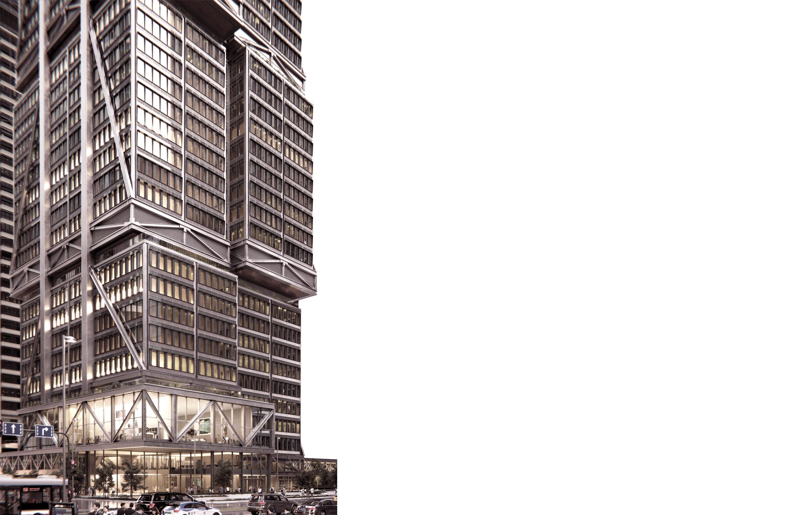
Emulating the “looped” design of the mixeduse site, CRL Center Dongguan is a new landmark to the city with a supertall tower and commercial retail center, addressing the full circle of needs of tenants, residents, and visitors through its program offerings.
Bordered by the Central Business District and Dongguan Park, CRL Center sits at the nexus of work, live, and leisure. The site is anchored by “the loop,” a concept that prioritizes community, access to nature, and the pedestrian experience. Overlooking a new central park and cultural
buildings, an expansive retail podium connects three towers, each positioned along the street perimeter. Greenery permeates the site, from the layered lawns and elevated pathways to a landscaped podium roof and tower terraces.
T1, a landmark tower that will be Dongguan’s tallest building upon completion, is located at the intersection of two major urban axes, marking a strong presence as users approach the project, while T2 and T3 are located on the other side of the block closer to the city’s main thoroughfare, Dongguan Boulevard.
I was part of the Tower team, focusing on T1 from 30% DD to 100% DD. Then, I worked on the 100% DD Addendum Service for the exterior of the commercial retail podium. T1 is composed of office, residential and hotel programs which are separated by skylobbies & served by three ground floor lobbies. Elevator shafts serve three different programs throughout the tower. The efficient core & slanted perimeter columns allow for stepbacks as terraces.
Updated the entry canopy in detail to fit façade engineer’s drawings & Produced many views like below to allow for decision making, stemming from different design options.
Designing where stormwater systems would fit inside the transom, I learned about different strategies to either solve inside the mullion or transfer to nearby mega columns.
Reveals run through the tower in the middle. This reading breaks down the scale and emphasizes the verticality concept.
Here, I produced this night-time render that represents the lighting design idea. Every other fin is lit, playing with the tower’s scale and rhythm in the night.
Modelled as Study Diagrams
In our overall section, I drew slanted columns & structural bracing. I updated all slabs with drop ceiling detail, incorporating the latest façade section wall-type. I drew structural beams in all floors referencing structural plans & updated the finish floor line in all levels throughout the tower for our 100%DD submission.
Here, the T1 Hotel Ballroom and Glass Box is seen, where I participated in how Tower 1 interfaces with the retail Podium.
Sun shading devices are hanged from the ceiling module & designed referencing the curved wall-types of the project.
During the Addendum
100% Design Development
Phase of the Podium, I was tasked with designing the entry facades near Tower 3 to incorporate critical ventilation louvers while maintaining a clean, modular aesthetic.
Working with the facade engineering team, I remodeled the façades through options that allowed for equal remodulation and cohesion of the building exterior with the design concept.
Podium 100% Addendum Service
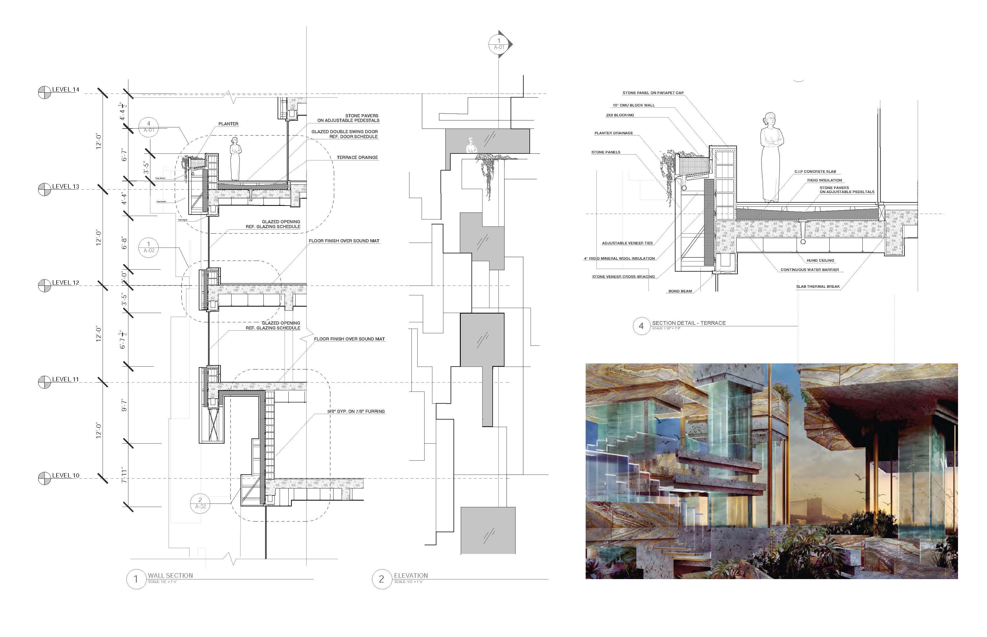
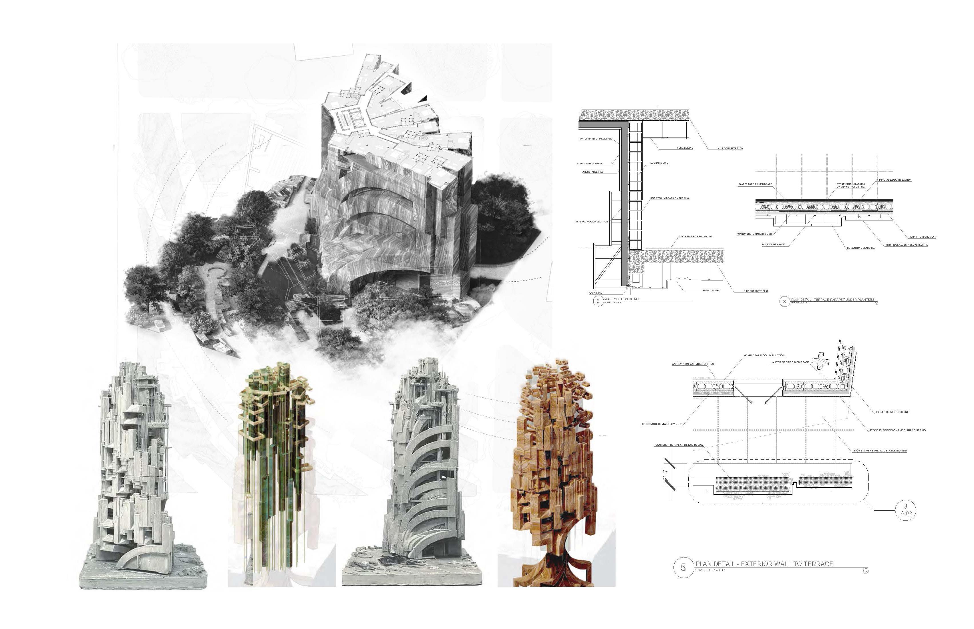
Sample Detail Wall-type Drawings Green Axis Parkside Façade
Typical Details adapt to varying conditions
By studying the drawings of façade engineers in China, I redrew and remodulated the exterior façade of the retail podium in plan in 7 levels, studying and solving issues as they arise while keeping our initial design intent intact.
Shenzhen, China
Client:
China International Marine Containers
125,000 m2 / 1,350,000 ft2
Headquarters + Office + Retail
2nd Place
Over the last four decades CIMC has established Shenzhen as a hub for the global network of logistics and manufacturing.
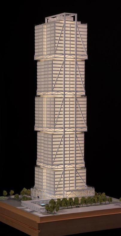
The structural system of the building ties closely to the architecture. It is an engineering feat of economy through spanning, suspending and stacking. We’re using the word economy in the sense of its Latin origin, economia, which means the order of the house.
What can we do to maximize the efficiency and value? The innovation here is really one which promotes the adaptability and flexibility of the structure in the future.
The underground entry from the subway station is a memorable atrium space. An atrium invites light and nature down into the basement level, emphasizing the vertical connectivity between the metro into the building podium. Vertical landscaping continues to activate café and lobby space at mezzanine level.
Level 2 is dedicated to retail space and public passage with connectivity through an expansive skybridge. Retail continues on level 3, accompanied by a large auditorium space at the northwest corner.
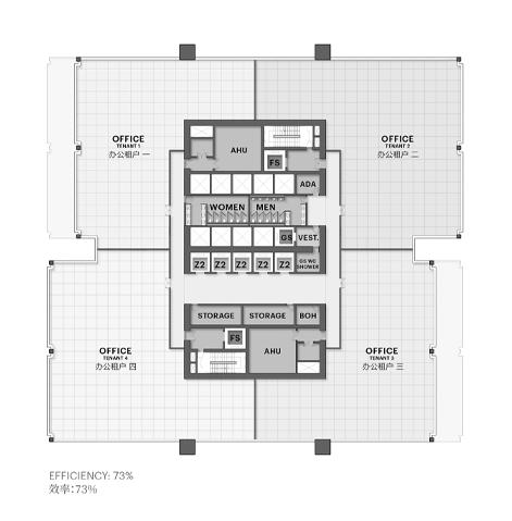
The office layout boasts super high efficiency through the column-free interiors and minimized perimeter columns.
A cafeteria begins on the 43rd floor, with a connecting stair to the upper level, leading to dedicated VIP dining that let out onto terraces, positioned to maximize views towards the neighborhood and Qianhai Bay.
The sky lobby is a double height space with a corporate exhibition hall and cinematic AV room to suit CIMC’s hosting and presentation needs.
73%
The design began with a set of mega portal frames, demonstrating the power of CIMC Manufacturing. Ten standardized functional modules are inserted into the mega portal to form the basic building volume, echoing CIMC’s rational and efficient manufacturing genes. These modules are slightly staggered, which injects vitality into the building while maintaining a stable and simple image, reflecting the innovation and diversity of CIMC Industries in the new era.
View
The window to wall ratio, optimized to 45:55 on all modules, provide a baseline for increased performance and reduced odd conditions. We then developed a system of shading devices, tapering from 550mm to 150mm, from the top of the tower to the podium. This allows every floor in the tower to receive optimized usable daylight, and reduces glare and the need for blinds.
At the ground plane, the greenery expands beyond the building form with outdoor gathering spaces and pathways, directing users to destinations including the sunken garden. The site has a main drop off location, with a separate parking lot accessed through an entrance at the south. Inside, the two office lobbies are connected at multiple points to allow flexible access across the site.
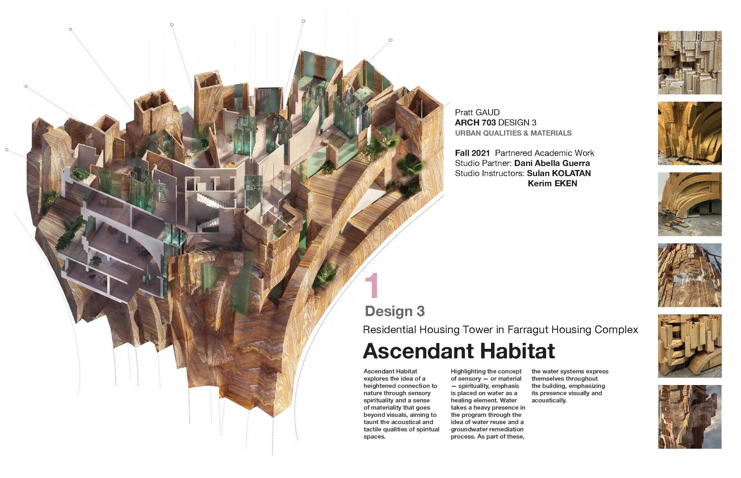
Pratt
Institute School of Arhitecture Professor
Pratt Institute School of Arhitecture
Professor
Pratt Institute School of Arhitecture