

Dear Friends, Partners, and Colleagues,
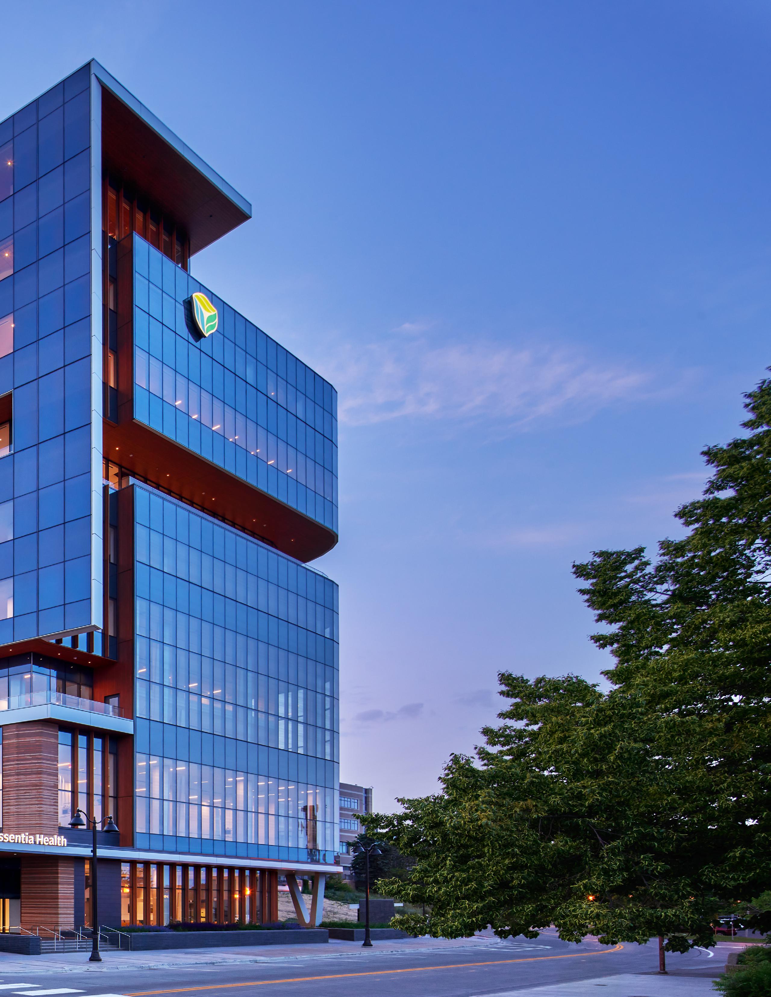
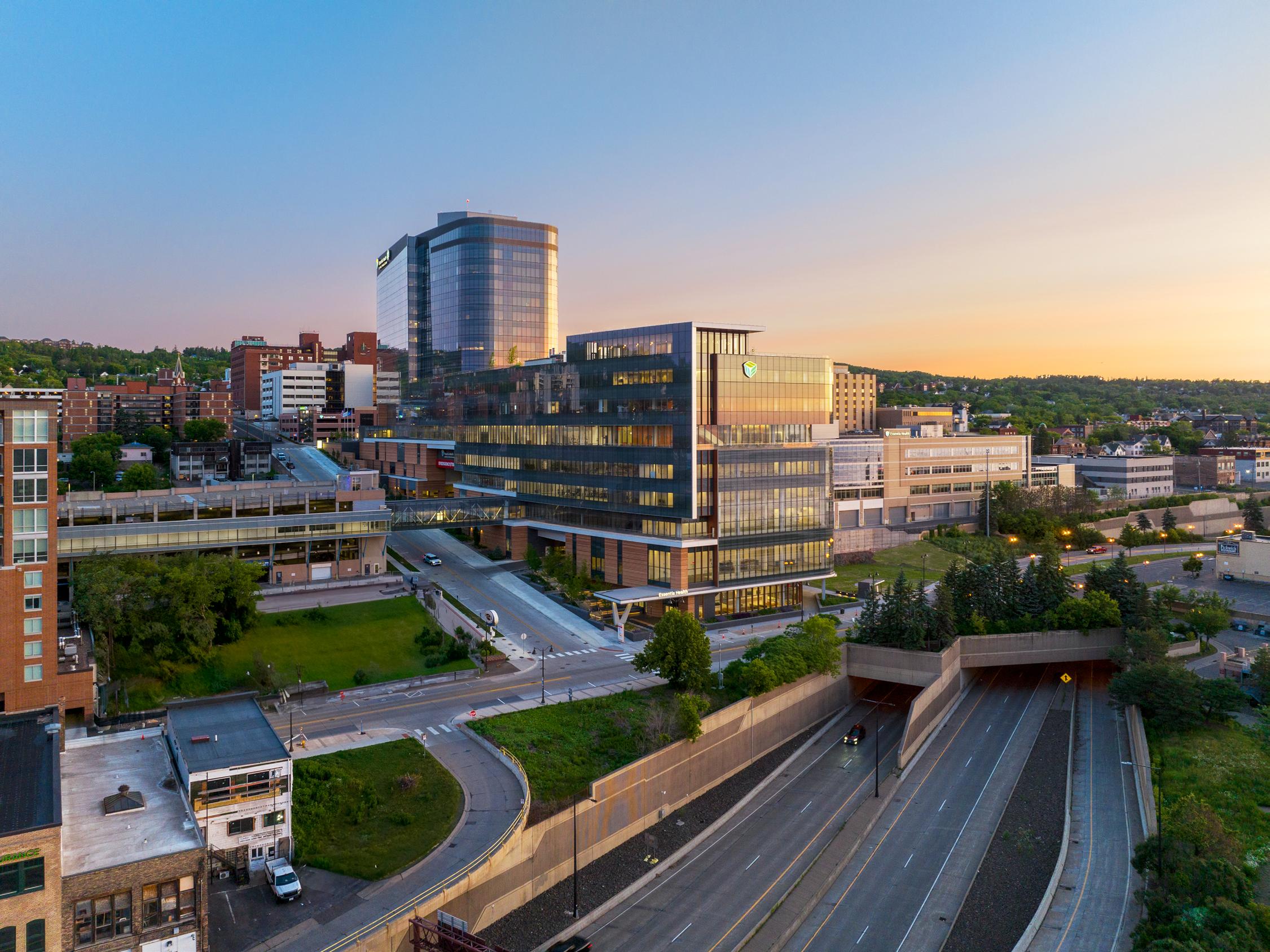
As we look back on 2023, we reflect on a historic achievement for our firm. Essentia Health’s St. Mary’s Medical Center, a monumental healthcare facility overlooking the banks of Lake Superior in Duluth, MN, is open to the community. St. Mary’s is EwingCole’s largest healthcare project to date and represents six years and countless hours of hard work and dedication on the part of our national healthcare practice. Architects, engineers, interior designers, and planners from across the firm played a role in bringing this one-million-square-foot project to life. The team approached this project from a holistic perspective, considering the diverse needs of the patient population, Essentia’s Health’s providers, and the broader community. Together, we delivered this project on time and on budget despite the extreme climate, a global pandemic, and supply chain disruptions. The result is a hospital that meets the highest standards of functionality, efficiency, and design. St. Mary’s is a testament to our commitment to fostering a positive, collaborative, and innovative firm culture.
We would also like to dedicate this issue to the memory of the lead Healthcare Planning Principal for this project, Scott Garand.
Sincerely,
 Robert A. McConnell, AIA President
EXTERIOR Fabric of a Community: Designing St. Mary’s Iconic Exterior
INTERIOR Living Art Gallery – How Hospitality Shapes the Healthcare Experience
INSPIRATION A Tapestry of Culture and History: Telling the Story of Duluth’s Ojibwa People
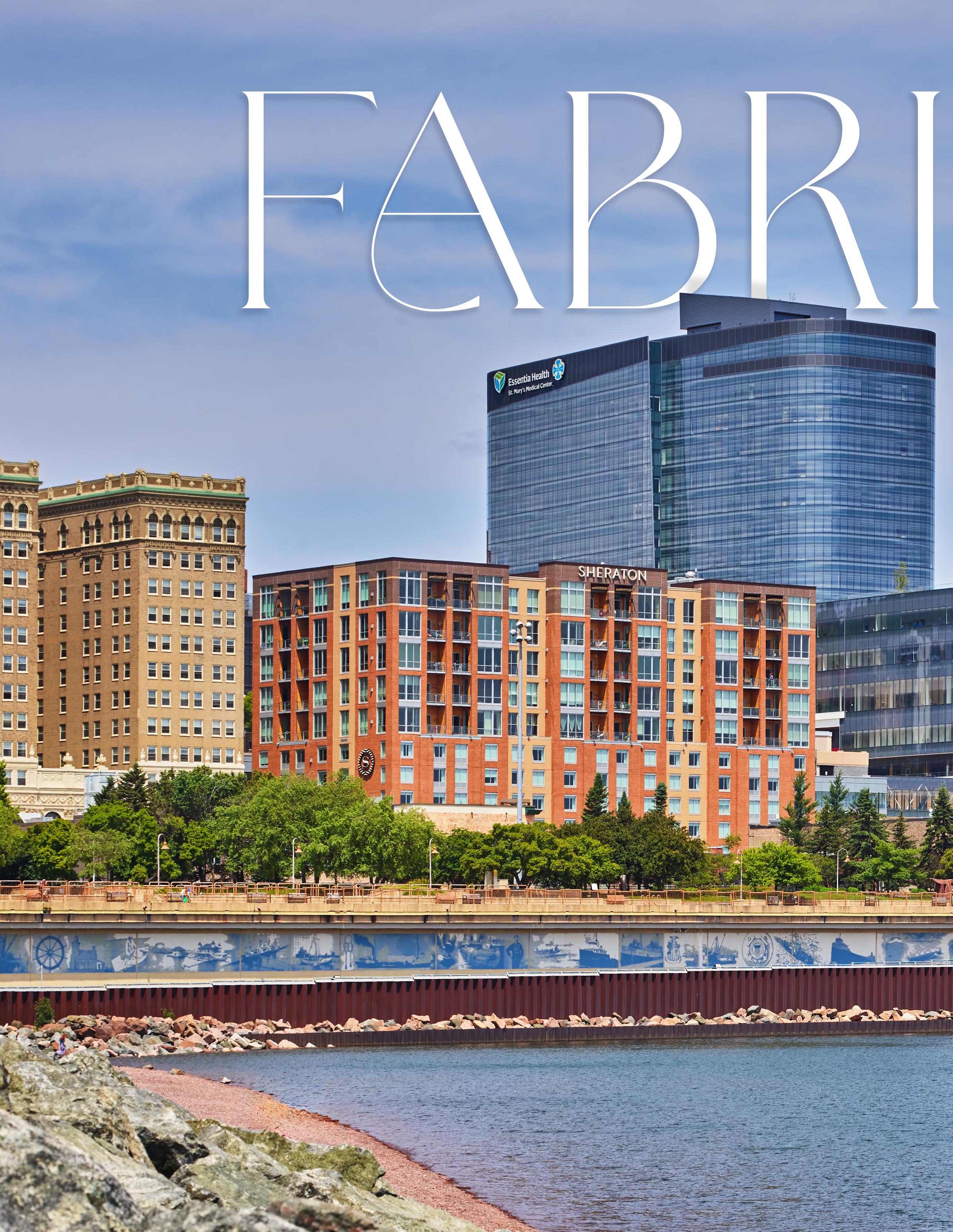
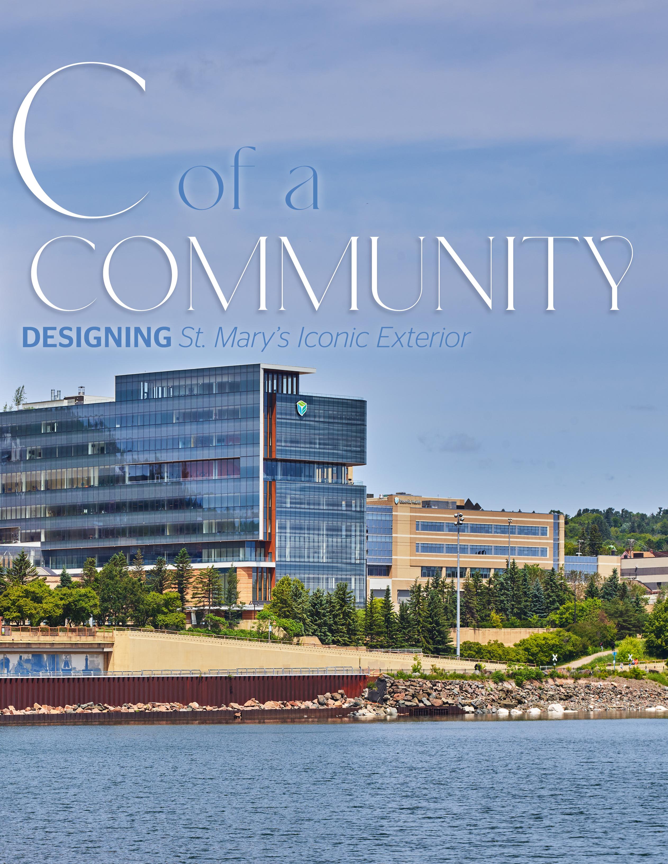
FROM THE OUTSET, THE PRIMARY GOAL FOR VISION NORTHLAND – NOW ST. MARY’S MEDICAL CENTER IN DULUTH, MN – WAS TO CONSOLIDATE ESSENTIA HEALTH’S CAMPUS-WIDE MEDICAL SERVICES UNDER ONE ROOF.
Despite its scale, this project is still considered a community-based hospital, so it needed to reflect the rich cultural heritage of Duluth, Minnesota. How this nearly one million SF hospital would blend with the fabric of its surroundings was the challenge presented to EwingCole’s design team.
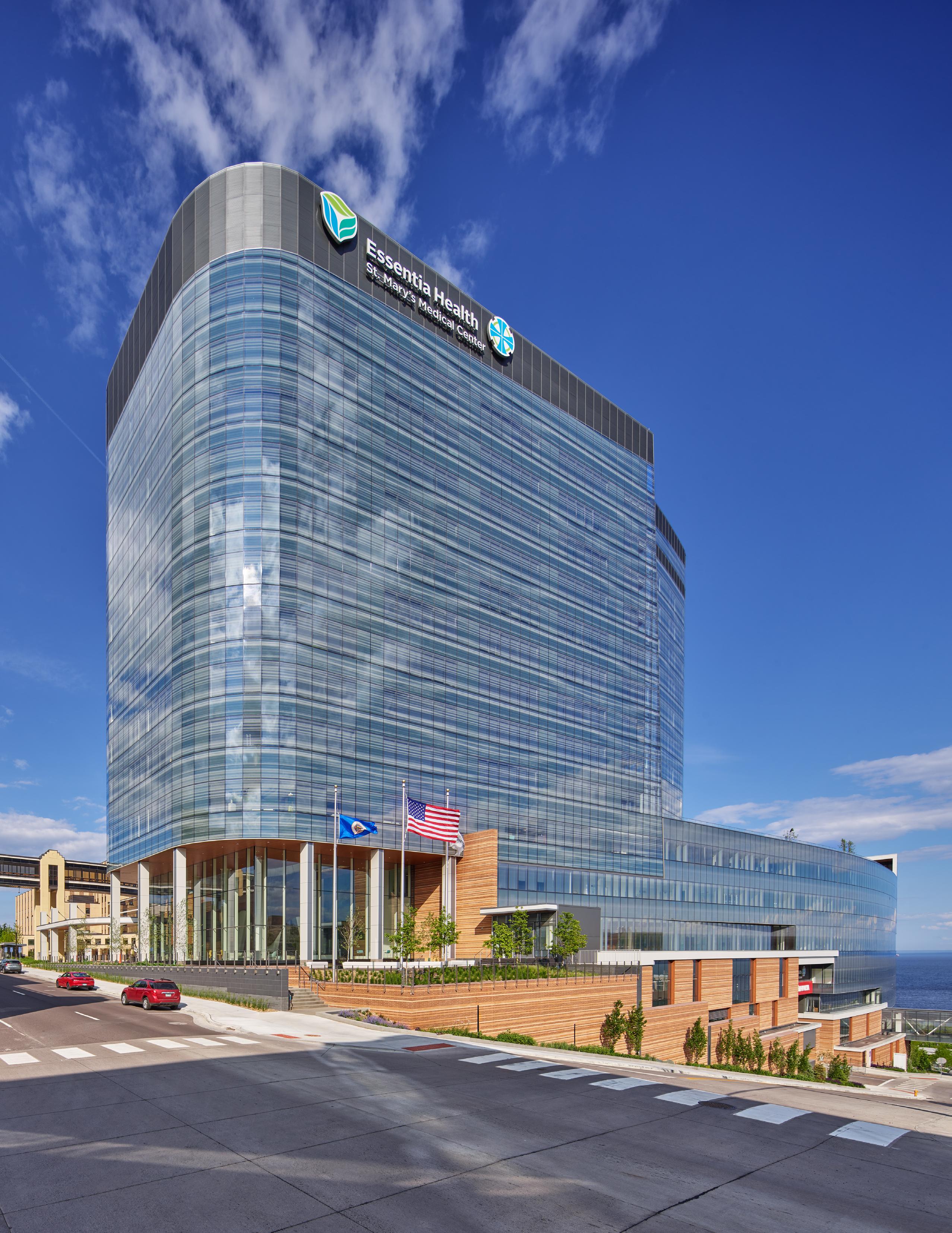
Key features of the building site are the sloping hillside topography and the site’s water’s edge of the mighty Lake Superior. Lake Superior is omnipresent in the City of Duluth. It impacts the area’s weather, is a key driver of the local economy and recreation, and is a site to behold. It only made sense that the building’s exterior should blend with the placid nature of the lake. Saul Jabbawy, design principal for the project, described how one of the lake’s weather phenomena inspired the concept for the building’s exterior.
“We knew we didn’t want the building to stand out too much. We wanted it to be a softer building,” he said. “We were sitting one day early in the morning having breakfast, and this fog came rolling out of the lake and we thought, ‘Wow, that's amazing.’ Why don't we try to incorporate this fog as a pattern for the building itself?”
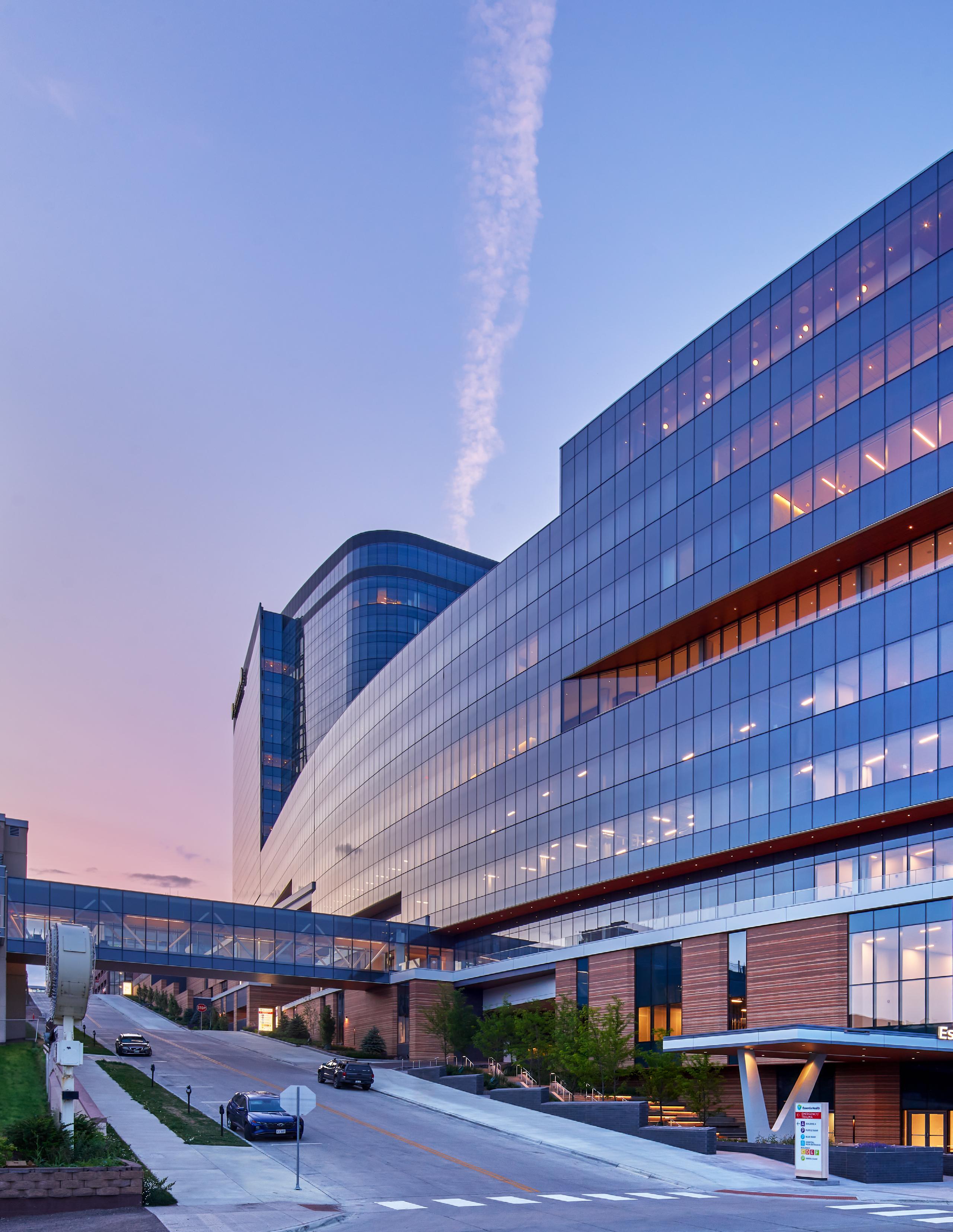
The primary glass façade is patterned with a soft wave-like ceramic screen that recalls the silky quality of the water
surface and its frequent rolling fog. The ceramic fritted glass pattern serves two purposes for Duluth’s tallest commercial building: the wave-like pattern, in addition to creating an appealing aesthetic and protecting the building’s interior from heat gain, is more visible to birds than standard reflective glass. In its early stages, community members
that could pull many manufacturing process steps together in one location. The frit also plays a key role in meeting Essentia Health’s sustainability goals by summer-solar heat gain and long-term cooling costs. Given the location of the project is in one of the most significant migratory bird paths in north America, the frit also responded to the concern
“ WE WERE SITTING ONE DAY EARLY IN THE MORNING HAVING BREAKFAST, AND THIS FOG CAME ROLLING OUT OF THE LAKE AND WE THOUGHT, ‘WOW, THAT'S AMAZING.’ WHY DON'T WE TRY TO INCORPORATE THIS FOG AS A PATTERN FOR THE BUILDING ITSELF?”
- Saul Jabbawy, Regional Director of Design, EwingCole
– specifically, local bird enthusiasts –expressed concern over the building’s height and potential obstruction for migratory bird strikes.
Creating a custom glazing system above the base often involves a global supply chain of multiple manufacturers and many transitions from one location to another. EwingCole selected a single-source, local manufacturer
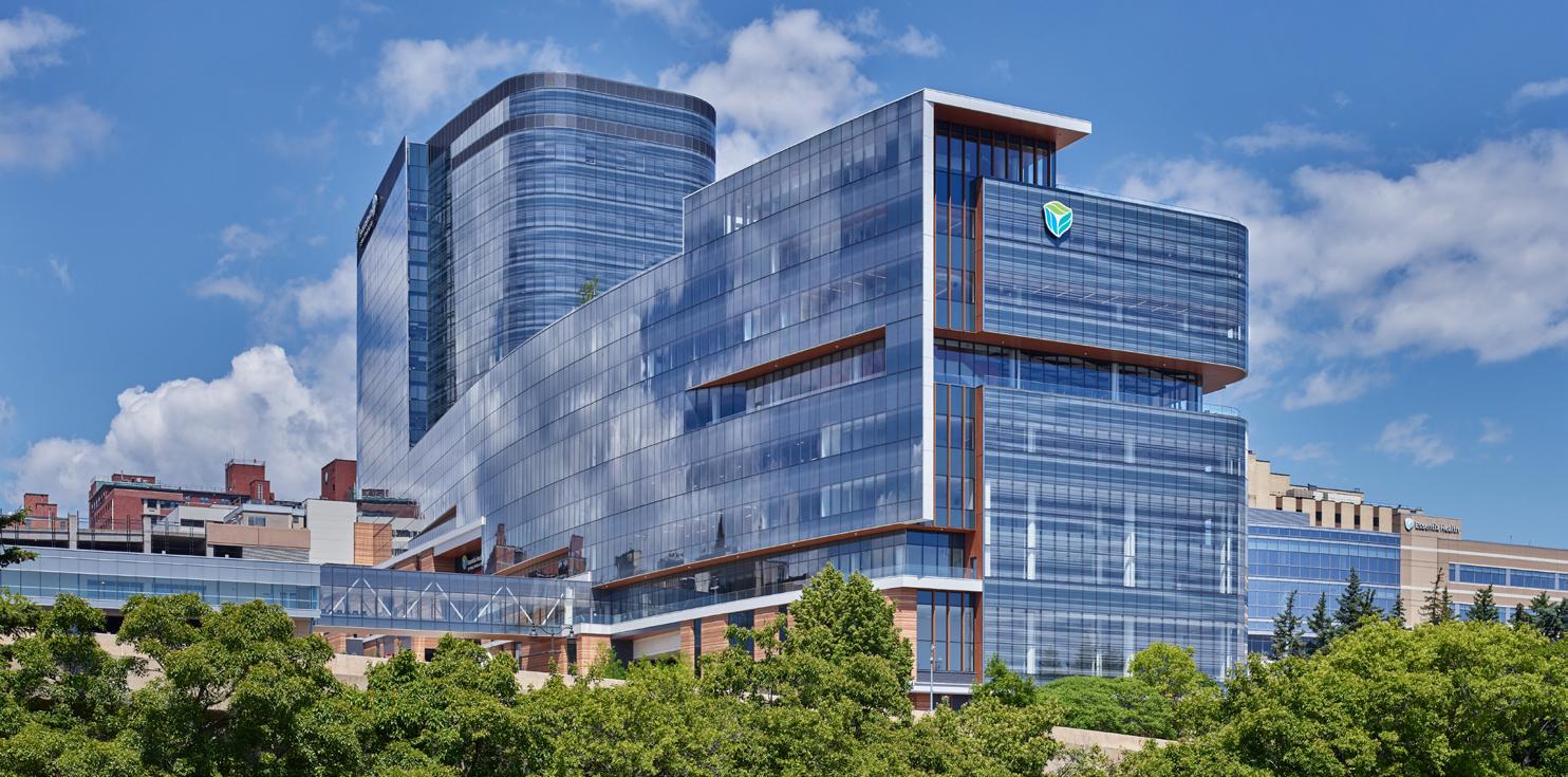
of the local environmental and bird watching community and was designed according to the Audubon Society's guidelines to minimize bird strikes.
Its three parts, the masonry plinth the glass podium, and the inpatient tower, respond to the condition of the site and
serve as key functions to the design’s intentions. For example, the building’s pill-shaped form interacts with the exterior glass pattern but was also designed to minimize wind turbulence from the intense winds coming across Lake Superior.
“St. Mary's Medical Centers' shape and orientation respond to the area's wind gusts and avoid creating wind tunnels, particularly in the areas with high foot traffic,” said Joe Wood, AIA. “We tested nearly a dozen building massings, and ultimately, the resulting curvature was ideal for protecting the building and pedestrians around the ground levels from the area’s intense winds and weather.”
The soft forms and curvature of the podium and patient tower were also designed to provide striking views toward Lake Superior and the surrounding hillside city, as Planning Principal Leslie Kipps AIA, LEED AP, EDAC, CLSSBB notes. “Most of the views look out over Lake Superior, and the views that don't, look toward the hillside, which is a beautiful landscape," she said. “There's not an
inpatient room with a bad view in this hospital.”
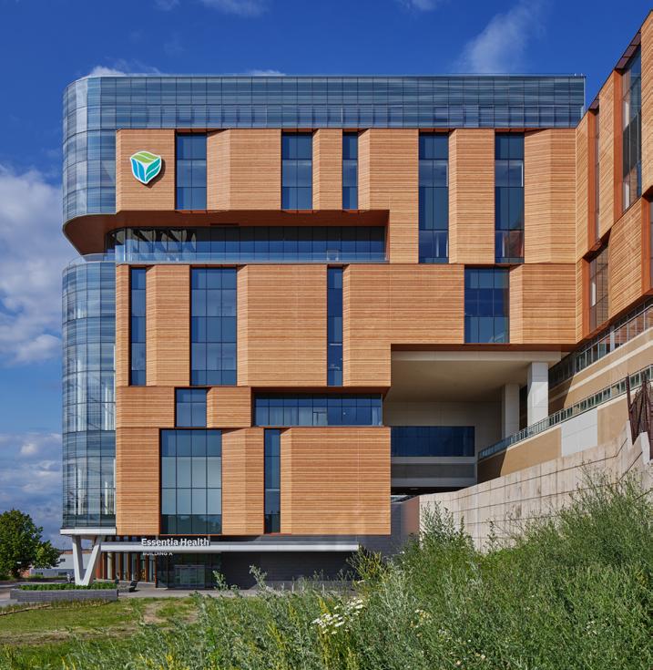
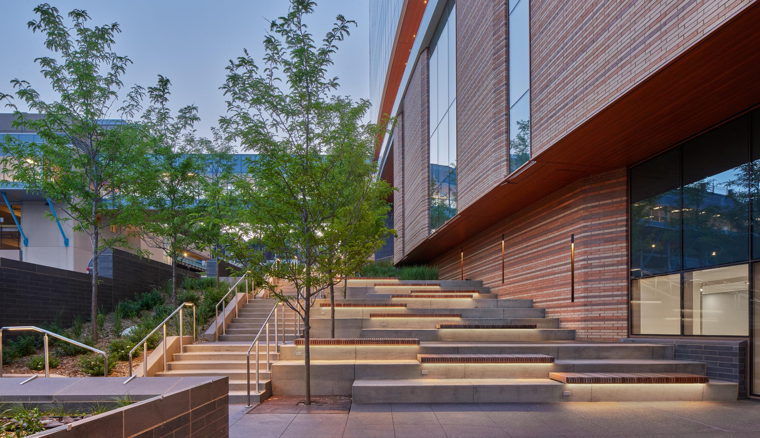
The masonry base echoes the terracing effect of the sloped city. The
building. The entire podium is curved inward to open views toward the lake along 4th Avenue. The gentle curvature of the western façade also helped minimize the visual impact of the
“MOST OF THE VIEWS LOOK OUT OVER LAKE SUPERIOR, AND THE VIEWS THAT DON'T, LOOK TOWARD THE HILLSIDE, WHICH IS A BEAUTIFUL LANDSCAPE, AND THERE'S NOT AN INPATIENT ROOM WITH A BAD VIEW IN THIS HOSPITAL.”
- Leslie Kipps, Principal, EwingCole
base of the building is designed with deeply articulated and striated brick panels and recessed glass, recalling the urban scale and texture of Duluth’s masonry tradition.
Within the glass podium and tower rising above the masonry base, terraces, and balconies provide viewpoints towards the lake as well as break down the larger mass of the
project by helping shorten the building length from a pedestrian point of view.
The two towers and plinth consolidate the new inpatient hospital and ambulatory facility, shifting the Essentia Health campus focus toward the waterfront. The urban design of the medical district is structured by the location of the Inpatient main
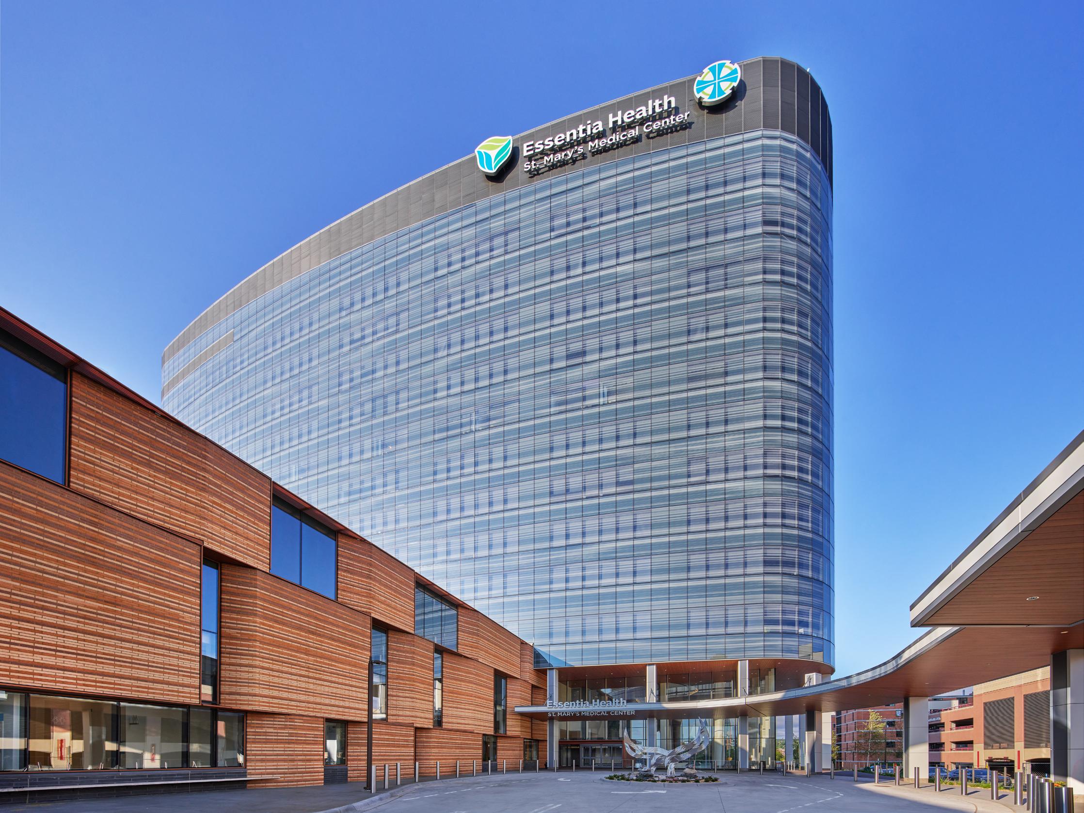
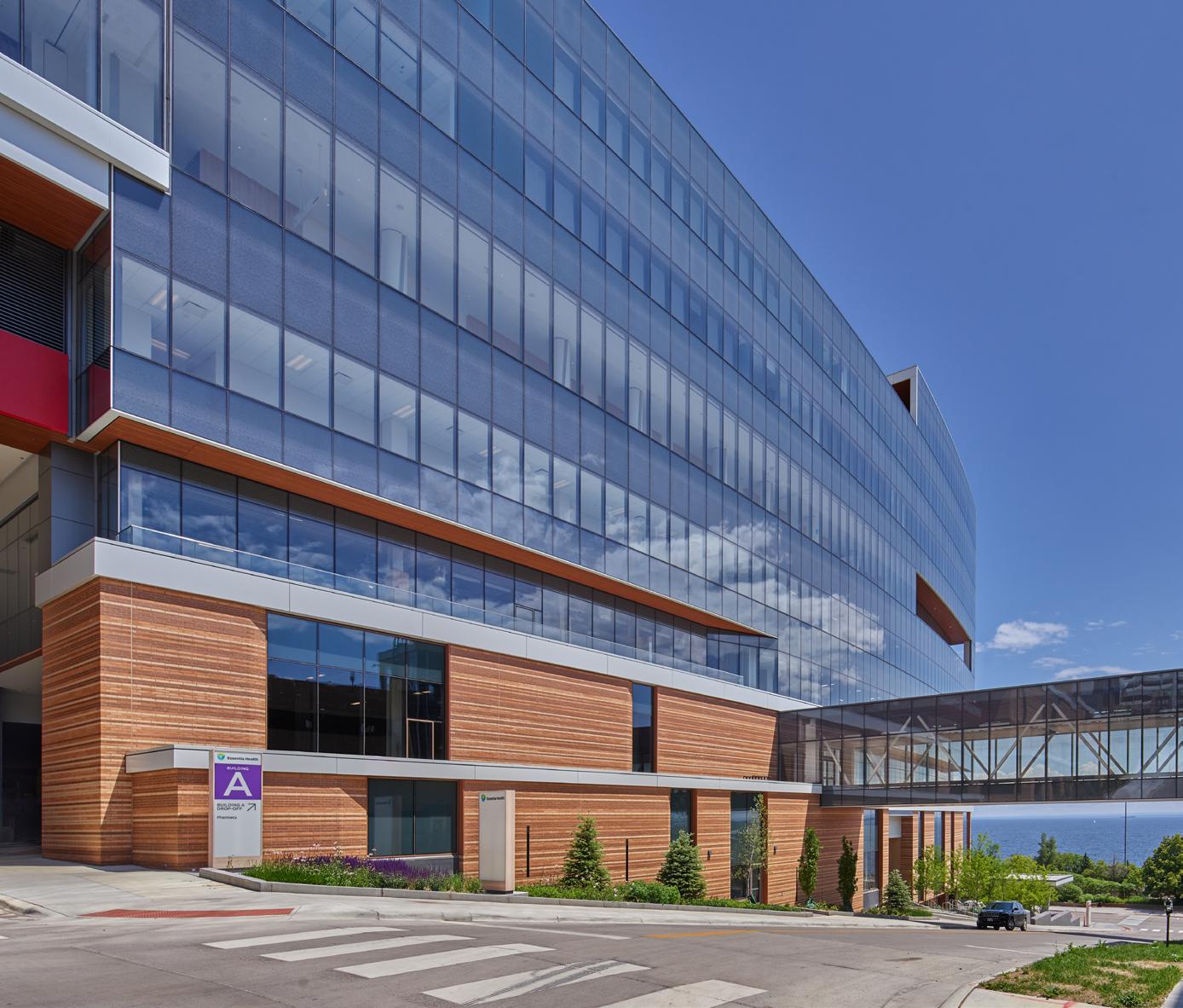
tower entry on 2nd Street, while the ambulatory's main entrance anchors the hospital presence on Superior Street a full 6 levels below the inpatient entry at 2nd Street. The project design takes advantage of the site's steep slope by providing a series of patient, guest, service and ambulance entrances at different levels, allowing for elevator cores to provide connection, hence minimizing the horizontal stretches required if all key entrances had been located on one floor.
The ambulatory facility entrance integrates into the vibrant commercial nature along Superior Street. A small plaza and a canopy create a gateway to the interior multi-story atrium facing the Lake. The canopy and a planter create a pedestrian-friendly scale at the street level, reducing the impact of the taller building.
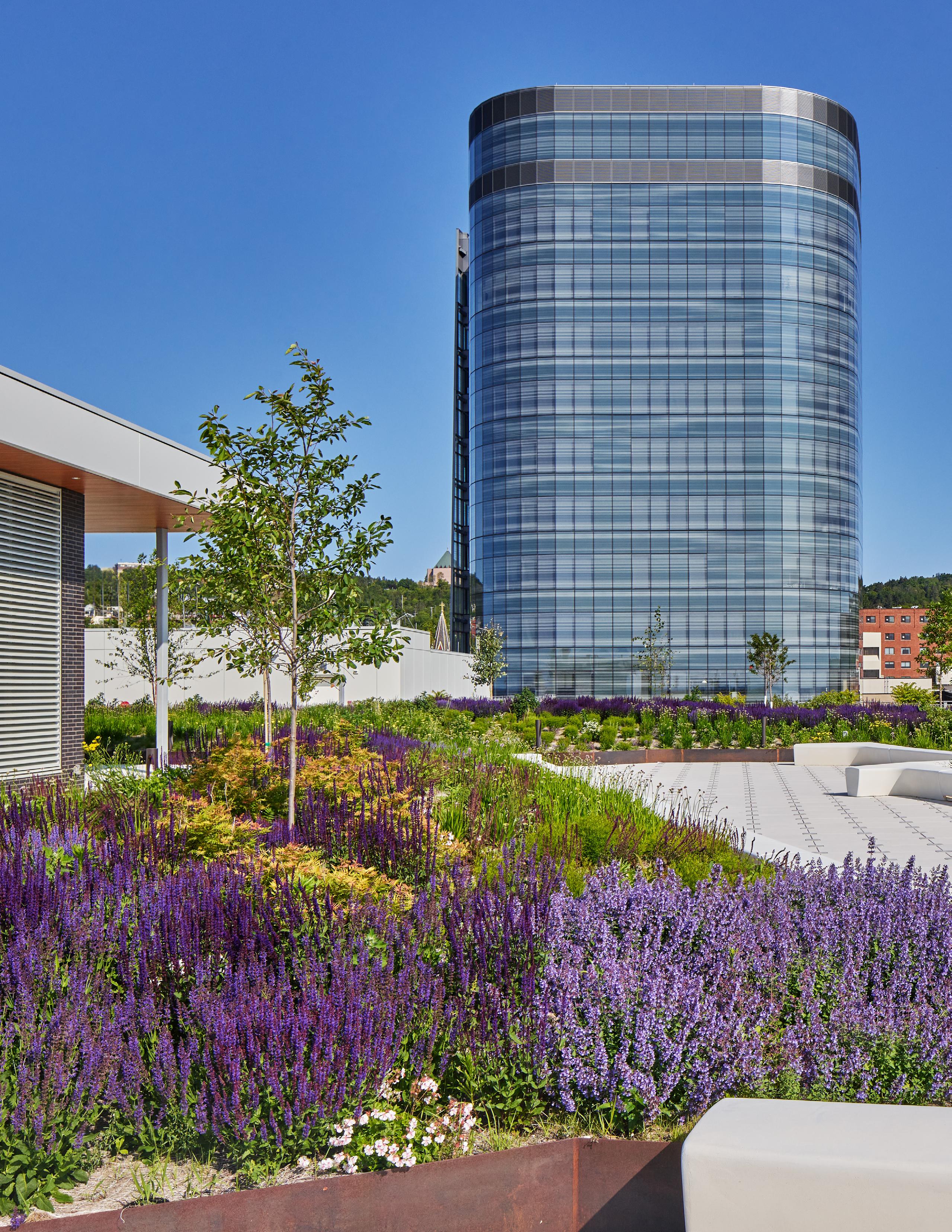
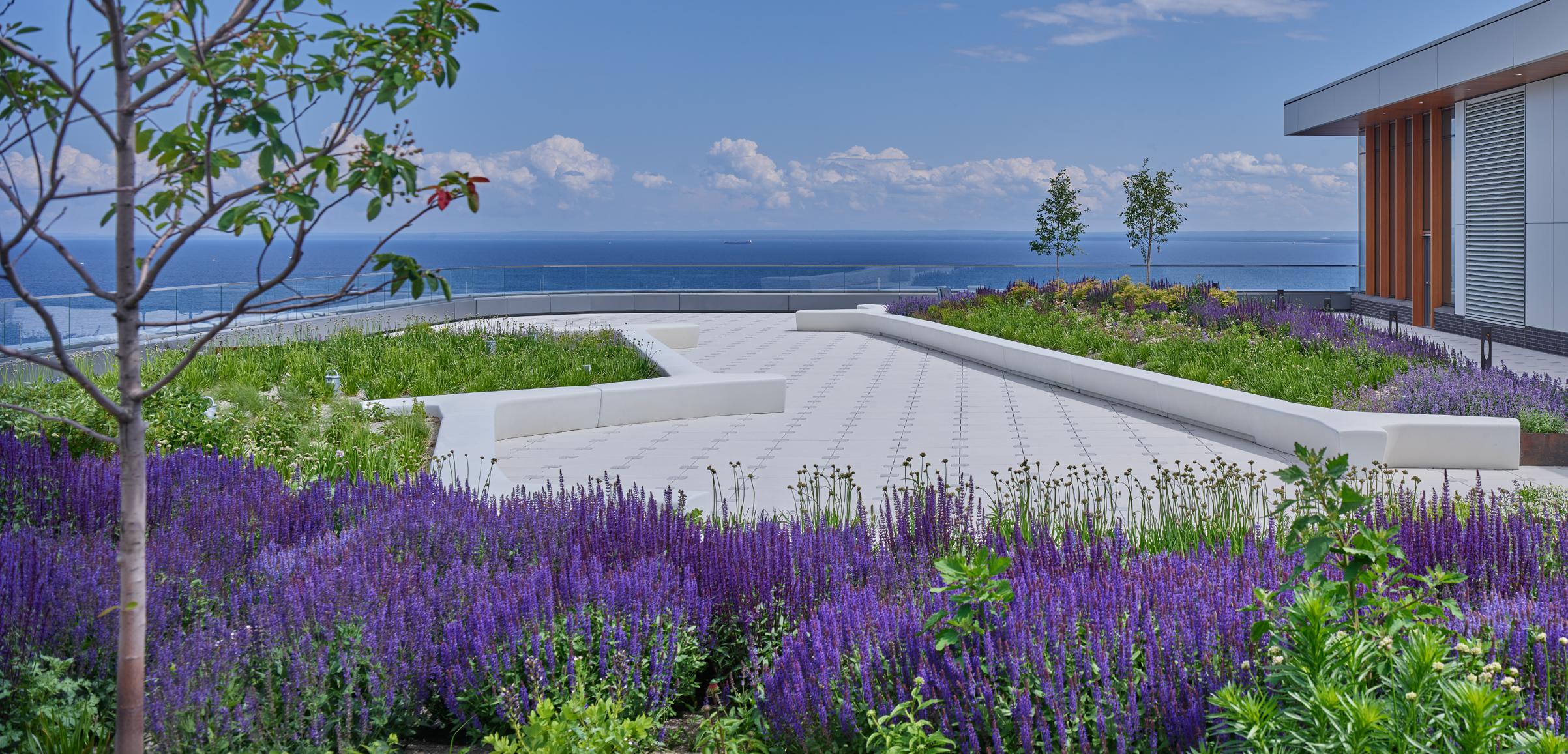
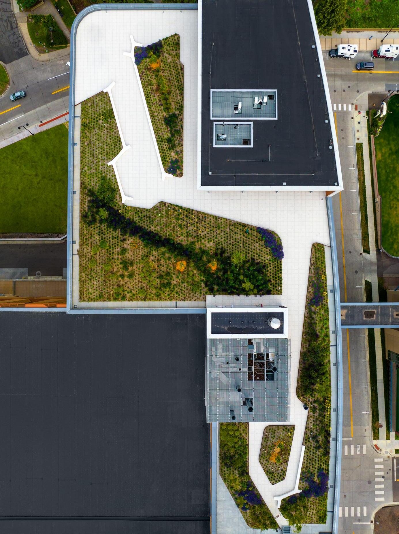
Key to the hospital’s ethos is the connection to the surrounding environment and community. The building’s masonry base and native plant gardens along Superior Street, 2nd Street, and 4th Avenue create a soft edge to the hospital between the main urban thoroughfare and the lake’s edge.
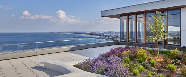
The community of Duluth celebrates the natural environment whenever possible and treasures its green spaces, whether wild or cultivated. The roof garden provides a park-like environment on top of the podium. It’s an accessible healing environment for patients, staff, and visitors, an unmatched observatory of the lake for the public, and a wonderful experience for the patients looking down from the tower. Like much of the building’s exterior, the roof garden inspires patients and families to experience and connect with the present and look beyond to hopeful futures. EC
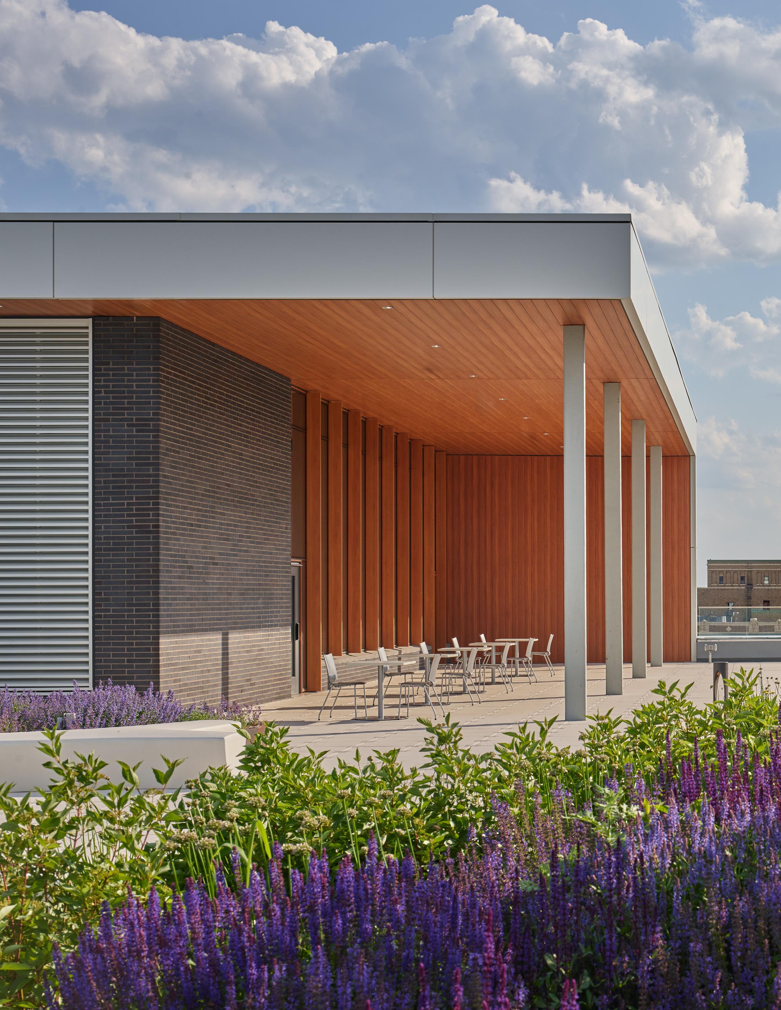
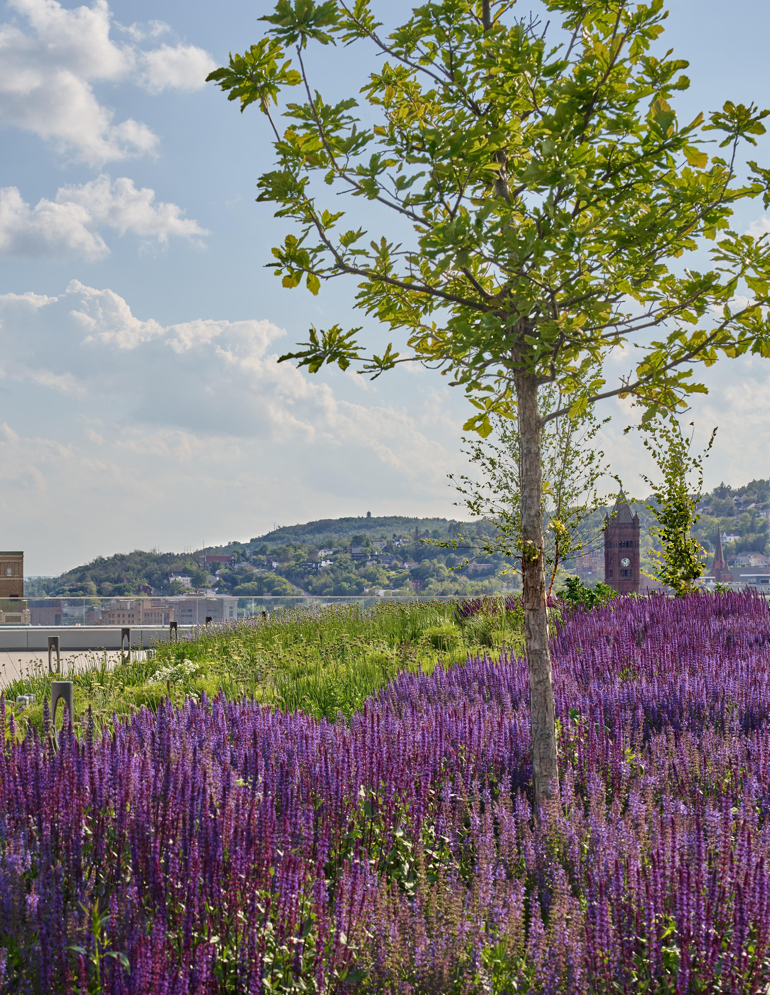
IN THE HEART OF DULUTH, ESSENTIA HEALTH’S ST. MARY’S MEDICAL CENTER IS REDEFINING THE VERY ESSENCE OF HOSPITAL DESIGN AND IS A TESTAMENT TO THE TRANSFORMATIVE POWER OF DESIGN.
From the early stages of development, EwingCole’s healthcare interiors team, Essentia Health’s staff, and patient advocates wanted a hospitality-driven interior concept that embraces visitors in a warm environment that extends beyond standard clinical design.
“If you look at the nature of hospitality, at its core, it’s about welcoming people into an environment that allows them to de-stress and providing them with choice,” said Saul Jabbawy, EwingCole’s regional director of design. “So how to allow them to de-stress, and how do we allow them to feel comfortable in a hospital environment are the questions we begin to ask.”
The team formulated three primary drivers to guide the hospitality strategy: provide visual access to the
views of the surrounding landscape wherever patients or families are present, incorporate spatial and textural elements that reference Duluth’s natural environment to form each space, and introduce graphic images and art that reference the region’s natural and manmade landscapes.
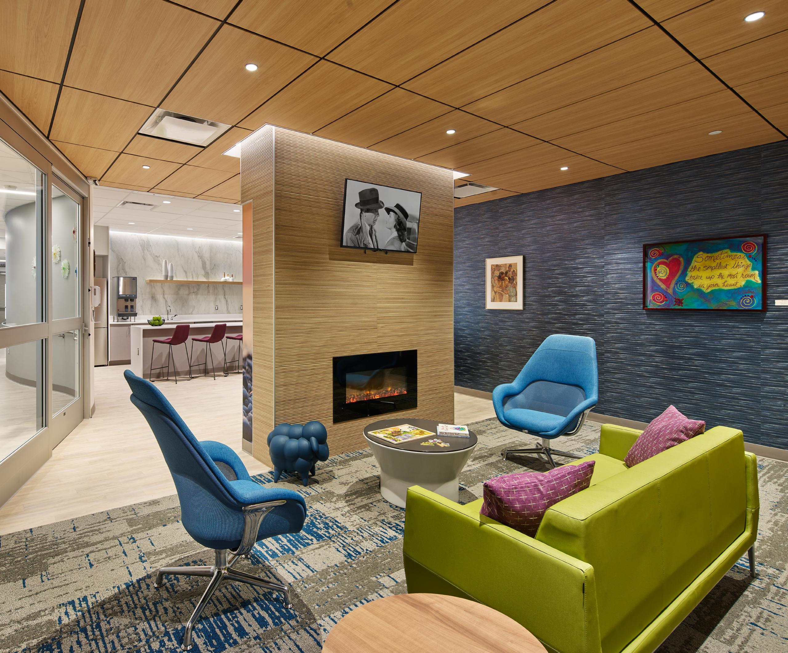
As a result, St. Mary’s redefines the healing experience by catering to the patient’s every need – including those beyond the clinical – providing a distraction from the oft-stressful healing journey by altering their perspective through comforting, creative, and efficient design. An array of comfortable seating areas and lounges, a variety of amenities, and artful design elements remove patients from the standard clinical experience and provide them with an abundance of choice, a sense of familiarity, and calm.
“We wanted this to be more than just a hospital. We wanted it to challenge contemporary healthcare design strategies and focus on creating an inviting and highly efficient space with hospitality at the center of the design,” said Jabbawy. “Above all, the design itself is a dialogue with Duluth, bridging the gap between healthcare and community. Essentia Health had the vision from the beginning; we just brought that vision to life.”
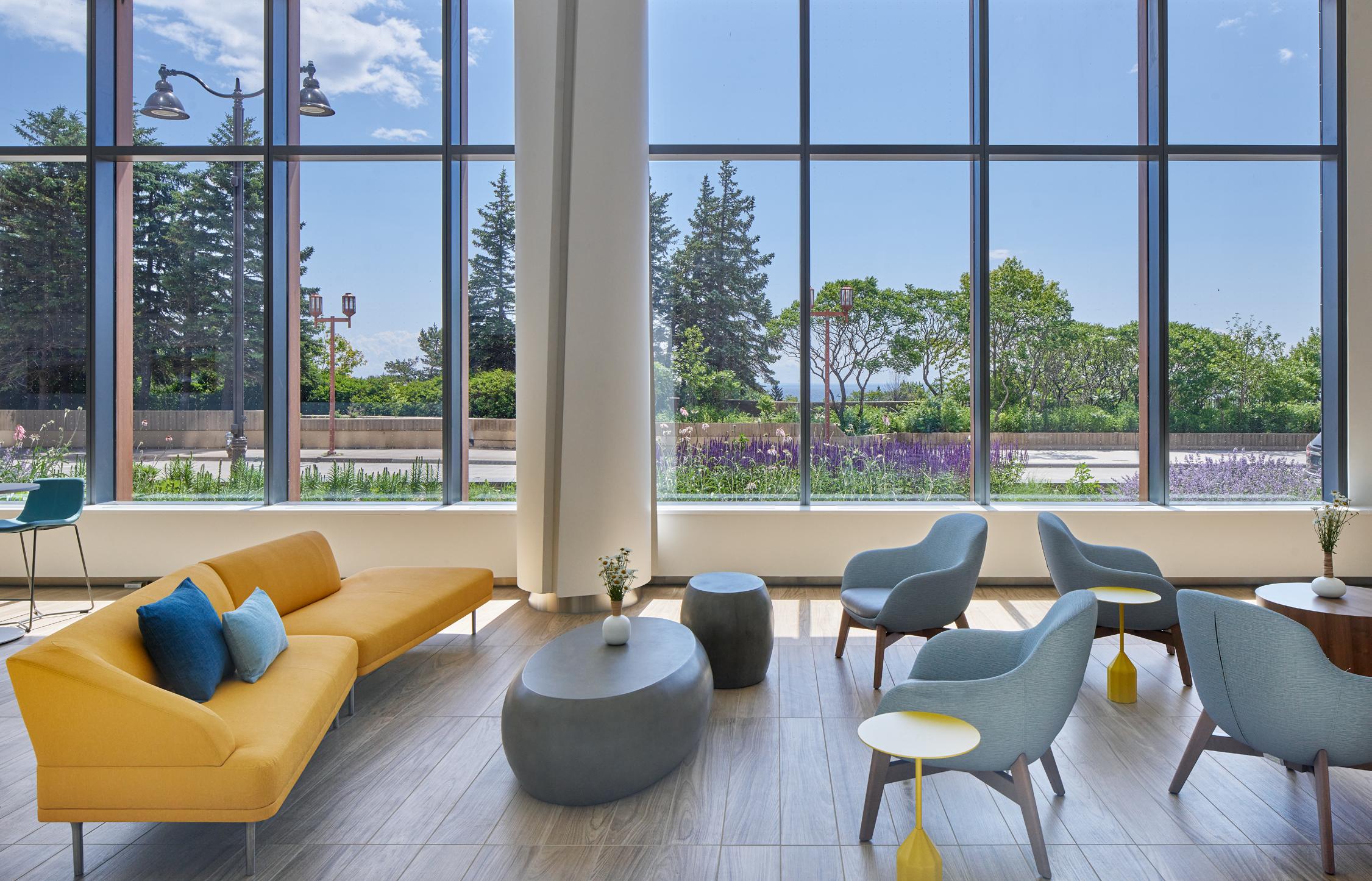
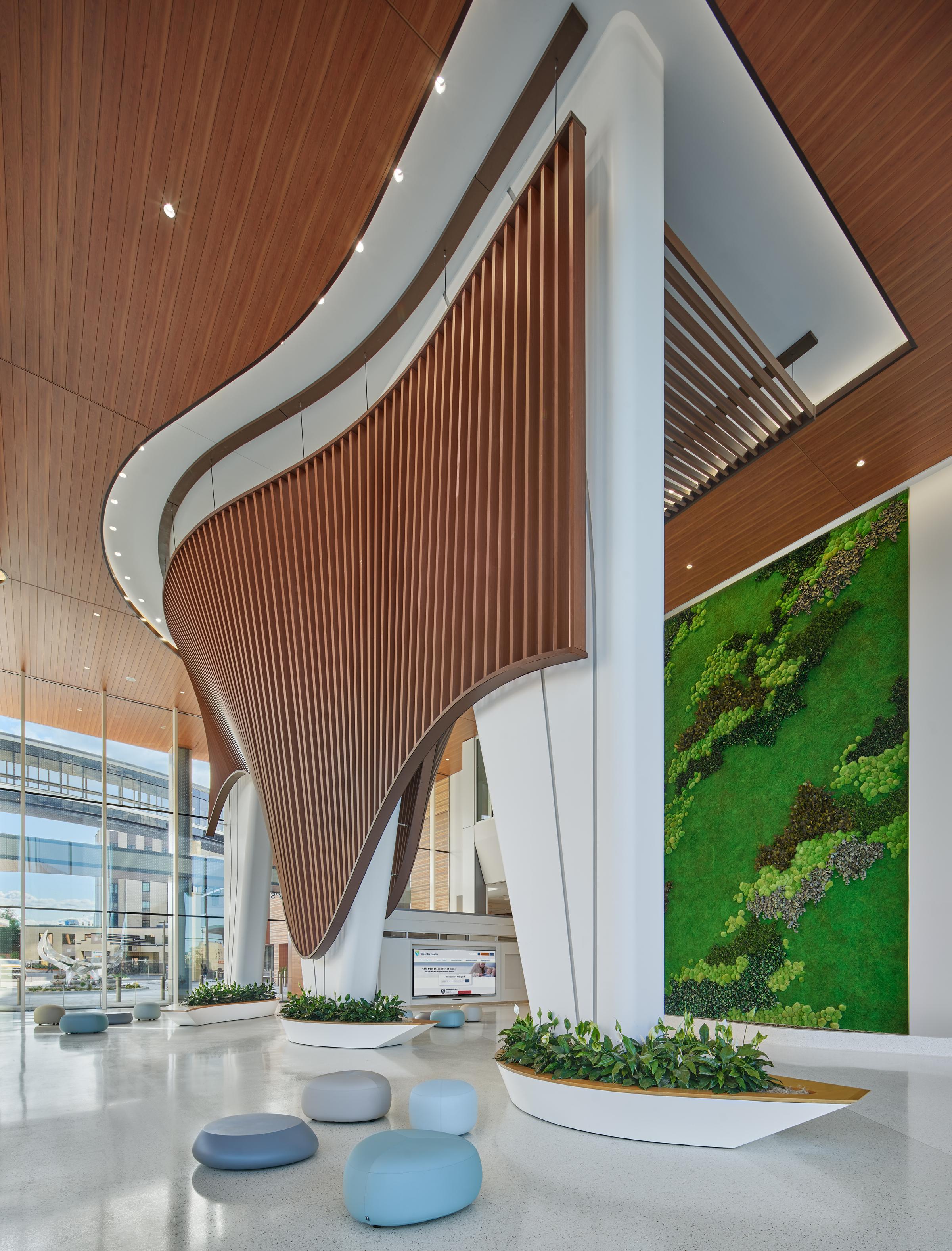
Throughout each floor of the hospital, visitors are given visual access to the outdoors. This connection to the surrounding environment influences the interior elements around them. On the ground floor ambulatory lobby, visitors are surrounded by flourishing
“WE WANTED THIS TO BE MORE THAN JUST A HOSPITAL. WE WANTED
IT TO CHALLENGE CONTEMPORARY HEALTHCARE DESIGN STRATEGIES AND FOCUS ON CREATING AN INVITING AND HIGHLY EFFICIENT SPACE WITH HOSPITALITY AT THE CENTER OF THE DESIGN”
-Saul Jabbawy, Regional Director of Design, EwingCole
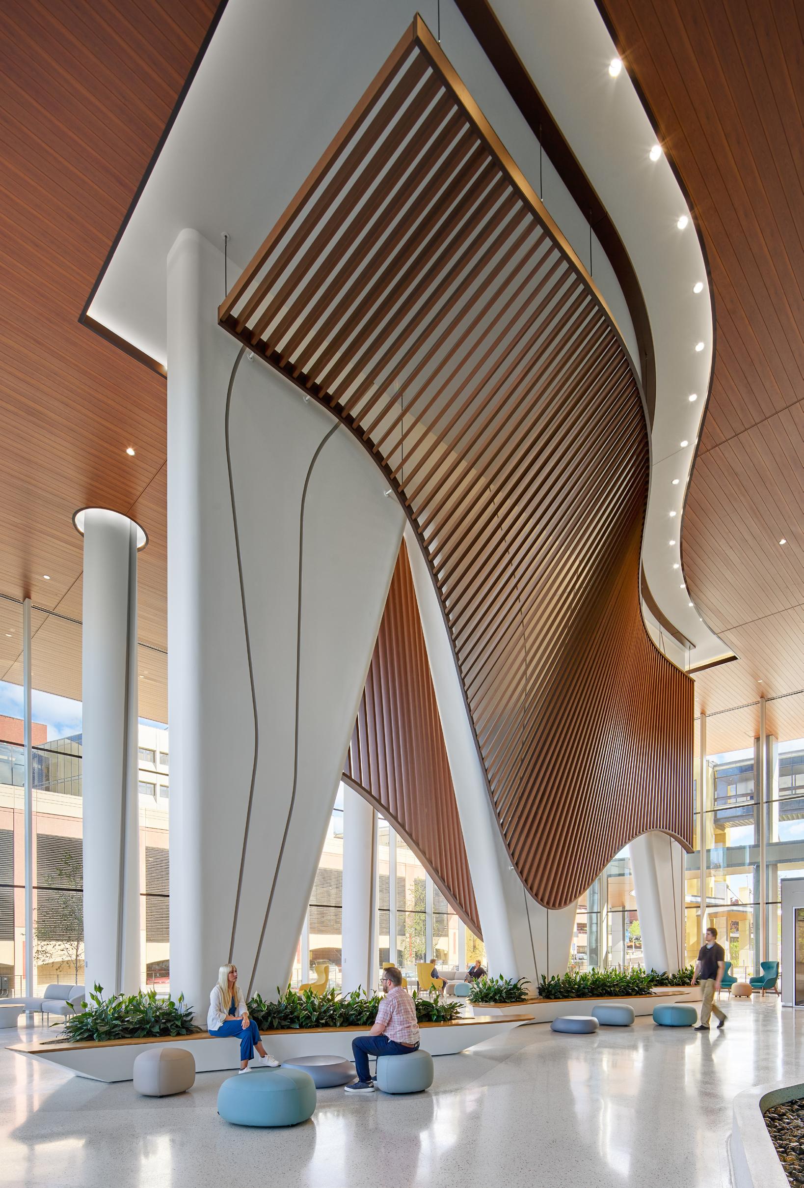
gardens and trees. On the upper floors, floor-to-ceiling windows grant visual access to the lake or the hillside city. These views play with the colors, textures, and lighting within.
The imagery throughout the hospital’s corridors and lobbies unfolds like a museum of the region, showcasing the city's lakeside charm, birch and conifer forests, waterfalls, and cultural landmarks. These elements guide the
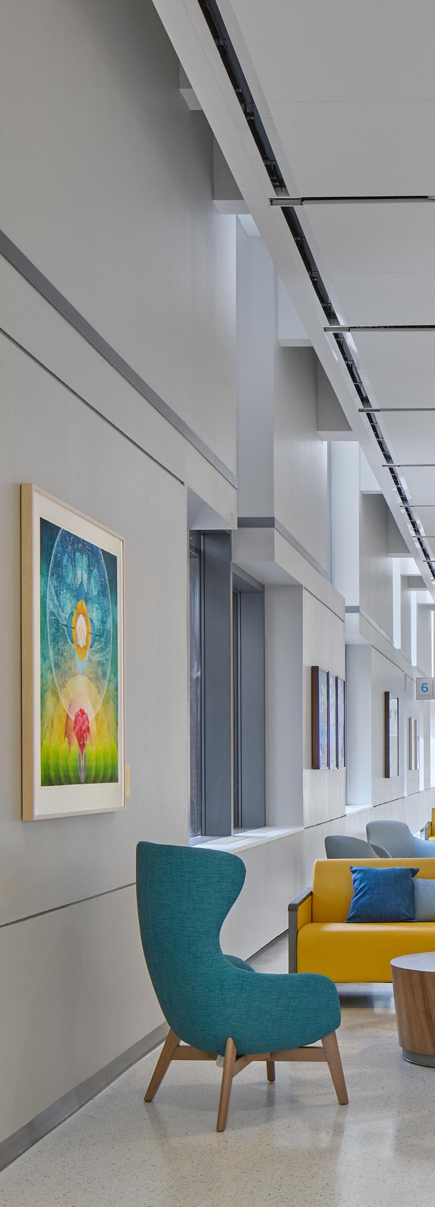
design, creating a seamless flow from floor to floor. The natural imagery also serves as a navigational aid, enhancing the spatial quality of each area of the hospital.
“There are different themes on each floor of the hospital, providing a unique experience no matter what level you’re on,” said Interior Architect Evan Rotenberger. “While some of the themes represent actual landscapes, other
spaces feature a specialized piece that serves as a focal point for the space.”
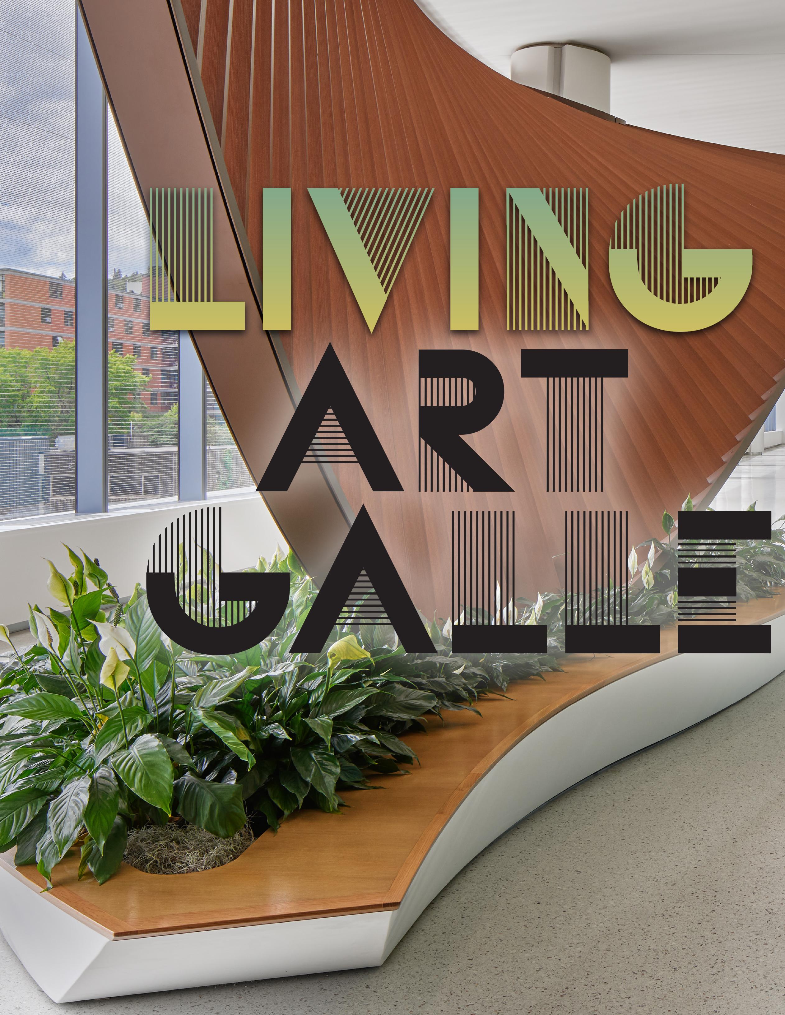
From its inception, the new St. Mary's Medical Center set out to revolutionize the healthcare experience. The guiding concept of utilizing the hospital as a living art gallery breathed life into its corridors and rooms. From the
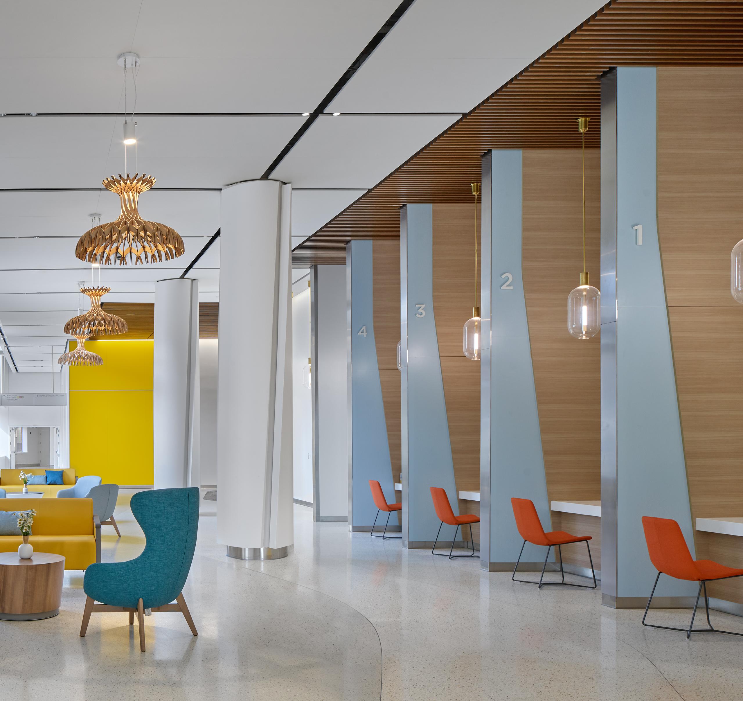
registration desk to each of its inpatient floors.
“We wanted the interior to reflect the landscape of Duluth. The design is similar to an art museum, and that overarching idea drove the collection,” said Rotenberger. “The pieces on display are a combination of abstract architectural expression, wall graphics, and curated local art pieces.”
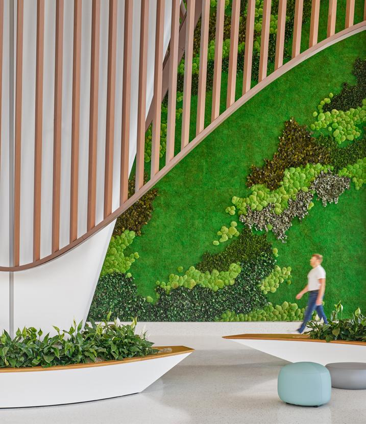
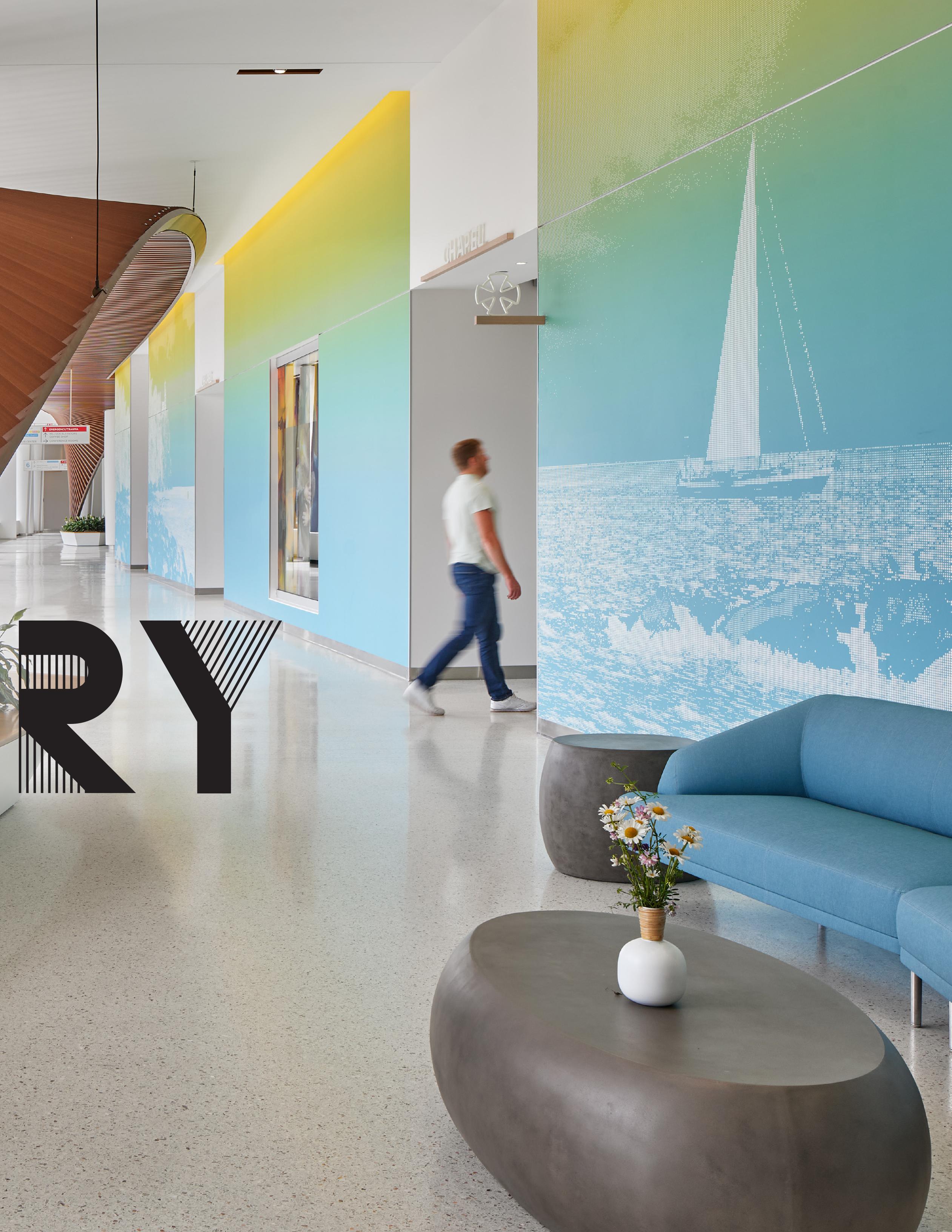
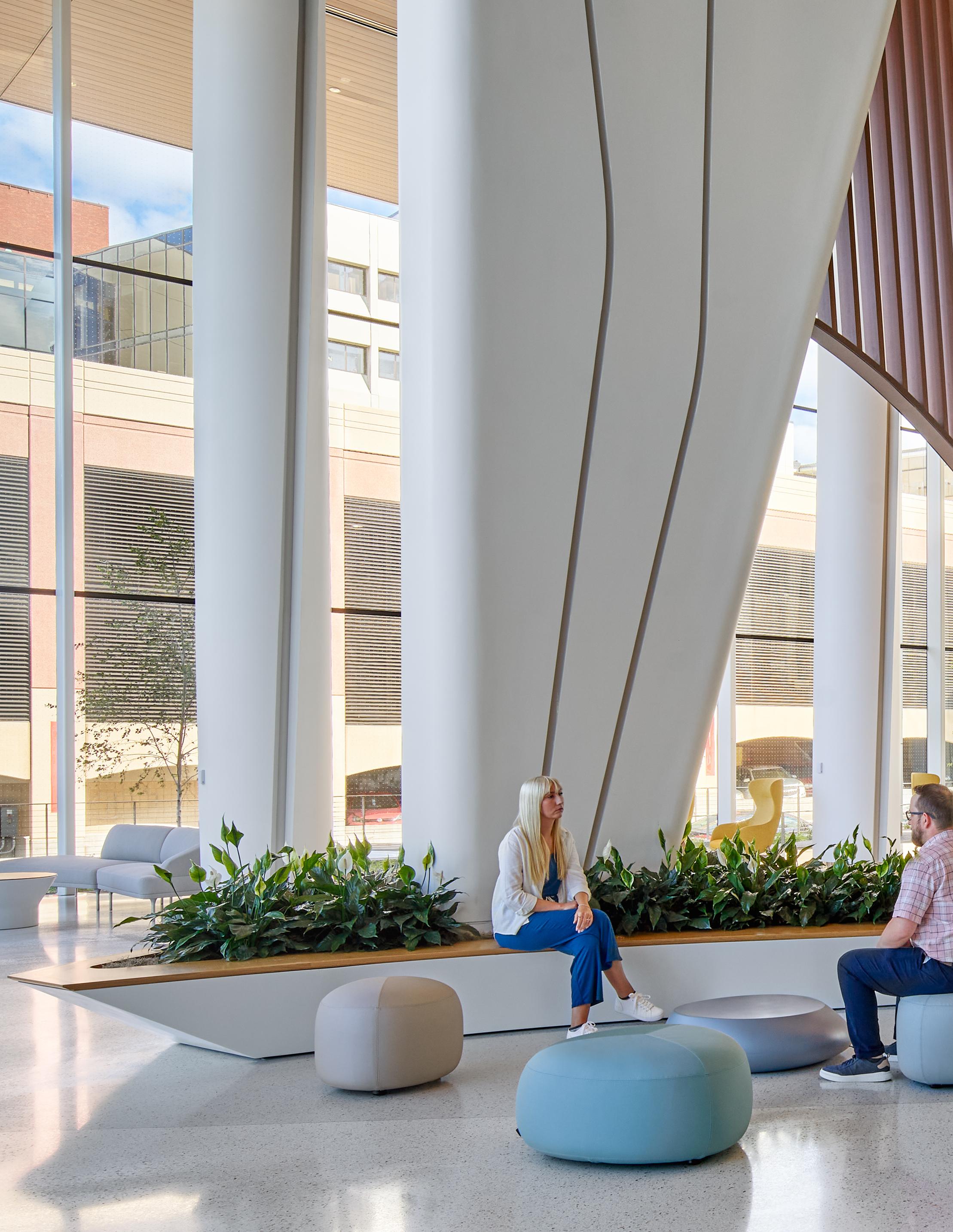
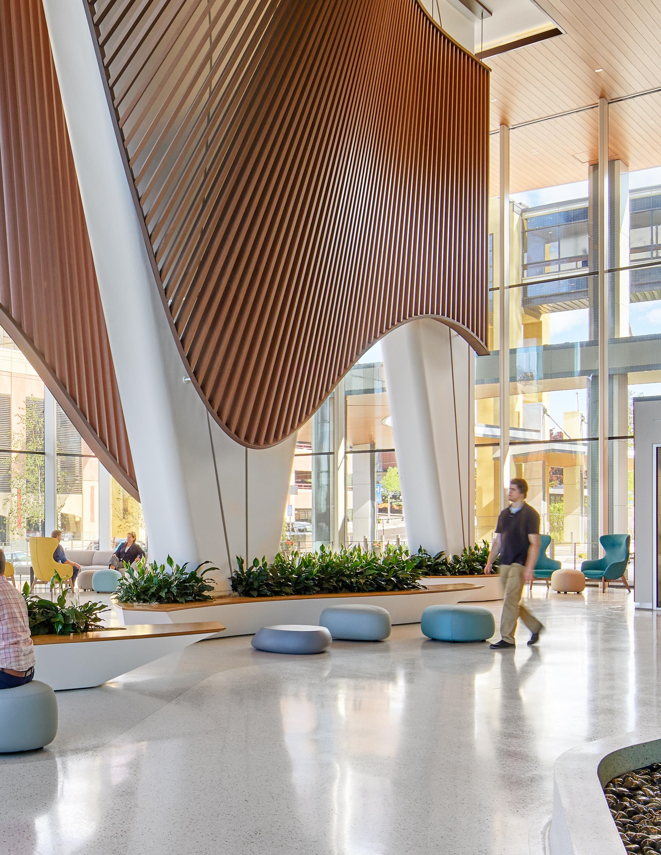
Throughout the sixth-floor concourse – the main thoroughfare through St. Mary’s – curvilinear wood-look trellises anchored by canoe-shaped planters and benches guide visitors from the main entrance lobby to amenities to the outpatient pavilion. These elements are inspired by the local Native American population and the iconographic shapes of traditional native lifestyles, such as housing structures and canoes.
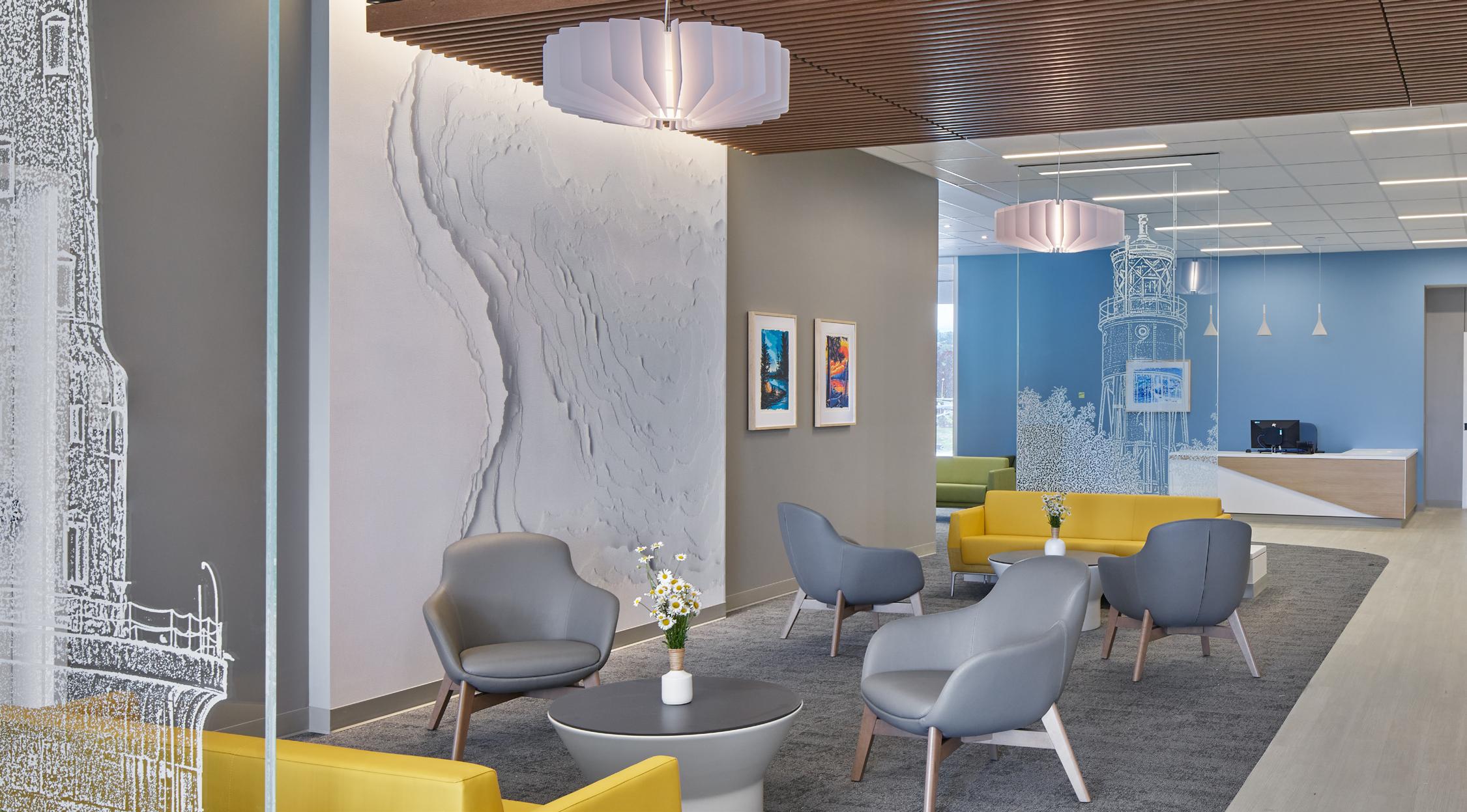
Immediately south of the sixth-floor main lobby, the main greeting desk, registration, cardiology entrance, and the café host several opportunities for graphic images and art. The wall opposite from registration hosts a community art gallery featuring pieces curated by Essentia staff from local artists. Behind the greeting desk, visitors find graphics of notable lighthouses perched upon the lake’s rocky shores.
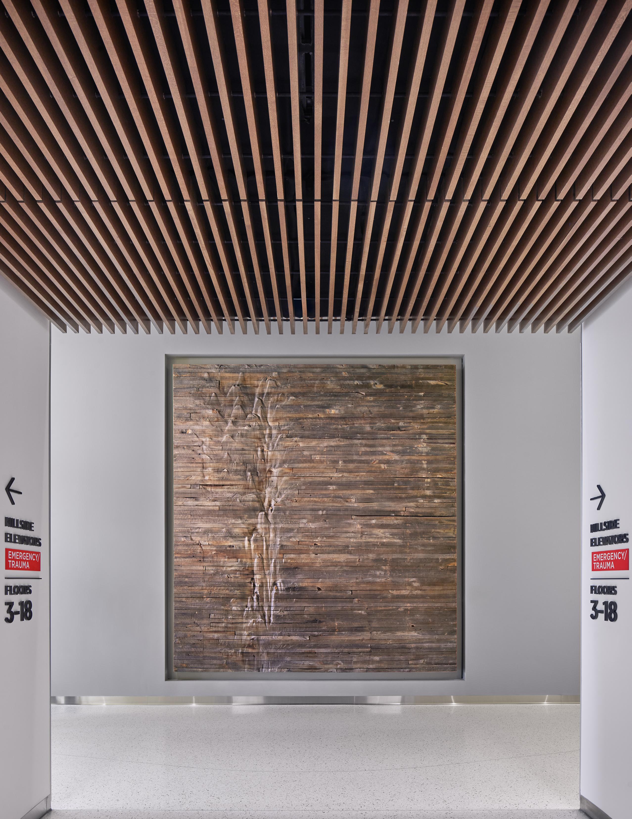
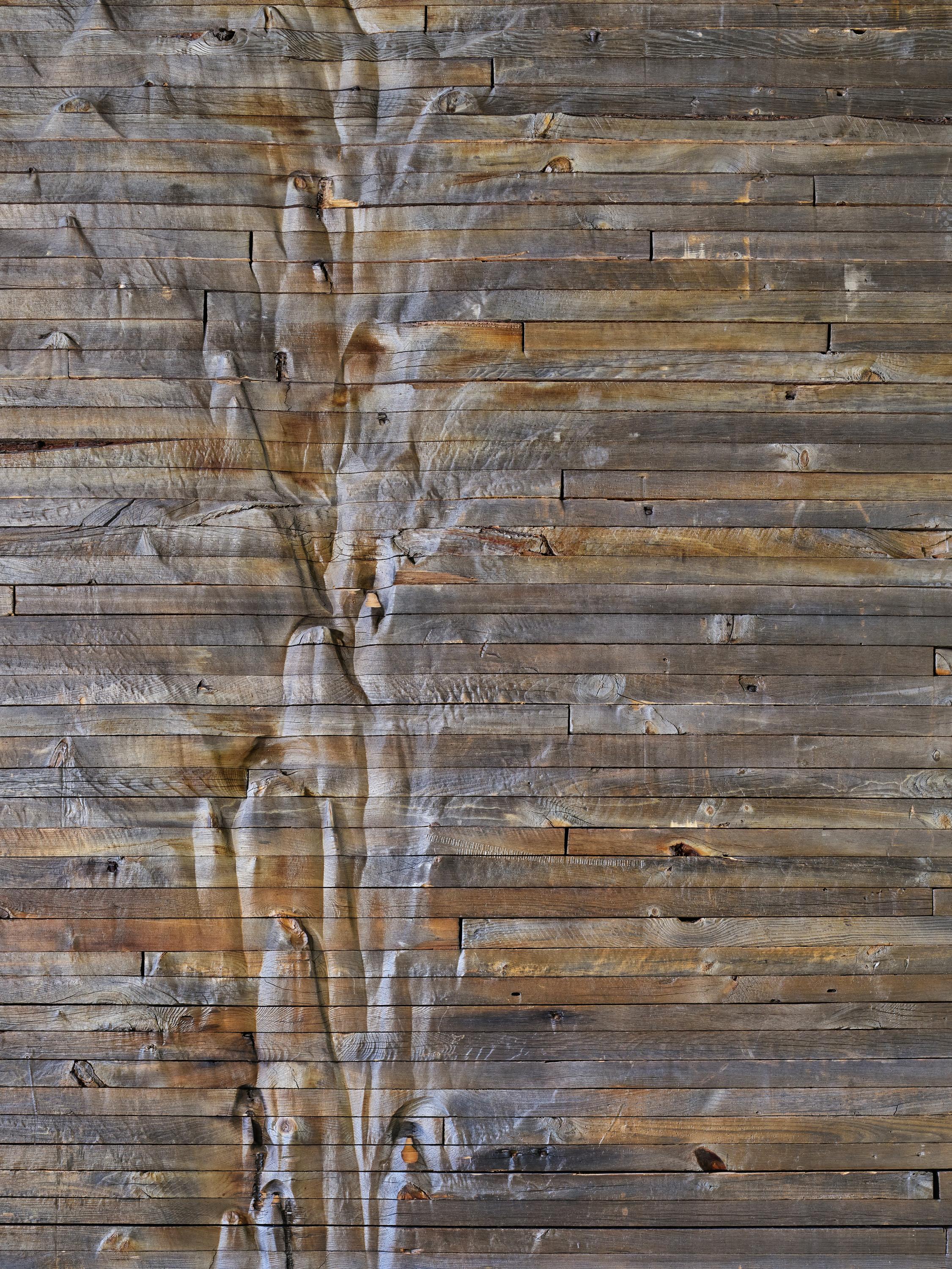
AS VISITORS ARRIVE AT THE INPATIENT ELEVATOR BAY, THEY ARE GREETED BY A PIECE MADE FROM THE RECLAIMED WOOD OF A LOCAL GRAIN SILO. ONCE IN A STATE OF DECAY, THE TARNISHED WOOD SHOWS ITS AGE WITH FLOWING MARKS OF EROSION, THE RESULT OF DECADES OF GRAIN SLOWLY DRAINING FROM THE SILO.
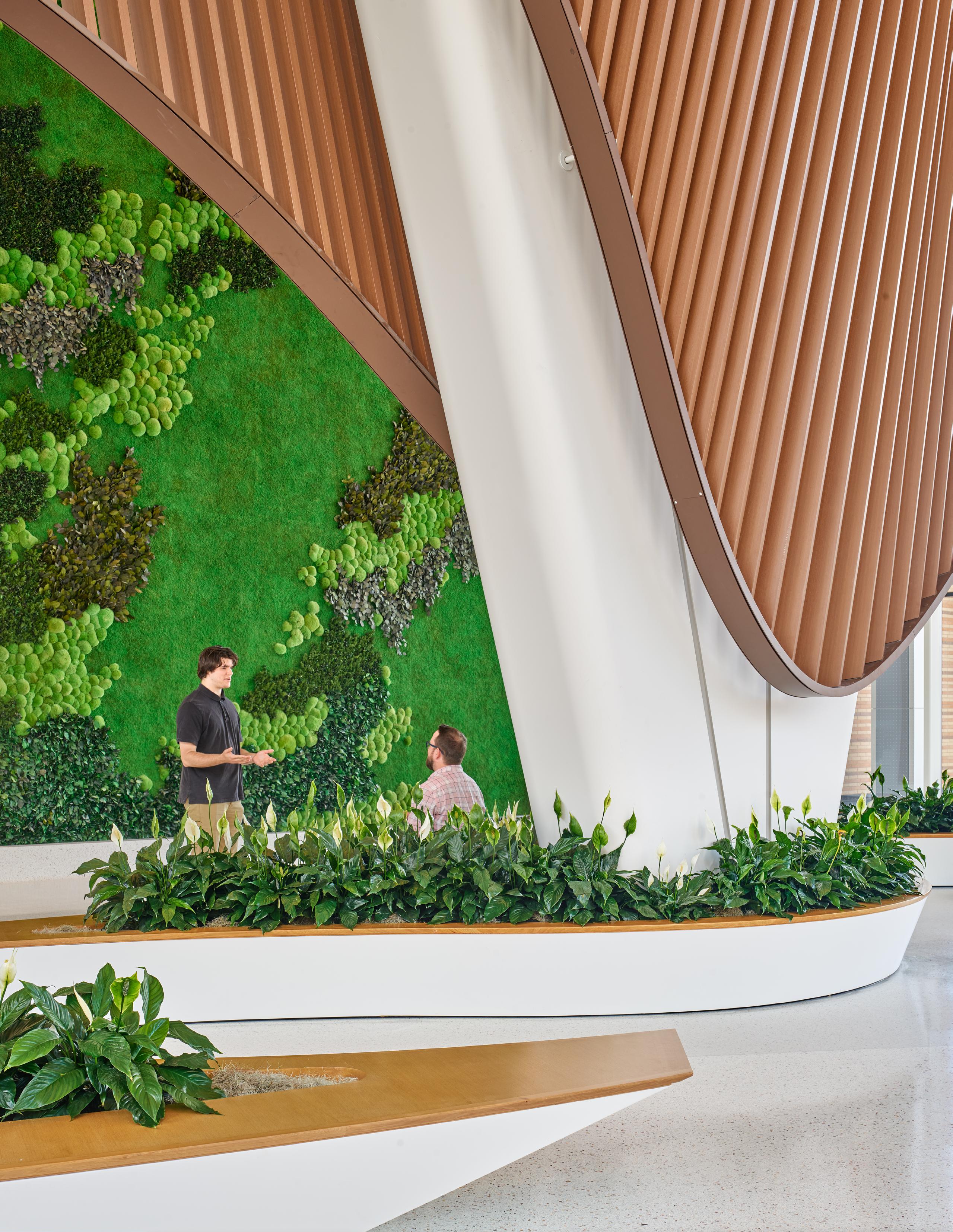
Maps of Duluth are used throughout the hospital as art pieces that create a sense of place for patients. In the sixthfloor lobby, a towering green wall soars above visitors as they pass through to the main lobby. At first glance, the wall appears as a patchwork of lowlying mosses and aquatic plants. Upon closer inspection, it reveals much more. Perhaps only recognizable to local mariners, the green wall is actually a map of Lake Superior and the islands that dot its surface around northern Minnesota.
In the lobby of each floor of the outpatient pavilion, large glass dividers feature cultural landmarks or a specific point on a map of the region. These locations serve as the focal point of the interior design concept and create small private spaces around registration desks and between seating areas. The inpatient surgical waiting area, for example, remains open while providing compartments and partial privacy through the introduction of glass partitions and planters. The different compartments can serve individuals or families waiting for their loved ones in surgery. Accent lights, wood soffits, and wall graphics further reinforce the hospitality atmosphere.
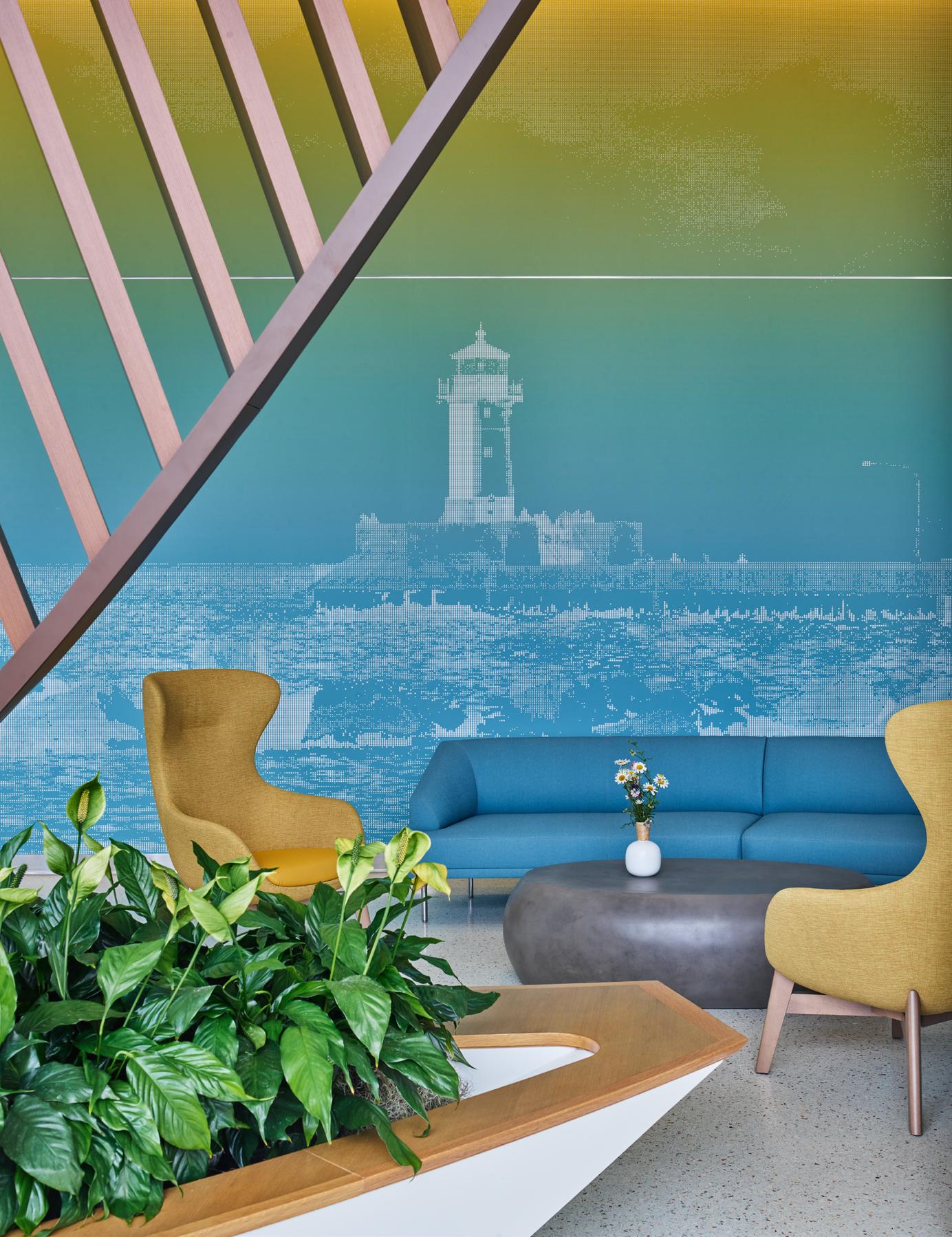
“Initially, these graphics involved a lot of research about the area. The client would inform us of locations to explore and what was geographically important to their values and identity,” said Interior Designer Amanda Kilpatrick. Once Essentia identified the landmarks they believed to be most significant to the project, Kilpatrick began combing through images and selecting the best ones based on multiple criteria.
“That was quite a meticulous process,” said Kilpatrick. “Once we found the best images, we turned them into beautiful graphic artwork. Essentia Health gave us a lot of freedom regarding the manipulation techniques we developed.”
One of the techniques used throughout the tower included vectorizing the original images in Illustrator through image trace. It calls out the most prominent 16 colors within an image. These colors were then used to create a palette that
permeates the graphics on each floor. While aesthetically pleasing and cohesive, this color coordination is largely used to help patients and staff identify specific departments or areas of the hospital.
“Throughout the tower floors, we created a color accent story for wayfinding,” Kilpatrick added. “Once the color palette story was developed, we created a graphics system where each floor would get its geographical landmark significant to the Duluth area.”
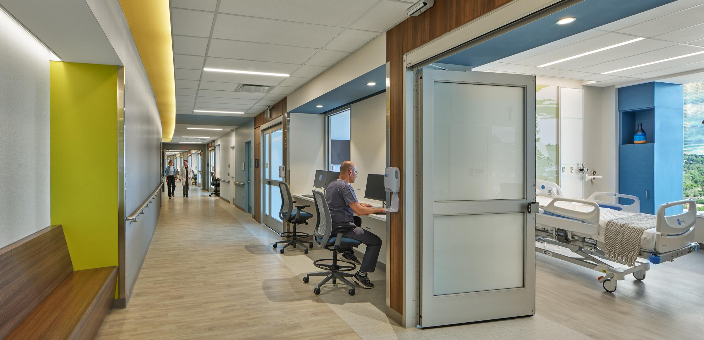
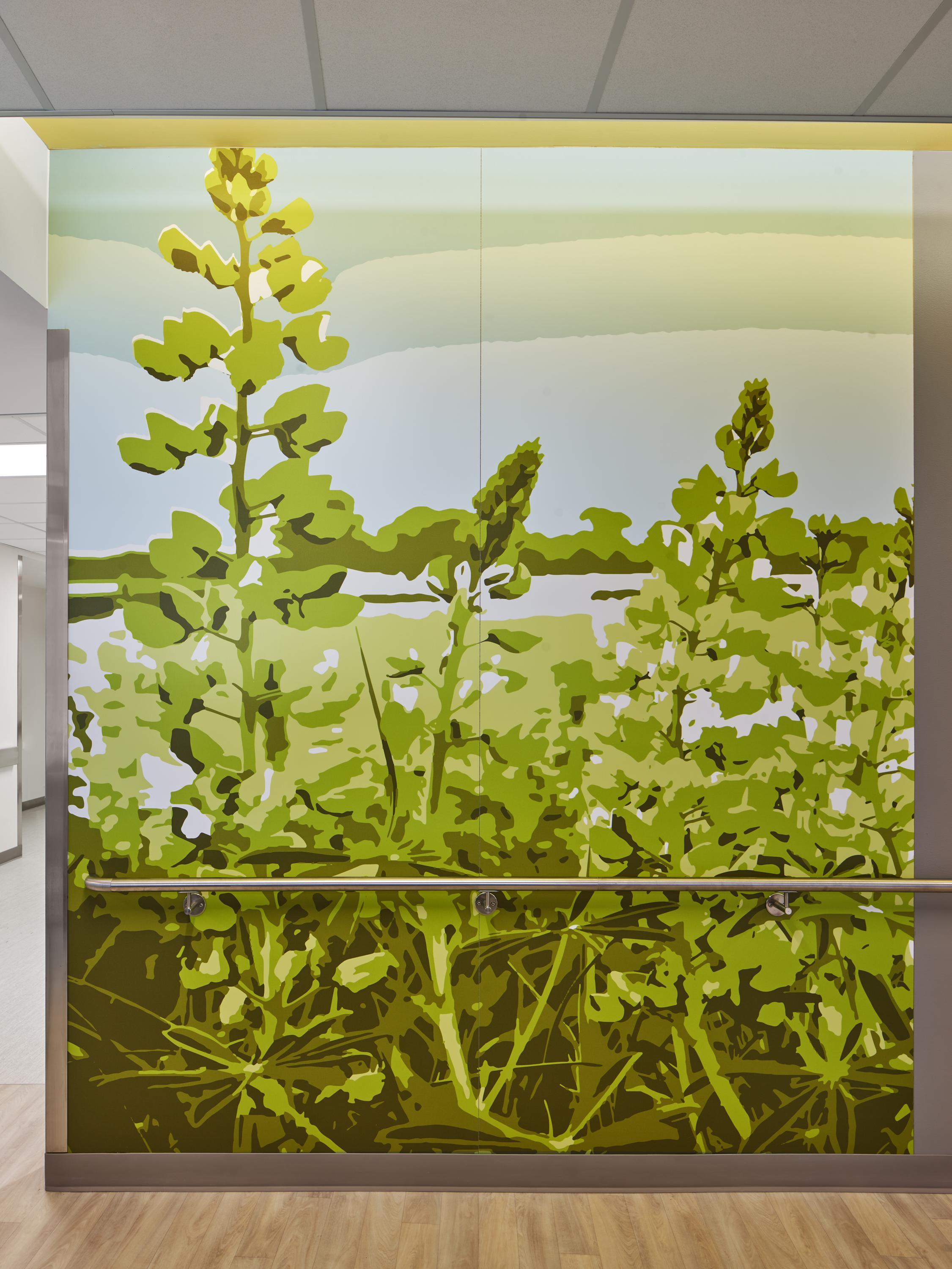
“THERE ARE DIFFERENT THEMES ON EACH FLOOR OF THE HOSPITAL, PROVIDING A UNIQUE EXPERIENCE NO MATTER WHAT LEVEL YOU’RE ON”
- Evan Rotenberger, Associate
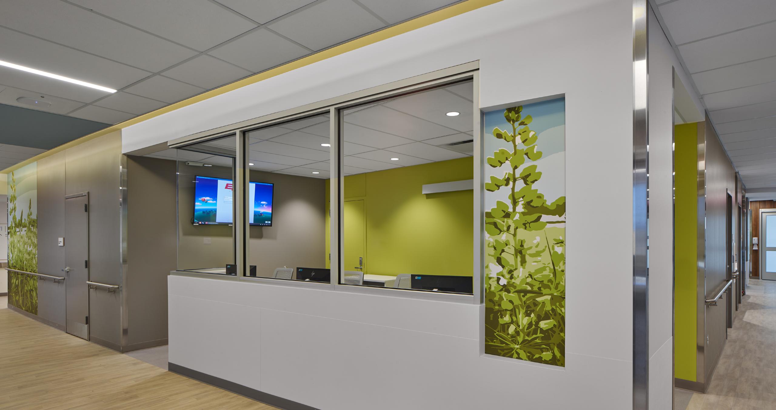
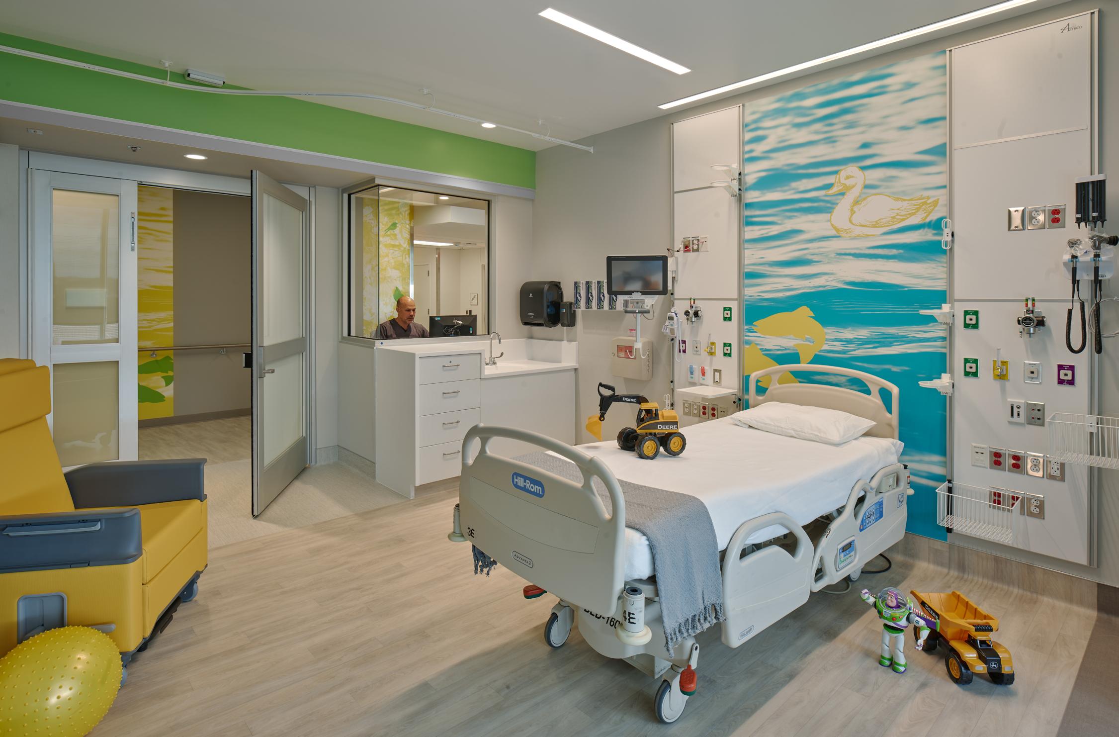
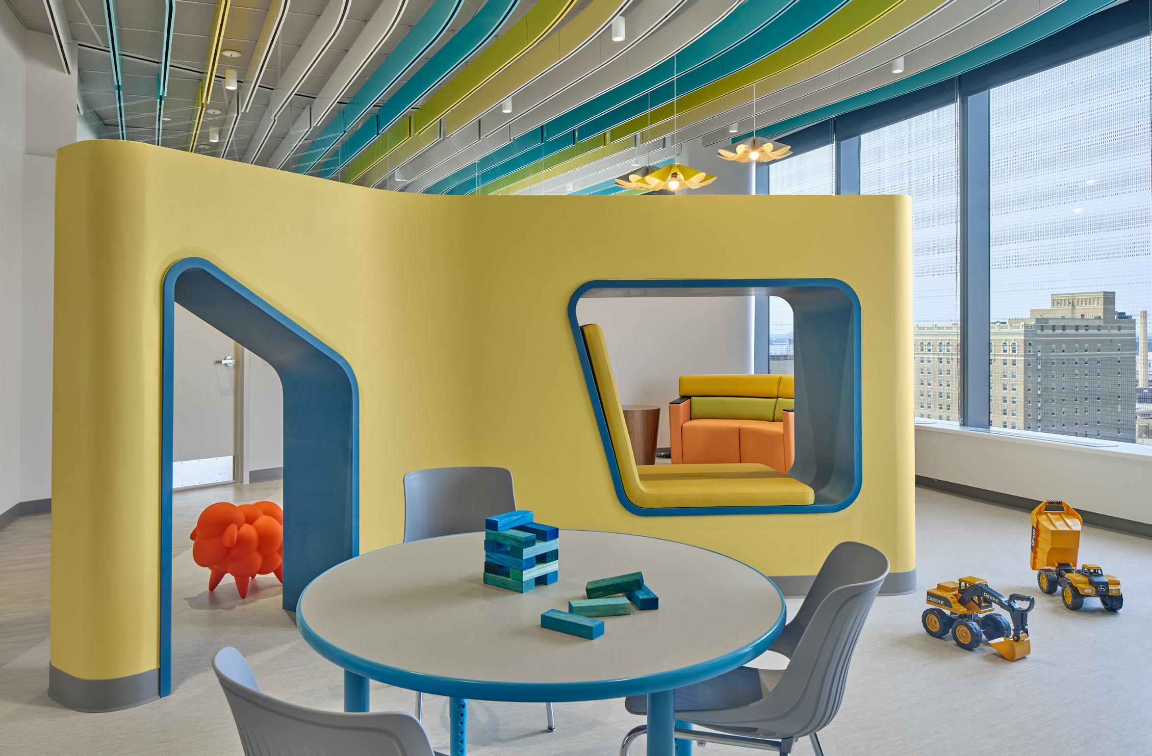
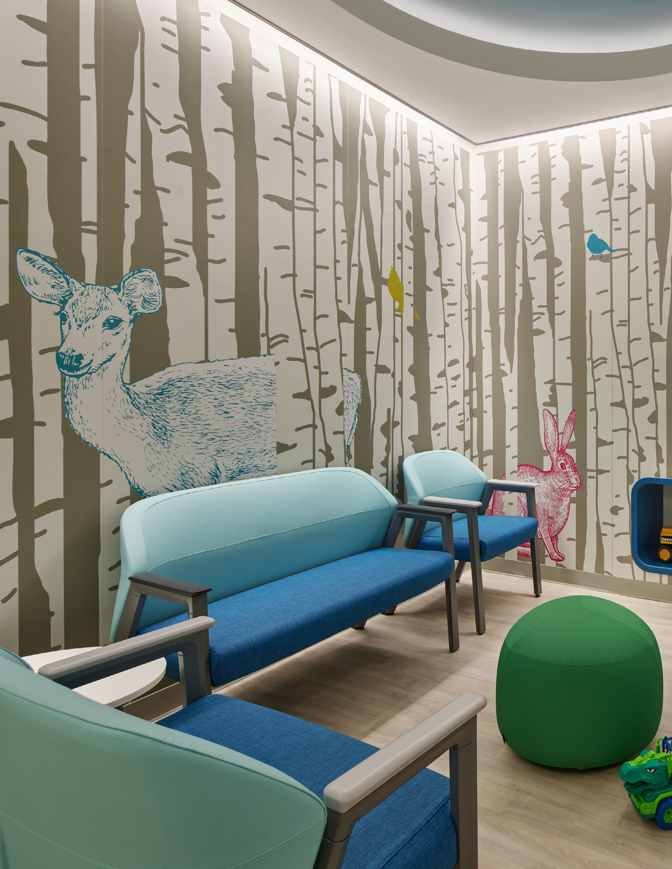
For the pediatrics floor, the graphics took their cues from the surrounding natural elements of the area, like water, birch, tree canopies, and wildlife. Many of the images seen throughout the hospital focus on the region's flora, so the design team wanted to incorporate something more lifelike for the neonatal and pediatric care floor. The primary goal was to use these graphics to differentiate the spaces based on age. This meant the pediatric lounge and waiting spaces, shared between younger and older children and teens, needed to accommodate both age groups.
“Making the graphics feel not childlike happened very naturally,” said Kilpatrick. “It was something I had always loved in nursery room design when there would be simple artwork of hand-drawn illustrations of animals. I thought they had a more mature presence because they were more artistic and visual than an animated cartoon.”
The design team wanted each space within the hospital to have meaning and a purpose. Each design element of the hospital’s interior is thoughtfully curated. Striking views on each floor of the hospital impact the atmosphere within. Colors, textures, and abstract
design elements provide a direct reference to the vibrant natural and man-made landscapes outside. The infusion of native plants, green spaces, and graphics celebrates the local landmarks and fosters the healing journey for patients and their families.
St. Mary's Medical Center is a testament to the power of design to shape environments that nurture and heal. It goes beyond being a hospital; it's an embodiment of warmth, art, and hospitality. With its thoughtful integration of natural elements, local culture, and innovative design, this institution redefines what it means to heal.
EC
“MAKING
THE GRAPHICS FEEL NOT CHILDLIKE HAPPENED VERY NATURALLY, IT WAS SOMETHING I HAD ALWAYS LOVED IN NURSERY ROOM DESIGN WHEN THERE WOULD BE SIMPLE ARTWORK OF HAND-DRAWN ILLUSTRATIONS OF ANIMALS. I THOUGHT THEY HAD A MORE MATURE PRESENCE BECAUSE THEY WERE MORE ARTISTIC AND VISUAL THAN AN ANIMATED CARTOON.”
- Amanda Kilpatrick, Interior Designer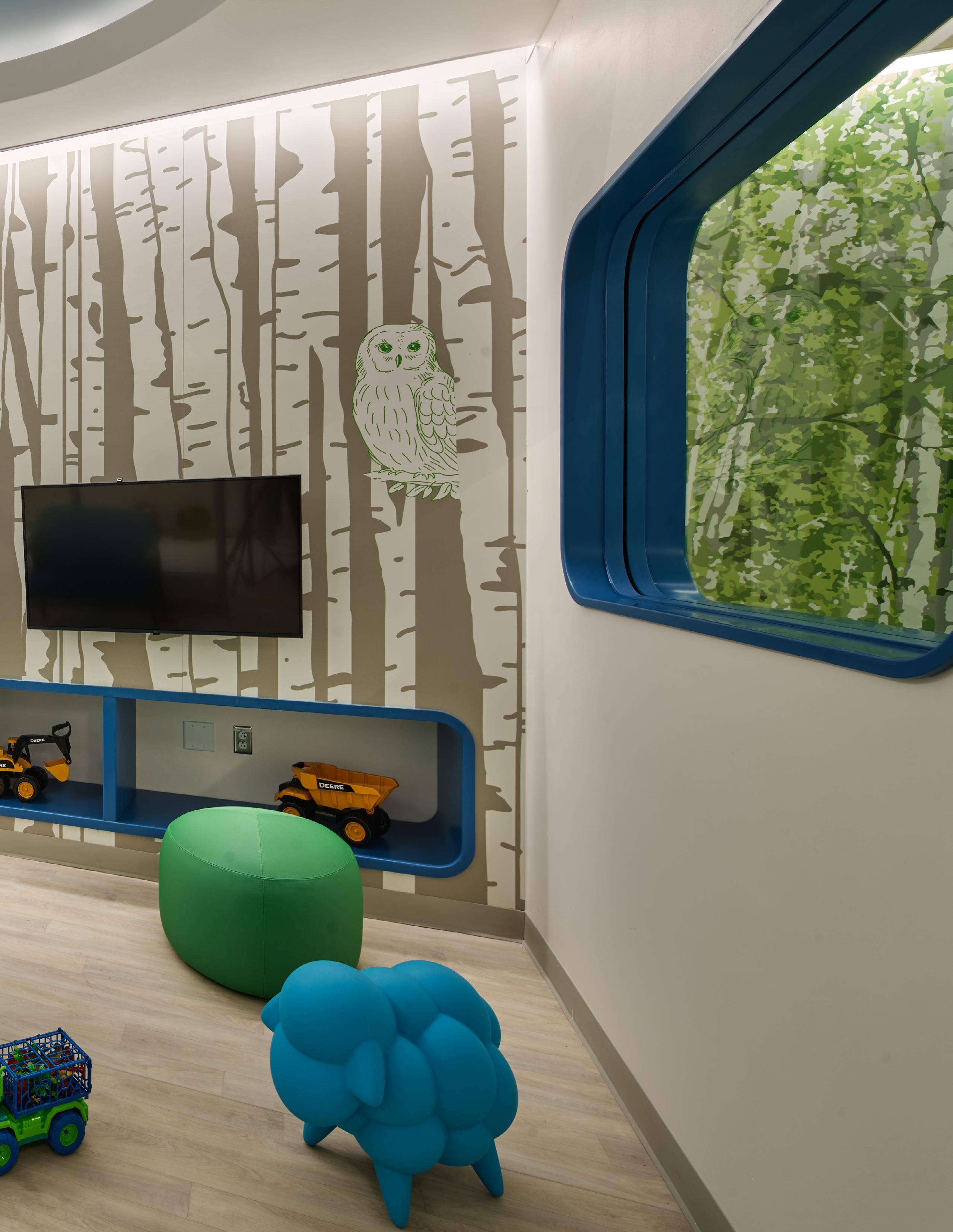
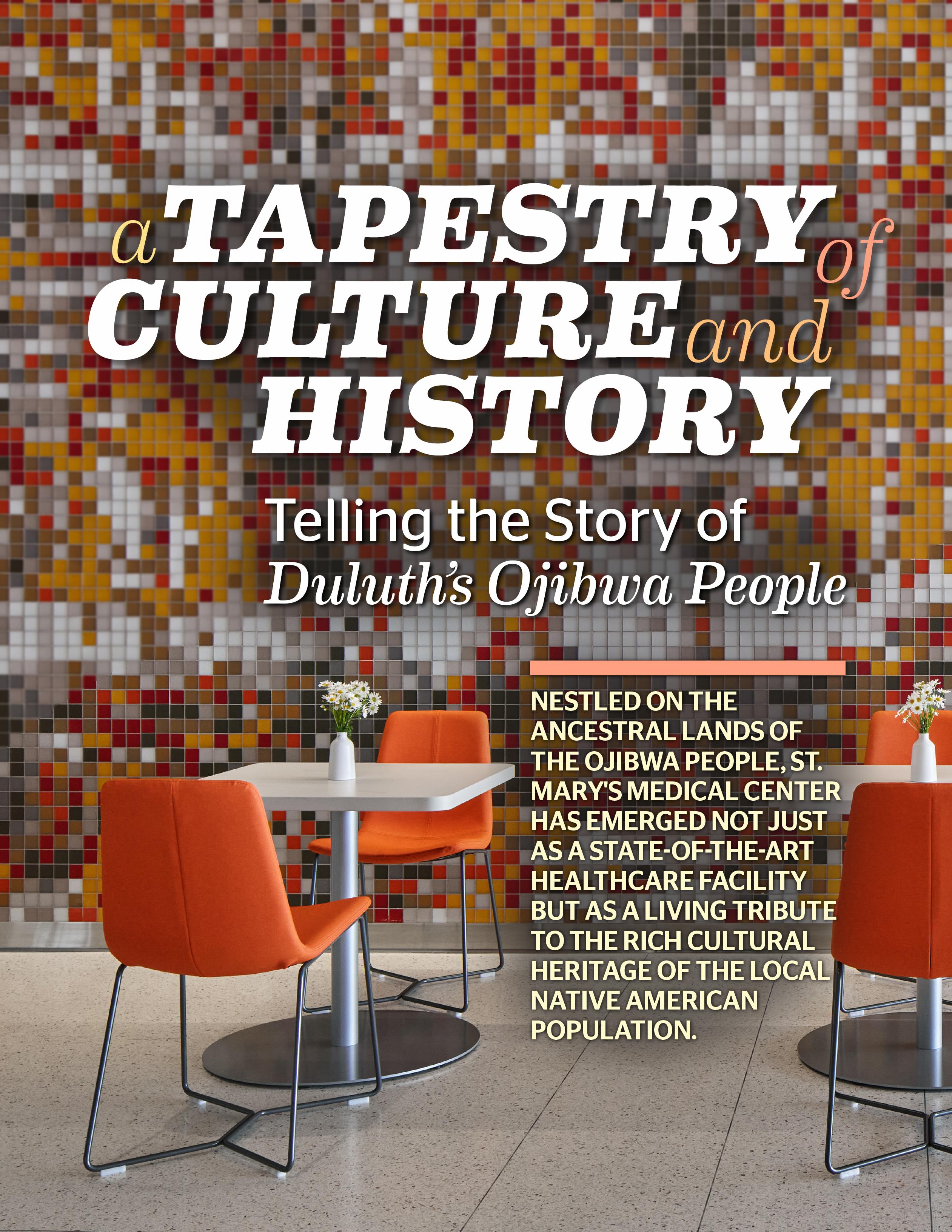
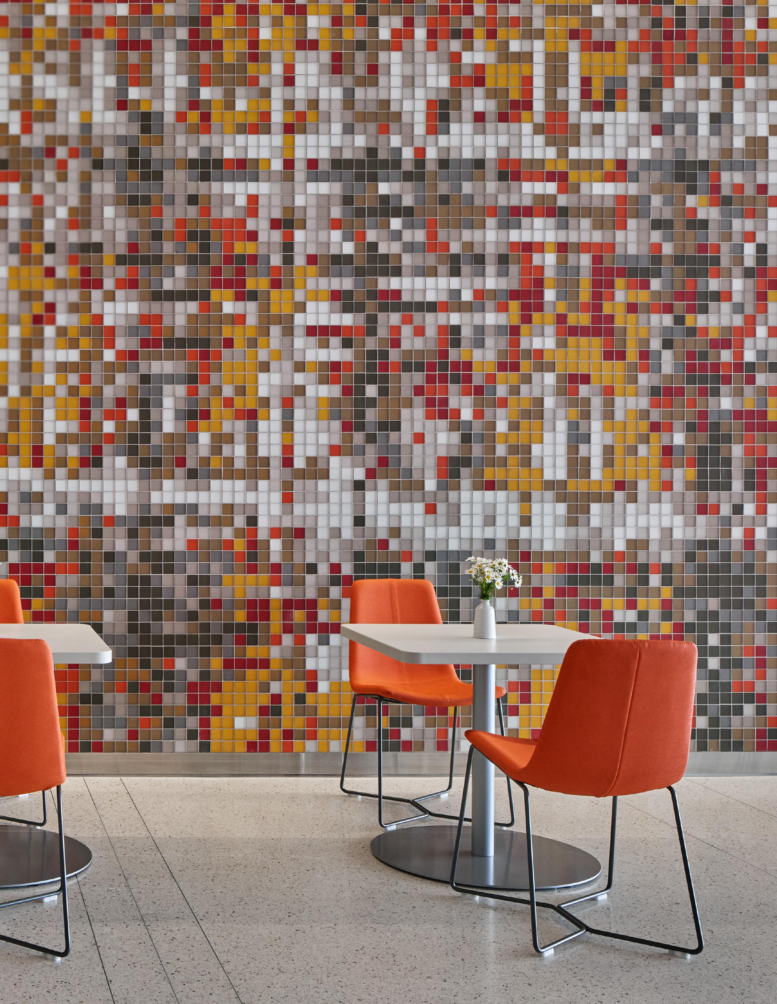
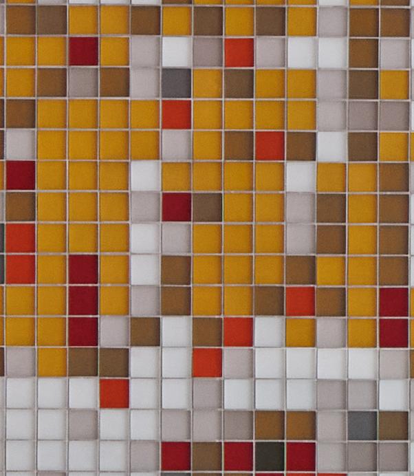
 This image of a woven piece of Ojbiwa fabric was digitally enlarged, pixelated, and translated to a colorful mosaic in adorning the dining Commons wall.
Stepping inside the doors of St. Mary's Medical Center isn't just entering a medical institution but embarking on a visual journey through history, art, and tradition.
The large-scale custom graphics, featured hanging art pieces, and intricate design elements seen throughout the hospital play the role of an extensive art program, telling a story that highlights the cultural landscapes of the city of Duluth and the wider Minnesota region.
Essentia Health leadership expressed their wishes to recognize and honor Native American culture within the new facility. Early in the design process, EwingCole’s Regional Director of Design, Saul Jabbawy, and Regional Director of Interior Design, Jill Wheeler, AIA, NCIDQ, LEED AP, accompanied Essentia administrators to the American Indian Community Housing Organization (AICHO) to view an art exhibit featuring the curated work of local Native Americans. Most notable from the exhibit was the work of Rabbett Strickland and Pat Kruse.
“The entire team was mesmerized by the Rabbett Strickland pieces that feature characters and tell stories from Ojibwe mythology with luminosity and clarity,” said Wheeler. “A large panel of his is now located at the entrance to the elevator lobby in the cafeteria.”
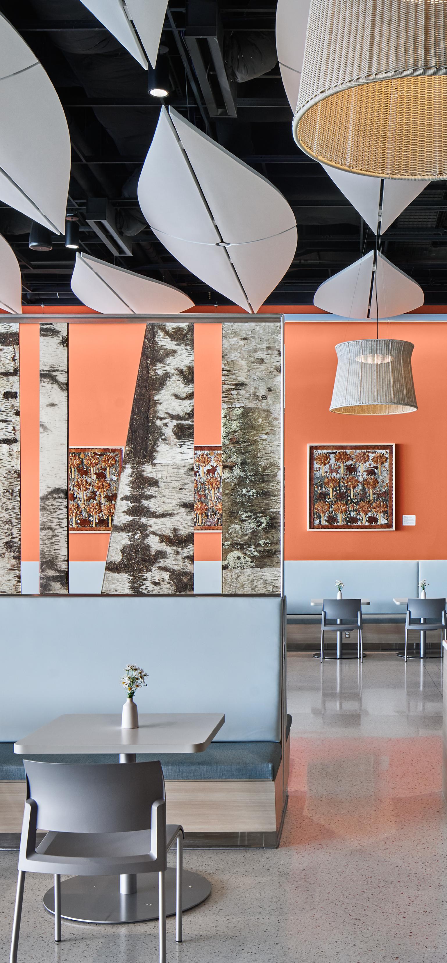
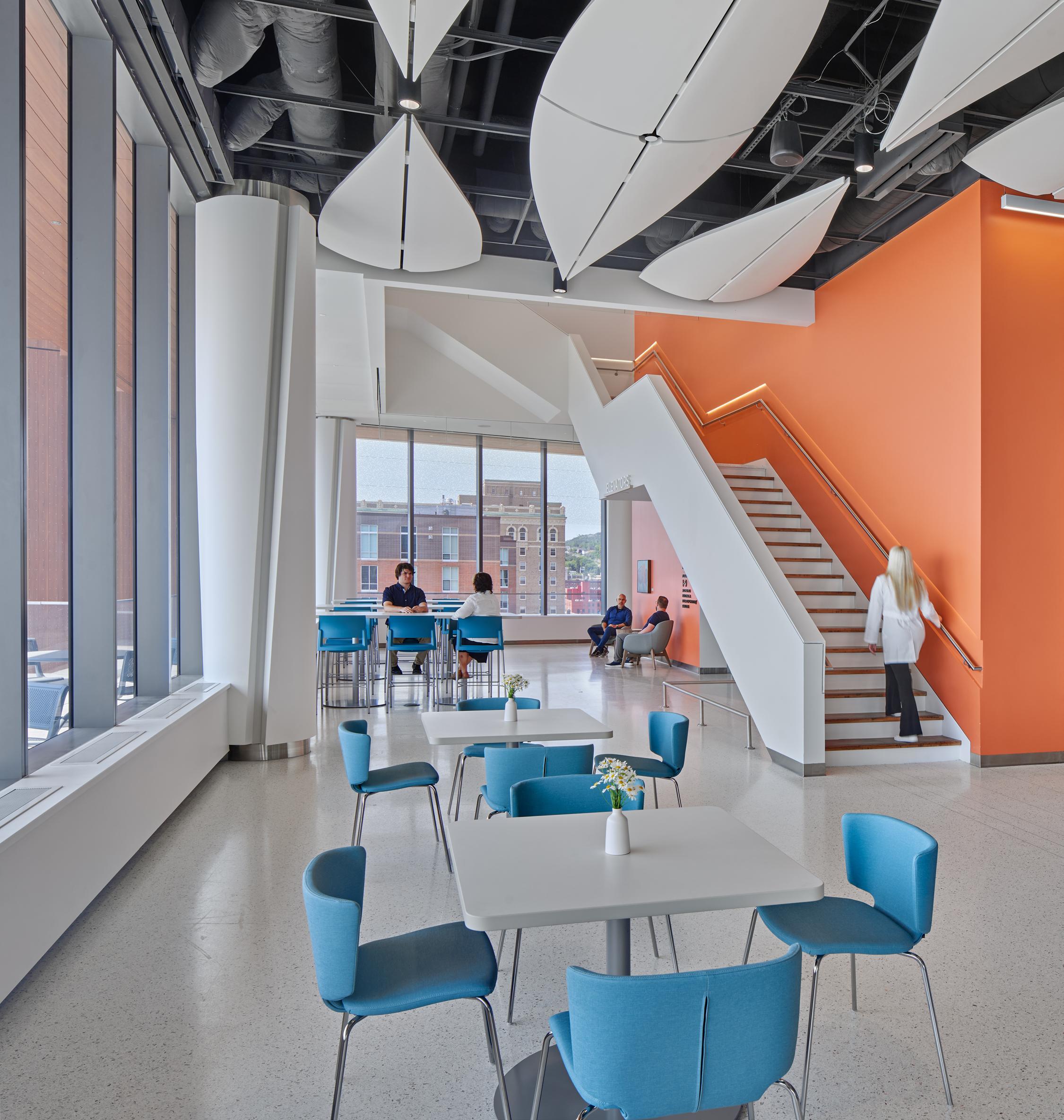
The native cultural narrative is most evident within the hospital's dining commons, a space that exceeds mere functionality and transforms into a gallery of the Ojibwa's enduring legacy. This is done by both photographic and abstract visual art and design.
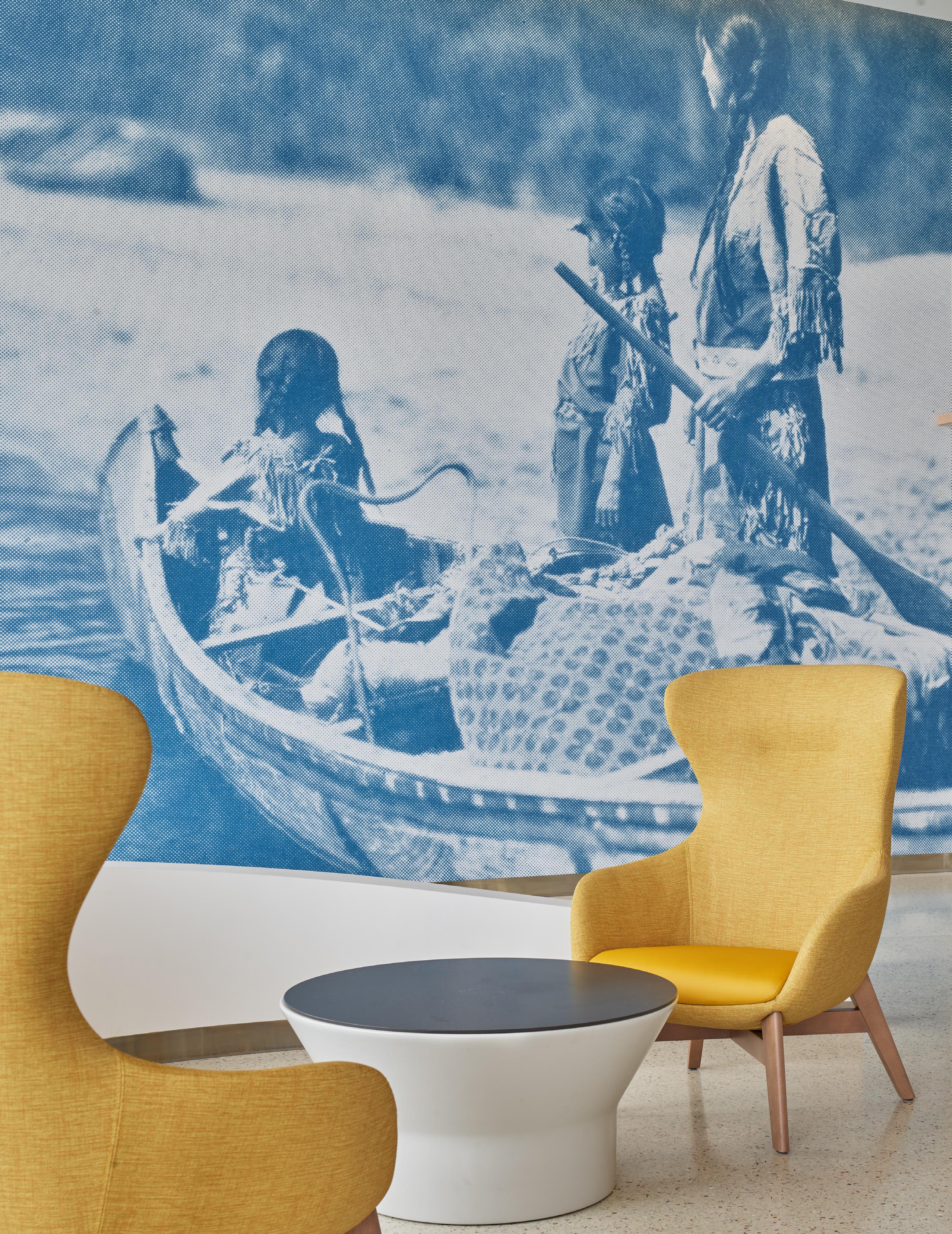
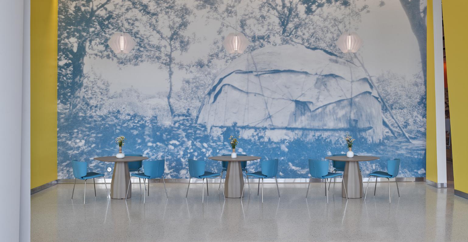
Central to this narrative are two historical images that greet visitors at the cafeteria entrance lounge areas, depicting various aspects of Native American life. These captivating visuals tell the story of the community in vivid detail. One photograph, titled "Blueberry Time" by Roland Reed, captures a
mother and her daughters in a canoe, embodying the strong familial bonds that have characterized the community. Another image portrays a wigwam – a traditional Ojibwa shelter - nestled in the embrace of the Mille Lacs Lake forest, underscoring the Ojibwa's deep-rooted connection to the natural world.
“The imagery was selected from the Minnesota Historical Society archives that presented Ojibwe culture, its focus on the family unit, and its craft,” said Wheeler. “These photos are significant to the community, so it was paramount that we featured them in a remarkable way.”
The hospital's reverence for Native American culture is evident throughout, woven into the very fabric of its design. The artifacts adorning the space serve as tangible connections to the Ojibwa's intimate relationship with nature. From meticulously crafted tepees fashioned from bent branches and birch bark to delicate woven cedar bark fabric, the physical manifestations of the community's connection to the land are proudly displayed through both abstract and literal design elements.
Another standout artist, Pat Kruse, has his birchbark creations on display in the hospital's main dining space. The design team references these birch bark pieces through several design elements. His artistry echoes the traditions of his ancestors, infusing the hospital's atmosphere with a connection to the Ojibwa's artisanal legacy.
Along with local art, the team was provided with several reference photos from which to draw
The array of reds, burnt orange, and yellow stitched fabrics was then recreated with matching tiles, which now encompass the wall stretching from the server to the corridor along the west link.
Snowshoes and canoes, symbols of the Ojibwa people’s survival skills and exploration, inspired the shape of the suspended sculptural ceiling elements in the dining hall that mimic the gentle contours of these watercraft.
“ THESE PHOTOS ARE SIGNIFICANT TO THE COMMUNITY, SO IT WAS PARAMOUNT THAT WE FEATURED THEM IN A REMARKABLE WAY.”
- Jill Wheeler, Regional Director of Interior Design
inspiration. For example, an image of an Ojibwa textile served as the catalyst for the mosaic wall in the dining hall. The textile image was digitally expanded and pixelized.
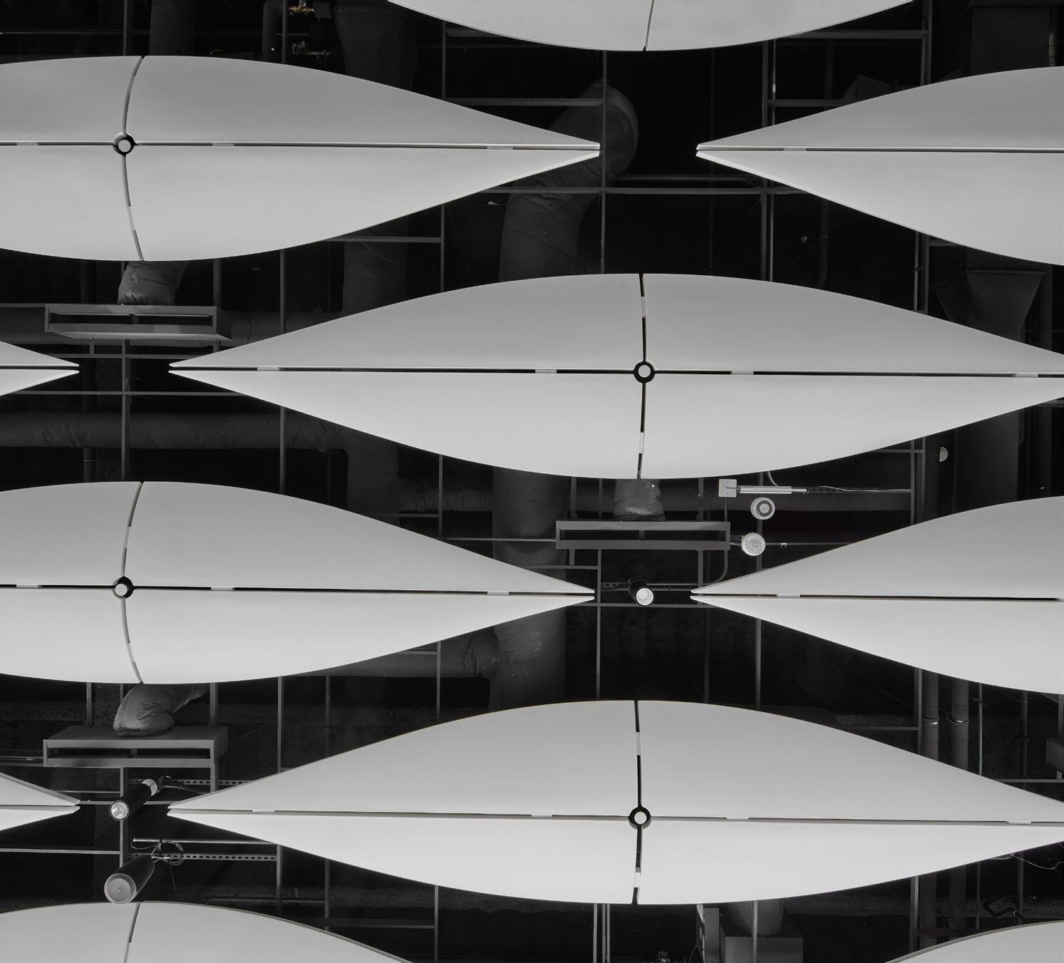
Their collective presence creates a harmonious visual echo of Lake Superior's waves, fostering a sense of connection to the environment beyond the hospital's walls.

St. Mary's new hospital in Duluth stands not just as a center of healing, but as a beacon of cultural homage. With every corner thoughtfully designed, carefully selected piece of art, and delicately woven narrative, the hospital becomes a living testament to the enduring spirit of the Ojibwa people. As visitors step into this space, they're not only embarking on a journey to better health but also immersing themselves in the rich tapestry of a heritage that continues to thrive and inspire. EC
“THE TEAM APPROACHED THIS PROJECT FROM A HOLISTIC PERSPECTIVE, CONSIDERING THE DIVERSE NEEDS OF THE PATIENT POPULATION, ESSENTIA’S HEALTH’S PROVIDERS, AND THE BROADER COMMUNITY.”
- Robert A. McConnell, President, EwingCole
“... A HOSPITAL THAT MEETS THE HIGHEST STANDARDS OF FUNCTIONALITY, EFFICIENCY, AND DESIGN. ST. MARY’S IS A TESTAMENT TO OUR COMMITMENT TO FOSTERING A POSITIVE, COLLABORATIVE, AND INNOVATIVE FIRM CULTURE.”
- Robert A. McConnell, President, EwingCole
