Architecture Portfolio
| Faezeh Sadeghi
2023
Teamwork | Academic Work | Master Studio | Patterns of Interaction, Generative Design, Computational Architecture |

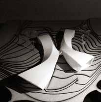


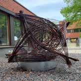
WOOD BUILDING
Individual | Academic Work | Master Studio | Wood Tall Building |


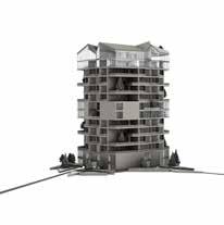

HINGE WALL
Team Work | Digital Fabrication Workshop | Wooden Wall |
BÉZIER SATAIR

Teamwork | Robotic Workshop |Stair|
FARMANIEH RESIDENTIAL
Professional Work / SETUParchitecture Studio | Residential Building |

DONESTUDIO RENOVATION
Professional Work / DoneStudio | Office Building Renovation |
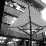
MATERIAL INFORMED SYSTEM
Individual | Academic Work |M.Sc. Thesis | Material System development, Generative design, Computational Architecture, & Speculative design |

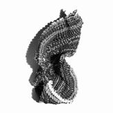
SEA-VSISION COMPLEX 2 3 4 5 6 7 8
2009 2009 2009 2009 2 0 1 0 1102 2102 3102 4102 4102 4102 2021 6102 2019 2019 02 1 5 2202 4102 2017 2018 2019 2 0 2 0 2 017
PROJECTS CONTACT
2014-2022
THE FLOW
Individual Academic Work |B.Arc. Graduation Project | Recreational Complex, Computational Design | 11 5 9 11 13 17 19 21
The Flow
Fall 2019
Team Work / Academic Work Master Studio
Instructors:
Toni Kotnik, Pia Fricker
Luka Piškorec, Kane Borg
CONTRIBUTION TO THE PROJECT MY ROLE
Idea Development

Modeling + Simulation
Modeling + Scripting
Rendering
Post Production + Visualisation
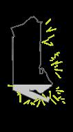
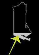
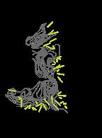
Shock Waves and Turbulence

Analysis of wind, water, and sound flow disturbances in the vector field environment influenced research further on different behavior patterns.
Team:
Faezeh Sadeghi
Egle Pilipaviciute
Amir H.Teymourtash
Diagram Design

Animation Development

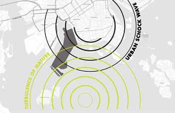
Design is provoking to think about the changing, evolving landscapes when nature and urban life are working together as a system providing constant new solutions and visual changes like the growth, and reformation of the wetlands. The designer is creating guidelines, while natural predicted and unpredicted processes continue to design the human surrounding. Water and air relation of the surface creates larger and smaller turbulences where the flow structure of those consists of high and low speed regions, which form and reform into different combinations (Banerjee, 2019). Many turbulent occurrences are visible in nature which affect urban environments
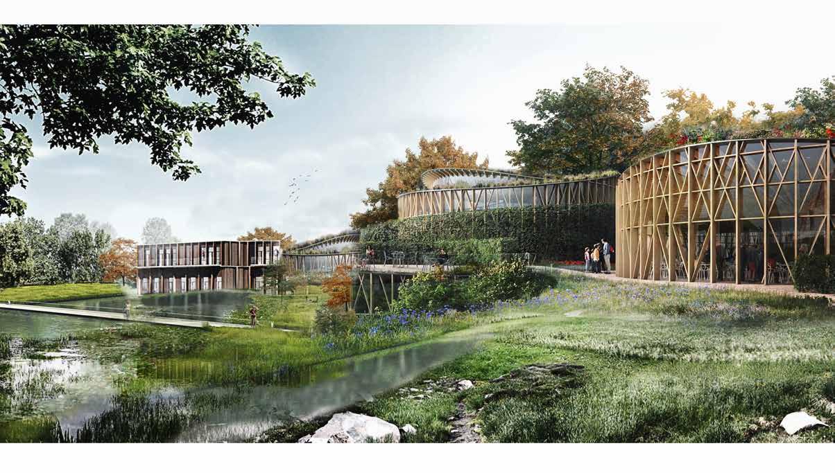
Combination of Different Turbulence Pattern
In order to understand how identified patterns are influencing each other and create turbulences of their own, we used a vector field that changes direction based on given forces. The final result is not static, but rather a dynamic system that constantly alters based on new triggers.


The pattern also visually represents two different environments of distortion: the natural (more shifts and curves) and the urban (more linear and rigid). We challenge this division and later experiment with how both can work together creating more diverse environments where natural and urban elements are part of the system and influence each other’s behavior: form, movement, flow, and collection.

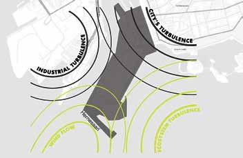
1 ARTICULATION OF TURBULENCES THROUGH PATTERNSvector field NATURE URBAN WIND FLOW ECOSYSTEM`S THROUGH CITY`S INDUSTRIAL NATURE ECOSYSTEM (from isting topography) WIND LO URBAN CITY INDUST RY
The System of The Design

Urban life is another reason of turbulence with political, economic, social fluctuations that influence the development and it`s parameters. Decisions that are aiming to improve the life of the humanity create collisions between sectors. In addition, street life, transport movement creates waves that transfer and distribute between obstacles and influence further environments and their atmospheres. Furthermore, the intangible relations of mixing cultures, characters, communal or individualistic goals creates the turbulent drive to shift and change the surroundings. All these urban life elements are shock waves constantly affecting city`s structure.
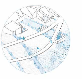
Project analyses how different flow patterns and parameters can influence density, topography and landscape design solutions while creating unique places that relate to existing and newly set boundary conditions. The rain flow and snow clustering analysis gives an inspiration for design solutions which enhance the attraction of a public space, promote the integration of ecosystem services on a wider scope while also influencing landscape formation. The aim of the design is to create ecosystems that can sustain themselves and thrive in the urban setting while providing water filtration and natural sedimentation. Design is provoking to think about the changing, evolving landscapes when nature and urban life is working together as a system providing constant new solutions and visual changes like the growth, reformation of the wetlands. Designer is creating guidelines, while natural predicted and unpredicted processes continue to design the human surrounding.
2
Pattern Transformation

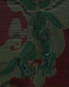
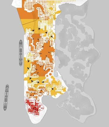
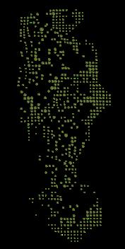
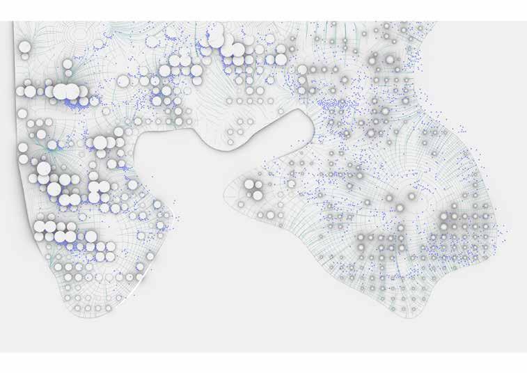
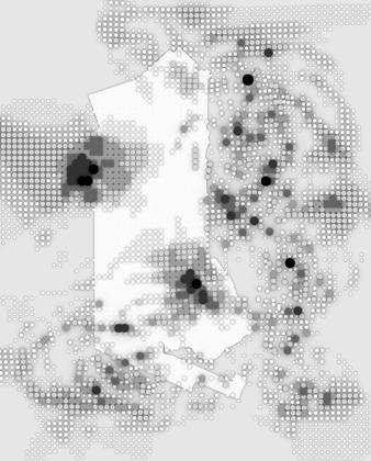
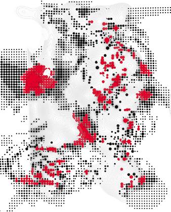
Using the heatmap of curvature and density analysis we transformed the results into two main elements: built environment and topography. The topography created from the curvature relaxes built structures (dot pattern) by the z (height) value. The higher elevation - the more relaxation on the “built”.
GENERATIVE PATHS FROM OPEN SPACE

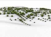
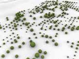


Agents on a surface were used to analyze a topography and find potential corridors of movement, and also areas of inaccessibility. A 1:20 rule was taken into account to make paths that are comfortable for people in wheelchairs, older people, and everyone else. Based on this regulation, a script was created that would send a swarm of agents–old ladies and people in wheelchairs–across a landscape, and from this analysis, a designer could then perhaps better understand potential access and barrier points. Loop after 140 rounds. Final generation.
MIXING STRATEGY FOR FUNCTIONAL DISTRIBUTION
OUTER BOUNDARY CONDITIONS


MIXING STRATEGY FOR FUNCTIONAL DISTRIBUTION INSIDE BOUNDARY CONDITIONS

DENSITY (ALIGNMENT DENSITY PATTERN ANALYSIS CURVATURE PATTERN ANALYSIS
CUR VA TURE
TOPOGRAPHY BUILT ENVIRONMENT
PATH S
BUILT DENSITY TRANSFORMATION GREENERY CLUSTERS IN WETLANDS
DENSITY TRANSFORMATION WETLANDS OUTER 3
RAIN FLOW AND SNOW CLUSTERING ANALYSIS


4
BUILT ANALYSIS: overlaps and clusters BUILT ANALYSIS: heights
HEIGHTS OVERLAP CLUSTER SNOW COLLECTION RAIN WATER COLLECTION
WOOD BUILDING
Spring 2020
Individual Work/ Academic Work Master Studio
Scripting + Solar Analysis (Ladybug Plugin)
Rendering
Instructors:
Willem van Bolderen, Pekka Heikkinen, Pekka Pakkanen
Technical Drawings
Post Production + Visualisation
Diagram Design
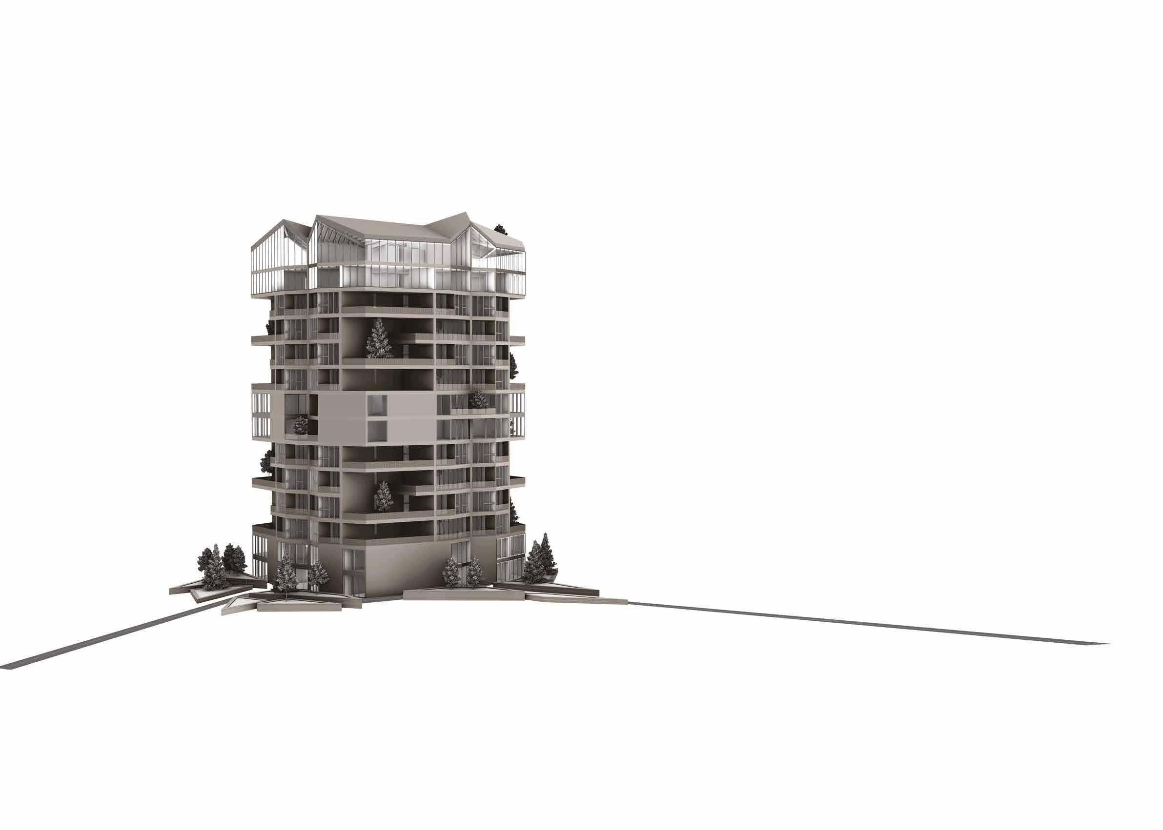
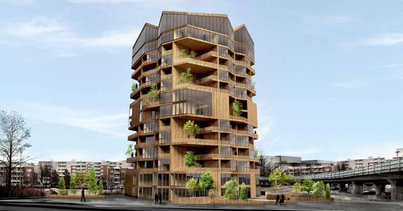
In my opinion people in the future would need to have more communication with each other, spaces for gathering, and connect to nature to make a balance in their hectic lifes. By growing population and developing urbanization, they will have to live more in apartments than before. So it was important for me to give as much as possible the same connection to the outdoors and nature to them. As a result, terraces, views, receiving sunlight was the most important parameters for me. These parameters led to generating my concept:
Creating in-between spaces with a sustainable connection to nature that works as a bridge between inside and outside.
Formation
Merging light, nature, views, and vegetation in a wood platform was the goal on the one hand, and on the other hand, the wooden structural system was a fundamental issue. I considered the prefabricated structural elements as the main elements of developing and generating spaces’ in-demand qualities. That is why I designed structural and architectural wooden frames to create not only the desirable perspectives in-between of wooden walls but also the light tunnels.
As my design concept was having a dynamic interaction with the outside during the whole building, the variety of scales and functions became more important to me. This dynamization also followed inside by attracting people from outside, bringing them in, and distributing on different levels. Accordingly, my design started with analyzing sunlight, users, and functions and the concept shaped the whole design.
Formation
Corners’ Void | Vertical Gardens| with Double Side View

The concept led to designing that structural system in order to:
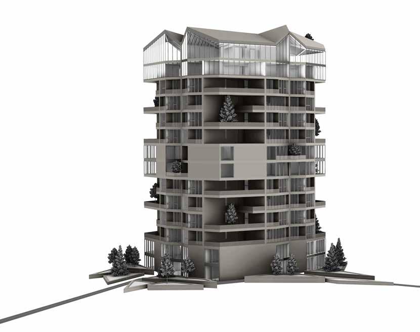
i. Having More free corners to make the special in-between terraces.
--> Vertical Gardens
ii. Making special wooden corridors to make perspectives to various view
--> Light Corridors
Light Corridors generated between the structural walls, work as in-between spaces

To bring Sunlight inside the building &
To make the various perspectives to the


Structural LoadBearing Walls and coulms > >
Corners’ Void works as the Vertical Gardens, semi-public outdoor places for gathering, gardening, etc.
Terraces with Double Side View (>270 degrees)
5
In Order To Maximum Benefit of Sunlight and Outside View
Coridors In Order To Bring Sunlight Inside the building and
Rotation
Light
How concept Formed the Topology of Building
Residential Built Area > Removing the corners, located in between modules, in order to have maximized view for each module, in residential floors. > >
Modeling
“LOAD BEARING ELEMENTS” plan


Structural system : Distributing structural elements vertically and horizontally from the core of building into the sides
“ROOF” plan
Roof Structural system: Shape and Slopes designed based on / Minimizing shadow of surfaces on each other to maximazing solar areas
/ More Perpendecular Angle with the direction of Sunligh
Customizing experiences in living spaces and characterizing flats based on users’ needs led me to design variations of flats in scales and openings.

Raw Matrial
/Core: unsheathed CLT walls
(Chosen For fire safety requirements)
Roof Area
Roof Garden Area
Optimized Solar Area
Recycling Building Parts
Suana’s outdoor Deck
Bioenergy
View To the East | Mustavuori Nature Preserve and Sea | Surfaces with More Sunlight | Less Shadow
Secondary Beams
/Primary Structural walls
/The 4 glued laminated timber columns
Primary Beams
/Scondary Structural walls:
Load Baring Elements of the Last Floor
Plans Layout | Residential Floors 3rd,5th,7th,9th Plans Layout | Residential Floors 4th,65th,8th,10th
6
Module A: *32 1 Bed Room 50 Sq M Module B: *16 2 Bed Room 70 Sq M Module C: *8 3 Bed Room 120 Sq M
Technical Drawings by Revit

Module C: 3 Bed Room 120 Sq M 7 20 19 18 17 16 15 14 13 12 11 10 1 104 001 1 104 002 1 3 A C 3207 4470 B 2 US 1 US 1 US 1 VS 2 VS 2 US 2 US 2 US 1 7676 7625 2225 7676 3220 4155 7070 600 713 1100 7550 3220 3955 4H+K 164 m2 ø 1500 ø 1500 US3 US3 Jk/VK AP L LT 600 1600 600 2593 356 1003 346 904 893 h=3000 h=2800 1100 1289 400 2800 4600 6273 2765 4670 600 2606 1503 2437 h=2800 7000 1100 965 UO x2400 v 1100 O 910 x2090 o x1480 W03 880 x1230 W01 880 1571 2277 808 2267 798 400 900 772 12498 0 15 m² OH 9 m² K 8 m² RT 11 m² ET 35 35 4600 600 354 900 346 597 403 1100 113 87 7000 87 6900 x2480 W02 6326 900 197 3557 1100 7209 2662 900 4600 100 910 1109 50 600 500 668 1627 368 802 12 m² PARV 936 6900 x2480 W08 6900 x2480 W08 6900 x2480 W08 6900 x2480 W02 +33 +80 +0 2200 10298 978 19.49° 17.00° 498 7345 1591 900 1211 135 5 m² KH 1536 2765 598 Faezeh Sadeghi, MSc. Student of Architecture at Aalto University Student Number: 773214 Faezeh Sadeghi +358466812739 faezeh.sadeghi@aalot.fi Construction Site Helsinki 30.03.2021 Scale Responsible Designer Designer Contact Information Mellunmäenraitio, 00970 Helsinki Content of Drawing Work Number Design Indutry File Drawing ID Construction Measure Building Number New Building Type of Drawing Refrencing No Authority markings District Helsinki Block 47329 Plot 2 Greeny Building AR 1 : 50 103 001 Floor Plan 01 103 001 20 19 18 17 16 15 14 13 12 11 10 1 104 001 1 104 002 5 m² PARV 1 3 A C B 2 VS 1 VS 1 US 1 VS 2 US 2 US 2 3220 4155 7625 2225 7676 7676 2924 92 1754 2391 4350 92 4533 3092 4450 2267 2911 92 4145 263 136 2600 136 17.17° 19.49° 1971 910 103 3350 910 103 100 910 3161 188 2600 136 VS 1 VS 1 US 1 PP KV PY ø 1500 600 400 172 600 US 1 US 1 US3 3176 Detail: 2098 188 2600 188 h=2800 1593 3300 610 663 h=2900..3751 h=2900...3499 h=2900...3499 h=2900..3751 600 O 910 x2090 o O 910 x2090 o O 910 x2090 o O x2090 v 910 x1780 W04 880 x2480 W06 2580 x1580 W07 3280 2000 911 3750 600 3023 3208 1163 826 335 1161 943 600 3195 1458 2200 2200 12500 100 910 2940 x1780 W05 880 4384 959 900 1112 2958 4573 7209 2652 900 7355 1122 1266 3221 9 m² B 13 m² MH 18 m² MH 2872 3972 2369 +3500 980 10300 4500 +3500 4 m² AH 7 m² ET 171 451 173 762 697 1211 900 8 m² KH 1:35 1:35 First Floor Plan Second Floor Plan
SEA-VSISION COMPLEX
Summer 2017
Individual Work/ Academic Work
B.Arch. Graduation Thesis

Modeling
Scripting + Solar Analysis (Ladybug Plugin)


Rendering

Instructors: Dr. Saghafi
Location:
Bandar Abbas, Iran
Agenda

Post Production + Visualisation

Diagram Design

3D printed Prototyping
Form finding
The harshest time of the year for living in Bandar Abbas is the summer. Due to high humidity, it is really hard to tolerate the heat, thus the comfort zone is either maintained by decreasing the heat or steady rate of wind which is needed to provide the necessary circulation. Needs for circulation, the beauty of waves, and the reflection of the lights though they led me to look for a dynamic shape as if the waves of the sea have shaped it. Accordingly, the formation started in both physical and digital prototyping. The hands-on prototyping was done by use of clay with the inspiration of waves in the Persian Gulf. And the 3D designs were developed based on the site analysis and solar analysis. Using geographical analysis with the application of a plugin of ladybug in the medium of the grasshopper and designing specific patterns in order to meet the required needs of circulation, light, heat, and view were the significant aspect of my design.
In my bachelor thesis, I tried to use the power of algorithmic procedure to go beyond the ordinary design and design by considering the geographical and cultural aspects of Bandar Abbas which is on the southern coast of Iran, on the Persian Gulf. It has hot and humid weather. This design tries to be a statement about our need to understand the climate changes and to face them instead of running away. I decided to design a sustainable recreation to make the atmosphere of the Persian Gulf more lively. In this design the outside and inside is integrated not only in developement of shape but also in experiencing the nature of sea in interiors.

Adjustment of the windows
The orientation of the roof and form were adjusted to block direct sunlight from entering the space, as it would be too sharp in that area and disturbing for the fishing complex users while using the natural lighting with special patterns of windows to make the sense of the sea and the reflection of light in water in the building.
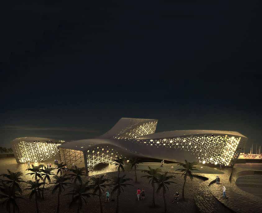
Formation 1 Entrance 2 Swimming Pool (for Men) 3 Swimming Pool (for Women) 4 Aquarium 5 Sand Ground 6 First Aid Room 7 Storage 8 Sea Sports 9 Praying Room More WindoesMore Daylight Smaller WindowsLess Direct Light No light - Shadow under the Oriented Roof
Pattern Development
Ground Floor Plan
9
Structure
The concrete shell structure was chosen for the project. This shell is composed of a relatively thin shell of concrete that wrap the interiors. This construction technique is suited for complex curveed architecture since allows wide areas to be spanned without the use of internal supports and creates an open and unobstructed interior



Design Development
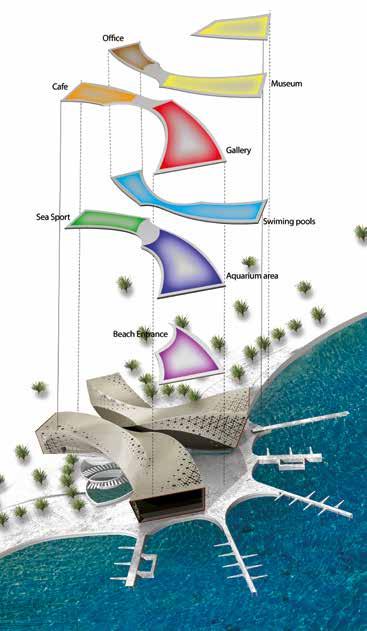
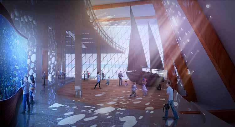
The services and mechanical spaces are located in the lowest level of the building. The entrance and the public spaces are located in the floor ground. The access to the first floor, museums, galleries and coffe is available through the ground floor. The transition of nature from landscape to architecture is shown in the interior views.
 Concrete Shell Main Shell Form Internal Supporter Floors Arrangement
Interior Views Toward Sea Section View A-A
10
Functional Diagram
HINGE WALL
Individual and Team Work
(CEAT)

Modeling + Scripting
Instructors:
Dr. Ramtin Haghnazar
Team Project:

Oveis Shahnaee, Saman Aboutorab
Living Hinge Method

Diagram Design

Fabrication + Contruction
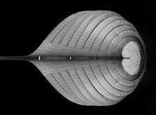
Individual Project / Wearing a flat cardboard
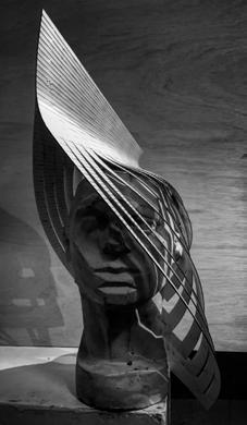
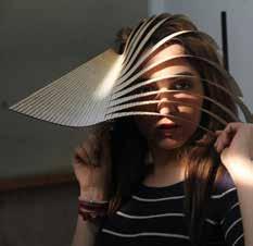
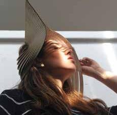
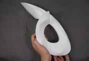
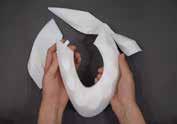
The process of creating a 3-D object from a flat sheet of material began by developing a small-scale object individually. I decided to utilize laser cutting to smooth flat cardboard and create a hat. My goal was to design and tailor a hat by cutting circular arrangements of straight lines in varying scales. In addition to creating a three-dimensional volume from a flat, rigid material, I aimed to create a cutting pattern that could generate multiple styles of wearing.
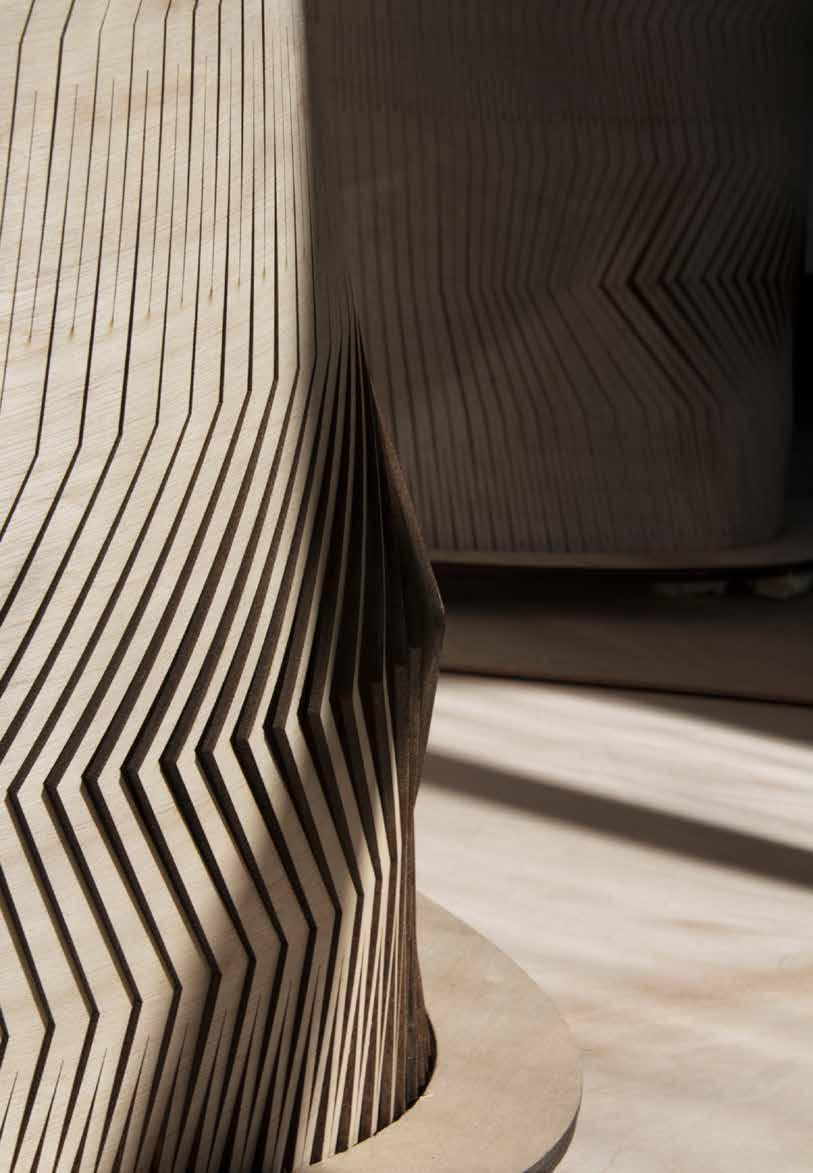
For the most part, laser-cut objects consist of flat panels that are either cut or etched before being assembled into a final configuration. There is another way to use laser cutting to create 3D objects from materials, and it uses a clever design element called a Lattice or Living Hinge. It is more common to see makers and hobbyists using Living Hinges in laser-cut wood because the properties of this material allow for a significant degree of flex before the material fractures.
In the 6-day workshop, we have been asked to design and construct hinged lumber on a scale of 1 to 1 by using a wooden sheet. Our group decided to design and implement a final product by focusing on the capabilities of the hinge. This led us to design a wall with a shape that was needed to create a parametric hinge.
Longer Sharper shorter Smoother Hinge Hinge Unsupported Length Spring Connection Inner Junction Detail, components, and Function Torsional Links Length Torsional Links Width
Fablab - Center of Excellence in Architectural Technology
FALL 2015
Modeling CONTRIBUTION TO THE PROJECT MY ROLE
11
Design Phase

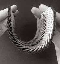

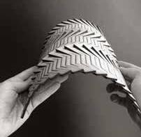
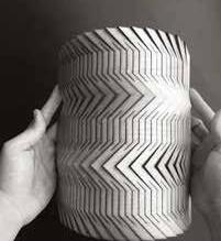
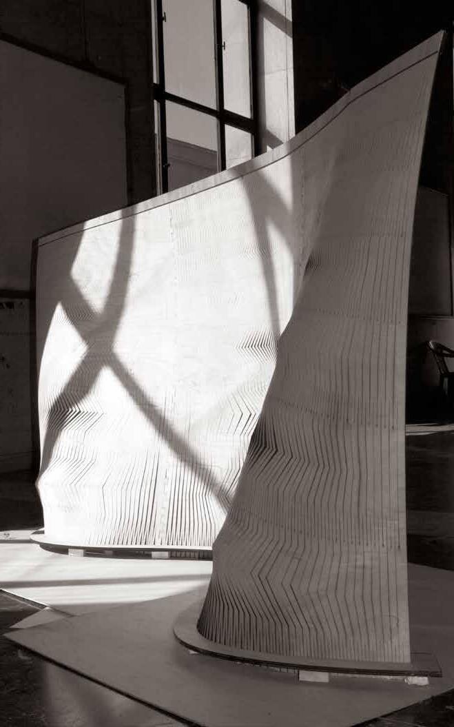

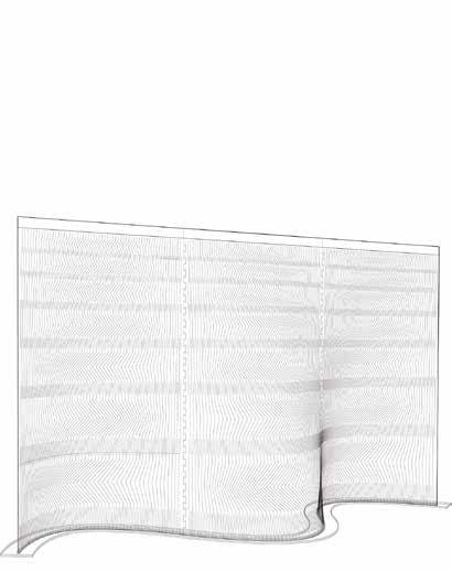
As the hinge length increases, the bending rate increases. As a result, we adjusted the parameters to the hinge length increase gradually from up to down. Also, we found by cutting the smoother line, we can control the panel more and we have less change in the lattice. It made us use another attractor point in designing. In the width we adjusted the inner junction edges, it was sharper in the middle of panels where we were going to have the most convexity to the smoother one in the edges to have no change.

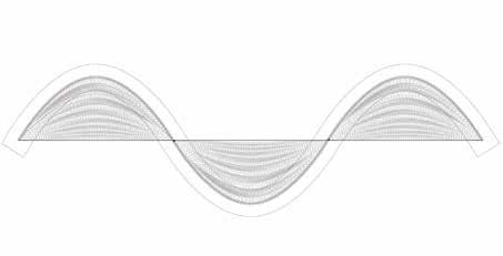
270 120 90 Torsional Links Width without change PLAN VIEW ELEVATION VIEW
270 CM 90 CM 90 CM 90 CM 90 CM 45 CM
As the length of the hinge increases, the bending ability of the sheet increases
Torsional
12
As the cutting lines are smoother, the hinges of the wooden sheet are less
Links Length Increase
BÉZIER STAIR

Summer 2017
Individual and Team Work
Tehran Robotic Architectural Matters

“TRAM” workshop
Instructors:
Sina Mostafavi, Shabnam Hosseini, Hasti Goudarzi
CONTRIBUTION TO THE PROJECT MY ROLE
Idea Development + Final Design
Modeling + Simulation
Modeling + Scripting
Rendering
Team project:
Faezeh Sadeghi, Ali Dehghani, Parto Jahangiri, Mahshid Moghadasi, Amir Hossein Zarin Rad, Masoomeh Hosseinzadeh
Stair
Visualisation
Diagram Design
Robotic Fabrication
3D printed Proto-


The stair is not only an element to go up. It is not an element to connect different levels. It is only a rigid element that «HAS TO be there». But in «Platform 28» it cannot be defined in its general format since there is no other level. Therefore, it is considered as an exhibited object, a piece of art that is going to be «watched» not used.
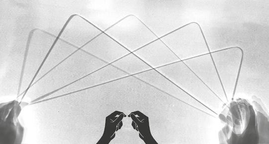
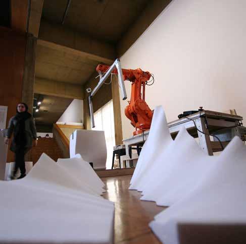
Robotic Light Printing
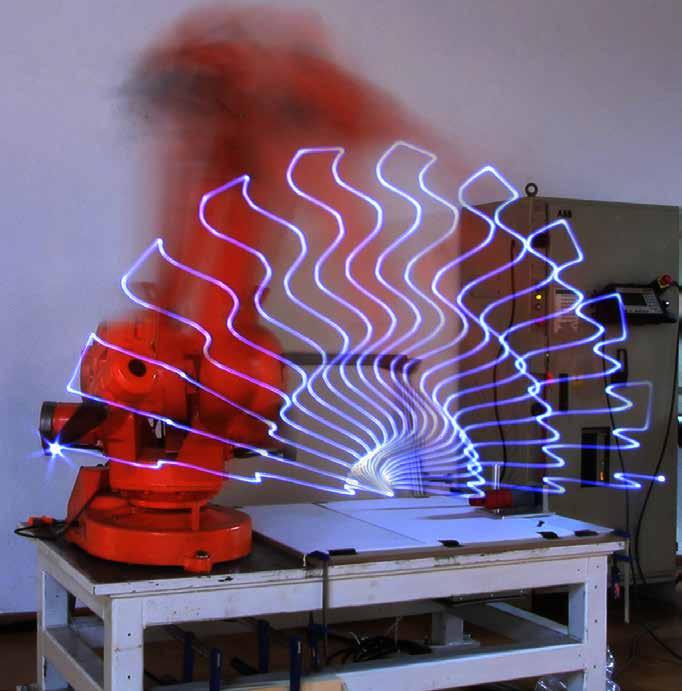
As the first exercise with the robot, light printing was used as the medium to illustrate the tool path, and translate digital lines to movement.
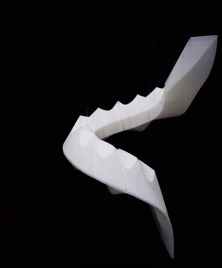
A point light source was used as the end effector and the robot›s movement was mapped with long exposure photographs.


This Experience was done in a small group of 2. My teammate and I tried to develop a dynamic path to employ all the ABB robot’s axis.

13
Isometric View Plan View
Individual Project / Customizable Robotic Cuts
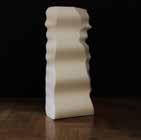
The wave-shaped forms by application of the sinusoidal waves with the help of a grasshopper were generated to challenge the robot in cutting customizable shapes. The combination of different formulas and their application in different directions ended with the various shapes with a combination of bumps. The shapes were in variable scaled details to study the potential of robotic cutting.

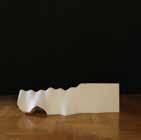
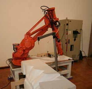
The shapes were designed generatively with variable sine waves that scaled and redirected throughout the block. Some of the designed prototypes were cut by the ABB robot and it shows in the following figures.

Platform 28
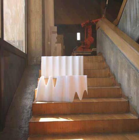
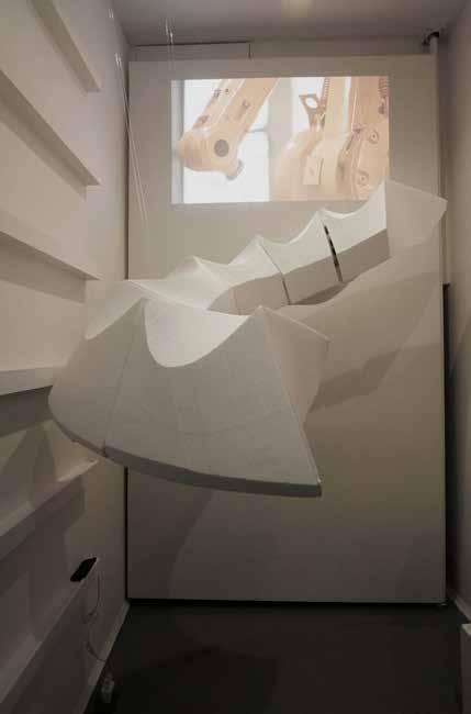
The studio focused on generative modeling and robotic crafting of 1:1 stair prototypes as complex architectural fundamental elements. Manifestation of this research and process are prototypes, exhibited at “Plat-form 28” from a computational design point of view, stairs are nested for-loops with which one may explore complex and performative configurations.
Design Design
Design Space
+ Thickness Variation Power-Line Creating Pattern ABB 1400 14
Design Space
Too Tight Heavy & Rigid Single Level Connecting Level Showroom Site: Platform 28 Product: Stair Exterio Structure
420 cm 3 3 0 c m 180 cm
Subdivision
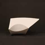
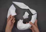
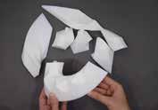
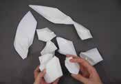
Every component was created using iso-curves of each surface of the form in a way that hypar forms resemble the steps, and therefore each component is a step.
created using iso-curves of each surface of the hypar forms resemble the steps, and therefore step.

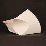
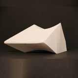
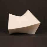

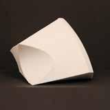
cut indepently with hot wire cutter with the aid of simulating the cuts with grasshopper. were designed and placed in the appropriate diagram shows the components and joints seperately.
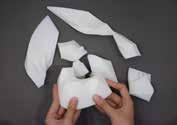
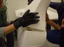
Components were cut independently with hot wire cutter with the aid of ABB robot after simulating the cuts with grasshopper. Afterwards, the joints were designed and placed in the appropriate positions.
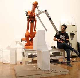
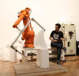
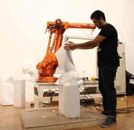
Digital Fabrication process and assembly
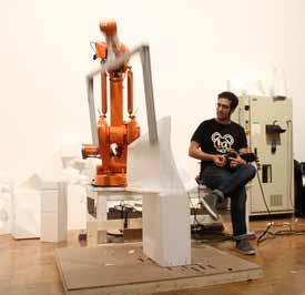
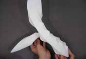


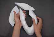
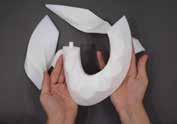
Afterward, the joints were designed and placed in the appropriate positions. The following shows the cutting steps of each surface of a single component. Because of the limited time of the workshop, although all the components were perfectly simulated, 6 out of 12 pieces were hot wire cut.
16
diagram
Component 5 and 6 Coming Together Detailed view of the components and the cutting tool path Detailed view of the joints and connections
FARMANIEH RESIDENTIAL
Fall 2017
Professional Work / SetupAarchitecture

Studio
Architect in Charge:
Sina Mostafavi
CONTRIBUTION TO THE PROJECT MY ROLE
Idea Development

Modeling
Modeling + Scripting

Rendering
Design Team:
Sina Mostafavi, Faezeh Sadeghi, Adib
Khaeez
Post Production + Visualisation


Diagram Design
Project Info:
Plot Area: 534
Built area: 2700
Levels: 8
Residential units: 5
Location: Iran,Tehran.
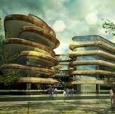
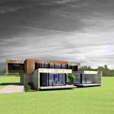
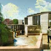
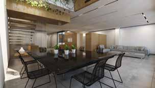
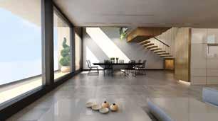
Farmanieh residential is a multi-level building with five units all with different layout and spatial qualities. Three dimensional positioning of the duplex units in the building block, result into double height voids in the building envelope allows for growing of vertical gardens.
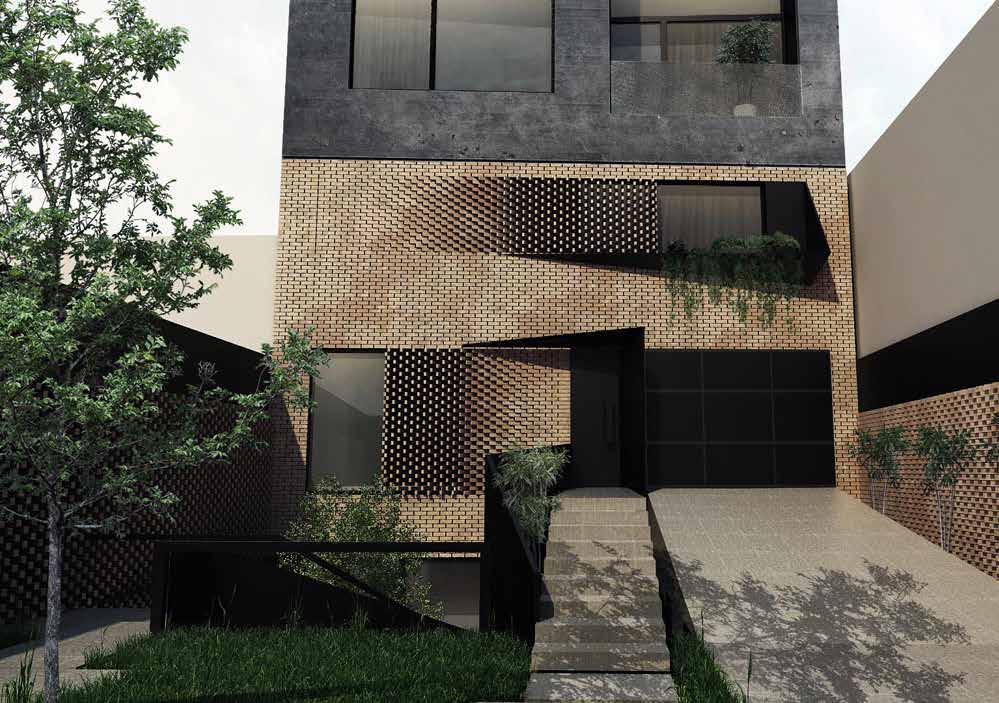

In this -8story building, the Lightwell works as the main core of the building which passes all units and reaches the roof garden. The extension of this lightwell is not vertical, but by passing from each floor extends itself inside that floor in a different way.
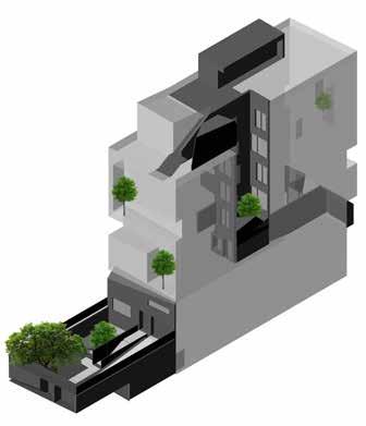 Lightwell as a Courtyard
Volume and voids SW View NE View SW View NE View
|South
Mass and Voids Diagram Mass and Voids Diagram
View| |North View| Vertical Gardens
Interior Views | South Duplex Section B-B
North Elevation
17
In the main concept of design, we considered this Lightwell as a courtyard because not only it is an unroofed external space, to allow light and air to reach where would be a dark or unventilated area, but also it plays a significant role inside by extending itself there based on the designed functions.
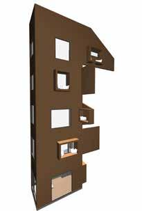
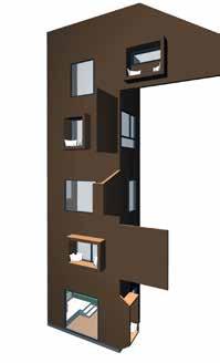
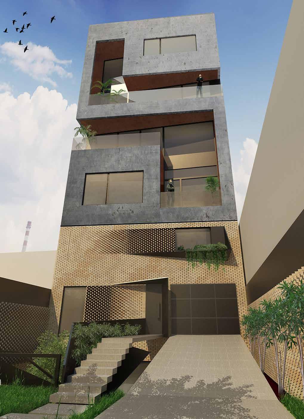 The Extension of the Lightwel inside Material: Brick
Second Floor Plan First Floor Plan Third Floor Plan Fourth FloorPlan Fifth Floor Plan 18
DONE STUDIO
Professional Work / DoneStudio /Renovation


Design Team:

Faezeh Sadeghi, Saedeh Sadeghi, Hamed Zahedmanesh
Architect in Charge and construction
Manager:
Faezeh Sadeghi
Project Info:
Flat area: 12 sqm

Levels: 1
Location: Iran,Tehran.
CONTRIBUTION TO THE PROJECT MY ROLE
Idea Development

Modeling
Modeling + Scripting

Rendering
Diagram Design
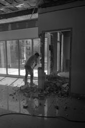
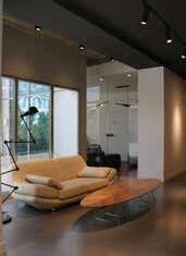
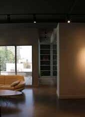
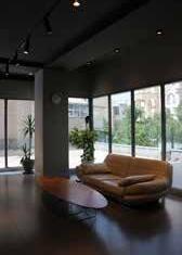
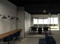
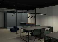
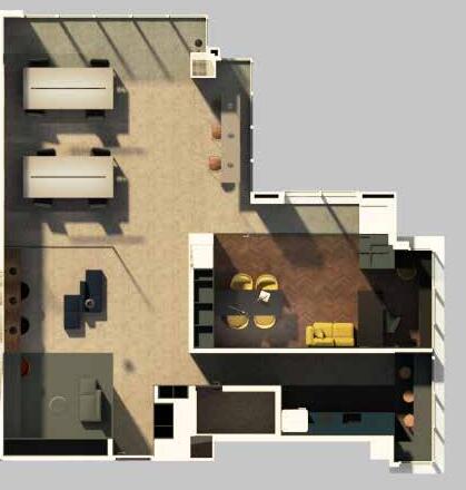
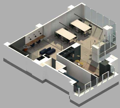
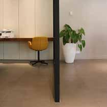
The Done studio was a renovation project of an office in an office building with an amazing view of the northern mountain of Tehran. The office had one room and it was an open office space. The object was to design an architectural studio. And the idea was to create separated customized areas that can be integrated together based on the desire in a multifunctional way.

Design Development
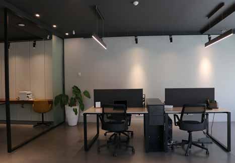
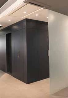
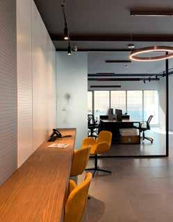
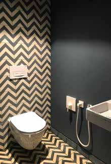
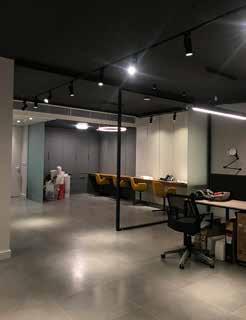
My team and I used colors, lights, and transparent partitions to define the multifunctional spaces. Besides all, maximizing the view of nature and application of natural light were other goals. We consider each place as a LEGO piece. As a result, we designed, built, and furnished every piece based on its functionality by the use of lights, colors, and the creation of perspectives.
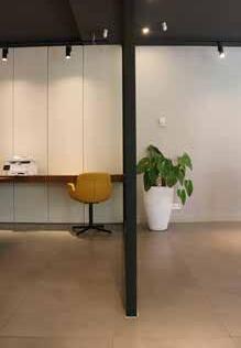
Based on the rules and small area of office we could not make any closed room except the one that we had already. But the idea of integrating spaces also changed the existed room. From that room, we created a white box in a dark office with a transparent wall to not only make more connections with other spaces, but also a corridor of light and greenery which ended with a shelf to store the architectural models. It is named the exhibition corridor that can be visited by clients. The clear box that is going to be a meeting room and its back white wall is a projection surface for movie nights in hectic times of working or gatherings.
Design Development based on the Function of Spaces, Space Experimentation, and Perspective Creation


WORKING AREA BREACKOUT SPACE MODEL MAKING SPACE WC LOUNGE KITCHEN CaféArea MEETING ROOM BEFORERENOVATION EXHIBITION CORRIDOR SERVICE CORRIDOR BEFORE UNDER RENOVATION
Fall 2018 19
The tailor-made metal wall, behind the hanging table in the breakout space, was designed and manufactured with holes in order to hang tools with specific hangers. And they are made of metal sheets to hang other stuff like papers with magnets. Besides the functionality of that wall, it was an idea to break down the perspective of the longest wall by changing the color, material, and texture.
The material of partitions is translucent to keep privacy and not block the light and view. Also, their surfaces are polished and flat to use as a board to write down the ideas in brainstorming sessions.


The working area can be expanded by furnishing the individual place. Both areas can be freed up and used as a showroom and the spotlights are considered for this purpose.


Brainstorming Space Model Making Space Breakout Space Working Space
Entrance Meeting Room Lounge Kitchen
NORTH
Render’s View | Isometric
SOUTH
Rendered View
Built Interior View
Rendered View
Built Interior View
EXHIBITION CORRIDOR LOUNGE MEETING ROOM WC
TEAM WORKING AREA INDIVIDUAL
20
WC
WORKING AREA
MATERIAL INFORMED SYSTEMS:
DYNAMICALLY TRANSFORMABLE GROWING STRUCTURES AND ARCHITECTURAL SPACES FROM “ENDLESS” MEASURING TAPE


Individual Work/ Academic Work
M.Sc. Graduation Thesis
Supervisor:
Prof. Günther H. Filz
Idea Development

Modeling
Modeling + Scripting

Rendering
Post Production + Visualisation

Diagram Design
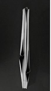
Strip material, which is forming specific patterns, is widely used in architecture and engineering to generate highly efficient, but lightweight and therefore sustainable structures. However, material, as we know it from measuring tapes, concave-convex strip, is usually not considered for construction. Such tapes have two predominant and unique features, firstly, they have high extension stability due to their concavity, and secondly, they are extremely thin and can be rolled to a small, compact dimension. So, measuring tape fabricators aim for both, the highest possible inflection points by the concavity of the tape, and the optimal running smoothness, which relies on the planarity when rolled. This master thesis explores possible constellations and structures from a single, “endless”, concave strip — a measuring tape— with the aim to satisfy both abovementioned requirements.
The Measuring Tape, a readymade product
The measuring tape is a readymade, mass-produced product that has phenomenal features besides its obvious function as a measuring device. To the best of the authors’ knowledge, it has been never used for architectural structural purposes and on an architectural scale. The development of the tape measure has an interesting history from flat strips from various materials to the concavely shaped metal strip compacting in a small case as we know it today. (Bailey K. Davis, 2011; Scarborough, 2019) After 100 years of experiments and innovation mostly on the locking system of the tape measures to hold the strip in the desired place in 1922 Hiram A. Farrand invented pocket tape measures without any locking mechanism. Farrand improved the selfstanding tape by changing the cross-section from flat to an open cross-section of concave-convex with significant structural and geometrical potentials. (Farrand, 1922; Bailey K. Davis, 2011; FieldForms, 2022)
Accordingly, the term of “standout” was introduced to describe the feature of self-standing of the tape, which became the most predominant and unique feature of tape measures. “The «standout» is defined as the metric distance a tape measure›s blade can be extended before it bends or ‹snaps›”. (Ribrosco, 2020 )

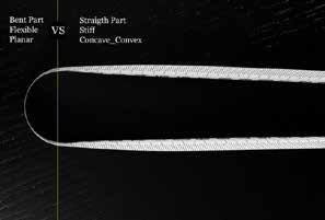
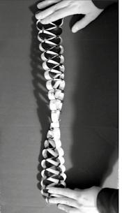
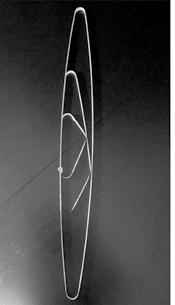
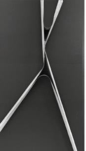
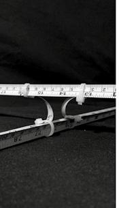
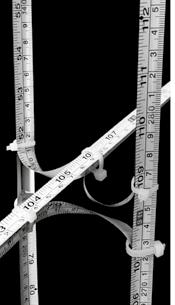
The tape has a curved cross-section and a straight line in a longitudinal way. By bending the tape through its weak axis, this changes by °90 in the bent part. That is the cross-section transforms into a straight line from a curved one, and the longitudinal section transforms into a curved from a straight line. We named the bent part “kink”. As illustrated in Figure 2, the “kink” is perpendicular to the longitudinal axis of the tape. Because of the flexibility of the tape, the kink can dynamically relocate its position by transferring along its longitudinal axis, Figure 3 (Right). As mentioned, a kink can appear at any point of the tape by bending through its weak axis by exceeding the standout length or by introducing force that is equal to or beyond the tape´s standout length. This bending can be introduced from both sides the concave and convex, whereas the results from testing the concave side are specified by manufacturers. Even though both sides were tested in our experiments, the concave side was considered more meaningful and therefore further on considered as significant.

21
The kink
Figure 3 (Left) Movable kink in a linear motion through a fix length of tape by moving hand in a circular motion
Figure 2 Shape changing in bent part, “kink”, From concave-convex to planar, side view
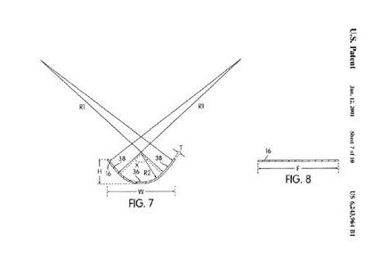
Image: John C Murray. 2001. Rule assembly with
standout. USRE39719E1, issued 2001. Fall 2022
Figure 1 A transverse cross-sectional view taken through a portion of the blade when the blade is in a stiff and straight configuration; John C. Murray’s patent, 2001 U.S. Pat. No. 6,243,964 B1
increased blade
Exploration of bundling, branching, nodes, and polyhedral structures


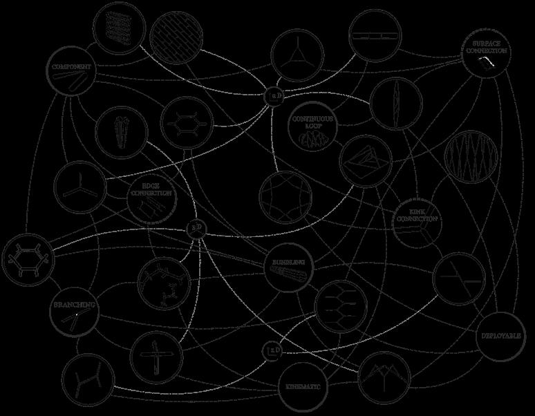
Our research approach adopts a material-centric perspective. Viewing the material system not only as a pre-manufactured structural element or artistic readymade but also as a key driving factor in the design process. To uncover the potential of the material system. The exploration was carried out through an iterative prototyping process, encompassing three main streams:
(i) the development of components and investigation of their proliferation,

(ii) the use of continuous tape to create an adjustable composition with the environment through repeated loops (differential growth of the tape), and (iii) the application of branching and bundling logic in the creation of structures.


The emergence of architecture and structure employing the “signs of life”
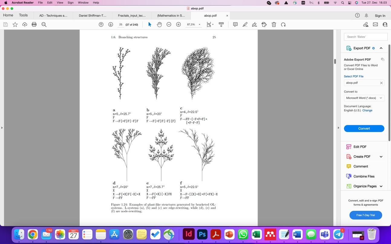
Based on the structural testing and combined with the previously mentioned aspects of the kink and modes of connection, obviously bundled constellations bear a high potential for the formation of spatial polyhedral structures by branching and connecting. The process of form-finding was completed by the development of the generative real-time design system through a computational tool in order to implement the logic of growth, sensing, and adaptation. Accordingly, the Grasshopper coding app was employed to create a generative design system in order to not only analyze and rationalize the boundary conditions but also generate infinite designs in response to defined conditions. The developed generative system is a recursive branching system based on the L-systems, which was introduced in 1968 by Aristid Lindenmayer, which is a grammar-based system to simulate the recursive pattern of growth. The L-system is a parallel rewriting system that involves three main components of the alphabet, axiom, and rules that are used to determine the process of self-similar (re-)generating. (Prusinkiewicz and Lindenmayer, 1990)
These systems were devised to not only model the

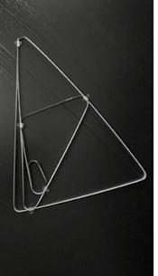
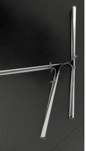
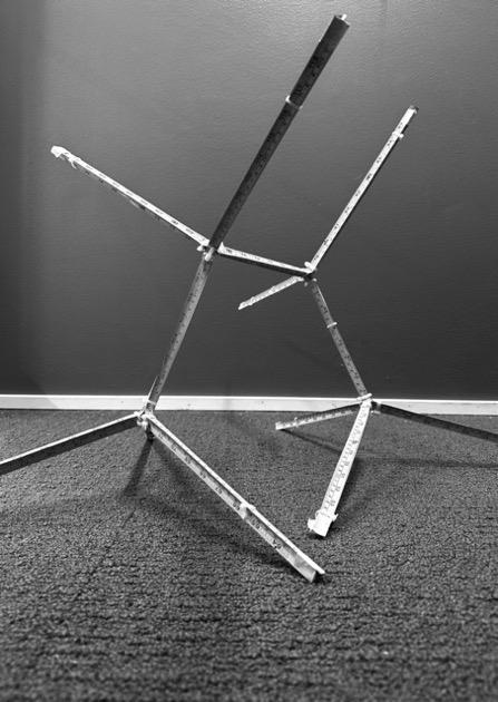
A numerous constellations of single tape and bundles of two to four and more tapes investigated. A hollow cross-section, which is assembled from three tapes with outward concaveness as shown in Figure 5 (a) turned out to be ideal from many perspectives. The cross-section is forming a stable shape of a spherical triangle and performs well as a profile and structural beam element. As illustrated in Figure 5 every single tape can turn into a branch (Figure 5 (b)). This way a node with four branches can be formed by combining this bundled element with three further tapes (Figure 5 (c)). Accordingly, the node evolves exactly at the position where all individual tapes have their kinks. Such nodes are movable due to the features of the transferable kinks of the individual tapes. Moreover, due to the mechanism of the nodes the direction of branches can dynamically adapt by changing the angle of kinks. Accordingly, the structure is kinematic and it can actively and reactively adapt. As a result, the movable nodes provide the feature of transformability and adaptability to the future design of architectural spaces and structures, which is beneficial for developing seemingly unlimited possibilities for spatial structures as illustrated in Figure 5 (d).

b a
Figure 4 A diagram of the matrix of proto-types with various ap-proaches and applied assembly methods
22
Structural Testing
The bundling of tapes in a certain order is beneficial for the resulting structural capabilities, which is confirmed by the result of our structural testing. For testing bundled tapes, both setups for the concaveness, namely concaveness down and concaveness up as shown in Figure 7 were considered and compared. The load case considered was predominantly dead load, which is 20 grams per meter of a single tape. Figure 8 illustrates and compares the increase of length of the «standout» as well as the deflection of the cantilevers. In this case we compare a bundled cantilever from three tapes with a single-tapes cantilever, considering dead weight only. In our tests the bundled cantilever from three tapes has a standout of 300cm, which has almost tripled ompared to a single-tape cantilever but the amount of deflection has not increased significantly. Assuming dynamical changes of the 3-dimensional structures into new configurations by transferring nodes, finding the efficient lengths for branches is a demanding task. Since the metric length and buckling length differ according to the type of support and simultaneously, such a branch can be both a cantilever or a simply supported beam, the range of safe configurations and length needed to be determined. As graphs show in Figure 9, the effective bucking length (L) for bundled tapes is assumed 300 cm in both simply supported and cantilever branches based on all results from structural tests.


Despite the continuity of tape through the structure and integration of nodes and branches, the structure is considered a node-based structure since it emerges from linear elements and nodes.
The use of a single material, the tape, and a single profile throughout the entire structure provide both structural stiffnesses in the branches and flexible, adaptable, and multifunctional nodes, making the spatial configuration transformable but stiff in all positions. The tapes can be disassembled, compacted, and then reassembled in a new location without loss of material, which offers both an extended life cycle of the material and the option of always new site- and space-specific bespoke configurations. Compared to the structure, the compacted tapes occupy extremely small volumes and therefore they can be easily stored before being transferred to new sites. The spatial development of the structure, as shown in Figure 10, includes 4 nodes and 13 branches, which are based on the system of bunding and branching.

The Algorithm feeding emergent architecture with technical information


Accordingly, the reactive system was developed in order to allow designing spaces where the structures can grow according to the implemented principles by dealing with the freedoms and limitations of provided boundary conditions actively. That is the design is flexible and the structure can actively adapt its form in a process of growing by multiplying and keep branching off in interaction with its environment. The process and the design can also be limited by predefined surfaces and volumes which can be also at the same time attractor point. The final form is flexible as well as tailor-made based on the defined parameters. Accordingly, there is no randomness in the code, and all the structural properties including angles and length consequently the direction of growth are derived from a real-time interaction of the structure with its environment. Therefore, the generated speculative structure is somewhere between a mathematical fractal tree and the result of interaction with design conditions and environmental stimuli categorized into allowed, not-allowed, and target objectives, illustrated in Figure 11. In developing the diagram of stimuli, the categorized stimuli are used to employ the architectural design objectives and hypothetical conditions. As a result, the diagrams are utilized as input for the algorithm in order to generate a tailor-made outcome.
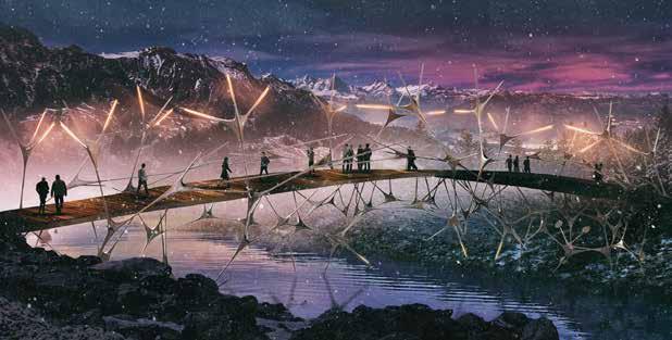
The proposed designs are developed across different architectural scales, including an indoor pavilion emerging between walls and roofs, and a bridge whose structure is grown to support its span. The diagrams of stimuli used to generate the speculative designs are illustrated in Figure 12 and Figure 13, with the results of the designs being shown consequently.
23
Figure 8 Cantilever single tape (100cm) vs cantilever bundled tapes, concaveness down (300 cm)
a b c
Figure 7 (a) Single Tape, concaveness up (b) bundled tapes, concaveness down (c) bundled tapes, concaveness up
Figure 11 The implemented stimuli in the generative design tool, (a) Allowed space (b) Not-allowed space (c) Target surface
Figure 9 Effective buckling length (L) of bundled tapes subjected to loading weights, (a) cantilever, (b) simply supported
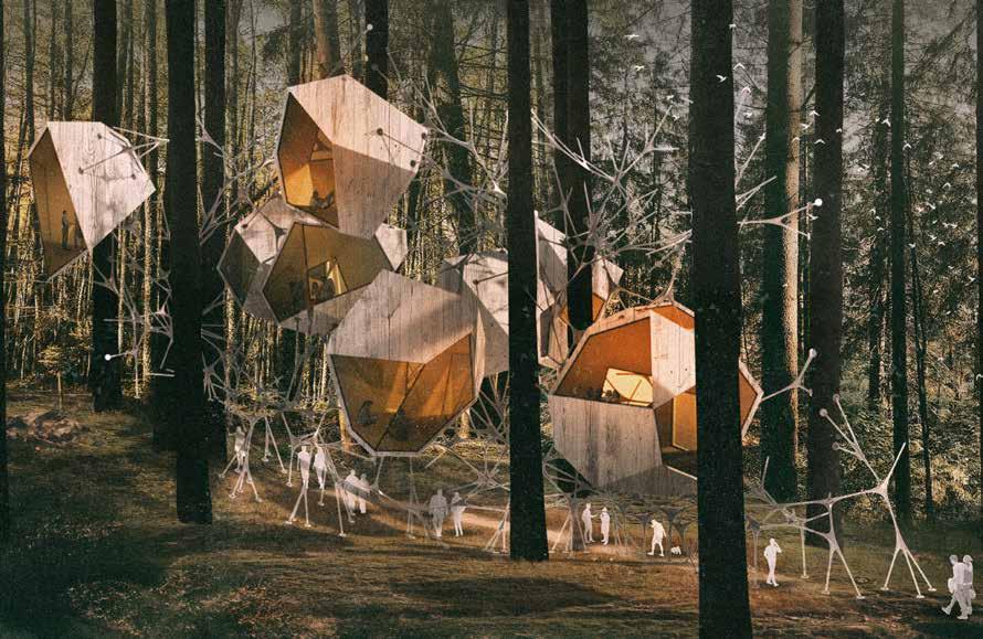
The speculative design of floating habitable spaces: a snapshot


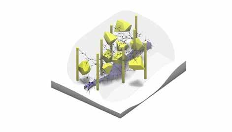
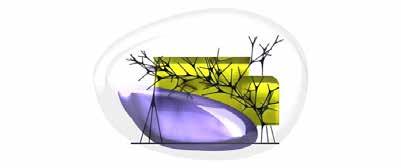
The “growth” of the structure was initiated by positioning four points adjacent to four trees, similar to seeds. With “growth” we mean the implementation of above-mentioned technical possibilities and restrictions, which lead to the formation of spatial, polyhedral configurations. Such possibilities and limitations include the bundling and branching of beam elements, possible nodes, and branching angles in space, the maximum standout before a conjunction with another cantilevering branch is necessary and so on. The diagram stimuli indicating the “allowed” and “not allowed” spaces and surfaces are shown in Figure 16. As designers, we define allowed spaces that limit the structure to grow.


24
Figure 14 Elevation view of the suspended accommodation above the generated corridor
Figure 13 (a) Diagram of stimuli for generating the bridge, side view (b) Side View (c) perspective view of the generated bridge
a b a c b c d
Figure 12 (a) Diagram of stimuli for generating the pavilion, side view (b) plan view of the generated pavilion (c) Isometric view (d) perspective view of the generated pavilion
Figure 15 Diagram of stimuli for generating the suspended accommodation
Figure 15 perspective view of the suspended accommodation
THANK YOU FOR YOUR ATTENTION


 Concrete Shell Main Shell Form Internal Supporter Floors Arrangement


 Lightwell as a Courtyard


 The Extension of the Lightwel inside Material: Brick
