

kăi farzád lee Portfolio 李 愷 作品集
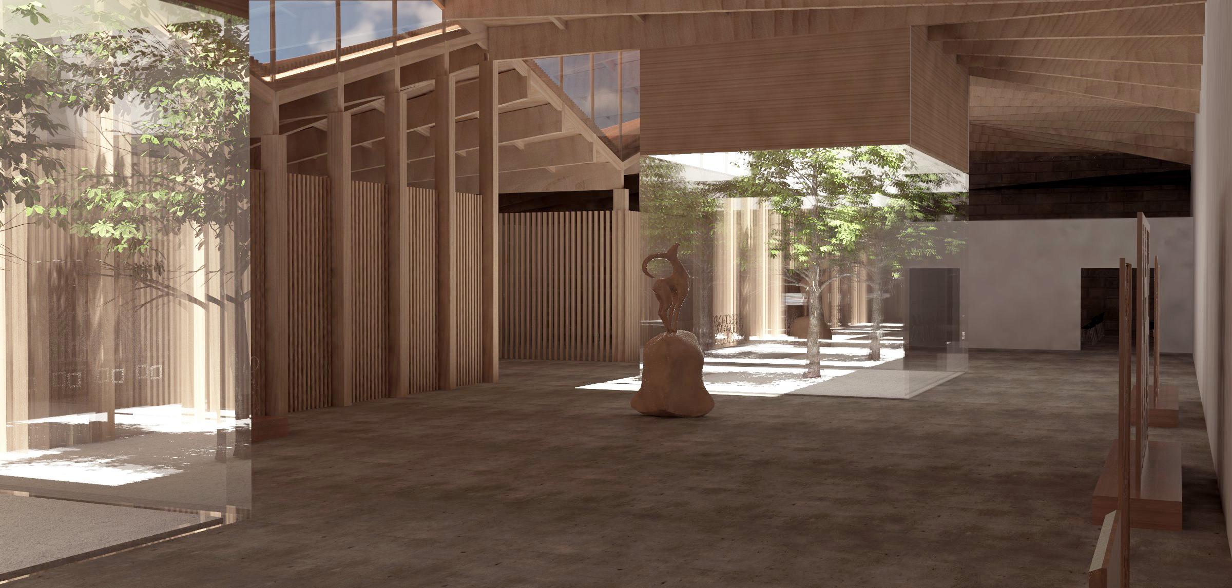
At the center of an expansive renovation of the former Old War Office building lies the pavilion. Through a delicate transformation, the former military offices have evolved into modern hotels and residences while respecting the site’s historical significance. In this historically rich context, the architectural vision transcends mere functionality, transforming the pavilion into a masterpiece of sculptural art.Inspired by the concept of a mirage, the rippled
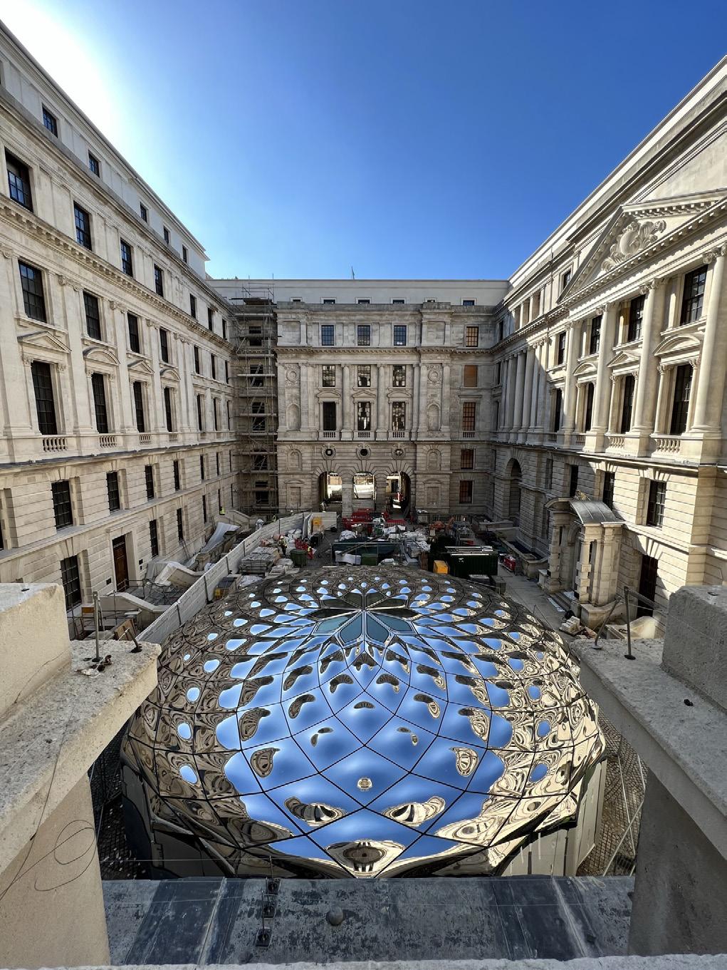
mirror building exudes an aura of mystery, appearing both present and ethereal. A captivating jewel-like water feature beautifully complements the dining pavilion, creating an enchanting play of light and form. The entire design is skillfully bound together by a dynamic pattern of carefully rearranged historic cobbles, weaving the past and present into a seamless tapestry of architectural excellence.
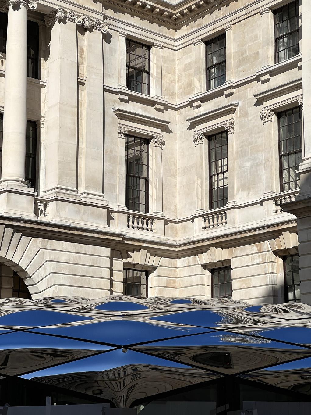 DaeWha Kang Design (2023) Graphic Representation
OWO Quadrangle Pavilion adorning the courtyard of the Old War Office

Clockhouse Avenue, London rebuilding the heart of Barking
DaeWha Kang Design (2023) Concept Design, Graphic Representation
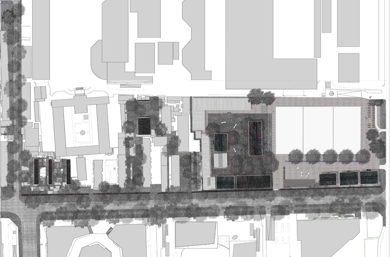
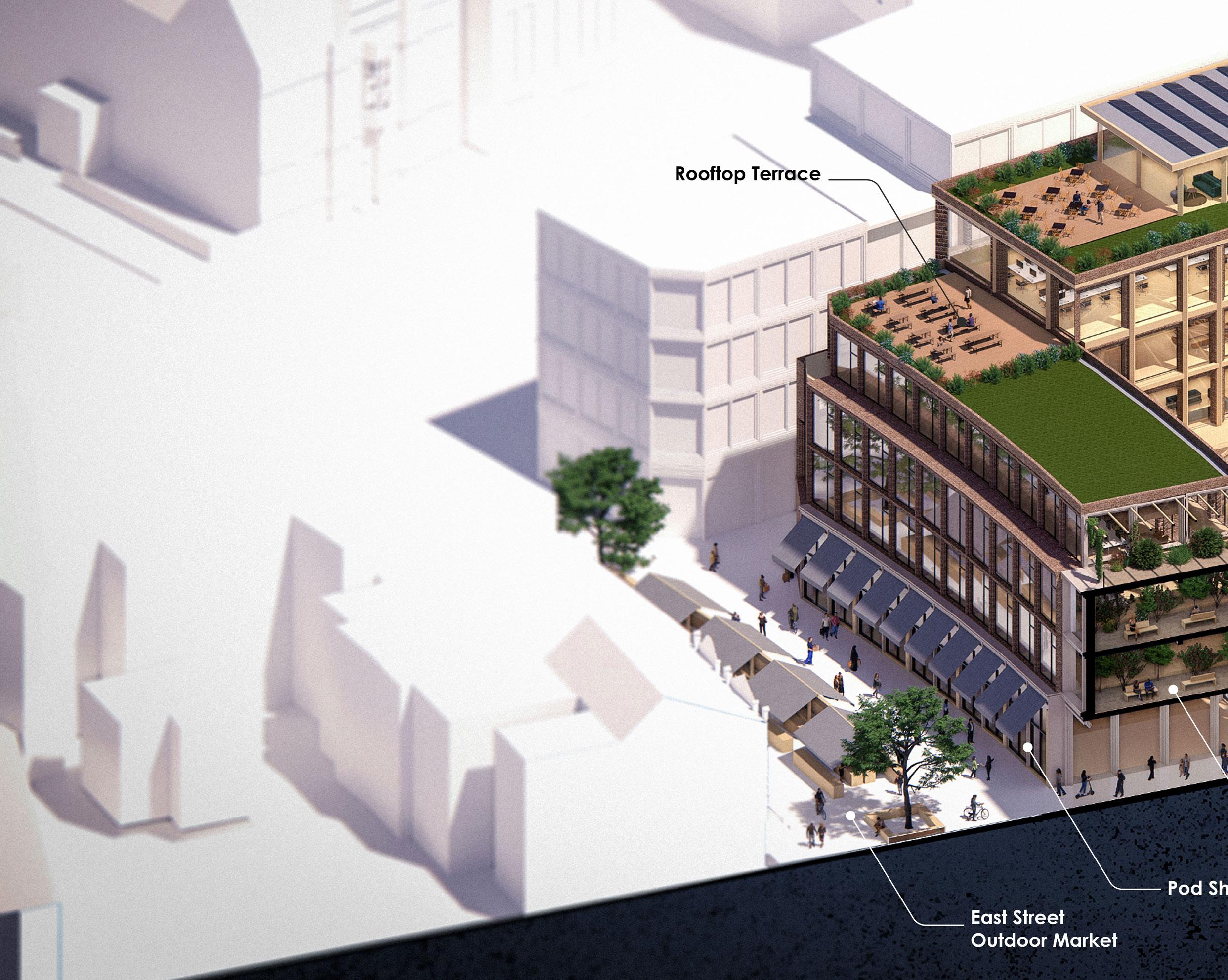 The anchor building of Clockhouse Avenue features a covered public atrium, retail spaces, and workshops on the ground level. This thoughtful design not only includes logistics handling for the market but also plays a crucial role in defining the significant urban edges of the city.

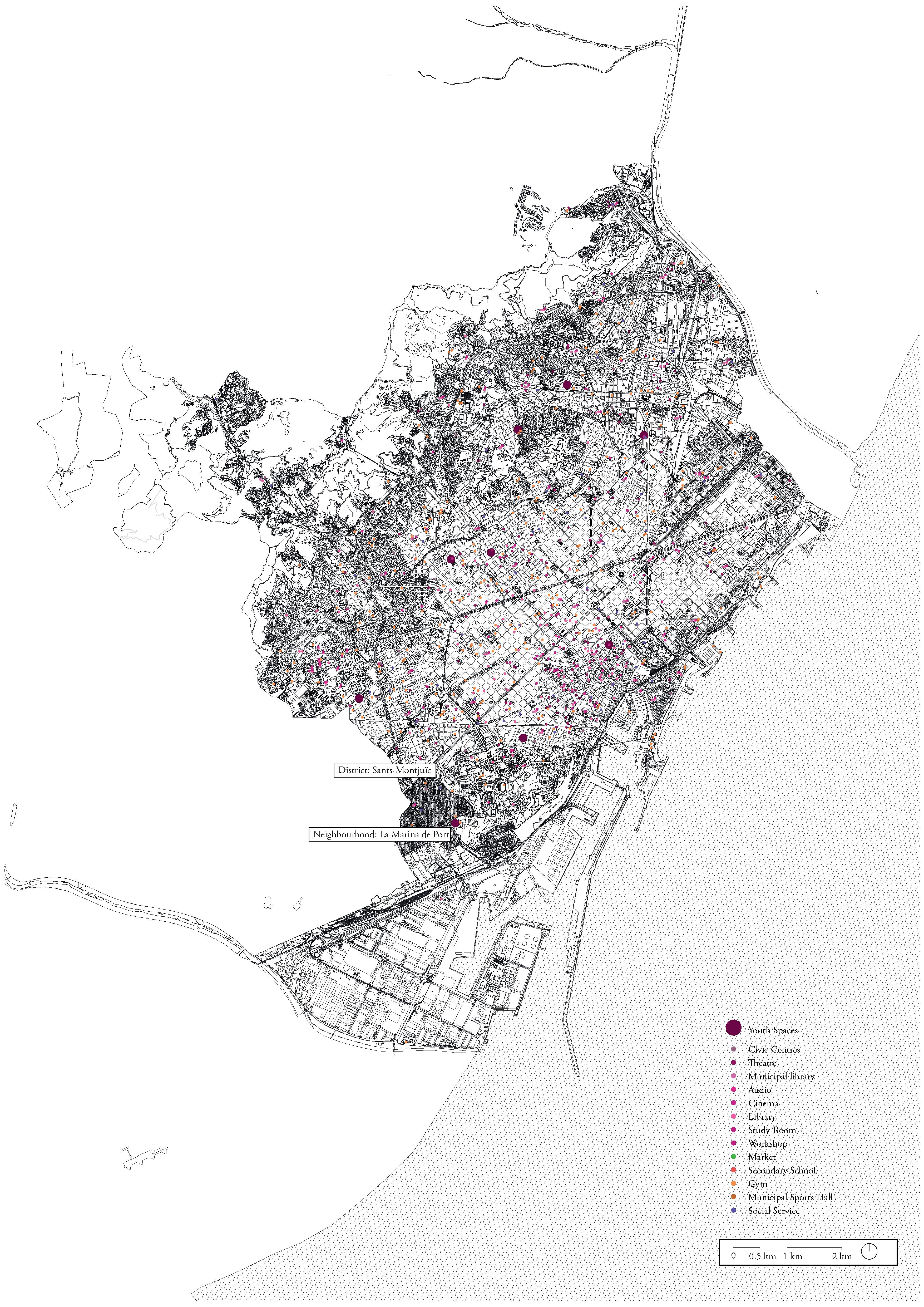
‘Liminal Age’ animating the city for the neither-kids-nor-adults
This project formulates a framework to provide the youth and teenagers in the city informal spaces to self-organize extra-curricular activities, in collaboration with different entities of the neighbourhood. Three programmes- namely a kitchen, a square, and a room, constitute an intervention to be tried out in La Marina de Port, a recently developed neighbourhood with a diverse demography. This prototype is to grow with the maturation of a group of teenagers, and their increasing collaboration with other inhabitants of the neighbourhood. It is also to disappear if conditions on-site changes, only to re-appear on another site.
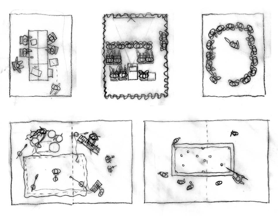 The Square
The Royal College of Art, London (2018-19)
The Kitchen The Room


‘The Theatre’ performing beyond the venue
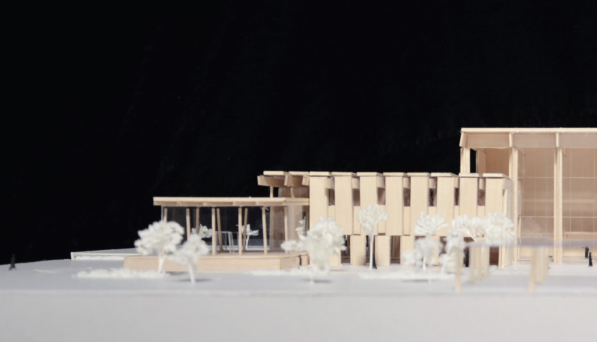

The Chinese University of Hong Kong (2016)
This project is located within the newly built Aldrich Bay Park, Sai Wan Ho, Hong Kong. Residents of all ages in the community use the park throughout the day. To prevent the theatre from being a dead space—used by rich patrons on specific days of the year—the theatre needs to be re-imagined and become relevant in the life of an ordinary contemporary man. The intent of this project is not only to expand the flexibility for formal productions but also to accommodate the spontaneous acts of any user. The broken boundaries between interlocking programs and opening of the façade to the north allow the possibility of productions to happen ‘out of the box’. On any non-performing day the theatre could be transformed into a space for exhibition, market, fairs, or purely a meditative pavilion for the local community.


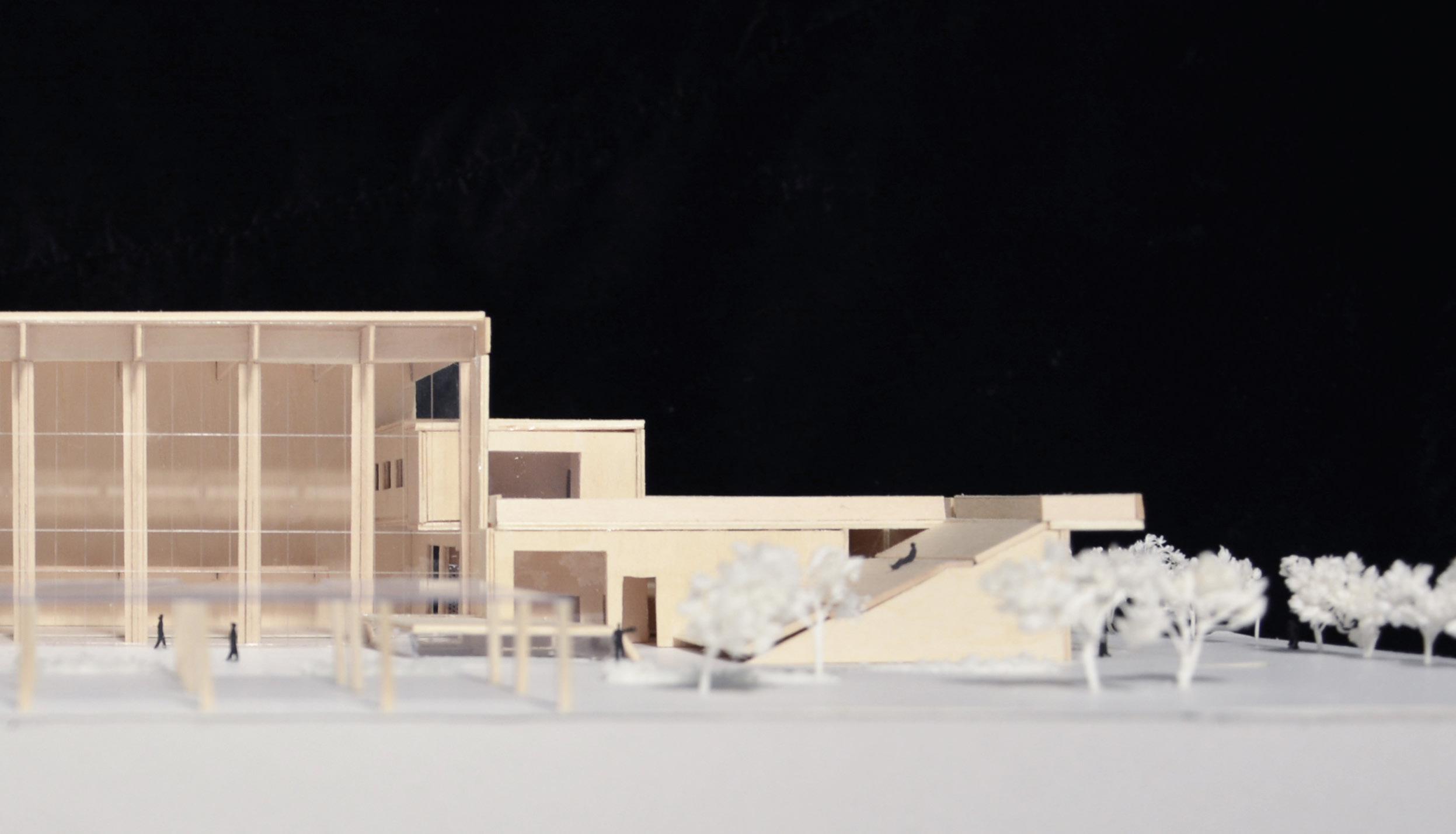
 The interlocking programs break the boundaries of where spectators and performers should be.
0 80 20 40 2 3 1 4 5
1 Aldrich Bay 2 High school; open 8:00-15:20; 849 students 3 Aldrich Bay Park; open 7:00-23:00
4 Oi Shun Road; 4290 cars/ day 5 IEC Expressway; 6570 cars/ day

 The project is situated at the edge of a bay-side park, right beside a flyover and surrounded by residential towers. The structure presents itself as an additional pavilion in the park.
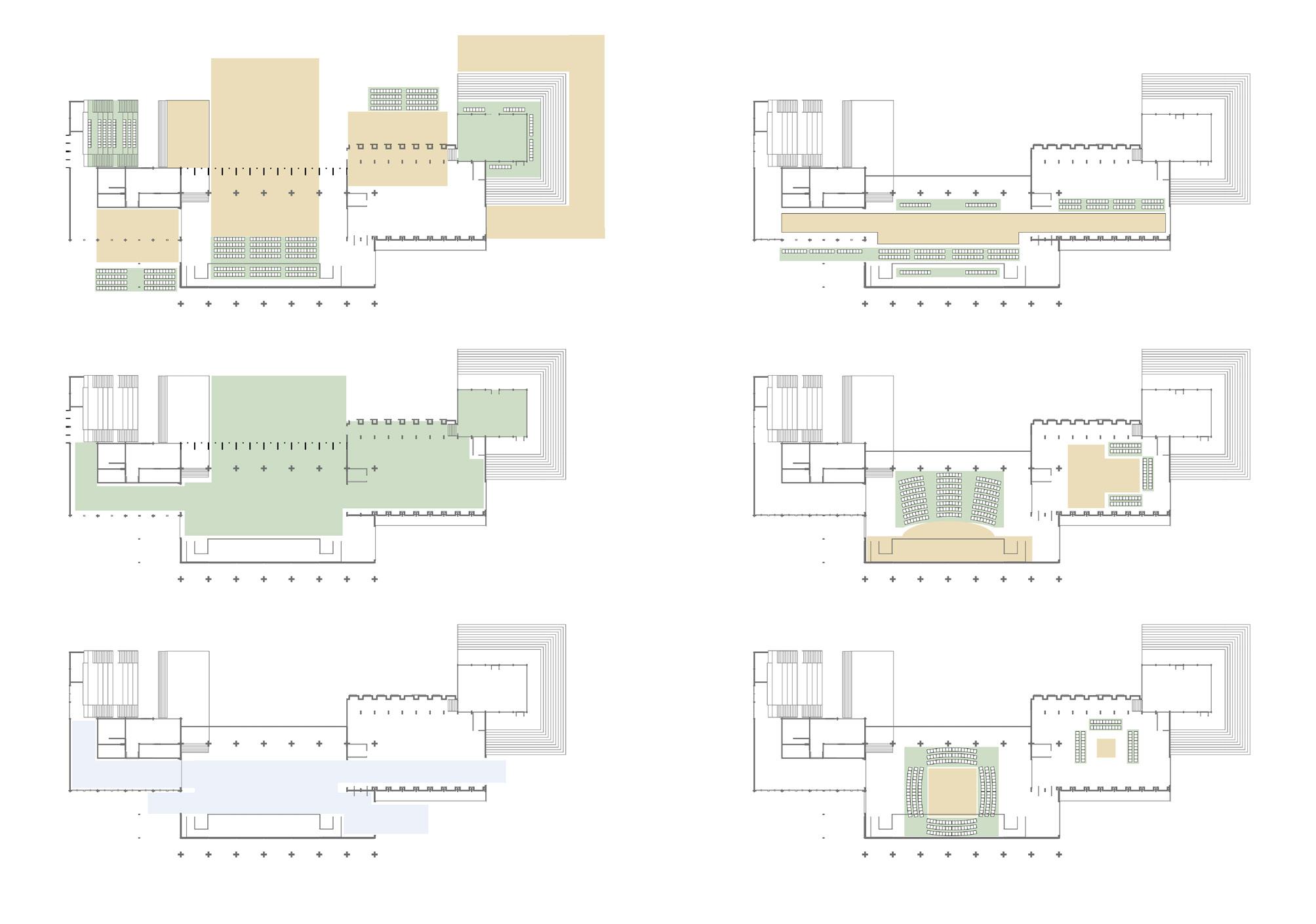
0 5 10 20 1 Entrance 2 Box Office 3 Pre-function 4 Black Box Theatre 5 Outdoor Stage 6 Rehearsal Hall 7 Cafe 1 2 3 4 5 6 7 B’ B A’ A Outward-reaching performance Open plan for exhibition etc. Loading and Setting Catwalk End Stage/ Cabaret + Thrust In the Round + Recital Audience Performers Crew
 The transparency of the northern facade is intended to welcome users of the park, while the southern elevation aims to block noise from the expressway.
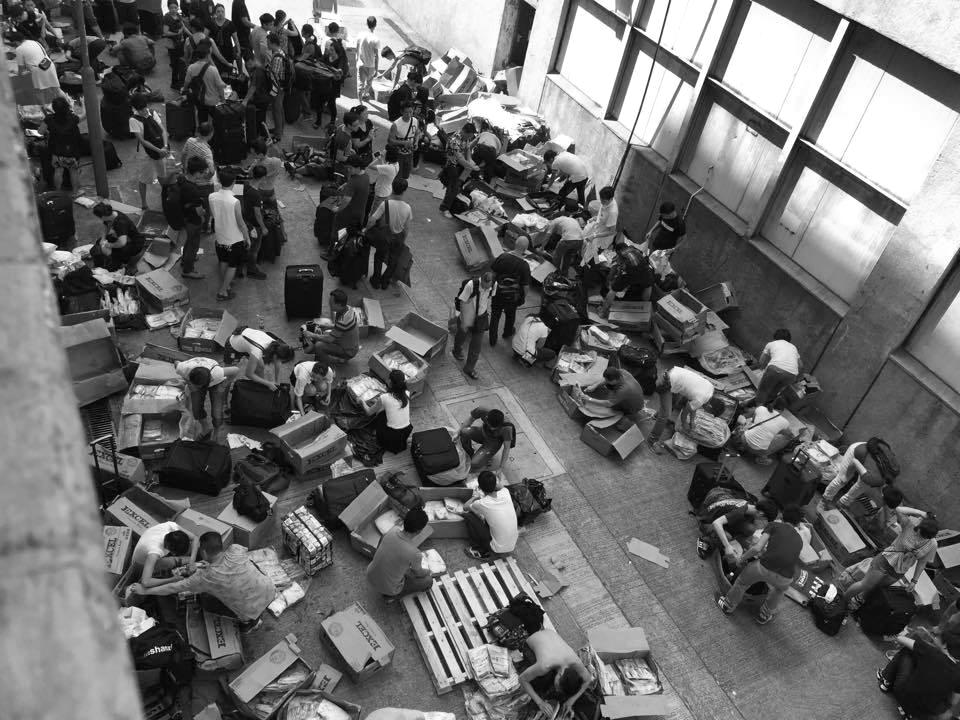
The challenge of this project is presented by the socioeconomic-political conditions at the street level of the site near the Mainland-Hong Kong border— we are asked for a radical reinterpretation of a podium tower in Hong Kong that takes into account the urban form, street life and pedestrian circulation of its location. In this exploration, the residential units are still elevated to allow for maximum view over the surrounding buildings. The podium refuses to take up the whole plot, and provides an open space that relieves the street of its pedestrian congestion. The residents are allowed their privacy in the entrance garden separated from the public plaza. The project attempts to achieve a coexistence of dualities on the same plot of land and strike balance between the contrasting conditions of the site.

 The Chinese University of Hong Kong (2015)
‘Returning Grounds’ questioning private boundaries
Sheng Shui, the Hong Kong county closest to the border of Mainland China, suffers from smuggling activities
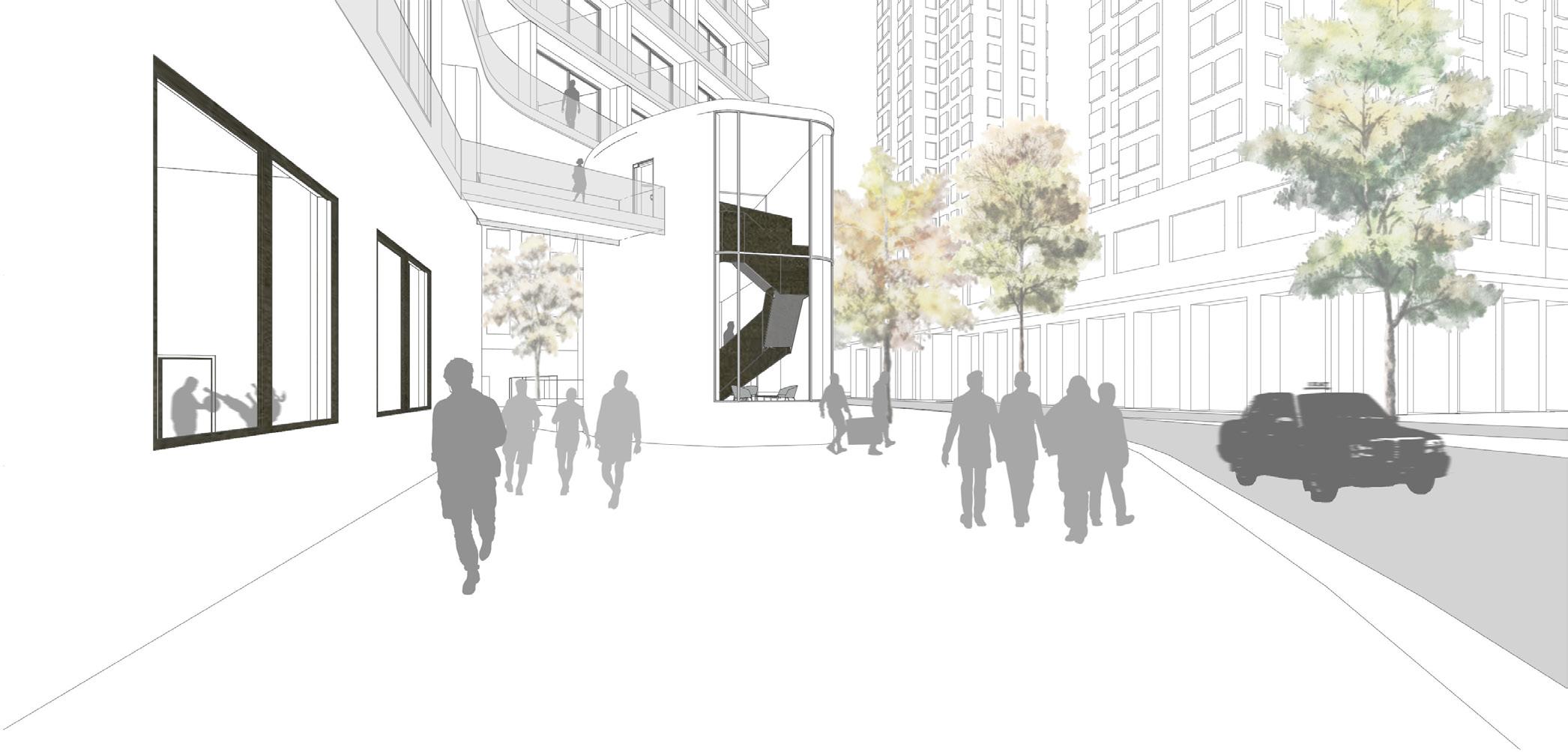
0 20 5 10 Plaza Entrance Garden Reception Private Public
To relieve the streets from the pedestrian traffic, most of the ground level is contributed to pedestrian use.
The lobby separates the private entrance garden from the public plaza.


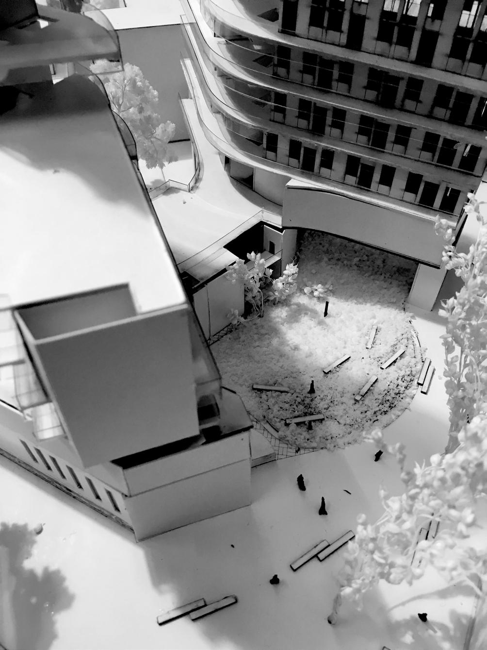

0 20 5 10 1 2 3 4 5 8 7 6 6
1 Cafe 2 Plaza 3 Security 4 Entrance Garden 5 Reception 6 Lift Lobby 7 Reading Room 8 Multipurpose Hall
Staggering towers allow maximum view and sunlight for each residential unit as well as the ground.

3 2 1 1
A shared kitchen for two units explores the possibility of co-living for the younger generation.
1 Single Studio
2 Shared Kitchen
3 Single Studio with en-suite kitchen
‘Pursuing
‘Modus Operandi’ attempting an alternative design method
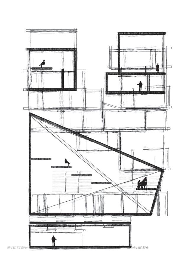
The design process did not start from massing studies. Instead, spatial qualities were first investigated through the process of making models without any particular typology in mind. Having extracted the desired traits from the brainstorm models, programs were then composed according to their requirements. The process of translating abstract qualities into a coherent project saw the emergence of unexpected ‘residual’ spaces. These were then assimilated into the final design.
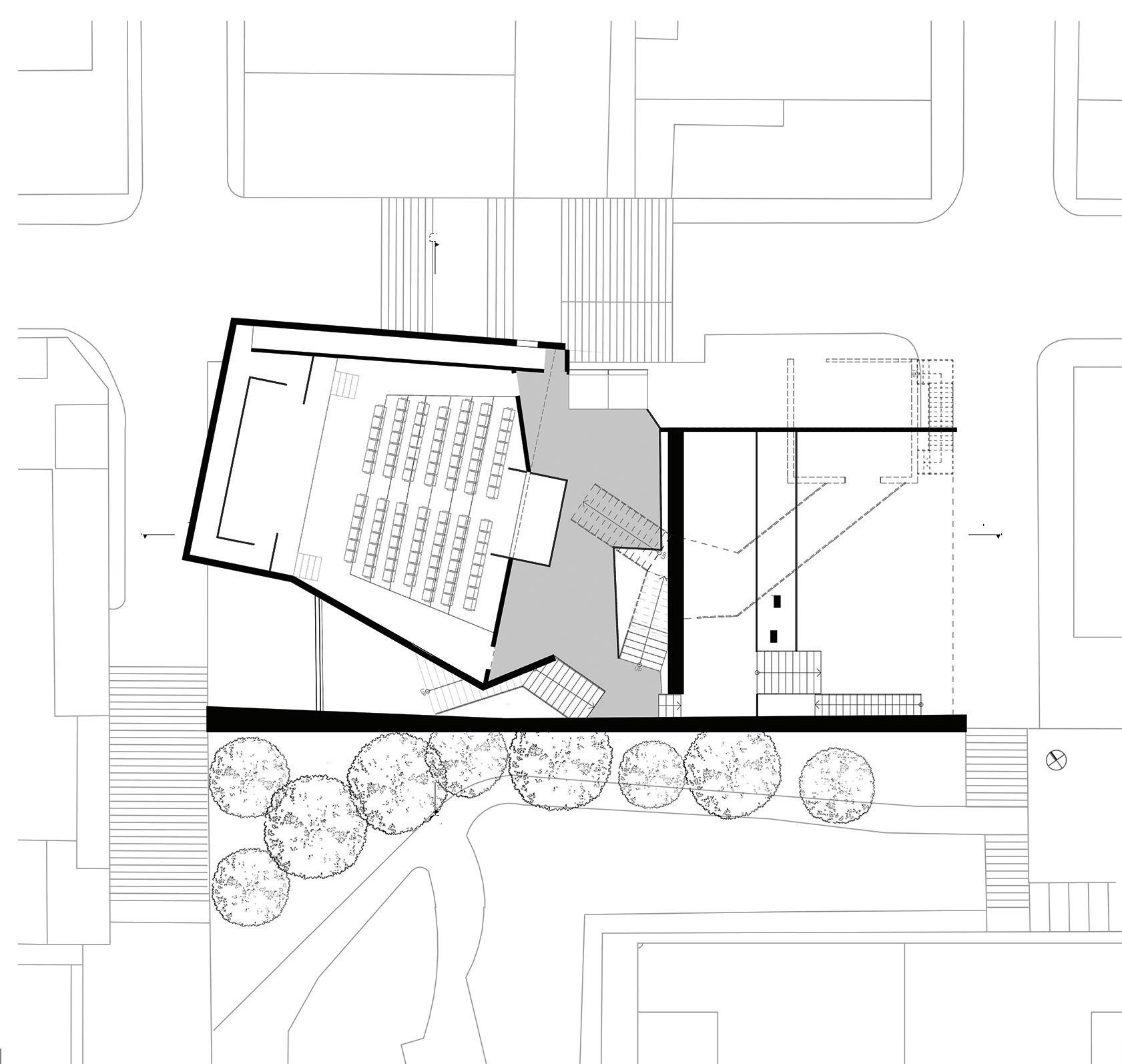
1 2 3 4 5
The Chinese University of Hong Kong (2014)
1 Foyer 2 Auditorium 3 Control Room
4 Mediatheque 5 Cafe

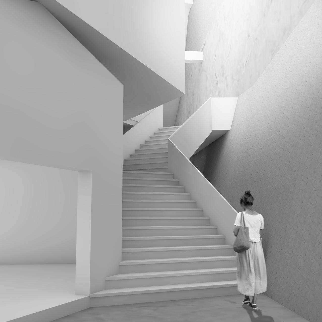 DNA models used to explore different spatial qualities were translated into architectural spaces
1:100 working model to study the composition of programmes, taking into consideration factors that affect vertical and horizontal layout such as procession of spaces, views, and privacy.

housing public private above middle below clinic education hall shop auditorium cafe mediatheque
1:200 model to make adjustments required by the context of the surrounding environment, in this case the level difference of the front and back of the plot.

garden retain housing workshop shop auditorium
Service Core, BaiTaSi, Beijing providing essential living functions
ZAO/standardarchitecture (2017) On-site construction management
We were given less than two months to finish construction of the interior of our previous hutong renovation project. The highlight of this interior project is the ‘Functional Module’ — a compact, integrated, core providing all service functions within approximately 4m2. The module has been under development since the initiation of this project more than two years ago. Only one prototype had been previously constructed, and changes in design were according to the
previously built version. Adjustments were still needed in both drawing and even during on-site construction, due to the site-specific conditions. Rigorous documentation of the Module’s construction process would contribute to the future evolution of its design.
Plan and originally drawn by S.J. FANG, revised by F. LEE Interior photo taken by Q.S. WU

Nan Xin Cang, Beijing conserving historical fabric
ZAO/standardarchitecture (2017)
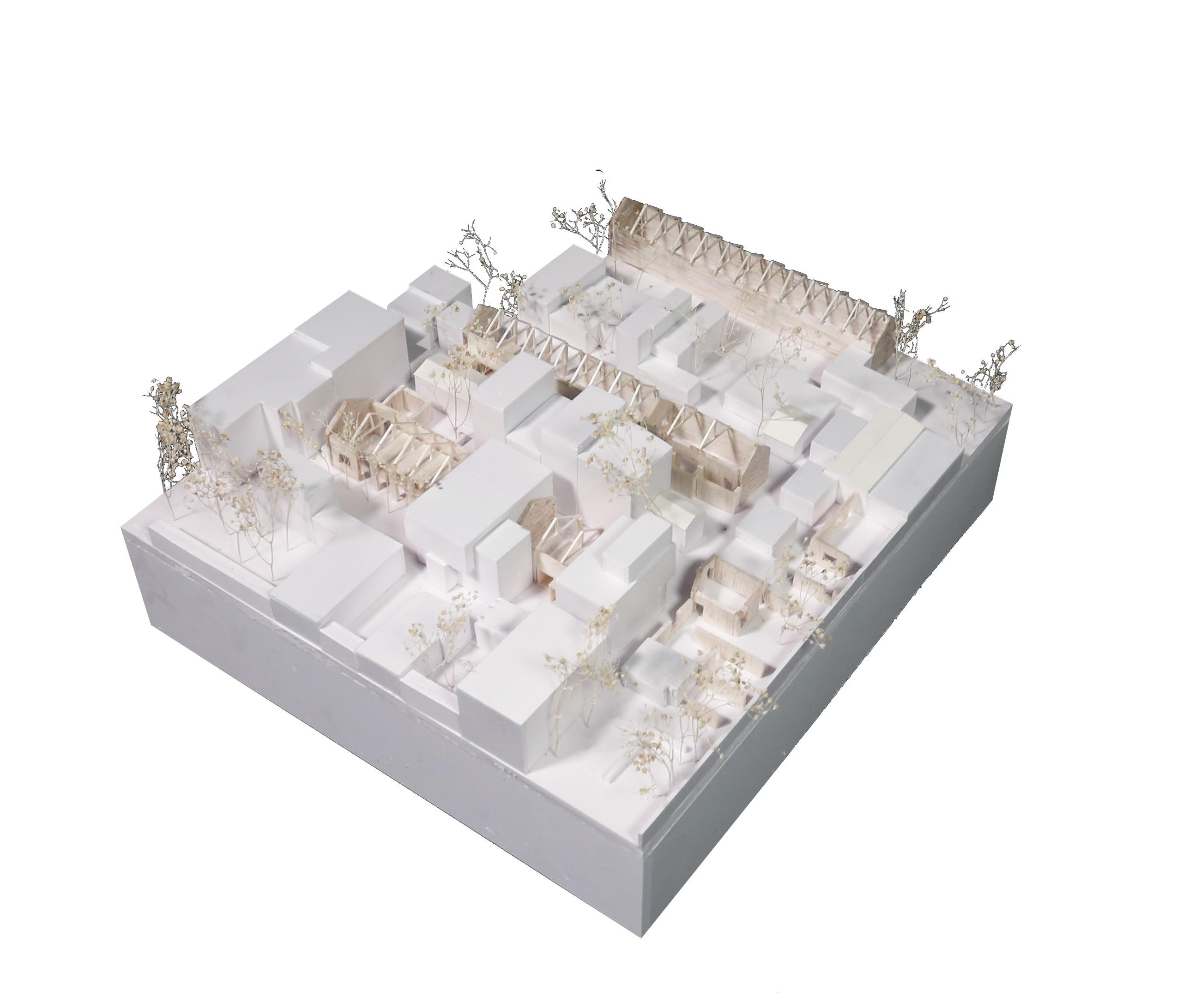
Concept Design
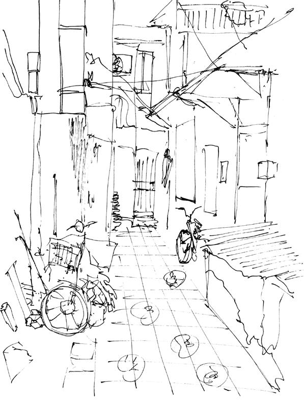
Beijing was evicting the ‘low-end population’ in a bid to ‘clean up the city”. A street renovation project beside a historic site was given to the team by the district government. In this complex socio-political context, we saw the potential to ameliorate the living conditions of the current residents in addition to improving the stipulated superficial image of the city. The challenge, then, was to extract the rich yet fragmented cultural and historical givens of the city to help us deliver on the government’s expectations.


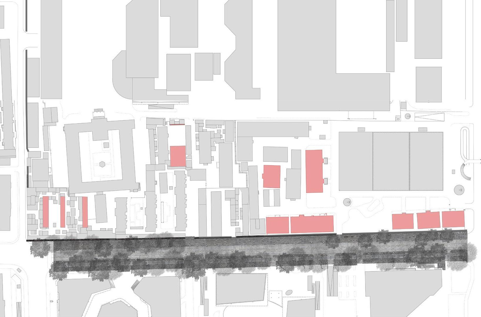
 1959 image highlighted with buildings that still exist
The government requested a street renovation and wall restoration project
Our proposal integrating the underused historic granaries and the disconnected residential districts (image by A. KIM)
B.Tap Baron read it to go
Freelance Graphic Design (2020)

B.tap Baron is an independent café serving egg waffles in Cambridge since 2017. The owner asked for a redesign of their takeaway menus and posters.


Size: A1 Posters, A5 menus
Software: Adobe Photoshop, Adobe Illustrator

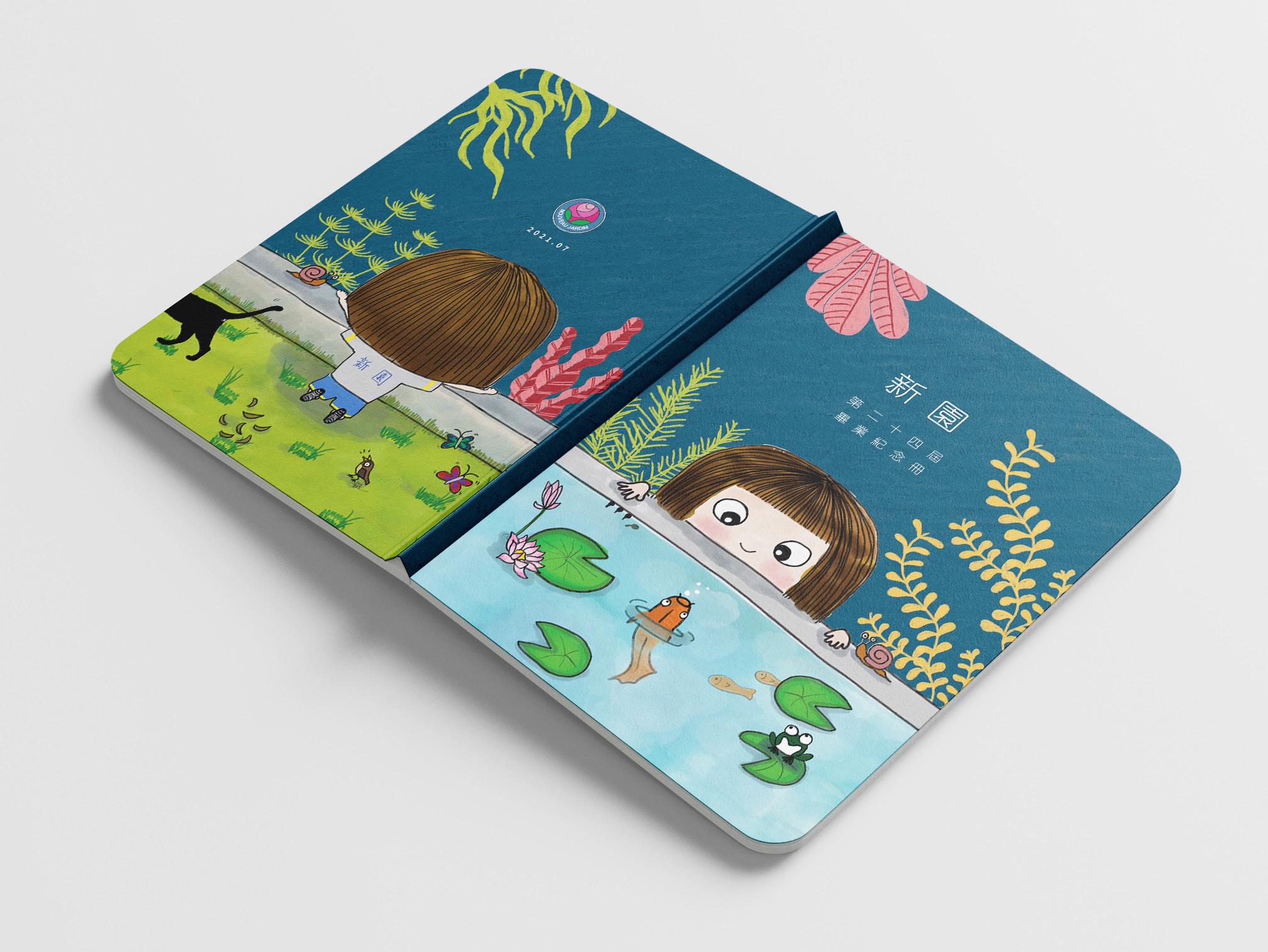
Nouveau Jardin Kindergarten documenting memories
Freelance Graphic Design (2020)
A Montessori kindergarten in Tainan, Taiwan asked for a design of their graduation photo albums for the students.Inspiration was taken from the charateristic fish pond at the school where children would feed the goldfish every day.


Size: A4 vertical book

Software: Adobe Photoshop

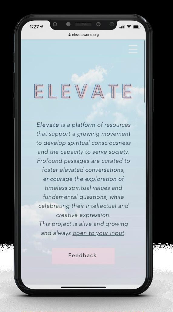
Elevateworld.org
curating resources for meaningful conversations
Digital Design Lead (2020)
Commissioned by the National Spiritual Assembly of the Bahá’ís of the United Kingdom, Elevate is a platform of resources that support a growing movement to develop spiritual consciousness and the capacity to serve society.


Software: Wix, Adobe Photoshop, Adobe Illustrator, Adobe InDesign


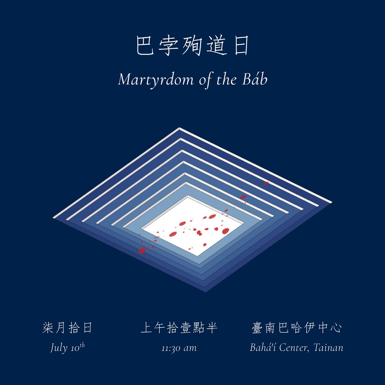
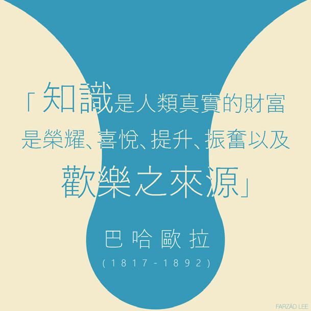
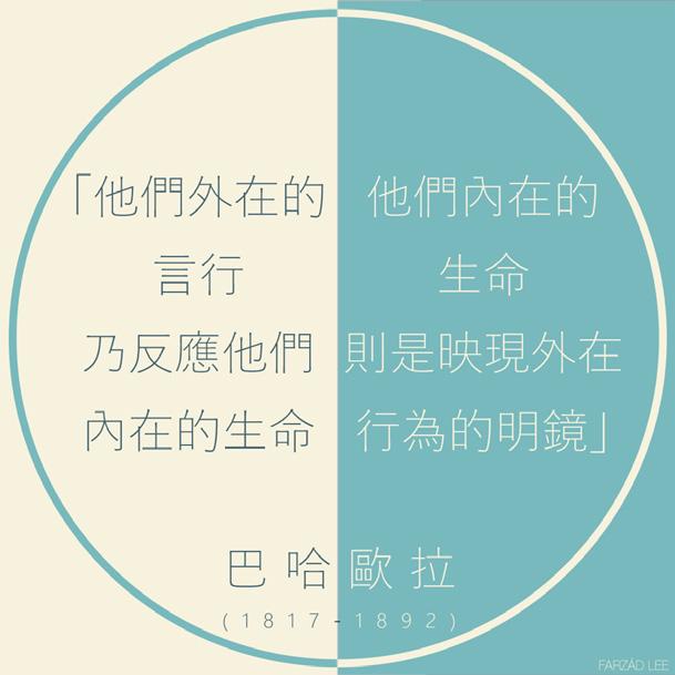
Bicentenary of Bahá’u’lláh invitations with style
Freelance Graphic Design (2017)
Commissioned by the Local Spiritual Assembly of the Bahá’ís of Tainan, a series of social media posts were designed for a campaign leading up to the Bicentenary of the birth of Bahá’u’lláh. Invitation cards were also designed with the same style. Software: Adobe Photoshop, Adobe Illustrator


 DaeWha Kang Design (2023) Graphic Representation
OWO Quadrangle Pavilion adorning the courtyard of the Old War Office

 The anchor building of Clockhouse Avenue features a covered public atrium, retail spaces, and workshops on the ground level. This thoughtful design not only includes logistics handling for the market but also plays a crucial role in defining the significant urban edges of the city.

 The Square
The Royal College of Art, London (2018-19)
The Kitchen The Room


 The interlocking programs break the boundaries of where spectators and performers should be.

 The project is situated at the edge of a bay-side park, right beside a flyover and surrounded by residential towers. The structure presents itself as an additional pavilion in the park.

 The transparency of the northern facade is intended to welcome users of the park, while the southern elevation aims to block noise from the expressway.

 The Chinese University of Hong Kong (2015)




 DNA models used to explore different spatial qualities were translated into architectural spaces


 1959 image highlighted with buildings that still exist
The government requested a street renovation and wall restoration project
Our proposal integrating the underused historic granaries and the disconnected residential districts (image by A. KIM)

