1 minute read
Beetlejuice and the Rejection of Modernity 29
& the Rejection of Modernity of Modernity

Advertisement

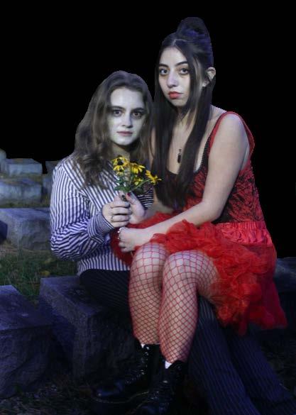
In 1988, Tim Burton gave life to one of his most wacky, vibrant, and endearing films; the fantasy horror comedy, Beetlejuice, was one of the most forward-thinking visual stories of the time. This film was not only famed for its storyline but also for the hair and makeup in it leading it to win an Academy Award for Best Makeup and Hairstyling. In classic Tim Burton fashion, the inspiration for the color palette came from Necco Wafers which were thin, pastel candies. From there, the colors became brighter and less gritty and creepy-looking as the makeup artists experimented and let their minds run free. This film became one giant creative exercise. The entire film was so unique, which is clearly seen in the work of artists Ve Neill, Steve LaPorte, and Robert Short. In the wake of what is known as 80s beauty, their execution ties in very nicely to the trends but also completely rejects them. When it comes to vibrant colors, the film has it. However, they also managed to make vibrant colors look horrific and dark. The main character, Beetlejuice, has pale yellow hair with green tips. But by adding big dark circles around his eyes, he began to look cartoony. This film shows that experimenting with makeup, hairstyles, and trying new things outside of your comfort zone, and societal norms can have wondrous outcomes. Makeup can be strange and unusual; it is meant to spark creativity and be over-thetop. Beetlejuice’s combination of light with dark made them a clear winner for the pure reason of having the ability to surprise the audience. This makeup stepped out of the modern and is a look that is absolutely necessary to revisit in years to come.


