&
Realism Representation
issue 43 • fall/winter 2010
Antony Gormley Kate Gilmore William Cochran Roman Signer Reshada Crouse Marlene Dumas William Kentridge Judith Shea Patricia Cronin William Pope.L Mark Tribe
COUNCIL BLUFFS, IOWA WHERE ART LIVES
Albert Paley, Odyssey, 24th Street Bridge, 2010 (work in progress photos); R ight : William King, Interstate, Mid-America Center, 2007; Jun Kaneko, Rhythm (detail), Mid-America Center, 2009; Deborah Masuoka, Haymarket Rabbits, Downtown Council Bluffs, 2007; William King, Sunrise, Mid-America Center, 2007; Jonathan Borofsky, Molecule Man, Mid-America Center, 2008; Jun Kaneko, Rhythm (detail); Brower hatcher, Wellspring, Bayliss Park, 2007.
iowawestpublicart.org
Yountville Public Art Walk | Yountville, California
GORDON HUETHER STUDIO ART IN ARCHITECTURE
gordonhuether.com
Four sculptures by Gordon Huether have been placed throughout the Town of Yountville, adding another layer of culture for local residents and visitors. Any sales of the sculptures will result in a 15% sales commission for the town that will be used to support arts-related events and activities.
t 310.392.2060 www.cliffgartenstudio.com
Cliff Garten Studio
Cliff Garten. Strings. University of Wisconsin School of Medicine and Public Health, Madison, WI. Commissioned by Percent for Art, Wisconsin Arts Board and School of Medicine and Public Health. Photo by C&N Photography.
&
issue 43 • fall/winter 2010 • volume 22 • number 1
Realism Representation
features 14 Putting Him, and Her, on a Pedestal: Antony Gormley & Kate Gilmore DAVID FRANKEL
12 • Introduction • patricia c. phillips + nancy princenthal
20 Experiments: The figurative, temporal, and sometimes explosive works of Roman Signer GREGORY VOLK
24 Public Ritual: William Pope.L and exorcisms of abject otherness DEREK CONRAD MURRAY and SORAYA MURRAY
28 Two Artists Reflect on the Contemporary Memorial: Memorial to a Marriage patricia cronin
Legacy Collection judith shea
30 Taking Public Liberties: Three graces in an African metropolis leora maltz-leca
34 Cash Cows: The CowParade and its discontents susan tallman
38 Reenactment & Media Representation: Interview with Mark Tribe patricia c. phillips
Roman Signer, in his 1994 “action sculpture” Schwarzes Tuch [Black Cloth] in Rheintal, Germany. Photo by Stefan Rohner.
issue 43 • fall/winter 2010 • volume 22 • number 1
realism & representation
departments 11
Publisher’s Note
41
Artist Page
45
Soap Box
47
Featured State: New York
JACK BECKER
WILLIAM cochran
ellen driscoll
From upstate to downstate to the Big Apple, New York has it all. Take a tour of the state’s public art and meet the women in New York City who help make it all happen. nadine wasserman and lilly wei 47
58
On Location: Reports from the Field Expanded coverage of people, places, and projects from around the globe.
UCIRA and embedded arts research across California • KIM YASUDA Made in Taiwan: Environmental art on the Beautiful Island • elizabeth wilson Memorial Reconceived: Public art as platform in Atlanta • Cinqué Hicks Life on the Avenue: Wing Young Huie looks at Saint Paul • diane mullin Lost in Bureaucracy: Missed opportunities at the Shanghai Expo • Adam Minter
58 60 62 63 64
69
Conference Reports
lee petrie, karin wolf and jennifer mcgregor
74
From the Home Front jon spayde
58
78
Book Reviews chris dodge, capper nichols, Laine Bergeson, dan wahl, joseph hart and kaisa cummings
90
www.ForecastPublicArt.org
82
Recent Publications
84
News
90
U.S. Recent Projects
94
International Recent Projects
98
Last Page: Crossword Puzzle
myles mellor
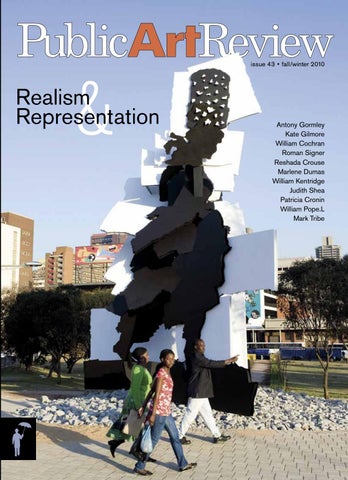
ON THE COVER Fire Walker (2009), by Johannesburg-born artists William Kentridge and Gerhard Marx, is situated on a previously derelict traffic island in Joburg. At ten meters tall, with no 90-degree angles, the sculpture depicts—from one angle—a silhouetted image of a woman walking with a fire brazier balanced on her head, an everyday sight in the city. The artwork was commissioned by the Trinity Session and funded by the Johannesburg Development Agency. See story on page 30.
2010 Umbrella! Event Thanks
REALISM & REPRESENTATION
issue 43 • fall/winter 2010 • vol. 22 no. 1
EDITOR + PUBLISHER Jack Becker
ADVERTISERS
DESIGN + PRODUCTION Nichole Goodwell
Barbara Grygutis Sculpture
A. Zahner Company Broward County Cultural Division College Art Association
GUEST EDITORS SENIOR EDITOR
Patricia C. Phillips Nancy Princenthal Karen Olson
ASSOCIATE EDITOR Joseph Hart
Thanks to Forecast Staff, Board Members, and volunteers who helped make our annual benefit a big success!
COPY EDITOR
Loma Huh
CONTRIBUTING EDITOR Jon Spayde
City of Albuquerque, NM City of Asheville, NC City of Calgary, Canada City of Sacramento, CA Cliff Garten Studio CMYinc. Creative Time Eichinger Sculpture Studio Electroland Franz Mayer of Munich, Inc. Gordon Huether Studio
Sponsors Minnesota Twins Baseball Club Minnesota Ballpark Authority Wet Paint, Inc. Minneapolis College of Design Mortenson Construction Park Midway Bank Univ. of MN College of Design Wipfli CPAs and Consultants
EDITORIAL ASSISTANCE Laine Bergeson Amelia Foster PRODUCTION ASSISTANCE Elijah Goodwell
Iowa West Public Art Kansas City Municipal Art Commission Los Angeles County Arts Commission LA Metro Art Myklebust+Sears Peters Studios Polich Tallix
ADVISORS
Host Committee Mayor R.T. Rybak Commissioner Mike Opat Dan Avchen Joan Campbell Fuller & Constance Cowles Jay Coogan Tom Fisher Joanne Kaufman Chuck Leer Dave St. Peter Additional Thanks Cinema de la Vie Dan Marshall Photography Soozin Hirschmugl ICEBOX Quality Framing & Gallery Jeff Lohaus Camille LeFevre One Voice Mixed Chorus
International Sculpture Center
David Allen
Mary Jane Jacob
The Revolving Museum
Jerry Allen
Mark Johnstone
Scottsdale Public Art
Penny Balkin Bach
Stephen Knapp
Seattle Office of Arts & Cultural Affairs
Tom Bannister
Suzanne Lacy
Taylor & Francis
Ricardo Barreto
Jack Mackie
Times Square Alliance
Cathey Billian
Jill Manton
Troco
Fuller Cowles
Jennifer McGregor
Western States Arts Federation
Susan Doerr
Patricia Phillips
www.ArtfulPlaces.com
Greg Esser
Phil Pregill
Thomas Fisher
Joyce Pomeroy
Gretchen Freeman Glenn Harper
Schwartz
Find links to our Advertisers’ websites at www.ForecastPublicArt.org/par-advertising.php
Shelly Willis
EDITORIAL INQUIRIES
Jack Becker
jack@ForecastPublicArt.org
ADVERTISING INQUIRIES
Nichole Goodwell
nichole@ForecastPublicArt.org
Correction • ISSUE 42 In our coverage of Memory House/Desire House (page 92), PAR attributed the conception and design to students at the University of Maryland. It was conceived and designed by architect Ronit Eisenbach; students helped develop and construct the project.
SUBSCRIPTION / ORDER INQUIRIES ABOVE: An umbrella flash mob performed in front of Ned Kahn’s wind veil The Wave at the Minnesota Twins Stadium during the event. Photo by Dan Marshall Photography.
info@ForecastPublicArt.org
© 2010 Public Art Review (ISSN: 1040-211x) is published twice annually by Forecast Public Art. Annual individual subscription rates are $24 for USA, $31 for Canada/Mexico, and $37 for Overseas. Annual institutional subscription rates are $48 for USA, $62 for Canada/Mexico, and $74 for Overseas. Public Art Review is not responsible for unsolicited material. Opinions expressed and validity of information herein are the responsibility of the author, not Forecast, and Forecast disclaims any claims made by advertisers and for images reproduced by advertisers. Public Art Review is indexed by Art Index and Artbibliographies Modern.
w w w.Forecast PublicArt.org
OUR MISSION Forecast Public Art is a 501(c)3 nonprofit organization that strengthens and advances the field of public art—locally, nationally and internationally—by expanding participation, supporting artists, informing audiences and assisting communities.
Thank you to the following who gave their support May 1, 2010 to November 1, 2010: Forecast Public Art
2324 University Ave. West #104
St. Paul, MN 55114-1854
TEL 651.641.1128
FAX 651.641.1983
FORECAST STAFF
Jack Becker Executive Director
Melinda Childs Grants Manager + Consultant
Kaitlin Frick Operations Manager
Nichole Goodwell Designer + Program Manager
Amelia Foster Administrative Assistant
BOARD OF DIRECTORS
Frank Fitzgerald (chair)
Pamela Belding
Joseph Colletti
Kurt Gough
Andrea Jenkins
Shakun Maheshwari
Caroline Mehlhop
John Morse
Erik Rogers
Richard Ruvelson
Joseph Stanley
Hlee Vang
Diane Willow
CLIENTS and PARTNERS
Americans for the Arts
ArtOrg, Northfield, Minnesota
The Bakken Museum
The Bridge for Youth
City of St. Louis Park, Minnesota
City of St. Paul, Minnesota
Nancy Ann Coyne
Do It Green! Minnesota
Grand Rapids Art Museum
Hennepin County Libraries
Hennepin County, Minnesota
Jeff Lohaus
LHB Design, Minneapolis
Minneapolis Community
and Technical College
Ox-bow, Michigan
Regional Arts Councils of MN
MN State University Moorhead
University of Delaware, Newark
University of Minnesota Libraries
Wenk Associates
MAJOR FUNDERS Andy Warhol Foundation
Arts Midwest
F.R. Bigelow Foundation
for the Visual Arts
ArtsLab Partners:
Jerome Foundation
Bush Foundation,
The McKnight Foundation
F.R. Bigelow Foundation,
Minnesota State Arts Board
Mardag Foundation,
National Endowment for the Arts
The McKnight Foundation,
St. Paul’s Cultural STAR Program
The Saint Paul Foundation
Travelers Foundation
MN REGIONAL ARTS COUNCILS
Metropolitan Regional Arts Council
Central MN Arts Board
Northwest MN Arts Council
East Central Arts Council
Region 2 Arts Council
Five Wings Arts Council
Southeastern MN Arts Council
Lake Region Arts Council
SW MN Arts & Humanities Council
This activity is made possible in part by a grant provided by the Minnesota State Arts Board, through an appropriation by the Minnesota State Legislature from the Minnesota arts and cultural heritage fund with money from the vote of the people of Minnesota on November 4, 2008 and a grant from the NEA.
DONORS • • • • • • • • • • • • • • • • • • • • • • • • • • • • • Give online @ www.ForecastPublicArt.org Jerry Allen
Stephen Knapp
Tobey Archer
The Lander Group Inc.
MULTI-YEAR DONORS
Anonymous (4)
Larry Kirkland Studio
Harriet Bart
Rebecca Banyas
Barbara McCarren & Jud Fine
Margaret Christiansen
Dr. and Mrs. William Becker
Karen McCoy
Malcolm Cochran
Cathie Behrend
Jennifer McGregor
Geri K. Connelly
Pamela Belding
Jerry Meyer & Nina Zingale
Frank Fitzgerald
Alan Bergman
John Morse & Joe Hamilton
Kurt Gough
Bob Kost, SEH Inc.
Anna Valentina Murch
Ann S. Graham
David & Diane Buck
Stuart Nielsen
Jim Hirschfield & Sonya Ishii
Melisande Charles
Laurie Phillips
Jim Gallucci Sculptor, Ltd.
Bob Close & Cindy Peltier
Johanna Poethig
Peter Kramer
Charlotte Cohen
Wayne E. Potratz
Helen Lessick
T. Allan Comp
Public Art Saint Paul
Caryl Christian Levy
Dan Cornejo
Shirley & Tom Reynolds
Katy Lindblad
C. Fuller Cowles
Jann Rosen-Queralt
Consuelo I. Marshall
Carol Daly
Phyllis Rosser
Caroline & Scott Mehlhop
Gordon Deane
Jim Rustad
Andrea Myklebust & Stanton Sears
Electroland LLC
Joyce Pomeroy Schwartz
Jody Pinto
Ronald Lee Fleming
Shapco Printing, Inc.
Philip Pregill
Gretchen Freeman
Joan Solomon
Philip & Mary S. Rickey
Leslie Fry
SRF Consulting Group
Richard Ruvelson
Shawn Gensch
Michael Sweere
Mark Spitzer
Gita Ghei
Sarah-Lee Terrat
Joseph Stanley & Lori Zook-Stanley
Ellen Grace
Lucy Thompson
UrbanArts Institute at
Jane M. Hallett
Tuckerbrook Conservation LLC
Nancy Holt
Roslye Ultan
Shelly Willis
Christine Huskisson
Ann Viitala
Barbara Benson Keith
Nancy Webber
Massachusetts College of Arts
Both the paper manufacturer and the printer of this issue of Public Art Review are certified by the Forest Stewardship Council™. It is printed on Starbrite Opaque paper, made from 10% post-consumer fiber. The vegetable oil-based inks used are free of volatile organic compounds (VOCs) and do not require solvents to cure; instead, curing was accomplished using an ultra-violet light source.
Congratulations
FORECAST AWARD recipients
for outstanding achievement in public art
• Ned Kahn • Tom Oslund • Target Corporation • Minnesota Twins On September 16, 2010, Forecast Public Art presented its first-ever awards to raise awareness and appreciation of outstanding achievement in the field of public art. The statuette, created by local sculptor Jeff Lohaus, is a solid pewter version of the Forecast Public Art logo. Ned Kahn Internationally renowned artist Ned Kahn created a monumental wind veil, The Wave, his first Minnesota commission, allowing the visual wonders of nature to make themselves visible through his work. Tom Oslund As a designer, landscape architect, and collaborator, Tom Oslund’s sensitivity to the context of the ballpark environment created an extraordinary public plaza. Target Corporation Accepted by Shawn Gensch, Vice President of Marketing. Target is a communityminded corporate leader and supporter of good design in everyday life, as well as a major investor in public art. Minnesota Twins Accepted by president Dave St. Peter. Forecast recognized the club’s commitment to building a ballpark that inspires players and fans, and creating an entry plaza that features public art. ABOVE: Ned Kahn’s The Wave (2009) overlooking Target Plaza. PHOTO BY GEORGE HEINRICH. LEFT to RIGHT: Forecast Award by sculptor Jeff Lohaus; Award recipients Shawn Gensch, Dave St. Peter, Tom Oslund, and Ned Kahn. PHOTOS BY DAN MARSHALL.
w w w.Fore cas tPublic Ar t .org
Jack Becker
PUBLISHER’S NOTE
“Public art exposes people to the ideas, energies, and talents of artists in a way that traditional and sequestered venues do not.”
Reality Check Needless to say, many nonprofits and government agencies are scrambling, cutting back and forging new alliances to stay alive, trying to maintain their relevance. Some are pursuing partnerships, mergers, or acquisitions or finding innovative solutions. Some are withdrawing and hunkering down for the storm. Some are focusing their attention on the fundamentals. Here in Minnesota, a consortium of foundations joined together in 2008 to support ArtsLab, a program managed by Arts Midwest and designed to build capacity among small to mid-size nonprofit arts organizations. In addition to modest funding over a three-year period, the program provides periodic retreats and workshops, professional development and staff training, plus networking among peers in the field. As a participant, we at Forecast Public Art are reevaluating our strategies and laying a stronger foundation for future growth and development. We’re also working on transition plans, a new website, and building bridges with organizations and individuals to create valuable new resources for the field. A bold step toward this bridge-building goal took place in June, just before the public art preconference hosted by the Public Art Network (PAN) as part of the Americans for the Arts’ annual conference in Baltimore. With the help of Liesel Fenner at PAN, we convened a gathering of some of the world’s leading providers of web-based public art resources, including Art-Public.com, Art on File, Save Outdoor Sculpture!, ARTstor, Community Arts Network, and the International Sculpture Center, among many others. Attendees committed to a process of identifying needs and opportunities to advance public art by collective action. We plan to continue working with individuals and organizations dedicated to archiving, educating, advocating, and promoting public art in all its manifestations. (A report summarizing the gathering is on Forecast’s website.) It is obviously still early in the process of developing a shared vocabulary about public art. We lack standards in the field, professional credentials that might help elevate the quality of work being produced, and sophistication in terms of the advocacy that is sorely needed. The field is still young, and quickly evolving, and we should recognize our limitations, but not give up the good fight. If we pay closer attention to the interconnectedness inherent in public art as a practice, and recognize the courage and leadership that proponents develop merely to survive in this field, we should have nothing but optimism for a future in which everyone recognizes and values the role that art plays in our everyday lives. JACK BECKER is the executive director of Forecast Public Art, publisher of Public Art Review, a nonprofit based in St. Paul.
PUBLIC ART REVIEW | FALL / WINTER 2010
With this issue on “Representation and Realism” it seems fitting to share some fundamental facts of life in the public art world, as I see it. First of all, the zone between “art” and “public” is filled with contradictions and compromise, constantly challenging artists and audiences alike to question motivations and rethink assumptions. The entire notion of personal expression in public/communal spaces suggests a cause-and-effect scenario, where signals are sent and communication attempted on various levels—a great experiment in which we willingly apply enormous amounts of time, energy, and resources. But toward what end? Public art exposes people to the ideas, energies, and talents of artists in a way that traditional and sequestered venues do not. In fact, it’s changing the whole equation by removing the traditional filtering systems between the art and the public. Art and people are facing each other very directly. So you have this incredible opportunity with that kind of interface to reach people, to affect change, to influence behavior and raise appreciation for who artists are and what they do and how they impact our culture. Yet how much do we really know about how our work affects others? There’s an enormous lack of research and hard evidence to back up the numerous claims about the positive impacts of public art—evidence that might gain us some respect and win us some support. We could all use some support about now. If “the recession is over,” then we’re feeling one hell of an aftershock. Artists are working twice as hard for half as many opportunities. Program managers are an endangered species. Public officials are looking for pennies under rocks—where the foundations for approved sculptures have already been poured—or looking for rocks to hide under! The lack of political will to adopt stronger policies and establish adequate funding mechanisms is being felt in our neighborhoods, and in our pockets. While public financing of public art is down, some attention has shifted to the private sector, or at least public/private partnerships. This could be a good thing, triggering more partnerships than ever before. More city councils and chambers of commerce have put public art on the agenda, in one form or another—even Cows on Parade are considered cash cows. As creative problem solvers, some artists take to this downturned economy like fish to water (better than flopping around gasping for air). Artists working in the public realm need to be more savvy marketers of their creativity, willing to explore uncharted territory, think beyond commissions, and find alternative sources of support. Street artists, independent producers, and corporate sponsors are demonstrating that government-funded art is only a slice of the public art pie.
11
T
he perhaps incautiously broad subject the
feature articles in this issue attempt to address—realistic figurative representation
—comprises three terms that are intriguingly
unmoored. All are subject to the influence and persuasion of politics and visual conventions. The radical forms of realism undertaken by Gustave Courbet, Edouard Manet, and Auguste Rodin in the late nineteenth century were a courageous departure from academic painting and sculpture; each responded to political and social events of their time. More recently, realistic figuration has often been associated instead with a depoliticized return to tradition, and a deliberate rejection of the possibilities presented by abstraction, performance art, and work that takes place between and among the media. Some contemporary
artists—several, for instance, represented in “Statuesque,” the Public Art Fund’s current exhibition at City Hall Park in New York—have turned to the vocabulary of classical statuary for expressing the complexities of the human condition. It remains the case, however, that ever since Jacques Derrida complicated the questions of representation and authenticity, most artists have approached realistic figuration warily. As editors, we were eager to keep the issue open and complex, rather than focused and finite. The authors of the following articles share the impulse to embrace complexity: Taking an engagingly eccentric perspective on two recent projects in New York, David Frankel compares Antony Gormley’s Event Horizon, in which 31 bronze body casts of the artist were placed in and around Madison Square Park and as far away as the Empire State Building, most of them hidden in plain sight on rooftops and ledges, to Kate Gilmore’s Walk the Walk, a five-day performance involving seven women stomping the rooftop of a small, cube-shaped pavilion in Bryant Park. Unexpectedly, Frankel finds
PATRICIA C. PHILLIPS + NANCY PRINCENTHAL Guest Editors
In his article on the Swiss artist Roman Signer, who stages ephemeral events that are often explosive and sometimes very funny, Gregory Volk proposes that performances presented outdoors, generally in remote places and without audiences, and then publicly shown in museums and galleries in the form (mostly) of video documentation, constitute a provokingly inter-media form of public art. Derek and Soraya Murray collaborate on an essay that examines the vivid—and critical—realism of William Pope.L’s work in the public realm. With particular focus on his legendarily anti-heroic crawls, they examine conflicted spaces of representation in the public realm. Pope.L’s strikingly challenging work raises urgent questions about viewers’ perceptions and experiences. Readers are reminded that public is a highly contested concept and space.
Patricia Cronin and Judith Shea present, in their work and in accompanying texts, startling adjustments to historic concepts of the memorial. Their figurative work challenges the conventional character of the memorial, which is traditionally affirmative, grandiose, and male. Leora Maltz-Leca considers three recent figurative public art projects that examine the concept of liberty in post-apartheid Johannesburg, South Africa. With Eugène Delacroix’s Liberty Leading the People (1830) as a touchstone, she vigilantly questions democratic ideals in this painting and sensitively analyzes the different—and deeply challenged—representations of liberty in works by Reshada Crouse, Marlene Dumas, William Kentridge and Gerhard Marx. Susan Tallman’s perceptive assessment of the global phenomenon called CowParade herds the livestock that have become ubiquitous on city streets into an analysis far from their comfort zone. With disarming wit, she explores how the painted bovines negotiate connections among commerce, philanthropy, vernacular idioms, and local identity. Finally, in conversation with Patricia Phillips, Mark Tribe reflects on the Port Huron Project—its impetus, orchestration, and vividly different afterlives. Reenactments of significant protest speeches from the late 1960s, and their ongoing presentation in multiple conditions and venues, raise urgent questions about political expression and how mediation plays a significant role in the public history that we accept or acknowledge. PATRICIA C. PHILLIPS is dean of graduate studies at Rhode Island School of Design and an independent writer, editor, and curator. She is the former editor of the College Art Association’s Art Journal. NANCY PRINCENTHAL is a New York-based writer and former senior editor of Art in America. She has contributed to Art News, Artforum, The Village Voice, and The New York Times.
One of Antony Gormley’s 31 cast iron figures peers down onto Madison Square Park from atop the St. James (1133 Broadway) as part of Event Horizon, 2010. Photo by James Ewing.
PUBLIC ART REVIEW | FALL / WINTER 2010
that the literal support for all the figures in both projects—their pedestals—constituted a shared element of key importance, and a link with questions inherent to figurative sculpture throughout its history.
13
PUBLIC ART REVIEW | VOL. 22 NO. 1 • ISSUE 43
14
One of Antony Gormley’s rooftop figures for Event Horizon overlooks Manhattan. Photo by James Ewing. Kate Gilmore’s Walk the Walk gives pedestrians pause in New York City’s Bryant Park. Photo by Amy C. Elliott.
Putting Him, and Her, on a Pedestal
Antony Gormley & Kate Gilmore David Frankel
the expanded field,
the urban context, the revision of both the object’s and the spectator’s status: All these seem fairly new in contemporary art, having gone mainstream in only the past 40 or so years. But just as cubism depended on the genre of the still life, old formal devices often live on, if transformed, in new approaches. In sculpture, as two public projects this spring and summer showed, one thing that persists is the pedestal.
Indexical Copies at Various Heights Antony Gormley’s Event Horizon, organized by the Madison Square Park Conservancy, took a maximalist approach to public art, comprising not one, not two, but 31 male figures dotted through a 20-block-long area of Manhattan centered on Madison Square Park. Placing these sculptures must have taken an elaborate campaign of logistics, engineering, and negotiation, since all but four of them roosted high on office and residential buildings at varying distances above the street.
PUBLIC ART REVIEW | FALL / WINTER 2010
P
erformance, video,
15
Two of Gormley’s Event Horizon sculptures in New York City, one at ground level and the other on a nearby rooftop. As Gormley describes, they are “indexical copies” of each other.
There were at least two starting points for experiencing the work: total ignorance of it, in which you might stumble on a figure, then on another, and then start looking for more; or prior knowledge that it was there, perhaps from the project’s website, where you could download a map and go out to find it. Not that the map always helped—often I caught myself staring from map to view in total puzzlement, unable to detect a sculpture I knew was close by, horizontally if not vertically. At 29th and Madison, when I told an old man watching me do this what I was about, he replied, “Another guy said the same thing!” bemused that a sculpture he had never seen and was not convinced was there had made his neighborhood a destination. But there in fact the work was, invisible since we were right under it: It came into view a couple of blocks south, high and tiny against the sky on the 55-story condo at whose foot we’d been standing. Indeed, many of the sculptures were obscured by height or absorbed into the architecture around them, except from certain angles or viewpoints at which they snapped into clarity. Even then, it helped to be looking not at the pavement but upward, which not all New Yorkers do. If the figures played hide-and-seek even for walkers with maps, many others must have passed them right by, oblivi-
Photo by James Ewing.
PUBLIC ART REVIEW | VOL. 22 NO. 1 • ISSUE 43
16
ous to them—except in Madison Square Park itself, which was ringed with them and included the four at ground level. Here, if nowhere else, the work insisted on being noticed, and here it achieved its most dramatic and contradictory effects, both sociological and phenomenological. Ever since the minimalist period, in walking around or through sculpture—one of Richard Serra’s Torqued Ellipses, say—we have been asked to become aware of the way the object shapes and channels space, and of how our own body is placed in relation to it and within the fluid body of air through which we move. Figurative sculpture generally doesn’t do that; we walk up to it, look at it, then walk away—the subject represented has priority over our sense of the object’s occupation of space, the shaping pressure it returns to the site around it. This is still true, I think, of the long tradition of carefully sited public statuary, those works set at focal points of an avenue or square to dignify some local hero. Such works are often precisely placed in relation to their site, and each is crucial in giving meaning to the other, so that they are in a way site specific, but the intention is less a sensory awareness of site and space than a kind of mutually reinforcing propaganda. Gormley’s figures, perched on roof edges or inserted into architectural crannies well above our habitual sight lines, had quite different effects: It was as if each were a point in a web, an area charged by coordinate vectors from sculpture to sculpture. As you walked toward Madison Square Park down Fifth, say, or up Broadway from Union Square, isolated appearances of the figures became more frequent, as though you were moving into a force field that grew steadily more intense. In the park itself, new sculptures kept coming into view, for there is, it turns out, no one place in the park that allows a full panorama around it—at least not in summer, when the trees are in leaf. So you had to keep walking, peering up through the trees and eventually realizing that you were encircled by Gormley’s figures. Their widely different altitudes in relation to the street accentuated the sense that collectively they charted a three-dimensional space, an invisible topographic volume surrounding their viewer, who paid new attention to the urban frame in order to understand what this space was. The effect bore comparison to that of an environmentally scaled Serra work, which cannot be grasped from one viewpoint, motivating the visitor to move through it and presenting a new experience to the eye with every step. A Serra, though, is an abstraction, elegant but massive, while Gormley’s works are human figures at human scale. The few at ground level allowed a close view, telling us what the more distant ones were: anatomically exact naked males—“not statues,” Gormley wrote, but “indexical copies” of the artist’s own body. What stops them, for him, from being statues, I imagine, is their want of particularizing detail: These are not portraits but anonymities, their faces indistinct, their mottled
PUBLIC ART REVIEW | FALL / WINTER 2010
skin unpolished and unsmoothed. Further, eight regular, diskshaped bumps at front and back, like some deliberately retained by-product of the casting process, signal the artist’s artifice and bring in a robotic, nonhuman tone. From the street, though, the sculptures on buildings just looked like dark, watching figures, too remote to fully perceive. When the figures were first installed, city police felt the need to reassure us that they weren’t alive—in other words, that they weren’t about to jump and kill themselves. But whether they were in danger at their heights or whether, rather, they were threatening—engaged in some labor-intensive form of surveillance—was in fact ambiguous. In art-historical terms, it’s crucial that Gormley’s figures lack pedestals, those on the ground standing toe-to-toe with us, not lifted above us per the honorific formula. Most of the figures, of course, were elevated, and hyperbolically so, by the buildings on which they stood, in a wildly exaggerated play on the pedestal tradition. In a piece in London last fall, entitled One & Other, Gormley used the pedestal more literally, asking participants to stand on an otherwise empty plinth in Trafalgar Square, built in the mid-nineteenth century for an equestrian statue that never trotted onto it. (Event Horizon itself received an incarnation in London in 2007.) Funnily enough, a more modest public artwork in New York at the same time as Event Horizon took off from the same formal history: Kate Gilmore’s Walk the Walk.
Eight Feet High: Real Women Walking
ABOVE: Photo by James Ewing. BELOW: Photo by James O Jenkins.
Gilmore is a younger artist known for videos in which she performs physically demanding labors while wearing, typically, a dress and pumps—a costume associated with female decorum, not with the strenuous tasks, both heroic and quixotic, that she sets herself. We have seen her enlarging a hole in a sheet of plywood with her face (Star Bright, Star Might, 2007); or struggling to remove a block of cement, which incidentally encases her foot, from the pail that molds it (My Love Is an Anchor, 2004); or—in a recurring device that is now her most familiar, through the inclusion of a work on this pattern in the 2010 Whitney Biennial—punching and kicking, with gloved hands
17
ABOVE: One of four ground-level Event Horizon sculptures installed in New York City in 2010. BELOW: A participant in Gormley’s One & Other project in London’s Trafalgar Square, from July to October 2009. Learn more about all of Gormley’s work at www.antonygormley.com.
Gilmore elevated her groups of women. . . into something literally to look up to.
PUBLIC ART REVIEW | VOL. 22 NO. 1 • ISSUE 43
18
Walk the Walk was Gilmore’s first piece using not her own body but a group of performers brought in for the occasion. For this project, presented in May by the Public Art Fund, she built a yellow cube in midtown Manhattan’s Bryant Park and set teams of seven women at a time, wearing dresses of the same color, on its roof, each team occupying the space for a five-hour shift, of which there were two a day throughout a working week. Eight feet above the ground, and confined in an eightfoot square, the women milled about tightly. Charged to keep moving—to walk the walk—they did so with varying degrees of purpose and aimlessness, energy and fatigue. Their passage was clumsy and random: There was no synchronization, and certainly no conversation among the women, although their clothing made them uniform with each other and with their environment. Watching them try to maneuver, I thought of the antithetical grace of schools of fish and flights of birds, who somehow
avoid crashing into each other—or maybe they don’t? Maybe their movement in unison produces glancing contacts but no collisions? The women on the roof were different: Their walk was deliberately unsystematic—rather than parade clockwise in a circle, they kept changing course—and avoiding hits must have taken a certain concentration. Visitors entering the cube, which had a door in each side, could hear the marching above their heads as an uncoordinated pacing and stamping. As is common in Gilmore’s work, the object of this endurance test was obscure. When the artist herself tries to climb up inside a column of sheetrock, or to break through to the other side of a wall of the stuff, what she gains when that goal is achieved—what any woman would—is never apparent. Here, similarly, we got a diagnosis without a cure—the point seemed to be simply to keep moving, to walk the walk, as if one’s life depended on it. Anyone who has worked in an office might recognize the syndrome. To cut, as with Gormley, to art history, Gilmore is as much sculptor as video or performance artist—her work usually involves some kind of object-making, or an unmaking of something made earlier—and the cube in Walk the Walk was unmistakably a pedestal. Just as Gormley made ordinary people living sculptures in Trafalgar Square, Gilmore elevated her groups of women and their mundane, repetitive, perhaps futile, yet necessary-as-breathing activity into something literally to look up to. But if Gormley’s use of buildings as pedestals raised his sculptures so high they were inaccessible to sight, making agreeable nonsense of the tradition’s purpose, Gilmore was more down to earth. This was an application of an ancient element of sculpture’s formal vocabulary to a present politics.
David Frankel is an editor and writer living in New York.
Photos by Amy C. Elliott.
and daintily shod feet, through walls of sheetrock. Gilmore is always trying to get through something, or to the top of something. In effecting these ambitions in clothes both coded as feminine and incongruous with the brute force required, she gives visual muscle to arguments rooted in the women’s movement and refashions them with a sharp absurdist signature.
PUBLIC ART REVIEW | FALL / WINTER 2010
19
Seven women walked in five-hour shifts for Gilmore’s Walk the Walk. Spectators could enter the structure to hear the shoes pound the cube from above. More at www.publicartfund.org/kategilmore.
Experiments The figurative, temporal, and sometimes
T
20
he video shows a man—the Swiss artist Roman Signer— seated on a wooden stool in a green field in front of an
easel (Punkt [Dot], 2006). With a paintbrush in hand, he is poised to make the first mark on a blank canvas. He could be a plein air painter, taking up a painterly tradition that goes way, way back, or perhaps a casual Sunday artist about to capture the lovely surroundings, including a forest at the edge of the
field. Sitting silently and motionless, as if waiting for inspiration, he also seems very sculptural: He might be a carved Born in 1938, Roman Signer spent
or cast sculpture. This sculptural quality is a key to Roman
many years far from the limelight while
Signer’s various temporary actions, sculptures-as-events, or
developing his unorthodox art. It is only since the mid–1990s that he has emerged as not only one of the top Swiss artists (something belatedly acknowledged when he represented Switzerland at the 1999 Venice Biennale) but also one of the very best and most compelling artists of the past several decades. —GV
•
what he likes to call his “experiments,” some of which only last for a very brief while (as in a matter of seconds). However, as you gaze at this seemingly frozen tableau, things suddenly go haywire. White smoke starts billowing from a small box on the ground several yards behind Signer’s back and stealthily advances toward him. Something is smoldering inside the container, a fiery surprise that the artist can’t see. As the smoke—and the tension—increases, Signer continues to sit like a statue, until the box ignites and explodes with a resounding boom, causing him to flinch and reflexively dab the canvas with a single stroke of black paint. After making this gesture, he continues to sit while the smoke drifts away. Near the end of the short video (it is under two minutes long), the camera zooms in to examine the painting, and it is surprisingly gorgeous. This short black stroke seems at once forceful and delicate, exceptionally minimal and unexpectedly complex, while it also resembles a scorch mark, as if Signer were a human conductor, transferring the explosion and fire directly onto his painting. Of course, there is something hilarious about this dramatization, or physicalization, of artistic inspiration—of a light bulb
explosive works of
Roman Signer GREGORY VOLK
ABOVE LEFT: Videoprints by Aleksandra Signer. LEFT: Photo courtesy the artist. THIS PAGE: Videoprints by Tomasz Rogowiec.
Man as Art in Lonely Places Since the mid-1970s, Roman Signer has been engaged in, among other things, a radical and idiosyncratic variation on figurative public art. Instead of sculpting figures from some inanimate material, he is often the figure himself: an inscrutable Everyman going about his odd business in lonely places, usually outdoors. His slightly rumpled appearance, deadpan expression, and deliberate motions are an important part of his esthetic. While many of Signer’s works occur in public, they usually take place without an audience and far off the beaten path: at remote sites in Iceland; volcanoes in Sicily; the rural Appenzell region of Switzerland around the city of St. Gallen, where Signer lives; a snow-covered field in Poland; a rooftop in Geneva. While most figurative public works are meant to be, if not timeless, certainly extended in duration, many of Signer’s interventions happen very quickly, and only come to the viewer via photographic or video documentation. They are temporary interactions with public space, not impositions on it, and incorporate elemental forces such as speed, time, friction, gravity, momentum, erosion, wind, and flowing water. He further probes the question of what constitutes public art with such seemingly humdrum actions as putting on or taking off his hat, going for a ride in a kayak, going to sleep, or sitting in an office chair. In Hut, Rochester (Hat, Rochester, 2008), Signer stood next to a mechanical traffic gate, the kind that automatically rises to admit cars into a parking lot. Perched at the end was the artist’s black hat, and when the gate went up it took the hat along with it; when it descended it put the hat back within Signer’s reach. In effect, he turned this impersonal apparatus
into a ridiculously elongated arm and hand; the up and down, near and far movement of the hat enacted satisfaction and loss, confidence and bewilderment. For Bürostuhl (Office Chair, 2006) [pictured above], Signer sat in a typical swivel chair, but atop a rocky embankment at the edge of a stream rather than in an office. As he sat, he held two burning, smoking fireworks in his gloved hands, spewing out powerful sparks; the force of the fireworks caused Signer’s chair to start spinning like some raucous ride in an amusement park. Excitation, danger, playfulness, elemental physics, rampant motion, meticulous precision mixed with a loss of control, and abundant absurdity all came together in an action that seemed like some nutty, homemade science experiment but that also functioned as a dazzling kinetic sculpture. For Zelt (Tent, 2002), Signer pitched his blue tent at the edge of a field next to the woods. He emerged from the tent fully clothed, like a hiker or vacationer arising in the early morning, then sprinted away in a straight line. After he had gone just a few strides, the whole tent blew up into a fireball behind his back, sending thick smoke mushrooming up before being entirely consumed; Signer kept hustling away. Once again strikingly visual—as an expansive sculpture, its constituent elements included the tent, Signer, the field, woods in the background, the fireball and smoke—Zelt also had multiple connotations. Stasis and motion, safety and danger, containment and exhilarating release all coursed through it. The same goes for the enigmatic Schwarzes Tuch (Black Cloth, 1994), for which a black cloth was draped over a mysterious object set in the middle of a dirt road leading through a field. Four tin cans were fastened to the edges of the fabric, and on the ground were four silver buckets filled with water. Suddenly, everything erupted: The cloth flew upward, water flew from the pails, the cans flew off in different directions, and the concealed object was revealed to be Signer himself, wearing a protective suit and a helmet while sitting calmly in a chair. This marvelous action suggested myths and magic rituals—maybe some kind of spiritual birth or rebirth—while also functioning, however briefly, as an enthralling public sculpture. Humble Moments of Destruction Bürostuhl, Zelt, and Schwarzes Tuch (and indeed a great many other works) featured explosives, which have led Signer to be identified, somewhat erroneously, as one of the prime explosions artists of his era (along with Chinese artist Cai Guo-Qiang), even though many of Signer’s works have nothing to do with combustion. It is, however, a fact that in tightly controlled Switzerland he is one of the few people, and probably the only artist, to be licensed to work with explosives, and each year he has to account carefully for his wares: how many blasting caps
PUBLIC ART REVIEW | FALL / WINTER 2010
going on in the brain, an “aha!” moment heralding some crucial breakthrough. But after you stop laughing—and humor abounds in Signer’s work, often of the slapstick variety—the complex power of this piece begins to sink in. Signer, his easel, the explosive device, and the verdant environment add up to a luscious visual ensemble; for all his oddball antics, Signer is an acute and precise sculptor, as well as a maker of riveting, richly evocative images. Throughout his work, he stages scenes of patience and thoughtful repose that are interrupted by a flash of shock, an upheaval, and catharsis—a sequence that also occurs in nature, for instance in volcanic eruptions, or in daily life when habitual activities and thoughts are scrambled by some transformative experience. Situated on a comparatively vast white canvas, Signer’s brushstroke seems tiny, and perfectly matches his own position as a small, lone figure in a big landscape. He has made his brief mark on the canvas, but also, by extension, on the world.
21
PUBLIC ART REVIEW | VOL. 22 NO. 1 • ISSUE 43
ABOVE: Six photographs comprise Roman Signer’s Schwarzes Tuch [Black Cloth], 1994. LEFT: Video still from Signer’s Kajak [Kayak], 2000. RIGHT: Video still from Signer’s Ski mit Rauch [Ski with Smoke], 1995.
he has used, how much dynamite, how many fireworks. Still, while there is often an element of danger in Signer’s work, he has never courted physical harm, and instead goes to great lengths to protect himself, including by wearing goggles, a helmet, heavy boots, gloves, and fire-resistant clothing. Nor has he ever been interested in razzle-dazzle pyrotechnics per se; on the contrary, if it is possible to stage discreet explosions, or humble moments of destruction, that’s exactly what Signer does, always with an eye toward effecting some decisive transformation. Indeed, transformation seems a key to the work of this visionary artist, whose sculptures often fuse creation and destruction. For Kajak (Kayak, 2000), Signer (who happens to be an expert kayaker) took off in his kayak, but not in a rural canal. Instead, he hitched the craft to a truck with a towline, put on a leather jacket and strapped on his motorcycle helmet, and went bumping, scraping, and rattling down a dirt road next to the canal, all the while making a frightful commotion. In the video (taken from the back of the truck), Signer’s trip seems precarious, and you fear that his kayak will crash into the trees, tumble into the canal, or bust apart into pieces. Midway through his journey he passes some wide-eyed cows, and while you expect them to scatter from all the racket, they do the exact opposite: They run after him, their bells clanging; it looks as if they are thrilled with this rift in their bovine routine, giddy about the excitement made by this weird Swiss guy in his noisy, misbehaving kayak. At last Signer reaches his desti-
nation, slows down, and stops. A gaping hole has been ripped in the bottom of his kayak, and he is up to his waist in gravel and dirt. He gets out, dusts himself off, turns the kayak over, and inspects it; it is almost ruined, but not quite. While Kajak has an absurdist streak, it also reveals a clearheaded engagement with core sculptural matters, including volume, scale, sight lines, momentum, and the figure. Moreover, Signer himself, his kayak, the curving towline, accidental cows, the country lane, and the quiet Swiss countryside add up to another of his visually lavish ensembles. What ultimately emerges is great deal of poetic resonance. This work juxtaposes speed and stasis, exuberance and danger, and accident and precision, and there are shuddering suggestions of mortality—of rushing through a life as the body wears down, trying to maintain balance while the world deals you friction and resistance. Kajak also upends a particularly Swiss cliché: A pleasant excursion on a sunny afternoon near the Alps was never quite like this before. But for all its wacky exuberance, this work is also poignant and lonely: It shows a single person making his arduous way through the world. The Fleeting Human Experience While Signer works indoors as well and has a thriving studio practice, he is most at home outdoors, in nature. This is where he feels most unencumbered, inventive, and at ease, and where, in his terms, “poetry” happens. His spare outdoor adventures are linked to post-minimal austerities, Fluxus antics, various kinds of performance art, and especially to land art. Yet, unlike some of the more renowned examples of land art, his works don’t alter the landscape in any lasting sense, and typically avoid anything monumental in favor of brief actions or events that enter into a dialogue with their surroundings, and which then disperse into the environment altogether, often without a trace. For Vulcanizzazione, Stromboli (1998), Signer, toting an inflated inner tube, climbed to the top of a volcano above a smoking crater. With the inner tube on the rocks right beside
ABOVE: Photos by Stefan Rohner. LEFT: Videoprint by Tomasz Rogowiec. RIGHT: Videoprint by Aleksandra Signer.
22
PUBLIC ART REVIEW | FALL / WINTER 2010
him, and with his back to the video camera recording this action, he contemplated the geological inferno in all its majesty and power, and in the video he again looks like a carefully composed statue. Then he rolled the inner tube down the slope, sending it bumping and careening into the smoldering pit. In the video documenting this action, the humble object seems strangely anthropomorphic. You feel a deep sympathy for the intrepid inner tube as it makes its reckless descent, even though you are aware that it is nothing more than inflated rubber. Signer has a peculiar ability to invest commonplace objects (many of his favored sculptural materials—including boots, blue barrels, balloons, wooden boxes, and alarm clocks—are readily found in any Swiss home, workshop, or cluttered garage) with distinctly human attributes: ungainliness and grace, fearfulness and robust aspiration. In Poland, in 1995, Signer made another vivid yet ephemeral sculpture—or, one could say, aerial painting—by cross-country skiing across a field while trailing red smoke from flares at his heels, which left a wavering line in the air, as from a rocket or an airplane (Ski mit Rauch [Ski with Smoke]). While comical, there was something deeply touching about this work, which tracked Signer’s position in time and across vast reaches of space. Turning as seemingly familiar an activity as cross-country skiing into an artwork is exactly the kind of transformation at which Signer excels. Throughout his work, things so familiar that under normal conditions they would hardly warrant a second thought suddenly take on a startling new life and assume unexpected, consciousness-altering power. For Schnarchen (Snore, 1994), Signer, like just another back-country trekker, ventured to a remote spot in Iceland, a hauntingly bleak yet gorgeous volcanic landscape. Once there, he pitched his tent, hung a microphone inside, placed two loudspeakers outside, went to sleep in his sleeping bag, and started to snore. When amplified through the loudspeakers, his snoring became a rhythmic roar, part moaning pain and part desolate entreaty. Reverberating through the landscape, it was a pure, involuntary announcement of, quite literally, his inner life, offered to an unhearing world. Precisely because so many of Signer’s works are fleeting, they assume the quality of resonant memories. The time he stood under gushing water in order to fill his waders up to the waist, after which he clumsily stumbled about and then
23
collapsed from the weight. The time he fell through the ice. The time he stood on a box that exploded, dropping him to the ground. The time, in Sicily, he climbed up a volcano in order to shoot small rockets and flares: an artist adding smoke to smoke, fire to fire. The time his kayak sank, and the time he futilely tried to outrun a small rocket. The time when a small rocket whisked his hat from his head and sent it flying far down a field. The time when, instead of protecting his feet on a wet day, Signer filled two black rubber boots with water and placed them on a dirt road (Wasserstiefel [Water Boots], 1986). An explosive charge in the boots sent the water jetting up to form a dazzling, loosely figurelike sculpture briefly suspended in midair. In photographic documentation this figure looks jaunty, even rakish, but also extraordinarily vulnerable, because you know that in the next split second it inevitably faltered and vanished. Here you really see how far Signer extends figurative public art. This more or less instantaneous sculpture was as intricate and spectacular as a complex object labored over for months in the studio. It was also unnervingly close to the bone, since we too are temporary, and all of our best, most inspired actions will likewise prove ephemeral. Gregory Volk is a New York-based art critic and curator who contributes regularly to Art in America as well as other publications. He is also associate professor in the School of the Arts at Virginia Commonwealth University in Richmond.
PUBLIC ART REVIEW | VOL. 22 NO. 1 • ISSUE 43
24
Public Ritual William Pope.L and exorcisms of abject otherness
Derek Conrad Murray + Soraya Murray
B
est known for his street performances, William Pope.L has worked for decades across a broad
array of media including public interventions, stage performances, installations, painting, and found objects.
Often collectively referred to as the eRacism series, these works are unified around the artist’s insertion of his own body as an abject signifier of blackness/ poverty/homelessness into the public domain. Pope.L does this through a series of seemingly ritualistic
PUBLIC ART REVIEW | FALL / WINTER 2010
25
ABOVE: Photo by Lydia Grey. RIGHT: Photo by Paul Fortin. LEFT: Photo by James Pruznick.
LEFT: William Pope.L, Tompkins Square Park Crawl, 1991, New York City. ABOVE: Member (a.k.a. Schlong Journey), 1996, New York City. RIGHT: Burial Piece (a.k.a. Sweet Desire), 1996, Skowhegan, ME.
actions that combine extreme physical duress with mental discipline. “Like the African shaman who chews his pepper seeds and spits seven times into the air,” he has said, “I believe art re-ritualizes the everyday to reveal something fresh about our lives. This revelation is a vitality and it is a power to change the world.” Pope.L’s formative years were profoundly marked by the proximity of working poverty, the incarceration of family members, and the intermittent threat of homelessness. These concerns largely defined the terms upon which Pope.L identified and honed his potent artistic and intellectual tools. It also informed his performance pieces, which explore physical and social abjection, the potential for transformation, and critique ideologies around the American Dream. This is evident in Burial Piece (a.k.a. Sweet Desire) (1996), in which Pope.L was buried up to his chest, immobilized and suffering for eight hours under the hot New York sun, while a large bowl of white ice cream lay just beyond reach of his parched mouth. Likewise, his notorious Member (a.k.a. Schlong Journey) of 1996, involved a stroll down 125th Street in Harlem while wearing a white suit and what was described by The New York Times as a “14-foot-long white cardboard penis” suspended at its tip by a wheeled support to keep it erect. Cited as a significant reason for the revocation of his $42,000 National Endowment for the Arts grant in 2001, Member brought public notoriety to Pope.L’s practice during the controversy. (Ultimately, the Andy Warhol Foundation for the Visual Arts awarded $50,000 to fund the major retrospective that the NEA’s grant was initially intended to support: William Pope.L: eRacism.) But it is his innovative and poignant utilization of crawling that has punctuated his life’s work.
Horizontal and Vertical Times Square Crawl (1978) was the first iteration of his careerspanning Crawl pieces. It involved a painful and slow journey across the not-yet-revitalized center known for adult theaters, shops, and prostitution. Wearing a business suit and moving along the filthy ground on his hands and knees, Pope.L became unassimilable, unsightly, a visual offense to the public sphere. His blackness redoubled this, creating a multilayered critique intersecting at issues of race, class, and privilege—all executed in New York, the epicenter of American financial systems. Tompkins Square Park Crawl (1991), in which he again donned a business suit and crawled New York’s Tompkins Square Park while gripping a small potted plant in one hand, fully realized the artist’s intention “to act out and wallow in signification,” as he once described it. With his particularly exaggerated, awkward military-style crawl, dragging his body in such a manner as to ensure the most mortifying effect, the artist and his white videographer drew the ire of an upset black
PUBLIC ART REVIEW | VOL. 22 NO. 1 • ISSUE 43
26
Pope.L, The Great White Way also explored the play between onlooker who verbally accosted Pope.L for “crawling up to the the hero and the homeless invisible everyman, the possessors white man.” In these works, homelessness and privilege are of influence versus the impotent, the vertical thrust of progress respectively signified through the public horizontality versus verticality of the body. In a prone position, the artist dramati- versus the horizontal drag of failure. All these themes grate cally inserted his body as an interruption to the bustling verti- against each other in his work, upsetting the normalcy and order that permits such tropes to persist. cal bodies moving about city, and indeed the urban space itself with its vertical buildings that suggest power and progress. In Pope.L’s epic The Great White Way, a nine-year per- Stereotypes, Exceptionalism, and the Ethics of Activist Art formance, the artist traversed a distance of 22 miles from the In Stereotyping: The Politics of Representation (Palgrave MacStatue of Liberty to the University Heights Bridge that con- millan, 2001), media and cultural analysis scholar Michael nects Manhattan and the Bronx. Begun in 2001, the crawl was Pickering writes of the reification of stereotypes that they funcexecuted in a Superman suit padded with unconvincing-look- tion “in relation to what is culturally ambivalent and thematiing pectoral and abdomcally contrary within inal muscles—giving everyday life, and [do] the impression of a sadso as a common-sense . . . just because a person is lying sack, capeless, imporhetorical strategy of on the sidewalk doesn’t mean they’ve tent superhero. A red naturalizing order and given up their humanity. skateboard emblazoned control. Stereotypes with a yellow “S” was operate socially as exorstrapped to his back faccistic rituals in maining wheels-up, pointing to a far less glorious form of transpor- taining the boundaries of normality and legitimacy.” William tation than flying. A masochistic, grueling exercise in endur- Pope.L’s work pushes forward the contrary, the ambivalent, the ance, the performance capitalized on the dual character of abject, the irrational in another form of exorcistic ritual that Superman as a prominent symbol of white male dominance functions—from the perspective of those subject to the presand moral superiority and Clark Kent as the weak, socially sures of normality and legitimacy—to make visible the brutalimpotent alter ego. Crawling along a path that symbolically ity of those demands. connected Ellis Island to his mother’s home, Pope.L made a At the same time, Pope.L’s public performances potenpublic intervention into the silent pervasiveness of race and its tially elicit a type of jouissance for the viewer, a painful and ideological translation into the everyday. somewhat forbidden pleasure, tinged with feelings of guilt, or Like Tompkins Square Park Crawl, it also explored the perhaps indictment. There is something decidedly cringe-wortension between vertical and horizontal. As Pope.L once said, thy about these iconic public works that border on the sado“the act of crawling, which is based on horizontality, refers to masochistic—particularly in their spectatorial intentionality. those who ‘have-not.’ In Western society, we are given exam- In many respects the effectiveness of Pope.L’s interventions ples of the vertical: the rocket, the skyscraper, Reagan’s and lies in the ideological violence directed toward the spectaBush’s Star-Wars system...it’s all about up. I want to contest tor. However, the artist also plays with the visualization of and challenge that. In the crawl pieces, like The Great White the abject (as a spectacle of suffering) that serves up a vision Way, I’m suggesting that just because a person is lying on the of debased black masculinity that is simultaneously pleasing sidewalk doesn’t mean they’ve given up their humanity. That and painful. The vision pleases because the representation of verticality isn’t what it’s pumped up to be.” black suffering (in the public sphere) is an image that, at least This vertical/horizontal theme was particularly significant within American society, affirms the status quo and confirms in a post-9/11 New York, pointing as it did to the annihilation an acceptable power dynamic that often goes unchallenged. It of the ultimate symbols of verticality—namely, the toppling of affirms, as Pickering has stated, the norm. Nevertheless, tenthe World Trade Center’s twin towers. But, as in other works by sions emerge if the artist’s playful jouissance is perceived as a game whereby the minority artist is charged with offering up otherness (in a sadomasochistic fashion) as both a site of pleasurable viewing and an indicator of social inequities. Activist artworks engaged with racial polemics are often accused of being only vaguely transgressive (if not disingenuously so) and functioning as conductors of liberal guilt, and the liberal spectator of these public interventions is accused of overidentifying with the underclass—if not also of masochistically and uncritically devouring these politicized artworks despite the indicting nature of their intent. These misgivings may have little or no worth, but they endure nonetheless, and inform our understanding of how the presence of difference signifies in the public realm. While Pope.L’s work entertains and provokes on multiple levels, it also
ABOVE: Photo by Ellen LaForge. LEFT: Photo by Lydia Grey.
Black / Post-Black Pope.L’s endurance-based crawls remain visually powerful and stark reminders of just how problematic the black male body is in public space. They are a fitting metaphor for the seemingly Sisyphean-like nature of racial progress in the United States. As a series of interventions, eRacism underscores the antinomies of individuality versus collectivity—and the manner in which racism undermines one’s citizenship (and humanity) within the body politic. It makes starkly visible the reality that racialized bodies are rendered devoid of individuality and made to exist almost entirely as figments of a public imagination. It is difficult to consider these works in the present tense without also pondering the success of Barack Obama and the rhetoric that he heralds a new “post-racial” era—that is, one in which race no longer drives outcomes and judgments. Even in the midst of this supposedly utopian turn where such postracial fantasies abound, the black male as a signifying presence in the public sphere (including our 44th president) has never been more embattled. Pope.L’s work is never discussed as post-black. The notion of post-black—a highly contested terminology coined in the art world by curator Thelma Golden and artist Glenn Ligon—suggests not a total rejection of blackness itself, but of the typical signifiers of blackness that have operated as a form of ethnocentric pride. More specifically, post-black emerges from blackqueer and black-feminist critiques of normative racial blackness as it was constructed during the civil rights and Black Power eras. Within these counter-discourses, blackness was characterized as a hetero-normative, masculine-defined brand of resistance that was hostile to women and intolerant toward sexual difference. During the identity debates of the 1980s and 1990s, black queer and feminist voices emerged that were often virulent in their effacement of blackness. In terms of content, Pope.L’s public performances appear to fall neatly under the dictates of post-black, as they engage
ABOVE: William Pope.L, Times Square Crawl, 1978, New York City. LEFT: The Great White Way, 22 miles, 9 years, 1 street, 2001–ongoing, New York City.
the problem of African-American identity while simultaneously gesturing aggressively toward something new. There is something violently unconventional in his work, a quality that is certainly disinterested in creating salable commodities for the art market, but also in terms of an undercurrent or ethos of universality or antiessentialism that seems to define its intended efficacy. Post-black has been described as a gesture toward an aesthetic of healthy self-esteem. However, we must consider whether this aesthetic necessitates a distancing from the realities of the black social condition. At least on the surface, Pope.L’s work is overtly concerned with these realities—but for the sake of polemics, its commitment could be contested on the grounds that the artist is perhaps merely creating an abject public spectacle that affirms, rather than contests, intolerances. There should indeed be skepticism if post-black is merely the art market elite’s version of the neoconservative, post-multicultural, post-racial society rhetoric that champions capitalism’s rugged individualism while turning a blind eye to oppression. It does appear that this current generation of post-black artists seems less socially engaged than their predecessors of the 1980s. William Pope.L could never be accused of disengaging from the political, historical, and cultural ramifications of visualizing the black and/or homeless body in public space. But is the general public in on the joke, or are they simply consuming abject otherness uncritically and without awareness of the work’s intellectual imperatives? In either case, the ritualized interchange enacted between Pope.L and his sometimesunwitting audience opens a vital space of critical dialogue within the public sphere. Derek Conrad Murray is Assistant Professor of Contemporary Art and Critical Theory in the Department of History of Art and Visual Culture at the University of California at Santa Cruz. Soraya Murray is an Assistant Professor in Film and Digital Media at the University of California at Santa Cruz.
PUBLIC ART REVIEW | FALL / WINTER 2010
encourages inquiries into the conceptual validity of minority art on the grounds that its self-conscious politicizations are potentially insincere—and that the artist presents himself (and the culture he represents) as uniquely abused and victimized. One could charge Pope. L with taking advantage of his viewer, so to speak, by cleverly capitalizing on this jouissance by envisioning an embodiment of blackness that affirms some of the ugliest stereotypes. If the perception is that Pope.L is indeed engaged in a type of fashionable rebellion, then would he ultimately be guilty of a type of performative exceptionalism? Meaning: His work on the public face of intolerance is engaged in a cultural politics that positions the history of racial oppression as greater—or more exceptional—than other expressions of inequality. This notion of exceptionalism is important in that it highlights the problem of essentialism and ultimately asks us to consider the ethical limits of activist art.
27
Two Artists Reflect
Memorial to a Marriage
PUBLIC ART REVIEW | VOL. 22 NO. 1 • ISSUE 43
28
nonprofit art projects institution, invited me to make a dream sculpture project. I had just finished a series of bronze horses, and I started looking around New York City at all the public equestrian monuments. In these nineteenth-century war memorials, the men were specific, the horses were particular, but, alas, the women were all allegorical. I loved these sculptures but found them lacking. I tried to find images of women in public that were particular. In Manhattan the only sculptures of specific women I could find were a statue of Eleanor Roosevelt, a bust of Golda Meir, Joan of Arc (on a horse), and then, Alice in Wonderland and Mother Goose! That was it. Three real women in all of Manhattan and then two storybook characters. I discovered that the same artists who made the massive equestrian war memorials had also made art for cemeteries, the original American venue for sculpture. For example, Augustus Saint-Gaudens’ renowned monument Adams Memorial (1886–1891), commissioned by Henry Adams in honor of his wife Marian Hooper Adams, is in Rock Creek Cemetery in Washington, D.C. [pictured center], and his Sherman Monument (1903) is at 59th Street and 5th Avenue at Central Park in New York City. Soon I was researching cemeteries and the “garden” or “rural” cemetery movement, as it was known, where men, women, and children are specifically remembered. In addition to correcting the glaring omission of women from public commemoration, I decided to address a federal failure, the prohibition of gay marriage in the United States. Since the federal government won’t accept any individual states’ civil union or marriage certificates for same-sex couples, my partner and I had to have lawyers draw up legal documents
(wills, health care proxies, power of attorney, etc.) in an attempt to simulate some of the legal protections of heterosexual marriage. These documents are depressing because their only usefulness is if one of us becomes incapacitated or dies. It’s not about our life together; it’s about the end of it. Since I am only officially afforded death, I decided to make an elegant and dignified monument to our relationship. I chose a nationalist form, nineteenthcentury American neoclassical sculpture, to address what I consider the federal failure to give gay Americans the basic human right of legal marriage. With the Grand Arts grant, I made Memorial to a Marriage, a larger-than-lifesize three-ton Carrara marble mortuary sculpture [pictured below]. It is a double portrait of my partner (the artist Deborah Kass) and me. To prepare, I studied the Western history of sculpture, which is preoccupied with death and remembrance, the cemeteries of Paris, and the history of dying in the United States. Memorial to a Marriage was installed on our actual burial plot in Woodlawn Cemetery, designed as America’s Pere Lachaise, in Bronx, New York. Deitch Projects represented the project and assisted in the purchase of our plot in Woodlawn Cemetery, where it will be on view through eternity. The marble statue has just been moved indoors to protect it from the elements and a bronze version is there now. The statue addresses issues of lesbian invisibility, gay marriage, love and loss, and power and status. In death I make official my “marriage,” which is still not legal while we are alive. Patricia Cronin’s work has been exhibited internationally and she is the author of Harriet Hosmer: Lost and Found, A Catalogue Raisonné, a conceptual art project that travels to Tulane University, New Orleans in the fall of 2011.
Photos courtesy the artist.
A few years ago Grand Arts, the Kansas City–based
Patricia CroniN
on the Contemporary Memorial JUDITH SHEA
Photos couresty the artist.
JUDITH SHEA is a New York City-based artist, whose work is represented in the collections of The National Gallery, The Metropolitan Museum of Art, The Museum of Modern Art, and The Hirshhorn Museum and Sculpture Garden, among others.
PUBLIC ART REVIEW | FALL / WINTER 2010
However you receive your daily news, you’re viewing images of horrific assaults on humanity juxtaposed with sumptuous pictures selling glamour and wealth. Whether by editorial choice or advertising price, in the design layouts of news pages there is little indication of a hierarchy of significance, a difference in importance between the two. And in our consciousness, perhaps, they get merged as well. A body of work that I began in 2005, based on the events of September 11, 2001, and its aftermath, explores this incongruity. As a resident of Lower Manhattan for many years, I wanted to locate the imagery there, to keep it personal, human scale. In photos I took in the months following the attack, the empty windows of the Brooks Brothers store directly across from Ground Zero presented a unique metaphor: the projected image of success, American style, reflecting a grandiose attempt to topple it. This format seemed to provide an obvious construct to work with. Using a gray flannel vocabulary, and the overcoat and sheath forms central to my work, the figures were carved to resemble mannequins, to reference fashion—the marketing of “self-image.” They are elongated, soaring, and mostly paired, like twins; but their faces are uplifted, downturned, or anxious, and their clothes are stained with the dust and light of explosion, the green of thermal night vision lenses, or the darkness of a night raid. In this collision of imagery they become expressive and narrative, rather than glamorous and promotional, the clothes more descriptive of their experience than their style. At the same time I began to digitally merge photos of the sculptures as they were evolving in the studio with pictures from the neighborhood, constructing scenes, narratives that guided the development of the work. Over and over in these photo-sketches, I used the images of Brooks Brothers’ blackened windows as the setting [pictured below], as if by looking into them we could witness the moment again reflected, to investigate, to understand. The first installation of the work [pictured above], both sculpture and photographs, was at the Humanities Gallery at LIU-Brooklyn in the anniversary month of September 2009. The space is a large, all-glass enclosure, centered in the busy entry hall of the Arts and Humanities building, which houses a theater as well as drama, dance, and art studios. Given this high volume of foot traffic around the gallery, I sited the figures for the view from outside the glass as well as from within it, with dramatic spot lighting on the faces. The effect was intended to parallel the allure of a store window. The show was titled JUDITH SHEA: Legacy Collection, suggesting a variety of references: first, of course, to the complex legacy of 9/11; then as a poke at the ubiquitous use of such terms promotionally, to assert a kind of lineage of style, a pedigree of both money and “class”; and finally, to the long trajectory of my own use of clothing to add meaning and context to the image of the human figure.
Legacy Collection
29
Taking Public Liberties:
Three graces in an African metropolis Leora Maltz-Leca
Liberty Leading the People (1830)—are tramping through downtown Johannesburg: The amazon of Reshada Crouse’s painting Passive Resistance hails audiences from the Nel-
son Mandela Theater; the child in Marlene Dumas’ tapestry The Benefit of the Doubt surveys the Constitutional Court; and William Kentridge and Gerhard Marx’s Fire Walker marches resolutely toward Queen Elizabeth Bridge. This pack of public graces were all commissioned by, or donated to, the city of Johannesburg and its civic organizations over the past decade. Each one seizes public space in the southern megalopolis political philosopher Achille Mbembe describes as “the classic location of African metropolitan modernity.” But even as these titanic women nod toward the democratic ideals of the post-apartheid state, they are less odes to Ms. Liberty than quibbles with her mythologized status in the African postcolony.
The truth is it’s a stretch to designate this motley troupe as Liberties. More accurately, we have Crouse’s “Liberty,” trailing debates around race and nudity with her; Dumas’ “pseudo-Liberty,” paint smeared and haunted; and Kentridge’s and Marx’s “anti-Liberty,” denying company with the rest. This gathering of monumental females in the downtown melee of Johannesburg certainly testifies to the elastic appeal of Delacroix’s image as a template for creating readable public art. But why is Liberty sauntering around a South African metropolis? Is she not out of time and out of place flapping her flag on the fringes of Africa? As an enduring symbol of nation, Liberty’s appeal in South Africa circa 1994, just as the country was emerging from four decades of apartheid and desperately trying to refashion itself into a new democracy, hardly needs dwelling on. But I do want to pause at the strangeness of her presence: for there is wonder to be found in the ongoing engagement with an exhausted—and seemingly discredited—figure. For Liberty has always walked under the sign of repetition, trawling a string of stereotypes— from Virgin Mary and St. Anne to Diana the huntress. Perhaps the reiterative logic of appropriating such figures is renewed in the southern context: Liberty means differently here. But if so, how far can an icon be re-imagined without making recourse to a mythical prototype a meaningless process? Formally and conceptually, these three quasi-liberties have migrated appreciably from Delacroix’s vaunted original: Liberty shuffles from allegorical naturalism (Crouse) to painterly figuration (Dumas) to veritable abstraction (Kentridge), straying further and further from grand manner realism with each iteration.
Liberty’s Southern Shadows France and its iconic revolution has long cast shadows down Africa. During apartheid, journalists spoke of “storming the
ABOVE: Eugène Delacroix, Liberty Leading the People, 1830, oil on canvas, Musée du Louvre. ABOVE RIGHT: Reshada Crouse, Passive Resistance, 1999, oil on canvas, Nelson Mandela Theater, Johannesburg, South Africa.
Bastille,” Mandela advocated a “return to the barricades,” and Kentridge invoked the stereotypical decadence of the ancien régime as a parallel to white South Africa. The comparison had only sharpened by 1989, the year that heralded both South Africa’s transition to democracy and France’s bicentennial celebrations. When Kentridge titled his 1989 film Johannesburg, 2nd Greatest City After Paris, his “after” once more embedded the production in Paris—site of revolution, fountainhead of modernism—even as it inscribed the artist’s distance from this
ABOVE: Photo courtesy Wikimedia Foundation. ABOVE RIGHT: Photo by Ruphin Coudyzer.
PUBLIC ART REVIEW | VOL. 22 NO. 1 • ISSUE 43
30
T
hree public “liberties”—all thumbing their nose to varying degrees at Eugène Delacroix’s
One is tempted to conclude that Crouse’s commitment to illusory origin. Little surprise that two years later Kentridge devised a film based on Liberty: Liberty Eckstein, Soho’s daugh- painting Liberty topless outweighed the hazards of a hybrid, prosthetic Liberty. So why was it so crucial that Liberty be topter, was slated to be the major character of Mine. However, she less? Paradoxically, this may have been the sole element of the kept being chased out of the film, her failure to materialize original painting that enabled Crouse to invoke local histories likely evincing Kentridge’s reluctance to embrace an image so of black female resistance—widespread yet unsung narratives laudatory of revolution. of corporeal struggle in which strategic nudity is enmeshed in Reshada Crouse was not plagued by such doubts. In any political protest. event, Passive Resistance, her monumental oil painting for the Mandela Theater, eschewed the pugilism of Delacroix’s painting to celebrate the relative nonviolence of South Africa’s “To Walk Naked”: A Full-Frontal Attack on Male Authority transition to democracy, and the role women played in that Crouse’s Passive Resistance summons not only the intellecaccomplishment. Honoring the oppositional histories of Resis- tual dissent of the theatrical community, but also the fiercely tance-era theater, her 18-foot canvas showcased Liberty leading somatic conflicts of black South African women who, facing a troupe of 40 local actors. But Crouse’s commission, won in tanks and machine guns, have repeatedly stripped naked to 1994, just at the time of South Africa’s first democratic elections, defend their land, homes, and children. In so doing, they have stumbled headlong into the fraught issue of how to visualize the “taken liberties,” overstepping the bounds of public propriety. emergent democracy. For if liberty has always been an abstract During apartheid, press censorship mitigated such incidents notion—notoriously difficult to personify, necessarily reduc- from entering the public record. But in 1990, when a group tive—the idea of nation is no less a fossilized ideal. Crouse’s of Soweto matrons famously undressed to stave off bulldozers painting, and particularly her prolonged search for a model for headed toward their shanty homes, their confrontation aired Liberty, concretized these abstract problems, and forced the on national news, even inspiring a documentary titled Uku question: What color is the body of the rainbow nation? Hamba Ze (To Walk Naked). Crouse’s insistence on painting Liberty bare-breasted, as in For black South African women, the fight for liberty did the French archetype, precipitated a string of problems: First, not end with apartheid, and in the years since its demise, John Kani, head of the Market Theater, refused to be led by women have reprised the fraught tactics of self-exposure to varthe artist’s white “Aryan beauty” daughter; then various black ious ends, but always to buck government and male authority. South African celebrities declined to be publicly immortalized They have disrobed and blocked roads to protest local leaders half-nude. Crouse resorted to issuing a public call for Liber- to regain land to grow crops (1999), and in defiance of police ties in the nation’s flagship newspaper, settling on an actress attempts to relocate them (2001). Surpassing the mere transof European descent whom she “creolized” with dark makeup. gression of cultural mores found in Judeo-Christian societies, This was a problematic solution, to say the least, which uncom- female public nakedness often impinges on serious religious fortably insinuated that the socio-political construction of race, taboos in local communities, inciting an opprobrium which or what Frantz Fanon called the “fact of blackness,” was some- eerily duplicates the reprobation Delacroix’s male contempothing that could be painted on and off. raries leveled at his image of uncurbed female resistance.
32
In art historian Marcia Pointon’s historic reading, though, Liberty’s charge is trumped-up, her threat spurious. For Pointon, Delacroix’s gun-toting, flag-wielding, anxiety-inducing Liberty marks an abnormal inversion of the social order that perpetuates woman as a sign of difference, merely fortifying existent binaries equating maleness with order, and femininity with political turmoil. However, the local meanings that Crouse’s Liberty accrue may prompt a rethinking of Pointon’s incisive analysis: for by invoking recent histories of post-apartheid protest, Crouse points to an ongoing process of revolution in which resistance against a hegemonic male order is written into the status quo as perpetually in motion. For women throughout the postcolonies the revolution never ends, but rather slips into an endlessly repeated struggle of reenactments. In this way, rather than acting as a frozen, static sign of difference, Liberty’s nudity in the South African context cues an ongoing history of defiance that stretches back through apartheid, and spirals forward into the future of a country scourged with misogyny and child rape. Crouse’s conjunction between the bare-breasted black female body and the politics of defiance is seconded, or rather presaged, in Marlene Dumas’ 1982 collage Drie Vroue en Ek, which pictures Pauline Lumumba marching topless through Kinshasa in 1961 in protest of the murder of her husband,
Patrice. Contrasting Lumumba’s seminudity with her usual Parisian couture, the Time article from which Dumas likely extracted the photograph links Lumumba’s public baring with a poetics of defiance and mourning. In appropriating this particular image, Dumas wrests bare breasts from their assigned place in the colonial imagination as the overdetermined sign of the naked native; instead, Dumas embeds strategic female nudity in the revolutionary moment, in the birth of the postcolony. Thus limning a history of the modern black female body of resistance, Dumas dispels in one sweep the racist logic of difference that equates black breasts with nature and white breasts with culture (allegory) or pornography. Twenty years later, in her Constitutional Court tapestry, Dumas revisits the vexed convention of pinning political transition onto the female nude, and Liberty again walks naked across the threshold of nation. But whereas Crouse saluted Delacroix’s image, Dumas firmly renounces it. Eschewing Crouse’s realism and clarity of meaning, Dumas embraces the futility of representing ideals of nation: She circles the stuttering limits of painting and prowls the border where lucidity bleeds into doubt. Indeed, The Benefit of the Doubt is the artist’s title for the monumental tapestries into which she inserted her 1993 oil painting Liberty, originally part of a series which included Give the People What They Want (1992), Equality (1993), and Justice (1993). Dumas’s Liberty—inscrutable and slightly twisted—is a child, who proffers stained hands that beg questions of guilt and responsibility. With her blue-tinged, bruised or masked face, her prepubescent body stalked by the specter of pornography, Dumas’ Liberty tears at the tradition of the allegorical nude. More than anything, it is Liberty’s broken wings—her clawlike appendages—that signal Dumas’ distance from Delacroix’s forward-thrusting woman, her wind-whipped tricolor buoying her into a revolutionary future. Dumas’s ham-handed child splays her talons in a maladroit, wooden gesture. As South African poet Marlene van Niekerk observes: “These hands do not grant liberty.” Formally, Liberty’s pose emerges from an early twentieth-century anthropological photograph in which a female child exposes herself to the camera. Only here, the child’s cloth has been dropped, leaving the penumbra of her unveiling act in the odd incline of her outstretched arms. Accentuated with furrows of thick black paint and ringed with a tenebrous nimbus of dry underpaint, Liberty’s constrained limbs spurn the winged victory of Delacroix’s Liberty—only to retrieve the equivocal invocation of his Greece Expiring on the Ruins of Missolonghi. In the latter painting, Delacroix’s other cardinal image of woman as nation, Greece extends her arms
ABOVE and LEFT: Photos courtesy the artist. RIGHT: Photo courtesy Wikimedia Foundation.
PUBLIC ART REVIEW | VOL. 22 NO. 1 • ISSUE 43
ABOVE: Marlene Dumas The Benefit of the Doubt tapestry installed at Rotterdam’s Museum Boijmans Van Beuningen in 1998. An identical set was installed at Johannesburg’s Constitutional Court in 2004. LEFT: Marlene Dumas, Liberty, 1993, oil on canvas. RIGHT: Eugène Delacroix, Greece Expiring on the Ruins of Missolonghi, 1826, oil on canvas.
Photos by John Hodgkiss, courtesy William Kentridge Studio.
PUBLIC ART REVIEW | FALL / WINTER 2010
in an open-palmed, ambiguous action which emotes precisely the knot of contradictory signs that Dumas gravitates to. As William Kentridge and Gerhard Marx, Fire Walker (two views), 2009, Johannesburg, South Pointon asks of Greece, so we must puzzle over Liberty: “Is Africa. The work is 10-meters high, built of three layers of steel sheeting, welded together. her gesture one of surrender and/or appeal? Is it sexual and/or political?” For Pointon, it is precisely Greece’s undecidability that facilitates the interpenetration of the erotic in the political, This public commission jests sardonically with the idealwhich sparks both of Delacroix’s fantasy images of revolution- ist tradition of Liberty: the artists radically localizes the generary woman. alized image, grounding Liberty in the geopolitics of the city, For several critics, Dumas’ infantilizing of Liberty defuses retrieving her striding body from the frame of history only to her eroticism. But for me, rather than mitigating the sexual inflect it with narratives of economic struggle and enterprise. undertones of the original, Dumas’ image makes overt—and “She is a very particular Statue of Liberty,” Kentridge explained uncomfortably so—the perverse sexualization of violence and to reporters, “Johannesburg’s Statue of Liberty—which carries power that structures Delacroix’s painting. Far from innocent, with it, at every point, either the history or the threat of its own Dumas’s child decries the ideals projected onto childhood as collapse.” The sculpture itself, originally cobbled together much as those of nation. Closely cropped, crushed up against from bits of torn paper, only settles into position from a sinthe picture plane, Dumas’s Liberty is painting as stain, or as gle, head-on perspective, thus visually rehearsing “its own van Niekerk suggests, paint as taint. When Dumas caustically collapse” as it disintegrates into incoherence when viewed declares that she paints because she likes to be bought and obliquely. Kentridge’s and Marx’s piece—and its enthusiassold, because she is a paint-stained “dirty woman,” she allies tic reception as Liberty—registers the indefatigable desire for herself with the sullied Liberty, hairy-armed and shameless, tidy images of nation, for immaculate images of conception, “ignoble” and “dirty” as racist French critics protested at the for uncomplicated, easily readable symbols. Even as his work time. Rather than upholding male fantasies of the “pure” or lampoons such traditions, public readings nevertheless remain virginal female nude, Dumas claims the so-called polluted, determined to slot it into an archive of canonical images. In so racialized female body always waiting on the other side of the doing, they underscore why Liberty will never die. specious ideal: the tradition of the tarnished and the whorish, In a world where ideals such as liberty strike one as dubithe blemished, gritty, grimy woman. ous at best and treacherous at worst, personifications of these It is with these histories in mind—with two other Liber- archetypes become all the more urgently desired, vehemently ties having already stormed downtown Johannesburg—that created, desperate sites of displaced fantasy. The phantasmic Kentridge and Marx’s Fire Walker was greeted by locals in resurgence of Ms. Liberty in downtown Johannesburg may June 2009. An abstracted assemblage of disembodied planes indicate other absences, other failures of the public realm, so that coalesce into the image of a woman carrying a brazier on that the dream of liberty surfaces with such potency where, her head, reporters for the city of Johannesburg website hailed in actuality, criminality and violence impinge daily on public Fire Walker with the headline: “JOZI GETS ITS STATUE OF liberties. LIBERTY.” On that occasion, Kentridge described the work, a homage to the resourcefulness of local female vendors who Leora Maltz-Leca teaches at the Rhode Island School of hawk roasted corns and sheep’s heads on nearby streets, as a Design. She is completing a book titled William Kentridge: Pro“monument to the everyday, the overlooked, and to the activi- cess as Metaphor and Other Doubtful Enterprises, which examties that have taken place on that site for so many years.” ines walking, talking, and the leaps of metaphor.
33
CaSh
PUBLIC ART REVIEW | VOL. 22 NO. 1 • ISSUE 43
34
The CowParade™ and its discontents
W
hen I moved with my family to Chicago at the turn of the millennium, we were
not without misgivings. Ex-New Yorkers returning to the States after a decade in Europe, we packed most of the predictable prejudices about the Midwest: Were we abandoning the cultural riches of Mitteleuropa for the banality of Big Brats and the Bears? Were we trading a global center for a provincial one? Was “the city of big shoulders” just an overblown cow town?
The cows did not help. In the autumn of 1999 Chicago’s city center was littered with life-size, kitschily painted cows: cows in dinner jackets, aprons, funny eyeglasses, and rhinestones. There were cows bearing the faces of Mayor Daley, Kurt Cobain, and Dora Maar. There were checkerboard cows, polkadot cows, starred and striped cows. We had just left Berlin, a city in which public space was understood as a complex and contested domain, embedded with historical legacies, political overtones, and economic conflicts. Chicago’s cows, with their cheery obliviousness to divisive ideologies or past tragedy, seemed bizarrely—even suspiciously—dumb. We questioned the natives: Why cows? What did they signify in Chicago? Was this a subversive allusion to the slaughterhouses that helped build the city’s fortunes? Surely, we thought, they must mean something? But they didn’t. The purpose of the Cows on Parade, it turned out, was not to provoke scrutiny of Chicago’s urban fabric, but to bring crowds into the city’s premium retail strip
PUBLIC ART REVIEW | FALL / WINTER 2010
35
A herd of painted CowParade cows about to invade the streets of La
Photo © CowParade Holdings Corporation.
Jolla, California in March of 2009.
and (secondarily) to raise money for charity. The idea had been borrowed from Zürich, where in 1998 some 812 fiberglass cows had been painted by local artists and installed throughout the town at the behest of the city’s tourism office. (The Zürich event was itself a recapitulation of a 1986 project which had employed lions, the city’s emblem.) A Chicago shoe shop owner named Peter Hanig had seen the Zürich cows while on holiday, and convinced his hometown merchants’ associations and city bureaucracy to import the idea. Cows on Parade was thrown together in a few months, using Chicago area artists and the same models of fiberglass cow as in Zürich. There was, however, one big difference. In Switzerland, cows are icons of rural Alpine life: Swiss tourist shops are chockablock with carved wooden cows, Edelweiss-bedecked cowbells, silver cow charms for bracelets, verdant cow postcards. The Zürich exhibition had been called Land in Sicht (Countryside in Sight), suggesting an interpenetration of urban and rural modes. In Chicago, however, the cow carries
no such iconographic weight (especially as these cows are recognizably Swiss—most American cows are hornless.) The importance of the cows in Chicago was, as Hanig once said, that “they are large but non-threatening, maternal, nurturing and friendly,” and they provide a lot of area for paint. So they really were dumb. That dumbness has been key to the phenomenal subsequent spread of the CowParade. The Chicago cows were not, as we feared, symptomatic of a local insipidity: the Chicago event was followed by CowParades in New York, Paris, Florence, Monaco. There have now been more than 50 CowParades around the world; they have appeared on every continent save Antarctica. All are organized by CowParade Holdings, a Connecticut company that supplies the cows, the trademark, and the organizational expertise. As in Chicago, the cows are painted by local artists selected through an open call and paid about $1,000 per head. This cost is born by the cow’s “sponsors,” mainly local businesses,
PUBLIC ART REVIEW | VOL. 22 NO. 1 • ISSUE 43
36
who frequently select designs that call attention to their firm. Though there is an injunction against “blatant advertising,” it is common to find aproned waiter cows in front of restaurants, broker cows (with The Wall Street Journal) in front of investment firms, and camera-toting tourist cows in front of travel agents. Over the years thousands of artists have painted thousands of fiberglass bovines, which have been viewed by millions of passersby. After the cows are exhibited for a few months, they are auctioned off for charity. CowParade Holdings reports that some $20 million has been raised for such charities as Save the Children and Special Olympics (each city chooses its own beneficiaries, but children’s charities are the most popular). This is lovely, but to put it in perspective, the Chicago Office of Tourism estimated that the Chicago event alone generated an additional $100 to $200 million in revenue for area retailers and restaurants. Popular cows are given a second life as miniature “collectibles,” generating yet another revenue stream. Unsurprisingly, the whole idea has spawned myriad imitators in other species—whales, elephants, horses, moose. CowParade bills itself as “the largest and most successful public art event in the world.” But clearly this is not “public art” in the sense of Trajan’s Column, or Richard Serra’s Tilted Arc, or Anish Kapoor’s Cloud Gate. The cows are not monumental, not site-specific, not socially or culturally substantial. The exhibitions take place in cities, but do not claim to alter our understanding or experience of urban life. And CowParade’s notion of “success” is a distinctly commercial one, measured by people attracted, wallets opened, and cash exchanged. But the word I find most intriguing in this claim is “event.” Event—in the singular—suggests that all 50-plus CowParades, from Auckland to Xiamen, are part of a single, global, ongoing gesamtkunstwerk (total artwork). Although the Bordeaux CowParade claims that “une Cow Parade ne ressemble à aucune autre,” they do actually resemble one another—both systemically (all employ the same organizational structure and purpose) and concretely (all employ the same three cow forms— standing, grazing, and lying down—originally sculpted for the Zürich event by Pascal Knapp). In fact, this slippage between
singular and plural may be the most interesting thing about the CowParade. Prefab sculptures with a do-it-yourself component, the cows could be seen as oversize echoes of the “multiples” movement of the 1960s, which sought to exploit industrial manufacture and end-user customization to produce what Swiss artist and designer Karl Gerstner once described as “the greatest possible originality and the lowest price.” As co-director of Editions MAT, Gerstner published works such as Niki de Saint Phalle’s 1964 edition of paintings fitted with plastic bags of paint that were to be shot by the owner: an “original” concept, each of which would enjoy a “unique” execution, while still being to some degree “mass-produced.” Seen in this light, the CowParade idea has a certain conceptual panâche: you take an arbitrary but unmistakable threedimensional form, engage a diverse but geographically discrete population to devise and execute adaptations of the form, then install them throughout the collaborating community as a kind of ephemeral self-portrait. What is curious about the cows, however, is how they fail to reflect local cultures on any level deeper than folkloric costume. One problem is figuration. The cow may be dumb, but it is not a blank canvas. It lends itself to both cloying anthropomorphism and the stifling cleverness of the pun: the sword-wielding Sam-moo-rai and Native American–themed Geronimoo with feather taildress are indicative of the genre, as are the many plays on Pi-cow-so. (The best, perhaps, is the simple and sittable Cowch.) The formal limitations and iconographic drag of the cow seem to act as a brake on inventiveness, limiting many artists to literally superficial adaptations: cows dressed up like people, or decorated with pretty floral patterns. The second problem is that it is in CowParade’s commercial interest to skirt controversy and nourish the feel-good factor. Thus the “maternal, nurturing and friendly,” quality of the cow is built up, while the meat property is played down. (Director David Lynch’s gory half-eaten cow was pulled from the New York CowParade, and PETA’s designs were rejected preemptively.) Even so, the cows are not universally loved: in Edinburgh, a cow painted with the Scottish flag was smashed
Cow photos © CowParade Holdings Corporation 2010. BELOW: Photo courtesy www.artliberated.org.
Susan Tallman is an art historian who has written extensively on issues of authenticity, reproduction, and multiplicity. Her books include The Contemporary Print: from Pre-Pop to Postmodern and The Collections of Barbara Bloom (with Barbara Bloom and David Hickey).
PUBLIC ART REVIEW | FALL / WINTER 2010
to bits in front of the Scottish Parliament; in Prague a cow that referenced a Russian tank memorial was beaten full of holes; and in Sweden, a cow with a tire around its middle in imitation of the tire-belted goat in Robert Rauschenberg’s famous combine Monogram (owned by Stockholm’s Moderna Museet) was kidnapped by a group demanding that “the cows be declared Non-Art and that all the cows, before 12:00 August 23rd, leave our streets. We also demand walls where we Stockholmers can paint and practice our freedom of expression.” The kidnappers were offered their own cow to paint as a kind of ransom, but preferred to express themselves by beheading their hostage cow on video (no points for tastefulness or originality there, either). These events suggest that the CowParade cows are no longer the empty bovine slates they were back in 1999. In Chicago, the cows traded on their lack of locally specific meaning, a quality that made them both silly and universally adaptable. But eleven years on, those same cows have been “branded” (in the corporate meaning of the word) as emblems of the CowParade, an entity both commercially specific and geographically diffuse. So while these various CowParades may give us none of the things we expect from good public art, these days they actually have a lot to say. Like Nielsen ratings, they show us what the broader public finds entertaining in short spans. And if they don’t reveal much about real cows or about the real patch of ground on which they stand, they do illuminate something important: a new global cultural fabric in which public space, private money, shameless promotion, and genuine philanthropy are tightly interwoven. And they make clear the fact that this fabric functions as effectively in the socialized democracies of Northern Europe as in the Chicagoan capital of ideological free-marketeers, or in capitalist-communist China. If the cows have any “art” content, any “truth” to share, it is this: in the age of globalization, all the world is a cow town.
CLOCKWISE FROM TOP LEFT: Buenos Aires; London; Barcelona; Barcelona; Buenos Aires; West Hartford, CT; Latvia; Barcelona; Boston; Boston; West Hartford, CT; and Buenos Aires. BELOW: CowParade cows in Chicago; and kidnappers’ ransom photo in Sweden.
37
Reenactment & Media Representation
Interview by Patricia C. Phillips
Mark Tribe discusses his Port Huron Project—and public artists as public intellectuals.
Patricia C. Phillips: Nancy Princenthal and I were invited to co-edit this issue of Public Art Review organized around the topic of representation and realism. While we did not select this theme, we have enjoyed the process of puzzling over the implications of these ideas—with each other and the authors in this issue—for contemporary public art. We wanted to explore and include issues and concepts that are central to your work, such as manifestations of performance in the public realm and political representation in public space. As you write in the publication on the Port Huron Project, the genesis for this work came from your observations of students at Brown University and a diminished or undeveloped culture of political protest and activism at colleges and universities today. I am interested in how your concept for this project developed, as well as its many different manifestations and iterations.
Mark Tribe: The impetus for this project did come from my early experiences as a professor at Brown in 2005. We were two years into the war in Iraq, and I knew the war was very unpopular with my students, but the signs of discontent at the university were quite subtle. There were no massive demonstrations or attempts to shut down the university. There were activist groups, most notably a chapter of the new SDS (Students for a Democratic Society), but I did not have the sense that I was witnessing the beginning of a massive social movement as in the 1960s. Some people have suggested that I was disappointed by students’ perceived apathy. I wouldn’t say that was the case. I didn’t presume to know whether our students were apathetic or if Americans, in general, were less engaged.
Port Huron Project videos installed during “Democracy in America” in New York City, 2008.
I was more interested in discovering what had changed since the 1960s in the ways we imagine protest and practice political activity. I sought to raise these questions by reenacting old protest speeches. I thought that by bringing them back to life in the present—by reanimating them—I might open up a space in which to consider what had changed. It was an attempt at anachronism but in a different way from, say, Civil War reenactors who seek a return to the past. I wanted to revisit the past as a way of asking questions about the present. It certainly wasn’t about wagging my finger at students and saying, “See what your parents’ generation was able to do? Why can’t you do that?”
Phillips: I like the distinction you make about traditional forms of reenactment that frequently are an uncritical valorization and performance of history. The Port Huron Project is also anomalous, but the people redelivering these speeches spoke with their own voices in ordinary clothes. They did not attempt to pose or posture as Coretta Scott King, Angela Davis, or Howard Zinn. They inserted themselves in a particular place and allowed a confusion of temporal conditions. I think this is an important distinction. Mark, I am interested in intentional and inadvertent audiences. I know there were invited members of the audience at these performances, but there were also unanticipated observers. Did you have opportunities to talk with people about their thoughts or responses to the speeches? Tribe: Most of the people who attended the reenactments were there specifically to see them. There were some passersby. I’m
Photo by Sam Horine.
PUBLIC ART REVIEW | VOL. 22 NO. 1 • ISSUE 43
38
In the context of New Left radical politics of the 1960s and 1970s, Coretta Scott King, Howard Zinn, Paul Potter, César Chávez, Angela Davis, and Stokely Carmichael delivered powerful protest speeches that challenged the Vietnam War, racism, and conditions of social and economic injustice. From 2006 to 2008, those speeches were reenacted—and reanimated—as public art performances in Mark Tribe’s Port Huron Project. Each speech was delivered by a performer at the same site as the original. Documentation of these events has been presented in video screenings, gallery installations, and online. They are also captured in his book, The Port Huron Project: Reenactments of New Left Protest Speeches (Charta: Milan, 2010).
PUBLIC ART REVIEW | FALL / WINTER 2010
ABOVE: Photo by Cesar Garcia. BELOW: Photo by Joel Levine.
39
often asked about the reaction of the public. I don’t see myself as a sociologist. I was interested in observing how audience members behaved, their body language, whether or not they applauded, or what lines triggered a reaction. I also noticed my own reactions. It often was very strange, even though I was familiar with the speeches and had heard them many times in rehearsal. But hearing again, for example, the Angela Davis speech that was originally given at a 1969 Black Panther rally in DeFremery Park in Oakland, delivered to a contemporary audience in DeFremery Park in 2008, did have a disorienting effect of historical vertigo. The site played a very powerful role in the performances, probably more so than in the videos. I still find it hard to imagine what it was like to hear a 25-yearold African-American woman give a speech like that, knowing she was a national revolutionary hero. On some of the archival recordings of Black Panther rallies, you can hear women singing “Revolution has come / time to pick up the gun” in the background. What would it be like to believe that revolution was coming to America? I was criticized most by people on the Left. Some of my harshest critics felt that I was invoking this history without contextualizing it in a way that would empower people to take action today. I didn’t attempt to organize people at the site or link the reenactments to contemporary issues. I wanted to keep them more ambiguous and open-ended.
Phillips: As frequently as I have written and thought about these issues over the years, I still am somewhat confounded by the notion of the public artist. Why do we use this as a signifier when we talk about particular artists?
Tribe: It seems that we have moved decisively beyond the idea of public art as a large steel sculpture in a public plaza. Nothing against Mark di Suvero, but the emphasis has shifted
from what Critical Art Ensemble call the “sedentary model” of public art toward practices that involve participation, performance, and other processes that unfold over time. But as I was working on the Port Huron Project, it occurred to me that the role of the public artist could also be seen as something akin to that of the public intellectual. The reenactments got a lot of play in mainstream media that extended their audience beyond the worlds of art and radical politics and put them into dialog with contemporary issues.
Ricardo Dominguez delivering César Chávez’s 1971 speech in Exposition Park, Los Angeles, CA in 2008; and César Chávez in June of 1974.
Phillips: The work of Mierle Laderman Ukeles also has this capacity to infiltrate and exist in many different forms of media. People access the work in different ways—and not solely through the art world. The Port Huron Project not only involved multiple sites and venues, but had a capacity to exist and intervene in many ways. I generally write about public art from the perspective of content—art that inquires what we mean and how we think about the idea of “the public” in all of its complex and manifold ways. For me it is not necessarily where it occurs, what it might look like, but what are the issues that are being addressed. I do think about audience, but I resist the idea that the reaction of the audience registers the quality or consequence
through rational-critical debate, people frame public opinion and push back against the state. In this intellectual tradition, the public sphere is typically understood as a discursive space in which we participate through language. But if we think of the public sphere as a performative space, a site for action, then it can be constituted not only through speech, but also through sit-ins, marches, and demonstrations. This would open up a lot of room for artists to think of themselves as public intellectuals.
Phillips: I think of Sharon Hayes’ suggestively inexact recapitulations of events or protests, or Jeremy Deller’s reenactment of the Battle of Orgreave, which deployed language and physical conflict.
Matthew Floyd Miller delivering Howard Zinn’s 1971 speech in Boston in 2007; and Zinn in 1971.
Tribe: I haven’t performed my own work since graduate
Tribe: I do wonder what it
school. I guess that makes me a performance artist who does not perform!
was like to be one of those thousands of people on the Mall. Would you have understood the size of the crowd? You might not have been able to hear very well and, even if you could, the conditions must have been very distracting. Often when we are witnessing history, we are not aware of significance of the event that has transpired. But representation—and here I mean media representation, the fact for example that the King speech was recorded and played over and over—manufactures historical import. Representation allows some things to enter the archive that becomes the substrate from which history is written. This is the logic behind my emphasis on documentation. I put as much work into the documentation as into the reenactments themselves. Also, for me, the documentation becomes part of the spectacle. The production is not something I want to hide—I put it front and center and allow it to disrupt and denaturalize the event. There is no attempt at authenticity. There is some concern for accuracy in terms of the location and the text, but not in terms of verisimilitude.
PHILLIPS: Your actors weren’t coached in a certain way… Tribe: No, in fact I didn’t want them to listen to the original recordings. Returning to the notion of the public, if you think of the public artist as analogous to the public intellectual, what makes a public intellectual is participation in the public sphere, defined by Jürgen Habermas as this discursive space in which,
Phillips: From this perspective, representation is not “here,” but represents a dynamic range of manifestations and issues. When we are public, we are engaged in representing what we think, who we are. In the Port Huron Project, you appear to be the organizer. Have you ever been the performer?
Phillips: It’s interesting to think of the ideas of afterlife—how work continues to act on us in some way. I think this is a central question of representation and its temporal dimensions—how work is perpetuated in the public realm. Tribe: Documentation has become an increasingly urgent topic. There is a blending of performance with media.
Phillips: When you think about representation and realism together, how does realism connect to reenactment? And why do a number of contemporary artists use forms of reenactment as a material or resource?
Tribe: Reenactment seems to be paradigmatically postmodern. In Subversive Intent: Gender, Politics, and the Avant-Garde, Susan Suleiman characterizes postmodernism as a condition in which the relationship of the present and the past becomes one not of progress but of repetition. So we see a lot of repetition, folding, replay, and pastiche. In performance, this often takes the form of reenactment. Scholar and theorist Rebecca Schneider describes this as the “queering of time.” For my part, I am less interested in innovation than in coming to understand my place in history—in using the past to understand the world around me today. MARK TRIBE is an artist and curator who teaches at Brown University. He is the founder of Rhizome: www.rhizome.org.
Photo byPhoto ABOVE: NamebyLast. Meghan Boudreau. BELOW: Photo by Daniel Ellsberg.
PUBLIC ART REVIEW | VOL. 22 NO. 1 • ISSUE 43
40
Tribe: There is the idea in performance theory that we perform ourselves—that we come to know ourselves through performance, particularly in public. Performance becomes a self-presentation and connects to the idea of political representation. We live in a representative democracy. Every time we act, we represent ourselves politically. One can think of the politics of the Port Huron Project as a politics of representation. How do we resist and contest the ways that power operates?
of the art. But it is interesting to think about audience and representation in other ways. I did not hear any of the original six speeches in the Port Huron Project, but let’s imagine Martin Luther King Jr.’s “I Have a Dream” speech and the multitude assembled to witness this historical event at the Lincoln Memorial in Washington, D.C., in 1963. How do these moments become so charged through the transactions that occur between people at a given moment?
William Cochran
ARTIST PAGE next page
For our Realism & Representation issue, we invited veteran trompe l’oeil muralist William Cochran to create the Artist Page. Turns out, he was in the midst of completing a new mural for Rockville, Maryland, which happens to fit our theme perfectly. As Cochran recounts below, the site informed his design for Cornerstone.
Following a hundred years of slavery and countless Civil War casualties, numerous hardships befell the black community that once settled here. Illiterate freedmen signed their X marks on an 1867 document pledging to pay for a school for their children while also being taxed for whites-only schools. Determination, court cases, and finally, civil rights protests, slowly built equality as the city’s cornerstone. Like the new downtown itself, the great-great-great granddaughter of a Civil War infantryman who modeled for this mural is unmarked by the struggles that lifted her.”
Photo by Name Last.
ABOVE: William Cochran’s Cornerstone, completed in 2010, in Rockville, Maryland. BELOW: Cochran incorporated reproductions of historical documents into the mural.
PUBLIC ART REVIEW | FALL / WINTER 2010
“The city of Rockville’s call for artists asked for art to ‘to honor and embrace Rockville’s long history and rich cultural diversity.’ Research revealed that their new, upscale public square sits on the unmarked site of a longstanding black community who sold out and moved off the land half a century ago.
41
ARTicle is a fashion line produced by The Revolving Museum of Lowell, Massachusetts. Another branch of public art, ARTicle fashion is urban, utilitarian and street wise. ARTicle is not only a clothing line but also an educational program teaching community youth multiple facets of fashion. Participants engage in producing runway shows, stylizing photo shoots and of course design and construction of garments. Known as the “Mill City,” Lowell was at the helm of the industrial revolution and textile manufacturing. It’s fitting that The Revolving Museum would connect to the mill city’s spirit and take a lead into cultivating a fashion scene. The Revolving Museum is known for its diverse public art projects. Characteristically, activating community parks to creating murals and sculptures in the downtown area, now The Revolving Museum hits the street with ARTicle clothing. Designers - ARTicle, Diana Coluntino and team, FOB Clothing Co., Ricky Orng Models - Alexandria Serafini, Bernard Long, Marlecka Men Stylist - Sopheak Sam / Make-up - Peter Veth Photos - Kojo Studios, Darion Kosal Mao and Joe Sinthavong
www.revolvingmuseum.org
Ellen Driscoll
SOAP BOX
False Assumptions: How We’re Holding Public Art Back The twentieth-century model
Assumption 4: Art is democratic and can counteract the class inequalities of capitalism. Art is an equal-opportunity cultural experience open to all. The reality: To a greater or lesser extent, art reflects the society in which it is made. But if art exists within a built environment, chances are good it was built with money, and that money came from somewhere. This fact doesn’t mean that art can’t be critical or socially progressive. But public art can’t exist without negotiated compromises. In a public space, for example, art is ultimately controlled not by the artist but by the power structure of the real estate it occupies. A public library project in Cambridge, Massachusetts, presents a different class and demographic environment than does one in East Baltimore. Is public art “open to all?” Yes, if a tax base exists to fund the project, and yes, if people can afford to live where the art is located or if they can travel to where the art is installed. One often hears the opinion that public art is somehow more compromised than other forms of art. Hidden in this notion is a logical fallacy: that there is no compromise inherent in producing art for a market fueled by private wealth. The money that drives the art market creates its own kind of biosphere in which the value of the art that has been purchased as an investment must be maintained. By contrast, public agencies that commission art for “the public good” do not maintain the same vigilant stewardship over their commission’s longterm investment value—though there are many cases of a kind of populist stewardship of artworks because they have become so significant for the communities in which they are situated. At the end of the day, of course, all art is compromised in some measure because all art is made with money. Even when the materials are free, the artist’s time is a form of currency. By collectively examining and unraveling the preconceptions and assumptions surrounding public art, and being honest about the strengths and limitations of our discipline, we can ensure that the work of the socially engaged public artist will thrive and become even more rigorous and vital.
All art is compromised
Assumption 1: Art can and should tell everyone’s story. Art is for the public and the public is everyone.
in some measure because
all art is made with money.
The reality: We don’t know who “everyone” will be in the future. The demographics of a public art site can change dramatically over time. How can an artist include “everyone” in an artwork that will long outlast the artist herself? Assumption 2: Abstraction is universal. It is impossible to offend anyone or leave anyone out if art is abstract. The reality: Anyone who has studied ancient art knows that abstraction can be culturally coded and may be no more neutral than representation. Consider the swastika, an abstract symbol that predates the Nazis by centuries but has come to assume the meaning overlaid on it by the Nazis.
Assumption 3: Art can “heal” historical wounds and traumas. The reality: Art can help reawaken awareness of historical trauma, and it is frequently asked to do so in the name of preventing history from repeating itself. Unfortunately, such art almost never succeeds. Art can shift paradigms of awareness through recontextualizing historical events—but this is not the same as healing. History does repeat itself in a fashion—consider Bosnia or Rwanda. In real life, time is the only healer.
ELLEN DRISCOLL is a professor of sculpture at Rhode Island School of Design. Her work includes As Above, So Below for Grand Central Terminal, and Filament/Firmament for the Cambridge Public Library. She has been awarded numerous fellowships including the Guggenheim Fellowship and the Bunting Fellowship at Harvard University.
PUBLIC ART REVIEW | FALL / WINTER 2010
of the artist is one of an isolated and angst-ridden figure who can produce good art only after a long inner journey of reflection and suffering. This traditional Western notion of the artist has left us poorly positioned to understand and embrace an alternate and equally viable historical model: that of the socially and politically engaged public artist. This second model may in fact be better able to engage artistically with the vital emerging issues of the twenty-first century: environmental degradation, economic inequality, human displacement. However, public artists need to look carefully at the impediments and prejudices that often prevent them from doing their best work. A number of preconceptions exist about public art—preconceptions sometimes embraced by those who commission the art as well as by the public and by the artists themselves. It is useful to look at them carefully in the hopes of advancing both the cause and the artistic legacy of the public artist.
45
FEATURED STATE
Save the Date for the 2011 Lifetime Achievement Award Gala to be held in honor of sculptor Frank Stella Tuesday, April 26, 2011 New York City Advance ticket, table, and sponsorship reservations are now being accepted. Gala ticket prices start at $500; tables start at $5,000.
Photo by Name Last.
For further information or to pre-order seats, please contact Valerie Friedman by calling 609-689-1051, extension 302, or via email at events@sculpture.org.
FEATURED STATE
An Upstate Tour Public art on the historic waterways of New York Nadine Wasserman
PUBLIC ART REVIEW | FALL / WINTER 2010
utica L
47
NA ERIE CA
ghent
poughkeepsie beacon
Upstate Defined In New York, the term upstate generally refers to anything outside of Manhattan, Long Island, the boroughs, and parts of Westchester, Rockland, and Putnam counties. But other lines have been drawn. Some people consider anything on the commuter line of the Metro-North Railroad to be an extension of the city and therefore downstate. Many in the Hudson Valley, which is considered upstate by those living in Manhattan, think anything North of Albany is upstate. Be that as it may, the upstate/ downstate divide is much less geographic than it is cultural, political, and economic.
Much of New York State’s economic and cultural history is associated with its waterways, starting with navigator Henry Hudson’s historic 1609 voyage up the river that now bears his name. Later, the Erie Canal, built in 1825 to connect Lake Erie to the Hudson River, opened a passage between the Atlantic Ocean and the Great Lakes that fueled the industrial expansion of the United States. Villages along this route were transformed by rapid growth and industry into prosperous cities. Many of these cities were hit hard beginning in the 1970s when the major corporations that anchored them, such as IBM, GE, Carrier, and Bethlehem Steel, began to downsize and relocate. The economic devastation of job loss and depopulation is evident throughout upstate New York. One thing upstate is not, however, is a cultural wasteland. While not as booming as they once were, many upstate cities offer ample opportunity for public art. Artists, attracted by affordable and large spaces, have transformed both conventional and unconventional spaces throughout the state.
FEATURED STATE
PUBLIC ART REVIEW | VOL. 22 NO. 1 • ISSUE 43
ABOVE: Alexander Calder, Triangle and Arches, 1965; (right) Lucia Warck Meister, The Birth of Venus, 2006.
BELOW: Joseph Bertolozzi, Bridge Music, 2009; (right) George Trakas, Beacon Point, 2007.
1 • Albany As the state capital, Albany is part of a region identified as the Capital District that includes its suburbs as well as Troy, Schenectady, and Saratoga Springs. The distinctive buildings that make up the Empire State Plaza dominate its skyline. Completed in 1978, the complex was conceived by then-governor Nelson A. Rockefeller and was inspired by architecture like Oscar Niemeyer’s Brasilia. Rockefeller’s vision included a permanent art collection that would complement the architecture. According to commissioner John Egan of the New York State Office of General Services, Rockefeller wanted to encourage an appreciation of provocative art in public spaces. The Empire State Plaza Art Collection consists of 92 paintings, sculptures, and tapestries—many by artists who were later identified as part of “the New York School”—sited in the buildings, concourse, and outdoor areas of the plaza. Works by artists such as Lee Bontecou, Alexander Calder, Donald Judd, Louise Nevelson, Claes Oldenburg, and David Smith, some of which were commissioned, form this collection, which belongs to the people of New York State. The collection exists as a snapshot of a significant period in American art that began after World War II, when styles such as abstract expressionism, action painting,
color field painting, pop art, and minimalism shifted the focus of the art world from Europe to the United States. More recent public art can be found at the Albany International Airport, where the Art & Culture Program is now in its twelfth year. This program oversees a dedicated gallery space for changing exhibitions as well as concourse exhibitions and site-specific installations that stay up for two to three years. With a focus on artists working in the region, the program is a model for public art programs. Current installations include Hudson Cascade by Harry Leigh, which dominates a large wall in the ticketing area. Recent installations in the concourses include Joy Taylor’s dangling foil leaves called Dream of Flight, and Nancy Shaver’s News Stand with T. Marie’s Shelf Life in an abandoned kiosk. Often these installations relate to the natural beauty of the region and to the notion of travel itself.
2 • Beacon Beginning in the 1970s, Beacon’s economy declined due to the loss of its manufacturing base. The majority of its factories were abandoned. Ever since the late 1990s, when the Dia Art Foundation announced its plans to open a museum in the
1 • Photo courtesy The Empire State Plaza Art Collection. 2 • Photo by Ken Goebel. 3 • Photo courtesy the artist. 5 • Photo by Jodi Bates, courtesy Sculpture Space.
48
FEATURED STATE
ABOVE: (left to right) Robert Melee, Her Leaving, 2008; Mike Roig, Whirled Peace, Redux, 2005; Bill Viola, The Quintet of the Astonished, 2000.
4 • Photo courtesty The Fields Sculpture Park at ART/OMI. 6 • LEFT: Photo courtesy the artist. RIGHT: Photo by Kira Perov.
3 • Poughkeepsie While Poughkeepsie has suffered economic hardship, it has no shortage of public art. It also has a history of murals—including the WPA murals made for the main post office. These murals and the historic building that houses them are particularly notable because President Franklin D. Roosevelt, a native of nearby Hyde Park, took a personal interest in the project and laid the first cornerstone for the post office himself. The multi-arts education center, Mill Street Loft, has been involved in a number of mural projects, most recently the Garden of Hope, created for the Pediatrics Specialty area of Vassar Brothers Medical Center. This past summer, 20 artists and art students, led by muralist Nestor Madalengoitia, completed a giant 63-panel public mural for the Pershing Avenue Park as part of a revitalization project for the city’s underserved northside neighborhood. Another exciting new work in Poughkeepsie is Bridge Music, a site-specific sound art installation composed by Joseph Bertolozzi that uses Poughkeepsie’s Mid-Hudson Bridge as an instrument. Unveiled in 2009 for the quadricentennial of Hudson’s voyage up the river, the piece can be listened to on the pedestrian sidewalk of the bridge or by radio broadcast in nearby parks.
4 • Ghent With its quaint hamlets and verdant Hudson Valley landscapes, Columbia County lies north of Poughkeepsie on the Hudson. The town of Ghent is home to the Omi International Art Center, a residency program and site for the Fields Sculpture Park. Open to the public year-round since 1998, the sculpture park
has more than 80 works on display with several new pieces added each year. Last year, new works included those by Julian Opie, Orly Genger, and Richard Nonas. This year, works by Franz West, Robert Melee, and Mel Kendrick were added.
5 • Utica/Rome Utica—a halfway point along the Erie Canal—once had a prosperous textile industry and later manufactured radios for General Electric. It is home to Sculpture Space, an artist-in-residence program that hosts 20 artists per year and has over 500 alumni. While Sculpture Space does have some sculpture on its own property, such as Ann Reichlin’s Translucent Home, its mission is to promote and commission public art for other institutions. In the nearby town of Rome, Sculpture Space worked in collaboration with the Griffiss Local Development Corporation to conceive the master plan for creating the Griffiss International Sculpture Garden. Located on the property of the Griffiss Business and Technology Park, a 3,500-acre former air force base, the Sculpture Garden began with the installation of 9 pieces in 2008 and 10 more have been added since. Sculptures including The Birth of Venus by Lucia Warck Meister and Lookout Landing by Jenny Polak were chosen by committee from the work of artists who are alumni of Sculpture Space.
6 • Syracuse Syracuse today is the economic and educational hub of central New York. But it’s had a varied past. Known for its salt industry in the eighteenth and nineteenth centuries, the city became the headquarters of the Carrier Corporation in the twentieth century until it downsized and moved its manufacturing to other domestic and international locations. Always at a crossroads, either for the Erie Canal, which used to run through it, or for the railway system, Syracuse was a hub of the abolitionist movement and was known as “the great central depot on the Underground Railroad.” This past May and June, a public art event called “The Great Central Depot in the Open City” explored the meaning of the term open city. Coined by Jermaine Loguen, who was a local reverend and a station master in the Underground Railroad, the moniker referred to Syracuse itself, a place where abolitionists were able to speak openly and publish antislavery documents while providing sanctuary to those in need. To stimulate a dialogue about Syracuse’s history and what an open city means today, the Spectres of Liberty artist collab-
PUBLIC ART REVIEW | FALL / WINTER 2010
town, new galleries, shops, and restaurants have opened. In 2003 Dia:Beacon opened in a vacant Nabisco printing factory and fueled a resurgence of the town that was enhanced by its close proximity to New York City. On the waterfront adjacent to Dia: Beacon sits Beacon Point, a deck and boardwalk along the shoreline designed by George Trakas. A collaborative initiative between the Dia Art Foundation, Scenic Hudson, and Minetta Brook, this permanent public artwork provides easy access to the waterfront and its scenery. Not far from the water on Main Street is Richard Price’s River Beacons mural. It was commissioned by the Beacon Sloop Club to celebrate the sloop Woody Guthrie’s thirtieth anniversary and also celebrates the relationship between the city of Beacon and the Hudson River.
49
FEATURED STATE
ABOVE: Jill Gussow, Life Patterns, 2009. BELOW: Takashi Horisaki, Social Dress Buffalo, 2010.
7 • Rochester Bisected by the Genesee River, Rochester was once nicknamed the “Flour City” because of the huge quantities of milled grain that were shipped from there after the Erie Canal opened (originally the canal went right through downtown). A number of companies were founded in Rochester, including Eastman Kodak Co., Xerox, and Bausch & Lomb. As the third most populated city in New York, Rochester has quite a bit of public art, and it has all been extensively documented by the local photographer Richard Margolis on his website www.rochesterpublicart.com. One of the more recent public art initiatives in the city is ARTWalk, “a unique outdoor museum whose mission is to strengthen, connect, and unify the community through increased engagement with and support of the arts.” ARTWalk includes sculptures, mosaics, and specially designed bus shelters and benches that run along several blocks from George Eastman House to the Memorial Art Gallery. There are plans to expand the project into neighboring blocks soon. Other recent additions include Mark and Diane Weisbeck’s Water Spirits, a “gateway” marker for the Corn Hill Landing development along the river, and Jill Gussow’s mosaic Life Patterns situated on the side of the East End garage near the Eastman Theatre.
8 • Buffalo As the gateway to the West, Buffalo grew quickly after the Erie Canal opened but has suffered economic and population decline since the late twentieth century. This past summer, the artist Takashi Horisaki, in conjunction with Buffalo Arts Studio, created a site-specific project that explored the issue of abandoned housing in the city. To create latex casts of ele-
ments of the buildings themselves, he worked with local activist groups, volunteers, and architecture students. Another initiative that uses architecture students is the Small Built Works Project, spearheaded by Brad Wales. This experimental design program has completed streetscape projects such as bus shelters, kiosks, and benches in Buffalo’s urban core since 2001. NADINE WASSERMAN is an independent curator and art critic based in Albany, New York. She lives in what’s left of the historic neighborhood that borders the Empire State Plaza.
All photos courtesy the artists.
PUBLIC ART REVIEW | VOL. 22 NO. 1 • ISSUE 43
50
orative worked with area organizations and Syracuse residents to create workshops, interviews, and discussions around the topic. The project culminated with an outdoor multimedia installation at Lipe Art Park. Once a railroad yard, Lipe Art Park was created in 2007 as Syracuse’s first sculpture park. Also a venue for exhibitions and performances, the park added its first structure only recently. Designed by Brendan Rose, Art Shark is a combination shade canopy and mural wall. Justin Moshaty painted its first mural, called Rebirth of Syracuse. Also in process at the park is a fiber piece called Albany to Buffalo, by Mary Giehl. Syracuse has a public art commission that has been quite active in the past couple years, but there are other creative initiatives throughout the city as well. The Urban Video Project is a multimedia public art initiative organized by Light Work and Syracuse University. At three different locations along what is called the “connective corridor” between Syracuse University and downtown, high-definition video, photography, and animation are projected onto buildings from dusk to 11 PM. The Window Projects space at the Warehouse Gallery was created in 2006; it’s a street-level space that is visible 24/7 and provides an experimental venue to mostly regional artists who wish to engage with the community. Farther out from downtown is Onondaga Community College. Through a combination of loans and commissions, the Arts Across Campus program—in collaboration with Sculpture Space—has installed sculptures throughout the campus. The first sculpture was placed in 2005 and there are currently a total of 10 pieces with 3 more being added in 2010. A signature sculpture for the campus is Whirled Peace by Mike Roig.
FEATURED STATE
NYC’s People in Public Art Lilly Wei
PUBLIC ART REVIEW | FALL / WINTER 2010
51
Like bouquets—or sometimes weeds—public art projects have sprung up all over New York’s five boroughs in the past two decades. Public art has especially flourished under the Bloomberg administration, abetted by a thriving economy and a growing acceptance and appreciation of contemporary public art, here and across the country. Even the current recession has not slowed the stream much, as evidenced by the multiple events produced by Creative Time and the Public Art Fund for the summer alone as just two—if two of the most prolific— of the city’s numerous public art presenters. Mayor Michael Bloomberg, our Lorenzo de’ Medici, combines an avid interest in contemporary art with an equally keen awareness that cultural preeminence can be translated into big bucks. He understands clearly what makes New York a global destination. It was Bloomberg who approved The Gates, a project in Central Park, New York, 1979–2005, conceived (and funded) by Christo and Jeanne-Claude, almost a quarter century after it was first proposed. Attracting an estimated four million visitors in 16 days, it generated around $250 million in revenue (however that figure was calculated), well over the $8 million originally projected. Olafur Eliasson’s New York City Waterfalls of 2008 followed that extravaganza, rivaling it in ambition. Both set new parameters for public art with the city itself in a starring role, encouraging the trend toward gigantomachy, spectacle, impermanence—and commerce.
They were a far cry from Richard Serra’s controversial Tilted Arc, installed in 1981 in Federal Plaza in downtown Manhattan and dismantled in 1989, pitting art experts against the public. Serra was quoted at the time saying, “I don’t think it is the function of art to be pleasing. Art is not democratic. It is not for the people.” Since that rancorous, extended debate, public art has changed, as have the attitudes that shape it. Nicholas Baume, the recently appointed director and chief curator of the Public Art Fund (Statuesque, his first show, opened in June in City Hall Park), said, “I’m looking for what we can do that is relevant, exciting, and fresh. New York is such a diverse and international city and I would like New Yorkers, foreign visitors, tourists, and students to experience the city through art, perhaps seeing this kind of work for the first time.” When asked how he would define public art, he laughed and said, “I know it when I see it.” Whether that’s always true or not, the new public art is different from the old and is certainly no longer “heroes on horseback,” as Anne Pasternak, president and artistic director of Creative Time since 1994, put it. It is, for the most part, antiheroic and tends toward the interactive and experiential, purposely engaging the public, seeking innovative sites and more experimental modes, a moveable feast of sound, light, digital, video, and performance in addition to the more traditional and
PUBLIC ART REVIEW | VOL. 22 NO. 1 • ISSUE 43
52
lasting, low-maintenance media required by the MTA’s Arts for Transit or the Percent-forArt programs, say, whose selections are permanent. What is public art at the moment? What challenges does it face? What values should it reflect? What breakthroughs has it made? To whom is it addressed? What is its function? Should it depict reality, be aspirational, or simply be entertaining and risk-averse? What are the differences between a public art that is ephemeral and one that becomes part of the infrastructure of the city? These are some questions asked of Anne Pasternak; Susan K. Freedman, longtime president of the Public Art Fund; Debbie Landau, director of Mad. Sq. Art and president and executive director of the Madison Square Park Conservancy; Sandra Bloodworth, director of the MTA Arts for Transit; and Sara Reisman, director of the Percent for Art programs. These are five of the people who are crucial to the present perception and definition of public art in New York. Their responses are excerpted from longer conversations.
h Anne Pasternak / Susan K. Freedman i
is being revitalized. There are many different ways artwork can engage the public. Key to the City by Paul Ramirez Jonas (June 3–June 27, 2010) has a much different—and already a much larger—audience. But look where it is, in Times Square. There were lines down 43rd Street from our kiosk on Broadway. We can tabulate the number of people participating by the number of keys given out, but we have no idea how many people see the Times Square videos we’ve sponsored for almost 10 years. It’s not, as I said, about numbers. It’s about connections. I have quite a few favorite projects in that regard: The 9/11 Tribute in Light is one; Paul Chan’s staging of Waiting for Godot in the Ninth Ward in New Orleans is another, and this newest one, Key to the City. I have a “worst project” but it is also a favorite: Cai Guo Qiang’s fireworks in Central Park, which fizzled. We got beat up publicly for it but Creative Time is about risk and experiment. We can’t control the weather—it rained—and about a million people were disappointed. Art is not seamless nor should it be.
Anne Pasternak President / artistic director of Creative Time
Susan K. Freedman President of Public Art Fund
For every project, we define the public differently. For Coney Island in 2004 and 2005, we invited artists to paint signs for the arcades— Dana Schutz, Ellen Harvey, Jack Pierson, and more. Did the general public go to see it? No. Did the art public go? Absolutely. But success is beyond audience numbers. Our project was a stimulus package, a free facelift. The businesses there said it helped them by making the place more attractive, and now the area
Rachel Whiteread’s Water Tower, which was installed in June 1998, really pushed us to the next level in terms of the types of projects we were producing at the time. We had always commissioned new works and were experimenting with different locations, media, and artists, but this was by far the most ambitious project we had undertaken. From that point, we began taking on more complicated projects and really collaborating with artists.
Great Guides to New York City’s Public Art ManhattanArtNOW New York: cultureNOW, 2010 Enormous (almost 2 x 6 feet) map of permanent public art—more than 1,500 works—in Manhattan. The website has details on the project, including tours, podcasts, and a search function: www.culturenow.org/ ManhattanArtNOW/index.php. And for people who love walking NYC with their iPhones in hand, the app, cultureNOW: Guidebook for the Museum Without Walls, is the perfect download.
Along the Way: MTA Arts for Transit Sandra Bloodworth, William Ayres, Stanley Tucci New York: Monacelli Press, 2006 Guide to Metro Transit public art projects (an extension of Art en Route).
ABOVE: Photo by Timothy Greenfield-Sanders, courtesy Creative Time. BELOW: Photo courtesy Public Art Fund.
FEATURED STATE
In my mind, the mission of Public Art Fund has always been twofold: to take art out of the confines of museums and gallery spaces and bring it into the public realm, as well as to allow artists to think about their work in a completely different way. Both of these goals are in some ways about audience. In the public sphere, artists can engage directly with the public, thereby creating new art audiences rather than speaking to existing art lovers in a museum or gallery setting. Another thing that’s so critical to the idea of public art in our city is that it encourages people to see New York in a completely different way, and Olafur Eliasson’s New York City Waterfalls is such a great example of this. I can’t tell you the number of people I spoke with who have lived here their whole lives but never seen New York from the perspective of a boat in the East River. One of the amazing things about the Bloomberg administration is that the city now has a great appetite for public art, which really began with The Gates. Whether you liked them or you didn’t, the entire city was talking about them. There was a real dialogue about public art.
h Debbie Landau / Sandra Bloodworth i
Debbie Landau President / executive director of Madison Square Park Conservancy / director of Mad. Sq. Art program Mad. Sq. Art began in 2004 with the exhibition of three works by Mark di Suvero. Since its inception, it has presented 17 commissioned public art projects in a wide variety of media, including exhibitions by Sol LeWitt, Ursula von Rydingsvard, Roxy Paine, Rafael
Lozano-Hemmer, and Tadashi Kawamata. One that continues to resonate with me is Flooded Chambers Maid, a site-specific mixed-media installation by Jessica Stockholder that was on view in the summer of 2009 and engaged the public in multifaceted ways. It was a hugely popular venue for everything from impromptu performances and plays to socializing and quiet reflection. Antony Gormley’s Event Horizon, our latest project, with its 31 figures installed on sidewalks, park paths, rooftops, and building setbacks all over the neighborhood has been our most ambitious project yet. [See page 14 for a review of the work]. Our public runs the gamut from serious art connoisseurs to people with very little exposure to contemporary fine art. It’s hard to generalize, but I would say that critical response tends to give more weight to how a project fits into an artist’s overall oeuvre or how it compares to larger trends in the art world, whereas the public approaches it more from the perspective of “How does this change my experience of this park? What is it like to see, and react to, and interact with this artwork in a public space I use every day?” The most exciting trend I have noticed in public art is the proliferation of public art throughout the country, particularly of dedicated venues for public art.
Sandra Bloodworth Director of MTA Arts for Transit This year marks the twenty-fifth anniversary of the MTA’s Arts for Transit program and we’re celebrating with exhibitions at the Brooklyn Transit Museum and our satel-
Creative Time: The Book Anne Pasternak, Lucy Lippard, Ruth Peltason, editors New York: Creative Time/ Princeton University Press, 2007 Guide to Creative Time–funded public projects, including a map.
The Outdoor Gallery: 40 Years of Public Art in New York City Parks Jonathan Kuhn City of New York Parks, 2007 Available online only: www.nycgovparks.org
Plop: Recent Projects of the Public Art Fund Tom Eccles, Anne Wehr, Jeffery Kastner New York: Merrel, 2004 Features dozens of compelling and innovative projects sponsored by Public Art Fund.
PUBLIC ART REVIEW | FALL / WINTER 2010
ABOVE: Photo courtesy Madison Square Park Conservancy. BELOW: Photo by Patrick Cashin.
FEATURED STATE
53
PUBLIC ART REVIEW | VOL. 22 NO. 1 • ISSUE 43
54
Our desire is not to reflect the New York lite gallery at Grand Central, opening in July. art world. We want to create art for people We’ve completed around 215 projects since who ride the subways. Sometimes the artists 1985. We’re busy even though we are affected are similar but our main priority is the kind by the current financial situation of the MTA, of art that resonates with the riders and the but the creation of the Second Avenue sublocation. way and the extension of the 7 line to West Street will provide numerous opportunities and the funding is already in place. Sara Reisman I remember Patricia Phillips saying in Director of Percent for Art, New York City the late 1980s, “I hear they are doing art in Department of Cultural Affairs the subways in New York.” I think of doing With my background as a curator, it’s hard art in the subway as a powerful concept, a to say whether I’m more interested in public powerful conceptual artwork. People expect art than art in general, but within this role it now, which is wonderful, and it has comI am interested in being part of the policy pletely changed the environment of the sysdiscussion on public art. One policy is that tem. It has made it into the most democratic we prioritize commissioning in areas where museum in the city with artists of a caliber there may be less access to art museums and that you would see at MoMA— Elizabeth visual art. Another inadvertent policy is that Murray, Roy Lichtenstein, Sol LeWitt, for we tend to commission less figurative work. example. Our commissions have to be duraJohn Ahearn’s percent-for-art project for the ble, with little or no maintenance, and the 44th Police Precinct in the Bronx (removed in Sara Reisman glass tiles for now are our best bet, although 1991 and now at Socrates Sculpture Park) was we are working on a LED project by Leo Vilhighly criticized as racist although his figures lareal. Mike and Doug Starn’s recent project at the South Ferry were literal portraits of local community members and not renwas also a new kind of model for us. The work was layered, dered derogatorily. So one trend—which I’m currently quesorganic, involving different kinds of materials and crews. It tioning—might be the avoidance of realism in public art simwas a network about networks, tying together the subway sys- ply because its specificity might be misunderstood. Another tem like a system of thought. trend might be toward technologically based art such as the
Great Guides to New York City’s Public Art (cont’d.) City Art: New York’s Percent for Art Program Eleanor Heartney, Adam Gopnik New York: Merrel, 2005 Guide to recent percent-forart-funded programs, including a map.
Public Art for Public Schools Michele Cohen New York: Monacelli Press, 2009
Art en Route: A Guide to Art in the MTA Network New York: Metro Transit Authority, 2006 Guide to New York City’s Metro Transit public art projects.
Survey of public art projects in all five boroughs of New York. Beautifully illustrated with many historical photos.
Photo courtesy New York City Department of Cultural Affairs.
FEATURED STATE
FEATURED STATE
PUBLIC ART REVIEW | FALL / WINTER 2010
Shakespeare Machine by Ben Rubin for the Public Theatre, a sculptural chandelier that has a scrolling display of languagebased searches of Shakespeare’s entire body of work. The Department of Cultural Affairs Percent for Art program has completed more than 250 works since 1982. The City’s collection of permanent art includes integrated design as well as more discrete works of art. Lane Twitchell, for example, designed some beautiful windows for the different areas of a homeless family intake center of the Department of Homeless Services. I’m especially proud to introduce art into spaces like that. Between the School Construction Authority’s new buildings and another Bloomberg initiative called PlaNYC, which includes the goal of adding open green spaces in every community, we have numerous upcoming commissioning opportunities. What I look for in art for the public is that the work is true to the artist’s vision. Sometimes the standard is so low for public art and can move so much away from the artist’s original intent that the public doesn’t know it’s art. But art should be understood by the art enthusiast, expert, and the general public, even people who don’t specifically care about art. Art should be able to reach them.
LILLY WEI is a New York-based independent curator and art critic. She has written regularly for Art in America since 1982 and is a contributing editor for Art News.
55
Public Art New York Jean Parker Phifer W.W. Norton Company, 2009 Sampling from all five boroughs, including murals, sculpture, plazas, and so on.
Street Art New York Jaime Rojo, Steven Harrington New York: Prestel, 2010 Image-based source book detailing creative street art and graffiti of New York (no map included).
Outdoor Monuments of Manhattan: A Historical Guide Dianne L. Durante New York University Press, 2007 Featuring 54 monuments and their stories, plus a map to help you find them all.
TIMES SQUARE ALLIANCE PUBLIC ART PROGRAM
Christine Jones, Theatre for One, 2010 Photo: Ka-Man Tse
Alexandre Arrechea, Black Sun Produced with Cuban Artists Fund, 2010
Jason Peters, Now You See It Now You Don’t , 2009
Paul Ramírez Jonas, Key to the City Produced by Creative Time, 2010 Photo: Ka-Man Tse
Through its Public Art Program, the Times Square Alliance brings temporary high-quality, cutting edge art and performance to Times Square’s public spaces, so that it is known globally as a place where ordinary people encounter authentic, ever-changing urban art in multiple forms and media. The program is supported by grants from the NYC Cultural Innovation Fund of the Rockefeller Foundation, Rockefeller Brothers Fund and the New York City Department of Cultural Affairs. For more information on past and future projects, the program guidelines and methods to submit proposals, visit www.timessquarenyc.org/arts.
Molly Dilworth, Cool Water, Hot Island. Produced by NYC DOT Urban Art Program, 2010
Sofia Maldonado, 42nd Street Mural Produced with Cuban Artists Fund, 2010
Arto Lindsay, Somewhere I Read Produced by Performa, 2009 Photo: Ka-Man Tse
WWW.TIMESSQUARENYC.ORG/ARTS
99th Annual Conference and Centennial Kick-Off
New York February 9 –12, 2011 Hilton New York
CAA hosts the world’s largest annual gathering of artists and arts professionals for four days of events, panels, and exhibitions.
Save online through January 21, 2011. Visit conference.collegeart.org for registration and event information.
COLLEGE ART ASSOCIATION
www.collegeart.org
ON LOCATION
Kim Yasuda
Repurposing the University: UCIRA and embedded arts research across California
Social Ecologies The Social Ecologies initiative provides opportunities for artists to investigate the diverse physical terrains belonging to the state, as well as the contested relationships between natural and developed spaces. Embedding artists in various fields encourages a wide range of research related to the state’s development, use, and interpretation of land. One program in Social Ecologies, “Mapping the Desert/ Deserting the Map,” in its third year of partnership with UC– Riverside Sweeney Art Gallery and Palm Desert Graduate Center, is an arts-centered investigation of California’s Mojave and Colorado deserts and of current visualization and mapping technologies. “The need to grapple with the multiple complexities and challenges contained within the actual deserts of the world—and within the no less complex idea of the ‘desert’—is more urgent now than ever,” says Dick Hebdige, UCIRA Desert Studies director. The most recent desert immersion drew students and scholars from seven UC campuses, along with other participants, to Joshua Tree National Park for three days of exchange. The group explored a vast array of ecologies during site visits to the Twenty-Nine Palms Marine Corps Air Ground Combat Center—a complex that includes faux Iraq/Afghanistan training facilities, “Pioneertown” (a Hollywood movie set–turned village), an ecological preserve, and a desert oasis. The participants created 24 temporary site-embedded installations
ABOVE: Participants on a guided tour of protected sand dunes in California’s Palm Desert. RIGHT and BELOW RIGHT: Gabie Strong, UR Rituals, 2010. This site-specific collaborative sound performance and temporal land art installation was staged at the ruins of an early 20th century homesteader house in Wonder Valley, near Twentynine Palms, CA.
that activated the land and connected with local year-round residents. UC–Riverside lecturer and artist Ken Ehrlich, “was inspired by the idea of how to facilitate future research and art projects in the desert.” He developed a set of conceptual drawings for a roving desert vehicle that would become an on-site field-teaching environment suitable for a range of off-the-grid mobile dwellers. Artist Gabie Strong, from UC–Irvine, co-organized a collaborative visual-sound performance, UR Rituals. This one-time media event, located in and around an abandoned homestead, produced a contradictory set of associations between the landscape and its history of human occupation. A second Social Ecologies effort involves arts research within the 135,000-acre UC Natural Reserve System, a rich holding of interpretive platforms for collaboration with the natural sciences. UCIRA commissioned a field study of the reserve’s 36 sites with the Los Angeles Urban Rangers, a collective whose membership of artists, historians, geographers, and nonprofit organizers work in collaboration with the public to map and enact alternative considerations and connections in California’s natural and acculturated spaces. From their study, UCIRA and the Rangers are currently assessing the capacity for interpretive programming at multiple UC Natural Reserves to enhance engagement by artists across the system.
Social Technologies Another UCIRA program, Social Technologies, provides a communication infrastructure for arts researchers in the university system to share practices and resources. This year, UCIRA brought in Chicago-based editor, writer, and cultural organizer Daniel Tucker to explore and interpret existing communications in the UC system. In early 2010, Tucker conducted interviews of more than 50 UC arts
ABOVE: Photo courtesy the author. RIGHT and BELOW RIGHT: Photos by Christopher Woodcock.
PUBLIC ART REVIEW | VOL. 22 NO. 1 • ISSUE 43
58
California artists and arts institutions are adjusting to downsizing in all sectors of state public programs. Scarcity can trigger unimaginative belt-tightening, but it also opens a liberal space for those on the margins to enter stage left with different propositions. In the face of economic and social instability, a new creative force is leading the charge to reimagine the future. Such exploratory models of arts practice are percolating from within the nine University of California (UC) campuses with arts programs, positioning artists to lead in California’s uncertain future. Since its inception in 1987, the UC Institute for Research (UCIRA) has served as an intercampus granting agency and think tank for innovative arts research in the UC system. In 2005, under a new administration, the institute expanded its mission. After an extensive tour of UC’s arts programs, leaders at UCIRA were struck by the degree of duplication in self-perception, efforts, facilities, and programs, as each campus aspired to be a self-contained research environment. In response, UCIRA aimed new programs toward cooperation and launched funding of experimental projects in visual, performing, and new media arts (see www.ucira.ucsb.edu). Recently, UCIRA announced three new initiatives to foster partnerships among UC researchers and broader sectors of the arts and its publics. As part of this seeding effort, UCIRA is commissioning artists both within and outside the university to serve as consultants to the university, with their “study” focused on the UC system itself as a site for critical self-reflection in this time of crisis and transition. The new initiatives are Social Ecologies, Social Technologies, and Integrative Methodoligies.
ON LOCATION
PUBLIC ART REVIEW | FALL / WINTER 2010
59
researchers to develop a communication platform to network and document artistic research emerging from the UC system. These interviews have formed the basis for a new, dynamic, online publishing project called SOTA/State of the Arts (ucsota.wordpress.com). The first six months of content will focus on the theme of “Public Ed and the Public Good,” which, from Tucker’s outside perspective, “brings together concerns about the value of arts and education with concerns about people’s jobs and economic future.”
Integrative Methodologies A third program, Integrative Methodologies: Rethinking the Art/Science Paradigm, fosters research relationships between the artists and scientists on a local, national, and international basis. The central assumption of the program is that the artist is a significant player in rethinking all disciplines; hence, UCIRA is crafting ways to place individual artists in a range of field settings, including studio environments and exploratory laboratories. As UCIRA director, I am currently developing a think tank with artists, urban planners, and geographers across the system to develop a UC Proximity Research Laboratory, using GIS mapping technologies to explore each campus’s unique range of geographies (suburban, urban, agrarian, bordered) in order to advance research into California’s development history since the inception of the UC system. Farther afield, UCIRA is joining an international consortium to facilitate trans-global research opportunities. The Arctic Perspective Initiative (API) sponsors an Arctic art-science residency led by current UCIRA co-director Marko Peljhan. The multidisciplinary team of researchers will work with the Inuit population to explore climate-change solutions based on both traditional indigenous and new technologies.
Since 2006, UCIRA-funded projects have been showcased at the Annual State of the Arts Conference, held at a different UC campus each year. This year’s conference, “Future Tense: Alternative Arts and Economies in the University,” took place at UC–San Diego, November 18–20. For more information see www.ucira.ucsb.edu. KIM YASUDA is a visual artist and professor of spatial studies in the Art Department at University of California, Santa Barbara. She is currently co-director of the multi-campus research unit, the U.C. Institute for Research in the Arts (UCIRA). The UCIRA serves as a major platform for presenting, discussing and advocating for the arts-centered research across the 10campus U.C. system.
ON LOCATION
Elizabeth Wilson
Made in Taiwan: Environmental art on the Beautiful Island Portuguese explorers gave Taiwan the name Ilha Formosa
PUBLIC ART REVIEW | VOL. 22 NO. 1 • ISSUE 43
60
(beautiful island) for the striking beauty of its rich, natural landscape. Today, Taiwan—with its bustling, industrialized urban centers—faces the environmental consequences of high population density and the rapid industrialization behind the “Taiwan Economic Miracle” of the past five decades. As in other areas of the world, public art here is now seen as a tool to educate local communities and raise awareness about environmental problems. This new approach to public art marks a departure from previous models. As Chou Ya-Ching, of the Council for Cultural Affairs, writes, “Public art was always effectively an afterthought or ‘adjunct’ to the building space and therefore failed to achieve a symbiotic relationship or establish itself as an integral part of a holistic design together with the building.” Recently, however, Taiwan’s public art has evolved to reflect a shift toward the importance of site-specificity and art’s connection to local communities. American artist and curator Jane Ingram Allen—who moved to Taiwan as a Fulbright scholar in 2004—marries these issues, curating exhibitions of site-specific works that use only natural materials and sustainable techniques.
Environmental Art Exhibitions After noticing a lack of natural materials in contemporary Taiwanese art, Allen began the annual Guandu International Outdoor Sculpture Festival four years ago at Guandu Nature Park, a conservation center in northern Taipei. The park has enthusiastically collaborated to bring more environmental artworks to the city, showing work by Karen McCoy, Herb Parker, Carlotta Brunetti, Ashish Ghosh, Lee Chao-Chang, and Stuart Ian Frost. Yang Chun-Sen, an artist in the 2009 festival, curated this year’s festival. In 2010, Allen proposed a public art project and exhibition in Cheng Long, a small rural fishing village on the south
western coast of the island. There, wetlands were created after underground water was pumped out for local fisheries, and brackish water flooded 100 hectares of sinking, neglected farmland on the outer edge of the village. “The Cheng Long wetlands has its own strange beauty even though it was caused by human error and natural occurrences like typhoons,” Allen says. “It has become home for many birds and other wildlife. Now, people are starting to come to watch birds and beginning to appreciate this wetland in a different way.” The exhibition in Cheng Long, which ran from April to July 2010, was intended to “raise awareness about natural materials and making art from ordinary things, showing that even waste materials could be interesting,” Allen says. It gave six artists the opportunity to explore natural materials, sustainable techniques, and native ecosystems.
Artworks at Cheng Long In collaboration with the Forestry Bureau and the Kuan-Shu Educational Foundation, three international artists and three Taiwanese artists worked with volunteers and local schoolchildren in Cheng Long to create five site-specific sculptures near the wetlands. • Playing outdoors has always given children a chance to explore their surroundings. With previous projects, Indian artist Shilpa Joglekar used art to reintroduce students to nature. At Cheng Long, her installation Box of Windmills, a large bamboo jungle-gym, was studded with 100 small windmills, which were made by students. The work created more outdoor space for the children in the village where most of the land is used for aquaculture, allowing them to reconnect with their environment. • Taiwanese artists Cheng Chung-Ho and Lu Chia-Ping created three wing-shaped structures, View Beneath the Wing, as shelters for children. Made from bamboo, mulberry bark
ON LOCATION
Changing Perceptions
All photos courtesy the artists.
The Kuan-Shu Educational Foundation, which focuses on creating educational programs for the public and advising local businesses on sustainable practices, organized a group of volunteers to help the artists for the entire residency at Cheng Long. “With everyone staying there in three houses that we rented, it made for much more interchange among artists and the volunteers, as we stayed up late together discussing many things about Cheng Long, the environment, art, and life in general,” Allen says. Many volunteers commented that they saw not only a lack of natural materials in contemporary Taiwanese art, but also, and more importantly, a lack of connection
between artwork and site. Their participation does more than provide general environmental education; it also helps change public definitions of public art. The eco-conscious community in Taiwan has gained increasing attention in the past 10 years and is still growing. While artists participating with this community have been predominantly foreign, more Taiwanese artists seem to be turning to natural materials. After collaborating with curator Allen and the artists, Wang Chao-Mei, the volunteer organizer at the Kuan-Shu Educational Foundation, sees public art as a new, exciting tool in environmental education: “I believe that if the people have ever experienced beauty in their environment, they will not allow it to be destroyed again.” Elizabeth Wilson is a writer based in Washington, D.C. Recently, she spent a year living and teaching in Taiwan.
FROM FAR LEFT: 2010 Cheng Long projects — Shilpa Joglekar, Box of Windmills; Cheng Chung-Ho and Lu Chia-Ping, View Beneath the Wing (one of three sculptures); Lo Yi-Chun, Listening (one of three); Myriam du Manoir, Migratory Birds; Roy Staab, Invasive Species.
PUBLIC ART REVIEW | FALL / WINTER 2010
cloth, and handmade paper, the long wings allowed small visitors to sneak farther into the wetlands and watch the birds without scaring them. The artists also prepared paths through the wetlands, so children could explore more of their own environment. • Lo Yi-Chun, a Taipei-based artist, used Cheng Long as an opportunity to explore natural materials. Inspired by sounds made with conch shells, Listening consisted of three large conch shells made from bamboo frames. Students helped glue oyster shells to the frames using a natural adhesive made from brown sugar, glutinous rice flour, and oyster shell powder. Listening provided a place for visitors to stop and hear the surrounding environment. • Myriam du Manoir’s Migratory Birds integrated easily into the landscape. The larger-than-life birds, made of reeds and bamboo not found in her native France, captured a snapshot of wildlife in the wetlands, reminding the community of its nonhuman neighbors and the importance of conservation. • For his project, Invasive Species, American Roy Staab inserted bamboo rods into the ground to form the shape of a tilapia, an invasive fish species in Taiwan’s ecosystem. A split at the top of each rod held a half oyster shell, echoing traditional oyster farming techniques and Cheng Long’s dependence on aquaculture. As the wetlands flooded during the rainy season, the work changed with the light of the day, the sun reflecting in the rising tide.
61
ON LOCATION
Cinqué Hicks
Memorial Reconceived: Public art as platform in Atlanta
CINQUÉ HICKS is an arts writer and cultural producer working in Atlanta. He is currently a visual art critic for Creative Loafing, Atlanta’s alternative weekly.
ABOVE: Tomboys vs. the Ladies, the third event of Memory Flash in 2010. BELOW: In the second event of Memory Flash, entitled The Joy Lounge, participants huddled together in a mobile refrigeration unit to watch original footage of the drag performers who had hid in the beer cooler of the Joy Lounge in the late 1960s to avoid arrest.
Photos by Bo Shell/GA Voice.
PUBLIC ART REVIEW | VOL. 22 NO. 1 • ISSUE 43
62
Self-consciously conceived as a public memorial for Collectively, Memory Flash’s stories express the nimble Atlanta, Georgia’s postwar queer history, Memory Flash improvisations that lesbians and gay men in the 1950s and unfolded on April 3 across a series of the city’s midtown public 1960s often deployed in order to thrive in a life on the margins spaces. A project of the newly founded artist collective John Q of mainstream society. A set of black gay men seeking bonds (Wesley Chenault, Andy Ditzler, and Joey Orr), and presented of mutual support in the early 1960s, for example, formed the by the nearly equally new public art organization Flux Projects, “Jolly Twelve.” This alternative social club enacted a simple the work’s four events moved, over the course of four hours, ritual—walking in unison and in uniform—striking a delicate from a private home in the Old Fourth Ward, to the site of a balance between taboo desire and public visibility. Similarly, former gay bar, to the ball fields of Piedmont Park, and at last two all-female softball teams, the Atlanta Tomboys and the to another gay establishment in Ansley Square. The collective Lorelei Ladies, became important loci of lesbian friendships calls this mobile structure a “discursive memorial.” Each site and romantic bonds, locally and nationally. Both of these instiserved as the setting for multiple performances and reenact- tutions were recreated in Memory Flash as memorials to spements based on material drawn from the gay and lesbian oral cific under-recognized histories. history archives of the Atlanta History Center. As cultural critic Marita Sturken has indicated, memori als as a genre look both backward and forward, articulating cultural memory and constructing a set of rhetorical codes that condition how an event may be communicated into the future. Memory Flash carves a new space in the conceptual field of the public memorial by introducing the impermanent, fugitive practices of relational art and public theater. Both forms posit art as process and relationship rather than as object. But if the documentary function of an archive is fully realized, then the function of leaving instructions for the future is still up for grabs. As a way out of this impasse, John Q and Flux Projects actively encouraged Memory Flash audiences to participate as coauthors in the experience. “We really encouraged people to record and document the events themselves and then share the material they’ve created,” says Orr. It’s only through supplemental, vernacular forms of audience documentation—like YouTube uploads and personal photos—that the work survives at all. As a new model of public memorial, Memory Flash hints at a prototype of the public work not as object or even as performance, but as platform. Audiences enter into equal authorship with artists to co-construct the work’s meaning and the work’s legacy for the future. “We have this idea of ‘relational scholarship,’” says Orr. In unearthing the archival stories with the public’s participation, he says, “the scholarship itself is publicly negotiated.” Memory Flash points to a next generation of public memorials in which we will have to take ever more seriously the notion of audience as co-creator. Under this paradigm, artists move beyond simply allowing audiences to generate casual commentary around their works in an ad hoc fashion. Instead, the memorial actively solicits the wellspring of audience knowledge and memory as an integral part of the work itself.
Diane Mullin
ON LOCATION
Life on the Avenue: Wing Young Huie looks at St. Paul with a camera, an idea, and one assistant—embarked upon an ambitious project to document Minneapolis’s Lake Street. Four years later, his black-and-white images graced public-facing windows, walls, and bus stop shelters along the six-mile roadway. From Hmong funerals and parents with children to business owners and prom-goers, the images were penetrating, gritty, and maybe best described as real. Lake Street USA, Huie’s book based on the project, became an instant classic, fixing in time an important and generally unrepresented image of the city. Though similar in intent and form to earlier projects, Lake Street USA expanded not only Huie’s audience but also his reach as an artist who bridges the always-problematic gaps between artist, subject, and viewer. In 2010, Huie unveiled The University Avenue Project, another multiyear, inquiry-based look at a stretch of road. This time Huie turned his lens and his journalistic sensibility on a six-mile stretch of a boulevard established in the late nineteenth century to link the cities of Minneapolis and St. Paul— one that’s on the verge of major transformation as the corridor for a new light rail line. The artist, now more experienced and much more well known, worked in collaboration with Public Art St. Paul. They provided financial resources as well as new links to collaborators, who Huie says guided him to new technologies that further explore the problem of the divide between the subject and the object. The entire University Avenue project—best understood as an event or even a festival—ran from May into October. It included workshops, meetings, photographs, public projections, and music and other live performances. Beyond the large-scale technical and festival-like components, Huie’s University Avenue images also distinguish themselves from the Lake Street Project through the simple, effective, and relatively low-tech strategy of bringing the subject’s words literally into the pictures themselves. Beginning with a predetermined list of questions including “What are you?” and “How do you think others see you?” the artist met with community members to record their responses. Using the rudimentary technology of handwritten statements on handheld chalkboards displayed for the camera, Huie opens the door for a deeper look into the subjects he pictures. The inclusion of the sitters’ responses does not necessarily make a truer representation. In fact, the words complicate the pictures in the best possible way: These are not snapshots of what people think of themselves, but rather deep portraits of what they think they think of themselves. In enacting this kind of portrait making, Huie allows his subjects a voice in their representation and ultimately a more fair-minded place at the table. In the end, perhaps the most refreshing thing about The University Avenue Project is that it is, at its heart (and soul), another fine example of Wing Young Huie doing what he has always done best: getting on the street level and staying there. DIANE MULLIN is associate curator at the Weisman Art Museum at the University of Minnesota. Her curatorial and scholarly focus is on modern and contemporary art and culture.
PUBLIC ART REVIEW | FALL / WINTER 2010
Photos courtesy the artist.
In 1996, Wing Young Huie —armed
63
Photographs from Wing Young Huie’s The University Avenue Project, 2007–2010, St. Paul, MN.
ON LOCATION
Adam Minter
Lost in Bureaucracy: Missed opportunities at the Shanghai Expo Visitors who entered Shanghai’s sprawling Expo 2010,
ABOVE: Li Songhua’s Untitled, 2009, situated at the base of the pedestrian boulevard. BELOW: Detail view of UAP’s Unite, which included figures carved out of recovered timbers.
ABOVE: Photo by Tony Metaxas. BELOW: Photo courtesy UAP and Roger D’Souza Photogrphy.
PUBLIC ART REVIEW | VOL. 22 NO. 1 • ISSUE 43
64
the largest and best-attended World’s Fair in history, had a choice of eight gates, each of which was supposed to be preceded by a public art installation. But that’s not how it worked out at the event that closed on October 31. “The idea was to create an entry zone before you entered Expo, before you entered the security gates, that made you experience a bit of Expo,” explained Matt Tobin, a principal at Urban Art Projects (UAP), a Brisbane, Australia, consultant in public art, chosen by the Shanghai Expo Bureau to design works for the entry gates. “But the organizers’ levels of anxiety over crowd control and people movement and security meant that the entry zones just became about the practicalities.” The Shanghai’s Expo Bureau issued a tender offer that attracted more than 100 bidders, but bureaucracy—as embodied in 15 review committees, according to Tobin—altered and even damaged the commissioned public art at Expo 2010. And, ironically, the very best works—the multimillion dollarpavilions that the bureaucrats could not alter—are slated to be demolished and recycled. (The Expo Bureau did not return two requests to comment for this article.) As a result, what was an unprecedented opportunity to redefine public art for one of the world’s fastest-growing metropolises became a giant missed opportunity that sprawled for six months, 2.5 square miles, and, reportedly, as much as $5 billion. As visitors passed the metal detectors and turnstiles of the Houtan Road gate, they emerged into a vast, barren concrete plaza where, at the far end, within view of the mall-like U.S. pavilion, several dozen wooden figures, just over human scale, were arranged in a circle that spanned perhaps 100 feet. The work, Unite, appeared to be an afterthought shunted to the side, a fact that frustrates UAP’s Tobin. As he explained in the firm’s Shanghai office during the Expo, the works, made from recovered timbers, were intended for a space near pavilions focused on sustainability. Exiling the down-sized artwork to the plaza was a bitter compromise, but it could’ve been worse. “At one point they had a security fence running through the middle of the work! When we complained, they said, ‘It’s alright. People can see it from the inside and outside of the fence.’” The “dumbed down” version (as Tobin calls it) of UAP’s Unite is but one example of compromised sitings and partial executions. Here’s another: Above and below the elevated pedestrian boulevard that crossed the length of the Expo site was Art for the World: The City of Forking Paths, an installation of 20 sculptures by Chinese and international artists at what was formally known as the Expo Axis. Because of arguments with the architects of the boulevard, who, according to independent curator Ami Barak, didn’t want to compete with artwork, many of the works were shunted to the side of the structure and placed on a slope below it. As a result, striking signature works such as Li Songhua’s Untitled, a granite corkscrew wrapped in iron, went almost unnoticed. Paris-based Barak curated Art for the World for JGM Galerie (also of Paris), and he shares some of Tobin’s frustration for what might have been. “[I]t was very hard work and a complex process just because of the gap between how we consider public art projects and how the organizers understand what it
ON LOCATION
PUBLIC ART REVIEW | FALL / WINTER 2010
ABOVE: Photo courtesy UAP and Roger D’Souza Photogrphy. BELOW: Photo by Tony Metaxas.
65
[public art] is about,” he explained from Paris. “[T]he problem in China is that, because of political reasons, if [the authorities] don’t control everything it’s very hard [for them] to accept it. And obviously art is not something that they control easily, so this was a tricky environment.” JGM’s original proposal of 40 works was trimmed in half when, in fall 2009, the Expo Bureau cut its budget (and UAP’s) by half in the face of funding problems. Despite such challenges, Art for the World had its successes. At a busy intersection next to the Expo Axis, two 15foot-tall playful stainless steel pandas reclined on a grassy incline. Designed by Zhang Huan, the two pandas, named He He (Great Peace) and Xie Xie (Great Harmony), became a popular gathering point and photo opportunity, especially for young adults. Perfectly sited, He He, Xie Xie, and nine other Art for the World works will become permanent installations at the former Expo site. No public information exists, though, on where they’ll be sited. For better or worse, the Expo 2010, unlike most that preceded it, was more focused on the pavilions than the public spaces, and countries spent record sums (Saudi Arabia, for example, spent $140 million) to promote themselves in the shadow of the 60-meter-tall China pavilion, nicknamed the “mahjong table” by disappointed Chinese visitors. None of them, except for the China pavilion, is slated to remain after the Expo. This is a pity. Several buildings, especially the iconic, Thomas Heathwick–designed UK pavilion, became wildly popular public spaces with lines that wound for several blocks, even on weekdays. In no small part, its success rested upon the fact that it was built without interference or input from the
ABOVE: Unite was installed on the fringe of the Expo’s otherwise desolate concrete plaza. BELOW: Three LED works by Julian Opie: Jennifer walking, orange; 3 men walking; Tina walking, orange stand nearby the 60-meter tall Chinese Pavilion.
Expo authorities. In the case of the UK, what Chinese visitors experienced was an unusual, self-contained park built in the shape of an open box, at the center of which was a “seed cathedral” consisting of thousands of translucent tubes that waved in the wind. Heathwick described the piece as an unwrapped gift to China: Each of the translucent tubes contained seeds from the Kew Charitable Trust that were donated to China at the end of the Expo.
ON LOCATION
PUBLIC ART REVIEW | VOL. 22 NO. 1 • ISSUE 43
66
ABOVE: Zhang Huan’s sculptures Hehe [Great Peace], Xie Xie [Great Harmony], 2009. MIDDLE: Exterior view of the Canadian pavilion. BELOW: The Canadian pavilion’s interior
In the North American section of the Expo, similar lines extended from the low-key, cedar-lined Canadian pavilion. Though rather uninspiring from the outside, visitors, when they entered the overhang that sheltered lines from the beating Shanghai sun, were embraced by a public space designed by Johnny Boivin, the creative director for Montreal-based Cirque du Soleil. The C-shaped gallery, he explained, was meant “to represent two arms that wrap around [Canada’s] population.” In the process, he created one of the few truly visitor-friendly public spaces on the Expo grounds. Sadly, all but the China pavilion and a few cultural centers will be demolished to make way for a redevelopment about which the city of Shanghai and the Expo organizers remain intensely secretive. Every indication is that the bureaucratic restraints that frustrated UAP and JGM Galerie are the likely to shape the future of the site. The role—if any–to be played by the few remaining Expo-commissioned artworks is likely to be minimal. ADAM MINTER is an American writer in Shanghai, China, where he covers a range of topics, including the Chinese environment, religion in contemporary China, trade, sports, and cross-cultural issues between the West and Asia. He is also widely published and cited on Expo 2010, Shanghai’s World’s Fair.
ABOVE: Photo by Tony Metaxas. MIDDLE and BELOW: Photos courtesty Department of Canadian Heritage.
was designed by Johnny Boivin, the creative director of Cirque du Soleil.
metro.net
Detail
Detail
Metro Art congratulates Sonia Romero for her public art contribution to our transit system. MacArthur Park, Urban Oasis Metro Rail Westlake/MacArthur Park Station
A;rming that art can make the transit experience more inviting and meaningful for the public, Metro commissions artists for a wide array of projects throughout Los Angeles County. To >nd out more or to add your name to our database for new art opportunities, call 213.922.4ART or visit metro.net.
11-0163tr Š2010 lacmta
Hand carved porcelain tile mosaic with relief.
Lee Petrie
CONFERENCE REPORT
Arts in the Airport Workshop When asked to name a location for public art, most people would imagine a park, a city square, or perhaps a civic building. Few would suggest an airport, yet airports have become significant venues for public art. As a result, a specialized subgroup of the American Association of Airport Executives—made up of curators and art program managers, as well as a few artists and studio representatives—meets annually to share updates and discuss issues. The workshop focuses on practical information, rather than academic research: new and successful exhibitions, installations, and live programming; technical and logistical challenges and solutions; funding; the commissioning process; and strategies for exhibition partnerships. Attendance is small. Typically there are 40 to 70 delegates, which makes it easy to connect with colleagues—and to learn from them. Every year, the Arts in the Airport Workshop host gets special attention. The new Indianapolis International Airport opened in November 2008 and features large-scale works by 17 artists, including Los Angeles–based Electroland, Martin Donlin from England, Ron Baron from Brooklyn, and several Indiana-based artists, like Greg Hull. His work exemplifies the airport’s commitment to inserting public art into every area of the terminal. Suspended in the central open area of the multistory parking garage, Hull’s mesmerizing Breath [pictured] consists of 11 red “spheroids”: fabric stretched over ribs (like two umbrellas end to end) that slowly open and close. His objective was to counteract the anxiety that often accompanies travel, and “slow people’s pace…and just catch their breath.” In this year’s first presentation, Leah Douglas, director of exhibitions at Philadelphia International Airport, noted that no two airports are alike and that the same is true of airport art programs. Douglas’ exhibition program, widely viewed as a benchmark, includes 18 rotating-exhibition locations and 11 permanent-collection works. Co-presenter John Hill, the curator at San Francisco Airport Museums, discussed its similarly extensive program, which produces more than 40 exhibitions per year and includes an 11,500-square-foot library and aviation museum. In contrast, Dayton International Airport operates on a much smaller scale, but the airport’s arts coordinator, Djuana Sims, who also served on the panel, offers both visual art and live music programming. Regardless of scope and budget, airport arts curators and managers share a common vision to not only enhance the passenger experience, but also engage with the community, involving local arts organizations and schools in the programming and, in some cases, conducting outreach activities in the community. Several airports are now expanding beyond public art and exhibitions and adding live performances, too. Because airports are hubs of technology, they are especially appropriate locations for digital and new media art projects. At the workshop, Sarah Cifarelli, airport art manager at Los Angeles World Airports, presented an ambitious video installation (a 25-screen video wall and a 58-screen video “filmstrip”) commissioned for the newly renovated Tom Bradley International Terminal at LAX. For this project, Cifarelli worked with an experienced audio-visual consultant to ensure that the technology was cutting-edge and that the artists had the necessary support. But technology also played another important role in the project: Effective communication was a priority for this
complicated installation, so Cifarelli set up a website where she and the artists and technology experts could post videos and photos, review technical information, and ask and answer questions. This innovative use of social networking eliminated repetitive emails and phone calls, and allowed each person to fully benefit from the others’ expertise. “The website was an indispensible tool that provided a broad and flexible platform that would not have been possible on email,” says Cifarelli. Workshop presentations are usually made by those directly involved in the airport art community. This year’s agenda, however, included a session by attorney Matthew K. Schettenhelm on the First Amendment and its implications for airport art. While the First Amendment applies only in the United States, Schettenhelm raised issues relevant for all airport art programs. Although some may see airports as public buildings and therefore venues for public discourse, airports are in fact nonpublic space, which means that speech—and the messages conveyed by art—can be regulated. Simply put, this means that an airport’s decision not to display work that contains, for example, religious or political content is not a violation of the First Amendment. However, in order to ensure that such a decision is not successfully challenged, it is crucial for airport art programs to establish clear policies and abide by them, as the courts look at both policy and practice when making a ruling. Essentially, once a decision is made not to display certain types of content, that decision must be applied consistently. If an airport art program applies the policy selectively, it may be challenged. The Arts in the Airport Workshop is on my must-attend list. As in the previous three workshops I attended, this year I left inspired and energized. In my view, the next step for the event is to address the challenge of evaluating airport art programs. Museums measure success through attendance, sponsorship, gift shop revenue, and visitor studies. These evaluative tools cannot be employed at most airport art programs (or with public art in general). It is difficult, if not impossible, to track the number of people who look at a work of art or an exhibit case—and conducting formal interviews with airport guests is not standard practice due to limited resources. I am hopeful that as airport art programs grow, we can add to our agenda critical issues and research-based presentations that deal with understanding our guests and developing evaluative strategies alongside the practical information. Lee Petrie is curator at Toronto Pearson International Airport.
PUBLIC ART REVIEW | FALL / WINTER 2010
Photo by Michelle Pemberton.
Indianapolis, Indiana • April 14–16, 2010
69
CONFERENCE REPORT
Karin Wolf
Public Art Network Preconference at the Americans for the Arts Half-Century Conference Baltimore, Maryland • June 24–27, 2010
PUBLIC ART REVIEW | VOL. 22 NO. 1 • ISSUE 43
70
In public art there is no better professional resource than Amer- ley in 1976, spoke about her lifelong devotion to social and environmental justice work. She emphasized that collective icans for the Arts’ (AFTA) Public Art Network (PAN). From the daily support provided by the PAN listserv to the AFTA con- meaning-making through creative expression creates understanding simply because “a brush passes between hands, choference, PAN turns a lonely, bureaucratic climb up Mt. Everest reographed hands.” into a Sherpa-guided journey. Baca’s talk, imbued with the wisdom of experience, pas This year, AFTA’s Liesel Fenner organized a much-appre- ciated preconference focusing on PAN and its 10-year anni- sion, and countless accomplishments, set the tone for both the preconference and the AFTA summit. As at a revival, the versary as “the nation’s only professional network dedicated speakers continually reminded the audience of the power of to advancing the field of public art.” Participants reviewed accomplishments, celebrated their ability to sustain this criti- art and how art saves. Steven Spiess, the outgoing chairman of the AFTA board, spoke about art’s role in affirming our humancal network of colleagues, shared professional passions, and ity. “There is something soothing, comforting, and reassuring recharged with new knowledge and new possibilities. Enthusiasm was palpable at the packed welcome recep- about knowing that the…art you see day to day will distract tion at Maryland Art Place, where PAN Council member Por- you and remind you of all the good and beauty,” he said. While inspiration is important, public art administrater Arneill led a public art Pecha Kucha event. Despite some tion requires nuts and bolts. Wendy Cooper, a first time AFTA technical glitches and background conversations of reuniting attendee, explained, “I like learning new things that validate colleagues, it soundly reaffirmed the value of sharing what we what I already know and bridge my existing knowledge with do and how we do it. Thursday morning began on a high note with artist, new ideas about what is possible.” Breakout sessions like educator, and community activist Judy Baca, winner of the “Time Based and New Media Art in the Public Realm,” led by conservator Jeff Martin and artist Janet Zweig, helped partici2010 PAN Award. Baca, who facilitated a community-created mural along a flood-control channel in the San Fernando Val- pants envision the possibilities and face the realities of our
50/50: Important, Impressive, Influential, and Personally Pivotal Public Art of the Past 50 Years Jennifer McGregor
Compiling a list of 50 significant works of public art over the past 50 years—which I presented at June’s Americans for the Arts 2010 Half-Century Summit—was a daunting task. Rather than approach it as a “top 50” list, I reflected on how this pluralistic field has been shaped by innovative projects, programs, and artists. After starting my own list, I conducted an informal survey, asking colleagues to identify personally pivotal works to help me recognize those with resilient staying power. The first five, listed here, exemplify the themes that organized the other 45 projects. [A sampling of images from projects included in the list is pictured above. The complete list is available online at www.forecastpublicart.org/par-50.php.]
1 The driving concept of art in public places, coinciding with the “percent for art” funding mechanism, is represented by Alexander Calder’s La Grande Vitesse, which was funded through a new NEA, exemplified citizen impetus, and ultimately became a symbol of Grand Rapids, Michigan. 2 Isamu Noguchi’s playscapes—conceived in the 1930s and realized in 1976 with Piedmont Park Playscape—embrace functionality, an overarching shift that defines the field. This recently restored project is a model of 50 fruitful years of commissions, underscoring significant collection management and conservation issues.
field: finding funding for projects, contracting to create new works, and maintaining work over time. PAN’s Year in Review, a perennial highlight surveying the previous year’s best public art projects, was curated by Helen Lessick and Fred Wilson. From monumental projects like Janet Echelman’s Her Secret Is Patience (2009, $2.4 million) to the more avant-garde, participatory work of Sara Daleiden in Domestic Hollywood (2009, $4,000) and the nonsanctioned temporary fountain Frozen Assets (2009, $300) by Matthew Dominic Farley, Year in Review is an essential primer in the “who is what” and “how much it costs to pull off” of the public art world. The great range of images from around the nation is invaluable to establishing budgets, developing scale, and managing expectations locally. An additional bonus was PAN’s 50year Retrospective, presented by Jennifer McGregor, Wave Hill director and senior curator (see below). As PAN’s preconference and the AFTA summit melded together, star-studded leaders focused on art as it relates to “things that matter.” Robert Redford urged courage in moving forward: “It is time to be bold. Don’t hold back. Push our government. Tell the story.” Arianna Huffington’s soulful talk emphasized art’s contribution to grace and change: “There is nothing more important than making art accessible because it can transform anyone.” The conferences were seamless in message: Work hard, make art happen, and use art to make the world a better place. Right now, we are laying a foundation for the next 50 years. We are the Sherpas and we each play a role in helping our field reach the summit.
LEFT to RIGHT: Photo by Art on File; James B. Abbott © 2004; Wolfgang Volz © 1976; Art on File; Roy Staab; Art on File.
LEFT to RIGHT: Richard Serra, Tilted Arc, 1981 (removed in 1989), New York, NY; Pepon Osorio with Congreso de Latinos Unidos, I have a story to tell you, 2003, Philadelphia, PA; Christo and Jeanne-Claude, Running Fence, 1972–1976, Marin and Sonoma Counties, CA;
3 With Franklin Court, Venturi, Scott Brown and Associates introduced a novel model for relating history to site, and invented a vocabulary to convey complex content through public art. 4 Robert Smithson’s iconic Spiral Jetty—recognized for its scale, relation to the land, and artistic vision—launched a new attention to the landscape that, along with other works presented, has led to environmental engagement. 5 Christo and Jeanne-Claude engaged the public on multiple levels with Running Fence, including approvals, installa-
PAN Council members—past and present—pose for a group photo in Baltimore, MD.
KARIN WOLF is the arts program administrator for the City of Madison, Wisconsin. She has a background in arts project management, research, writing, and educational programs and has established many temporary and permanent public projects.
Maya Lin, Vietnam Veterans Memorial (detail), 1982, National Mall, Washington, D.C.; Robert Smithson, Spiral Jetty, 1970, Great Salt Lake, UT; and Jaume Plensa, Crown Fountain (detail), 2004, Millenium Park, Chicago, IL.
tion, and finally with an indelible experience. The artistinitiated approach is vital to the field and represented in each of the categories. Finally, over the past year we have lost several very influential women, including Jeanne Claude, Louise Bourgeois, Nancy Spero, and Coosje van Bruggen, so I selected projects that celebrate their contributions. Jennifer McGregor is senior curator at Wave Hill, a public garden and cultural center in the Bronx. She was the first director of New York City’s percent-for-art program.
PUBLIC ART REVIEW | FALL / WINTER 2010
Photo courtesy Porter Arneill.
CONFERENCE REPORT
71
TroCo_AD_Fall10-1.indd 1
Lightspan
10/1/10 10:53 AM
Memphis,Tennessee
ELECTROLAND - electroland.net
URBAN ART COMMISSION - urbanartcommission.org
Rebecca Méndez, Tree by Tree, from Sea to Mountains, 2008, vinyl banner. 132’w x 15’h. Los Angeles County Election Operation Center
Los Angeles County Civic Art Program 4,000 square miles, mountains to beaches, urban to rural Commissions from $30,000 to $1,000,000
Unlimited
Vistas Subscribe to our LISTSERV and learn more at www.lacountyarts.org/civicart.htm
FROM THE HOME FRONT
Jon Spayde
A locally based legend was honored, a lauded photographer put up one of his most ambitious projects, a controversial civic sculpture program unveiled its second work, and a fiberglass beaver came under attack— all in all, it was a lively summer for public art in Minnesota.
PUBLIC ART REVIEW | VOL. 22 NO. 1 • ISSUE 43
The legend is Siah Armajani, the architecturally inflected sculptor best known in the Twin Cities for the poetic paintedsteel Irene Hixon Whitney Bridge [pictured above] that links the Walker Art Center and Loring Park. The McKnight Foundation gave the Tehran-born Armajani its Distinguished Artist Award, carrying a $50,000 honorarium, lauding him as an artist “who has made a worldwide career of connections.” Another notable connecter among Minnesota artists is Wing Young Huie, whose powerful photographs of inner-city people bridge many a gap in culture and income. He installed his University Avenue Project—hundreds of photographs of neighborhood folks of all races, many holding chalkboards inscribed with personal secrets, dreams, and statements of faith—in storefronts along University, the multicultural avenue that links Minneapolis and St. Paul [read more on page 63].
Steel and Glass, Water and Grass In its literal-minded way, University Avenue runs directly into the University of Minnesota, whose already stellar public art collection was beefed up further by two notable pieces. Craig David, whose ingeniously wry, gently surreal mosaic murals enliven one of the walls of the Twins’ new ballpark downtown, completed The Ribs of Humanity, a gathering of semi-abstract red granite figures near a massive granite flame, for the plaza in front of the U’s undergrad business school. And Belarus-born, St. Paul-based Alexander Tylevich adorned the new Science Teaching and Student Services building, designed by Kohn Pedersen Fox Associates, on the east bank of the Mississippi with a gigantic spiral ribbon of suspended glass. When the city of Minneapolis broached plans to commission 10 sculptural drinking fountains to promote the city’s
ABOVE: Photo courtesy Walker Art Center.
74
water (and sell it to other communities), there was the usual brouhaha about wasteful art spending in a time of belt-tightening, and the city council shrank the project to four fountains. The second debuted in late July, in front of the Midtown YWCA. Three Forms, by Gita Ghei, Sara Hanson, and Jan Louise Kusske, is an ornate monument to water’s triple identity as liquid, ice, and vapor—all three changeable states are depicted in cast metal, along with rock formations and other geological details celebrating water’s relationship with earth. Earth—a grassy expanse of it—was the inspiration for an ambitious summer-long Walker Art Center program, “Open Field,” that couldn’t have been more public-spirited. A couple of curators were wondering what to do with the big greensward that adjoins the Center—the former site of the Guthrie Theater. Their answer: Turn it into a commons, like the shared grazing land in villages centuries ago. Only this would be a “cultural commons,” with the Walker inviting community members to organize and lead activities, from t’ai chi sessions to book-making to arts-software classes to participatory artworks—all alfresco. Many, many artists responded, including Rebecca Krinke, who brought her project Unseen/Seen: The Mapping of Joy and Pain to the field (as well as to several Minneapolis parks). Participants were invited to literally map their emotions by coloring a map of the Twin Cities: gold for places where they have felt joy, gray for locations that have brought them sorrow.
The Lucky Ones The St. Paul–based Bush Foundation announced its 2010 Artist Fellows on June 14. The Bush did well by public art this round, with Nancy Ann Coyne, Lori Greene, Mali Kouanchao, and Jimmy R. Longoria garnering the honor and its $50,000 in unrestricted financial support. Forecast Public Art announced its own grant awardees for the year. John Grider and Mike Fitzsimmons, collaborating as Broken Crow, won a Research & Development grant, as did Cecilia Schiller and the trio of Kelsey Bosch, Matt Frank, and Vanessa Cambier. Seven-thousand-dollar Public Projects grants went to Andrea Steudel and Luke Anderson, Karl Unnasch, and Michele Spaise. Forecast also forged a new collaboration this year with three of Minnesota’s
eleven regional arts councils to offer research and development funds to artists around the state. Grants were awarded to Eric Carlisle, Keith Raivo, Valorie Stavem Arrowsmith, Bill Gorcica, Chris Wilson, Gene Olson, Andrew Nordin, Barb Hawes, Tom Wirt working with the City of Hutchinson Public Arts Commission, and Michon Weeks. Details of these projects can be found at www.forecastpublicart.org.
Outstate Benches and Beavers Greater Minnesota’s summertime public-art profile was colorful, with no fewer than 18 painters embellishing 13 public benches with motifs ranging from the historical to the inspirational to the collage-like in Rochester’s “Life’s a Bench!” project. Mankato followed St. Paul’s lead by stamping the verses of seven local poets into wet concrete; the words appeared along Riverfront Drive in the city’s central business district. And Bemidji got on the city-icon bandwagon with fiberglass sculptures painted in different ways and installed all over town—nine beavers, in Bemidji’s case. One particular beaver, however, became a minor cause célèbre when a handful of Bemidjians objected to what seemed to them to be a large vagina on its front. Obscenity or Georgia O’Keefe-like artistic license? Bemidji’s city manager viewed it as the former and removed Deborah Davis’ Gaea from public view. The resulting outcry (including a Facebook campaign) thrust the city council into special session, and the banished beaver was returned by legislative fiat to the always-contentious public realm. JON SPAYDE is a contributing editor to Public Art Review. He edits The Line, an e-zine covering culture, entrepreneurship, and neighborhood issues in the Twin Cities.
ABOVE LEFT: Siah Armajani, Irene Hixon Whitney Bridge, 1988, Minneapolis. BELOW (left to right): Alexander Tylevich, untitled (from above); Craig David, The Ribs of Humanity (detail); Gita Ghei, Sara Hanson, Jan Louise Kusske, 3 Forms: The Lake Street Bubbler; Rebecca Krinke, Unseen/Seen: The Mapping of Joy and Pain; Deborah Davis, Gaea; all 2010.
PUBLIC ART REVIEW | FALL / WINTER 2010
BELOW (left to right): Photo by Tim Griffith, courtesy KPF; Photo courtesy the artist; Photo by Alexander Nikitsin; Photo courtesy the artist; Photo by Julie Saari, www.thisismytownbemidji.com.
FROM THE HOME FRONT
75
www.artfulplaces.com www.artfulplaces.com www.artfulplaces.com www.artfulplaces.com www.artfulplaces.com www.artfulplaces.com www.artfulplaces.com www.artfulplaces.com www.artfulplaces.com www.artfulplaces.com
Great Art. Great City.
Laurent Louyer – Creatmosphere Sources and River of Light Lighting installation on the Bow River August 2010 Photo: Carlos Amat
calgary.ca/publicart
2010-2052
We proudly support the work of Minnesota artists exploring the public realm. Our Artist Services Program, with support from Jerome Foundation and five regional arts councils, awards grants in nine categories.
To receive calls for artists, join our e-mail list at www.seattle.gov/arts/publicart.
Seattle Office of
SuttonBeresCuller, Sequence/Consequence, 2009, at the Seattle Streetcar’s Westlake Hub station. Photo by SuttonBeresCuller.
Planning and Project Grants are available statewide, as well as in the regions of the following arts councils: • East Central Regional Arts Council • Five Wings Arts Council • Northwest Minnesota Arts Council • Southwest Arts & Humanities Council • Central Minnesota Arts Board
More at w w w. Forec astPublic Ar t .org Funded in part by the Minnesota arts and cultural heritage fund as appropriated by the Minnesota State Legislature with money from the vote of the people of Minnesota on November 4, 2008.
BOOK REVIEWS
Chris Dodge / Capper Nichols
LAND/ART
PUBLIC ART REVIEW | VOL. 22 NO. 1 • ISSUE 43
78
Llewelynn Fletcher
e-Xplo
Nan Masland Erickson
Ephia
Krista Elrick
Benjamin Forgey
Jess Dunn
Ye Ehekatl
Nina Dubois
Abigail Doan
Patrick Dougherty
Kanarinka D'Ignazio
Nell Dickerson
Cheryl Dietz
Ben Delevoye
Diagram
Janet Dees
Bonnie Devine
Nicole Dextras
Catalina Delgado Trunk
Fernando Delgado
Anne Cooper
Sheri Crider
Matthew Coolidge
Susanne Cockrell
Matthew Cohen
Alfred Clah
Matthew Chase-Daniel
AREA Chicago
Center for Urban Pedagogy
Charles Bowden
Paula Castillo
Paula Castillo
Lori Blondeau
Erika Blumenfeld
JB Bryan
Lisa K. Blatt
Tiger Brooke
Jill Guarino Brown
Michael P. Berman
Bobbe Besold
Rebecca Belmore
Leticia Bajuyo
Vaughn Bell
John Baca
Amy Beeder
Jeff Beekman
Stephen Ausherman
Ellen Babcock
Katherine Bash
Kim Arthun
Steve Barry
Laurie Anderson
New Mexico
BOOK REVIEWS
URBAN INTERVENTIONS: Personal Projects in Public Spaces
LAND/ART New Mexico
Robert Klanten and Matthias Hübner, editors Berlin: Gestalten, 2010 288 pages, $69 (hardcover)
Bill Gilbert and Kathleen Shields, editorial consultants Santa Fe, New Mexico: Radius Books, 2009 170 pages, $45 (hardcover)
Beautiful graffiti, cogent billboard alteration, trompe l’oeil architectural additions, fool-the-head pranks, and public performance: Such subversions of norms not only turn heads, provoke questions, and elicit smiles, but awaken people from the torpor of life in a culture of boxes, cement, and trash. Such play is a necessary godsend to passersby, which all of us are. A photographic catalog of the works of over 150 artists and groups, Urban Interventions testifies to the international genius of provocateurs whose “interventions,” using technology old and new—simple, complex, and sometimes a mix of the two—help us reconsider space and how it is used, rethink consumption, dispute authority. Here guerrilla gardeners with tools inspired by spy gadgetry walk streets whose derelict walls and utility pools are decorated with intricate and lovely ceramics, whose ventilation shafts inflate animal sculptures made of garbage bags, whose cracks are patched not with tar but with multicolored Lego blocks. The spirit of Dada lives: A basketball hoop appears 30 or 40 feet up the side of an apartment building, while anarchist and fascist action figures surreptitiously placed on store shelves seem no more out of order than the “Amazing Heroes” just above them. And political art need not be didactic: Two simple black poster boards turn ad-displaying televisions in public places into abstract art. A book that prompts more questions than it answers (captions are minimal), Urban Interventions helpfully provides an artist index that gives a URL or two for each so that the curious can go online to learn how Luzinterruptus made those wonderfully lit plastic garbage sacks, or (perhaps) what other people think of the redesigned lost-pet and housemate-wanted signs that Cardon Webb makes and posts over the crude, yet effective, originals. A day or two after first examining the works pictured here, I went outside and made temporary graffiti on rocks using pine catkins, and felt much better for having done so. May the documentation in Urban Interventions of snow sculptures on parked cars, stenciled lane-marker appendages, decorated dog turds, slingshot-powered text messages, “poster pocket plants,” and multicolored knit parking-meter cozies so inspire countless others.
Can (indoor) sculpture, photography, even landscape painting be labeled land art? Bill Gilbert says yes—that now any work with “environmental content,” any work that examines relations between land and art, nature and culture, can qualify. But while this book does include some such genreexpanding work, it mostly depicts art outdoors that engages directly with the land. The range, though, is certainly greater than the monumental land art of Smithson, Heizer, De Maria, Holt, and Turrell: Here materials include such ephemera as sound, ice and seeds, tumbleweeds, plastic bags, the human body in motion…. The occasion for the book is the 2009 LAND/ART project in New Mexico, a six-month bonanza of exhibitions, installations, and performances, spread across the state and involving 28 arts organizations and more than 200 artists. New Mexico is claimed as land art’s homeland and a place where it is evolving in a lively manner. In addition to photographs of the various works, the book includes five short essays (and a descriptive index of 34 shows/ exhibitions). Gilbert’s introduction provides a brief, useful overview of land art, and the last essay, by MaLin WilsonPowell, helpfully describes the 2009 LAND/ART project (information that would have fit better at the beginning than at the end). But the two standout pieces are by Lucy Lippard and William L. Fox. Lippard places land art in the context of the New West and argues that contemporary artists should work more with previous human impacts, to acknowledge “the rough edges as well as the romance.” Fox writes an intriguing genealogy of land art, connecting it to the work of early-nineteenth-century explorer scientist Alexander von Humboldt. The photographs depicting the recent projects are mostly excellent; the projects themselves the sort that send one to the Internet to see and learn more. Of particular interest were Basia Irland’s Receding/Reseeding, Steve Peters’ The Very Rich Hours, Nan Masland Erickson’s Cardens, and Bill Gilbert’s Matter of Fact: Walk to Work. What counts as land art may be expanding, but in this book it’s still the work out under the sky, not just of, but in the land, that best succeeds.
CHRIS DODGE is an editor and indexer living in rural Montana.
CAPPER NICHOLS teaches at the University of Minnesota on the history and ethics of technology, on interactions between science and religion, and on environmental and natural history.
Laine Bergeson / Dan Wahl
Kirk Savage Berkeley: University of California Press, 2009 408 pages, $34.95 (hardcover)
Laine Bergeson is a writer, editor, and public art enthusiast.
In the photo from the Anatomy Lesson series, she floats naked in a swimming pool with animal organs piled on her belly. Eyes closed, serious yet serene, Lacy may have been dreaming her eventual birth as a new kind of artist. Like a lamb thrown in water, her ideas cause ripples that spread from the art of the body, flow through the minds of collaborators and audience/participants, and erode the stony resistance of social injustice. Spaces Between forms a model for seeing artwork that is, in the final stroke, invisible. Lacy’s “new genre public art” uses the artist herself as a catalyst to create social change. The body and the person, the various spaces they move through, have been Lacy’s passion from the beginning of her artistic journey. Healing is a recurrent theme. Lacy’s real art is not the piece, however, but what comes before and after. People bond to “make” an art project but, more importantly, create the actual ideas of it, based on their local social needs. They perform by communicating with each other for a public audience. And after, as dialogues continue, the project spreads. For example, for La Piel del Memoria (Skin of Memory), interviewers in a violence-ridden neighborhood recorded stories amid the street violence and gathered letters and 500 deeply personal objects which were then displayed in the reverent light of a “bus-museum,” which traveled across the community’s space, class, race, age, and gender. Beneath the bus-museum was the subtle art of paving a coalition, and its passage opened spaces for dialogues that brought the message home. The book traces the crisscrossed terrain of the artist’s evolution with the same conscientious care that Lacy uses in the handling of her embodied works. Readers opening the book in search of shock and titillation will find none here. Enter Spaces Between if you want to see how a better world might be created. Reside there awhile if you want to take public performance to the next level, a place both above and below the visible pool of art, where you see the waves but not the wind, hear the splash but not the slow, sure erosion of stones. DAN WAHL is an artist, writer, teacher, and mentor who lives at Windfall, a country place near Northfield, Minnesota.
79
BOOK REVIEWS
The National Mall in Washington, D.C., feels like it’s always been there—as if George Washington built the city on that exact spot because the sweeping, angular park was already fully formed, because the Washington Monument already soared above the horizon, because the marble face of Lincoln, wise and worried, already gazed down on throngs of visiting sixth graders. Indeed, “the monumental core in Washington functions somewhat like a pilgrimage site,” writes Kirk Savage in Monument Wars: Washington, D.C., the National Mall, and the Transformation of the Memorial Landscape. “The rhetoric of civil religion—pilgrimage, holy ground, sacred space—is often used to describe monumental Washington because it does seem to ring true.” Yet despite our collective reverence for monumental Washington, the history of monuments in the United States is fraught at best. Since the founding of the country, proponents have wanted to build monuments to honor and commemorate the past, while skeptics—and there have been many—feared that monuments were “mere gestures by a powerful few rather than spontaneous outpourings of popular feeling.” It is this tension that Savage covers in his dense and deeply engaging book. Savage unfurls the history of the National Mall and “reads” the landscape as an ever-evolving combination of “aspiration and design” and “the unpredictable effects of human use and practice.” In rich detail, he tells the story of the often-competing visions that informed the creation of the Mall and, along the way, he highlights shifts in public sentiment toward (and interaction with) public monuments, the history of urban planning in America, and the ideological difference between public grounds and public space. The book’s richness of detail can feel too rich at points, but the contentious history of the Mall will hold your attention even when the details get heavy. You will walk away from this book with a new appreciation for the Mall, a space so central to national identity that not even its very human history can make it seem less transcendental: “A great public space,” in the words of architecture critic Paul Goldberger. “As essential a part of the American landscape as the Grand Canyon.”
SUZANNE LACY: Spaces Between Sharon Irish Minneapolis: University of Minnesota Press, 2010 288 pages, $25 (paperback)
PUBLIC ART REVIEW | FALL / WINTER 2010
MONUMENT WARS: Washington, D.C., the National Mall, and the Transformation of the Memorial Landscape
BOOK REVIEWS
BOOK REVIEWS
PUBLIC ART REVIEW | VOL. 22 NO. 1 • ISSUE 43
80
Joseph Hart / Kaisa Cummings
BOOK REVIEWS
THE YES MEN FIX THE WORLD
SITE DANCE: Choreographers and the Lure of Alternative Spaces
Andy Bichlbaum and Mike Bonanno, directors New York: Docurama Films, 2010 87 minutes, $26.95 (DVD)
Melanie Kloetzel and Carolyn Pavlik, editors Gainesville: University Press of Florida, 2009 344 pages, $34.95 (hardcover)
The Yes Men have figured out how to make a statement out of making a mockery of the captains of global capitalism. The pranksters launch genuine-looking websites in imitation of agencies like the World Trade Organization and corporations like Haliburton, then lurk in the ether waiting for invitations to speak at conferences or to unsuspecting reporters. Mayhem ensues. Often the results are merely hilarious. At one conference, the Yes Men modeled a ridiculous hoax-Haliburton “SurvivaBall” suit designed to protect corporate management from the effects of global climate change. Some of their actions, however, can leave you feeling queasy. In 2004, for instance, posing as an official from Dow, Yes Man Andy Bichlbaum announced on the BBC that Dow would commit $12 billion to compensate victims of its lethal Bhopal industrial spill and clean up the toxic site, which still poisons residents 20 years after the accident. Stunts like this one are gutsy and stick it to corporate villains. But was it fair for the victims of the Bhopal disaster? The Yes Men Fix the World answers the question, and you can guess from the title just how. The film (written and directed by Bichlbaum and other Yes Men) provides an appropriately comical history of the group, complete with footage of many of their pranks in action. And it convincingly makes the case that the activists in Bhopal, in spite of having their hopes for fair treatment raised and then dashed, see the group’s efforts as sharing common cause with their struggle. For cultural interventionists, The Yes Men Fix the World serves as a rollicking inspiration and a how-to overview—and for any artist with a sociopolitical agenda, the film pries open a toolbox of tricks to expand the reach of what’s possible. Yet while they’ve embarrassed a number of corporations and exposed hypocrisy, the Yes Men have yet to fix the world. After all, Dow continues to deny its culpability for the Bhopal disaster. The group does, however, make a convincing case that, like love, it’s better to have tried and lost than to never have attempted in the first place.
In Site Dance: Choreographers and the Lure of Alternative Spaces, the first anthology dedicated to site-specific dance, editors Melanie Kloetzel and Carolyn Pavlik explore the work of 16 acclaimed choreographers who took their work outside conventional performance spaces to further develop the interface between humans and place. Airport terminals, sidewalks, city lots overgrown with weeds, center aisles of trains, and myriad other exotic locales have become the new stage for site dance practitioners. Site choreographers collectively agree that art taken outside traditional realms can influence the largest number of people while developing social and cultural dialogues. There is also an elemental intrigue in the anarchy of site-specific performance; city officials and spectators are forced to reevaluate what is and what is not appropriate public behavior. The essays and interviews compiled in Site Dance acquaint us with some of the most influential people of the site dance movement as they examine the challenges, rewards, and central themes behind contemporary site dance performances. We are introduced to Meredith Monk, one of the forerunners of the genre, who first brought site dance to parking lots and lofts in the 1960s; Stephan Koplowitz, who has made over 28 site works in architecturally significant places; Eiko Otake, who blurs the line between landscape and body; and Heidi Duckler, who brings site dance to overlooked urban areas. Their works and others are depicted in a wide array of photographs that show the spectacular scope of site dance performances over the past decades. Even to those unfamiliar with the performance art world, Site Dance does not fall short as an intellectually engaging read. It goes beyond the technicalities and complexities of site dance to remind us to appreciate and be alert to the magic in what surrounds us. Regardless of the context, the reader can glean from Site Dance a new motivation to remember, revitalize, and rethink how we perceive and imagine this time and space we occupy. kaisa cummings is a student at Lake Forest College in Lake Forest, Illinois.
joseph hart is a freelance writer and the associate editor of Public Art Review. Send BOOK announcements to: info@ForecastPublicArt.org
Submit your research to this new journal launching in 2011
Public Art Dialogue serves as a forum for critical discourse and commentary about the practice of public art defined as broadly as possible to include: memorials, object art, murals, urban and landscape design projects, social interventions, performance art, and web-based work. Public Art Dialogue is welcoming of new and experimental modes of inquiry and production. Most issues are theme-based, and each features both peer-reviewed articles and artists’ projects. The Editors welcome submissions from art historians, critics, artists, architects, landscape architects, curators, administrators, and other public art scholars and professionals, including those who are emerging as well as already established. The Editors are inviting submissions for all sections of the journal: Articles We are seeking scholarly articles presenting new information or interpretations of subjects pertaining to the theme of the issue. There will be opportunities for open issues without specific, predetermined themes as well.
Essays These are opinion pieces, comparable to position papers that advocate a particular approach (theoretical or otherwise) to the subject.
Artists’ Projects Artists’ projects generally relate to the theme of the issue but may take any form that can be included in the journal. Links to web-based works are also acceptable.
Visit the website to find out more
www.tandf.co.uk/journals/rpad
Ellen Harvey: “The Home of the Stars”. Hand set glass mosaic wall, 11 panels, 200’ long. Yankees-E. 153rd Street Station Metro-North Railroad. MTA Arts for Transit. Photos: Jan Baracz
Franz Mayer of Munich, Inc. Architectural Art Glass and Mosaic
www.mayer-of-munich.com
PEOPLE
PROJECTS
RECENT PUBLICATIONS
SWOON Caitlin Kenney, editor New York: Abrams, 2010 192 pages, $35 (hardcover)
PUBLIC ART REVIEW | VOL. 22 NO. 1 • ISSUE 43
82
This first monograph on the street artist known as Swoon chronicles an incredibly diverse body of work. Color photographs show life-size prints and paper cutouts displayed in the streets. Swoon’s most recent project, Swimming Cities, involved volunteer craftsmen to create makeshift boats of salvaged materials as an experiment in mobile artwork and communal living. Accompanying essays from her contemporaries provide context for her projects.
RECENT PUBLICATIONS
IN PLAIN VIEW: 30 Years of Artworks Illegal and Otherwise Dan Witz Berkeley, CA: Gingko Press, 2010 216 pages, $39.95 (hardcover) This monograph is a complete portrait of Dan Witz’s 30-year career in street art. The artist’s illustrations and anecdotes accompany 250 color photographs. The Wooster Collective interviews Witz, providing a narrative background to a primarily visual book. RICHARD LONG: Heaven and Earth Clarrie Wallis, editor Mustang, OK: Tate Publishing, 2009 240 pages, $37.50 (hardcover) Illustrated and designed in collaboration with the artist, Heaven and Earth surveys earth artist Richard Long’s entire career, starting with early works A Line Made by Walking (1967), A Ten Mile Walk (1968), and Climbing Mount Kilimanjaro (1969). Full-page photo-graphs from the artist’s installations and an extensive essay by Tate curator Clarrie Wallis provide an insightful look at Long’s work.
CHRISTO AND JEANNE-CLAUDE: Remembering the Running Fence Brian O’Doherty Berkeley, CA: University of California Press, and Washington, DC: Smithsonian American Art Museum, 2010 178 pages, $49.95 (hardcover) This book, companion volume to the exhibition of the same name, tells the story of Christo and Jeanne-Claude’s enormous outdoor public art project, The Running Fence. Colorful sketches and hundreds of black-and-white photographs detail the four-year construction and twoweek installation of a 24.5-mile white curtain in rural communities of northern California. Brian O’Doherty’s essay and remembrances from other contributors provide insight into the legacy of the project, 34 years after its completion. HOW MANY BILLBOARDS? Art in Stead Peter Noever and Kimberli Meyer, editors Nürnberg, Germany: Verlag für moderne Kunst; Los Angeles: MAK Center for Art and Architecture, 2010 160 pages, $40 (hardcover) This book chronicles a recent project in Los Angeles in which 23 artists were invited to redesign billboards around the city. Large color photographs display artists’ interpretations of the assignment, and their responses range from language-based strategies to abstract images. Essays from co-curators Kimberli Meyer, Gloria Sutton, and Nizan Shaked provide background information on the artists and explain the MAK Center for Art and Architecture’s vision for art in public spaces. IN THE CITY Greyworld London: Greyworld, 2010 64 pages, £19.95 (hardcover) Beginning with the tale of a young girl who lives in a story filled with wonderful art, this book is a collection of projects by Greyworld, a group of British artists who create art for urban spaces. Full-color photographs and illustrations detail several of Greyworld’s installations, including interviews from artists. Projects range from living statues to benches that cheer when sat upon. A feature essay by Charlie Gere discusses the history of their public works.
SHILPA GUPTA Nancy Adajania, editor New York: Prestel, 2010 248 pages, $60 (hardcover)
NEIGHBOURHOOD SECRETS: Art as Urban Process Jan Inge Reilstad, editor Oslo: Forlaget Press, 2010 404 pages, $60 (paperback)
This first monograph on Indian artist Shilpa Gupta profiles her interactive art projects, including video art, found objects, photography, sound, and performance art. In one project, museum patrons were invited to carry a briefcase that read “there is no explosive in this” through a public space, and their experiences are included in this volume. Essays from Gupta’s contemporaries contextualize her vision of globalization and technology in the art world.
In 2006 the residents of Stavanger, Norway, voted on the most meaningful locations in the city and then commissioned international artists including Paul Kos, Alfredo Jaar, and Lars Ramberg to develop site-specific works. This book chronicles the project with essays by Nicolas Bourriaud, Paul O’Neill, and Rana Dasgupta, among others. All of the resulting eight art pieces are profiled. Neighbourhood Secrets intends to expand process-oriented art practice in public spaces worldwide.
NO ZONING: Artists Engage Houston Toby Kamps and Meredith Goldsmith, editors Houston: Contemporary Arts Museum, 2009 136 pages, $24.95 (paperback) Companion to an installation of the same name, No Zoning is a collection featuring 23 artists, including Mary Ellen Carroll, Mel Chin, and Sharon Engelstein. These artists are inspired by Houston’s lack of zoning laws and its resulting potential for public art. Four essays about site-specific art precede more than 100 pages of artists and their public projects. Each artist is profiled with several pages of color photographs and a brief biography. The book also has a running chronology of public art projects in Houston since 1930. THE QUIET IN THE LAND: Luang Prabang, Laos France Morin and John Alan Farmer, editors New York: The Quiet in the Land, Inc., 2010 240 pages, $45 (hardcover) This book documents a series of communitybased projects realized in Luang Prabang, Laos, from 2004 to 2008. France Morin’s nonprofit organization The Quiet in the Land worked with artists to create projects that commented on globalization’s impact on Laotian communities. Included in this book are a timeline for the project, essays from contributors, and colorful stills from their installations. WAITING FOR GODOT IN NEW ORLEANS: A Field Guide Paul Chan, editor New York: Creative Time Books, 2010 338 pages, $45 (hardcover) This title is the final installment of Creative Time’s multifaceted project by Paul Chan, Waiting for Godot in New Orleans. Following the tragedy of Hurricane Katrina, Creative Time staged a production of Samuel Beckett’s classic play in two New Orleans neighborhoods—one in the streets of the Lower Ninth Ward, another in the front yard of an abandoned house in Gentilly. This book brings together photographs, articles, and essays from artists involved in the community project, collectively illuminating the political conditions faced by New Orleans residents and evacuees. THE UNIVERSITY AVENUE PROJECT: Volume One Wing Young Huie St. Paul: MN Historical Society Press, 2010 128 pages, $12.95 (paperback) A companion volume to a project of the same name by photographer Wing Young Huie, this volume covers the artist’s six-mile-long gallery, including 450 publicly displayed images that explore the cultural and socioeconomic diversity of the neighborhoods along University Avenue in Saint Paul, Minnesota. Intending to destroy stereotypes, Huie engaged his subjects with questions about their everyday lives, and in the book he has collected his photographs alongside the stories behind his subjects (see report on page 63).
THEORY / CRITICISM
ROAD SHOW: Art Cars and the Museum of the Streets Eric Dregni and Ruthann Godollei, editors Golden: Speck Press, 2009 160 pages, $19 (hardcover)
+ MORE
RECENT PUBLICATIONS
MEMORIAL MANIA: Public Feeling in America Erika Doss Chicago: University of Chicago Press, 2010 488 pages, $35 (hardcover)
ART AT LINCOLN CENTER: The Public Art and List Print and Poster Collections Charles A. Riley II Hoboken, NJ: Wiley & Sons, Inc., 2009 228 pages, $75 (hardcover)
In this volume Erika Doss examines the reasons behind spontaneous memorials and their consequences in our culture of commemoration. She argues that an obsession with memory and history underlies each spontaneous offering of flowers and candles. By offering a framework for understanding memorials, Doss hopes to engage the larger issues of public feeling and politics of representation in America.
This is the first volume to display the Lincoln Center’s public art alongside its List Poster and Print Collection. A brief tour of the campus is followed by a comprehensive history of the Lincoln Center’s public art collection, including anecdotes from chief advisors Frank Stanton, David Rockefeller, and Philip Johnson. The story of the List Collection’s creation and a complete catalog of the print and poster collection conclude the book.
PERFORMANCE AND THE CITY D. J. Hopkins, Shelley Orr, Kim Solga, editors Hampshire: Palgrave Macmillan, 2009 264 pages, $85 (hardcover)
NOW OPEN SUNDAYS! A Celebration of Signs from a Church with a Message Rev. Paul Sinclair London: Anova Books, 2010 128 pages, $12.95 (hardcover)
This book documents the urban art revolution taking place on the streets of New York. Over 200 color images include works by Banksy, Dan Witz, Swoon, Os Gemeos, and more. From tiny stencils to massive murals, this is an all-inclusive portrait of the expansive street art movement.
Featuring essays by Marla Carlson, Rebecca Rugg, Klaus van den Berg, and many others, this book explores how theater and performance affect urban policy, architecture, and civic history. From site-specific performance to theater and urban policy development, each writer examines the urban studies understanding of city as “text.”
DRAINSPOTTING: Japanese Manhole Covers Remo Camerota New York: Mark Batty Publisher, 2010 96 pages, $12.95 (hardcover)
PIXELS AND PLACES: Video Art in Public Space Catrien Schreuder Rotterdam: NAi Publishers, 2010 160 pages, $40 (hardcover)
This small volume collects images of Japanese manhole covers—a surprising place to find unique design. Text is limited to a brief introduction and an interview with Hirotaka Nagashima, president of the Nagashima Foundry, which produces these creative manhole covers. The rest of the book contains color photographs of these modest artworks.
Art historian Catrien Schreuder lends her expertise to the field of video art in Pixels and Places, the first international survey of video art projects. Schreuder’s essays cite more than 80 video works, initiatives, organizations, and artists from her native Netherlands and around the world. This book seeks to situate video art within an art-historical and theoretical framework while exploring its potential to transform civic experience.
GUERILLA ART Sebastian Peiter, editor London: Laurence King Publishers, 2009 112 pages, $19.95 (hardcover + DVD) This image-filled book examines street art’s dominance in the contemporary art market through interviews with key artists including Banksy, Futura, Os Gemeos, and several others. Early street art pioneers Futura, Ramm: ell:zee, and Blek Le Rat discuss their roots in subway train graffiti and tagging. The 60minute documentary on the accompanying DVD shows street artists and their works around the world.
THEATER IN A CROWDED FIRE: Ritual and Spirituality at Burning Man Lee Gilmore Berkeley: University of California Press, 2010 256 pages, $24.95 (paperback + DVD) This book examines the seven-day celebration of art, community, and fire known as Burning Man. Lee Gilmore offers an anthropological and ethnographic perspective on the grandscale theater event. An accompanying 30-minute DVD contains footage from the festival and an interview with the author.
This small volume documents Reverend Paul Sinclair’s 12 years of humorous signs outside his church in Willesden Green, North London. His joyful messages were a hit with the local community and even the national media. Now all of the pastor’s clever witticisms are collected into this volume, and Paul’s favorite Bible verses explain the inspiration behind the message.
ROADSIDE AMERICA John Margolies Köln, Germany: Taschen, 2010 288 pages, $39.99 (hardcover) Archiving America’s mid-era automobile culture, this title contains more than 400 images of roadside attractions, motels, gas stations, and miniature golf courses. John Margolies spent three decades traveling the United States to collect the photographs presented in Roadside America. These public relics recall a past distinguished by playful design without corporate uniformity.
Send recent PUBLICATIONS announcements to: info@ForecastPublicArt.org
83
RECENT PUBLICATIONS
STREET ART NEW YORK Jaime Rojo and Steven P. Harrington, editors New York: Prestel, 2010 176 pages, $24.95 (hardcover)
This title is an encyclopedic survey of over 80 of the most loved public statues in London, from Boudicca near the Houses of Parliament to Bobby Moore at Wembley Stadium. Accompanying each full-page color photograph is a biography of the commemorated figure, a guide to each statue’s location, and commentary on the sculptor.
PUBLIC ART REVIEW | FALL / WINTER 2010
STREET ART
This title is a photographic tribute to the history of artists transforming their cars. Hundreds of photographs trace the art car’s social and symbolic history, from King Tut’s golden-wheeled chariots to the present. Accompanying text illuminates art cars’ capacity for folk art, social commentary, and visual performance, demonstrating how artists can transcend the boundaries of high and low art and bring the museum to the streets.
THE STATUES OF LONDON Claire Bullus and Ronald Asprey, editors London: Merrell, 2008 256 pages, $89.95 (hardcover)
NEWS
PUBLIC ART REVIEW | VOL. 22 NO. 1 • ISSUE 43
84
NEWS Kapoor and Balmond to BE at the London Olympics Artist Anish Kapoor and structural engineer Cecil Balmond, both London-based, won the commission to create a giant work of public art for the London Olympic Park. Originally titled Orbit by its creators, The ArcelorMittal Orbit is now named after its primary funder, Lakshmi Mittal, a steel magnate who is the richest man in Europe. At a cost of nearly $30 million, this snaking steel structure will be the London equivalent to Paris’ Eiffel Tower. The ArcelorMittal Orbit will stand at 377 feet, much shorter than the Eiffel Tower’s 1,063 feet, but equally complex. Construction, which is expected to be complete by December 2011, will require approximately 1,400 tons of steel. Visitors will be able to ride up the curving structure in an elevator and have the option to walk down a spiral staircase. Renderings by Arup.
Year-Round Art on Governors Island Lower Manhattan Cultural Council (LMCC) opened its new Arts Center at Building 110 on New York City’s Governors Island in June, becoming the first arts organization to establish a year-round presence on the Island. With 20 studios, two rehearsal spaces, and an exhibition gallery—all with views of the Lower Manhattan skyline and New York Harbor—the Arts Center provides space for visual and performing artists in LMCC’s Swing Space residency program to develop and present new projects. Visual artists are awarded studio space for five-month residencies, and performing artists receive rehearsal space on a rolling basis for two weeks to two months. All artistsin-residence with LMCC on the Island will show work during the Island’s public access season, which runs early June to mid-October.
NEWS
William Kentridge on PBS Art in the Twenty-First Century (Art21) has run on PBS for five seasons. This fall Art21 aired its first film produced outside the biennial series, which is also its first film focused on one artist. William Kentridge: Anything is Possible premiered on October 21. It gives viewers a look into the mind and creative process of Kentridge, a white South African of Jewish heritage, who works in charcoal drawings, animations, video installations, shadow plays, mechanical puppets, tapestries, sculptures, live performance pieces, and operas. The documentary shows him working in his studio, discussing his artistic philosophy, and talking about how his personal history has informed his work—including how violent oppression, class struggle, and social and political hierarchies have appeared as recurring themes (see story on page 30). Photo courtesy University of Chicago News Office.
Work of Art on bravo This year we saw something new in reality TV. Instead of searching for the usual next top model or next top chef, Bravo’s Work of Art set out to find the next top artist. Fourteen contestants from across the country competed for a solo show at the Brooklyn Museum and $100,000 from Prismacolor. Episode 6—in which Yvonne Force Villareal, president and cofounder of the Art Production Fund, was guest judge— brought out high emotions in some of the contestants. Two teams of four were asked to create a piece of public sculpture for Lower Manhattan Cultural Council’s LentSpace—and both did. But instead of being judged on their finished work, contestants were assessed by how well the teams worked together, and who did what in each piece. Needless to say, the contestants had a lot to say about that. “This week’s Work of Art made me want to run away,” wrote Jerry Saltz, an art critic and judge on the show, in New York Magazine’s Vulture.com. “What shook me was all the psycho-drama, anxiety, and pain I glimpsed boiling to the surface. I kept thinking about how too much self-knowledge can sometimes be a bad thing; that reality TV sometimes pulls the curtains back a little too far on certain personalities.” But when the show wrapped up in August, Saltz’s overall assessment in another Vulture.com article was more generous. “If watching this show sometimes made the hairs on the back of my neck stand up, I can only imagine what it did to the hairs on the back of the collective neck. Yet I honestly never thought of saying no to this show. I loved doing it; it changed the way I think—somewhat, anyway. I wanted to see if art criticism was porous and supple enough to actually exist on a different stage. And it did.”
At Play in Indianapolis’ New Art Park This summer, the Indianapolis Museum of Art opened the Virginia B. Fairbanks Art & Nature Park in a former gravel quarry north of the museum. The $25 million project was conceived as a playful and innovative alternative to more formal sculpture parks: Each installation invites participation. Visitors can play basketball in a court designed by the Havana-based art collective Los Carpinteros, in which aluminum tubes mimic the arcs of bouncing balls. After walking through a long tunnel and reaching an amphitheater surrounded by a hedge, they can meditate in Alfredo Jaar’s Park of the Laments. Visitors could take a rowboat to visit two art students living aboard Tea Mäkipää’s Eden II (pictured). The park hopes to attract repeat visitors by adding one new installation each year. Photo courtesy Indianapolis Museum of Art.
85
NEWS
Expanding Community Art’s REACH The Maryland Institute College of Art (MICA) has been awarded a two-year $200,000 grant from the Kresge Foundation’s College/Arts Initiative. The grant will fund four to six new community partnerships for the college’s Community Arts Partnerships (CAP), which link art students interested in community engagement with low-income communities, reaching as many as 175 inner-city residents. Among other outreach activities, CAP interns currently run after-school art clubs at neighborhood recreation centers, make art with adults in rehabilitation centers, or partner with the community to create murals that beautify and tell the stories of specific public spaces. The grant will also provide seed funding for MICA’s partnership with the Gallup Student Poll to quantify community arts’ positive impact on society. The College/Arts Initiative is in its first year and was awarded to only seven colleges nationwide.
Art on the Small Screen
PUBLIC ART REVIEW | FALL / WINTER 2010
Two San Francisco Hospitals Prioritize Public Art In collaboration with the San Francisco Arts Commission, two area hospitals incorporated public art into their new building planning process from the start. The new San Francisco General Hospital and Trauma Center will open in 2015. With $7 million in Art Enrichment funds, 13 artists were chosen to participate in its public art project. The plan includes medium- to largescale permanent public artworks including major commissions of outdoor sculpture, art glass, terrazzo floor design, tile mosaic murals, artist-designed seating, and video- and lightbased artwork. The main entry drive will have a sculpture by Cliff Garten and the entryway will include a sculpture by Tom Otterness. A plaza design by Anna Valentina Murch will connect the old and new buildings. Each of the hospital’s nine floors will have work by a different artist. Rupert Garcia and Paul Kos are among several well-known Bay Area artists who have been commissioned to create work for the hospital. The Laguna Honda Hospital and Rehabilitation Center has been serving San Franciscans since 1866. Its new building is the first hospital in the state to earn LEED certification, and with $3.9 million in Art Enrichment funds, it now has more than 100 pieces of original commissioned public artwork from 17 local and national artists. The artworks include individually framed two-dimensional prints, photographs, and paintings; glass or tile mosaics (including mosaics recreated from paintings by Owen Wilson, best known for his cover images on The New Yorker); ceramic or porcelain enamel tile; relief sculpture; free-standing sculpture; and environmental artworks. In addition, the art helps fulfill certain functions called for in the architectural design, such as way finding, sensory stimulation, activity, memory stimulation, and orientation to place and time.
NEWS
PUBLIC ART REVIEW | VOL. 22 NO. 1 • ISSUE 43
Storm King Celebrates 50 Years Storm King Art Center in Mountainville, New York, celebrated its 50th anniversary this year with two special exhibitions. The View from Here: Storm King at Fifty was an indoor exhibition that celebrated the history of this 500-acre sculpture park in the Hudson Valley. Originally intended as a museum for the Hudson Valley painters, Storm King’s focus switched early on to large-scale outdoor sculpture and now includes work by artists like David Smith, Alexander Calder, Henry Moore, Mark di Suvero, and Maya Lin. A changing outdoor exhibition, 5+5: New Perspectives, is curated by the center’s director, David Collens. It includes work from five artists new to Storm King (John Bisbee, Maria Elena González, Darrell Petit, Alyson Shotz, and Stephen Talasnik [above]) and five artists already included in its permanent collection (Alice Aycock, Chakaia Booker, Andy Goldsworthy, Mark di Suvero and Ursula von Rydingsvard [left]). Photo by the artist (above) and Jerry L. Thompson (left).
86
NEWS
Public Art on the Worldwide Web Find Murals + Sculpture Parks The International Directory of Sculpture Parks and Gardens (www.bbk.ac.uk/sculptureparks) celebrated its first birthday in June. The online directory lists more than 560 sculpture parks, sculpture gardens, outdoor university collections, sculpture trails, and earthworks around the world, all searchable by name or location. It also contains about 300 images of works sited in urban parks, private and public outdoor collections, forests, and even underwater. Mural Locator (murallocator.org) is a new Web tool to help locate murals around the world. In addition to a news section, it includes a world map that identifies mural locations and visitors can submit murals for inclusion. The organization is looking to connect with artists and art foundations to expand the public’s knowledge of art.
community arts network WEBsite Closes Due to lack of funding, the Community Arts Network (CAN), an online portal to the field of community arts, providing news, documentation, theoretical writing, communications, research, and educational information, shut down its website in September. Founded by Linda Frye Burnham and Steven Durland, CAN is a program of Art in the Public Interest, a nonprofit organization also founded by Burnham and Durland. CAN plans to continue to seek funding to preserve its content in an online archive, but nothing will be available online until such funding is secured. For now, CAN has a page on Facebook where visitors can post information and initiate or participate in discussions.
Curators Convicted in Moscow At the Sakharov Museum in Moscow, Forbidden Art 2006 displayed works that previously had been banned by Russian museums. It included works like Chechan Marilyn, a veiled woman whose long dress is billowing up, and a piece that juxtaposed an image of Jesus with the McDonald’s golden arches along with the words “This is my body.” Charged with inciting religious and ethnic hatred, the organizers of the show—Yuri Samodurov [above], a former director of the Sakharov Museum, and Andrei Yerofeyev [below], the show’s guest curator—went to trial two years ago. Artists and human rights activists showed up to support the curators. Fundamentalist Russian Orthodox activists opposed them. In a subversive public art performance, an antigovernment art collective called Voina (War) released thousands of cockroaches into the courtroom. In July, the defendants were found guilty and given fines but no jail time. Afterward, reports The New York Times, Samodurov claimed that this verdict leaves essentially no room for public dialogue about religion in a secular context. “Now any exhibition on religion showing works that are not straightforwardly religious can be deemed criminal,” Samodurov said, according to The Times. Photos by Jane Lezina.
NEWS
87
NEWS
Largest Earthwork in Human Form Landscape architect Charles Jencks has begun construction of Northumberlandia, an earth sculpture also called Goddess of the North, in Northumberland, England. This giant reclining woman—which at 112 feet high and 1,312 feet long is thought to be the largest human form ever to have been sculpted into the land—is being created from 1.5 million tons of locally excavated soil and clay. Northumberlandia will be the centerpiece of a landform park at Blagdon Estate that is expected to open to the public in 2013. Some residents in the area worry that the nude female form will be distasteful, but the Northumberland County Council passed its design in 2007 and hopes it will bring more than 200,000 visitors to the area each year. Illustration by Charles Jencks.
PUBLIC ART REVIEW | FALL / WINTER 2010
To Honor and Celebrate Ike Frank O. Gehry’s preferred design concept for the National Eisenhower Memorial was unanimously selected by the Dwight D. Eisenhower Memorial Commission earlier this year. The memorial will be the first presidential memorial of the twenty-first century and only the seventh in U.S. history. “The approach to the design was to create a cohesive and important civic space and urban monument in the heart of the capital region that provides a quiet and contemplative space for learning about the vast accomplishments of President Eisenhower,” said Gehry. “He was a masterful but modest leader. My aim was to capture that spirit with the design.” Created by Congress in 1999 to manage memorial development, the bipartisan commission has 12 members: four senators, four representatives, and four private citizens. Eisenhower’s grandson, David Eisenhower, is a member of the commission and said that not only was Gehry’s understanding of his grandfather’s accomplishments remarkable, but also that “he was able to translate
the key theme of democracy into a compelling visual experience.” The memorial will be located on a four-acre site at the base of Capitol Hill in Washington, D.C. (between Fourth and Sixth Streets Southwest, south of Independence
Avenue). It will be surrounded by the Department of Education and the National Air and Space Museum, which houses artifacts of the National Aeronautics and Space Administration (NASA), created by Eisenhower in 1958. Photos courtesy Gehry Partners, LLP.
NEWS
PUBLIC ART REVIEW | VOL. 22 NO. 1 • ISSUE 43
88
NEWS
landscape Design Selected for Arch In September, landscape architect Michael Van Valkenburgh and a multidisciplinary team introduced as experts in “urban renewal, preservation, commemoration, social connections and ecological restoration” were selected for the planning phase of The City + The Arch + The River 2015 international design competition. The team includes artist Ann Hamilton, who has integrated multisensory public art installations into existing and newly built architecture and landscape projects throughout her career. Hamilton was a 1993 MacArthur “genius” fellow and is serving this fall as the inaugural Arthur L. and Sheila Prensky Visiting Artist in the Sam Fox School of Design & Visual Arts at Washington University in St. Louis. The jury chose the Michael Van Valkenburgh Associates (MVVA) team over 48 other applicants competing to enliven the area around the Gateway Arch and connect it to downtown St. Louis, the Mississippi River, and its Illinois bank. Based in New York, MVVA’s portfolio includes the redesign of Pennsylvania Avenue at the White House and the design of Brooklyn Bridge Park.
The MVVA team’s design concept narrative describes their vision for the redesigned park as a “centerpiece of civic culture, an engine of regional economic growth, a showcase for sustainable ecological restoration and a celebration of the national significance of this historic place.” “MVVA is an outstanding team that presented a winning combination of the ambitious and the manageable,” said Tom Bradley, superintendent of the Jefferson National Expansion Memorial, who served on the competition’s governing group. “They showed great reverence for the beauty and significance of the existing site, while suggesting improvements and attractions in line with our competition goals. We’re excited to start planning.” The Gateway Arch, which honors America’s western pioneers, was designed by architect Eero Saarinen in 1947 and completed in 1965. The new landscape design, called for in the National Park Service’s General Management Plan, will be completed by October 2015. More at www.cityarchrivercompetition.org. Rendering courtesy MVVA.
More Public Art in So Cal In a recent Los Angeles Times article, Holly Myers reports that there’s been “a striking upswing in the production of public art in Los Angeles in recent years,” and the work produced looks different than it did in the past. That’s because, Myers writes, there’s a relatively new institutional player: the independent public art nonprofit. Within the past five years alone, several organizations dedicated to art in public spaces have originated or received nonprofit status, including West of Rome, Los Angeles Nomadic Division (LAND), LAXART, Outpost for Contemporary Art, and the Watts House Project. This summer, as Jori Finkel reports in another Los Angeles Times article, one of those organizations, LAXART, received $210,000 from the Getty Foundation to help expand the already extremely ambitious plan for next year’s pan–Southern California exhibition, Pacific Standard Time, A nine-day performance and public art festival is scheduled for the end of January 2012. In October 2011, about 40 Southern California museums and nonprofit galleries will have shows that focus on the origins of the art scene in the region from 1945 to 1980. The Getty Trust has been coordinating and funding the project; it’s already given nearly $7 million to participating nonprofit museum and gallery partners. This summer, reports Finkel, the Getty Research Institute started reaching out to commercial galleries in the area as well, though they will not receive funding. The Institute is also considering re-creating several historic performances, including Mark di Suvero’s Peace Tower and Judy Chicago’s Atmospheres. But funding for such re-creations will now be determined by LAX Art, not the Getty Research Institute. According to Finkel, LAX Art founder Lauri Firstenberg says some of that $210,000 grant will be used to produce artworks or events, but most of it will help other nonprofit organizations participate.
Send your latest public art NEWS to:
off ice@ForecastPublicArt.org
by Cher yl Foster
Pub l i c A r t & D e s i g n www. b r o w a r d. o r g / a r t s
One of six mosaic Wishing Vessel sculptures ranging in height from 6’ to 11’, Edgar P. Mills Multi-Purpose Center, Fort Lauderdale
vertical.indd 1
8/25/2010 2:52:46 PM
Presented by Creative Time at the 92nd Street Y Lead project support provided by the Rockefeller Foundation creativetime.org/ globalresidency
U.S. RECENT PROJECTS
PUBLIC ART REVIEW | VOL. 22 NO. 1 • ISSUE 43
90
U.S. RECENT PROJECTS An artist who wishes to remain anonymous has been transforming the buildings of Flagstaff, Arizona, into gallery walls for his black-and-white photographs. The anonymous photographer enlarged his photographs, printed them on paper, and affixed them this July to the sides of buildings all around Flagstaff. His hope is that the work, which he’s calling e-vo-lu-tion + jetsonorama, will inspire conversations, a sense of community, and interest in and engagement with public art. He also hopes other artists will join him in the project (which is part of the reason for his anonymity: He wants the project to feel like it belongs to everyone). The installation process was as important to the artist as the photographs themselves. While installing the pieces, he struck up conversations with community members and he hopes watching the installation inspired them to think more about the role of public art and public space. The outdoor pieces were accompanied by photographs, also by the anonymous artist, inside the Flagstaff Photography Center through the month of July. The outdoor images will remain up as long as the elements allow. Photos courtesy the artist.
Remediate/Re-vision is a series of art installations taking place this November in diverse locations—parks, water treatment facilities, waterfronts, and city roofs—across the country. Artists created installations to raise awareness of ecological concerns such as watershed fragility, industrial and natural history, and ecological balance. Some pieces are part of large-scale projects, such as when artists collaborate in the design of a water treatment facility or a park. Some projects are smaller and lower-tech. All the projects involved community stakeholders and required artists to work outside their studios. The project was curated by a team at Wave Hill, a public garden and cultural
center in New York, and was developed by the Cambridge Arts Council in Cambridge, Massachusetts, where a companion exhibition was on view in its gallery through August 20. Some of the projects include Ellis Creek Water Recycling Facility (Petaluma, California) by Patricia Johanson, a series of ponds to restore wetlands and wildlife habitats; Veden Taika (Salo, Finland) by Jackie Brookner, three floating islands in a local water treatment plant lagoon that function as a nesting site for birds and plants chosen to remove pollutants from the water (pictured); and The Monolith (Redding, California) by Buster Simpson, an interpretive sculpture created from the ruins of a gravel plant. Photo courtesy Wave Hill.
U.S. RECENT PROJECTS
91
U.S. RECENT PROJECTS
Catherine Widgery’s new sculptural installation Cloudbreak was created for the Cisneros Jury Assembly Room at the Denver Justice Center. The work, which can be viewed from both in and outside the building, is a sculptural wall of glass. As the sun moves across the sky, illuminating the glass tubes, it provides an ever-changing aesthetic experience inside the jury room. At night, the interior lights are visible from outside. Widgery’s hope for the work is that it will be a meditation on beauty and call viewers, most of whom are awaiting jury duty, to take their responsibility as jurors seriously. The installation, which was fabricated by Peters Studio, was completed in June 2010. It comprises 11,200 glass tubes and stands 14 feet tall and 41 feet wide. The tubes vary in dimension between 1.5 and 3 inches in diameter and between 12 and 24 inches long and span an entire wall. Photo courtesy the artist.
The city of Long Beach has a lacy new look thanks to artists Freya Bardell and Brian Howe. In hopes of bringing community together in new and innovative ways, the Long Beach Redevelopment Agency (RDA) commissioned the duo to create an outdoor performance space for concerts, workshops, and other events. The temporary installation launched August 2010 is called Urban Lab: Chantilly Clad, and was created by weaving 30,000 feet of boat rope to look like a lace canopy. The canopy structure is supported by a large crane—a familiar site in the port city of Long Beach—and the stage underneath is made out of reclaimed lumber. Part of the RDA’s mission for the project is to temporarily activate and energize this future redevelopment site. Urban Lab: Chantilly Clad will be up for two years, during which time the city will bring temporary visual and performance art to the site. Photo by Moshe Hacmon.
PUBLIC ART REVIEW | FALL / WINTER 2010
The Denver Office of Cultural Affairs (DOCA) commissioned artist Janet Echelman to create 1.26, a large, netted aerial sculpture to float above downtown Denver for the month of July 2010. The sculpture, which loosely resembled an oceanic invertebrate, was actually inspired by the National Oceanic and Atmospheric Administration’s (NOAA) graphic representation of February’s Chilean earthquake and the resulting tsunami. The sculpture, an intricately designed net that followed the precise outline of the tsunami’s higher-amplitude areas in graphic form, translated two of the epiphenomena of the earthquake: the 1.26-microsecond shortening of the day that resulted from the redistribution of the earth’s mass and the change in the ocean’s surface. Echelman consulted scientists from NASA’s Jet Propulsion Laboratory and the NOAA Center for Tsunami Research. She then used her proprietary net-building software to create the high-flying sculpture. The piece was meant to evoke the interconnectedness and interdependence of communities around the world and the broad effects of major environmental phenomena. Photo courtesy the artist.
U.S. RECENT PROJECTS
PUBLIC ART REVIEW | VOL. 22 NO. 1 • ISSUE 43
92
U.S. RECENT PROJECTS
It’s art fun for everyone! FIGMENT is the world’s largest participatory art event—a twoday, two-city affair that it is free and open to the public. All attendees are invited to create, participate, touch, and perform in numerous, diverse art projects. The goal of the project, which began on Governors Island in New York in 2007 and now includes a separate two-day stint in Boston, is to “advance social and personal transformation through creativity” and to take art out and beyond the gallery walls and into the world. Held this June in both Boston
The painting Square with Four Circles in Temple Plaza in New Haven, Connecticut, is both an installation and a performance. Felice Varini’s 110-foot-tall, multidimensional painting—his first public work in the United States—was treated as a performance during installation. The installation process took eight days in June 2010, was done during the day and night, and provided the public a unique
and New York City, the event was bigger than any previous year, with more participants, projects, volunteers, and exhibitions. FIGMENT accepts no sponsorship and neither organizers nor volunteers are paid. The project, which is made possible by Lower Manhattan Cultural Council’s Swing Space program, is intended to serve as an “alternative to many of the shortcomings of the commercial art world” and to challenge participants to find new ways to create, share, think, and dream. Photo of Picket Dream by Anna Kadysheva.
glimpse into the artist’s process and the evolution of the work. The work will remain installed for a year. During that time, Site Projects Inc., which commissioned the work, will sponsor a series of programs that connect art, architecture, mathematics, and technology to Varini’s work. Varini will also be doing an artist’s residency in New Haven during the installation. Photo by Judy Sirota Rosenthal.
Yes, it’s true. This past summer you were being watched at the corner of State and Van Buren in Pritzker Park, Chicago, thanks to artist Tony Tasset’s installation sculpture Eye. A project of the Chicago Loop Alliance’s Art Loop 2010, Eye was a giant, über-realistic eyeball made of 9,000 pounds of fiberglass and 9,000 pounds of steel. Created and installed in July as part of Art Loop 2010’s summer art programming, the 30-foot-high sculpture kept vigil over Pritzker Park through late October. While the piece had an ick factor for many Chicago residents (with the realistic thin, red veins running through the white of the eyeball and the iridescent blue iris), that wasn’t Tasset’s intention for the piece. “It’s a symbol of consciousness and being part of a community,” Tasset told Time Out Chicago. Tasset is an American multimedia artist with a special artistic interest in taxidermy. He was awarded a Guggenheim fellowship in 2006 and currently resides in Chicago. Photo by D. Eric Murphy.
The animals that live in the Presidio, the national park ensconced in San Francisco’s Golden Gate National Recreation area, have new digs: Presidio Habitats, funded by the FOR-SITE Foundation and the Presidio Trust and launched in May 2010. Presidio Habitats is a site-based art exhibition that invited 11 artists to imagine habitats for animal residents (and some former animal residents) of the Presidio, which, at 1,491 acres, is the largest urban national park in the United States. Artist Nathan Lynch created a conceptual set piece advertising a race between the jackrabbit and the tortoise, hoping to appeal to the jackrabbits’ pride in their own dexterity and race-winning ability and lure them back to the park. Jensen Architects strategically placed 10 yellow chairs across the park where visitors can experience the great blue heron by becoming part of the landscape. Other artists include Ai Weiwei, Amy Lambert, and Fritz Haeg. Presidio Habitats is the first site-based art exhibition conceived for a national park. Photo by Monique Deschaines.
U.S. RECENT PROJECTS
to protect from invaders). It is a perfect canvas for this permanent piece, which spans more than 4,000 square feet of the interior walls and ceiling. The themes in the fresco are as sweeping and grand as its size and include religious iconography, celestial bodies, and meaningful cultural references. A native of Sante Fe, Vigil has been working in fresco for many years. The Torreón Fresco—four years in progress at the time— helped mark Albuquerque’s 300th birthday celebration in 2006. Learn more about the center at www.nationalhispaniccenter.org. Photo of detail by Kim Jew.
Portland-based artist Adam Kuby imagined his home city as a human body—and he’s begun to heal that “body” with his portland acupuncture project. An ancient healing technique in Chinese medicine, acupuncture is said to restore the harmonious flow of chi, or energy, through the body. The artist created a set of 18-foot-tall acupuncture needles (fabricated with the help of Art & Design Works in North Plains, Ore.) for Portland and then, with a group of collaborators, chose areas in the city to insert them with the aim of restoring health. From April to October, the needles were moved to 10 chosen spots, calling attention to work that needs to be done there or showcasing each area’s potential. The project coincided with a series of public workshops to help steer the Portland Plan, a guide for the city’s growth over the next 25 years. Photo by Yalcin Erhan.
If you’ve ever nodded off on a park bench or wanted to spread out for a few zzzzs on a picnic table, you’re not alone. Artists Mia Rushton and Eric Moschopedis, calling themselves the C Project, organized a performance piece that persuaded Toronto residents to personalize sleeping masks using a simple crafting technique and then don the masks for a nap in a public park in the Queen West neighborhood. The project was a mixture of art, social engagement, and political statement. The artists view the prohibition against public napping as an affront to the fatigued citizens of the world, and with Z’s by the C they hope to take back the public park bench for one of life’s most glorious pastimes. The performance has been undertaken in New York City, Zurich, Ottawa, and Calgary. It tucked into Toronto this past July. Photo courtesy the artists.
93
U.S. RECENT PROJECTS
Old meets ancient in artist Frederico Vigil’s Torreón Fresco at the National Hispanic Cultural Center (NHCC) in Albuquerque, New Mexico. The painting, completed in October, embraces the ancient by using the centuriesold fresco method of painting, in which paint is applied to wet plaster to create a permanent chemical bond. The Torreón Fresco, which Vigil began in 2002 and completed this year, depicts the development of Hispanic culture from prehistory to the present onto the interior of the Torreón structure, built with few windows and very small entrances (a design originally meant
stones used to create seating are all local, and recycled concrete pavement was used to create the path and the beautiful entrance arch. Four pedestrian bridges were added to make traversing the canal easier. Zanjero is Spanish for “water master,” a person who controlled the flow of water from the canals into the surrounding farmers’ fields (while now primarily residential, south Phoenix was once home to flower and citrus farms). The aim of the project is to encourage residents to use the trails and discover the important history and role of the Highline Canal. Photo by David Newsom Photography.
PUBLIC ART REVIEW | FALL / WINTER 2010
The Zanjero’s Line by artists Mags Harries and Lajos Heder opened on March 27. It stretches four miles along the Highline Canal, a waterway in south Phoenix at the base of South Mountain. Formerly an underused area more utilitarian than user-friendly, the new stretch of art and landscaping along the canal has transformed the space into a recreational trail and relaxing gathering spot. The built elements of the project make use of cast-iron buckets, planks, and boulders—design references to the water flowing through the canal, water usage, and the environment around South Mountain. The
INTERNATIONAL RECENT PROJECTS
PUBLIC ART REVIEW | VOL. 22 NO. 1 • ISSUE 43
94
INTERNATIONAL RECENT PROJECTS A new sculptural installation, cool(E)motion, installed on an iceberg in Greenland, hopes to engage viewers on the topic of climate change. Using the dramatic, frozen landscape as a backdrop, artist Ap Verheggen installed a huge sculpture that conjures the majesty and harshness of this geographical region. To reach wider audiences, Verheggen recorded the installation of the piece for later broadcast on TV and the Internet. Verheggen launched the project in March 2010 with hopes to demonstrate the link between climate and culture, and to encourage people to think about the consequences of climate change. He is especially concerned with the effect of climate change on the Inuit people, who, says the artist, have no voice. The sculpture, flown into location by helicopter because the ice was too thin for sled dogs to pull it in, takes loose form as a pair of wings or a heart against the crisp, monotone iceberg. Verheggen has more Arctic sculptures in the works. Photos courtesy the artist.
The Bow River, which runs through Calgary, Alberta, got a little PR help this summer in the form of a seven-day living art installation that used the latest lighting technology and colorful balloons to illuminate the river at night. The installation was part of six-part public art series aimed at reminding Calgarians about the Bow River’s “purity, abundance, and indispensable role in connecting all life-forms to the river.” The illuminated spheres of light by artist Laurent Louyer and the lighting studio Creatmosphere represent the Bow River’s four water sources: rainwater, groundwater, glacier, and snowmelt. Sources & River of Light were part of the “Celebration of the Bow River” festival, attracting thousands of people to gather at the riverbanks. The light sculptures are meant to map the physical and social demands on the Bow River and focus viewers’ attention on the intricacies and interdependencies of the river’s life cycle and water sources. The installation ran a 7.5-km stretch of the river from Edworthy Park to Prince’s Island Park. The installation, which ran from August 14 to 21, concluded with the spheres of light being released into the river and floated down the 7.5-km stretch to Prince’s Island, where they were diverted into the lagoon and collected by viewers. Photos by AdamZuzik (above) and Laurent Louyer (below).
INTERNATIONAL RECENT PROJECTS
and invisibility onto the side of each building. Sibande’s art work deals with broad psychosocial and empowerment issues involving black women and their historical roles on the domestic stage. The city of Johannesburg hopes to make city-wide art installations an annual event, each year featuring a new internationally-known artist. The Sibande installation was funded by the National Lottery Distribution Trust Fund and will remain up for three months. Photo by 2point8photo / Nadine Hutton.
Ornithology in Ithaca, New York, include the squeak of a mouse, a humming bee, and a roaring tiger or bear, to name just a few. Visitors can come to the studio to play, record, improvise, mix, teach others how to play, or simply listen. Organized activities will also take place at the studio, such as a monthly concert and weekly events (lectures, workshops). The studio opened in April and will be up through April 2011 and all the recordings made there will be kept in a permanent archive. The project was sponsored by Sculpture International Rotterdam, which manages and develops the international artworks for Rotterdam and assists the city in achieving its international and cultural ambitions. Photo by Attilio Maranzano.
95
INTERNATIONAL RECENT PROJECTS
Grrr Jamming Squeak is a new public artwork by the Italian artist Paola Pivi, created for the city of Rotterdam. Located in the city’s center, Grrr Jamming Squeak is a fully functional recording studio open to anyone at any time. Admission is free. The recording studio is equipped with advanced recording technology and is managed by professional sound engineers. It is stocked with instruments, including a saxophone, synthesizer, and drum set, in soundproof rooms that can accommodate individuals or groups. The only catch for would-be rock stars? They must record their masterpieces along with the recorded sounds of animals. The animal sound recordings, made available by the Macaulay Library at the Cornell Lab of
PUBLIC ART REVIEW | FALL / WINTER 2010
South African artist Mary Sibande has turned the city of Johannesburg into a metro-wide art museum. Her new exhibit, Long Live the Dead Queen, features 19 giant canvases wrapped around buildings throughout the inner city. The canvases feature painted images of “Sophie,” a fictional domestic worker Sibande created for her sold-out exhibit by the same name that was installed at Gallery Momoin in 2009. Represented on the buildingwraps, Sophie is larger than life. By her sheer size, she almost literally steps out of poverty
A water reservoir in Barcelona has a new, hightech exterior called the Balance Tower. Part of a pumping station built by ATLL, a Spanish water supplier, Balance Tower has a concrete core that spans 768 square meters which is covered in a mosaic of metal, photovoltaic cells, and 18,000 LED lights (powered by the photovoltaics). This “media skin,” developed by mediatechture company ag4, lights up at night with moving images and text across the dramatic architecture of the building. The photovoltaic cells capture sunlight during the day to power the LEDs, and the structure generates all the energy it needs to display the images. The installation opened in November 2009 and is meant to highlight and explore themes concerning sustainable management and use of energy and water reserves. The LED-based animations evoke the natural water cycle of rain, water flow, and evaporation. Ruisanchez arquitectes and ATLL worked closely with ag4 to conceptualize and develop the tower. Photos © ag4.
INTERNATIONAL RECENT PROJECTS
PUBLIC ART REVIEW | VOL. 22 NO. 1 • ISSUE 43
96
INTERNATIONAL RECENT PROJECTS Send your latest public art NEWS and recent projects information to:
off ice@ForecastPublicArt.org
The new large-scale sculptural installation Temenos, by the artist Anish Kapoor and structural engineer Cecil Balmond [pictured at left] in Middlesbrough, UK, is part of a broader initiative to regenerate the whole of the Tees Valley in northeast England. Temenos, which was installed in June 2010, is just the first in a series of five large-scale installations, dubbed the Tees Valley Giants, across the region. The five Giants will cost a total of £15 million, and claim to be the biggest public art project in the world. The 48-meter-high sculpture fits in amongst the background of large ships and cranes in this industrial area of Middlesbrough. The artist wanted the Temenos, which is a Greek word meaning “place apart” or “sacred ground,” to be in dialogue with the other large structures around it, but he also wanted the piece to have an ephemeral quality. To evoke this quality, Kapoor and Balmond floated two large rings above the harbor with steel beams and connected the two floating rings with a woven wire tunnel that feels light as air. Anish Kapoor is an internationally renowned artist who has represented Britain at the Venice Biennale and who was awarded the Turner Prize in 1991. Cecil Balmond is a civil engineer with Arup who has collaborated with a number of leading artists and architects including Rem Koolhaas and Toyo Ito. Photos courtesy Kirstie Handley Photography.
A new sculpture by Pierre Goudiaby on the west coast of Africa is a source of grandeur and controversy. Monument de la Renaissance Africaine, a large, looming statue of a mother, father, and child in a quasi-militaristic pose that invokes images of patriarchy, domination, and—in an odd twist for a heavily Muslim country—overt female sexuality, was installed in April 2010 near the airport in Dakar, Senegal. The piece was commissioned by the government to represent Africa’s common past and shared goals for the future, say Senegalese leaders, but the $28 million statue has left a bad taste in the mouths of some citizens and opponents of the government who say the money could have been better spent to help citizens in this deeply impoverished country. Other detractors are up in arms about the seemingly helpless, scantily-clad woman, an affront to fundamentalist Muslim sensibilities. The sculpture, which was planned to memorialize the fiftieth anniversary of Senegal’s independence, is taller than the Statue of Liberty and, government leaders hope, will become as renowned as the New York City attraction; they hope the statue will generate enough in tourist dollars to help lift Senegal citizens, who suffer daily water and electricity shortages, out of poverty. To learn more, visit www.monuraf.com/en.html. Photo by Philippe Faurie.
www.ForecastPublicArt.org
COMING SPRING 2011 :
Religion & Spirituality
LAST PAGE
Crossword Puzzle by Myles Mellor
PUBLIC ART REVIEW | VOL. 22 NO. 1 • ISSUE 43
98
Across 1 “Crown Fountain” artist 4 Artist who created “Shakespeare Machine” for the Public Theater, _____ Rubin 6 He created “Conjoined,” _____ Paine 11 Go downhill fast 12 What public art fills, often 13 Director of Mad. Sq. Art program, Debbie _____ 15 “The greatest” boxer 17 String instrument equipment 18 Hospital room, for short 19 Core 20 Measure of weight 21 Opposed to 23 NY village, with Harbor 25 Type of light 26 Vigorous and fresh, connected to spring 28 Function 30 Blue period emotion? 31 Kilogram, for short 32 Limits 33 Id’s associate 35 Major federal sponsor of public art throughout the U.S. 39 _____ Lindsay Gordon Memorial 40 Identity, for short 41 Style of public art 43 Type of sculptures 45 Pool tool 46 Anish Kapoor’s “Bean” 49 Less common 51 Painting medium 52 Auction segment 53 Humor For answers, see www.ForecastPublicArt.org/par–crossword.php.
54 Common sculpture material 55 Artist _____ Lin
Down 1 2 3 5 7 8 9 10 13 14 16 17 22 24 27 29 34 36 37 38 39 42 44 45 46 47 48 50
President and artistic director of Creative Time Creator of “New York City Waterfalls” Conserving Former “Free Stamp” artist Who do you see in the mirror? Forever relevant Uncooked Throw gently Aesthetic creation Tilt Commingled Form of temporary public art: _____ sculpture Public art-friendly Mayor of New York City Royal Academy, for short Allow participation Atlanta locale Pose as a model Promotions which are usually excluded from public art Uprising Dawn time Relative magnitude “Tilted Arc” artist U.S. jobs program in the 70s that put artists to work Chicago’s _____ Parade 52, in old Rome Little child Ribonucleic Acid, for short
Kapolei Judiciary Complex, Kapolei, Hawaii Hawaii State Foundation on Culture and the Arts Artist: Doug Young Title: Water Series: Lanikuhonua / Anianiku Material: Insulated glass units combining fused enamels and slumped glass
PETERS STUDIOS Further Information:
www.peters-studios.com
Germany:
United States:
GLASMALEREI PETERS GmbH Am Hilligenbusch 23 - 25 D - 33098 Paderborn phone: 011 - 49 - 52 51 - 160 97 - 0 fax: 011 - 49 - 52 51 - 160 97 99
PETER KAUFMANN 3618 SE 69th Ave. Portland, OR 97206 phone: 503.781.7223 E-mail: p.kaufmann@glass-art-peters.com
PHOTO: PETER PEIRCE FABRICATOR: ART METAL INDUSTRIES
BRONX RIVER VIEW W HITLOCK AVENUE S UBWAY S TATION / 6
LINE
C OMMISSIONED BY M ETROPOLITAN T RANSPORTATION A UTHORITY A RTS FOR T RANSIT, N EW YORK , NY
Barbara Grygutis
S CULPTURE LLC P O B OX 3028 / T UCSON AZ 85702-3028 USA
T EL : 520-882-5572 / FAX : 520-206-0692 / E MAIL : WWW. BARBARAGRYGUTIS . COM
BARBARA @ BARBARAGRYGUTIS . COM