THE STATE OF SPATIAL DESIGN
BP BP BX €24.95 DE €24.95 IT €24.90 CHF 33.00 UK £19.95 JP ¥3,800+ tax KR WON 40,000
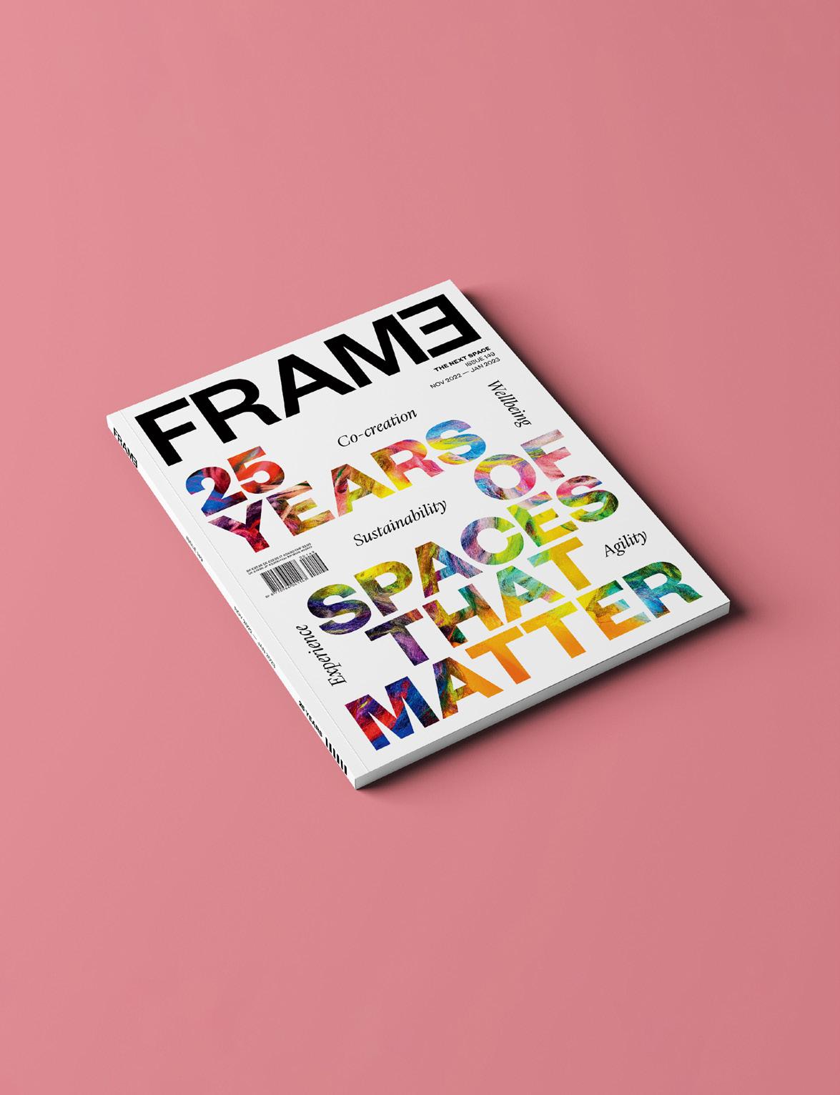
THE NEXT SPACE ISSUE 150 2023 SPECIAL
AWARDS 2022
HONORARY 08 Lifetime Achievement Award winner India Mahdavi 18 Designer of the Year: Elena Salmistraro 20 Emerging Designer of the Year: Fumihiko Sano Studio 22 Client of the Year: Adidas CONTENTS RETAIL 24 Victoria Stiles of Australian property developer Mirvac on designing for a circular economy 28 The four category winners 36 Leolux’s inspiration station HOSPITALITY 40 Larry Traxler of Hilton Hotels and Resorts on the changing hotel typology 44 The five category winners 46 34 08
FRAME
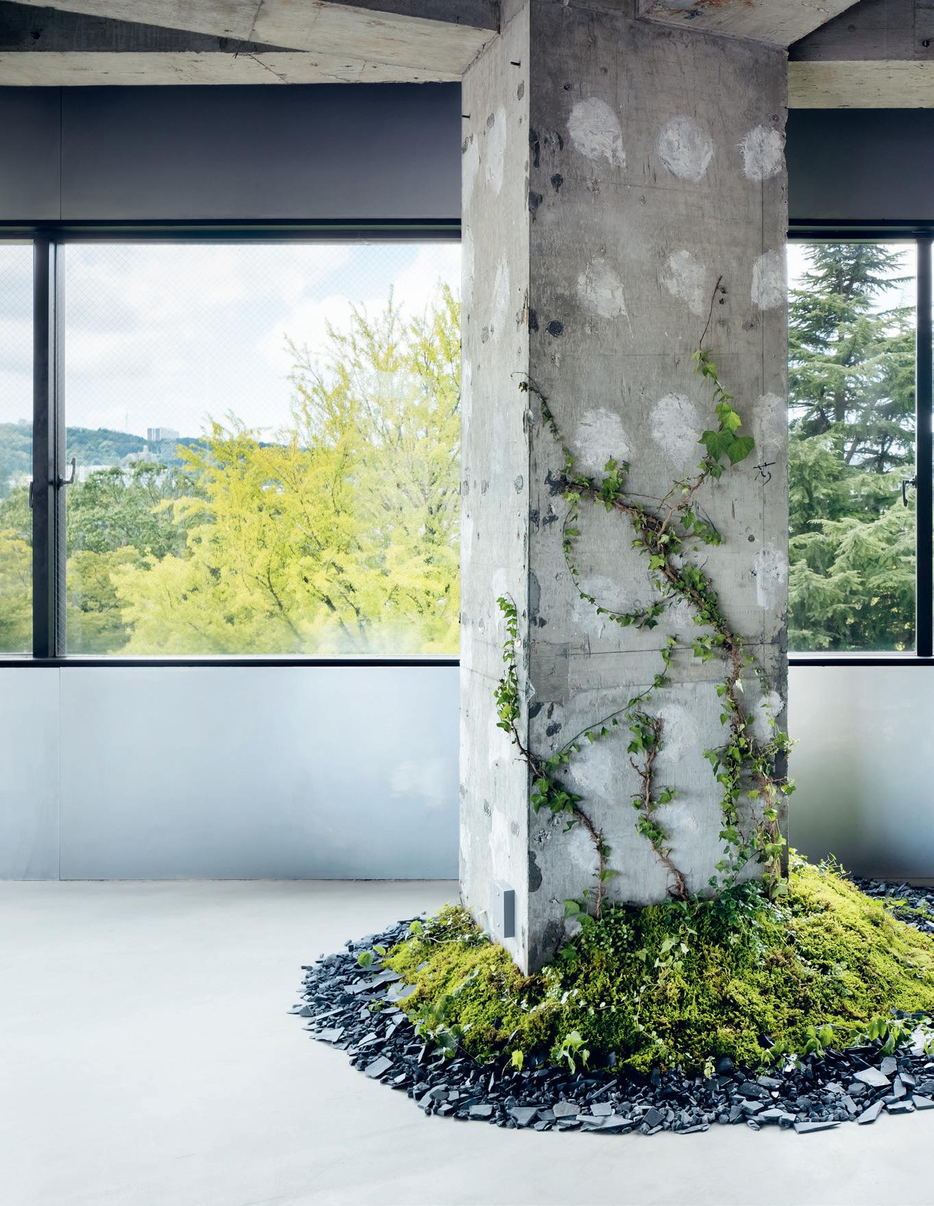
Junpei Kato, courtesy of Shiseido Creative and Hakuten
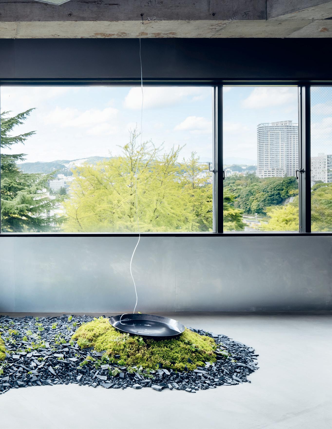
Amit Geron, courtesy of Pitsou Kedem Architects
1 FRAME 150
Sabine Mirlesse
WORK
54 The many nuances of the future workplace, courtesy of Philippe Paré of Gensler France
58 The three category winners
SHOWS
64 Natasha Greenhalgh of Nxt Museum on the connection between body and show
68 The three category winners
106
62
LIVING
74 Viviane Stappmanns of Vitra Design Museum on un-designing
78 The seven category winners
INSTITUTIONS
92 Mark Raggatt of ARM
Architecture on the changing role of architects
96 The four category winners
EXECUTIONAL
106 The three category winners
PRODUCTS
124 The post-trend society according to Yorgo Lykouria of Rainlight
128 The four category winners
136 Material Bank offers the complete package
MARKET
138 New releases from Flos, Pedrali, Lensvelt and more
130
Takumi Ota, courtesy of Takt Project
2 Contents
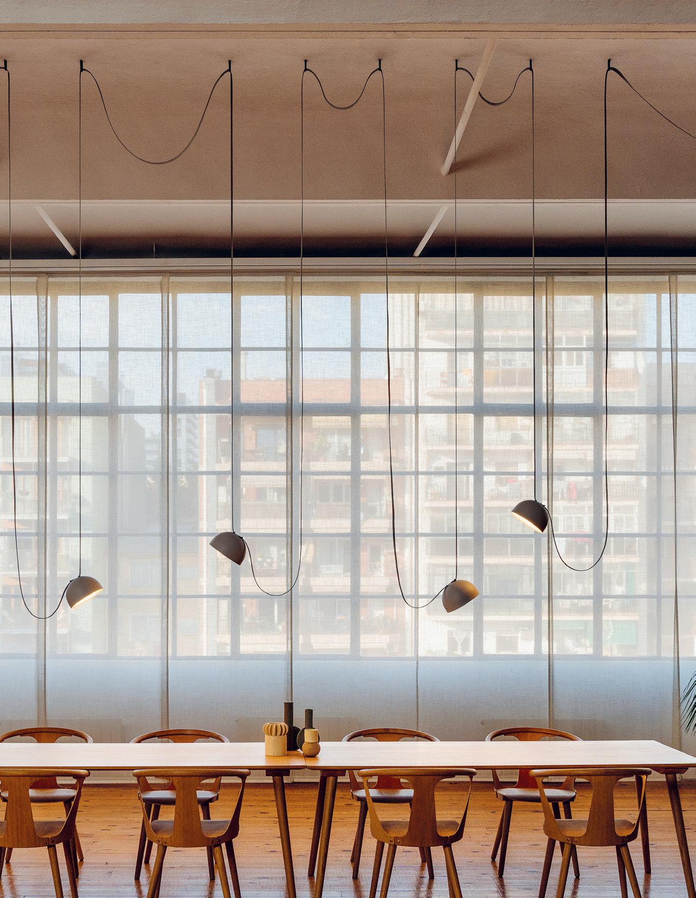
Ouyang Yun, courtesy of AD Architecture Courtesy of Vibia
FRAME is published five times a year by FRAME Publishers frameweb.com
EDITORIAL
For editorial inquiries, please e-mail frame@frameweb.com or call +31 20 4233 717.
Editor in chief
Robert Thiemann – RT
Head of content
Floor Kuitert – FK
Editor at large
Tracey Ingram – TI
Editors
Anouk Haegens – AH
Lydia Johnson – LJ
Head of digital
Lauren Grace Morris – LGM
Junior editor
Kayla Dowling – KD
Copy editor
InOtherWords (D’Laine Camp)
Design director
Barbara Iwanicka
Graphic designer
Zoe Bar-Pereg
Translation
InOtherWords (D’Laine Camp, Maria van Tol)
Contributors to this issue
Polina Bachlakova – PB
Roddy Clarke – RC
Simon Flöter – SF
Karianne Fogelberg – KF
Adrian Madlener – AM
Riya Patel – RP
Kristofer Thomas – KT
Cover
Tohoku Lab by Takt Project (see page 62 and 118)
Photo Takumi Ota
PUBLISHING
Publisher
Mira Huussen
Marketing and communication specialist
Renata Sutton renata@frameweb.com
Customer success manager
Raluca Pop raluca@frameweb.com
Subscriptions
For subscription inquiries, please e-mail service@frameweb.com.
1-year print subscription €129
1-year digital subscription €195
1-year print + digital subscription €295
Please visit frameweb.com/subscribe for the latest offers.
Back issues
Buy online at store.frameweb.com
ADVERTISING
International sales managers
Sara Breveglieri sara@frameweb.com
T +39 339 4373 951
Veerle de Muijnck veerle@frameweb.com
T +31 61 4562 079
Advertising representative Italy
Studio Mitos
Michele Tosato michele@studiomitos.it
T +39 042 2894 868
FRAME (USPS No: 019-372) is published five times a year by FRAME Publishers NL.
ISSN FRAME: 1388-4239 © 2023 FRAME Publishers and authors
Printing
Grafisch Bedrijf Tuijtel Hardinxveld-Giessendam
Back issues
Buy online at store.frameweb.com
4 Colophon
colour is yes and – it’s not that interesting’
HONORARY AWARDS 8
‘Using one like and no that interesting’
India Mahdavi
9
India Mahdavi
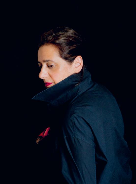
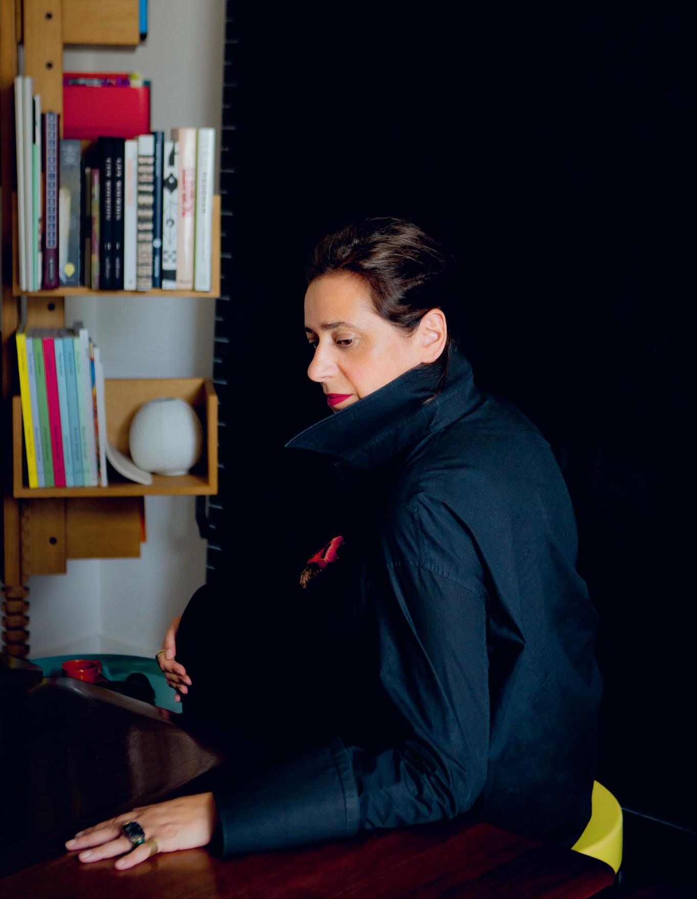
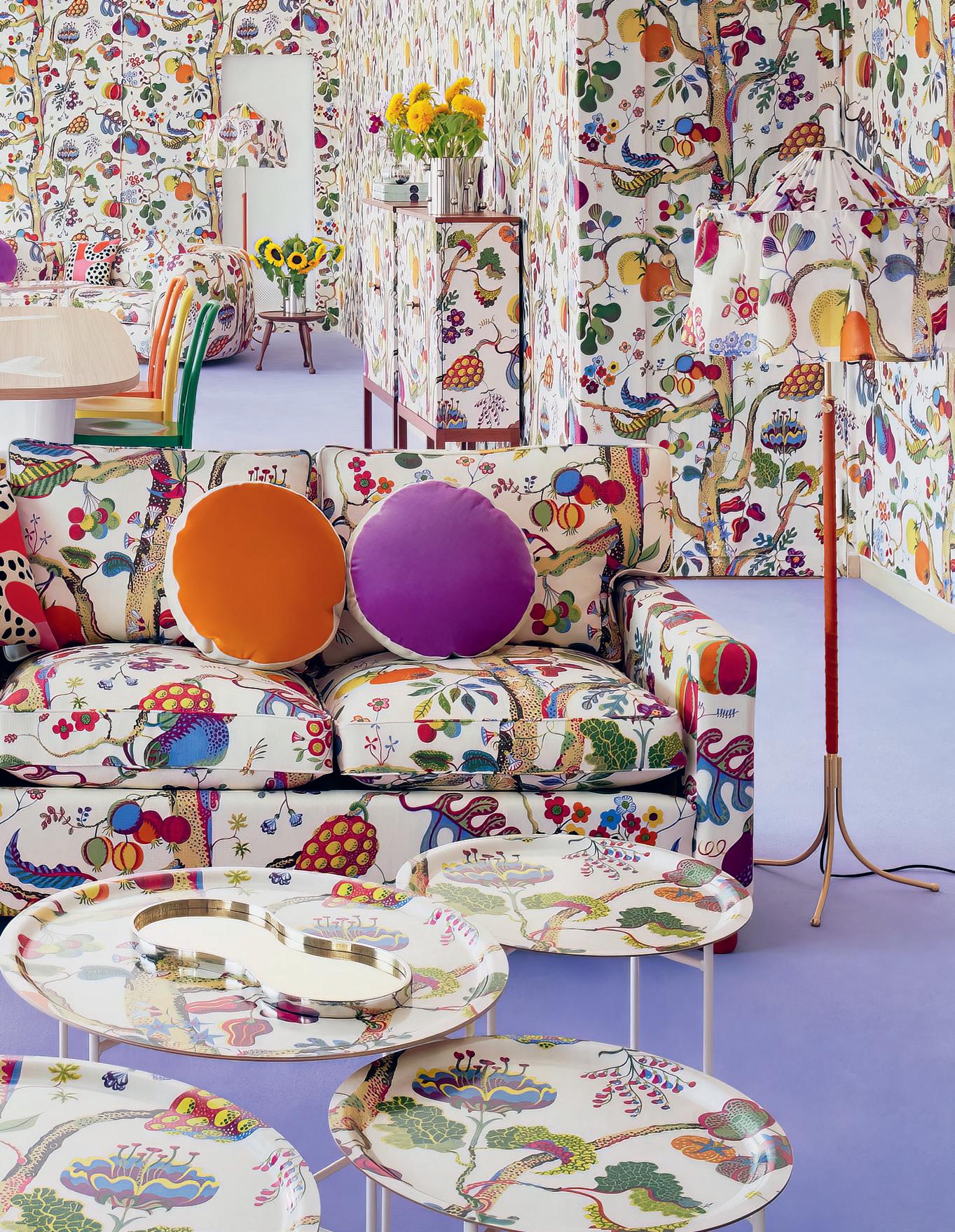
We bestowed this year’s Lifetime Achievement Award on Paris-based IranianEgyptian designer India Mahdavi for her acute and sensitive use of colour, a skill that has inspired a more joyous, human-centric approach to spatial design worldwide. At heart, hers is an intuitive process, guided by her multicultural background – she was born in Tehran in 1962 and spent time in the US, Germany and France as a child before settling in the latter.
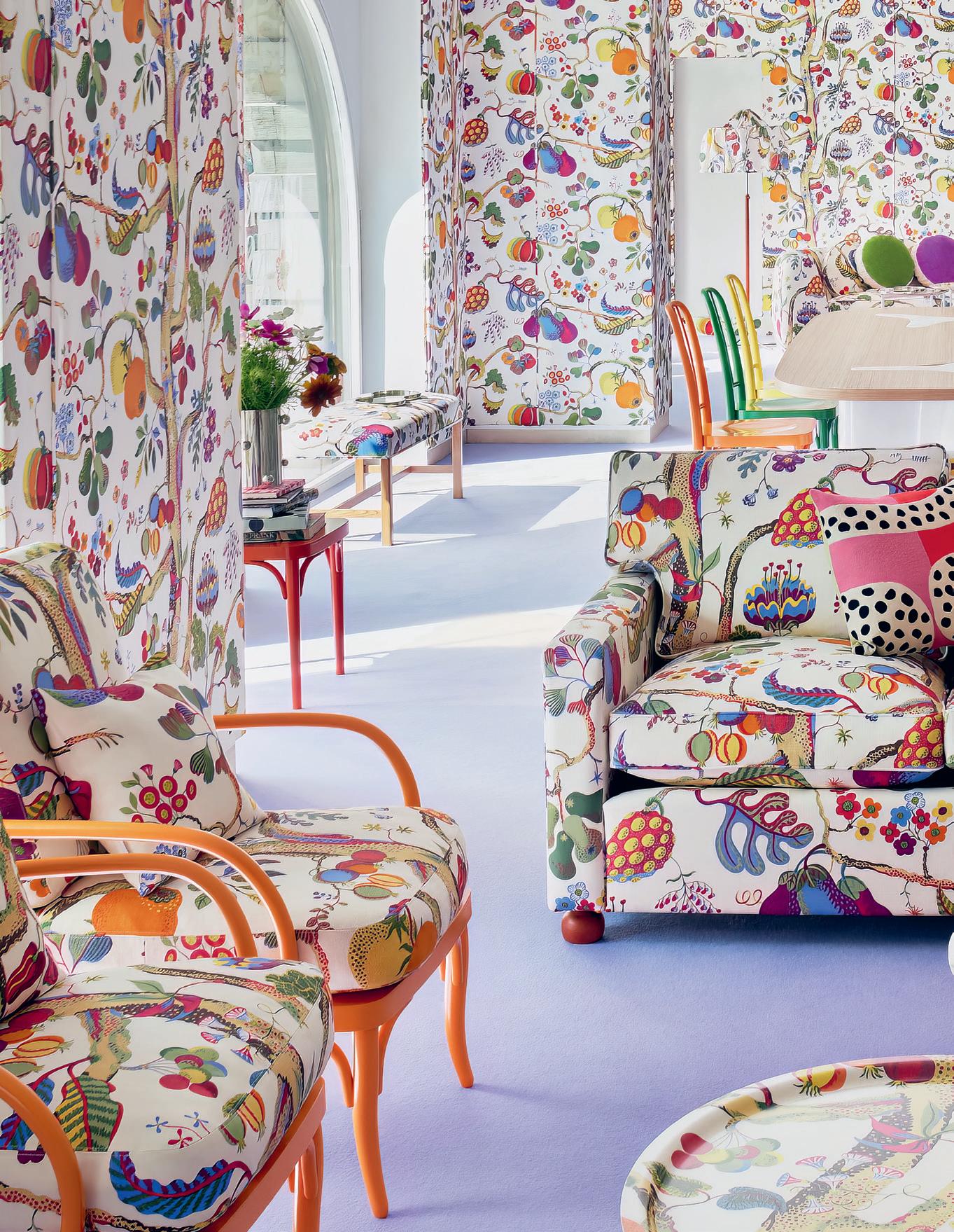
Mahdavi has earned her title as the undisputed Queen of Colour, honing her mastery of hue to the highest degree and creating some of the most visually recognizable spaces of our time. It took Mahdavi a month to decide on the rosy pink that characterized her most famous project, Insta-favourite London restaurant Sketch. First opened in 2014, the space is now enrobed in golden yellow, which she sees as a natural evolution in light of our post-pandemic need for intimacy and warmth. Mahdavi’s mood-driven approach to colour – one that responds to today’s anxiety-ridden, digital-first times – is indicative of her broader attitude to the tool, a purveyor of joy and sensuality alike.
Mahdavi’s expert wielding of colour’s power to enrich our physical world –and our experience of it – is precisely why we named her FRAME’s 2022 Lifetime Achievement Award winner. Since opening her eponymous studio in 1999, she’s lent her sensitivity – one that melds with, never overpowers, the needs of the client – to projects all over the world, from Cavallino restaurant at Ferrari’s home base in Italy to global Ladurée outposts and the Monte-Carlo Beach Monaco hotel. Other clients include Louis Vuitton, Valentino and Nespresso.
We sat down with Mahdavi to hear why and how to integrate more colour into interiors, whether working with colour is a talent or can be learned, and how interior designers can help time-honoured artisans adapt and survive.
Interview Tracey Ingram
LIFETIME
ACHIEVEMENT AWARD
FRAME 150 10
Sabine Mirlesse
 Henrik Lundell
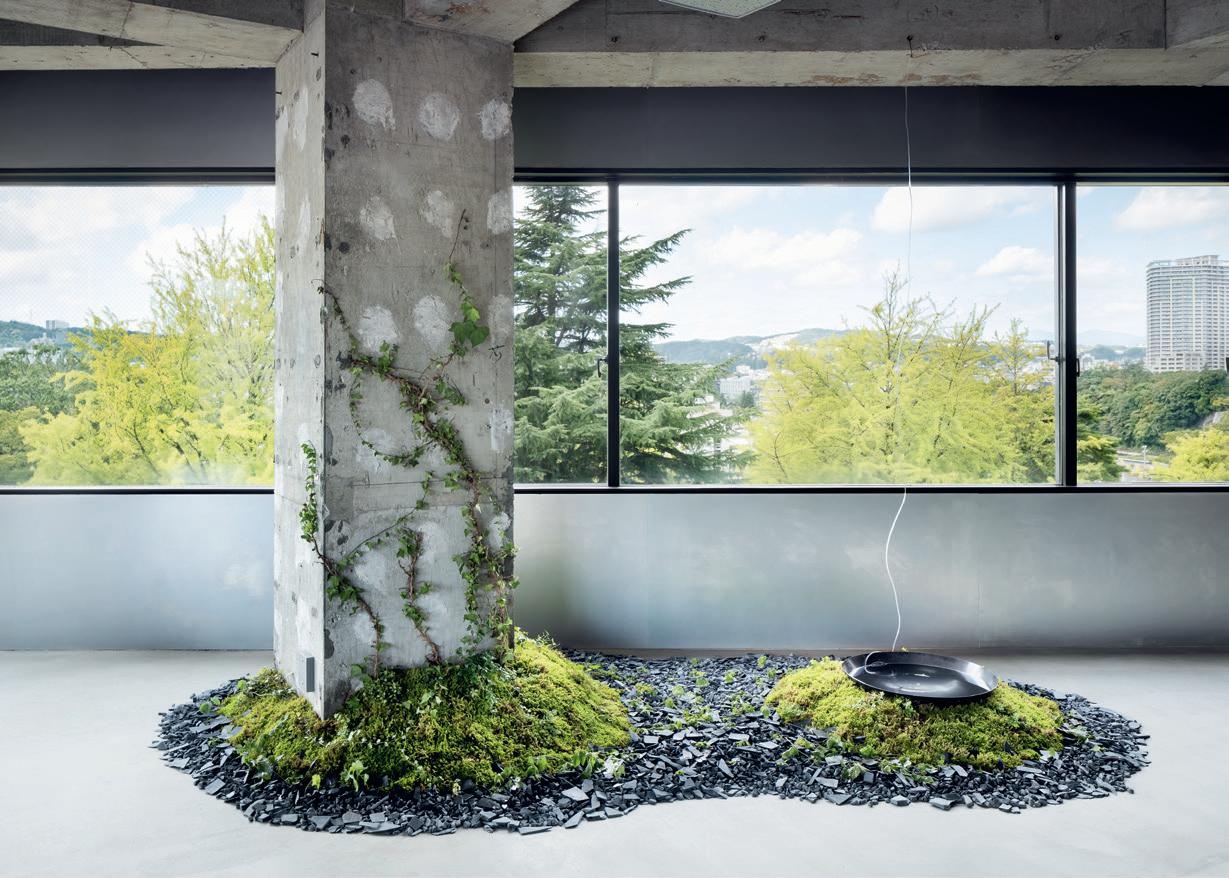
Fumihiko Sano Studio
For jury member Hiba Alobaydi, managing editor at Archello, Fumihiko Sano Studio ticked all the boxes for Emerging Designer of the Year. ‘The studio demonstrates innovation, functionality, creativity and sustainability in spades,’ she said, admiring its ‘unwavering sense of integrity in the face of design challenges’. The eponymous Japanese studio was founded in 2011 by Fumihiko Sano, who began his career at Nakamura Souji Komuten in Kyoto as an apprentice of sukiya carpentry – a traditional craft passed down through generations. Throughout his portfolio – whose strong focus on hospitality is interspersed with the likes of residential, retail and installation projects – Sano bridges Japan’s past and present, reinvigorating extinct or endangered traditions. Alobaydi commended this approach. ‘The studio demonstrates a reverence for the past,’ she said, pointing to Tokiwa restaurant, whose design is based on a Japanese tea ceremony room, ‘as well as a rapturous sense of originality,’ using the Yakabei Tunnel Hotel as an example of the latter. Hosted in a soonto-be-opened tunnel, the temporary hotel and restaurant celebrated local materials and produce. This local approach extends to everything Fumihiko Sano Studio does, a factor that scored extra points with the jury. fumihikosano.jp

EMERGING DESIGNER OF THE YEAR
21 Honorary
Kenta Matsusaka
Adidas
A name that needs no introduction, Adidas claimed this year’s Client of the Year award for its inspirational and engaging spaces, unique brand experiences and collaborative initiatives. The brand aims to bring to life its mantra – ‘Through sport, we have the power to change lives’ – in experimental retail spaces that look to the future while keeping sport at their heart.
Adidas sees every new project as an opportunity to test and learn. From creating its most sustainable store to date, in Munich, to installing a plant-based air-purifying system in Berlin, to creating an ever-evolving gallery in Tokyo’s Harajuku, the brand considers its retail spaces to be playing fields to inspire and engage.

Many of these goals were acknowledged by the jury. ‘All Adidas’s projects clearly transfer the brand’s roots in sports,’ said Sabine Krieg, deputy professor of retail design at the University of Applied Sciences Düsseldorf. ‘Its spaces are very inspirational and engage customers at all touchpoint levels.’
Beyond Disciplines cofounder and creative director Christian Lungershausen touched on Adidas’s approach to key interior issues such as flexibility, accessibility and locality. He pointed out the spaces’ ceiling rail systems that facilitate future use, their clear wayfinding and their relationship to their local context.
One thing the jury missed, though, was more explicit engagement with sustainability. As Epistle founder Tanya Khanna said: ‘It would be wonderful to see how Adidas has leveraged its role as a leading international brand to make a larger impact on the built environment.’ adidas-group.com
CLIENT OF THE YEAR
Noritsugu
Dirk Tacke 22 FRAME Awards
Katayama
‘Design a economy’
Member of the FRAME Awards 2022 April jury and grand jury Victoria Stiles is a retail design manager who manages assets nationally at Australian property group Mirvac. The real estate developer manages over €16 billion of assets and oversees a €19-billion development pipeline, contributing significantly to Australia’s major cities. Stiles works on maximizing the value proposition of assets while being a ‘huge advocate’ for a sustainable approach to retail design.
Words Robert Thiemann
Illustration Simon Flöter
for circular economy’
Which retail project struck you for its sustainability while judging the awards?
VICTORIA STILES: The winning single-brand retail store, Kolon Sport in Jeju, South Korea [see p. 28] is all about embracing existing ecosystems. Jo Nagasaka/Schemata Architects incorporated local marine debris into the store’s fixtures to show how the brand can embrace sustainability and do good. Sustainable design solutions have been around for a while, but the exciting thing is that now retailers are willing to invest and make a difference.
Why is sustainability top of mind now? Solutions are more readily available and lessons have been learned. Big businesses have led the way and now their findings are filtering down. Retailers aren’t as nervous anymore to go out and make changes. Moreover, consumers now have a huge say by aligning more than
ever with brands that have clear sustainability goals and initiatives. In this regard, Gen Zers have a loud voice. We’re leaving them the legacy of our planet, so we should be listening.
How should designers make retail more sustainable?
The overall message is that we should be designing for longevity instead of a five-year timespan. Start with getting the fundamentals right: use fixtures and finishes with a long lifespan to design a beautiful, minimalistic and smart shell that allows products to be showcased well. Incorporate art, inject quirky elements, work with different lighting concepts, change colours and switch signage to keep the experience fresh. That’s what retail is all about. You need to draw attention to your store by continuously collaborating with amazing product designers, artists or graphic design-
ers. It will always be an ongoing process. But we also need to design for a circular economy. Consider reusing, repairing, refurbishing and recycling existing materials and fit-outs. We should be designing to eliminate or at least minimize waste. That’s a really exciting exercise in itself.
On its website, Mirvac states that retail can positively impact communities if it’s reimagined. How?
Our retail centres are more than places to shop. They are trusted community meeting places. Landlords need to think about how they can ensure their spaces are safe, inclusive and welcoming for all. This can be done through reimagining the spaces in and around these buildings for community events; partnering with local organizations, schools and artists; and inspiring people to deliver workshops, »
RETAIL
25 FRAME 150
Window Display of the Year
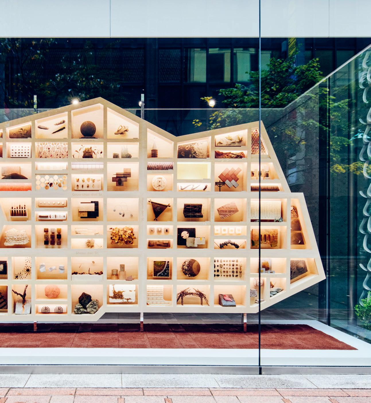
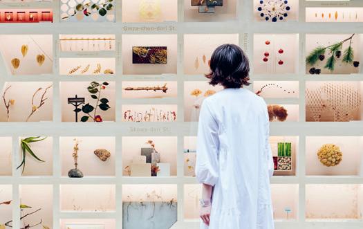
Ginza Ecological Map SHISEIDO CREATIVE AND HAKUTEN


TOKYO What ingredients make a successful shop window? According to our jury, they must stop passers-by in their tracks, triggering them and rousing their curiosity. They should tell the story of a product or brand. And, due to their short lifespan, they should be as sustainable as possible.
Their chosen winner – Japanese skincare brand Shiseido’s Ginza Ecological Map designed by Shiseido Creative and Hakuten – was inspired by Tokyo’s ecology and natural beauty. A three-dimensional map of the surrounding district highlighted its natural elements, discovered through fieldwork and research involving Ginza residents. Over the course of a year, a grid system displayed different items relating to two themes, organisms and earth, as if they were scientific specimens.
‘There’s a narrative communicated through vignettes and a community spirit,’ said jury member Carlos Virgile, director of CV Design and Brands. ‘It doesn’t sell anything, which I think flips the concept of a window display upside down.’ The lack of a hard sell also won over Zen Zheng, design director at Leaping Creative: ‘Instead of showing an actual product or explaining a service, they show the consumer that they care about the environment and community. This is a very subtle way of selling the brand.’ hakuten.co.jp
Junpei Kato FRAME Awards 34
Jury member Talar Bardakjian, creative director at ODG, appreciated that the care and attention given to the display means it can live on beyond the window: ‘It could be displayed in a museum or Shiseido’s headquarters.’

RETAIL Spatial 35
‘A hotel a hotel’
Larry Traxler is the senior vice president of Hilton Hotels and Resorts’ global design services. Not only is Hilton a household name in hospitality, but it’s a legacy brand. Drawing on this century-long history and 13 years in his current role, as well as previous positions with Hyatt Hotels and Ian Schrager, Traxler highlights how hotels – once places with clear-cut segments, spaces and services – are adapting to changing customer needs.
Words Kristofer Thomas Illustration Simon Flöter
HOSPITALITY
is no longer
You served on the FRAME Awards grand jury for Restaurant and Hotel of the Year. What were the main takeaways from the process?
LARRY TRAXLER: The stakes have ramped up significantly with respect to what good design is. We’re no longer just looking for beautiful spaces; when we talk about ‘good design’ the expectations are much higher from everyone involved, and spaces not only have to be fit for purpose, or well-conceived from a business and narrative perspective, but they must respond thoughtfully to environmental, social and cultural drivers, too.
What are the standout recent developments in hospitality?
Sustainability and the ESG message have continued to increase, but the biggest change we’ve seen is in the social behaviours of our guests. There’s a renewed focus on creating agile and flexible designs that morph to suit their needs, whether that’s in the context of business or leisure, relaxation or play. Designing an environment that adapts to different consumer needs at different points in their journey is paramount for a successful space today. Public spaces need to flex between work and social demands, and the lines between
indoors and outdoors have blurred as well. Hotels were extremely reliant on outdoor spaces during the pandemic, and I think people are slow to give those connections up. Between public and private, too – it’s important to feel that you have your own space, but that you also have some proximity to a community so as not to feel detached.
How will this evolve throughout 2023? Can these lines be blurred further?
It’s been interesting to see these demands trickling out of the hospitality space and into other sectors like workplace design. This is something we’ve noticed during the redesign of our headquarters, where we’ve been leveraging hospitality ideals into the workplace, and the same goes for residential design, retail, education and even healthcare. The evolution will be more agility and flexibility, and it will bleed into every aspect of the built environment in a way that creates better human usage.
Are there any Hilton projects that demonstrate these shifts?
In the luxury sector we have new projects in central LA and Nashville, both of which respond to a lot of these needs we’re talking about. A flexible lobby that can morph across
different times of day, and a blend of indoor and outdoor space, which is really magical in a place like LA. Similarly, a new Hilton in Ohio has some great F&B space that blends between different zones, but even the lifestyle segment is really embracing this shift: a new property in Chelsea and a Tempo in Times Square are both looking closely at how to create seamless transitions between different usages. Public space that bleeds into entertainment spaces and then a food hall, for example.
Many years ago, a hotel was a hotel, and you could differentiate segments by the level of finishes, but programmatically the contents were all the same. You enter and you have a lobby, reception, all-day dining and meeting space. We’re no longer thinking about it that way. Rather, how can we blend all these? What opportunities are there to break the spa away from the main building and create a destination environment? How can we use the roof? Can we use the outside of the building as a projection opportunity? Is there a way parking structures can host outdoor events? I think the pandemic taught us to be a lot more creative and not turn a blind eye towards any space. I love the idea of spaces that continually change. After all, if you visit a hotel four times a year, you don’t want it to
»
41 FRAME 150
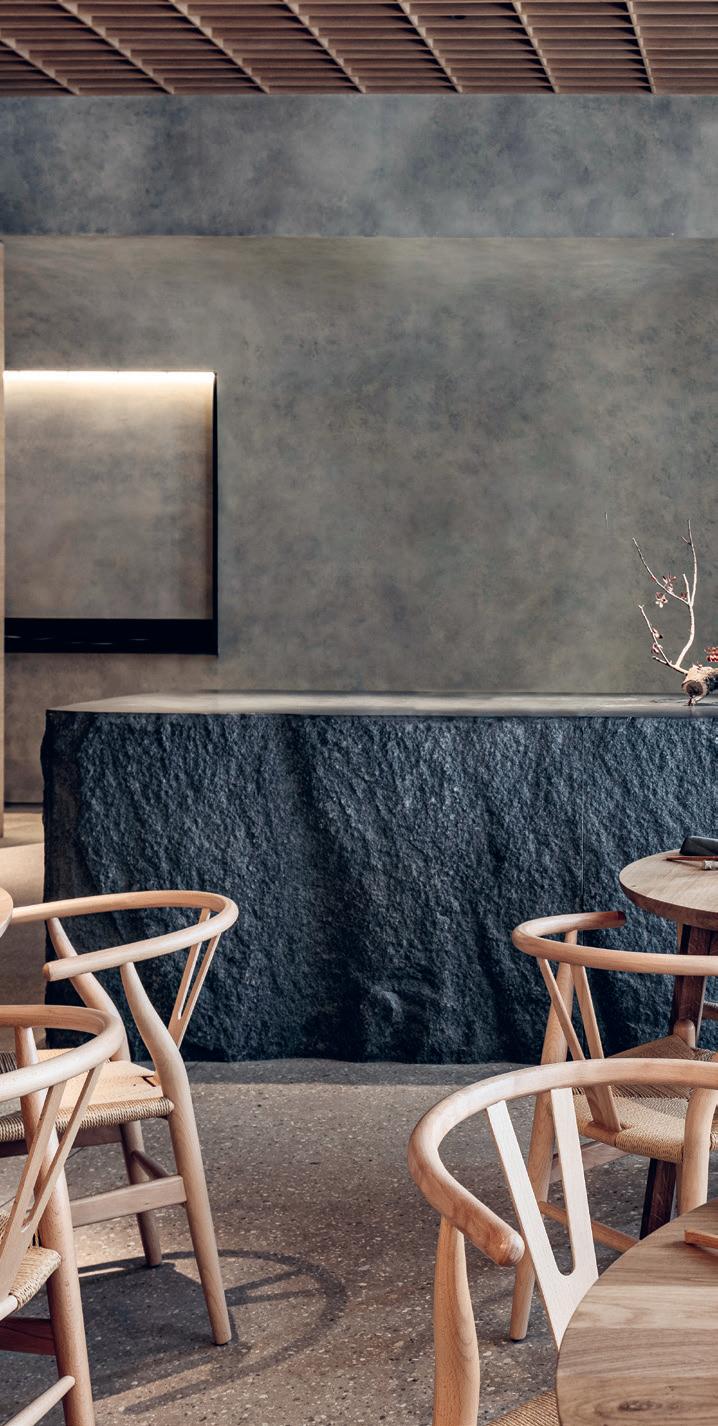
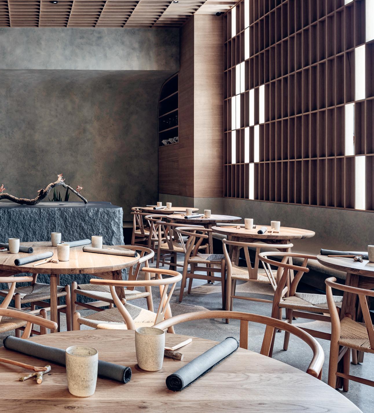
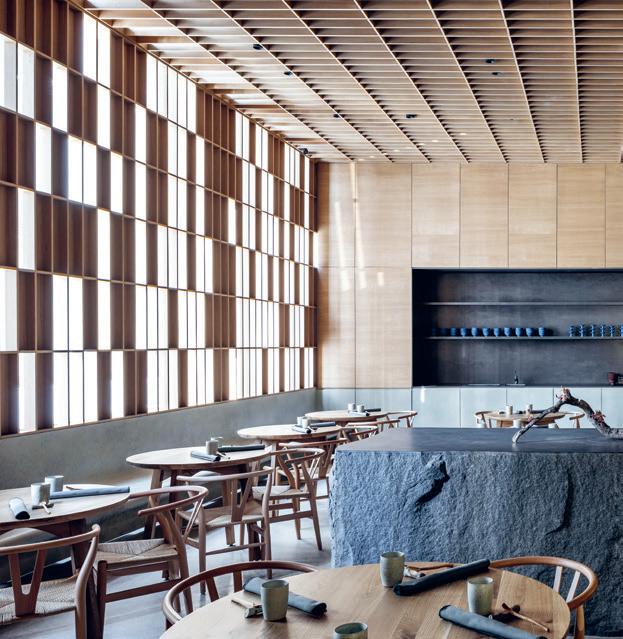
Hiba Restaurant PITSOU KEDEM ARCHITECTS
TEL AVIV One of the challenges for restaurant design, believes jury member Sara Duffy –principal, interiors division at Stonehill Taylor – is to offer a high-design experience that’s still welcoming and warm. ‘I personally don’t want to be in a situation that feels cold and bleak. The use of materiality is so important, because in a restaurant you’re sitting for two or three hours and experiencing those materials.’
Pitsou Kedem Architects answered the call with Tel Aviv restaurant Hiba, where natural materials like oak wood, concrete and granite prevail. ‘I think there’s a new sense of awareness about tactility and natural materials,’ said Larry Traxler, senior vice president of Hilton Hotels and Resorts’ global design services. ‘People are looking for a connection to nature, whether it be through materials or by blurring lines between indoors and out.’
The use of natural materials for the interior reflects the restaurant’s focus on local, raw ingredients, which are prepared in the open kitchen in front of diners – a gesture that brings fine dining down to earth. This correlation between food and space was of great importance to the jury: Worldesignteam design director Guillermo Blanco and Ester Bruzkus Architekten partner Peter Greenberg both highlighted the need for restaurant interiors to ‘be appropriate for’ and ‘merge with’ the food being prepared. pitsou.com
‘The materials are very well balanced,’ said jury member and Worldesignteam design director Guillermo Blanco, adding that anything visitors see or touch contributes to a welcoming and cosy dining experience.

Restaurant of the Year
FRAME Awards 46
Amit Geron

HOSPITALITY Spatial 47
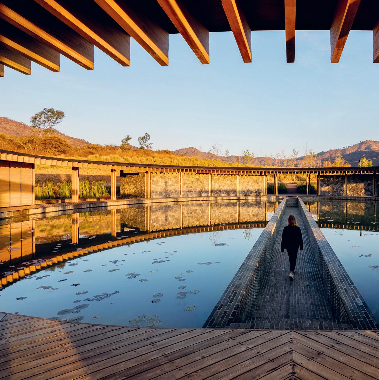
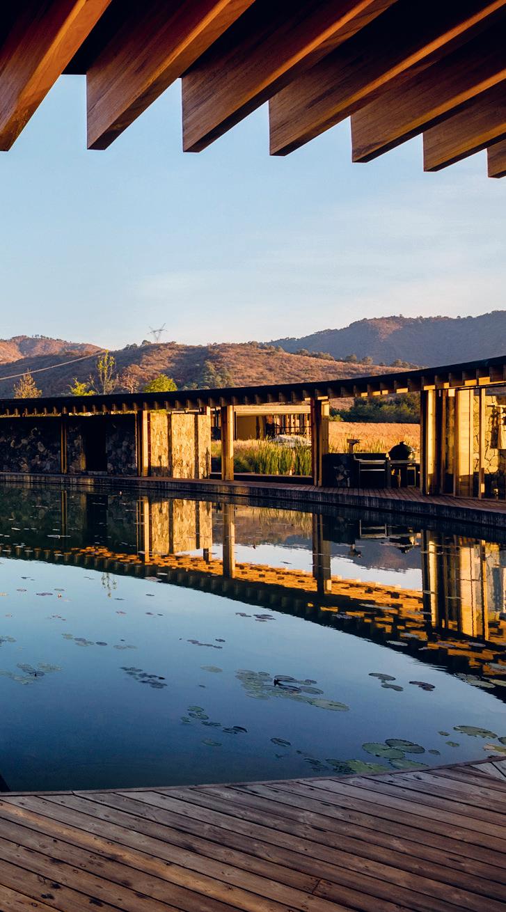
No matter what time of day it is, said jury member Vincent Zhang, founder and design director at Stylus Studio Zhang, Valle San Nicolás ‘looks very harmonious, like it’s part of the nature’.

HOSPITALITY FRAME Awards 50
Entertainment Venue of the Year
Valle San Nicolás SORDO MADALENO
SANTA TERESA TILOXTOC Tucked in a new residential development in Mexico’s Valle de Bravo region, the Valle San Nicolás clubhouse and water-skiing lake was commended by our jury for the way it is integrated in its surroundings. Born from an investigation into the site’s conditions, the design by Sordo Madaleno ensures that the natural course of rainwater runoff is uninterrupted. The roof is designed in such a way that water falls directly into the central lake, where it is purified and reused.

Many jury members mentioned the circular floor plan, which offers space for social and wellbeing programming while providing near-360º views of the landscape. AW² partner Stephanie Ledoux saw the circle as a symbol of bringing strangers together, whereas Sara Duffy – principal, interiors division at Stonehill Taylor –loved the idea of using the shape to force people to walk around the water, making them interact with the building in a certain way.
CV Design and Brands director Carlos Virgile referred to the project’s ‘limited’ interior design. ‘A stronger interior could have enhanced the experience without interfering with the driving concept of integration.’
sordomadaleno.com
Spatial 51
Rafael Gamo
‘The workplace become
Canadian Philippe Paré has spent 18 years with Gensler and earned a reputation among clients and peers for creating inspiring workspaces that foster interaction and excitement. Will those aspects still be crucial in tomorrow’s offices? And with the rise of remote working, how can organizations navigate the HQ’s shifting role? The principal and managing director at Gensler France shares his thoughts.
Words Riya Patel
Illustration Simon Flöter
What’s been the most important development in the work sector in the past year?
PHILIPPE PARÉ: A strong sense of empathy towards workplace users. Making sure we create workplaces that workers are excited to go back to, that make them feel refreshed, well and reconnected to the mission and values of the organization to which they belong. This is manifesting in some exciting microarchitecture developments. More than ever before, there’s this idea of using furniture to create and define different environments and support people’s various needs – think kits of parts and flexible furniture solutions. Previously everything was built-in and permanent. Now it’s much more agile.
Does this align with what you encountered when judging the FRAME Awards?
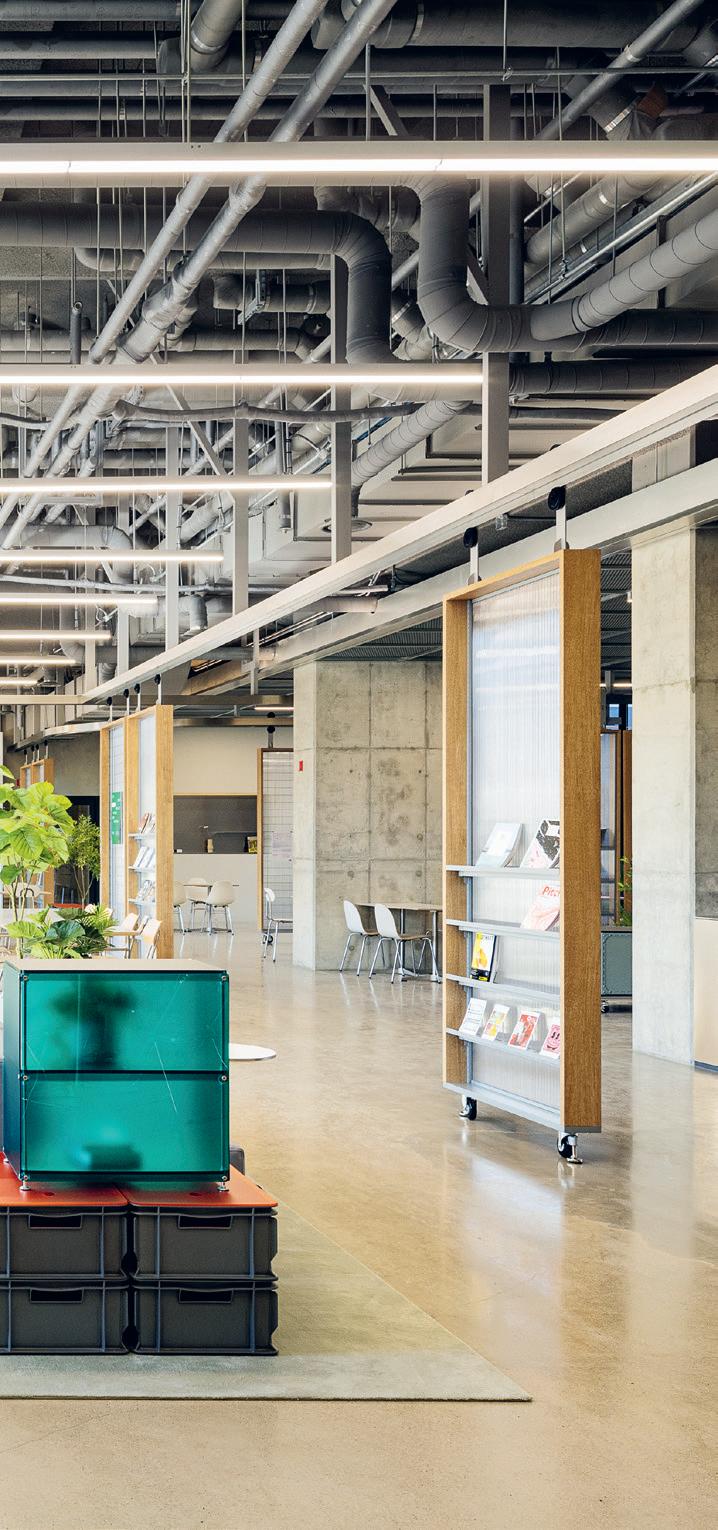
The projects that sparked a lot of discussion shared a restrained approach. There was an emphasis on economy of means and doing a lot with very little – repurposing materials found on site, for example, or having one product or material perform multiple functions. But yes, other projects that stood out did have a more empathetic point of view towards users. A deliberate concern to provide a diversity of work settings and typologies, giving users the ability to choose what best suits them and the task at hand. Incorporating a lot of biophilia, natural materials, access to the outdoors and natural light.
54 FRAME 150
WORK workplace has more nuanc ed’
A sliding scale of different types of atmospheres. There was a much more nuanced approach to the workplace across the board.
What do architects and designers of workplaces need to focus on in 2023, and why?
Right now, most organizations are asking themselves fundamental questions about the workplace’s purpose: how we work, and how remote work impacts people’s expectations of the office. There’s a tremendous opportunity because organizations are willing to experiment and take risks. We’re seeing a flourish of new ideas, ways of approaching the workplace and unexpected solutions. »
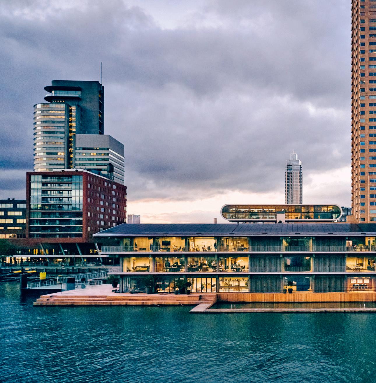
‘The office sends a strong message about access to views, daylight and nature,’ said jury member Jaime Vélez of Velez+Valencia Arquitectura. ‘It should be a big driver of what’s going to happen next in workspaces.’

WORK
FRAME Awards 60
Floating Office

Rotterdam POWERHOUSE COMPANY
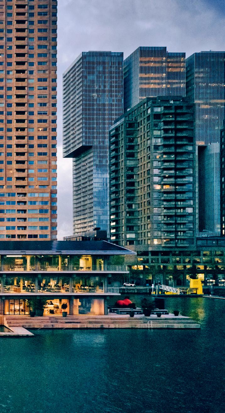
ROTTERDAM At a time when employers are wondering how to draw their staff back to the physical workplace, our jury commended the Floating Office Rotterdam for its spatial variety, connection to nature within a city and mood-lifting atmosphere. ‘You’d want to leave your house to go there and spend time with your colleagues and friends,’ said Ben Adams Architects’ associate director Emma Maiko Holt of the project, which comprises wellbeingoriented workspaces and public facilities like a restaurant and outdoor terrace. Principal and founder of AEDS Ammar Eloueini agreed, attributing much of the appeal to the views over the water in which it floats – the Maas River in the Dutch city of Rotterdam.
The Powerhouse Company-designed home for the Global Center on Adaptation is climate-resistant, energy-positive and CO2-negative. The building’s buoyancy makes it responsive to flooding or rising waters, while nearly 900 m2 of photovoltaic panels on the roof generate enough power for the entire space, with the surplus energy routed to the city. ‘Powerhouse Company has really considered climate change and rising sea levels,’ said Holt, ‘and future-proofed its space accordingly.’ powerhouse-company.com
Large Office of the Year
Spatial 61
Mark Seelen
‘Understand human’
64
what it means to be
Technology’s intertwinement with daily life raises questions for exhibition designers, including how and whether to embrace new media, and if our safety will be compromised. To find out more, we sat down with Natasha Greenhalgh – cofounder of Nxt Museum, the Netherlands’ first space dedicated entirely to new media art, and jury member at the 2022 FRAME Awards –who believes the future of exhibition design is critically digital, experimentally collaborative and, above all, utopian.
Words Polina Bachlakova
Illustration Simon Flöter
‘Understand
65 FRAME 150
SHOWS
Sound Design Festival Hamamatsu
TAKT PROJECT
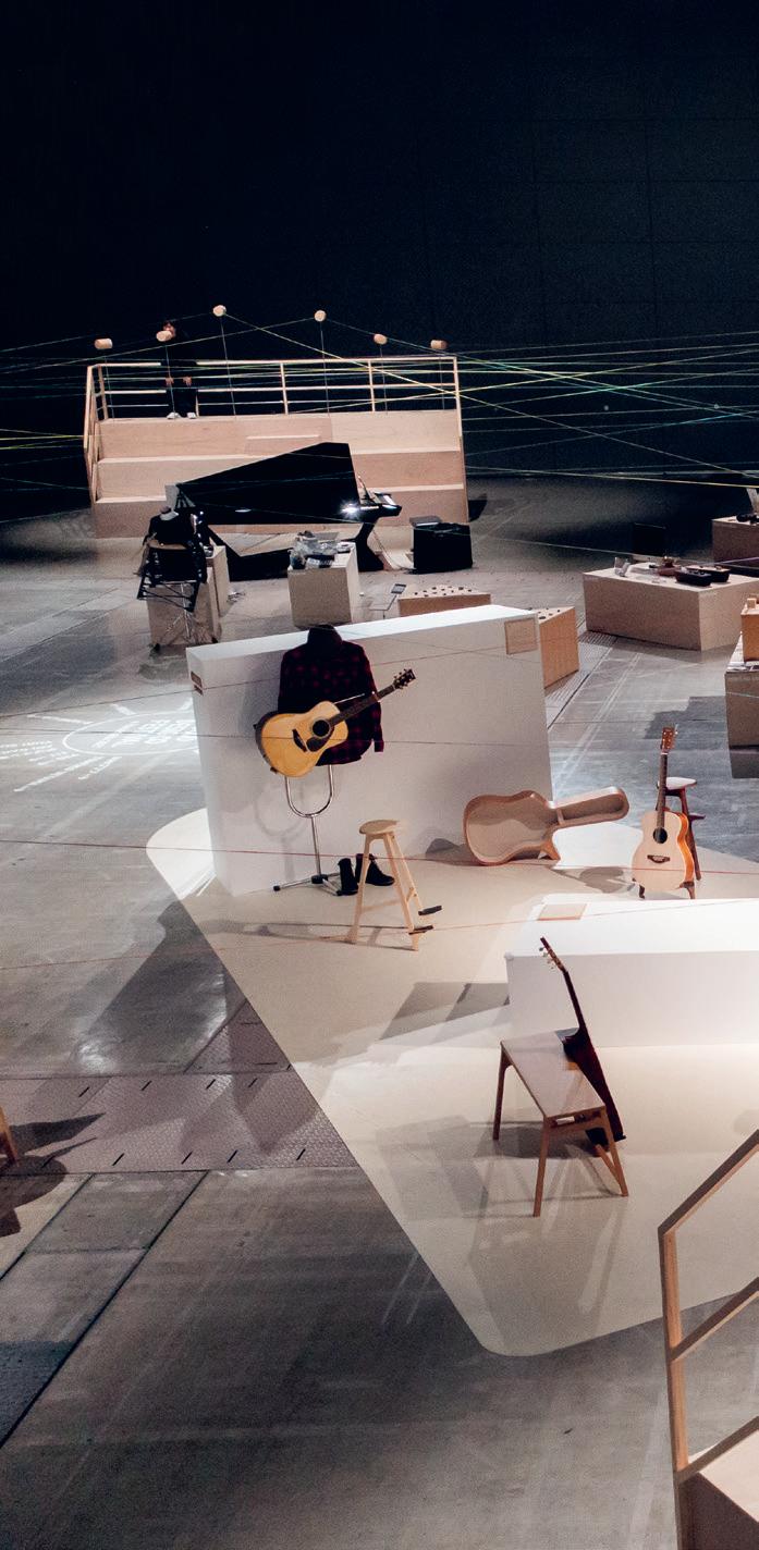
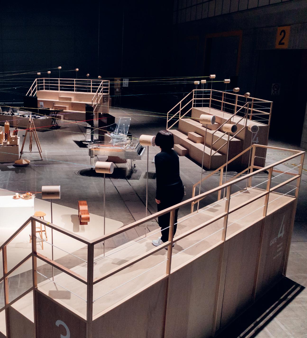
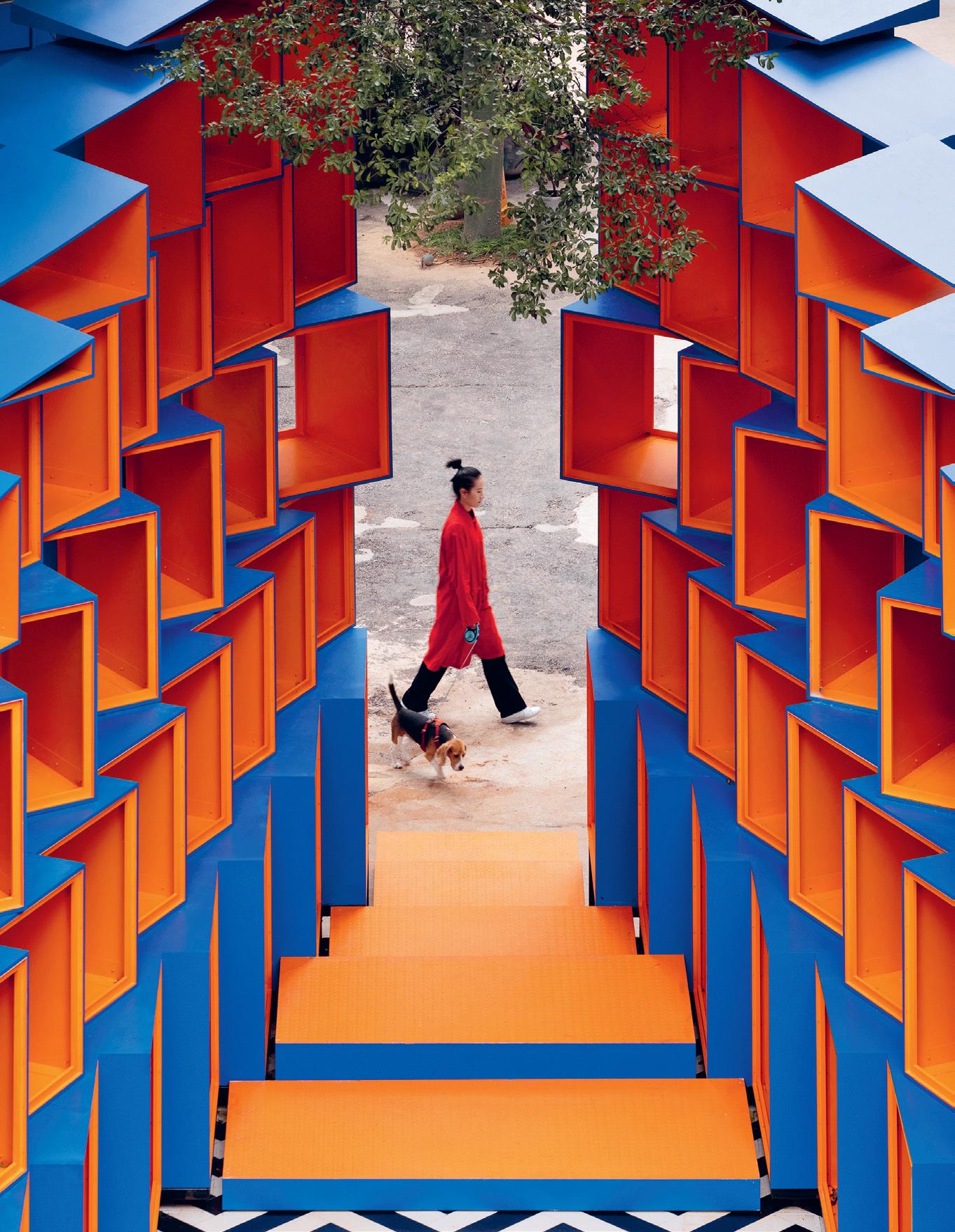
HAMAMATSU For the 2021 edition of the Sound Design Festival in Hamamatsu, Japan – a member of the UNESCO Cities of Music Network – Takt Project brought to life the edition’s theme: the forms of communication created with sound. To visualize the often unseen vibrations that accompany acoustic transmission – and to maximize the significance of the festival’s physicality – Takt based its design on string telephones.
A spiderweb of coloured strings connected the phones, traversing an arena formed by seven staircases, which doubled as viewing points for central sound performances. By using no wall or floor fixings, Takt ensured its design is highly portable and can be reused in the future – a factor our jury applauded.
Jury member Christian Lungershausen, Beyond Disciplines cofounder and creative director, found poetry in the project’s simplicity, calling it ‘an exhibition to reanimate our archaic senses without using digital tools’. He also appreciated how the scenography connected people physically in a circle, a consideration Nxt Museum cofounder and creative director Natasha Greenhalgh highlighted, too: ‘An incredibly rich and evocative concept that really shows the power and strength of resonating with intrinsic human emotions,’ she said, ‘the power of connection, of the coming together of people and sharing.’ taktproject.com
‘From the staircases to the strings defining the space and mapping out the exhibition – every element elevated the experience of sound and made it visible and almost tangible,’ said jury member Karen El Asmar, architect and interaction designer at Tech.

of the Year
Exhibition
FRAME Awards 70
Daisuke Ohki

SHOWS Spatial 71
‘Shift and rather than reinvent’
One of the few FRAME Awards jury members who isn’t working at the coalface of the design industry, university educator and Vitra Design Museum curator Viviane Stappmanns has what she calls an ‘outsider’s perspective’ on design. Particularly interested in issues surrounding social sustainability in the practice of interior design, she hopes the future of living is frugal.
Words Roddy Clarke
Illustration Simon Flöter
LIVING 74 FRAME 150
pivot, than reinvent’

FRAME Awards 78
Jury member Simon Saint of Woods Bagot felt Episode Suyu 838’s sustainability credentials – such as the prioritization of eco-friendly materials – were a ‘huge selling point’.
Co-living Complex of the Year

Episode Suyu 838 COLLECTIVE B
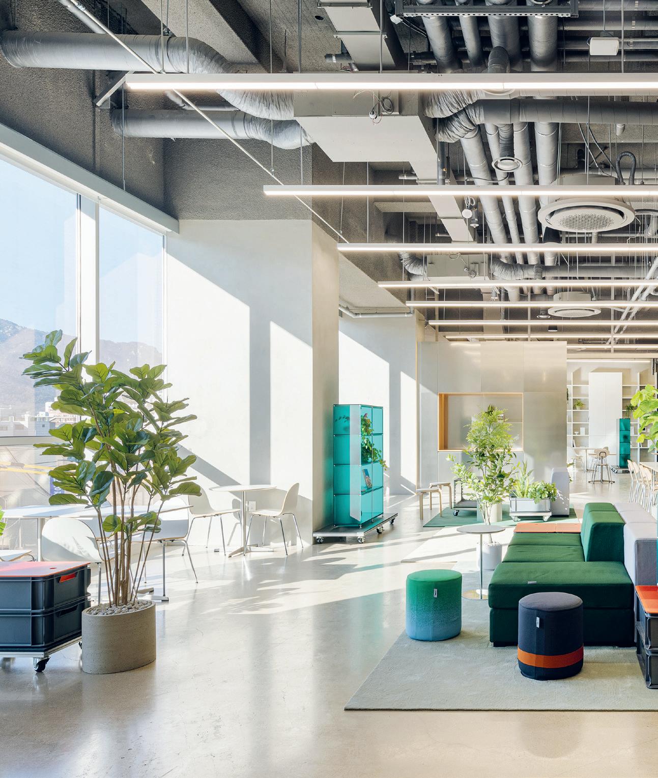
SEOUL ‘This is an excellent prototype for co-living.’ So said Yorgo Lykouria, Rainlight Studio founder and creative director, of Episode Suyu 838 during jury deliberations. The project is the largest single co-living building in the world and the fourth location from Episode, a label under SK D&D. Situated in a busy commercial area of Seoul with diverse inhabitants, the residence has 838 householders.
Acknowledging the fast-changing needs of urbanites, Collective B envisioned the 23-level space as a modular platform for sustainable living that rises to such contemporary challenges as providing affordable housing and battling loneliness. The design features natural contact points that encourage interaction and help to meet the various needs of different households. ‘The use of modular interior elements to change the use and functionality of the spaces is very promising,’ said Lykouria, ‘and the intention to have a focused sense of community is very appealing. I also think the slant towards a workplace environment is very appropriate in these times – you could imagine a person living and working quite well in this facility.’ Simon Saint, principal and residential sector leader at Woods Bagot, agreed: ‘The multifunctional nature of the spaces shows how co-living can be pushed to do different things, as well as respond to our current situation.’
collective-b.com
LIVING
Spatial 79
Yongjoon Choi
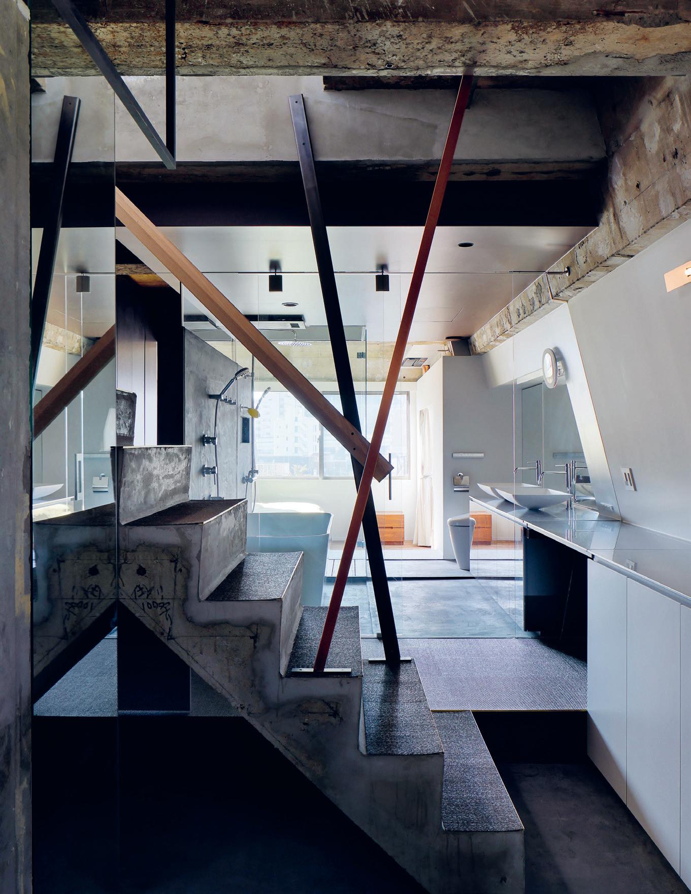
‘I love that they dared to expose the bedroom and the bathroom,’ said jury member and design strategist Jocelyne Sacre.

‘As an architect, I have to say wow,’ said Guillermo Blanco, founder and design director of Worldesignteam, when judging Utopia 2020 Dream Home.

Show Flat of the Year
OHV 932 DESIGN & CONTRACTS
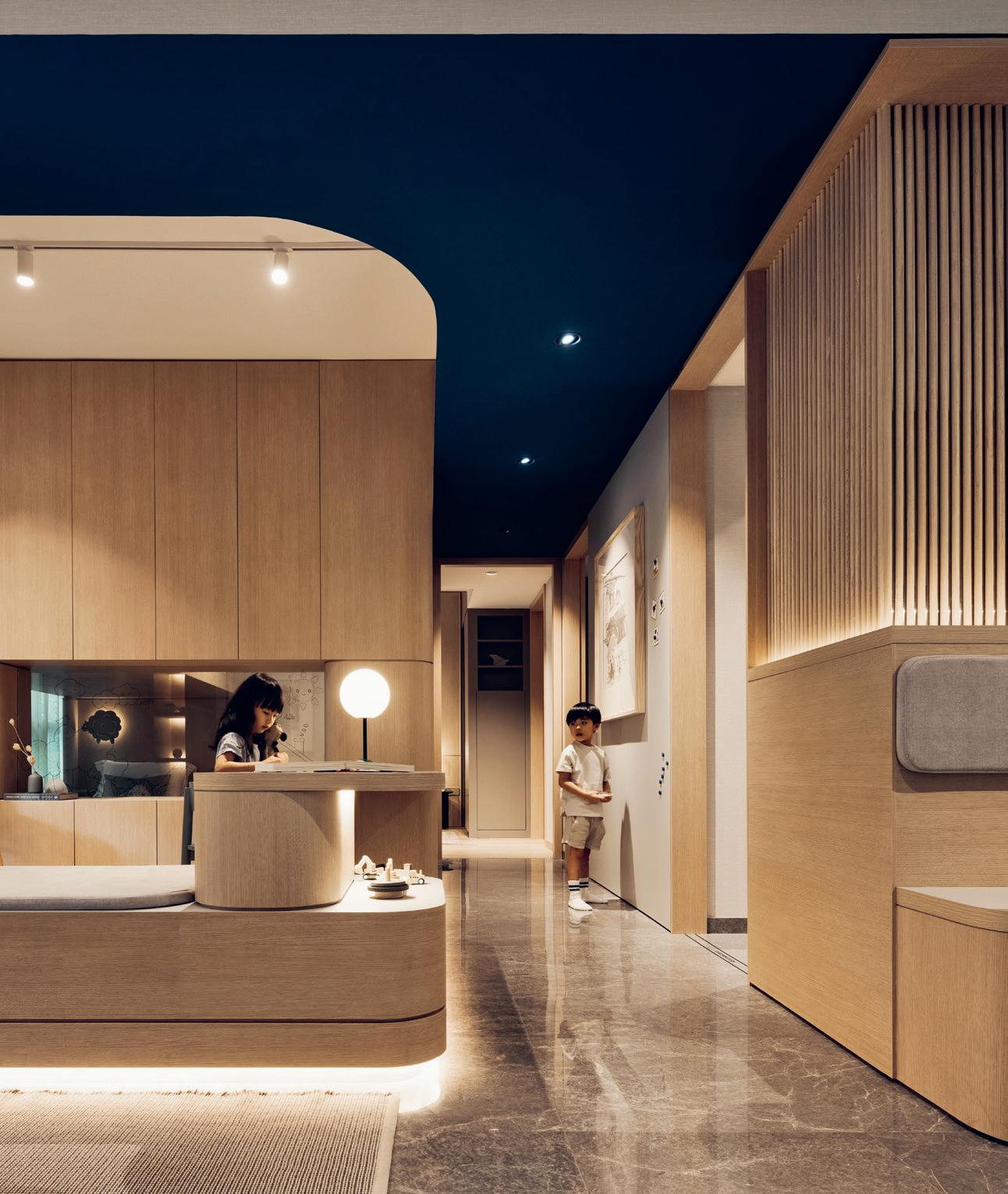
SINGAPORE OHV is a three-bedroom condo show unit in Singapore for the Far East Organization. Conceived by 932 Design & Contracts during pandemic-induced lockdowns as a dwelling for two young professionals and their two preschool children, the project responds to the home’s altered role. It emphasizes space for close familial interactions and private areas alike, and was specifically designed to mitigate feelings of ‘cabin fever’. A raised platform helps to segment the interior, while transparent walls and strategically placed furniture create division and connection, allowing parents to keep their kids in sight – and vice versa.
Our jury discussed the role of show flats, with design strategist Jocelyne Sacre concluding that they must ‘be relatable’ and ‘help people to project their lives into the future of the space. That’s the biggest selling point, and the end goal here is selling.’ Epistle founder Tanya Khanna added that they ‘have to appeal to not one particular inhabitant but to a range of people’. OHV came out on top for doing just that. ‘It accommodates all people through a cohesive experience, from the materials to the palette,’ said Khanna. ‘The lighting, colours and materials make children and their parents comfortable,’ agreed Design Plus Design founder and creative director Michael Lam, who applauded the high functionality of the modest, 140-m2 space. 932designs.com

LIVING FRAME Awards 86
Studio Periphery / Marc Tan

Spatial 87
Misak Terzibasiyan, founder and principal architect of UArchitects, appreciated the minimalist ‘Japandi’ style. ‘The wood, the colours – it’s calm and in balance.’
‘The of the architect is expanding’
With offices situated throughout Australia, ARM Architecture specializes in everything from master plans for cultural centres to educational institutions, endeavouring to closely collaborate with not only Indigenous people, but a whole host of stakeholders.
Mark Raggatt – director of the Sydney-based office and FRAME Awards 2022 juror – talks about the importance of identitymaking and research in shaping the future of institution design.
Words Adrian Madlener
Illustration
Simon Flöter
INSTITUTIONS
FRAME 150 92
role the architect expanding’

SFAP

SUBSCRIBE NOW *For locations outside the EU, a shipping surcharge applies. Be at the forefront of SPATIAL DESIGN . Enjoy Frame delivered bimonthly to your door and save on the listed retail price � YEAR PRINT €129 � YEAR DIGITAL €195 � YEAR PRINT + DIGITAL €295 store.frameweb.com
Executional Awards
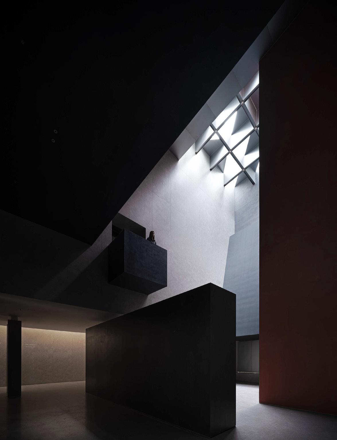
Light and shadow alter sensory perception, colour defines spatial boundaries, and raw materials form the ingredients of an open-ended office.
105

Executional 111
‘A stunning and seductive use of light that creates an atmosphere and evokes strong feelings,’ said jury member Emma Maiko Holt, associate director at Ben Adams Architects. ‘It beautifully highlights the qualities and texture of the tiles.’

FRAME Awards 112
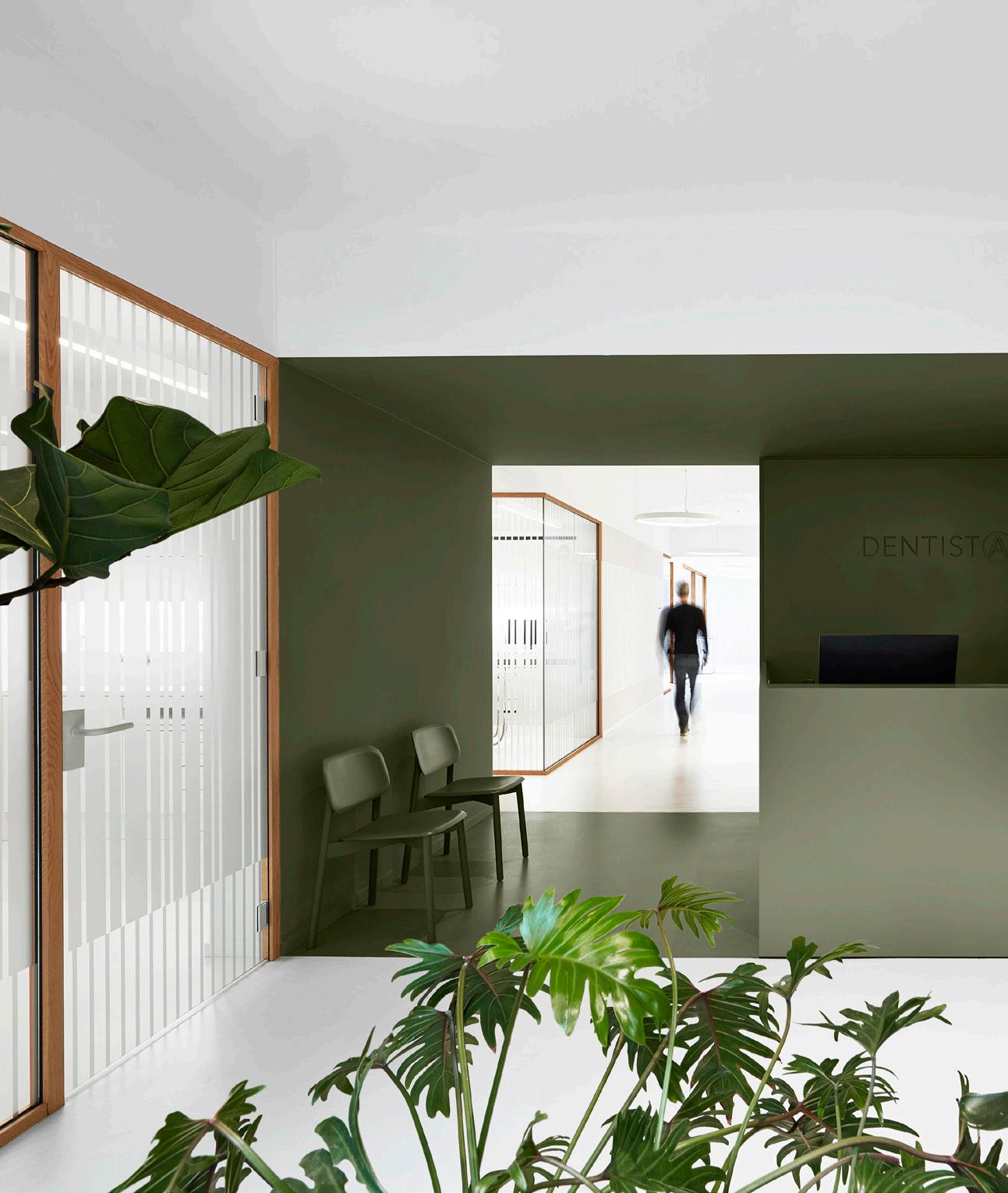
Best Use of Colour Dentista I29
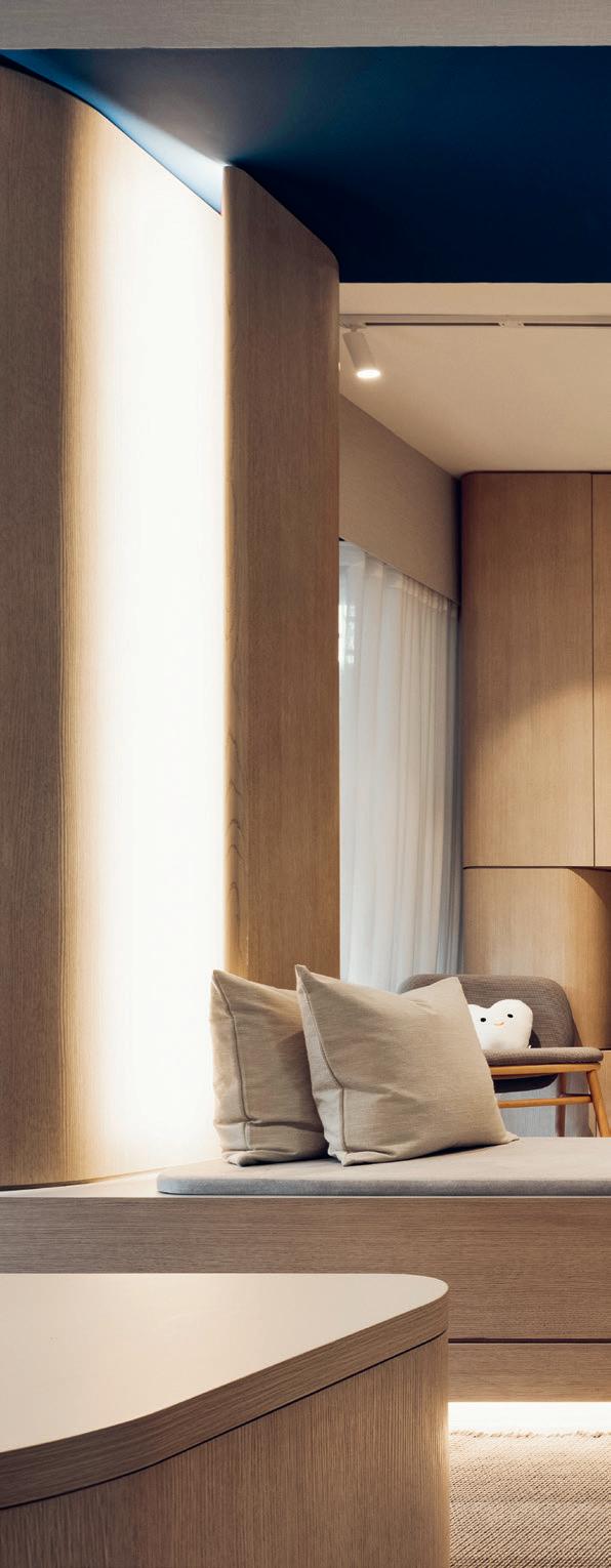
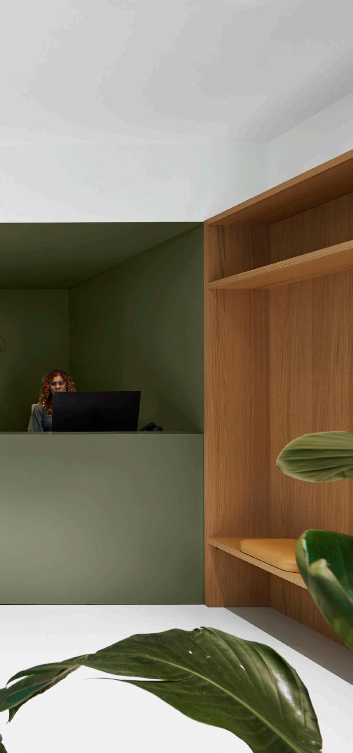
AMSTERDAM This year’s Best Use of Colour is surprisingly uncolourful. Designed by i29 in the Dutch city of Amsterdam, it combines just a few tones – white evokes medical professionalism while green(ery) and wood convey humancentricity. Colour blocking also helps to define the clinic’s various zones, distinctly separating the waiting areas from the treatment rooms. i29.nl

COLOUR Executional 113
Thomas van Schaik
‘The design has been beautifully executed,’ said jury member Victoria Stiles, retail design manager at Mirvac. ‘The fit-out embraces a purist design philosophy and a sculptural, sustainable delivery.’


in a post-trend
Yorgo Lykouria – owner and creative principal of London-based multidisciplinary studio Rainlight, and jury member of this year’s FRAME Awards –has applied his human-centric design approach to projects for the likes of Zumtobel, Okamura and Tecno. He advocates a renewed discipline of thinking in the industry and more design out of necessity.
Words Karianne Fogelberg
Illustration Simon Flöter
‘We’re post-trend society’
PRODUCTS
Looking back at the FRAME Awards, what did you take away from the projects and discussions in relation to products?
YORGO LYKOURIA: We’re in a very interesting situation right now when we discuss what is ‘good design’, because there are so many tendencies and crosscurrents of influence and activity that it’s really hard to pinpoint things – and that’s probably the way it will stay. We’re in a post-trend society. Being a designer is not just about the formalized aspect of beauty, which can be shallow and meaningless. We can all make something beautiful, but design’s relevance is in engaging people and relating to their imaginations and lives. There are many ways of approaching lighting, for instance. It can be purely functional. A lot of lighting designers want fittings to be invisible in architecture so that light seems to magically appear in a space. In other
cases, lighting becomes an object in and of itself, something with a presence, something you have a relationship to. Sometimes you have a real dilemma because you might have a competition entry that’s technically great, another that’s really well executed from a product-design point of view, and yet another that’s truly poetic and wonderful. When you put these three different tendencies together in a room, I find it very hard to choose a winner. All three are, in their own way.
Being in a post-trend society, what influences design if not trends?
Looking at the last five or ten years, every year has brought us a brand-new challenge and we’ve had to rethink everything. While it’s challenging, I think it’s also quite good in that it forces us to ask questions or solve problems that we might have been brushing under »
125 FRAME 150

‘This is a sustainable, versatile and durable material,’ said jury member Andrés Fredes, creative director of Alldsgn. ‘It’s a great canvas with which to play in interiors.’

Market
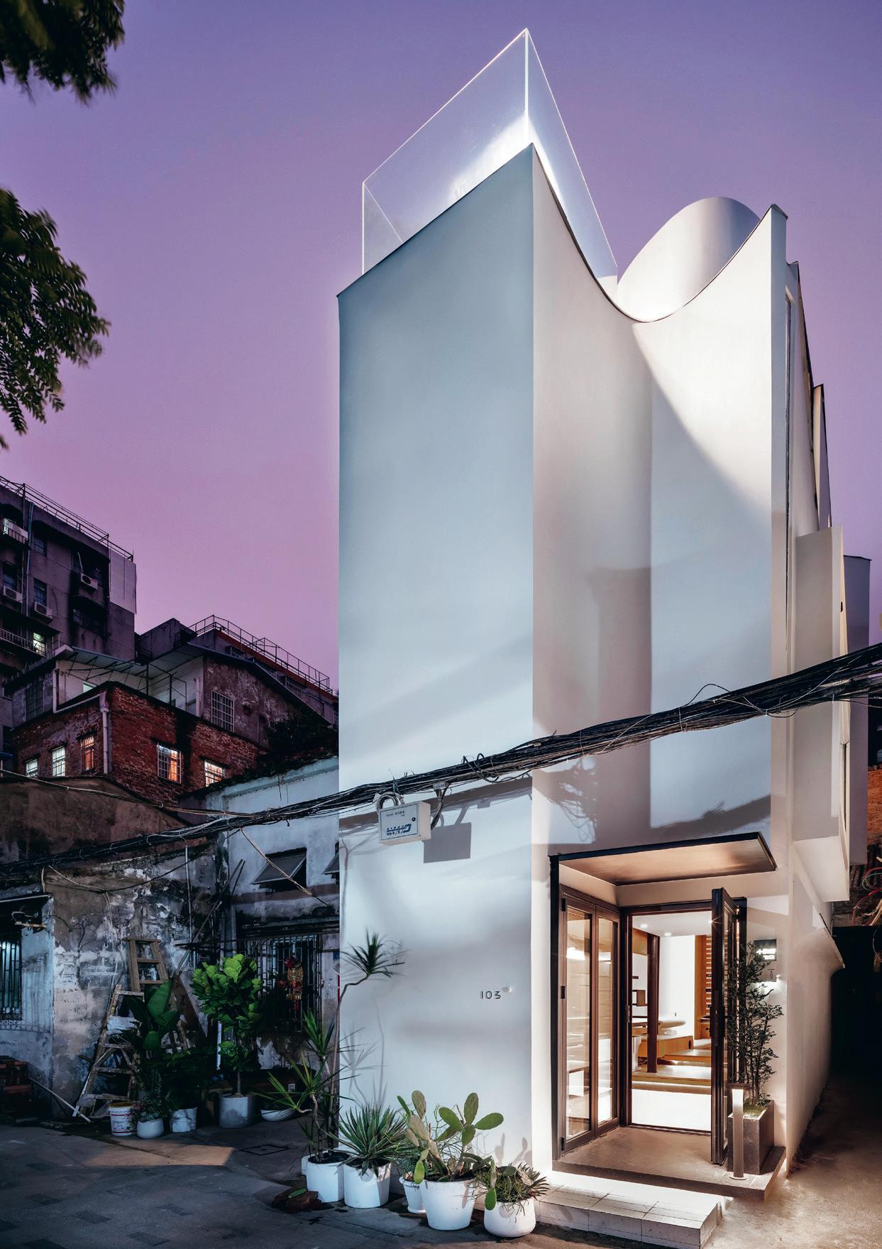
Furniture from otherwise unrecyclable materials, openended lighting and office chairs, transformable knitted objects, and co-created kids’ furniture.
138
MINIFORMS BICE
E-ggs designed the Bice chair for Miniforms. A rounded upper backrest and circular seat characterize its slim wooden frame. The chair is available in four wood finishes, so that it fits in a variety of workplace settings. miniforms.com


IRIS CERAMICA BOTTEGA D’ARTE
Literally translating as ‘art workshop’, Iris Ceramica’s Bottega D’Arte project combines traditional craftsmanship with modern technological expertise in the creation of refined red clay ceramic claddings. The manufacturer has achieved sustainability through innovation in its reinvention of a locally sourced material, maintaining the original charm of red clay in a contemporary tile that is available in five finishes. irisceramica.it
SANTA & COLE VASO
Conceived for Santa & Cole by London-based studio Industrial Facility, Vaso is a light installation that functions on its own or as a series in domestic and commercial spaces. Its simple, tumbler-shaped aluminium form and monotone colour palette make it suitable for a wide range of interiors.

santacole.com

Market 139
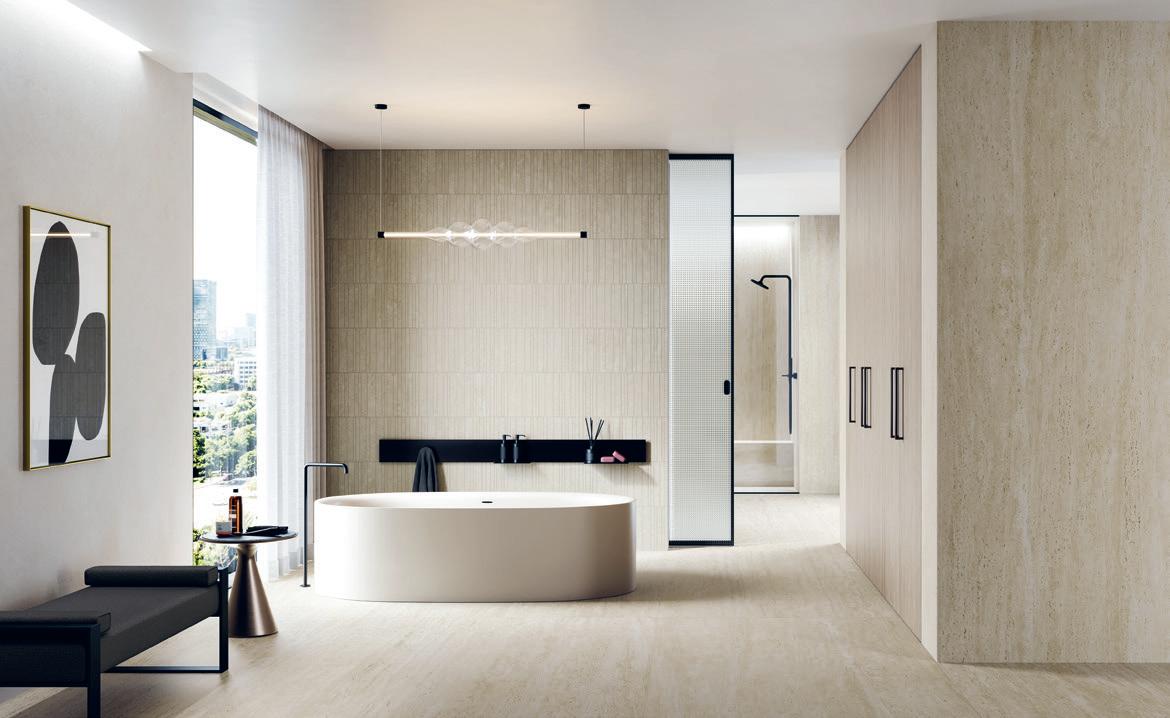
ATLAS CONCORDE MARVEL TRAVERTINE

Atlas Concorde and Hirsch Bedner Associates have faithfully reproduced the colours, cuts and patterns of travertine stone in their Marvel Travertine collection. Available in the tones White, Sand and Pearl, the ceramic surfaces sport five different patterns – Tessellation, Origami, Basketweave, Chiselled Urban Grid and Diamond. atlasconcorde.com
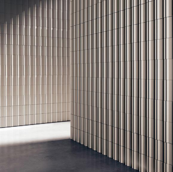
MUTINA RENGA
Inspired by the Japanese term meaning ‘chain poetry’, Belgian architect and designer Vincent Van Duysen created Renga to be used both as a brick-like construction element and a decorative object in its own right. The terracotta pieces that make up the Mutina collection are formed with a casting technique that uses a coloured liquid stoneware mixture, and their square base and rounded cylindrical edges form attractive and versatile stacking units. mutina.it

Officine Mimesi FRAME 150 140


 Henrik Lundell


