SPATIAL THERAPY
How interiors can benefit body and mind

BP EU €24.95 CHF 33.00 UK £22.00 JP ¥3,800+ tax KR WON 45,000 BP THE NEXT SPACE ISSUE 153 AUTUMN 2023


CONTENTS 11 MARKET The latest releases from Montana, Pedrali, Nanimarquina and more 17 Atlas Concorde Dynamic ceramics 23 Wilkhahn Canvases for collaboration 27 ONES TO WATCH 28 AB+AC Architects Tapping into neuroarchitecture 38 Lise Vester Humanizing care products 46 Sensiks Sensory stimuli for de-stressing 54 THE CONVERSATION What is wellbeing in the context of retail? A discussion with Quinine’s Ian Johnston and Arigami’s Ari Peralta
Cecilie Jegsen, courtesy of Lise Vester Courtesy of Cotto
Nicola Gnesi, courtesy of AB+AC Architects
Jussi Puikkonen, courtesy of Kustaa Saksi


64 LOOK BOOK Respite, relaxation and restoration across sectors 83 INSIGHTS 84 Design’s role in destigmatizing psychedelics 94 The neurodiverse institutions helping individuals thrive 100 How housing can get wellness right 108 Leolux Refreshed heritage 112 MOOD BOARD Cross-disciplinary creative concepts that promote healthier habits and habitats 130 CASE STUDY Booking.com’s human-centric Amsterdam HQ 142 TAKEAWAYS Facts and figures on wellbeing-led design
W Workspace, courtesy of IDIN Architects
Courtesy of Layer
David Zanardi, courtesy of ENESS
4 CONTENTS
Courtesy of Samaritual
The LAMORISSE armchair collection by CMP Design for PEDRALI features a striking combination of a sleek supporting structure and a large, enveloping cushion. The versatility of this collection is enhanced by its frame, which is available in aluminium for outdoor use or in solid ash wood for indoor settings (pictured), providing a complete assortment of seats that can be used in spaces characterized by indoor-outdoor continuity. pedrali.com

DEVORM presents a combined solution for acoustics and illumination with its FOST LARGE lamp, which features a ø118-cm lampshade and a dimmable LED module. Made of recycled PET bottles, the lamp has a ribbed pattern on the outside and a soft fabric on the inside, creating a contrasting visual effect. devorm.nl

Turkish designer Begüm Cânâ Özgür conceived HAZE for NANIMARQUINA directly on the loom, testing different chromatic interactions and colour fading to mimic the atmospheric haze of colours in nature. There are five sizes and four colourways to choose from. nanimarquina.com
 Albert Font
Andrea Garuti, styling Studio Salaris
14 MARKET


28
AB+AC

AB+AC 3DD 29 ONES TO WATCH
Lise Vester

Cecilie Jegsen
Approaching design
It was while collaborating with a Danish hospice – the same hospice her aunt spent her last days at – that Lise Vester developed an interest in the role of design and architecture in creating caring atmospheres. Whether it be in intimate settings like the home, healthcare spaces like a hospice centre, or shared outdoor urban spaces, she believes that designing for contemplative moments requires a holistic, human-centric approach. ‘Design should aim to stimulate the senses, foster emotional connections, have empathy for people’s needs and provide aesthetic pleasures,’ the Copenhagen-based creative says. ‘It should offer meaningful experiences that ground us and stimulate us mentally, physically, socially and spiritually. By incorporating these principles, designers can create environments and products that contribute to our overall wellbeing, and support people at different life stages.’

Vester focuses on designing products that elevate and enhance daily life experiences, both in the practical and emotional sense, as well as designs specifically tailored to individuals dealing with physical disabilities or facing mental challenges. In creating those objects, she strives for inclusivity. ‘Design should address specific needs without attaching a stigma to them,’ she says, building on the premise that every individual deserves good design. She believes that it is the designer’s responsibility to understand and enhance users’ realities and contexts. By doing so, she says, designers can influence not only the atmosphere of a space but also shape behaviour, mental and physical wellbeing, and self-perception. People with dementia, for example, may perceive a black doormat as a hole in the floor. ‘Understanding how we sense the world is critical for designing meaningful environments. I strongly believe in the significance of recognizing and embracing care as a holistic process – mentally, physically, socially and spiritually tailored to each individual.’
Vester draws inspiration from Healing Architecture, which she describes as a set of design principles that demonstrate how elements like materials, art, nature, views, mood and lighting impact people within built environments and is prevalent in healthcare facilities, including hospices. The latter is an environment Vester is invested in supporting through her work. ‘The senses of hearing and touch, particularly with our hands and cheeks, are the last senses we have. This understanding opens »
for wellbeing from a holistic perspective, Lise Vester elevates everyday products to provide contemplative moments and support (palliative) care.
39 ONES TO WATCH
Jonas Swienty


Christian Torp 42
‘DESIGN SHOULD ADDRESS SPECIFIC NEEDS WITHOUT ATTACHING A STIGMA TO THEM’
FROM LEFT TO RIGHT Drawing inspiration from Hans Christian Andersen’s fairytale featuring the Sandman, who has the ability to soothe and lull people to sleep, the sculptural Pust lamp radiates a warm and calm light. The project is sponsored by FC System.

‘People who depend on welfare technology deserve aesthetic, uplifting and tactile designs,’ says Vester. Which is why she conceived Pacem, a motorized chair designed to add a warm and homey feeling to institutional spaces while enabling visitors with disabilities to comfortably sit down and get up without help.
Pallium is a line of tactile products, including a sound pillow for music therapy and two comforting and anxiety-releasing weighted pillows, designed to stimulate the senses of bedridden hospice patients. Users can enjoy music at very low levels, ensuring minimal disturbance to their surroundings, while also maintaining social inclusivity.
Thanks to its rocking mechanism, the Munin chair has a calming effect on people that feel restless, anxious or unsettled. Subtle movements evoke the soothing motion a parent provides to their baby, reminiscent of the time spent in the womb. An additional rounded screen hugs the user, enhancing a sense of personal space while providing acoustic benefits.

43 ONES TO WATCH


‘WELLNESS SHOULD THE FOUNDATION CUSTOMER EXPERIENCES’


eral t
iP
a
BE FOUNDATION OF ALL CUSTOMER EXPERIENCES’


 RobertThiemann
‘WELLNESS
Ian Johnston
ROOM(S) RESTORE

W
Workspace
ROOM(S) TO RESTORE

ARCHITECTURE

Designed by Specific Generic and Spillmann Echsle Arkitekten, running brand On’s headquarters in Zurich fosters a sense of belonging for its 700 employees. The 15,000-m2 complex is broken up into smaller neighbourhoods, offering employees a mix of focus, social and collaborative spaces. Corridors become narrower and stairs steepen as you move up the building, transforming its vertical circulation into a long mountain trail. Several installations interrupt this ascending path and animate the interior, offering adventurous moments of intensity. Flexible walls, screens and furniture pieces are interspersed throughout the building, keeping spaces open to different uses and interpretations.

Eduardo Perez 68 ACTIVE
Mikael Olsson

69 LOOK BOOK
PROGRESSIVE CARE
Note designed a diagnostics clinic for Neko Health, a health-tech company responsible for developing a new non-invasive and affordable medical scanning technology that focuses on preventative measures and early detection. To express the progressive nature of its technology in a more digestible and comprehensible way, the healthcare space, located in Stockholm, draws on futuristic aesthetics achieved through lighting and materiality. The Note team’s goal was ‘to make the diagnostic experience inspiring and enjoyable, something that people would like to do repeatedly’.


70
Jonas Lindström


72 LOOK BOOK
SAFE HAVEN
Designed by Paul Le Quernec Architectes, the Fleury-surOrne nursery in Caen, France, provides temporary placement and care for children in complex or dangerous family situations. Metal dome structures house the children’s living spaces and are arranged in a circle around areas for shared activities as with a small village and central square. Regarded as ‘cocoons’, the homes symbolize the primary goal of the architecture – to ensure the wellbeing of the young residents, all between one and six years old. The living areas are separated from the other functional buildings by a walkway, demarcating a boundary between the world of children and that of adults. This physical and psychological separation establishes a sense of protection and removal from parent-related crises.


73
11h45
VERTICAL BIOPHILIA
Bjarke Ingels Group (BIG) and Carlo Ratti Associati (CRA) co-designed CapitaSpring, a 280-m-tall multiuse biophilic skyscraper in Singapore that houses over 80,000 plants. Separating the residential and office levels is a 35-m-tall open-air garden that spans four connected levels, dubbed the ‘Green Oasis’, which grants residents access to green space they usually wouldn’t have at such a height. Nature is woven into the building’s architecture, which mimics the plant hierarchy of a tropical rainforest. The rooftop is home to Singapore’s tallest urban farm, which grows more than 150 species of fruits, vegetables, herbs and flowers and supplies the building’s restaurants with fresh food.
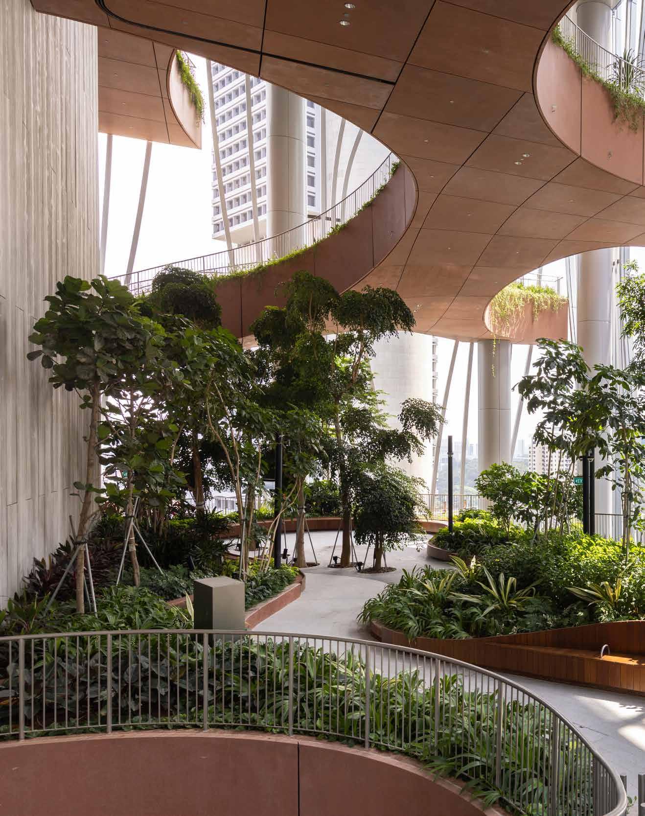
Finbarr Fallon

CROSS-GENERATIONAL WELLBEING
Schemata Architects added two volumes to a residence that sits on a southfacing slope on one of Japan’s Seto Inland Sea’s many islands. Measuring 52 m2, Dokubo comprises five private sleeping units and sanitary facilities, a place for the family’s kids and their friends to disconnect. El Amigo, in turn, is a space for the adults of the home to socialize, have drinks after dinner or hold tea ceremonies. Schemata Architects was inspired by shukubo – the accommodations of temples and shrines – for the wood-clad interiors. Attuned to different age groups, the residential spaces are designed to benefit the family’s wellbeing at the individual and collective level.

78 LOOK BOOK


79
Kenta Hasegawa
How design can destigmatize

PSY CHE DE LICS
With the rise of psychedelic-assisted therapy and microdosing, psychedelic design – a term once associated with the groovy patterns and kaleidoscopic colours of the 1960s and ’70s – has adopted a wellbeing-oriented aesthetic.
Words Tracey Ingram
 In anticipation of the further legalization of psychedelics, NewTerritory conceptualized an at-home kit for microdosing.
CLOSE TO HOME

Sabi Mind in Calgary is the first fully integrated psychedelic-assisted therapy clinic in Alberta, Canada – the province with the country’s lowest mental-health ranking, according to the Mental Health Index. Solo Studio’s design fuses the Japanese philosophy of wabi-sabi (beauty in imperfection and impermanence) with residential cues to make visitors feel at home and assuage anxiety. Aligning with the shift towards humanized healthcare, the clinic features natural materials, diffused lighting and soft, informal furniture.

88 INSIGHTS
Brendan Klem

89 PSYCHEDELIC DESIGN

90
MEANINGFUL MATERIALS
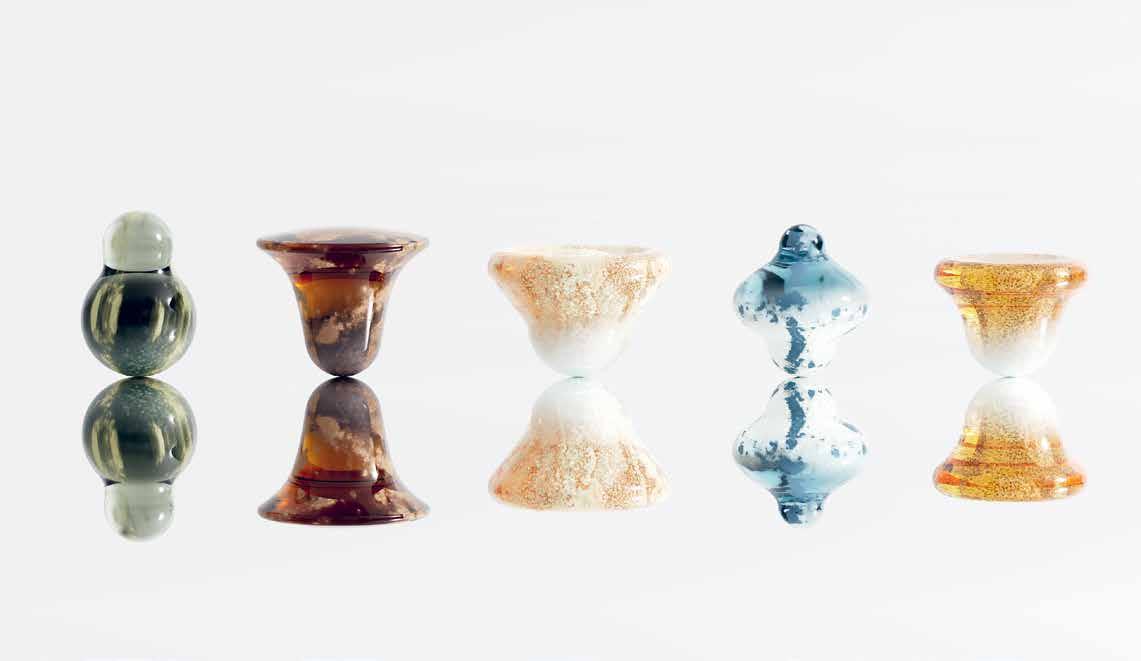
With Keia, a conceptual subscription service for microdosing psychedelics, Layer hopes to shift the perception of microdosing from an underground trend to a mainstream wellness solution, using materials and design cues that draw from nature. The three products are each packaged in an analogous home-compostable material: mycelium for the psilocybin chewables (both relate to fungi); wheat straw, a by-product of wheat farming, for the LSD wafers (lysergic acid is produced by a type of fungus that grows on grains like wheat); and pressed tea stems, coffee grounds and wheat bran for the ayahuasca tea pucks.

What neuro-inclusivity means for LEAR NING SPA CES

Kevin
Mak
The term ‘neurodiversity’ is all around us. So why are our educational settings so ill-equipped to address it?
Words Lauren Grace Morris
Francis Crick, an English molecular biologist, biophysicist and neuroscientist, once said: ‘There is no scientific study more vital to man than the study of his own brain. Our entire view of the universe depends on it.’ Luckily, increasing understanding of our most complex organ is helping us embrace neurodiversity, or the variety of ways in which individuals’ minds work. Are there ways we can improve our environments to create healthier, happier experiences for those with neurodivergences? Definitely. And it’s learning spaces that can benefit most greatly from brain-friendly design.
EXPAND THE DESIGN PROCESS
Unfortunately, most schools and educational settings are critically lacking in serving those with cognitive disorders and disabilities. ‘It’s impossible to create a solution that works for everyone,’ points out Dr Katie Gaudion, who is a design consultant and senior research associate at the Helen Hamlyn Centre for Design – an inclusive design centre based at the Royal College of Art in London – and dyslexic and dyspraxic herself. Optimizing sensory conditions, boosting flexibility and offering users choice, she notes, can help us push past one-size-fits-all design. ‘The most effective strategy for designing buildings that cater to neurodivergent individuals is inclusive design, which involves their participation in the design process from start to finish.’
This co-creative approach relies on an expanded design process, thinks Dr Philippa Simpson, director of the Design, Estate and Public Programme at the UK’s V&A museums. The institution recently unveiled its new-and-improved Young V&A, a children’s museum in London co-created with youth. ‘Be as broad as possible in terms of the activities and materials you use, to ensure everyone has the chance to express themselves in the way easiest and most effective for them – modelling, drawing, writing, speaking, acting it out,’ she advises. Accepting unpredictability within a project is also necessary: ‘We can’t always know how visitors or users will react to or use a space, and it has to be resilient to that,’ she says. ‘Most importantly they must foster connections and conversations, and create a platform for new encounters – not provide different areas or resources for different people.’
So: what actually constitutes a neuroinclusive learning environment? Natural lighting, acoustic protection, soft edges and finishes, access
to the outdoors, flexible spaces and furnishings, and clear communication aids – and interventions that promote autonomy – are key elements, according to Gaudion and Simpson. Los Angeles’s Westmark Lower School is set to be a leading example, with a campus conceived by global architecture, design and planning firm NBBJ. Nature, in this under-construction project, is embraced as a guiding force. ‘Neuroscience research shows access to and views of nature build wellbeing, decrease stress, enhance cognition and foster delight,’ say design leader and partner Jonathan Ward. Beyond embodying the aforementioned interior elements, Westmark’s design employs various outdoor settings for students who need to find respite or connection beyond four walls. ‘The campus becomes a classroom, with the outdoors providing unique learning opportunities for hands-on discovery and engagement.’
LEARNING HAPPENS EVERYWHERE
That supports a core idea expressed by Simpson: learning happens everywhere, meaning designing neuro-inclusive spaces is a universal task. ‘For some people school is almost the worst environment to learn in – overly structured, ordered environments, limited personal space. This can work for certain ways of thinking but not for all,’ she explains. ‘Other institutions can offer not only an alternative but perhaps also a provocation, to think in new ways about how we design all sites of learning.’
Empathy is necessary to keep this momentum going. ‘By taking the time to learn about neurodiversity and the needs of neurodivergent individuals, and exploring what inclusivity means on a more individual and less generic basis, we can modify “neurotypical” spaces to make them more welcoming and inclusive for a lot more people,’ Gaudion says. ‘Creating more inclusive and accessible spaces for neurodivergent people requires a deep understanding of their needs and experiences. It’s crucial to acknowledge that different people have different needs, and what works for one person may not work for another.’
Simpson concurs. ‘It’s not about “making adequate provision” for people but making everything for everyone as far as is possible. Designing well for all users is the definition of good design – and so will never be a compromise.’•
95

98
CO-CREATED EDUCATION
Creative education features heavily at the revamped Young V&A children’s museum in London, a joint effort between the institution, De Matos Ryan Architects, Agents of Change Architecture and V&A’s target audience – children aged 0 to 14. In addition to the in-gallery activation spaces, there are three workshop spaces for learning, and a dedicated reading room devised to encourage youth development.
 Luke Hayes, courtesy of V&A
How housing can get wellness

RIGHT
Housing developers are fully aware of the appeal of wellness add-ons to draw in customers, but before sprinkling on the croutons, they need to perfect the salad.
Words Tracey Ingram
100
Amenities, amenities, amenities. Check out the latest high(er)-end housing developments, and you could very well find a list of trimmings like a cinema, swimming pool and shared cars. But the very definition of the word amenity – ‘useful or pleasant facilities or services’ – highlights their expendability. Before tacking on bonuses, living spaces should have a solid base for wellbeing.
Linq-X founder Steve Lastro agrees that the word ‘wellbeing’ is being misconstrued in the world of housing. ‘Developers talk about “community” and “wellbeing” in terms of things like spas and gyms,’ he says. ‘That’s not wellbeing; that’s a lifestyle decision. To me, wellbeing is about creating conditions in a space that contribute to being well.’
AN ESSENTIAL RECIPE
And just what are the ingredients for creating those conditions? Unlike sports facilities decked out in the latest expensive equipment or luxurious spas and treatment spaces, they’re about returning to essential needs. Think of sunlight, access to nature, clean water and air, and reasonable sound levels, all of which are key considerations in the Well Building Standard. Lastro asserts that healthy light and air and clean running water should never be seen as optional extras. ‘It’s not like when you bought a car in the 1980s and could get an upgrade for air conditioning. They should be standard features in today’s homes, no different from a kitchen and plumbing.’
This may sound obvious and simple but it’s unfortunately not the norm. The World Health Organization (WHO) estimates that by 2030, billions of people will lack access to safe water, sanitation and hygiene (the sixth sustainable development goal) unless the rate of progress quadruples. There’s an even greater percentage of people susceptible to household air pollution from cooking on open fires or inefficient stoves (around one-third of the global population). According to the WHO, the combined effects of ambient and household air pollution are associated with 6.7 million premature deaths annually, as well as several noncommunicable diseases. As for lighting,
quick-fix housing trends like the conversion of office spaces into residential units can exacerbate the issue, as the former often lack natural light.
WRITING BETTER RULES
While some skirt around the regulations in the interest of profit, others are rallying for change. Take Neometro, Australia’s first B Corp-certified property developer, which is in the process of launching the Framework for Healthy Buildings. ‘People were talking about the impact of their homes on their physical and mental health, but the causes weren’t as well understood [as environmental sustainability], and any international frameworks that would help people design and develop buildings that support holistic wellbeing hadn’t been distilled into highly workable protocols and guidelines for the Australian market,’ director James Tutton told FRAME. During Neometro’s briefing process, architects and interior designers now receive a comprehensive wellbeing guide that encompasses aspects such as air quality, fostering community, incorporating greenery within and around the building, and optimizing lighting to promote both physical and mental health – all specific to local planning and code constraints. Tutton says it’s not about reinventing the wheel, but about ‘taking information that’s out there, putting it into a practical framework and then literally building the outcome of the research into our projects. The results could be apartment wayfinding that nudges towards small, proactive health moments like walking; water fountains at entries for hydration; or planting that attracts bird life, offering a connection to nature that’s known to boost mental wellbeing.’
Meanwhile, at this year’s edition of the Global Wellness Institute (GWI)’s Wellness Real Estate and Communities Symposium, GWI researchers previewed their Wellness Policy Toolkit: The Built Environment. Also critical of elitism in the wellness industry, the researchers emphasized the urgency of government policy interventions to create healthier housing and communities. While acknowledging that individual aspects of wellbeing such as healthy food and exercise should be considered, the researchers
OPPOSITE Wellness consultant and Linq-X founder Steve Lastro worked with Valentino Gareri Atelier and global wellness real estate company Delos (pioneers of the Well Building Standard) on Sunflower Village, a proposed residential community with a central communal area. Each home is equipped with Delos’ DARWIN™ Home Wellness Intelligence platform, which monitors, calibrates and activates indoor home environments. The system focuses on four main components: air filtration, water purification, circadian lighting and comfort-focused technologies.
» 101
COMMON NEEDS
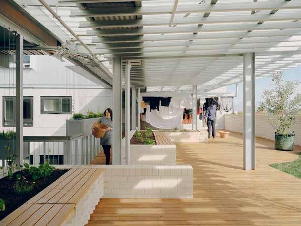
Nightingale Village in Melbourne, Australia, comprises 203 homes across six buildings. Living areas are oriented towards the park and streets, and bedrooms with operable windows face light courts, allowing cross ventilation and providing acoustic havens on a site impacted by train and road traffic noise. Each building includes a communal rooftop where residents cross paths in the shared laundries, tend to productive gardens and gather in entertaining areas.

104 INSIGHTS
Tom Ross

105 HEALTHY HOUSING
Eyes on the future
Dutch furniture producer Leolux writes its next chapter with Studio Truly Truly.
Words Adrian Madlener

 Developed with Dutch designer Daniël de Bruin for Leolux’s Milan Design Week 2023 Alcova showcase, the Rhythms installation was defined by a moving textile ceiling sculpture that would periodically conceal and then reveal the brand’s distinct collections by Studiopepe and Bram Vanderbeke.
Yuta Sawamura
Healthy habit(at)s

Courtesy of External Reference
PREVIOUS SPREAD LEFT NYC-based creative atelier Samaritual speculates about and explores how AI can be harnessed to boost imaginative capabilities, which founder Samar Younes believes are crucial to shaping our shared health narratives. The pictured AI-generated image proposes a future where craft, art and nature are the catalysts for wellbeing.
PREVIOUS SPREAD RIGHT Evoking real species, the biomimetic designs of PurePlants – conceived by External Reference and 3D-printed by LaMáquina – are made using Pure.Tech, an advanced polymer composed of 100 per cent natural minerals that absorb and neutralize CO2, nitrogen oxides (NOx) and volatile organic compounds (VOCs) for catalysis.
LEFT Ulises Design Studio employed AI design tool Midjourney to conceptualize a series of futuristic, adaptable and mobile workstations. Supporting flexible work lifestyles, the fully equipped travelling desks make impromptu, nature-engulfed outdoor meetings possible.

AH/FK Courtesy of Ulises 114 MOOD BOARD
From the festival terrain to the metaverse to the wardrobe, the growing awareness of wellness is impacting all aspects of real and virtual life. In this issue’s Mood Board, we explore creative concepts from a range of disciplines that help establish healthier habits and habitats.

Dreamed up by artist Nimrod Weis, founder of Melbourne-based art and technology studio ENESS, Modern Guru and the Path to Artificial Happiness launched at France’s Centre d’art à Châteaugiron. The installation took visitors on an immersive journey through a landscape of inflatable ‘mountains’ in psychedelic patterns that chanted incantations, chimed and blinked at passers-by through digital eyes.
 David Zanardi
Conceived by Marine Renaudineau, Horizon gamifies – and by doing so, increases the accessibility of – mental healthcare. The digital experience adopts and reshapes the Voice Dialogue method used in psychotherapy and lets players interact with their different inner selves to gain greater emotional self-awareness.


128 MOOD BOARD
Courtesy of Marine Renaudineau
MBERSHIPS Unlock unlimited design intelligence with frameweb.com/subscribe Fuel your creativity, deepen your knowledge build mastery. Choose your plan. DIGITAL & PRINT €295/YEAR PRINT €129/YEAR DIGITAL €195/YEAR EEE EEEE E
M

Matthijs van Roon
BUILT-IN WELLBEING

EXAMINE YOUR DEFINITION
What does wellbeing mean? Many developers and designers have tied the term to ‘wellness amenities’ like spas and workout spaces, rather than to its true essence of ‘being well’. Defining this key difference will help you to become aware of which spatial conditions contribute to being well (and which don’t) and to translate those elements to every user touchpoint, including online.
RETURN TO ESSENTIAL NEEDS
Before adding on extras, get the wellbeing basics right. Think of sunlight, access to nature, clean water and air, and reasonable sound levels, all of which are key considerations in the Well Building Standard. How can spatial design not only integrate but maximize these aspects?

1
TAKEAWAYS
2
GET PHYSICAL
Physical spaces have the power to direct their inhabitants. With sedentary lifestyles on the rise due to the likes of desk work and a lack of available exercise spaces, interiors can (covertly) promote physical activity. What if the staircase is more conveniently located than the lift, for example, or if meeting rooms double as spaces for movement and play?
CONSIDER SENSORY STIMULI
Don’t underestimate the role of sensory stimuli in wellbeing – make sure to integrate sensory design from the outset, not as a layer on top. Visual beauty, for example, can register in the body and mind as pleasure or parasympathetic dominance, contributing to physical and emotional restoration. With new research emerging that blends psychology, cognitive neuroscience and design, the awareness and importance of sensory design will likely increase.

3 4 W Workspace, courtesy of IDIN Architects Courtesy of NewTerritory
UNDERSTAND THE ATYPICAL
Individuals experience spaces differently – as an extreme example, those with dementia might perceive a black doormat as a hole in the floor. By understanding these variations – and how they affect our experience of the world – designers can better create empathetic and inclusive humancentric spaces that benefit all of society.
BUILD CONNECTIONS
Communities foster social wellbeing. Even in a project’s conceptual phase, the end users can feel a sense of community and connection by contributing ideas. While buildings themselves might double as a ‘community centre’ – think of offices, which are becoming places to gather rather than to simply work – the spaces within them should encourage people to come together in various ways.

5 6 Courtesy of
144 TAKEAWAYS
Samaritual
THE FRAME AWARDS CEREMONY IS COMING TO SHENZHEN, CHINA, ON 14 OCTOBER 2023


THE DATE SAVE THE DATE SAVE THE DATE SAVE THE DATE SAVE THE DATE SAVE THE DATE SAVE THE DATE SAVE THE THE DATE SAVE THE DATE SAVE THE DATE SAVE THE DATE FRAMEWEB.COM/EVENTS


 Albert Font
Andrea Garuti, styling Studio Salaris


 RobertThiemann


 In anticipation of the further legalization of psychedelics, NewTerritory conceptualized an at-home kit for microdosing.


 Luke Hayes, courtesy of V&A


 Developed with Dutch designer Daniël de Bruin for Leolux’s Milan Design Week 2023 Alcova showcase, the Rhythms installation was defined by a moving textile ceiling sculpture that would periodically conceal and then reveal the brand’s distinct collections by Studiopepe and Bram Vanderbeke.
Yuta Sawamura


 David Zanardi


