PORTFOLIO

Interior and Spatial Design

Wenxuan XU
Selected work 2019-2023


Interior and Spatial Design

Wenxuan XU
Selected work 2019-2023
WENXUANXU 26/ 01/ 1998
Chinese
+39 3484151887
wenxuan.xu@mail.polimi.it
Hello! am a curious interior and spatial designer who is organized and eager to learn, a big picture thinker that possesses strong attention to the interior and exterior boundaries, and a dynamic team player with excellent time management abilities and problemsolving skills. I believed I'm a responsible and creative person, who is quite adaptive to various tasks given both individually and in groups.
Dec2022-June2023
Mar-May2022
Feb-Dec2021
June-July2019
2020-Current
Architecturalintern
DavidChipperfieldArchitects,China
Exhibitionresearchassistant
OfficeU67ApS,Denmark
Freelance
LACStudio,China
Furnituredesignintern
OnleadGroup,China
TimeManagement
Teamwork
Mindfulness
Self-discipline
Positivity
Modeling&Rendering
Photography Writing
AdobePhotoshop
AdobeIllustrator
AdobeIndesign
AutoCAD
Rhino
Sketchup
3Dsmax
Enscape
Vray
AdobePremiere
FinalCutPro
PolitecnicodiMilano
M.ScInteriorandSpatialDesign
2016-2020
2021
2021
NanjingForestryUniversity
B.ScIndustrialDesign
Fullmarkforthestudioof"Newinterior" PolitecnicodiMilano
Workselectedfor Nature&Artifice_PrototypeExhibition
PolitecnicodiMilano
2018
"Outstandingstudent"scholarship
NanjingForestryUniversity
Mandarin Spoken
English Spoken
Written
Written @avery_xwx
https://www.behance.net/467237228xwx
https://www.linkedin.com/in/wenxuan-xu-4bbb5a1a6
“
Human interaction shapes and influence the space.
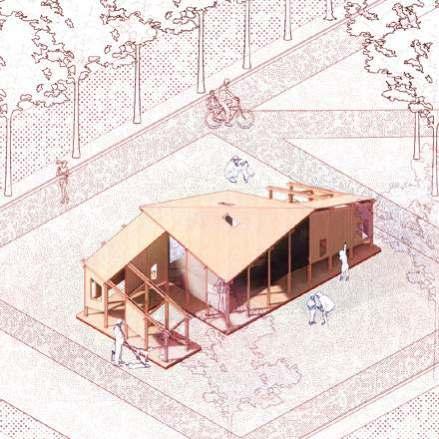
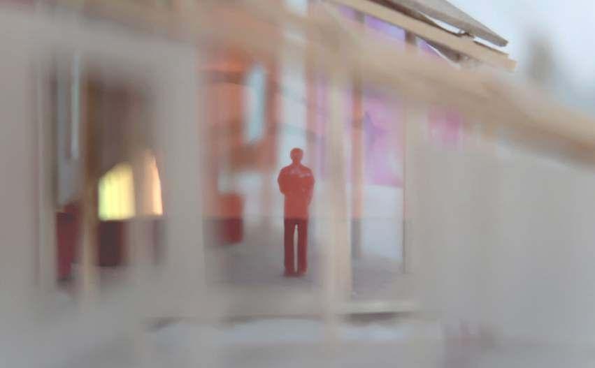
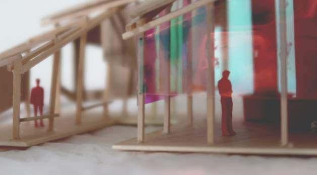
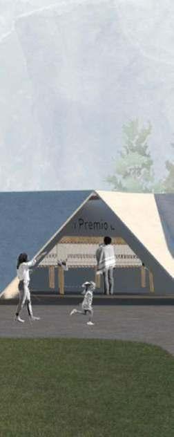
Designing a pavilion for our Voliere Aperte-PiazzaleBacone,aplacewithstrongidentityand long history, we draw inspirations from Milanese films of different times. Three elements-- door, window and mirror are selected to be used as design language to create a narrative, interactive space that introducing Milanese films and filmmakers to the surrounding community and all Milanese. With the name SCENE’ING, the activities inside the pavilion will never end as Milanese will continue to meet each other, observe and learn information, live and experiencelifehere.
Type: Urban Design, Group Academic Work
Location:Piazzale Bacone, Milano
Period: Apr - July 2021
The Piazzale Bacone is in the northeast of city Milan. It has a long history and strong identity. Surrounded by several schools and major shopping avenues, Piazzale Bacone is a multi-functional park with playground, green space and dog park. Although not very big, this place has strong attachment for the residents, students and people work there.
During the design process, we take elements from Milanese films and transform them into physical structure and texture. The dimension and materials of the pavilion make it well blended in the existing site. The recognition of the site is not only a playground, but a site with new cultural/ education infrastructure at public disposal.
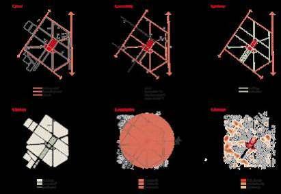
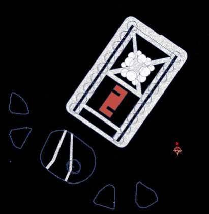
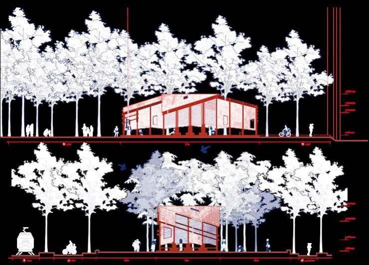
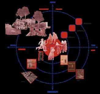
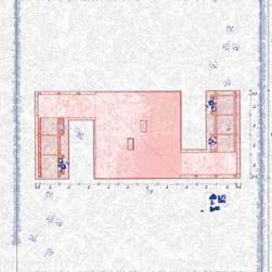
The pavilion takes the uniform language while looks morphing through space from open to semi-close. Visitors go through the introduction corridors and then guided to the main space for introducing Milanese films and filmmakers.
1_Roof


_wooden panels

_digital screens
_windows
2_Beam
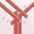


_150*50 mm timber chords
_track for lighting system
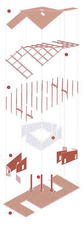
_track for hanging posters
3_Pillars

_150*50 mm timber chords
_outdoor benches
_door elements
4_Facade
_mirrored glass
_projector for outdoor cinema
_mirror elements
5_Facade
_50 mm thickness wooden panels

_information boards
_window elements
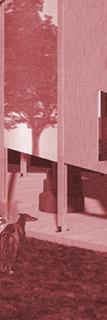
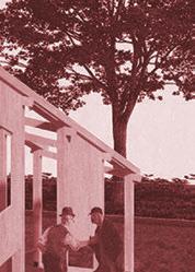
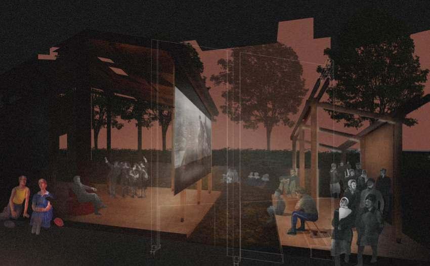
The pavilion has a wooden structure and is covered with mirror glass skin. The wood offers a warm feeling and strong support of the pavilion. Thus the interior is flexible to host all kinds of events ranging from resting to exhibition space and outdoor cinema. The mirror glass makes the pavilion well blend in the context by daytime and glow with light at night.
6_Interior
_equipment layer
_indoor furniture
7_Deck
_200 mm thickness wooden base
_grass
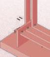
steel locator plate
equipment layer curved wooden bench
timber chords

_50*150 mm
metal corner connector

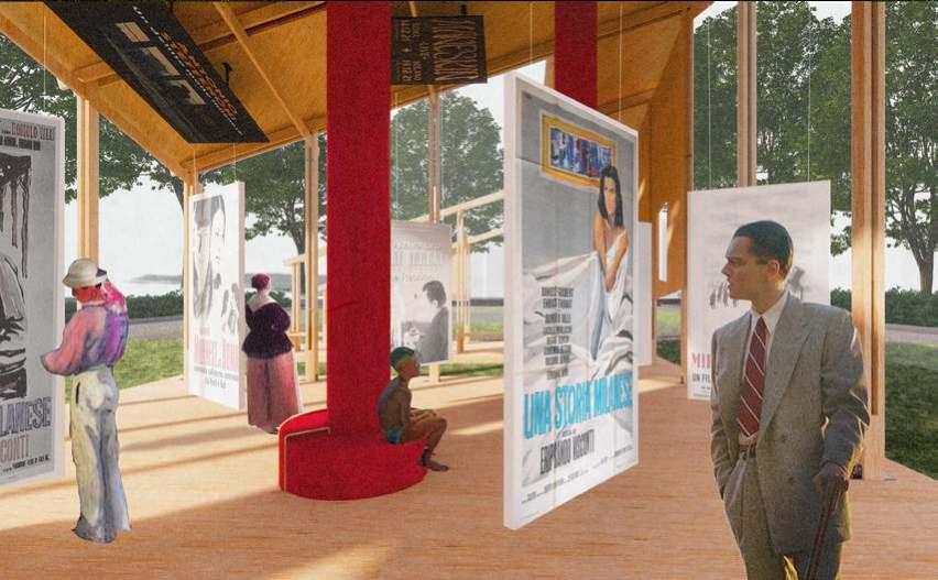
The pavilion can also serve as a place to hold events such as exhibitions. The metal tracks installed on the roof can be used to hang posters. The screens will play differentvideos.Togetherwiththeintractiveinfopointsonthefloortoscan,visitorscanhaveamulti-sensorarylearningexperiencehere.

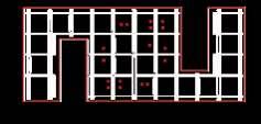


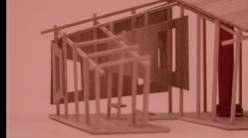
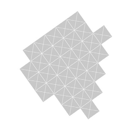
Under the rapid economic development and rapid improvement of people’s quality of life, Jinqiao, a new city sub-center, is being actively constructed.Jinqiao art center allows us to explore a new form of architecture. We can investigate a novel architectural style at the Jinqiao Art Center. We didn’t want to create an “art center” like many current art centers, where visitors must buy tickets to see a few works of art. We want to explore more possibilities - a container, a building without borders, a building thatisnotabuilding.
Type: Competition, Group Practical Work
Location: Shanghai, China
Period: Dec 2022-Mar 2023
Here, the art center has become a social condenser, bringing people together for various activities around the purpose of art. What does this space look like? Firstly, it should be an all-encompassing space that harbours artworks and activities; secondly, it should be a place of rich connectivities, so as to promote the flow of people andspace;lastbutnotleast,itshouldbeorganicallyintegratedintothetrafficandlifeofthecity,asifasubwaystationortrainstation,ahubembeddedinthecity.
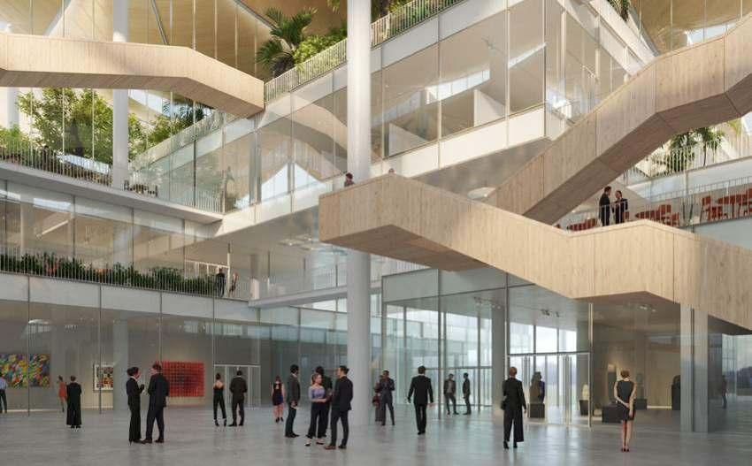
The site is located in the southwest corner of Jinqiao Central Park, with three sides facing the park and one facing the city. In this case, one of the focal points is the relationship between architecture and the city as well as architecture and the park. Unlike the town squares in Europe, in the traditional Chinese culture, social space is more likely in pavilions surrounded by lovely natural scenery. As a result, the design was motivated by symbiosis with nature. We began by creating a roof that would cover the entire site, providing a place to shelter people from the light and rain. Shanghai is located in a subtropical region with a temperate and rainy climate and relatively hot summers. A well-performing roof provides a comfortable indoor and semi-outdoor environment, with controlled light to regulate the temperature and adapt to the various climate of each season. This roof is unique to this location; it wasn’t created for a specific piece of art; it is bespoken fortheplace.
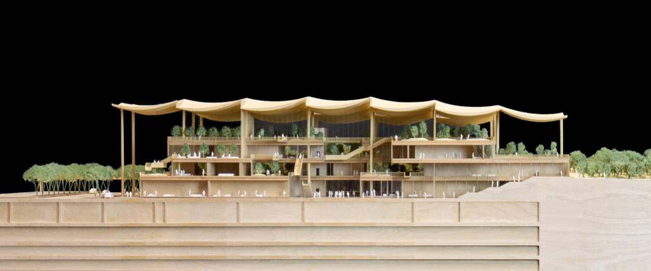
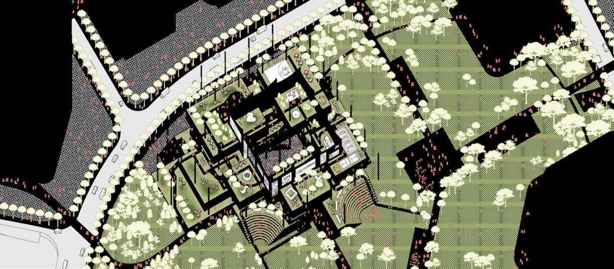
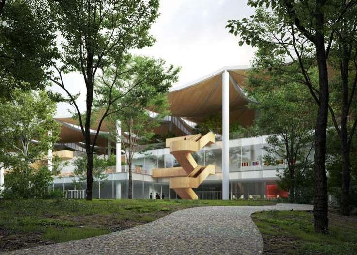
Each space is a unique landscape with infinite changes.
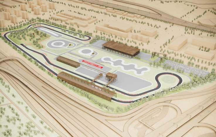
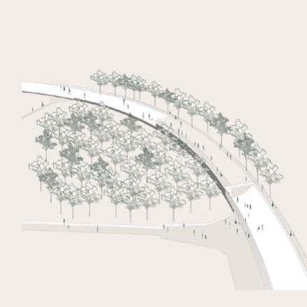
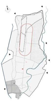
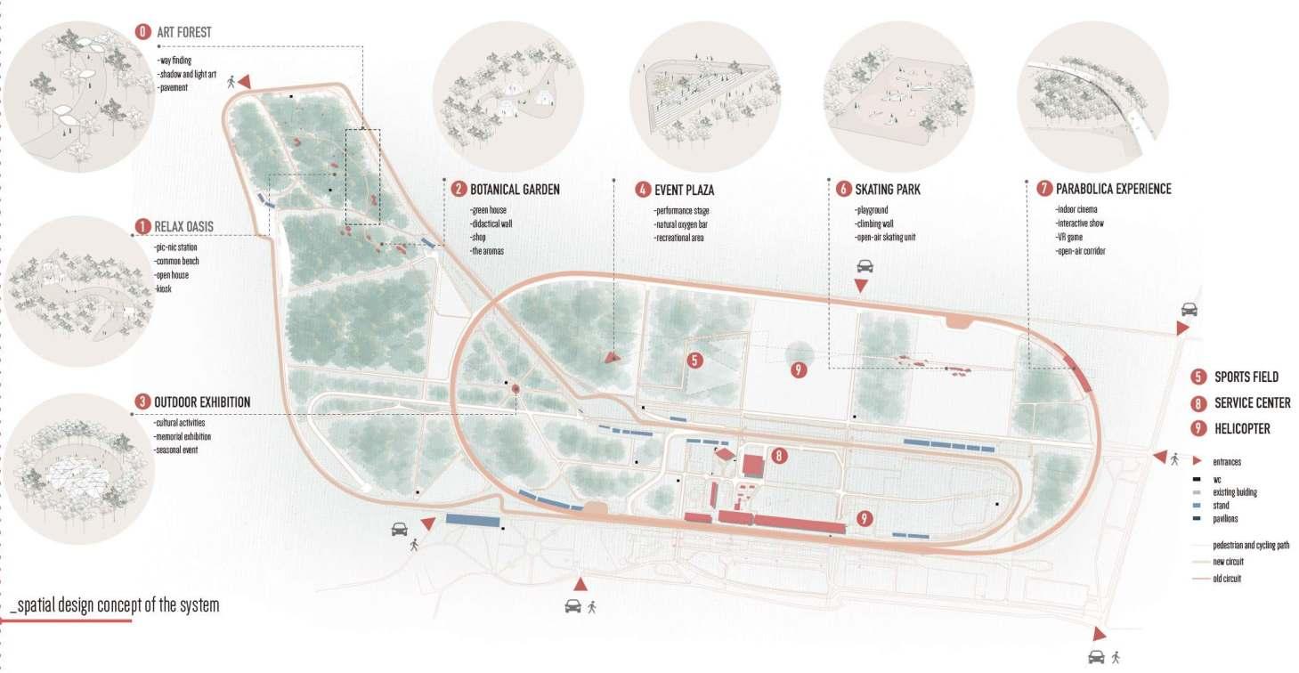
Speed is everything around us, speed is nature, it is humans in motion, it is in objects we observe regularly, speed is Parco di Monza.This project is a visual representation of speed and movement, how can we transfer something that is intangible into something with physical presence?From this we started exploring the six different scales, and how each scales shows the in depth application of our triangular grid on different scales and in different activities and how we started representing speed with new concepts and respecting the relationship between human behavior and the environment.
Type: Landscape Design, Group Academic Work
Location: Autodromo Nazionale, Monza
Period: Sept 2020- Feb 2021
gridsandconnection
The name Monza now is more recognized and associate to Autodromo from 19th century. Autodromo Nationale Monza was found in 1922 and continue to hold one of a top position internationally for Grand Prix. Since then it transformed Monza with its new found identity and continues to bring more visitors and patriots from all around the world.
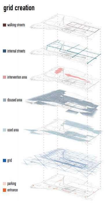
From Macro to Micro, representation of different layers overlapping onto each-other. Starting from the general map of the Monza area, showing the main and submain roads and then Parco di Monza showing its main axesaswellaspointsofentrancesandexists.TheCircuit
Area is divided in different layers according to a function so that the area could be analyzed better as a whole.


historicalsettings
The design strategy for this project is a visual representation of speed and movement, by analyzing speed and how it can be showed in a visual way, by forming a sort of connection between speed and geometricalforms.Thusgivingasenseofmotion,theline appears fast whereas a cube remains stable and slow.
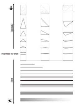


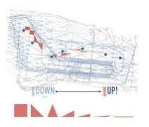
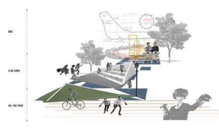
We abstract the speed change of the site as the change of shape. The specific expression is: a rectangle becomes a triangle and then becomes a line, which symbolizes the speed from 0-100%.
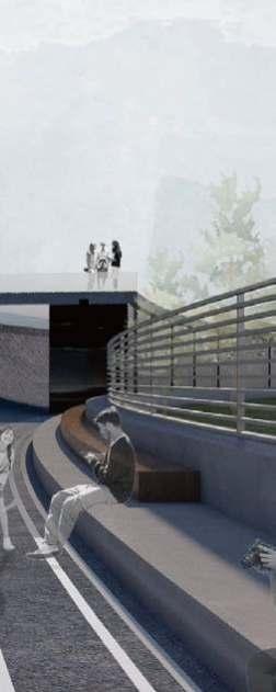
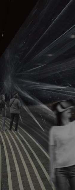
The basic strategy of pavilions is to raise or lower the grid. For example, the parabolica ex-perience, which represents 85% of the speed, is not a triangle sinking in the true sense, but by supplementing the perspective relationship of the characters into an abstract triangle rela-tionship, which derives the design concept of an observation deck and an indoor cinema.
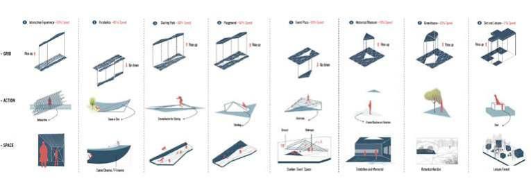
The abstraction of shape is reflected in whether people can truly experience the corre-sponding speed in the site. At this time, the triangle or straight line has been internalized into an experience, which is closely related to the shape, density and material of the pavilion.

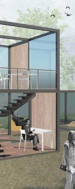
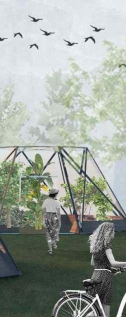

In the traditional China, private gardens gradually forgotten by the world provide more thanthemeaningofbeingstoppedtoappreciate for people. prefer to let people integrate into the interior of buildings to arise the memory of the past. Besides, The path itself is not only a part of the site but also the spread of the site, linking all segments into a whole. In this reconstruction project of ancient buildings, the path is connected in series with a series of edited landscape scenes, like a "landscape dreamland". Here, there are full of metaphorical projections of landscapes and literati life.
Type: Spatial Design, Individual Academic Work
Location: Jiangsu, China
Period: Nov 2019-Jan 2020
Dongguan Street is the center of Yangzhou handicraft industry. After the accumulation of thousands years, rich historical relics and cultural relics are widespread in the street. Therefore, it can be called the best preserved ancient street in cities along the Grand Canal in China. The front and the back shops and their stores are all over the street. The street is full of listed wells, developing businesses and thriving businesses. In addition to the long-standing shops, there are also many historical relics such as Yipu, Wang's small garden and Geyuan, which are all national key cultural relic protection.
The gate of Yipu is southward, the west is the sixth entrance for residential buildings, and the front yard of the east is the garden. In Yangzhou residential gardens, the gardens are mostly built behind the houses, only on the east side, side by side with the houses.
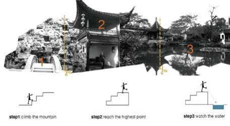
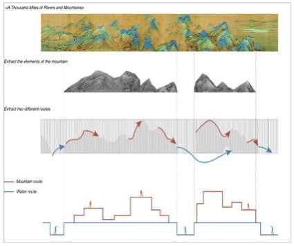


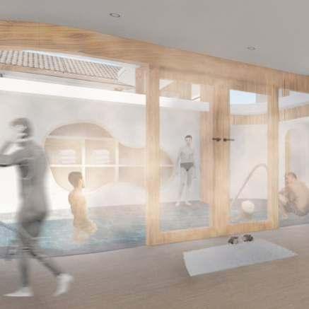
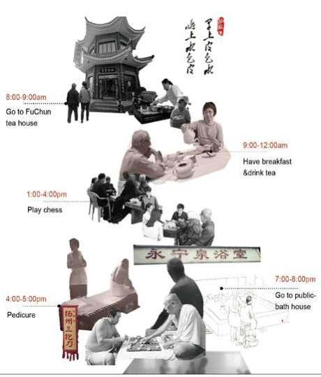
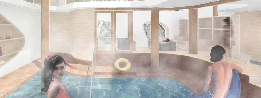
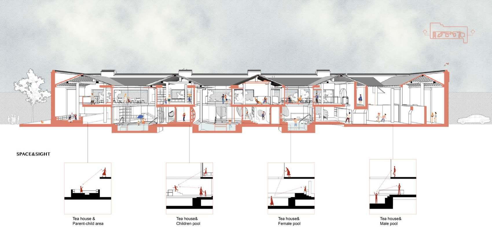
Most of the residents who settled in Dongguan Street are Yangzhou citizens of the older generation, and their daily activities can be roughly sorted out the living habits of Yangzhou. Yangzhou citizens go to the teahouse in the morning and bathe in the public bathroom in the evening, reflecting Yangzhou people's comfortable life rhythm. Yipu is adjacent to Geyuan and the latter is more famous than the former, so people rarely enter Yipu that once was called the "no-one scenic spot". This project hopes to transform Yipu into a compound space, which combines bathing with teahouse by using tourist attractions for the second time, activating the leisure space of ancient streets.
My inspiration comes from the Mianyun Pavilion in Suzhou, which is divided into two floors. Only when get to the second floor can I see the water in the distance. Climbing up the mountain, you can see a mountain path is set up in the gap and you can reach the high-rise teahouse at any corner, like climbing up a "mountain tower". Besides, you can see the real scenery of the mountain garden outside the window and the interaction between the nearby people and the "mountain" obviously.
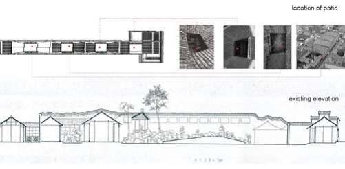
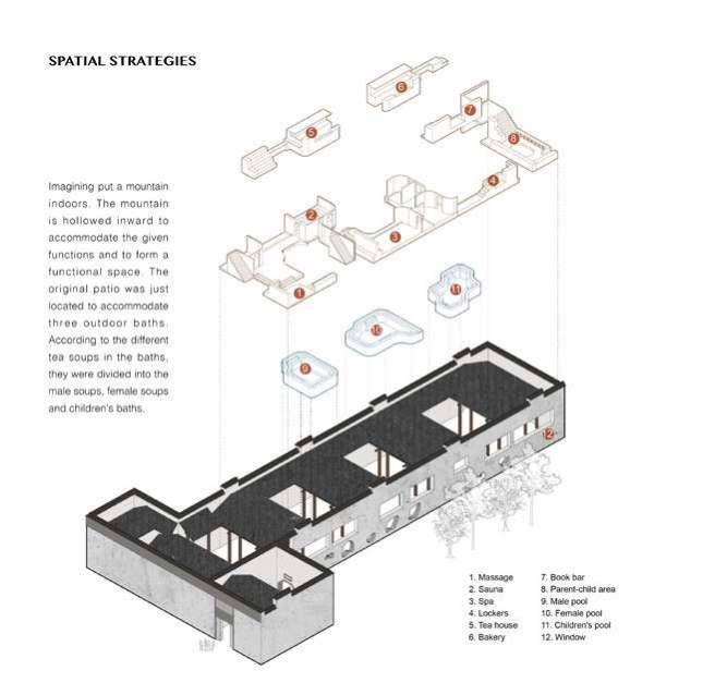
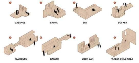
Imagining put a mountain indoors. The mountain is hollowedinwardtoaccommodate the given functions and to form a functional space. The original patio was just located to accommodate three outdoor baths. According to the different tea soups in the baths, they were divided into the male soups, femalesoupsandchildren’sbaths.

“ ” Diversity and inclusion make a unique community.
There are cubicle self-study rooms that meet the requirements of students in many scenes of Korean dramas and Japanese dramas. However, the traditional industry is difficult to meet the needs of the people, and people's demand for learning facilities is increasing, so the cubicle model will eventually be eliminated. In my opinion, the Shared selfstudy room needs to meet people's spiritual needs in more aspects. This project takes the Shared self-study room as the carrier to study the relationship between human behavior and space boundary, and then discusses how to design a dedicated learning space.
Type: Spatial Design, Individual Academic Work
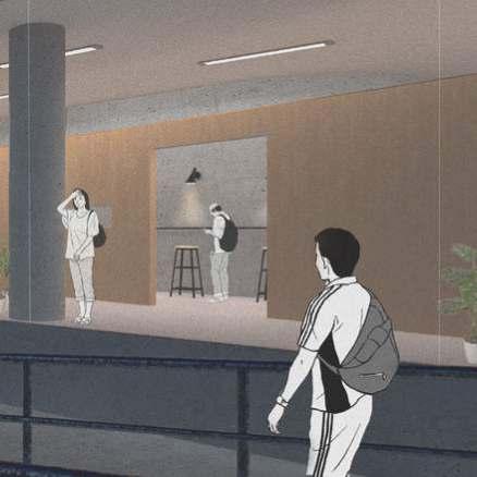
Location: Shanghai, China
Period: Jan 2020-Feb 2020
Boundaries and sound
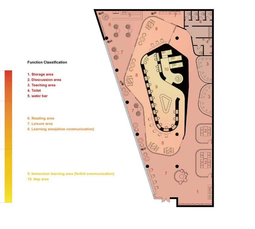

Leisure area has the brightest lamplight indoor and people can sit there to eat, drink, and read freely. Storage cabinets and self-service printing areas are also set on the right side of the door to provide convenient services for people in the seminar room and tutorial area.e.
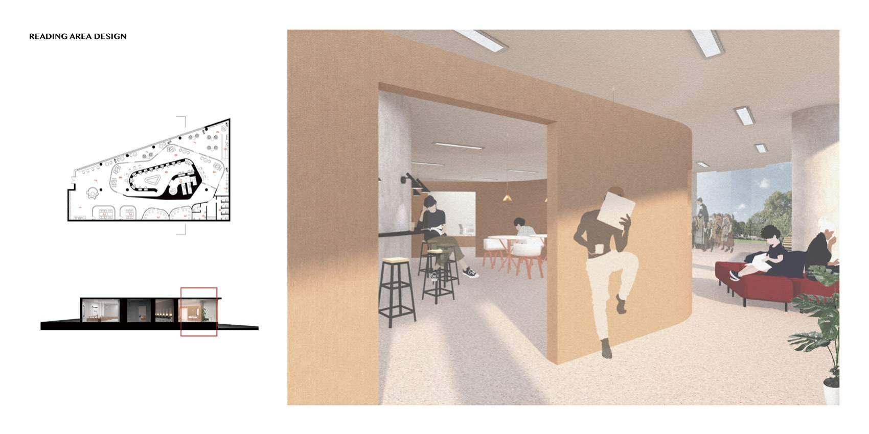
The woodiness partition makes the dimensional boundary of learning area’s periphery and it cut off the sight of leisure area to some extent. Windows are set up towards the green plants or the outdoor scenery, which can effectively relieve the visual fatigue of learners and keep their mood happy. The partition wall is not capped and the inner wall of learning area brings out the best with the partition wall, enriching the environment as a whole.e.
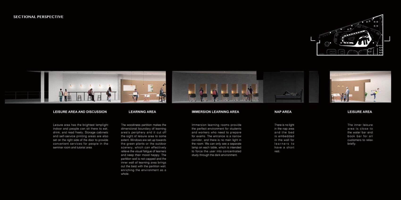
Immersion learning rooms provide the perfect environment for students and workers who need to prepare for exams. The entrance is a narrow corridor, and there is no main light in the room. We can only see a separate lamp on each table, which is intended to force the user into concentrated study through the dark environment.
There is no light in the nap area and the bed is embedded in the wall for learners to have a short rest.
The inner leisure area is close to the water bar and book bar for all customers to relax briefly.
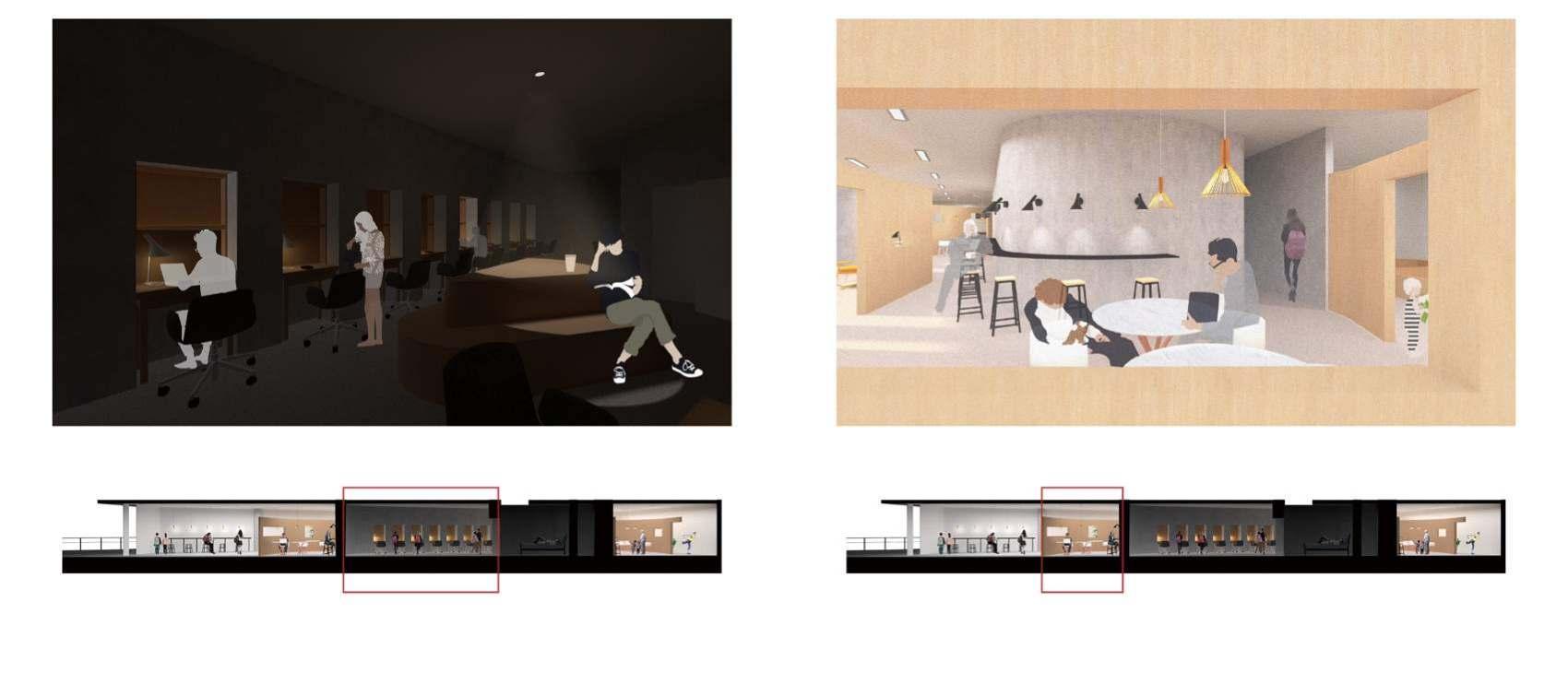
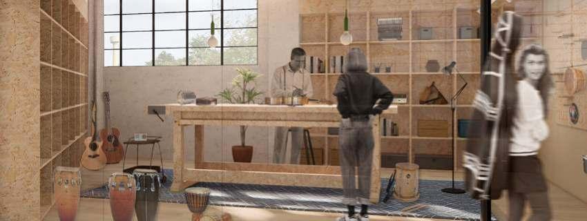
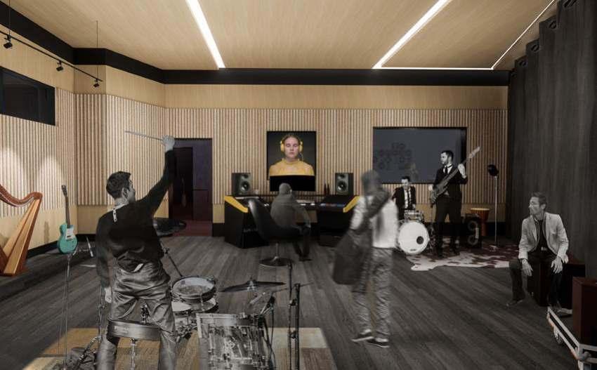
With the theme “Buzz Fair”, we want to create a co-working space that flows. The users inside could communicate and share the ideas freely. Buzz does not only imply the music people made, but also the sound of different mind collide, the interaction occured. Here we appreaciate the community, in which people from various background could work together. It contains working space and facilities for not only musicians, but also designers and photographers that cooperate with musicians. The overall mood is open, live and bright, highlighting our concept of buzz fair.
Type: Interior Design, Group Academic Work

Location: Milano, Italy
Period: Sept 2021-Jan 2022
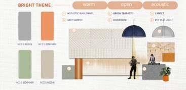
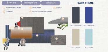
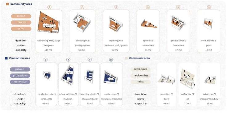
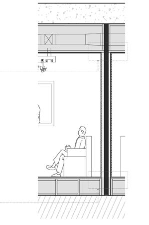
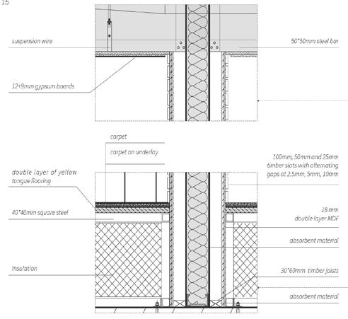
The whole co-working space is divided into two main parts. For the production zone, the atmosphere is intense and immersive with darker theme. While in the community area the mood is light and open with bright color. The production area has a dark theme in general. The technical details are designed to isolate sound and provide a well acoustic environment while being inspirational. The community area contains working space and facilities for not only musicians, but also designers and photographers that cooperate with musicians. communityarea productionzone


The community area is open to designer, photographer and ousider guests. The coworking area can switch to stage at night to host music events.
The production area is open to professional musicians , producers and sound engineering. They will enjoy the good acoustic environment and cool dark theme.

A glimpse of a part of me, but much more than
We were offered a [NASA] Data-set of natural mineral environments and a “deck of 22 cards: Nature&Artifice_ TAROTS” with key suggestions, in the form of images and words. For each guest/projet two suggestions-cards were chosen to help us devolop our own identified conceptual space.
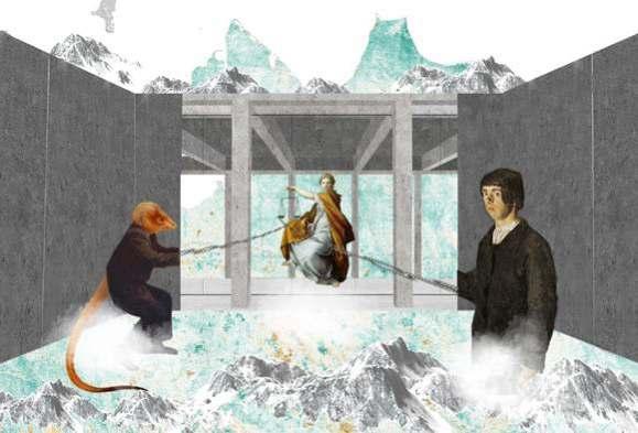

The Interdisciplinary Workshop offered, in the AY 2020/21 edition – which took place completely remotely – the opportunity to activate a transversal theoretical / practical observation lens, between the natural and artificial dimension of contemporary and future reality, to provoke acquisition in the Master's students of a different awareness to identify the reasons, and therefore the objectives, to be pursued to design the spaces of the future.
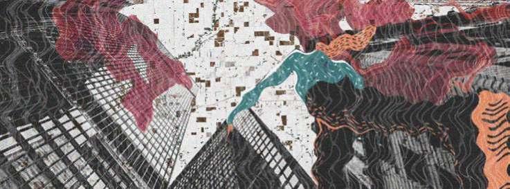
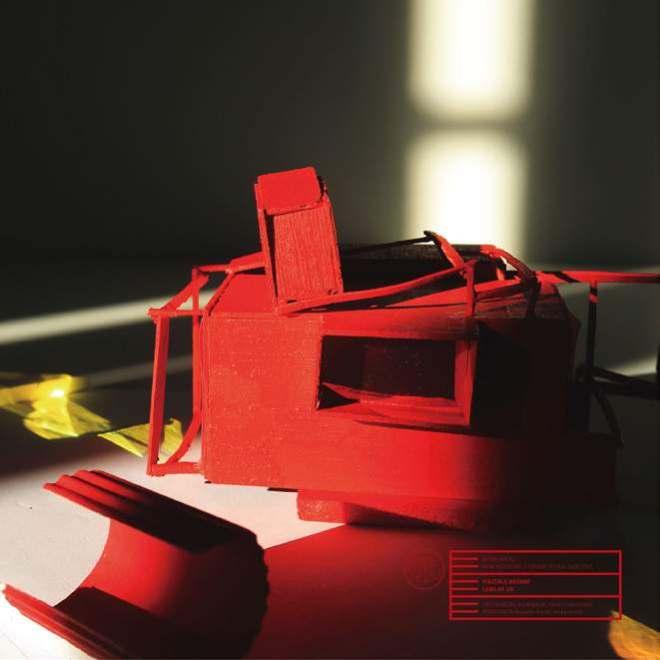
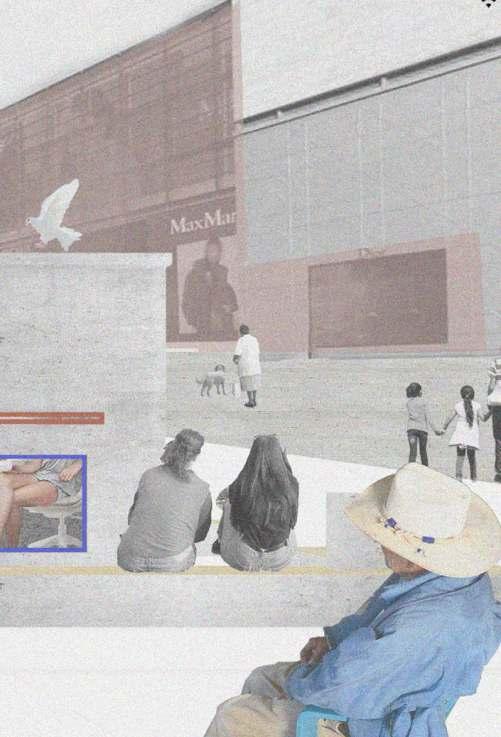
The neorealism movement laid a solid foundation for the development of Milan's film culture. The most important feature of this movement is to "carry the camera on the street". At the same time, neo-realistic filmmakers are used to using long shots , mudium views and full views to form a movie space.

This monument abstracts the camera, stacking the simplest square blocks to form a shape. While there are mirrors in all four directions of the volume, which correspond to different shots in the film language. When people pass by or are active in the piazza, the mirror will reflect the “plot” of daily life.
