THE ARCHITECTURAL KITCHEN
MODERN STYLE
CONTENTS EDITORIAL COMPANY WORLDWIDE BOSSA | CONCRETE CLASSIC-FS | TOPOS BOSSA | FS 45 STEEL | CLASSIC-FS | TOPOS BONDI | XYLO BONDI | ORLANDO PROJECT | KARLSRUHE CLASSIC-FS | VALAIS BONDI-E | VALAIS TOCCO | CONCRETE CLASSIC-FS | TOPOS CLASSIC-FS | TOPOS SURFACES WORKTOPS HANDLES TYPES AND MEASUREMENTS IMPRINT 05 06-07 08-09 46-55 56-65 66-75 76-89 90-95 3
Willkommen in der Welt der LEICHT Küche. Wir schaffen Räume zum Wohlfühlen im Zentrum des Hauses – und mitten im Leben. Repräsentativ und einladend. Im Einklang mit Ihrem Lebensstil und der umgebenden Architektur. Zeitlos und modern zugleich in Farbe und Formsprache, anspruchsvoll in Material und Ausstattung, konsequent in Qualität und Funktion.
Welcome to the world of LEICHT kitchens. We create oases of well-being at the centre of your home – and at the very centre of life. Representative and inviting. In harmony with your lifestyle and the surrounding architecture. Both timeless and modern in colour and design, sophisticated in material and equipment, consistent in quality and function.
Bienvenue dans l‘univers des cuisines LEICHT. Nous créons des espaces de bien-être au centre de la maison et au cœur de la vie. Des espaces représentatifs et accueillants, en harmonie avec votre style de vie et l‘architecture environnante. Coloris et langage formel intemporels et modernes, matériaux et équipement exigeants, qualité et fonction cohérentes.
Bienvenido al mundo de las cocinas LEICHT. Creamos espacios para disfrutar en el corazón del hogar y al ritmo de la vida. Representativas y acogedoras, en armonía con su estilo de vida y con la arquitectura reinante. Cocinas intemporales y modernas tanto en colores como en formas, con materiales y características funcionalidad.
Welkom in de wereld van de LEICHT keuken. Wij creëren feel-good ruimtes in het centrum van het huis – en midden in het leven. Representatief en uitnodigend. In harmonie met uw levensstijl en de omgevende architectuur. Tijdloos en modern tegelijk qua kleur en vormentaal, aantrekkelijk qua materiaal en uitrusting, consequent qua kwaliteit en functionaliteit.
EDITORIAL
05 EDITORIAL
Stefan Waldenmaier Chairman LEICHT Küchen AG
06
Der Name LEICHT steht für Innovationskraft, Individualität, für hohe Qualität und einen zeitgemäßen internationalen Wohnstil. Die Wurzeln liegen in der „mechanischen Schreinerei für Möbel und Innenausbau“, die die Brüder LEICHT
Gmünd gründeten. Daraus hat sich ein Unternehmen entwickelt, das bodenständig und zugleich richtungweisend ist für anspruchsvolle moderne Küchenarchitektur „Made in Germany“. LEICHT ist Funktion, Eleganz, Harmonie. Aktuell ausgezeichnet mit dem GERMAN DESIGN AWARD.
The LEICHT brand stands for innovative strength, individuality, high quality and a contemporary international lifestyle. The company‘s roots are in the „Mechanical Workshop for Furniture and Fittings“,
in their home town Schwäbisch Gmünd, southern Germany. What started out as a workshop has grown into an enterprise which is down-to-earth but at the same time pioneering when it comes to sophisticated modern kitchen architecture „Made in Germany“. LEICHT is all about function, elegance, harmony. And recently received the GERMAN DESIGN AWARD.
La marque LEICHT est synonyme de puissance d’innovation, d‘individualité, de haute qualité et d‘un style d‘habitat international contemporain. Les origines de la société remontent à la «Menuiserie mécanique pour meubles et aménagement intérieur», créée par les frères LEICHT en Gmünd. Elle a abouti à une entreprise quivatrice en termes d‘architecture de cuisine ambitieuse et moderne « Fabriquée en Allemagne ». LEICHT est synonyme de fonction, d‘élégance et d‘harmonie, et a obtenu récemment le prix GERMAN DESIGN AWARD.
LEICHT es sinónimo de fuerza innovadora, individualidad, calidad y un estilo de mobiliario internacional y contemporáneo. Las raíces de la empresa se encuentran en la “carpintería mecánica de muebles e interiores” que los hermanos LEICHT fundaron
Gmünd. De ahí surgió una empresa tradicional y a la vez pionera en la arquitectura
y armonía. Ha sido galardonada recientemente con el GERMAN DESIGN AWARD.
De naam LEICHT staat voor innovatiekracht, individualiteit, hoge kwaliteit en voor een hedendaagse internationale woonstijl. De wortels liggen in de “mechanische schrijnwerkerij voor meubelen en binnenafwerking”, die de gebroeders
Schwäbisch Gmünd hadden opgestart. Daaruit heeft zich een onderneming ontwikkeld, die van eigen bodem en tegelijkertijd koersbepalend is voor hoogwaardige moderne keukenarchitectuur “Made in Germany”. LEICHT betekent functionaliteit, elegantie, harmonie. Actueel onderscheiden met de GERMAN DESIGN AWARD.
COMPANY
07 COMPANY
AFRICA . ANDORRA . AUSTRALIA . AUSTRIA . AZERBAIJAN
BELARUS . BELGIUM . BRAZIL . CANADA . CHINA . CHILE
COLOMBIA . CYPRUS . COSTA RICA . CZECHIA
DOMINICAN REPUBLIC . EGYPT . ESTONIA . FRANCE
GREAT BRITAIN . GREECE . HONG KONG . HUNGARY . INDIA


INDONESIA . IRAN . IRELAND . ISRAEL . ITALY . JORDAN
KAZAKHSTAN . KOREA . KUWAIT . KYRGYZSTAN . LATVIA


LEBANON . LITHUANIA . LUXEMBOURG . MALAYSIA . MALTA
MAURITIUS . MEXICO . NETHERLANDS . NEW ZEALAND


PHILIPPINES . POLAND . PORTUGAL . PUERTO RICO

QATAR . ROMANIA . RUSSIA . SINGAPORE . SLOVAKIA
SOUTH TYROL . SPAIN . SWEDEN . SWITZERLAND
TAHITI . TAIWAN . THAILAND . TURKEY . TURKMENISTAN
UKRAINE . UNITED ARAB EMIRATES . USA . VIETNAM


08
LEICHT Küchen sind in der ganzen Welt zuhause. In über 55 Ländern. Mit einem Exportanteil von rund 60 % ist der Name LEICHT weltweit ein Synonym für Küchenkultur „Made in Germany“. Exklusive Showrooms repräsentieren die Marke in den Metropolen der Welt. Internationale Architekten und Planer verwirklichen die Philosophie der LEICHT Küche in ihren Entwürfen.
LEICHT kitchens are at home all over the world. In more than 55 countries. Around 60 % of our kitchens are exported, making the name LEICHT a synonym worldwide for kitchen culture „Made in Germany“. Exclusive showrooms in metropolises all over the world perfectly showcase the brand. International architects and planners implement the philosophy of the LEICHT kitchen in their designs.
Des cuisines de LEICHT sont installées tout autour du globe, dans plus de 55 pays. Avec un taux d‘exportation approximatif de 60 %, le nom LEICHT est, dans le monde entier, synonyme de culture de la cuisine « Fabriquée en Allemagne ». D‘élégantes salles d‘exposition représentent la marque dans les métropoles du teurs travaillant à l‘échelle internationale mettent en œuvre la philosophie de la cuisine LEICHT dans leurs projets.
Las cocinas LEICHT están en todo el mundo en casa. En más de 55 países. Con una cuota de exportación alrededor del 60%, el nombre LEICHT se ha convertido a nivel mundial en un sinónimo para una cultura de cocina „Made in Germany“. Showrooms exclusivos representan la marca en las ciudades más grandes internacionales realizan en sus diseños la
LEICHT keukens zijn in de hele wereld thuis. In meer dan 55 landen. Met een exportpercentage van circa 60 % is de naam LEICHT wereldwijd een synoniem voor keukencultuur “Made in Germany”. Exclusieve showrooms vertegenwoordigen het merk in de metropolen van de wereld. Internationale architecten en ontwerpers hun ontwerpen werkelijkheid worden.
WORLDWIDE 09 WORLDWIDE
12 CONTINO 10
11
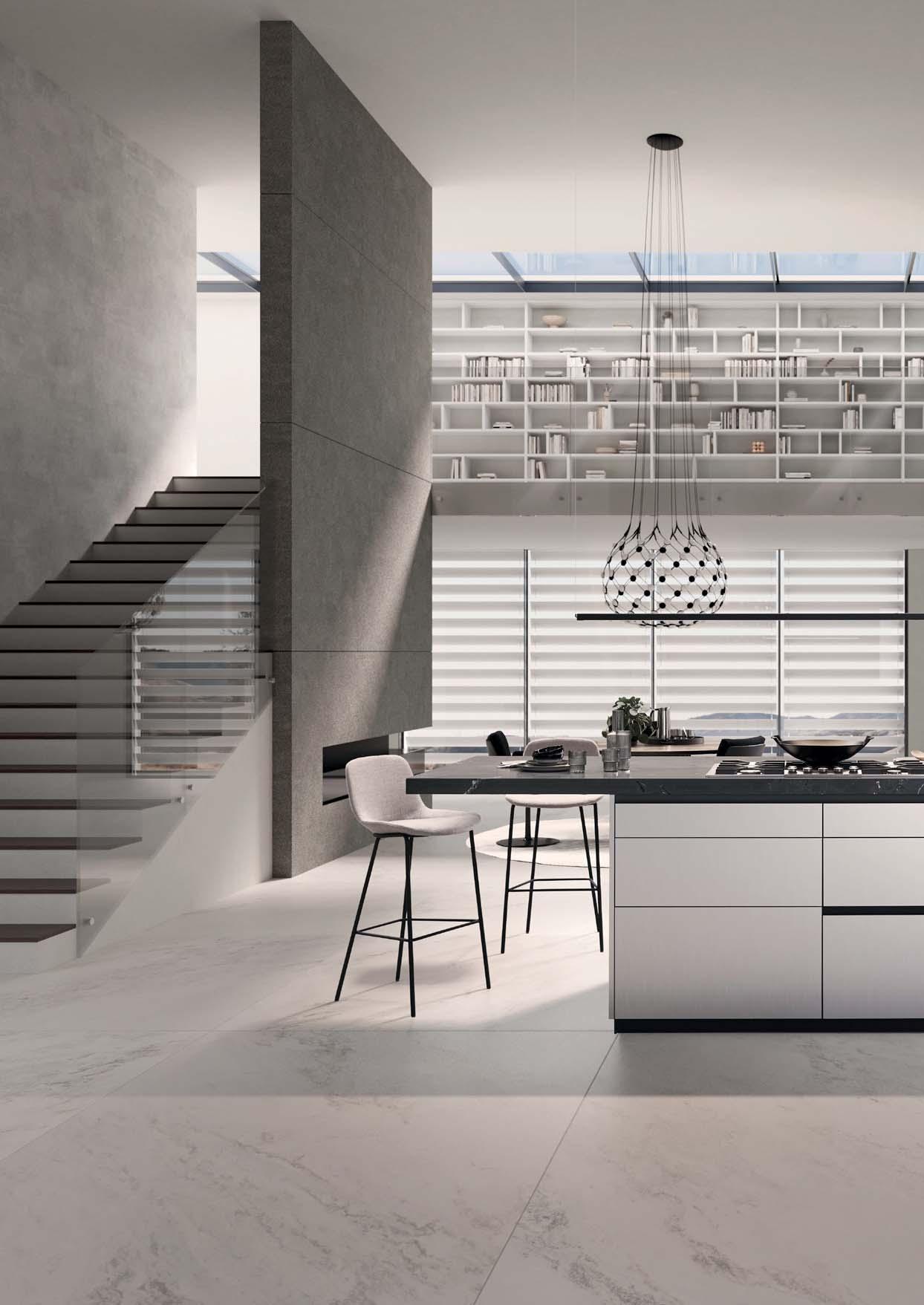
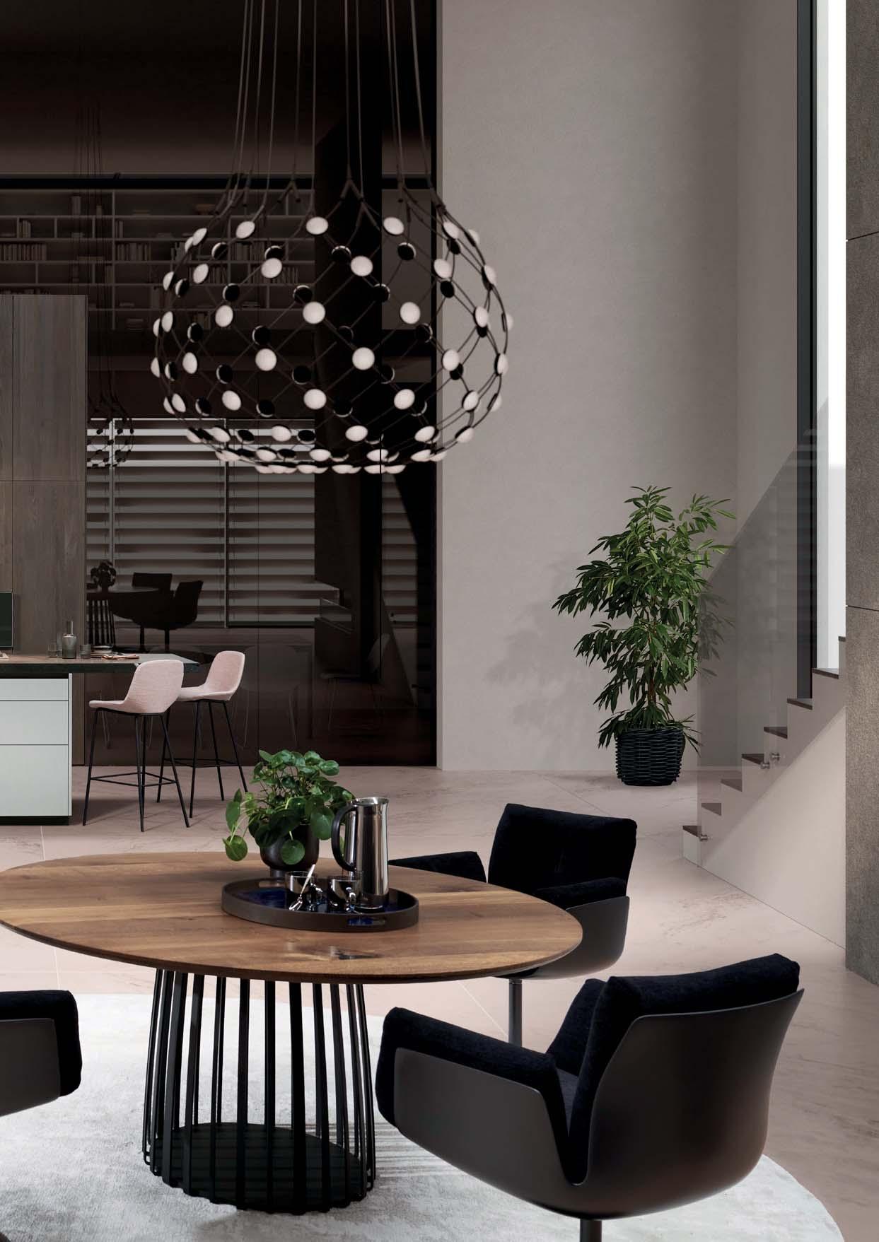
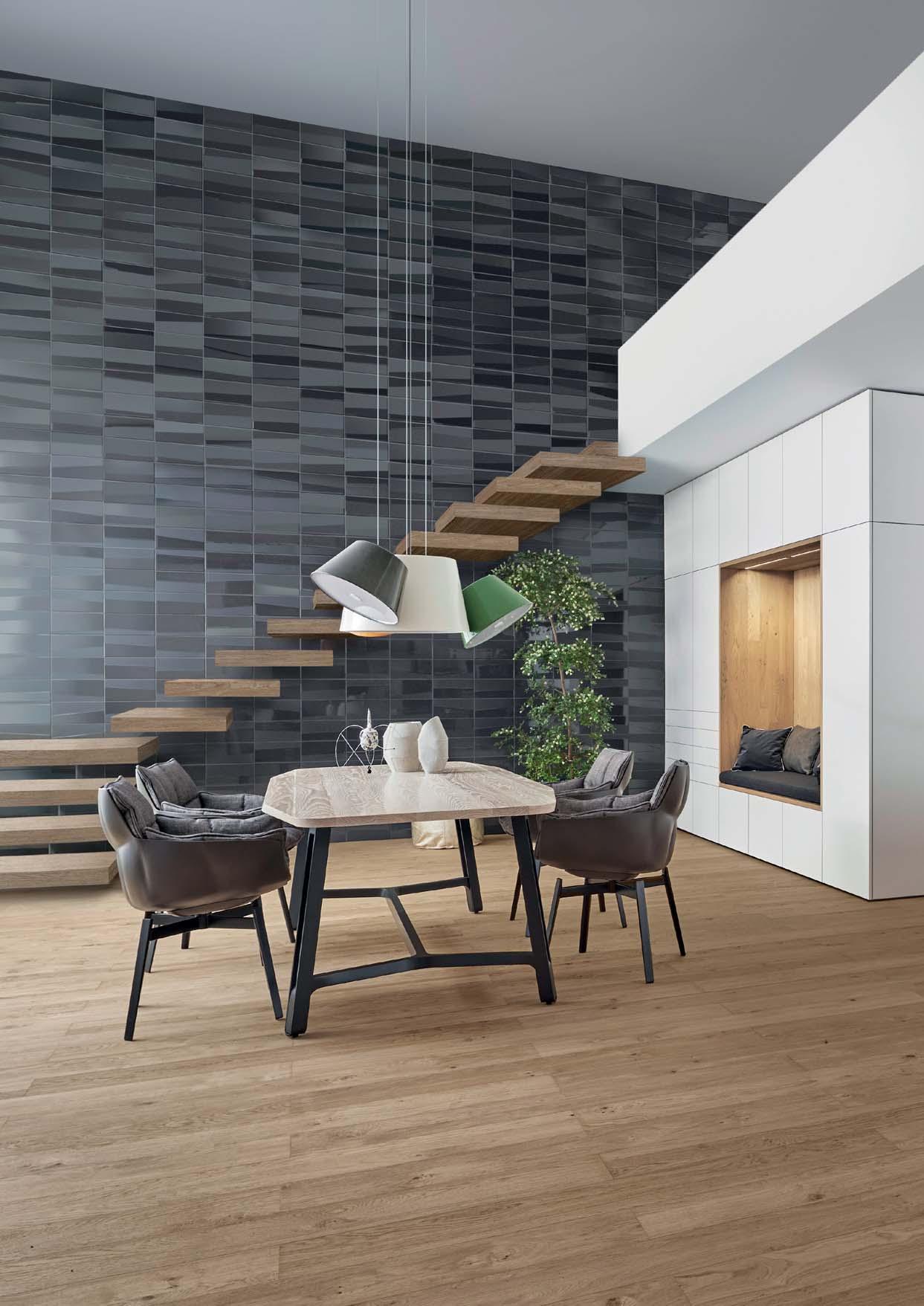
MINIMAL AND MAXIMAL
12
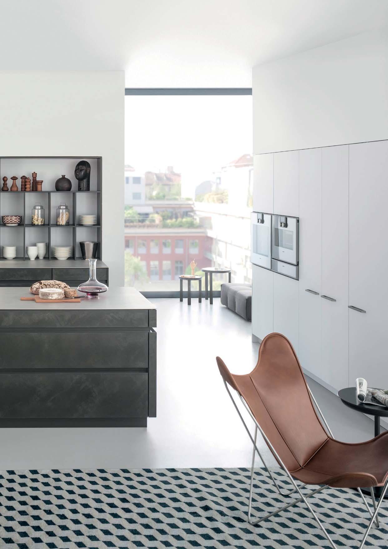
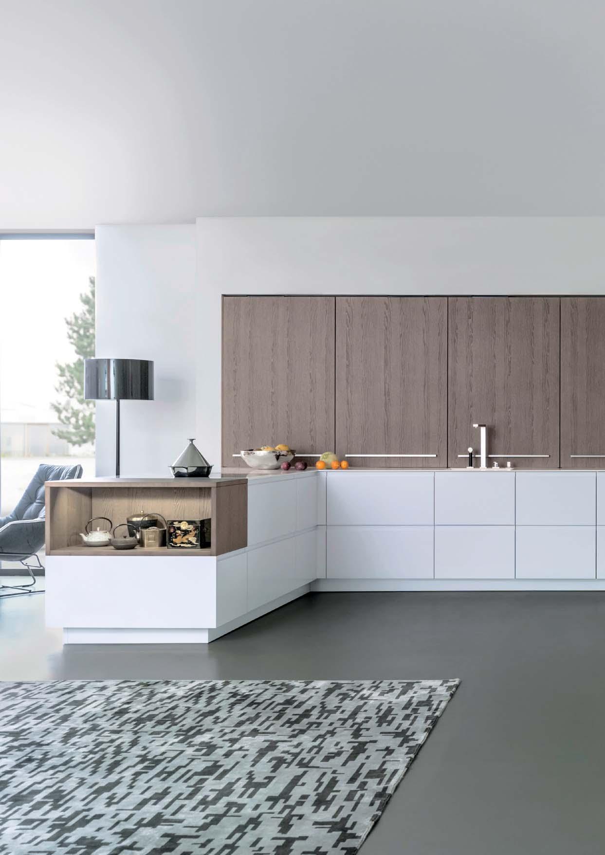
Das Verständnis von Raum wird bei dieser Küchenplanung aufgelöst und neu zusammengesetzt: Zum einen konzentriert sie sich auf das ICONIC Regal sowie auf den freistehenden Raum-im-Raum-Kubus, der als begehbarer Hauswirtschaftsraum Struktur stiftet. Parallel verleiht die Front Contino -
nation aus kühlen und warmen Materialien einen angenehmen Kontrast.
In this kitchen design, the understanding of space is completely suspended and puttrates on the ICONIC shelving system as well as on the free-standing room-in-room cube, which, as a walk-in utility room, provides structure. At the same time, the Conti-
and warm materials creates a pleasant contrast.
compréhension de l‘espace est entièrement construit autour de l’étagère ICONIC et d‘un cube autonome qui abrite en son intérieur un espace auxiliaire, selon le principe de
la cuisine sans poignée une esthétiquetériaux froids et chauds crée un contraste attrayant.
Este proyecto revoluciona la forma de entender el espacio de la cocina. El diseño se basa en la estantería ICONIC y en un cubo independiente que alberga una zona auxiliar, según el principio del «espacio dentro de otro espacio». Al mismo tiempo, -
muebles sin tiradores una estética elegante y depurada. La combinación de materiales fríos y cálidos crea un sugestivo contraste.
Het begrip ruimte wordt bij dit ontwerp uit elkaar getrokken en opnieuw samengesteld. Aan de ene kant focust het ontwerp op de ICONIC kast en de vrijstaande kubus in de ruimte, die als bijkeuken structuur
in de greeploze keuken voor een strakke en verfijnde uitstraling. Dankzij de combinatie van koele en warme materialen ontstaat er een mooi contrast.
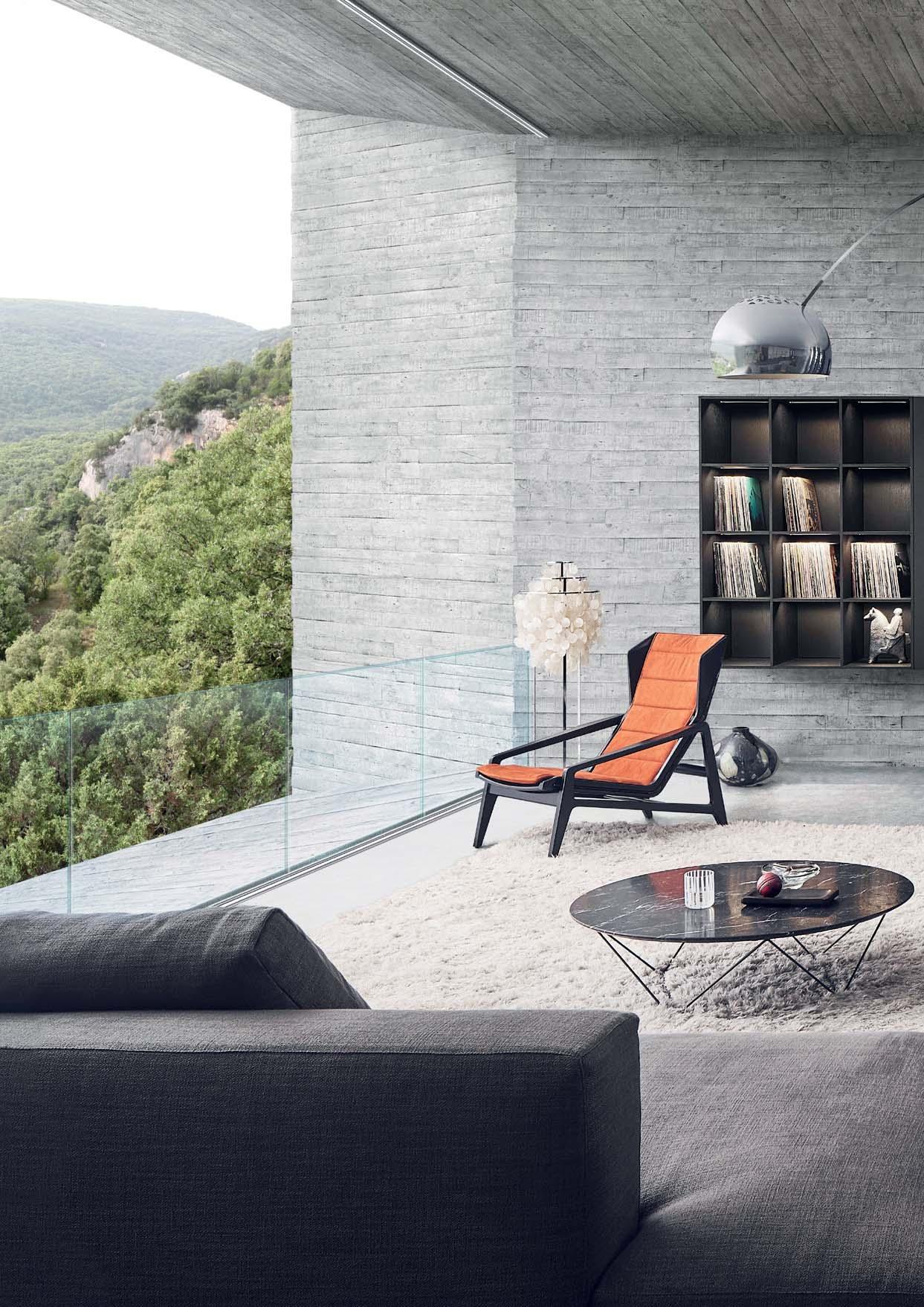
HIGH-RISE
13
14
15
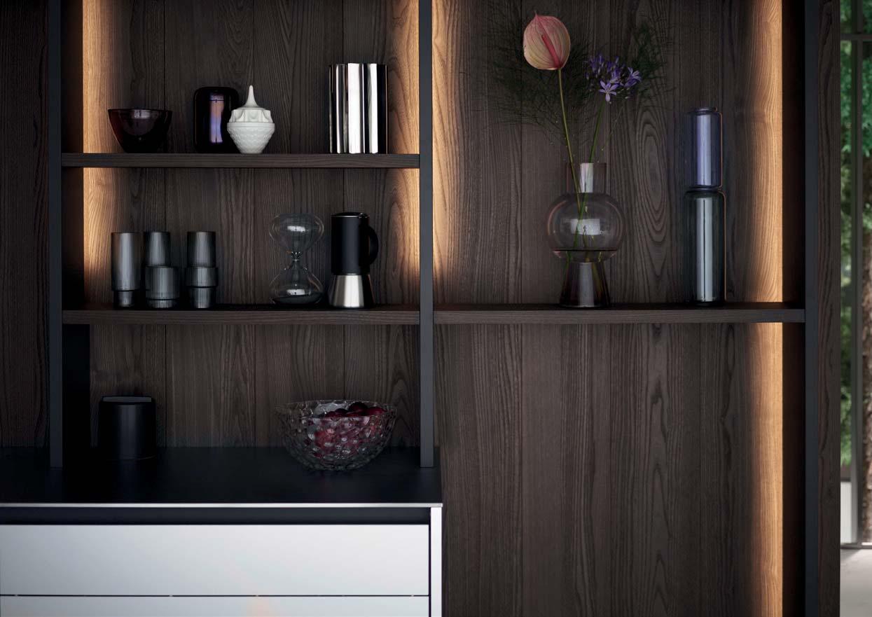
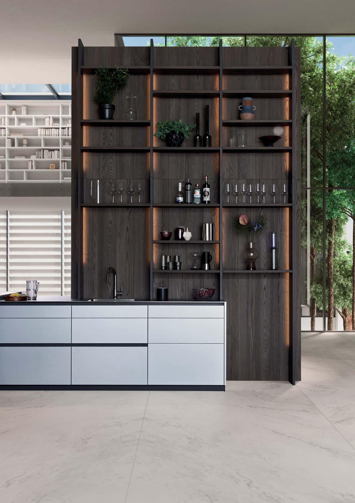
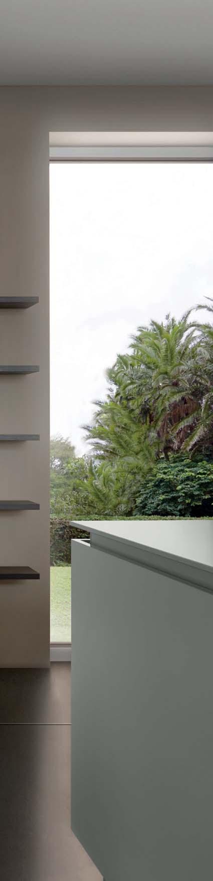
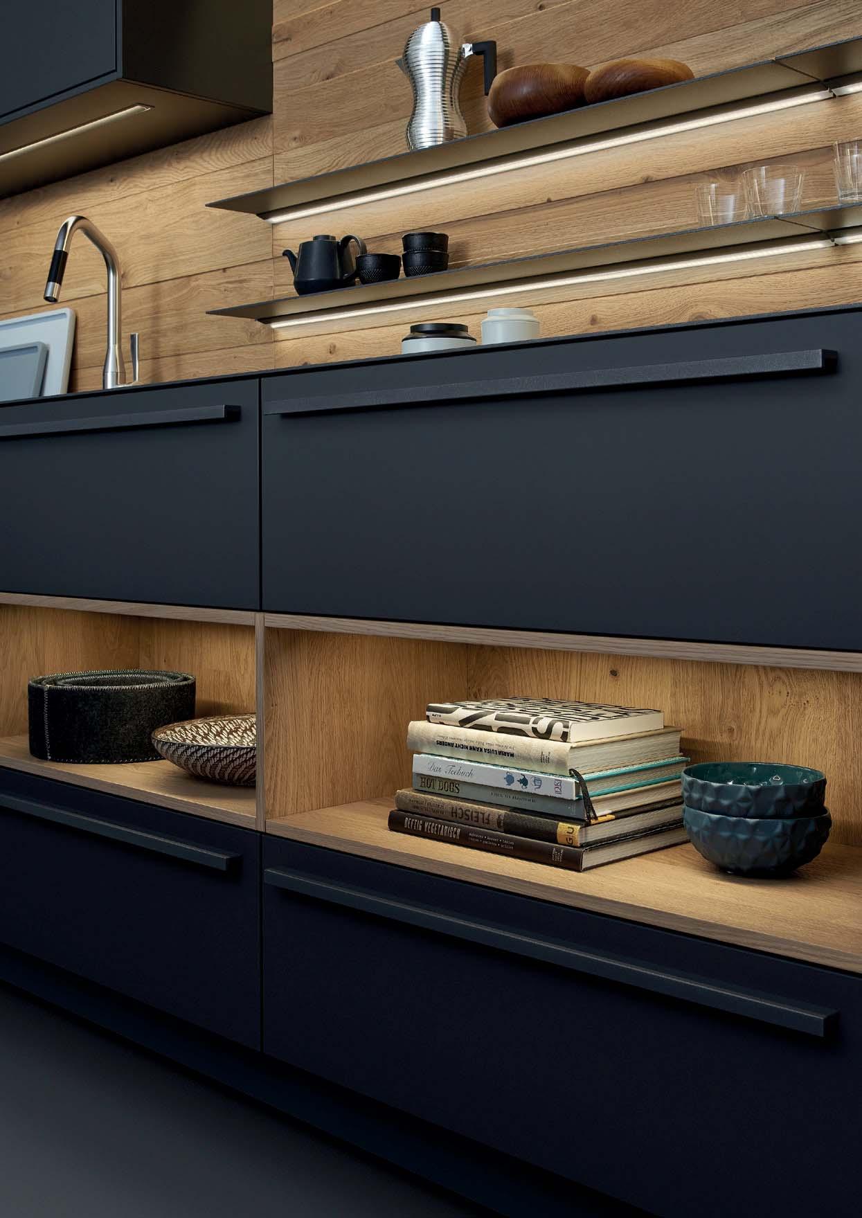
A QUESTION OF DETAIL
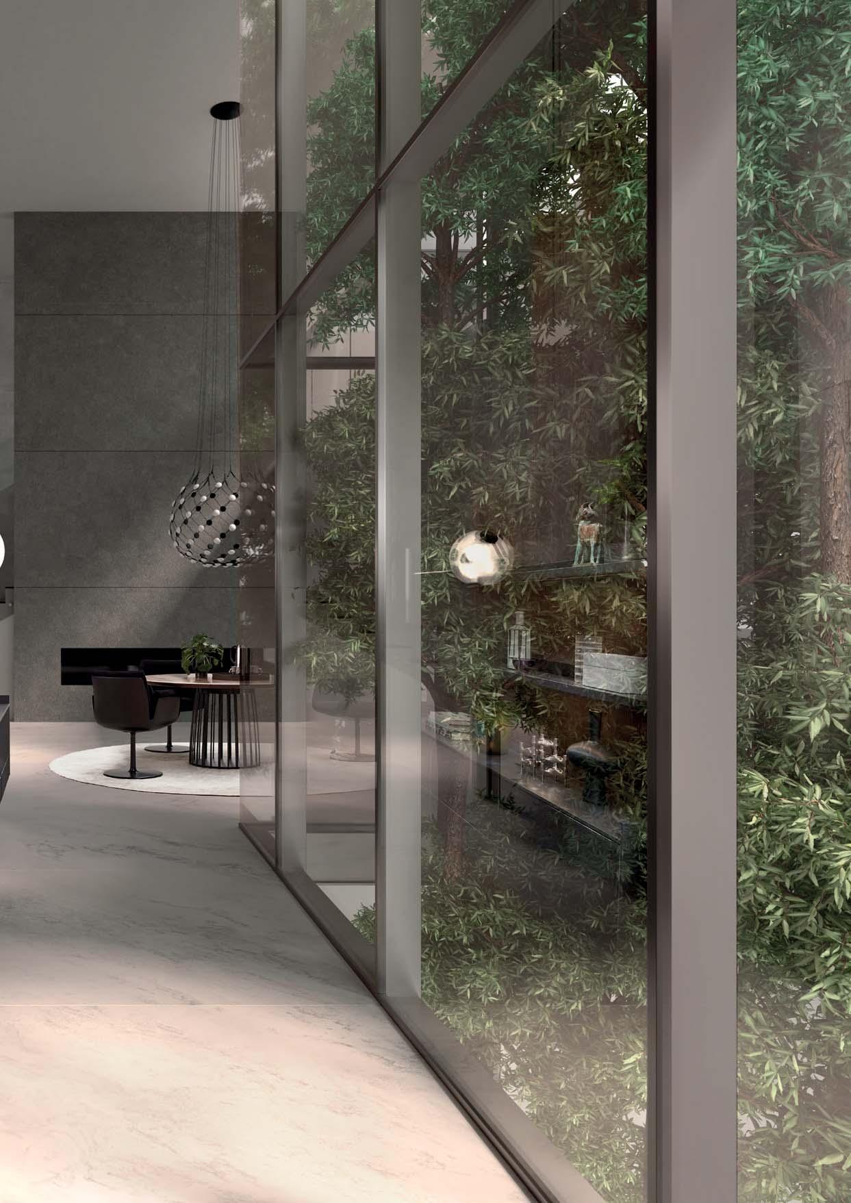
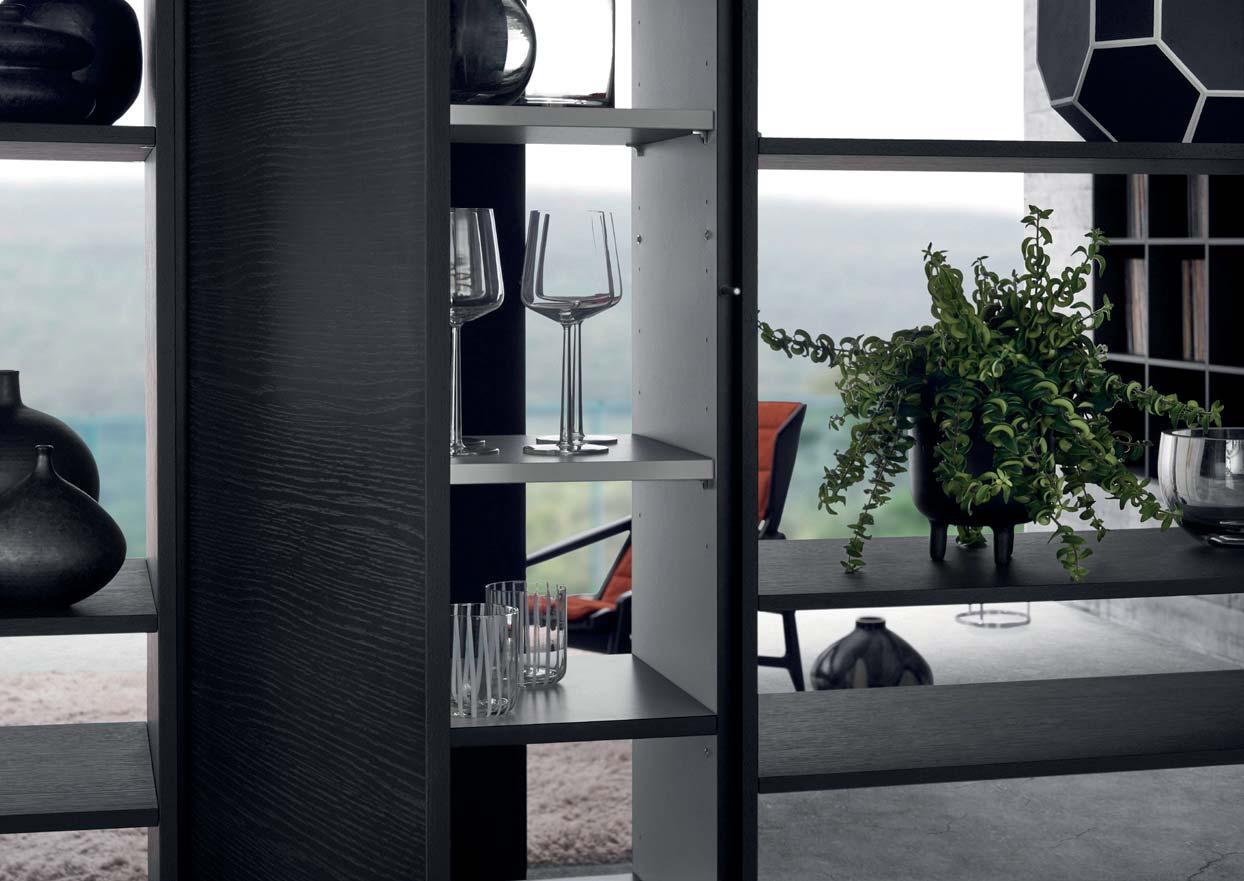
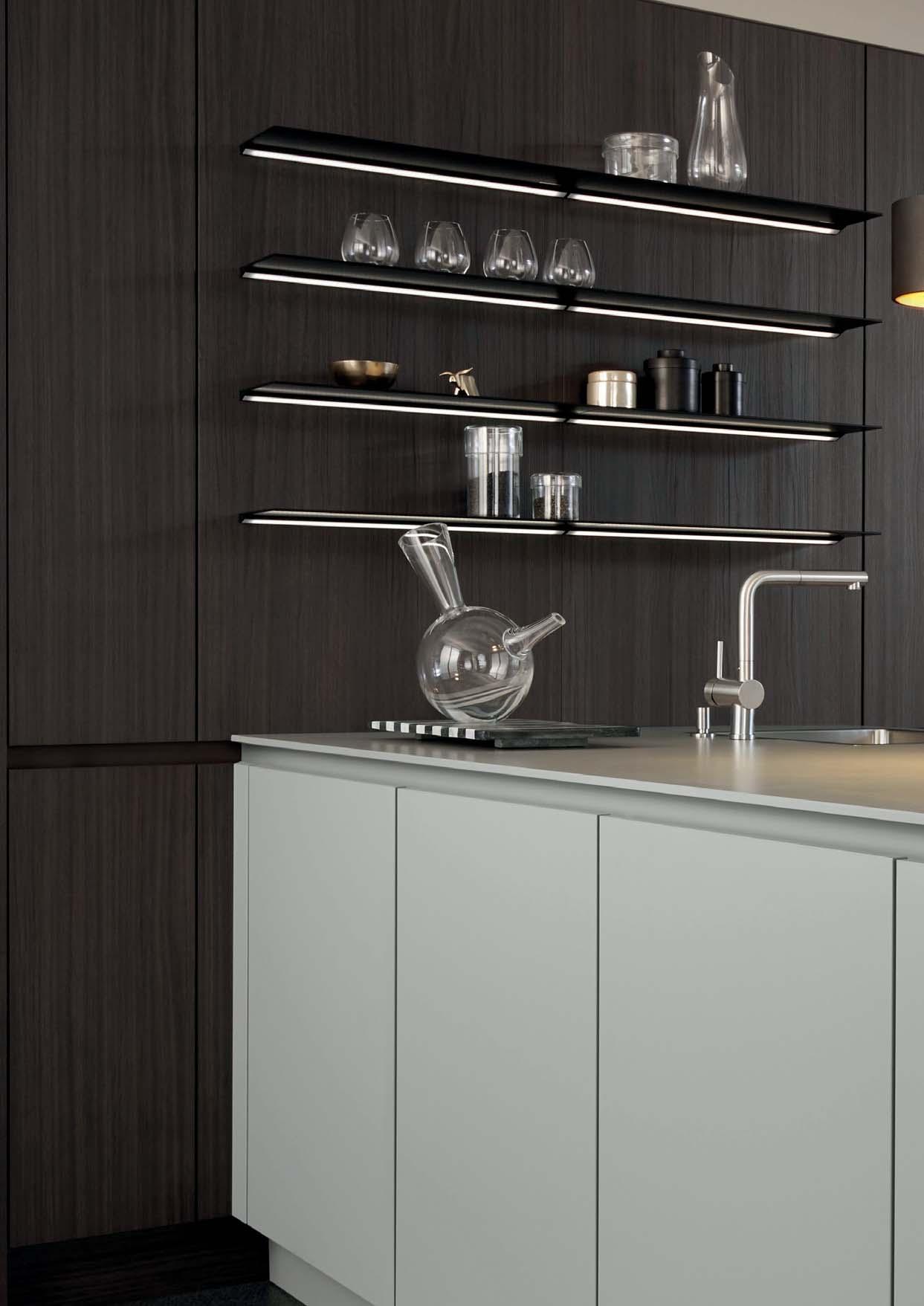
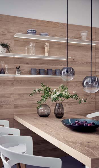
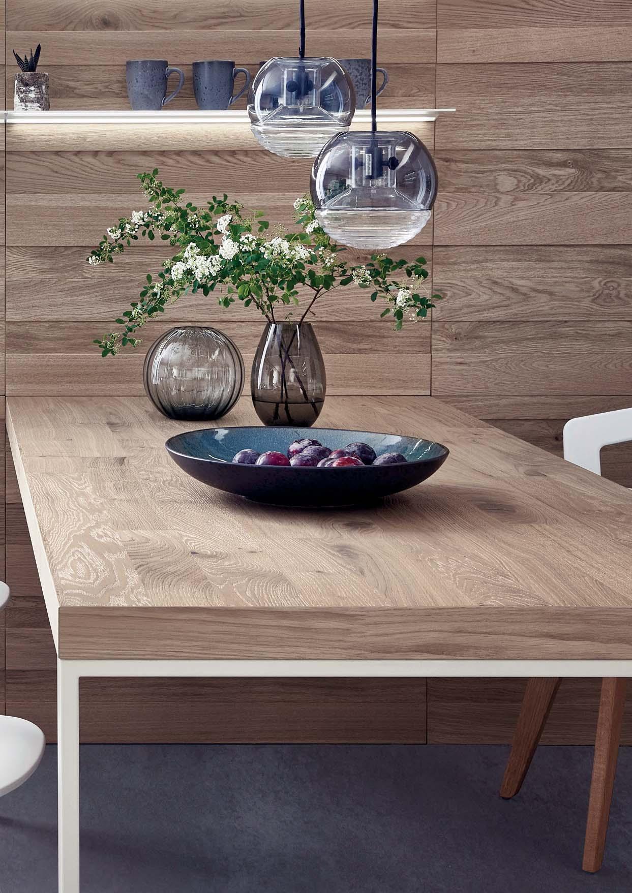
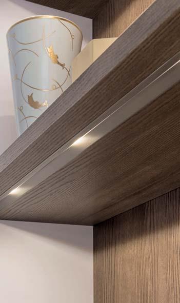
Seitlich des ICONIC Regalsystems zeigt sich ein entscheidendes Detail: Die vertikalen Regalseiten stehen mit einem minimalen 5 cm Abstand von der Wand entfernt. Rückseitig dieser Wangenkanten verläuft
Rückwand optisch hervorhebt. Dabei sorgt das bewusst inszenierte indirekte Licht für eine dreidimensionale Wirkung, die ebenso die wohnliche Atmosphäre des offen ge-
A decisive detail is revealed at the side of the ICONIC shelving system: the vertical shelf sides stand at a minimum distance of 5 cm from the wall. An LED strip light runs along the back of these shelf sides, visually highlighting the extensive back panel. The deliberately staged indirect light ensures a three-dimensional effect, which the open-plan living space.
Le système d’étagères ICONIC se caractérise un petit espace de 5 cm sépare les côtés verticaux de l’étagère et le mur. La bande lumineuse LED qui court le long du bord des panneaux latéraux met en valeur le panneau arrière. Cet éclairage indirect délibérément mis en scène crée un effet tridimensionnel qui accentue par ailleurs l‘atmosphère accueillante de l’espace ouvert.
El sistema de estanterías ICONIC destaca por un detalle fundamental: entre los paneles verticales laterales y la pared queda una pequeña distancia de solo
los paneles se ha instalado una tira de diodos LED que realza visualmente la pared trasera. Esta iluminación indirecta crea un efecto tridimensional que, además de su belleza, acentúa la atmósfera hogareña del espacio abierto.
Aan de zijkant van het ICONIC kastsysteem wordt een doorslaggevend detail zichtbaar: de verticale kastzijden staan op slechts 5 cm afstand verwijderd van de wand. Aan de achterzijde van deze wangenopening verloopt een led-strip die de doorgaande achterwand optisch accentueert. De bewust indirecte verlichting zorgt voor een driedimensionaal effect die de gezellige sfeer van de open leefruimte bepaalt.
16
17
18
19
20
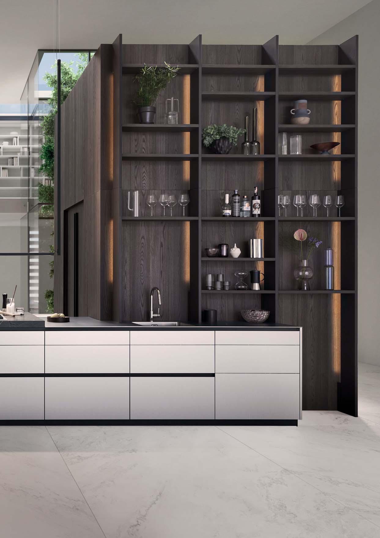
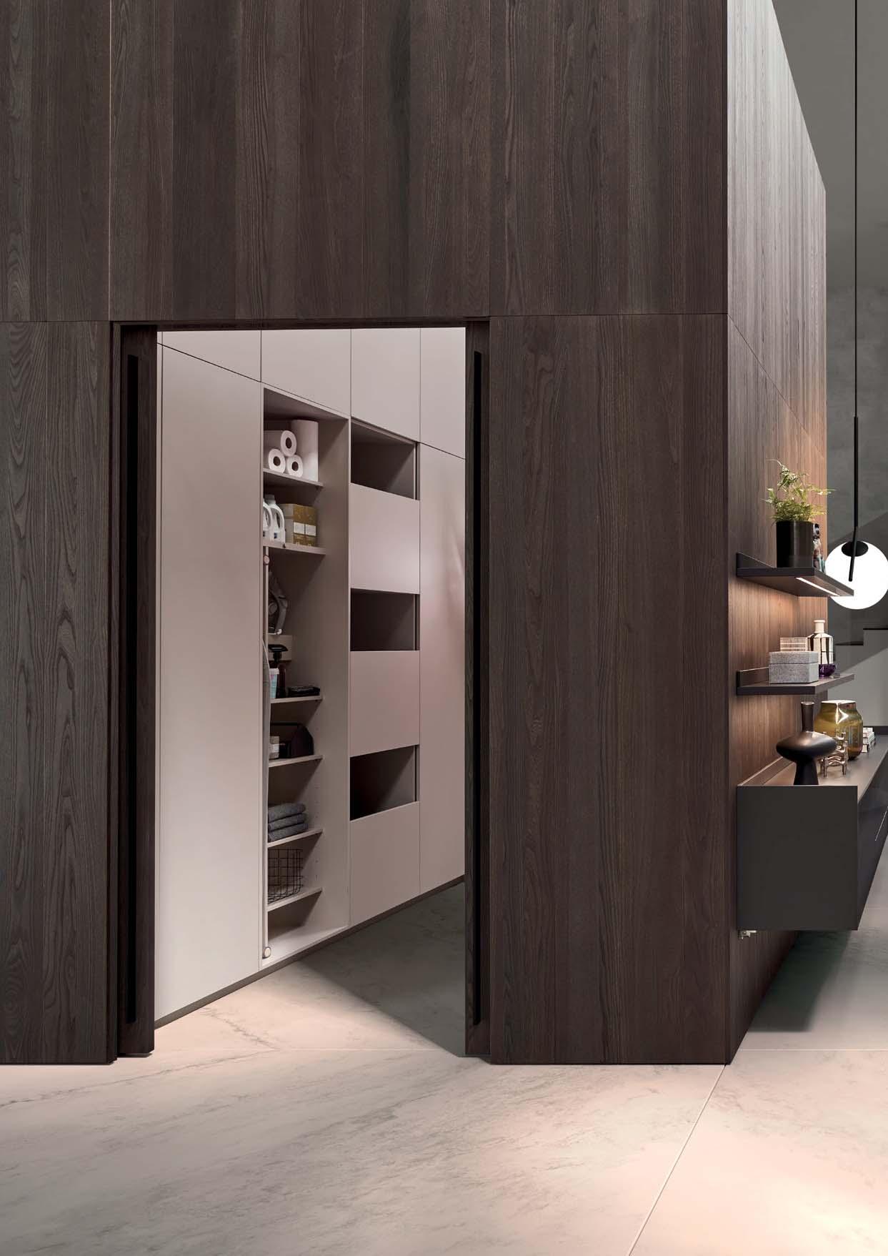
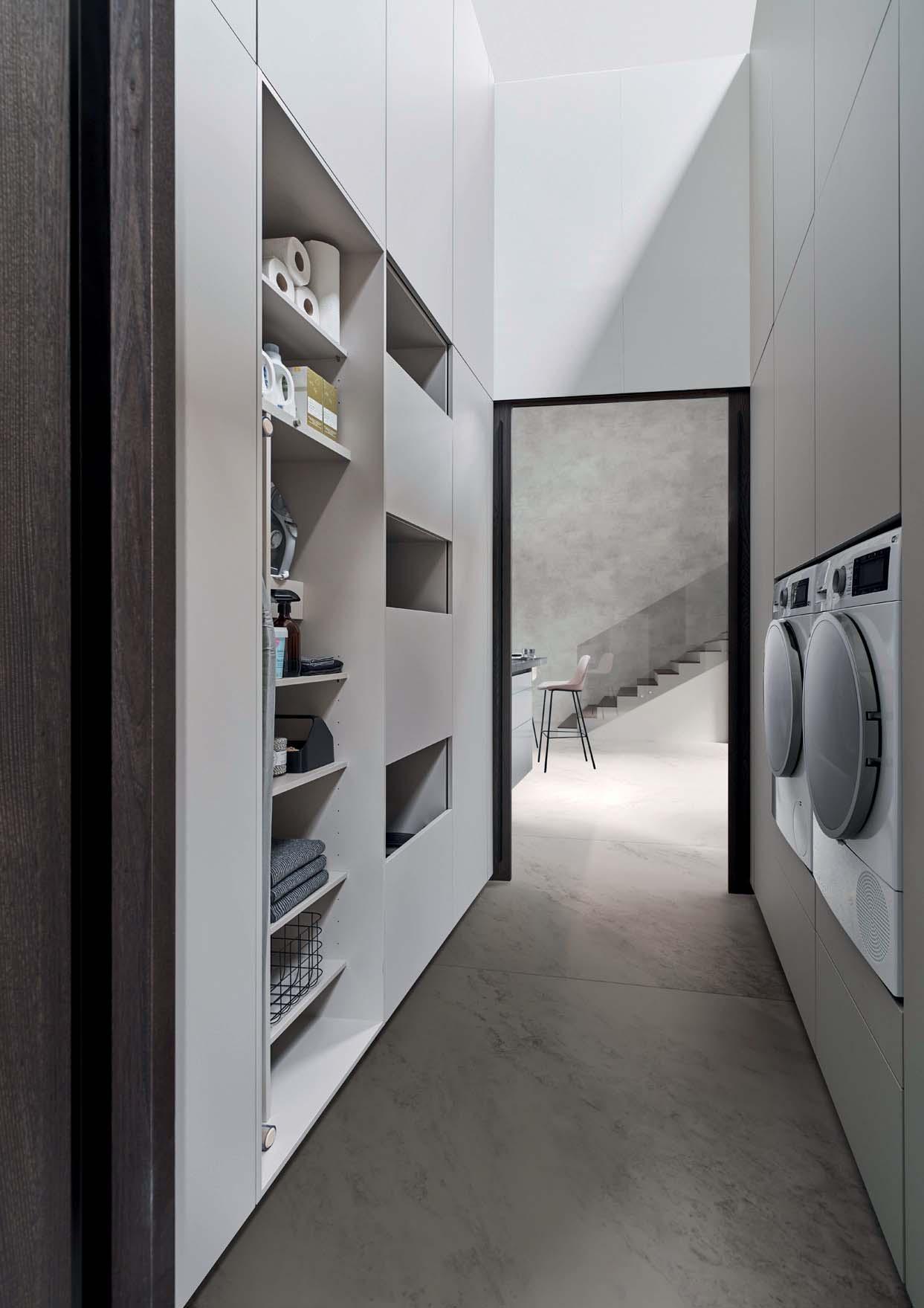
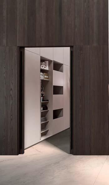
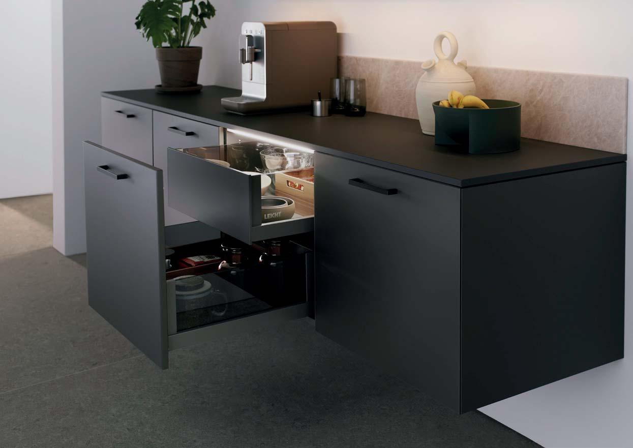
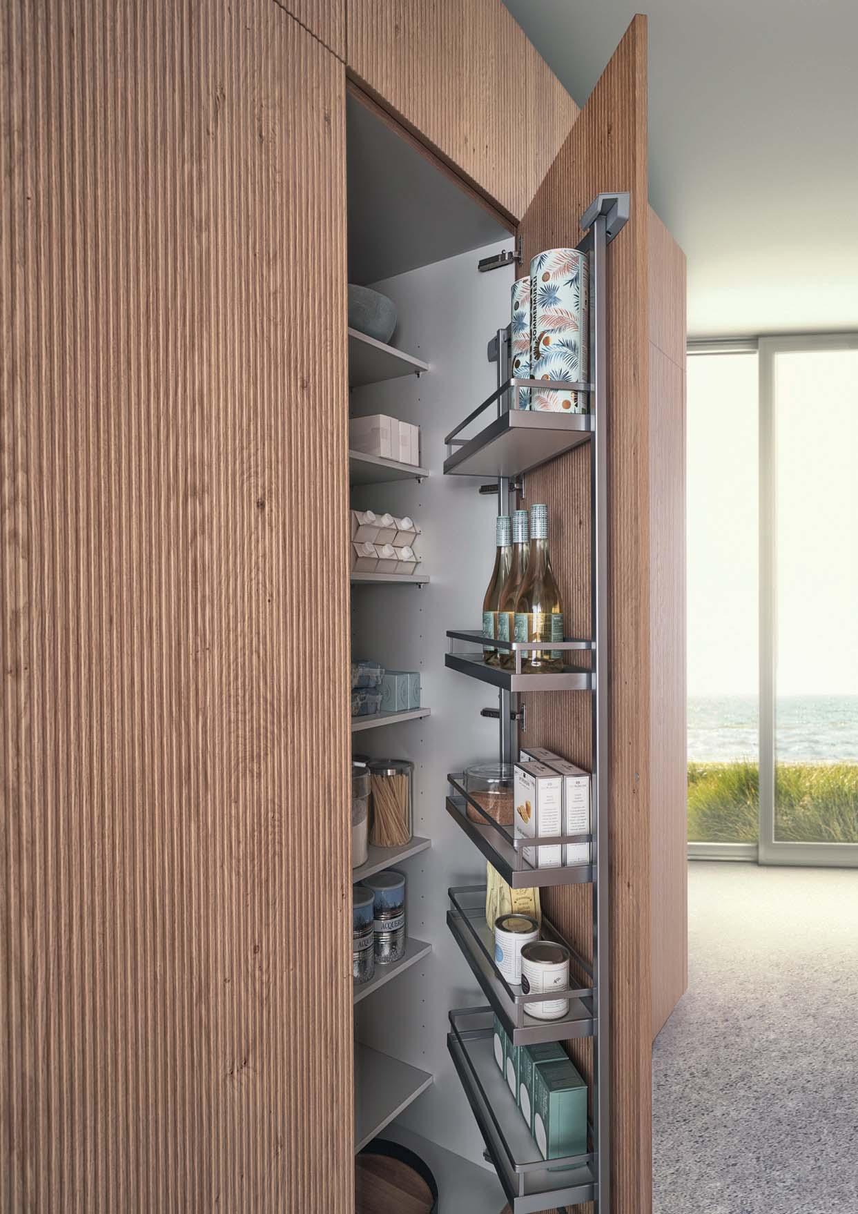
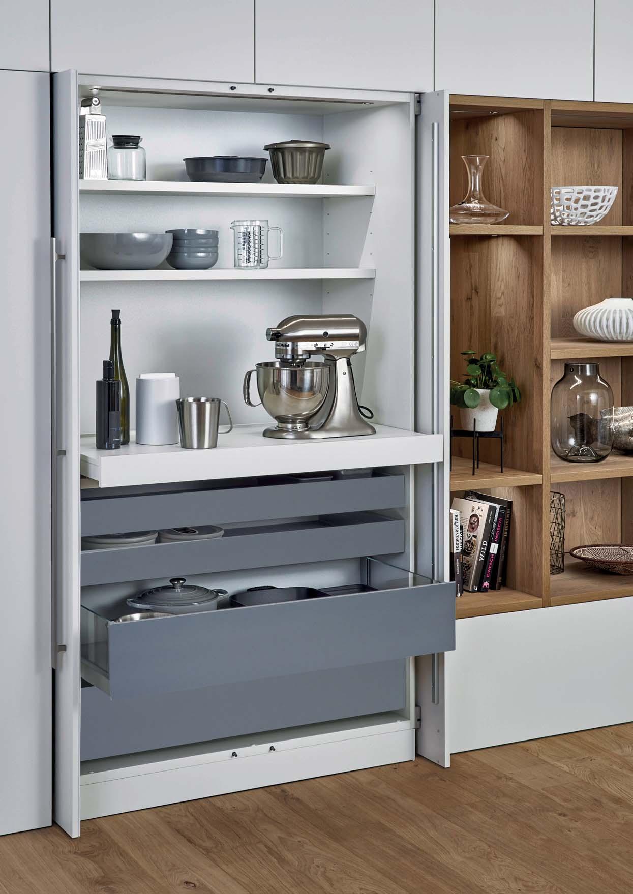
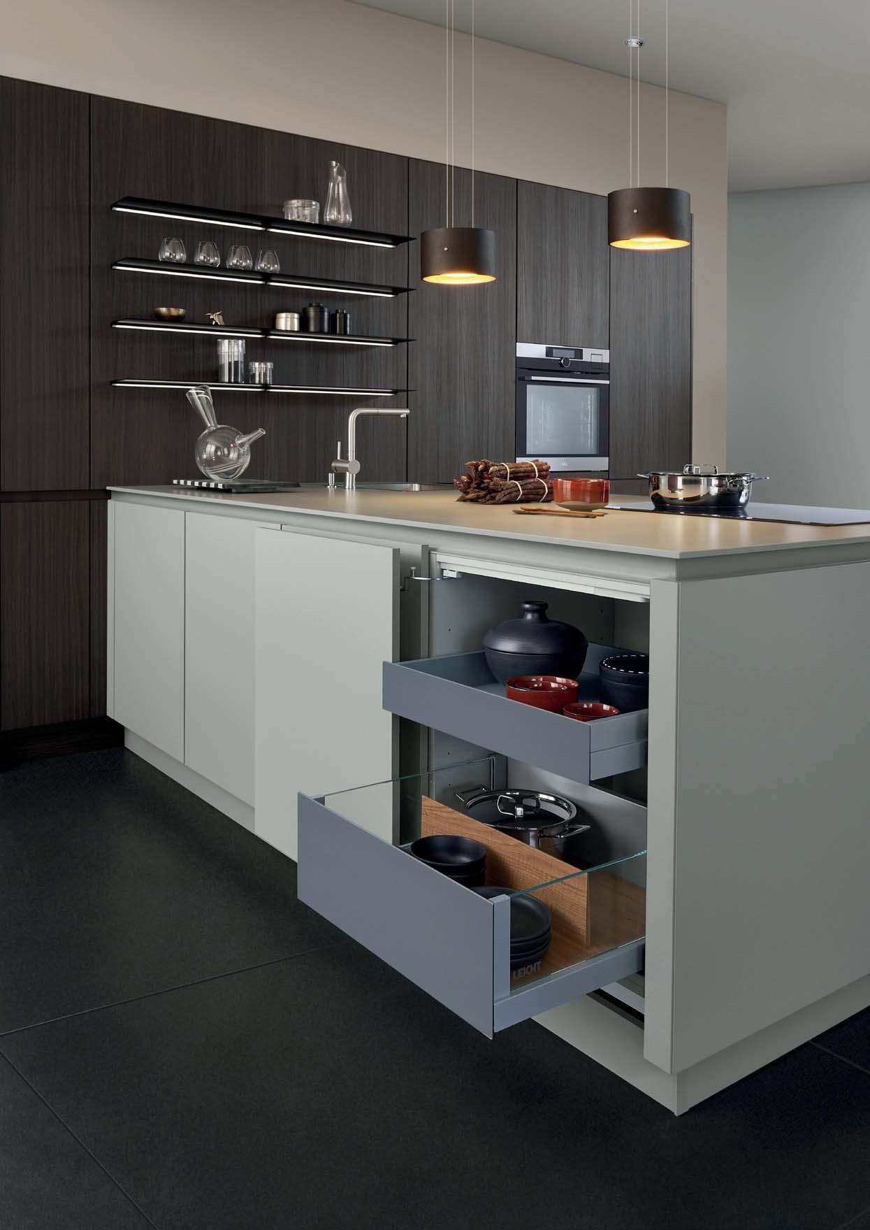
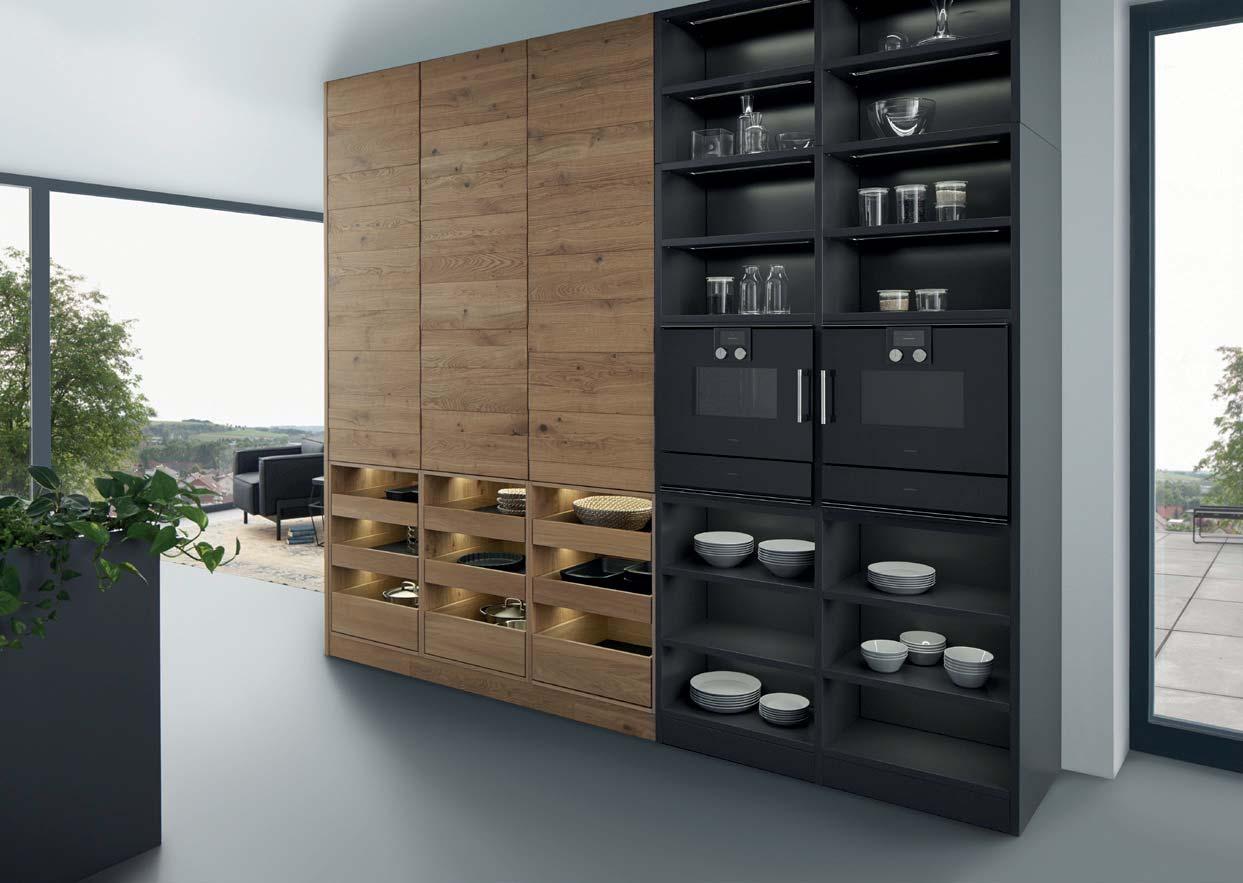
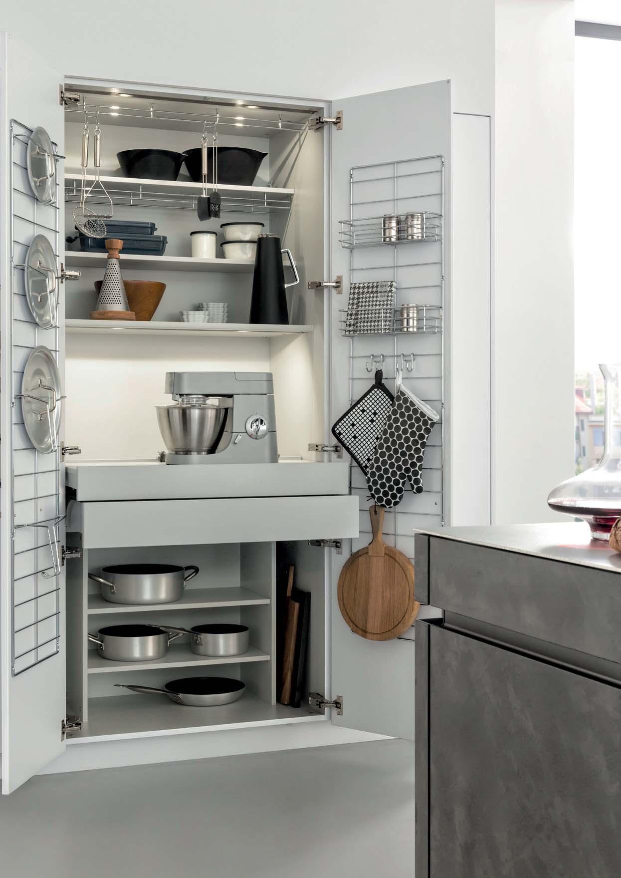
STORAGE PAR EXCELLENCE
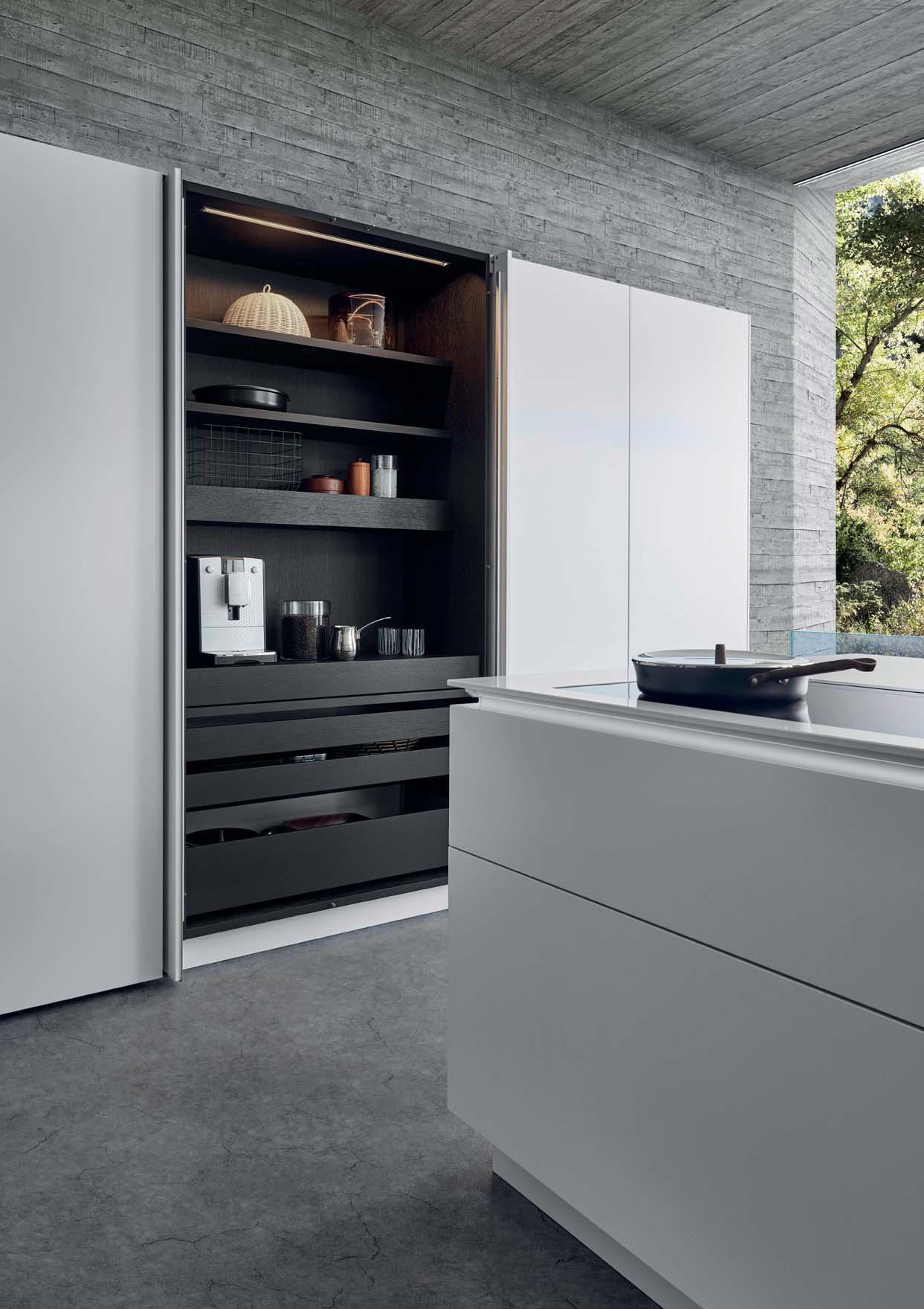
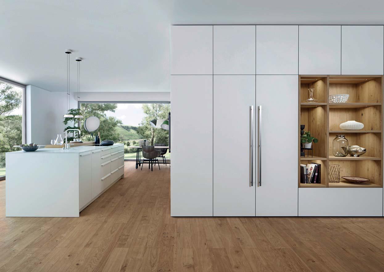
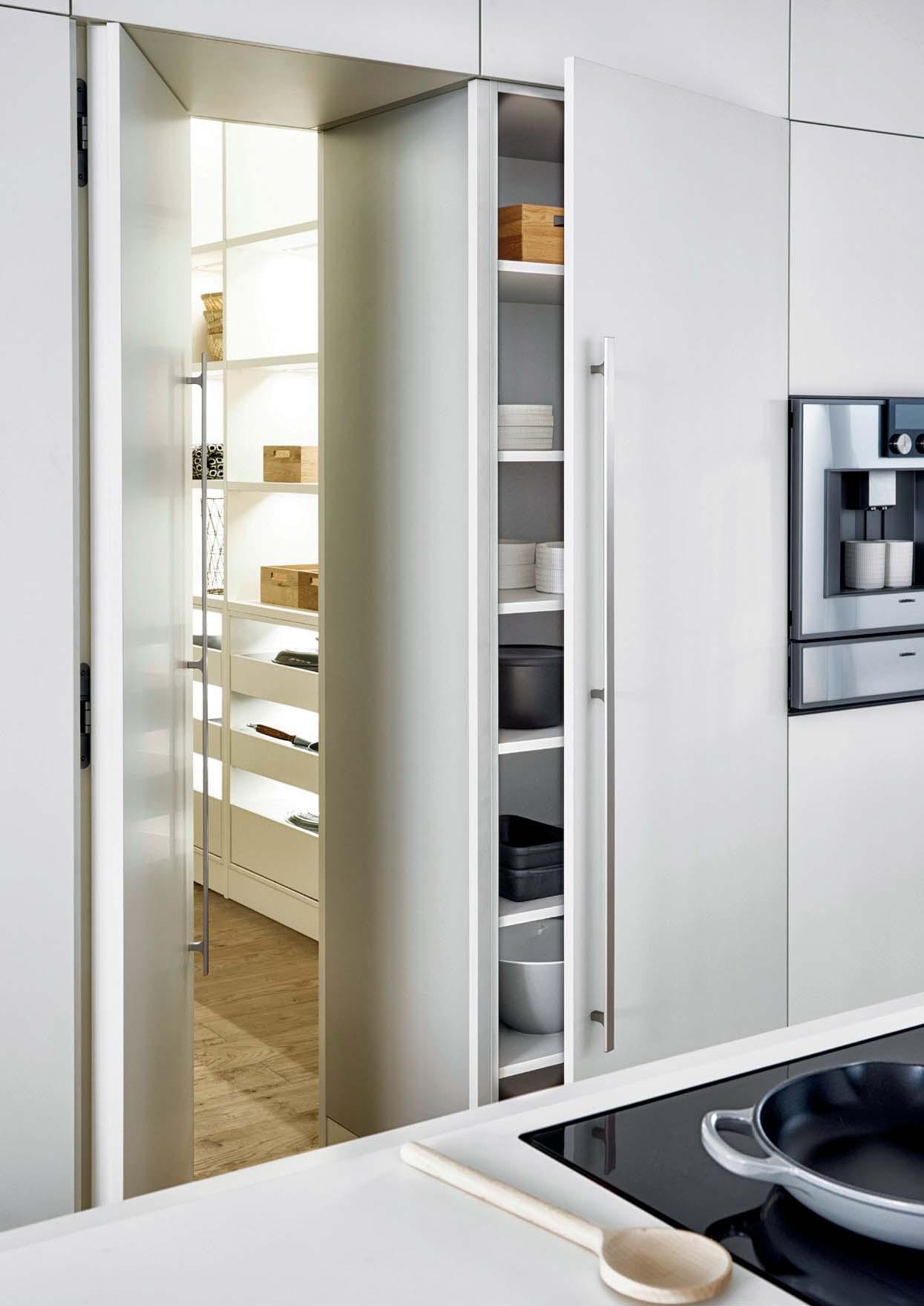
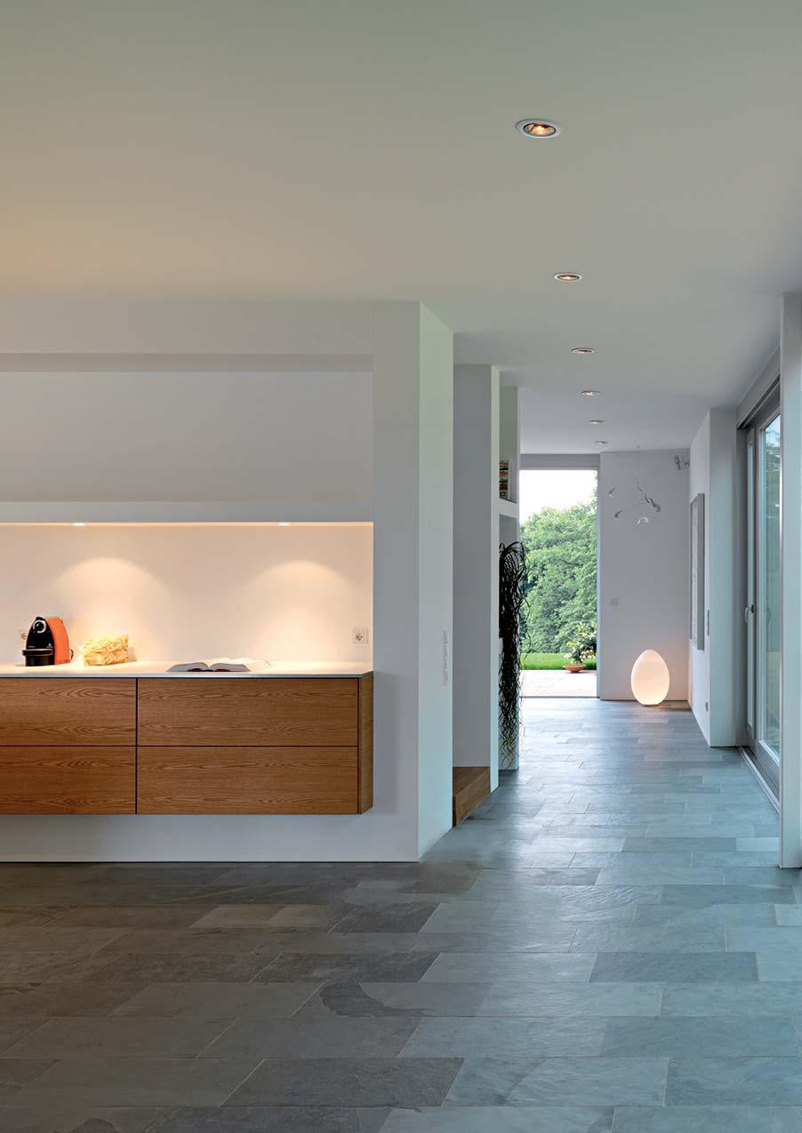
Was sich von außen als großzügige Schrankfront darstellt, ist ein begehbarer Raum: ein kompakter Kubus, der sich durch eine Schwenktür betreten lässt. So ist es nur ein kleiner Schritt von der repräsentativen Küche hinein in den Funktionsraum, der vielfältig nutzbaren Stauraum bietet und sich individuell anpassen lässt.
What looks to be a spacious unit front from the outside is in fact a walk-in room: a compact cube that can be entered through a swing door. This makes it just one small step from the representative kitchen into the functional room offering storage space that can be used in a number of ways and adapted to suit individual requirements.
Ce qui semble de l’extérieur être une façade d’armoire aux dimensions généreuses est en fait un espace accessible : un cube compact dans lequel on entre grâce à une porte battante. Un seul pas sépare ainsi la cuisine représentative de l’espace fonctionnel qui offre un vaste espace de rangement et peut être adapté individuellement.
Lo que desde fuera parece ser un amplio frente de armarios, es en realidad una galería: un cubo compacto al que se puede acceder por una puerta oscilante. Se trata simplemente de un pequeño acceso desde la propia cocina hacia el interior del espacio funcional, que cuenta con una zona de almacenamiento para múltiples usos que se puede adaptar en función de las necesidades.
Wat zich van buiten als een royaal kastenfront presenteert, is een begaanbare ruimte: een kubus die via een zwenkdeur kan worden betreden. Zo is het slechts een kleine stap van de representatieve keuken naar het interieur van de functionele ruimte die veelzijdig te gebruiken opbergruimte biedt en zich individueel laat aanpassen.
21
22
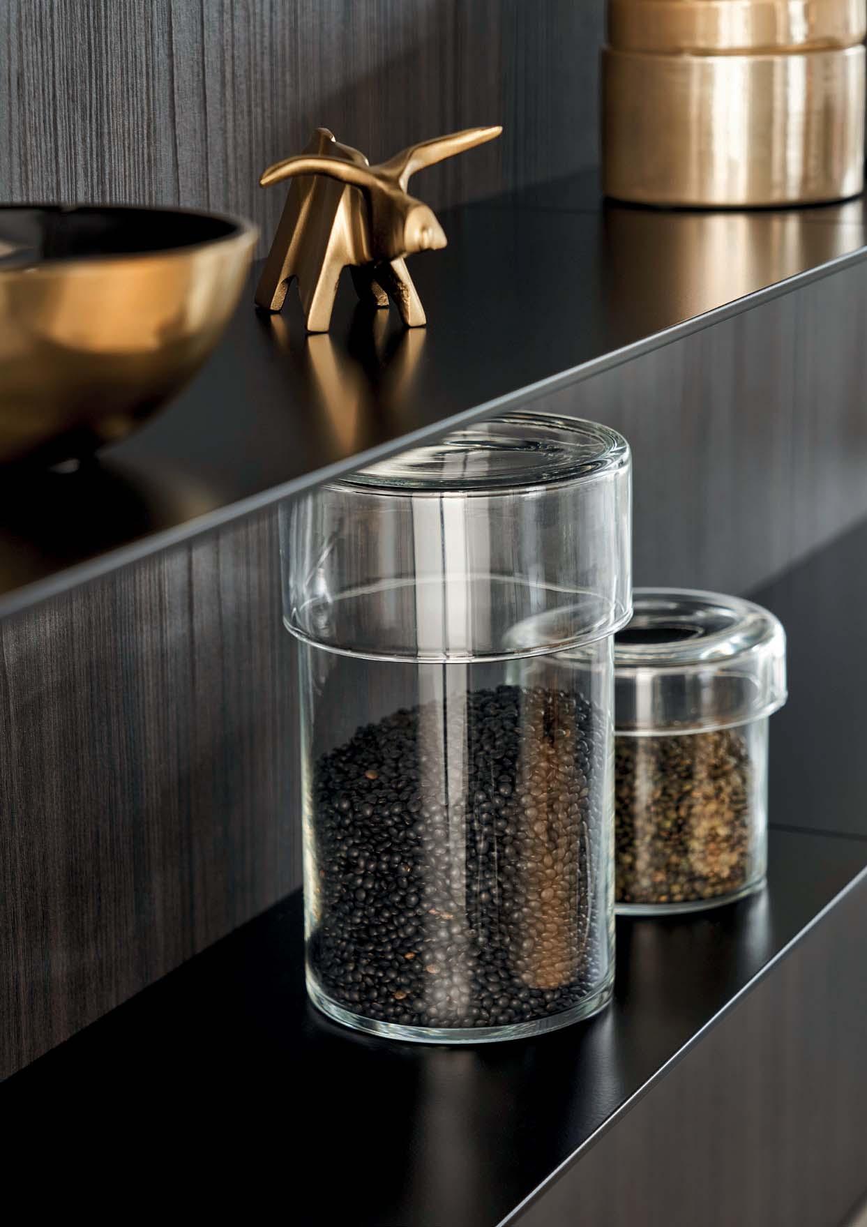
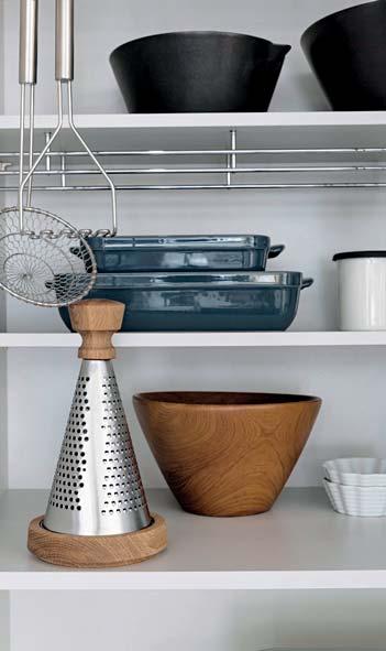
MATERIAL AUTHENTICITY
heit den ästhetischen Ansprüchen von LEICHT entspricht und eine moderne, hohe
exklusiven Mattlack-Farben Les Couleurs® Le Corbusier sowie in sämtlichen RAL- und NCS-Farben in Mattlack und der LEICHT
Kanten in den Ausführungen silber, oxid titan und oxid bronze erhältlich – eine Vielfalt an Möglichkeiten für harmonische Form- und
the aesthetic demands of LEICHT in its simplicity and radiates modern, high quality.
lacquer Les Couleurs® Le Corbusier colours, as well as in all RAL and NCS colours in matt lacquer and the LEICHT aluminium surface ALURO with chamfered edges in silver, oxide titanium and oxide bronze – a variety of possibilities for the harmonious composition of form and surface.
la sobriété répond aux exigences esthétiques de LEICHT et qui transmet un sentiment de modernité et de qualité. La façade est de laque mate Les Couleurs® Le Corbusier,tion laquée mate et dans la surface en aluminium à bords biseautés ALURO de LEICHT, en versions argent, oxyde de titane et oxyde de bronze – une grande variété de possibilités pour créer des compositions harmonieuses de formes et de surfaces.
cuya sencillez responde a las exigencias estéticas de LEICHT y que transmite una sensación de modernidad y calidad. El frente
Les Couleurs® Le Corbusier de acabado lacado mate, en todos los colores RAL y NCS de acabado lacado mate y en los acabados plata, titanio óxido y bronce óxido de la con bordes biselados: una amplia variedad de posibilidades para crear composiciones armoniosas.
concept dat in zijn eenvoud voldoet aan de esthetische eisen van LEICHT en een moderne, hoogwaardige kwaliteit uitstraalt.
matte lakkleuren Les Couleurs® Le Corbusier, alsook in alle RAL- en NCS-kleuren in matte lak en het LEICHT aluminiumoppervlak ALURO met afgeschuinde kanten in de uitvoeringen zilver, titaanoxide en bronsoxide: een diversiteit aan mogelijkheden voor harmonieuze composities van vorm en oppervlak.
-
-
23
24
FORM, FUNCTION AND EVERYDAY LIVING
BOSSA | CONCRETE 25
26
ARCHITECTURE WITH VISION
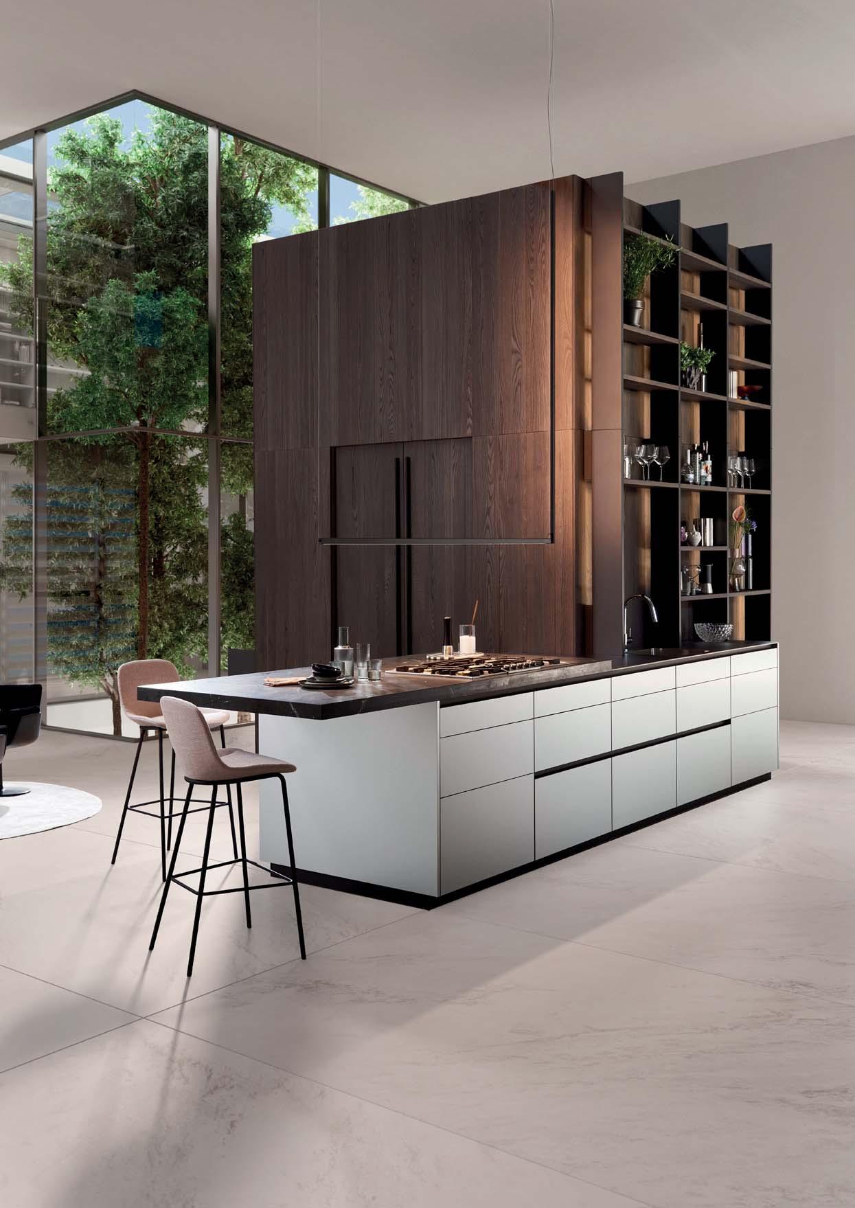
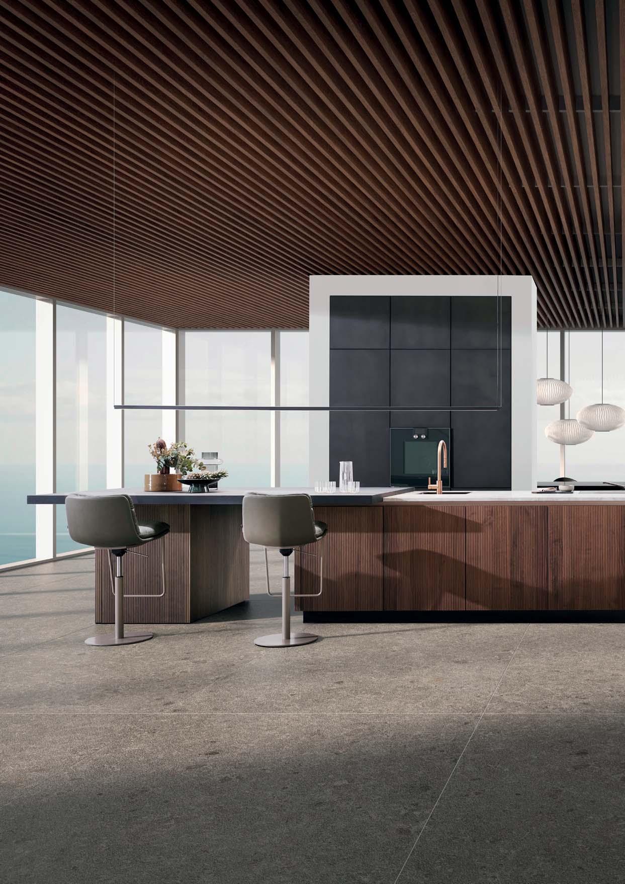
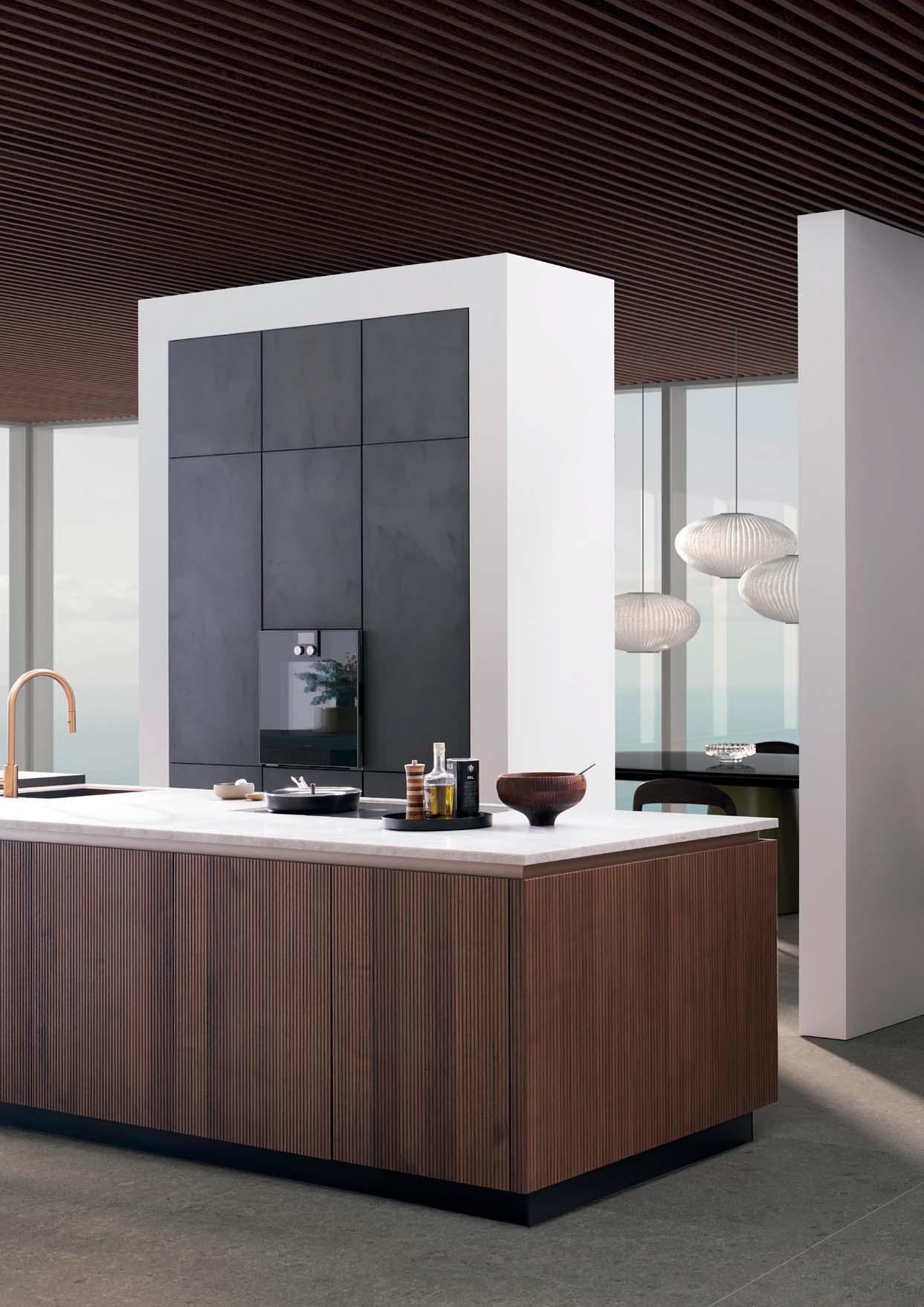
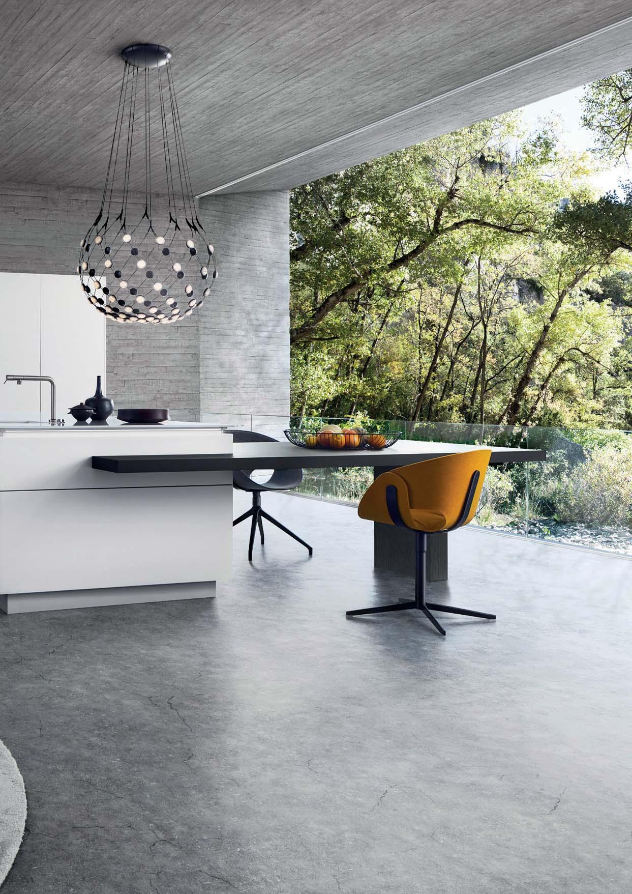
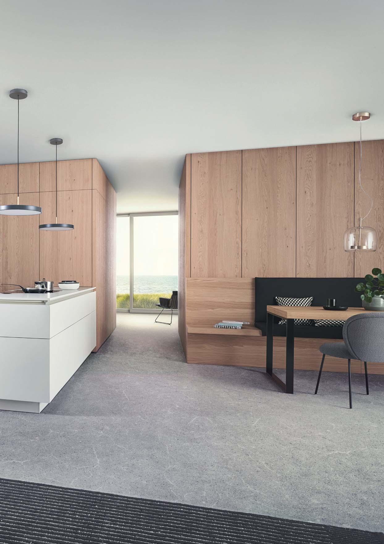
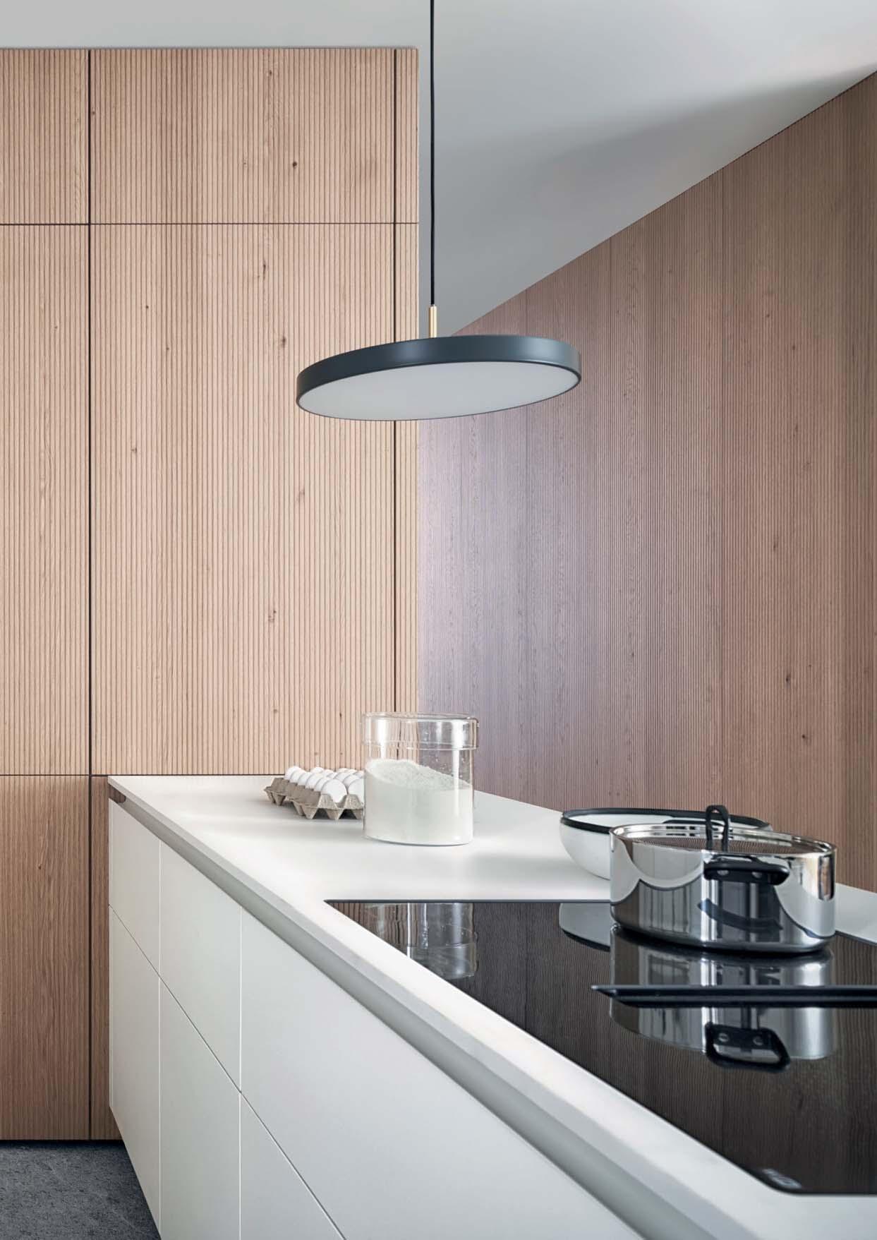
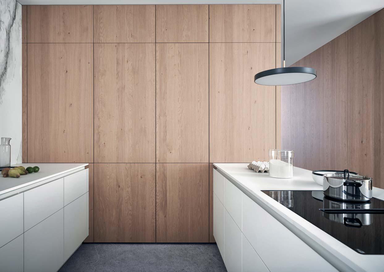
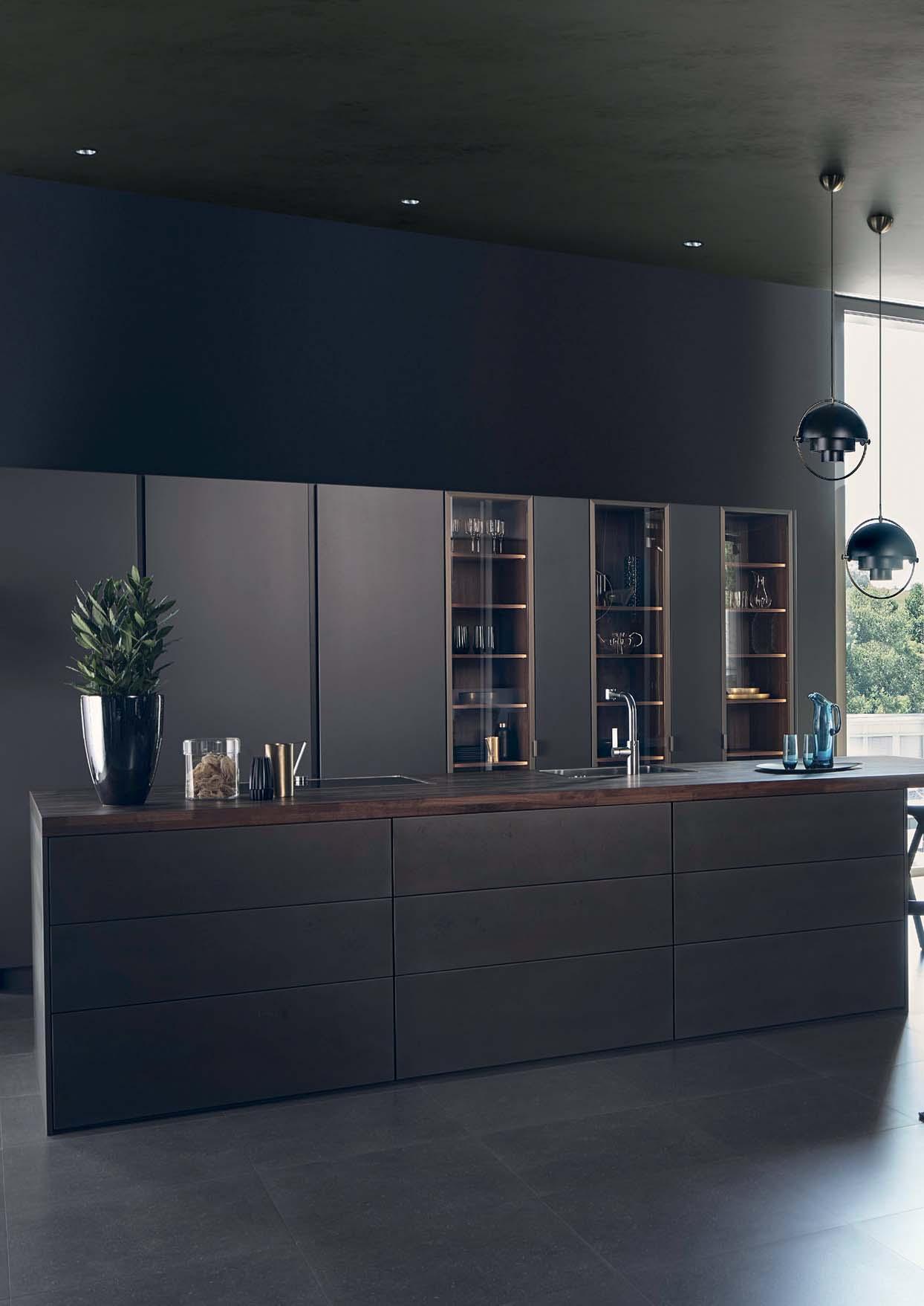
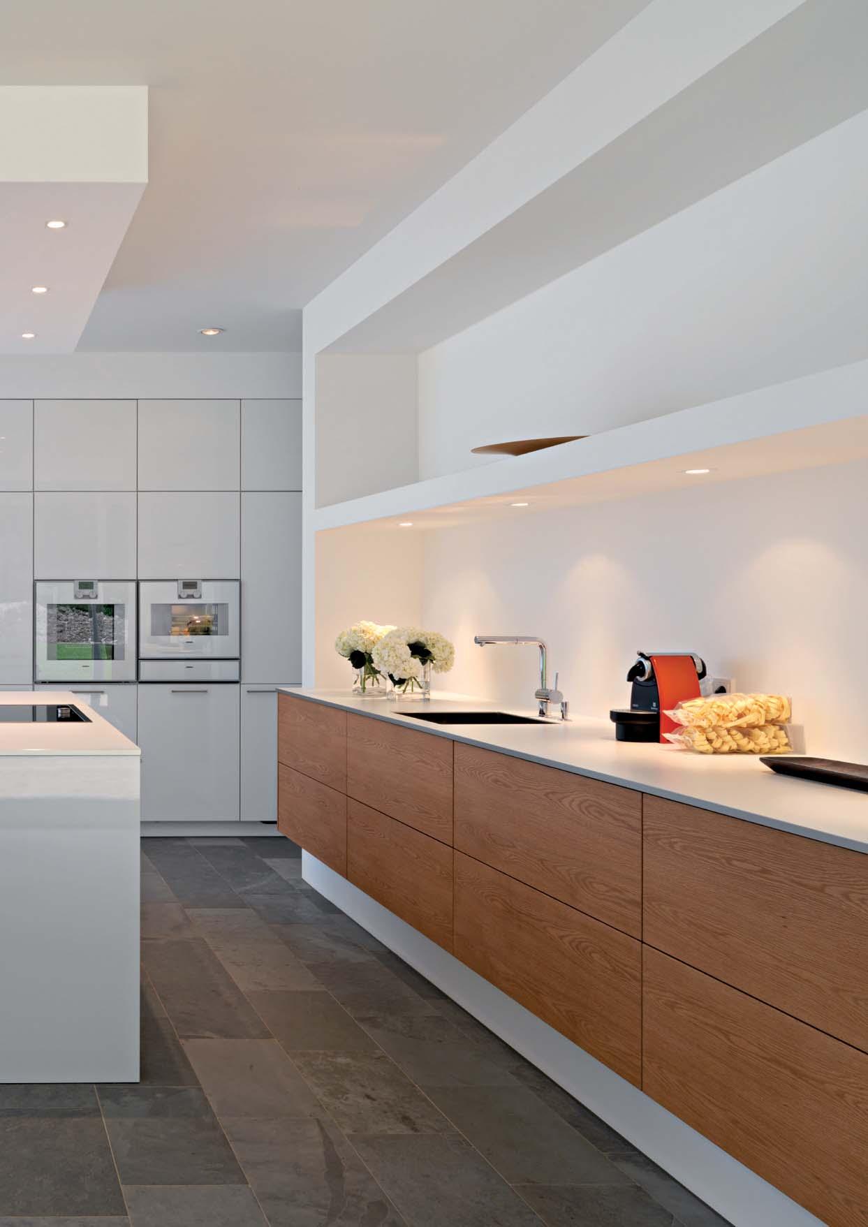
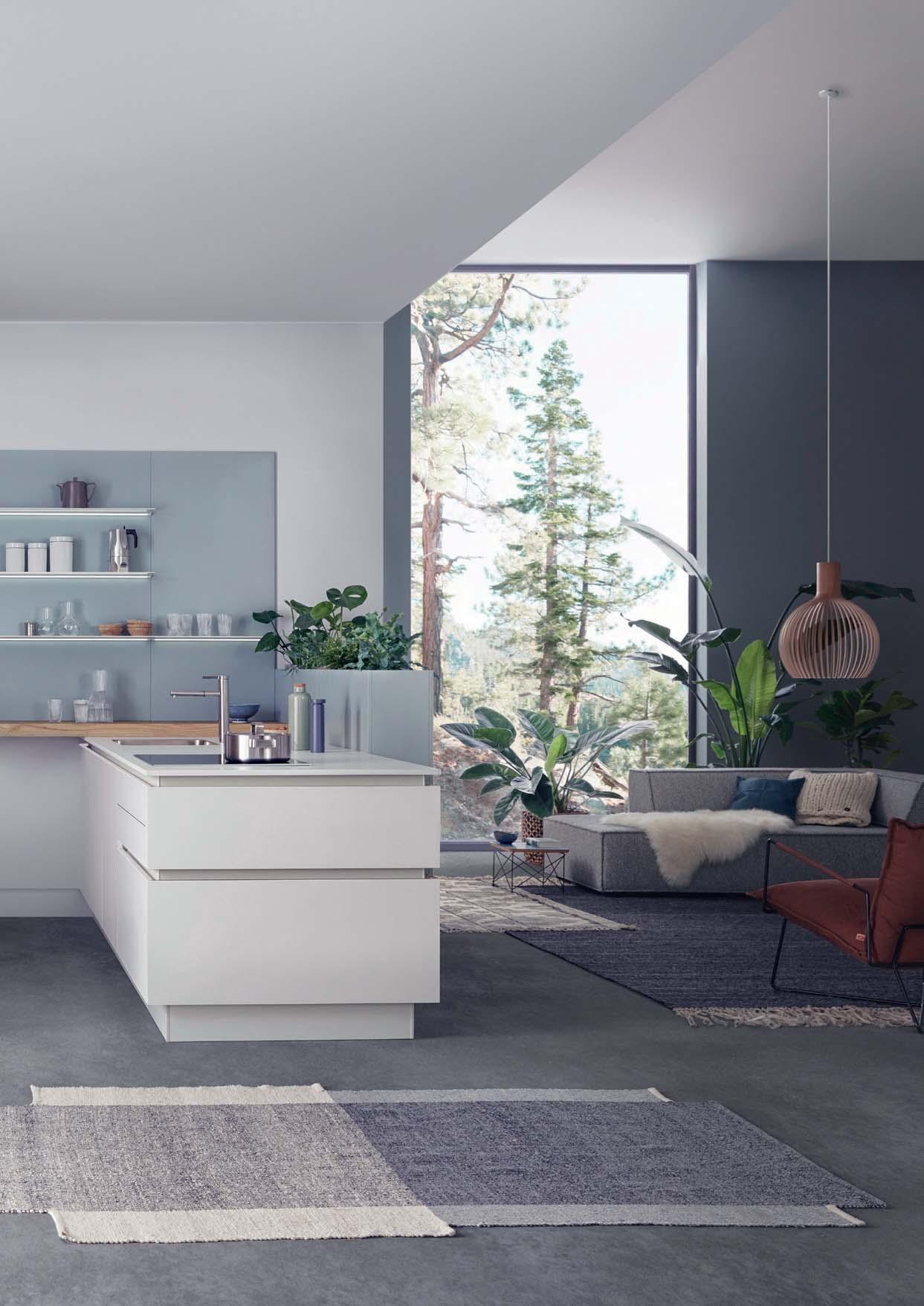
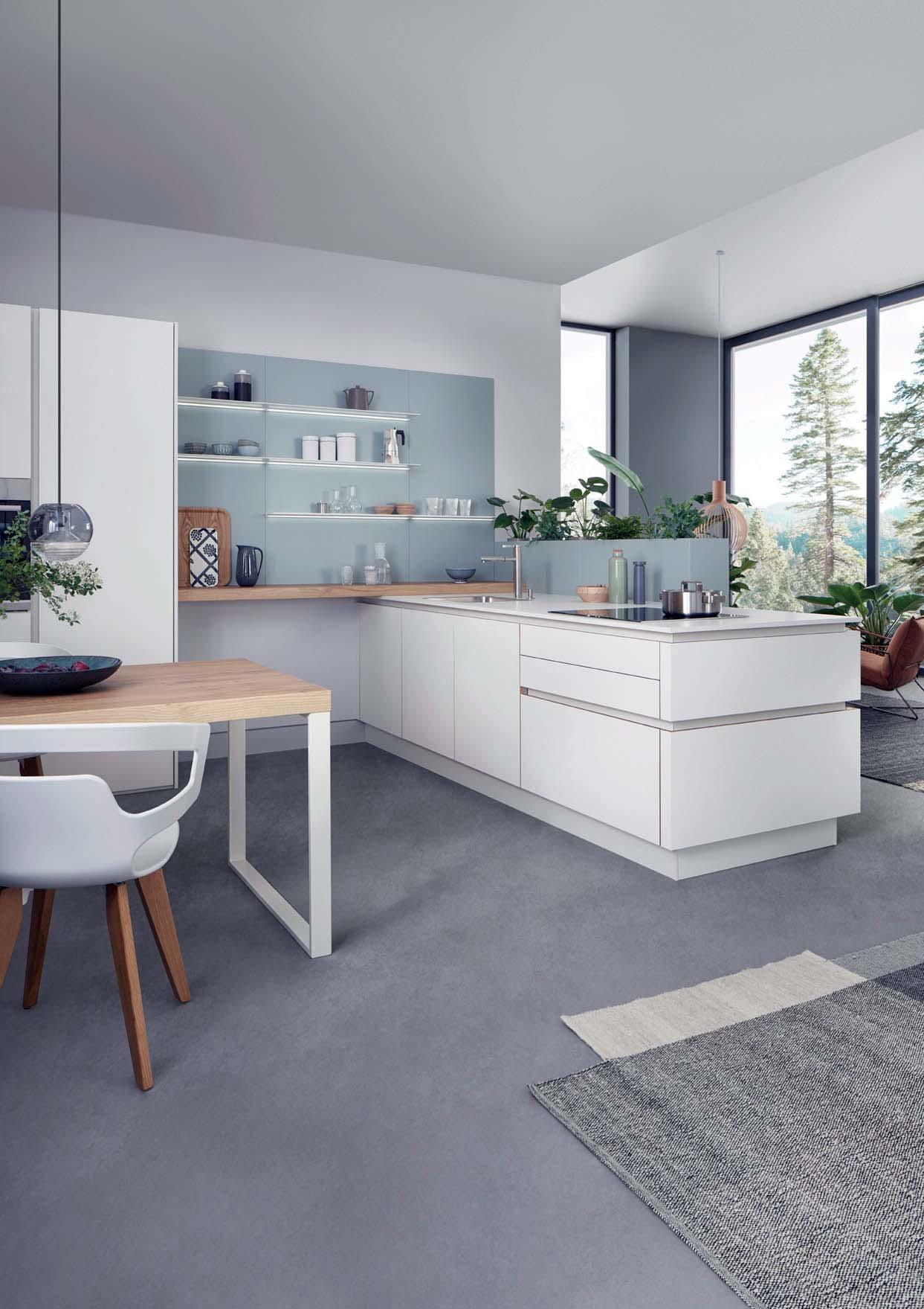
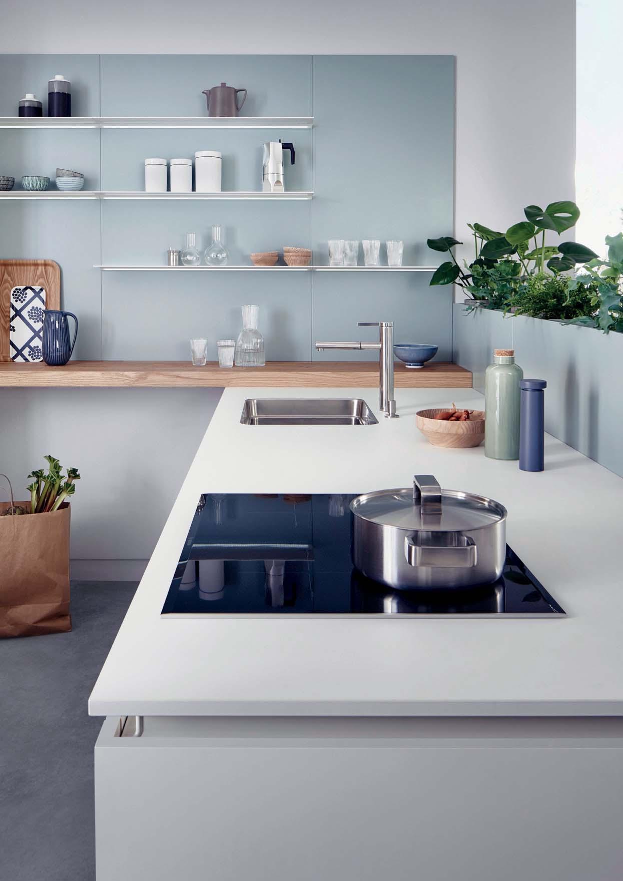
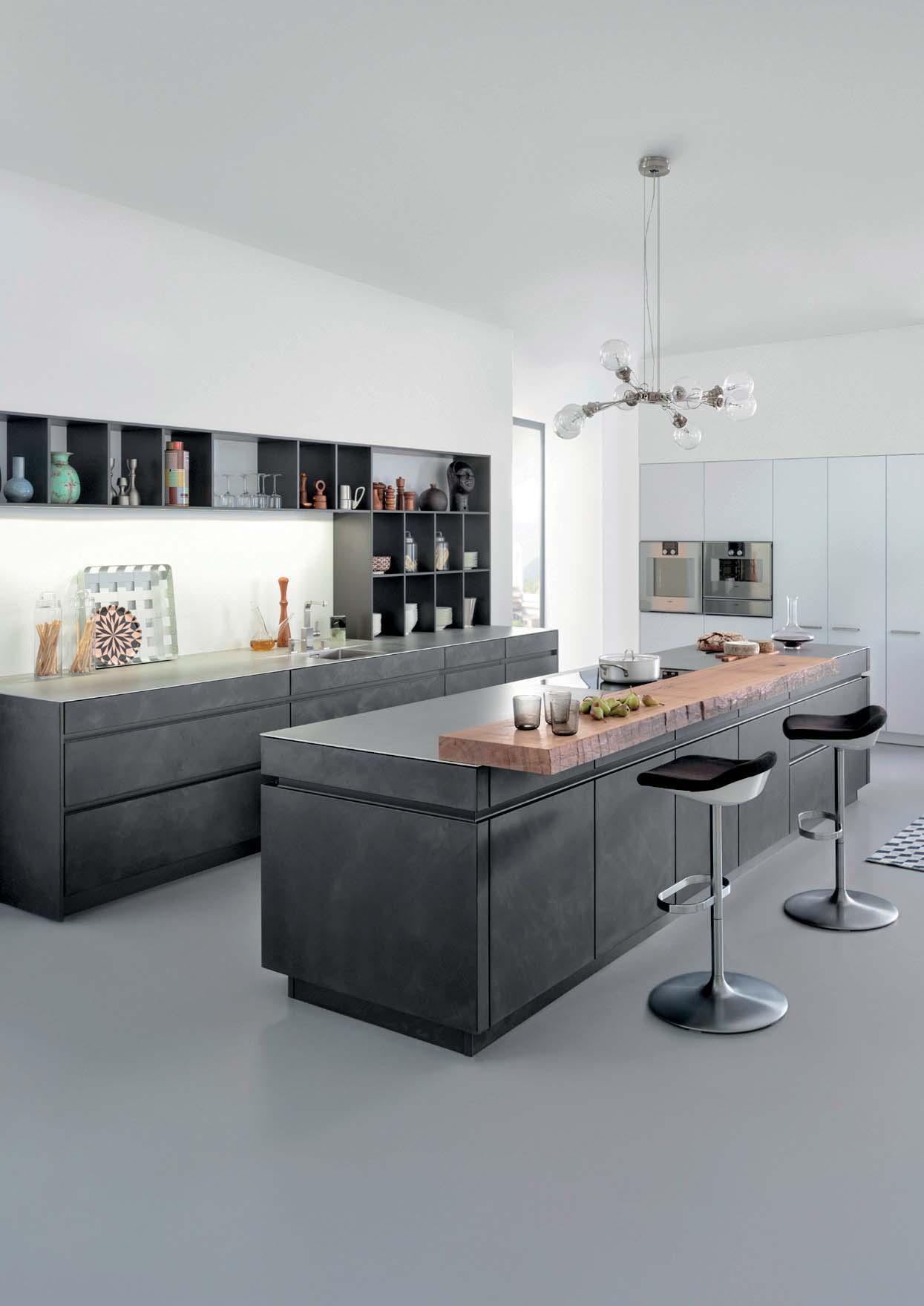
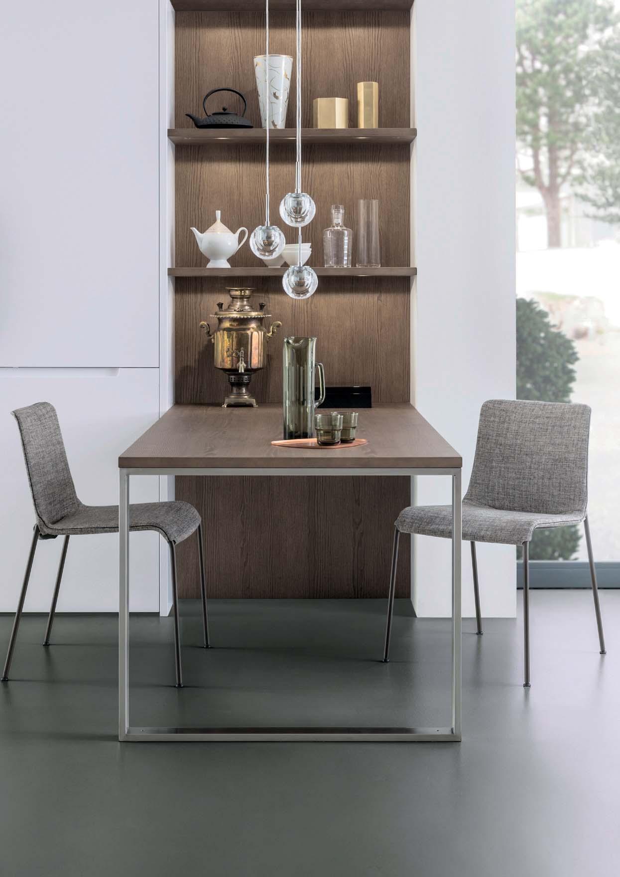
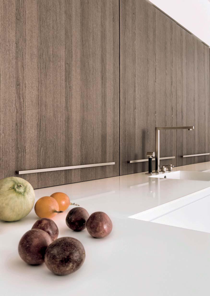
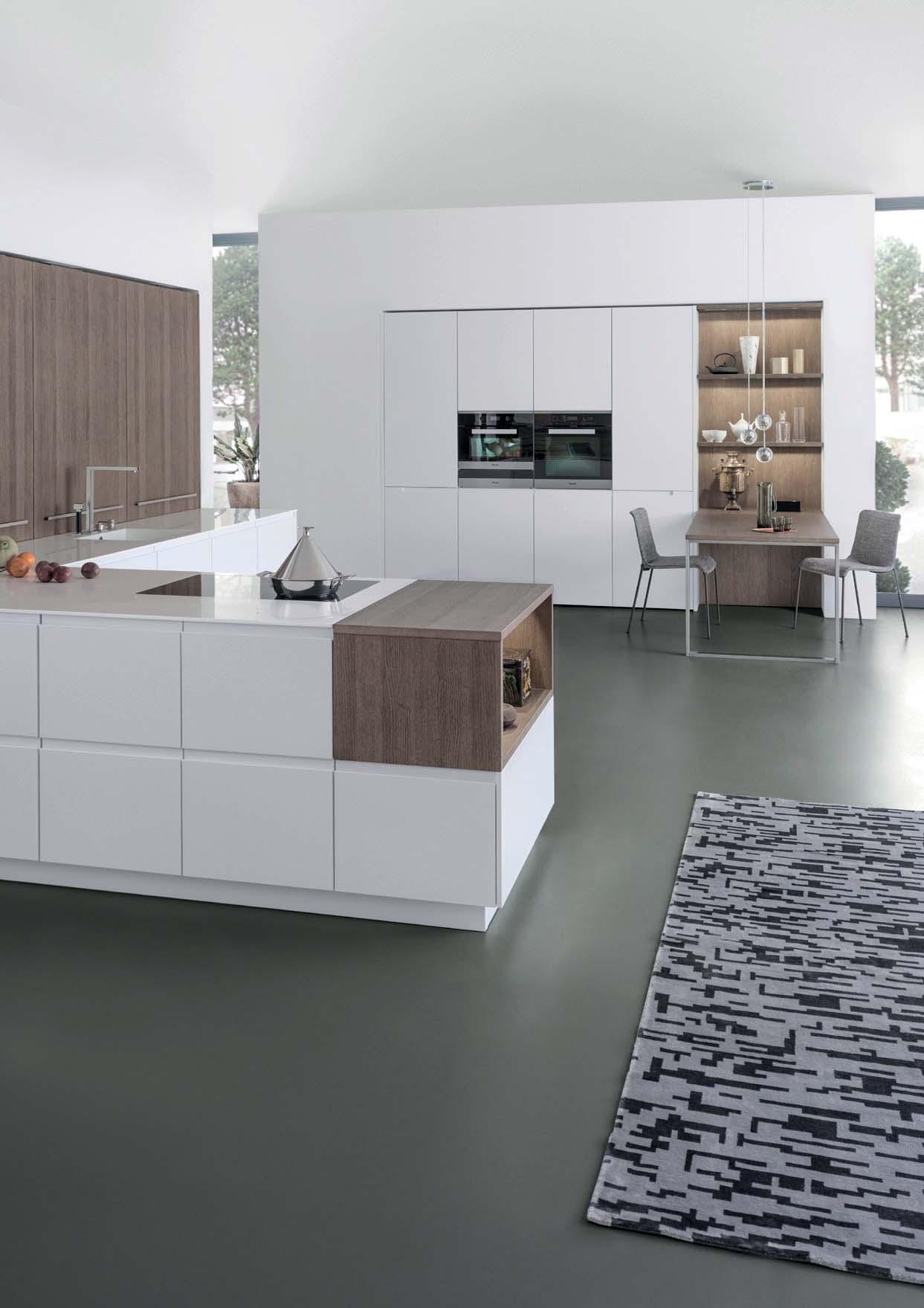
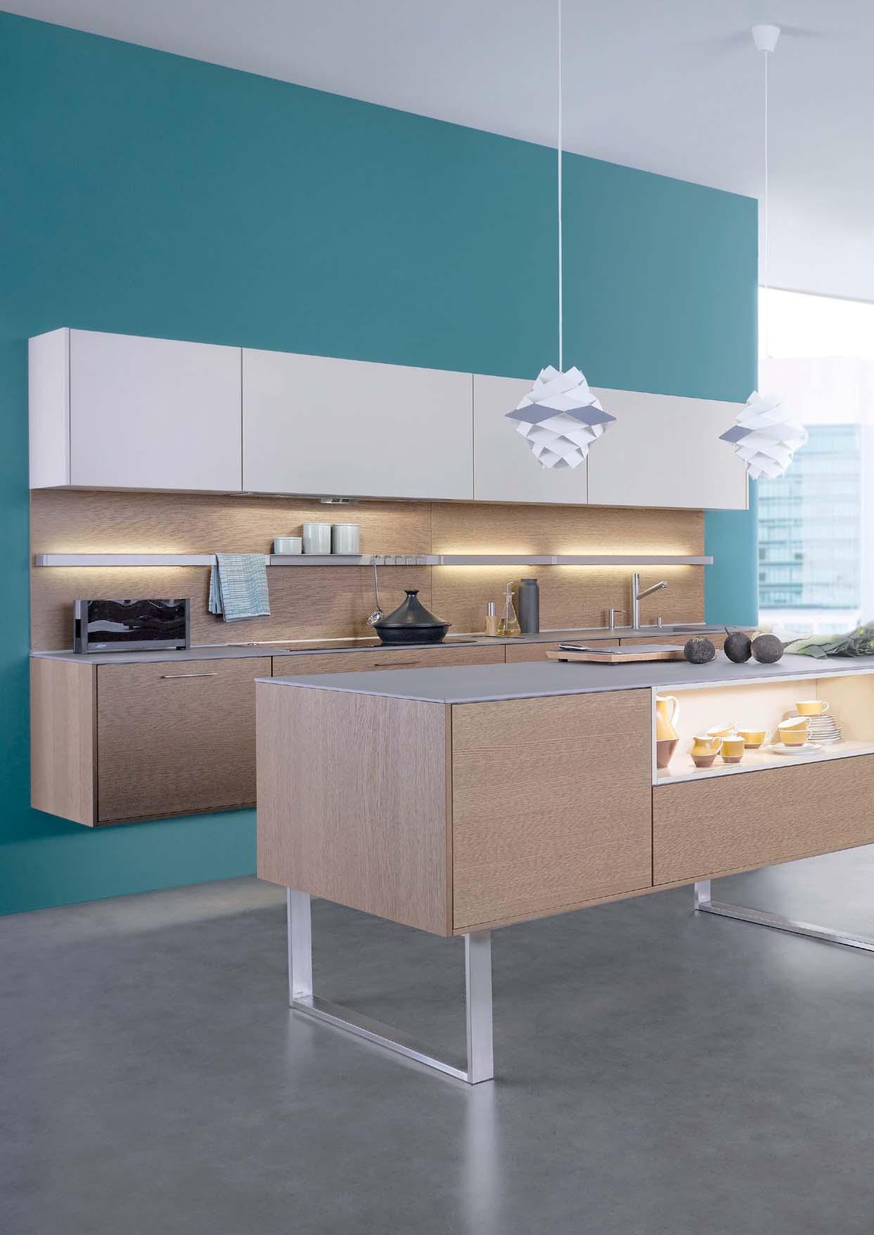
Den Dreh- und Angelpunkt des täglichen Lebens bildet bei dieser offenen Planung Sitzbereich, dem das erfolgreiche Echtholzrundherum eine besondere Struktur verleiht. Die vorstehenden, linearen Stäbchen der Front kreieren ein warm anmutendes, einheitliches Gesamtbild und verleihen der Küche eine lebendige Wirkung. Während das Walnussholz Wärme ausstrahlt, fügt die Naturstein-Arbeitsplatte eine ausgleichende Kühle hinzu.
This kitchen’s handle-less island block with its integrated seating area is conceived as the hub of daily life and is given a special structure all round by the successful real wood surface programme BOSSA in walnut. The protruding, linear ridges of the front create a warm-looking, uniform appearance and give the kitchen a vital effect. While the walnut wood radiates warmth, the natural stone worktop adds a balancing coolness.
îlot conçu comme centre de la vie quotidienne, avec des meubles sans poignée et une zone d’assise intégrée, revêtue sur le pourtour du programme de surface en lui confère une structure caractéristique. Les lamelles de bois en saillie de la façade créent une image d‘ensemble homogène et chaleureuse et confèrent à la cuisine un effet vivant. Tandis que le bois de noyer est un matériau chaleureux, le plan de travail en pierre naturelle offre un contrepoint frais.
En esta cocina diáfana, el centro de la vida cotidiana es una isla con muebles sin tiradores y una zona de asientos integrada. El
auténtica BOSSA con acabado de nogal da a la isla una estructura singular por los cuatro lados. Las tiras en relieve de los frentes dan homogeneidad al conjunto, transmiten calidez y dan a la cocina un efecto tridimensional lleno de vida. Mientras que la madera de nogal es un material cálido, la encimera de piedra natural aporta frescura y actúa como elemento equilibrador.
Het middelpunt van het dagelijks leven vormt bij dit open ontwerp een greeploos kookeiland met geïntegreerde zitgelegenheid. De succesvolle serie BOSSA met echt houten fronten in walnoot zorgt hier voor een bijzondere structuur. Het reliëf met stroken van de fronten zorgt voor een warm, gelijkmatig totaalbeeld en geeft de keuken een levendig effect. Terwijl het walnotenhout warmte uitstraalt, voegt het natuurstenen werkblad een koelere uitstraling toe.
27
28
BOSSA | CONCRETE 29
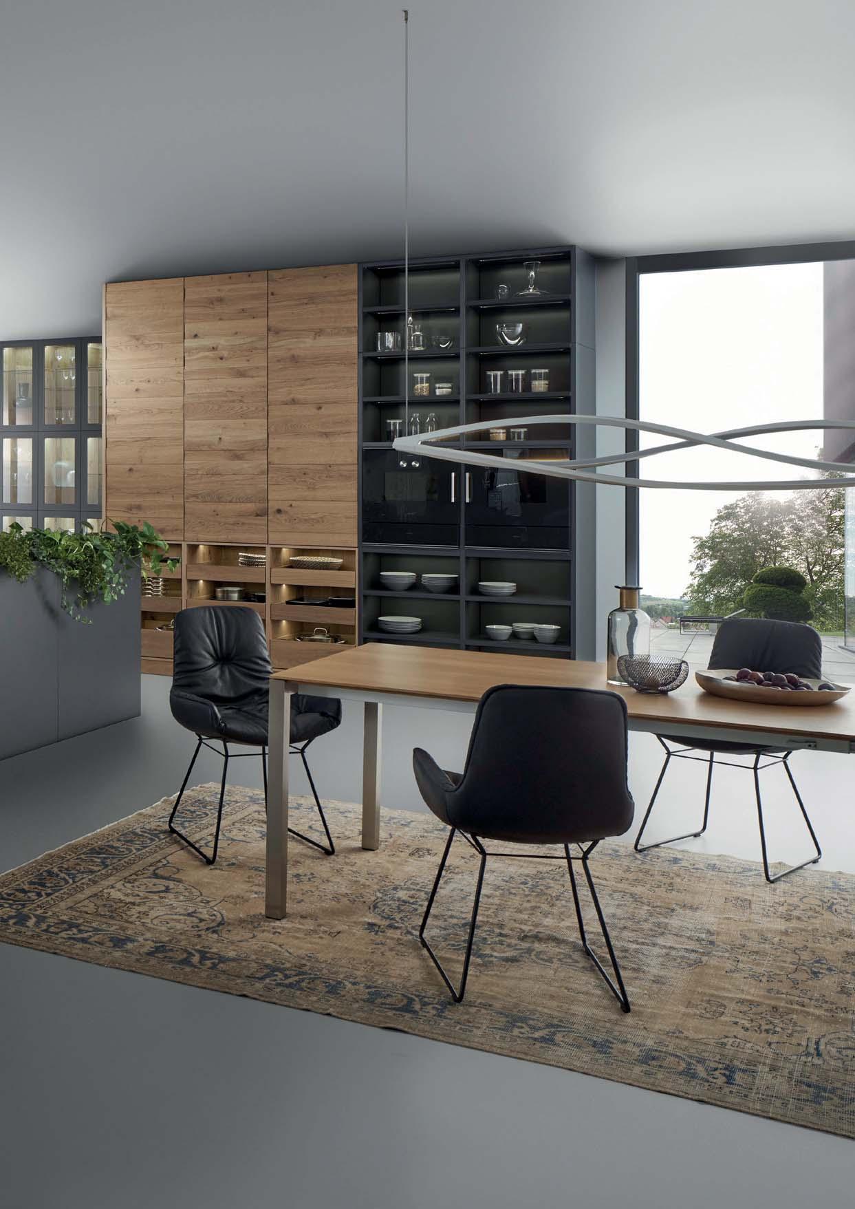
STRUCTURING FURNITURE
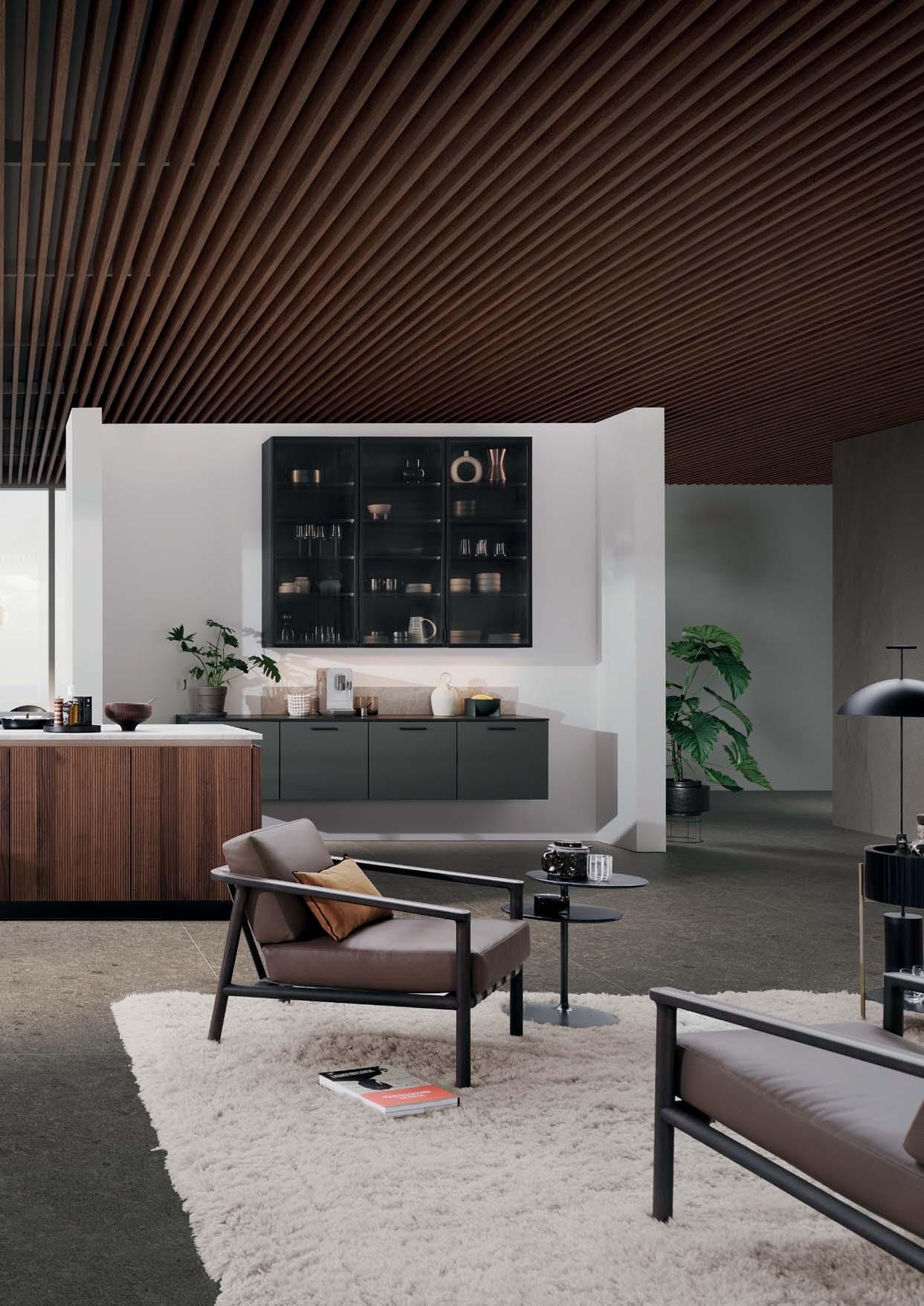
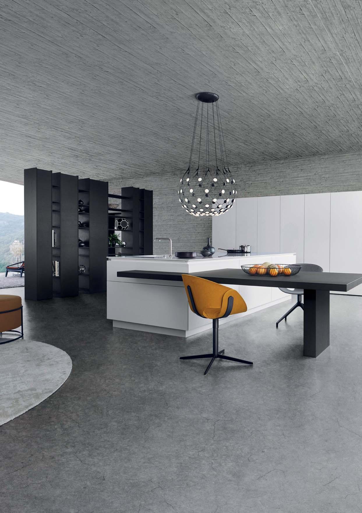
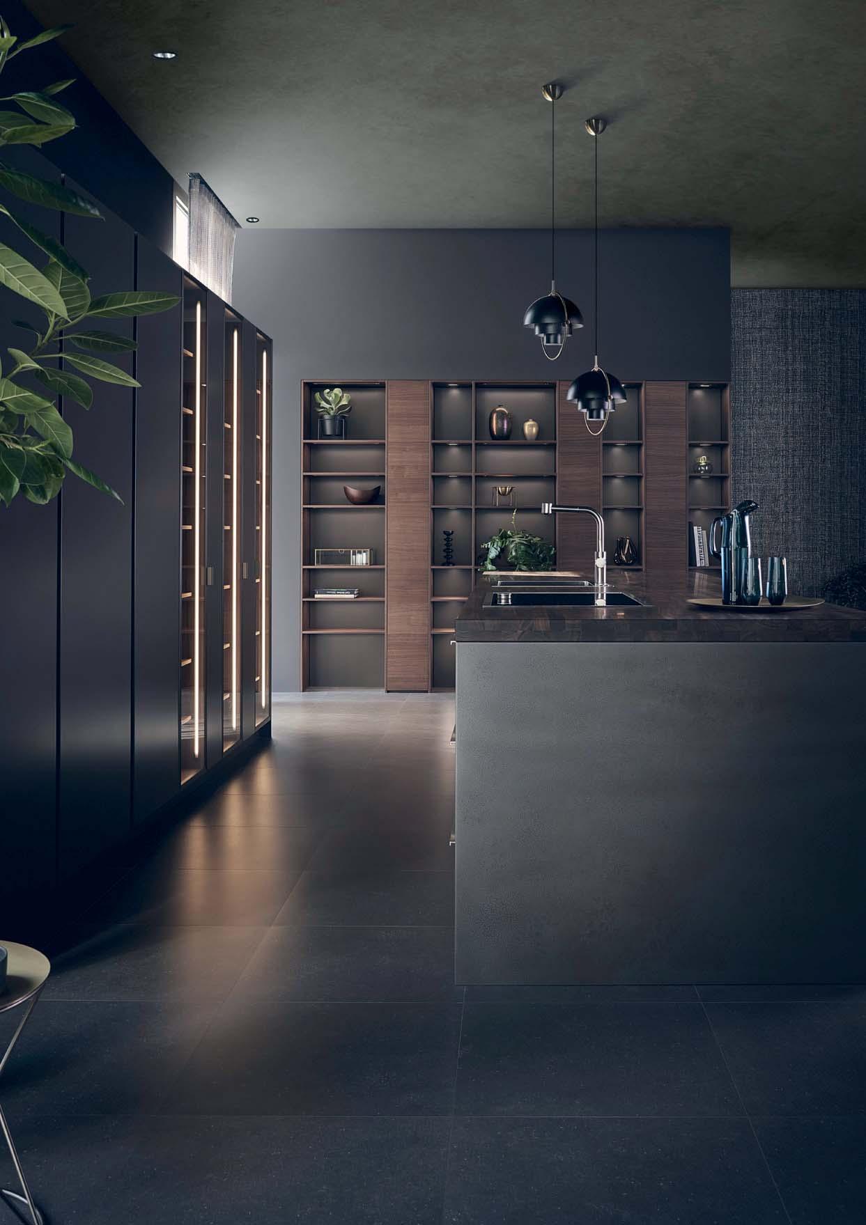
Zwei frei im Raum positionierte Wan-
Ein blockartig angelegter, eingelassener Hochschrank im Programm Concrete brasilia sowie ein Sideboard in carbongrau, das Platz für essentielle Küchenutensilien bietet. Über dem Möbel verläuft eine auf die gesamte Breite geplante NatursteinLeiste in ROCCA, die einen unmittelbaren Bezug zur Materialität des Inselblocks herstellt. Im Zusammenspiel von Material und Form ergibt sich ein einheitlicher Planungsgedanke, der sich über die gesamte Raumgröße zieht.
Two freely positioned wall elements provide the necessary structure: a block-like, recessed tall unit in the Concrete brasilia programme as well as a sideboard in carbon grey, that offers space for essential kitchen utensils. Above the sideboard there is a natural stone panel in ROCCA, presenting an immediate connection to the material of the island block. The interplay of material and form results in a uniform planning idea that extends across the entire space.
Deux éléments muraux positionnés
du programme Concrete brasilia formant un bloc homogène et un sideboard gris carbone pouvant accueillir des accessoires de cuisine essentiels. Une bande de pierre naturelle ROCCA court le long de ce meuble, créant un lien direct avec le matériau du plan de travail de l‘îlot. L‘interaction entre la forme et le matériau forme un concept l‘ensemble de l‘espace.
Dos elementos murales colocados libremente en el espacio definen su estructura: un armario empotrado con acabado Concrete brasilia que forma un bloque homogéneo y un aparador de color gris carbón que resulta ideal para los utensilios esenciales. A lo largo de este mueble se ha colocado una tira de piedra natural ROCCA que dialoga directamente con el material de la encimera de la isla. El resultado de esta interacción entre formas y materiales es un concepto de planificación homogéneo que se extiende a todo el espacio.
Twee vrij in de ruimte geplaatste wandelementen bepalen de noodzakelijke structuur: een blok met een inbouwkast uit de serie Concrete brasilia en een sideboard in carbongrijs dat ruimte biedt voor belangrijke keukenspullen. Boven het meubel loopt over de gehele breedte een natuurstenen lijst in ROCCA die het materiaal van het kookeiland weer mooi oppakt. Het samenspel van materiaal en vorm zorgt voor een gelijkmatig beeld in het ontwerp dat door de gehele ruimte loopt.
30
BOSSA | CONCRETE 31
32
Natur Einzug in diese Küchenplanung. Die optischen und haptischen Strukturen beleben das Interieur, während die dunklen Farbnuancen Ruhe vermitteln und einen eleganten Ausdruck erzeugen.
Select surfaces bring nature into kitchen plans. The visual and haptic structures vitalise the interior, while the dark colour nuances convey calm and exude elegance. Avec les surfaces choisies, la nature fait cuisine. Les structures visuelles et tactiles dynamisent l‘intérieur, tandis que les tons sombres apportent le calme et créent une esthétique élégante.
de cocina abren paso a la naturaleza. Las texturas visuales y táctiles dinamizan el interior, mientras que los tonos oscuros transmiten calma y crean una estética elegante.
In dit ontwerp komt de natuur terug in geselecteerde oppervlakken. De optische en tactiele structuren maken het interieur levendig, terwijl de donkere kleurnuances rust uitstralen en voor een elegant effect zorgen.
NATURAL INSPIRATION BOSSA | CONCRETE 33
34
OPEN SPACE LIVING 35 CLASSIC-FS | TOPOS
36
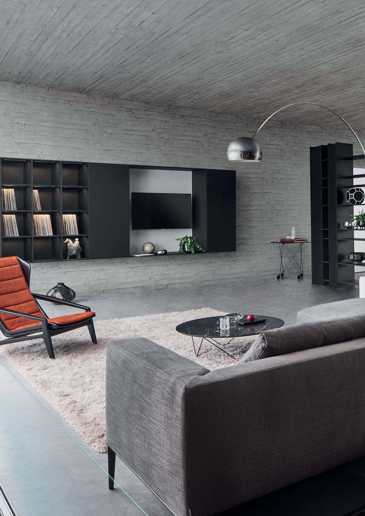
HARMONY IN BLACK AND WHITE
Offene Raumplanung, klare architektonische Achsen: Diese Küche verkörpert ganz im Sinne der Architekturmarke LEICHT die Verschmelzung von Kochen und Wohnen zu einem ganzheitlich gedachten Lebensdunklem Holz gehaltene Sitzbereich gehen nahtlos ineinander über. Die auf Gehrung gearbeiteten Auszüge und Wangen verschmelzen elegant miteinander.
Open room plan, clear architectural axes: totally in line with the architectural brand LEICHT, this kitchen embodies the fusion of kitchen and living to form a holistically planned living space. The handle-less island block and the seating area in dark pullouts and panels elegantly merge with one another.
chitecturaux clairs : cette cuisine incarne la fusion entre la préparation des repas et le séjour pour former un espace de vie conçu de manière globale, tout à fait dans l’esprit de la marque architecturale LEICHT. L’îlot dépourvu de poignées et la zone d’assise en bois foncé s’enchaînent sans transition. Les joues et les coulissants coupés en onglet se fondent les uns dans les autres avec élégance.
arquitectónicos claros: esta cocina encarna la fusión característica de la marca LEICHT entre la zona de cocinar y la zona de estar para crear un único espacio vital concebido integralmente. La isla sin tiradores y la madera oscura de los muebles del salón presentan una gran cohesión. Los paneles laterales y gavetas acabados a inglete se funden entre sí con elegancia.
Open interieurplanning, heldere architectonische assen: Deze keuken representeert de versmelting van koken en wonen tot een holistisch geconcipieerde leefruimte, geheel in lijn met het architectuurmerk LEICHT. Het greeploze eilandblok en het in donker hout uitgevoerde zitgedeelte gaan naadloos in elkaar over. De in verstek verwerkte uittrekelementen en wangen versmelten elegant met elkaar.
-
37 CLASSIC-FS| TOPOS
38
39 CLASSIC-FS | TOPOS
INTIMATE FEEL
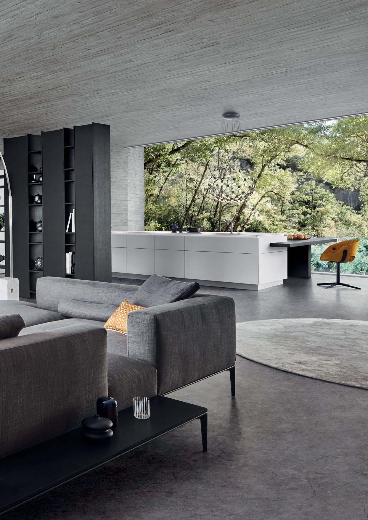
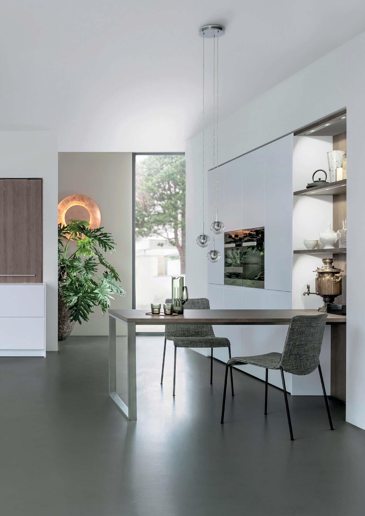
Als perfekte Fortführung des Küchenbereichs verschmilzt der Wohnraum sowohl optisch als auch funktional mit dem Ambiente. Ein durch offene und geschlossene Regal- und Schrankeinschübe untergliedertes Element kommt als architektonischer Raumteiler gekonnt zum Einsatz: Es ermöglicht sichtbare Blickachsen in beide Bereiche ohne ihnen Intimität zu nehmen und schafft so kommunikative Verbindungen im Raum.
As the perfect continuation of the kitchen area, the living space merges both optically and functionally into this atmosphere. The architectural element featuring open and closed shelf and unit sections is a skilful way of dividing the room: it creates visible axes of vision into both areas without taking away any of the intimacy and thus makes for communicative connections within the room.
Prolongation parfaite de l’espace cuisine, la pièce à vivre se fond dans l’ambiance d’un point de vue visuel et fonctionnel. Un élément subdivisé par des étagères et des compartiments ouverts et fermés sépare habilement l’espace architectuvisibles dans les deux zones sans violer leur intimité, créant ainsi des connexions communicatives dans l’espace.
Como perfecta prolongación de la zona de la cocina, la sala de estar se funde visual y funcionalmente con el ambiente. Un elemento formado por estantes y armarios abiertos y cerrados se utiliza como hábil separador arquitectónico de los espacios: al crear ejes visuales entre ambas zonas sin desvelar la intimidad de sus ocupantes, este elemento establece un nexo comunicativo entre ambos puntos.
Als een perfecte voortzetting van het keukengedeelte versmelt de woonkamer zowel visueel alsook functioneel met de ambiance. Een door open en gesloten schuifelementen onderverdeeld kastelement wordt als architectonische ruimteverdeler op een knappe manier toegepast: Het maakt zichtbare zichtlijnen in beide ruimtes mogelijk zonder de intimiteit te verstoren en creëert zo communicatieve verbindingen in de ruimte.
40
41 CLASSIC-FS | TOPOS
42
43 CLASSIC-FS | TOPOS
44
Als gegenüberliegendes Pendant präsentiert ein individuell planbares Wandregal Accessoires im eleganten Setting und greift die in der Küche integrierten hochwertigen Holzmaterialien wieder auf. Innerhalb des Küchen- und Wohnbereichs unterstreicht das Zusammenspiel von Schwarz und Weiß mit
holz des LEICHT-Programms TOPOS und in Kombination mit sichtbarem Rohbeton einen zeitlos luxuriösen Kontrast sowie eine
Its counterpart opposite is an individually plannable shelving system which showcases accessories in an elegant setting and picks up the high-grade wooden materials integrated in the kitchen. Within the kitchen and living area, the interplay of black and white with light lacquered surfaces and the dark oak of the LEICHT range TOPOS in combination with visible rough concrete highlights a timelessly luxurious contrast as well as an architecturally clean look.
une étagère murale individuellement modulable présente des accessoires dans un cadre élégant et reprend les différentes essences de bois de qualité intégrées dans la cuisine. Dans les zones cuisine et séjour, l’interaction du noir et du blanc avec des surfaces laquées claires, le bois de chêne foncé du programme TOPOS de LEICHT et la combinaison avec le béton brut apparent souligne un contraste luxueux intemporel ainsi qu’un esthétisme architectural clair.
Como contrapartida, una estantería de pared personalizable fabricada con los materiales de madera de alta calidad integrados en la cocina presenta los accesorios en un entorno elegante. En la cocina y el salón, la interaccilacadas de color claro, la madera de roble oscuro del programa TOPOS de LEICHT y el hormigón bruto visible, crean un contraste lujoso y atemporal y una estética arquitectónicamente clara.
Als tegenhanger ertegenover presenteert een individueel planbare open wandkast accessoires in een elegante omgeving en pakt de in de keuken geïntegreerde hoogwaardige houtmaterialen weer op. Binnen het keukenen woongedeelte accentueert het samenspel van zwart en wit met lichte lakoppervlakken, donker eikenhout uit het LEICHT-programma TOPOS en, in combinatie met zichtbaar ruw beton, een tijdloos luxueus contrast en een architectonisch heldere esthetiek.
-
MATERIALS 45 CLASSIC-FS | TOPOS
LUXURIOUS
46
NORDIC BY NATURE 47 BOSSA | F 45
48
CALMING ELEGANCE
Vom Entrée über den Flur bis in den KüchenBOSSA in heller Eiche in architektonisch anspruchsvollen Küchenplanungen als FrontHöhe verlaufende Wandelemente vereinen das gestalterische Bild innerhalb der Lebens-chen erzeugen eine rhythmische, nach oben
In architecturally sophisticated kitchen designs the new real wood surface BOSSA in light oak is used as front panelling from the entrance through the hall to the kitchen area. Large-scale wall elements running right up to the ceiling shape the creative look within the living areas. The vertically structured wall effect with a lively impact.
Dans l‘entrée et le couloir jusqu’à l‘espace cuisine, la nouvelle surface en bois véritable BOSSA en ton chêne clair convient pour le revêtement des façades et des murs dans des conceptions de cuisines au design architectural exigeant. Des éléments muraux de granl‘esthétique des espaces de vie. Les surfaces murales rainurées verticalement créent un effet ascendant rythmique et vivant.
En la entrada, a lo largo del pasillo y en todo madera auténtica BOSSA en tono roble claro es adecuada para el revestimiento de frentes y paredes en diseños arquitectónicos de lujo. Los grandes elementos murales de orientaci-
verticales crean un efecto rítmico ascendente y extraordinariamente vital
Van entree en hal tot in de keuken kan het nieuwe echt houten oppervlak BOSSA in licht eiken worden toegepast als frontbekledingwerpen. Hoge, royale wandkasten tot onder het plafond zorgen voor een mooi in elkaar overlopende vormgeving in het interieur. De wandoppervlakken met hun verticale structuur krijgen een ritmisch, naar boven toe vloeiend effect met een levendige uitstraling
49 BOSSA | F 45
50
51 BOSSA | F 45
BRIGHT AND LIGHT
Küchenmodule nicht als funktionale, sondern als wohnliche Elemente wahrgenommen und der schlanke Kochbereich spielt sich visuell ausschließlich an den beiden groß gedachten Planungsszenario strahlt der Einsatz des BOSSA-Programms aufgrund der Holzmaserungen eine einladende Ruhe und Einheitlichkeit aus.
The new surface ensures these kitchen modules are not perceived as functional but as homely elements, with the slimline cooking area very obviously centring exclusively around the two kitchen runs. In this handle-less, large-scale planning scenario, the incorporation of the BOSSA range exudes an inviting calm and unity thanks to the wood grain.
Grâce à la nouvelle surface, ces modules de cuisine ne sont pas perçus comme des éléments fonctionnels, mais comme des éléments au confort accueillant, l’espace cuisine aux dimensions modestes étant ainsi limité visuellement aux deux linéaires de cuisine. Dans cette conception généreuse sans poignée, l‘utilisation du programme BOSSA avec ses veinures de bois dégage un calme et une uniformité accueillants.
-
los de la cocina ya no se perciben como componentes funcionales, sino como un elemento más del hogar; a simple vista, da la impresión de que la cocina se reduce a dos hileras de muebles bajos. Este espectacular diseño, en el que destaca la ausencia de tiradores, transmite una sugestiva sensación de calma y uniformidad gracias al veteado de la madera BOSSA.
Dankzij het nieuwe oppervlak worden deze keukenmodules niet gezien als puur functionele zaken, maar als echte interieurelementen. Het slanke kookgedeelte speelt zich visueel gezien uitsluitend af aan de twee keukenblokken. In dit royaal bemeten ontwerpscenario met greeploze
tekeningen in het hout een natuurlijke rust en warmte uit.
52
53 BOSSA | F 45
54
Ruhe, Großzügigkeit, Lebendigkeit: Mit der Wandverkleidung BOSSA präsentiert LEICHT eine neue Front, die im deutschen Küchenmarkt auf diese Weise noch nicht existiert und in der Küche sowie im gesamten Wohnraum eine gänzlich neue Bildsprache schafft. Die hochwertige Echtholzfront in den Furnieren Eiche oder Walnuss verleiht jeder Küche eine einzigartige Optik.
Calm, spaciousness, vitality: with the BOSSA wall panelling, LEICHT is presenting a new front that, in this form, is new to the German kitchen market and creates a completely new visual language in the kitchen and the entire living space. The high-quality real wood front in oak or walnut veneer gives every kitchen a unique look.
Sérénité, générosité, vivacité : avec le revêtement mural BOSSA, LEICHT présente une nouvelle façade qui n‘était pas disponible sur le marché allemand jusqu‘à présent et qui crée un langage visuel entièrement nouveau dans la cuisine ainsi que dans tout l’espace de vie. La façade en bois véritable de haute qualité, plaquée chêne ou noyer, confère à chaque cuisine une apparence unique.
Serenidad, amplitud, vitalidad: con el revestimiento BOSSA, LEICHT presenta un nuevo tipo de frente que hasta ahora no existía en el mercado alemán y que permite crear un lenguaje visual completamente nuevo tanto en la cocina como en el resto del hogar. El chapa de roble o nogal convierte cada cocina en un espacio único.
Rust, sfeer, levendigheid: met de BOSSA wandbekleding presenteert LEICHT een nieuw front dat op deze manier nog niet bestaat op de Duitse keukenmarkt en zowel in de keuken als in de gehele woonkamer zorgt voor een compleet nieuwe beeldtaal. Het hoogwaardige echt houten front in eiken unieke look.
THE JOY OF NATURAL WOOD
55 BOSSA | F 45
56
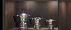
57 STEEL | CLASSIC-FS | TOPOS
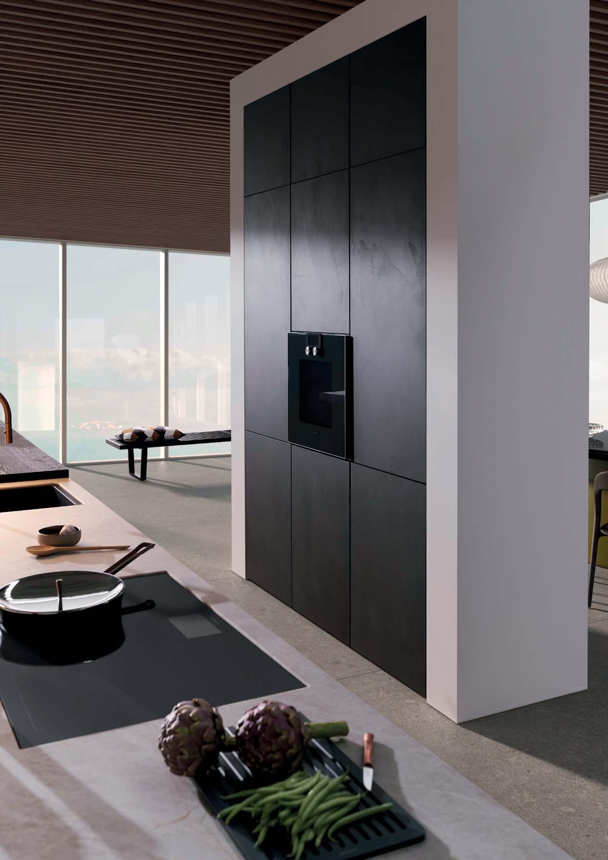
HIGH CLASS
58
INTERIOR REFINEMENT
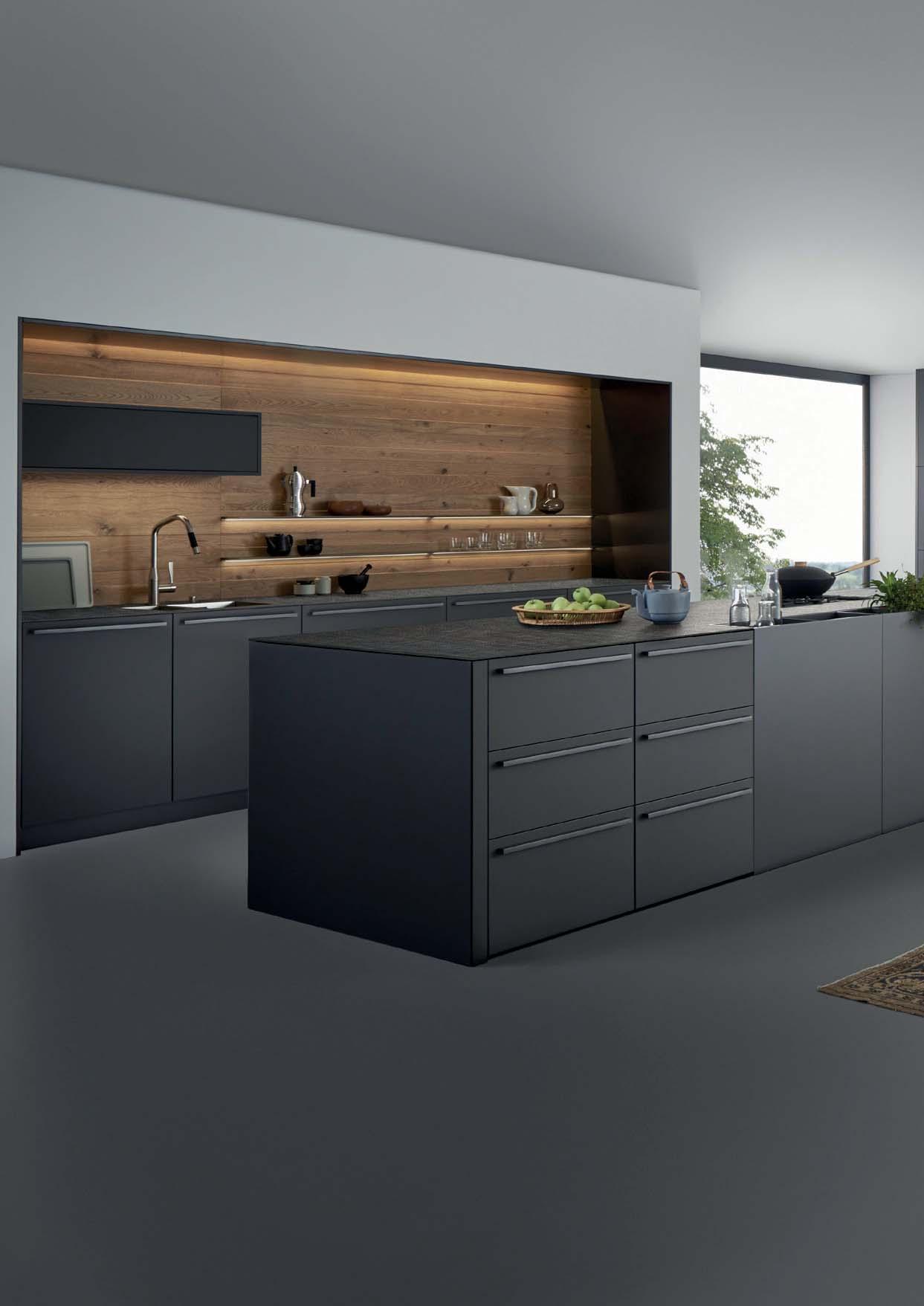
Architektur und Städtebau wirken sie puristisch und authentisch. Werden sie für den Innenraum veredelt, klingt neben der ursprünglichen Qualität – nennen wir sie „rough industrial“ – noch eine weitere
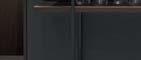
Eine Küche wie diese ist als solche kaum mehr wahrnehmbar, sie ist vollständig mit dem wohnlichen Umfeld verschmolzen.
Steel surfaces are fascinating: in architecture and urban planning they have a puristic, auoriginal quality – best summed up as „rough industrial“ – is embellished with another characteristic: elegance and sophistication. A kitchen like this is no longer recognisable as such as it is completely merged with the homely environment.
Les surfaces en acier exercent une fascination : dans l‘architecture et le développement urbain, elles forment une impression puriste et authentique. Anoblies pour l’utilisation intérieure, elles évoquent, outre leur propriété originale que nous appellerons « industrielle brute », une autre caractéristique : l’élégance
est à peine perceptible en tant que telle, elle s’intègre entièrement dans l‘espace de vie.
el ámbito de la arquitectura y el desarrollo urbanístico transmiten una imagen de pureza para su uso en espacios interiores, además de la calidad original (llamémosla «rough industrial»), adquieren otras dos caracterícomo esta apenas se percibe como tal: está perfectamente integrada en el entorno doméstico.
Stalen oppervlakken zijn fascinerend: In de architectuur en stedenbouw ogen ze puristisch en authentiek. Wanneer ze voor het interieur worden veredeld, klinkt er naast de oorspronkelijke kwaliteit – die we „rough industrial“ kunnen noemen – nog een andere
Een keuken als deze is als zodanig nauwelijks nog waarneembaar, hij is volledig versmolten met de woonomgeving.
59 STEEL | CLASSIC-FS | TOPOS
60
61 STEEL | CLASSIC-FS | TOPOS
VERO
Metallrahmentüren mit leicht getöntem Glas und integrierter Beleuchtung. Variantenreich planbar und in den Abmes-
stahl, Bronze dunkel, Stahl schwarz.
Metal-framed doors with slightly tinted glass and integrated lighting. Can be planned in a wide variety of ways and
colours: stainless steel, dark bronze, black steel.
62
VERO als Oberschrank, optional mit Glasfachböden VERO as a wall unit, optionally with glass shelves
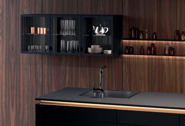
Lowboard mit VERO-Schränken in der Ausführung mit Rahmen in Edelstahl Lowboard with VERO units with a frame in stainless steel
Lichtsystem, das der Höhe des Schrankes folgt und den Innenraum gleichförmig beleuchtet. Lighting system that follows the height of the unit and uniformly illuminates the interior
63 VERO
64
Stahl hat seine eigene Faszination. Als Werkstoff dieser Küche gleicht er einem dunkel ausgeglühten Stahlblech mit spezielles Oxidationsverfahren erzeugt die für jede Front einzigartige Bildstruktur. Eindruck von Tiefe. Zugleich steckt in ihr etwas Archaisches: die Idee des handgefertigten Unikats.
Steel has a fascination all of its own. As the material used in this kitchen, it resembles darkly annealed sheet steel with slight suggestions of rust. A special oxidation procedure generates a structure
and gives an impression of depth. At the same time there is something archaic about it: the idea of having a kitchen which has been hand-crafted and is thus one of a kind.
L‘acier exerce une fascination propre. En tant que matériau pour cette cuisine, il ressemble à une tôle d‘acier recuite foncée, avec une légère patine de rouille par endroits. Grâce à un processus d‘oxydation spécial, chaque façade a une apparence l‘impression de profondeur. En même temps, elle a une touche archaïque : l‘idée de la pièce unique faite à la main.
El acero tiene una fascinación propia. En esta cocina tiene el aspecto de una chapa de acero oscurecida por recocido con una ligera pátina de óxido en algunos puntos. Un procedimiento de oxidación especial permite lograr una textura única en cada -
sión de profundidad y, al mismo tiempo, introduce una imagen arcaica: la idea de la pieza única elaborada a mano.
Staal heeft een speciale fascinatie. Als materiaal voor deze keuken lijkt het op donker uitgegloeid plaatstaal met hier en daar wat vliegroestplekjes. Door een speciaal oxidatieproces ontstaat op elk front een unieke
geeft een indruk van diepte. Tegelijkertijd heeft het iets archaïsch: het idee van een met de hand vervaardigd unicaat.
SPECIAL CHARACTERISTICS
65 STEEL | CLASSIC-FS | TOPOS STEEL | CLASSIC-FS | TOPOS
66
SENSE OF SPACE 67 BONDI | XYLO
68
FINE ARRANGEMENTS
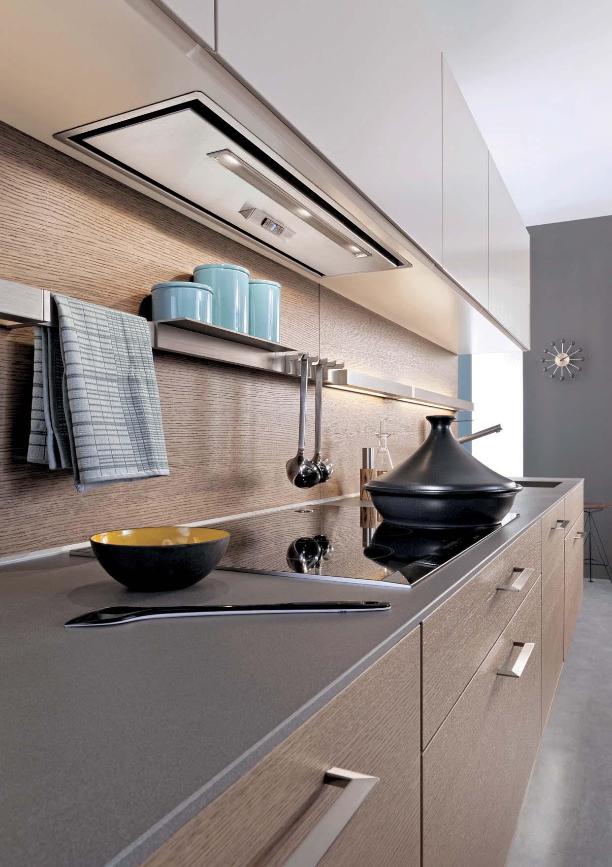
Eine ruhige, zum Wohnen offene Küchenarchitektur sowie perfekte, funktionale Detailösungen – das sind die Eigenschaften, die eine LEICHT Küche charakterisieren. Im Wechsel mit offenen Flächen entsteht eine wohnliche Atmosphäre, ebenso durch den gekonnten Materialmix: elegante, matt strukturiertem Echtholz.
A calm kitchen architecture open to the living area as well as perfect functional details – these are the characteristics of a LEICHT kitchen. A homely atmosphere is the result of an interchange with open spaces and the brilliant combination of materials: elegant, matt lacquered surfaces contrast
Une architecture calme et ouverte sur l’espace à vivre ainsi que des solutions fonctionnelles et parfaites jusque dans les moindres détails – telles sont les caractéristiques d’une cuisine LEICHT. Une atmosphère confortable naît en contraste avec les surfaces ouvertes, notamment grâce à un savant mélange de matériaux : des surfaces élégantes, laquées mat, contrastent avec le bois véritable à la structure
Las cocinas LEICHT se caracterizan por una arquitectura abierta en un ambiente relajado y acogedor que se combina con soluciones muy cuidadas, funcionales y perfectas. El ambiente hogareño se consigue alternando espacios abiertos, así como con la mezelegantes pintadas en mate que contrastan con madera noble con un acabado exquisito.
Een rustige, richting woongedeelte open keukenarchitectuur evenals perfecte, functionele detailoplossingen – dat zijn de eigenschappen die kenmerkend zijn voor een LEICHT keuken. Onderbroken door open vlakken ontstaat een behaaglijke sfeer, net als door de geslaagde kleurenmix: elegante, mat gelakte oppervlakken contrasteren met
69 BONDI | XYLO
LIVING SPACE
Edles Mattweiß in Harmonie mit Echtholz und durchgängige Fronten – die Küche verbirgt ihre gesamte Komplexität hinter einer Insel und bodentiefen Schränken, deren Frontgestaltung variabel ist: offene Regale können ebenso integriert werden wie eine komfortable, dezent beleuchtete Sitznische.
Elegant matt white in harmony with genuine wood and continuous fronts: the kitchen conceals its entire complexity behind a calm exterior consisting of an island and
design of which can vary: open shelving can be integrated as can a comfortable, warmly lit seating alcove
Noblesse du blanc mat en harmonie avec le bois véritable et façades d’un seul tenant – la cuisine dissimule sa complexité sous une apparence calme, avec un îlot et des armoires prolongées jusqu’au
: il est possible d’y intégrer aussi bien des étagères ouvertes qu’un coin pour s’asseoir, confortable et bien éclairé.
La cocina, con un precioso blanco mate a juego con la madera noble y los frontales, oculta toda su complejidad tras un exterior relajado compuesto por una isla y armarios que terminan en el suelo, además de un diseño frontal con múltiples posibilidades que permite integrar estanterías abiertas, o bien un coqueto rincón iluminado al detalle para sentarse cómodamente.
Edel mat wit in harmonie met echt hout en doorlopende fronten – de keuken verbergt zijn gehele complexiteit achter een rustig uiterlijk, bestaande uit een eiland en tot de vloer reikende kasten met een variabele frontvormgeving: Open kasten kunnen net zo worden geïntegreerd als een comfortabele, decent verlichte nis.
70
71 BONDI | XYLO
72
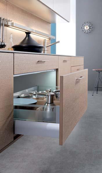
STORAGE PAR EXCELLENCE
Was sich von außen als großzügige Schrankfront darstellt, ist ein begehbarer Raum: ein kompakter Kubus, der sich durch eine Schwenktür betreten lässt. So ist es nur ein kleiner Schritt von der repräsentativen Küche hinein in den Funktionsraum, der vielfältig nutzbaren Stauraum bietet und sich individuell anpassen lässt.
What looks to be a spacious unit front from the outside is in fact a walk-in room: a compact cube that can be entered through a swing door. This makes it just one small step from the representative kitchen into the functional room offering storage space that can be used in a number of ways and adapted to suit individual requirements.
Ce qui semble de l’extérieur être une façade d’armoire aux dimensions généreuses est en fait un espace accessible : un cube compact dans lequel on entre grâce à une porte battante. Un seul pas sépare ainsi la cuisine représentative de l’espace fonctionnel qui offre un vaste espace de rangement et peut être adapté individuellement.
Lo que desde fuera parece ser un amplio frente de armarios, es en realidad una galería: un cubo compacto al que se puede acceder por una puerta oscilante. Se trata simplemente de un pequeño acceso desde la propia cocina hacia el interior del espacio funcional, que cuenta con una zona de almacenamiento para múltiples usos que se puede adaptar en función de las necesidades.
Wat zich van buiten als een royaal kastenfront presenteert, is een begaanbare ruimte: een kubus die via een zwenkdeur kan worden betreden. Zo is het slechts een kleine stap van de representatieve keuken naar het interieur van de functionele ruimte die veelzijdig te gebruiken opbergruimte biedt en zich individueel laat aanpassen.
73 BONDI | XYLO
74
Seine Wärme und lebendige Struktur, seine Dauerhaftigkeit und Natürlichkeit, all das macht Holz im Interieur so begehrenswert. Es wird mit den Jahren noch schöner. Und es erzählt eine persönliche Geschichte. Im Innenausbau eröffnen sich unendliche Möglichkeiten, das Holz so verwenden, dass es die eigenen Werte und Individualität vollkommen zur Geltung bringt.
Its warmth and lively structure, its perpetuity and naturalness, all this makes wood so desirable in the interior. And it becomes even more attractive over the years. Telling a personal story. Indoors there is no end to the possibilities of using wood to ensure its intrinsic values and individuality are shown off to their best advantage.
Sa chaleur et sa structure vivante, sa durabilité et son naturel font du bois un matériau convoité dans les intérieurs. Et il embelpersonnelle. L’aménagement intérieur offre manière à ce qu’il exprime pleinement les valeurs et la personnalité de chacun.
La madera en el interior resulta muy apetecible por su estructura cálida y viva, su durabilidad y su carácter natural. Con los años su belleza se acrecienta y narra una historia personal. El empleo de la madera abre tantas posibilidades para el diseño de interiores que acentúa en su totalidad la individualidad y los valores propios.
Zijn warmte en levendige structuur, zijn duurzaamheid en natuurlijkheid, dit alles maakt hout in het interieur zo begerenswaardig. Het wordt door de jaren heen nog mooier. En het vertelt een persoonlijk verhaal. In de interieurinrichting openen zich eindeloze mogelijkheden om het hout zo te gebruiken dat het de eigen waarden en individualiteit volledig tot hun recht brengt.
PASSION FOR WOOD
75 BONDI | XYLO
76
ELEGANCE AND HARMONY 77 BONDI | ORLANDO
78
FINE ARRANGEMENTS
Im spannungsreichen Zusammenspiel von Hell und Dunkel entsteht eine langlebige und allgemeingültige Küchenarchitektur, ebenso in der klaren räumlichen Komposition von Hochschrank, Insel und offenem Regal. Einen innovativen Impuls für die hochwertige, wohnliche Planung setzt die Farbnuance Olivgrau in Kombination mit fein strukturierter Bergrobinie.
An exciting mix of light and dark results in a durable, traditional kitchen architeccomposition of tall unit, island and open shelving. Olive grey in combination with innovative impulse in high-grade, homely planning.
Le jeu dynamique entre les couleurs claires et sombres ainsi que l’ensemble spatial épuré composé des armoires hautes, de l’îlot et des étagères ouvertes créent une architecture de cuisine durable et universelle. Combinée au robinier de gris olive donne une impulsion innovante gamme.
Por su fascinante combinación de tonos claros y oscuros y su clara composición espacial —formada por un armario alto, una isla y una estantería abierta— esta arquitectura de cocina es perdurable y de validez universal. El tono gris oliva, combinado con la madera de acacia de
acogedora y de gran calidad.
In het spanningsrijke samenspel van licht en donker ontstaat een duurzame en algemeen geaccepteerde keukenarchitectuur, net als in de ruimtelijk heldere compositie van hoge kast, eiland en open wandrek. Een innovatief impuls voor de hoogwaardige, behaaglijke planning geeft de kleurnuance olijfgrijs in combinatie met
79 BONDI | ORLANDO
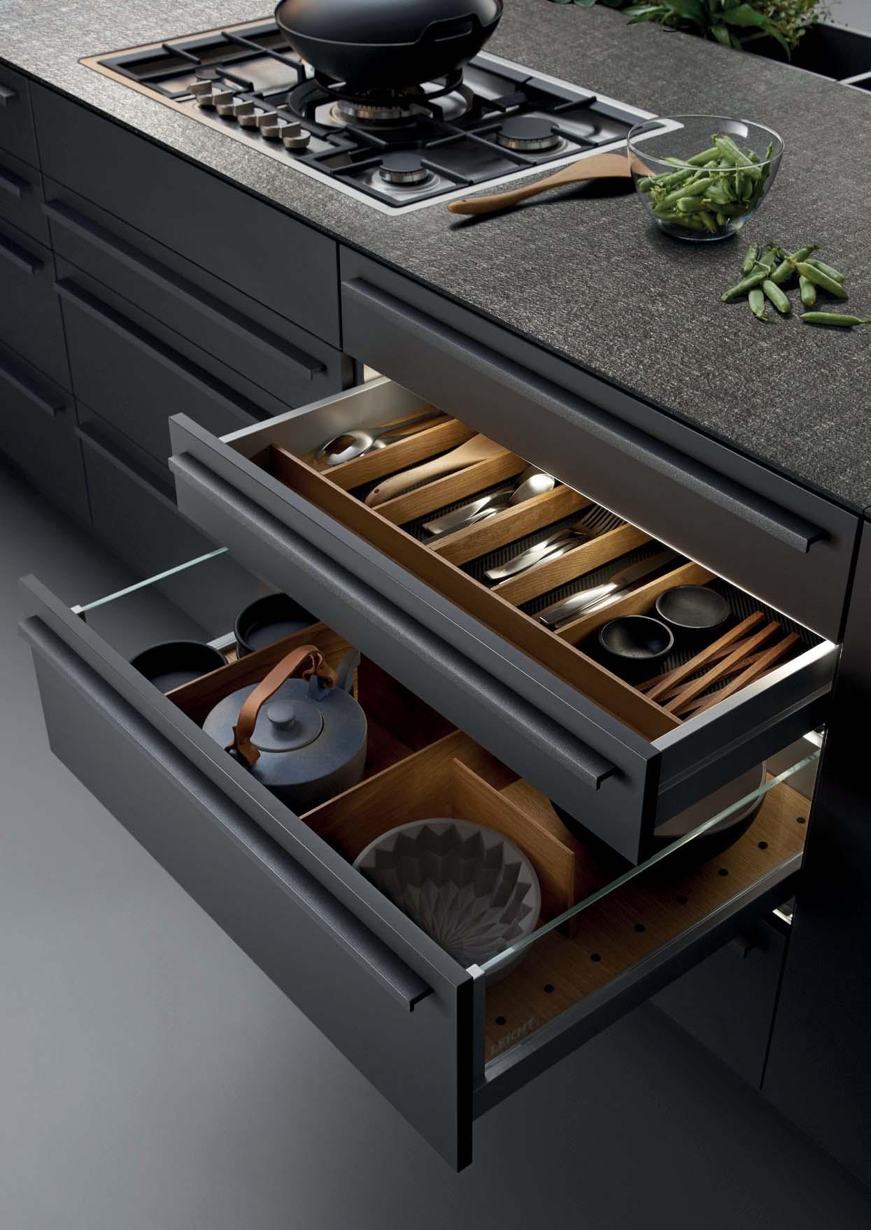
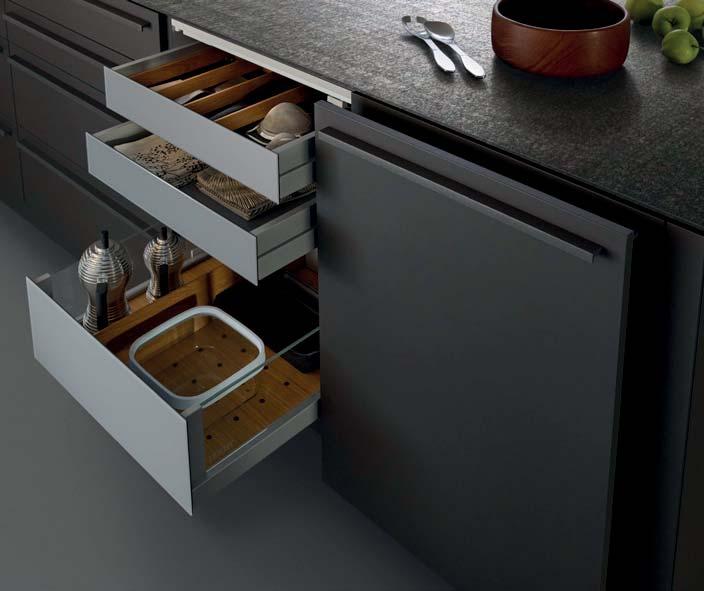
PERFECT DETAILED SOLUTIONS
hige Küchenarchitektur, die offene Küche wirkt perfekt aufgeräumt und durchkomponiert. Beim Öffnen zeigt sich die hohe Funktionalität. Elegante und hochwertig verarbeitete Auszüge bieten reichlich Raum für Staugut und sind auch geöffnet ein ästhetischer Anblick.
Handle-less fronts shape the clear and calm kitchen architecture; the open kitchen looks perfectly tidy and orchestrated. Its great functionality is revealed on
pullouts offer plenty of storage space for kitchen utensils and are lovely to look at even when open.
Des façades sans poignées caractérisent l’architecture claire et sobre, la cuisine ouverte semble parfaitement rangée et élaborée jusque dans les moindres détails. Le haut niveau de fonctionnalité se révèle après l’ouverture. Des coulissants
les ustensiles et offrent une apparence esthétique même à l’état ouvert.
Los frentes sin tiradores crean una arquitectura clara y serena; la cocina abierta transmite una sensación de orden y equilibrio. Al abrir puertas y cajones es cuando se aprecia su gran funcionalidad. Los elementos extraíbles, elegantes y de gran calidad, ofrecen espacio para todo tipo de utensilios y artículos y resultan sumamente atractivos incluso cuando están abiertos.
Greeploze fronten bepalen de heldere en rustige keukenarchitectuur, de open keuken oogt perfect opgeruimd en doorgecomponeerd. Bij het openen komt de hoge functionaliteit tot uiting. Elegante en hoogwaardig afgewerkte uittrekelementen bieden volop ruimte voor keukengerei en zien er ook in geopende toestand esthetisch uit.
80
81 BONDI | ORLANDO
82
83 BONDI | ORLANDO
84
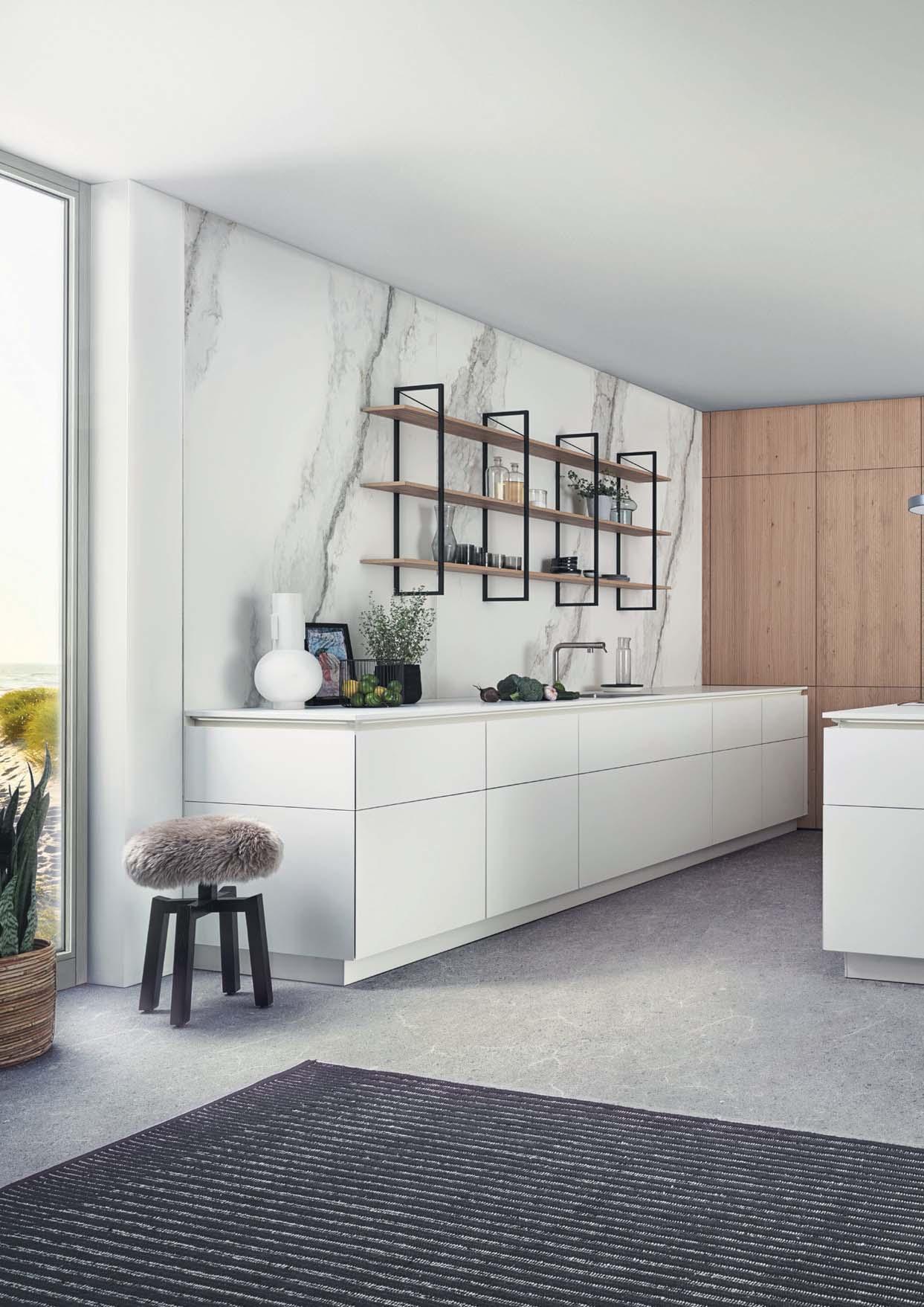
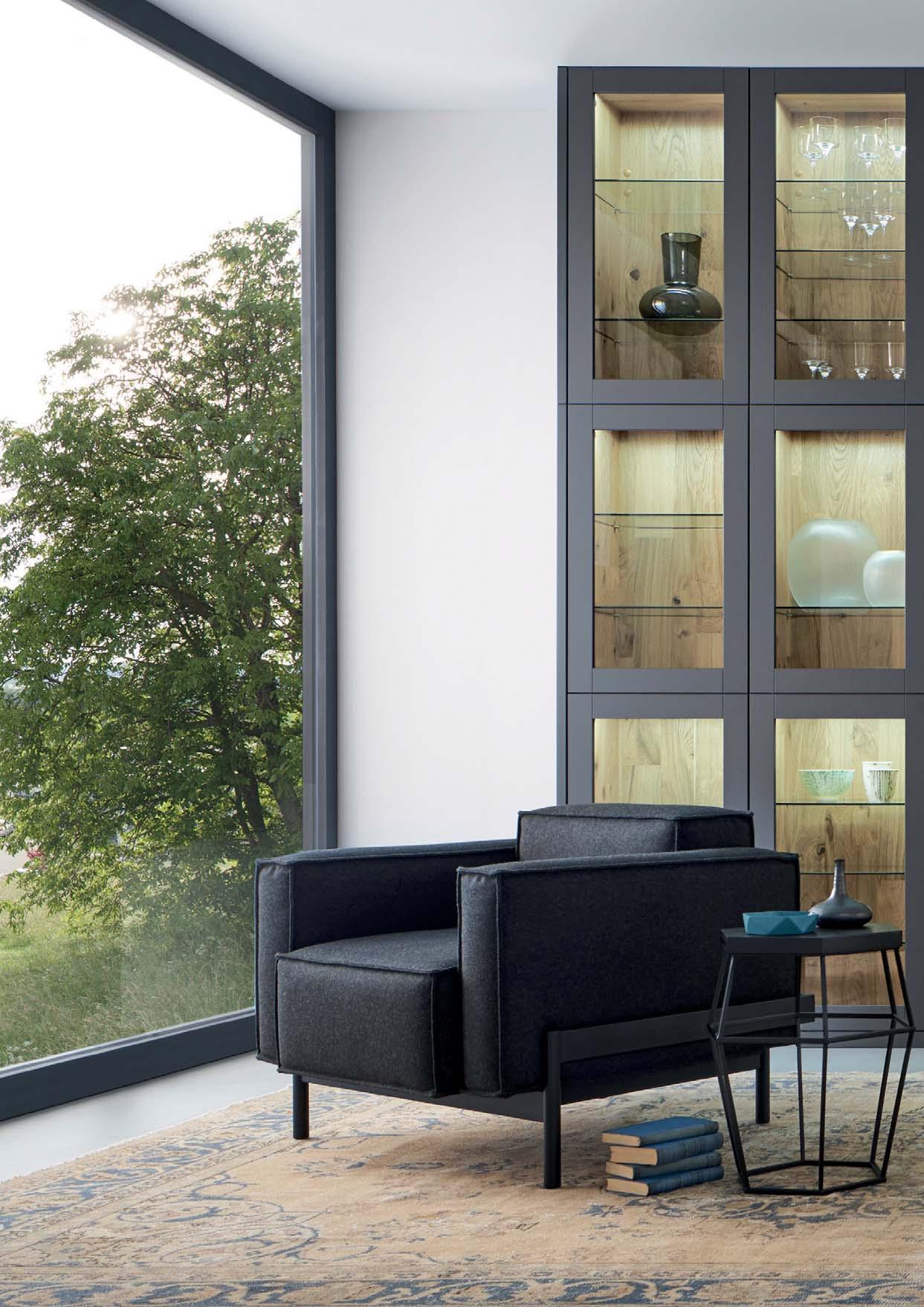
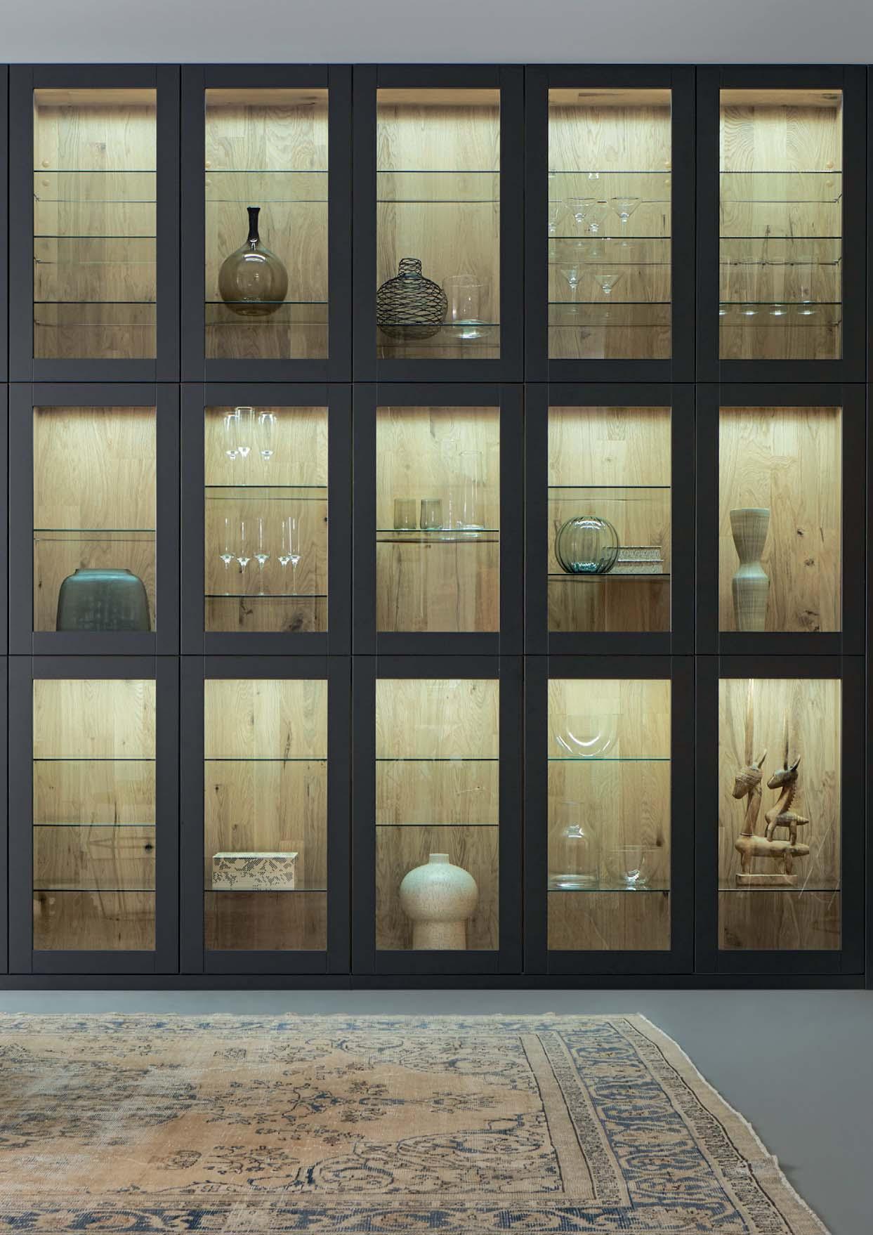
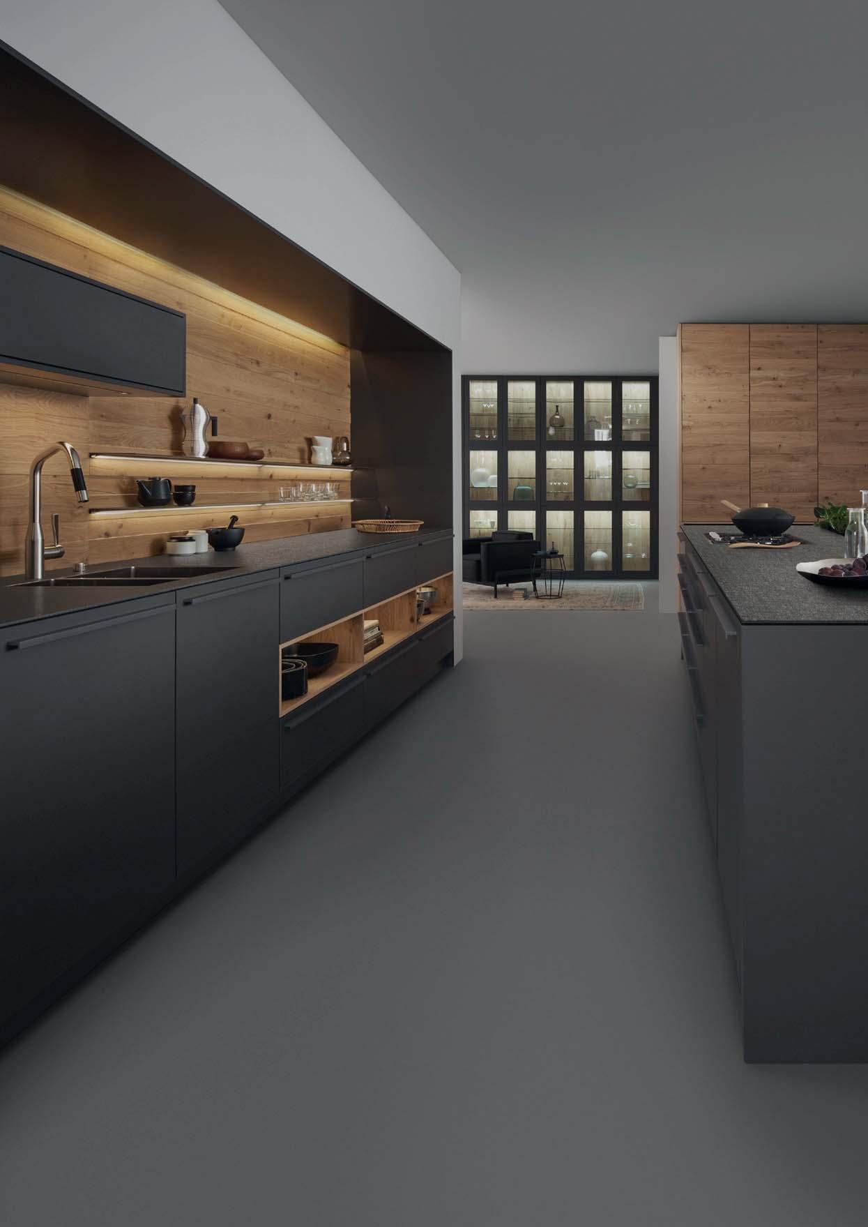
BEAUTY AND INDIVIDUALITY
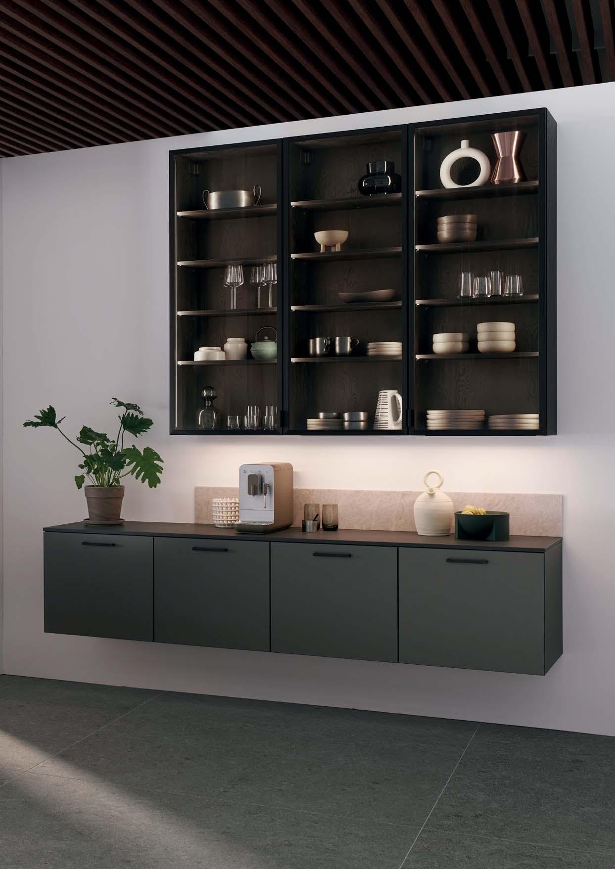
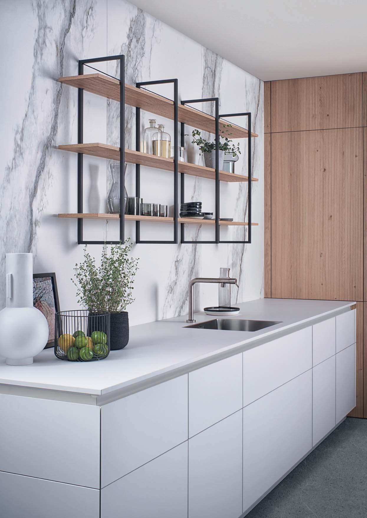
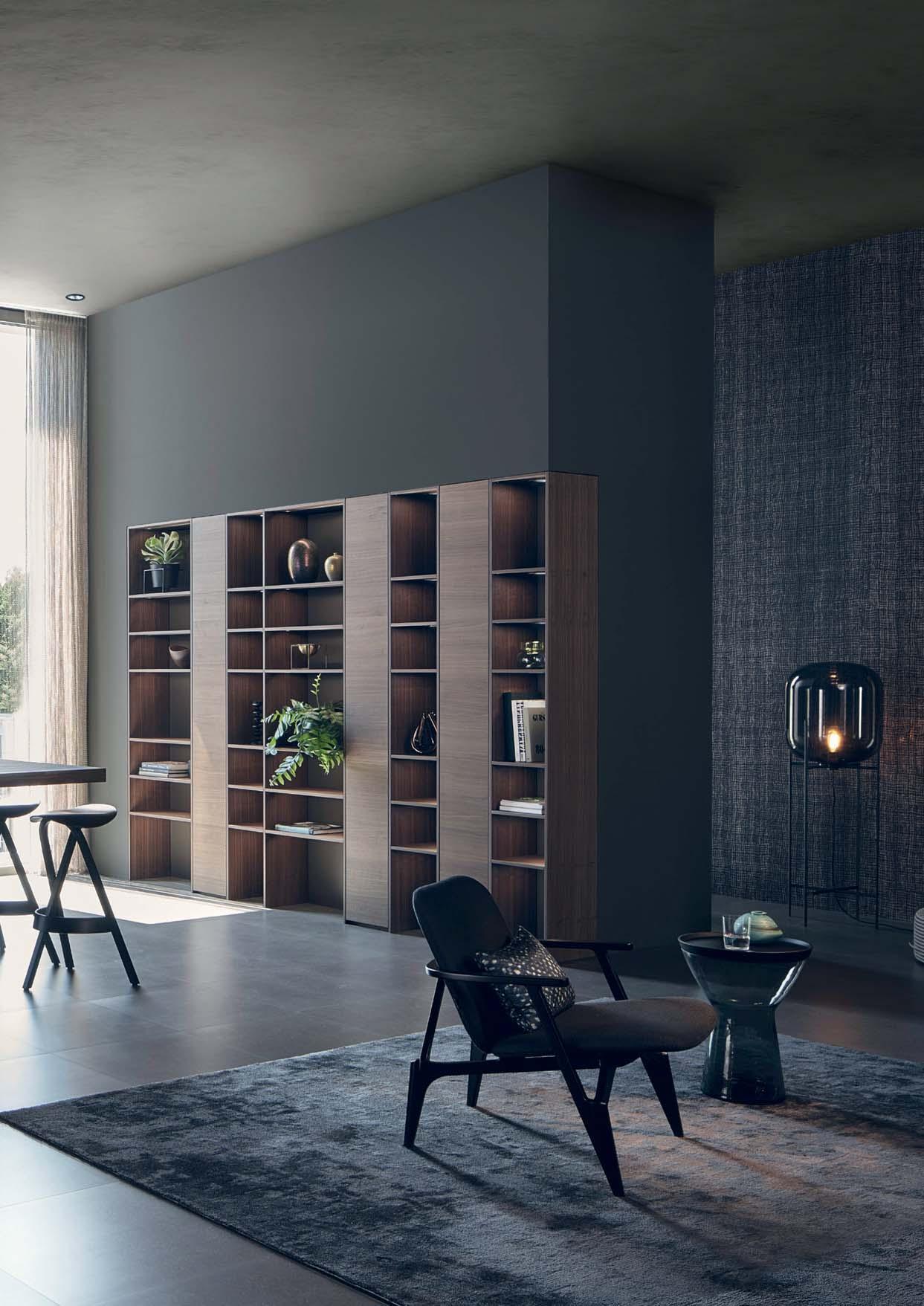
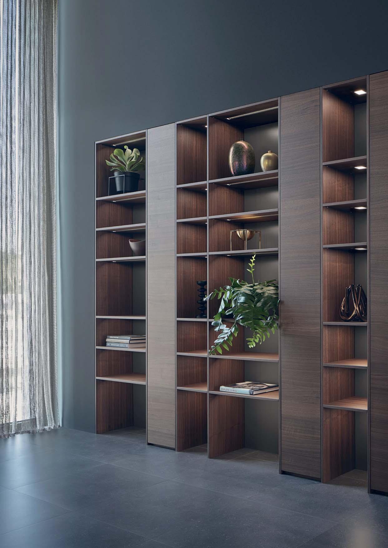
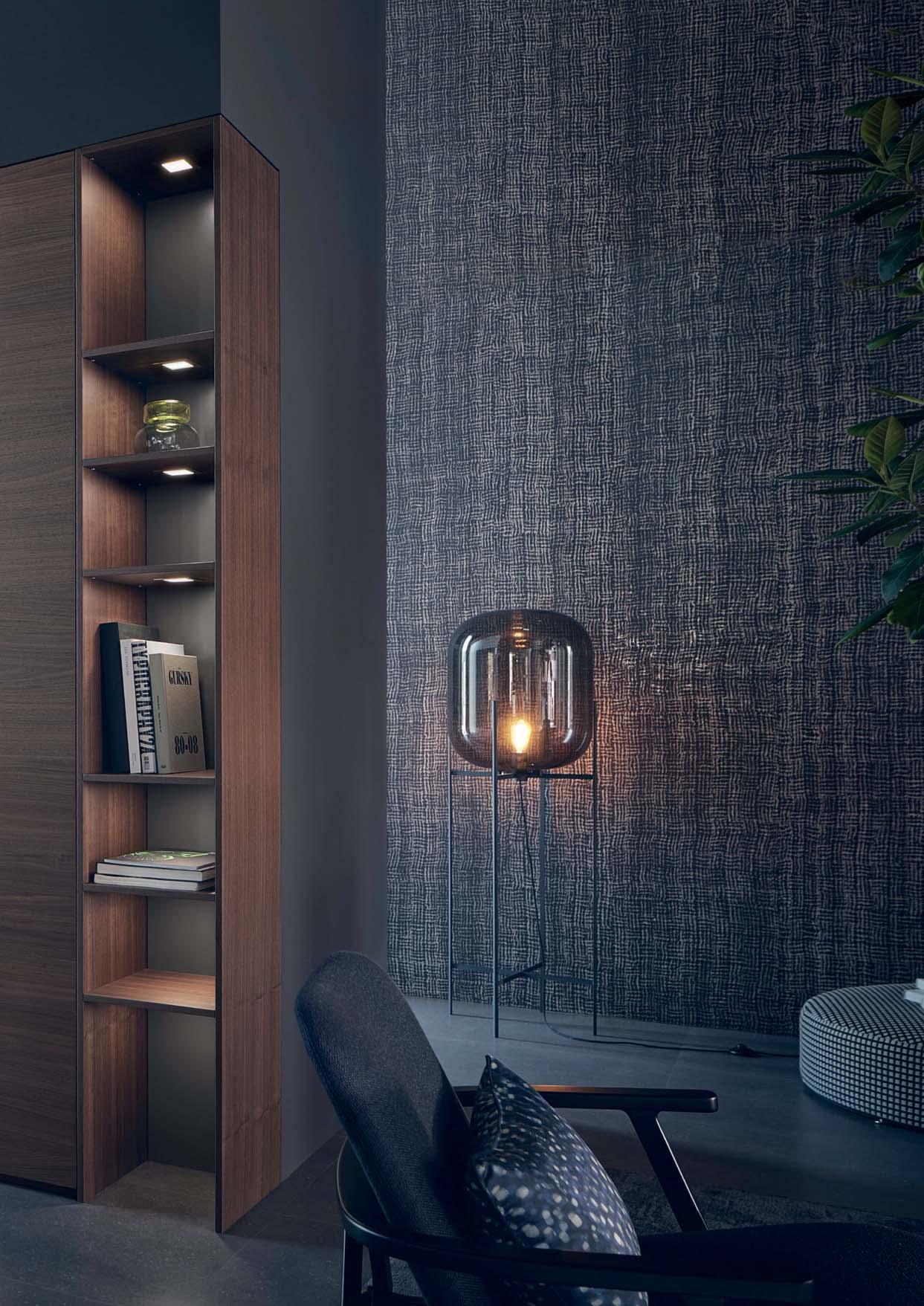
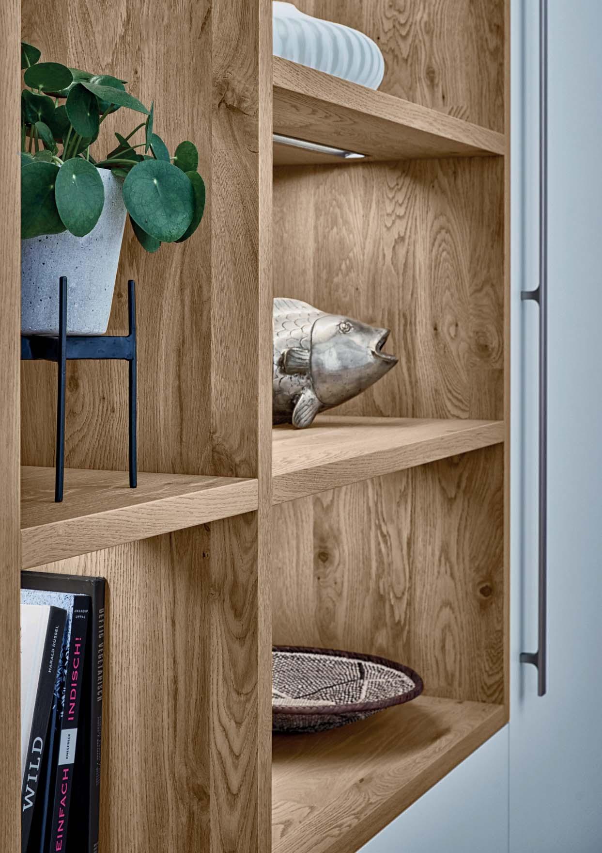
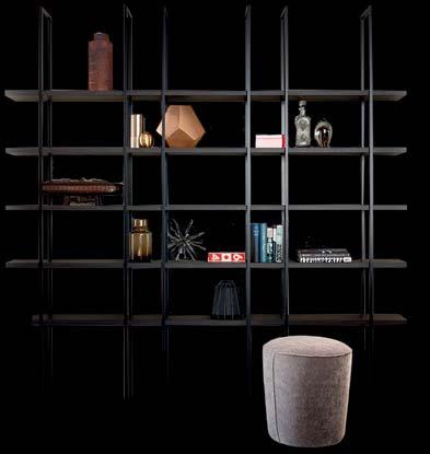
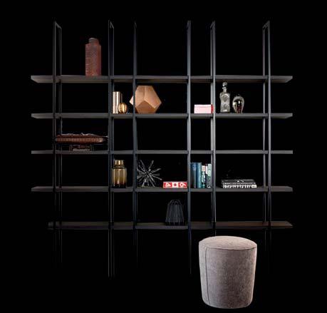
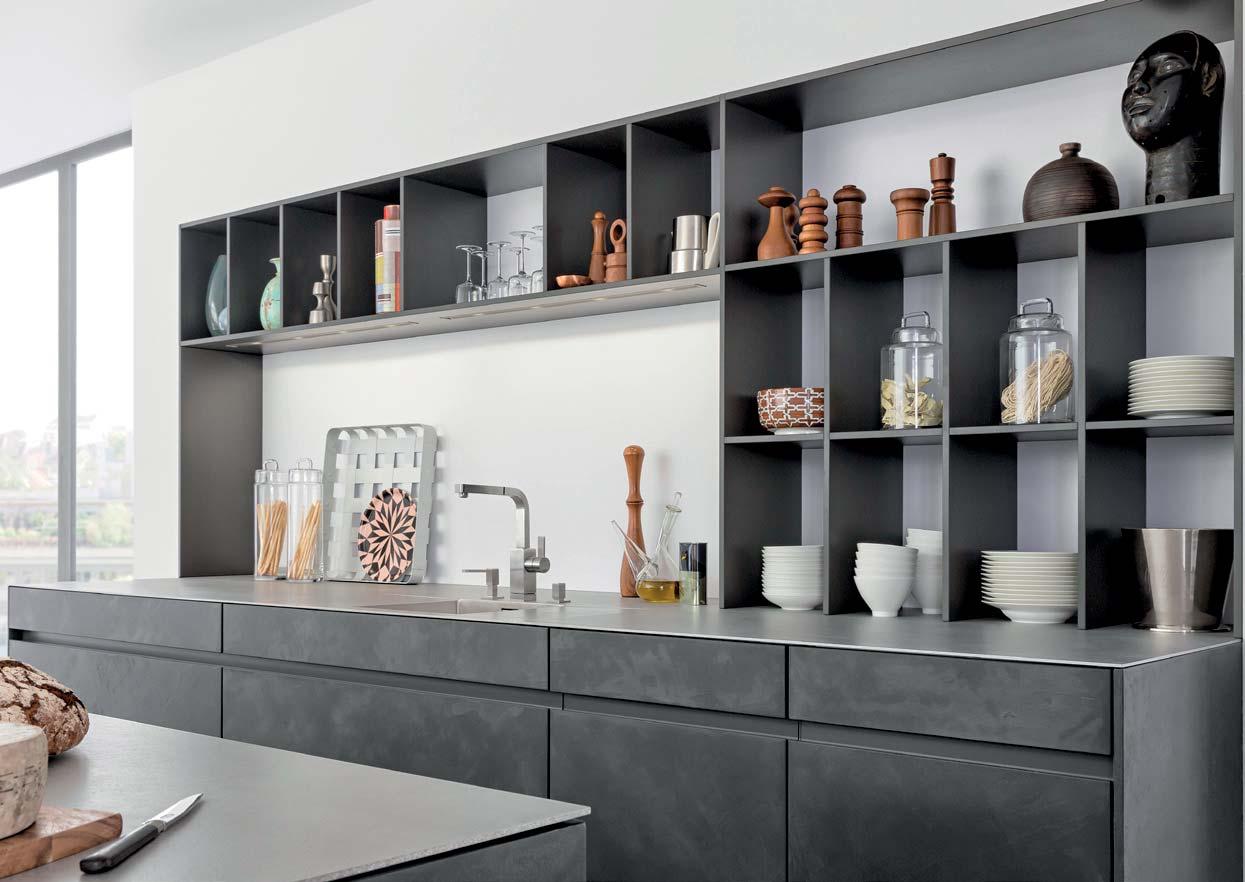
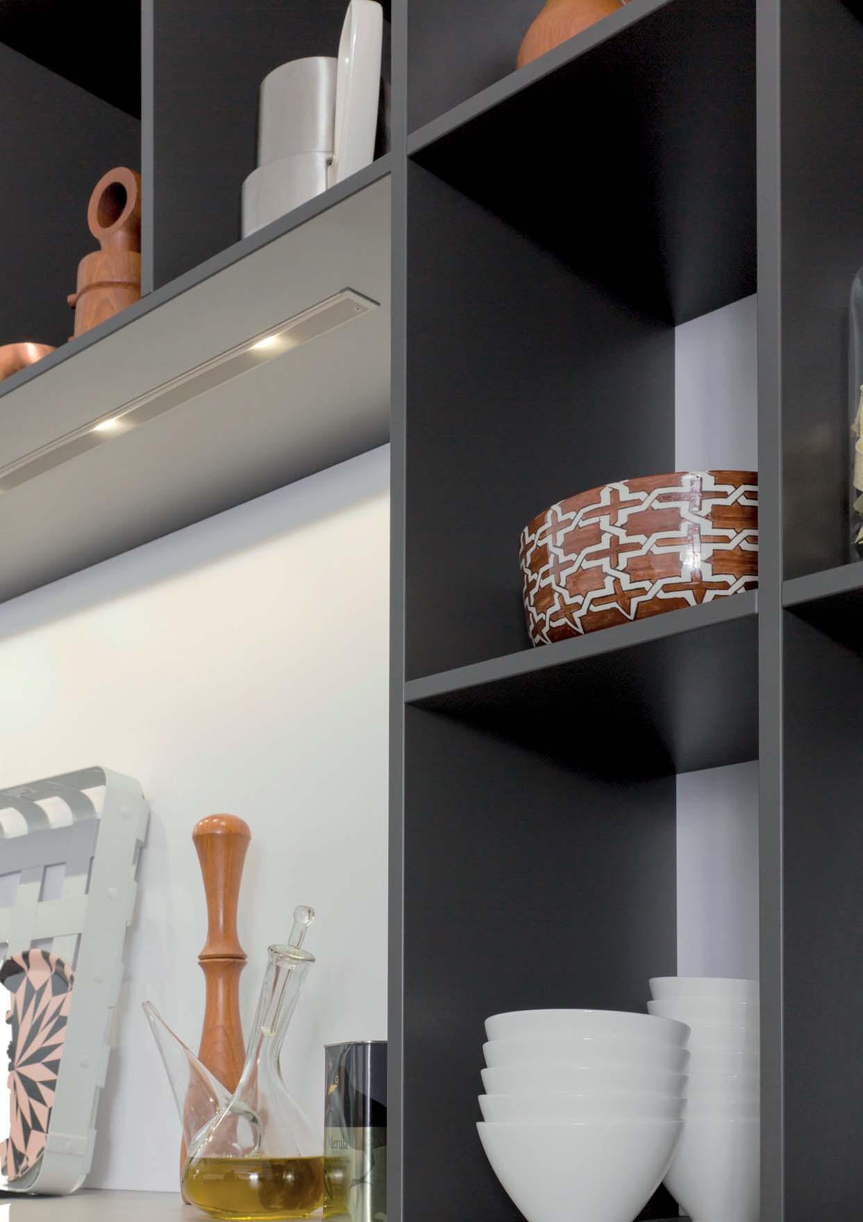
Offen und wohnlich mit viel Raum für Accessoires. Regale sind ein elementarer Baustein in der modernen Küchenarchitektur – sie liegen im Trend und sind zugleich zeitlos elegant. Regale erlauben es, die Küche als individuellen, zum Wohnen offenen Raum zu planen und in einen wirkungsvollen Kontrast zu geschlossenen Flächen zu setzen. Als System in Maß und Material nach persönlichen Vorgaben planbar.
Open and homely with plenty of room for accessories. Shelving is an elementary element of modern kitchen architecture – it is both fashionable and yet timelessly elegant. Shelving makes it possible to plan kitchens as individual, open rooms which are part of the living area, and to make an effective contrast to closed surfaces and areas. As a system, shelving can be planned in size and material to suit personal requirements.
Ouvertes et conviviales avec beaucoup d’espace pour les accessoires. Les étagères sont une composante élémentaire dans l’architecture de cuisine moderne – elles sont à la fois tendance et d’une élégance cuisine comme un espace individuel, ouvert sur l’espace de vie, et de former un contraste particulier avec les surfaces fermées. Elles personnelles en termes de mesures et de matériaux.
Abiertas y acogedoras, con mucho espacio para accesorios. Las estanterías son un elemento fundamental de la cocina moderna: ofrecen una elegancia atemporal y, además, están de moda. Las estanterías permiten plaabierto en el que vivir y ayudan a crear un Los materiales y medidas se pueden elegir según las necesidades personales.
Open en behaaglijke met veel ruimte voor accessoires. Open wandrekken zijn elementaire bouwstenen in de moderne keukenarchitectuur – ze zijn de actuele trend en tegelijkertijd tijdloos elegant. Met open kasten en wandrekken is het mogelijk de keuken als individuele, richting woongedeelte open ruimte te plannen en een effectvol contrast te plaatsen ten opzichte van gesloten oppervlakken. Als systeem qua afmetingen en materiaal volgens persoonlijke wensen planbaar.
85 BONDI | ORLANDO
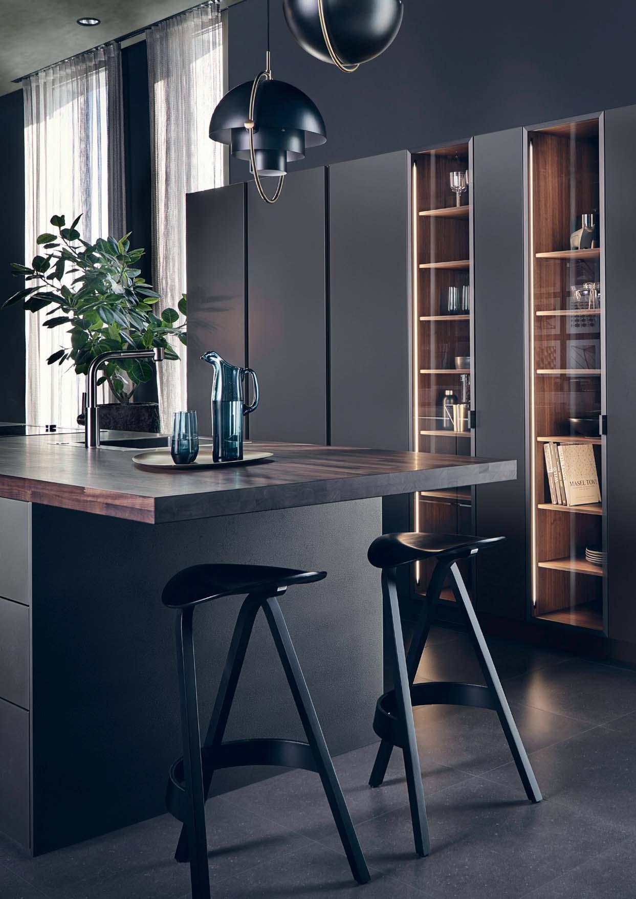
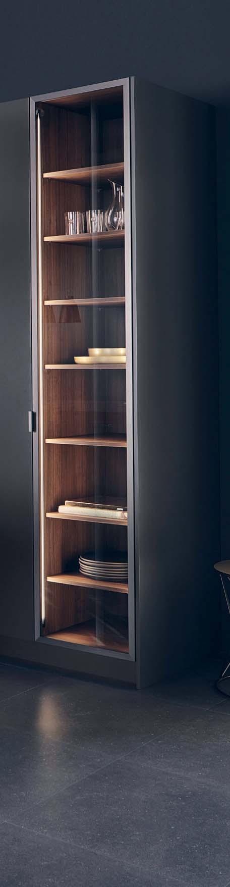
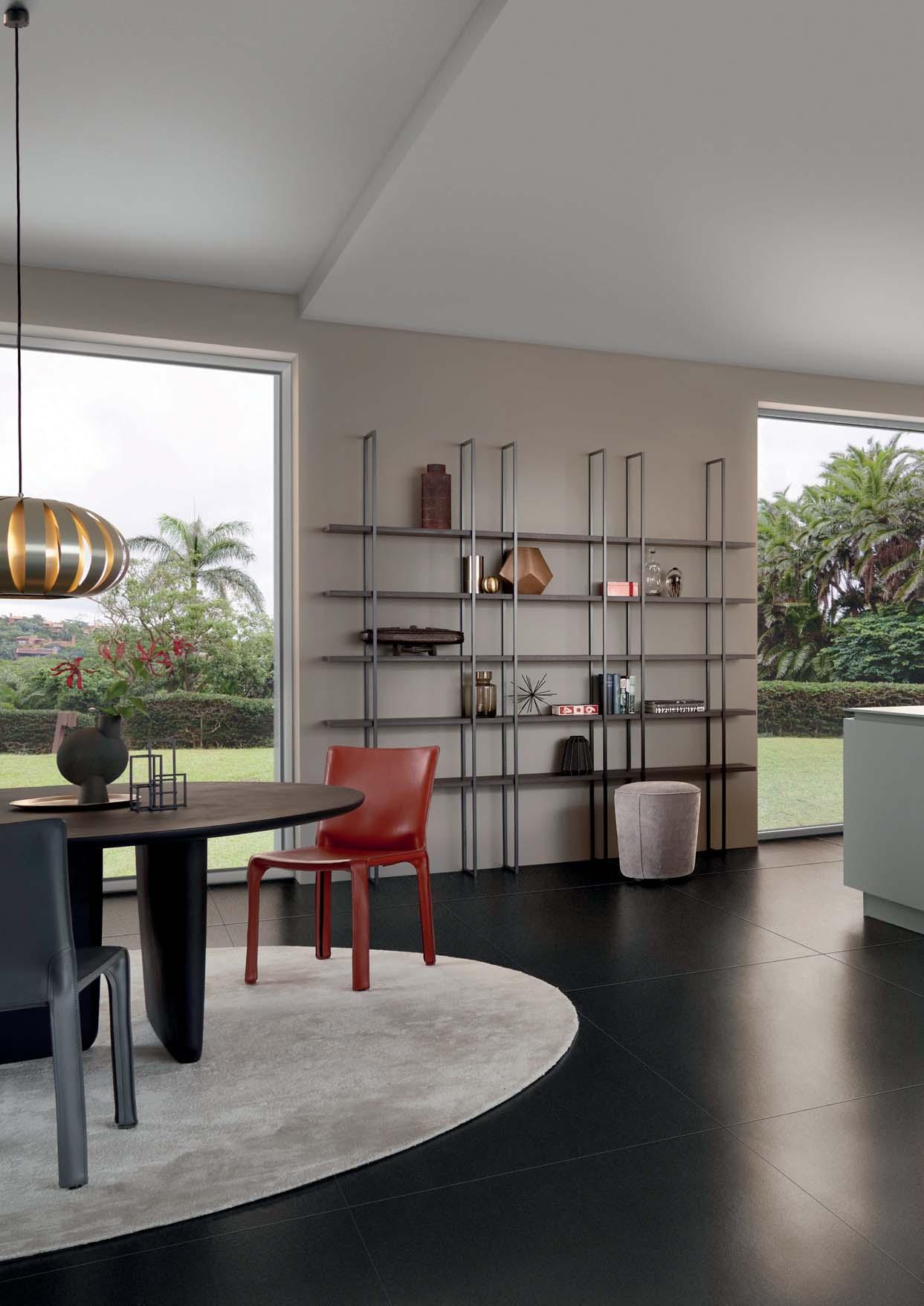
FIOS
Freely plannable shelving system with ted in several colours. Shelving available surfaces.

86
FIOS Regal als wandhängende Lösung FIOS shelving system as a wall-mounted solution
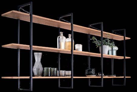
Die Doppelung der Rahmen erzeugt eine asymmetrische, spannungsvolle Gliederung The doubling of the frames creates an asymmetrical, exciting structure


87 FIOS
FIOS bodenstehend, als dekoratives Element an einer Kücheninsel
88
Das Gefühl von Harmonie und Lebendigkeit entsteht, wenn ausgesuchte Materialien und Farben zusammenspielen, sich ergänzen und einander hervorheben. Dunkles, feinstrukturiertes Holz und natürliche Anthrazit- oder Grautöne vermitteln im Zusammenklang nicht nur vollkommene Harmonie, sondern auch zeitlose Schönheit.
A feeling of harmony and vitality is guaranteed when select materials and colours interact, when they complement andtured wood and natural anthracite or grey tones exude not only perfect harmony, but also timeless beauty.
La sensation d’harmonie et de vivacité résulte de l’interaction entre des matériaux et des couleurs sélectionnés avec soin qui se complètent et se mettent mutuellement en valeur. Par leur symbiose, le bois naturelles d’anthracite et de gris créent non seulement une harmonie parfaite, mais encore une beauté intemporelle.
La sensación de armonía y vivacidad surge cuando los materiales y colores seleccionados interactúan, se complementan y se realzan unos a otros. La madera oscura delicadamente texturizada y los tonos grises o antracita naturales no solo transmiten una perfecta sintonía, sino también una belleza atemporal.
Het gevoel van harmonie en levendigheid ontstaat als zorgvuldig geselecteerde materialen en kleuren worden gecombineerd, elkaar aanvullen en elkaar
hout en natuurlijke antraciet- of grijstinten ogen in samenklank niet alleen volkomen harmonisch maar creëren ook een gevoel van tijdloze schoonheid.
PURE ATMOSPHERE
89 BONDI | ORLANDO
90
Wohngebäude | Karlsruhe
Residential Building | Karlsruhe
Deutschland Germany

architekten
baurmann.dürr
PROJECT
PROJECT
94
Erdgeschoss | Ground Floor
Ansicht Nord | Elevation North
Ansicht Süd | Elevation South
95 PROJECT
96
QUALITY AND TIMELESSNESS 97 CLASSIC-FS | VALAIS
98
Zeitlose Eleganz, wohnliche Wärme und handwerkliche Perfektion strahlt diese klassisch in Weiß gehaltene Küche aus. Das fein strukturierte Holz steht im Mittelpunkt und wird variantenreich durchgespielt: Als dezente Massivholzkante, bei der vielfältigen Innenausstattung und als Übergang zum Wohnen.
This kitchen, all in white, conveys a sense of timeless elegance, homely warmth and perfect craftsmanship. The focus is on the number of different ways: as a delicate soand as a top quality wall panel which acts
Déclinée en blanc, cette cuisine classique dégage une élégance intemporelle, une chaleur conviviale et la perfection de joue un rôle central et est décliné dans de nombreuses variations : en tant que chant discret en bois massif, au niveau des divers équipements intérieurs et comme panneau mural de haute qualité dans la
Esta cocina, diseñada en un blanco clásico, es elegante e intemporal, cálida y hogareña, e irradia perfección artesala protagonista y se utiliza en múltiples variantes: en los discretos cantos de madera maciza, en el versátil equipamiento interior y en el bello panel mural que ayuda de la vivienda.
Deze klassiek in wit gehouden keuken straalt tijdloze elegantie, behaaglijke warmte en ambachtelijke perfectie uit.
middelpunt en wordt in talrijke varianten toegepast: als decente massief houten kant, bij de veelzijdige interieur-indeling en als hoogwaardig wandpaneel op de vloeiende overgang naar het woongedeelte.
MASTERPIECE
99 CLASSIC-FS | VALAIS
100
101 CLASSIC-FS | VALAIS
AUTHENTIC AND DURABLE
Die Küche ist ein „Meisterstück“: langlebig, solide, authentisch. Beim Öffnen der ruhigen, Kante aus fein strukturierter Eiche sichtbar, die dem Programm viel Emotionalität und den Ausdruck handwerklicher Solidität verleiht. In perfekter Harmonie dazu stehen die zeitlosen Fronten in Mattweiß.
The kitchen is a ‚masterpiece‘: durable, solid, authentic. When you open the calm, handle-less fronts, a high-grade edge made
an expression of solid craftsmanship which lends the range considerable emotionality. In perfect harmony with this edge: the timeless fronts in matt white.
La cuisine est un « chef-d’œuvre » : durable, solide, authentique. L’ouverture des façades sans poignées à l’aspect épuré fait apparaî-
haute qualité qui confère au programme un caractère émotionnel et l‘expression d‘un savoir-faire artisanal solide. L’harmonie avec les façades intemporelles en blanc mat est parfaite.
Esta cocina es una «obra maestra»: duradera, sólida y auténtica. Cuando se abren los discretos frentes sin tiradores queda a
texturizado que transmite a esta gama una gran emotividad y expresa el primor de su manufactura. Los frentes atemporales de color blanco mate armonizan perfectamen-
te con el conjunto. De keuken is een „meesterstuk“: duurzaam, solide, authentiek. Bij het openen van de rustige, greeploze fronten wordt een
eikenhout zichtbaar, die het programma veel emotionaliteit en de expressie van ambachtelijke soliditeit verleent. Hiermee in perfecte harmonie: de tijdloze fronten in mat wit.
102
103 CLASSIC-FS | VALAIS
104
EMOTION AND INDIVIDUALITY
Accessoires geben der Küche eine wohnliche und persönliche Note. Filigrane Fachborde werden in die hochwertige Paneelwand integriert und individuell positioniert. Die in dieser Ansicht in dezentem Weiß gehaltenen Fachborde sind mit einer unauffällig integrierten LED-Lichtleiste ausgestattet – eine Detailösung mit großer Wirkung.
Accessories give a kitchen a homely and personal note: delicate shelves are integrated in the high-grade panel wall and positioned individually. The shelves shown here in delicate white are equipped with a cleverly integrated LED strip light –a detail with major impact.
Les accessoires donnent à la cuisine une touche chaleureuse et personnelle.
au panneau mural de haute qualité et positionnées individuellement. Réalisées ici en blanc discret, elles sont équipées d’une bande lumineuse LED discrètement intégrée – une solution de détail à l’effet maximal.
Los accesorios dan a la cocina un toque
se pueden colocar individualmente en la posición deseada. Estos estantes —aquí en un discreto color blanco— llevan una tira LED invisible incorporada: un detalle de gran efecto.
Accessoires geven de keuken een behaaglijk en persoonlijk cachet. Sierlijke legborden worden in de hoogwaardige paneelwand geïntegreerd en individueel geplaatst. De in deze opstelling in decent wit gehouden legborden zijn voorzien van een onopvallend geïntegreerde LEDlijnverlichting – een detailoplossing met groot effect.
105 CLASSIC-FS | VALAIS
106
Seine Wärme und lebendige Struktur, seine Dauerhaftigkeit und Natürlichkeit, all das macht das Material Holz im Interieur so begehrenswert. In Kombination mit sorgfältig ausgewählten, darauf abgestimmten Farbnuancen kommt der einzigartige Charakter von Holz, beispielsweise von strukturreicher Eiche, noch intensiver zum Ausdruck.
Its warmth and vital structure, its perpetuity and naturalness all make wood a desirable indoor feature. In combination
example a warm white to a natural olive grey, the unique character of the highly structured oak is expressed with even more intensity.
Sa chaleur et sa structure vivante, sa durabilité et son naturel font du bois un matériau fortement convoité dans les intérieurs. En combinaison avec des nuances de couleur sélectionnées avec soin, allant par exemple d’un blanc chaud à un gris olive naturel, le caractère unique du chêne structuré s’exprime d’une manière encore plus intense.
Calidez, durabilidad, naturalidad y una textura llena de vida: estas son las características que hacen de la madera un material tan apreciado para la decoración de interiores. El roble, con su carácter y su rica textura, cobra una expresión aún más intensa cuando se combina con tonos cuidadosamente elegidos, como un blanco cálido o un gris oliva natural.
Zijn warmte en de levendige structuur, zijn duurzaamheid en natuurlijkheid, dit alles maakt hout in het interieur zo begerenswaardig. In combinatie met zorgvuldig uitgekozen kleurnuances, bijvoorbeeld warm wit of een natuurlijk olijfgrijs, komt het unieke karakter van gestructureerd eikenhout nog intensiever tot expressie.
MEANINGFUL
CLASSIC-FS | VALAIS
Sikkens ON.00.78
108
PURE SOLIDITY 109 BONDI | VALAIS
110
Charaktervoll und gediegen wirkt diedrucksstarken Reliefstruktur. Im spannungsreichen Kontrast dazu die präzisen Konturen von Fronten und Arbeitsplatte. Inspirierend ist auch der Materialmix: Strukturiertes Holz mit seiner warmen Tonalität steht in bewusstem Gegensatz zur Anmutung des Mattlacks in kühlem Carbongrau.
The oak surface is characterful and digwhich is excitingly contrasted with the precise contours of fronts and worktop. The material mix too is inspiring: structured wood with its warm tonality stands in deliberate contrast to the matt lacquer in cool carbon grey.
Avec sa structure en relief expressive, la surface en bois de chêne se démarque par son caractère et son style. Les contours précis des façades et du plan de travail forment un contraste saisissant avec cette dernière. Le mélange des matériaux est lui aussi de nature inspirante : le ton chaud du bois structuré forme un contraste délibéré avec l‘élégance du vernis mat, décliné en gris carbone, au caractère plus froid.
expresiva estructura en relieve transmite una gran personalidad y elegancia. Los encimera contrastan con ello de forma muy expresiva. La mezcla de materiales también resulta inspiradora: la madera estructurada con su tonalidad cálida contrasta conscientemente con la apariencia del lacado mate en un gris carbón frío.
Karaktervol en behaaglijk oogt het eikenhouten oppervlak met de expressieve reliëfstructuur. In een spannend contrast hiermee de precieze contouren van fronten en werkblad. Inspirerend is ook de materiaalmix: gestructureerd hout met z‘n warme tonaliteit staat in bewuste tegenstelling tot de gevoelsindruk van de matte lak in koel carbongrijs.
PRECISION IN DETAIL
111 BONDI | VALAIS
INNER BEAUTY AND PERFECTION
Ruhige, durchgängige Fronten im Wechsel mit dezent beleuchteten Vitrinen und offenen Regalen. Es ist eine reine Freude, das Innenleben zu erkunden: Einsätze und Unterteilungen aus hochwertigem Echtholz erlauben es spielend leicht Ordnung zu halten. In Zusammenklang mit der carbongrauen Front ergibt sich bei geöffneten Auszügen ein facettenreiches Farb- und Materialspiel.
Calm, continuous fronts interchange with discreetly lit display cabinets and open shelving. Enjoy the sheer pleasure of investigating the interior: there is nothing easier than keeping things tidy with trays and dividers. In harmony with the carbon grey front, there is a wide-ranging interplay of colours and materials when the pullouts are open.
Des façades continues harmonieuses alternent avec des armoires en verre à l‘éclairage discret et des étagères ouvertes. La découverte de l‘aménagement intérieur est un vrai plaisir : grâce à des rangements et séparateurs en bois véritable de haute qualité, maintenir l‘ordre est un jeu d‘enfant. En association avec la façade gris carbone, les tiroirs ouverts créent un jeu de couleurs et de matériaux plein de nuances.
Frontales moderados y consistentes en alternancia con vitrinas discretamente iluminadas y estantes abiertos. Descubrir el mundo interior es un verdadero placer: los compartimentos y las subdivisiones de madera genuina de primera calidad permiten mantener el orden sin esfuerzo. En consonancia con el frontal en un tono gris carbón, se crea un juego de colores y
materiales muy variado al abrir los cajones. Rustige, doorlopende fronten worden afgewisseld door decent verlichte vitrines en open kasten. Het is een puur genoegen om het interieur te verkennen: inzet- en indelingselementen van hoogwaardig echt hout maken het heel eenvoudig om alles netjes te houden. In samenklank met het carbongrijze front ontstaat bij geopende uittrekelementen een rijk gefacetteerd kleuren- en materiaalspel.
112
113 BONDI | VALAIS
114
115 BONDI | VALAIS
116
THE WARMTH OF WOOD
Die unvergleichlich warme Ausstrahlung von Holz macht eine Küche nicht nur ausgesprochen wohnlich, sie verleiht ihr auch einen wertebeständigen, langlebigen Charakter. Der annähernd nahtlose Übergang von Arbeitsplatte und Fronten hinterlässt einen stimmigen, durchgäng–igen Gesamteindruck – äußerst präzise
Metallkante in Carbongrau.
The incomparably warm look of wood not only makes a kitchen extremely homely. It also expresses its stable, longlasting character. The virtually seamless transition of worktop and fronts makes a coherent, consistent overall impression – the delicate surrounding metal edge in carbon grey features extremely precise
L‘apparence chaleureuse incomparable du bois fait tout le confort d‘une cuisine. Elle lui confère de plus le caractère intemporel d‘une valeur sûre. La transition quasiment imperceptible entre le plan de travail et les façades crée une impression d‘ensemble harmonieuse et cohérente.rane de couleur gris carbone est travaillée avec une précision extrême.
La irradiación cálida incomparable de la madera hace que una cocina no solo sea realmente acogedora. También leadero. La transición casi sin costuras de la encimera y los frontales crea una impresión de conjunto armónica y contodo el contorno ha sido elaborado con la máxima precisión.
De onvergelijkelijk warme uitstraling van hout maakt een keuken niet alleen uitgesproken behaaglijk. De keuken krijgt hiermee ook een waardebestendig, duurzaam karakter. De vrijwel naadloze overgang van werkblad en fronten creëert een harmonische, doorlopende totaalindruk – uiterst nauwkeurig afgewerkt is de sierlijke, omlopende metalen kant in carbongrijs.
117 BONDI | VALAIS
118
Enkel, heißt es. Er überdauert Generationen – ebenso wie ein gut gemachtes Meisterstück. Das Faszinierende an diesen Dingen: Sie haben, auch wenn sie jung und neu sind, die Ausstrahlung des Dauerhaften. Im hochwertigen, perfekt verarbeiteten Holz steckt diese Qualität, noch intensiver herausgearbeitet durch kontrastierende Materialien und Farben.
They say you plant an olive tree for your grandchildren. It outlives generations – as does a well-made masterpiece. What is fascinating about such things is that they have a look of perpetuity, even though they are young and new. This quality is in high-
even greater advantage with contrasting materials and colours.
Un olivier se plante pour les petits-enfants, dit-on. Il se transmet de génération en génération – tout comme un chef-d‘œuvre bien exécuté. Le côté fascinant de ces choses : même jeunes et nouvelles, elles ont l‘apparence des valeurs durables. Le bois de haute qualité parfaitement travaillé comprend cette qualité, encore davantage accentuée par des matériaux et des couleurs contrastants.
Muchas personas plantan un olivo pensando en sus nietos. Estos árboles sobreviven generaciones – al igual que una obra maestra bien elaborada. Lo fascinante de estos elementos es que poseen un carácter de durabilidad aunque sean elementos recientes y nuevos. Esta calidad se encuentra en la madera perfectamente expandida de primera calidad, trabajada con mayor intensidad a través de materiales y colores que contrastan.
Een olijfboom wordt voor de kleinkinderen geplant, zo zegt men. Hij overleeft hele generaties – net als een goed gemaakt meesterstuk. Het fascinerende aan deze dingen: zij hebben, ook als ze jong en nieuw zijn, de uitstraling van iets duurzaams. In het hoogwaardige, perfect verwerkte hout zit deze kwaliteit, nog intensiever geaccentueerd door contrasterende materialen en kleuren.
MASTERPIECES
BONDI | VALAIS
120
MODERN LIVING 121 TOCCO | CONCRETE
122
Beton, das bevorzugte Baumaterial moderner Architektur, entfaltet auch in der Küche hierzu in einem handwerklichen Verfahren auf den Küchenfronten verspachtelt, um erzielen. Ein Schutzlack macht das Ganze küchentauglich.
Concrete, the building material of choice for modern architecture, also unfurls its puristic look in kitchens. For this purpose, in a highly skilled process to achieve the characteristic concrete surface. A prosuitable for use in kitchens.
Le béton, matériau de prédilection de l‘architecture moderne, déploie également son esthétique puriste dans la cuisine. Les façades de cuisine sont ici enduites d’apparence caractéristique. Un vernis protecteur garantit l’aptitude à l’utilisation dans une cuisine.
El hormigón, material de construcción preferido de la arquitectura moderna, despliega también en la cocina su estéticadiante un delicado procedimiento manual de hormigón. Un lacado protector los convierte en aptos para la cocina.
Beton, het favoriete bouwmateriaal van de moderne architectuur, ontplooit ook in de keuken zijn puristische esthetiek. Fijnbeton wordt hiervoor op ambachtelijke wijze in spateltechniek op de keukenfronten aangebracht om het karakteristieke betonoppervlak te verkrijgen. Een beschermlak maakt het geheel geschikt voor de keuken.
SAVOIR
123 TOCCO | CONCRETE
VIVRE
SLIM-LINE SHELVING
Je unterschiedlicher die Materialien, desto interessanter und spannender das Zusammenspiel: Betonfronten, eine
naturbelassene Massivholz der Bartheke bilden hier einen reizvollen Dreiklang. Das feingliedrige Regal ist auf den Farbton der Fronten abgestimmt.
The more different the materials, the more interesting and exciting the interaction: concrete fronts, an elegant stainless steel worktop and the natural solid wood of the bar create an attractive trio. The slim-line shelving is colour-coordinated with the fronts.
Le jeu de la composition est d’autant plus riche et captivant que les matériaux sont divergents : les façades en béton, le inoxydable et le bar en bois massif naturel forment un accord admirable. L’étagère gracile est adaptée au coloris des façades.
Cuanto más diferentes sean los materiales, tanto más interesante e intenso resultará el juego conjunto entre ellos: puertas de hormigón, una encimera de maciza de la barra del bar, en su tonalidad natural, forman aquí un trío de elementos muy atractivo. La tonalidad de la estilizada silueta de la estantería se corersponde con el color de las puertas de la cocina.
Hoe verschillender de materialen, des te interessanter en spannender is het samenspel: Betonfronten, een sierlijk roestvrijstalen werkblad en het onbehandelde massief houten barelement vormen hier een aantrekkelijke drieklank. De ranke open kast is afgestemd op de tint van de fronten.
124
125 TOCCO | CONCRETE
126
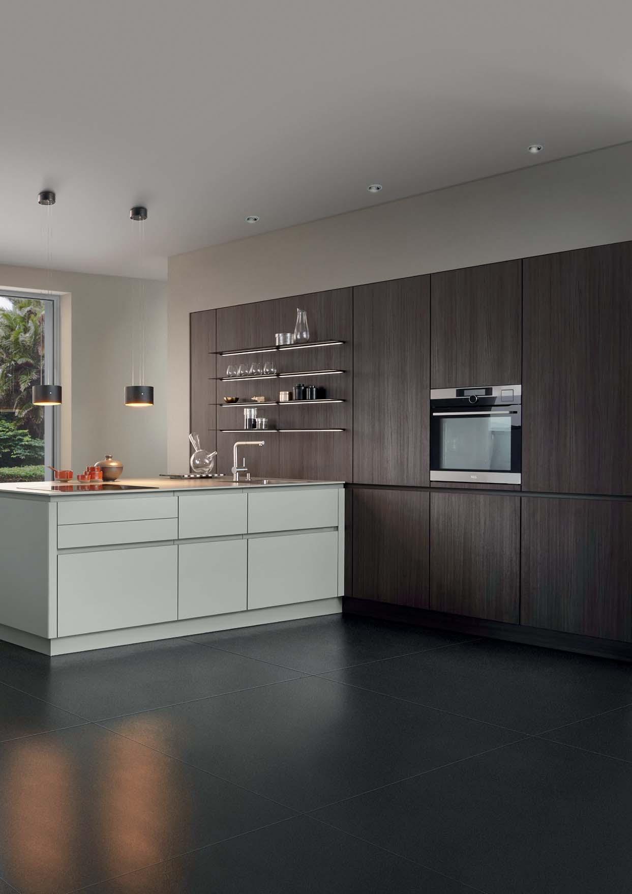
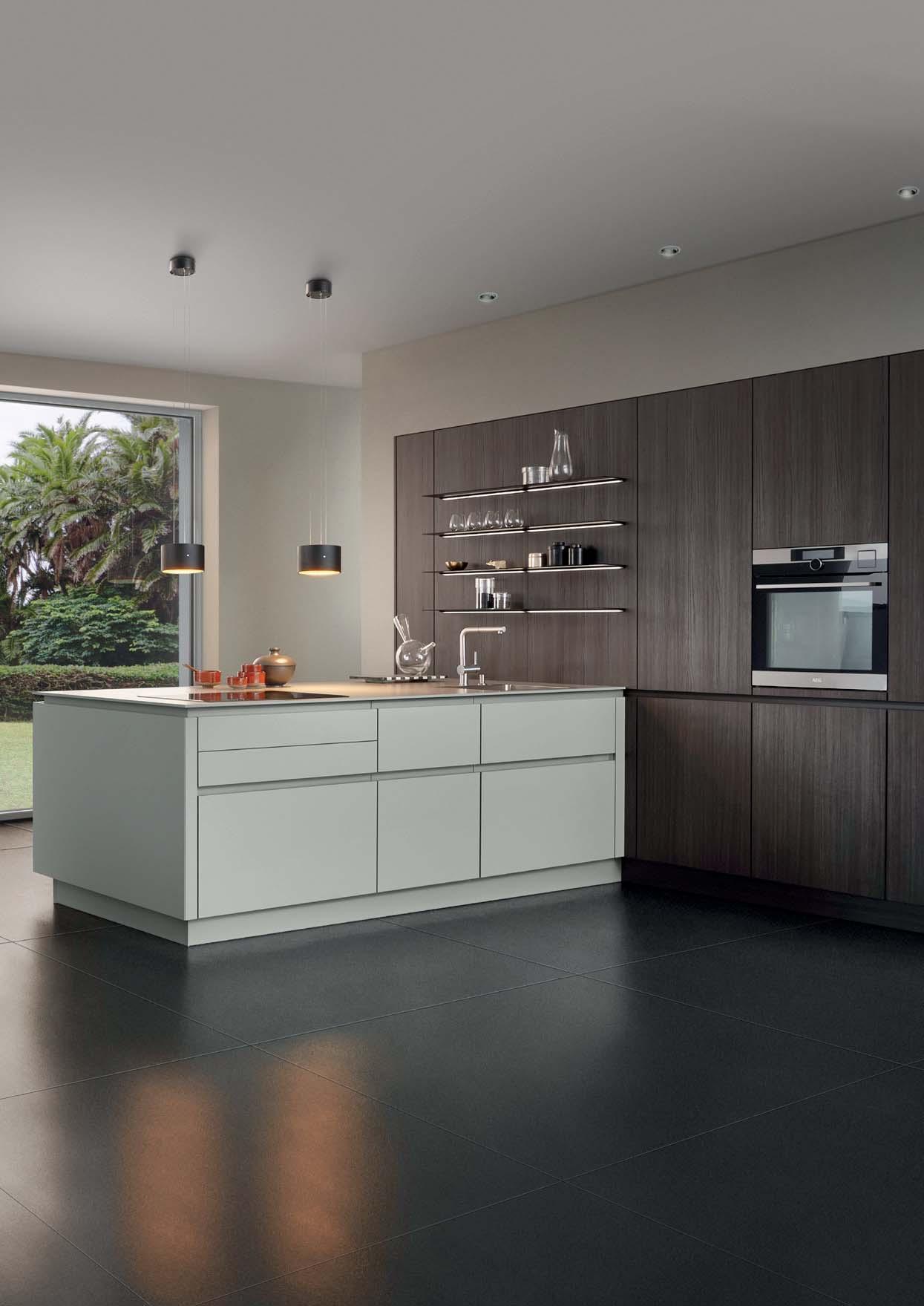
QUALITY INSIDE
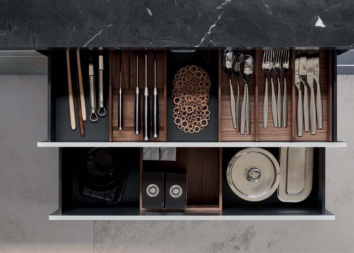
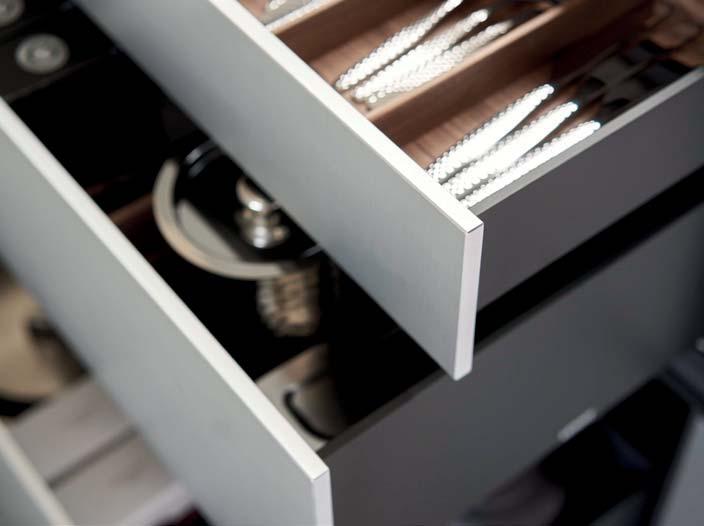
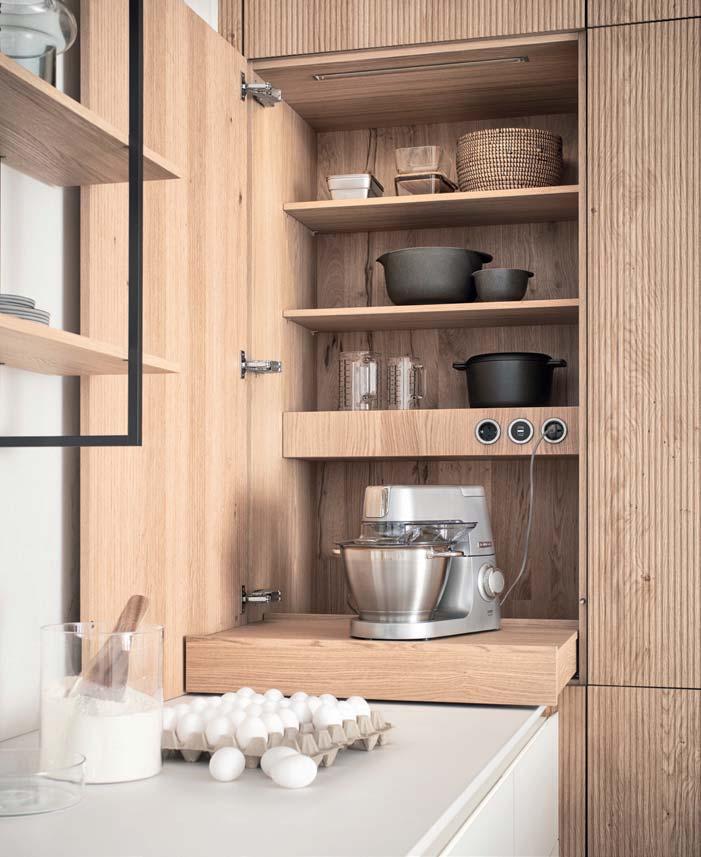
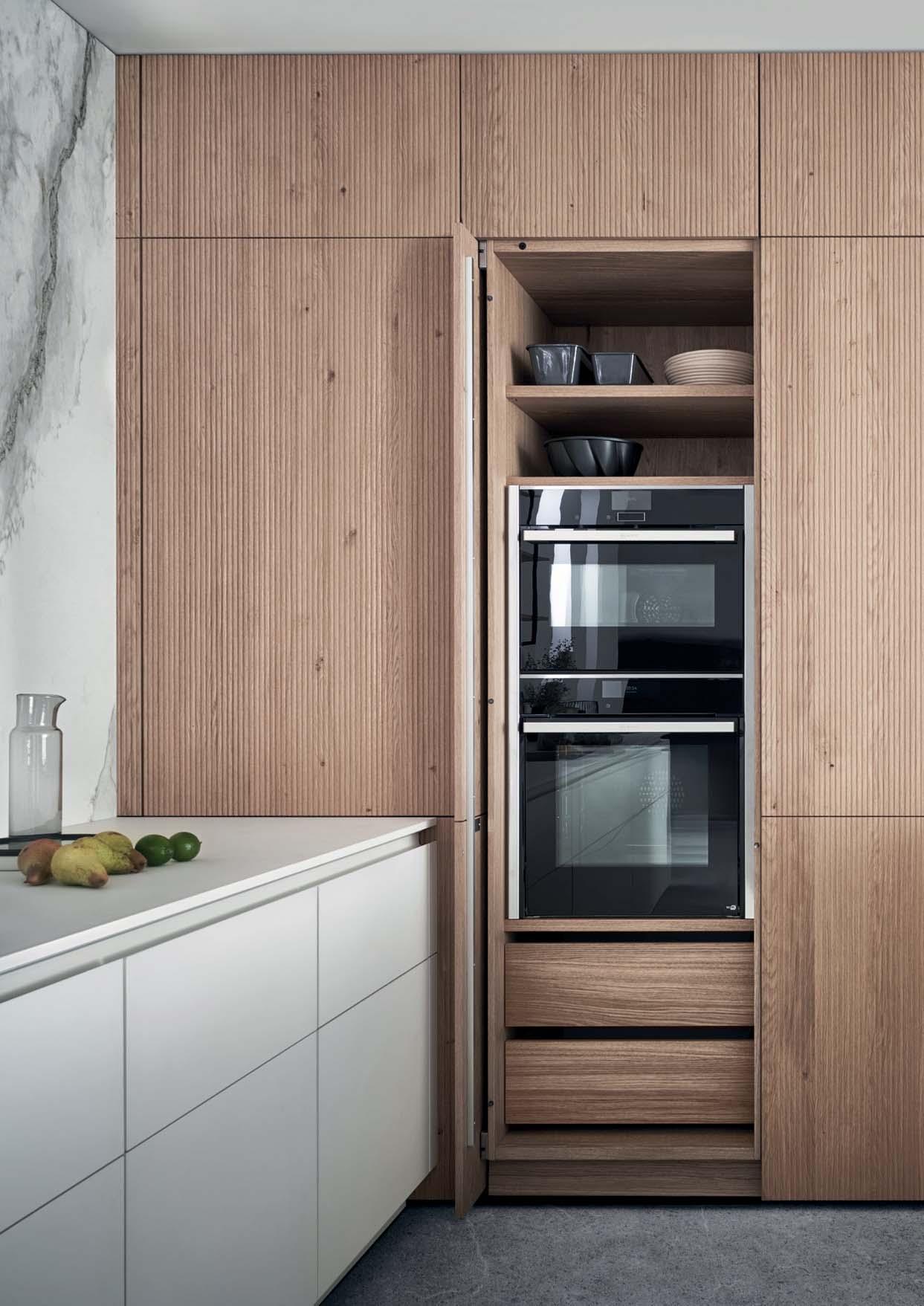
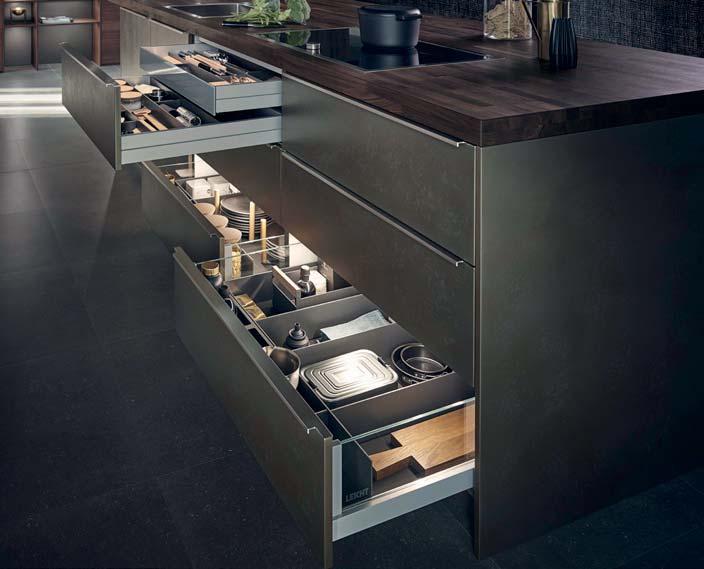
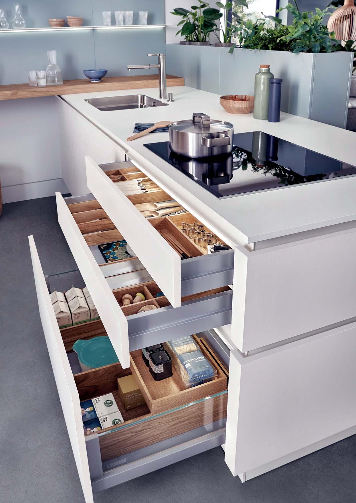
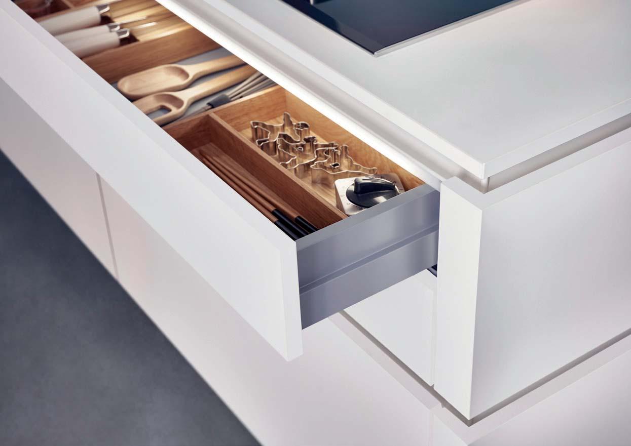
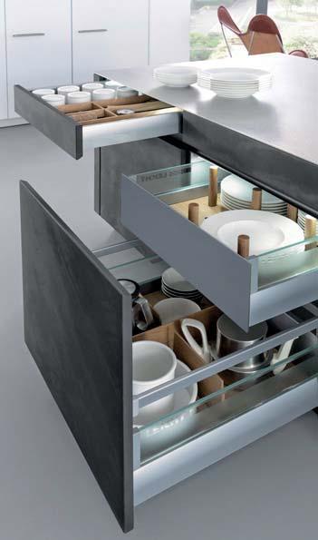
integrierten Hochschränke bieten reichlich und gut zugänglichen Stauraum, beispielsweise auch in dem übersichtlichen Kochgeschirrcenter. Auszüge und Schubladen erlauben direkten Zugriff von oben. Sie sind mit einer Innenausstattung aus Massivholz und moderner Führungstechnik mit Selbsteinzug und komfortabler Dämpfung ausgestattet.
the wall offer plenty of easily accessible space, for example in the clearly laid out cookware centre. Pullouts and drawers permit direct access from above. They are equipped with interiors of solid wood and modern guiderail technology with independent close and convenient cushioning.
Les armoires hautes blanches, intégrées espace de rangement généreux et bien accessible, par exemple dans le centre de rangement clairement structuré. Des tiroirs et coulissants permettent l‘accès direct par le dessus. Ils sont équipés d‘un équipement intérieur en bois massif et d‘une technique de guidage moderne avec retour automatique et amortissement confortable.
Los armarios superiores blancos y planos acoplados a la pared ofrecen mucho espacio y muy accesible, por ejemplo en el ordenado centro de utensilios de cocina. Los cajones interiores y las bandejas extraíbles permiten tener acceso a los utensilios desde arriba. Poseen un interior de madera maciza y una técnica de guías con cierre silencioso y amortiguación.
De witte, vlak in de muur geïntegreerde hoge kasten bieden een royale en goed toegankelijke opbergruimte, bijvoorbeeld ook in het overzichtelijke kookserviescentrum. Uittrekelementen en laden zijn rechtstreeks van boven toegankelijk. Ze zijn voorzien van massief houten ladeindelingen en uitgerust met moderne geleidingstechniek met zelfsluiting en comfortabele demping.
127 TOCCO | CONCRETE
128
Wie das Morgengrauen zwischen Nacht und Tag, wie Nebel, der aus feuchten Wiesen aufsteigt, so steht die Farbe Grau zwischen Weiß und Schwarz. Unbunt und von sachlicher Klarheit. Dabei ist Grau gar nicht kühl, insbesondere, wenn es mit Farben und Materialien aus der Natur zusammengeführt wird.

Like the colours of daybreak or fog rising from damp meadows, grey too is an interim colour between black and white. Achromatic and matter-of-fact. But grey is not cool at all, particularly in combination with colours and materials from nature.
Comme l‘aube entre chien et loup, le brouillard qui monte des prairies humides, la couleur grise se situe entre le blanc et le noir. Elle est achromatique et d‘une clarté dépouillée. Et pourtant le gris n‘est pas une couleur froide, surtout associé à des couleurs et des matériaux naturels.
Igual que al amanecer, cuando entre la noche y el día se eleva una nieva desde los prados húmedos, así se representa el color gris entre el blanco y el negro. Poco colorido y con una claridad objetiva. Y eso, que el gris no es un color frío. Sobre todo no, cuando se junta con colores y materiales de la naturaleza.
Zoals de ochtendschemering tussen nacht en dag, zoals de mist die opstijgt uit vochtige weilanden, zo staat de kleur grijs tussen wit en zwart. Kleurloos en van zakelijke helderheid. Daarbij is grijs helemaal niet koel, in het bijzonder als dit met kleuren en materialen uit de natuur wordt gecombineerd.
04 Sikkens ON.00.64 0201 0304 0302 04 01 02 0104 03
TOCCO | CONCRETE
COLOUR COORDINATION
130
ART OF LIVING 131 CLASSIC-FS | TOPOS
132
ACCENTED DINING
Holz wirkt am stärksten in Kombination mit Unifarben, hier in esche madeira mit weißem Mattlack. Das mit blendfreien
bildet den Hintergrund für den eingeschoalles, was man gern griffbereit in der Nähe des Sitzplatzes hat.
Wood looks at its best in combination with plain colours, here in ash madeira with a white matt lacquer. The shelving with its glare-free LED stripes forms the backdrop for the inserted dining table. It provides plenty of space for everything you like to have to hand close to where you are sitting.
C’est en combinaison avec des couleurs unies que le bois déploie son plus fort effet ; dans cet exemple, du frêne couleur madère associé à du vernis blanc mat. La table à manger est intégrée à une étagèreissement. Elle accueille tout ce qui est nécessaire ou doit être accessible depuis la table.
La madera produce un mayor efecto al combinarse con tonalidades monocolor. Aquí aparece en fresno, de color madeira con lacado blanco mate. La estantería,
sobre el que aparece apoyada la mesa. La estantería ofrece espacio de almacenamiento para todo aquello que se desea tener al alcance de la mano, cerca de los asientos.
Hout oogt het mooist in combinatie met door mat wit gelakte kastelementen. De open kast met verblindingsvrije led-lichtingeschoven eettafel. De legborden bieden ruimte voor alles wat men in de buurt van de zitplaats graag snel bij de hand heeft.
133 CLASSIC-FS | TOPOS
NATURAL WOOD EFFECT
Schiebetüren der Aufsatz-Schränke. Der gesamte Stauraum oberhalb der Arbeitsplatte wird damit verschlossen, die gesamte Tiefe der Arbeitsplatte ist nutzbar.
Classy ash unfurls its true appearance and elegance on the smooth, large sliding doors of the top cupboards. The entire storage space above the worktop is thus closed; the full depth of the worktop can be used.
Le bois de frêne noble confère une esthétique élégante aux généreuses portes coulissantes planes des éléments sur plan de travail. L’espace de rangement est ainsi fermé, le plan de travail étant disponible dans toute sa profondeur.
La noble madera de fresno despliega su estética y elegancia en las puertas correderas, lisas y de amplias dimensiones del altillo. La totalidad del espacio de almacenamiento superior de la encimera aparecerá cerrado y todo el fondo de lable.
Edel essenhout ontplooit zijn esthetiek en elegantie op de gladde, grootvlakkige schuifdeuren van de opzetkasten. De gehele berg-ruimte boven het werkblad wordt daarmee gesloten, het werkblad kan over de gehele diepte worden benut.
134
CLASSIC-FS | TOPOS
136
CREATIVE PLANNING DETAILS
Kreative Planungsideen und individuelle Detaillösungen lassen sich in einer LEICHT Küche jederzeit umsetzen. Hier bildet ein zum Raum geöffnetes Regalelement den Abschluss einer freistehenden Unterschrankzeile. Die mit lackierten Griffmulden ausgestatteten Auszüge sind alle 40 cm hoch. So entsteht ein ruhiges Frontraster.
Creative planning ideas and individual touches can be implemented in LEICHT kitchens whenever you like. Here, an open shelf facing the room is the perfect concluThe pullouts with their lacquered recessed handles are all 40 cm high ensuring a calm front.
Une cuisine LEICHT vous permet de réaliser toute idée créative et de répondre à tout besoin individuel dans les moindres détails. Le linéaire de meubles bas est ici clos par une étagère ouverte orientée vers la pièce. Les tiroirs équipés de prises de main laquées font tous 40 cm de haut, formant ainsi une façade homogène.
soluciones individuales hasta el último detalle se pueden convertir en realidad en una cocina LEICHT en todo momento. Aquí vemos como un elemento de estantería, abierto hacia el espacio, sirve de cierre a una línea de muebles bajos, en colocación libre. Las gavetas, dotadas de golas lacadas, tienen una misma altura de
Creatieve planningsideeën en individuele detailoplossingen kunnen in een LEICHT keuken te allen tijde worden omgezet. Hier vormt een naar de ruimte geopend open kastelement de afsluiting van een vrijstaand onderkastblok. Alle uittrekelementen met gelakte greep-gleuven zijn 40 cm hoog. Zo ontstaat er een rustig frontraster.
137 CLASSIC-FS | TOPOS
138
Hell und dunkel, warm und kalt, glatt und strukturiert – Menschen lieben Kontraste. Denn Gegensätze ziehen sich an, beziehen sich aufeinander, wecken Emotionen. Auch für die visuelle Wahrnehmung sind Kontraste fundamental, sie sorgen für Spannung und beleben den Raum.
Light and dark, warm and cold, smooth and textured – people love contrasts. Because opposites attract, relate to each other, arouse emotions. Contrasts are also fundamental for visual perception, they create excitement and liven up a room.
Clair et sombre, chaud et froid, lisse et structuré – nous aimons tous les contrastes. Car les contraires s‘attirent, se réfèrent les uns aux autres, suscitent des émotions. Les contrastes sont également d‘une importance fondamentale pour la perception visuelle, ils créent une tension et égayent l‘espace.
Claro y oscuro, caliente y frío, liso y estructurado: a las personas nos gustan los contrastes. Y eso es porque los opuestos se atraen, se relacionan entre ellos y despiertan emociones. Los contrastes también son buenos para la percepción visual, generan emociones y reviven la habitación.
Licht en donker, warm en koud, glad en gestructureerd – mensen houden van contrasten. Want tegenstellingen trekken elkaar aan, staan met elkaar in betrekking, wekken emoties op. Ook voor de visuele waarneming zijn contrasten fundamenteel, ze zorgen voor spanning en verlevendigen de ruimte.
COLOUR CODE CLASSIC-FS | TOPOS
140
E INNOVATIVE TECHNOLOGY 141 CLASSIC-FS | TOPOS
142
HARMONIOUS INTERPLAY
Harmonisches Zusammenspiel von Farbe und Material, von Eichenholz, Lack und Keeingelassene Umluft-Dunstabzug arbeitet besonders wirksam dank innovativer PlasmaNorm®-Technik. Er ist daher auch im Niedrigenergie- oder Passivhaus umweltfreundlich einsetzbar.
Harmonious interplay of colour and material, of oak wood, lacquer and ceramic. The recirculating extractor, integratedcularly effective, thanks to the innovative PlasmaNorm®-Technology. It can therefore also be used in a low energy or passive houses, as it is environmentally friendly.
Jeu harmonieux des couleurs et des matériaux, en bois de chêne, en laque et en céramique. La hotte aspirante à recyclage, -
à l’innovante technologie PlasmaNorm®. Elle est de plus parfaitement adaptée pour une utilisation en maison à basse consommation d’énergie ou en maison passive.
Armonioso juego conjunto entre color y material, entre la madera de roble, el lacado y la cerámica. La campana, incorpo-
alto, trabaja de manera especialmente efectiva, gracias a su innovadora técnica PlamaNorm®. Es por ello que se puede colocar en las casa con bajo consumo de energía o en las casas “pasivas”, con total respeto al medio ambiente.
Harmonisch samenspel van kleur en materiaal, van eikenhout, lak en keramiek. De vlak in de bovenkast ingebouwde recirculatie-afzuigkap werkt bijzonder effectief dankzij de innovatieve PlasmaNorm®techniek. Hij kan daarom ook in laag-energiehuizen en passiefhuizen milieuvriendelijk worden ingezet.
143 CLASSIC-FS | TOPOS
GAINING LIGHTNESS
Ohne sichtbare Halterungen an der Wand montiert und auf eleganten Metallkufen ruhend, scheinen die Unterschränke in dieser Küche zu schweben. Der Raum gewinnt dadurch Leichtigkeit und Offenheit. Fixed to the wall without visible support and resting on elegant metal skids, creaThe room gains lightness and openness.
Sans supports visibles montés sur le mur et posés sur un élégant cadre en métal, les meubles bas de cette cuisine semblent être en suspension. La pièce gagne ainsi en légèreté et en clarté.
Montados en la pared, sin soporte alguno visible o descansando sobre elegantes patas metálicas de diseño, los muebles bajos en esta cocina causan impresión de
de ellos, el espacio cobra apariencia de ligereza y de apertura.
Zonder zichtbare houders tegen de wand gemonteerd en rustend op een elegant metalen onderstel lijken de onderkasten in deze keuken te zweven. De ruimte wordt daardoor luchtiger en opener.
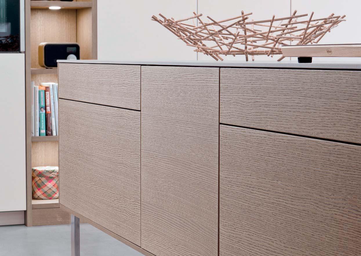
144
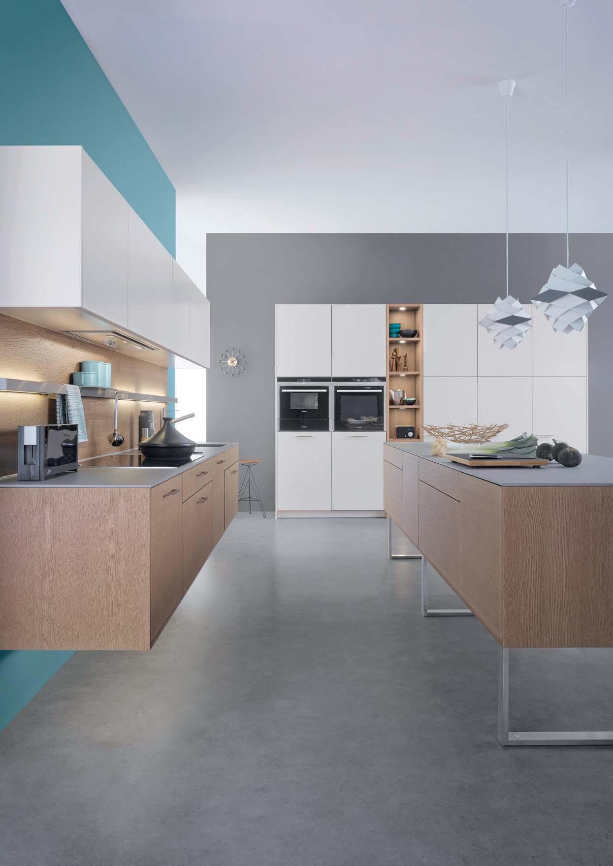
145 CLASSIC-FS | TOPOS
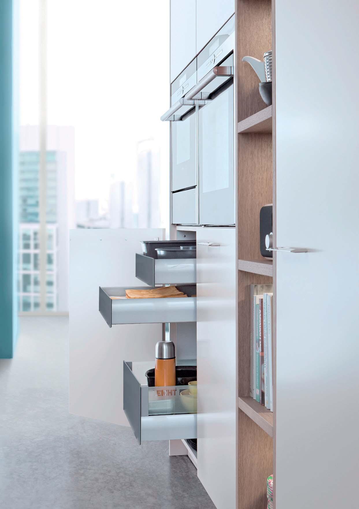
146
Modernes Design und Einsatz hochwertiger Materialien – auch an das Schrankinnenleben stellt LEICHT hohe Ansprüche. Modernste Technik sorgt bei Auszügen und Schubladen für perfekte Laufeigenschaften und einen gedämpften, leisen Anschlag. Mit Öffnungsautomatik ist die Bedienung noch komfortabler. Lifttüren bieten Kopffreiheit bei der Küchenarbeit.
Modern design and the use of high quality materials – LEICHT places high demands also on the inner life of the cupboards. The latest technology for pullouts and drawers provides perfect running quality and a cushioned, quiet closing. Automatic opening makes handling even easier. Lift-up doors offer headroom during kitchen work.
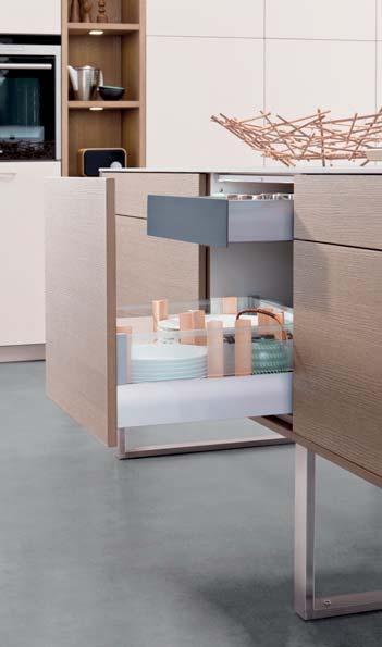
Le design moderne et l’utilisation de matériaux de la plus grande qualité sont également présents à l’intérieur des meubles LEICHT. La technologie la plus moderne permet un mouvement parfait d’ouverture et de fermeture des coulissants, ainsi qu’une Équipé du système d’ouverture automatique, l’utilisation est encore plus confortable. Les portes lifts permettent de libérer l’espace de mouvement durant le travail de préparation dans la cuisine.
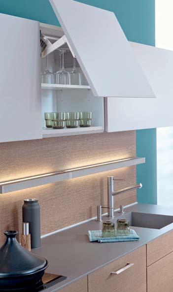
Un diseño moderno y el empleo de valiosos materiales –también en la vida interior de los muebles LEICHT establece unos altos niveles de exigencia. La técnica más moderna se encarga, en las gavetas y cajones, de que se den unas perfectas características de deslizamiento y un cierre, amortiguado y silencioso. Con aperturas automáticas, su utilización resulta aún más confortable. Las puertas elevables le brindan libertad de obstáculos a la altura de la cabeza en el trabajo de la cocina.
Modern design en de toepassing van hoogwaardige materialen – ook aan het kastinterieur stelt LEICHT hoge eisen. Supermoderne techniek zorgt bij uittrekelementen en laden voor een perfect soepele loop en een gedempte, bijna geruisloze aanslag. Met de automatische openingsmechaniek is de bediening nog comfortabeler. Liftdeuren bieden bij het keukenwerk voldoende bewegingsvrijheid voor het hoofd.
VALUE INSIDE 147 CLASSIC-FS | TOPOS
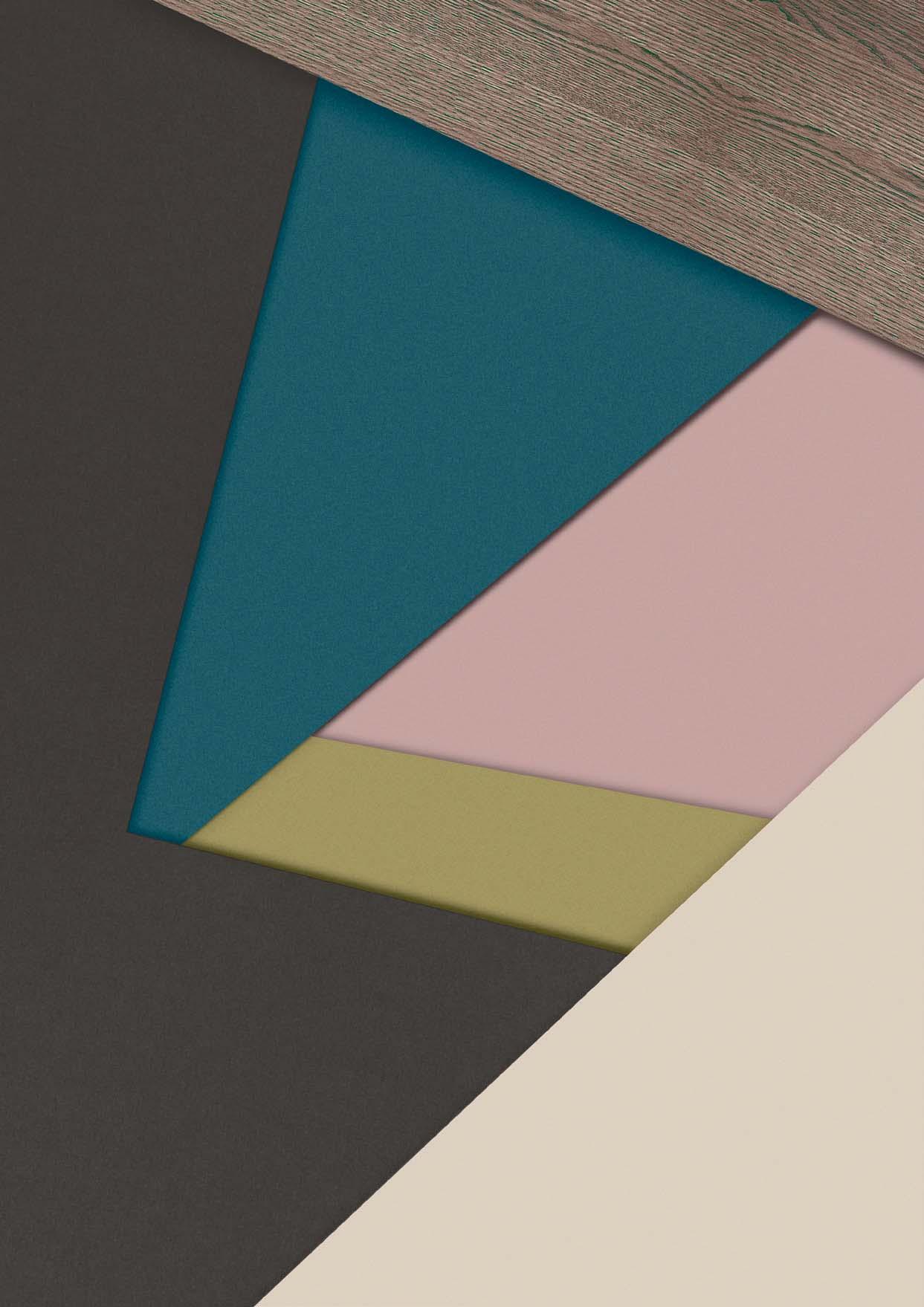
148
Offene Weite und Klarheit signalisiert der Farbton Blau. Seine Wirkung im Raum ist ausgleichend und beruhigend. Zugleich fördert es die Konzentration, macht wach. Die passende Farbergänzung dazu: natürliche Holztöne, mattes Saharabeige, warmtonige Akzente in Rosenholz oder Gelbgrün.
Blue signalises expanse and clarity. It balances and is calming within a room. It also promotes concentration and is stimulating. The corresponding colour complement: natural wood tones, matt sahara beige, warm accents in rosewood or yellowy green.
La couleur bleue signale une immensité sans obstacles et la clarté. Son effet dans l‘espace est équilibrant et apaisant. En même temps, elle favorise la concentration, éveille les sens. Le complément couleur assorti : des nuances de bois naturelles, un beige Sahara mat, des accents aux tons chauds en bois de rose ou du jaune vert.
El color azul indica anchura y claridad. En una habitación ofrece equilibrio y tranquiliza. A la misma vez fomentan la concentración y mantiene despierto. Ampliaciones de color a juego: tonos naturales de madera, un beige Saraha mate, acentos de matices cálidos en palo de rosa o amarillo-verdoso.
De kleur blauw duidt op open weidsheid en helderheid. Z’n werking in de ruimte is kalmerend en rustgevend. Tegelijkertijd bevordert het de concentratie en maakt wakker. De bijpassende kleuren: natuurlijke houttinten, mat saharabeige, accenten in warme tinten, zoals rozenhout of geelgroen.
CLASSIC-FS | TOPOS
COLOUR VARIETY
SURFACES LAMINATE
LEICHT setzt feinstrukturierte Fronten mit hochwertiger Melaminharzbeschichtung oder hochglänzendem und matten Schichtstoff in einer Vielzahl von Programmen ein. In aktuellen Farben und natürlichen Holzdekoren. Diese sind je nach Ausführung und anlog zur Echtholzverarbeitung „auf Bild“ gearbeitet. Das heißt, das Bild der Maserung setzt sich über alle Fronten und die gesamte Schrankhöhe hinweg fort.
quality melamine resin coating or high-gloss and matt laminate in a number of programmes. In fashionable colours and natural wood decors. Depending on the design and as in genuine wood processes, these feature matching graining. In other words, the grain pattern is continued over all fronts and the entire unit height.
structurées avec un revêtement mélaminé mat pour un grand nombre de programmes. Elles se déclinent en couleurs actuelles et en décors de bois naturels qui, en fonction de la du bois véritable, sont caractérisés par un la veinure se prolonge sur toutes les façades et sur toute la hauteur de l’armoire.
LEICHT utiliza para varias gamas frentesto de resina melamínica de alta calidad o colores actuales y referencias de maderas naturales. Estas referencias de madera se han trabajado según el modelo de forma analógica sobre „el dibujo“ de la madera continúa sobre todo el ancho y la altura de los armarios.
LEICHT past bij een groot aantal met een hoogwaardige melamineharscoating of hoogglanzende en matte kunststof. In actuele kleuren en natuurlijke houtdecors. Deze zijn al naargelang de uitvoering analoog aan de verwerking van echt hout “op beeld” verwerkt. Dat betekent dat het beeld van de vlam over alle fronten en de gehele kasthoogte doorloopt.
150


SURFACES | LAMINATE 151


211 marmonero *08 032 magnolia *01 134 olive grey 201 keraton *02, 06 *02, 05, 06 100 arctic *02, 05, 06 103 merino *02, 05, 06 120 frosty white *02, 05, 06 130 mohair *02, 05, 06 136 sand grey *02, 06 273 platinum *02 282 alpine grey *02, 06 284 carbon grey *05, 06 202 liton *01 286 black slate *05, 06
LAMINATE 138 fossil grey *02, 05, 06 152 kiruna *07 205 neroton *01
SURFACES
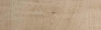
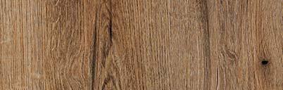
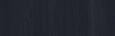
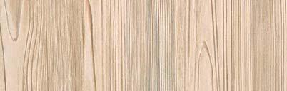
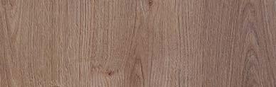
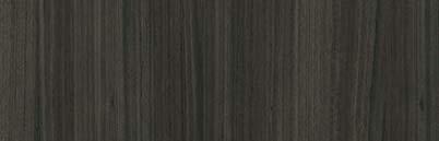
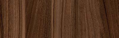
240 walnut le midi *03 *09 IKONO PG 1 CERES PG 1 ORLANDO PG 1 SYNTHIA PG 1 *04 227 japanese pine 232 olmo grigio *04 234 highland
*04 239 karst
*03 228 weather
*04 242 virginia
*09 SURFACES LAMINATE *01 *02 *03 *04 SELVA PG 2 229
*04 345 mountain
*03 BONDI PG 2 TOCCO PG 3 MINERA PG 2 MARMO PG 2 *05 *06 *07 *08 SURFACES | LAMINATE
oak
oak
oak
oak
fjord oak
robinia
SURFACES
supermatt, softe Haptik, AntiEigenschaften dieses widerstandsfähigen Materials haben sich in der Küche durchgesetzt.
super-matt and soft-to-thesmart characteristics of this hard-wearing material have asserted themselves in the kitchen.
SURFACES
STEEL
che kann auf unterschiedlichste Weise wirken: LEICHT beherrscht den Umgang mit diesem langlebigen Material virtuos. Um Fronten mit der unvergleichlichen Ausstrahlung von veredeltem, korrodiertem Metall zu schaffen, wird das Metall aufgespritzt, per Hand bearbeitet und matt lackiert. So entstehen natürliche Strukturen und eine haptisch angenehme
A metallic, patinated surface can have a number of different effects: LEICHT is a master at dealing with this durable material. To create fronts with the incomparable look of processed, corroded metal, the metal is sprayed on, worked by hand and then lacquered matt. The result: natural structures and a surface pleasant to the touch.
ultramat, doux au toucher, antitraces de doigts et réparable. Les propriétés intelligentes de ce matériau résistant se sont imposées dans la cuisine.
ultramate, de tacto suave, con efecto antihuellas y reparable. Las propiedades inteligentes de este resistente material se han impuesto en las cocinas de hoy en día.
supermat, zachte haptiek, anti-genschappen van dit resistente materiaal hebben zich in de keuken doorgezet.
Une surface métallique patinée peut dégager différentes impressions : LEICHT maîtrise l‘approche de ce matériau durable d‘une apparence incomparable en métal le support, traité à la main et laqué mat. Il en résulte des structures naturelles et une surface au toucher agréable.
puede dar una impresión muy diferente: LEICHT domina perfectamente la elaboración de este material duradero. Para crear un frontal con un incomparable aspecto metálico noblemente envejecido se trabaja a mano el metal aplicado por inyección modo se crea un acabado con un tacto de estructuras naturales.
Een metalen, gepatineerd oppervlak kan de meest uiteenlopende effecten hebben: LEICHT beheerst de omgang met dit duurzame materiaal op virtuoze wijze. Om fronten met de ongeëvenaarde uitstraling van veredeld, gecorrodeerd metaal te vervaardigen, wordt het materiaal opgespoten, met de hand bewerkt en mat gelakt. Zo ontstaan natuurlijke structuren en een haptisch aangenaam oppervlak.
154


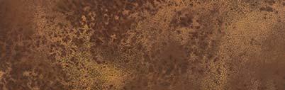
279 midnight blue 140 boreal green *10 *10 138 fossil grey *10 137 taupe grey *10 SURFACES F 45 - C made by PG 3 134 olive grey *10 100 arctic *10 103 merino *10 122 nimbus *10 130 mohair *10 284 carbon grey *10 286 black slate *10 *10 STEEL PG 7 *11 297 corten SURFACES STEEL 298 ferro *11 *11 155 SURFACES | | STEEL
SURFACES COLOUR LACQUERED
Die Küche nach Wunsch in rund 4.000 Farben, diese Farbvielfalt gibt es nur bei lackierten Küchenfronten. Hochglänzend oder supermatt, feinstrukturiert, samtmatt oder mit feinem Reliefdekor. LEICHT setzt dabei nahezu ausschließlich mehrschichtig verarbeitete Wasserlacksysteme ein, die nach dem neuesten Stand der Technik fürckelt wurden – gut für die Umwelt und die Gesundheit.
The perfect kitchen in around 4,000 colours: this massive range of colours is only available with lacquered kitchen fronts.
velvet-matt or with exquisite relief decor. LEICHT uses almost exclusively multi-layer, water-based lacquer systems developed specially for heavily used surfaces in accordance with state-of-the-art methods.
La cuisine de votre choix dans environ 4 000 couleurs, une telle variété n‘est disponible que pour les façades de cuisines laquées, ultrabrillantes ou ultramates, décor en relief. À cet effet, LEICHT utilise presque exclusivement des systèmes de laques à l‘eau multicouches, qui ont été développés pour les surfaces fortement sollicitées selon les technologies les plus récentes.
La cocina deseada disponible en casi 4000 colores. Esta variedad de colores solamente existe en cocinas con frentes pintados. Con mucho brillo o súper mate, con una
para ello casi únicamente sistemas de pintura a base de agua que han sido desarrolladas según los últimos conocimientos grandes esfuerzos.
De keuken naar wens in ongeveer 4000 kleuren, deze kleurendiversiteit bestaat alleen bij gelakte keukenfronten. Hoog-
LEICHT past hiervoor vrijwel uitsluitend in meerdere lagen verwerkte waterlaksystemen toe, die naar de laatste stand der techniek voor zwaar belaste oppervlakken zijn ontwikkeld.
156


SURFACES | COLOUR LACQUERED 157 SURFACES | COLOUR LACQUERED
SURFACES
COLOUR LACQUERED
*14, 15, 16, 17
015 céruléen pâle (32034)
*14, 15, 16, 17
019 vert anglais pâle (32042)
*14, 15, 16, 17
023 ombre naturelle claire (32142)
*14, 15, 16, 17
027 terre sienne claire 31 (32122)
*14, 15, 16, 17
016 céruléen moyen (32032)
*14, 15, 16, 17
020 vert anglais clair (32041)
*14, 15, 16, 17
024 ombre naturelle moyenne (32141)
*14, 15, 16, 17
028 terre sienne brique (32121)
*14, 15, 16, 17
*14, 15, 16, 17
017 bleu céruléen 31 (32030)
*14, 15, 16, 17
*14, 15, 16, 17 021 vert anglais (32040)
*14, 15, 16, 17
025 ombre naturelle 31 (32140)
*14, 15, 16, 17
029 l‘ocre rouge (32110)
*14, 15, 16, 17


286 black slate *14, 15, 16, 17 279 midnight blue *13, 14, 15, 16, 17 270 graphite grey *17 137 taupe grey *13, 14, 15, 16, 17 138 fossil grey *12, 13, 14, 15, 16, 17 032 magnolia *12, 13, 14, 15, 16, 17 100 arctic *12, 13, 14, 15, 16, 17 103 merino *12, 13, 14, 15, 16, 17 120 frosty white *12, 13, 14, 15, 16, 17 130 mohair *12, 13, 14, 15, 16, 17 136 sand grey *13, 14, 15, 16, 17 139 lava * 13, 14, 15, 16 273 platinum *12, 13, 14, 15, 16, 17 277 black *13, 17 282 alpine grey *13, 14, 15, 16, 17 285 basalt grey *13, 14, 15, 16, 17 106 brilliant white *17 284 carbon grey *13, 14, 15, 16, 17 *12 *13 *14 *15 *16 SIRIUS PG 1 CLASSIC-FF PG 3 CLASSIC-FS PG 4 CARRÉ-FS PG 4 VERVE-FS PG 4 *17 LARGO-FG PG 5 *12,13, 14, 15, 16, 17 134 olive grey SURFACES COLOUR LACQUERED RAL | NCS *13, 14, 15, 16, 17 140 boreal green *13, 14, 15, 16, 17 122 nimbus *14, 15, 16 SURFACES | COLOUR LACQUERED
Einmalig und natürlich schön: Küchenfronten aus Echtholz-Furnier. Gefertigt aus dem Holz von Eichen, Eschen oder Nussbäumen. In verschiedenen Beiztönen, von hell bis dunkel. Mit horizontaler oder vertikaler Maserung – vertikal ist diese dann „auf Bild“ gearbeitet, d.h. die Maserung verläuft durchgehend über die gesamte Schrankhöhe. Echtholzfronten sind alle mit umweltfreundlichen wasserbasierenden Acrylharzlackenfreundlich.
Unique and naturally attractive: kitchen fronts made of genuine wood veneer. Made from wood from oak, ash or walnut trees. In various stains, from light to dark. With horizontal or vertical grain - vertically this is in a continuous form, i.e. the grain is continued over the entire unit height. Genuine wood fronts are all sealed with environmentallyfriendly water-based acrylic resin lacquers and are thus particularly easy to look after.
Beauté naturelle unique : les façades de cuisines en placage de bois véritable. Fabriquées en bois de chêne, de frêne ou de noyer et disponibles en différentes teintes, des tons clairs aux tons foncés. Avec veinure horizontale ou verticale – en cas de veinure verticale, elle est continue et se prolonge sur la hauteur complète des armoires. Les façades en bois véritable sont toutes protégées par des laques de résine acrylique aqueuses respectueuses de l‘environnement et sont donc très faciles à nettoyer.
Una belleza natural y única: Cocinas con frentes rechapados de madera noble. Fabricados con madera de roble, fresno o nogal. Con barnices en diferentes matices desde un color claro hasta un color oscuro. Con vetas en sentido horizontal y vertical. Las vetas en sentido vertica cubren la altura completa del módulo. Todos los frentes de madera noble están sellados con lacas acrílicas ecológicas a base de agua y con ello muy fácil de cuidar.
Weergaloos en natuurlijk mooi: met echt uit het hout van eiken, essen of notenbomen. In verschillende beitstinten, van licht tot donker. Met horizontale of verticale vlam – verticaal is deze dan “op beeld” verwerkt, dat betekent dat de vlam doorloopt over de gehele kasthoogte. Alle echt houten fronten zijn voorzien van een beschermlaag van milieuvriendelijke, watergebaseerde acrylharslak en daardoor bijzonder onderhoudsvriendelijk.
WOOD VENEER 160
SURFACES
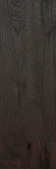
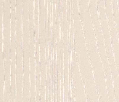
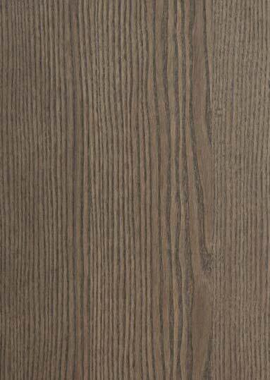
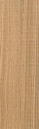
SURFACES | WOOD VENEER
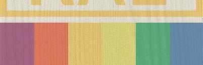
438 ash fossil grey *18 437 ash taupe grey *18 079 ash midnight blue 400 ash arctic *18 432 ash magnolia *18 403 ash merino *18 RAES *18 420 ash frosty white *18 430 ash mohair *18 436 ash sand grey *18 439 ash lava *18 473 ash platitum *18 082 ash alpine grey *18 085 ash basalt grey *18 084 ash carbon grey *18
WOOD VENEER 434 ash gris olive *18 AVENIDA PG 4 *18 086 ash black slate *18 140 boreal green *18 162
SURFACES
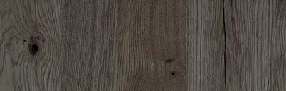
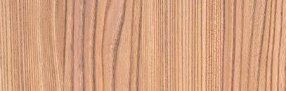
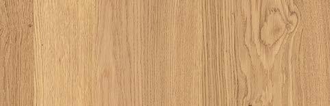
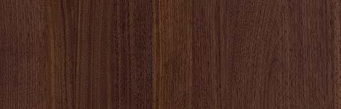
218 elm natural 219 alpine natural oak 220 walnut natural *19 *19, 23 *19, 23 TOPOS PG 5 VALAIS PG 8 MADERO PG 5 TERMA PG 6 KYOTO PG 6 *19 *20 *21 *22 *23 221 textured oak abruzzo *19 222 textured natural oak *19 223 textured oak barrique *19 310 ash madeira *19 312 walnut *19 313 textured oak copper *19 316 textured oak marsh *19 309 bergamo elm *19 335 alpine natural oak *20 SURFACES WOOD VENEER 262 wild oak alpine *21 267 wild oak marsh *21 263 wild oak copper *21 266 wild oak barrique *21 360 maraval chesnut *22 264 wild oak abruzzen *21 163 SURFACES | WOOD VENEER
SURFACES BOSSA
Vorstehende, lineare Stäbchen in 7,5 mm Breite und einem 5 mm Abstand zueinander verleihen dem Furnier der BOSSA eine feingliedrige, sehr lebendige und dreidimen-
BOSSA eine einzigartige Verschmelzung von Küche und Wandverkleidung – die gesamte Fläche wirkt wie ein Möbel-Solitär, ein nahtloses Raummodul.
Protruding, linear ridges, 7.5 mm wide with a gap of 5 mm between each ridge, give the BOSSA veneer a delicate, extremely vital, three-dimensional look. With it, BOSSA creates a unique fusion of kitchen and wall cladding – the whole surface looks like a furnishing soloist, a seamless space module.
Des baguettes linéaires en saillie, d’une largeur de 7,5 mm et espacées de 5 mm, confèrent au placage de BOSSA un effet gracile, tridimensionnel et très vivant. Avec cette esthétique, BOSSA réalise une fusion exceptionnelle entre la cuisine et le revêtement mural – l’ensemble de la surface fait l’effet d’un meuble unique constitué d‘un module sans aucun joint.
Unas tiras de 7,5 mm de anchura separadas entre sí por acanaladuras de 5 mm dan a la chapa de madera de la gama BOSSA un efecto tridimensional alegre y lleno de vitalidad. Con esta estética, BOSSA logra una fusión sorprendente entre la cocina y el revestimiento de las paredes: todo el conjunto parece un único mueble formado por un módulo sin uniones.
SURFACES
Modernität von Küchenfronten aus Glas gibt jedem Küchenraum eine hohe Wertigkeit und Repräsentativität. Zum Einsatz kommt bei LEICHT ausschließlich vergütetes Weißglas – wahlweise mit matter oder
die schützende, prismenartig abgeschrägte Glaskante im Übergang zu den umlaufenden Metallkanten in Edelstahloptik.
The appearance, naturalness and timeless modernity of kitchen fronts made of glass gives every kitchen a top-quality and prestigious air. LEICHT only uses annealed clear glass – either with a matt or glossy surface. Characteristic: the protective, prism-like chamfered glass edge in the transition to the stainless-steel-looking metal edges applied all round.
L‘esthétique et l‘apparence naturelle et intemporelle des façades en verre confèrent à chaque cuisine un caractère précieux et prestigieux. Est uniquement utilisé chez LEICHT du verre blanc ayant subi un traitement spécial, à la surface mate ou brillante. Il se caractérise par un chant en verre biseauté prismatique dans la transition avec les arêtes métalliques circulaires, d‘apparence acier inoxydable.
La estética, naturalidad y la modernidad intemporal de los frentes de vidrio de las cocinas le prestan a cada espacio de cocina un valor elevado y representatividad. LEICHT utiliza únicamente cristal blanco revenido - opcionalmente con un acabado
vidrio protector rebajado como un prisma óptica de acero inoxidable en todo el contorno.
Een lijnenreliëf van 7,5 mm brede strookjes afgewisseld met voegen van 5 mm ertussen levendig en driedimensionaal effect. Met deze vormgeving creëert BOSSA een unieke versmelting van keuken en wandbekleding – het hele vlak krijgt de uitstraling van één compleet meubelelement met naadloos in elkaar overlopende modules.
De esthetiek, natuurlijkheid en tijdloze moderniteit van keukenfronten van glas verleent elke keukenruimte een hoge waarde en representatief karakter. Toegepast wordt bij LEICHT uitsluitend veredeld wit glas – naar keuze met mat of glanzend oppervlak. Karakteristiek: de beschermende, prisma-achtig afgeschuinde glaskant op de overgang naar de omlopende metalen kanten in rvs-optiek.
164
GLASS


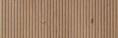
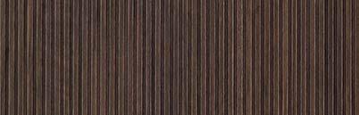


GLASS BOSSA PG 7 *23 350 alpine oak lined 032 magnolia *24, 25 103 merino *24, 25 120 frosty white *24, 25 130 mohair *24, 25 277 black *24, 25 282 alpine grey *24, 25 RAL | NCS *24, 25 292 silver *25 293 metal *25 294 anthracite *25 273 platinum *24, 25 284 carbon grey *24, 25 100 arctic *24, 25 136 sand grey *24, 25 139 lava *24, 258, 29 SURFACES BOSSA *24 *25 IOS-M PG 6 IOS PG 6 *24, 25 352 walnut lined *23 *23
134 olive grey *24, 25 279 midnight blue 286 black slate *24, 25 *24, 25 137 taupe grey138 fossil grey *24, 25 140 boreal green *24, 25 165 SURFACES | BOSSA | GLASS
SURFACES
SURFACES CONCRETE
LEICHT hat Beton, ein zeitloses und zugleich modernes Architekturmaterial, für die Küche entdeckt. Feinbeton wird in manueller Spachteltechnik auf einen lackierten MDF-Träger aufgetragen. So entsteht ein authentisches, immerturen, die Front zum Leben erwecken. Eine Mattlackversiegelung sorgt für hohe Strapazierfähigkeit.
LEICHT has discovered concrete, a timeless and at the same time modern architectural material, for use in kitchens. Fine concrete is manually applied to a lacquered MDF base using the putty technique. This results in an authentic, always unique surface with a texture that livens up the front. Matt-lacquer sealing ensures high durability.
SURFACES
Die unvergleichliche Wärme und einzigarhat LEICHT dazu inspiriert, nun auch
Küchenplanung aufzunehmen. Dabei handelt es sich um eine mit hohem Aufwand
harzgebundenen Gesteinsmehlen, die mit Mattlack versiegelt wird.
The incomparable warmth and unique feel of natural surfaces have inspired LEICHT to include surfaces with a natural stone look in their kitchen planning. This is a surface made of resin-bound stone dust applied painstakingly by hand, sealed with matt lacquer.
LEICHT a découvert le béton pour la cuisine, un matériau architectural à la fois appliqué manuellement sur un support en MDF laqué, au moyen d‘une spatule. Il en résulte une structure de surface authentique et unique, qui donne une touche vivante à la façade de la cuisine. Un revêtement en vernis mat assure une haute résistance.
LEICHT ha descubierto hormigón, un material para la arquitectura intemporal y al mismo tiempo moderno para la cocina. Para esta gama se aplica a mano una espátula sobre un substrato MDF pintacon una óptica auténtica pero también cada vez única y con estructuras que le dan vida a los frentes. Un barniz mate elevada resistencia.
LEICHT heeft beton, een tijdloos en tegelijkertijd modern architectuurmateriaal, voor de keuken ontdekt. Fijnbeton wordt handmatig in spateltechniek op een gelakte MDF-drager aangebracht. Zo ontstaat er een authentiek, altijd uniek oppervlaktebeeld met structuren die het front tot leven wekken. Een beschermlaag van matte lak zorgt voor een hoge gebruiksbestendigheid.
La chaleur incomparable et le toucher unique des surfaces naturelles ont inspiré LEICHT a intégrer désormais des surfaces à l‘aspect de pierre naturelle là d‘une surface en poudre minérale liée par résine, appliquée à la main dans un procédé complexe et protégée par du vernis mat.
La calidez y el tacto singular que transmiten los acabados naturales han inspirado a LEICHT a seleccionar acabados de aspecto natural en su gama de cocinas. Se trata de un acabado de piedra molida mezclada con resinas que se aplica a mano y se sella con un barniz mate.
De onvergelijkelijke warmte en de unieke haptiek van natuurlijke oppervlakken heeft LEICHT ertoe geïnspireerd om nu ook oppervlakken in natuursteenoptiek in de keukenplanning op te nemen. Daarbij gaat het om een zeer zorgvuldig met de hand aangebracht oppervlak van harsgebonden gesteentemeel met een beschermlaag van matte lak.
STONE 166
192 brasilia *26 *27 188 dakar *26 189 manhattan *26 191 le havre *26 SURFACES CONCRETE *26CONCRETE PG 7 SURFACES STONE STONE PG 7 148 cotta *27 149 fossena *27 167 SURFACES | CONCRETE | STONE
SURFACES PEARL
Programm in metallischen Farbtönen,ten Acrylglasschicht versiegelt sind. Die -
und makellos zur Geltung kommen. Die besondere Bekantung mit angearbeiteter Fase im Acrylglas lässt seitlichen Lichteintritt in das Material zu, sodass jedes Frontteil mit einer Lichtbrechung entlang der Kante erscheint.
Programme in metallic colours, sealed by a two-millimetre layer of translucent acryof the acrylic glass surface allows the shimmering metallic undertone to appear with a machined bevel in the acrylic glass allows light to enter the material from the side so that each front part appears with light refraction along the edge.
SURFACES
Hochwertige Frontausführung in Echtaluminium. Kern ist ein Holzwerkstoffträger, der beidseitig sowie entlang der Kanten mit farbig eloxiertem Aluminiumblech verkleidet ist. So entsteht eine kühl
Die gefaste Kante bringt den Aluminiumkern zum Vorschein und zeugt so von der Ehrlichkeit des Materials.
High-grade front in real aluminium. The core is a wood material base, clad on both sides and along the edges with colour-anodized aluminium sheet. This results in a cool-looking, puristic metal surface. The chamfered edge reveals the aluminium core, thus showing the material‘s honesty.
Programme en coloris métalliques scellé par une couche acrylique translucide de anti-traces de doigts de la surface en verre acrylique souligne l’apparence parmétalliques. Le chant biseauté spécial du verre acrylique permet une pénétration latérale de la lumière dans le matériau, de sorte que chaque partie frontale paraît réfracter la lumière le long du chant.
Programa de tonos cromáticos metálicos sellado con una capa de cristal acrílico -
cristal acrílico realza de forma impecable y limpia el tono cromático metálico de fondo. El canto biselado especial del cristal acrílico permite que la luz penetre en el material lateralmente, con lo que se produce una refracción de la luz a lo largo del canto de cada frente.
Serie in metallic kleuren die verzegeld zijnprint-afwerking van het acrylglas blijft het oppervlak vlekkeloos schoon en komt de metaalachtige glanzende onderkleur nog beter tot zijn recht. Door de speciale afwerking van het acrylglas met afgeschuinde randen kan het licht vanaf de zijkant in het materiaal intreden. Hierdoor breekt het licht in de rand van ieder front.
Finition de façade de haute qualité en aluminium véritable. Le noyau est constitué d’un support en matériau à base de bois, revêtu sur les deux faces et le long des bords de tôle d’aluminium anodisée de couleur. Le résultat est une surface métallique froide et minimaliste. Le bord chanfreiné fait apparaître le noyau en aluminium, témoignant ainsi de la transparence du matériau.
Frente con acabado de aluminio auténtico de alta calidad. El núcleo es un tablero de madera revestido por ambos lados y a lo largo de los cantos con una chapa de aluminio anodizado teñido. De este modo
y purista. El canto biselado deja a la vista el núcleo de aluminio y muestra así la nobleza del material.
Hoogwaardige frontuitvoering in echt aluminium. De kern is een drager van houtmateriaal, die aan beide zijden en langs de kanten is bekleed met gekleurd geëloxeerd aluminium plaatmateriaal. Het resultaat is een koel ogend, puristisch metalen oppervlak. De afgeschuinde rand brengt de aluminium kern tevoorschijn en getuigt zo van de eerlijkheid van het materiaal.
REAL METAL 168

*29 071 opal *28 070 citrine *28 SURFACES PEARL *28PEARL PG 4 SURFACES REAL METAL ALURO PG 8 169 oxid titan *29 168 oxid bronze *29 167 oxid silver *29 169 SURFACES | METAL EFFECT | REAL METAL
SURFACES KERA
durch ihre besondere Materialität und gearbeitet und durch eine kleine Fase miteinander verbunden. Trägermaterial derspanplatte, die von einer 4mm starken Keramik umfasst wird.
The ceramic surface KERA is captivating because of its special materiality and its front surface and connected by a small bevel. The carrier medium of the front is by 4 mm thick ceramic.
SURFACES
ROCCA, ein Natursteinprogramm mit subtil eleganter Wirkung. Der Träger ist eine 8 mm starke, melaminbeschichtete Platte, verbunden ist. Die Frontkanten sind umseitig mit edlem Naturstein belegt sowie entlang der der Gehrungsverbindung von Front zu Kante gefast. Ein Detail, das diegelt.
ROCCA, a natural stone programme with a subtly elegant effect. The carrier medium is an 8 mm melamine-coated natural stone. The front edges feature elegant natural stone and are chamfered from front to edge along the mitre joint. the surface.
L‘attrait de la surface de la céramique KERA réside dans sa matérialité particusont coupés en onglet avec la surface frontale et sont reliés par un léger biseau. Le matériau porteur de la façade est un panneau de particules à trois couches, feuille de céramique de 4 mm.
KERA reside en la singularidad del material y en la belleza de su acabado. Los frente y están unidos entre sí con un ligero bisel. El material utilizado como base para el frente es un tablero aglomeradotido con una lámina cerámica de 4 mm.
Het keramische oppervlak KERA overtuigt door de bijzondere materialiteit en zijn ten opzichte van het frontoppervlak in verstek gesneden en met elkaar verbonden door een kleine afschuining. dik drielaags spaanplaat omgeven door 4 mm dik keramiek.
ROCCA est un programme de pierre naturelle à l’effet discret et élégant. Le support, un panneau de 8 mm d‘épaisseur revêtu de mélamine, est relié à une pierre chants de façade sont revêtus de pierre naturelle à l‘arrière et sont biseautés le long du joint entre la façade et le chant, la surface.
-
ral con un efecto discreto y elegante. El soporte es un tablero de 8 mm de grosor con revestimiento de melamina que lleva encolada una lámina de piedra natural
revestidos con piedra natural por la parte de atrás y van biselados a lo largo de la unión a inglete entre el frente y el canto: un detalle en consonancia con la gran calidad del material.
ROCCA, een natuursteenserie met een subtiel en elegant effect. Drager is een 8 mm gemelamineerde plaat waarop
De kanten van het paneel zijn rondom afgewerkt met luxe natuursteen en langs de verstekverbinding van front naar kantenband afgeschuind. Een detail dat de hoogwaardige kwaliteit van het oppervlak nog een extra accentueert.
170
ROCCA
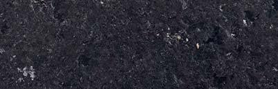
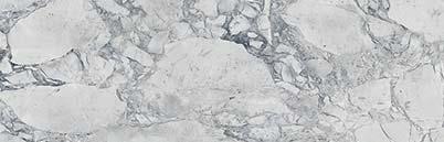
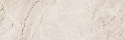
*31 *32 *33 *34 *35 542 cordillera *30 541 marés *30 SURFACES KERA *30 KERA PG 8 +50% SURFACES ROCCA ROCCA 01 PG 8 + 60% ROCCA 02 PG 8 + 70% ROCCA 03 PG 8 + 80 % ROCCA 04 PG 8 + 100% ROCCA 05 PG 8 + 110% 685 nero san marcos satined *31 684 white fantasy sanded *35 683 taj mahal sanded *35 SURFACES | KERA | ROCCA 545 iguazu *30 544 nasca *30 687 nero assoluto waterjet *33 686 steel grey satined *32 691 black musk waterjet *34 690 breccia imperiale satined *34 689 negresco satined *34 540 pamir *30
Die Arbeitsplatte ist ein wichtiges Gestaltungselement in der Küche. Und sie muss zugleich höchste Anforderungen an erfüllen. Schichtstoff-Arbeitsplatten erfüllen hierzu alle ästhetischen und funktionellen Voraussetzungen. Sie werden in einem aufwendigen Hochdruck-Verfahren aus mehreren Lagen Harz und Papier hergestellt.
The worktop is an important design eledemands both in terms of durability and being easy to look after. Laminate worktrequirements. They are manufactured in an elaborate high-pressure process from several layers of resin and paper.
Le plan de travail est un élément décoratif important dans la cuisine, qui doit de plus répondre aux exigences les plus élevées de durabilité et de facilité d‘entretien.
à toutes ces exigences esthétiques et fonctionnelles. Ils sont composés de plusieurs couches de papier et de résine et produits dans un procédé à haute pression complexe.
La encimera es un elemento de decoración importante en la cocina. A la misma vez tiene que cumplir con los más elevados requisitos en cuanto a resistencia y fácil mantenimiento. Encimeras de
requisitos estéticos y funcionales exigidos. Se fabrican en un proceso de alta presión muy costoso con varias capas de resina y de papel.
Het werkblad is een belangrijk vormgevingselement in de keuken. Het moet tegelijkertijd voldoen aan de hoogste eisen op het gebied van belastbaarheid en onderhoudsgemak. Kunststof werkbladen voldoen wat dit betreft aan alle esthetische en functionele voorwaarden. Ze worden volgens een uitgebreid hogedrukprocedé vervaardigd uit meerdere lagen hars en papier.
WORKTOPS LAMINATE 172
WORKTOPS | LAMINATE 173
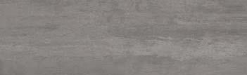
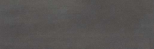
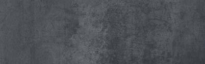


286 black slate LAMINATE 284 carbon grey 134 olive grey 205 neroton 032 magnolia100 arctic 120 frosty white 130 mohair 136 sand grey 273 platinum 282 alpine grey 103 merino 201 keraton 204 carboton 177 trentino porphyr 202 liton 152 kiruna 279 midnight blue 211 marmonero 138 fossil grey 137 taupe grey 140 boreal green *13, 14, 15, 16, 17 122 nimbus *14, 15, 16 174
WORKTOPS
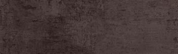
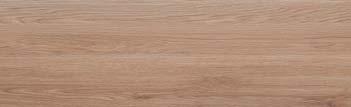
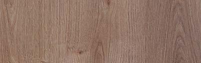
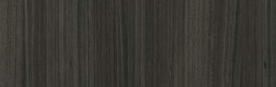
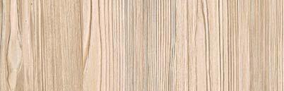
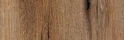
345
229
WORKTOPS LAMINATE 227
456
453
481
458
mountain robinia
fjord oak
japanese pine
228
weather oak
oxide brown
ouro preto
dark concrete
oxide grey beige
234
240
175 WORKTOPS | LAMINATE
239 karst oak
highland oak
walnut le midi
Porzellankeramik ist ein natürlicher Werkstoff. Für seine Herstellung werden fein gemahlene, mineralische Rohstoffe gemischt, gepresst und in speziellen Hochtemperaturöfen gesintert. Die durch den Sinterprozess homogen verdichtete und gehärtetebrannt – von schlichten Unifarben bis hin zu mit haptisch ansprechender Struktur.
Porcelain ceramic is a natural material.
mineral raw materials being mixed, pressed and sintered in special high-temperature kilns. The surface, which is homogeneously compacted and hardened in the sintering process, is extremely robust, scratch-resistant and absolutely insensitive to chemical
and extremely easy to clean. The design is burned into the surface – from simple plain colours to natural interpretations of stone surfaces with a structure pleasant to the touch.
La céramique de porcelaine est un matériau naturel. Pour sa production, des matières mélangées, pressées et frittées dans des fours spéciaux à haute température. La surface compactée de manière homogène et durcie grâce au processus de frittage est extrêmement robuste, résistante aux rayures et absolument insensible aux à l‘usage alimentaire et est extrêmement facile d‘entretien. Le motif du décor est incrusté dans la surface lors de la cuisson –des couleurs unies sobres aux surfaces en pierre d’aspect naturel avec une structure au toucher attrayant.
La cerámica porcelánica es un material natural. Para su fabricación, las materias prensan y se sinterizan en hornos especia-pactada y endurecida de forma homogénea que se obtiene a través de este proceso es extremadamente robusta y resistente a los arañazos y a la acción de los productos químicos. Además, es apta para uso alimentario y muy fácil de limpiar. El patrón desde sencillos colores lisos hasta tonos piedra de aspecto prácticamente natural con una agradable textura al tacto.
Porseleinen keramiek is een natuurlijk -
gemalen minerale grondstoffen vermengd, geperst en in speciale hoge temperatuur ovens gesinterd. Het door het sinterproces homogeen verdichte en verharde oppervlak is extreem robuust, krasbestendig en absoluut bestand tegen chemische invloeden. Het is bovendien levensmiddelenbestendig en bijzonder onderhoudsvriendelijk. Het decorbeeld is in het oppervlak ingebrand – van eenvoudige unikleuren tot en met zo natuurlijk mogelijk ogende stenen oppervlakken met een haptisch aantrekkelijke structuur.
176
WORKTOPS CERAMIC
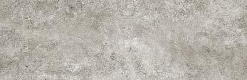
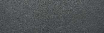
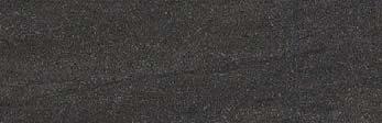
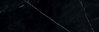

541
CERAMIC WORKTOPS 540
535
539
537
545
marés
542
cordillera
pamir
namib
askja
hammada 544 nasca
iguazu
550 antarctica
177 WORKTOPS | CERAMIC | QUARTZ MATERIAL
551 pietra di piombo
Das Besondere an den modernen, nurschichtstoffplatten ist der an den Kanten sichtbare Schwarzkern. Damit wird der horizontale Verlauf der Arbeitsplatte wirkungsvoll akzentuiert. Fünf aktuelle Farben stehen zur Auswahl. Auch als Wangen und für Fachborde ist das absolut wasserfeste Material einsetzbar. Spülen werden unterbündig eingeklebt. The special feature of the modern, just worktops is the visible black core at the edges. This effectively accentuates the horizontal progression of the worktop.tally water-resistant material can also be used for side panels as well as for shelf edges. Sinks are installed built-under and glued into place.
cm d‘épaisseur est le noyau noir visible au niveau des chants, qui souligne le tracé horizontal du plan de travail. Cinq coloris actuels sont disponibles. Ce matériau parfaitement résistant à l’eau est également utilisable pour les joues et les étagères. Les éviers sont collés sous plan.
Lo especial en esta placa maciza de -
mera. Hay cinco colores actuales entre los que se puede elegir. Este material absolutamente resistente al agua también se puede utilizar como panel o como estante. Los fregaderos van pegados desde la parte inferior.
Het bijzondere van de moderne, slechts
compacte kunststof is de aan de kanten zichtbare zwarte kern. Daarmee wordt het horizontale verloop van het werkblad effectvol geaccentueerd. Er staan vijf actuele kleuren ter keuze. Het absoluut waterbestendige materiaal kan ook als wangen en voor legborden worden toegepast. Spoelbakken worden van onderen vlak ingelijmd.
COMPACT MATERIAL 178
WORKTOPS

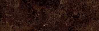
100 arctic 120 frosty white 130 mohair 453 ouro preto Black Core available in: 100, 103, 120, 130, 134, 177, 452, 453, 481, 482 White Core available in: 120 103 merino 177 trentino porphyr 481 dark concrete WORKTOPS COMPACT MATERIAL 134 olive grey 482 corvo 138 fossil
179 WORKTOPS | COMPACT MATERIAL
grey
WORKTOPS
Transparentes Glas, rückseitig in Wunschfarbe nach RAL lackiert, mit matt satinierter
zugleich ausgesprochen küchentauglich, gegen mechanische Beanspruchungen. Schöne Raumgestaltungen ergeben sich mit material- und farbgleicher Nischenrückwand. Besonders dekorativ wirkt ein untergebautes Spülbecken, denn die Glaskanten am Spülenausschnitt sind dann poliert.
Transparent glass, coated with the RAL colour of your choice on the back, with a
also extremely suitable for use in kitchens, is shock-proof and largely insensitive to mechanical damage. Rear niche panels in the same colour and material are particularly attractive. A built-under sink is particularly decorative because the glass edges at the sink cut-out are polished.
Du verre transparent, laqué sur sa face arrière dans un coloris au choix selon RAL et doté d’une surface satinée mate, c’est le summum de l’esthétique dans la cuisine. De est tout à fait adapté à l’utilisation dans une cuisine, résistant aux chocs et pratiquement insensible aux sollicitations mécaniques. L’utilisation d‘un matériau et d‘un coloris identique pour la face arrière de la niche permet de réaliser des solutions très esthétiques. Un évier sous plan est particulièrement décoratif, car les chants en verre au niveau de la découpe de l‘évier sont polis.
Vidrio transparente pintado en la parte posterior con el color RAL que usted desee, es estética pura en la cocina. El vidrio de apto para la cocina, resistente a los golpes y en su mayor parte resistente a esfuerzos mecánicos. Con partes posteriores del mismo material y color se pueden crear bellas decoraciones de interiores. Muy decorativo queda un fregadero montado desde la parte inferior de la encimera ya que de este modo los cantos del vidrio quedan pulidos
WORKTOPS
Massivholz als Arbeitsplatte – ein schönes und wertvolles Material für Liebhaber und Kenner. Schon im Werk werden die Massiveinem Spezialöl behandelt. Mehr als eine gelegentliche Nachbehandlung mit Öl ist
Holzpatina ist gewünscht und ein Zeichen für die Echtheit des Materials. Massivholzarbeitsplatten werden in Eiche, Buche und Nussbaum in 4 und 6 cm Plattenstärke angeboten.
Solid wood as a worktop – an attractive and precious material for connoisseurs and treated with a special oil during manufacture to protect the surface. The only care the surfaces need are an occasional treatment with oil. The typical wood patina is deliberate and desired, and indicates the genuine nature of the material. Solid wood worktops are available in oak, beech and walnut, 4 and 6 cm thick.
La plan de travail en bois massif - un matériau beau et précieux pour les amateurs et les connaisseurs. Dès l‘usine, les panneaux en bois massif sont traités avec une huile simple application d‘huile, de temps en temps, est le seul entretien nécessaire. La patine typique du bois est souhaitée et souligne l‘authenticité du matériau. Les plans de travail en bois massif sont proposés en chêne, en hêtre et en noyer, en épaisseur de 4 et 6 cm.
Madera maciza como encimera en un material muy bello y valioso para los amantes y expertos. Las placas de madera maciza ya reciben en fábrica un tratamiento con un
Por ello, como mantenimiento no requieren más que un tratamiento posterior ocasional con aceite. La típica patina de la madera es un efecto deseado y una indicación de la autenticidad del material. Ofrecemos las encimeras de madera maciza en roble, haya o nogal con un grosor de 4 y 6 cm. Massief hout als werkblad – een mooi en
Transparant glas, aan de achterzijde in wenskleur volgens de RAL-kleurenwaaier gelakt, met een mat gesatineerd oppervlak – dat is pure esthetiek in de keuken. Hettijd uitermate geschikt voor de keuken, stootvast en verregaand resistent tegen mechanische invloeden. Fraaie interieurcreaties ontstaan met een nisachterwand van hetzelfde materiaal en in dezelfde kleur. Bijzonder decoratief oogt een ondergebouwde spoelbak, want de glaskanten aan de spoelbakuitsparing zijn dan gepolijst.
kostbaar materiaal voor liefhebbers en kenners. Al in de fabriek worden de massief houten werkbladen met een speciale olie behandeld om het oppervlak te beschermen. Meer dan af en toe nabehandelen met olie is voor het onderhoud niet nodig. De typische houtpatina is gewenst en een kenmerk voor de echtheid van het materiaal. Massief houten werkbladen worden aangeboden in eiken-, beuken- en notenhout in diktes van 4 cm en 6 cm.
GLASS
SOLID WOOD
180

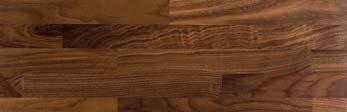
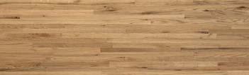
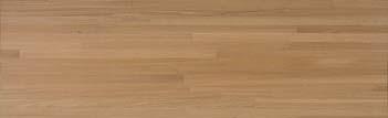

AP GL 1 RAL 116 walnut 118 limed oak 117 oak distinctive WORKTOPS GLASS WORKTOPS SOLID WOOD WORKTOPS | GLASS | SOLID WOOD
HANDLES
Griffe sind mehr als nur ein Detail der Küchengestaltung. Sie sollten gut in der Hand liegen, angenehm und sicher zu greifen sein. Darüber hinaus haben
Gesamtwirkung der Küche. Sie betonen eine horizontale oder vertikale Linienführung der Möbel und setzen Akzente. In der LEICHT Griff-Kollektion gibt es für jede Küche – ob modern-elegant, im Vintage-Look oder Classic-Style – eine in Material, Farbe und Formgebung perfekt abgestimmte Griffvariante.
Handles are more than just a detail of kitchen design. They have to feel good tin your hand, be pleasant and easy to get hold of. Furthermore, they also have a great impact on the overall effect of a kitchen. They emphasise the horizontal or vertical lines of the furnishings and are focal elements. The LEICHT handle collection has the perfectly coordinated handle for every kitchen in terms of material, colour and shape – whether modern/ elegant, in vintage look or classic style.
Les poignées sont bien plus qu‘un simple détail dans la conception d‘une cuisine. Elles doivent avoir une prise agréable et une préhension sûre, et ont un impact important sur l‘impression globale de la cuisine. Elles soulignent le tracé horizontal et vertical des lignes des meubles et poignées LEICHT comporte une variante de poignée parfaitement adaptée à chaque type de cuisine en termes de matériau, de couleurs et de formes, de style moderneélégant, vintage ou classique. Los tiradores son más que solamente un Deben ser cómodos en la mano, agradables en el tacto y seguros en el momento de tener que agarrarlos. Por otra parte global de la cocina. Ellos acentúan tanto horizontal como verticalmente el trazado de las líneas de los muebles y marcan unas pautas. En la colección de tiradores de LEICHT hay para cada cocina una versión de tirador que hace perfectamente juego en cuanto al material, el color y la forma; independientemente si es una cocina moderna o elegante, en un estilo Vintage o clásico.
Grepen zijn meer dan slechts een detail van de keukenvormgeving. Ze moeten goed in de hand liggen, prettig aanvoelen en veilig grijpbaar zijn. Bovendien hebben ze echter ook grote invloed op het totaaleffect van de keuken. Grepen onderstrepen een horizontale of verticale lijnvoering van het meubilair en plaatsen accenten. In de grepencollectie van LEICHT is er voor elke keuken – of deze nu modern is of elegant, vintagelook of classic-style – een qua materiaal, kleur en vormgeving perfect afgestemde greepvariant.
182
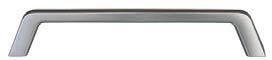
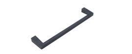
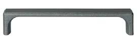
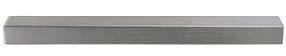
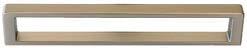
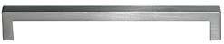
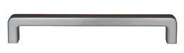
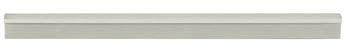
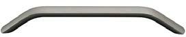
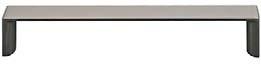
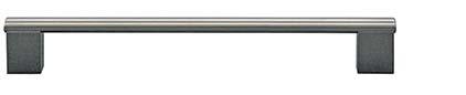
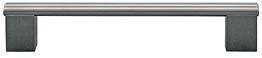
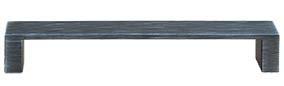
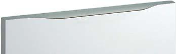
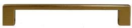
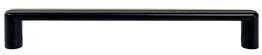
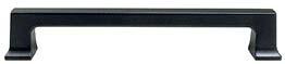
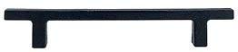
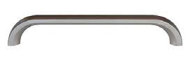
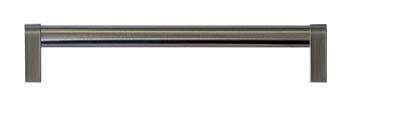
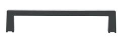
* COLOUR: 011, 012, 013, 015, 016, 017, 019, 020, 021, 023, 024, 025, 027, 028, 029, 032, 100, 103, 120, 130, 134, 136, 137, 138, 139, 273, 277, 279, 282, 284, 285, 307 601.405 | 602...* HANDLES 395.405 391.405 396.404 528.306 | 529... 566.405 | 576... 405.405 | 406...* 564.405 565.404 | 565.306 620.405 | 621...* 584.404587.405 | 597...* 555.306 | 555.405 605.405 | 606...* 554.306 | 554.405 | 544...* 550.409 | 550.405 | 550.416 | 550.284 | 550.286 551.277 | 551.405 378.306 375.414 574...* 387.404 552.405 | 553...* 401.405 | 402...* 810.405 | 809...* 807.405 | 817...* 710.405 | 720...* 804.405 | 814...* 530.306 | 531...* ONLY BOSSA 183 HANDLES
TYPES AND MEASUREMENTS
PRIMO
Die LEICHT Kollektion zeichnet sich aus durch hohen Variantenreichtum und ein breites Spektrum an Farben, Materialien die Möglichkeiten ergonomischer Planung.
The LEICHT collection is distinguished by a great number of variants and a wide range of colours, materials and decors. The of ergonomic planning.
AVANCE | HANDLE-LESS
Ein Klassiker der modernen Küchenarchimit der charakteristischen abgeschrägten Frontkante. Die obere Griffmulde sitzt hier unter dem ersten Schubkastenband.
A classic of modern kitchen architecture: the handle-less AVANCE by LEICHT with its characteristic chamfered front edge. The top recessed handle is right under the
CONTINO | HANDLE-LESS
Basierend auf dem erfolgreichen AVANCE Konzept, zeigt diese Kollektion eine eigenständige, gerade abgekantete Front. Sie ist beim 80er Korpus direkt unter der Arbeitsplatte positioniert. Auch hier steht
Based on the successful AVANCE constraight-edged recessed front. In the 80cm carcase, it is situated directly under the worktop. Here too, the new carcase range
Basée sur le concept AVANCE couronné
La collection LEICHT se caractérise par une grande richesse de variantes et une large gamme de coloris, de matériaux et-
tion ergonomique.
La Colección LEICHT se caracteriza por un alto grado en la riqueza de sus variantes y por un amplio espectro en colores, en materiales y en decoraciones. La línea de una realización ergonómica.
De LEICHT collectie blinkt uit door een grote rijkdom aan varianten en een breed spectrum aan kleuren, materialen enjkheden voor een ergonomische planning verder uit.
Un classique de l‘architecture de cuisine moderne: la gamme sans poignées AVANCE de LEICHT avec ses caractéristiques chants de façade en biseau. La prise de main supérieure est située sous la première rangée de tiroirs.
Un clásico de la arquitectura moderna de cocinas: el modelo sin tirador AVANCE de LEICHT con sus característicos cantos de puertas biselados. La gola superior aquí aparece debajo de la primera banda de cajones.
Een klassieker van de moderne keukenarchitectuur: de greeploze AVANCE van LEICHT met de karakteristieke afgeschuinde frontkant. De bovenste greepgleuf zit hier onder de eerste rij laden.
de succès, cette collection se démarque par une propre façade aux chants droits. Pour les corps de 80 cm, elle est placée directement sous le plan de travail. La disponible dans ce contexte.
Basándose en la misma concepción de AVANCE, que cosechó tantos éxitos, esta colección muestra una gola orientada rectilíneamente, igualmente independiente.
En el armazón de 80 cm, se encuentra situada directamente debajo de la encimera. También aquí tiene Ud. a su disposición la
Met het succesvolle AVANCE concept
als basis toont deze collectie een geheel eigen, recht afgeschuinde front. Deze is bij de 80 cm hoge korpus direct onder het werkblad gepositioneerd. Ook hier staat
184
CARCASE LINE 80 CARCASE LINE 86 224,65 237,90 211,40 54,25 14 cm (7 cm - 20 cm) 3,9 cm (1 cm - 6 cm) 73 93 224 210 197 153 80 73 73 73 73 73 73 40 53 66 120 134 147 73 Etagen-Aufsätze Oberschränke NischenNormmaß 54,25 Sockel Arbeitsplatte 6,75 13,25 13,25 13,25 13,25 13,25 13,25 13,25 13,25 13,25 13,25 13,25 13,25 Gesamthöhen: 227,15 213,90 54,25 10 cm (7 cm - 20 cm) 3,9 cm (1 cm - 6 cm) 80 217 190 204 146 80 80 80 80 80 80 80 27 40 53 66 107 120 134 80 200,65 Etagen-Aufsätze Oberschränke Gesamthöhen: NischenNormmaß 54,25 Sockel Arbeitsplatte 13,25 13,25 13,25 13,25 13,25 13,25 13,25 13,25 13,25 13,25 13,25 13,25 217,65 230,90 54,25 7 cm (7 cm - 20 cm) 3,9 cm (1 cm - 6 cm) 86 80 224 210 197 153 66 86 86 86 86 86 86 27 40 53 107 120 134 86 6,75 13,25 13,25 13,25 13,25 13,25 13,25 13,25 13,25 13,25 13,25 13,25 13,25 Etagen-Aufsätze Oberschränke NischenNormmaß 54,25 Sockel Arbeitsplatte Gesamthöhen: Hochschränke Unterschränke Hochschränke Unterschränke Hochschränke Unterschränke 204,40 PRIMO 185 TYPES AND MEASUREMENTS | PRIMO
TYPES AND MEASUREMENTS
Oberschränke / Aufsatzschränke
266,90 253,65 240,40 227,15 217 217 204 204 27 27 40 40 190 190 27 40 54,25 10 cm (7 cm - 20 cm) 80 80 3,9 cm (1 cm - 6 cm) 80 50 37 66 53 66 80 80 119 93 27 27 27 Unterschränke Hochschränke Gesamthöhen: NischenNormmaß 54,25 Sockel Arbeitsplatte 13,25 13,25 13,25 13,25 13,25 13,25 13,25 13,25 13,25 13,25 13,25 13,25 13,25 13,25 13,25 AVANCE | HANDLE-LESS 186
CARCASE LINE 80
TYPES AND MEASUREMENTS
237,90 251,15 264,40 277,65 54,25 14 cm (7 cm - 20 cm) 3,9 cm (1 cm - 6 cm) 43 119 224 224 210 210 197 197 73 73 73 73 73 80 80 93 66 66 27 27 27 27 27 40 40 40 40 40 40 Oberschränke / Aufsatzschränke Unterschränke Hochschränke NischenNormmaß 54,25 Sockel Arbeitsplatte 6,75 13,25 13,25 13,25 13,25 13,25 13,25 13,25 13,25 13,25 13,25 13,25 13,25 13,25 13,25 13,25 Gesamthöhen: 240,40 253,65 266,90 227,15 54,25 10 cm (7 cm - 20 cm) 217 217 204 190 204 190 80 80 80 80 3,9 cm (1 cm - 6 cm) 80 50 53 66 80 80 119 93 27 27 27 27 27 27 40 40 40 Unterschränke Hochschränke NischenNormmaß 54,25 Sockel Arbeitsplatte 13,25 13,25 13,25 13,25 13,25 13,25 13,25 13,25 13,25 13,25 13,25 13,25 13,25 13,25 13,25 Gesamthöhen: 230,90 244,15 257,40 270,65 54,25 7 cm (7 cm - 20 cm) 3,9 cm (1 cm - 6 cm) 43 224 224 210 210 197 197 86 86 86 86 86 66 66 80 53 53 27 27 27 27 27 40 40 40 40 40 40 13,25 13,25 13,25 13,25 13,25 13,25 13,25 13,25 13,25 6,75 13,25 13,25 13,25 13,25 13,25 13,25 80 27 Oberschränke / Aufsatzschränke Unterschränke Hochschränke NischenNormmaß 54,25 Sockel Arbeitsplatte Gesamthöhen: CARCASE LINE 86 Oberschränke / Aufsatzschränke CARCASE LINE 80
| HANDLE-LESS 187 TYPES AND MEASUREMENTS | HANDLE-LESS | CONTINO
CONTINO
HERAUSGEBER PUBLISHER EDITEUR EDITOR
UITGEVER
LEICHT Küchen AG
Postfach 60
Germany
info@leicht.com www.leicht.com
TEXT TEXT TEXTE TEXTO TEKST
neumann communication
Claudia Neumann
Carla Bohn | Fabian Leinweber | Elena Hurt BOSSA
bering*kopal Kommunikation
Charlotte Farber-Hemeling
ENTWURF PLAN PROJET PROYECTO ONTWERP
Interior Design LEICHT
Christiane Montenach
FOTOGRAFIE PHOTOGRAPHY PHOTOGRAPHIES FOTOGRAFÍA FOTOGRAFIE
Vasily Bulanov 05, 06
Peter Schumacher
Bruno Helbing 90-95 Fotolia 08
STYLING STYLING STYLING STYLING STYLING
Michaela Bazing
gen vor. Drucktechnisch bedingte Farbabweichungen sind möglich.
LEICHT reserves the right to make technical alterations. Due to printing limitations, colours may not be exact.
LEICHT se réserve le droit à toutes mode couleurs en raison des techniques d’impressions sont possibles.
LEICHT se reserva el derecho de introducir cambios técnicos. Es posible que se den diferencias en la exactitud de reproducción de los colores, debidas a las técnicas de impresión.
LEICHT behoudt zich het recht voor, technische wijzigingen aan te brengen. Om druktechnische redenen zijn kleurafwijkingen mogelijk.
IMPRINT -
188
