GD U S A
2023 DIGITAL DESIGN AWARDS
60TH ANNUAL PRINT + PAPER SURVEY
SPONSORED BY BILLERUD
21ST ANNUAL LOGOLOUNGE REPOR T


2023 DIGITAL DESIGN AWARDS

60TH ANNUAL PRINT + PAPER SURVEY
SPONSORED BY BILLERUD
21ST ANNUAL LOGOLOUNGE REPOR T

Sterling® Premium is back. Crafted in America with pride by people who bring generations of papermaking skill and passion to every product we make. Re-engineered for next-level consistency, Sterling Premium offers a new option for quality, printability and sustainability. Available in matching digital and offset sheets, Sterling Premium is made using 10% recycled fiber carrying three chainof-custody certifications. All of this backed by service and support as strong as our passion for paper.
Sterling Premium. An American classic. Reborn.

“You can observe a lot by watching.” So said Yogi Berra, whose baseball career and malaprops are having a revival due to a new documentary in theaters now.

It pretty well describes my job as editor here — at least until AI and ChatGTP replace me and that could well be soon. The phrase also captures the essence of our 60 year practice of polling the creative community in order to watch the integral and evolving role of print and paper in the service of graphic communications. History will record these decades as the full coming of age of designers as communicators, strategists, influencers and thought-leaders and, also, print’s rise to dominance in the graphic arts and subsequent evolution into a more selective and strategic role in a digital era. More on this later in the magazine.
Meanwhile, one thing has not changed since we began to poll in 1963: designers understand, appreciate and embrace the inherent qualities and capabilities of print to forge a human connection. Indeed, our 2023 poll reveals a community more positive, confident and assertive about the classic strengths and continued relevance of print communication than we have seen in recent times. Interestingly, this positivity is rooted in a realistic view of print’s current and potential role, rather than arising from some soft nostalgia for a bygone era or the digital fatigue of pandemic isolation. You can see it in the numbers; 96% design for print in their mix and 55% of assignments involve print in some way, shape or form. More so, you can feel it in the hundreds of meaningful comments we have received. As for us, we’ll be back at it in year 61, assuming our tech overlords permit. GK
This is the 23rd edition of the GDUSA awards program formerly known as ‘Web Design.’ Over the past couple of years, we have built it out and renamed it to better capture the dizzying depth and breadth of design for screens that characterizes 2023. And the vital role that graphic designers play in affect and impact. Websites, of course, but also social media and email marketing, digital ads and apps, interactive publications and displays, video and animation. More than two thousand entries were received with roughly onein-ten designated a ‘winner.’ I would double down on a conclusion we reached last year: Digital communication, and those who create and produce it, are in a virtuous cycle: burgeoning demand, richer tools, more stable technologies, and an increasingly sophisticated appreciation for how vital sound design principals are to ultimate success. SKW
We ’ve have never seen Bill Gardner hit or catch, but he can toss out a Hall of Fame quote with the best of them. As evidence, his initial observation from his 21st annual LogoLounge Trend Report: “I can’t help realizing how logo trends and weather have a lot in common.”
And so it begins, again, a non-linear journey through all manner of cultural and technological contexts that influence logo design in 2023. Think circular imagery, the omnipresence of symbols, the value of wordmarks, 3D use and abuse, green versus pink, and, of course, the ramifications of Artificial Intelligence. On the last point, Bill cites an unattributed quote on LinkedIn that is priceless: “Don’t worry about AI stealing your job. To replace graphic designers with AI, clients will need to accurately describe what they want. We’re safe.”
In turn, I asked Chat GPT to provide me with Bill background and here is the response: “Bill Gardner’s research and analysis provides valuable insights into the ever evolving world of logo design. Gardner’s passion for design, coupled with his unwavering dedication to his craft, has earned him a prominent place among the industry’s greats.” Got that right. GK
Get creative with Shutterstock FLEX, the industry’s 昀rst multi-asset subscription plan. Now you can access everything—images, clips, music, and more—in 1 easy-to-manage plan that bends to your will.




Learn more at shutterstock.com/pricing



GDUSA - Graphic Design USA Volume 60 / No. 3 May/June 2023 Kaye Publishing Corporation (ISSN0274-7499/USPS227020). Published 6 times a year with combined issues in January/February, March/April, May/June, July/August, September/October, November/December. Executive, editorial and advertising offices at 89 Fifth Avenue, Suite 901, New York NY 10003. Phone: 212.696.4380, Fax: 212.696.4564, www.gdusa.com.
SUBSCRIPTION: Domestic, $72 one year. International, $140 one year. Periodicals postage paid at New York NY and additional mailing office.
POSTMASTER: Send address changes to GDUSA - Graphic Design USA, PO Box 3072, Langhorne PA 19047. Permit #224.

Common Enemy basketball shoes hit the ground running for public health; Turner Duckworth invites Jim Beam drinkers to the front porch; Mother Design sets the table for new meat industry; Chermayeff & Geismar & Haviv redraws Warner Bros. shield for the family of brands; Blink Fitness rebrands as a welcoming road to inner wellness; JDO and Hawaiian Tropic confront collision of suncare and skincare; Xhilarate repositions senior community as lifestyle destination; and more.
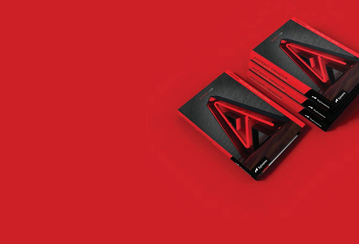
For the 60th year, we have polled our readers on benchmark questions regarding print design and paper specification. Over the years, the role of graphic designers and print itself has evolved, and our polls are a way to witness that evolution. One thing has not changed over six decades: creative professionals understand and appreciated the inherent qualities print and paper to touch, to engage, to forge a human connection.
Over more than two decades, Bill Gardner has compiled and reviewed 400,000-plus logos via LogoLounge.com. And more than ever, Mr. Gardner commands attention with a sweeping overview of the past year’s logo designs — the context and culture from which they arise — the patterns he gleans — and the wisdom he so gracefully imparts along the journey.



Our 23rd American Digital Design Awards™ saw a record-breaking number of entries, and here is a select showcase of winners. The contest formerly known as ‘web design’ has been expanded to better reflect and amplify the power of design to enhance online and interactive experiences – for websites, yes, but also social media, email marketing, digital ads, interactive and interface design, video and animation, 3D and more. It adds up to a virtuous cycle: more demand, bigger audiences, richer tools, better technology, and the elevation of sound design principals that tie it all together.
To learn more about the meaningful messages and offers in this edition, please view the advertisements and connect with these important suppliers and services.
In today’s digital world, the physical nature of paper grounds us. Whether it’s a book you just can’t put down or a package you can’t wait to open, our connection to paper is tangible. We’re excited to make this special relationship possible, into the next century and beyond.

PAPER. PULP. PACKAGING.

The story of paper has always been a page-turner.
Billerud provides paper and packaging materials that challenge conventional packaging for a sustainable future. We are a global leader in superior paper and packaging materials made from virgin fibers, and we’re passionately committed to sustainability, quality and customer value.
We serve customers in more than 100 countries with nine facilities in Sweden, USA and Finland and around 5,800 employees in over 13 countries. Billerud is listed on the Nasdaq Stockholm.
In the United States, Billerud operates out of a regional head office in Miamisburg OH, two mills in Michigan's Upper Peninsula and numerous distribution centers. We are a leading supplier of high-quality graphic and label papers, packaging materials, and market pulp. At Billerud, we build brands and business results for our customers.
This June 2023 edition of GDUSA is printed on Influence® Gloss, 60 lb. text from Billerud. Influence® is a high quality coated No. 3 web paper. More information about the graphic papers available from Billerud can be found later in this edition.
To learn more, please contact your Billerud graphic papers sales professional or visit billerud.com.
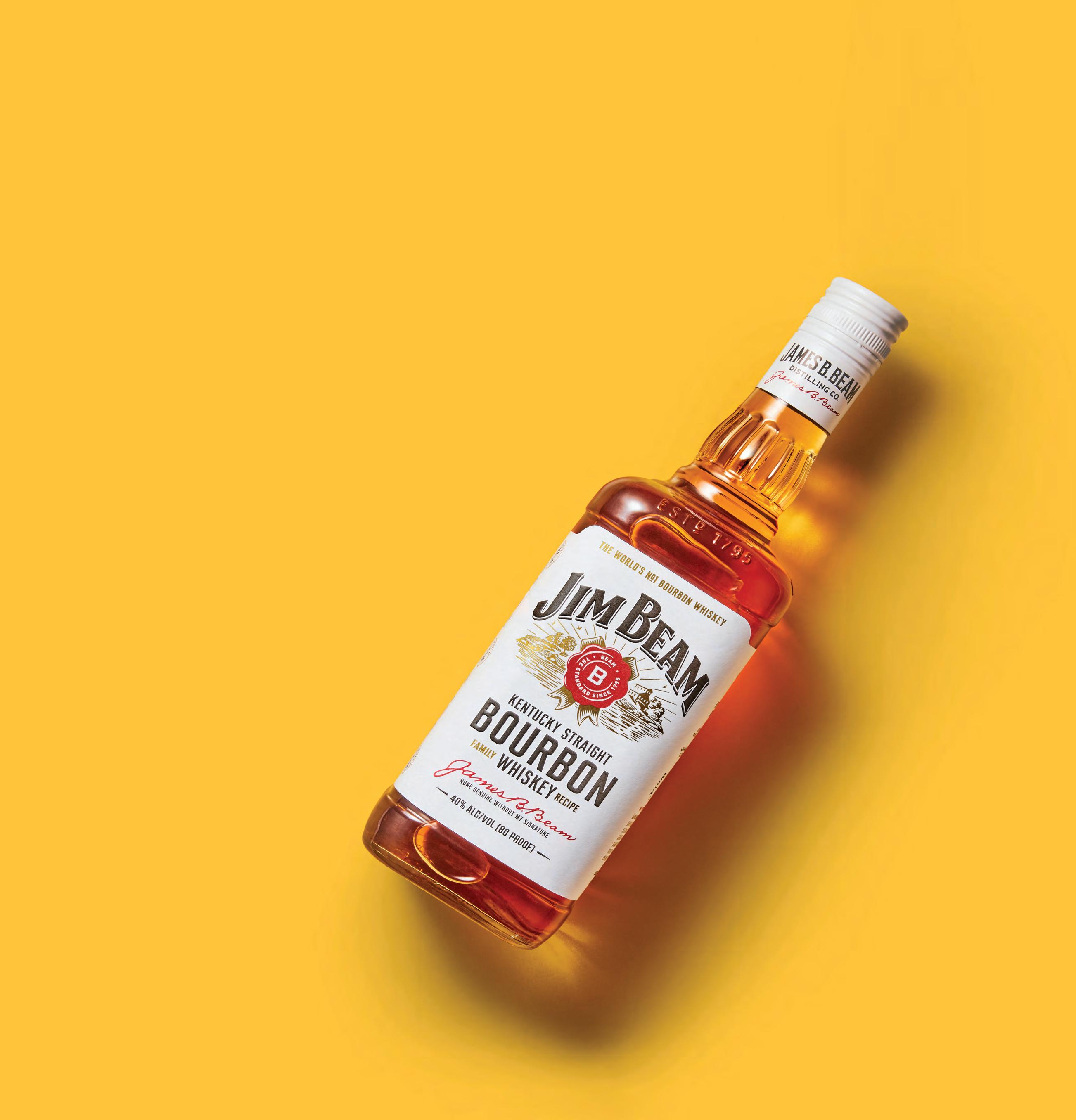
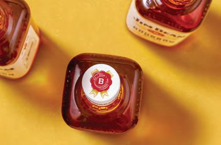
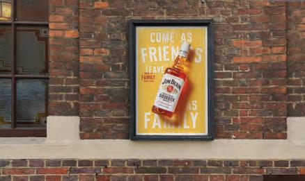
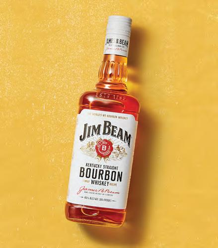
Turner Duckworth’s new visual identity for Jim Beam uses a range of elements explored and celebrated in this edition of GDUSA — logo design, print and label design, and a new website — to capture the spirit of the bourbon maker’s homey porch. The story is at PAGE 12.
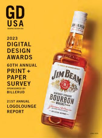
COVER PAPER CREDIT : The cover of this special edition of GDUSA is printed on FSC-certified Kallima Coated Cover C2S, part of the Kallima Paper family of FSC-certified coated cover paperboard, manufactured by the Tembec Paper Group. A leading advocate of sustainability, Kallima has a distinct low-density high-bulk construction resulting in less trees used and signficant cost savings to the customer. Contact: kallimapaper.com and 1.800.411.7011
Gordon Kaye PUBLISHER
Ilana Greenberg CREATIVE DIRECTOR
Sasha Kaye-Walsh EDITOR | WEBSITE + SOCIAL MEDIA
Gordon Kaye EDITOR | PRINT
Althea Edwards READER SERVICES
Angelo Abbondante ACCOUNTS MANAGER
Jennifer Hoff Scott Sczcypiorski INTERNET SERVICES
Maliya Malik DESIGN + SOCIAL MEDIA INTERN
Jay Lewis
Jeffrey Rosenberg PHOTOGRAPHY
Ron Andriani ADVERTISING SALES + INTEGRATED MARKETING + BUSINESS DEVELOPMENT
201.669.9884 212.696.4380 randriani@ gdusa.com
Milton L. Kaye 1921– 2016 FOUNDER
COPYRIGHT 2023 BY KAYE PUBLISHING CORPORATION
The Great Resignation has left companies scrambling for talented designers and creatives searching for fulfilling projects. That's where Artisan Talent comes in. We're a boutique creative staffing agency here to make things easier for you - whether you’re hiring talent or finding work. From small agencies to major corporations, our team is in the business of connecting people. That’s what makes us Artisan.
TOP PLACED TITLES
Art Director Brand DesignerCopywriter
Product Designer Digital DesignerGraphic
DesignerSenior
Visual
UI/UX
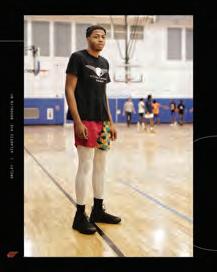
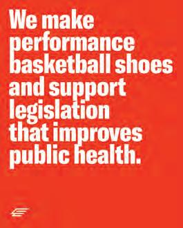
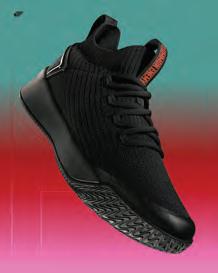
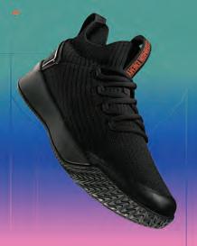
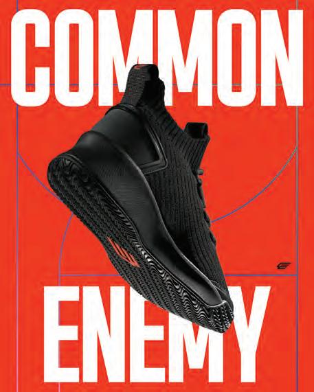
Designer Designer DesignerNEW YORK NY Dave Frankel, formerly of Pentagram and COLLINS, has developed a brand identity for basketball sneaker company Common Enemy. Led by founder and PUMA alum Ryan Gordon, Common Enemy is hitting the ground running to change the conversation around public health in the U.S. by donating 5% of every purchase to nonprofits fighting to improve our public health system. When it came to bringing this vision to life, Gordon says that he called on his old friend and dormmate to create a visual identity that reflected an elite-level performance basketball shoe company intended to make an impact. Frankel and Gordon note the key design elements: the complete system is anchored in its blunt and urgent approach to typography and color; for the display typeface, a condensed sans-serif GT America was chosen as a modern take on 19th century American Gothics and 20th century European Neo-Grotesk typefaces; for the color palette, a brand-red orange is kinetic, loud, and urgent, while secondary gradients provide aesthetic depth and uniqueness; abstract linework rooted in the lines of basketball courts can be found within the photographic elements, on the shoe box and bag packaging; the liner treatment above and below the brand name in the logotype are also a reference to the inbound lines of a basketball court; and for the logo, an abstracted “C” and “E” express movement. The founder of Virgo design firm in New York City, Frankel has spent the last three years teaching graphic and interactive design and typography at the School of Visual Arts, has been a guest critic at Parsons School of Design and the Pratt Institute, and has been writing about design. davecfrankel.com


A GRADUATE DEGREE AS UNIQUE AS YOU ARE. The Multimedia, Photography and Design program is for students who are passionate about expanding their career and gaining industry ready skills in the field of graphic design, motion design, 3D design, XR and immersive design, UI/UX design as well as photography and cinematography: all hands-on.
newhouse.syr.edu
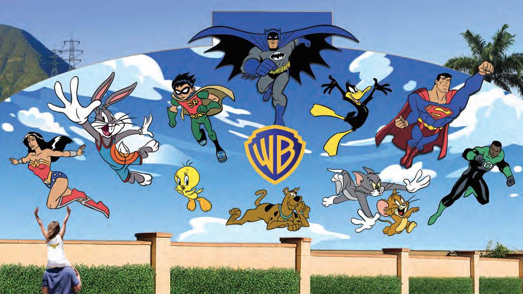
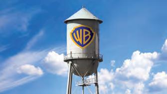
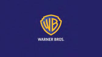
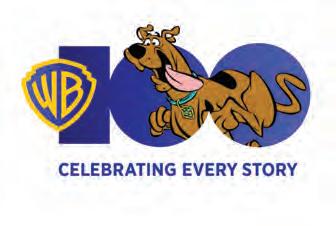
NEW YORK NY Chermayeff & Geismar & Haviv has redesigned the identity for Warner Bros. Pictures and for the entire Warner Bros. family of brands. The brand architecture is united by a newly redrawn shield. A distillation of the classic 1948 Warner Bros. emblem, the updated mark features reductive geometry, streamlined curves, and bright colors. Reimagining the shield from its original three-dimensional rendering involved redrawing it from scratch, and equalizing the weight of the W and B letterforms with the stroke of the encasing shield shape. The new consistency of line weight, with harmony between each element, creates what the design firm describes as “a unified, timeless symbol” that can work seamlessly with all the properties in the company’s portfolio. The strong, sans-serif, all-capital letters for the wordmarks have been redrawn to accentuate the curvature of the rounded letterforms, such as the Ps, Bs, and Rs to complement the revised WB letters in the shield to update the typography for modern uses and legibility. Two manifestations of the new shield anchor the identity system: the solid rendition is used primarily in corporate communications, while the outline rendition promotes movies, tv, games, and other content. Both manifestations can take on the background colors and textures of the specific creative content, providing a consistent canvas. cghnyc.com

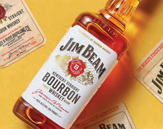
CLERMONT KY Jim Beam has launched a global brand campaign to celebrate the belief that “People Are Good For You.” The campaign — which includes a new website and advertising accompanied by a refreshed visual identity and packaging — is an effort to drive an emotional connection between the popular bourbon and the next generation of consumers. An introductory spot was directed by Noam Murro with creative by Leo Burnett (featuring the classic connection tune Sweet Caroline) while the visual design was led by Turner Duckworth. Explains Global Brand Vice President Veronique Mura: “We started this process by going back to our heritage as a brand crafted through the generations by the first family of bourbon. Jim Beam is an iconic brand that has celebrated the power of human connection for over two hundred years, going back to the front porch of the Beam family home where everyone was welcome. Our new campaign puts our authenticity and warmth on full display and reminds audiences that there’s no feeling more special than being around other people.” Of the new visual identity, Matt Lurcock, Creative Director, Turner Duckworth London, says: “Great brands always seem to have a spirit of place about them. Talking to Fred Noe, the great grandson of Jim Beam, we kept hearing about the Beam family porch. It’s where Beam was first bottled and shared, where traditions were born and where folks came together time and again for more than seven generations. Bringing this spirit of the porch together we retained all the brand’s familiarity, but packed it full of warm, honest soul.” turnerduckworth.com

Create pantsuits
Create typography
Create photographs
Create games
Create cars
Create shirts
Create reels
Create mobile apps
Create werewolves
Create gloves
Create stories
Create imagery
Create impact
Create pantsuits
Create experiences
Create orbs

Create sculpture
Create comics
Create costumes
Create memes
Create renderings
Create worlds
Create paintings
Create wireframes
Create whatever you want
School of Graphic Design
Create consoles
Create websites
In the School of Graphic Design, you’ll learn to combine words and pictures to create meaning, provide guidance, and help us make sense of our world. Graphic designers work their magic on virtually everything — computers, phones, games, apps, cars, clothes, ads, products, packages, websites, printed items, and within environments both built and virtual. Graphic design is a dynamic and exciting profession, providing the means to apply your creative and artistic skills within a practical business context. Study online or on campus in San Francisco, a world-renowned center for creativity, technology, and innovation.
Create werewolves
Academy of Art University Defy the Ordinary, Create the Extraordinary academyart.edu
Create buildings
Create jewelry
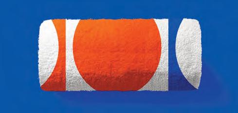
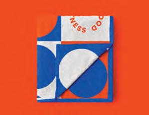
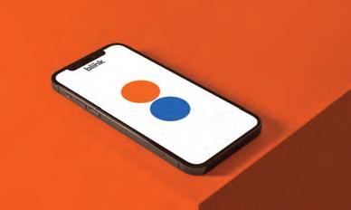
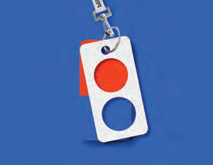
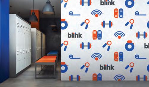
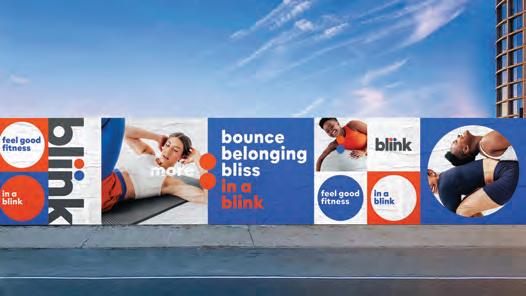
NEW YORK NY Creative company Mrs&Mr has rebranded Blink Fitness, the national fitness brand with more than 100 locations. The new visual identity system refreshes the look and feel, and seeks to elevate the brand’s positioning as “aspirational, approachable and accessible to all.” Comments Kate Wadia, founder and CCO of the agency: “Through research, we uncovered that Blink’s unique selling point is ‘inner fitness.’ It’s mood over muscle. It’s how you feel versus how you look. A clear antidote to a category that reinforces intimidation and exclusion, we positioned Blink as the friendliest and most welcoming gym — one that makes it simple and easy to get on the road to inner fitness ... The new visual format is anchored in a system of circles that telegraph a sense of motion and playfulness. Circles were chosen as the distinctive visual equity for their welcoming and unifying quality. They are used prominently across the organization for patterns, photography, interiors and exteriors, on merchandise, and as the foundational element for all illustration. Vibrant hues of blue and orange define the distinctive color palette combination to promote an uplifting and upbeat feeling that translates well inside the gyms, in contrast to the darker color palettes of most other gyms.” To complement the circles, a sans serif font was selected for its openness and approachability, and custom letterforms were created for the wordmark. The new branding has been implemented across digital media, the website, app and the interiors and exteriors of Blink gyms. As part of the repositioning, “Feel good fitness — in a Blink” has become the brand’s consumer-facing line and its mission to make working out as simple and easy as possible from communications to check in to classes and more. mrsandmr.com


Apple Inc. has multiple positions available for the following job opportunities in Cupertino, CA and various unanticipated locations throughout the USA:

Refer to Req# & email resume to: jobadv@apple.com:
1. Human Interface Designer (REQ#2879712)
Rspnsbl fr dsgnng inttv & hmn-cntrd exprncs tht hlp our custmrs nvgt & use th apps wth eas. $161,000.00 - $242,000.00/yr.
Apple Inc. has multiple positions available for the following job opportunities in Culver City, CA.
Refer to Req# & email resume to: jobadv@apple.com:
1. Content Designer (REQ#3161680)
Collbrte with cross-functnal teams for innovtve prodcts within the Music & Servcs spce. $106,500 - $160,500/yr.
Apple is an EOE/AA m/f/disability/vets.
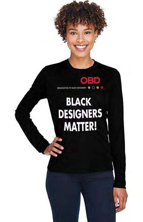
The Organization of Black Designers/OBD created the "Black Designers Matter!" T-Shirt to show solidarity with the Black Lives Matter movement. The shirt also references the pressing need for greater Diversity, Equity and Inclusion in the design professions. That has been the mission of OBD since its founding in 1994. Proceeds from the sale of these shirts will go to support and build our OBD Scholarship Endowment Fund. We will also contribute 5% of our T-Shirt sales to Black Lives Matter.
Thank you for your support.
JERSEY CITY NJ
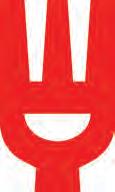
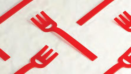
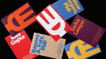
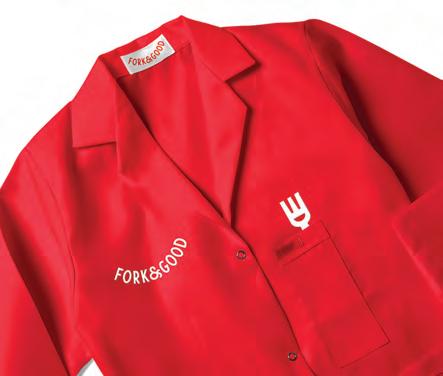
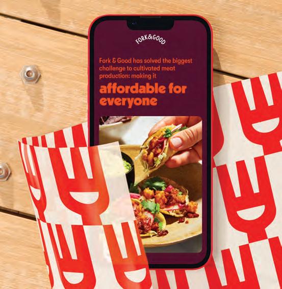
Cultivated meat lives in a brand category that, at present, is largely notional. Barriers like cost-effectiveness, scalability, and cultural skepticism have largely kept lab-grown meat products from gaining traction in the mainstream — despite a longstanding place in the sustainable food conversation. Fork & Good is pioneering the way meat is cultivated at scale and paving the path forward for the new industry. With a primary focus on ground pork — the most consumed animal protein — Fork & Good mainly partners with food trucks and fast casual establishments, with offerings that include tacos, dumplings, gyoza, meatballs, and similar items. Created by Mother Design, the company’s new identity encapsulates the idea of infinite possibilities and accessibility for any cuisine and all meals. The new identity lives on the company’s website, packaging, social media channels, new office, and lab signage and coats. For the wordmark and logo, Mother Design found inspiration in traditional butcher shop signage. The curvature of the mark emulates the characteristic cutout in its new “Smiley Fork” logo, and both curve and cutout are expressed in many variations in motion and static use. The same cutout informs the “bowl” device in its graphic system — the two-dimensional container for meal variations photographed in high contrast — and, paired with chopsticks found in the negative space between the fork’s tines, further represents “the universality inherent to the brand’s DNA.” The system is rounded out by repetitive, foodwrapper-like patterns and a vibrant color palette of bright red, cool dijon, deep eggplant, and other appetizing tones. forkandgood.com


NEW YORK NY Brand design firm JDO has taken Hawaiian Tropic, founded in 1969, beyond the beach with new identity that highlights the sunscreen brand’s skin-loving credentials. The challenge: the next generation of consumers brings with them a philosophy based on awareness, authenticity and acceptance and this — along with the collision of suncare and skincare — has set new expectations for the category. JDO was tasked with evolving Hawaiian Tropic with a more conscious and intentional sensibility that would better resonate with the values of this younger audience. The key challenge of this restaging: maintaining the essence of Hawaiian Tropic as it shifts from a carefree, only-for-the-beach sunscreen brand to a thoughtful, all-occasions skin-loving brand. “Hawaiian Tropic is a beautiful brand, that holds a special place in the hearts and minds of its extremely loyal following,” comments Paul Drake, Founding Partner and Creative Director of JDO. “For that reason and more, we felt very protective of the brand and worked very hard to retain its allure as we brought stronger relevance with a more contemporary aesthetic.”


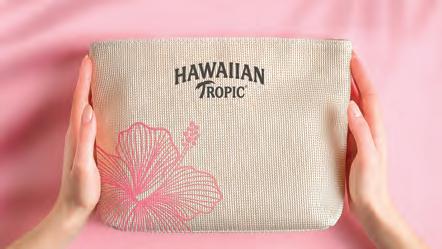
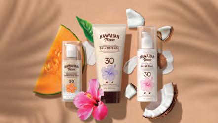

From rebalancing the logo to highlighting the brand’s natural qualities by elevating its iconic Hibiscus flower, the identity embodies the new positioning. Simplifying the package creates a more contemporary look and gives more space for the brand to convey ethical, ecopositive messaging to better resonate with consumers. Concludes Elizabeth Gioia, Senior Global Brand Strategy and Innovation Manager, Sun Care at Edgewell, says that the new identity “evolves the brand with fidelity and finesse, helping Hawaiian Tropic embrace its future as a modern beauty brand for people who love their skin as much as they love the sun.” jdouk.com

PHILADELPHIA PA
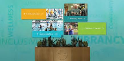
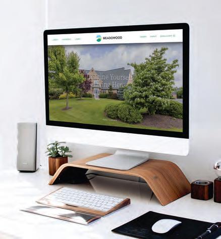
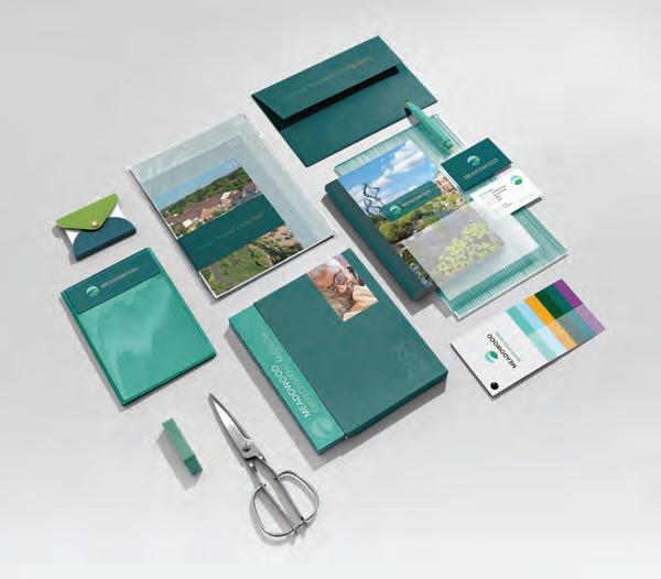
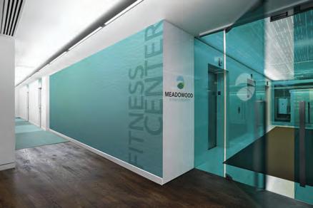
With the arrival of spring, residents at Meadowood, a non-profit Life Plan community in Worcester Township PA, can walk along 135 acres of gardens and wooded areas filled with birds and wildlife. Spring also ushered in a rebrand by Xhilarate, that included dropping “Senior Living” from the name, a new logo, website, signage, and refresh of all touchpoints. “The target audience is getting younger and more active, looking at these communities as lifestyle destinations rather than retirement communities,” says Russ Napolitano, partner at the Philadelphia-based design and branding firm. A key element of the rebrand is the logo — the first update since 1988 — a circular graphic featuring shades of blue skies and lush greenery with a pathway cutting through the center. A clean and modern typeface completed the rebrand. The Xhilarate designers also recommended bold and vibrant colors along with extensive imagery to better communicate the property’s attributes through the new website. While the previous website was heavy with information, the new version emphasizes the grounds, range of activities, residential living options, its wellness program and the various amenities conducive to an active lifestyle. It’s designed to encourage visitors to act by calling or filling out a form to schedule a visit. Says John Kotsatos, VP, Sales & Marketing at Meadowood: “We wanted to partner with an agency that would tell our story authentically, based on our founder’s vision, while also setting us apart from other life plan communities.”
Of particular importance, he adds, was an online presence that was less copy-heavy and better captured the spirit of the place. xhilarate.com


HiretheLatestDesignTalent
Ourdesignersarethenewesteditionto thelegacyoftheSyracuseUniversity communicationsdesignprogram.Their portfoliosrepresentdiverseprojectsthat spanabroadrangeofskillsincluding branding,artdirection,editorialdesign, packagingdesign,UI/UXdesign,webdesign andadvertising.Notwoportfoliosarealike. Viewtheimpressivecollectionofworkhere: vpa.syr.edu/cmd2022
admissu@syr.edu
315.443.2769
vpa.syr.edu/cmd2022
@su_commdesign
“You can observe a lot by watching.” So said Yogi Berra, whose baseball career and malaprops are having a revival due to a new documentary in theaters now. It pretty well describes my job as an editor — at least until AI and ChatGTP replace me which could well be soon. The phrase also captures the essence of our 60 year practice of polling the creative community in order to watch the fascinating, integral and evolving role that print and paper play in the service of graphic communications.
To (wildly) oversimplify the history of this thing of ours, we can discern three broad phases dating back to 1963. In the first phase, designers were often perceived (and self-perceived) as decorators and prettifiers rather than decisionmakers. Among the consequences of passivity: print and paper decisions were restricted by little product choice and dominance by printing and production experts. In phase two, designers emerged as creative masters, strategists and thought-leaders known to add value and to shape commerce and culture. In this phase, control and responsibility for content and production flowed upstream to the creative community — making designers the center of all things print, and sparking a golden age of paper specification and creative print buying. We are living now in phase three, in which designers are ever more recognized and celebrated for the value they bring to the table. But, of course, the rise of digital communications has broadened the media options and forced designers to recalibrate their relationship with print and paper. What we are witnessing in our past few polls is the nature of that evolution.
One thing has not changed over six decades: designers have always understood and appreciated the inherent qualities and capabilities of print to forge a human connection. Thus, it is gratifying that our 2023 poll reveals a community more positive, confident and assertive about the classic strengths and continued relevance of print — even (or especially) in a digital era — than we have seen in recent times. Interestingly, this positivity is rooted in a realistic view of print’s current role and potential, rather than arising from some soft nostalgia for a bygone era. You can see it in the numbers and, more so, feel it in the hundreds of meaningful comments we received. As for us, we’ll be back at it next year, human or otherwise. Watching so that we may observe and likely pillaging Yogisms for additional wisdom.
Print continues to play a vital role in how professional graphic designers make a living. Fully 96% of respondents say they work in print as part of their professional mix and 55% of their projects involve a print component. In addition, 72% say they expect the same level of print design this year as in the past and, of the remainder, more designers say they expect to do more print (19%) rather than less print (9%) in the coming year. In short, our readers reaffirm the relevance of print to their professional lives.
Everyone understands that print is now a role player rather than the star — best used as part of an integrated marketing mix or for certain targeted audiences and purposes. That requires more sophisticated judgments about how and when to deploy print, and how to combine technologies such as QR codes and AR combined with print deliverables.
Designers believe print endures because of its classic strengths. Foremost among these is tangibility — it is sensual, touchable, physical, real, permanent, and encourages a human connection often missing in the virtual world.
These classic strengths are amplified by digital clutter. Because print is relatively rare, it has the potential to stand out and be special — fresh, welcome, surprising, disruptive, personal, engaging, meaningful, a statement that a brand values itself and its customers. And then there is the related concept of digital fatigue. The fatigue factor from the pandemic era seems to have fostered a new appreciation for the attributes of print.
Closely related is the issue of trust: quality printed pieces are seen to possess authenticity and credibility because they feel real and present, spring from an identifiable source, and are the result of a deliberate act of craftsmanship. This strain of thought is much stronger this year than in the recent past, and that may be notable. The fleeting and ephemeral nature of digital communications does not inspire similar confidence.
1 6 8 10
Relatedly, designers have a sharper understand of where print is most effective and where it is not. There is a growing consensus: Packaging is a growth area and an opportunity. Print excels for luxury brands, large consumer purchases, catalogs, invitations, and a host of specific industries like real estate, healthcare, art, engineering, education where quality, permanence, craftsmanship and depth of information matter. For fast-paced industries or circumstances where immediacy counts and information changes rapidly, not so much.
4
2 3 5
If print is to stand out and be special, that imposes a responsibility on creators and producers: superior print design, well-crafted execution, strategic deployment, sustainable methods matter more than ever. Perhaps that explains why, when print is part of the marketing mix, designers try to retain responsibility and control for critical steps in the process: 80% buy or specify paper and 86% buy or specify printing.
7 9
There is clearly less emphasis on printcraft and its intricacies. Digital solutions tend to be the default position — they feel bigger, broader, cheaper, easier, more contemporary, often sexy to clients — and this is especially true for each younger generation of designers and consumers.
As has been true for six decades, Brochures + Collateral are the most frequently executed print projects. This year, Sales Promotion, Posters, Invitations, and Direct Mail follow closely. Against the odds, Business Cards remain popular, while Annual + Corporate Reports and Catalogs are mainstays.
Sustainability is an important factor when assessing a project — including, of course, whether to recommend print or digital media. In earlier times, there was an easy assumption that digital had the lighter footprint. But designers now have a more nuanced understanding of the environmental costs of the digital infrastructure, and many see print and paper as a green option and a renewable resource. That said, the print and paper industries have work to do to spread the message: respondents to today’s poll are divided as to which media is more sustainable, and nearly 40% simply do not know.
We are a global leader in superior paper and packaging materials made from virgin fibers, and we’re passionately committed to sustainability, quality and customer value. We serve customers in more than 100 countries with nine facilities in Sweden, USA and Finland and around 5,800 employees in over 13 countries. Billerud is listed on the Nasdaq Stockholm.
In the United States, Billerud operates out of a regional head office in Miamisburg OH, two mills in Michigan's Upper Peninsula and numerous distribution centers. We are a leading supplier of high-quality graphic and label papers, packaging materials, and market pulp. At Billerud, we build brands and business results for our customers.
Sustainable packaging is no longer optional. It’s a must for any brand that wants to future-proof its business. That’s why our decisions are always guided by the promise of creating a better tomorrow, today.
As a leading supplier of virgin fiber-based paper and packaging materials, and with sustainability at our core, we are passionately committed to our customers and their businesses, every day. With our industry knowledge and expertise, we are here to inspire and make you feel confident in making the best packaging choices that help reduce your climate impact.
Our roots and our proud history in the forestry and paper industry go back more than 150 years. In October 2022, we took our next step into the future under the name of Billerud. This change symbolizes our growth agenda and our development as an international company, together with our new mills in North America.
With our distinguished graphic product line, streamlined supply chain and flexible manufacturing capabilities, we are ready to respond to market demands that best service our customers. Ours is the best quality graphic papers with a broad selection of forest management and chain-ofcustody certification options for all types of commercial printing applications. Our US mills are strategically located near top industry printers across North America, so our products are available when you need them. And we provide expert customer support, on-press technical service and insightful solutions that bring added efficiency and productivity straight to your business.
Our family of sheetfed grades spans your premium through economy needs, for applications that include high-end brochures, annual reports, corporate collateral, direct mail, high-end packaging, and general commercial printing:

• Sterling® Premium
• Productolith® Pts.
• Sterling® Ultra C1S
• Anthem Plus®
We have been a leader in manufacturing digital papers since digital printing technology first emerged more than two decades ago, offering specialized expertise, dedicated production capacity and a portfolio of products to meet the needs of the various applications of digital and inkjet printing:
•. Sterling® Premium Digital™
•. Productolith Pts. Digital®
•. Blazer Digital®
•. TrueJet® Book
OUR COATED WEB PORTFOLIO:

We make it easy for coated web paper customers to do business with us, with breadth and quality of web products that are second to none:
• Sterling® Ultra
•. ArborWeb Plus®
•. Influence®
•. ArborWeb®
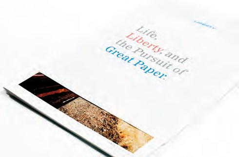
•. Liberty®
•. New Era® Matte
To learn more, please contact your Billerud graphic papers sales professional or visit billerud.com.
THIS EDITION OF GDUSA IS PRINTED ON INFLUENCE® GLOSS, 60 LB. TEXT FROM BILLERUD
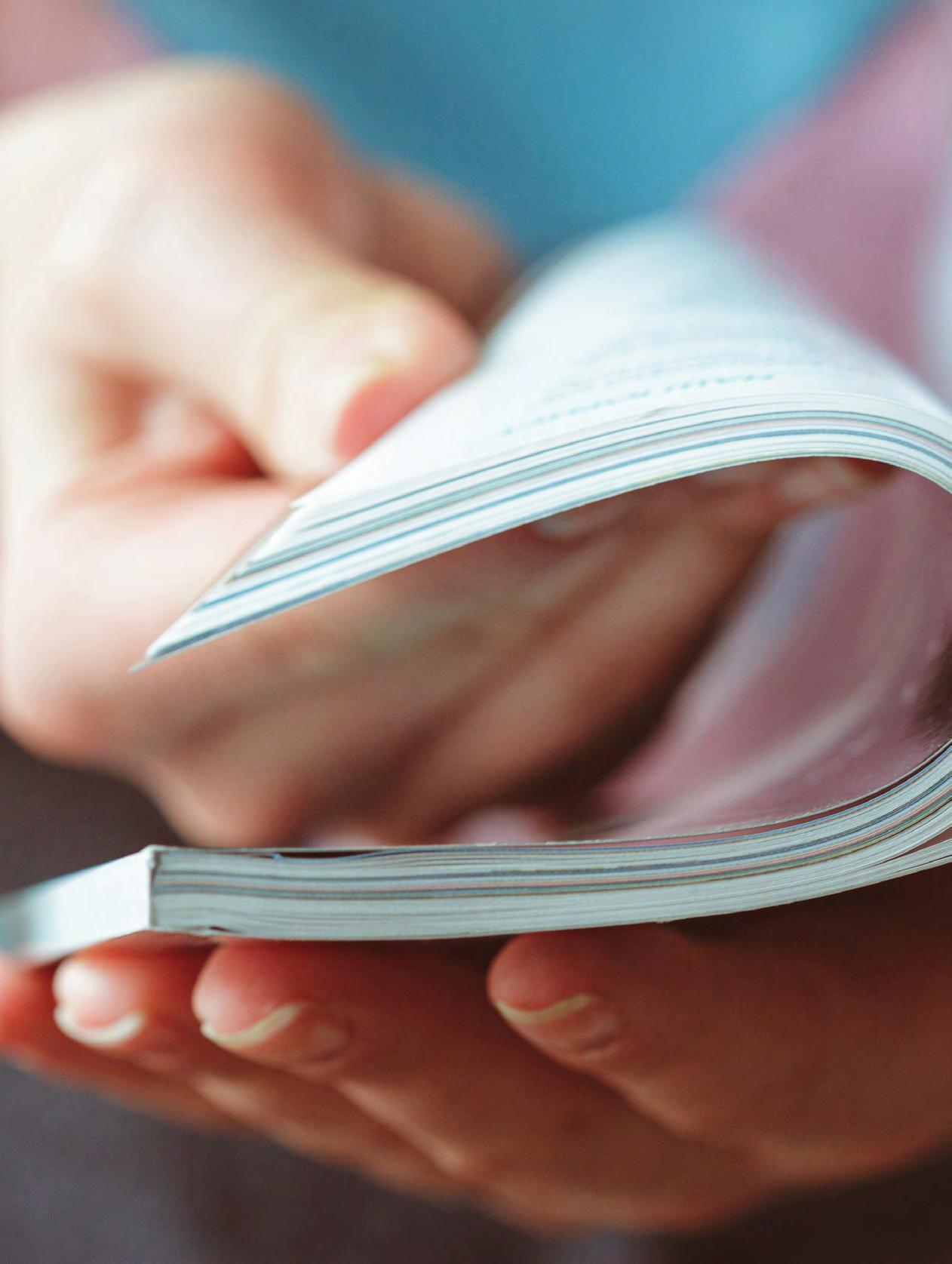

OUR 2023 POLL WAS SENT TO A RANDOM SELECTION OF 10,000 GDUSA PRINT AND E-SUBSCRIBERS. THE BENCHMARK RESULTS MAKE CLEAR THAT, EVEN IN A DIGITAL AGE, PRINT REMAINS ESSENTIAL TO THE GRAPHIC DESIGN PROFESSION.
In the field of design, print remains vital. Its tactile qualities, permanence, and credibility hold significant value. Physical artifacts like brochures and packaging provide immersive experiences. Print’s lasting nature captures a designer's vision and offers credibility through meticulous production. Tangible materials convey trust and professionalism to clients and consumers. Creative exploration through paper textures and printing techniques enhances visual impact. Despite the digital age, print design continues to be indispensable for effective communication and leaving a lasting impression in the design world.
In today’s world, it's no secret that digital work is more common than ever. As designers we still care a lot about the appearance and feel of paper and packaging, and the question arises whether or not the client cares enough about it. That said, print continues to be a very big part of the business! Almost all of our clients, including those who rely primarily on their web and digital presence, not only utilize printing and paper but also care about the standards of quality for both.
CRAIG VALENTINORABE & CO / THANK GOD IT'S
I love holding a favorite magazine in my hand and studying the spread of an interesting story (looking at it on my iPad just isn't the same – scrolling ruins the experience). Or the feel of a textured stock and turning the pages of an informational brochure a favorite company sent me (again scrolling is aggravating). I love perusing my collection of design ephemera and those favorite magazines for inspiration I've gathered over the years... Sometimes (OFTEN!) it's better to be unplugged...
BILL THAUER FREELANCE ART DIRECTOR/DESIGNER/PHOTOGRAPHERI love printed material! I love to work on print projects of all kinds and I believe that print and digital support and enhance each other if done properly. Well done, well-placed digital advertising and marketing helps promote printed magazines, books, etc., just as well done, well-placed print material helps promote broadcast and digital media. There's no getting around it, print is here to stay!
I hate dealing with absolutes but I feel like print will always have a place. Print marks special occasions in our lives. How many of us have a shoebox or a giant tote filled with concert tickets, programs from events, signed pictures, newspaper clippings, magazines, etc.? I'm going to go out on a limb and say probably 99.9% of us do. It's hard to be nostalgic about an email. But holding that piece of your history in your hands is powerful. It's
important. If you spent the time, money, and resources to put ink on paper, it must be important.
Absolutely! Part of the overall design has to include the touch f actor. It can change the way a piece is viewed when they touch something that surprises them. Online cannot give that kind of experience — ever.
I don’t see digital media replacing printing. They are better off working together to support each other. Print can become more personalized and focused with the help of digital, and print offers digital a more lasting impression with its tactile nature.
Print is still important. People have short attention and have less working memory capacity. Having a take-away print helps your product stay in the forefront of their mind. If your product is shared digitally it can easily become “lost in the shuffle,” which ironically originates from paper. Print has become more special — digital ads and videos have become vices from which you need to take a break.
The traditional strengths of print are more relevant today than ever before. Touch, sensuality, permanence and portability provide human connection that is missing in the virtual world. Print also has longevity, whereas digital does not as it can easily be clicked away and vanish. Print has more impact today because people are simply tired of digital everything.
It is very difficult to trust what is coming onto my screens these days. A printed piece, a letter, a brochure, a catalog, direct mail piece makes me feel more comfortable and more likely to consider a purchase.
Yes! As a package design company, print is very important to us, as is the whole experience of touching and interacting with the paper/ package that provides the consumer with an emotional connection.
Print is alive and very much has a place and a purpose. Email communications for advertising are deleted multiple times daily without even opening. Print is a clearer communication method and has much more credibility.
The visual and tactile attributes of paper can’t be duplicated. They provide instant credibility and a sense of permanence. You can use a textured paper background in a photo or take a photo of the surface and add that credibility to visuals that lack that tactile nature.
Most digital design executions are hollow, void of relevant concepts, and will not endure. It is driven by trendy motion-based executions. It exists within a world of followers rather than innovators.
Placing ink on paper is permanent. Thought-provoking print-based assignments require a higher level of thinking, design expertise, and greater sensitivity to nuances of the visual arts profession. Print-based design is a concept driver medium. An experienced print designer offers the audience a tactile experience that digital will never be able to deliver.
Print and paper’s traditional strengths still matter. Touch: There is something special about the feel of paper in your hands. It is a tactile experience that can't be replicated on a screen. Permanence: Print materials are more permanent than digital materials. They can be stored and read for years to come. Credibility: Print materials are often seen as more credible. This is because they are more difficult to create and distribute, which makes them seem more legitimate. In conclusion, print is still an important part of our lives. It has many strengths that digital materials can't match, and it is still a valuable tool for both professional and personal use.
We’re still struggling to get the quality of paper we could before COVID. But printed materials are still a very big part of our customer experience: direct mail, print ads in trade publications, brochures, and trade show materials. We are making use of QR codes more at shows, recruitment events, etc. but people still pick up physical copies at these events.
Taking a break from a digital experience is soothing and can be a significant boost to mental health. I find a calmness in print that doesn’t [yet] exist in digital media. With print, motion is represented through composition, and the mind is open to imagination — taking time to see “layers”, details, and other intricacies of design without being led by digital motion. There’s an element of natural discovery and sophisticated thought processing that occurs with print.
People recognize that our digital world is often an unhealthy or unpleasant one. A printed piece slows us down and engages all of our senses, and gives us a hands-on experience that digital media simply cannot.
Tactile projects have a longer shelf life then digital projects. The budgets may be smaller but print projects trend to be more impactful.
In the industrial truck scale industry, people still like to initially look at brochures and catalogs to get a sense of what they’re considering. They may or may not from that point jump onto a website for more information.
In this world of screens, gadgets and gizmos we NEED the tactile quality of paper. As humans, the ability to hold, smell, feel, touch, and interact with materials is paramount to our sense of wellbeing and our sense of being grounded. And remember, science still tells us that the physical act of handling paper, pages, books, etc., allows us to better retain the information we read.
In my professional work, I often use print materials to create marketing materials, presentations, and reports. I find that print materials are more effective than digital materials in some cases, such as when I need to make a strong impression or to provide information that needs to be easily accessible offline.
I still prefer print but that’s just not the nature of my business anymore. Paper doesn’t allow us the same flexibility as online communications.
If I am creating an invitation, I want the paper to feel special. If it’s a poster, I want it to be more of a cardstock with a nice finish so it can withstand the environment and stand out.
We do our LookBooks every year for our clients, and we send 300+ copies out a year. We also create and make these for our big clients every year. I feel it is important to have this done to build credibility in the market, and to showcase your work as a reminder to all your current clients and future clients.
‘Paper’ is still one of the most viable ways we earn our referrals believe it or not, as an agency. Hard to not see/touch/appreciate your hard work when our catalog is in a client’s hands.
Print is and will always be important. It’s a form of communication and by that alone we need to understand the value and importance paper or print graphic design shapes our style of communication. It holds a realm that digital cannot. It is tactile and dimensional.
I’ve been in printing for over 25 years and have seen the shift from more standard stationery printing to specialty printing. We still do traditional stationery but work more with dye-sublimation and flexible packaging.
I 100% believe in touch and permanence. People need reminders of things in-hand. If everything was solely digital, it can be clicked off of, skimmed over, or scolled past so easily. Print in hand is still just as effective. Our company, which is predominantly print, hit record breaking sales last year, and is already projected to do the same again.
While more and more content seems to be moving toward digital platforms, the remaining print items take on a new significance... and are probably surviving — maybe even thriving — for a good reason. New technology doesn’t always completely displace an older technology. Sometimes, it just creates a new space, while the older technology takes on a narrower relevance … So, yes, print and paper still matter, just in an evolving way.
I think it will still be a long while before people give up giving out business cards. I know that some people do still like to be able to hold a physical newsletter to read. Also, if I get something online — it's much more likely to be lost in my email than something physical that I set aside to read (but that's just me).
Print is very important to us. Over the past 5 years, our business model has changed dramatically. We have transitioned from mostly working for clients to working almost primarily for ourselves. We print and promote our unique illustrations, painting, designs and photography. We still do work for a few non-profits, whose causes we belief in, but our focus now is all about creating art and selling prints of that art… The papers we print on are archival, and have a specific tactile texture and look that enhances our work. The right paper is critical to our brand.
Paper is fundamentally important to society. You don’t hang up a digital version of a diploma. You hang A PAPER DIPLOMA. Rappers don’t hold up handfuls of Bitcoin in videos. They hold up PAPER MONEY. Printed pieces will always have a place in our lives. And while you can turn a page in a digital book, if you don’t charge the tablet, you’re not going to get to read that book. Unless it’s made of PAPER.
Print is still important but the same designs must also translate to digital formats for display across multiple platforms.
While digital platforms have gained significant prominence, print remains important in both my professional work and personal life. Print offers a tactile experience that digital media cannot replicate, allowing for a deeper connection with information. Additionally, print provides a sense of permanence, as physical copies can be
stored and accessed reliably over time. The credibility associated with print materials also persists, as they are often regarded as more trustworthy and authoritative. Despite the convenience of digital alternatives, the traditional strengths of print, such as touch, permanence, and credibility, continue to hold value, making it relevant and significant even in today’s digital age.
With so much digital content today, I feel like having something to hold and feel, is making a comeback. Although now with QR codes, we can combine the impact. Today, however, print needs to really stand out and catch the reader’s attention to justify itself
Print is a core part of my job, specifically when it comes to packaging and branding design. I still prefer a good book rather than reading on a screen and when I design for print, I try to use materials that have a nice texture and feel like a premium experience, by also using special inks to elevate the final product.
Currently, most of my projects revolve around print, although I have observed that my clientele is slowly transitioning some projects to digital media. Additionally, the younger demographic may not value printed materials in the same way my generation does.
Professionally, print is still important, for trade show quick guides, trade show banners, printed catalogs (customers want them), brochures and flyers. Personally paper is very important in my personal life. Did I say how much I love paper and the varieties of paper? I’m a consumer of paper products like journals, notepads, greeting cards, and am also a painter and printmaker so I purchase specific types of paper for painting, sketching and printmaking.
It’s hard to imagine the scarcity of paper in say the 18th century, and that not everyone had access to paper. I’d like to think that I don’t take access to paper for granted.
Print projects have decreased and digital has taken over. That has been the case for the past 10 years.
The sense of touch is so important to the experience of connecting with messages and retaining the content. Neuroscience supports that what we see and what we feel creates experiences that directly affect the brain.
Print still matters but in this day and time it is very important to use sustainable materials in all print, including packaging. Sustainability is the key, protecting the environment and not contributing to the pollution is paramount.
I do think print matters. I think there is an ebb/flow to these kinds of things that trend more toward digital, but then as soon as they do, they go too far very quickly and many demographics feel marginalized by the “busy-ness” of digital communications.
Then print comes in to reconnect with human touch points.
Print always matters. It’s been sad to see some of the shift away from tactile printed materials post pandemic. Especially in the world of hospitality... menus being the most important.
To me, print is important and I wish it wasn’t waning. But things change so fast that the shelf life of a print piece is often no longer worth the cost to a client.
Print still matters. I see its use reserved for special situations, when a project needs to make an extra splash or requires a personal touch.
Paper (touch) is absent from digital communication. Adding back or including print/paper is more rare and therefore even more impactful than ever.
I specialize in publications, primarily books for self-publishing authors. Though they make their biggest profit selling ebooks, they all want/need print for author signings — a main marketing tool. Readers still like the tactile experience of holding a book and turning pages. However, the cost of printing continues to rise, making it less affordable for publishers of all kinds. This prohibitive cost is what may eventually be the death knell for print books. The price of paper and the cost of fulfillment contribute to this. It’s certainly NOT the cost of design and production, as designers are competing with Fivver and the like.
I feel like print is still very relevant. In my personal life, it is very much. However, for my job, I’m not called on as often as I once was to produce print materials. That probably differs from job/ industry to job/industry.
Print is critical both in my professional life and my personal life. Working in the B-to-B publishing space, doctors (our readers) still prefer print publications. And after spending 10 hours on a computer each day, I still prefer to read print materials in my down time.
Printed materials still command credibility. The challenge is that so many public-facing materials are printed digitally, with little attention to the touch and feel of the paper being used.
My job is an artist, designer and I oversee the agency’s Print Shop. We are a state agency — we design and print a large amount of different things during the year.
Print absolutely still matters. Unfortunately, very few companies or people understand where print's value is best utilized.
I love print. Always have. Print feels good; it’s memorable, unlike so much digital I don’t even open. Print should be celebrated for the valuable contribution it makes to communication and design.
To me, print still matters. I am working predominantly with packaging and trade show poster wall designs. Also print matters for a non-profit I work with, i.e., for EMS uniforms, banners and outreach material for recruiting (including brochures to kids coloring books). Personally, I buy less print; one reason is that there is so much information out there, often not worth the paper it is printed on. That said, I believe there is always a market for good quality. I just bought a heavy format nicely printed craft book. I also subscribe to a handful of magazine. Real paper is just a different experience and more stimulating to the senses. Personally, I’ll always love paper and use it in personal projects or in bookbinding. Choosing the right paper for a project is still an important part of the project’s life cycle. But printing costs for clients are becoming more of a factor, even for the one or two print pieces that are a go. Print projects either wind up being scrapped for digital or downgraded to quick printing services.
Yes, it brings in more of the senses and stays with a person longer than digital. However the combination of both digital AND print brings a whole new level of awareness and interaction.
Print leaves a stronger impression and serves as a good reminder when I get something that I actually care about and want to follow up on. My company is starting to understand the importance of good print, as well.
No. I don't even want paper in my house except for books to read.
I believe designing for print is a dying art, even though demand is still there. This opens the field for the cream of the crop of print designers.
I believe print has leaped into new dimensions with digital, and the pairing with AI is adding a whole other dimension.
Personally, I still love to read a printed book and receive printed cards and letters. I do not miss receiving catalogs in the mail and would be happy to see all printed junk mail cease to exist. On the business side, I think if there were fewer low quality printed pieces out there, budgets could increase for higher quality printed collateral that would be more attractive to the intended audience.
Print will never die, but continues to contract, which results in greater prestige.
Our customers react to print strongly when considering the large overall picture, but are more responsive to appropriate, honest, tactical, digital messaging.
We embed video screens into print so it is the best of both worlds!
Maybe I’m ‘old school,’ but print is still important to me, mostly in my professional work. I do appreciate getting a beautiful print piece mailed to me, but mostly if it’s something special. Runof-the-mill stuff usually ends up in the recycle bin. At work, we produce a print and digital magazine. The print version is BY FAR more impressive. We feature large, beautiful photography, which just doesn’t come across as well in our digital version.
I enjoy reading books and magazines in print form. I find that I am more engaged with the content when I am reading it in print. I also appreciate the permanence of print materials. When I read something in print, I can keep it for reference or to share with others.
Yes, print and paper are relevant today. I have had client try to go all digital and they have had to go back to print because digital didn’t have the pass-through that print collateral had.
Absolutely relevant, especially with regard to food packaging. However, some print may be replaced by digital as a focus on the environment and paper waste, particularly as junk mail gains scrutiny.
I still love paper products and packaging. There’s something about touch and feel that brings you closer to the product. Books too! I hope print doesn’t dissolve completely, but I understand that in our instant demand world, digital is just easier.
Professionally, many of the projects I design are digital but designed so that the end user can print them out if they wish. My clients have found that printed materials are still needed for event invitations, programs, and fundraising appeals.
Print is no longer really very important. I do like paper books, but have moved to digital news. I receive a few printed magazines. But print design is now largely business cards and invites. Invites have been made more complex by people not coming to the office, so e-invites are safer. Companies do like to have something physical printed for events as a hand-out for visitors to take away.
Yes, printed pieces matter! In my professional life, I regularly work on book design and print advertising. In my personal life, I can't get enough of printed materials. The touch, permanence, credibility are always something I’m thinking of and admire.
I believe that print is still very important, perhaps even more so, as design goes digital and ephemeral, the fact that printed pieces are actually tangible will make them increasingly precious.
Nowadays clients want a logo design, business cards and then a website. Then they’ll try advertising, direct mail postcards. Beyond that maybe a brochure, catalog, promotional item. Some are being replaced by digital, for example, I have a bookkeeper, tax preparer who would order a presentation folder every year to place hard copies of the tax return and a cover letter. Now the client wants a pdf instead. Print is taking some hits.
Print only matters from a collectability standpoint. Anything that is meant as temporary such as catalogs, newspapers, promotions, etc. is dying off and replaced by online publication. However, books and things that are meant to have value beyond the temporary still hold credibility.
Coming from a traditional print background but evolving into the digital age, I appreciate and respect the tactile longevity of printed pieces. I love how paper thickness, coating, and inks can bring a project to life. In art school, we weren't allowed to touch a computer until Junior year, so we learned how placement, composition, use of fonts, images, and colors impact a message. In grad school, I learned how movement via video and animation could enhance the messaging. In my professional work for the past 25 years, I've learned the importance of designing a message that can work as a static or with motion — many times using both in one campaign, so they must relate and complement each other. Having been a mentor to newer designers who only learned digital design, I stress the importance of composition and how it will look on a page — that it takes true thought to make something permanent.
I love print but I admit that it is dwindling in my professional life. In fact, I am right now considering eliminating my shelves of paper swatch books [insert crying emoji] as I moved my office and hardly ever spec “fancy” paper anymore. I love digital design, but I miss the days of picking up the latest swatchbooks, print samples, and swag at paper shows.
I believe print will continue to have value in all aspects of life. There is growing sense of digital fatigue.
In my experience, print is particularly effective for clients who value tangible experiences, such as luxury brands, high-end publications, and artistic endeavors. Print excels in conveying a sense of quality, permanence, and craftsmanship. Additionally, print is relevant when targeting specific demographics, such as older audiences who may prefer traditional mediums. On the other hand, for fast-paced industries with rapidly changing content, digital platforms may offer more flexibility and real-time updates, making print less relevant. Ultimately, the effectiveness of print depends on the specific goals, target audience, and nature of the content being communicated.
Print is especially effective for packaging clients and consumers. All aspects of packaging quality (materials, finishes, etc) are highly considered and still make a huge impact on the competitive shelves. As for clients who do not rely on packaging, including those who mainly have an online presence, just about all of them still take much pride in their business card printing and apparel/ promotional materials. We also have clients who care about photography of their products and services, and the high-quality book printing we do for them is very effective.
Print is important. Clients still need brochures. Clients still need business cards. Clients still need posters and sales flyers. A digital leave-behind is not as effective. If you leave a brochure, then that brochure might be passively seen laying on a desk by the prospective buyer. If you leave a PDF for them to look at, they have to be intentional. The prospective buyer will have to actively load up that PDF to be reminded of whatever it is you are selling. Even if your leave-behind is a business card with a QR code, it's still a physical piece in the real world.
Print is especially effective for learning new content, changing the way you think, or developing a new process. A printed quick reference or reminder that lives at your desk is extremely beneficial. If you're learning or training virtually—print is irrelevant. However, a problem may arise where general ideas are retained, but specific content and concepts need reinforcement, coaching, or digital reminders.
In my experience, print is particularly effective for clients and content that require a tangible and immersive experience. Industries like luxury brands, real estate, and art often benefit from print's ability to showcase products or visuals with highquality images and design. Print is also effective when targeting certain demographics that prefer physical materials, such as older audiences or those in rural areas with limited internet access. On the other hand, print may be less relevant for timesensitive content, rapidly changing information, or when targeting tech-savvy, digitally-oriented consumers who prefer instant access and interactive features. Ultimately, the effectiveness of print depends on the specific context and target audience.
I’ve found it extremely relevant to every client. The idea that it is not relevant is the actual problem; some (many, too many) clients think they don’t need anything but a social media account. Once they see the impact of a catalog, or direct mail, or packaging, or books to have and to hold, the light switches on. I do everything possible to keep that light ON.
In my experience, both print and digital/online communications both have a solid space with clients. Having the choice on how to communicate and choosing your delivery solution is what's powerful.
Our industry is mostly made up of baby boomers as far as decisionmaking goes. They grew up with print and are still likely to prefer it over digital.
After living in San Francisco for a long time, and then moving to a much smaller town, I was shocked to see such a difference in the utilization of digital media in general. I’m afraid that designers in big cities over-estimate the usage of digital media in most people's lives.
Effective = older consumers, higher value clients. Less effective = younger audiences.
I’ve learned print has no age — older, more traditional consumers appreciate a tactile piece, but younger ones have begun to truly appreciate a break from the sensory overload of digital media. Having worked in several fields like architecture, advertising, editorial, education, marketing, packaging, promotions, POP/POS displays, I see the benefit of having a print component that gives another dimension and feel to a message. Digital saves trees, but uses electricity, so one method isn’t completely environmentally friendly. Since there are many audiences, it’s hard to rule out one method over the other — so as not to alienate an entire population that may not have digital access or competence, nor
assume everyone wants to collect a bunch of printed pieces that take up space.
Print is an effective novel tool used to engage a precise audience — a tactic to gain attention and speak to an audience in a new way. As the saying goes, “Everything old is new again.”
Large consumer purchases and luxury purchases need the touch and feel of paper; it slows down the frenetic pace and gives people a chance to think and consider.
We love doing OHH and posters for our movie clients, as well as NFP clients we have. It is essential for events to have leave behinds, takeaways and something to remember you by.
Print is critical for packaging, and book/magazine publications. Not relevant for digital platforms including social media, pod casts, blogs and digital newsletters.
Associations and nonprofits tend to print more than traditional for-profit outfits. Healthcare prints a lot. So does Real Estate.
I have both types of clients. Some projects are okay with just posting online, but some need both online and print. We work with college students and it seems they prefer digital, but notice that when something is in print it gets more attention.
Our distributors/customers still want paper catalogs.
I would say magazines with readers who are passionate about the subject should stick with print (or have options for both print and digital). Few of my own favorites: American Bungalow, American Road, Coastal Living, Outdoor Photographer, Downeast. Technical subjects maybe not so much... Sad to see advertising moving to more online/digital...
For my industry, we focus on employee communications and for many companies, print is still important to target those who are not on a computer as part of their job, or there are topics/ decisions relevant to partners/family members.
The Real Estate industry definitely still needs the print media. Flyers and brochures in the open houses give prospective buyers something to think about when making a decision.
Real world clients need to include touch/paper in their communication mix. Digital clients can add touch/paper to establish greater presence/realness to their mental presence.
Print for weddings still hold strong.
Our customers rely on printed schematics, installation instructions, quick start guides, etc. They request print as opposed to online materials.
My clients who work in industries with tangible products find print materials particularly important; especially those that have products aimed toward wealthier clientele. For example, a folder of information for a high-end countertop company.
Business to Business, Corporate, and Image-focused clients in particular are more concerned in including print and collateral material as part of their overall branding efforts.
My last two jobs are actually a great example of each. My current position is with a cybersecurity company and print materials aren't as common. There are some but the majority is digital. I would say 25/75. My previous position was in higher education and the print materials were far more common. I would say it was more like 75/25 print to digital.
II have found that financial advisors, as a client group, seem to enjoy printed collateral, even when the same content is available digitally on a website.
Quick takes: Print is irrelevant for mass mailings and even targeted mailing lists. More effective for turning good prospects into clients. Bespoke, and/or personalized print communications still make an impression. There’s just too much print ‘noise’ still. It needs to evolve more in this digital-forward age.
With the older generations print will probably be preferred method considering that is how they were ingrained to retain and gather information. They’re also not as tech savvy.
Print is relevant with Not-for-profits. Real estates. Corporate communications.
Print is irrelevant in short lived news updates, entertainment, info clutter and opinions. General public informative materials and tech books are too fast-lived and seem outdated as soon as they are printed. However good quality (color) print will always have a market. Educational material is still strong, as I don’t think it is good to have kids online too early and online presence can’t be expected everywhere. Another good print market is packaging which can help selling a product and also informs and fulfills government guidelines, i.e., with nutrition labels. (I just bought a new Pantone fan for color printing on supplement labels.) Packaging for transport is still is strong with paper, brown bags, pouches and wrappers, cartons. Demographics who prefer the print versus online, such as seniors, like clear readable information material in the mail, likewise government communication or fire hazard information … Less used, but still needed: letterheads, envelopes, even calling and appointment cards. Indoor and outdoor signage and environmental label systems and posters are still important. Calendars, on point
guidelines, recycling info postcards… Sustainable furniture made from carton material is tested as alternative to plastic and veneer. Printing on that furniture would be a new market.
Printed brochures may still be picked up, but are less relevant as single information sources. We do information posters for the trade booths which also have a QR code… whole wall or poster video screens that replace poster walls are already seen, however are rare as they are still expensive and confusing, less good for type heavy information, and the impression is short lived. I also order decorative (poster) prints from the nature photographs I take.
CPGs rely heavily on print in the overall expression of a product. Invitations can still be print dependent, although they seem to be going digital.
In my experience, some form of print collateral can be used effectively in almost every marketing/advertising solution.
We see a lot of activity in the real estate industry. Direct mail and signs are still highly effective. We also see a lot of sales in manufacturing and healthcare.
I can no longer speak for this since we basically fired all our commercial clients, but for our non-profit clients and our own personal work, print is very effective.
Using both print and digital is a great combination. As stated before, print tends to tingle more senses and stay with reader longer if it is something they WANT to hold on to.
I think it is effective when trying to get the word out about something important and helps increase the odds that someone gets the memo. Print is also more effective when you want a luxe experience.
Packaging still requires print and people love stickers as ephemera. It is irrelevant for editorial, news, invitations, bills.
I think depending on the communications goals of each client/brand either print or digital come to play. Nowadays print also has the job of being more sustainably conscious ... Print can be exceptionally effective for audiences who don’t gravitate towards digital, have difficulty with digital technology, or for whom digital connectivity is an issue. I have observed many elders who look forward to opening their traditional, printed mail
as a daily activity. Others of various ages and backgrounds enjoying a book or magazine while leaving digital devices behind. Those with religious observances that include a powering down of digital devices on the Sabbath and certain holidays.
Fashion continues to utilize print as well — think of tags and labeling. Even brand logos that are printed directly on the fabric — this is still print!
Printing/branding on transportation vehicles like airplanes, buses, trains, and such is important. While not paper, this is still print.
There are lots of examples where print remains an effective solution, but one thing that comes to mind is a printed note card. It takes on a new level of significance in the face of overloaded email in-boxes.
We suspected that at employee recruitment events involving younger people and recent graduates that digital would rule, but we see people of all age groups just have personal preferences for print versus digital.
Especially in an era where RGB color on smooth screens and mobile video is so pervasive and distracting, the immediate credibility of well-designed print provides a great way to stand forward. Especially when adding even more credibility with the authenticity of embossing or debossing. And combining foil leafing and varnishes.
Print is relevant for Manufacturing and Engineering. Buyers of art and photography and kids' books. In person meetings. Long content (such as books). Packaging. Events. Healthcare and energy related. Restaurant and retail clients for Menus, POPs, and tents. Invitations. Greeting cards and POS.
Non profits, government, and small businesses use print more in my experience.
Long term things like catalogs are a must for print, but print will no longer work for shorter term things that need the reach and immediacy of digital.
As an institution of higher education, we generally mail to market to students and well as their parents. Parents find it a great tool when choosing colleges and keeping information straight.
I imagine that client selling products are the most relevant. Packaging and branding help make buying decisions. Special promotions are also more effective when they arrive by mail. And then there’s event marketing. For special events, printed campaigns work well for driving greater attendance.
Visual and tangible items are still important. Look, feel and touch is still relevant. Package design is important for consumer attention to products. Newsletters, magazines and the like are in both realms both print and digital. Those depend upon the customer preference. What fits best in their lives. Some like the printed, to get away from digital screen, some like the digital as for them it's more efficient and available.
Baby boomers still rely on printed materials for many things, but are actually open to digital for others. I still think they are the biggest print clients when it comes to information that is more involved. Print is more and more irrelevant for first touches in the younger generations, however, I think any communications plan would be completely ineffective without print materials at some phase of customer contact. This is all coming from a higher education design/marketing background.
Consumer-end (packaging). Industry is demanding more sustainability but there is still a need for packages, shipping boxes, PDQ and endcap displays, etc.
It appears that the older population has not fully adopted digital media compared to the younger generation.
Print is important in both my personal and professional life. Print materials are more effective in creating marketing materials, presentations, and reports that require a strong impression or offline accessibility. Reading books and magazines in print enhances engagement and offers the benefit of permanence. The traditional strengths of print still matter: touch, permanence, and credibility. Printed materials feel special and are stored easily, making them more credible than digital materials. In conclusion, print remains an essential part of life and has strengths that digital media cannot match, making it a valuable tool in both personal and professional use.
In my experience print and digital media go hand in hand. Each serves a purpose and each reaches the target audience in different ways. They work best together to drive the clients market share.
My nonprofit clients have found that people still respond to mailed fundraising appeals, so they have kept printing their fundraising letters but reduced the quantity of each mailing.
Print can be helpful when you’re explaining a new product. I just received some Moringa powder from a DTC order and got a mini brochure in the package explaining the benefits of Moringa and how to use it in recipes. That will be handy to keep around. Anytime you order something physical, like a pair of shoes, it's possible to extend the sale by included something printed.
Print is important to consumers of books — not everyone likes to read off a digital screen. Books are portable in a way that Kindles or electronic devices are not. They don’t need to be recharged, and it's fun to flip pages with your fingers. Also, the packaging industry will always have use for print. I suppose people don't write actual letters sent through the post that much anymore. That skill is becoming or has become a lost art form.
The fine art world requires a lot of attention to paper and detail.
The book projects I work on are typically with photography or art based clients. They want their work to be on display in a physical setting and prefer the beauty of a physical object over a quick scroll or click.
Print is especially effective for projects or clients that are trying to project a sense of strength, stability and security, such as in banking, real estate, medicine. It is less relevant for information that is constantly changing, such as the news, the stock market, etc.
Print is effective for my healthcare and CPG clients. There are lots of trade shows and packaging that requires paper good to communicate or house items. It's almost irrelevant for my smaller clients who don't have large budgets and only want to push digital.
Print is still big with my nonprofits, as they are still mailing their annual appeals. However, they do not usually want to spec unusual or fancy paper as they need to keep costs down.
Effective in situations in which client is trying to enhance a sense of value (wineries, boutique financial firms, etc). Also, when information is dense.
In things like consumer packaged goods or informational folder kits or stationery design, nothing can replace print, and when it’s done right using carefully chosen papers and finishes, it is gratifying and well appreciated and received by the customer or consumer.
Maybe it’s because I live in the Midwest, or maybe it’s because I put this report together every spring when the region’s nickname ‘tornado alley’ suddenly makes sense, but I can’t help realizing how logo trends and weather have a lot in common. Context.
As unique and fantastic and otherworldly as tornadoes are … they don’t appear out of thin air. They’re created by certain conditions. They’re not always predictable, but there’s a certain pattern that emerges before they appear, especially if you’re paying attention.
I’ve been paying attention. To a few million logos over the years. And much like a meteorologist (perhaps you’d call me a logologist) I start to notice patterns or certain conditions that exist when logo trends emerge. Logos don’t simply emerge from thin air either, no pre-existing conditions, no context. And if they do, they’ll appear anomalous to the public.
Context isn’t just particular cultural movements or moments, it’s also tools and technology. While the advancing cold front of AI has sent a chill down many a creator’s spine (we’re talking about Artificial Intelligence, not Adobe Illustrator), it’s important to understand how to work with it, instead of ignoring it or working against it. (Don’t spit into the wind.)
Instead of taking the tools at their face value, learn to use them as a sort of brainstorming tool. Much like lightning disrupts the sky and illuminates things in new and wild ways, AI can quickly churn out unique perspectives. Sometimes they’re awful (like when it hits a tree, sets it on fire, and it falls on the house nearby) and sometimes it’s incredible and releases nitrogen into the air, fertilizing the ground below and fostering new growth. In other words, AI isn’t
going anywhere, so we might as well use this tool to enhance the creative thought process we already excel at.
I recently came across this (unattributed) quote on LinkedIn, and loved it so much I want to share it with you:
“Don’t worry about AI stealing your job. To replace graphic designers with AI, clients will need to accurately describe what they want. We’re safe.”
Another tool we see coming in on the trend front, the tool du jour, so to speak, is inflation. No, not the economic kind that means you need to take out a second mortgage to pay for groceries. I’m talking about the kind that enables designers to “puff up and lift” items off a page, like Sam Smith strutting the red carpet in an inflatable black latex suit at the BRIT Awards. As a standalone piece, the (probably squeaky) balloon-esque ensemble might not make much sense, so it’s important to understand the context of the design trend. Anticipate designers over-using this 3D tool in a nascent way until it shifts gears to a more mature and thoughtful capability and not just a trick.
It’s not an easy job making sense of all the logos we receive each year–more than 30,000 of them–to put together this report. It’s like the world’s largest match game for myself and a cadre of exceptional designers. We initially identified around 60-70 clusters, then divided those down into the 15 with the greatest impact.
This trend report looks back to move us forward–providing invaluable insight developed by countless hours tracking the trajectory of design trends. I’m not here to tell you which of these trends is my favorite (though there are some stellar ones), but rather, I’m laying out ‘what is’ and sorting through the mayhem to help explain the ‘why.’
Here at LogoLounge, we know our stuff. Through analytics, intuition, good judgment, and 20 years of experience creating this report we are able to isolate nuances and breakout directions that you can use to evolve your brand design forward. We’re not telling people to pick up these styles and run with them. Rather, if you wish, you can stand on the shoulders of these emerging trends, or push them to the next iteration.
And remember, trendy and trends are not the same. Trends are directions — the way in which something will most likely go. Trendy is more ephemeral. Renowned designer Tom Geismar said it best when he shared with me, “Nothing dulls so quickly as the cutting edge.”
For the 2023 report, we saw a variety of circular shapes take center stage, all familiar yet with their own twist (and in the case of the spiral, twists upon twists). Word marks continue to keep their traction, especially when the product they represent is already the visual leader of the brand. We’ve seen a lot of solutions rebounding from insignificant sans serif fonts, and now veering to more psychedelic, or art nouveau, retro, or irreverent. (It’s complete mayhem out there.) NeoStencil, Stretcher, Foreshort, and NameFills are all logo trends this year that elevate and differentiate text.
Last year we saw a crap ton of pink (that’s a real scientific measurement), and this year it’s green (any shade) and
blue (a certain shade of blue), a newly discovered color that we can’t get enough of. Of course, at some point, every color that’s visible to the human eye has been cornered, and we must look beyond the palette proffer. So we see dichroic foils hitting the scene, shimmering with eyecatching possibilities.
Symbols (notably happy faces, castles, mushrooms, too many eyes and flags) are omnipresent, but we must keep in mind that symbols are only as strong as the context in which they were born. For example, a more eastern visual interpretation of clouds incorporates wind and they are moving westward, while the occidental variety is more static. Trends this year took us toward both the tangible and intangible. Wildflowers invite us to stop and smell the roses, Sonics make us stop and listen–while Fades alter our sense of reality and put our eyes to the test.
Now, before you dive into the trends, remember that I am just reporting on what we’ve found through a thorough analysis of the more than 30,000 logos submitted (and also every significant brand introduction and update internationally). We know our stuff. But just like any meteorologist will tell you, they can’t guarantee a forecast. And we can’t always predict the direction a designer will take a trend next. That’s what keeps us on our toes and makes it fun.


LogoLounge members gain access to better than 400,000 exceptional logos from which to find inspiration. They’re contextualized and searchable, making it easier to find a path that leads to your next design destination. You’ll have more than 20 years of trend reports to explore, and if the conditions are right, lightning just might strike.


A perfect time for the scratch and sniff industry to make a resurgence would be with this abundant crop of blooms capturing the imagination and dollars of consumers. This botanical association with all things natural, holistic, or healthful was once reserved for hibiscus tea and alpine cough drops. In 2022 the beverage industry calculates that better than half of the new market entries have listed floral ingredients among their flavor tones. Enthusiasm for other leaves, buds, petals and the resulting benefits in the health, beauty, spirits and recreational industries have heightened awareness in the design industry as well. Designers are embracing the challenge with a feverish zeal, crafting lavish visual brands ready to wake our olfactory senses through our eyes.
Interpretations of flowers range from highly identifiable to vague fantasy placeholders. Badges and crests that were once replete with moons, hearts, and stars to fill out their background, have now been populated with leaves, vines and sundry blooms of every kind. Whether these logos use floral elements as the feature or as a bit player there is an evident upping of the design aesthetic in this crop that’s looking beyond cliches. Papel picados, photo embellished ribbons, and hand drawn badges exemplify just how diverse this trend has become. I am left to wonder if we’ve so over saturated the infused gin market with flowers that we might run short. Not one of the above marks is for a florist. Interesting.
DESIGN AGENCY:
SIMONIAN DESIGN STUDIO

CLIENT: CURIO COLLECTIVE




DESIGN AGENCY: ANAGRAPHIC
CLIENT: G.E.B.A
DESIGN AGENCY: TRUST DESIGN SHOP

CLIENT: FRIDA BEAUTY COLLECTIVE

DESIGN AGENCY: AVIDTY CREATIVE
CLIENT: MOTHERSHIP COFFEE ROASTERS
As the antithesis to those brethren of geometrically solid marks brimming with right angles, perfected radius, and precision symmetry, sometimes a client needs to let down their hair, and their guard. Perfected logos speak to perfection, and frankly not every personal or branding relationship is founded on perfection. Enter a trend of highly relaxed and very approachable marks that look as loose and comfortable as the entity they represent. There is smart design here with good symbolism, proportions, and positive/negative spatial rapport, and despite the fluid nature all hold their own as a logo. You may know that you’ve been initiated in this trend if the majority of your mark appears to have been drawn with a honey bear squeeze bottle.
That unconstructed liquid appearance may well speak to the spontaneous nature of the brand experience you’ll come to expect, or the flexibility you can anticipate. It’s often attached to natural or leisure-oriented products that want to dial down the wall of formality. To counter a too-loose persona, the attending typography or other contextual graphics may offer a bit more structure to assure consumers the brand’s brain does have a left side. Numerous fonts have been released with letterforms that flow neatly into this trend. In particular there are a rash of script wordmarks this year that are all droop and no points. Am I too late to rename this trend Pointless?
DESIGN AGENCY: SECOND MELODY
CLIENT:SCHOLAR ROCK
DESIGN AGENCY: RAINFALL
CLIENT: ASOCIATIA ARBORESCU
DESIGN AGENCY: YOUNG JERKS
CLIENT: KIDDIWINKS
DESIGN AGENCY: GLASSHOFF
In an international survey, participants were asked which of their senses they’d least like to lose. An astounding 70% responded sight with 8% least wanting to lose their hearing, with smell, touch, and taste trailing in the results–no surprise to a contingent of designers that would probably clock in at 100% in favor of keeping their sight. What does strike me is that most of the population either wears glasses or has some form of corrective vision. We forget that up until the last century a large piece of the population just lived with an inability to focus. That’s a circuitous set-up for this trend which is counterintuitive and puts a consumer’s strong vision to a test or at least challenges it.
This logo for Blurry is a beautiful thing to behold if I knew where to grab it. The completely unfocused orb speaks to the app of the same name which assists in linking musical artists through anonymity. Smart thinking. Most of the marks that are adopting some forms of this effect are blending focused and unfocused elements to help contrast one from the other or to show a gradual shift to demonstrate building clarity or possibly in the inverse if they want to obfuscate. There have been some exceptional uses of this in brand applications where animation allows focus to tell a story as it creates a transitional reveal in slow motion. Catch the way the Myers & Briggs Foundation utilizes this via personality testing to reveal an individual’s awareness of themselves. parker.studio/work/myers-briggs

DESIGN AGENCY: SIGNIFY
CLIENT: BLURRY
DESIGN AGENCY: BRANDFUSION


CLIENT: VERUVIS
DESIGN AGENCY: TRISHULCREATIVE
CLIENT:ECO UTILITIES GROUP

DESIGN AGENCY: SILART DESIGN
CLIENT: OLAJOZUNK
Long before we could grab an asset on screen and tumble, spin, stretch, and diminish it into a semblance of three dimensionality, we couldn’t. Hand drafting an image to conform to a one-, two-, or three-point perspective didn’t even exist until Brunelleschi. The genial genius of Italy fathomed the concept in the early 1400’s and the renaissance shifted from simmer to bonfire. I’m just trying to give a little credit and perspective to the whole concept of perspective! Designers are copiously utilizing the same principle that jarred humanity centuries before. It was considered wizardry at the time when a subject they were accustomed to seeing on a two-dimensional plane swung back into space and suddenly created a sense of place.
These logos create a feeling of cinematic drama and though we’re no longer left in astonishment they do slow us down long enough to beg consideration. They help demonstrate space and time or anything else that exists on a continuum. They also establish the vantage point for the viewer. Logos may be looming overhead or leaving you behind. Possibly racing toward you or in the case of the Jodrell Bank Observatory logo, giving a sense of shape and space as the concave dish is defined. Squeezing down text in this fashion also tends to turn an otherwise lengthy wordmark into a compact and manageable symbol. And though the group of marks assembled here are type in orientation, it was a propensity but not an imperative to belong to the trend.
For the greater part designers have very few clients that are downers. The vast majority will tell you at the opening of conversations that their business is on the way up. Profits are up, clients are up, sales are up, the better part of their world is on the up and up. It’s usually once you move beyond the direction their future is headed that they’ll start to share the meaty part of their venture that will give you the most value in building a brand story. This said, there are those times when an uplifting mark is really what’s called for and this year things must have been looking up. Part of the challenge of dealing with rising fortunes is the cliché arrow has been utilized to excess. This year there seems to be a trend that embraces the lift but presents it in a refreshing format. Designers have taken the opportunity to not only indicate a direction but exhibit velocity of achievement at the same time.
The upward triangular arrows are built from linear segments that indicate a sequence of thrust as a primary message. Each line chronicles a stage in a process that may relate back to the core of your client’s procedures or steps they take in a patented process of improvement. Some of these marks show the acceleration of a juggernaut strapped to a rocket and others give the impression they’ve reached cruising speed and are holding steady. Note that another demonstration of the process is to colorize each step to indicate the intensity of each subsequent layer. Here’s hoping for a long life for this trend and an upward track for all.
DESIGN AGENCY:

1DEA DESIGN + MEDIA INC.

CLIENT: GREEN
CENTRE CANADA

DESIGN AGENCY: SIGNIFY


CLIENT: ALL OUTDOOR
DESIGN AGENCY: PAUL WILSON DESIGN

DESIGN AGENCY: THE INFANTREE
CLIENT: PERSONAL BRANDING

The year’s 1170 and Leonardo, a young boy from Italy, visits Algeria and returns writing a treatise on Arabic math. Europe embraces 1-2-34-5 instead of the Roman numeral system the continent had been laboring under. Way to go Leo. He also formulates a numeric sequence revealing why a nautilus shell spirals and explaining a few thousand other mysteries of nature. Much of Europe called him “the traveler from Pisa.” His family name was Bonacci, but a historian in the 1800s called him Filius Bonacci or the “son of Bonacci.” Leonardo never heard this name, nor did he realize it would get abbreviated to who we know now as Fibonacci. The master mathematician who gifted us with the Fibonacci sequence. Trends and a history lesson…check that off the list.
Where the designer in us picks this story up is in just how essential this little equation of adding each number to the prior to obtain a sequence of 1, 1, 2, 3, 5, 8, 13, 21 and so on… plays out in design. Considering it defines the golden ratio and helps us understand nature from the atom to celestial bodies–we’re in good stead leaning on it to build a logo or two. The resulting spiral is most associated with the cross section of a nautilus shell. The pure simplicity of this shape derived from such a divine formula of nature allows it to fairly represent depth with simple beauty. Concepts as complex as Replay’s genomic sequencing or representing infinite sources of energy such as wind, for EDP, are easily achieved. You’re sure to earn bonus points from a client now able to work Fibonacci into their elevator pitch.
CLIENT: EVEN KIEHL DESIGN
Imagine standing there minding your own business and entirely without warning, something slams smack into you at Mach 1 speed. That’s the speed of sound and you’re still able to survive. Sound hits us at 761 mph every moment of our lives yet those crucial sound waves are invisible to us until we give them that second thought. They can communicate, educate, fascinate, irritate, obliterate and just about all of those other -ates. But we can’t see them so when we try to demonstrate sound in a visible manner we tend to fall back on sine waves or the bars from an audio equalizer. These are all nice but still not what sound looks like. It’s merely a measurement of sound via a mathematical equation. (That tends to pull all the feel good out of a song.)
Leaning heavily toward these measuring devices appears to be the pathway for this trend. Considering the increasing role sound plays in marketing it’s no surprise designers are enlisting new ways of representation. Multiple whipping sine waves in fine line form are everywhere this year from logos to supporting fields of brand pattern. Scalability is still challenging but filling in the zone between wave lines is providing enough surface acreage for many of these to overcome that obstacle. Equalizer bars are rampant as well, and though not new they continue to manifest in new iterations. It’s reality that we cling to cliches because consumers can relate. Surely a fresh visual interpretation is only steps away but as they say, it’s tough to make the invisible visible!
DESIGN AGENCY: JOST BRANDS
CLIENT: SAM BURNS
SOUND DESIGN

DESIGN AGENCY: RICK BYRNE
CLIENT: INSITRO
DESIGN AGENCY: PROJECT.GRAPHICS
CLIENT: SPEEEX LLC

DESIGN AGENCY: NB STUDIO
CLIENT: PHILHARMONIE LUXEMBOURG
I think the word misbehaving is a sorely misunderstood concept, and frankly it’s a badge many designers wear often and with great pride. Possibly a better interpretation of misbehavior would be testing boundaries. Progress is often defined by pushing the known boundaries and that virtually is the definition of evolution. This trend is a manifestation of our digital tool kit and has designers grabbing and tugging bezel points on perfectly mundane solutions to stretch them into new dimensions. Or interpreted another way, redefining boundary lines. Encodia, a company involved in reimagining DNA processing, has taken the outline of an uppercase E and shifted its left face to the right two ticks. Presto! A reimagining of basic information.
These simple modifications of the outline of a starting point still leave behind a ghost of their former self to let the consumer see where they started in life. That tends to telegraph action or a process of metamorphosis to help illustrate a brand story. This trend was named WireForms as most of these marks are crafted in a monoline aesthetic allowing them to take on a dimensional quality as boundary lines are tugged across each other. That crossover is the signature of the trend and transforms a solid shape into a series of shapes tenuously tethered where the lines converge. Note the MDES mark also fits this family but is equally successful as a filled form. A fairly compelling solution for a client that fits the story and doesn’t mind testing the boundaries.
DESIGN AGENCY: MUCHO

CLIENT: ENCODIA
DESIGN AGENCY: JACOBS & CO.

CLIENT: SCHOOL OF ART -
UNIVERSITY OF ARKANSAS
DESIGN AGENCY: PARAGON INTERNATIONAL
CLIENT: FIRST PROJECTS
DESIGN AGENCY: WILDFIRE CREATIVE STUDIO
CLIENT: ZOYA FINANCIAL

Over the last decade there’s probably been no more ubiquitous trend than the introduction and proliferation of monoline design and the variables spawned from this juggernaut. The delight of the monoline aesthetic is its continued evolution as it reinvents itself with such speed that it’s turned from a one trick pony into a veritable stampede of diversity. For this trend you’ll notice each of these linear barbed lines have been capped with a ball tip. Obviously there to protect the overzealous consumer. Fortunately, these have evolved beyond the circuit board language often associated with the dot tipped line but it can be a cliché that’s hard to escape. There is an undeniable technical tone to these, but the ball is a destination or a starting point. It’s the objective that lets us signal finality. It’s the character we need to focus on, and the line is merely a pathway used to reach a conclusion.
Many of these use a dense field of repetitive linear elements such as the outstretched body and there’s little discrimination regarding whether a single or both ends of a line are capped. For those marks, the bulbous tips seem more of an intention to provide closure. Still another grouping uses more sparing linework and only caps a single end, giving the appearance of a contrail or tail following the dot to indicate direction and motion. Make note of the comparative scale, which tells us if we’re to focus on the dot as our subject or the line as our action.
DESIGN AGENCY:
MONGE DESIGNS
DESIGN AGENCY: EINSZWEI - KREATIVAGENTUR
CLIENT: SEBASTIAN GERICHHAUSEN
DESIGN AGENCY: STANISLAV REGIS
CLIENT: ORBITCOIN


DESIGN AGENCY:SIGNIFY

CLIENT: NORD DENTAL
This crop of trends throws a lifeline to designers of two minds. The ones that love type but really want to crank out a symbol or maybe those with skills swinging just the opposite way. Why not do both? We register an abundance of words all crafting out shape and symbol but managed in a variety of iterations. Some like the Spirit of Karma embrace a simple illustration as the dish to serve up letters on. Neither the type nor the infinity symbol are strong on their own but the mash-up works great. By blending the symbol and name you avoid any need to consider a lockup as all the critical information is self-contained. A blessing for those that feel like the tag along with the wordmark is a nuisance to deal with or vice-versa.
Some of these have embraced elevated types and cleaned up their field of play. Latching onto the shape of an elevator floor indicator creates an ideal package to hold the same word. As well, Valkyrie neatly finds a home in the folded ribbon V. Both hold their own as a symbol or typographic mark. Then there’s always that spirit that sheds all inhibition and ventures out unencumbered. This mark for Coffee Brothers Roastery pulls off a badge with nothing but type and frankly I dig it. Then again, drop this on anything smaller than a venti cup and you’re asking a pre-caffeinated user to read some pretty fine print. Good range to roam within this trend of unadulterated yet well considered type, and simple shape messaging.
DESIGN AGENCY: RULE29
CLIENT: ELEVATOR
DESIGN AGENCY: MALT
CLIENT: VALKYRIE
DESIGN AGENCY: RYAN BOSSE DESIGN
CLIENT:COFFEE BROS
DESIGN AGENCY: CORIC DESIGN
CLIENT: PERSONAL BRANDING

As much as I love a logo that’s a good solid little symbol that just tells a visual story and pops off the screen in a bold stroke or two and it pairs with a wordmark to support it … the tables are turning. And when the focus is on a letterform to carry the message or brand story, it has to pick up the baggage the symbol might have carried for the team. Expression through symbolism in type has become more critical and designers are stretching themselves and the letterforms to prove it. It may be no more than extending a significant letter or the more unorthodox insertions of a stretched letter of a different mother. These efforts are ranging from demure tweaks, to HEY I’m over here and notice ME!
Onoma’s wordmark demonstrates another approach to this trend is taking a word with multiples of the same letter and modifying one of the pairs to avoid duplication. Note the letter O appears twice and they have varied widths. Letter modification within these marks are made with purpose and not just out for a stretch on a lark. They may represent a product or a process associated with the client and certainly anytime the cadence of standard text is broken our eyes are drawn to it like a train wreck. But in a good way. And on a closing thought, take comfort this stretching demonstration helps consumers recognize the difference between another word that strayed away from its headline and one that’s a fully pedigreed logo.
DESIGN AGENCY: BRUNO SILVA.DESIGN

CLIENT: LAMA


Aside from the kid down the block with the stencil kit painting addresses on curbs for her side hustle, I’d never given them much thought. They were a seventeenth century invention used primarily to paint liturgical passages inside houses of worship. With a little care the artist would come back and fill in the gaps left in the letterforms that had those floaters like O and A and P and D, R,Q … that’s a batch of cleanup! Those necessary gaps in the letterforms were kept to a minimum, unobtrusively in the same location on any font. For that matter the first printing fonts that emulated the stencil didn’t occur until the 1930s. Type on a press didn’t need breaks so why would they bother?
This trend is about breaking the rules we’ve taken for granted. As designers, we understand the vernacular and impressions these letters form in the consumer’s mind. Stencils are a visual shorthand for industry, construction, the common individual, and grass root efforts. This is still strong in the public’s associative vernacular. Note in this trend the designs have taken liberty with where and why letter breaks occur. Old precepts have been abandoned and though the symbolism remains the modified breaks are telling a new story and building visual traction. The visual branding of Cohere by Pentagram Partners is especially effective. A variable responsive font was built that adds or subtracts letter breaks reflecting the divisions of biological cells to reflect Cohere’s efforts. Just as well those early stencilers left their letter breaks, or we may never have gotten here.
Asterisks are still in contention for one of the most relied upon symbols in our design arsenal. We brazenly incorporate or feature them in our logos in every imaginable iteration. There’s no set color or number of points, some meet in the middle and others don’t. They are thick and thin and friendly and sharp and transparent and frankly, there is an asterisk out there in every mood imaginable. It’s a ubiquitous actor because it has such a broad range. It indicates something deserves special attention or that it’s missing. It serves as a placeholder, as a burst of brilliance or as that button you get to use when a hashtag won’t cut it. And speaking of cutting it, designers have correctly observed that cutting an asterisk in half, doesn’t diminish its magical intensity in the least.
It's fair to read this trend as both a special sparkle or burst of light as well as brandishing that captivating “look here and take note” that the asterisk was intended for. Its economical construction permits designers to modify stroke weights broadly in a design, making it an even more popular companion. Admittedly a few of the candidates falling into this trend could be half a twinkling star or half a sun but generally these are certified asterisks lopped in half to neatly snuggle up with another player critical to the brand story. It’s the sparkle that may be missing from a mundane product or the promise of radiance associated with its use. The word asterisk literally translates to “little star” — an apt description of this trend.
DESIGN AGENCY:


RIPPKE DESIGN
CLIENT:
AMES SILVERSMITHING
DESIGN AGENCY: VICTOR MILLS DESIGN
CLIENT: PERSONAL BRANDING

DESIGN AGENCY: STARTER
CLIENT: MYCONOM

DESIGN AGENCY: 1IDEA DESIGN + MEDIA INC.



CLIENT: HIDDEN INSITE
Orbs, balls, globes, planets, moons, and any other object of a spherical nature have a special gravitational attraction to designers. And exactly who’s orbiting who may still be up for consideration. Double Os is really about relationships and not just terrestrial and lunar. It’s about relationships–good, bad, symbiotic, magnetic, emotional, amorous, subordinate and superior–that’s just enough to start this conversation. Each and every logo in this trend is challenging you to consider the correlation between a larger and a smaller circle. But that’s as simple as that relationship will ever be phrased. Designers resort to circles not just because they have so many symbolic meanings, which they do, but because they are a terrific conceptual place holder. They are that universal representative that will never make the consumer wince.
Circles just touching may represent a relationship of closer dependence, maybe a symbiotic benefit from their proximity. Quarto, a publishing group, focuses on the Q letterform with the tail of the letter represented by the smaller dot placed tangentially next to the larger circle like there is a magnetic connection that won’t release. Others in this category give the appearance of an orbiting sphere kept in check by the gravity of the dominant partner. Still others are merging or splitting away from the larger component in a cytokinetic action. Pairs of solid circles also populate this trend but that doesn’t seem to alter the symbolism. Surprising is the lack of examples rendered with dimension, but now that genie is out of the bottle, we’ll possibly visit that galaxy next year.

Never underestimate the impact of popular culture or the snap of a good cracker. There was seldom a time that a box of Ritz couldn’t be found at a family gathering or just hanging out in the back of a cupboard. The heritage of that little round guy with seven trademark holes dates back better than a century. There’s a comfort to the feel, the size, and the profile of the cracker that makes the consumer smile. That scalloped edge might remind us of the seal on that certificate we won or imply a warranty or an action of some official nature. Regardless, the eased, ruffled edge isn’t a harsh saw tooth and beckons us to touch.
Where this shape really comes into its own beyond a badge is as the inviting container to hold an iconic reference to your client. Or it could be the shape that emulates nature or fruit or a flower or the cross section of rigatoni or a churro. So much happiness to go around. This shape is so ingrained in our memory that just seeing a partial arc of the familiar ruffle still feels right. It can be technical, but approachability is the charm to this trend. Surprise, there’s no set number of scallops to an edge to join the club but you’ll know it when you see it. You my friend are allowed to incorporate as many or as few as you like, as long as it strikes the right chord in the consumer’s mind.
DESIGN AGENCY: BXC DID IT

CLIENT: HASBRO
DESIGN AGENCY: JEROEN VAN EERDEN
CLIENT: AUTENTICA

DESIGN AGENCY: ROY SMITH DESIGN
CLIENT: JORG BATTERMANN
DESIGN FIRM: OLET DESIGN

CLIENT: THINK CARRIER
Thousands of designers use LogoLounge every day as a Gallery, Portfolio, Network, and Source of Inspiration. LogoLounge members gain access to better than 400,000 exceptional logos from which to find inspiration. They’re contextualized and searchable, making it easier to find a path that leads to your next design destination. Learn more at logolounge.com/join
Our 23rd American Digital Design Awards™ saw a record-breaking number of entries, and here is a select showcase of winners. The contest formerly known as ‘Web Design’ was expanded this year to better amplify the power of design excellence to enhance online and interactive experiences — for websites and microsites, yes, but also social media campaigns, email marketing, digital advertising, e-publications, apps, animation, video, 3D and more. Winners are displayed in alphabetical order by Design Firm or Organization primarily responsible for the design.
1HQ USA
80east Design
AARP Publications
Acenda Integrated Health
Affinity Creative Group
Alamini Creative Group
Alight Solutions
American Bankers Association
Andeza
Angela E. Terry/George Mason University
Axiell ALM Inc.
Bailey Brand Consulting
Barnett Design, Inc.
BaselineGroupNY
Bei Hu
BNY Mellon Asset Management UX
Breakout Studio
Carolyn Brower/Auburn University Graphic Design
CF Napa Brand Design
City and County of San Francisco, Shared Spaces Program
Clean Clear Creative
Creative Force
DESIGNOLOGY, LTD
Donlon Agency
DOOR3
DRIVE
DTN
EH Design Works
Eight Moon™
Erica Holeman
Farm Credit Council
Fine Design
fishbat Media
Four Winds Graphics
Freaner | Creative & Design
Gabe Diaz Design
GAF Creative Design
GCNY Marketing
Handshake Digital
Howard Design Group
Huemen Design
Invok Brands
Jacqueline Ward Creative, LLC
Karen Skunta & Company
KASA Collective
Katagraphics
Kim Hyunjee/Oklahoma State, Stillwell
KUDOS Design Collaboratory
KUDOS Design Collaboratory x Principle
Left Right Labs
Lentini Design & Marketing, Inc.
Lingou Li/Art Center College of Design
Little Big Brands (LBB)
Manual Labor
Mass General Brigham MathWorks
Matthew Bruner/Drexel University, Westphal College
MaxMarCom - Max Marketing Communications
MiDESign & Marketing Consultancy
Minds On Design Lab
Mission Partners
Mouser Electronics
Odonnell Company
Orion Innovation
Piedmont Brand Co.
Qihang Fan
QM Design Group
QuickBooks In-house Design Team
Rad Source Technologies
RAS Communications
Rebel Fish Creative Group/Norwegian Cruise Lines
Rocketboy Media, Inc.
ScreenPal Team
Seokjun An/School of Visual Arts
Signal Theory
Smith & Connors
Smith Design
Spohn Design
Spring Hills
Stephen B. Starr Design, Inc.
The Grove Creative
The Molo Group
The Walker Group
The Word & Brown Companies
Throughline, Inc.
Toral Advertising + Design
TreacyDesign/TFX
ULINE Creative
University of Hawaii with Sig Zane Kaiao
University of Illinois at Urbana-Champaign
Vision Creative Group
Waltz Creative
Weiler Abrasives
Western Growers Marketing
Xindi Lyu
Design Firm: 1HQ USA Client: VitaFusion Title: VitaFusion Kids Smoothies
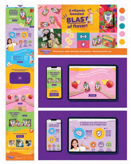
Webpage Creative Director: Kate Rascoe Art Director: Cat Losi
Designers: Marina Goba, Mallory Whitfield Developer: Digital Target Marketing
Account Director: Suzanne Abaza
Design Firm: 1HQ USA Client: VitaFusion Title: VitaFusion Smoothies Social
Media Ads
Creative Director: Kate Rascoe Art Director: Cat Losi
Designer: Marina Goba
Account Director: Suzanne Abaza
Design Firm: 80east Design Title: March 2023 Palindrome Days
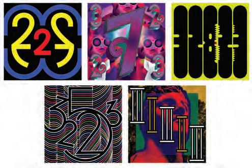
Creative Director: Trevor Messersmith Designer: Trevor Messersmith
Design Firm: 80east Design Title: Pop Portraits for Instagram and Facebook
Creative Director: Trevor Messersmith Designer: Trevor Messersmith
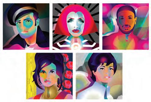
Design Firm: AARP Publications Client: AARP Title: AARP InstagramA Journey Through The Lives of Gen X Creative Director: Scott A. Davis
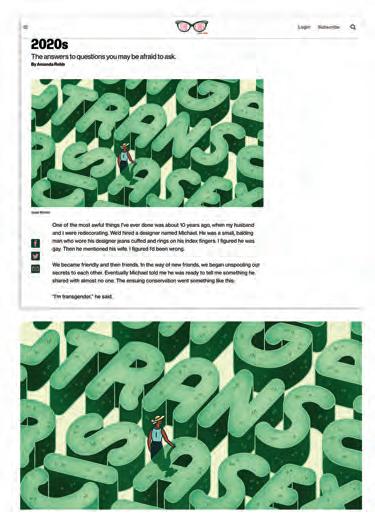
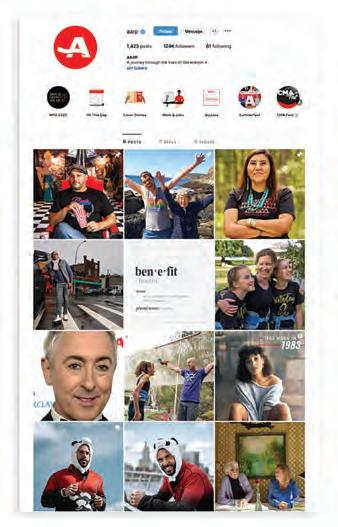
Photo Editors: Jane Clark, Michael Wichita, Caitlin DeFlaviis, Katrina Zook
Design Firm: AARP Publications Client: AARP Title: AARP Publications App
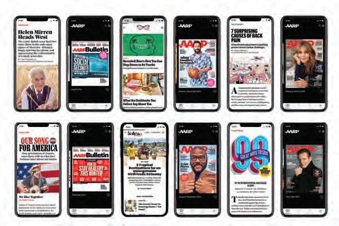
Creative Director: Scott A. Davis Art Director: Todd Albertson
Digital Editions Specialist: Joseph Broda
Design Firm: AARP Publications Client: Sisters from AARP Title: 6 Smart, Easy, Fun Ways to Buy Black Art Director: Dian Holton Illustrator: Alyah Holmes
Design Firm: AARP Publications Client: The Ethel from AARP Title: The Grandma’s Guide to Gender and Sexuality in the 2020s Art Director: Lesley Q. Palmer Illustrator: Josie Norton
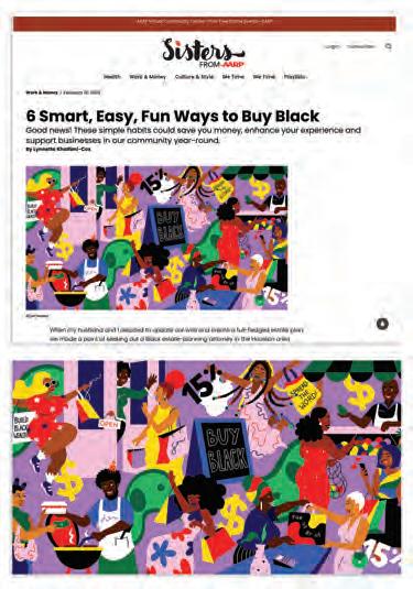
Design Firm: AARP Publications Client: The Girlfriend from AARP
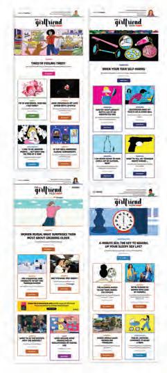
Title: Things To Try On Your Mental Health Days Art Director: Dian Holton Illustrator: Kathleen Fu
Design Firm: AARP Publications Title: The Girlfriend from AARP
Art Director: Dian Holton Designer: Paola Sorto Photo Editors: Caitlin DeFlaviis, Cielito Vivas, Katrina Zook Editor: Shelley Emling
Design Firm: Acenda Integrated Health Title: Acenda Integrated Health Community eNewsletter Creative Directors: Mari Considine, Cari Burke
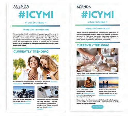
Designers: Zachary Ruhl, Stephanie Taylor, Mariana Heyel
Design Firm: Affinity Creative Group Client: Distinguished Vineyards Title: Textbook Vineyards Website Redesign Designer: Affinity Creative Group Developer: Affinity Creative Group Programmer: Affinity Creative Group

Design Firm: Affinity Creative Group Client: Monvera Glass Decoration
Title: Monvera Website Redesign Designer: Affinity Creative Group
Developer: Affinity Creative Group Programmer: Affinity Creative Group
Design Firm: Alamini Creative Group Client: University of Illinois Chicago/Tobacconomics
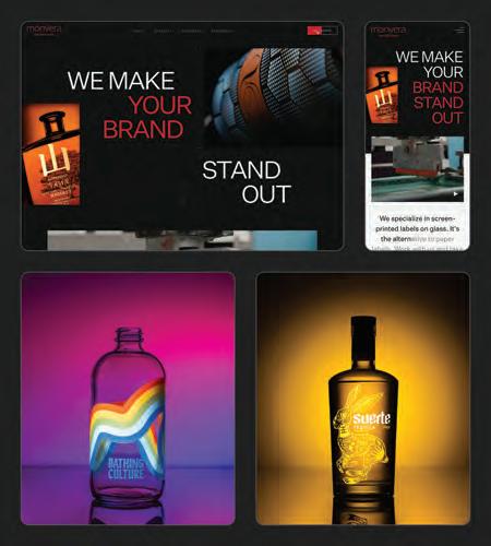
Title: Tobacconomics Cigarette Tax Scorecard Video Teaser Series
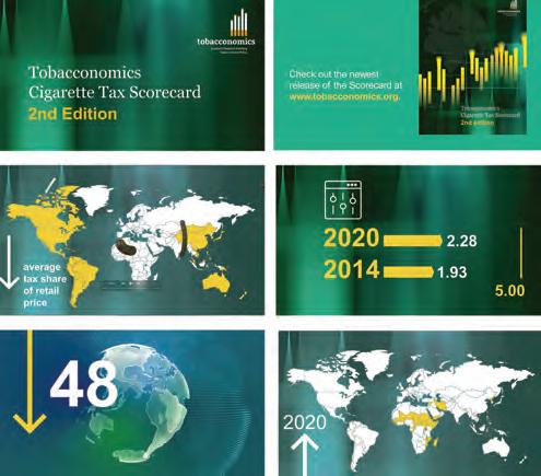
Design Firm: Alight Solutions Client: PepsiCo Title: insight eNews
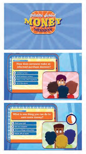
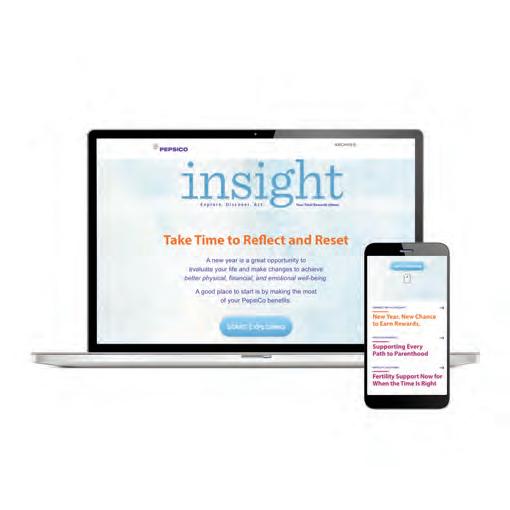
Creative Director: Cristine Giannotti Designer: Cristine Giannotti
Writers: Kathleen Becker, Kevin Clapp, Ken Mastro
Production Editor: Randall Van Vynckt Project Manager: Kristin Peacock
Creative Director: Jennifer Bergamini Designers: Jennifer Bergamini, Steven Albarracin
Writer: Tobacconomics Team Video Editing: Hossam
K.Narration: Jerome Butler
Design Firm: American Bankers Association Title: ABA Middle School
Money Mission Art Director: Gary Bloom Designer: Moises Oliveira
Writer: Marlee Ribnick Marketer: Annie Galvin
Design Firm: Andeza Client: Lemme Title: Lemme Amazon Store VP, Creative Services: Lisa Dalton Creative Director: Wing Lo
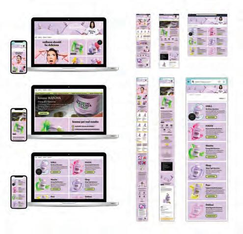
Design Student: Angela E. Terry School: George Mason University
Title: Print is Precious Motion Design Designer: Angela E. Terry Professor: Anna Tobin
Design Firm: Axiell ALM Inc. Client: Indiana Historical Society Title: You Are There Online and In-Gallery Exhibition Creative Director: Dan Shockley
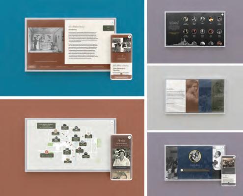
Art Director: Lauren Smedley Designer: Lauren Smedley
Developer: CultureConnect Programmer: CultureConnect Writer: Daniel Gonzales
Project Manager: Rosalind Stobart Videographer & Editor: Zach Heider Senior Director Exhibits: Jeff Mills
Design Firm: Bailey Brand Consulting Client: Cornerstone Building Brands
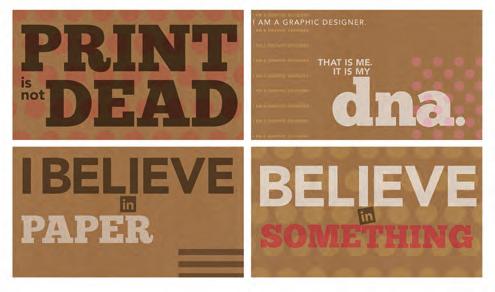
Title: Simonton Windows & Doors Website Creative Director: Stephen R. Perry
Art Director: Gary LaCroix Designers: Chloe Atchue-Mamlet, Evan Marshall, Phillip Lee Developer: Suyati Writer: Colin George

Design Firm: Barnett Design, Inc. Client: PIM Brands Title: Welch’s Fruit Snacks Instagram and Facebook Posts Creative Director: Debbie Barnett
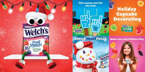
Art Director: Jeff Ramos Designers: Tara Maratea, Val Haymes
Programmer: Doug Cleek Writers: Bob Devol, Dimitri Ehrlich
Design Firm: BaselineGroupNY Client: ParkLexington Advisors
Title: ParkLexington Advisors Website Redesign Creative Director: Darcy Ann Flanders
Designer: Tanya M. Luckert Developer: Mark Frankel Writer: Sutton Creative
Design Firm: Bei Hu Title: BARK - Building A Community For City Dog Owners App Designer: Bei Hu
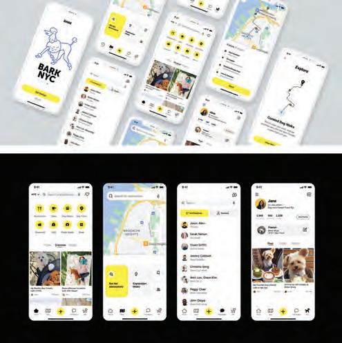
Design Firm: BNY Mellon Asset Management UX Client: Dreyfus
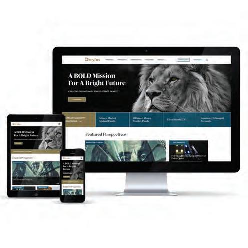

Title: Dreyfus Corporate Website Creative Director: John Thudium
Designers: John Thudium, Jon Hatch Developers: Sunil Kothari, Harshil Bhatia
Chief Marketing Officer: Marissa Murray Digital Marketing Manager: Gabrielle Ambrose
Graphic Designer: Megan Chamberlin
Design Firm: Breakout Studio Client: LinkUp Title: LinkUp Website Redesign
Creative Director: Jenn Levreault Designers: Jill Dick, Chandler Wescott
Developer: Good Work Writers: Elise Johnston, Nick Fava, Hurley Winkler
Project Manager: Gabë Regenhardt
Design Firm: Breakout Studio Client: Techcyte Title: Techcyte Website Redesign
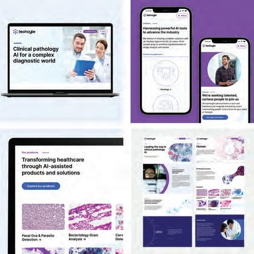
Creative Director: Jenn Levreault Designers: Chandler Wescott, Madeline Austin
Developer: Acclaim Writer: Elise Johnston Project Manager: Gabë Regenhardt
Design Student: Carolyn Brower School: Auburn University Graphic Design
Title: North Fulton Community Charities (NFCC) App Design Designer: Carolyn Brower Writer: NFCC
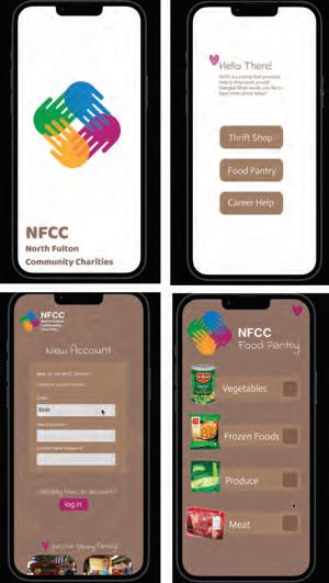
Design Firm: CF Napa Brand Design Title: CF Napa Brand Design Website
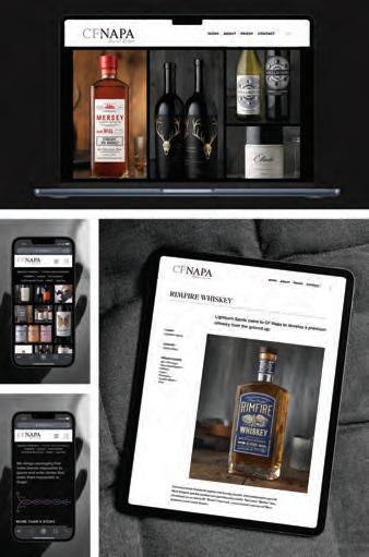
Designers: CF Napa Brand Design
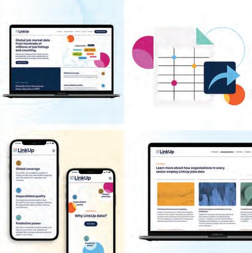
Design Firm: City and County of San Francisco, Shared Spaces Program Title: Shared Spaces Program Manual, Spring 2023 Creative Director: Robin Abad Ocubillo
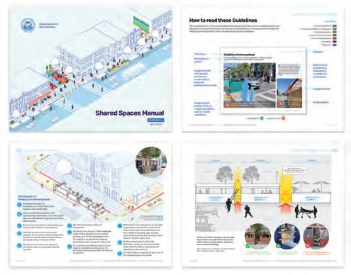
Art Director: Maria DeAlva Designer: Gary Chen Writer: Robin Abad Ocubillo
Design Firm: Clean Clear Creative Client: MettaWorks Title: MettaWorks ReBrand and Website Creative Director: Rosanne Romiglio-Ashley
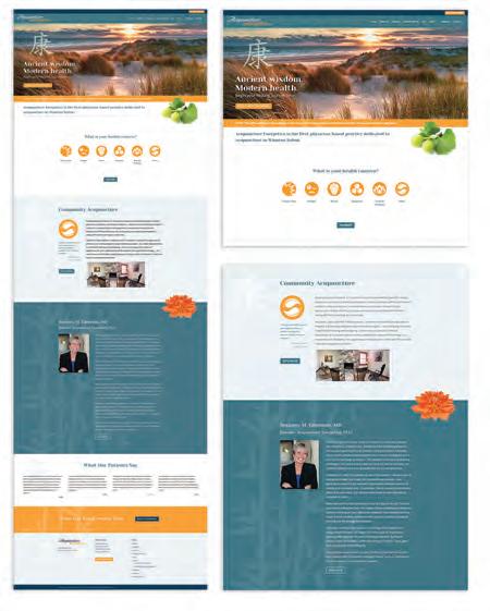
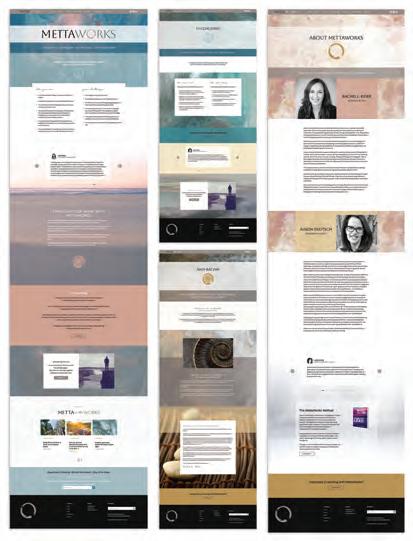
Art Director: Rosanne Romiglio-Ashley Designer: Rosanne Romiglio-Ashley
Original Art: Rosanne K. Romiglio-Ashley/4winds1breath.com
Design Firm: Creative Force Client: Acupuncture Energetics Title: Acupuncture
Energetics Website Creative Director: Kristie Staton Art Director: Kristie Staton
Designer: Kristie Staton Developer: Kristie Staton Writer: Suzanne Edmunds
Design Firm: DESIGNOLOGY, LTD Client: Harbaugh Village
Title: Harbaugh Village Holiday Site Creative Director: Casey DeCarlo
Developer: Ethan Lacey Director of Client Services: Steve Beckman
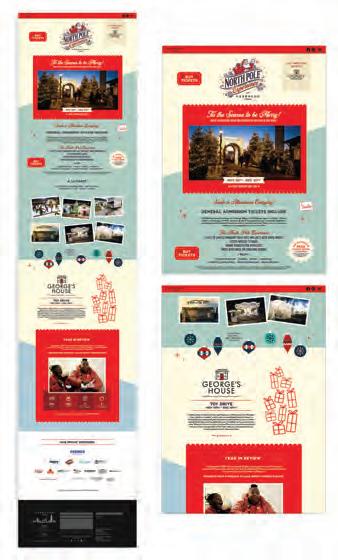
Design Firm: Donlon Agency Client: Dartmouth Health Title: Honor A Caregiver Campaign Creative Director: Atena Masoudi Designer: Atena Masoudi
Developer: Donnie West Writers: Mike Berry, Sophia Huneycutt
Senior Account Manager: Felicia Hunt Honor A Caregiver
Logo Designer: Maria Frank, Maria Louise, LLC
Design Firm: Donlon Agency Client: Donlon Agency
Title: Donlon Agency Introductory Animation
Creative Director: Atena Masoudi
Designers: Rachel RInks, Atena Masoudi Writer: Kra Tassoni
Voiceover: Wayne Chin
Design Firm: Donlon Agency Client: Huntsman Cancer Foundation
Title: Research For Life Campaign Creative Director: Atena Masoudi
Designers: Rachel RInks, Atena Masoudi Developer: Donnie West Writers: Mike Berry, Sophia Huneycutt Senior Account Director: Felicia Hunt
Design Firm: Donlon Agency Client: North Kansas City Hospital
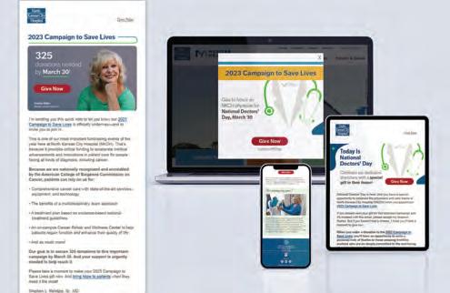
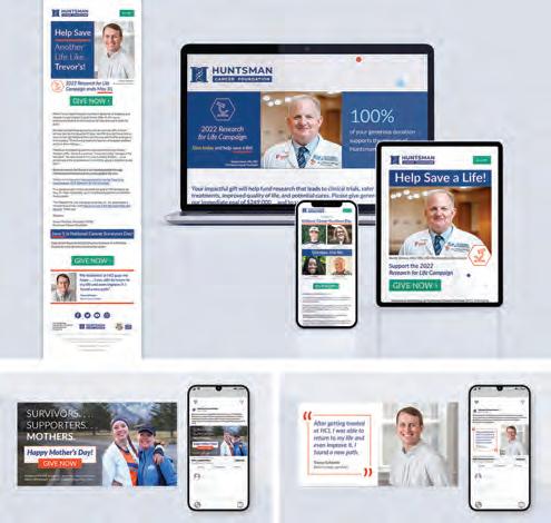
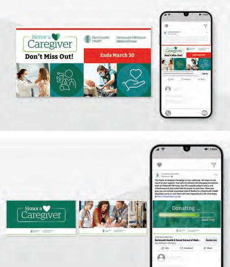
Title: 2023 Campaign to Save Lives Creative Director: Atena Masoudi
Designer: Atena Masoudi Developer: Donnie West Writer: Mike Berry Senior Account Manager: Felicia Hunt
36433979
Design Firm: Donlon Agency Client: St. Joseph Health Title: St. Joseph Health
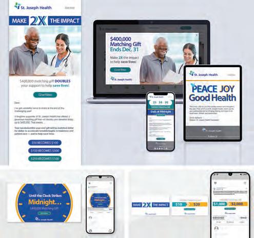
Matching Gift Campaign Creative Director: Atena Masoudi
Designer: Atena Masoudi Developer: Donnie West Writer: Mike Berry
Senior Account Manager: Felicia Hunt
Design Firm: DOOR3 Client: Retrievr Title: Retrievr Startup Website and Mobile Redesign Creative Director: Tom McClean Designers: Bailey Costello, Jess Minzner, Liz Flyntz, Leander Johnson Developer: Volodymyr Fedorov
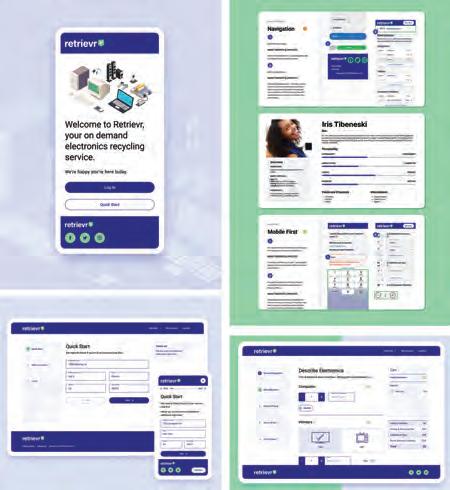
Primary Consultant: Matt Dimler
Design Firm: DRIVE Client: Viverant Physical Therapy Title: Viverant Physical Therapy Social Media Campaign Creative Director: Jodi Eckes
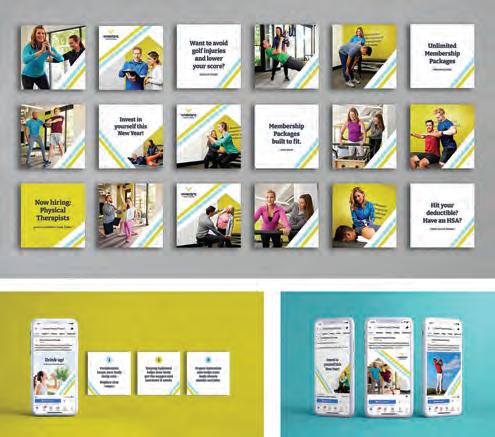
Designer: Jodi Eckes Writer: Charles K. Youel Photographer: Hickey Photography
Design Firm: DTN Title: AgTarget Explainer Video Art Director: Michelle Hoffman
Designer: Dave Casto Developer: Dave Casto Writer: Susan Montgomery
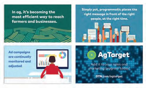
Design Firm: EH Design Works Client: General Air Products
Title: Sprinkler Madness 2023 Graphic Design, Logo Design, Website Design and Development: Eric Hayes
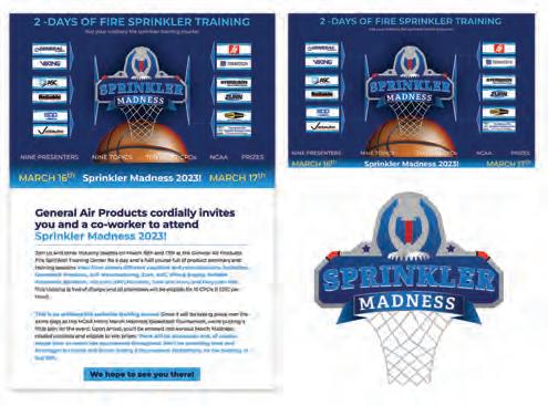
Design Firm: Eight Moon™ Client: Park Dental Title: Park Dental Display Ads
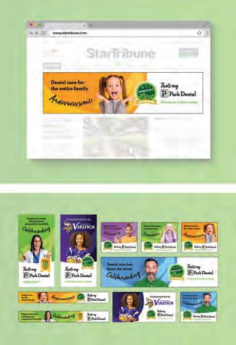
Creative Director: Megan Junius Designer: Emmi Brytowski
Design Firm: Eight Moon™ Client: Park Dental
Title: Park Dental 50th Anniversary Video Creative Director: Megan Junius
Designer: Emily Wettergren
Design Firm: Erica Holeman Client: University of North Texas Title: College of Visual Arts and Design (CVAD) Month Social Media Series
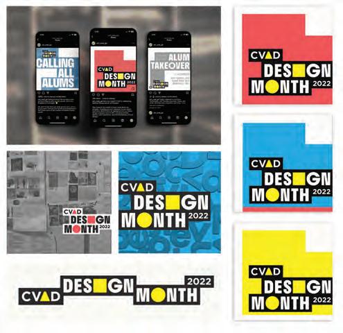
Designer: Erica Holeman
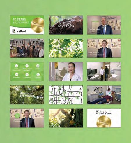
Design Firm: Farm Credit Council Title: Farm Credit Display Banners
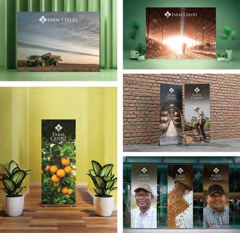
Creative Director: Morgan Anderson Art Directors: Morgan Anderson, Drew Bonsu Designer: Drew Bonsu
Design Firm: Farm Credit Council Title: Farm Bureau Ag Innovation Challenge
Social Media Campaign

Creative Director: Morgan Anderson
Art Director: Morgan Anderson Designer: Morgan Anderson
Design Firm: Fine Design Client: Mieko Mahi Title: Hallet Oak Gallery
Find the Joy Promotion Creative Director: Stan Fine Art Director: Stan Fine
Designer: Stan Fine Developer: Mieko Mahi Programmer: Mieko Mahi
Writer: Mieko Mahi
Design Firm: fishbat Media Client: Clarity Benefit Solutions
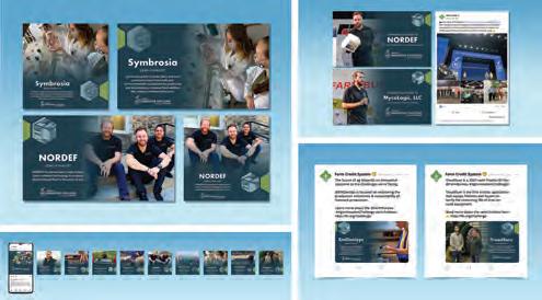
Title: National Simplicity Day Infographics Creative Director: Michele Hamel
Designer: Joleen Usher Writer: Alex Sciranka Account Manager: Mindy Davis
Design Firm: fishbat Media Client: National Facilities Direct
Title: National Facilities Direct Display Ads Creative Director: Allisa Evarts Designer: Joleen Usher Writer: Allisa Evarts

Design Firm: fishbat Media Client: World Macadamia Organisation
Title: Love Macadamia Brand Partner Landing Page Creative Director: Michele Hamel
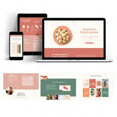
Designer: Joleen Usher Developer: Vibe Branding Writers: Michele Hamel, Allisa Evarts Project Manager: Rena Mehlhoff
Design Firm: Four Winds Graphics Client: Rainbow Housing
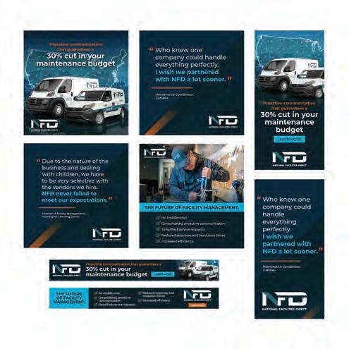
Title: Rainbow Digital Awards Invitation Designer: Peggy Hellem
Design Firm: Freaner | Creative & Design Client: Cal Fresh-HHSA-Medical
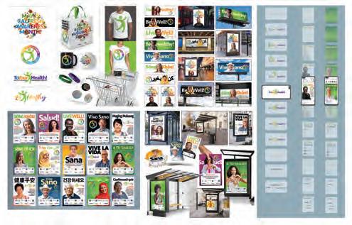
Awareness Month Title: Email Marketing Campaign Creative Director: Ariel Freaner
Art Director: Ariel Freaner Designer: Ariel Freaner
Design Firm: Freaner | Creative & Design Client: Calimax
Title: Calimax Online Store App Creative Director: Ariel Freaner
Art Director: Ariel Freaner Designer: Ariel Freaner Developer: Ariel Freaner Programmer: Ariel Freaner
Design Firm: Freaner | Creative & Design Client: Grupo SOJO Developers
Title: Social Media Promotional Campaign
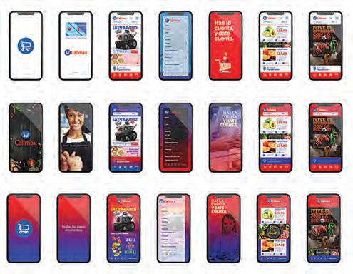
Creative Director: Ariel Freaner
Art Director: Ariel Freaner Designer: Ariel Freaner Developer: Ariel Freaner Programmer: Ariel Freaner
Design Firm: Freaner | Creative & Design Client: San Diego County District
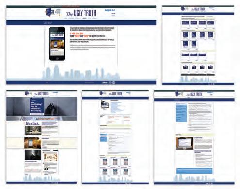
Attorney’s Office Title: The Ugly Truth Website Creative Director: Ariel Freaner
Art Director: Ariel Freaner Designer: Ariel Freaner Developer: Ariel Freaner Programmer: Ariel Freaner
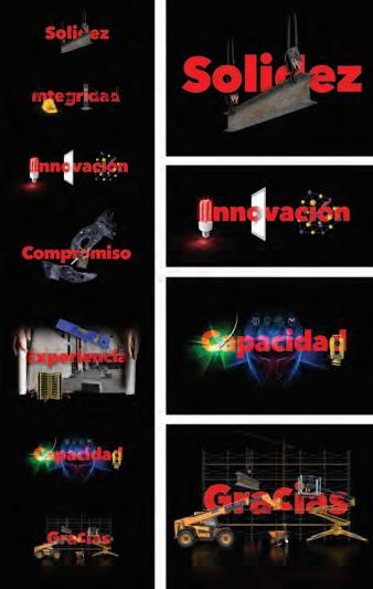
Design Firm: Freaner | Creative & Design Client: San Diego County Land Use & Environment Title: Let’s Get There! Campaign
Creative Director: Ariel Freaner Art Director: Ariel Freaner Designer: Ariel Freaner
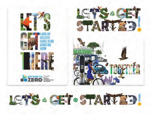
Design Firm: Freaner | Creative & Design Client: Victorinox Watches
Title: Victorinox Watches Microsite Creative Director: Ariel Freaner
Art Director: Ariel Freaner Designer: Ariel Freaner Developer: Ariel Freaner Programmer: Ariel Freaner
Design Firm: Gabe Diaz Design Client: Livin the Pup Life Title: Livin the Pup Life Website Creative Director: Gabe Diaz Art Director: Gabe Diaz
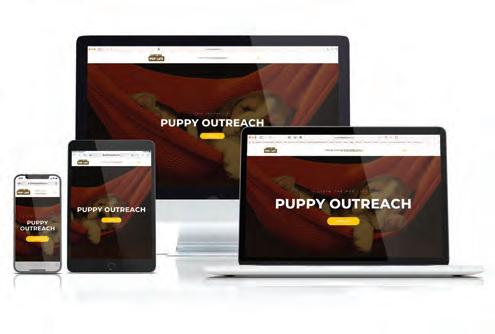
Designer: Gabe Diaz Programmer: Chris Young Writer: Gabe Diaz
Design Firm: GAF Creative Design Title: GAF Dave & Wally Meta Campaign
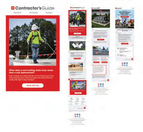
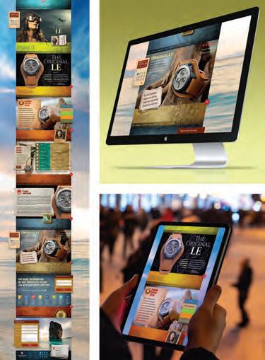
Designer: Chris Gazzo Writer: Michael Hyde Integrated Marketing Manager: Katerina Roskova Project Manager: Leonora Gordon
Design Firm: GAF Creative Design Title: GAF Email Template Suite
Creative Director: Carlos Caicedo Designer: Chris Gazzo Project Manager: Leah Gordon Copywriter: Don Kilcoyne Integrated Marketing Manager: Katerina Roskova Retoucher: Richard Toonkel Automation Manager: Chip Chaffee
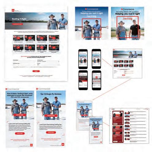
Design Firm: GAF Creative Design Title: GAF Parts of a Roof Webpage
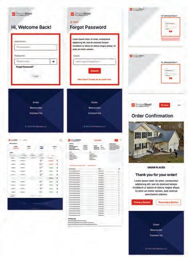
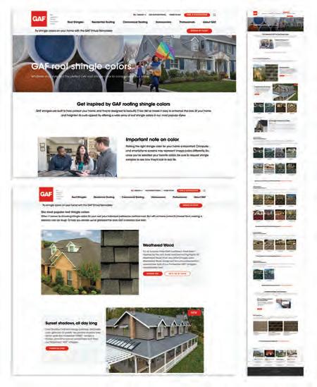

UX Lead & UI Designer: Erin DeGrand Writers: Don Kilcoyne, Karen Goulart
Graphic Artist: Richard Kwon SEO: Cristal Xavier-Cohen Content Author: Matt Neilan
Project Manager: Lawrence Foppiano Integrated Marketing Manager: Alison Dahlhaus
Retoucher: Richard Toonkel
Design Firm: GAF Creative Design Title: GAF Roof Shingle Colors Webpage
UX Lead & UI Designer: Amanda S. Loveland Writers: Karen Goulart, Don Kilcoyne Graphic Artists: Richard Kwon, David Shin
SEO: Cristal Xavier-Cohen Content Author: Matt Neilan Retoucher: Richard Toonkel Integrated Marketing Manager: Christina Dalglish
Design Firm: GAF Creative Design Title: GAF Storm Videos Producer: Ashley Rentas
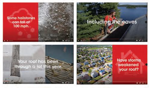
Editor: Maria Christiansen Project Manager: Rob Fitzgerald.
Writer: Don Kilcoyne Integrated Marketing Manager: Barbara Llull
Design Firm: GAF Creative Design Title: GAF TimberSteel Microsite
UX Lead & UI Designer: Amanda S. Loveland Writers: Kristen Kruczowy, Don Kilcoyne Graphic Artist: Richard Kwon Retoucher: Richard Toonkel
Project Manager: Lawrence Foppiano Developer: ACADACA

Design Firm: GAF Creative Design Title: GAF Timberline UHDZ Social Media Ads
Designer: Chris Gazzo Copywriters: Don Kilcoyne, Kristen Kruczowy
Producers: Marla Christiansen Production Assistant: Gabby White
Line Producer: Ashley Rentas Video Editor: Michael Lewis Retoucher: Richard
Toonkel Integrated Marketing Manager: Alison Dahlhaus Product Manager: Ashley Alfonso
Design Firm: GAF Creative Design Title: GAF StreetBond Newsletter
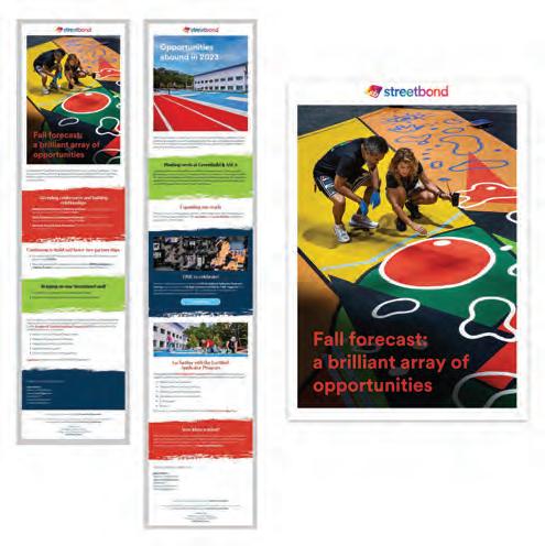
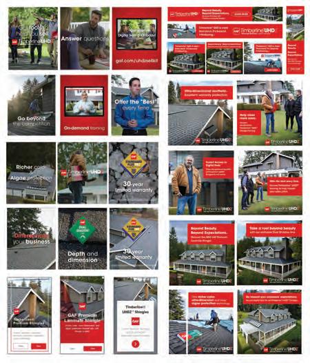
Creative Director: Carlos Caicedo Designer: Chris Gazzo Writer: Don Kilcoyne
Project Manager: Leah Gordon Integrated Marketing Manager: Katerina Roskova Retoucher: Richard Toonkel Automation Manager: Chip Chaffee
Design Firm: GCNY Marketing Client: Centers Health Care Title: Taking Centers Labs National Creative Director: Joseph Blumenfeld Art Director: Yanky Perl
Designer: Yanky Perl Developer: Martin Kay Writers: Mayer Silver, Cathy Greenberg
Design Firm: GCNY Marketing Client: Surfpoint Recovery Title: A Fresh Start for Surfpoint Creative Director: Joseph Blumenfeld Art Director: Yanky Perl
Designer: Emily Choi Developer: Martin Kay Writers: Cathy Greenberg, Mayer Silver
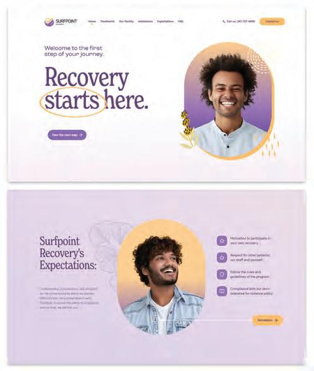
Design Firm: GCNY Marketing Client: The Loft Steakhouse Title: The Loft Steakhouse Creative Director: Joseph Blumenfeld Art Director: Yanky Perl Designers: Yanky Perl, Rachel Levy Developer: Martin Kay Writer: Mayer Silver
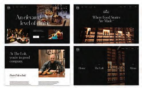
Design Firm: Handshake Digital Client: AudioCityUSA Title: Automotive Custom Colors Email Marketing Creative Director: Chris Schneider Designer: Rebecca Cady Writer:Sam Lenger
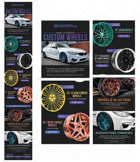
Design Firm: Handshake Digital Client: Awake Chocolate Title: Awake Chocolate Email Welcome Series Creative Director: Chris Schneider Art Director: Pat Routa Designer: Rebecca Cady Writer: Alicia Hansen
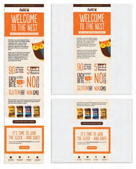
Design Firm: Howard Design Group Client: IEEE Power & Energy Society (PES) Title: PES Website Redesign
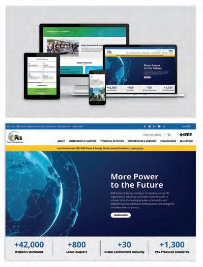
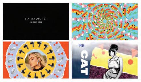
Design Firm: Huemen Design Client: Harman International/JBL
Title: JBL Fest 2022 Animations Creative Director: Rubin Carasco Designers: Ryan Durinick, Chris Dimaggio, J. Klossner
Design Firm: Huemen Design Client: Harman International/JBL
Title: Giannis in the Metaverse Creative Director: Alex Effimov Designer: Edgar Sandoval Writer: Brendan Kelley

Design Firm: Huemen Design Client: Harman International/JBL
Title: Giannis x JBL TWS Shoppables Page Designers: Erica Jules, Joseph Setton
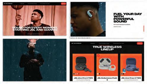
Writers: Marisa Haber, Brendan Kelley
Design Firm: Invok Brands Client: Culinary Collective and Aneto
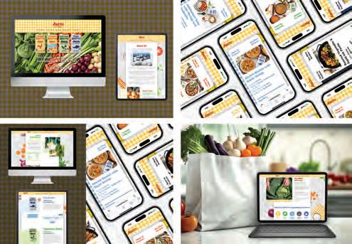
Title: Aneto Brand Website Design Creative Director: Tim McLaughlin
Art Director: Tim McLaughlin Designer: Carolina Blomberg
Developer: Scott Hieatt Writer: Danielle Wintrip Strategy: Sebastian Maynard
Design Firm: Jacqueline Ward Creative, LLC Client: Center for Cyber Safety and Education Title: 2023 Chapter Impact Challenge: 1 Million Certified in Cybersecurity
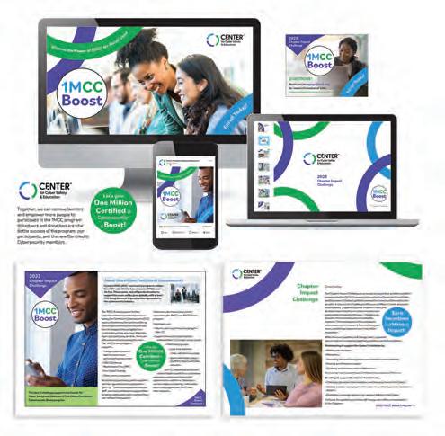
‘Boost’ Program Promotional Toolkit Creative Director: Jacqueline Ward
Designer: Jacqueline Ward Writer: Alisha Wenc, Center for Cyber Safety and Education Sr. Director, Creative Services, Center for Cyber Safety and Education: Holly Schneider Brown
Design Firm: Karen Skunta & Company Client: Toussaint River Watershed Conservancy Title: Wall of Honor Interactive Exhibit Creative Director: Karen A. Skunta Designer: Jen A. Maxwell Programmer: Blue Robot
Video: All Pro HD Fabricator: Exhibit Concepts Inc.
Design Firm: KASA Collective Client: Poster House Title: Made in Japan: 20th Century Poster Art Creative Director: John Kudos Art Director: Ashley Wu
Designer: Fay Qiu Project Manager: Amanda Knott Curators: Nozomi Naoi, Erin Schoneveld Chief Curator & Director of Content: Angelina Lippert
Director of Design & Exhibits: Ola Baldych Associate Director of Exhibits: John F. Lynch Assistant Director of Design: Mihoshi Fukushima Clark
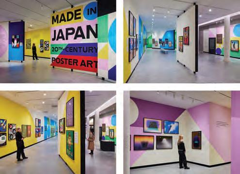
Fabricator: Rob Leonardi Director of 3D Art: Robert de Saint Phalle
Design Firm: Katagraphics Client: Leading Indicator Systems
Title: Leading Indicator Systems Infographics Creative Director: Kathleen Amaral
Art Director: Kathleen Amaral Designer: Kathleen Amaral
Design Student: Kim Hyunjee School: Oklahoma State University, Stillwater
Title: Floristry Perfume Prescription Event Designer: Hyunjee Kim
Design Firm: KUDOS Design Collaboratory Client: Proximity Media
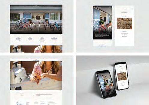
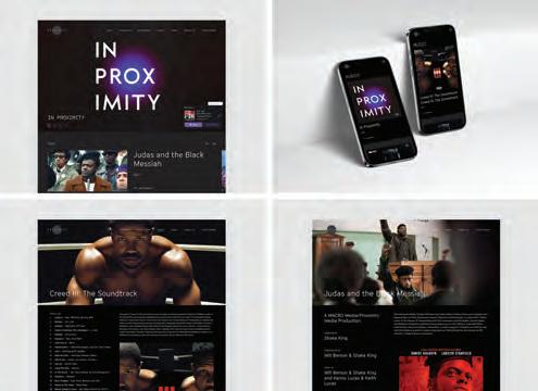
Title: Proximity Media Website Creative Director: John Kudos Designer: Fay Qiu, Jamus Marquette, Owen Febiandi Developers: Christyan Juniady Setiawan, Chris Manlapid Project Manager: Amanda Knott
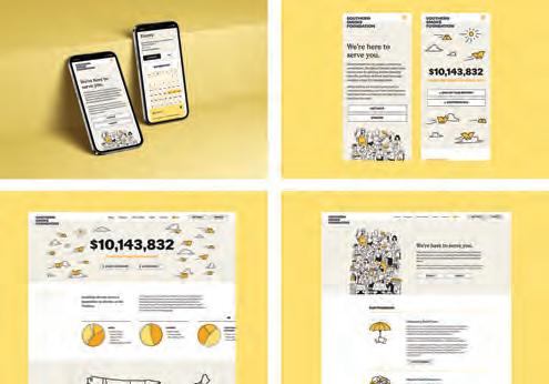
Design Firm: KUDOS Design Collaboratory x Principle Client: Southern Smoke Foundation
Title: Southern Smoke Foundation Website
Designers: Elizabeth Kelley, Drake Preston, Jackson Mahlke
Developer: Christyan Juniady Setiawan Writers: Erin O’Connor, Taylor Tokarz
Illustrator: Ivan Mesaroš Project Manager: Amanda Knott
Design Firm: KUDOS Design Collaboratory x Principle Client: Tiny’s Milk & Cookies
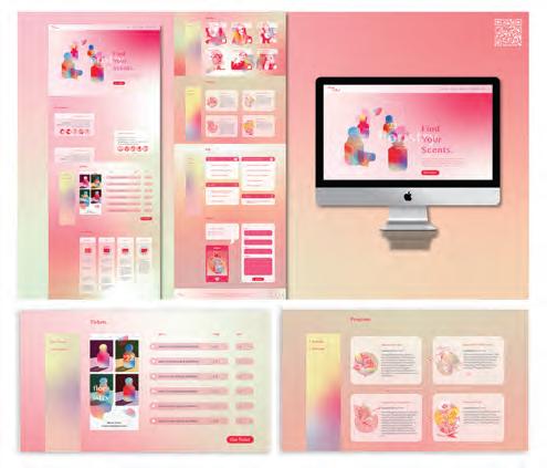
Title: Tiny’s Milk & Cookies Website Creative Director: Elizabeth Kelley
Designer: Elizabeth Kelley Developer: Christyan Juniady Setiawan
Writer:Erin O’Connor Photographer: Arianna Jopling Project Manager: Amanda Knott
Design Firm: KUDOS Design Collaboratory™ Client: Spiderhorse
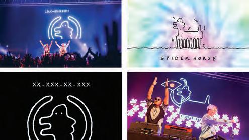
Title: Stage Backdrop Animation Creative Director: Gene Shinozaki Art Director: Kiki Katahira Animator: Imam Fadilah Original Storyboard: Gene Shinozaki
Design Firm: Left Right Labs Client: Heal Los Angeles Foundation
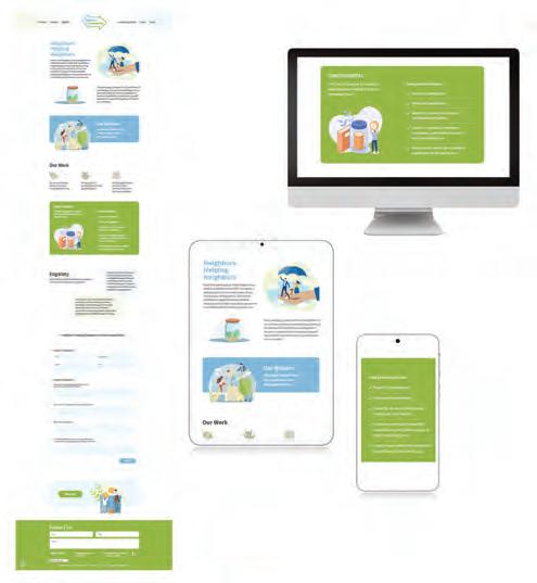
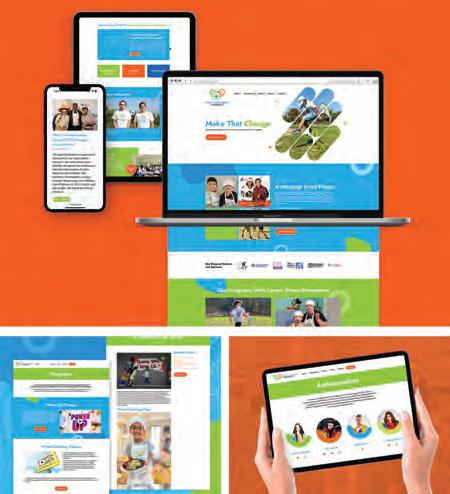
Title: Heal Los Angeles Foundation Website Creative Director: Trina Fisher Designer: Trina Fisher Developer: Gretchen Cawthon, Mark Coronado
Design Firm: Lentini Design & Marketing, Inc. Client: Harbor Connects Title: Harbor Connects Landing Page Design & Build Creative Director: Hilary Lentini
Art Director: Hilary Lentini Designer: Leanna Hanson Developers: Keith Hollingshead, Hilary Lentini Programmers: Keith Hollingshead, Hilary Lentini
Design Student: Lingou Li School: Art Center College of Design
Title: All The World’s A Stage Motion Graphics Creative Director: Lingou Li
Art Director: Lingou Li Designer: Lingou Li
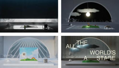
Design Firm: Little Big Brands Client: Chicken of the Sea
Title: Chicken of the Sea Campaign 2023 Creative Director: John Nunziato Designer: Ben Glotzer. Designer: Renée Ercoli
Design Firm: Little Big Brands Client: Dimetapp Title: Dimetapp Fall/Winter
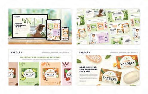

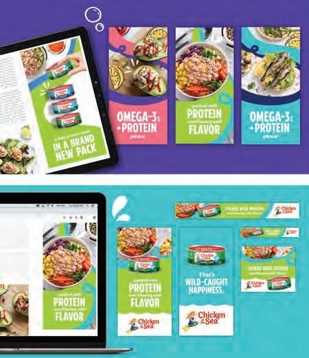
2022 Campaign Creative Director: Ben Glotzer Designer: Marissa Loiodice
Account Director: Katie Lopez
Design Firm: Little Big Brands Client: Wellbeam Consumer Health Title: TruSkin Social Media Creative Director: Ben Glotzer Designer: Pika Stearns Account Director: Bill Frohlich
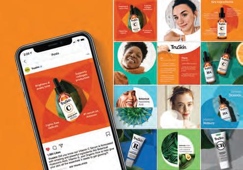
Design Firm: Little Big Brands Client: Yardley London Title: Yardley London
Website 2023 Creative Director: Richard Palmer Designer: Emily White
Account Manager: Emma Jackson
Design Firm: Manual Labor Client: George Kaiser Family Foundation
Title: Tulsa For You & Me Website Design Creative Director: Samantha Choi
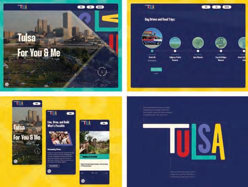
Cadley Designer: Kjersti Jorgenson Developer: Andy Ferreira
Writer: Kelly Wrather, Ashley Lengen Interaction Designer: Kayla Park
Design Firm: Mass General Brigham Client: Spaulding Rehabilitation Outpatient Center Medford Title: Pain and Functional Restoration Program Overview Video Art Director: Michelle Johnson Senior Art Director: Amy Whittenburg
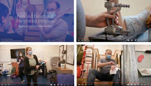
Videographers: Jeffrey Andree, Michelle Rose Photographer: Katherine Flock
Voiceover: Kelsey Damrad
Design Firm: MathWorks Title: MathWorks Celebrates Black History Month Social Media Creative Director: Kevin Hart Designer: Bernice Merola, Gabrielle Vendetti
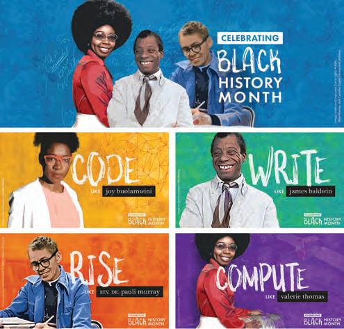
Design Student: Matthew Bruner School: Drexel University, Westphal College of Media Arts & Design Title: Typographic Animation: Children as Enemies

Designer: Matthew Bruner Developer: Matthew Bruner
Programmer: Matthew Bruner Instructor: Marisa Watanabe
Design Firm: MaxMarCom - Max Marketing Communications Client: ProFab
Welding & Machine Title: ProFab Website Design and Development
Designer/Developer: Max Allers Copywriter: Michael Dapper
Design Firm: MiDESign & Marketing Consultancy Title: MiDESign & Marketing Consultancy Website Redesign Creative Director: Marco Ippaso
Art Director: Marco Ippaso
Designer: Marco Ippaso Developer: Marco Ippaso
Programmer: Marco Ippaso Writer: Marco Ippaso
Design Firm: Minds On Design Lab Client: Coast Guard Foundation
Title: Coast Guard Foundation Website Art Director: Michelle Perreault
Designer: Valerie Diaz De Arce Developer: Adam Chlan Strategy: Seth Giammanco
Design Firm: Mission Partners Client: ISVE - Initiative for Strategic Volunteer Engagement Title: ISVE Research Report Creative Director: Carrie Fox
Art Director: Anne Kerns Designer: Anne Kerns, Eleni Stamoulis
Design Firm: Mission Partners Client: Youth Represent
Title: Youth Represent Strategic Plan Creative Directors: Anne Kerns, Carrie Fox
Art Director: Anne Kerns Designer: Anne Kerns
Design Firm: Mouser Electronics Title: Mouser Wright Brothers Email
Creative Director: Jennifer Krajcirovic Art Director: Robert Harper
Designer: Katie Sandoval Developer: Katie Sandoval Writer: David Fambrough
Marketer: Katy Cole
Design Firm: Mouser Electronics Title: Mouser Lightspeed Social Animations
Creative Director: Jennifer Krajcirovic Art Director: Robert Harper
Designer: Katie Sandoval Writer: David Fambrough
Design Firm: Mouser Electronics Title: Mouser Acronym Infographic
Creative Director: Jennifer Krajcirovic Designer: Sean Lowery Writer: Sean Lowery
Design Firm: Mouser Electronics Title: Forbidden Places Advertising
Creative Director: Jennifer Krajcirovic Art Director: Robert Harper
Designers: Sam Cooper, Katie Sandoval, Morning Roseman Writer: David Fambrough
Design Firm: Odonnell Company Client: DMHAS/Department of Mental Health and Addiction Services Title: LiveLOUD Voices of Recovery Social Media
Creative Director: Eileen Odonnell Art Director: Anna Rubino
Designer: Shuhei Matsuyama
Writers: Julia Fishman, Cassidy Anthony
Production Director: Pete Gartner
Design Firm: Odonnell Company Client: DMHAS/Department of Mental Health and Addiction Services Title: Be In The Know Cannabis CT Social Media
Creative Director: Eileen Odonnell Art Directors: Anna Rubino, Renee Schoolcraft
Designers: Shuhei Matsuyama, David Nguyen, Renee Schoolcraft
Writers: Julia Fishman, Irene Baker Production Director: Pete Gartner
Design Firm: Orion Innovation Client: Rheem Manufacturing Company
Title: Rheem Contractor App Creative Director: Jeff Piazza
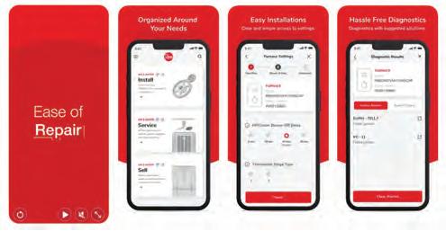
Art Director: Ian Cunningham Designer: Amanda Chan
Developers: Elizaveta Saltykova, Ramil Sarbaev, Dragan Sulja, Alexander Kashaev
Program Managers: Angela Florie, Elizaveta Burdaeva
Design Firm: Piedmont Brand Co. Client: New Way Property Management
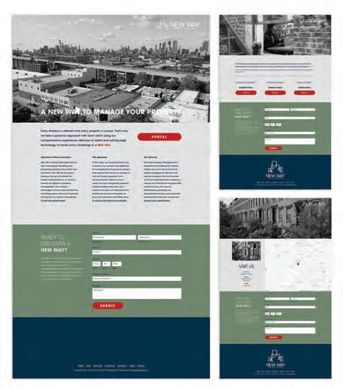
Title: New Way Website Art Director: Brad Stoneking Designer: Brad Stoneking Developer: Brad Stoneking
Design Firm: Qihang Fan Title: Four Typologies in Immersive Web3 Architecture
Experience Creative Director: Qihang Fan Art Director: Qihang Fan
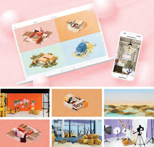
Designers: Qihang Fan, Kangxin Wu Developer: Qihang Fan Programmer: Qihang Fan
Project Instructor: Peter Testa Web Development Instructor: Anthony Tran
Design Firm: QM Design Group Client: John Eric Home Magazine
Title: John Eric Home Magazine Travel Edition Creative Director: Hillary Broadwater
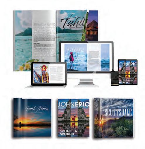
Designer: Hillary Broadwater Editor: Angela Casey Publisher: John Eric
Design Firm: QuickBooks In-house Design Team Client: Intuit QuickBooks
Title: QuickBooks Design Site Creative Director: Suncica Lukic Design Lead: Tina Yuan Visual Designers: Adam Thomas, Ashley Meadows, Alex Glenn, Dario Lofish, Hetal Soni, Jesse Bray, Manjia Zhao, Sarah Struck, Shaun Cavanaugh
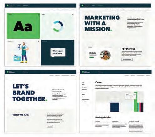
Interaction Designer: Nava Tummalapalli Design Technologists: Aaron Ranftl, Jun Pan, Kiran Nasim Motion Designers: Brandon Wall, Benjy Deng
Content Designers: Stacey Chase, Emily Jewell Dunn, Alex Glenn
Web Developers: Adrian Jacob, Brian Bento, Dixit Patel
Contributors: Amy Im, Judy Lee, Sreekanth Gubiligari, Afzal Yusuf Gousjan
Design Firm: Rad Source Technologies Title: Easter Social Media Post

Creative Director: Brandon Georges Art Director: Brandon Georges
Designer: Brandon Georges
Design Firm: Rad Source Technologies Title: Christmas Social Media Post
Creative Director: Brandon Georges Art Director: Brandon Georges
Designer: Brandon Georges
Design Firm: Rad Source Technologies Title: 4th of July Social Media Post

Creative Director: Brandon Georges Art Director: Brandon Georges
Designer: Brandon Georges
Design Firm: RAS Communications Client: Gladstone Park Chamber of Commerce Title: Throwback Music Fest Miss Throwback Social Media Promo Video
Creative Director: Russell Schultz Art Director: Russell Schultz
Designer: Russell Schultz
Design Firm: RAS Communications Client: The Police Officers Network
Title: The Police Officers Network Website Creative Director: Russell Schultz
Art Director: Russell Schultz Intern: Christian Fuentes
Design Firm: Rebel Fish Creative Group Client: Norwegian Cruise Line
Title: NCL Great Stirrup Cay Lighthouse Creative Director: Luije Padron
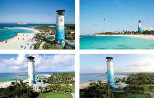
Art Director: Rebecca Winters Designer: Pauline Smadja-Prades
Design Firm: Rebel Fish Creative Group Client: Norwegian Cruise Line
Title: NCL Latitudes Members Online Magazine Creative Director: Luije Padron
Art Director: Rebecca Winters Designer: Monica Garcia
Developer: Ceros Programmer: Ceros Writer: Becky Manuel
Design Firm: Rebel Fish Creative Group Client: Norwegian Cruise Line
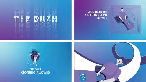
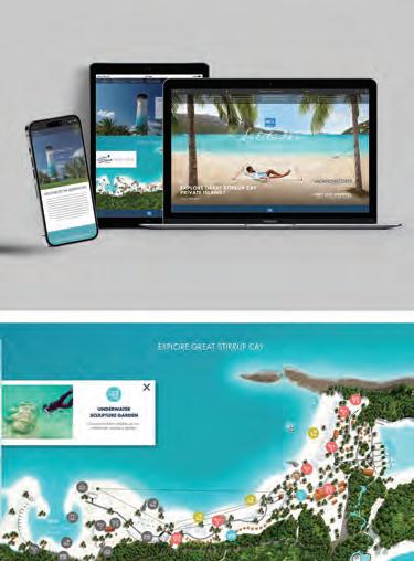
Title: NCL The Rush Animated Video Creative Director: Luije Padron
Art Director: Rebecca Winters Designer: Monica Garcia Developer: William Benevides Writer: Claire Smith
Design Firm: Rebel Fish Creative Group Client: Norwegian Cruise Line
Title: NCL Viva Website Creative Director: Rebecca Winters
Art Director: Cristina Serarols Designer: Ali Armas Writer:Lejanet Herrera
Design Firm: Rocketboy Media, Inc. Client: Sepulveda Escrow Corporation
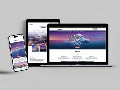
Title: Sepulveda Escrow Corporation Website Creative Director: Scott Weber
Art Director: Scott Weber Designer: Scott Weber Developer: Scott Weber Programmer: Scott Weber Writer: Robin Kellogg Associates
Design Firm: ScreenPal Team Client: ScreenPal Title: ScreenPal Website Redesign
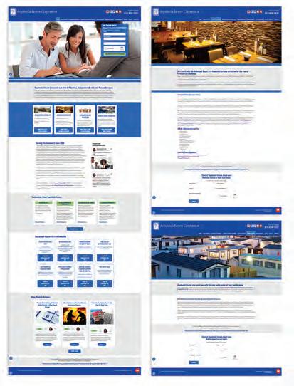
Design Firm: ScreenPal Team Client: ScreenPal Title: ScreenPal Content Hosting Platform
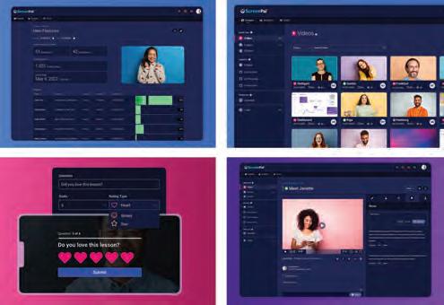
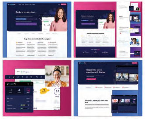
Design Student: Seokjun An School: School of Visual Arts Title: Smeg Manual Website Creative Director: Seokjun An Art Director: Seokjun An Designer: Seokjun An Instructors: Melike Turgut, Peter Colòn
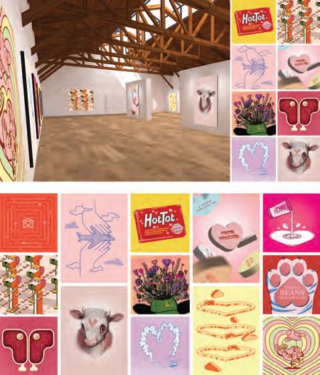
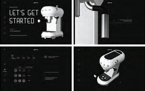
Design Student: Seokjun An School: School of Visual Arts Title: New York, New York Lyrics Video - Capturing The Essence of 1960s NY Through Collage Technique Creative Director: Seokjun An Art Director: Seokjun An Designer: Seokjun An Music: Frank Sinatra, Tony Bennett Instructor: David Conklin
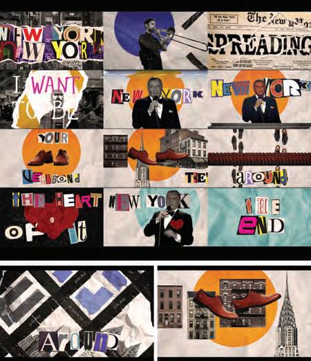
Design Firm: Signal Theory Client: John Deere Title: Harvest Time AR Filter
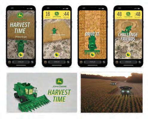
Creative Director: Shaun Crockett Associate Innovation Director: Beth Wickerson
Design Firm: Signal Theory Title: Valentines NFT Gallery Creative Director: Brent Davidson Art Director: Julie Babcock, Micah Barta, Halie Branson, Chloe Cloud, Mary Corcoran Crawford, Madeline Deabler, Seth Gunderson, Linh Trieu, Joe Wilper Writers:Gracie Fitzgerald, Mitch Howard, Tyler Adams
Marketing Automation Strategist: Sara Theurer Technology & Innovation Director: Elijah Kleinsmith Associate Innovation Director: Beth Wickerson
Design Firm: Smith & Connors Client: Lawrence Berkeley National Laboratory
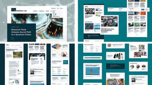
Title: Berkeley Lab Website Redesign Creative Director: Talie Smith
Art Director: Diana Goldman Developer: Nic Laflin Writer: Scott Smith Tech Director: Becca Connors
Design Firm: Smith Design Client: Eggland’s Best Title: Born Free Eggs Social Reels Creative Director: Jenna Smith Art Director: Miles Hoffman
Designer: Jessica Murray Account Director: Dave Bolton Videographer: Ken Kiger Food Stylist/Props: Grace Peluso
Design Firm: Smith Design Client: Thomas Foods Title: Thomas Foods Social
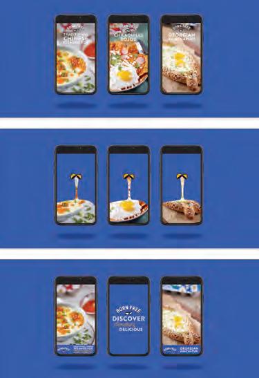
Posts Creative Director: Jenna Smith Art Director: Miles Hoffman, Becki Murray
Designer: Jessica Murray, Becki Murray, Marissa Cook
Account Manager: Dave Bolton Copywriter: Dave Bolton, Sara Bellog
Design Firm: Spohn Design Client: American Honda Motor Co., Inc.
Title: Honda Smart Home Virtual Tour Creative Director: Ron Spohn
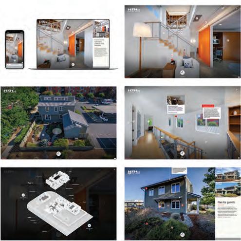
Designer: Ron Spohn Developer: Ron Spohn
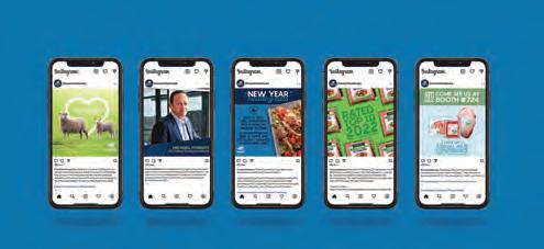
Design Firm: Spring Hills Title: Spring Hills Opulence Collection Website
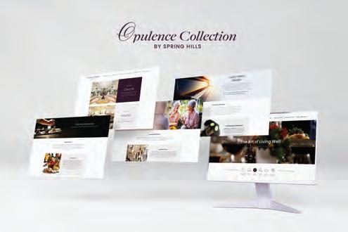
Creative Director: Krystal Pratt Designer: Krystal Pratt Developer: BeVirtual Writer: Christina O’Leary, VP of Branding + Media
Design Firm: Stephen B. Starr Design, Inc. Client: Affiliates In Counseling
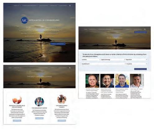
Title: Affiliates In Counseling Website Creative Director: Stephen B. Starr
Art Director: Stephen B. Starr Designer: Stephen B. Starr Developer: Stephen B. Starr
Programmer: Stephen B. Starr Writer: Stephen B. Starr
Design Firm: The Grove Creative Client: Lifetoken Software, Inc. Title: Lifetoken Mobile Application Creative Director: Grisson Davis Art Director: Katelyn Murray
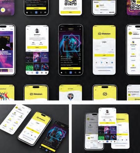
Designer: Will Guthrie UI/UX Designer: Harpreet Singh
Design Firm: The Grove Creative Client: Switchfly, Inc. Title: Switchfly Website
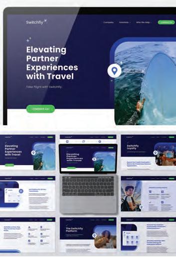
Creative Director: Grisson Davis Art Director: Katelyn Murray Designer: Will Guthrie
Developer: Brad Messenger Writer: Dina Klarisse Dugar
Design Firm: The Molo Group Client: Velocity Electronics Title: Relax, We’ve Got You! Creative Directors: Cristalle Gleason, Katelyn Strumolo
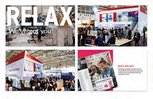
Art Director: Adri Montano Designer: Adri Montano Developer: Jacob Candia
Programmer: Jacob Candia Writer: Jessica Dart Project Coordinator: Cook & Associates
Design Firm: The Walker Group Title: Leadership Greater Hartford Social Media
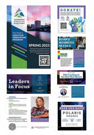
Art Director: Nicole Pierzchalski Digital Marketing Manager: Kristen Beausoleil
Design Firm: The Walker Group Title: Verinomics Website Design
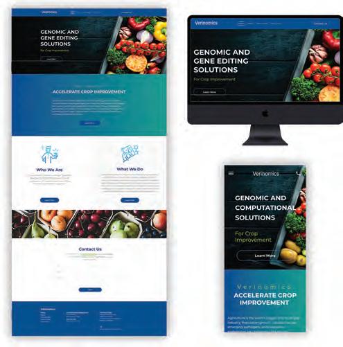
Creative Director: Jeffery Williams Digital Marketing Manager: Kristen Beausoleil
Design Firm: The Word & Brown Companies Client: CHOICE Administrators
Title: CHOICE Administrators Sales Appreciation Event Campaign (Save the Date + Invitation) Creative Director/Art Director: Homer Villegas, Studio Director

Marketing Manager: Rikki Nedelkow Senior Digital Marketing Specialist: Noe Villasenor Events Marketing Director: Jessica Haluck
Events Manager: Heather McDonald
Design Firm: The Word & Brown Companies Client: CHOICE Administrators
Title: That California Different Feeling Social Media Creative Director: Homer Villegas, Studio Director Designer: Noe Villasenor, Senior Digital Marketing Specialist
Senior Marketing Manager: Rikki Nedelkow Marketing Project Manager: Brandi Daiken
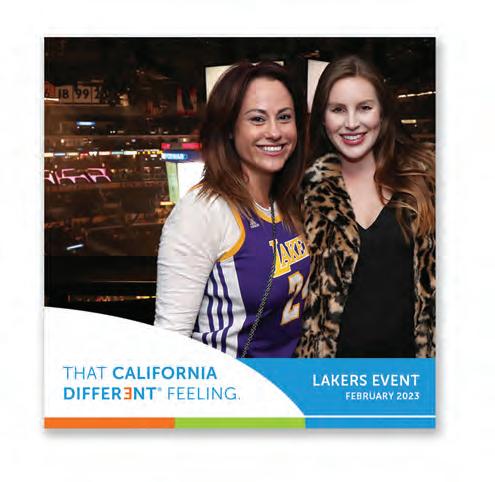
Design Firm: The Word & Brown Companies Client: CHOICE Administrators
Title: Member Campaign Art Director/Designer: Homer Villegas, Studio Director
Writers: Alex Strautman, Senior Copywriter; Rikki Nedelkow, Sr. Mktg. Manager; Polly Neves, Executive Vice President, Marketing Marketing Project Manager: Brandi Daiken Senior Digital Marketing Specialist: Noe Villasenor
Design Firm: The Word & Brown Companies Client: Word & Brown General Agency
Title: Word & Brown New Broker Blog Microsite Art Director/Designer: Hugo Miramontes, Sr. Graphic Designer Designer: Noe Villasenor, Senior Digital Marketing Specialist Writer: Alex Strautman, Senior Copywriter Developer: Jarrell Walker,
Front-End Developer Executive Vice President, Marketing: Polly Neves.
Marketing Director: Missy Bynon Marketing Project Manager: Heather Jung
Digital Marketing Director: Kalup Alexander Digital Manager: Vidah Quirante
Design Firm: The Word & Brown Companies Client: Word & Brown General Agency
Title: J&R Report Microsite Art Director/Designer: Hugo Miramontes, Sr. Graphic Designer Writers: Alex Strautman, Senior Copywriter; Noe Villasenor, Senior Digital Marketing Specialist Developer: Jarrell Walker, Front-End Developer
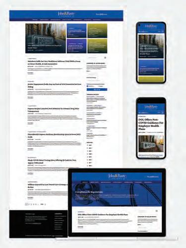
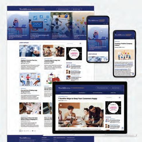
Digital Director: Kalup Alexander Digital Manager: Vidah Quirante
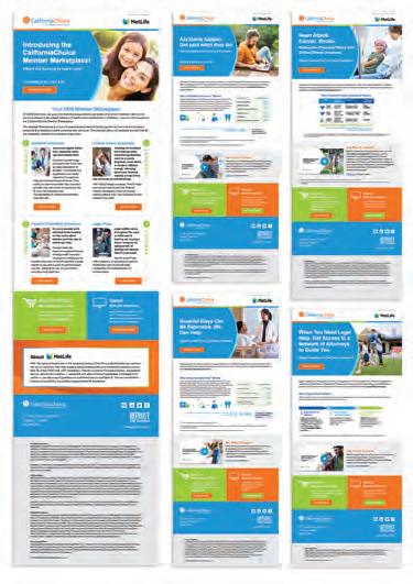
Design Firm: The Word & Brown Companies Client: Word & Brown General Agency
Title: [&] Effect Monthly Eblast Series Art Director/Designer: Hugo Miramontes, Sr. Graphic Designer Designer: Noe Villasenor, Senior Digital Marketing Specialist
Writer: Alex Strautman, Senior Copywriter Marketing Director: Missy Bynon
Marketing Project Manager: Heather Jung
Design Firm: The Word & Brown Companies Client: Word & Brown General Agency
Title: Top Producer Event Teaser Video Series Creative Director/Art Director: Hugo Miramontes, Sr. Graphic Designer Marketing Director: Missy Bynon Marketing Project Manager: Heather Jung
Design Firm: The Word & Brown Companies Client: Word & Brown General Agency
Title: Top Producer Microsite Art Director/Designer: Hugo Miramontes, Sr. Graphic Designer Writer: Alex Strautman, Senior Copywriter Developer: Jarrell Walker, Front End Developer Executive Vice President, Marketing: Polly Neves
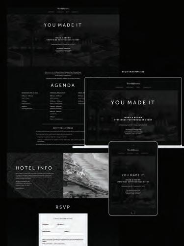
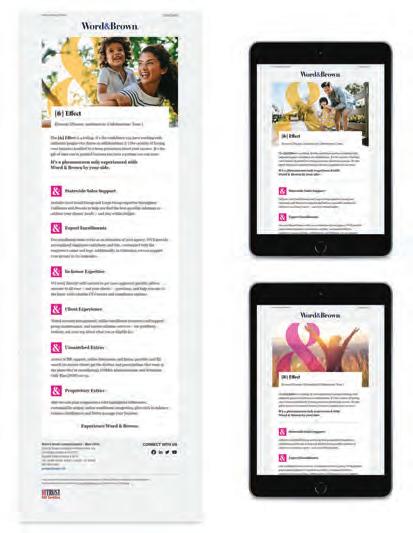
Marketing Director: Missy Bynon Marketing Project Manager: Heather Jung
Digital Marketing Director: Kalup Alexander Digital Manager: Vidah Quirante
Design Firm: Throughline, Inc. Client: Deloitte AI SGO Title: Deloitte AI-Enable Government Digital Map Designer: Juraj Mihalik Writer: Tom Zorc Design Strategists: Danny Beckerman, Val Lopez
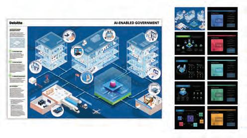
Design Firm: Throughline, Inc. Title: What’s Your Throughline?
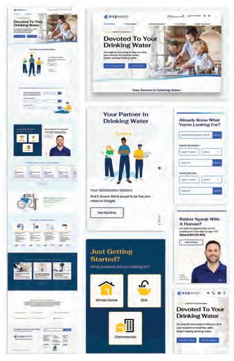
Creative Director: Amy Eser Art Director: Julia Tylor Designer: Daria Klimova
Content Strategist/Voice-over Actor: Amanda Sadler
Design Firm: Toral Advertising + Design Client: Corsair Gaming, Inc.
Title: T-Pain Virtuoso RGB Wireless XT Release Creative Director: Jose Toral Designer: Jose Toral Writers: Larot Esoj, Ancel Ayran Marketing Director: Ancel Ayran
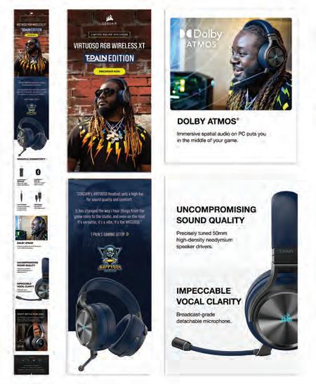
Design Firm: Toral Advertising + Design Client: Elgato Title: Elgato Event
Product Launch Keynote Creative Director: Jose Toral Designer: Jose Toral Writers: Larot Esoj, Ancel Ayran Marketing Director: Ancel Ayran
Event Key Art: Elgato Internal
Design Firm: Toral Advertising + Design Client: ESP Water Products
Title: ESP Water Products Website Rebrand Creative Director: Jose Toral
Designer: Jose Toral Writers: Larot Esoj Illustrator: Anastasia Frizen
Site Audit: Randy Daems, Innovacean LLC
Design Firm: TreacyDesign/TFX Client: Helium Commerce Platform
Title: Social Digital Campaign Creative Director: Joe Treacy Art Director: Joe Treacy Designer: Joe Treacy Developer: Joe Treacy Programmer: TreacyDesign/TFX In-house Studio Writer: Joe Treacy
Backgrounds: Will Treacy WIQKT
Design Firm: TreacyDesign/TFX Client: Treacyfaces.com Title: Publishers Do The Craziest Things To Save Money Campaign Creative Director: Joe Treacy Art Director: Joe Treacy Designer: Joe Treacy Developer: Joe Treacy Programmer: Joe Treacy Writer: Joe Treacy Video: Courtesy of Frank Romano
Design Firm: ULINE Creative Title: Uline’s Happy New Year 2023 Email Creative Services Director: Lisa Murphy Designer: Jen McClellan
Web Merchandising Project Director: Judy Nicolet VP of Creative: Elizabeth Tenner
Design Firm: ULINE Creative Title: General Warehouse Animation
VP of Creative: Elizabeth Tenner Creative Director: Sarah Fritz
Senior Art Director: Heidi Stieber Art Director: Wendy Gruselle Designers: Jeff Mayfield, Kady Jordan
Design Firm: University of Hawaii with Sig Zane Kaiao Client: University of Hawaii at Manoa Title: Beyond Wayfinding Co-Designers & Principal Investigators: Brian Strawn, Karla Sierralta Co-Designers & Principal Investigators: Nalani Kanaka‘ole, Sig Zane, Kha'o Zane UH Project Manager: Carol Ogata
Contractor: Global Specialty Contractors Fabricator: CREO Industrial Arts Wayfinding Consultants: Two Twelve Photography: Tom Takata Photography
Design Students: University of Illinois at Urbana-Champaign
Title: Roomiversity Mobile App Concept Creative Director: Lillie Ostarello
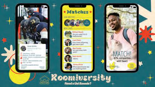
Creative Strategy: Hope Fowler Brand Strategist: Caroline Azzo
Market Analyst: Simran Shah Professor: Terry Kasdan
Design Firm: Vision Creative Group Client: Casio Title: Casio Privia Landing Page
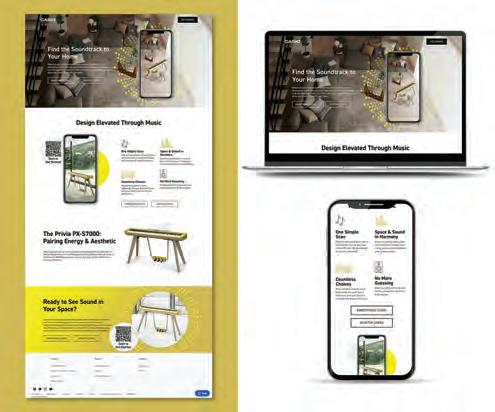
Creative Director: The Vision Creative Group Team
Design Firm: Waltz Creative Client: Central Coast Community Energy

Title: Why Electrify Bilingual Commercial Campaign Creative Director: Zack Shubkagel Rovella Art Director: Cheryl Lovejoy Designer: Sara Frey
Writer: Central Coast Community Energy, Waltz Creative
Account Managers: Nicole Arduini, Heidi Ash
Design Firm: Waltz Creative Client: Flourish Ventures Title: Digital Corner Shop
Campaign Creative Director: Cheryl Lovejoy Designer: Sara Frey Developer: Sara Frey Writer: Flourish Ventures Account Manager: Heidi Ash
Design Firm: Waltz Creative Client: The Hoffman Agency
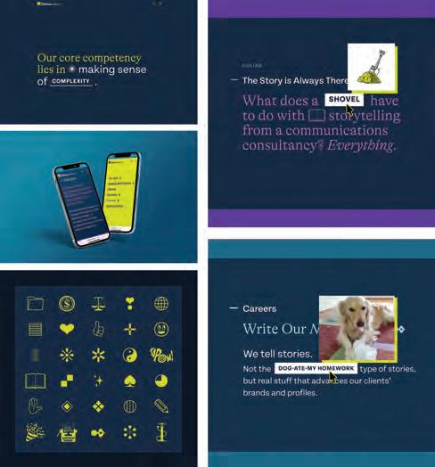
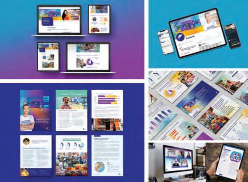
Title: Dingbats Are Cool Again Creative Director: Cheryl Lovejoy Art Director: Michelle Padron Designers: Diane McGirr, Sara Frey Developer: Chee Studio Writer: The Hoffman Agency Account Manager: Nicole Arduini
Design Firm: Weiler Abrasives and The Fuze Client: Weiler Abrasives
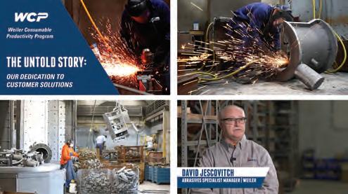
Title: The Untold Story: Our Dedication To Customer Solutions
Digital Graphic Designer: Chad Hauenstein, Eric Sauermeich (Weiler Abrasives)
Lead Video Content Strategist, The Fuze Videographer, Erik Haviland, The Fuze
Design Firm: Western Growers Marketing Title: Western Growers Association
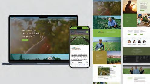
Website Creative Director: Tim Vu Art Director: Cristian Orozco
Designer: Cristian Orozco Developer: 36 Creative Programmer: 36 Creative
Design Firm: Xindi Lyu Title: Shape Languages Motion Graphics
Designer: Xindi Lyu
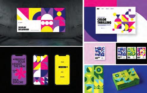
CELEBRATING 150 YEARS OF PREMIUM PAPER-BASED SOLUTIONS.
PACKAGING
LABEL
SIGNAGE
MARKETING COLLATERAL
GIFT CARDS & CARRIERS
ENVELOPES
WALLCOVERING

As a creative, you take pride in crafting winning designs for your clients. But when did you last put the same love and care into designing your career path?
Creating a professional development plan can help. Consider assembling a document where you lay out what you want to achieve, how you will get there and what resources you will need along the way. Think of it as your roadmap to staying abreast of industry trends, mastering the latest digital tools and learning from peers and design leaders.
Why is this process so important? Let’s dive into the data. If you’re like 42% of professionals in a Robert Half survey, chances to learn and expand your skills may boost your job satisfaction. Lack of these opportunities can even cause people to quit: 42% of managers of marketing and creative teams said insufficient career advancement opportunities was a top reason they’d had employees leave the company.
It’s not surprising then that a full 81% of these managers said that expanding or enhancing professional development programs had helped them retain talent in the last year.
In addition to asking your manager for chances to upskill, you can start creating a strategy on your own. Here's a five-step plan to get you started.
Kick off your plan with a thorough self-assessment. It's crucial to perform this step at the outset and also whenever you update your document.
Take a step back and consider your current skills, knowledge and expertise and split them into career-specific and transferable categories. Career-specific details might include logo design principles, experience with art direction and proficiency in niche software and tools. Transferable (or soft) skills are things like time management, adaptability, problem-solving and communication. Don’t shy away from your weaknesses — owning them
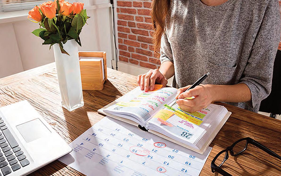
is the only way you’ll know what to work on to achieve your goals.
Now that you’ve got a clear picture of your strengths and weaknesses, it's time to set some goals. While it's tempting to scribble down something like “Get a promotion by the end of Q4,” stick to the SMART method: specific, measurable, achievable, relevant and time-bound.
For instance, you might want to master Adobe After Effects to help you create dazzling motion graphics and animations. As well as being specific, this goal is measurable (aim for a certification), achievable (you’re able to spare 1-2 hours per week for learning and practice), relevant (you can offer more services to your clients), and time-bound (you can polish it off in six months).
Next up, brainstorm some ideas to level up your skills. Here are a few strategies to include in your plan, plus some ways to put them into action.
Conferences are great ways for learning about the latest design trends, connecting with fellow creatives and soaking up knowledge from industry leaders. Do some research, find events in your field and make a wish list of conferences you want to attend.
Check out online platforms like Skillshare, Udemy or Coursera, or look for in-person workshops and classes. Choose courses that align with the goals you set in step two.
Joining an Industry Association:
Being part of an industry organization like AIGA can hook you up with valuable resources, networking opportunities and exclusive events.
If the Robert Half research mentioned above is anything to go by, you'll be pushing at an open door if you ask your manager to support your professional development. Research the costs and benefits of the development opportunities and explain how they’ll help both you and the company. For example, you might pick up some game-changing insights at a conference that could level up your team’s projects. Show your boss that investing in you is a win-win for everyone.
Setting up a timeline with deadlines for your goals is essential for staying on track. It’s the “T” (time-bound) in your SMART goals.
Remember the “R” as well — your deadlines must be realistic. Rome wasn’t built in a day, and you can’t revamp your personal website in a week. Aim for the sweet spot between giving yourself enough time to nail your goals and pushing yourself to grow professionally.
PAUL FLAHARTY is District President for Robert Half Talent Solutions, overseeing Technology and Marketing & Creative Contract and Permanent Placement operations in the Southwest United States including the Los Angeles Metro Market, Orange County, San Diego, Phoenix, Nevada and more. Robert Half connects professionals with companies hiring in marketing, creative, digital, advertising and public relations.

To request free product information from advertisers featured in this issue contact the advertisers directly as provided below or in their advertisements.
What do the high brightness and preferred blue-white shade of Accent® Opaque mean for you?
Excellent print contrast. Expect intense whites and subtle tone variations for dark colors.
Accent® Opaque is a premium uncoated sheet that stacks up to more expensive papers in quality, performance, selection — and results.
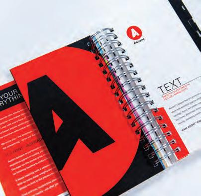
Explore finishes, basis weights and project inspiration at accentopaque.com
