
CONTENTS — PRIMED 2022 YEAR 12 VISUAL ARTS EXHIBITION Showcasing work from IB Visual Arts VCE Media VCE Studio Arts VCE Visual Communication Design Sunday 17 October 2022 Geelong Grammar School Cover Image Credits Tobias Balcombe-Ehrlich (Yr12 FB)
VISUAL ARTS Tobias Balcombe-Ehrlich Elaine Dang Myrah Dhawan Millie Forwood Elsa Li Suri Li Amelia Los Kane Ouyang Amina Wang Amber Zhang
08–29 30–71
VCE MEDIA
Alex Atkins Sophie Canny Sammy Christie Claudia CoombeTennant Alannah D’Andrea Prue Devilee Eliza Frazer Georgia Gall Thalia Goulios Sienna Gracanin Aiden King Hugo Lefebvre Ailish McEvoy Marlley McNamara Chloe Nikakis Amy Officer
Tara Quach Kayne Razmovski Paige Rowell Hugo Temple Emily Widjaja
72–115
VCE STUDIO ARTS Giorgia Borrello Georgia Danckert Sebastian Durran Claire Hamilton Sacha Hannebery Ella-Rose Hare Charlotte Harry Hugo Lefebvre Nathan Liao Milly MacLachlan Cassie Peris Caitie Remen Paige Rowell Indie Schutzinger Abbey Shackleton Ruth Scott
Tahlia See Mazey Taylor Daisy Turnbull Audrey Vincent Mackenzie Woodman
116-148
VCE VISUAL COMMUNICATION DESIGN Renee Arton-Powell Alex Atkins James Backwell Sammy Christie Charlotte Harry Taylor Hobbs Mia Kirby Georgina Parks Jade Preston Abbey Shackleton William Simpson Hugo Temple Emma Trethewey Brooke Warner Emily Widjaja
IB
FROM THE HEAD OF VISUAL ARTS
It gives me immense pleasure to present to you the PRIMED 2022 Exhibition Catalogue. The catalogue includes the works of 59 students involved in IB Visual Arts, VCE Media, VCE Studio Arts and/or VCE Visual Communication Design.
The title of the show is not accidental. PRIMED, according to the Oxford dictionary, means “prepared for a situation so that an individual knows what to do, especially after being given special information”. The exhibition showcases projects of students who, over the last two years, have been impacted by the Visual Arts.
They have received their “special information” to take them on to the next level. Whether they will choose to pursue Art and Design education further or not is, at this stage, uncertain. The feedback from the students who have done the subjects in the past would suggest that they will, however, definitively bring along new perspectives and energy for creativity to any academic field.
INTRODUCTION — PRIMED 2022 5
There is much talk in the media and in our own school about creativity, innovation, agility and 21st century skills. Likewise, there is a nation-wide push to approach this issue by embracing what we know as STEM education.
The PRIMED exhibition demonstrates that there is more to learning than Science, Technology, Engineering and Mathematics. If we want to have a real culture of innovation, then we need to have true creativity at its heart. A sophisticated, erudite, creative society requires Art as a core part of education and the national curriculum. Luckily, the School recognises this important link and the students are given an exclusive opportunity to experiment with different media and materials in a variety of purpose-built venues, like the darkroom, painting, printing and ceramics studios or the computer lab (known as ‘MacLab’). They are also given a chance to observe and work alongside leading contemporary Australian artists and experience first-hand the creative processes of prominent Melbourne-based design studios.
INTRODUCTION — PRIMED 2022 6
This year, we were privileged to host three exquisite artists: Julia Roche (He’03), Deborah Klein and Shane Jones. Our guests not only generously shared their knowledge and skills but, more importantly, discussed their life-stories. Understanding the value of experimentation, resilience, learning from mistakes, determination to succeed, perseverance, humility and, most of all, hard, honest work for their creative practice, provided further “special information”.
Looking around the three display spaces – Sinclaire Centre, Hirschfeld Mack building, Senior Art School – and the works exhibited therein, it is easy to see the effects of “priming”. The artworks and designs on display are a culmination of sweat and tears shed over the course of the students’ journey. As they advanced, and especially through the last two years of their study, the students were developing their investigative, analytical and reflecting skills. They strove towards an appropriate form and the highest level of resolution to attain full ownership of their artistic development. Furthermore, they also worked effervescently to respond to specific briefs and/or self-guided challenges.
In the process, they created works that express how they perceive and respond to the specific design needs of the world around them. The visual thinking helped them to express what it is that they feel and what they see. Being “prepared for a situation” our students “know what to do”, and thus receive skills for life, skills for living.
The Visual Arts Department, as well as the School, would like to acknowledge the effort, determination, perseverance and ultimately the wholesome development that so many of our students have demonstrated, especially through the last two years.
The students are truly PRIMED. We wish them well in their future endeavours.
Dr Peter Bajer Head of Visual Arts
INTRODUCTION — PRIMED 2022 7


8 IB VISUAL ARTS — PRIMED 2 0 22 INTERNATIONAL BACCALAUREATE VISUAL ARTS


9 Necessities Video
TOBIAS BALCOMBE-EHRLICH [FB]
My collection of works addresses the masculine experience, specifically the ways in which societal pressures influence the masculine experience. The collected works use singular male characters to encourage reflection about the broader masculine experience and how these pressures impact men across society. The most explicitly addressed pressure is the expectation of achieving materialistic and monetary success, including conforming to the somewhat antiquated role of the primary male breadwinner. Other pressures include pressure to hide any weakness or insecurity, both physical and emotional, and to not deviate from rigid ‘masculine’ stereotypes through sexuality, gender fluidity or displays of characteristics traditionally associated with femininity, like sadness or fear.
The altar-like works within the exhibition combine diptychs and triptychs, inspired by Hieronymus Bosch’s ‘Garden of Earthly Delights’ and a variety of triptychs by Frances Bacon. The viewer is asked to open the doors to reveal the larger interior image, viewing inside the man’s head and seeing through his eyes. Other works in my collection use simple geometric shapes and objects to enclose the male subjects, articulating the framing of the male persona.
Overall, the exhibition does not aspire to overview recent male experiences but focuses more narrowly on men I interact with in my personal life. Consequently, most images are shot in my hometown of Darwin in Australia’s Northern Territory, where I grew up.

10 IB VISUAL ARTS — PRIMED 2 0 22
Arne Bowen’s Spiral Digital Photography

11 Necessities
VideoNine to Five Phil Goldman Digital Photography
Staring at the End of a Barrel Acrylic on canvas

ELAINE DANG [Ga]
My exhibition captures moments of saying ‘goodbye’, reflecting on human vulnerability. As children, we focus so much on our future, thinking of the things we can do and the people we will meet, that we often overlook those in our past. There are so many moments in our lives that we forget to appreciate, and often we don’t realize it until it is too late. My exhibition, ‘I love you just in case’, reflects on final moments shared, usually between two intimate subjects whether it be friends, family or a significant other. I want to remind everyone that we only have one life, and in this life we need to remember and to cherish the ones we love.
12 IB VISUAL ARTS — PRIMED 2 0 22


13 IB VISUAL ARTS — PRIMED 2 0 22 Necessities Video
Till Death
Do Us Part Acrylic on canvas My Past, Your Future Acrylic on canvas
MYRAH DHAWAN [EM]
The concepts of dreams have always intrigued me as they convey the deepest part of our subconscious or the most vivid part of our imagination. The specifics are unique to each individual and dreams transcend the human experience to other animals. Dreams are illusionary visions we have while sleeping. It is the mind’s attempt to synthesise our experiences, helping us deal with personal conflicts, emotional struggles and our fears. The possibility of ideas that can be portrayed in dreams are limitless nevertheless, as we get older, our ability to recall dreams progressively decreases. As dreaming is a universal experience, I was trying to capture both childhood nightmares, as well as bad dreams experienced by adults. Through this exhibition, ‘Where Do We Go After Midnight’, I explore the theme of nightmares. I am heavily inspired by the Surrealism movement as it aims to portray the balance between the conscious and subconscious mind. The Surrealism movement uses distant realities to activate the unconscious mind, revolutionising the human experience. I have used sculpture and painting to depict this theme as these mediums helped me to create the best visual impact.

14 IB VISUAL ARTS — PRIMED 2 0 22
A Penny for Your Pain Acrylic and polymer gloss on canvas
Mixed media installation

Mother’s Mutilation
cast sculpture glazed with copper
with
Nursery Web
polymer gloss

15 IB VISUAL ARTS — PRIMED 2 0 22
(clay
carbonate oxide & cobalt oxide
white crackle, acrylic box)
Acrylic and
on canvas
MILLIE FORWOOD [EM]
Throughout art history, the female body has been a tremendous source of inspiration; its form, abilities and nature an eternal source of true wonder for artists of every description, each endeavouring to capture the female identity in ways that are incessantly evolving. Coined by Laura Mulvey, ‘the male gaze’ has been described as the presentation of women through masculinity’s looking glass; a perspective that labels male depictions as diminishing, and that we should subsequently reject them. But whilst some artists, through their creations, have undoubtedly crafted idealistic caricatures of women, is this truly what they set out to do? Did men earnestly intend for women to feel this way, or were they simply fascinated by the foreign divinity of the female body, an entity they simply do not possess? Using the ‘male gaze’ perspective, my exhibition is a benign paradox of feminism; a demonstration of a woman adopting the ‘male gaze’ to explore feminine beauty through the eyes of the male beholder, liberating nude creations from notions of phallocentrism. From Rodin to Schiele, my inspiration predominantly stems from a body of male artists, through which, by mimicking their respective techniques, I seek to better understand the male viewpoint to further appreciate how and why men depict women in certain ways. Sculpture was the most effective media when exploring my ideas. Through the artform’s tangibility, I was able to understand how, when depicting the female form, men often become anatomists; their vision obscured to focus on the body’s anatomical composition, rather than the societal realism of their subject figures. The women depicted in my exhibition remain anonymous, their defining faces removed from the scrutinisation of their viewers.
By impersonalising each piece, I seek to equitably explore the female form, capturing her simply ‘As She Appears’ (the title of my exhibition).

16 IB VISUAL ARTS — PRIMED 2 0 22
Girl of your dreams Video art

17 Necessities Video
Nude (with shawl) Oil on canvas
ELSA LI [Fr]
I believe that ‘good’ art does not require anything special to create. In fact, my favourite and most used materials is a pencil and sketchbook. I always have it with me to scribble down anything and everything of potential, from funky chairs to striking faces. I think this collecting and collating of ideas has fabricated a relatable mundaneness to my art. The pieces I create are windows of escape from life in the modern world, where the pressures to perform and conform have never felt more prevalent. I collage and layer these unconventional materials to create in. I have also grown to love acrylic, charcoal, digital art, and my favourite of all- a combination of all of them. Through experimentation with multimedia, I was able to achieve a particular style that is ragged, with parts intentionally left incomplete. The layering technique I use came about during lockdown when my access to art supplies was limited. I adapted and covered old canvases using a paper mâché-like technique, pasting on items from my recycling bin. This resulted in a ‘fresh’ yet familiar skinned canvas, constructed from materials common to all students. Through my art, I wish to materialise the pressure, exhaustion and frustration that is a by-product of school. Realness and representation of the high school experience is conveyed. The experimentation and distortion of the human form is the main subject of all my pieces, to an extent, they are all self-reflections. My desire to explore why I feel this way and ultimately how to better understand the human condition has led me to create art that represents this journey.

18 IB VISUAL ARTS — PRIMED 2 0 22
Curated self
Printed digital drawing, glued onto recycled canvas then painted over with acrylics, draw over with colour pencils
Taking notes on how to become myself Collage on top of recycled canvas, drawn with charcoal then painted over the top with acrylic
Necessities
Video
It’s getting real Collage and red paint on top of recycled canvas, drawn over with charcoal


19 IB VISUAL ARTS — PRIMED 2 0 22
Fragmentation
Oil on canvas
Distortion
Graphite Pencil and Oil on canvas
Mother, can I hold your hand? Oil, acrylic and ink on canvas
SURI LI [A]
What if Fyodor Dostoevsky’s concept of suffering was embodied through the artistic style of Egon Schiele? Interlacing works of literature and symbols of solitude and melancholy, I sought to envision prose through visual imagery. Literature has always been a prominent element of my life, especially tragic and psychological works of fiction. Works that affected me most and most integrated into my exhibition are: Jean-Paul Sartre’s Nausea, Dazai Osamu’s No Longer Human and Perfume: The Story of a Murderer by Patrick Süskind. Hence, each work of my exhibition was inspired by a certain quote from the aforementioned novels. My vision of the exhibition was to evoke a sense of familiarity through the subtle use of complex imagery and, just like how a reader would unravel an analysis in literature, I wanted the viewer to interpret a message in my works. I incorporated my strengths, particularly oil paint and graphite pencils, as my mediums. The affinity of my works was unified by a similar colour palette of cool tones (majorly Prussian blue, ivory black and emerald green) and use of the human anatomy. My characteristic art straits are the eyes, distortion of the flesh (saturated at joints) and explored through majorly one subject matter. I purposefully used a deficit of warm tones to highlight the grim qualities of my work. I wanted to convey to my audience through the simplistic words of the quote, language can easily change and influence the perception of an image. I sought to represent in my work that there is no specific message the viewer should take from my art. Instead, the spectators are encouraged to read the quote to make their own interpretations before reading my explanations. In this exhibition, the lines between reality and imagination blur, where fiction represents the manifestation of unbounded thought.
20 IB VISUAL ARTS — PRIMED 2 0 22


21
Ceaseless E-noise
Digital Collage, digitally manipulated on Adobe Photoshop Distortion


E- work doesn’t stop at 5pm
Digital Collage, digitally manipulated on Adobe Photoshop
AMELIA LOS [Cl]
The world we inhabit today in the 21st century is defined by technology. The impacts of technology and noise is universally ingrained in the human experience. Fundamentally, the notifications that pop up on our screens, the constant information overload and need to compulsively check our devices is simply ‘noise’. Each artwork can be connected to an element of extreme consumption, consumerism and over stimulation by the devices we own and interact with each day.
Noticing how art has become more digitalised, the theme of ‘noise’ has been communicated through a complex digital process involving the use of digital photography and digital manipulation. My inspiration came from a range of graphic designers who contributed to a volume called Extreme Graphics and editorial illustrations and articles from Adbusters Magazines, a journal devoted to challenging consumerism. The later magazine has also influenced my cyberpunk, dystopian aesthetics. Some of my pieces display also neo-expressionistic, unfinished qualities.
This exhibition has been conceptually motivated by my personal experience of digital technology. Through my artworks I hope to address the patterns of technology that society is occupied by to coherently show the subconscious distress that noise brings up on us. I wish to highlight the shared universal impact of E-noise and ask the viewer, ‘Are we out of touch with reality?’. In such, these artworks endeavour to personally connect with the viewer in the hopes that they question their role as a digital consumer.
22 IB VISUAL ARTS — PRIMED 2 0 22

23 IB VISUAL ARTS — PRIMED 2 0 22 Necessities Video Are w-E living? Digital Photography Installation displayed on 15 iPads
Shame of Jingkang
Acrylic on canvas
Shame of Jingkang (detail)
KANE OUYANG [M]
As an international student from China, I have always been interpreted as multicultural. I am heavily influenced by Chinese culture, in which I grew up, and also inspired by Western culture, which is the dominant culture during my senior school time. With the two completely different worlds around me and shaping me into who
I am as an 18-year-old young adult, I am uncertain with the difference between the two cultures. During this art research named ‘People as Mirror’, I got inspired by a Chinese saying- “With copper as a mirror, you can correct your clothes. With history as a mirror, you can know the ups and downs of a nation, and with people as a mirror, you can see the gains and losses.” So, I started investigating ancient Chinese history, the desire for peace, the tragic, the verve, the bravery and the determination of the ancients. Each of my paintings presents one ancient spirit of Chinese culture. Each artwork has an artifact that has a symbolic meaning: the crown represents imperial power; the sword represents unyielding determination; the prison window represents the determination to dedicate to a great cause; the armour represents duty of protection. Beside the Chinese culture where I got the main characters of the painting, I also acknowledged Western culture. All my paintings are painted using the acrylic method, which is invented and developed in the West. I was inspired by a romantic artist, Henry Fuseli, with the way of portraying the spirit of the characters and Caravaggio’s use of chiaroscuro. In summary, I took the Chinese culture as the “bone” and the Western culture as the “skin” to shape my exhibition.
24 IB VISUAL ARTS — PRIMED 2 0 22


Piercing eyes
Digital drawing printed on smooth cotton rag
Ladybugs (Triptych)
3 Digital drawing printed on smooth cotton rag
Elephantidae
Digital drawing printed on smooth cotton rag
Rhinopithecus
Digital drawing printed on smooth cotton rag
AMINA WANG [Ga]
My works centres around the theme of ‘Equilibrium’, a concept crucial to our environment’s health. The artworks are based on animals’ intricate beauty and codependency and highlight the importance of achieving such a state for humankind. The exhibition seeks to call attention to the animal kingdom’s vulnerability and create a stronger appreciation for endangered species. Inspired by Marco Mazzoni, I’ve adopted a minimalistic style and created monochromatic works. I was also heavily influenced by Martin Wittfooth and his thought-provoking paintings in which he analyses the relationship between industrial society and nature via an unusual combination of images of humans and animals. Each of the works takes on a timely process of being sketched on paper, scanned and refined on my iPad, then exported into Illustrator, where the textures were enhanced using digital brushes. In the later stages, the works were also printed on smooth cotton rags (310gsm|485 microns) to mimic the texture of a pen illustration, thus allowing the intensity and contrast in those digitally composed drawings to be demonstrated. The works together as a whole aim to create an experience for the audience to dive into the natural ecosystem of the land and forest ranges, explore the world of biodiversity and be endorsed by the intricate beauty of the creatures. This collective of artworks displays the incredible beauty of the natural environment and present the synergetic relationships of all creatures. I’ve used this device to symbolise the need to establish the harmonious coexistence of man and nature. Apart from provoking a reflection, each time-consuming and detailed digital illustration aims to draw the audience in. I wanted to focus our attention on the intricate details and beauty of the species around, raise appreciation of fragile ecosystems and reflect on the importance of conservation and protecting our environment.
26 IB VISUAL ARTS — PRIMED 2 0 22


27 IB VISUAL ARTS
The Gaze of Tranquillity Digital collage

AMBER ZHANG [Ga]
“Beloved I pray that all may go well with you and that you may in good health, as it goes well with your soul.” (3 John 1:2)
Life is pervaded by illness and suffering, and can manifest both psychologically or physically. In this secular age, we seem certain about how to deal with it, as there are plenty of available tools that could help us alleviate the pain. However, what if the suffering is not mental or physical, but spiritual. What if someone’s soul is sick? It seems that with materialism prevailing in our world, people’s spiritual life is gradually devoured. A while ago, I went through a low point in my life, where I felt paralysed and incapable of coping with everything. So, I started a long term of self-isolating and feeling like I was entirely drifting away from my body. Luckily, I found a way to get through my depression, thus spirituality and self-psychology became a light guiding me through my recovery journey. Hence, this experience of emotional breakdown and engagement with spirituality drove me to research the topic of spiritual healing and further inspired me to hold this exhibition titled ‘At that moment of spiritual healing.’
28 IB VISUAL ARTS — PRIMED 2 0 22
Drifting away


29 IB VISUAL ARTS — PRIMED 2 0 22 Necessities Video
Drawing on paper sawn transparent fabric


VCE MEDIA — PRIMED 2 0 22 30 VICTORIAN CERTIFICATE OF EDUCATION MEDIA


31
ALEX ATKINS [Cl]
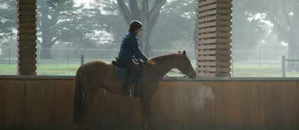
Common Goal is a documentary-style short film which explores the relationship between a horse and rider in the world of equestrian. Captured on a Sony A7S (24105mm lens), the film investigates the unknown elements of a sport that involves a complex language between a horse and human and the dedication, time, effort and hard work equestrians exert in order to achieve success. Explored through the visual insight of an emerging young rider, Ella Sevior, and her horse, Paddy, accompanied by dialogue from Julie Roycroft, who shares her own insightful explanation coming from a distinguished background of Olympic equestrian, the film develops a clear and sophisticated expression. The documentary exists as an educational experience for those who are unfamiliar with the sport as well as a fitting and relatable transmission for those involved in the world of equestrian; covering the vital components and details behind the art of riding and the horse-human partnership as they work towards achieving a Common Goal

VCE MEDIA — PRIMED 2 0 22 32
Common Goal
Documentary-Style Short Film


VCE MEDIA — PRIMED 2 0 22 33
SOPHIE CANNY [Cl]
My photographic series presents three different stories that are all based around the matter of domestic abuse/violence, with the sub-genre of you don’t know what happens behind closed doors. My fragmented narrative, presented through twelve images, was created to depict a realistic representation of the worldwide issue in our society, that victims sometimes hide. Through each story, I use symbols and settings to show each protagonists daily life, later revealing the scars underneath that people cannot see. Through the series, audiences are presented with a confronting outlook on a take of domestic abuse, which urges people to speak up and create awareness. I wish for this to reach my target audience of ‘adults’ as a whole, as through their personal experiences they are more able to take this on board. I intended to instil emotions in viewers as they observe my series, in the hope of leaving a long-lasting effect. My three subjects (Eliza, Jane and Dorothy) convey different stories all in different age brackets. This illustrates age diversity that domestic abuse can happen to anyone. This increases the emotional effect on viewers, as they are most likely to relate to one of the ages presented. This may also aid in providing shock to audiences, as by showing their normal lives at first, audiences may feel they can relate to the normalities of one’s life, before enlightening viewers of what is really happening ‘behind closed doors.’ In addition, it is important to have my audience viewing the full series, so that they understand my narrative. At the end of my final photograph, I will add a domestic abuse hotline number in case this fragment is a trigger, or if they are a victim. Once my series is viewed, I hope to induce my audiences with a sense of guilt, empathy, justice, and a slight feeling of ‘uncomfortableness’ when faced with the realism of my photographs.

VCE MEDIA — PRIMED 2 0 22 34
Warning: Mature Audience only


VCE MEDIA — PRIMED 2 0 22 35
You don’t know what happens behind closed doors
Narrative Photography
SAMMY CHRISTIE [M]
My intention for my media product is to create a short film focused on a fight scene between two characters, called The Last Slice. The film shows the characters, Tom (Hugo Temple) and Jerry (Jonah Wilkins), clashing with one another, with the film opening with a training montage and then the majority of the rest of the film capturing the fight between each other. I wanted to achieve the creation of an impressive fight scene that would grip the audience’s attention. I incorporated many different camera movements and shots to achieve this, as well as altering the fight scene through editing techniques. I also wanted to create a narrative in my short film that initially appeared gritty and serious, but after a plot revelation halfway through the film, evolves into a more comedic and wacky narrative. This helped the narrative presented in the film be more engaging to my target audience of young action fans, subverting their expectations and making them more surprised by the film’s premise. This film was a fun process to create, and I am proud of the final product as I was able to fulfill my vision of an exciting fighting movie.

VCE MEDIA — PRIMED 2 0 22 36
The Last Slice Narrative Short Film
Warning: Adults only


VCE MEDIA — PRIMED 2 0 22 37
CLAUDIA COOMBE-TENNANT [Ga]
My Media product is a photo essay displayed in a zine print production. The zine includes 36 pages in an A5 portrait picture book layout. The photos are constructed in the form of a systematically organised series of interconnected black and white images each displaying a landscape open for interpretation. The purpose is to compile an idiosyncratic showcase for forward-thinking and provocative areas of current photographic practice. The product looks at questioning the ideology of modern society which is to judge or initially view a scene, or certain landscapes, in their natural essence. Filled with eye-catching, bold, and stylised images inspired mainly by Rui Palha, Eric Kim and Bruce Gilden, the zine deals with displaying the beauty of decay, in a comparison to landscapes with wealth tied to them. This product was created primarily for adults aged 20-60 that are out of school and university, due to the zine’s ideology it also appeals to those of younger ages studying or interested in social structures, social studies, cultural studies and/or class structures. The audience’s interpretation drives the narrative, and these photos will give the viewers an opportunity to see the two groups in a similar light.

VCE MEDIA — PRIMED 2 0 22 38
Digital Photography

ALANNAH D’ANDREA [Ga]
My final media product is a photographic book centred around waiting rooms, with a purpose for it to be displayed and read in waiting rooms. It is focused on the universal experience of having to wait in a waiting room; a type of transitional space, liminal in nature, between ‘what was’ and ‘what is next’. I made the creative decision to photograph the spaces without individuals present as I wanted to probe my target audience to contemplate how their own emotions impact their personal perception of a space. I have chosen to edit the photos by colour grading them either blue or yellow to not only create a sense of continuity throughout my book but to emphasise the atmosphere and details within each of the spaces.

VCE MEDIA — PRIMED 2 0 22 40
Narrative Photography


VCE MEDIA — PRIMED 2 0 22 41
PRUE DEVILEE [Cl]
Break is a short psychological thriller film about a girl who suffers from schizophrenia. Filmed at Geelong Grammar School’s Corio Campus, it captures the struggles that my subject, Aria, experiences, such as bullying and loneliness, which eventually drives her to the edge.
VCE MEDIA — PRIMED 2 0 22 42
Break Short Film


ELIZA FRAZER [EM]
SKIN DEEP is a small coffee table book consisting of twelve pages that reinvent the iconic “slip, slop, slap” campaign for young females aged 18-20. Incidence rates of skin cancer and melanoma are significantly higher amongst Australian woman, and Australians in general, compared to other countries. I wanted to encourage my audience to change the narrative around how we care for our skin to prevent devasting effects in the future. Therefore, the use of eye catching and thoughtprovoking images underpin the narrative of the motions we go through during sunscreen application, while also including other ways we can encourage each other to protect our skin. When coupling the energetic images with frightening statistics in relation to skin cancer and an interview with TV personality, entrepreneur, and skin cancer survivor Deborah Hutton, I use both print language and visual composition to convey that the negative culture around sun protection must change and how we can and must move away from the “Bronzed Aussie” notion imbedded in our culture. I want my audience to understand that they need to love the skin they are in, that pale is beautiful and there is simple solution to decreasing the incidence of skin cancer and melanoma.

VCE MEDIA — PRIMED 2 0 22 44
Skin Deep Narrative/Editorial Book
GUARD YOUR SKIN FOR LIFE
Sun protection is a vital part of skin health. It needs to be part of our daily routine. It’s important all year round, not just in summer. So when the UV index is greater than 3 we must remember to wear sunglasses and a hat, apply a broad spectrum sunscreen with and reapply every two hours, cover up, and seek shade especially between 10am and 2pm.


IT TAKES TWO


Good things come in pairs and sometimes those hard to reach spots need someone to help you apply. So don’t be shy, grab a friend and do it together.

45
GEORGIA GALL [Ga]
My media product is a photography fashion magazine, comprised of 16 pages of A4 sized matte paper, bounded with saddle stitching. I’ve incorporated a flip cover in my magazine with ‘two’ magazines in one. Pages 1-10 consist of a current era style magazine with old style sports clothing pictured above in pictures 2 and 3, while pages 11-16 consist of an older style magazine with current style sports clothing. I chose to do this because I wanted to juxtapose the different eras by depicting the evolution of female fashion in sport while demonstrating how society has progressed, in terms of gender equality through the lens of female fashion, by it now being able to provide clothing specific to women. My print layout explores the perception of society changing within fashion in sport as beauty being expressed in performance rather than through looks or how someone’s dressed. Through implying this, I aim to influence young females to dress to perform in sport rather than impress through fashion or looks.
VCE MEDIA — PRIMED 2 0 22 46
Georgia
Gall Narrative/Editorial Photography

THALIA GOULIOS [He]
My Media product is a zine print production. It is titled Silhouette, being teenage in the digital age, and includes 12 pages in a magazine layout. This zine depicts the innocence that is taken away from teenagers due to the hyper sexualisation of young adults, promotion of certain beauty standards and the detrimental nature of toxic masculinity. Specifically, my desired audience was made up of both males and females aged 14-22. It may also appeal to a second audience, aged 40-60, who are parents of the young men and women reading this zine. My intention was to create a zine that shows the crippling anxiety teenagers face when exposed to specific beauty standards in the media and lets my audience know that other people feel this way too. To bring this perspective to print media, I’ve complied the following poems from the voices of TikTok and given them the titles REFLECTIONS, SHADOWS and ECHOES. Reflections, because this is how we are trained to see ourselves, Shadows, because of the cultural baggage we’re followed by and Echoes, because of the voices stuck in our heads. Unlike on the app, there’s no swiping away from these. They tackle our perceptions head-on and remind us of the power we hold to change them. Let them speak to you. Remember, we are not bound by our silhouettes.
VCE MEDIA — PRIMED 2 0 22 48
Silhouette Print Production


SIENNA GRACANIN [EM]
For my media product this year, I chose to do photography. My intention was to convey a narrative to my audiences through the chronological sequencing of these photographs formatted into one larger image. This was inspired by cinematography, and how films use codes and conventions to tell stories to their audiences. I challenged myself to do this for my photography which obviously does not allow sound, movement or dialogue, therefore I had to be intentional with my camera, lighting and editing. I am unable to write about the narratives behind my photographs as the purpose of them is for the narrative to be undetermined and interpreted by the audience who will most likely have similar or opposing views. This decision is beneficial to my work as it allows for discussion and it positions the photographs to almost be a problem to solve - something to investigate - which is what a successful film does using the common codes and conventions. That is exactly what I am attempting to replicate so, by revealing my perspective on the narratives initially, the magic and engagement of the audience is spoiled and that is something I did not want.

VCE MEDIA — PRIMED 2 0 22 50

VCE MEDIA — PRIMED 2 0 22 51
AIDEN KING [P]

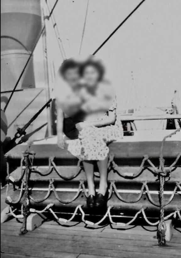
Hannah Burger’s Life Story is a documentary-style short film which explores the journey of Hannah Burger during the bombing of London as well as being a Jewish Women in Australia. Filmed through a first-person lens, it explores the complex and personal experience which my subject Hannah faced with her thoughts and pictures. Through a narrative created to depict a collection of memories and thoughts, I unravel the ideas within her journey and the wholesome impact the bombing had on her life. The story I want to convey through my film is that from generation to generation, we learn from the past to create a future. This has been conveyed using music, visuals, and diegetic sound. Due to copyright unfortunately this film can’t be shown as Hannah wants to keep her story private and only want’s family members to view it.

VCE MEDIA — PRIMED 2 0 22 52
Hannah Burger’s Life Story Documentary-Style Short Film

HUGO LEFEBVRE [FB]
Throughout the production process, I have developed and refined my aesthetic style to produce a surf magazine I am proud of. While I was faced with a number of challenges throughout the process, I worked through these to make the final product stronger. For instance, once I started the actual production and creation of my media product, I realized that I needed to make significant changes to my original page layout designs, the balance between the images and the text and the use of the font. I also needed to extend the content and narrative to ensure there was more variety for my readers. Creating strong content for the magazine was important. I realised during production that to achieve the overall look or aesthetic style of the magazine and to ensure I appealed to my audience, I needed a variety of content/ narratives. This forced me to approach advertisers, create a mock competition and add in single page, easy to read content. The result was a magazine where nearly every page was different and unpredictable, which was the aesthetic quality I was looking for. Overall I have enjoyed the production process and I am most proud of the fact that I was able to create a media product that matched my intention statement, was high quality and, from the audience who have seen it, they have said they love it.

VCE MEDIA — PRIMED 2 0 22 54
Below the surface (Series) Colour Photography displayed on Light Box

VCE MEDIA — PRIMED 2 0 22 55
MODE Magazine Layout

AILISH MCEVOY [A]
My Media product is a fashion editorial magazine. My magazine is called MODE and includes 10 pages in a magazine layout. It’s filled with eye catching typography, stunning photographs and models. This product was created for young teenagers to adolescents (Gen Z) which is typically aged 14-21. Specifically, my desired audience was made up of young females and males that are interested and inspired by the fashion and modelling industry. My intention was to create a magazine that’s inspiring and engaging to look at and read. It includes make up, clothes, models and an article.
Each page or connecting pages will have a different layout and feel and will resemble most editorial pages like Vogue or Harper’s Bazaar.
VCE MEDIA — PRIMED 2 0 22 56

57
Being in Time Short Film
CHLOE NIKAKIS [Cl]
My short film, Being in Time, is an arthouse-style music video which explores the transition from adolescence to adulthood and offers insights into the protagonist’s own introspect. To do so, I have constructed a non-linear narrative, which displays three stages of the protagonist’s life. The first stage being her as a young girl of about three years, the second stage is her at about age thirteen, and the final stage is her in the present moment (eighteen years old). This scattered storyline has been designed to depict an assortment of the protagonist’s memories, as she reminisces on her younger self. I have attempted to convey notions of nostalgia in doing so, through several characteristics such as editing, setting and costume. I hope that in doing so, audiences can relate on many levels, as this transition is one that all must undergo. Recognisably, the emotional responses to such changes vary amongst individuals, thus I wanted to create a somewhat ambiguous collection of these emotions in which I hoped would be open for interpretation, with the aim of relating to each individual in some manner. I tried to avoid granting either positive or negative connotations to this phase of life, and rather wanted to create a piece that could be interpreted either way. Thus, the way this film is received is relatively dependent on the subjective audience member. Due to my profound consideration of visuals, I aimed to produce an arthouse film, in which would exploit symbolism and motifs as a means of finding deeper meaning. I have achieved this through contrasting settings, and colour grading, along with many more aspects of mis en scène to summon certain audience responses. My film is accompanied by the supporting song, The Beginning of Time by Tilly Vickers-Willis, which allowed me to propel my narrative effectively and intensely.

VCE MEDIA — PRIMED 2 0 22 58


VCE MEDIA — PRIMED 2 0 22 59
Confusing Girl Short Film
AMY OFFICER [Fr]
Confusing Girl is a music video and a coming-of-age short film that explores the teenage experience and learning to enjoy time by yourself. Filmed in different locations such as the snow, it depicts the enjoyment of the simple things in life such as making a snowman. The song contributes to the narrative by reinforcing the story of a teenage girl coming to terms with someone not wanting to spend time with them. The message I want to convey through this video is that there is more to life than waiting for a text that will never come. Being able to embrace the environment around you by going out in the snow and making the most of your teenage years. Through my video, I show these experiences in a positive light to inspire my audience.

VCE MEDIA — PRIMED 2 0 22 60


VCE MEDIA — PRIMED 2 0 22 61
By The Day Short Film

TARA QUACH [A]
By The Day is a short film about raising awareness for people who deal with mental health and the impact that it has on one’s self. The film follows the daily life of a young man (Hugo) who experiences mental health issues. My desired audience was people aged 16-30, specifically, I aimed to show this film in the United States, Colombia, the Netherlands and Ukraine, as these countries are the leading countries where mental health issues are the most prominent according to a World Heath Organisation global study. Through my narrative, I show that Hugo experiences ‘anxiety attacks’ throughout his daily life and this is represented by a physical being- the “hooded figure”. This representation displays the struggles that individuals go through on a daily basis where they cannot control their emotions. My product shows the more severe side of the effects of mental health but my main intention for the film was to educate those who don’t understand what mental health does to someone.
VCE MEDIA — PRIMED 2 0 22 62


VCE MEDIA — PRIMED 2 0 22 63
KAYNE RAZMOVSKI [Fr]
Calcio is a sports/fashion magazine capturing athletes off the field with elegance and class. Based off GQ Sports, my magazine is showcasing unparalleled coverage of style, culture and beyond. These images are moments that create conversations. Each image tells a story of the obstacles and challenges athletes must overcome to become a professional athlete. This narrative is used to inspire the younger generation to continue to play sports during their teen years and depicts themes of inclusivity. In a contemporary society, where people are often judged for what they do or who they are, Calcio explores how people can discover that sports are a haven to express themselves.

64
Calcio
Magazine layout


VCE MEDIA — PRIMED 2 0 22 65
PAIGE ROWELL [EM]
My Media product, You and Me, is a photographic series accompanied by cinematic styled captions within a collage, which is from a point of view of a teenage couple and gives an insight into the societal pressures that come with young love, accompanied by thoughts, feelings and conversations between the couple so the audience can really get inside their head and further understand their relationship. The collage which makes up my photo series is eight rows long and has 10 images in each row. Each row transports the viewer to a new picturesque location in which the couple is, each image has been carefully composed so that each line of the story matches up to each image. My intended audience for my media product was 16-22 year olds, in particular people that are in relationships. The series is highly detailed, each individual image is its own piece of art and, when displayed in the collage style that it is it, becomes an even bigger piece of art. Through the storyline which is displayed as captions on each image, it gives the effect that each image is a still from a movie or a short film. Overall, I am extremely happy with my media product and think it turned out even better than I imagined it being.

VCE MEDIA — PRIMED 2 0 22 66

67 You and Me Media
Again? Short Film
HUGO TEMPLE [A]
My short film Again? follows the life of a student that is resentful of school. As school progresses, his work begins to pile up each day and, as a result, he becomes increasingly overwhelmed. The days start becoming more and more similar and repetitive as time goes on and the state of his mental health declines. Due to this, some unnatural things start happening to the main character. I wrote, filmed and scored the entire film, in an attempt to communicate a similar feeling (obviously not to the extent presented in the film) that some students may have felt throughout their schooling. I filmed this on a home camera and edited it using Adobe Premiere Pro and After Effects, with the use of an AI software to visually manipulate some scenes.

VCE MEDIA — PRIMED 2 0 22 68


69
i’m [not] okay Mixed Media Zine

EMILY WIDJAJA [EM]
i’m [not] okay is a mixed media zine which discusses suppressing emotions. It presents the narrative that what people show on the outside, or what they say, is not always what they feel deep down. Focusing on the experiences of young females around this topic, it includes a collection of five individual reflections, which are exhibited through texts that reflect my model’s personal thoughts and emotions, and portraits using mixed media techniques: image transfer technique and torn paper. Combined with the use of tracing paper in my product, I intend to create a layered narrative for my audience to perceive that, as they flick through each model’s individual section, they are coming closer to unravelling the model’s pure emotional state, which refers back to the narrative that what people show isn’t always the truth because they suppress it and cover it up. My intention is to engage females who feel they are constantly suppressing their emotions from their surroundings; I want them to be able to feel assured that they are not alone and feel understood that is it hard to express it, let alone explaining it to their surroundings.
VCE MEDIA — PRIMED 2 0 22 70


VCE MEDIA — PRIMED 2 0 22 71


VCE STUDIO ARTS — PRIMED 2 0 22 72 VICTORIAN CERTIFICATE OF EDUCATION STUDIO ARTS


VCE STUDIO ARTS 73
The core theme surrounding my folio this year has been the concept of Metamorphosis. This is a sudden change in the form and habits of some animals during their transformation from an immature stage to an adult stage. I wanted to depict this idea using a focal and reoccurring subject: Daisy, a feminine teenage adolescent. Through my overarching theme I developed two concepts that depicted core ideas representing Metamorphosis. My first concept, ‘Standing out’, is an interpretation of my inspired artist, David Bromley, exploring the use of materials of gold leaf and acrylic paints of what butterflies look like when bloomed at their final stage of transformation. My other concept was ‘Fleeting Beauty’, illustrating that the youthful connotation of being beautiful is only for a fleeting moment until transitioned into an adulthood. My reoccurring strong subject matter of Daisy was prevalent again with the use of incorporating different materials to form a collage surrounding Daisy to show her in her prime stage of beauty.

VCE STUDIO ARTS — PRIMED 2 0 22 74
GIORGIA BORRELLO [Ga]
Standing out Mixed Media

GEORGIA DANCKERT [YR11 CL]
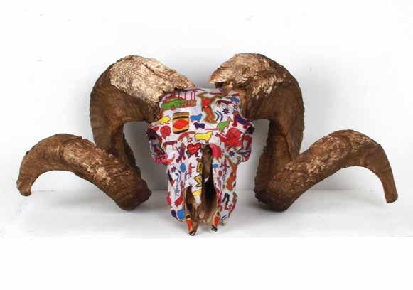
My two final artworks reflect the theme of Australian culture and, more specifically, the cringe culture that is embedded in our contemporary day-to-day activities. With Aussie culture being past, present and future, spreading wide around our nation, I wanted to represent this through my surfaces being 3D found objects as well as my inspiration from the artist Rosaline Gascoigne. My 3D surfaces included road signs that I drew cartoons on, embedding to give a funny and playful aesthetic that can then be carried onto my other work, skulls. These skulls have more of a symbolic nature about them; the two ram skulls link to the history of ‘riding on the sheep’s back’ and how Australia first generated its wealth through the sheep industry. The middle skull has the pattern wrapped around it to add the symbolic idea of modern-day Australia adding a new layer to the foundations of our past. The two supporting skulls on either side have been spray painted to symbolise classic money and is ‘dipping’ into our past for the benefit of our future. I have taken the cringe perspective of our culture and my drawing style and colour palette was strongly inspired by Jean-Michael Basquiat and Keith Haring and how they brought their art to the people by exhibiting out of traditional galleries. I hope that these artworks can be enjoyed by a large audience, young and old. Overall, I have intended for these works to be whimsical and feel I have achieved this by using a comedic and playful cartoon style of drawing as well as bright colours. I then tied this all in by using the repeated subject matter and things that make us cringe at our own culture.

VCE STUDIO ARTS — PRIMED 2 0 22 76


77
SEBASTIAN DURRAN [A]


My two Final Artworks, ‘The Process of Recovery’ and ‘Fractured Composure’, are visual representations of my experience with posttraumatic stress disorder. They explore the many segments of the disorder, which impacts all areas of life. I aimed to investigate the nature of PTSD in a contemporary way, dissecting the stigmatised condition with a modern lens to break down preconceived ideas. This theme came to be on a ‘Shattered Self’, visualising the feeling of loss and grief that PTSD sufferers experience as their psyches are torn between past, present, and future. This evolved into the use of mirrors and an emphasis on direction within the two final artworks.
My Final Artwork 1 is a series of three artworks titled ‘The Process of Recovery’, which depict the three key stages of PTSD therapy. The artworks had a key focus on colour, using the introduction of purples within a sunset as a symbol of transition and change. The dreamlike associations between coloured skies and fantasy are a reference to EMDR therapy, which uses the eye movements of sleep to alter how an individual reacts to certain memories. The vibrancy of the colours represents the power of dreaming as both a help and a hindrance when reaching for recovery.
My second Final Artwork is a spliced collage, containing the fragments of several shattered photographs. By combining several settings with practical effects, the piece has managed to evoke ideas of the invisible audience and the loss of identity that PTSD can cause as your consciousness is torn between the past and the present. This image is much more exposed and vulnerable, evocative of the darker side of PTSD.
VCE STUDIO ARTS — PRIMED 2 0 22 78

VCE STUDIO ARTS — PRIMED 2 0 22 79 The Process of Recovery Series of A3 digital prints on gloss paper Fractured Composure A2 digital print on semi-gloss paper
A piece of Time Digital Photography and Acrylic on Canvas

From then to Now Digital Photography and Acrylic on Canvas
CLAIRE HAMILTON [YR11 HE]
Throughout my design process, I have been inspired by the presence and impact of ‘Time’. This has been my theme, as I was inspired by the ever-changing world around us and how it has formed the world we live in today. My first final artwork, ‘From then to Now’, looks at the past through the significance of an old family clock that hangs in our family farm’s shearing shed. My second artwork, ‘A piece of Time’, views how the past has sculpted the present through the growth of the family business.
Through this, I have created two A3 size canvas works with the aid of two different media formats of photography and painting. I completed both of my finals by taking a photograph that had a single, honed-in focus point. This created a singular focal point created by the main element of the subject matter and allows the overall significance of the work’s conceptual theme to be enhanced. I further took these images and printed them onto a glossy photography paper before ripping them in half, sticking half of it onto a canvas and re-painting the other side with acrylic paint. Through this process, I have aimed to incorporate fine levels of detail in both my media formats, providing a unique final that reflects the way I perceive the infinite ticking of time around us.
VCE STUDIO ARTS — PRIMED 2 0 22 80

SACHA HANNEBERY [Cl]
This year in Studio Arts, I explored the symbiotic relationship of colour, and its inherent connection with emotions and alternating environments. To present this theme, I have created two final artworks in digital photography, ‘Engulfed’ and ‘Silent’, both of which have been produced with the Canon 450D camera and printed at an A3 scale with Epson glossy printing paper. My subject matter unifies in both final artworks as my subject presents a strong facial expression and body language in order to depict the melancholic and isolating emotions of which she is facing internally. My conceptual focus upon the human expression of emotions is illustrated through Artwork #1: ‘Engulfed’, which depicts creating a reflection of the journey of overwhelming emotional turmoil, glossy blue liquid is utilised to stand as a metaphoric exemplification of the overhauling depressive states experienced. ‘Engulfed’ conveys intimate, sombre and eerie aesthetics, which are achieved by the influence of Bill Henson’s inspired ‘chiaroscuro’ lighting technique. Furthermore, capturing the theoretical theme of colours and emotions, Artwork #2 ‘Silent’ captures a wide shot symbolic narrative of the same female subject, sitting hunched, vulnerable and secluded from the oceanic setting which surrounds her. The centrally composed subject is depicted as minuscule in comparison to her surroundings in order to communicate the ability of the desaturated natural environment to dominate the human form and force an individual into isolation. The monochromatic blue toned composition is crafted from the influence of Pablo Picasso’s Blue Period, emphasising the reflection on externally exposing one’s sombre emotion. Both ‘Engulfed’ and ‘Silent’ capture isolating environments that simultaneously reflect the subjects mellowing emotion, encapsulating the seclusive nature of these depressive states, whilst using colour and scale as a symbolic tool in order to represent these emotions.

VCE STUDIO ARTS — PRIMED 2 0 22 82

83 Engulfed Digital Print Silent Digital Print
ELLA-ROSE HARE [He]
My exploration has been on the concept of how life has many different relationships and how they influence certain aspects of our world. I wanted to capture two certain relationships: how humans have mimicked nature during the invention something new and the relationship between the moon and our earth; could we survive without this connection or not? I wanted to capture my concepts in an interesting and unique way. I have purposely made my artwork simple so my viewers are encouraged to unpack the hidden meaning; wanting them to immerse themselves within my work. I chose photography, Photoshop and drawing as my media. Photography allowed me to capture a naked, unaffected photo which gave me room to add further alternations. Capturing the royal photo gives a sense of life rendering within the background/ subject. My mixed media style enhances the associations between two beings, portraying the unimaginable depth that two aspects have with each other, enveloping you with its realisational factors.
VCE STUDIO ARTS — PRIMED 2 0 22 84
Untitled Digital Print on Rag Paper Untitled Digital Print


VCE STUDIO ARTS — PRIMED 2 0 22 85
Petri Dish

Cotton embroidery on cotton fabric
Macro Environment
Latch hook and crochet fibre
manipulation of natural and synthetic yarns on chicken wire
CHARLOTTE HARRY [Cl]
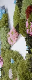
My two final artworks are centred around the theme of biomimicry of natural phenomena, specifically mycology and the environments in which these fungi exist. I have conveyed this idea through the use of fibre manipulation such as latch hooking, embroidery and crochet, using yarn and other threads. My first artwork is a ‘Petri Dish’ containing embroidery mould, lichen, mycelium and other types of fungi made using a needle and thread. The subject matter is something that is generally thought of to be unappetising and off-putting, however, I wanted to invert the audience’s perception of this by creating an appealing, tactile artwork that would evoke a want to touch. The colour palette is slightly saturated and enhanced compared to how these fungi may look in real life, to assist with the ‘prettiness’ and attractiveness of the piece. This artwork helps to convey the idea that upon further investigation, there is beauty to be found in typically unappealing objects. My second final artwork, ‘Macro Environment’, focuses on the macro side of biomimicry and the broader environments in which fungi thrive. The subject matter depicts a topographical, ‘maplike’ birds-eye view of a landscape. In particular, the landscape shown is inspired by a photograph of Mount Lofty Botanic Gardens in South Australia, by photographer Bo Le (also known as “SA from Above”). I have selected this image to base my artwork on as it has a bright colour palette, and although it is not a typical landscape, it is still recognisable as one. This photograph has also been likened to a petri dish, which links it to artwork one and the overall theme. Once again, this artwork aims to attract the audience and evoke a sense of curiosity, exploration and want to touch. Throughout the studio process, I have found that people are generally more attracted to artwork two and want to interact with it due to its large scale and tactile qualities. Once the audience is drawn in by artwork two, they notice artwork one. I would hope that the viewer recognises that artwork one, although they may find it repelling, may be hidden within artwork two in the real world.
VCE STUDIO ARTS — PRIMED 2 0 22 86


VCE STUDIO ARTS 87
For my final products I wanted to create a series of photographs which clearly represent my themes and show a cohesion between all of them. The size which my products will be is in 108x73cm. I wanted to go for this sizing as it has allowed me to retain the majority of my photograph without having to crop too much of it out due to framing and making it fit within it and not compress it and make it uneven. I chose a dark, dull theme for my ‘rhythm and movement’ series and a light, vibrant theme for my ‘man and nature’ series to show the contrast between the two extremes in the ocean, but the two-colour pallets complement each other so that the products do not feel out of place but rather combine well with each other. The feeling of nature and the rhythm and movement and the way we interact with the ocean is reflected in my work through the use of multiple different techniques, from the camera angles and settings, lighting, and the movement of the ocean. This approach has allowed me to create these six final art pieces which all complement each other and none of them feel out of place or clash with one another; even though my two collections have vastly different colour pallets, they both fit in with one another and make a cohesive final art piece. My work has captured and reflected my passion for the ocean and everything it holds. I have captured the calm and soft side of the ocean and the turbulent and aggressive side of the ocean, which each have a very different meaning behind them but both carry a similar message that we should respect the ocean and use it as it is a mediative place and experience being under water.

VCE STUDIO ARTS — PRIMED 2 0 22 88 HUGO LEFEBVRE [FB]


VCE STUDIO ARTS — PRIMED 2 0 22 89
Above the surface (Series) Black and White Photography displayed on Light Box
NATHAN LIAO [Fr]
A wife wants to take out her husband… permanently.
So, the vindictive woman orders an assassin to take care of it.
Unknown to the hired gun, the zealous woman also hired two other hitmen to ensure that the job was done right.

In the streets of the city, all three killers coincidentally plan to eliminate the target on the same day.
Each person is the protagonist of their own story and hold a unique perspective on the world. However, these unique perspectives can be lost when we perceive the strangers around us as supporting characters to our own story. My artwork explores how different people see the world around them. The aspect of having numerous perspectives contributes to the circular narrative I want to tell. Specifically, how each picture only depicts a fraction of the world around it, only by viewing all the pictures can one piece together a wholistic view of the story. I want the viewer to be engrossed by my work and look closely at the clues placed in each image. Hopefully, they will be able to put the pieces together and uncover the overarching narrative. Those who look a little closer and spend a little longer noticing the details will be rewarded with tiny “easter eggs” in my drawings

VCE STUDIO ARTS — PRIMED 2 0 22 90
The protagonist Greylead and watercolour on paper
Alternate perspectives of the same scene x3 Greylead and watercolour on paper


91
Constant Companion Digital Photography

Man’s best friend
Photography
MILLY MACLACHLAN [A]
The focus of my folio this year was to looking at the relationships that exist between humans and animals. I have used photography to create images of animals that are part of my daily life. I have added colour to these images to create a sense of intrigue and connection to the warmth and companionship these animals provide.
VCE STUDIO ARTS — PRIMED 2 0 22 92
Digital

VCE STUDIO ARTS 93
Standing Out Digital Photography
Blending In Digital Photography

CASSIE PERIS [Ga]
The subject of ‘Standing Out/Blending In’ that I have been working on throughout my portfolio will be portrayed in all three of the artworks that are displayed. I’ll divide my artwork’s theme into three distinct concepts to help it stand out more. The final artwork will be one of three, with one representing the entire concept and the other two either blending in or standing out. My products are produced in an A3 Gloss picture paper size. All three of my pieces include humans as subjects who are put in positions where their identities are revealed or implied because we cannot see their faces. Two of my artworks depict this. When you first look at my artwork, it might seem as though they don’t follow the concept because of the different background settings, but if you focus on the tiny details that make up the concept, you can see the connections between all three of them, especially artwork #3, which captures the essence of my theme. Throughout my work I have made decisions that added onto my final work ideas. Originally, I intended to only have two final workplaces but then I added on a third photo that I believed fit the concept well, but also because I cut my original theme into three parts. I also had the idea of playing with light and dark, to further put my photos in their respective places. While working through my works in order to arrive to my three finals, I noticed that I have incorporated the idea of identity in my works.
VCE STUDIO ARTS — PRIMED 2 0 22 94

CAITIE REMEN [EM]
My two artworks are centred on the power and significance of reflections; my first artwork (‘Self-reflection’) captures an introspective reflection, and my second artwork (‘Double distortion’) delineates a candid and slightly warped understanding of the subtle yet powerful nature of reflections. I have therefore created two black and white photographs centred on a reflective surface to convey the increasing significance of one’s reflection in our contemporary world, capturing the same (relatively anonymous) female subject to highlight this. I have placed a physical mirror in between my two artworks to not only serve as a connecting point, but to literalise this process of self-reflection. By employing a fast shutter speed and a low aperture for both of my photographs, I have achieved a sense of depth and compositional layers to further the portrayal of the complex and intricate power of reflections. Hence, my artworks fundamentally ruminate on the power of perception that can distort yet also provide clarity around candid moments – ultimately prompting a discussion around whether we recognise or overlook the power of perspective.

96

97 Double distortion Digital Photography Self-reflection Digital Photography
Pink Aura
A3 Photographic print on matte paper
Purple Aura
A3 Photographic print on matte paper
PAIGE ROWELL [EM]
My initial theme was based around the relationship between humans and the natural For my final, I created two cohesive photographs which represent each of my model’s auras. My first photograph, titled ‘Pink Aura’, looks into the characteristics of having a pink aura and the photograph includes my model lying down on grass with flowers around her, perfectly aligned with the horizon. Characteristics of a pink aura displayed in my image are calmness, appreciation of nature, kindness, feminine energy and, on the negative side of a pink aura, there is emotional immaturity and timidness. My second photograph titled ‘Purple Aura’ looks into the characteristics of having a purple aura and the photograph includes my model perfectly situated within a ring of purple light. The flowers on her face and in her hair are giving the illusion that they are blooming out of her and it is a representation of her inner aura colour showing through to her outer being. Characteristics of a purple aura displayed in my image are spirituality, wisdom, enlightenment, mystery, creativity and divinity. The negative sides are that people with purple auras often do not set strong enough boundaries and it makes them very vulnerable. Through creating my work, I have developed my skills in the art form of photography. I aimed to create beautiful and ethereal artworks and I am confident in saying that is what I have done. Overall, I could not be more proud of how my exploration into auras went and I am extremely proud of my final artworks. They effectively and cohesively represent my exploration as well as being stunning individual pieces of artwork that are pleasing to look at and evoke a strong appreciation of the beauty of my photography and one’s inner aura.

VCE STUDIO ARTS — PRIMED 2 0 22 98

Blue Blood
Acrylic on canvas
Beware the Narcissist Acrylic on canvas
SCHUTZINGER [Ga]
This piece is a large (A2) painting of Kim Kardashian envisioned through a mirror, whilst being above the earth, which conveys my subject as being above and more important than everyone else, further progressing the main theme of narcissism. I included a peacock reference, due to the clique reputation that peacocks are a symbol for power, strength, confidence and even divinity, thus I decided to incorporate peacock feathers into the hair of Kim and make her overall skin tone a deep blue color to reflect her being as “proud as a peacock.” The flatness of this artwork is achieved through my thick layering of acrylic paint and unnoticeable brush strokes, which I hid through continually going over my brush strokes with another paint brush containing only water on it. The unusual colour choices form a somewhat façade to who the subject is and what message my artwork conveys, although the longer viewers glance at it the meaning behind it becomes clear through the numerous symbols that I include. I used heavy shading within this artwork, especially on the facial features of Kim, to elucidate the tiring effects of narcissism and how although working towards replicating a “perfect” appearance, which can be achieved through plastic surgery, can initially have a positive outcome, the impossible expectations of image within society becomes overwhelming and draining.
This piece is a smaller artwork compared to my other concept, being represented on an A3 canvas due to my desire to replicate a similar size to an original propaganda poster. This idea of propaganda is represented by a pop culture subject, Megan Markle, through a formal lens, dressed in formal wear and being the face that represented leadership as well as change. Not only does this image represent Markle being a leader within society, but the underlying perceptions that society has about her is portrayed through the numerous symbols intertwined within the painting such as the money necklace and the golden crown. The money necklace is there to represent societies intuition that Megan Markle only married for the wealth and fame which is also further emphasised through the crown symbol.
VCE STUDIO ARTS — PRIMED 2 0 22 100 INDIE


VCE STUDIO ARTS — PRIMED 2 0 22 101
Growing Independence Digital Photography
Unconditional love Digital Photography

ABBEY SHACKLETON [A]
My final artworks, ‘Unconditional love’ and ‘Growing Independence’, were both developed using Photoshop to create an emphasis on the element of colour. ‘Growing Independence’ explores the idea of a dog and owner bond, and the unbreakable bond that forms through the dog’s life. I believe my final artwork is attractive and delivers a clear message. My final on ‘Growing Independence’ explores a child developing into an adult and the changes that occur. I used motion in both of my finals as it gives a lifelike feel and creates a deeper level of emotion and direction. I believe my second final communicates the idea of ‘Growing Independence’ and is attractive to the audience.
VCE STUDIO ARTS — PRIMED 2 0 22 102

Who am I? My body?
Acrylic on Canvas
Have faith in my body
Acrylic on Canvas
RUTH SCOTT [Fr]
My two artworks, ‘Who am I? My body?’ and ‘Have faith in my body’, stand as a representation of the two reactions to the expectations of women’s bodies throughout history – following the theme of ‘The human body’. My first artwork, ‘Who am I? My body?’, is a symbolic reflection of the concept of feminine rage. It captures the vindictive passion and desperate wrath of the anger that women feel towards the beauty standards that society expect of them. Its hot and vibrant colour pallet of intense pinks and fierce reds paired with the extreme size of the three canvases that make up the body of art demands a confronting yet contemplative experience when viewing it. Whereas my second artwork, ‘Have faith in my body’, is made up of soft, warm and organic tones and shapes. Thus, stands more as a representation of the understanding of how, throughout history and in different cultures and religions, a whole variation of bodies have been desired and even worshiped. This artwork is a content appreciation that the beauty standard is always changing and is essentially impossible to always be following – so why bother? This contrast has been done purposefully to create that jarring experience when looking at the two bodies of art together, as they feel like they don’t belong together at first glance. However, while different, I have created two bodies of work that do interrelate through theme, subject matter and materials used.

VCE STUDIO ARTS — PRIMED 2 0 22 104


VCE STUDIO ARTS — PRIMED 2 0 22 105
Possession
Collage and paint on paper
Stick a flag in it and call it yours Collage on paper

TAHLIA SEE [Ga]
My theme is ‘Always was, always will be’, which I used to explore the hidden history of colonial Australia. In my work I delved into symbols of colonialism in Australia, such as old English fashion and invasive species. I created two collage pieces that combined several art forms, such as painting and collaging, to explore these symbols and their place in modern Australia. The main subject matter I used was newspaper clippings, sketches of rabbits and colonial drawings. In one of my pieces, ‘Blue’, I combined this subject matter with as few colours as possible and used those colours to direct the viewer’s focus to the subject matter as that is what I wanted the audience’s attention to be focused on. In my other piece, ‘Red’, I used colour much more frequently and used the lack of colour to direct the focus of the audience. My use of vibrant colours and collaging of colonial art was heavily inspired by Joan Ross, especially her piece ‘Touching other people’s butterflies’. Her themes and messages are often about ownership – of people, places and objects – and the way she expresses her intent through her art is very clear and stark. I admire that and strive to emulate it by using obvious imagery in my work.
106

107
Feigned Spontaneity
Oil pastel on magazine paper printed in A1 size and digital photography printed on glossy paper in A1 size
Succession
Oil pastel on magazine paper printed in A2 size and digital photography printed on glossy paper in A2 size
MAZEY TAYLOR [YR11 EM]
My folio surrounds the concept of ‘you are what you wear’. This is the idea of fashion describing personality and creating individuality. Through this, I looked at what can influence an individual’s fashion choice. I depicted this theme using two artformsphotography and illustration. I focused on cycles of fashion throughout Unit 4, using past fashion trends as my main form of subject matter. I wanted to create an editorialstyle artwork, drawing inspiration on the magazine style of Antonio Lopez. However, I also aimed to integrate a sense of nostalgia through subject matter and photography techniques borrowed from Ellen Von Unwerth. I combined both aesthetic qualities by interpreting features of the past and placing them in a contemporary setting. My first artwork represents multiple trends of multiple periods in time through clothing that is placed in a contemporary setting. This creates a sense of looking back on the past. Artwork 2 reflects past trends that have been contemporised to fit a modern-day setting. Through this, I have created two interpretations of the idea that “everything old is new again”. This concept of contemporising within present day artworks is often used among artists, as the past influences new and modern ideas.

VCE STUDIO ARTS — PRIMED 2 0 22 108

DAISY TURNBULL [Ga]
Throughout my studio processes I explored the intricacies that embody the ‘Details of Domesticity’ and what can be used to encompass and represent these illustrative details. I aimed to expose the unique capacity of mundane items, with the omission of people to uncover the universal tropes that have permeated homes throughout history.
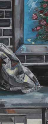
I completed both of my final artworks, ‘Nap Room Still’ and ‘Kitchen Scene Still’, with gouache on canvas. Using gouache brought a dusty and muted quality to the pigment, which I was able to apply to represent reflection and shine, particularly in ‘Kitchen Scene Still’, through purposefully placed highlights such as thin white lines on the beaker and the curtains. Depictions of fabric and folded material are integral in my paintings, encompassing expressions of femininity and comfort within domesticity, seen in the tea towel, blanket and curtain drapes. Using objects with representative value, I have been able to explore the symbolic narrative seemingly mundane objects can hold and how they can work in conjunction to tell a story; from the warmth brought by baking equipment to the intricacies of flowers, such as small daisy flowers, in encompassing new life and womanhood. I incorporate still life artist Katie Koenig’s process of working from a dark base to light, to bring definite form and opacity to this object. Through intentional stokes of specifically chosen colours, I painted with inspiration from Paul Cezanne’s work to render the multidirectional and varied state of the blanket and other shapes struck by varied light. Centred with imperfection – a wholly recognisable and relatable theme in homes – I included moments of imperfection, such as the spilled mug and cup and the crumpled tea towel, to further narrative purposes.

VCE STUDIO ARTS — PRIMED 2 0 22 110

VCE STUDIO ARTS — PRIMED 2 0 22 111
Kitchen Still Gouache on canvas Nap Room Still Gouache on canvas
VINCENT
The focus of my folio this year was to investigate the negativity that surrounds women when they are portrayed in the media. I was strongly influenced by retro cartoons with my drawing style and used my two final artworks to explore the idea of what the future could include. My second final artwork investigated the negativity of paparazzi and their fascination with celebrities. This greed for knowledge has ultimately fed the social media frenzy we are currently living in.

VCE STUDIO ARTS — PRIMED 2 0 22 112 AUDREY
[Ga]

VCE STUDIO ARTS — PRIMED 2 0 22 113 Us vs Them A4 poster drawing printed onto glossy paper Sell-out A3 poster drawing printed onto A4 glossy paper
MACKENZIE WOODMAN [EM]
Anonymous Digital Photography

The focus of my folio this year has been to compare women to flowers. I have investigated the understanding of how life cycles and age are often depicted and described using the same language. Within this theme I have investigated the way that women begin to feel invisible and less relevant and their youthful beauty fades. This has been explored in my work by deliberately hiding the identity of my subject.
My second artwork looks at the cycle of life as the flowers (and indeed women) slowly wither as their beauty fades and are often compared to flowers.
VCE STUDIO ARTS — PRIMED 2 0 22 114


VCE VISUAL COMMUNICATION DESIGN — PRIMED 2 0 22 116 VICTORIAN CERTIFICATE OF EDUCATION VISUAL COMMUNICATION DESIGN 20115286R PRESENTATION TWO abt book wrist


117 EST 9491 EST 1949 WEBSITE DESIGN book newsall
wrist neck cuff
RENEE ARTON-POWELL [A]

My client, Wren.en, is a small business based on the Australian Surf Coast which designs and produces a range of handmade beaded jewellery such as necklaces, bracelets, anklets and earrings. The client provided a brief looking for a new logo to represent their business which will be used for a variety of business advertising as well as a new packaging design that is environmentally sustainable. The designs are targeted predominantly at young adults who are concerned with fashion and the latest trends, which resonates with the type of jewellery that Wren.en has to offer. The company currently attracts predominantly females between the ages of 18-30. For the logo I explored a variety of different designs including surfy aspect, the use of line to create shape as well as an incorporation of the presence of nature. As the business originated on the Surf Coast, I chose to stick with this idea and produce a logo which reflects the beach. For the packaging design, I went with a very simplistic approach in using only white on a cardboard box to create shape and interest. I believe my final logo and packaging design conveys the ideas of the company and will attract the target audience.

VCE VISUAL COMMUNICATION DESIGN — PRIMED 2 0 22 118


119
ALEX ATKINS [Cl]
My client, Aesop (est. 1987), is an established global luxury skin care brand with over 34 years of experience in the beauty industry and stores spread across 25 countries globally. The brand specialises in formulating skin, hair and body care products and is recognised for its minimalistic designs, retail experience and products which remain one of its main attractions for its higher socioeconomic target audience. The brand had recently decided to design a collection for younger age groups and create products that will attract children. My client provided a brief looking for a suitable and appropriate shampoo bottle design for children that would still reflect and maintain the brand’s recognisable trademark and use of logo. This design was of course targeted at children but additionally, it was also targeted at parents who are current Aesop customers and looking to buy shampoo products for their children. To promote this design, my client’s second communication need was an advertisement poster of the shampoo bottle. It remained with the same target audience and had to fit into the brand’s retail environment. The A3 poster design offers a visual description of the design with included images as well as brief information about the product and the Aesop logo to ensure brand recognition.
VCE VISUAL COMMUNICATION DESIGN — PRIMED 2 0 22 120


JAMES BACKWELL [FB]
My Client, Geelong Grammar School, is a boarding school in Victoria. It is home to boarding students from around the world. The client provided a brief looking for a design of a new Geelong Grammar Careers Day and a security hut. The target audience is students in years 10-12, as well as other students and guest speakers. The design of the app logo is to inform the audience about the event as well as to create a visual symbol that represents Geelong Grammar School Careers Day. The final presentation needs to include screenshots from the app that showcases a map of the school, information on the public speakers attending and areas of focus, a booking section and a calendar of the day’s events. I believe my final app logo design along with the app layout is highly functional and aesthetically pleasing, whilst staying within the school’s colour requirements. The security hut is targeted at students, teachers, parents, visitors and couriers, with the purpose of providing housing for the security guard who will greet visitors and prevent unauthorised entry/theft. I explored the use of materials that fit with the aesthetic of the school by utilising bricks, wood and steel. The final presentation will be presented on an A5 sheet of gloss paper. Renderings of the hut from north, south, east and west, perspective views, proposed location only with materials and floor plan. I used vector works to produce the final product and believe the hut is highly functional for the intended purpose.

VCE VISUAL COMMUNICATION DESIGN — PRIMED 2 0 22 122
Do you consider yourself to be creative, expressive and have good communication skills? Perhaps you could channel this artistic vision and allow it to pave your career path. Come and hear about where an Architecture degree, Communication Design and Product Design Engineering can lead you. From developing the visual identity of a company, to videography and photography and using design to optimise services and systems, these OGGs have interesting paths to share. Digital business has changed the face of operating a business. It has also broadened the world of data analytics, helping businesses optimize their performances. Are you interested working with computer technology or in Business? Come and hear from a software engineer who works at realestate.com.au, a data analyst and someone who manages a global team within the business world. Commerce is broad business-based degree with the ability to specialise in Finance, Management, HR, Marketing, Economics or Accounting. In this session hear from OGGs working in investment onking; an associate who through nancial analysis, provides g Do you enjoy working with people? Would you prefer not to work in an o ce? Do you enjoy problem solving or caring for people? Come and hear from these OGGs who work as an ambulance paramedic, a perioperative nurse who assists during surgeries in the cardiothoracic theatres and an early childhood educator who is a childcare assistant working with toddlers. Having studied aerospace engineering, one of the OGGs in this session has some great stories about where his propensity to say ‘yes’ has taken him. From working with rockets to designing jet engines in Berlin to the switch to software engineering during the covid pandemic. Also in this session, hear from a Project Coordinator in the construction industry who began by studying Environments at Melbourne Uni and Property and Valuations graduate doing graduate programme with Australia’s largest commercial landlord, Dexus. another twist! However, there are many other pathways into businEss! Come along and listen to other people who work in Businesses and took di erent path to get there: small business start-up owner and venue manager who looks after every facet of running top tier hospitality business. Commerce is a broad business-based degree with the ability to specialise in Finance, Management, HR, Marketing, Economics or Accounting. Leveraging o Commerce degree that was a good introduction to nance and economics, James runs high growth crypto start-up – a small cryptocurrency project with a product known as ‘stable coins’. After Scott’s commerce degree, he rst moved into an accounting/auditing role but his career has taken another twist! However, there are many other pathways into busin CAREERS DISCOVERY DAY SESSION TITLES AND GROUPINGS Small Business Start-Up Entrepreneur – Cryptocurrency Perioperative Nurse Childcare Assistant Software Engineer Property and Valuations Graduate Designer Service Designer Software Engineer Director of Global Partnerships Investment Banking Analyst NTERNATIONAL RELATIONS, International Security/Languages Student Army Captain Lawyer (Class Actions) Lawyer (Wills Estates) Merchandising Assistant Account Manager Clinical Embryologist Head of Music & Arts, Secondary VCE History Literature Teacher, Secondary We sincerely thank the OGG volunteers! 1.20pm Students and parents meet in the SPACE 2.05pm All students move to Session 2.55pm Completion of 3.00pm 3.45pm 4.25pm Completion of Session 4.30pm Afternoon Tea in the SPACE for students, OGGs and parents CAREERS Space 4.30pm GROUND Epipen De brilator Epipen Clocktower Level 1 Toilets De brilator Epipen Epipen Clocktower De brilator Epipen Clocktower SESSION TITLES AND LOCATIONS CONSTRUCTION, ENGINEERING & PROPERTY SCIENCE (2.15pm) (3.00pm) CAREERSCAREERS Guest Speaker Subject Business / Commerce Construction, Engineering & Property Creative & Design Digital & Technology 08/26/2022 Australia/Melbourne (06:36 PM) Friday, August 26 9:00 AM 10:00 AM 12:00 PM 4:00 PM 11:00 AM 13:00 PM Finance International Relations, Communications & Defence Law Medicine Science Teaching Careers CAREERS DISCOVERY DAY SUNDAY 23 MAY 2021Small Business Start-Up Perioperative Nurse Childcare Assistant Property and Valuations Graduate Service Designer Videography/Photography Analyst Senior Associate in Economics & Policy Investment Banking Associate Assistant Adviser to the Minister for Trade, Tourism Investment Lawyer (Class Actions) Lawyer (Wills & Estates) Merchandising Assistant Account Manager Agriculture – Sustainability Officer Planetary Geophysicist VCE History & Literature Teacher, Secondary Primary School Teacher 2.05pm Parents remain Play House for Introduction to VCE, VCAL and IB (optional) 2.15pm Commencement of Session 2.55pm Completion of Session 3.40pm Completion of Session Parents join students for Session 3.45pm Commencement of Session Map BookingProgram Speakers Information SCHOOL ROAD Space 4.30pm ART SCHOOL ROAD Epipen Epipen (2.15pm) Science Centre Dining Hall TOWER ROAD SCHOOL ROAD Afternoon tea in the Space 4.30pm ART SCHOOL ROAD Main GROUNDFLOOR GROUNDFLOOR FLOOR FLOOR Gladys Bell Room South foyer C01 Level Toilets De brilator Ground Floor Level Toilets Epipen De brilator Epipen Clocktower Toilets De brilator Epipen Ground Floor Epipen Clocktower Ground Floor Epipen Clocktower SESSION TITLES AND LOCATIONS INTERNATIONAL RELATIONS, COMMUNICATIONS & DEFENCE Q16 MARKETING, MEDIA & PUBLIC RELATIONS INTRODUCTION TO VCE, VCAL AND IB Play House YEAR 10 AND BEYOND Play House Do you consider yourself to be creative, expressive and have good communication skills? Perhaps you could channel this artistic vision and allow it to pave your career path. Come and hear about where an Architecture degree, Communication Design and Product Design Engineering can lead you. From developing the visual identity of a company, to videography and photography and using design to optimise services and systems, these OGGs have interesting paths to share. Digital business has changed the face of operating a business. It has also broadened the world of data analytics, helping businesses optimize their performances. Are you interested working with computer technology or in Business? Come and hear from a software engineer who works at realestate.com.au, a data analyst and someone who manages a global team within the business world. Commerce is a broad business-based degree with the ability to specialise in Finance, Management, HR, Marketing, Economics or Accounting. In this session hear from OGGs working in investment onking; an associate who through nancial analysis, provides g Do you enjoy working with people? Would you prefer not to work in an o ce? Do you enjoy problem solving or caring for people? Come and hear from these OGGs who work as an ambulance paramedic, a perioperative nurse who assists during surgeries in the cardiothoracic theatres and an early childhood educator who is a childcare assistant working with toddlers. Having studied aerospace engineering, one of the OGGs in this session has some great stories about where his propensity to say ‘yes’ has taken him. From working with rockets to designing jet engines in Berlin to the switch to software engineering during the covid pandemic. Also in this session, hear from a Project Coordinator in the construction industry who began by studying Environments at Melbourne Uni and a Property and Valuations graduate doing a graduate programme with Australia’s largest commercial landlord, Dexus. another twist! However, there are many other pathways into businEss! Come along and listen to other people who work in Businesses and took di erent path to get there: a small business start-up owner and venue manager who looks after every facet of running top tier hospitality Commerce is a broad business-based degree with the ability to specialise in Finance, Management, HR, Marketing, Economics or Accounting. Leveraging o a Commerce degree that was good introduction to nance and economics, James runs high growth crypto start-up – a small cryptocurrency project with product known as ‘stable coins’. After Scott’s commerce degree, he rst moved into an accounting/auditing role but his career has taken another twist! However, there are many other pathways into busin CAREERS DISCOVERY DAY SUNDAY 23 MAY 2021Small Business Start-Up Perioperative Nurse Project Coordinator/Interface Manager Software Engineer Property and Valuations Graduate Designer Service Designer Software Engineer Director of Global Partnerships Investment Banking Associate Investment Banking Analyst International Security/Languages Student Lawyer (Class Actions) Lawyer (Wills & Estates) Content Producer/Studio Manager Merchandising Assistant Surgical Resident Clinical Pharmacist Clinical Embryologist Head of Music & Arts, Secondary We sincerely thank the OGG volunteers! PROGRAMME 1.20pm Students and parents meet in the SPACE 2.15pm 2.55pm Completion of Session 3.00pm Commencement of Session Parents join students for Session 3.45pm Commencement of Session 4.25pm Completion of Session 3 CAREERS SCHOOL ROAD Space 4.30pm ART SCHOOL ROAD Epipen Epipen (2.15pm) TOWER ROAD SCHOOL ROAD Afternoon tea in the Space 4.30pm ART SCHOOL ROADDarling LEVEL FLOOR GROUNDFLOOR South foyer S11 S12 Level Toilets De brilator Epipen Clocktower Ground Floor Level Toilets De brilator Epipen Clocktower Level Toilets De brilator Epipen Clocktower Epipen Clocktower Epipen Clocktower SESSION TITLES AND LOCATIONS LAW COOK THEATRE (2.15pm) (3.00pm) CAREERS
Security Hut Features - Visible


Security
Small
Lockable
Sliding
Complements


By-fold

123 East
View North ViewSouth View West View
view to oncoming vehicles -
camera for monitoring vehicles from behind -
in side (6.3 x 3.3 m) - Includes bathroom (1.9 x 1.9 m) -
door -
door to save space -
schools aesthetic with wood slats and brick - Secure and comfortable -
windows for easy communication - 1 m long wall to prevent security guard walking into on coming tra c - Large wooden desk
Metal Corrugated iron (Roof)
Bricks
(External wall)
Tiles (Bathroom)
White paint
(Internal
walls
Grey Paint (External walls)
Wood (External slates) Wood (Internal Desk)
Crusted Paint (Roof)
Geelong Grammar
School
Security Hut
ALL MEASUREMENTS IN MM
SAMMY CHRISTIE [M]
My client, Australian hip-hop music artist Rover, requested for an album cover design to be created for his new album CULT, as well as a design for his website. These designs are meant to cater towards young hip-hop fans, aged 16-30, who are interested in the online hip-hop culture. The album cover was to be used on all streaming services as well as printed onto CDs. The design for the album helped create a visual identity for the album, linking its tone and themes to a visual format. As well as this, it creates a grimy and urban aesthetic through the use of torn images and dirty filters. The website design included five separate pages: a home page, an artist page, a music page, a tour page and a merchandise page. The design for the website was focused on simplicity and functionality, making it easy for visitors to understand and use. The website followed the dark aesthetic,, similar to the album but did so in a more digital and minimal style, linking the website and album together. By completing each design, I fulfilled the client’s request for both an album cover and website design, catering it towards Rover’s target audience and visually depicting the dark aesthetic and style that Rover implements into his music.

VCE VISUAL COMMUNICATION DESIGN — PRIMED 2 0 22 124

125
Lorem
Lorem
Lorem
Lorem
Lorem
Lorem
calypsocalypso
Drinks
Lorem ipsum dolor
Lorem ipsum dolor sit 32
Lorem 32
Lorem ipsum 32
Lorem ipsum dolor sit amet 32
Lorem ipsum dolor sit amet, consectetuer adipiscing 32
Lorem ipsum dolor sit amet, consectetuer 32
Lorem ipsum dolor 32
Lorem ipsum dolor sit 32
Lorem 32
Lorem ipsum 32
Lorem ipsum dolor sit amet 32
ipsum

Lorem
Lorem
Lorem ipsum
Lorem ipsum
Lorem ipsum
Lorem ipsum

Lorem
Lorem
Lorem
Lorem
Lorem
Lorem
Mains Desserts
Lorem
Lorem
Lorem
CHARLOTTE HARRY [Cl]
Lorem ipsum dolor sit amet, consectetuer adipiscing 32
Lorem ipsum dolor sit amet, consectetuer 32
Lorem ipsum dolor 32
Lorem ipsum dolor sit 32
Lorem 32
Lorem ipsum 32
Lorem ipsum dolor sit amet 32
Lorem ipsum dolor sit amet, consectetuer adipiscing 32
Lorem ipsum dolor sit amet, consectetuer 32
Lorem ipsum dolor 32
Lorem ipsum dolor sit 32
Lorem 32
Lorem ipsum 32
Lorem ipsum dolor sit amet 32
Lorem ipsum dolor sit amet, consectetuer adipiscing 32
Lorem ipsum dolor sit amet, consectetuer 32
Lorem ipsum dolor 32
Lorem ipsum dolor sit 32
Lorem 32
Lorem ipsum 32


Lorem ipsum dolor sit amet 32
Lorem ipsum dolor sit amet, consectetuer adipiscing 32
Lorem ipsum dolor sit amet, consectetuer 32
My fictional clients are looking to open a Mediterranean restaurant in Melbourne, called Calypso. The client provided a brief requesting a logo, food and drink menu designs, and interior designs for the restaurant. All designs had to be connected to the Mediterranean in some way. The designs are targeted toward the client’s target audience of creative, feminine individuals aged between 18 and 40, who fall within the mid-to-high socio-economic bracket. In creating the final designs, I used Adobe Illustrator, Photoshop, Procreate, SketchUp and V-Ray, as well as an array of hand drawing and painting techniques. For the logo and menu, I explored different styles of type and imagery ranging from ancient to futuristic, and greyscale to bright and colourful. I believe my final logo and menu are cohesive and contemporary and are effective in attracting the target audience. For the interior design, I again explored a range of different styles, but I believe that the final rendered design is a perfect modern twist on traditional Mediterranean interior design and architecture.
VCE VISUAL COMMUNICATION DESIGN — PRIMED 2 0 22 126
ipsum dolor sit amet, consectetuer adipiscing elit, sed 32
ipsum dolor sit amet, consectetuer 32
ipsum dolor sit amet, 32
ipsum dolor sit amet, consectetuer adipiscing elit, sed diam nonummy 32
ipsum dolor sit amet, consectetuer adipiscing 32 Lorem ipsum dolor sit amet, consectetuer adipiscing elit, sed diam 32 Lorem ipsum dolor sit amet, consectetuer 32 Lorem ipsum dolor sit amet, consectetuer adipiscing elit, sed diam nonummy 32
ipsum dolor sit amet, consectetuer adipiscing elit, sed diam 32 Lorem ipsum dolor sit amet, consectetuer adipiscing elit, 32 Lorem
dolor sit amet, consectetuer adipiscing elit, sed 32
ipsum dolor sit amet, consectetuer 32
ipsum dolor sit amet, 32
dolor sit amet, consectetuer adipiscing elit, sed diam nonummy 32
dolor sit amet, consectetuer adipiscing 32
dolor sit amet, consectetuer adipiscing elit, sed diam 32
dolor sit amet, consectetuer 32
ipsum dolor sit amet, consectetuer adipiscing elit, sed diam nonummy 32
ipsum dolor sit amet, consectetuer adipiscing elit, sed diam 32
ipsum dolor sit amet, consectetuer adipiscing elit, 32
ipsum dolor sit amet, consectetuer adipiscing elit, sed 32
ipsum dolor sit amet, consectetuer 32
ipsum dolor sit amet, 32 Lorem ipsum dolor sit amet, consectetuer adipiscing elit, sed diam nonummy 32 Lorem ipsum dolor sit amet, consectetuer adipiscing 32
ipsum dolor sit amet, consectetuer adipiscing elit, sed diam 32
ipsum dolor sit amet, consectetuer 32 Lorem ipsum dolor sit amet, consectetuer adipiscing elit, sed diam nonummy 32
ipsum dolor sit amet, consectetuer adipiscing elit, sed diam 32 Lorem ipsum dolor sit amet, consectetuer adipiscing elit, 32 Entrees
32
Lorem ipsum dolor sit amet, consectetuer adipiscing elit, sed diam nonummy nibh euismod tincidunt ut laoreet dolore magna aliquam erat volutpat. Ut wisi enim ad minim veniam, quis nostrud


VCE VISUAL COMMUNICATION DESIGN — PRIMED 2 0 22 127
MYD
TAYLOR HOBBS [Fr]
My fictional client, Melbourne Yacht Designs, is a design company that creates logos and vinyls for boats to be used in competitions. The specific competition that the designs were aimed at was a fictional national championships for the ILCA class, which is a one-person boat which has variations for both male and female participants. The first presentation is a logo for the company accompanied by a name. The selected name for the company was Melbourne Yacht Designs and a logo was made with the target audience of future customers as well as current competitors and teams using the company’s products. The second presentation was a set of liveries for the teams with Victoria being the main priority however other states should be included in the final. The target audience for this was competitors and teams that had been entered into the event. Both pieces were presented on foam board as prints with the logo being presented by itself as well as on company deliverables and the liveries being presented on mock ups of the boats.
VCE VISUAL COMMUNICATION DESIGN — PRIMED 2 0 22 128
2022 VIC 2022 WA 2022 TAS 2022 QLD
MYD MYD MELBOURNE YACHT DESIGNS
VCE VISUAL COMMUNICATION DESIGN — PRIMED 2 0 22 129 2022 VIC 2022 TAS 2022 QLD MYD MYD MELBOURNE YACHT DESIGNS 2022 VIC 2022 WA 2022 TAS 2022 QLD MYD MYD MYD MELBOURNE YACHT DESIGNS
MIA KIRBY [He]


My fictional client, Mingbool Wines, is a luxurious family-owned winery owned and operated through three generations across 73 years, producing both red and white wines. The client provided a brief requesting a rebranding of their logo to address a more sophisticated and luxurious target audience, as well as a fresh design of a wine label for their Sauvignon Blanc. The new audience of customers targeted through a redesign of branding are 30 to 50-year-old wine enthusiasts who fall into the medium-high socioeconomic status brackets and are situated or visiting the Metropolitan areas of Melbourne and Adelaide. For the logo design I explored a variety of different graphics that could be incorporated, testing their attractiveness to the target audience requested by the client. I believe that the aesthetic achieved in my final design is highly attractive to the intended audience in providing a luxurious element to the business through the design. For the wine bottle design, I primarily used Adobe Illustrator to experiment efficiently with a variety of different label shapes, compositions, types and colour. I believe the final design produced encapsulates the essence of the business, whilst attracting the desired audience and presenting the label information in a way differing from the business’ competitors.


VCE VISUAL COMMUNICATION DESIGN — PRIMED 2 0 22 130


VCE VISUAL COMMUNICATION DESIGN — PRIMED 2 0 22 131 EST EST 1949 EST 1949 MICHAEL CRUISE CEO OF MINGBOOL WINES www.mingboolwines.com 0439 345 935 CRUISE WINES EST 1949 EST 1949 EST 1949 MICHAEL CRUISE CEO OF MINGBOOL WINES www.mingboolwines.com 15517 Riddoch Hwy Coonawarra South Austarlia 5263 0439 345 935 EST 9491 EST 1949 EST 1949 MICHAEL CRUISE CEO OF MINGBOOL WINES www.mingboolwines.com 15517 Riddoch Hwy Coonawarra South Austarlia 5263 0439 345 935
LITTLE COTTAGE
GEORGINA PARKS [Fr]
My fictional client, Little Cottage, is a luxury playhouse company which uses sustainable materials to create each individual playhouse, which has the option to be personalised by each customer. The client has created a brief looking for a logo for the company which could be shown on business cards as well as plaques and a website with five pages, including home page, a gallery, explore page, history page and a how to order page. Both the logo and website need to appeal to both the younger audience of the children and the parents or carers of these children. This needed to be done by the type of colouring and unique shapes. The designs are targeted at young families as well as people who work with child, which includes childcare professions, providers and workers. The company attracts mostly females within the ages bracket of 20-35 years of age. For the logo I explored both a smoother luxury and modern luxury designs and chose the more modernised luxury design. I used Illustrator to create this design. My final design displayed the luxury design stated in the brief whilst also appealing to the aesthetic desired by the target audience. For the website, I added a series of features which would be displayed on an many other websites. The website was created with Illustrator and the final layout was made on Photoshop. My final website will assist the target audience in purchasing from Little Cottage.
VCE VISUAL COMMUNICATION DESIGN — PRIMED 2 0 22 132
LITTLE COTTAGE LITTLE COTTAGE Suzanne Smith CEO of Little Cottage Graphic designer Contact Us Little Cottage Street, Ballarat, Victoria, 3876 Phone (03) 9396 4833 Email info@littlecottage.com Web www.littlecottage.com.au
Suzanne

LITTLE COTTAGE
LITTLE COTTAGE


LITTLE

133 VCE VISUAL COMMUNICATION DESIGN — PRIMED 2 0 22
COTTAGE
Smith CEO of Little Cottage Graphic designer Contact Us Little Cottage Street, Ballarat, Victoria, 3876 Phone (03) 9396 4833 Email info@littlecottage.com Web www.littlecottage.com.au
HIDDEN GEMS
JADE PRESTON [Ga]
HIDDEN GEMS HIDDEN GEMS

Hidden Gems, is a new, up-and-coming nightclub franchise which focuses on providing its customers with a physical escape from reality. Each of the locations are placed in ‘hidden’ underground environments with limited cell reception and restricted entry beneath the busiest cities in the world. The client provided a brief, seeking a logo, branding and a website. The designs were to be targeted towards 18–30-year-olds, both females and males, of a mid-to-high socioeconomic status, individuals that enjoy music and partying and who crave an escape from the intense, busy outside world.
The process of designing a logo for the client began by identifying and building a deep knowledge of the target audience, the client, and some background history on nightclubs. This was a critical stage as this information would form the basis of the direction of the design. I then proceeded to generate, develop and refine my ideas to produce the final logo and branding of Hidden Gems, which has a clean, professional finish. Initially, the design of the website started with extensive research which progressed into generation, development and refinement to build a website that represents the intriguing and interesting nature of the Hidden Gems franchise. The fluorescent green coloured design attempts to represent the gem-like aesthetic of the business which simultaneously appeals to the young audience. The slogan ‘Time to escape reality’ was used to inform the audience of the mysterious element of the business but also to emphasise the physical escape that the nightclubs will provide, something that separates Hidden Gems from its competition. Both of my final designs successfully meet the needs of the client and the requirements of the brief whist conveying the ideals of the business.


VCE VISUAL COMMUNICATION DESIGN — PRIMED 2 134 OPEN ME...


135 VCE VISUAL COMMUNICATION DESIGN — PRIMED 2 0 22 THIS MONTH’S LINEUP HAYDEN JAMES RÜFÜS DU SOL DISCIPLES PEGGY GOU OUR LOCATIONS 20115286R WEBSITE DESIGN PRESENTATION TWO
EildonSprings ES
EildonSprings
My fictional business, Eildon Springs, is a certified luxury event location. This old farmland is looking for a new use for the land. The client provided a brief looking for a logo and brochure design to be used for promotion and advertising. The designs are targeted mainly at females, people looking for a location to hold an event and who fall into the higher socioeconomic status bracket. The company is targeting a mostly feminine audience, aged 25 to 40 years of age. I believe my final logo design is both attractive and aesthetically pleasing, whist also capturing the essence of the company and attracting their target audience. For the brochure, I used photography and Adobe Illustrator to create my design. I believe my final brochure conveys the ideas of the company and will attract the target audience.
VCE VISUAL COMMUNICATION DESIGN — PRIMED 2 0 22 136 ABBEY SHACKLETON [A]
EildonSprings
History of Eildon Springs


VCE VISUAL COMMUNICATION DESIGN 137
Lorem ipsum dolor sit amet, consectetuer adipiscing elit, sed diam nonummy nibh euismod tincidunt ut laoreet dolore magna aliquam erat volutpat. Ut wisi enim ad minim veniam, quis nostrud Lorem ipsum dolor sit amet, consectetuer adipiscing elit, sed diam nonummy nibh euismod tincidunt ut laoreet dolore Lorem ipsum dolor sit amet, consectetuer adipiscing elit, sed diam nonummy nibh euismod tincidunt ut laoreet dolore magna aliquam erat volutpat. Ut wisi enim ad minim veniam, quis nostrud Lorem ipsum dolor sit amet, consectetuer adipiscing elit, sed diam nonummy nibh euismod tincidunt ut laoreet dolore Lorem ipsum dolor sit amet, consectetuer adipiscing elit, sed diam nonummy nibh commodo consequat. Duis autem vel eum iriure dolor in hendrerit in vulputate velit esse molestie consequat, vel illum dolore eu feugiat nulla facilisis at vero eros et accumsan et iusto odio dignis Lorem ipsum dolor sit amet, consectetuer adipiscing
ES
WILTON PARK GUN CLUB WILTO


Est. 1987


WILLIAM SIMPSON [Yr11 P]


My fictional client, Wilton Park Gun Club, is a clay target shooting club situated on the outskirts of Bannockburn. It was founded by the president, Wilton Smythe, in 1987. The client provided a brief outlining what was needed for the club. It specified that it needed a logo for the club as well as a poster advertising a school clay target shooting day that will be held at the club. The logo is designed to attract all people interested in clay target shooting from ages roughly 16-upward, while the poster is designed to attract those who are in high school currently (12-18) who are interested in clay target shooting. A lot of the audience are going to be male, however the presentations are designed to attract a female audience as well. For the logo I wanted to take a more traditional approach which would help attract an older audience. I chose to include elements from the surrounding area such as wine grapes and wheat stalks to allow it to fit into the location more effectively. For the poster I wanted to include imagery of the location as well as very bright colours for the titles to allow them to stand out from the rest of the poster. Adobe Illustrator was the main tool in use for the designs.


VCE VISUAL COMMUNICATION DESIGN — PRIMED 2 0 22 138


139 SCHOOL CLAY TARGET COMPETITION DATE & LOCATION: Friday 16th September 11 O’Clock Start 1600, Midland Highway, Bannockburn, Victoria 3331. Sign up at: www.wpgc-school-competition.com.au WILTON PARK GUN CLUB
HUGO TEMPLE [A]


For my presentations I created a fake client, Tesoro, a luxury men’s jewellery brand originating In Italy. The client provided a brief looking for a web design promoting their products including a design of a new ring. They also asked for a logo and branding for the company. Both designs appeal to an audience that are those aged 18-35, generally male, that are interested in fashion and high-quality jewellery products, of mid-high socio-economic status. They are interested in a comfortable, high-quality product that will last the test of time. My aim was to bridge more modern fashion with a vintage aesthetic. I used Adobe Illustrator to create my branding and web design, and for the ring I modelled and rendered in Vectorworks.


VCE VISUAL COMMUNICATION DESIGN — PRIMED 2 0 22 140
abt book newsall
wrist neck cuff


Tasmanian Agriculture Company (Tas Ag Co) produces regenerative Wagyu cross beef that’s good for you and our planet. Tas Ag Co is looking to grow another branch of the business for chicken eggs; they are looking to have a new name for this branch while maintaining the concept that it is underneath and owned by Tas Ag Co. They are looking for branded packaging. The main thing they are looking for is a new logo to be presented on their meat packaging. The logo is going to be made to advertise the new chicken branch of Tas Ag Co, and the packaging will inform about the environmental benefits of sustainable and carbon neutral eggs, with the information applying to chickens instead of beef. Used to develop and identity and therefore identify the brand by the packaging, the logo will become a representative of this side of the brand and be used on the website, Instagram, TikTok, the packaging of the meat and on the new webpage. It will look to attract people interested in environmental sustainability. Specifically, for the eggs, it will be directed to Tasmanians as that is only, currently, where it is available, however the logo and website will be directed to broader audience internationally and nation-wide to those who have interest in environmental sustainability and also regenerative agriculture. The logo needs to be the same as the original as while it will come under different branding, they want people to know that it is still Tas Ag Co that they are buying it from. They are looking for a logo to be the base of their branding and then they need a design for the egg cartons.

VCE VISUAL COMMUNICATION DESIGN — PRIMED 2 0 22 142 EMMA TRETHEWEY [A]


VCE VISUAL COMMUNICATION DESIGN 143
BROOKE WARNER [YR11 A]

My fictional client, Beenz, are officially recognised and well-known coffee connoisseurs with over 20 years of experience in delivering ethically sourced and roasted coffee beans. The client provided a brief looking for a new and enhanced package design for their new coffee line including a brand new logo and a new advertisement design for billboards. The designs are targeted at new and existing coffee consumers who are looking for new and unique flavours of coffee that are available locally, typically people with a mid-high socio-economic status. For the logo and packaging designs, I researched a variety of materials and shapes the packaging could potentially be. To increase the function of the packaging, I chose to use two different materials – brown paper and plastic – as it allows you to see the contents inside. My final packaging designs, in my opinion, are both incredibly useful and aesthetically pleasing, while also encapsulating the company values and attracting their target audience. For the billboard, I used Adobe Illustrator and After Effects to create the design. I believe my final billboard successfully fulfills the company brief and displays the company values.

VCE VISUAL COMMUNICATION DESIGN — PRIMED 2 0 22 144


VCE VISUAL COMMUNICATION DESIGN — PRIMED 2 0 22 145
EMILY WIDJAJA [EM]
My fictional client, Emau Homewares, is a company supplying furniture and home accessories located in Melbourne, Australia. They are a company that prioritises providing products that have minimalistic exterior, good functionality, are sustainable, and of good quality to the market. The client provided a brief looking for a stationery organiser design to increase the product range of home decor accessories as well as a logo rebrand of their current existing logo. The designs are targeted at individuals, both male and female, who fit in the category of mid-to-high socio-economic status, aged between 20-40 years old, as well as traits such as individuals who are concerned with buying stylish, contemporary, good quality furniture and homeware accessories to decorate their homes and organise their belongings. For the stationery organiser, I explored a variety of forms the organiser could take while trying to keep the minimalistic factor using VectorWorks. To maximise the functionality of the organiser, I chose to include a stacking and joining element to make it unique compared to what’s available on the market. For the logo and rebranding, I used Adobe Illustrator to create my design. I believe the final logo and rebranding conveys the ideals of the company and will attract the target audience.
VCE VISUAL COMMUNICATION DESIGN — PRIMED 2 0 22 146


VCE VISUAL COMMUNICATION DESIGN — PRIMED 2 0 22 147
THANK YOU
I would like to say a very big thank you to the Visual Arts Department staff and especially to Ms Jen Nicholls, who taught 12 VCE Media, and Mrs Lucy Haigh, who was in charge of two 12 VCE Studio Arts classes. A special mention must also be given to Mx Martin Beaver, who left the School at the end of Term 1, but who also taught many of our current graduates last year.
I also want to acknowledge the hard work of all the other members of the department: Ms Sharron Goodwin-Ryan, as well as Jane Maaser and Rupert Porter, our Art Technicians. I am also most grateful to the art staff from the other three campuses. I am sure that at various stages of their artistic journey, many of the art and design graduates were taught or assisted by them. The work that you see in this catalogue would not have been created if it was not for the staff’s ongoing mentorship of the students.
Likewise, I would like to express my gratitude to Charlotte Harry (Cl) and Hugo Temple (A) who, as the Visual Art Captains, represented the Department this year.
Finally, special thanks must also go to Stef Driscoll and Kate Noseda, responsible for this wonderful publication.

INTRODUCTION — PRIMED 2022 150

INTRODUCTION — PRIMED 2022 151


