35 minute read
Using BIM Data Together with City Models


Exploring thE opportunitiEs and ChallEngEs
Using BIM Data Together with City Models
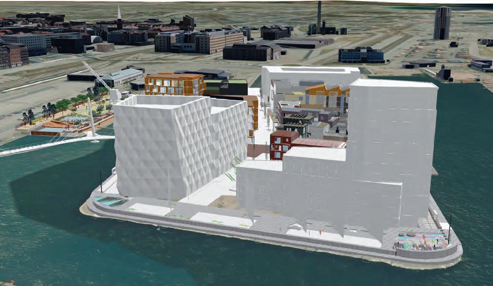
An increasing number of cities are creating 3D city models to support visualization and simulations in the urban planning process. The 3D city models are often extended with planned buildings. One way to facilitate this is to add simplified building information modelling (BIM) models of the planned buildings to the 3D city model. This article summarizes some of the recent academic and industrial studies of this topic.
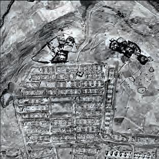
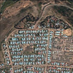
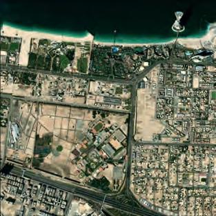
There are several commercial and opensource tools for integrating BIM data into 3D city models (Figure 1). The integration is complicated, as it requires transformation between different information models (ontologies), e.g. between the open BIM format Industry Foundation Classes (IFC) and the open 3D city model format CityGML. The transformation of geometries is also challenging and includes a conversion from solid modelling (used in BIM) to boundary representations (used in city models). In 2019, a GeoBIM benchmark was launched to study the interoperability in the GeoBIM domain, where GeoBIM stands for an integration between city models and BIM. The benchmark – which was coordinated by the 3D Geoinformation Group at TU Delft, the Netherlands – focused on the interoperability of tools implementing the CityGML and IFC standards, as well as on tools for conversion between the standards. For the latter, some extract, transform & load (ETL) scripts (mainly from Safe Software) were evaluated, and several software tools were tested on four datasets. One conclusion drawn is the problem that IFC files are modelled in different and incompatible manners in terms of the IFC elements that are used and their structure. This makes it challenging to write generic programs to convert IFC data to proper CityGML models. In addition, most IFC elements in the benchmark were translated into generic CityGML objects, which in practice would require manual inspection and modification. To tackle these challenges, the
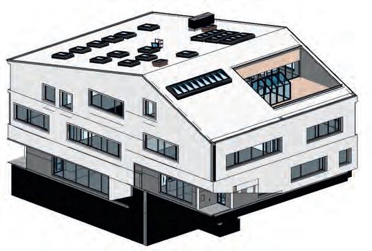
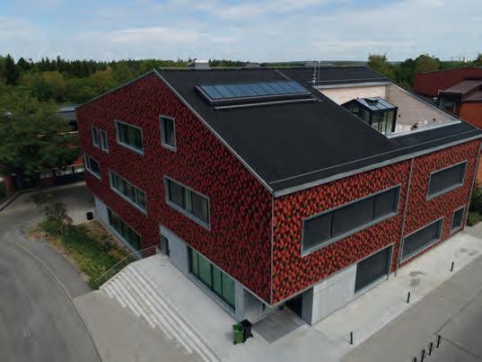
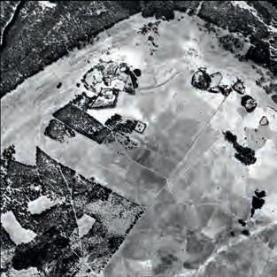
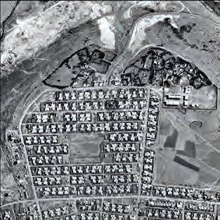
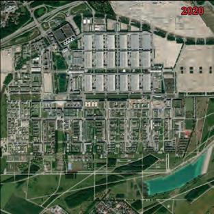
Figure 2: KTH educational building (left) and the BIM model (right). (Image courtesy: City of Stockholm and Christensen & Co Architects)
architecture, engineering and construction (AEC) domain needs to reach consensus on the standards and guidelines concerning how to model IFC models (such work has been conducted at national level in several countries). More efforts are also required to standardize the city models. Note that the latest version of CityGML (3.0, which was approved at conceptual level in September 2021) introduces some concepts to improve its interoperability with IFC.
extRacting Building geoMetRies fRoM BiM data to update 3d city Models
As-built BIM models can be used as an alternative to on-site surveying to update 3D city models. In one case study to evaluate the geometric aspects of this process, the first step was to formulate new measuring guidelines (for several levels of detail) for the building theme in a 3D city model. The guidelines were based on several Swedish guidelines for geometric representations on data exchange, documents from the German SIG3D project, and a number of research papers. Since the guidelines are detailed and lengthy, it was decided to only include one example rule here, stating when to divide a building into building parts or building installations: “The parts of the building that differ due to physical aspect should be modelled as separate building parts or building installations if any side of the parts is longer than 2m or the area of the part is larger than 2m2, or the difference in roof height is longer than 2m”.
The measuring guidelines were used to extract geometric information of three buildings, including the educational building at KTH, Stockholm (Figure 2). Two people performed the geometric information extraction in parallel. The first person utilized 2D building footprints and airborne laser scanning (ALS) point clouds (point density: 12 points/m2). This input data was modelled using standard ALS methods and ETL tools to generate the geometric models. The second person used BIM as input data to other ETL processes to generate the models.
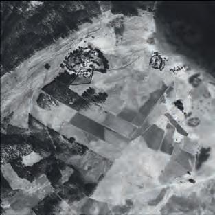
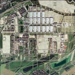
The resulting building models for the KTH building are shown in Figure 3. The relative geometric differences between the models are marginal, with RMS values in the size of a few decimetres in the horizontal plane and around one decimetre in the vertical dimension. Since the BIM models were not georeferenced, the absolute geometric differences could not be evaluated. One apparent difference between the generated models is that the model created from BIM data includes a greenhouse on the terrace. This greenhouse is not included in the model from ALS/footprint data, as the greenhouse is made of glass which results in a low number of points in the ALS data. Neither of the models represented the roof overhang at the entrance. ALS data is not capable of identifying such an overhang, and the person using BIM data lacked instructions in the measurement guidelines about how to handle roof overhangs.
The study confirmed that BIM models can potentially be used to update city models with new buildings. A main lesson learned is the need for good measurement guidelines that allow multiple data sources to be used.
Requesting BiM data on queRy level
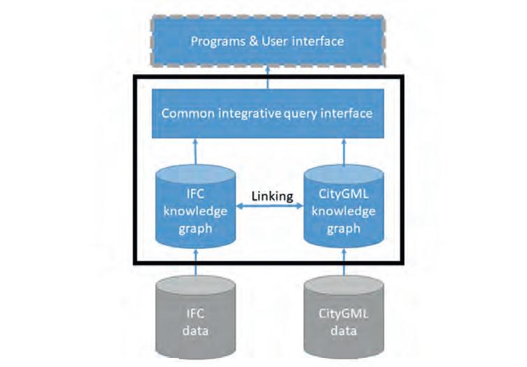
In the previous study, BIM data was transformed into CityGML and integrated into the 3D city model. An alternative approach is to keep the BIM data and the city models in separate data repositories and create a common query interface instead. In this manner, an application can utilize both data sources. Integration on query level requires that the information models for the 3D city models and BIM data are interlinked. One
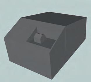
Figure 3: Resulting models of the KTH educational building based on ALS data and the 2D footprint (left) and BIM data (right).
plausible solution to achieve this is to create a knowledge graph (linked data) from the two data sources, where the respective ontologies are aligned. Knowledge graphs are increasingly used to break data silos in various domains, but are only sparsely exploited in GeoBIM, partly due to the difficulties in handling geometries in knowledge graphs. However, work is ongoing to define ontologies for 3D city models, e.g. based on the CityGML data schema, and ontologies in the BIM domain, such as ifcOWL and BOT.
Solar neighbourhood simulation is one application that requires both city models and BIM data. The modelled incoming solar radiation is used to estimate the indoor daylight comfort and also energy savings. Solar neighbourhood simulations require simplified building geometries that can be retrieved from city models, as well as window information, which is seldom presented in city models but can be extracted from BIM models. In order to evaluate the applicability of the knowledge graph approach, a case study was conducted with one building available as IFC model and converted to CityGML. Data from both sources was transformed into knowledge graphs based on their respective ontologies (CityGML and ifcOWL/BOT) and linked to the building instances using a commonly used vocabulary (Figure 4). The knowledge graphs were stored in an RDF store. The query interface partially utilized the OGC standard GeoSPARQL – an extension of the query language SPARQL. The system architecture enabled queries such as finding the total window area of the building and extracting the geometries of all the windows in the building.
Several challenges remain before a common query interface to knowledge graphs can be used in a production environment. The ontologies have to be further developed and they should be interoperable and well aligned. This is one important theme of an ongoing cooperation between OGC (from the geospatial side) and BuildingSMART (from the BIM side). On the data level, there is a coordination challenge of defining responsibilities and practices in setting common IDs and handling them through the life cycle. From a technical perspective, it is challenging to develop efficient RDF stores for querying and storing the geometries of 3D data. Finally, from an end-user perspective, the support of knowledge graph (RDF) data from relevant programs is a prerequisite, i.e. they should ideally implement a SPARQL interface. Despite these challenges, the authors believe that the knowledge graph approach has great potential in GeoBIM.
conclusions
This article has discussed the opportunities and challenges associated with utilizing BIM data together with city models. Experience has shown a large potential for utilizing BIM data in several applications to update and enrich city models. However, the technical solutions should be guided by a comprehensive understanding of the target applications.
FurthEr rEading
- noardo, F., Harrie, l., arroyo ohori, K., Biljecki, F., ellul, C., Krijnen, t., eriksson, H., Guler, D., Hintz, D.,
Jadidi, M.a., Pla, M., sanchez, s., soini, V.-P., stouffs, r., tekavec, J., and stoter, J., 2020. tools for BiM-Gis integration (iFC Georeferencing and Conversions): results from the GeoBiM Benchmark 2019. isPrs int.
J. Geo-inf., 9, 502. https://doi.org/10.3390/ijgi9090502 - sun J., olsson P.-o. eriksson H., and Harrie l., 2019. evaluating the Geometric aspects of integrating BiM
Data into City Models. Journal of spatial science. https://doi.org/10.1080/14498596.2019.1636722 - Huang, W., olsson P. o., Kanters J. and Harrie l., 2020. reconciling city models with BiM in knowledge graphs: a feasibility study of data integration for solar energy simulation. isPrs annals of Photogrammetry, remote sensing and spatial information sciences. 4/W1 ed.
Copernicus Publications, Vol. 6. p. 93-99.
about thE authors
lars Harrie is a professor of geomatics at lund university, sweden. His research interests include digitalization of urban processes, spatial analysis and cartography.
perola olsson is a researcher in geomatics and remote sensing at lund university, sweden. His research interests include digitalization of urban processes and 3D data modelling.
Weiming Huang is a researcher in geographical information science at lund university, sweden, and shandong university, China. His research interests mainly lie in the areas of geospatial data integration and mining.
Jing sun is a PhD candidate in geodesy at the Department of real estate and Construction Management of the KtH royal institute of technology, stockholm, sweden. Her research interests include geodata quality and analysis, BiM, 3D cadastre and city models.
Multi-disciplinary Trend Detection, Analysis and Forecasting from Aerial Film Archives The What, Where and When of Past Events
Only a small fraction of the information content in aerial films has ever been recorded on paper maps, most of which are inaccessible. The use artificial intelligence (AI) to fully automate the process of information extraction from imagery will soon unleash the true value of this information by enabling the creation of land cover maps of all the world’s countries stretching back to the 1930s.
From the 1930s to about the year 2000, much of the world was captured at regular intervals on high-resolution aerial film using aerial mapping and reconnaissance cameras, by national mapping organizations,
1957
defence organizations and private mapping companies. During that time, the Earth has been transformed by massive industrialization and urban growth. The Earth’s population increased threefold from two to six billion people, tens of millions of kilometres of roads were constructed, billions of houses were built, global GDP increased fourfold, and large areas of forest and grasslands were transformed into agricultural fields and towns.
These changes to the Earth are recorded on millions of rolls of aerial film that mostly lie locked way in archives and remain inaccessible. Unfortunately, due to past technical limitations and laborious manual feature extraction, only a small fraction of the information content in these films has ever been recorded on paper maps, and most of these are no longer accessible and not digitized. Many of the films are deteriorating, or even worse are being disposed of as the storage costs are considered too high. However, these films record the heritage of our changing world and are a highly valuable resource if they can be accessed.
UnlEashing ThE TrUE valUE
Until now, scanning the films was a very slow and expensive process. For most organizations, the majority of their archive is therefore still inaccessible, except for bespoke and costly scanning of individual frames. The true value of the archive is only achieved when the data becomes easily accessible as
1971 1984 1994
2002 2007 2019
a complete digital archive. Once all the films are scanned and georeferenced, they can form temporal imagery layers that can be quickly viewed to identify changes and trends and to make predictions.
Traditionally, human operators were required to extract information such as the location of buildings, roads, tracks and boundaries. This was a very time-consuming and expensive exercise. Conventional data acquisition concentrated on collecting data as individual objects using a standardized mapping schema. Only specific objects were recorded based on whether they were of specific interest and were of a sufficiently large size. The environment at that time was widely ignored and poorly documented. It is estimated that only about 5% of the information in these films was ever extracted and a fraction of this remains in a digitally accessible form.
ThE UsE of arTificial inTElligEncE
This has now all changed. It is now possible to use artificial intelligence (AI) to fully automate the process of information extraction from imagery. If a human operator can identify a feature, then AI can do so too as long as it is provided with sufficient training datasets. The deep learning models are advancing rapidly, and techniques such as transfer learning are significantly reducing the number of training datasets required.
In a similar way in which Esri, The Impact Observatory and Microsoft were able to generate 10m land cover maps of the entire world using recent multispectral Sentinel-2 images, it will soon also be possible to create similar land cover maps of each country of the world stretching back to the 1930s based on training and running AI on higher-resolution panchromatic and colour imagery. The spectral depth of the multi-spectral satellite imagery can be replaced with the context obtained from the higher-resolution stereo aerial imagery. The existing aerial photography was nearly all flown with 60/30 overlap, meaning that there are between three and five separate views of each location. This independent measurement redundancy will further increase the obtainable accuracy.
land covEr maPs
These land cover maps will provide real statistics on how the planet has changed. Moreover, creating multiple temporal data points will enable us to determine accurate trends in various domains and hence to better predict the consequences of future development measures. These data points in time can be correlated with other measurements to better understand the cause and effect that humans have on the environment, as well as the changes that must take place to avert a global environmental disaster.
Land cover maps also enable simple change detection and anomaly detection for the identification of features currently lost to more recent human development or natural erosion processes. Further, review of the imagery provides irrefutable evidence that is not available in older paper maps which are based on human interpretation and biases.
snaPshoT of ThE World
A single image in time provides a snapshot of the world. That in itself is fascinating. We can identify things that have been lost in time and draw accurate conclusions on aspects such as property boundaries, forest extents, levels of infrastructure, and the location and structure of buildings that may no longer exist. A series of pixel-aligned georeferenced images tell an even greater story. The significance is created by the time-lapse effect, similar to a movie clip composed multiple of images, highlighting gradual movement and changes over time. Therefore, observing temporal orthoimages enables us to instantly identify objects that have changed or been displaced, even when in the displacement has been too slow to be noticed on site in real time. The time-lapse effect allows us to identify developments at an early stage, when we can still identify the cause and consequently have the opportunity to respond to the trend. Waldo Tobler’s first law of geography states that “Everything is related to everything else, but near things are more related than distant things”. The definition of “near” is not only spatial, but also applies to time. Everything affects everything: an axiom!
saTElliTE imagEry imProvEmEnTs
Space-based imagery has been available since the 1970s. With the exception of the Corona Satellite photography imagery (about 1960-1970) that had approx. 3m resolution and was kept highly secret for about 30 years, the only wide-area satellite imagery coverage was from the Landsat programme which at that time had 60m resolution. Most aerial imagery between the 1930s and 2000 was captured at sub-metre resolution, and cities often at decimetre resolution.
The resolution of commercial satellite imagery has improved immensely since then. In 2000s,
1965 1986
1998 2020
1945 1963 1978

1994 2006
2020
1m resolution imagery became accessible, and today accurate global 1m resolution imagery is available along with accurate digital terrain models. The massive volumes of highresolution satellite and digital aerial imagery is providing us with an accurate definition of our world today, but to really understand the trends we need to look back at the changes that have taken place over many decades. The availability of such accurate highresolution basemap and digital terrain models greatly facilitates the georeferencing and orthorectification of the older aerial imagery to enable suitable simple comparisons.
solving sToragE challEngEs
Whereas storage costs were a challenge in the past, these have been superseded by massive increases in hard disk storage and relatively inexpensive cloud storage costs. A single 15um 8bit panchromatic image can be compressed from about 250MB to about 75MB with minimal quality loss. An aerial film archive of a thousand roles of aerial film will contain approximately a quarter of a million images and require about 18TB of storage, which nowadays would fit on a couple of hard disks or can easily be uploaded to cloud storage. Moreover, the computing cost for AI is low and so what was previously inconceivable is now quite possible. GeoDyn is revolutionizing the accessibility of aerial film archives by developing highly advanced photogrammetric aerial film scanners capable of transforming these aerial films into quickly accessible, accurate digital images that maintain the full information content. With PromptSCAN, the conversion speed is now 50 times faster and a magnitude cheaper than was previously possible. In addition to scanning, GeoDyn also provides highly efficient workflows for accurately georeferencing these images to create temporal image maps and the extraction of information to enable the identification and quantification of change.
TrEasUrE TrovE of informaTion
Once accurately scanned and georeferenced, these digital images provide a treasure trove of valuable Information. They enable us to determine the ‘what, where and when’ of past events. Using new machine learning and data mining technologies, we can now trace how the Earth has transformed, categorize the kinds of changes that have taken place and help to predict future trends.
GeoDyn was founded by a team of photogrammetrists. The vision is to unlock the information recorded in aerial film archives around the world and convert it into temporally sequenced maps so that humanity can fully understand the Earth’s geopolitical, climatic and industrial development over time. Between them, GeoDyn’s employees have over 200 years of experience in the aerial survey industry. The company provides full-service aerial film conversion, georeferencing and information extraction. In addition to the development of high-speed aerial film scanners, GeoDyn has developed technologies that enable the rapid and accurate conversion, georeferencing, rectification and delivery of aerial imagery.
As an Esri Gold Level business partner, GeoDyn assures full integration with ArcGIS. All images become accessible as both temporal base maps and dynamic image services, enabling the full information content of the imagery to be accessed in a wide range of applications for visual interpretation, automated feature extraction using machine learning, and data analytics.
More InforMatIon
a sample selection of georeferenced multi-temporal aerial images can be viewed at www.geodyn.com.
Airborne Photogrammetry: Still Going Strong after 100 Years
Airborne photogrammetry has been around for more than a hundred years. As early as 1851, the French inventor Aimé Laussedat began imagining the possibilities of using the newly invented camera to capture reality through pictures for mapping purposes. Some 50 years later, the technique was successfully employed, and photogrammetry emerged as a long-range landscape measurement technique through analysis of analogue photographs. In the 1920s, Heinrich Wild took professional photogrammetry to the sky with WILD’s first aerial camera, the C2. In the following 80 years, the industry progressed from analogue to digital cameras, fulfilling the dream of photogrammetrists to quickly create detailed maps.
Photogrammetry today
Today, after 100 years of continuous innovation in airborne photogrammetry, entire countries can be mapped faster than ever before. The exponential technological advancement since the digital era has led the industry to evolve, grow and excel. Developments in cloud computing and artificial intelligence (AI) on the processing side as well as sensor miniaturization and chip technology on the hardware side have opened up new opportunities. Every IT innovation propels the industry to new heights.
Several industry trends have led to the increasing demand for geospatial imagery in recent years. With our world changing faster, more frequent refresh rates are required and mapping cycles have accelerated. Customers now want to capture larger project areas at increasing measurement density, while budgets decrease. Other considerations are open data policies and growing interest in monetizing the captured data. As geospatial data becomes more important, more and more stakeholders are involved in the procurement process. All these trends drive the need for increased productivity and new, creative business models.
InnovatIons In technology
The fast evolution of complementary metal oxide semiconductor (CMOS) sensors is delivering higher resolutions. Advancements in cloud technologies and GPUs result in greater processing power and capacity. AI and machine learning (ML) enhance data extraction capabilities. The miniaturization of components means more and more features fit into one instrument. The Leica CityMapper-2 hybrid oblique imaging and Lidar sensor is one example of how miniaturization has enabled what was not possible previously. It contains a Lidar system, data logger, GNSS/INS system and six cameras in one compact package. This enabes it to fit in the same space as past cameras, while its all-in-one package design improves reliability. The same concept applies to software: multiple apps with unique functionality have become part of a unified high-performance multi-sensor workflow platform: Leica HxMap.
Big IT is driving the photogrammetry revolution on the data and processing side. Customers now have the ability to process

data in the cloud using platforms like HxMap, spinning up between 2,000 and 20,000 machines to accelerate processing and scale their capacity as needed. With AI and ML unlocking analytics, automatic feature extraction and object detection, we can put geospatial data to use in different ways. For instance, instead of trying to understand natural disasters after they happen, we can start mining information in advance to create contingency plans. Cloud services enable the hosting and streaming of geospatial data in one central place, providing an easy method for consumption, distribution and access for all.

the FUtUre
The future of photogrammetry lies in hybrid sensors which capture imagery and Lidar data simultaneously. In fact, at Hexagon we believe in this so strongly that we do not envision imaging-only systems to remain viable as customers’ expectations exceed the capabilities of such systems. Instead, hybrid systems enable the capture of more data from every fl ight, allowing digital twins to become more effi cient and affordable for a larger customer base. While the past 100 years of photogrammetry have been exciting, I have no doubt the next 100 years will be even more remarkable.

Leica CityMapper-2.
Imagery and Lidar data simultaneously captured with the Leica CityMapper-2 provides detailed 3D digital twins of cities for more informed decision-making.
ABOUT THE AUTHOR
John Welter is the president of Geospatial Content solutions at Hexagon’s Geosystems division, based in Washington D.C., usa. With three decades of extensive and demonstrated experience in the information technology and services industry, Welter is an expert on topics including geospatial services, airborne mapping technology, big data concepts and it strategy.


Innovation Drives the Continuous Evolution of Data Visualization
Data visualization is inherent to humans and continuously evolves, driven by innovation. The term has come into popular usage relatively recently, but the concept actually goes back to the earliest days of humans many thousands of years ago: from the first people scratching out their location in relation to food sources or to one another. Needless to say, the expression of data visualization has changed and evolved many times through the ages, accelerating with each new related technological innovation.
Data visualization is an inherent human trait because our survival depends on it for food, trade and security. We can see this throughout history. The first people sketched the relative locations of food and water sources and other geographic features and phenomena, initially on the ground. As they developed tools and pigments, they illustrated this information on cave walls, some of which are still preserved today around the world. Land boundaries were demarcated with monuments, and physical descriptions were verbally communicated to establish geographic locations for land ownership. Chapters 13-21 in the Book of Joshua in the Old Testament Bible and Jewish Scriptures, from approximately 1400 BCE, contain a detailed description of the boundaries of the 12 tribes in enough detail that they have been placed on maps with a fair level of accuracy. Since then, Arab, Asian, Mediterranean and Polynesian sailors have navigated with instruments to ply trade routes thousands of miles from home.
The invention of papyrus and paper enabled geographic data to be visualized better, faster and cheaper. This important innovation led to the development and use of maps as we know them today, and cartography emerged as the prominent way to visualize location data. Travel for warfare, pilgrimages and trade further drove the development of mapping. Exploration in the 14th and 15th centuries exploded the need for mapping and catapulted the ancient marine navigation techniques onto rhumb lines, or Portolan charts, which evolved into modern-day nautical charts. The invention of the printing press allowed cartographers and printers to meet the growing appetite for maps to visualize the data coming back from the New World with every voyage. Innovations in shipping allowed for circumnavigation of the Earth, and a new kind of data visualization was required with terrestrial globes, celestial globes and armillary spheres to visualize the Earth and stars in 3D. The age of exploration was quickly followed by the ‘golden age’ of cartography to meet the visualization needs of the ensuing global trade that emerged and location data at these terminals. In the 18th and 19th centuries, many innovations in measurement and surveying led to a higher level of accuracy and larger-scale mapping, which dramatically improved data visualization at new scales.
Imagery and gIS changed everythIng
In the 20th century, visualization of geography changed dramatically with the invention of the aeroplane that was quickly adopted by many nations’ militaries. They put cameras on board and intelligence, surveillance and reconnaissance (ISR), and visualization of geographic data and mapping were revolutionized. Imagery joined mapping as one of the key geographic and cultural visualization tools. Mapping itself was changed forever as imagery became the primary source for change detection and feature mapping. This accelerated the need to map more quickly, and innovations in photomechanical reproduction methods began to replace hand-drawn maps.
In the 1960s, technological innovations enabled computer-assisted cartography and geographic information systems (GIS) to revolutionize how data was visualized and Early examples of data visualization in history.
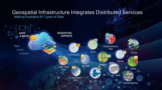
Figure 1: GIS integrates all types of data for visualization and analysis. Figure 2: GIS leverages technology innovations.
analysed. Data was no longer compiled and produced for a single point in time, only to quickly degrade. Instead, the results of efforts to capture and produce the map data could now be stored in computers, which allowed the data to be updated and continually reused. As this process was further refined in the 1970s and 1980s, organizations were able to free up resources to leverage the data for many different uses.
I learned this first-hand in 1992, when I started using GIS as a production manager at a Silicon Valley start-up that was on its way to becoming the largest provider of routing map data for in-vehicle navigation systems and eventually the internet. Automotive manufacturers around the globe wanted the data to deliver turn-by-turn instructions to drivers. However, the data itself was not enough. The car companies were not successful until we provided the cartographic attributes in the data model to allow each company to visually render a map to their specifications. In a very short time we enabled many different automotive companies to each visualize the data uniquely to their brand. The map data we created was consumed and visualized by many different organizations and in many different cartographic styles. That same map data was used for cartographic paper maps and digital maps that eventually went into apps and web services.
InnovatIng wIth locatIon data
While we were using GIS on cutting-edge technology in Silicon Valley, the rest of the world was beginning to discover GIS for many different applications. It is a widely accepted fact that 80-90% of the data around the globe has an underutilized location component. GIS leverages that location data attribute and enables the data to be visualized and analysed to derive additional value and uses. Even non-GIS people can take advantage of their data by visualizing it in dashboards and further analysing it to discover new insights using a simple but powerful browser-based GIS app.
Data can now be created, visualized, analysed and utilized in apps in desktop, enterprise, mobile, web and cloud GIS environments. The data can be shared easily, integrated harmoniously and add value to applications across a myriad of government and industry activities, covering thousands of use cases. The different types of data are as diverse as vector, imagery, Lidar/point clouds, terrain, 3D, textured mesh and multidimensional data, voxels, CAD/BIM, tabular and unstructured, big data and real-time (IoT) (see Figure 1).
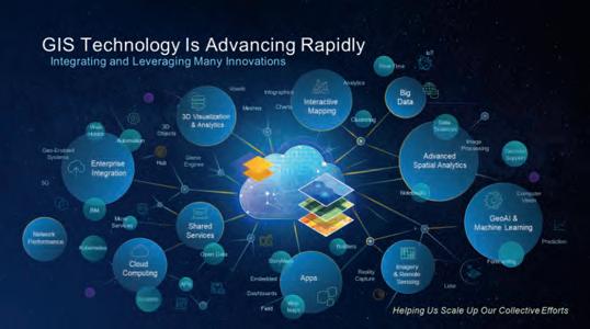
Increasingly, GIS is being used to make sense of the exploding volume, velocity, veracity and variety of data coming at us every day. GIS allows us to do geoprocessing of big data in the cloud utilizing containerization and microservices. GIS with AI and deep learning, or ‘geoAI’, enables us to data mine this big data to quickly perform change detection and identify, classify and extract information. This gives us the ability to keep up with the blizzard of data coming from imagery and remotely sensed data services streaming from satellite, airborne, terrestrial, marine and drone platforms (see Figure 2).
how to make data actIonable
So the inevitable question is, how do we make all of this data actionable? In his book titled Information Anxiety, Richard Saul Wurman (founder of TED Talk and TED Conference) wrote: “To deal with the increasing onslaught of data, it is imperative to distinguish between data and information. Information must be that which leads to understanding.” And as he has famously stated, “Understanding precedes action.”
GIS enables us to visualize our data and turn it into information using geospatial analysis. With human interaction and innovation, that information can be transformed into knowledge, insight and understanding as the basis for more effective actions and decisions. Today’s mapping and geospatial authorities play a key role in this.
Further reAding
innovating with Data, Brent Jones, esri understanding Precedes action – and Geography Maps the Course (including quotes by richard saul Wurman) esri.com/maps
About the Author
mark cygan has been working in Gis and mapping since 1984. today, he is director of esri’s national Mapping solutions, having been in esri’s industry solutions Group since 2005. Before that, he worked for nearly a decade as a senior consultant and project manager in esri’s Professional services. Prior to joining esri, Cygan was on the management team at naVteQ (now Here), a pioneer in digital mapping for in-vehicle, web and mobile uses. Cygan is actively participating in the united nations Committee of experts on Global Geospatial information Management (un-GGiM) as a un-GGiM Geospatial societies board member (and past chair), is the executive secretary of the user Community of Geospatial authorities and is on the board of directors of the international Map industry association (iMia). mcygan@esri.com
From the Perspective of Developers and Users
The Photogrammetric Platform Strategy Approach
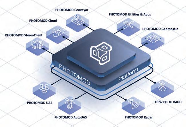
‘Platform’ has become somewhat of a buzzword nowadays and is widely used in the context of economics, finance, social networks and IT. At Racurs, however, they believe it is more than just a buzzword and have been implementing the platform strategy approach for the development of software products since 2020. This article introduces the concept of a photogrammetric platform that is built upon the software set of the PHOTOMOD system.
As repeatedly confirmed by market research, the last couple of decades have seen explosive growth in spatial data processing technologies. Photogrammetry is no exception, despite its long history. New user queries are emerging, dozens of remote sensing data satellites are being launched, and new sensors and hardware are being developed. In response to these changes, developers of photogrammetric solutions have to quickly adapt their solutions to the market – not only at the functional level, but also at the level of photogrammetric manufacturing systems. Likewise, the implementation of photogrammetric technologies is a complex process that entails many factors. In both of these cases, a platform strategy approach can offer a solution. The concept of the platform in its two applications – photogrammetric developer platform and photogrammetric user platform – is examined below.
DeveloPer PlATform
Data processing methods, calculation algorithms, processing chains and so on are all key in the development of highquality products. Reliable operation of the algorithms and methods enables two main functions of the photogrammetric platform from the point of view of product development: configuration and customization.
• Configuration: Algorithms of photogrammetric processing must work well in different computing environments and operational systems – from a laptop to a cluster, and from a local company network to global cloud services. Photogrammetric platform software must also support stable operation in the course of geodetic fieldwork where there is no internet access, or in large enterprises equipped with modern cluster systems and gigabit networks. The development of cloud technologies and the improvement of data transmission speed is removing limitations on the creation of remote workspaces, but it remains crucial to follow all the stages of photogrammetric data processing. Stereoprocessing was a limiting factor for a long time, but this problem has been solved as well. PHOTOMOD StereoClient enables users to connect to a server via the internet and access PHOTOMOD data, projects and software as well as execute stereovectorization and stereomeasurements remotely using ‘thin client’ technology in the same way as on a local computer.
• Customization: Implementation of current data processing algorithms facilitates fast software solutions in line with the needs of clients from different industries. For instance, the StereoMeasure app was developed for forest evaluation needs. This app is based on PHOTOMOD stereocapabilities. New user solutions can be developed by building processing chains from software modules that are using algorithms. For example, PHOTOMOD AutoUAS is ‘one-button’ software for unmanned airborne system (UAS) data processing that is based on the same algorithms and methods as other PHOTOMOD photogrammetric platform products.
One of the most important features of a platform is the network effect, i.e. the The photogrammetric PHOTOMOD platform structure.
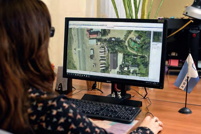
Photogrammetrist at work. 3D model of the city of Graz, Austria.
platform value grows as the number of users grows. Can it be said that software products, especially ones as complex and specialized as photogrammetric products, create a network effect? The two important features of the platform mentioned above – configuration and customization – are key to create a network effect. The number of users of photogrammetric products is growing; the market is no longer limited to the classic aerial and satellite survey industry. The rapid development of new functions and applications on the basis of reliable algorithms allows photogrammetric technologies to be implemented in various areas, often far removed from geoinformatics. This is driving not only growth in the number of users of the photogrammetric platform, but also growth in its value.
USer PlATform
The photogrammetric software that is being developed must support the efficiency of the user platform in terms of both financial resources and human resources. From its own long-standing experience, Racurs knows that two features must be taken into account when developing the user platform development: scaling and integration.
• Scaling: The number of specialists involved in the production – whether one specialist in a small company or dozens of staff members in large national mapping agencies or cartographic agencies – is irrelevant to the effective implementation of the photogrammetric platform. The platform must enable easy restructuring of the production workflow and be adaptable to the number of users. Historically, PHOTOMOD is based on a modular architecture in which each programme module is designed for the execution of the required operations at each project stage. Such an architecture allows large photogrammetric production systems to be built. For instance, when the PHOTOMOD platform was implemented in Uzbekistan as part of the creation of the National Geographical Information System, 60 workspaces were arranged within the shortest possible period of time by optimizing the number of modules and adjusting the network processing.
• Integration: Due to the wide variety of photogrammetric processing tasks, the implementation of only one general-purpose product is ineffective. Clients may have different queries that are subject to change, while enterprises evolve and may shift their focus onto other types of production. As the number of programmes and separate modules increases, it is important to ensure their mutual integration. This requires platform components to use the same algorithms and methods, to complement each other in terms of technology and to have a common system of data storage and data management. This allows the development of optimal processing chains for remotely sensed Earth observation data on the basis of different software solutions, while taking different levels of user expertise into account. For example, algorithms with a high level of automation and reliability facilitate automatic photogrammetric processing without requiring the involvement of experienced photogrammetrists. In the case of strict confidentiality and precision requirements, however, all the stages of data processing must be supervised interactively by an experienced specialist.
So is it possible to achieve a network effect for a user platform? The photogrammetric platform creates an intermediate link between the source data and end users. This intermediary position complies with the network effect concept. In other words, the photogrammetric platform acts as a kind of bridge – not only connecting operators of remotely sensed Earth observation data with end users, but also connecting end users with one another.
Apart from the developer platform and the user platform, Racurs’ development strategy involves collaboration with technology and production partners as well as scientific and educational organizations. The company firmly believes that this approach based on mutual support and development will allow it to create a truly valuable photogrammetric platform.
More InforMatIon
https://en.racurs.ru/


