e-mail: gonchar.anastasiya@bk.ru
tel: +382 68 441979


e-mail: gonchar.anastasiya@bk.ru
tel: +382 68 441979
Dear Admission Committee,
I am writing to express my strong interest in the architecture program at your esteemed university. I am a driven, capable, and responsible person with good visual skills, an ability to pay attention to details and delve deeply into the essence of projects.
My primary professional goal is to create such architecture that meets the needs of modern people, and work with space in a way that makes people’s lives more ergonomic and comfortable while also being safe, beautiful and environmentally-friendly. Your program’s emphasis on combining creative and engineering skills, aesthetic and technological quality, sustainability, and a healthy built environment resonates deeply with me. I hope my portfolio reflects my passion and ambition for architecture. I am eager for the opportunity to further my professional knowledge at your distinguished university.
Thank you for considering my application.
Sincerely,
Anastasiia GoncharBachelor’s degree of Urban Planning (completed 1 year)
Saint Petersburg State University of Architecture and Civil Engineering
Diploma of Secondary Vocational Education in Interior Design with distinction
Saint Petersburg State University of Industrial Technologies and Design
Art school graduate
Municipal Budgetary Educational Institution of Supplementary Education for Children «Children’s Art School»
date of birth: 01/04/1998
address: Herceg-Novi, Montenegro
e-mail: gonchar.anastasiya@bk.ru
tel: +382 68 441979
behance: gonchar_anastasiya
10/2023-02/2024
Freelance/Architect
Concept creation and design of a redevelopment project for Soviet public baths in Krasnoyarsk/ team work
2020-currently
Freelance/Interior Designer
Valuable works:
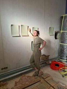
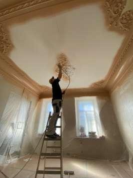
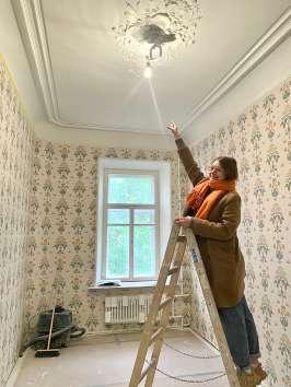
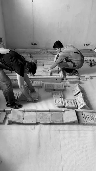
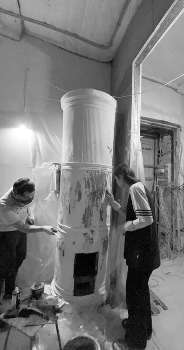
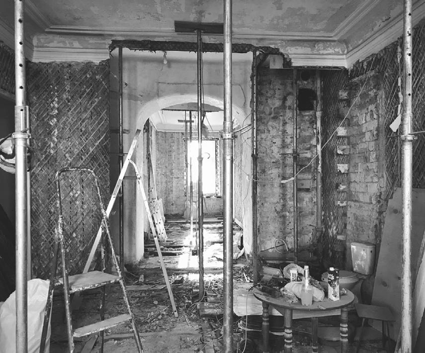
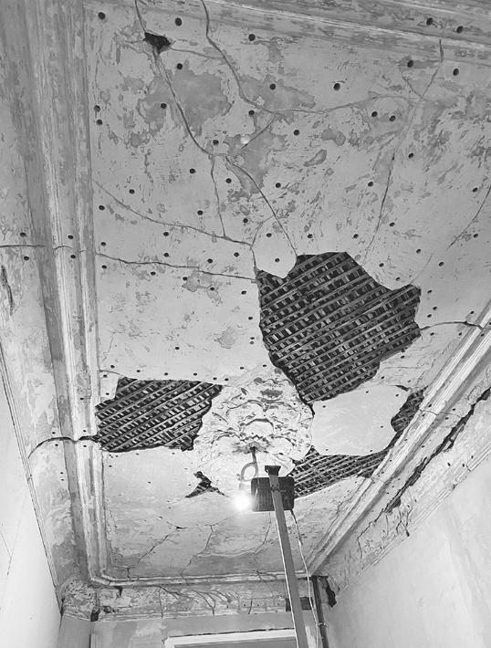
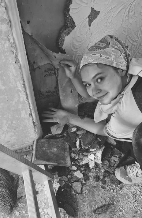
Project implementation in a historic building/ team work
Design project for an apartment for a young woman in Saint Petersburg
02/2020-07/2020
Mobelia Furniture Factory/3D Visualizer
Modeled realistic soft furniture and interiors to facilitate online shopping/ team work
03/2019-02/2020
4room Gallery/Interior Manager
Assisted in selecting furniture, lighting, tableware, and decor to complete public and residential projects, conducted presentation meetings, made photoshoots, managed social media pages/ team work
07/2015-07/2016
09/2021 - 07/2022
09/2014 - 07/2018
09/2009 -06/2014
Street Art Museum/Volunteer
Assisted invited artists from different countries in the implementation of their projects in the museum/ team work 1 project, 2 project
Graphisoft ArchiCAD
Autodesk Revit
Autodesk AutoCAD
Autodesk 3ds Max
Corona Renderer
Adobe Photoshop
Adobe Illustrator
Adobe InDesign
10/2022-01/2023
QGIS: Urban Analysis
Architectural Graphics in Illustrator School «Archiigraphic»
10/2022-11/2022
Workshop «How to Create Your Own Building»
School «Soft Culture»
Professor Daria Zaytseva of Moscow School of Architecture
2018-2019/2020-2021
Preparatory Courses in Architecture
Saint Petersburg State University of Architecture and Civil Engineering
03/2019-03/2020
3ds Max Course
School «Art Glück Education»
05/2018-12/2018
Interior Visualization and Modeling in 3ds Max + Corona School «Ilya Izotov»
09/2017-11/2017
Interior Visualization and Modeling in 3ds Max + V-ray «Art School»
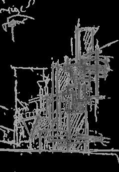
HAND
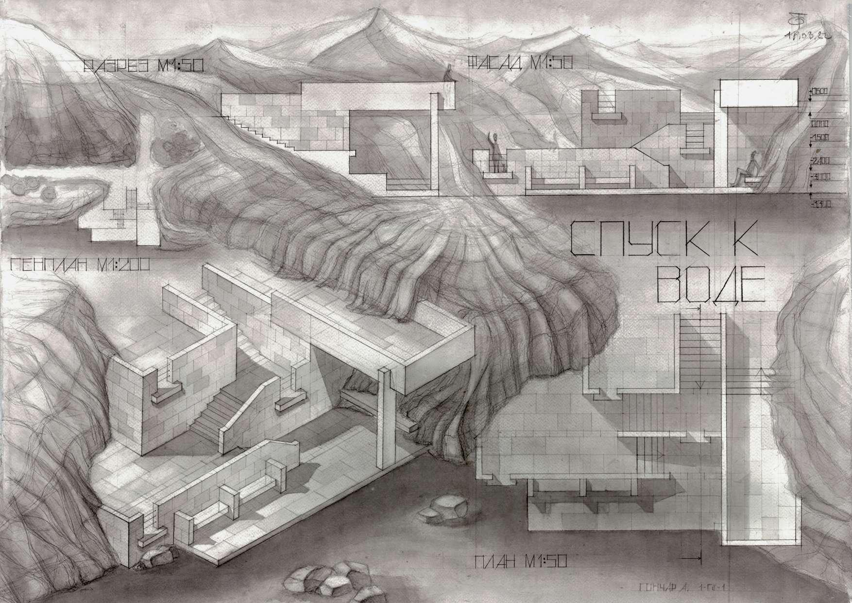
Descent to the water
Water rescue station
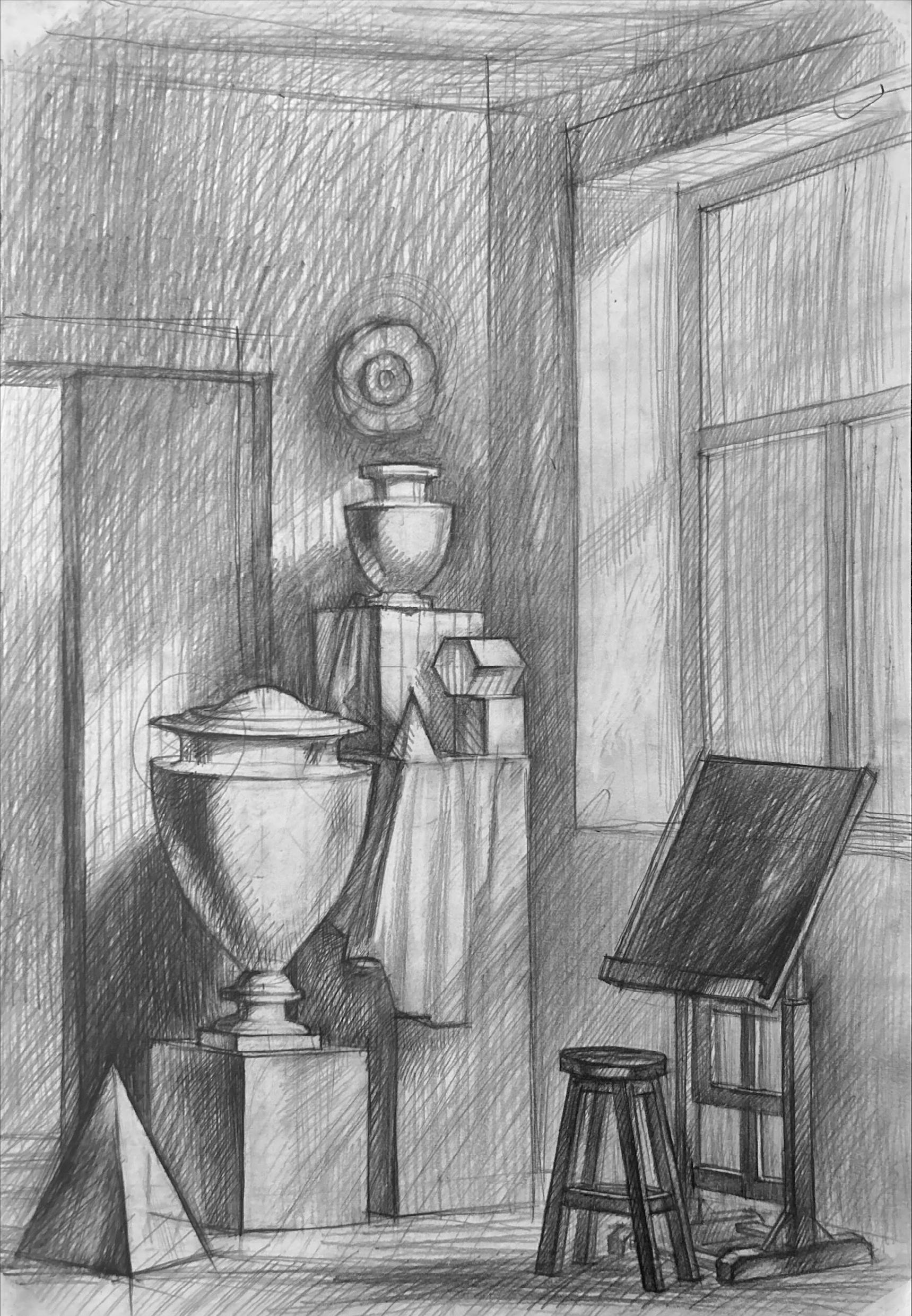
Hand-drawing of interior
Hand-drawing of composition
Diploma project of Vocational degree
Interior design in the historic apartment
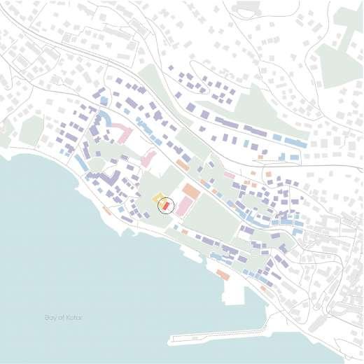
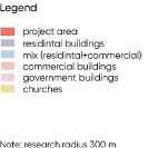
Urban analysis for Herceg-Novi city
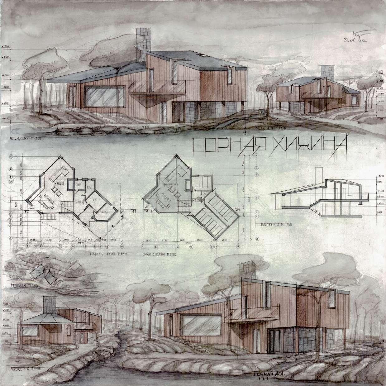
2022, 2 semester, final project/ Saint Petersburg State University of Architecture and Civil Engineering
personal/ academic
750x750 mm/ pencil, watercolor
Task:
I should design a hut in the forest that serves as a way-point for hikers and their guides. I had to incorporate the terrain’s elevation changes as a distinctive feature of the architecture, and design the levels of elevation so that each level could be viewed from the others.
Concept:
I decided to connect two simple modules (1 - common lounge area and 2 - bedrooms) at an obtuse angle to allow more natural light into the common space and to create a rhythm with the diagonals, which are also present in the plans and facades. Using natural materials and diagonals, I tried to give the house a cozy feel and blend it organically into the natural surroundings.
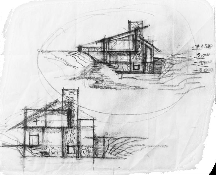
On the ground level, the hut includes a convenient storage room for equipment, two bathrooms, a drying room.
On the first level, there are a common area for relaxation with the second light, a kitchen and a stove that heats the house and dries clothes.
On the second level, from that you might see the common area of the first level, there are two bedrooms for the group, a bedroom for the guides, and a bathroom.
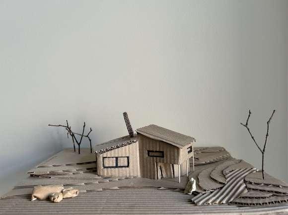
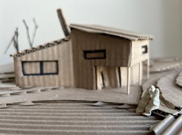
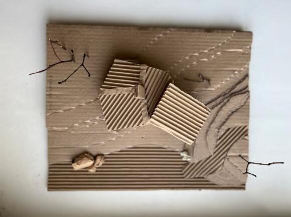
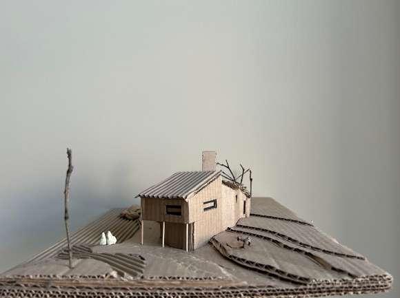
2022, 2 semester/ Saint Petersburg State University of Architecture and Civil Engineering
personal/ academic
550x750 mm/ pencil, ink
Task:
I should design a comfortable descent to the water, harmoniously blending it into the mountainous terrain using natural stone for cladding.
Concept:
My water descent features five levels with platforms where visitors can enjoy the views, take a break, and on one of them, find shelter from the scorching sun or rain and interact with the water.
I aimed to design a cascading form that seamlessly integrates into the natural landscape, thereby keeping the focus only on the surrounding nature.
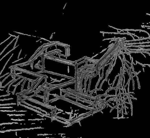
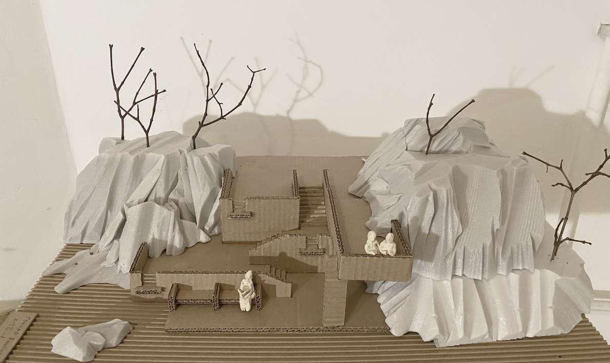
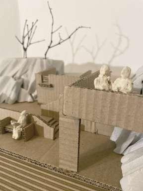
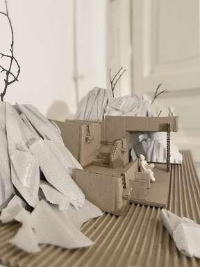
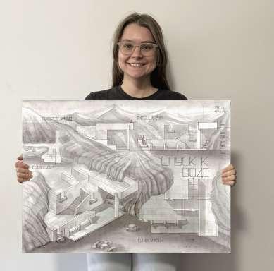
2022, 2 semester, Saint Petersburg State University of Architecture and Civil Engineering
personal/ academic
550x750 mm/ pencil
Task:
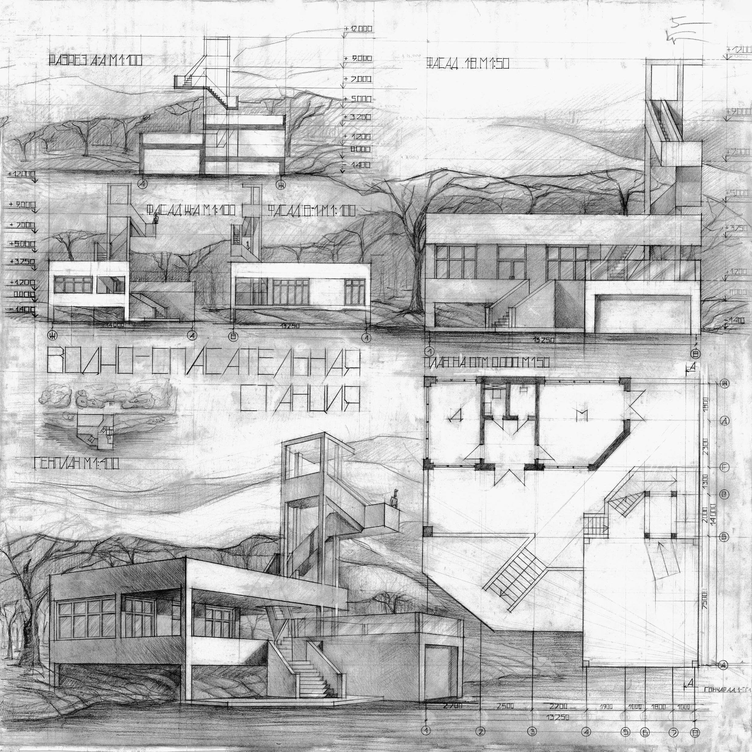
I should design a water rescue station on the shore of a reservoir, which had to include a doctor’s office, an office for water rescue officer, convenient access for stretchers, a bathroom with a shower, a garage for storing two boats, and an observation tower with sun protection.
As with previous projects, the architecture had to be integrated into the landscape and not detract from the surrounding natural beauty.
Concept:
As I felt that I was ready to work with more complex forms, I decided to use diagonal directions for the stairs and the tower’s shape in contrast with the straight and simple forms of the main building in this project.
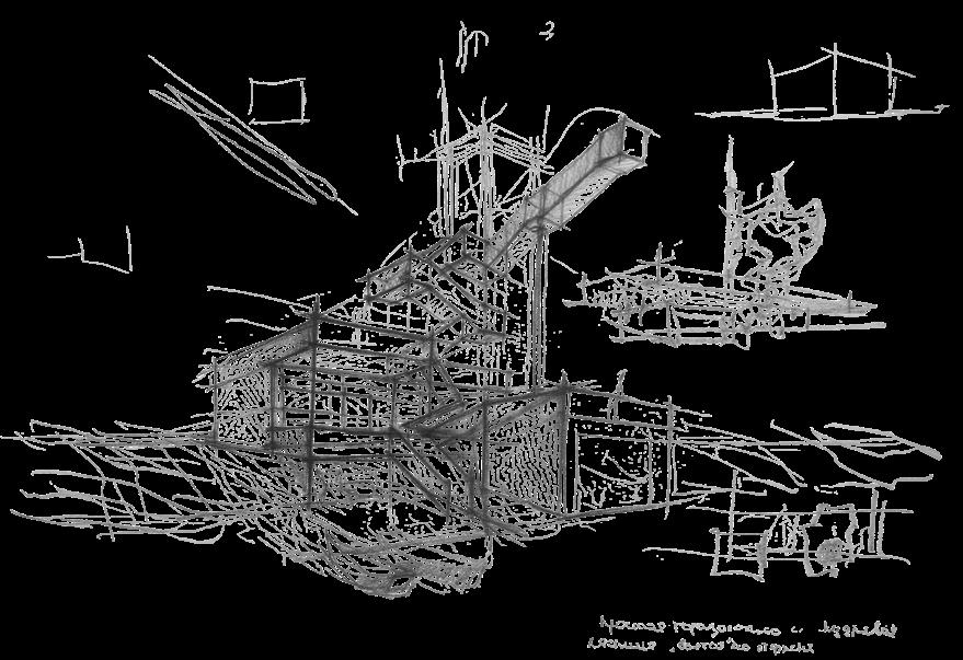
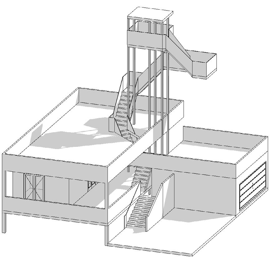

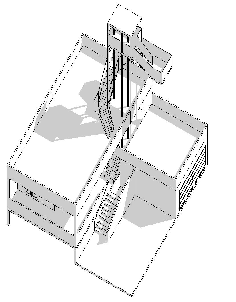
Traditionally, students start studying professional software later, in the second half of the second semester. However, I could not wait and decided to model my station in 3D using ArchiCAD to see how it looks, observe how the shadows fall, find the best angles, and compare it with my hand-drawn visual representation.
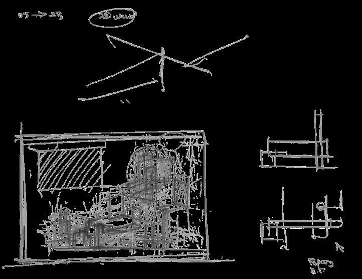
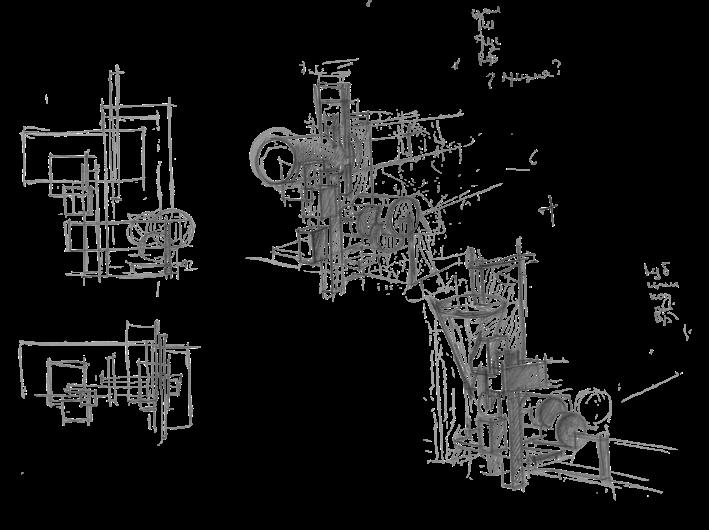
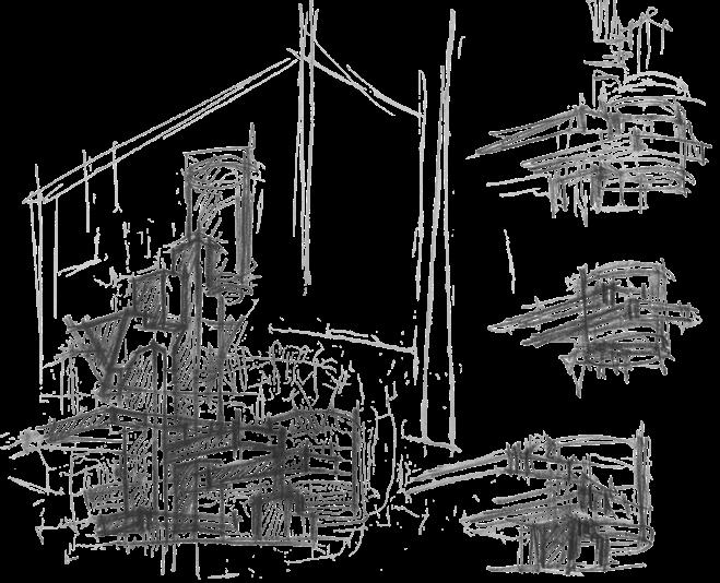
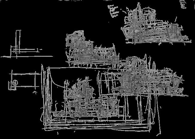
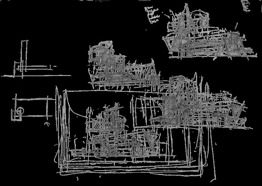
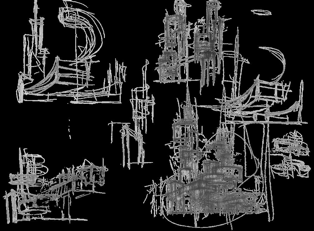
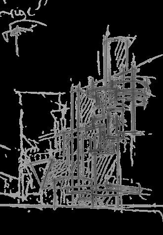
2020-2022, 1-2 semester, Saint Petersburg State University of Architecture and Civil Engineering personal/ academic
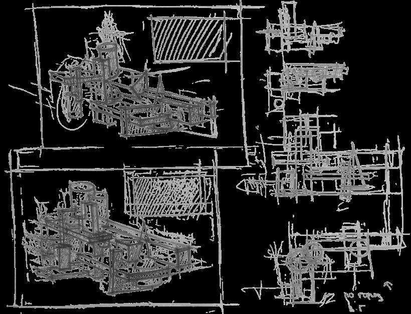
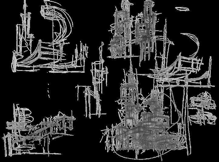
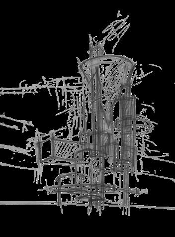
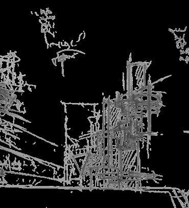
This hand-drawing technique was invented at this university by architect professors in the 20th century and is still taught today. Its distinctive feature is that it emphasizes the perception of the image by using different «masses of spots» to draw the viewer’s attention to the main subject, divert it from the secondary, and convey depth.
This method allows for neglecting the quality of strokes, perspective, and creating multiple vanishing points in one image. According to the professors, this method is an excellent way for architects to learn how to understand and work with space.
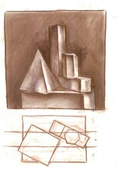
What catches our eye first? What is closer to us, and what is further away?
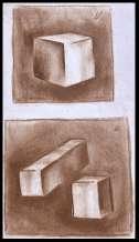
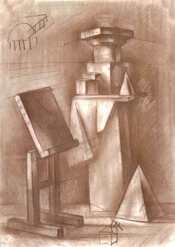
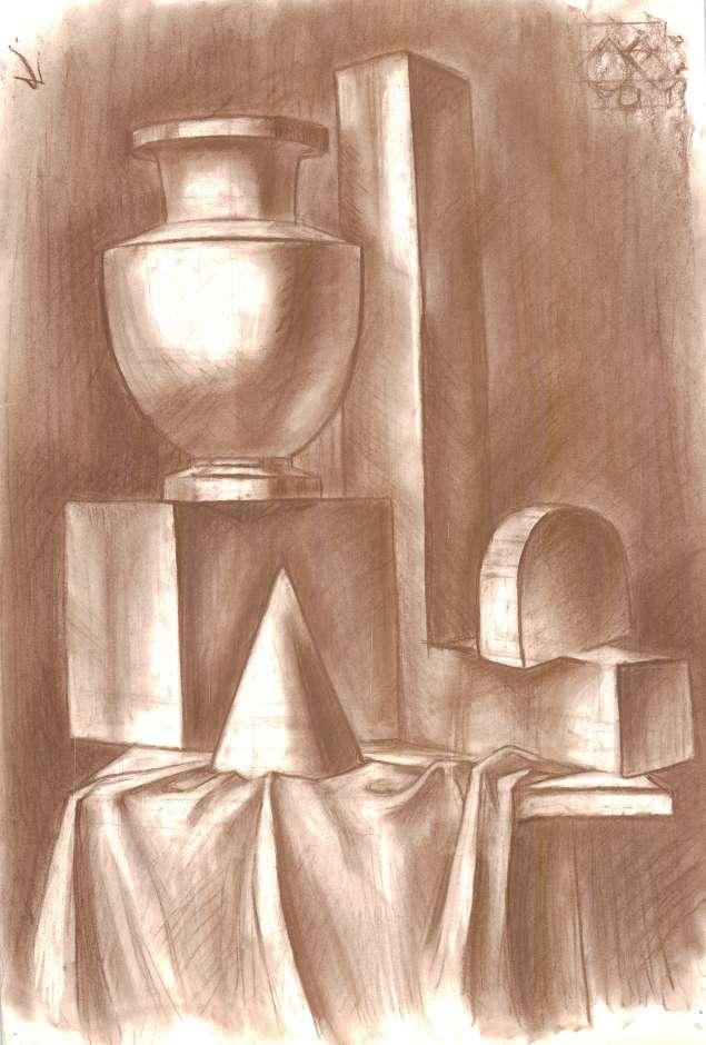
In university, this was one of my favorite subjects. I saw drawing as a world of my own where I could create what I needed, depending on my goals. When you think about how much emphasis to place on certain areas to make one object stand out as the main focus while diverting attention from another.
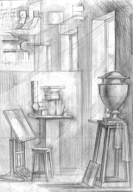
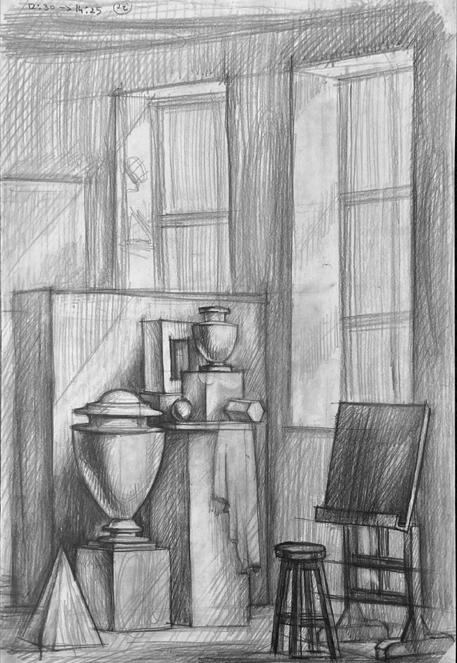
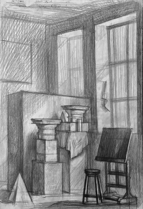
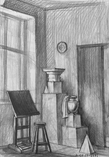
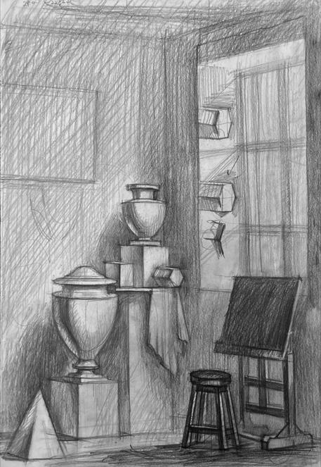

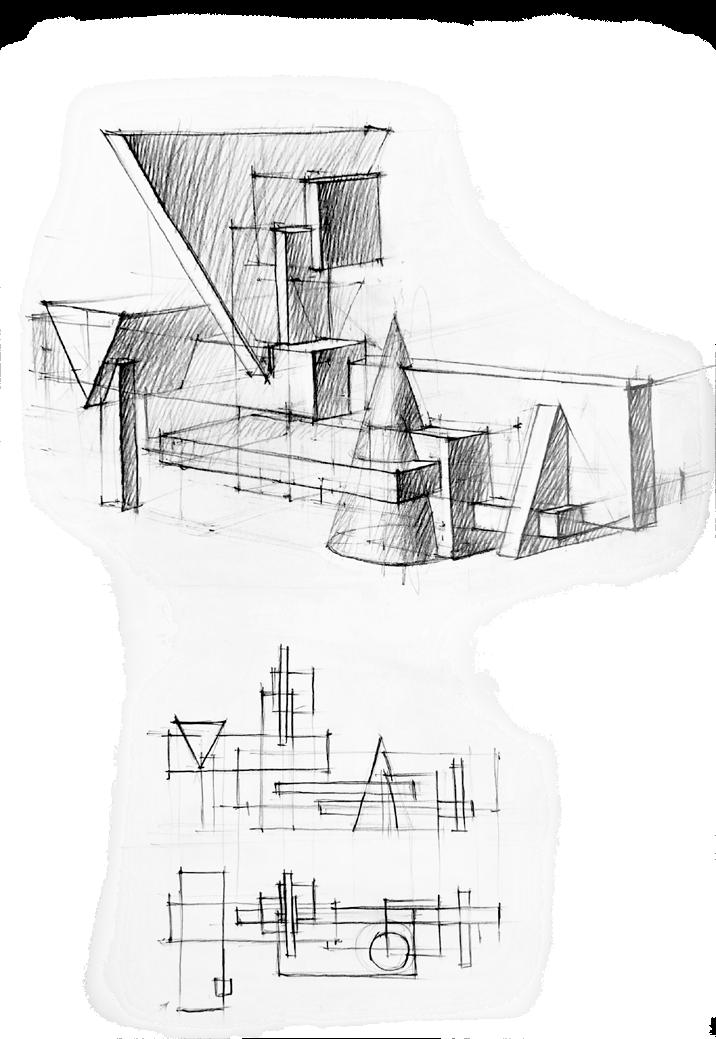
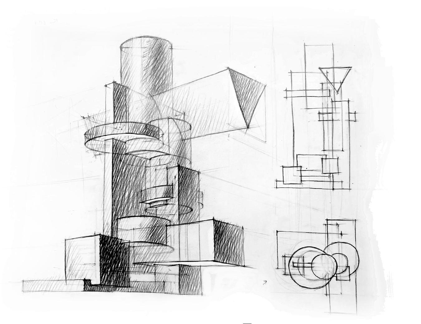
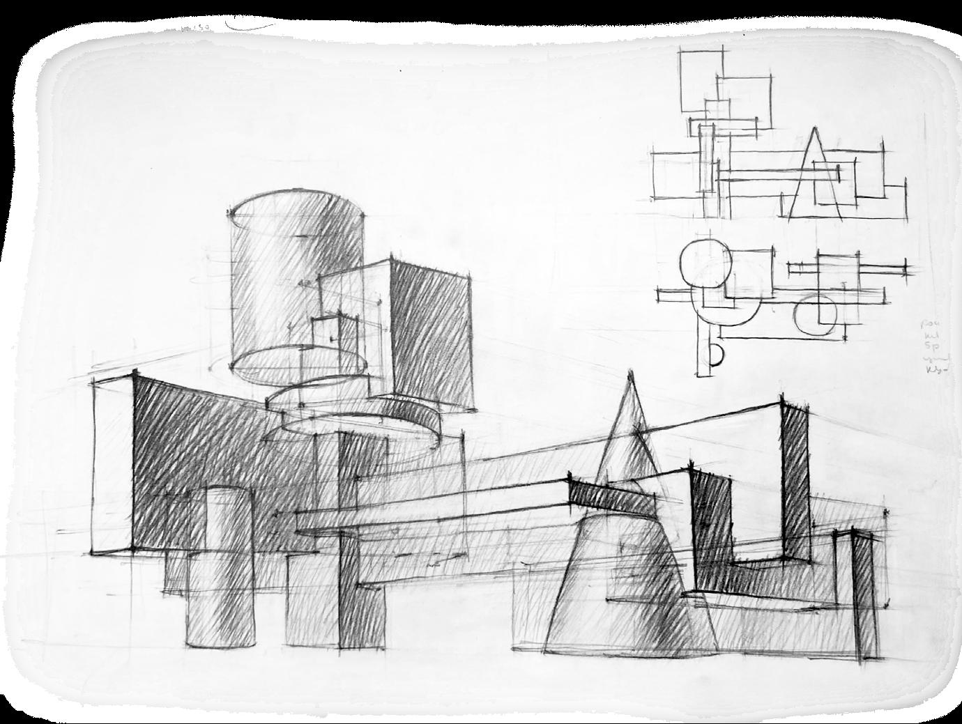
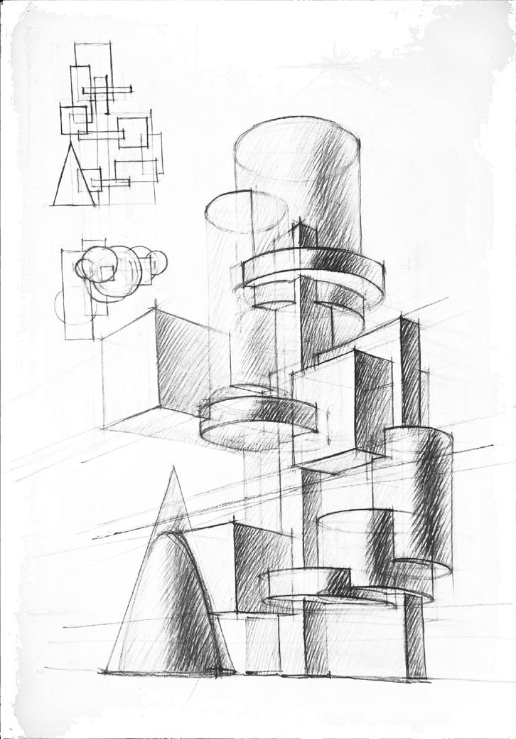
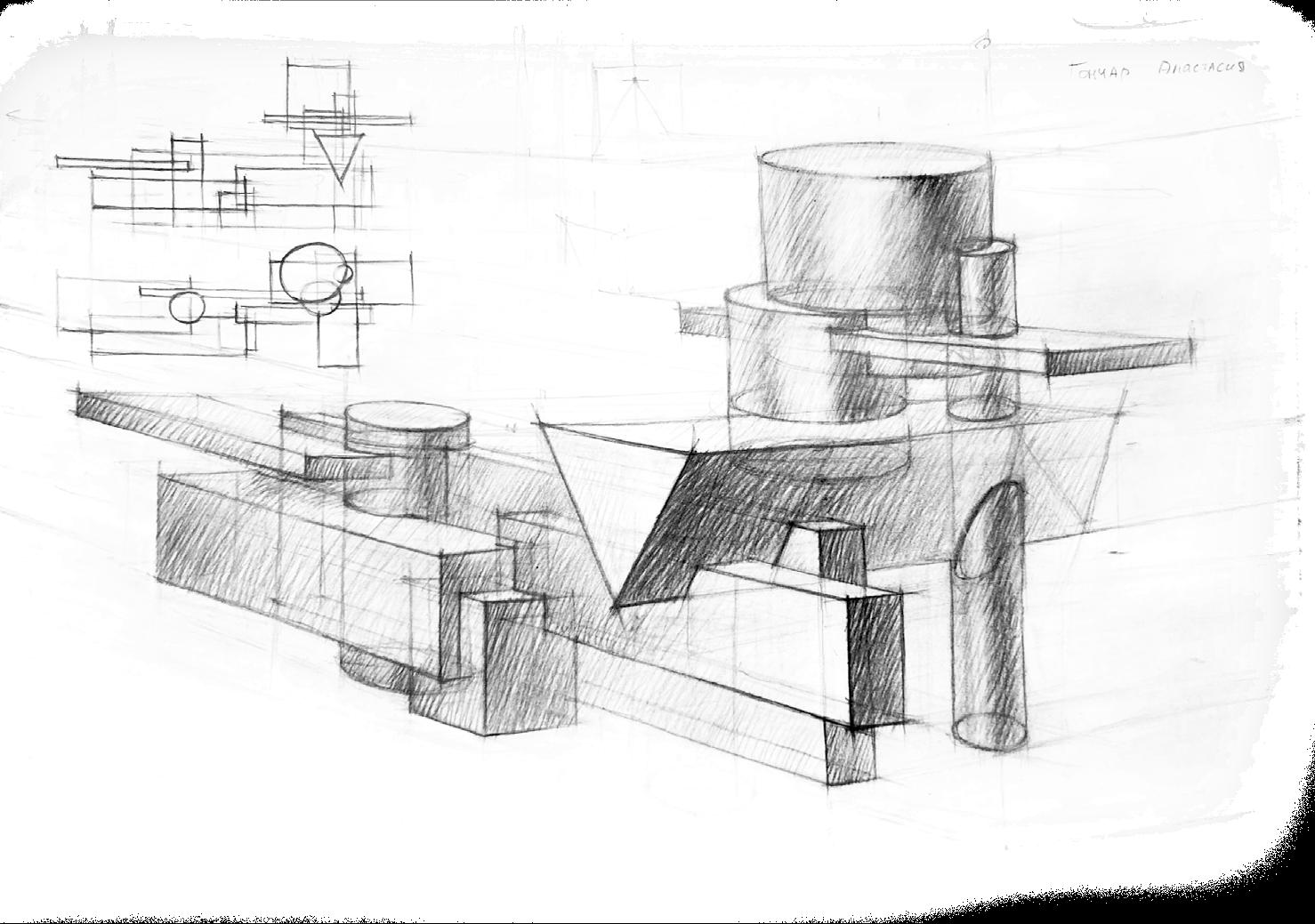
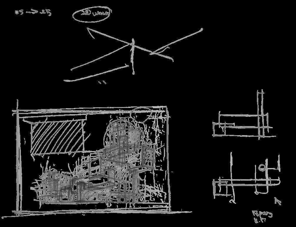
2020 -2021, Preparatory Courses in Architecture, Saint Petersburg State University of Architecture and Civil Engineering
personal/ academic
A3/ pencil
Task:
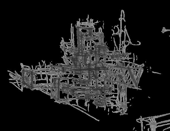
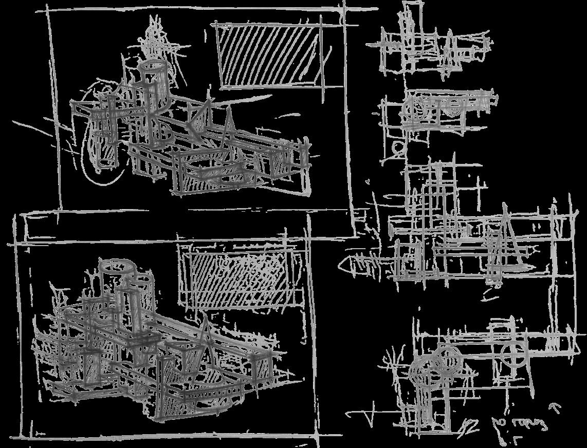
I should create a composition with basic geometric solids in perspective and its projections (plan and main facade) based on the data provided in the task ticket. It could be either a vertical or horizontal composition, with an upper or lower horizon. The ticket also specified a combination of figures that formed the «core of the composition». I also had to pay attention to the composition of my work in the format of paper, creating rhythms with different types of figures, their scales and voids. Time allowed: 60 minutes
An example «core of the composition» from the ticket, which I had to use to create my composition horizontally and from the upper horizon.
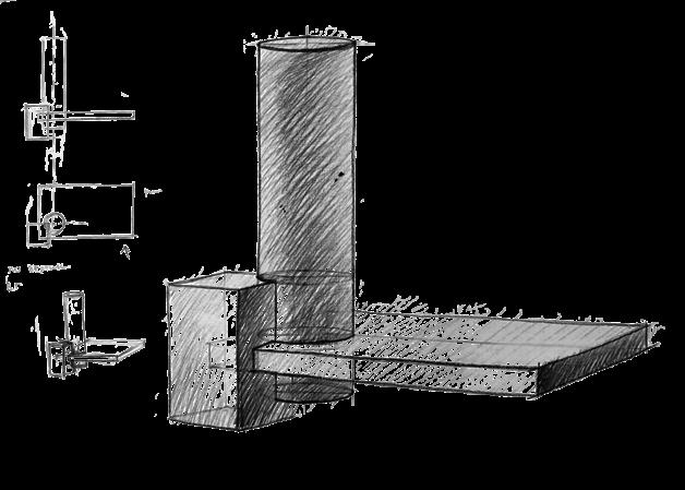
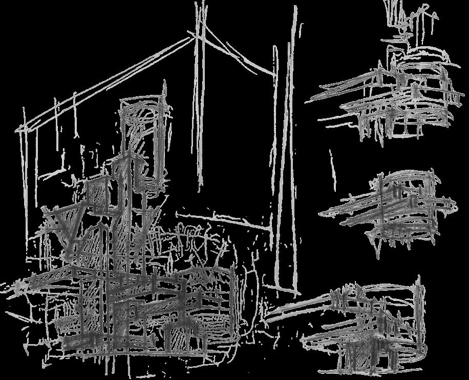

April 2018 - June 2018/ Saint Petersburg State University of Industrial Technologies and Design/Vocational education
team work/ academic
Software: ArchiCAD, Adobe Photoshop, Autodesk 3ds Max
Task:
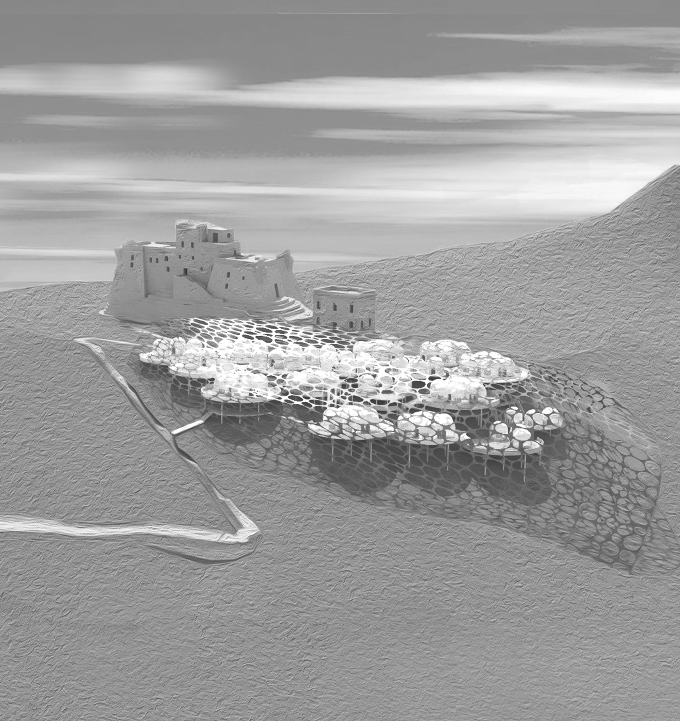
The thesis project is based on a competition assignment to design an art space at St. Catherine’s Fortress on Favignana Island, Italy.
Concept:
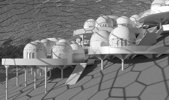
After analyzing the territory and history of both the fortress and the island itself, we concluded that we can diversify the island’s tourist activities, create a new attraction, and provide additional jobs, thereby improving the island’s economy while harmoniously integrating into the surrounding environment and landscape.
My classmate and I developed the analysis and project concept together and then divided the project tasks equally.
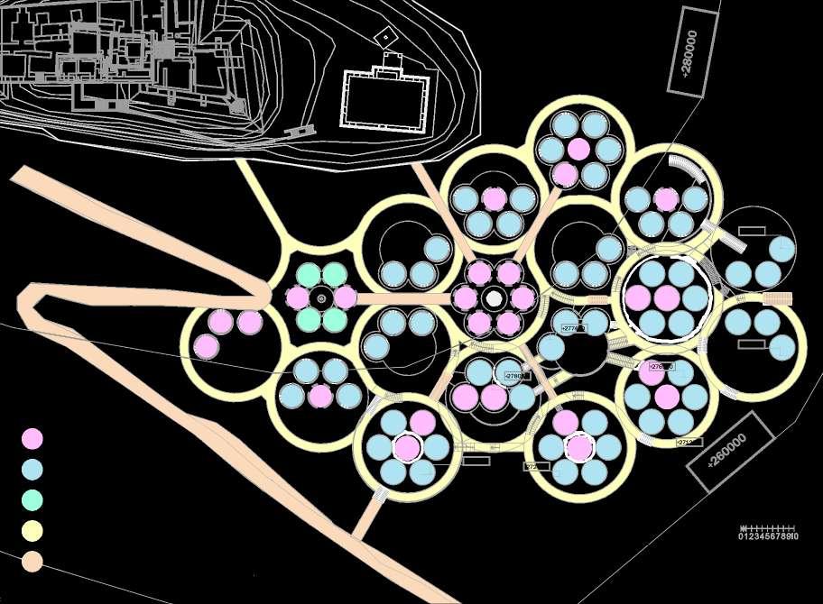
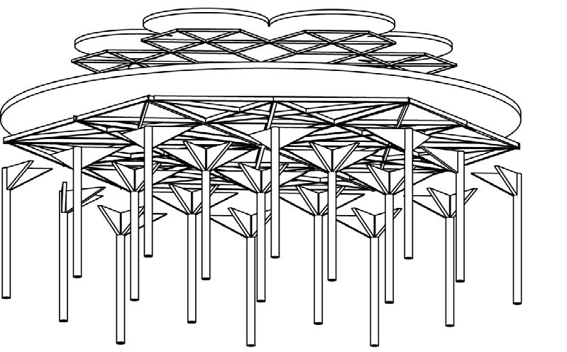
- The idea is to invite artists from various fields gather in teams and create exhibitions on a set theme for the exhibition season. Each team is allocated a certain area of the fortress. We envision that the exhibition should consist of various combinations of human perception (sound, light, smell, textures, etc.). We decided not to construct anything additional within the fortress and to preserve its existing appearance.
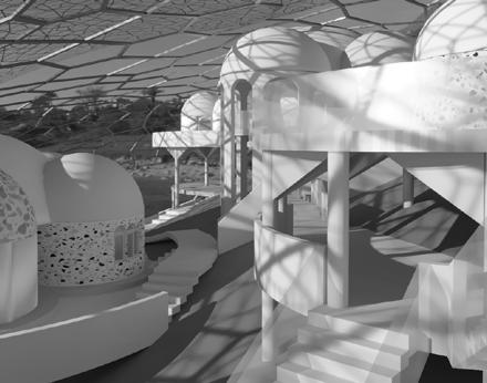
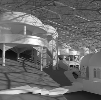
- For the artists, during the exhibition special living modules are designed, featuring common spaces for collaborative work and personal modules (designed by me).
- For tourists, special living modules are also designed in another part of the mountain for the duration of the exhibition, allowing them to stay on the island (designed by my classmate).
- For all visitors, there are designated food zones, rest areas, lecture zones, and toilets, as well as organized public and private transportation to the island and the fortress.
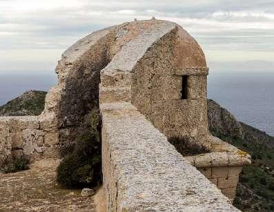
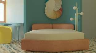
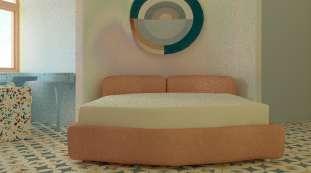
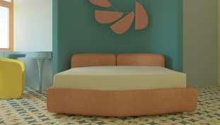
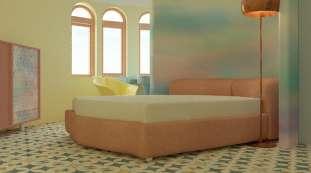
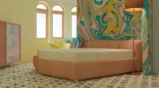
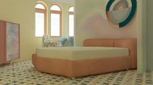
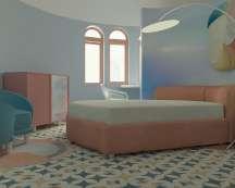
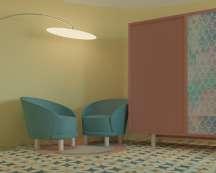
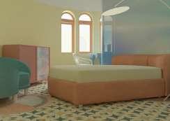
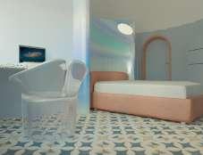
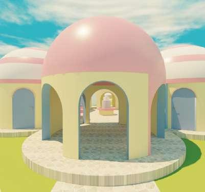
For the artist modules, I took inspiration from the shape of the fortress tower, and the interior design was inspired by the vibrant and diverse nature of the island, the water shimmering in the bright sun, and traditional motifs.
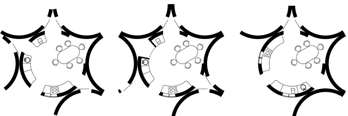
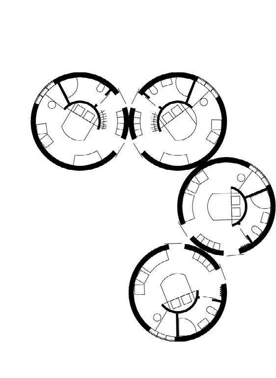
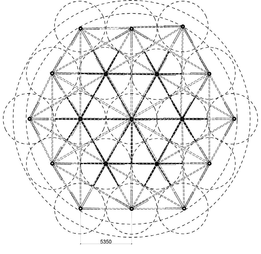
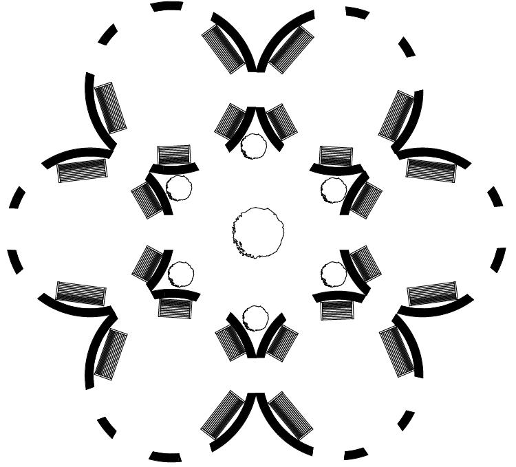
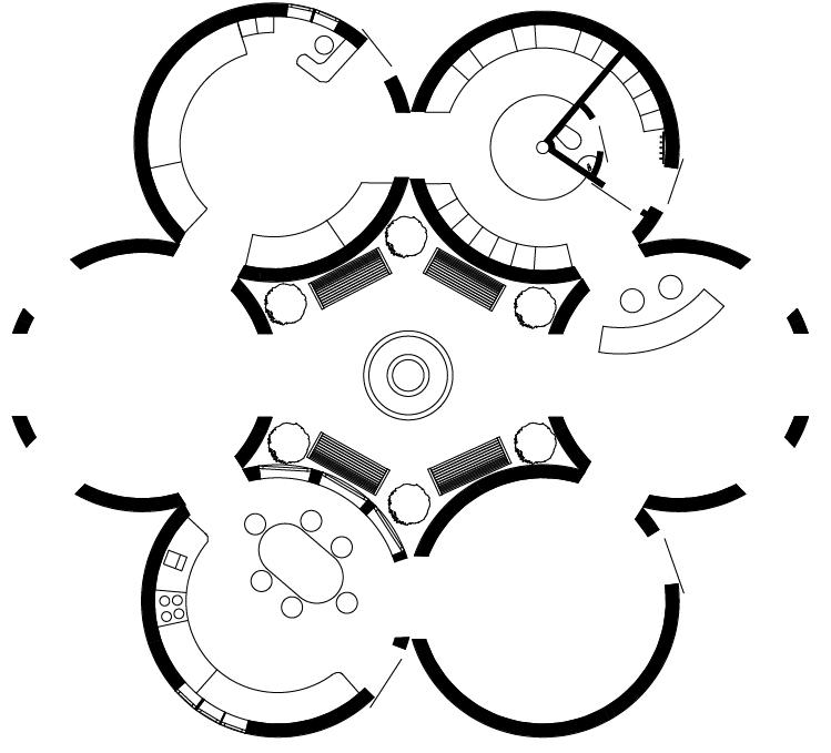
Layout variants for residential modules

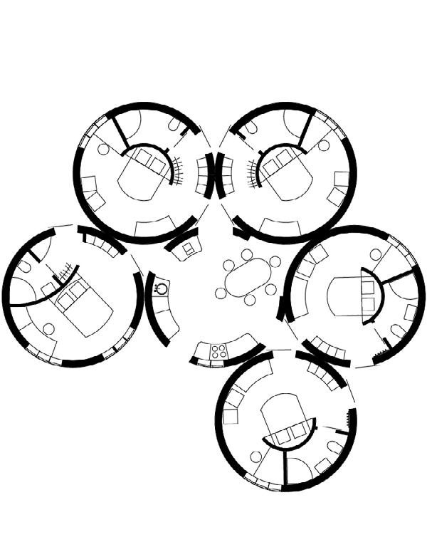
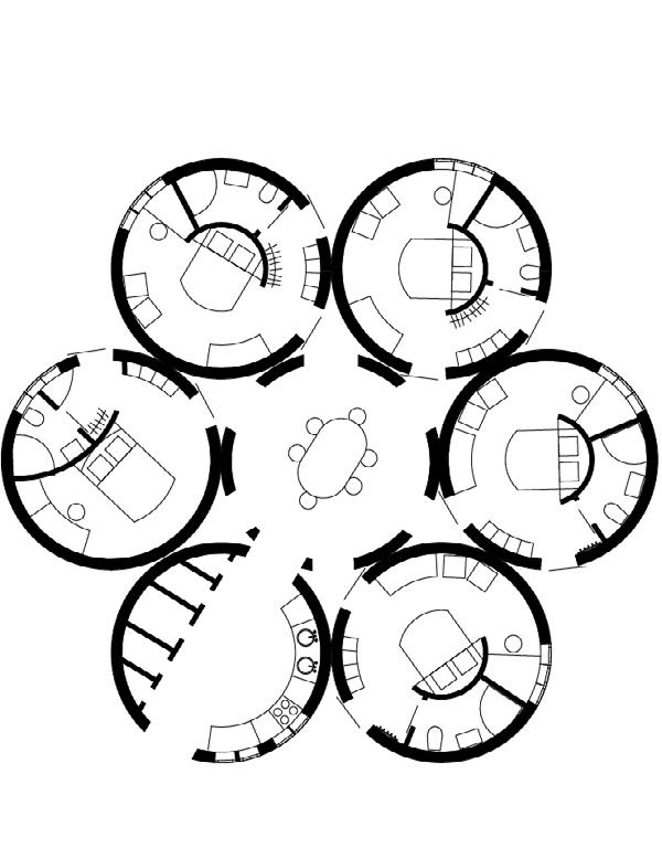
Kitchen layout variants for combinations of 7-module houses

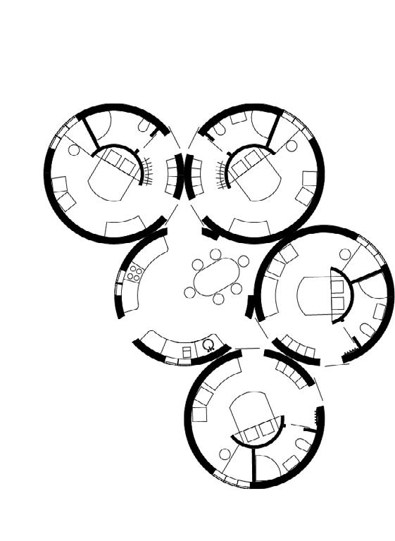
Kitchen layout variants for combinations of 6-module and 5-module houses
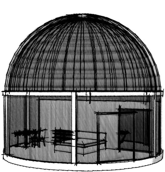
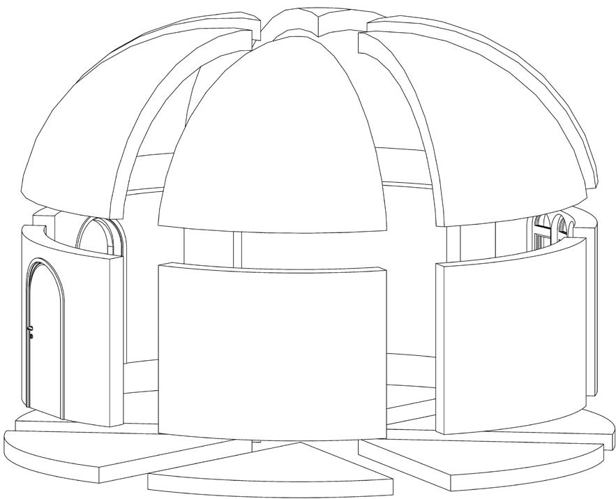
Interior design ideas for residential modules
- public spaces
- residential spaces
- administrative spaces
- local roads
- main roads
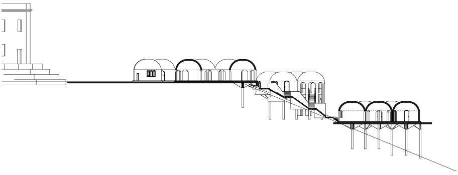
Combination variants for residential modules
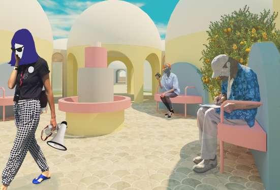
Location: Russia, city Saint-Petersburg Area: 83,5 m2
Implementation: 2020-2023
Clients: a young couple
personal | professional
Software: ArchiCAD, Adobe Photoshop and Illustrator, Autodesk 3ds Max + Corona
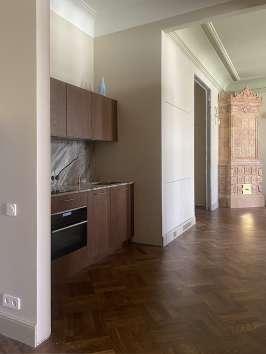
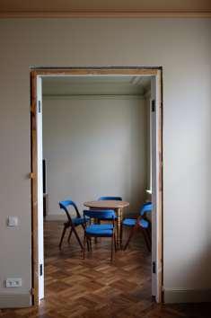
The apartment is situated in a historic, lucrative building constructed in 1910 for the influential timber merchants, the Kolobov brothers. Originally, the apartment was considerably larger and belonged to a single family. However, during the Soviet era, it underwent renovations, transitioning into a communal space, and ultimately, being divided into two separate apartments.
The location on the top, the 5th floor, offers numerous benefits, such as an abundance of natural light, enhanced privacy, and a panoramic view. The windows in the new common area overlook the court of honor with tall maple trees, while the window in the private zone provides views of a small front garden featuring maples and birches. The reflections of the tree canopies create beautiful shadows within the apartment.

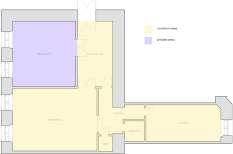
reconstruction of the original geometry and enfilade layout tailored to the needs of modern individuals
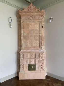
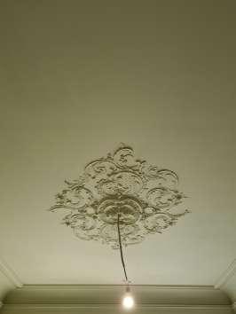
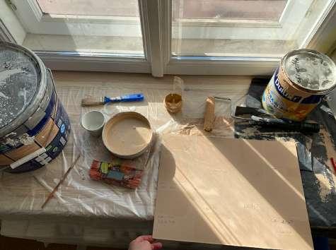
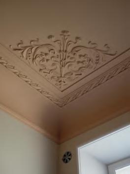
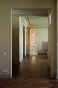
preservation and restoration of the remaining historical elements within the apartment, including stucco ceilings, doors, windows, furniture, two fireplaces, ventilation grids, and arch surfaces
establishment of a new spatial zoning arrangement, which includes the creation of comfort common and private areas of the apartment
careful and compromise integration of modern conveniences and technologies into the historical environment
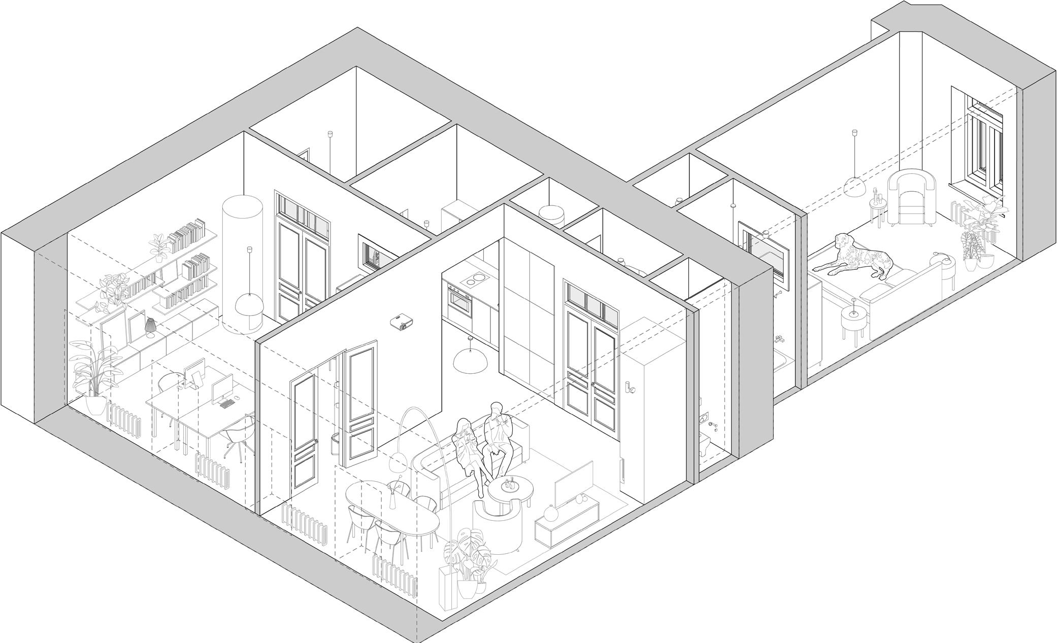
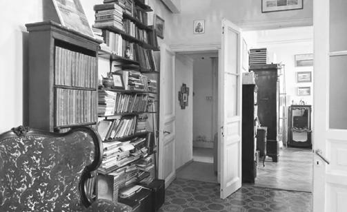
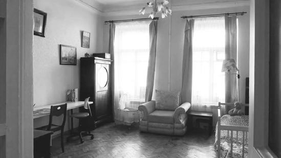
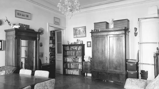
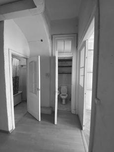
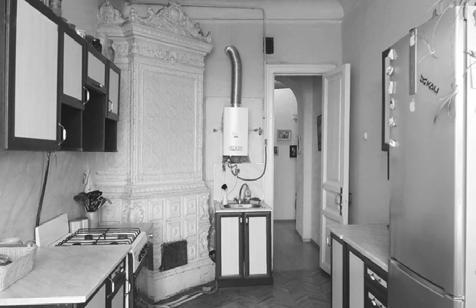
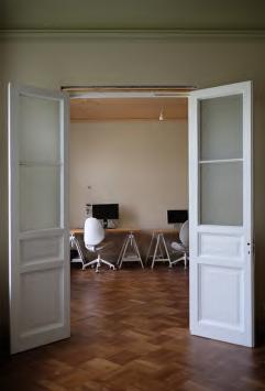
You may notice how the space has become more comfortable due to changes in zoning, all while preserving the original geometry. Now, upon entering the apartment, you are greeted by a beautiful fireplace that invites you into the living room.
The pass-through common space layout and central arrangement of some furniture allow for movement from different sides, making the space feel more expansive.
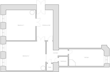
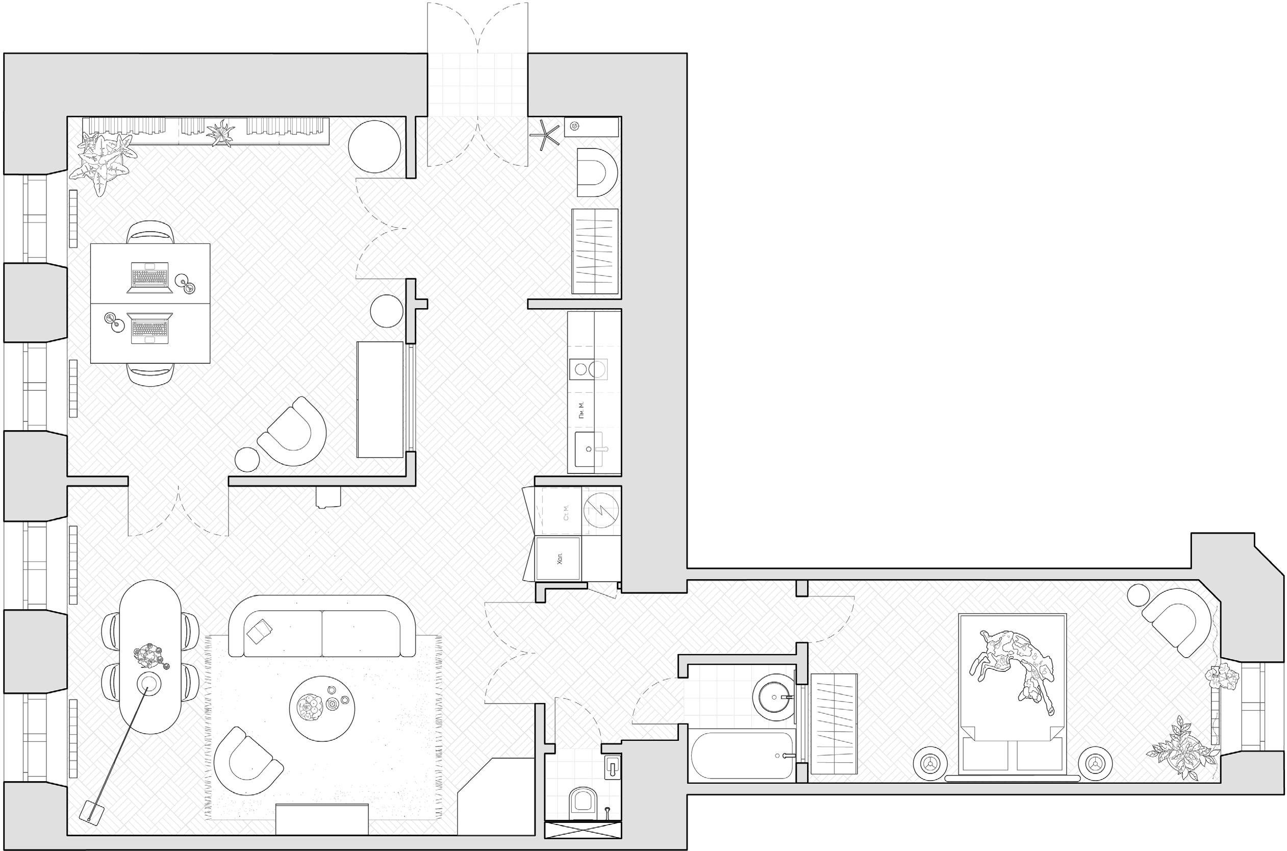
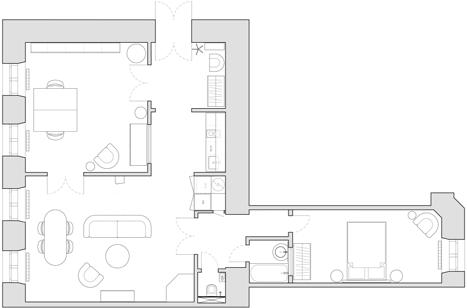
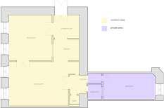
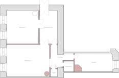
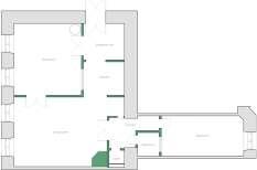
The bedroom is now situated at the far end of the apartment, ensuring privacy. It is the quietest area, with windows overlooking a serene front garden adorned with trees.
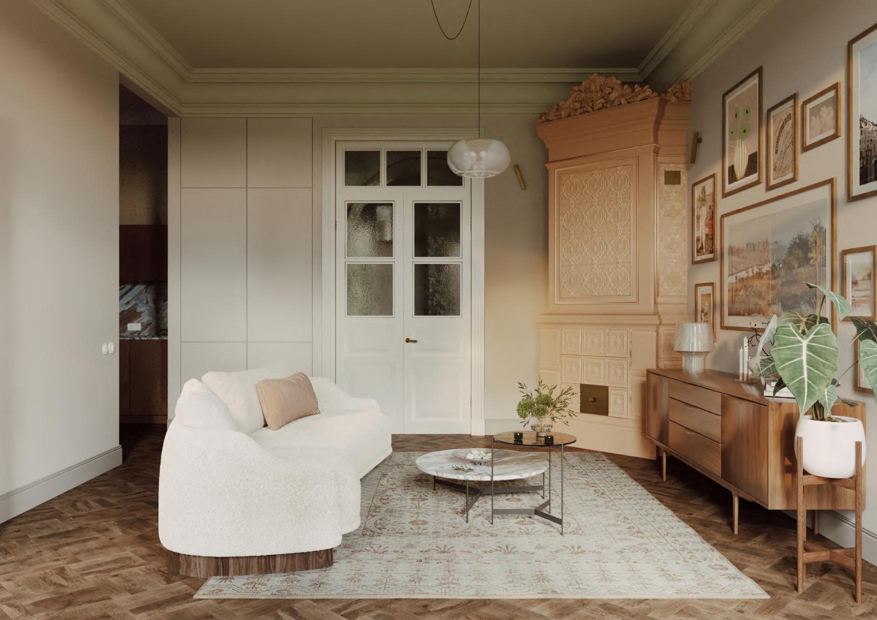
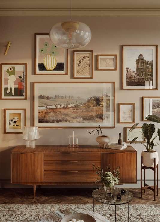
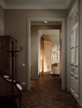
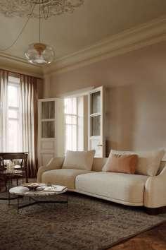
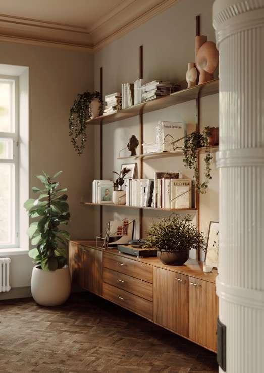
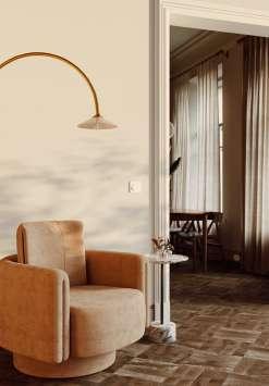
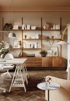
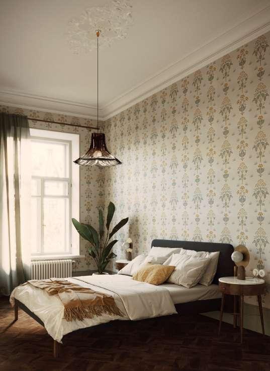
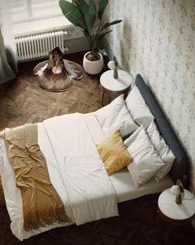
In this project, I aimed to create realistic visualizations to facilitate material and furniture selection and avoid mistakes in real life.
To create a realistic atmosphere, I modeled some objects myself, such as ceiling elements, two fireplaces, bedroom lighting, parquet and tile flooring, historical doors and windows, and furniture for the bathroom, kitchen, and workspace.
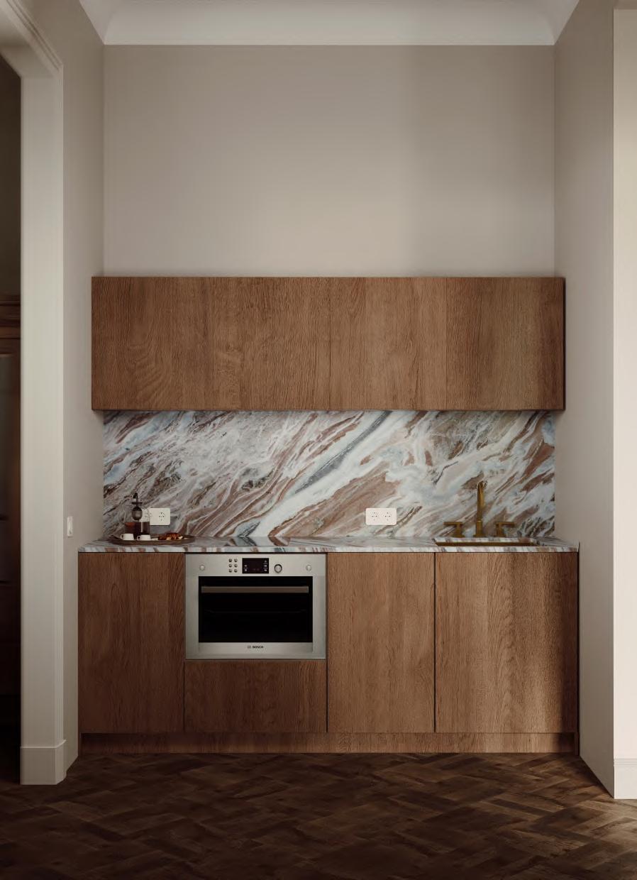
In this project, I prepared a complete album of necessary drawings, including design projects for several pieces of furniture for implementation, such as furniture for the bathroom and kitchen. One of the drawings and visualizations can be seen on this page.

October 2022 - April 2023/ course of QGIS: Urban Analysis
personal/professional
Software: Qgis, Adobe Indesign, Adobe Illustrator
As part of a course on studying the QGIS program to expand my professional skills, I decided to study the territory of the city Herceg-Novi in Montenegro I recently moved to.
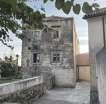
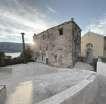
While walking around the city, I discovered an abandoned building in the city center where many people gather. I decided to conduct research to understand how the building and the surrounding area could be utilized to make the city more convenient. Since the city is small, I decided to study it entirely.
My research consists of 4 points:
1. Location in the city
2. Transportation accessibility
3. Building analysis
4. Natural framework
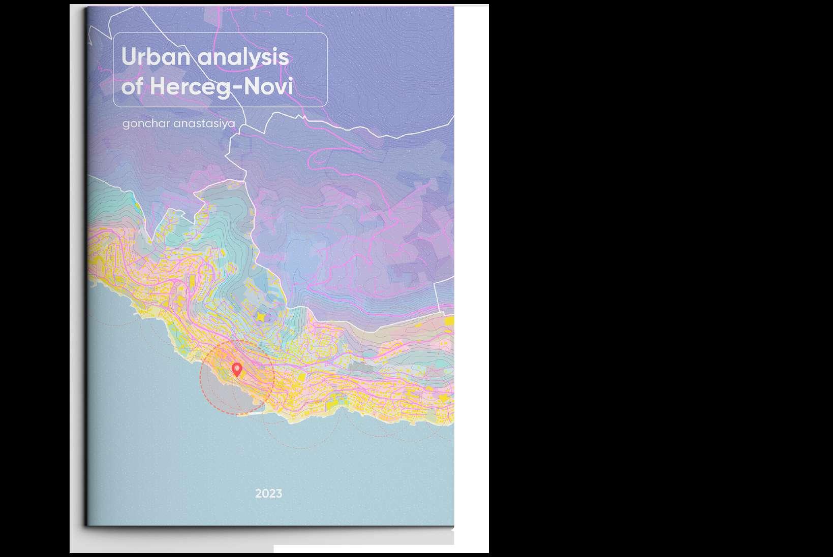
Full project you might see here:

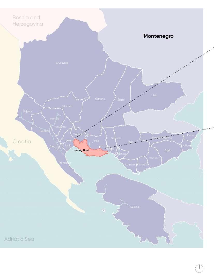
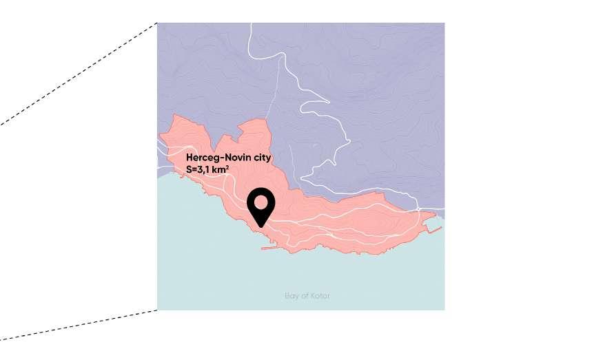
Municipality:
Area:
Population:
Population Density:
Herceg Novi
3.1 km2
16,493 people
5,500 people/km2
Herceg Novi is the administrative, economic, and cultural center of the eponymous municipality, located on the coast of the Bay of Kotor. It borders Croatia, the Republic of Serbia, Bosnia and Herzegovina, and Italy across the Adriatic Sea.
One of the youngest cities on the Adriatic, it was founded in 1382 as a trading city. It is the first city at the entrance to the Bay of Kotor, which is one of the most beautiful bays in the world, the southernmost fjord in Europe, and the deepest in the Mediterranean Sea. Thanks to its seaside location and natural diversity, the city is a popular destination for tourists, especially during the summer.
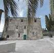
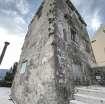
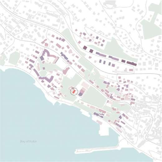
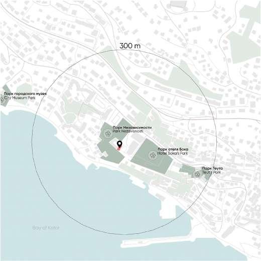
The project building is situated near the historic center of Herceg Novi, within the Park Nezavisnosti, and is close to the most active street, Njegoševa.
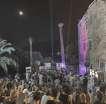
During the warm season, the surrounding area with an amphitheater serves as a venue for concerts and festivals, and the building’s facade is used for projecting light effects.
The building itself is always closed and not in use.
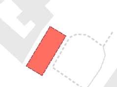
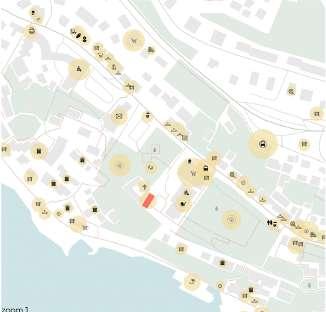
Popular places in the city during the season
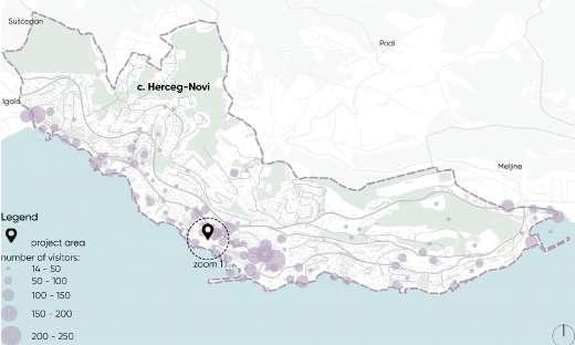
Popular places in the city during th off-season
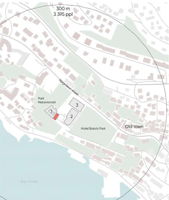
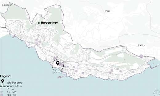
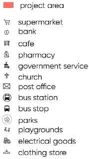
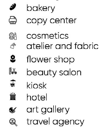
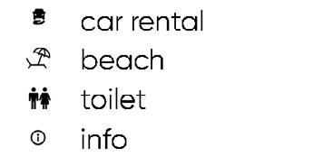


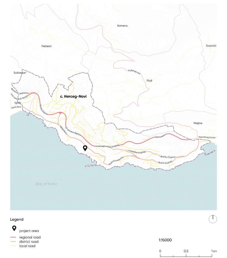
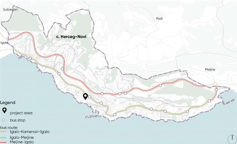
Street hierarchy Public transport/buses
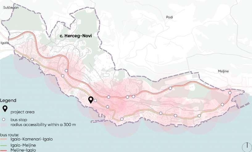
Radius of accessibility
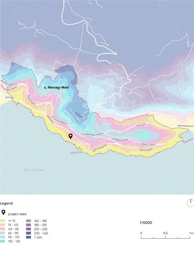
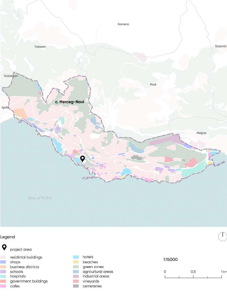
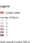
Building functions Building heights
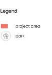
Parks within a 300 m radius
Summary of the research:
Using the SWOT analysis method, I drew conclusions based on my research, which will serve as a foundation for developing the project concept.
strengths
Stunning sea view
Excellent central location in a vibrant areanear a park and the sea
Good transport accessibility
Quite large area
Proximity to a church
Abandoned house without utilities
Existing use of the outdoor space and building facade
Existing adjacent area with an amphitheater potential for utilization
Existing function of the building and territory as a music venue and for projecting light effects on the facade - potential for utilization
Risk of site damage due to natural disasters: strong wind with rain, earthquakes
Preserve the existing function of the territory
Preserve the existing buildings on the territory
Place new functions inside the building oriented towards the views
Existing use of the outdoor space and building
Strengthen the territory for resilience against natural disasters
Consider protection against rain and wind for the existing building
Create sound insulation from the church
Improve and develop the existing function of the territory
Renovate the building to enhance the function of the territory and accommodate more people
Provide utilities to the territory with additional protection against disasters
Strengthen the territory for resilience against natural disasters and provide sound insulation from the church weaknesses opportunities threats S S-O W S-T O W-O T W-T

behance: gonchar_anastasiya


e-mail: gonchar.anastasiya@bk.ru
tel: +382 68 441979
