5 minute read
DOUBLE IDENTITY
from GRAY magazine No. 44: LUXURY
by GRAY
LE IDENTITYinteriors + architecture DOUB
With a partial renovation of his firm’s new Vancouver office space, architect D’Arcy Jones demonstrates the power of restraint and resourcefulness in design. Written by
JENNIFER BAUM LAGDAMEO
Photographed by
SAMA JIM CANZIAN
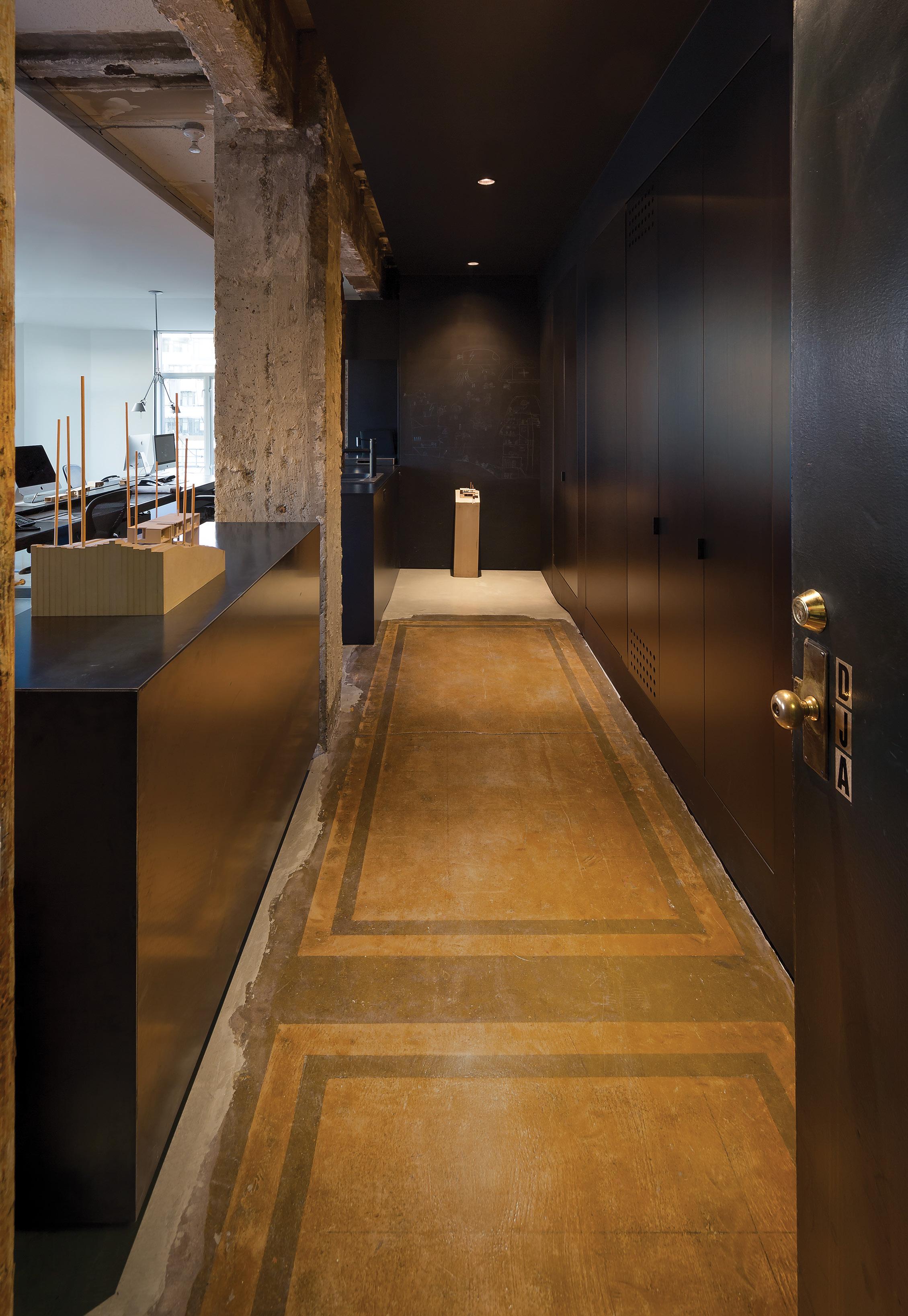
THIS PAGE: D’Arcy Jones Architects’ office in downtown Vancouver was influenced by “nerdy color theory ways,” according to the firm’s namesake founder. Black was chosen for the central space. “This is where we meet clients, say hello to a courier, or have a coffee,” he says. “People are more open in darker spaces.” White, on the other hand, is a more introverted color, one conducive to concentration. The entranceway’s original flooring gives the space a multilayered feel. OPPOSITE: The rest of the old wood floors were damaged, so Jones replaced them with cement floor-patching material that was hand-troweled for a textured, rustic look. »
“We exposed all the warts that typically aren’t considered charming, except when they exist in contrast to a perfect white shell.” —D’Arcy Jones, architect
IT’S OFTEN SAID THAT THE THIRD TIME’S A CHARM, an adage well suited to D’Arcy Jones Architects’ new office—the firm’s third space in Vancouver’s historic Lee Building. Named after its original owner, who lived on the top floor and lost the building by gambling, the landmark 1912 structure is located in the Mount Pleasant neighborhood, an imposing, brick-laden reminder of the city’s gritty industrial past.
By 2015, after the firm had spent 11 years in the building, the addition of new team members meant a need for increased space. When a move was at last in the cards, two years later, a 1,000-square-foot apartment opened up just down the hall. D’Arcy Jones, lead architect and founder of the firm, knew that he wanted to stay in the building, and the newly vacated spot proved to be the ideal solution.
Jones, who is known for his modern, inventive design work, approached his company’s new home base determined to get as much function—and light—out of the new space as possible. Originally an office that had been
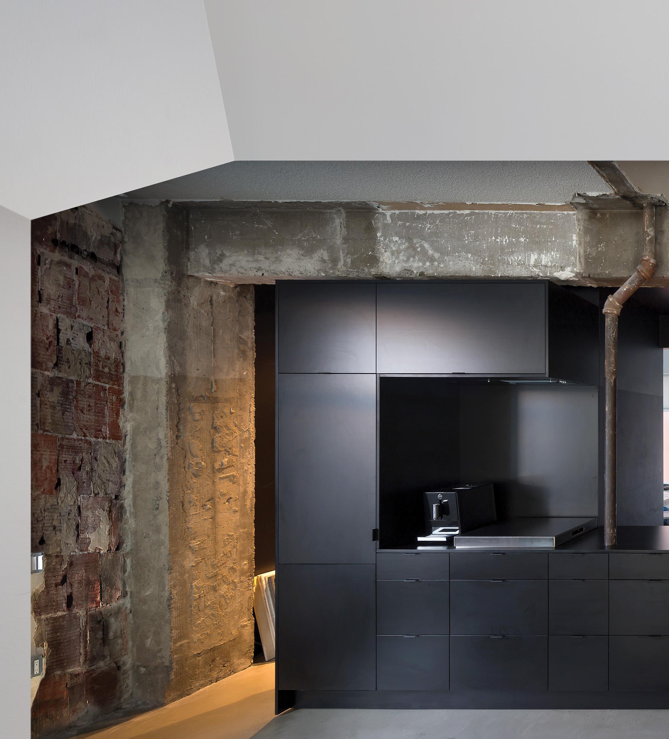
At first glance, the custom black cabinetry in the office’s sleek modern center space seems to be metal, but a closer look reveals plastic laminate—a “tough and cheap” material, in Jones’s words, that he uses to show clients alternatives to more expensive choices. The central zone also houses a kitchen and a hidden pantry/storage room.
converted into an apartment in the 1980s, the space was a series of small rooms fitted into a larger, rectangular configuration. This meant that the first and biggest task was the removal of all the non-load-bearing interior walls.
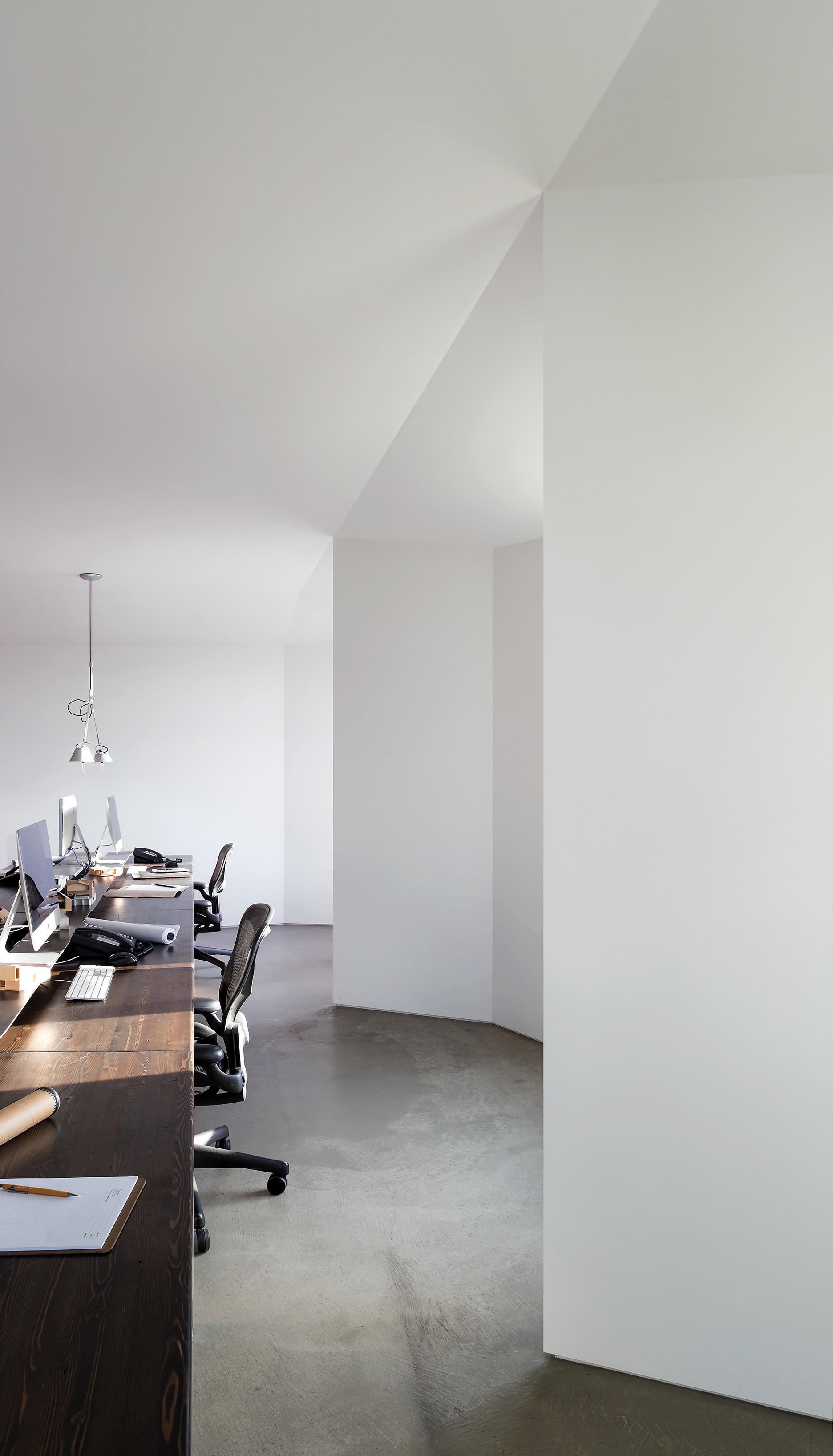
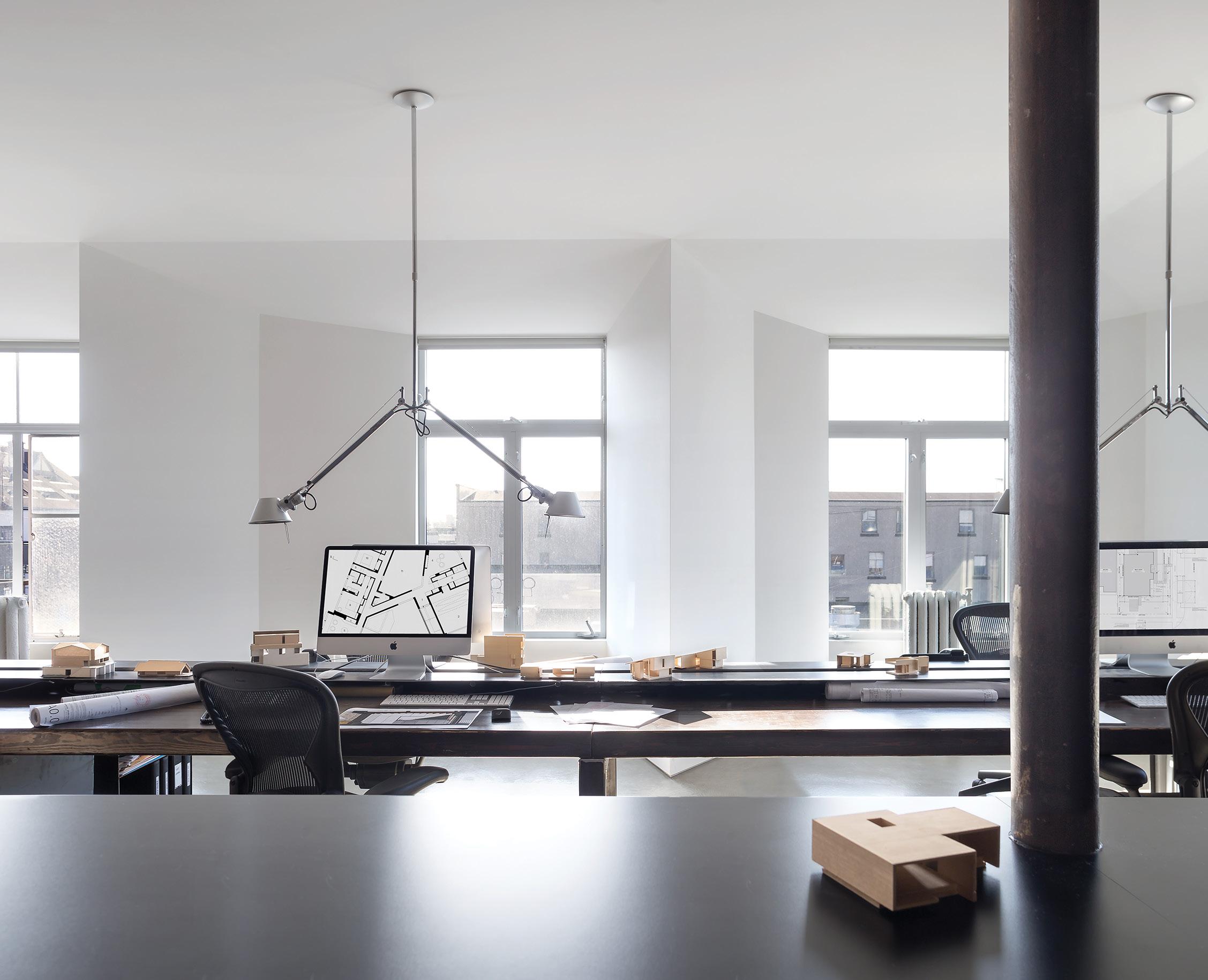
Once the old apartment had been opened up into a single space, a sculptural white work area with large windows—and a 28-foot-long communal table—was established in the western half of the room. A long, rectangular area in the center of the room became the entrance and common area, while the office’s northeast portion was split among a conference room, a printer cabinet, and a bathroom. DJA designed the workspace’s artistically angled walls for a practical purpose: to hide all the existing piping. The renovation’s biggest single expense was the insertion of two windows in the north-facing façade of the building. “It is very complicated to cut a hole in brick,” Jones explains. But the new windows are well worth it, as they not only flood the workspace with natural light but also provide beautiful views of the North Shore mountains. »
THIS PAGE: In the bathroom, DJA first stripped the room and then added small white swimming-pool tiles from Daltile to freshen the space, which also showcases the firm’s own custom-made Corian countertops. The faucet is Aquabrass, through Wolseley Plumbing. OPPOSITE: Work stations at the custom dark-stained glulam desk made by Structurlam, with custom raw steel legs by False Creek Fabrication. Its three beams were sized to fit in the building’s elevator. The lighting is Tolomeo by Artemide, through Inform Interiors.
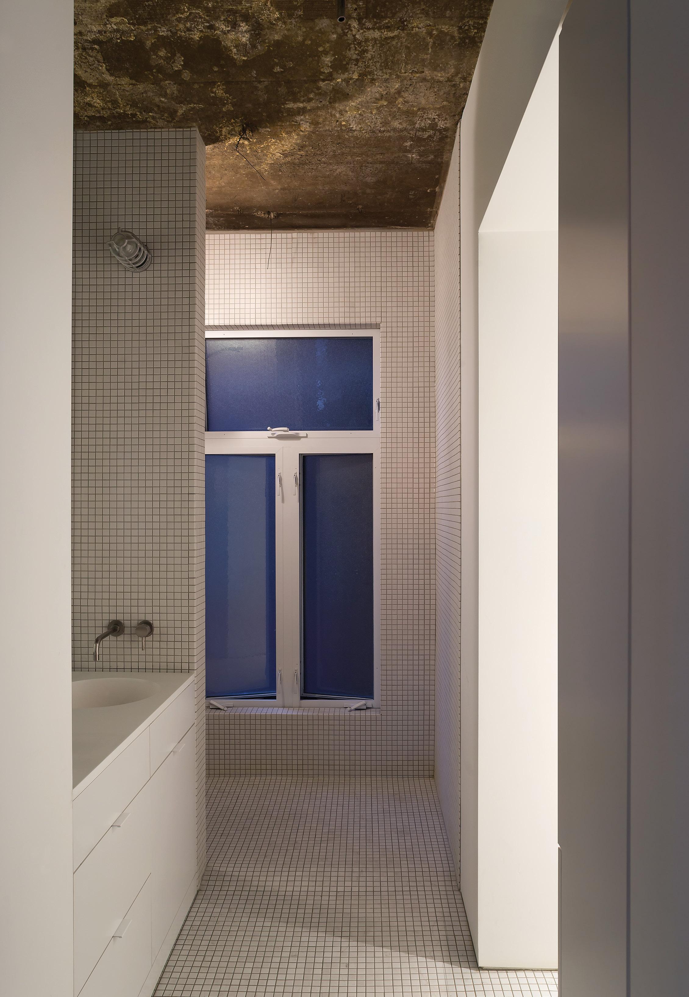
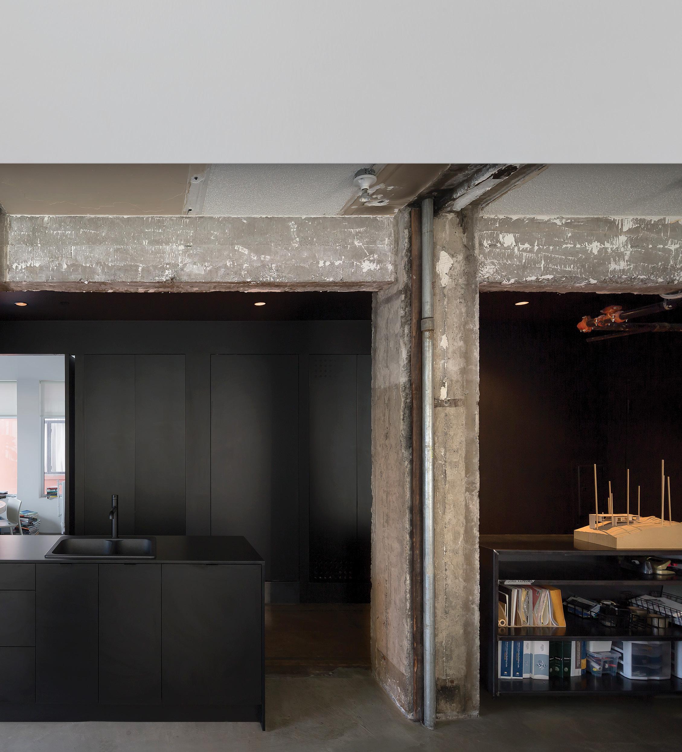
In contrast, the center portion of the office is defined by custom-made black cabinetry, and includes some of the space’s original elements. “It’s almost like we did half a reno,” Jones explains. “Instead of spending to update the entire space, we made the white workspace look perfect and then didn’t spend any money on the other spots.” He embraced unexpected “found” details, such as exposed areas of rough popcorn ceilings and “106 years of paint,” all of which DJA left untouched after applying a clear coating to seal the surfaces against dust and prevent odors. “We exposed all the warts that typically aren’t considered charming,” he notes, “except when they exist in contrast to a perfect white shell.”
Another project-driving element that DJA didn’t shy away from was a limited budget. “Having a tight budget isn’t necessarily a negative,” Jones says. “It just means you have to be really creative.” It’s a philosophy that he hopes to impress upon his clients, too. By using the office as a showroom to highlight the beauty of simple materials, it becomes not only a place to draft plans and hold meetings, but also a proof of concept that encourages clients to try materials they might otherwise shy away from. For example, the black plastic laminate used in the office kitchen is a practical and cost-effective choice that embraces the dark kitchen trend.
The sleek results definitely prove that materials need not be expensive in order to look good. “It’s great to work in this office,” Jones says, reflecting on the year that he and his team have occupied the space. “It makes us all feel better than our old office did. We spend a lot of time here, so it better have a nice feel.” h


