LEGENDS INTERNATIONAL GRAY AWARDS WINNERS
ISSUE 67 architecture
interiors design fashion
+
INI ARCHIBONG
PAUL COCKSEDGE PAOLO FERRARI HOLLY HUNT PATRICK LAM MIA LEHRER
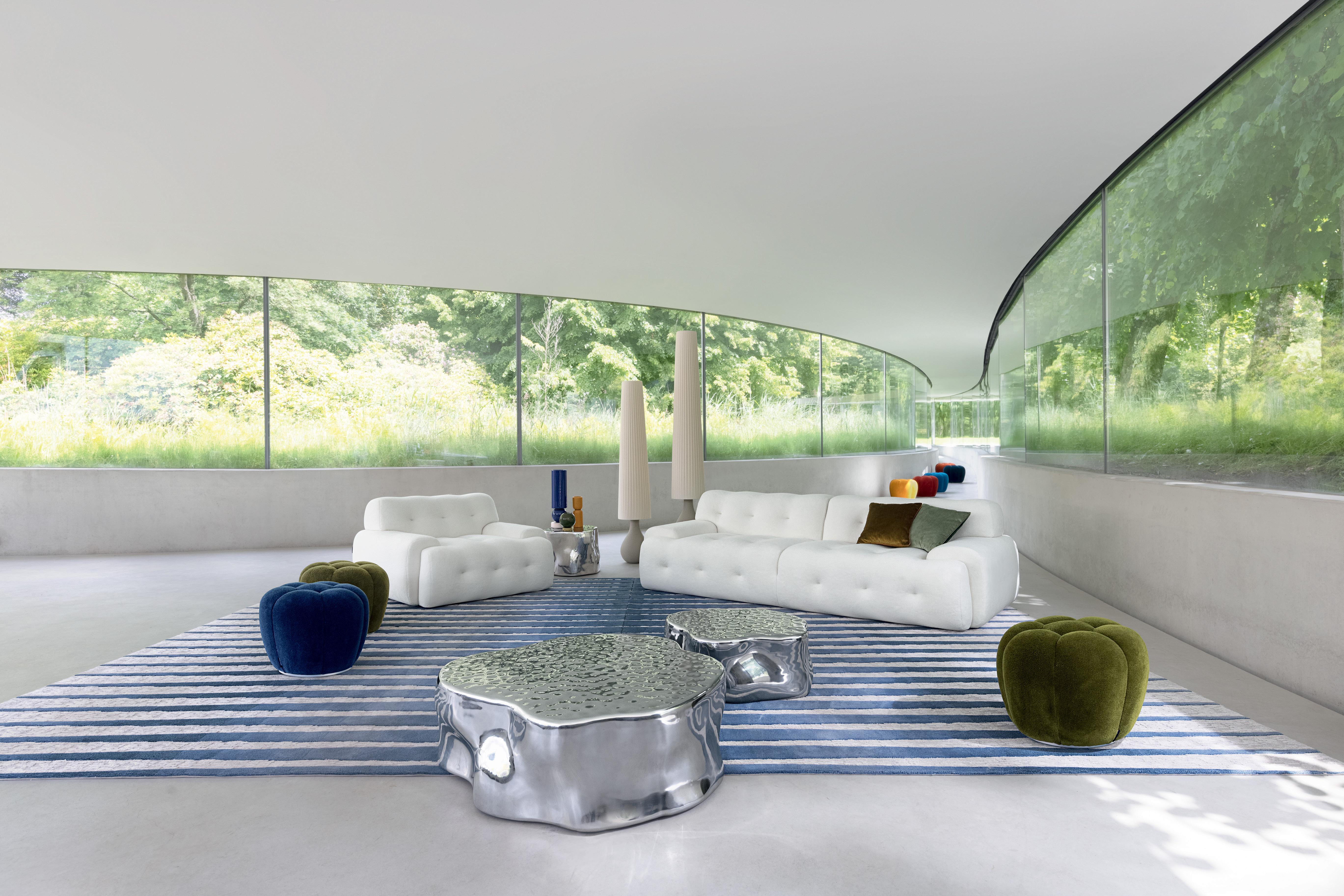 Blogger 3. Large 3-seat sofa and armchair, designed by R. Tapinassi & M. Manzoni. Silver Tree Bossa. Cocktail tables and end table, designed by Wood & Cane. Apex. Ottomans, designed by Sacha Lakic. Annapurna. Floor lamps, designed by Fabrice Berrux.
In-store interior design & 3D modeling services (1)
 Photos by Flavien Carlod and Baptiste Le Quiniou, for advertising purposes only. www.vijversburg.nl, Architect: Junya Ishigami. (1) Conditions apply, contact store for details.
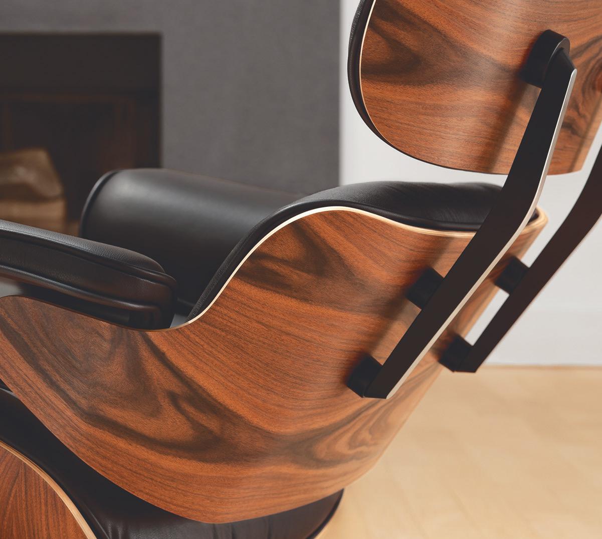
eames® lounge chair & ottoman, designed 1956 - made in the usa by herman miller®
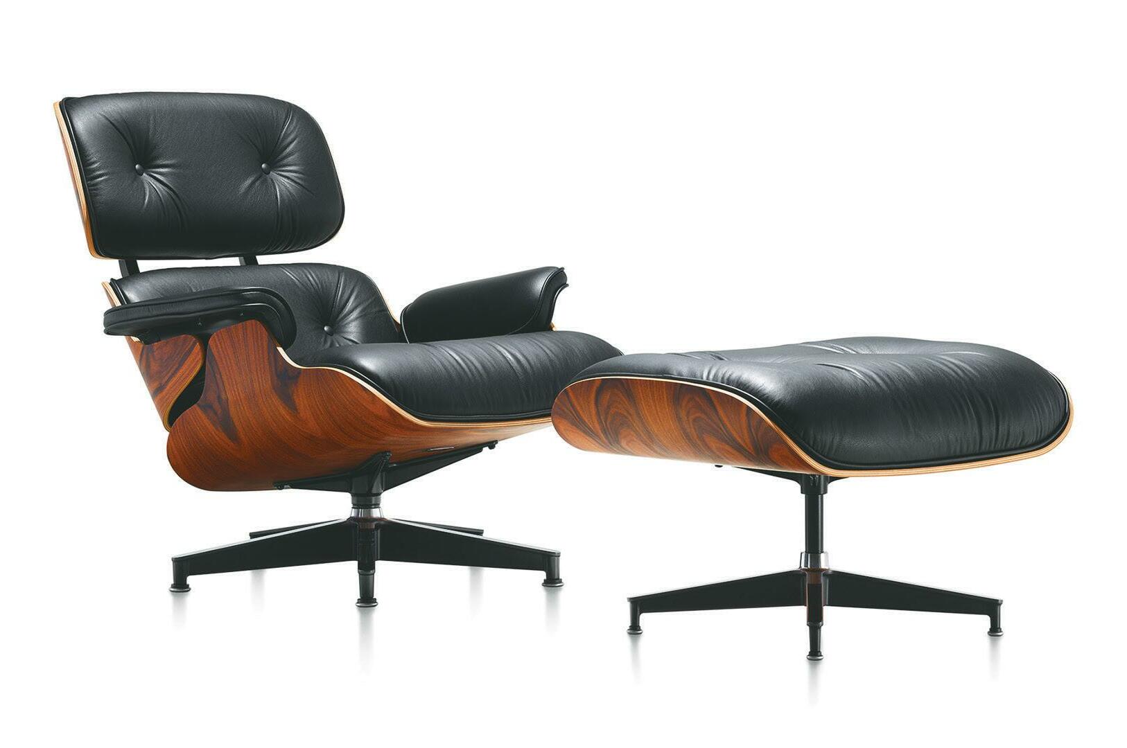

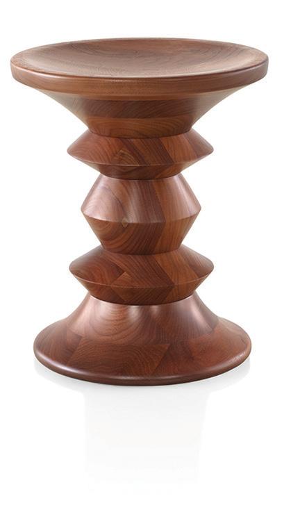

 herman miller carl hansen vitra kartell bensen knoll flos artek artifort foscarini moooi and more! visit hivemodern.com or call toll free 1 866 663 4483 free delivery within the continental u.s.
INTEL 21 FIRST LOOK
The latest introductions in the world of design, including a stunning collaboration between Lalique and artist James Turrell, fashion designer Guo Pei’s work for the Rug Company, and the latest prefab cabins, crafted with the hospitality industry in mind.
GRAY AWARDS 25 INTRO
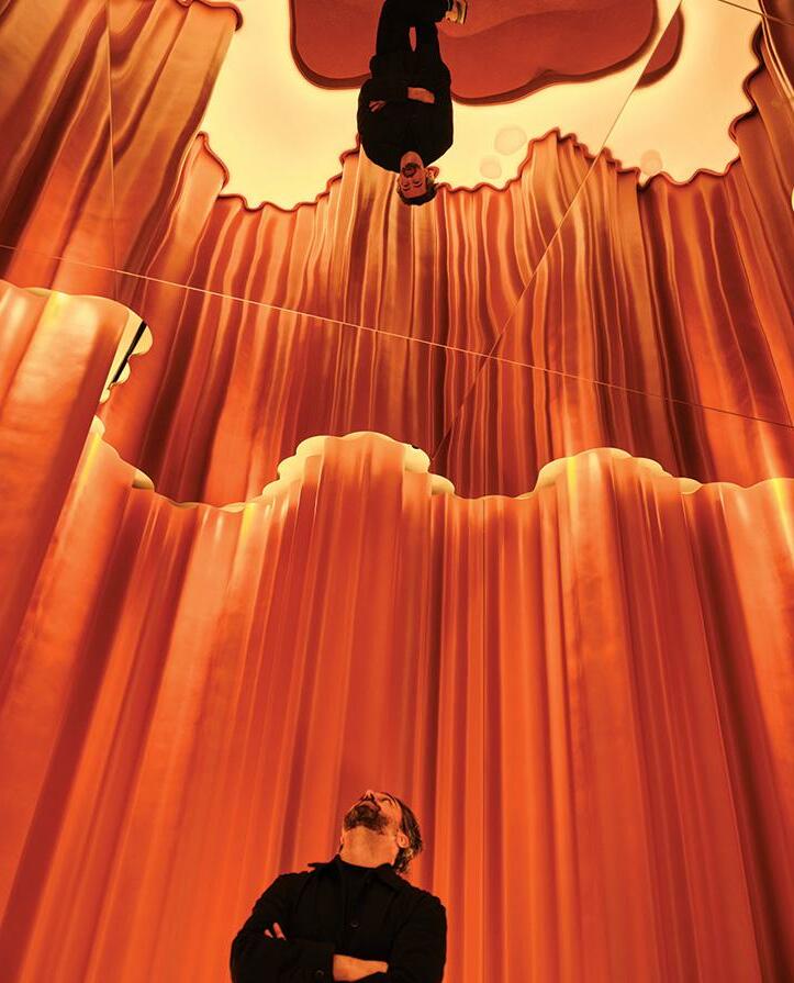
A mixed-use parkade in Calgary and an architectural installation in the heart of Times Square are among the forward-thinking designs that have earned top honors in this year’s GRAY Awards competition.
28 LEGACY
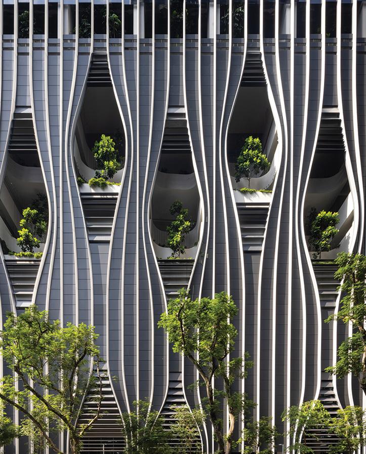
GRAY presents this year’s Legacy Award, a recognition of a respected and influential member of the Pacific Northwest design community.
34 . DESIGN FOR GOOD
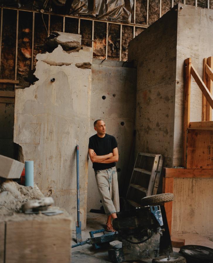
The product of more than 10 years of planning, the first commercial project in Oregon built entirely with mass timber construction is named this year’s Design For Good winner.
8 GRAY
XX N O 67 : THE LEGENDS ISSUE 42 21 28
on the cover
38 JUDGES
The GRAY Awards 2022 judges’ category winners were scored and selected by Ini Archibong, Paul Cocksedge, Paolo Ferrari, Holly Hunt, Patrick Lam, and Mia Lehrer. GRAY talked with them about their portfolios and their outlooks on design.
52 JUDGES’ CATEGORY WINNERS
World-class architecture, interiors, landscapes, and product design.
96 HONORABLE MENTIONS
This year, GRAY introduces a new section of the competition: Honorable Mentions. From best lounge to best home office, these are the niche category winners, chosen by the team at GRAY.
LAST CALL 109. CONCIERGE
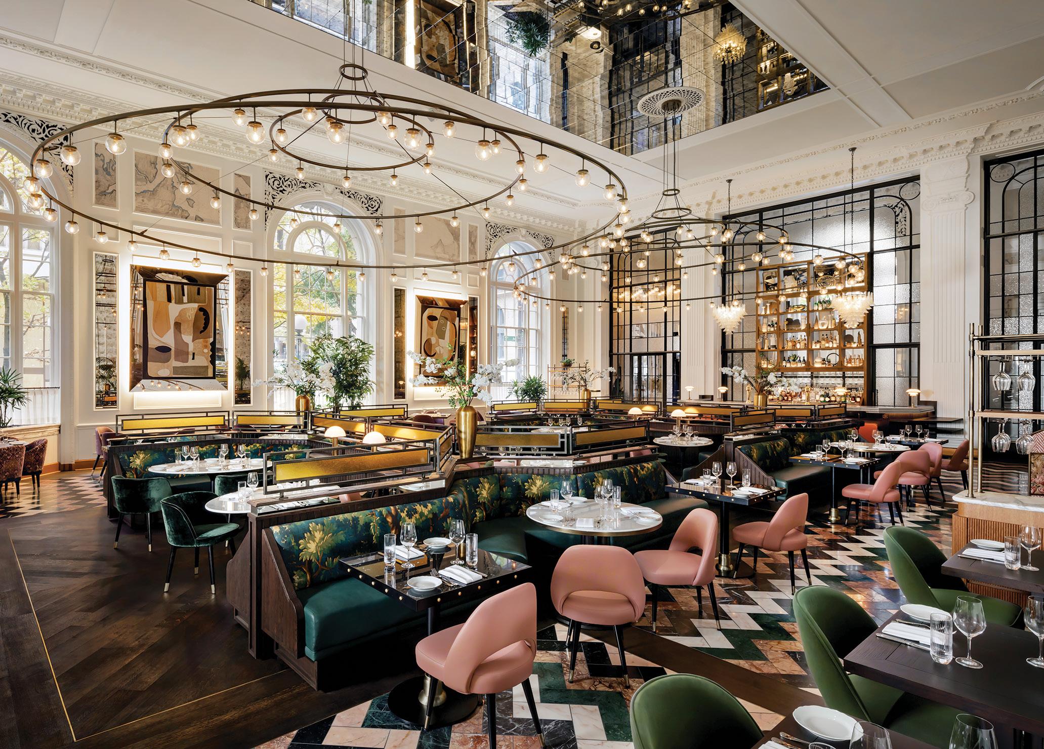
The Fairmont Olympic Hotel’s restaurant reopens with a sophisticated design that embraces the property’s rich heritage.

GRAY 9
SEE PAGE
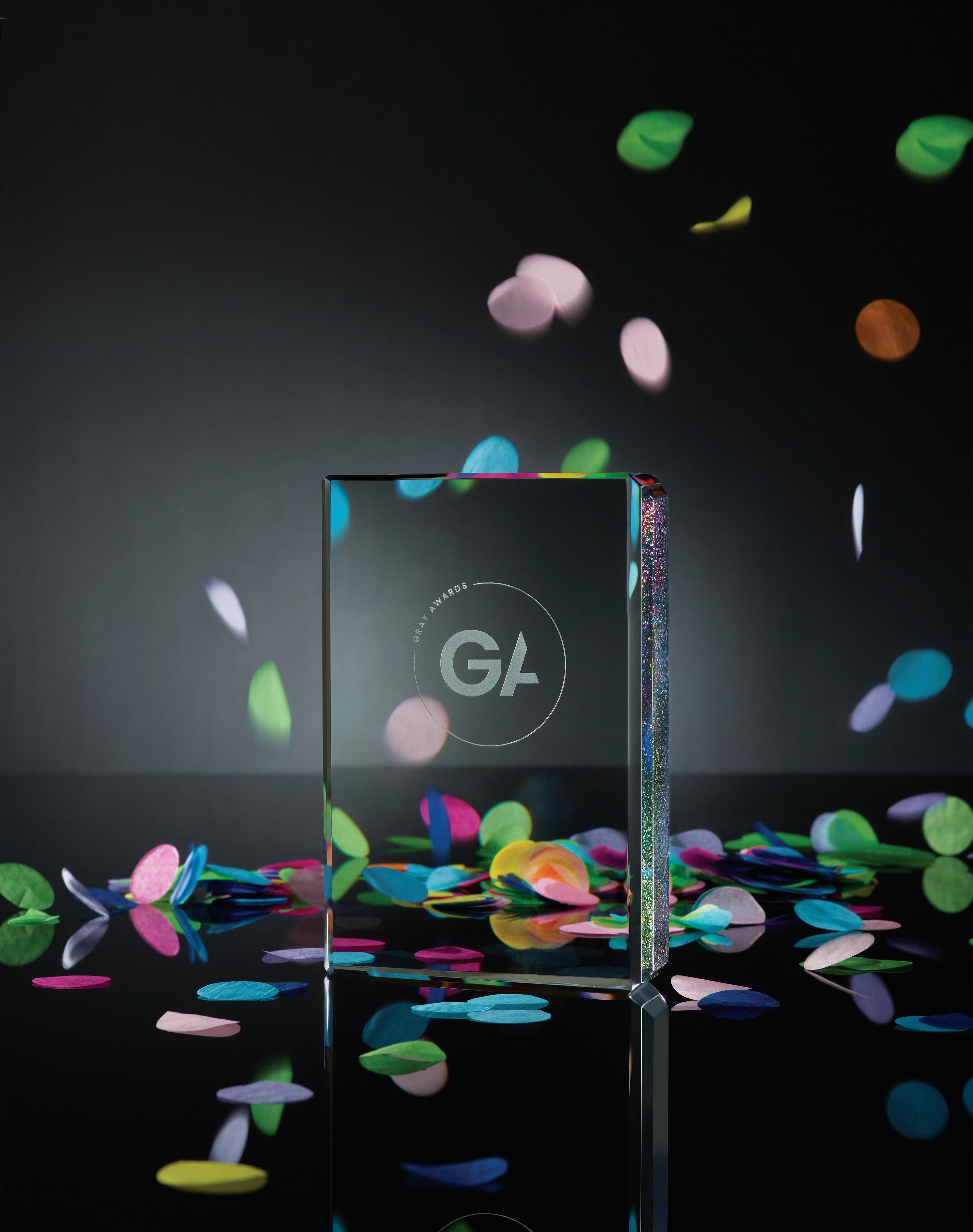
The 2022 GRAY Awards trophy, custom designed by renowned glass artist John Hogan. Photographed by Hank Drew
25
56 90 109
MASTHEAD
Publisher Shawn Williams
EDITORIAL
Deputy Editor Rachel Gallaher rachel@graymag.com
Copy Editor Christine DeOrio
ADVERTISING
Account Executive, International Shawn Williams
New Business Development John Spear Coffeehouse Media
STUDIO G Creative Director Meghan Burger
Sr. Digital Content Strategist Brandon Gaston
HEADQUARTERS Founder, CEO Shawn Williams shawn@graymag.com
Executive Services Manager Tracey Bjerke
Administrative Assistant Kendal Sinclair
INQUIRIES
info@graymag.com editors@graymag.com advertising@graymag.com events@graymag.com subscriptions@graymag.com accounting@graymag.com
SUBSCRIPTIONS
Subscribe at graymag.com
No. 67. Copyright ©2022. Published by GRAY Media, LLC. All rights reserved. Reproduction in whole or in part without written permission is strictly prohibited. While every attempt has been made, GRAY cannot guarantee the legality, completeness, or accuracy of the information presented and accepts no warranty or responsibility for such.
POSTMASTER send address changes to: GRAY Media, LLC 1709 124th Avenue N.E., #896 Lake Stevens, WA 98258 United States
Instagram, TikTok, YouTube: @gray_magazine #graymagazine #grayawards
CONTRIBUTORS
Hank Drew
(Cover photo; pg 25) is a studio photographer based in Seattle. He regularly photographs products for clients including Nordstrom, REI, Starbucks, and Amazon, and is also an editorial photographer for local and regional media.
Tomos Lewis (“Paul Cocksedge,” page 40; “Paolo Ferrari,” page 42) is a writer and radio journalist based in Canada. He was the Toronto bureau chief for Monocle and is currently its correspondent in the city. He has worked at BBC News in Washington, D.C., and Wales, and is a commentator on North American affairs for the BBC’s Welsh-language TV and radio news services. Lewis is a graduate of Columbia University’s School of Journalism, where he was a recipient of the Fulbright Alistair Cooke Award in Journalism.
Heidi Mitchell (“Ini Archibong,” page 38; “Mia Lehrer,” page 48) has been a writer and editor covering design, tech, culture, people, and places for the past 26 years. Starting as a staff editor at the seminal music and culture magazine Ray Gun, she has held positions at various publications, including Rolling Stone and Travel + Leisure, and was most recently editor-in-chief of Town & Country Travel Over the past few months, her work has appeared in Architectural Digest, Travel + Leisure, the New York Post, Chicago magazine, and the Wall Street Journal.
Additional Contributors
Thom Allen, Iwan Baan, Brandon Barre, Jeremy Bittermann, James Brittain, B-Roll Project, Mark Cocksedge, Craig Collins, Joel Esposito, Pieter Estersohn, Finbarr Fallon, Joe Fletcher, Leonid Furmansky, Fahim Kassam, Daniel Kaven, Dion Yuyan Lin, Peter Lustyk, Kara Mercer, Stephen A. Miller, Meghan Montgomery, Uzo Oleh, Jason O’Rear, Andres Orozco, Patricia Parinejad, Kevin Scott, Rafael Soldi, Lara Swimmer, Billy Rood, Cody Ulrich, Adam Joseph Wells, When They Find Us
10 GRAY LEGENDS
 fieldworksconcrete.com
Architecture: Chadbourne + Doss Concrete: Fieldworks Custom Concrete
Photo: Kevin Scott

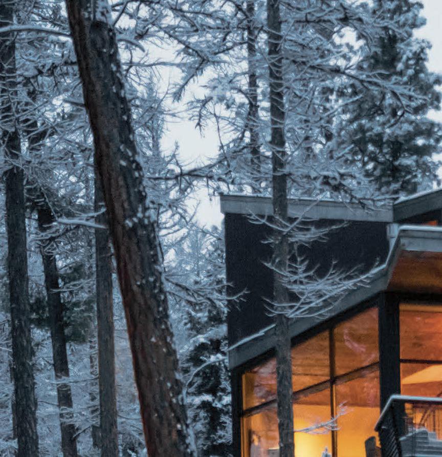
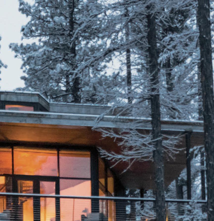

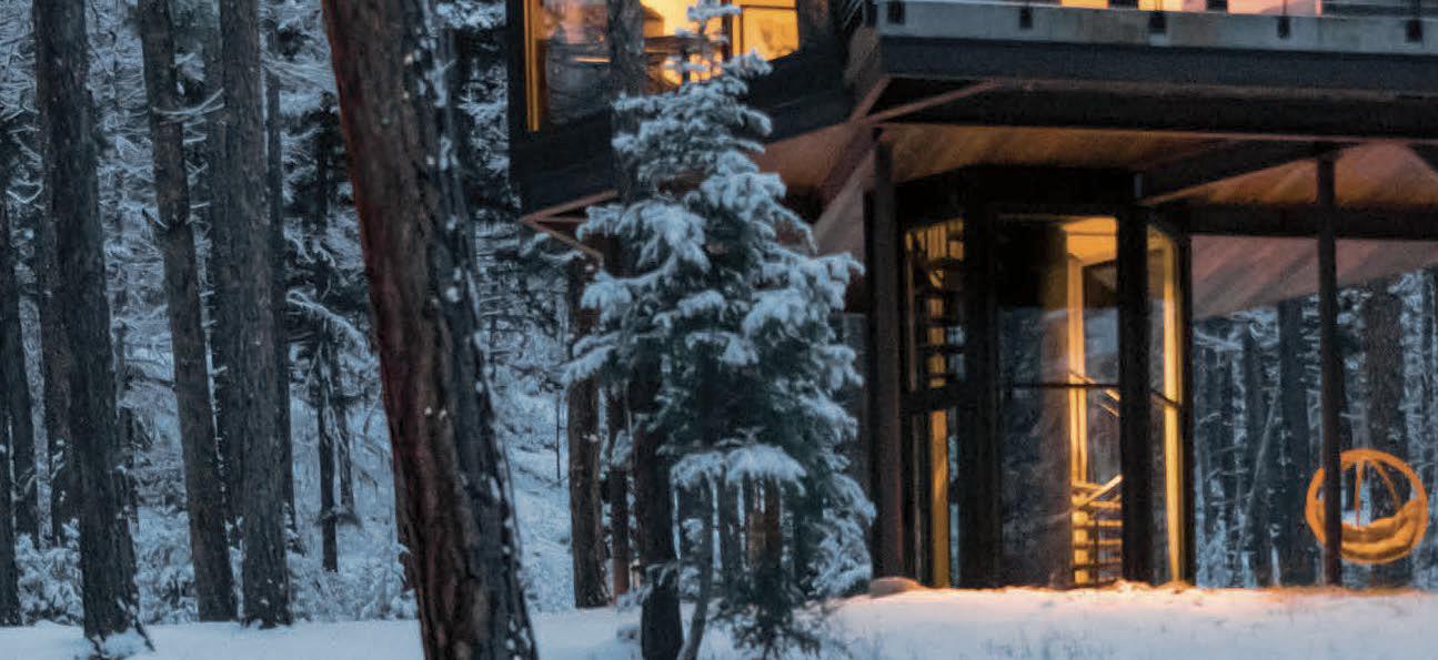


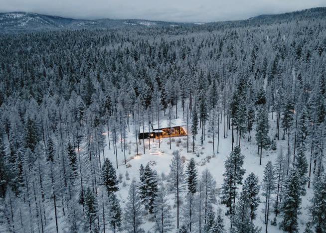


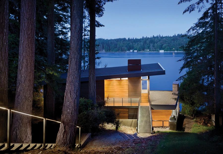
© 2022 The Last Best Beef LLC thegreeno.com I Greenough, Montana I 877-278-8979 Ra re i s t h e re s o r t t h at c a n b o a s t i m p e cc a b l e a rc h i te c tu r a l d e s i g n , u nmatc he d p ri va c y and wo r l d - c l a s s amen i t i e s Rare r s t i l l , o ne t hat provides all this a nd a nonstop parade of M ont ana ’ s finest wildlife just beyond your window B ut that ’ s the promise of each and ever y H aus at the gre en o E xquisitely designe d with floor-to - ceiling views and materials in per fe c t sync with your surroundings , you ’ ll discover out here, the line bet we en where nature ends and luxur y begins is ver y fine inde e d . Please join us THIS IS NOT YOUR KID’S BACKYARD TREE HOUSE.


AFTER A GRAND MULTI-MILLION DOLLAR RENOVATION FAIRMONT OLYMPIC IS SEATTLE’S PLACE TO BE TO FIND OUT MORE CONTACT US AT 206 621 1700 OR FAIRMONT.COM/SEATTLE
ARCHITECTURE + INTERIORS
The following design firms are among the best in the world, and are included here on an invite-only basis. We are proud to call them our partners. Consider them first for your next project.
To learn more about each firm, visit graymag.com
First Lamp firstlamp.net
 Eggleston | Farkas Architects eggfarkarch.com


babienko ARCHITECTS pllc babienkoarchitects.com Atelier Drome atelierdrome.com BC&J Architecture bcandj.com Baylis Architects baylisarchitects.com Board & Vellum boardandvellum.com Designs Northwest Architects designsnw.com GATH Interior Design gathinteriordesign.com Garret Cord Werner Architects & Interior Designers garretcordwerner.com


Steelhead Architecture steelheadarchitecture.com Workshop
AD workshopad.com
Minarik Architecture minarikarch.com H2D Architects h2darchitects.com Guggenheim Architecture + Design Studio guggenheimstudio.com
William / Kaven Architecture williamkaven.com



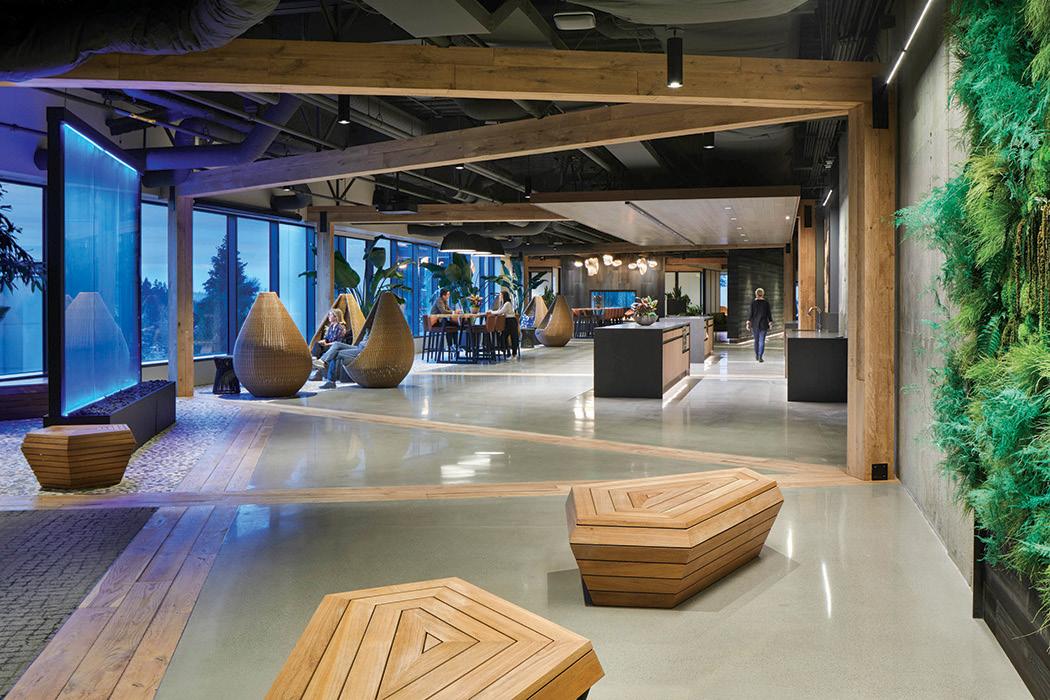 SCOTT | EDWARDS ARCHITECTURE LLP seallp.com
Tyler Engle Architects tylerengle.com Uptic Studios upticstudios.com
skylab skylabarchitecture.com
Hyde Evans Design hydeevansdesign.com jpcarchitects.com


ARCHITECTURE INTERIOR LANDSCAPE PRODUCT FASHION LUXURY COMMERCIAL RESIDENTIAL DÉCOR + FURNISHINGS PRODUCT DESIGN WORKSPACE HOSPITALITY INTERVIEWS DISCOURSE FOR THE A+D TRADE FOR CONSUMERS DYNAMIC GLOBAL GRAY MAGAZINE ALL NEW IN 2023 SUBSCRIBE TODAY GRAYMAG.COM/SHOP



AS SEEN IN ISSUE NO. 60 ANSON SMART; NO. 63 YONG JOON; NO. 50 KAST; NO. 65 RHONISHA FRANKLIN/R.DIONE PHOTO; NO. 56 LAURIAN GHINITOIU
A Revolution in Furniture



ResourceFurniture.com New York City Los Angeles Calgary Washington, D.C. Seattle Vancouver San Francisco Toronto Mexico City
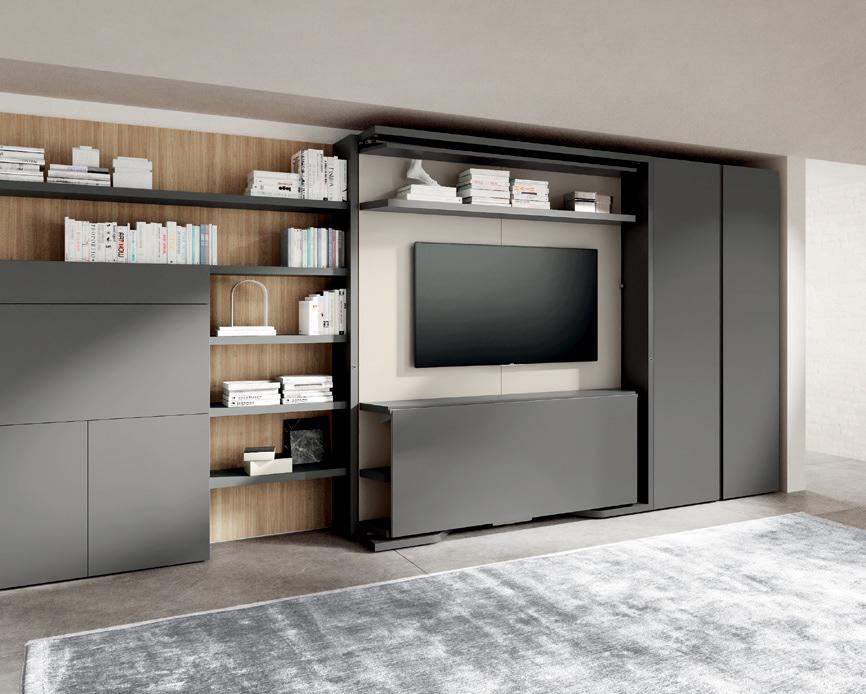
Meet the LGM 2.0: A new concept in flexible furnishings. Italian-made and endlessly customizable, the LGM 2.0 wall bed revolves 180° to reveal a queen bed. With an optional TV mount, shelving, and fixed or removable table, your imagination is the limit.
ResourceFurniture.com
LGM
2.0 Revolving Wall Bed & Home O ce System
New York City Los Angeles Calgary Washington, D.C. Seattle Vancouver San Francisco Toronto Mexico City
New

 By Rachel Gallaher
BOTTLED AMBITION
American artist James Turrell is known for working with light installations and space to create immersive environments that challenge a viewer’s perception of the world around them and create wonder. When French crystal brand Lalique asked him to collaborate on a collection, the scale of the work was much different—the Crystal Light release includes two perfume bottles and a series of decorative crystal wall panels—but Turrell’s approach was not. “The
light I am interested in is the one we see with our eyes closed, the one in our dreams,” he says. “The aim of my work is to enable people to perceive this same light while they are awake, with their eyes open.” Inspired by the 1912 Zane Grey novel Riders of the Purple Sage, Turrell attempted to capture the beauty of the American West through the ethereal tones of the arid desert and its brilliant sunsets. »

GRAY 21
and noteworthy in global design.
INTEL
COURTESY LALIQUE
GOING SOLO
Opening on December 10, 2022, the first major solo exhibition featuring the work of Ole Scheeren will examine the German architect’s career, his innovative approach to design, and his buildings’ impact on cityscapes around the globe. Known for his complex and technologically advanced structures, Scheeren has won several awards for his work, including the inaugural Urban Habitat Award from the Council on Tall Buildings and Urban Habitat in 2014. The exhibition, titled Ole Scheeren : spaces of life, will focus on the human experience of architecture with immersive installations in
HOME COUTURE
Deck out your home runway-style with the recently released collaboration between the Rug Company and renowned Chinese couturier Guo Pei. Comprising seven new rugs and two cushions, the Opulent Nature collection is inspired by Chinese history and designed with Pei’s customary attention to detail. Incorporating nods to traditional Chinese tailoring—as well as motifs that include waves, clouds, florals, and lions—the elegant, intricate patterns are informed by centuries-old storytelling and a deep respect for beauty. “In developing the Opulent Nature collection, I wanted to tap into the rich heritage and tradition of Chinese culture,” Pei says. “It was important to reflect its beauty through the carefully curated application of motifs, symbols, and ideas, and to develop them in a visually engaging manner.”

the large atriums at the ZKM | Center for Art and Media in Karlsruhe, Germany. “Ole Scheeren’s projects are the result of intensive experimental urban field research,” says Peter Weibel, artistic and scientific director of the ZKM. “They are stunning aesthetic solutions to social and ecological considerations.”

22 GRAY
INTEL FIRST LOOK THE RUG COMPANY; ©BURO-OS,
IWAN BAAN
MOD SQUAD 2.0
The latest newcomer to the modular cabin market is Nokken, a company that’s bridging the gap between glamping and luxury hotel accommodations by offering hospitality operators adaptable units that can be easily launched and scaled. Designed by London-based interiors and branding studio Aylott + Van Tromp, Nokken cabins come in 15 base footprints, all with customizable luxury fixtures and finishes. (Standard Edition models have dark-stained softwood paneling and natural softwood ceilings and flooring to contrast with black walls.) Nokken also offers interior styling packages that feature top
GARDEN OF DESIGN DELIGHTS

Singapore’s newest high-rise, one of the city’s tallest buildings, unites nature and community with its dynamic interplay of public space and greenery. Designed by BIG - Bjarke Ingels Group and Carlo Ratti Associati, CapitaSpring is located in the heart of Singapore’s financial district on the site of a former parking garage and hawker center (an open-air complex with stalls for food vendors). The 51-story building—which includes offices, residences, public spaces, restaurants, and a new hawker center—offers street-level garden paths that lead into a large, pedestrian-friendly plaza at the foot of the tower, a space designed to integrate the new structure with the surrounding neighborhood. A rooftop garden with sweeping views of the city is home to more than 150 species of fruits, vegetables, herbs, and flowers that supply the building’s restaurants. h
contemporary furniture, lighting, and accessory brands, including Verden, Menu, Ferm Living, Takt, and more. In addition to being completely customizable, the units are available in both on-grid and off-grid versions, and are designed to have a minimal impact on the environment.

GRAY 23
AYLOTT + VAN TROMP; FINBARR FALLON

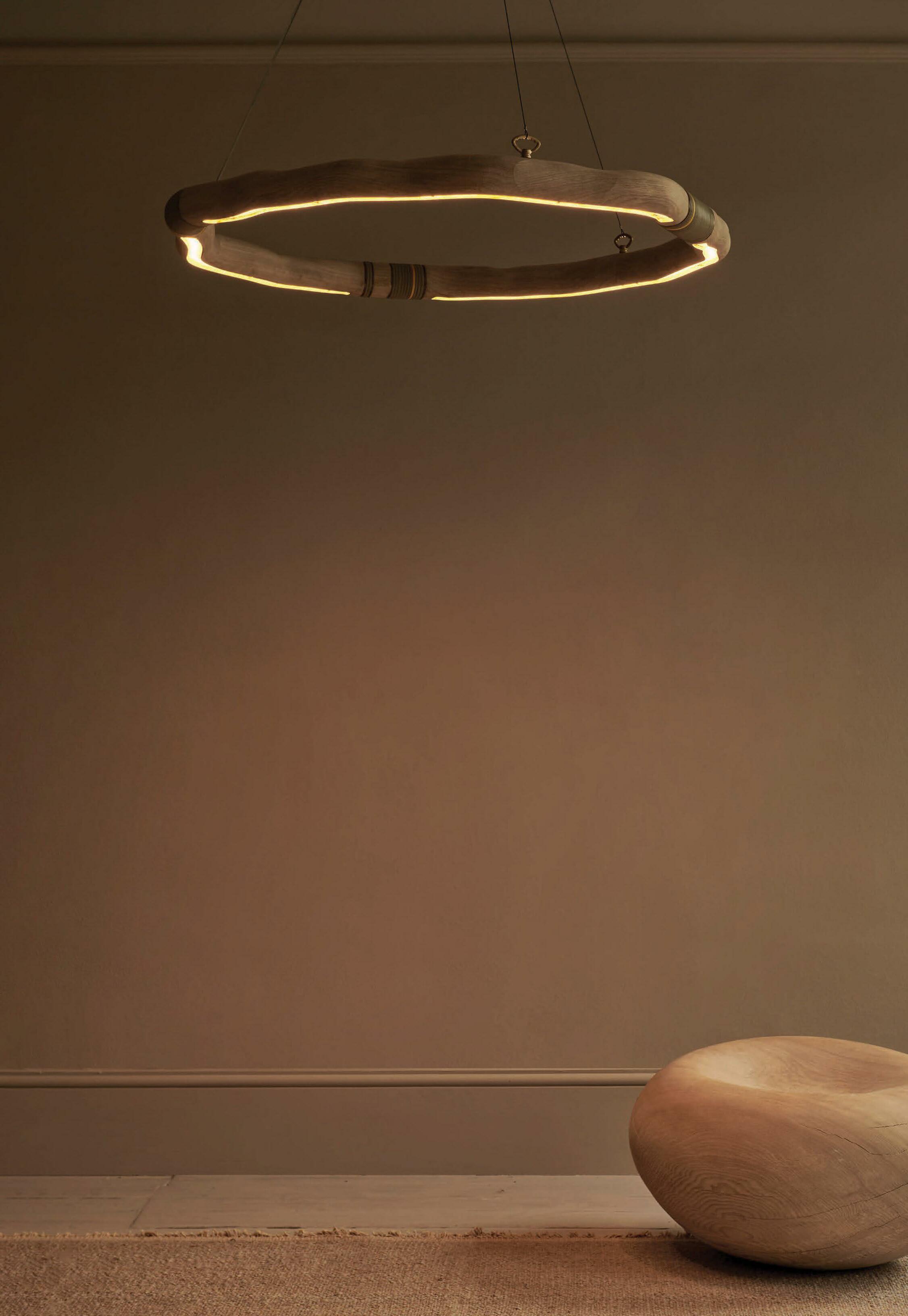
FOLLOW FOR INSPIRATION @SEATTLEDESIGNCENTER 5701 6TH AVE S. SEATTLE, WA OPEN M - F 9AM TO 5PM SAT BY APPOINTMENT SEATTLEDESIGNCENTER.COM 22 SHOWROOMS THOUSANDS OF REASONS TO BE INSPIRED OCHRE, REPRESENTED BY TRAMMELL-GAGNÉ
GRAY AWARDS

GRAY 25
World-class architecture, interiors, landscapes, and product design.
The trophy for the sixth-annual GRAY Awards, custom designed by acclaimed glass artist John Hogan.
HANK DREW
LEGENDARY DESIGN
A mixed-use parkade in Calgary and an architectural installation in the heart of Times Square are among the forward-thinking designs that have earned top honors at this year’s GRAY Awards competition.
Designers are essential to making the world a better place. Creating spaces for tranquility, optimal functionality, and everyday ease across sectors, from healthcare to hospitality, designers are an endless source of innovative thinking. Since launching the GRAY Awards in 2017, we’ve seen more bold design statements come through the competition and a rise in spectacular collaborations and thoughtfully sustainable and regenerative built spaces. Through this competition, it has become clear that today’s creatives are ambitiously pushing against accepted norms to reach new levels of sophistication in luxurious and lasting works. It is our honor to present the 2022 winning projects.

THANK YOU

Inexhaustible drive and talent shone brightly in every project submitted to the competition. Thank you to everyone who entered and for the exceptional work that you put into the world. Thank you to our esteemed panel of judges, sponsors, partners, and everyone behind the scenes who make GRAY Awards special.


 ShawnShawn Williams, GRAY founder + CEO


26 GRAY LEGENDS
AWARDS
GRAY
#GRAYawards
SO MUCH MORE THAN BUILDING HOMES FOR THOSE LIVING OUTSIDE
Founded in 2010 by architect Rex Hohlbein, Facing Homelessness is a nonprofit organization built on the idea that we can end homelessness if we invite the community to be a part of the solution.

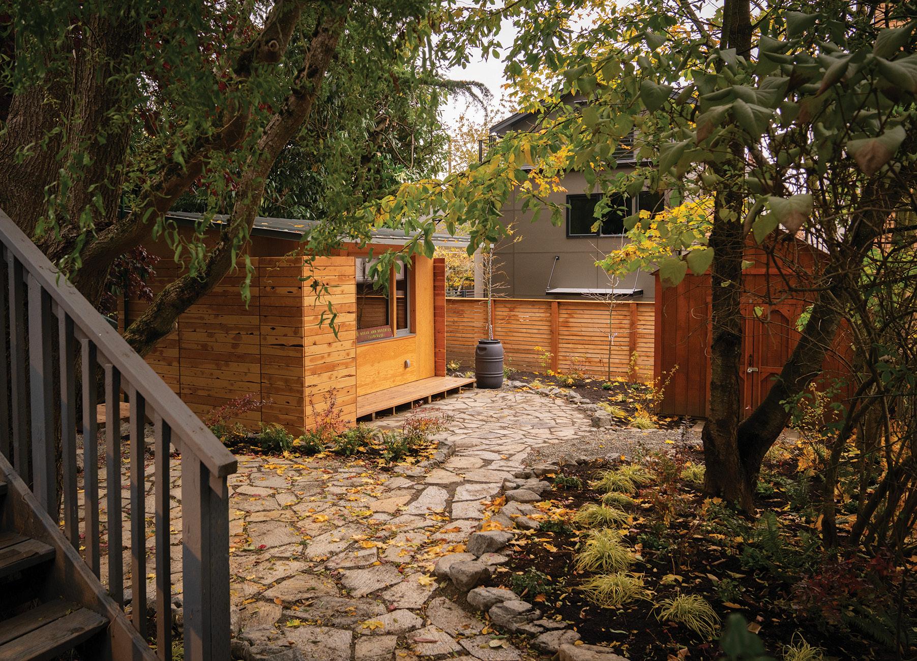
The Block Project, a Facing Homelessness program, builds healthy, fully equipped tiny homes for people experiencing homelessness. BLOCK Homes are permitted and placed in residential backyards throughout Seattle by welcoming homeowners. This model gives residents a place to call home and communities around the city an opportunity to make a real difference by supporting our unhoused neighbors and addressing the issue of homelessness together.
Be part of the solution; please donate today.

GRAY 27
CHARITY PARTNER
DONATE
WHITNEY
A tiny home designed by BLOCK Architects and built by Facing Homelessness with the help of community volunteers. Collaborators: Swenson Say Faget, FSi Engineers, Best Plumbing, West Seattle Electric, and Solterra. BARRON
PEPER
GRAY AWARDS: LEGACY
GRAY presents this year’s Legacy Award, a recognition of a respected and influential member of the Pacific Northwest design community.
 By Rachel Gallaher
28 GRAY LEGENDS
FAHIM KASSAM


GRAY 29 LEGACY 2022 WINNER OMER ARBEL WILD • CARD 2022 WINNER CLB ARCHITECTS WILD • CARD 2022 WINNER CLB ARCHITECTS D E SIGN FOR GOO D 2022 WINNER WAECHTER ARCHITECTURE
Omer Arbel, founder of multidisciplinary design studio Omer Arbel Office and
and creative director of Vancouverbased lighting company Bocci. THIS PAGE: A Bocci 44 light fixture.
FAHIM
KASSAM OPPOSITE:
co-founder

30 GRAY LEGENDS
GRAY AWARDS: LEGACY
FAHIM KASSAM
THIS PAGE, FROM TOP: Designer Omer Arbel; an installation of Bocci 100 lights at the Wilhelm Hallen gallery in Berlin. OPPOSITE: Bocci 28 lights.

As a child with a creative spirit and a penchant for crafting things, Omer Arbel knew he wanted to be part of the design industry. He set his sights on a career in architecture, but once he arrived at university, he discovered that his true passion was not for the planning or sketching stages, but for the physical act of making.

“I quickly saw that my talent, and the thing that brought me the most joy, was working with my hands,” says Arbel, who is best known as the co-founder and creative director of Vancouver-based lighting company Bocci, which he launched in 2005 with Randy Bishop. “In retrospect, it seems almost random,” he says of his association with lighting. “I was making other things at the time too, but lighting is the one that stuck on a mass scale. What really interests me are the materials and processes. The work is the method that we’ve developed, and the artifacts produced are interesting but secondary.”
Originally from Jerusalem, Arbel moved to Vancouver with his family at age 13. As an adolescent, he was a competitive fencer who made the Canadian Junior National team and ranked in the top 20 at the Junior World Championships. After high school, Arbel studied architecture at the University of Waterloo, and five years after graduating, he
established Omer Arbel Office (OAO), a multidisciplinary creative studio with a broad output that includes architecture, lighting, art, and materials studies (Arbel designed the medals for the 2010 Olympic and Paralympic Winter games, held in Vancouver). OAO and Bocci work synergistically, with a focus on experimentation and the development of ideas.
“Architecture and industrial design are not separate in our studio,” Arbel says. “Our process is to make work without a brief, then we sit down a few times a year and look at everything we’ve made to see what the works want to be. Some things apply to architecture, others to product, and some are too expensive and difficult to create.”
Bocci launched with the 14 pendant light—a cast-glass sphere that can be hung individually or in large clusters—and grew to offer various lighting options, from wall sconces to table lamps. The company’s popularity soared as homeowners and designers saw Bocci’s customizable lighting solutions as »
GRAY 31
FAHIM
KASSAM; PATRICIA PARINEJAD
pieces that blur the line between art and design, while tapping into the Northwest’s history as a glassblowing hotspot. Arbel’s unique approach to his work also captures the region’s creative spirit.
“Vancouver is only around 130 years old,” he says. “I enjoy that sense of youthfulness. There’s less infrastructure for really cerebral work, but on the other hand, the newness has a kind of optimism that’s exciting and refreshing. It’s a wonderful place to make new work and think about new ideas.”
In September 2022, Arbel used the annual London Design Festival to explore ideas surrounding materials, history, art, and creation, transforming the John Madejski Garden at the Victoria & Albert Museum into an immersive glassblowing experience that was part maker demonstration and part art performance. Titled Material Experiments, the nine-day project produced a series of 113 sculptures. The pieces were the results of a process in which glass forms are filled with

copper alloy that causes the glass to shatter as it cools, revealing sculptural shapes that capture the moment of transformation.
“In my fantasy, I wanted to use objects from the museum’s permanent collection,” Arbel says, “but obviously they said no, so we used pieces we found at flea markets and secondhand stores.”
Rebellion is a throughline in much of Arbel’s work. But what initially comes off as irreverence is actually part of a deep-seated curiosity that the designer uses to evolve his craft and challenge entrenched notions about design. Currently, the studio has three residential projects on the books, and there are plans for a studio in Berlin and a five-story Bocci headquarters in Vancouver. When asked what keeps him working in the design industry, Arbel replies with a hint of incredulity: “What else would I be doing? I don’t really have much of a choice.” h
32 GRAY
LEGENDS GRAY AWARDS: LEGACY
FAHIM KASSAM
THIS PAGE: The 64 candle—the result of a project by Arbel in which molten beeswax is cooled around a wick inside a centrifugal chamber filled with shards of ice.
OPPOSITE: Material Experiments, which debuted at the 2022 London Design Festival, was a nine-day project by Arbel that produced a series of 113 sculptures at the Victoria & Albert Museum.

GRAY 33
FAHIM KASSAM
GRAY AWARDS: DESIGN FOR GOOD

34 GRAY LEGENDS
GRAY 35 2 OMER ARBEL D E SIGN FOR GOO D 2022 WINNER WAECHTER ARCHITECTURE D E SIGN FOR GOO D 2022 WINNER WAECHTER ARCHITECTURE
MISSISSIPPI
LARA SWIMMER
GRAY AWARDS: DESIGN FOR GOOD
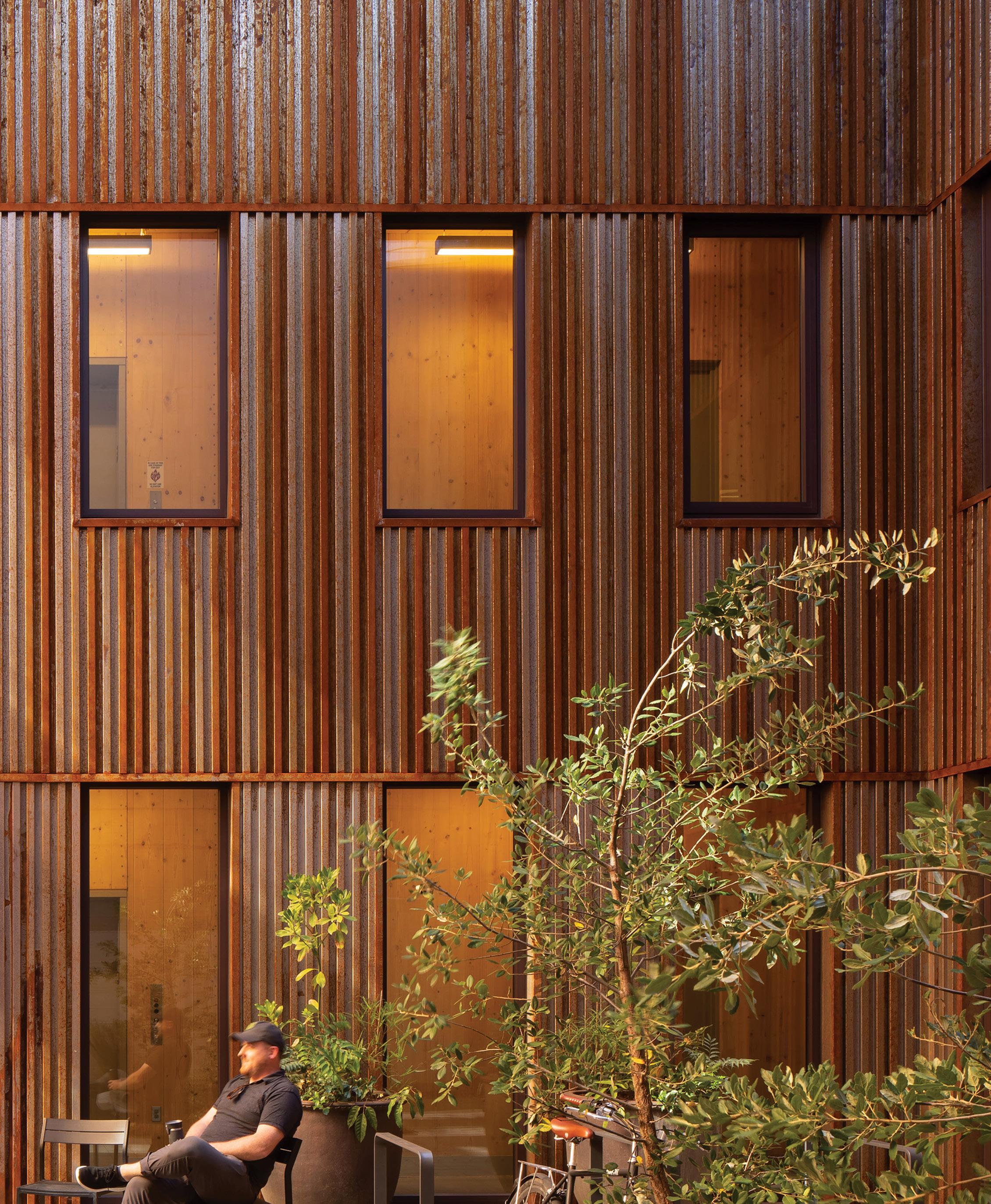
Mississippi, a project designed by Portland-based Waechter Architecture, is the first commercial project in Oregon built entirely with mass timber construction. Named after the prominent commercial avenue along which it sits, the building is located on an infill site, and is, as the firm writes in its entry, “envisioned as a prototype that seeks harmony between individuality and community, flexibility and permanence, and new expression and timeless elegance.”

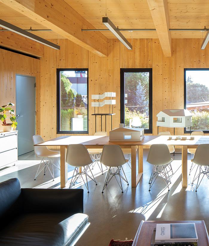
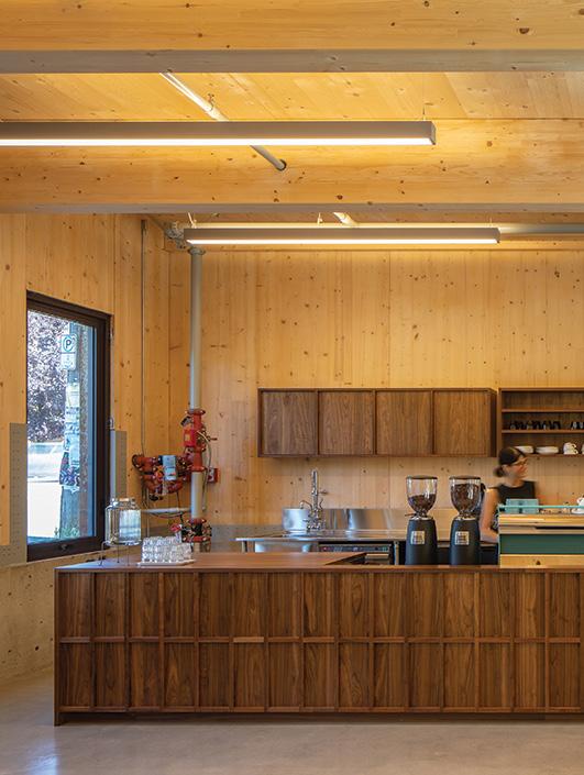
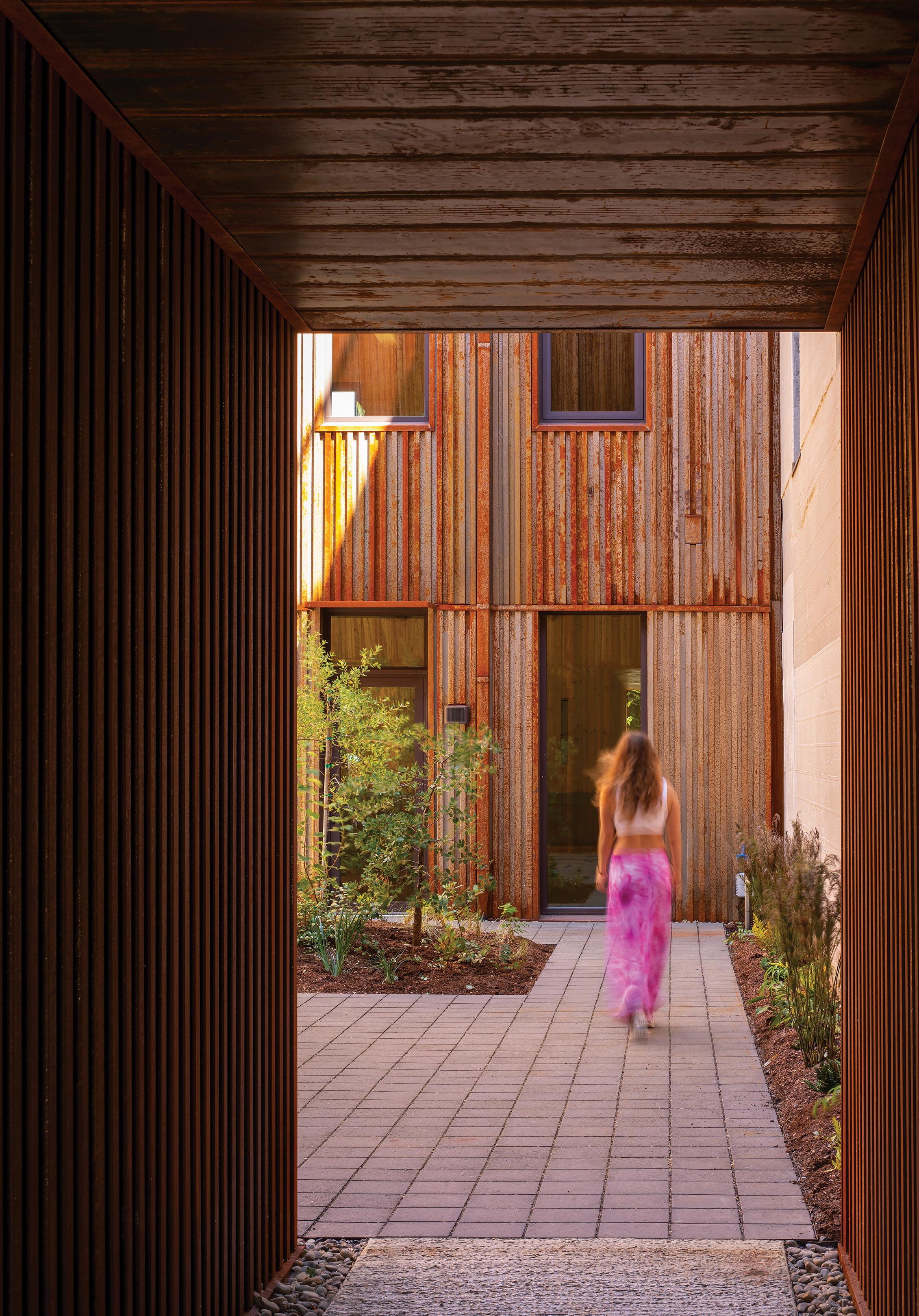
The product of more than 10 years of planning, Mississippi was designed and developed by Waechter Architecture to prove the feasibility of sustainable building systems and construction technologies, and to serve as a forum for new creative conversations. “Other than a ‘rain jacket’ of weathering steel on the exterior and radiant concrete flooring, all surfaces within the building are exposed wood without the need for additional finishes or fireproofing,” the firm notes. “This approach creates a simplicity and wholeness that is absent in standard CLT or traditional frame projects, and creates spaces with uncommon warmth, beauty, and durability.”
The building is divided into six equally sized rooms, which are stacked in three tiers on each side of a shared courtyard. A compact service and circulation section along the building’s northern edge connects these two wings and houses bathrooms, stairs, and elevators, while providing the infrastructure for future kitchen and bathroom plumbing tie-ins for the main spaces. At the heart of Mississippi is the open-air courtyard that can be used for events, relaxation, and gathering.
Built to be flexible and adaptable, the building was created with the best intentions for the users and the environment. “Every decision, from the building’s organization to the selection of highly efficient materials and building systems, such as all-electric, refrigerant-free, hydronic heating and cooling systems, embodies the principles of resilience and enduring design,” the firm writes. “The ultimate goal is to create a future-proof building that also possesses a strong sense of identity, grace, and permanence.” h
PROJECT DETAILS
DESIGN TEAM
Ben Waechter, Alexis Coir, Emily Kappes, Duncan Scovil, Giovanni Sidari
COLLABORATORS
Structural and Civil Engineer: KPFF Mechanical Engineer: Hood-McNees Contractor: Waechter Architecture with Owen Gabbert LLC
LOCATION
Portland, Oregon, United States
DATE OF COMPLETION July 2022
36 GRAY LEGENDS
LARA SWIMMER


GRAY AWARDS: THE JUDGES INI ARCHIBONG
By Heidi Mitchell
Trying to put a singular label on Ini Archibong is impossible. The Southern California native is agnostic when it comes to taking on projects (he’s dabbled in a spectrum of mediums, from sculpture to music to architecture), and even though he was trained as an industrial designer, a discipline that undoubtedly informs his choices, he’s not beholden to traditional industry standards.
“Any [work] of mine that people see is usually the first time I’ve done that,” Archibong says, adding that he’s happy to be described by the nebulous term “creative.”
The 39-year-old, who lives in the lakefront town of Neuchâtel, Switzerland, has worked with brands ranging from Hermès (on a reimagining of the classic Galop d’Hermès watch) to Bernhardt (in 2010, the furniture brand gave him the Student Designer of the Year Award as part of the American Design Honors at the annual International Contemporary Furniture Fair in New York). Other projects in his portfolio include an interactive sound installation for the Dallas Museum of Art, a film


short for Logitech, and the Pavilion of the African Diaspora showcased at the London Design Biennale.
“I don’t see all my work as different,” Archibong says. “It’s all the same thing to me. Anything that is creative, I just do it using the same process. The only thing that changes from one object to the next is scale and how people are affected by its presence.”
To Archibong, the key to unlocking a breakthrough design is contemplating scale and considering the available tools. “You don’t use a crane when you build a sofa,” he explains.
The storytelling aspect of each design takes Archibong’s work to the next level. Whether it’s a furniture collection for Knoll or a multisensory museum experience, the message is always front and center. “There is storytelling in every object we put around us,” Archibong says. “Sometimes it’s intentional, sometimes it doesn’t come from the designer but from the era. When I think about making an object, I try to think about the feeling being expressed, and I ask myself, ‘Where did I feel that?’— and from that flows color, texture,
and form.” Much like a fairy tale, his work casts a spell on the viewer, ideally bringing them to a place of empathy. “Even if it’s just telling yourself a story, that allows you to put yourself in a space that hopefully people can feel,” he says. “That is why storytelling has always been an integral part of art. The goal is to have viewers accept [as universal] something that may seem unusual.”
Archibong is the recipient of several major design awards, including, most recently, the prestigious Swiss Institute Design Award. In November, he opened his second solo show with Friedman Benda, this time in Los Angeles (his first show with the gallery, in 2021, was at its New York location). Despite the acclaim, he remains humble, curious, and eager for projects that will test his abilities. “I am an antenna,” he says. “I find inspiration when I’ve taken care of the practical stuff and my mind is clear.” It’s a testament to his inventiveness, and a solid reminder that every good story starts with a blank page. h
38 GRAY LEGENDS
COURTESY INI ARCHIBONG; UZO OLEH

GRAY 39
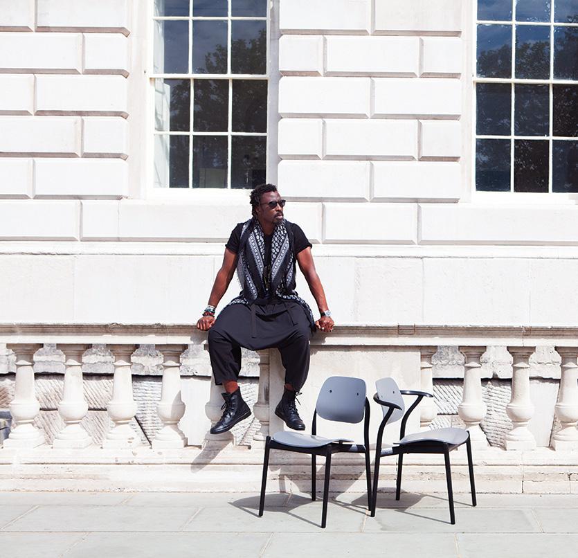
THIS PAGE: Pieces from the Below the Heavens furniture collection, designed by Ini Archibong for Sé. OPPOSITE, FROM
LEFT: A piece from Archibong’s first solo gallery show Hierophany, which debuted in 2021 at new York’s Friedman Benda. A close-up of a piece in Archibong’s 2019 Theoracle installation at the Dallas Museum of Art (in 2020 the designer updated and renamed the work To Be Determined in protest of violence against Black people). Designer Ini Archibong.
SÉ
COURTESY
GRAY AWARDS: THE JUDGES
40 GRAY
LEGENDS
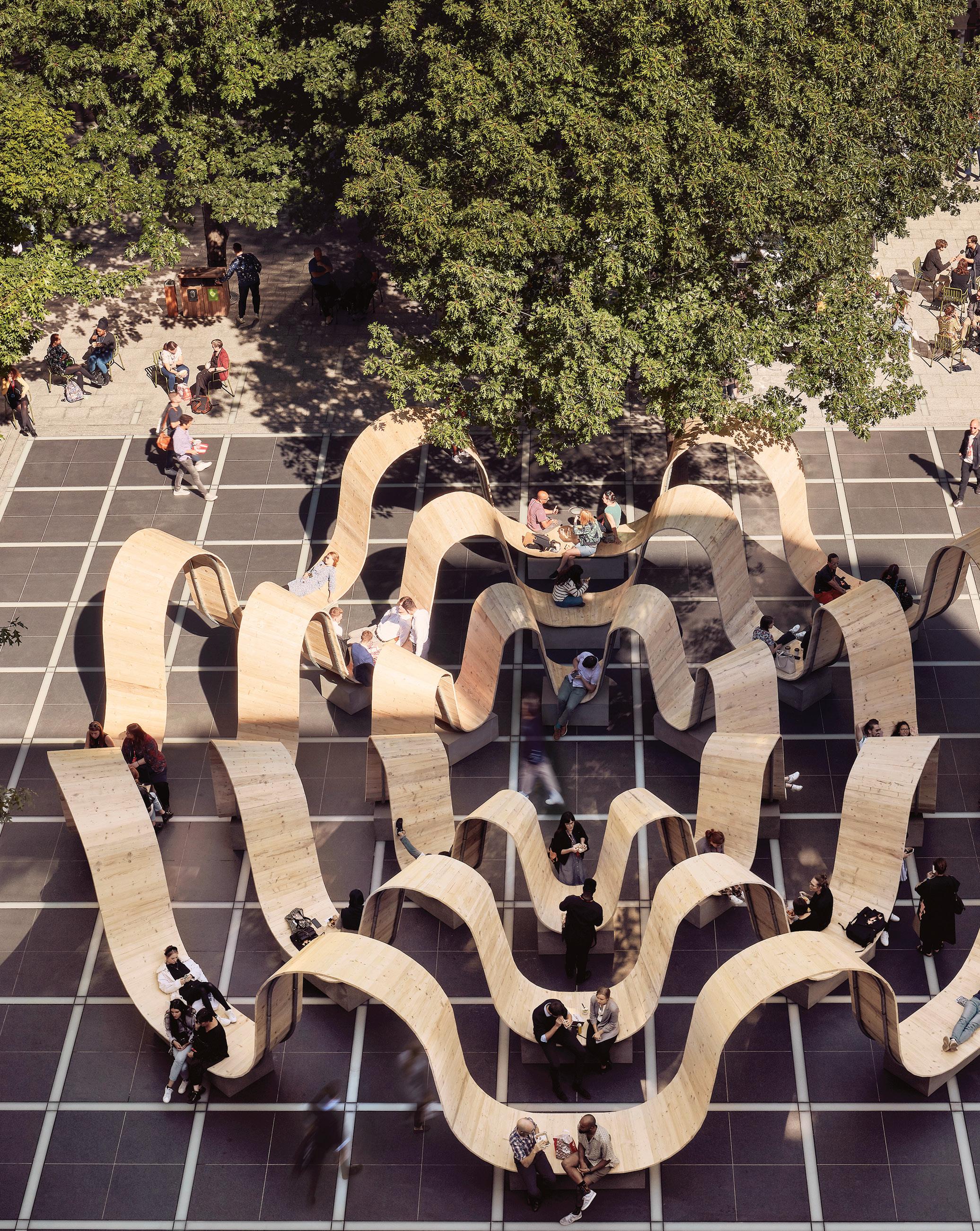
ABOVE: A commission by the London Design Festival and British Land, Please Be Seated was a temporary installation designed by Paul Cocksedge in 2019. OPPOSITE: Multidisciplinary designer Paul Cocksedge.
PAUL COCKSEDGE
By Tomos Lewis
During the United Kingdom’s first national lockdown in the spring of 2020, the acclaimed British designer Paul Cocksedge had an idea. The government recommended maintaining a 2-meter distance between people while meeting outdoors, so Cocksedge conceived a way, through design, to bridge the gap.

Here Comes the Sun is the name for the resulting circular picnic blanket. A large, central fabric ring is affixed with four round, fabric seating panels spaced at 2-meter intervals. The design allowed people to meet outdoors as spring eased into summer— at a physical distance, yet connected by the blanket’s central ring.
Cocksedge published the pattern online as a free download, encouraging people to make their own iterations with leftover fabric at home. It captured the public’s imagination and was later included in the V&A Dundee museum’s exhibition on socially distanced design.
“Joy is a fundamental, universal emotion,” says Cocksedge, who founded his namesake studio with his partner, Joana Pinho, in 2004. “As a designer, it makes total sense to aim for that, and I believe that it’s one of the key ingredients of great creative work. When you start investigating new ways of doing things, new materials, or ideas that you haven’t thought of before, that gives the most interesting results.”
That curiosity is evident in Cocksedge’s large and multifaceted body of work, which spans an array of forms—from an award-winning Bluetooth speaker design to the innovative Double O bicycle light— and materials, as evidenced by his 108-foot-long sculptural metal

sunshade under construction at the Oman Botanic Garden. “I like to stay open-minded and move in different directions,” he says. “If you come to a project with a set way of thinking, you end up with a set output. I’m more interested in letting the project take control. That’s what makes it so delightful and interesting.”
The studio’s recent projects include a permanent ceiling installation at Dior’s Peter Marino–designed flagship store in Paris. Titled Bourrasque Dior, the suspended assembly of curved, illuminated panels evokes sheets of paper blown in a breeze. Last year, Cocksedge’s landmark public sculpture, Time Loop—a coiling infinite loop made of sustainably sourced timber that doubles as public seating—was unveiled in Hong Kong.
“Working on many different projects lets my brain have ideas that can come from anywhere—any direction and any place; I just follow,” Cocksedge says. “What I’ve learned over the past 20 years is that ideas have to stay at the top; anything else is just a distraction.” h
GRAY 41
©MARKCOCKSEDGE
GRAY AWARDS: THE JUDGES PAOLO FERRARI
 By Tomos Lewis
Early in his career, Paolo Ferrari, the Toronto-based interior architect and furniture designer, was on a visit to Lake Como, in northern Italy. During the trip, a chance conversation with an antiques dealer about Ico Parisi, one of Italy’s great midcentury architects and furniture designers, yielded an idea that would become a guiding principle in Ferrari’s own work: A well-designed interior succeeds not solely in its disparate component parts, but as a whole.
“He had pieces by Parisi in abundance,” Ferrari says of the dealer. “I just fell in love with this idea of a completely holistic practice; thoughtful design at every touch point [in a space], from the entryway to the furnishings to the scaling-out of the complete vision for the interior. I’ve been pursuing that ever since.”
That ethos is evident throughout Ferrari’s international portfolio of work, which ranges from his genredefying design for a bar at a five-star hotel in Dubai to the more muted interiors of a private summer home
in the Canadian countryside.
“Some projects are about reconnecting with the restorative quality of nature; some are about escapism,” he says. “It’s really about understanding the aspiration of the client, and the guest, and seeking to create moments of awe. But a space should unfold effortlessly, and with an abundance of artistry.”
Ferrari was born in Toronto and is a graduate of the city’s Ontario College of Art & Design University (OCAD). “Canada is a very young country and, in turn, has a young history of design and architecture,” he says. That allows designers in Canada a nimbleness in their work. “We want to be rewriting the playbook, not following the rules,” he adds.
Ferrari has worked with international luxury brands including LVMH, Raffles, and Four Seasons, and he launched his namesake studio in Toronto in 2016. The firm’s team of 30 represents multiple design disciplines, Ferrari says.

“It’s not common for design studios to design every aspect of a project,” he adds. “But we are passionate about design, and we’re highly collaborative when we’re focused on designing an entire world.”
Studio Paolo Ferrari currently has projects underway in Europe, North America, Asia, and the Middle East. Notable among them are a new, firstof-its-kind luxury desert resort in Saudi Arabia, and the interior design for Forma, Frank Gehry’s landmark condominium towers in Toronto, which are scheduled to be completed in 2028. The fourth collection of Ferrari’s inventive, made-to-order Editions range of furniture and design objects (manufactured in Toronto) debuted in New York earlier this year.
“To me, the magic in the work that we do always comes back to the transportive quality of design,” Ferrari says. “I want to create experiences that will live with someone for a very long time.” h
42 GRAY LEGENDS
DION YU YAN LIN; JOEL ESPOSITO
GRAY 43
DION YU YAN LIN
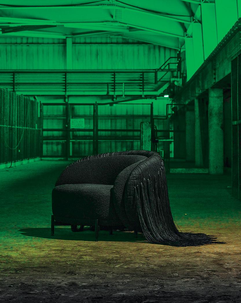
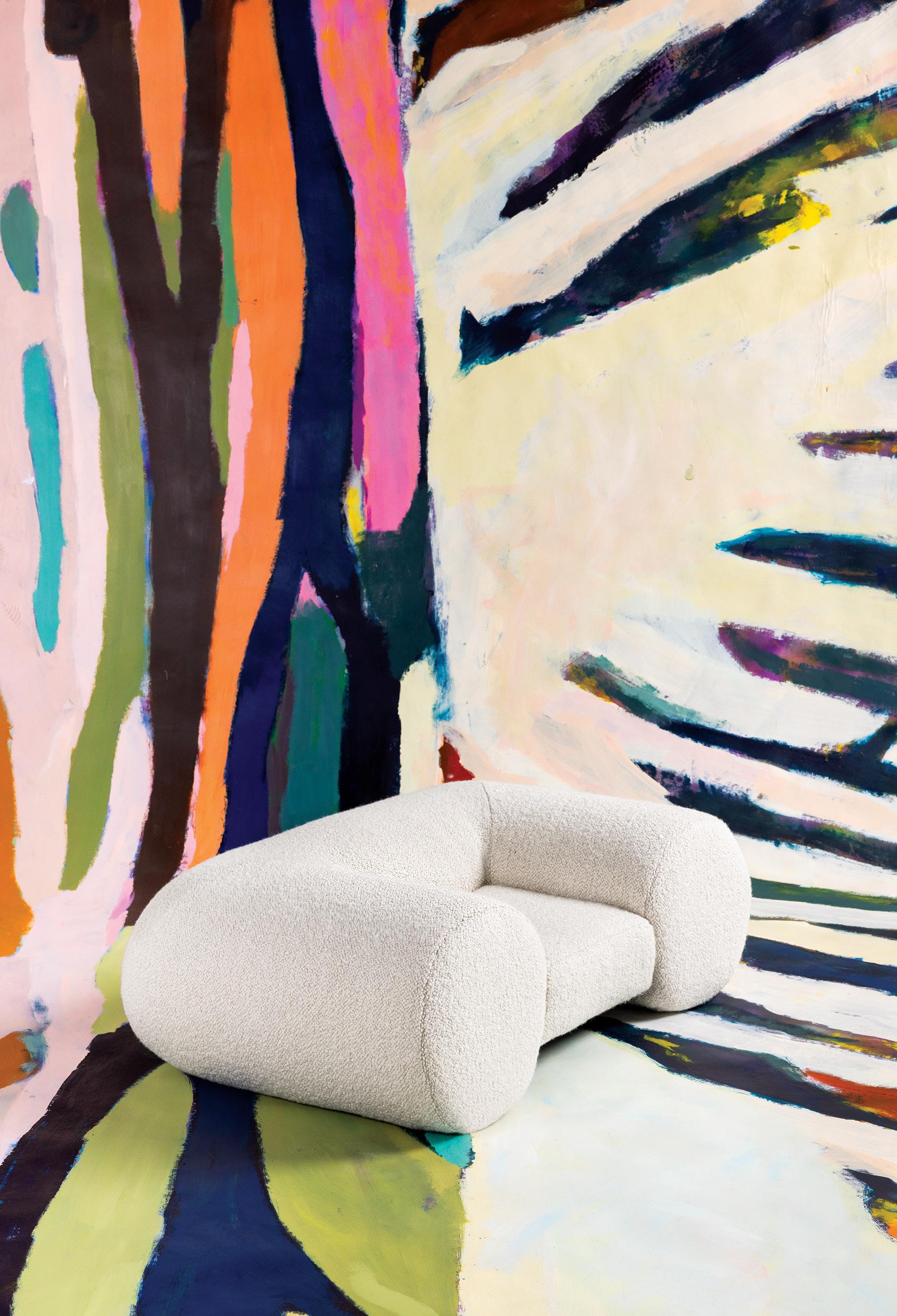
THIS PAGE: A mini sofa, designed by Paolo Ferrari for his Edition 4 collection (artwork by Lucas Biagini). OPPOSITE, FROM LEFT: The Ame Lamy chair, created in collaboration with Hiroko Takeda for the Edition 4 collection. Designer Paolo Ferrari.
GRAY AWARDS: THE JUDGES
44 GRAY LEGENDS
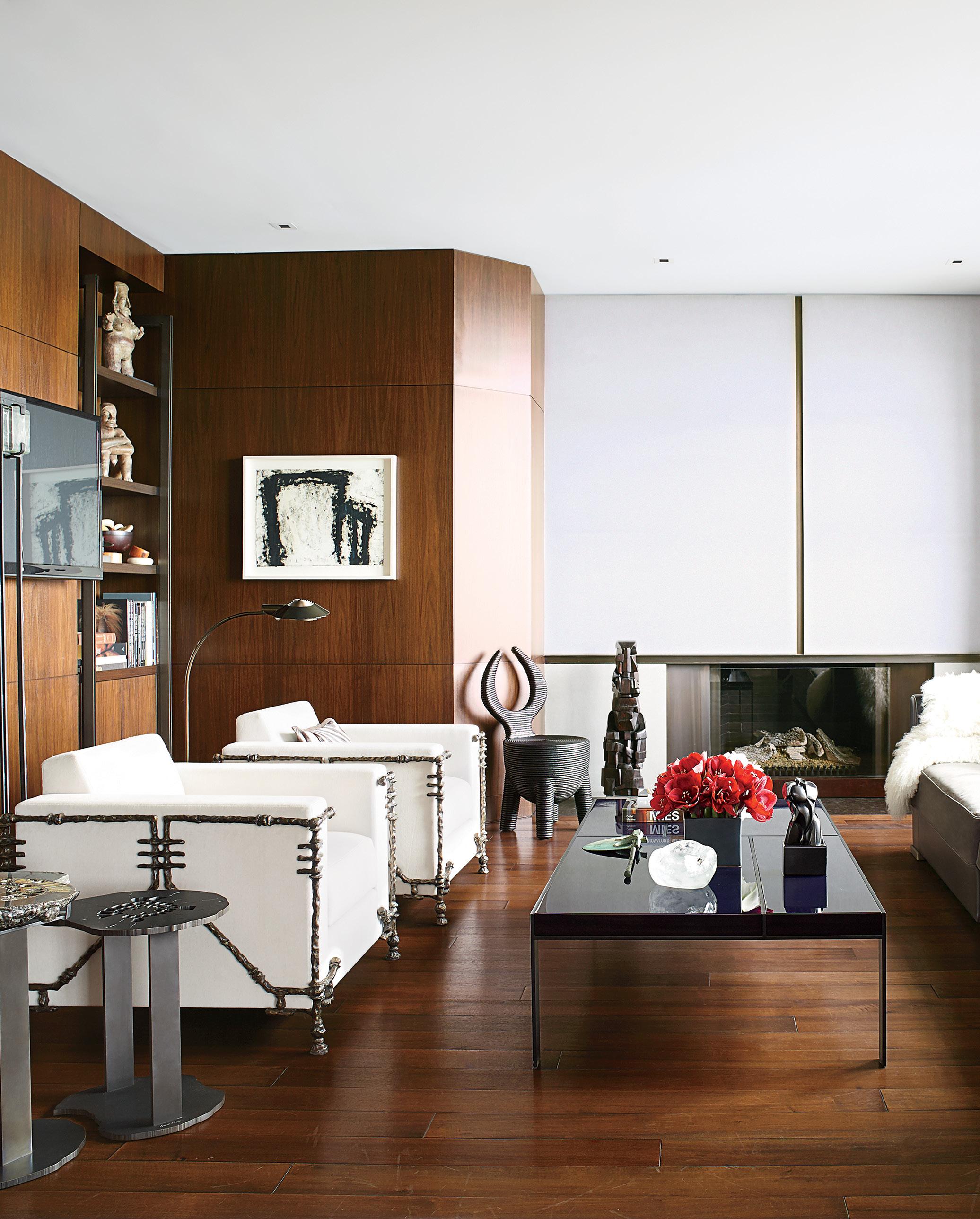
THIS PAGE: Designer Holly Hunt’s Chicago apartment. OPPOSITE: Designer Holly Hunt.
HOLLY HUNT
By GRAY Editors
In 2015, Holly Hunt sold her namesake design empire to Knoll for a whopping $95 million. During the previous 30 years, the Texas-born entrepreneur had grown her business from a single Chicago furniture showroom into a brand that designed and manufactured furniture, textiles, and lighting fixtures—all displayed in a network of global showrooms.

It all began in 1983, when Hunt discovered an interior design showroom in Chicago’s Merchandise Mart in need of financing. She purchased it and launched her own independent design business. “At the time, buying interior design product was messy,” she says. “Customer service wasn’t terrific, and very few places had a clear point of view. I had no big plan—but I thought I could do it better than it was being done.”
Hunt may not have had grand plans—or even a formal design education—but she did have a point of view. In the early 1980s, the market was dominated by traditional furniture and neo-antique-style décor. Hunt, however, had an eye for more contemporary styles. She introduced the works of European designers including Karl Springer and Christian Liaigre to the North American market, helping to define an aesthetic of clean lines and restrained silhouettes that continues today. “I was never inter-
ested in crazy trends,” Hunt says. “I’ve always wanted [our products] to be classic in a way, to live through the decades, and I think that has everything to do with proportion and form.”

Hunt credits much of her success to intuition. She has a knack for looking at a design and sensing which details need to be moved by as little as a fraction of an inch. As an entrepreneur, she has an instinct for where tastes are headed. “I’ve always been very flattered when people say that I can see around the corner,” she says. “I can’t, but I do have a sense of what’s fresh and new.”
Hunt is no longer helming the Holly Hunt brand, but she isn’t sitting still. In 2020, she launched House of Hunt, an interior architecture and design studio. She insists that she’s not trying to build a second empire with House of Hunt—she’s content to keep the business small and intimate— but its beginning is similar to that of its predecessor: impromptu and built on instinct. “A few people came to me and wanted help with their house,” Hunt says, “so I thought we’d make it into a little business. [The home]—the rooms, the objects, the materials—has always been second nature to me.” h
GRAY 45
PIETER ESTERSOHN; BILLY ROOD
GRAY AWARDS: THE JUDGES
PATRICK LAM
By GRAY Editors
Architect Patrick Lam grew up in Hong Kong’s Kowloon City in a fifthfloor apartment that spanned just 200 square feet. “[My parents, brother, and I] didn’t have our own individual rooms, or separate spaces to study, sleep, or dine,” Lam says. “We had to think about how [our home] could have more functions without decreasing our standard of living.”

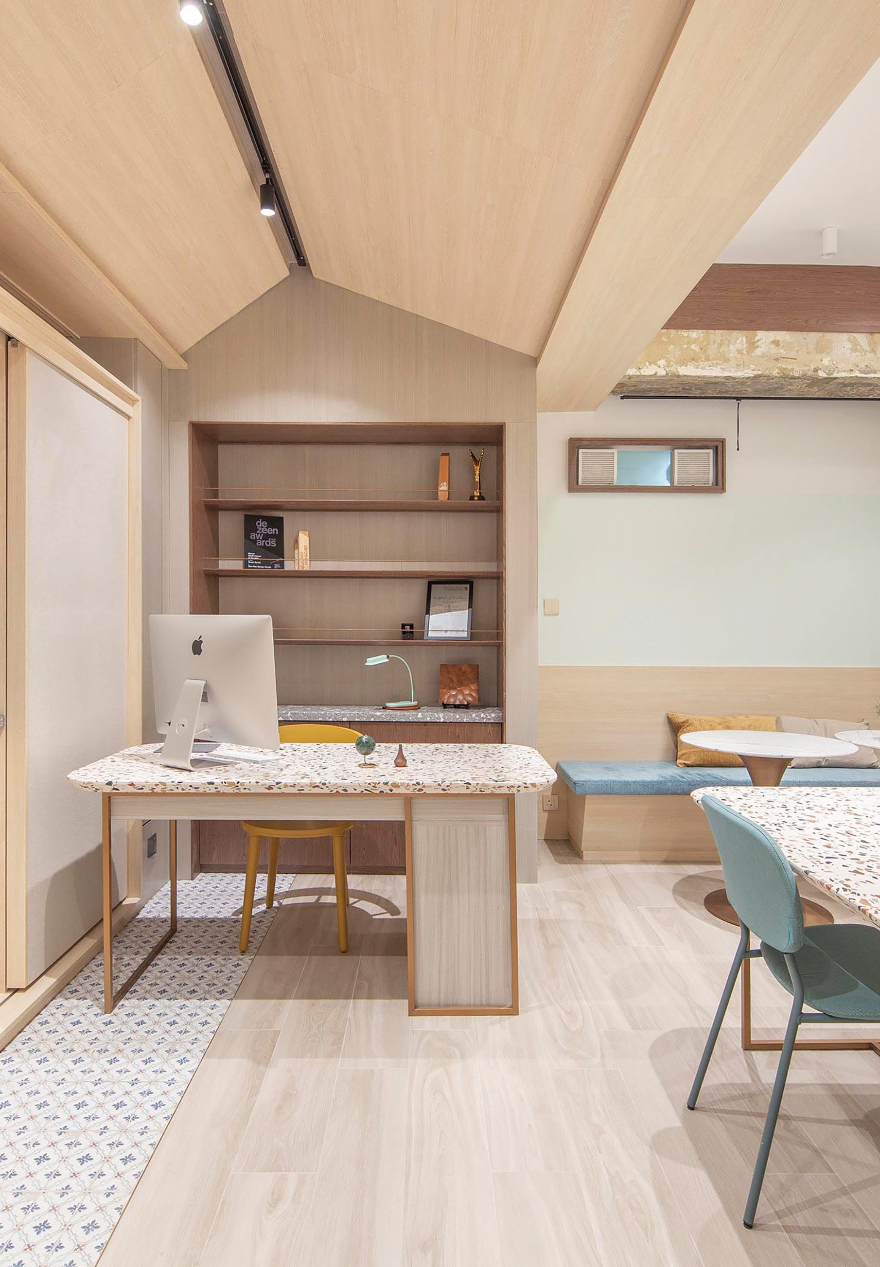
As the founder of interior architecture and design studio Sim-Plex, Lam has continued to explore the limits and opportunities of small spaces. The Hong Kong–based studio creates apartments in which rooms and furniture don’t have the luxury of serving a single purpose, but are instead required to shift their function according to the user or time of day. For one project—a 492-square-foot apartment for a family of three—Sim-Plex solved a pressing problem: the need for live-
in childcare when one of the parents travels for work. Lacking space for a separate bedroom, the firm designed a living room that can transform into sleeping quarters. When needed, a clever wood coffee table disappears into the floor (which comprises a series of pull-up storage cabinets) and a set of sliding doors emerges to create a private space.
Sim-Plex’s designs are noteworthy not only for their ingenuity, but also for the designers’ intimate understanding of their clients’ lives. “Communication with the end user is especially important in our design process,” Lam says. “They’ll tell us their requirements, and then we have to organize them, find the compromises, and give them our solutions.” In one tiny Hong Kong apartment whose owners insisted on giving their cats space to roam, round holes punched through kitch-
en cabinetry transform the millwork into feline walkways.
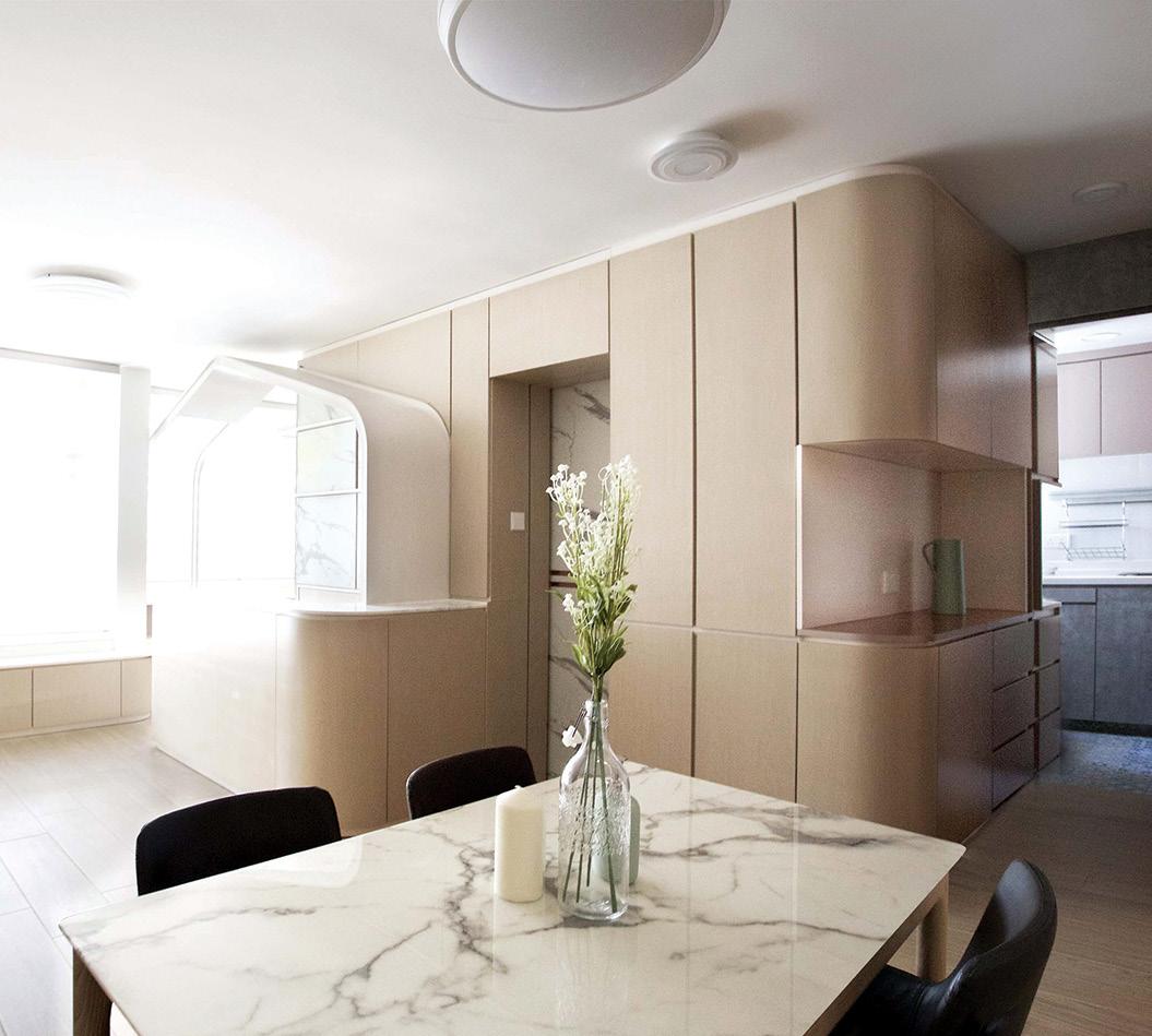
In decades past, requiring every piece of furniture to serve multiple functions might only have been necessary in exceptionally dense cities like Hong Kong or Tokyo, but Sim-Plex’s ability to maximize tiny spaces offers valuable lessons for navigating a climate crisis, the rise of multigenerational living, the increasing cost of home ownership, and a global pandemic that has required many homes to double as offices.
Does Lam ever feel creatively boxed-in by such tiny residences? Is he curious to test his design abilities when given the luxury of space?
“I don’t think our focus will ever shift to high-end residential or commercial projects,” he says. “We’re focused on compact living.” h
46 GRAY LEGENDS
BROLL PROJECT; PATRICK LAM
GRAY 47
LAM
THIS PAGE: The gallery and studio space of Hong Kong–based interior architecture and design firm Sim-Plex. OPPOSITE, FROM LEFT: Architect Patrick Lam, founder of Sim-Plex. A studio apartment in Hong Kong designed by Sim-Plex, which specializes in small-space living. PATRICK
By Heidi Mitchell
GRAY AWARDS: THE JUDGES MIA LEHRER

Landscape designer Mia Lehrer understands the power of place. The El Salvador native began her advanced education in Massachusetts at Tufts University, then continued on to Harvard, but it wasn’t until she moved to California with her husband that she felt at home in America.
Upon arriving in Los Angeles in the 1980s, Lehrer designed gardens for Hollywood A-listers and playgrounds for public schools, until a project with a water-conservation group led her to consider larger-scale undertakings that would benefit the public at large.
Working at the intersection of climate justice, urbanization, and natural beauty, her Studio-MLA practice follows a simple mantra: advocacy by design. “We advocate for places, spaces, and solutions by showing through our design tools what exists and what could be,” Lehrer explains. “In the process of design, the landowner or developer might say that all they want are soccer fields, but you have to help them understand that a lot of people want to walk and jog. Kids need playgrounds and a community center.”
By helping stakeholders visualize how a landscape can unite all these pieces, Lehrer says, a designer can balance the requirements of a community while developing a thoughtful plan.
This approach is evident in Lehrerdesigned parks like Vista Hermosa Natural Park in LA, which was the first park to open in the city’s
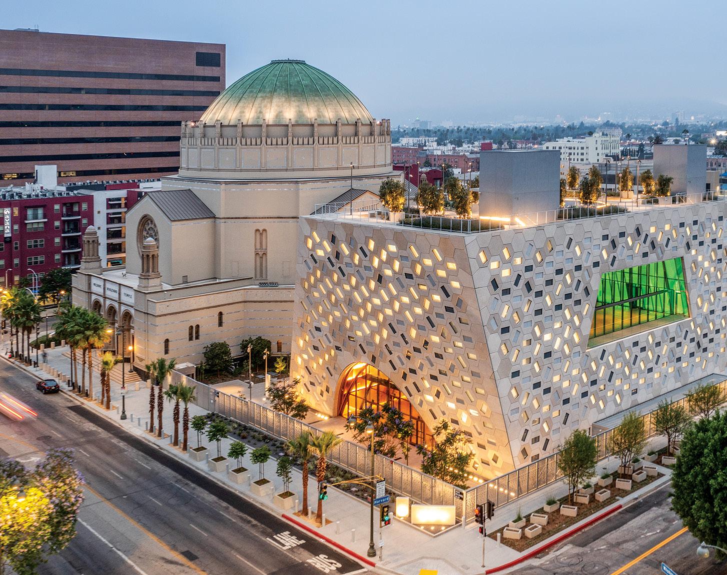
downtown in 50 years. The land— which was formerly studded with oil wells—had a concentration of methane which was mitigated, and it’s now a popular spot for quinceañeras, holiday photos, and marriage proposals that take place along a stream, meadows, and trails. Another one of Lehrer’s projects is the Nature Gardens, located on the north side of the Natural History Museum, across from the University of Southern California. When Lehrer was hired, the museum assumed that visitors would access the institution by walking through four acres of parking—the opposite of a welcoming entrance. That parking lot became the new entrance with gardens that celebrate Southern California flora with more than 400 plant species (70 percent of which are native).
Local schoolchildren take field trips to this living natural history lab each year to better understand their relationship with the environment.
Lehrer’s more recent projects have reimagined the spaces around sports stadiums, which are typically surrounded by car parks and industrial neighborhoods, and which tend to follow stock designs that allow for
little creativity. Lehrer has become the go-to landscape architect for the redevelopment of these essential structures, working on Dodgers Stadium, Banc of California Stadium, and, most recently, the $5-billion transformation of the Hollywood Park racetrack into LA’s new SoFi Stadium and the adjacent Lake Park. “I’ve learned to work in concert with the place, the people, and the land I’m working on, not against them,” Lehrer says. “In California especially, you get educated, and then you advocate.” h
48 GRAY LEGENDS
AUDREY IRMAS PAVILION: JASONO’REAR; COURTESY STUDIO-MLA


GRAY 49
THIS PAGE: Landscape designer Mia Lehrer recently headed up the design for LA’s new SoFi Stadium and the adjacent Lake Park. OPPOSITE, FROM TOP: The Audrey Irmas Pavilion, one of Lehrer’s projects, is a multi-purpose event space that serves as a gathering place for community. Mia Lehrer, founder of Studio-MLA.
CRAIG COLLINS
Make space for dreams come true.
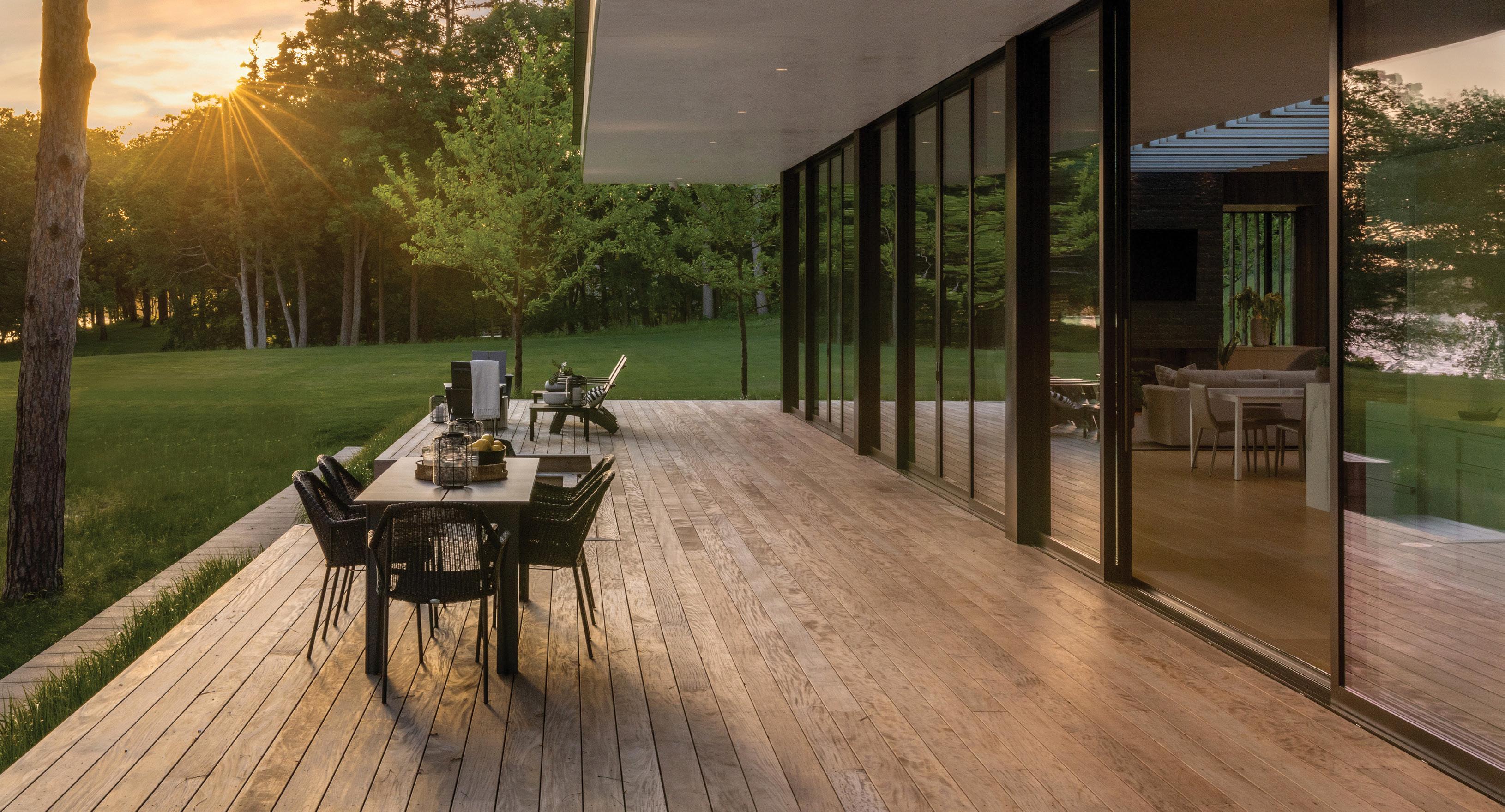
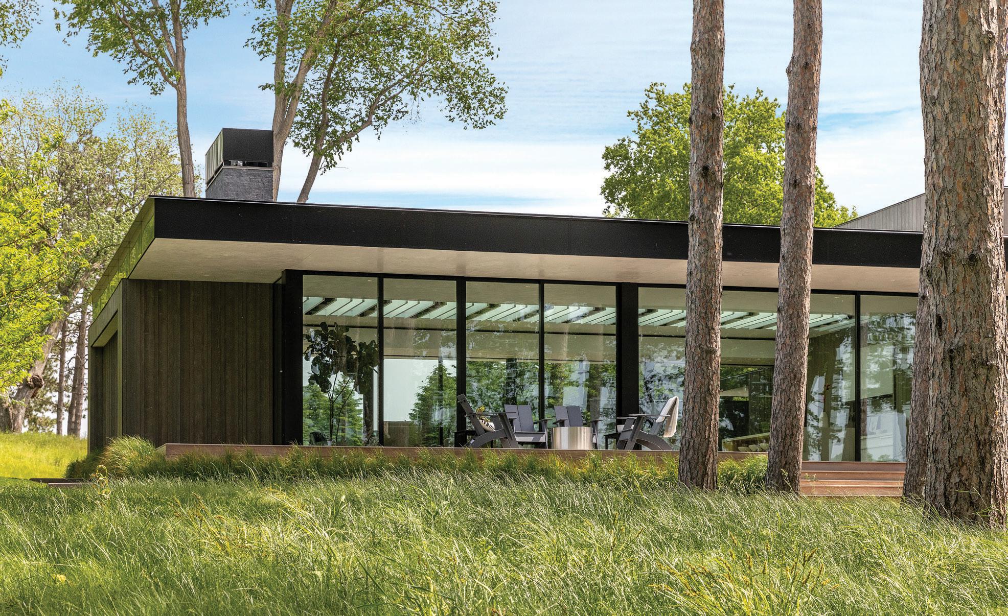
Making your client’s dreams a reality is a complex process with many moving parts. A partner that understands this, and works to streamline your process, can be invaluable. Marvin windows and doors deliver precision, innovation, and quality, and will exceed expectations for service every day—allowing you to make space for distinction, perfection, and everything that matters most to your clients.
marvin.com


 Photos courtesy of Spacecrafting
9TH AVENUE PARKADE & INNOVATION CENTRE

AVENUE & INNOVATION A R C H I T E C T URE • COMM E R C I A L 2022 WINNER 5468796 ARCHITECTURE INC. RP O D U C T D E SIGN • LIGHTI N G , F URNITURE 2022 WINNER YABU PUSHELBERG FOR NIENKAMPER
BRITTAIN
JAMES
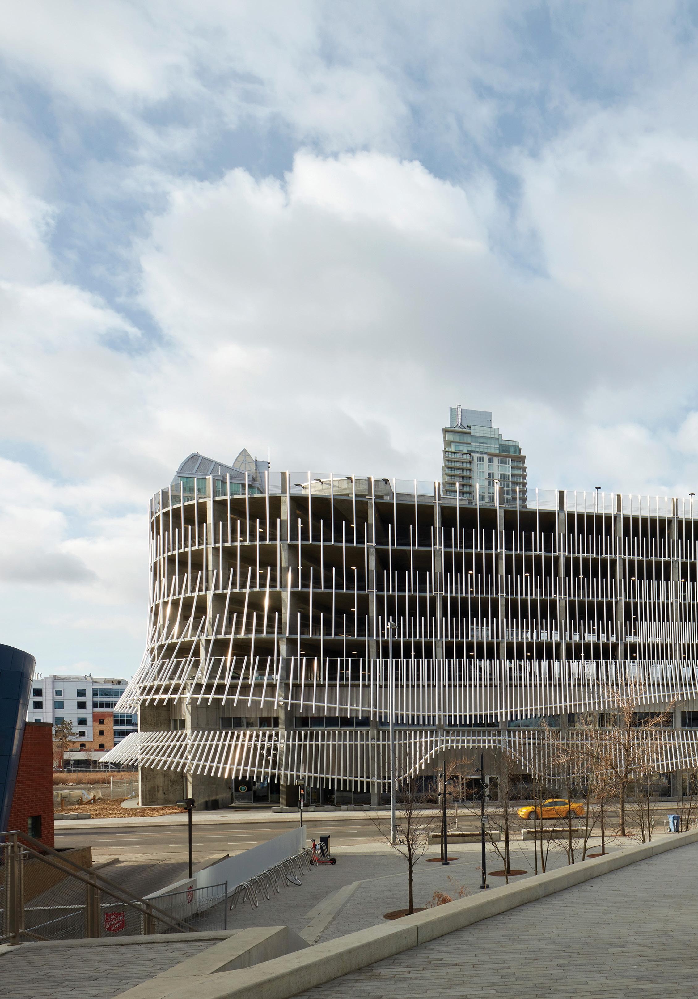
As the ways in which humans move around cities evolve—spurred by the increased availability of rideshare services, public transportation, and nonmotorized vehicles— so too does the approach to creating transportationrelated infrastructure, from parking lots to multi-vehicle garages. Case in point: a new parking structure in downtown Calgary designed by Winnipeg-based 5468796 Architecture. “The project brief called for a 510-stall parkade that could be converted into an office, light industrial, or residential [space] sometime in the future,” the firm writes in its entry. Those requirements made an underground development unfeasible, and a design that would allow for easy renovation essential. The project site was bisected by an unbuildable easement for an existing underground light rail tunnel—an
PROJECT DETAILS
DESIGN TEAM
5468796 Architecture: Emeil Alvarez, Pablo Batista, Ken Borton, Jordy Craddock, Eric Decumutan, Donna Evans, Ben Greenwood, Johanna Hurme, Jeff Kachkan, Stas Klaz, Lindsey Koepke, Kelsey McMahon, Colin Neufeld, Sasa Radulovic, Amanda Reis, Matthew Trendota, Shannon Wiebe; Kasian Architecture: Katherine Robinson, Joanne Sparkes, Tesfa Mulat, Fredrick Voo, Bart Otwinowski
COLLABORATORS
assumed loss of land value. But where others saw a constraint, 5468796 Architecture recognized a creative opportunity. Designed in the shape of an elliptical helix, this unique parkade bridges the easement, recaptures the land value, and allows for an interior courtyard that provides increased daylight exposure and ventilation for the interiors. What’s more, “the clear span of concrete structure combined with universal load-bearing capacity resulted in minimal cost ramifications while enabling multiple futures,” the firm notes.
With high floor-to-floor height, light-filled routes, clear and simple wayfinding, and straightforward, singledirection circulation, the design provides a stress-free, safe, and human-centric experience for the present, and the potential for new uses in the future. »

Structural engineer: Entuitive
Mechanical/electrical: Smith + Andersen
Landscape: Scatliff Miller Murray
Civil engineer: Aplin Martin
Shroud: Heavy Industries Accessibility: Level Playing Field
LOCATION Calgary, Alberta, Canada
DATE OF COMPLETION May 2022
54 GRAY
JAMES BRITTAIN

DESERT PALISADES

A R C H I T E C T URE • COMM E R C I A L 2022 WINNER 5468796 ARCHITECTURE INC. RP O D U C T D E SIGN • LIGHTI N G , F URNITURE 2022 WINNER YABU PUSHELBERG FOR NIENKAMPER A R C H I T E C T URE • RESIDE N T I A L 2022 WINNER WOODS + DANGARAN RP O D U C T D E SIGN • OTHER 2022 WINNER AUTHOR/DESIGNER: DANIEL KAVEN PUBLISHER: BIRKHAUSER JOE FLETCHER
 JOE FLETCHER
 JOE FLETCHER
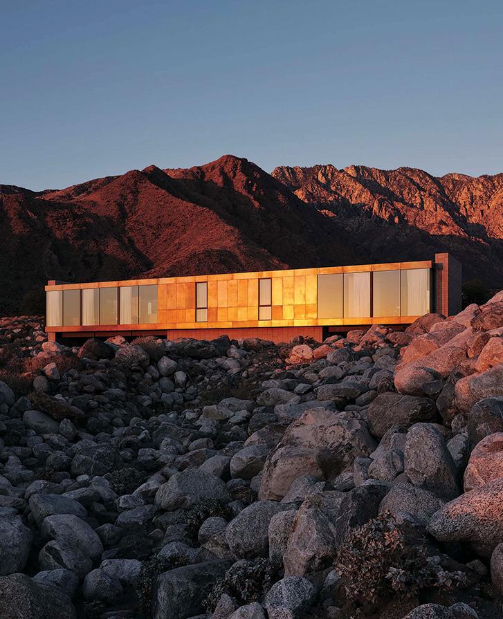
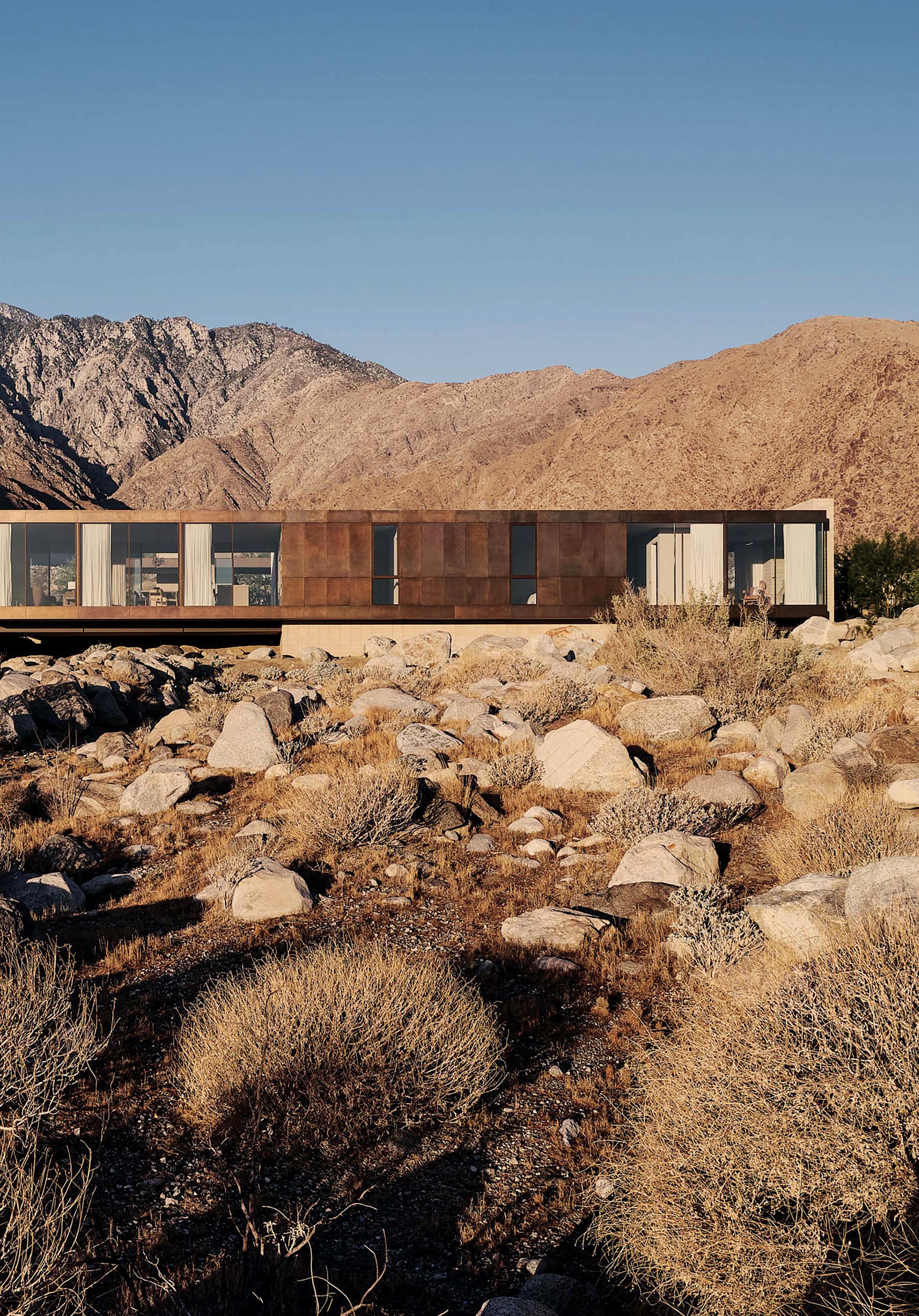
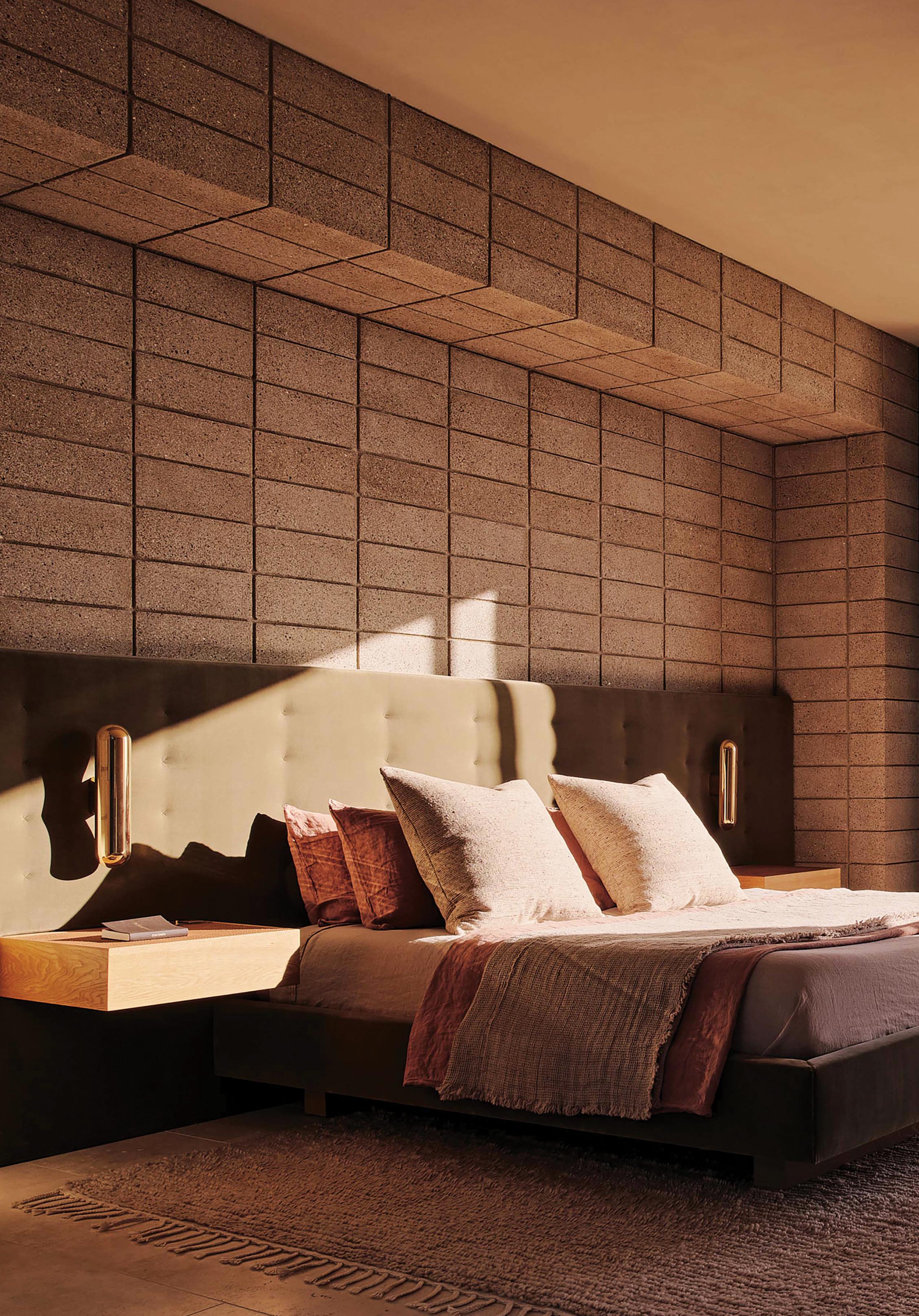
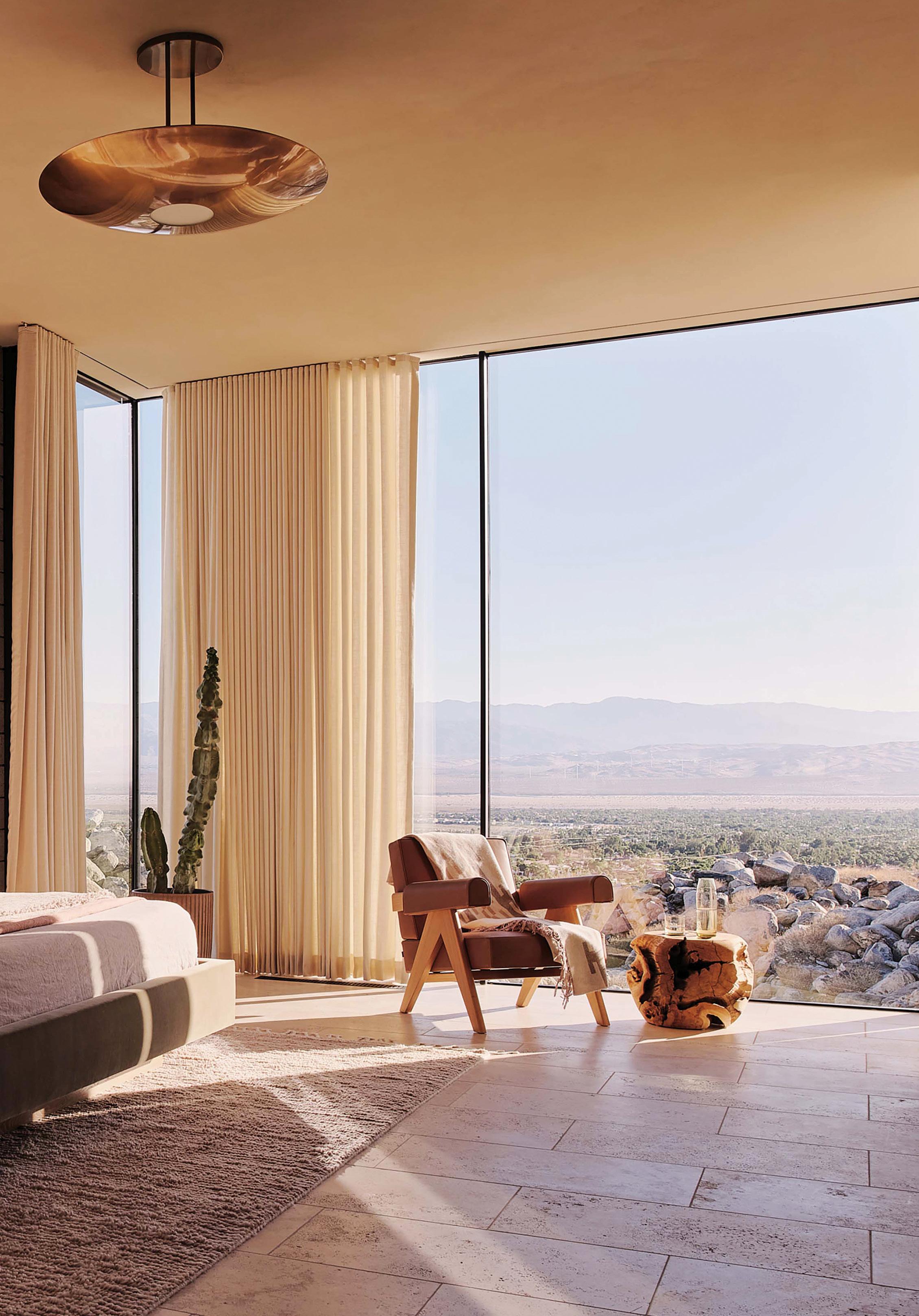
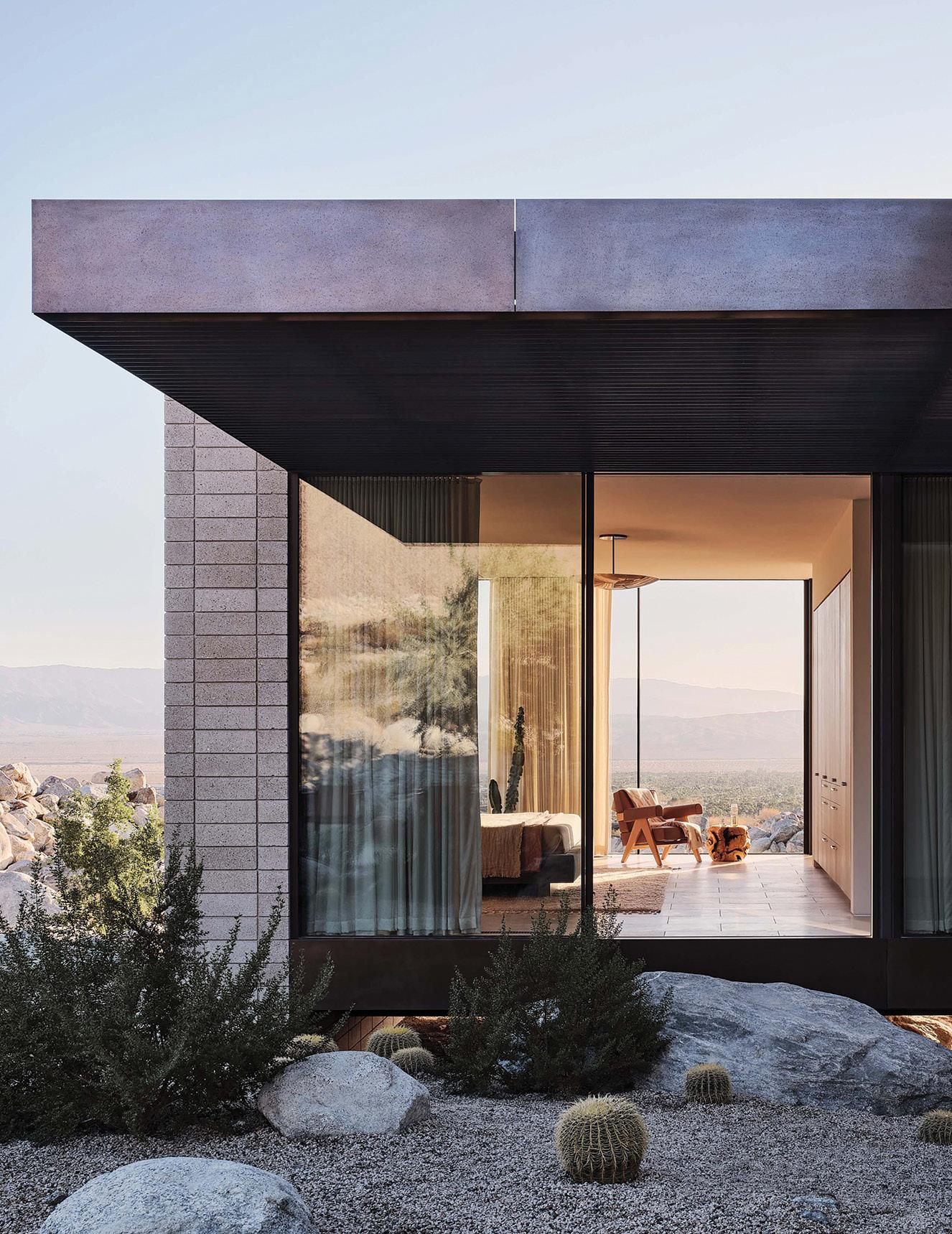
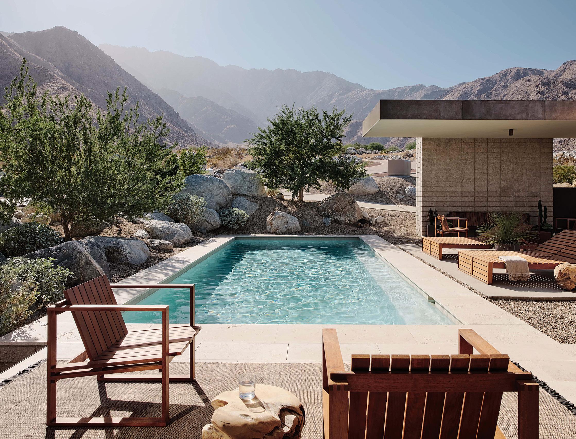
nspired by the majestic desert landscape of California’s Palm Springs region, this modern residence, designed by Woods + Dangaran, blends elegance and simplicity in a form that respects its surroundings. “The design celebrates the hallmarks of classic desert modernism— horizontal lines, the use of natural materials, expansive glazing, and visual and physical linkages between indoors and out,” the firm explains. “It is at once deeply rooted in the site and elevated above it, enjoying broad vistas over the floor of the Coachella Valley.”
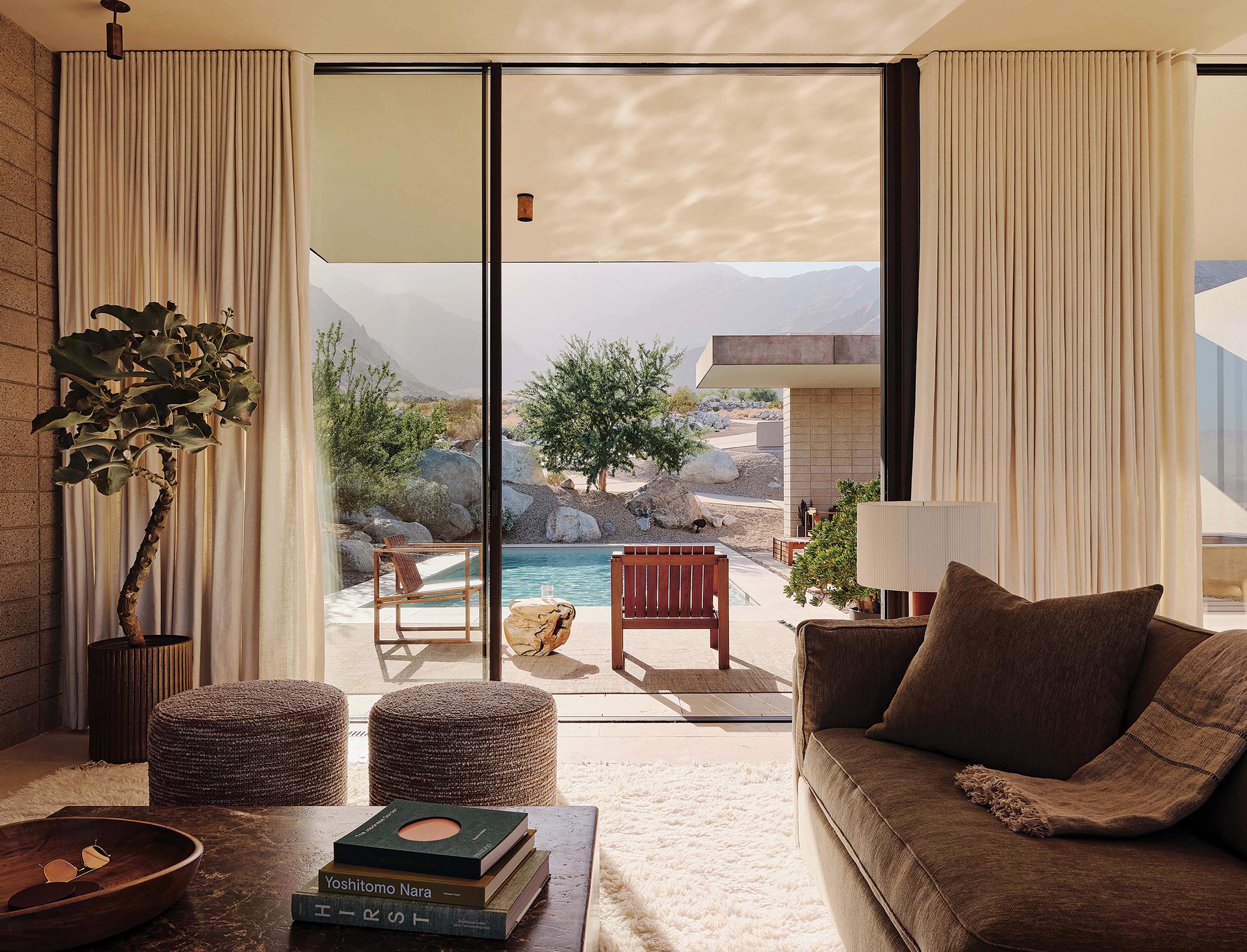
Comprising two rectangular wings, the home is perched lightly above two natural arroyos and existing boulders, in order to preserve the natural terrain
and maintain drainage channels. The west wing (the structural anchor of the house) includes the entry, guest room, and garage, and the east wing contains the primary suite, two bedrooms, and a great room flanked by floor-to-ceiling windows spanning 30 feet on each side.
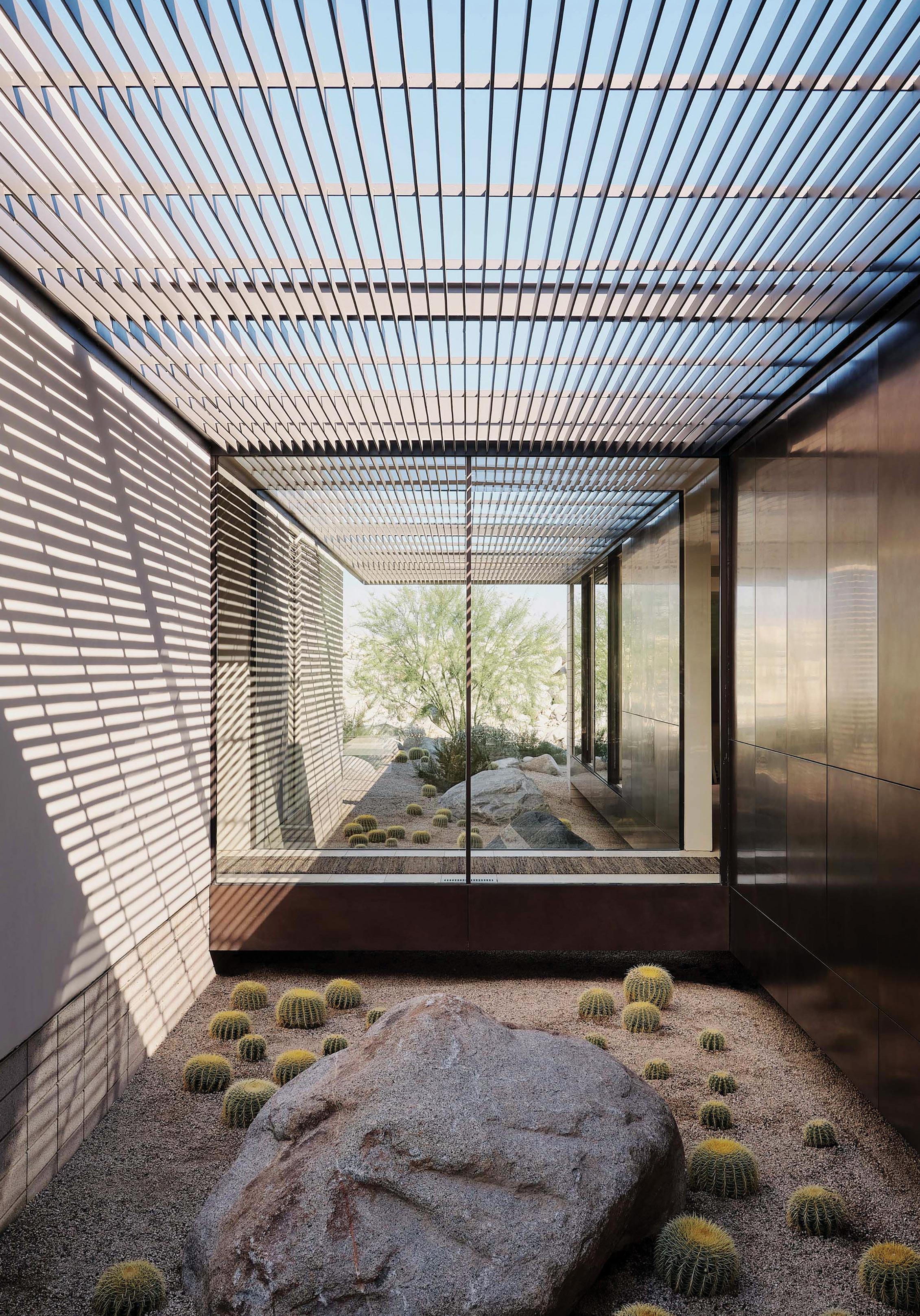
“A glass bridge connects the two wings,” the firm notes, “providing a sense of tranquility from the point of entry and defining two internal courtyards filled with native plantings. Trellises filter diffused daylight into the courtyards, which create visual connections to the landscape from many vantage points.” Large sliding-glass doors unite the living area with a spacious outdoor deck that includes a pool, dining area, spa, fireplace, and lounge.
62 GRAY
I
To ensure a sense of harmony with the surrounding landscape, the architects used earth-toned plaster and concrete masonry units for the home’s exterior. The main wing and its 12-foot-deep overhangs are clad in brass paneling that will patina over time. As Woods +
PROJECT DETAILS
DESIGN TEAM Woods + Dangaran
COLLABORATORS
Landscape architect: Chris Sosa
General contractor: HJH Construction
Soils engineer: Landmark Consultants, Inc.
Structural engineer: Labib Funk + Associates
Dangaran explains, the house was “created first and foremost with its context in mind. It allows the owners to experience what is most important—its siting, environment, and landscape—and is emblematic of the desert modernism that came before it.” »
LOCATION Coachella Valley, California, United States
DATE OF COMPLETION October 2021
Plumbing engineer: California Energy Designs, Inc.
GRAY 63
JOE FLETCHER
SERENA WILLIAMS NIKE WHQ TNI E R I O R D E SIGN • COMM E R C I A L 2022 WINNER SKYLAB ARCHITECTURE LEGACY 20 OMER ARBEL N T I A L 2022 WINNER DANGARAN TNI E R I O R D E SIGN • RESIDE N T I A L 20 WOODS + DANGARAN 2022 WINNER AUTHOR/DESIGNER: DANIEL KAVEN BIRKHAUSER WILD • CARD 2022 WINNER CLB ARCHITECTS
BITTERMANN
JEREMY
 JEREMY BITTERMANN

 JEREMY BITTERMANN; OPPOSITE PAGE: STEPHEN A. MILLER
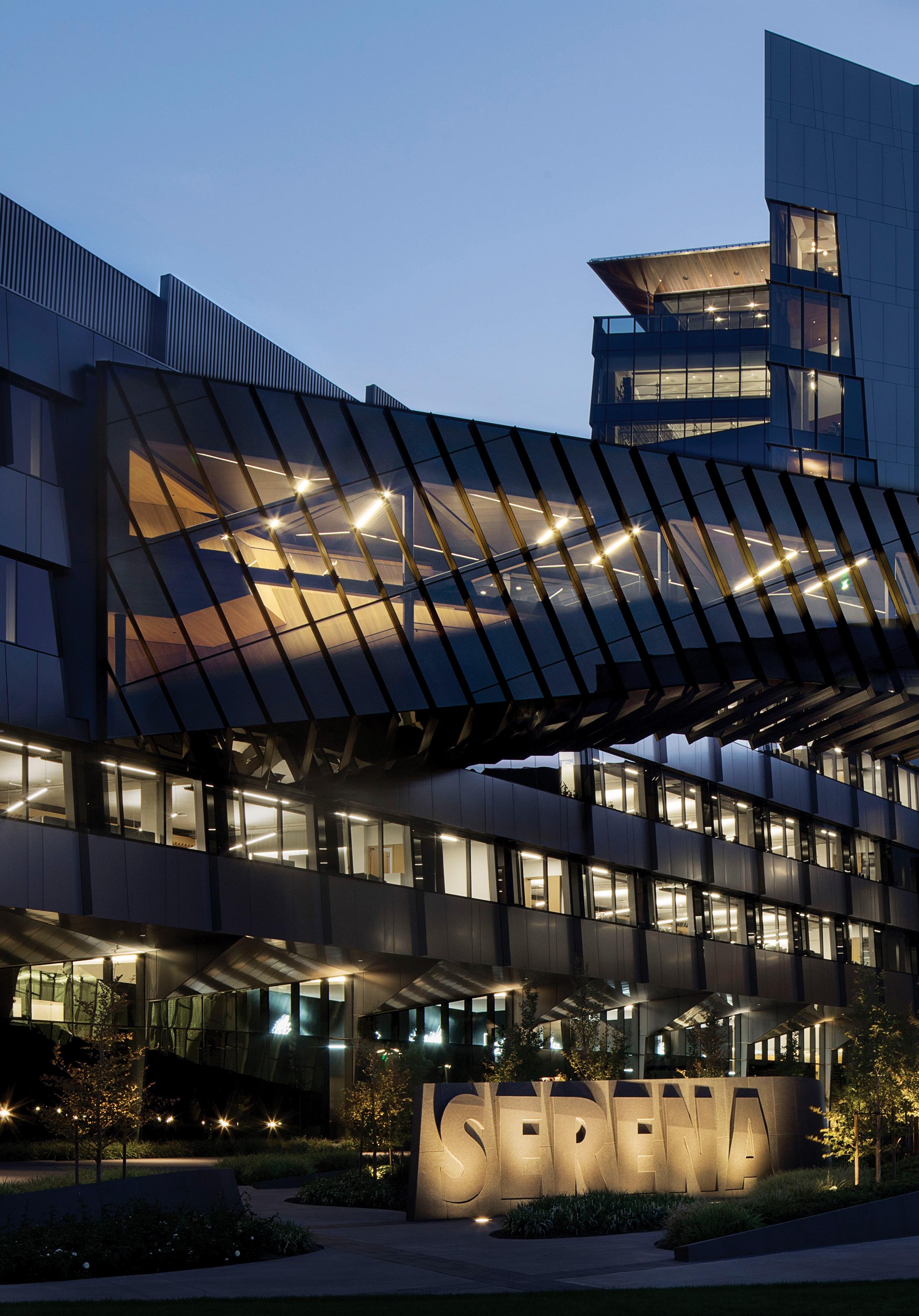
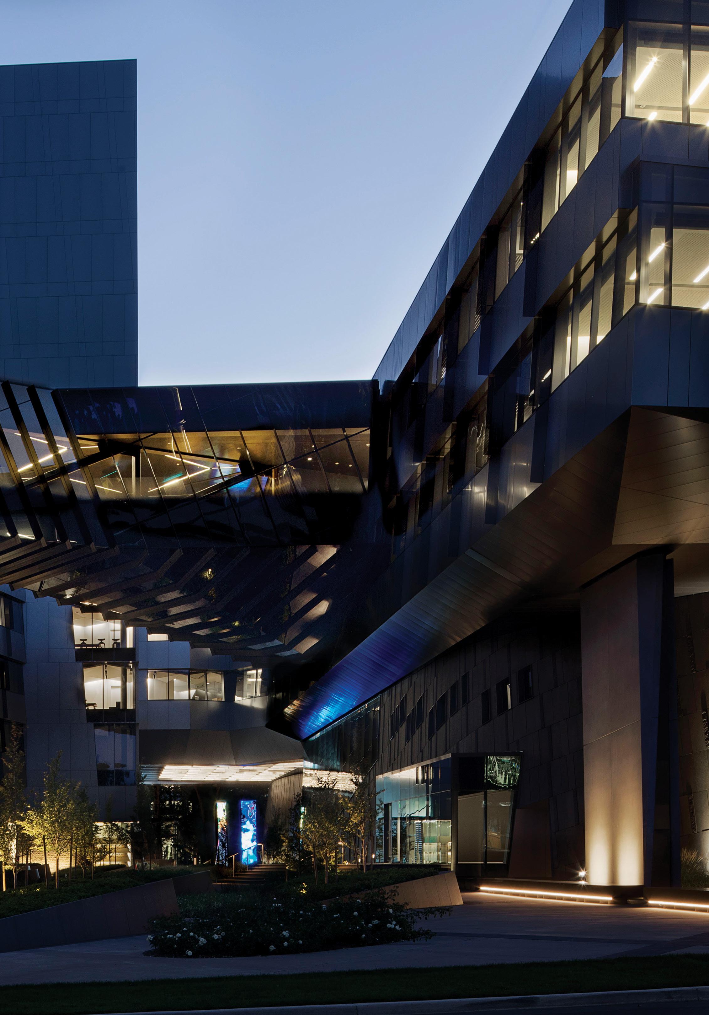
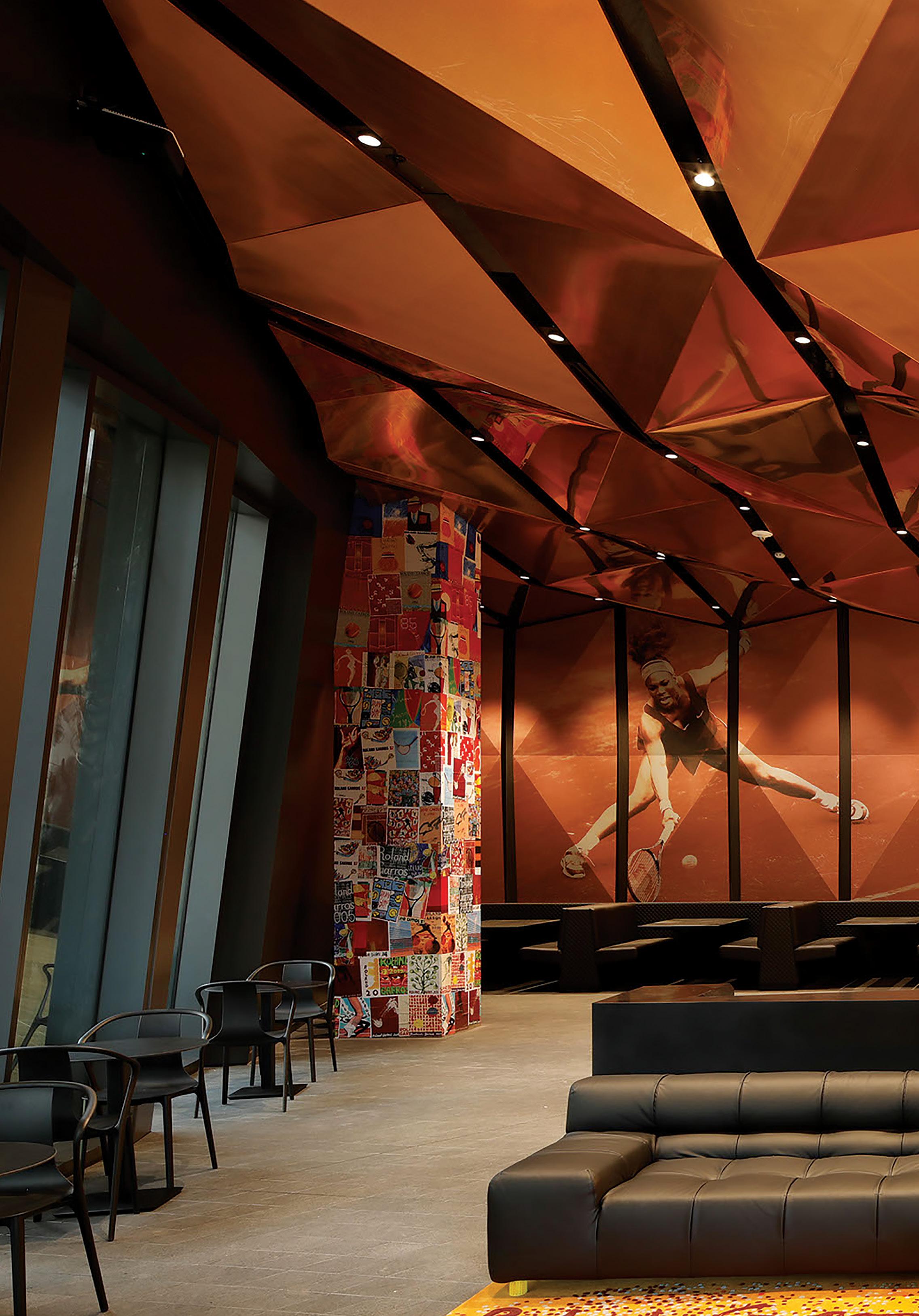
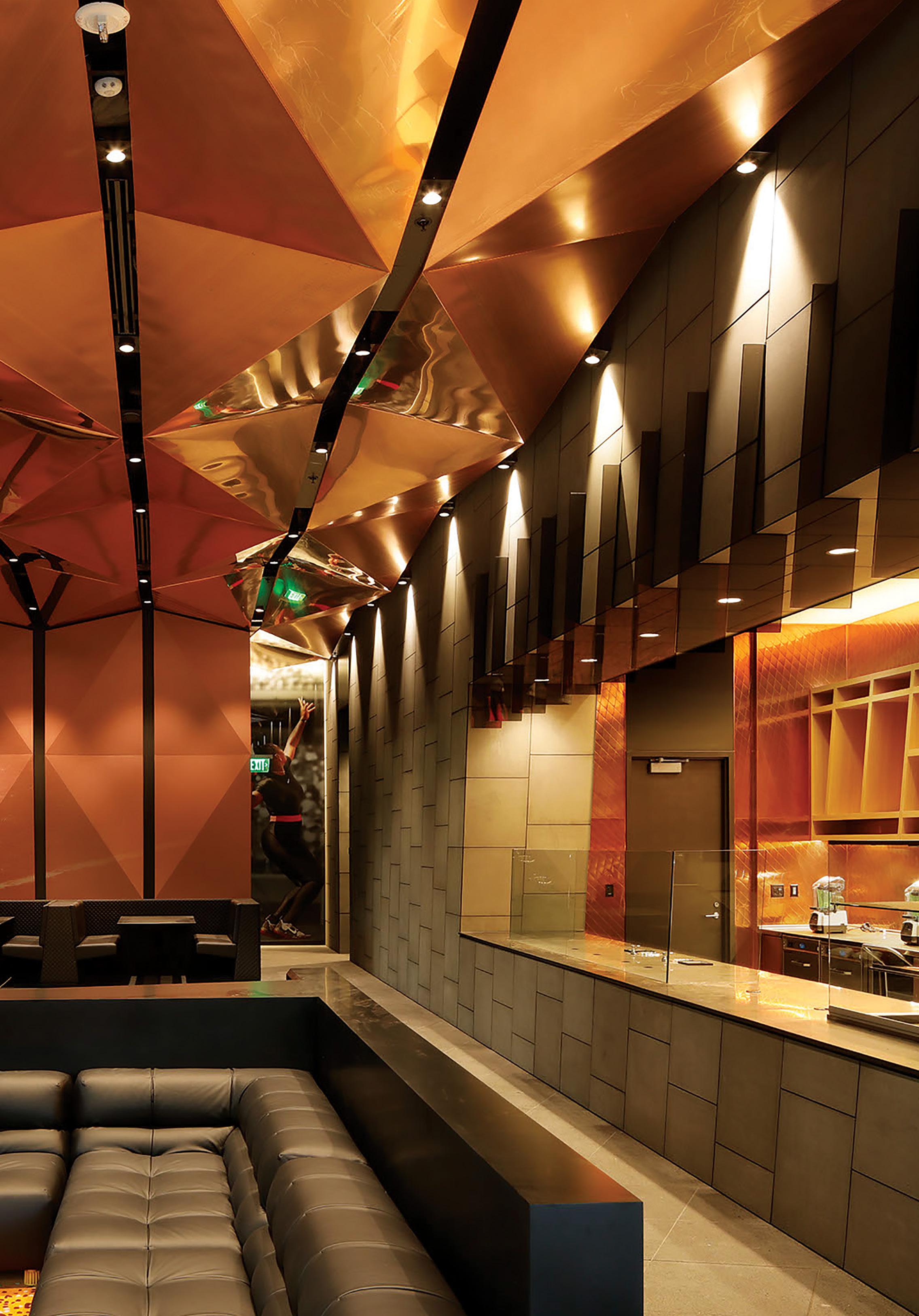
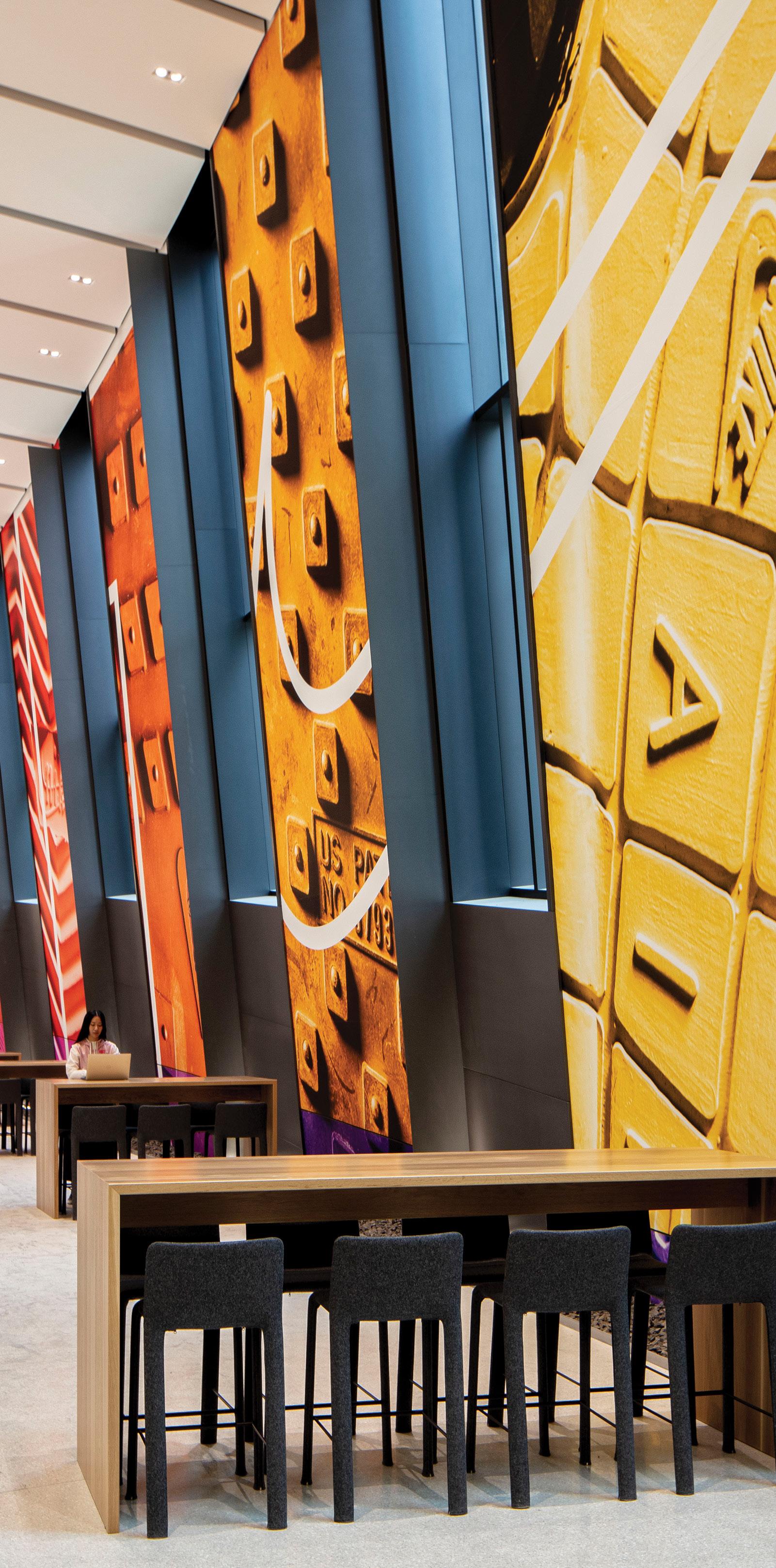
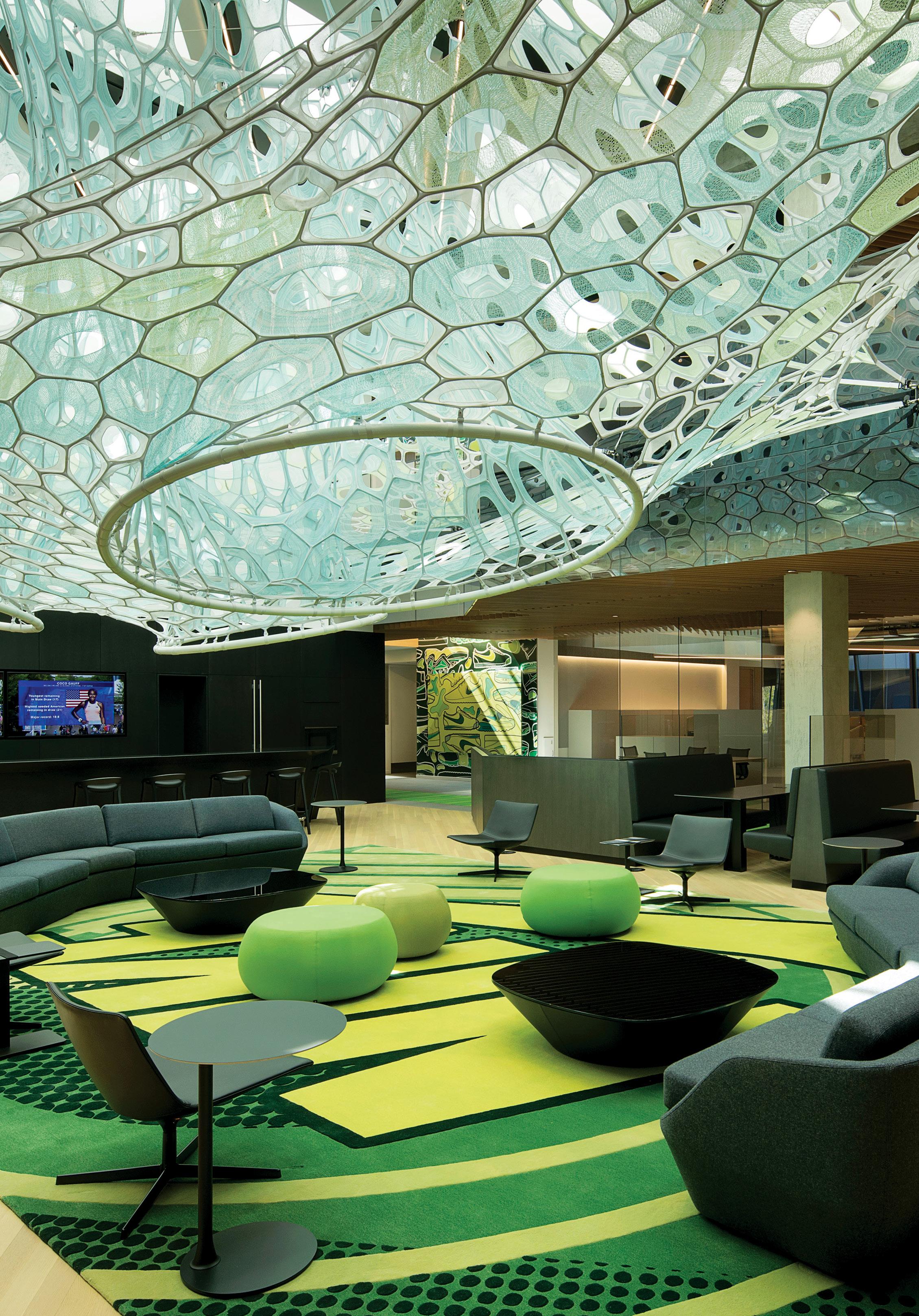
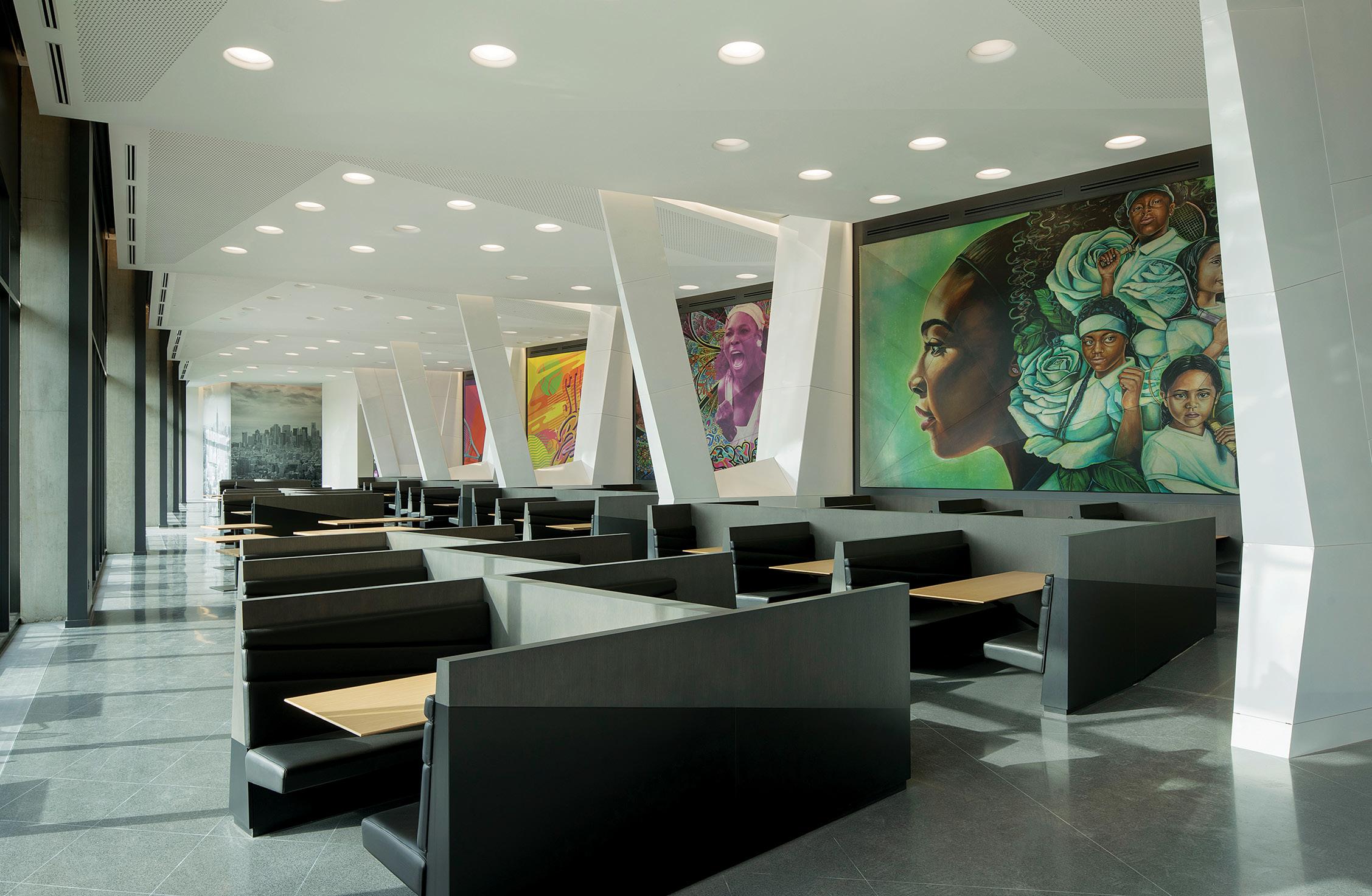
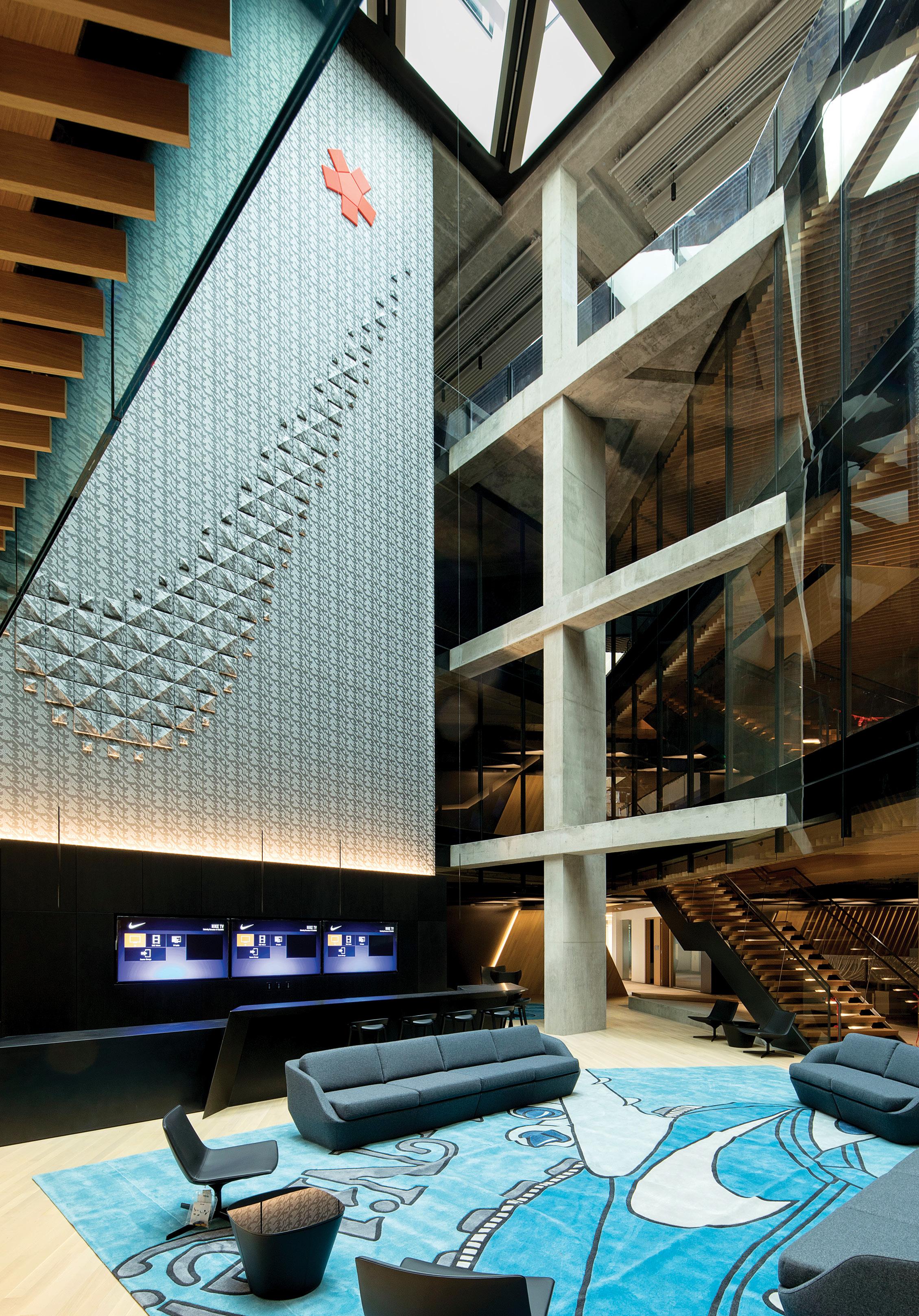
Spanning more than 1 million square feet, the Serena Williams Nike World Headquarters is the largest and most ambitiously designed building on the sportswear giant’s Oregon campus. In the new facility, products can move from sketch to prototype to final design to retail product under one roof—a first for Nike.
When developing the project, Skylab Architecture checked the following boxes: Offer employees a workspace that fosters connection, collaboration, and innovation; leverage regenerative design principles to optimize benefits for the site and building occupants; and capture the ethos of sport, Nike’s heritage, and the spirit of tennis champion Serena Williams.
“The building personifies Serena’s narrative,” Skylab notes in its project description. “Samurai armor inspired the exterior, the concept of ‘flow’ informed programmatic connectivity, and the abstracted wing of Nike’s [logo] is evident in [the structure’s] tripartite massing.”
The new headquarters consists of four components: an underground parking garage and loading dock, a merchandising center for prototyping retail spaces, design studios for multiple product categories, and a 12-story tower with shared amenities for the campus. The tower’s two intertwined volumes are a nod to Phil Knight and Bill Bowerman, Nike’s two co-founders.
The building, located on a site adjacent to a wetland, is LEED Platinum certified. “We used regenerative design principles to engage the natural world as the catalyst for respectful site design,” Skylab explains. “The building establishes new links to the existing campus through restored wetlands, public plazas, and view corridors.”
Much like the products developed by Nike, the building’s interiors are bold, but not overdone. A feeling of celebration comes from bright colors and installations by various artists and designers, while graphic wall details embrace the company’s iconic branding (one corridor features floor-to-ceiling close-up photographs of the soles of various Nike shoes) in creative, eye-catching ways. »
PROJECT DETAILS
DESIGN TEAM
Jeff Kovel
Brent Grubb
Susan Barnes
Robin Wilcox
Nita Posada
COLLABORATORS
Contractor: Hoffman Construction
Structural engineer: Thornton Tomasetti MEP - PAE
Lighting: Luma
Landscape: PLACE Landscape
Building enclosure: Facade Group
Civil engineer: WHPacific
Civil Engineering
Sound: Listen Acoustics
Signage/wayfinding: Ambrosini Design
Sustainability consultant: Brightworks
Code consultant: Code Unlimited
Kitchen Consultant: HDA
Specifications consultant: M.Thrailkill
LOCATION
Beaverton, Oregon, United States
DATE OF COMPLETION
July 2021
70 GRAY
BITTERMANN
JEREMY
TWENTIETH G RAY AWARDS OMM E R C I A L 2022 WINNER SKYLAB ARCHITECTURE LEGACY 2022 WINNER OMER ARBEL TNI E R I O R D E SIGN • RESIDE N T I A L 2022 WINNER WOODS + DANGARAN AL N D S C A P E DESIGN • COM M E WEBER THOMPSON RD 2022 WINNER ARCHITECTS JOE FLETCHER

JOE FLETCHER
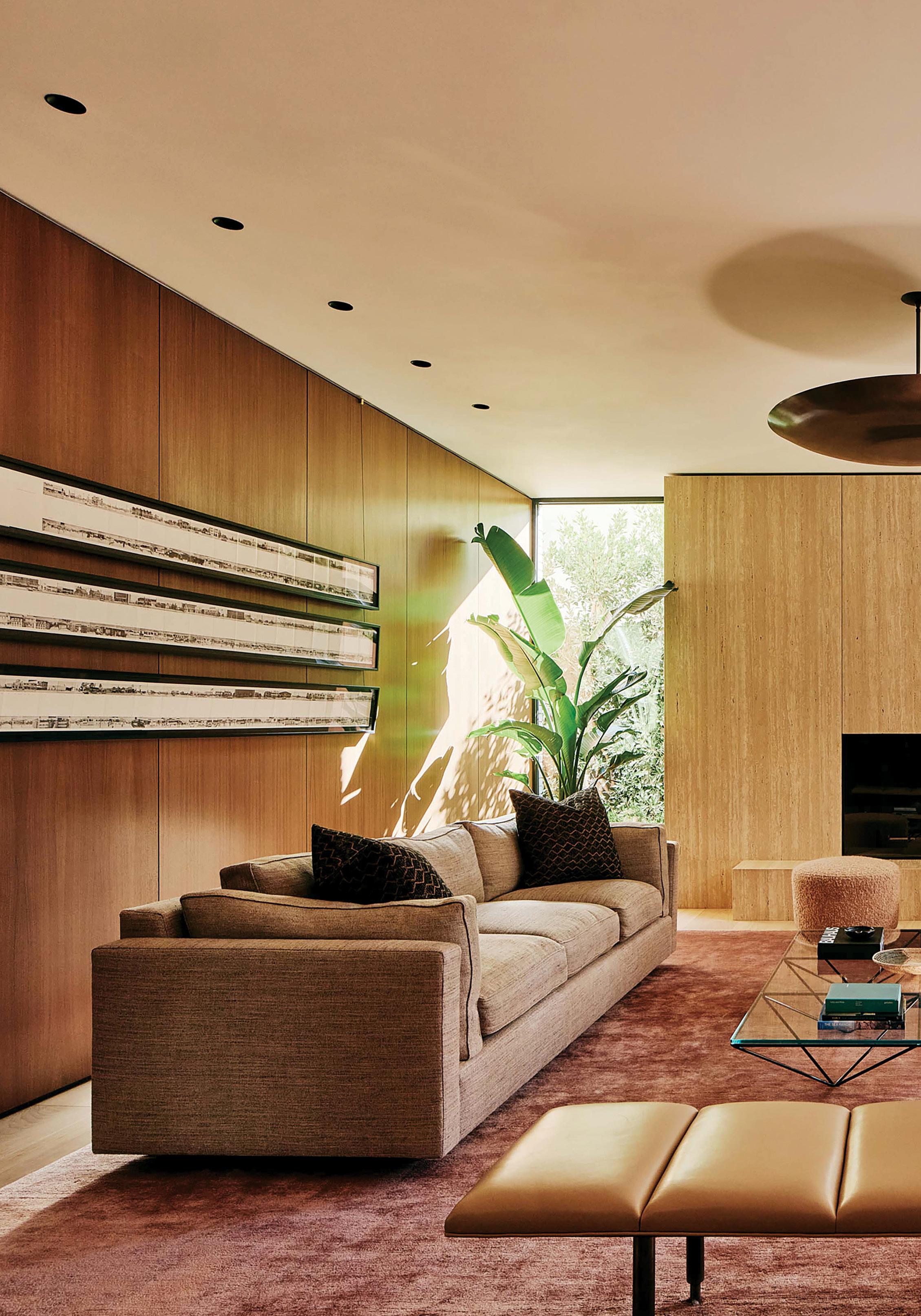
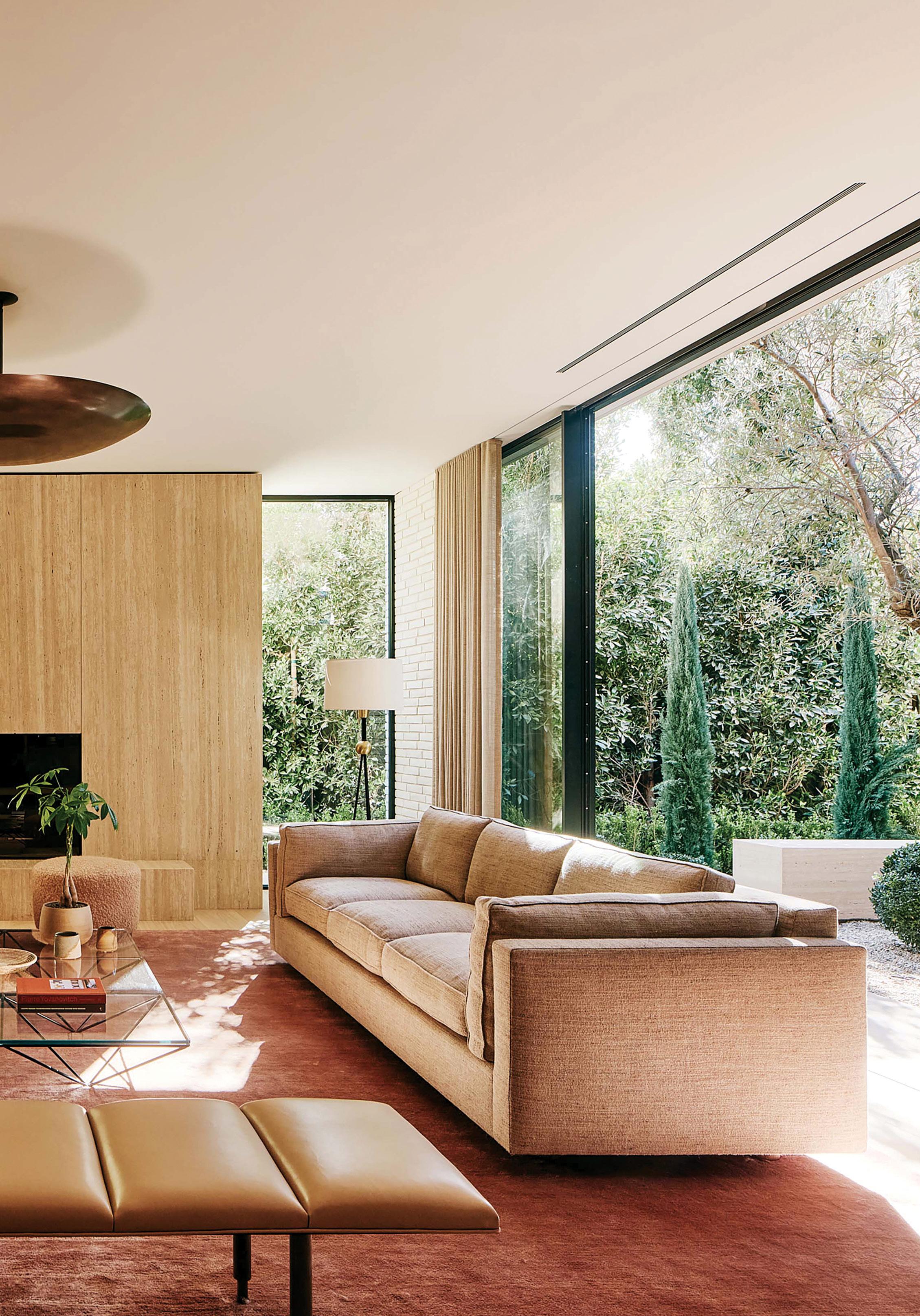
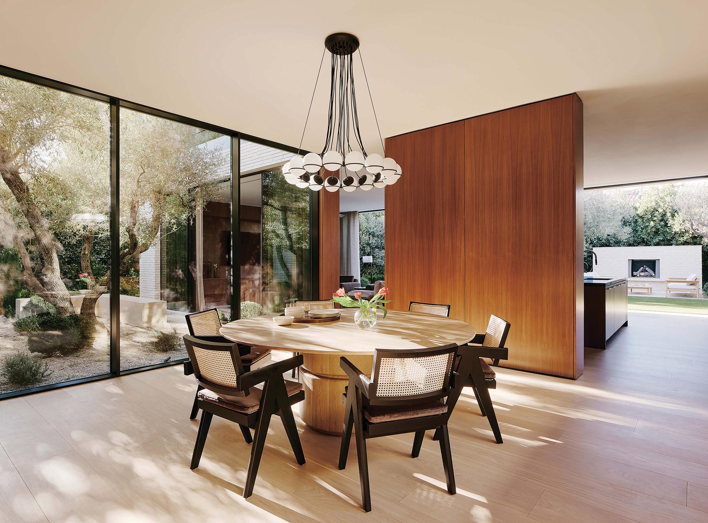
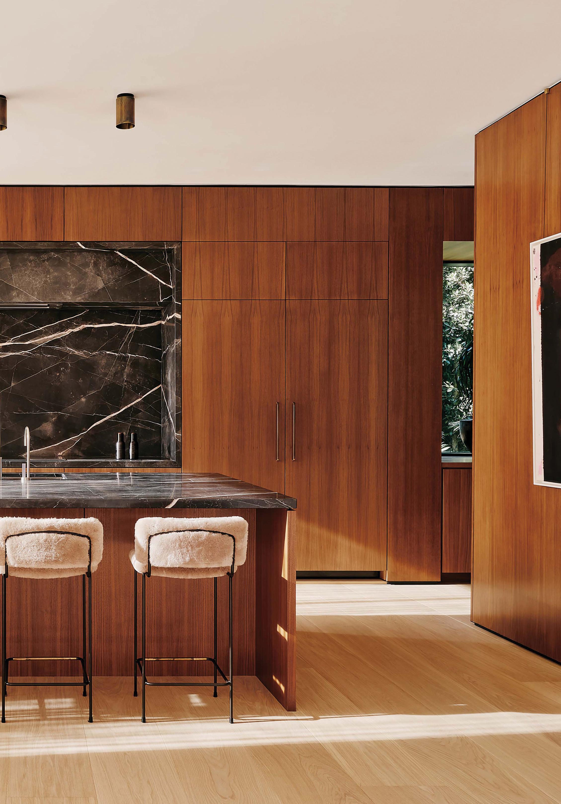
Balancing luxury and comfort, this Santa Monica home was designed to fit the needs of a growing, active family that loves to entertain. To establish the interior aesthetics—anchored by a sophisticated mix of furniture from different eras— design studio Woods + Dangaran chose two standout vintage pieces for the entryway: a Tetraclio suspension light by Sergio Mazza, and a Turkish tulu rug. Backdropped by walnut wall paneling and a floor-to-ceiling picture window framing an old-growth olive tree, the space nods to midcentury Californian design.
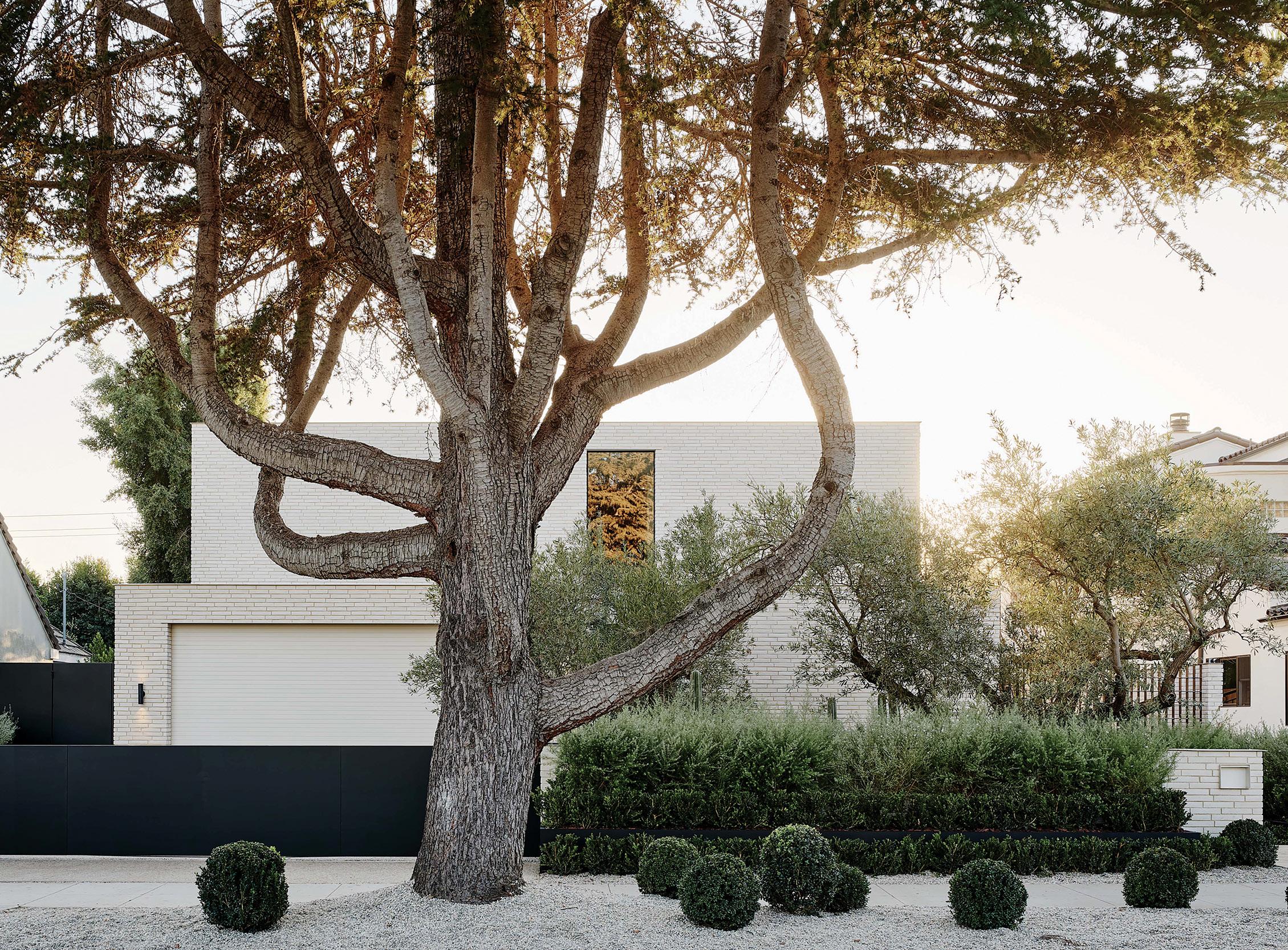
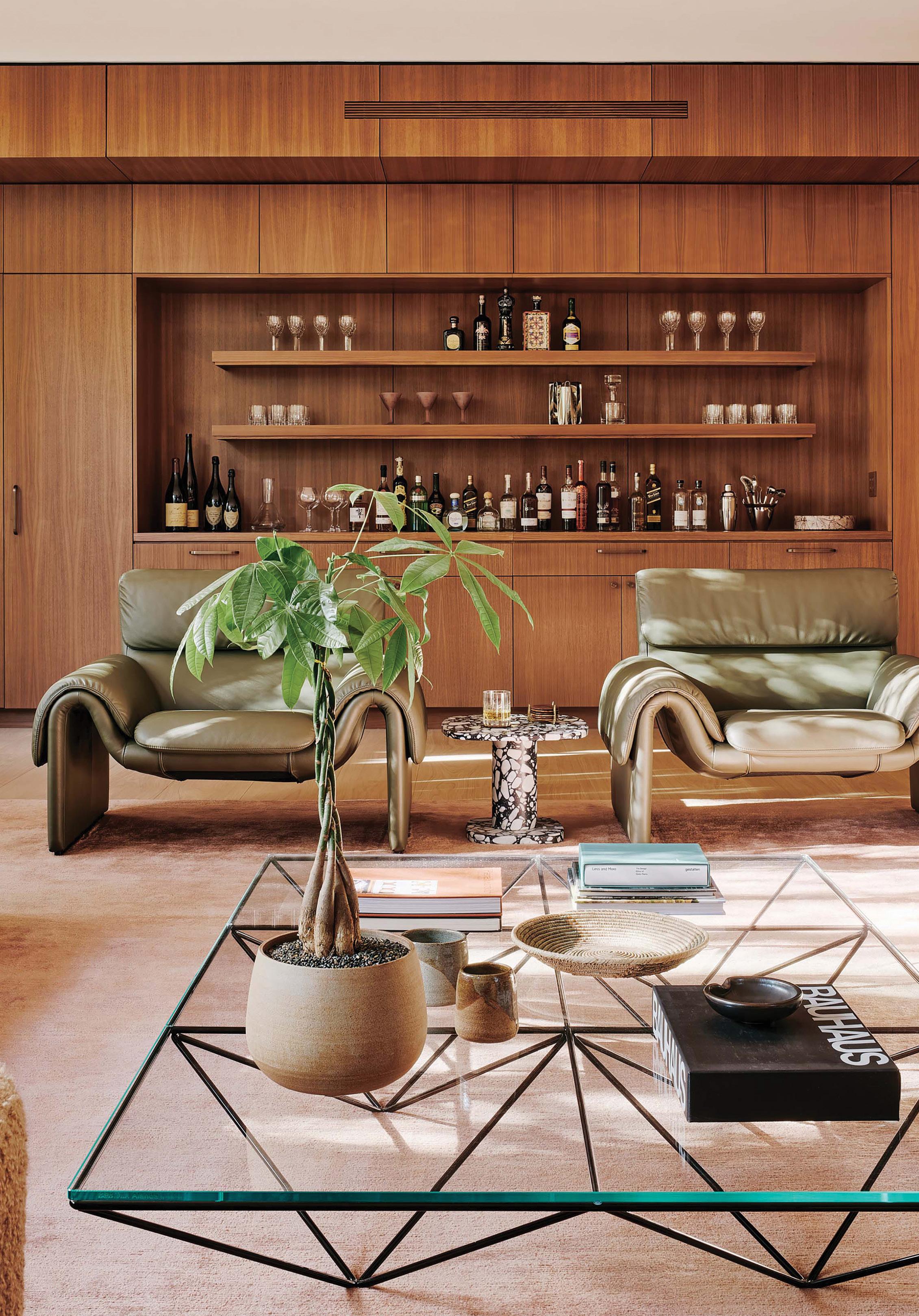
Entertainment spaces—the formal living room and the family room—are located toward the front of the house. The former is lined with windows to let in plenty of natural light. A large, rose-gold-colored rug serves as a grounding element for eclectic furnishings, including sculptural de Sede lounge chairs, two custom sofas, and a geometric Alanda coffee table by B&B Italia. “The family room is no less grand [than the formal living room], but it replaces artfulness with coziness,” the firm writes in its entry. “A custom, monolithic stone-mass coffee table, comfy Mesa lounge chairs by Lawson-Fenning, and wide doors to both the courtyard and the backyard make this an ideal room for the family to gather and connect at the end of the day.”
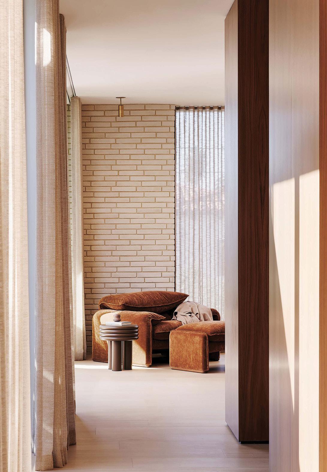
On the second floor, the light-filled primary suite provides a serene oasis. Woods + Dangaran used a Cassina lounge chair and ottoman upholstered in a chestnutcolored suede as a focal point at the end of the long entry corridor; the autumnal shade hints at the minimal palette that unfolds in the room. Around a corner, the suite opens to reveal a custom bed and built-in side tables. The room is finished with a custom silk shag rug from Mehraban and a vintage Venini chandelier.
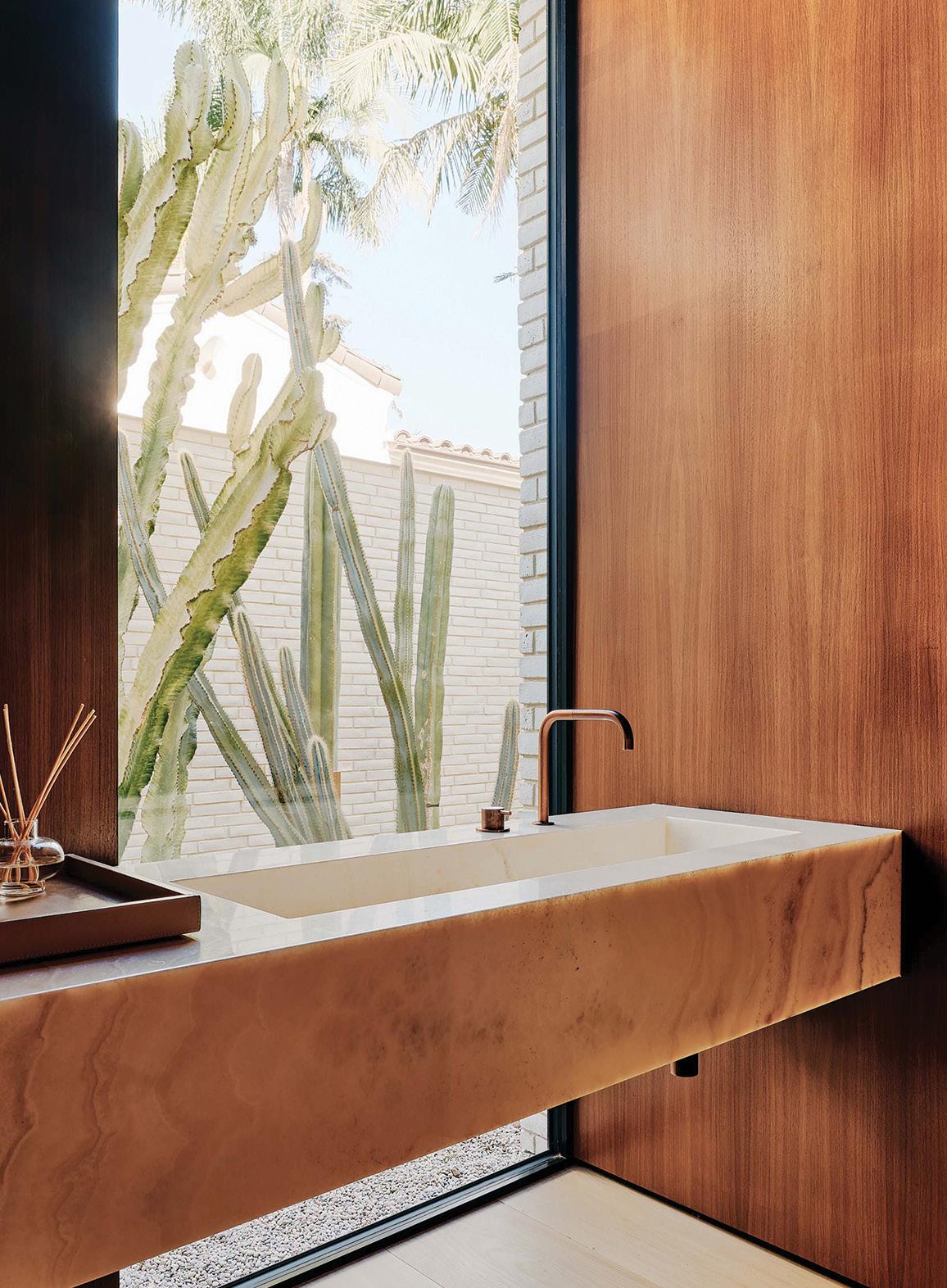
Texture from various materials—artisan brick, walnut and oak, marble and onyx—adds elevated dimension to the house. As the firm notes: “Luxurious furnishings and finishes, along with punches of cool color like deep avocado and sumptuous salmon, elegantly personalize the family’s new-classic aesthetic while elevating the space from ‘custom new build’ to ‘bespoke forever home.’” »
PROJECT DETAILS
78 GRAY
DESIGN TEAM Woods + Dangaran LOCATION Santa Monica, California, United States
DATE OF COMPLETION November 2020 JOE FLETCHER
AURORA BRIDGE SWALES

G RAY AWARDS LEGACY 2022 WINNER OMER ARBEL TNI E R I O R D E SIGN • RESIDE N T I A L 2022 WINNER WOODS + DANGARAN AL N D S C A P E DESIGN • COM M E R CIAL 2022 WINNER WEBER THOMPSON MEGHAN MONTGOMERY
82 GRAY
MONTGOMERY
MEGHAN
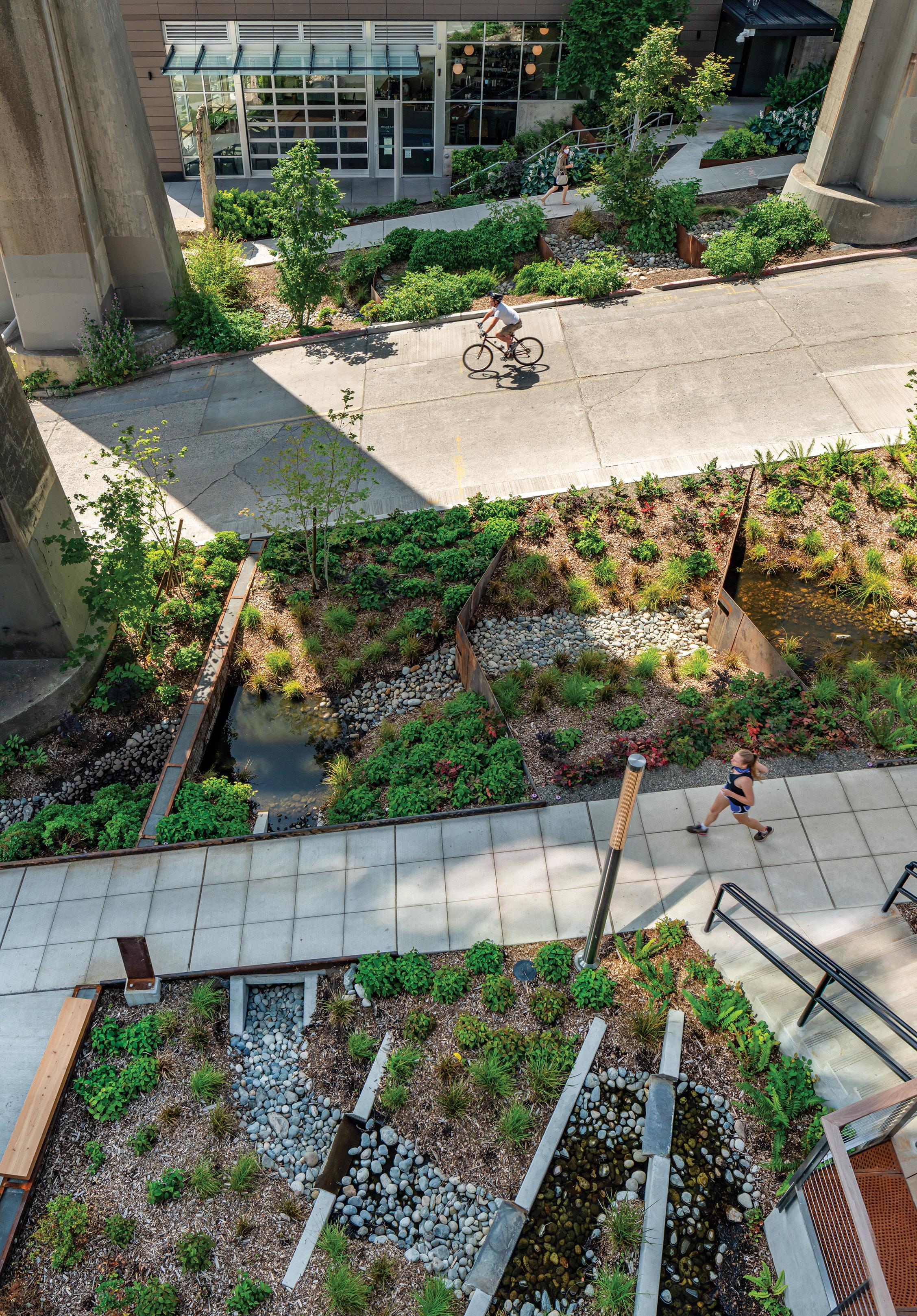
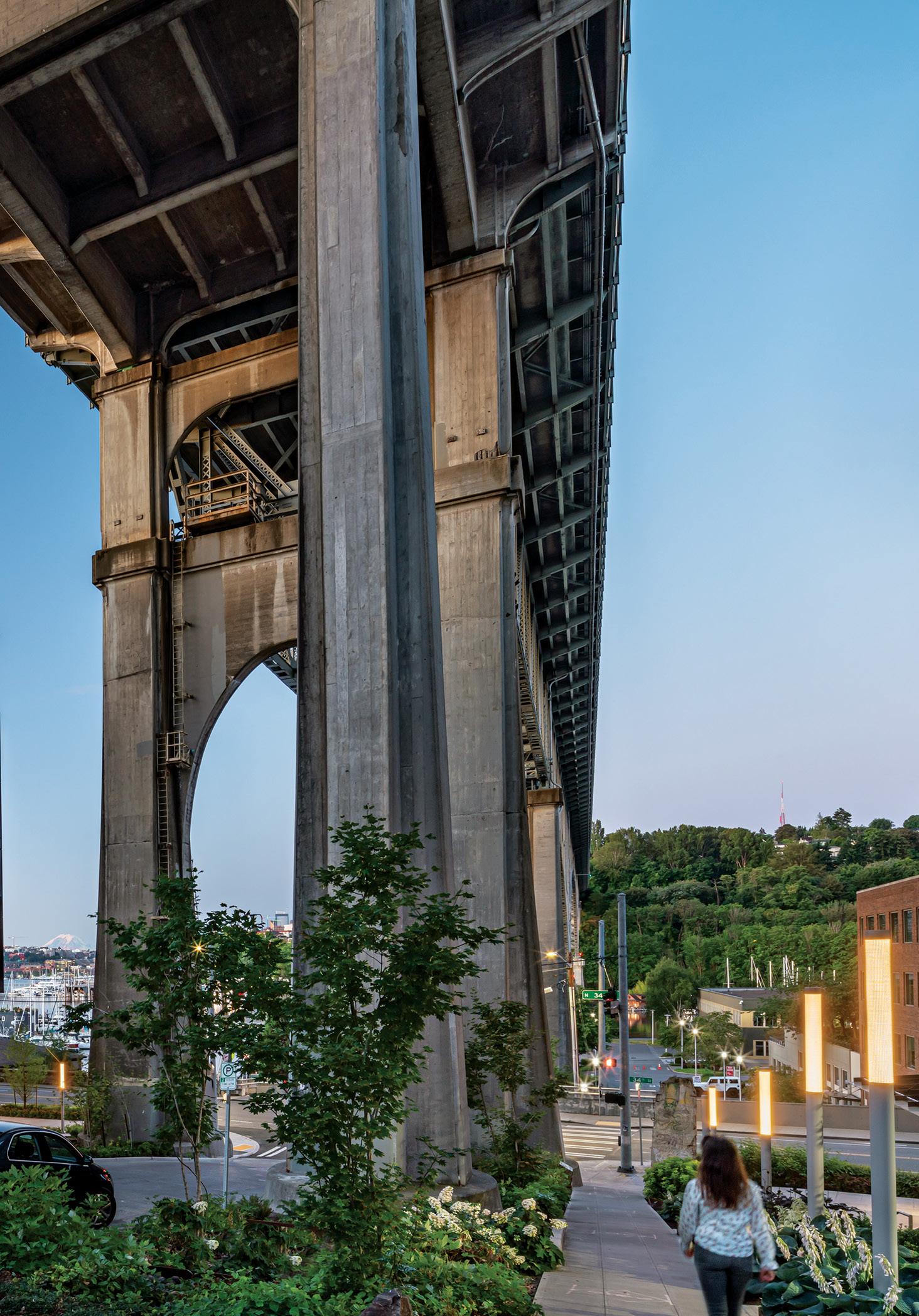
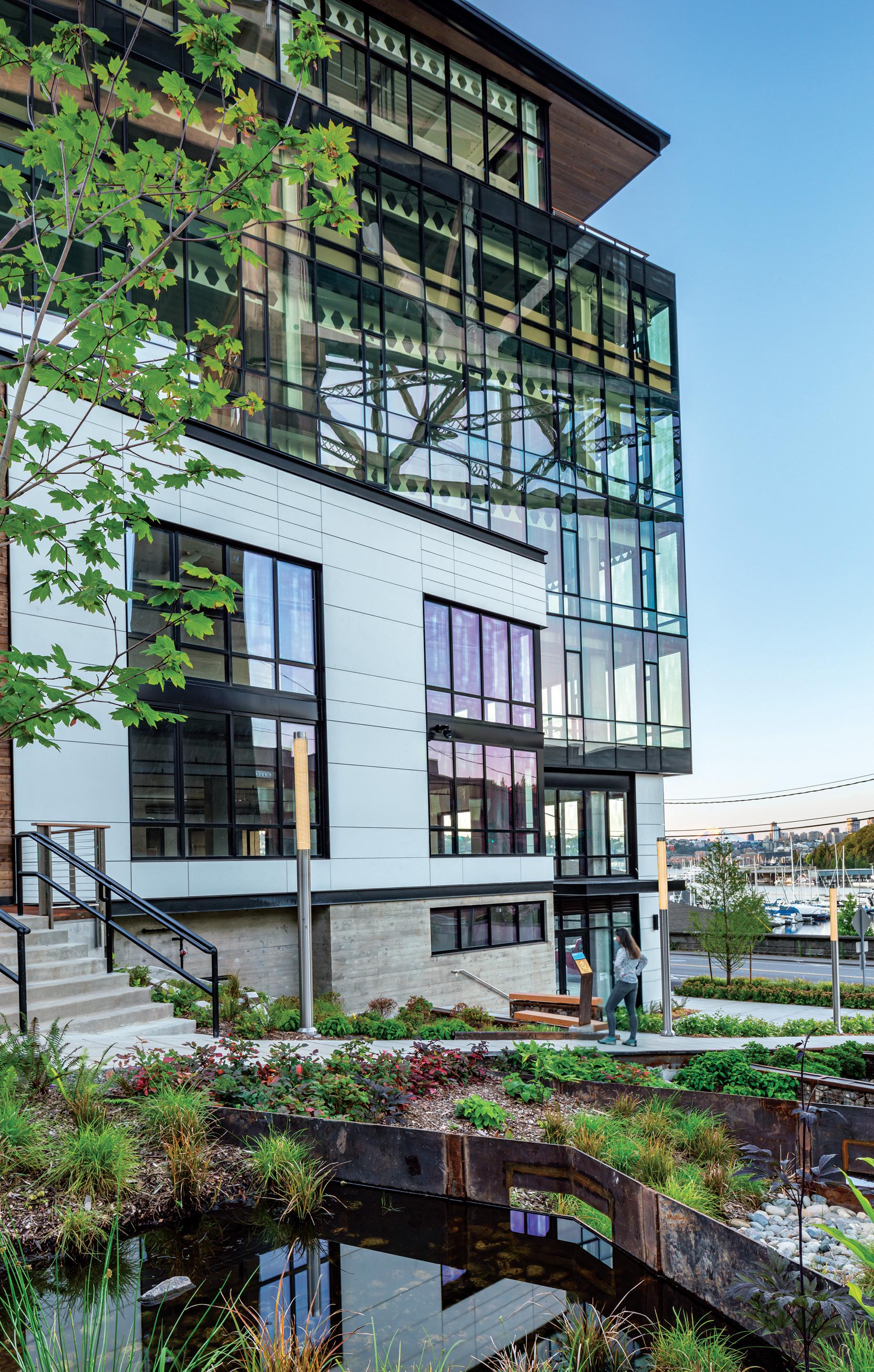
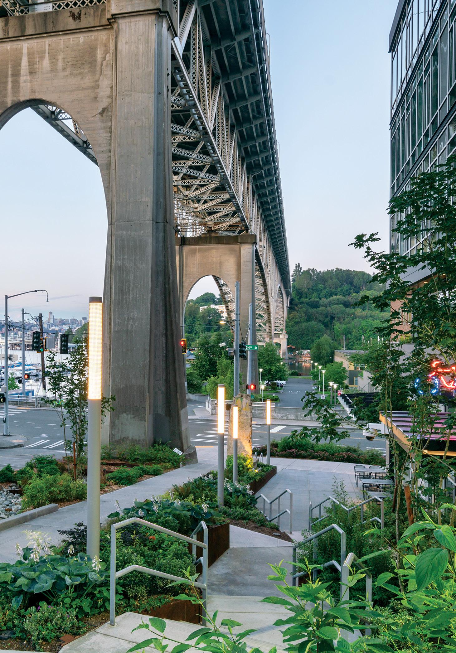
Built in the early 1930s, Seattle’s Aurora Bridge crosses the Lake Union section of the Lake Washington Ship Canal. An estimated 65,000 vehicles cross the bridge every day, yet few of the drivers or passengers in them understand the impact of their commute—tire dust and toxins from the bridge mix with rainwater and flow untreated directly into the lake below.
“Over the past decade, researchers in the Pacific Northwest have identified thousands of chemicals in urban stormwater runoff,” writes Weber Thompson, the local architecture firm that decided to act by designing an innovative, large-scale, green infrastructure project to clean the toxic runoff. “These toxins create lethal conditions for the five salmon species that swim below the bridge during annual spawning runs. Salmon are a keystone species, and the detrimental impacts on their health have a cascading effect on human and orca health in our region.”
Researchers have discovered that soil is an effective filter of toxins and is capable of eliminating their fatal impacts on an ecosystem. The Weber Thompson team, which has an office just steps from the bridge, worked with the site’s steep roadway grade, building terraced overflow bioretention cells with Corten steel weirs every two feet of grade change. Native plants, along with a variety of flowering species meant to attract pollinators, were planted in between the cells. “The vegetation naturally scrubs stormwater,” the firm notes, “allowing dissolved pollutants to settle before the filtered water is diverted back into Lake Union.”


Collectively, the Aurora Bridge swales function as a natural filter that treats up to 2 million gallons of water annually from the entire north span of the Aurora Bridge. “Seattle Public Utilities has now begun programs to incentivize similar improvements with private developments,” Weber Thompson writes. “This first-of-its-kind project is an example of how landscape architecture can serve as an agent of change, providing communities with a call to action to improve the health of our world.” »
PROJECT DETAILS
DESIGN TEAM
Rachael Meyer, PLA, LFA, GRP, LEED AP Burton K. Yuen, LEED AP BD+C Shoshanah Haberman
COLLABORATORS
Architecture: Weber Thompson
Civil engineer: KPFF
MEP design, built ecology: WSP
Living building consultant: Skanska
Transportation engineer: Heffron Transportation, Inc.
Building envelope: Allana Buick & Bers
Specifications: Applied Building Information
Steel fabricator: Metals Fabrication Company
Concrete: Turner Concrete
MEP subcontractors: Sequoyah Electric, Emerald Aire, JH Kelly
Curtain wall: Mission Glass
Electrochromic glazing: View Glass (installed by Mission)
LOCATION
Seattle, Washington, United States
DATE OF COMPLETION May 2020
84 GRAY MEGHAN MONTGOMERY
ROWAN T
Designed by Toronto- and New York–based Yabu Pushelberg, the Rowan table showcases the studio’s dedication to creating timeless furniture for contemporary life with its blend of elegance, minimalism, and innovation. Part of a collaborative collection with Canadian brand Nienkämper, the wooden conference table features a patented detail called the Cascade Edge: A crisp edge runs the length of the table on both sides, and a rounded edge caps each


end. Users can integrate power, data, and video connectivity solutions into the base, where removable panels provide easy access to wiring. “Rowan has a visually dynamic form,” Nienkämper writes in its submission.
“Borrowing elements found in nature, [it] explores shape, balance, and materials. Organic materials and design add warmth and character to modern workplace interiors. From boardrooms to lounges, this versatile collection will inspire refined sophistication in any space.” »
86 GRAY


ABLE
LUSTYK
DETAILS
DATE OF COMPLETION June 2022 RP O D U C T D E SIGN • LIGHTI N G , F URNITURE 2022 WINNER YABU PUSHELBERG FOR NIENKAMPER ..
PETER
PROJECT
DESIGN TEAM Glenn Pushelberg and George Yabu
ARCHITECTURE OF NORMAL: THE COLONIZATION OF THE AMERICAN LANDSCAPE
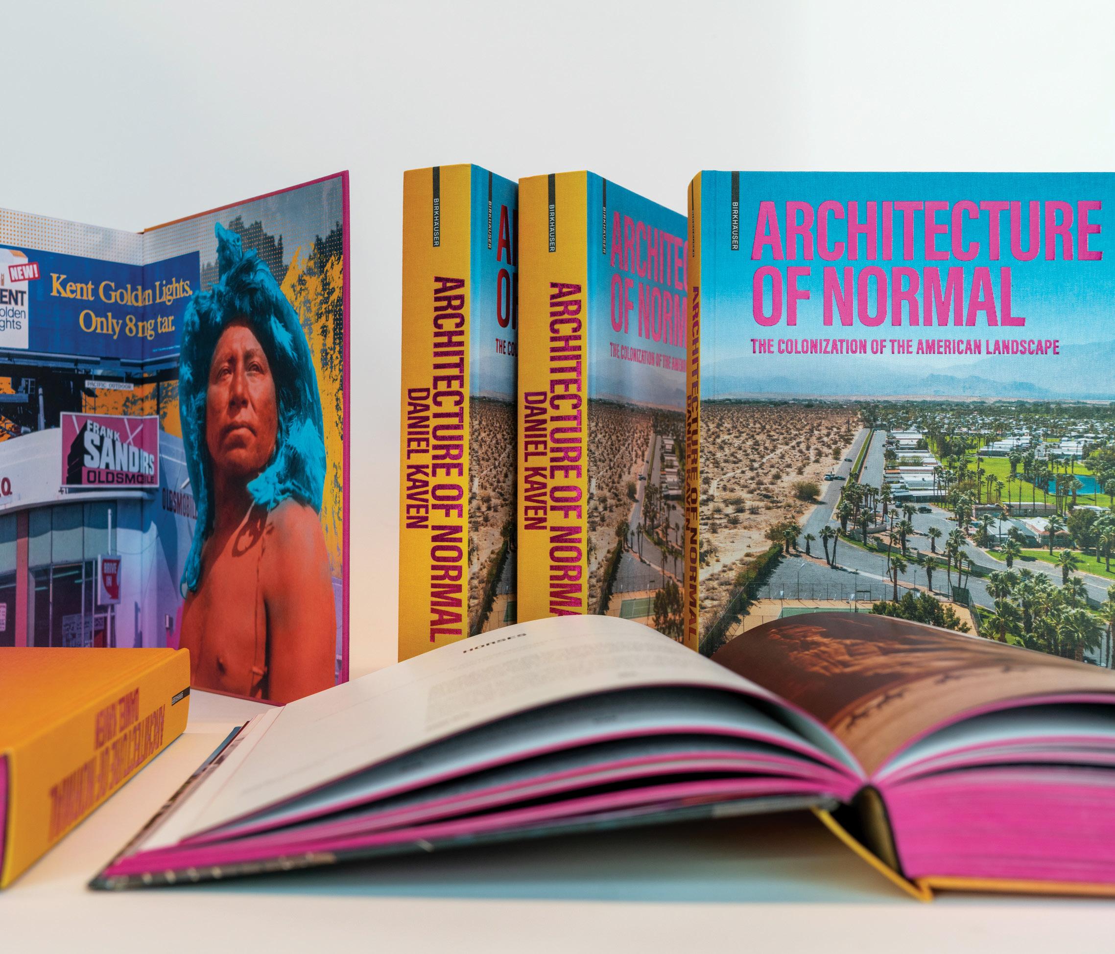
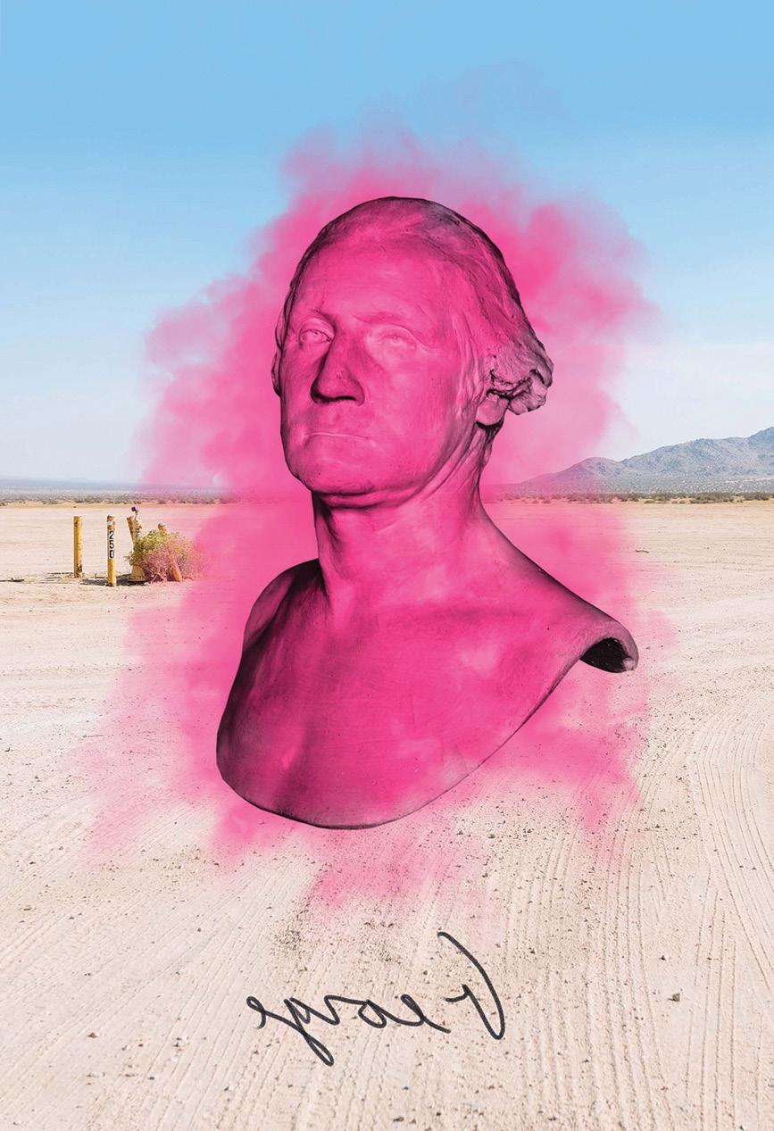
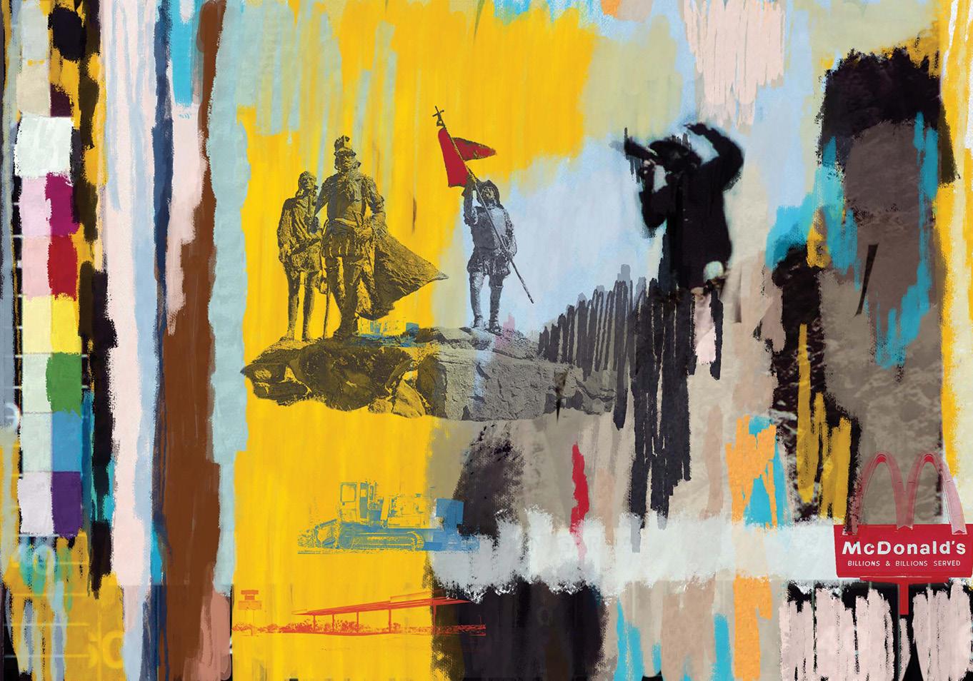
n his book Architecture of Normal: The Colonization of the American Landscape (through Birkhäuser), Portland-based architect Daniel Kaven explores the contrast between the grandeur of the American landscape and the underwhelming architecture of its suburban strip malls, fast-food chains, motels, and tract housing. Part travelogue, part art book, and part architectural survey, the volume also traces how the evolution of modes of transportation (starting with the introduction of horses by the Spanish to Native American societies) has influenced design and development in the United States over the past 200 years. Using extensive historical photography, personal narrative, and original art, Kaven takes the reader on a highly visual journey through areas of America that are often overlooked.
“The [book’s] design is intended to evoke the loud, branded architecture that consumes much of the modern American West,” Kaven writes in his entry. “To this end, [I] utilized a palette of electric colors and foil stamping, mirroring the neon hues and gaudy signage that dominate the built environment as seen from highways. Bright pink page edges further reflect this aesthetic and serve to unify the book’s bold interior and exterior.” »
GRAY 89
DANIEL KAVEN
I PROJECT DETAILS DESIGN TEAM Lead designer: Daniel Kaven COLLABORATORS Publisher: Birkhäuser Graphic design: Daniel Kaven Editor: Natalie Garyet Copy editor: Elizabeth Gregory Project management for Birkhäuser: Ria Stein Production: Amelie Solbrig Printing: Eberl & Kœsel GmbH & Co. KG, Altusried-Krugzell Prepress: pixelstorm, Vienna DATE OF COMPLETION March 2022 RP O D U C T D E SIGN • LIGHTI N G , F URNITURE 2022 WINNER YABU PUSHELBERG FOR NIENKAMPER RP O D U C T D E SIGN • OTHER 2022 WINNER AUTHOR/DESIGNER: DANIEL KAVEN PUBLISHER: BIRKHAUSER ..

ANDRES OROZCO

TNI E R I O R D E SIGN • COMM E R C I A L 2022 WINNER SKYLAB ARCHITECTURE A R C H I T E C T URE • RESIDE N T I A L 2022 WINNER WOODS + DANGARAN RP O D U C T D E SIGN • OTHER 2022 WINNER AUTHOR/DESIGNER: DANIEL KAVEN PUBLISHER: BIRKHAUSER WILD • CARD 2022 WINNER CLB ARCHITECTS WILD • CARD 2022 WINNER CLB ARCHITECTS FILTER

 LEONID FURMANSKY; OPPOSITE: KEVIN SCOTT
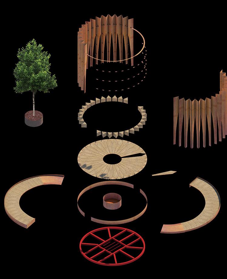
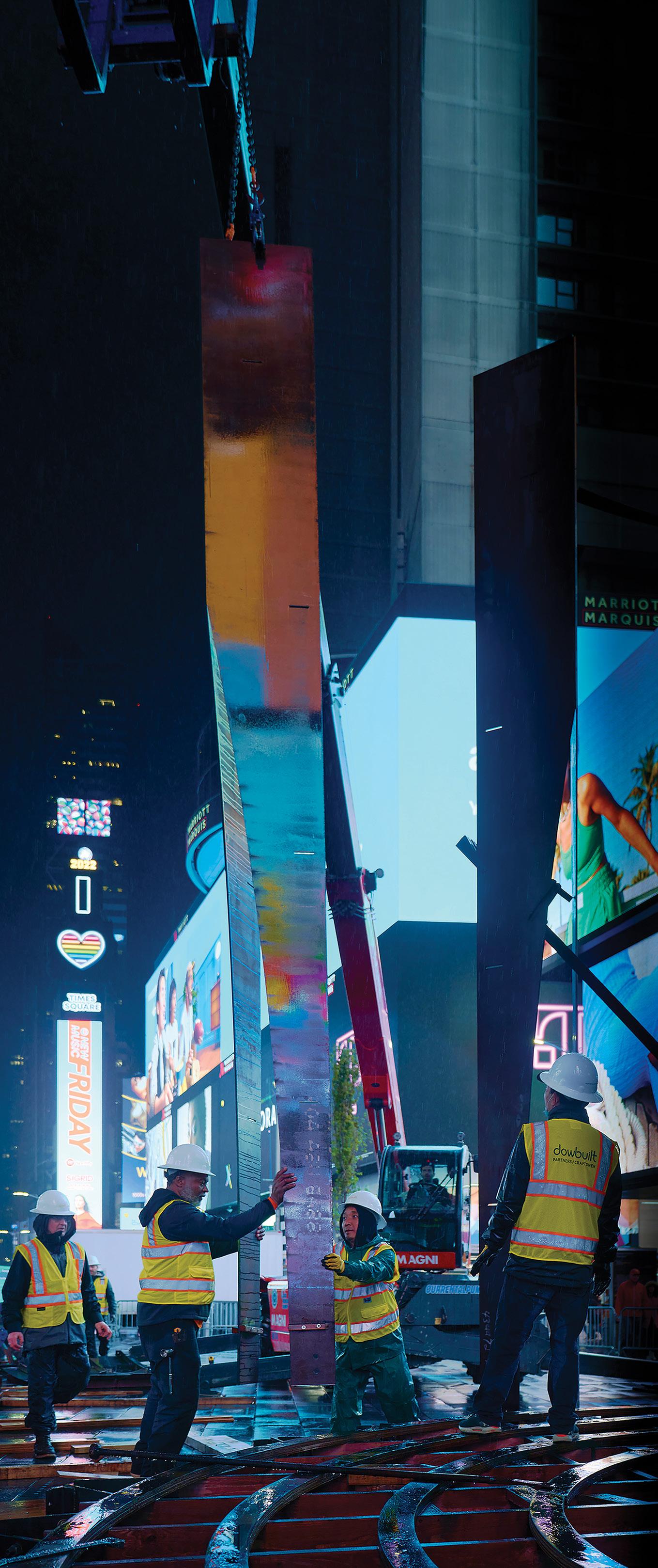
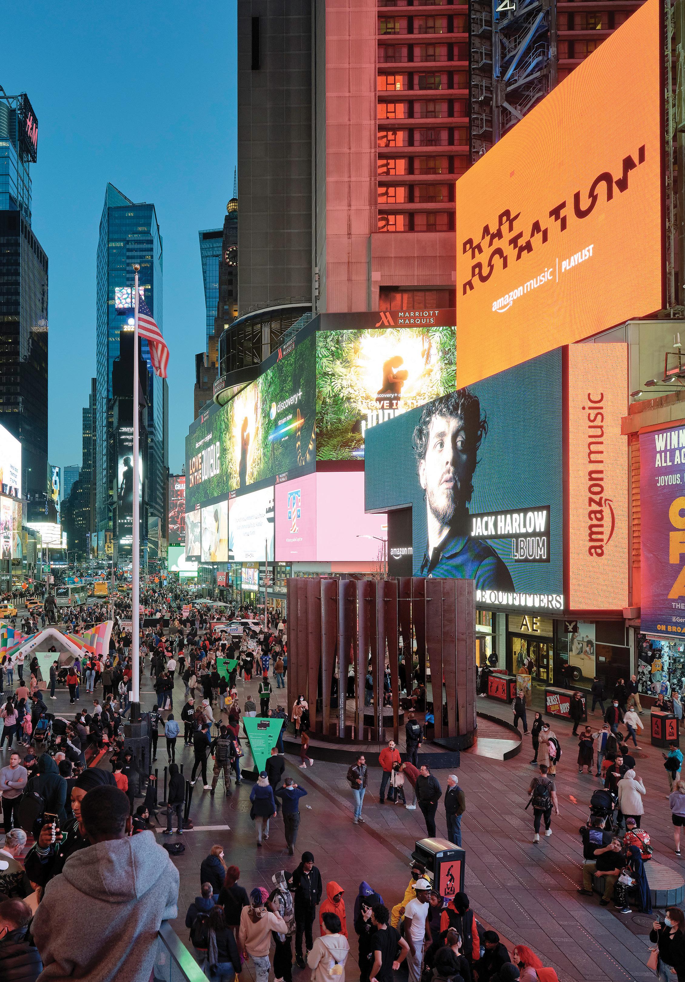
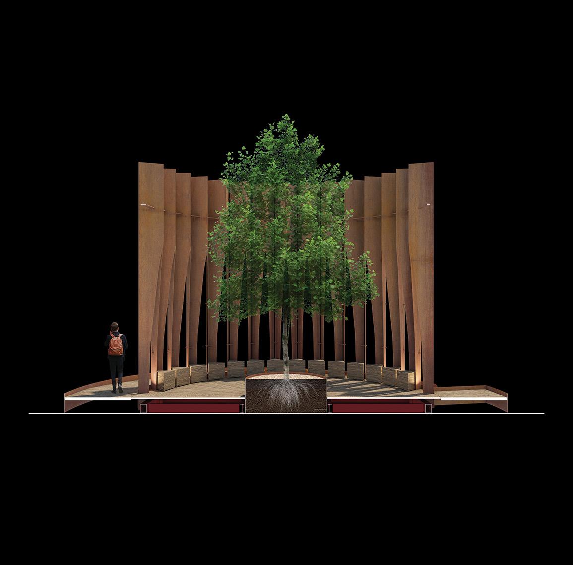
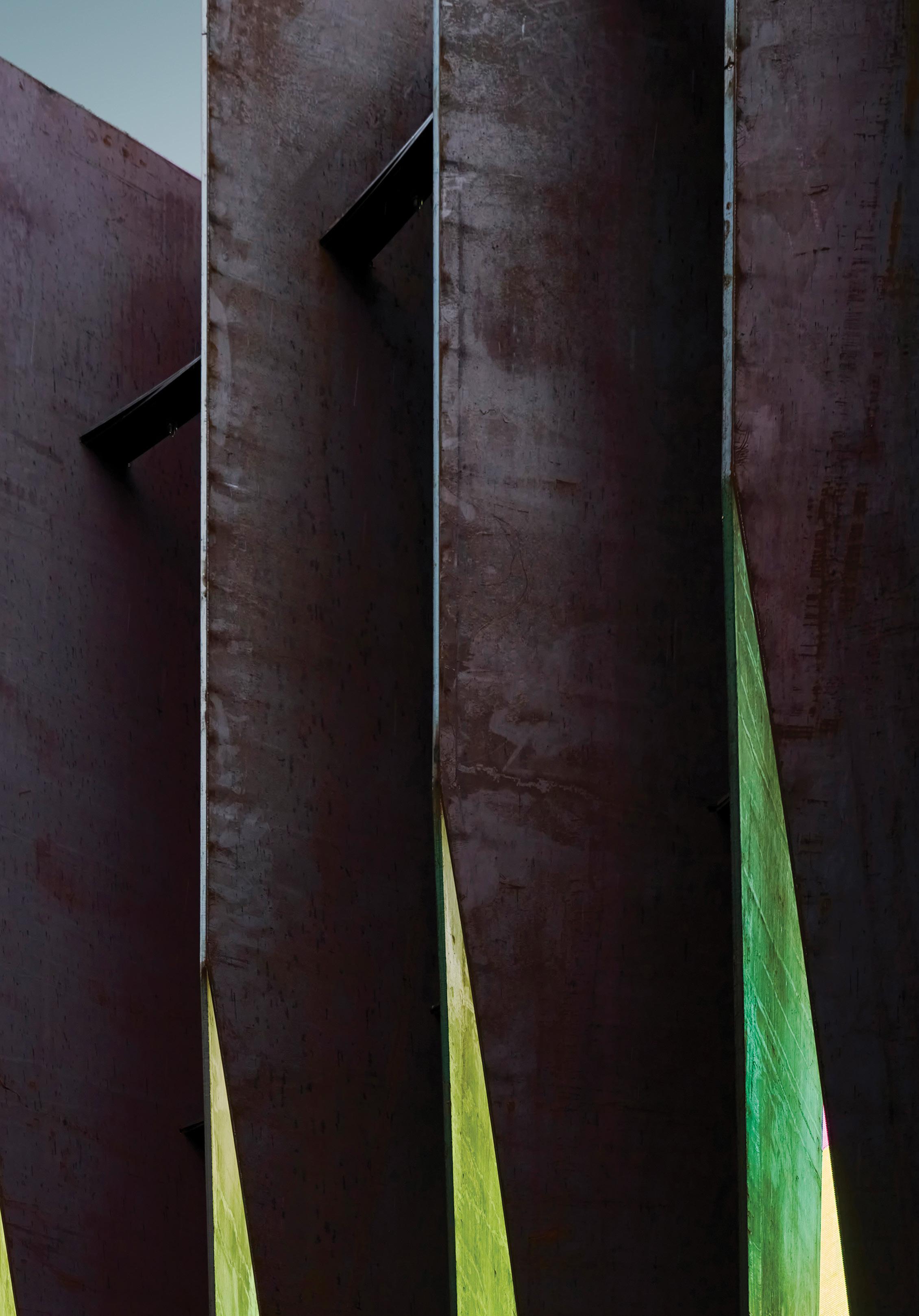
Created for the NYCxDesign 2022 festival, FILTER—a dynamic architectural installation in the heart of Times Square—served as both an object and an experience. The brainchild of Wyoming-based CLB Architects “is the result of a close collaborative process,” the firm writes. “It draws on the expertise of over 100 craftsmen, engineers, and designers at nine firms spanning North America. From British Columbia to New York City, this wide-reaching root system provided the physical materials and skills [to create] the pavilion, which transplants a fragment of the Rocky Mountain West into a bustling East Coast metropolis.”
The concept for the structure began as a folded sheet of paper, carefully sliced and able to stand on its own. Meant to evoke the rugged Wyoming landscape and to contrast with the chaotic energy of Times Square, the finished FILTER was a series of hot-rolled-steel plates arranged to form a 24-foot-wide ellipsoid that stood 20 feet high. A gently sloping ramp wrapped the perimeter, offering views of the interior, which held a lone tree meant to draw passersby in for a moment of calm. “The pavilion’s chapel-like design facilitates a new understanding of place,” writes CLB, “and provides each occupant the chance to explore their relationship with the natural world.”
FILTER was designed with attention to its sustainability, portability, and longevity. Following the NYCxDesign festival, the tree was donated to the New York City nonprofit the Battery Conservancy and the pavilion was disassembled and transported back to Wyoming to continue its life as a public sculpture at the steel fabricator’s headquarters. h —Rachel Gallaher
PROJECT DETAILS
DESIGN TEAM
CLB Architects: Eric Logan, Sarah Kennedy, Bryan James, Jeffrey Johnston
Exhibit patron, steel supplier and Fabricator: EMIT Wood supplier and wood fabricator: Spearhead

COLLABORATORS
Builder: Dowbuilt
Structural engineer: KL&A, Inc.
Lighting designer: HELIUS
Light fixture Provider: B-K Lighting Tree provider: Raemelton Farm
Lighting contractor: Apollo Electric
LOCATION
New York, New York, United States
DATE OF COMPLETION May 2022
94 GRAY
 KEVIN SCOTT
BEST BAR OR LOUNGE
HONORABLE MENTION
TOMO GRAYPANTS
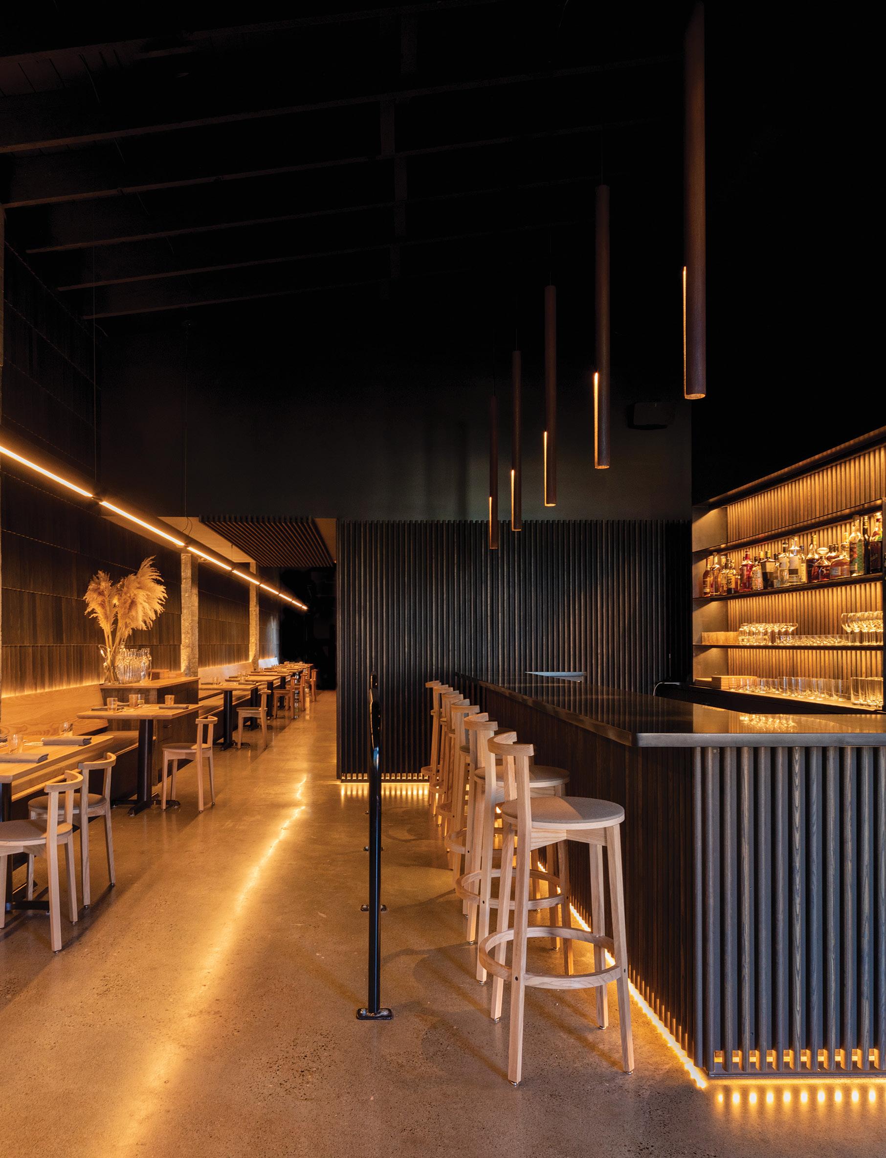
Each seat feels like the best one in the house in this luxurious, handcrafted interior. With a modest budget, the design team made simple materials feel chic by using a monochromatic palette and finishes that feel complex but are efficient to install. Nearly every piece of the interior was created locally—the pendant lighting, the 80-foot-long light fixture, bench seating, chairs, barstools, tabletops, slatted wall panels, and shake cladding were custom designed and fabricated in a studio just 5 miles away. DESIGN TEAM: Seth Grizzle, Bryan Reed, Caleb Patterson, and Alan Marrero. COLLABORATORS: Fin Design Shop. LOCATION: White Center, Washington, United States. DATE OF COMPLETION: September 2021.
96 GRAY GRAY AWARDS
ADAM JOSEPH WELLS
LIVE-WORK BATHROOM REMODEL
MICHELLE DIRKSE INTERIOR DESIGN
BEST BATH
It’s the simplicity of palette that makes the bathroom in this live-work space shine. The mostly white room is a backdrop for meticulously installed lavender marble tile, which adorns walls, the walk-in shower, and the vanity backsplash. Complementing the beautifully veined stone are elegant plumbing fixtures, wall sconces, a vintage chandelier, and an oversize mirror that extends to the 11-foot-tall ceiling. DESIGN TEAM: Michelle Dirkse. COLLABORATORS: Blue Sound Construction; Icon Tile. LOCATION: Seattle, Washington, United States. DATE OF COMPLETION: July 2022.

GRAY 97
KARA MERCER
BEST COLLABORATION
HONORABLE MENTION
REMIX MAISON
IRINA FLORE AND NATIVE SHOES

98 GRAY GRAY AWARDS
THOM ALLEN
Product designer Irina Flore collaborated with purpose-led footwear brand Native Shoes, using its proprietary Native Shoes Remix material (a combination of EVA and rubber sourced from reclaimed footwear) to design sculptural, multifunctional furniture. DESIGN TEAM: Irina Flore. COLLABORATORS: Thom Allen, Native Shoes. DATE OF COMPLETION: August 2022.
BEST HEALTH & WELLNESS SPACE
AEON FUTURE HEALTH CLINIC
MCKINLEY STUDIOS
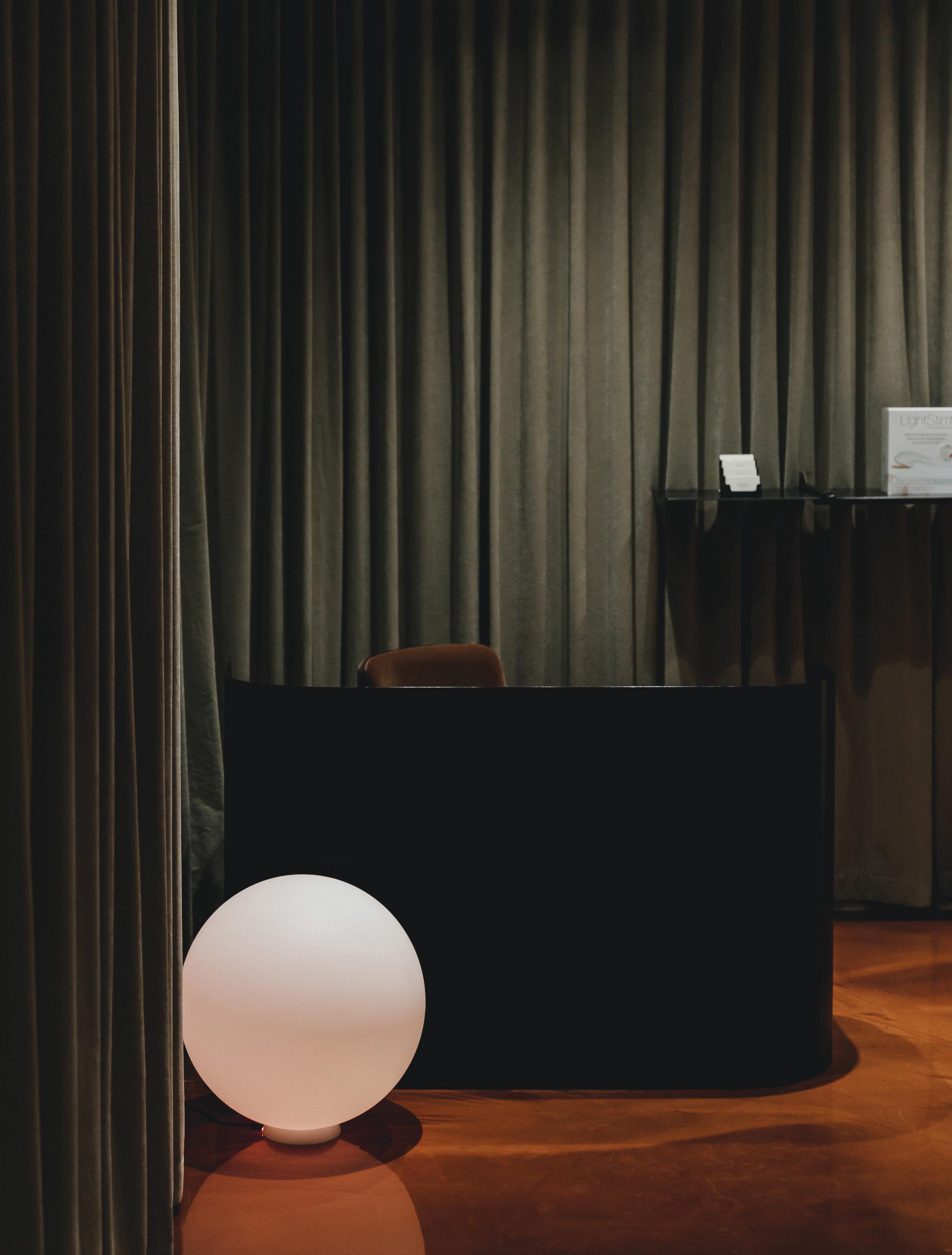
Rich textiles in a monochromatic palette set the tone and a lighting system aids wayfinding throughout the interiors of this futuristic health clinic—bright light attracts, dim light soothes, soft glow calms, and red light energizes. DESIGN TEAM: Diane Cassidy and Walker McKinley. COLLABORATORS: Procuratorial; D.B.K. Engineering Ltd. LOCATION: Calgary, Alberta, Canada. DATE OF COMPLETION: June 2020.
GRAY 99
WHEN THEY FIND
US
HONORABLE MENTION
BEST HISTORIC RESTORATION / RENOVATION PROJECT
THE PLAZA THEATRE MCKINLEY STUDIOS
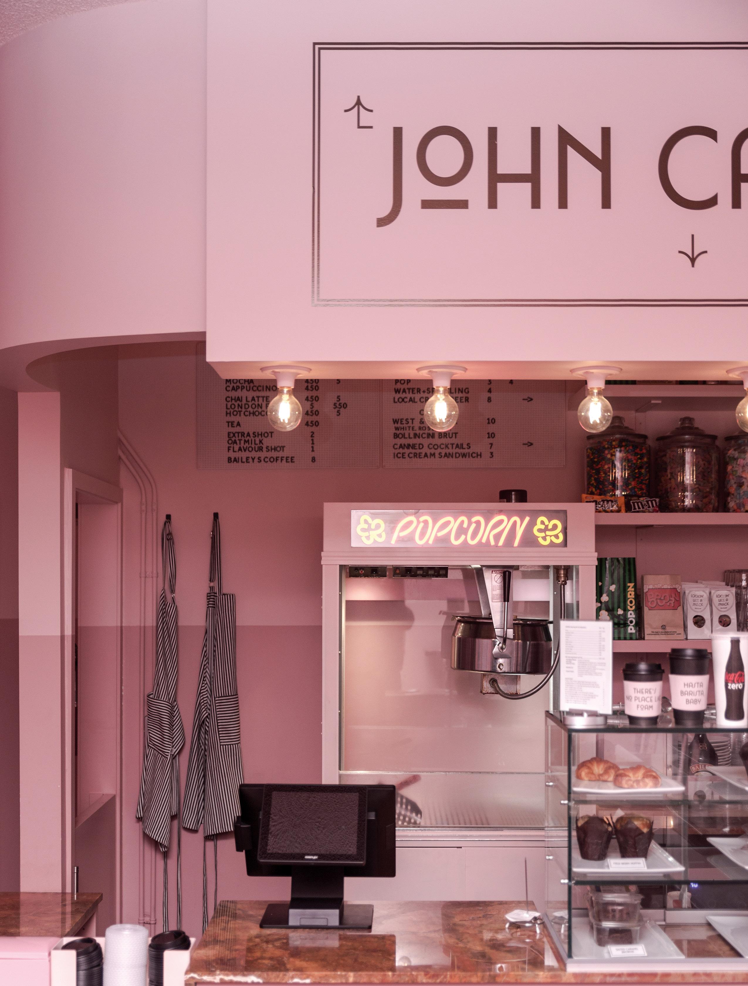
A renovation highlighting culture, music, and art expresses the sense of fun and spectacle that the historic Plaza Theatre has always embodied. The concession stand (labeled “John Candy”) is color-blocked in pinks and revived with new millwork and repurposed boneyard-sourced stone-slab countertops. A janitor closet was converted into a speakeasy designed to evoke the vibe of West African taverns of the 1960s. Outside, an Airstream-turned-food-truck is home to a rotating roster of local restaurateurs. DESIGN TEAM: Bao-Nghi Nhan and Emma Dwinnell. COLLABORATORS: Procuratorial; Create Construction Management Group. LOCATION: Calgary, Alberta, Canada. DATE OF COMPLETION: June 2021.
100 GRAY GRAY AWARDS
WHEN THEY FIND US
SEATTLE KITCHEN REMODEL
GRAY 101
BEST KITCHEN
RAFAEL SOLDI
MICHELLE DIRKSE
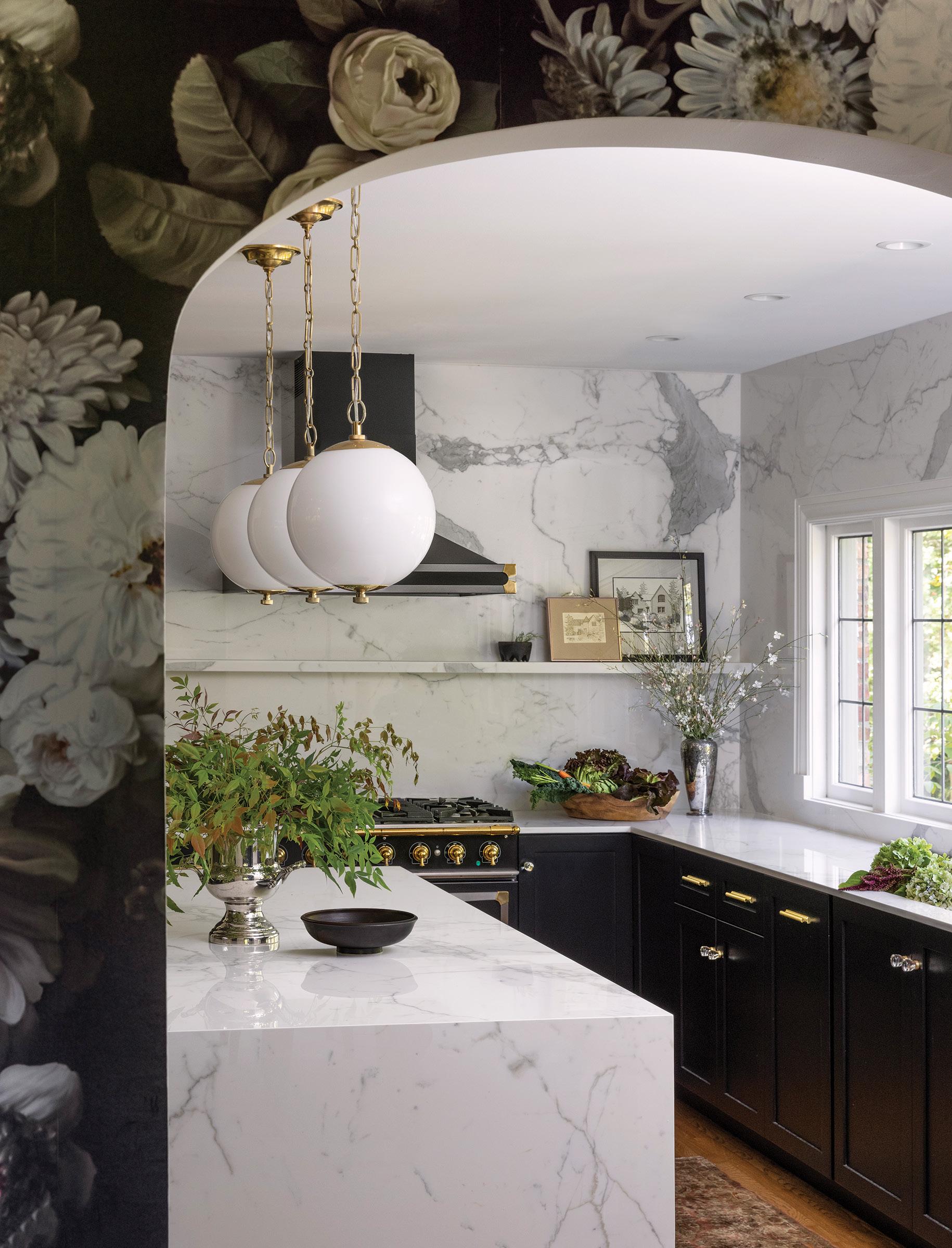
INTERIOR DESIGN Blurring the line between modern and traditional, this kitchen features black cabinetry and Carrara-marble-like porcelain counters and backsplash with a narrow ledge for displaying art or small kitchen items. The enlarged archway connecting kitchen and dining room is covered in a bold floral wallpaper. DESIGN TEAM: Michelle Dirkse, Vilma Garshae, and Ashlyn Turner. LOCATION: Seattle, Washington, United States. DATE OF COMPLETION: August 2021.
102 GRAY GRAY AWARDS HONORABLE MENTION BEST SMALL SPACE MICHELLE DIRKSE INTERIOR DESIGN OFFICE MICHELLE DIRKSE INTERIOR DESIGN
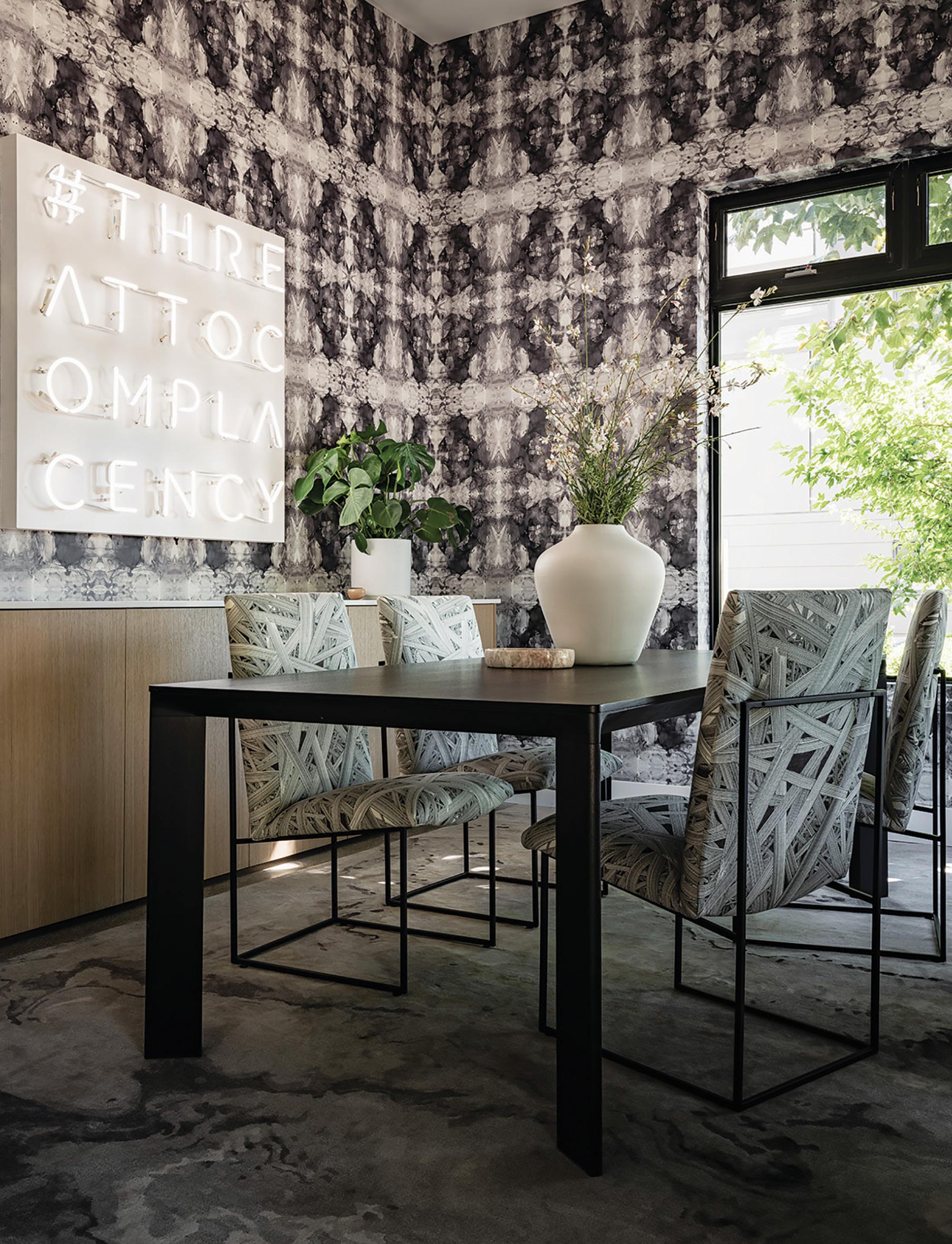
MERCER Black-and-white pattern on pattern is a design theme throughout this live/work space. The conference room features the designer’s own line of textiles—wallpaper, chair upholstery, and rug—and custom local art hangs above the credenza. DESIGN TEAM: Michelle Dirkse. COLLABORATORS: Blue Sound Construction; Icon Tile & Design; Kevin Cox Graphic Design. LOCATION: Seattle, Washington, United States. DATE OF COMPLETION: July 2022.
KARA
GRAY 103
3FORM
BEST SURFACE MATERIAL PROFILE
3 FORM ELEMENTS
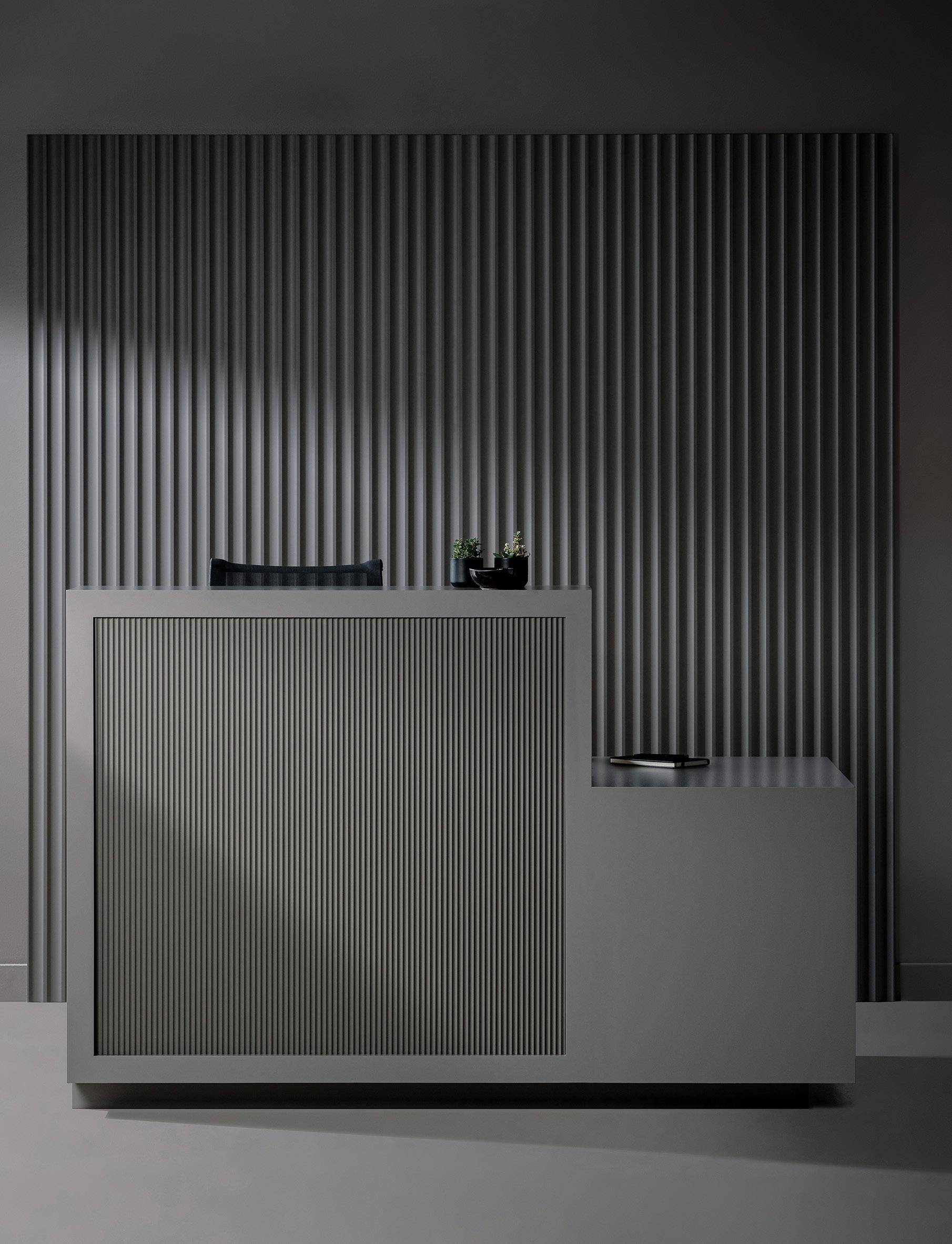
Drawing design inspiration from fluting, a traditional architectural detail dating back to ancient Greek columns, 3form’s latest Profile patterns (Cord, Crimp, Groove, Ruffle, and Rumble) bring linear texture and drama to commercial applications. DATE OF COMPLETION: July 2022.
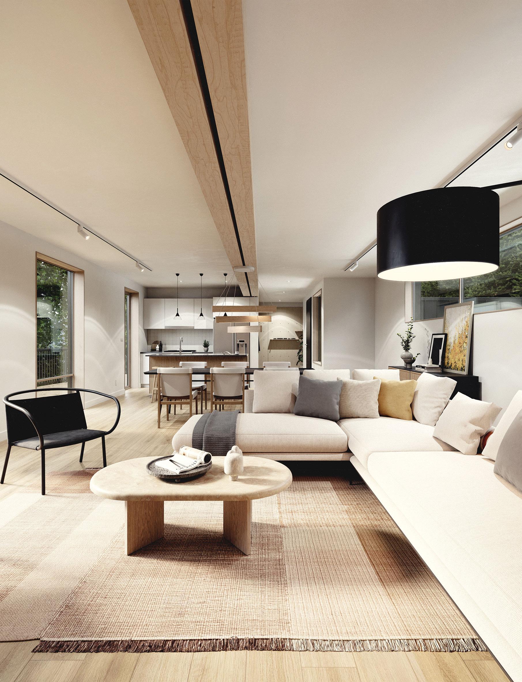
Enova Residential turned to Measured Architecture to design a net-zero modular home that would exceed current building codes, all for a lower-than-average price tag. The architecture firm’s solution is a stylish and efficient home made for year-round living, on- or off-grid, with the ability to produce at least as much energy as it consumes. DESIGN TEAM: Piers Cunnington, Clinton Cuddington, and Helene Morvant. COLLABORATORS: Adaptive Homes; Snazzy Construction Ltd.; Fast + Epp Structural Engineers; Capital Home Energy Inc. LOCATION: Pre-fabricated in Revelstoke and transported to Salt Spring Island, British Columbia, Canada.
DATE OF COMPLETION: August 2021.
GRAY AWARDS
MENTION BEST SUSTAINABLE DESIGN NET ZERO MEASURED ARCHITECTURE MEASURED ARCHITECTURE
HONORABLE
104 GRAY
SCOTT EDWARDS ARCHITECTURE
BEST VISIONARY DESIGN
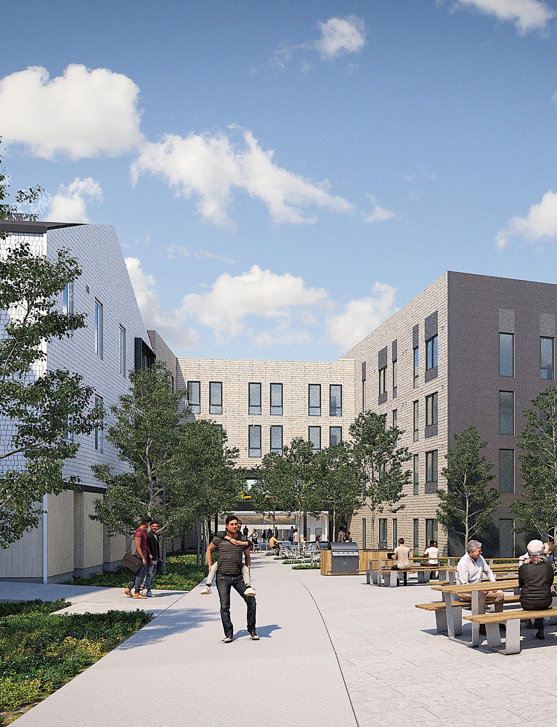
Addressing socio-economic stratification, this “Community for All Ages’’ cultivates intergenerational interaction. Designed to Earth Advantage Platinum standards, the development uses cross-laminated timber (CLT) and a rooftop solar array, and employs strategies for wildfire resiliency. DESIGN TEAM: Lisa McClellan, Dave Mojica, Alexa Cano, Philip Viana, Molly Culbertson, Amy Cripps, Jared Thornberry, Melissa Ehn, and Michael Gregg. COLLABORATORS: Community Development Partners; PLACE; Interface Engineering; Stonewood Structural Engineers. LOCATION: Salem, Oregon, United States. DATE OF COMPLETION: Anticipated July 2024.
GRAY 105
MAHONIA CROSSING AFFORDABLE HOUSING COMMUNITY
SCOTT EDWARDS ARCHITECTURE

106 GRAY GRAY AWARDS
MENTION BEST WORKSPACE/ HOME OFFICE KIPS BAY DECORATOR SHOW HOUSE PULP DESIGN STUDIOS CODY ULRICH Designed with strong, smart, savvy female occupants in mind, this workspace’s distinct personality is defined by a geometric patterned wallpaper, custom ceiling mural, upholstered furniture, and layers of textures. DESIGN TEAM: Beth Dotolo and Carolina V. Gentry. COLLABORATORS: More Design + Build. LOCATION: New York, New York, United States. DATE OF COMPLETION: September 2021. h
HONORABLE
CH& provides highly effective legal counsel to clients in all aspects of real estate development, land use and zoning, business transactions, litigation, and bankruptcy and creditors’ rights. We are known for our ability to combine creative thinking, local partnerships and expert knowledge to achieve our clients’ success.


 Inform Interiors 1526 Bellevue Avenue, Seattle (on Capitol Hill) 206.622.1608 informinteriors.design
exclusively at
the beauty of design
CAIRNCROSS.COM Design Professional Representation and Construction Law

LAST CALL
One more round of inspired design.
GRAY 109
BRANDON BARRE
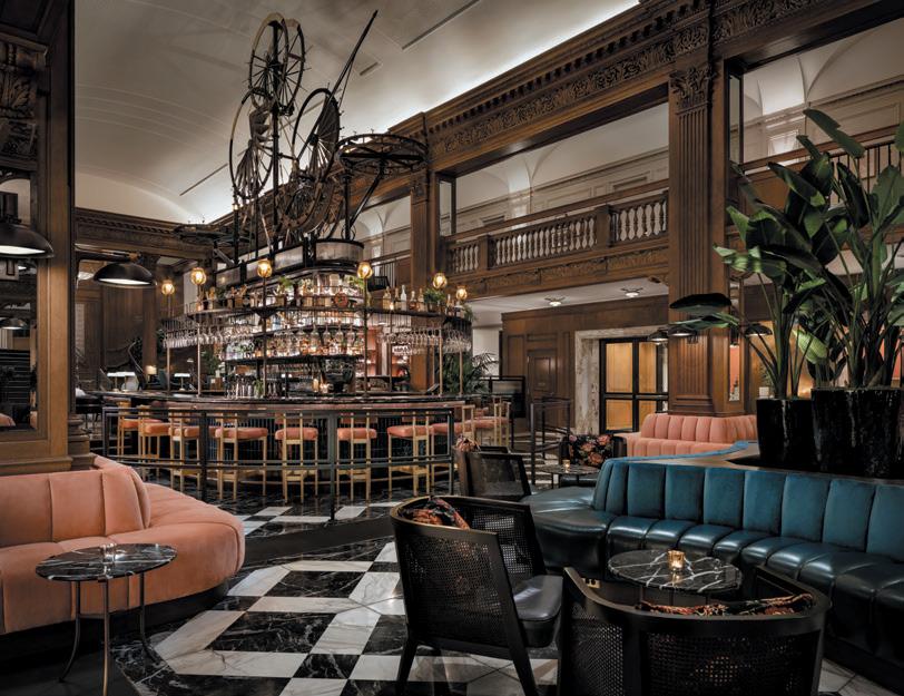
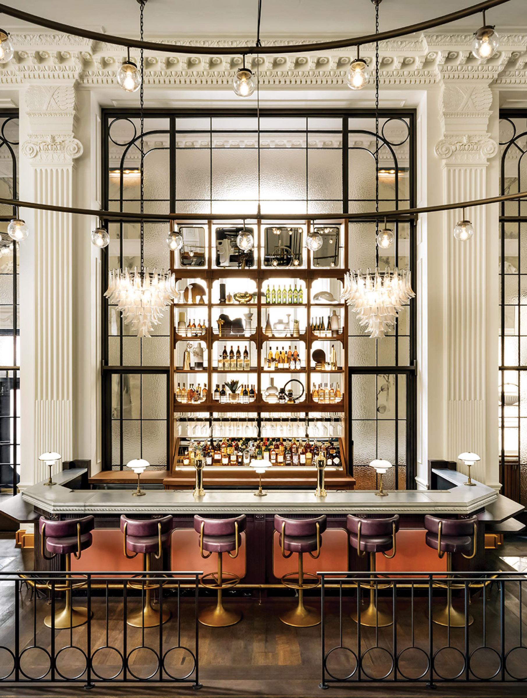
Seattle’s Fairmont Olympic Hotel opened its new restaurant, the George, last spring. The newly added bar is elegant yet not overdone, embracing the heritage of classic European brasseries.

110 GRAY LAST CALL
CONCIERGE
BARRE
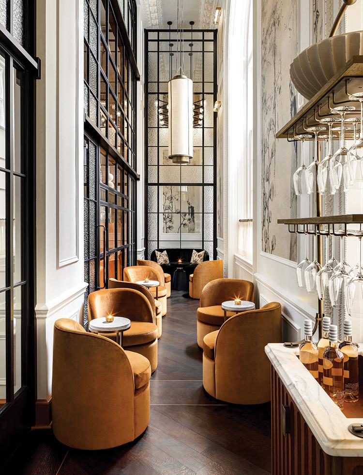
ABOVE AND OPPOSITE: When designing the George, Lázaro Rosa-Violán Studio retained the historic hotel’s architectural details, combining them with plush furnishings and layers of pattern.
BRANDON
CULINARY ELEGANCE
The Fairmont Olympic Hotel’s restaurant reopens with a sophisticated design that embraces the property’s rich heritage.
By Rachel Gallaher
Last spring’s opening of the George restaurant at Seattle’s Fairmont Olympic Hotel marked the completion of a two-phase renovation of the historic downtown property, which opened in 1924. Formerly known as the Georgian Room, the space was reimagined as a modern brasserie by Barcelona-based design firm Lázaro Rosa-Violán Studio, with MG2 serving
as the architect of record. Original architectural details, from elegantly curved windows to decorative moldings, were retained to preserve the original character of the dining room, which features a palette of soft pinks and shades of green with gold accents. The design team created a balanced, vintage-meets-contemporary look with curvy velvet-upholstered
chairs, giant modern circular chandeliers, and marble floor tiles set in a bold zigzag pattern. A new bar with a carved marble countertop and wooden, multi-tiered bottle storage feels Parisian, but simple décor and a muted color palette keep its design grounded in the Pacific Northwest. h
GRAY 111
Join us as we explore the theme ‘Moving Parts’, shining a light on design products and processes which have evolved to meet ever changing global conditions. Register Now.
IDSToronto.ca
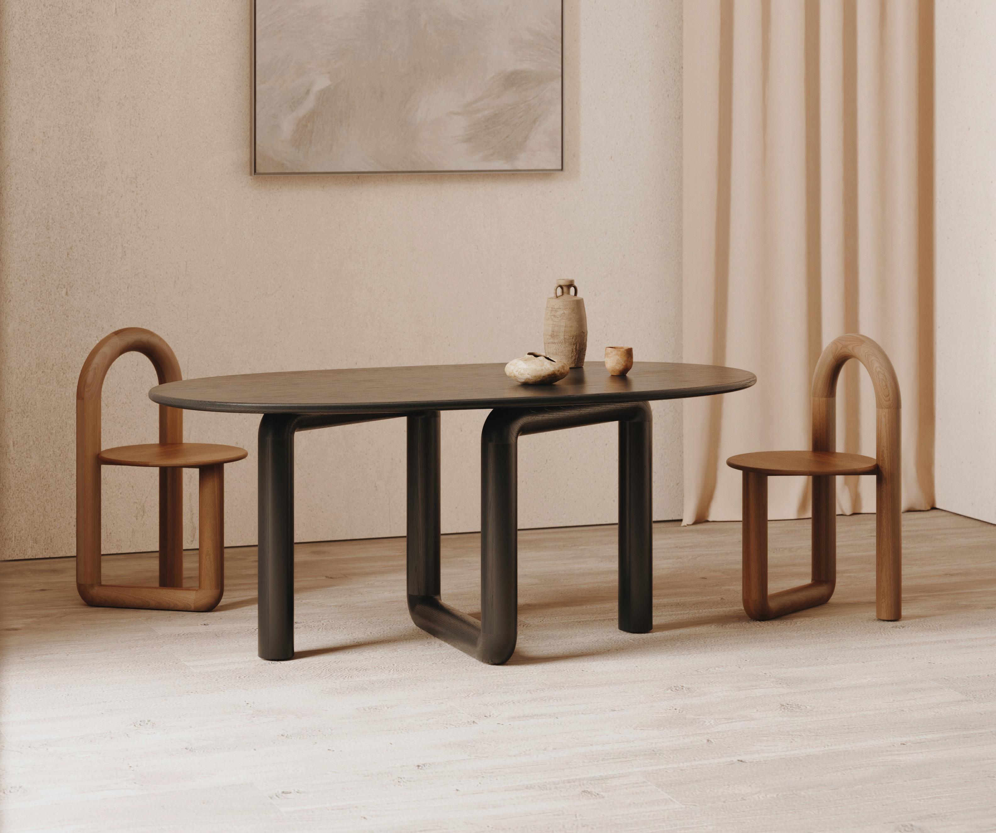
Oval Mono Table by Objects and Ideas

Trade Days & Conference Jan 19-20 Opening Night Party Jan 19 Trade & Public Days Jan 21-22 Metro
South
Toronto Convention Centre
Building Sponsors
Use code IDSGRAY20 for 20% off admission prices
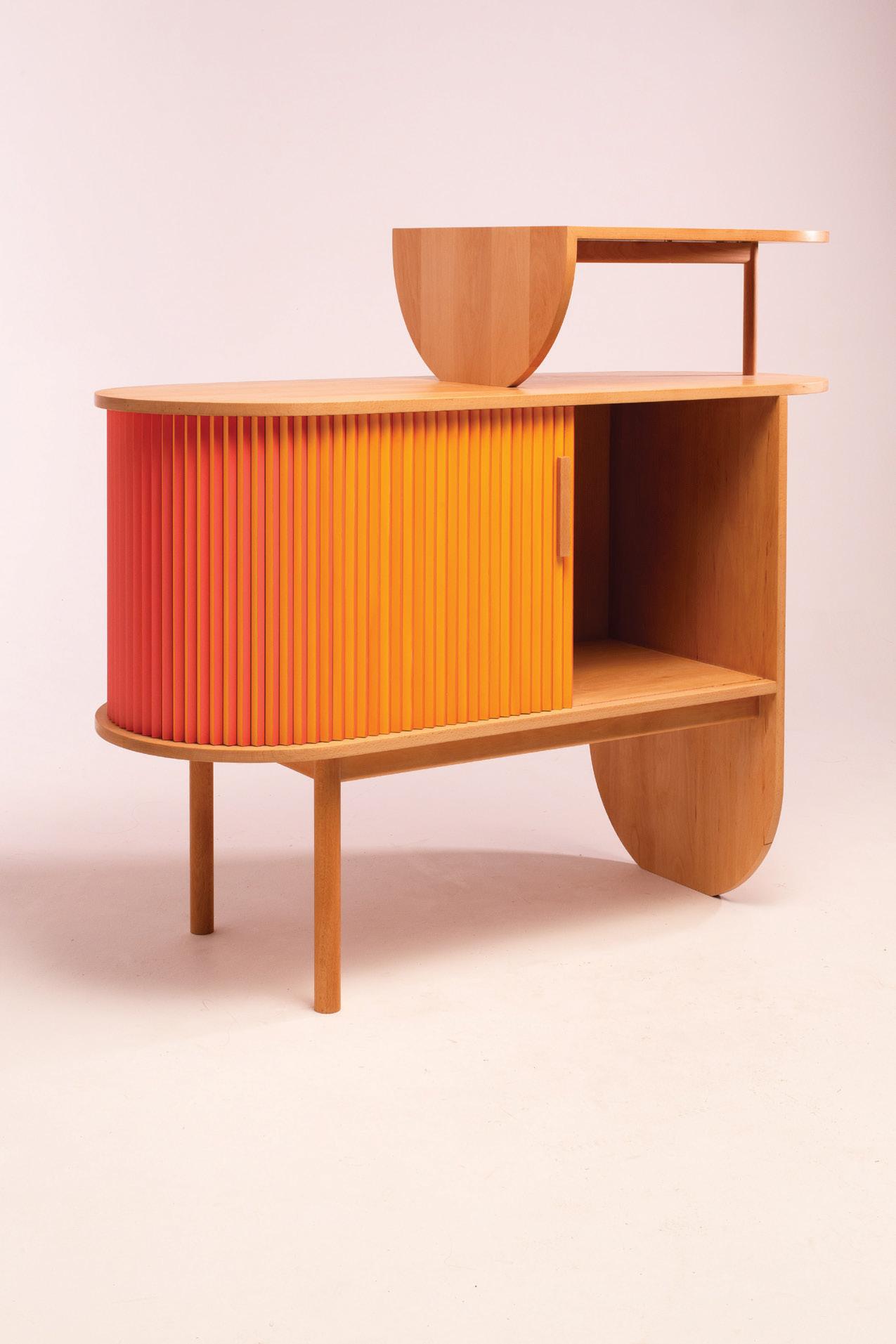
Sex on the Beech Cabinet by Alison Postma
24 GRAY
GRAY 25 May 10–12, 2023 CEU-accredited talks Offsite events Info and tickets graymag.com/design-con DESIGN CON IS A DESTINATION CONFERENCE AND FESTIVAL WHERE INNOVATION, CREATIVITY, AND COMMUNITY CONVERGE

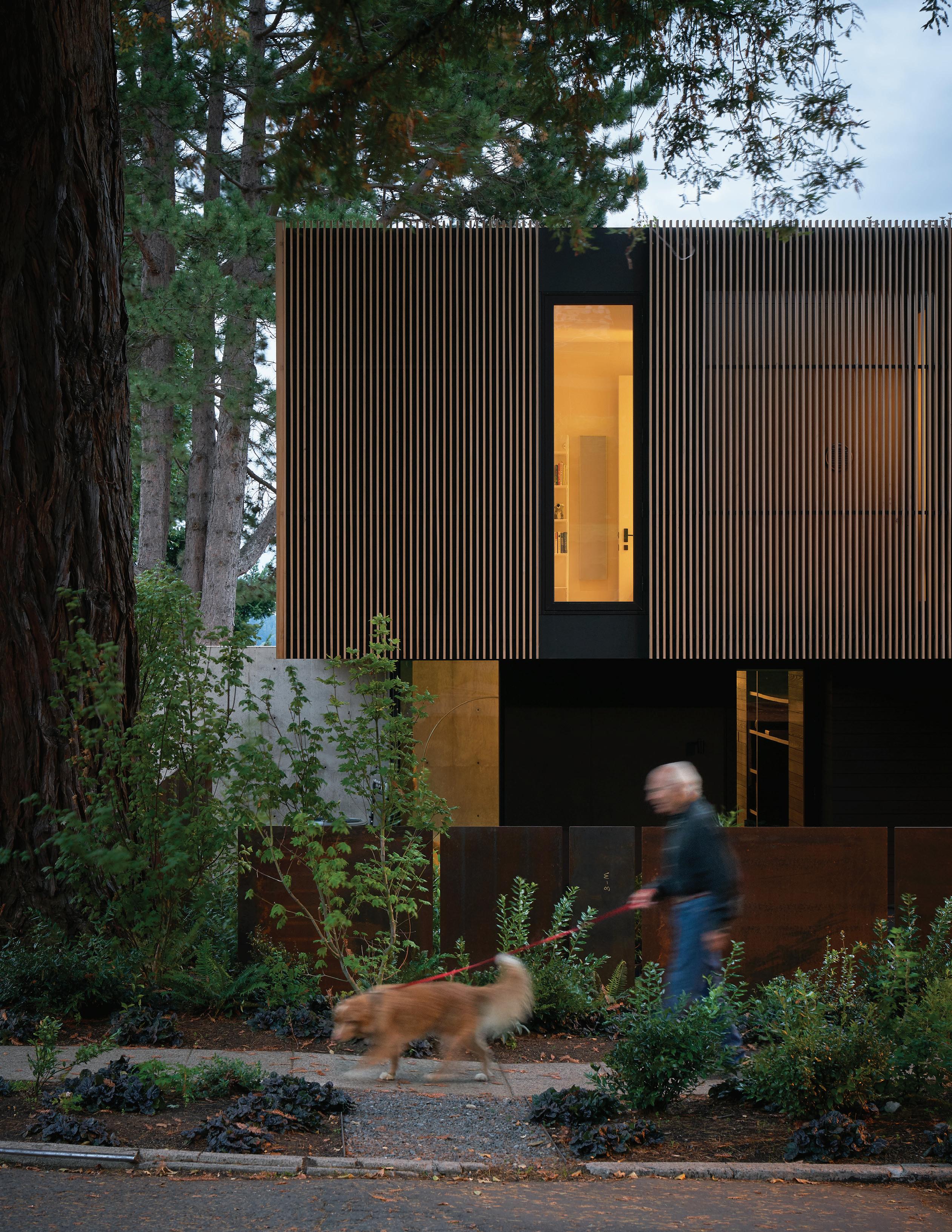 ARCHITECTURE / mwworks PHOTOGRAPHY / Kevin Scott
DOWBUILT


 Blogger 3. Large 3-seat sofa and armchair, designed by R. Tapinassi & M. Manzoni. Silver Tree Bossa. Cocktail tables and end table, designed by Wood & Cane. Apex. Ottomans, designed by Sacha Lakic. Annapurna. Floor lamps, designed by Fabrice Berrux.
In-store interior design & 3D modeling services (1)
 Photos by Flavien Carlod and Baptiste Le Quiniou, for advertising purposes only. www.vijversburg.nl, Architect: Junya Ishigami. (1) Conditions apply, contact store for details.


 herman miller carl hansen vitra kartell bensen knoll flos artek artifort foscarini moooi and more! visit hivemodern.com or call toll free 1 866 663 4483 free delivery within the continental u.s.


 fieldworksconcrete.com
Architecture: Chadbourne + Doss Concrete: Fieldworks Custom Concrete
Photo: Kevin Scott


 Eggleston | Farkas Architects eggfarkarch.com


 SCOTT | EDWARDS ARCHITECTURE LLP seallp.com
Tyler Engle Architects tylerengle.com Uptic Studios upticstudios.com


 ShawnShawn Williams, GRAY founder + CEO


 By Rachel Gallaher


 By Tomos Lewis


 Photos courtesy of Spacecrafting


 JOE FLETCHER


 JOE FLETCHER


 JEREMY BITTERMANN


 JEREMY BITTERMANN; OPPOSITE PAGE: STEPHEN A. MILLER


 LEONID FURMANSKY; OPPOSITE: KEVIN SCOTT


 KEVIN SCOTT


 Inform Interiors 1526 Bellevue Avenue, Seattle (on Capitol Hill) 206.622.1608 informinteriors.design
exclusively at
the beauty of design


 ARCHITECTURE / mwworks PHOTOGRAPHY / Kevin Scott
DOWBUILT