MAY | JUNE 2024 HOMEBOOK


TIMELESS AUTHENTICITY Wildly Wood, Boldly Beautiful Exclusively at


OUR NAME SAYS ROOFING, BUT WE DO SO MUCH MORE! We are happy to work on residential homes, commercial properties and multi-housing properties. Serving the Twin Cities area and western Wisconsin. Locally owned & operated since 1992. jtrroofinginc.com 612-419-6906


E xperience Life ~ Love ~ Luxe in the heart of your home... A North Star Kitchen NORTHSTARKITCHENS.COM | 612.375.9533 | INFO@NORTHSTARKITCHENS.COM 811 GLENWOOD AVENUE, STE. 270 MINNEAPOLIS, MN, 55405 EXQUISITE DESIGN • EXTRAORDINARY CABINETRY LIC# BC168736 BUILDER: JOHN KRAEMER & SONS ARCHITECTURE: RAUSCHER & ASSOCIATES PHOTOGRAPHY: SPACECRAFTING

on the cover
Designed by Bria Hammel Interiors and David Charlez Designs, an arched window and stunning stone surround effortlessly frame views of a Lakeland kitchen’s enchanting backyard forest. PHOTO BY SPACECRAFTING
14 EXCELLENCE
UNVEILED
BY KATELYN BLOOMQUIST
Meet the winners of the 2023 ASID MN Interior Design Awards
32
A MODERN CLASSIC
BY ELIZABETH ROUBIK
Blending traditional elegance with fresh functionality, this Lakeland sanctuary illustrates the beauty of balance
38 A
TUDOR REAWAKENED
BY ANNA BJORLIN
A reimagined 1930s home in St. Louis Park returns to its roots with a thoughtful, functional update
45 BEST
IN THE BIZ
BY ELIZABETH ROUBIK
Meet the Midwest’s best in building, remodeling, architecture, landscaping, and more
59
IDEAS TO STEAL
BY KATELYN BLOOMQUIST, ELIZABETH ROUBIK , SHELBY DEERING , DANIELLE DEVOTA , EMMA ENEBAK , GLENN HANSEN , MACY HARDER & CAMILLE LEFEVRE
Tips, tricks, advice, expert columns, and this year’s top trends across eight can’t-miss categories await essentials
8 FROM THE EDITOR
12 STYLEMAKER
Tim Alt of ALTUS Architecture + Design

MIDWEST HOME 4 PHOTOS ( FROM ABOVE ) SCOTT AMUNDSON, ETHAN SCHULTZ MAY | JUNE 2024 VISIT OUR INSPIRATION GALLERIES AT MIDWESTHOME COM/INSPIRATION
VOL 33 | NO 3
welcome
features
INUNISON DESIGN; SALA ARCHITECTS
CEDAR AND STONE NORDIC SAUNA

possibilities and savor the Explore Visit our inspiring showroom and get started on your kitchen journey. 11300 47th St W # 100, Minnetonka, MN 55343 SHOWROOM


online
ASK THE PROS: DRAPERIES
Interior designer Anne McDonald, founder and principal designer of Anne McDonald Design, answers the question, “How does drapery contribute to the feel of a space?”
MIDWESTHOME COM/ASK-THE-PROS-DRAPERIES
FASHION FORWARD
Bridget Chirigos, principal and lead designer of Chirigos Designs, explores the impacts of fashion on interior design trends in this expert column.
MIDWESTHOME COM/FASHION -FORWARD
INSTAGRAM INSPO
These artificial intelligence-infused Instagram accounts will blow you away with whimsical, out-of-this-world architecture and design.
MIDWESTHOME COM/AI- ON -INSTAGRAM
MADE FOR SHADE
Blazing Star Gardens in Owatonna curates premade garden kits comprised of flowers, grasses, and sedges for all sorts of garden arrangements—from shade gardens to pollinator-friendly habitats.
MIDWESTHOME COM/MADE-FOR-SHADE
STORAGE SOLUTIONS: BATHROOM EDITION
How and where to store it all: from extra shampoo bottles and grab-and-go toiletries to backup bedsheets and bath towels.
MIDWESTHOME COM/BATHROOM-STORAGE
RESOURCE GUIDE
For information on the products and suppliers found in this issue of Midwest Home, visit MIDWESTHOME .COM/2024-RESOURCE- GUIDE
FOLLOW US

MIDWEST HOME 6 PHOTOS ( FROM ABOVE ) TAYLOR HALL O’BRIEN, SPACECRAFTING
SIGN UP FOR OUR ENEWSLETTER AT MIDWESTHOME COM/NEWSLETTER
INTERIORS BY ANNE MCDONALD
DESIGN; STYLING BY LIZ GARDNER
M&M HOME CONTRACTORS INC


revolutiondb.com 952.594.5037 | BC 631863 family is in our recipe
I LOVE TO WRITE AND BRAG! ABOUT our area’s builders, interior designers, remodelers, architects, landscapers, and more, largely because I truly believe they are some of the country’s most talented in the design-build sphere. They are the cream of the crop, the pick of the litter, the jewel of the crown—and this deepseated belief is only reinforced through the hundreds of Midwest Home Design Awards (MHDA) entries we receive annually. On the brink of our fourth year, I am amazed by not only the continued outpouring of support but also the always-climbing caliber of the community’s creativity, sheer talent, and quality craftsmanship. Playing a part in shaping, nurturing, and witnessing the growth of this annual program is a profound privilege.
from the editor

Last year’s 700-plus entries are a testament to this unprecedented growth, and this year, we’re eager to smash more ceilings. Our anonymous, national panel of judges is ready to rumble, too, prepared to rank and select three semi nalists and winners in nearly 70 categories. Moreover, every submission is automatically considered for the prestigious Best in Show accolade, awarded to the project with the highest overall score. The rst-, second-, and third-place winners in each category will be featured in the January/February 2025 MHDA commemorative issue, in which the Best in Show winner receives a multipage feature story that also graces the cover.
If you are keen to participate, the submission window opens May 22 and closes at 11:59 p.m. on July 31. All semi nalists are notied in October and invited to the black-tie awards gala on Dec. 2
at the Radisson Blu Mall of America. It’s an action-packed evening that I, our attendees, and sponsors alike have found to be incredibly memorable.
With that said, such a program wouldn’t be possible without the generous support of these valued partners—including industry leaders like Allstar Construction, DWELL44 Modern Design Showroom, Manomin Resawn Timbers, Phantom Screens, Select Surfaces by Cambria, Terrazzo & Marble Supply, and Two Men & A Truck. They share our vision of showcasing these exceptional projects, and we’re grateful for their sponsorship of the Midwest Home Design Awards.
But all this MHDA talk is more than a kicko or commencement—it’s also an introduction to our annual Homebook issue. In fact, the themes, trends, and more we encountered within last year’s submissions largely influenced what you’re about to uncover on the following pages—from tips, tricks, and columns to insightful articles, expert advice, and much more, including a stunning feature story on the Small-Space Remodel winner from last year’s program. There’s truly no better way to kick o the Midwest Home Design Awards than with a summer edition formed by the awardwinning projects that inspired it in the rst place. Pun intended.
KATELYN BLOOMQUIST Editor, Midwest Home


MIDWEST HOME 8
FOR MORE INFORMATION AND TO DOWNLOAD THE ENTRY PACKET, VISIT MIDWESTHOME COM/DESIGNAWARDS
PHOTO DAVID ELLIS
publisher
Tammy Galvin
editorial
EDITORIAL DIRECTOR Alesha Taylor
GROUP EDITOR Katelyn Bloomquist
ASSOCIATE EDITOR Elizabeth Roubik
art
CREATIVE DIRECTOR Ted Rossiter
ART DIRECTORS Olivia Curti, Traci Zellmann
production
PRODUCTION DIRECTOR Deidra Anderson
SENIOR ADVERTISING COORDINATOR Tony Wagner
ADVERTISING COORDINATORS Sydney Kell, Ellianna Radovich
sales
SENIOR ACCOUNT EXECUTIVE Lori Miller, lmiller@greenspring.com
SALES + MARKETING SPECIALISTS Madeline Braverman, Tausha Martinson-Bright
integrated marketing
DIRECTOR OF EVENTS & MARKETING Meghan Gess
EVENT & OFFICE MANAGER Rick Krueger
MARKETING & EVENTS COORDINATOR Jordyn Tayloe
business
DIRECTOR OF BUSINESS OPERATIONS Kathie Gorecki
ACCOUNTING ASSOCIATE Austin Schmelzle
circulation
AUDIENCE DEVELOPMENT DIRECTOR Geri Wilson
CIRCULATION MANAGER Riley Meyers
CIRCULATION MARKETING SENIOR COORDINATOR David Benvenuto
CIRCULATION ASSISTANT Cathy Krajenke
WHAT’S HAPPENING

LANDSCAPE SHOWCASE

NEWSPAPERS | DIGITAL
Our community newspapers, along with advertising shoppers, specialty publications, and associated websites provide an important communication tool for citizens and businesses in these local communities.
GREENSPRING MEDIA
9401 James Ave. S., Suite 152 Bloomington, MN 55431
612-371-5800 FAX 612-371-5801 greenspring.com
HOUR MEDIA
CEO Stefan Wanczyk
PRESIDENT John Balardo
VOLUME 33, ISSUE 3: Midwest Home (ISSN 1947-0142) is published bimonthly by Greenspring Media, 9401 James Ave. S., Suite 152, Bloomington, MN 55431.
SUBSCRIPTIONS: $9.95/six issues (U.S. only).
BACK ISSUES: $4.50 + shipping, prepaid. For subscriptions or back issues, call 866-660-6247.
ADVERTISING: midwesthome.com/advertise or 612-371-5800.
POSTMASTER: Send address changes to Hour Media LLC, 5750 New King Drive, Suite 100, Troy, MI 48098.
Copyright © Greenspring Media 2024. All rights reserved. No part of this publication may be reprinted or otherwise reproduced without written permission. Printed in the USA. The pages between the covers of this magazine (except for any inserted material) are printed on paper made from wood fiber that was procured from forests that are sustainably managed to remain healthy, productive, and biologically diverse.
Yardscapes Inc. is excited to join the Artisan Home Tour by Parade of Homes again this summer. The tour kicks off June 7 and runs every weekend through June 23. Yardscapes, alongside many other talented companies, will be showcased at several homes across the Twin Cities metro. For more information, visit ARTISANHOMETOUR.ORG or YARDSCAPESINC.COM

MAGAZINES | COMMERCIAL PRINTING
We help local organizations produce and distribute magazines, guides, and other print pieces. Our teams can help sell the advertising, design ads, layout the final piece, print and distribute.


MIDWESTHOME COM 9
adamspg.com PROVIDING COMPLETE NEWS AND ADVERTISING PRODUCTS TO THE COMMUNITIES WE SERVE. PHOTO YARDSCAPES INC.
SPECIAL ADVERTISING SECTION


DAILY VISIT LUXURYHOMETOUR.NET TO PURCHASE TICKETS AND FOR LIST OF BUILDERS AND HOMES PHOTO SPACECRAFTING HOME KOOTENIA HOMES
JULY 26, 27, 28 • AUG. 2, 3, 4 • AUG. 9, 10, 11 12-6 P.M.


PREPARE TO BE INSPIRED 3 WEEKENDS OF MULTIMILLION - DOLLAR HOMES PURCHASE TICKETS NOW! $15 PASSPORT TO ALL HOMES bronze sponsors silver sponsors

MIDWEST HOME 12 | stylemaker
written by GLENN HANSEN
photos by DINA KANTOR
Style? Get Out
Tim Alt puts homes in their place
When you ask Tim Alt, “style” simply means “lifestyle.” It’s not a look, a design theme, or an artistic expression. A home’s style, Alt says, is more about its connection to a location. “We make houses that are sensitive and quiet responses to a location,” says Alt, founder of ALTUS Architecture + Design in Excelsior. “And we don’t get caught up in the style. If I had to put a name on it, I might refer to the style as ‘organic minimalism.’”
Alt gets to know his clients and their lifestyles. He’ll ask thoughtful questions like, “What are the rituals of your day?” and “How does the path of the sun and natural light help develop the spaces in your house?” “We want to help create a residence that endures, ts their identity, their lifestyle, and the location,” Alt says. “The result will be a home that is unique to the site and their personal expression. We do not focus on ‘style.’ Our goal is to amplify experiential awareness.”
An ideal representation of Alt and his rm might look like this: “I think of a space with a great view, and tall windows that invite me outside, with continuity to the outdoors,” he says. “I like light in the space throughout the day, and I look for shadow patterns.” He also likes to work with tactile materials like “wood, maybe some stone, if that’s in the budget.”
One look at pictures of homes he has designed, and it’s as clear as a window that the outside is as important as the inside. But it’s not just about doors and windows. “Our job is to create a space that is enduring, gentle on the land, and belonging ideally in that place only.”
ARCHITECT | Q & A
HAVE YOU ALWAYS WORKED IN RESIDENTIAL ARC H ITECTURE?
I did commercial work before I launched ALTUS, including the interiors of the Federal Reserve Bank building in Minneapolis. Residential work lets me build relationships and rapport with the decision makers: the residents. We keep our toe in commercial but only when asked.
WH AT ARE YOUR FAVORITE OUTDOOR PLACES AND EXPERIENCES?
I’m a Midwesterner at heart, and the North Shore is my favorite place— especially Grand Marais. As a serviceman’s kid, I did live in Germany for a few years when I was young. And as a family, we were outdoors people—loving the land, camping, scouts, sailing, and skiing.
A NY PASSION PROJECTS OR COMMUNITY INVOLVEMENT?
We’re working on designing the adaptive reuse of a historic midcentury modern church that will be an arts and music center for the community. We’ve also designed a new house in Lexington, Virginia, that is currently under construction.


CLOCKWISE FROM LEFT: EXCELSIOR-BASED ARCHITECT TIM ALT POSES IN FRONT OF “WOODLAND HOUSE,” ONE OF HIS OWN CREATIONS THAT EMBODIES THE GUIDING PRINCIPLES OF HIS PRACTICE THE MAIN STRUCTURE IS NESTLED WITHIN THE LUSH PROPERTY AND BOASTS ENDLESS WALLS OF WINDOWS THE NEARBY DETACHED SHED REFLECTS THE SURROUNDING SITE AND SEEMINGLY DISSOLVES INTO THE WOODED LANDSCAPE
MIDWESTHOME COM 13
Excellence Unveiled
THE 2023 ASID MN INTERIOR DESIGN AWARDS
 WRITTEN BY KATELYN BLOOMQUIST
Interior design begins with a dialogue, one where designers’ curiosity piques and prods to get to the bottom of their clients’ deepest needs, values, and desires. The American Society of Interior Designers’ (ASID) local association members consistently engage in these critical conversations, devising innovative plans that surpass client expectations by thinking two steps ahead: How will the client inhabit and interact with this space? How will they infuse it with their own essence, creating moments of joy and laughter within its walls? The designers featured on the following pages both asked and answered with awardwinning projects that speak for themselves. Here, we get up close and personal with the 25 first-place projects of the ASID MN’s 2023 design competition.
MIDWEST HOME 14
PHOTO SPACECRAFTING
LUCY INTERIORS


BEST IN SHOW COMMERCIAL
COMMERCIAL INSTITUTIONAL
PROJECT NAME: University Blues FIRM: PureAlchemy Design
DESIGNER: Stephany Eaton, ASID
DESIGNER’S NOTE: This renovation of a university-owned student apartment complex exemplifies smart design solutions that elevate the student living experience without breaking the bank. One of the key challenges was updating the tired oak doors and base without a complete overhaul. To address this, a hybrid flooring material was used to seamlessly blend with the existing trim, creating a cohesive look throughout the complex. Meanwhile, the lobby was transformed into a welcoming space with a striking deep-blue wall and clean architectural elements, establishing a strong design statement. Durable materials were selected for high-traffic areas, ensuring longevity and easy maintenance. The final product is a modern, well-maintained space that meets both design and budget goals, pleasing residents and management alike.

MIDWESTHOME COM 15 PHOTOS STEPHEN VOEGELI

COMMERCIAL CORPORATE (SMALL)
(15,000 SQUARE FEET AND UNDER)
PROJECT NAME: Chippewa Valley Contemporary HQ
FIRM: Shelter Architecture
DESIGNERS: Jackie Millea, ASID; Lisa Antenucci, Allied ASID; Jackie Colpaert, Allied ASID; Kersten Decker, Allied ASID; Piper Donlin, Allied ASID; and team
DESIGNERS’ NOTE: When a commercial client decided to trade their suburban office for a vibrant, walkable locale, they knew their team needed more than just a change of scenery. The vision? A space that not only welcomed employees and clients but also nurtured well-being and community ties. The design team rose to the challenge, crafting a lounge reminiscent of a cozy coffee shop, seamlessly blending indoor and outdoor elements with a touch of biophilic design. Natural materials, abundant sunlight, and picturesque outdoor views were strategically incorporated to create a serene, health-focused workspace. The result is a dynamic, culturally rich office space that not only meets but also exceeds expectations—fostering a happier, more connected workforce.
COMMERCIAL RETAIL
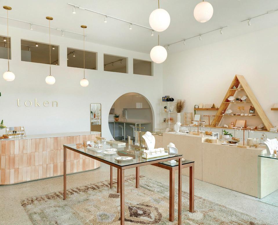
PROJECT NAME: Radiant Boho
FIRM: Shelter Architecture
DESIGNERS: Jackie Millea, ASID; Lisa Antenucci, Allied ASID; Jackie Colpaert, Allied ASID; Kersten Decker, Allied ASID; Piper Donlin, Allied ASID; and team
DESIGNERS’ NOTE: A jewelry maker turned business owner sought a shop design that could accommodate growth and reflect her warm, neutral aesthetic. The concept centered on organic materials and sunlight, incorporating arched and circular shapes inspired by nature. Opening the floor plan and adding transom windows flooded the space with natural light, creating a sense of airiness. Custom elements like the peach-hue tile (made from tile waste) and a unique semicircle door handle (reminiscent of the sun) add character. The design team ensured the project met budget and code requirements by collaborating with local vendors and retrofitting the building, reducing costs and the carbon footprint significantly.


RESIDENTIAL BATHROOM
(150 SQUARE FEET AND UNDER)
PROJECT NAME: Plaisance Bath
FIRM: Kate Roos Design
DESIGNERS: Kate Roos, ASID, and team
DESIGNERS’ NOTE: The renovation of the second-floor bathroom in this 1916 home is a project that combined functionality with classic style. Designed to accommodate the client’s teenagers and occasional guests, the project culiminated in a space that provides privacy while maintaining the home’s aesthetic. Challenges such as working around original windows and staying within the existing footprint were met with creative solutions. Tempered glass sashes were added to preserve the windows, nearby closets were incorporated for storage, and separate toilet and shower rooms were created. A frosted glass door maintains light and openness, while special features like the large soaking tub, handmade hex tile floor, and Schumacher’s Citrus Garden wallpaper add practicality and style to the space.
MIDWEST HOME 16 THE 2023 ASID MN INTERIOR DESIGN AWARDS
PHOTOS ( FROM ABOVE ) SPACECRAFTING ( 2 ) ANDREA RUGG ( 2 )
RESIDENTIAL BATHROOM
(151 SQUARE FEET AND OVER)
PROJECT NAME: Woodland Oasis
FIRM: LiLu Interiors
DESIGNERS: Lisa Peck, ASID; Laura Shikowsky, Allied ASID
DESIGNERS’ NOTE: The renovation of the clients’ secluded home, designed as a sanctuary from their demanding work life, focused on updating the primary bathroom to create a warm, intimate, and serene space. With the goal of daily stress relief in mind, the clients desired various amenities and a seamless connection to the home’s surrounding nature. The design challenge was to achieve intimacy without major structural changes. Solutions included creating a small laundry zone and large linen cabinet to reduce the cavernous feeling, using warm tones and textured materials, and optimizing lighting for both task and ambient purposes. The final product is a cozy, serene bathroom that offers a peaceful retreat and connection to the natural surroundings— providing the clients with a much-needed respite from their busy schedule.

RESIDENTIAL KITCHEN
(250 SQUARE FEET AND UNDER)
PROJECT NAME: Connecting Nature to the Modern World
FIRM: Habitation Design
DESIGNER: Karl Peltier, Associate ASID
DESIGNER’S NOTE: The homeowners of this 1972 midcentury modern home in Bloomington have spent the last five years transforming it into a unique, current-day oasis for their growing family. The goal was to retain the home’s original charm while updating it for functionality. They started by redesigning the kitchen (initially hidden behind a large wall) to be open and functional, incorporating warm walnut tones and modern features. They also expanded their living space by removing a leaking solarium. The new design incorporates architectural lighting and design elements that pay homage to the home’s midcentury roots—resulting in a space that blends modern convenience with its original character.

RESIDENTIAL BEDROOM SUITE
PROJECT NAME: Inspired by View
FIRM: David Heide Design Studio
DESIGNER: David Heide, ASID
DESIGNER’S NOTE: The transformation of this family cabin’s ’90s-style primary suite into a contemporary, yet woodsy retreat—inspired by its scenic surroundings—presented several challenges. Despite restrictions on structural changes and plumbing locations, the space was renewed through furniture and fixture reorientation, as well as material upgrades. One key challenge was determining bed placement for a view of the lake, solved by positioning the bed in the room’s center and designing a custom walnut headboard with integrated features. Horizontal design elements throughout the room contrast with the vertical forest view, avoiding cliche cabin aesthetics. The tranquil bathroom features oak and Japanese mosaic tile, with a sleek soaking tub and custom solutions for functional and aesthetic enhancement—all of which contribute to a peaceful, nature-connected experience.

MIDWESTHOME COM 17 PHOTOS ( FROM ABOVE ) CHAD HOLDER, RICH MICHELL, RYAN STADLER


BEST IN SHOW
KITCHEN & BATH
RESIDENTIAL KITCHEN
(
251-400 SQUARE FEET)
PROJECT NAME: Nicollet Kitchen
FIRMS: Kate Roos Design & Partners 4, Design
DESIGNERS: Kate Roos, ASID; Nicole Sirek, Allied ASID
DESIGNERS’ NOTE: This riverside property underwent a remarkable transformation to enhance its views and modernize the interior while maintaining a soft, feminine sensibility. The design focused on opening the heart of the home to the living area, transforming both the kitchen and flooring while blending modern elements with warm tones. Challenges included addressing existing mechanicals, creating a defined kitchen layout, and achieving symmetry in an asymmetrical space. The accompanying solutions ran the gamut of rerouting mechanical runs, adjusting the kitchen work aisle, and creating symmetry with a range hood and painted cabinetry. Special features include a hidden walk-in pantry, double islands, and partial waterfall countertops to create a modern, functional, and inviting space.

MIDWEST HOME 18 THE 2023 ASID MN INTERIOR DESIGN AWARDS
PHOTOS ANDREA RUGG

RESIDENTIAL KITCHEN
(401 SQUARE FEET AND OVER) – TIE
PROJECT NAME: Lakeside Retreat
FIRM: Shelter Architecture
DESIGNERS: Jackie Millea, ASID; Lisa Antenucci, Allied ASID; Jackie Colpaert, Allied ASID; Kersten Decker, Allied ASID; and team
RESIDENTIAL KITCHEN
(401 SQUARE FEET AND OVER) – TIE
PROJECT NAME: Cottage Red
FIRM: David Heide Design Studio
DESIGNERS: David Heide, ASID; Michael Crull, Allied ASID; Elizabeth Mueller, Allied ASID
DESIGNERS’ NOTE: This family cabin underwent a significant expansion and transformation to accommodate large gatherings while maintaining a rustic aesthetic. The kitchen redesign features custom details and distinctive materials, balancing a substantial scale with warm, enveloping materials. It serves as a hub—connecting the dining room, living room, deck, and scullery— with spaces for gathering. A large island, complemented by white cabinetry with vertical V-groove detailing, conceals a wine refrigerator and provides ample serving space. Custom elements include a stainless steel and wrought iron hood, passthrough serving window with red shutters, and custom-designed open shelving—achieving a balance between grandeur and cozy cabin vibes.
Designers’ Note: The clients of this project aimed to create a modern lake home on their existing cabin site that emphasized lake views while preserving the surrounding trees. They favored large timber construction and a strong indoor-outdoor connection for their family, with ample space for entertainment and gear storage. The design strategically positioned windows and spaces to maintain privacy and maximize views, all while respecting the existing trees. The main area features a dramatic kitchen, with custom timber and steel trusses for vaulted ceilings, as the focal point. The kitchen includes a “back of house” concept with a working pantry (showcasing high-end materials like handmade Moroccan tiles and quartz countertops), while a large sliding door blurs the lines between indoors and out.


RESIDENTIAL VACATION HOME
PROJECT NAME: Woodland Fairy-tale Cabin
FIRM: Lucy Interiors
DESIGNERS: Lucy Penfield, Allied ASID; Ryan Welters, ASID; and team
DESIGNERS’ NOTE: Nestled deep in the woods, this fairy tale-inspired cabin is a delightful, petite guest retreat designed for a growing family. Its storybook-like exterior, complete with brown-stained board and batten siding, white trim, and a charming green roof, effortlessly blends into the forested surroundings. Inside, the Goldilocks Kitchenette exudes more charm with its cottage-style cabinetry painted in Dayroom Yellow, complemented by a handcrafted marble-mosaic backsplash and soapstone counters. The Wildflower Bedroom, Forest Bath, and Café Au Lait breakfast bar add to the cabin’s whimsical allure. Crafted by skilled craftsmen with local materials, this cabin—complete with a wood-burning fireplace and Douglas fir flooring—is a nostalgic getaway destined to be cherished for generations.
MIDWESTHOME COM 19
PHOTOS ( FROM ABOVE ) RICH MICHELL, SPACECRAFTING ( 2 )

RESIDENTIAL MULTIPLE ROOMS/ENTIRE RESIDENCE
(1,000 SQUARE FEET AND UNDER)
PROJECT NAME: Preserving a Gem
FIRM: Lucy Interiors
DESIGNERS: Lucy Penfield, Allied ASID; Ryan Welters, ASID; and team
DESIGNERS’ NOTE: Reviving a neglected 1960s home for a conservation-minded couple meant preserving its essence with a modern twist and vibrant hues. A corner fireplace was restored with a custom mantel and walnut slats. The kitchen, in dire need of a refresh, was revamped with elegant walnut cabinetry, durable soapstone counters, and a striking emerald backsplash. Lighting received a significant upgrade as well, including a sculptural ceiling fixture in the lounge. The sunroom received larger windows and lively wallpaper, while the dining area was enlivened with bold red chairs. The hallway now features terrazzo tile and a custom enameled armoire and coffee bar, blending function with style.
RESIDENTIAL MULTIPLE ROOMS/ENTIRE RESIDENCE
(1,001-3,000 SQUARE FEET)
PROJECT NAME: Hilltop Estate
FIRM: Partners 4, Design
DESIGNERS: Lisa Pope, ASID; Nancy Baker, ASID
DESIGNERS’ NOTE: After a quarter-century in their home, the client sought a sophisticated update to their first floor to elevate the entertaining experience. The designers faced challenges with circulation (as two islands disrupted traffic flow), and the finishes felt dated and lacked distinction. The solution involved a complete reimagination of the floor plan, including the addition of a scullery and laundry behind the kitchen, the relocation of mudroom closets, and the incorporation of a large single island with ample storage. Highperformance appliances, a decorative hutch, and an open bar area with visual separation are key features. The transformation was completed with floor-to-ceiling tile, elegant lighting fixtures, and carefully selected finishes—resulting in a modern, timeless space.

MIDWEST HOME 20 THE 2023 ASID MN INTERIOR DESIGN AWARDS PHOTOS SPACECRAFTING
TIE FOR BEST IN SHOW RESIDENTIAL
RESIDENTIAL MULTIPLE ROOMS/ ENTIRE RESIDENCE
(3,001-6,000 SQUARE FEET)
PROJECT NAME: River Serenity
FIRM: InUnison Design
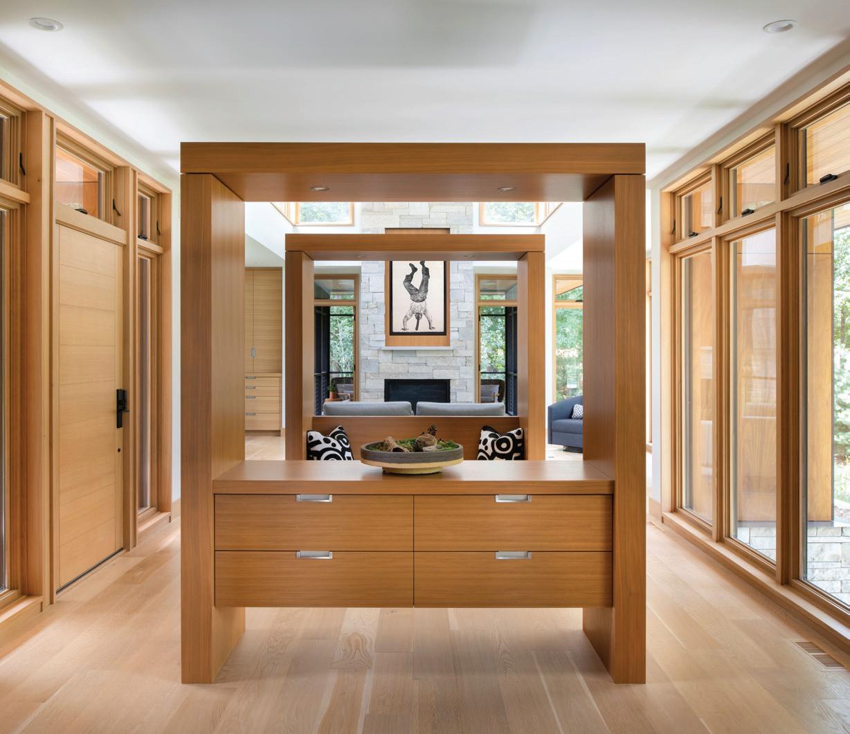
DESIGNERS: Christine Frisk, ASID; and team
DESIGNERS’ NOTE: Desiring a spacious kitchen, dining area, screen porch, private getaway, and bedrooms for their grown sons, the owners of this St. Croix River home sought an abode with a deep connection to nature that was also maximized for family gatherings. The design features long, low-slung architecture along the river, with cabinetry at the main entry subtly breaking up the space while maintaining sight lines. Natural textures and finishes create peaceful interiors. With walnut and white oak prominent throughout, the main level—anchored by lighting and furnishings—flows seamlessly. Outdoor spaces blend with the interior, emphasizing the natural surroundings for a relaxing retreat.

RESIDENTIAL SINGULAR LIVING/ SPECIAL-PURPOSE SPACE
(300 SQUARE FEET AND UNDER)
PROJECT NAME: Project Lovely LL Bar
FIRM: Home Design by Annie
DESIGNER: Annie Tropple, ASID
DESIGNER’S NOTE: The clients of this project envisioned a space that exuded warmth and a welcoming atmosphere, with a specially designed wet bar as the standout feature. The designer collaborated on a custom metal door, nestled within a rustic wood shiplap wall—crafting a snug alcove that sparks conversation. The wet bar’s rich, masculine textures and earthy tones create a “mountain retreat” ambience, infusing the lower level with coziness and character. It’s an ideal setting for hosting gatherings or catching up on sports, fulfilling the clients’ wish for a functional and inviting space highlighted by a unique design element.

RESIDENTIAL MULTIPLE ROOMS/ ENTIRE RESIDENCE
(6,001 SQUARE FEET AND OVER)
PROJECT NAME: Forever Farmhouse
FIRM: KASA Interior Design Inc.
DESIGNER: Bonnie Kespohl, ASID
DESIGNER’S NOTE: This new-construction family residence was designed to accommodate frequent entertaining, out-of-town guests, remote work, and an active lifestyle. Challenges included balancing amenities with intimacy, blending a casual farmhouse feel with modern comforts while managing details remotely amid pandemic-related delays. Solutions embraced meticulous space planning, a warm and inviting color palette, and adaptable spaces for evolving needs. The design exudes casual sophistication, featuring entertainment areas such as a bar, TV lounge, and sport court. Despite its challenges, reselections were expertly managed with industry partners to maintain the integrity of the original design and budget.

MIDWESTHOME COM 21
PHOTOS ( FROM ABOVE ) SCOTT AMUNDSON, ALYSSA LEE, SPACECRAFTING

RESIDENTIAL SINGULAR LIVING/ SPECIAL-PURPOSE SPACE (301-600 SQUARE FEET)
PROJECT NAME: Artful Living
FIRM: InUnison Design
DESIGNERS: Christine Frisk, ASID; and team
DESIGNERS’ NOTE: The client of this project envisioned a living room that embraced a sense of welcome and simplicity while emphasizing natural textures. The focal point is the breathtaking view of the river, seamlessly blending with a screened porch to evoke an outdoor ambience. Abundant natural light enhances the room’s connection to the surrounding nature, and the space is accented by touches of green that harmonize with the lush trees outside. The room is designed for family gatherings and features a grand piano, fireplace, and integrated storage solutions. Timeless furniture pieces like the Pollock armchair and a Chet Baker painting—reflecting the family’s passion for jazz—are complemented by organic textiles and bespoke metal elements.
RESIDENTIAL SINGULAR LIVING/ SPECIAL-PURPOSE SPACE (601 SQUARE FEET AND OVER)
PROJECT NAME: Rhapsody in Blue
FIRM: Ellington & Co. Design
DESIGNER: Carrie Ellington, Allied ASID
DESIGNER’S NOTE: This residence received a remarkable makeover to suit the lifestyle of a young family, with an overall objective of crafting a captivating and inviting area that was contemporary, comfortable, and suitable for children. The room showcases a blend of formal, funky, and chic elements, with ample seating and secluded nooks for intimate conversations. Luxurious fabrics and finishes like velvet sofas, tufted leather chairs, and an array of eclectic tables introduce texture and warmth. This room, accommodating up to 20 guests, has quickly become the family’s go-to spot for both relaxation and entertainment.


RESIDENTIAL SPECIALTY
PROJECT NAME: Secret Haven
FIRM: Lucy Interiors & TDM Designs
DESIGNERS: Lucy Penfield, Allied ASID; Tim Mohnkern, Allied ASID; Ryan Welters, ASID
DESIGNERS’ NOTE: A 10-year-old boy, living with cystic fibrosis, desired a backyard treehouse to escape his daily health routine. In a heartwarming collaboration, a team of creatives and donors came together to make his dream a reality—providing all materials and labor as a not-for-profit effort. The treehouse, designed to promote well-being, boasts a dark, courageous aesthetic with his favorite colors: blue and green. It includes personalized elements like a crest, interactive games, and a secret room accessed through a pivoting bookcase. This special space offers him a retreat to simply be a kid, enjoy outdoor activities, and socialize with friends—providing a healing and empowering environment.
midwest home 22 THE 2023 ASID MN INTERIOR DESIGN AWARDS
PHOTOS (FROM ABOVE) SCOTT AMUNDSON, SPACECRAFTING (2)
RESIDENTIAL CHILDREN’S BEDROOM/ YOUTH SPACE
PROJECT NAME: Children’s Space/Basement Remodel
FIRM: Color Pop Interiors
DESIGNER: Kashai Zupancich, ASID
DESIGNER’S NOTE: Underneath the staircase, a colorful retreat calls children into an imaginary wold—complete with a charming Dutch door, soft cushions, and fun patterns perfect for reading or play. In the kitchen area, a beverage cooler, popcorn machine, and child-size table (ideal for crafts and projects) await. An insulated subfloor ensures warm feet, while ample recessed lights illuminate the basement. This remodel masterfully blends functionality with a vibrant aesthetic, showcasing eye-catching wallpaper and custom storage builtins that infuse the space with color and creativity. Every element is thoughtfully designed to cultivate joy and growth for the young adventurers who inhabit it.


RESIDENTIAL USE OF COLOR – TIE
PROJECT NAME: Gastronomic Glamour: Deep Hues Loft Kitchen
FIRMS: Spencer Design Associates & Partners 4, Design
DESIGNERS: Shane Spencer, Associate ASID; Nicole Sirek, ASID
DESIGNERS’ NOTE: Mixed metals, luxe finishes, industrial-style concrete and brick, and light bronze elements all complement the classic color palette within the kitchen of this urban loft in Minneapolis’ Mill District. Shades of deep blue, intertwined with soft grays and pure whites, were chosen by the homeowner, who has a love of culinary artistry and exquisite wines. The details are equally luxurious: The kitchen’s custom hardware is crafted by English artisans, while a climate-controlled wine cellar fabricated in California is the pièce de résistance in the traditional, yet on-trend space.
RESIDENTIAL USE OF COLOR – TIE
PROJECT NAME: Stairway to Heaven
FIRM: InUnison Design
DESIGNERS: Christine Frisk, ASID; and team
DESIGNERS’ NOTE: The clients of this project envisioned a home on the Mississippi River that would blend with their active lifestyle and offer spaces for outdoor activities, family gatherings, and future expansion. The first step involved constructing an attached garage with a studio apartment, where the family intends to reside until the main house is completed. The staircase connecting the spaces emerged as a central feature, designed to be visually striking and durable. Portholes in the shower offer glimpses of the staircase mural and the river beyond, while thoughtful use of color and texture throughout the staircase adds vibrancy and character to the space.


MIDWESTHOME COM 23
PHOTOS ( FROM ABOVE ) ALYSSA LEE, SCOTT GILBERTSON, ALYSSA LEE ( 2 )

CUSTOM-DESIGNED OBJECT/DETAIL
PROJECT NAME: East Town Stairs
FIRM: Albertsson Hansen Architecture and Interior Design
DESIGNERS: Christine Albertsson, ASID; and team
DESIGNERS’ NOTE: The East Town Stairs project in downtown Minneapolis aimed to replace a circular staircase with a safer, more efficient design for accessing a roof deck-level bedroom suite. Crafted with reclaimed Douglas fir, Glulam stringers, and steel, the new staircase seamlessly harmonizes with the loft’s original warehouse construction. Open risers and strategic landings enhance safety and flow, while steel and cable railings add a light and elegant feel. The staircase now feels like an integral part of the space, making the daily journey between floors effortless.
BIOPHILIC
PROJECT NAME: Connection to Nature in a Modern World
FIRM: Habitation Design
DESIGNER: Karl Peltier, Associate ASID
DESIGNER’S NOTE: Over the past five years, the clients of this Bloomington abode have been gradually updating their unique 1972 midcentury modern home to create an oasis for their young family. With a 2-year-old son and another baby on the way, they aimed to modernize the home while preserving its original charm. The residence’s interesting floor plan, including a round staircase and catwalk, posed design challenges. Rich walnut tones and black contrasts were used to complement the era of the home, while architectural lighting highlighted its unique lines. Adding biophilic design elements, such as texture, color, and artwork, enhanced the entire home and its outdoor spaces as well.


STUDENT COMMERCIAL
PROJECT NAME: Oakley’s Dog-Friendly Cocktail Bar
SCHOOL: University of Minnesota – College of Design
DESIGNER: Caitlin Drews, Student ASID
DESIGNER’S NOTE: Oakley’s Dog-Friendly Cocktail Bar in St. Paul’s North End neighborhood offers a luxurious experience for both humans and their four-legged companions. The bar boasts a grand wood ceiling with a dog bone feature, sealed concrete floors for durability, and a layout that accommodates events and training classes. The design includes an indoor play area tailored to different dog sizes, a blue and yellow color scheme visible to dogs, and furniture selected for style and practicality. The outdoor space includes an off-leash dog park and a terrace overlooking the Great Northern Railway. Oakley’s provides a unique and upscale experience that celebrates the bond between pets and their owners.
MIDWEST HOME 24 THE 2023 ASID MN INTERIOR DESIGN AWARDS IMAGES ( FROM ABOVE ) WING HO, RYAN STADLER, CAITLIN DREWS


1 2 3

CONGRATULATIONS TO THE 2023 SECOND-PLACE WINNERS!
■ COMMERCIAL CORPORATE (SMALL) (15,000 SQUARE FEET AND UNDER) [1] PureAlchemy Design
■ COMMERCIAL HOSPITALITY/LIVING PureAlchemy Design
■ COMMERCIAL RETAIL InUnison Design
■ RESIDENTIAL BATHROOM (150 SQUARE FEET AND UNDER)
Albertsson Hansen Architecture and Interior Design; Home Design by Annie
■ RESIDENTIAL BATHROOM (151 SQUARE FEET AND OVER) Home Design by Annie
■ RESIDENTIAL BEDROOM SUITE Engler Studio Interior Design
SPECIAL AWARD WINNERS


DESIGNER OF DISTINCTION: Nicole Sirek, ASID; Partners 4, Design
■ RESIDENTIAL KITCHEN (250 SQUARE FEET AND UNDER) Albertsson Hansen Architecture and Interior Design
■ RESIDENTIAL KITCHEN (251-400 SQUARE FEET) Partners 4 Design
■ RESIDENTIAL KITCHEN (401 SQUARE FEET AND OVER) [2] Ellington & Co. Design
■ RESIDENTIAL MULTIPLE ROOMS/ ENTIRE RESIDENCE (1,000 SQUARE FEET AND UNDER) Engler Studio Interior Design
■ RESIDENTIAL MULTIPLE ROOMS/ENTIRE RESIDENCE (1,001-3,000 SQUARE FEET) Bruce Kading Interior Design; Mike Rataczak Studios
■ RESIDENTIAL MULTIPLE ROOMS/ ENTIRE RESIDENCE (3,001-6,000 SQUARE FEET)
Engler Studio Interior Design
■ RESIDENTIAL SINGULAR LIVING/ SPECIAL-PURPOSE SPACE (300 SQUARE FEET AND UNDER)
Home Design by Annie
■ RESIDENTIAL SINGULAR LIVING/ SPECIAL-PURPOSE SPACE (301-600 SQUARE FEET)
Bruce Kading Interior Design
■ RESIDENTIAL USE OF COLOR
Spencer Design Associates; Partners 4 Design
■ RESIDENTIAL VACATION HOME [3] Albertsson Hansen Architecture and Interior Design

TOM GUNKELMAN LEGACY AWARD:
Bruce Kading, ASID; Bruce Kading Interior Design

FRITZ WEBER VOLUNTEER OF DISTINCTION: Nancy Baker, Allied ASID; Partners 4, Design

EMERGING TALENT:
Julie Tuerk, Allied ASID; Julie Tuerk Interior Design

INDUSTRY PARTNER STAR:
Twin Cities Closet Co., accepted by Todd Moldrem
OUTSTANDING STUDENT VOLUNTEER:
Janell Colley, Student ASID; Century College
midwesthome.com 25 PHOTOS (CLOCKWISE FROM ABOVE LEFT) STEPHEN VOEGELI, SPACECRAFTING, COREY GAFFER, STEPHEN VOEGELI (6)


Call for Entries


Design
Construction
Renovation

Interiors
Architecture

exceptional
unsurpassed
historical
impeccable
amazing


featured
Don’t delay, enter your best projects today. Visit MidwestHome.com/DesignAwards for the complete list of award categories, including everything from detailed millwork to new home construction, remodeling, interior/ exterior design, and much more! All entries must be submitted by 11:59pm, July 31, 2024
If your work is among the best in the business, enter it in one of 70 categories
in the 2024 Midwest Home Design Awards program.
Guide to Good Design

NKBA Advantage
Working with an NKBA Minnesota member ensures your next remodel project will be on trend and built to last
When remodeling a kitchen or bathroom, hiring a designer may not be at the top of your list. However, the cost of hiring a professional is a small fraction of the project budget and investing in one can help you save in other ways, such as time, money to x potential problems, and the overall hassle of taking on a large project.
If you’re interested in remodeling your kitchen or bathroom, modernizing or updating a room, or nding ways to creatively utilize existing space, the National Kitchen and Bath Association (NKBA) is the place to nd professionals who can help.
With more than 14,000 member companies representing all segments of the kitchen and bath industries, NKBA members can help create the most e cient and beautiful use of your space—all while being respectful of your budget. Professionals know high-quality design and materials and have a vast knowledge of construction,
mechanical, plumbing, electrical systems, building codes, and safety regulations.
NKBA members can also speed up the remodeling process with pro ciency in planning, design documentation, selecting nishes and materials, bidding and estimating, and managing contractors. Working with a Certi ed Kitchen & Bath Designer will also reduce the likelihood of change orders midway through the project.
When selecting your designer, the NKBA recommends that homeowners research several designers in the area, meet with each of them, and trade ideas and suggestions. Ask to see a portfolio of past projects. Look for well-constructed presentations and interesting designs. You’ll want a professional who thinks outside the box and can work with a broad range of styles.
During the meeting, homeowners should also take note of what a designer’s showroom looks like. Showrooms serve as a
The National Kitchen and Bath Association (NKBA) is a nonprofit trade association that promotes the professionalism of the kitchen and bath industry
ABOUT NKBA
Originally established in 1963, the National Kitchen and Bath Association (NKBA) has become a cohort of designers, manufacturers, distributors, remodelers, and other professionals in the kitchen and bath industry. Networking opportunities, tools, and resources designed to support growth in the trade field are the building blocks the NKBA uses to support its members.
way for designers and dealers to showcase their work. If it is messy and missing elements of displays, it might be a warning sign to look elsewhere.
Another important aspect to consider is the people you’re going to work with. A kitchen or bath remodel could take months to complete, and you will want to have an enjoyable experience with the professionals you’ll be in close contact with.
Finally, don’t dismiss the importance of satis ed client references. If a designer is unable to provide you with a list of satis ed clients, it may be an indication that you will not be satis ed either.
Whether you need a little help planning your project, professional advice, or creative ideas to rejuvenate your space, a certied NKBA professional designer can guide you through the remodeling process and help you make the best-informed decisions to achieve your wants and needs. NKBA members always work with the end goal of designing a safe and functional space that is cost-e ective, reflects your taste, and ts your lifestyle.
NKBA MINNESOTA CHAPTER | NKBAMN . ORG


MIDWEST HOME 28 SPECIAL ADVERTISING SECTION PHOTO SPACECRAFTING
JULIAN DESIGN


FEATURED PROJECT Beautiful & Bright
The homeowners of this Plymouth residence were eager to revitalize their main-level kitchen and living room, with goals of opening the floor plan, updating the aesthetics and amenities, and enhancing flexibility for hosting and entertaining. While the kitchen was original to the home, the clients desired a brighter space with increased seating and improved flow into the living room. To achieve these goals, the team at Julian Design eliminated a small dinette next to the kitchen and expanded the island to accommodate the entire family, as well as increase the room’s footprint.
In the living room, the fireplace was resurfaced with molding and stone details to enhance the height of the space and create architectural interest. Further emphasizing the vertical space of the room, Julian Design also incorporated draperies to draw the eye upward and add a touch of sophistication.
With a seamless blend of functionality, style, and spaciousness, the homeowners now have the flexibility to host large gatherings or simply enjoy a cozy, intimate evening together.
Julian Design 952-937-0589 | julianinc.com


MIDWESTHOME COM 29 SPECIAL ADVERTISING SECTION PHOTO SPACECRAFTING JULIANINC.COM | 952-937-0589 Space Planning | Furniture and Lighting Flooring and Cabinetry | Window and Wall Finishes Full service interior design studio offering:


Living for All Generations


Timeless Living for All Generations
Lake Country Builders empowers homeowners and their families to not only thrive but also gracefully age in place—seamlessly adapting to evolving needs and lifestyles
written by elizabeth roubik


Homeowners are increasingly prioritizing dynamic spaces in their homes that can adapt and evolve alongside their changing needs. While the process of integrating aging-in-place features can seem daunting, local building, remodeling, and interior design experts are tirelessly innovating and refining lifestyle strategies to ensure homeowners can remain in their memory-filled homes with both comfort and confidence.




A ZERO-THRESHOLD SHOWER ALLOWS HOMEOWNERS EASE OF ENTRY AND ENCOURAGES INDEPENDENCE WHILE USING THE BATHROOM AMENITIES


With 48 years in business, Lake Country Builders is at the forefront of multigenerational design. No matter the challenge—from mobility issues and bathroom safety to kitchen accessibility and poor lighting—Lake Country Builders strives to support generations of families, both past and present. “There’s immense satisfaction in helping clients we’ve known for two decades remain in the homes we’ve built for them,” says Renee Aldecocea, vice president and director of marketing at Lake Country Builders.
Our home o ers us a sense of familiarity and comfort. By remodeling or adapting current spaces rather than relocating to a new, unfamiliar environment, homeowners not only save money but also maintain their independence, dignity, and quality of life as they
MIDWEST HOME 30 SPECIAL ADVERTISING SECTION PHOTOS ( FROM ABOVE ) ADOBE/RAWPIXEL.COM, SPACECRAFTING
Timeless
navigate the journey of aging. Some of the most common services Lake Country Builders o ers for clients in need of age-in-place upgrades are bathroom and kitchen remodels, doorway widening and ramp installation, lighting and electric adjustments, smart home integration, and other miscellaneous accessibility feature additions. Since accessibility is the overarching goal for aging in place, the company recommends single-level living to eliminate the need for stairs and reduce risk of falling. Bathroom and kitchen modifications, such as grab bars, lowered countertops, and lever-style handles are also helpful for individuals as they age. And while interior accessibility is crucial for comfort and convenience, make sure outdoor areas are also optimized with smooth pathways and sturdy handrails. (Consider ramps or lifts for accessing elevated areas like porches or decks.)
With a vast variety of age-in-place o erings, Lake Country Builders is able to help homeowners enhance safety, save on long-term costs, and customize their home to fit their unique lifestyle. Aldecocea says, “We’re not just renovating houses—we’re positively impacting lives. Ensuring families can stay in secure and safe homes for as long as they desire is our ultimate goal.”


MIDWESTHOME COM 31 SPECIAL ADVERTISING SECTION PHOTO CHUCK CARVER GREATER MN • TWIN CITIES • NW WISCONSIN LakeCountryBuilders.com | 952.474.7121 DESIGN | BUILD | REMODEL
Photo Credit: Chelsie Lopez Productions
IN-HOME ELEVATORS OFFER CONVENIENCE AND ACCESSIBILITY FOR THOSE WHO STRUGGLE WITH STAIRS, ALLOWING HOMEOWNERS IN MULTILEVEL RESIDENCES TO AGE IN PLACE WITH EASE




MODERN CLASSIC A


BRIA HAMMEL, CEO AND CREATIVE
DIRECTOR OF BRIA HAMMEL
INTERIORS, WORKS HER MAGIC IN THE LIVING ROOM OF THIS LAKELAND HOME ADDING
COZY FINISHING TOUCHES IN HER SIGNATURE STYLE


Blending traditional elegance with fresh functionality, this Lakeland sanctuary illustrates the beauty of balance
written by ELIZABETH ROUBIK
photos by SPACECRAFTING
Michael and Madison Zaslavsky kn ew they were ready for their forever home. “When we decided to move to the east suburbs to be closer to family, we vi ewed it as our opportunity to create a home that t us completely—both in design and in function,” they say. The family’s previous residence was a model home designed by Bria Hammel Interiors, with architectural design by David Charlez Designs. Familiar with their quality of work, the homeowners recruited help from each rm to create what is now a 5,000-square-foot moderntraditional masterpiece.
With four young children, there were myriad considerations in terms of both location and looks. First, the family yearned for a wooded lot with a few acres the kids could explore. “When we stumbled upon our new property, we felt like it was a hidden gem,” they explain. Nestled among 3 acres of mature red and white pine trees with a view of the St. Croix Valley, the lot o ers privacy amid the convenience of the surrounding Lakeland neighborhood.
When planning the interior, a challenge arose in crafting a clean, elegant design that also remained practical for the growing kids. Katie Pieper, design team manager and lead designer at Bria Hammel Interiors, says, “They wanted the home to feel elevated, but they also wanted it to be very functional and durable for their young family.” The kitchen, which acted as the project’s starting point, is a prime example of this with its porcelain, stain-resistant countertops. As the most design-centric





AN INTIMATE ALCOVE OFF THE KITCHEN PROVIDES THE FAMILY AN INTENTIONAL SPACE TO CREATE CHERISHED MEMORIES DURING MEALTIME








space in the house, the kitchen sets the tone for the rest of the home and allows each surrounding element to e ortlessly unfold from it. Pieper notes how “it blends organic with stone and high contrast [to feel] a little bit luxe with polished nickel nishes.” One of the space’s most notable components is the arched window and stone accent wall, proposed by David Charlez Designs in the original architectural plans. E ortlessly framing the backyard, the window and stone surround stun with enchanting forest views and welcome in tons of natural light.
Occupying an alcove o the main area is a charming breakfast nook, which provides an intimate gathering space for the family





to enjoy morning co ee and cozy conversations. Wood-paneled ceilings and blackframe windows come together to further emphasize the high-contrast feel found throughout the kitchen.
The focus on practicality continues in the powder bath, complete with flair- lled features and dramatic accents. “We worked directly with Cambria on creating the custom design of adding the reeding within the vanity slab,” Pieper explains. “[We were] very intentional about the design and how it could be super elevated, but as durable as it could be for their lifestyle.”
The added character in the space comes in the form of wallpaper—an element the homeowners were excited to experiment
MIDWESTHOME COM 33
with throughout the home. Described by Pieper as “moody,” the floral wall covering from UK brand Woodchip & Magnolia makes a colorful statement.
When it came to the main living spaces, the homeowners prioritized their love of entertaining. Unlike most popular new builds, Michael and Madison wanted a closed-concept layout with multiple gathering spaces. They felt keeping each area intentional and separate would “provide intimacy within large gatherings.” To do this, the spaces were kept special and personalized with unique identities and purposes. “They really wanted to start creating stories within each of the spaces in their home,” Pieper says. However, continuity was embraced through moderntraditional design to ensure the aesthetic felt cohesive throughout. She continues, “[The design] was balanced with really light walls and brass nishes so things still feel light and airy—[all while having] that darker contrast in each of the spaces.”
The home’s exterior leans toward a Tudor look with more modern elements, so the design team sought to maintain this balance in the interior. Stepping through the front door, the foyer meshes perfectly with this style, pairing traditional paneling and millwork with contrasting modern light xtures. On the staircase, metal spindles and a classic plaid runner further emphasize the e ortless symmetry of the styles. “Sometimes, the super modern house isn’t livable for a young family with all the sharp edges,” Pieper says. “But when we can soften it with traditional elements, it makes [everything] feel more welcoming and cozy.”
Madison’s favorite space in the home is the living room, complete with builtins, a wall of windows, and a grand stone replace that anchors the space. It’s truly all-encompassing for the family’s lifestyle, with Madison stating, “It can feel grand during daylight hours but still cozy in the evening next to the re.” Then, adjacent to the living room is a play space for the children—perfectly positioned for the parents to keep an eye on them. Boasting

yet another fun wall covering, the playroom employs a neutral color palette to shine a spotlight on the unique woodland-themed wallpaper that embodies the beauty of the surrounding landscape.
But while the great room and nearby spaces o er family-friendly functionality, the dining room is where the homeowners’ passion for hosting truly shines. Pieper says, “In their dining room, the homeowners said, ‘We like to host amazing dinner parties for our friends, and we want it to feel like they’re in a luxe restaurant.’”
Attached to the clean, bright kitchen, this
space boasts a darker, more moody palette to mimic the desired aesthetic of an elevated ne-dining experience.
After a two-year process and numerous unexpected delays, the resulting home epitomizes the concept of balance in all its forms. Although the Zaslavskys have been in the home for less than a year, Pieper is con dent they have loved every moment. She says, “They wanted it to feel like a retreat, and I know they were very intentional about how each room was going to be used. It was a very long process, but it was all worth it in the end.”
MIDWEST HOME 34


CLOCKWISE FROM BELOW RIGHT: A DRAMATIC POWDER
ROOM MAKES A BOLD
STATEMENT WITH A PAINTINGREMINISCENT FLORAL WOODCHIP & MAGNOLIA
WALL COVERING AND CUSTOM
REEDED VANITY FROM THE WHIMSICAL, WOODLANDTHEMED PLAYROOM TO THE SERENE PRIMARY BATHROOM AND BRIGHT KITCHEN
EACH UNIQUE SPACE
EFFORTLESSLY FRAMES VIEWS OF THE SURROUNDING FOREST LANDSCAPE
MIDWESTHOME COM 35
Remodeler
UP CLOSE
Embarking on a home remodel can be daunting, but with the right approach, it is a rewarding experience. Here, ELEA HEALY – Remodelists o ers valuable tips and advice for navigating a successful home renovation project.




How can a homeowner ensure their remodel runs as smooth as possible? Communication is crucial. Share as much information as possible with your design-build partner about your hopes and fears, and make sure to ask them questions directly rather than going to the trade partners. You should also consider your temporary living situation. It will be loud, dusty, and disruptive for a while, but your contractor should be adept at making arrangements like work barriers and a temporary kitchen to ease the process. Lastly, expect surprises. Typically, they are related to hidden existing conditions, and sometimes they will provide an opportunity to improve the design. Surprises are a piece of the experience that can and will be resolved.
What is the difference between a builder and a remodelist?


A remodelist is a remodeling specialist—someone who knows houses of all eras with their intricacies and quirks. Remodelists have the knowledge and expertise to work on a variety of systems and structures. We are adept at integrating existing infrastructure with new modern technologies, finishes, and systems. True remodelists also possess a level of professionalism, trust, communication, and demeanor that allows their clients to feel comfortable welcoming them into their home. A remodelist prioritizes relationships first, whether they be with clients, trade partners, or vendors.

MIDWEST HOME 36 SPECIAL ADVERTISING SECTION PHOTOS ( CLOCKWISE FROM ABOVE RIGHT ) ALYSSA LEE ( 2 ) ADOBE/NEW AFRICA
What happens when the client and decisionmakers disagree?
Part of being a remodeling professional is finding the subtle connections between disparate design desires. Working to find ways to meet multiple visions requires good listening skills and the application of expertise to educate clients on why certain choices might make more sense than others. Understanding the house (including how it is structured and decoratively appointed) gives us a springboard for planning. It is important to share our knowledge and insights so our clients can make fully informed decisions.


MIDWESTHOME COM 37 SPECIAL ADVERTISING SECTION 612-547-7247 eleahealy.com EXPERIENCE THE NEW MODEL OF REMODELING THIS IS WHAT HAPPENS... ...when YOU are the central focus, not our bottom line. ...when your team of Remodelists is PASSIONATE about their work. ... when you finally feel HEARD. ... for YOU when you collaborate with US
WITH THE HOMEOWNER’S PENCHANT FOR QUIET COLOR, THE KITCHEN CABINETRY IS PAINTED A SOFT BLUE-GREENGRAY SHADE, AND THE TILE BACKSPLASH FEATURING A TRADITIONAL MOORISH STARAND-CROSS PATTERN IS WHITE SO IT DOESN T OVERWHELM THE EYE SHELVES ARE INTEGRATED INTO THE WINDOWS, PROVIDING SPACE TO DISPLAY PLANTS AND TRINKETS


MIDWEST HOME 38





A TUDOR Reawakened


A reimagined 1930s home in St. Louis Park returns to its roots with a thoughtful, functional update
written by ANNA BJORLIN
When Billy and Liz Levin began expecting their rst child, they were ready to nd their family home. “We knew we wanted to live in the area where I grew up,” explains Liz, who was raised in St. Louis Park but met her husband while attending medical school in Chicago. “My mom saw that our good family friend’s home had just gone on the market. I hadn’t seen it in 20 years, but when we went and saw it, I knew right away it would be our forever home.”
While the 1931 Tudor-style abode had beautiful bones and plenty of charming character, a 1980s addition ended up burying the original kitchen in the middle of the house. “The front of the home was perfect, but I needed more light in the back half of the house,” says Liz. “I love to cook and spend a lot of time in the kitchen, and it had no windows. So, I wanted to move the kitchen into a space with a lot of windows and natural light.”
In lieu of windows, the original kitchen featured a complex, nonsensical series of doors—no less than ve separate openings made for far too much foot tra c— and a chaotic and cumbersome work area with limited counter space. With no closets or separate entry area for the back door, the kitchen was also serving as a mudroom, with most coats and shoes being stored there as well. “Pathways to the staircase, garage, basement, and powder room all passed directly through the kitchen, which made you feel like you were cooking in the middle of an interchange,” says Michael Hanslick, senior project manager at TEA2 Architects.
MIDWESTHOME COM 39
photos by ROUND THREE PHOTOGRAPHY
To remedy these issues, spaces were repurposed within the existing footprint. A rarely used sunroom was converted into the new kitchen, while the old kitchen space was transformed into a dinette and hallway layout. The architecture team also added north and south corridors to improve the flow of the home—getting foot tra c out of the kitchen and adding the muchneeded mudroom and storage spaces. “It was really a matter of rearranging so the homeowners would actually be in the spaces of the house that made use of the sunlight and sight lines to the yard,” explains Dan Nepp, principal at TEA2 Architects.
With large windows that provide views in three directions, the new kitchen feels much more open. Storage space that was lost with the addition of the windows was regained through creative solutions that blend seamlessly into the architecture, such as cabinetry built into the corners and shelves strategically integrated into the windows—both of which are favorite elements of the design-build team. “We had to work closely with Marvin Windows to realize the cornerradiused window, so seeing how well it was integrated into the cabinetry with Über Built [the contractor] was very satisfying,” says Hanslick.
While the cabinetry is painted a soft blue-green-gray shade and the quartzite countertops add an understated shine of silver, the new wood windows received a rich dark-brown stain to highlight their beauty and add contrast to the space. “It’s so dynamic and creates a connection to the stained millwork throughout the rest of the house,” says interior designer Heather Peterson. “It’s a small thing that makes a huge di erence in how you appreciate that kitchen—it really creates a strong focal point and makes that main window the sight line.”
Previously the old kitchen, the dinette is a special, cozy nook in the middle of the house that provides an informal dining area near the new kitchen (so Liz can still interact with her family without them crowding her while preparing meals) while also acting as a central passage that links the garage, mudroom, and main living spaces. It also features a unique interior window that allows natural light into the hallway while providing a view of two beautiful mural-covered doors that disguise the new pantry and mudroom storage.
“The trick was to nd something that would read through the window but also made sense in the hallway,” says Peterson. “It felt wrong to paint those doors because all the other doors in the house are stained, but if we stained them, you wouldn’t be able to see the detail of the banquette window. So, we came up with the idea


WITH A VAULTED CEILING AND CUSTOM BANQUETTE SEATING, THE NEW DINETTE FEELS TIMELESS WHILE ALSO MAKING OPTIMAL USE OF A RELATIVELY SHALLOW DINING AREA THE INTERIOR WINDOW EXTENDS VIEWS AND CONNECTS THE KITCHEN AND ITS NATURAL LIGHT TO MORE OF THE HOUSE


MIDWEST HOME 40

THE REIMAGINED FIREPLACE IN THE FORMAL LIVING
ROOM NOW BOASTS A LARGER CENTRAL FORM TO BALANCE OUT THE SURROUNDING ARCHED NICHES WITHOUT STEALING ATTENTION


BEFORE AND AFTER: THE SMALL FOOTPRINT AND WINDOWLESS CENTER OF THE HOUSE POSED A UNIQUE CHALLENGE WHICH THE ARCHITECTURAL TEAM SOLVED WITH A NEW DINETTE AND HALLWAY LAYOUT CREATING NEW WAYS TO FRAME VIEWS AND LAYER SPACES
MIDWESTHOME COM 41
“ IT’S A dream … IT’S JUST A dream. ”
–LIZ LEVIN, HOMEOWNER
to use wallpaper on the panels so the doors themselves would still feel really traditional.” The solution was a lovely Iksel mural, featuring a landscape and cranes, which echoes the blue-green tones of the kitchen while introducing a more exotic feel to the space.
Restoring authenticity to the home was another project goal. In addition to making the house usable for her own family’s needs, Liz also wanted to use the renovation as an opportunity to reconnect the house with its traditional Tudor origins. “I wanted to make sure we kept the integrity of the home, and although our main project was a modern updated kitchen, I wanted the remodel to be timeless. I didn’t want people to be able to guess the year it occurred,” she says.
In response, the architecture team made a conscious e ort to use select design details of the original house in the renovation to help stitch it all together, such as Tudor arched openings, vaulted ceilings, textured wall nishes, tile flooring, and more—all key features to creating a consistent character for the house, says Hanslick. “For example, we used the millwork pro les from the existing dining room cabinet doors on the interior windows of the dinette,” he explains. “So, while the interior windows helped give that renovation a more contemporary feel, the pro les helped reconnect the design back to the original house.”
Tudor arches frame the new rooms, creating layers of inviting spaces, while dark-stained oak wainscoting and trim help connect the rooms and features. A mix of antique and new light xtures bridges eras, while brass nishes add a subtle shine. In the formal living room, the understated replace was also reimagined. A tapered plaster wall now brings the replace forward, while the flat stone surround was replaced with an arched, custom-carved pro le that echoes the two existing built-ins flanking it. “Previously, there was a flagstone surround and mantel tacked on,” explains Peterson. “Transforming that to a more dimensional plaster replace with a mantel that repeats that Tudor arch was a subtle change that had a big impact on the volumes of space in the living room.”
To enhance the new layout, beloved antiques and heirloom decor and furniture were also brought out

and given new life in places of prominence. “Liz had some wonderful inherited pieces we wanted to honor,” says Peterson. “Before, her grandparents’ desk and chair set was hidden away, and now it’s one of the rst things you see in the living room.” Chairs were reupholstered, Liz’s set of handpainted Roya-l Copenhagen porcelain was put on display, and a gorgeous watercolor of the home (gifted to the Levins from the previous owners) is now showcased in the dining room.
“When we got there, there was really no furniture in the living room. They [the family] weren’t really living in the house. They had been there for several years, but with renovations postponed due to the pandemic, it felt like they had never really unpacked and settled in,” says Peterson. “When we did the nal walkthrough, Liz kept saying, ‘It’s a dream … it’s just a dream.’”
TUDOR ARCHES AND CURVES WERE INTRODUCED INTO DOORWAYS AND ELSEWHERE THROUGHOUT THE RESIDENCE

MIDWEST HOME 42


*All tickets are subject to availability. All attendees must be 21 years of age or older. Legal ID required. No children or strollers. No exchanges or refunds.
Omni Viking Lakes Hotel, Eagan VIP Admission: 5:00-9:00 p.m. | General Admission: 6:00-9:00 p.m. Tickets on sale now! $70 VIP | $60 General Admission FineSpiritsClassic.com MINNESOTA MONTHLY A Celebration of Spirits and Cocktails Use promo code HOME for 50% OFF thru June 28, 2024
Friday, June 28, 2024


best in the biz


Whether constructing a new home or renovating an existing one, it’s critical to seek qualified professionals who can bring your visions to life—and then some. Luckily, Minnesota is home to the best of the best in the industry. When it comes to high-quality craftsmanship, communication, and creativity, these industry pros are at the top of their game.
profiles | MIDWESTHOME COM 45
46 ARCHITECTURAL BUILDING 47 ARCHITECTURE 50 BUILDING + REMODELING 57 LANDSCAPING PHOTO LANDMARK PHOTOGRAPHY
NOR-SON CUSTOM BUILDERS

Landschute
THE LANDSCHUTE NAME
In 1975, Jon Monson, AIA, studied architecture in Landschute, a small medieval town in Germany. There, he developed an appreciation for the master builder practice of architecture as a builder. To this day, the name Landschute stands for integrating the science and art of building—a seamless continuity between design and construction.
PASSION FOR CRAFT
For more than 47 years, Jon and Mary Monson have been designing, building, and remodeling homes with the goal of enhancing one’s quality of life. Landschute is a family business that enjoys working together as a team, is passionate about its craft, and has a deep sense of accountability. With the second generation carrying on the family tradition, the team is genuinely energized and excited by the opportunity to do what they love every day.


BUILDING LAKE MINNETONKA
Calling Excelsior home, Landschute has remodeled, designed, and built nearly 100 homes on and around the Lake Minnetonka area.
LEAVING A LEGACY
Because of its love and respect for history, Landschute nds unique satisfaction in saving an old structure from demolition and reworking it into a timeless gem. At the same time, it sometimes makes more sense to start from scratch. Either way, Landschute always appreciates the opportunity to create something that will be beautiful for generations to come.

LANDSCHUTE.COM
46 MIDWEST HOME HOMEBOOK 2024 | architectural building
PHOTOS LANDSCHUTE


CF Design & LUMstudio
BACKGROUND
Founded by principal Cheryl Fosdick in 1998, CF Design has crafted over 100 new homes and remodels across the Midwest and Upper Great Lakes regions. O ering a full range of residential architecture and design services, CF Design works with clients at all stages of the design process—from project conception and schematic design to material sourcing and construction supervision. The rm’s work transforms words, experiences, and ideas into a carefully organized project—one that is durable, a ordable, and beautiful.
PASSION & PROCESS
CF Design grounds its work in the stories and values of the client, as well as the context—physical and otherwise—of the project. The process begins with inquiry and discovery—meeting and learning about the client, their stories, and goals, as well as the unique features of the site. In addition to its signature focus on site-sympathetic and site-dependent designs, the rm’s work is characterized by a distinctive regionalism that harmonizes with the landscape of the Upper Midwest while also ensuring durability against the weather extremes of the area. Use of local materials and expressive structural elements is also a hallmark of CF Design’s work.
SHINE BRIGHT
Inspired by the magni cent natural light on Lake Superior, Fosdick launched LUMstudio, an o shoot of CF Design (located in Duluth), in 2023. A space for contemplation, education, and inspiration, LUMstudio displays iconic and innovative xtures from the world’s nest lighting designers. The lights and furniture showcased in the studio embody a variety of aesthetic standpoints, but many are influenced by Danish modernism. With its carefully curated collection of products, LUMstudio makes the craft, creativity, and quality of the nest international lighting manufacturers accessible to curious and discerning buyers in northern Minnesota and beyond.

CFDESIGNLTD.COM LUMSTUDIO.US
MIDWESTHOME COM 47 PHOTOS ( CLOCKWISE FROM ABOVE RIGHT ) LAURA JEAN MEDIA SERVICES, ASHER JAMES CREATIVE ( 2 )
architecture |


Unfold Architecture
BACKGROUND
Unfold Architecture designs custom homes to be direct reflections of its clients’ lives. With the belief that the best homes are deeply personal—places to unwind and connect—the company prioritizes client visions while also incorporating sustainable building practices along the way. As a tech-forward, agile team, they take pride in their collaborative approach—designing each home in response to both the client’s unique aspirations and the context of the site.
STANDOUT APPROACH
With a personal and intentional approach, Unfold Architecture is able to shape truly intimate, unique homes. The rm’s process is split into ve distinct phases: Discover, De ne, Develop, Detail, and Deliver. Through these phases, the team ensures consistent involvement throughout the entire process, from initial planning to building and completion. “We like to spend time in the early phases of our project really getting to know our clients and understand what makes them unique,” says Greg Vose, co-founder. “We challenge ourselves to think outside the standard paradigm of what makes a house a home, and then design something that supports and heightens the day-to-day lives of our clients.”
SLEEK & SUSTAINABLE
With a responsibility to be good stewards of the earth, the company strives to prioritize sustainability in its designs. Geothermal, exterior insulation, and passive heating/cooling strategies are just a fe w elements Unfold Architecture has implemented into its structures. In fact, the company was recently recognized for its sustainable design e orts in the 2023 Midwest Home Design Awards. This award is one of many on the team’s list of accolades, showcasing their craftsmanship and dedication to sustainable, quality architecture.

| architecture 48 MIDWEST HOME HOMEBOOK 2024 PHOTOS HYBRID STUDIO UNFOLDARCHITECTURE.COM


SALA Architects
For over 40 years, SALA Architects has been at the forefront of residential design. As a full-service architectural rm, SALA specializes in crafting distinctive residential spaces, including primary and secondary homes, as well as remodels and renovations. With a diverse team of designers, the company is able to work within a wide variety of architectural styles, placing a strong emphasis on the positive impact of good architecture in our individual lives and communities, as well as on the sustainability of the planet.
At SALA, the team understands that great design is a lasting investment. That’s why they collaborate closely with each client, ensuring their values, the site, and the surrounding environment are celebrated in the design process. From initial planning to the nal stages of construction, SALA uses its knowledge, training, and design expertise to work with its clients as integral members of the design team. Through this personalized approach, the rm creates welcoming and nurturing structures that promote a sense of well-being and comfort for homeowners.


MIDWESTHOME COM 49
SALAARC.COM PHOTO COREY GAFFER architecture | dream. Victoria Retreat Dream with us at: MomsDesignBuild.com Plan. DO.


Boyer Building Corporation
BACKGROUND
Boyer Building Corporation has been a premier home builder and full-service remodeler in the Twin Cities area for over 70 years. The company is steeped in a tradition of superior craftsmanship and service. The driving motivation for Boyer is to provide a professional product that not only improves quality of life for its clients but also demonstrates its dedication to being one of the best rms in the industry. With numerous awards and countless happy homeowners in the Twin Cities western suburbs, the Boyer tradition continues to live on.
EXCEEDING EXPECTATIONS
Boyer is happiest when exceeding homeowners’ expectations. The team employs skilled experts and craftsmen, talented designers, and innovative technologies to ensure this occurs. The company’s process begins by providing homeowners with transparent information in a reasonable timeframe and ends with a comprehensive warranty. This clear, direct, and time-tested approach is what makes Boyer’s clients come back project after project.
CLIENT TESTIMONIAL
“We have used Boyer for three projects now: a complete remodel of our upstairs, a complete remodel of our lower level, and a twostory addition of a three-car garage with a primary suite and two o ces above. There’s a reason they’re our builder of choice— every project has been completed with beautiful attention to detail, excellent communication, and outstanding craftsmanship. We regularly recommend them to friends and neighbors who are looking for a partner for their home improvement projects.”
–Becky & Nick, Minnetonka
| building + remodeling 50 MIDWEST HOME HOMEBOOK 2024 PHOTOS LANDMARK PHOTOGRAPHY
BOYERBUILDING.COM

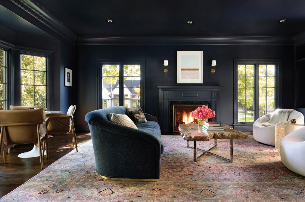

Erotas Custom Building
BACKGROUND
With over 30 years of experience building and remodeling custom homes in the Twin Cities and beyond, Erotas Custom Building executes every project with passion and precision. Its talented team of project managers and tradespeople works together during the construction process, and their commitment to exceptional craftsmanship, attention to detail, and personalized service exceeds clients’ expectations every step of the way.
BUILDING DREAMS
At Erotas, the building process is as much about leveraging strong and lasting relationships as it is about consulting, collaborating, and building trust with clients and their team of architects, engineers, and designers. From the initial meeting, Erotas is considerate of the clients’ time and budget, working with its team of professionals to bring together the latest concepts, nest materials, and most current technologies to create the structure of their dreams. Upon completion, Erotas examines every detail to ensure the nal result exceeds every expectation for years to come.
A REWARDING INDUSTRY
A carpenter on the Erotas team recently expressed the most satisfying part of his job was “seeing how our work brought such joy to clients.” In fact, one client went as far as to say, “We have had the pleasure of working with Erotas on several projects. The team takes great pride in their work, which can be seen in the quality of construction, superior subcontractors, and clean job site. They have a very organized system and process that makes the building process enjoyable for all involved. We cannot wait to work with them again.”

MIDWESTHOME COM 51
EROTASCUSTOMBUILDING.COM PHOTOS SPACECRAFTING
building + remodeling |


Great Northern Builders
BACKGROUND
Great Northern Builders (GNB) is a full-service general contractor that specializes in custom design-build remodeling, new home construction, and light commercial projects. With an expert team of engineers, fabricators, welders, master carpenters, tile setters, trimmers, and more, the knowledge and experience of the sta is nothing short of priceless. Working by the slogan, “Your Contractor for Life,” GNB strives to do things right so clients choose to come back time and time again.
PASSION & PROCESS
GNB employs a thoughtful, yet straightforward approach in each of its projects. By listening to clients’ wants and needs throughout all phases of the process, the designers are able to assemble amazing renderings and designs to showcase exactly what the client envisions. From the initial planning to the nishing touches, the GNB team also takes great care in looking at the way the clients live to ensure their home will function well for them for years to come.
A REWARDING INDUSTRY
“Helping people turn their homes into something they have only dreamed about is an amazing feeling,” says Chris Biljan, owner and president of GNB. “Watching the transformation of each space we work on, [as well as] the collaboration among our team, vendors, and trade partners, is like a well-orchestrated performance. When it all falls into place, there is nothing quite like it.” In fact, GNB recently nished a project for a champion wrestler and marine who su ered a major injury in Iraq. In crafting this project, GNB was able to band together the community, vendors, and trade partners to bring the project to life.

52 MIDWEST HOME HOMEBOOK 2024 PHOTOS GREAT NORTHERN BUILDERS
GNBMN.COM
| building + remodeling
Nor-Son Custom Builders
BACKGROUND
Founded in 1978, Nor-Son Custom Builders is a premier custom home builder specializing in high-end custom homes and extensive renovations. Combining the science of building with skilled artistry in its work, the team of expert craftsmen creates stunning, one-of-a-kind homes to last for generations, bringing to life the company’s motto: “No one builds like Nor-Son.”
CRAFTSMANSHIP BEYOND COMPARE
Nor-Son Custom Builders was built on the principles of craftsmanship, collaboration, and professionalism. Driven by these values, the company provides a unique high-touch and high-tech experience to deliver a highperformance built environment. Each Nor-Son home undergoes a rigorous quality inspection, ensuring it lives up to precise company standards, as well as the standards of the client.
CLIENT SATISFACTION
With the attention and detail necessary to craft a custom home, it’s important to create an open, collaborative environment where all parties—including the architect, builder, interior designer, landscaper, and homeowner—can work together to create a seamless process and achieve a beautiful result. It is this approach that drives Nor-Son’s client experience, with one homeowner stating, “Nor-Son Custom Builders over-delivered on all aspects of my new home: quality, attention to detail, and schedule. [Nor-Son was] an invaluable partner that was always willing to consider and recommend tweaks to improve the nal product.”


PHOTOS ( FROM ABOVE ) SCOTT AMUNDSON, LANDMARK PHOTOGRAPHY, SPACECRAFTING MIDWESTHOME COM 53
NOR - SONCUSTOMBUILDERS.COM building + remodeling |


McDonald Remodeling
BACKGROUND
Changing lives with award-winning remodeling requires trust, clear communication, stellar design, and wellestablished processes. McDonald Remodeling takes tremendous pride in bringing these aspects to every project, transforming houses into homes to suit each client’s unique needs and infuse every space with joy. Not only does the McDonald sta understand they are guests during a remodel, but they are also professionals celebrating design down to every detail. As collaborators, the team translates—through expansive knowledge and expertise—each client’s wishes into the design goals envisioned for the home.
AWARDS & HONORS
McDonald’s work has earned multiple CotY, Roma, Chrysalis, Remodeling Magazine, and Midwest Home awards, but client satisfaction is second to none. With a stunning collection of rsthand accolades from current and previous clients, McDonald o ers customer service that is unmatched in quality. “McDonald Remodeling was extremely thorough, from the very beginning of the project to the very last detail,” enthuses one satis ed homeowner. “Communication and respect for our home was outstanding.”
TIMELESS BEAUTY
Not only does McDonald design homes that are beautiful, comfortable, and practical, but it also thrives on tting the unique needs of each client and the time-tested rules of design. “The design sta , project manager, and specialists were humble and hardworking, responding promptly to concerns and respecting our home,” adds another homeowner. “McDonald Remodeling exceeded our expectations.”

54 MIDWEST HOME HOMEBOOK 2024 | building + remodeling PHOTOS MCDONALD REMODELING MCDONALDREMODELING.COM


Showcase Renovations Inc.
BACKGROUND
Showcase Renovations Inc. is a design-build, remodeling, and n ew construction rm dedicated to its clients, ensuring the goals and visions for every project are achieved with stunning results. The team’s seasoned carpenters, trusted trade partners, and collaborations with gifted architects—along with expansive knowledge and attention to detail—consistently lead to awardwinning projects and superior customer satisfaction.
PEOPLE, PASSION & PROCESS
For Showcase Renovations, communication is critical—as is a passion for craft. This passion for the industry helps the rm remain on the leading edge of smart, sustainable remodeling. As a master of t and nish, Showcase Renovations constantly strives for durable, superior quality. The company’s approach employs new building science, unique materials, and energye cient practices, resulting in strong and creative architecture.
TIPS FOR HOMEOWNERS
For many projects, more than a year might pass from the initial design phases to the completion of the punch list. “I often joke with prospective clients at initial meetings that choosing a contracting team is like dating,” says President Greg Kraus. “You go into the relationship with high hopes and expectations, but along the way, things will inevitably come up that were unexpected or unplanned. Longevity in any relationship stems from having the right team in place—one that is emotionally intelligent, one that you can trust, and one that you can communicate with through the hardships. This is imperative to ensuring the spark doesn’t go out by the time you cross the nish line.”

MIDWESTHOME COM 55 PHOTOS ( CLOCKWISE FROM ABOVE LEFT ) SPACECRAFTING, SHOWCASE RENOVATIONS INC., COREY GAFFER SHOWCASERENOVATIONS.COM building + remodeling |


Knight Construction Design Inc.
BACKGROUND
Established in 1993, Knight Construction Design Inc. is a small family-owned business with the sophistication of a large rm. Each client receives rst-class service and attention from talented professionals who guide them every step of the way. Visit Knight’s beautiful showroom in Chanhassen for design ideas and inspiration.
PHILOSOPHY
As a local design-build rm, Knight understands that reputation is everything. The team is dedicated to achieving the highest levels of customer satisfaction through honest and straightforward business practices, e cient project management, and strong work ethic. Knight understands that its work transcends building and remodeling houses—that’s why the team treats every job with the same respect as if it were their own home. By consistently communicating and following through with details, Knight works hard to earn each client’s trust.
THE TEAM TAKES GREAT PRIDE IN...
…the many satis ed clients who welcome them back to do multiple projects and refer the company to others. Repeat business and referrals are the best compliments Knight receives. The team also takes pride in their accurate bids and extensive knowledge of helping clients through the vigorous selection process. It starts with a great design, followed by bringing in subcontractors the company knows and trusts—resulting in stunning homes to last for generations.

56 MIDWEST HOME HOMEBOOK 2024
| building + remodeling PHOTOS KNIGHT CONSTRUCTION DESIGN INC. KNIGHTREMODELING.COM

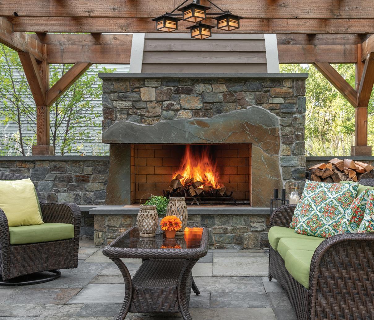
Southview Design
FIRE, WATER, AIR & EARTH NATURE SUSTAINS US
It’s a known fact that landscaping increases a home’s value, but at Southview Design, it o ers so much more. Landscaping is about creating spaces that nurture emotional well-being. Time spent in nature—in places with a green vegetative environment or near calming water elements—has been linked to reduced stress levels, improved mood, and increased feelings of relaxation. The team at Southview understands the importance of these emotional bene ts and strives to bring them to your doorstep.
INDUSTRY TRENDS
Landscaping can create a sensory haven with water or re features, natural textures, and the delightful scents of flowers and herbs. Quiet seating areas o er a peaceful retreat, while elements like hot tubs and cold plunge pools provide invigorating sensations. One exciting trend Southview is increasingly seeing is the inclusion of urban vegetable gardens. These gardens, when interspersed with perennials and annuals, present a unique opportunity for gardening. This hands-on activity not only adds to the beauty of a landscape but also provides a satisfying way to connect with nature.
BACKGROUND
Southvi ew Design is dedicated to turning visions into reality. With proven expertise in the landscaping industry, the company is committed to enhancing the value of homes and enriching the overall quality of life for its clients. With more than 210 employees during the landscape season, Southview provides residential and commercial landscape design, construction, and maintenance services. This variety of services has resulted in numerous awardwinning designs, which have garnered recognition from the Minnesota Nursery and Landscape Association, the Minnesota Chapter of NARI, the National Association of Landscape Professionals, and more.
MIDWESTHOME COM 57 PHOTOS ( FROM LEFT ) JOHN WIESE, DREW GRAY
SOUTHVIEWDESIGN.COM landscaping |


Yardscapes Inc.
BACKGROUND
For the last 50 years, Yardscapes Inc. has been designing and installing custom residential outdoor spaces for clients across the Twin Cities metro and beyond. Founded by David Kopfmann, lead designer, the business is known for its client-centric approach and high-quality craftsmanship—both of which contribute to the stellar reputation it has today. By combining art and science in their designs, the Yardscapes team creates unique, oneof-a-kind projects for every client.
PASSION FOR CRAFT
With an old-school, creative set of designers, the Yardscapes team hand draws and colors each master plan for their clients. Once the initial sketches have been presented, the team then provides photo examples and 3D drawings to help the client visualize their spaces more clearly. In both planning and installation, Yardscapes ensures each project is personalized to the homeowner. In fact, the company hosts its own metal shop at the o ce, with a full-time metal fabricator available to incorporate custom pieces into landscape designs of all scopes.
CLIENT SATISFACTION
Yardscapes’ loyalty to its clients keeps people coming back year after year for di erent projects. This dedication to client satisfaction has resulted in numerous awards and ve-star reviews, with one customer stating, “They are high quality, professional, timely, and easy to work with. The design team listens to what you are trying to achieve and provides a design that works well in the environment. I have nothing but good things to say about this business.”

| landscaping 58 PHOTOS ( FROM ABOVE ) LANDMARK PHOTOGRAPHY, SKYE MCLOUGHLIN, SPACECRAFTING MIDWEST HOME HOMEBOOK 2024
YARDSCAPESINC.COM


ideas to steal




Each year, emerging trends lend an inspiring inside look into the always-evolving world of home design, from awe-inspiring architecture to sustainable solutions and more. So, call it what you will: a fad, a craze, a movement. Either way, we’ve compiled them all in one place with the help of skilled local industry pros who know them best.


MIDWESTHOME COM 59
EMERGING ECO-TECH Tech + Sustainability SLEEK & CHIC Kitchen + Bath EXTERIOR ESCAPES Exteriors + Landscaping 71 STEP INTO STYLE Floors + Surfaces 75 DAILY DELIGHTS Decor + Design 78 TIMELESS TOUCHES Details 81 PLENTIFUL PALETTES Color, Paint + Wall Coverings 86 CRAFT & CONSTRUCT Building + Architecture IMAGES JEFF MURPHY JEFF MURPHY, PRESIDENT AND DIRECTOR OF DESIGN AT MURPHY & CO DESIGN IN WAYZATA , HAND DRAWS CUSTOM CREATIONS FOR HIS CLIENTS. ( READ MORE ON PAGE 87.)


Technological


Emerging Eco-Tech

home advancements and sustainable initiatives shape a smarter,
greener future
THE STATE OF SUSTAINABILITY
This year’s trending eco-friendly initiatives include smart features, exterior continuous insulation, and more WRITTEN BY MACY HARDER
In the face of recent years’ global climate concerns, the conversation around sustainability has taken prominence. The design and architecture industries are no exception, as many homeowners have opted to introduce solar panels, low-flow faucets, triple-pane windows, and other eco-friendly solutions to their living spaces. Not only are these initiatives here to stay, but there are also new products, technologies, and design features pushing the envelope.
Known and respected for its savvy in this particular field, Sustainable 9 Design + Build is a Minneapolis-based firm building high-performance homes without compromising design. Paul Trieu, Sustainable 9’s director of architectural design and engineering, explains how buildings can have negative impacts on the environment (similar to those of industrial agriculture) if not designed with sustainability in mind. “It is starting to come into the collective consciousness that it’s not enough to drive a Prius and recycle,” Trieu says. “It’s really not up to just individual choices. With a house, it lasts 100-plus years if we’re lucky... so, everybody here feels a sense of urgency to make as many homes as high-performing as we can.”
Right now, the movement to “go green” includes high-performance home features like balanced ventilation, airtight construction, and more, Trieu explains. Products like smart indoor air quality sensors, electrical panels with built-in monitoring, and smart lighting and shades also are starting to take precedence. “These are things we’ve all done before but are not yet expected standards,” Trieu says. “I think there are definitely some capabilities there that could theoretically create less consumption.”
From a builder’s standpoint, insulation is top of mind. He adds, “It’s recommended by the International Code Council that we should have what’s called exterior continuous insulation (ECI),” which reduces

THIS STUNNING SUSTAINABLE 9 DESIGN + BUILD PROJECT EARNED THE DEPARTMENT OF ENERGY’S ZERO ENERGY READY CERTIFICATION AFTER MEETING RIGOROUS REQUIREMENTS THAT ENSURE OUTSTANDING LEVELS OF ENERGY SAVINGS, COMFORT, HEALTH, AND DURABILITY
the amount of energy and heat lost by a building. While ECI is already required in much of Canada and is common in commercial buildings throughout the United States, residential is up to bat. Sustainable 9 is already working on it, Trieu says, and the firm has emerged as one of the region’s leaders in pioneering ECI techniques for residential homes.
Sustainable 9 has also seen a recent uptick in clients who want to build all-electric houses, despite them being a relatively new phenomenon. “We probably only had about one or two in the last five years, and then we had five in the last year or two,” Trieu says. Removing all fossil fuel-based appliances, with the addition of on-site solar power, helps in achieving a truly net-zero home.
Whether building a brand-new home or shopping around for products with eco-friendly features, invest in things you will continue to use in the future. “Creating something people really love and enjoy is also highly sustainable,” Trieu says. “If you don’t like something, it ends up in the landfill or you don’t use it. It has to work, but it also has to be enjoyable.”
WHITE PAINT IS THE COOLEST LITERALLY


Researchers at Purdue University have engineered the world’s whitest paint, which can reflect more than 98% of the sun’s rays that hit the earth’s surface. This record-setting ultra-white shade marks a turning point for the climate change crisis, helping to drastically decrease air temperatures when used on roofs and exterior surfaces. –Elizabeth Roubik
MIDWEST HOME 60 IMAGES ( FROM ABOVE ) LANDMARK PHOTOGRAPHY, ADOBE/VPANTEON

LET’S TALK ARTIFICIAL INTELLIGENCE IN THE HOME INDUSTRY
Kirsten Erickson of Alma Homes shares her company’s initial foray into AI technologies WRITTEN BY KATELYN
B LOOMQUIST
MH: What prompted you to start using AI? How, specifically, are you currently using it in your daily work?
KE: We love embracing new technology, so we were excited to learn how to use some of the different AI tools. I’ll be the first to admit we are just scratching the surface on learning what AI is capable of. The technology seems to be evolving incredibly quickly. We have been using AI predominantly for inspiration, sharing the images we create on social media.
What are the advantages and disadvantages of using AI in home design?
We’re able to quickly and easily bring our design ideas to life, [but] there are definitely limitations. The AI tools we use are not actual rendering software, so you can’t model a client’s specific home. We rely strictly on prompts to create images, so it would be very challenging to re-create their home with the current tools we’re using. AI also has the habit of putting objects in strange spots, and when you look closely, things don’t always make sense. Because of that, we haven’t been using it too much with clients on their projects. We have mainly been using it to create different design concepts. It has been fun to be able to showcase different ideas we have on social media, because traditionally, we’ve been restricted to only sharing actual client work where clients ultimately have the final say.
How will AI enable you to potentially create more customized or personalized design solutions?
As our team becomes more familiar with the AI tools out there, I could see us incorporating them into design meetings as a way to better articulate ideas we have. Often during selection meetings, we are swapping out materials quickly, and clients want to be able to see how it would look in a room. With a few quick prompts, we can create images that may not show the exact product but give a general sense of how something like that would look in a room.
Where do you see the future of AI in home design heading?
As AI capabilities continue to evolve, the possibilities will be endless when it comes to home design. Being able to automate some of the tedious tasks of plan detailing would be incredible, as would being able to take any floor plan and having it quickly create a rendering.
CONTINUING EDUCATION SCIENCE IN DESIGN
“Beauty is something we all strive for; we seek it out,” says Mike Peterson, founder of Science in Design, a certification course centered on the convergence of science and design through neuroaesthethics.
“It lowers our heart rate [and] blood pressure. The point is that beauty is an alternative health resource. When you start thinking about it that way, designers create beauty. The axiom, then, is that designers also improve health. Douglas Wood of the Center for Innovation at Mayo Clinic even said, ‘The future of medicine is in the home.’” Through lessons led by a renowned faculty of medical doctors, neuroscientists, and more, the course’s five modules teach students how beauty, fine design, and nature support health and well-being to create spaces that nurture the mind, body, and soul. So far, more than 100 industry professionals seeking to hone their expertise have enrolled in the recently released course, including Fusion Designed’s Sheree Vincent, principal, pictured above. “A certification in science and design enables me to bring a unique blend of creative problemsolving coupled with analytical thinking [to projects],” says Vincent, who is based in Forest Lake. “This certification blends artistic creativity with scientific principles, giving me the ability to approach each project with a deeper understanding of human behavior.” –Katelyn Bloomquist

“Beauty is something we all strive for; we seek it out.”
– MIKE PETERSON , Founder of Science in Design
MIDWESTHOME COM 61 tech + sustainability
AN AI-GENERATED KITCHEN
BY ALMA HOMES
IMAGES ( FROM LEFT ) ALMA HOMES, BEN CLASEN

DIGITIZED DWELLINGS
These top tech-focused features propel new builds into the future WRITTEN BY KATELYN B LOOMQUIST
“Imagine you have a movie stored on your computer, and you want to watch it on your TV in the living room,” prompts Kristin Reinitz, general manager and co-owner at Admit One Home Systems. “Instead of physically carrying a DVD or USB drive to the TV, you can use your home network to stream the movie directly from your computer to the TV.”
This, she explains, is network-based audio and video distribution in action— a technology feature Admit One employs more and more often in today’s homes. “It allows more flexibility in scalability and product placement over traditional category cabling, which has allowed us to deploy reliable systems in a variety of applications large or small—in new construction or in existing structures with existing infrastructure,” she explains. “In simpler terms, it’s like a virtual pipeline that delivers movies, music, or any other multimedia content from one place to another over the internet or a local network.”
Another tech-related feature embraced by industry professionals is the invisible speaker, says Alex Lelchuk, president of St. Louis Park-based Lelch Audio Video. He says, “Invisible speakers are a gamechanger; they completely disappear, blending with the space’s material and essentially transforming the way we perceive sound within our environments.” As an alternative, Reinitz suggests Line Source speakers by Wisdom Audio. “Particularly in expansive, contemporary homes with open floor plans or multitiered theater areas, achieving balanced, dynamic sound can pose a challenge,” she says. “Line Source speakers address this by minimizing floor and ceiling reflections while evenly dispersing sound levels throughout the room’s width.”
Lelchuk sees homeowners opt for myriad other tech features as well. “The advent of ultra-flat and zero-gap TVs has revolutionized visual technology, integrating seamlessly into the design of a room without any intrusive edges or gaps,” he says. “And, perhaps most impressively, intelligent lighting control has elevated the concept of lighting from a mere necessity to an art form. With glass palladium keypads and warm-dim architectural fixtures, lighting now serves as both a functional element and a piece of ‘wall jewelry,’ offering control and aesthetic appeal.”
Reinitz agrees, reinforcing the popularity of integrated lighting control, motorized shades, and lighting as a unified system. “Recognizing that lighting control and fixtures must harmonize for optimal performance, professionals are prioritizing early involvement of lighting and technology consultants,” she explains. “These experts possess comprehensive knowledge of system capabilities and options, ensuring seamless and efficient project execution.”
SENSIBLY SOLAR
With the help of RAICO windows, Streeter Custom Builder makes a sustainable statement in its latest Stillwater project
Streeter Custom Builder, in collaboration with PKA Architecture, is redefining the use of glass in residential architecture. Seamlessly blurring the lines between indoor and outdoor living, the Stillwater home features a stunning 25-foot solarium designed to open and expand views of the backyard patio, pool, and spa, as well as the serene prairie woods beyond. The solarium is composed of multiple 7-by-11-foot RAICO site glazed units, which were imported from Germany by local supplier Tanner Windows and installed locally by Tanner Construction.
“One of the reasons RAICO was selected is because of the large scale of the glass and complexity of glazing in a roof condition,” says Josh Crenshaw, director of innovation at Streeter. “Finding a curtain wall system capable of handling something of this size and scope is a little bit unique.”
Additionally, RAICO, a German-based company, employs a key focus on environmental sustainability in its glass development, using recyclable materials including steel, aluminum, and timber—all while actively recycling scrap materials back into the production process. But the sustainability of these windows carries on even after production, as they are intentionally designed to limit energy consumption thanks to their low heat transfer coefficients. “One of the things that’s really unique about the RAICO system is that you can fine tune the amount of solar gain it gets, as well as the visible light and thermal performance of the window,” explains Crenshaw.
This cutting-edge engineering not only conserves energy by limiting the use of the homeowners’ heating and cooling systems but also makes the addition of a solarium more practical in colder climates like that of Minnesota’s. Through all four seasons, RAICO glass is designed to keep homeowners comfortable while simultaneously providing the stunning, expansive views that only a window of its scale can. –Emma
Enebak

MIDWEST HOME 62 tech + sustainability
PHOTOS ( FROM ABOVE ) SONANCE/LELCH AUDIO VIDEO, STREETER CUSTOM BUILDER
HOME BY JYLAND BUILDERS & CHARLES R STINSON
ARCHITECTURE + DESIGN, FEATURING LELCH TECHNOLOGY


Architectural Homebuilder


MIDWESTHOME COM 63
Photo: Landmark


Sleek & Chic

This year’s top kitchen and bath trends promise beauty, intention, and uncompromised quality


See-Through Style
A wall of glass-fronted cabinets that houses curated collections of dinnerware creates a striking focal point in this Ispiri-designed New Richmond lake home, which features medium-tone wood floors that serve as the neutral foundation for striking black and white enameled and stained cabinetry. (This high-contrast kitchen also flaunts mixed hardware styles and two-tone cabinets—both of which continue to shine in kitchens across the country.)
MAKING A SPLASH
Wet rooms are becoming increasingly more popular in the world of bathroom design, and while homeowners are tempted by their convenience and aesthetic appeal, they are not without their quirks. Citydeskstudio is familiar with both the pros and cons of this concept, having mastered the art of wet room design in its own work. According to Principal Ben Awes, AIA, “Wet rooms tend to be more costly because [they’re] waterproof, which impacts how they’re built.” But he also notes their luxurious aspects, stating, “It’s nice to be able to move from area to area without being concerned about splashing water.” Boasting design fluidity, wet rooms are not limited by defined edges or boundaries in a bathroom, he explains. “This is evident in the lack of thresholds and curbs, continuous tile, reduced requirements for enclosure, [and] even the way light is interrupted by fewer edges.” –Elizabeth Roubik
CABINETRY CRAZE
Mixed hardware styles, two-tone palettes, and natural, warm woods are still in vogue, but we’ve cooked up even more on-trend cabinetry ideas WRITTEN BY KATELYN BLOOMQUIST
Clear Off the Counters
Inspired by its clients’ former home designed by renowned late architects Elizabeth and Winston Close, Albertsson Hansen Architecture and Interior Design chose a warm walnut wood—an increasingly popular choice in today’s design realm—for the cabinetry in this midcentury modern kitchen. Efficient storage, custom drawers designed for cookware and utensils, and integrated walnut paneling on the refrigerator all complement a convenient appliance garage—the perfect nook for small kitchen gadgets to be hidden from view when not in use.


Reeded & Ravishing
Adriatic Construction and Niosi Design took modern minimalism to new heights within the kitchen of this Minneapolis new build. White oak cabinetry treated with hardwax oil showcases the natural elegance of the wood, which boasts a popular reeded
texture—sometimes seen etched into marble waterfall-edge islands and on bathroom vanities—atop the range and around the island base.

MIDWEST HOME 64 kitchen + bath PHOTOS ( CLOCKWISE FROM ABOVE LEFT ) SPACECRAFTING, WING HO, ALYSSA LEE, PETER VONDELINDE

IN THE VEIN OF VANITIES
Designers are moving on from boring, basic ceramic sinks in primary and powder bathrooms. Instead, these functional pieces are starting to feel more like custom furniture with unique detailing, warm underlighting, ornate hardware, and more. The vanity set in this primary bath in a 1929 French Provincial house by Rehkamp Larson Architects, Alecia Stevens Interiors, and Welch Forsman Associates, for instance, features a Breccia Capraia marble top and apron supported by custom brass legs and flanked by tall, figured red birch veneer storage cabinets. Aiming for a more rustic look? Skip the vanity altogether and try a troughstyle sink. –Katelyn Bloomquist

THE STAYING POWER OF THE SPA AESTHETIC
In a departure from the clean whites and jewel tones of years’ past, spa-inspired bathrooms are darkening up with earthy tones, statement patterns, drapery, and more. But the affinity for freestanding tubs remains, as seen in this European-inspired primary suite by Codie Donahue Interior Design. The en suite bathroom offers a personalized spa experience within the home, complete with a walkin rain shower, dedicated water closet, and multitude of marble surfaces. –Elizabeth Roubik

PRODUCT PICK TECH-Y TOILETS
Toto USA’s newest wallhung toilet models, the NEOREST WX1 and WX2, will impress even the techiest of homeowners. The awardwinning, minimalist smart bidet toilet prioritizes sustainability and personal hygiene with a high-efficiency dual flush system, energy-saving features, advanced cleaning technologies, adjustable settings, and a seamless heated seat—all managed by an elegant stick-style remote that recalls preferences for up to four users. totousa.com –Katelyn Bloomquist
MIDWESTHOME COM 65 kitchen + bath
PHOTOS ( CLOCKWISE FROM ABOVE LEFT ) SCOTT AMUNDSON, TOTO USA, SPACECRAFTING
TREND ALERT
THE ECLECTIC KITCHEN
The ‘eclectic kitchen’ is making its mark in the world of interior design. Here, Kailee Klevan of Beyond Kitchens shares the defining elements of this unique style. WRITTEN BY ELIZABETH ROUBIK
Homeowners are seeking to spunk up their spaces, and kitchens are no exception. In fact, the concept of the “eclectic kitchen” is rising the ranks on social media, with searches for the phrase up 160% on Pinterest. “People are getting tired of the all gray and white kitchens and are looking to add personality back into their homes,” says Kailee Klevan, lead designer at Rochester-based Beyond Kitchens. “[Homeowners] are looking for a space that is a true reflection of them—one that is a conversation starter when they have company over.”
But what truly defines this unique design style? According to Klevan, the eclectic kitchen is comprised of elements from several different styles that can all work together in an eye-catching way—whether it be through thrifted finds, vintage appliances, or pops of paint (green, specifically, is very trendy at the moment). Through her work, Klevan is seeing people incorporate quirky features in all parts of the kitchen, ranging from cabinetry and appliance colors to fun barstools, backsplash, and decor.
“When I’m designing a kitchen, I always make sure there is something in the design that is going to be an attentiongrabbing conversation piece,” she explains. This can come in many forms, from countertop material to hood design, but whatever the client may choose, “it’s important to have something that will make the design stand out from the rest.”
Designer Tip
“When designing an eclectic space, make sure the main pieces will stand the test of time. If you balance out the eclectic pieces and stay mindful of the longevity of what you’re specifying, your eclectic kitchen design will be a success.” –Kailee Klevan, lead designer at Beyond Kitchens
CULINARY EXCELLENCE

When it comes to creating a custom kitchen that exudes sophistication, functionality, and cutting-edge design, choosing the right appliances is key. Invest in these deluxe, off-the-beaten-path brands on the cusp of culinary excellence.
AGA , agarangeusa.com
Bertazzoni, bertazzoni.com
Gaggenau , ga=ggenau.com
Hallman Industries, hallmanindustries.com
ILVE , ilve.com
La Cornue, lacornueusa.com
Miele, mieleusa.com
Molteni, molteni.com
Monogram , monogram.com
Sub-Zero, Wolf, and Cove, subzero-wolf.com
Thermador, thermador.com Viking , vikingrange.com


MIDWEST HOME 66 CREDIT kitchen + bath
LEARN MORE ABOUT THESE APPLIANCE BRANDS AT MIDWESTHOME COM/LUXURY-APPLIANCES PHOTOS ( FROM ABOVE ) MARIT WILLIAMS PHOTOGRAPHY, SCOTT AMUNDSON
REHKAMP LARSON ARCHITECTS; ALECIA STEVENS INTERIORS; WELCH FORSMAN ASSOCIATES


MIDWESTHOME COM 67 NO ONE BUILDS A BETTER PICKLEBALL COURT Call to schedule a free estimate! SportCourtMN.com | 952.746.4545 9208 James Ave S Suite 5 Bloomington, MN 55431 residential interior design I believe your home should refect the best of you — that you should meet yourself when you walk in your door. mikerataczakstudios.com | minneapolis, mn | 347-803-9967


Exterior Escapes


Elevate your home’s curb appeal with the help of industry experts specializing in gardens, landscapes, and outdoors

STAND-ALONE STRUCTURES: SAUNAS & MORE
If you’ve never had the pleasure of experiencing a Cedar and Stone Nordic Sauna for yourself, you’ve likely at least heard of the myriad ways the company, helmed by Justin Juntunen, is bringing saunas to the masses. From its public experiences on Lake Superior in Duluth to the Four Seasons Hotel rooftop in Minneapolis, Cedar and Stone even brings its beautifully designed, sustainably built saunas directly into homeowners’ backyards.
“We love designing outdoor spaces,” Juntunen says. “The backyard should provide access to all the elements of the sauna ritual—hot, cold, rest, rehydrate, and repeat. We are often working with owners, architects, contractors, and landscape designers to ensure everything fits and flows together. We love to include outdoor pools, showers, cold plunges, and places to rest all nestled around the sauna.”
In Nordic countries, the sauna is a centerpiece to people’s property for their enjoyment and health, ultimately pointing to why
homeowners choose to invest in a residential sauna. “The cultural wisdom of sauna health (known by the Nordic countries for centuries) is now being matched with scientific data that shows the impact of regular sauna use,” says Juntunen, who adds that the ease and simplicity of maintenance and upkeep is another perk. “You sit and enjoy the heat, and while doing so, get a light cardio workout, boost your immune system, lower your inflammation, improve sleep, and destroy the stress of the day. We [also] continually see our clients telling us stories of the ways they are valuing time with their partner, their children, and their neighbors while using the sauna.”
Other stand-alone structures, all of which are excellent ways to elevate your exteriors, span from she-sheds and accessory dwelling units (check out Christopher Strom Architects’ renowned work) to tiny homes, conservatories, and pub-style bars like the one Tays & Co. Design Studios built on Upper Gull Lake. –Katelyn Bloomquist
MIDWEST HOME 68
PHOTOS ( CLOCKWISE FROM ABOVE LEFT ) ETHAN SCHULTZ, MADELINE PARK, ADOBE/K.A, SPORT COURT MINNESOTA LEARN MORE ABOUT TAYS & CO.’S LAKESIDE RESIDENTIAL PUB AT MIDWESTHOME COM/OLD-WORLD-PUB
CEDAR AND STONE NORDIC SAUNA
Q&A
EDIMENTAL EDUCATION
Both edible and beautiful, these plants add ornamental appeal to every landscape WRITTEN BY KATELYN
B LOOMQUIST
Ever heard of “edimentals”? Neither had we, until recently, at least. It’s a playful, combined spin on the words “edible” and “ornamental,” and they have plenty of perks in home gardens and landscapes—from decorating a yard to bringing in loads of fresh produce. Madeline Park of Leitner’s in St. Paul knows the extent of the benefits well, and here, she offers advice on how to make the most of these beautiful, palatable plants.

MH: Tell us about your favorite edimentals.
MP: Artichokes are a pollinator’s dream plant! I let my artichokes bloom every season, which just means I stop harvesting the buds, and the blooms are a really beautiful purple-blue color. Artichokes are a good drought-tolerant option, too.
Blueberries are great for full- to part-sun areas and have nice color all season long: They bloom in late spring, have blueberries by August, and then turn a nice maroon or orange in the fall. Grapes are very easy to establish—some might argue they are too easy and end up covering more area than the average gardener might want. I think they work great for privacy screening on chain link fences or growing along an arbor.
Lastly, rhubarb can be a total showstopper in the landscape, with a height of over 6 feet


when it blooms. The large leaves make it seem almost tropical, plus it’s super hardy and is one of the first things to start popping out of the ground in spring.
How do I incorporate edible plants into my existing landscape?
I like to mix my edible plants right in with my perennial gardens. Artichokes look lovely next to Russian sage; strawberry plants and chamomile can grow as a beautiful border; and dill and asparagus are gorgeous additions to the back of gardens since they get nice and tall. Even throwing pumpkin or squash seeds over your compost or scrap pile can be an easy way to encourage more produce in an area you otherwise might not landscape.
What if I don’t have any room for more plants?
If a gardener already has an existing, full landscape, incorporate edimentals in potted arrangements. I often put herbs and lettuce in
my front pots. The lettuce pairs wonderfully with pansies. In the summer, I use rosemary or sage as a foliage among my flowering annuals. I recommend using herbs that won’t grow too quickly (such as cilantro or parsley) for this technique. There are also some edible flowers I like to use, such as nasturtiums. Nasturtiums have wonderful circular leaves, and the blooms are most commonly a bright red or orange. They are a trailing plant, so I use them in window boxes.
Do you have any other advice?
Like any plants (especially new plants), keeping them well-watered throughout the season is key. With the recent droughts we’ve been facing, I recommend investing in a rain barrel, using soaker hoses, and mulching. The rain barrel will help conserve water, the soaker hose will ensure the water goes directly to the base of the plant, and the mulch helps the soil stay moist.
TREND ALERT
THE RISING POPULARITY OF PICKLEBALL COURTS
Using cutting-edge materials and technologies to guarantee peak performance, safety, and comfort alike, Bloomington-based Sport Court Minnesota specializes in athletic court construction, including pickleball courts—an increasingly popular outdoor amenity.
“We have always offered and built pickleball courts, but these past four years have significantly impacted our overall business,” says Craig Jones, owner. “Our average-size court before the craze of pickleball was 25 by 45 feet—now [it’s] 30 by 60 feet or larger. … We design the courts for multiuse. Not only can [homeowners] play pickleball, but the net also adjusts up to badminton and volleyball, and we almost always incorporate a basketball hoop on the court as well,” he continues. “The popularity of pickleball is not going away any time soon. It is such an easy sport to play, encourages interaction with your kids, and gets them off their screens. The added bonus is Mom and Dad now can entertain their friends on the court, too!” –Katelyn Bloomquist
MIDWESTHOME COM 69
A TRIO OF ARTICHOKES IN BLOOM
GARDEN GEMS
Shop unique seeds, potted plants, and gardening equipment and accessories at one of the Twin Cities’ esteemed plant nurseries and garden centers
Applewood Nursery & Landscape Supply applewoodnursery.com
Bachman’s bachmans.com
Cal’s Garden Center calsgarden.com
Dundee Nursery & Landscaping dundeenursery.com
Gertens gertens.com
Gregor Farm & Greenhouse gregorfarm.com
Heidi’s GrowHaus & Lifestyle Gardens growhausmn.com
Highland Nursery thehighlandnursery.com
Horta Culture shophortaculture.com
Lilydale Garden Center lilydalegardencenter.com
Mother Co., Plants mother-plants.com
Mother Earth Gardens motherearthgarden.com
Minnesota Valley Garden Center minnesotavalley.com
Otten Bros. Garden Center & Landscaping ottenbros.com
Paisley Gardens paisley-gardens.com
Queen Bee’z Lawn & Garden queenbeezgarden.com
Steve’s Elk River Nursery steveselkrivernursery.com
Tangletown Gardens tangletowngardens.com
Terra Garden Center terragardencenter.com
Tonkadale Greenhouse tonkadale.com
Whispering Gardens whisperinggardens.com

ATTRACTING POLLINATORS
Elaina Moss, a Minneapolis-based master gardener, shares her methods for drawing wildlife into her garden WRITTEN BY E LAINA MOSS
We all love our honeybees and monarch butterflies. We know they are in decline and wonder how we can help. The truth is, though, that honeybees and monarchs (while iconic) are not more important than other pollinators, such native bees, flies, beetles, moths, and other butterflies, which do most of the pollination.
Our yards, balconies, and plant choices can help our pollinator friends, yet most American households have yards that do not feed or supply adequate habitats for them. Pollinators need flowers, dead logs, barren soil, tall grasses, dried stems from perennials to nest in, and dark spaces with no artificial light. A few small changes can help them not only survive but also thrive in our yards or on our balconies.
Steering clear of insecticides is necessary because they hurt not only the “bad” bugs but also the good ones. Lacewings and hoverflies will eat the bad bugs, keeping their population under control. They are attracted to plants in the carrot family, like yarrow, fennel, and parsley. Having these plants intermixed in your yard or garden is a great way to attract pollinators to pollinate your plants, as well as eat the problem-causing bugs.
Pollinators also need food year-round to survive. (Did you know over one-third of our food needs pollination to make it to our own plates?) The plants that attract the most

pollinators in my yard during spring are sweet alyssum, plum trees, and dandelions. I grow yellow, white, and even pink dandelions. In the summer, there is no other plant that attracts more bees than wild bergamot, and for butterflies, Meadow Blazing Star. In the fall, showy goldenrod steals the show. If you don’t have a yard but have a small balcony, grow sweet alyssum with zinnias. During those fall months, cut stems of perennials and flowers 12-18 inches for stem-nesting bees. Leave the foliage in fall garden beds alone because pollinators nest in them. When spring rolls around, only clean them up when dandelions bloom.
While I love my PowWow Echinacea hybrid perennial for its lower growth habit, it has less pollen to feed pollinators than native Echinacea purpurea. By choosing nonnatives or hybrids, our pollinators must forage up to 10 times as many flowers, adding to their collapse. In addition to choosing native plants, our lawns themselves can be a source of food. Stopping applications of Weed & Feed and allowing clover and dandelions to bloom not only supplies a hard-to-find spring food but also adds nitrogen to your soil, making fertilizer unnecessary. Dandelions also provide aeration. Creeping thyme, selfheal, yaak yarrow, and microclover are other low-growing bee lawn flowers that can help produce a no-mow lawn.
MIDWEST HOME 70 exteriors + landscaping
PHOTOS ( FROM LEFT ) ELAINA MOSS, ANDREA RUGG
EXPERT COLUMN
FOLLOW MOSS’ GARDENING JOURNEY ON INSTAGRAM AT @FUSSYGIRLURBANFARM


Step into Style


From tile to timbers, these surface selections set spaces apart with limitless potential

A CUT ABOVE
The use of statement-making marble slabs as kitchen backsplashes or waterfall-edge islands isn’t anything particularly new—but the styles, cuts, designs, and installation methods do indeed evolve year over year. One could argue colorful, overly veiny selections with blends of rich tones—like the oversized quartzite center island of this Vela Interior Design and Kenzo Construction kitchen renovation—are topping other counter material trends this year. –Katelyn Bloomquist
A TWIST ON TILE: THREE TRENDS TO TRY
Mercury Mosaics Founder & CEO Mercedes Austin’s take on this year’s tile trends
WRITTEN BY ELIZABETH ROUBIK
Vibrant Colors
“Clients are embracing boldness [in tile] with vibrant blends and reimagined classic patterns,” says Mercedes Austin, founder and CEO of Mercury Mosaics. And while this lean toward more fun, playful pieces brings personality to a space, she also notes the importance of balancing the vibrant colors with more grounding, neutral tones. She says, “We’re seeing this trend show up in the kitchen and extend to other areas of the home [in] backsplashes and accents.”
Stacked Subway Tile
Subway tile continues its reign as a fan-favorite but with a twist—now being stacked versus offset to achieve a clean, cohesive look. While horizontal stacking closely relates to the traditional brick pattern, vertical stacking is also being incorporated in kitchens and bathrooms, with capabilities of drawing the eye upward and elongating a space.
Earthy Accents
“Tiles that evoke a sense of coziness are very popular at the moment,” Austin says. In her experience, earthy colors in tile design are what bring warm and welcoming feelings to a space. She continues, “Rather than a clean and cold aesthetic, earthy color accents bring a delightful pop of character.”

floors + surfaces 71
PHOTOS ( FROM ABOVE ) BETHANY BIRNIE, HOMECOMING PHOTOGRAPHY
MIDWESTHOME COM
KITCHEN BY ERINN FARRELL DESIGN, FEATURING MERCURY MOSAICS’ MID MOD SQUARE TILE

AND MA PETERSON DESIGN BUILD OPTED FOR NO GROUT THROUGHOUT VARIOUS SPACES OF THIS REMODELED MINNEAPOLIS RESIDENCE
Q&A GROUT COUTURE
Wendy Boyer of Brown Cow Design offers insight into the ways grout— or none at all—can affect tile WRITTEN BY ELIZABETH ROUBIK
MH: What are the different visual effects of dark and light grout colors?
WB: Grout dynamically changes the way tile looks. You can use a light or dark grout color on a tile, and it makes the tone look completely different—just as different mortars do with stone. If you use a light grout color, the overall pattern of the tile becomes harmonious and looks more like a solid wall of tile. Darker grout, however, individualizes each tile, so your eye is drawn to the shapes themselves rather than the entire scope of the wall. When using no grout, the wall will have a more aged, stacked look that appears casual and handmade.
Should homeowners use any specific grout for different areas of their home?
Grout has come a long way in its durability and resistance to staining. There is now epoxy grout available, which deters staining where you walk or stand on a regular basis. Epoxy grout is superb in resisting stains, chemicals, and moisture, which makes it a good choice for bathroom floors. Any color could work in any area of a home—it’s just important to consider the environment. If a client is concerned about cleaning grout on backsplashes and shower walls, I often recommend choosing a large-scale tile so they have less grout lines to clean.
How do you recommend choosing the right grout color for different tiles?
I carry grout sample sticks in my car! I feel it’s best to venture into my clients’ homes to help them pick grout, as the grout color can change due to lighting in the home versus in the showroom. Each grout manufacturer offers different shades and colors. I have favorites for each brand, so I always bring three options to choose from. To me, grout is like the jewelry on a dress—it can make a tile feel classic and stately, old or new, and fun and artful.

COUNTERTOP CHRONICLES
Tanya Otten of Select Surfaces reveals the three most important questions to ask when choosing and installing countertops
WRITTEN BY ELIZABETH ROUBIK
1. Is my countertop worth the investment? “Custom countertops are a long-lasting investment that most consumers don’t replace often,” explains Tanya Otten of Select Surfaces. So, when it comes time to start shopping, it is crucial to research and “explore reviews to understand how different products and brands perform, as well as how they fit into your vision for your space,” she adds.
2. Is my countertop choice sustainable and beautiful? Upon first glance, a countertop might seem like the perfect fit for your home, but it is also important to explore the “behind-the-scenes” features. Otten says, “It’s essential to ensure the surface you choose is not only durable but also sustainable and nontoxic. In general, opting for a surface that doesn’t require chemical cleaners or sealers for maintenance will contribute to a healthier environment.” Her recommendation? “Consider a quartz brand that is 93% natural quartz and backs up its products with lifetime warranties.”
3. Should I spend more on material or installation? When shopping for countertops, it’s easy to neglect the importance of proper measuring, fabricating, installation, and warranty coverage. “Take a moment to browse Google reviews to gain insights from past customer experiences and select an installation company with a stellar reputation,” Otten says. “You’re investing in a new countertop for the long haul, so it’s wise to choose a company that stands behind its workmanship.”
MIDWEST HOME 72 floors + surfaces
( FROM LEFT ) ALYSSA LEE, SELECT SURFACES
PHOTOS
BROWN COW DESIGN


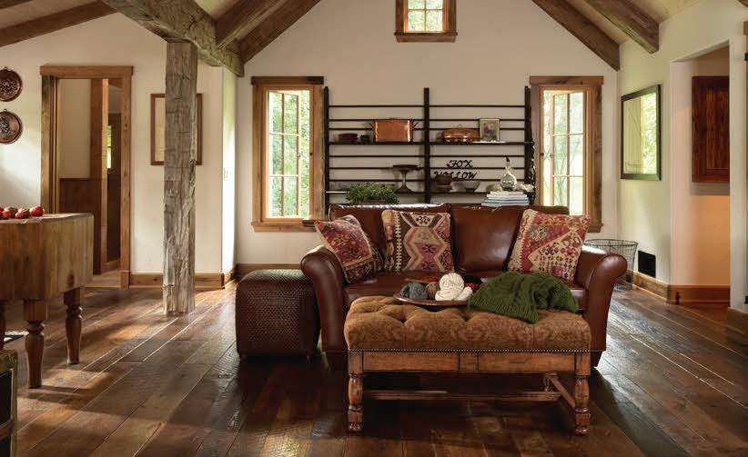


2019 | MINNESOTA HOME 27 ALL THINGS RECLAIMED LUMBER HOME DESIGN • FLOORING • TIMBERS SIDING • ANTIQUE BARN KITS • TRIM WWW.BIGWOODTIMBERFRAMES.COM • (651) 298-8776 BIG WOOD TIMBER FRAMES INC ALL THINGS RECLAIMED LUMBER HOME DESIGN • FLOORING • TIMBERS SIDING • ANTIQUE BARN KITS • TRIM WWW.BIGWOODTIMBERFRAMES.COM • (651) 298-8776 BIG WOOD TIMBER FRAMES INC ALL THINGS RECLAIMED LUMBER HOME DESIGN • FLOORING • TIMBERS SIDING • ANTIQUE BARN KITS • TRIM WWW.BIGWOODTIMBERFRAMES.COM • (651) 298-8776 BIG WOOD TIMBER FRAMES INC 2019 | MINNESOTA HOME 27 ALL THINGS RECLAIMED LUMBER HOME DESIGN • FLOORING • TIMBERS SIDING • ANTIQUE BARN KITS • TRIM WWW.BIGWOODTIMBERFRAMES.COM • (651) 298-8776 BIG WOOD TIMBER FRAMES INC ALL THINGS RECLAIMED LUMBER HOME DESIGN • FLOORING • TIMBERS SIDING • ANTIQUE BARN KITS • TRIM WWW.BIGWOODTIMBERFRAMES.COM • (651) 298-8776 BIG WOOD TIMBER FRAMES INC ALL THINGS RECLAIMED LUMBER HOME DESIGN • FLOORING • TIMBERS SIDING • ANTIQUE BARN KITS • TRIM WWW.BIGWOODTIMBERFRAMES.COM • (651) 298-8776 BIG WOOD TIMBER FRAMES INC
TIMBER TAKEOVER
What to know before you invest in reclaimed wood products
WRITTEN BY KATELYN BLOOMQUIST
Reclaimed wood has been the name of Big Wood Timber Frames’ game for 25 years, ever since the company invested in a few truckloads of Douglas fir timbers from the now-closed Twin Cities Army Ammunition Plant in Arden Hills. With two-plus decades of experience, it only makes sense that Mike Nicklaus, owner, knows better than most exactly why reclaimed wood is a worthy contestant in a search for the perfect “imperfect” surface—whether it be floors, ceilings, beams, mantels, exteriors, or otherwise.
“In our region, we harvest Douglas fir and pine timbers, along with maple flooring, from industrial buildings,” says Nicklaus, who sources product locally across Minnesota, Wisconsin, and Iowa. “The timbers in the barns of Minnesota and the Midwest are red and white oak, elm, ash, hemlock, white pine, tamarack, rock elm, and poplar. We even find walnut, cherry, and butternut timbers sprinkled in. … All reclaimed wood has a rich and unique patina that varies from species to species.”

Beyond wood type, there are several other nuances and considerations for homeowners who are prepared to pull the plug on purchasing such a product. The level of required maintenance, for example, often prompts both questions and assumptions— but Nicklaus reassures care instructions are no different than any other wood type. “Our reclaimed flooring is installed and finished in the same manner as traditional flooring,” he says. “Many of our clients will put a coat of penetrating sealer on any exterior timber trusses, brackets, siding, and trim.”


But what about investment? “Reclaimed wood has a higher price point than new wood,” Nicklaus explains, “primarily because the character of reclaimed [wood] distinguishes it from new wood, the cost of labor [it requires] to take a building down piece by piece, and nails—the never-ending process of removing nails.” There are other factors that affect price, too: “Wider flooring boards are priced higher than narrow flooring, and the same goes for timbers,” he continues. “In some cases, age affects the price—hand-hewn timbers from the mid- to late-1800s are more


REVIVING RUGS
scarce than circle-sawn pine timbers from the 1920s and 1930s.”
Keeping a careful eye on the wood’s historical relevance is part of the process for Nicklaus, who keeps track of where the timbers and boards come from so clients can gain a sense of the antiquity behind each piece. “Some barn timbers have Roman numerals carved in them to indicate the sequence of construction,” he says. “We recently reclaimed an 1880s log cabin from Dent, Minnesota— imagine the life of a pioneer settling [there] shortly after Minnesota became a state.”
Social media platforms are buzzing with satisfying (and addicting!) carpet cleaning content. If you’re captivated by these videos and itching for a refresh, revitalize your rugs with the help of these Twin Cities carpet cleaners.

Commercial Steam Team commercialsteamteam.com
EnviroCare Cleaning envirocarecleaning.com
Green Clean , teamgreenclean.com
Lucky Klover Inc. , luckykloverinc.com
Tiller’s Steam Carpet Cleaning , tillerscarpetcleaning.com
MIDWEST HOME 74 floors + surfaces PHOTOS ( FROM ABOVE ) LANDMARK PHOTOGRAPHY, ADOBE/ZZGOOGGIIGZ
LEARN MORE ABOUT CARPET CARE FROM THE EXPERTS AT CJ’S CHEM-DRY IN BRAINERD BY VISITING MIDWESTHOME COM/CARPET-CARE
BUILD BY LECY BROS HOME & REMODELING, FEATURING BIG WOOD TIMBER FRAMES’ RECLAIMED WOOD


Daily Delights


Funky artworks, elegant draperies, vintage furnishings, and more lend personality and charm to our most-loved interior spaces
A PIECE OF THE PAST
Jennifer Davis of Davis Interiors advises how to incorporate vintage and antique items into today’s homes WRITTEN BY
JENNIFER DAVIS
In today’s fast-paced world, there’s something captivating about the allure of vintage and antique items in home decor. Beyond mere pieces of furniture or accessories, these treasures offer an opportunity to infuse character and a sense of history into modern interiors. From antique rugs to patinaed cabinet hardware, each item tells a story, adding charm to any space.
One of the most intriguing aspects of incorporating vintage and antique elements into the home is the journey of sourcing these items. It’s a treasure hunt that can lead to unexpected discoveries, whether scouring antique shops, perusing estate sales, or delving into the depths of Etsy. Each find is more than just an object—it’s a connection to the past.

Take, for example, antique cabinet hardware. These small, yet significant details can completely transform the look and feel of a piece of furniture or cabinetry. Imagine opening a drawer adorned with intricately designed brass pulls or closing a cupboard door secured with a vintage latch. These subtle details not only elevate the visual appeal of the space but also infuse it with intrigue.
Similarly, antique rugs possess a unique appeal that mass-produced alternatives simply cannot replicate. Whether it’s a faded Turkish rug or a handwoven kilim, the imperfections, faded hues, and intricate patterns serve as reminders of the artisans who painstakingly crafted these pieces generations ago—lending a sense of warmth and character to any room.
Here are some of our favorite local places to shop for vintage pieces:
■ A Rare Bird
■ Andie Collective
■ Architectural Antiques
■ H & B Gallery
■ Loft Antiques
■ Retro Wanderlust
■ Victory Vintage
But vintage and antique items are not limited to mere accessories—they can also serve as focal points and functional elements within a home. Consider repurposing salvaged doors as striking focal points or using an antique dresser as a distinctive powder room vanity. These pieces not only add a sense of uniqueness to the space but also contribute to sustainable design practices by giving new life to old materials. Furthermore, integrating architectural salvage into home decor can yield stunning results. Imagine a weathered

window frame repurposed as a statement mirror or a reclaimed fireplace mantel serving as a captivating centerpiece in a living room. These salvaged elements not only add visual interest but also infuse the space with a sense of history and authenticity that can’t be replicated with modern reproductions.
In a world inundated with mass-produced furnishings and cookie-cutter decor, the charm of vintage and antique items lies in their ability to transcend trends and evoke emotions. They serve as reminders of bygone eras, celebrating craftsmanship, authenticity, and the passage of time. So, next time you’re decorating your home, consider incorporating a piece of the past—you might just find that it’s the perfect finishing touch your space has been missing.
MIDWESTHOME COM 75 decor + design PHOTOS ( FROM LEFT ) JENNIFER DAVIS, SPACECRAFTING
WHAT’S IN, WHAT’S OUT?
Discover what’s popular in the world of interiors according to area designers WRITTEN BY SHELBY
DEERING
British writer and textile designer William Morris once famously said, “Have nothing in your home that you do not know to be useful or believe to be beautiful.” Interior design trends are followed more than ever these days (thanks to platforms like TikTok and Instagram), and while weaving them into your home can create a fresh and current look, at the end of the day, you can stick to whatever you “believe to be beautiful,” even if it’s out. But perhaps following decor trends makes you genuinely happy, or maybe you’re just downright curious. Whatever the case may be, we’ve compiled some styles that are trending upward and downward according to recent research and surveys, as well as the insight of local designers. Here’s what they’re saying about the latest, and not-so-greatest, interior design trends.
What’s In
Even though it had its beginnings several decades ago, modern design continues to reign supreme. For instance, when it comes to midcentury modernism, Amy Haglin of Amy E. Haglin Interior Design says, “Mod is in when you layer the look with additional clean-line items.” And Principal Interior Designer and CEO Danielle Loven of Vivid Home believes mid-mod styles to be “timeless” and “very current in Minneapolis.”
Then there’s Scandinavian modernism— picture a sleeker version of IKEA at a higher price point. Although interior designer Kimberly Niosi believes this trend has met “critical mass” and has achieved “oversaturation,” it does continue to resonate with those seeking comfort, coziness, and simplicity in their homes. Meanwhile, monochromatic schemes, which often have a decidedly modern feel, “continue to be a popular choice for creating sophisticated and cohesive interiors,” according to Niosi.
As a form of juxtaposition, both minimalism and maximalism continue to be on trend.
“While minimalism often prioritizes clean lines and uncluttered spaces, maximalism can perhaps offer a sense of warmth and intimacy through layered textures, bold colors, and soft furnishings, as well as curated collections,” Niosi reflects. Victoria Sass, owner of Prospect Refuge Studio, refers to these design styles as her favorite

“yin and yang.” She advises, “For a fresh take on either, consider incorporating some philosophies from one concept into the other.”
Biophilic design, which seeks to connect us to the natural world, is also quite beloved these days. Niosi says, “Overall, floral and plant motifs in interior design continue on an upward trend, driven by the appreciation for natureinspired elements.” Loven agrees, explaining how these motifs are “very in” and can be spotted on fabrics, wallpaper, and artwork.
Meanwhile, Loven thinks the “Urban Aunt” aesthetic, which derives inspiration from movie portrayals of hip, city-dweller aunts, is “amazing” and exudes “cool vibes.” (Think exposed brick, modern lighting, and layered rugs.) Additionally, the “Old Money” look “offers a masculine, ’80s-inspired style,” as Loven says. “The dark, rich colors, plaid patterns, and traditional design elements evoke a sense of nostalgia for a time of cigars, whiskey, and timeless sophistication.”
What’s
Out
Rustic themes, pulled from cabins of yore, have had their day in the sun, and instead, Haglin recommends a nonliteral “modern
rustic” interpretation that uses raw and natural materials. “Cottagecore,” a trend full of sweet flowers and chipped furniture, also derives its visuals from simpler times. The trend can be associated with “overly fussy and frilly decor,” which Niosi says is out.
Throwback trends like brutalism—a modern decor style that emphasizes metals and sharp edges—“is not even relevant right now” Loven says, noting that she doesn’t see a lot of it in today’s residential designs. But on the flip side, Haglin says brutalism is indeed in, stating, “It’s making a comeback from the 1950s, adding glass and wood to soften the sculptural look.”
Another bygone trend that might be saying goodbye is neoclassicism, but Haglin believes she’s actually seeing a “resurgence” in the look with arched doorways and barrel ceilings. Meanwhile, Loven sees geometric motifs “going away,” but if you still love shapely decor, Haglin suggests sticking to one shape throughout the room “so your eye isn’t bouncing around.”
Butterfly and insect designs have dropped in popularity as well. Designers aren’t using these motifs nearly as often in their designs, but as Loven says, “For the right room, it’s so much fun and can work in the right area.”
MIDWEST HOME 76 decor + design
IMAGES ( FROM LEFT ) JEFF JOHNSON, JEFFREY GRAY BRANDSTED, MIKE RATACZAK, ART GIRLS, TRACI ZELLMANN/ADOBE/LUMOS SP
PROSPECT REFUGE STUDIO
PROJECT SPOTLIGHT
BIG-CITY LIVING
A Minneapolis designer by way of New York City brings together old and new to create head-turning spaces
WRITTEN
BY
SHELBY DEERING
Mike Rataczak, a Minnesota native and principal of Mike Rataczak Studios, relocated back to the Twin Cities area after a 32-year stint in New York City. Although the designer loved the color and life of the Big Apple, he returned to spend more time with family—but his years spent on the East Coast continue to serve as inspiration in his designs.
Opening his design studio in 2019, Rataczak is partial to contemporary design that melds old and new—a look he achieved beautifully in his New York City apartment. As a pre-war building constructed in 1931, the apartment lends itself to a vintage vibe that also feels fresh.
Maintaining original details, such as the metal railing around the sunken living room and the fireplace, Rataczak punctuated the living space with a real-deal Eames lounge chair, along with some bygone artwork, like the early 19th-century oil painting in the hallway and the 1928 August Sander photograph hanging below it. Pieces including the area rug and glass-topped coffee table add to the aesthetic and offer contemporary visuals. “The overall effect of the room is a mix of old, new, and in-between, and it all just works together,” Rataczak says.
Frequently entertaining in the dining room of his previous apartment, Rataczak now does the same in his Minneapolis Cape Cod-style home, complete with original hardwood floors and curved plaster crown moldings. His surroundings no doubt provide inspiration for his latest projects, like the 2024 ASID Design Home, where he’s designing the primary bathroom and dressing room.
The designer now works on projects in the Twin Cities, New York City, and The Hamptons. With a mix of Midwestern roots and New York style, Rataczak’s designs offer the best of both worlds.


ART PLACEMENT 101





Hollie Blanchard, founder and art concierge of Art Girls in Minneapolis, shares her golden rules for crafting visually appealing at-home art displays


PLACE ARTWORK 5-8 INCHES ABOVE FURNITURE

When hanging artwork above a sofa, chair, or table, shoot for 5-8 inches higher. “I always like the pieces to form vignettes and be relational to their surroundings or objects,” Blanchard says. “A good rule of thumb for artwork above a sofa is 1/2 or 2/3 the length of the sofa—it is best to err on the side of caution and go large rather than small.”
PLACE ARTWORK 57 INCHES (ISH) FROM THE FLOOR
While there isn’t necessarily a fixed measurement when it comes to placement in relation to the floor, your view should be effortless and centered when standing in front of the artwork. Blanchard explains, “The 57-inch rule does always allow for uniformity throughout the home, but if 60 inches works better for you, use that throughout for consistency.”
PLACE ARTWORKS EQUIDISTANT FROM EACH OTHER IN A GALLERY WALL
Gallery walls are meant to be cohesive, displayed as one unit rather than smaller, individual pieces of art. Blanchard says, “Using a mix of different mediums helps to add interest. Don’t be afraid to use different moldings but keep an element that will have the same pattern of usage throughout,” such as frame color. She recommends first laying out the pieces on the floor to ensure the art is displayed evenly. –Elizabeth Roubik


MIDWESTHOME COM 77 decor + design


Timeless Touches

From millwork to lighting, these small, yet sensational details deliver both flair and finesse

LOVE IT OR LEAVE IT?
Email your reaction to kbloomquist@ midwesthome.com
BIG ON BOWS
“Bows were everywhere in fashion in 2023, so it’s fun seeing them show up in interiors in a big way this year,” says Erin Francois, a selfdescribed “design-forward DIYer,” influencer, and founder of her popular online blog, Francois et Moi. “They help turn the everyday into something special. I’m a big fan of adding bows anywhere you’re looking for an extra bit of femininity or embellishment, such as picture hangers, window treatments, and wreaths.” –Katelyn Bloomquist
Expert Tips
■ Use the “bunny ears” shoe-tying method you might have learned as a kid.
■ Play with various ribbon textures and widths (depending on formality level or season).
■ Choose a soft, velvet ribbon for a luxurious look and feel.
GLASS, GLASS BABY
High Point Market (HPM), held biannually in North Carolina, doubles as a crystal ball for home design trends, and last fall’s event put glass—cast glass, fused glass, slumped glass, hand-blown glass, and colored glass—at the center of several conversations. This piqued our interest, calling us to ask Andrew LeJeune, president of GlassArt Design, what’s really happening in the world of residential glass products.
“The national uptick in interest for diverse glass applications [as seen at HPM] aligns with our firsthand observations, suggesting a broader trend in favor of these materials this year,” says LeJeune, who, below, offers more insight into what discerning Twin Cities homeowners are really asking for.
Custom Countertops
“Custom glass countertops are in the spotlight for their unique charm and sustainable makeup, using 100% recycled glass to offer endless color possibilities,” LeJeune says. “Color is in.”
Glass Railings
“Glass railings have surged in popularity for both their sleek appearance and functionality,” LeJeune says. “They not only provide safety but also allow uninterrupted views and light flow, making spaces feel more expansive and connected. This trend is particularly favored in modern home designs where maximizing natural light and maintaining open visuals are key.”
Metal Grids
“The metal grids, part of our GridLines collection, are sought after for enhancing both showers and home offices, balancing privacy with an airy openness,” he shares. –Katelyn Bloomquist

MIDWEST HOME 78 PHOTOS ( FROM LEFT ) ERIN FRANCOIS, GLASSART DESIGN
CUSTOM ONE HOMES


AN ETERNAL APPEAL
Decorative woodwork, also known as millwork or moldings, “brings the interior structure of a home to life,” says Bruce Kading, principal of Bruce Kading Interior Design in Minneapolis. “It’s like adding just the right earrings, a special belt, scarf, or other accessories to your attire. Without it, you only have a basic form. Moldings provide a sense of quality, style, and character.”
Millwork originated with classical Greek architectural forms, including proportion, scale, and how moldings are joined, columns are detailed, and cornices designed, Kading explains.
“Even in today’s modern homes without much detail, many classical Greek proportions are used,” he says. Throughout history, residential millwork has adapted along with architectural styles, from elaborately carved Victorian panels, screens, staircases, and newel posts to the dark-stained paneled rooms, heavy crown moldings, and box beams of the Arts & Crafts era.
“With our busy, complicated lives today, we are looking for simplicity, but at the same time, we want warm, comforting spaces to relax and rejuvenate ourselves,” Kading adds. The sheer scale of today’s homes has also increased. “Now, with


NATURE ILLUMINATED


The outdoors convey a sense of peace and calm, which people are naturally drawn to—especially in the form of lighting. “Incorporating natural elements and biophilic designs in the home brings the tranquility of the outdoors into the spaces we use every day,” says Tara Simons, director of business operations at Creative Lighting by Bellacor. This connection to nature is showing up this year through biophilic lighting designs resembling botanicals, like these stunning options Simons suggests. Shop at bellecor.com. –Danielle Devota

Interior designer Bruce Kading delves into how different millwork styles add depth, style, and warmth to today’s homes WRITTEN BY
CAMILLE LEFEVRE
9- or 10-foot ceilings, trim needs to be scaled up,” he explains. “Baseboards are now 5- to 7-inches tall, and door and window casings are beefed up to 3 1/2 to 4 inches. Five- and 7-inch crown or cove moldings are used around the ceiling, sometimes with a back band to make tall rooms more intimate.”
Kading notes that designers have returned “to trimming windows with a stool [the first piece of trim] and apron [trim against the wall beneath the stool], a more classic construction aesthetic.” He adds, “Windows can be dressed out with panels to the floor, adding a sense of height. Wainscoting and paneling provide character and warmth for libraries and dining rooms. Box beams enhance ceilings in traditional rooms, and timber beams can enliven a cottage or European-style [home].” But, he says, “Homes today are more tailored, with much less ornate detailing.” In short, “Styles ebb and flow over the years,” Kading says. But throughout the day and evening, as lighting changes inside the home, “millwork catches shadows and depth, accenting the structure and framing and setting interior spaces apart from less-exciting and less-detailed homes.”


MIDWESTHOME COM 79 details
LIGHT PENDANT IN BROWN MACCHIATO, EUROFASE LIGHTING, $5,990 2 HYGEA GOLD LEAF FOUR-LIGHT FLUSH MOUNT CORBETT LIGHTING $1 749 3
KEY LARGO ONE-LIGHT
IN SOFT BRASS, MINKA LAVERY, $295-$500 1. 2. 3. IMAGES ( FROM LEFT ) CREATIVE LIGHTING BY BELLACOR ( 3 ) TRACI ZELLMANN/ADOBE/PAKHNYUSHCHYY
1 JALORE SIX-
.
PENDANT

ASK THE PROS
WHAT IS LAYERED LIGHTING?
From ambient and task lighting to simple accent lighting, the effects of these “layers” are endless. “Things like reading lamps and under-cabinet fixtures with more focused light provide brighter task light—illuminating what you are doing [rather than] the room itself,” says Cassandra Jaworski, sales consultant at Southern Lights. “But having another level of general light that will softly bounce off the ceiling or walls will give you the ambient lighting to illuminate the rest of the space.” For artwork, photos, or other decor, she recommends using small spotlights or art lights that showcase prized items on the wall. But the true jewelry of the home is decorative lighting, she explains. “This is where you can express yourself and really make the space your own.” –Elizabeth Roubik


TREND ALERT


FROM THE EDITOR


DIY WALL MOLDING


Do it big with a do-it-yourself wall treatment—an upgrade on which homeowners can cash in for a quick, easy enhancement that elevates interiors with a touch of traditional flair. Although there are countless how-to tutorials to follow and learn from online, jot down these perhaps lesser-known tips and tricks from Editor Katelyn Bloomquist, who recently revamped her primary bedroom with a dreamy accent wall.
1. With varying wall sizes and panel dimensions, calculating the math perfectly can be one of the hardest and most time-consuming parts. Online calculators engineered for wall-panel planning can lend a hand if crunching numbers isn’t your forte.
2. Even if choosing an affordable, easy-to-cut polystyrene trim, use a miter saw to cut your pieces to length. A hand miter will likely result in uneven cuts and jagged lines. (We learned this the hard way.)
3. A partner to assist in nailing and placement, plus a trusty ‘ol level, are key. The installation phase is a two-person job, especially if you’re working with longer pieces, so plan accordingly.
CALL ME CHROME
4. Buy extra material. You’ll be grateful if you encounter those unplanned and unexpected slipups. (See No. 2!)
5. After installation, use your finger (instead of a tool) to work putty into the nail holes and in the corners for a smooth, clean look.
6. For a fun finishing touch, panel the inner rectangles with your favorite wallpaper for an extra punch of pattern and personality, or hang a family portrait under a picture light. We chose a battery-operated version for ease and convenience.
7. Prefer to lose (some of) the manual labor? Multiple Etsy sellers offer precut, ready-to-install and custom-order kits to make the upgrade even easier.
Chrome and silver are reclaiming their space in the spotlight, particularly in faucet, plumbing, and hardware categories. Not only are these finishes revered for their timelessness, durability, and resistance to tarnishing and corrosion (making them perfect for high-moisture areas like bathrooms and kitchens), but their reflective surfaces also brighten a room and evoke a clean, modern aesthetic with an on-trend twist. “The chrome finish is a chameleon—both vintage and contemporary but always relevant,” says Brizo’s Category Manager Chris Wilson. “It has an unmistakable allure that homeowners find both timeless and fresh.” –Katelyn Bloomquist
Design Tip: Consider pairing chrome and silver with the alreadypopular all-black, matte, or brass finishes to add visual intrigue to your home.
MIDWEST HOME 80 details
IMAGES ( CLOCKWISE FROM ABOVE LEFT ) SPACECRAFTING, TRACI ZELLMANN, BRIZO
AULIK DESIGN GROUP


Plentiful Palettes


Spruce up your spaces and lean into the beauty of creative color
TIPS & TRICKS
CHOOSING PAINT FINISHES
Discover the right paint finish for each room of your home WRITTEN BY
When you finally decide on a paint color for your project, you’re faced with even more questions: Which finish is best for that particularly space? What are the differences between them? With the help of expert Wendy Doornink, color services manager at Hirshfield’s, we break down the “need to knows”—including considerations and suggestions for where each finish works best.
Flat
Flat finishes don’t reflect too much light, so they’re easier to touch up over time. However, this type of finish shows more imperfections and tends to get roughed up quicker, so it works best on an interior wall or ceiling.
Matte
Matte finishes have varying sheens—from low to high. It’s important to note that lower sheens hide imperfections better than higher ones, and paint with a matte finish is often harder to touch up and can require repainting a whole wall. Matte finish paints are best in lower traffic areas such as bedrooms or living rooms.
Eggshell
DANIELLE DEVOTA
An eggshell finish has even more sheen to it than matte. As a more durable finish, it’s great for higher traffic areas such as mudrooms, hallways, kids’ rooms, and kitchens. It’s also great for bathrooms where moisture is a typical concern. (Note that eggshell finishes require a full wall touch up.)
Satin
Satin finish is best on the trim around doors and baseboards. While it can be used for walls, too, eggshell achieves the same effect without the added shine.
Semi-Gloss
Semi-gloss finish is typically used on trim for a shinier effect. (Note that it will likely show more imperfections in the wood!)
Gloss/High-Gloss
Gloss or high-gloss finish is rarely used, but if you’re looking to have some fun and embrace the challenge, try it on a new front door or cabinets for a unique look.
THE ILLUSION OF PAINT PLACEMENT
The number of ways a homeowner can leverage the power of paint—from a simple four-wall touchup to an accent wall or ceiling—is countless. Plus, different applications can achieve an illusion of more or less space, length, and comfortabilty. Wayzata-based M. Carlson Painting can help you get started: “You can play around with doing the same color for your ceiling, trim, and walls,” says Matt Carlson, CEO, speaking to the trend of color drenching (flip the page for more!). “It’s much cleaner and more modern of a look.” Create an illusion and play with the length of a room by painting the rear wall a darker color, or paint the walls a darker color to make the room feel shorter. When it comes to height, a darker color on the ceiling makes the room feel shorter and cozier, especially if it’s a larger space. Lighter paint achieves the opposite effect, making rooms feel more spacious. If the room is longer, placing a dark color on the back wall makes the room feel closer. In a narrow room, adding a darker color on one wall but leaving the others a lighter color makes the space feel more open. –Danielle Devota


IMAGES ( FROM LEFT ) ADOBE/MANUT, TRACI ZELLMANN/ADOBE/LUMOS SP


colors, paint + wall coverings


COLOR SPLASH
Ashley Peloquin, interior designer at Studio M Interiors, shares her tips and tricks for color drenching WRITTEN BY
Color has power. Even when used on its own, a single color can be bold and impactful enough to completely transform a space. Color drenching is a technique that embraces the power of color, saturating rooms with a single deep, rich hue. This method conveys personality and adds depth, mood, and elegance to any space.
Choose the Right Color
If you’re thinking about a color-drenched project, consider the mood and energy you’re looking for: Is it moody and mysterious? Cheerful and warm? Elegant and European? Choose what resonates with you—you’ll know it when you feel it.
Layer & Texture
While it seems like this technique is all about paint, it’s not—this is where layering with textures and materials comes in. Furniture and fabrics have tremendous
ASHLEY PELOQUIN
color options with variations that are unique and independent of paint. Filling your space with things in the same color family—from window treatments and furniture to rugs and accessories—is true color drenching.
Balance With Neutrals
Balance bold colors with neutral tones to prevent from overwhelming the space. Incorporate natural wood accents or add neutral touches with other decor items and accessories, such as lampshades and picture frames.
Lighting
Lighting is everything in a color-drenched space—it can enhance the sheen or depth of the color. When considering lighting, link back to the feeling you’re looking to achieve in the space so you can gauge whether bright or soft lighting will contribute best to the overall atmosphere.

PATTERN PLAY
Local wallpaper and wall covering companies specialize in color, texture, and more
■ Area Environments, areaenvironments.com
■ Hygge & West, hyggeandwest.com
■ Kelli Fontana, kellifontana.net/wallpaper
■ She She, bysheshe.com
■ Sylvie and Mira, sylvieandmira.com

LUXURY IN LIMEWASH
Influencer, designer, and vintage dealer Gladys Tay offers insight into the beauty of hand-applied wall treatments
The world of interior design is seeing a rise in the popularity of brushed wall treatments. From French Wash and limewash to Venetian plaster, these types of textured finishes add complexity and movement to any space.
“Whether you’re a minimalist or a maximalist, wall treatments are a win for all,” says Gladys Tay, who boasts her own distinct, eclectic style.
“[These treatments] give rooms character by creating soft and cozy environments.”
Since certain techniques require skills when applying, Tay recommends hiring a professional to achieve the best results. However, she has been experimenting with this method in her own home and has found that Underlayment Patch and Skimcoat, a cement-based product, is simple to use and requires little to no specialized skills. As a fast-drying product, it allows for projects to move along quickly. “The finishing of the product is suede-like, with a combination of light and dark tones that adds so much warmth to a space,” she explains.
“All you need is a trowel and some patience.”
But if dark colors aren’t your style, “try adding two different shades of a similar paint color to the cement wall,” she suggests.
“Painting over the cement will give a similar limewashed effect with patina. The fun part of this entire wall treatment is that there isn’t a right or wrong way of doing it—it’s about experimenting until you get the effect you’re looking for.”
–Elizabeth Roubik

MIDWEST HOME 82 PHOTOS ( CLOCKWISE FROM ABOVE LEFT ) STUDIO M INTERIORS, WING HO, HYGGE & WEST
ELDER WALLPAPER IN SKY
BY HYGGE & WEST
STUDIO M INTERIORS

CRAFTING WITH COLOR
With a plethora of competing color trends, Twin Cities pros reveal the tones that are making waves in the industry this year WRITTEN BY
E LIZABETH R OUBIK
It’s no secret color has made its comeback in interior (and exterior!) design. There are dozens of companies that annually declare a “Color of the Year,” some of the most anticipated being Pantone, Benjamin Moore, and Sherwin-Williams. And while this year’s lineup ranges from soft blacks and deep greens to warm peaches and sky blues, central themes of versatility, comfort, and connection to nature are reflected in each.
“The color trends we see going strong here in Minnesota and all over are the deeper shades of neutrals trending warmer and leaning toward tones of brown,” says Jean Haukaas, showroom manager at Hirshfield’s Design Resource. “[But] we do see cabinets being painted with a trend color, which makes it the focal point of the space.” As seen through this year’s trends and survey findings, greens and blues are some of the most popular choices. Maureen Haggerty, owner of mint interior design confirms, stating, “I am seeing a lot of blue right now—from dark navy to soft spa blue.” But green hues are always classic, she adds. “I view them almost as neutrals. They play nicely with lots of colors.”
When incorporating color in home design, one of the most important considerations is balance. Haukaas notes “powder rooms and entryways are great spaces where people like to be bold. You can have fun without committing to a big space, and you don’t have to consider furnishings or [other] home accessories.” Haggerty agrees, saying, “Dramatic colors need to be done in small, intentional doses, [such as] a powder room, focal point wall in a loft, or a child’s playroom.”

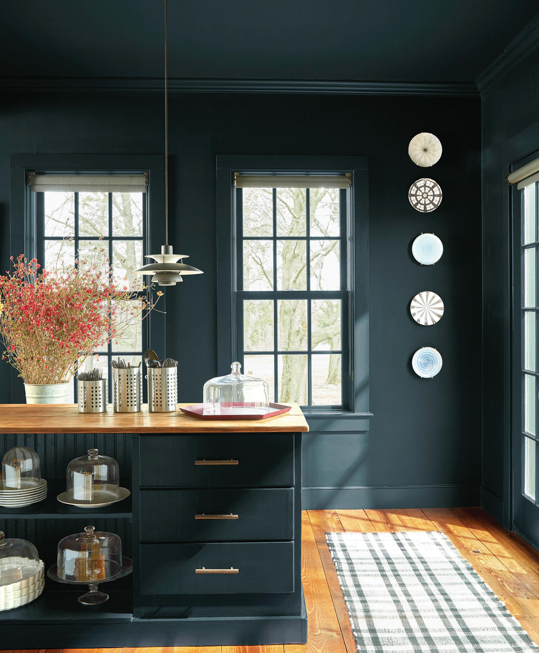
However, color drenching is becoming increasingly popular, with homeowners dousing spaces in a singular hue. “I love to color drench a home office, paneled dining room, or a den/library,” Haggerty says. “The key is selecting the perfect color!” For this technique, Haukaas suggests embracing drama and moodiness. With green’s popularity and timeless appeal, consider using a soft sage green like Hirshfield’s Fiorito or Hirshfield’s Vegetarian. “I think people
ABSTRACT WHIMSY
really feel more at peace when surrounded by a biophilic color palette,” she adds. While the color trends are fun to follow, they should be taken lightly, Haukaas advises. “[Color trends] are based on information taken nationally, and what the Midwest likes and uses is [likely] much different than the East Coast, West Coast, and southern states.” So, amid the ever-evolving power of color, opt for playful, yet timeless shades that reflect your personality and make your house feel like home.
Wake up your walls with a custom mural for a playful pop of personalization. Molly Reopelle, owner of Made by Molly Jo, knows their effects well as a residential muralist who specializes in colorful concepts that communicate a sense of whimsy with interesting silhouettes. “Creating scenes that overlap and flow from one moment to the next with a blend of distinct iconography, abstract shapes, and nature inspired elements has become a signature of my style,” Reopelle says. “My hope is that [my residential murals] leave both residents and guests feeling comfortable and truly at home. I want to create pieces that make people want to spend time in that specific environment.” @madebymollyjo –Katelyn Bloomquist
MIDWEST HOME 84
colors, paint + wall coverings
PHOTOS ( FROM ABOVE ) HIRSHFIELD’S DESIGN RESOURCE, MOLLY REOPELLE
REGENT GREEN
BY BENJAMIN MOORE
 LYNNETTE BAILEY, SHOWROOM MANAGER
SUB -ZERO WOLF AND COVE SHOWROOM BY ROTH LIVING 952 - 933 - 4428
SUBZERO -WOLF COM
WHAT CAN YOU EXPECT WHEN VISITING THE SUB-ZERO, WOLF, AND COVE SHOWROOM BY ROTH
LIVING?
Our showroom in the North Star City is an immersive experience that allows visitors to not only curate a one-of-akind luxury appliance package but also envision a lifestyle centered on divine flavor and priceless memories within the kitchen. During your visit, you’ll be invited to explore the luxurious breadth of appliance finishes and models while your Roth Living consultant demonstrates the features and functions available. Visualize your appliance package in real time and at scale on our life-size Digital Wall Configurator while exploring a variety of configurations, models, finishes, and sizes. With the help of the Roth Living team, you can build an appliance suite that not only matches your lifestyle, but also enhances it. Join us for educational ownership and cooking classes, where we hope you’ll discover a lifelong love affair with the joy of cooking, preserving, and cleaning with Sub-Zero, Wolf, and Cove appliances.


MIDWESTHOME COM 85 mint-design.biz | 651.332.9609 The Spirit of Minnesota SUBSCRIBE TODAY PHOTO ROTH LIVING SPECIAL ADVERTISING SECTION INSIDE ADVICE


Craft & Construct

From cutting-edge trends in building, remodeling, and architecture to the intricate craftsmanship behind them, industry professionals ensure our homes can become personal sanctuaries


BEYOND BOOKS


The team at Hartman Homes explores the value of libraries in residential design
“Libraries offer a quiet space to retreat for relaxation and meditation but can also be used as a small gathering space,” says Jessica Link, chief financial officer and general manager at Hartman Homes. “Homeowners can use a home library to display their book collection and showcase art pieces and other collectibles.” In fact, the comfortable, yet collected “bookshelf wealth” aesthetic is trending on social media, with homeowners leaning into a lived-in look that displays beautiful paintings, objets d’art, and of course, an enviable bevy of books. –Elizabeth Roubik

ARCHITECTURE TRENDS OF THE YEAR
Twin Cities architecture firms share the top industry trends they’re seeing this year WRITTEN BY
ELIZABETH ROUBIK
Family-Centric Design
As homeowners are prioritizing not only themselves but also their loved ones in their home designs, there are various architectural components to consider. The team at Albertsson Hansen Architecture and Interior Design says, “Often, the focus is on creating a place where adult children feel comfortable bringing their families, so we usually create a small suite with a kitchenette.” Other popular layouts for big families and frequent entertainers include compartmentalized bathrooms and private office spaces.
Holistic Building
This year, architectural trends are synthesizing three key factors: nature, connection, and technology. “Architects are prioritizing designs that nourish human connection and health by integrating biophilic design principles, specifying sustainable and green materials, and focusing on the impact of construction on the environment,” says the team at Blue Pencil Collective. From insulated windows to the incorporation of green spaces in homes, “the appeal of holistic building lies in its focus on enhancing health and well-being while also addressing the need for nurturing the world we leave behind for future generations.”
Traditional Planning
People are seeking intimate, intentional spaces within their home, which is leading to a shift from open layouts to more traditional, separate spaces. According to the team at Unfold Architecture, “We see dining and lounge spaces becoming more defined from one another and decreasingly one large, open space. Rooms like dens, lounges, music studios, and studies are being reintroduced to the main-level living areas to reinvent some of the cozier, more intimate feelings from traditional homes.”
MIDWEST HOME 86 IMAGES ( CLOCKWISE FROM ABOVE LEFT ) SPACECRAFTING, BLUE PENCIL COLLECTIVE, SPACECRAFTING, ANNA CHRISTIAN, CHARLES STINSON
RENDERING BY BLUE PENCIL COLLECTIVE
HARTMAN HOMES


A TIMELESS ART
Artistic architectural sketches and drawings show off unique skill sets WRITTEN BY CAMILLE
LEFEVRE
CALLING ALL KIDS
Is your family growing in the next nine months? Do you have grandchildren on the way? Like adults, the younglings in our lives also need curated spaces to rest their heads and burn their energy. Whether it be a nursery with a Susan Harter mural amid a serene blue-green color palette (courtesy of Davis Interiors and Norton Homes) or a shared modern Scandinavian-style bedroom for two brothers (courtesy of Call It Christian), our kids’ spaces can and should be personalized, fun, and functional—all while being beautiful, too. –Katelyn Bloomquist


“I really don’t talk well without a pencil in my hand,” architect Ralph Rapson famously said. Among the first generation of American modernists, Rapson arrived in 1954 to head the University of Minnesota School of Architecture. His influence was profound. Not only did he design the some of the first International style U.S. embassies, rocking chairs for Knoll Furniture, and many iconic residences, but his students also went on to start significant firms and even enjoy international careers.

“Ralph was my first superhero who wasn’t Superman or Batman,” says Charles Stinson of Charles R. Stinson Architecture + Design. One of Rapson’s students, Stinson found Rapson’s articulation of design through drawings fascinating. He says, “When I was in school, drawing was it. Everyone drew. There weren’t any computers.”
Stinson was an art major before he switched to architecture, so, “drawing was the only way I could get over my shyness during my juries. I told the story of the project through drawings,” he explains.
Today, Stinson is nearly as famous for his hand drawings as Rapson was, with the artistic method playing an integral part in his design process and daily life. Case in point, a drawing board sits in the center of the great room in his home. “I love to draw. I’m addicted to it,” he says. “It brings the project to life. Tracing paper, colored pencils, and ink are such incredible tools.”


new home.” Stinson agrees: “Clients love it when, while we’re talking about some aspect of their project, I do the sketches in the real time. Hand drawing gives clients so much confidence in the process. They’re become engaged and can see what I’m thinking.”


But how many residential architects still hand draw? Is it a dying art? “When looking at housing design as a whole, I believe [hand drawing] is fading,” says Jeff Murphy, president and director of design of Murphy & Co. Design. “But in high-end architecture, [hand drawing] is prevalent around the country and beyond. Many architects are proud of their hand-drawn abilities and share them regularly on social platforms. I think because it’s an art form, it feels very bespoke and personal to our clientele,” as opposed to work produced on a computer.
Drawing residential designs allows Murphy to “come up with ideas and convey them immediately in front of a client, or while working collaboratively within an office. This helps the process move quickly, since clients can react and make decisions on the spot. I think it’s also an endearing trait of what many people consider an architect or designer to be able to do—sketching beautiful designs of their
Murphy adds that early “loose” sketches help clients relax as “they don’t feel like the design is set in stone; it can be adjusted, unlike early computer drawings, which can feel cold, impersonal, and harder to make changes to in the client’s eyes. They like our ability to sketch right on the spot during a meeting—they might bring up a thought for something they’d like to see different, and we can pull out the trace paper and show a new idea right over the old one,” he continues. “They also like how romantic hand drawings feel. There’s an aesthetic to them that feels like it was penned from an artist.”
Hand drawing, Murphy adds, is “one of the aspects of working with us our clients look forward to the most.” And for Stinson? He likens hand drawing to “a deep meditation,” he says. “The ideas start to grow out of the paper when I’m drawing and become real in the clients’ imagination. From those initial drawings, their dream home is realized and built. As soon as I have the concept in my mind, I’m picturing them in the house already.”
MIDWESTHOME COM 87 building + architecture
DAVIS INTERIORS & NORTON HOMES
CALL IT CHRISTIAN
HAND DRAWING BY CHARLES STINSON

INDUSTRY OUTLOOK
THE EVOLUTION OF HOMEOWNERSHIP
Wanted: Two-office home with appliance garage and outdoor living room WRITTEN BY GLENN HANSEN
With your first one, you work on it. Invest in it. Then you settle in for a while and enjoy it. Later, you make a change because you want to or need to.
What are we talking about here—a career, a relationship, a home? All three maybe. But the home—for those who choose (and can afford) to own one—is the tangible center of it all. It is often the literal investment, the security, and the stability of one’s life. It might also be the chore and the worry. (Did I turn off the oven before we left?)
The evolution of homeownership follows the track of your life, but it’s not all labradoodle puppies and job changes. Several factors affect how you buy, live in, and own a home. We’ll look at today’s big three in the evolution of homeownership.
Stay Home
From spa bathrooms and home offices to chef-ready kitchens, we spend more time in our homes today than in generations. A recent study by Pew Research Center found that about a third (35%) of workers with jobs that can be
done remotely are working from home all the time. The number was higher during the height of COVID-19 (as high as 55% in October 2020). Pre-pandemic? Only 7% worked from home.
“Before 2020, I was challenging people to get rid of the home office,” says Rebecca Remick, owner of City Homes, a Twin Cities custom home builder and remodeler. “I encouraged people to build only the spaces they would need and use. Now, bedrooms are becoming a second home office.”
If you frequently work from home, you probably eat at home more often, too. A study by NPD Group, a consumer trends research firm, shows sales of food storage and preservation products are soaring. People want to save those leftovers, whether from home-cooked meals or to-go entrees.
Kitchens have always been a gathering place in the home. Remick says people are prioritizing kitchen space and efficiency because they’re spending more time there. She points to design trends like butler pantries and appliance garages to clean up counter space and keep the kitchen usable.
Get Out
“The outdoor living trend is a priority for many buyers,” says Tim Devane, realtor with Rize Realty. “Whether because of children, room for pets, or for an outdoor kitchen, outdoor space is much more of a decision point for home buyers, especially above the $500,000 price point.”
In “The Future of Home Design” survey, published by the New Home Trends Institute, an open yard ranks low when compared to multipurpose options. Just 28% of respondents chose open yard space in the survey, compared with other more popular features like covered or open-air outdoor rooms (73%), patios (68%), and decks (55%). The same study shows owners increasingly favor a home with a front porch to increase community connection.
It’s not all about being outdoors. “People are putting in so many windows now,” says Remick. “Sometimes wall space for art and pictures isn’t even an option. The view outside becomes the art.” And everybody loves three-season porches, according to Remick. “With a good heater, these can be used year-round and give an outdoor feel.”
Save Money
Data from the National Association of Realtors shows that home prices in the U.S. hit their alltime high in spring 2022. Although prices have come down a bit, they’re still relatively high, and current interest rates hamper affordability. Last year, home sales declined 6.2% year over year.
Whether homeowners are buying and moving or staying in their current home, Remick says they’re looking for efficiency and cost-saving opportunities. She points to smart home technology, insulation upgrades, and new systems like a smart electrical panel that can help homeowners direct electricity use to save money.
Townhomes are an increasingly attractive home-owning option as well. Young first-time buyers and older empty nesters like the simplicity and lack of yardwork. Builders like townhomes because they’re faster and cheaper to build. In fact, the National Association of Home Builders (NAHB) reported that townhouse construction accounted for nearly 20% of the total housing starts in the final quarter of 2023—the highest rate in nearly 17 years, according to census data.
We all want a dream home, but the reality is that real life tops fantasy. As our lives evolve, a home’s function is most important. For work and play, family, and finances, make your home work well for you.


MIDWEST HOME 88 building + architecture
PHOTO SPACECRAFTING
CITY HOMES

Three takes on Modern Architecture.
Three distinctly modern homes with so many things in common. Yet each is distinct in its own design. The frst borrows from European Architecture. The second draws from the International style. The third is more organic in nature. Each exemplifes what an Architecture frm well versed in all genres can design. And each is now available for a discerning owner. They’re modern homes with a twist.


877.796.5623 jamesmcnealarchitectureanddesign.com info@jmad.design


 WRITTEN BY KATELYN BLOOMQUIST


 LYNNETTE BAILEY, SHOWROOM MANAGER

