

Rida Yanis Rida YanisPORTFOLIO

Contact >
Location
Dubai, UAE.
Phone
+971-50-783-4696
Email rida.yanis@gmail.com
LinkedIn rida yanis
Welcome!
I'm Rida Yanis , and I know I can help your company create stunning visuals. As someone who has worked in graphic design and marketing for over 18 years, I know what brands need to capture their audiences' attention. With my powerful design skills and knack for marketing, I have the right background for your brand's needs.
What do I do >
Art Direction
Concept Design
Logo Design
Brand Identity Design
Collateral Design
PowerPoint Presentation
Video Editing
Storyboarding
Packaging Design
Promotional Design
Book Design
Magazine Design
Newspaper Design
Brochure Design
Catalogs & Reports Design
Business Development
Winning Proposals Design
Marketing Communication
Advertising Campaigns
Copywriting (Arabic)
Business Translation
Data visualization design
Infographic design
Environmental GFX Design
Technical Illustration
Illustration
Character Designs
Children Stories
Comics Drawing
Hand lettering
SW Skills >


Adobe InDesign
Adobe Illustrator
Adobe Photoshop
Adobe Lightroom


Adobe After Effects
Adobe Premier Pro
Adobe Acrobat Pro QuarkXpress

Clients in Work Experience
>
Saudi Basic Industries Corporation (SABIC)
Roads and Transport Authority (RTA Dubai)
Dubai Electricity & Water Authority (DEWA)
SEHA (Abu Dhabi Health Services Co.)
Sheikh Shakhbout Medical City
Tawam Hospital & Tawam Dialysis Center
Mafraq Dialysis Center
Cleveland Clinic Abu Dhabi
Mediclinic Middle East (Hospital)
King Faisal Specialist Hospital
The Red Sea Development Company (KSA)
SAUDIA (Saudi Airlines)
Royal Jet (Private Airlines)
Afriqiyah Airways (Libya)
Ethiopian Airlines
PowerPoint
Word
Excel Windows & Mac OS
UAE University
Al Ain Municipality
Musanada (Abu Dhabi)
GFH Financial Group
Union Properties
Bloom Properties
Limitless Real Estate
IMKAN Real Estate
Al Qudra Real Estate
ASHGHAL
Serene International
Eunidan Innovations
Smart Solutions
Zarouni Foods
Stantec
Illustrations
Logos
Packaging
Publications
Miscellaneous
Website >
https://rida.softr.app
Illustrations Illustrations


Illustrations
“A picture is worth a thousand words” -the popular saying, deriving from Chinese philosopher Confucius, conveys the significance of visual art and imagery.
Any lover of language, poet or writer, might strongly dispute this claim, but there is no doubt that images, photographs, drawings, and even cartoons powerfully make an impact on the viewer and convey meaning, and have the ability to evoke a visceral emotional reaction. Think of political cartoons that comment on the current climate, or photographs of famine and natural disasters that provide a catalyst for donations and action.
Illustrations are a vital part of visual image-making.
ILLUSTRATIONS
The Belly Dancer X
Character Concept Design for a Confidential Project.
◆ Client: Confidential
◆ Date: November 2010
◆ Description: I designed and drew this character with its supporting characters. Then I produced a short story with its author to explain the author’s ideas for this character.
◆ Showing Samples: The characters with some pages from their short story.


ILLUSTRATIONS
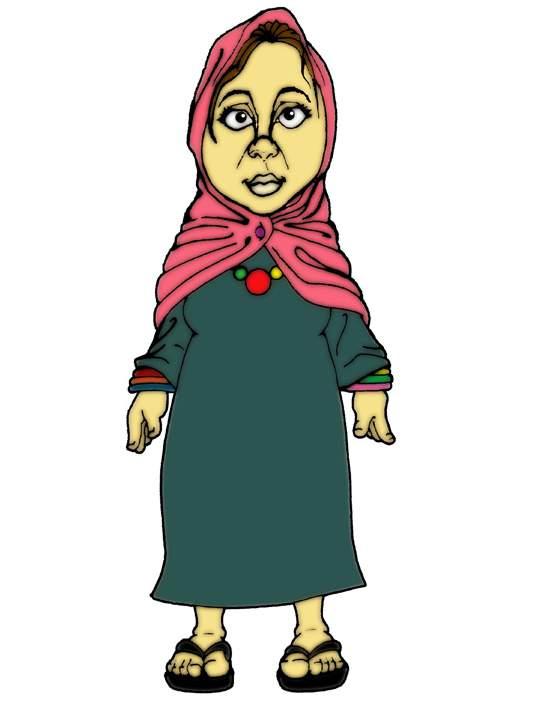
Hibah Stories Series
23 Children Stories published in 2005.
◆ Client: Dr. Al-Moa’atasem Deyab
◆ Date: June 2004
◆ Description: I Drew the 23 children stories and then produced it by Photoshop.
◆ Showing Samples: Story covers and some illustrations from this series.


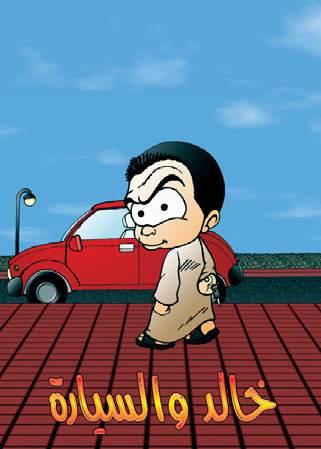


Mango
Character Concept Design Project.
One of my personal comic characters. I drew it in 2003.


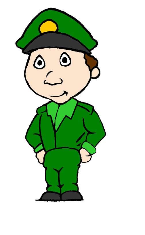
For Learning Cards
In September 2006, I Drew more than 350 characters on 332 learning cards for a kindergarten school
(Al- Etihad Kindergarten –Al Ain, UAE.)


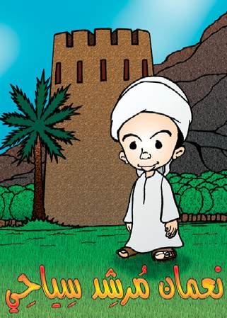
The Emirati Boy
Character Concept Design Project.
One of my personal comic characters. I drew it in 2005.


Logos Logos

Logos
A logo is a symbol made up of text and images that identifies a business. A good logo shows what a company does and what the brand values.
Logo design is all about creating the perfect visual brand mark for a company. Depending on the type, a logo usually consists of a symbol or brandmark and a logotype, along with a tagline.*
√ A logo makes you stand out from the competition
√ A logo identifies key information about your business
√ A logo builds brand recognition
√ A logo fosters brand loyalty
Smart Solutions
◆ Client: Smart Solutions Management Consultants - UAE
◆ Date: May 2008
◆ Description: Smart Solutions is one of the leading business setup companies in the UAE. The management team requested me to design the company logo.
Smart Solutions
S ح S
DESIGN CONCEPT
I asked the client’s team for the company’s services, clients type, goals, ...etc. Then, I summarized their answers and selected the following main bullets to build the logo’s concept upon it.
COMPANY NAME: Two Langs – Clients Speak
Smart Solutions is a company helps its clients to setup and start their business in an Arabic country, that uses two languages in its government sectors: Arabic and English. For that, I got the idea to represent the two languages through the first letter from each language for the company name.
COMPANY
SERVICES:
Arrow of Success
Smart Solutions helps its clients to achieve success, and this can be represented by drawing a raised arrow in their logo. I took the advantage of both letters’ curved shapes by swapping letters’ original positions and then connecting them through their curves. And then frame them.
GOLDEN RATIO W/ NEGATIVE SPACE
I used a frame with a golden ratio to give the logo a pleasant appearance. After I reshaped both letters and then connected them to become one shape, I cut them out from the rectangle frame, then deleted both lower corners. The final look is a logo that uses negative space and shows a raised arrow coming out from two letters.
LOGOS
Tashieed
◆ Client: Tashieed Holding Group - UAE
◆ Date: April 2008
◆ Description: Tasheel Holding Group, marketed as Tasheed, is based in United Arab Emirates. Tashieed decided to rebrand itself. As a start point, they asked for a new logo that carries the company's name.
DESIGN CONCEPT
I decided to take advantage of the Arabic name and make my own decorative style version for it. I started with a sketch and then elaborated using Adobe Illustrator as shown on the image above. Then I add it on the top of the English font which holds the company's Latin name.
I selected Trade Gothic font to represent the company name. Then, I cut some of its Latin letters' edges, to make it balanced with the Arabic calligraphy shape that I did.
Last, I drew two dummy squares based on the first dots in the Arabic shape. These two frames acted as proxies to determine the position and size of the Latin name to the Arabic shape.


Serene
◆ Client: Serene International - UAE
◆ Date: December 2009
◆ Description: Serene International is a leading technical production company that delivers creative events and communication solutions using innovative methods and offers all types of Audio-Visual products.
DESIGN CONCEPT
The logo must be in bold since they provide audio and video services. The bold font of their logo will guarantee visibility on all types of screens.
I created the four waves coming out from a dot to show the audio innovation services from Serene.
Then I placed the dot at the center of the last two 'e's. Last, I made the dot size close to the size of 'e' letter to connect the logo shape with the logo font.


Electronic Emirati Dirham
◆ Client: The UAE Ministry of Finance (MoF)
◆ Date: March 2009
◆ Description: A design competition for the MoF logo for the 2nd Generation e-Dirham system was held in 2009. This logo must be visible when its size is scaled down to its place on the plastic card. I participated by sending my following design proposal.


DESIGN CONCEPT
The design concept is based on connecting the prefix e- (for electronic) with the Emirati dirham (coin). As a start, I made a circle representing the value of one dirham of the Emirati currency.

SHAPE: 'e' Through A Spinning Coin
The coin gives many curved shapes when you spin it. I traced the spinning traces to draw the prefix e, then selected four shapes from the traced spinning action. after I highlighted the lines which
draw the letter e, then I deleted the redundant lines. Last, I positioned the circle for the value of one dirham, inside the drawn prefix e shape. This circle act as the anchor for the logo parts.
COLORS:
The Emirati Flag
I colored each shape from the logo 3 shapes by a color from the UAE flag colors, starting with the anchor point (the circle). I didn't use white color because it's the color for the basic version of the e-card.


Packaging
Packaging design
Product packaging design refers to the creation of the exterior of a product. That includes choices in material and form as well as graphics, colors and fonts that are used on wrapping, a box, a can, a bottle or any kind of container.
Packaging design is the connection of form, structure, materials, color, imagery, typography, and regulatory information with ancillary design elements to make a product suitable for marketing. Its primary objective is to create a vehicle that serves to contain, protect, transport, dispense, store, identify, and distinguish a product in the marketplace. Ultimately, the goal of a packaging design is to meet marketing objectives by distinctively communicating a consumer product's personality or function and generating a sale.*
PACKAGING
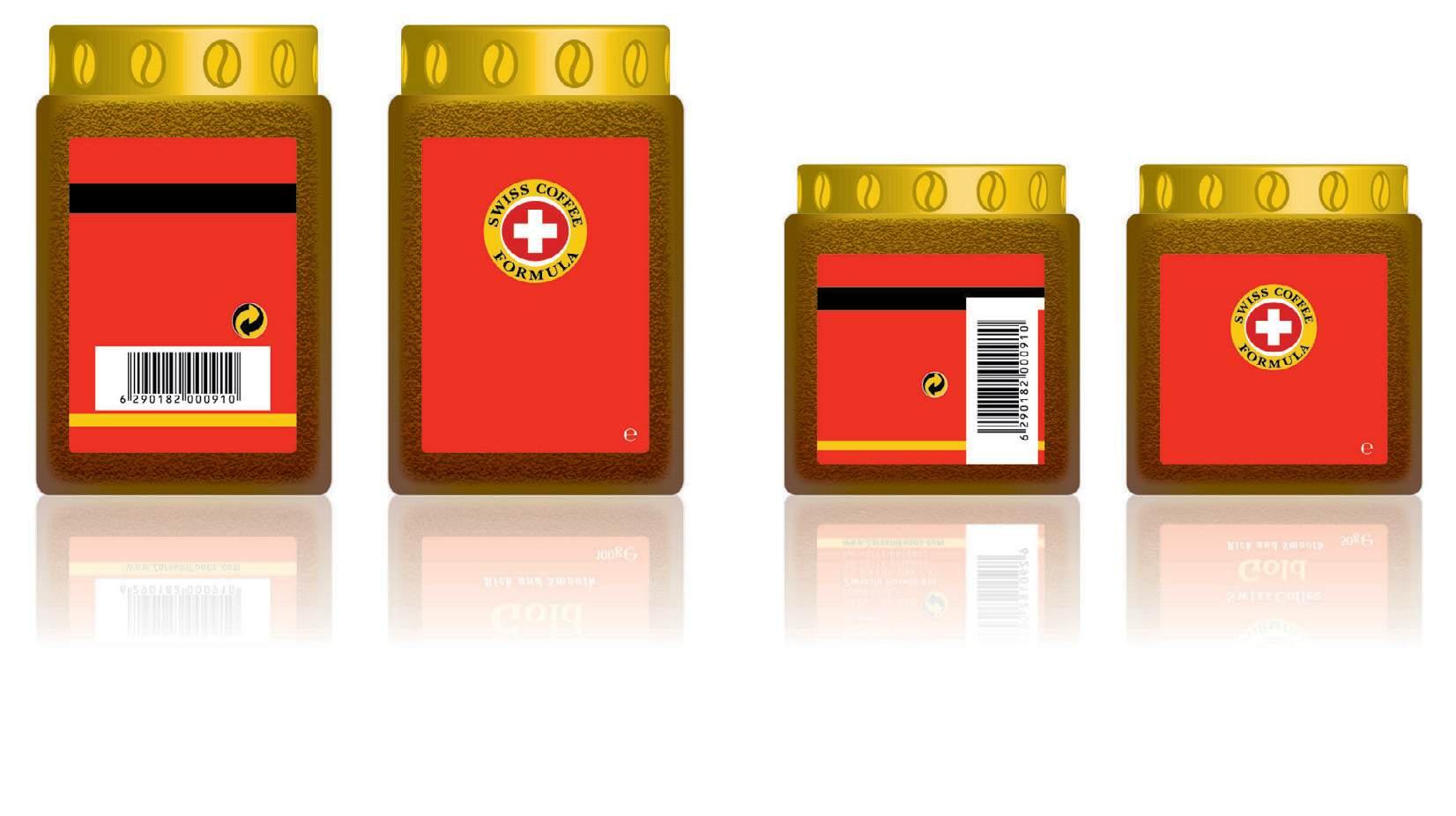
Swiss Coffee : Gold and Classic
◆ Client: Zarouni Foods Inc. ◆ Date: 2009
◆ Description: I designed both two types of instant coffee under the same brand name. Zarouni Foods decided to have a different shape for each product, to help in distinguishing between them, in addition to the font style used for each type title. Product colors have been derived from the brand logo.
For the Gold type; its package is made out of a glass jar with a metal cover. I made it a cube shape, to take less space instore and be easy to handle. I added coffee bean shapes on its cover. These coffee bean shapes are engraved inside the metal cover, to help use opening this product easily.

I designed this small mug, to market this product. I made its shape curvy so it is easy in hand and to present the smoothness of the coffee taste.
For the Classic type; its package is made out of a glass with a plastic cover. I made it in this shape to help in holding it quickly by the hand. This shape also helped this product to stand out on the shelf from the other coffee products.
PACKAGING
Zarouni Gourmet Penne Rigate Pasta
◆ Client: Zarouni Foods Inc.
◆ Date: 2009
◆ Description: I designed the product box and created its icons for cooking instruction.
◆ Description: I gave the green colors to distinguish this product from competitors’ products. All Pasta products from Zarouni Foods is having this green theme blended with the red color from the Zarouni Gourmet logo.
On the box front, I made a transparent oval shape, to allow consumers to inspect the pasta quality’s appearance.
I illustrated the cooking instruction by creating colorful 3D icons, which supported the 6 language cooking instructions.
On the same side, I made rectanglewith-a semicircle shapes for the background behind the cooking instructions and their icons, to mark the hand fingers, to inspire the consumer to capture the box from the store shelf.


Good publications require well-written text, appropriate illustrations, intelligent design and layout, careful typography, and good-quality printing and binding. Each step is important, whether producing a book, booklet, magazine, or newspaper.*


What do different kinds of publications have in common is the need for a good layout and typography. One that you can't put down and want to keep reading, whether that'd be online or with a copy in your hands.
For browsing the brochures at my work samples, please visit: https://issuu.com/guyver
The New Libya Magazine
◆ Client: Alpha Beta Publishers and Media Consultants
◆ Date: October 2011
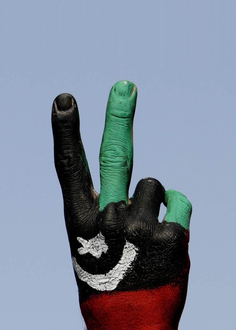
The World After Gaddafi

◆ Description: The New Libya is a bilingual monthly magazine that covers a number of topics including politics, business, and social issues. The magazine provides coverage of happenings that take place in the middle east region. (size= 210mm x 285mm)
I designed the logo and the prototype (the zero issue). For the logo, I made the Arabic typeface closely match the English typeface. The logo background used Libya’s flag colors.
Flynas Inflight Magazine
◆ Client: Flynas (formerly Nas Air based in Saudi Arabia)
◆ Date: December 2011
◆ Description: I designed this bilingual magazine to be included with an inflight media company business proposal to Flynas Airlines. I designed the logo (e.nas) and the prototype (the zero issue). For the logo, I made the Arabic typeface closely match the English typeface. (size= 210mm x 285mm)


RAK Airways
Inflight Magazine
◆ Client: RAK Airways (Ras Al-Khaimah, UAE)
◆ Date: January 2012

◆ Description: I designed this bilingual magazine to be included with an inflight media company business proposal. (size= 200mm x 290mm)
Royal Jet Inflight Entertainment Guide
◆ Client: Royal Jet (an airline based in Abu Dhabi, UAE)
◆ Date: June 2011 - January 2014
◆ Description: In December 2013, I redesigned this guide to incorporate the new identity for the Royal Jet. This guide is bilingual: Arabic and English. (size= 210mm x 297mm)


◆ Client: Ethiopian Airlines
◆ Date: October 2013
◆ Description: I created the icons and illustrated the figures in this brochure. And did the design to incorporate Ethiopian Airlines brand identity. I proposed my design in a bifold brochure with a half-cut front to highlight the safety instructions intro.
This brochure design was included with an inflight media company business proposal to Ethiopian Airlines.


Ethiopian Airlines Safety Instructions Brochure


Afriqiyah Airways Inflight Entertainment Guide
◆ Client: Afriqiyah Airways (a state-owned airline based in Tripoli, Libya)
◆ Date: July 2013
◆ Description: I designed this guide which held the new logo for Afriqiyah Airways for the first time. I made sure the layout is relaxed layout since it’s a guide for passengers who need comfort on their trip. This guide is trilingual: Arabic, English, and French. (size= 160mm x 240mm)


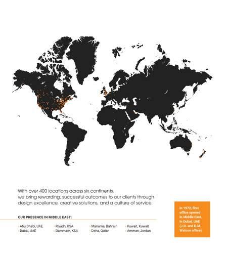
Stantec Company Profile
◆ Client: Stantec
◆ Date: 2018
◆ Description: I designed the Middle East region version company profile for Stantec in a way suit the client taste and culture in this region. I presented best projects for Stantec in the region with highlighting it’s global achievements.


Stantec Brochure for Community Development
◆ Client: Stantec
◆ Date: 2018
◆ Description: I designed the Middle East region version brochure for Stantec in a style suit the middle eastern culture.


Stantec Brochure for Healthcare


Stantec Brochure for Wastewater Treatment
◆


Stantec Engineering Capability Brochure
◆ Client: Stantec
◆ Date: 2017
◆ Description: My design for the engineering capability statement brochure for the company in the Middle East region. The brochure highlighted the company's services and presented its best projects in the Middle East region.


UAEU HR Certified Professional Certificate
◆ Client: UAE University
◆ Date: 2008
◆ Description: I gave a new look for UAEU brochures by designing this brochure. This brochure introduces the university program for this certificate. (size= 210mm x 297mm)
◆ Showing Samples: The cover and selected pages.
Research Affairs Mag
◆ Client: UAE University ◆ Date: June 2007


Miscellaneous Miscellaneous


Miscellaneous
Today, the term design is generally used for what was formerly called the applied arts. The boundaries between art and design are blurred, largely due to a range of applications both for the term 'art' and the term 'design'.
Design can be used to promote and sell products, to convey a message, or to develop a brand identity. Though some graphic design has a commercial purpose, graphic design can also be a form of art and expression.
Graphic design is communication design.
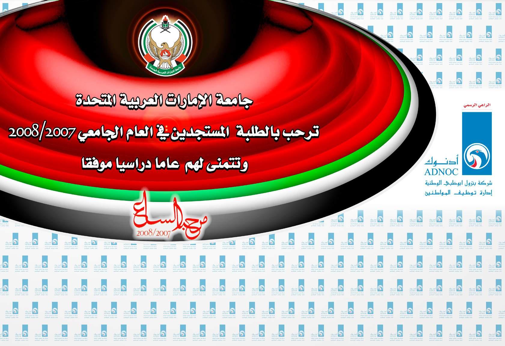
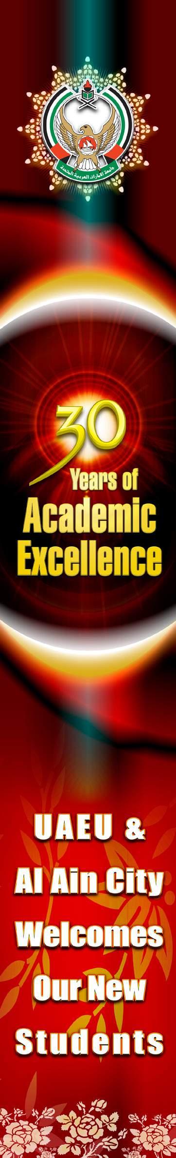
UAE University 2008 New Student Welcome Event
This event coincided with the 30th anniversary of the founding of the university.
◆ Client and Location: UAE University - Al Ain, UAE.
◆ Date: August 2007
◆ Description: I designed multiple designs to be resized for different platforms.
01. Five Advertising Flags (size= 90cm x 300cm) —showing top-left
02. Banner–A (size= 150cm x 250cm) —showing top-center
03. Banner–B (size= 50cm x 70cm) —showing middle
04. 10 Meter Hanging Vertical Banner (size= 150cm x 1000cm) —showing Right
05. Backstage Banner (size= 600cm x 300cm) —showing bottom-left
06. Roll-Up Banner–Design A (size= 80cm x 200cm)
07. On-Ground Billboard (size= 244cm x 122cm)
08. Roll-Up Banner–Design B (size= 80cm x 200cm)
09. In-Ground Banner (size= 243cm x 50cm)
10. Cloth Badge and Arm Ribbons – include my design for event’s Arabic tagline: Marhaba el-Saa’
11. Bag (size= 28cm x 35cm)
12. Quarter Page Newspaper Advertisement (size= 155cm x 265cm)
I drew 3 circle flares at the back of number 30 (in the theme for the 30 years of Academic Excellence), to represent the 3 decades.
This event was sponsored by two establishments. The official sponsor was Abu Dhabi National Oil Company (ADNOC), while the sub sponsor was Abu Dhabi Islamic Bank (ADIB). The event committee requested me to place the sponsors’ logos on most of the designs.


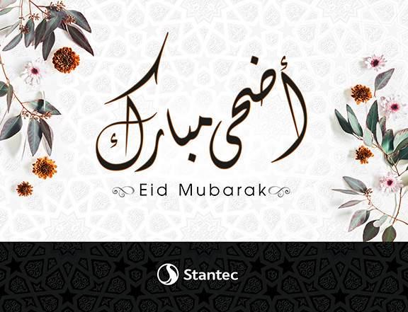
Social Media Posts / e-Greeting Cards
◆ Client Stantec
◆ Date 2014 - 2020
◆ Showing Samples
5 e-Greeting Cards for Islamic occasions.


Rida Yanis Rida Yanis
Contact > Dubai, U.A.E.
Tel. +971-50-783-4696
rida.yanis@gmail.com
LinkedIn: ridayanis