

H A N A A Z M I
ARCHITECT - INTERIOR DESIGNER


20th February, 1994.
Female
EDUCATION
KU Leuven
MSc in Architecture
(Ghent, Sint-Lucas Campus, Belgium)

September 2019 - June 2021


2-Year International Masters in Resilient Architecture and Sustainable Strategies. Graduated with distinction (Cum Laude).
Arab Academy for Science & Technology
BSc of Architectural Engineering and Environmental Design. (Alexandria, Egypt)
September 2012 - January 2018
5-Year Bachelor’s Degree in Architecture with a Minor in Interior Design.
RIBA Part 1 (Royal Institute British of Architects)
Graduated 1st in class with Excellence, Honors, and GPA of 3.82/4.
International Liberty School American Department (Alexandria, Egypt)
Graduated in June 2012 American High-school Diploma.
Lycée Français d’AlexandrieChampolion (Alexandria, Egypt)
Graduated in June 2009
French National Brevet Diploma.

LANGUAGES
Arabic:
March 2022 - Current (Ghent, Belgium)
Ghent, Belgium.
Hana94Azmi@gmail.com +32 49 111 5701
www.HanaAzmi.com
WORK EXPERIENCE

Architectural Designer - 3ARCHITECTEN Office


- Church Renovation competition: designing and producing the drawings, plans, and animated video with D5 render for a plus designing a futuristic Columbarium with urns.
- Social Housing competition for De Mandel: Designing the houses layouts, the masterplan, as well as producing all the necessary drawings in Revit and 3D renderings.
- De Vleugels master plan study: contributing in the master plan design of a care facility as well as making the 3D master plan renderings and a short animation video with Enscape
- Working on the execution (uitvoering) interior drawings phase of the office building of Mirom in Roeselare.


- High-end apartments in Roeselare: Designing the interior design and making the interior and architectural 3D renderings in the execution (uitvoering) phase. As well as the VR walkable model.
Architectural Designer - TRiAS Architecture Office


June 2021 - February 2022 (Mechelen, Belgium)
Working on many different architectural projects from the design phase to submitting the necessarily building permission and tender documents. Including;

- A winning sports competition in Mechelen for a “Green Building”, for 2 football clubs. I was responsible for the design of the building, and the design of the parametric façade with Rhino and Grasshopper programs. As well as the required documents including the 3D renders, animation video with Twinmotion, plans, sections alongside other necessary documents.
- A 50 apartments residential complex in Beerse. I was responsible for the design phase of the building, the apartment layouts, 3D renders, animation video as well as helping making the building permissions documents.

- Offices in an industrial site. I designed the extension of the already existing building with offices as well as make to a building permission for office containers.
- 3D Printed building competition: I am participating in the design phase of a new 3D printed building cafeteria with polymer concrete
- 3D Chair: Designed a parametric chair with 3D printed polymer concrete.
SOFTWARE SKILLS
Architecture Intern/Student Job - AVDK Office
June 2020 - November 2020 (Kortrijk, Belgium)
- Designed the renovation of a Residential House and Office and contributed in producing the building permits drawings. *The project is in my portfolio*
- Designed an Architectural Pavilion.
University Teaching Assistant - Arab Academy For Science & Technology
February 2018 - February 2019 (Alexandria, Egypt)
- Teaching multiple Bachelor-level design courses including: Interior and Furniture Design.
- Supervision of multiple Bachelor level Architecture Graduation Projects.
Freelancer - Hana AZMI Designs
February 2014 - Current
- Renovating a luxury Furniture store in Cairo, Egypt.
- Renovated an apartment in Marseilles, France. Designed the kitchen and bathroom, and produced all the necessary drawings that will make as it pre-built in Egypt, and shipped and assembled in Marseille.
- Designed a Temporarily Maze Structure of a real life game in a Mall in Jeddah, Saudi Arabia.
- Winning the tender of Cairo’s International Airport Royal Hall interior redesign with Azmi Furniture.
- Redesigned from an old antique store to a French café; “CHAQUE JOUR: PÂTISSERIE”.
I have redesigned the Façade and Interior Design and supervised it. Also collaborated with the graphic designer to have a coherent “Brand Identity” in the designs. Built in one of the oldest street of Alexandra; Fouad Street. (Realized in 2018) *The project is in my portfolio*
- Designed and supervised the renovation of an old apartment in Alexandria, Egypt.
- Collaborated with a French team of an Architect, a Landscape designer and a structural engineer to Design “Bio Home”; an Eco Residential Compound in King Marriot, Egypt.

- Designing many kitchens and bathrooms and producing the 3D Renders and execution drawings with Gallery Shousha since 2014.
Architecture Student Internship at Shalalat Group Office
Trained under the architect Ihab El Habbak; one of the Architects who designed the Library of Alexandria. (Alexandria, Egypt)
July 2014 - September 2014
- Designed the interior, kitchen, and dressing room of a residential villa, where I also produced the 2D drawings and 3D renders.
- Was part of the design team of the competition of multi-story complex.
- Visited multiple project sites.
July 2013 - September 2013
- Assisted in the design of a residential villa.
- Researched about Montessori educational design standards.
- Visited multiple project sites.
A young ambitious architect with a strong passion for design, and experience in multiple domains. I received my master of architecture degree from KU Leuven, Belgium in June 2021. Currently working as an Architectural Designer at 3ARCHITCTEN where I worked on 2 competitions for church renovations and social housing. I’m working on a 60,000 m2 care center, De Vleugel master plan design study in Klarken. I am also working on high-end residential apartments in the execution phase and doing the interior of the apartment
in VR. I’ve previously worked with TRiAS architecture office, on a variety of architecture projects, including, a winning sports building competition, 50 residential apartments, office buildings and 3D printed buildings with polymer concrete. I also spent 5 months at the AVDK architecture office (Kortrijk, Belgium) with a focus on house and office renovation. I have more than 2 years of work experience including more than a year in Belgium.
Possessing freelance experience since the second year of my BSc allowed me to work on designing up to realizing multiple custom-built kitchens, and residential apartments in both Egypt and France. Also, I was involved in designing the façade and the interior of a café establishment as well as on-site supervision Furthermore, I was chosen to assist in teaching multiple BSc level architecture design courses.
I believe my ability to develop a clear design vision based on the client’s needs along with my excellent skill in quickly creating multiple creative and unique design proposals with high attention to circulation and space connections which are my greatest strengths. I like to imagine the different users of the building taking a journey across it and seeing if all the space connections, views and access matches well with my overall design concept that is imagined with the clients using different high quality 3D renderings, sketches, sections, plans and façades. This allows me to ensure that my client’s requirements are optimally met. Additionally, welcoming all constructive feedback and embracing challenges that push me out of my comfort zone elevate my experience and my steady progression.
ACADEMIC PROJECTS

URBAN SPORTS HUB - GRADUATION PROJECT
Architecture: Multi-Sports Complex Building
Interior Design: Indoor Skatepark and Skaters Café
Mixed Martial Arts - Training Facility


FURNITURE DESIGN

Reception Area - Counter, Sofa, Chair and Table Design. Maquette (Model)
MASTER DISSERTATION DESIGN STUDIO - HARDCORE HERITAGE

Renovating the iconic British colonial ‘Makbass Masr’ Cotton Building overlooking Minet El Bassal, a post-industrial site, of Alexandria, Egypt. Consists of a Museum, Fashion School, Brain Bar, Dynamic Market and the famous Friday Market of Alexandria.
Multi-Purpose residential building, Gent, Belgium. Urban Proposal and Architecture building. Also with Project Management and Building Costs.
Two Kindergartens in rural Morocco. The design is documented in an Architectural Comic Book

THE DYNAMIC PIXEL KIDS OF TOMORROW AL KHOR SUBWAY STATION
A Multi-layer subway station in the suburbs of Qatar.
“You can design and create, and build the most wonderful place in the world. But it takes people to make the dream a reality.” - Walt Disney
PROFESSIONAL PROJECTS

CHAQUE JOUR PÂTISSERIE
French Pâtisserie and Café in Alexandria, Egypt. Page 18
Realized Freelance Professional Work.
LEEST FOOTBALL - PROFESSIONAL COMPETITION WINNER


Professional work with TRiAS Architecten where we won first place to build 2 football fields with the supporting facilities buildings in Leest, Belgium. (Building Phase)
BEERSE APARTMENT

Professional work with TRiAS Architecten to design a 50 apartment buildings in Beerse, Belgium. (Building phase)
METALLO OFFICE EXTENSION
Professional work with TRiAS Architecten to design a floor extension for the office building on the Metallo (metal company) industrial factory, in Beerse, Belgium. (Building phase)
DE VLEUGELS - HEALTH CARE


Professional work done with 3ARCHITECTEN. We designed the study of the masterplan of the new development phases until 2050.


DE MANDEL SOCIAL HOUSING - COMPETITION
Page 36
SOENEN LUXURY APARTMENTS

Professional work made with 3ARCHITECTEN. Luxury apartments in Roeselare, Belgium.
SINT-DENIJS COLUMBARIUM AND CHURCH RENOVATION - COMPETITION
Professional competition done with 3ARCHITECTEN. We designed the re-purposing of the church to a community space and designed the stand alone columabriums (Urns storages) that the town would need.
KORTRIJK HOUSE AND OFFICE RENOVATION
A house and an office renovation in Kortrijk, Belgium.
Professional Work at AVDK architecture Office (Internship).
LES JARDIN DU ROI RESIDENCE
Professional work with different teams of French Architect, French landscape designer, structural engineer and a 3D artist. Designing a 10 detached spacious homes in Alexandria, Egypt but with a more European take on the landscaping approach and design as well as integrate solar panels, water capture and other environmental techniques that are new in the region. (On hold)
CAMAS APARTMENT RENOVATION
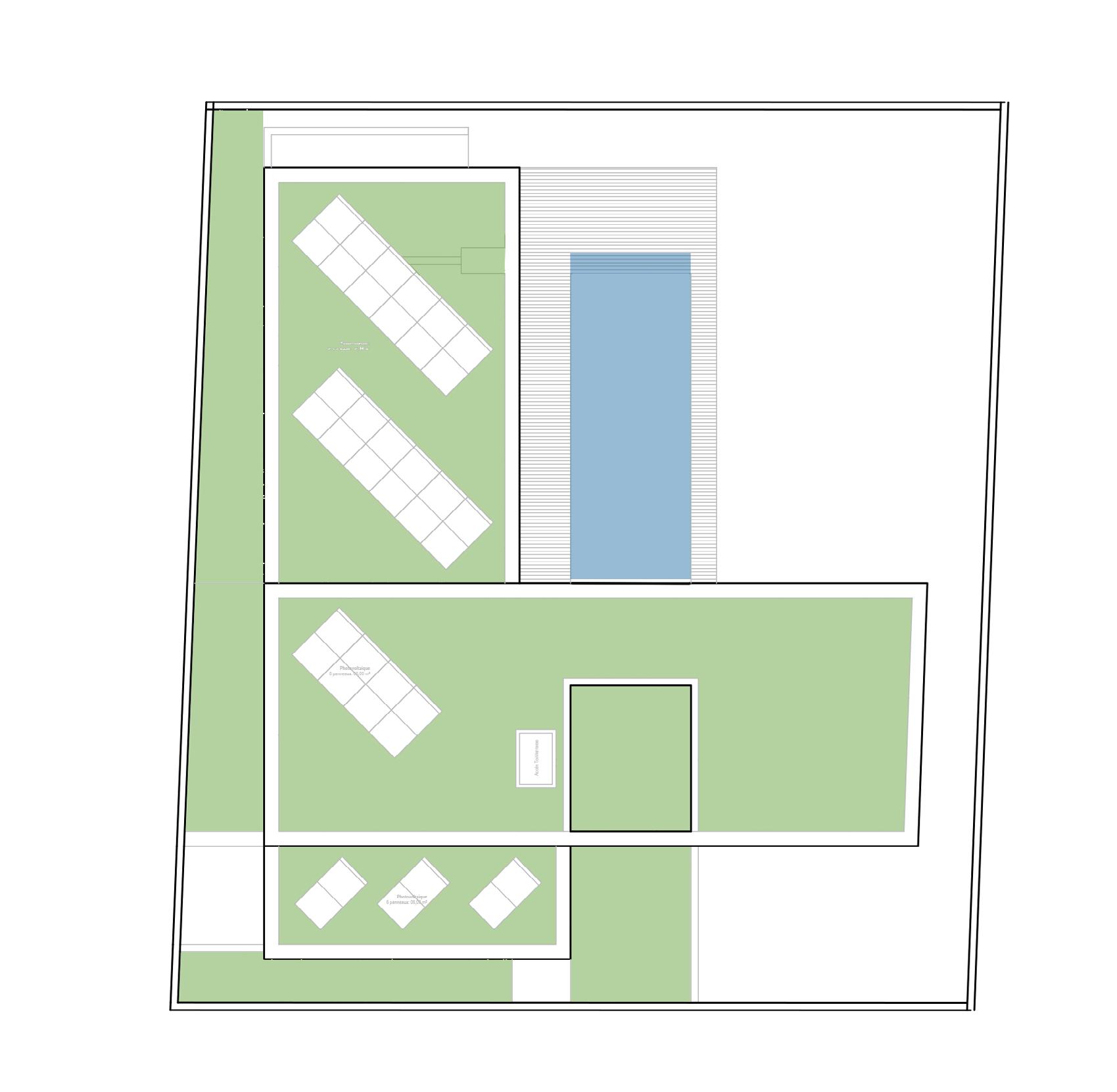
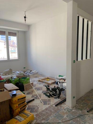
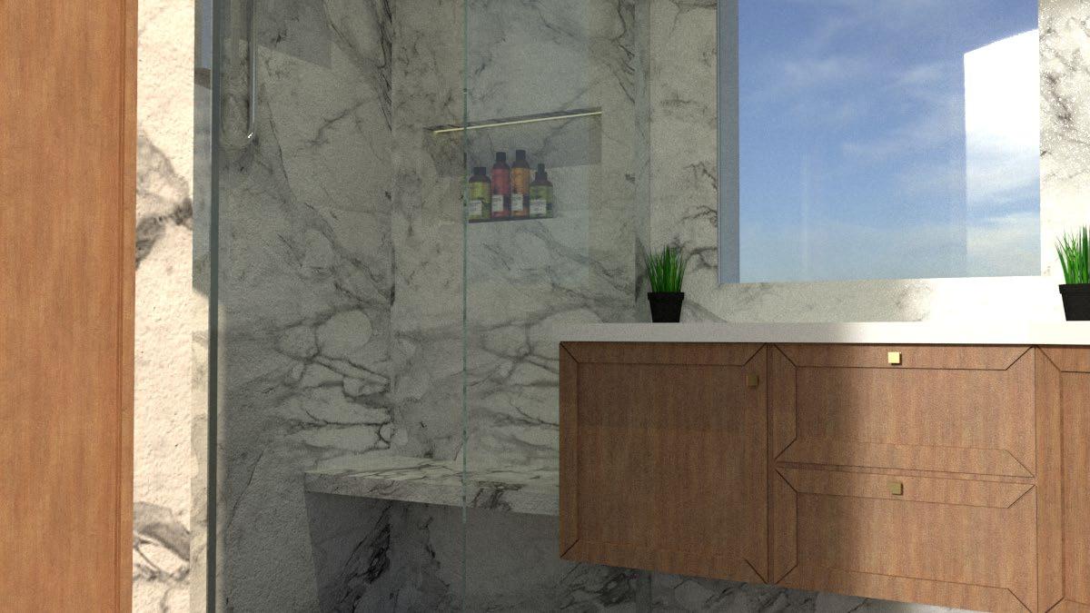
Realized Freelance Professional Work. Renovation of an old apartment in Marseille, France. Where the furniture, flooring, ceramics, kitchen and bathroom where manufactured in Egypt, then shipped to Marseille where it was assembled on site.
Page 40
Professional competition done with 3ARCHITECTEN. We had to design 50 social houses following the Belgian code and regulations for social housing with different topologies. Page 44
Page
Graduation Project - AR501 Undergraduate Graduation Project - Individual Project Architecture and Interior Design Project Programs Used: AutoCAD, Adobe Sketch, SketchUp, V-Ray For SketchUp, Rhino, Grasshopper and Photoshop.

Grade: A+ ( 1st in Class.)
With the rise of the new urban sports, like skateboarding joining the summer Olympics, Egyptian youth are now looking for new ways to express themselves. Having no place to perform these new activities, they end up taking the streets, where they are unwelcome and unsafe.

SITE ZONING

Designed on 50,000 Sq. meter, it has activities which are extended from the buildings to the outdoors, like the Skatepark, Plaza, Multipurpose Park and the Recreational Park. It also has an above ground parking at the Arena entrance and an Underground Parking at the Arena entrance and the Athletes entrance, connected together through an underground street.


Entrances of the training facilities are from the plaza. For the Arena, the athletes entrance is close to the plaza, while the spectators entrance in the opposite side.
ENVIRONMENTAL TREATMENTS


UHPFRC is a new structure system that can help achieve great structural spans, with less columns with smaller size too. Faster in Construction time, that can withstand great compression and tension compared to steel or regular reinforced concrete.


The 1st building that implemented this was Muceum, Marseilles, France, 2012.
SHADE: To shelter the buildings, and provide an outdoor shaded area, that will have different activities for the Urban Athlete.

SCREEN: Filters the sunlight and act as a double skin for the buildings that aids in the hot Egyptian climate.

AIR FLOW: The shade provides a good air flow, because it’s smooth & have skylight openings.


ENGLISH COURT: brings sunlight and air to the lower level. 3D details of Parametric screen with the curtain wall.


INDOOR SKATEPARK & SKATERS CAFE

SIGNIFICANCE: Skateboarding has just been added for the first time to the Olympic Games 2020 in Tokyo

PROBLEM: In Egypt, we lack skateparks and professional skateboarders that can compete on the international level.
AIM: Therefore, having an indoor skatepark is going to promote the sports across the nation. It can also, be a starting point for any beginner who wants to try it. It will also contain a café specially for skaters who can enjoy their session with healthy food and beverages. On site, there is also an outdoor skatepark and a shop that will sell original skateboarding merchandise and soft goods. It will also offer sponsorships to promote the sport furthermore.
PLAN LOOKING UP
FLOOR PATTERN KEY PLAN FURNITURE


CONCEPT PRELIMINARY SKETCH


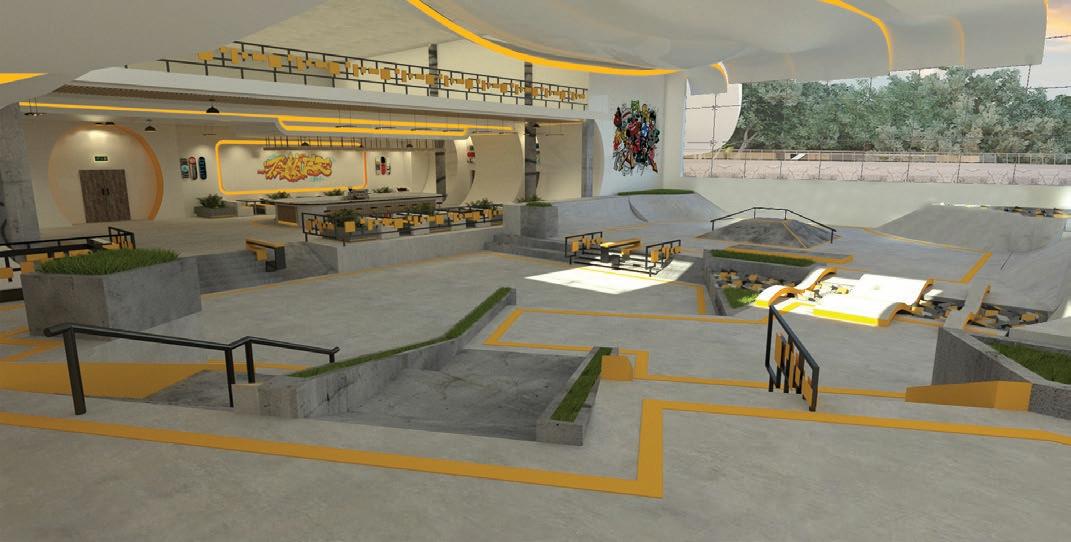
Designed on different levels, it has multiple foam pits to provide safety and landscape element contrasting the concrete floor. Provides natural lights through big windows.
Café furniture inspired from the Urban Environment and Skateboarding Culture
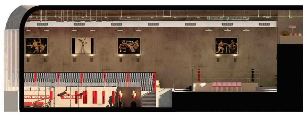
MIXED MARTIAL ARTS
The space entrance showing different levels and the café on the mezzanine
SIGNIFICANCE: Mixed Martial Arts is booming everywhere and in Egypt too. Its good to learn how to defend yourself and others, builds up confidence, especially for females, have a lot of different types of competition to stay motivated.
Boxing and Taekwondo, are in the Olympics, and Egyptians have won medals before in each of them. So, its important to have a professional place which is well maintained.

PROBLEM: There are lots of athletes with different ages who train. So far all of the places in Egypt and especially Alexandria are lacking space, tools, equipments, rings and mats. They use the basement of or the first floor of an apartment building that offers a poor training experience.
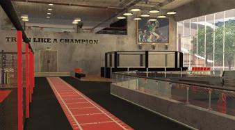
AIM: A state of the art Martial Arts facility, that has a full size Boxing Ring, Octagon Cage, 150 sq. meter of padded mats that can be used for all types of Martial Arts. A General Training Area is in a lower level, that contains different types of Sandbags, equipments and shadow boxing.





FURNITURE DESIGN

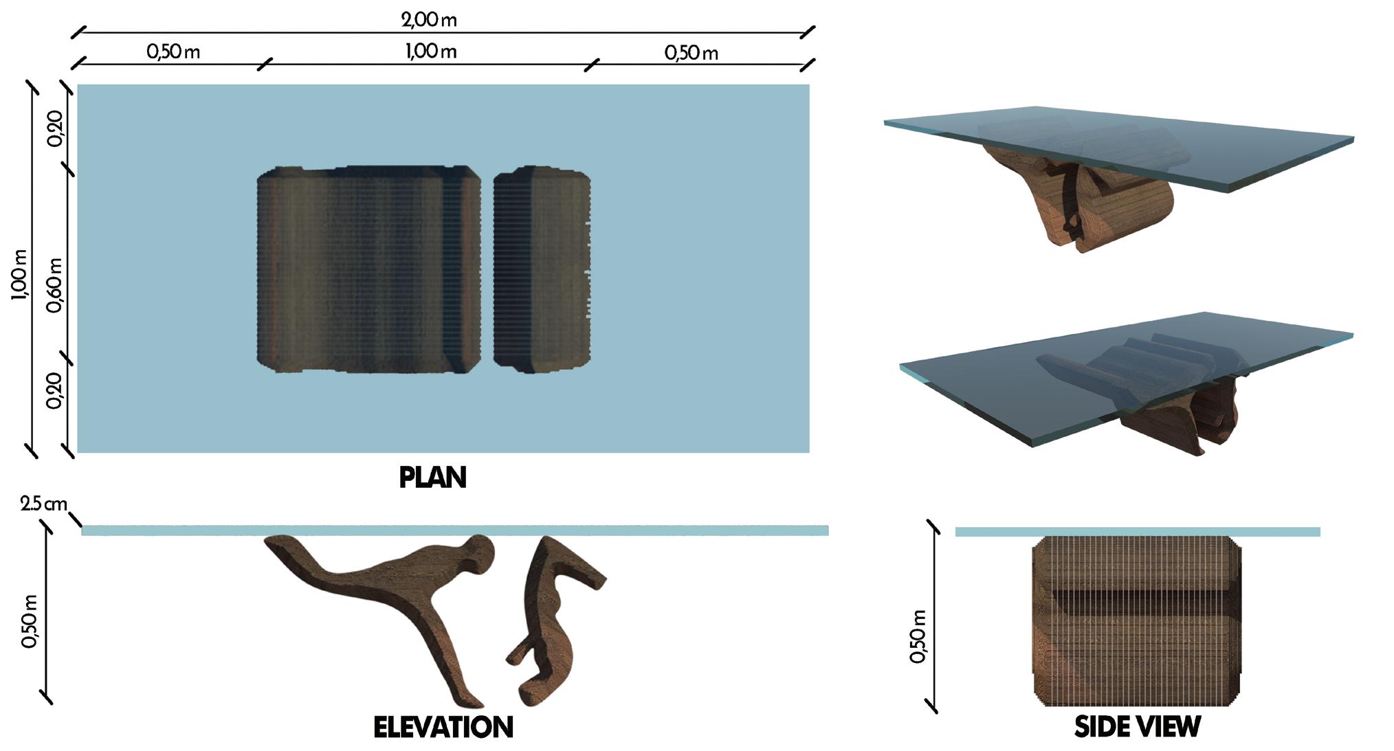
SIGNIFICANCE: Reception areas are the first enclosed space that users get to see and use in any building. This Reception area is for a sport building, needing to express the athletic movement to welcome them in the building.


AIM: Furniture made from the dynamic unique movement of the sports, that captures the human form and artistic expressions, while respecting the functions of the furniture and the ergonomics of the users.
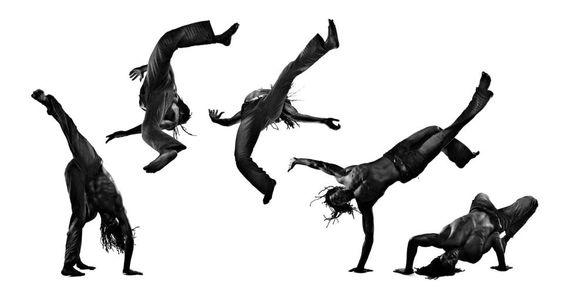
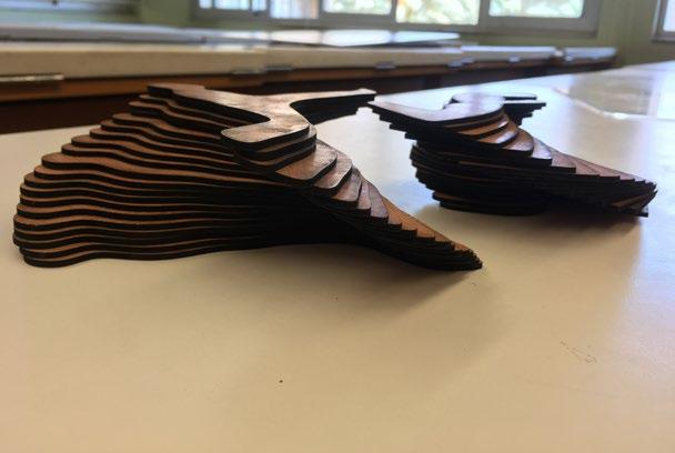
Combining the ergonomics of the human body with the athletic dynamic movement was the main design inspiration. The main design unit was the ribbon. This Ribbon was repeated, changing its profile to create a modern sofa.


Form inspired from Parkour.
RECEPTION COUNTER
The head is used as a privacy barrier elevated with aluminum columns with a glass panel on top. The space between the arms and legs is used as drawers on both ends.
Form inspired from Capoeira.
The profile is extruded forming strips that are repeated, then offsets and is extruded at the ends. This form has 3 points of contact with the glass top and 2 with the ground. Form inspired from Capoeira.






CHAQUE JOUR PÂTISSERIE

SIGNIFICANCE: Located in one of the oldest and historical Street in the world, Foad St. is in the heart of Alexandria, Egypt. For the past few years it has been transitioning from mainly old offices/banking buildings to an outstanding mix-use with a strong Food & Beverage businesses that keeps the life in the street after the office hours.

PROBLEM: A new French Pâtisserie & Café with its 1st branch, in a street that has strong business competition & historical ties. The design need to reflect the French business concept while respecting the history of the street and also having a French-look, from the small facade to the cozy Interior.
MY ROLE: As the main and sole Architect, I’ve designed the elevation, ground floor plan layout and the atmosphere of the café. I’ve also supervised this project from the initial business ideas, construction, to the grand opening.


WHAT I’VE LEARNED: Being one of the co-owners of this business, I was able to see how the design affects the actual business. That design is a never ending process that is always changing with different needs for seasons and special occasions. It needs to be adaptable during it’s operation.

The first floor acts as the main sitting area for the café. It is designed to feel cozy and welcoming for the guests to be their main hangout place for everyday (Chaque Jour). There is also a bar that looks the famous Foad St. that people can use high chair to sit on.


In special occasion it can be use as an open buffet table just like in the picture below.

Ground floor area


LEEST FOOTBALL - WINNING COMPETITION

Professional Work with TRiAS Architecten
Designed in September 2021
Currently being constructed.
Programs Used: AutoCAD, SketchUp, Twinmotion and Photoshop.
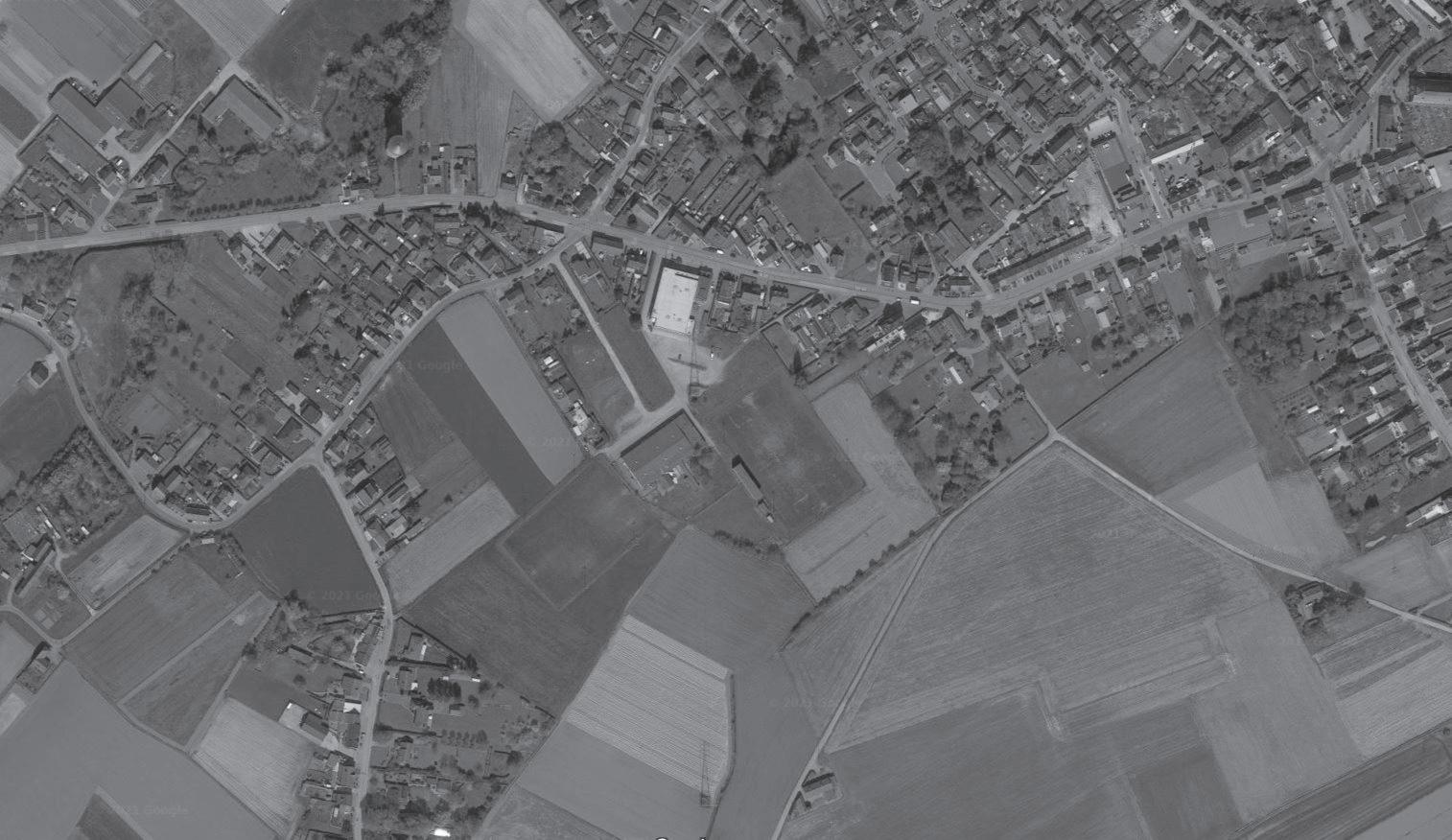
SIGNIFICANCE: This was an old football and abandoned hockey field.
PROBLEM: The place was in a bad condition, it needed service facilities.

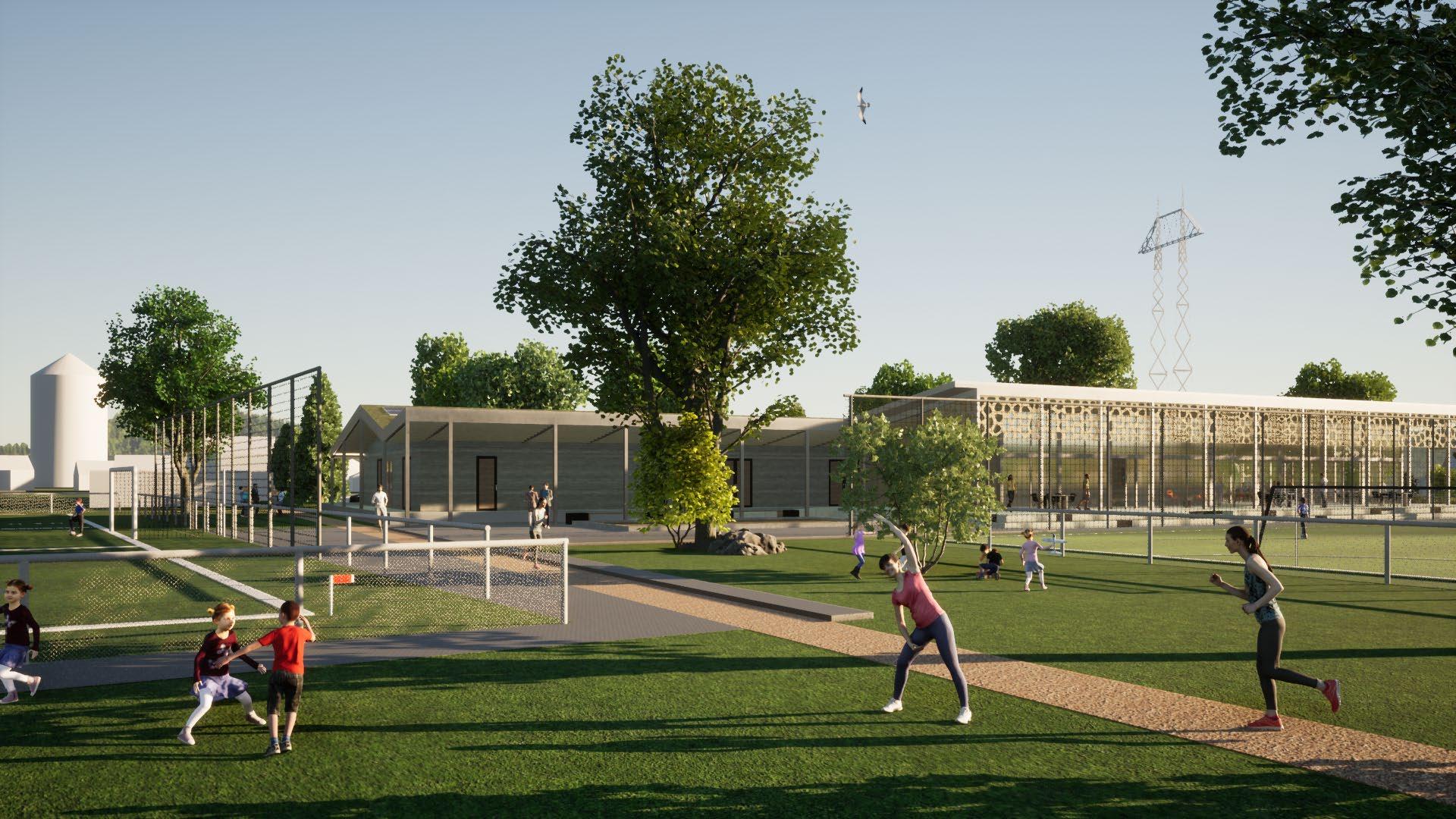
AIM: The aim was to built a new service building with two extra football fields and rework the entrance attached to the existing multipurpose sports building.
MY ROLE: It was an competition project and I was tasked to solve the architectural design. Make many layout proposals and combine different function. Design the elevation, see different possible facade materials through constantly making 3D Modeling and rendering. I also made architectural animation videos.


WHAT
I’VE
LEARNED: This project taught me rules and regulations of the public buildings about the safety codes. I had to make advanced patterns with Rhino and Grasshopper. The design helped me explore and create interesting parametric solutions and CNC cutting. It was my first time working with a team of young architects and win a competition project.



The facade of the football club was specifically design to brand and promote the local identity of L E E S T We designed a complex pattern as a part of that branding design of the town. I learned a special grasshopper script that can make me write anything with this patter in minutes. I was in contact with Rockpanel to see how they can make this panels with their facade solutions.




BEERSE APARTMENTS
Currently being constructed.
Programs Used: AutoCAD, SketchUp, Twinmotion and Photoshop.
SIGNIFICANCE: The project is situated in between two main roads will offer 50 new residential apartment to the growing city of Beerse in Belgium.


PROBLEM: The main problem was the building height regulations and managing the budget and selling unit price.
MY ROLE: I was tasked to do the architectural layouts and design all the apartment units types. I was also tasked with making the building permits (bouwaanvraag). I also made the 3D models, rendering and architectural animations.


WHAT I’VE LEARNED: This project taught me how to make building permits. I also learned more about of apartment regulations and fire rules and techniques in Belgium. I also learned to iterate the design many different times for the clients wishes, this made me learn to find new techniques to work more efficiently.


METALO OFFICE EXTENSION
AIM: The main goal was to design interesting facade so it creates an unique identity in the industrial site.


PROBLEM: The company needed an extension floor of their existing office.

MY ROLE: I was tasked to solve architectural design. Design the elevation, see different possible facade materials, through drawings. I was also making 3D Modeling and rendering.
WHAT I’VE LEARNED: This project taught me about the different facade materials and using colors to add depth and identity to a project.


DE VLEUGELS - MASTER PLAN STUDY


AIM: The focus was to transform the healthcare facilities of differently-able and mentally challenged people and built it different phases overtime.
PROBLEM: The main problem of this project was the size and the complexity in function and construction phases. The site was big and there were already people living in the healthcare facilty. The initial transition phases posed a critical senario, as delicately the phases needed to transition without disrupting the everyday lives of the people living there.

MY ROLE: I was tasked to design the masterplan with the guidance of the project architect. I also created 3D renders and animation to use as visions for the proposal for the different party of this big project..
WHAT I’VE LEARNED: This project taught me how to work and design phases in a bigger project. It also gave me realizations of how important it is to create safe and inclusive spaces for differently-able people.
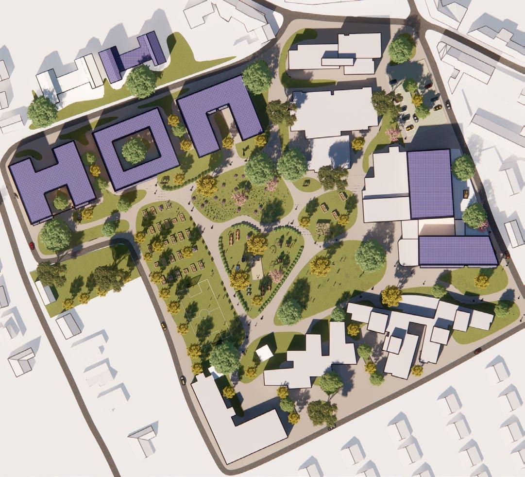


Het domein van de Vleugels is bijna volledig bebouwd. De resterende, waardevolle open stukken grond innemen zou kwaliteitsverlies betekenen voor de bewoners en omgeving. Daarom werd een masterplanvisie voor de site uitgewerkt die de Vleugels toekomstgericht en kwalitatief uitbouwt.


FASE 0
De bestaande site is een mix van gebouwen gebaseerd op verschillende inzichten, filosofieën, tijdsgeest,... Afgestemd op specifieke noden van dat moment en met relatief weinig flexibiliteit naar de veranderingen toe.
Hierdoor is de site niet meer geoptimaliseerd voor de bewoner, onoverzichtelijk voor de bezoeker en wordt een vlotte werking voor het personeel moeilijk.
FASE 1
Een ‘tweede Tandem’ met vier leefgroepen op twee verdiepingen maakt het mogelijk dat Wilgenerf 5/6 kan verhuizen en afgebroken worden. Dit vermijdt containerwonen. De doelgroep kan later wijzigen.
De activiteiten van de grote zaal worden tijdelijk verplaatst, waarna ze wordt afgebroken om plaats te maken voor een nieuw school terwijl Heuvelzicht in gebruikt blijft.*

*afhankelijk van specifiek scenario school grote zaal

FASE 2
Op de plaats van Wilgenerf 5/6 komt een eerste gebouw uit een reeks van 3. Dit gebouw bevat vier leefgroepen op twee verdiepingen en een (half)ondergronds verdiep voor bijvoorbeeld technieken. Wilgenerf 1/2 en 3/4 kunnen verhuizen en afgebroken worden.
Op de positie van het bestaande schoolgebouw komt een nieuwe grote zaal.*
*afhankelijk van specifiek scenario school grote zaal

FASE 3

Twee nieuwe gebouwen voor elk vier leefgroepen twee bewoond en één voor ondersteunende functies en parking komen op de plaats van Wilgenerf 1/2 en 3/4. Schakel kan verhuizen en afgebroken worden.


De kernpunten van het masterplan zijn gerealiseerd. Deze fase wordt verder uitgediept. Veertien nieuwe leefgroepen vervangen elf huidige. De Vleugels heeft nu een park als Kloppend hart en groene long.

FASE 4
Op langere termijn kunnen ook Zuidkant, Horizon, de wasserij en technische dienst vervangen worden door nieuwe gebouwen volgens dezelfde principes waarin leefgroepen en ondersteunde functies zoals kiné, snoezelruimtes, behandelingsruimtes,... ondergebracht worden.


DE MANDEL SOCIAL HOUSING - COMPETITION


SIGNIFICANCE: The site was connected to a historical significant church the Christus-koningkerk. The triangular roof of the church holds high design significance as well.

PROBLEM: The main challenge of designing was how to design a sensitive form that can co-exist with the significant church and making aesthetically connection. the other problem was designing inviting spaces for the community.
MY ROLE: I was tasked to design the architectural layouts and facade drawings working with the guidance of our teams master architect. I also made 3D models and renderings.

WHAT I’VE LEARNED: I learned rules and building codes for social housing in Belgium. I was interesting to me that it is possible to make decent space and not compromise on efficient spaces with a minimum expense.


SOENEN LUXURY RESIDENCE


AIM: The main target was to create a luxurious apartment building, providing big terraces on each floor and bringing in nature into the builtspace, in the middle of Roeselare.


MY ROLE: I designed the interior with the guidance of the Project Architect. I also made the 3D models, architectural renders and interior renders.
WHAT I’VE LEARNED: This project gave me more knowledge about materials, details and also designing with less elements to built an environment. I also learned to make more professional renders,


SINT DENIJS COLUMBARIUM AND RENOVATION


SIGNIFICANCE: This was a competition project.
PROBLEM: The project challenged us to re-purpose the Church which was protected heritage (exterior and interior), Thus only minimal intervention was possible. The design of Columbarium was also a new challenge for me, MY ROLE: I was tasked to design the renovation of the church and new Columbarium with the guidance of our teams master architect. I also made 3D models, renderings and architectural animation. WHAT I’VE LEARNED: This was my first project to design a Columbarium and other church elements I did not know before. I also learned and designed with tensile structures.
The idea of the big curtain being the main innervation in the space that can divide the space into different parts to create a dynamic space, without changing the interior heritage of the church.

Existing Site Existing Site


KORTRIJK HOUSE RENOVATION
Internship Work at AVDK office Designed in 2020

SIGNIFICANCE: This was an old typical West Flemish house. It is in the same plot of the AVDK Architecture Office. They acquired it and wanted to renovate it to something that will reflect their design identity and will be a street façade of their office.


PROBLEM: The house was in a bad condition, it needed a lift off They wanted to rent it and see the potential if it becomes an office, a house or a mix of both. We also had to think of the connection with the neighbor and see if you remove the pitched roof to turn it into a straight one where we can have extra functional space.
MY ROLE: I was tasked to design its renovation. Make many layout proposals and combine different function. Design the elevation, see different possible facade materials through constantly making 3D Modeling and rendering. I also went on site, took measurements, and evaluated its actual status. Later, I worked with a colleague on producing some of the building permits documents.
WHAT I’VE LEARNED: This was my first project to work on in Belgium. I learned many things about Flemish standards, materials, and industry brands. I also learned to work with a big team of colleagues and learned Dutch Architecture terminology.
After experimenting with many different layouts and functions. We decided to have an office on the ground floor that can be rented separately with two different entrances from the street and the patio from the alley. On the first and second floor, there will be an entrance from the street. The pitched roof will be replaced with a flat one, which would allow for extra space to accommodate the house inhabitants. A southern terrace on the first floor was also added to overlook the patio, as well as a small green balcony on the second floor to overlook the street.


LES JARDIN DU ROI RÉSIDENCE
Freelance
Professional Work Designed in Summer 2018 Project


AIM: To design 10 detached luxury houses in an upper part in Alexandria, Egypt. With the European techniques fused with the Egyptian climate and needs. Also to use solar panels and water storage that was new to the Egyptian market.


PROBLEM: Managing a project that is between a French team of architect, landscape designer, structural engineer and an Egyptian client with an visualizer. I had to play an active role to communicate with the different party and work with the French architect to design an luxury villas for the Egyptian market and needs.
MY ROLE: I had to play an active role to communicate with the different party and work with the French architect to design an luxury villas for the Egyptian market and needs.


CAMAS APARTMENT - RENOVATION
Freelance Work
SIGNIFICANCE: Doing an intercontinental is something that I was always interested to do, with this project I was able to learn more about management and logistics as this project was manufactured in Egypt and shipped in a container to Marseille port where it was assembled in an apartment for its renovation.
PROBLEM: Managing a project that is being manufactured in Egypt and assembled in France while I was living in Belgium, came with its own set of new challenges. Nevertheless, I was able to deliver a good project that was below the budget with higher quality.
MY ROLE: I designed the renovation of the apartment, kitchen and bathroom. I managed the team of carpenter in Egypt to make sure the design and dimensions is exactly how I designed it with the clients. I also choose with the clients the ceramic tiles, and furniture in Egypt where they were bought and shipped.
WHAT I’VE LEARNED: I learned new design standard and dimensions for the French market that is different to the Egyptian kitchen designs. I learned to intercontinental manage a project that is truly international. I learned to solve problems faced during construction and to adapt to them.




One of the challenges that was faced in this project is getting the correct color for the kitchen cabinet. The blue color that was chosen wasn’t available. The French clients wanted it to choose black instead to be sure that the correct color value would be made in Egypt.




BEAUTY IN THE EYE OF THE BEHOLDER
@COTTONTOWN.ALEX
Master Dissertation Studio


Academic - Master Thesis - Individual Project Programs Used: AutoCAD, SketchUp and Photoshop.
Re-imagining the renovation of Egypt’s cotton building in a post industrial neighborhood.


SIGNIFICANCE: Due to the building location and history, the re-imagining of the building can act as a guideline when renovating the monumental buildings of Minet El Bassal.
PROBLEM: Located at post industrial abandoned neighborhood, where it is in desperate needs of reviving the area to preserve the strong history, deteriorating social integration of the local people, as well as lack of building spaces in Alexandria.
AIM: Designing evocative scenographies for the iconic British colonial ‘Makbass Masr’ Cotton Building overlooking Minet El Bassal of Alexandria as spatio-cultural hotspot to reconnecting Egypt’s Centuries-old mastership of weaving to the 21st Century ‘fabric’ related skills of craftsmanship from the perspective of meshworking and contested legacy.

HERITAGE SYNERGIES SOCIAL INTEGRATION
SCAN ME!
For The Full Reflection Paper Of this Master Dissertation

THE HISTORY OF MINET EL BASSAL


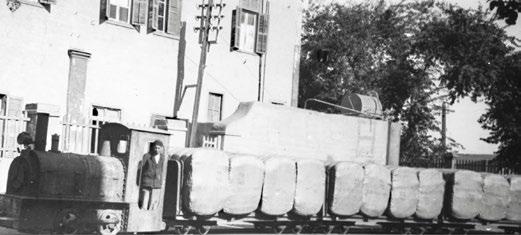


The Alexandria Cotton Exchange located in Minet El Bassal has rivaled both the one in New York and Liverpool and brought vast wealth to the cotton merchants. The stock exchange is located in Mohamed Ali’s square where it has became the city’s symbol. Portrayed in postcards, books and guides to the city, it was a the center of attention of the international financial community.
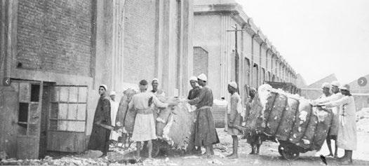
FRIDAY MARKET
Souq El Gomaa, or The Friday Market, is an old market that happens every Friday in the Minet El Bassal district. It has been going on for more than 50 years.
It is a very famous market in Alexandria where many people go there which made it one of the landmarks of the neighborhood.


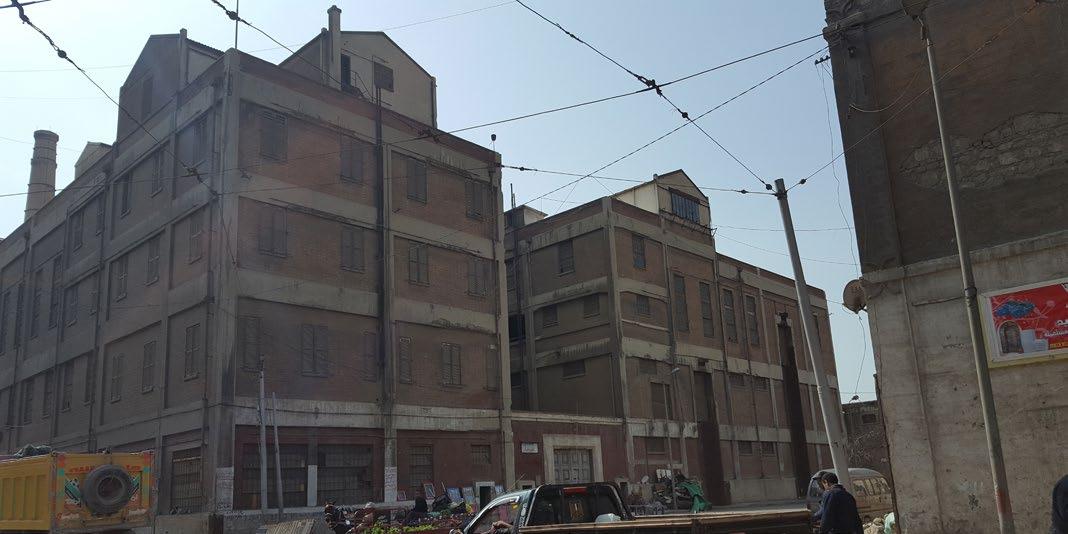

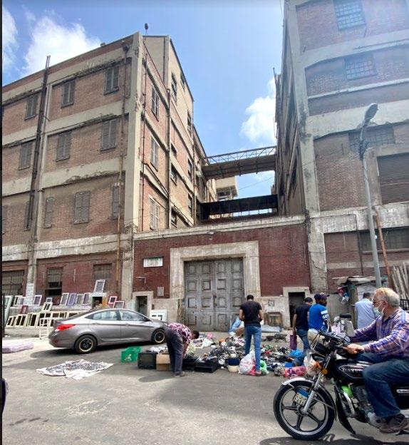
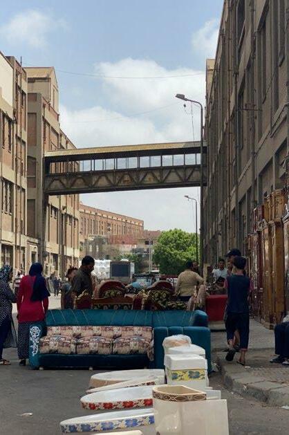
Street merchants often sell antiques, and a variety of second hand products.
Those merchants do not have any license to sell. They are displaying their products on the street or on the buildings Façades. Yet, the government has not so far stopped them.
EXISTING GROUND FLOOR PLAN AND FACADES


DESIGN PROCESS
This building is a Gigantic/Super Box with sides of 54 meter and 133 meter. Total floor area of 20,000. It offers a many long span spaces that can be used for big functional spaces. This building is sometimes is used as an extra warehouse for the port. The Skeleton of the building is still in good quality, the brick façade and the windows needs to be refurbished to bring it back to its glory.
COTTON TOWN CONCEPT
Multi-Purpose Hall/ Dynamic Market Educational Museum
Shops


Opening up the building to allow more skylight, natural ventilation,and brake the barrier between the building and the pedestrian. This provide positive urban interior spaces with alleys, bridges connecting the different smaller buildings together.


1 - Original Building. 2 - Expanding the atrium from the Friday Market to the canal.
3 - Opening up the building and creating smaller masses.
4 - Connecting the building masses together with bridges.
SYNERGIES IN FUNCTION
PLANS
Second Floor Plan.


ATRIUM’S COLLAGE

SECTION


Cross-section

URBAN INTERVENTION


Widening the sidewalks to allow for different functions and more pedestrian friendly.


THE BRAIN BAR
FABRIC FURNITURE
3 unit Market stalls long.
1 Market Stall with colored Fabric.
3 unit Market Stalls combined together.

CATWALK
“Bubble” seats with fabric ropes”


The Catwalk can be installed temporary in the multipurpose area where the Dynamic Market is located.


Curved seats with fabric ropes.
The middle part of the façade is fully glazed so that the Catwalk can be in different configuration for the people to look from the street.
THE DYNAMIC PIXEL


Master Design Studio 1 - Generous Gesture Academic - Master - Group in Pair Project Programs Used: AutoCAD, SketchUp, and Photoshop.

Atrium is the main center point of the buildings where the different users meet.

SIGNIFICANCE: To have quality affordable housing in the growing city of Gent, Belgium.

PROBLEM: Now there is more and more people working from home, either as freelancers or employees. Having the proper space that would allow them to do their work while being in the comfort of their own home is something that a lot of people are looking for and also taking into account the privacy of the residents of the home when they have work guests or clients.
AIM: To have a strong sense of community in a building, that has commercial spaces, offices and different types of residential layouts with the flexibility in mind. The different types of users would share a lot of services together to create this sense of community. Having a big atrium to meet each other and the communicate together. Moreover, caring greatly about having natural light everywhere in the buildings including in the corridor.
Building Concept

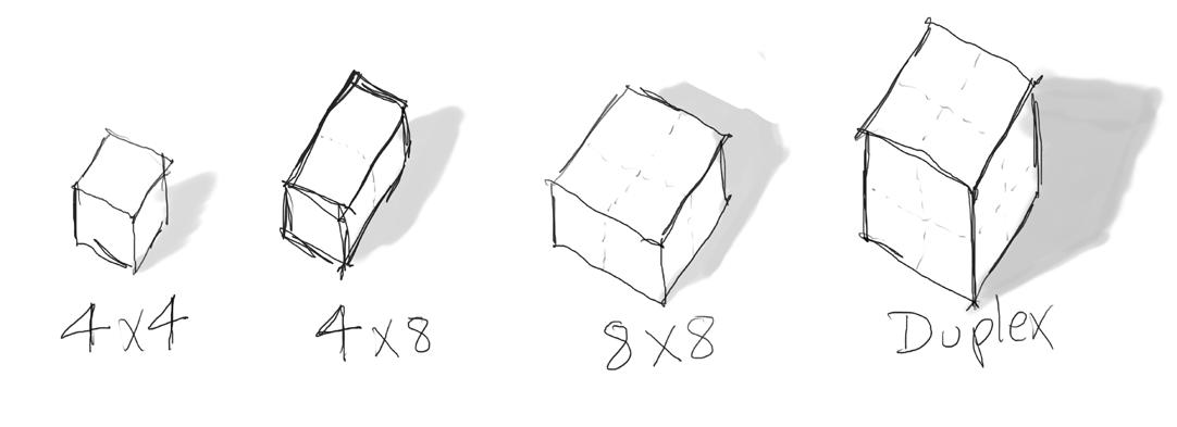


To create a multi-complex buildings that focuses on the Work-Home lifestyle that allows them to sell their products or services along the main sharing corridor. Also, to have a strong sense of sharing and community. The Pixels help with creating a flexible module that caters the future needs of the residents or business. The main module has a an “Extra room” that can be used for whatever the user needs; office, store, studio or an extra bedroom. It can also have an access from the “Commercial corridor” if the residents wanted to “sell” their products. The commercial areas are on the street side to benefits from the foot traffic to sell their products while keeping the privacy residency.


Different Possibilities and Flexibility
Master Plan Concept
Located in Merelbeke Station Gent, we had to propose a new village with 1,000 houses with commercial, offices and services. Our theme was dense “Blocks”. We located the public buildings on the train tracks to act as a barrier for the noise. We wanted to create a new village for the future, that is made for the pedestrian not cars. So we had the parking at the edge of the site. Focusing on the journey with the bike or walking in the village to always discover new angles and directions for the buildings. There are 2 main forests, with an aim of planting 1,000 trees for each house, with many courts scattered around the village.
ZONING

SECTION


NGround floor: Commercial shops on the street side & Duplex residential units on the interior court.

Typical floor: Offices on the street side & smaller residential units on the interior court for more privacy of the residents.

SALES POTENTIAL RENTING POTENTIAL
- The construction costs is taken from the building costs estimation.
- The land price is estimated using the average land price in Merelbeke.
- The profit is calculated using the totaling selling price minus all other costs.
Total building construction estimation was € 9.3 million. While the total costs of the project (without acquisition cost)is € 11.8 million.
The land price in Merelbeke is sold at an average of € 300 / meter sq. The total land area of the project is 4,000 sq. Making the land area cost estimation to be € 1.2 million.
The Acquisition price is calculated with: Sales Potential - Cost of Project (includes construction costs, services, financing & selling)
16.4 - 11.8 = € 1.65 million Acquisition
The Acquisition price is € 1.65 million.
Making the total project cost € 13.45 million
Profit Estimation:
Total Selling Price - Total Project Costs
16.4 - 13.45 = € 2.95 million Net Profit
The total estimated selling price is € 16.4 million . Making a positive profit of € 2.95 million (18% of the total project cost)
The project concept is designed to be rented not sold. Therefore, In this assignment it is also proposed to estimate the profit for the investors if the whole project was to be rented out monthly.
From the calculation costs (page 11) it is estimated to receive € 62.425 Monthly in rent.
To calculate the potential income rent of 30 years ( 360 Months) This equation is used: total months x total monthly rent
(NOTE: The inflation rate and the increasing renting price is neglected.)
360 x 0.06245 = € 23.12 million Rent
To calculate the potential net profit over 30 years of rent. This equation is used: Total incoming rent - Total project costs (including acquisition)
23.12 - 13.45 = € 9.67 million Net Profit
For the project management subject I chose this project to analyze from the management, time scheduling and budgeting aspect. I wanted to go further into comparing if the units were sold from the start or rented and evaluate the return on investment.
KIDS OF TOMORROW
Future Rural Schools of Morocco
Master Design Studio 2 - Future Rural Schools


Academic - Master - Group of 3 student Project Programs Used: AutoCAD, SketchUp, Photoshop and Procreate.


SIGNIFICANCE: Reshaping how the future education in rural Morocco, by customizing it’s architecture to it’s local cultural needs while using their local materials. The most outstanding proposals will be built in the summer.
PROBLEM: Two different kindergardens were to be designing in two different villages. Each one has different typology that would influence greatly their designs.
AIM: To design 2 pre-schools in rural Morocco focusing on sensible design approaches and using local materials while documenting the process using an Architectural Comic Book
SNAPS FROM OUR ARCHITECURE COMIC BOOK


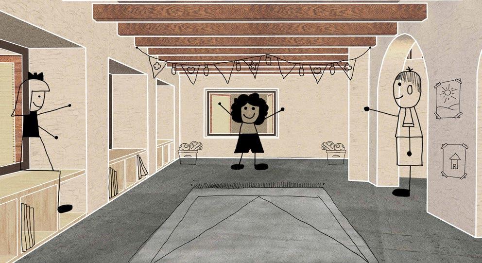
We wanted to design a classroom for the future children of Morocco, so we wanted to put ourselves in their shoes. We decided to design from the children’s and teachers’ angle by addressing them as our “clients”. Then by imagining how the experience and use the school.

KIDS OF TOMORROW - TAMGOUNSI VILLAGE
Tamgounsi has a very distinct landscape and typology. We used the slope and the building pattern as the main feature of the design. The kindergarten classroom consists of 2 spaces, the main teaching area and a creative space where the kids can use it as a library or be in a smaller group.
The main teaching area has an interesting interior space framed by beams arranged in a unique diamond shape. The diamond shape allowed us to use local wooden beam as the span is shorter than regularly arranged beams. The form of the classroom follows the rectangular language of other classrooms, and the levels follow the contour of the landscape. The area defined by the columns around the classroom can be used as playing area or outdoor teaching space.

These outdoor areas will be shaded for most of the time either by the roof or by the shadow of the classroom. The ramp that connects both levels not only has accessibility function but it is also a playing element for the children.

Elevation
SECTION


Back classroom entrance to library area
Main courtyard entrance

KIDS OF TOMORROW - TIDILI VILLAGE
Tidili’s urban fabric is a mix of old and new clusters. It is highly dense with alleys in between buildings. We wanted to use those alleys to create intimate spaces for the children, as we noticed that younger kids like to be in tight spaces that are proportionate to their sizes.

Despite the small area available, we managed to create 3 different spaces in the classroom. There is an open main teaching area, a small library, and a more intimate creative area. The creative space is divided into 2 levels – under the mezzanine and on the mezzanine. The mezzanine is connected to the tree house on the upper level, where a relaxing net can be found for the children. The main teaching area has a direct connection to the classroom courtyard.
This courtyard provides the possibility to have an outdoor teaching environment and it will be shaded by the classroom most of the time. All of these different elements could allow for different configurations to facilitate a non-traditional teaching methods.

Elevation


SECTION


AL KHOR STATION
Master Design Studio 3 - A-Live Academic - Master - Individual Project Programs Used: AutoCAD, SketchUp, V-Ray and Photoshop.

SIGNIFICANCE: A subway station in the suburbs of Qatar to act as a strong TOD in the growing city.

PROBLEM: Located at strong interaction, there are many logistics constrains. The highway makes it hard to have the station along the street. Moreover, the different modes of transportation that comes to the subway, has to have the proper drop-off zones with the appropriate area to allow for maximum efficiency and fluidity.


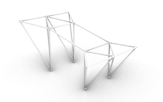
AIM: To design an elevated subway station above the highway that comes from Doha. By locating the subway along the street, a Multi-layer design would offer the optimum efficiency. Also, using the structure as a prominent feature in the design.
EFFICIENCY MULTI-LAYER SMART DROP-OFF

DESIGN PROCESS
N


The Multi-Layer Concept

To ease of connection between arriving to the station and reaching the platform was a main attraction that shaped the design of the station. By having a shared platform for the two tracks, it allowed to have a clear way finding in the station.


MEZZANINE PLAN



STRUCTURE

The Mezzanine rendered floor plan is showing the mezzanines as 2 main vertical circulation landing. The 2 mezzanine connects to the upper train platform with the stairs, escalators and elevators. The mezzanine is also connected to the adjacent buildings with 4 bridges.


PLATFORM PLAN
The
Structure in between the Train Tracks.
3D EXPLODED MODELS

Counter Design with the front having a parametric wooden contour design. It is modeled using SketchUp, Rhino and Grasshoper. It is showing the exploded view all the connections, materials and joints.

Spider Curtian wall system design Corian Screen with the Voronoi pattern It is modeled using SketchUp, Rhino, Grasshoper, and then rendered using V-Ray. It showing the exploded view all the connections, materials and joints.

HAND-DRAWN PROJECT

A fully hand-drawn and marker colored project. An architecture project consisting of two buildings on site which works together to form a wellness center. The first building is an Olympic 10 lanes Swimming Pool center with a Gym. It has a unique structure and roof that makes the identity of the building. The adjacent building is an Outpatient Primary Care Unit with different medical care units. Its structure is rigid for modular spaces and to accommodate the underground parking grid.

PHOTOGRAPHY


The main corridors of MUCEM, located on the edge of the building, showing the complicated structure system, that holds the corridors, UHPFRC Columns (on the left) and Screen (on the right). -


