17 minute read
25 tips for dynamic fantasy scenes


Pencil 3 SIMPLE TIPS FOR PROPORTIONS
CHARLIE PICKARD continues his ten-part series of quick tips on anatomy to improve your figure drawing; this month, he explores effective proportions
Advertisement
ne of the first, most
Oimportant difficulties a student will face as they begin their figure drawing journey is the problem of setting up consistent and solid proportions for every figure. As such, much has been written about ideal proportion systems for the human figure.
Many of these systems are based primarily on the relative size of the head to the figure. These systems, while immensely useful and worth learning, can be limited in their application, only working when the figure is in a full, un-foreshortened view. Alongside this they can be too complex to check quickly, with the most common proportion being an eight-head tall figure.
In this month’s article, I will discuss three simple proportional relationships that I have found very useful in my own work. These three relationships, based more on comparisons to the torso, are simple to remember, easy to control and very effective.
ANATOMY – PART 2


1 Pubic bone is a useful halfway point The first of these three proportional relationships, and the one that is most consistently among the first marks that I make in most figure drawings. On any standing figure, this proportion is extremely easy to find and track.
Charlie Pickard is a classically trained fine artist and illustrator. Recently awarded the Philip de László Award for excellence, Charlie continues to work, exhibit and teach out of his studio in London. www.charliepickardart.com
Pubic bone on halfway Balanced idealised body type Pubic bone above halfway Short torso/long legs body type Pubic bone below halfway Long torso/short legs body type
This is an easy control for varying body types
Of course, as with all of these proportions, they are merely an ideal, a useful proportion to vary from. Bodies come in all shapes and sizes and we should strive to represent these varied characteristics in our work.
The real power in this particular proportion lies in just how effective it is for controlling and easily varying the body types of our figure drawings. For example, we can see in the illustration above just how easily we can vary this by simply moving our pelvis in relation to the centre of our figure.
2 Leg proportion splits the body into 3 equal parts
Our second proportion is based on the legs, which will generally be half at the joint of the knee. To be more specific, the lower leg from the bottom of the heel will be equal in height to the full length of the femur from the greater trochanter down to the patella.
Even more usefully, this same length will roughly equal the height of the torso down to the start of the pelvis. This breaks down the entire figure into roughly three equal parts.
This relationship lets us fold up compact
I find a helpful way to remember this particular proportion is to consider how it allows us to fold ourselves up into a squat position.
I like to think of this as similar to a three-piece foldaway table. Just like with the table, the three sections of the body need to be a similar size to allow for us to take this efficient, more compact position. So next time you are unsure about the proportions of the legs, consider whether your figure folds up neatly into this shape.

The length of the upper arm allows us to transfer the weight into the stronger ribcage, making it easier to carry things! The arm halving at the shoulder is just the right size to let us carry things over our shoulder. Any smaller or larger and this wouldn’t work.


3 Arm proportion Our third and final proportion relates to the arms. The first element to consider is that the upper arm ends almost exactly at the bottom of the ribcage. When drawing, we can always consider the arc the arm would make back to the torso to easily check if this proportion works in our drawing.
If we consider the halfway point of the arm at the elbow, the forearm is slightly shorter than the upper arm. In fact, the lower arm all the way up to the knuckles of the hand is the same length as the upper arm.
The easiest way to remember this is to consider how, if you bend you arm, your knuckles will end up at the top of your shoulder.


A functional purpose
I like to remember this proportion largely by considering how well it enables the main function of the arm, this being to carry things.
Seen above, the upper arm’s alignment with the ribcage allows us to easily transfer the force of a heavy object diagonally into the much stronger muscles of the ribcage, making it easier to carry things.
In a similar way, our knuckles ending at our shoulder makes it incredibly easy for us to carry things over our shoulder. If it were any longer or shorter this would be impossible. Form truly does follow function. Understanding how will always be the easiest way to remember these ideas.


Oils 25 TIPS FOR DYNA MIC FANTASY SCENES


RALPH HORSLEY breaks down his oil painting process into 25 expert tips, explaining how to develop your own fantasy scene with a compelling narrative
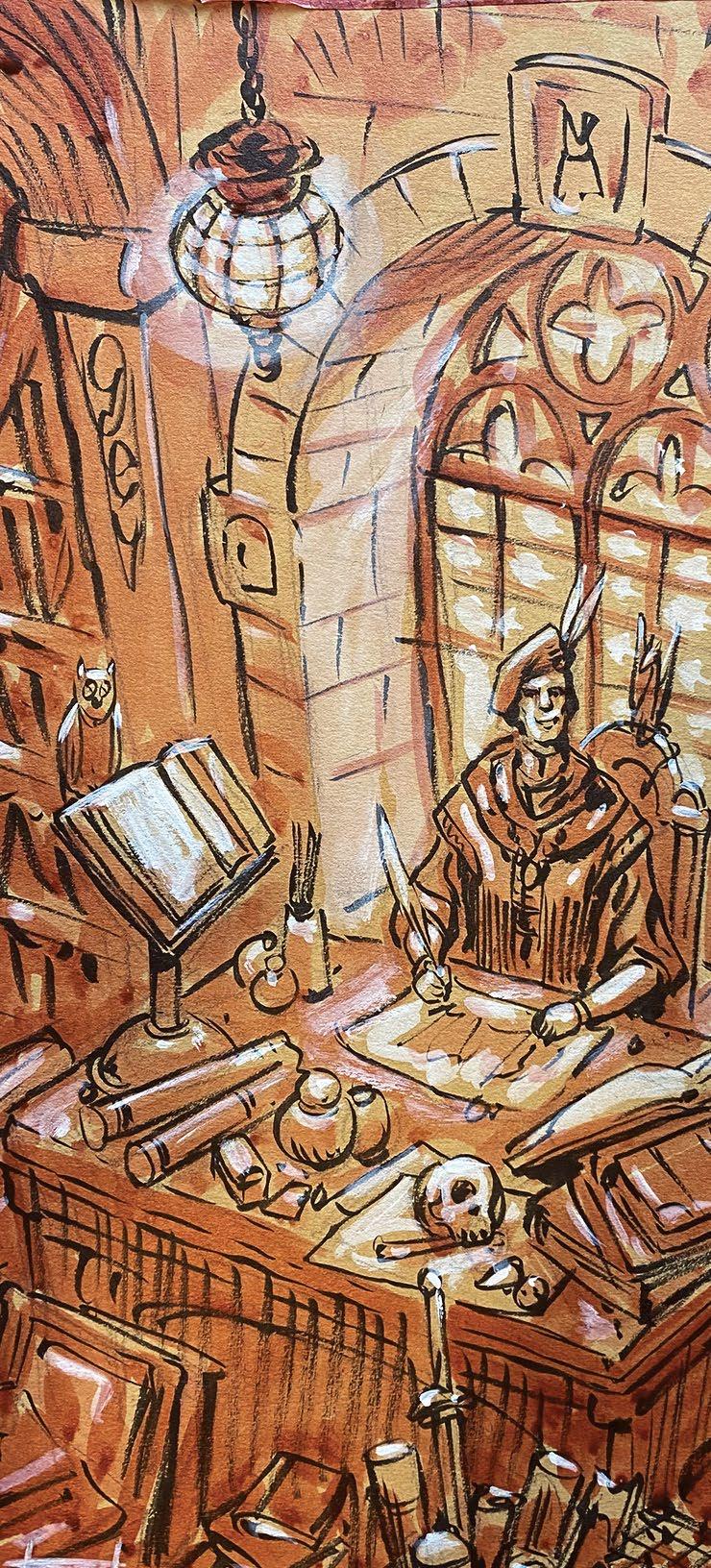
his painting, ‘The Scribe’,
Tis the back cover to my art book, Ralph Horsley: An Art Adventure. The book is a career retrospective, and this image encompasses the processes and techniques for creating fantastical oil paintings that I have developed over the past 30+ years of my career. These include a dynamic point of view, interesting lighting, storytelling and detail. My work process has evolved through experimentation, trial and a degree of error. I believe that having a clear methodology helps me create stronger work. This article breaks down my approach into a series of tips that lead from the initial idea and thumbnail sketches through to a completed oil painting. I encourage you to think about your own approach, experimentation and decision making.
Art has been an exciting journey that has taken me from being a teenager playing Dungeons and Dragons to painting cover artwork for the game. I hope this helps you on your own path.
1 Preparation is key It can be hard to resist the temptation to launch into a painting straight away. Introducing some preparatory stages prior to that can feel like adding extra work (and time) onto a project, but good preparation will not only help you create a better picture, it’s also a more efficient way of working. There is a lot of decision making in creating art, and parcelling them up into bite-size chunks does ease digestion of the whole. 2 Write your own brief When working on a commercial assignment I will be given a brief. This will have the physical constraints of the dimensions, trade dress and key elements that need to be included. The latter might include specific characters, setting, and focus of the action. You don’t need to be as prescriptive, but it is useful to give yourself a starting point and establish a brief for your project. Ralph is a traditional artist who has successfully forged his passions for gaming and fantasy art into a career painting dragons and goblins. www.ralphhorsley.co.uk
3 Seek inspiration Having created my brief, I looked for elements that would work with it. I trawled pictures of medieval rooms, writing slopes, desks, artists’ studios – my own in particular. This is a fun exercise where you can let your image search engine take you down all kinds of avenues and back alleys. The best of the bunch can be selected as reference material, but the key is to get your brain working creatively by giving it stimulus.
4 Explore ideas This is when I put pencil to paper and start sketching. I’ve generated lots of ideas and have piles of reference; this is the stage when I try to make sense of them. These simple sketches are what can be called ‘thumbnails’, small doodles that are about placing the key elements in compositional relationship to each other. The main figure might be shown by a couple of circles, the desk by a rectangle. This is when you have total freedom to explore compositional ideas. It should be a lot of fun; there is no pressure at this stage to get things ‘right’, just the exploration of ideas.
5 Methodology always helps Okay, so thumbnails let you do whatever you want, however wacky, but following this method helps to guide that exploratory madness. I always cover some basic ground with my thumbnails. Firstly, viewpoint. Try out three different points of view, looking up (worm’s eye), level, looking down (bird’s eye). Each creates a different mood. A figure looming over us can appear more powerful, looking down can make the viewer more of a voyeur. Secondly, depth of field. Foreground, middle ground, background – try each of your elements in those different placements. How does that change the composition of your image?
6 Composition study I filter out the ideas I like and create a scaled drawing a quarter the size of the final piece. This enables me to refine my decisions about placement, perspective and lighting. While not fully detailed, this study should resolve any ambiguity in the thumbnail. Perspective will be resolved, extra detail will be added, figure poses more clearly defined, maybe additional features brought in. This also tells me if something isn’t working.
7 Be prepared to scrap Realising an element isn’t working is a key part of developing one’s craft. It is important to be prepared to change. That can mean rubbing something out and starting again. This is so much easier to do with a thumbnail or scaled sketch than a final, so it’s important to make that decision early on.
8 Colour takes the credit… …but value does the work. My preference is to draw my study on toned board. I’ll create a graphite pencil sketch, add linework with a brushpen, mid values with sepia ink, and highlights with white acrylic paint. This technique lets you explore a full tonal range, which is especially helpful in deciding upon the lighting. Lighting defines form, exemplified by rim light. Crucially it also provides focus.

MATERIALS
SURFACE n Daler-Rowney mountboard, sandstone n Laser print on printer paper PRIMERS n Liquitex, Clear Gesso n Liquitex, Acrylic Matte Medium
ACRYLIC PAINTS n Liquitex, Soft and Heavy Body OIL PAINTS n Gamblin, Artist’s Oil Colours n Daler-Rowney, Georgian Oil Colours MEDIUMS n M. Graham & Co. Artist’s Oil Medium, Walnut Oil n Winsor & Newton, Oil Colour Mediums, Liquin Light Gel n Winsor & Newton, Oil Colour Mediums, Drying Linseed Oil CLEANING AGENT n Bartoline, Premium Low Odour White Spirit n Domestic liquid soap PENS n Pentel Brush Pen n Sharpie GRAPHITE STICKS n Caran d’Ache, Grafstone, 3B BRUSHES n Pro Arte, Sablene, Rounds, 1, 4, 6 n Bristlon, Silver, Filberts, 2, 4 VARNISH n Gamblin, Gamvar, Matt n Gamblin, Gamvar, Gloss MISCELLANEOUS n Stanley knife n Cutting board n Masking tape n Steel ruler n Clear plastic ruler n Mahl stick n Apron n Coffee mug 9 Where is the focus? Where is the action happening? Where do you want the eye drawn first? ‘The Scribe’ has a gentle spotlight on the table, the lighter pages and skulls offset against the desk. White sleeves and feathers triangulate our attention to the face. The lantern itself adds height, and thereby depth. The shadows do their part by providing contrast and recession. When constructing a picture, keep in mind that you are deciding how you want the viewer to read it.
10 The base layer The surface is the foundation of any traditional painting. I like to paint over my sketch, and that influences the materials I use. This painting was going to be finely detailed, so I chose to work my graphite sketch onto the smooth surface of an art board. The board is robust enough to receive several layers of clear gesso, but priming is required to support oil paints. For my landscapes I often paint on more textured canvas that allows different brush marks. Try experimenting and see how surface affects outcome.

11 Preserve the sketch My sketch is going to have three layers of clear gesso added to it, then oil paint applied. Those stages can easily cause the loss of some of the precious information our sketch has captured. To offset this I will add ink outlines first. Keeping the integrity of the sketch like this gives more freedom when you apply the paint. I also make sure to have a scan of the sketch, which can be referred to as additional backup. Lots of hard work has been done by now, so let’s not lose that.
12 Perspective is the scaffolding As lighting aids focus, so too does perspective. Perspective is the physical rule that makes the pictorial world believable. In ‘The Scribe’ I use three-point perspective to funnel our view onto the figure and his work, adding a sense of drama to an otherwise still picture; another tool to emphasise the focus. The sketch is the framework for the paint, and perspective the scaffolding for the sketch.
13 Choose your palette The complementary colours of red and orange will create a different mood to that of clashing purples and greens. I experiment with different combinations on a scaled-down printout of the sketch. I like to use acrylic paint because of its drying time, and flexibility to work into areas with additional layers. This can be a really exciting process; it’s about laying down blocks of colour and not worrying about the details. There are no mistakes, just print out another copy and try something different. One exercise is to try limiting your palette to as few colours as possible.
14 Reference as visual memory Through creating art one builds up a visual memory, but while we can easily recognise things, reproducing them accurately is more challenging. You can’t be expected to rely on that memory alone, hence the value of reference material. I had lots of everyday objects to hand – bottles, jars, books, skulls, etc – that I could reference directly. For other items, like the lantern, I looked at photos to see how they are constructed then created my own design. The real world is the ideal starting point from which to build the fantastical.
15 Remember to tell stories Your painting should have a narrative drive. This one is relatively simple, a scribe creating a book, but that story is embellished by the objects around him. Where did the cyclops skull come from? Or those masks? Is that egg going to hatch? I like to have an easily read, overarching story, followed by lots of side quests and reveals when you look closer. Even the page he is working on echoes the contents of the book that this image is the back cover to. Telling stories is fun.
16 Hot and cold Warm and cool colours give an interesting push and pull. The warm reds and browns in ‘The Scribe’ contrast with the cool blue-grey of the window, helping the latter act as a framing device.
17 One at a time Lots of these tips encourage experimentation. That is how you learn preferences and outcomes. It keeps your creative process fresh and moving forward. Stasis is stagnation. Remember to change only one variable at a time, be it surface, medium or brush – that way you can know what is affecting your results. 18 How wet? I’ve made lots of decisions up to now. What remains is the application of the paint. Oil paints are accompanied by different mediums. Each of those will change the consistency of the paint and accelerate, or retard, drying time. I use walnut oil, drying linseed oil and Liquin. The linseed oil is the mid-range, it adds flow to the paint and reasonable drying time. Walnut oil gives a lovely viscous quality, but stays wet for days; whereas Liquin dries fast, but is gloopy. I use them in different combinations. Walnut plus Liquin gives a nicer paint texture, and dries faster. Each equation has its own merits.


19 Make your mark In digital art there can be a drive to personalise brushes to generate different marks. The same holds true traditionally. The three classic brush shapes – round, flat and filbert – combined with size and material, each offers their own distinct mark. I’ve already made my decisions about colour through my earlier study, now I can concentrate on how I paint.
20 Mix on the palette I like to mix up my range of colours on the palette before I apply any paint. I lay out my colour selection as decided upon through my colour studies. This makes it much easier to pick from, without mixing as you go. Also by using a palette knife, or old brush, you are keeping your paint brushes in good condition.
21 Side by side Transitions from one value to another can be accomplished in oils by applying the paints side by side, then use a dry brush to blend them together. This is a very effective blending technique.
22 Losing the edge Remember we are trying to keep the picture’s focus. That means the focal areas, the figure and desktop, are tightly rendered with clear detail. Conversely, as we move to the edge of the image everything becomes a little softer – edges are lost and merge into the shadows. This is a continuation of one’s lighting choices. Use the blending technique above to soften and lose those edges.
23 Check values Before calling a painting done, the main area I will assess is the value range. How do the lights and darks read against one another? A handy technique is to take a photo on your phone, then edit the image to remove all the saturation, turning it into a greyscale image. That helps you read the picture without the distraction of colour. Remember tip #8.
24 Look after your materials If you look after your tools they will look after you. Take care to thoroughly clean your brushes. I use home decorating brush cleaner and liquid soap to remove the oil. Any detergent works well. Brushes will deteriorate, losing their shape over time, but in turn they can generate interesting and different marks.
25 Ref lection I like to keep a finished painting propped up in my studio whilst working on new pieces. This gives me the opportunity to reflect on it, and inform myself as I move forward. One needs to develop a critical eye to assess what could have been improved, but equally important is to credit yourself with what did work well. Take that knowledge and apply it your next painting.
Pro tips and step-by-step tutorials from digital artists and illustrators