6 minute read
Project 2 - Bauhaus
Bauhaus
is a project named after the early 20th century’s movement of architecture and design in Germany. In the movement, advocators tried to combine art and crafts together, emphasizing the rationality and functionality of forms, and thus creating a new industrial aesthetic suitable for mass production. The methods and ideas in the Bauhaus movement soon evolved into the modern design procedures that we apply to various aspects today.
Advertisement

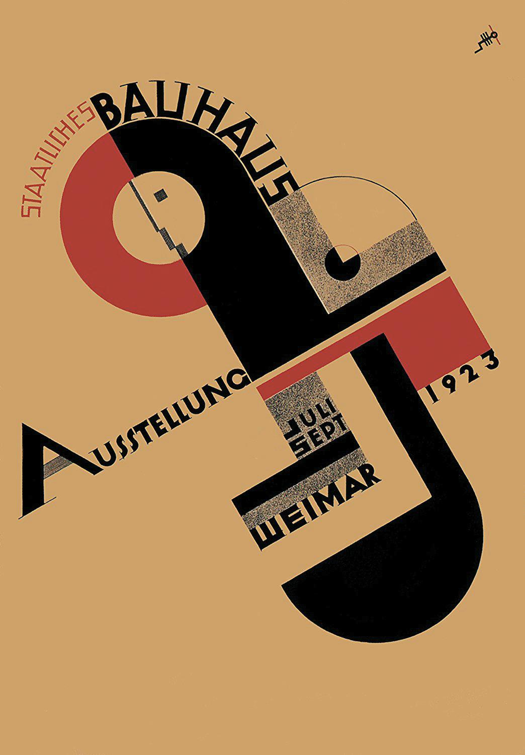
Joost Schmidt / Bauhaus Exhibition Poster / 1923.
The project
The project starts by choosing a graphic art, poster, or print from the Bauhaus movement, then transforming it into a three-dimensional spatial model according to any design principle or method. The poster on the right is what I choose to do the transformation. It is a poster for the first exhibition of the Bauhaus school in 1923, Weimar, designed by Joost Schmidt, a teacher of the school.
The poster is designed to draw the attention of the view’s eyes through a z-shaped movement: from the top left of the title of the school – STAATLICHES BAUHAUS and the school emblem, to the middle word – AUSSTELLUNG meaning an exhibition, and finally to the bottom right information of the month, location, and year of the exhibition. These directions of the sightline are accomplished by the composition of the poster, different eye-attractiveness of the colors, and the arrangement of the shapes and words.
Analyzation
Since the poster is design to direct attention of eyes by the arrangement of different components and colors, the transformation starts by analyzing the eye-catching parts on the poster along with their reasons, and also the relationships between the components drawn by auxiliary lines to point out the coordination in each part.
Eye-catching parts
Different colors indicate different levels of eyeattractiveness:
Red – most attractive.
Green – medially attractive.
Black – baseline.
Gray – detail parts that merged into the closer attractive portion.
Auxiliary lines
Indicating correlational parts. Any changes on them should be coordinated.
Ratios
Revealing the ratio relationship in each part.
The concept
According to the analyzation, I make up a concept of the transformation. It turns the poster into the form that it is observed and noticed with the emphasis on different levels of eye-attractiveness, and the relationship between the components is also considered to make sure it keeps in order and balanced.
The first transformation – from 2D to 3D
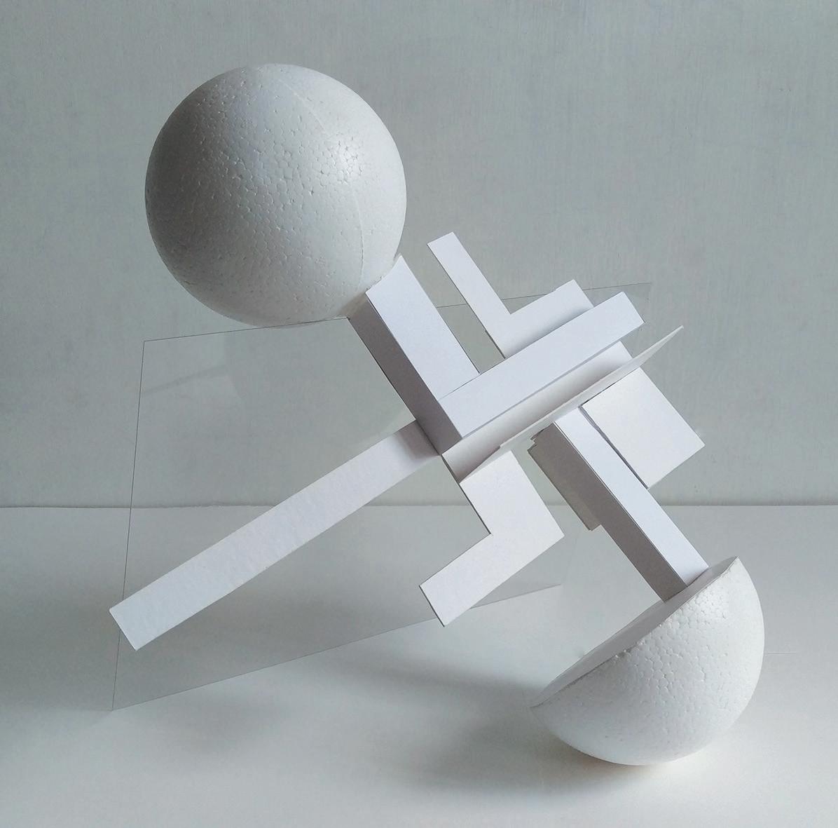
The first stage of the transformation is turning the original poster into a three-dimensional model. The concept form is then transformed from a plane diagram to a spatial model, making the abstractive eye-attractiveness solidify with different rectangular solids, strips, surfaces, spheres, and a cube to demonstrate different levels of intensity.
Unsteady or steady placement
The model is special in the property that it can be placed in either unsteady state or steady state. In the unsteady state, it appears the original look of the poster with a 30° rotating angle from the vertical line, and the whole model tilts backward with another 30° angle with the support of an A4 size transparent plastic plate, forming an unsteady state of balance with the effect of lightness and floating.
In the steady state, the model can be placed steadily in horizontal way with the support of the cube and the pillar on the model, forming another feeling of asymmetrical balance, and it looks like a strange tower or an antenna.

unsteady placement.
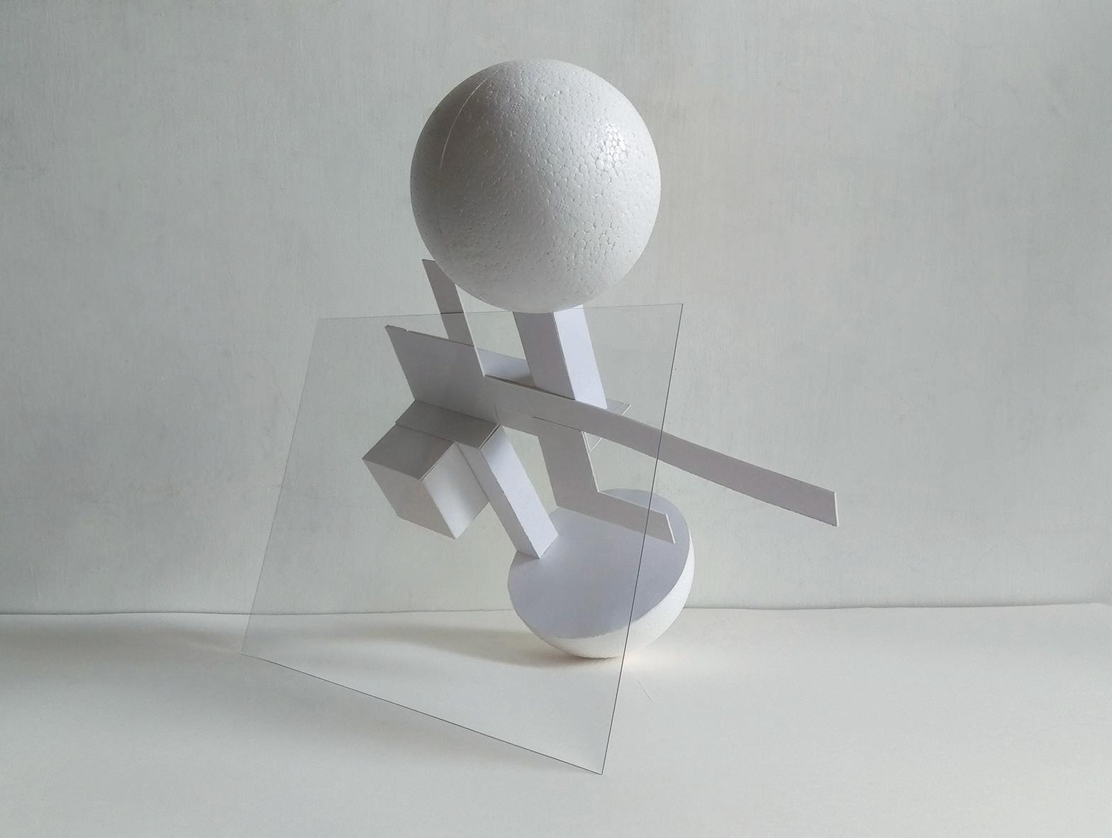
unsteady placement.

unsteady placement.

steady placement.
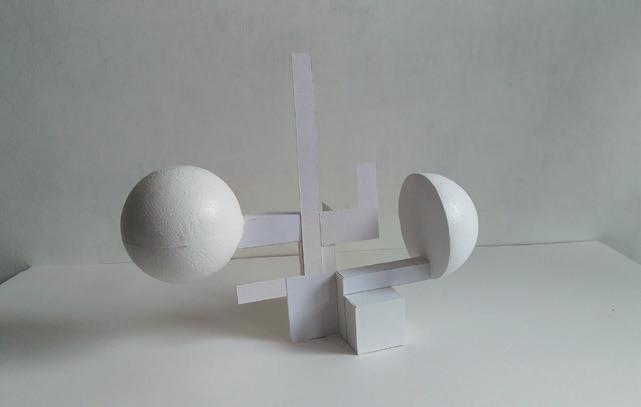
steady placement.
The second transformation – from 3D to 2D
In the second stage of the transformation, the objective is to transform the 3D model into another 2D format of work. Firstly, we have to construct a drawing of the observation of the model with different thickness of lines, and then, representing the drawing into a collage form. And here is my observation of the model below:

In the drawing, it shows the lateral view and frontal view of the model placed in unsteady state. The thickest lines show the solid parts of the model and the thinnest lines point out the relationship between each part.
To bring out a collage from the line drawing, I focus on the constituents that compose the figure. They are basically: circles, L-shaped strips, single strips, squares, and intercrossing lines.
The collage presentation
The collage is composed of the previously analyzed components from the line drawing: circles, L-shaped strips, single strips, squares, and lines. The composition of the collage is based on the rule of the line drawing – rotating 30° to the left from the vertical line, constituted by particular geometric shape components, and composed with strong emphasis on the relationships among each of the components, that means, in each of the components, you can find specific corresponding relationships with the others.
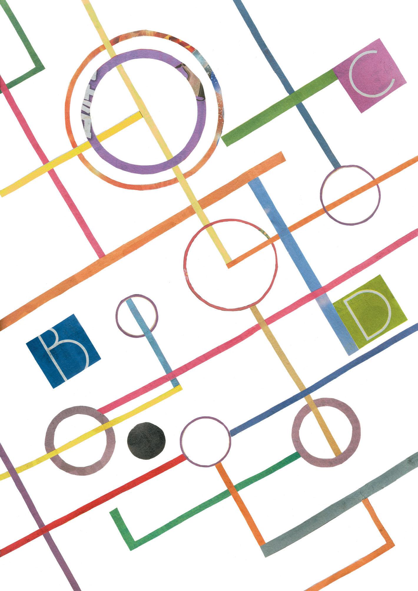
The materials of the collage are wholly clipped from the newspapers on their original appearances; they are separating bars between columns, decorative lines, circular frames around articles and titles, and square labels indicating different pages of the newspapers. It is the multiple lines I can use that I choose the newspapers for my collage materials.
The colors of the components are chosen and arranged by following the guidelines of harmony and colorfulness, distributed as equally as possible by the hues of the three primary colors, bringing some feeling of delight and energy; meanwhile, the tones of the colors are selected to look soft and light, making the overall picture has a feeling of lightness and floating, just like the original model in unsteady state.
Review and comments
This project made in the Fundamentals of Design, NCTU, Spring 2018, is a series of continuous transformation, from transforming the original poster into a 3D model according to eye-catching effect, to transforming it back to a 2D graphic in the form of line drawing, and finally to a collage form by using the composing rules and the constituents of the line drawing.
The transformation method in the start tries to be more systematic and methodical in the approach, rather than doing the transformation by subjective opinions or simply making it associated with something. However, the result it produces, the 3D model, might have an appearance too similar with the original poster; it would look more ideal if it takes on the form more impressive and more creative, and that will change the outcome of the following transformation, too.
Nevertheless, the transformation of the model received an unexpected comment from the instructor, Professor Chang Chi-Yi. He said the model shares a correlative trait with the wiry model in the Project 1, Air and Flow, for they both challenge the state of unsteadiness, displayed in a way out of the frame. That’s an aspect I didn’t notice myself while I just take these the instinctive choices I will adopt. And that’s part of the reason why I set the theme of this portfolio as “Floating Clouds”.
Keep challenging the state of unsteadiness.


