Hojoon Lee
RIBA Part 1 Assistant Portfolio
Architectural Association School of Architecture
2020-2023

The story of the Living Island
Market typologies in Indonesia and site analysis
Mechanism studies from the nature
The Penyu-Pulau: The creature as a metaphore of the narrative
Technical Studies of the Penyu-Pasar
Architectural drawing of the Penyu-Pasar
Home Away from Home: Redefining housing typology for international students
Mapping Kings Cross and mass-modeling
Home Away From Home proposal
Life inside the accomodation
Sunny Side Up: Redesigning the Huguenot House
Survey of Huguneot House and its context
Design through sketches and model-making
Model of the proposal
Sunny Side Up design proposal
The Penyu-Pasar: Floating market island that eases the trilateral tension in North Jakarta Bay 04
Millennium Tower House: Designing a tower house using passive strategies
Millennium Bridge Thames Bay survey
Designing through sketches and mass-modeling
Design of the Tower House and its context
Analysis of the design through diagram and model
01

Floating market island that eases the trilateral tension in North Jakarta Bay
AA School, Year Three, Inter 3, 2022-2023
(Work in Progress)
The Story of Living Island


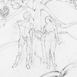
The project started with a simple and intuitive exercise by defining what mythical, synthetic, and digital land is for me through drawing. The drawings were then reinterpreted using Peter Cook’s drawings as references. Studying the anatomy of creatures in my drawing helped me to push my idea of mythical land into an architectural language.


Market Typologies in Jakarta and Site Analysis


The site I focused on was North Jakarta Bay. It was a site where there was a trilateral tension between the native local village, an ancient mangrove forest, and a new land reclaimed commercial district. The local village: Kampung was a fishermen’s village- having the capability to produce but lacked in platform to sell. Whereas The new commercial district: Cove at Batavia, PIK had the platform to sell but lacked in social sustainability and culture. I believed that the tension could be eased with what interested me the most during the trip to Indonesia: markets. Markets not only acted as a space to sell goods and earn profit but were a place where you exchange culture, human resources, knowledge, and more. By bridging the two, the site could become a dynamic culture.


Markets in Indonesia 1 - Kampung night fish market .01 Markets in Indonesia 2 - Pasar Muara Karang .02 Markets in Indonesia 3 - Cove at Batavia, PIK .03 Markets in Indonesia 4 - Grand Indonesia Mall .04 Mapping of the North Jakarta Bay .05 Kampung -Fishermen’s Village .06 Cove at Batavia, PIK .07 Mangrove Aquafarming Ponds .08 Mangrove Preservation Forest.09 Chunk Model of the Site .10


Sea Turtle’s Flipper Movement Mechanism Study


From the narrative of a living island, I was intrigued by the notion of movement, especially the movement of the sea turtle’s flipper. So I wanted to mimic the motion and make it work. I went through a series of model-making and diagram drawings starting by making a simple up-and-down flap. The model soon evolved forward to making the circular swing of the flipper. One important study during the process was to study the joints. The Laser cut universal joints had a few problems of being heavy and being less flexibility. Soon I moved on to 3D-printed ball joints which were lighter and more flexible.
Iterations of the Flipper Movement Test Model .01

Drawings of the Flipper Movement Test Model .02
Anatomy of Sea Turtle’s Flipper .03
Universal Joint Made from Lazercut .04
Universal Joint Diagram .05

Ball Joint Made from 3D Print .06

Ball Joint Diagram .07


Turtle’s Neck Extrusion Movement Mechanism Study

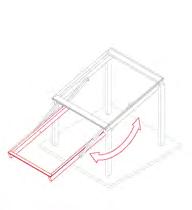
Another aspect that I studied in depth was the extrusion motion of the turtle’s neck. There were two methods to mimic the motion, one was to use a rail to extrude and another was to swing forward. This study was then pushed forward and adapted to the mechanisms of the extruding roof panels in the design.

Iterations of the Opening Movement Test Model .01

Drawings of the Opening Movement Test Model .02


Anatomy of Turtle’s Neck Movement .03
Sliding Extension Mechanism Test Model .04

Sliding Extension Mechanism Diagram .05
Swinging Extension Mechanism Test Model .06


Swinging Extension Mechanism Diagram .07


Architectural Drawings of the Penyu-Pasar
The drawings show when the vessel is docked to the PIK district and the market is held. The roofs open up and extrude, not only protecting the users from sunray but forming a new spatial relationship with the site. The architecture has three floors in total, the basement is used as a storage or technical facility room. the ground floor is where the main activity takes place. The first floor is a semi-private space for the sellers to rest. Additionally, food and grocery kiosks are pulled out and a temporary street market is made at the coast.


The site is a communal garden called the Story Garden located behind the British Library. The site was an intersection of the three major train stations and two large international universities. With this context, I have decided to propose student accommodation for the near by universities. Because Somerstown was a vulnerable and fragile site, I decided to hide the volume of the building below ground and open up the rest of the space to the public.


Life Inside the Accomodation
The communal kitchen is the key of the proposal where it acts as the heart of community and social gathering space. Students will come by day and night to eat and will inevitably meet each other. by doing so, they will cook together and dine together forming a sense of ownership and belonging. Each unit is double floored, allowing more aerial space and sunlight. The hexagonal layouts allow multi-scales of communal spaces design to bring in a sense of belonging.


Plan


Survey of Huguneot House and Its Context


The project started by visiting the site in Leicester Square. My first impression of the building was that it was in bad condition and was neglected without care for a long time. We decided that despite that the building was in poor shape, we should keep the residential block of the building. Also, because the building’s square was dark and spooky compared to the neighbors, we decided to brighten up the area as well.


Design Through Sketches and Model-Making


The intuitive response after visiting the site was to redesign the building so that it acted as a space where it could attract people. To accomplish this, the team wanted to design an eye-catching facade that illuminated during the night. Spatial-function-wise, we transformed the parking lot into an amphitheater where cultural events could be held or even used as a public space.


Sunny Side Up Design Proposal
The proposal is a multi-complex building with a textile facade that dances along the wind, catching visitors’ attention. The ground floor is an open plaza where people can freely hang out. The two ramps at the ends lead the visitors to the amphitheater at the back. Here diverse cultural activities such as music festivals for Friday movie nights are held. The top remains a residential block, redesigned from the original Huguenot House.
Design within the Context .01
Plan Drawing of the Restaurant .02

Plan Drawing of the Bar .03
Plan Drawing of the Residential .04 Exploded Isometric of the Final Design .05


Designing

Millennium Bridge Thames Bay Survey Designing Through Sketches and Mass-Modeling


The most outstanding characteristic besides the tide was that the riverbank was composed of diverse materials from soft sand to pebbles, terracotta pieces, and concrete. Also, the beachside constantly changed its form from the waves and tides. Taking these characteristics into account, we decided our third material to be concrete - A material strong enough to stand against the waves and at the same time be made from what was already existing at the site.

Map of the Site .01

Material Palette of the Site .02


Site Photo When Hight Tide.03
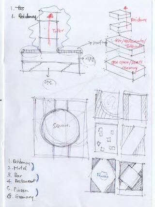
Thinking and making design decisions through multiple hand drawings was a crucial step in designing the tower house. I started with using simple geometries and diagrams which developed into designing more complicated structures and movements throughout the vertical space. I have also cast concrete blocks to experiment with the limitation of the cantilevered decks to what degree they could be extruded.
Sketches for the Design .01
Sketches of floor Planning .02

Section Sketches of the House - Minimum Extrusion .03


Section Sketches of the House - Maximum Extrusion.04
Massing with Concrete Blocks - Minimum Extrusion .05


Massing with Concrete Blocks - Maximum Extrusion .06

Design of the Tower House and Its Context


The final design was a five levels-high tower house sitting on the beach of the Thames River next to the Millennium Bridge. The floor on the ground level functions as a living space. Above is the kitchen and then a working space, where a bridge is connected to the land. On the fourth floor is a toilet and a bedroom at the very top. The two bottom floors submerge underwater when high tide and come back above water on low tide. Because the lower floors are continuously in touch with the waves, the walls are made from concrete, resembling the form of a tetrapod.


Analysis of the Design through Diagram and Model
The exploded isometric drawing shows the structural aspect of the design. Glulam beams were the primary material used for the structure including the beam grid for resisting the load of the floors above. Repurposed plastic sheets were then used as claddings for the exterior finishes to control the amount of light coming into the building.

Exploded iso of first and second floor .01
Overall photo of the second floor model .02

Interior view of the second floor model .03


Top view of the second floor model .04

Overall photo of the second floor model-2 .05
Overall photo of the second floor model-3 .06
