
9 minute read
Maya Making of Cheese Platter
from oct-
by Hiba Dweib
Wrapping & Animating Grass around objects
Making of Cheese Platter
Advertisement
by Hau Ming (Jamie) Li, USA tvholicjames@gmail.com

Introduction
Hi, my name is Hau Ming (Jamie) Li and this will be my first tutorial so I will try to explain how I did this Cheese Platter the best that I can.
I created this Cheese Platter using Autodesk Maya 8.5 and Adobe Photoshop. It is actually a photo concept derived partially from the image on right.
Originally, I was told to create this based on the original reference, but I feel the point of Shading and Lighting is to show off your texturing skills and give it better lighting if possible. As you can see, the lights are overblown in the original picture. So I added more stuff like blue cheese, cheese cubes, brie cheese, almonds and crackers to make it busier and at the same time, make it look like a painting.

References
It is always good to have more than one reference to look at when modeling and texturing. Try to find ones that you can purchase and have it in front of your face when modeling and texturing. This is because the pictures you grab online can have bad lighting, be pixilated, or not contain enough details.
Here are some of the references I used.

Modeling
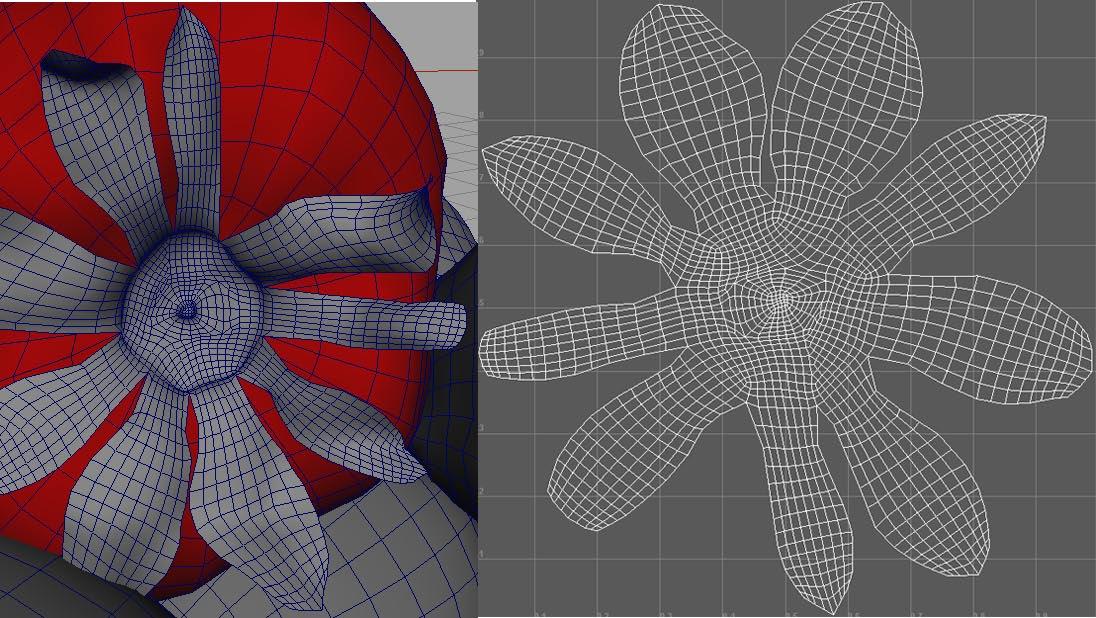
For the strawberries, I modeled one in NURBS and converted it to Polygons. I checked the normals and then reversed the normals (very important, but I will explain later), then UV mapped it.

For the strawberry leaves, I used Polygon planes and the append tool. I shaped it with a lattice, and then UV mapped it.
For the bowl, I used a NURBS CV curve, revolved it, and then used the rebuild command on the surface.
For the crackers, I modeled it in Polygons and extruded. I modeled only one side, not two because you are not going to see it.
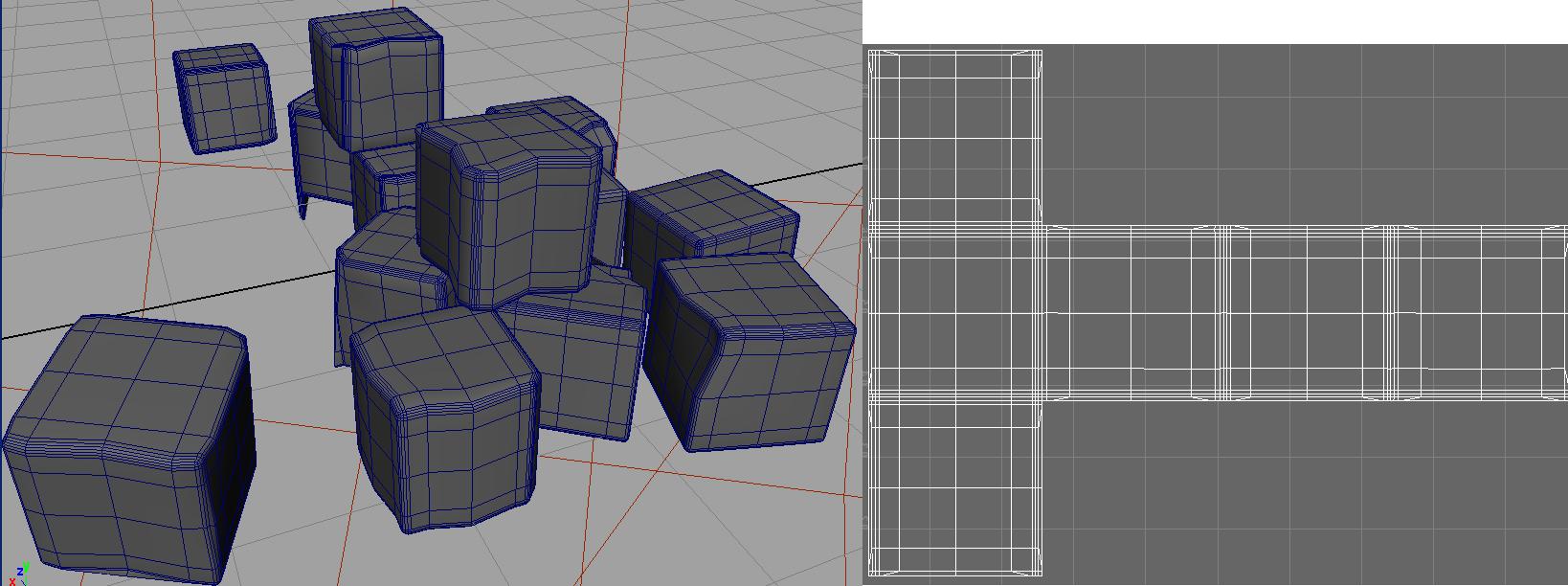
For the cheese cubes, I basically modeled one good one in Polygon with rounded edges, and UV mapped it. Then I duplicated and shaped them with a lattice individually to make them look less uniform and less perfect. Then when I placed them, I rotate each cube so the camera can see one side of the textures. This will save you time instead of modeling, uv mapping and texturing them individually.


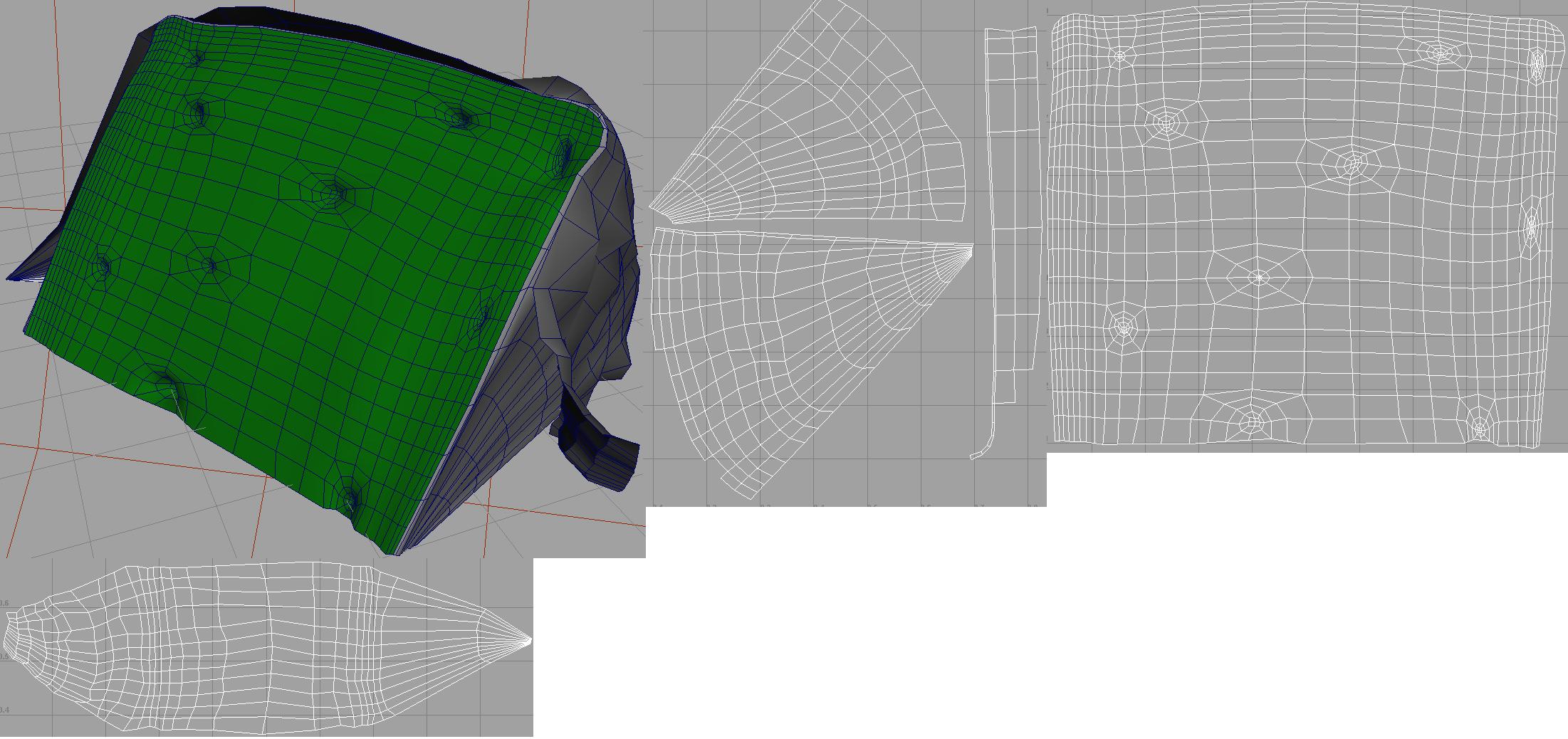
For the blue cheese, I used a Polygon cube, shaped it, and then extracted the Polygons to separate the skin and the cheese. I duplicated the skin to make the wrapper. I deleted the Polygons at the back of the cheese skin because you are not going to see it. I used a lattice to bend and shape the wrapper.
For the almonds, I used a NURBS sphere, converted it to polygons, reversed normals, and UV mapped it.
For the Brie cheese, I used NURBS CV curves, which I lofted, and then shaped them by pulling the vertices. I converted the surfaces to Polygons and UV mapped them.


Subsurface Scattering
For an organic character, the conversion scale will generally remain small. However, the fruits and cheese have translucencies which are a lot higher. Therefore, there will be more noise to balance out, which means higher values for the scale conversion.
However, there is more than one way to balance the noise without having such insane numbers for the scale conversion. You can play with the numbers of the samples of the lightmap in addition to the minimal numbers of the scale conversion.
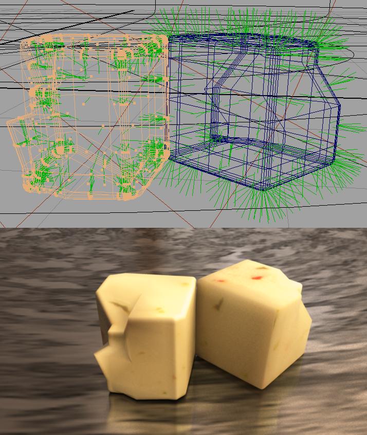
The reason why I said it is important to check your normals earlier, was because NURBS have a tendency to have normals facing inwards. If the normals are facing in, light cannot scatter throughout the object and you would not be able to see the real details of the texture maps. Notice in the left picture below, the cheese cube looks dry and you can barely see the textures, even with a specular map, versus the picture on the right, in which the cheese cube looks more detailed, wet and translucent.
For all the cheeses and strawberries, I used the Maya’s Skin Shader instead of the simple fast shader because of the control for the specularity and reflectivity attributes.
Overall is a tint.
Diffuse and Epidermal attributes multiply each other.
Subdermal and Back Scatter attributes are where you control how translucent you want your object to be. I found it is mostly the Subdermal weight that you have to play with to get an object more translucent.
Primary specularity is where I put the specular map I created using different size brushes, and then tinted it very light blue in the color gain of the strawberry primary specularity.
Secondary specularity is where I put a black and white noise map to break the highlight of the strawberries.

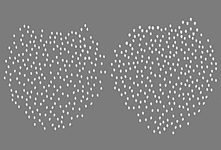
Since people kept asking me about the strawberries, I’ll tell you how I did it in Photoshop. For the Color Map of the strawberries, I cropped a good looking seed, individually place them on the UV layout for the imperfections, then I duplicated the jpeg seeds several times and merged visible. I did that so the seeds won’t have that pixilated look from the jpegs that I got on the internet. Next I used the brightness and contrast from Photoshop and beveled them so the seeds can have that curvy popped out look without using geometries. For the base color, I sampled the redness of one of the photos, added noise and gaussium blur. Next, I painted the rawness of the strawberry’s white and green color, blurred and blended in Photoshop. For the Bump Map, I duplicated the seed layer, inverted it to have the bump up look, then I duplicated again and turned them into black and gaussium blurred it and put that layer under the white bump up layer. This will give the look of the dentedness with the seeds popped out. For the Primary Specular Map, I used different size brushes and randomly paint it onto the UV layout. As for the Secondary Specular Map, I used a noise filter, played around with the level, brightness and contrast, duplicated the layers several times, merged the layers. This is important, because Maya can’t seem to be able to show the white specs of the noise in the attribute editor when I plugged it into the Secondary Specular Color. So what I did was to bring more of the whiteness out in the noise map so I can see it in the attribute editor. Here are the maps of the strawberries and the Skin Shader attribute:


For the strawberry leaves, I used an Anisotropic Material and manipulated the sliders of translucency attributes.
For the crackers and almonds, I used a Phong.
Color Map Specular Map Bump Map

Color Map Bump Map Specular Map
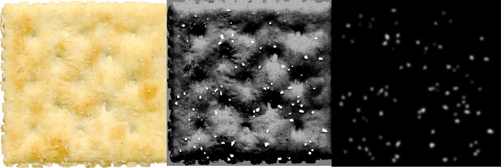
Color Map Specular Map Bump Map

For all the cheeses, I used a skin shader.
Blue Cheese Interior
For the Blue Cheese Skin, I used a Lambert, and played around with the translucent values. Same thing for the brie cheeses.
For the wrapper, I used a two-sided shader and plugged in the front and back color map.
For the tray, I used a metal texture from www.cgtextures.com and plugged it into the diffuse and reflectivity attribute of the MIA material.

Diffuse, Epidermal, Subdermal and Back Scatter Color Map Bump Map Primary Specular Map Secondary Specular Map


Diffuse and Subdermal Epidermal and Back Scatter Color Map Primary Specular Map Bump Map Secondary Specular Map


Diffuse, Epidermal, Subdermal and Back Scatter Color Primary Specular Color Bump Map
Lighting
HDRI, 1 Area Light, emit photons with a yellow and orange color for the photon color and light color. If you want to show emotions and make it appetizing, don’t use white light. Render with Global Illumination, Caustics and Raytracing on.
The more translucent an object is, the more you will lose the shadows to show depth. But don’t let that frustrate you; as this is where post production work with an occlusion pass comes in.

Post Production
Do NOT use the default Occlusion presets. The shadows are way too dark, and it looks horrible. You want to be able to control how dark the shadows are.
Use the MIB-Occlusion node in Maya 8.5 and change the black color to dark gray, and play with the sliders. I used 2 MIB-Occlusion nodes for the scene.
Now render the color and occlusion separately and bring them into Photoshop. Duplicate the color file and put the occlusion pass in the center. Use Multiply or Overlay for the Occlusion. Play around with the opacity. For the Color on top, use a little Gaussian Blur and screen the top color file.
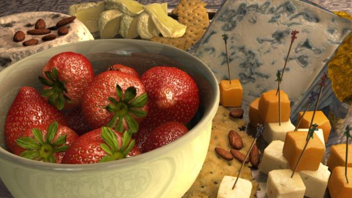

A little warning about using the skin shader and rendering with Mental Ray: If your scene has 90% skin shaders like mine, it gets pretty expensive to render even with a core 2 duo processor. This present scene takes a bit over an hour to render a frame with the school’s computer and their computers are way better than mine. Good luck!

Hau Ming (Jamie) Li
www.haumingli.com tvholicjames@gmail.com


