HOME NZ June / July 2014

Page 1

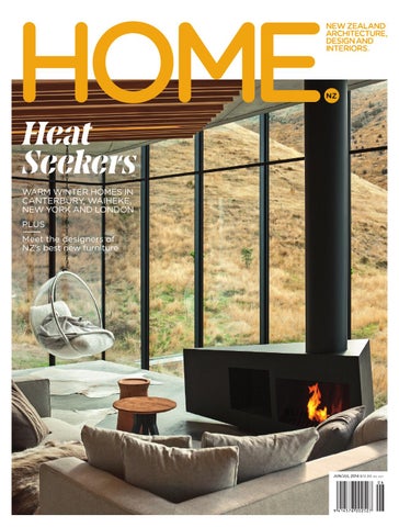
Heat Seekers warm winter homes in Canterbury, Waiheke, New York and London PLUS Meet the designers of NZ’s best new furniture

jun/jul 2014 $10.90 inc gst

the of living

Biophilia collection explores a new design language that forms a dialogue between time, form and space... This collection pushes the boundaries between material structure and form, into a new modern territory, as yet unseen, parametrically conceived and diametrically apposed to modernism in it expression. - Ross Lovegrove

Biophilia collection designed by Ross Lovegrove for VONDOM

www.matisse.co.nz KITCHENS, BATHROOMS, LIGHTING, FLOORING AND RESIDENTIAL FURNITURE, AUCKLAND - 99 The Strand, Parnell T 09 302 2284 - E design@matisse.co.nz


CHRISTCHURCH - 134 Victoria Street T 03 366 0623 QUEENSTOWN - 179/A Glenda Dr. T 03 409 0855

where design becomes art


Inspired by Design Proud sponsors of Home of the Year 2014

ALTHERM™ carries the APL quality assurance commitment


Architect: McCoy + Heine Architects. Builder: Percival Construction Ltd.

A LTHERM . CO. N Z

facebook.com/AlthermWindows


BMW 4 Series Gran Coupé

www.bmw.co.nz

FLY THE COUPÉ. The coupé has evolved. Introducing the BMW 4 Series Gran Coupé - the embodiment of performance and space. The design of this Ultimate Driving Machine escapes convention and demands redefinition of the term, coupé. Four doors, sleek lines and assertive styling surround an expansive interior, all within the proven proportions of the two-door coupé chassis. Powerful, agile, and practical, now nothing can stop you experiencing the uncompromised thrill of the coupé.

BMW BMW0 M 0920 2 PRES 2ESS-HO SS-HO S M

THE FIRST-EVER BMW 4 SERIES GRAN COUPÉ.


THE WINTER ISSUE 66.

80.

92.

104.

118.

OUT HERE, ALONE

PREFABULOUS

AWAY FROM HOME

ANGLE POISE

MODERNIST MAGIC

A small, jewel-like retreat by Pattersons on Banks Peninsula

New Zealand expat Debbi Gibbs' prefab New Jersey lake house

New Zealand interior designer Christopher Hall's London flat

An inventive Waiheke Island family home by Michael O'Sullivan

A Christchurch midcentury masterpiece by Warren & Mahoney

contents


Looking out from the mezzanine floor of a playhouse designed by architect Mark Lithgow for his sons. For more, see p.19.

Photography / Simon Devitt

28. FLYING HIGH

The design duo behind Paper Plane in Mt Maunganui 30. MEISTER PLAN

44. CONTINENTAL MODERN

ART & DESIGN

Auckland-based cabinetmaker Tim Laing

Mid-century European homes under the lens

19. SCALING DOWN

32. HARD CRAFT

An architect designs a playhouse for his sons

A Wellington jewellery designer goes global

Our correspondents report from Milan Design Week

23. DESIGN FINDS

35. SIDEKICKS

53. DESIGN AWARDS

New design items worth having

The best side tables shine in the spotlight

Our annual showcase of New Zealand's best new lighting and furniture

40. fully fuelled

The understated refit of Auckland's Engine Room bistro

8 / HOME NEW ZEALAND

48. milan reports

EXTRAS 129. KITCHEN designs

Architects and designers on new kitchen innovations 141. SUBSCRIbe to home

Subscribe and save 146. MY FAVOURITE BUILDING

Elizabeth Caldwell on a Wellington Art Deco treasure


Blum showrooms 621 Rosebank Rd, Avondale, Auckland 27 Dalziel Place, Woolston, Christchurch

Your Kitchen sorted with Blum Tailored to suit your personal storage requirements. ORGALINE is purposed speciďŹ cally for drawers, as Blum recognises this is the most ergonomic and functional way to store and access goods. Organisation made easy, Organisation made just for you.

www.blum.com/ideas

Top Left: Spice Holders, Top Right: Bottle Store with chopping boards, Above: Cutlery insert


Architecture Elegance Luxury Modern Style

Andersen has established itself as Minotti’s top seller so it’s great to see the addition of this stunning Andersen Quilt sofa. Like its predecessor it has the qualities of restrained elegance which infuse a room with modern minimal-chic sophistication.

deliberately more classic flavour. Its base hovers just off the floor, offering clean, uncluttered lines.

In the new version the unique seat, enhanced with a lightly quilted motif, gives the Andersen Quilt a

Mike Thorburn Managing Director, ECC

Andersen Quilt is available in a range of fabric or leather upholstery from the Minotti range. Come and see it in our Auckland showroom soon.


Since 1909

www.ecc.co.nz

Auckland Wellington Christchurch Sydney Melbourne Brisbane Milano


NEW LIGHTING COLLECTIONS “In the right light, at the right time, everything is extraordinary.” – Aaron Rose

Auckland: 19 Earle St, Parnell, Auckland t: 09 309 0500 e: auckland@backhousenz.com Wellington: 12 Kaiwharawhara Rd, Wellington t: 04 499 8847 e: wellington@backhousenz.com

backhousenz.com


Photography / Jeremy Toth

Get the latest online homenewzealand.blogspot.com @homenewzealand @_jeremyhansen facebook.com/home.nz.mag instagram.com/homenewzealand

editor’s letter

104

92

53

66

The topic of isolation haunts many conversations about this country, but this issue of the magazine feels like another nail in the coffin of the notion of it being a bad thing. Look, for example, at the finalists in our annual Design Awards for New Zealand's best furniture and lighting (p.53). This year we're delighted to welcome Fisher & Paykel as our Design Awards partner, a company that has already proven that geographic isolation is only a state of mind. Indeed, constraints are what fuel good design; in this case, the need to easily reach export markets means our finalists share a lean elegance that only enhances their appeal. Many designers are already succeeding in markets abroad: Cheshire Architects' winning 'Parison' pendant and Simon James' 'Pick Up Sticks' chair both debuted at Milan Design Week in April as part of the Resident collection and immediately garnered international coverage. We're proud to feature them and the work of all the other finalists in this issue. The theme of distance pervades other parts of this issue. We connect with two New Zealand expats who have forged careers in faraway places: interior and furniture designer Christopher Hall – who left Christchurch just after finishing high school and now divides his time between major commissions in Istanbul, London and Riyadh (p.92) – and New York-based music manager Debbi Gibbs, who says she might not have stayed in Manhattan if not for her innovative prefab lakeside escape in New Jersey (p.80). We also feature a warm, inventive home by Michael O'Sullivan on Waiheke Island (p.104) where expat Englishman Richard Beniston has settled with his wife and family. And if you need any further evidence that isolation can be a very good thing, look no further than the remarkable home by Pattersons in a Banks Peninsula bay (on our cover and on p.66): it is a crystalclear representation of the beauty of being as far away from everything as you can get. Jeremy Hansen, Editor

Our August/September issue (which will be on newsstands on August 4) is our regular examination of the connections between fashion and architecture, and this year we've recruited someone very special to help out: fashion designer Karen Walker is stepping in as the issue's guest editor. She's already been working her international contacts so we can introduce you to them and their unique homes (we've commissioned shoots in New York, Sydney and Geneva for this issue, with more to come). We're working with the theme 'Global Villages' and the idea that, as international travel becomes more common and modern life more frenetic, we increasingly crave the intimacy of the neighbourhoods we live in. Which, when you think about it, is an interesting companion to the themes of isolation and distance woven into this issue.

HOME NEW ZEALAND / 13


Our Design Awards finalists, from left: Nat Cheshire, Nathan Goldsworthy, Tim Webber, Simon James, Nigel Groom, Emma Fox-Derwin and Timothy John. Photographed on May 7 by Toaki Okano at Auckland’s White Studios. More on p.53.

Editor Jeremy Hansen

Art Director Arch MacDonnell Inhouse Design Senior Designer Sarah Gladwell Inhouse Design Senior Stylist/Designer Kendyl Middelbeek Stylist/Designer Samantha Totty

On our cover, a photograph by Simon Devitt of a home on Banks Peninsula by Pattersons. For more, see p.66.

Designer Oliver Worsfold Inhouse Design Editorial Assistant Fiona Williams

Contributors Jo Bates Simon Farrell-Green Gemma Gracewood Amelia Holmes Katie Lockhart Henry Oliver Lara Strongman

Chief Executive Officer Paul Dykzeul

Photographers Emily Andrews Simon Devitt Samuel Hartnett Duncan Innes Russell Kleyn Toaki Okano Patrick Reynolds David Straight Wayne Tait

Commercial Sales Manager Liezl Hipkins-Stear lhipkins@bauermedia.co.nz +64 9 308 2873

Publisher Lisa Ralph Commercial Director Paul Gardiner Group Sales & Marketing Manager Amber Ardern

Classified Advertising Kim Chapman classifieds@xtra.co.nz +64 7 578 3646 Brand Manager Ingrid Frisk ifrisk@bauermedia.co.nz +64 9 308 2844 Events and Sponsorship Manager Jessica Allan Financial Business Analyst Ferozza Patel Group Production Manager Lisa Sloane Production Co-ordinator Clare Pike

Editorial Office Bauer Media Group Shed 12, City Works Depot 90 Wellesley St Auckland New Zealand homenewzealand@ bauermedia.co.nz +64 9 308 2739 Postal address HOME New Zealand Bauer Media Group Private Bag 92512 Wellesley Street Auckland 1141 New Zealand

Subscription Enquiries www.magshop.co.nz 0800 MAGSHOP or 0800 624 746 magshop@magshop.co.nz +64 9 308 2721 (tel) +64 9 308 2769 (fax) Bulk/Corporate Subscriptions corporates@magshop.co.nz +64 9 308 2700

Advertising Auckland Liezl Hipkins-Stear lhipkins@bauermedia.co.nz +64 9 308 2873 Sydney Massey Archibald marchibald@ bauer-media.com.au +61 2 8268 6273 Printer Webstar Distributor Netlink Distribution Company

HOME New Zealand is subject to copyright in its entirety and the contents may not be reproduced in any form, either in whole or in part, without written permission of the publisher. All rights reserved in material accepted for publication, unless initially specified otherwise. All letters and other material forwarded to the magazine will be assumed intended for publication unless clearly labelled “not for publication”. We welcome submissions of homes that architects or owners would like to be considered for publication. Opinions expressed in HOME New Zealand are those of the contributors and not necessarily those of Bauer Media Group. No responsibility is accepted for unsolicited material. ABC average net circulation, 12 months to September 2013: 12,232 copies ISSN 1178-4148


ASB4051/HOME/R

What do you give the person who has everything? An ASB Private Banker.

ASB Private Banking. When you have significant assets and high income, it pays to consider ASB Private Banking. Like your accountant or solicitor, your ASB Private Banker is an expert in their field, who will personally ensure you maximise the considerable financial benefits available to you at ASB. To arrange a confidential discussion email private.bank@asb.co.nz

Succeed on.

asb.co.nz/privatebanking

ASB Bank Limited


contributors SAMANTHA TOTTY

KENDYL MIDDELBEEK

HENRY OLIVER

You’re new at the magazine, and you worked on two big shoots for this issue. What have been the most memorable experiences for you so far? Yes I’m the newbie and I love it. Meeting the finalists at the Design Awards shoot was a pretty special moment. The amount of creative talent in the studio that day was ridiculous. I had the honour and privilege to style products that were created by designers I admire most. It was a crazy, frantic, overwhelming but totally amazing day.

You’ve styled two major shoots in this issue. Can you tell us a little bit about your approach to each? With most shoots for HOME, I tend to start with colour and context. What kind of set am I going to create for the items to live in, and what kind of colour palettes do I want to experiment with? Having such strong colour choices in the side tables feature (p.35) provided a good foil for what tends to be the very neutral-toned furniture market in New Zealand. Once you throw in a few key coloured pieces it starts to come together, with a generous splashing of genius from [photographer] Toaki. You always gain more clarity on the shoot day, so I try to keep some flexibility and let it develop organically. For our Design Awards feature, the entries needed to be the heroes, and I knew I was going to have a fairly monochromatic palette to work around. I wanted to add touches of domesticity, like the slippers and the ceramic watering can, to contrast against what is clearly a photographic studio environment, which can be fairly stark.

This is your first piece for HOME. What led to your interest in architecture, and how did you enjoy visiting the home? I became interested in architecture by travelling and being more conscious of my environment. I actually considered becoming an architect in my mid20s but chose poorly and became a lawyer instead. Now I’m a writer with an interest in architecture. Visiting the home was inspiring. It was great to have a space explained to you in detail and see the family interact within it. The house worked exactly as it was meant to.

Our new designer and stylist worked on our Design Awards shoot (p.53) and our feature on side tables (p.35).

You worked closely with Kendyl in styling the Design Awards shoot. Which pieces of furniture from among the finalists have you got your eye on? It’s too hard to choose, so can I take all of them? But my favourite would have to be Simon James’ ‘Pick up Sticks’ chair. The design is calming, well-crafted, versatile and refined. It’s also available in a beautiful tangerine colour that makes my heart skip a beat. Which home in this issue would you most like to spend time in, and why? I’m in awe of the Banks Peninsula home designed by Andrew Patterson. The building is small and intimate and complements the surrounding landscape so magically. I love the blend of earthy textures - the stone, concrete, wood, water and rustic grass. Pure bliss!

Our senior stylist and designer styled our side tables shoot (p.35) and our feature on our Design Awards finalists (p.53).

You also wrangled our Design Awards finalists to gather at White Studios for our group portrait. Any tales of diva tantrums, petty rivalries and breathtaking snubs to report? They were all great and came to the shoot on pretty short notice. We also appreciated the very high standard of their personal styles! They were great subjects – this industry is too small and hardworking for any design divas to survive.

The writer visited the home designed by architect Michael O’Sullivan on Waiheke Island (p.104).

If you were to have your own place designed, what would you ask your architect for? This is something my wife and I discuss often. I’m usually at one of two extremes: I’d either want something super-minimal, clean and functional or something wild, sculptural and uncompromising. I like the idea of having something designed especially to cater to our lifestyle and aesthetic, or just handing the reins over to someone who would do something I couldn’t conceive of. There’s a reason they (whoever they are) are an architect and I’m not. Which architects, living or late, interest you the most? I like the Soviet Brutalists, Buckminster Fuller, Atelier Bow-Wow, Fujiwaramuro Architects and whoever designed the abandoned, overgrown, modernist house on William Denny Avenue in Westmere, Auckland. I’m also really interested in how young New Zealand architects are reacting to our current housing issues, people like Wellington’s Patch Work Architecture who are finding ingenious, economic solutions in a difficult real estate climate.


COLENSO0084

890 litres of storage, individually temperature controlled drawers, and a 10 year warranty. If that isn’t enough to whet your appetite, maybe you need some chilled water from the in-door dispenser. How do you like yours, still or sparkling? See our full range at Samsung.com/nz


Below The timber structure, clad with polycarbonate and plywood, makes for a robust, safe playhouse.

Scaling Down

design

D:01

PHOTOGRAPHY / Simon Devitt

Auckland architect Marc Lithgow designs a pint-sized playhouse for his young sons.

You designed this playhouse for your own kids. What got the project started? MARC LITHGOW, SPACE DIVISION It was conceived more as a kids’ space than a playhouse and possibly born of only having a modest house and two “dynamic” boys: our eldest is four and his brother is one-and-a-half. Commercial options were a little too themed. I wanted to offer the boys something that allowed them to create what happens in it. One minute it’s a shop, the next it’s a farmhouse – whatever they want it to be. It’s weathertight so they can keep a few things in it, and big enough to invite adults if they want to. It was about creating a space they see as their own to use and have responsibility for.

What was the design process like? Where did you draw inspiration from? I used their building blocks, which they spend hours with, as inspiration: the elements of the building are stacked blocks of solids and light, using a defined module of framing and cladding to create the blocking. There was a bit of investigation – watching them climb and move through things in order to get the scale and dimensions right. I found they were comfortable climbing a lot higher than I thought! In future I can add or remove from it as they change, and it’s also of a scale that they won’t be too tall for it too soon, and if they decide it’s not for them, I’d be happy with it for a shed.

text / Jeremy Hansen

HOME

HOME NEW ZEALAND / 19


Left Lit from within, the polycarbonate cladding emits a soft glow.

Top The lookout from the mezzanine is an ideal vantage point to watch for advancing enemies or adults.

Top right Architect Marc Lithgow reckons the playhouse will make a fine shed if his sons lose interest in it.

Above left The chalkboard painted walls allow the kids to scribble and scrawl on the interior as they wish.

What is it made of? It is timber framed, with polycarbonate and plywood panel cladding and a polycarbonate roof. The interior has been painted with a chalkboard paint – the kids can draw on anything that’s solid inside. The polycarbonate creates a soft light inside, and it’s interesting to observe how the light moves on it during the day. The materials are robust and safe, and it’s easy to clean. How do the kids enjoy having a space of their own to use, and how do they use it? Day-to-day they will use it if we are out in the garden, and often disappear into it. When we had a get-together over summer,

Above The playhouse has a mezzanine floor where the boys often retreat to take time out on their own.

Above right Lithgow used his sons' favourite toys, their building blocks, as design inspiration.

there were a lot of people here and I noticed I hadn’t seen our eldest around. He was camped out in the hut, away from the crowds on the mezzanine level! He also has been known to ask to be set up out there when he’s sick, with the portable DVD player, pillow and blanket during the day. Kids love it, and you can fit more of them in there than you would think – the most so far is six three-yearold boys. So they’re using it, and enjoying it. It’s a space they view as their own.

spacedivision.com

HOME NEW ZEALAND / 21


3

1

2

4

5

D:02

surprise, surprise

Elements of the unexpected in artful design discoveries. 6

8

1 / 'Super' sign, $55 from Flotsam & Jetsam, flotsamandjetsam.co.nz 2 /

7

10

9

'Loop' chair by Willy Guhl for Eternit, $2000 from The Vitrine, inthevitrine.com

3 / Enamel cups, $10 each from Flotsam & Jetsam, flotsamandjetsam.co.nz 4 / Herbivore Botanicals aftershave, $29.90 from The Tonic Room, thetonicroom.co.nz 5 / ‘Hinge’ coffee

table by Junya Ishigami for Living Divani, $3,590 from Studio Italia, studioitalia.co.nz 6 / ‘Mr Chain Mail' backpack, $590, and fur accessories by Mr Lure, $89 each, from Deadly Ponies, nz.deadlyponies.com 7 / 'Bloom' chair by Piergiorgio Cazzaniga for Living Divani, $5,300 from Studio Italia, studioitalia.co.nz 8 / ‘Fuzzyvibes Inside’ large sculpture by Cushla Donaldson, $3500 from Fuzzyvibes, fuzzyvibes.com 9 / ‘Frisbee’ bin by Frédéric Périgot, $610 from Everyday Needs, everyday-needs.com 10 / 'Yo-ga' document holder by Raf Simons, $1100 from Zambesi, zambesi.co.nz. Edited by Amelia Holmes.

HOME NEW ZEALAND / 23


1

2

3

4

D:03

5

pride of place

Beautiful pieces get the attention they deserve.

6

8

7

9

10

1 / Folded metal bookends from Everyday Needs, $65 from Everyday Needs, everyday-needs.com 2 / ‘Copenhague CPH110' table by Ronan & Erwan Bouroullec for Hay, $5253.20

from Corporate Culture, corporateculture.co.nz 3 / ‘Raining Offies’ artwork by Matt Arbuckle, $950 from Tim Melville, timmelville.com 4 / Knob by Tom Dixon, $195.95 from ECC, ecc.co.nz 5 / Double chain bracelet by Raf Simons, $560 from Zambesi, zambesi.co.nz 6 / ‘Lama’ chaise by Roberto Palomba for Zanotta, $13,570 from Studio Italia, studioitalia. co.nz 7 / Martina Organics moisturiser, $99 from The Tonic Room, thetonicroom.co.nz 8 / 'Puzzle' table, $355 from Flotsam & Jetsam, flotsamandjetsam.co.nz 9 / ‘Counter Culture’ fermentation jar by Sarah Kersten, $465 from Everyday Needs, everyday-needs.com 10 / Marble clock by Norm Architects for Menu, $525 from Simon James Concept Store, store.simonjamesdesign.com. Edited by Amelia Holmes.

24 / HOME NEW ZEALAND


Visit one of our showrooms today for more home inspiration.

Auckland: BLOC 20 Normanby Road, Mt Eden. Tel (09) 630 0557 Auckland: Britomart 36 Custom Street East. Tel (09) 555 9923 Wellington: The Woolstore 258 Thorndon Quay. Tel (04) 499 8885 Email: sales@boconcept.co.nz

www.boconcept.co.nz

txt “urban” to 9090 to get your FREE BoConcept catalogue


D:04

1

2

well crafted

Lean, thoughtful design finds full of quiet delight. 3

4

5

6

7

8

9

10

1 / ‘Yeh’ wall table by Kenyon Yeh for Menu, $265 from Simon James Concept Store, store.simonjamesdesign.com 2 / Sliver and black bangle by Zelda Murray, $350 from Miss Crabb, misscrabb.com 3 / Herbivore Botanicals restorative facial serum, $52.50 from The Tonic room, thetonicroom.co.nz 4 / Vintage Czech Republic schoolhouse lights, $295 from the Vitrine, inthevitrine.com 5 / Bedspread by Ottoloom, $295 from Superette, superette.co.nz 6 / ‘DDMMYY 010913’ book by Stella Corkery, $25 from Fuzzyvibes, fuzzyvibes.com 7 / Copper wire basket by Robert Gordon, $99 from Superette, superette.co.nz 8 / 'Pick Up Sticks' chair by Simon James for Resident, $1350 from Simon James, simonjamesdesign.com 9 / 'Cinque' rug by Nodi Hand Made Rugs, $2,290 from Tessuti, tessuti.co.nz 10 / ‘Ukhli’ stool from India, $299 from Zoo Warehouse, zoowarehouse.co.nz. Edited by Amelia Holmes.

26 / HOME NEW ZEALAND


THE DAILY GRIND YOU JUST CAN’T DO WITHOUT.

EXPERIENCE PERFECTION EVERYDAY. From the country that invented the espresso machine and perfected the

!

"

# "

)*+''',-/

$%$& '$$ ($$ delonghi.co.nz


D:05

FLYING HIGH Interview / Jeremy Hansen PHOTOGRAPHY / Wayne Tait

HOME What made you decide to open Paper Plane? KRISTA PLEWS, CO-OWNER My partner Timothy [John] and I met in Canada in 2006, where I was practicing architectural design and he was cycling across the country training for the New Zealand Ironman. I followed him back to New Zealand shortly afterwards and was ready to shift focus in the design industry and Timothy, a builder by trade, started furniture design. We had talked about opening a design store for a while and having our own retail presence seemed like the best way to enable us to manufacture products locally while keeping the retail price affordable. Mount Maunganui is rapidly changing in an exciting way, but it still needed a great design store. After much planning, we opened Paper Plane and its online store last July.

Now you've been in business a few months, how would you describe the store's ethos? Paper Plane is all about designing and curating quality products with a clear function and a point of difference at an accessible price point. We are inspired by creatives who do what they love and do it well; it brings us great joy to be able to connect them with our customers. At Paper Plane, we are very curious, a little silly and always welcoming.

HOME NEW ZEALAND / 28

A creative couple and their Mount Maunganui design store. You stock your own designs as well as others. How do you choose which other items to stock? We are finding our balance between catering to our customers and pushing them beyond their comfort zones. When selecting products, we look for that special point of difference. With more than 80 suppliers, each product is hand-picked, market-tested then brought onboard in a more permanent way. The one thing that makes Paper Plane truly unique is our exclusive in-house range which is still in its infancy. How is life in the Mount generally? Amazing! We lived in Whakatane for six years which was nice, but a bit of a stretch for me having grown up in Vancouver. The Mount offers our ideal lifestyle as we love to surf and play beach volleyball. The area has a strong network of young creative entrepreneurs. We have design workshops where we all bring something we’re working on to discuss and refine. This mutual support is incredible and, I imagine, quite rare. Paper Plane 99 Maunganui Road Mount Maunganui 07 575 7505 paperplanestore.com

Above, far left Paper Plane retails products with a point of difference and market-tests each before taking them on board. Above centre Creative duo Krista Plews and Timothy John draw from their respective design backgrounds in their work for Paper Plane. Above right As well as furniture and objects for the home, the store stocks towels, blankets and throws. At left, the 'Sidekick' stools are designed by Timothy.


D:06

Meister Design meisterdesign.co.nz 022 078 8519

Above Unfulfilled by an office-based job, Tim Laing left to study furniture and cabinet making. Above right Laing creates bespoke furniture and cabinetry on a commission basis for architects and clients. Above right The cabinetmaker enjoys working with solid wood, preferably rimu, walnut and beech.

Meister plan Auckland-based cabinetmaker Tim Laing finds his groove. Interview / Jeremy Hansen

What timber do you like working with most, and why? I really enjoy working with solid wood, in particular rimu, walnut and beech. Timber is an amazing, precious resource that has grown and had a life of its own. I like the fact that there are imperfections and irregularity and that’s what forms its personality.

PHOTOGRAPHY / Duncan Innes

How did you get into this business? TIM LAING, MEISTER DESIGN I was working in an office and seemed to spend the majority of my time doodling or on Photoshop and feeling very bored and unfulfilled. So I packed in my job and studied furniture and cabinet making with an amazing tutor who taught me about real craftsmanship. I’ve been in business a few years now and loving it.

How does it feel to create bespoke timber furniture in a world full of cheap MDF? I am a firm believer in buying something that is made with quality materials and care. My grandfather said “You can’t afford to buy bad quality,” and this really resonates with me. I don’t design to trends and try not to be influenced by them as it shortens a product’s lifespan. I’d like to think there is longevity in what I make and it may have several owners over its life.

How do you work? Do you generate your own designs or work to others’ specifications, such as architects and interior designers? I work on a commission basis. More often, I am producing and

What are you working on at the moment? I’m finishing a renovation of a character building on Symonds St for some clients who gave me a brief and let loose on the kitchen, bathroom and bedroom.

HOME

HOME NEW ZEALAND / 30

making the designs, although I still work to specification for architects and clients. Either way, I'm conceptualising something and producing it, which is immensely rewarding.


This isn’t the only important decision.

When you hire a Master Plumber you gain the protection and peace of mind only a Master Plumber can offer.

Visit: www.masterplumbers.org.nz

!"

" # $ % " & ' ( )

" #


D:07

Below Several pieces of Wellington-based Schrijer's work, including this brooch, appear in the exhibition.

Below right Manuka, brass, silver, ocean jasper, citrine and greywacke are used in the piece 'Civilisation'.

Far right A brasshinged scallop shell necklace created by Schrijer is named 'Nuclear Chicken'.

Below right 'Cockbrooch' brooch is crafted with rimu, copper, ink, enamel and steel wire.

Wunderruma: New Zealand Jewellery At The Dowse from June 21 to Sept 28 dowse.org.nz 45 Laings Road Lower Hutt

Why jewellery? What got you into it in the first place, and how did you learn your skills? MONIEK SCHRIJER Jewellery has the freedom to creatively go anywhere. I was always aware of jewellery just as I was always aware I was an artist, but my first influential experience of jewellery was a 2001 exhibition at The Dowse entitled Grammar: Objects and Subjects. I decided to study jewellery at Whitireia, where the tutors are also practitioners in contemporary jewellery and are working on their practice alongside you. They also hold masterclasses with national and international jewellers of note, giving the students a deeper understanding of the goings-on in the wider jewellery world. It’s a mad, amazing and a seriously addictive realm to work in. HOME

Hard Craft A young Wellington jeweller plays a starring role in a major survey. Interview / Jeremy Hansen

HOME NEW ZEALAND / 32

How would you describe your work, and what are you trying to communicate? There has to be room for celebration of like and dislike. I would describe my work as bold,

considered, and part of me. I pull a lot of different elements and techniques to create it – I choose materials which communicate my ideas, and materials which have substance. I thoroughly enjoy working with metals, but I continue to explore other materials such as glass, timber, stone, cork and concrete. Your work is part of a big survey of contemporary and historic New Zealand jewellery and taonga at The Dowse, which was also exhibited in Munich earlier this year. What threads connect your work with those of other artists in the show? Do New Zealand jewellers have a unique approach to their craft? I think we do have our own unique flavour here: it’s dark, mysterious, humorous, rough, beautiful, happy and sad. New Zealand jewellers tend to look inside themselves and at their surroundings. It’s serious stuff: nobody is a dabbler, and nobody’s work is vain.


Sunday, August 3rd is Selaks New Zealand Roast Day. Go to selaks.co.nz to download your free Selaks Roast Day eCookbook to find inspiring new recipes and tips to help you have a legendary Roast Day. Selaks, bringing family and friends together for over 80 years.

SELAKS.CO.NZ

FIND US AT

/SELAKSWINES AND

@SELAKSWINES #SELAKSROAST

PLEASE DRINK RESPONSIBLY


Sidekicks Casting light on the best side tables. styling /

Kendyl Middelbeek & Samantha Totty PHOTOGRAPHY / Toaki Okano

From far left 'Bigger' table by Carlo Colombo for Poliform, $2190 from Studio Italia, studioitalia.co.nz; 'Lup' candle holders by Hay Studios, $91 each from Corporate Culture; 'Grid' vase by Martin Poppelwell, $1,200 from Melanie Roger Gallery, melanierogergallery. com; 'Jiff' table by Antonio Citterio for Flexform, $2,050 from Studio Italia, studioitalia.co.nz; 'Saturn' lamp, $349 from BoConcept, boconcept.com; 'Poppy' table by Raul Barbieri for Rexite, from $585 from Backhouse, backhousenz.com; porcelain bowl by Suzanne Sullivan, $88 from Douglas and Bec, douglasandbec.co.nz; vase, $169 from BoConcept, boconcept.com; 'U' candleholder by Mimimalux, $395 from Simon James, store. simonjamesdesign.com. On wall 'Grid Study IV' and 'V' by Martin Poppelwell, $2,750 each from Melanie Roger Gallery, melanierogergallery.com.


This page from left ‘Circle' table by Enrico Casana for Busnelli, $2170 from Studio Italia, studioitalia.co.nz; 'Lightolier' mushroom lamp by Laurel, $395 from Mr Bigglesworthy, mrbigglesworthy. co.nz; 'Max-Beam' stool by Ludovica + Roberto Palomba for Kartell, $495 from Backhouse, backhousenz.com; 'Kaleido' tray by Clara Von Zweigbergk for Hay, $90 from Corporate Culture, corporateculture.co.nz; cup and saucer by Suzanne Sullivan, $60 from Douglas and Bec, douglasandbec.co.nz; 'Poppy' side table by Raul Barbieri for Rexite, from $585 from Backhouse, backhousenz.com; vase by Seletti, $310 from Studio Italia, studioitalia.co.nz; 'Hexagon' wood and rubber stool, $429 from BoConcept, boconcept.com.

36 / HOME NEW ZEALAND

Opposite page from left 'Screw' table by Tom Dixon, $2,455 and 'Soffione' lamp by Alberto Mason and Michele de Lucchi for Artemide, $1,895, both from ECC, ecc.co.nz; 'Link' table by Simon James, $646 and 'Cast Factory' money box by Tom Dixon Eclectic, $320, both from Simon James, store. simonjamesdesign.com; Octahedron sculpture, $89 from BoConcept, boconcept.co.nz; 'Grid' vase by Martin Poppelwell, $1,200 from Melanie Roger Gallery, melanierogergallery. com; 'Elements 002' table by Jaime Hayon for Moooi, $2,110 from ECC, ecc.co.nz; 'Gipsy' tables by Flexform, $3120 (large) and $2760 (small) from Studio Italia, studioitalia.co.nz; ceramic hexagonal stool, $2875 for a pair from Mid Century Design, midcenturydesign.co.nz. On wall 'Tom Thai' artwork by Matt Ellwood, $3,500 from Melanie Roger Gallery, melanierogergallery.com.


From bottom left 'Toobe' lamp by Ferruccio Laviani for Kartell, $542 from Backhouse, backhousenz.com; 'DLM' table by Thomas Bentzen for Hay, $552 from Corporate Culture, corporateculture.co.nz; one of a pair of lilac stone bookends, $1,092.50 from Mid Century Design, midcenturydesign. co.nz; dish by Jessica Hans, $45 from Douglas and Bec, douglasandbec.co.nz; Scheurich vase, $160 from Mr Bigglesworthy, mrbigglesworthy.co.nz; 'Central Station' table, $1050 from Cavit & Co, cavitco.com; plant and pot, $48 from The Botanist, 09 308 9494; 'Tanabe' table, $2450 from Cavit & Co, cavitco.com; lamp, $649 from BoConcept, boconcept.com; 'Upper' step ladder by Alberto Meda and Paolo Rizzatto for Kartell, $664 from Backhouse, backhousenz. com; 'Make Your Own' angle lamp, $289 from Douglas and Bec, douglasandbec.co.nz. On walls Jute wall hanging, $776.25 from Mid Century Design, midcenturydesign. co.nz; 'Rose Crystal' by Ruth Thomas-Edmond, $850 from Melanie Roger Gallery, melanierogergallery.com.


From left 'Flash Rectangle' table by Tom Dixon, $860 from ECC, ecc.co.nz; 'I Shine, U Shine' vase by Eugeni Quittlet for Kartell, $245 from Backhouse, backhousenz.com; 'Lotus' pendant, $59 from BoConcept, boconcept.co.nz; 'Dida' table by Antonio Citterio for Flexform, $3090 from Studio Italia, studioitalia.co.nz; 'Quarry' table by Barbara Barry for Baker, $2565 from Cavit & Co, cavitco.com; 'Elements 007' table by Jaime Hayon for Moooi, $2,480 from ECC, ecc. co.nz; vintage German pot, $287.50 and trio of obelisks, $632.50 from Mid Century Design, midcenturydesign. co.nz; bowl by Fort Standard, $128 from Douglas and Bec, douglasandbec.co.nz. On wall 'Grid #12' by Ruth Cleland, $6,500 from Melanie Roger Gallery, melanierogergallery.com. Colour Opposite page, left panel: Resene 'Just Right' (left) and Resene 'Trinidad' (both also used on p.35 and p.37). Right panel: Resene 'Riptide' (top) and Resene 'Torea' (bottom) (both also used on p.36-37). This page: Resene 'Sunflower' (also used p.36).

HOME NEW ZEALAND / 39


Left Co-owner Carl Koppenhagen (right) and chef Amber Thorensen in The Engine Room's new kitchen, located just inside the front door.

Fully fuelled The Engine Room opened in a former post office in the Auckland suburb of Northcote Point in 2006 with bare tables and a blackboard menu, serving steak frites and schnitzel as well as fabulous churros with chocolate for dessert. It was a classic bistro with brilliant food – owner Natalia Schamroth, a former chef, worked the floor and her husband Carl Koppenhagen worked in the tiny open kitchen. The original post office, built in 1929, has metal-framed windows and high ceilings that perfectly suited Schamroth and Koppenhagen’s pared-back aesthetic. The only issue? It was never big enough. The place seated 40 comfortably, 60 at a push. Schamroth and

Below The restaurant pushed into an adjoining building, with Fearon Hay Architects designing the new space to merge with the original eatery.

Popular Auckland bistro The Engine Room gets a beautifully understated refit. text / Simon Farrell-Green PHOTOGRAPHY / David Straight

Koppenhagen would turn the tables over frequently, doing up to 90 covers a night. “We had to,” says Koppenhagen, “to make it viable”. Given these constraints, the couple hungrily eyed a 1973 concrete block addition to their building which was leased to other tenants as offices. Schamroth, who grew up in the neighbourhood, remembers visiting as a child. Finally, after seven years, they managed to convince the landlord to sell them the building. They then commissioned architects Jeff Fearon and Tim Hay of Fearon Hay Architects to redesign the restaurant to take in this new space. Their brief, in essence, was for the same but different. “We didn’t want to be posh,” says Schamroth.

HOME NEW ZEALAND / 41


“We just wanted it to be bigger.” Fearon Hay’s design was simple. They left the original post office largely unchanged and opened the newly acquired space to the street, inserting metal-framed windows in the concrete walls where previously there had been narrow, high ones. They created a new spine to connect the two spaces, a long timber bar that joins with its counterpart in the older building. And they placed a new kitchen at the heart of the design, connecting the two wings of the building: “It is The Engine Room, after all,” says Schamroth. Which makes it all sound so easy, until you consider that Schamroth and Koppenhagen had their hands full with their first child, Marlow, a month before work started in November. Then, disaster struck: their contractor walked off the job after the first day. A couple of weeks before Christmas, Alaska Interiors stepped in to start work on the addition while Schamroth and Koppenhagen kept the restaurant running in its original space. Seven weeks later, the revamped and expanded restaurant opened on schedule. Koppenhagen managed the project closely with Tim Hay, obsessing over small details such as the finish on the oak-topped tables (they’re fade-sprayed to make them seem worn) and using leftover brass from the exterior name plate to make handbag hooks under the bar. Koppenhagen searched demolition yards for timber,

42 / HOME NEW ZEALAND

finding a single piece of heart rimu for the bar – it sits in a blackened steel frame and has been simply finished, then oiled. They tiled the bottom half of the bar and the splashbacks with hand-made tiles from Portugal – a touch of luxury, though not a glossy one. They laid a recycled matai floor in the new wing to match the floors in the original restaurant. The old kitchen is now used for prep and pastry, while the new kitchen isn’t all that much bigger than the old one. “Small boxes work,” says Koppenhagen. “It’s all within arm’s reach. You go to those Thai cafes and the mamma’s making som tam and everything’s a handful, a handful, and it all works.” The Engine Room now feels like the restaurant it always wanted to be. You enter through wide glass doors and straight in front of you is the kitchen, with potted herbs on the counter, the chefs working away, the sounds and smells of a hard-working space. This lack of artifice is what always made the place so delightful. The renovation feels simultaneously like a big change and not much change at all: the restaurant’s original spirit has been retained, which is just as its owners wished. The Engine Room 115 Queen Street, Northcote Point, Auckland 09 480 9502 engineroom.net.nz

Looking from the new wing, a new bar extends into the restaurant's original space. The bar is finished with tiles hand-made in Portugal. The steel-framed bar is underlit to give the tiles a gentle glow in the evening.


Your new kitchen companion Taste magazine is now online! • Delicious recipes • How-to advice from the experts • Prizes to win • Plus updates on people and places of interest to lovers of all things edible. See it all for yourself at taste.co.nz

A DELICIOUS W AY O F L I F E


Continental modern For her second book, American photographer Leslie Williamson visited the mid-century homes and studios of some of Europe’s major modernists. text / Katie Lockhart PHOTOGRAPHY / Leslie Williamson

Above left A fold-down desk in the home of designers Robin and Lucienne Day in Chichester, UK.

44 / HOME NEW ZEALAND

Above centre Lino Sabattini's designs are mixed with other pieces in his home in Bregnano, Italy.

Above right Williamson declares the bedroom with the single bed in Sabattini's home is her favourite.


Above Finn Juhl designed a modest home for himself in Charlottenlund, Denmark. Williamson describes each room as a "precise composition of colour, furniture, object and art". Juhl's 'Chieftain' chair is surrounded by other examples of his work, including the walnut and oak 'Kaufman' table, which he designed as a work desk for his home.

On a trip to the United States a couple of years ago, Leslie Williamson’s book Handcrafted Modern became our equivalent of a Lonely Planet travel guide. We planned our itinerary around the chapters of the book, which were each based on the homes or studios of modernist architects or craftspeople. We visited Wharton Esherick’s incredible home, were wowed by the work of the amazing furniture maker George Nakashima at his beautiful home and compound, and dropped in on sculptor and furniture designer Harry Bertoia’s sculpture barn. Seeing the spaces with my own eyes made me realise what a great job Williamson had done in capturing the spirit of each place. Through the pages of her book, she revealed the intimacy of the homes and, despite their absence from the photographs, a strong sense of their owners. “Our home is the heart of our private selves,” Williamson says in her introduction to the book. “What we have in it can be more telling than a portrait of our face. I consider these chapters to be portraits of these designers, and I hope that they convey my deep admiration for them.” Williamson’s second book, Modern Originals, has just been published, featuring the homes of European modernists. I’m already starting to feel a European road trip is imminent, book firmly in hand! I spoke to Williamson about her book when it was released.

KATIE LOCKHART Did

you always intend to create a second volume to follow Handcrafted Modern, or did this new book just evolve out of its popularity? LESLIE WILLIAMSON For me this has always been a worldwide project. I began with the United States houses for Handcrafted Modern, but places like Le Corbusier’s Cabanon and the Aalto House [which appear in Modern Originals] have been on my list from day one. There are fashion designers and scientists, thinkers and a lot of contemporary architects and designers. Basically the list is of people whose work I really admire and love. And the houses have to be intact as they were when they were lived in, or the designers still live there. I always wanted to photograph and experience these houses for myself. What is your process for approaching the various subjects? Do you always find them to be willing and eager? Each house is different. My first approach is usually to try and see if I know someone who can personally introduce me. But much of the time I write an email and send them my book. With Handcrafted Modern, it was basically cold calls and emails with a link to my website. It is a bit easier now that I have a book out. I wish I could say I have never been turned down, but I have been. Some people are not interested in having their home photographed, or have

HOME NEW ZEALAND / 45


had bad experiences in the past. I do my best to read the feelings of the person and respect their wishes. I really do believe that the right houses come to me in the end to make up the perfect mix. So the ones that fall away I just let go of as gracefully as possible.

than seeing a photograph of it on a purely basic level, in terms of orientation and which rooms comes after which in the floor plan. I do my best to sequence the images so the chapter represents how you would move through the house.

How long do you spend in each home when photographing? Ideally, I spend two full days photographing a house. But it depends on how big or small they are. Sometimes more, sometimes less.

What makes a house a home in your opinion? I think home is more than a place. It is a feeling. It is about feeling safe and loved and secure. Ideally, we feather our nests in ways that nurture those feelings in us. Or at least I do. Homes are about the people who live there. Every object and in the case of these homes, every doorknob selection, paint colour – they’re all the designer’s personal choices.

Do you have any rituals or processes that you follow once you are on site? I shoot with only natural light or whatever lighting is available in the house. When I first arrive I ask for a little house tour and then I go where the light is best and begin. I watch the light as the day wears on and plan my next day with the knowledge of watching the light on the first. As for rituals, I’m not sure I would call them that, but I always photograph people’s bookshelves. And if they let me look in their drawers – kitchen drawers, desk drawers, closets, whatever – I shoot inside those. I love looking inside of things! Did any of the homes surprise you? Honestly, all of the homes are surprising to me. Many of them I have seen in photographs before if I have not already been there. But being in a space is always different

46 / HOME NEW ZEALAND

Can you describe your own home? I’ve lived in the same home in San Francisco for more than eight years now. It is modern – by Joseph Eichler – with big walls of windows and it has a pair of owls that live in the redwood trees in the backyard. It is a magical place to call home.

Modern Originals by Leslie Williamson is published by Rizzoli and is out now.


Above, far left The studio of Achille Castiglioni in Milan, Italy, retains the energy of the master of 20thcentury design, says Williamson. His archives, in numbered boxes, are at the very heart of the four-room studio. Castiglioni worked at the studio for around 40 years and today it is run as a museum by his family. Above left With minor exceptions, Bruno Mathsson designed every piece of furniture for his lakeside home in Värnamo, Sweden, including the 'Pernilla 3' lounge chair, 'Pernilla' arm chair and the occasional tables. Despite having an office in Värnamo, Mathsson worked predominantly from home.

Above Carlo Mollino never lived in this apartment in Torino, Italy, despite accumulating many desired possessions here. The bathroom, tiled in red-and-gold Vietri, features prints of scantily clad starlets. Above right The kitchen of Renaat Braem's home in the suburbs of Antwerp reveals the impeccable detailing of Belgium's leading modernist architect. Designed for himself and his wife in the mid 1950s, Braem left the home and its contents to the Belgian government when he died in 2001. Right Simple, clean lines in a bedroom resonate with the façade of the home that Alvar Aalto designed for his family in Helsinki, Finland, in 1934.

HOME NEW ZEALAND / 47


home + STUDIO ITALIA

M:01

MILAN design week

02

04

03

VALERIA CARBONARO-LAWS

The co-founder of Studio Italia reports on her favourite discoveries at April’s Milan Design Week. 01.

02.

03.

04.

05.

‘Ladle’ chairs by Luca

‘Katrin’ chair by Carlo Colombo for Arflex

‘Fitted’ wardrobe by

‘Phoenix’ kitchen

‘Bristol’ sofa by Jean-Marie Massaud for Poliform

I was delighted to begin collaborating with Arflex at this year’s fair – we’ll be stocking their wonderful furniture in our showroom very soon. With over 65 years on the international design scene, they’ve made history with many of their designs, which are showcased in their own museum. ‘Luca’ is a classic chair designed 60 years ago that has been re-imagined with the ‘Ladle’ seat system, which shows a more contemporary point of view but with the same enduring comfort.

The continuous research of elegance and simplicity brought architect Carlo Colombo to realise the armchair ‘Katrin’, conceived as a body to be worn with an elegant and luxurious dress. Made with a chrome or painted-steel structure, it can be covered with cowhide or a winter coat.

This new wardrobe from Poliform is designed by Rodolfo Dordoni and features fine detailing and the use of glass and LED lights to create a lightweight, spacious unit. It is also incredibly functional with all the new accessories available.

‘Phoenix’ is the latest kitchen design showcased by Varenna at Eurocucina, the kitchen design event held biannually in conjunction with Milan Design Week. A distinctive absence of handles creates clean lines and beautiful detailing. I was particularly impressed by the new 6mm-thick stainless steel benchtops and the new timber finish in a more ‘natural’ look.

The Poliform stand at the Milano fair is always one of the most anticipated. This year we saw new additions to the ‘Bristol’ range, functional elements to further enhance the sofa design, such as wraparound wooden elements, double backrest cushions, coffee tables and buffets – all with bronzed vertical details and available in a selection of timbers.

Nichetto for Arflex

01

48 / HOME NEW ZEALAND

Rodolfo Dordoni for Poliform

by Varenna

05


home + MATISSE 04

M:02

05

ALAN BERTENSHAw The co-founder of Matisse reveals his finest finds from Milan Design Week 2014. 01.

02.

03.

04.

05.

‘Tobi-ishi’ table by Barber

‘Bell’ lights by

‘Albero’ by Gianfrance Frattini for Poltrona Frau

‘Husk’ sofa by Patricia

‘Multileg’ by Jaime Hayon for BD Barcelona

The austere rigour of Japanese aesthetics inspired the ‘Tobi-ishi’, a name that refers to the ornamental stones in formal Japanese gardens. The shape of this table has broken away from the traditional round table with a central support with this beautiful oblong version, asymmetric with no sharp corners. It is available in more than 16 colour finishes, and concrete and marble.

Sebastian Herkner’s ‘Bell’ lights recall the form and function of studio lights, bringing the idea of adaptable lighting from the photography studio to the home with optional combinations of textile shades, non-ferrous metals and warm colours. A clamping ring makes it easy to change the shades at will – bulb sockets of grey, brass or copper and lampshades as a copper cage or in various fabrics.

The ‘Albero’, a magnificent centrepiece for most rooms, was originally conceived in the late 1950s as a floorto-ceiling freestanding bookcase. The complexity of the cabinet making and its sculpted style meant it was designed for private use in interior settings rather than for mass production so it has always been exclusive. An excellent showcase for your precious objects and books.

The ‘Husk’ sofa is not a sofa with soft comfortable padding placed on a base, but is instead softness turned into a sofa. You don’t sit on it but you step into it – it embraces you. The oversized squared quilting creates built-in cushioning to buffer you from all angles. With one depth, two lengths and a choice of supports in copper or bronzed nickel, plus throw cushions, you can create a comfort zone that is uniquely yours.

This new walnut version of the successful ‘Multileg’ cabinet gives the design a solidity and a more timeless appearance. It can now be integrated into almost any décor from a contemporary woody beach house dining area to a traditional panelled entranceway – with the ability to do double duty as a liquor cabinet thanks to the added bottle storage options.

Osgerby for B&B Italia

Sebastian Herkner

Urquiola for B&B Italia

03

01

02

HOME NEW ZEALAND / 49


home + backhouse interiors

M:03

MILAN design week

01

05

02

MICHELLE BACKHOUSE

The Backhouse Interiors director presents her most inspiring picks from Milan Design Week. 01.

02.

03.

04.

05.

‘Kartell in Tavola’ tableware collection

‘Madame – World of Emilio Pucci’ edition by Philippe

‘Chimbarongo’ collection

‘Dialog’ range by

‘Mantis’ light by Bernard Schottlander for DCW

This exquisite tableware range in PMMA and melamine is sophisticated, modern, elegant and practical. It features four collections (‘Namaste’ by Jean-Marie Massaud is pictured above) that are imaginative, glamorous, and useful. Reinterpreting a historic collection designed by Anna Castelli Ferrieri, the founder of Kartell in the 1970s, Kartell has brought together celebrated chefs and industrial designers including Patricia Urquiola, Philippe Starck, Jean-Marie Massaud and Davide Oldani to collaborate on this original and exciting range.

This new armchair project from Kartell is designed by Philippe Starck and upholstered with four striking limited-edition Emilio Pucci prints featuring abstract designs of streets, squares and skylines depicting city scenes of Paris, Rome and New York. It’s glamorous and comfortable, featuring a padded seat with a soft, rounded design of the back and armrests. It’s a demonstration of how Kartell continues to bring different design disciplines together to celebrate the best of both industries.

PET Lamp is a global project that also addresses the problem of waste from plastic bottles while celebrating and supporting indigenous artisans by keeping their textile traditions alive. The result is a beautiful product range. It is designed as a tool for social development. The new collection, ‘Chimbarongo’, is from Chile and reflects the natural character of wicker and the sober personality of the craftsmen in the centre of the country. It’s a piece of bold and contemporary design, weightless and yet with a great presence, as if floating in the illuminated space. It’s available as single lights in three sizes or clusters of three, six, 12 and 18.

Technically, this didn’t feature in Milan, but it would easily have held its own there. Our latest New Zealand range, ‘Dialog’, is the result of a conversation between Designworks, Backhouse and five outstanding local designers: Jamie McLellan, who designed the ‘Batten’ sofa and armchair and ‘Pin’ table (below); David Trubridge, who created the ‘Fantail’ and ‘Sweeps’ lights; Tim Wigmore, the man behind the ‘Acorn’ light and ‘Zax’ stool (below); Nathan Goldsworthy, who created the ‘Ballerina’ table and ‘Ballet’ chair; and Tim Webber, designer of the ‘Contour’ sofa (below) and ‘Edge’ stool. It’s a collection of furniture and lights, made in New Zealand to exacting standards for use in the office or the home.

An admirer of Alexander Calder, Bernard Schottlander created the ‘Mantis’ series of lamps in England in 1951. Both an artist and an engineer, his clever system of counter-weights combined with a series of strong, flexible and beautifully fine metal arms create an eternal play between balance and imbalance, solidity and emptiness. The aluminium shade is also unique, like an acrobat suspended in midair. Like his idol’s mobiles, Schottlander’s lights appear to defy the laws of gravity. The ‘Mantis’ is available in desk, floor and wall lamps.

Starck for Kartell

04

03

50 / HOME NEW ZEALAND

by PET Lamp

Designworks and Backhouse


home + ECC 01

m:04 05

02

MIKE THORBURN

ECC’s Mike Thorburn on his most exciting finds at Milan Design Week. 01.

02.

03.

04.

05.

‘Bell’ pendant and ‘Scent’ range by Tom Dixon

‘Love’ sofa by Marcel Wanders for Moooi

‘Evolution’ by Ferruccio

Laviani for Emmemobili

‘Anwar’ by Stephen Burks for Parachilna

I sat down to chat with Tom in Milan and we recorded our conversation for you to see (it’s ‘Milan Report 1’ on the Design Digest section of the ECC website, ecc. co.nz). There was a feast of new product as Tom Dixon moves towards new tooling and industrial production, along with variants to current ranges, like the ‘Bell’ pendant. The new ‘Scent’ range of elemental fragrances from Eclectic is just another of the new products that has almost doubled this brand offering.

Who wouldn’t like to sit naked with your loved one on this oversized chair with its sumptuous furry cover? That’s what I thought when I sat in it in Milan, but you’ll notice I kept my clothes on. There are low- and high-back versions, and if fur is not your thing, there are several other textile options.

‘Collar’ sofa, ‘Aston’ armchair and ‘Kirk’ side table by Rodolfo Dordoni

When we met the owner of Emmemobili I noticed his hands were those of a craftsman. He spoke with passion about his collection and pointed out bespoke detailing, like the creative blending of old and new in the ‘Evolution’ sideboard. You can almost see the cabinet marching from Baroque to Modernist. A great statement piece.

It was great to re-establish my relationship with Román, formerly of Metalarte, who has set up Parachilna as his new creative venture. The first products show a promise of things to come. I particularly liked the delicacy of the woven ‘Anwar’ pendant, which is in fact an illusion, as it is constructed with steel rods electroplated in black, gold or copper.

04

for Minotti

The Minotti Collection is one I always look forward to seeing, as it stamps its mark on the aesthetic for the coming year. While signature Minotti sophistication and contemporary style endures, a taste for preserving tradition shows through with some furnishings coming back into vogue. This year lush velvets, brass detailing and a nod to the old-fashioned drawing room are all in.

03

HOME NEW ZEALAND / 51


home + IMO

m:05

furniture update

04

SAM HAUGHTON

03

IMO co-founder Sam Haughton on his firm’s latest releases. 01.

02.

03.

04.

‘Plateau’ table by IMO

‘Signal’ side chair by IMO

‘Fiord’ table by IMO

‘Armstrong’ chair by IMO

With its easy proportions and the warmth of timber, this will be a table you will cherish for decades to come. Its generous dimensions and gentle edges make ‘Plateau’ the perfect partner for entertaining, or to put your feet up and enjoy a lazy Sunday breakfast. It’s made from hand-selected solid timber.

An all-rounder, the ‘Signal’ side chair fits right in just about anywhere – from home, to waiting areas and breakout spaces. Meticulously proportioned, it works from every angle. The generous seat, waterfall edge and upholstered seat pad provide optimal comfort and stability. A well-crafted, elegant and understated chair at an affordable price.

Characterised by its visual lightness and architectural leg structure, the ‘Fiord’ table can be enjoyed both indoors and out – at home, in your local cafe or at the office. Link the modular elements together to create the ultimate longest lunch table. Tops are available in solid timber or powder-coated aluminium.

The inviting dimensions, soft lines and comfortable seat of this reading chair are just calling for a sunny corner, favourite book and a cup of tea. This robust range of chairs, loungers and bench seats is built to last in the most demanding of living rooms or well-trodden waiting areas.

01

02

52 / HOME NEW ZEALAND


Meet the designers of New Zealand's best new furniture and lighting in our annual Design Awards. text styling /

/ Joanna Bates

Kendyl Middelbeek and Samantha Totty PHOTOGRAPHY / Toaki Okano

I N A S S O C I AT I O N W I T H


meet the designers

Introducing the finalists in our 2014 Design Awards. 01 / NAT CHESHIRE Cheshire Architects

Designer, 'Parison' pendant p.56 02 /

NATHAN GOLDSWORTHY Goldsworthy

Designer, 'Ballet' chair and 'Ballerina' table p.58 03 /

TIM WEBBER Tim Webber Design

Designer, 'Duffle' ottoman p.61 04

/ SIMON JAMES Resident

Designer, 'Pick Up Sticks' chair p.62 05 /

NIGEL GROOM AND EMMA FOX-DERWIN Well-Groomed Fox

Designers, 'Notch' pendants p.59 06

/ TIMOTHY JOHN Timothy John Design

Designer, 'Handmade' chair, table and light p.60 07 /

RODERICK FRY Moa Room (absent: in Paris)

Designer, 'Pi' table p.57

01

02

03


04

05

06


Also pictured: Threadwrapped horse hair tassels by Fredericks and Mae, $170 from Douglas and Bec, douglasandbec.com.

winner

cheshire architects

'Parison' pendant light for Resident Exquisite in its nature and delicate form, the winner of our Design Awards 2014, the ‘Parison’ pendant by Cheshire Architects, merges an ancient technique with precision technology. “We wanted to collide an organic, handmade form with the precision and control of the digital,” explains Nat Cheshire of Cheshire Architects of the design he created with Emily Priest, Rachael Piper and Fraser Horton. “We hoped this would make an object that was soft and beautifully unfamiliar.” Cleverly, the group achieved this with a bubble of layered molten glass being mouth-blown into a computer-cut mould of water-soaked cherrywood. The ombre effect emphasises the pendant’s organic

nature. Following the success of the ‘Oud’ lamp for Simon James’ furniture brand Resident (which featured in our 2012 Design Awards), Cheshire Architects has established an in-house product design department that intends to launch “a hundred things”, Cheshire says. “First up, more lamps that investigate the potentials of a different process in mouth-blown and cast glass, and a series of timber tables and chairs that mix digital fabrication with hand-tooling.” With Home of the Year title already under their belts, it looks like this Auckland studio is on a roll.

$1280 from Simon James Design, simonjamesdesign.com


finalist

roderick fry 'Pi' table

With ingenious simplicity, Roderick Fry’s ‘Pi’ system is the result of his desire to create flat-pack furniture that doesn’t compromise on stability. With a silhouette resembling the 'Pi' symbol, the self-supporting furniture is quick to assemble and elegant in result. Fry is a Paris-based New Zealander (for obvious reasons, he was unable to appear in our portrait with the other designers) who represents New Zealand designers through the store and distributor Moa Room, which he established with his French partner, Laurence Varga. The flat-pack ‘Pi’ table is one of the first releases under their own brand. The design began with a clear aim of prioritising function over form – although these two qualities coalesced in the end. “Very little consideration was given to the aesthetic of the table when I was designing it,” Fry says. “However, once the most

stable design had been found in terms of leg angles and the width of the top and the legs, we found it was naturally very attractive and elegant looking. The eye seems to appreciate natural balance and force in an object or building.” The 'Pi' range's tables, benches and consoles are assembled by sliding wooden tops into leg units and then pivoting the legs into place. Metal strips on top of the table share the weight with a folded metal bar underneath. The resulting ‘leverage’ effect created between top and bottom locks the top firmly into position, reducing movement and vibration.

Table, $3,695 and bench, $2,395 (the 'Pi' system is available as individual pieces and with different timber options) from Backhouse, backhousenz.com and David Trubridge, davidtrubridge.com

Also shown, from left: 'Kam' mug by Eric Bonnin, $40 from Douglas and Bec, douglasandbec.com; blanket, $750 from Siggada, siggada.co.nz; 'Niche' centrepiece by Zaha Hadid for Alessi, $212.10 from Simon James Concept Store store.simondjamesdesign. com; 'Post Hole' vase by Martin Poppelwell, $1,100 and plate, $1,200, from Melanie Roger Gallery melanierogergallery.com.


finalist

nathan goldsworthy 'Ballet' chair and 'Ballerina' table for Dialog by Backhouse Interiors

Nathan Goldsworthy’s work often references nature and artistic expression, from butterflies to ballet. A finalist in last year’s awards, his elegant ‘Monarch’ table and ‘Kimono’ stools were noted for their “perfect poise”. Interestingly, Goldworthy’s submissions this year – the ‘Ballet’ chair and ‘Ballerina’ table – are similarly en pointe. Initially commissioned for Kiwibank and now part of the ‘Dialog’ range developed in collaboration with Designworks and Backhouse Interiors, the designs “give visual expression to the intimacy of furniture”, says Goldsworthy, who established his studio in 2004. “The tightly corseted waist of the pedestal constrains the ash timber surfaces, while the chair’s embrace is generous and comforting.” The chair and table are crafted from laminated ash timber, and the chair is upholstered in wool.

'Ballet' chair, $856 and 'Ballerina' table, $2295 from Backhouse, backhousenz.com

Also shown this page, on table at left: Glass preserving jars from Hungary, $130 and $150 from The Vitrine, inthevitrine.com; jug, $35, part of set from Tessuti, shop.tessuti.co.nz. On table at right: Ceramic dish by Martin Poppelwell, $200 from Melanie Roger Gallery, melanierogergallery. com; nutcracker by Tom Dixon Eclectic from Simon James store. simonjamesdesign.com; 'Untitled' ceramic skull by Martin Poppelwell, $2,000 from Melanie Roger Gallery.


Also shown on this page: Ceramic vessel from Tessuti, $86.50 shop. tessuti.co.nz; glass preserving jar from Hungary, $150 from The Vitrine, inthevitrine.com.

finalist

wellgroomed fox

'Notch' pendant lights Rather than applying colour or texture by glazing, the 'Notch' hand-made porcelain pendants retain colour within the ceramic. The effect imbues each shade with a raw, matte depth and a tactile nature. Developed over a two-year period by Emma Fox Derwin and Nigel Groom of Wellington's WellGroomed Fox (which the duo founded in 2008), the technique was developed through a process of colour experimentation and slip-casting. The form is a simple series of connected circles finished with a defined lip framing the bulb. Each pendant is handfinished, with small perforations notched into the top of the lamp which cast an up-light reminiscent of factory lanterns. Branding is subtly embossed on the shade’s interior. The lights are already proving popular in residential and hospitality settings.

From $288 from Backhouse, backhousenz.com


finalist

timothy john

'Handmade' range for Paper Plane Revisiting classic design and craftsmanship, Timothy John’s ‘Handmade’ collection of pieces in natural timber are imbued with the desire for functionality and form. John – the designer of the hit ‘Sidekick’ stool, a finalist in our 2013 Design Awards – cites the creation of the range as a direct result of his relationship with the New Zealand market, a response to daily discussions with clientele at Paper Plane, the Mount Maunganui design store he co-owns with his wife, Krista Plews. John’s designs are crafted by Nigel Cotterill, a classically trained English master craftsman. The ‘Bowler’ light and ‘Nordic’ chair – a take on the classic spindle-back chair – are made from solid American ash hardwood, which is meticulously hand-turned, while the custom-made ‘Splay’ table, available in ash or laminate versions, is timeless and classic. Each product is pared back to enable affordable production and mass appeal, but without skimping on detail or charm.

Light, $199, mirror, $199, and table from $2100, at Paper Plane, paperplanestore.com

Also shown, from left: Ceramic watering can by Gidon Bing, $134 from Simon James, store. simonjamesdesign.com; ceramic spoon by Suzanne Sullivan, $40 from Douglas and Bec, douglasandbec. com; chopping board by Tom Dixon Eclectic, $215 from Simon James; 'Untitled #19' candlestick by Richard Orjis, $400 from Melanie Roger Gallery, melanierogergallery.com; 'Micro' basket and 'Pencil' bucket by Doug Johnston, $44 each from Douglas and Bec,.


finalist

TIM WEBBER

'Duffle' ottoman Fun and playful, yet sturdy and practical, Tim Webber’s ‘Duffle’ ottoman (there’s also a stool in the range) transpose a number of features and materials from the traditional and much-loved duffle bag. Designed for home or office, Webber appropriated the components of the bag that stood out to him for their practical and aesthetic values. “The leather that usually runs around the base of the duffle was a perfect feature to use as a split between various possible fabric options for the stool,” he says. “Proportionally, the strip works well with the overall aesthetic and gives a distinct nod to the timeless styling of the duffle bag. The rope drawstring and leather accents of the duffle bag are standout features that make it durable and classic. Just as the duffle bag can be thrown over your shoulder, the rope handles make the stool and ottoman easier to pick up and manoeuvre.” Since establishing his eponymous design firm in 2011, Webber has developed a range of approximately 30 pieces of furniture and lighting, which are designed and manufactured in New Zealand for the residential and commercial markets.

'Duffle' ottoman, $1245 from Tim Webber Design, timwebberdesign.com

Also shown: Fleece sweatshirt, $129 and Boy Scouts throw, $248 from Simon James, store. simonjamesdesign.com.


finalist

simon james

'Pick Up Sticks' chair for Resident In Milan earlier this year, the ‘Pick Up Sticks’ chair was launched by the New Zealand furniture and lighting company Resident, of which Simon James is co-founder and creative director. Last year the ‘Hex’ pedant, designed by Simon James and Scott Bridgens, was the winner of our Design Awards. This year, the 'Pick Up Sticks' chair is a fine addition to Resident's beautifully edited collection of New Zealand-designed furniture. James’ chair design was prompted by desire for an “upholstered, stackable, breakout armchair that celebrates its solid oak frame. It exhibits refinement and its lightweight look and feel provide a balance and contrast between the soft and hard surfaces.” Practicality was also a significant consideration. By separating the frame and its upholstery, lead times and freight costs are reduced. “Retailers and distributors can hold the frames in stock and we simply send out the upholstered component when required,” explains James.

From $1350 from Simon James, simonjamesdesign.com

Also shown: Vintage Afyon runner, $1,200 from Siggada, siggada.co.nz; slippers, $55 from Father Rabbit, fatherrabbit.com.


HOME + FISHER & PAYKEL

MARK ELMORE

Left Mark Elmore. Below Fisher & Paykel’s Gas on Glass cooktop (top) and 60cm Built-In

Oven (below), both winners of prestigious Red Dot international design awards.

Fisher & Paykel’s head of industrial design on innovation, success and the advantages of isolation.

You’ve recently won three Red Dot awards for your Gas on Glass Cooktop, Touch & Slide Induction Cooktop and 60cm Built-In Oven, the prestigious German-based awards programme. What makes Fisher & Paykel’s products stand out in global competitions like this? MARK ELMORE Red Dot is a global benchmark in product design and we’re very proud to win these awards, in particular as they’re judged and tested through both the performance and resolution of the design. We measure the same things though our design process. Firstly, the unique technology that underpins the product, the attention to the user experience through a deep understanding of the interactions that people will have with the product, along with meticulous attention to detail about fit and finish in a kitchen. When our peers judge these universal themes and we get awarded we know we got it right. HOME

This is our annual furniture Design Awards issue, which often raises the topic of the pros and cons of New Zealand’s isolation from the rest of the world. Now the world is much more virtually connected, is isolation still an issue for you and your design team? What are the advantages and disadvantages of it? Isolation is a state of mind. New Zealand is as connected to the world as anywhere else – it can just take a little longer to travel there. We are a New Zealand-based global brand and we design products for global markets. We work with research, design, engineering, marketing and sales teams around the world – they come to us, we go to them, we converse often – monthly, weekly and daily. As we become more connected with our customers it is interesting how similar their wants and needs are – whether they live in Auckland, Texas, Shanghai or London. From where we

sit we can sometime see patterns and insights that others may not by immersing ourselves, then returning and reflecting from here. We are not constrained by distance – we use it as a competitive advantage. What is good design to you? And how do you maintain the energy and curiosity in your work to go on creating it yourself? Good design is something in which all things are considered equally, in that you balance the useful and usable with the desirable and meaningful. You experience good design through both function and emotion. For us, creating good design emerges from a highly energetic and ambitious design culture. It is easy to maintain an eye on the prize when your peers don’t see design as work but as a privilege to serve customer interests. Good design is really addictive. The more of it I do, the more I uncover how much still needs to be done.


THE PERFECT RESULT

Introducing the next generation 60cm Built-in Oven, reinvented from the inside out with an extraordinary 77 litres of usable capacity and unique ActiveVent™ technology – an ingenious oven system that maintains heat and controls moisture levels for the

6598_FPG

perfect roast every time.


presents

Heat Seekers 66. a futuristic canterbury getaway 80. Debbi gibbs' by pattersons prefabricated new jersey escape 92. interior designer christopher hall's 104. a waiheke london bolthole island family home by michael o'sullivan 118. matt and kate arnold in a minor masterpiece by warren & mahoney


Out here, In an isolated Banks Peninsula bay, an exquisite, jewel-like home by Pattersons looks out on an unforgettable view. Jeremy Hansen PHOTOGRAPHY / Simon Devitt TEXT /

Accessible only by four-wheel drive track (or by helicopter), the home hunkers into the hill under a turf roof.

alone


The getaway home is essentially a studio, with a combined bedroom, living and kitchen area facing the view. The 'Bubble' chair is by Eero Aarnio.


Below The view from the home takes in a spectacular rocky headland.

70 / HOME NEW ZEALAND

Bottom left The home juts from the steep hills to overlook the rocky bay.

Bottom right The deck has an outdoor fireplace and a chair by Cameron Foggo.

Right The building has a wall of glass facing the view of the secluded beach.


The hills in these photographs will look familiar to some people, so we begin with a recap. In our last issue, we featured a farmhouse on Banks Peninsula designed by Andrew Patterson whose golden cedar skin appeared to meld beautifully with the sunburnt grasses around it. The home on these pages – also designed by Patterson and his team – is just over a ridge from the farmhouse, and is also part of Annandale, a 4,000-acre farm owned by Mark Palmer, a New Zealand businessman who divides his time between Annandale and the US. It is possible to walk from one house to another in less than 10 minutes, but despite their shared parentage, the buildings are less like siblings and more like species that spent millennia evolving in complete isolation from one another. The farmhouse is classical, voluminous and old-school confident; the home on these pages is small, tough and futuristic, a world apart. The differences between the two buildings, Patterson says, can be explained by their settings. The farmhouse is set on a generous flat area in the centre of a wider bay. The home on these pages – which is officially known as ‘Seascape’ but had the working title of "the honeymoon house" in the Pattersons office – is in a much smaller bay where

the hills rise abruptly from the sea. “It was a not a beach for a big building,” Patterson says. He worried that an oversized structure would “kill the spot”. Palmer first noticed the bay when he was observing the farm from a helicopter almost a decade ago. It was located on the property’s northern extremity – at that stage the farm's road didn't extend there – and he asked the pilot to set him down there so he could admire the view of a magnificent headland topped with an intricate, comb-like rock formation with three pillars (part of the formation later collapsed in the Canterbury earthquakes, but it remains resolutely picturesque). “It was just magic,” Palmer says. “I thought, where in the world do you find a place like this?” He decided, then and there, to have something designed to maximise the enjoyment of the site, a building that “was intimate and romantic and about the water and the view – we didn’t want to distract from the natural beauty of the place”. (The home is available as a luxury rental in the Annandale coastal farm escape and luxury villa collection). Palmer had already been working with Patterson and his team on the successful restoration of Annandale’s original homestead and shepherd’s cottage. Given the firm’s strength in contemporary

HOME NEW ZEALAND / 71


72 / HOME NEW ZEALAND


Left The bathroom wall features stone from Annandale farm's own quarry. The door at right opens onto a terrace with a hot tub. The artwork above the bath is by Emily Siddell.

This photo The deck has a large bench beside a fireplace and a view north towards Kaikoura. The 'Dama' side table is by CR&S Poliform and is from Studio Italia.


Owner Mark Palmer wanted a building that was romantic, intimate and about the view. His evocative brief contained no programmatic requirements and Pattersons responded with diagrams of a bed, a fire and a view – with a cave to contain them. The artwork is by Chris Charteris.

74 / HOME NEW ZEALAND


HOME NEW ZEALAND / 75


design, it made sense to commission them to create Seascape as well (work on the nearby farmhouse – the one featured in our last issue – began around the same time). Before developing a plan, Patterson chose a site, thinking a building at the beach’s eastern end would be able to enjoy views of the cove as well as the length of the beach itself. The dwelling’s intricate geometry is governed by the desire to make the most of these two key views: look at the floor plan on p.76 and you’ll see how part of it is oriented towards the cove, and the other part pivots towards the beach. Palmer’s evocative brief contained no programmatic requirements, so Patterson and his team were free to dream. “Our first diagrams consisted of a bed and a fire and a view, and a cave to contain them,” Patterson says. This simple list of elements is essentially what they have built: the structure is really just a studio, albeit a very glamorous and romantic one. The building is partly dug into the hill with a turf roof. The bed sits on a platform two steps above a couch and a fireplace whose triangulated surround marks the intersection of the building’s two geometries. This space melds with a small kitchen, which in turn opens onto a sheltered deck with an outdoor fireplace. The cave-like bathroom – where a wall

76 / HOME NEW ZEALAND

featuring stone from the farm’s own quarry is illuminated by overhead skylights and a sliver of ocean view – opens onto a terrace with a hot tub. It is small, but there is plenty to explore. “For a small building it gives the amount of spatial interest that a big house would give,” Patterson says. “You get to enjoy the whole bay all the time.” Outside, an extensive revegetation programme initiated by Palmer is starting to pay off, with pohutukawa and many other trees starting to rise among the grasses. The building’s concrete structure has brutal tendencies, but has been thoughtfully softened inside with the addition of macrocarpa acoustic panels on the ceiling, the rich, warm texture of the stone walls and, of course, the golden grasses of the hillside waving in the breeze outside. The building’s angular futurism and secretive locale give it a whiff of unreality, as if you’ve found yourself in a lair designed for a sophisticated mystery man in a James Bond film. But its liberation from the humdrum requirements of regular homes – garages, extra bedrooms, storage – means the building also has a wonderful sort of freedom, a place at the edge of the world where convention (and pretty much everything else) no longer feels as if it matters.


This photo A hot tub is situated on the terrace outside the bathroom. Left The building's tough exterior yields to softer touches such as macrocarpa ceiling panels inside.


Below A view through the living area towards the bay.

Bottom A small kitchen is tucked into the space near the deck.

01 / Service room 02 / Foyer 03 / Bed

04 / Living

05 / Kitchen

06 / Bathroom 07 / Deck

08 / Hot tub

08

07

05

06

04

03

02 01

design notebook Q&A with Andrew Patterson

The architect talks about the creation of this one-of-akind getaway.

78 / HOME NEW ZEALAND

What were you asked to create here on this remarkable site? Mark [Palmer] had no housing vision other than to create experiences that built on the experience of the farm. The cove was small and intimate and magical, and it became obvious that it was not a beach for a big building. If you put a great big house [on this site] it wouldn’t work, you’d end up killing the spot. So we were lucky that he didn’t have a specific area requirement. We sited the house before we did the brief, as it seemed like the natural space where we wanted to be. Our first diagrams consisted of a bed and a fire and a cave to put them in. It’s very romantic – the bed is there in the middle, with a big fire in front.

The house is small, but it has quite a complex geometry. What is this derived from? It’s simply the response to the beach view. There are two axes: one along the view to the comb [on the headland] and other along the beach. These planes shift against one another. The fireplace is shaped the way it is because it’s at the intersection of these two geometries. It follows the logic of the rest of the building. For a small building, [the design] gives the amount of spatial interest that a big house would give. You get to enjoy the whole bay. Seascape is available as a luxury rental. Visit annandale.com for information.


……………..


This photo The home is positioned on the edge of Lake Iosco, linked to New Jersey's Wanaque Reservoir and just 45 minutes by car from Manhattan. The reservoir outflow can be controlled, meaning there is no risk of flooding. Left Debbi Gibbs and her son Blake on the deck of their weekend home, a prefab design by Resolution: 4 Architecture.

Prefabulous New York-based New Zealander Debbi Gibbs chose prefab techniques for her lakeside escape. Gemma Gracewood PHOTOGRAPHY / Emily Andrews TEXT /


Below Gibbs (pictured with Max the poodle) admits it's difficult to design a kitchen "with no walls" without compromising essentials such as fridges, but the open and airy space is now her favourite in the house.

Right All three bedrooms face Lake Iosco, which means 'shimmering waters', and are located on the upper floor. Gibbs says they're empty during the day. "It’s not like you lie in bed reading. You go outside."

As much as the world loves to come to New York City, those who live here are constantly obsessing about how to escape. The answer can be closer to Manhattan than you’d expect. A decade or so ago, expatriate New Zealander Debbi Gibbs found a special lakeside spot in New Jersey for which, a few years later, Resolution: 4 Architecture designed a prefabricated “pavilion of light and calm”. Lake Iosco is a mere 45-minute drive from Gibbs’ Financial District apartment – the same time it takes the average Brooklynite to get to Midtown on the subway – but it’s many more mental miles away from the incessant hum and grind of the city.

82 / HOME NEW ZEALAND

On the approach, suburban strip-malls are left behind and “deer crossing” signs become more frequent. Then, as hawks circle and forests thicken, an off-ramp delivers visitors to Gibbs’ house within five minutes of the highway. This is not a summer home that gets closed down for the relentlessly cruel north-east winters. She is here almost every weekend with her 12-year-old son Blake (who is named after Sir Peter Blake). The indoor fireplace and a spa pool sunk into the lakeside deck keep them cosy through the cold months. Over the long, hot summers the entertainment options include a floating dock, kayaks, and trampoline. On a typical


Modular home specialists Resolution: 4 Architecture designed a prefabricated "pavilion of light and calm".

HOME NEW ZEALAND / 83


Left The 'Bubble' pendant by George Nelson sits above a 'Cross' extending table and 'Profile' chairs by Matthew Hilton for Case. Next to Blake is a drawing by Gibbs' friend Florent Morellet. Far left As well as echoing the vivid autumn colours, Gibbs uses the occasional pop of orange to liven the neutral greys that predominate in furnishings, such as the 'Case Study' day bed by Modernica. Despite the considered interiors, Gibbs says the focus remains "all about the windows".

summer weekend, Gibbs’ dog Max, a black poodle, will be harassing bass at the lake edge, or flopped in a doorway waiting for his daily hour-long loop around the lake, and Gibbs will be readying the barbecue for impending visitors. Blake, meanwhile, will have disappeared with some friends – enjoying space and freedom he doesn’t have in Manhattan. “In the city you can’t let a 12-year-old go too far, whereas here, Blake can get in the kayak or go down by the stream catching frogs,” says Gibbs. “You can’t see them, you can’t hear them, and they feel like they’re completely out of parental range, and independent, living in their own little world. I don’t see them all day, and it’s just fantastic.” Lake Iosco is one of four small lakes linked to the nearby Wanaque Reservoir, which provides the drinking water supply for nearly two million New Jerseyites. Gibbs discovered the place through her friend Florent Morrellet of the late, lamented Restaurant Florent, a pioneering eatery in New York’s Meatpacking District that championed political causes and fed leaders in the art, design and film worlds. (The restaurant has been immortalised in a documentary, Florent: Queen of the Meat Market.) After months of dinners at Florent’s Lake Iosco house, says Gibbs, “I got pregnant and I thought, hmm, the gay boys might stop inviting me to stay once there’s

a crying baby in the mix, so that’s when we started looking. Created in the mid-1920s, Iosco – Native American for “shimmering waters” – was a rustic fishing and hunting base for the mill workers from nearby Paterson. Anglers still fish here, even in winter, cutting holes in ice that freezes thick enough for neighbours to skate to each other’s houses for lunch. Residents don’t own their land; they become shareholders in the Lake Iosco Company, which leases properties to the lake’s 43 homeowners for 100-year terms. With shareholder funds, the company maintains the lake, dams, roads and 550 acres of woods, which back onto Norvin Green State Forest. Gibbs’ position on the lake is a prime one: the shore opposite can’t be developed due to rules attached to the land. Unlike nearby ridgetop homes, she chose to site the house at lake level. “People often think the best view is to be looking down on something, but I love being engaged with the lake.” (Being near the dam means the lake levels can be controlled to prevent floods). Her Resolution: 4 prefab replaced a 1920s aluminium fishing shack that never took advantage of the view. “It had no windows you could actually see out of. It was like a cave. I wanted this to be the opposite, obviously. I wanted it to feel like you were outside all the time, so it’s like a pavilion.”

HOME NEW ZEALAND / 85


Left Surrounded by glass, a corner spot is simply furnished with an Eames chair. Right As well as providing the freedom they are not afforded in the city, Gibbs says their lake escape has given Blake "more regular comfort and familiarity with the outdoors and plants and bird life." His in-ground trampoline is a novelty for Americans, who tend to surround theirs with safety nets.


Left Crisp, white interiors in the stairwell direct the eye to the outdoors.

Resolution: 4 specialises in modular housing that can be built in the factory and transported to site. Gibbs began working on designs with principal partner Joseph Tanney, but “life got in the way” – Blake’s birth, a divorce, an illness. When at last it was time to build, things happened fast: Gibbs was in the house (albeit in a slightly incomplete state) within three months. It helped that she had trained as an architect and knew exactly what she wanted. Everything, except for the flooring and exterior cladding, was made in the factory, so the house was transported to the site in four pieces. Upstairs, the three bedrooms face the lake, and there’s an office for city friends who may need to work. The sun rises over the trampoline and rock garden on the road side, and sets prettily over the lake, behind the forest opposite her house. Gibbs’ favourite place is the kitchen, where glass doors open on either side to the decks and a gentle air flow cuts the need for expensive air-conditioning. “With an outdoor dining area on both sides, and the indoor kitchen and outdoor grill, it feels like a seamless indoor-outdoor flow. To me, that’s crucial and that’s what makes it so successful. I love having big groups of people out there and cooking. It’s a really good space for multiple people to work in and out of. It just works really, really well.”

88 / HOME NEW ZEALAND

Above The bathroom was kept simple, with clear glass tiles installed throughout.

The music manager and philanthropist, originally from Auckland, moved to New York 21 years ago after her career as the manager of legendary Flying Nun band Straitjacket Fits ended with their dissolution. Through the agency Just Managing, she now represents several of the music world’s top producers, including James Brown who works with US rock superstars Foo Fighters and Kings of Leon. Apart from some New Zealand artworks in the lake house, the attractions are as far from Aotearoa as you can get, from the north-eastern native plants in her garden to the wildlife in the vast woods beyond. “There are thousands of acres up there with bobcats and mountain lions. The wildlife is incredible – we’ve got bears and foxes and coyotes and beavers. When you come from New Zealand, it's just unbelievable.” The other stark difference from home is the “extreme change” in seasons. “In New Zealand, the difference between summer and winter is a jacket. Here, your summer and winter wardrobes never usually meet,” says Gibbs. “It’s a completely different way of life. The first snow is always so fun and exciting. When the lake freezes it’s so fun and exciting. Fall is just gorgeous.” It’s the perfect antidote to the incessant hum and grind of New York city. “I don’t know if I’d have stayed this long if I didn’t have this, to be honest.”

Right The prefab house was built in four pieces in a factory before being sent to the site.


Ground floor

06

01 / Playroom

02 / Bathroom 03 / Dining

04 / Kitchen 05 / Living

06 / Hot tub 07 / Study

08 / Bedroom

02 05

04

03

09 / Bunk room

01

10 / Bathroom 11

/ Bathroom

12 / Bedroom

First floor

10 09

12

08

07

11

design notebook Q&A with Debbi Gibbs

The music manager and philanthropist on her "undesirable" lake home and cityto-country life. Of the 40-plus homes around the lake, and apart from an A-frame, yours is the only contemporary design. How does that sit in the community mindset? It’s different and some people are not so keen on it. 'Contemporary' is apparently a very undesirable house. Rates are based on how many

90 / HOME NEW ZEALAND

bedrooms and bathrooms a house has, and then there are multiples based on style, such as Cape Cod style and so on. But contemporary style is the lowest, so the rates on this place actually went down from the shack, which is what used to be here! When you are not at the lake, what does your work life entail? Predominantly running an agency for record producers called Just Managing. I also go to Detroit for about a week every other month to work on my Dad’s [Alan Gibbs] amphibious vehicles, which are built there. And I’m on a couple of non-profit boards that fill in any spare second that I might have. One is Atlas Network, an international organisation that funds freedom-fighting organisations around the world. We’ve been dealing a lot with Ukraine and Venezuela. When you travel you meet interesting people who are part of the network. The other is Compassionate Choices, a national organisation fighting for end-of-life choice.

Top Blake in the bunkroom. Middle The home's prefabricated components were trucked from the factory and put together on site. Bottom The fireplace in the living room.


Away from home In his London bolthole, New Zealand interior designer Christopher Hall finds respite from a hectic international life. Jeremy Hansen PHOTOGRAPHY / Emily Andrews TEXT /

Left Christopher Hall in his London flat. The furniture and textiles are all his own designs. The photographs at left are by Fiona Pardington. The artwork reflected in the mirror is by Max Gimblett. Above The Georgian-style building is near the South Bank of the Thames, with Renzo Piano's The Shard in the background.

HOME NEW ZEALAND / 93


Below right Hall designed all the furniture in the bedroom of his London flat. The vertical artwork, unsigned from the 60s, was a gift from Australian interior designer Leslie Walford.

Right Hall works at a table of his own design on the flat's mezzanine floor. The lamp and chair are also from his own range. The life-size portrait of Lenin, by an unknown artist, hangs before him.

As a boy, Christopher Hall would walk his dog along Christchurch’s New Brighton beach and look across the ocean, dreaming of what might lie on the other side. Almost as soon as he finished high school, he left the country to find out. Now the 46-year-old furniture and interior designer divides his time between a home overlooking the Bosphorous in Istanbul, an apartment in Riyadh, where he has commissions for Saudi royalty, and the flat on these pages in southeast London, where he is currently working on a home in Chelsea for a Turkish family. This peripatetic, fast-paced lifestyle “is good for me”, he says, “because I’m a gypsy at heart. A lot of my best design work comes from being in different places. It’s quite motivating and inspiring.” The wanderlust that propelled him abroad as a teenager has fuelled him ever since. The first country that entranced him after his departure from New Zealand was Greece, where he lived for a couple of years learning the language and “discovered an incredible sense of freedom – coming from Christchurch, it was quite exotic”. From there, he moved to Rome for five years, where he worked in an art gallery and later created window displays for a smart furniture showroom in the heart of the city, his first paid foray into the world of design. He then relocated to Sydney and spent four years working for the late, great Australian interior designer Leslie Walford, with whom he toiled on Rupert Murdoch’s Sydney house and a number of other high-profile projects. In 1999 he decided, more or less on a whim, to move to Istanbul, “a city I’d always been in love with”. He immersed himself in the place, became fluent in Turkish and, after a year, set up his own interior design business. The limited availability of furniture led him to start designing his own pieces. “I didn’t know anyone and did a lot of walking and found entire suburbs with incredible artisanship,” he says. “I learnt Turkish quite quickly and was able to design things and communicate with these artisans and get them to make it – they had incredible skill. I opened a small

94 / HOME NEW ZEALAND

"I'm a gypsy at heart. A lot of my best design work comes from being in different places. It's quite motivating and inspiring."


A chair, table and lamp of Hall's own design sit under the stairs; he also designed the wall lamp. The four artworks are Parisian flea-market finds.


Left A hand-painted black-and-white photograph sits above a table, candle holders and stool, all designed by Hall.

Right The flat's mezzanine level has a view of artworks by Edwards + Johann, flanked by mirrors of Hall's own design.

"I try to bring serenity and peace into my projects by keeping things quite calm. It's important not to have a big ego, and to really listen." shop, and it started moving from there.” His furniture is now stocked by William Yeoward in London and ABC Home in New York, and he juggles the creation of new furniture ranges with his interior projects. His Istanbul office has nine staff. The petite London pad on these pages is just a few minutes’ walk from the Tate Modern on the Thames’ South Bank and Hall's office at London Bridge, where he employs a team of three. The flat isn’t large, but its double-height space offered the opportunity to hang some big pieces of art, including a long portrait of Lenin by an unknown artist and photographs by New Zealander Fiona Pardington which he purchased from his cousin, Arrowtown art dealer Nadene Milne, with whom he also collaborates on some projects. Although

he only manages to visit New Zealand about every four years, the artworks in the flat serve as reminders of the country of his birth. As well as the Chelsea commission from his Turkish clients, he is designing interiors for Saudi residents of the British capital. London, he says, “has a hell of a lot going on at the moment – it’s booming”. The Chelsea terrace conversion is a collaboration with London architect Alistair Langhorne, who Hall says is “quite minimalist and quite pure, while I like objects and art, so it’ll be an interesting result”. Does he have an identifiable style that links his different projects? “It's more about the clients than me,” he says. “I try to bring serenity and peace into my projects by keeping things quite calm, but still personalising the clients’ loves and passions as much as possible. It’s important not to have a big ego, and to really listen.” He is also working on the home of the governor of the Saudi Arabian city of Medina, and on ongoing improvements to the residence of a Saudi prince in Riyadh. The Saudi Arabian projects, he says, are on an almost unimaginable scale, compounds with “nannies and teachers and basketball courts and that sort of thing”. Hall’s entry into these rarefied realms came through a collision of happenstance and talent: a Belgian antique dealer friend told a client from Jeddah that Hall might be able to design the bronze

HOME NEW ZEALAND / 99


Top left A large tapa cloth hangs in the dining room. The dining chairs are Hall designs.

chandeliers she needed; when he successfully did so, she introduced him to one of her relatives in Riyadh who needed work done on his large home. Since then, one big-budget commission has followed another. It is a country Hall has come to love. “They’re so exposed to the world through their travels,” he says. “They’re a very private and shy people who love their culture and deep traditions. I enjoy being in their rhythm.” Things at home in Istanbul have become more complex in the last year, with regular protests and unrest sweeping the capital. “It has changed,” Hall says. “The city is exhausted and overloaded. It’s a little bit off the rails at the moment. It’s developed too

100 / HOME NEW ZEALAND

Left A side table designed by Hall holds a collection of objects from his travels.

Right The Georgianstyle apartment building is just a short walk from the Thames.

quickly and has to go back and fix the broken bits. People are tired and it’s very polarised.” But on the flip side, the artisans and workshops he enjoys collaborating with are still producing work of the highest quality, and “creatively there’s still a hell of a lot going on [in Istanbul], and young Turks are expressing themselves more in art and design,” he says. “The essence of Turkey is very much intact.” In fact, Hall intends Istanbul to remain his primary residence: for all this time, he has travelled on a New Zealand passport, but he is about to receive Turkish nationality. It almost looks as if this long-time wanderer might be getting ready to settle down.


Far left The sturdy Georgian street frontage to Hall's beguiling London home. Left A bowl of autumn's bounty sits artfully on the small dining table. Below An oryx, with its striking markings, makes a noble presence.

design notebook Q&A with Christopher Hall

The New Zealandborn interior designer on his dynamic international career.

102 / HOME NEW ZEALAND

You’re originally from New Zealand. How did you end up living in London and Istanbul? I grew up in Christchurch and started exploring the world when I was 19. My journey began in Greece, which had this incredible sense of freedom for a Kiwi boy who hadn’t travelled at all. I started studying Greek and that really set the tone for the rest of my life – I lived off and on there for a couple of years, then went to Rome where I lived for five years and got a good education in the beginnings of interior design. Then I moved to Australia and worked with Leslie Walford for four years on Rupert Murdoch’s Sydney residence and other big projects. In 1999 I decided I wanted to move to Istanbul, a city I’d always been in love with.

Thirteen years later I find myself there and also in England part-time. I have my head office and all my production in Istanbul and I have an office here in London. I’m between the two cities. How did you get into furniture design? When I first went to Istanbul there wasn’t a lot of furniture available. I set up my own business and learnt Turkish quite quickly and was able to communicate and started designing things and getting them made. It’s not really my main business but it’s the part that I enjoy the most because it’s very private and obviously very personal and I don’t have to answer to anybody. It’s really my playground. I enjoy it thoroughly.


ADVERTISING PROMOTION

NEW & NOTEWORTHY Just-released homewares to brighten up your home

TAKE A SEAT Add a retro vibe to your dining room with the new Jansen chair by Danske Mobler. Constructed from solid ash with a whitewash finish, Jansen can be upholstered in any fabric you choose from the large range in-store. danskemobler.co.nz

ANYONE FOR COFFEE? Playful colours, unique pleasure. The all-new Inissia from Nespresso combines contemporary design with advanced technology, making it the most lightweight and compact coffee machine from the worldwide pioneer of premium portioned coffee. Available in six new colours. RRP $299 (including Aeroccino).

BOLD AND BEAUTIFUL Introducing a new range of custom rugs and runners in goat hair, designed by Fiona Lynch for Tretford. Lynch creatively melds curated colours from the Tretford palette with experimental shapes to create a signature range of rugs. Inspired by 1960s New York Colour Field painters and Peter McIntyre’s iconic River House, the Fields collection continues a modernist approach with its geometric forms and strong use of colour. Available from Artisan Flooring. Phone 0508 Artisan. artisanflooring.co.nz.

COMFORT AND STYLE New from Satara, the Stealth dining chair is handmade from European Oak with a distinctive coloured Formica veneer exterior and linen cushions. Striking in lime green or yellow, also available in teak. Use as a dining or lounge chair. Phone 09 575 2423. sagelifestyle.co.nz.


Below Adhering to a strict budget, architect Michael O'Sullivan advocated for an austere, utilitarian approach to aspects such as cladding in favour of elevating the living spaces with more sensual elements. Left Fijian kauri, which imbues the home with a warm glow, is an example of the architect's ambition to spend where it counts in order to enhance everyday living.

Angle poise Warm, thrifty and inventive, a home by Michael O’Sullivan on Waiheke Island makes family living easy. Henry Oliver PHOTOGRAPHY / Simon Devitt TEXT /

HOME NEW ZEALAND / 105


Below Nina (left) and Sid in the kitchen with their parents. The kitchen cabinetry is by MK Furniture and the 'Splint' stools are by Yellow Diva. The 'Triangle' pendant lights are by Douglas + Bec.

Right Almost industrial in style, the protruding slatted detailing was designed and made by O'Sullivan and provides privacy for the western end of the home's sunny, northfacing deck.

The Beniston family home on Waiheke Island has no obvious street number. I’d been told to simply ask the taxi driver to take me to the “long metal house” at the bottom of Ostend Road. On approach, there’s no mistaking it. From the street you are confronted by a long slab of corrugated iron that, if not for a single window and the protruding slatted detail, would look at home on a farm or a factory yard (“Not my cup of tea,” the driver told me before checking that I was not a friend or relative of the owners). On arrival, there is no welcoming entrance. A small break in a row of pre-adolescent trees leads to a discreet path and the front of the house. Facing north, away from the street and towards the sun, the iron turns to wood. Cold becomes warm. The shed becomes a home. Richard Beniston moved to Waiheke Island from his native England with his New Zealand wife nine years ago and the two have lived there since, both commuting five days a week to the city. With their two young children, Nina and Sid, in an increasingly crowded Palm Beach house, the couple searched the island for something bigger. When they couldn’t find anything suitable, they found a plot of land with enough space for a family and a garden, thinking they

106 / HOME NEW ZEALAND

would relocate a villa and modernise it to their needs. “We wanted something big enough for us as we grow as a family to being four adults living in a house,” Beniston says, “but not so big that we couldn’t live here once the children are gone.” Architect Michael O’Sullivan of Auckland’s Bull O’Sullivan Architects convinced the couple not to relocate an old house to the land they’d purchased. “It’s a lost opportunity for someone to come from the other side of the world and live in a villa in the South Pacific,” O’Sullivan says, “so I suggested they could take the key elements of the materiality of a villa and treat it in a more site-specific way.” Those key elements are evident throughout the house. The weatherboard cladding on the front exterior is reflected in the soffit and extended to the ceiling, creating a distinctive pattern which is both a reference to the traditional villa and to the ceilings, which are an O’Sullivan design trademark. But there are major differences to a villa, too. The entrance to the house is not a single front door leading to a central hallway, but a row of six sets of stained cedar French doors leading to an open-plan living, dining and kitchen area. Moving west, the French doors meet the glass exterior of the kitchen – under tall


108 / HOME NEW ZEALAND


Left The glass and marble cabinet was designed by O'Sullivan and made MK Furniture. The kitchen windows frame a view to the chicken coop and shed.

Below Stretched in appearance, the home's shed-like street elevation has no visible street number and is known locally as the "long metal house".

Bottom Around the other side from its stark south-facing street elevation, iron becomes wood and the shed-like building becomes a home.

HOME NEW ZEALAND / 109


Below The dining table by O'Sullivan is paired with 'Stick Back' chairs by Ercol; the Ercol sideboard is a family heirloom. The white bookcase is by Ernest Race for Isokon and the 'Chestnut' origami pendants are by Studio Snowpuppe.

110 / HOME NEW ZEALAND

Bottom The hallway links the study, laundry, bathroom and three bedrooms. Largely doing away with internal doors, velvet curtains hang in their place, softening angular elements. The 1950s L-shaped sofa in the study is by John Crichton.

Right Richard Beniston and Sid play among the French doors that lead to the deck and the expansive lawn. The home has no formal front door; instead, all the rooms face north and open onto the deck without a rigid hierarchy.


"It's cool to crunch everyone in together and share space. That's what family life is. You don't need all this extra stuff. It's about whittling down to what you really need to live."


The home is big enough to eventually house four adults, but it's "not so big that we couldn't live here once the children are gone," says Beniston. Each room in opens to the deck and lawn. In the living area, an 'RS2' tripod floor lamp by Douglas + Bec gives the walls a warm glow.


"I suggested they could take the key elements of the materiality of a villa and treat it in a more site-specific way," Michael O'Sullivan says. Left The 'Anglepoise Type 75 Mini' by Kenneth Grange bedside lamp for Margaret Howell is from Everyday Needs. It sits on a bedside table by Douglas and Bec.

windows, a marble and glass cabinet displays plates and bowls to the outside world and, from the inside, becomes a prism in the afternoon sun. A string of six rooms (study, laundry, bathroom, two children’s bedrooms, master bedroom) sit side by side, linked by a 20-metre hallway featuring the home’s only streetfacing window. The street-side wall inclines to create space in the narrow hall, which bends in the middle so when standing at one end you cannot see the other. Measuring an economical 170 square metres, the home opens to a 40-square-metre deck, with every room facing the sprawling, almost rural garden – a former tennis court of vegetables, fruit trees, flowers, a chicken coop, and a simple shed, which mirrors the home’s corrugated exteriors. The garden meets a low hill where the trees will some day be tall enough to hide future neighbours. Inside, stark elements are softened by the use of natural materials and comfortable furnishings. The Fijian Kauri walls, floors and cabinetry glow in the ample sun. The interior has a considered aesthetic without being oppressively architectural, angular without being sharp – children live here without being impaled on its edges. Another trademark O'Sullivan touch: the house has few internal doors,

114 / HOME NEW ZEALAND

Right In the study (which doubles as a second living room) the Ercol Reissue stacking chair by Lucian R Ercolani for Margaret Howell is from Everyday Needs.

opting instead for hanging velvet curtains, something that adds to its ease and homeliness (this is an approach O'Sullivan deployed successfully in his own warm, charming family home in the Auckland suburb of Mangere Bridge, a finalist in our 2009 Home of the Year award). In designing the home, O’Sullivan squeezed the most out of a strict budget, advocating an austere approach to secondary aspects in order to elevate the spaces where the family would live. “The cladding to the street can be as utilitarian as corrugated iron,” O’Sullivan says. “Going for cheap corrugated iron at the back means you can put something sensuous, warm and alluring in the way of cedar joinery and beautiful materials in the interior.” On paper, the house seems full of detail and design but, in person, you are struck by its deceptive simplicity, its functionality as a family home. With children around your feet and their drawings taped to the walls, you feel the lightness and comfort of life within. “Michael’s approach was ‘family life is family life’ and it’s cool to crunch everyone in together and share space,” says Beniston. “That’s what family life is. You don’t need all this extra stuff. It’s about whittling down to what you really need to live.”


HOME NEW ZEALAND / 115


01 / Living

02 / Dining

03 / Kitchen

03

04 / Study/lounge 05 / Bathroom 07 / Bedroom

08 / Main Bedroom

01 02

06 / Bedroom

04 08

05

07

06

05

Below The home's southern wall has a jaunty tilt. The 'RS2' floor lamp is by Douglas + Bec.

design notebook Q&A with Michael O'Sullivan

The architect on designing an economical home for a family on a strict budget. Why did you use curtains instead of internal doors in certain rooms? Doors just take up too much space. And they make a horrible noise when they close or somebody shuts them in anger. It’s just dreadful for the whole essence of the home. And if it’s a family home, then nobody needs to hear that sort of stuff. Curtains are a much more graceful thing to move through spaces with.

116 / HOME NEW ZEALAND

Is it difficult to convince clients to give up doors? It wouldn't cross most people's minds to do without them. Yeah, man. People think you’re nuts. People think it's a complete breach of their public and private realms. How did you decide on a weatherboard ceiling? It was what they could afford for cladding. The effort to get the door full height without a lintel and using the mullions as a load-bearing capacity meant that there was a seamless transition between the soffit and the ceiling and I suggested that they use the same wall cladding on the soffit and to pull the soffit through into the actual space. So we didn’t start with the ceiling and move out, it started from the cladding and retracted. Are these design moves of yours references to the traditional New Zealand villa? Damn right. It’s the inside out of the villa. It’s the scrim. The wind doesn’t whistle through it.


The winning cabins; Murray Crane, Melanie Roger and Cameron Law (middle left); winning designer Nat Cheshire (middle right); Altherm’s Shane Walden and Rochelle Taylor with Jeremy Hansen and Nat Cheshire (lower left).

HOME OF THE YEAR Toasting our 2014 award at Auckland Art Gallery. PHOTOGRAPHY / Sarah Grace

Photography by Mark Smith

It was fitting that we held our 19th Home of the Year celebration with our award partners Altherm Window Systems in another awardwinning space: Auckland Art Gallery, designed by FJMT and Archimedia and the winner of the 2013 World Building of the Year title at the World Architecture Festival. Our guests drank cocktails with Angostura Rum and toasted the ingenuity of our winning designer, Nat Cheshire, and the architects of the five finalists in the award.

HOME NEW ZEALAND / 117


Modernist magic Matthew and Kate Arnold’s Christchurch abode is one of Warren and Mahoney’s mid-century best. Lara Strongman PHOTOGRAPHY / Samuel Hartnett TEXT /

Right The living room's lovely fireplace lintel was the result of Warren & Mahoney project architect Nicholas Kennedy having the builder redo it three times until he felt it was right. The leather-clad 'Sirocco' chairs are by Arne Norell. The photographic collage above the fireplace is 'One of These Days' by Jae Hoon Lee and the painting to the left is by Michael Harrison. The 'Luminator' floor lamp is by Achille Castiglioni.

118 / HOME NEW ZEALAND


Looking into the living area, with its quarry tile floor, the 'GE-290' sofa is by Hans J. Wegner and the 'Knight Light' pendants are by David Moreland. Above the child's table is an artwork by Ricky Swallow. The green 'Arnold Circus' stool is by Martino Gamper; it sits below a work by Tony de Lautour. A work by Michael Parekowhai takes a bird's-eye view of the living area.

120 / HOME NEW ZEALAND


A simple white box with a pitched roof and a fetching abstract window pattern, the home was nevertheless described it as a 'chicken coop' and 'two-storey toilet' by some of its original neighbours.

The Munro House in Christchurch is built high on a clay hillside in Huntsbury, near the site of the old Brickworks. You park at the bottom and climb a flight of concrete steps and a steep straight path which neatly bisects the grounds: the approach is like a Wellington walk-up, although the Munro House could have been built nowhere else but Christchurch. Although little known, it’s one of Warren and Mahoney’s quintessential Christchurchstyle houses. It was built in 1968 for Ian and Beverley Munro. In the previous decade, Miles Warren and Maurice Mahoney had developed a successful architectural practice designing houses in a distinctive modernist style which adapted elements of European New Brutalism for the local context. By 1968, working on the winning design for the Christchurch Town Hall, Warren and Mahoney were expanding their business, designing office blocks and significant commercial and public buildings. While the Munro House followed in the tradition of the houses that had brought the architects to prominence, in its uncompromising nature it also gestured towards their contemporary commercial work. In its 46-year history, the Munro House has only had three owners. The first owner, Ian Munro, was a commercial artist; the current owner, Matt Arnold,

who bought the house in 2009 with his wife Kate, is a graphic designer. Munro’s brief to the architects effectively gave carte blanche: he walked in off the street, told them the money he had to spend, and asked for three bedrooms and a design that was influenced by Warren and Mahoney’s office and attached residence at 65 Cambridge Terrace, completed in 1962. What he got was something extraordinary. The Munro House is two storeys on a 70-square-metre footprint: a compact, elegant house with clearly defined internal spaces and sweeping views across the city to the mountains. As a simple white box with a steeply pitched roof, it nods towards Scandinavian modern. (It was not always appreciated by its neighbours, who variously referred to it as the ‘chicken coop’, and the ‘two-storey toilet’.) Built of reinforced exposed concrete block, the lower floors are quarry tiles while the ceiling – the underside of the upper floor – is rimu tongue and groove boards over timber beams. The language of its construction is instantly recognisable to people who have spent time in Christchurch’s modernist public buildings, yet there is a homeliness and an ease of living in the house which is belied by its hard surfaces and is derived instead from balance and proportion. When Sir Miles Warren visited the home last year, Arnold

HOME NEW ZEALAND / 121


In its original orange, the extension of the chimney flue from the living room stands tall in the bedroom. An Achille Castiglioni 'Lampadina' lamp sits by the bed.

122 / HOME NEW ZEALAND


Sweeping views over Christchurch city can be taken in from the comfort of the 'Lady' chair by Marco Zanuso. Above the chair is a piece called 'Helen' by Kirstin Carlin.

HOME NEW ZEALAND / 123


Colonel Boo Boo, the Arnolds' dog, in the dining room with 'Series 7' chairs by Arne Jacobsen, a 'Superellipse' table by Piet Hein and Bruno Mathsson, a 'PH5' light by Poul Henningsen and a Saskia Leek artwork.

The uncompromising vision and fabrication of the house was what attracted the Arnolds, who spent two years negotiating with the second owner to buy it. interviewed him about it. “It’s the abstract window pattern of the gable which is the thing I always remember about this house, it sticks in one’s mind," Sir Miles said, "but it’s the interior that’s unusual because it is so pure. It doesn’t feel like there has been compromise.” The detail of the design was produced by Nicholas Kennedy, a young architect working with Warren and Mahoney in the 1960s. Kennedy worked on various Warren and Mahoney buildings including the Christchurch Town Hall, the College House Chapel, and the award-winning Dorset Towers before setting up his own practice. He died tragically young in the

124 / HOME NEW ZEALAND

mid-1970s. Ian Munro told Arnold he remembered Kennedy as extremely thorough: “He made the builder redo the fireplace lintel three times. He rejected it twice because the impression of the timber form work wasn’t good enough.” Kennedy also produced stringent specifications for the builder, which read: “All workmanship and material shall be of the highest quality and of the best description. ‘Best’ shall be taken to mean that there is no better class of workmanship or higher quality of material available.” The uncompromising vision and fabrication of the house was what attracted the Arnolds, who spent two years negotiating with the second owner to buy


A Hans Olsen 'Fried Egg' chair sits in front of a poster of the 1970s Air New Zealand typeface by Tom Elliott.

HOME NEW ZEALAND / 125


The anglepoise lamp in the study is by Sir Kenneth Grange, and the desk chair is by Giancarlo Piretti. At its back is a calendar by Massimo Vignelli.

126 / HOME NEW ZEALAND


it. A careful restoration job followed, completed a few months prior to the September 2010 Greendale earthquake. The house, with its reinforced concrete walls, came through largely undamaged. Then came the earthquake in February 2011: the floor tore away from the walls and concrete blocks exploded outwards from the gables. The Arnolds’ second restoration of the house would prove far more complex. Stories of dealing with the Earthquake Commission and insurers in the wake of the Christchurch earthquakes are told with depressing regularity: the particular twist with the Munro House was the Arnolds’ desire to restore it to its original condition without compromise on quality or material. They required the original floor tiles to be retained, for example, and conducted protracted negotiations for the floor to be injected with structural resin to re-level it rather than for it to be ripped out and re-poured. The damaged concrete block work presented an almost insuperable difficulty. The house had been constructed with imperial blocks, some 5mm longer in all dimensions than contemporary metric blocks, and the Arnolds argued that these should be retained: the proportions of the windows and doors had been calculated around the imperial block size. Anything else would involve a fatal compromise of the original design. Consultation with Ian Bisman, the longestserving architect at Warren and Mahoney confirmed this. “There is no other solution,” Matt Arnold recalls Bisman stating. “You need imperial blocks.” Months of attempting to locate and secure 50-yearold concrete blocks from condemned buildings followed. Kate Arnold drove around the city to sites of Warren and Mahoney buildings, watching the demolition crews at work on the destruction of the city’s modernist architectural heritage. In the end the necessary blocks came from several sites: the recycled materials allowed the house to be restored to ‘as new’ condition. When the second restoration was complete, the Arnolds invited the original clients and architects for afternoon tea, in order to share their love of the house and to learn more about its history. Knowing about the context of its production enhances their experience of living in the house. It has also revealed the power of an outstanding client and architect relationship in the generation of good work. “I love this house,” commented Matt Arnold. “It just gets better. The design is so immaculate and wellconceived. This is as good as it gets as far as little houses go. It’s a gem.” An artwork by Michael Parekowhai (top) injects a flash of orange that is echoed in the bathroom (above).

HOME NEW ZEALAND / 127


Lower floor

Upper floor

08

03 07

01 06

09 04 02

05 01 / Living 02 / Study

03 / Dining

04 / Kitchen

05 / Laundry

06 / Bedroom

07 / Bathroom 08 / Bedroom 09 / Bedroom

design notebook Q&A with Matt Arnold

The passionate modernist on his beloved home. What is it about Christchurch’s modernist homes of this era that appeals to you so much? Miles Warren is the master of modern New Zealand architecture. Surrounding Miles was a bunch of architects who bounced off each other and created a collective energy that bubbled up into what’s known as the "Christchurch School”. It’s rare to develop an original, regional design style and maintain it, but those guys did.

128 / HOME NEW ZEALAND

Where do you think your home stands in the context of other Warren and Mahoney homes in Christchurch? At the time it wasn't an important job for them; just a small home on a modest budget by a firm that was busy building the Town Hall. But I think this house is special because the client and architect complemented each other so well. A lot of their clients were older, well-todo and conservative. On the outside their houses were very modern, but on the inside the architects had to make concessions. This was different; there wasn’t any compromise. You had long post-quakes battles to preserve the home and its character. Did you feel like giving up? We never considered moving on. Kate did most of the front-line fighting; preparing dossiers for tradespeople which included excerpts of original drawings and specifications. I loved her for that. And we had a wonderful builder and friend, Mark Hamlyn to help us, too.


kitchen 01

Architect

Location

Brief

Waiheke kitchen

Wendy Shacklock

Waiheke Island

To designV a separate kitchen in a new home

PRIVATE REALM

K:01

Benchtops White benches from Trendstone, others in stainless steel. Tapware Vola tapware from Metrix. Bar stools ‘Munn’ stools by Karri Monni for LaPalma from ECC Lighting Pendants from Inlite. Oven Falcon from Kitchen Things. Cabinetry Oak cabinets fabricated by Connoisseur Kitchens. Tiles White ceramic tiles from European Ceramic and Stone.

Photography / Samuel Hartnett

A kitchen by Wendy Shacklock carves out its own zone.

KITCHENS

In this house you subtly separated the kitchen from the living areas. Are you not a fan of openplan? WENDY SHACKLOCK The dining and kitchen spaces are divided by cabinetry that is a fundamental part of the house design – each space was to have its own character and provide a series of surprises as you move around. The kitchen incorporates a dining area and offers a different ambience for more relaxed entertaining, which the clients do if it’s just one other couple. How did you choose materials to go with the cedar ceiling? The palette evolved from the black cedar of the room divider – the ‘polished’ timber finish on the cupboards is the smooth interior of the divider unit and gives a more practical finish. The white materials offset this and make the timbers the focus.

Rather than a separate scullery, you’ve created a kind of nook in a corner of the kitchen. The scullery corner is working well. It’s nice to be able to tuck some things away. Also it’s just really efficient to have a tight working space in a large kitchen and it keeps other people out of your way without being anti-social. What makes an ideal kitchen for you? I do like the Jamie Oliver philosophy of cooking – everything to hand. I believe a galley kitchen gives you this efficiency and I always make sure I have a zone like this even if the overall space is bigger and more complex. As in this example, the room is also about socialising, connecting with the view and the courtyard. I like a place to sit while doing food prep for long-haul dinner parties, and not open to my living room, where I like peace and quiet.

HOME NEW ZEALAND / 129


kitchen 02

Architect

Location

Brief

Brooklyn kitchen

David Berridge Architect

Brooklyn, New York

To design a kitchen as part of a new residence in an old building

130/ HOME NEW ZEALAND


K:02

THE LONG VIEW

Benchtops Solid walnut planks. Flooring Porcelain 550 x 550 grey tiles. Cabinetry Standard prefinished maple plywood cabinets with stainless-steel custom fronts. Lighting Poulsen pendants, plus wall washers for art at each end wall, combined with long fluorescents and specific task lights with par lamps.

Architect David Berridge creates a long, lean kitchen in a Brooklyn home. In this living, dining and kitchen space, you’ve run the kitchen along one wall. What made you choose this strategy? DAVID BERRIDGE The overall “parti” of the studio drove the kitchen layout. [My client] Jennifer Bartlett wanted and already lived and worked in a space that broke down barriers between daily activities. We wanted the kitchen to be upstairs in the light, so by default we had this 11-metre-long room. So who wouldn’t want an 11-metre-long counter looking out to the church across the street? The wall that defined the studio space was 7m x 3.6m high, and this was ideal for all the tall bulky storage she needed – behind the light fibreglass screens at right are all the plates, bowls and so on. It’s a really open, airy, free-flowing space.

Photography / Emily Andrews

How did you refine the details, such as the drawer pulls on the cabinetry and the single timber bench? The walnut plywood furniture in the space came from Jennifer’s studio so we matched the counter with solid walnut. The Louis Poulsen lights also came from her studio, so the brushed aluminium shades made me explore the possibility of stainless-steel cabinets. The dishwashers and oven are concealed by a cabinet chassis of standard plywood with custom-made stainless steel draw and cupboard door fronts. Because the counter was so long I didn't want a forest of handles and knobs so I developed the open pull. The kitchen is in an existing building. How did this affect your approach? The old building materials are really seductive and one wants to preserve them. So it was an opportunity to go off the reservation a little. The brick is an ideal splashback and even though the existing windows were below the counter height, we thought we’d just build a little box back there to put things, like in a bar. You’re a keen cook yourself. What makes an ideal kitchen for you? Long, uninterrupted counter space and long, uninterrupted counter space plus uninterrupted counter space. And I do hate splashbacks, so this kitchen got me off the hook.

HOME NEW ZEALAND / 131


K:03

ARCHITECTS

Location

Brief

Castle Rock House kitchen

Herbst Architects

Whangarei Heads

To create a kitchen connecting inside and out

A kitchen by Herbst Architects melds indoors and out.

Photography / Patrick Reynolds

Open and shut

kitchen 03

How did you achieve the openness of this kitchen? LANCE HERBST, HERBST ARCHITECTS The kitchen is the pivotal point around which two covered decks rotate, positioned at the opposite side to the two prevailing wind conditions so as to always have one of the decks in a wind shadow. The kitchen relates to the south-facing deck (which also has the primary view) by essentially extending into it. We achieved this by extending the back bench of the kitchen into it and incorporating the gas barbecue. This bench will be used for food preparation and layout when the building is in full swing. The doors onto both decks are outrigged and slide onto protruding frames which project from the building so as to render them invisible when rigged to open position. The building has been designed with a series of layers of defence against the weather so it can be used as an open pavilion in all but the worst weather conditions. And the kitchen bench has been designed to double as a dining table when the weather is bad.

132/ HOME NEW ZEALAND

It’s located in a holiday home, but does this kitchen also contain lessons that you think can be applied in urban contexts? We (unfashionably) are great believers in crafting buildings so as to have a close and seamless relationship with the land in which they sit. We can push this thinking to its limits in a bach context, but it also informs our thinking in an urban context. The idea of a space that is neither in nor out that is something that we have brought across into our urban buildings, albeit articulated in a more refined way. The owners spent last summer at the house. How did the kitchen function for them? The brief for the bach included a desire for it accommodate large numbers of their extended family over summer, and I understand they had 36 people staying over in tents. The open pavilion nature of the building, and its ability to be articulated into smaller spaces was, I understand from the clients, very successful.

Benchtops FSC certified kwila designed by Herbst Architects and made by Geoff Locke Cabinetmakers Ltd. Flooring FSC certified Kwila, finished with Osmo Polyx by Natural Oils Ltd. Appliances Fridge and oven by Fisher & Paykel. Lighting ‘Victo’ pendant by Seppo Koho for Secto from Simon James Design, with T5 fluorescent task-lighting strips concealed behind a timber strip. Stools ‘Pedro’ stools by Craig Bond for Candywhistle from Simon James Design.


K:04

ARCHITECTS

Location

Brief

Lovell kitchen

Lovell O'Connell Architects

Wanaka

To create a practical entertainers' kitchen

A kitchen by Lovell O’Connell Architects for cooking and entertaining.

Photography / Patrick Reynolds

Command Station

kitchen 04

This kitchen is part of a living and dining area, but it clearly occupies its own zone. How did you go about achieving this in the plan? ANA O’CONNELL, LOVELL O’CONNELL ARCHITECTS The kitchen and dining areas are defined by the contrast in volume, nestled under the mezzanine floor with a low ceiling and exposed Lawson’s Cypress beams. The low ceiling height and sense of containment provide a sense of intimacy which contrasts with the large volume of the living room. The great Wanaka summers mean that a lot of the dining is done outside, so the kitchen and dining areas were designed to connect to two courtyard dining areas on the northern and southern sides. How did you decide on the placement of appliances? A main design driver was Doug’s passion for cooking and entertaining. Doug can spend hours stirring a stew and loves to spin a yarn while doing so. The pot-stirring position became the

command station – the cook faces out and can see people arriving, can chat to people in the living room, dining room and see out to the courtyards. From the living and dining areas there are no visible appliances, providing a clean, uncluttered timber backdrop to the ‘cooking performance’. The ovens are positioned below bench height and the fridge is integrated behind a ply door. The rangehood is concealed within a planar timber surround which helps define the kitchen space. We also designed areas out of sight for smaller appliances: an area for the kettle, toaster and breakfast food hidden behind two sliding doors. The pantry houses the large freezer and has a bench for the coffee machine. What makes a good kitchen, in your opinion? A kitchen should reflect the inhabitants’ food culture and be strongly integrated with the overall house design. Alongside this, the pragmatics of good circulation, light and ergonomics are critical.

Cabinetry Blum ‘Tandembox’ drawer runners and hinges, plywood draw and cupboard fronts. Joinery was built by McMaster Joinery from Waimate, working under the main contractor, Tony Quirk. Appliances Twin Bosch Pyrolytic ovens, Asko rangehood, Electrolux fridge (integrated in cabinetry) and freezer, 900mm Fisher & Paykel induction hob. Benchtops Stainless steel benchtop, black formica benchtop in utility areas, yellow spray-lacquered steel splash back. Lighting LED task lighting is located in the rangehood surround directly over the benchtop. LED strip task lighting is also installed under overhead cupboards above benchtops.

HOME NEW ZEALAND / 133


K:05

DESIGNER

Location

Brief

Modular kitchen

IMO

Parnell, Auckland

To create an adaptable prefabricated kitchen

A new modular kitchen system by IMO offers freestanding design flexibility.

Photography / Toaki Okano

piece by piece

kitchen 05

This kitchen is made up of modular cabinetry from your Kase range. What made you want to develop the range? SAM HAUGHTON, IMO We applied the knowledge we gained from our Kase Storage System to kitchens using the same simple, classic aesthetic and durable, quality materials. The freestanding kitchen provides a lighter, more subtle aesthetic than traditional built-in cabinetry. The ability to be able to reconfigure the modular elements to suit the way you live was really important to us – what works for you now may not work for you in five or 10 years’ time, or what you simply thought would work in the planning stage now drives you mad. Also, for young couples or families that may not have the budget to start with, being able to add modules later is hugely valuable. And if you sell up once the kids have left home, you can pack it all down and take it to the bach for another decade of enjoyment.

134/ HOME NEW ZEALAND

How does the system work? Our kitchens consist of four main modules in several sizes that can be combined according to individual needs and requirements. If these modules don’t work for a space we can design a kitchen using custom dimensions. It’s important to work with your architect or designer to ensure that it works alongside the overall scheme, but if you don’t have a designer we can help. We are striving to make this process simple and easy – it should be as enjoyable as cooking a slow-roasted pork belly. Does Kase allow integration of appliances? Yes. Every appliance manufacturer has a slightly different dimension, so we have a face plate for those appliances that don’t fit seamlessly into the module width – a trim that integrates the appliance into the rest of the cabinetry.

Cabinetry Kase kitchen modules Appliances Fisher & Paykel fully integrated refrigerator and freezer (behind tall cupboard), Fisher & Paykel fully integrated 90cm CoolDrawer (in island), Fisher & Paykel fully integrated 90cm DishDrawer Wide (in bench modules), Fisher & Paykel 60cm built-in oven, Fisher & Paykel 60cm Induction Cooktop. The system is designed to integrate all major appliance brands. Stools 'Baker' stools by IMO with solid oak seat top and legs with aluminium collar and ring. Island Powder-coated steel frame and solid oak top by IMO. Benchtop 4mm-thick plate stainless steel. Tapware Vola 2 hole mixer in brass.


home + BLUM

smooth operators

Below left The new Matt Black finish for Blum’s LEGRABOX drawer is available for the space-efficient SPACE TOWER pantry system.

Below Timber inserts for the new premium Blum drawer system, mixed (top); the internal organisation of the LEGRABOX drawer system (bottom).

Blum’s innovative kitchen hardware makes design and function simple.

The Austrian kitchen hardware specialists Blum have been studying the requirements of kitchen users for over 30 years. More than 300 kitchens from across the globe have been analysed over a period of a week each to help Blum gather information about how different people, lifestyles and environments affect the workflow and activities in a kitchen. This research helps Blum develop products and storage solutions to enhance the usability, functionality and efficiency of a kitchen. Blum also uses this environment to test new developments in real working spaces before they are launched. The products then go through a vigorous testing process using machines to simulate the wear and tear of everyday kitchen use for more than 55 years. Only after passing all of these tests are they introduced to the marketplace. Blum prides itself on its highly practical and ergonomic systems and products. In fact, all Blum’s ORGA-LINE accessories are made specifically for drawers (as opposed to cupboards),

as Blum recognises that goods stored in drawers are easier to access, providing a better view of all contents. Blum is consistently ranked in the top 10 in the inventions ranking of the Austrian Patent Office. Last year, the company again reached second place with 57 patents granted. With such a focus on quality, ergonomics and innovation, Blum has proven itself as one of the world’s leading kitchen hardware manufacturers. It’s no wonder top New Zealand designers and international design houses such as Poggenpohl, Alno, Boffi and Varenna have chosen to use Blum mechanisms and storage solutions for their kitchens. Blum’s constant quest for innovation means the company has a number of exciting new products ready to enter the market early next year. Blum has developed LEGRABOX, a new drawer system with a sleek and straight-cut design. LEGRABOX has already won several international design awards. In April this year at Milan’s EuroCucina, the world’s leading

kitchen and furniture exhibition, there was a shift in colours and materials being incorporated into cabinet and benchtop surfaces. Gone were the high-gloss, sterile, minimalist white kitchens and instead black and charcoal matte-finished cabinets mixed with warmer-toned timbers and veneers dominated the show. Detailing was refined and simple. Islands where timber was incorporated looked and felt like furniture. The aesthetics of Blum’s new LEGRABOX drawer and its internal drawer organisation parallels this design shift to provide a classic, timeless yet modern look. Watch out for this exciting new product in early 2015. Check out the rest of Blum’s innovative range at blum.com

HOME NEW ZEALAND / 135


HOME + corian

Below A kitchen by Boffi with a stark, semiindustrial palette at Eurocucina 2014.

eurocucina 2014 Nicky Duggan reports on the latest kitchen design trends at Eurocucina 2014 – and how Corian® has all options covered.

Right Corian combined with marsh oak (top) and a sleek kitchen by Boffi (bottom).

TREND 1: MOODY BLUES NICKY DUGGAN While

still strongly neutral-focused, the colours being used in kitchens at Eurocucina were deepening and darkening. Blue in its more interesting and complex shades was a winner, including duck egg, sapphire and deepest indigo. Shots of yellow in cabinetry, stools and light fittings continued to be seen, although the colour was deeper and brighter, no longer acid. For deeper and sophisticated neutrals, check out Corian® Sonora, Rain Cloud and Lava Rock. DuPont’s Deep Colour Technology, which creates more intense and durable black shades will also be available in the Corian® range come August 2014.

deep neutral shades, enabling you to deliver on both of these trends with your kitchen benchtop. TREND 3: INDUSTRIAL CHIC

It was clear at Eurocucina that the “cosy industrial” look of two years ago has moved to a more “industrial chic” approach. The same basic components remain – raw steel and timber, polished stainless steel, butcher or subway tiles, blackboards and vintage accessories – but the overall look has become more sleek and polished: think New York loft style rather than New York diner. You can combine classic Corian® Rain Cloud or Corian® Venaro White in a thick benchtop with the elements listed above to deliver this updated, more sophisticated industrial style.

TREND 2: METALLICS

Evolution of Surfaces 0800 267 426 corian.co.nz

136 / HOME NEW ZEALAND

I noticed a lot of mix-and-match metallics, which we have been seeing in top designer home accessories for a while – think Tom Dixon’s lights and accessories in metallics. Metallic patterns and highlights were used in the benchtops and panels to add depth, shine and sparkle to layered neutral colour palettes. Come August 2014, new Corian® colours with metallic highlights will be available in sultry,

TREND 4: WHITE WITH RUSTIC ACCENTS

Bold, structural white kitchens continued their run of popularity, with accents provided through use of roughhewn timber slabs – the more rustic the better – highlighting the contrast between sleek, pure white man-made and original natural elements. Corian® has a complete range of whites in solids, patterns and organics that work with various styles and budgets.


home + delonghi group

perfection at home Kitchen innovations from De’Longhi, Kenwood and Braun. 1 / Braun Multiquick 7 hand blender Whip, beat, shred, slice: The Multiquick 7 Hand Blender does it all with its Smart Speed control function. The Smart Speed control is revolutionary technology - the more you squeeze the more power you get. Increase the hand blender speed by gently pressing the speed regulator button. You can easily prepare all your recipes with one hand, changing the speed in real time, without interruptions. That means no more awkward speed dials. One squeeze, all speeds! Braun Multiquick 7 hand blender, RRP $199.99

2/

De’Longhi Scultura toaster De'Longhi Scultura kettle When you experience De'Longhi’s new high-end breakfast set you will immediately understand the veracity of the adage ‘no one ever regretting buying quality’. Distinctive, innovative design, De'Longhi’s Scultura collection comprises of a single kettle and two toaster designs, both metal, both bristling with convenient, stylish features. De'Longhi Scultura kettle and two-slice toaster, RRP $199.99. Four-slice toaster, RRP $249.99. 3/

4/

Kenwood Multipro Excel food processor A complete system in one, the Kenwood Multipro Excel is ideal for those who entertain guests regularly or who batch-cook for bulk freezing. Designed to set Kenwood at the pinnacle of high-quality food processing, the Multipro Excel offers durability, power and capacity. With a myriad of food preparation tools for slicing, dicing, shredding and mixing to tools that make the perfect dough, create the lightest egg whites, creams and mousses and cut the perfect French fry, it’s the must-have piece in your kitchen for all cooking enthusiasts. Kenwood Multipro Excel food processor, RRP $799.99

1

5/

De'Longhi Primadonna XS Deluxe coffee maker Lovers of fine Italian design and sophistication rejoice – the launch of De'Longhi’s Primadonna XS Deluxe delivers all this and more with barista-quality coffee at the touch of a button in the comfort of your own home. What’s more, the new fully automatic machine occupies a minimal 19.5 cms of bench-front real estate – it’s narrower than an A4 sheet of paper – and easily fits on a standard kitchen bench. The Primadonna's performance, versatility and advanced technology makes a perfect espresso, cappuccino, latte or flat white with a minimum of fuss. De’Longhi Primadonna XS Deluxe coffee maker, RRP $2,599.99

3

2

6/

Kenwood Cooking Chef Following 100,000 man-hours of development and 60,000 hours of testing, Kenwood introduces a ground-breaking new kitchen machine that will revolutionise cooking. The Kenwood Cooking Chef takes all the expertise, quality and versatility of the Kenwood Chef concept and adds induction-heating technology under the bowl to deliver a totally new dimension to the art of cooking. It’s a complete food preparation system that mixes, stirs and cooks all at the same time, the first-ever total mixing kitchen machine to cook meals. The induction cooking system is safe, clean and energy-efficient, allowing food lovers to take their cooking creativity to a whole new level. Kenwood Cooking Chef, RRP $2,299.99

4

5

6

HOME NEW ZEALAND / 137


+ PRESENT

kitchen design day 2014

A day of design briefings and expert advice on the latest kitchen innovations guided by HOME editor Jeremy Hansen

HOME’s inaugural Kitchen Design Day is an exclusive day-long series of design briefings, showroom visits, rundowns on new innovations and expert advice on how to make the most of every home’s most important space. It also includes a special session with award-winning kitchen designer Morgan Cronin. Numbers are limited to 50, so book your tickets now.

Friday july 18

HOW TO BOOK

$75

Book your tickets online at eventopia.co/ kitchendesignday. Each ticket costs $75 and includes lunch and our all-day Kitchen Design Day experience. For information, contact Ashleigh Webb on 09 308 2850 or awebb@bauermedia.co.nz

Thanks to our sponsor, Blum.


Photography / Patrick Reynolds

1 year 6 issues $50 save 24%

2 yearS 12 issues $90 save 31%

Heat Seekers

Subscribe to HOME.

Receive issue after issue of inspiring architecture and design. Subscribe securely online at www.magshop.co.nz/home/M406HAE Phone 0800 MAGSHOP (0800 624 746) and quote M406HAE

warm winter homes in Canterbury, waiheke, new york and London PLus meet the designers of nZ’s best new furniture

Free delivery to your home

Never pay cover price again

This offer is valid for delivery in New Zealand before 3 August 2014 to subscribers by phone or online at www.magshop.co.nz/home/M406HAE. The savings for the one year subscription is 24% off the $65.40 full year retail rate. The savings for the two year subscription is 31% off the $130.80 full two year retail rate. This subscription offer cannot be used in conjunction with any other offer. Once processed, all subscriptions are non-refundable. Rates include GST and postage. Please allow 6 weeks for delivery of your first magazine. For overseas subscription rates and full terms and conditions refer to www.magshop.co.nz.


Style safari Our day of expert design briefings, thanks to ASB Private Banking. PHOTOGRAPHY / Sarah Grace

For 50 HOME readers, May 16 was a day of great design. Our Style Safari began with coffee and pastries at our sponsor ASB Private Banking's headquarters, which recently won the New Zealand Architecture Medal, the highest award of the New Zealand Institute of Architects. We then set out on our visits to five of Auckland’s best design stores, where each of the store’s owners gave briefings on their latest releases and new interior developments. We first visited Backhouse Interiors, then IMO's smart new showroom, before a rundown on the latest from Milan Design Week at Matisse. After

a delicious Japanese lunch at Ebisu, ECC's Mike Thorburn gave a rundown on his Milan highlights. We finished the day with champagne at Studio Italia, while co-owner Valeria CarbonaroLaw presented Milan's best. Our next big event is our very special Kitchen Design Day on July 18 – see p.138 for details, and be sure to book your tickets soon, as these events sell out fast. In May, HOME editor Jeremy Hansen and the ASB Private Banking team took our 50 Style Safari participants on an exclusive tour of Auckland’s best design stores.

141 / HOME NEW ZEALAND


ADVERTISING PROMOTION

Mal Corboy Thinking of renovating or perhaps you are building new? Before you embark on your project have a chat to us. With over 20 years’ experience and over 40 awards to his name Mal Corboy is a leader within the industry. Let Mal work with you to make your kitchen dreams become a reality! With so many choices out there Mal will make the process easy for you from the initial concept though to the finished room. Call or email us for your free in-home consultation on 09 521 7167 or office@malcorboy.com www.malcorboy.com

Nicola Cumming Design By understanding how you use your kitchen or bathroom, we design your new space to suit your lifestyle and the character of your home. As an independent kitchen and bathroom designer, Nicola Cumming can design, build and facilitate your project through to completion or assist you with design only. Nicola will spend time with you and consult on-site to discuss ways of improving the layout, suitable products and materials, budget, and to determine what further assistance may be required to ensure you’re happy with your design. Phone Nicola today and turn your dream into reality. • Conceptual kitchen design. • Analysis and development of kitchen design. • Conceptual presentation drawings – large scale floor plan and elevation drawings. • Preliminary analysis – itemising products and costs, with estimated building costs. • Presentation of above with materials and colour proposals. • Assistance with kitchen fittings, appliances and accessories.

0800 NC Design (623 374) | (021) 805 981 nicola@kitchendesigner.net.nz www.kitchendesigner.net.nz

To advertise here contact Kim Chapman, phone: (07) 578 3646, mobile: 021 673 133, email: classifieds@xtra.co.nz

Myflatpack Make a modern statement with our IKEA kitchen and dining range. From functional kitchen trolleys to industrial display cabinets, the stylish Scandinavian products are robust, sturdy and breathe quality. For the past four years, Myflatpack has hand picked 500 of the best IKEA homewares and made them available to New Zealanders. Visit our large Auckland showroom or shop online for this stylish IKEA range. We love Ikea - you will too! Although Myflatpack is not affiliated with INTER IKEA SYSTEMS B.V. or the IKEA brand in any way, all our products are genuine IKEA products sourced from IKEA stores.

110 Carlton Gore Road Newmarket (entrance off Clayton St) Auckland 0800 FLATPACK www.myflatpack.co.nz

Kitchen Showcase


ADVERTISING PROMOTION

Design Council Interiors

Estilo Design Estilo Design is a leading edge and contemporary interior design business who offer all interior design aspects in both the residential and commercial sectors with award winning design experience.

There is no substitute for real design... Design Council Interiors. Est. 1995. www.dci.co.nz. sharon@dci.co.nz. 027 241 3714

Visit us in store or online for more information. Estilo Design 245 Wakefield St, Wellington, NZ niki@estilodesign.co.nz 04 801 8088 www.estilodesign.co.nz

Queenstown Interiors

Sandalwood Design

Luxury Interior Design at it’s best. Queenstown Interiors, Design, Procurement, Installation.

Sandalwood Design is an oasis of inspirational colours, fabrics and interior flair. Sandalwood’s designers have the skill and confidence to mix patterns and textures for impressive impact and vitality. No project is too big or too small for Fiona, Anna or Cheryl.

Studio at 1,70 Glenda Drive, Queenstown Phone Julia 03 441 4185 or mobile 0274 750 510 www.queenstowninteriors.com

Celine Vernezy Interiors

Di Baker Interiors

CV Interiors offers complete interior architectural design work, all interior furnishing and general embellishment to residential homes. With over 20 years experience spanning the interior industry between France & New Zealand.

Our reputation is for imaginative and enduring design, working across NZ from our Wellington based studio. Design and project management for every room — including kitchens, bathrooms, custom furnishings, to full-scale interior design. Solving problems and identifying solutions are central to how we work.

Ph: 09 520 2205 15 Shore Rd, Remuera, Auckland celine@cvinteriors.co.nz | www.cvinteriors.co.nz

www.dibakerinteriors.co.nz Ph: 027 5335992 Ph: 04 3852353

MMiD

Phone (09) 480 4470 studio@mmid.co.nz www.mmid.co.nz

Life’s too long for bare interiors! Specializing in timeless quality and style, MMiD offers the complete design service including bespoke furniture, kitchen, bathroom and laundry design, colour schemes and advice, soft furnishings, floor and wall treatments and lighting design for renovations, new builds and boutique commercial spaces.

Interior Design Showcase

Lake Road Interior Design Working closely with our clients to understand their needs, allows us to deliver creative solutions that fit their budget: simplifying design, and achieving beautiful interiors. Visit us on line and make an enquiry to see how we can help with your project.

Ph: 09 523 4529/021 977742 www.lakeroad.co.nz Lake Road Inter ior De sign

To advertise here contact Kim Chapman, phone: (07) 578 3646, mobile: 021 673 133, email: classifieds@xtra.co.nz

www.sandalwooddesign.co.nz 55 Blighs Road, Strowan, Christchurch Ph: 03 351 1905


SOURCE – General

WINNER 2013 CREATIVE EXCELLENCE AWARD FOR THE MOST INNOVATIVE KITCHEN Visit our display kitchen at: PO Box 28-700, Remuera Phone (09) 813 6192 www.croninkitchens.co.nz

155 The Strand, Parnell.

www.strawmark.co.nz | 027 289 3478

With more than 15 years of building experience and an established reputation with an excellent team of qualified subcontractors, Bungalow & Villa Renovation Specialists have the expert knowledge to turn your building dream into reality.

www.bungalowvilla.co.nz Phone (09) 629 0366/ 021 270 1388

To advertise here contact Kim Chapman, phone: (07) 578 3646, mobile: 021 673 133, email: classifieds@xtra.co.nz

Readership: 97,000* Circulation: 12,064** * Nielsen Media Research NRS Jan-Dec13 ** NZ Audit Bureau of Circulations Jan-Dec13

To advertise your product in the Urban Living Directory

contact: Kim Chapman Ph: 07 578 3646 | Mob: 021 673 133 Email: classifieds@xtra.co.nz

Importers and distributors of genuine vitreous enamel industrial lighting www.boudi.co.nz

Ph (06) 878 0166


SOURCE - General

Design Comfort Style Visit our online store: www.chairobsession.co.nz Ph: 09 489 2626

Phone 07 856 5430 Mobile 027 474 8501 www.habberleys.co.nz

As seen on TV series How Did You Do That - as seen on The Living Channel

Interior Designer 09 445 1098 www.designworxnz.co.nz

• Kitchen Design • Bathroom Design • Soft Furnishings • Colour Schemes

Using your photos & our design skills, we create bespoke digital art for your home, EDFK RU RIŹFH or as a gift for someone special.

v n a c n o ur photos into Art 2

We turn yo

(09) 376 8065 021 465 465 lindy@on2canvas.co.nz

on2canvas.co.nz

0800 LOCARNO or (09) 525 2525 info@locarno.co.nz www.locarno.co.nz

To advertise here contact Kim Chapman, phone: (07) 578 3646, mobile: 021 673 133, email: classifieds@xtra.co.nz

Studio and Showroom 64 Vauxhall Rd Devonport


my Favourite building City Gallery Wellington director Elizabeth Caldwell admires a building from Deco’s heyday. “I wanted to pick the building I work in, but that seemed like cheating! So, I’ve chosen the Wellington Free Ambulance Building, a similarly stylish Art Deco structure designed by William Turnbull and built in 1933. It served the ambulance service for nearly 60 years and is now St. John’s bar and restaurant. I’ve always enjoyed the geometric forms and symmetrical arrangements of Art Deco’s formal elements. There is something deeply soothing and aesthetically pleasing about the sense of order

and balance to be found in the vertical and horizontal lines dominating their façades, with just enough decorative flourish to keep them lively and interesting. St. John’s has all these qualities, including an elegance of proportion that distinguishes it from other Wellington buildings of the period. Art Deco represented luxury, glamour, exuberance and a belief in progress of all kinds, characteristics often appropriate for the organisations occupying buildings from this time today.”

PHOTOGRAPHY / Russell Kleyn

146 / HOME NEW ZEALAND


One of the most successful innovations to come out of the Black Forest. And a cuckoo clock.

The difference is Gaggenau. In the Black Forest, some things never change – others have been evolving since 1683. Innovation has become a tradition for us ever since our company was founded as a hammer & nail works, along with unique design that is highly regarded the world over. Such as the 400 series shown here with oven, combi-steam oven and warming drawer – a combination that unites cutting-edge technology and premium materials with superior design. The only thing that stays the same is that they just keep looking better and better. www.gaggenau.com/nz


An Italian-made kitchen adaptable to any space, the Artex collection creates an enchanting environment to cook and entertain in. Available exclusively from Studio Italia.

Auckland + 64 9 523 2105 96E Carlton Gore Rd, Newmarket

www.studioitalia.co.nz info@studioitalia.co.nz

SUPP SUPPL SUPPLY S PP PLY Y 6548H 54 48H HNZ Z


Turn static files into dynamic content formats.

Create a flipbook
Issuu converts static files into: digital portfolios, online yearbooks, online catalogs, digital photo albums and more. Sign up and create your flipbook.