Design Destination: Thun
vol 17 issue 06
June 2018
Specialist: Courtyard
total pages 134
THE GIANT COMES TO GURGAON
ULTRACONFIDENTIAL CREATES A SLEEK DESIGN FOR AMAZON’S LARGEST STAND ALONE FASHION STUDIO
Design Quest: Songs of Summer
RS 100 HOME-REVIEW.COM
LIVING WITH ART USINE STUDIO OUT OF THE QUIRKY BOX QUIRK STUDIO BATH SPECIAL NEWLY launched products and modern trends in the bath segment today
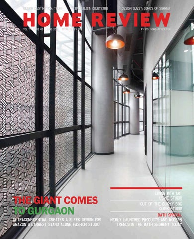
Photo: Cyrus Dalal
I
s it really relevant to create a space that resembles ‘contemporary American design’ in the heartland of India? A brief for a new-age imaging studio for Amazon alluded to this design intent. However, the team at Ultraconfidentiel felt the need to approach this differently. Striking a fine balance and melding modern design with traditional Indian iconography through textiles and other embellishments, the design head of the firm, Valentin Blanchard, created a unique identity for the Blink imaging studio in Gurgaon. His ideas were anchored in being glocal - creating an expression which embodied a distinct regional flavor but laced with an air of modernity. The result was an edgy space that challenged the status quo and has become a laboratory for creating innovative marketing communication for the thousands of brands who retail on Amazon. MVRDV is a Netherlands based practice engaged in creating architecture and addressing issues of urbanisation across the globe. Their design approach is research-based and they recently highlighted their commitment of examining urban conditions by articulating an installation at the Bi-City Biennale of Urbanism / Architecture at Shenzhen, China. The design powerhouse closely analysed and commented on varied conditions of urban villages, exploring several ideas related to co-existence, growth and diversity that occur in these dense pockets. It was an endeavour that showcased the genius and evolution of these packed habitats and also forecasted how they are likely to evolve in the future. Wouldn’t a similar research initiative for our very own dense urban jungles in India be a great idea? Anish Bajaj, Editor anish@marvelinfomedia.com
4 Home Review June 2018
emails + feedback Problem Solved
Traditional
I have recently designed my bathroom and was wondering about what to buy for my shower. After reading about the Artize Rainjoy in the Marketplace section, I have made my decision. I will definitely be going for this product. Thanks Home Review for solving my confusion.
Courtyard products are so beautiful and reminded me of my younger days. Furthermore, their work ethic is so noble, that I would love to purchase some items to show my grandchildren and also support the cause.
By Email Elise Charming
Let us know what you love and hate about this issue. Mail us at letters@marvelinfomedia.com
6 Home Review June 2018
By Email Sumati Chawla
Impressed
Hip
Very impressed with the arty bungalow design by Usine Studio. As a design student from Gujarat, I feel inspired to learn from such chic designs. I wish to design like them someday.
Being a fitness fanatic myself, I couldn’t help but admire the funk of Evolution Design by P&D Associates. If all gyms looked like this, people would work out more. Nice work!
By Email Dimple Amin
By Email Dharmesh Patel
30 art
22
form
Moscow based Tanya Gavrilova brings fairy-tale like creatures to life
36
Quirk Studio transports you to a world of art, poetry and film with their Wedding Nama office design
43
Cover Story Ultraconfidential designs the largest stand alone fashion imaging studio for Amazon
By Puja Rao
46
JUNE
Usine Studio juggles art, noise and space via their crafty creation,‘Samruddhi Bungalow’ in Vadodara
52 Bengaluru based ‘Made in Earth’ delves into eco-friendly and calm hued projects
56
82 Bath Special
Ground breaking appliances and brands that are revolutionising the bath industry
76 MVRDV presents their take on urban living through various exhibits at the Bi-City Biennale
8 Home Review June 2018
90
Eclectic styles, varied themes, upcoming trends come together in our newly launched segment!
94
86 Situated in Normandy, along France’s north western coast, Le Mont St Michel is a UNESCO World Heritage site dating back to the 8th century
Le Royal Monceau-Raffles Paris, exemplifies a hard to describe “Parisian elegance” as a luxe hotel swarming with celebrities
106
101 GREEN PROJECT Unconventionally named and designed Compass House by Toronto based architectural firm,Superkül
JUNE 110 P&D Associates revolutionise fitness goals with their gym design, Evolution Fitness
Landscapes
116 Award winning Landscape Design Workshop brings together a range of emerging voices actively engaged in advancing landscape and culture in Florida, USA
122
THUN
128
A DESIGN DESTINATION
Nivasa Contemporary, home decor brand reinvents modern furniture
10 Home Review June 2018
THE MARKETPLACE Get your hands on the latest products to hit the market
132
Editor & Publisher Anish Bajaj Creative Director Natalie Pedder-Bajaj
Dhanishta Shah Freelance Writer She believes that writing gives sense to experience and her areas of interest span a diverse range including interior design,fashion, watches, luxury, parenting, art,business, health and travel.
Features Editor Mala Bajaj Assistant Editor Shweta Salvi Sr. Sub-Editor Neerja Kapadia Contributing Writers Chryselle D’Silva Dias Devyani Jayakar Dhanishta Shah Himali Kothari K Parvathy Menon Kanupriya Pachisia Ramya Srinivasan Shruti Nambiar Virupa Kantamneni Designers Asif Shayannawar Darshan Palav Snigdha Hodarkar
Shruti Nambiar Writer Freelance Writer and Photographer In 2010, Shruti quit three years of corporate drudgery in Bengaluru to start on a career in writing. A little over two years ago, she joined The Indian Express, Pune, as a Feature Writer. Currently based in Pune, she is pursuing freelance writing and photography.
14 Home Review June 2018
Editorial & Marketing Mumbai Ms. Chand Anam B-62, Cotton Exchange bldg., Cotton Green, Mumbai 400 033 T 022 23736133 / 23736131 / 23743069 E response@marvelinfomedia.com Chennai Mr. S. Venkataraaman Flat No. 2, 3rd Flr, E-Block, Hansa Garden, 30 Madampakkam Main Rd, Rajakilpakkam, Chennai 600 073 Tel 044 22281180 / 09444021128 Email: svenkat@marvelinfomedia.com Publishing Director Mr. R.I.Bajaj Distributed in India by India Book House Pvt. Ltd. 412, Tulsiani Chambers, Nariman Point, Mumbai 400 021. This issue has a total of 134 pages comprising of a 4 page cover and 130 inside pages. We welcome unsolicited material but do not take responsibility for the same. Letters are welcome but subject to editing. All rights reserved. Nothing may beprinted in whole or part without written permission of the publisher. The editors do their best to verify the information published but do not take responsibility for the absolute accuracy of the information. All objections, disputes, differences, claims and proceedings are subject to Mumbai Jurisdiction.
Quirk Studio Out-Of-The-Quirky-Box, Page 36. Quirk Studio is an Interior Design Company founded by Disha Bhavsar and Shivani Ajmera in 2013. Its design philosophy is finding simplicity in the clutter and to create in order to inspire. Quirk Studio’s goal is, for its designs to have the power to transport you into another world, allow you to dream and most importantly, evoke an emotional response.
Usine Studio Living With Art, Page 46. Usine is an emerging design studio, Based in Vadodara; Founded by Yatin Kavaiya and Jiten Tosar, They started their own studio in 2010 to tap into the growing market. Whilst the firms partiality to clean lines, minimalistic palette, artistic approach and giving meticulous attention to details, also fuses luxe to organic accents. Which marks them as one of the leading and most sought after Architectural & Interior Design firm in the city.
Editor Mr. Anish Bajaj. Published and Printed by Mr. Anish Bajaj on behalf of the owner Marvel Infomedia Pvt. Ltd, B-62, Cotton Exchange bldg, Cotton Green, Mumbai 400 033.
P & D Associates Social Incubators, Page 110. P&D Associates was founded in 2009 by Pratik Siddhpura and Devang Patel, who along with Shruti Siddhpura, are its principal designers. Since its establishment, ithas grown to be one of the premiere Interior design as well as Civil and Architectural planning firms in Bharuch. Partik Siddhpura & Shruti Siddhpura holds a Bachelors degree in Interior design from NIFD, Baroda and Devang Patel holds a Diploma in Interior design from NIFD, Baroda. The trio hold a collective experience of over 9 years.
16 Home Review June 2018
PAST & FUTURE
E V E N T S 25 MAY 26 NOV TO
Venice Biennale, Venice, Italy But Design District is more than just a state-ofthe-art fair; you can also find exhibitions of design academies and young designers and you can attend lectures on a multitude of topics to stay updated in all things design.
The Venice Biennale is back for its 16th edition showcasing two of our Indian architects, Rahul Mehrotra and Gurjeet Singh Mathroo in addition to many world famous entities. With the theme of FREESPACE, the Biennale will present for public scrutiny examples, proposals, elements built or unbuilt - of work that exemplify essential qualities of architecture which include the modulation, richness and materiality of surface; the orchestration and sequencing of movement, revealing the embodied power and beauty of architecture. While previews of the main event will be held on 24th and 25th May, the exhibition will open to the public from 26th May - 25th November, 2018.
Design District started in 2002 in the Netherlands under the name 100% Design and has always taken place in special and historic locations such as the Cruise Terminal Rotterdam, the Van Nelle Factory and the Hembrug site in Zaandam. This year for its 16th edition, it will take place from 6th – 8th June 2018 in the Van Nelle Factory in Rotterdam.
TO 07Barcelona 14 JUN Design Week, Barcelona, Spain
TO 07A@W 08Lyon, JUN
Toulon, France
www.labiennale.org
TO 05Design 08 District JUN
Rotterdam, the Netherlands
18 Home Review June 2018
www.lyon.architectatwork.fr
www.designdistrict.nl
Architects, Designers, Installations, Products, Art dealers, Curators, Sculptors, Students and all other design fanatics will coagulate under one fair, uniting to benefit each other from networking to building. It will be a one stop shop to associate with some of the who’s who of the design world globally.
Design District is the best trade event for interior design in the Netherlands which attracts interior architects, architects, designers, project designers, stylists, retailers and other interior professionals from all over. During 3 days, a floor covering more than 10,000 m² will be filled with presentations of the 200 most beautiful interior brands. You will find furniture, lighting, ceramics, surfaces and fabrics to name a fraction of the vast variety you will see.
Furthermore, the unique and innovative exhibition layout of A@W LYON has been designed in order to ensure optimal contact between exhibitors and visitors. This layout led visitors automatically along a route that winds its way through small, uniform modules. The innovations showcased by the exhibitors were presented in corner units and on the walls. In each box, which comprises four corner units, a multimedia console takes center stage.
Architect@Work takes place in different countries globally facilitating a networking of exhibitors, buyers and influencers. This month, this carefully curated two day show will take place in Lyon where national and international interior designers, specifiers and suppliers will showcase their latest innovations. All the exhibitors go through a rigorous selection process with external panels overseeing the product selection to ensure high quality.
Barcelona Design Week is an event that showcases graphic design, urban planning, user experience design, technology, music, food, film, art and architecture and more. It is being held from 7th - 14th June 2018 in Barcelona, Spain and is organized by BCD (Barcelona Design Centre). It will host over 100 activities and the 13th edition of this international event will gather businesses, entrepreneurs, designers and other agents within the design industry. It will also open up to the city for local attendance for the purpose of learning and improving quality of life. This year, under the slogan of ‘Revalue’, BCN Design week will address a much needed topic that will concern us all by implementing a comprehensive program of activities revolving around the idea of taking a fresh look at everything that surrounds us and to rethink poor sustainable practices. www.barcelonadesignweek.com
Subscribe to The Inside Track and stay connected
India’s leading trade publication that connects manufacturers, dealers and designers across the country No. of Issues
You Pay
You Save
36 + 8 Free
Rs. 900
20%
24 + 4 Free
Rs. 600
16%
12
Rs. 300
Please fill up this coupon and send it along with your cheque/DD to: Marvel Infomedia Pvt. Ltd., B 62, 1st Floor, Cotton Exchange Bldg, Cotton Green, Mumbai 400 033. Tel (022) 23736133/1, 32958501 Fax (022) 23743069 Email response@marvelinfomedia.com www.theinsidetrack.in
I am enclosing a cheque/DD No _________________ Dated __________________ drawn on ( name of bank ) ________________________________ favouring “Marvel Infomedia Pvt. Ltd.” for Rs.__________________________________( Add Rs 40/- for non Mumbai cheque/DD ) YOUR DETAILS Mr/Mrs/Miss/Ms_________First Name __________________________________________Surname ____________________________________________ Address_________________________________________________________________________________________________________________________ City____________________________________________State____________________________________________________Pin Code________________ Phone__________________________Email____________________________________________________Occupation_____________________________ the inside track reserves the right to extend, cancel or discontinue the offer without giving any reason or prior notice
PAST & FUTURE
E V E N T S 07 10 JUN TO
LA Design Festival Los Angeles, U.S.A
Design Miami is the global forum for all things design. Each fair brings together the most influential collectors, gallerists, designers, curators and critics from all around the world. Occurring alongside the Art Basel fairs in Miami and Basel, Design Miami/ has become the premier venue for collecting, exhibiting and creating collectible design. Design Miami is more than a marketplace for design where the world’s top galleries gather to present museum quality exhibitions. Each show balances exclusive commercial opportunities with progressive cultural programming creating exciting collaborations with designers, art and fashion, lectures, and panels with luminaries worldwide.
The LA Design Festival honors LA’s city’s rich design culture and celebrates its status as a global design capital. Their definition of design is purposely broadened to ensure that their festival is reflective of LA’s diversity and talent. Now in its 8th year, the festival is the only citywide festival of its kind, featuring over 50 events throughout LA. From architecture and interiors to graphic, industrial, fashion, set, costume, and experiential design, the LA Design Festival showcases the best of the local design scene as well as some exciting national and international voices. The LA Design Festival would not be possible without the participation of the LA design community, generous sponsors, and their amazing brain trust of designers and mentors.
15 TO 17 JUN
Build Ex Asia 2018, Ahmedabad, India
EBuild.in is a virtual library of architectural design and construction material resources. It has created its niche in the field with its comprehensive approach to businesses. The platform saves you time and money by providing a single source for specifications, rates, vendors, and images with appropriate categorization. It is an online source of continuous information for a growing community searching for the latest projects and events. Ex Asia Exhibition will be an ideal platform for the Building Construction, Interiors & Furnishing industry fraternity. Meanwhile it is also a sign of increased opportunity to the exhibitors who can showcase building material equipment, architectural products, ceramic & sanitary
20 Home Review June 2018
www.ebuild.in
TO 15Death 23 ofJUNArchitecture,
Bhimsen Joshi Hall, Pune
www.basel2018.designmiami.com
www.ladesignfestival.org
Basel, Switzerland
This year, it will be hosted at the Gujarat University and Convention Exhibition Centre from 15th – 17th June, 2018.
By continuously expanding and enriching its program, Design Miami/ seeks not only to satisfy the demand for a high-end design fair, but also to broaden awareness of modern and contemporary design, fuelling the market for collectable and accessible design for enthusiasts.
The LA Design Festival is non-profit organization and also allows the press with proper credentials to attend the event complementary. There is an awards program which honors and encourages accomplished and aspiring individuals. This year, the festival will take place from 7th – 10th June 2018.
TO 12Design 17 JUNMiami/Basel,
products, glass, door & windows equipment and technologies of Building and Construction industry at this esteemed show.
The Death of Architecture; circa 2000 is a traveling exhibition assembled by 13 of India’s thinking and concerned design practices. Through evocative art works, poetry and prose, the exhibition decodes and amplifies actions some which are orchestrated, others inconsiderate. Actions that slowly tear and restructure the fabric of our cities and the architecture within and along with that impact our sense of being. The exhibition presents evidence that will allow discussions about our present, and yet at the same time is embedded with clues and signs that can help effect meaningful dialogues about the future. In a sense, it consolidates the many critical discussions that form the dough which leads to design such as those about the demise of our cities as we know them or the meaning of inspirations from the past, or ideas of beauty, or duplicitous ways of achieving identity, or ways of understanding spatiality. The exhibition is a strong mirror that will allow cities and design communities to structure conversations that are pertinent to their immediate realm and concerns. It is going to take place at Bhimsen Joshi Hall in Pune from 15th – 23rd June, 2018 www.deathofarchitecture.com
THE DÉCOR KART INTRODUCES THEIR EXQUISITE RANGE FOR THE MONTH OF JUNE 2018 The Decor Kart introduces its new collection of exquisite home decor figurines. Inspired by the effortlessly beautiful European and Oriental decor styles, this collection will rejuvenate your decor space. In the Decorative Figurines collection, they have launched Fine Porcelain Figurines which are made of fine Porcelain and are hand painted, making them a perfect candidate to become your family heirloom piece - one that is passed from generation to generation. In the Kitchen and Dining section they have launched Shibori Dye Tableware. The Shibori designs of this collection are inspired by the ancient Japanese tie-dying technique used to produce fine and subtle hue variations in textiles. Each plate, platter and bowl features a different pattern for added visual interest in a table setting. In the Wall Accents section they have brought an extremely unique and interesting collection - The Great Catch
Fish Sculpture Collection which features larger-than-life resin fish sculptures that can be hung on the wall. One can let these sculptural pieces ‘swim’ on your walls. They’re easy to mount with a hook on the back; just attach the bracket provided along to your wall. Our silver fishes will generate a tidal wave of admiration! Apart from the above, a wide range of artificial flowers and plants, Angel Cherub Figurines, Tuscany Wall Plates has been launched. The Décor Kart’s latest Figurine Collection signifies the expansion of their pure grown Porcelain & Resin categories. The brand will continue to evolve and expand their Home Decor collections, offering new products in more verticals. www.thedecorkart.com Home Review June 2018
21
22 Home Review June 2018
Global e-commerce giant Amazon’s largest stand-alone Fashion Imaging Studio, ‘Blink’ in Gurgaon, India has been designed by Ultraconfidentiel. Though sleek and contemporary in its aesthetic, it is rooted to its location by the juxtaposition of Indian imagery through jaalis, carpets, fabrics and colour. When Amazon, the world’s largest online retailer announces a list of probable cities which it is considering in which to open a new office, it garners the kind of enthusiasm normally reserved for bids to host the Olympics, as noted by the New York Times. So, after deciding to locate in Gurgaon, Delhi, the matter of the design of the space was given due deliberation.
Text By Devyani Jayakar Photographs Courtesy Kapil Kamra
THE GIANT COMES TO GURGAON Home Review June 2018
23
In keeping with Amazon’s other offices, a contemporary aesthetic was in favour. “With state-of-the-art digital imaging facility, this studio is the first of its kind in India and only the third of its kind globally, by Amazon,” says Valentin Blanchard, Design Head, Ultraconfidentiel. It enables Amazon Fashion to creatively collaborate with fashion brands and partners to produce lakhs of high-quality images for its fashion merchandise every year, so that customers can shop clothing collections in India.The aim is to redefine the way the customer discovers, engages with, and shops for fashion online by boosting creativity and interactions between all generations of fashion designers.
Spread over 44,000 sq ft, the space allows Amazon India’s sellers - including international brands - to access digital imaging facilities.The footprint is an irregular one, starting with a large ‘doughnut’ which houses the reception and then extends into what could loosely - very loosely - be described as an irregular wedge with a couple of large setbacks on its periphery.“The building was meant to be a mall - all the buildings on this road have different shapes,” shrugs Valentin.
24 Home Review June 2018
The reception is an impressive space and has a six-metre height with glazing. The connected editorial room has a sliding folding partition and a cyclorama background for shooting, which is the biggest in India. Hence an instant background is easily provided for photo shoots. This office is an extension of Amazon’s imaging and cataloguing services that helps retailers with product photography at an economical price. The fashion brand partners can create and edit images and videos and develop creative content with assistance from Amazon. Photographers, models, stylists, video editors and other resources are provided.
Home Review June 2018
25
Sellers can get professionally-shot pictures of the products, before they are listed on the e-commerce platform. Brands are also being encouraged to feature their new season’s collections first on Amazon. The office has 14 individual high-tech photography bays, a large editorial suite, video editing facilities, a merchandise co-ordination area, production room, editorial bay, a large office space and operations area, creative spaces, a catwalk for fashion shows and a 50 seater cafeteria. “It can also unfold itself for large gatherings and corporate meets,” says Valentin. The signage has received a significant amount of attention. One dark wall proclaims ‘JFK,’ ‘LHR’ and ‘DEL,’ alluding in airline ticket manner to the locations of Amazon’s other offices, together with the year in which they were instituted. Arcs of light from overhead spots spill over the lettering, drawing attention to it in the sombre palette.
“The brief called for contemporary American design but we introduced an Indian touch. Of the previous two offices, the one in New York is a stark clinical white, while the one in London is black. We struck a balance here by using grey tones relieved by three jaali patterns, a modern version of traditional Mughal jaalis specially invented and customised for this project.
26 Home Review June 2018
There are also Indian carpets, traditional textiles and bursts of colour,” says Valentin of the way the design is rooted in India. While the exposed ceiling with visible ducting has an industrial look, the fadedred micro concrete flooring recalls the sand stone used for centuries in Indian architecture. Five phone booths have walls covered with saris specific to different parts of India, representing its cultural diversity. A kanjeevaram from Tamil Nadu, a pashmina from Kashmir, a bandhani and a patola from Gujarat and a bagh print from Madhya Pradesh all display the characteristics which give them their fame. “With their intricate details, it was a challenge to find a balance between a sleek, sharp look and Indian sensibilities,” says Valentin.
“Brands can rent the studio and present their latest styles and innovative ideas
and market their through fashion shows and
other events Home Review June 2018
27
Since a large part of the space is used for photography, natural light is not welcome. “This is totally contrary to the acknowledged benefits of natural light, which is known to have a positive correlation with employee well-being. In this space, however, it is restricted to the office area and cafeteria. The latter is housed in a balcony which was not usable earlier. A 15 metre long green wall now brings in nature while adding an informal vibe. The space is a great success, making it Valentin’s favourite space in the office. “In India, cafeterias are only used for eating. But here, a mix of many things happen. People even play games when they are taking a break.” The production room used for informal meetings itself has four types of lighting. Linear tracks on the ceiling provide ambient lighting, while a black track closer to the wall illuminates a long horizontal board used for writing, along with a pin board. Suspended from the ceiling, pendant lights echo the ones in the reception area. More decorative, they strike a balance between modernity and tradition. Accent lights give depth to the black expanse of the ceiling, fulfills the lighting schematic, while task lighting on the table adds focus.
28 Home Review June 2018
“Our aim was to ease every step of the work through our design. Many technical aspects were involved which made the project more complex,” says Valentin. “But our design tells a story and depicts not only fashion but also the essence of India. A blend of modern designs and revisited Indian traditions inhabit this studio, giving it a unique identity.” hello@ultraconfidentiel.com www.ultraconfidentiel.com
Home Review June 2018
29
Baba Yaga inspired witch doll, nearly 36 cms in height, without counting the hair.
30 Home Review June 2018
art form
Witches, Hedgehogs And Old Men - A Modern Fairytale Self-taught doll-maker, Tanya Gavrilova speaks about her journey into the art that is now a ‘forever love.’
Moscow based, 48 year old Tanya Gavrilova is a Russian doll-maker who brings to life objects, animals, and characters from what fairy tales are made of. Speaking exclusively to Home Review, the artist tells us how she came by the art and how it stayed on with her. “I visited an exhibition of dolls four years ago and was very impressed with the craftsmanship of the artists,” Gavrilova confesses. It was while walking down the aisles of the exhibition and observing the various dolls on display that she decided to take matters into her own hands. “I decided that I want to make dolls too,” says the travel and photography enthusiast. With needle-felting as one of the main techniques, Gavrilova brings the endangered elephant to life in a rather cute and innocent depiction.
Text By Priyanka Menon Photographs Courtesy Tanya Gavrilova Home Review June 2018
31
Russian culture is fascinatingly entrenched in creativity and is renowned for handmade objects and dolls. However, in modern times the hyper-realistic and eccentric handmade dolls have far surpassed the traditional Matryoshka Nesting Dolls, which were simply round and brightly-coloured. It is their life-like, yet uncharacteristic features that make these new dolls such an important part of modern Russian culture and its correct depiction. At the same time, the art form allows for ancient stories and folklore to be represented and restored. Gavrilova’s doll inspired by the famous Russian fairytale ‘Baba Yaga’, which is a story based on a witch, is a wonderful example of the artist’s creative genius. “My favourite doll is the Russian fairytale character, Baba Yaga,” she says. With art being touted as the sole medium for history and tradition to survive, it is important to understand how Gavrilova’s doll based on the fairytale helps in a modern understanding of the story. “I am a self-taught artist,” Gavrilova says when we asked her if she received any formal training. But one look at her works and you’re all but certain that the artist can give trained commercial artists a run for their money. “I use a lot of polymer clay, pastel acrylics, wire, sheep wool, fur, cloth, glass eyes, twigs and branches, raffia, etc,” she divulges. “I usually take two to three weeks to make one doll. But some items may take longer, like the big bear which took almost three months to make,” she explains.
23 cms in height, the hedgehog is made from wool, with wires for frames (hands, legs and fingers), genuine leather suspenders, with eyes and nose made of polymer clay.
32 Home Review June 2018
As unusual as her list of materials is, Gavrilova’s dolls are just as much. From witches in fairytales to simple elephants and hedgehogs, her dolls have a singular quality. Not only do they appear to be life-like, but they also reflect a certain kind of perspective, perhaps that of the artist herself. A closer look at the Baba Yaga inspired doll will tell you how much of thought has gone into its making.
Grandmother hedgehog and grandchild hedgehog, this combined collection is about 18 cms high.
Home Review June 2018
33
From the witch’s typically crooked nose and extra long nails, to her clothes, teeth and hair - Gavrilova’s witch is exactly how most of us have probably imagined witches in fairytales to be. There exists a common stereotype surrounding dolls – that they are mere toys. But dolls like Gavrilova’s and contemporary doll-makers have put a spin on this age old notion. While giving these dolls a natural human-like anatomy and transforming them into magical (albeit inanimate) figures, these doll-makers endeavour to preserve traditional techniques and materials in a modern mold. After becoming an artist of her own making, Gavrilova participated thrice at the ‘The Art of the Doll Exhibition’ in Moscow. For any self-taught artist, this is a shining moment. For Gavrilova, it was no different. Although doll-making has never seen a decline, the new-age dolls that are a fantastical blend of old and new techniques can work as a wonderful medium of channeling tradition into the modern era. This is perhaps why Gavrilova was moved enough to take up dollmaking, and eventually fall in love with the art form. gavrilova-tanya@mail.ru
28 cms long, this is Gavrilova’s version of Winnie the Pooh, tightly made of wool.
34 Home Review June 2018
The editing room at Wedding Nama is every editor’s dream. Quirky elements contrasting with stylised ones give this room a sepia hue with its subdued pop colour palette.
36 Home Review June 2018
OUT OF THE QUIRKY BOX Quirk Studio, a Mumbai-based design firm has created a delightfully eclectic office space for a wedding photography business.
Text By Priyanka Menon Photographs Courtesy Pulkit Sehgal
Home Review June 2018
37
The screening room is replete with hark backs to old Hindi cinema in a theatre-like setting.
38 Home Review June 2018
Quirk Studio is an interior design firm founded in 2013 on the philosophy of “finding simplicity in clutter and creating in order to inspire.” Its founders, Disha Bhavsar and Shivani Ajmera aspire for their designs “to have the power to transport you into another world.” It is into just such an alternate world, that Home Review takes you into today as we explore the office space of Wedding Nama in Andheri West, Mumbai. Wedding Nama, a professional wedding photography company is the brainchild of two best friends. And it is their mutual passion for art, love, travel, stories and adventures that they wanted to reflect in their office space. “The brief from the client duo was to design a space that truly represented their inherent creative style,” say Disha and Shivani. Being wedding photographers, they understandably wanted their office to be bursting with happy colours and accents that could be juxtaposed with clever design solutions and ideas. Along with this, the clients wanted a space that would comfortably accommodate their young and ever-growing team of photographers. From the brief given to them, Quirk Studio decided to play along with the space without interfering with the original layout and the openness of it. “We intuitively chose an eclectic style for the space,” say Disha and Shivani as they expound on how they went about capturing various moods in order to give a distinct and singular look and feel to every different area of the space. “It is surrounded by an all-encompassing stepout terrace, allowing lots of natural light in,” they add. One step into the Wedding Nama office and you know you’ve stepped into a world inspired by art, poetry, film and a respect for the minutest details. “We took a lot of inspiration from Wedding Nama’s body of work,” Disha and Shivani say. “We worked with several bright colours and neutrals to create strong contrasts and informal nooks and spaces for the team to meet and brainstorm together.” The meeting room is a particularly interesting space that looks nothing like a traditional meeting room.
Home Review June 2018
39
40 Home Review June 2018
With a restaurant-like vibe, with woodentop tables and teal blue chairs, in the heart of the meeting room reads the sign Let’s Meat Here. The light fixtures are an interesting blend of quirk and eccentricity with light bulbs tied to ropes dropping down from the ceiling. This here is a direct illustration of the coming together of the client as well the designer team, a manifestation of their chemistry and how well they have understood each other. “The office has an open workspace with a brainstorming section, a main cabin, and a fun pantry,” add Disha and Shivani. The editing room is yet another interesting nook with quirky light fixtures and illustrations on two walls – our favourite is the wall with photographs strung together in eight lines with a simple quote ‘We shoot love stories’ written across. Perhaps the most fascinating and outof-the-box area of the office space is the screening room. A throwback to the quintessential Hindi cinema studios of yesteryears, the screening room with its theatre-style seating is a tribute to old Bollywood with photographs of actors and movies in beautifully gilded frames bringing an old-world charm to the room.
}
Soft hues underline the room’s aesthetic with blues, light browns and greys off-setting each other. The centretable and couch are a smooth blend of classic and contemporary styles. A lighter rug over deep wooden floors adds the finishing touch to the space as well. “The seamless layout allows the clients of Wedding Nama to come into the space, understand their style, see their display of work and make for a great client experience,” explain Disha and Shivani. For a wedding photography business, their clients, predominantly the bride and the groom, bring their own set of requirements, ideas and wish-lists.
Old meets new in this room with a pop of colour here and there to reduce the ostentation contributed by the antique wooden chest serving as a centre-table.
Home Review June 2018
41
The meeting room at Wedding Nama where the dreaming minds come together to discuss and strategise. Let’s Meat Here! is a quirky and tongue-in-cheek quote to lighten the nerves that could be just as jittery as a bride’s.
In the space developed by Quirk Studio, which is a sublime integration of the Wedding Nama team’s personal and professional passions, the decisionmaking time is reduced considerably, because the customers know what they’re in for the moment they walk into the office. And more often than not, it is exactly what they want. So, in a way, every wedding that is covered by Wedding Nama has a fair bit of Quirk Studio also imprinted into its photo album. www.quirkstudio.in
42 Home Review June 2018
GARDEN CHARMS
By Puja Rao
DESIGNQUEST
Rooted in Bangalore, Songs of Summer, Garden Store and Pottery Studio, was created out of a love for customising green products and spaces. Their products and services include the retail of ceramic garden products, customised green gifts for corporates and turnkey garden design for balconies, patios and terraces.
Text By Vandana Krishnan Home Review June 2018
43
Be it a terrace, your quaint balcony, a spacious front yard, a humble backyard or even your empty walls, Songs of Summer is here to enliven your outdoor spaces with their appealing range of products. They have also created a presence in the world of ceramics by setting up a pottery studio and incepting their inhouse brand. The limited edition Songs of Summer collection is a fun and quirky line of handcrafted garden products and accessories designed with an eye for detail.
44 Home Review June 2018
They design and develop ceramics for customised gifting, corporate and personal occasions, landscape design for residential and commercial spaces and pottery workshops for individuals and occasions. They offer a plethora of options to cater to all your gardening needs. You name it and the brand does it all.
All their products are designed and handcrafted in-house and draw inspiration from nature. Their philosophy stems from creating spaces that are sensory and imbibe your lifestyle and personality.
When asked about how they plan on dealing with competition, Puja Rao, owner, replies, “We have always focused on looking inward rather than outward, at what everyone else is doing. Our focus is on bettering our skills in terms of technique, finish and design relevance. With the use of ceramics as any craft, the pieces designed are purely based on our skills, vision and aesthetics - which differ from potter to potter”.
They work with other gardening companies, stores and potters and don’t see them as competition but collaborators to share, learn and increase their combined knowledge. They also design and develop products for other garden stores that meet their brand aesthetic - in an essence, working with their competition!
“I think our customers buy our products because they share our aesthetic and design sensibility. If they are looking for more traditional Indian designs then they go to other companies who are good at that, and we send them there,” adds Puja. www.songsofsummer.com
Home Review June 2018
45
The house is almost austere, devoid of architectural embellishments. It presents itself as an assemblage of glass boxes in a predominantly white structure with simple yet strong horizontal lines
46 Home Review June 2018
LIVING WITH ART With a significant art collection taking centre stage, the design of this bungalow outside Vadodara takes a respectful backseat to the stars scattered liberally through its spaces. Usine Studio ably performs a juggling act, balancing the two without compromising function.
With a brief to curate, showcase, even celebrate art throughout this home, when Yatin Kavaiya and Jiten Tosar of Usine Studio started work on this project, the columns and slabs of the structure had already been executed. Given a raw framework as a fait accompli, they had to judiciously locate several works of art which included paintings as well as sculptures into its spaces, after completing the remaining work. Situated eight kms outside Vadodara, the bungalow has a built-up area of 10,500 sq ft, sitting on a 36,000 sq ft plot with a 26,000-sq ft garden. If one concludes that peace and quiet could be taken for granted so far away from the bustle of the city, one would be mistaken. Abutted by the Nalanda International School, there are sporadic outbursts of boisterous children every day, both at the beginning and end of school hours. Moreover, the unmetalled road on which 165 buses ply each day ensure that noise levels compete with any city.
Text By Devyani Jayakar Photographs Courtesy Tejas Shah Home Review June 2018
47
Yatin and Jiten quickly realised that controlling noise levels would be one of the first tasks they would have to undertake, along with keeping out the dust. They spent an extensive amount of time in devising solutions and in rephrasing the language of the concrete framework which had been presented to them. Employing triple glazed, full length glass ensured that sufficient light would enter the inner spaces, without any of the above mentioned drawbacks. As the height of the slab was 14 ft on the ground and 13 ft on the first floor, the glass had to be sourced from out of the state, the installation of the glazing also posing a challenge. Well worth the effort, however, the result is that all the rooms have an expansive view of the surrounding landscape from the non-reflective, glare-free glass. Set against double height glazing, the staircase has a floating, cantilevered effect, daylight filtering through the spaces created by its missing risers.
}
The house itself is almost austere, devoid of architectural embellishments. It presents itself as an assemblage of glass boxes in a predominantly white structure with simple yet strong horizontal lines, “The focus was on acquiring pieces of art and then creating spaces that would revere them. Consequently, the exterior is clean, without any cladding,” says Yatin. Within, the ceilings are also minimally articulated so that the emphasis is not diverted from the art. The pathway leading to the entrance is paved with a rather humble variety of tiles but set against it is a large bronze mural by Ratilal Kansodaria portraying the dance of life during the rains. “Letting in a soft filtered view of the garden beyond, it is 25 ft wide and 14 ft high. Its installation was a big challenge as it was formed at the workshop and then brought to site for the final installation,” says Jiten. The main door bears a bright coloured wooden mural by Gulam Mohammad Sheikh, a similarly vivid Japanese piece on the wall beside it. In the double height foyer within, more than five dozen tiny glass birds by Himanshi Shah hang as a sweeping spiral, almost as if the rain mural at the entrance cued them into the house for safety. In the formal living room on the left, the plush fawn coloured sofas blend with the plain walls, drawing attention to the two purple arm chairs sitting below the Kodanda Rao Teppala painting on the wall, depicting people on a beach.
48 Home Review June 2018
The daughter’s room has a mix of greens enhanced by a Mallika Rangwala behind the bed.
Home Review June 2018
49
Further inside, a dramatic gold engraved human figure sculpted in wood by Ashish Dash stands on the floor in the centre of the room. Set against double height glazing, the staircase behind it has a floating, cantilevered effect, daylight filtering through the spaces created by its missing risers. On one side is the dining area with colourless glass human figurines also by Himanshi Shah hovering over the elegantly muted dining table. In contrast the bold colours and distinct textures of glass, ceramic and metal in the abstract Shiv lings on the wall by Vinod Daroz add a punch of colour. The backsplash of the open kitchen is in a sunny yellow with black counters, while the shutters of the cabinets and walls are in white. At the other end of the room is the family living area with blue sofas and a collection of family portraits on the wall, lending the space an intimate and personal atmosphere. “On the floor above, each bedroom has a colour palette in sync with the preferences of the user. The master bedroom has an occasional red punch on a backdrop of muted beiges, the artwork being by Pankaj Vishwakarma,” says Yatin. The son’s room with a Rutwa Gajjar, has a sophisticated pairing of yellows with greys while the daughter’s room has a mix of greens enhanced by a Mallika Rangwala. “Each room has handpicked works of art to complement the décor.”
}
The reading space has a smoky beige sofa with bright orange cushions and a muted olive arm chair. The wall is peppered with artist Radhika Wader’s rendition of her thoughts at different occasions, executed on 150 unique pieces of Italian paper. A student of Fine Arts at The M.S. University of Baroda, her work was chosen by the client to nurture and promote local art and artists. Ground Floor Plan
50 Home Review June 2018
}
The multipurpose hall is a congregation space for the whole family and for their close friends, all of whom happen to be avid card players. Aptly, the installation commissioned for this room is an abstracted version of a deck of cards. The comfortable recliners in candy tones infuse happy colours in this space, imparting an informal ambience.
“In the process of sourcing the art for this home, we met more than 150 artists, some of whom were quite renowned,� says Jiten. The result is evident – a home in which art takes centre stage in the carefully orchestrated spaces, while the function of a home remains uncompromised. info@usinestudio.in www.usinestudio.in
Home Review June 2018
51
Bengaluru-based Made In Earth Studio stays true to its name - its design ethic unfailingly revolves around the central ideas of natural materials and sustainable thinking. Shruthi Ramakrishna, Jeremie Gaudin, Agnimitra Bachi, and Ajinkya Unhale form the Made In Earth collective. It is essential for the studio to not just “know” the natural materials it is so in love with, but also become friends with it! Also critical is an appetite for getting one’s hands dirty, which means working closely with the team at the construction sites. Unsurprisingly, the firm’s projects, especially the ones mentioned below, stand as confident examples of ecofriendly, often neutral-hued and calm spaces that are secure enough to not demand loud attention.
52 Home Review June 2018
Bengaluru loves a good-looking café, and this one has clearly been created with a lot of love. There is a calm stillness about this space, in spite of being a potential host to many conversations and cutlery sounds. Those walls, they seem to be exuding meditative peace. That was achieved by a careful finish of natural plasters in a tadelakt form, a mix of lime, clay and pigments infused with fine stone dust. It is a wonderfully unusual mix that gives the walls a lived-in feel, like they have stood there for a long while and acquired their hue by absorbing bits of the natural elements. The furniture and upholstery add to the calm, having few sharp edges or glaring colours. Sitting at the lovely marble-topped tables and soaking in the natural light streaming in from the wide windows will be a definite treat; the planters outside create a feeling of being in the middle of a lush retreat and not a bustling city. The browns are of the comforting childhood cocoa drink shade, and the shelving is made from upcycled teak wood. Perfect companions in the scheme are the woven cane surfaces and the hardwood floors, with some herringbone patterns and polished black kadappa with brass inlay popping up in parts. All of it is being overseen by “the little sky of stars”, made up of LED bulbs dressed in vintage lampshades. A passive air cooling system negates the need for air conditioning. Made In Earth has done well in realising their client, The Green Theory’s values of ‘health, ecology and authenticity’.
Text By Shruti Nambiar Photographs Courtesy Courtesy the Designer Home Review June 2018
53
This is the work space of a team that certifies organic agricultural produce, and the demand for a vibrant and natural set-up fit Made In Earth’s sensibilities well. What the design team got was a 280 sq m shell on the first floor of a building, a two-month deadline, and a tight budget. So, you either crumble, or you decide to dance, and create a module! This meant creating a patterned layout with multipurpose elements. A shelf can become a bench, a blackboard, and a window, and a storage cabinet can be fashioned out of a partition door. The 3x3 ft frames, bolted plaster panels with clay/lime rendering, grey oxide flooring, natural clay/lime plaster walls, exposed brick, glass, and pine wood boards and surfaces come together to form a dynamic pastiche that negates any possibility of same-ness and keeps the spaces looking original with every turn of the head.
54 Home Review June 2018
The overall feel here is earthy, with the potted greenery, glass jars filled with raw food, and dark framed pictures sharing space with office paraphernalia showing that this is a team dedicated to natural matters.There is no airconditioning here, and Made In Earth Studio was disinterested in using plastics, resin and any type of chemical treatment. The angular, shelved swath running across the space also creates a surprising sense of movement, like everyone is on a train journey maybe, with the views constantly shifting!
In this space, the eponymous colour had to take centre-stage. Which meant, that everything around it had to be neutral, subtle and more accommodating, rather than stand-out. This is a denim research and design studio, housed above an apparel factory floor and committed to sustainability. These factors decided the “raw, natural, and eco-friendly� considerations of the Made In Earth design team. Striking is the muted lighting scheme, spot-lit in parts and broody in most other sections, as is the handcrafted flooring combining the natural beauty of black stone and wooden inlay work. The clay ceiling here is covered in chemical-free paint. The textures of the walls found their inspiration in the unique weaves of denim fabric - smooth terracotta greets the designers, while a lime and straw sculpted clay wall spans the ramp area. Natural clay plaster dominates the gallery section. All the imagery of waves - blue, brown, stormy, ripple-like - establishes a fantastic sense of controlled movement within the otherwise disciplined space. If hit by a design block, the designers only need to look up and around, at all the fawn-coloured and textured accenting, to get back into the groove. contact@madeinearth.in www.madeinearth.in
Home Review June 2018
55
Page 64
Page 66
Page 67
Page 78 Page 68
A Toilet Of Worth
Bucket List Bathtubs
Feel Good Bathing
Page 70
Sealing Victories
56 Home Review June 2018
Clever Details
Design In The Detail
The Final Finish
BATH SPECIAL
Page 62
Page 60
Page 58
Stepping Into Luxury
Page 72
Sustaining A Winner
Page 74
Pulsating Trends
SMALL FOOTPRINT BIG ON STYLE! Text By Kanupriya Pachisia A limited footprint should not impact your creative flair when it comes to churning out your modern compact bathroom. If you’re in a quandary over how to decorate your personal sanctuary, stand by as we introduce to some quick and stylish solutions. In a small space like a bathroom, every detail matters, especially when the space is becoming synonymous to being called one’s personal sanctuary. Today the axis is tilting towards modern compact bathrooms. Small bathrooms may seem like a difficult design task to take on; however these spaces may introduce a clever design challenge to add to your plate. In fact, every design element should then have a purpose and be functional in some way or another to create a space saving sanctuary. Home Review takes you on a tour of modern compact bathrooms and trends this month, as you dive into the pages that revamp your private abode.
When we prefix the adjectives, modern and compact before a bathroom we start hunting for minimalistic yet statement making products. It won’t be wrong to say that product manufacturers and designers have worked really hard to offer chic design solutions. Today a plethora of bath surfaces are making the bathroom look stylish and practical. Neutral shades and big dimensions are optically making compact bathrooms appear larger. New age faucets and mixtures are building up on the design quotient as they perk up the overall look in fresh, innovative moulds. While large furniture pieces can dwarf a small space, wall hung and multifunctional bathroom furniture is there to bail you out and pack on the personality of your space. Corner designs of shower enclosures work perfectly too. Free-standing baths create a focal point in a small space and an illusion of space. This month’s special issue focuses the spotlight on all such products and much more, We’ve also got on board, industry giants who share their award winning products, journeys and thoughts on the industry ahead. As you engage to browse through the following pages, do not miss out on the fresh trends that are leading the industry to new horizons and giving your bathrooms a new look.
Home Review June 2018
57
THE FINAL FINISH Surface details have resurfaced with a new contemporary and classic look. Giving your bathrooms the final finish, these envelopes are totally revamping your space and giving them a tangible feel that reflects your personality.
BISAZZA MARMO Marmo by Bisazza is a new collection that enhances the floors. In line with its decorative vocation, it is a series of patterns inspired by the tradition of polychrome stone floors, revisitied in a contemporary way. Squares, hexagons, triangles and trapezoids made up of 2 colours with a 3 dimensional effect are available in 9 colours and 16 patterns.
FAP CERAMICHE LUMINA Lumina by FAP ceramiche is indoor porcelain stoneware that exhibits a 3d wall cladding effect. It is an extra ordinary collection that continues to grow, offering an increasingly exhaustive range of solutions that bring sophisticated nuances and decorations to a range of settings, defining them down to the last detail. Available in sizes of 25x75 cms, it comes in a coating of white, beige or grey. www.fapceramiche.com
www.bisazza.com
SALVATORI SILK GEORGETTE
PORCELANOSA STON-KER - ANTIQUE STON-KER porcelain tiles are designed for both indoor and outdoor surfaces given its first class technical characteristics. Thus, these tiles made of clay, sand and feldspars can withstand the harshest conditions, exhibiting high resistance to wear and tear. They also meet slip resistance criteria that makes them perfect for wet floors. Large format tiles of 120 cms reduce tile laying time and costs. www.porcelanosa-usa.com
58 Home Review June 2018
Ideal for both floors and walls, Silk Georgette is what could be described as ‘greige’ – a harmonious combination of grey and beige. An elegant and classic stone, its unique waves of different greyish hues and dark quartz like veins give it the appearance of a luxurious draped fabric. Available in 6 different textures, they do not present any risk of breakage. www.salvatori.it
BHARAT FLOORINGS DECORATIVE CONCRETE - ACID STAIN With concrete becoming more and more appealing as an interior finish, rustic modern bathrooms are embracing it whole heartedly. Bharat Flooring’s range of ‘Decorative Concrete’ allows you to convert a dull concrete floor into a decorative one with acid staining. Due to the inconsistencies in surface levels of concrete floors, the staining creates a variegated appearance that is unique to each slab. A sealer coat protects the floor.
GRESCASA ASH TREE COLLECTION This glazed porcelain tile collection stems from the species of wood that is from the ash tree gender. The inspiration behind the tile made a new wooden effect tile emerge blending a slightly rustic surface with contemporary pantone and grey tones. Available as Ash Tree and Clapboard Ashtree, it comes in sixes of 20x120 cms and 30x90 cms. www.grescasa.com
www.bharatfloorings.com
VILLEROY & BOCH MARMOCHIC Marmochic by Villeroy & Boch is an authentic non-vitreous glazed vibostone porcelain stoneware for walls and floors that recalls the glory of old Venetian palazzos, in the form of a modern forward looking European style. These tiles are available in both matt and high gloss finishes and their expressive details bring a mystical shimmer to the spaces they embrace. www.villeroy-boch.co.uk
SICIS VETRITE - GLASS WALL TILES The Vetrite Collection by Sicis is a large format thin glass panel that flaunts a luxurious surface cladding. Sicis iconic fabrics and polymer films are sandwiched between large glass slabs. They are available in thicknesses of 6 or 12 mms. The versatile surface can be clad on walls, floors, bathtubs, counters and furniture. It also comes with a self-cleaning and anti-bacterial surface. www.sicis.com
Home Review June 2018
59
DESIGN IN THE DETAIL Luxury has an extravagant lure. It’s all about affording to choose. It is for those who are plucky and different. Today’s new age faucets and mixers are all about this luxury in a new innovative mould.
KOHLER THE BOL The Bol ceramic faucet by Kohler lends artistic distinction to your bathroom or powder room with its stunning design. Inspired by an antique apothecary mortar and pestle, this faucet features a fluid shape and quiet operation that showcases the soothing sound of flowing water. The above-thecounter model displays a straight line design with soft surface curves. It also handles speed of water flow.
COCOON PIET BOON COLLECTION Winner of the Red Dot Design Award 2017, Cocoon’s Piet Boon Collection defines ‘industrial chic’ in gunmetal black and polished nickel. It combines perfectly with solid white baths and basins rendering a contrasting charm to your bathroom. The characteristic appearance of the hand brushed stainless steel enriches its experience. It also comes with a swivel spout and in deck mounted and wall mounted options. www.bycocoon.com
www.kohler.co.in
GRAFF LUNA
GESSI RETTANGOLO COLOUR Through superior aesthetics and advanced function, Rettangolo Colour by Gessi is a sensor tap that elevates the tap from an everyday object to an essential aesthetic element. Its squared and minimalist form I supported by an electronic basin mixer with temperature and water flow rate adjustment through under basin control. It is also equipped with LED light that changes colour depending upon the water temperature. www.gessi.com
60 Home Review June 2018
Luna resembles a celestial element floating along the wall that delivers a stream of water into the vessel below. Winner of the Merit Award for design in the bath segment, its singular thermostatic design is available as a wall mounted and deck mounted wash basin or bath tub spout and valve. With a mirror like finish it is available in polished chrome and satin nickel. www.graff-faucets.com
GROHE ALLURE F-DIGITAL The Allure F-digital takes faucet design in a new direction. Part of the Grohe Spa Collection, it is convenient and intuitive to use. A square base plate gives rise to a circular control. You need to simply turn the product on, twist the outer ring to control water flow and press the plus or minus to control temperature. Its LED ring gives visual feedback on temperature.
JAQUAR ARTIZE TAILWATER Inspired by nature and contemporary architecture, Tailwater is a striking piece. It resembles a bird, perched on the edge of a pool. The lever and spout are united in a single form. The curve of the tap’s body echoes the flow of water, while its reflective surface appears as seamless as liquid metal. The ‘tail’ acts as a mixer lever, which moves smoothly. Designed to be deck-mounted, the tap widens and curves slightly at the base and discreetly conceals the fixtures and water supply. www.artize.com
www.grohe.com
TOTO LEGATO
ROCA AVANT
The Legato by Toto is a deck mount tub filler trim with hand shower and a widespread lavatory faucet. Moulded in a solid brass construction it has a durable finish. Equipped with a ceramic disk valve cartridge it comes with a metal shower hose. It also supports a metal pop-up drain and single lever handles. It injects simplistic charm with its modern design.
The Avant by Roca is a timer faucet with an advanced design suitable for public or semi-public spaces like hotels that aim to differentiate themselves from the rest. Its ergonomic shapes avoid water splashes. Its soft push button is user friendly. It is a self-closing deck mounted basin mixer with a lateral handle for temperature regulation and an integrated aerator.
www.asia.toto.com
www.roca.in
Home Review June 2018
61
CLEVER DETAILS Bathroom furniture and accessories are essential in order to create a style statement in your bathrooms which are becoming a private indulgence more and more as the days go by. Let’s take a look at some style magnets.
GRAFF DRESSAGE COLLECTION Inspired craftsmanship and impeccable charm - Graff’s ‘Dressage’ collection is a collection of furniture where the warmth of tradition, transmitted by the use of solid wood meets with the functionality of an innovative material such as DuPont Corian. The strong artisan component is reflected through its standalone solid wood vanities, stools, chest of drawers, mirror and Lealpel bath tub headrest to name a few.
ZUCCHETTI. KOS MODULAR FURNITURE COLLECTION Designed by Ludovica and Roberto Palomba, the Modular Furniture Collection in wood or metal, compliments precious materials and unusual configurations that enrich any bathroom. Modular shelves and mirrors in different shapes and colours, aesthetically linear tables, pleasant container trolleys in multiple shades can be positioned in any situation giving design freedom. It is definitely an elegant and colourful punctuation for every bathroom. www.zucchettikos.it
www.graff-faucets.com
SALVATORI ADDA MODULAR DRAWERS
LAUFEN ILBAGNOALESSI ONE COLLECTION Characterized by timeless forms that spark imagination and a hint of eccentricity is what defines the Ilbagnoalessi One Collection by Laufen. A creation of Italian designer Stefano Givannoni, the range is a modern classic that is poetic, sensual and feminine. Complementing the ceramic elements in a bathroom it is a pure style setter and a visual anchor. www.laufen.com
62 Home Review June 2018
With a nod to the wooden décor of the 1950’s and 60’s, designer David Lopez Quincoces has created a retro-contemporary collection for Salvatori that plays with the inherent properties of each material, in the coolness of natural stone and warmth of wood. Richly toned Walnut wood adopts a classic ribbed finish. The drawers can be combined with the basin units for utmost flexibility. www.salvatori.it
DURAVIT LIGHT AND MIRROR RANGE The ‘Light and Mirror’ Range is a top quality and flexible range of mirrors that harmonize with every bathroom style. A versatile design solution it also provides optimal and beautiful illumination. Available in three different variants, namely – Top Edge Light Field, Dual Light Fields and Good, each variant renders a wall wash effect that facilitates an atmospheric look. All versions are operable via a wall switch.
BOFFI TWIG COLLECTION Designed by Keiji Takeuchi, the Twig collection stems from the designers local roots seeded in Japan. Simplistic and minimalistic, the range flourishes in solid Iroko wood with parts in white Cristaplant and supports in metal, treated with grey graphite PVD technology. Consisting of a towel, toothbrush and soap holder, toilet paper holder and a small table for bathtubs it recreates an ambience synonymous to Japan. www.boffi.com
www.duravit.in
AXOR UNIVERSAL COLLECTION
INBANI ORIGIN COLLECTION
Anyone who appreciates elegance and perfection will love the Universal Accessories Collection by Axor. Towel racks, hooks, mirrors, shelves, soap dispensers, toothbrush tumblers – each accessory is a unique designer product. All 12 components of the collection have a timeless feel and can integrate themselves into any bathroom ambience. They can be combined with one another or used individually to make life easier and more comfortable.
Origin implies the beginning of craftsmanship and industry through the different fabrication of wood, metal or glass, amalgamating each one to perfectly establish each element. Designed by Seung-Yong Song, the collection that includes shower curtains, standing towel rails and bathroom stools to name a few, surrounds itself in a traditional and cultural atmosphere with strong eastern roots that spreads total precision and artistry in your bathroom.
www.axor-design.com
www.inbani.com
Home Review June 2018
63
BUCKET LIST BATHTUBS Homeowners who decide to renovate and uplift their bathrooms gravitate towards luxurious features and bathrooms. Modern bathtubs are not kept hidden from this search and have become one such trend that manifests the resurgent popularity of the bathtub too.
SALVATORI ISHIBURO BATHTUB Designed by Kengo Kuma, the Ishiburo bathtub by Salvatori aspires to maximize the inherent material quality of stone. The design stemmed from his notion that being immersed in water contained within stone brings instinctive comfort to human beings. The tub definitely creates a truly harmonious and tranquil bathing experience. Available in 4 varieties of stone, it can be textured to your liking. www.salvatori.it
ZUCCHETTI. KOS FARAWAY POOL The Faraway Pool is a bath tub cum mini pool that settles at floor level, completely integrating functionality and aesthetics. Distinguished by a graphical motif on its inner bottom surface, its floor level overspill doubles the perimeter line of the tub. The fan generates a ripple that runs across the whole length of the tub. It is a unique form wellness for both indoor and outdoor living. www.zucchettikos.it
64 Home Home Review Review June June 2018 2018
BETTE BETTELUX OVAL COUTURE BATHS The Bettelux Oval Couture Baths elevates the bathroom fitting to a lifestyle object. The first fabric coated baths; they bring comfort into your bathroom and bathroom comfort into your home. Their bodies are manufactured from enameled titanium steel and the surround from woven waterproof and weather resistant fabric. Available as a freestanding bathtub, it comes in four colours of fabric. www.bette.de
KALDEWEI SOUND WAVE The Sound Wace is Kaldewei’s version of music in the bathroom. Comprising of two transducers, six acoustic panels, a control box and a receiver, the system combines effortlessly with the Kaldewei bathtub that acts as a sound box. It can play back audio files from any Bluetooth enabled device. The volume increses as the tub fills up with water, literally allowing you to immerse in your favourite tunes. www.kaldewei.com
Home Review June 2018
65
A TOILET OF WORTH Who would have thought that technology would completely revamp the worth of a toilet. Flushing systems and water closets are taking the batten forward as they give in to technology and emerge winners.
GEBERIT SIGMA CONCEALED CISTERN The Sigma Concealed Cistern by Geberit is a classic modern bathroom installation. They come equipped with conduit pipes that supply water to Geberit AquaClean Shower Toilets. It is available as a barrier free or height adjustable system. It also offers odour extraction by recirculating air. It works on front actuation and remote flush actuation. It is flexible and comes in various construction heights. www.geberit.in
TOTO NEOREST WC WITH ACTILIGHT The Neorest is an intelligent toilet that uses integrated UV light (Actilight) and a special zirconium coating to break down dirt and grime in the bowl. It rinses it clean with ‘ewater’ which is the company’s electrolyzed water bringing new levels of health and hygiene to your bathrooms. When the lid is closed, the Actilight blankets the bowl and interacts with oxygen and water that helps breakdown organic matter. asia.toto.com
66 Home Home Review Review June June 2018 2018
FEEL GOOD BATHING Your dream bathroom meets complex requirements and encompasses every imaginable area of your bathroom to form one unique design. Tubs and whirlpools that are but an offshoot of your dreams become a primary component then.
HAFRO GEROMIN BOLLA INFINITY The Bolla Infinity is a bathtub with a state-of-the-art design that allows for an exceptional volume of water. Equipped with a hydro massage system with adjustable speed, it has 24 airpool jets and a disinfection system that keeps it clean and ready to use for a longer period of time. It comes with a frame and drain plug and is available in Ecomalta and White panels. www.hafrogeromin.it
DURAVIT BLUE MOON The Blue Moon is a built-in whirlpool bathtub based on a modular system. While the insert is available in teak or pure white, the outside comes in 5 different finishes. Compatible for both indoor and outdoor use, it comes with a foot rest and a cover that can convert the tub into table. Its underwater coloured light can be controlled via its waterproof remote control. www.duravit.in
Home Review June 2018
67
STEPPING INTO LUXURY A shower is probably the best way to escape the everyday mundane routine. Today companies are rolling out products that are making this experience even more intimate and luxurious.
ASTON SEN989 VANORA SHOWER ENCLOSURE The symmetrical SEN989 Vanora by Aston is designed for the corner layout area of your bathrooms. The completely frameless square enclosure provides a much larger swinging hinged entrance and features a unique dual door entryway. Available in a number of custom size options it is composed of thick premium clear or frosted glass and stainless steel, oil rubbed bronze and leak seal hardware. www.astonbath.com
ROCA TERRAN - SHOWER TRAY The Terran Shower Tray by Roca is made of STONEX - a strong and durable material. It is offered in a wide range of dimensions and its textured finish makes it highly slip-resistant. It is a superslip 45 mm built-in shower tray that can be customized and comes with a 90 mm waste. It is either rectangular or square in shape and comes in multiple colours. www.roca.com
68 Home Home Review Review June June 2018 2018
Home Review Now on Apple and Android Devices
All you need to do is download the free ‘Magzter app. Apple users can download Magzter from the App Store.’ Android users can download Magzter from Android Market.
Try it out today.
SEALING VICTORIES Innovation is not just about ideas but about making those ideas happen. Backed by this notion, VitrA has been sealing victories one after the other. Mr. Serhan Ates Yagiz, India Country Manager, VitrA, talks about the company’s celebratory moments and how there is always a way to do it better. 2018 has seen a flurry of awards coming in for VitrA. Winner of 11 Good Design Awards last year and bagging 8 iF awards, including Gold this year, could you share details on some of your protagonists that set the stage of glamour for you this year?
Mr. Serhan Ateş Yağız, India Country Manager,VitrA
VitrA is a brand focusing on changing lifestyles and expectations of different user groups at every stage of the design process. Fulfilling these expectations and also considering different bathroom layouts was the key to success. VitrA has won 8 new iF awards, largely considered being the worldwide symbol of product and designing excellence. Some of the winning series created by the VitrA Design Team were the Sento bathroom series, the Suit mixer series, the Seat shower tray with seat and Frame half monoblock washbasin.
VitrA has always been walking ahead when it comes to sustainability. Can you tell us more about your program titled ‘The Blue Life’ - a pledge for the future? We care about the future of our blue planet. That is why we are taking essential steps to preserve natural resources. As the Eczacıbaşı Building Products Division, we believe we are not alone. We recognize our responsibility to conserve resources to ensure the sustainability of life on our planet. That is why we embrace ‘VitrA Blue Life’ guidelines in all our processes. We create solutions to ensure the sustainability of the living Earth and we put our solutions at the service of everyone - from our employees and business partners, to consumers and society.
70 Home Review June 2018
‘Blue Life’ means minimizing the use of non-renewable resources in our production processes. We invest in technologies that enable the smart use and recovery of raw materials, true to our commitment to conserve resources beginning from the production stage. We develop different kinds of recycling systems in our production facilities and scale down losses in raw material use and power consumption.
Adding another gem to the crown, Vitra has not only bagged the status of the best R&D centre in its industry for the 5th consecutive year but has also secured the title of the 2nd best R&D centre in Turkey. What keeps the team going ? Leading our research and development efforts is VitrA Innovation Center, which in 2017 was named “Second Best R&D Center in Turkey” by the Turkish Ministry of Science, Industry and Technology following an evaluation of 751 R&D centers from every industry, including some of the largest and most prominent technology-based operations in the country. For the fifth year in a row, it also earned the title of ‘Best R&D Center’ in the glass and ceramics industry. In 2017, VitrA Innovation Center made 57 building product patent applications in Turkey. New product highlights included preparations for large-scale production in 2018 and 2019 of our first two smart technology products for the bathroom - a smart mirror and smart panel - and a new bio-polymer toilet seat that reflects our commitment to reducing our consumption of finite natural resources. Including this year’s awards, VitrA has won 22 iF awards to date. It has also won numerous other prestigious design and innovation awards, including EDIDA, Design Innovation, Design Plus, Iconic Awards, Interior Innovation, Plus X, Red Dot and Wallpaper. B-102, Durolite House, Opposite SAB TV building, New Link Road, Andheri- West, Mumbai 400453. Contact no 022-67085000 Toll Free no: 18001231134. www.vitra-india.com
We have been using efficient waste water treatment methods based on optimal technologies since 2007. We have readjusted temperatures of our ceramic baking ovens, reducing energy waste and saving power by 15 % annually. Extensive improvements in the recovery and recycling of waste paper in our manufacturing sites help save 17,178 trees yearly to continue to produce the oxygen we all breathe.
Home Review June 2018
71
SUSTAINING A WINNER Extending its bathroom program by adding new innovative products, churning out stellar designs and fighting against plagiarism, it has been no easy feat for the leading sanitary brand to carve its niche. Mr. Gaurav Malhotra, Managing Director, Hansgrohe, India engages in conversation with Home Review telling us more about the journey - past and to come. Gaurav Malhotra, Hansgrohe India
Ranked 6th amongst 2000 listed companies on the International Design Forum’s (iF) ranking table that indicates a company’s level of success in design; you are ahead of brands like Apple and BMW. How do you handle the pressure and from what do you draw your inspiration? Hansgrohe has cherished its passion for the element of water for over three generations. We have always worked towards creating an emotional water experience and making bathrooms a really comfortable space. The consistency, innovation and love for great designs are deeply anchored in our company’s DNA. We concentrate on our own strengths. We impress our customers with the high-quality products and sustainable use of water as we have also done in the past. It’s the passion, great care and a sense of people’s needs that keep us motivated to shape the bath culture, and even in the coming years we will remain to be the original from the Black Forest.
Can you single out one trend that will lead the way when it comes to building modern compact bathrooms? Individual bath solutions which adapt to the changing needs of the user and allow the user to configure his or her bathroom with his or her products individually are a must. This ranges from the walk- in shower to faucets, hand and over-head showers with intuitive Hansgrohe Select user technology. The flow of water can be started and stopped at the simple touch of a button. Light pressure with the hand, the elbow or the arm is enough. Also, the spray modes like hansgrohe’s latest ‘PowderRain’ that envelop the body in a cocoon of water with minimum splashing which makes it much easier to keep the shower area clean.
72 Home Review June 2018
It is a great advantage in open showers. With PowderRain products, water consumption also reduces further by 20%. It is the need of the future bathrooms. Such products also convey safety, comfort and perfect functionality at the highest quality. A shower that looks like a lampshade, astonishing faucets that sport transparent glass spouts, environmentally friendly technologies like CoolSmart and EcoSmart - what is next for Hansgrohe? For decades Hansgrohe has influenced bathrooms around the world. With two of its brands - AXOR and hansgrohe, creating engaging shower experience and developing avant-garde design objects for luxurious bathrooms and kitchens have been the
Your tap - Metris Classic was awarded the ‘Plagiarius’ Award last year. This not only gave your brand design recognition but also safeguarded one of your best designs. How do you plan to continue the fight against piracy and how do you think piracy affects the market? Brands that are successful in the market are always the ones to be imitated. Hansgrohe continues to be relentless in its fight against product piracy, including taking legal action across the globe. We are rigorously clamping down on our competitors’ pirate copies: using legal confiscation and destruction. We have a policy of zero-tolerance towards plagiarism. We invest two to three million euros a year in protecting our rights. Hansgrohe consistently defends its “Made by Hansgrohe” quality guarantee and awards like ‘Plagiarius’ Award also raise awareness of the importance of proprietary rights and send a clear message. Cheap copies contain defects in quality, safety and function whereas the original products offer more features and provide consumers with far greater benefits. What is your latest offering for the modern compact bathroom? An exceptionally gentle showering experience and 20% more water saving. At Hansgrohe we shape the water flow in the bathroom, and delivering the delightful water moments. Our latest offering ‘PowderRain’ is an innovative spray technology that envelops the body in a misty summer rain. It is quite an experience. PowderRain is featured in the new series of showerheads – Raindance which we presented at the Salone. PowderRain lowers water consumption in handheld showers by about 30 percent to just 12 liters per minute.
priorities. But we have moved far beyond and are making bathrooms more individual, in perfection - as the AXOR brand claims. Our new collection will be a statement of personality, self-expression and individual creativity. A variety of surface colours and materials for the exceptional look together with a new and sensuous way of experiencing water - they create the point of departure for a personalised bathroom.
Home Review June 2018
73
PULSATING TRENDS Modern compact bathrooms of 2018 have entered into an unalterable search of new and functional. In fact, the pulse of leading trends throbs on super clean palettes highlighted by creativity and elegance that inject a new life into your bathrooms.
Smart bathroom - moxie shower head by Kohler
At first glimpse, the bathroom is often perceived as the dullest and not fashionable space of the home - tributary to its functionality and prosaic means. But today, it is increasingly becoming a part that has to blend with your lifestyle, enhance your routines and match your requirements. Let’s take a look at some trends that will direct 2018 for the modern compact bathroom. Going Green As green technologies advance at monumental pace, designers around the world are offering progressively innovative interpretations of sustainable trends. It is perhaps the best time for bathrooms to go green! While the newest designs in flooring feature renewable resources like bamboo and cork, low flow toilets and aerators on faucets help preserve water. Recycled glass tiles that consume a lot less energy when manufactured as compared to ceramic tiles are also leading the way.
Scaletta tubes radiatori heating system
Smart Bathrooms Smart is becoming a keyword when it comes to describing lifestyles and the kind of homes we want today. Smart bathrooms, therefore prevail!
74 Home Review June 2018
Countertops are adopting a new personality in the light of going green. Natural sources such as grass, seaweed, shells and ground stones can be laminated and used as attractive countertops. Paper counter tops are also pushing the limits of environmental friendliness. The paper composite includes recycled wood and other ingredients, mixed with a binding resin or cement which eventually looks as stunning as natural stone.
Tubone heating system
Beyond being able to adjust water flow and temperature, digital faucets also help conserve water. LCD shower panels are allowing you to stream location and indulge in Chroma therapy. Shower heads inbuilt with speakers play your favourite tunes and bath tubs act like an audio box. Mirrors read out your agenda for the day and toilets with seat warmers and wateproof TVs are only increasing comfort. It won’t be wrong to say that the bathroom is proving to be the best place for a smart infrastructure revolution. Design Icons Making heads turn with their designs, some products are doing an excellent job in adding a statement piece to your bathrooms. A takeaway from across the borders, intriguing models for heating systems are offering innovative solutions in new designs that offer utmost freedom in their positioning. With folded shapes like paper origami, funky ladder lookalikes; the design collections of Scaletta of Tubes Radiatori, the Origami and Antrax – Tubone are a magnificent eclectic touch for any modern premise. Unleashing the value of water to designers from across the world, the Axor WaterDream rediscovers the old organic connection between clay and water to develop fully functioning pieces that push the boundaries terms of today’s faucets.
Kohler lighting
A Play of Geometry The bright lines of architectural, structural elements inspire a variation of geometrical shapes when it comes to the trends in tailing and ceramic cladding. Hints of the Orient are introduced in a modern and dynamic way in the new tile collection of Claesson Kovisto Rune. Not only serving as a new take on hexagonal tile coverage for bath surfaces, it also blends the peripheries seamlessly into a mix of random design patterns. This creates an illusion of unending space in a small contemporary bathroom. The Trick of Lighting Multiple switches or Lutron systems create moods that help pinpoint a focal feature. While lighting can visually trick you, its subtle soft illumination sets the perfect ambience for your visitors to adore. Indirect and innovative lighting is fast gaining traction as a growing trend. Showcased at the Milan Design Week, Kohler did not back away from using lighting to further ingnite some of its products. It’s new ‘Lighting Suite’ for the organic ‘Veil’ collection magnifies the mirror, sink, vanity, bath and wall hung toilet by framing and enhancing them with an ambient glow which can change shades according to the user’s mood.
Chromatherapy
Home Review June 2018
75
Courtyard showcases a plethora of bespoke traditional products while reinventing nostalgia in their own way. In today's fast-paced life, reminiscing about the past is a heartwarming and indulgent experience.
Courtyard Amber Marthban Medium
76 Home Review June 2018
A WALK DOWN MEMORY LANE Text By Neerja Kapadia
Home Review June 2018
77
Courtyard Auruville Martaban Degchi
It reminds us to pause, breathe and savour the simpler things in life. Courtyard has taken it upon itself to bring that warmth of the old world charm in our everyday lives.
78 Home Review June 2018
Courtyard by Aline creates hand-crafted products in brass, copper, silver and iron by using traditional metal-smithing techniques. An interplay of a variety of techniques makes each Courtyard product unique, displaying a diverse mix of textures and designs. While Courtyard products are designed for the modern consumer, they maintain their innate craft sensibilities, reminding us that each piece has been created by specifically designated skilled artisans who mirror back-in-the-day sentiments and makes us savor and appreciate the good ole days. Brainchild of founder, Mr. Kapil Mathur, a NIFT & NID alumnus, conceived this brand with a vision to bring back the old world charm back into our lives and compelled us to reconnect with our roots by way of artifacts made from metals like brass and copper. He gathered together skilled artisans from the metal smithing community who weren’t able to sustain in today’s world. He trained and guided these ‘urban karigars’ from scratch to build on his designs using their hammering, welding and piercing skills. Additionally he offered them retiral benefits along with a work discipline ensuring a happy and content work environment. Designed and created in-house in Noida, Courtyard products are divided into three main categories which consist of innovatively named collections; ‘Utility’ is the one which includes items made of brass and copper for the kitchen, within the serving category. The ‘Lamps & Lighting’ category comprises of products like table lamps, floor lamps, wall lights and suspended lights. Lastly comes the ‘Décor’ category which, as the name suggests consists of decorative items like candle holders and vases among other artifacts.
Courtyard Ganga Panchbhooti
Courtyard Phulkari Tea Set of 3
Comprising of nine collections namely Amber, Bhor, Phulkari, Sundaram, Copper, Collection, Umang, Rajbhog, Ganga and Auroville, Courtyard embraces the complete traditional feel and teleports us back to a simpler time.
Courtyard Amber Mashaladan
Home Review June 2018
79
Even though all their products are widely appreciated, the Ganga and Amber collections have been most popular. The ‘Banaras Lamps’ and ‘Turkmani Lamps’ are best sellers in the Lamps & Lighting category. When asked about his vision for the brand, he said, “We are spread pan India in numerous stores as well as all the leading portals in addition to being present in most of the format stores. In 5 years from now, we see ourselves with a strong brand presence across every Indian as well as international portals.” Courtyard by Aline caters to people with refined taste and values who appreciate hand work and the skill gone into developing a product. When asked regarding the core brand values Mr. Mathur said, “We are targeting a niche clientele who is nostalgic about the luxurious life and look forward to creating a space of comfort and warmth in their daily hectic life.” With the launch of 200 new designs every year, they deal with the competition with ease and continuously generate fresh and novel products for their customers. They plan to spread their wings and branch out to other material categories to make Courtyard a complete brand.
COURTYARD Phone: +91 9873285963 courtyard@alinedesign.org www.courtyard.co.in
Courtyard Bhor Tea Glass
80 Home Review June 2018
A CULINARY EXPERIENCE A live cooking event to remember at Häcker kitchens in delhi. When design, technology & innovation meet, the outcome is extraordinary Kitchens. It was a similar experience to be remembered during a cooking event organized by the Times of India, in association with Hacker Kitchens and SIEMENS. With a series of inventions that have revolutionised the life of mankind, Siemens is most decisively Europe’s leading Built-in Appliance brand today. Hacker invited Celebrity Chef Asawari Khot from Mumbai to give a live cooking experience to the Elite of Delhi. She demonstrated heartwarming cooking tips and 8 popular recipes. Having a rich and varied experience working with the elite hotels in the country, she also showcased very passionately how even the most indigenous recipes can be cooked with the right precision and ease using Siemens cooking appliances! Capt. Mukesh Kumar, CMD, Hacker, who brought the brand to India in the year 2004, said, “Siemens and Häcker have had an association for over a decade to provide perfect kitchen solutions to our customers.” He also explained that the basic idea of this cooking event is to bring client and prospective buyers under one roof to give them a demo. “We take pride in the word-of-mouth promotion. High quality precision with state-of-the-art production are common attributes for both the companies and therefore complement each other perfectly with their wide product range.” Siemens has its experience centers in Mumbai, Bengaluru and Delhi where the clients can experience the real touch and feel of the appliances and live cook.
Clients are assisted right from the time they chose the appliances till the time they have perfected the art of cooking & baking in their appliances with a 24 hours seamless service back up. Chef Asawari Khot’s fine culinary skills set up a sumptuous display of food at the event entertaining the guests who were a mix of top Delhi architects & end customers. One of the architects commented, “Live Cooking Event at Hacker was quite an experience to remember, getting my hands on and learning how to cook some of the mouthwatering recipes in a state-of-the-art design kitchen with the best appliances to support was like a dream, a true experience. A kitchen is the heart of the home & a built-in look which provides lot of moving around space is the most important aspect to me. Häcker just makes the experience magical - clean designs, modern aesthetics with great storage”. Over all it turned out to be a fantastic & interactive event that left people requesting for more of such similar events. A-248, Mahipalpur Extension, National Highway - 8, Delhi- Gurgaon Road, New Delhi - 110037 , Tel: 011-46102000 / 9313134488 info@hacker-kitchens.com www.haecker-india.com www.haecker-kuechen.com
Home Review June 2018
81
The colourful and vibrant (W)ego House is installed in Nantou, the historic old town of Shenzhen.
82 Home Review June 2018
THE FUTURE OF URBAN LIVING
Design firm MVRDV presents their take on urban living through various exhibits at the seventh edition of the Bi-City Biennale of Urbanism / Architecture.
In 1979, a SEZ was established in Shenzhen in southern China. This opened the doors for foreign investment to flow into the city and over the next three decades it became one of the fastest growing cities in the world. The ultramodern Shenzhen cityscape is characterised by the skyscrapers that have come up across the city, a trend that continues to thrive and transform the city’s skyline. Thus, it is not surprising that the Bi-City Biennale of Urbanism / Architecture (UABB) has chosen it to showcase its vision of the future of urban life amidst the streets of this thriving megalopolis. The Biennale was established in 2005 with an aim to highlight global urban issues and engage the public and the international design community through its presentations. The theme of the UABB’s 2017 edition Cities, Grow in Difference will highlight the hybrid growth of culture and society and their relationship with the utilisation of available space through multiple sites in Shenzhen’s Namtou Old Town. MVRDV, with offices in Rotterdam and Shanghai, was one of the design firms that was invited by UABB to express the Biennale’s theme through their exhibits and installations. MVRDV’s design philosophy focuses on “the urban landscape, the public realm, and the influence of architecture on the everyday life of its inhabitants and users.” The studio’s emphasis on “the social and environmental integration and impacts of building” means that MVRDV and UABB is a match made in heaven.
Text By Himali Kothari Photographs Courtesy ZhangChao 2017
Home Review June 2018
83
MVRDV presents “a number of interventions within the section themed ‘Hybridity and Coexistence’, which is dedicated to the analysis, research, explorations, relative exhibition and future imagination of urban villages.” MVRDV joined hands with The Why Factory to develop displays that would help open up future cities. A partnership between MVRDV and Holland’s Delft University of Technology, The Why Factory is a global think-tank and research institute that “aims to analyse, theorise and construct future cities.” An haphazard stack of wall-less rooms painted in vibrant candy hues greet the visitors in search of the (W)ego House, the central piece of the exhibition. The House aims to provide a window into the future when finite urban space will compel users to negotiate and compromise with each other to optimise the use of the available space.
84 Home Review June 2018
The (W)ego House is a means to provide dwelling solutions to the problems created by hyper-density in urban spaces. Through its Vertical Village installation, MVRDV displays a three-dimensional community that will enable users to infuse “personal autonomy, diversity, flexibility and neighbourhood life into the cities of Asia.” Based on the motto ‘Individual, Informal, Intense’, this exhibit aims to open the world’s eyes to an alternative development model for Asia’s cramped urban pockets. What kind of products will we use in the future? How will they change the world and impact day-to-day life? Will these products be fun, compact, green and fast? These are some of the questions that MVRDV seeks to address through its film installation The Future City Is Wide: Products that will Change our Cities. A culmination of over ten years of research raises pertinent questions on what urban life will look like in the future and it presents endless possibilities in terms of products that will change the future of our world.
}
MVRDV’s fourth installation is The Next Hutong. Established in 13th century China, especially Beijing hutongs refer to neighbourhoods formed by joining together traditional courtyards. While many hutongs were demolished in the 20th century, in recent times several of the original hutongs are being protected to preserve a part of Chinese culture and history. One such hutong is The Xianyukou Hutong, located next to Beijing’s Tiananmen Square which awaits redevelopment. In this interim period, most of its inhabitants have moved out of the space and the space has been left vacant. The hutong’s location and its importance have made it a highly visible project and the decision regarding its future use is a matter of great responsibility. MVRDV’s The Next Hutong is derived from its research of the Xianyukou Hutong. The installation seeks to compel reflection on the developments of past hutongs and encourage dialogue that will enable the creation of better models for the future. The common thread running through all of MVRDV’s unique presentations is to strike a balance between individuality and collective co-existence. The studio along with its research arm The Why Factory has endeavoured to show the world the possibility of beauty in the urban villages of the present and the future. office@mvrdv.com www.mvrdv.com An haphazard stack of wall-less rooms painted in vibrant candy hues greet the visitors in search of the (W)ego House, the central piece of the exhibition. Home Review June 2018
85
The Mont rises spectacularly from surrounding lowlands and is crowned by the abbey at the very top.
The Mont of the Militant Saint TEXT AND PHOTOS BY KUNAL BHATIA AND SHUVAJIT PAYNE kunal@kunalbhatia.net www.kunalbhatia.net Situated in Normandy, along France’s north western coast, Le Mont St Michel is a UNESCO World Heritage Site dating back to the 8th century. Long a place of pilgrimage, its built form has evolved over a millennium to include an assortment of structures that reflect the favoured architectural styles of their century, along with a physical manifestation of medieval notions of social hierarchy; both of which had to be suitably adapted to conform to the peculiar topography of the site. The Mont’s landform rises like a pyramid to an astounding eighty metres above the surrounding tidal flatlands.
86 Home Review June 2018
It was on the very top of this pinnacle that a chapel was first built in 708 CE. In the 11th century this chapel was converted into a large abbey with just its transept crossing occupying the pinnacle. To then support the transept arms, the chancel and the lengthy nave required a series of crypts to be constructed below, abutting the Mont and effectively widening the space available on the top for the abbey to be built. The 13th century saw the construction of the ‘Merveille’ - two adjoining threestoreyed structures that were the main living and working areas of the monks. At its lowest level, the Merveille completely abuts the rock of the Mont and has two halls with thick walls to support the heavy weight of the levels above. These are a wine cellar; and an almonry for the monks to receive common people.
On the middle level are two great halls, more lavish than their counterparts below and adorned with large windows and fire places. One of these was the Hall of the Knights used by the monks to produce manuscripts and the other is the Hall of the Guests where royalty & nobles were suitably entertained. The top most level; the Merveille connects directly to the abbey and was reserved for the monks and abbots themselves. One half is the refectory where the monks ate their meals and the other is an open-to-sky cloister. Its central garden gives the impression of being at ground level, but it is in fact planted on the roof of the Hall of the Knights that lies exactly underneath it. Living quarters for the abbots were built over multiple levels to the southern front of the abbey with a staircase and interlinking bridges running between the two.
Top and Bottom (L)The sheer height of the abbey becomes evident when looking up from the streets of the village at the base of the Mont. (R)The ‘Grand Staircase’ separates the priestly quarters on the left with the abbey on the right, though the two are connected by wooden bridges. The periphery walls at the base of the Mont include ramparts, bastions and watch towers to protect against invaders.
Home Review June 2018
87
(L)Crowned with a gilded statue of St Michel, the spire of the abbey sits right above the transept crossing. (R)The original Romanesque chancel of the abbey was replaced by a Gothic style one. The cloister consists of a central garden surrounded by a covered walkway on all four sides.
88 Home Review June 2018
(L)Double rows of slender columns surround the cloister. (R) Recessed windows of the refectory let in light without being seen. The Hall of the Knights in the middle level of the Merveille forms the base of the cloister above.
Home Review June 2018
89
Design A Countryside Home, Pune The ACDS team has converted a 6000sq. ft of land in Pune into a quaint countryside home. With a brief of elements like free flowing greens, dense foliage with trained hedges, arched long hallways, white structures with french windows and louvered doors, it was a premium project for the team. They were also given the freedom to choose the material palette that matched the design requirements. The material palette included black shingles with Burma teak edge detailing for the roof, sandblasted limestone cladding for external walls, paired with high glossy black louvered french doors, handmade stone tiles from Spain in the living room and dining room, bespoke handmade wooden flooring with Rose wood, beach and star pattern cut teak in bedrooms. The house situated at the base of an existing banyan tree includes features like verdant lawns and water bodies, vertical trained hedges, outdoor cabanas which add to the authenticity of the project. One of the rooms has been treated with Japanese art in form of fresco style painted wardrobes, and screens depicting the blossoming of the cherry tree, to address the occupants special liking for Japanese art. info@acds.in www.acds.in
Text By Avani Patwardhan
90 Home Review June 2018
Intelligent design need not be restricted to mammoth-sized spaces. Sometimes, even a small idea can lead to stunningly brilliant interior themes.
Mixology Design Mixology spotlights innovative design in various domains such as showrooms, bars, clinics, spas and much more.
Minaret House, Noida The Minaret House in Noida, is a representation of modern technologies and traditional ideologies. The house is situated in an urban setting in the National Capital Region. The design team of Nilesh Bansal, Tejeshwi Bansal, Manisha Nimish and Tarini Sharma, from Chaukor Studio decided to revive and re-interpret traditional ideologies to meet the modern day needs through this house. Their study of the architectural heritage of India, served as the fundamental part of design process for this house. To keep the interiors cool in this dry and hot climate, a natural ventilation system has been implemented in the house with the use of a minaret. With this exposure the air heats up quickly inside the tower and creates negative pressure at the top, thus forcing the hot air out and creating a continuous airflow inside the house. The Minaret House not only incorporates the climatic principles but also the traditional social patterns. As a reinterpretation of traditional social spaces, distinct character is provided to public and private zones of the house. This is done through strict planning and placement of functions, segregated circulation patterns and varied spatial volumes. chaukorstudio@gmail.com www.chaukorstudio.com
Home Review June 2018
91
Wellness Resort, Kandy Santani Wellness Resort, designed by Thisara Thanapathy Associates, is based on Kandy and the city’s beauty, tranquility and grandeur. Kandy in Sri Lanka, with the serene Kandy Lake in the middle, is surrounded by tea plantations, rainforests and mountains. The design, takes guests across a series of green terraces that follows the slope of the land, resembling a stepped paddy field. The turfed terraces blend well not only with the paddy field in the front, but also with the adjacent well-groomed tea estate. The orientation of the terraces makes a strong visual connection with the far away mountains and makes one feel at one with nature. Two simple pavilions constructed on pillars slightly above the ground resemble Kandyan vernacular structures on pillars. A well-articulated pathway brings visitors to the reception pavilion, which frames and captures the view of the scenic mountains. A tunnel in the pavilion leads one down to the immediate lower level which has the water therapy room, steam room and sauna. The firm after understanding the requirements of the client has interpreted them beautifully in the form of Sri Lankan architectural language and style.
92 Home Review June 2018
STONY TRANSLUCENCE CMC Introduces New Variants in Its Stone & Luce Collection.
Classic Marble Company (CMC) has introduced six new luminous products in its latest collection of translucent stones – Stone & Luce. Launched under the company’s popular brand KalingaStone engineered marble, the Stone & Luce is a mosaic inspired collection with backlit surfaces. The contemporary variants of mosaics feature small pearly white pieces embedded in colourful backgrounds. Branded as Eden, Crystal, Gemma, Oro, Preziosa and Alba, the products are available in baby blue, light grey, blush red, silver pink, gold yellow, pale yellow and black colours. Timeless elegance of the mosaic patterned marble slabs make the stone appear all the more gorgeous in the evenings when its backlit. The stones also create a serene environment in the day while making for a warm and welcoming ambience in the evenings.
Besides being visually gratifying, the new products are less porous and harder than natural marble making it an ideal choice for various interior and decor applications like flooring, walls, table tops, etc. in commercial as well as residential areas. Classic Marble Company Pvt. Ltd. 15, Bhandup Village Road, Subhash Nagar, Bhandup (W), Mumbai 400078 Contact no 91 22 4140 4140 www.kalingastone.com
Redefined for modern architecture, Stone & Luce is a unique collection that combines the exquisiteness of mosaics and the elegance of marble. With translucence as its main characteristic, the marble allows light to pass through the small pieces of stones or chips embedded in the surface. Home Review June 2018
93
When it reopened its doors in October 2010, Le Royal Monceau - Raffles Paris had maverick designer Philippe Starck completely re-imagine its spaces.
94 Home Review June 2018
A Certain Je Ne SAIS QUOI Le Royal Monceau - Raffles Paris at Avenue Hoche, a stones throw away from the Champs Elysees, still exemplifies a hard to describe “Parisian elegance� as a luxe hotel swarming with artists, writers and celebrities from the roaring twenties! Attracting the likes of Maurice Chevalier, Ernest Hemingway, General Eisenhower and Walt Disney in its hay day, newer superstars like Michael Jackson, Madonna and Robert de Niro are just some of the celebrities that have passed through its hallowed halls.
Text By Natalie Pedder-Bajaj Photographs Courtesy Le Royal Monceau - Raffles Paris Home Review June 2018
95
Revelling in the sophistication of the 40’s and 50’s, all rooms have vestiges of a traveller scattered about - lamp shades decorated with a sketch, photos leaning against walls, a signed acoustic guitar propped up in a corner etc.
Stone, steel and glass dominate the bathrooms - some fully mirrored giving them an avant-garde look.
96 Home Review June 2018
At Le Royal Monceau - Raffles Paris, art, culture, beauty and creation have been kept in the forefront, whether in the layout of the spaces, in the furnishings and even in the service. Maverick designer Philippe Starck, who has completely re-imagined the hotel echoes this sentiment when he says, “A hotel is intrinsically pointless, it is just a shelter for people who deserve our attention, generosity and consideration.” It was here that the Duke of Chartres decided to establish a park in 1773 and entrusted this project to Louis Carrogis, an avant-garde landscape designer who devised an Anglo-Chinese style garden decked with a multitude of miniature buildings or ‘follies’. Over time, while the gardens were preserved, the buildings became the Le Royal Monceau hotel, designed by the architect Louis Duhayon. Guests crossing the threshold into the hotel first arrive at La Réception that Philippe Starck has conceived as a familial home. This beautiful antechamber then sweeps into the lobby which is a large corridor interspersed with private salons and tiny display cases that evoke the ambience of travel - a Siberian knick-knack, an Italian vase, a work of art etc peppers the spaces. Draping itself at one end is the historic staircase, elegant and graceful, seemingly endless due to the mirrors that reflect clusters of twinkling chandeliers. Revelling in the sophistication of the 40’s and 50’s, all eighty-five rooms have been brought to life with warm colours and vestiges of a traveller scattered about books peering down from mantel pieces, lamp shades decorated with a sketch, a Murano shell laying about, party photos nonchalantly leaning against walls, a signed acoustic guitar propped up in a corner, love letters left in drawers, a scarf, a pearl necklace…. Stone, steel, mirrors and glass dominate the bathrooms also dotted with paintings or photographs jammed behind mirrors; carrying on this playful style seamlessly.
Home Review June 2018
97
98 Home Review June 2018
The sixty-four suites have also been visualised in the same way, bearing the souvenirs of all their previous residents. Suite 714 has been named in honour of the great Ray Charles and has photographs by Arlette Kotchounian who wrote, “The Sun Died” for him, while the three Presidential Suites are laid out like a private house with an inconspicuous entrance on Avenue Hoche, next to hotel. Set over five floors, some suites also have a Turkish hammam, gym, home theatre and off course a private chef! Eating at the hotel is in itself a culinary journey. The hotel’s Italian Michelin-starred restaurant, Il Carpaccio flaunts a Sicilian baroque elan, (embellished with an ornate shell décor on the walls), unfurling itself into a sumptuously furnished glass conservatory permeated with light. While gourmands are in for a treat with master pastry chef Pierre Hermé’s novel interpretations of classic Italian desserts, world famous chef Nobu Matsuhisa has also opened the first Matsuhisa restaurant in France at this iconic property.
}
Placed at the heart of this Parisian institution is Le Bar Long. For this space, Philippe Starck has flouted all the rules of a conventional bar and created a space where the glitterati can relax, read or just luxuriate in the atmosphere with a glass of champagne. At the nucleus of the hotel is La Terrace, a lush garden that most of the restaurants open out onto, an outdoor space far from the maddening crowd of gay Paris. But the pièce de résistance is the pond in the middle, whose depths mysteriously reveal the water swishing in the spa swimming pool below! When it reopened its doors in October 2010, Le Royal Monceau - Raffles Paris developed a contemporary art gallery, a private collection of over 300 works and an Art Concierge service. Conceptualised by Philippe Starck himself, the Art Concierge’s role is to answer any inquiries regarding art and culture to its esteemed patrons. Guests can also enjoy works from the collection which have been exhibited in each of the hotel rooms and suites, as well as in the public areas and the garden.
Le Royal Monceau - Raffles Paris has its own contemporary art gallery, a private collection of over 300 works - some of which are exhibited in the hotel.
Home Review June 2018
99
The hotel’s Italian Michelin-starred restaurant, Il Carpaccio flaunts a Sicilian baroque elan, unfurling itself into a sumptuously furnished glass conservatory permeated with light.
Le Royal Monceau - Raffles Paris is not just somewhere one just passes through, it’s a home away from home, milling with world culture, fantastical creations and off course that je ne sais quoi Parisian feeling! www.raffles.com
The beautiful Clarins spa pool can be seen from the garden pond above.
100 Home Review June 2018
Designed as a weekend home for a family of six, Compass House takes its name from the clients’ desire to chart a new course as they transition from United Kingdom to Canada.
GREEN PROJECT
LEADING THE WAY
A compass is a device that helps you find your direction. Compass House, designed by the Toronto based architectural firm Superkül, was probably named so, to reflect two paths or directions; one the clients’ transition from the UK to Canada, and secondly the architects’ passionate commitment to sustainability principles in residential design.
Text By Ramya Srinivasan Photographs Ben Rahn/A-Frame Studio Courtesy V2com Newswire Home Review June 2018
101
A thicket of mesmerising apple trees provides windbreak and a sense of enclosure to this retreat.
Just like its name, the Compass House, is unconventional. It is one of those rare residential projects that is LEED Goldcertified, a mark of its pledge to building a sustainable house for generations to come. Designed as a weekend home for a family of six, a couple and four children, this sprawling house amalgamates the spirituality of nature with the domesticity of ordinary life.
The choice of low-maintenance construction materials such as cement-board siding, aluminium windows and a steel roof on the exterior minimises future repair and ensures that the building would age gracefully.
102 Home Review June 2018
The Compass House won the 2017 Architizer A+ Award (Jury Winner) in the Residential Private House (L 3,000-5,000 sq ft) category.
In a larger context, the sustainability comes through in the way the Compass House leaves behind a legacy or a family heirloom. Meg Graham and her husband Andre D’Elia, co-principals of Superkül, said, “The project demonstrates a historic and geographic contextual relevance and exemplifies the harmonious integration of architecture and landscape.” In addition to the big picture, the house is conspicuous for the numerous technical aspects that have resulted in its exceptional energy performance.
“Passive ventilation was achieved through strategically placed operable windows and skylights, which encourage the flow of air throughout the house. Cross-breezes keep the house cool without air-conditioning, and the skylights, when open, enable the stack effect to occur, releasing rising hot air through the roof to the outdoors. These glazed openings also serve to maximise daylight, which reduces reliance on artificial lighting, while providing framed views to the stunning landscape,” explained Graham and D’Elia.
Passive ventilation is one of the key sustainable techniques employed in the project.
There is also an in-ground geothermal system (usage of earth as a heat source in the winter and heat sink in the summer), premised upon a standard in-ground horizontal geothermal loop.
Other strategies such as efficient surface water management, high-efficiency plumbing fixtures and high insulation values demonstrate the architects’ consistent approach to sustainability. Even the waste from the construction has been sorted with 88% of it diverted for recycling. The materials have been carefully picked and locally sourced, too. On the exterior, the choice of low-maintenance construction materials such as cement-board siding, aluminium windows and a steel roof to minimise future repair enables it to be a building that would age gracefully.
Home Review June 2018
103
The judiciously placed skylights in the soaring pitched roof planes of the house allow soft washes of light to illuminate the interior.
Materials are mostly locally sourced; walls and floors of knotty white cedar and white oak render texture, warmth and contrast, while expansive white ceilings float above.
“In the interior, the materials reinforce the role of nature: texture, warmth and contrast are introduced through walls and floors of knotty white cedar and white oak, while expansive white ceilings float above. The distinct difference in materiality echoes the meeting of land and sky outside,” commented the architects. The siting, tectonics and landscape design of the Compass House is attributed to the circumambient nature. With its location on the Niagara Escarpment, forests to the west, a hill to the south and 100 acres of fields to the north and east, nature serves as an inspiration to the house. Low retaining walls, constructed from fieldstone found directly on the property, not only create a foundational plinth for the house but also accord an unobstructed connection between the house and its environs.
104 Home Review June 2018
To add to this, the longhouse form of the main residence is setup to allow the house to register various seasons. “During the winter months, the view is directed east and west, towards the forest and harvested farmland. Then, as summer approaches, the view is refocused north and south as the glazed bi-fold doors on either side of the open-concept kitchen/ living/dining area slide away to let nature in, merging interior spaces with the generous courtyard, hills and new crops beyond,” explained the architects. The longhouse with an elongated narrow footprint is an inherently efficient typology found throughout Europe and parts of North America.
The building’s low-lying horizontality finds its contrasting force in the totemic form of the outdoor fireplace that adds a critical vertical counterpoint.
“The length also allows for a balanced and effective distribution of programming, with a generously scaled yet intimate family space at the centre of the plan, and bedrooms comfortably separated on either end,” said Graham and D’Elia. The Compass House has a yin-yang type of juxtaposition with its balance of intimacy and expansiveness, light and dark, land and sky. For example, the restrained colour palette changes its visual effects between winter and summer. The white exterior is distinct amidst the green fields of summer, but, during winter, comfortably merges with the landscape of waning light and snow.
This project, an inspiration for other sustainable residences, won the 2017 Architizer A+ Award (Jury Winner) in the Residential Private House (L 3,0005,000 sq ft) category. Graham and D’Elia shared, “The clients’ self-appointed role as environmental stewards of the property is ideologically consistent with our prioritisation of sustainability.” The Compass House is an example of how a shared ethos of sustainability between architects and clients can result in something that is not only respectful of the planet but also be a nice cost effective, energy efficient home that can be cherished for years to come.
press@superkul.ca
Home Review June 2018
105
CONCRETE WALL TILES BY BENTU DESIGN There is a large cluster of ceramic factories and the best developed ceramic product chain in Foshan, China. 4 million tons of ceramic waste and leftovers are generated annually and dumped illegally into urban villages and fishponds. This land pollution entails a lot of expense to clean up. Also ceramic which is a non-degradable material could occupy and pollute the land for over a few hundred years.
Bentu Design is an independent design brand founded in 2011, engaged in innovative designing and manufacturing. It is an outstanding concrete furniture brand based in Guangzhou Shi, China, was recently awarded the highest distinction in the Red Dot Award: Best of the Best for their Concrete Wall Decoration Tiles - Shadow. These are tiles made of recycled concrete that consists of 50% disused ceramic as aggregate in cement. In the ceramic industry which is undergoing an unforeseen boom about 30% of the production is not recycled at present. One can only imagine the enormous amount of waste that is headed to landfills from such factories.
Text Compiled By Mala Bajaj
106 Home Review June 2018
Recycling ceramic waste is of news today, but earlier, the traditional way of recycling was to first smash the ceramic into powder and then mix the powder into porcelain clay. Powder added into clay made the porcelain fire faster and reduced the clay required. However the quantity of powder acceptable was quite limited because it could lower the viscosity of clay and worsen the quality of product. Recycling massive amounts of ceramic waste by mixing powder into clay is still not practical.
Wall tiles commonly seen often rely on color and a wavy surface to serve as a cladding material but Bentu Design’s Shadow range is unique.
However Bentu Design found that the gelation effect of cement is unaffected by ceramic aggregate and thus they carried out a brand new way of recycling ceramic waste. On this basis the Shadow line of tiles were developed. This not only transpired into success with a new material but also forged a way to protect our environment from non-degradable ceramic waste. With a novel approach to the form of cement and employing the principle of light and shadow imaging, the design on the Shadow tiles stays in a planar form but presents different shades of shadow with grooves of different depths resulting in a visually three-dimensional effect that enhances the dĂŠcor of the space it is used in.
Home Review June 2018
107
Bentu Design believes that they have created a product which will speak for itself without the need to tom-tom its positive properties. The principle of their designing was simply to allow the form to follow the function with as few fancy embellishments as possible, so the designs of the Shadow range are pretty concise and elegant.
Professor Dr. Peter Zec, the founder and CEO of the Red Dot Award has commented: “Only design visionaries can achieve the perfect harmony between the quality of the function, seductiveness, use and responsibility. The Red Dot award finds ground-breaking designs like these and makes them visible to the whole world.�
Bentu Design has an exploration team and also a laboratory. They even make products just to satisfy their necessary or casual needs, step by step from initial designing to the final polishing. Through a series of experiments and exploration, they unfold the primeval feature of materials by beautifully revealing their original texture, quality and temperament.
What drives their focus is their equal care for all - all the raw materials, techniques and cultures and of course the environment. Devoting themselves to design they have the capability of making dirt as priceless as diamonds. Bentu Design focuses on the R&D, design, production and sales and promotion of products which varies from lighting, home furnishing, outdoor furniture, wall decors and so on. Most of their products are already certified to CCC, PSE, CE, ROHS2.0, SAA, C-TICK, FCC and IC. They have their own IPR and own more than 200 patents. www.bentudesign.com
108 Home Review June 2018
The Inside Track Now on Apple and Android
DOWNLOAD YOUR FREE COPY* OF The Inside Track and stay connected All you need to do is download the free Magzter app. Apple users can download Magzter from the App Store. Android users can download Magzter from Android Market. Try it out today.
* Limited Period Offer
All architectural design is a stage that celebrates the activity happening upon and within it. Evolution Fitness by P&D Associates is one such platform that houses a combination of contemporary style and a peaceful vibe that is sure to entice.
Fitness has long turned from a fad into a faithful lifestyle for most urbanites. Keeping this in mind, it won’t be wrong to say that the design of a fitness club has become pivotal in generating an emotional response for and from the people who visit it. Nevertheless, dealing with throngs of people who have had long days at work, can be quite draining if the setup is not of the right kind. But, for those seeking a more serene way to sweat, Fitness Evolution in Ankaleshwar, designed by P&D Associates is fast becoming a sanctuary for the discerning. A gym that emanates a sophisticated air of tranquility and fortitude from all its architectural beauty, Fitness Evolution is also one trendy place where people come not just to train but also to recreate. As the designers, Pratik and Devang share, “The gym was conceived as a place that not only felt sporty, but also meant business.” The space references retro-industrial gyms that were usually direct and without any unnecessary frills. The creative brains tell us, “When we first visited the site it was just a structure of beams and columns without any walls. Thus the idea was to create a gym that would leave an impact the moment you enter it.”
Text By Kanupriya Pachisia Photographs Courtesy Photographix Sebastian + Ira
110 Home Review June 2018
SOCIAL INCUBATORS
“The beams overhead helped in forming the zones for different equipment dedicated workouts without seeming to clutter the overhead visual,� share the architects.
Home Review June 2018
111
112 Home Review June 2018
The proposal sought maximum integration of spaces. The functional requirement of the gym called for a constant communication between the trainers and the trainees. Keeping that in mind, compartmentalisation of the different areas was necessary, like the reception and lounge area, locker rooms and the warmup and training areas. “The beams overhead helped in forming the zones for different equipment dedicated workouts without seeming to clutter the overhead visual,” share the architects. The volume of the space was also maintained by avoiding a false ceiling making it better suited for more pumped up physical activities. It’s true that one never gets a second chance to make a great first impression so the reception itself initiates the design statement present inside. It leaves a lasting impression from the moment one sets eyes on it. Carefully curated, it exhibits a free flowing layout and texture palette and sports just the right aesthetic setting the tone for what visitors will experience once inside. Unburdened by any heavy upholstered furniture, a straight edged black desk made of M.S radiates strength which incidentally is one of the core values of the gym, as it stands elegantly on multiple arcading legs. wall grants a faint view of people { back working out inside, with the gym’s A rectangular glass cut-out on the
indirectly backlit insignia etched into it. A pair of modern retro chairs detailed with metal, prop themselves up against an industrial raw wall that holds a cluster of frames showcasing athletic men and women - once again igniting a spark of motivation.
The beauty of a monochromatic colour scheme is one that is hard to pin down. Derived from a single base hue the architects have extended shades of the three primary colours into the envelope in small chunks which add pep and punk to the ambience. “The place sports a bright yellow coupled with a sophisticated deep grey to exude a casual yet intense feel,” informs the duo.
In order to avoid the feeling that you aren’t walking into a big field of fluorescent light, the space is dotted with incandescent lamps hanging from black holders and cables.
Home Review June 2018
113
A set of black skewed walls in the reception direct the sight towards an engaging shock of yellow in the work out zones. Black rimmed mirrors set amidst a wall collaged with pictures of well-toned people, framed in pleasing shades of pastel blue and green lend colour to the industrial rawness that wraps the restrooms. Even the bright red doors work well against the uninterrupted concrete surfaces. In order to combat the wear and tear factor especially in a place like a gym, rubber flooring, IPS walls framing the restrooms and bare concrete wall surfaces have been intelligently incorporated into the design. Lighting is crucial. In order to avoid the feeling that you are walking into a big field of fluorescent light, the space is dotted with incandescent lamps hanging from black holders and cables. “The areas underneath are washed by yellow light that strikes the bold canary yellow and black of the walls and equipment, creating a dramatic effect,” informs the pair. When it comes to a gym, there is a lot of talk internally about that energy and how to encourage people to use all of the gym. It won’t be wrong to conclude that the architects have tried to avoid creating dead ends and have designed a lot of spaces within that overlook other areas, lending the charm of a ‘social incubator’ to the vibe of the place. It is a timeless space with elements that refer to good things of the past in a simple and contemporary language. www.pdassociates.in
Derived from a single base hue the architects have extended shades of the three primary colours into the envelope in small chunks which add pep and punk to the ambience.
114 Home Review June 2018
Special Skills Zone: Live demonstrations of different art forms by giving underprivileged a chance to showcase their talent. Hospitality, Interior Designers, Retail Day: Renowned interior designers, retailers and hotel purchase managers to be hosted. Renowned international speakers talking about Trend Forecasts for 2019 (French & Nordic designers to come to India). Apart from this specially curated design platform, this event will host the Interior Lifestyle Awards that will bring creative masters from the interior and home textile sectors together which will follow the theme of “My Heritage, My New Age India”. Ace designers Leena Singh, Alex Davis and Lipika Sud will pick the best duo to represent India at the globally renowned platform Ambiente & Heimtextil in Frankfurt.
TALENT NETWORKING Heimtextil India & Ambiente India’s 5th edition to kick start from June 27 - 29 in New Delhi. The 5th edition of India’s finest home fashion business exhibition - Heimtextil India & Ambiente India, will open itd doors this month from 27 - 29 June, 2018 at Pragati Maidan, New Delhi. Organised by Messe Frankfurt Trade Fairs India, the three day fair will bring top manufacturers and suppliers of the home textiles and interior décor industry with more than 100 companies participating from India, China, Indonesia, Switzerland and Thailand. Top home fashion players like D’décor, Aditya Birla, Reliance, R.R International, Hira Hastkala among others, are said to be showcasing the first looks of their latest collections displaying the best in Dining, Living, Giving and Home Textiles sectors. The Indian edition of these globally renowned fairs will not only present their business to domestic buying agents but also a plethora of modern design concepts, native décor themes, art, colour trends and fresh business ideas through a host of supplementary events.
From themed exhibits to inspiring product designs, seminar sessions and experience zones, the platform will offer a quality experience in terms of networking. As the leading business platform in the segment, the organisers have also prepared a series of trend-setting features, set to create a buzz among architects, interior designers, retailers, home stylists and design experts. Key highlights of the show are: New Product Launches: First-look and season’s new collections launched by leading brands. Indian Art & Crafts: Presenting the best of heritage art and crafts of India. ILA Experience Zone: Innovative concepts in interior spaces showcased through a design face-off between product and textile designers. Winners will represent India at Ambiente Frankfurt & Heimtextil Frankfurt next year.
The trade fair will also organise the Hospitality Day & Interior Designer Day, a hospitality and ID procurement programme, which will bring topclass purchase managers and interior designers from the industry.Together, Heimtextil India and Ambiente India together will host over 100 companies from countries like India, Indonesia, Switzerland and Thailand showcasing trendsetting designs in the interior décor and home textile industry. Ambiente India, as the most significant platform for consumer goods, will offer a wide spectrum of décor. Among the highlights, includes a range of a signature line of 58 fragrances called the ENCENS D’AUROVILLE, Colibri a natural insect repellent, Candles, Men’s perfumes and aromatherapy incense by Manorama. Another product highlight is handmade furniture crafted with genuine leather, foldable leather chairs and dining tables by Hira Hastkala. Heimtextil India celebrates the latest trends and innovations in the world of home textiles. While industry leading brand D’décor will address every surface of the Indian home. First time participant Florida is said to bring stunning home products that will transform bedroom spaces with their wide variety of products. Aadyam - a handwoven corporate initiative where weaver communities in India develop luxury hand-woven textiles will present three exclusive collections called Caravan, Regalia and Eclectic. A one of its kind product that will be seen this year is the sustainable, traceable bedding concept by REKOOP from GHCL Company. Home Review June 2018
115
With their fanning green fronds injecting a pulse of tropical luxury and ornamental trunks adding a rustic appeal, the sunlight loving palms create shady nooks and corners.
116 Home Review June 2018
Landscapes
ECLECTICALLY CONTEMPORARY A project that bagged Landscape Design Workshop, the 2017 American Architecture Prize brings together a range of emerging voices actively engaged in advancing landscape as a medium of contemporary culture. While many know Florida for its serene beaches and bustling theme parks, it is actually a tropical mosaic. One of the most populous states in the country, it is a bellwether that is more diverse than ever.
Text By Kanupriya Pachisia Photographs Avatar Productions, Courtesy v2com Home Review June 2018
117
A row of conical trees, tucked by a running hedge that sprouts from a perfectly manicured green patch creates a ‘Kodak moment’ as they stand tall against a white wall to catch a glimpse of rippling reflections.
It is hard to beat Florida when it comes to experiencing the human tapestry at its most colourful and vibrant. It was the study of this human tapestry that led Landscape Design Workshop to design a space that previews the lifestyle of the inhabiting community while conceiving the project, ‘The Botaniko Sales Gallery’ in Weston, Florida. “The client wished to create a sales gallery for a residential community with 125 luxurious estate lots,” informs Landscape Design Workshop. Thus the outdoor spaces were designed to distill the essence of the future residential community.
118 Home Review June 2018
This guided the design. The team shares, “What emerged from this investigation was the importance of water, a strong indooroutdoor alliance and the integration of art work into the community.” In plan, the sales gallery consists of two volumes – the reception area and the model unit that pivot from a connecting glass box. The outdoor spaces relate to the indoor spaces, with the vehicular arriving court relating to the reception area and the sculpture garden relating to the model unit. The vehicular court is designed to evoke the feeling of arriving home.
The entry fountain has been strategically placed to provide scale and visually connects the arrival court with the glazed interior volume.
The sound of cascading water, lush planting and wide inviting steps welcome visitors. The sculpture court relates both to the outdoor and indoor units. “It was designed such that it can be experienced from a moving car as well as from within,� inform the landscape architects. It is perhaps true that in the absence of flowing water a landscape seems lifeless. The entry fountain has been strategically placed to provide scale and visually connects the arrival court with the glazed interior volume. A visitor driving into the arrival court experiences the dynamic views of the sculpture surrounded by a reflecting water feature and a bosque of wild date palms.
Different layers of water and planting, anchored by art, fuse together in this real estate sales gallery. On observing the landscape closely, you will certainly not be disappointed to find the absence of pretty flower borders. In fact, flowers and colour would have been distracting. The contrasting shades of green act as a subtle backdrop for the sculpture. Contemporary art enhances and enlivens a space. The mere presence of a quality piece of art can totally change the mood and atmosphere of the outdoor surroundings.
The multifaceted piece of sculpture, that occupies center stage, reflects the wonderful colour variations found in the sceneries in this part of Florida. The intense and muted greens, merged with the earthy shades of tree trunks and modern greys are not in emulation of the surroundings but add to the palette. The beams of light illuminating it exhibit more vitality, resulting in a nice camouflage. The massing of the single-story building visually reduces its impact and reads it as a splayed but tightly unified composition. It lightly inserts itself and nestles into the trees.
Home Review June 2018
119
In plan, the sales gallery consists of two volumes – the reception area and the model unit that pivots from a connecting glass box.
Indeed the sculptural court fans out as a markedly discreet addition to the otherwise heavily built terrain. It has its own presence and own expression of horizontality fringed by a water body, skirted by wild grass that takes its own silver cast in the winters. A row of conical trees, tucked by a running hedge that sprouts from a perfectly manicured green patch create a ‘Kodak moment’ as they stand tall against a white wall to catch a glimpse of rippling reflections. Landscape Design Workshop’s projects are known for their attractiveness and sustainability which is a very important aspect of landscape design.
120 Home Review June 2018
A garden needs to sustain itself over years and not just pose as a pretty moment. There are many varieties of palm trees that thrive along northwest Florida and peppering the project with ornamental date palms was a wise selection. With their fanning green fronds injecting a pulse of tropical luxury and ornamental trunks adding a rustic appeal, the sunlight loving palms create shady nooks and corners.One can catch glimpses set amidst the light and shade of trees and even within the ponds where pinpoints of light add to the mood.
We’re conditioned to think that the built environment has more authority over the un-built but this project totally blurs the lines between the two. Filled with plants and greenery to emphasise the fluid, uninterrupted dialogue between interior and exterior ambiences, a significant portion of this exclusive gated enclave is rightly dedicated to the exhibition of the outdoor collection.
www.landscapedesignworkshop.com
It has its own presence and own expression of horizontality fringed by a water body, skirted by wild grass that takes its own silver cast in the winters.
Home Review June 2018
121
DESIGN DESTINATION
TH WHERE The town of Thun is located by the Lake Thun, near the resort town of Interlaken in Switzerland’s Bernese Oberland region. The town has a rich history and its most popular landmark, the Thun Castle, stands on a hill above the old town.
122 Home Review June 2018
UN WHEN
WHY
The best time to visit would be from March to June, which is early spring and summer, or September to October, which is slight chilly but perfect for outdoor activities. July and August are two peak summer months, so it could get more crowded then.
Thun is a picture-perfect Swiss town, with fantastic views of the mountains, a beautiful lake and many ancient buildings, it is the quintessential fairy-tale town! The plethora of cafes and boutiques, as well as an exceptional performance venue makes it a magnet for music lovers. This is a town that is young at heart!
Home Review June 2018
123
THE OLD AND THE NEW The Hotel Emmental is a property that is definitely a nod to old world charm and dĂŠcor, but is yet contemporary and minimal. While all these terms might seem to contradict each other, the truth is that they aptly describe the hotel dĂŠcor. The cosy hotel overlooks the Bernese Alps. It is hosted in an 1898 wood building. From the outside, it looks like a charming Swisschalet. Key design highlights include the very ornate balconies and high ceilings. The rooms however have a touch of the contemporary. The hotel has a total of twelve bright minimalist rooms, where just a dash of the modern feel comes in. They are quite spacious and have been decorated in a stylish yet quirky style.
124 Home Review June 2018
ROYAL HERITAGE Switzerland is also quite well-known for its beautiful castles that have withstood the test of time. The Thun Castle is undoubtedly one of those historical gems. The present day castle was originally a fortress, when it was built in the 12th century by the Dukes of Zähringen. With its four towers enveloping the middle structure, it looks every bit like a picture-perfect castle. The key architectural highlight is the imposing middle tower, which was symbolic of their commanding power. This single 14-metre high room, called the Grand Hall or the Knights Hall, is representative of the ceremonial halls of the Middle Ages. The panoramic views from here of the nearby towns are truly exceptional. Its massive roof was built almost two centuries later. Some of the additional buildings that were added exemplify the Gothic style of architecture. In 1886, a prison was also added. Today, the castle hosts a museum that explores the history of the region and of the castle itself, through varied exhibits and artifacts. The Schloss Hotel Thun, is also located in the turreted castle.
Home Review June 2018
125
ARCHITECTURAL ´ MELANGE The Town Hall Square is the historic centre of the city of Thun. It is surrounded by many historic buildings and hence it would probably be apt to call it an architectural mÊlange. The Hotel Rathaus, is actually the oldest brick house in the city. Built in the 14th century, it retains an ancient charm even as it holds all essential modern comforts. The 15thcentury town hall itself is a stately building that is very admirable. The Burgerhaus Thun, also located nearby, is a late-baroque building dating from the 18th century.
PERFORMANCE DESIGN KK Thun, a performance and event venue located at Thun, is quite a far cry from the historical buildings that one sees while moving about the city. Here, there are extensive facilities and an in-house catering and technical service as well for an all-in-one venue of cultural and corporate events. It is absolutely modern in stark contrast to the historic buildings that one sees in Thun. It exudes a minimalistic vibe. The venue is located just next to the Lake Thun. One finds extensive use of glass facades that allow the natural light and beauty to filter in. The building has a spacious foyer with a panoramic view. In addition, there are varied conference rooms, auditoriums and ancillary spaces. Earlier on, this space used to be a single auditorium. From 2009 to 2011, the complex was completely overhauled and remodelled by the Zurichbased architectural practice EM2N. Text By Dhanishta Shah
126 Home Review June 2018
Home Review June 2018
121
An extension of the home decor brand NIVASA, Nivasa Contemporary reinvents modern furniture.
128 Home Review June 2018
Retail Therapy
Contemporary Twist NIVASA Contemporary merges in-house manufacturing prowess with a hands-on and contemporary approach to design. The result is a retail outlet that exudes a clean modern aesthetic, but yet steers away from minimalism. Text By Dhanishta Shah Photographs Courtesy Deepak Aggarwal
Home Review June 2018
129
The first segment focuses on natural light with a play on neutral colours. It is perfect for people who like earthy tones and subtle colour pops. Here, it is more about the natural texture of materials.
An extension of the home decor brand NIVASA, Nivasa Contemporary believes in reinventing modern furniture. Headed by the young and versatile Saba Kapoor, the store hosts furniture made with innovative materials and techniques. Occupying a vast 12,000 sq ft area, the boutique is subtly divided into three spaces. The first segment focuses on natural light with a play on neutral tones. It is perfect for people who like earthy shades and subtle colour pops. Here, one sees handcrafted wooden headboards, fabric rich seaters, statement glasses and marble coffee tables.
130 Home Review June 2018
This gives way to an area rich in patterns, materials and textures. This segment houses a plethora of material and texture combinations and is perfect for people who love innovative combinations like beds infused with metal details, leather crafted living room furniture pieces, and tables in glass and metal! The final segment is the understated grey wall area with metal and deep hues for a very luxe and rich look. Some of the items displayed here are curved bars, statement brass chandeliers and beds that are perfect for lounging too. It is a space that features the most vibrant colour and material combinations and is very regal looking.
The walls of the respective sections have been decked with beautiful mouldings and the different cove lights complement the layout in that particular section. However, there is one feature common across all these three sections – they all look like lived-in spaces. It is more about creating a mock reality wherein patrons can visualise for themselves and decide what will work best in their own homes. There are different set-ups laid out bedroom, living room, a bar and so on, all with the relevant accessories so that it is easier for patrons to make a decision. “The focus was to create experiences and spaces and not just lay out products that the customer might want to pick out. We wanted to design spaces specific to lifestyles and that is what drove the design of the store,” explains Kapoor.
There is great emphasis on lighting and varied light fixtures as well.
It is more about creating a mock reality wherein patrons can visualise a space and decide what works best for them from the different set-ups laid out.
The colour scheme of the store is predominantly grey and white. “The spaces have been designed as per different lifestyles and are prototypes of how your own home would look like. Hence, we went with a neutral colour palette for the walls and fixed elements; pops of unique colours were added via pieces of furniture,” states Kapoor. The flooring varies from Italian marble to tiles to hardwood.
There is great emphasis on lighting and varied light fixtures as well. The store is laid out in such a manner that all kinds of lighting is included - everything from natural light to luxe chandeliers. The columns at the store have been used as light fixtures. The cove lighting is such that it brings out the texture and compliments the hues of every space. As one enters the store, there is a lot of play of natural light. As one moves further into the layout, there is a very luxe setup that is complemented with chic chandeliers in brass and wood and marble. The lighting is just perfect to set the mood and make customers feel at home.
“The intricately and heavy crafted grey pillars were designed very painstakingly and took a lot of effort and attention to detail. They were first craved out of wood, then turned into a mould and then finally took form in POP. The wall of mirrors is another element that is very chic,” explains Kapoor. All the products have been manufactured and designed in-house. The layout of the store is specific to lifestyles and makes it easier for customers to visualise a space. The products are laid out in such a manner that they come together to create a ‘designer space’. The ethos of the store is basically summed up in Kapoor’s words“We want the customer to walk in to the store and feel like they are walking in to their future home.” www.nivasa.com
Home Review June 2018
131
THE MARKETPLACE Artize Presents Shower Spa- Rainjoy+
Jaquar Group’s luxury brand Artize has designed a unique shower spa- Rainjoy+. The Rainjoy+ showering experience is a complete body bath that envelops the senses with an array of soothing sensations inspired by nature’s brilliant ways offering the ultimate satisfaction. Artize Rainjoy+ is more than just a shower, it is a combination of specialised water outlets and different flow modes. Combining the hydro flow design with the best aqua pressure and chromotherapy, Rainjoy+ provides soothing sensations and blissful relaxation with every shower. One can choose the perfect showering moment with a choice of varied modes like rain, intense, massage and mist. It’s large, enviable, concealed overhead showers have multiple modes and showering concepts to suit the exact needs of a true connoisseur of wellness. The Rain mode lets you enjoy an extra-large, overhead shower zone for a complete body bath. Special nozzles recreate the joy of being in a cloud as the Mist mode’s floating blanket of feather-touch droplets gently covers you with freshness. Artize Rainjoy+ comes in two models- Oval and Square. Featuring clean, aesthetic lines and an unobtrusive design, both the styles use a larger than life size to envelop you with sensations that aim to relax the muscles, restore calmness and repair the damage caused by daily life’s stress and strains. www.artize.com
132 Home Review June 2018
VitrA Introduces Water Jewels Collection
VitrA introduces a soft, yet elegant line of Water Jewels Washbasins. Their exclusive color options add originality and sophistication to bathrooms of every style. The Water Jewels Washbasins, are created by the Italian designer Matteo Thun, together with the VitrA Design Team. This collection’s seemingly simple form and function are enhanced to incredible effect with PVD coatings, a state-of-the-art process of vaporising and depositing metal powder onto a surface, which remains corrosion- free and scratch-resistant. This series artfully showcases the designs of ceramic washbasins finished with brilliant
metallic rim coatings that draw inspiration from traditional Turkish craftsmanship. The Water Jewels Washbasins are available with platinum, gold and copper colored rims and traditional white gloss and suitable for bench mount, semi-inset and undercounter installation; the basins add texture, depth and a unique identity rarely seen before in bathroom design. With its stylish aesthetics, sophisticated details and infinite product range, Water Jewels Wahbasins is the choice of people who are on a lookout for a bathroom series to complement prestigious households. www.vitra-india.com
Antica Ceramica Launches Techno Tiles Collection The Techno tiles collection presented by Antica Ceramica comes in a large format of porcelain tiles which is designed with a trust of finest ceramic’s material and are artistically designed and customized to blend in sophisticated colors of brown, beige, grey and white with different trendy patterns. These tiles are one of its kinds that come with an excellent finishing touch and safety glazed porcelain coating that restricts it to be non-slippery and simultaneously infuse harmony and utmost perfection without any compromises. According to Rahul Bhugra, Director- Antica Ceramica- Techno tiles are perfect to give your home a luxurious feel of cement finish at a reasonable cost which is also easy to maintain. This is the reason we have introduced our recent techno tiles collection which masters in presenting a refined look to your personal spaces.
The collection is exclusive and exquisite that merges designer patterns infused to architectural spaces defining a contemporary elite aesthetics to your spaces. These tiles are easy to install and requires less maintenance with long lasting durability with having a strong element of modern designs. www.anticaceramica.in
Home Review June 2018
7
Home Review June 2018
7