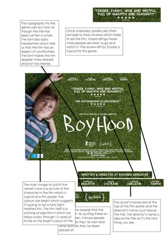
The typography fits the genre well as it look as though the title has been written in chalk. The font also looks handwritten which tells us that the film has an aspect of youthfulness. The font makes the film appear more relaxed and not too intense.
Once screened, posters are often remade to show reviews which helps to sell the film. Good ratings mean more people are likely to go and watch it. The review left by Empire is typical for this genre.
The main image to catch the viewer’s eye is a picture of the character in the film which is typical of a film poster. The colours are bright which suggests it’s going to be a fairly lighthearted film. The film itself is a are the awards that the These coming-of-age film in which we won. By putting these on film has follow a boy through 12 the years filmofposter, it shows people his life so the bright colours of awards the what they’ve won and grass and the boys clothing what festivals they’ve been played at.
The actor’s names are at the top of the film poster and the director’s name is just above the title. The director’s name is above the title so it’s the next thing you see.