
 Neorest


 Neorest


Michigan’s recognized leader for quality home furnishings and interior design.
A store full of ideas for the way you want to live. Gorman’s offers a one-stop resource for your home furnishings solutions. World class furniture, lighting, art, rugs, window treatments and accessories from the BEST 100 Brands. Plus, experienced, professional interior designers to help you put it all together. Furnishing your home has never been easier.
Add Gorman’s National Low-Price Guarantee, Gorman’s “MUST BE RIGHT” policy, and there’s no reason to shop anywhere else. Gorman’s has it all.
Over 80 years of furnishing Michigan’s Finest Homes. The best service, selection and savings are at Gorman’s Design Centers.




















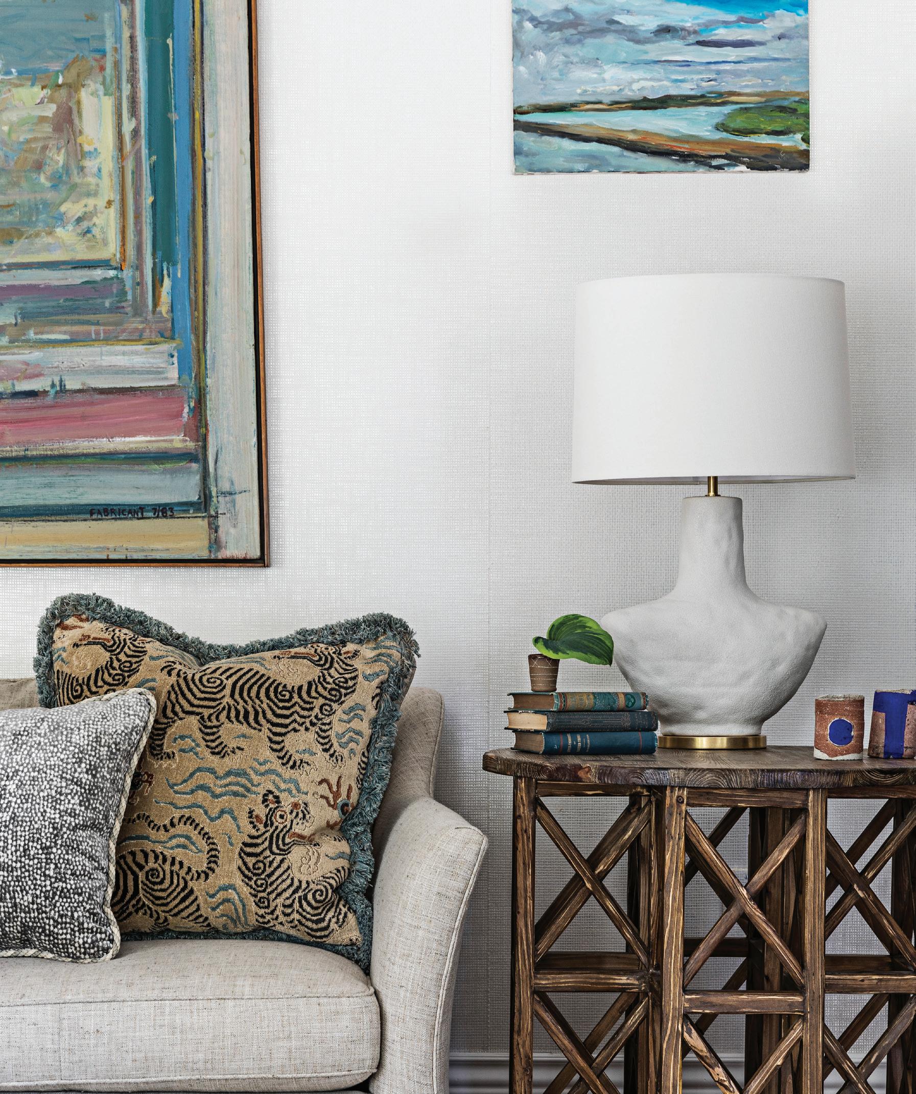
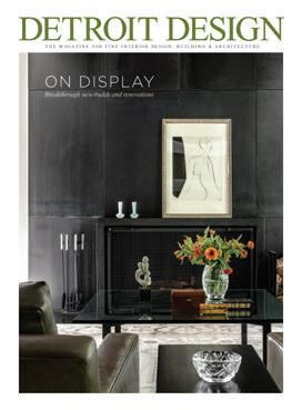
40 Serene in Saugatuck
Designer’s contemporary home takes full advantage of its stunning site.
50 Fresh Start
A couple discovers their preferred style by starting new with design firm Cloth & Kind.
58 In Living Color
Once outdated, this 1940s Birmingham bungalow is now a modern marvel, complete with bold art and an outdoor living oasis.
66 California Dreamin’
Globe-trotting homeowners return to Bloomfield Hills, where they transform a dark and dated mid-century home into a little bit of Venice Beach.
74 Mid-Century Revival
This Ann Arbor renovation takes a modern classic to new heights.
82 Worth the Wait
An active family turns their wish list into chic reality.
90 Coming Home
Returning to her roots, a young woman purchases her first house and calls on astute designer Katie Rodriguez.
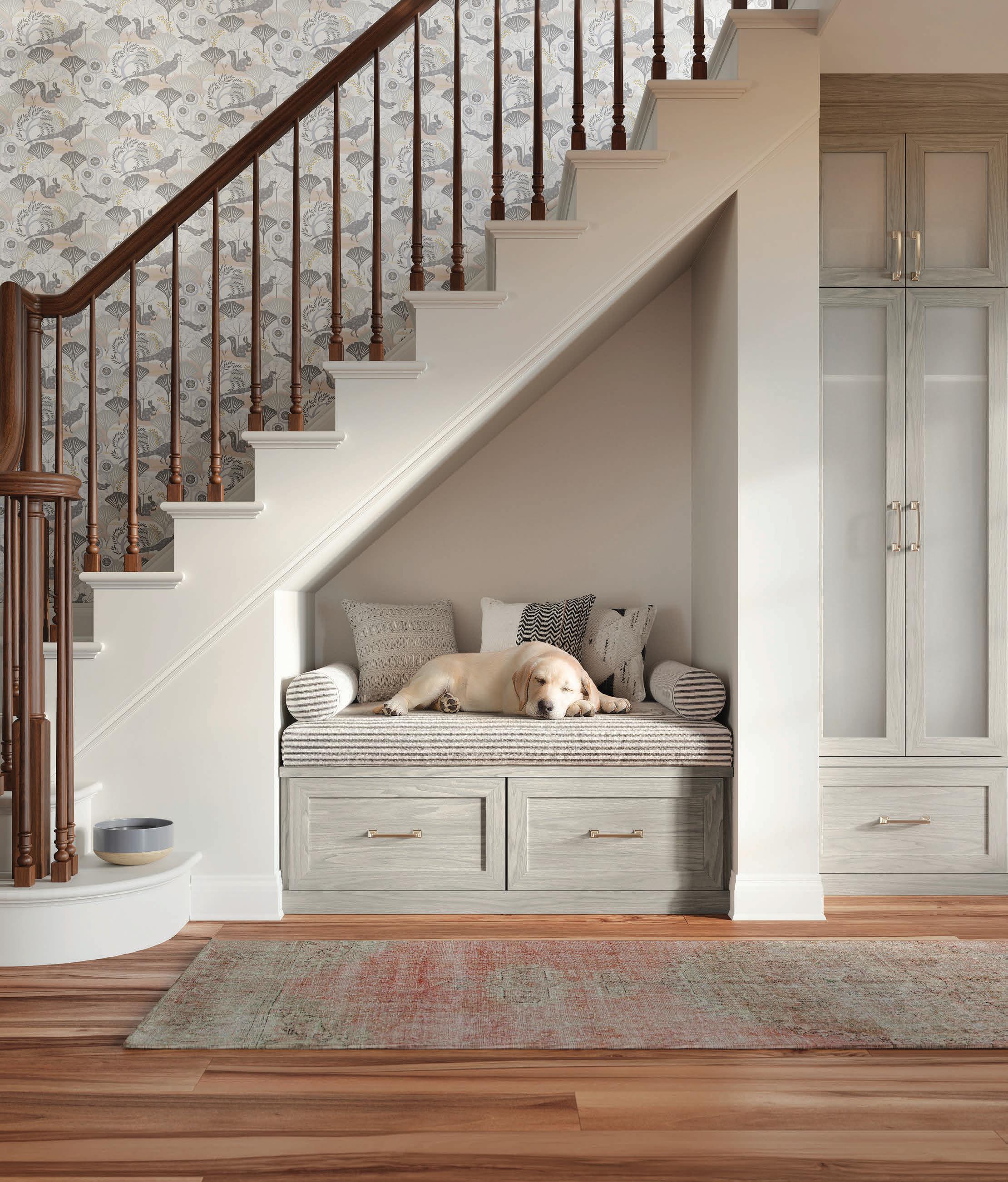


ORGANIZED STYLE
This sophisticated and functional mudroom, designed by Lauren Tolles of Maison Birmingham in collaboration with Anne Strickland Interiors, boasts plenty of storage and style.
18 On the Horizon
Blue Nova 825, Benjamin Moore’s 2024 Color of the Year, is inspiring décor and more.
20 Mudroom-Ready
Sleek yet functional accents add a stylish spin to your home’s most hardworking space.
22 Fresh Picks
Give your seasonal blooms a dramatic lift with these vases and vessels.
26
SNAPSHOT:
Desert Oasis
A primary bathroom becomes a peaceful retreat for a Detroit homeowner.
28
SNAPSHOT:
Sustainable Luxury
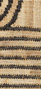
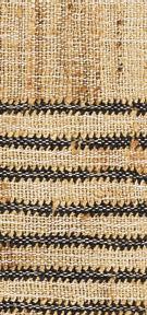
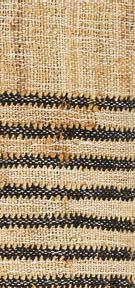
Studio Variously’s handmade, eco-friendly textiles are giving a modern look to ancient artisanal crafts.
30 SNAPSHOT:
Recycle Restyle
From the local designers and founders of Woodward Throwbacks comes a brandnew book to inspire your next space.
32 SNAPSHOT:
Fancy Fauna
Floral and animal accents add a touch of whimsy to this elegant home.
34 DESIGNS ON:
New Life
After a nearly $400 million renovation, the recently completed Book Tower development shines light on both the past and future of Detroit.
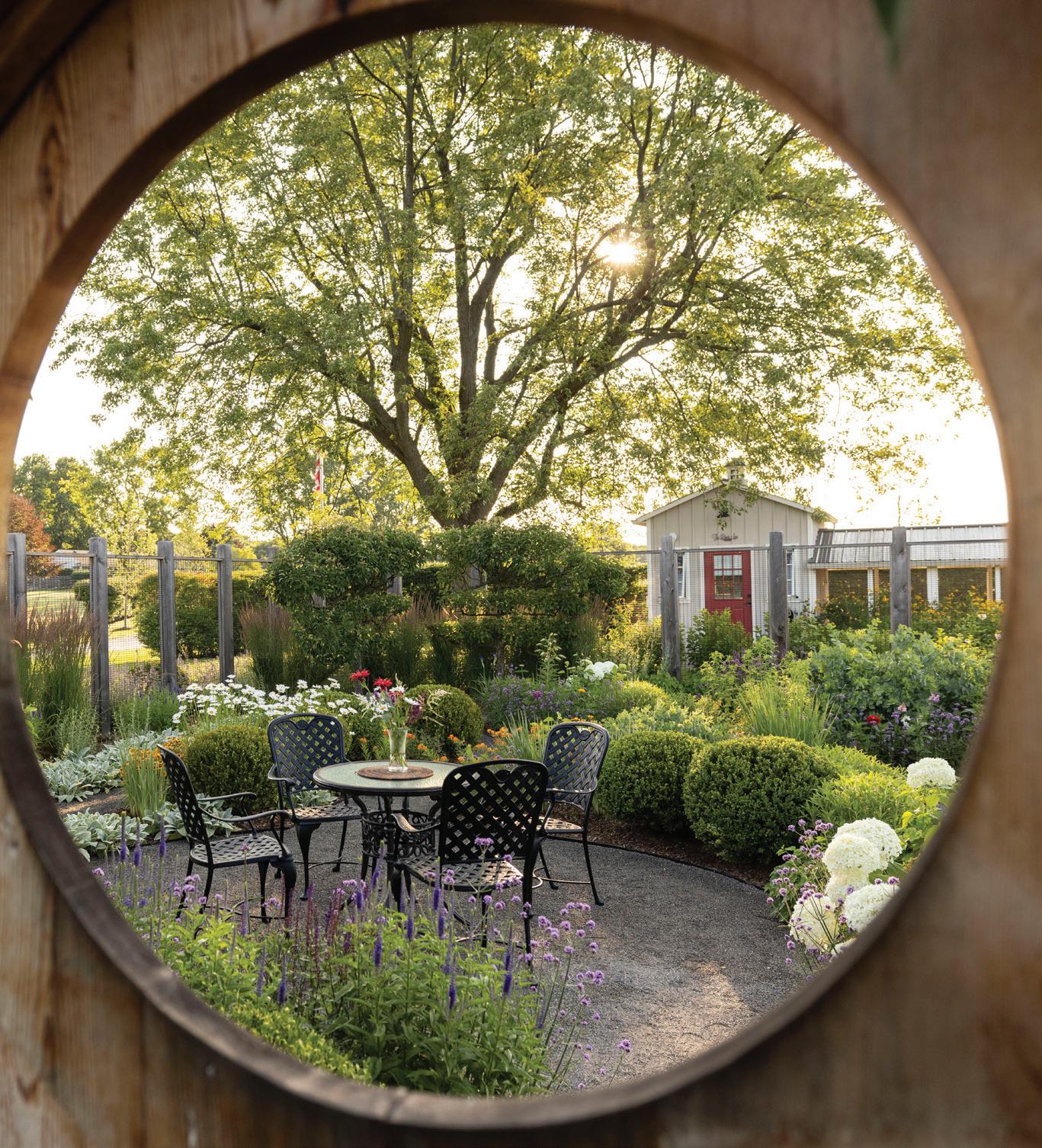
38 SEASONS:
Secret Garden
Adding an enchanting feature to an expansive property is magical.
14 Editor’s Letter Full circle.
102 House Party Inspiring displays take center stage at a Michigan Design Center event.
100 Design Resources Product information.
104 Bravo!
A dog-washing station gets a sophisticated update.
LEFT


With


The


is the world’s most followed brokerage on social media. Follow @cindykahnrealestate to join in on the experience!





To say I’m excited for this issue — my first with Detroit Design magazine — would be an understatement. Design has always been a part of my life.
My father works in masonry construction and, when I was young, many weekend and summer days were spent visiting his job sites. I’d often look up in awe at him, standing tall on multiple stories of scaffolding as he meticulously laid brick in intricate patterns. “How does he do that?” I wondered, absolutely fascinated. I may have been young, but I already had a strong appreciation not only of what went into the construction of a building, but of the ability of those, like my dad, who could take a few walls and transform them into something spectacular.
When I was in my teens, my parents built their own home, and I was lucky (even though my 16-year-old self didn’t know it at the time) to be there through each stage of the process. I saw the basement poured, the frame raised, the walls built, the flooring selected, and the furniture chosen. It was astonishing to watch a home go from dream to reality.
As I grew older, my interest in design led me to fashion and a career in New York. Just like in a build, a garment has so many facets — the intricacies of a stitch, the subtleties of a cut, the inspiration behind the design. To this day, these details continue to amaze me. When my husband and I moved back to Michigan upon the birth of our first child, I noticed a shift in my design interests, this time thanks to our first home. Furniture, paint colors, hardware, landscaping — there were so many choices, so many possibilities. It was then that I began to see the parallels between the career I had pursued and the one I grew up with.
While, admittedly, our home’s aesthetic du jour was more about stain-resistance and babyproofing — especially with our second child — as our children grew and I began writing more about interiors (thank you, Megan Swoyer!), my passion for the field exploded, especially for what we have going on locally.
There’s just so much history here when it comes to architecture and interiors. From the iconic formalist, Minoru Yamasaki, to all the Mid-century Modern revolutionaries of Cranbook, we’re a mecca of architectural wonder. Just look at the Barton Hills residence that designer Patrick Thompson renovated for a family of six (page 74). It was designed by the legendary David Osler in 1967, and not only did Thompson update the home with incredible (and, not to mention, family-friendly) results, he kept the integrity of the architect’s original philosophy.
We’re also lucky to have an unparalleled network of local makers and innovators who are actively shaking up our city’s design scene with their ingenuity, creativity, and passion. At Woodward Throwbacks, for example, owners Bo Shepherd and Kyle Dubay have been taking scrap materials, bound for the landfill, and repurposing them into gorgeous furniture — so much so, that they wrote a book about it (page 30). There’s also Bedrock, who, with ODA, had an incredible vision to bring new life into the iconic Book Tower (page 34), and Iannuzzi Studio, which took an outdated and abandoned home on Sodon Lake and transformed it into a beacon of efficiency and modern style (page 66).
The talented community we have in the metro Detroit area and around the state amazes me every day, and I’m so excited to showcase it all in these pages. Just as design has continued to inspire me since my youth, I hope that each home, each room, each product, and each designer we’ve featured in this issue inspires you in your own story.


GNADROWSKI@HOUR-MEDIA.COM
VOLUME 22 • ISSUE 1
PUBLISHER Jason Hosko
EDITORIAL
EDITOR Giuseppa Nadrowski
COPY EDITOR Anne Berry Daugherty
CONTRIBUTING WRITERS/STYLISTS Jamie Fabbri, Jeanine Matlow, Patty LaNoue Stearns, Megan Swoyer, Khristi Zimmeth
ART
CREATIVE DIRECTOR Lindsay Richards
ART DIRECTOR Justin Stenson
SENIOR PRODUCTION ARTIST Stephanie Daniel
JUNIOR ART DIRECTOR Steven Prokuda
GRAPHIC DESIGNER Kathryn Dave DESIGN INTERN Valentina Tersigni
CONTRIBUTING PHOTOGRAPHERS Jeff Aisen, Jackie Blair,John D’Angelo, Jeff Garland, Gerard + Belevender, Jason Keen, Justin Maconochie, Sally Matak, Laur Nash, Christopher Payne/Esto, Marta Perez, Hayden Stinebaugh, Joseph Tiano, Martin Vecchio, Matthew Williams, Jason Willis
ADVERTISING SALES
ACCOUNT EXECUTIVES Cynthia Barnhart, Karli Brown, Cathleen Francois, Donna Kassab, Lisa LaBelle, Carol Lawrence, Andrew Nolan, Mary Pantely and Associates
PRODUCTION
PRODUCTION DIRECTOR Jenine Knox
SENIOR PRODUCTION COORDINATOR Jill Berry
ACCOUNT MANAGER Elizabeth Kowalik
AD COORDINATOR Amanda Kozlowski
PRODUCTION ARTIST Jonathan Boedecker
GRAPHIC DESIGNER Jim Bibart
HOUR CITY STUDIOS
VIDEO PRODUCER Nicole Toporowski
VIDEOGRAPHER Heather Moody
DIGITAL
DIRECTOR OF DIGITAL STRATEGY Travis Cleveland
DIGITAL DEVELOPMENT MANAGER Matt Cappo
SENIOR DIGITAL DEVELOPMENT SPECIALIST Luanne Lim
DIGITAL DEVELOPMENT SPECIALISTS Jim Bowser, Connor McDonald
DIGITAL MEDIA ASSISTANT Robyn Banks
IT
IT DIRECTOR Jeremy Leland
CIRCULATION
CIRCULATION MANAGER Riley Meyers
CIRCULATION COORDINATORS David Benvenuto, Susan Combs, Cathy Krajenke, Rachel Moulden, Michele Wold
MARKETING AND EVENTS
MARKETING AND EVENTS MANAGER Jodie Svagr
MARKETING AND EVENTS COORDINATOR Jaime Presnail
COMMUNICATIONS AND PR Regan Blissett
MARKETING RESEARCH DIRECTOR Sofia Shevin
MARKETING RESEARCH COORDINATORS Alyssa Fueri, Kristin Mingo
MARKETING RESEARCH SALES COORDINATOR Alexandra Thompson
MARKETING RESEARCH ASSISTANT Theresa Lowery
PRS GRAPHIC DESIGNER Kendra Okamoto
BUSINESS
CEO Stefan Wanczyk
PRESIDENT John Balardo
DIRECTOR OF BUSINESS OPERATIONS Kathie Gorecki
ASSISTANT OFFICE MANAGER Natasha Bajju
SENIOR ACCOUNTING ASSOCIATE Andrew Kotzian
ACCOUNTING ASSOCIATE Kate Manley, Austin Schmelzle
DISTRIBUTION Target Distribution, Troy
Postmaster:
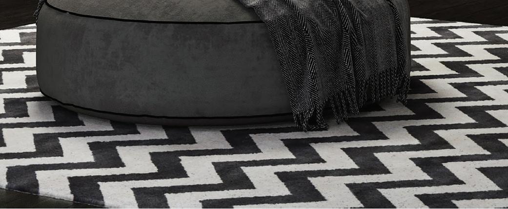
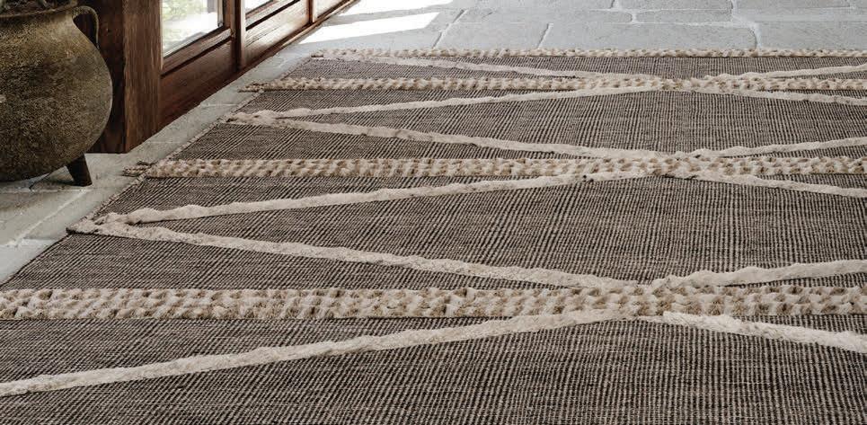
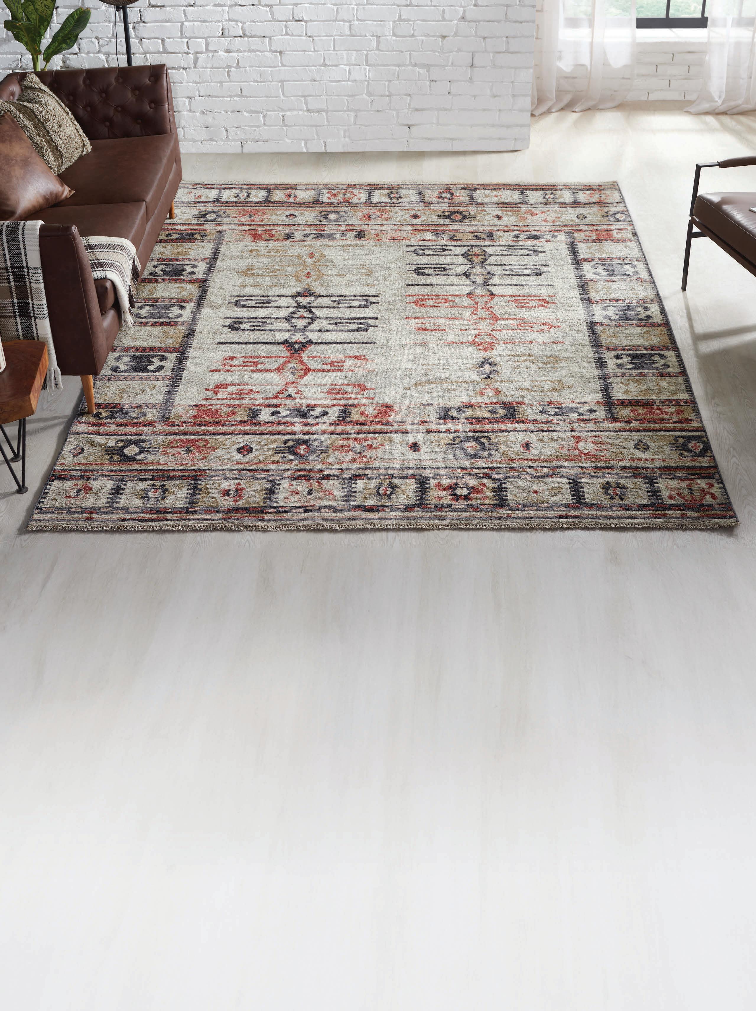
Recharge your spaces with a charming Soumak design, rendered in a fresh, spirited colorway. Constructed of 100% wool, this affordable rug features a unique herringbone texture and geometric pattern. Available in a variety of sizes, including a 10’ runner and an 8’ round.
We invite you to visit our showrooms for exceptional service and an unparalled selection of in-stock rugs and daily new arrivals.
Birmingham: 850 S. Old Woodward
• 248-646-RUGS (7847)
Novi: 43223 Twelve Mile Road • 248-449-RUGS (7847)
HagopianRugs.com
Call 1-800-HAGOPIAN (424-6742) for your Rug, Carpet, Wood, Tile, Air Duct & Furniture cleaning needs.


Masterful design + expert installation create an innovative kitchen you’ll truly love.
Now is the time to visit the Dillman & Upton Design Center. Overflowing with state-of-the-art products and cutting-edge materials, we have ideas & inspiration for every room. Drop by to browse or start talking with one of our design specialists. You’ll be thrilled with the results!
607 Woodward Street | Rochester, Michigan | 248.651.9411 | dillmanupton.com

Blue Nova 825, Benjamin Moore’s 2024 Color of the Year, has inspired a new moody palette for everything from walls to textiles, appliances — and even your clothes
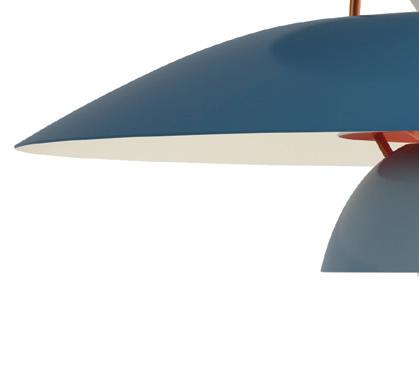
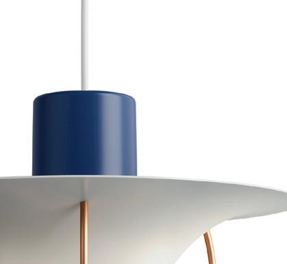
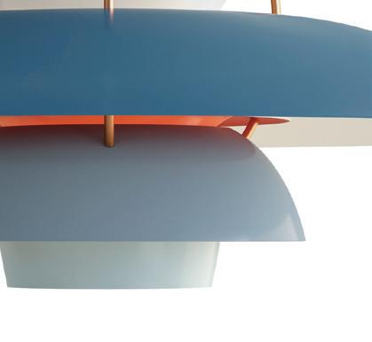
1. The Louis Poulsen PH5 Pendant Lamp by POUL HENNINGSEN shines with color. $1,224, Design Within Reach, Grand Rapids, dwr.com.
2. MAXMARA debuted a colorful Spring collection that includes looks in varying blue hues. MaxMara, Somerset Collection, Troy, maxmara.com.
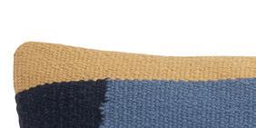
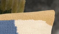
3. Geometric patterns lend COZEY’s Romi Cushion a playful touch. $32, Cozey, cozey.com.
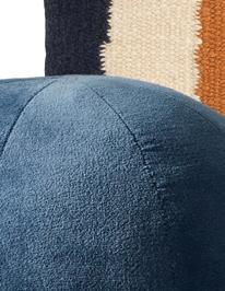
4. The Terra Velvet Sphere Throw Pillow by CB2 adds a luxe design detail. $49.95, CB2, Birmingham, cb2.com.
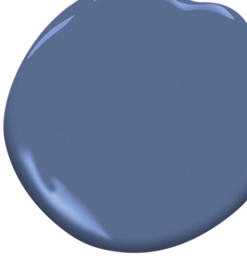
5. BENJAMIN MOORE’S Blue Nova
825 is the 2024 Color of the Year. From $52.99/gallon, Benjamin Moore, benjaminmoore.com.
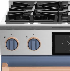
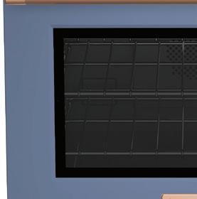
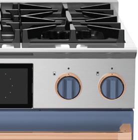
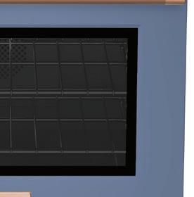
6. Go bold with the 30-inch Dual Fuel Range by BLUESTAR, in Pigeon Blue. From $8,295, Specialties Showroom, Berkley, bluestarcooking.com, michigan.kitchen.
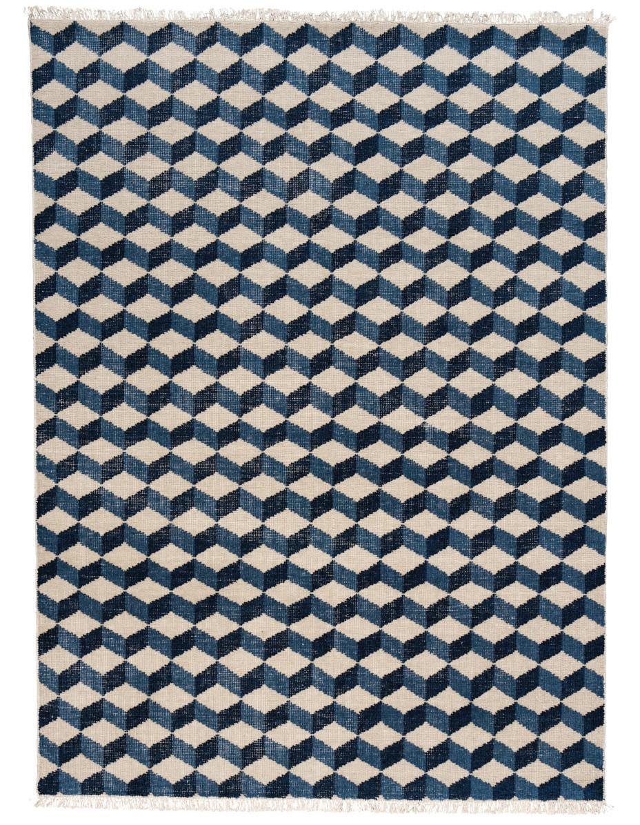
7. The Pompeii HandKnotted Rug from SCHUMACHER is crafted of a luxe cotton and wool blend. To the trade, Schumacher, Michigan Design Center, Troy, schumacher.com, michigandesign.com.
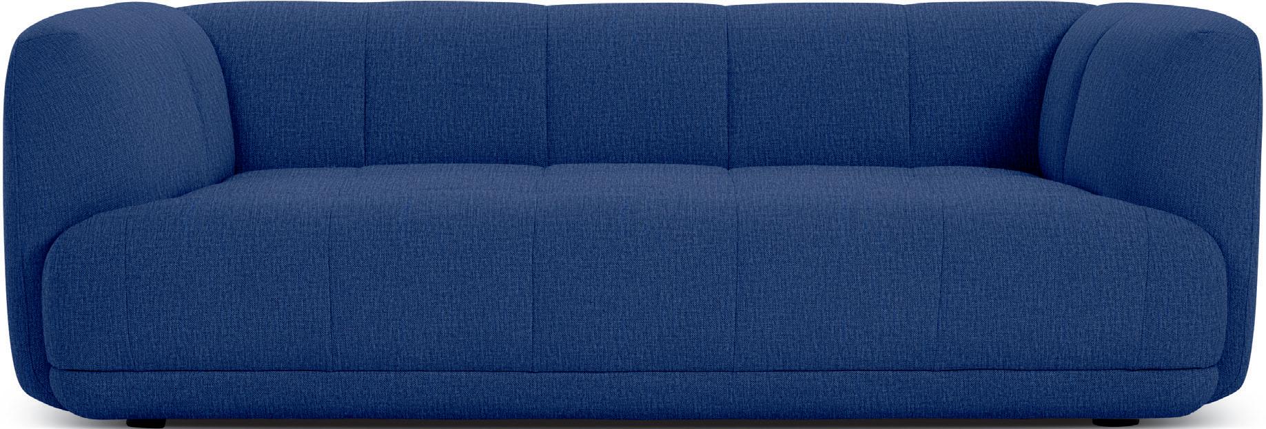
8. The modern Quilton Sofa was designed by DOSHI LEVIEN for HAY. $3,595, Design Within Reach, Grand Rapids, dwr.com.
























Sleek yet functional accents add a stylish spin to your home’s most hardworking space
FABBRISTYLED BY JAMIE
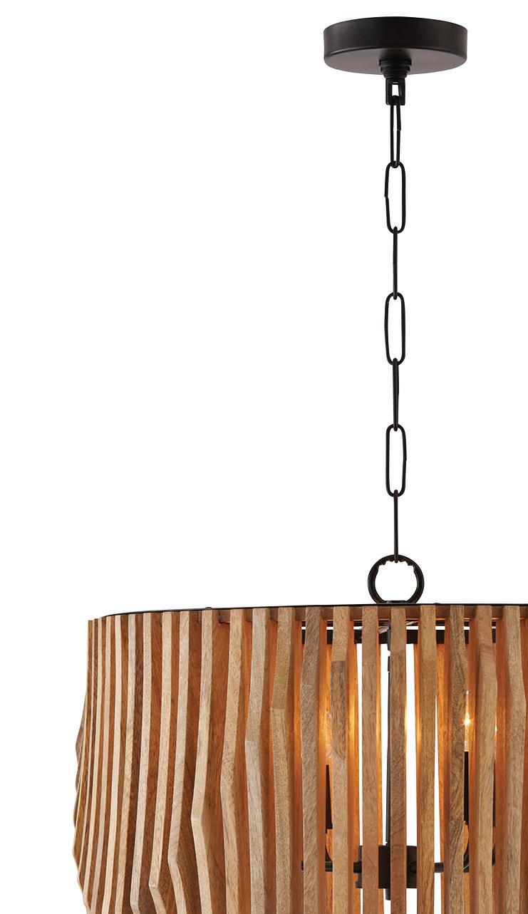
1. Don’t skimp on simple but chic lighting, like the Archer Wide Drum Chandelier by CAPITAL LIGHTING. Price upon request, Ferguson Bath, Kitchen & Lighting Gallery, Troy, ferguson.com.
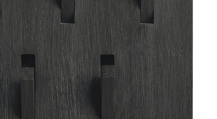
2. Keep coats and bags organized with INDUSTRY WEST’S modern Utilitie Wall Hanger, crafted from solid oak. $259, Industry West, industrywest.com.
3.The Trenton 3-Piece Essential Organization Set with Calendar from POTTERY BARN offers command center essentials to keep things tidy and on track. $329, Pottery Barn, multiple locations, potterybarn.com.
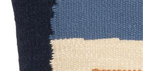
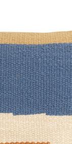
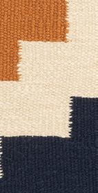
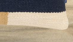
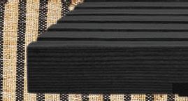
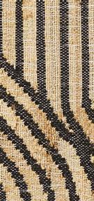
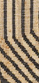
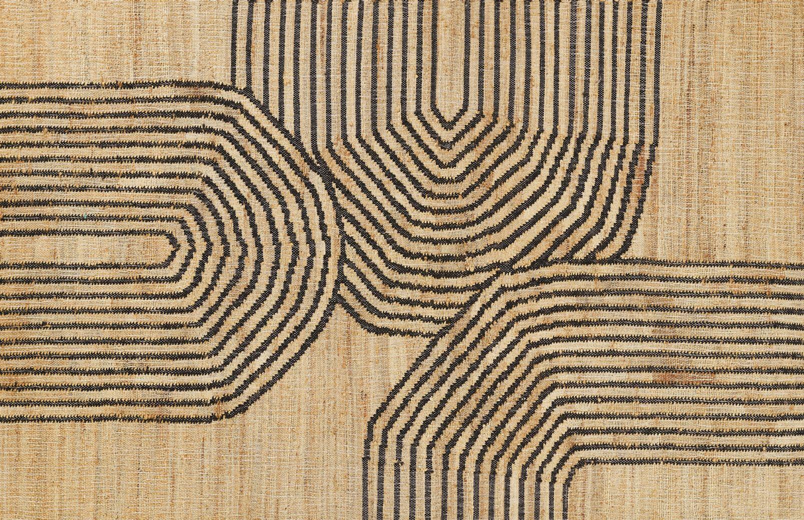
4. A durable rug is a must for any mudroom, like this lightweight Abstract Arches Flatweave Area Rug by TEMPAPER & CO. $199-$799, Leon & Lulu, Clawson, leonandlulu.com, tempaper.com.
5. GUS MODERN’s versatile Transit Bench, in black ash, has a sleek silhouette that’s sure to fit any stylish space. $795, Throwbacks Home, Detroit, throwbackshome.com, gusmodern.com.
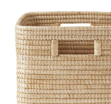
6. The La Jolla Square Bin by SERENA & LILY provides a pretty yet practical place to keep storage at bay. $98, Serena & Lily, Birmingham, serenaandlily.com.




“We’ve found that incorporating a command center (or drop zone) in the mudroom is extremely functional, and still remains out of sight in a utilitarian area. For families, we highly recommend an area where everyone can see a calendar and find any essential items they need to take with them as they’re flying out the door.”
— LAUREN TOLLES, FOUNDER OF BIRMINGHAM-BASED MAISON BIRMINGHAM



















Give your seasonal blooms a dramatic lift with these vases and vessels
STYLED BY JAMIE FABBRI




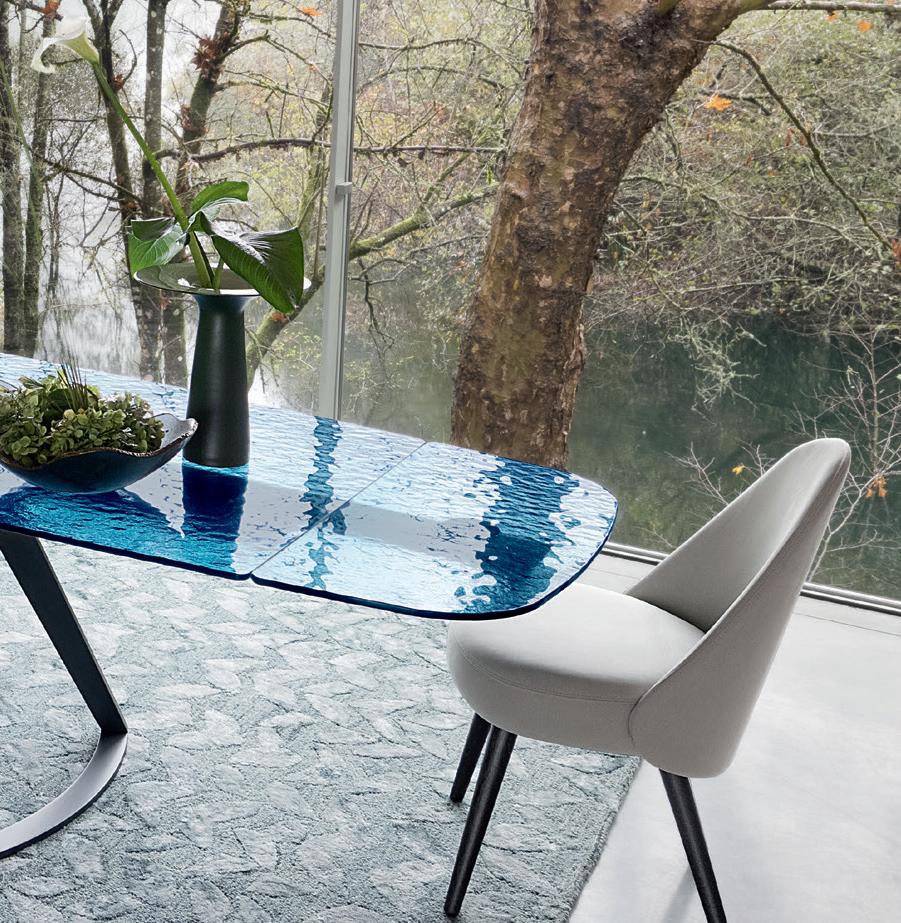
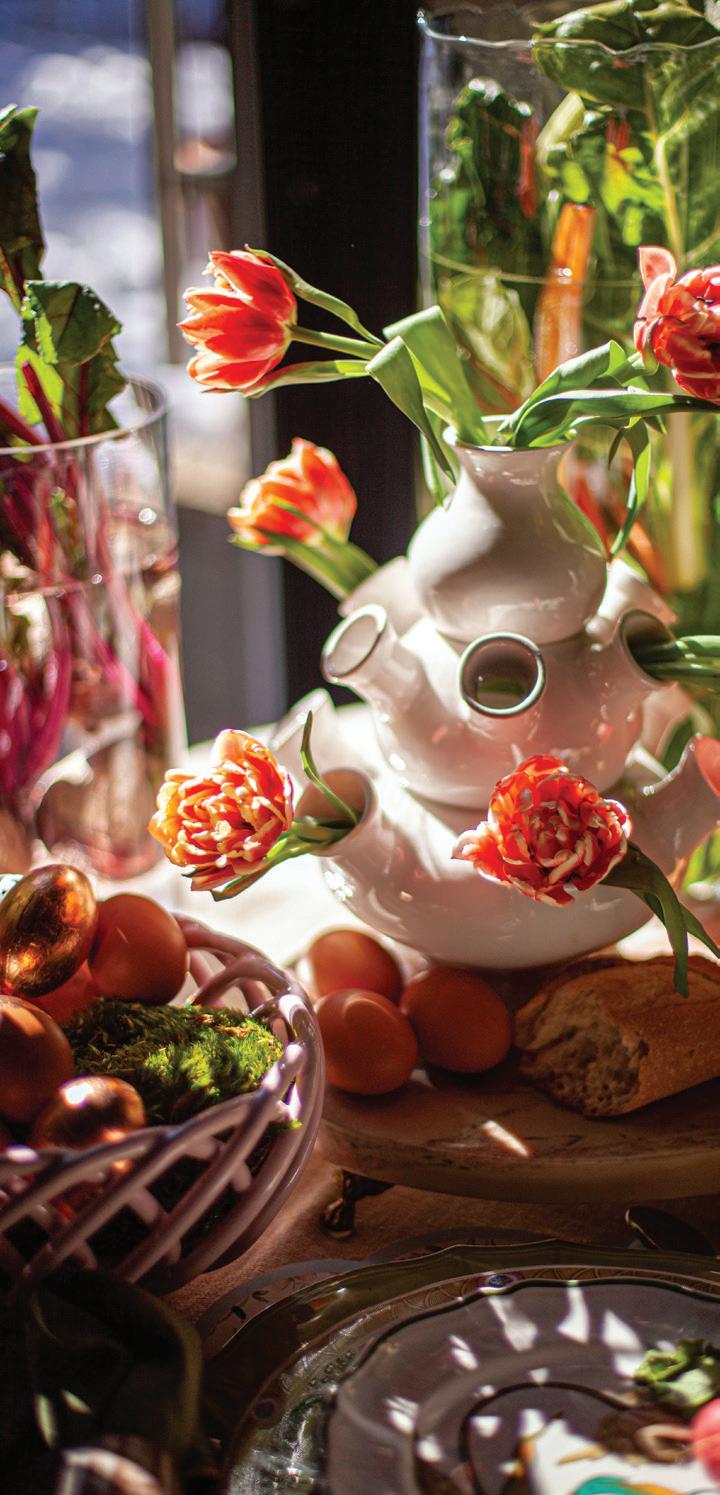
1. FLEURDETROIT’s Vintage Tulipiere is a statement accent. fleurdetroit, Bloomfield Hills, fleurdetroit.com.
Studio, Michigan Design Center, Troy, michigandesign.com, uttermost.com.

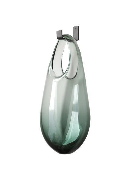
2. With its unique design, SKLO’s Hold Wall-Mounted Vase adds a modern touch. $880, Arkitektura, Birmingham, arksf.com.


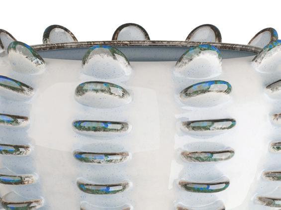
5. The Ailee Vase by ARTERIORS HOME has a silhouette like a spiny sea urchin. $340, CAI Designs, Michigan Design Center, Troy, arteriorshome.com, michigandesign.com.
6. Give your space an artistic vibe with REGINA ANDREW’s Poe Vase. $262.50, Regina Andrew Detroit, Wyandotte, reginaandrew.com.
3.The Sicilian Heads Lemons Head Vase by VIETRI features a beautiful woman with vibrant yellow lemons adorning her head. $860, The Italian Dish, Birmingham, theitaliandish.com, vietri.com.




1. To ensure a longer vase life, we recommend always cutting your stems on a diagonal, at your desired height.


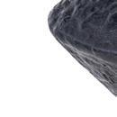


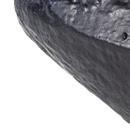







2. Remove any unnecessary foliage from the stems. The more leaves you remove, the more energy will be reserved for the bloom, helping with the flower’s longevity.

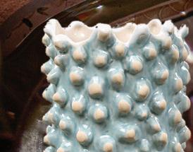
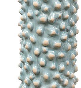
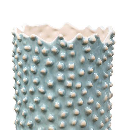
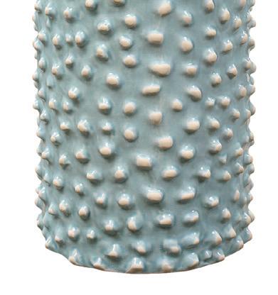
4. Aqua ceramic vases by UTTERMOST boast a heavy texture and an interior glaze. Price upon request, Lighting Resource
boast a heavy texture and an interior glaze. Lighting Resource








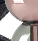



7. CLOUDNOLA’s Flip Vases are designed to be flippable, presenting two distinct looks in one. $35-$110, Fauno Floral, Detroit, cloudnola.com, faunofloral.com.






3. Change the water every few days, or anytime it appears murky. As with all cut flowers, fresh clean water is imperative, as it keeps natural bacteria from developing, thus lengthening the life of your cut stems.















ORGANIC CURVES
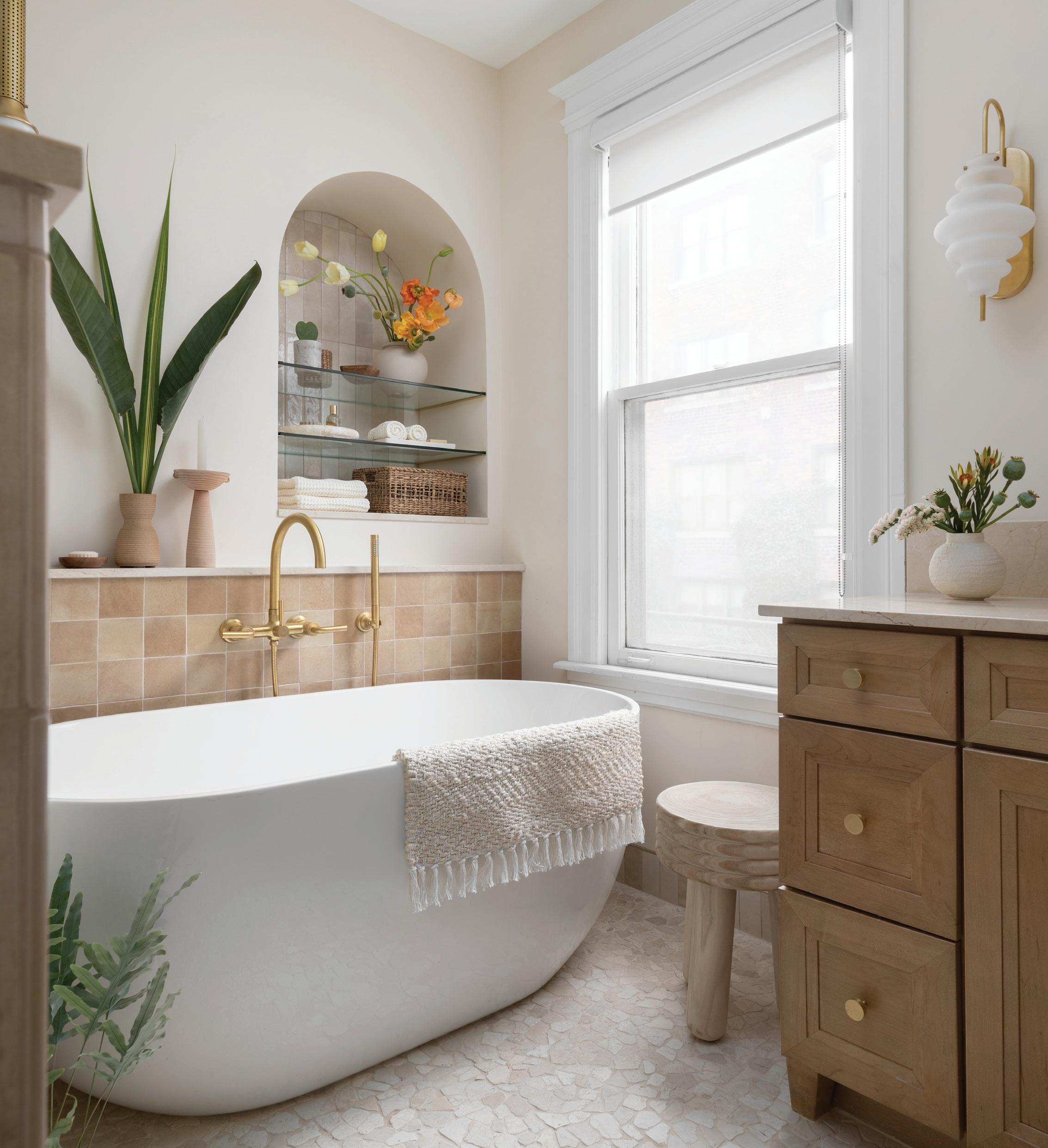
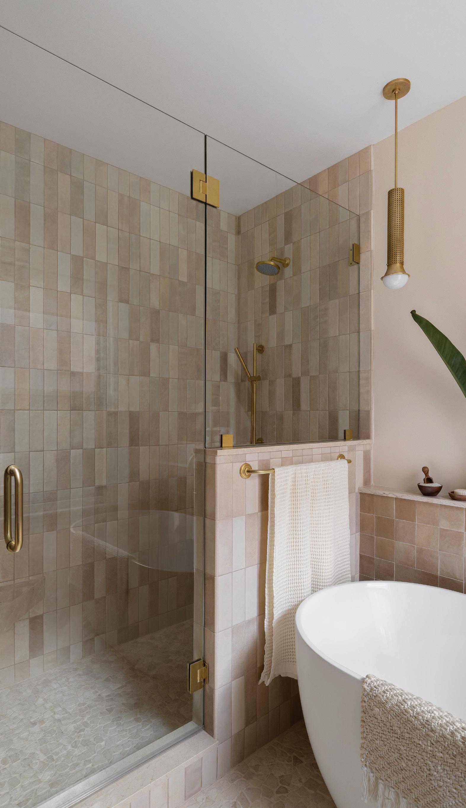
Once a guest room, this transformed primary bath takes inspiration from the Californian desert with its muted palette, cool textures, and modern shapes.
Primary bathroom transforms into a peaceful retreat
TEXT BY JEANINE MATLOW PHOTOGRAPHY BY JOSEPH TIANOThanks to a thoughtful renovation by Anahi Hollis, owner of Anahi Hollis Design in Pleasant Ridge, the primary bathroom in a West Village home built in 1914 feels like a desert getaway. “She loves Palm Springs and the whole West Coast vibe, and she wanted something serene, like a spa bath she can relax in,” Hollis says about her client, Waiinine Simmons, who appreciates every last detail.
“I can’t pick a favorite feature; the soaking tub, the niche, the shower,
everything in the bathroom is beautiful,” Simmons says. “Once I walk through the closet and into that bathroom, it’s like heaven at home.”
A former guest room became a primary bathroom. “We reconfigured the back half of the house,” Hollis explains. A walk-in closet leads to the space from the bedroom. It now incorporates a soaking tub and a separate shower, which were on Simmons’ wish list. Above the tub, an arched niche and a ledge on the half-wall below add storage space. The shower features a curved bench and additional niches.
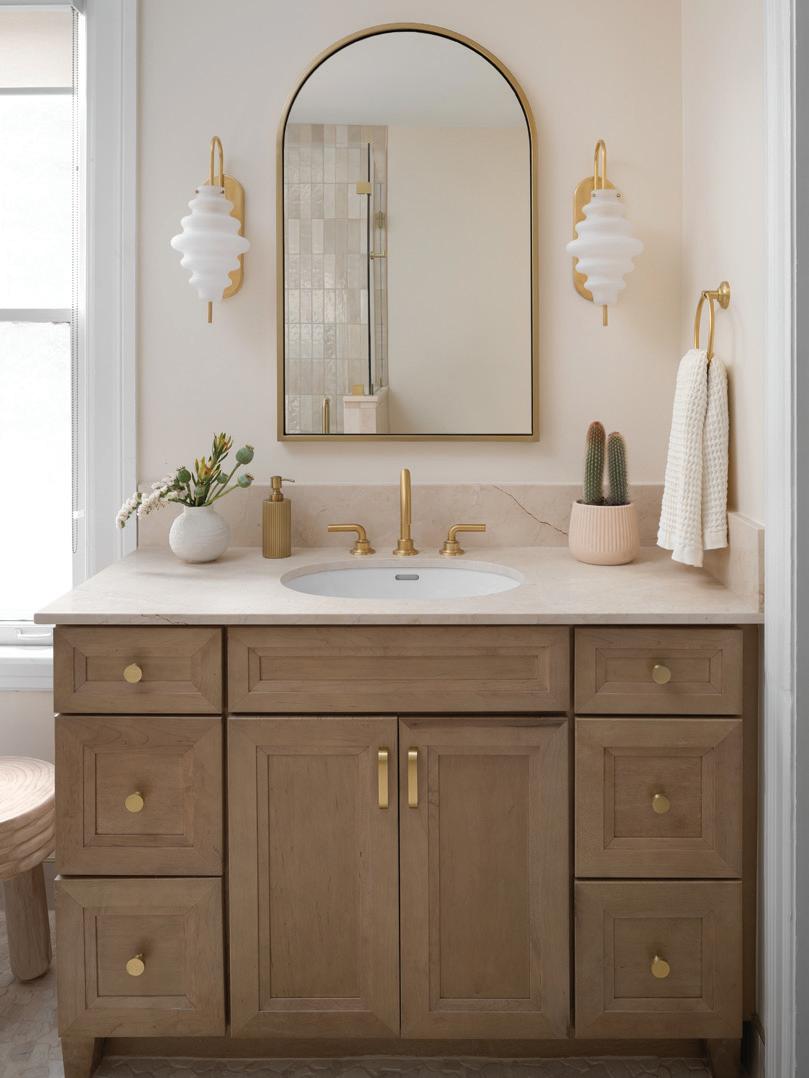
Distinct light fixtures with brushed brass finishes include a pendant above the tub and sconces that flank a rounded mirror above the vanity. “We tried to maintain a lot of curves and arches in the space to soften any sharp corners,” the designer says. Subtle texture comes from the tumbled marble mosaic floor tiles in creamy shades and the shower wall tiles with color variations that range from soft pinks to sand hues. The bathroom’s natural light amplifies the warm white color of the walls.
Hollis says primary bathrooms take some planning. “The biggest challenge, always, is coming up with a perfect layout,” she says. “Everywhere you look, (there’s) a feature wall that has something interesting going on.”
Material pairings also matter, Hollis notes. “I always pay attention to details and how things play off of each other,” she explains. “Coordinating different tiles is a welcome challenge. I love working with tile.”
The desert aesthetic in this home has a calming effect. “If you close that window shade, you can be anywhere. That’s the beauty of design. It can transport you to a different place,” she says. “Sometimes you just need to get away. It’s really good to have that space where you can check out and still be at home.”
MORE INFORMATION: anahihollis.com
 WEST COAST COOL
Growing up in Ahmedabad, Gujarat, India, where design, art, textiles, and architecture are among the city’s many treasures, Anjali Purohit, the founder and creative director of Bloomfield Hills-based Studio Variously, a sustainable design studio whose in-house brand Variously focuses on ethically-sourced materials and artisan craftsmanship to create modern textiles, couldn’t help but soak up the inspiring visuals.
“I come from a place with a very strong legacy for design,” says Purohit, who earned her bachelor’s degree in accessory design at the National Institute of Fashion Technology in New Delhi, and her master’s at Nuova Accademia di Belle Arti in Milan, Italy.
Working through college in various design fields gave Purohit invaluable real-life experience and exposure to working with different materials, industries, and markets, learning what it “took to design collections” as well as gaining a better understanding of “the whole supply chain.”
“Most of your first experiences are to understand how things are getting made, how things are getting done, and that it could be (mass-produced) or it could be done by hand,” says Purohit, who has had opportunities in the past to work with both larger, more mass-produced businesses and on smaller more artisan-based projects. “You get these various kinds of experiences when you’re really young … and it changes the way you think and also helps you appreciate your own work.”
For Purohit, the biggest pitfall of working in larger-scale industries was that “you’re just simply churning out pieces after pieces without thinking, is this really necessary? Also, everything was heavily made on machines.”
HANDMADE
Wanting to open her own company and feeling a pull toward more handmade designs, Purohit knew she wanted her business to take an artisan-based direction. “It was just a space I felt I could give more justice to my creative energies, as well as a better use of my time and my experience as a designer. I would rather enable more artisans than more factories, so it was a very conscious choice. I’ve had the fortune of working with many factories and big suppliers, so it could have been a really lucrative opportunity to just continue doing that. But I felt there would be nothing new that I would be doing, and if I’m taking the risk of starting a business, I might as well make it worth it.”
In 2016, Purohit launched her company, Studio Variously, with the mission of creating responsible products that are sustainable; crafted of ethically sourced, natural materials; and that utilize heritage weaving and dyeing techniques. She also wanted to ensure the safety of the artisans and the communities they reside in by only employing the use of non toxic dyes. “When you’re using materials that are natural and sustainable, it’s a safer environment for the artisans, because if they’re using highly toxic dyes, it can cause water pollution in the areas around them. So, for the people who

are putting in their time and effort to create these pieces, their ecosystem shouldn’t be hampered,” Purohit says.
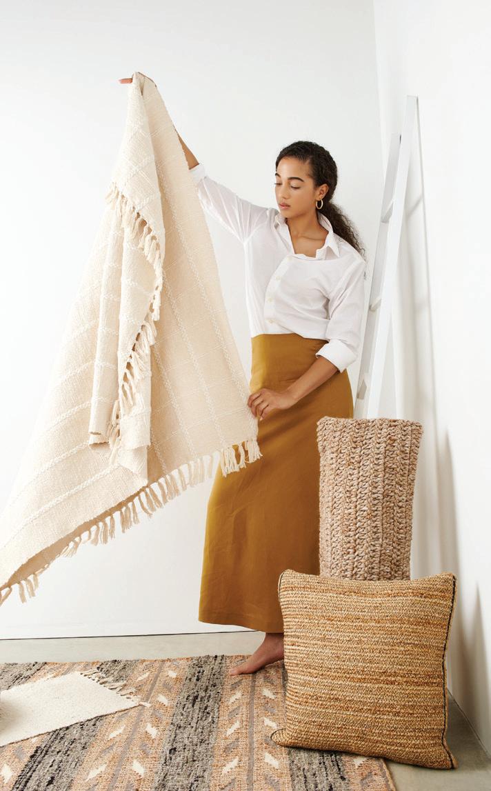
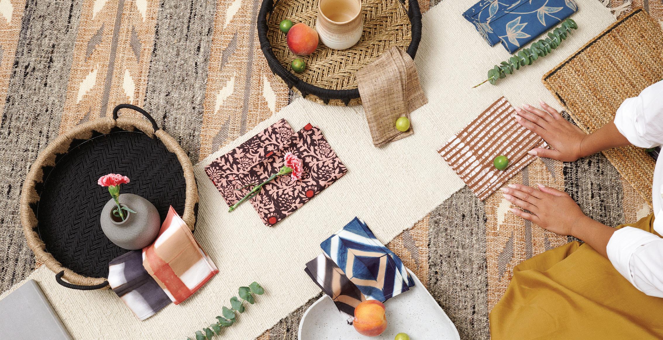
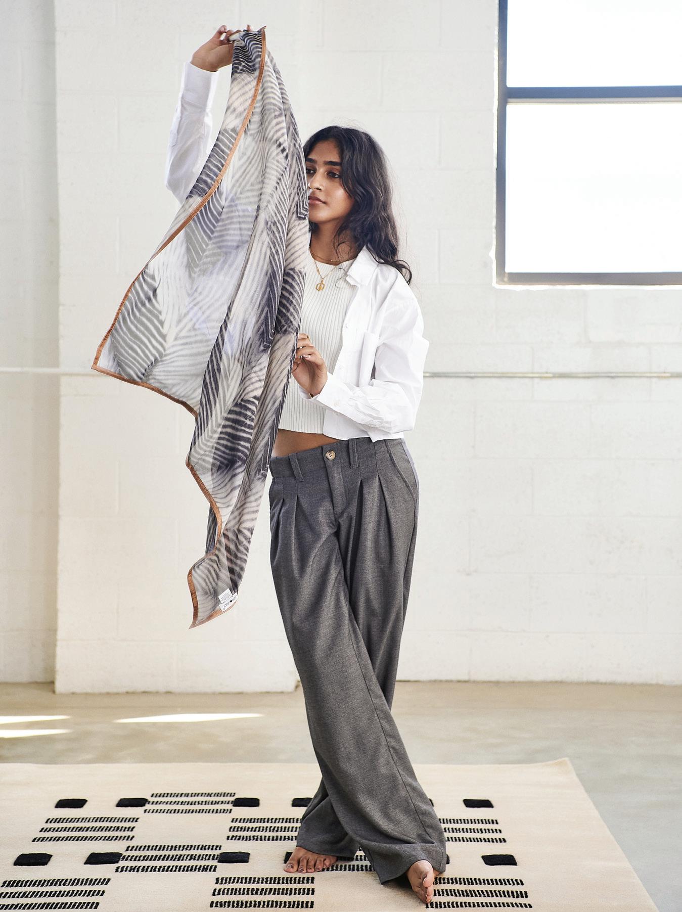
At the basis of her award-winning business is her commitment to the direct partnerships she has fostered with mostly women artisans in India, Nepal, and Peru who create the modern and minimalist lifestyle goods she designs and offers to both retail and wholesale markets under her trademarked Variously brand. From gorgeous rugs (this year she’ll be releasing hand-knotted, hand-tufted, and handwoven varieties) to graphic pillows, handwoven cotton throws, shibori hand-dyed napkins, and scarves (in sumptuous fabrics like linen, cotton, alpaca and silk with details like block prints and hand embroidery), her luxurious creations are giving new life to ancient craftsmanship.
She also collaborates with interior designers and architectural studios on projects in both commercial (such as hotels) and residential spaces. The beauty of working with skillful artisans, Purohit says, is that they can customize colors, sizes, and specific looks to “provide extremely unique, high-quality products.”
This May, Purohit’s remarkable designs will be showcased at ICFF + WantedDesign Manhattan, an annual trade event in New York City that promotes the creative community both nationally and internationally with conversations, exhibitions, and workshops.
MORE INFORMATION: studiovariously.com


From the local designers and founders of Woodward Throwbacks comes a brandnew book to inspire your next space
TEXT BY GIUSEPPA NADROWSKI PHOTOGRAPHY BY GERARD + BELEVENDERFor Bo Shepherd and Kyle Dubay, the design duo behind Woodward Throwbacks, the Detroit-based sustainable furniture brand, this spring is a season for celebration as their first-ever book, “Throwbacks Home Interiors,” hits bookshelves. The 256-page hardcover, published by Clarkson Potter, showcases 15 one-of-a-kind homes that highlight the beauty and charm of using often-scrapped and overlooked materials – some of which Shepherd and Dubay worked on themselves. Throughout the book, Shepherd and Dubay share tips and tricks for how to use, style, and recycle these one-of-a-kind accents into your own home. Detroit Design recently spoke with Dubay about the inspiration behind the book, the homes featured, and what readers can expect to find within its pages.
Since 2013, Dubay and Shepherd have created furniture and renovated homes throughout the city using found materials, so when it came to writing this book, they were all about inspiring their readers to look for the beauty and treasure in reusing these resources. “We wanted to try to show people that you can use reclaimed and salvaged materials, and that it doesn’t have to always look reclaimed,” Dubay says. He notes that the homes featured range from modern to industrial, classic, and even eclectic.
“If there’s any takeaway between all the homes, it’s that they’re all very creative in their own right. Each house is very different, but each speaks to the individual (homeowner).” From the bold hues and contrasting prints of the Not Your Grandma’s House to the stunningly industrial Garage House, which features repurposed gas cans for seating and a light and bright kitchen that exemplifies how to marry the old with the new (like a shimmering zellige tile backsplash paired with cabinets using an old building’s façade and an island designed from vintage church pews), each picture and page recognizes the beauty of designing a home with recycled pieces. Dubay’s and Shepherd’s own 1901 Victorian Corktown residence is also featured. “You get a more authentic product,” Dubay says of using repurposed materials, which lend character to your home. “Sometimes these new buildings are just so soulless, so you kind of bring some of these reclaimed elements in there and it just brings a lot to the project.”
For Dubay and Shepherd, who in 2022 opened their first showroom and retail location in Detroit’s Capitol Park, making sure the spaces displayed in the book were “accessible and attainable” was of utmost importance. “There were no interior designers on these projects, no architects. These are all the homeowners, in their own facilities, within their own means, and I think that’s going to resonate well with a lot of people,” Dubay says. “The idea was to inspire people. If you’re doing a renovation or a smaller project, hopefully you can find something (in the book) that can inspire you to reuse some of the materials that you’ve taken out of the project. I just think this is a great highlight for Detroit, too. It really showcases the creative individuals here and the opportunities there are.”
MORE INFORMATION: throwbackshome.com

Floral and animal accents add a touch of whimsy to this elegant home
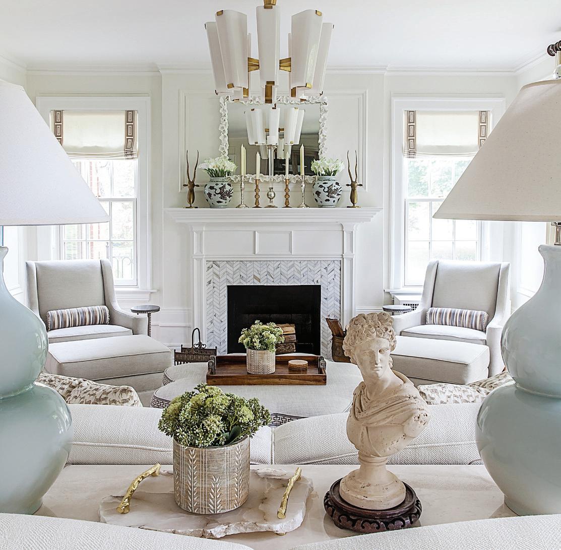
TEXT BY MEGAN SWOYER PHOTOGRAPHY BY JEFF GARLANDWhen interior designer Annie Kordas first set eyes on the 1930s Colonial she was about to update, she knew the living room would be a challenge. Kordas, of 9-year-old Annie Kordas Interiors in Grosse Pointe Farms, says her client was confused and overwhelmed by the space. “My client has a great eye for design, but that living room has three arched French doors, (and) it’s long — so long — and wide. I suggested putting two sofas in the voluminous space, back-to-back, with different seating areas,” Kordas says. To punctuate the two areas, two identical chandeliers from Visual Comfort create symmetry and ambient lighting.
After solving the layout puzzle, the rest of Kordas’ commission at the Grosse Pointe Park home was downright fun. Pops of whimsy flow from the main space to the foyer, side entrance, and stairway landing.
Known for pulling together a head-turning
mix of materials, patterns, and touches of the unexpected, Kordas started with a thoughtful palette (in this case, lots of creams, tans, and a few light blues). The resourceful designer almost always brings in updated antiques (like the foyer’s reupholstered 1940s chairs, once featuring a gaudy orange and now clothed in a Schumacher plaid) and metal accents that she strategically places here and there.
Another trademark is her penchant for animals. For this project, she found two large brass stags for the mantel (“I found one on Etsy and one on eBay,” Kordas says). Nearby, tiny antelopes grace accent pillows that feature a sweet Schumacher pattern.
Heading up the stairs, a window seat on the landing, which was formerly plain, now is welcoming with sconces, a custom seat cushion, and pillows — including one with a cute little deer. “I always tell clients if they don’t like what I’ve installed, I’ll take it all out and begin again,” Kordas says. “The only thing I showed her before the install was the window seat fabric, which has a hint of abstract to it and complements the grass cloth wallpaper.”
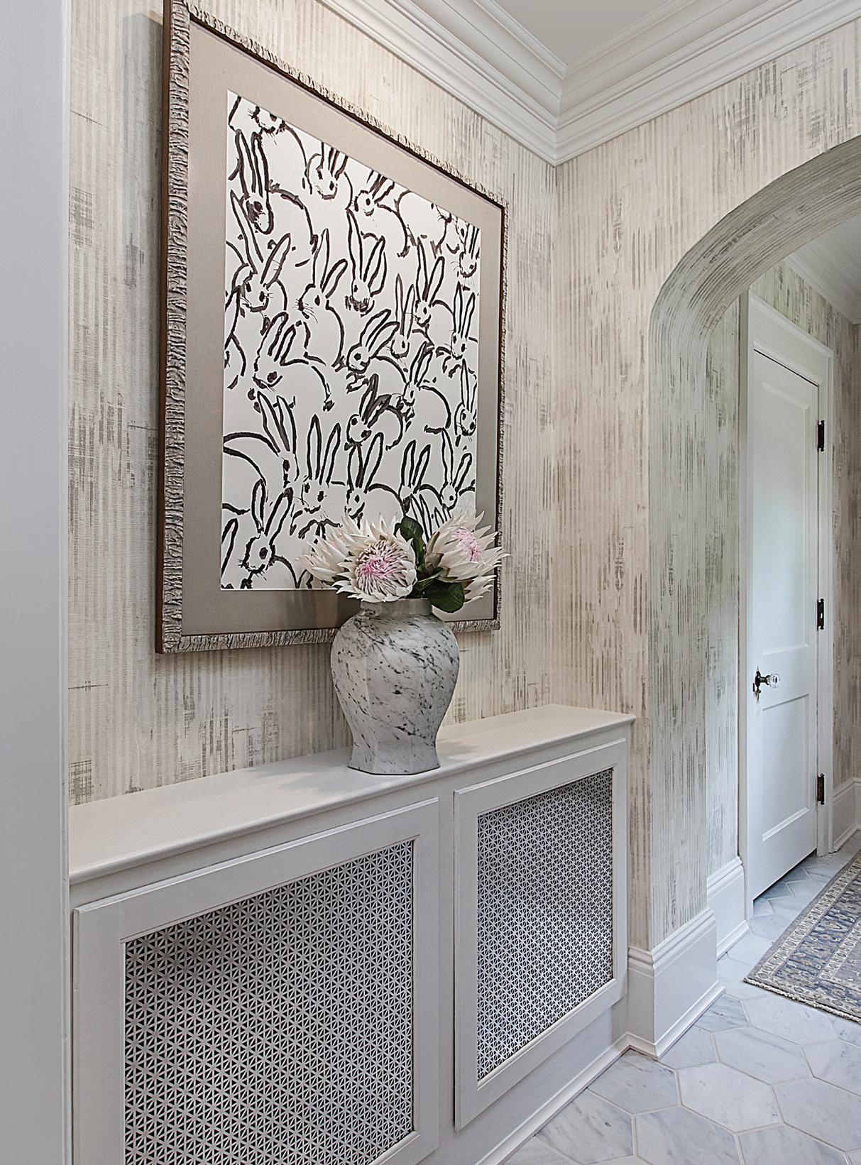
At the side entrance of the home, a framed piece of wallpaper — the pattern is from a renowned Hunt Slonem rabbit painting — cheers the space. “Who can afford a Slonem original?” Kordas asks. She ordered the wallpaper, selected a gorgeous frame and museum glass from a favorite framing shop — The Great Frame Up in Grosse Pointe Woods — and, voila, clever art!
“I just love the mix — plaid seats, feminine florals, whimsical animals. It’s a clever blend that doesn’t overwhelm the eye or the palette,” Kordas says.
MORE INFORMATION: anniekordasinteriors.com
 ANIMALIA
The designer’s penchant for animals is evident throughout the home. In the living room, two large brass stags grace the mantel.
PLAYFUL POLISH


After a stunning seven-year, nearly $400 million renovation, the recently completed Book Tower development shines light on both the past and future of Detroit
TEXT BY GIUSEPPA NADROWSKIWA
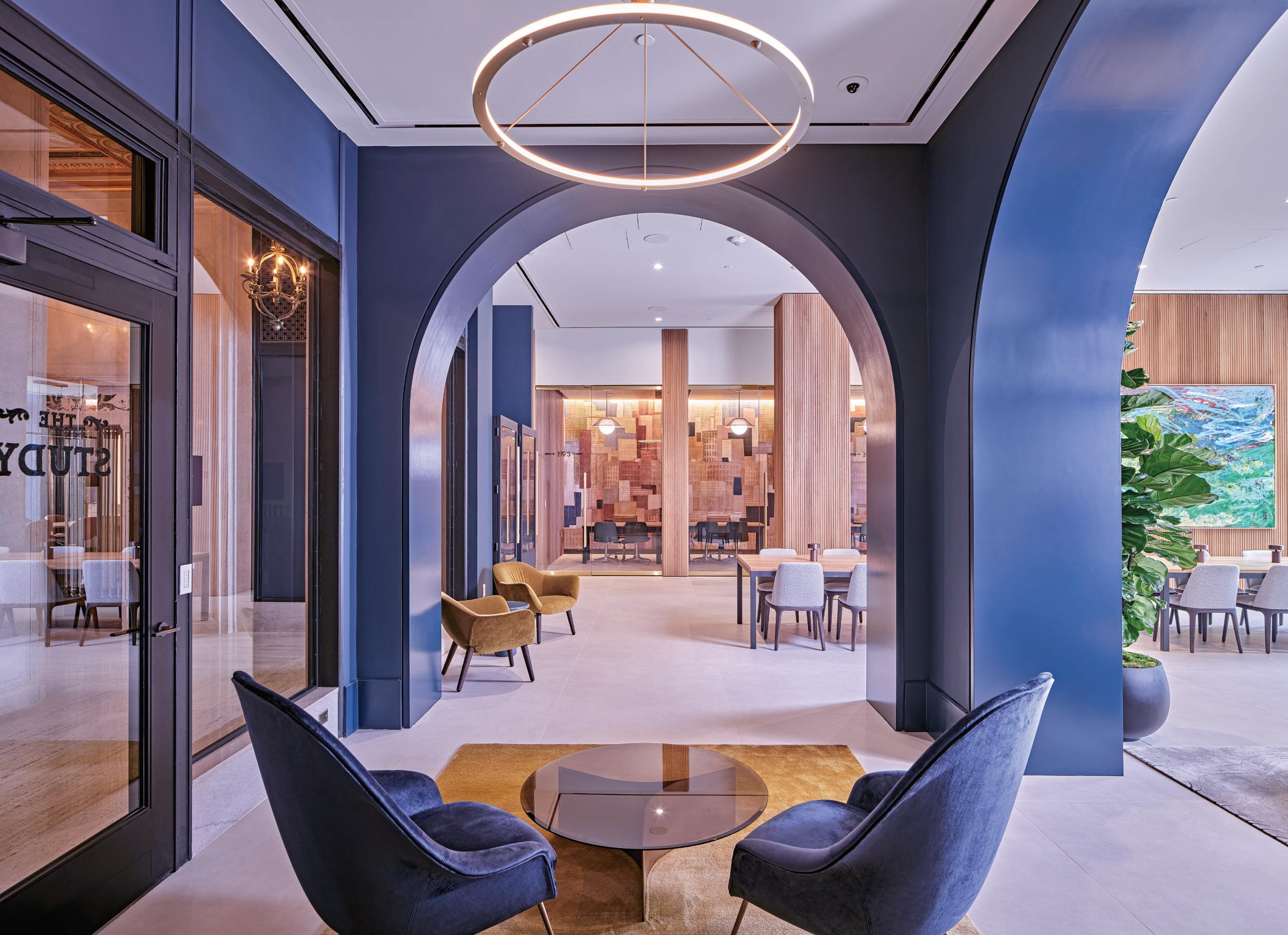
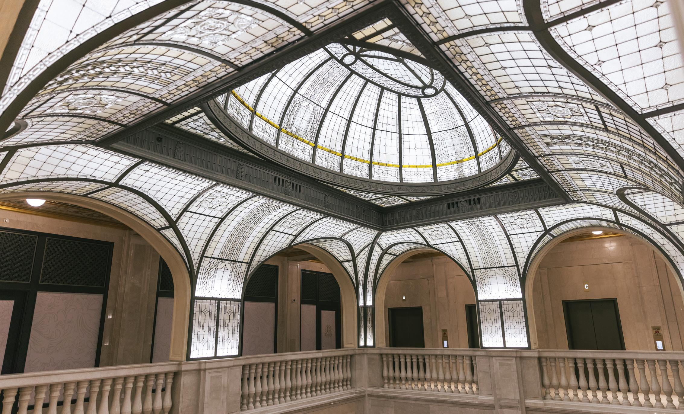
alking into the atrium of the newly renovated Book Tower, one is instantly greeted by a sense of glamour and elegance that evokes a bygone era. It’s at once a look into the history of Detroit and a look into its future, as large-scale artwork curated by a local gallery, the Library Street Collective, adds an unexpected modernity to the classic Italian Renaissance Revival architecture. It’s a mix that’s perfectly Detroit, thanks to the teams Detroit-based real estate firm Bedrock employed during its seven-year, nearly $400 million renovation of the historic Book buildings. The team included Detroitbased Kraemer Design Group, which oversaw the historic preservation;
Detroit’s Christman-Brinker, which was responsible for construction; and ODA, a New York-based architecture and design firm that led the design of both the interior and exterior, as well as the landscape. The project began in 2015, when Bedrock acquired the iconic Book Tower and its two adjacent buildings. Designed by legendary architect Louis Kamper and commissioned by the iconic Book brothers — Herbert Book, Frank Book, and J. Burgess Jr. Book — the buildings were completed between 1917 and 1928, and were used primarily
for offices and retail establishments. In 2009, when the last tenant left, much of the structure had already been abandoned and left to decay.
“The interior was in pretty bad shape,” says Gene Pyo, AIA, LEED AP, project director at ODA, whose team was brought on two years after Bedrock began work on the exterior (which included restoring 29 exterior caryatids, repairing the limestone façade, and replacing all 2,483 windows).
Restoring the interior was a challenge, Pyo says, not only due to the building’s dilapidated condition, but because many of the original details had been removed, destroyed, or filled in to create modern office layouts. One such element, the dome of the stained-glass skylight, was in awful condition when renovations began. Covered in tar and nicotine and missing significant portions, it was only after cleaning had begun that it was discovered that the skylight was actually made up of clear and amber-colored glass.
“We came across a photo of the atrium and saw that it had this beautiful, vaulted ceiling,” Pyo says. “It was immediately clear that we had to try to restore it to the full glory that it once was.” The atrium, also known as The Rotunda, became the “heart of the project,” Pyo adds, especially the skylight. With only the skylight’s dome remaining intact, a complex reverse engineering process was employed to recreate the missing glass panels, while those that were
INTRICATE DETAIL
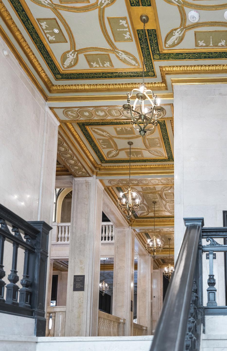
More than 7,000 square feet of plaster ceiling tiles were repainted during the renovations.
still intact underwent intense restoration. In the end, more than 7,000 glass jewels and 6,000 glass panels were individually replaced.
To continue the atrium’s awe-inspiring transformation, the lobby needed to be opened up, as it once was. In addition, 7,000 square feet of plaster ceiling tiles were repainted, the 100-year-old cherub clock was restored, and the original travertine floors were refinished. The pillars, stone fascias, and archways were all new but recreated to look like they originally did, thanks to portions of historic drawings and photographs. Today, the space shines as brilliantly as it did in the 1920s.
During the lobby’s renovations, Pyo says the team began to look at it “as a living room” and a space where they “could give back to the public.” Luxurious seating, tables large and small, and the new Bar Rotunda, an all-day café and wine bar, were added — allowing the space to be accessible to those living in, working in, and visiting
SKYLINE VIEWS
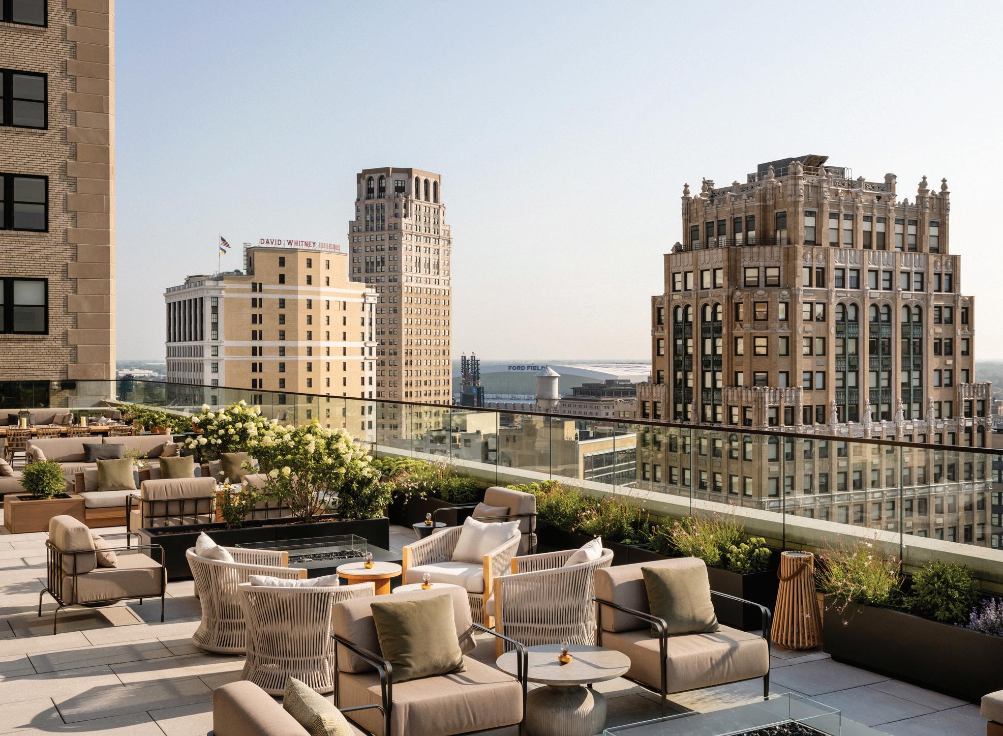
Named after the building’s legendary architect, the new Kamper’s Rooftop Lounge sits atop the 14th floor of the Book Tower.
the area. It was all about “how can we create a really public building that would benefit the city,” Pyo explains. “We didn’t want it to be this private building that nobody could enjoy.” This idea informed the remainder of the ground-floor renovations including the adjacent service drive, which will become an activated alley featuring rotating artwork and public seating. “It will also be the backdrop for the lobby,” Pyo says. Large floor-to-ceiling glass windows allow those inside to view the new outdoor space.
The lobby and alley were only a portion of the incredible Book Tower restoration. There are now 229 residential units and 117 ROOST
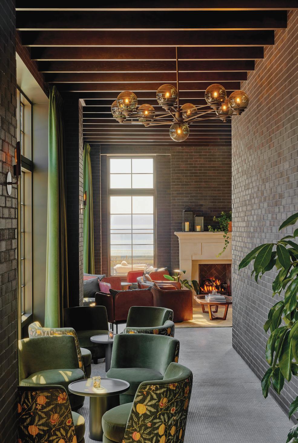
extended-stay hotel suites. For Daniel Olsovsky, creative director at Method Co., the firm that operates the hotel, as well as the dining and event spaces, the new ROOST suites embrace “the nostalgia of stories embedded in local heritage while adapting to the contemporary reinventions of its new neighborhood and building.”
He adds that the suites are “an exploration of Detroit’s lauded music history and automotive empire of the early 1900s,” while offering “guest rooms outfitted with a multitude of eye-catching design elements like custom furniture by Poritz & Studio, vintage rugs from Old New House, hardwood herringbone oak flooring, and quartz countertops.” Both permanent residents and ROOST guests have access to a 3,000-squarefoot co-working space, a 24-hour private fitness center, and the 14th floor Terrace Club, an indoor/outdoor lounge with unparalleled views.
There are four new restaurants within the development including Le Suprême, a French brassiere; Kamper’s, the 14th floor’s rooftop bar; Hiroki-San, which offers izakaya and omakase dining; and Sakazuki, a sake and sando pub. On the 13th floor, a solarium-inspired conservatory ballroom is open for events of up to 300 guests. It is a brand-new addition to the building. “There was never anything there (before), and we turned it into a giant skylight where you’re able to look back and see (the tower),” Pyo says. The space is among his favorites.
“Book Tower has stood as an icon on the Detroit skyline and a landmark along Washington Boulevard for over a century,” says Jamie Witherspoon, vice president of architecture and design at Bedrock. “Originally designed as a commercial office building by the architect Louis Kamper, our redevelopment strategy for Book Tower celebrates its rich history while providing a place for the community to gather and create new memories for the next 100 years.”
“It’s not only looking at the past, but it’s looking toward the future,” Pyo adds, “and I think that’s what’s most exciting about this.”
MORE INFORMATION: booktowerdetroit.com
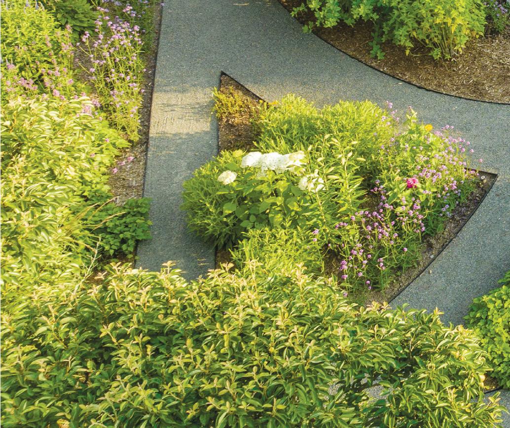
The main goal for a private cutting garden on a 600-acre family estate in Metamora designed by R. Youngblood & Co., a landscape architecture and design/build firm in Rochester, was pretty straightforward. “(The homeowner is) very much into vases and flower arrangements inside her home. With the cutting garden, she can walk out and cut fresh flowers, or take a stroll and simply enjoy time within the cutting garden,” says Ryan Youngblood, president/design director of the company. “Another must-have was that it had to be protected from deer and other wildlife, so it’s fully enclosed — but in a very tasteful way.”
The garden’s featured blooms represent the color tones and textures his client wished to see in her arrangements, such as purples, blues, and whites. It also includes several hydrangeas and a rose garden with varied palettes and petal types, as well as daisies, black-eyed Susans, purple coneflowers, gladiolus, and iris.
Youngblood estimates the cutting garden occupies about a quarter of an acre on the expansive land. “The largest challenge was designing an enclosure that was very tasteful,”

FLORAL ESCAPE
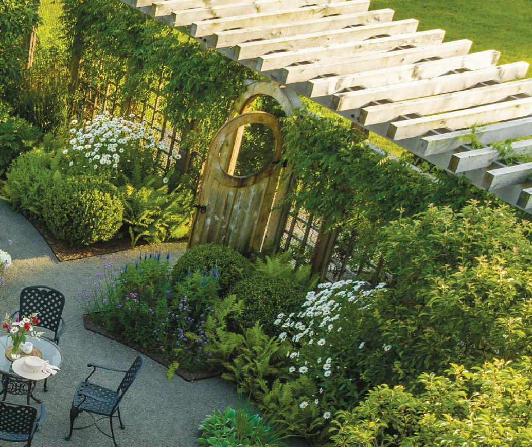
Fully enclosed, this flower and vegetable garden also features fruit trees, a strolling path, and a gorgeous custom cut-out gate.
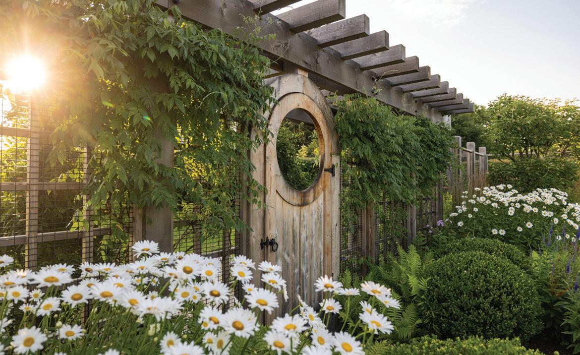
he says about the cedar fence with wire panels. “The entire property and the architecture have a timeless feel. A new piece has to look like it’s been there for years, which is why we used a lot of old-school plants like gladiolus, hollyhocks, and tea roses.”
At the entrance, a classic pergola surrounds a charming garden gate. “The garden gate is a very special feature that was designed like more of a garden door, with a large circle cutout that allows you to stand and take the garden in,” Youngblood says. Special elements within the cutting garden include a seating area to soak up the sumptuous surroundings, and chipped granite pathways that weave their way around the intimate space.
“The paths themselves are strategically inter-


twined with each other. They encourage a stroll the way it’s laid out,” Youngblood adds. An enclosed vegetable garden for the family also yields a productive strawberry crop. Foundation plants include sphere boxwoods and espalier pear trees, which bear edible fruit.
Like fine wine, the cutting garden only gets better with age. “It’s a working harvest garden from the standpoint of fruit and vegetables,” Youngblood explains. “We built it three summers ago and it’s been functional for two full summers. It’s becoming more established and feels more lush, and the textures and colors are threading together as intended.”
MORE INFORMATION: ryoungblood.com






 TEXT BY KHRISTI ZIMMETH | PHOTOGRAPHY BY JUSTIN MACONOCHIE
 FOREST FINERY
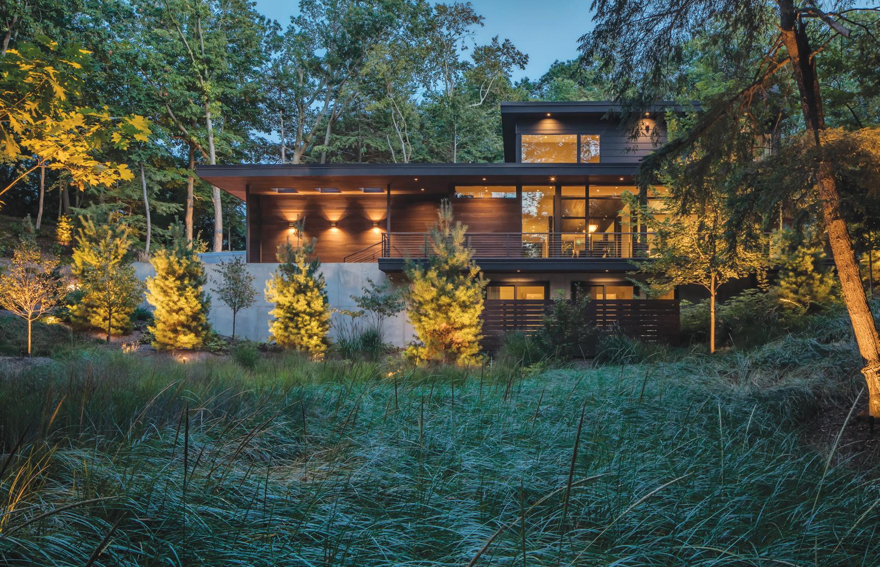
IIt takes guts and more than a little faith to purchase a property sight-unseen. Birminghambased designer Kevin Serba and his husband, Tim Tamer, had both faith and guts when, in 2017, they purchased the approximately one-acre lot their Saugatuck house now sits on.
Filled with rolling hills and forested sand dunes along the shores of Lake Michigan, the land was once part of an 1899 Presbyterian summer camp. Serba spent many years vacationing in the area and used to run through the property, so although he hadn’t seen this particular parcel, he knew the land well and didn’t hesitate when he heard that a developer had backed out and lots were available.
The site the couple purchased, which Serba describes as “a large forested bowl” is 1,100 feet from the water and is surrounded by a 50acre preserve. “After seeing the views and treecovered hills, I decided we needed a modern home with big spans of glass to take advantage of the forested views,” he explains.
The couple hired Lucid Architecture, from Zeeland, to engineer and design a 5,200-squarefoot home that would capture and complement the stunning site, and feature the same materials inside and out. “I wanted it to feel cohesive,” Serba says.
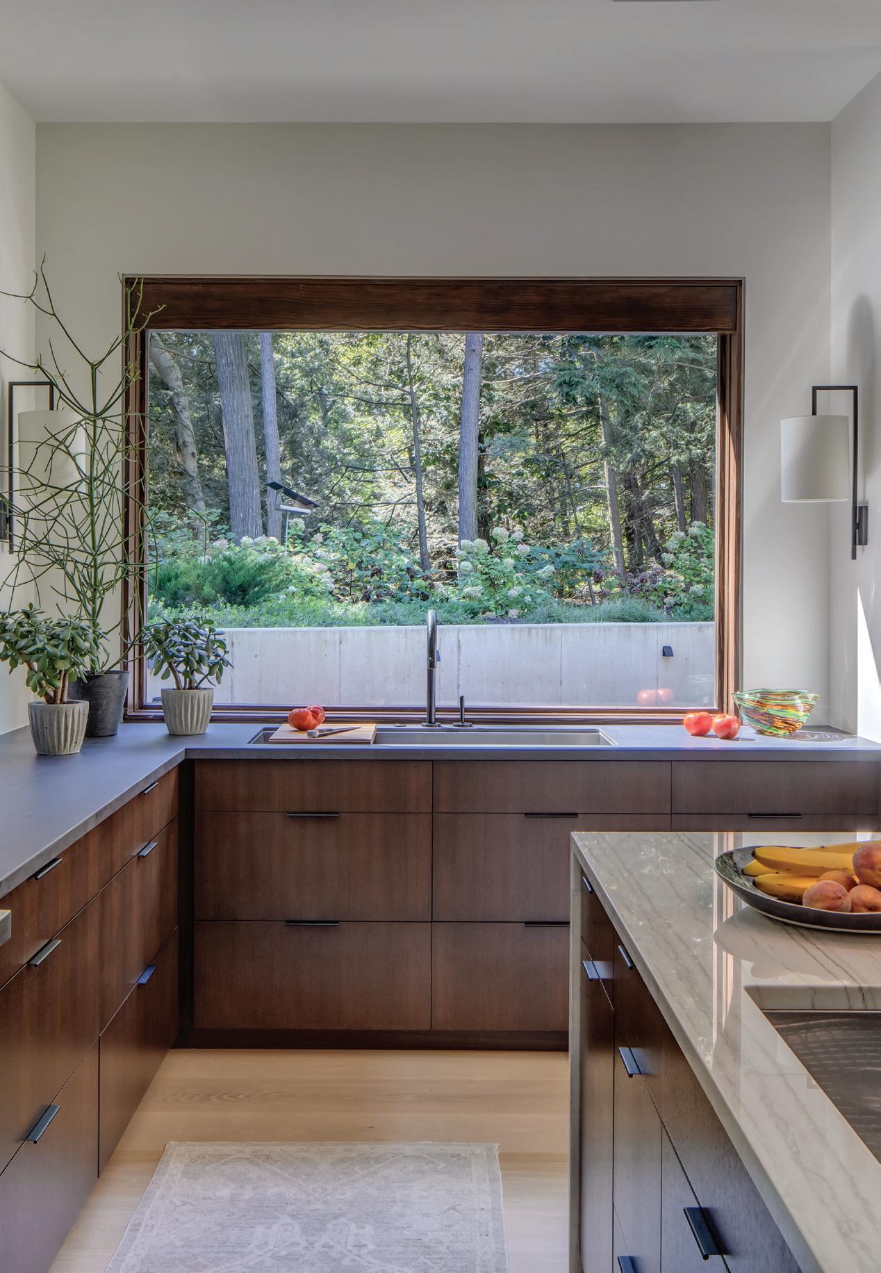
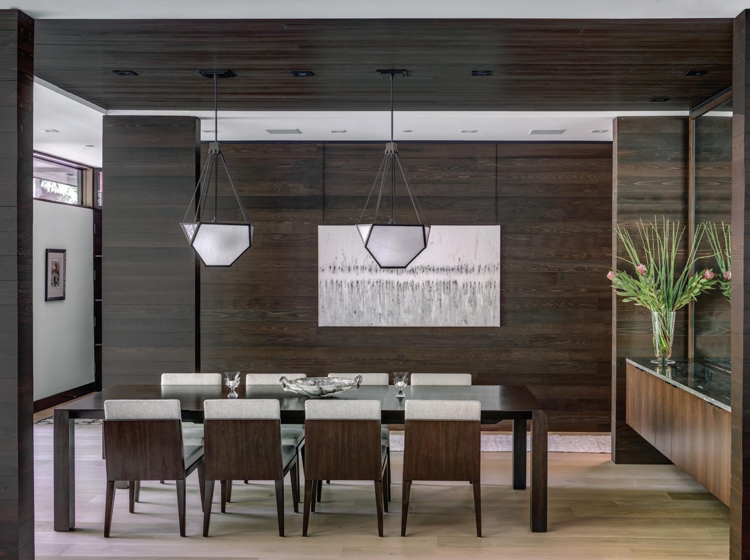
Far right: Serba says his favorite areas in the home are the kitchen and this splendid dining area featuring plenty of warm woods, comfy materials, and eclectic lighting. Dramatic artwork in muted tones soothes.
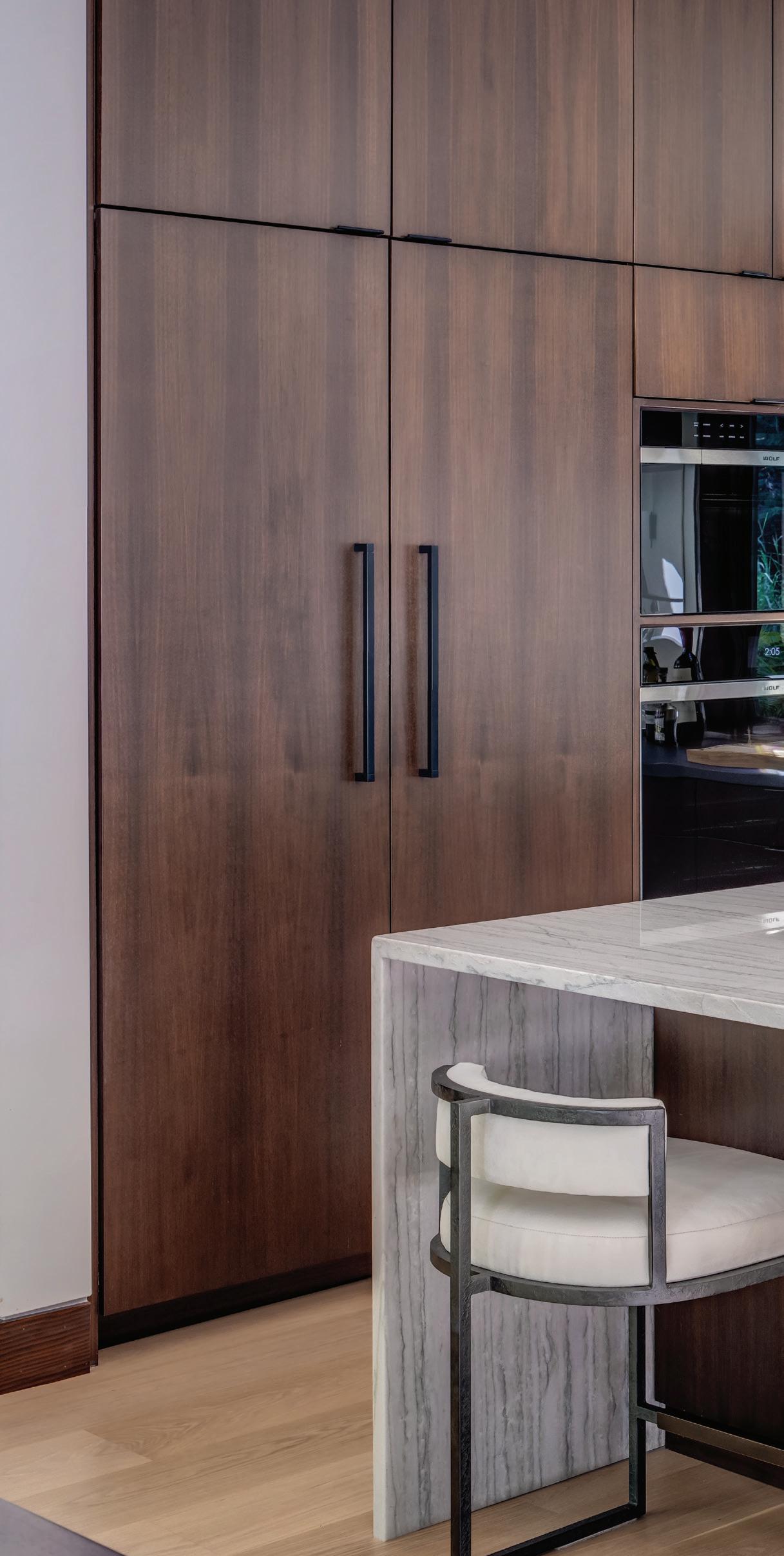
COOKING UP BEAUTY Serba designed every detail in the home, including the custom kitchen.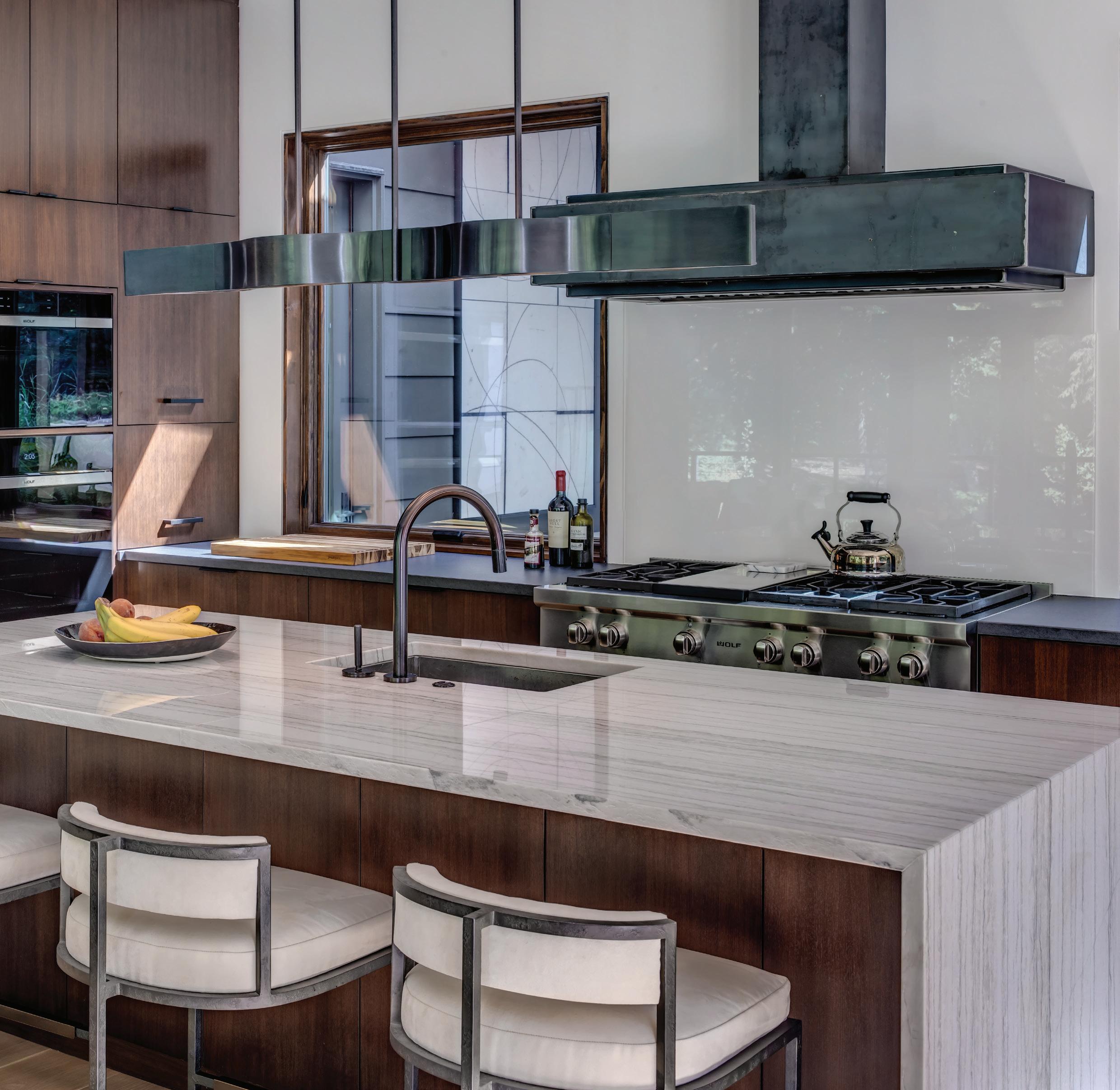
“AFTER SEEING THE VIEWS AND TREE-COVERED HILLS, I DECIDED WE NEEDED A MODERN HOME ...”
— KEVIN SERBA

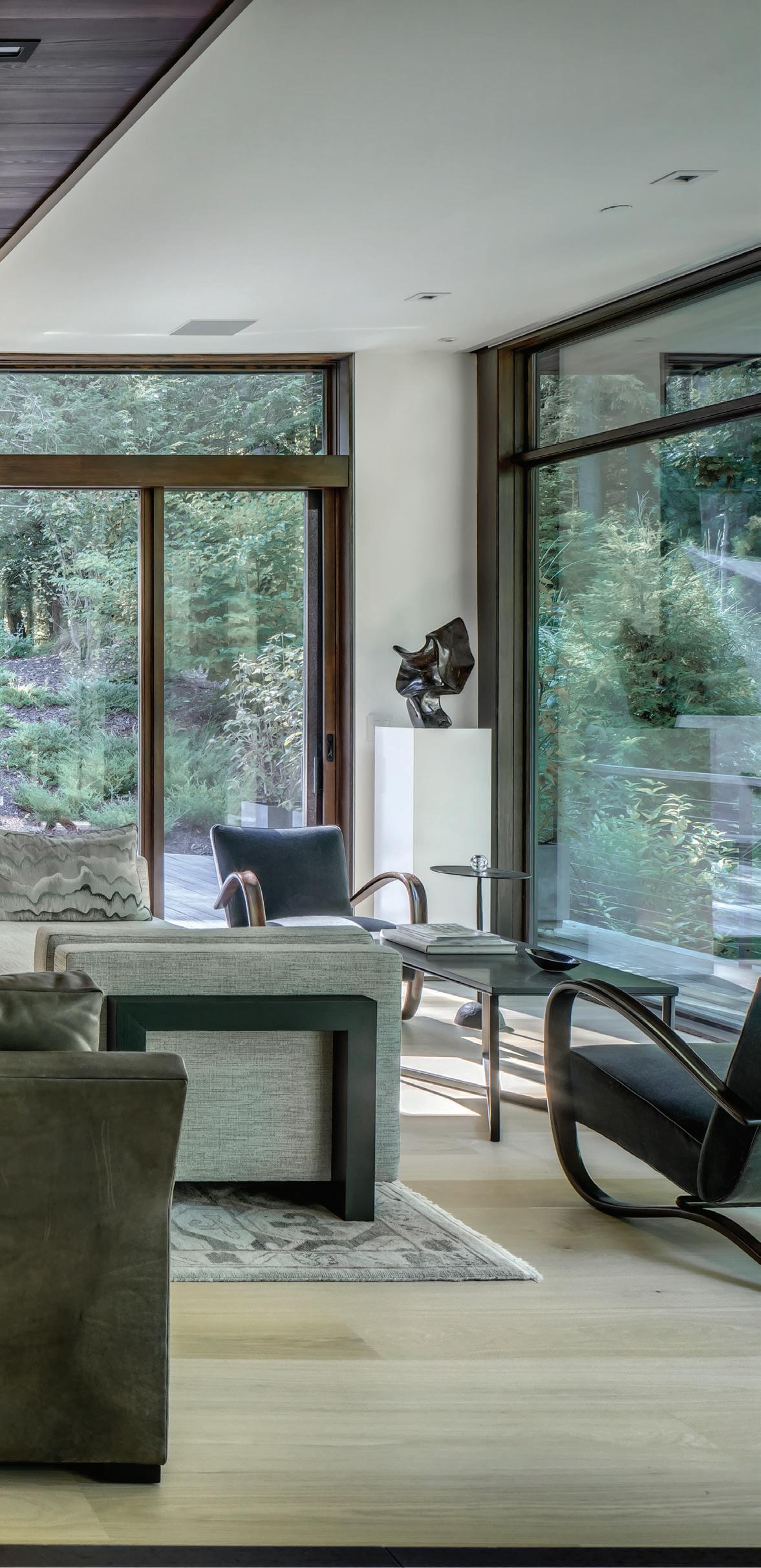
Because the home is used year-round, the designer opted for warm wood tones along with expanses of glass, using the same cedar from the exterior on walls and accent ceilings. “We’re there in the winter as well as summer,” he explains, noting the destination is 2.5 hours from the couple’s main home in Birmingham, as well as 2.5 hours from where Tamer works part of the week in Chicago. “We enjoy all the seasons; it’s really beautiful with the snow.”
Warm neutral tones are found in the fabrics and furniture, and don’t distract from the yearround views showcased throughout the home’s
The home is used yearround. Serba opted for warm wood tones along with expanses of glass, through which the couple loves to see the changing of the seasons, especially here in the living room.
four-bedroom, 4.5-bath open floor plan. Serba’s favorite spaces include the kitchen and dining area, as well as the stunning living room, where he’s especially fond of the large fireplace. “We love to build fires in the winter,” he says.
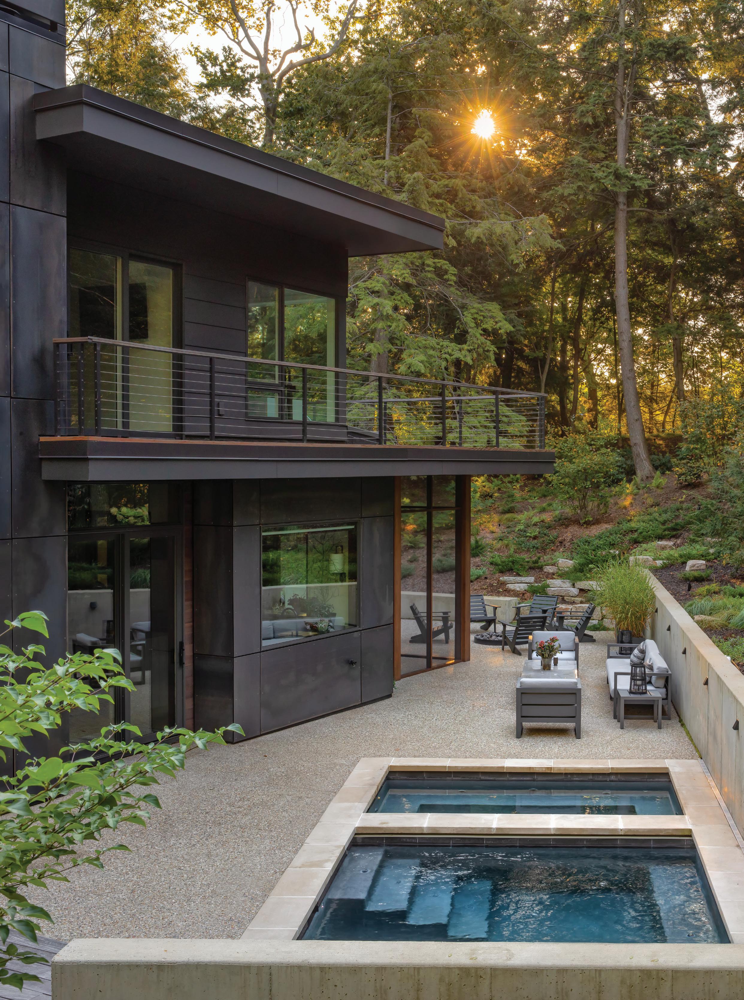
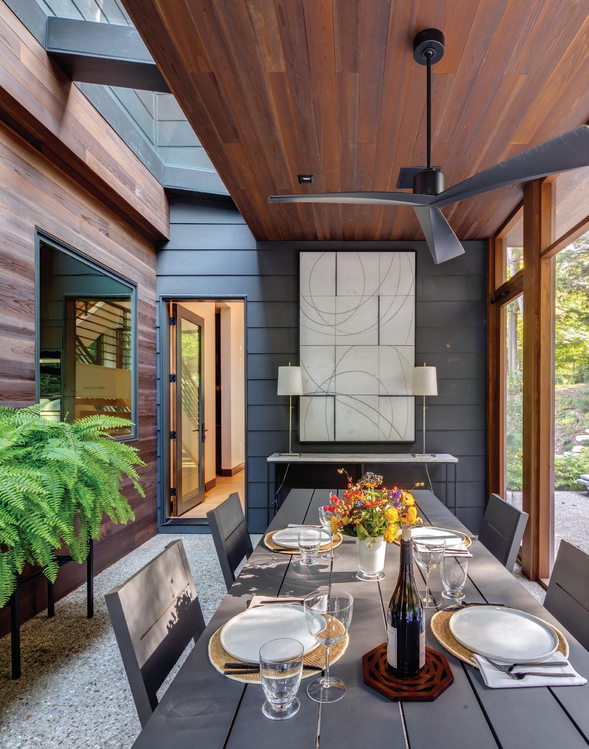
The couple has many friends in the area, and they rotate who hosts gatherings during the warmer months. “The screen porch is a great place to entertain,” Serba says, adding that summer, fall, and winter are his favorite seasons. Recent additions include an outdoor bar, kitchen, and pergola designed to make the most of al fresco opportunities and show off the couple’s natural and planted landscape. “My husband loves to work in the yard,” Serba adds.
Ironically, the couple had put an offer in on another lot when they heard that their current lot had become available. They backed out of the first deal
 WELL THOUGHT OUT
and put an offer in on this lot, which was accepted the same day. After designing hundreds of second homes for clients, it’s surprising to hear that this is the first time the couple has worked on their own project. “It’s always fun to design for myself,” says Serba. “I’ve been doing this so long, I had everything selected long before we got started.”
Serba designed every detail in the home,
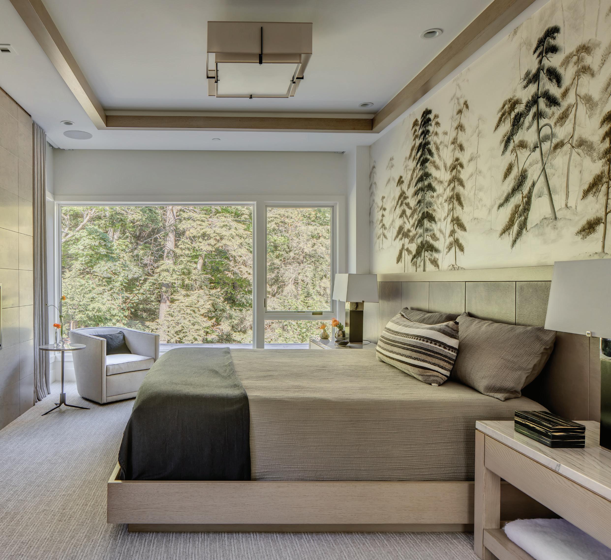
including the custom kitchen, baths, bar, wine room, and numerous built-ins. The living room’s dramatic steel fireplace wall has doors behind the art to hide a television for movie nights. Furnishings include neutral pieces, both vintage and custom, as well as an extensive art collection gathered during years of travel. The primary bedroom features custom, hand-painted de Gournay panels above a custom
wood-and-leather bed and custom nightstands.
The home took 14 months to build, and Serba reports that everything went according to schedule. He and Tamer moved in at the start of the summer in 2019, and have happily spent almost every summer and many weekends there since. “When we’re not in Palm Springs, we’re in Saugatuck,” the designer explains.
Serba says there were no major challenges, and he has no regrets. “It was the best thing we could have done. The house itself is even better than I expected,” he says, noting that the property’s value has increased. “The end results were worth the early unexpected change in plans. It’s so quiet. That’s what I love about it. It’s truly an escape.
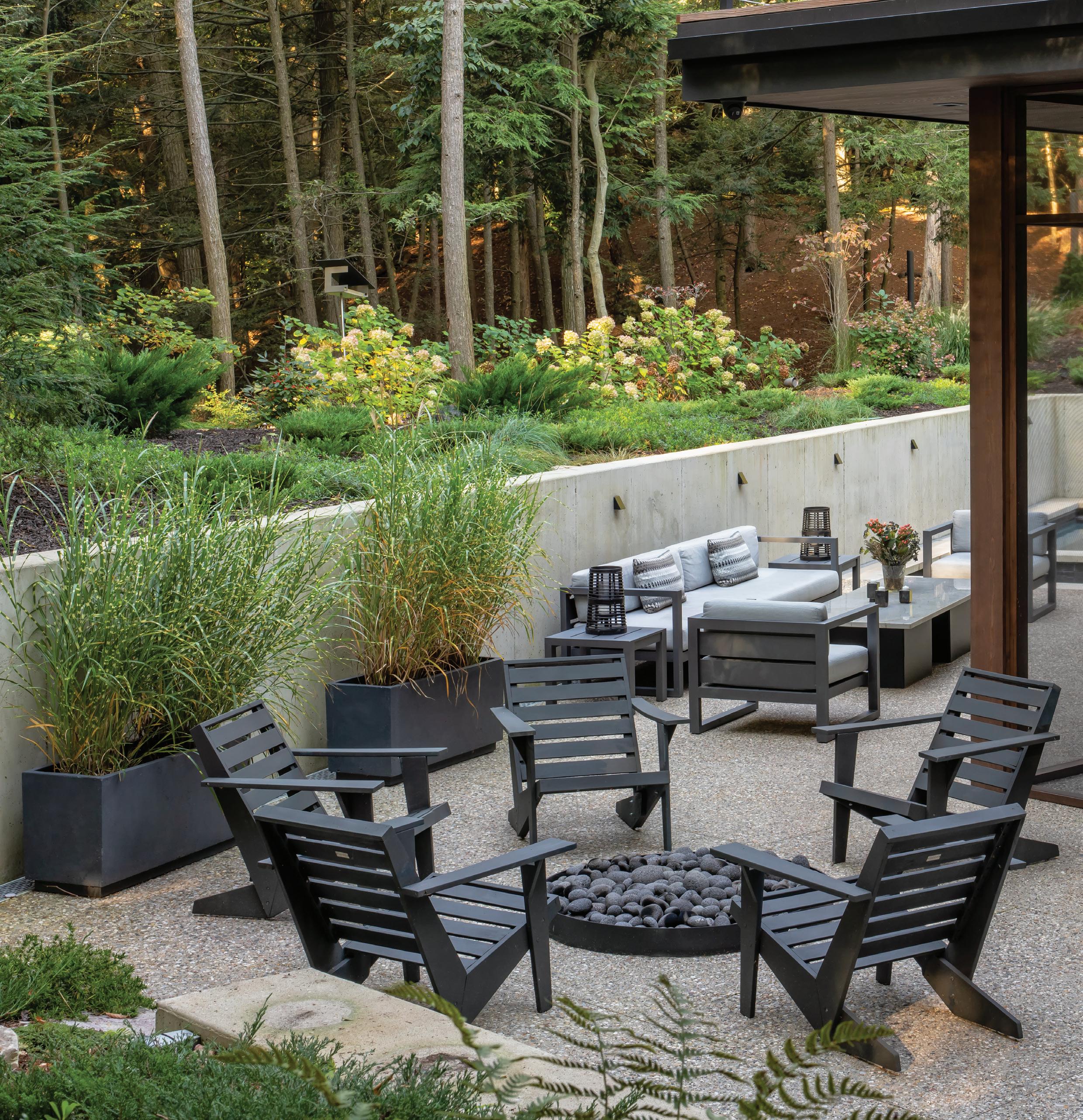
Both pages: Recent additions include an outdoor bar, kitchen, and pergola designed to make the most of al fresco opportunities and show off the couple’s natural and planted landscape.
INTERIOR DESIGNER
Kevin Serba, Serba Interiors, Birmingham, serbainteriors.com
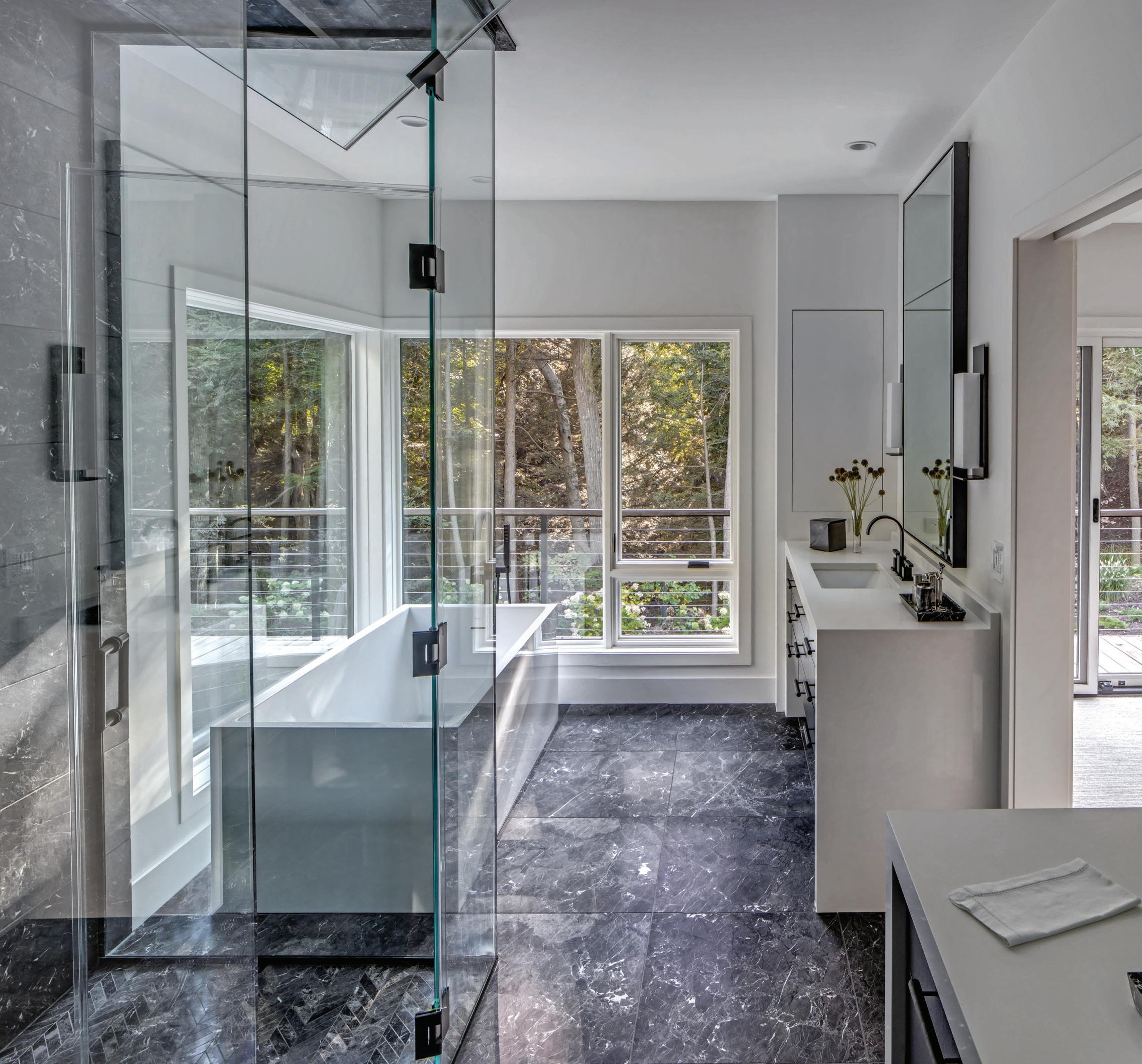
BATHROOM, PRIMARY
Bathtub – Bain Ultra
Cabinetry – Custom, Rift Cut Oak Countertop – Quartz, Signature Stone
Flooring – Charcoal and White Marble, Ann
Sacks, Michigan Design Center, Troy
Mirror – Custom
Shower – Newport Brass
Sconces – Boyd
Vanity – Custom, Rift Cut Oak
BEDROOM, PRIMARY
Accent Chair – A Rudin
Bedding – Custom
Bed Frame – Custom, Rift Cut Oak With Leather, Serba Interiors, Birmingham
Bedside Chests – Custom
Bedside Lamps – Ralph Lauren
Ceiling Treatment – Custom
Curtains – Coraggio
Headboard – Custom, Garrett Leather, Tennant & Associates, Michigan Design Center, Troy
Fireplace – Limestone, Ann Sacks, Michigan Design Center, Troy
Flooring – Ghiordes Knot, Michigan Design Center, Troy
Lighting, Ceiling – Hubberton Forge
Mirror – Custom
Wallpaper – de Gournay
ENTRY
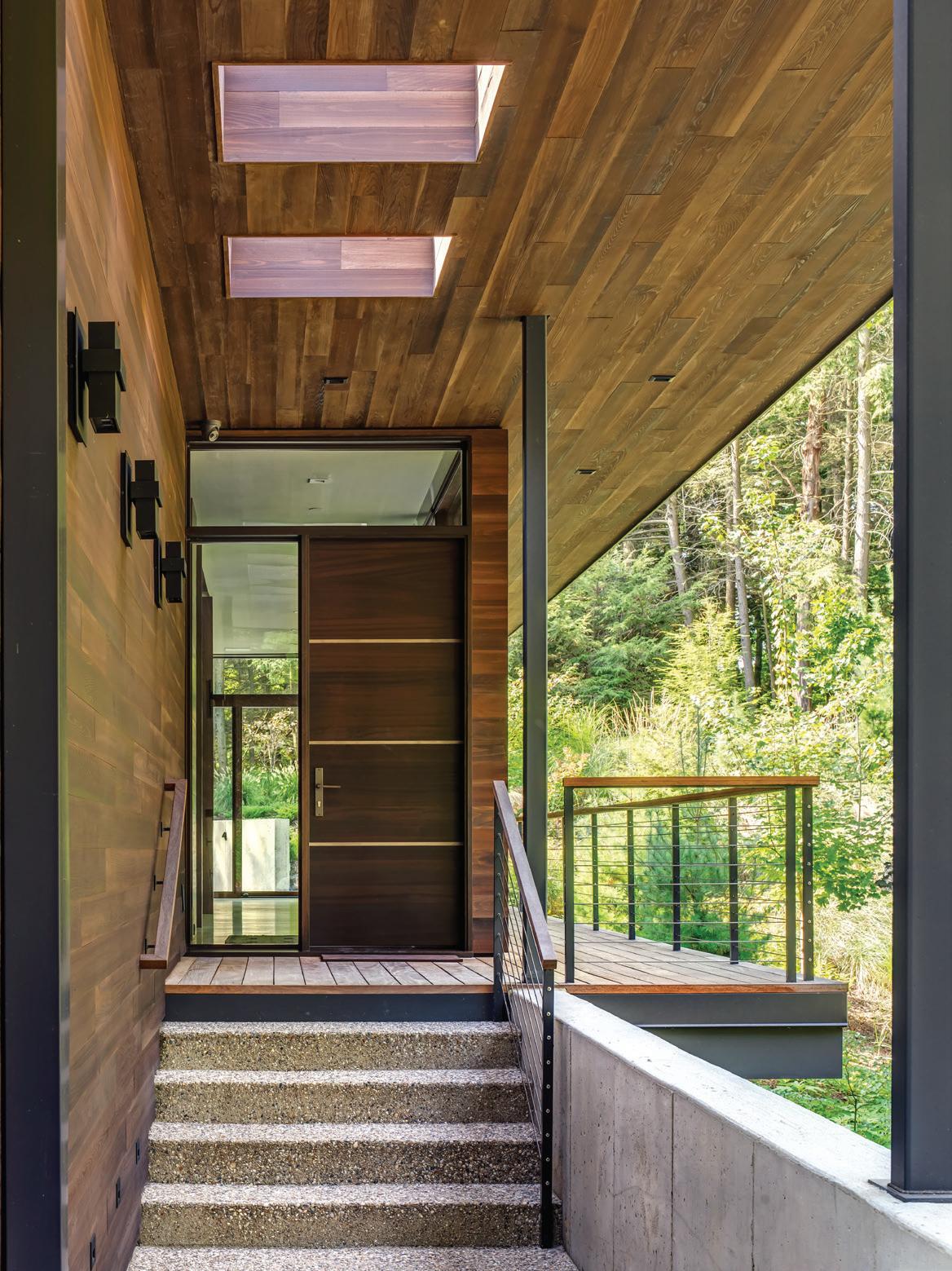
Deck Materials – Aggregate, Ipe Decking
Door – Custom, Walnut with Steel Inlays
Hardware – Rocky Mountain Hardware
Lighting – Modern Forms

Railings – Custom
DINING ROOM
Chairs, Dining – Bolier, Decca Home
Lighting – Urban Electric
Table – Bolier, Decca Home
Wall Paint – Benjamin Moore, Cloud White
FAMILY ROOM
Armchairs, Leather – Highland House Furniture
Armchairs, Streamline – ‘30s Halabala
Ceiling Treatment (Wood) – Cedar
Daybed – Custom
Flooring – Custom, Oak
Fireplace Treatment (Stone) – Absolute Black Honed, Surround, Steel Panels
CUSTOM IS CUSTOMARY
Both pages: The splendid primary suite brims with luxe and unique details like the custom, hand-painted de Gournay panels above a custom wood-and-leather bed.
Lamp – Visual Comfort
Sofa – Hickory Chair Furniture Co.
Table, Coffee – Custom, Iron and Glass, Serba Interiors, Birmingham
Table, Console – Donghia
Wall Paint – Benjamin Moore, Cloud White
KITCHEN
Backsplash – Painted Glass
Bar Stools – Baker, Baker | McGuire, Michigan Design Center, Troy
Cabinetry – Custom, Walnut
Countertops – Signature Stone Tops, Comstock Park
Double Oven – Wolf
Faucet –Kallista, Ann Sacks, Michigan
Design Center, Troy
Flooring – Custom, 9-inch White Oak
Hood – Custom
Lighting, Bar – JPD Construction, Saugatuck
Sconces – Boyd
Stove – Wolf
PANTRY
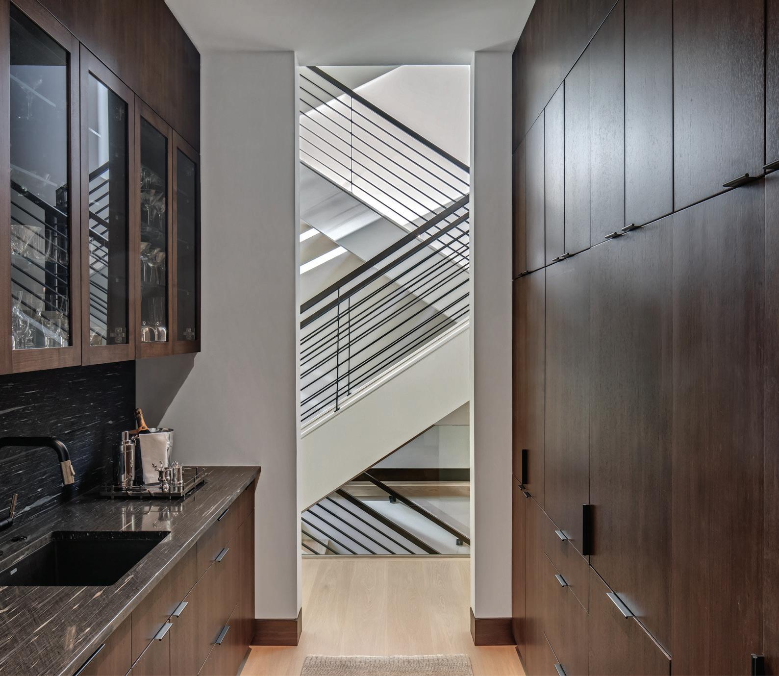
Cabinetry – Custom Walnut
Railings, Stairway – Custom Steel
Sink – Newport Brass
PATIO
Armchairs, Outdoor – RH
Bonfire Pit – Custom
Coffee Table, Outdoor – Custom End Table, Outdoor – RH
Jacuzzi – Bain Ultra
Sofa, Outdoor – RH
POWDER ROOM
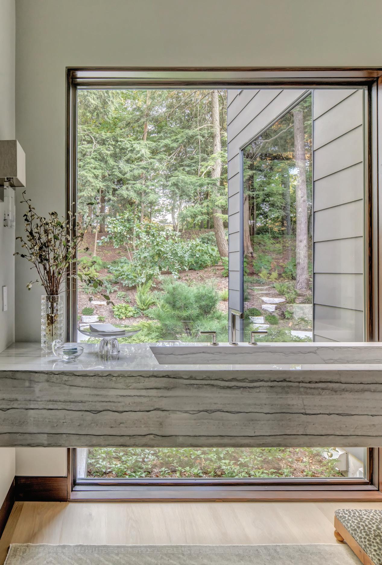
Sink –Custom Quartzite Sink, PMP Marble & Granite, Troy
Faucet – Newport Brass
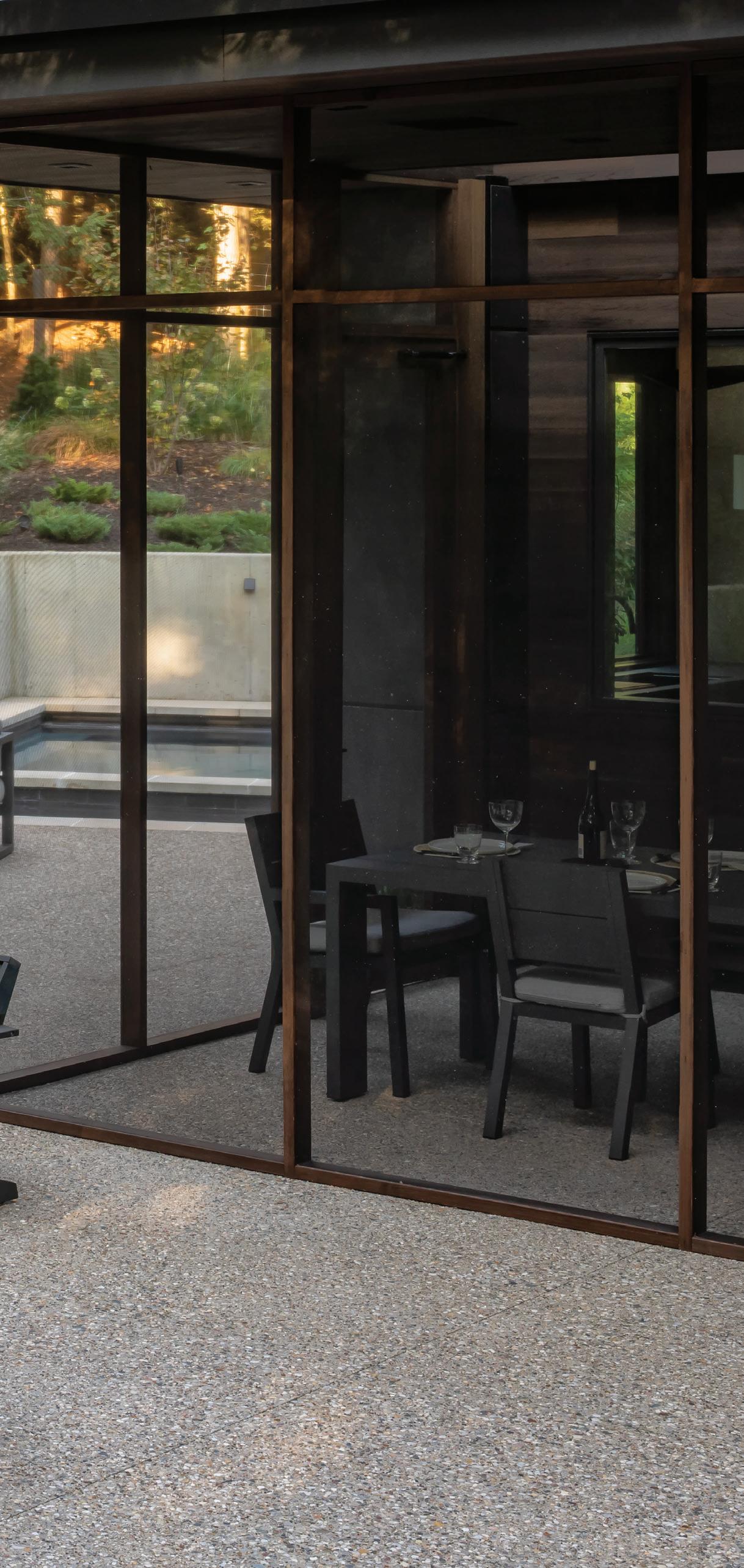
SCREENED-IN PORCH
Artwork – Custom
Console Table – Custom, Stone and Iron
Dining Chairs, Outdoor – RH
Dining Table, Outdoor – RH
Fan – Modern Forms
Skylights – Pella
EXTERIOR
Architecture – Lucid Architecture, Zeeland
Balcony, Railings – Cable, JPD Construction, Saugatuck
Building Materials – Cedar, Bolyard Lumber, Birmingham
Landscaping – Craig Bergmann Landscape Design, Inc.
Masonry – JPD Construction, Saugatuck
Paint Color – Sherwin-Williams, Iron Ore
Roofing – JPD Construction, Saugatuck
Windows – Pella, JPD Construction, Saugatuck

A COUPLE DISCOVERS THEIR PREFERRED AESTHETIC BY STARTING NEW WITH DESIGN FIRM CLOTH & KIND
TEXT BY MEGAN SWOYER | PHOTOGRAPHY BY MARTIN VECCHIOINDIVIDUAL CHARM
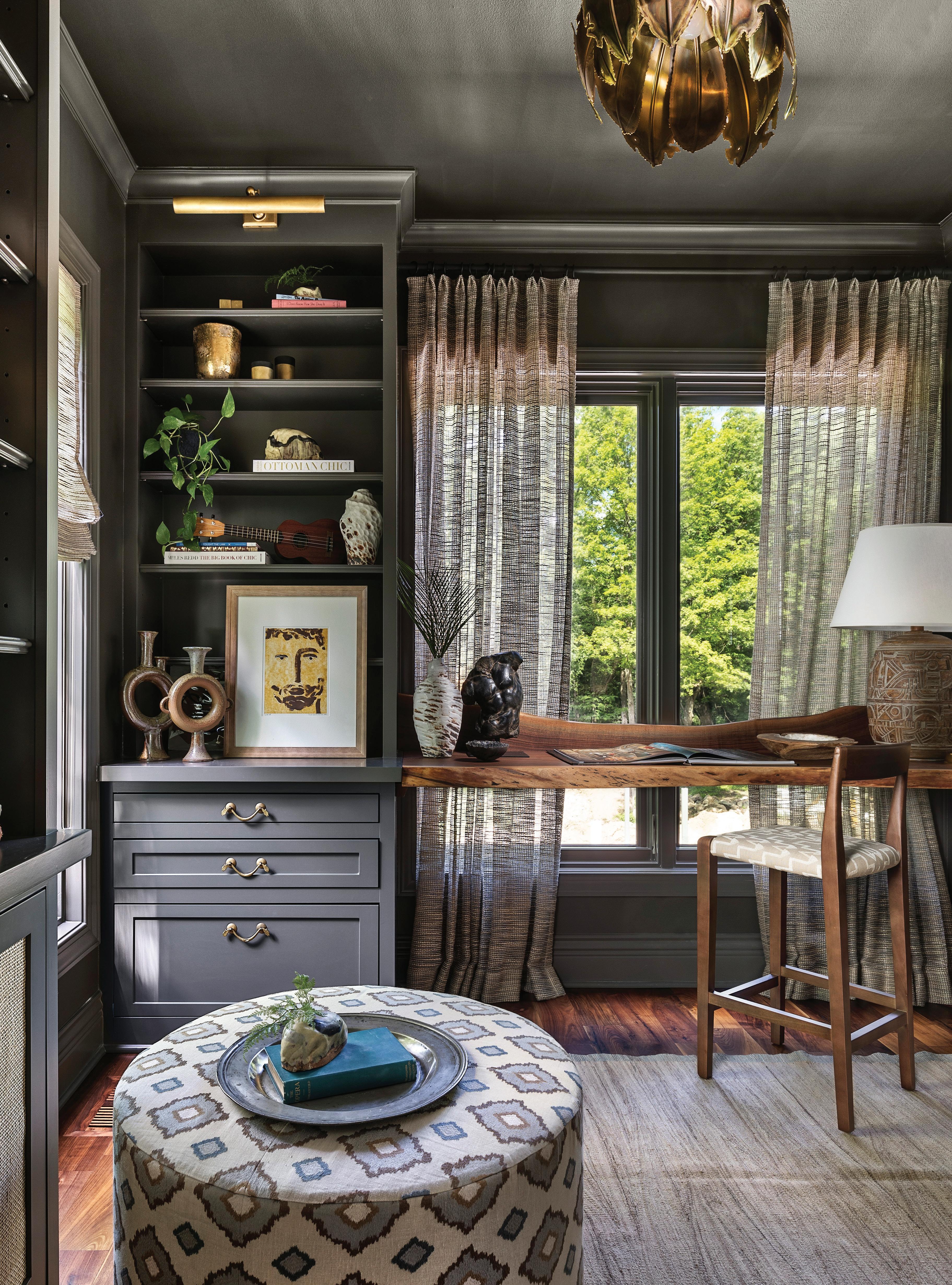
This page: Cool tones of gray-blues define the office which features a custom live-edge floating desk Opposite page: With 10-inch hand-hewn wood beams, a bubble-motif light fixture, and worldly accents, this living room represents Cloth & Kind’s signature design philosophy.
WWhen you know you want a certain look for your home, it’s often about starting fresh and pinpointing your personal style. That was the case for a Northville family who worked with Cloth & Kind, an Ann Arbor-based interior design firm owned by Krista Nye Nicholas and Tami Ramsay.
“Our clients didn’t bring a whole lot with them. They wanted a warm, inviting, and cozy feeling,” says Nicholas, whose design studio is 11 years old and includes a 5-year-old showroom of highly curated, artisanal textile and wallcovering lines from around the world.
“They didn’t want what everyone had, which was neutrals and grays and tone-on-tone. They wanted more color and unique applications,” Nicholas says. The couple also knew that when
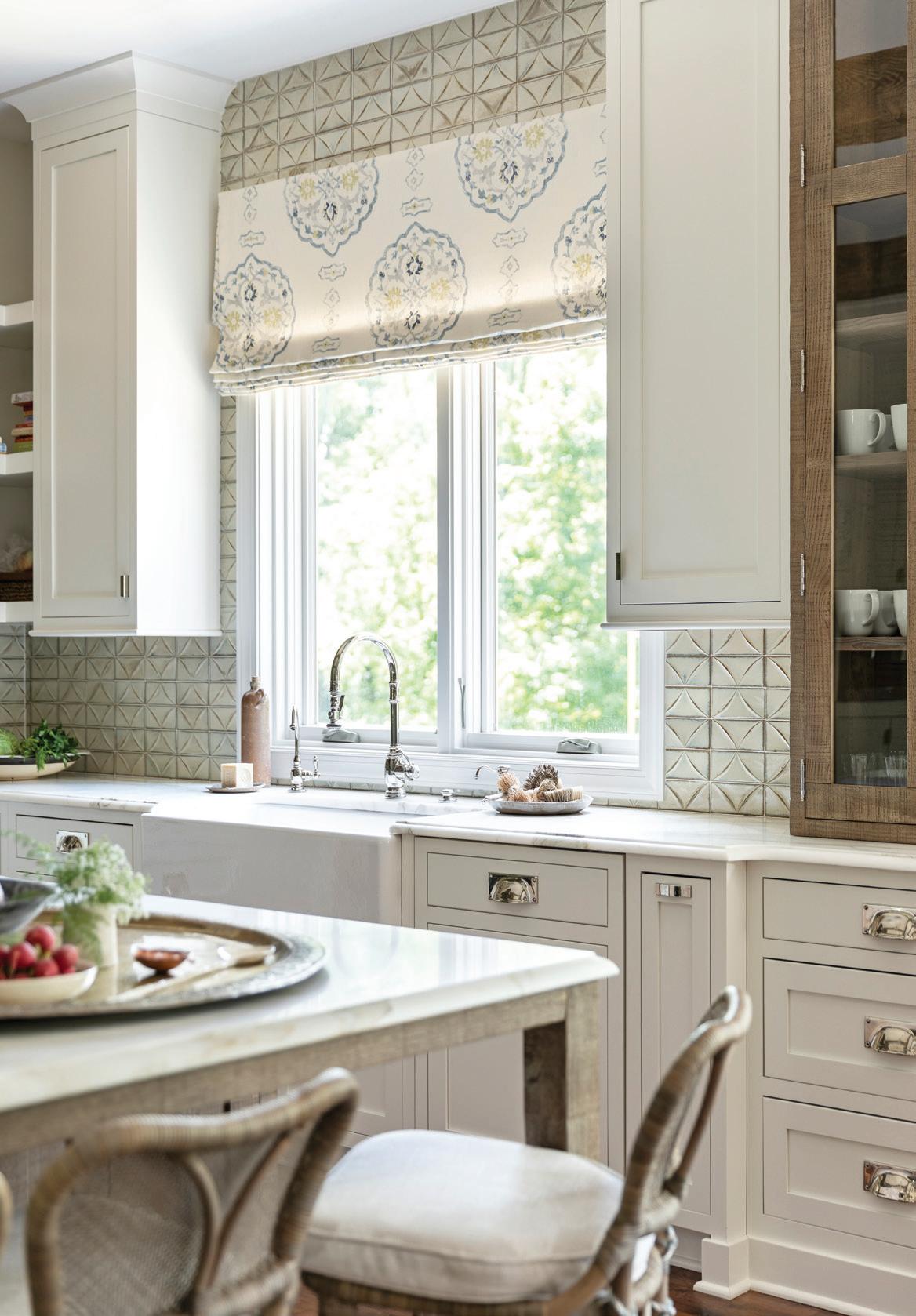
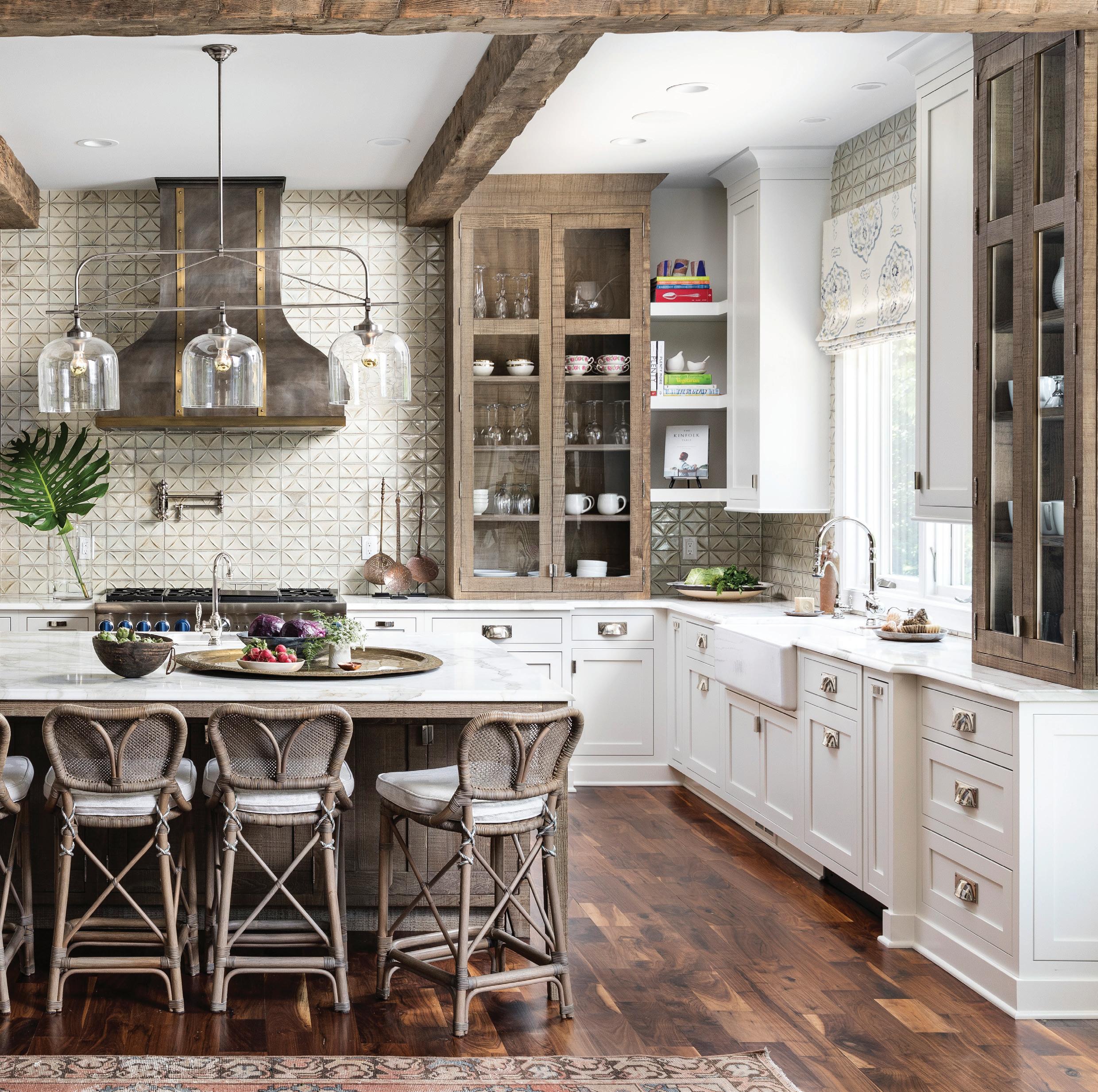
Above: The kitchen takes on a custom look with Calacatta Gold marble counters, Ann Sacks tiles, and an intricate range hood from St. Udio.

you’re building a dream home, it’s a good time to figure out your design aesthetic.
The clients’ house was originally intended for the home’s builder, but he decided to sell it to the Northville family. With two daughters, the new homeowners wanted more family space and a theater, a game room, and a backyard with options for entertaining.
Nicholas and the team, including Guidobono Building Co. of Northville, made many interior architectural changes, most of which involved removing existing details like half-walls, tray ceilings, and interior columns.
DISTRESSED DETAILS
Above: Upper cabinets with a rough-sawn finish add to the home’s rustic appeal.
Inset: The banquette’s built-in bench features a whimsical David Sutherland fabric.
The kitchen, for example, was open to the family room, but it was visually separated by curved half-walls and curved ceiling details. A new ceiling treatment features the addition of hand-hewn wood beams, and the charming banquette’s built-in bench makes use of the tall windows as frames for custom upholstered backrests. “It’s one of the family’s most popular places to lounge and hang out,” Nicholas says.
The designer was glad the clients were game for the kitchen’s wood upper cabinets and their rough-sawn finish. “They hadn’t seen anything like that,” Nicholas says. The island has the same

wood finish, while a custom hood and wall tile with a beautiful diamond-relief pattern make the gathering spot special. “It’s my favorite kitchen of all the kitchens we’ve done,” Nicholas says.
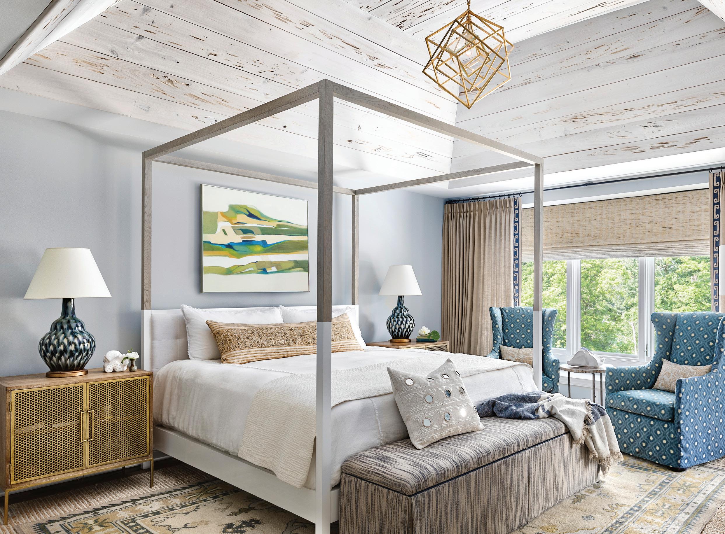
A deep tray ceiling was reworked in the primary bedroom to include pecky cypress, finished with a soft wash to mellow the tone while still allowing its warmth to come through.
Cool tones add drama in the office, which is bathed in deep gray-blues. “We knew that our clients weren’t afraid of dark colors,” Nicholas explains. “Guidobono, who was wonderful to work with, helped source some great custom elements that we came up with, like the office’s live-edge floating desk.”
The firm’s signature design philosophy — which typically evokes age, charm, tradition, whimsy, warmth, detail, and worldliness — is
TEXTURE PLAY
Above: From the pecky cypress ceiling to a custom rug overlay and glimmering drapes, the use of contrasting materials and textures gives the primary bedroom grand sophistication.
evident throughout the home.
Nicholas’ passion and global aesthetic likely stem from the time she lived in India with her family when she was in third grade, while Ramsay’s passion comes from her days traveling and living in Argentina. “Spending time in India is where my love of color, pattern, and patina come from,” Nicholas says. “We like things that aren’t so new and precious.” The two designers source from the world over, including Europe, Africa, and India. When they travel, they intentionally look for vintage art and items with patina.
“Tami and I are also mad-passionate for details,” Nicholas asserts. She notes that an unexpected detail in the back powder room is the trim, painted in a cheerful turquoise hue. Vintage art, a customized mirror, and Katie Leede & Co. wallpaper add to the appeal.

In the primary suite, the drapery (Seema Krish’s Glitterati linen) has a gold glimmer to it. “It’s quietly elegant,” Nicholas says. She prefers to have a seating area in a primary suite and was excited that these clients truly use it. “They sit, read, or talk, and get away from the kids,” she says. A custom-designed rug overlay — featuring greens, blues, and ochers — was inspired by an antique Oushak rug. Bunny Williams Pheasant lamps are “perennial favorites of ours because of the unique sancai (tri-colored) glaze process,” says the designer.
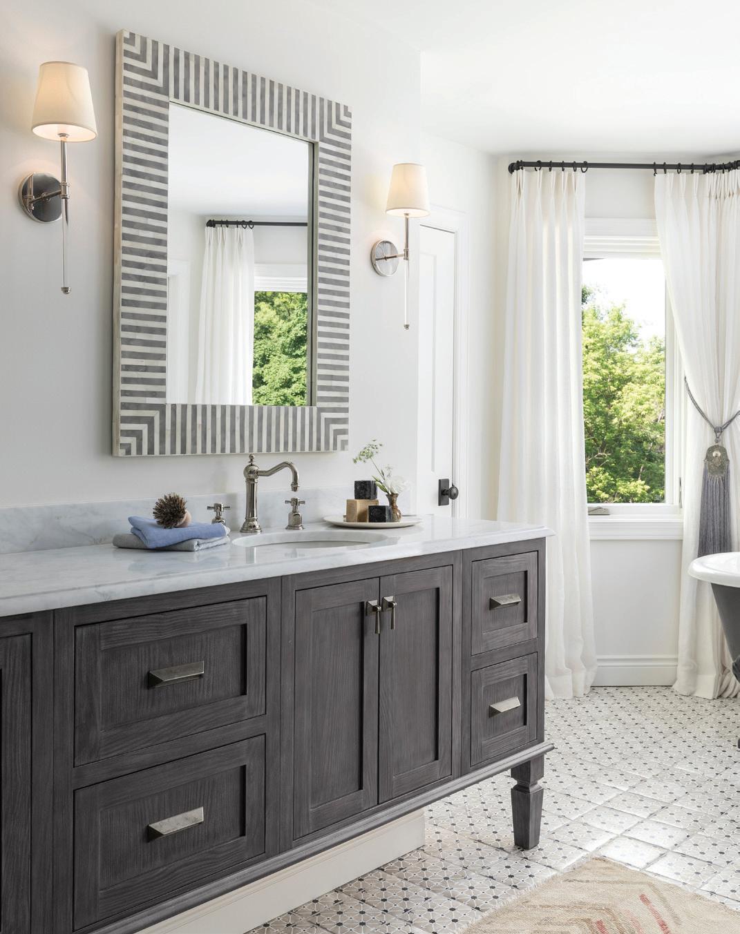
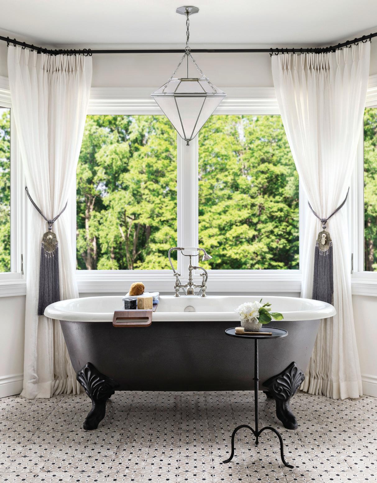
In the primary bath, the design team selected shimmery gold tile (hand-painted, terracotta),
“SPENDING TIME IN INDIA IS WHERE MY LOVE OF COLOR, PATTERN, AND PATINA COME FROM.”
— KRISTA NYE NICHOLASELEGANT RETREAT Right: A vintage-inspired clawfoot tub set against large windows looks effortlessly at home under a silver geometric pendant. CURATED POLISH Above: Hand-painted terracotta tiles and sheer drapery tiebacks sourced during the designers’ global travels add an international touch to this elegant primary bath.
while sheer drapery tiebacks were picked up in Morocco during Nicholas’ and Ramsay’s travels. Other mixed-in international pieces include a large antique Kuba cloth from Africa that hangs in the lower level.
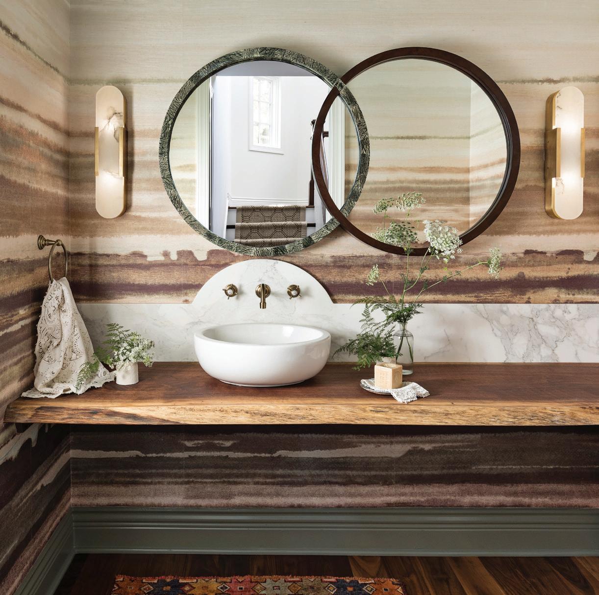
The art of the mix is apparent throughout the home. Consider the second powder room, where Phillip Jeffries wallpaper, a marble MaitlandSmith mirror, and an off-center sink create a distinct look. “I fell in love with the mirror at High Point Market (North Carolina),” Nicholas says. “It was never put into production; luckily I was able to score the sample, because I had designed the whole bathroom around it!” The live-edge counter is made by the same outfit that crafted the office desk. In the family room, a multibubble-motif light fixture adds eclectic appeal. “She likes the idea of something dressy and he wanted casual, so the light fixture is her and the beams are him.”
In the end, the family was thrilled to make a fresh start in the design department. “They had a melting pot of things that he had, and she had, but they had never really articulated their style together as a family,” Nicholas says. Now their home reflects not only their newfound passion for personal style and beauty, but it accommodates all their needs as a busy, fun-loving family.
INTERIOR DESIGNER
Krista Nye Nicholas, Cloth & Kind, Ann Arbor, clothandkind.com
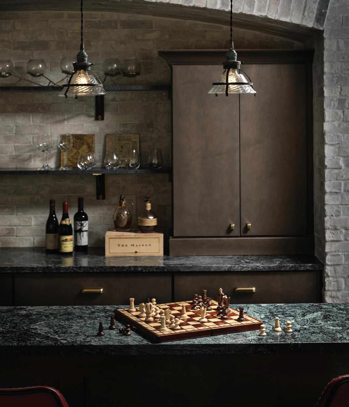
BAR, BASEMENT
Brick – Reclaimed Brick Veneer, Brick Floor Tile
Cabinetry – Design Classics Cabinetry
Countertop – Soapstone, PMP Marble & Granite, Troy
Hardware – Larkin Bin Pulls and Finger Pulls, Rejuvenation
Lighting, Pendant – Small Industrial Pendant with Snap-In Shade, 1stdibs
Shelving – O&G Stirrup Shelf Bracket 10-inch, Rejuvenation
BATHROOM, PRIMARY
Bathtub – Existing
Cabinetry – Design Classics, LLC
Countertop – Carrara, PMP Marble & Granite, Troy
Drapery – Linen Panels with One-of-A-Kind Moroccan Tiebacks; LouLou Designs, Dexter
Faucet – Purist, Polished Nickel, Kohler, Advance Plumbing and Heating Supply Co., Walled Lake
Flooring – Rue Des Rosiers 3, Charcoal & Oxford on Lavan 6”x 6”, Tabarka Studio, Ann Sacks, Michigan Design Center, Troy
Light, Pendant (Over Bath) – Cannes Pendant, Polished Nickel with White Glass, Visual Comfort, Cloth & Kind Showroom, Ann Arbor
Lighting, Sconce – Camille Sconce, Polished Nickel with Natural Paper Shade, Visual Comfort, Cloth & Kind Showroom, Ann Arbor
Mirror – Malena Mirror, Made Goods
Sink – Caxton, Kohler, Advance Plumbing and Heating Supply Co., Walled Lake
Wall Paint – Benjamin Moore, White Dove
Bed Frame – Sonder Living
Bench – Ryan King Size Storage Bench, Duralee, Troy; Fabric, Eddy, Neptune, Rose Tarlow; Trim, Italian Leather
Piping, Commodore
Blinds – Waterfall Woven Wood Shades, Montauk, The Shade Store
Ceiling Paint – Benjamin Moore, Decorator’s White
Chair, Accent – Three Chairs Co., Ann Arbor; Fabric, Katie’s Ikat, Indigo, Katie Leede
Drapery – Glitterati, Gold/Natural, Seema Krish, Cloth & Kind Showroom, Ann Arbor; Trim, Wonky Key, Indigo, Kravet, Kravet | Lee Jofa | Brunschwig & Fils, Michigan Design Center, Troy Lamp, Floor – Lilian Floor Lamp, Gild, Visual Comfort, Cloth & Kind Showroom, Ann Arbor
Lamps – Pheasant Feather Lamp, Bunny Williams Home
Light Fixture, Ceiling – Cubist Small Chandelier, Gild, Visual Comfort, Cloth & Kind Showroom, Ann Arbor
Rug, Overlay – Custom, Cloth & Kind Showroom, Ann Arbor
Rug, Underlay – Torrell, Chestnut with Linen Binding, Stark, Troy
Table, Accent – Bart 3-Legged Accent Table, Bradley USA
Tables, Bedside – Demian Bedside Table, Oly Studio
Wall Paint – Benjamin Moore, Sterling
Above left: A live-edge counter and Phillip Jeffries wallpaper add style to this powder room. Above right: A dramatic lower-level bar features a soapstone counter and classic brick detailing. Opposite page: Bold art, like the Kuba cloth in the lower-level game room, can be found throughout the home.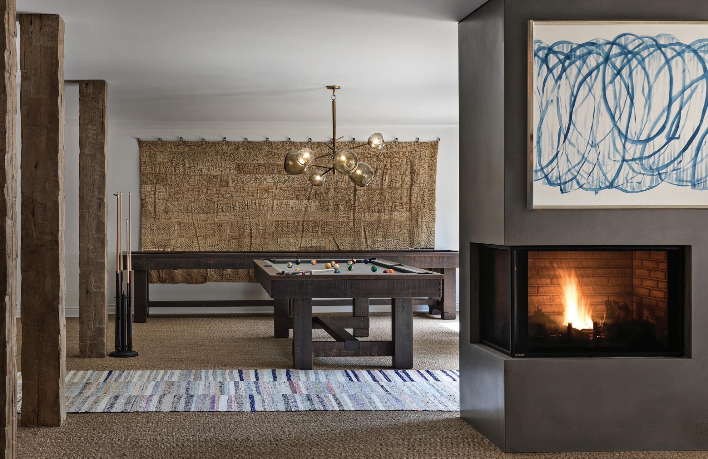
Art, Over Fireplace – Castelli Framed Silk Panel, Blue, Villa & House
Columns – Hand-Hewn Wood Columns; Installation, Guidobono Building Co., Northville
Fireplace – Concrete
Flooring – Seagrass Straight Woven, Stark, Troy
Lighting – Molten Chandelier, Regina Andrew, Wyandotte
Pool Table – Breckenridge, Olhausen Billiards
Rug – Extra Long Vintage Turkish Kilim, Lavender Oriental Carpets
Shuffleboard Table – Rustic, Olhausen Billiards
Tapestry – Vintage, Kuba Cloth Tapestry, Cloth & Kind Showroom, Ann Arbor Wall Paint – Benjamin Moore, White Dove
KITCHEN
Backsplash – Nottingham Ceramic Diamond, Icecap, Ann Sacks, Michigan Design Center, Troy
Beams – 10-inch Hand-Hewn Wood Beams; Installation, Guidobono Building Co., Northville Chairs, Bar – Jordan 24” Counter Barstool, Grey, Palecek; Cushions, LouLou Designs, Dexter; Fabric, Ink Blot, White Sands, Perennials
Countertop – Calacatta Gold Marble, PMP Marble & Granite, Troy Faucet – Traditional PLP Extended Reach Pull Down Faucet, Waterstone, Advance Plumbing and Heating Supply Co., Walled Lake
Hardware – Sun Valley Bronze, Cloth & Kind Showroom, Ann Arbor
Lighting, Island – Neo Triple Bar Fixture, Polished Nickel, O’Lampia Lighting, Cloth & Kind Showroom, Ann Arbor
Roman Shade – LouLou Designs, Dexter; Fabric, Waverton Blue, Penny Morrison, Cloth & Kind Showroom, Ann Arbor Cabinetry – Design Classics Showroom
Refrigerator – 42-inch French Door, SubZero, Witbeck Home Appliance Mart, West Bloomfield
Sink – Shaws Original Lancaster Single Bowl Apron Front Fireclay Kitchen Sink, Rohl, Advance Plumbing and Heating Supply Co., Walled Lake
Stove – 48-inch Professional Series Pro Grand Commercial Depth Dual Fuel Steam Range, Thermador, Witbeck Home Appliance Mart, West Bloomfield
Vent Hood – St. Udio
Wall Paint – Benjamin Moore, White Dove
Bench – Upholstery, LouLou Designs, Dexter; Fabric, Elements, Rhino (Reverse), David Sutherland, Perennials Chairs – Hadley Chair, Silver Mesh Metal, Made Goods; Reupholstered, Fabric, Elements, Rhino, David Sutherland, Perennials
Lighting, Pendant – Benit Medium Sculpted Pendant in Plaster, White and Gild, Visual Comfort, Cloth & Kind Showroom, Ann Arbor
Pillows – Custom, Cloth & Kind Showroom, Ann Arbor
Shades, Roman – LouLou Designs, Dexter; Fabric, Taro Strip, Nagata, Zak+Fox Table – Echo Dining Table, White, Nuevo Living
Wall Paint – Benjamin Moore, White Dove
Beams – 10” Hand Hewn Wood Beams; Installation, Guidobono Building Co., Northville Chairs, Swivel – Sullivan Swivel Club
Chairs, Highland House, Cloth & Kind Showroom, Ann Arbor; Fabric, Pazura, Snow, Zak+Fox
Drapery – LouLou Designs, Dexter; Fabric, Libeco, Oyster, McLaurin & Piercy, Cloth & Kind Showroom, Ann Arbor; Trim, Basket Weave Jute Loop, Spa, Fringe Market
Fireplace – Soapstone, PMP Marble & Granite, Troy
Flooring – Original, American Walnut
Lamps, Table – Armato Small Table Lamp, Porous White Ceramic with Oval Linen Shade, Visual Comfort, Cloth & Kind Showroom, Ann Arbor
Light, Ceiling – Muriel Chandelier, Brass & Clear Cast Resin with Bubbles, Oly Studio
Paintings – Vintage, Gillian Bryce Gallery
Rug, Hide – Hide Rug, Light Brindle Tan, Saddlemans
Rug, Underlay – Bombay, Birch Manali, Linen Binding, Fibreworks, Cloth & Kind Showroom, Ann Arbor
Sconce – Leather Wall Sconce, Lostine, Michele Varian Shop & Design
Shades – The Woven Woods, Montauk No. 3, The Shade Store
Sofa – Alston Sofa, Graded in Fabric, Highland House, Cloth & Kind Showroom, Ann Arbor
Table, Coffee – Serrano Coffee Table, Dovetail Furniture
Table, Side (Sofa) – QS Zimmerman Side Table, Old Wood, Noir Furniture
Table, Side (Swivel Chair) – Large Ari Side Table, Frost White, Oly Studio
Wallcovering – Sherwin-Williams, Decorator Grasscloth II
OFFICE
Chair – Ameri Counter Stool, Nuevo Living; Fabric, Turkish Step, Ivory, Schumacher,
Michigan Design Center, Troy Curtains – LouLou Designs, Dexter; Fabric, Novelty Weave, Lino, Travertine/Ebony, Opuzen
Desk – Custom, Live Edge Floating Desk, Tree-Purposed, Farmington Hills
Lamp – Custom Shade, Etsy
Light, Ceiling – Danish Brutalist Pendant
Lamp, Patinated Blow Torched Brass, Svend Aage, 1stdibs
Ottoman (Fabric) – Sikar Embroidery, Flax, Schumacher, Michigan Design Center, Troy
Sconce – 18-inch Cabinet Maker’s Picture Light, Hand-Rubbed Antique Brass, Visual Comfort, Cloth & Kind Showroom, Ann Arbor
Wall Paint – Benjamin Moore, Dragon’s Breath
Faucet – Paris 206 Two-Handle Faucet, Waterstone, Advance Plumbing and Heating Supply Co., Walled Lake
Lighting – Melange Elongated Sconce, Antique, Burnished Brass with Alabaster, Visual Comfort, Cloth & Kind Showroom, Ann Arbor
Mirror – Odin Circle Mirror, MaitlandSmith, Cloth & Kind Showroom, Ann Arbor
Sink – 81 12-NoHole Planet Ceramic Vessel Sink, Scarabeo, eFaucets
Wallcovering – Fade in Sienna on White Manila Hemp, Phillip Jeffries, Tennant & Associates, Michigan Design Center, Troy
Builder – Eric Guidobono, Guidobono Building Co., Northville
ONCE OUTDATED, THIS BIRMINGHAM BUNGALOW IS NOW A MODERN MARVEL, COMPLETE WITH PRIMARY PALETTES, BOLD ART, AND AN OUTDOOR LIVING OASIS
TEXT BY PATTY LANOUE STEARNS| PHOTOGRAPHY BY
JACKIE BLAIR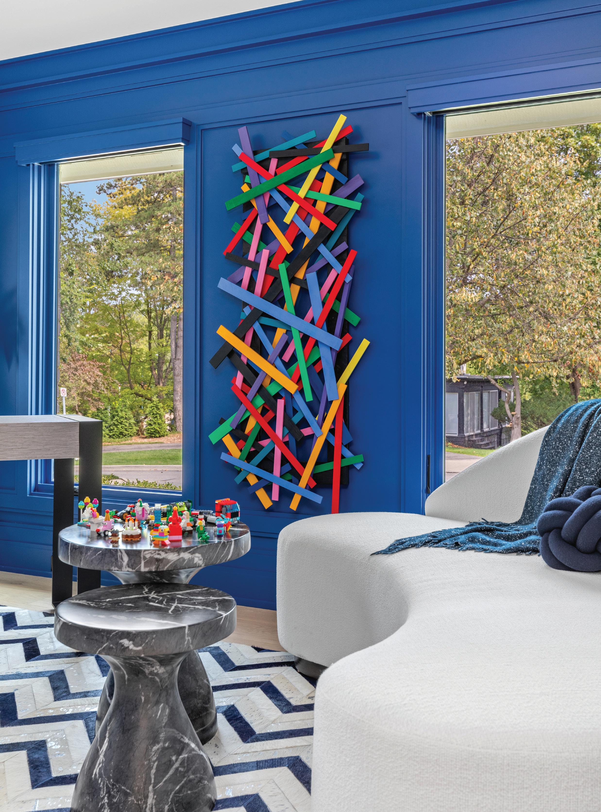 PAINTBOX PANACHE
WWhen Sharon Maskin found this property near downtown Birmingham, it had the right footprint and a yard big enough to accommodate a swimming pool, and it was a close walk into town. She wanted a smaller home than the one she and her husband lived in — something more manageable and with less maintenance, among other needs.
As for the house, a 1940s bungalow that had been added onto, the idea was to knock it down and start anew. But just as the papers were signed and plans started to take shape, Maskin’s beloved husband, Richard, passed away.
There was no turning back with the property, but Maskin thought remodeling the house would
be faster than tearing it down.
“I needed to downsize, so I decided to just remodel,” Maskin says. She turned to Farmington Hills builder Terry Nosan, of Nosan Signature Homes, and Birmingham designer Ian Hartwell, of Oliver Max Inc., to get things moving.
The project was intense. “There was lots of demo on the first floor,” builder Nosan recalls. Luckily, the old house’s materials had no remediation issues. To achieve the design intent, however, that level had to be modified to support the upper floor, plumbing, HVAC improvements, and removing walls in order to open up the layout.
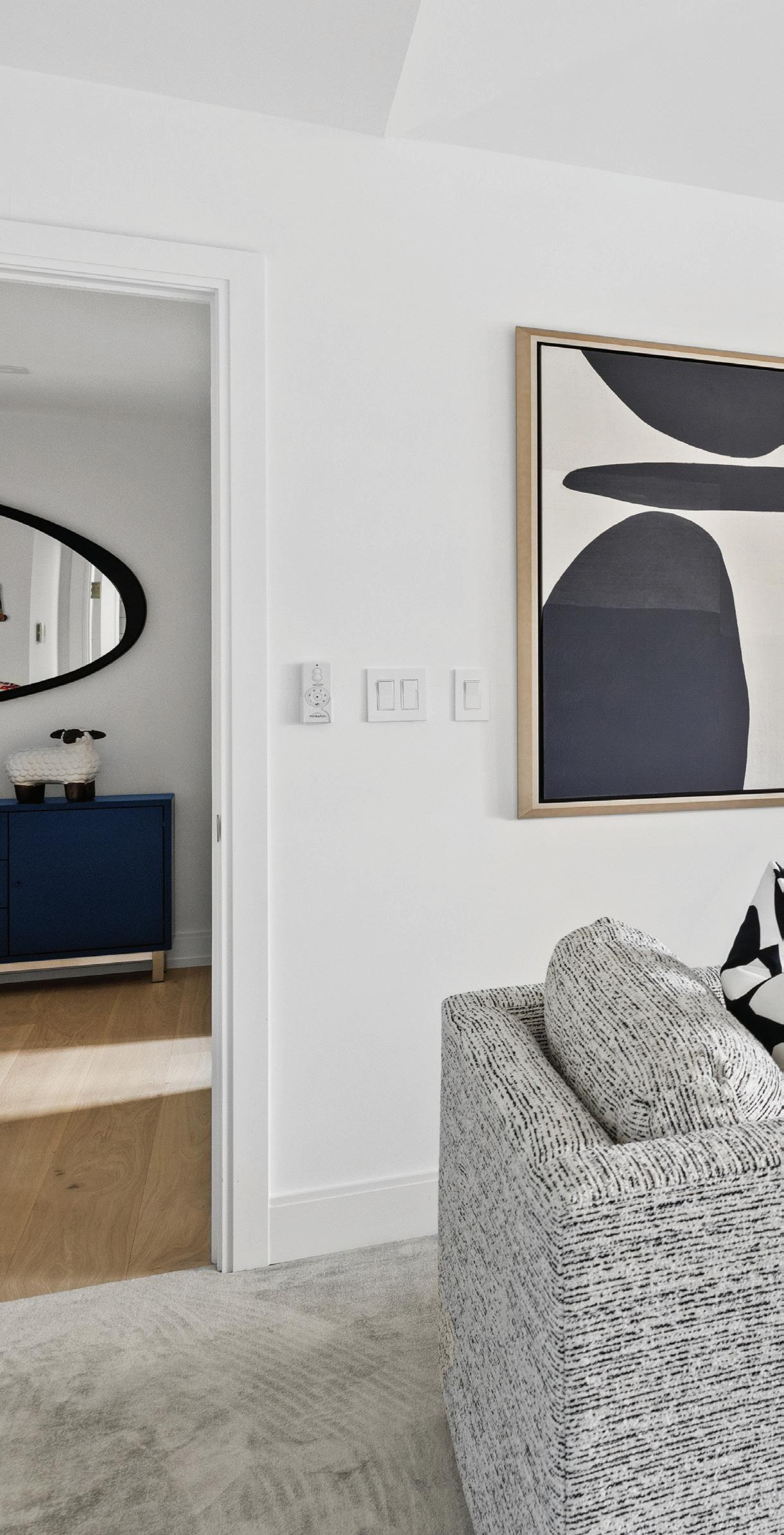
Above: A bright blue fireplace adds a playful punch to this second-floor loft. Inset: A mix of brilliant and bold colors defines the home, and is evident in the cutting-edge entryway.
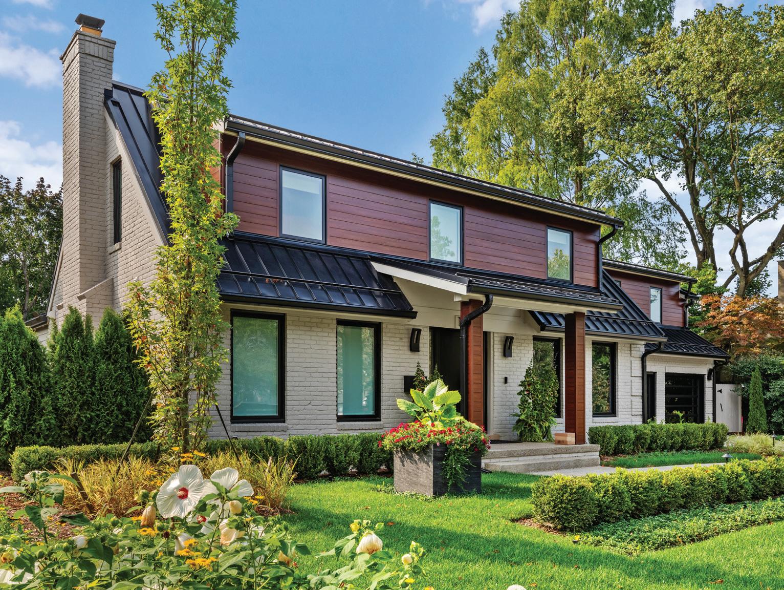
Top left: Warm cedar-like siding gives a luxe look and is maintenance free.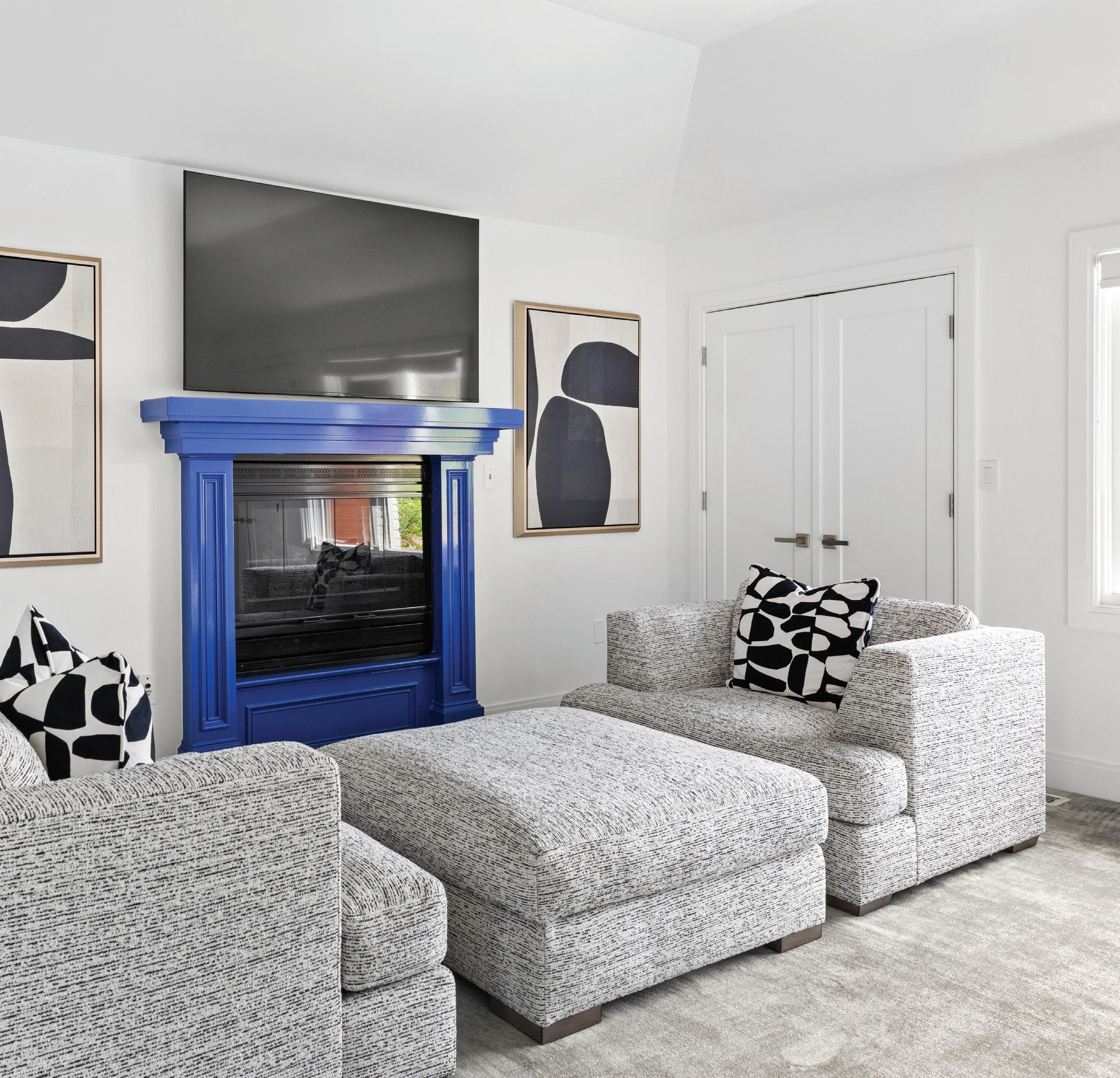
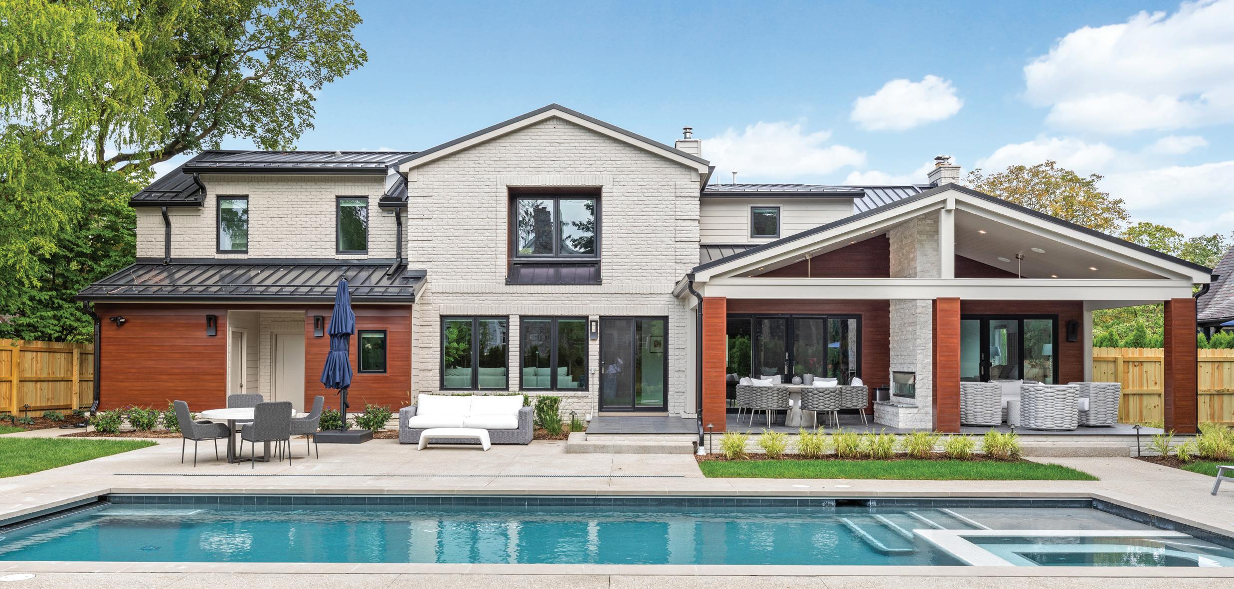
Nosan turned a portion of the living room into part of the primary bedroom and added another 300 square feet to create an ensuite bath, walkin closet, and covered porch in the back. He opened up the whole kitchen; removed the gabled dormers along the second story and reconfigured a single dormer; added new windows, a new front door and sidelights, a portico, and heavy-duty extruded metal siding; and painted the bricks for a more modern exterior. The final touch was a sturdy metal roof. In the process, the home grew from 3,223 square feet to 4,400 square feet.
The second level features another primary suite, plus another bath and two smaller bedrooms that connect via a carpeted tunnel. Maskin says her grandsons use the tunnel as a big, long fort, and to move between rooms. For her married children and their families, the second floor is a mellow place where they can relax when they visit.

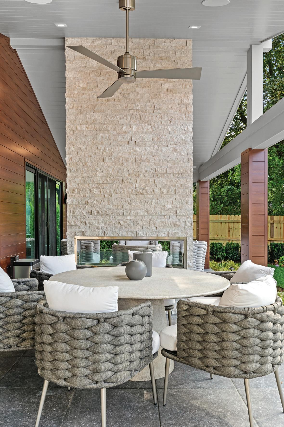
In the rear of the house, there’s a covered terrace with a two-way fireplace, a swimming pool, pool storage, and a half bath — all screened and landscaped for privacy. An open terrace with a fireplace is conveniently located outside the primary bedroom.
“All the demo on an existing home is hard,” Nosan says. “You’ve got to have skilled carpenters who know what they’re doing.” Fortunately, he has them.
Nosan recalls some of the hairier moments of the deconstruction: “Once we took it all apart, there were portions of the house that were
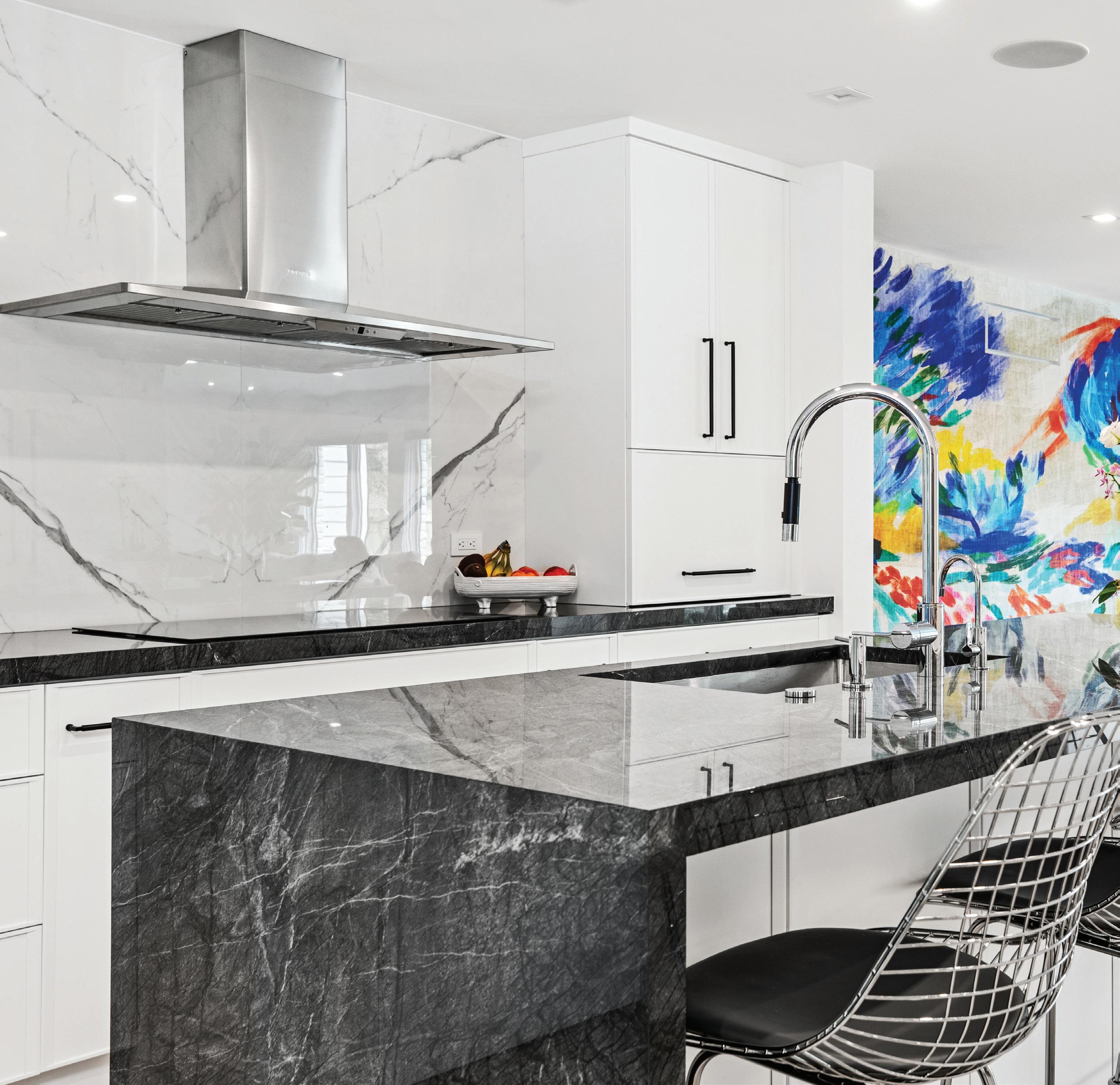
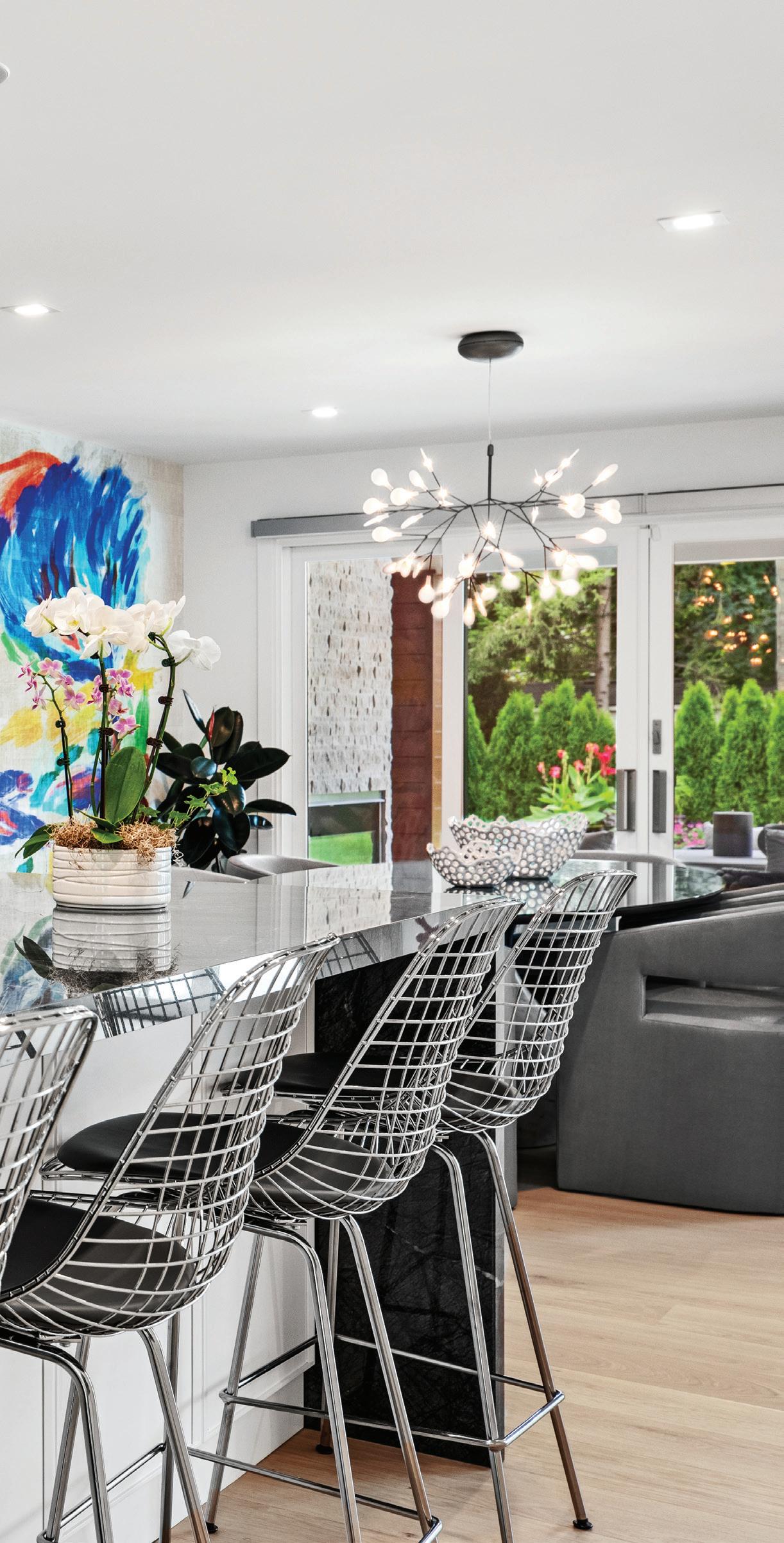
Above: With custom cabinets, neutral hues, and high-shine Eames stools, the elegant kitchen is streamlined and modern.
very old compared to today’s standards,” he says. One spot on the main level, for example, had old floorboards and his team had to figure out how to make the floor level from one end of the house to the other.
“When moving walls, you just don’t know how it will work,” the builder continues. “First you strip the drywall or plaster, then it’s kind of reverse engineering, and sometimes you can’t do it.”
Hartwell, who directed both the interior and exterior design, recalls some of his goals and challenges, which occurred in the thick of the pandemic. He says he and Maskin had to look at samples via Zoom, and upholstery orders were 30 to 40 weeks out.
“Sharon wanted color,” Hartwell says. “She likes art and wanted to showcase hers and invest in more. She wanted a modern aesthetic — a new feel, a new start.” Thus, he curated the brilliant palette of electric blues
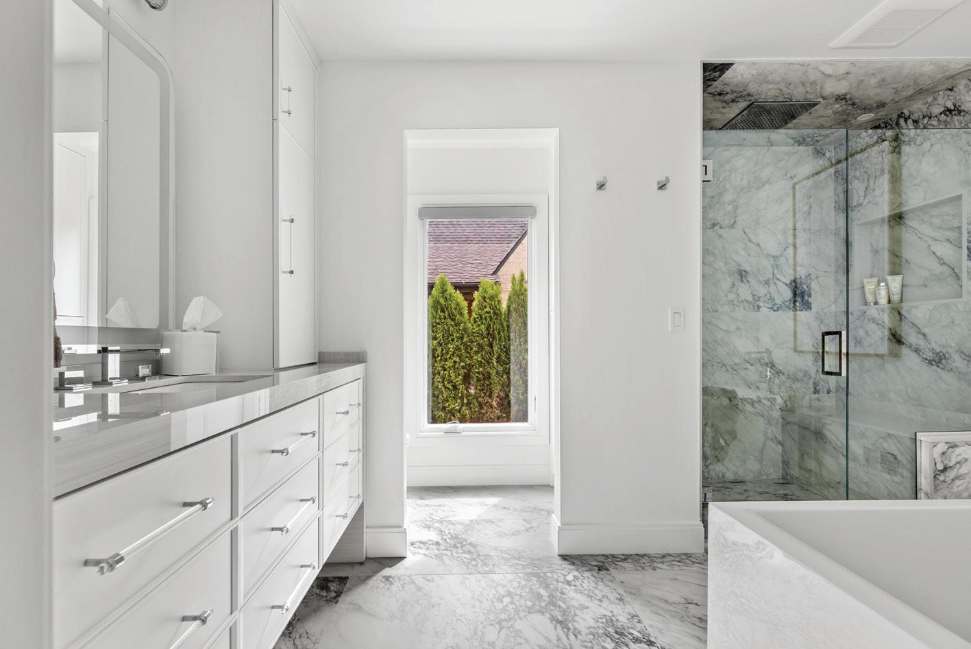
Above: This spacious ensuite exudes glamour.
Below: A two-way fireplace for al fresco entertainment.
and primary colors, and the wide-open feel of this remodel, which he calls “modern mountain.”
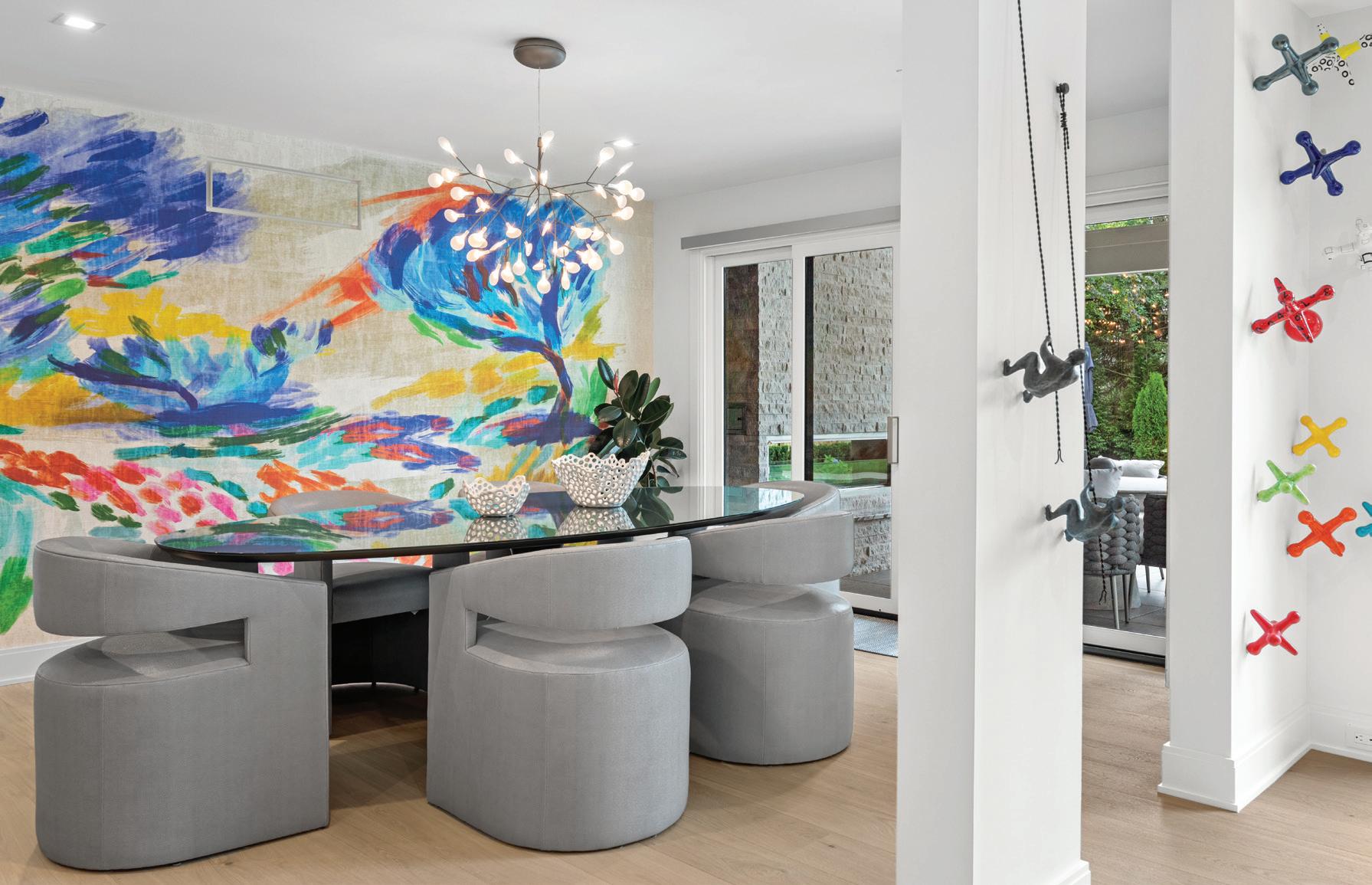
Inside, the home is filled with interesting artwork and murals, and although it’s luxurious, it’s also kid-friendly. Outside, the house is clad in a warm cedar-look siding that’s maintenancefree. The kitchen and bath décor are elegant and neutral. The library/office features WeldWork custom-handcrafted steel doors with a divided light glass, so Maskin can see what’s happening in the house, and a floor-to-ceiling wall of custom cabinets that hide the grandkids’ toys. The 15-by40-foot pool, with its large charcoal glass tile
OUTDOOR
A metal roof, new siding, freshly painted brick and a 15-by-40foot pool are among the many exterior improvements.
surround and spa, is painted in soft hues that Hartwell compares to “a big glass of water.”
Maskin loves her four-bedroom/three-fulland two-half-bath house — particularly the site lines of her sleek kitchen, where she enjoys cooking and entertaining, and everything can
be contained behind closed doors. She says Nosan Signature Homes went out of their way to customize moldings, casings, and all cabinetry to provide the clean lines she wanted.
It was about 17 months before Maskin could move in, and many projects were still in the
Terry Nosan, Nosan Signature Homes, Farmington Hills, nosansignaturehomes.com
Bathtub – Nokori, Bain Ultra, Advance Plumbing and Heating Supply Co., Walled Lake
Cabinetry – Bernier Cabinetry, Executive Kitchens, Royal Oak
Countertops – Artemis Polished, Geoluxe, Ciot, Troy
Door, Shower – 3/8-inch Shower Guard Tempered Glass; Hinges, Square Style Polished Chrome; Pull, Hamburg, Kartners
Faucets – California Faucets, Advance Plumbing and Heating Supply Co., Walled Lake
Fixtures, Shower – Jaclo, Hansgrohe, Mountain Plumbing, Advance Plumbing and Heating Supply Co., Walled Lake
Fixtures, Vanity – Diamonds LED Collection, George Kovacs, Pine Tree Furniture & Lighting, Lake Orion
Flooring – Renoir, Ciot, Troy
Mirror – Lux Collection LED, Elegant Lighting, Pine Tree Furniture & Lighting, Lake Orion
Sink – Toto, Advance Plumbing and Heating Supply Co., Walled Lake Tile, Shower – Renoir, Ciot, Troy
Wall Paint – Benjamin Moore, Super White
Window Treatments – SoundCheck, Southfield
Chairs – No. 725 Chair, A. Rudin
Chandelier – Heracleum III Pendant, Bertjan Pot, Moooi, Lightology
Door, Sliding – Siteline, Jeld-Wen, Antcliff
Windows & Doors, Burton
Flooring – Live Pure, Plank Castle, Boen, Everlast Floors, Troy
Table – Aqua Dining Table, Fabrice Berrux, Roche Bobois, Novi
Wall Art (Jacks) – Kaiser Suidan, Next Step Studio & Gallery, Ferndale
Wall Covering – Custom Sized Mural, Élitis
Wall Paint – Benjamin Moore, Super White
FOYER
Bench – Custom, Lambskin Wool, Made Goods
Door – Signature Flush White Oak, Mans Lumber, Canton
Flooring – Live Pure, Plank Castle, Boen, Everlast Floors, Troy
Lighting – Palisades Ave Pendant, Avenue Lighting, Pine Tree Lighting, Lake Orion
Railing – Viewrail
Rug and Stair Treads – Missoni Tivoli, Lapis, Stark Carpet, Troy
Wall Art – Original Piece, Danielle Peleg Gallery, Keego Harbor
Wall Paint – Benjamin Moore, Super White
Cabinetry – Bernier Cabinetry, Executive Kitchens, Royal Oak
Cooktop – 36-inch Black Induction Cooktop, Wolf, Specialties Showroom, Berkley
Counter Stools – Eames Wire Stools, Herman Miller, MarxModa, Detroit
Countertops – Crystal Black, Ciot, Troy Faucet – Single-Lever Mixer, Chrome, Dornbracht, Advance Plumbing and Heating Supply Co., Walled Lake Sink – Crosstown Stainless Steel, Elkay, Advance Plumbing and Heating Supply Co., Walled Lake
works. Given the enormity of the remodel, she laughs: “I should have just knocked it down.” But, all considered, she says, “there wasn’t one horror story, and I’d do it all again with Terry Nosan. He went above and beyond for me in many instances.”
Vent Hood – Diamante, Faber, Specialties Showroom, Berkley
Wall Material – Statuario Manhattan, Ciot, Troy
Wall Paint – Benjamin Moore, Super White
Chairs – Giselle Chair, Bernhardt; Fabric, Pierre Fray, Holly Hunt
Doors – Madison, Jeld-Wen, Mans Lumber, Canton
Fireplace, Color – Benjamin Moore, Delphinium
Flooring – Bellisimo, SSD Carpets
Ottoman – Andie Bumper Ottoman, Bernhardt
TV – SoundCheck, Southfield
Wall Art – Balancing Act, Bobby Berk, Left Bank Art
Wall Paint – Benjamin Moore, Super White
OFFICE
Desk – Honour Desk, Arteriors
Flooring – Castle Pink, Boen, Everlast Floors, Troy
Rug – Hyde/Metallic Rug, Mastour
Sofa – Custom, Oliver Max Inc., Royal Oak Table, Tiered – Serafina Tables, Arteriors
Wall Art – Melody Kratz, Studio of Art, Oak Park
Wall Paint – Benjamin Moore, Blueberry Hill
Windows – Siteline, Jeld-Wen, Antcliff
Windows & Doors, Burton
Window Treatment – SoundCheck, Southfield
PATIO
Chair, Patio – Santa Cruz Chair, Bernhardt
Chairs, Patio (Poolside) – Antilles Rope
Arm Chair, Bernhardt
Concrete – Exposed Aggregate, Natural
Fan – Wet Custom, Zonix, Pine Tree
Furniture & Lighting, Lake Orion
Fireplace – Barcelona Lights, Astria,
American Fireplace and BBQ Distributors, Ferndale; Stone, Split Face Panels, Ritz Gray, Ciot, Troy
Paneling, Ceiling – V-Groove Lumber
Pool – Heated Saltwater Pool, PebbleTec, Limestone Coping, Gillette Brothers Pool & Spa, Troy
Roof – Standing Seam Metal
Siding – FastPlank, Dark Walnut, Bolyard Lumber, Birmingham
Sofa, Patio – Capri Sofa, Bernhardt
Table, Patio – Martini Table, Stone Yard Inc., Carlsbad Manufacturing Corp.
Table, Patio (Poolside) – Del Mar Round Dining Table, Bernhardt
Umbrella – Allstate Home Leisure by Watson’s, Watson’s of Livonia, Livonia
Brick – Existing; Paint Color, Amazing Gray, Sherwin-Williams
Columns – FastPlank, Dark Walnut, Bolyard Lumber, Birmingham
Front Door – Signature Flush White Oak, Mans Lumber, Canton
Garage Door – Horizon, Amarr Garage Doors, M&M Garage Doors, New Haven Landscaping – Great Oaks Landscape, Novi
Lighting, Front Door – Dawn, Modern Forms, Black, Pine Tree Furniture & Lighting, Lake Orion
Roof – Standing Seam Metal
Siding (Wood) – FastPlank, Dark Walnut, Bolyard Lumber, Birmingham
Windows – Siteline, Jeld-Wen, Antcliff Windows & Doors, Burton
Architect– David Lubin Architects, Bloomfield Hills
Interior Designer– Ian Hartwell, Oliver Max Inc., Birmingham
Thursday, May 30, 2024 One Campus Martius 16th Floor, Detroit.





GLOBE-TROTTING HOMEOWNERS
RETURN TO BLOOMFIELD HILLS, WHERE THEY TRANSFORM A DARK AND DATED MID-CENTURY HOME INTO A LITTLE BIT OF VENICE BEACH
TEXT BY KHRISTI ZIMMETH | PHOTOGRAPHY BY CHRISTOPHER PAYNE/ESTOTRANQUIL RETREAT
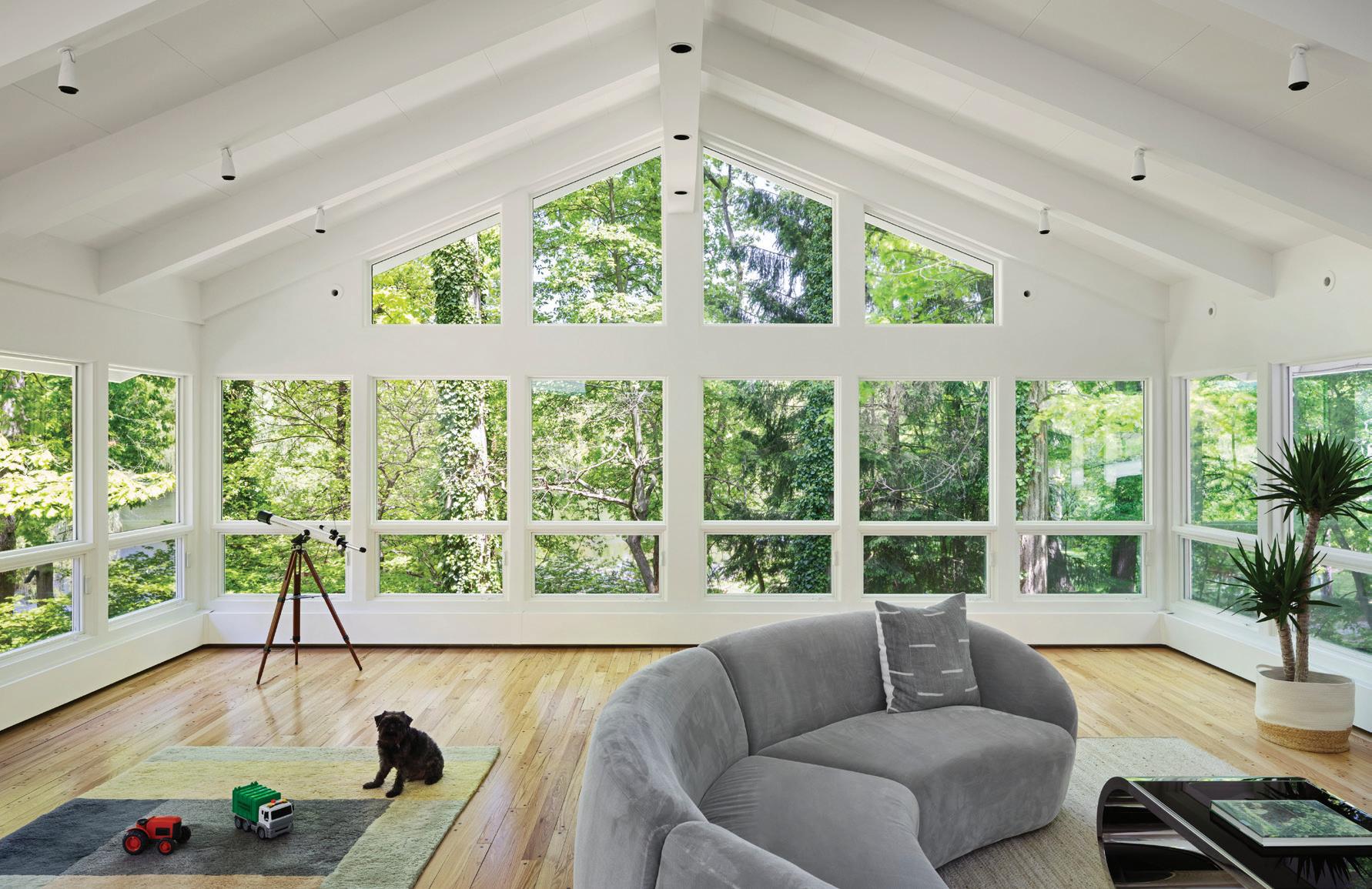
This page: “It was really peaceful, private, and beautiful,” says Martine Ilana of the home. “Coming from the big city, I loved the idea of so much space.”
Opposite page: The homeowners wanted nature to be the focus, so they used minimal art.
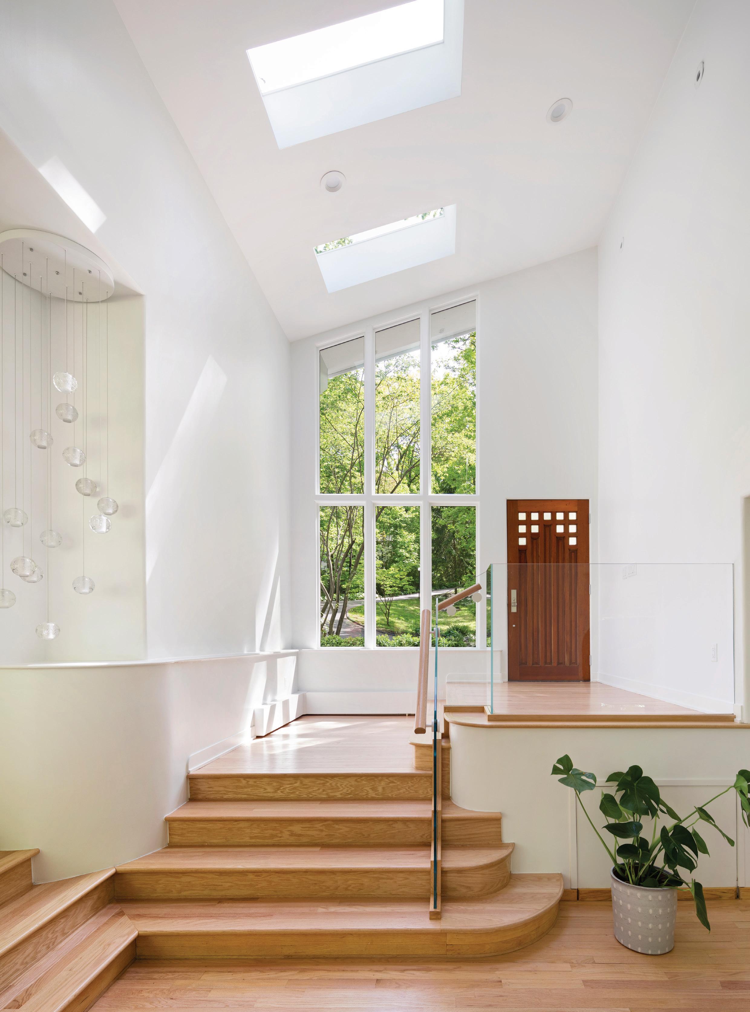
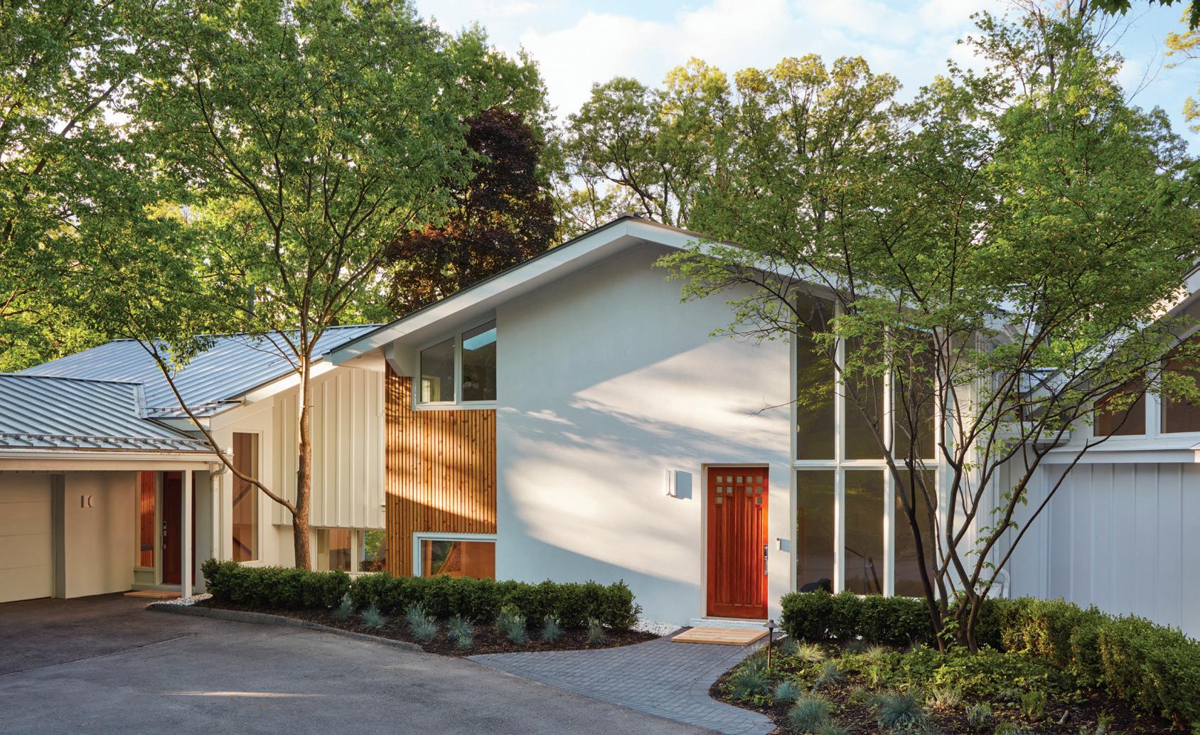

A“A hidden gem” is how homeowner Martine Ilana describes her quad-level contemporary home on Oakland County’s Sodon Lake. “The (homeowner) who lived here for 30 years passed away (in 2017), and basically it was just sitting here,” she says.
It was a gem that definitely needed polishing, however. Built in 1955, with a 1960 addition, the 5,200-square-foot home had been empty and abandoned for more than three years when Ilana and her husband, Chad Howard, came across it.
The couple and their two children had looked at many other options before finding the fivebedroom, 3.5-bath Mid-century residence. “We wanted something that was fresh, clean, and
Above: Sustainability was important, so the original bricks were covered with an exterior insulation and finish system and decaying wood siding was replaced with a custom rain screen of rot-resistant cedar.
Below: A fresh and clean aesthetic with creative touches defines the home, and is seen in this bright and airy dining room.

modern, with an artistic sense to it,” she explains. “We knew we wanted to renovate.”
They were lucky enough to find the blueprints for the original structure and the addition during the initial demolition. Both are now displayed on the wall in the living room. Later changes included a “teeny 1980s kitchen,” but the majority of the house was intact and ripe for a redo. “Basically, we kept the same footprint and adjusted the walls and touched every surface, inside and out,” Ilana explains.
Top of the list: a color change. “Everything was brown,” Ilana remembers. “We wanted to
BOLD DETAILS
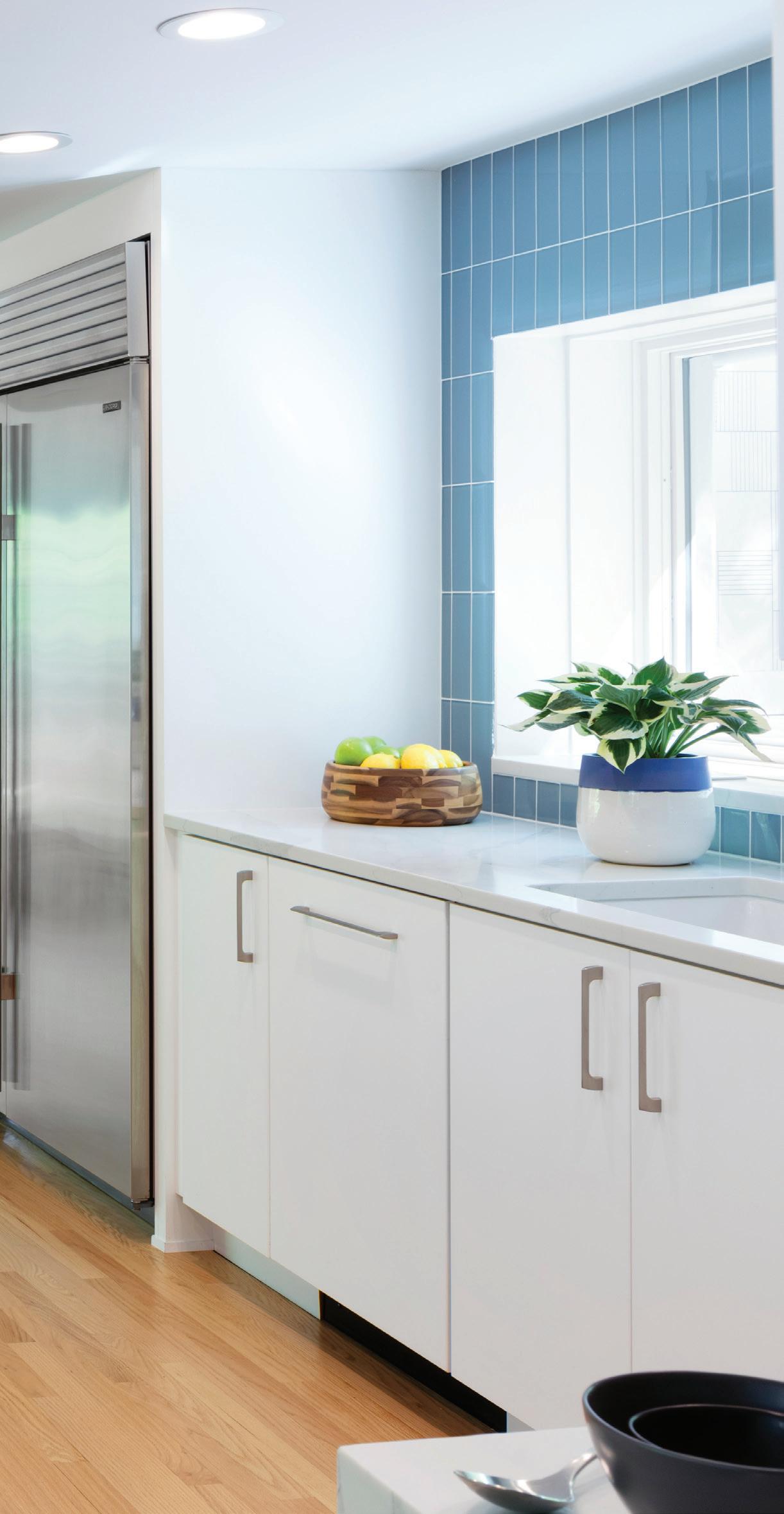
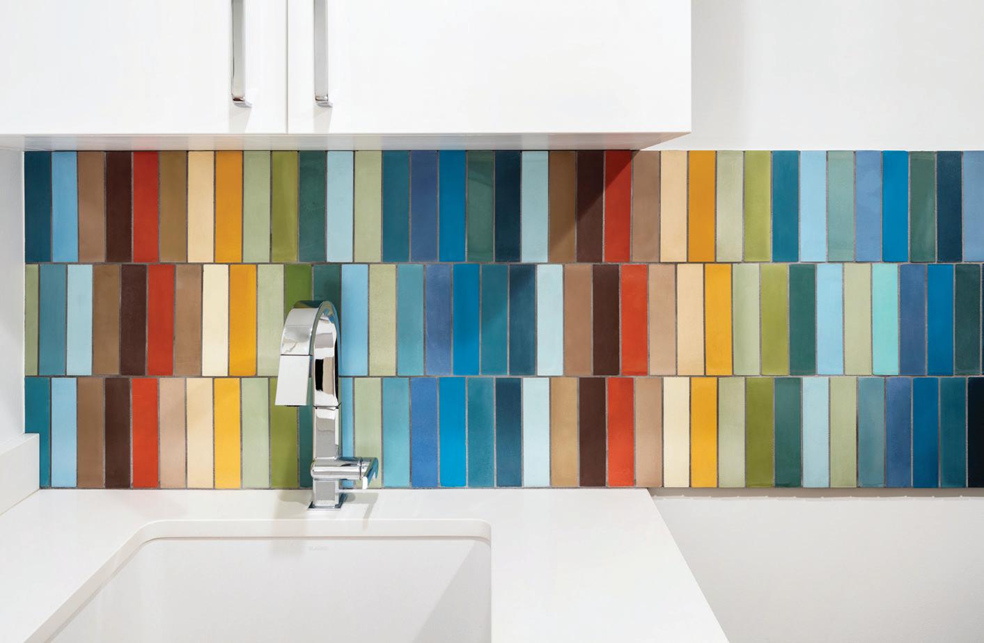
Above: The kitchen’s blue tile is among Ilana’s favorite details and can be seen from the living room, where the home’s original blueprints hang.
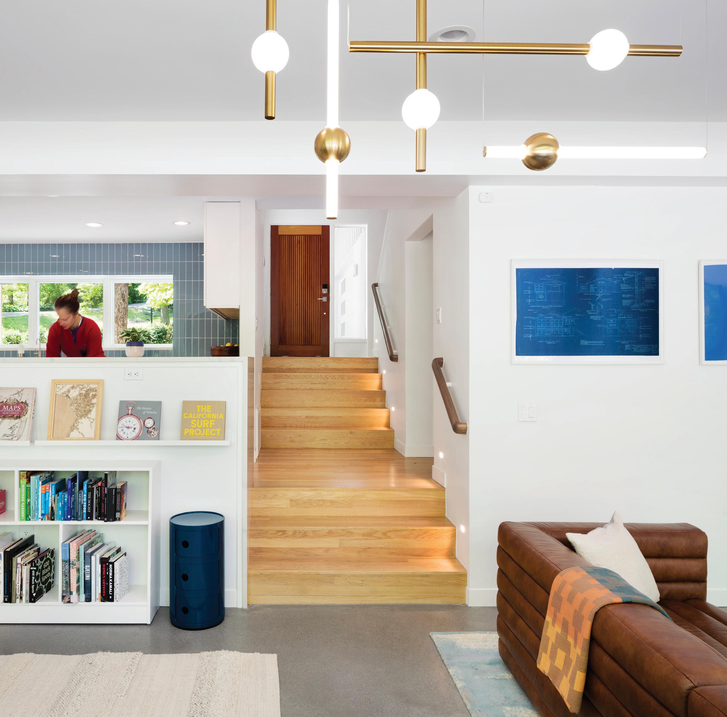
lift the house up with color.” They also needed to fix rotted ceilings and broken doors and, overall, to “breathe life back into the space,” she says. Outside, plans included covering the original dark brick with a lighter, synthetic stucco.
The challenge was that they had limited time to complete the project before needing to move from their temporary rental home. The couple bought the house in October of 2020 and moved in a year later. “It was crazy,” Ilana says of the quick turnaround. “We had 50 people here every day.” That included architect David Iannuzzi, of Detroit’s Iannuzzi Studio, and Livonia builder
Eric Masters. Ilana says both were integral to the project’s success.
“A typical tired Mid-century Modern house” is how Iannuzzi remembers the before, “but you could tell it had amazing bones. Martine fell in love with the house and, like us, she had the ability to visualize its potential.”
The house had sat on the market for a few reasons, Iannuzzi says: It needed an extensive renovation, it has a lot of different elevations, and the walk-out has a steep slope. “Not everyone liked how quirky it was on the inside,” he adds.
Lucky for the house, Ilana did, and she was
willing to undertake ambitious alterations. Her vision and decisiveness made the quick turnaround possible, Iannuzzi says. “She was very willing to commit to a concept and not go backward. The challenge for us was distilling Martine’s hopes and dreams and vision for this house and making it come to life.” Masters agrees that the timeline was the biggest challenge, and he also credits Ilana. “She was very involved throughout. Most people don’t share our passion for construction,” he says.
An industrial and interior designer and owner of Temescal Creative, a sustainable
This page: Removing walls in the kitchen “opened it up and let it sing,” says the architect, David Iannuzzi.
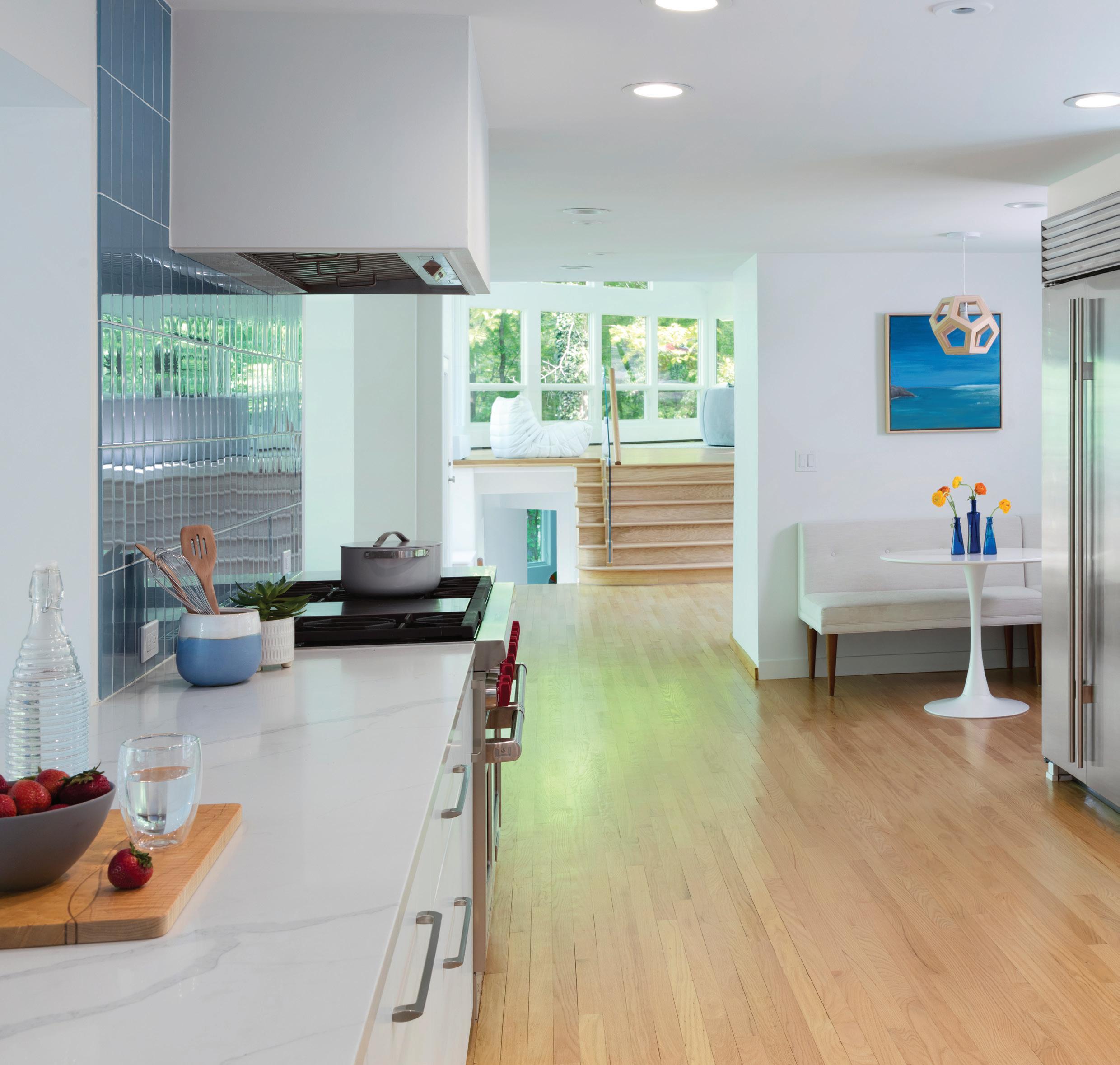
design agency, Ilana had remodeled commercial spaces, but the house was her first residential project. She drew inspiration from the West Coast style and architecture, and the home’s natural surroundings.
“I have an arts and crafts background and wanted to focus on handmade and carefully selected (items),” she explains, adding, “I really wanted it to feel calm.” She also wanted an open and light-filled floor plan, and for the house to have a smooth flow and not feel compartmentalized.
Born in the Midwest, Ilana lived in Bloomfield, and later moved all over the
country before ending up in California. Returning to Michigan wasn’t in the plans until Howard and Ilana both had great professional opportunities arise locally. Howard is also from Michigan, and eventually the family decided they wanted to give their twins the kind of childhood they had enjoyed.
When they were searching for their family home, Ilana had two criteria: it had to be by water, and it had to be near Cranbrook, her alma mater.
She was shocked to find that no one had made an offer on the property, which she described as really peaceful, private, and beautiful. “The idea of so much space was appealing, especially after years in the big city,” she says.
While she remembers it as “an intense undertaking,” Ilana wasn’t intimidated by the amount of work the house needed. “I wanted to challenge myself creatively and see if I could do it,” she explains. Iannuzzi handled the architecture and she did the interior design, furnishing the home with things she had acquired through her many travels, including hand-painted lockers in the lower-level playroom. “All the things I’d collected over the years finally had a place,” she says.
Ilana was mindful of not over-decorating, and using minimal artwork and a clean palette. “I wanted nature to be the artwork,” she says of
the surrounding vistas of the lake and trees, seen through the home’s expansive picture windows. Sustainable design was also critical to the renovation. That included covering the original brick with EFIS, an exterior insulation and finish system, replacing decaying wood siding with a custom rain screen of unfinished cedar that provides passive cooling and ventilation while being rot-resistant, adding a recyclable standing seam metal roof, and using low-maintenance natural materials and no-VOC finishes throughout.
Two years after moving in, it’s hard for Ilana to list her favorite parts. She loves the blue glass tile in the renovated kitchen, which mimics the
 PRIMARY ACCENTS
Right: The homeowners hand-picked each piece of cedar on the accent wall behind their bed.
RAINBOW BRIGHT
Above: Colorful accents, like this backsplash in the laundry room, lend an artistic touch throughout the home.
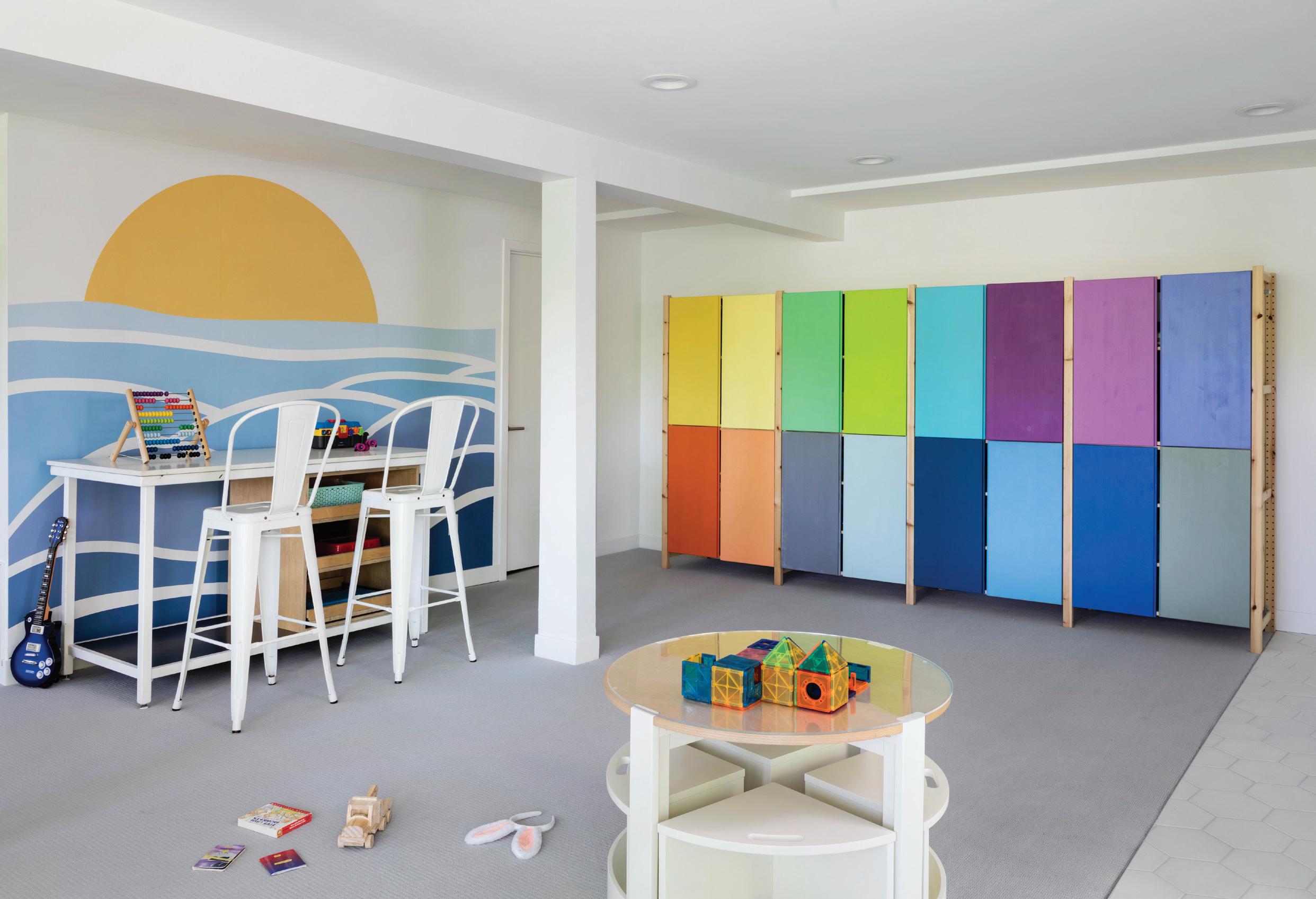
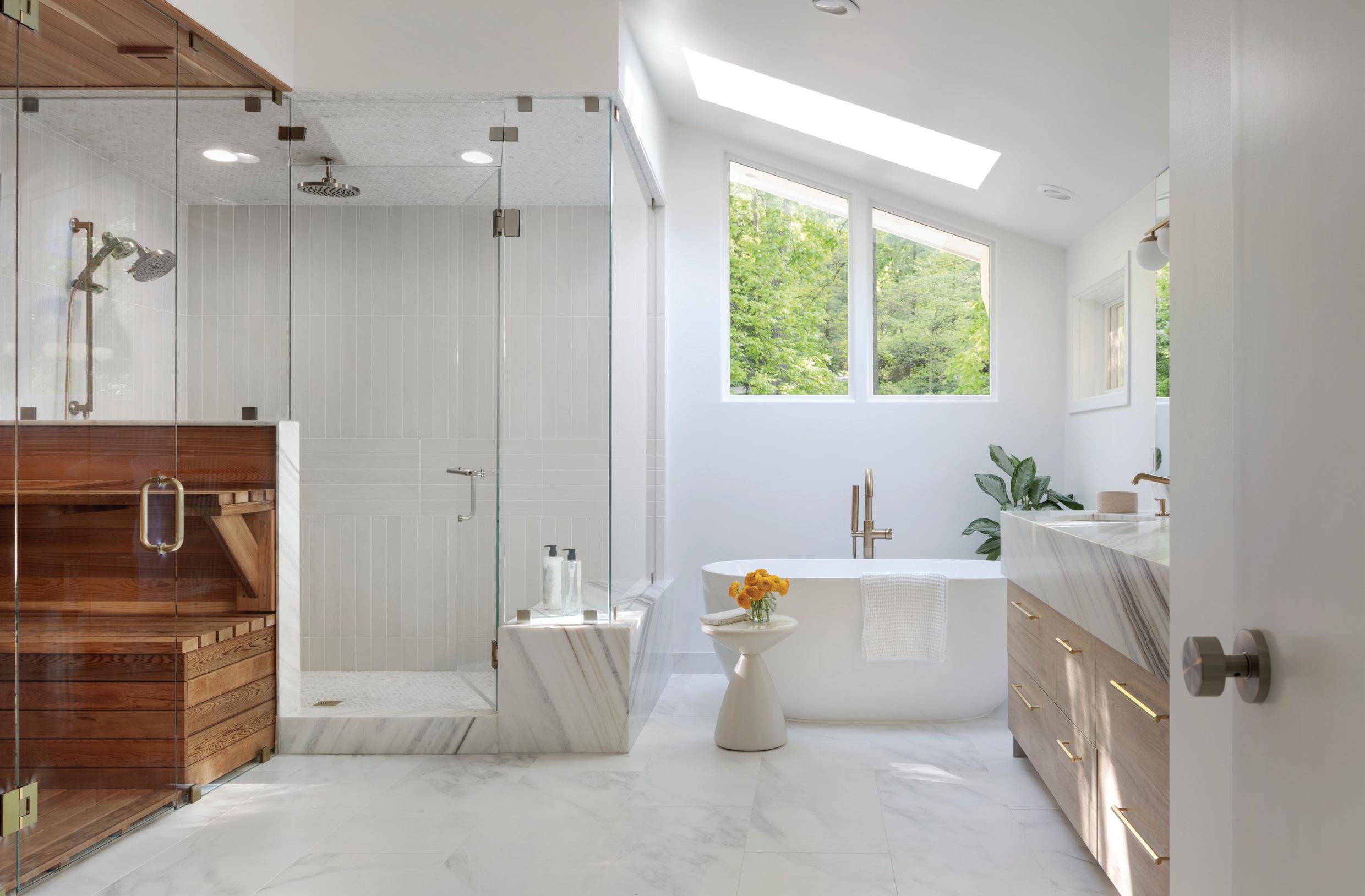
This page: “We just brought (the home) back to its glory,” Iannuzzi says. Left: The playroom’s multi-colored lockers were found during Ilana’s travels, while the primary bath showcases her love of light-filled spaces.
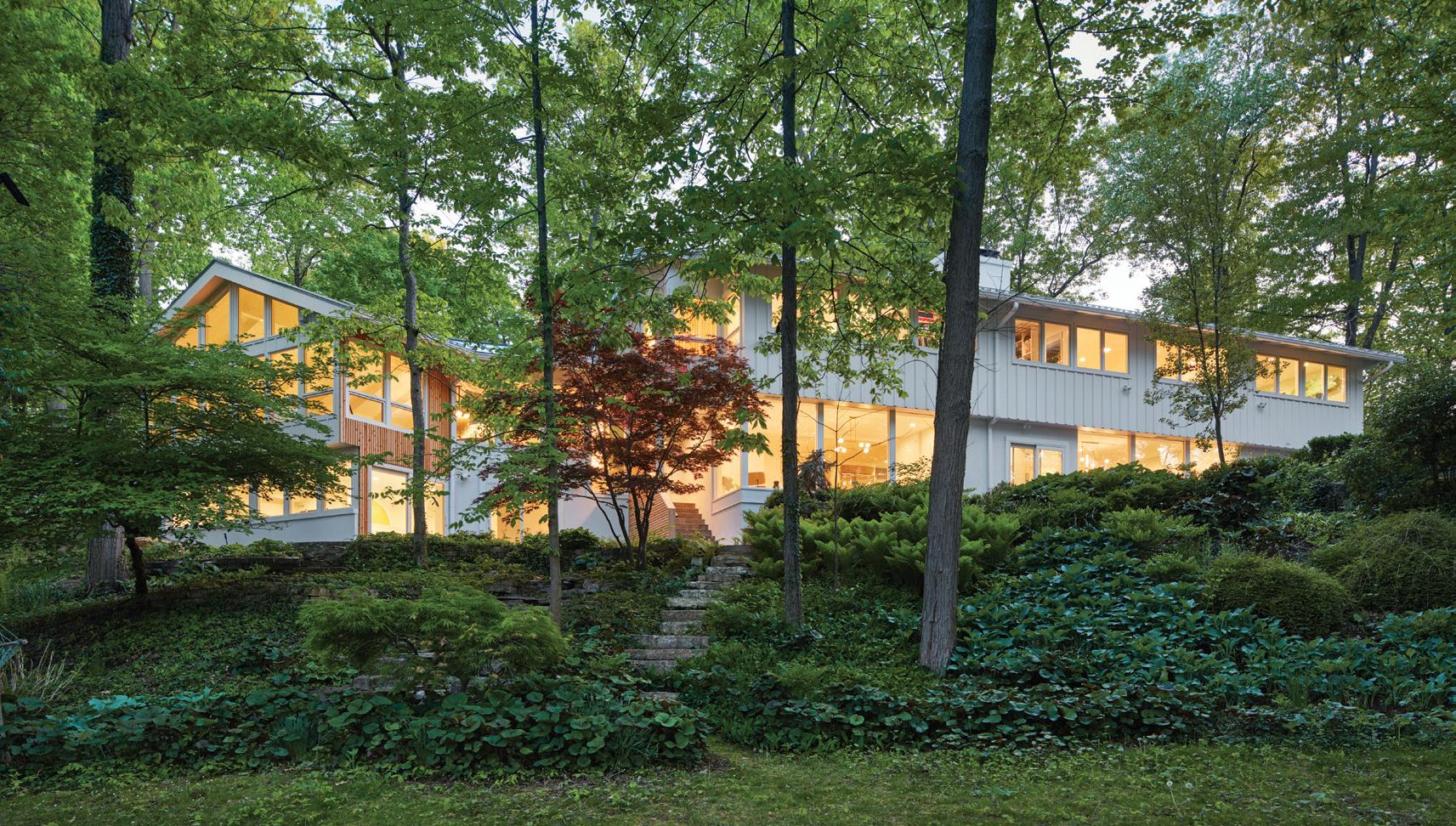
ocean and is inspired by years spent living in Venice Beach. “I’m never going to get sick of it,” she says. She also loves the mural on the side of the house, made from hand-picked Italian tile, and she loves her kids’ bath, which features her “favorite tile ever” (handmade in Portugal) as well as vintage IKEA wall art.
She’s also fond of the spacious primary bathroom, transformed from a brown and travertine “dark dungeon” into a light-filled space
that features hand-picked cedar in the sauna (the same material featured in slats behind her bed and throughout the house, she points out), a marble vanity, and a soaking tub.
Ilana says she kept at least one thing from the former owners. “The woman who lived here was a master gardener,” she says of the lot’s picturesque woodland garden. “I’ve learned a lot about gardening.” New treehouses built from salvaged materials look out over the peaceful,
ARCHITECT
David Iannuzzi, Iannuzzi Studio, Detroit, iannuzzistudio.com
INTERIOR DESIGNER
Martine Ilana, Temescal Creative, Franklin, temescalcreative.com
BATHROOM, PRIMARY
Bathtub – Oceana, Advanced Plumbing and Heating Supply Co., Walled Lake
Countertop – Marble, Ciot, Hard Rock Stone Works, Sterling Heights
Door, Shower – Custom, lannuzzi Studio and Temescal Creative; Fabricator, Diaek Glass
Faucet, Sink – Kintsu, Brizo, Advanced Plumbing and Heating Supply Co., Walled Lake
Fixtures, Bathtub and Shower – Kintsu, Brizo, Advanced Plumbing and Heating Supply Co., Walled Lake
Flooring – Porcelain Tiles, Floors & Decor
Mirror – Triple A Glass
Sauna Room – Custom, lannuzzi Studio, Detroit and Temescal Creative; Fabricator, GC Masters, Livonia
Vanity – Cabinetry, UltraCraft, Kurtis Kitchen & Bath, Livonia; Hardware, Rejuvenation; Lighting, Shades of Light
Wall Paint – Sherwin-Williams, Pure White
BEDROOM, PRIMARY
Bedding – Parachute Home
Mirrors – Custom, Temescal Creative; Fabricator, GC Masters, Livonia
Nightstands – Crate & Barrel
Sconce – Vega Light
Wall Art, Bedside – Handcrafted, Circle Painting from Mexico of Family Dog Wallcovering (Wood) – Custom, lannuzzi Studio and Temescal Creative; Fabricator, GC Masters, Livonia
DINING ROOM
Chairs, Dining – Eames Molded Plastic Chairs, Design Within Reach Chair, Side – Eames Lounge Chair and Ottoman, Design Within Reach Flooring – White Oak
Lighting – Bloom Loft Lighting
Table – Emmerson Reclaimed Wood Rectangle Dining Table, West Elm Table, Side – Glas Italia Shimmer Side Table, Design Within Reach
Wall Paint – Sherwin-Williams, Pure White
FOYER
Chandelier – 14 Pendant Chandelier, Bocci
Door – Original, ‘50s Mahogany
Rail, Glass – Custom, lannuzzi Studio and Temescal Creative; Fabricator, GC Masters, Livonia
Railing – Custom, lannuzzi Studio and Temescal Creative; Fabricator, Triple A Glass
Wall Paint – Sherwin-Williams, Pure White
KITCHEN
Art (Above Table) – Painting, Martine Ilana Backsplash – Glass Tiles, Ocean Blue, Floor & Decor Cabinetry – UltraCraft, Kurtis Kitchen & Bath, Livonia
non-motorized lake.
Ilana readily admits that at first it was hard to return to Michigan. “I had a tough time when I moved back, but I loved the idea of building something that could feel transformative when you walked in,” she says. “The house grounded us.” Overall, she’s been happy with the move. “This house changed my experience with Michigan in a good way,” she explains. “I love it here.”
Chairs – Eames Molded Plastic Chairs, Design Within Reach Countertops – Ciot, Hard Rock Stone Works, Sterling Heights
Flooring – White Oak
Light (Above Table) – CB2
Refrigerator – Sub-Zero
Stove – Wolf, Witbeck Home Appliance Mart, West Bloomfield
Table – Tulip Table, Eero Saarinen
Wall Paint – Sherwin-Williams, Pure White
LAUNDRY ROOM
Backsplash – Custom, Temescal Creative; Fabricator, GC Masters, Livonia; Material, LiLi Cement Tiles
Cabinetry – UltraCraft, Kurtis Kitchen & Bath, Livonia
Countertops – Ciot, Hard Rock Stone Works, Sterling Heights
Faucet – Chrome, Brizo, Advanced Plumbing and Heating Supply Co., Walled Lake
LIVING ROOM
Ceiling Paint – Sherwin-Williams, Pure White
Flooring – Original, ‘50s Wood Flooring
Rug – Color Block, HAY, A+R
Rug, Sofa – Handwoven Jute Rug
Sofa – Roma Sectional Sofa
Wall Paint – Sherwin-Williams, Pure White
Windows – Pella Windows & Doors
Bookshelf – Custom, Temescal Creative; Fabricator, GC Masters, Livonia
Flooring (Cement) – Poured Concrete; Fabricator, GC Masters, Livonia
Flooring (Wood) – Oak, Refinished Light, Ceiling – Estrella Lighting
Pillow – Mudcloth Pillow, Cream, ElleSEAshoppe
Rug – West Elm and IKEA
Sofa – Strato Leather Sofa, CB2
Throw – Mungo
Wall Art – Custom, 1955 Blueprints; Designer, Temescal Creative
Wall Paint – Sherwin-Williams, Pure White
Cabinetry – Custom, Multi Color Storage; Designer, Temescal Creative; Fabricator, GC Masters, Livonia
Chairs, Counter – Tolix Bar Stools, White
Flooring (Gray) – Karastan Clare Carpet, Light Grey, Riemer Floors, Bloomfield Hills
Flooring (Hex) – Porcelain, Floor & Decor
Mural – Beach and Sun, Pearl Walls, Etsy
Table, Play – Crate & Kids
Wall Paint – Sherwin-Williams, Pure White
Mural, Tile – Living Ceramics
Siding (White) – Synthetic Stucco, EIFS
Siding (Wood) – Custom, Milled, Vertical Grain Cedar Rain Screen; Designer, lannuzzi Studio and Temescal Creative; Fabricator, GC Masters, Livonia
Builder – Eric Masters, GC Masters, Livonia

UPDATED MARVEL
Both pages: Originally built by renowned architect David Osler, the home, recently renovated by Detroit-based designer Patrick Thompson, has sweeping views of the property thanks to large windows.
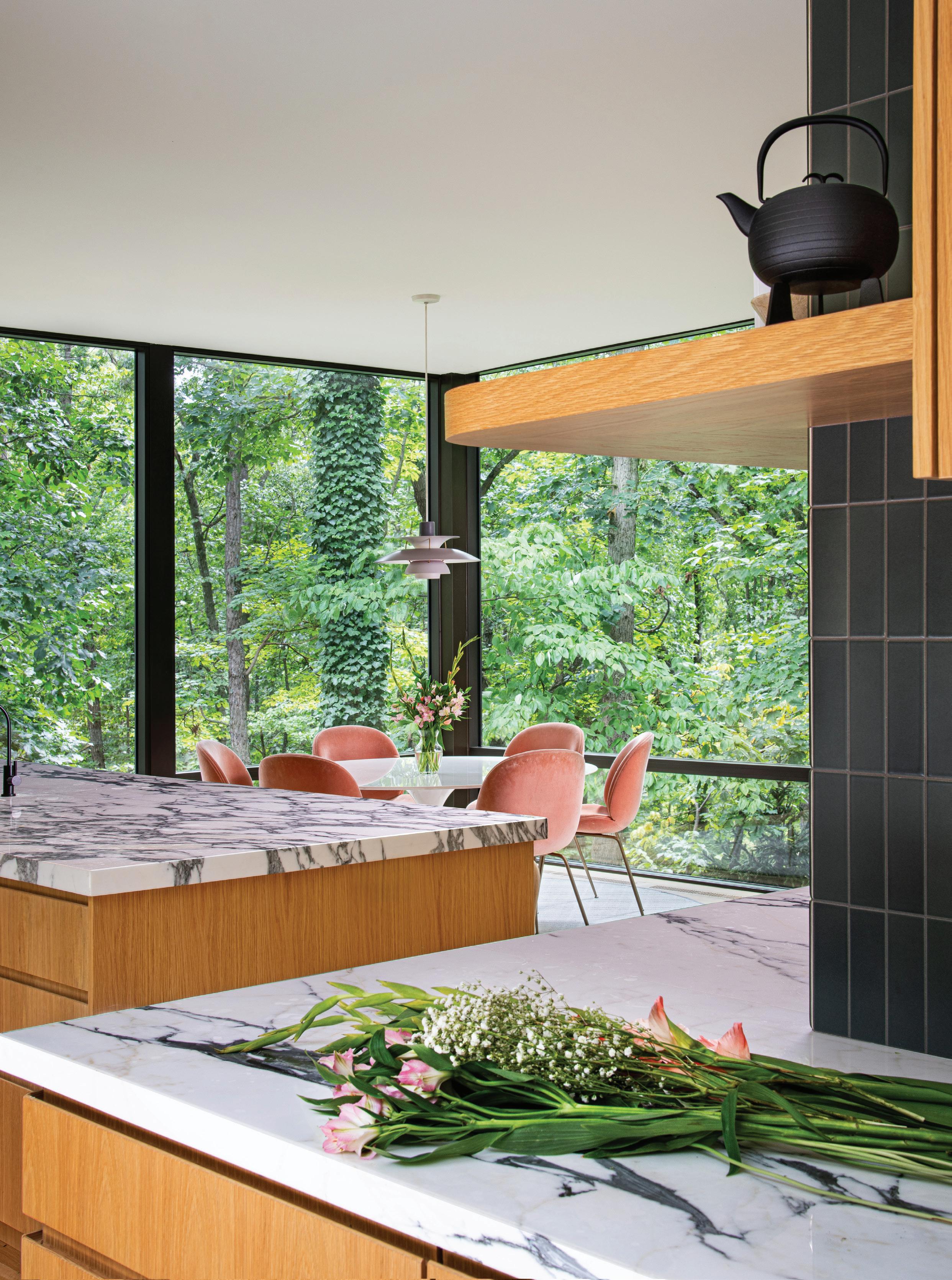
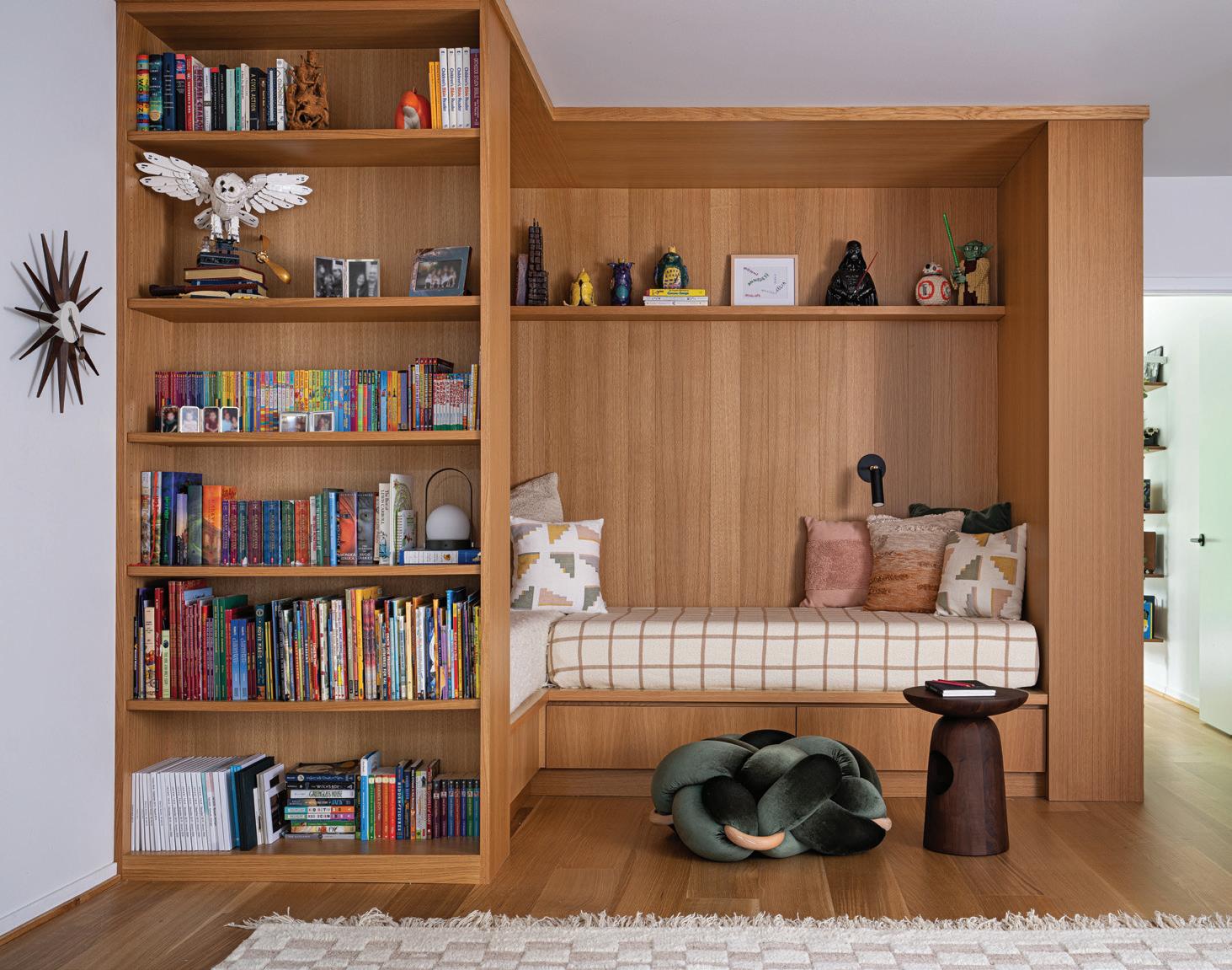
NNestled in the woods along the Huron River, this freshly renovated home was designed by architect David Osler and built in 1967 on two acres in Ann Arbor. Post-renovation, it suits its current owners and respects its roots. “An addition in the late 1990s made it almost double in size. You can see where it stops and starts,” says Patrick Thompson, principal of Patrick Thompson Design in Detroit, about the elegant residence his firm revived in the Barton Hills neighborhood he describes as a “Mid-century Modern mecca.”
Thompson did his homework on Osler, a prominent Ann Arbor architect who also did commercial work. Known for residential projects that reflected the personalities of his clients and an “elegant conservative” aesthetic, he saw a house
Above: “The owners wanted their kids to be able to do homework anywhere in the house and be comfortable,” the designer, Patrick Thompson, says. This reading nook is one of many comfy niches.
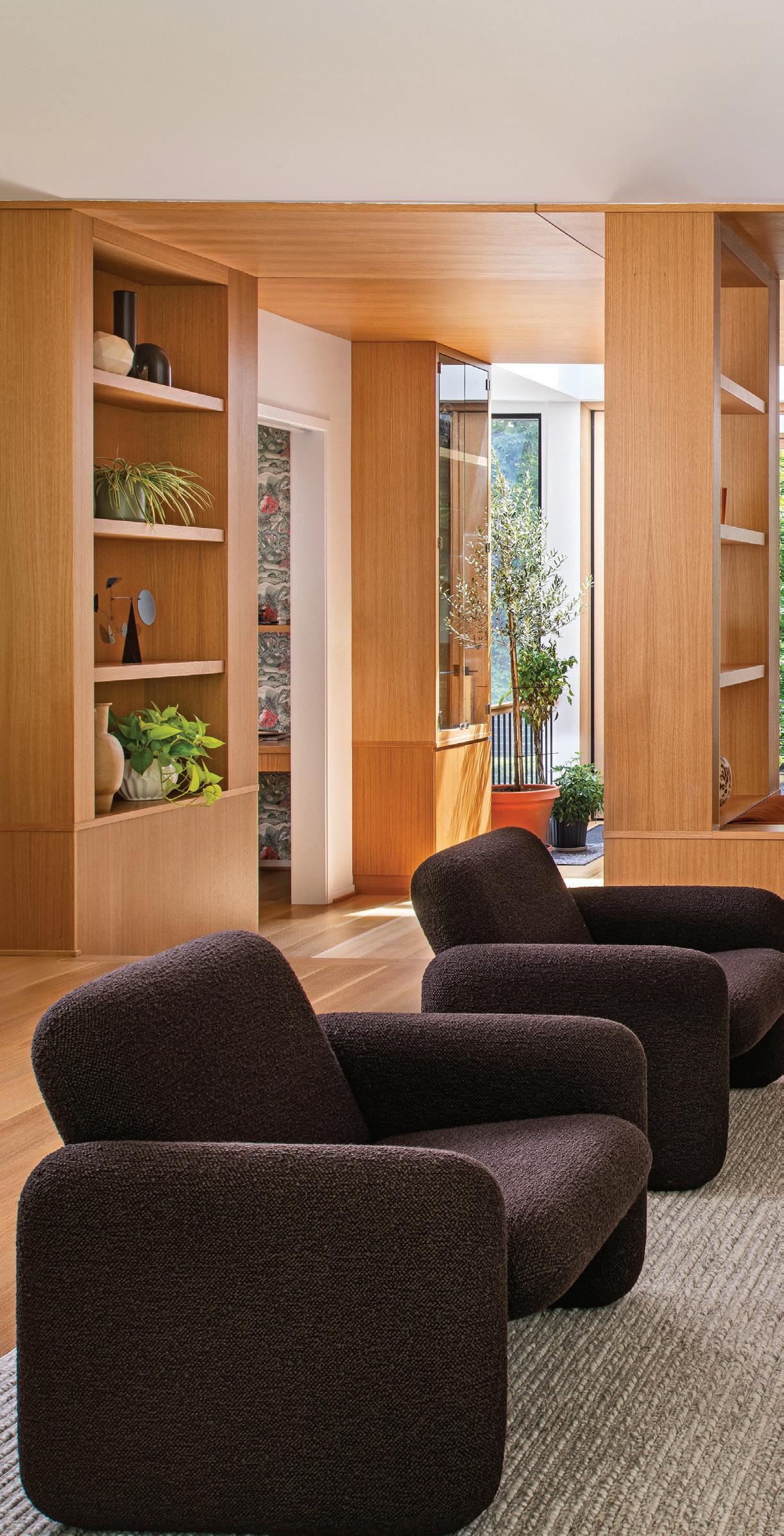
as a series of experiences and spaces that was unique to the lot on which it stood. Voluminous rooms that combine public areas with places to retreat kept his clients’ privacy in mind.
The designer says he felt a personal connection to the architect and his original vision. “I definitely tapped into his philosophy, which happened very naturally with the needs and wish lists of the clients, as well,” Thompson says. “The house had great bones. Even with the addition, we didn’t change too much of the shape. There were some ’90s addition spaces that were compartmentalized, and we removed all of that to return the house to the Osler way.”
Above and inset: Creating social spaces with a warm and inviting nature was a top priority for the family.
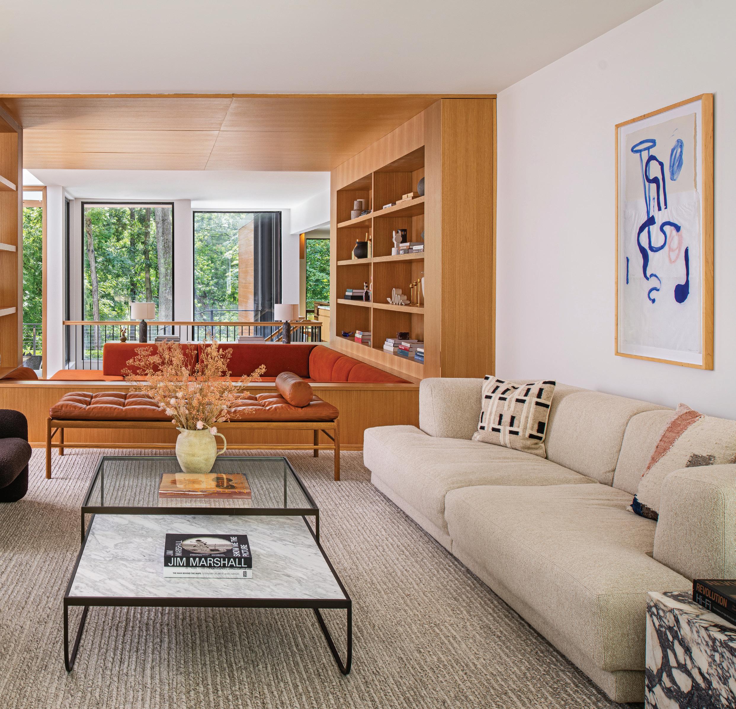
His clients — a family of six — came from a cozy, traditional house. “They wanted to find a way to create a warm and inviting home with plenty of social places for entertaining, but privacy too. Everyone has their own retreat, but there are also public spots for entertaining. The owners wanted their kids to be able to do homework anywhere in the house and be comfortable,” he explains.
The sun moves throughout the day, and thanks to all of the home’s expansive windows, family members tend to follow. “We were careful to honor the modern bones of the home and incorporate Japanese elements, as well,” the designer says.
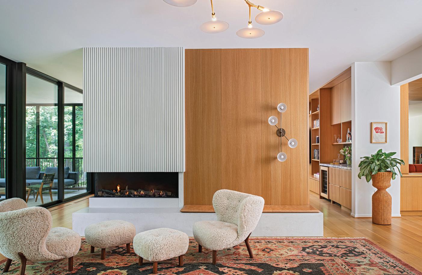
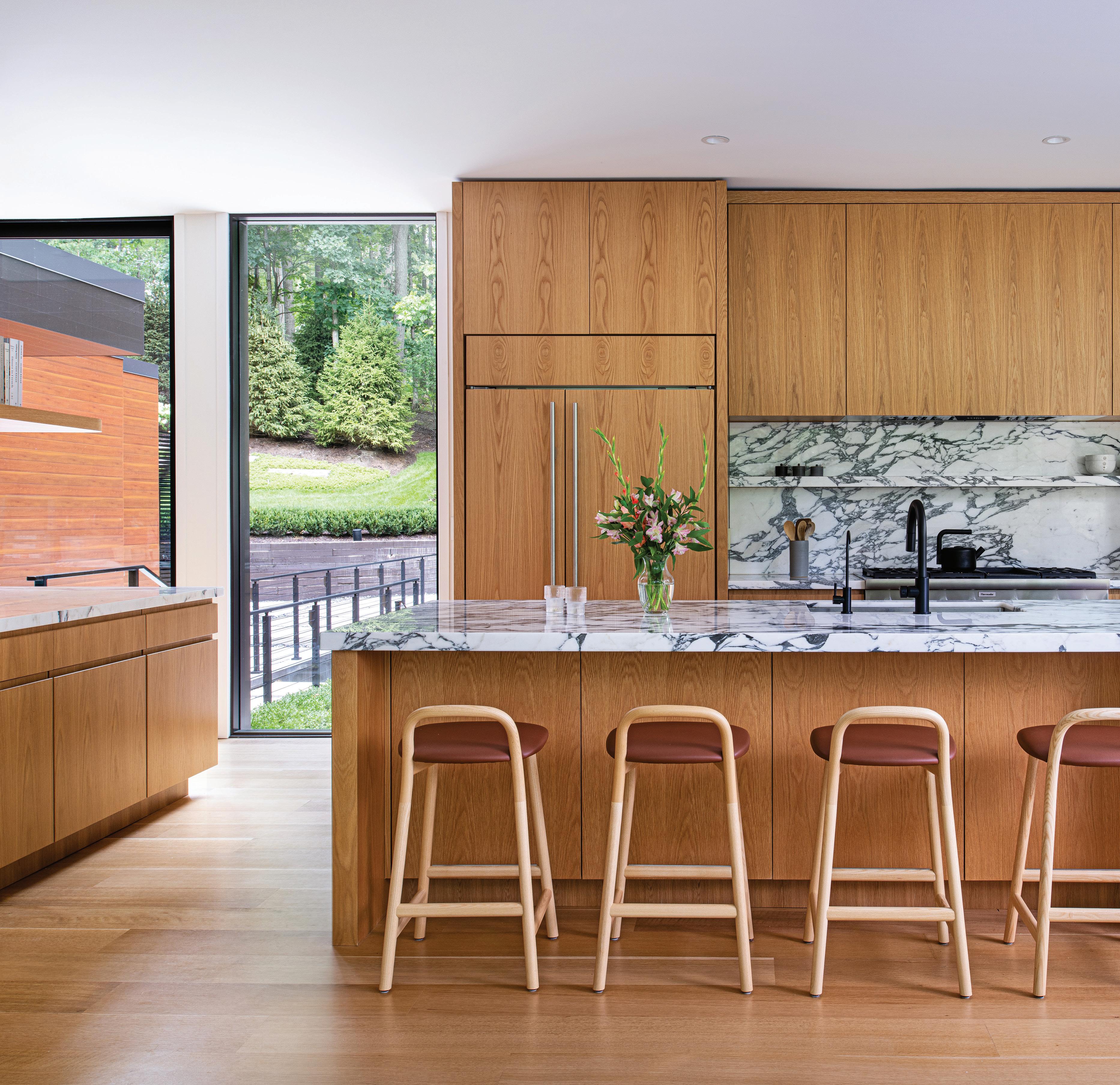
“The wife visited Japan as a child and wanted to include some Japanese sensibilities, so it wasn’t all Mid-century Modern.”
The extensive project, which involved taking the house down to the frame, experienced delays during the pandemic. Another challenge was updating the home to comfortably fit six without changing the footprint, while still honoring Osler’s intent. In the end, the warmth of the interiors turned out better than expected. “Cozy was the word that kept coming to mind,” Thompson says.
“With a 6,000-square-foot house that has a lot of glass, it also has a comfortable, inviting nature. The home is elegant and beautiful without being too precious.”
Rift-cut white oak appears on the floors and walls, along with some ceilings. Built-ins that highlight artifacts collected during the family’s travels add character to the sunken parlor, where a built-in rust-colored lounge creates a cozy nook. An elevated music room was planned around the piano. Furnishings throughout the house combine custom and new pieces, as well as vintage finds.
A custom fireplace that features textured cast concrete and white oak grounds the dining room, which includes a lounge area with vintage sheepskin chairs. “It’s a spot where eight people can sit at the dining table and two can be socializing by the fireplace. It’s a really cozy area that allows perfect interaction between the two spaces,” Thompson says.
The family spends a lot of time in the openplan kitchen, where a substantial island is topped with natural marble. “It was really important to have as many natural materials as possible,”
SEATING FOR ALL Natural materials were key in this spacious kitchen.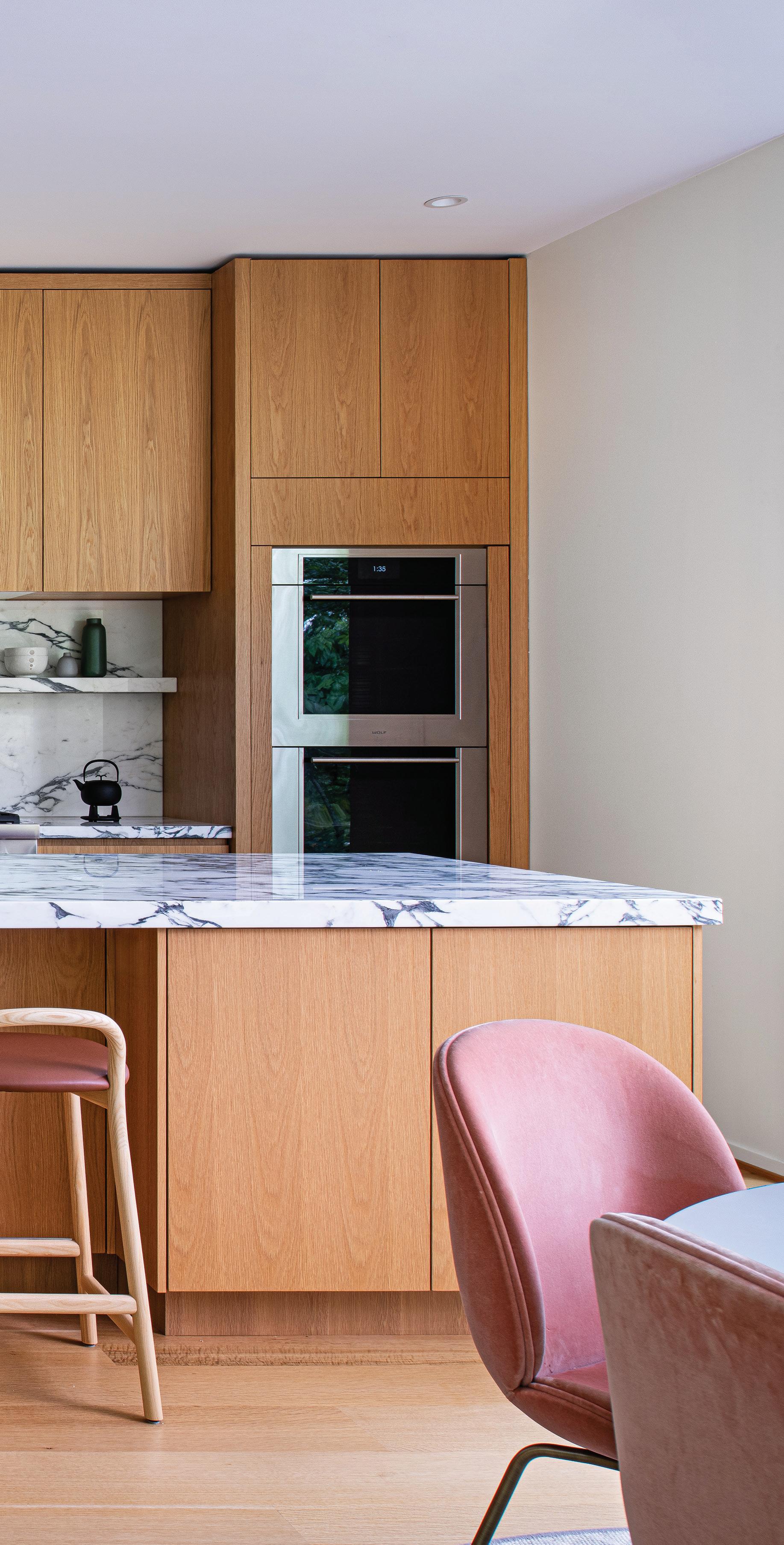
Thompson adds. Additional seating comes from a classic Tulip table that anchors a corner with sweeping views of the property.
A built-in bar and beverage center makes the family room a special destination, while another standout in the stunning home would have to be the powder room. “The whole house is light and airy, so we went a little moody in (the powder room) with a William Morris wallcovering,” the designer says. “It’s definitely a conversation piece.”
Tucked below the architectural staircase, a cozy reading nook offers a place to do homework.
“THE HOME IS ELEGANT AND BEAUTIFUL WITHOUT BEING TOO PRECIOUS.”
— PATRICK THOMPSON
 RETRO VIBES
Right: A white oak vanity and shapely vintage chair are just a few of the stunning elements within the luxurious primary bath.

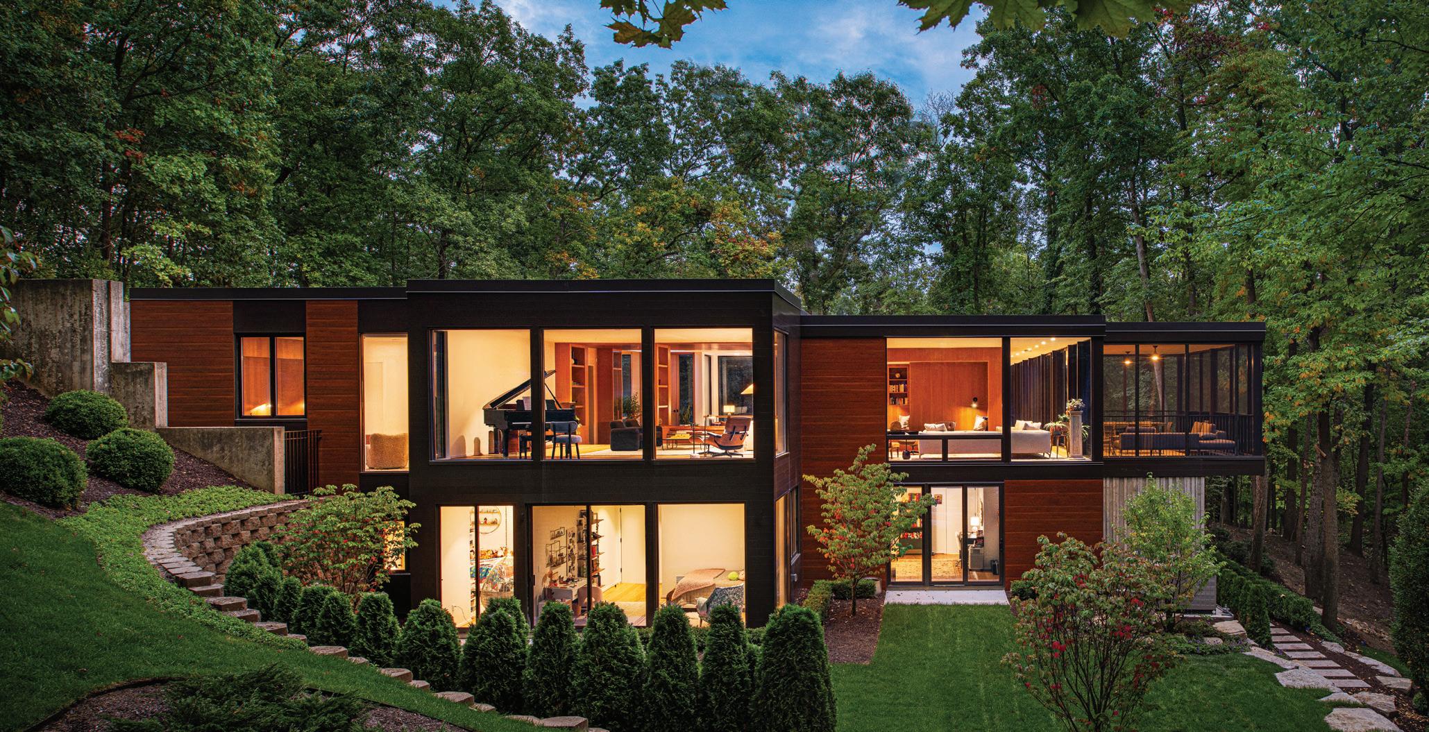
“It’s a really beautiful spot to be with the reading light at night, and lots of light during the day,” Thompson says. “All the spots are private, but within earshot of others.” On the lower level, a bunk area for the kids includes a knotted ottoman that provides a fun perch.
Custom elements also grace the private spaces — like the bed frame and the cabinetry in the primary suite, where the luxurious bathroom incorporates a natural stone counter and handmade ceramic tiles that complement a
Patrick Thompson, Patrick Thompson Design, Detroit, patrickthompsondesign.com
Chair – Sarah Sherman Samuel, Lulu and Georgia
Countertop – Ciot, Troy
Flooring – Porcelanosa
Mirror – Gubi
Sconces – Kelly Wearstler, Visual Comfort
Tile, Backsplash – Heath Ceramics
Vanity – Thompson Millworks, Remus
Cabinetry – Braam’s Custom Cabinets
Chairs – Gubi
Countertops – Ciot, Troy
Faucet – Delta, Ferguson Bath, Kitchen & Lighting Gallery, Ann Arbor
Flooring – Owens Flooring, ProSource, Romulus
Lighting (Over Table) – Louis Poulsen, Design Within Reach
Shelf – Braam’s Custom Cabinets
Stools, Counter – Very Wood, Haute Living
Tile, Backsplash – Heath Ceramics
Range – Thermador, Big George’s Home Appliance Mart, Ann Arbor
Refrigerator – Sub-Zero, Big George’s Home Appliance Mart, Ann Arbor
Table – Knoll, Design Within Reach
Wall Oven – Wolf, Big George’s Home Appliance Mart, Ann Arbor
Windows – Marvin Windows & Doors
Chairs and Ottoman – &Tradition, A+R
Fireplace Material – Fluted Concrete Wall and Solid Concrete Hearth, Andrew Ward, Line Studio Detroit, St. Clair Shores; Wood Paneling, Thompson Millworks, Remus
Flooring – Owens Flooring, ProSource, Romulus
Light, Ceiling – Lindsey Adelman Studio
Light, Wall – Apparatus Studio
Rug – Jaipur Living
Windows, Floor to Ceiling – Marvin Windows & Doors
Wood Paneling – Thompson Millworks, Remus
Bench – Carl Hansen & Søn
Chairs, Accent – Herman Miller, MarxModa, Detroit; Fabric, Geiger Textiles, MarxModa, Detroit
Rug – Stark, Troy
Sofa (White) – Boffi, DePadova; Fabric, Theo Table, Glass – Asplund
Table, Side – Audo Copenhagen, Design Within Reach
Windows – Marvin Windows & Doors
WARM AND INVITING
Left: Bold and colorful accents and cozy seating make this lighted cove a must for reading. Above: Even with all the large expanses of glass, the 6,000-square-foot home retains its comfortable and welcoming nature.
white oak vanity and shapely vintage chair. The soaking tub with a floor-mounted faucet is a real showstopper.
For this project, Thompson says his clients were more like partners. “The entire family, including the kids, had input on their spaces. At design meetings, the collaboration sometimes had the six of them,” he recalls. “The home was designed by committee, but a well-informed committee. They put their trust in us and we in them.”
Wood Paneling – Thompson Millworks, Remus
Art/Sculptures – Curated and Sourced by Homeowner and Joe Posch
Chairs (White) – &Tradition, A+R
Flooring – Owens Flooring, ProSource, Romulus
Lamps – Gubi, Rouse Home
Rug – Jaipur Living
Sofa – Thompson Millworks, Remus; Upholstery, Foam N’ More, Clawson; Fabric, Kravet
Tables – SSS Atelier
Table (Behind Sofa) – Thompson Millworks, Remus
Wood Paneling – Thompson Millworks, Remus
READING NOOK
Art/Sculptures – Curated and Sourced by Homeowner and Joe Posch
Wood, Built-In – Thompson Millworks, Remus
Flooring – Owens Flooring, ProSource, Romulus
Lamp, Reading – Cedar and Moss
Pouf – Knots Studio
Rug – Sarah Sherman Samuel, Lulu and Georgia
Table, Accent – Design Within Reach
STAIRCASE
Flooring – Owens Flooring, ProSource, Romulus
Lamp, Reading – Cedar and Moss
Pouf – Knots Studio
Seat, Built-In – Thompson Millworks, Remus; Upholstery, Morris & Co.
Stairs and Railing – Viewrail
EXTERIOR
Siding Materials – Long Board
Stone on Wall – Existing Windows – Marvin Windows & Doors
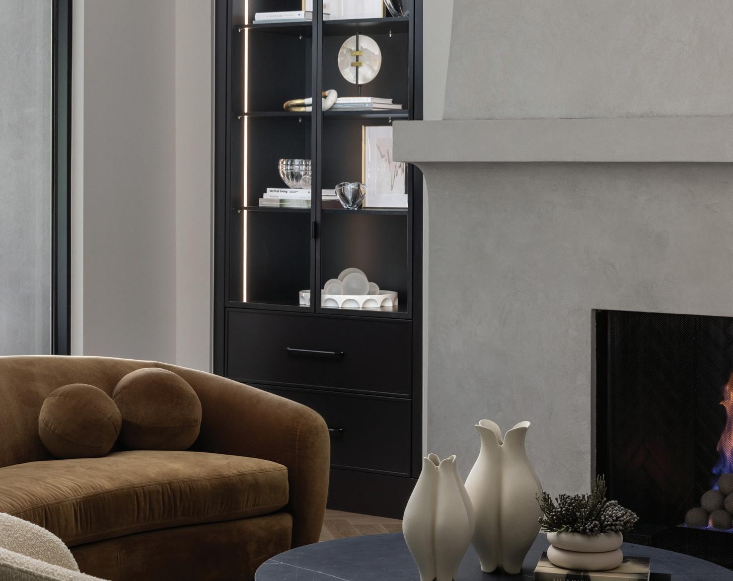
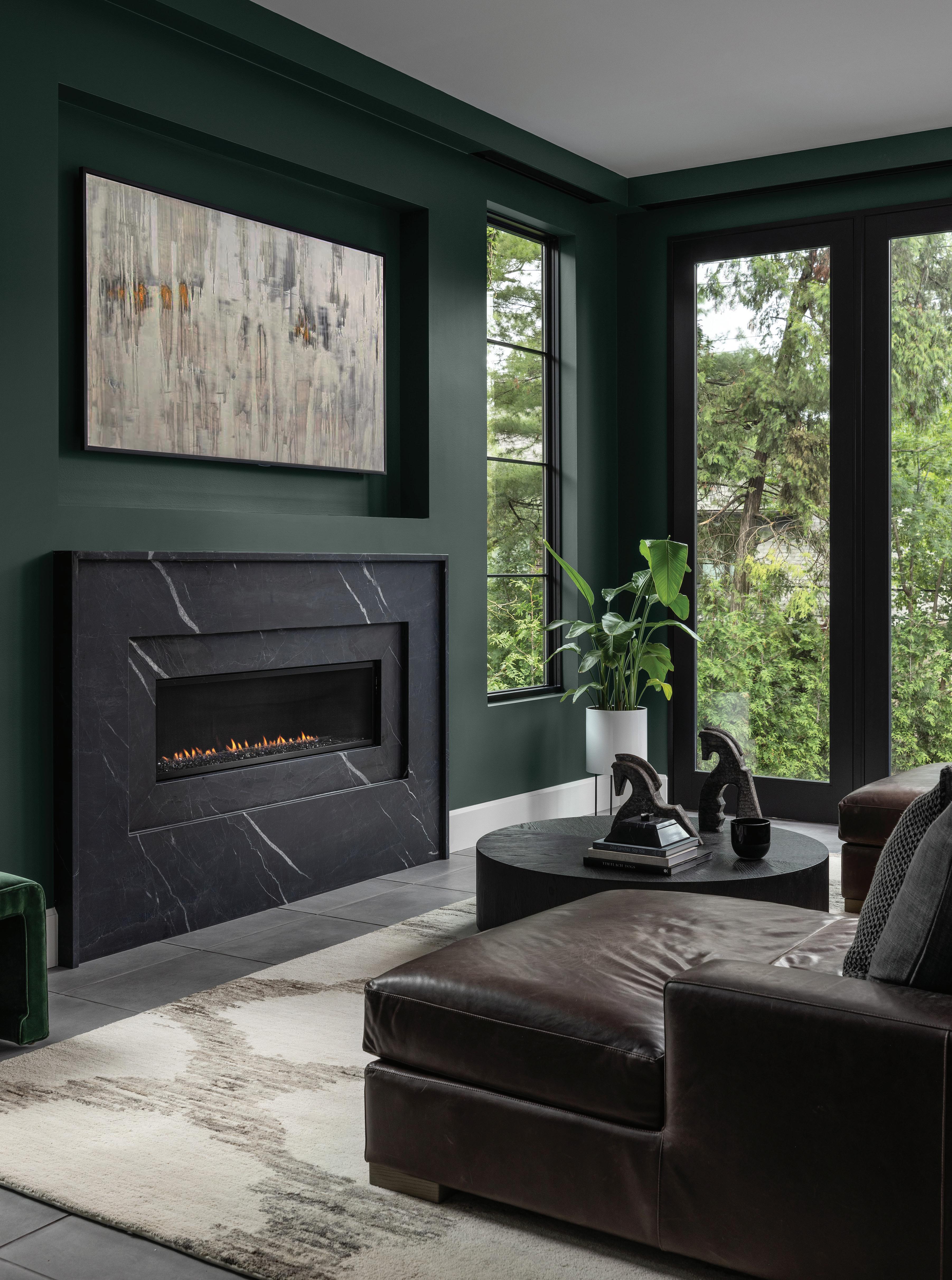
SLEEK AND FUNCTIONAL
This page: A moody hue sets the room’s tone. Opposite page: Custom built-ins flank the dramatic fireplace.
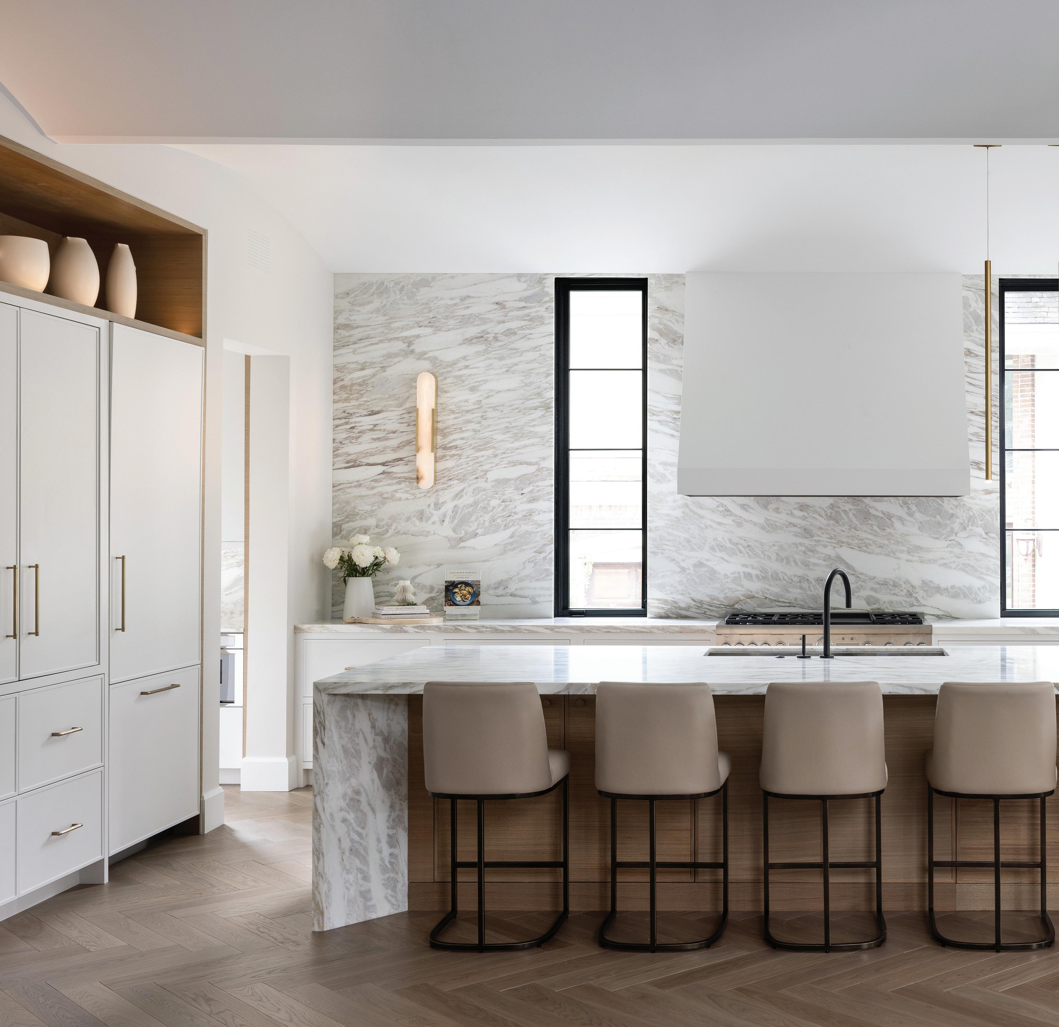
TThere were a lot of things Sarvy Lipari and her husband, Brandon, liked about their former house, including the layout and its Birmingham location. But there were also features they were less crazy about, including the size — the house became more cramped and problematic as their family grew. By the time their two sons, Mason and Micah, were older, they knew it was time to upgrade.
ELEVATED LUXURY
Above: From a 12-foot island to the Calacatta Gold marble counters and backsplash, this kitchen is a true oneof-a-kind treasure.
An empty in-town lot purchased in 2019 offered a clean slate and the chance to build the house the couple envisioned. To help, they brought in a team that included friend and kitchen designer Lauren Tolles of Maison Birmingham, who recommended architect Brian Neeper and interior designer Amanda Sinistaj of Ellwood Interiors.
“There was a lot I wanted to improve on,” Lipari says of her priorities for the 5,200-square-foot, U-shaped contemporary residence. “One of the first things I said was that I wanted the kitchen open to the living room and dining room.”
There was one big reason for that request: “No one ever wanted to sit in the living room,” she remembers of her previous residence. “I wanted to create an area that was pretty to look at and functional.” She also “wanted a lot of light, and a lot of glass and windows” throughout, she says of
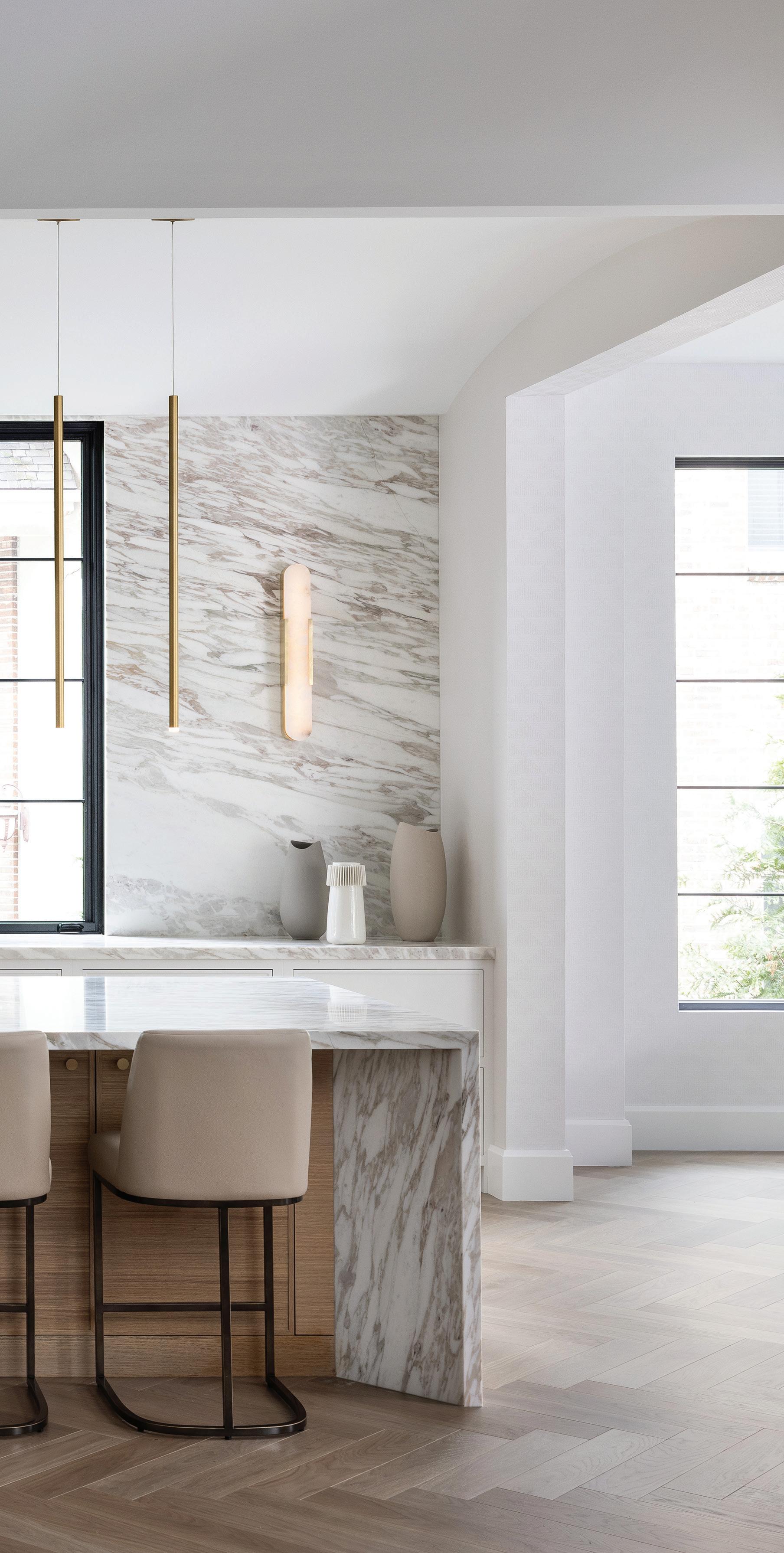
the home’s abundant black-framed oversized windows. “I wanted a house that was almost see-through.”
Neeper describes the overall design as “modern Mediterranean,” explaining that the plan takes its inspiration from villas with living spaces around a central courtyard. “The partially covered courtyard acts as an outdoor living space, with strong visual and physical connections to the interior spaces, while the west-facing exposure floods the interior with natural light,” he says. The site, with its rear slope, is unique for Birmingham, and provides daylight to the

“I WANTED TO CREATE AN AREA THAT WAS PRETTY TO LOOK AT AND FUNCTIONAL.”
— SARVY LIPARIDRAMATIC DINING
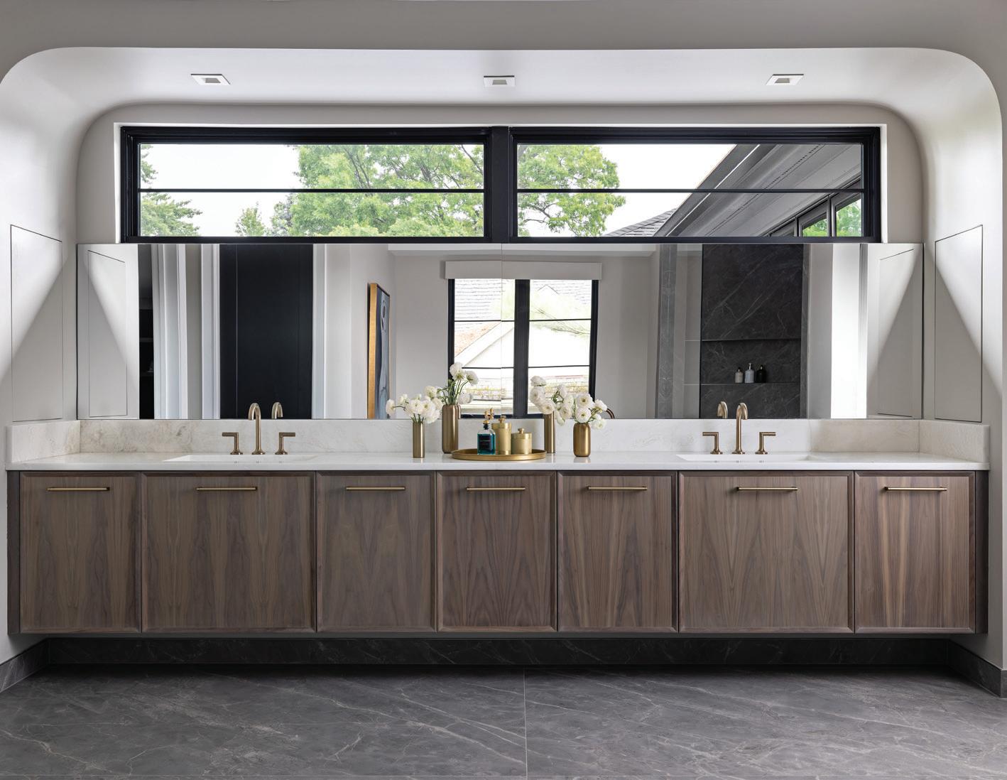
Above: The primary suite has spacious closets and a large, light-filled bath with tile imported from Italy. “We waited a long time for that,” designer Amanda Sinistaj says.
lower level as well as direct access to a locker room from the home’s outdoor sports court. “The outdoor sports court and accessible lower-level spaces provide a casual retreat from the main level’s more formal spaces,” Neeper explains.
Inside, Lipari leaned toward “a minimal aesthetic with warmth and texture — clean lines, but interesting,” Sinistaj says. With four bedrooms and six baths, the spacious and serene home delivers on all fronts. Sinistaj was involved pretty much all the way through the building process, which was completed in 2023.
“We worked on all the hard finishes up through furnishings,” she says, describing the building and design process as “very collaborative.”
The team tweaked some of the original plans, modifying certain built-ins and kitchen cabinets and making them wider. They also added “lots of soft curves and finishes,” to keep the contemporary design from feeling cold. Chevron floors in the front hall direct people in, while arches in the front door and scallops in the ceiling “are both subtle and beautiful,” the designer explains. “It’s all in the details.”
Light woods and earth tones keep spaces from feeling cold. “I like a white kitchen but wanted something that felt warmer,” Lipari shares. Sinistaj describes the palette as “sandy
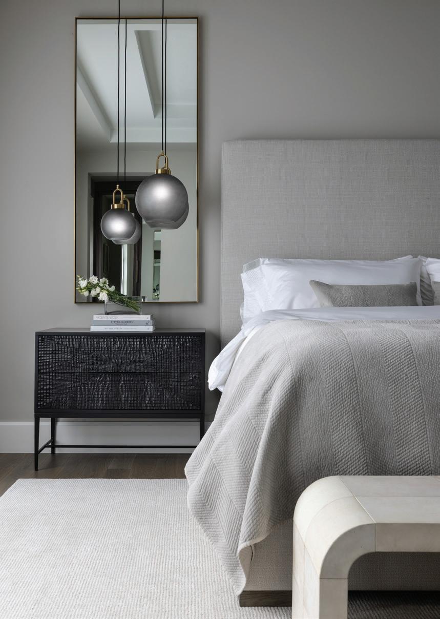
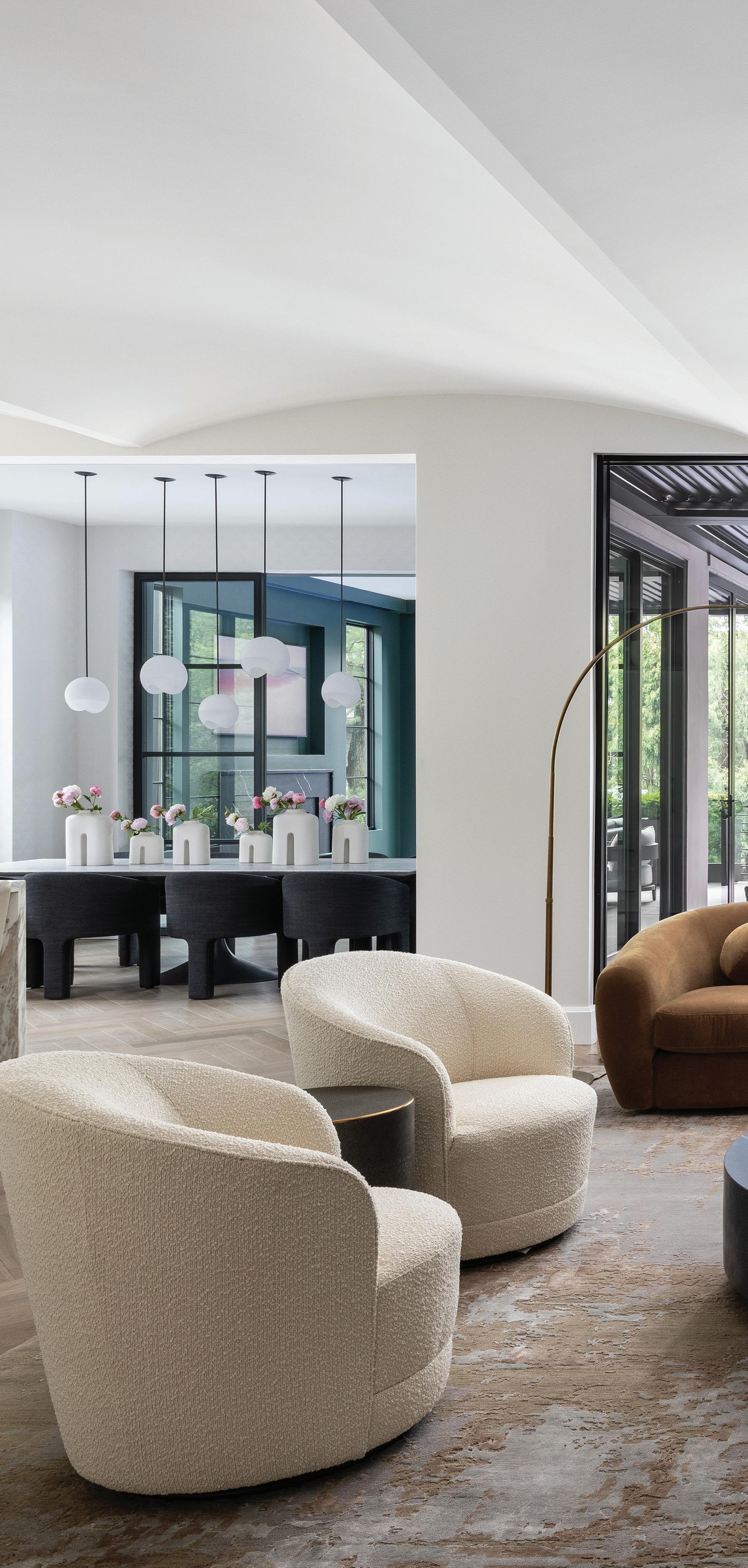
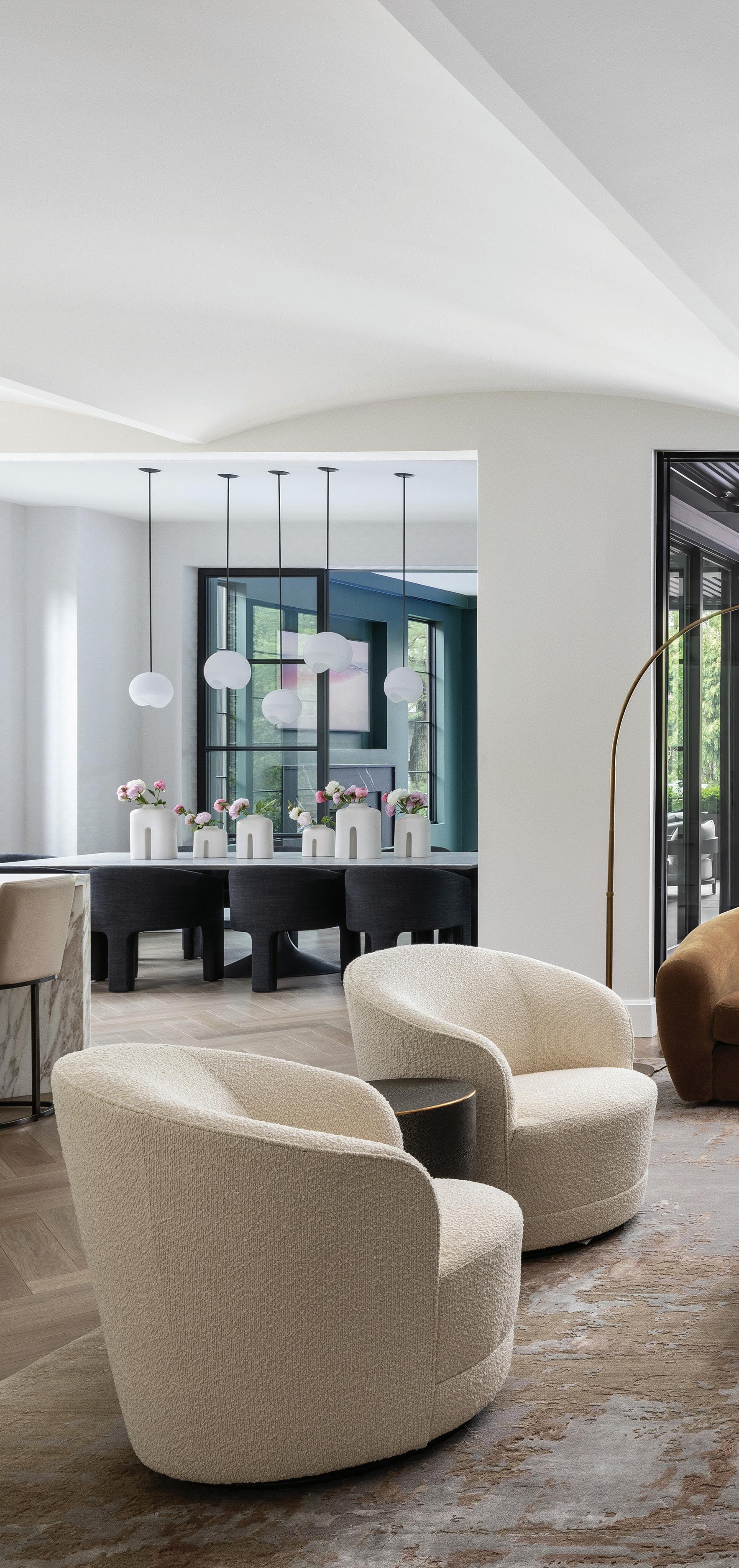
MIXED MATERIALS
Left: The homeowner, Sarvy Lipari, wanted “a minimal aesthetic with warmth and texture — clean lines, but interesting,” Sinistaj says. It’s a style masterfully represented in the home’s primary suite.
BRIGHT AND AIRY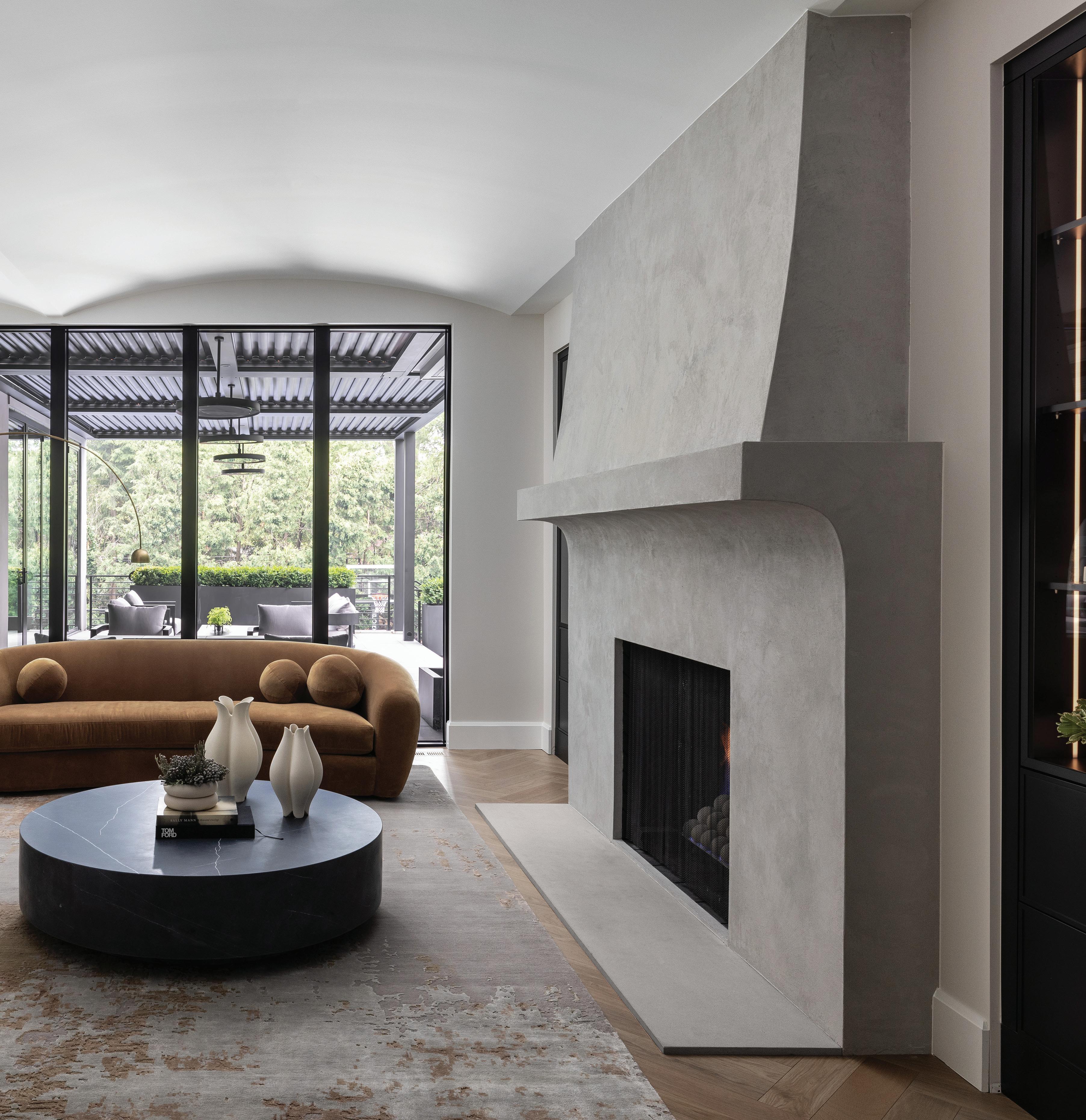
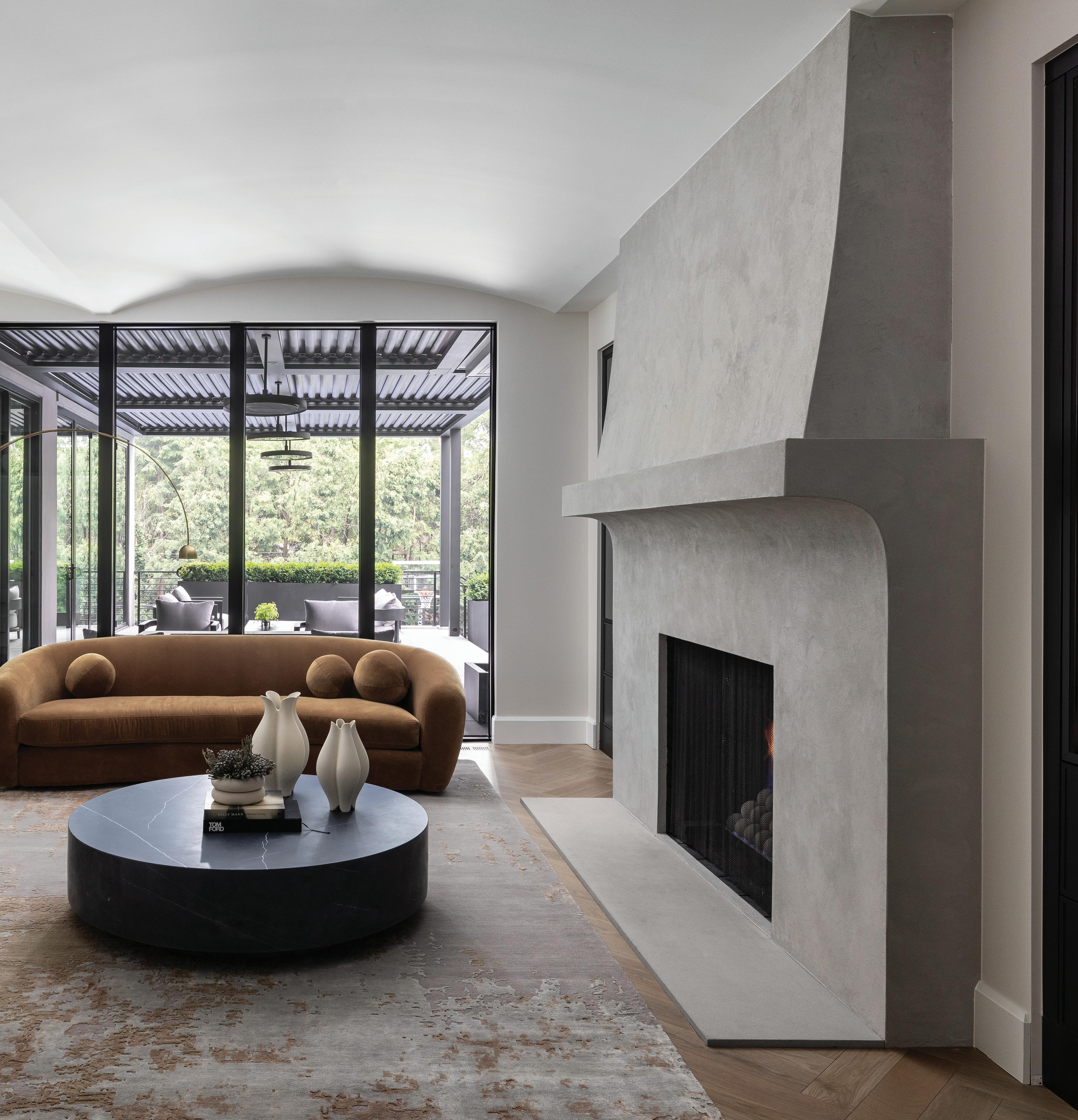
beach colors,” and says they kept the color scheme to white, off-whites, and caramel tones, and used lots of natural materials with texture. “The marble in this house is just incredible,” she says.
The show-stopping kitchen includes a 12-foot island with abundant storage and book-matched marble. “Getting the pieces and pattern right took a little engineering,” Sinistaj admits. Taking the marble all the way up the 12-foot barrel-
vaulted ceiling was the homeowner’s idea, she says, raving, “it’s so beautiful!” Matching the cabinets to the marble tones in the kitchen and nearby L-shaped prep kitchen “gives the spaces that extra cohesiveness and polish,” Tolles says.
“If I had to use just one word to describe the project, it would be thoughtful,” Tolles adds. “From the floor plan to the cabinets, everything was very intentional. I love how clean and modern the house feels. It’s still warm and
OPEN CONCEPT Above: For Lipari, a main priority was having a kitchen that opened to the dining and living room — a space now complete with a plush, caramel-colored, velvet RH sofa.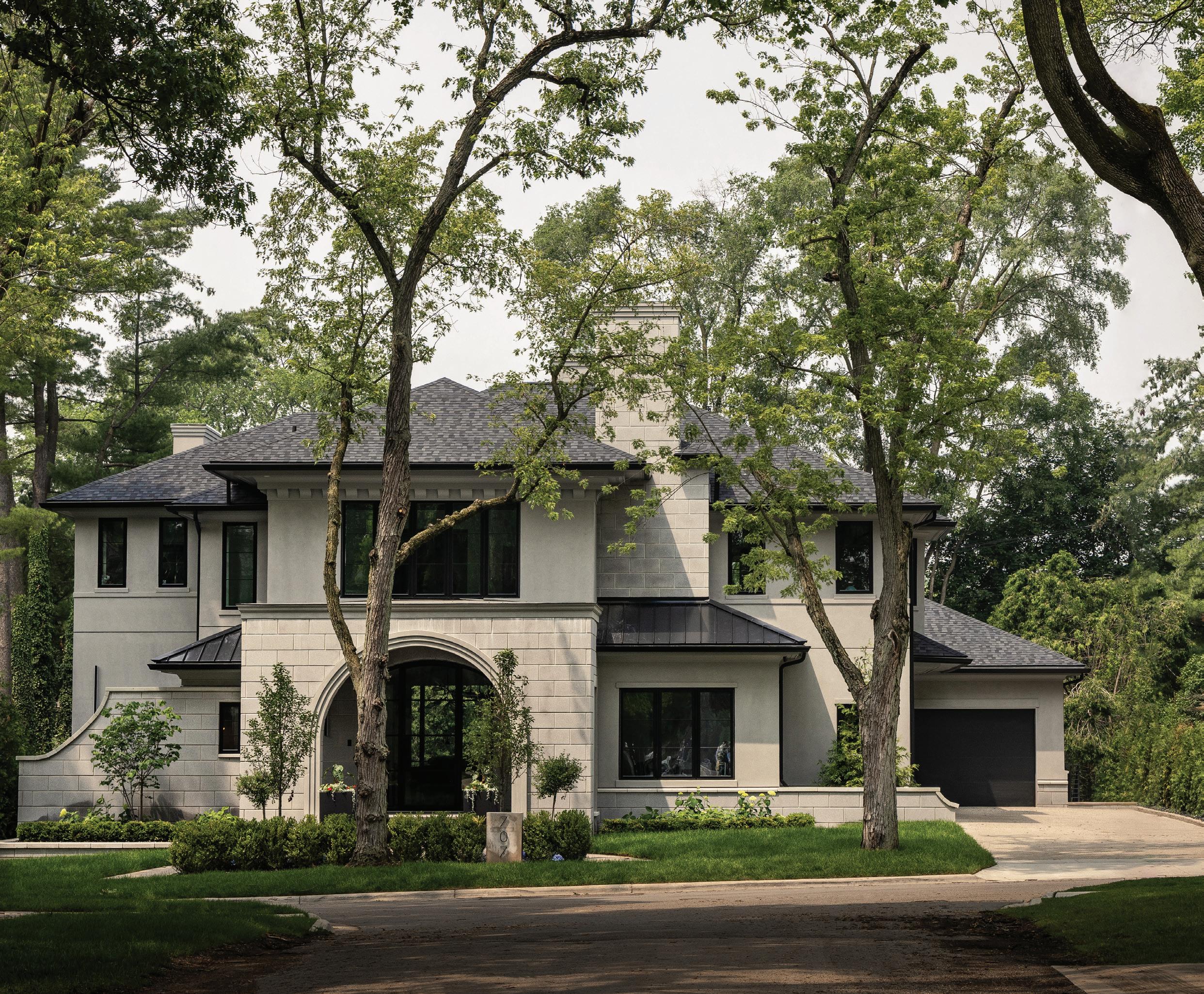
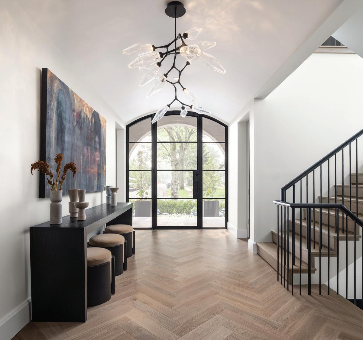
welcoming, with a nice balance of finishes and materials. Overall, the house feels sophisticated but really calm.”
Other first-floor highlights include the large mudroom, a must with a busy hockey-playing family, and the deep green family room on the back of the house — a favorite spot for Sunday night football. In summer, Nana doors open to the backyard and the extensive patio.
Lipari saw a photo of a dark green room and decided to break with the home’s otherwise neutral palette. She says she had to work hard to find the right color (Crisp Romaine by Sherwin-Williams), but she’s happy she did. “This has been a really great room for us,” Lipari says. Sinistaj says she appreciated the fact that the homeowners were open to a less-expected color scheme, adding, “It’s nice that this isn’t another typical gray house.”
Lipari says the two-year process was one of the more challenging parts. “I’m not very patient,” she admits, but says the house has been worth the wait. “We’re very happy here. I haven’t found one thing I would change. It’s really nice to be in a house we’ve been talking and dreaming about for so long.”
GRAND ENTRANCEINTERIOR DESIGNER
Amanda Sinistaj, Ellwood Interiors, Birmingham, ellwoodinteriors.com
BATHROOM, POWDER ROOM
Countertop – White Cobra Satin, Terrazzo & Marble Supply Cos., Farmington; Fabricator, Granite Creations, Farmington
Faucet – East Linear Wall-Mounted Lavatory Faucet, Satin Brass, Newport Brass
Flooring – White Oak, Herringbone, Everlast Floors, Troy
Lighting – Precision Petite Elongated Pendant in Antique, Burnished Brass, Visual Comfort
Sink – Pacifica Large Sink, Maylin
Wallpaper – Linen Shell, Omexco, Tennant & Associates, Michigan Design Center, Troy
BATHROOM, PRIMARY
Cabinet – Flat Iron Floating Vanity, Driftwood Finish on Walnut, Maison Birmingham, Birmingham
Countertop – Dover White Honed, Terrazzo & Marble Supply Co., Farmington
Faucets – Odin, Luxe Gold, Brizo
Flooring – Etoile De Rex-Gris Matte, Florim
Wall Paint – Benjamin Moore, Rodeo
Windows – Low-E Series, Black, Andersen Windows
BEDROOM, PRIMARY
Bed – Modena Fabric Panel Platform Bed, Perennials
Performance Textured Two-Tone Linen, Bisque/ Grey Oak, RH
Bench – Lucien Parchment End-of-Bed Bench, RH
Flooring – White Oak, Everlast Floors, Troy
Lighting – Bowen Modern Glass Ball Pendant (Large and Small), Light by Light
Mirror – Metal Floating Mirror, 29”x67”, Lacquered Burnished Brass, RH
Nightstand – Kyoto Chest, Matte Black, Global Views
Rug – 10’x14’ Pinstripe Fendi, Cella Carpet, Professional Rug Works, Troy
Wall Paint – Benjamin Moore, Rodeo
OUTDOOR OASIS

DINING ROOM
Chairs – Inès Closed back Armchair, Para Italian Performance Basket Weave, RH Doors, Glass – Weldwork, Royal Oak
Flooring – Custom, White Oak, Herringbone, Everlast Floors, Troy
Lighting – Eclipse Pendants, Oil Rubbed Blackened Steel with Soft Etched White Glass, John Pomp Studios
Sculptures – Guardian Vases (Small, Medium and Large), White/Cream Textured Ceramics, Global Views
Table – Aero 120-inch Honed Italian Carrara Marble and Cast-Iron, Black, RH
Wallpaper – Torrance Geometric, Winfield Thybony, Kravet | Lee Jofa | Brunschwig & Fils, Michigan Design Center, Troy
Windows – E Series, Black, Andersen Windows
FAMILY ROOM
Doorwall, Interior – Weldwork, Royal Oak
Fireplace – Stone, Noir Blanc Satin Marble, Terrazzo & Marble Supply Cos., Farmington; Fabrication, Granite Creations, Farmington
Flooring – Gc05 Mirage 48”x48” Tile, Dwyer Marble & Stone Supply, Farmington
Rug – Rana Hand-Knotted Wool Rug, 10’x14’, RH
Sculpture – Cheval Object, Global Views
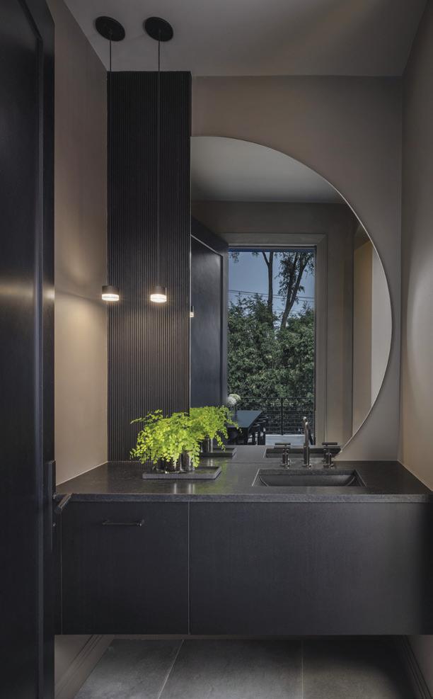
Sofa – Modena Track Sectional, Italian Berkshire Graphite Oak, RH
Table, Coffee – Machinto 47.25-inch Round Coffee Table, Black Oak and Bronze, RH
Wall Paint – Benjamin Moore, Crisp Romaine
Windows – E Series, Black, Andersen Windows
FOYER
Door – Hardwood Door and Bevel, Auburn Hills
Flooring – White Oak, Herringbone, Everlast Floors, Troy
Lighting – Branch Chandelier, Matte Black and Clear Glass, Hammerton
Railing – Tapered Black Spindles, House of Forgings
Stools – Rocco Stool, Cameron Marlborough Velvet, Chaddock
Table, Entry – Custom Colton
Console Table, Oxford Black on Oak, Chaddock
Vases – Totem Vase, Gardeco, CAI Designs, Michigan Design Center, Troy
Wall Paint – Benjamin Moore, White Dove
KITCHEN
Cabinet – Broadway Door Style, Super White, White Oak Accents Custom Stained to Match Floor, Maison Birmingham, Birmingham
Countertop – Calacatta Gold Extra Honed, Terrazzo & Marble Supply Cos., Farmington
Faucet – One Pull-Down, Black, Kallista
Flooring – White Oak, Herringbone, Everlast Floors, Troy
Light, Pendant – Nevada 1-inch Round Pendants, Antique Brass Gold, Eurofase
Range – 48-inch Pro Grand Commercial Depth Range, Thermador; Hood, Custom Built, Maison Birmingham, Birmingham
Sink – 45-inch Black Underground Sink, Multiere, Kallista
Sconce – Melange 28-inch Elongated Sconce, Visual Comfort
Stools, Counter – Emery Curved-Back Armless Counter Stool, RH
Wall Paint – Sherwin-Williams, Lunar Lite
Windows – Marvin Windows & Doors
LIVING ROOM
Cabinet, Built-In – Custom, Black Powder Metal Cabinets, Maison Birmingham, Birmingham
Chairs, White – Infiniti Chairs, Crate & Barrel
Fireplace – Custom, Fireproof Smooth Limestone Plaster, Venetian Plaster Co.
Flooring – White Oak, Herringbone, Everlast Floors, Troy Table, Coffee – 55-inch Marquina Marble Table, RH
Rug – RH
Sofa – Sylvain Sofa, Lustrous Velvet in Burnt Caramel, RH
Vases – Pond Vases (Small and Large), Global Views
Wall Paint – Sherwin-Williams, Lunar Lite
EXTERIOR
Door – Custom, Hardwood Door and Bevel, Auburn Hills
Garage Door – Newmyer, Clopay Door, Modern Steel, Milford
Roofing – Landmark, Moire Black, CertainTeed Stone – Tapestry, 12x24 Executive Grey, Shouldice Designer Stone, Best Block Co., Warren
Wall Material – Stucco; Benjamin Moore, Storm
Windows – Andersen Windows
EXTERIOR (BACK)
Pergola – StruXure, Building Integrity, Clarkston Railing – Fairway, Johnson Lumber Co.
Table and Chairs, Outdoor – Portofino, Laurel Collection, RH
ADDITIONAL PROJECT CONTRIBUTORS
Architect – Brian Neeper Architecture, Birmingham
Builder — Alpine Construction, Clinton Township
Cabinet Designer — Lauren Tolles, Maison Birmingham, Birmingham
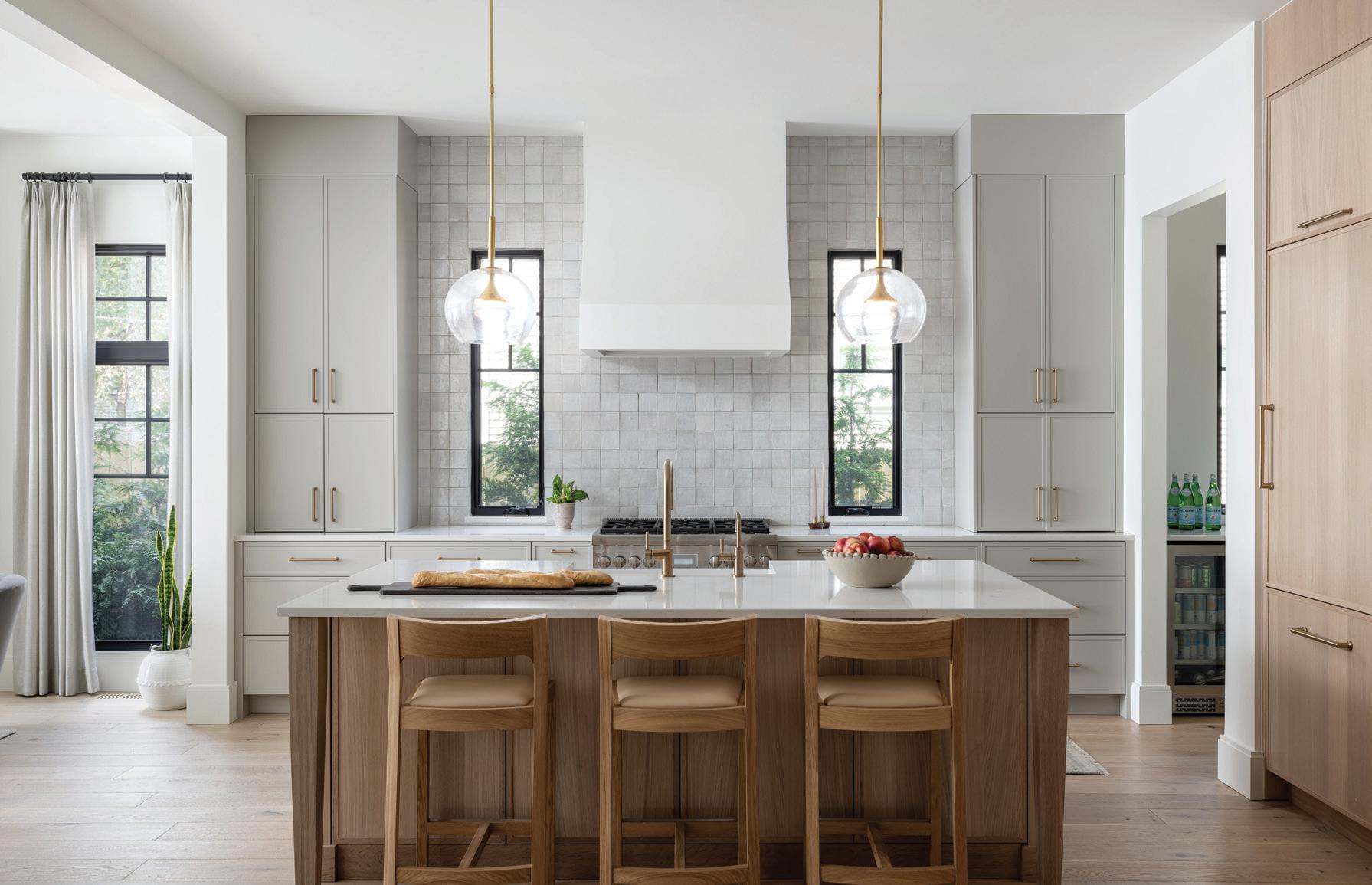
TIMELESSLY MODERN
This page: This sleek Birmingham residence owes its signature style to designer Katie Rodriguez and homeowner Kate Holden. Opposite page: White oak flooring, light cabinetry, and zellige tile give the kitchen a bright and airy feel.
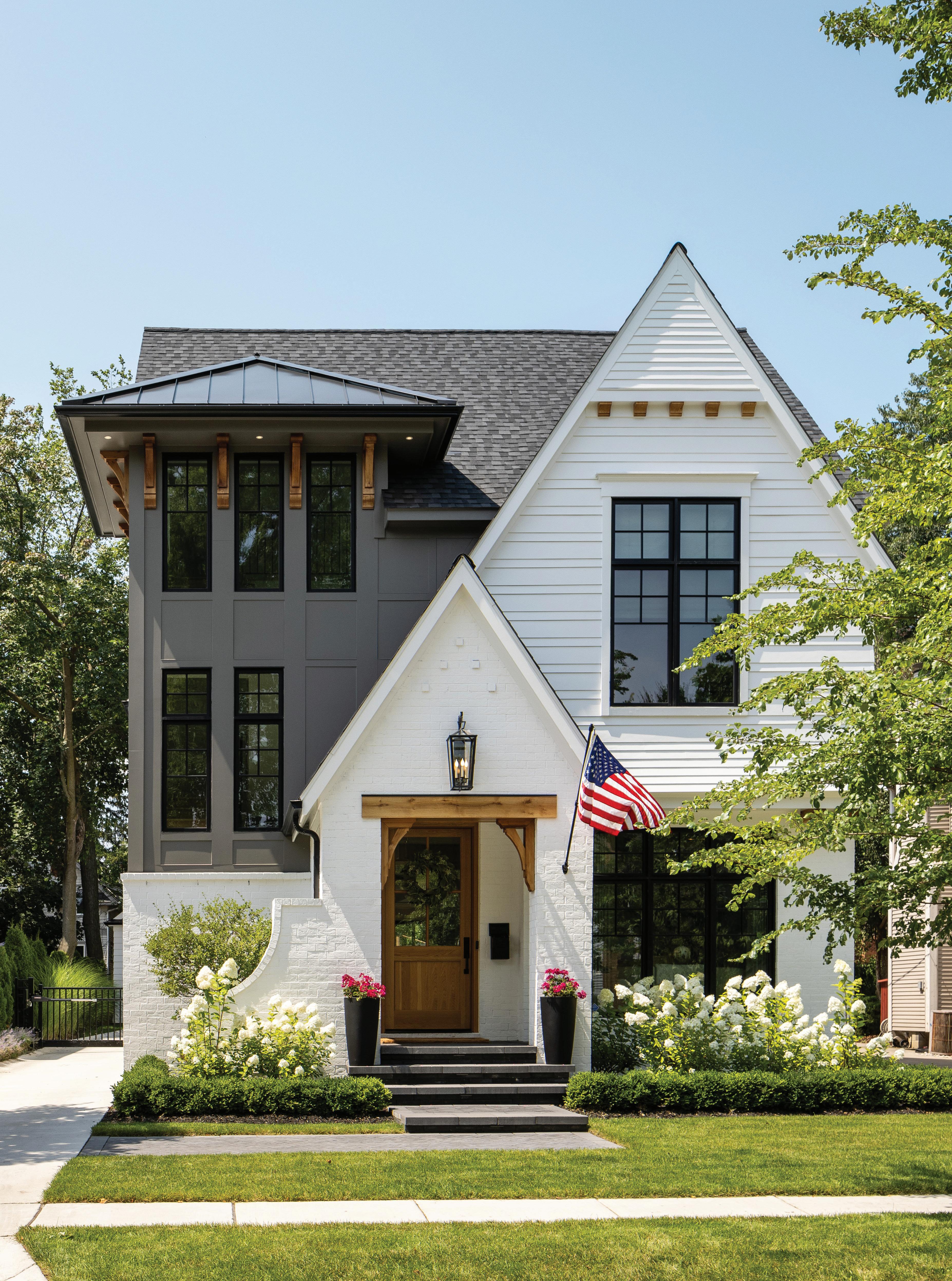
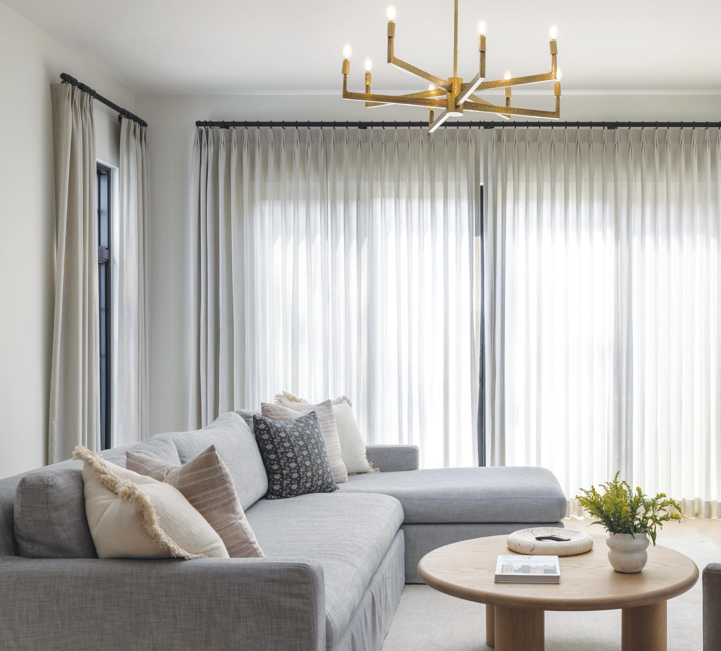
WWhen Kate Holden moved back to Michigan from San Francisco during the COVID-19 pandemic, she had no idea the move would change her life. Not only did she decide to stay (she now works remotely for her company, Salesforce), but she bought her first house and, not long after, met her husband-to-be, David McCormack.
“Had COVID not happened, I wouldn’t have ended up here,” says Holden, who grew up in Bloomfield Hills and later worked in cities around the world. In the fall of 2021, she purchased a PRM Custom Builders spec home in Birmingham that was in the early stages of development.
When it came to finding an interior designer, Holden’s brother reminded her that designer
Above: With its neutral palette and muted tones, the family room represents Kate Holden’s style.
Katie Rodriguez is a family friend. Holden first called on a few other designers and then contacted the astute Birmingham-based Rodriguez, who runs Katie Rodriguez Design. “Katie and I walked the property together and they were just starting to frame the house,” Holden says. “I liked Katie’s portfolio and design style best,” she says.
The home, with three bedrooms on the second floor and one on the third, is tall and narrow, Holden says, adding, “Katie was instrumental in helping me make decisions on structure, space maximization, and style.”
Holden prefers neutrals and muted tones, and told her designer that she sways toward designer Jenni Kayne’s California-inspired lifestyle vibe as well as McGee & Co.’s offerings. “Katie could translate my style by looking at my inspiration photos,” she says.
Explains Rodriguez: “Pictures do speak a thousand words. I look at what the common themes are in the photos, including feeling and palette. And then (I can) start to deviate a little from that when the client comes to trust me. I try to help the client find their own personal style.”
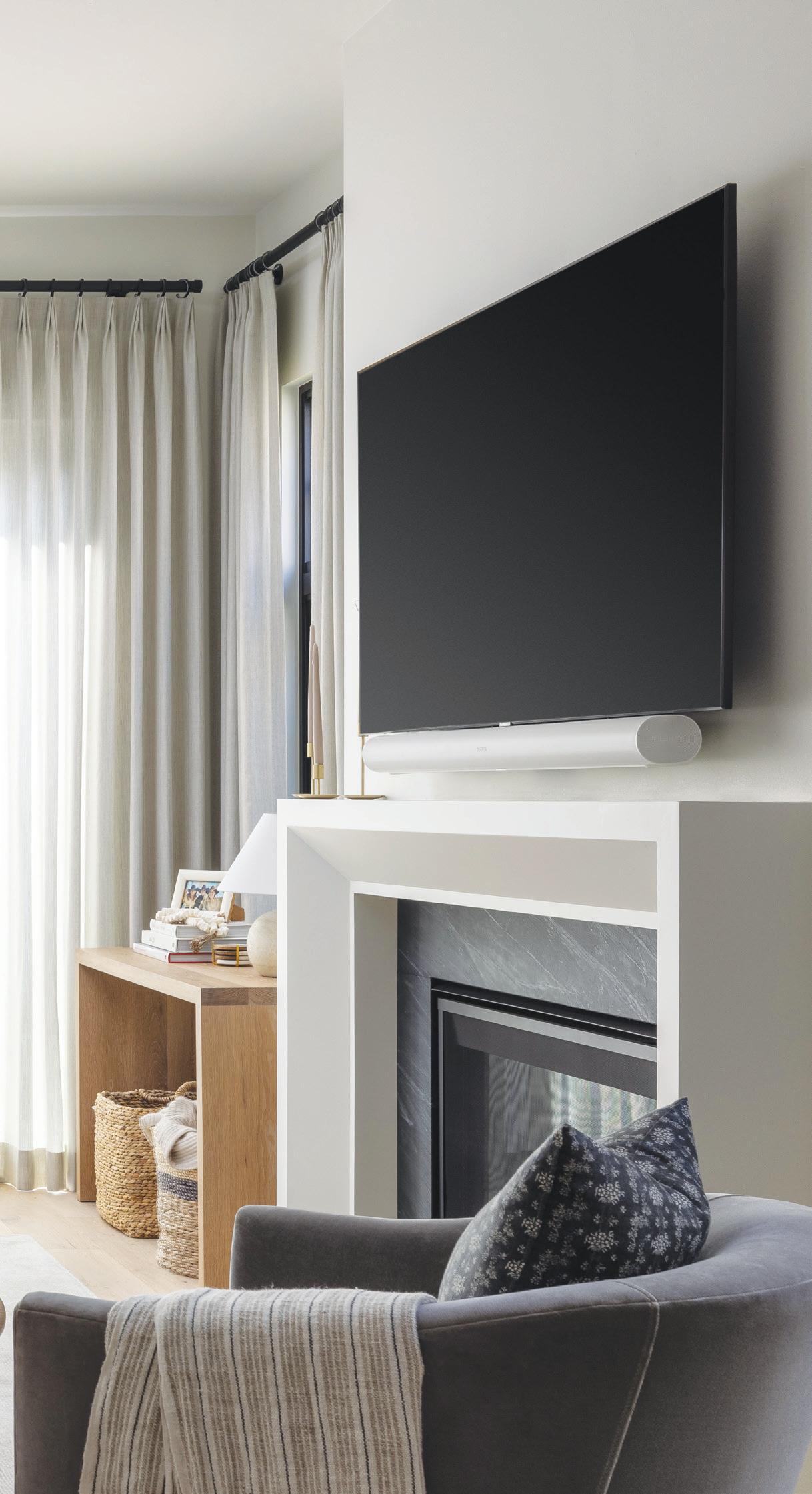
Both the designer and the homeowner were crazy about the white oak flooring. “It’s light and airy. And it has a bit of a knot to it, so it has an earthy feel,” Rodriguez says.
Because Holden now works from home, the office was one of the most important spaces to consider during the design process. “I needed something that I could transition into from being at home to being focused on my job,” Holden says. They also considered Holden and McCormack’s Lola, a sweet golden retriever who loves to be near her owner when she’s working. “We came up with a plan so that she could look out the window and still be near me,” Holden says. The sofa that 10-year-old Lola climbs onto for viewing outdoor activity needed to be low and firm, Holden says.
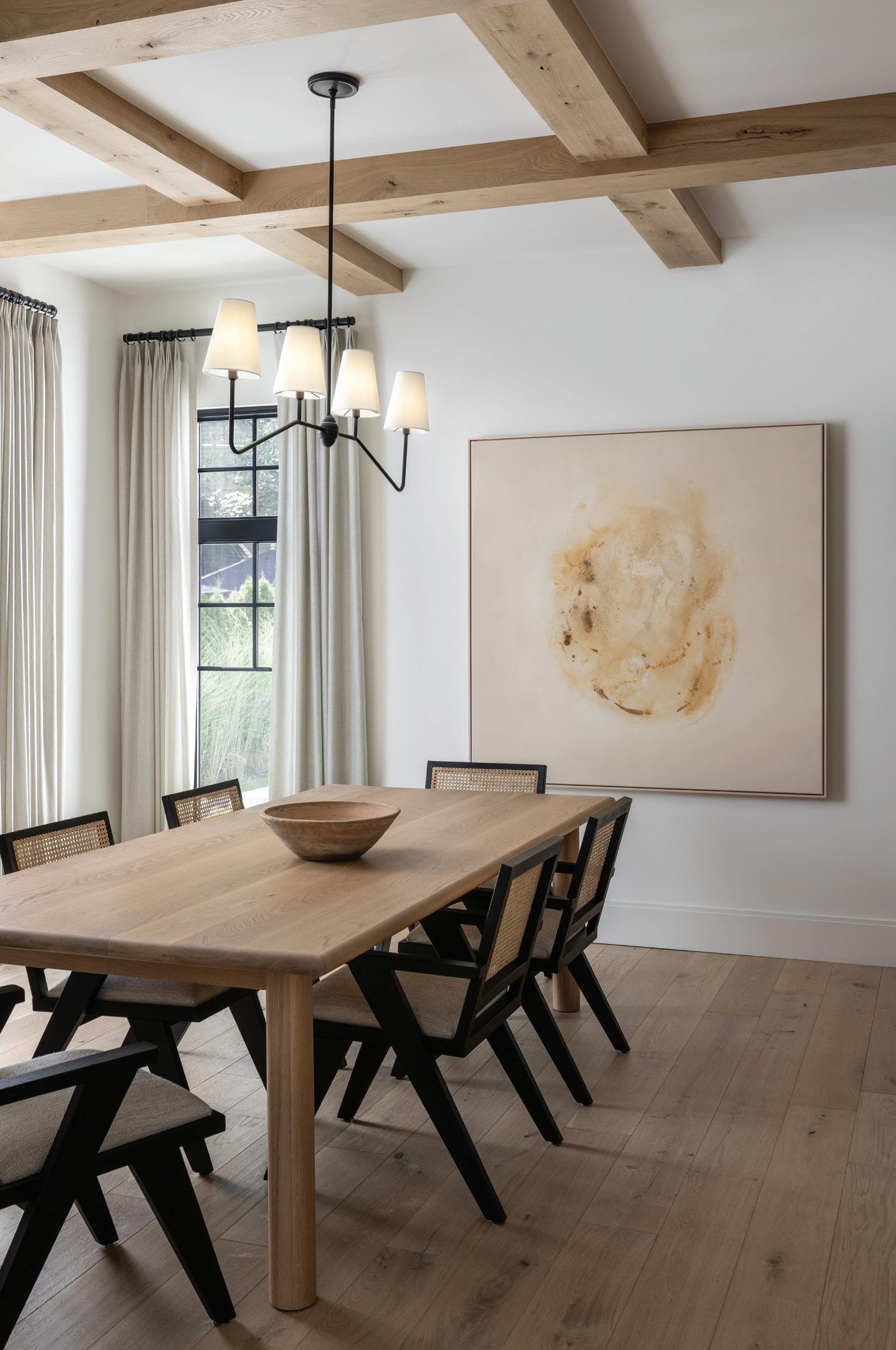 ON DISPLAY
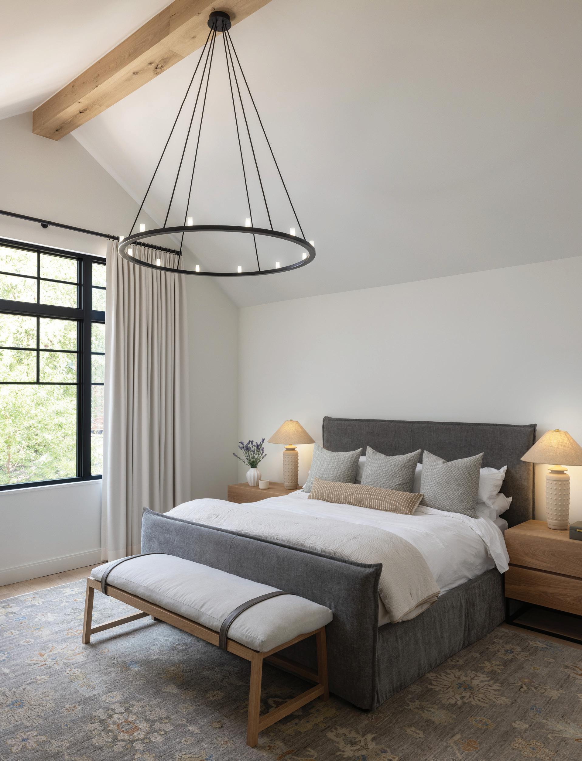
Regarding office colors, Rodriguez says she’s happy they “made the decision to do the office dark. People working from home need to feel happy in their work environment, and there needs to be a differentiation between work and home. The deep color is calming.”
An inviting bar with a durable, granite surface is located just beyond the office before you get to the kitchen and dining room. The bar sits beneath a pretty, arched ceiling and echoes the same deep blue-gray tone that adorns the office. “Kate wanted to be able to set the bar up for guests with doors that track back so you can close it, too, and it’s not on display all the time.” In the kitchen, light cabinetry and ceramic, zellige tile (with an unrefined clay base, whereby each tile is artistic and unique) runs from the quartz
HOTEL-INSPIRED
This page: The primary suite’s boutique feel is due to its calming color palette and use of natural materials and textures.

STYLE PRIORITY
Above: An uplifting office that was distinguishable from the rest of the home was a necessity. Right: The Jack & Jill powder room is effortlessly chic with concrete counters.
“PEOPLE WORKING FROM HOME NEED TO FEEL HAPPY IN THEIR WORK ENVIRONMENT ...”
— KATIE RODRIGUEZ
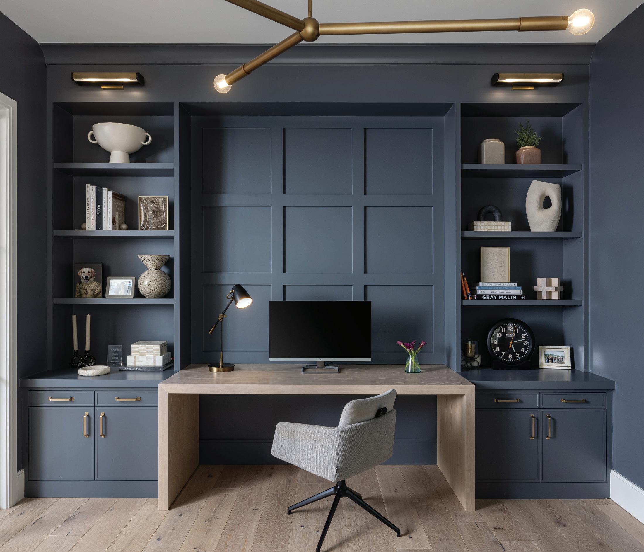
countertop all the way to the ceiling. “Katie makes unique suggestions like that,” Holden says. “It makes the space feel larger.” The homeowner and her fiancé love to entertain, and they use the butler’s pantry for putting out delectable spreads. Floating shelves hold items the couple use every day.
For sit-down meals, a welcoming dining room is just the ticket. There, a commissioned abstract painting by Sam Kupiec turns heads. “We knew the exact size and the colors we needed, and could go back and forth with the artist,” the designer shares.
Wallpaper can be considered art, too. Holden says she wanted a bold pattern in the powder room, to break up the many neutrals on the main floor. Pink blooms mingle with deep indigo, verdant greens, and lush golds to create a striking pattern.
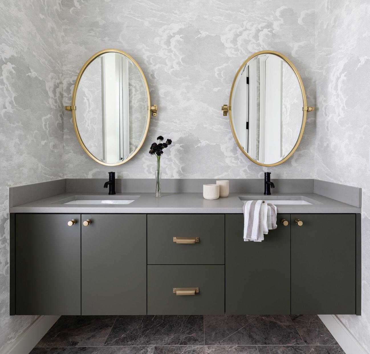
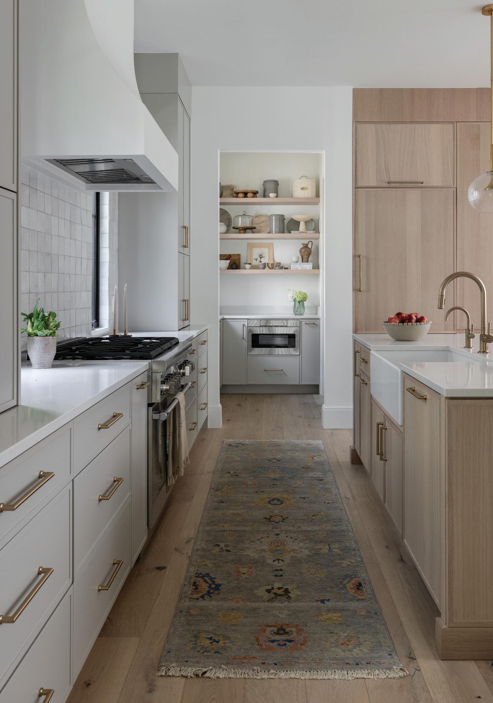
The primary bedroom — with its textured lamps, rich woods, black-framed windows, soft grays and creams, and a round chandelier with romantic, small lights — is reminiscent of a guest room in a fine boutique hotel.
The couple spends most of their time in the living room. “I wanted it functional and casual, and I wanted the ability to cook dinner and be near people who are watching football games or whatever,” Holden says.
Overall, the design process for this first-time homeowner was an enjoyable journey. “Katie helps facilitate a nice experience. She broke the process into small, manageable steps to eliminate
the stress. We even had a shared Dropbox with the whole team so we could be sure we were all on the same page and could easily recall how we arrived at various decisions.”
Adds Rodriguez: “More than half of the design process is organization, and the creativity is the rest of it, the fun part. With a construction project, there are many decisions for a homeowner to make. I try not to overwhelm.”
There’s no doubt this home reflects its owner, Rodriguez contends. “It’s very tailored and buttoned up, but at the same time it has a great warmth about it. That’s who Kate is. She’s a warm person but has a modern way about her.”
Left: The homeowner often uses the butler’s pantry while entertaining. Right: A cozy Arhaus accent chair in the primary suite is a relaxing addition. Middle: An arched built-in bar with a granite surface echoes the same deep tones of the office. Far Right: A departure from the home’s neutral hues, the powder room features a moody Morris & Co. wallpaper.

Katie Rodriguez, Katie Rodriguez Design, Birmingham, katierodriguezdesign.com
Cabinetry – Elmwood, Garden Gate Finish, Cor Cabinet Solutions, Troy
Countertop – Raw Concrete, Caesarstone, Ciot, Troy
Faucets – Trinsic, Delta, Ferguson Bath, Kitchen & Lighting Gallery, Troy
Flooring – Luna Engineered White Oak, 6-inch, Costa, PRM Custom Builders, Bloomfield Hills
Hardware – Channing Pull & Lilly Knob, Top Knobs, Russell Hardware, Bloomfield Hills
Mirrors – West Slope Oval Pivot Mirror, Rejuvenation
Wallcovering – Nuvolette, Cole & Son, Kravet | Lee Jofa | Brunschwig & Fils, Michigan Design Center, Troy
Countertop – White River Polished, Trend Quartz, Ciot, Troy
Door – Logan Door, Masonite Doors, Bolyard Lumber, Birmingham
Door, Hardware – Classic Egg Knob, Emtek, Bolyard Lumber, Birmingham
Faucet – Purist, Kohler, Ferguson Bath, Kitchen & Lighting Gallery, Troy Light – Ormandy, Rejuvenation

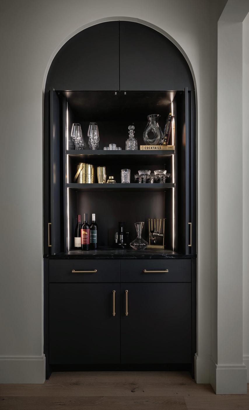
Mirror – Fernis, Made Goods, Katie Rodriguez Design, Birmingham
Vanity – Ambassador 36-inch Freestanding Single Bathroom Vanity Base, Burnt Chocolate, Fairmont Designs, PRM Custom Builders, Bloomfield Hills
Wallcovering – Pimpernel, Morris & Co., Rozmallin, Michigan Design Center, Troy
BEDROOM, PRIMARY
Bed Frame – Gerston Fabric Panel Bed, Bernhardt, CAI Designs, Michigan Design Center, Troy Bench – Julian Bench, Community Manufacturing Chair, Accent – Arhaus
Drapery – Brimar and Joseph Nobel, Decoroom, Michigan Design Center, Troy and SBS Studio; Fabric, Meaningful Ivory Dresser – Room & Board
Flooring – Luna Engineered White Oak, 6-inch, Costa, PRM Custom Builders, Bloomfield Hills
Lamps – Sonoran Table Lamp, Currey & Co., CAI Designs, Michigan Design Center, Troy Pillow, Lumbar (Bedding) – Coterie
Rug – Ankara, Kalaty, Hagopian, Birmingham Table, Side – Prendale Nightstand, Community Manufacturing
DINING ROOM
Ceiling Detail – White Oak, PRM
Custom Builders, Bloomfield Hills
Chairs – Flora Dining Chair, Four Hands Chandelier – Berkshire 48-inch Linear Pendant, Rejuvenation
Drapery – Brimar and Holly Hunt,
Decoroom and Tennant & Associates, Michigan Design Center, Troy Table, Dining – Peré Dining Table, Community Manufacturing Wall Art – Commissioned, Sam Kupiec
HALLWAY
Cabinet, Bar – Elmwood, Cor Cabinet Solutions, Troy
KITCHEN
Appliances, Butler’s Pantry –Microwave, Sharp, Ferguson Bath, Kitchen & Lighting Gallery, Troy Barstools – Profile Stool, Design Within Reach Cabinetry (Dark) – Elmwood, White Oak Washed, Cor Cabinet Solutions, Troy Cabinetry (Light) – Elmwood, Mist, Cor Cabinet Solutions, Troy Cabinetry, Pantry – Elmwood, Cor, Troy, MI - Mist and White Oak Washed Countertop – White River Polished, Trend Quartz, Ciot, Troy Faucets – Odin, Brizo, Ferguson Bath, Kitchen & Lighting Gallery, Troy Hardware – Morris Pull, Top Knobs, Herald Wholesale, Troy
Lighting, Pendant – Rochester Globe Pendant, Visual Comfort, City Lights Detroit, Michigan Design Center, Troy Refrigerator – Thermador, Ferguson Bath, Kitchen & Lighting Gallery, Troy Rug – Adana, Hagopian, Birmingham
Sink – Torun, Signature Hardware, Ferguson Bath, Kitchen & Lighting Gallery, Troy Stove – Thermador, Ferguson Bath, Kitchen & Lighting Gallery, Troy
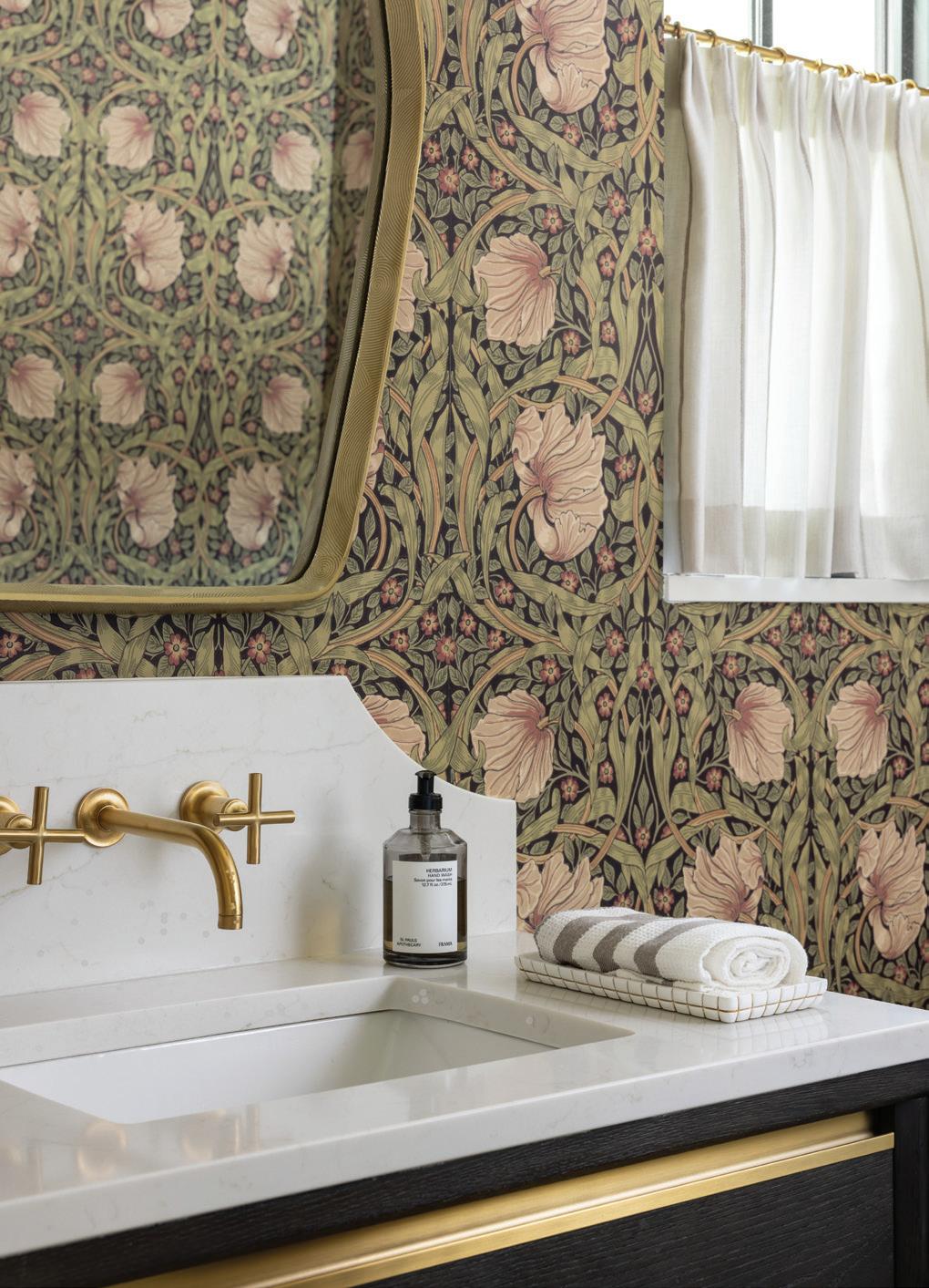
Tile – Zellige Pure White, Zia Tile
LIVING ROOM
Chair, Accent – Oliver Barrelback Slope Arm Swivel Chair, RH
Drapery – Decoroom and Tennant & Associates, Michigan Design Center, Troy; Fabric, Silver Fox, Suitor, Holly Hunt Fireplace (Mantel Stone) – Ocean Black Brushed, Ciot, Troy
Flooring – Luna Engineered White Oak, 6-inch, Costa, PRM Custom Builders, Bloomfield Hills
Lighting – Griff Chandelier, Arteriors, Lighting Resource Studio, Michigan Design Center, Troy Pillows – McGee & Co.
Rug – Davos, Hagopian, Birmingham
Sofa – Belgian Track Arm Slipcovered Sectional, RH
Table, Console – Cline, Community Manufacturing
Throw – McGee & Co.
Cabinetry and Shelving – Built On-site, PRM Custom Builders, Bloomfield Hills; Color, Benjamin Moore, Trout Gray
Chair – Steelcase, NBS Commercial Interiors, Troy
Chandelier – Talon Chandelier, Regina Andrew, Lightology
Desk – Custom, White Oak, Designer Furniture Services, Michigan Design Center, Troy
Door – Weldwork, Royal Oak
Flooring – Luna Engineered White Oak, 6-inch, Costa, PRM Custom Builders, Bloomfield Hills
Lighting, Sconce – David Art Light, Visual Comfort, City Lights Detroit, Michigan Design Center, Troy
Wall Paint – Benjamin Moore, Trout Gray
Brick Glaze – Beeck, West Friendship Materials, Detroit
Door, Finish – Rift White Oak with Sikkens Clear Coat
Door, Hardware – Transitional Heritage Monolithic, Emtek, PRM Custom Builders, Bloomfield Hills
Light – Darlana Large Tall Bracketed Wall Lantern, Visual Comfort, City Lights Detroit, Michigan Design Center, Troy
Paint (Light) – High Reflective White, Sherwin-Williams
Paint (Dark) – Gauntlet Gray, Sherwin-Williams
Roof, Asphalt – Landmark Shingles, Moire Black, CertainTeed, PRM Custom Builders, Bloomfield Hills
Roof, Standing Seam – Matte Black, PRM Custom Builders, Bloomfield Hills
Siding – Gauntlet Gray, Sherwin-Williams
Windows – Windsor Windows, PRM Custom Builders, Bloomfield Hills
Architect – Brian Neeper Architecture, Birmingham
Builder – PRM Custom Builders, Bloomfield Hills



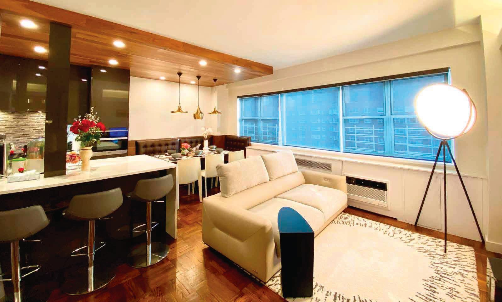







ADVANCE PLUMBING & HEATING
313.831.7770 | 248.669.7474
Detroit | Walled Lake, MI advanceplumbing.com

CALIFORNIA CLOSETS
248.624.1234
Birmingham | Troy | Wixom | Northern MI californiaclosets.com
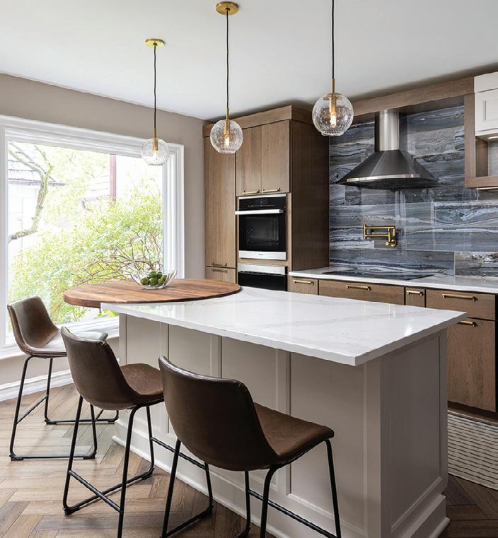
DILLMAN
248.651.9411
Rochester, MI dillmanupton.com
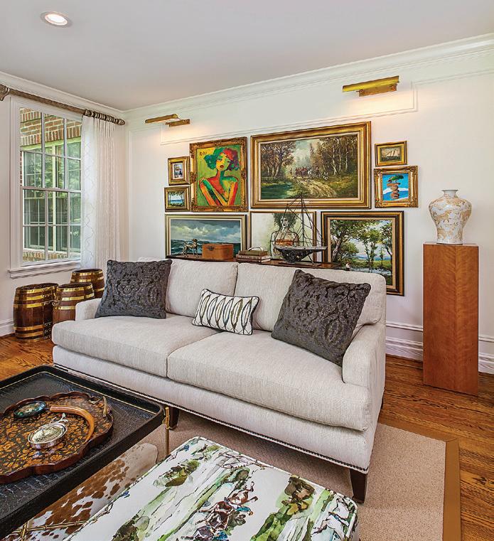
ANNIE KORDAS INTERIORS
313.378.2125
Grosse Pointe, MI anniekordasinteriors.com
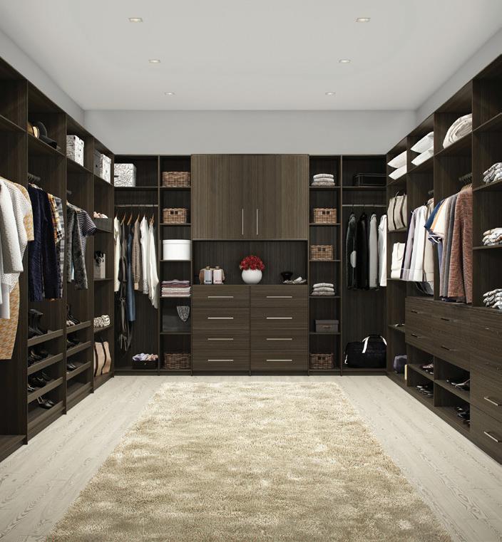
CLOSETS BY DESIGN 888.348.1475
South East Michigan detroit.closetsbydesign.com
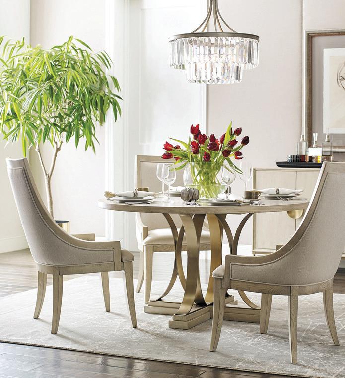
GORMAN’S
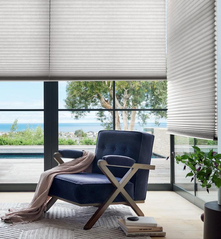
HUNTER DOUGLAS BY BAKER BLINDS 248.471.1111
Birmingham | Farmington, MI bakerblinds.com
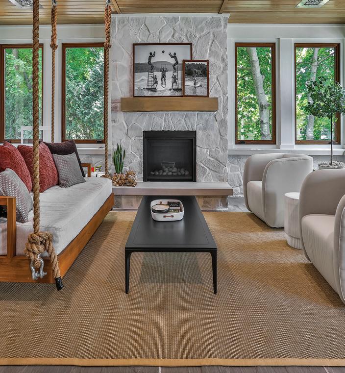
CONTINENTAL INTERIOR DESIGNS, INC. 810.629.7211
Fenton, MI
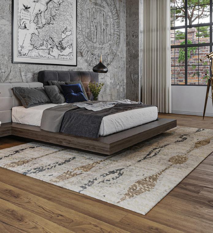
HAGOPIAN
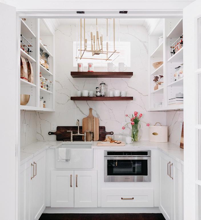
248.514.3839
Royal Oak, MI kendalldesignbuild.com

248.649.4772
Troy, MI michigandesign.com
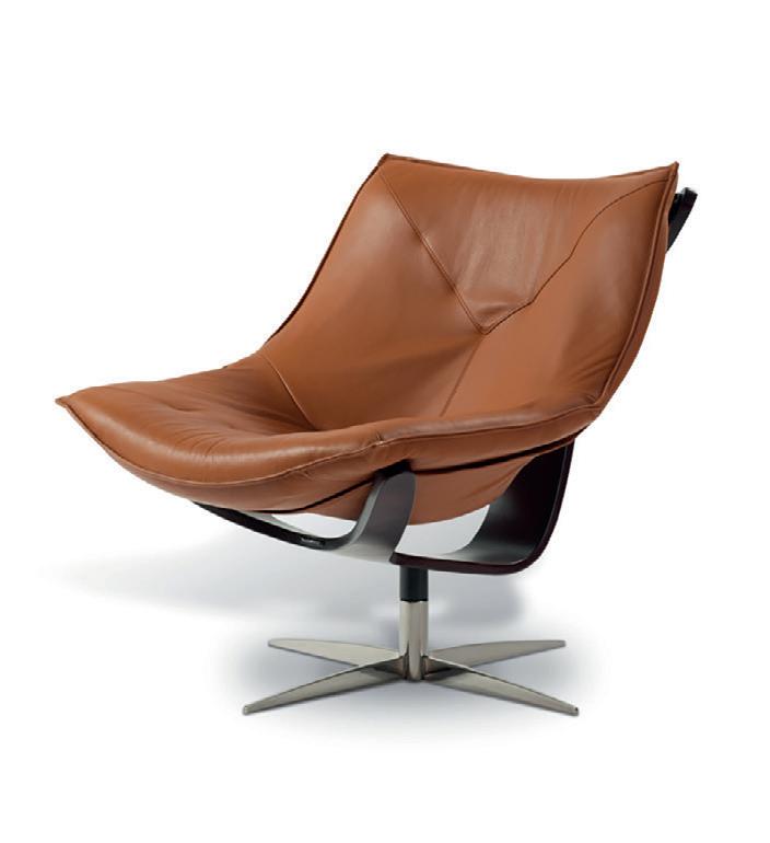
ROCHE-BOBOIS
248.833.0300
Novi, MI roche-bobois.com
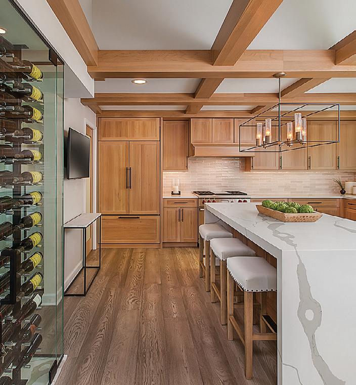
248.644.6330
Birmingham, MI mainstreetdesignbuild.com
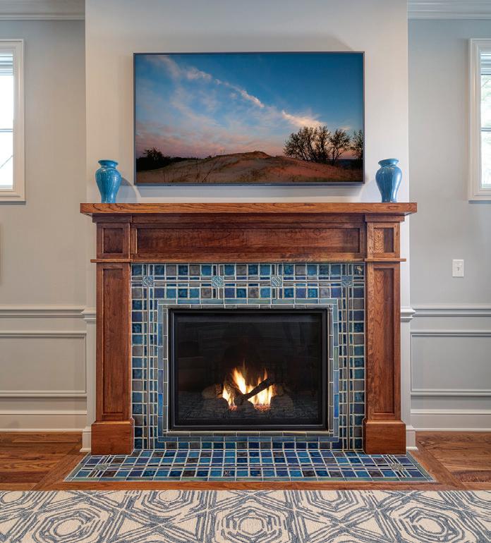
313.626.2030
Detroit, MI pewabic.org/tile
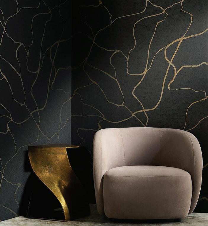
248.643.6140 Troy, MI
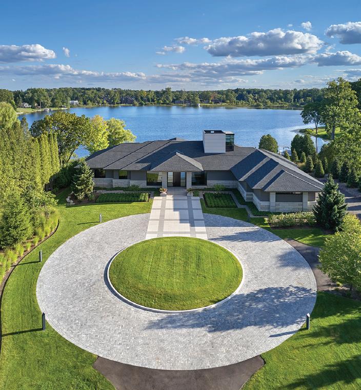
248.644.3410
Birmingham, MI mjdul.com
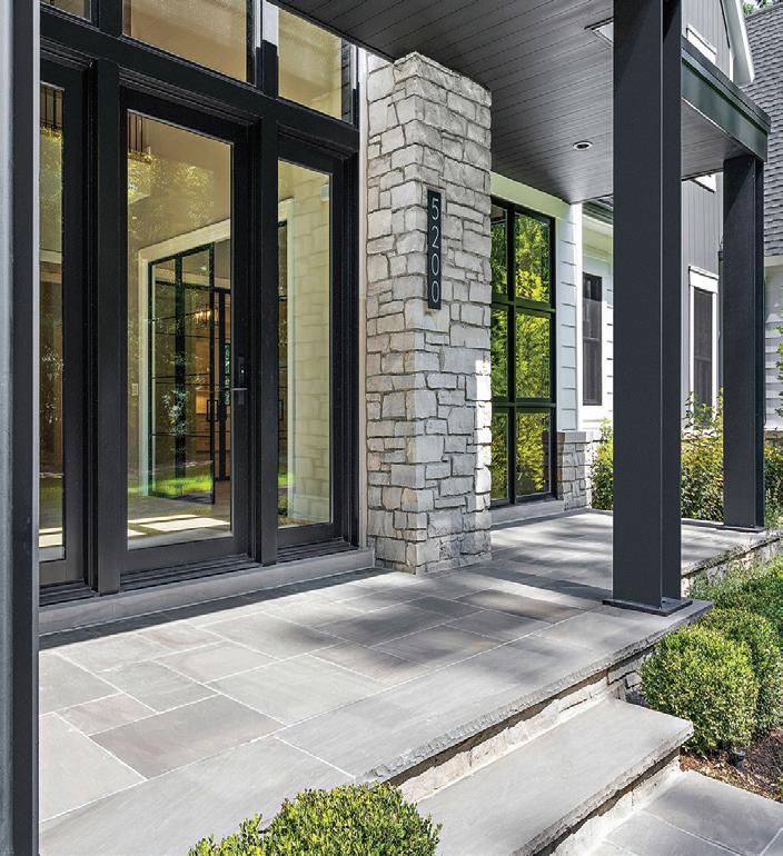
248.240.3051
Bloomfield Hills, MI prmcustombuilders.com
248.479.4925
Farmington Hills, MI thorntonandgrooms.com
KENDALL DESIGN + BUILD MAINSTREET DESIGN BUILD MICHAEL J. DUL & ASSOCIATES MICHIGAN DESIGN CENTER PEWABIC TILE PRM CUSTOM BUILDERS TENNANT & ASSOCIATES THORNTON AND GROOMS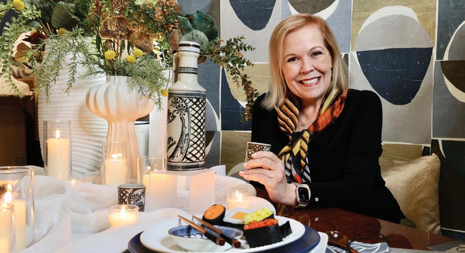
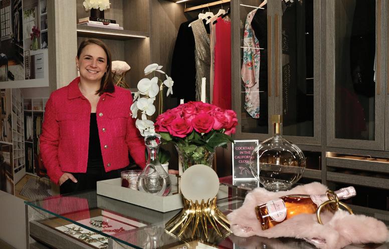
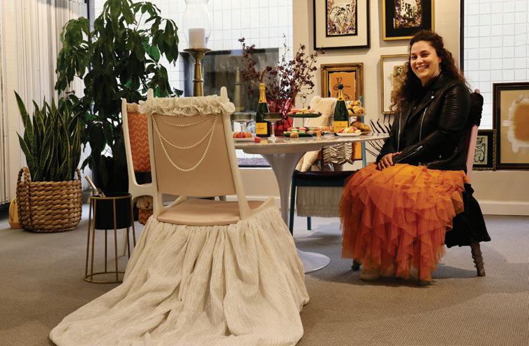
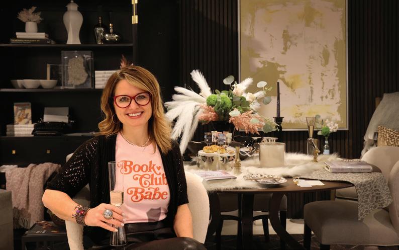
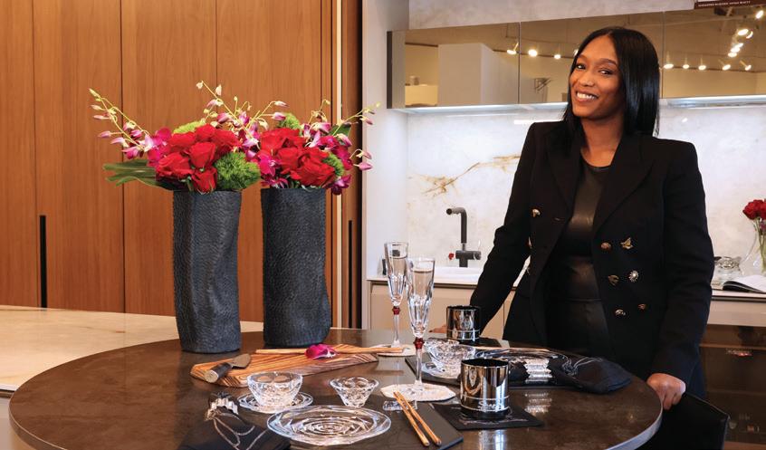

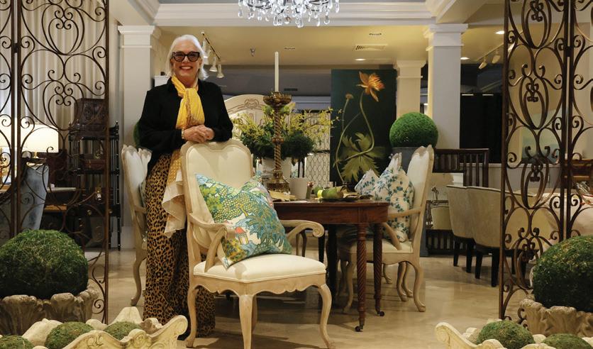


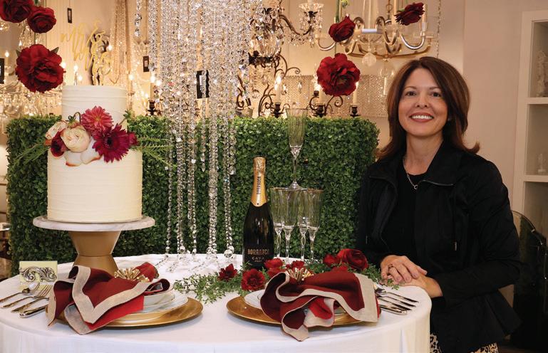

THIRTY-FOUR METRO DETROIT-BASED INTERIOR DESIGNERS came together this past November for Michigan Design Center’s “The Modern Table” — a fundraising event in which each participating designer was tasked to create a spectacular tablescape. The successful event, which benefited Gleaners Community Food Bank, collected more than 772 pounds of food and over $2,000 for the local charity from the 300-plus guests in attendance. These donations will help to provide more than 6,500 meals to those in need in southeast Michigan.
With an overall goal of inspiring guests, each designer was given their own unique theme.
The results, displayed throughout MDC’s many showrooms, were stunning, and attendees were invited to vote for their favorite tables. Designers Penny Heideman and Candy Welch of Interiors by Holmes won the Crowd Pleaser award for favorite display; designers Arthur White and Loretta Crenshaw of A & E Decor and Crenshaw & Associates took the Design Inspiration award for the table guests were most likely to recreate in their own homes; and designer Joel Baird of Baird Design Group captured the One in a Million award for most imaginative display.
MDC also held a drawing during the event to select the grand-prize winner of its $25,000 Wish
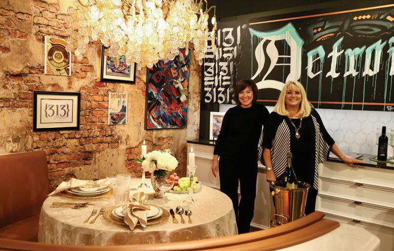
List contest. The winner, Allison Bracci of Rochester Hills, was chosen at random and can use those funds toward services or furnishings from MDC’s more than 35 showrooms. michigandesign.com
— By Giuseppa Nadrowski
1. Terri Ellis
2. Erin Najor
3 Carrie Long
4. Ruth Casper
5. Brittany Clark
6. Barbara DeMaggio, Paige Loperfido, Tammy Kelly, Kelly Osten, Aubrey Crawford
7. Phyllis Whitehead
8. Brittany Elliott, Merien Daka
9. Mia Johnson
10. Stacy Moore
11. Karolina Wasiolek, Sissy Yellen, Renée McBride
12. Jennifer McCann, Lori Gardner


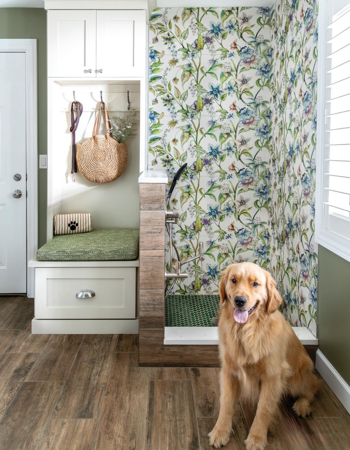
These homeowners are in the doghouse, literally!
TEXT BY MEGAN SWOYER | PHOTOGRAPHY BY SALLY MATAKRobb and Judy Clark love dogs. Their company, Resco Pet Products (under the Clarks’ Tecla umbrella), manufactures and sells quality pet products ranging from grooming essentials to leashes.
So it’s no surprise that when their interior designer, Ruth Casper, suggested the couple include a dedicated pet-washing and grooming space in their new mudroom, the Clarks — and their golden retrievers — embraced the idea with open arms and paws.
Casper, who runs Ruth Casper Design Studio, based in the Michigan Design Center in Troy, was renovating and redesigning the Clarks’ circa-1954 Bloomfield Township home (working with Krieger Klatt Architects) when the idea for a pet-specific space came up.
“The Clarks have dynamic personalities, and they love color and weren’t afraid to take risks,” says Casper, who’s been an interior designer for 26 years. “I took Judy shopping for tile at The Tile Shop, and she saw a floral pattern (Genius Porcelain) and said, ‘That’s the one for the (dogs’) shower!’ ”
Casper combined that tile with other complementary elements and selections, like a rich green wall color (Benjamin
Moore’s Louisburg Green), porcelain flooring that looks like wood, a low pot-filler in the shower for the dogs’ water bowls, and a showerhead that can brush the dogs’ fur. The flooring and half-wall tile is a wood-look porcelain that’s waterproof, while the shower floor is a penny-style emerald porcelain mosaic.
The designer worked in plenty of storage, including shelves and cupboards for dog necessities and the Clarks’ gloves, hats, and bags. The mudroom even has custom storage for the robotstyle vacuum that zooms around regularly to keep the amount of dog hair in check.
Once part of the living room and kitchen in this Colonialstyle home, the new space flows well with the rest of the house. “Green is Judy’s happy color, (so) there’s a pop of green in every room,” Casper says. The green on the mudroom wall, she points out, is also the color of the kitchen cabinetry. “We like to get into the heart of who our clients are and put their personality in the design,” she says.
As for worrying about future resale when making unique interior design selections, Casper banishes the thought. “You need to design spaces for you, right now. Life’s short.”
MORE INFORMATION: ruthcasperdesign.com


