

It always helps to talk things out. Whether you need assistance selecting a simple color scheme, or want insightful design direction for an entire room, the interior design professionals at Gorman’s are here to help and their assistance is complimentary.
With their guidance, your vision, and Michigan’s most complete offering of name-brand home furnishings, you can create the room – and the home – that you’ve always wanted at the right price. Learn how certain fabrics work well together, how light can influence color, and how a simple change in layout can create a space that better suits you and your family. Visit us today. Let’s talk.


34 Reimagined Mid-century
An outdated quad-level is refashioned into a forever home.
42 Timeless Tradition
A Grand Rapids ranch enjoys a new lease on life.
52 Contemporary Sophistication Cutting-edge details give this family’s house its wow factor.
60 Modern Cozy
A custom build in Colorado connects to the rugged landscape.
76 The Layered Look
Tiers of beauty and chic details define this remodeled home.
84 All About the Art
An extensive renovation gives a modern feel to this special project.


94 A Year In Review A look back at some of our favorite homes. 98 MATERIALS
These furnishings aren’t only chic, they’re Earth-friendly, too.
99 Heavy Metal
High-shine accents in steel and aluminum are rock-star style choices.
100 The Stone Truth From concrete to limestone and marble, natural stone — in all its variations — is a solid pick for any home’s aesthetic.
101 Warm Woods Light, natural woods have long been the rage, but there’s been a sartorial shift and dark, moody stains now reign supreme.


When my husband and I were planning our wedding, we were living on the East Coast. We both grew up in the metro Detroit area, and knew that a wedding in the Motor City was a no-brainer. Throughout the planning stages, I looked for ways to pay homage to our hometown. For our Save the Date cards, I was able to salvage and repurpose a vintage postcard of Michigan Central Station. Like many people, I had always been fascinated with the massive structure that, even in its abandoned state, stood as a grand fixture above Corktown. I was elated to showcase a piece of the city’s rich architectural history in our wedding planning, especially to our friends and family who lived out of state.
You can only imagine my surprise and utter excitement when I came across the same postcard on display in Michigan Central’s archival exhibit, “Resurrecting a Landmark,” during a recent visit following its grand reopening on June 6. There it sat, among other found relics and artifacts. It had been discovered among the station’s debris and given new life as a storied object. I instantly snapped a picture and messaged my husband — it was especially meaningful since our 13th wedding anniversary was just around the corner.
I’ve got quite a soft spot for historical restorations, so it’s with no surprise that I’ve been completely obsessed with how Ford Motor Co. was able to revitalize Michigan Central Station (page 26). Not too far away, in Grand Circus Park, there’s also the newly renovated Hotel David Whitney — definitely worth a stop when in the neighborhood! Housed in the historic David Whitney Building, Patrick Thompson Design seamlessly blended the building’s legendary glamour with a modern sensibility. (page 28). Each of these structures is an extraordinary work of art. From their architecture to all their intricate details and unbelievable craftsmanship — it’s all so inspiring. There’s just so much life behind these classic edifices, too — so many memories, stories, characters. To see each alive again, weaving a new chapter with each day, makes me excited to see what other remarkable transformations might lie ahead for our city’s iconic landmarks.
There are also so many designers and artists paving brand-new paths for Detroit and our surrounding communities. In the East Village, gallerist Isabelle Weiss is redefining what a traditional gallery and exhibition looks like with her conceptual at-home space (page 20). Designer Staci A. Meyers took a renovation in an artistic direction, using contemporary works to define a Bloomfield Hills home (page 84), while designer Carrie Long also let art be the focus in a stunning new-construction with builder Dan Moore (page 52). At MOZ Interiors, owner and designer Lyzz Hope leaned into a mid-century home’s original details (page 34) and gave it a family-friendly yet modern aesthetic — an insane before and after!
All these exciting new ventures of buildings and homes — both old and new — are further proof of why Detroit is a UNESCO City of Design. If you need additional evidence, just check out all the amazing events Design Core Detroit will be presenting this September for its 14th annual Detroit Month of Design (page 25). We can’t wait to attend!


PUBLISHER Jason Hosko
EDITORIAL
EDITOR Giuseppa Nadrowski
COPY EDITOR Anne Berry Daugherty
CONTRIBUTING WRITERS/STYLISTS Tracy Donohue, Jamie Fabbri, Christine Hildebrand, Jeanine Matlow, Megan Swoyer, Khristi Zimmeth
ART
CREATIVE DIRECTOR Lindsay Richards
ART DIRECTOR Justin Stenson
SENIOR PRODUCTION ARTIST Stephanie Daniel
ASSOCIATE ART DIRECTOR Steven Prokuda
CONTRIBUTING PHOTOGRAPHERS Dane Cronin, John D’Angelo, Amanda Doumochelle, Shelby Dubin, Christine M.J. Hathaway, Jacob Hawkins, Jason Keen, Justin Maconochie, Marta Xochilt Perez, Heather Saunders, Stoffer LTD, Joseph Tiano, Martin Vecchio
ADVERTISING SALES
ACCOUNT EXECUTIVES Cynthia Barnhart, Hannah Brown, Karli Brown, Cathleen Francois, Aubrey Kapala, Donna Kassab, Lisa LaBelle, Carol Lawrence, Mary Pantely and Associates
SALES INTERN Eden Amcheslavsky
PRODUCTION
PRODUCTION MANAGER Crystal Nelson
ACCOUNT MANAGER Elizabeth Kowalik
PRODUCTION COORDINATOR Amanda Kozlowski
DIGITAL
DIRECTOR OF DIGITAL STRATEGY Travis Fletcher
DIGITAL DEVELOPMENT MANAGER Matt Cappo
SENIOR DIGITAL DEVELOPMENT SPECIALIST Luanne Lim
DIGITAL DEVELOPMENT SPECIALIST Connor McDonald
IT
IT DIRECTOR Jeremy Leland
CIRCULATION
CIRCULATION MANAGER Riley Meyers
CIRCULATION COORDINATORS David Benvenuto, Cathy Krajenke, Rachel Moulden, Michele Wold
MARKETING AND EVENTS
MARKETING AND EVENTS MANAGER Lyndsay Zelenak
MARKETING AND EVENTS COORDINATOR Jaime Presnail
COMMUNICATIONS AND PR LEAD Regan Wright
BUSINESS
CEO Stefan Wanczyk
PRESIDENT John Balardo
DIRECTOR OF BUSINESS OPERATIONS Kathie Gorecki
SENIOR ACCOUNTING ASSOCIATE Andrew Kotzian
ACCOUNTING ASSOCIATES Dian Mauro, Austin Schmelzle
DISTRIBUTION Target Distribution, Troy
Postmaster: Send


Paying a visit to The Mill of Glen Arbor — complete with a restaurant, farmhouseturned-inn, and café — is a must for anyone heading north this fall. The former grist mill and accompanying three-room MillHouse (shown here) feature a perfect blend of contemporary and vintage aesthetics thanks to creative director Kelsey Duda, of northern Michigan-based Fernhaus Studio.
Get the look with a mix of contemporary finishes, vintage-inspired prints, and warm wood details
BY GIUSEPPA NADROWSKI
1. Designed by Kelsey Duda of Fernhaus Studio in northern Michigan, the cafe of The Mill in Glen Arbor blends historic details with modern accents. themillglenarbor.com.
2. Local watercolor artist KELLY VENTURA’s Meadow Wallpaper in Cedar reminds us of fall days outdoors. $85/yd, Kelly Ventura, Milford, kellyventura.com.
3. A romantic floral, this Wood Asters print from celebrated Michigan watercolor artist KELLY VENTURA exudes cozy cabin vibes. From $30, Kelly Ventura, Milford, kellyventura.com.
4. Hand-formed of Venetian glass, we love MOOOI’s Kaipo TOO lamp. $3,129, Moooi,


Italcasa Design, Michigan Design Center, Troy, moooi. com, italcasa.us.
5. Crafted of solid oak, the Amira Accent Chair for LULU AND GEORGIA delivers timeless style. $1,199, Lulu and Georgia, luluandgeorgia.com.
6. With a dark wood base and a check pattern, SERENA & LILY’s Barton Sofa optimizes classic cottage comfort. From $8,298, Serena & Lily, Birmingham, serenaandlily.com.
7. Designer Sarah Sherman Samuel’s Irregular Grid HandKnotted Rug for LULU AND GEORGIA is an ideal mix of retro and modern. From $1,448, Lulu and Georgia, luluandgeorgia.com.


Everything you need to create a cozy yet luxurious reading space
STYLED BY GIUSEPPA NADROWSKI
1. This sophisticated nook, designed by PERLMUTTERFRIEWALD, is just one of many at Flyleaf, a bookstore/café that opened last year in Grosse Pointe Farms. flyleafgp.com.
2 Add a spotlight to a favorite nook with this Draper Floor Lamp from ARTERIORS
$1,430, Arteriors, CAI Designs, Michigan Design Center, Troy, arteriorshome.com, caidesigns.net.
3. These Jacque Bookends from ARTERIORS are a sculptural accent. $415, Arteriors, CAI Designs, Michigan Design Center, Troy, arteriorshome.com, caidesigns.net
4. DESIGN WITHIN REACH’s Uno Pouf is a playful piece to kick
7


back with. $1,195, Design Within Reach, Grand Rapids, dwr.com.
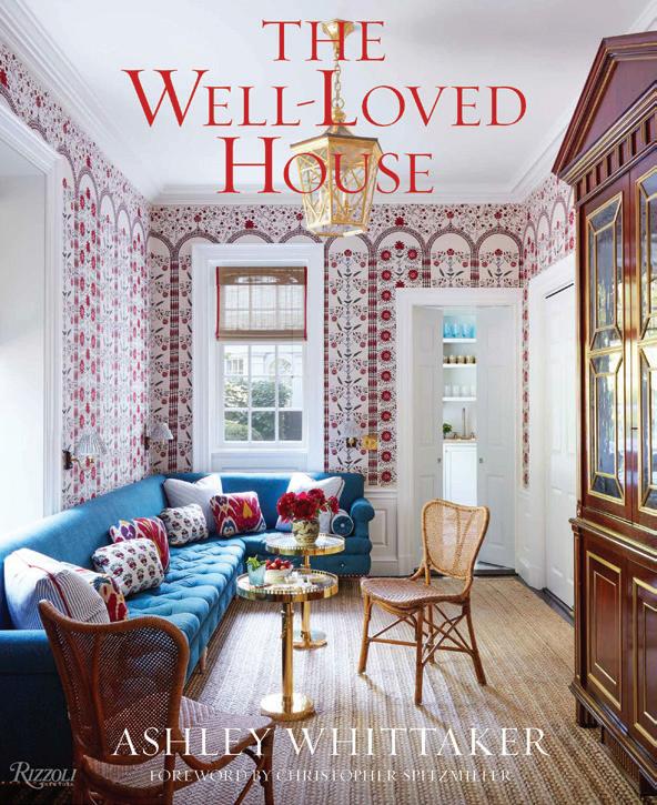
5. “The Well-Loved House,” by Ashley Whittaker, is one of FLYLEAF owner Lindsay Cotton’s suggested reads. $50, Flyleaf, Grosse Pointe Farms, flyleafgp.com.
6. Shown in an electric blue hue, this DESIGN WITHIN REACH shelf displays your books in style. $496, Design Within Reach, Grand Rapids, dwr.com.

7. Crafted of marble, RH’s Ponti Side Table is a luxe library addition. From $850, RH, Birmingham, rh.com.
8. A comfy space to read is a must, and this sculptural Mayan Sofa from RH fits the bill. $4,995, RH, Birmingham, rh.com.




“I think a home library should feel like an intimate space filled with personal items that are meaningful to you. That same concept was applied to Flyleaf, and people really do comment all the time on how warm and welcoming the space feels.”
— LINDSAY COTTON, OWNER OF FLYLEAF




SNAPSHOT:
SNAPSHOT:
PHOTOGRAPHY BY JACOB HAWKINS
SNAPSHOT: ALL ABOARD

Detroit’s I.M. Weiss Gallery celebrates 10 years with new shows and a new home
TEXT
BY
CHRISTINE HILDEBRAND
PHOTOGRAPHY BY
JOSEPH TIANO
When Isabelle Weiss was growing up, her mother, a local artist, took her and her brother to the Detroit Institute of Arts with sketchbooks in hand. Those artistic excursions “built the foundation of who I am and what’s most important to me,” Weiss says.
Weiss attended Cranbrook as a high school student, and recalls being deeply connected to art and the pertinence of objects. She wove her varied interests together during her undergraduate years, majoring in art history and linguistics, and studying economics at the University of Michigan. Postcollege, Weiss worked for an auction house as a cataloger and art appraiser. In 2014, realizing there was no local platform where craft and design artists could sell their work, she launched NEXT:SPACE, which later evolved into her namesake, the I.M. Weiss Gallery.
A decade later, the I.M. Weiss Gallery is celebrating its 10-year anniversary with three new shows and an experimental new home on Detroit’s east side. Today, the gallery represents artists whose mediums
range from fiber to woodworking, plastic, glass, sculpture, and furniture. “I’m obsessed with the personal connections we have to objects,” Weiss says. “Objects are the artifacts of our lives.”
Earlier this year, Weiss moved her gallery into an innovative location: her own home within Detroit’s Little Village cultural district. As a gallerist, it’s her job to help the artists she represents build financially stable practices; the more work sells, the more work can be made. Installing new exhibitions every six to eight weeks, however, wasn’t a realistic way to accomplish this goal. The solution? Consolidating the I.M. Weiss Gallery and her home into one. The gallery is open by appointment, and each month Weiss hosts an open house. When she hosted her first public event in April, she didn’t know what to expect. That day, more than 100 visitors walked through her front door. “The spirit of supporting
namesake gallery represents artists whose mediums range from fiber to sculpture, furniture, and more.


local artists and businesses is in the DNA of the neighborhood,” she says.
In Weiss’ Belvidere Street home, the living room assumes the responsibility of a showroom. The curation of her artists’ work in an intimate setting demonstrates how the objects resonate in the familiarity of a home. The collection depends on what sells; so as a result, no exhibition is static. If a piece is sold, Weiss works to replace it. Like any dwelling, the remainder of her home is styled with belongings and artwork from her personal collection — a demonstration of how art blends into a domestic space.
During September’s Detroit Month of Design, Weiss is opening her gallery and home for a threepart exhibition spotlighting ceramicist Benjamin Teague. The exhibit begins Sept. 19th. She’s also working on two additional shows for the month: one with Kresge fellow and ceramicist Lauren Kalman (runs Sept. 6-28), and another with sculptor and designer Cody Norman (it opens on Sept. 19) at the Edsel & Eleanor Ford House in Grosse Pointe Shores.
Teague’s upcoming exhibition, “Adaptive Objects / or / Terms for Living,” takes on a IN CASA
performative element, divided into three acts representing work made across his career. In Act I, the gallery will reflect Teague’s Pontiacbased studio, with elements found within his workspace. In Act II the stage shifts, showcasing Teague’s Offering Vases — created as a physical practice and emotional response to processing grief. Act III is a curation of the artist’s latest vessels and is emblematic of his randomized process of dipping and firing his objects until each is unrecognizable — a metaphor for how memory distorts and reshapes over time.
In tandem with running the gallery, Weiss is also an accredited art appraiser and the director of CollectorAnonymous, an appraisal and advisory firm that builds collection management solutions for its clients. Weiss emphasizes the necessity of championing local artists and small businesses. “It takes a community to support one another,” she notes. After building I.M. Weiss from the ground up, she says “it feels like I’m giving back.”
MORE INFORMATION: imweiss.gallery, collectoranonymous.com

An out-of-the-box remodel in Clarkston transforms an otherwise standard basement into a personal playground
TEXT BY CHRISTINE HILDEBRAND | PHOTOGRAPHY BY JACOB HAWKINS

There’s no doubt a finished basement lends immeasurable value to a homeowner’s lifestyle. Nevertheless, unearthing its potential takes creativity and courage. “It doesn’t have to be a continuation of your main floor; you can think outside the box in terms of design,” says Steph Morris, the owner and visionary behind North + Birch, a boutique interior design firm nestled in downtown Clarkston. Recently, Morris and her small but mighty team proved they had the right levels of ingenuity, fearlessness, and collective maternal instinct needed for an accessible and inclusive lower-level remodel in Clarkston.
North + Birch prides itself on having a motherly grip on the colorful aspects of parenthood. “Between myself and my two team members, we have seven children,” Morris says. She and her team remained openminded, playful, and persistent when it came to building their client’s dream. “We were looking for something fun for the kids and fun for the adults,” the homeowner explains.


The client dreamt of connecting the groundfloor foyer to the basement using a slide. Unlike the previous firms she had interviewed, Morris embraced the unique vision. “I looked for a designer for about a year,” the homeowner says.
“I really just wanted a designer who understood being a mother to young children, and who would be game for creating something fun.”
Morris grasped the heart of the concept and agreed to transform the space into a showstopper.
The result is a dramatic playground for all.
“Imagine the logistics of getting a slide into the house!” Morris exclaims. While the 11foot, electric-blue slide was the most shocking
and unexpected part of the project, it’s one of many jewels to be found in the 3,000-squarefoot space.
Other gems include a private cinema with seven theater seats, a secret bar, a stage, a oneof-a-kind living space, and a stylish kitchen sporting custom walnut cabinets from Royal Oak’s Studio Harmony, phyllite counters, and a zellige, hand-cut terracotta tile backsplash — one of the homeowner’s favorite elements.
At first, the basement’s large footprint and 12-foot-tall ceilings posed challenges, but they evolved into a design win. Carolyn Sauber, a lead designer at North + Birch, says instead of

Left and right: From a rock-star stage to reading nooks, climbing walls, and perfectly-sized work zones, this kid-friendly basement is a dream come true.
PATTERN PLAY
Left: Custom cabinets and statement tile define the lower level’s kitchen.
Below: The design for the living area began with this printed Stark carpet, whose rust tones complement the backsplash. The wall paneling perfectly camouflages the hidden doors to the theater while adding interest and depth to a long, blank wall.


forcing cohesion, each room was designed to take on a distinct personality of its own.
The secret bar is masked in true speakeasy fashion. Accessed from the theater through hidden Alexa-operated automated doors, the hideaway’s moody atmosphere is achieved through perfectly-chosen details like a handmade lampshade by East Sussex-based print designer Anna Hayman. Its tassel skirting invites drama, while the velvety shade complements the high-gloss lacquer of the bar’s floating cobalt shelves and a nearby photograph of a woman wearing a lampshade (this original work was sourced from Tell Me I’m Pretty, a fine art website run locally by interior designer Lyzz Hope and photographer Shelby Dubin).
“Showcasing local talent adds a rich level of storytelling to each project,” Morris says. Her team also worked with Clarkston-based builder Brian Galley, from Bella Custom Homes, on the basement’s transformation, while Ann Arbor-based muralist Payton James created the playroom’s captivating murals.
Stylistically, the basement is described as bold and eclectic — a reflection of the homeowner’s playful imagination and artistic approach. “I love that the space feels polished, but it doesn’t feel stuffy,” the client says. “Nothing is untouchable, and you can still roller skate through the house.”


When Morris and Sauber presented the first rendering of the basement kitchen, their client didn’t make any adjustments. “In this moment, we knew they were on board and unafraid to be bold,” Sauber says. “We took risks mixing things, and I think it was the lack of hesitation from our clients that got us, and the design, to where we landed.”
North + Birch’s lower-level wonderland is a true performance piece. Adds Morris, “At the heart of the project, we tried to create an inclusive space for all regardless of age or ability.”

Design Core Detroit presents its 14th annual Detroit Month of Design
TEXT BY GIUSEPPA NADROWSKI
Design Core Detroit’s 14th annual Detroit Month of Design is taking the city by storm this September with 84 participants, 41 exhibitions, 27 experiences, 15 tours, 11 talks, nine open studios, seven workshops, and seven installations. Each year, DCD brings together designers, artists, makers, and more in a citywide celebration.
“With its unique community culture and proud history of innovation, Detroit is a destination like no other for designers to convene and share their new ideas,” says Kiana Wenzell, co-executive director of DCD.
“Year after year, our city continues to turn heads across various fields of design, attracting the attention of industry leaders from around the world who are looking to develop the next big thing in fashion, mobility, fabrication, or technology. The 2024 Detroit Month of Design is about celebrating that impact.” Here, we’ve showcased a sampling of events we’re excited to check out.

SEPT. 5, 5:30-10 PM: CONSTRUCTING FUTURES
(Opening Reception)
Hosted by the College of Architecture and Design at Lawrence Technological University, Bedrock, and the Urban Tech Xchange (UTX), Constructing Futures is a series of lectures, workshops, and exhibitions that explore industrial robotics, artificial intelligence (AI), additive manufacturing (AM), and computational design in the fields of construction and design.


SEPT. 13, 6-10 PM: NIGHTCAP – A CREATIVE COLLECTION OPEN HOUSE AT ROSSETTI
Detroit-based architecture and design firm ROSSETTI is hosting artists and installations at its o ce and rooftop patio. This open house-style event will allow guests to interact and engage with the featured artists and their work.
SEPT. 14, 5-7 PM: INSIDE/OUT (Opening Reception)
Matéria Gallery’s EDITION space in Core City is highlighting the works of five participating design studios including Form&Seek, Simon Anton, and Detroitbased architectural firm END Studio as they explore ideas that exist both inside and out. The show will extend into the adjacent Core City Park 2.
SEPT. 14 & 15, 12-5 PM: LIVE/WORK CRANBROOK ALUMNI IN DETROIT
Connect with local artists and makers while exploring the studios of talented Cranbrook Academy of Art alumni at this Open Studio Crawl event. Visitors should register for this free event ahead of time, as a list of participating alumni and a map will be emailed to all participants a week prior to the event.
SEPT. 19, 6:30-8:30 PM: CODY NORMAN AT FORD HOUSE (Opening Reception)


SEPT. 6, 8 PM: THE ALBERT KAHN SONATA
The Albert Kahn Sonata, a musical tribute to the famed architect, played on a concert grand piano by Forrest Howell at the Fisher Building. The sonata was composed by Dr. Michael Kropf and will be performed against a short film highlighting Kahn’s designs in Detroit.
SEPT. 7, 5-8 PM: JACK CRAIG, ANTE ROOM
(Opening Reception)
Local artist Jack Craig creates furniture and fixtures using unexpected material combinations like bronze, PVC, and molded carpet. This September, he’s showcasing new work at David Klein Gallery’s Detroit location.


Ford House’s inaugural artist-inresidence, Cody Norman, created an outdoor exhibition fashioned from collected plastics. Norman collaborated with curator Isabelle Weiss and Ford House’s exhibitions team on this groundbreaking project.
SEPT. 21, 2-6 PM: GRAND ON RIVER
Located in an historic bank building in Detroit’s Core City neighborhood, Grand On River’s open studios event will showcase the work of its resident artists, including printmaker Nicholas Dowgwillo, textile artist Kit Parks of Spool & Dye, furniture and lighting designer Nicholas Tilma (his work is shown at left), metal fabricator and photographer Lily Kline, and furniture-maker Jason Kehdi of Argonaut Studio.
INFORMATION: detroitmonthofdesign.org

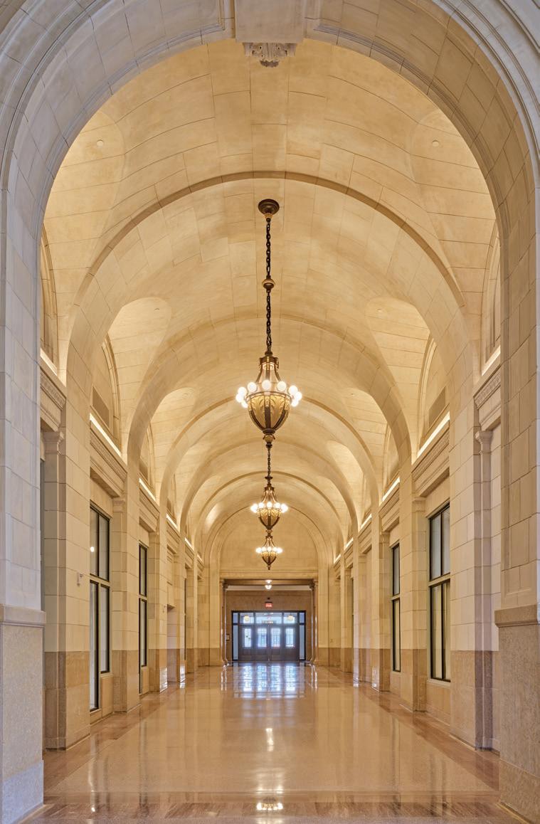
After an extensive seven-year renovation, Michigan Central Station shines anew
TEXT BY GIUSEPPA NADROWSKI | PHOTOGRAPHY BY JASON KEEN
Entering the Great Hall of Detroit’s iconic Michigan Central Station is one of those goosebump-inducing moments. From its complex legacy to its significance to the community and the breathtaking grandeur of its rejuvenized Beaux-Arts design, visitors experience an almost otherworldly feeling among its halls and corridors.
“Michigan Central has lived many lives, many chapters — and throughout each of those chapters, it meant something to everyone,” says Melissa Dittmer, Michigan Central’s head of place. “Everyone who comes has an emotion for the train station that’s specific, for them, to a moment in time.”
Dittmer, a trained architect who has led many design-forward developments, says seeing people’s emotional reaction to the building has been overwhelming. “And that isn’t specific to architecture,” she notes. “It’s specific to what this building represents to all Detroiters. I’ve never experienced anything like it with any of my other projects.”
Built in 1913, Michigan Central Station welcomed more than 4,000 guests a day at its peak. Closed in 1988, the building sat crumbling until Ford Motor Co. purchased the property in 2018. Today, Dittmer says, it’s once again welcoming visitors, albeit with a new purpose: to become a catalyst for thinking about the future of innovation. The station is part of Bill Ford Jr.’s revolutionary plan to transform the 18-floor depot and its surrounding 30-acre campus into a mobility and technology hub.
The scope of the building’s renovation is mind-blowing: It took 3,100 skilled trade workers six years and 1.7 million work hours to complete. Ford worked with the teams at Quinn Evans Architects and Christman-Brinker to make the 640,000-square-foot vision a reality.
BORN AGAIN
Above: The Grand Hall (left) and Arcade (right) underwent a remarkable restoration. Today, they glow as they originally did. Opposite page, left: Archival photos highlight the original ticket booths of the Grand Hall (top) and Arcade (below).
“The research phase was (both) academic in nature and a bit like historic detective work. We hired one of the best historic restoration architecture groups and then we did a call-out for objects that could help inform our restoration process,” Dittmer shares. “We needed both because many of the original drawings and photos didn’t get down to the level of finite detail that we needed to inform our restoration process.”
One such object was the Carriage House’s 750-pound clock. An anonymous donor who had salvaged the timepiece after the building was closed returned it, so it could hang as it once did. Re-creating a ram’s head ornament was another piece of the puzzle that required the help of a collector. Original drawings depicted the building’s ornate accents (the replicas can be found in Michigan Central’s Historic Reading Room), but didn’t provide enough detail to re-create them. Thanks to an individual who happened to have one, the team was able to make a digital scan to create a prototype and mold, which was then cast in plaster and hand-painted to look just like the original.
Assessing the building’s extensive damage was also a key part of the restoration process. “Much of the stone had worn away due to water continually flowing, and there had been a lot of vandalism,” Dittmer notes. More than 3.5 million gallons of water in total were pumped from the basement, 3,990 cubic yards of debris was removed, and 102,000 square feet of windows were replaced or restored. Ironically, some areas of the building were still in pristine condition.


In the South Concourse, where the glass of the 31,600-square-foot skylight had to be entirely replaced (the steel is original!), the brick walls, while needing a thorough cleaning, looked to be in their 1913 condition, Dittmer says.
To restore the exterior, 600 tons of limestone were sourced from the same Indiana quarry that provided the building’s materials 100 years ago. The quarry, long closed, was reopened to ensure an exact match. In the Waiting Room and Grand Hall, 29,000 Guastavino ceiling tiles were individually sounded (tested for structural stability), hand-cleaned, and secured with 8.7 miles of grout. Of those, only 1,700 had to be replaced. A quarter-mile of cornice was also restored, 4,200 new light fixtures were added, original chandeliers were replaced and replicated, 5.6 miles of new plumbing was installed, and 300


miles of new cables and wires were added. And that’s only a partial list of the work that was done.
Above right: The 18-story station glows above Roosevelt Park, completed in 2023. Inset: The ram’s head ornaments in the Reading Room were replicated to look like the originals. Below: The brick masonry in the South Concourse, outside of needing a good cleaning, was in almost perfect condition despite decades of weather making its way inside.

To pay homage to the station’s more recent past, some graffiti was also salvaged and preserved — most notably in a hallway off the Concourse. “You can think that the years of vacancy represents something negative, but for a lot of people, it represented a cultural or creative inspiration,” Dittmer says. “The station, during the vacancy stage, was a very positive thing for Detroit’s creative side. It was important for us to represent that and remember that this building has gone through a lot of different chapters and narratives, and it will continue to do so. We’re just building upon that.”
That’s what’s so remarkable about this renovation — it’s upholding the past while also catapulting the city forward. Within Michigan Central Station, the ground floor is to be activated with public art, live programming, restaurants, and retail, while the tower will be home to offices, startups, a hotel, and nonprofit organizations. “What was and what is extremely exciting about this project is that it’s built upon Detroit’s legacy as a city that designs things and makes things. If we think about Detroit’s designation as a UNESCO City of Design, we come from a legacy of people who design and make beautiful things. Michigan Central is one example of that legacy,” Dittmer explains.
“It was important for us to think about how we’re going to use this building, and then build upon it for the next generation of designers and makers,” she adds. “The ways in which we’re moving the building forward will be done in a contemporary way. If you think about our programming, and it being this focal point for folks thinking about the future of mobility and innovation and the ways in which they’re thinking about objects and the ways people move around, we’ve done that for the past 100 years — and we’re going to do that, in this building, for the next 100. It becomes quite poetic in the way it represents all that is Detroit.”
MORE INFORMATION: michigancentral.com
A period-perfect renovation gives Grand Circus Park’s iconic 1915-built David Whitney Building a refreshing new look
TEXT BY TRACY DONOHUE | PHOTOGRAPHY BY JOHN D’ANGELO
When Detroit-based real estate and investment firm
The Roxbury Group acquired the historic David Whitney Building in 2011, it did so with bold plans for a nearly $90 million adaptive-use renovation that would include a Marriot Aloft hotel and upscale apartments. The project was completed three years later.
STATELY DESIGN
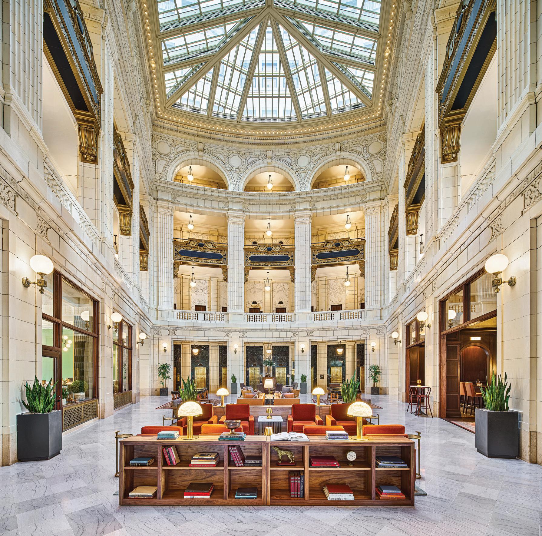
Furnishings in the stunning four-story atrium lobby were reimagined to incorporate more intimate groupings while preserving historic materials.
As with many other buildings in the city, the David Whitney Building had fallen into disrepair and had been empty for more than a decade before being given new life. Its success helped usher in the now-vibrant market for high-end and boutique hotels in downtown Detroit that began in 2008 with the renovation of The Westin Book Cadillac Detroit hotel.
“This is such a cherished building in Detroit,” says David Di Rita, principal of The Roxbury Group. “We wanted to invite the public in through hospitality. We knew this incredible building was always meant to be a hotel.”
The David Whitney Building has been an elegant part of Detroit’s historic Grand Circus Park since it was completed in 1915. The stately 18-story building was commissioned by David C. Whitney to honor his father, David Whitney Jr., a successful lumber, shipping, and real estate baron, whose iconic Detroit residence, The David


Whitney House, is now a Midtown restaurant simply called The Whitney.
The Whitney Building was designed by D.H. Burnham & Co. of Chicago in the NeoRenaissance style, which was favored by wealthy Americans at the time. The mixed-use structure included retail and medical offices, and was one of the city’s most visited properties.
This past spring, The Roxbury Group completed a second significant renovation of the historic building and relaunched Hotel David Whitney as a premium-branded Marriott Autograph Collection hotel. The number of hotel rooms was increased to 160 by converting two dozen former apartments into full-size hotel suites. Eighty apartments remain in the building.
The Roxbury Group worked with Patrick Thompson Design, Influz Architects, and O’Brien Construction to realize its vision.
Patrick Thompson, principal of Detroit-based Patrick Thompson Design, explains: “The goal was to create spaces that look like they were always there and honor the Neo-Renaissance architecture. Rich leathers, brass fixtures, marble, and mahogany were all incorporated to match existing architecture. The concept for the hotel was like getting a personal invitation from the Hotel David Whitney to be a guest in their home.”
Above: For designer Patrick Thompson, the goal for the building “was to create spaces that look like they were always there.”
Right: Capper & Capper is a coffee shop and market named for the former men’s clothing store that was a fixture in the building for nearly eight decades.

Because the hotel remained open during the two-year construction process, ensuring its guests had a positive experience was paramount — and it was also the main challenge of the project.
The building’s enhanced interior includes event space as well as Presley’s Kitchen + Bar, the Library Bar, and Capper & Capper, a coffee shop and market named for the former men’s clothing store that was a fixture in the building for nearly eight decades.
Furnishings and appointments in the stunning four-story atrium lobby were reimagined to incorporate smaller, more intimate groupings while preserving historic materials including the abundance of marble and terracotta.
Thompson describes how the renovation paid homage to the building’s rich history: “The atrium lobby and the library were inspired by the lavish living rooms and parlors of the grandest residences of the 1910s. Furniture, millwork, and finishes were all inspired by the period of the building. The artwork and curiosities are inspired by the adventures and travels of the lumber barons.”
According to Di Rita, to further honor the Whitney family’s legacy, current family members donated artifacts and photographs for display in the building.
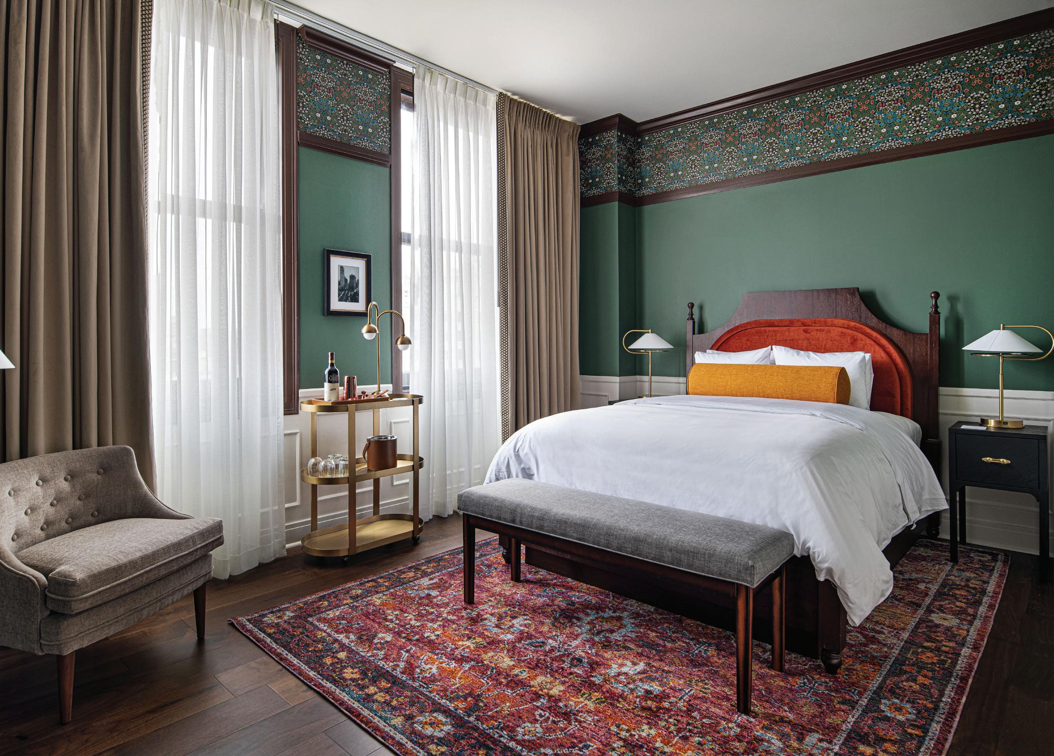
Thompson reveals his best-loved part of the renovation is the use of color in the guest rooms. “The guest rooms are special to me. They’re fresh and sophisticated, while feeling like they’ve always been there. Everything in the rooms is custom. The beds, reading lamps, and artwork all have a story, and you can feel it when you’re in the rooms.”
SOPHISTICATED SUITE
“We wanted to invite the public in through hospitality. We knew this incredible building was always meant to be a hotel,” says David Di Rita, principal of The Roxbury Group.

Di Rita adds, “We set out to finish the job we started a decade ago by creating a quintessential Detroit hotel with a grand residential feel. The degree to which it has been so completely and effortlessly embraced is like it has always been here.”




Bloomfield Hills designer imagines and builds sustainable year-round backyard retreats
TEXT BY KHRISTI
ZIMMETH
PHOTOGRAPHY BY
MARTA XOCHILT
PEREZ
Fond memories of her own childhood treehouse prompted designer Martine Ilana, of Temescal Creative in Franklin, to design and build a backyard getaway for her 7-year-old twins, Opal and Oscar. “I absolutely loved my treehouse,” she reminisces. “It was a calm, comfortable, and simple space — close enough to my family’s house so that I was safe, but it also gave me room to be creative and enjoy nature. I believe the time spent outdoors in my treehouse during my childhood gave me a heightened appreciation for the natural world. My treehouse was where I could do a million different craft projects and it was a fun place to bring friends, too.”
While she had the same goals in mind for the outdoor space she envisioned for her twins at their Bloomfield Hills home, that’s where the similarities end. “My goals were to push the reclaimed treehouse concept, its design, and eventual sourcing of the materials, to be as sustainable as possible,” she explains. “I wanted the space to connect the twins to nature and make
Accessible year-round, the structures are “go-to play areas in both sunshine and snow,” designer Martine Ilana says.
sure it was designed and created in a sustainable way — not only with the material selections (reclaimed and recyclable materials), but also to allow (their treehouses) to grow with them as they got older, instead of growing out of them, as they do with many of their toys.”
When she couldn’t find anyone whose products met her criteria, she decided to do it herself.
“I wanted to personally design, draw the plans, and source every component,” she explains.
“My intention was for 85 percent of the materials to be sourced locally and then for the 15 percent that was not locally sourced to be recyclable. Nontoxic materials include salvaged woods, metal roofing, and low-VOC (volatile organic compounds) paints.”
Set inside a circle of 100-year-old maple and oak trees near Sodon Lake, the two A-frame structures are connected in the middle by a large swing bar. “This visually represents the unique relationship of twins,” Ilana explains. “(They’re) separate but always connected.” Her hope was to have the treehouses be a visually

ECO-FRIENDLY FUN
Set inside a circle of 100-year-old trees, the two A-frame structures are connected in the middle by a large swing bar and were created using reclaimed and recyled materials.
appealing addition to the landscape and look like sculptures in the backyard.
Constructed with the ability to disassemble and then reassemble the parts into different forms as the twins grow, the design allows for a phase two that might involve taking the slide off and adding a second room off the back, or even a phase three, which could transform the space into an ADU (accessory dwelling unit), for an additional on-property living space. “I (purposely kept) the design modular and easy to work with in the future,” she adds.
Accessible year-round, the structures are “go-to play areas in both sunshine and snow,” Ilana says. “This is where they go to play charades, bring their friends, dance, read books, color, and have snacks. It’s their calm space, where they can regroup and relax after racing around our backyard.”
The designer says she would welcome the opportunity to create similar projects for other homeowners. “It was incredibly fun and rewarding,” she says, adding that the twins are fans, too. She and her children “watch a lot of ‘Treehouse Masters with Pete Nelson,’ ” Ilana says, referring to the Animal Planet series. “(We) get inspiration and (Nelson) offers many phase two construction ideas.”
MORE INFORMATION: temescalcreative.com


TEXT
BY GIUSEPPA NADROWSKI | PHOTOGRAPHY BY SHELBY DUBIN
INSPIRED ROOMS
This page: The original and handmade wood paneling is what sold the Babbie family on this 1960s home. Highlighting this one-ofa-kind accent inspired the entire renovation. Opposite page: An entertainer’s paradise, the lower-level lounge is defined by conversation-ready seating and custom details.


HHouse-hunting wasn’t going well for Kristina and Fadi Babbie — until they stumbled upon a listing their Realtor “was shocked” they wanted to see.
“When we walked in, Fadi and I immediately looked at each other and we were like, This is going to be our house,” Kristina says. The home, built in 1967, had more than 5,000 square feet of living area, but its appointments were less than pleasant — outdated bathrooms, unsightly carpet, a cramped ’90s-era kitchen, and awkward cabinetry. On the plus side, it sat on a gorgeous half-acre lot and featured one-of-a-kind custom millwork — an accent the couple was fascinated by.
With the ability to envision the home’s potential, the couple — who were expecting their first child at the time — decided to make the Midcentury quad-level their own.
Their goal was to bring the residence up to date
Above: From the salvaged and repurposed pew to the modern oval dining table and statement pendant above, this eating nook seamlessly combines fashion and function.

while respecting its legacy. Above all, the home’s wood paneling was to remain. The original homeowner, who ran a sawmill, had meticulously hand-crafted each individual wall plank from rare Alaskan red pine and California redwood. When the couple interviewed designers, most wanted to alter the precious wood. Thankfully, they found Lyzz Hope, of MOZ Interiors, who shared the couple’s vision. “She was just so fascinated with the house, too,” Kristina remembers. “We hit it off right away.”
Having grown up in her mother’s antique shop, Hope, who launched her Rochester Hills and Birmingham-based studio in 2019, specializes
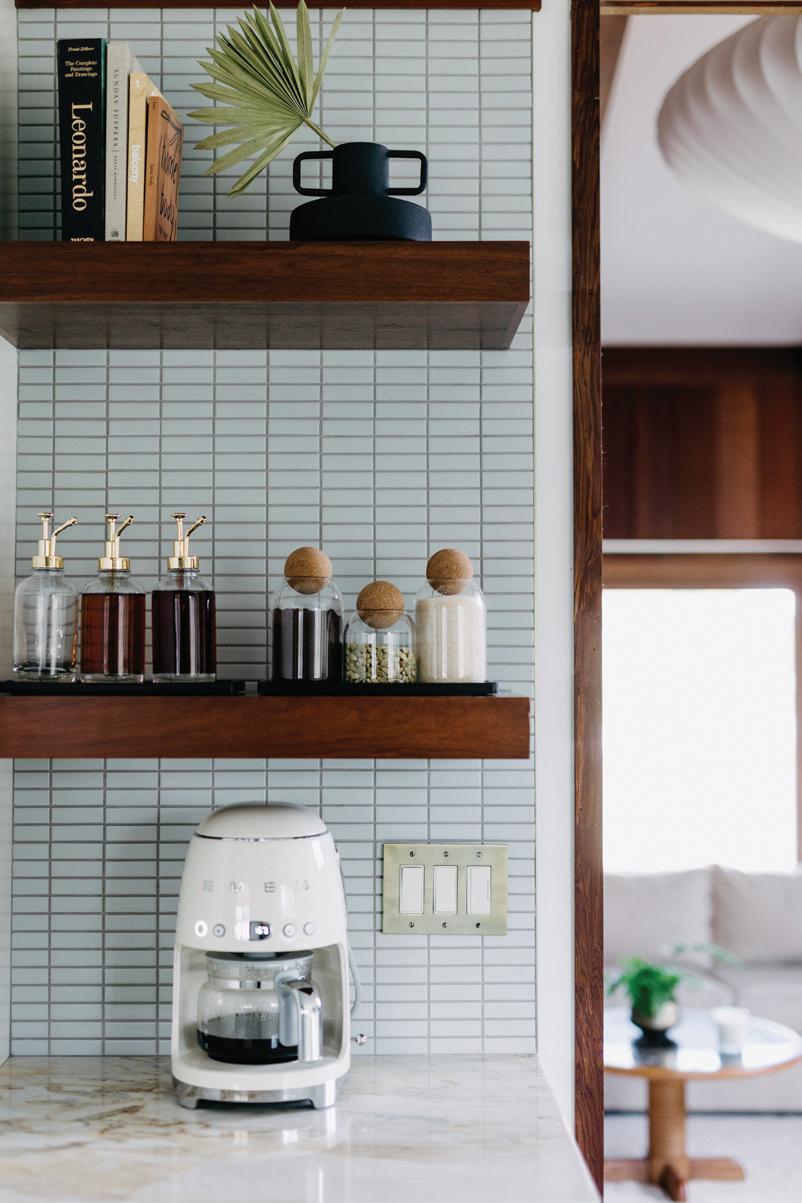
Above: To create a larger cooking footprint for the homeowner, designer Lyzz Hope combined the former kitchen and dining room into one sleek and open area. Inset: Stacked grayblue tiles and warm wood shelves given the bright white kitchen subtle color.

“ONE OF THE MAIN ASPECTS OF ANY SPACE I DESIGN IS BRINGING SOMETHING FROM THE PAST INTO THE PRESENT.”
— LYZZ HOPE

in mixing vintage and antique furnishings with modern designs.
Her first priority was to reimagine the kitchen. As a private chef, Fadi needed more room. To accommodate a larger footprint, the opening above an existing peninsula was adjusted and the home’s former dining room was blended into the new area by removing a wall. Crisp white cabinetry brightens the kitchen, while Matarazzo polished quartzite countertops add a natural finish. Stacked grayblue tile adds subtle color to the room and complements its new slate floors.
An eating nook offers the perfect place for
the couple and their now 16-month-old daughter to enjoy meals together. Hope sourced a pew from Architectural Salvage Warehouse Detroit and repurposed it into a child-friendly bench. “One of the main aspects of any space I design is bringing something from the past into the present. It gives a room soul,” she says. Hope gave the pew personality with a custom cushion in a tiger-print Dedar fabric.
In the living room, soaring ceilings warranted dramatic lighting. Hope chose an iconic Herman Miller pendant, as it “casts a very soft, diffused glow over the room and makes the (large) room feel more intimate.” Because the family is a proponent
of clean living, the spacious sectional was enveloped in a plush cotton velvet. “We didn’t use anything that wasn’t a natural material,” Hope notes. The original floors and paneling were refinished so that they now glow as they originally did.
Behind the sofa, a pony wall was transformed into a planter. “Plants are essential in every single space. The more the better, in my mind,” Hope says. A black-and-white powder room features an abstract mural that Hope handpainted herself.
Off the lower-level lounge, a second powder room received an equally bold face-lift with

Above: A favorite of the homeowners, the primary bedroom features a new fireplace; sleek furnishings; gorgeous natural light thanks to skylights above; a dramatic warm-glow pendant; and a relaxing minimalist aesthetic.

Above: An original art piece by designer Lyzz Hope looks right at home with a period-perfect clock and vintage typewriter. Right: A refinished and original built-in gets a modern touch with contemporary accents and vibrant plants.
contemporary accents. Since the couple wanted to retain the room’s existing tile, Hope sought out a Lemieux et Cie wallpaper with a modern chinoiserie print to effortlessly blend the elements. Kristina is thrilled with the transformation and laughs that “everyone comes over and wants to take selfies in there.”
The updated lounge, which the couple uses for entertaining, features a custom bar outfitted with Tilebar’s Antique Gray tile, brass wire bar stools, and glass shelves. Retro-inspired sconces add a soft glow to the lounge, which is now the home of four vintage Barcelona chairs that inspired the renovation’s overall aesthetic.


Originally designed by Ludwig Mies van der Rohe in 1929, the Bauhaus-era chairs are a pillar of the Mid-century movement. The Babbies were lucky to have found them at an estate sale prior to moving. “I just envisioned that space having those chairs in it,” Hope says, adding that the placement of the chairs around a green agate table “instigates conversation.” For Kristina Babbie, the chairs are also a welcome repose. “I sit down and read, and lose myself in a book,” she says.
Nearby, a vintage record player sings below an original photograph Hope created with photographer Shelby Dubin as part of a collection entitled, “Tell Me I’m Pretty.” Original accents, such as the newly refinished checkerboard wood flooring and natural fireplace, add a warm and inviting ambience.
Hope says the couple wanted the primary suite “to be very soft and serene.” The room, abundant with natural light, overlooks the home’s wooded yard and has a private terrace. “It’s like a retreat, so they didn’t want to over-design it,” she explains. A former addition, it had an awkward wall of cabinetry that had been designed to conceal a chimney. The chimney became part of a new electric fireplace, which is clad in a sleek black tile. Antique accents like the settee and server continue the home’s modern-meets-vintage vibe.
Hope says the home “has a wonderful, happy energy.” She adds, “I’m very happy with it. I think it ended up being better than we all imagined.”
Kristina Babbie agrees: “This is our forever home.”
TIME TO RELAX
Above: A sleek new bar features brass and glass accents alongside the original custom wood paneling. Right: To update the powder room while maintaining it’s original tilework, Hope used a blush pink wallpaper to pull the pieces together.


TIGER MOUNTAIN
Dedar, Tennant & Associates, Michigan Design Center, Troy, dedar.com
“I’ve swooned over this fabric for the longest time. It’s so intriguing and is an unpredictable play on the classic tiger print.”
SANTORO AGATE COFFEE TABLE
CB2, Birmingham, cb2.com
“The natural beauty of stone is a must have,” says Hope. “Whether it’s a simple bowl, candle stick, or it’s this gorgeous focal point in a seating area. Plus, CB2 in


INTERIOR DESIGNER
Lyzz Hope, MOZ Interiors, Birmingham and Rochester Hills, mozinteriors.com
ADDITIONAL CONTRIBUTOR
Contractor: Adam Hammoud, True Built Custom Contracting, Dearborn
SAUCER BUBBLE PENDANT
Design Within Reach, Grand Rapids, dwr.com
“I love playing with scale especially with an iconic piece like the Herman Miller Saucer Bubble Pendant,” says Lyzz Hope.

BLAISE WALLPAPER
Lemieux et Cie, lemieuxetcie.com

“This is a modern and playful approach to a traditional bird wallpaper by an amazing designer named Christiane Lemieux.”


“SLIM AARONS”: THE ESSENTIAL COLLECTION BOOK
Serena & Lily, Birmingham, serenandlily.com
“You can never have too many coffee table books. Slim Aarons, a WWII war photographer turned photographer of the glamorous and lavish, has always been one my biggest influences.” Birmingham has the very best staff, so I’ll take any excuse to go visit them.”

BARCELONA CHAIR
Design Within Reach, Grand Rapids, dwr.com
“These were an estate sale find from another icon in design.”
This piece continues to be manufactured today, thanks to Design Within Reach.


TEXT BY KHRISTI ZIMMETH | PHOTOGRAPHY BY STOFFER LTD.
This page: Even small spaces like this game-time perfect nook, pack serious punch. Opposite page: As a busy family with two teenage boys, the clients wanted a house that was both stylish and practical. Designer Jean Stoffer delivered on both fronts, as seen in this home’s main living area.


GGrand Rapids-based designer Jean Stoffer says she has a special place in her heart for renovations. She’s worked on hundreds of them throughout her career, and says her clients are about evenly split between new-builds and remodels. “I love both,” she enthuses. “There are special things you can do with a new-build that you can’t with the restraints of a remodel.”
Remodels offer different benefits, Stoffer notes. “In addition to really enjoying the uniqueness of each of these homes, I get satisfaction from restoring and redeeming something that others would discard,” she says.
A project she recently worked on for a suburban Grand Rapids family is a great example. Built 20 years ago, the home “is on a wonderful piece of
Above: The homeowners love to cook and entertain, so a kitchen with excellent flow was a priority.

land with woods and rolling hills,” the designer explains. “The windows all across the back have a great view and it’s exceptionally beautiful yearround. The house also had gracious-sized rooms in good locations.” That’s the good news. The bad news is that the finishes were very dated, and the floor plan included many angled hallways and rooms — something that’s typical for homes built in the late ’90s and early 2000s. Stoffer says the angles created wasted space and difficult room shapes, and points out that over-scaled moldings and interior columns also dated the home.
MODERN COMFORTS
Above and inset: “While (the kitchen is) a big space and there’s a lot going on in the room — a large island, coffee bar, breakfast nook, range alcove — it all fits together so well,” says homeowner Jill Conrad.

“IT’S ALL GREAT SPACE AND MODERN IN CONVENIENCE, WHILE TIMELESS IN DESIGN.”
— JILL CONRAD


The busy family — which includes two teenage boys and two yellow labs — purchased the 6,000-square-foot Ranch-style home in 2009 when they moved to Grand Rapids from the East Coast. “We loved a lot of things about the house, starting with the location,” says Jill Conrad, who purchased the house with her husband, Chris. “It sits on about 8 acres across from a horse farm. It’s quiet and secluded, yet just a few minutes from downtown Ada and another 20 from downtown Grand Rapids.” The couple also “really liked the footprint of the house,” she says. “It doesn’t look very big from the street, but it opens up once you’re inside.”
The family lived with the house for 12 years before deciding to renovate. They knew Stoffer was right for them after following her on social media. “We particularly loved the English influence in her work, along with her transitional style — something we felt was timeless. While we wanted the house to look updated and relevant, we didn’t want anything that was trendy. Our goal was to pick a designer and style we’d love in five, 10, or 20 years as much as we loved it on day one.”


The original plan was to start with the kitchen and primary bathroom, but once the couple met Stoffer, the project grew. “Ultimately, it was Jean’s vision for the entire main floor that convinced us,” Jill Conrad explains.
Stoffer’s goals included updating the home’s aesthetic and changing the layout of the rooms that get the most use, including the kitchen, mudroom, and master suite. The renovation also included reworking the floor plan, as well as changing every finish in every room on the main floor.
The family was inspired by another project Stoffer completed in a similar home. “It opened their eyes to what could be possible with their own home,” the designer says, adding that both she and the Conrads “were very inspired by eclectic interiors that have a combination of classic and modern elements.”
“First and foremost, we wanted an awesome kitchen,” Conrad explains. “That’s where we spend so much of our time, and it’s the center of our home
Above: Stoffer and the Conrads were inspired by eclectic interiors that combine classic and modern styles.
and our lives. We wanted it designed for both the cooks and guests — thoughtful design, plenty of room to move around, and great appliances.”
Stoffer delivered on all fronts, she says. “It’s all great space and modern in convenience, while timeless in design. We love the mix of materials (including) nickel, unlacquered brass, soapstone, and quartzite, along with the light fixtures. While it’s a big space and there’s a lot going on in the room — a large island, coffee bar, breakfast nook, range alcove — it all fits together so well.”
The primary bathroom and closet were also reimagined. Both had a small footprint
TIMELESS FACETS
“I think it’s very important to mix styles, textures and finishes in a project. It creates staying power and a ‘collected over time’ aesthetic,” Stoffer says of the home’s style. “With the mix, the interiors can be more unique and personal, and will age gracefully.”


and the bathroom lacked a bathtub, which is something the homeowners wanted. Stoffer borrowed space from an office and the primary bedroom. “It’s amazing how efficiently Jean used the space,” Conrad says. “We got everything we needed.”
Stoffer says her favorite areas are the kitchen, the primary bathroom, and the dining room bar. “The way the kitchen is laid out provides a great workflow for our client, who loves to cook and have people over for dinner. It’s also aesthetically very pleasing with its quiet, mid-toned finishes and beautiful light fixtures. It’s a triumph of elegance and efficiency of space,” she says, adding that there “was a lot we wanted to fit in this footprint, and we were able to do it with architectural interest and interesting finishes. The dining room bar is filled with gorgeous details; the brass grills, leathershaded sconces, and fully integrated appliances make it a handsome, wellused area.”
The family moved out for seven months during the renovation, which took about a year. “We love so many aspects of the house,” Conrad says, adding that she and her husband are “beyond thrilled” with the results. “We love it as much today as the day we moved back in, and I think we’re going to love it in another 10 years. It’s better than we could have hoped for, and we’re so thankful we get to call this house our home.”
This page: The primary bathroom had a small footprint and lacked a bathtub, which is something the Conrads wanted. Stoffer borrowed space from an office and the primary bedroom to fulfill the couple’s wish list.


To give the client’s office architectural interest, Stoffer used a dark paint and custom millwork. A series of Vintage Trees from Stoffer Home add a sophisticated and collected feel.

Jean Stoffer, Grand Rapids, stofferhome.com

Contractor: Kenowa Builders, Ada


TRANSITIONAL STUDY 8
Sto er Home, Grand Rapids sto erhome.com

JANE DOUBLE ARM LIBRARY LIGHT
Sto er Home, Grand Rapids sto erhome.com
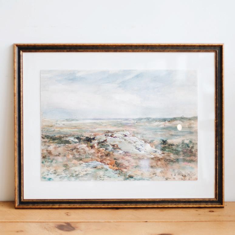
“Lighting transforms a space. The sconces that flank the grand fireplace illuminate the Conrads’ art collection. I have a very special art collection, and I inherited many of the pieces from my grandfather, so selecting a special light fixture to bring the artwork to life was important to me.”
“This piece ties in so many of the colors in this home that it felt like it was meant to be here!”
LIAISON LINEAR CHANDELIER
Sto er Home, Grand Rapids sto erhome.com
“I love how it makes a statement while also perfectly blending in with the rest of the home.”

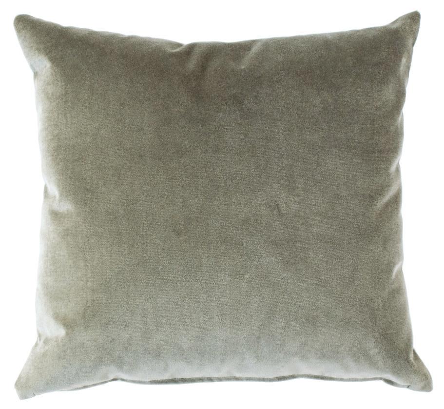
MOSS VELVET DESIGNER PILLOW COVER
Sto er Home, Grand Rapids, sto erhome.com
“Pillows soften any space, even a breakfast nook.


“Pillows soften any space, even a breakfast nook. The moss velvet color is a beautiful sage/gray that perfectly complements the colors in this space,” says designer Jean Stoffer. “I also chose this pillow because both the front and back fabrics are performance fabrics, so it can handle everything daily life will throw at it. Finally, I’m proud to share that all of the S|H designer pillow covers are made in Michigan.”
pillow because both the front and back fabrics are daily life will throw at it. Finally, I’m proud to made in Michigan.”




CLEO ORB ACCENT TABLE LAMP
Sto er Home, Grand Rapids sto erhome.com
“The office was designed with a rich, green color, and the Cleo Orb Accent Table Lamp in antique white has an interesting shape and offers a contrast to the room. While small, it has a big impact, and I love the warm glow it has when it’s turned on.”
ODETTE QUILT IN NATURAL
Sto er Home, Grand Rapids sto erhome.com


“Bedding can be difficult to layer in a way that feels elevated but approachable. I chose to layer the Odette Quilt in natural over our oatmeal duvet set for a monochrome look that brings in a new texture. This room has warm tones and is rich in texture, so the bedding had to match.”


WESLEY SIDE TABLE
Sto er Home, Grand Rapids sto erhome.com


“I designed this side table, which is handmade in Michigan and lovingly named after my grandson. Made with solid wood, it is a design-conscious choice that is both modern and classic.”


GIVE THIS FAMILY-FRIENDLY HOME ITS WOW FACTOR
TEXT BY TRACY DONOHUE | PHOTOGRAPHY BY JOSEPH TIANO
This page: The entry table of this Bloomfield Hills foyer was custom-designed by


WWhen Dan Moore and his wife, Liz, decided to build their third house together, they wanted a warm and welcoming, yet modern, home that their young family could love in the long term.
“The house was such an investment of time and money that we wanted it to be timeless and something our family could grow into and evolve (with) as needed,” Moore says.
The impressive five-bedroom, 5,700-squarefoot construction project (with an additional 3,000 square feet on the lower level) sits on a 1 1/3-acre lot in Bloomfield Hills and took two years to complete.
The Moores came to the project with a heightened level of knowledge, as they’re business owners in the construction industry.

Above: The home’s white walls show off artwork that was selected by homeowners Dan and Liz Moore. The pieces come from local artists and galleries recommended by Long.
Moore, owner of Moore Custom Homes in Bloomfield Hills, served as the contractor on their house project. His wife is a co-owner of her family’s Michigan-based business, Bolyard Lumber & Design.
They hired interior designer Carrie Long, of Royal Oak-based Carrie Long Interiors, to work with them to create the stunning contemporary home they envisioned. The project turned out to be serendipitous for both sides.
“Dan and Liz were very hands-on with the project. They’re my favorite type of client to work with, as we can feed off each other and elevate
Above: One of the project’s biggest challenges was the reglet base and wall detail. The sleek design element can be seen in the white oak niches in the great room. Inset: Long says the Moores wanted the home to be clean and elegant — a look perfectly exemplified in this bathroom.

“THEY NEEDED A HIGHLY FUNCTIONAL, FAMILY-FRIENDLY HOME THAT’S WARM AND INVITING, WITH GREAT FLOW FOR ENTERTAINING...”
— CARRIE LONG


Ketra lighting — a smart system — can transform the mood of the home with di erent lighting for various times of day. “This lighting system can mimic daylight and gets warmer at night, to make the space more inviting for entertaining,” homeowner Dan Moore says.

ideas and designs. They’re so experienced, and we were able to talk out every detail of ‘now versus later’ to make this a great home for their family over time. It was a truly collaborative experience,” Long explains, adding, “Dan was in the unique position of being the homeowner, which comes with emotion, but at the same time (he was) the builder, who wants to showcase incredible details and execute (the project).”
Moore shares the designer’s sentiment. “Liz and I are already in tune with design trends, and we were on the same page as Carrie from our first meeting. We brought some uncharted
ideas that hadn’t been done before in this area, and Carrie’s team and (the) skilled trades were able to make them happen. We had a vision in mind, and Carrie helped it go above and beyond.”
One of those “uncharted ideas,” which became one of the project’s biggest challenges, was the reglet base and wall detail, which allows for a flush base and a trimless contemporary aesthetic. This sleek design element can be seen throughout the house, from the white oak niches in the great room to the striking primary suite hallway.
“They needed a highly functional, familyfriendly home that’s warm and inviting, with great
flow for entertaining — but (they also wanted a) wow factor. They wanted the design to be clean and elegant, with understated sophistication engulfed in every single detail,” Long says.
According to Long, she focused the interior design on a timeless neutral palette that included lots of textures, to accentuate the architecture and help make the large rooms warmer and cozier. Neutral colors were selected for large anchor pieces, to enable future flexibility if the couple decides to accent with different accessories or create a new palette at some point down the road. She says they also used materials such as

Both right: Moore shares that his two favorite spaces in the finished home is the office, shown here, and the great room.
concrete, wood, and acrylics (“all the tools in the toolbox”) in unconventional ways, to bring warmth to the space.
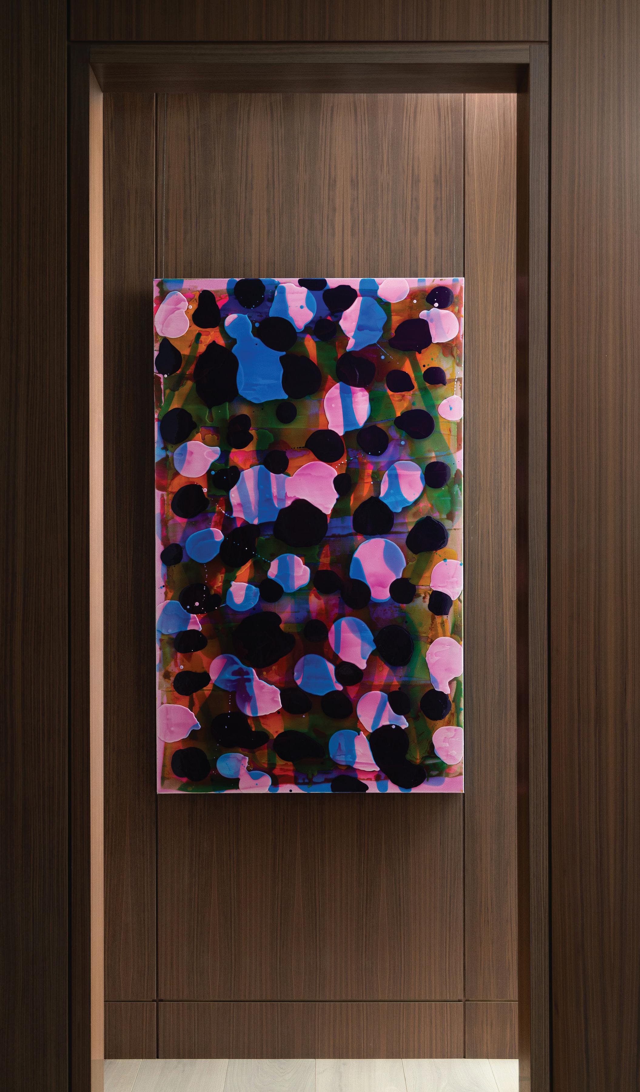
The white walls throughout the residence show off artwork that was selected by the homeowners from local artists and galleries recommended by Long. “Artwork is so personal; it becomes the soul of the house,” Long says. “I advise clients to find what they love, and I’ll provide the support to make it shine in their house. I want clients to feel good about the art they choose and know its story. I love the art collection Dan and Liz put together, and the


ABSTRACT ACCENTS
“Artwork is so personal; it becomes the soul of the house,” Long says. “I advise clients to find what they love, and I’ll provide the support to make it shine in their house.”
white walls are the perfect clean, crisp backdrop to accentuate it.”
Adds Moore: “It was the most uncomfortable part of the project for me, but we’re happy with the results.”
The homeowner shares that his two favorite spaces in the finished home are the ones where he spends the most time: his office and the great room. However, he notes that part of what makes the house so special is the Ketra lighting — a smart system that transforms the mood of the space with different lighting for various times of day. “I’m passionate about lighting and the effects on the space,” he says. “This lighting system can mimic daylight and gets warmer at night, to make the space more inviting for entertaining.”
Long says the impact of the home as a work of art can’t be understated. “While (images of the house) are beautiful, it doesn’t do the home justice to just catch a vignette. To actually experience and live in artwork creates a different emotion that can’t be captured in a picture.”
While the Moore house was the first project the designer and builder did together, it isn’t their last. The pair now regularly collaborates on professional projects.
“In this line of work, people get most excited about the design, but rarely the details. We get excited about both,” the designer notes. “This project had the dream team. We wouldn’t have been as successful with only one of us.”

JANE BED
Montauk, montauksofa.com
“To emphasize the ease and glam we wanted (in the primary suite), there really was no choice other than Montauk’s (Jane Bed),” Long says. “The craftsmanship works perfectly for this client and will serve them well through the years.”
DESIGNER
Carrie Long, Carrie Long Interiors, Royal Oak, carrielonginteriors.com
ADDITIONAL CONTRIBUTOR
Dan Moore, Moore Custom Homes, Bloomfield Hills
CUSTOM COFFEE TABLE
Carrie Long Interiors, Royal Oak, carrielonginteriors.com
“To (design) a space exactly the way a client wants it, sometimes we have to create original pieces to meet the need,” interior designer Carrie Long says of the custom coffee table (below) she designed for this Bloomfield Hills home’s lower level.


HAVANA SOFA
Lee Industries, leeindustries.com
“Lee Industries has become a ‘go to’ for CLI over the years,” Long says of this sofa in the home’s lanai. “They had the perfect pieces to define our design plan.”


MICHEL SECTIONAL
Nathan Anthony Furniture, nafurniture.com
“Nathan Anthony Furniture has a mastery with upholstery design. We chose (this sofa and those in the lower level) because they’re gorgeous and punctuated our design goals, but they’re also one of the best brands in the market. These are heirloom pieces the family could recover in the future and use for years.”


MARGATE RUG
Stark Carpet, Michigan Design Center, Troy, starkcarpet.com
“There’s a reason Stark remains one of the top rug brands in the country — heritage. It’s run today by the third generation of Starks, and you can see the family pride in the craftsmanship and beauty in each piece. We chose (this rug and others in the home) not only due to this reputation, but because they truly completed that relaxed elegance we subscribed to.”


TEXT BY JEANINE MATLOW | PHOTOGRAPHY BY DANE CRONIN
This


WWith its picture-perfect postcard location, this Boulder, Colo., property was already off to a great start. “The inspiration came from the natural surroundings; we didn’t want to take away from the exterior,” Heather Duggan, principal designer with Heather Duggan Interiors in Troy, says about the new construction home for the emptynester clients she first worked with when they lived in Wixom. “The views are what brought them to the lot.”
Other than material delays experienced during the pandemic, Duggan says there were no major challenges during the project. She describes the home as “modern cozy,” with a subtle backdrop that features white oak floors and neutral walls. Since her clients are practical, each piece had to

Above: Unique light fixtures throughout the residence include strap-suspension pendants that offer a welcome departure from the standard rod or chain.
serve a purpose. “The interiors are streamlined and clean,” the designer says. “It’s more about the textures and having different materials, like the slabs on the fireplace.”
The classic palette takes a slight turn in the guest suite, above the garage, which reveals more color. “It’s an appropriate spot (to use some color) because they don’t have to live with it 24/7, so it gave us a little more opportunity to do something different,” Duggan says about the apartment, where an upholstered bed is embellished with lively accents like patterned
Above: Quartz stretches beyond the counters, resulting in a calm and cohesive feel. Inset: White oak floors and neutral walls keep the palette classic and clean.

“THE INSPIRATION CAME FROM THE NATURAL SURROUNDINGS; WE DIDN’T WANT TO TAKE AWAY FROM THE EXTERIOR.”
— HEATHER DUGGAN

their
COMFORT FACTOR
and out,

pillows and a striped rug. “They look like they were meant to be together.”
Unique art pieces include one on the main level that was created using paint that was applied to wood with a condiment bottle, then sanded down. “It’s very smooth to the touch,” the designer says. In the same area, a Moroccanstyle rug supports a black cocktail table with a textured top, and gray linen sofas meet the couple’s overall request for comfort in what the wife dubbed “the snuggle room,” where they like to spend time. “Out of the whole house, that’s their main space,” Duggan notes.
Accordion glass doors blur the lines between inside and out. “The whole back of the house opens up,” the designer says, noting that the location gives the outdoorsy couple easy access to mountain biking trails. Fewer contents inside the home mean each piece had to stand out, like the boucle chairs with bolster backs that take on a sculptural tone in the dining room, along with the 3-D paper airplane artwork above the credenza.
In the kitchen, quartz stretches beyond the counters to create a full-height backsplash, resulting in a calm and cohesive feel. Cabinets with a dark blue/almost black finish add contrast,
and the waterfall island gets a boost with upholstered stools that are super comfy. Unique light fixtures throughout the residence include strap-suspension pendants that offer a welcome departure from the standard rod or chain.
The home’s comfort factor weaves its way inside and out, from the sectional in the family room by the two-sided fireplace to the woven chairs around the spacious table on the terrace. Lounge seating out back includes daybed swings by the pool house and chaises alongside the pool. Back inside, a swivel chair in the family room and a pitched chair with an ottoman in the

“snuggle room” are among the coveted picks. “If you sit in that chair, you have to have your feet up,” Duggan says.
Another significant contributor to the custom structure, Steve Dodd — an architect and owner of Dodd Studio in Boulder, Colo. — designed the home to have net-zero energy efficiency with highly insulated exterior walls, roof, and window systems. In combination with high-efficiency mechanical systems and solar panels mounted on the roof, the home produces more energy than it consumes on a yearly basis. Other energyefficient elements include expansive gridded

Bold colors and fabrics add a dramatic pop to the guest apartment.


windows, the mechanical system, and the solar panels that make the house twice as efficient as a standard home.
The long and narrow lot allowed the house to have south-facing views of the Flatirons, unique rock formations in the area. “The (goal) was to line the southern edge of the home with the public spaces and the ones up above,” Dodd says. “The main level leads out to the patio with covered trellises, a pool, and a pool house. The whole idea was to move very freely within the spaces in the home, and also from the house into the yard.”
On the exterior, the main material is plaster, while hemlock — a light, natural wood with a clean finish — was used for the outdoor soffits. The sustainable construction also includes limestone accents. “It was built so that it wouldn’t need to be rebuilt,” Dodd says. “The standingseam metal roof is very durable, and the roof pitch was very favorable for solar panels. Steel trellises provide shade, reduce heat gain, and don’t require any maintenance.”
The architect admits he did face one challenge along the way: “The floating staircase was more complicated than the ones we built before. The way it’s configured in this particular space is tricky, with steel details and glass panels. It was one of the more challenging elements.”
With so many distinctive details, the house feels seamless inside and out. “We wanted to have sort of grand spaces and to bring in light and views without it feeling overly ostentatious,” Dodd says. “That was the goal.” Mission accomplished.


This page: “The main level leads out to the patio with covered trellises, a pool, and a pool house,” says architect Steve Dodd. “The whole idea was to move very freely within the spaces in the home, and also from the house into the yard.”
“Comfort was key when it came to the snuggle room and these sofas didn’t disappoint,” Duggan says. “The style of these sofas is so versatile and they can be paired in so many different settings.”


INTERIOR DESIGNER
Heather Duggan, Heather Duggan Interiors, Troy, heatherdugganinteriors.com
ADDITIONAL CONTRIBUTORS
Architect: Steve Dodd, Dodd Studio, Boulder, Colo.
Builder: Tim Ryan, Ault Park, Colo.
TRUE GROWTH IS A LEAP INTO THE DARK
Seth Marksberry, CHC Art, chcart.com
“Sophisticated fun provides interest to any space,” interior designer Heather Duggan says of this work by artist Seth Marksberry, who was inspired by his son for this piece. “There are some who follow the herd and those who choose their own route. It’s when we embrace our fears that we truly progress,” he says.
WINK BAR STOOLS Thayer Coggin, CAI Designs, Michigan Design Center, Troy thayercoggin.com, caidesigns.net

ZINC TEXTILE
IN MUD CAKE Romo, Tennant & Associates, Michigan Design Center, Troy, romo.com
“(This) colorful embroidered fabric helps tie the space together,” Duggan says of this bold design found in the home’s guest loft.


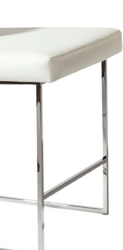
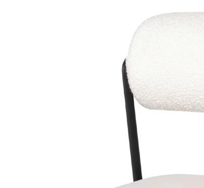
MARNI CHAIR Nuevo, nuevoliving.com
“These chairs are like sculpture to the space,” Duggan notes. “Clean lines and neutral tones still make a bold statement!”




“The metal base with white leather upholstery provides a classic, modern look,” Duggan says.


SOHO GRAY RUG FJ Kashanian, kashanian.com
Duggan says, “this ‘high/low’ wool rug provides durability and depth.”





FUNCTION AND FORM COME TOGETHER SEAMLESSLY AT
TEXT BY TRACY DONOHUE | PHOTOGRAPHY BY MARTIN VECCHIO
This page: Classic oak paneling was combined with warm white tones for a modern lake house feel. Opposite page: “The primary bed was from Lillian August, and its enveloping scale and inviting texture instantly added a feeling of coziness to the space,” says interior designer Leighanne LaMarre.


LLeighanne LaMarre, interior designer and owner of Leighanne LaMarre Interiors in Brighton, had just completed a home design project for a Detroit-area client in late 2021 when the homeowners requested her design expertise for a vacation house they had purchased on Walloon Lake in Charlevoix County.
“Leighanne was so easy to work with, and we knew we couldn’t do the lake house without her,” the homeowner says enthusiastically. “She brought both houses together and made them feel like home for our family.”
According to the owners, their Walloon Lake home was built in 2008 as a guest house for the home next door. Coincidentally, the lake home’s original architect, Greg Presley of Presley
Above: “My husband and I are drawn to darker, more masculine, moody colors, but the house gets a ton of natural light, so it doesn’t seem dark at all,” says the homeowner.
Architecture in Northville and Petoskey, had designed their Detroit-area residence, so it made sense for him to handle the renovation redesign of their new lake home.
Ben Percy, of Percy Construction in Boyne City, a family-owned custom building company with over 50 years of experience, was the contractor for the northern Michigan project. His highly skilled crew included his father and brother. “Ben was so organized and hands-on. He paid such attention to detail that we didn’t have to worry about being on-site (all the time), like I was able to do with our other house,” the homeowner says.
Above and inset:
blended traditional tones with contemporary details throughout the home but especially in the spacious kitchen and adjacent dining room, where the lake views are on full display.

“OVERALL, IT’S SOFT CONTEMPORARY WITH A COLLECTED UP-NORTH VIBE.”
— LEIGHANNE LAMARRE


The welcoming home sits on a secluded lot that’s just over an acre in size and boasts 110 feet of lake frontage. During the renovation process, a 500-square-foot addition was built onto the original 2,900-square-foot home, along with a two-story carriage house/garage and a breezeway joining the two structures.
Keeping entertaining and overnight guests in mind, the thoughtfully designed property now has five bedrooms, a bunk room, and 6.5 bathrooms. The project was completed last year, in time for the summer season to officially kick off.
“As a repeat client, I know them so well that it’s like working with friends, while also factoring in that aesthetics, function, and lifestyle are different Up North,” LaMarre explains. “I wanted their lake home to feel different but still reflect their personal style and love of entertaining. It also had to be easy-care and low-maintenance, due to sand and snow.
“Their lake house took on a sense of Up-North nostalgia and a more traditional feel than their main home. In the lake house, we achieved this by fusing traditional with patina tones in a more designed and deliberate way, while embracing the water
views from nearly every room in the house. We used warm white and wood tones including oldschool oak paneling in a more updated, modern way as a focal point. We played with layering and texture, such as the blue patterned area rug in the great room, to give the feel of curated family heirlooms. Overall, it’s soft contemporary with a collected Up-North vibe.”
The designer says she especially loves the home’s master bedroom. “It’s modern and cozy, with warm white colors and textures. The contemporary beige artwork above the bed offers juxtaposition against the traditional wall.”

Above: The homeowners’ favorite part of the house is this back porch, with its uninterrupted views of the landscaping and lake.

Above and below: The homeowners wanted an area where family and guests would feel comfortable.
The homeowner adds: “My husband and I are drawn to darker, more masculine, moody colors, but the house gets a ton of natural light, so it doesn’t seem dark at all — even the walkout basement.” She also appreciates the touches of blue in the house that play against the neutral palette and sparkling lake views.
Since the property didn’t originally have a garage, the addition of the carriage house offered the opportunity to add an extra 1,000 square feet of living space above the new garage. The second level includes a game room, bedroom, full bathroom, and kitchenette. LaMarre admits

it was her favorite part of the project. “I always care as much about the home’s exterior as the interior,” she says. “The carriage house added a special architectural element, as well as function and privacy.”
As a complement to the renovation, the homeowners made improvements to the outdoors, as well, with updated landscaping done by Boyne City’s Robinson’s Landscaping & Nursery. Overgrown plants were removed to enhance the property and water views, leaving room for picturesque birch trees and great pines to thrive. During the clean-up, the homeowner notes that stone columns from an old hotel that previously was located on the property were unearthed and restored.
“We’re outdoor people. We love the lake, and skiing in the winter. My favorite part of the house is the back porch that opens from the main living room and looks out at the water. It’s so inviting and relaxing for coffee in the morning or cocktails at night,” the homeowner shares.
LaMarre says the biggest challenge of this project involved the addition to the kitchen, laundry room, mudroom, and office — and finding space to accommodate the homeowners’ full wish list. “The addition needed to be extremely deliberate with form, function, and focal points that worked for the family’s lifestyle. I think we succeeded.”
The homeowner reflects,
“This isn’t just a summer house for us; it’s a year-round home that we visit during all four seasons. The lake house is somewhere special for our family and guests to feel comfortable. It feels like us.”
MICHIGAN CHARM
Accents throughout the lakeside home evoke a classic Up-North vibe.


MARABEL RUG

ORIGAMI WHITE
Sherwin-Williams, area SherwinWilliams stores, sherwin-williams.com
“When selecting our exterior paint color, the priority was for it to complement and showcase the warm gray exterior window finish.”
Feizy, Leighanne LaMarre Interiors, Brighton, leighannelamarreinteriors.com, feizy.com
“Early on in the project I fell in love with this rug during one of our vendor’s visits to our studio, and just knew it would be the perfect choice to provide the foundation for all of our selections.”


Leighanne LaMarre, Leighanne LaMarre Interiors, Brighton, leighannelamarreinteriors.com

ADDITIONAL CONTRIBUTORS


Construction and Millwork: Percy Construction, Boyne City
Ben Percy,


Cabinetry: Wolverine Cabinet Company, Royal Oak Drapery (Roman Shades): Room Dress, Troy
Harry Jung,

Landscaper: Robinson’s Landscaping & Nursery, Boyne City


Woven Shades: Ralph Guthrie, Lake Street Design Studio, Petoskey


THE HENRY INDUSTRIAL HANGING LIGHT BY THOMAS O’BRIEN

Visual Comfort, Leighanne LaMarre Interiors, Brighton, leighannelamarreinteriors.com, visualcomfort.com
“(This light) provided the classic utilitarian feel needed to anchor the island and complete the look,” says designer Leighanne LaMarre.


CHEATING HEART
Benjamin Moore, area Benjamin Moore stores, benjaminmoore.com
“Nothing says dramatic yet cozy quite like Cheating Heart by Benjamin Moore,” LaMarre says.“It gave us the perfect backdrop for the warm wood tones of the game table, desk, and woven wood window shades in the office.”


OVINGTON WALLPAPER
Schumacher, Leighanne LaMarre Interiors, Brighton, leighannelamarreinteriors.com, schumacher.com
“Because of (the pantry’s) visibility from the main kitchen space, I knew we had to add an element of playful pattern that would instantly add polish to the functional space — Ovington, in Stone, was the clear winner.”
OAST DINING TABLE
Chaddock, Leighanne LaMarre Interiors, Brighton, leighannelamarreinteriors.com, chaddock.com
“Because our goal was to give the entire house a good mixture of nostalgic and new, we wanted this table to feel like it had seen thousands of family meals. We partnered with a vendor based in North Carolina who was as enthusiastic as we were about getting the wood species, planking, and finish just right!”


TEXT BY MEGAN SWOYER | PHOTOGRAPHY BY HEATHER SAUNDERS
This page: “This arm chair is super comfortable and feels very luxurious in a velvet that’s also performance and easy to clean,” designer Anna Versaci says of this


DDramatic. Layered. And a bit on the maximalist side. That’s how interior designer Anna Versaci describes a 14-year-old home she worked on (and is still updating) in Birmingham.
“I love thoughtful design — the layered look and designing in layers,” says Versaci, who operates Anna Versaci Design out of her home studio in Beverly Hills. “I love to touch every surface of a room, from ceilings to rugs to wallcoverings.”
And that’s certainly apparent in this lovely home. The busy family, whose house looks out to Quarton Lake, has been working with Versaci since before 2020. Without changing any of the basic architectural elements of the residence,
CONVERSATION PIECE
Above: Luxurious seating in various shapes and hues is ideal for entertaining.
Versaci brought in new lighting, altered wall treatments and drapery, and injected heaps of spice in the way of new rugs, furnishings, and accents. “I love this type of work because you have to consider the limitations and how you can work with them,” she says.
The wife’s goal was to have a textured, cozy look, while the husband wanted easy-toclean fabrics (they have a 3-year-old child) and comfortable seating in the family room.
“I can give Anna an idea of what my vision is, and she totally can execute it on the first try. She has such a creative style,” the wife says.

Above: Versaci had the shelves in the dining room custom made by Ron Nicolai of Jacaranda Woodworking in Troy. “The touch of brass adds some glam and plays well off of the Chaddock credenza,” she notes. Inset: Blush tones, a constant throughout the home, continues in this sleek kitchen.

“I LOVE TO TOUCH EVERY SURFACE OF A ROOM, FROM CEILINGS TO RUGS TO WALLCOVERINGS.”
— ANNA VERSACI

STYLISH SEATING
Below: Versaci says the silhouette of the chair and coffee table pair well with the dramatic ombre drapes. “It’s a little play on mid-mod style.”


“All of the art was sourced in Michigan from antique stores such as Oddfellows in Berkley and August in Petoskey. This gives the bedroom a very Old World feel,” Versaci says.
Versaci first tackled the nursery, then the primary bedroom, kitchen, and family room. The sitting room, dining room, guest bedroom, and playroom came later. “My favorite way to work is to go slowly, room by room,” she says.
The guest room best showcases Versaci’s love of layers. “Yes, I’m a bit of a maximalist,” she says with a laugh. With plaids and deep greens, the richly adorned space exudes a Ralph Laurenmeets-English-countryside appeal. “It’s all very dark and feels Old World,” the designer says. She found old oil paintings at vintage emporiums; in a shop called August, located in Petoskey; and

at the Petoskey Antiques Show. “I love finding pieces in little towns Up North,” she shares.
Several key investment pieces adorn the home, including a large photograph by former Cranbrook student Lauren Semivan that’s displayed in the sitting room. Versaci says she discovered the piece at the David Klein Gallery in Birmingham. “I stay away from stock art,” the judicious designer says.
In the dining room, velvet, mint-colored drapery is the perfect side dish to the room’s blush tones. “Blush is our ‘neutral’ and runs pretty much through the first floor,” Versaci says.
A buffet by Chaddock has a pull-out feature that offers more countertop space for, say, an ice bucket when entertaining. Walnut shelving with brass inlays adds special appeal. A textured (of course) Thibaut wallcovering adds another level of interest. Headliners include the light fixture, from The Urban Electric Co., and a plush charcoal-and blush-toned rug from Ghiordes Knot. The light’s shades were color-matched to a Benjamin Moore hue that plays off the adjoining sitting room.
Speaking of lighting, the designer adores Arteriors’ Tilda design, and cast it as the main star in the kitchen. “I’ve used that style in black
and in white, and in different sizes,” she says. “Here, it’s just so dramatic. Sure, we could’ve done the standard pendant with glass sides, but this adds interest.” It is, in fact, as zesty as the nearby beaded, dimensional wall art from Palecek. “That artwork is more of a sculptural element and interacts nicely with the draped look of the light fixture,” Versaci notes.
The family room evokes the warm tones of autumn leaves and apple pie — especially a certain velvet chair that’s upholstered in a cinnamon shade. “This space is toasty,” Versaci says, “with bronzy shades.” The designer loves
that her client wasn’t afraid of going against the grain. “When we started working on this home, gray was so in, and I was never into that,” she says. Here, accents in black mattes and shimmery golds add subdued elegance. Striking, beaded wall art from Palecek features creams and blacks.
With more traditional seating in the family room, the designer says her clients were able to consider more unusual types of chairs for the sitting room. “It’s got seating that’s for both show and function,” Versaci says. A pink cuddle chair shares space with a heart-shaped ottoman (both the chair and ottoman are from Nathan Anthony Furniture). With arms that appear to hug its occupants, the chair can easily hold two people. Other chairs, including a gray piece and armless blush-colored chairs, are from Verellen. The icing on this designer’s cake is the Italian ombre drapery, with raspberry on the bottom merging with lighter tints toward the top.
“This area is the main event of the first floor,” Versaci says. “It’s impactful. As soon as you walk in through the foyer, it’s visible.” The homeowner concurs. “My favorite areas of the home are the dining room and the sitting area,” she says. “We host a lot of dinner parties and have been able to utilize these two rooms on numerous occasions. Anna has helped make each room in our house not only beautiful, but functional.”
Upstairs, the primary bedroom was a slight challenge for the designer due to its size. “It’s huge,” she acknowledges. “The question was how to make it feel warm, so we kept it light and simple.” The wallcovering is an “almostlike-suede” material. “A soft feeling in the primary is important. I almost always suggest an upholstered bed,” Versaci says, adding, “primary bedrooms are about sleep and relaxation, so I don’t use hard lines.” On the floor, a colorful

The master bedroom, above, features a double layering of area rugs.
“This really frames the hand-knotted rug and also is a fun way to increase the surface area of the rugs in the primary,” Versaci says.
rug lies atop a sisal-style rug. “Layering makes it feel cozy, especially when you have so much surface area,” Versaci says. She also made sure the curtains extended higher than the top of the windows. Framing the bed with them “pushes the eye to the outside,” she explains.
With these layer-upon-layer changes and additions, the home now oozes with personality. Says Versaci: “We’ve turned the house into a unique and personalized home. It’s eclectic and stylish, reflective of the homeowners.”





Anna Versaci, Anna Versaci Design, Beverly Hills, annaversacidesign.com
Art Installation: Mike’s White Glove Treatment, Clarkston
Custom Shelving: Jacaranda, Troy
Drapery/Workroom: Slipcovey, Royal Oak
Fireplace Surround: Soberal Tile & Marble, Eastpointe
Window Treatments: Royal Crest Blinds, Oak Park


LAUREN SEMIVAN, UNTITLED (JANUARY 15), 2021 David Klein Gallery, Birmingham, dkgallery.com


CHILTERN ON BRACKET


The Urban Electric Co., urbanelectric.com


“This dining room table pendant was so special because we were able to choose a custom Benjamin Moore color for the shade, to play off of the blush tones


DELLWOOD SAND 1019


EMBRACE CUDDLE CHAIR
Nathan Anthony Furniture, Designer Group Collection, Michigan Design Center, Troy, nafurniture.com
“This chair is the perfect element of surprise and whimsy for a room that’s really about creating conversations and taking risks with the design, to create a story and have fun.”


Benjamin Moore, area Benjamin Moore stores, benjaminmoore.com


in the adjoining sitting room. Urban Electric handcrafts lighting made in Charleston, S.C., and their attention to detail is benjaminmoore.com excellent.”


GASTON CHAIR AND OLIVE COFFEE TABLE
Verellen, Chatham House Lifestyle Gallery, Michigan Design Center, Troy, verellen.biz
“The seating area really plays with scale. It’s dainty but very comfortable to sit in and have a personal conversation,” Versaci says. “Smaller-scale furniture works very well for entertaining spaces, where you want to create various options for conversations and gathering.”


“This incredible artwork, which is actually a beautiful photograph that was sourced at David Klein Gallery in Birmingham, is the perfect feeling of lightness and joy,” designer Anna Versaci says.


“The sitting room draperies are the room show-stopper and main event of this space. They feature a gorgeous Italian Dedar ombre fabric, which ended up being well worth the wait.” Shown above in the Notte hue, Versaci had the drapes crafted in the Slipcovey workroom in Royal Oak.


TEXT BY JEANINE MATLOW | PHOTOGRAPHY BY JEFF GARLAND

This page: “We love the transformation of the stairs from their original state. We created a canvas for art that draws you in,” says designer Staci A. Meyers. “Each view gives the user an opportunity to think more deeply about your experience.” Shown here is art from Peter Bialobrzeski (above) and Yoshimoto Nara (below). Opposite page: Artist Anish Kapoor’s Shadow III, 2009 ( 9 colors) is the focus of this grand living space.

FFor a redo on a custom DesRosiers Architects home built in the late 1980s, a creative team with seasoned pros like Staci A. Meyers, interior designer and owner of S|A|M Interiors in Bloomfield Hills, made updates that feature clean and modern interiors to better suit the client. “It was about cleaning it up visually so it could be a nice palette with a modern feel, and (a place to showcase) the homeowner’s art collection,” the designer says.
“We could tell it was a great house; we wanted to make it a really timeless interior. The hardware, doors, and windows are a focal point, so it was really about honoring the integrity of the architecture and softening it,” Meyers says.
After deciding to replace the carpet in several areas, the designer had to work around the high demand for white oak during the pandemic. “We went with rift-cut red oak and lightened it with bleach, and applied a finish to tone down all the red,” she explains.
The updates to the four-story home have staying power. “The house was brought back
Top left: In the rounded office, the millwork, built-in, and shelving were refinished and restained, while a glass-topped desk and leather chair are new.

to its original beauty. It has one of those classic interiors that will feel current in 15 or 20 years,” Meyers says. Classic contents include a customcolored rug and a cable-suspension light fixture with crystal globes in the great room. Velour chairs and a generous sectional with headrests create the ultimate lounge area, and the TV fades into the environmentally conscious slab fireplace.
Art adds a personal layer to the mix. “We curated the artwork for the project, starting with the great room. It’s a great visual pop of something that was unexpected,” the designer says about a series of pieces with simple frames that make them stand out. “When you’re going for a clean, modern feel, art gives you an opportunity to reflect your personality and (determine) how you want people to feel when they walk in the space.”
DETAILS WITH IMPACT
Above: “The clean simplicity of the Montio DelRay fireplace fit this master perfectly,” Meyers says.
“Working with American Fireplace (in Ferndale) always provides the best knowledge of the industry.”
Inset: An Andy Warhol-print wallpaper transforms this powder room.

“... ART GIVES YOU AN OPPORTUNITY TO REFLECT YOUR PERSONALITY AND (DETERMINE) HOW YOU WANT PEOPLE TO FEEL WHEN THEY WALK IN THE SPACE.”
— STACI A. MEYERS


Other conversation pieces include the textured wallpaper with an Andy Warhol theme in the rounded powder room, where a custom backlit mirror and pendant light accent the refinished vanity and countertop. “It was a really fun powder room to do,” the designer says. “We wanted to honor the curves of the wall. The whole room is like a sculptural (work of) art.”
Unique artwork also appears near the floating stairs, where the handrail was stained to match the millwork. The featured pieces include intricate buildings and a girl with an eye patch by artist Yoshitomo Nara. “They make you stop and look at them,” Meyers says. In the rounded office, the millwork, built-in, and shelving were also refinished and restained, while a glass-
ON VIEW
Above: In the dining room, work by artist Frank Thiel emboldens the space, as does a nearby piece by Alex Katz entitled Hommage to Degas, which hangs above a sleek bench.
topped desk and leather chair are new. “They’re very timeless, clean, and simple,” she adds. “The desk really lets the architecture (shine).”
The home’s interiors speak for themselves. “This project was a combination of my vision for what the house could be, and working with a really talented builder — Don Alfred, of Hughes Building — and trades, and an amazing client who really trusted us,” Meyers says. “There was very little back-and-forth. He was very quick and efficient with design decisions. It was a great investment, and now he wants to spend time in it. I’m really proud of it.”
The homeowner explains that he had already built a house from scratch, and enjoyed the process. “This (house) had great bones. The hope

was to bring it back to life and then either use it as an investment or as a permanent home,” he says. “It turned out better than I thought it would; we changed the aesthetic and brought the home back to life. It’s the same house, but it has our personality and it’s open, bright, and airy.”
He says that his somewhat eclectic art collection consists of pieces he appreciates. “I like the idea of bringing disparate elements together and seeing how they mesh — just like design — in a way that resonates, like the wallpaper in the powder room,” the homeowner says. “I like to make it whimsical and fun.”
In the dining room, art that looks like paint flaking off a building also made the cut. “I’m just drawn to individual pieces,” the homeowner says.

Top right: “Art in this space is the focal point, the furnishings play a supporting role,” Meyer says. Featured works here include two pieces by Richard Anuszkiewicz.
Even his 3-year-old son loves his art collection, which includes four Op Art pieces from the late ’70s by Richard Anuszkiewicz. “They’re threedimensional and very geometrical. They both pull you into the art and push you out at the same time.”
At the project’s completion, the homeowner, his girlfriend, and their son decided to stay put in the residence, which now reflects its inhabitants. “The quality of the build was really astounding. To take a house with a great structure and cosmetically lift it up was really cool,” he says. “It’s a happy place and I feel really fortunate to work with great people like Staci, who brought it to fruition. That was the goal, and it lives really well.”

BOOK TABLE
Moe’s Home Collection, moeshome.com
Meyers selected this accent table for its “sculpted cement base and black terrazzo tabletop.”


INTERIOR DESIGNER
Staci A. Meyers, S|A|M Interiors, Bloomfield Hills, s-a-m-interiors.com
ADDITIONAL CONTRIBUTOR
General Contractor: Don Alfred, Hughes Building, LLC, Bingham Farms


SONNEMAN CHANDELIER
Pinetree Lighting, Lake Orion, sonnemanlight.com, pinetreelighting.com
“Acoustics were a strong consideration for comfort in the (great) room,” Staci A. Meyers says of the selections for the room which included this dramatic chandelier, a custom rug, and two Poliform guest chairs that “are great for having a cocktail or swiveling to watch the TV or a movie.”


GRACE
Paul Vaga, TRA Art Group, Michigan Design Center, Troy, traartgroup.com


“Paul Vaga’s sculpture has graceful movement that reflects the room’s soft curves in the custom builtins and wall.”


EAMES ALUMINUM GROUP CHAIR
Design Within Reach, Grand Rapids, dwr.com


“The Eames Aluminum Group Chair in black leather is timeless. It nods to Eames’ influence and his time spent as a student at the Cranbrook Academy of Art.”
MILA CHAIR
Colibri Furniture, colibrilifestyle.com


“We chose this chair for its clean lines, and tailored black leather upholstery.”


CROWD (WHERE’S WARHOL) Flavor Paper, flavorpaper.com


“Flavor paper has lots of attitude. Crowd was the perfect choice for this powder room. It’s wallpaper inspired by the artist.”


In each issue of Detroit Design, we feature six to nine incredible homes designed and built by local interior designers, architects, and builders. These homes are a testament to the incredible work and creativity that thrives in our metro Detroit community, and throughout the state of Michigan. From modern masterpieces to traditional gems, exciting remodels, and innovative new-builds, we’re showcasing some of our favorites from the past year. Each is a reflection of originality, inventiveness, and artistry. We hope they continue to inspire you, as they have us.
A GLOBALLY-INFLUENCED VISION BECOMES A REALITY
When the owners of this Clarkston residence returned to the U.S. after spending five years in Korea and a year in China, they brought with them not only a collection of furniture, art, and accessories gathered from their travels, but an internationally influenced style and sensibility.
Upon their return, the family decided to upgrade parts of the home they had bought in 2005 to reflect their experiences. They hired Armina Kasprowicz, of Armina Interiors in Rochester Hills, to spearhead the renovation. Among the spaces they tackled together were the lower level, first-floor master suite, great room, foyer, and some second-floor areas.
At the start of the renovation, the house was a long way from the clean-lined contemporary space the homeowner envisioned, the designer says. “It was very traditional, very Tuscan,” she says of the 13,000-square-foot “before.” Today, after an extensive remodel, the home reflects the homeowners’ fresh outlook and personal style, and has an “elevated, sophisticated feel,” Kasprowicz says.
- Khristi Zimmeth
ARCHITECTURAL FIRM RETURNS TO RENOVATE A PAST PROJECT
Norm and Kim Barman, the new owners of a waterfront home in Goodrich designed by DesRosiers Architects 40 years ago, turned to the original architect to help them take the structure — perched on a sprawling 80-acre site on Shinanguag Lake — into the 21st century. “It’s very rare to be able to design a home without any restrictions, neighbors, or rules and regulations,” Lou DesRosiers, president of the firm, says. “As an architect, it’s a dream come true.”
The amount of time that had passed between the original and recent projects was beneficial to the seasoned architect. “It was great to have all the years of experience to renovate a house I designed in 1982,” he says. By adding 1,000 square feet to the formerly 6,000-square-foot home, the Barmans got an exercise room, mother-in-law suite, home theater, and second garage. “Aside from the addition, we completely gutted the entire house,” DesRosiers says.
The original architecture took its cue from California’s Sea Ranch style, and the updated version maintains the same aesthetic. “The views capture the sunset and the lake,” DesRosiers says about the new dwelling, which includes four pods with sloped roofs to house distinct areas. “Every morning I wake up and think, ‘Wow, I can’t believe I live here,’ ” Kim says. “It’s pretty amazing. Everyone who comes over says it’s like a resort.”
- Jeanine Matlow
ARCHITECTURE: DesRosiers Architects, Bloomfield Hills

2
2 3 4 3 4

ROCHESTER HOME UPDATE YIELDS A LUXURIOUS FAMILY RETREAT
Meg Corley, interior designer and principal at Meg Corley in Birmingham, recently embarked on a full-house renovation for a couple with five grown children. “Now that the kids are older, we can spread throughout the house,” the wife says of her Rochester residence.
The deluxe rooms exude comfort. “It’s a great space for all of us to come together,” she adds. “It has such a flow to it, with the warm colors and all the attention to detail. It’s traditional with a twist.” Corley found creative ways to incorporate sentimental treasures like photos and mementos. “It’s a family-oriented house,” the designer says. She also worked closely with the husband, who’s a local contractor.
Wainscoting, archways, and painted details are among the fine features that enhance the house. “We wanted to really hone in on those layers that the couple appreciates,” Corley says. “They wanted a finished home, down to the accessories and artwork.”
- Jeanine Matlow
ONCE A TRICKY SITE, THIS HOME IS NOW A FAMILY GATHERING SPOT
Susan Brownell and Carl Messer were lucky to enjoy 10 happy years at their Lake Huron cottage in Harrisville. As their neighborhood became more developed, the couple decided to search for a new getaway on a different lake. In 2017, the couple made an offer on 15 acres with 250 feet of Lake Michigan frontage, and soon thereafter it was theirs.
However, “the land came with big obstacles,” Brownell says, and the lake could only be accessed by a quarter-mile drive on a rustic path over a protected dune. The couple turned to architect Edward Zwyghuizen, of Gen1 Architectural Group in Zeeland, for the design and site plan of their new home, which would emphasize the land’s natural features. “Without his experience and knowledge, this project wouldn’t have been possible,” Brownell says of the 8,100-square-foot, eight-bedroom vacation home.
Brownell and Messer also brought in designer Denise Seifferlein, of d’avignon interiors in Clarkston, to consult on the project. “The goal of this stunning lake house was to provide a space where family and friends could gather, celebrate holidays, and enjoy all the wonderful year-round activities living in Michigan offers,” the designer says.
- Khristi
Zimmeth
INTERIOR DESIGN: Meg Corley, Birmingham
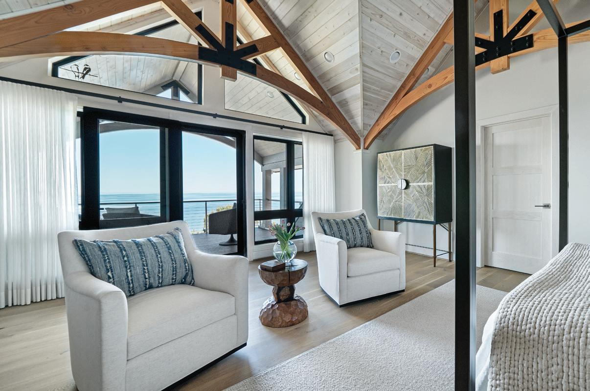
ARCHITECTURE: Gen1 Architectural Group, Zeeland
INTERIOR DESIGN: d’avignon interiors, Clarkston

Ryan and Wendi LaFontaine knew exactly what they wanted before they built their dream home. All they needed was a dream team. After they found it, the couple was intimately involved in every single room in their 11,815-square-foot-plus manse on Genesee County’s Silver Lake, near Fenton. The result is a monument to their family and their love of Detroit’s history.
The six-bedroom/eight-bath home was at least a five-year process, says Ryan, CEO of the LaFontaine Automotive Group. The couple has five children, including two sets of twins, so they wanted to be sure their new house “felt like home, not a museum piece,” Ryan says.
The LaFontaines and their builder, Fenton’s Patrick Widing Custom Built Homes, brought on Schaerer Architextural Interiors of Bloomfield Hills at the start of the project. Designer Bob Schaerer worked alongside the builder and architectural designer, Christopher Macklin Design of Fenton, to devise the unique style and layout of the home.
BUILDER: Patrick Widing Custom Built Homes, Fenton
-
Patty LaNoue Stearns
INTERIOR DESIGN: Schaerer Architextural Interiors, Bloomfield Hills
A CUSTOM HOME COMPLEMENTS ITS LAKEFRONT LOCATION
It seems the stars aligned for these homeowners, who found a prime spot on Pine Lake and built a beautiful new primary residence once the property’s original structure was gutted to the studs and the rooms were reconfigured to optimize the views. “We created a main living space to enable the family to work and live and entertain within different zones,” says Barbi Stalburg Kasoff, interior designer and owner of Stalburg Design in Bloomfield Hills and Washington, D.C.
At 3,500 square feet, the transitional lake house was meant to be multifunctional. Several work-from-home areas include a command center office, a banquette with electrical outlets, and a guest room that doubles as a workspace. Durable materials suit the lakefront location, while pet-friendly selections stand up to the family’s beloved dog.
The couple credits the trades for all the incredible details. “It was a great collaborative effort,” Mike Mladenoff, general contractor and president of Lakes Development Group Inc. in Sylvan Lake, says. Having a great team that included Patrick Dyke, who devised the initial architectural plans, made this job much easier. Continuing the team effort, Stalburg Design created several interior architectural drawings that the builder used and worked off of.
- Jeanine Matlow
ARCHITECTURE: Patrick Dyke Collaborative, LLC, Ann Arbor
CONTRACTOR: Lakes Development Group, Sylvan Lake
INTERIOR DESIGN: Stalburg Design, Bloomfield Hills


8 7 7 8
A MARINA CONDO BLENDS HOTEL STYLE WITH LAKE LIFE
Matthew and Lori Schulz live in East Grand Rapids, but they wanted a retreat downstate where they could entertain their relatives and moor their boat during the warm summer months.
They found a perfect corner-unit condo in Harrison Township on Lake St. Clair, but the décor wasn’t their style. After getting a recommendation from a mutual friend, the couple called Jennifer Asmar, of Asmar Interiors in Troy, to help them make their condo sing.“They wanted to transform the space so the second floor would feel like a luxurious hotel and the main floor would feel like a sophisticated lake house,” Asmar says.
“It was a fun project,” adds general contractor George Sommers, of LaBelle Construction in Mount Clemens, who took the condo down to its bare bones. Asmar drew up her plans and quickly went to work. “I designed the whole condo, from the layout to the last candle on the table,” she says.
Much thought about style and creature comforts went into this rebuild. Not a thing is missing. “Lori gave me her list and I gave her my list,” Asmar says. “I’ve grown up on the lakes around Michigan, so I really planned it so that it’s not only beautiful, but it’s functional for their needs.”
- Patty LaNoue Stearns
CONTRACTOR: LaBelle Construction, Mount Clemens
INTERIOR DESIGN: Asmar Interiors, Troy
BLOOMFIELD HILLS OASIS BRINGS THE OUTDOORS IN
“If you obey all the rules, you miss all the fun,” reads a dish featured in this Bloomfield Hills pool house. Designer Marianne Jones, principal at Marianne Jones, LLC, says the whimsical accessory with the Katharine Hepburn quote inspired her, and is the perfect expression of the wife’s personality. “She’s very fun and has an irreverent streak that I love,” Jones says.
Jones and Elle Tor, partner at Marianne Jones, LLC, worked with the homeowners, architect Glenda Meads, and landscape architect Patrick Funke of Michael J. Dul & Associates on the project, which includes a new pool and a stone deck, pool house, and covered dining space with an outdoor fireplace/ pizza oven.
Meads says the goal for the luxurious pool house was to complement — as well as contrast — the main house. The homeowners also wanted it to be as low-maintenance as possible. Meads had first imagined it as a hotel lobby, but says the plans evolved into something more like a spa when the homeowners requested a golf simulator. The pool house structure also includes a kitchen, dining room, changing room, and a bathroom, as well as a family room with beams and a fireplace.
“The whole point was to bring the outdoors in,” Jones says. “When all the doors are open, you really feel like you’re outside.”
- Khristi Zimmeth
ARCHITECTURE: Glenda Meads, Birmingham
INTERIOR DESIGN: Marianne Jones, LLC, Birmingham LANDSCAPE ARCHITECT: Michael J. Dul & Associates, Birmingham

These furnishings aren’t only chic, they’re Earth-friendly, too
STYLED BY JAMIE FABBRI

WOODWARD THROWBACKS is known for creating luxury furniture out of recycled materials. Their Modern Block Coffee Table and End Table are built using deconstructed oak church pews from Detroit. $975 (Coffee Table), $550 (End Table), Woodward Throwbacks, Throwbacks Home, Detroit, throwbackshome.com.


For an environmentally responsible paint, consider BENJAMIN MOORE’s Eco Spec line, offering zero VOCs and zero emissions (shown in Hale Navy). Price upon request, Benjamin Moore, multiple locations, benjaminmoore.com.


Made from 100 percent recycled plastic, the Construct Rug from GUS MODERN diverts 964 plastic bottles from landfills, oceans, and waterways. $595-$1,195, Gus Modern, Throwbacks Home, Detroit, gusmodern.com, throwbackshome.com.
Polanco Plinth Coffee Tables from ARHAUS are made from oystercut fragments of salvaged Mexican ash and sustainably harvested European ash burl. $5,599, Arhaus, Ann Arbor and Troy, arhaus.com.
The MEM collection from DORNBRACHT, with NATURE SQUARED, transforms natural materials that would normally be considered waste into handcrafted luxury bathroom fittings. Price upon request, Russell Hardware Co., Bloomfield Hills, dornbracht.com, russellhardware.com.
The InsideOut line from KRAVET was developed in partnership with the SEAQUAL INITIATIVE, a collaborative community that works with ocean clean-up programs to repurpose recovered materials. To the trade, Kravet | Lee Jofa | Brunschwig & Fils, Michigan Design Center, Troy, kravet.com, michigandesign.com.


High-shine accents in steel and aluminum are rock-star style choices
STYLED BY JAMIE FABBRI

This brutalist-inspired Pilotis console table from MINOTTI is crafted of polished steel and features a brushed Licorice lacquered ash wood top. From $25,8055, Arkitektura, Birmingham, arksf.com.
Make a statement with the Space Nugget Side Table by HOLLY HUNT. Price upon request, Tennant & Associates, Michigan Design Center, Troy, hollyhunt.com, michigandesign.com.


Eclisse by VICO MAGISTRETTI for ARTEMIDE is a striking table lamp with an avantgarde balance between form, function, design, and utility. Price upon request, Arkitektura, Birmingham, arksf.com, artemidestore.com.


Channel the soft glow of a starry night with the Raimond lighting collection by MOOOI. Price upon request, Italcasa Design, Michigan Design Center, Troy, moooi.com, michigandesign.com.


The Panthella Table Lamp (1971) by VERNER PANTON for LOUIS POULSEN is one of the designer’s most popular lighting creations (shown in chrome). $635-$1,270, Design Within Reach, Grand Rapids, dwr.com.


This modern dining table by ORA ITO for ROCHE BOBOIS comes in a variety of finishes, including metallic steel, copper, and bronze. $7,635, Roche Bobois, Novi, rochebobois.com.
Detroit-based artist and furniture designer NINA CHO’s metal Cantilever Table is both functional and sculptural. Price upon request, Nina Cho ninacho.com.
A polished stainless steel frame shines against the plush leather cushion of INDUSTRY WEST’s Rudolph Occasional Chair. $1,695, Industry West, industrywest.com.


From concrete to limestone and marble, natural stone — in all its variations — is a solid pick for your home’s décor
STYLED BY JAMIE FABBRI
HOLLY HUNT’s Ripple Side Table features a Slovenian marble base, with options for neutral to jewel-toned tops. Price upon request, Tennant & Associates, Michigan Design Center, Troy, hollyhunt.com, michigandesign.com.


Created in collaboration with Melbourne-based VUUE, this Pierre Bench from CB2 is a stunning display of Saint Laurent black marble. $1,699, CB2, Birmingham, cb2.com.


CASTOR DESIGN took a solid block of Indiana limestone and transformed it into a turntable with custom powered speakers on aluminum stands. Price upon request, Castor Design, Detroit, castordesign.ca


Designed by Brett Beldock for CB2, the Aster Dining Table is constructed from solid fantasy marble that’s set upon an S-shaped aluminum base. $3,899, CB2, Birmingham, cb2.com.


Built from solid marble, the Slinkly Marble Table Lamp by REGINA ANDREW is a seamless blend of elegance and nature. $462.50, Regina Andrew Detroit, Wyandotte, reginaandrew.com.


The Boveda Stone Table Lamp (left) by CRATE & BARREL gives off a sleek and sculptural vibe. $249, Crate & Barrel, Novi, crateandbarrel.com
Made of Lena Grey Marble, BAKER | MCGUIRE’s Cove Coffee Tables (below) bring the spirit of the shoreline to life. Price upon request, Baker | McGuire, Michigan Design Center, Troy, bakerfurniture.com, michigandesign.com.


LIGNE ROSET’s Stump Occasional Table was hewn from a solid piece of white-veined black Marquinia marble and features a unique waterrepellent treatment. $2,475, Arkitektura, Birmingham, arksf.com.


Light, natural woods have long been the rage, but there’s been a sartorial shift and dark, moody stains now reign supreme
STYLED BY JAMIE FABBRI
GUS MODERN’s Munro Vitrine is offered in a warm walnut hue and is ideal for storing all your family treasures. $2,195, Gus Modern, Throwbacks Home, Detroit, gusmodern.com, throwbackshome.com.



The Riviera Chest by BAKER | MCGUIRE is inspired by the bold artistry and natural beauty of the Italian Riviera. Price upon request, Baker | McGuire, Michigan Design Center, Troy, bakerfurniture.com, michigandesign.com


Add dimension to your coffee table or mantle with the hand-carved acacia Wooden Links Centerpiece by REGINA ANDREW. $350, Regina Andrew Detroit, Wyandotte, reginaandrew.com.


A stunning style for any dinner space, the oak Boteco Dining Sideboard from MINOTTI features Sahara Noir marble accents for a modern touch. From $35,280, Arkitektura, Birmingham, arksf.com.


At DESIGN WITHIN REACH, classic shapes get a modern twist, as seen in the Geiger Crosshatch Chair (right) designed by EOOS. $3,395, Design Within Reach, Grand Rapids, dwr.com.


This unique Salvaged Walnut Hand-Carved Side Table (below) by ROUGH SAWN DETROIT is carved from a single piece of wood. $3,875, fleurdetroit, Bloomfield Hills, fleurdetroit.com





Walnut-veneer block legs complement the solid, honed-marble top of this sleek VUUE-designed Spesso Desk for CB2 $1,999, CB2, Birmingham, cb2.com.


CONCETTI IS AN AWARD-WINNING, DETROIT-founded interior design strategy studio that specializes in both residential and commercial design. The firm delivers bold, professional interior design strategies for people who want to cocreate spaces that are extensions of who they are — spaces where they can enthusiastically, authentically, and simply be themselves.
By viewing their clients as co-creators and following a phased, human-centric approach to design, the Concetti team is able to make one thing very clear: They want you to be you.
Home you. Work you. Out in the community you. Boldly you. By serving as advocates who empower their clients to be bravely, boldly themselves, Concetti creates spaces that become you.
Detroit
313-338-9559
concetti.studio/


WITH A SPECIFIC FOCUS ON THE BLOOMFIELDS, Franklin, and Birmingham, Nosan Signature Homes has been building custom luxury homes in southeast Oakland County for more than 25 years. Nosan Signature Homes has expertise in extensive remodels, additions, and new construction — and they’re not just builders; they also like to do design/build projects, providing clients with a more custom experience.
Nosan Signature Homes’ philosophy includes ensuring budget awareness from the beginning of the home-building process, thereby creating a more transparent and seamless environment for clients who are looking for their dream home. Contact Nosan Signature Homes today to find out how to make your dream home a reality.
Farmington Hills
248-538-1549
nosansignaturehomes.com


THE ANGELINI AND ASSOCIATES TEAM brings beautiful, timeless design to life in the home of every client. The team listens closely and works collaboratively with clients to translate each need and desire into living spaces that are at once comfortable, functional, and aesthetically striking. Sensitive and sustainable architecture begins with thoughtful design solutions that will endure over time, so Angelini and Associates embraces the unique context and challenges of each project as an opportunity to cultivate usable, welcoming spaces with one-of-a-kind, perennial beauty.
Because each client is unique, so too are Angelini and Associates’ design solutions. The team invites clients to participate in developing and refining spaces, selecting materials, and engaging in the construction process. Over more than three decades of practice, this commitment to collaboration between homeowner, architect, and builder has earned the firm multiple Detroit Design Awards and American Institute of Architects Awards. Their projects have also been featured in national publications.
Ann Arbor
734-998-0735
angeliniarchitects.com


TRANSFORMING VISIONS INTO REALITY, this design and build team crafts exquisite homes with unparalleled dedication to innovation and client satisfaction. For over 30 years, Ben Heller and his expert team at Heller and Associates have been at the forefront of the architectural world, delivering award-winning residences that marry intricate design with personal flair.
At the heart of Heller and Associates’ mission is the creation of homes that not only captivate and inspire but also offer a sanctuary of comfort and peace. The team’s designs seamlessly integrate with nature, creating a harmonious balance between the built environment and the natural world. Natural light plays a pivotal role in their architectural philosophy, with each space meticulously planned to maximize daylight.
With an unwavering commitment to creativity, enthusiasm, and unparalleled service, Heller and Associates sets the standard in luxury home design and build. Its relentless pursuit of excellence ensures each project is a harmonious blend of elegance and functionality, reflecting the unique personal style of each client.
Historic Downtown Pontiac
248-322-6777
hellerhomes.net


DISCOVER LUXURY AND SOPHISTICATION
AT Bolyard Lumber & Design, your premier destination for Marvin windows. Redefine your living space with Bolyard’s exclusive collection, which seamlessly blends innovation with timeless elegance. With three exquisite locations in Rochester Hills, Birmingham, and Ann Arbor, Bolyard Lumber & Design offers tailored solutions to complement your lifestyle.
Bolyard’s team of experts is dedicated to exceeding your expectations, whether you want panoramic views, energy-efficiency, or exquisite design versatility. From sleek modern designs to classic architectural styles, their custom solutions will transform your space into a sanctuary of unparalleled beauty and comfort. Redefine your living experience with their exceptional Marvin windows, meticulously crafted with precision and passion, and enhance your home to new heights of elegance and sophistication.
Experience the epitome of luxury with Bolyard Lumber & Design
Rochester Hills
248-852-8004
Birmingham
248-644-3636
Ann Arbor
734-441-0700
bolyardlumber.com


EUROAMERICA DESIGN FEATURES ONE OF the largest showrooms in Michigan of European and Domestic cabinetry, including the iconic luxury brands Poliform, Valdesign Cucine, and Alf DaFre. Their contemporary cabinetry emphasizes the European aesthetics of design, timeless materials, and luxurious finishes.
EuroAmerica takes care of every aspect of your cabinetry project from start to finish: from conceptual design to on-site measurements, supervision, and final installation. Their team strives to turn every project into a personalized and unique solution, using exceptional products to create your dream home.
Visit the EuroAmerica Design showroom, located across the street from the Michigan Design Center in Troy, or schedule an appointment to discover how EuroAmerica can bring your vision to life.
Troy 248-649-8950 euroamericadesign.com


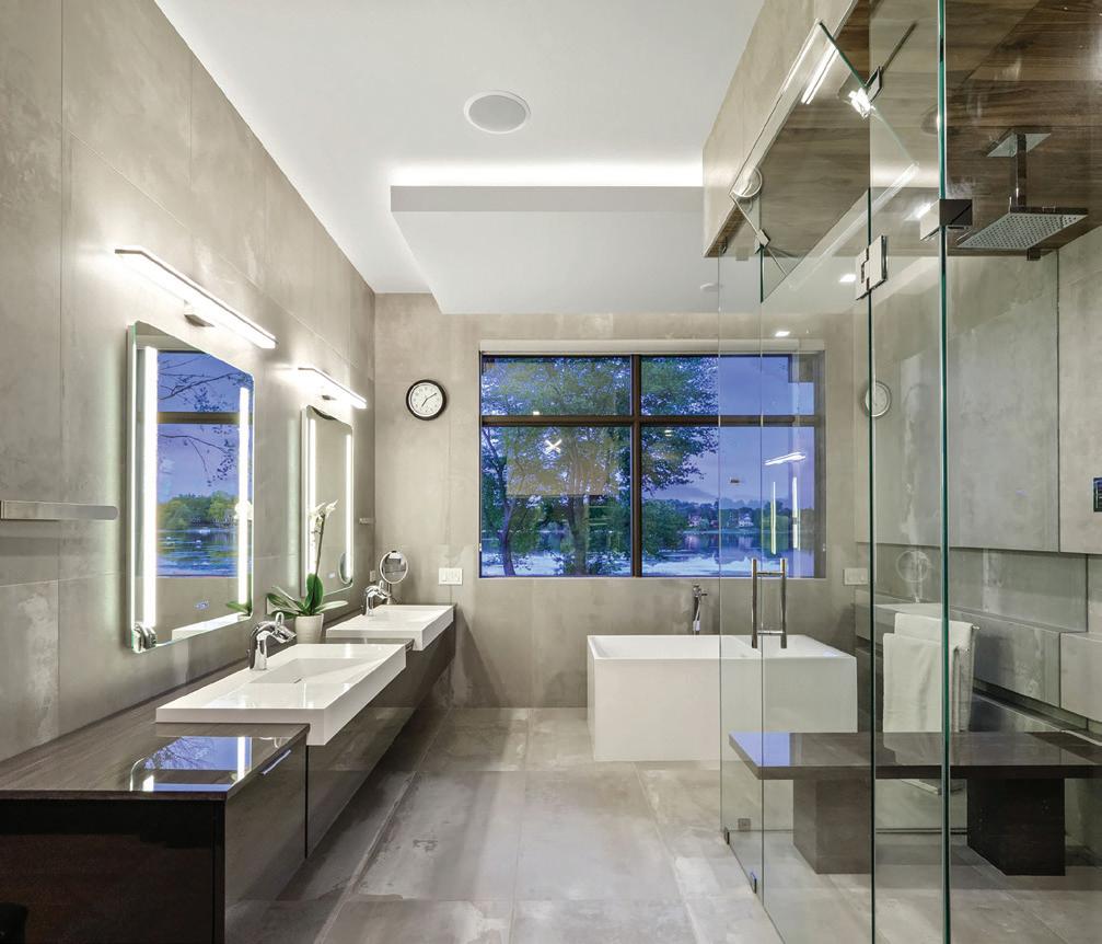


THE TEAM AT CALIFORNIA CLOSETS TAKES THE TIME TO LISTEN because the intentionality behind every custom solution isn’t by accident — it’s by design.
Serving greater Detroit and northern Michigan since 1988, California Closets is distinguished by a legacy of innovation, organizational expertise, quality craftsmanship, and design authority. From beautiful closets and home offices to hardworking mudrooms and media centers, California Closets designs custom home storage that adds value to your life and home by making space for what belongs. It’s what the company calls “Practical Magic.” And with its flexible design approach, California Closets is able to work with any style and budget.
Your experience includes personalized 3D designs, precise craftmanship, and expert installation by the company’s own employees — never subcontractors. As the industry pioneer, California Closets is the expert of choice for customers and trade partners alike.
Let one of California Closets’ experienced designers uncover your home’s hidden potential.
Showrooms located in: Birmingham | Troy | Wixom Also serving Northern Michigan 248-624-1234


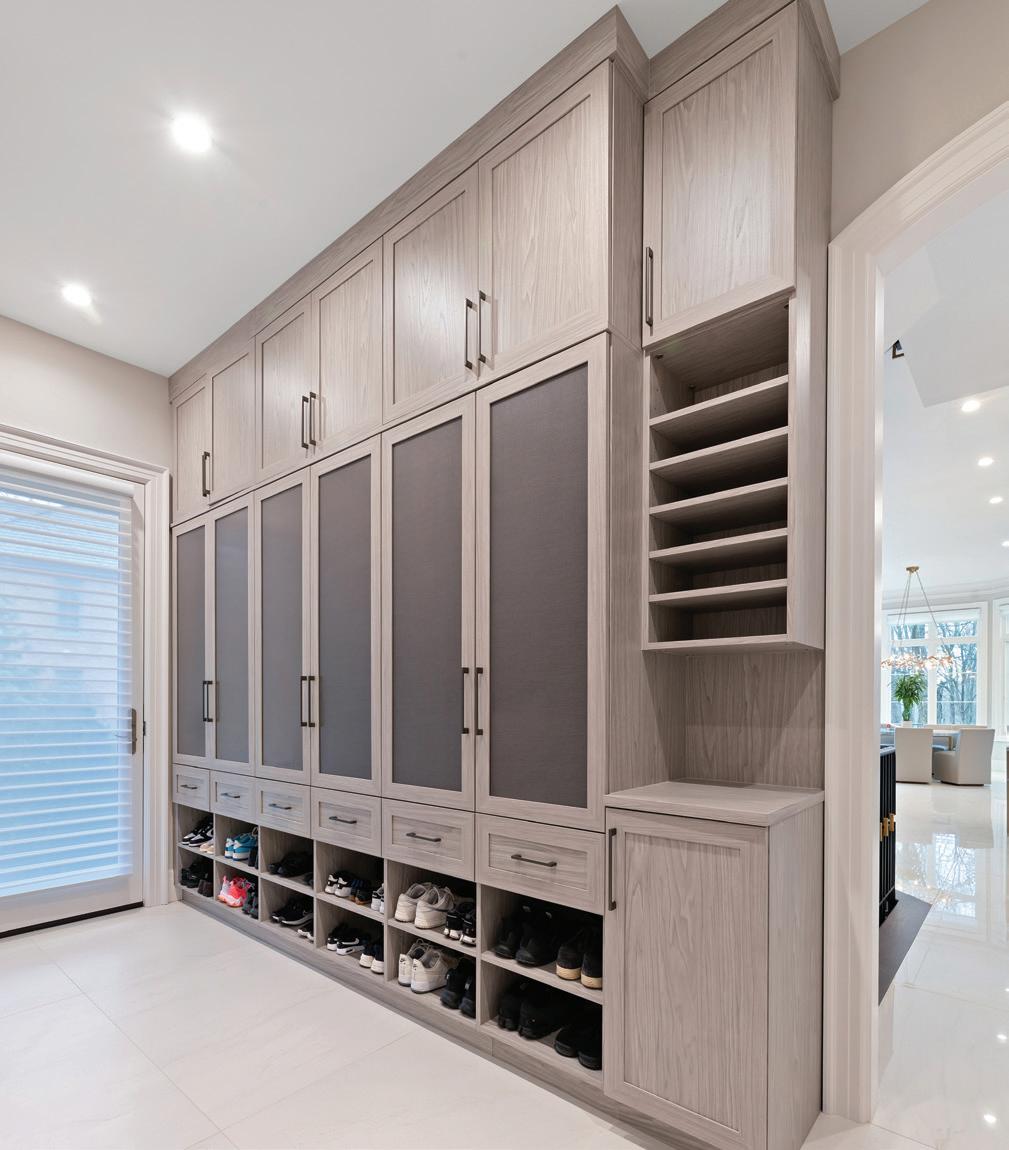


FROM THE INTERIOR OF YOUR HOME ALL
the way to the garage, let the Closet Factory help you design your home to maximize your space — it’s a change the whole family will enjoy. The Closet Factory’s experts are ready to make your dreams a reality, and make your home everything you envision and more.
No matter what area of the home you need help with — closets, garages, home offices, entertainment centers, bedrooms, wall units, laundry rooms, pantries, craft rooms, mudrooms, wine rooms — the professionals at the Closet Factory can work miracles to make your life easier and more organized.
Contact the Closet Factory today at 248-5737019, or visit closetfactory.com to set up your free, in-home design consultation. The Closet Factory is locally owned and operated.
7036 Kensington Rd. Brighton, MI 48116
248-573-7019
closetfactory.com


SINCE 1939, THE HAGOPIAN NAME HAS BEEN synonymous throughout metro Detroit with beautiful, hand-knotted rugs — from the newest contemporary designs to one-of-a-kind traditional rugs. Hagopian’s Birmingham and Novi showrooms have thousands of rugs in stock, and when a project calls for something out of the ordinary, they can create a rug to fit your style, budget, and timeline.
Hagopian also offers top-quality carpet with expert installation, to give your floors the comfort and warmth you desire. And when it comes to stairs, Hagopian has a vast number of options that are only limited by your imagination.
Hagopian has built its reputation on quality, selection, and service. Their experienced sales consultants will provide personalized service, and their knowledge and passion will help them guide you through the many beautiful choices.
The foundation of beautiful design starts from the ground up at Hagopian World of Rugs.
Birmingham
248-646-RUGS (7847) Novi
248-449-RUGS (7847) hagopianrugs.com


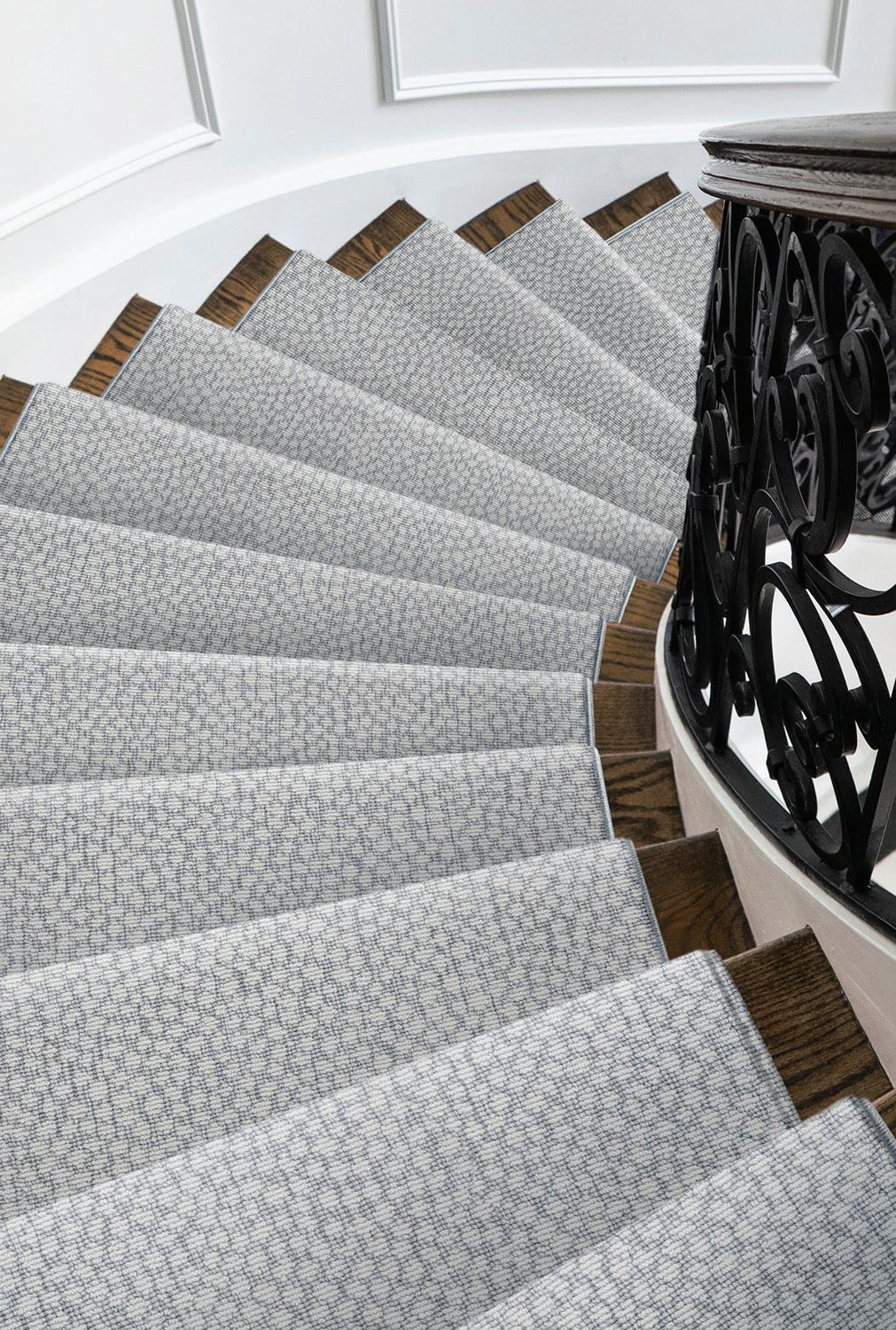


MARIELLA’S CUSTOM DRAPERY is an awardwinning, family-owned and -operated business located in Southfield. For more than 40 years, they have provided custom drapery solutions, blinds, and textiles directly to the trades and homeowners nationwide. Their creations are used in both commercial and residential applications.
From your initial consultation with Mariella’s staff through the completion of your project, the expert team works closely with you to ensure your vision is brought to life. Whether it’s custom draperies or automated shades, Mariella’s is committed to creating beautiful products that work.
Their skilled artisans meticulously handcraft each piece, giving careful attention to every detail. All of Mariella’s products are made in the U.S., and finished products are always above and beyond industry standards. Only the highest-quality raw materials are used.
Contact Mariella’s today to learn more about their custom, white-glove service for your business or home.
Southfield 586-588-0012
mariellascustomdrapery.com


ROCHE BOBOIS IS A WORLD LEADER IN furniture design and distribution. Working closely with renowned designers such as Marcel Wanders, Kenzo Takada, Cédric Ragot, and Sacha Lakic, and with haute couture fashion houses such as Jean Paul Gaultier, Missoni, and Christian Lacroix Maison, Roche Bobois offers a broad range of exclusive designs, all manufactured with a high level of customization in small European workshops.
Visit their beautiful showroom in Novi or browse their full collection of premium-quality furniture including sofas, armchairs, cocktail tables, dining chairs, sideboards, beds, wardrobes, storage, and accessories including lighting, cushions, and rugs on their website: roche-bobois.com.
Novi
248-833-0300
roche-bobois.com


TENNANT & ASSOCIATES OFFERS THE FINEST textiles, expertly crafted wall coverings, hand-forged lighting, American-made furniture, innovative trimmings, and bespoke woven window coverings exclusively to the trade. You’ll find extensive one-of-a-kind and custom options for residential, hospitality, and commercial designers. The focus at Tennant & Associates is on personalized customer service.
Tennant & Associates proudly represents Artistic Frame, Cowtan & Tout, Dedar, Garrett Leather, Glant Textiles, Hartmann & Forbes, Holly Hunt, Ironware International, Jim Thompson, Kohro, Phillip Jeffries, Pollack, Romo, Samuel & Sons, and Weitzner.
Troy 248-643-6140
tennant@tennantassoc.com

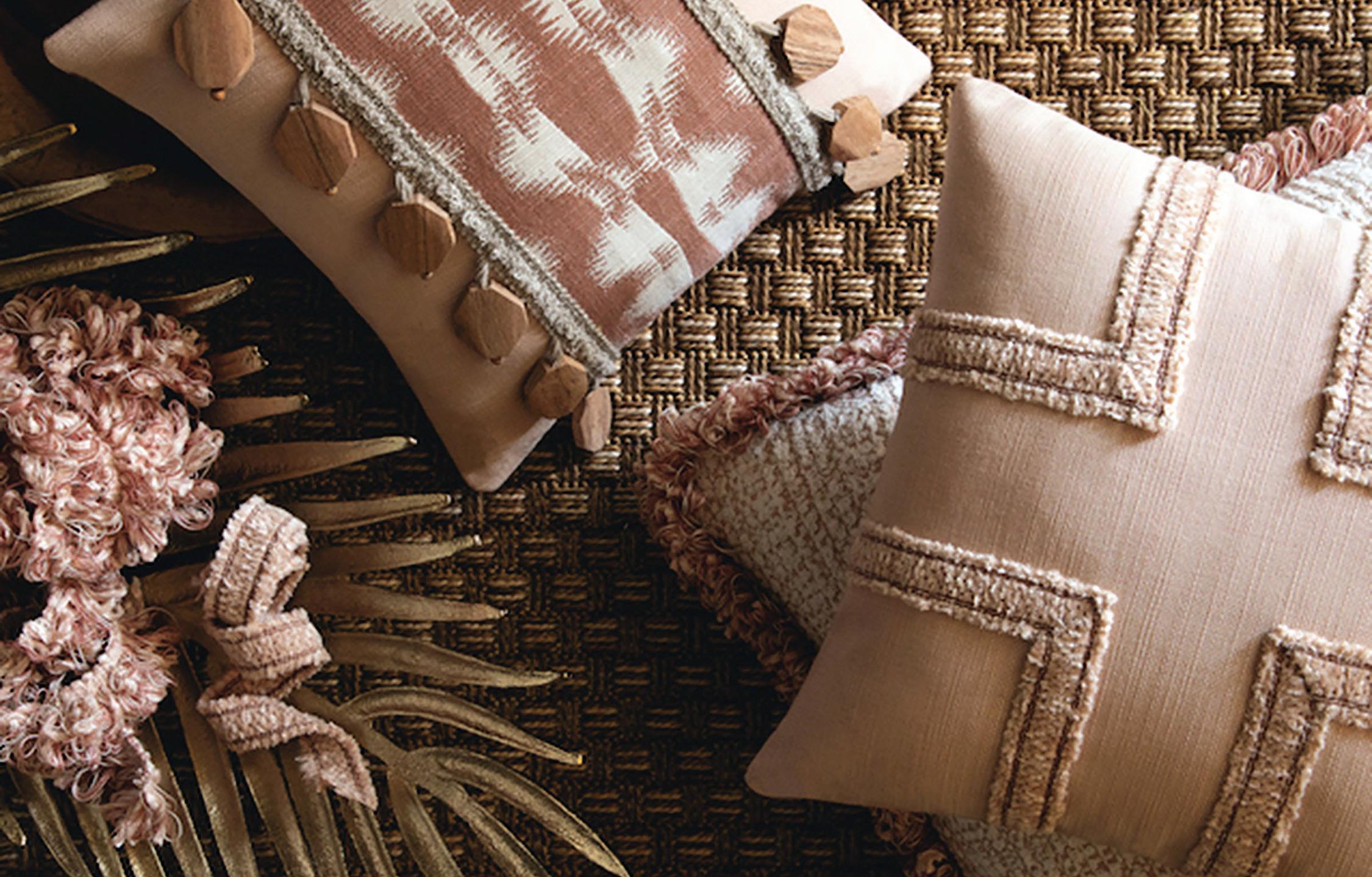


DEE DEE’S FINE VINTAGE IS A SPECIALTY home décor and furnishings shop featuring lovingly reimagined vintage and antique furniture. Housed in a charming 1923 brick bungalow in Clawson, Dee Dee’s offerings are curated with great care, attention to detail, and commitment to quality.
After opening in 2021, Dee Dee’s quickly became a local favorite, earning Hour Detroit Best of Detroit honors in 2023 and 2024. Whether seeking beautifully refurbished furniture items, custom handcrafted decorative pillows and textiles, thoughtfully selected home accents, or gifts and accessories available only at Dee Dee’s, guests are sure to find something special.
For DIY enthusiasts, Dee Dee’s is metro Detroit’s premier retailer of Fusion Mineral Paint and Wise Owl Paint products, providing the supplies and expertise necessary to make each home project a success.
Visitors to Dee Dee’s will enjoy a friendly welcome, a warm cup of tea, and an inviting space filled with stylish, sophisticated wares.
Clawson
248-752-4284
deedeesfinevintage.com


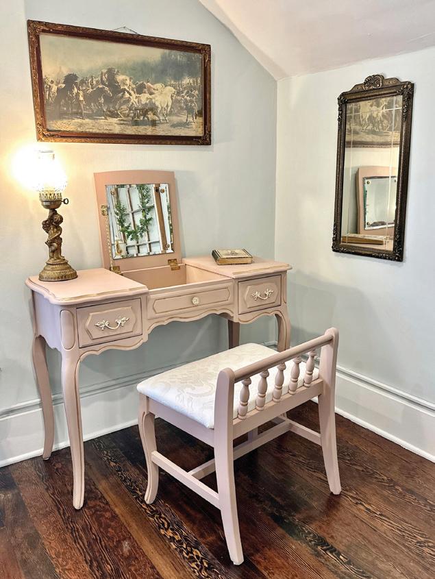




A HOME IS A STATEMENT OF ITS OWNER’S personality and taste, and the products at Advance Plumbing are carefully selected to reflect just that. This fourth-generation, familyowned business has been catering to the Detroit area since 1920. The company’s legacy not only reflects the quality of its products, but also its dedication to customer service and community involvement.
Within its expansive showrooms, a diverse selection of decorative plumbing fixtures awaits. From the refined elegance of California Faucets (featured left page) to the serene designs of BainUltra (featured right page), each brand tells a unique story. Renowned for exceptional craftsmanship and innovative designs, California Faucets and BainUltra fully embody the excellence Advance Plumbing is known for. These aren’t just products; they’re partners in the creation of memorable spaces within our homes.
Advance Plumbing isn’t just the end of a hunt for the perfect fixture — it’s the beginning of a journey into self-expression, luxury, and sophistication.
Detroit
313-831-7770
Walled Lake
248-669-7474
advanceplumbing.com




Transform your backyard into an oasis with a StruXure louvered pergola. At Skyview Detroit, we do more than build and install StruXure solutions. We are the StruXure experts, guaranteeing a premium product — and a premium customer experience.


LIVE OUT YOUR VISION WITH MICHIGAN’S SOURCE FOR PREMIUM OUTDOOR LIVING SOLUTIONS. Beyond solutions, Skyview Detroit’s knowledge, curiosity, and constant desire to exceed customer expectations truly set the firm apart. At this residence in Bloomfield Hills, the Skyview Detroit team connected a custom StruXure pergola to a covered patio and finished the project with a MagnaTrack solar screen system. The company’s full lineup of solutions includes the following: StruXure pergolas, MagnaTrack screens, TimberTech decks, LivingSpace Sunrooms, Patios, and Glass Systems.
Every Skyview Detroit project achieves a perfect combination of style and functionality. The home featured here is now a destination with endless possibilities for outdoor living, entertaining, and much more.
Visit the Showroom
2605 Oakley Park Road, Suite B Commerce Township, MI 48390 skyviewdetroit.com


AT Michael J. Dul & Associates has created memorable residential and commercial outdoor spaces for more than 40 years. Their design signature lets each project speak for itself — simple, subtle, impactful.
They begin by actively listening to clients, to obtain a clear understanding of their desires. Next, they develop the owner’s Program Statement. Their passion for design helps solve each owner’s challenges in unexpected ways.
The company’s talents include integrating architecture with the site, for seamless and comfortable transitions. An understanding of site engineering, utilizing a wide range of materials, and implementing the latest technologies contributes to each project’s success.
Many organizations and publications have recognized their creativity with design awards, year after year. Above all, they take care of their clients and projects every step of the way. The result? Referrals and recommendations, allowing them to serve more clients by providing thoughtful design solutions.
Birmingham 248-644-3410 mjdul.com


THE LUSCIOUS LANDSCAPE OF THIS Detroit golf course home, located in an older neighborhood of Detroit, was designed by Jeremy Locke of Great Lakes Landscape Design. His design improves the flow toward the back entrance set amid large oaks. To emphasize this secondary entrance, the team at Great Lakes Landscape Design used vibrant plant selections, including all-gold Hakone grass, low astilbes, little lime hydrangeas, and blue hostas. Simplifying the palette with repetition and mass plantings ensured an elegant flow, complemented by larger plants like arborvitaes and kousa dogwoods for privacy and visual layers.
This project was completed in phases, which focused first on the front door landscape and then progressed to other areas, including a barrier against an unsightly neighboring property.
Throughout the project, the client’s deep understanding of landscaping facilitated smooth collaboration, and adjustments were made during installation to achieve the client’s vision of a lush, colorful design that thrives throughout the seasons.
13201 Northend Ave., Oak Park, MI 48237
248-543-6320
greatlakeslandscapedesign.com


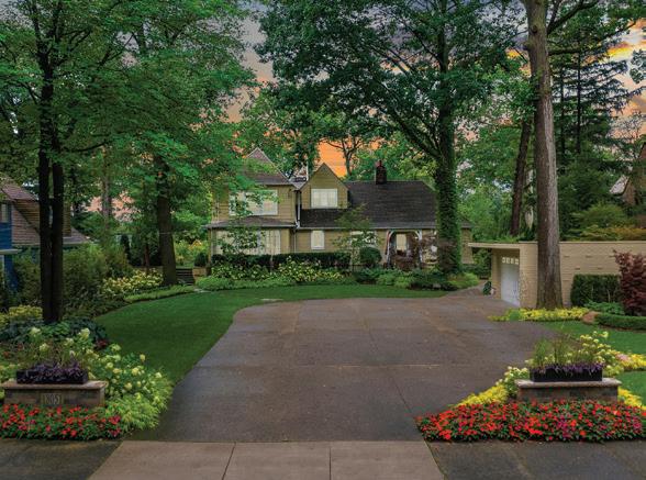


FOR 96 YEARS, VIRGINIA TILE CO. HAS STOOD as a stalwart in the industry, solidifying its reputation as a premier and dependable tile supplier. Specializing in tiles ranging from large-format porcelain to stone, glass, 2CM, and ceramics, the company seamlessly blends durability with beauty and style.
Virginia Tile’s collection spans from timeless classics to cutting-edge trends, ensuring that every taste, budget, and preference finds a match within their extensive selection. Whether you’re in search of flooring solutions, wall accents, or stylish backsplashes, Virginia Tile offers a myriad of options to elevate your project.
Renowned for exceptional customer service, the company boasts a deep inventory and knowledgeable staff who are ready to assist. To enhance your experience further, Virginia Tile goes the extra mile by providing free design services in their showrooms.
With Virginia Tile Co., you not only invest in top-quality tiles, but in a seamless and enjoyable customer experience.
Troy 248-649-4422
virginiatile.com


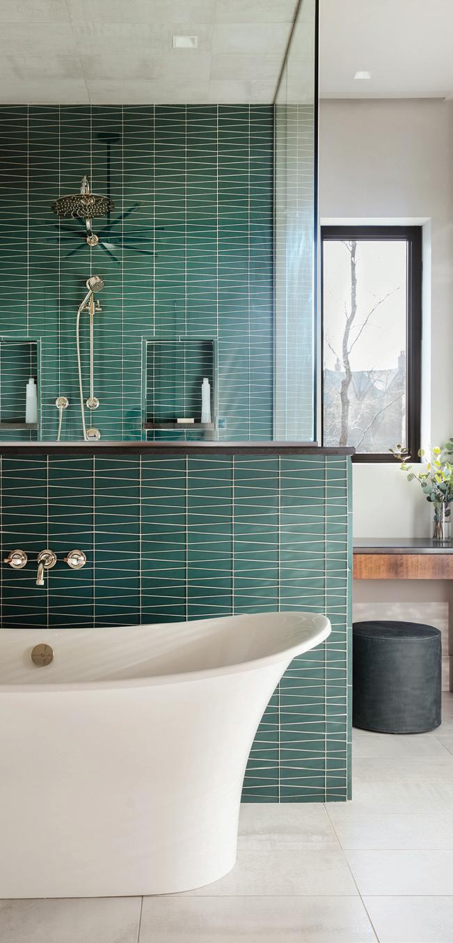


PEWABIC HAS BEEN HANDCRAFTING
CERAMIC tile in its National Historic Landmark pottery studio on East Jefferson for more than a century. That tradition continues today with architectural tiles for homes and businesses. Its time-honored process produces subtle variations in size and color to create beautiful and unique tiles for backsplashes, fireplaces, walls, floors, outdoor spaces, and murals. Made from high-fire stoneware, each tile is skillfully handcrafted by Pewabic artisans specifically for your individual project. Pewabic’s designers offer full design services for homeowners or in collaboration with architects, designers, and contractors. Visit the pottery’s Tile Showroom or the Resource Center at the Michigan Design Center to explore the possibilities of transforming your space with Pewabic Tile.
Detroit
313-626-2030
pewabic.org/tile


LIVING’’ anniekordasinteriors.com


''EXEMPLARY DESIGNS FOR BETTER LIVING'' @@kordasinteriors 313-378-2125 kordasinteriors@gmail.com I an niekordasinteriors.com


THIS PAST JUNE, ROYAL OAK-BASED Vogue Furniture celebrated its 47th anniversary with a psychedelic bash. The theme was 1977, in honor of the year owner Greg Bartelt opened his beloved business. Bartelt, along with his wife, Sue, and daughter, Madison, who are both active in the business, engaged the help of Melissa Feldman of Vitale Events to help plan the successful soiree. With eats and treats provided by Andiamo, drinks from Griffin Claw Brewing Co. complete with personalized disco labels, a dance floor lit up thanks to the visual stylings of Madison Heights-based Band-Ayd, an eight-piece band that performed ’70s hits, and
more than 300 industry-wide guests dressed in theme, the celebration was a far-out success.
“It was a night to celebrate the multiple generations of Vogue supporters, from Jim Reilly, who’s been with us since the beginning and is now the general shop foreman, to team members just starting their careers fresh out of high school,” Bartelt says. “A village of people have contributed to our business and personal success over the past 47 years and, going forward, this next generation is committed to delivering the level of quality product and design that our clients deserve.” voguefurniture.net
— By Giuseppa Nadrowski
1. Arielle Cohen, Francesca Eid
2. Dan Kelly, Jason Weir, Maggie Corazza
3 Greg, Sue, and Madison Bartelt
4. Joe Bachrach, Miriam Siefer
5. Jill Schumacher, Michele Mio
6. Eric Pyke, Lona and Brett Battishill
7. Lauren and Phil Fisher
8. Lewis Seymour, Danie Ross, Ray Ross
9. Matt and Amy Schaerer


TO TOAST THE LAUNCH OF HER NEW downtown Birmingham boutique and studio space, House of Reem, interior designer Reem Akkad welcomed more than 250 guests to a sophisticated grand opening celebration. Attendees enjoyed a ribbon-cutting ceremony and sampled a variety of appetizers as they explored the beautifully curated showroom, which blurs the lines between an interior design studio, art gallery, and furniture retail boutique.
“I was thrilled to open the doors to the community and share my passion for timeless design and artistic expression. My vision is to make curated interiors more accessible for anyone wanting a higher-level, more curated look for their spaces,” Akkad says. houseofreem.com
— By Giuseppa Nadrowski
1. Carrie Curnow, Link Wachler, Fred Dawson
2. Amar Hamoude, Rania Akkad, Loulya Tarabin, Sahar Akkad, Reem Akkad, Dr. Lena Akkad, Tamara Tarabin
3 Aziza Zebari
4. Costin Dragnea,
5.
6.
7.
8.
9.


Birmingham basement remodel embraces a moody palette
TEXT BY JEANINE MATLOW | PHOTOGRAPHY BY JOSEPH TIANO
For her 1940s basement, which had been partially finished but never completely redone, Margaret Skinner had to start from scratch. “It was about expanding the living space and having a place for entertaining,” says Skinner, interior designer and principal of Margeaux Interiors in Birmingham.
In the main area, which features a luxurious living space, a lounge, and a bar, a charcoal ceiling adds a dramatic backdrop. “Had the ceiling been light, it would have made the basement feel small,” the designer says. “It has small windows and a low ceiling — there are so many factors (that came into play). We were even limited to where the TV could live.”
In spite of the challenges, Skinner found a way to work her magic. “Many people (believe that) because the space is so dark, you have to do the opposite. I wanted to work with what was there and turn it into a positive,” she says.
The low ceiling and lack of natural light contribute to the moody vibe, which makes the basement feel like a speakeasy. “Using a dark color palette is dramatic,” Skinner says.
Her approach worked especially well since that part of her home gets more use at night, when she watches TV or has cocktails with guests. The drama unfolds at the glamorous bar, which is equipped with a sink and a fridge. Custom
display cabinets were built on-site, and the wallpaper wows with wood and gold accents.
A Parsons console with a stone top and a waterfall edge features a backlit metal screen below, where counter-height stools include a pair that tucks under the table. Boucle ottomans and a quilted velvet banquette offer additional seating in the lounge area, where the remodeled fireplace was revived with porcelain tile. Distinct touches include a sun light fixture and heirloom art by the designer’s mom. A comfy sectional and woven chenille chair outfit the living space.
The guest bathroom was completely gutted and reconfigured, while a laundry area that had never been touched became a destination thanks to graphic wallpaper and white cabinets that provide the perfect contrast. The fact that it went from a just-passing-through-to-get-to-the-laundry-areaand-change-the-air-filter space to a beautiful basement makes Skinner happy. “It was a pass-through area. It wasn’t a livable space,” she says. “To know what it can be shows how you can take an awful space and turn it into a gem. It’s probably our favorite (part of) the house.”
MORE INFORMATION: margeauxinteriors.com
