PROFESSIONAL


PROFESSIONAL


• Modeling, rendering, drawing documentation, diagrams, presentation slides, and 3d-printing across concept stage to developed stage
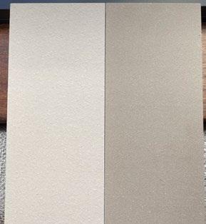
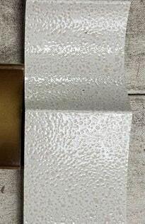
• Material Samples Collection and Coordination in the DD stage
• GFA: 116,000 sqm
• LOCATION: Hong Kong
• CLIENT : A Local Developer
• PROGRAM : Retail, Office, Data Center
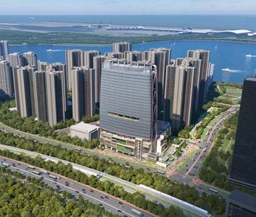
The site is located in Tung Chung area. The airport express railway on the south goes past the site. The target customers of this mixed-use property are the passengers from the airport and residents in the communities nearby.
The project consists of three main programs: office, retail, and data center. The office program is housed in a 160m tall tower, facing the lantau mountain view of the south, situated on top of the retail podium. The data center, designed to meet stringent security requirements, is located north of the office tower.
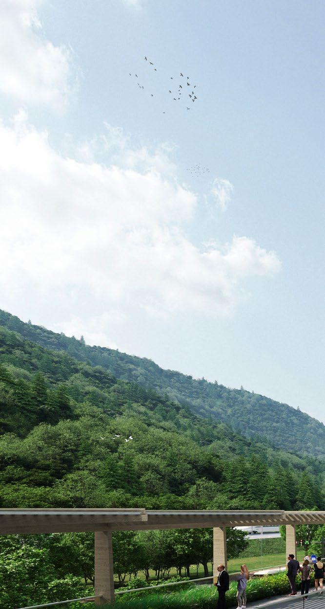
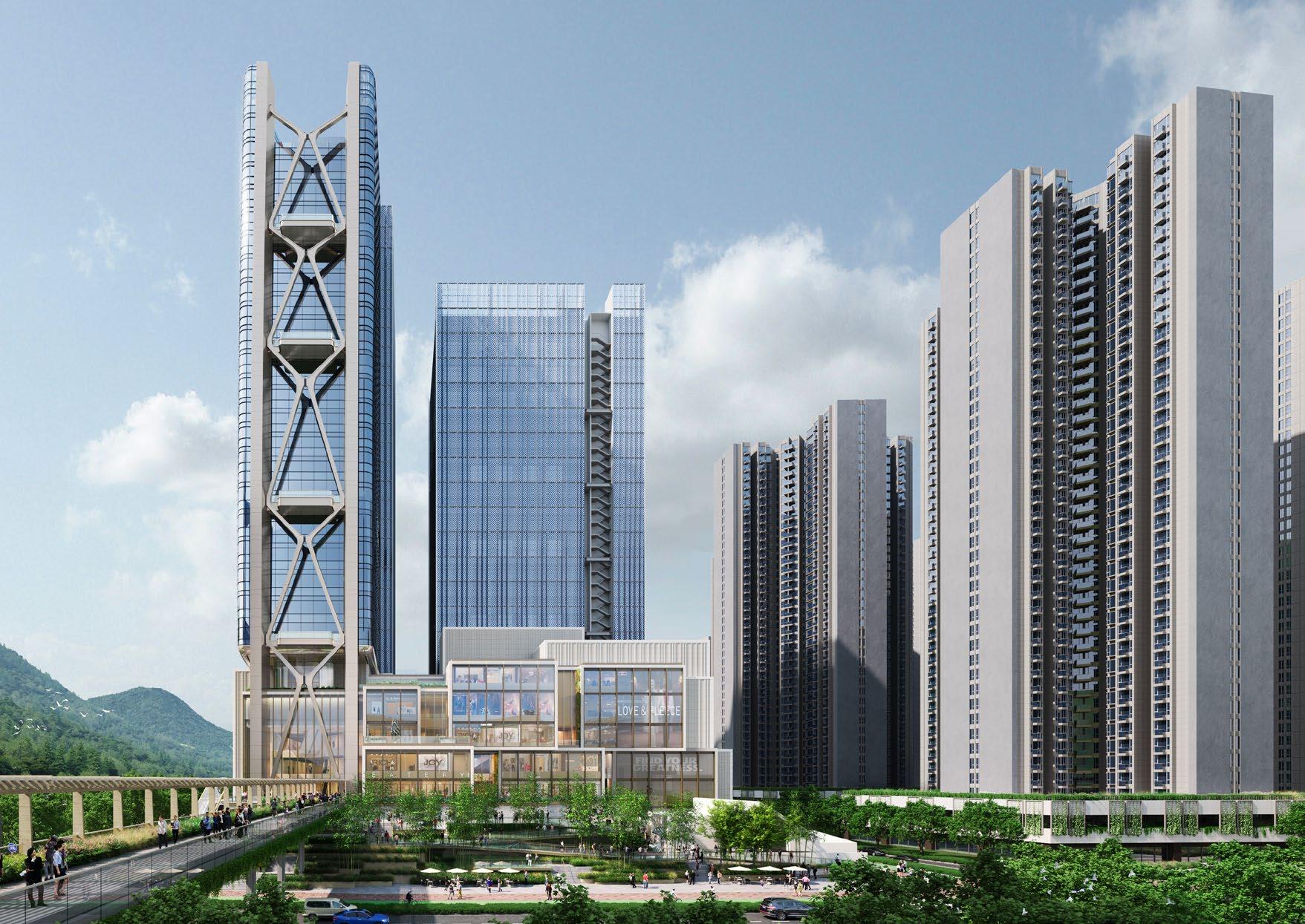
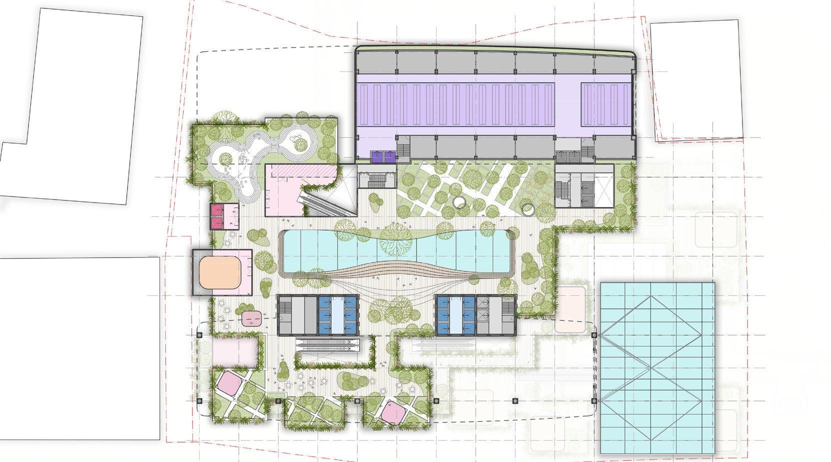
I joined this project in the final production stage in the competition phase. I helped mostly on the drafting and graphic tasks on 2d drawings. Green and lush are the dominant elements in our concept and i was contributed to develop the landscape idea in plan for the public area and roof.
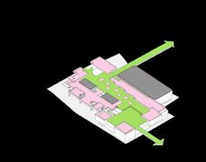
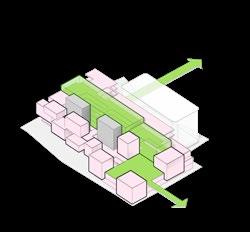
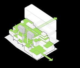
To create indoor and outdoor integrated green promenade and public spaces is the initial idea that dominates
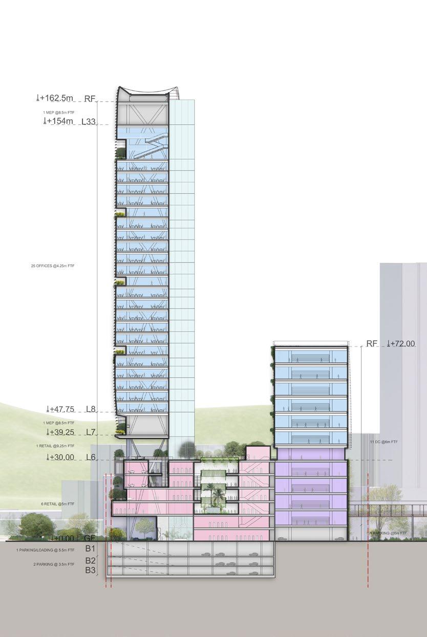

I drafted the sections/elevations in the production stage, using Rhino, photoshop.
After we got the commission, the client had made changes to the proposal brief from the competition stage. The gross floor area and the three main programs remained, but their respective areas had been significantly adjusted. The data center area had increased by one third, while the retail podium area had decreased by the same amount. In the concept reconciliation stage, we adapted our plans accordingly to accommodate these changes.
During the concept stage, we tested the massing relationship among the three main programs. To optimize the arrival experience from the MTR bridge, we placed the retail massing in the front and positioned the data center behind it. By aligning the data center’s location and width with the office tower’s back core, we established a visual massing relationship between the two distinct towers, despite their functional differences.
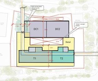
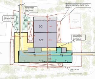
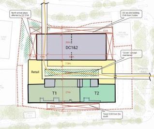
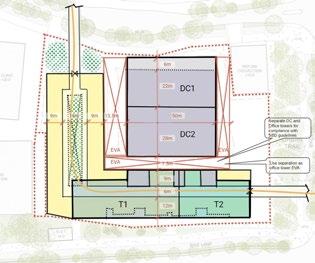
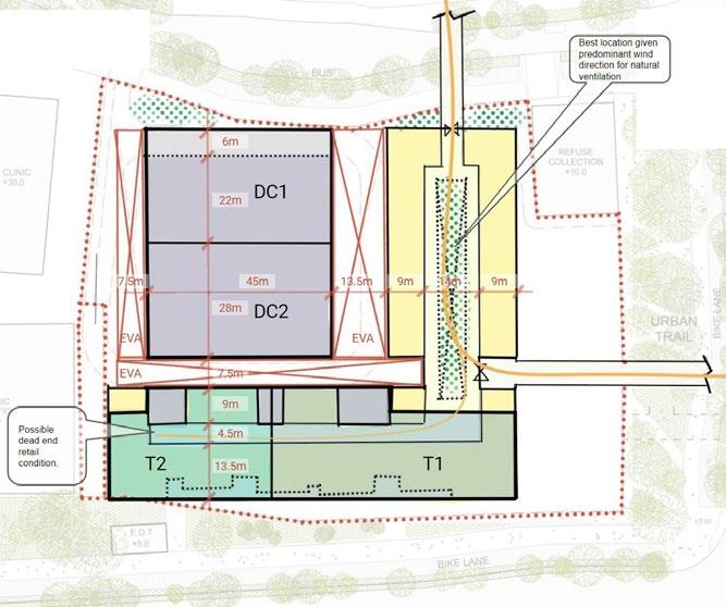
Podium massing tests were conducted in order to comply with the SBD guideline, while maintain the shop area as much as possible.
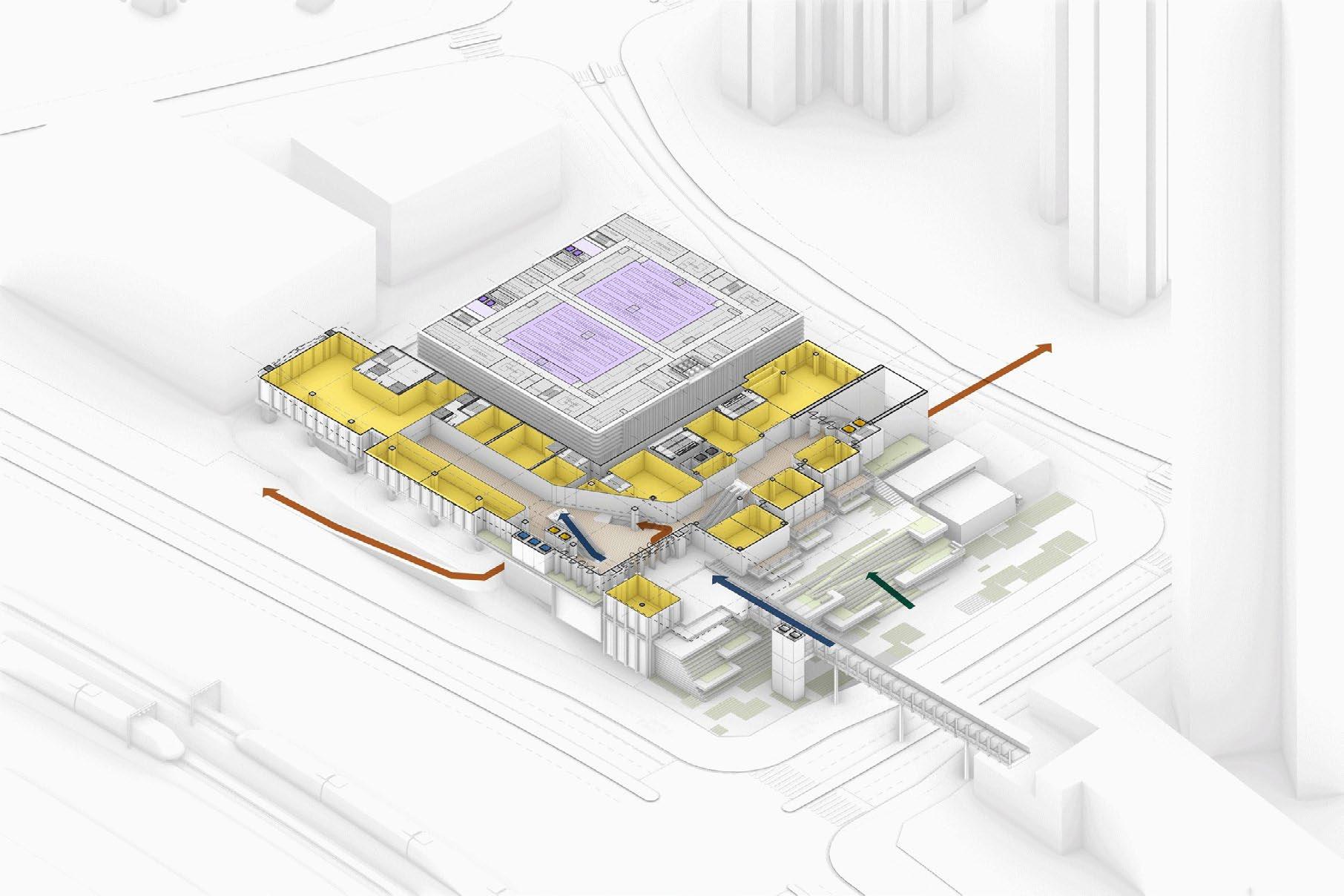
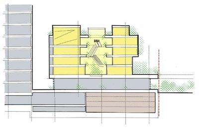
Retail Podium Option 1, Challenging SBD line
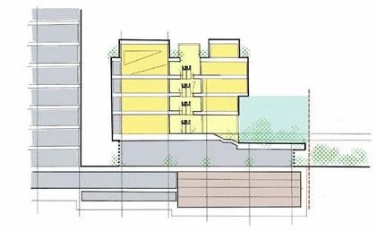
Retail Podium Option 2, compressed double loaded retail podium
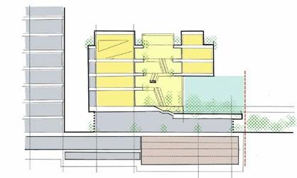
Retail Podium Option 3, single- loaded to comply with SBD line

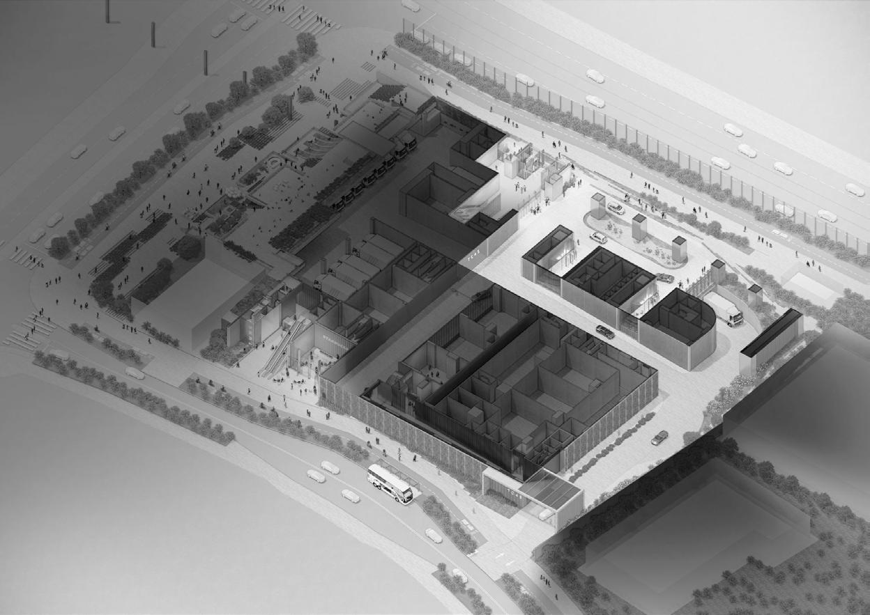


With the curb cut on the north side and the VIP dropoff on the south side, creating a cohesive arrival experience for VIP cars is crucial. Natural elements dominate the ground floor vehicular arrival.
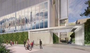
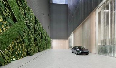
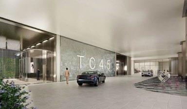
With cars passing through a terracotta portal, a lane bordered by green walls, terracotta, movable plants, and water curtains, and reaching the southern drop-off area surrounded by a waterlily pond and a grand fountain waterfall.

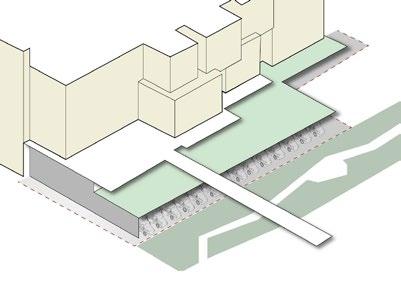
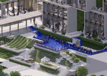
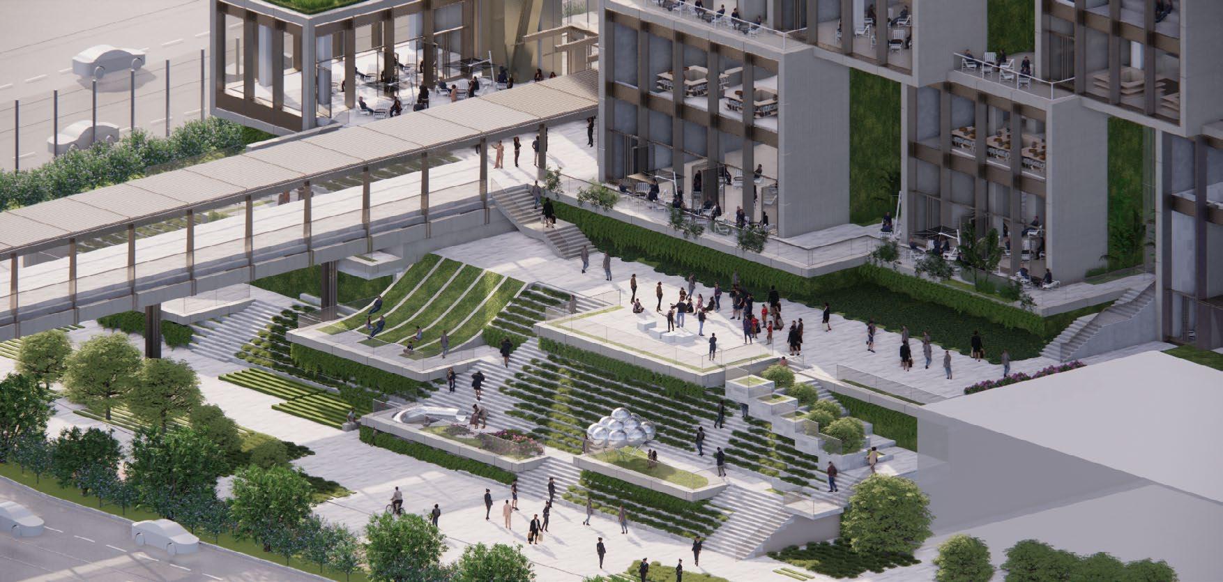
The main strategy is to link three key elevations together: Retail main entrance on L1+9.3 ; lower deck on +5.8; municipal linear park on GF + 0.00
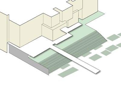
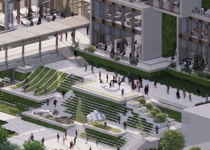
Landscape steps are the key elements to resolve the vertical barrier.
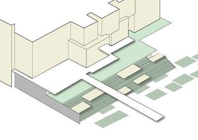
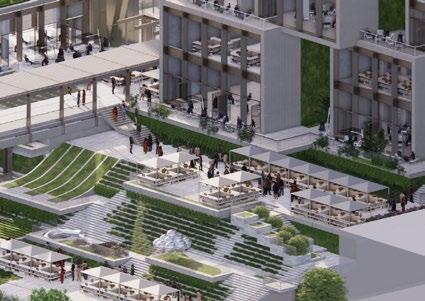
A series of larger terraces were plugged into the landscape steps to provide spaces for potential commercial activities and people gathering.
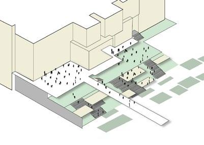
Multipal routes were provided for circulation from GF to L1, and linked the expanded landscape decks all together. the L1 deck becomes a perfect outdoor space for L1 retail passengers. The L1 lower deck is a perfect space for holding street markets, street performance, catwalks, and so on.
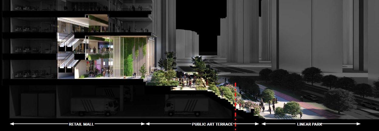
This landscape area not only connects the ground and Level 1 entrance but also serves as an exciting space. With terraces of varying sizes and heights, it offers versatile spaces for commercial and community activities. From hosting fashion shows on larger platforms to exhibiting art installations on smaller platforms, it provides opportunities for diverse events, including community market gatherings during holidays.
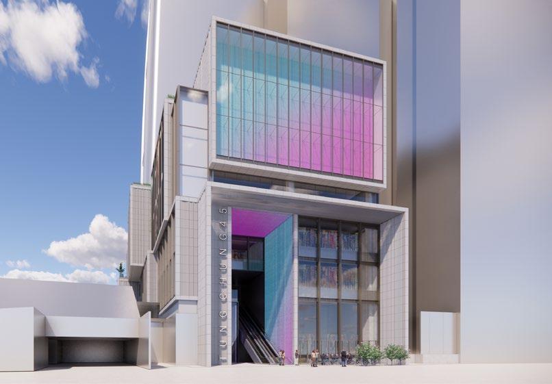
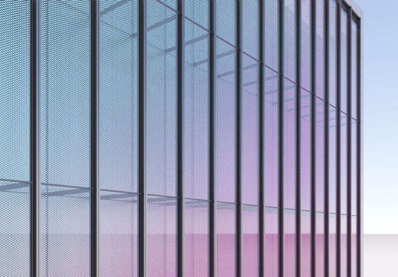
In this stage, i focused on retail podium. I contributed on testing the visual effect of mullions in different portions of retail facades, under the supervision of senior architects. We received information about glass build-up, mullions types and sizes from our facade consultant.
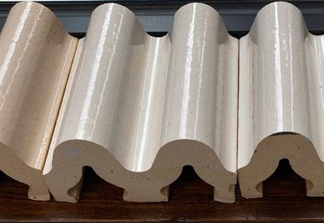
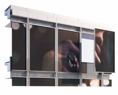
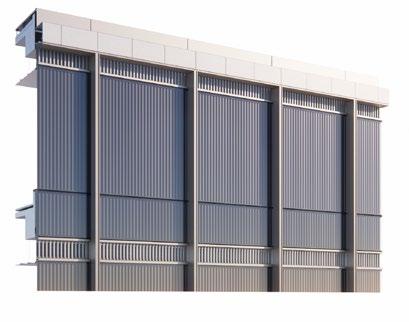
In the SD stage, This facade zone on the outside of IMAX cinema house was a cavity space with media wall on the inside and glass on the outer side. From the DD stage, the client was considering to use ceramic tiles as a cost-effective alternative. Therefore, we were also proposing to create a graphic pattern by applying colorful glazed tiles attached to the wall.
Stainless steel cap
Bamboo Panel
Stainless steel cap
Laminate glass 12T+12T
Stainless steel post
Aluminium panel with bronze color
Terracotta panel
Aluminium corrugated panel with bronze color
IGU
Laminate glass 12T+12T
Stainless steel post
Aluminium panel with bronze color
Terracotta panel
Aluminium corrugated panel with bronze color
IGU
Bamboo Panel Door rail
Granite Flooring
Granite Flooring
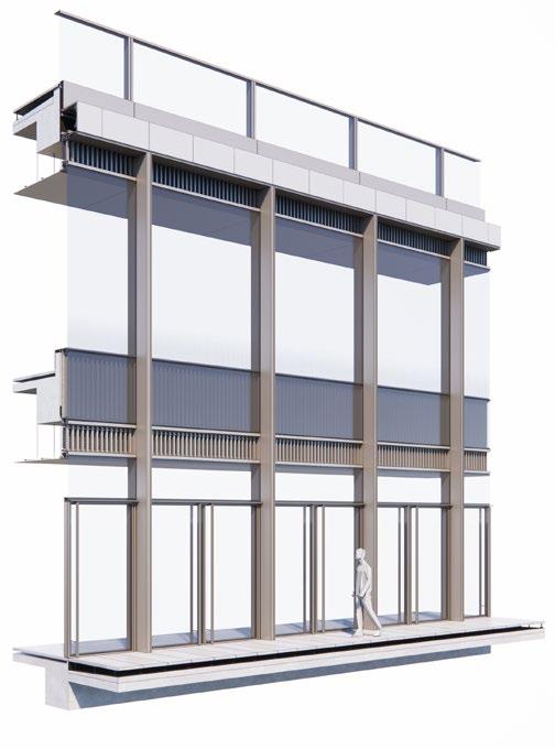
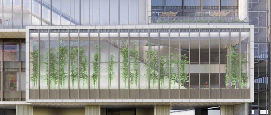
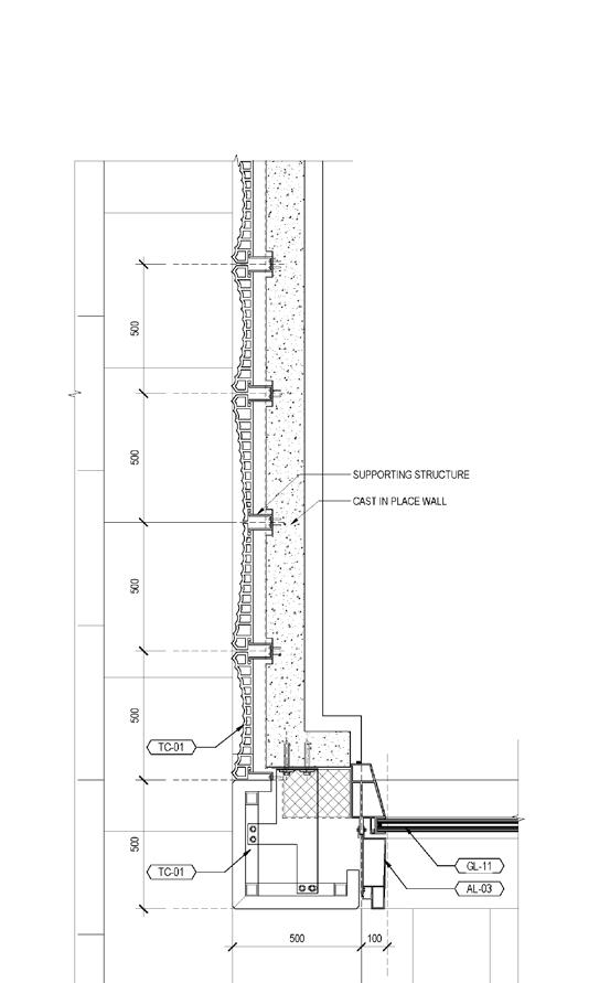
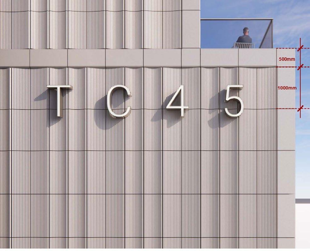
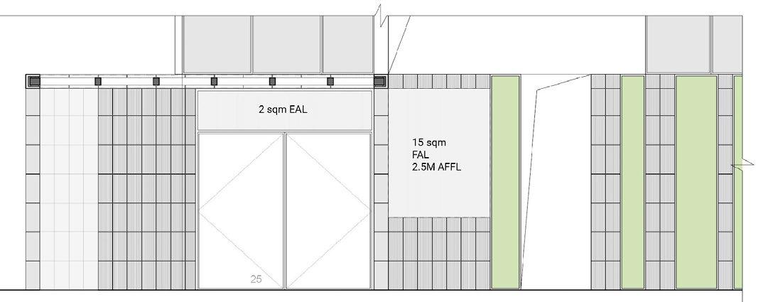
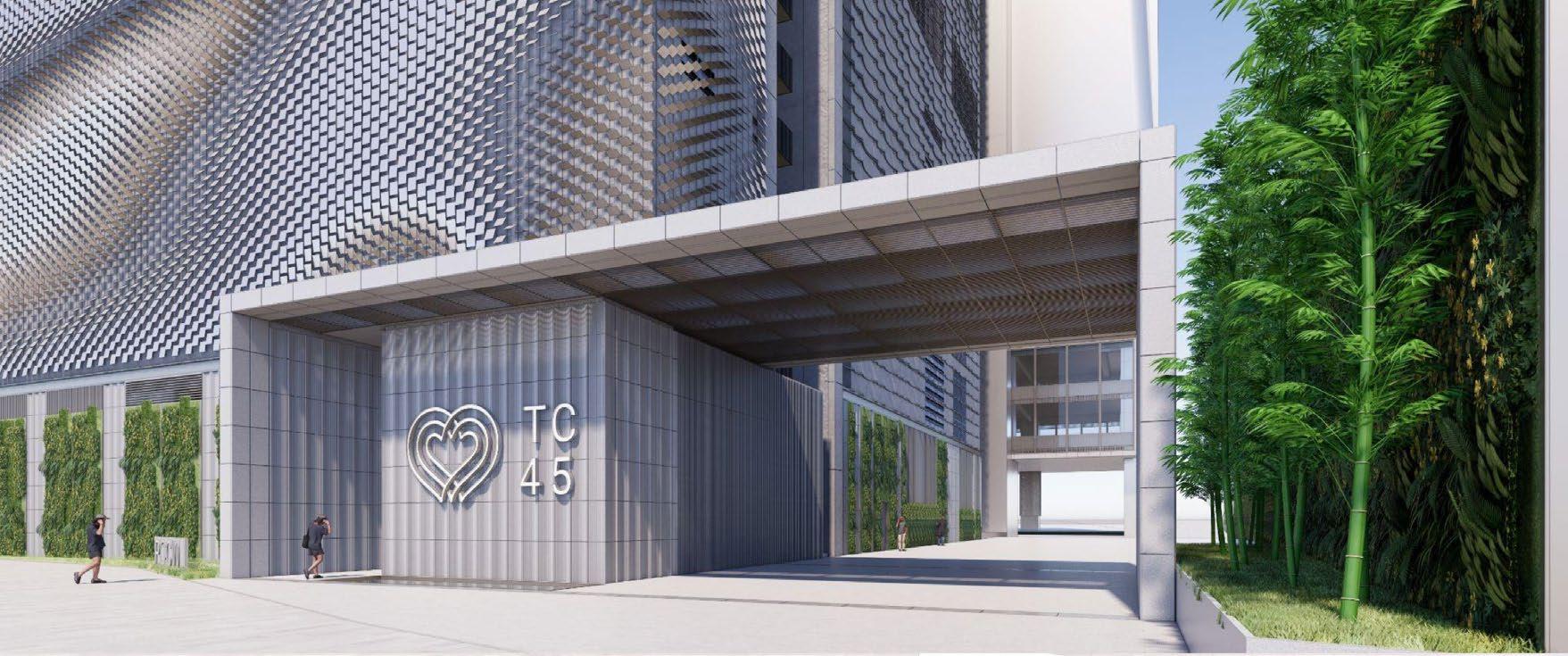
The portal beneath the data center tower serves as the initial point of ground floor arrival experience for the vehicle, as previously mentioned during the schematic phase. It also acts as a security checkpoint for individuals entering the DC tower. The design maintains a concise portal language, incorporating prominent terracotta and bronze materials. The alignment of the canopy, terracotta wall cladding, and granite flooring joint lines corresponds with the data center façade module.
• Diagrams, plans, sections
• 3D modelling design test
• Landscape Concept
• 3d printing
• GFA: 33,000 sqm
• LOCATION: Colombo Port City, Sri Lanka
• CLIENT : China Harbour Engineering Company Ltd (CHEC)
• PROGRAM : Residence, amenities program, Retail (smallscaled)
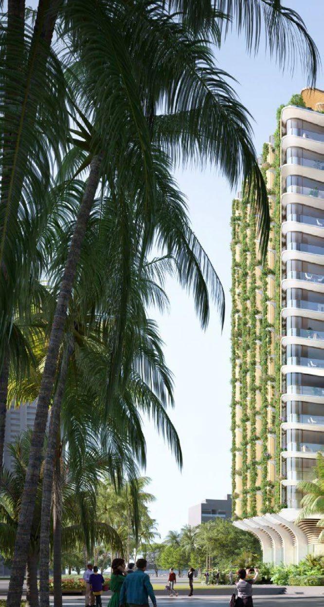
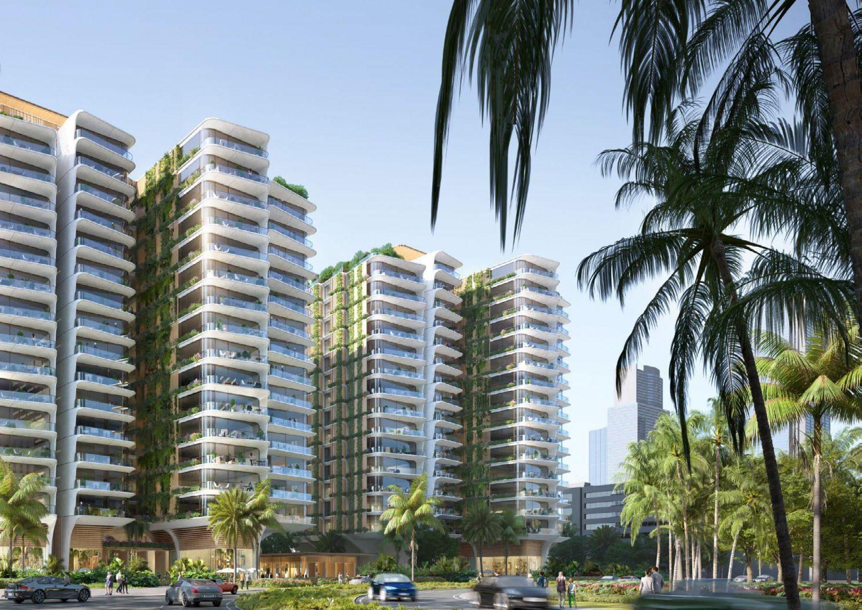
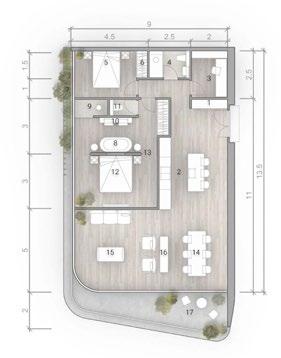
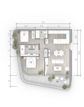

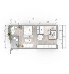
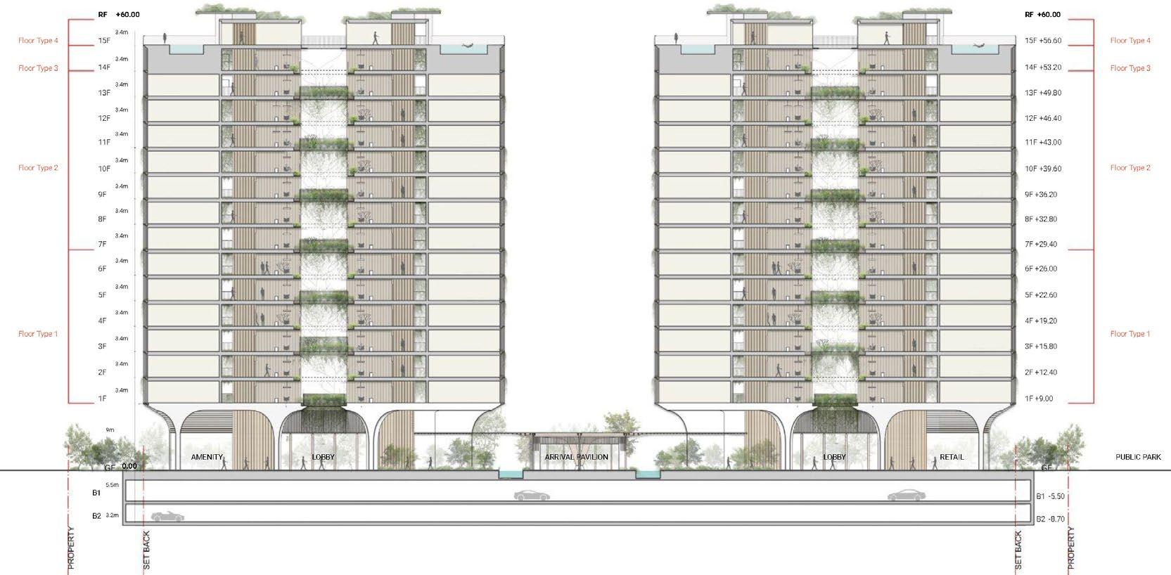
The aim for this development is to create a luxury curated lifestyle experience from the moment one arrives at the entry pavilion. The central arrival pavilion forms a ceremonial approach to the development. Units
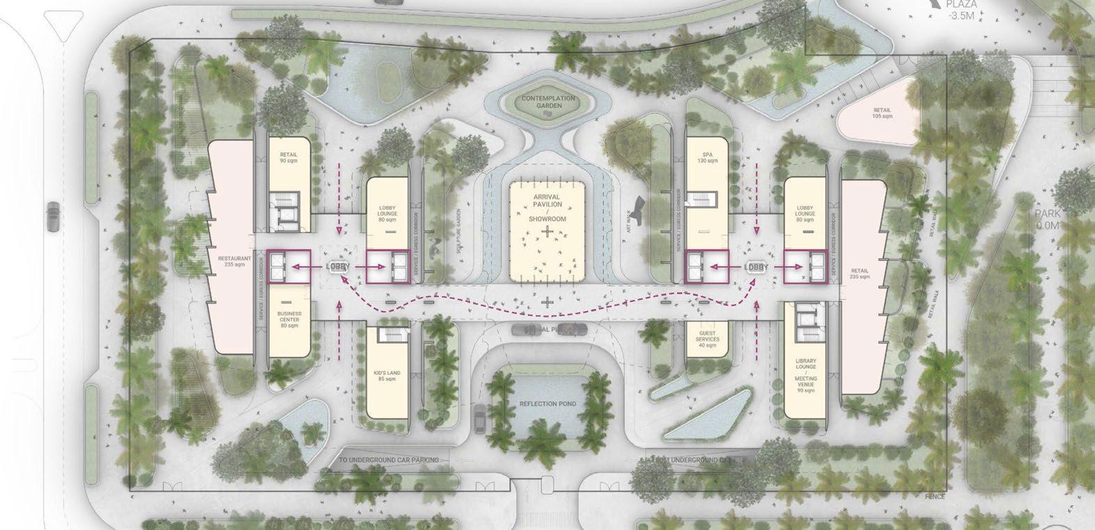
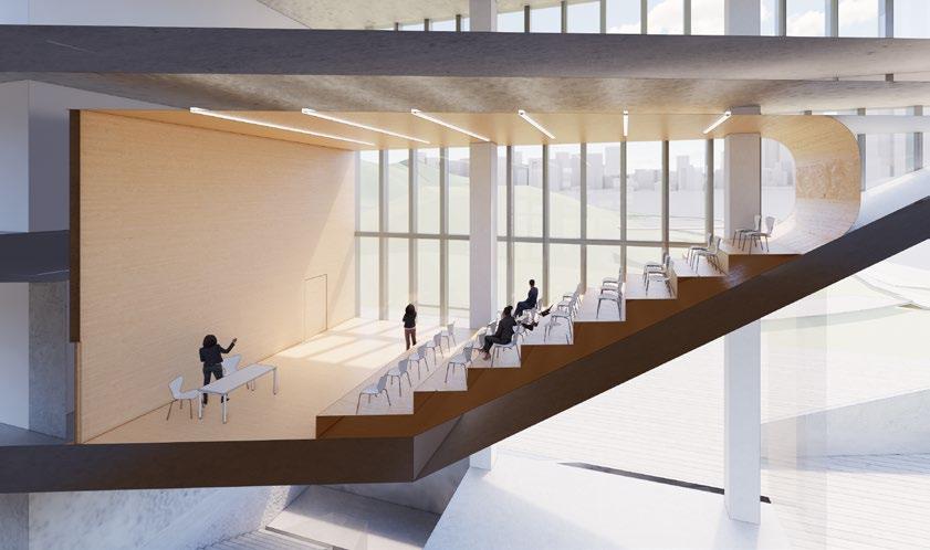
People goes up to the typical floors and amenity spaces through ‘green lounge’ . On the top level of each tower is where the sky pools, fitness studios and private dining rooms are located, with stunning views over the marina and ocean beyond.
Penthouse is also located on the top level deck with their private entry and deck.
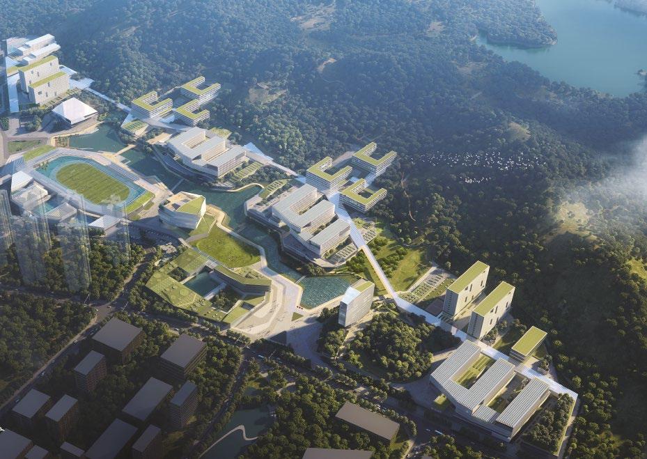
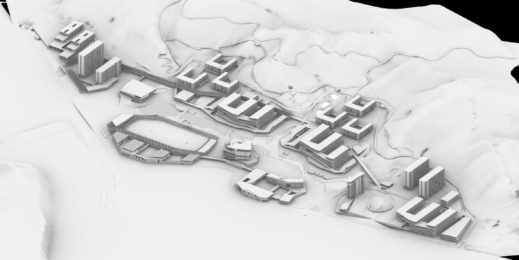
• masterplanning coordination: indexes/facades/circulations
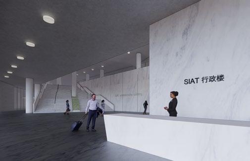
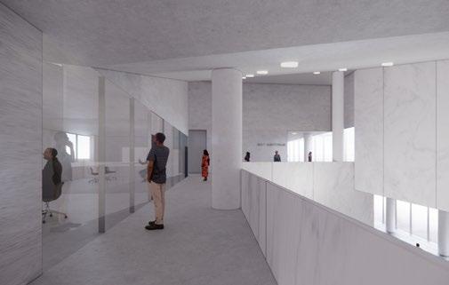
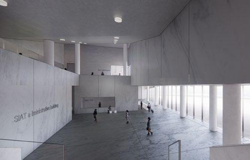
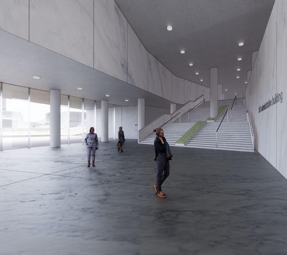
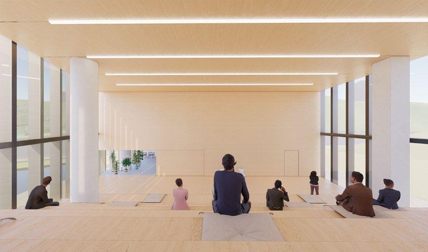
• administration tower schematic design and interior design
• 3d modeling,rendering,diagrams
• GFA: 562,000 sqm
• LOCATION: Shenzhen, China
• CLIENT : Shenzhen Public Work Bureau, SIAT
• PROGRAM : offices, canteens, auditoriums, gym, stadium, library, teaching, apartment
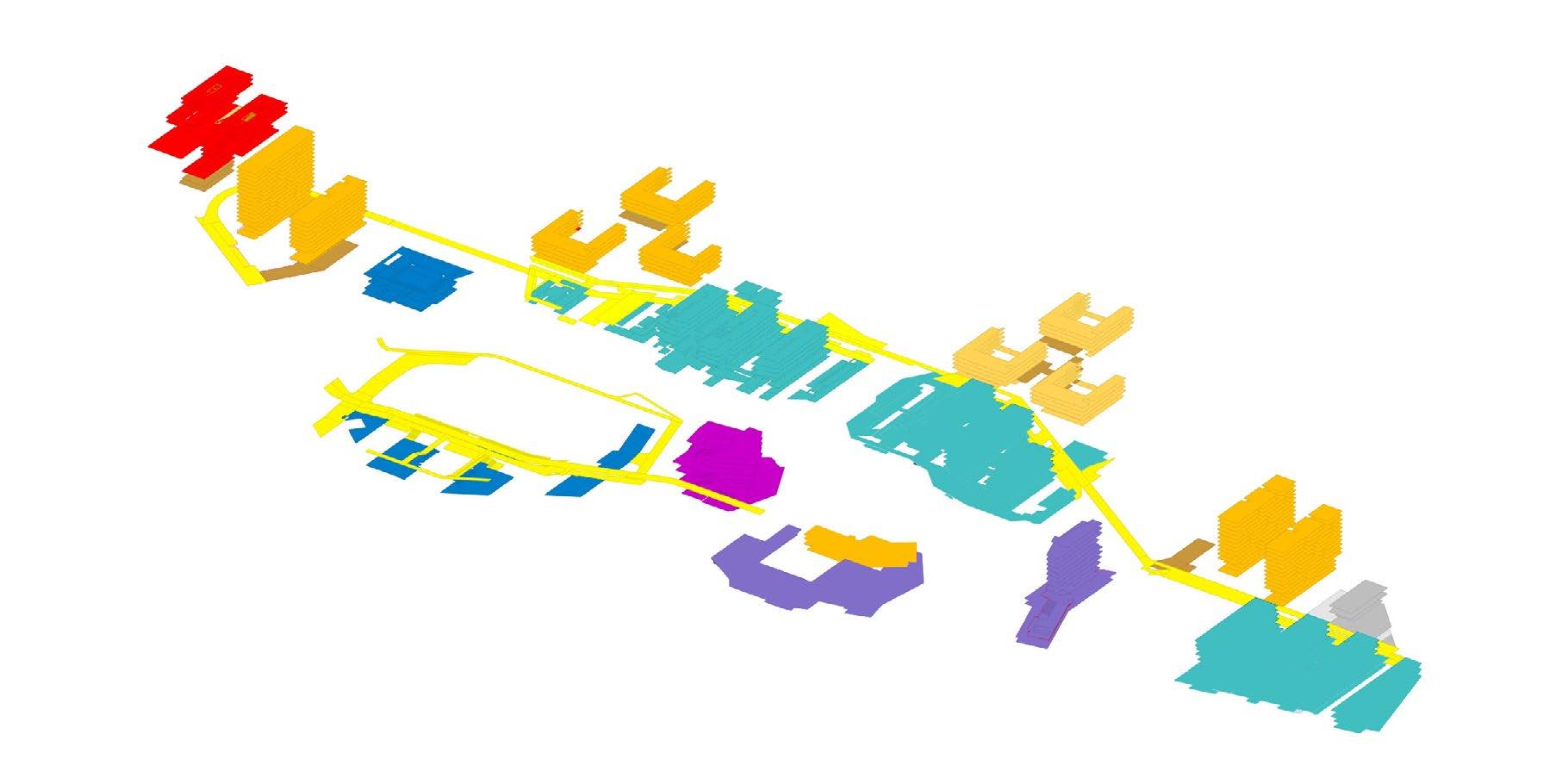
实验15400
后勤及附属278
宿舍41906
食堂1500
后勤及附属357
2#本科书院
24712
宿舍19218
食堂2000
后勤及附属1877 单身教师宿舍1617
2#本科研学
55922
室内体育用房5514
会堂2400
后勤及附属用房1310
地下设备用房817
室内体育用房4614
师生活动用房2960
后勤及附属用房2385 规划配套430
图书馆17008
教室1760
后勤2932
实验24760
教室7696
食堂2000
后勤及附属180 专职科研用房21286
3#本科研学
49928
学术交流中心10000
专家周转用房4700
教室960
后勤及附属用房1200
食堂1160
实验23182 教室7375
后勤及附属209 专职科研用房18566
3#本科书院
24972
院系及教师办公10240
校行政办公6000
后勤及附属用房1960
宿舍19182
食堂2000
后勤及附属1807 单身教师宿舍1983
实验22818
教室5809
食堂1500 后勤及附属用房225 专职科研用房18566
宿舍38094 地下设备3205
专职科研用房986 国家重点实验室7986
国家重点实验室10014

• Site analysis and brief analysis
• Worked on the deliverable list, work division, and time schedule for the consortium
• Coordinated with the LDI, got their technical supports
• Coordinated with the 3D architect so as to help him produce a more reasonable shape
• Worked out the way to organize functions and circulations, based on the overall shape of the building, and took the regulations into the consideration
• Prepared the schematic plans and sections
• Worked out the narrative logic and the final layout of the booklet
• Produced diagrams/2D drawings for the booklet
• GFA: 70,000 sqm
• LOCATION: Shenzhen, China
• Tenderee: Shenzhen Bao’an government
• Collaborated partners: Shenzhen Machine Architectural Design Co., Ltd.
• Programs: Archives, Civil service center
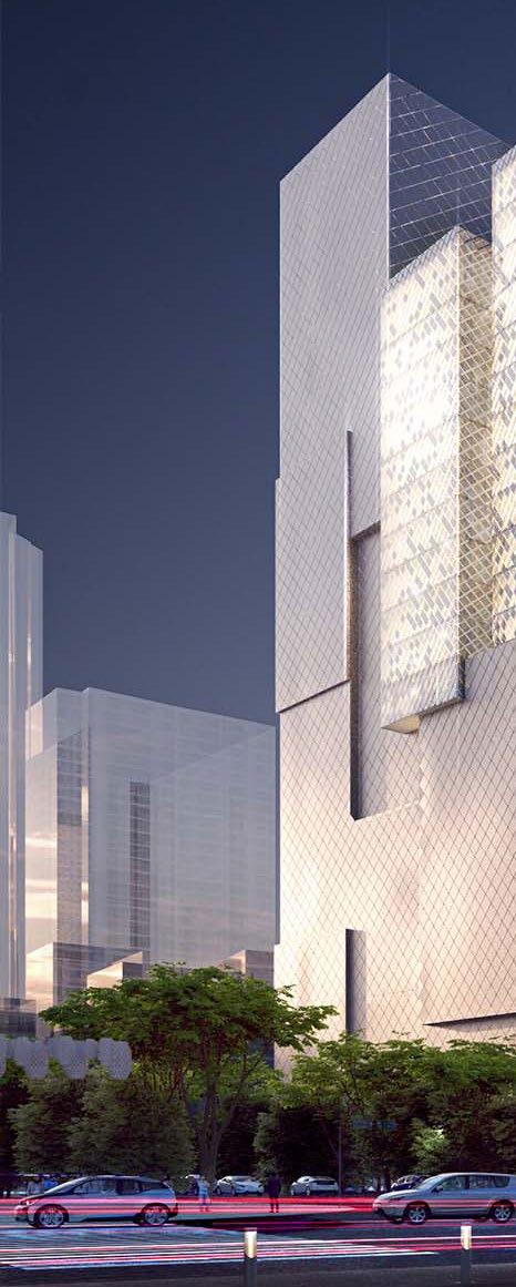
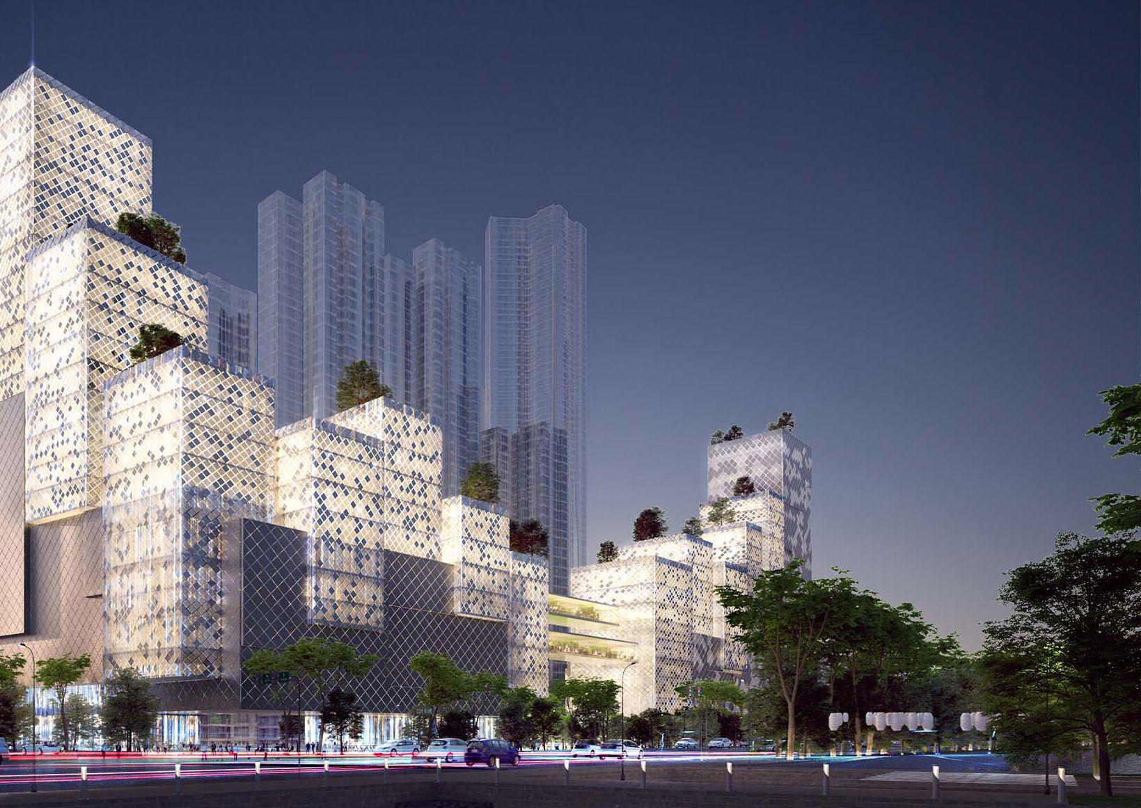

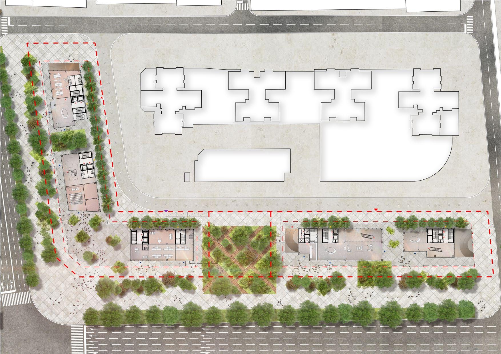
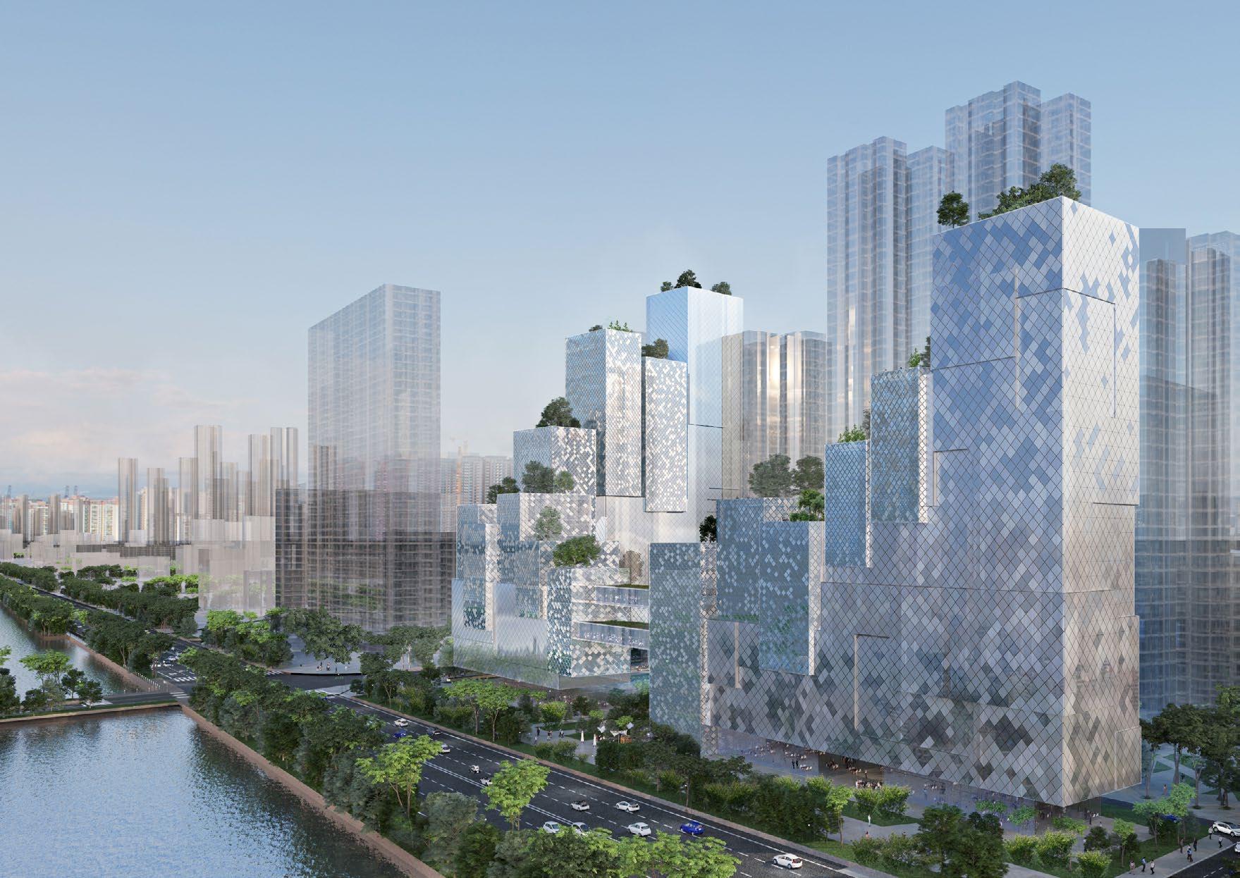
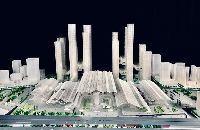
LANTERN, in traditional Chinese culture, represents the meaning of wishes and hopes. In the Old times, people will light on the lanterns in the important festivals to make a wish. Today, the Chinese cities are becoming popular for the lightning skylines. Shenzhen in particular is becoming famous for hosting digital lighting show events that happens on every important Memorial Day for this city when the people, as in the old times, is still making their wishes by lighting on lanterns, but in a modern way. In the show, the high-rise towers become the new ‘lantern’, and the façades brings the light in a more vivid way. Various images and animations are shown on the façades of the towers to express the glorious expectation by this city and its people.
Our inspiration of this design came from this gorgeous scene - THE DIGITAL LANTERN. With its happiness and luckiness, a digital lantern will be located as the unique landmark at Bao’an district with its interactive façades and strong identity.
• Site analysis and brief analysis
• Coordinated with the LDIs (Urban design team and transportation design team)
• Work together with the model company to complete two models (1:500 and 1:1000), deliver the design concept
• Prepare the booklet, diagram, narrative ideas
• GFA: 3,400,000 sqm
• LOCATION: Shenzhen, China
• Collaborated partners: UPDIS, GZTI, Stoss landscape, Buro happold
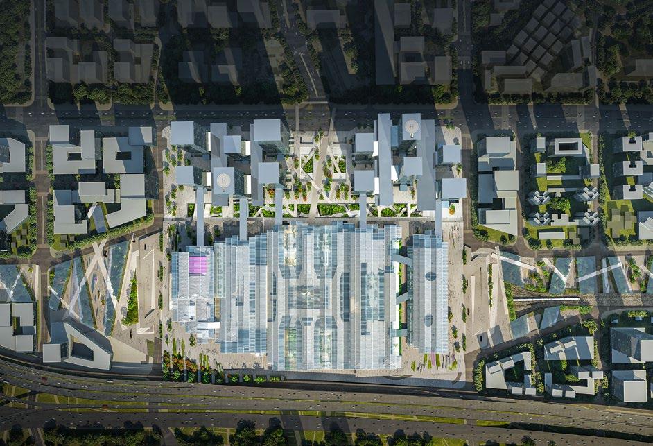
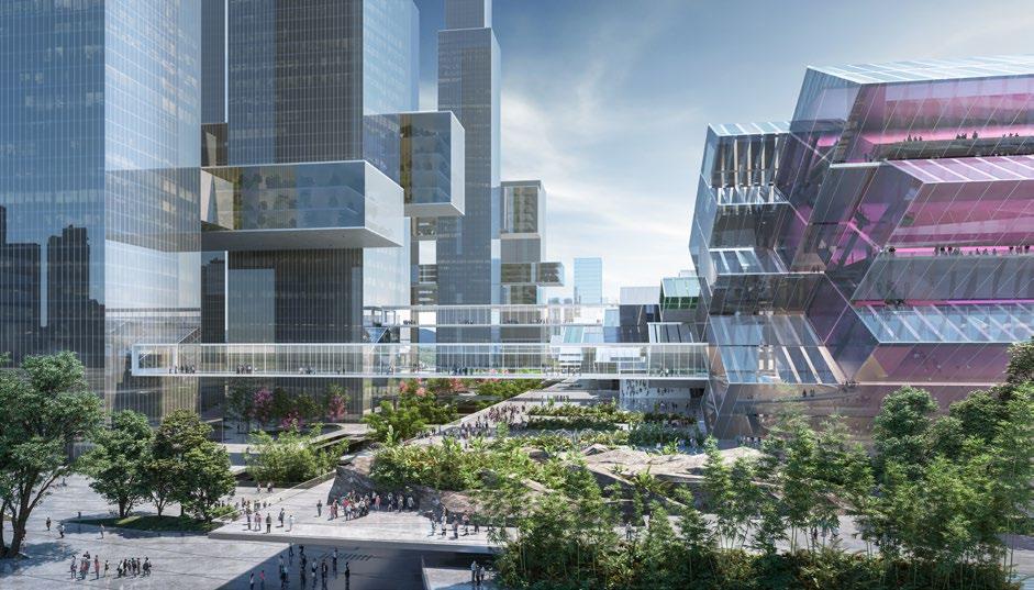
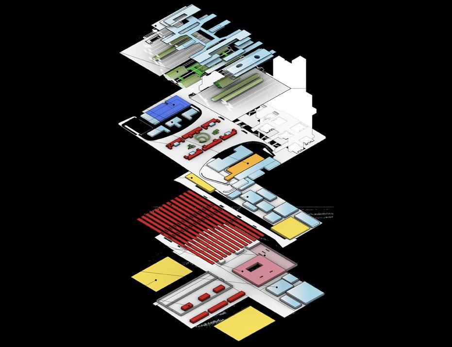
• Programs: High-speed Train Station, Convention center, Commercial development
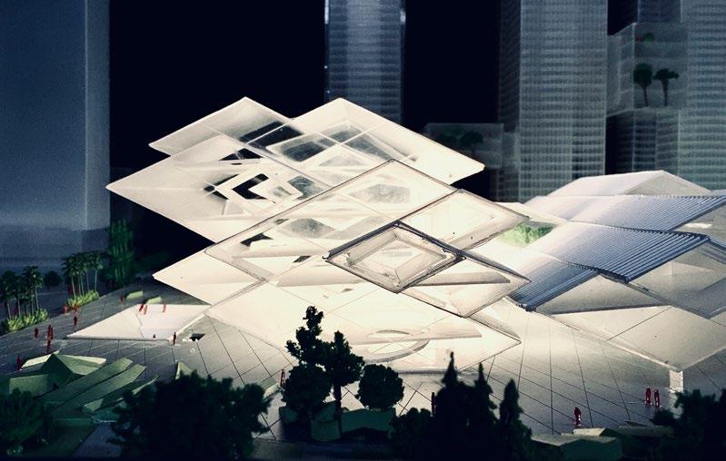
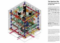

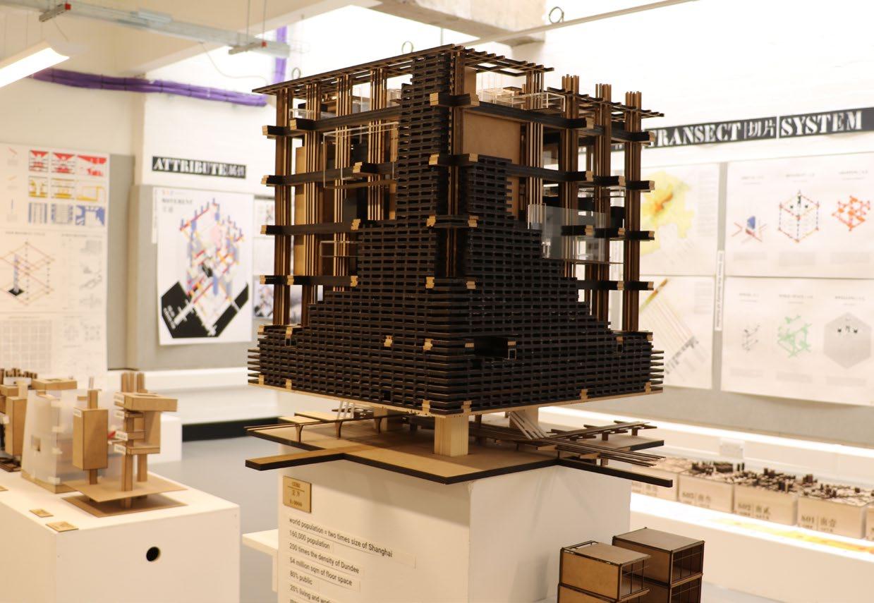
More than 50% of the world’s population live in the cities. Yet the city finds itself a fragile entity-its very identity is at risk. The remarkable intensity that comes with compression of time and activities into small geographical areas is being eroded by a growth pattern that promotes increasing isolation of temporal zones.
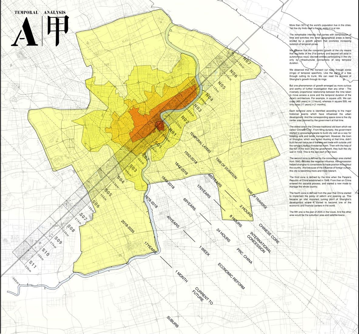
From the research and analysis of Shanghai, we observe that the concentric growth of the city means that the urban fields of the 21st century and beyond will exist in autonomous ways, discreet entities participating in the city only by infrastructural connections of long temporal duration. One phenomenon of growth emerged as more curious and worthier of further investigation than any other - the inversely proportional relationship between the time taken to move access a zone and the longevity of that zone’s development moral duration of the zone’s architecture. For example, in central area, we can cross nearly 500 years in about 2 hours, whereas in suburban area, we only cross 17 years in 1 month.(fig.1) We identified five zones in Shanghai, each relating to the major historical events which have influenced the urban development.
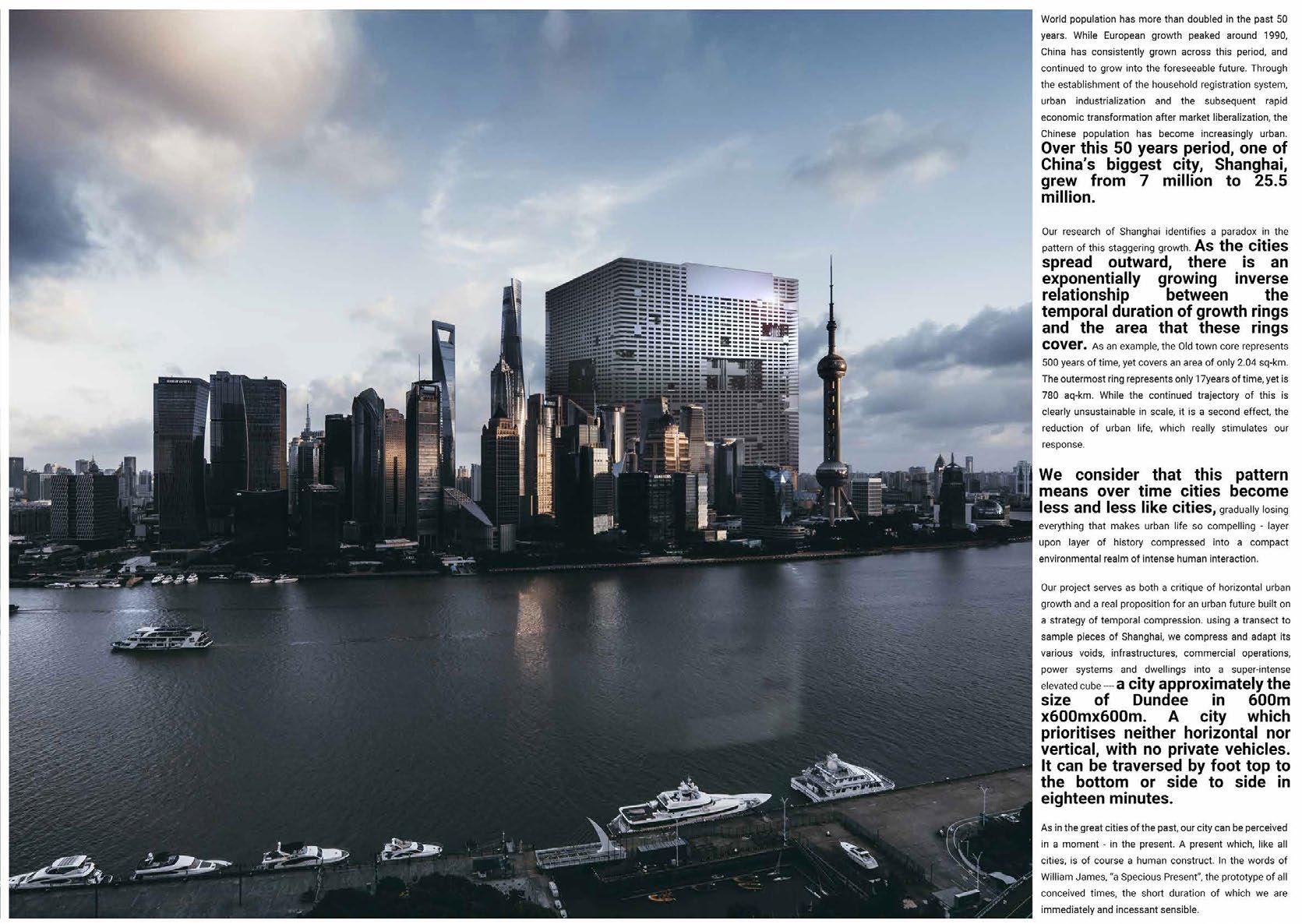
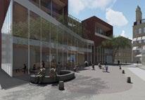
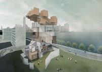
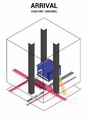
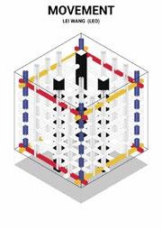
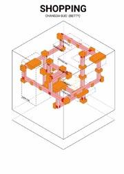
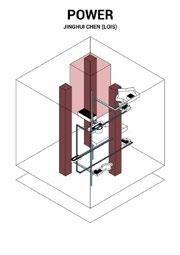
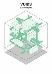
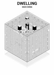
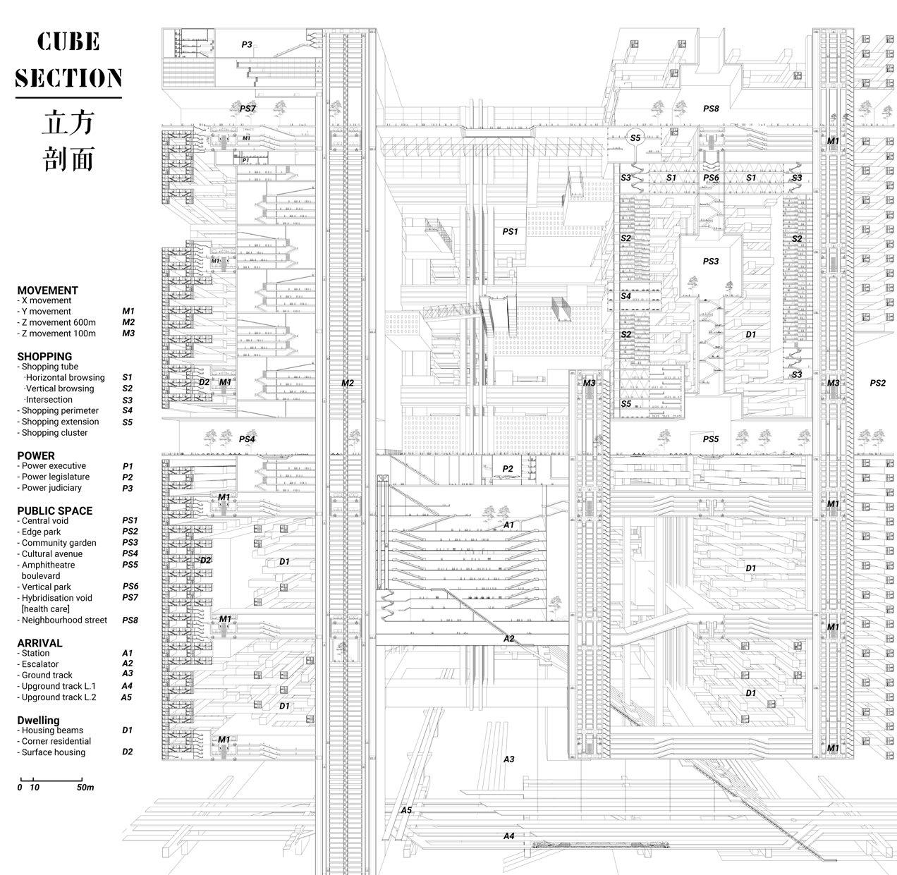
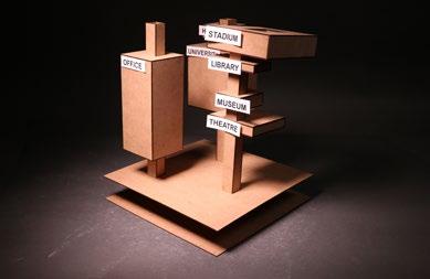
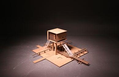
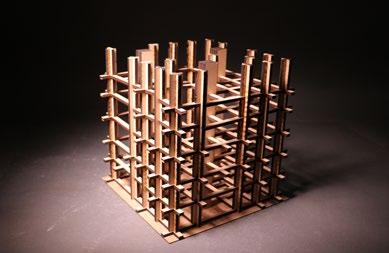
Then, for the purpose of solving the isolation of these zones and permanently keeping the intensity of time into small areas, the idea of temporal ‘compression’ is proposed. This approach of compression manifests in a design proposition a radical and direct solution in order to solve problems that cities like Shanghai have. Under this city prototype, there are six individual projects focused on what we call different ‘attributes’ – dwelling, shopping, public space, power, arrival, and movement. All attributes should be reconsidered in response to the new urban organisation.


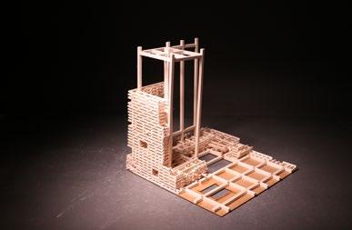
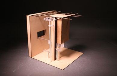
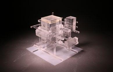
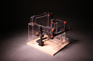
Montpellier, France
Individual Year 4 project
Supervisor: James Robertson
Duration: 2017.9-2018.5
This project demonstrates one way of finding a position that is in harmony with the surrounding historical urban context, instead of being outside the space. It tries to find its own way of respecting and reserving the inherent atmosphere of the site. Meanwhile, as a professional forum, this project aims to increase public engagement through the use of one form of architecture, the void.
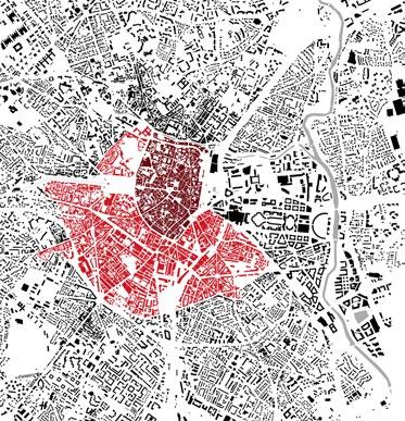
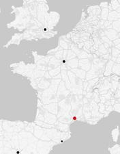
The Site : Montpellier is a French city, located to the Mediterranean Sea. It is the eighth biggest city in France by area and the largest city by population density, whilst it has a long history. The old medieval town is sat at the core of the city, which is always under protection from the different planning procedures while the whole city was experiencing urban expansion from 1970s. This large-scale expansion resulted in massive growth outward from the historic centre and unorthodox proposals for design solutions
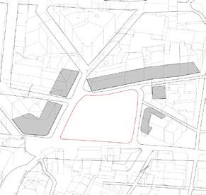
to the demands of a rapidly growing city. The site is situated at the southernmost tip of the medieval escutcheon. The site is adjacent to a tram stop. It sits at the point where the medieval centre gives way to the surrounding city, transitioning from the old to the new.
Patrick Geddes and the Design Proposal:
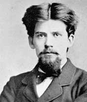
Patrick Geddes, the Scottish polymath and academic, spent several years putting into practice some of his theories on medicine, biology, and also education and town planning. Geddes’s education theory emphasizes the importance of integrating learning through various subjects. Meanwhile, the urban environment is of great importance to improve people’s quality of life. Geddes proposed getting local people involved in town planning because he said that those who use it is the best people to decide how a city should be developed. Practically, He created the Outlook Tower in Edinburgh to help citizens know their urban environment. In Montpellier, he created the Scott school. It is with big green space for outdoor educating. Students were learning and living there as units.
Our proposal is to design a new architecture and urban planning forum for the professional, the students, and the local citizens. The design thinking was concluded as ‘public participation’, ‘interpretation’, ‘synthesis’. The proposal is to design a building which promotes public engagement.
Paris
London Montpellier
 Medieval center Area till 1950s
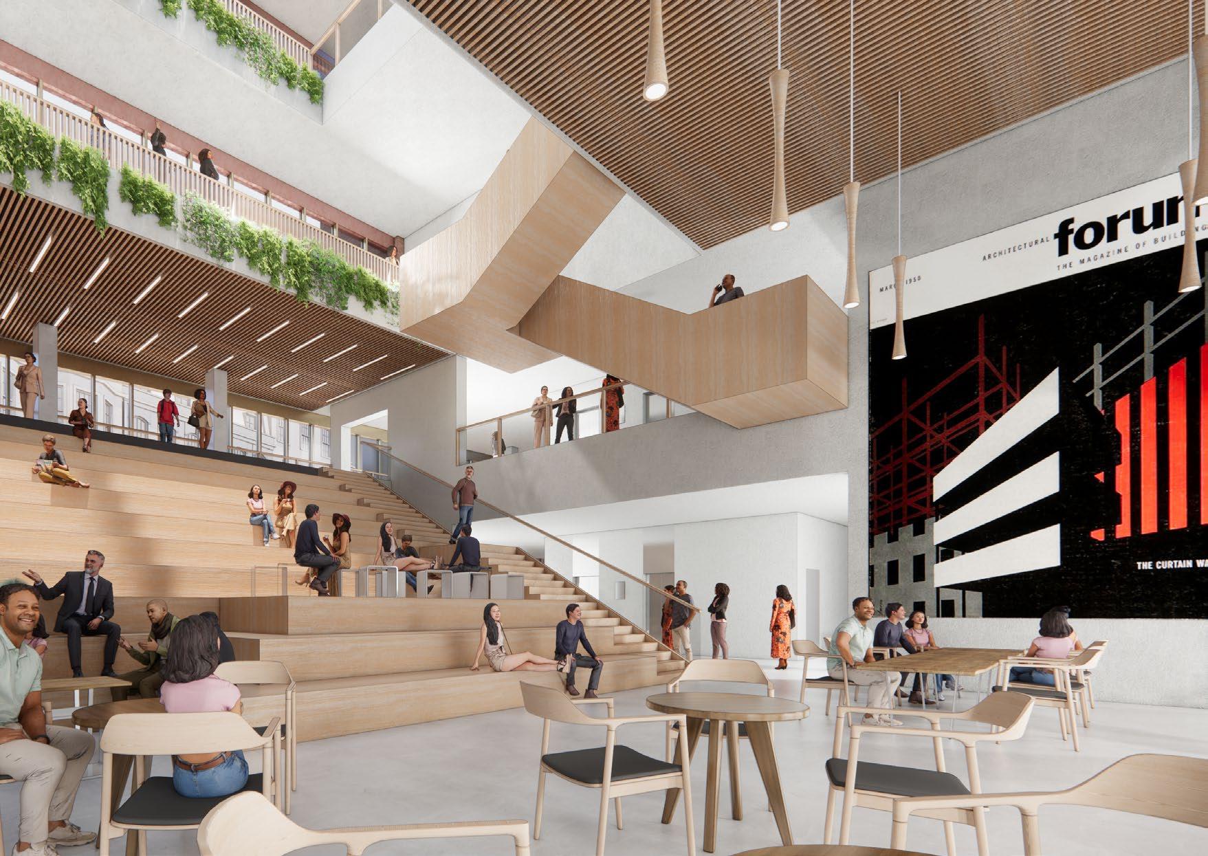
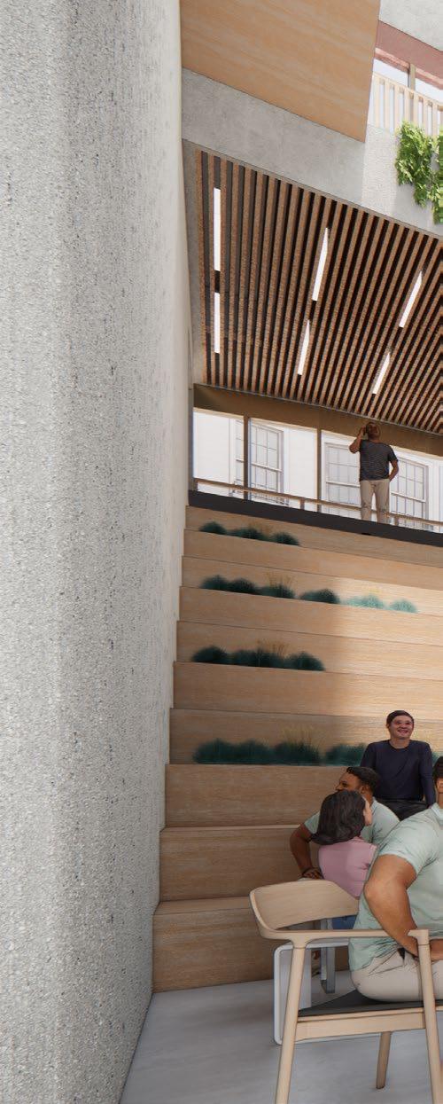
By the corridor, there are public communication spaces like big stair and coffee shop for public functions such as speeches.
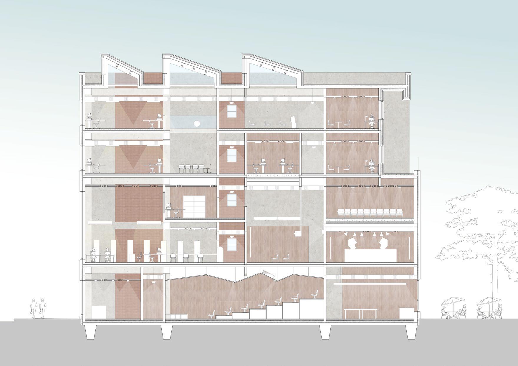
A corridor inside the building connect the south and north so passersby will go through this forum.
On open days, studio public spaces welcome the public to attend their critics and other acticities. The professionals (teachers and students) will share with and receive ideas from the public.
School set exhibition towards the public. People could leave their ideas and comments there to interact with some professionals


Wuhan, China
Individual project
Year 3 Summer vacation
Supervisor: Zhiying Xu
Duration: 2017-8 to 2017-12
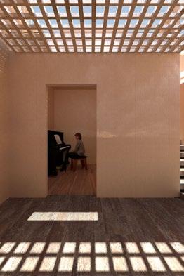
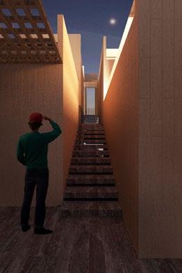
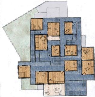
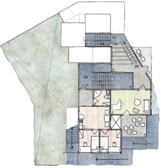
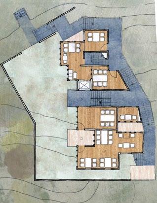
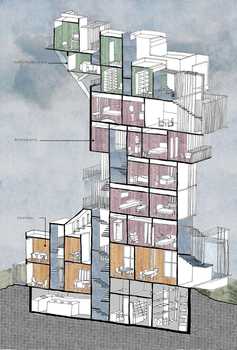
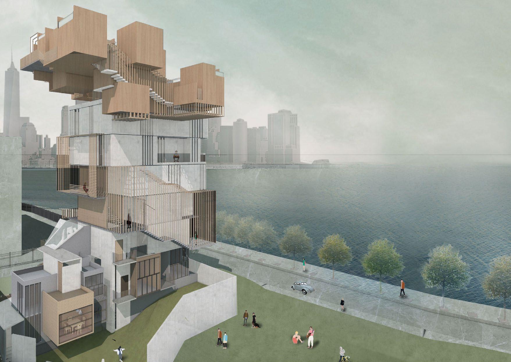
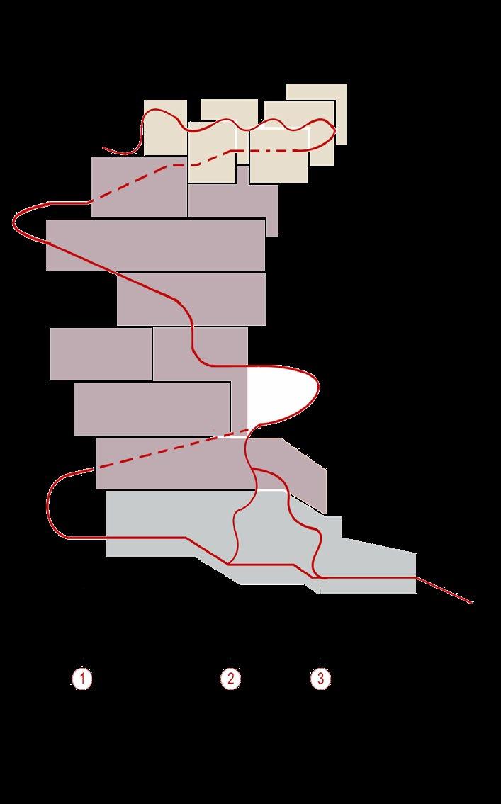
Usually the Chinese student dormitories only provide the essential requirements for living. However, we are living in a period in which everyone enjoy expressing own personality, so this project attempts to create a new living space for student to accompany with their living styles. The design comes from the imagination of a series of ways people living, eating and communicating. The imaginary scenes lead the whole design process.

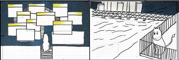
6. Finally he arrived at the top level.Light came out from the cell rooms, implicting someone stayed alone there.
7. Mumin enjoied the beauty of the lake. He was seeing the boat, the long bridge as well as the illuminated city image in distance. How warm the night wind was.

1. Mumin woke up during the mid-night.
2. He decided to eat something in the canteen. He left his apartment and went downstairs.
5. After eating, Mumin went upstair. It was interesting that many students were gathered on their balconies where no one would stay during daytime.
8. But... wait! "I am on my bed?" He thought. Well, it was just a special dream.
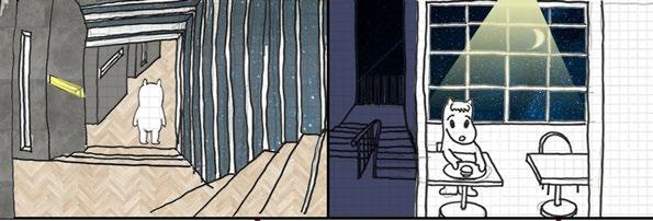
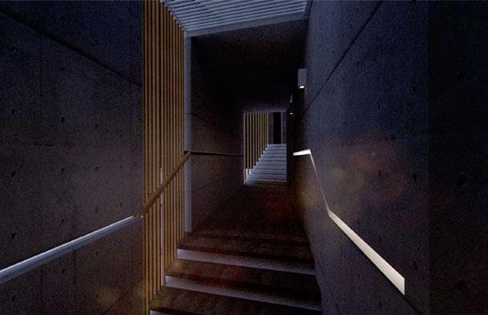
3. The corridor appears to be really dark. The linear lights gaves a hint for him to the destination-canteen.
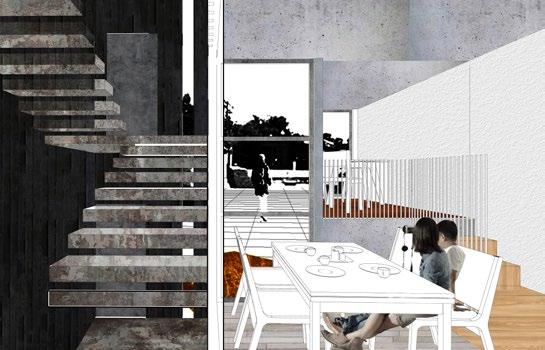
4. After going through the dark corridor, he arrived at the canteen. How bright the canteen was! There was only himself eating quietly.

