THE ISU LOOK: A Guide For Branding University Spaces


Design and Brand Standards for On-Campus Spaces


Design and Brand Standards for On-Campus Spaces


Branding University Spaces

Using the Facilities Lookbook
Interior Design Standards
Lobbies and Greeting Spaces
Large Classrooms and Lecture Halls
Small Classrooms
Research and Teaching Laboratories
Collaborative Spaces
Conference Rooms
Corridors and Common Spaces
Break Rooms
Give us your feedback on the Lookbook

Idaho State University’s brand is one of our most valuable assets.
When some people hear the word brand, they think of a logo, font, or combination of colors. At Idaho State, our brand is much more.
Our brand is how we are recognized, and it serves as a visual reminder of our mission, vision and values. Education is at the center of everything we do, and our University’s brand reinforces that commitment. It reflects who we are, and expresses what we want to become.
A strong and consistent brand, from logos and colors to furniture and fixtures, represents our commitment to student opportunities and programmatic excellence. At Idaho State, we do everything with purpose and intent, and that includes how we use our facilities and campus spaces to reinforce our identity.

branding our campuses. This Lookbook contains inspiring photos of our varied spaces and environments. It is meant to be a resource and guide to support the planning and design phases.
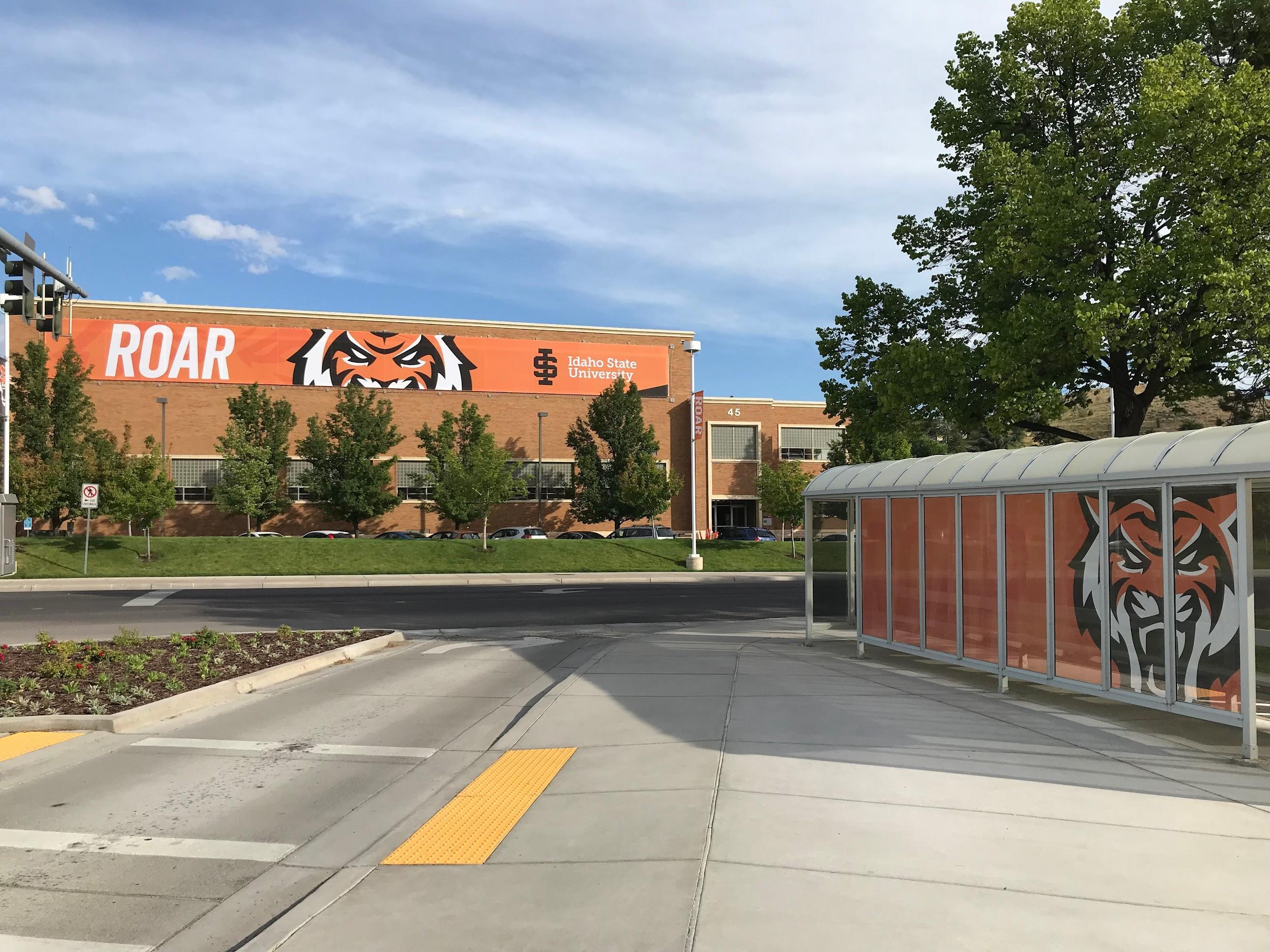
Facilities Services and the Office of Marketing and Communications will partner with you to finalize all design decisions.

1. Review design elements from this Lookbook and select options that you would like to incorporate into your project.
2. Submit a Project and Space Request (PSR) to Facilities to initiate a project request.
3. The Facilities Services design team will work with you to review budgets, develop timelines and coordinate with contractors, as necessary, to create a schedule for the project.
For many who visit our campuses, lobbies and greeting spaces are the first impression of Idaho State. These spaces should feel inviting, welcoming, and accommodating for the broadest possible range of needs. From comfortable seating to bold University branding, lobbies and greeting spaces should be designed to reinforce Idaho State’s commitment to quality and excellence.

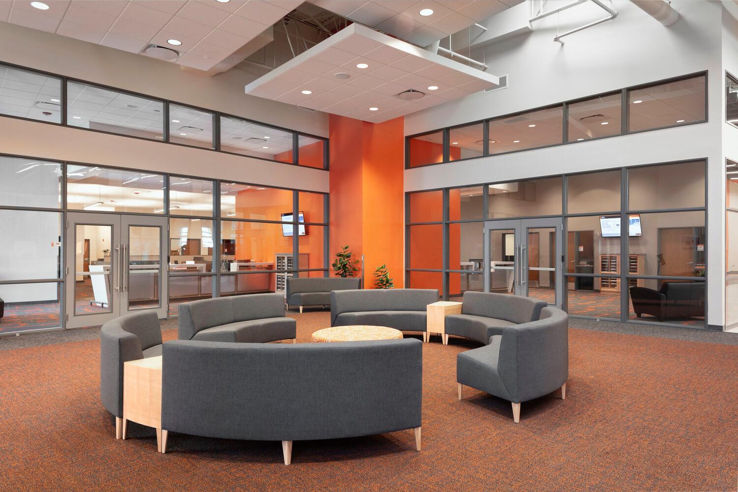
A This lobby shows the use of color blocking in a large space. Having a bright open area with high ceilings makes this design choice possible and helps direct the eye to intended traffic patterns (note the doors flanking each side of the Roarange walls). The branded walk off carpet in a high traffic space is an excellent choice for comfort and functionality.
B The lobby depicted in this picture shows a high traffic and collaborative space. This allows guests to feel welcomed and provides them a space to meet up or wait for appointments. Furniture that has flexibility in layout and easy-care finishes work best in these types of lobbies.

C This Dean’s suite lobby shows pride in their program while maintaining connection to the overall brand of the University, emphasizing ISU’s collaborative spirit. The strategically placed accent wall is appropriately sized for the space.
D This space highlights a beautiful and ADA accessible counter with bright surfaces and a clean open floor plan. Keeping in mind the diversity of needs for a space helps in making welcome centers like this one comfortable for everyone.

Creating spaces where students and faculty feel inspired and receptive to learning is a core necessity for ISU. Keeping large classrooms and lecture halls up to date in technology and finishings makes this possible. These areas should have flexible lighting options and sustainable design choices.

A This is an example of how spaces can be customized to meet the needs of a program. Intentional flooring separations and computer screen arrays accommodate collaboration and definition of roles required for each individual area of the classroom.

B This heavily utilized lecture hall has large profile carpet tiles that provide a consistent look to accommodate the multiple fixed chair installations. Focused lighting and design elements on the presentation space, which includes an ADA accessible podium, make this lecture space functional, accessible and exciting.
C Acoustical flooring and chairs designed to suit the room elevate this lecture hall to produce an enhanced learning environment.
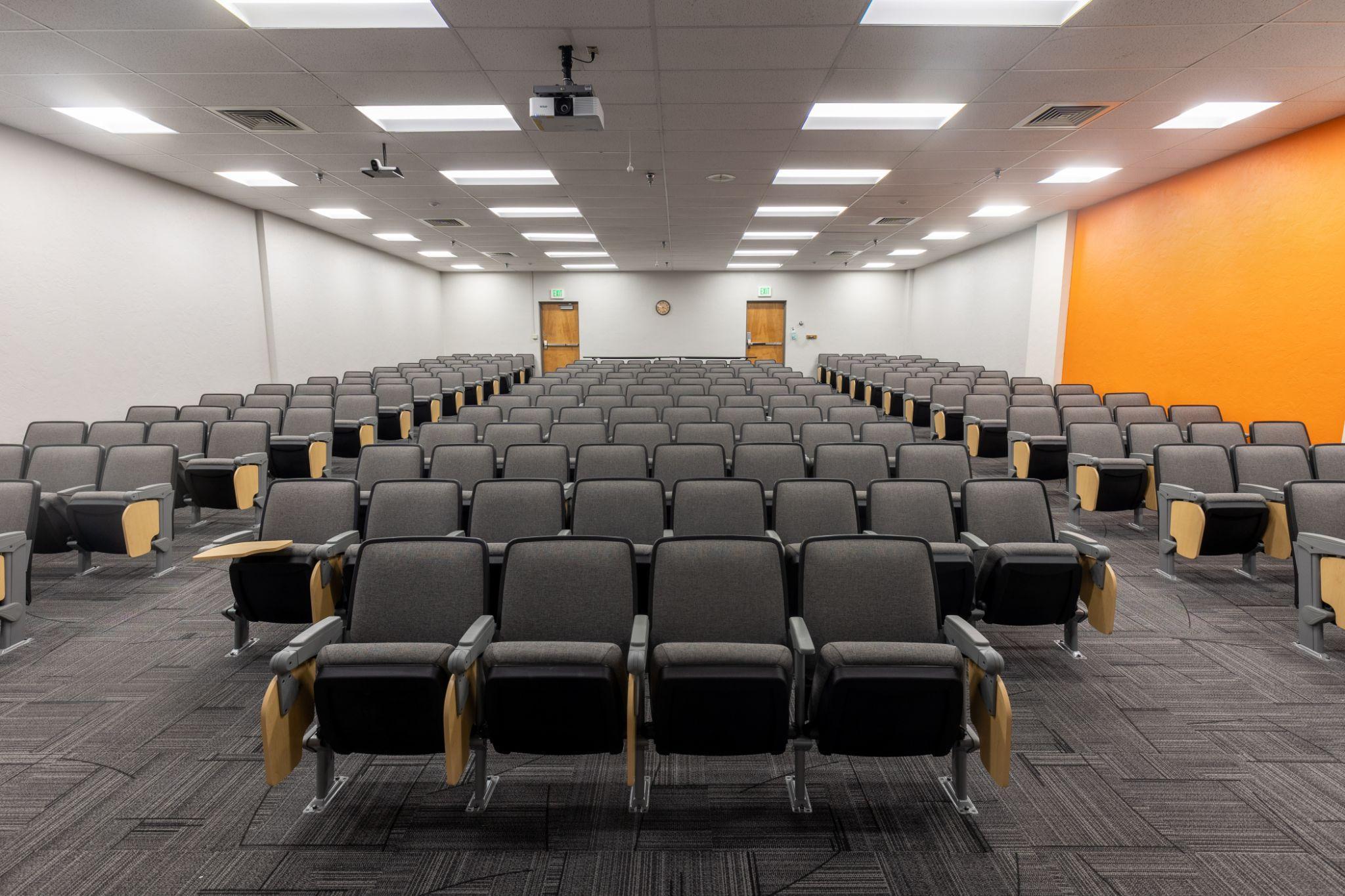
D Furnishings that are flexible can transform this multipurpose room with each use, efficiently utilizing the room to its best advantage for every situational need.

Focused learning environments are created in small classrooms, which make up a large portion of the learning spaces on our campuses. Similar to large classrooms and lecture halls, these spaces should inspire faculty and students while fostering a collaborative and interactive atmosphere. Having flexible furniture choices and bright, functional walls with instructional resources bolsters this effort.
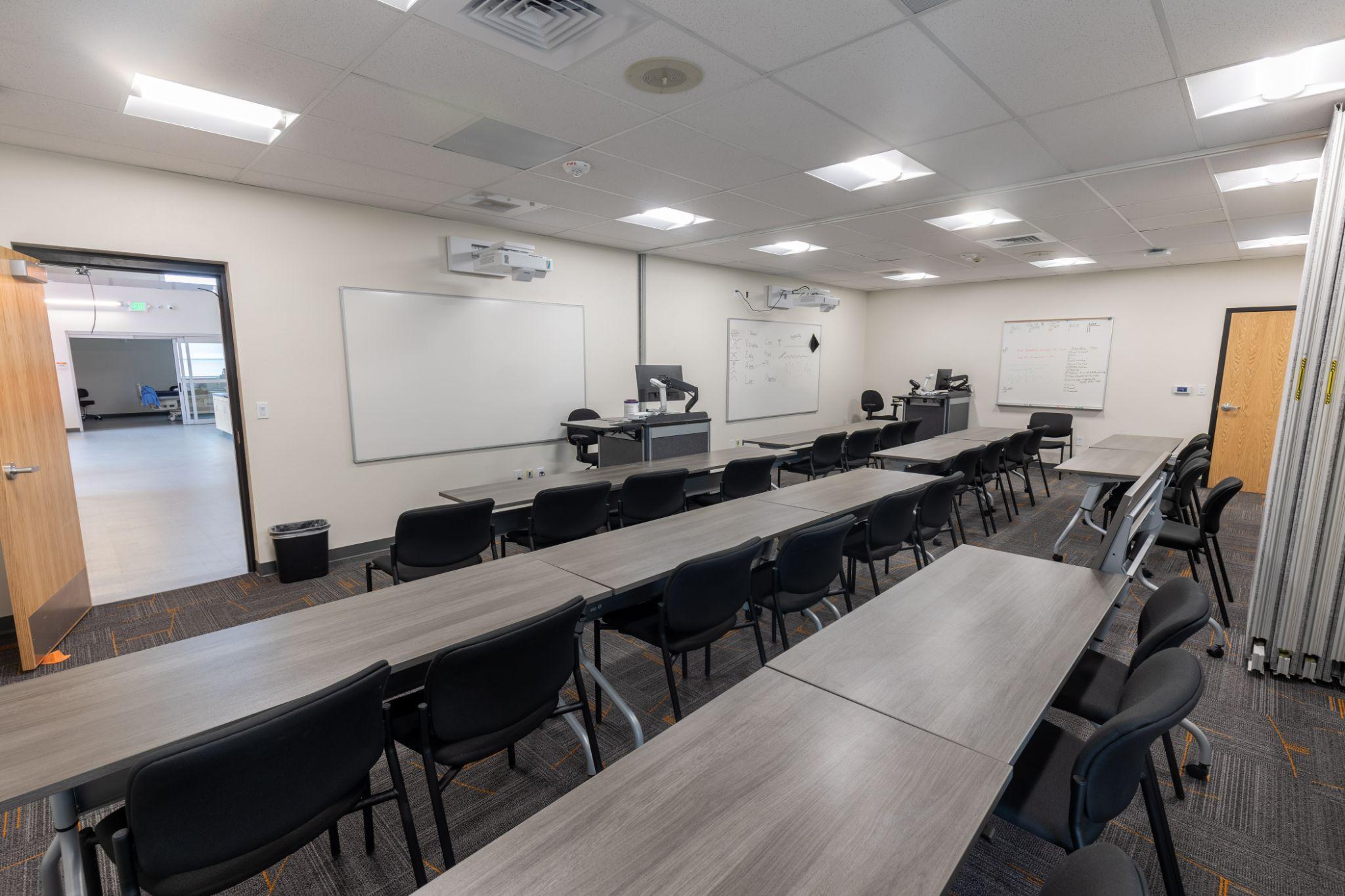


A Using color in a space like this can be tricky, but we see a great example of how it can be done well here. The bright pop of color in the flooring is offset by the more complimentary non-distracting colors on the walls.
B The instructional space here illustrates how a small space can be well appointed with some flexible furniture options.
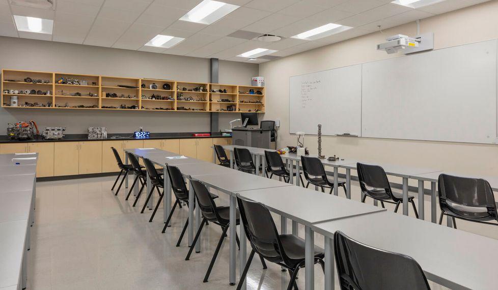
C A space designed to be easily cleaned because of the program’s use of hands-on materials reduces transfer to unintended areas. Keeping the focus on the functionality of the space is essential in classrooms like these. Easy access to supplies from the workspace is another aspect of the room’s design that focuses on case use. The grey accent wall clearly defines the front of the room in a way that also breaks up the efficient and functional finishes.
D Carpet choice makes this small room interesting but not overwhelming. The accordion divider in the middle of the room provides more flexibility in the use of the space for smaller groups.
Research and teaching labs depend on technology and sustainability to support success in each space. These locations should inspire students while providing a view into the real-world context of their studies. Labs are designed to be functional and modern, promoting the discovery of new knowledge.
A Bright, high-gloss finishes maximize lighting while making the furniture and amenities of the space sustainable. Traffic patterns of the room are defined clearly by the layout of the furniture and teaching materials. The environment echoes current lab trends and establishes a realistic expectation for the future environments of our students.

B To accommodate this high-traffic lab area, the flooring is a hard surface that is easy to clean and maintain. Storage areas run along the interior of the corridor, delineating action space from supplies.

C Using correct specifications of real-world scenarios is on full exhibit in this lab, connecting our students to their future careers. Using branded finishes maintains the lab’s connection to Idaho State and shows pride in what we do here.
D The use of ISU Roarange on the walls in this lab energizes the space and maximizes the high ceilings and bright natural light.

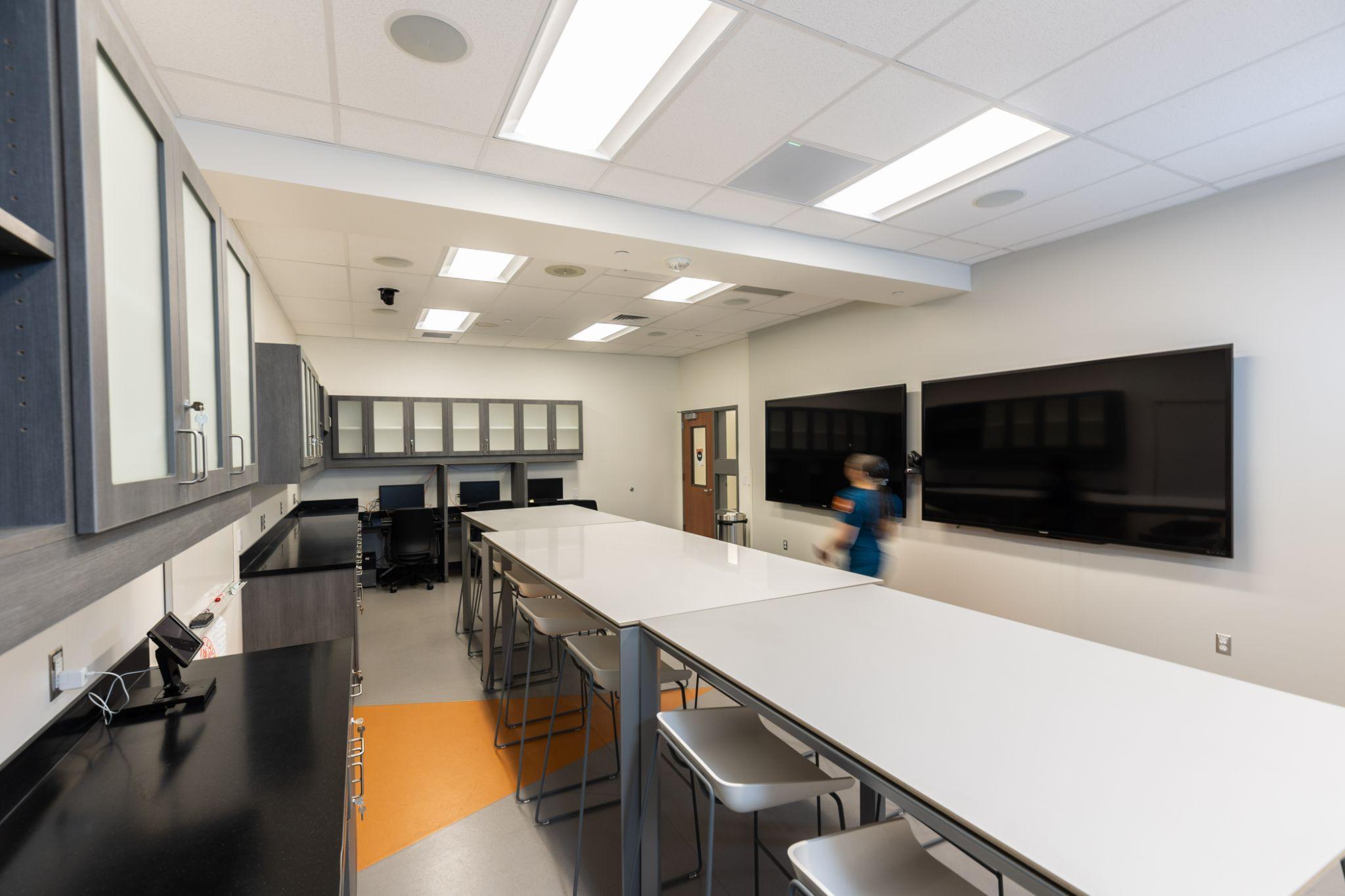
Collaborative spaces for students, faculty and staff make study and work at ISU possible. In these areas, the goal is to design spaces that have flexible furniture layouts, comfortable finishes, and bright atmospheres, leading to feelings of belonging, inspiration, and longevity.

A This is a great example of how furniture layout can be changed to create multiple areas of interest and accommodate varying levels of collaboration. The lighting is bright and the pop of color in the carpet keeps the room interesting but distraction-free.
B The strategic placement of furniture and use of color in this space illustrates how pops of color add interest but don't distract from the intended use of the space.
C A variety of seating options provide functional spaces for group discussions. This example can be used as a template for creating accessibility in a space.
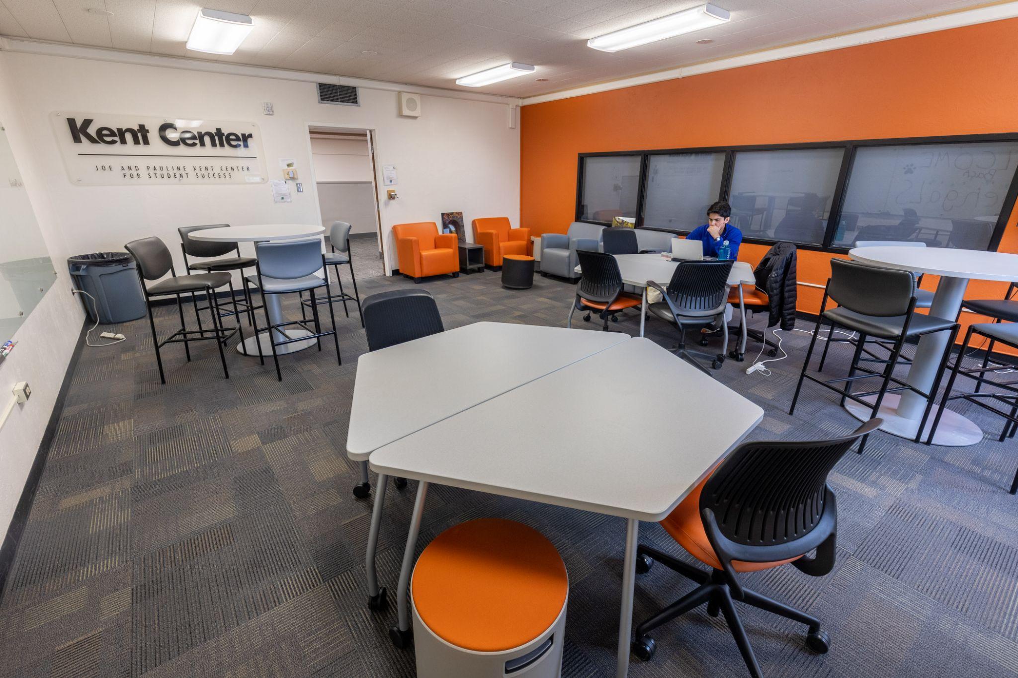
D This student study space doubles as a break or lunch room and demonstrates that even simple designs encourage the development of personal connections. The belonging cues of our Roarange branded color and ROAR wall decal further enhance the University connection in the space.


Conference rooms are welcoming and productive spaces for students, faculty and staff. Constructing a polished and uncluttered feel in these spaces is crucial in providing the right atmosphere for group work. Finding the right fit of furniture, adding appropriate technology and installing abundant lighting further enhances the functional use of these rooms.
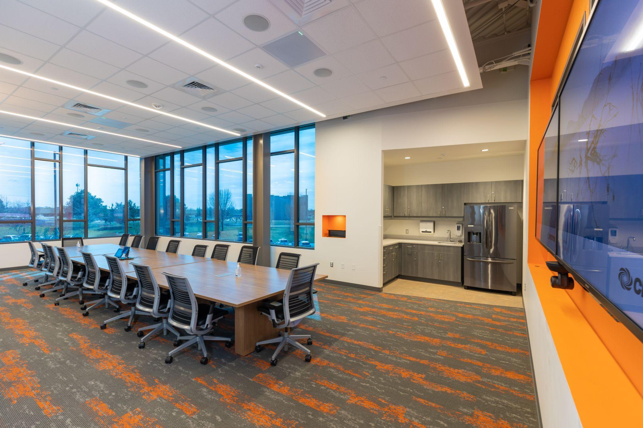
A The large windows, bright lighting and ceiling details create an invigorating meeting space. Combining the need for both a break room and a conference room, this is a great way to consolidate resources and provide that extra level of comfort for long meetings.


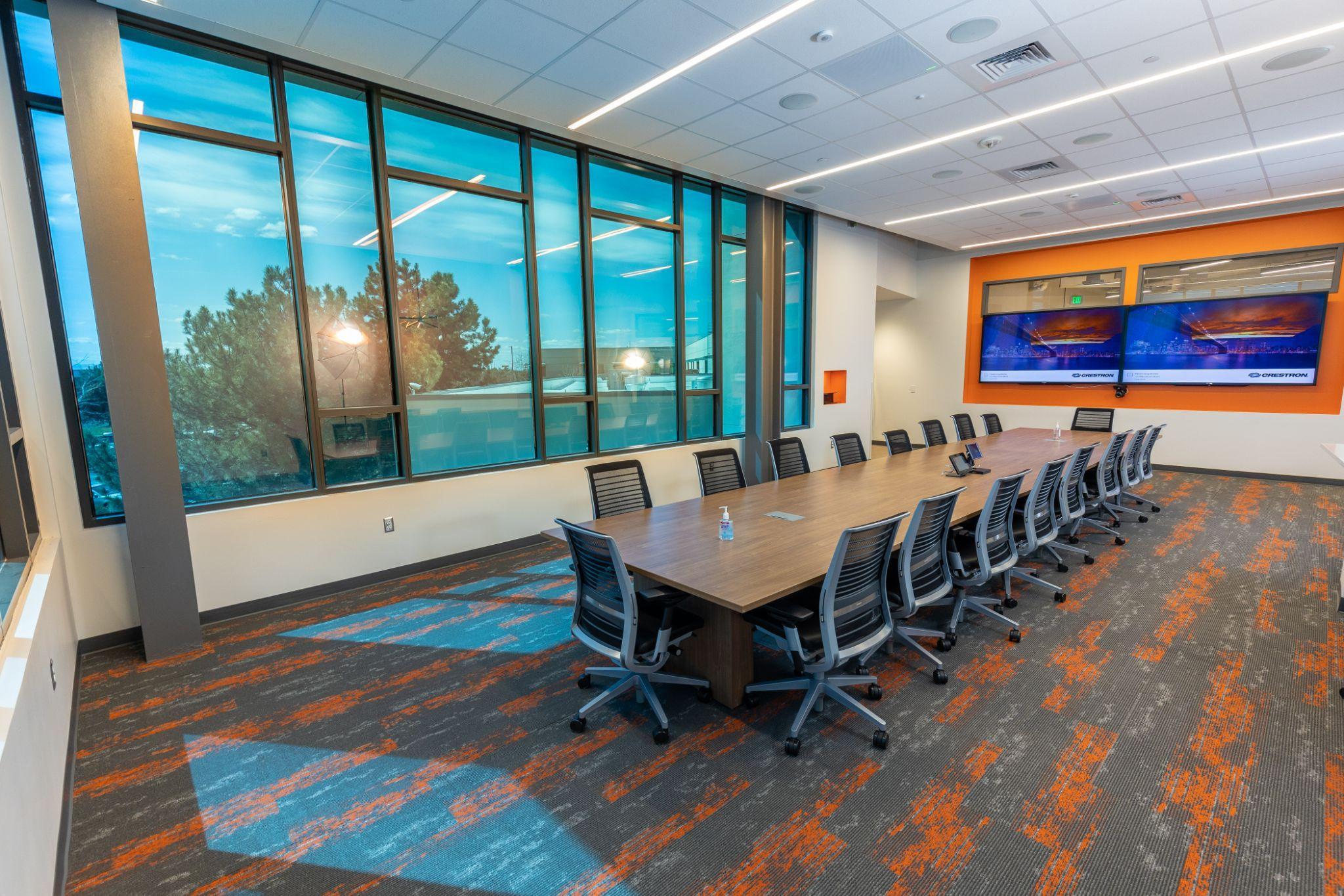
B This high-energy room makes great use of the wall of windows that look out into a larger collaboration space, which makes the room feel open and connected.
C Bright pockets of color in the wall recesses coordinate with the carpet and draw attention to the technology use in the room, giving the room a polished look.
D This space demonstrates an excellent use of lighting that runs the length of the room to help the space feel more open and streamlined. The placement of furniture offers several different uses for this space.
Corridors and common spaces are high-energy zones in every building. These spaces should be well lit and designed to facilitate an unobstructed flow of traffic. High gloss finishes and slip-resistant, yet weatherproof, flooring is a must for the longevity and usability of these areas.
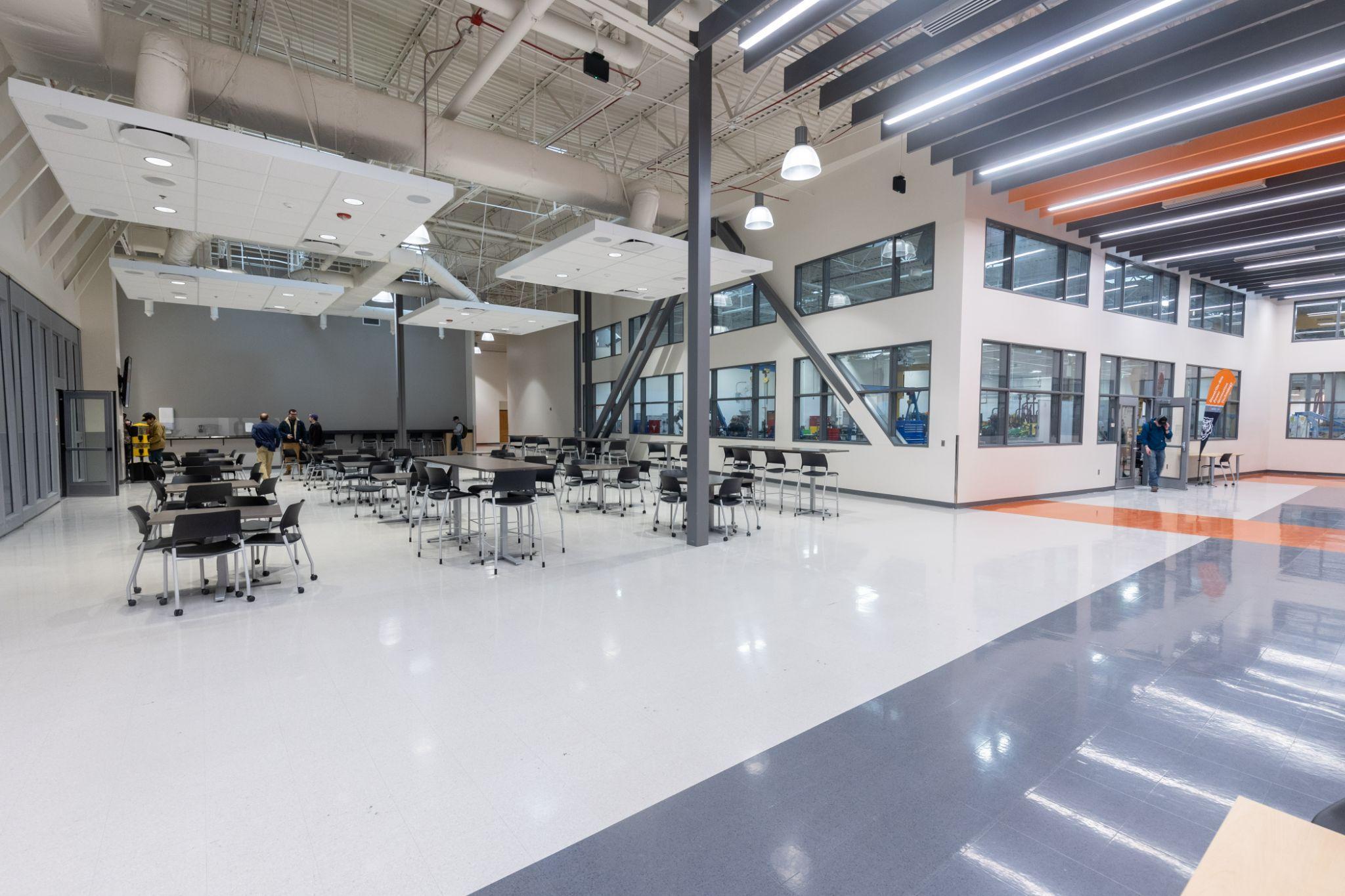

A Using color blocking with the walls and flooring helps direct traffic and provides a clear delineation between space usage. The attention is grabbed by the bright orange wall that invites people to enjoy the common spaces.
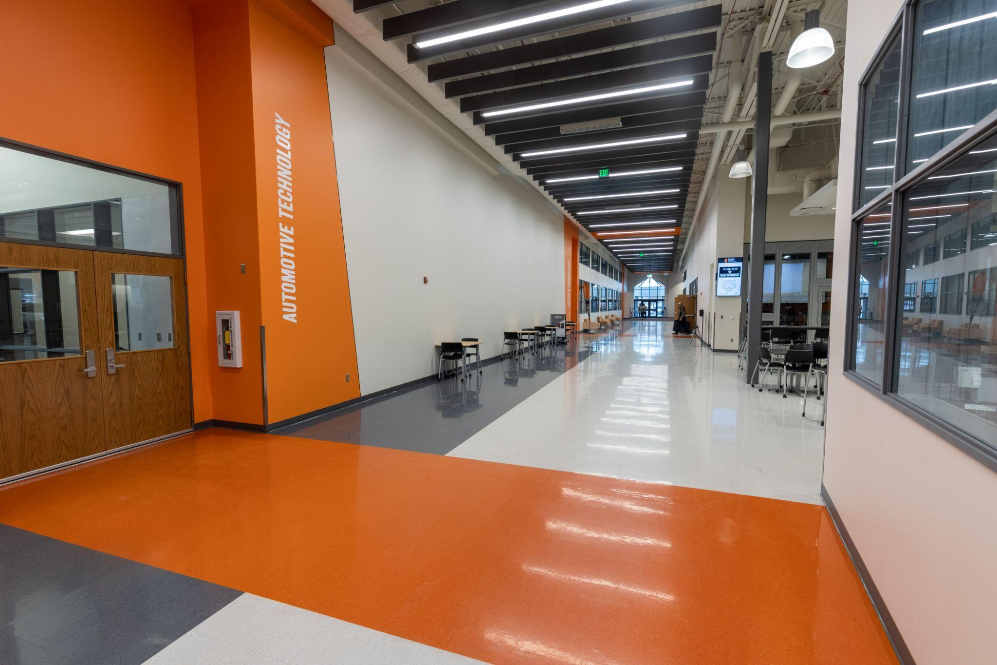

B This space showcases the use of color blocking that begins on the floors and travels up the walls and ceiling to point to the rooms and direct traffic.
C Carpet and furniture can be used in high-traffic areas to elicit space use cues and to break up large spaces into smaller functional units.
D This large common space has multiple uses that are defined by the use of colors and ceiling options. Note the large fins of acoustical material that run parallel to the corridor, breaking up the space and corresponding with the color usage on the floor to direct attention to entrances. The acoustical material also provides noise dampening between class periods.
The break room is a space where staff, faculty and students can relax, socialize and enjoy snacks or lunch, supporting a healthy workplace environment. These spaces should feel clean, uncluttered and welcoming. Break rooms offer an opportunity to instil a sense of joyful community and restfulness.

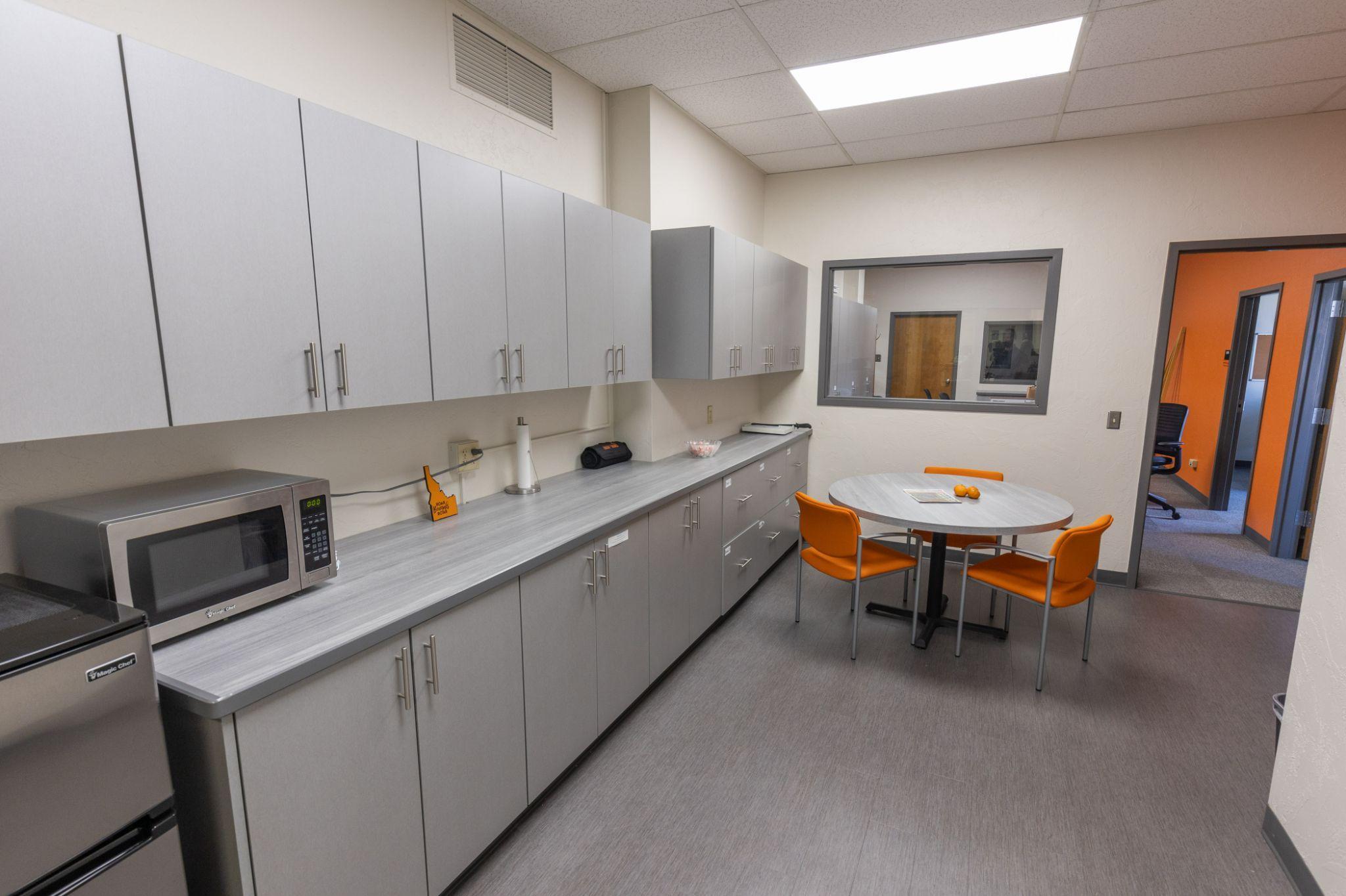
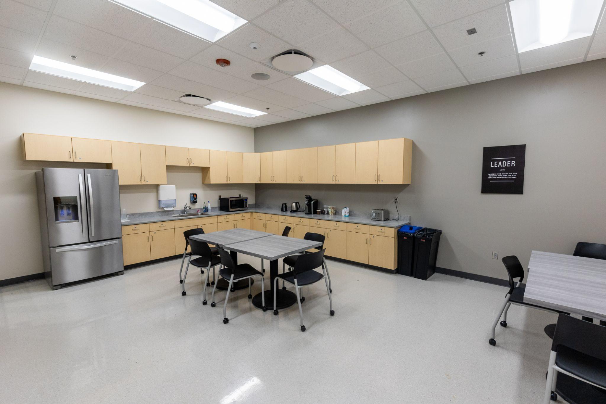
A This break room showcases what can be done with a transitory space that has limited room. While maintaining its function of connecting two other spaces, this break room doesn't feel like a compromise. Utilizing bright lighting, light colors in its finishes, and ample storage, this space optimizes functionality.
B Another great example of the use of light colors and clean, uncluttered storage options. This break room offers a wide range of flexibility in the layout of furniture and appliances.
C The theme of light, bright and clean continues in this break room, which again showcases excellent storage options and well-placed appliances.
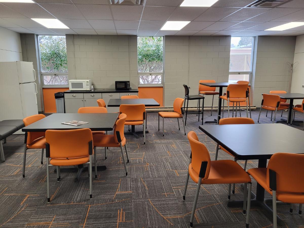
D A gathering room/break room maximizes the use of the space by providing a collaboration spot for teams. This is a simple solution to for creating a multi-use space.
