best indesign


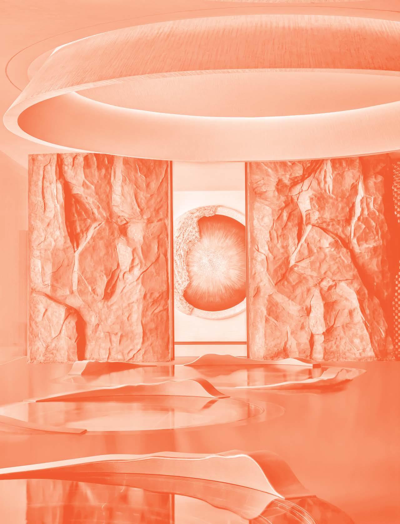
Could this be our best ever Best in Design book? We think it just might; after all, almost 40 percent of the projects in this 212-page treasury are Interior Design Best of Year Awards winners or honorees. Best, indeed—and a true snapshot of design today.
Across myriad market sectors organized into four chapters—Residential, Workplace, Hospitality, and Mix (encompassing cultural and institutional facilities, commercial-resi development, etc.)—are key recent projects by such contemporary design luminaries as Kelly Wearstler, Bjarke Ingels, David Rockwell, Clodagh, John Cetra and Nancy Ruddy, Lyndon Neri and Rossana Hu, and Will Meyer and Gray Davis. Naturally, there are many Interior Design Hall of Famers among them.
Use this portfolio of notable design for inspiration or, if you’re a would-be-client, to discover new architects and interior designers, perhaps finding the right one for your next RFP. Accompanying professional photography of each project (selected by Editor-in-Chief Cindy Allen) is a story on the design concept and details as well as Instagram handles and websites that point readers to more information. Think of this book as the springboard for delving deep into what each firm has to offer.
A teaser of what’s to come: In the first chapter, a thought-provoking residence with mindful flourishes for an art collector by interior designer extraordinaire Nicole Hollis (bookmark the neon-art powder room and tonal paradise of a primary bedroom). Among the flexible, future-minded offices in Workplace is a Detroit headquarters by Pophouse that boasts a spectacular spiral staircase and funky art all over, including an installation made from a most unlikely source: deflated basketballs. Hospitality’s gems are numerous, but we are especially partial to Otto Studio’s high-concept hotel for 25hours in Florence, Italy, which is based on Dante’s “Divine Comedy.” It features left-field interventions that could only have come from the fertile imagination of firm founder Paola Navone, a self-described “anthropologist of objects.” To wit: wiggly garden hoses as lounge decor, giant Seussian foliage surrounding dining tables, and in reception, suitcases painted and arranged in teetering piles to suggest a lost-luggage office from hell. That leaves Mix, an assortment of projects as diverse as Diana Kellogg’s school for girls in Jaisalmer, India, and the Bob Dylan Center by Olson Kundig, a museum as contrarian and layered as the musician himself. All this and more, within. Enjoy!
ASHBURN
COPAKE LAKE HOUSE / DESAI CHIA ARCHITECTURE
PRESIDIO HEIGHTS RESIDENCE / NICOLEHOLLIS
PLAYHOUSE GARDEN / VIOLA GARDENS
SALT GULCH RANCH / ANIK PEARSON ARCHITECT
4101 ELYSEE / LIGHT ON WHITE
POND HOUSE / ROGER FERRIS + PARTNERS
MARY DOUGLAS DRYSDALE ASSOCIATES
LONDON RESIDENCE / JASMINE LAM DESIGN STUDIO
OSTERHOUT / MICHNER AZURDIA INTERIOR DESIGN
ENGLEWOOD CLIFFS HOUSE / MOJO STUMER ASSOCIATES
STANFORD RESIDENCE / HUANG IBOSHI ARCHITECTURE
PARK SLOPE APARTMENT / HABITAT WORKSHOP
ROXBURY HOUSE / DESAI CHIA ARCHITECTURE
1990’S RENOVATION / PASCALI SEMERDJIAN ARQUITETOS
CONTEMPORARY HOUSE / ANIK PEARSON ARCHITECT
WEST VILLAGE LOFT / AMANDA SULLIVAN STUDIO ARCHITECTURE
BEDFORD HOUSE / STEVEN HARRIS ARCHITECTS AND REES ROBERTS + PARTNERS
CARBONELL RESIDENCE / ADRIANA HOYOS DESIGN STUDIO
DIMIT
ROCK VENTURES & ROCK FAMILY OF COMPANIES HEADQUARTERS / POPHOUSE
DYSON GLOBAL HEADQUARTERS / M MOSER ASSOCIATES

A home reflects its residents and their values, and the following unique and soulful projects are case in point, ranging from a rustic Sonoma, California, abode full of perfectly imperfect reclaimed materials to a modernist apartment with a sustainable focus in far-flung São Paulo, Brazil.
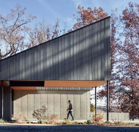
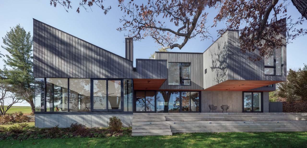
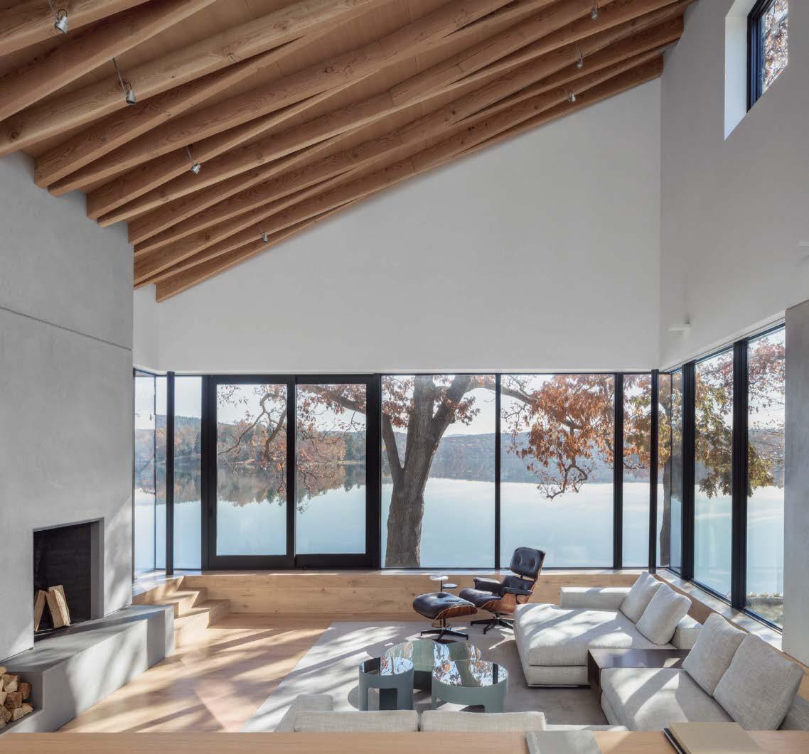
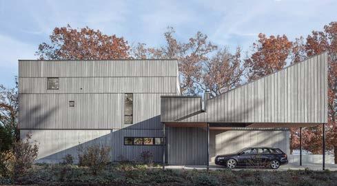
Katherine Chia and Arjun Desai’s clients wanted a place from which they could escape their busy city life: namely, a lake house oasis in Copake, New York, suitable for both indoor and outdoor entertaining. From arrival at the carport, the ritual of leaving behind the urban bustle begins. The 3,900-square-foot edifice by Desai Chia Architecture has an easy flow between interior and exterior, employing cantilevered volumes that engage with the lake and create protected micro-environments shaded by overhangs.
The sunken living room feels as if it is nestled in the water and gives the adjacent dining area unobstructed views across the lake. The overhead crisscross of wooden beams supporting the vaulted ceiling resembles a canopy of tree branches. The nearby kitchen, meanwhile, functions as a connector between individual and communal areas, its direct relationship with the terrace providing seasonal flexibility for barbecuing and alfresco dining.
A system of stormwater management, including a roof that channels water into rain gardens, eases flooding and erosion. Lakefront wetlands paired with the rain gardens slow the speed of runoff, filtering water before it enters the lake. This is in keeping with Desai Chia’s extensive knowledge of sustainable technical strategies and preference for humane architecture.
 PROJECT TEAM KATHERINE CHIA, FAIA; ARJUN DESAI, AIA; DUSTIN HEIM; RYAN ERB KEY CONSULTANTS DAVID KUFFERMAN, P.E.; CRAWFORD ASSOCIATES; BILL STRATTON BUILDING COMPANY; CHRISTINE SCIULLI LIGHT + DESIGN; JAMIE PURINTON PHOTOGRAPHY PAUL WARCHOL desaichia.com; @desaichiaarchitecture
“Our architecture celebrates conceptually bold design and graceful simplicity in order to better our collective experience of place-making”
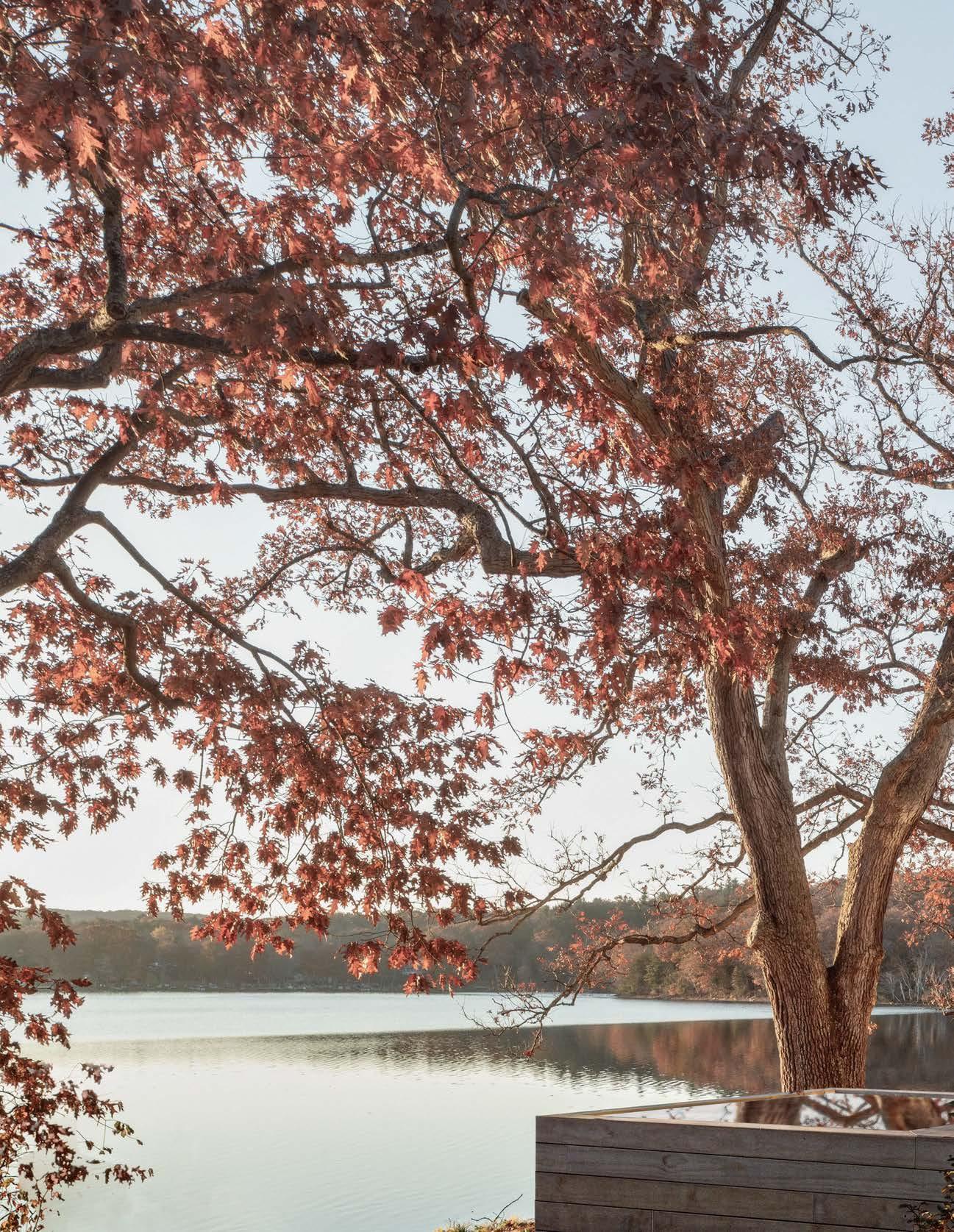
 Cladding the underside of the overhanging volumes is a warm-toned wood that contrasts against the cool gray siding. It’s a clever juxtaposition inspired by neighboring oak trees, their protective gray bark disguising a warmer, softer interior wood.
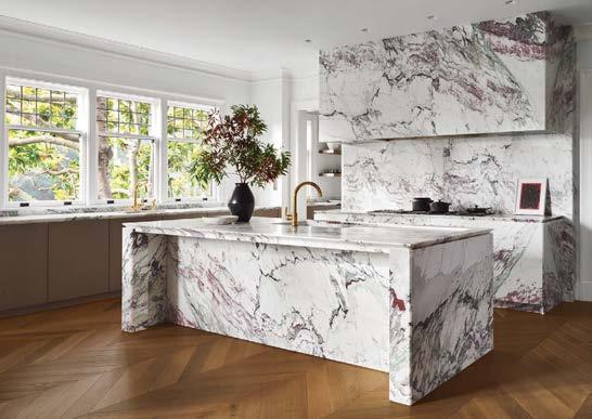
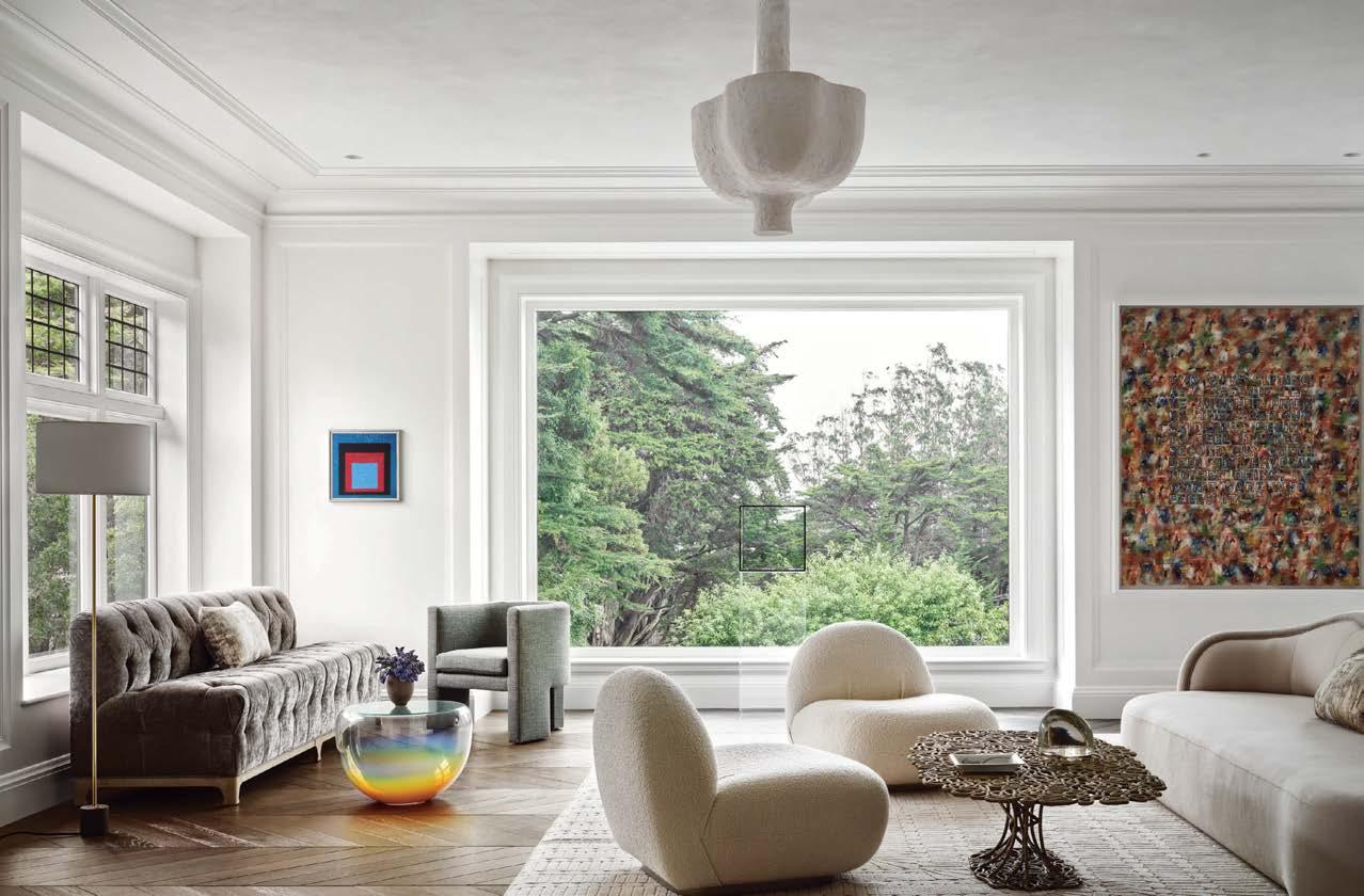
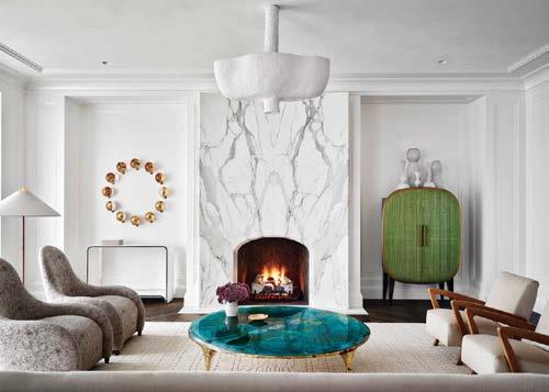
A first-rate remodel of a 13,000-square-foot 1910 house for an art collector and her family seamlessly incorporates the client’s existing museum-worthy collection—and new commissions, too. The client approached the project as a “forever home,” with the intent that the San Francisco abode would suit all phases of life. The most notable interior architecture element is arguably the spectacular winding plaster stair, a sculpture in its own right. But it is the homeowner’s diverse art portfolio that was the primary design driver, with measures employed such as reducing contact with sunlight to preserve the works for subsequent generations. To steer clear of trends that might hamper future flexibility, neutral tones swathe built-in elements, with pops of color coming from furnishings, art, and accessories. Firm founder Nicole Hollis chose living finishes like unlacquered brass and oil-rubbed bronze, since they age beautifully and can be restored long-term. For the same reason, she specified materials such as wood with thick wear layers and solid stone, which can be cleaned, refinished, and sealed multiple times, minimizing the need for replacement. The client also prioritized working with highly skilled local and European artisans and craftspeople, who used centuries-old processes combined with modern technology to fabricate bronze elements, stone works, and hardware designed to endure. It’s a home for art, sure, but the house itself is a piece of art, too.


PROJECT TEAM NICOLE HOLLIS; INNA BARANOVA; ADELE CUNNINGHAM; DANIELLE RIVERA; PATRICK CHUENJAI; MICHAEL BEHRMAN; GABRIELA MARMOLEJO
KEY CONSULTANTS UPSCALE CONSTRUCTION; WILLRICH ARCHITECTURE; ERIC JOHNSON ASSOCIATES; EVERDELL GARDEN DESIGN; MARCHAND WRIGHT & ASSOCIATES; LAURA SWEENEY ART ADVISORS

PHOTOGRAPHY DOUGLAS FRIEDMAN
nicolehollis.com; @nicolehollissf
Clockwise from top left: In a powder room at a 1910 San Francisco house renovated by NICOLEHOLLIS, a custom light fixture by Johanna Grawunder overlooks a bespoke blueresin pedestal sink by Sabine Marcelis. The firm provided interior architecture services— including selection of all finishes, fixtures, casework, and millwork—for the full-scope down-to-the-studs remodel. Materials such as the lime plaster on the stair were selected for their longevity, both aesthetically and performance-wise. The interior scheme carves out distinct casual and formal settings for both family togetherness and individual enjoyment. The formal living room features a Pierre Augustin Rose chandelier, an Olafur Eliasson sculpture, a fireplace wall clad in book-matched Calacatta Oro marble, and a Patrick Naggar bar cabinet available through Ralph Pucci.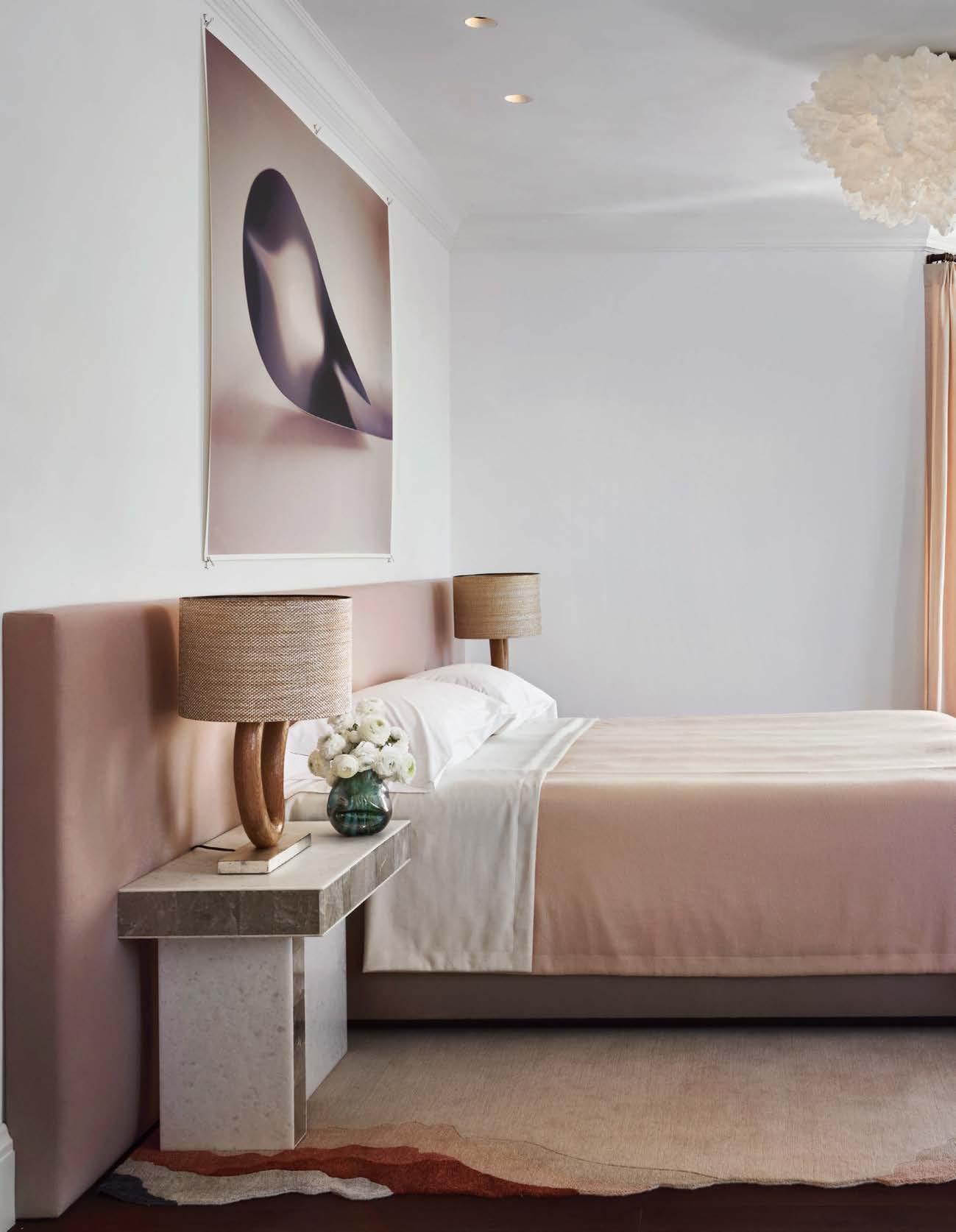
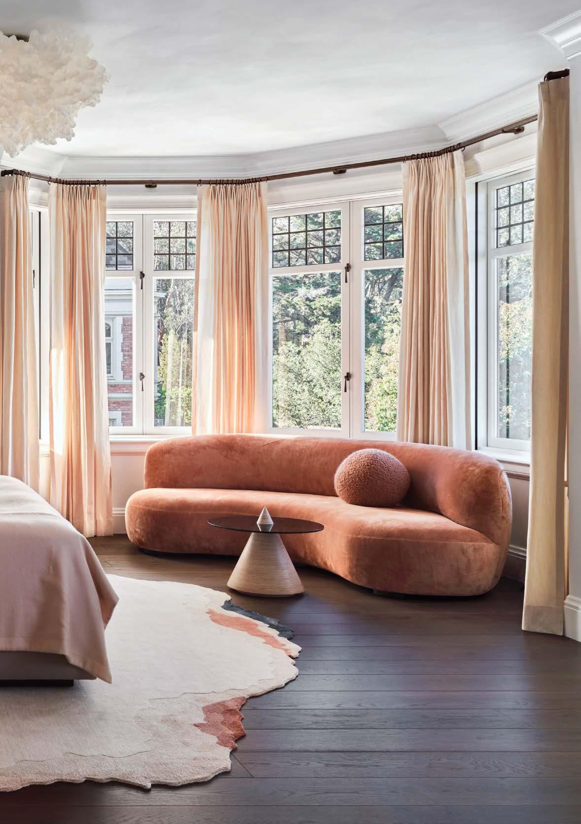 In the blush-pink primary bedroom, a rug by Atelier Février is surveyed by a dreamy ceiling-mounted fixture by Ayala Serfaty. The coffee table is by Erickson Aesthetics through Colony Design and the bed and headboard are custom, upholstered in Sandra Jordan Alpaca fabric.
“The client asked for the most creative ideas the design team could dream up and ultimately agreed to them all”
Clockwise from right: A bathroom is clad almost entirely in marble, carved from a single block. Another bathroom, with white onyx pedestal sink, boasts walls and ceiling finished in a custom calamine Venetian plaster with mica flecks by Londubh Studio. A Christophe Delcourt sofa, Wendell Castle table, and Michael Anastassiades chandelier form a vignette in the family room. A Yayoi Kusama pumpkin sculpture cozies up to the standout plaster stair. NICOLEHOLLIS provided a complete furniture, accessory, and decorative lighting package for the project.
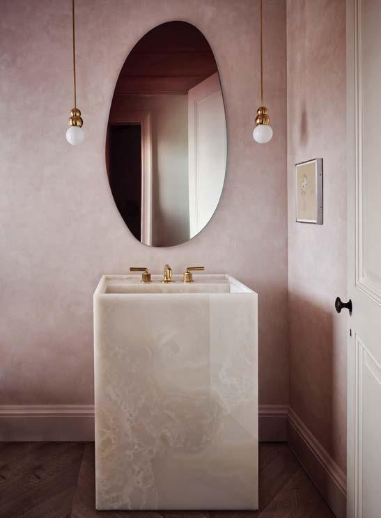


This verdant SoCal garden by holistic landscape designer Jessica Viola showcases simple materials deployed in a fresh and engaging manner. The roughly 3,000-square-foot scheme, for a private residence, centers on unusual shapes and creative construction ideas (think an angular timber-slat children’s playhouse) and incorporates multiple seating and entertaining zones, a farm-to-table produce garden, a fruit-tree orchard, and a pollinator waystation. At the same time, built-in erosion control and regenerative landscape techniques are thoughtfully integrated. Areas that cater to the different interests of the family members—grilling, writing, hosting, and more—have fostered a deep connection between client and garden, encouraging greater care for the land, a spirit of curiosity, and an ethos of stewardship.


The steep terrain represented a challenge, but Viola’s goal was to lean into the hillside and keep the slope intact. She utilized local materials like timber and crushed granite in unique ways to accommodate the client’s budget, playing with curves, angles, shadow, and light. The plant palette was developed with care to regenerate the once barren, lifeless property with ecologically relevant, drought-tolerant vegetation native to the region. The species chosen will eventually establish deep root systems to stabilize the hillside naturally, without the need for extensive retaining walls. Other shrubs and flowers will attract welcome pollinators: butterflies, bumblebees, and hummingbirds.
 Clockwise from left: Firm founder Jessica Viola filled the steep terrain with abundant native plants, succulents, and wildflowers at this awardwinning Los Angeles garden. UV-shaded roofing ensures the children’s playhouse doesn’t overheat. Pavers embedded in pebbles form wide paths through the landscape. A modified fence accommodates nature. Plantings that attract birds, butterflies, and bees abound. A view from inside the slatted playhouse reveals the property’s majesty. Greenery cascades over walls, softening the built environment.
PROJECT TEAM JESSICA VIOLA; LIBERTY SILVER; KIAN HEDAYAT; KELCIE DAMRON KEY CONSULTANT RICO EPIFANIO PHOTOGRAPHY SUZANNE STRONG violagardens.com; @violagardens




What began as temporary lodging on a remote homestead ranch in Utah’s Escalante Wilderness, three hours from the nearest major town, has become the full-time residence of the clients, who happen to be the mother and stepfather of New York–based Anik Pearson Architect’s namesake founder The modern American Craftsman–style house, a new build to replace a worn-down 1970’s structure that previously occupied the property, has a distinctly Swiss alpine influence in homage to the homeland of Anik Pearson’s mother. Out of respect for its wilderness location, the couple wanted the main building and detached guest house, totaling 5,400 square feet, to be built sustainably yet be able to stand up to the high-desert weather, which swings from triple-digit heat to heavy snowfall across the seasons.
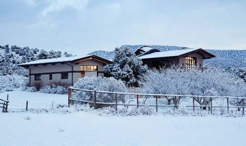
Since the house is far from the nearest fire department, and since water is a scarce resource in this area of the country undergoing an extended megadrought, the designer eschewed wood on the exteriors in favor of such combustion-proof materials as concrete, stucco, and metal. Case in point: The roofs and eaves, built by a master craftsman who relocated from Colorado to work on the project, consist of interlocking copper panels that can expand and contract in extreme weather. The clients are also artisans, and operated a worldrenowned ornamental wrought-iron business for many decades. Their own work appears throughout the house in the form of handrails, table bases, and more. It’s an all-in-the-family collaboration.

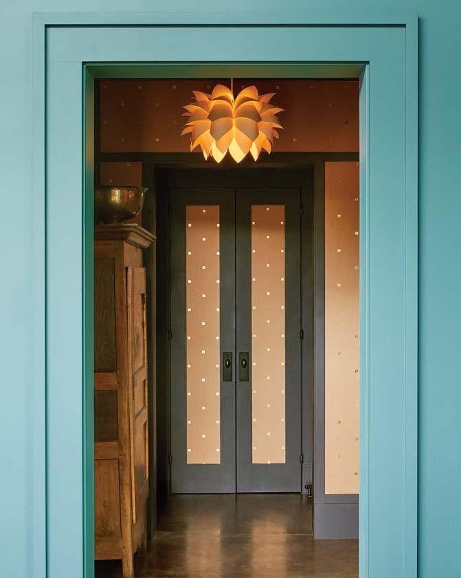
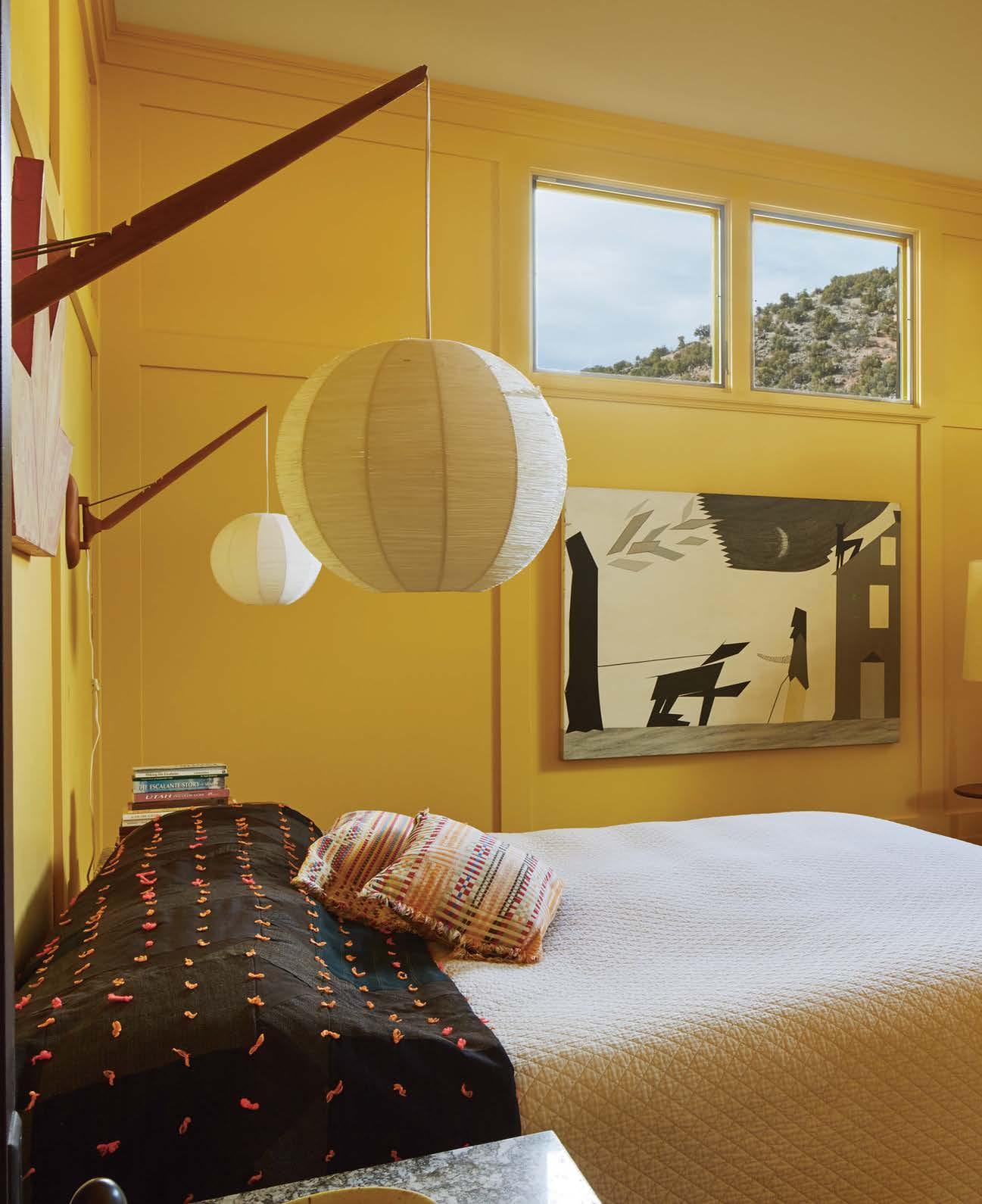
Clockwise from above: The kitchen of a Utah ranch by Anik Pearson Architect features a wall of acid-etched steel panels. The entry hall of the detached one-story guest house is adorned with a hand-painted copper-leaf wallcovering by Donghia. Vintage cast-iron buddhas watch over the breezeway between the main and guest houses. Custom metalwork designed by the architect and fabricated by the clients includes the fireplace surround in the living room, which also boasts vintage leather club chairs and an antique Persian rug. The high-desert property receives heavy snowfall in winter. In the guest house, a bust of Napoleon surveys a dining table, its wrought-iron base also crafted by the clients.



“The custom metalwork at this ranch is just one example of how we work to incorporate our clients’ talents into the design process, resulting in a truly one-of-a kind project”

“I’ve always felt that the most successful interiors have something to say about the people that live in them,” says Alizee Brion, owner and design director of Light on White. “Your home should tell a story. Where you’ve been, whom you love, what matters to you.” For one of the most prominent luxury condominiums in Miami, Brion walked the talk, transforming a 3,300-square-foot blank canvas into a sophisticated yet livable residence. “As with all our projects,” she continues, “we sought to make this a true reflection of the clients’ style, interests, and functional needs.”
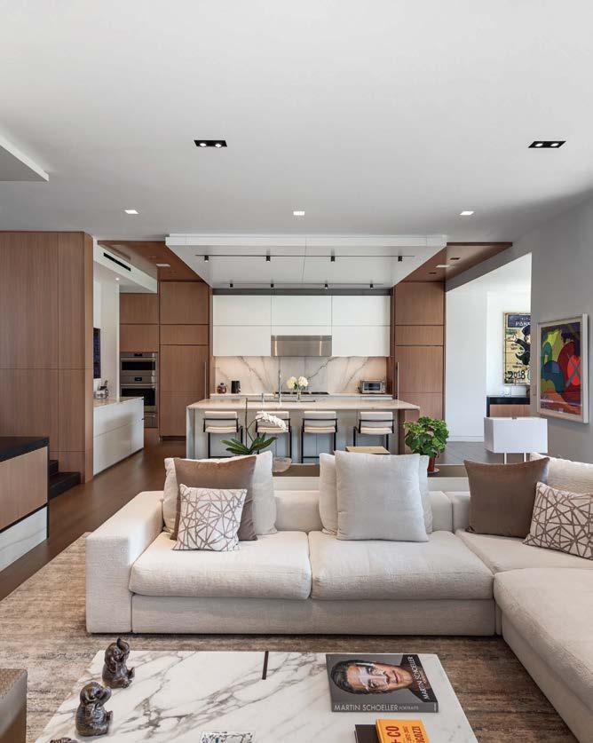
Throughout, watercolor wallcoverings in muted blues and greens complement sweeping ocean views and lend vibrancy to the neutral base palette. Upholstery in soft suede, ribbed velvet, and nubby bouclé adds tactility, and art and accessories speak to the clients’ shared passion for travel. Taking advantage of the natural light pouring in from floorto-ceiling windows, Brion introduced graphic contrast through dark or warm tones in select architectural finishes. In the open-plan living area, a minimalist 25-foot-long millwork wall combines a concealed oversize TV, a marble fireplace, a wine bar, and ample storage. Its ultra-clean lines juxtapose layered furnishings in playful shapes and textures. Also key to this room is the Mah Jong, the iconic modular sofa from Roche Bobois. Brion upholstered its myriad sections in Pierre Frey fabrics that anchor the color palette of the project as a whole.
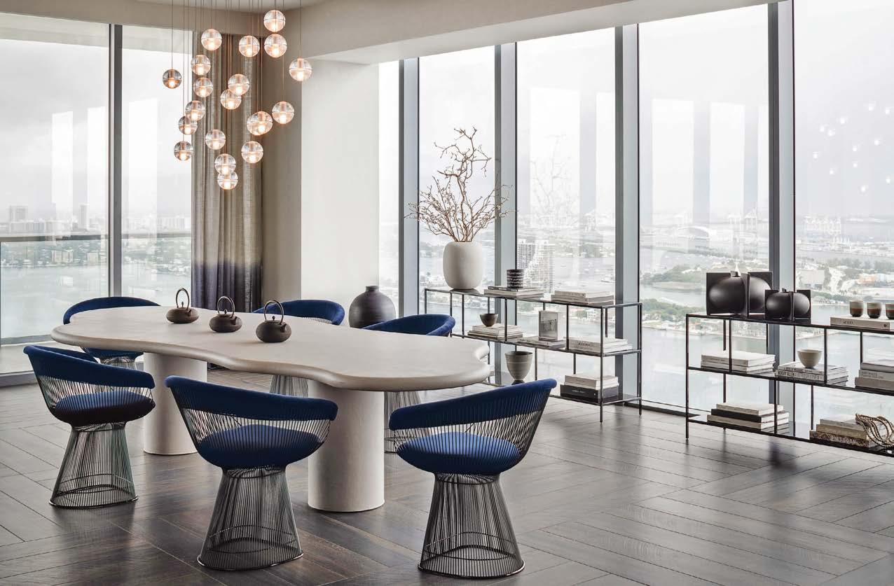
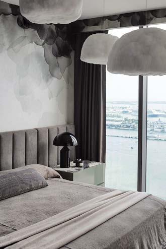
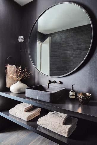

 Clockwise from left: Knoll chairs cozy up to a Bieke Casteleyn dining table at 4101 Elysee, a Miami apartment by Light on White; the globe chandlier is by Bocci. In the primary bedroom, the bed and nightstands are custom, pendants are by Richard Clarkson Studio, and the wallcovering is by Emma Hayes. A nook in the same room incorporates a Breccia marble desktop. In the powder room, the sink is carved from Nero Marquina marble. Hans Hopfer’s Mah Jong sectional and cocktail tables by Sebastian Herkner gather in the living area. Custom shelving in the same space features decorative accessories by Guaxs and Rina Menardi.
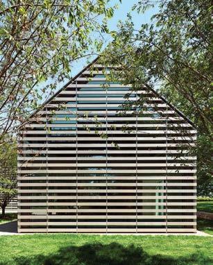
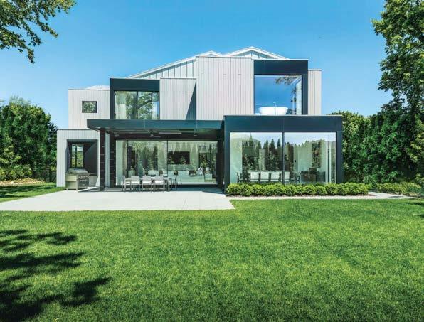
When designing Pond House, architect Roger Ferris subtly evoked the vernacular architecture of Wainscott, a formerly agricultural hamlet in the Hamptons. He reinterpreted traditional barns and farmhouses in a minimalist, modern way, conceiving two gabled volumes of glass shrouded in delicate slats of Western red cedar that provide a subtle, layered interior experience.
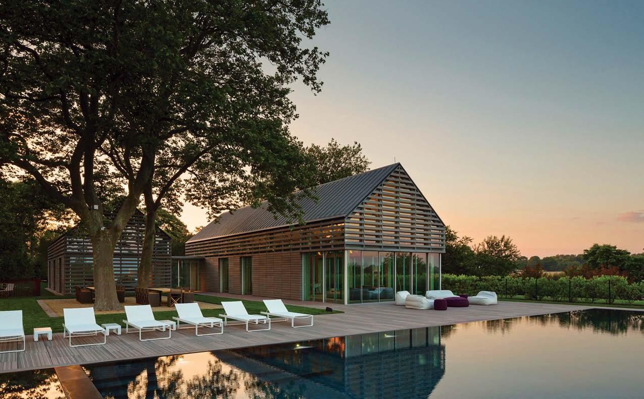
The 5,600-square-foot refuge—with a swimming pool, terrace, and outdoor dining room—is sited by a large pond and blends into that context. Ferris and his team placed the building in such a way as to preserve mature trees that offer shade and privacy. They aimed to construct a variety of living spaces and maximize functionality.
The two volumes, connected via a glass-walled corridor, separate the private and public zones. One has two stories and five bedrooms— some lofted within the tree canopy—and the second contains an airy great room with dazzling water views. A smaller volume within the great room houses the kitchen, the pantry, and the powder room.
Pond House blurs the distinction between interior and exterior spaces, bringing in sunlight and natural ventilation through highperformance glass walls and sliding wall panels. The wood slats provide shading and reduce solar gain, not to mention creating an elegant echo of the past.
KEY CONSULTANTS
PHOTOGRAPHY PAÚL RIVERA ferrisarch.com; @rogerferrisarchitects

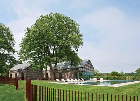
 Clockwise from above: The soaring great room of the award-winning Pond House, by Roger Ferris + Partners, opens out to a pool. The architects carefully preserved the site’s mature trees. The home’s five bedrooms include a bunk room. The two gabled volumes reference the region’s traditional barns and farmhouses. Western red-cedar slats reduce solar heat gain and provide a layered interior experience.
PROJECT TEAM ROGER FERRIS; MYRON MIRGORODSKY; ROBERT MARX; BRIAN RIDGEWAY; AHMED ARASTU
WRIGHT & COMPANY CONSTRUCTION; ECKERSLEY O’CALLAGHAN; HOLLANDER DESIGN
 The volumes, connected by a glass-walled corridor, separate out the sleeping and living/dining quarters.
“Our

objective was to use the traditional vernacular in a minimalist way”
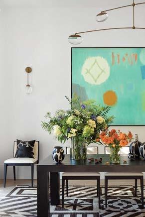
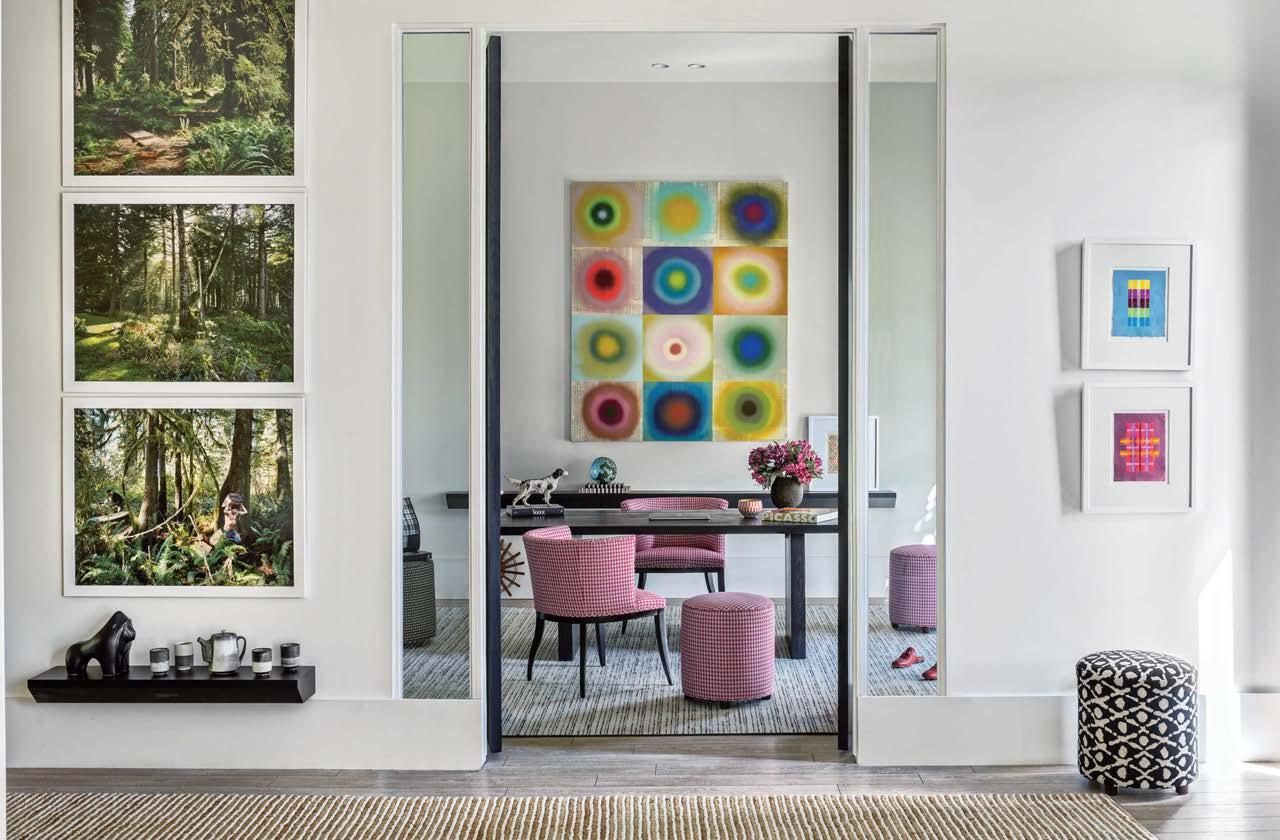
This renovation project began with newlyweds, a personality-free house in Ashburn, Virgina, and some big dreams. The clients reached out to Mary Douglas Drysdale, who founded Mary Douglas Drysdale Associates in 1985, after seeing her work in a showhouse; Drysdale’s projects typically have a strong architectural component and are transitional, filled with a mix of custom pieces and art collected by her clients—and/or pieces she helps them choose. The designer has also been widely published and won numerous awards for her eyecatching interiors.
The couple felt their 3,500-square-foot residence lacked character, did not use space well, and was outfitted with furnishings in the wrong scale and style. Since the home’s 12-foot ceilings cried out for large-scale, colorful pieces, Drysdale took the clients to galleries from the outset, offering advice with a light touch. The wife, a retired executive, was decisive and involved in every decision; the combination of the two ended up being an effective one. The husband, somewhat less involved, remarked, on the final install day, “This looks great! Gosh, I thought you were just going to change the coffee table!”
 PROJECT TEAM MARY DOUGLAS DRYSDALE; MIKE LIDWIN; KAILEE BLALOCK; FRAN HOYLE; DANIEL GOSSARD KEY CONSULTANTS CROSS MACKENZIE GALLERY; HEMPHILL GALLERY PHOTOGRAPHY JOHN COLE marydouglasdrysdaleinteriordesign.com; @marydouglasdrysdale


 Clockwise from above: A painting by Steven Cushner defines the entry in an Ashburn, Virgina, home by Drysdale Design Associates. Black trim on the house’s exterior informed a fireplace wall of the same color that now visually anchors the living room; the diptych is by Ruri Yi. A detail shot captures the informal dining room.
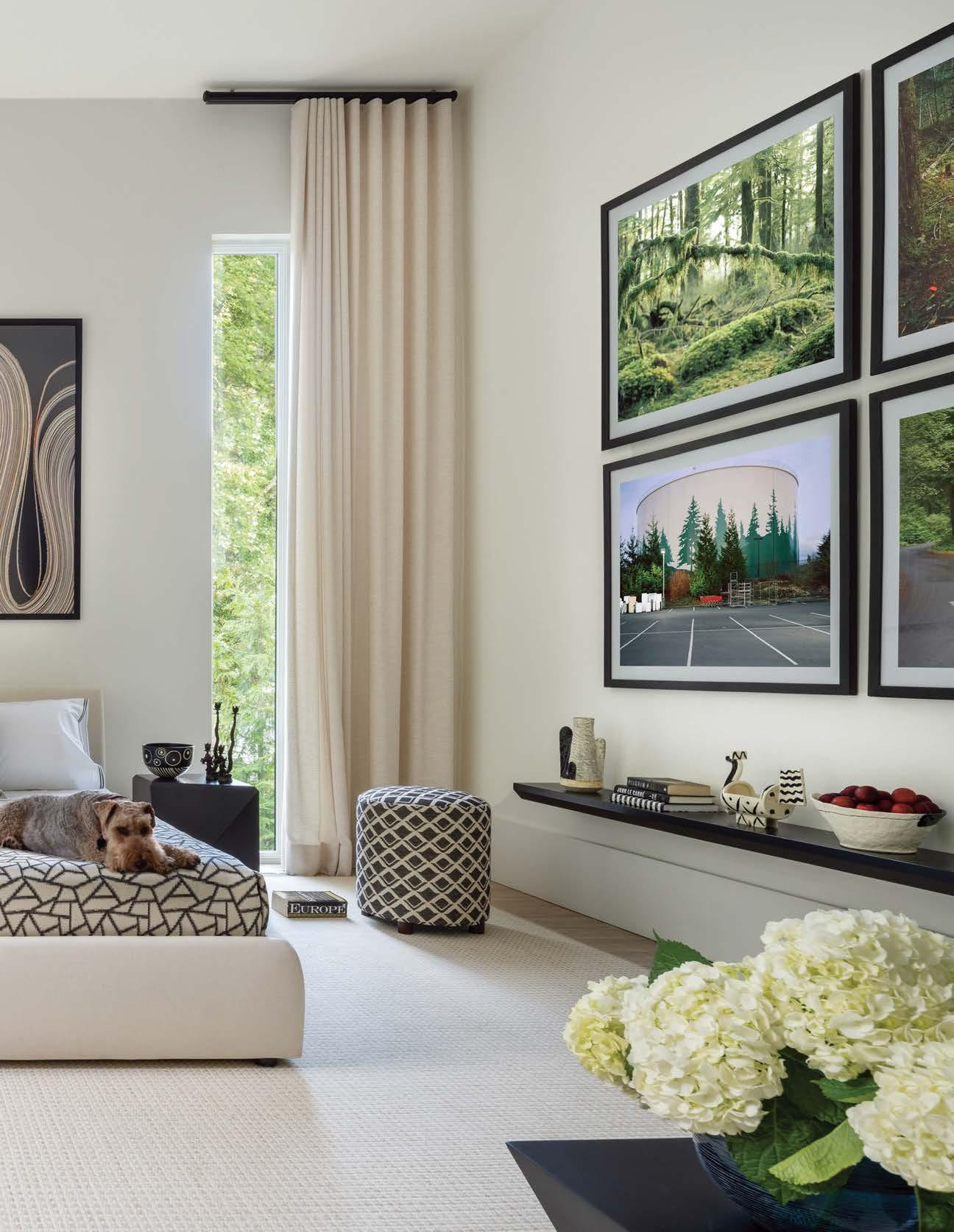
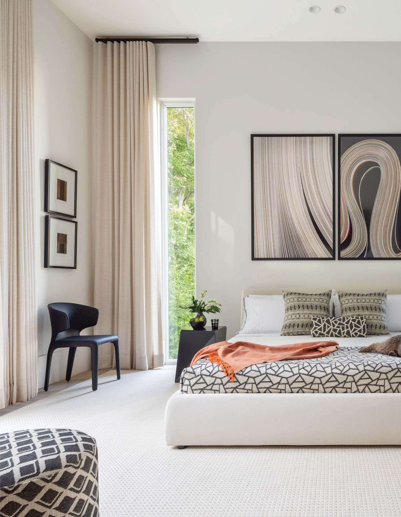 In the primary bedroom, abstract works by John Cole join neutral floor-to-ceiling curtains and boldly geometric fabrics designed by Dr ysdale on ottomans.
“I feel that one of the obligations of a home is to delight”
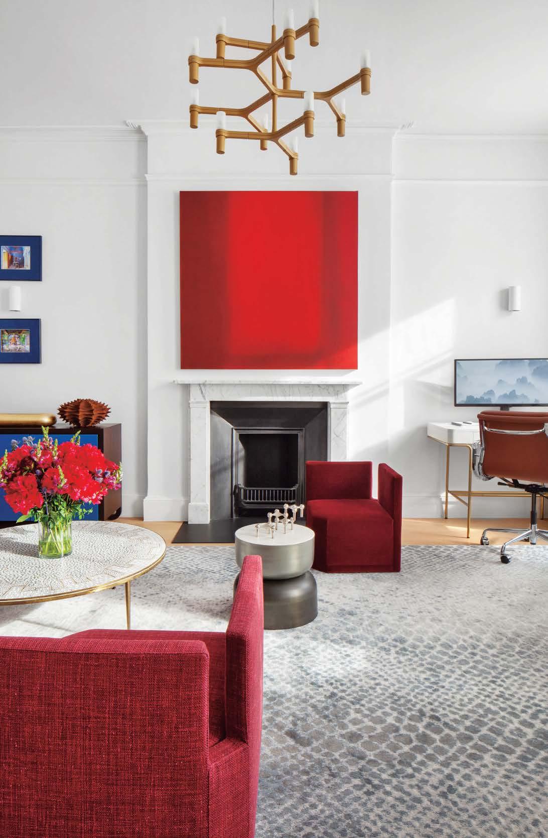
This project in London’s chic Marylebone neighborhood is designer Jasmine Lam’s own pied-à-terre and marks an expansion of her eponymous studio’s work into Europe. It’s housed in a Grade II–listed terraced town house, built around 1820 by John White as part of the Duke of Portland’s estate in the historic City of Westminster and later converted into a multifamily residence. The grand one-bedroom flat has soaring 11-foot-high ceilings and a spacious living room with a color palette inspired by the deep, rich tones used in traditional English houses. In the bedroom, a clean white backdrop with tan accents fosters serenity. As always, art has an important curatorial function in Lam’s design. “I was particularly focused on highlighting women artists and women-owned vendors,” she notes. Contemporary furnishings are paired with vintage and collectible pieces by Florence Knoll and other classic modernists. Above the sofa, a painting by Elsbeth Shaw references fashion images but in pixelated, abstracted form. A turned-wood vessel by artist Eleanor Lakelin, who uses timber felled in the British Isles, sits on the bedroom desk next to a “welcome” mat designed by Banksy and hand-stitched by Syrian refugee women in Greek camps with fabric salvaged from abandoned life vests.


KEY
 Clockwise from right: In a London residence by Jasmine Lam Design Studio, the large oil-and-wax painting above the living room fireplace is part of Louise Crandell’s Infrared series. The color palette was inspired by the rich colors used in classic English houses. Jehs + Laub’s Crown Minor chandelier hangs above a coffee table made of vintage mosaic tiles. Bedroom sconces by Vezzini & Chen are hand-blown glass and etched porcelain.
PROJECT TEAM JASMINE LAM; NATALIA PASCOVICH
CONSULTANT GEORGE MANN JOINERY & CONSTRUCTION
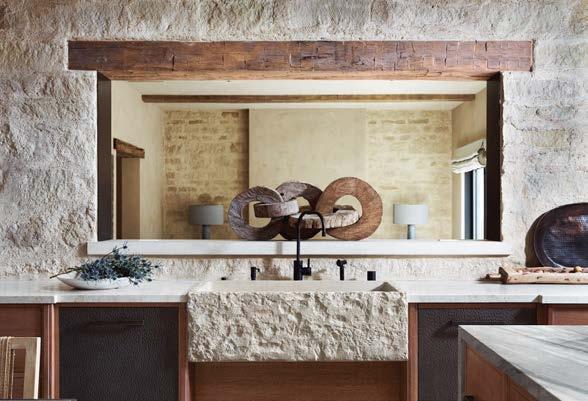
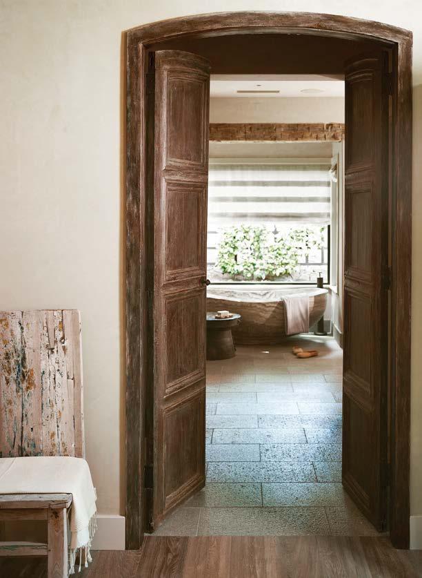
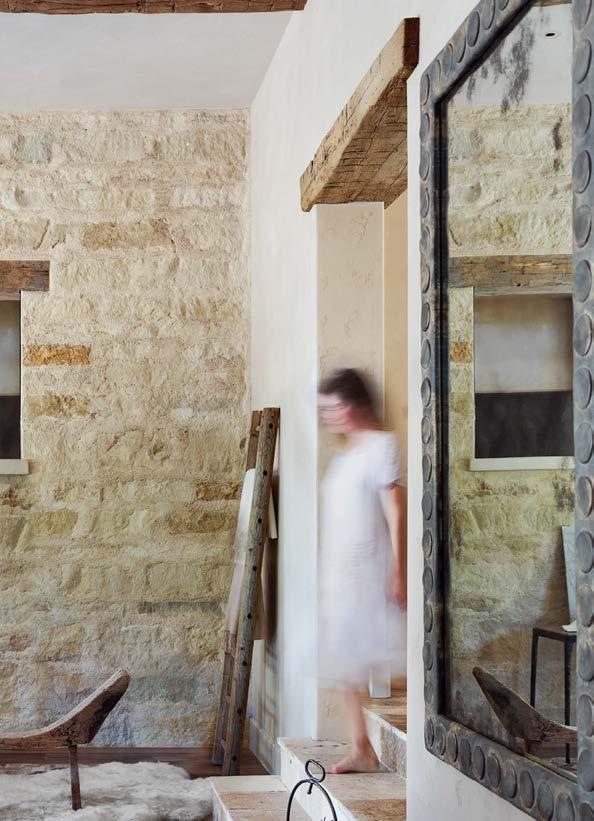
A Mediterranean-style home in Sonoma, California, by Stevi Michner, founder of Michner Azurdia Interior Design, was originally intended as a simple project: just a quick kitchen remodel. But every week, the clients, spurred by a love for Michner’s holistic vision, decided to do more, until eventually the 5,500-square-foot house was down to the studs. The property was intended as an escape from the client couple’s busy life at their San Francisco penthouse loft. Michner, formerly cofounder of RH’s contemporary art program, knew exactly how to achieve that goal. It starts with honest materials. “I use a lot of reclaimed materials, with history. Imperfections reflect a charm that cannot be replicated,” Michner says. Here, French antique doors, limestone, and wood beams are among the reclaimed materials used, creating an elegiac, timeworn mood.

The husband of the couple is known as the real-life Q from the James Bond films—he got his start designing equipment for the movies before decamping to the U.S. Department of Defense. So, naturally, technology is of utmost importance to him, but it was also imperative that gadgets not overtake the remodel. “It was a delicate dance to make the smart-home features blend into the background,” Michner notes. To that end, there are TVs in every room, sure, but they’re stealthily concealed when not in use: behind a mirror, lifting out of a kitchen countertop, or tucked into the ceiling cavity.
converge in the living room.
have a lived-in patina.
clients’ objets: “It pushes me to thoughtfully curate and display items in a way that deepens their meaning to the client.”


working
PROJECT TEAM STEVI MICHNER
KEY CONSULTANTS ROBERT BAUMAN ASSOCIATES; BRIDGES CONSTRUCTION PHOTOGRAPHY COURTESY OF STEVI MICHNER michnerazurdia.com; @michner_azurdia
Clockwise from bottom left: A limestone terrace surrounds the swimming pool at a Sonoma, California, house by Stevi Michner of Michner Azurdia Interior Design. Centuries-old beams survey a custom sink. Textures Finishes and furnishings The primary bathroom is entered through antique doors. Michner loves with Limestone pavers reclaimed from historic manors in France form the kitchen floor.
“I use a lot of reclaimed materials, with history. It adds character and depth imperfections in honest materials reflect a charm that cannot be replicated”

Discover a contemporary architectural gem by Mojo Stumer Associates in Englewood Cliffs, New Jersey. Strategically sited to maximize privacy, the 5,500-square-foot residence welcomes guests with a captivating interplay of limestone, wood, black aluminum, and glazing. Upon approach, the eye is drawn to the front-facing garage, which is carefully oriented inward to create an impression of depth and seclusion. A continuous overhang extends from above the garage doors, seamlessly aligning with a full-height window that beckons natural light into the interior. As the gaze ascends, the two-story massing of the home unfolds. Here, a series of double-height windows and horizontal overhangs temper the visual scale, infusing the design with understated elegance. Promoting privacy without compromising on natural illumination, a panel of wooden slats partially conceals the front bedroom windows.
The rear of the house features oversize floor-to-ceiling glass sliding doors that open onto meticulously landscaped grounds, dissolving the visual boundary between indoors and out. Interiors are just as refined, a harmonious interplay of natural materials that embodies contemporary luxury. The project has been such a success that it earned Mojo Stumer the best compliment a studio can receive: the client saying they never want to leave.
 PROJECT TEAM MARK STUMER; JOE YACOBELLIS; MIKE DOYLE; JESSICA LICALZIS
Clockwise from above: Mojo Stumer Associates designed an Englewood Cliffs, New Jersey, residence that harmoniously blends natural materials and contemporary accents into a captivating composition. The interior scheme, also by MSA, is a study in sophisticated, muted tones. Copious glazing invites in daylight. The exterior is a careful study of form and material. The interior combines contemporary luxury with comfort.
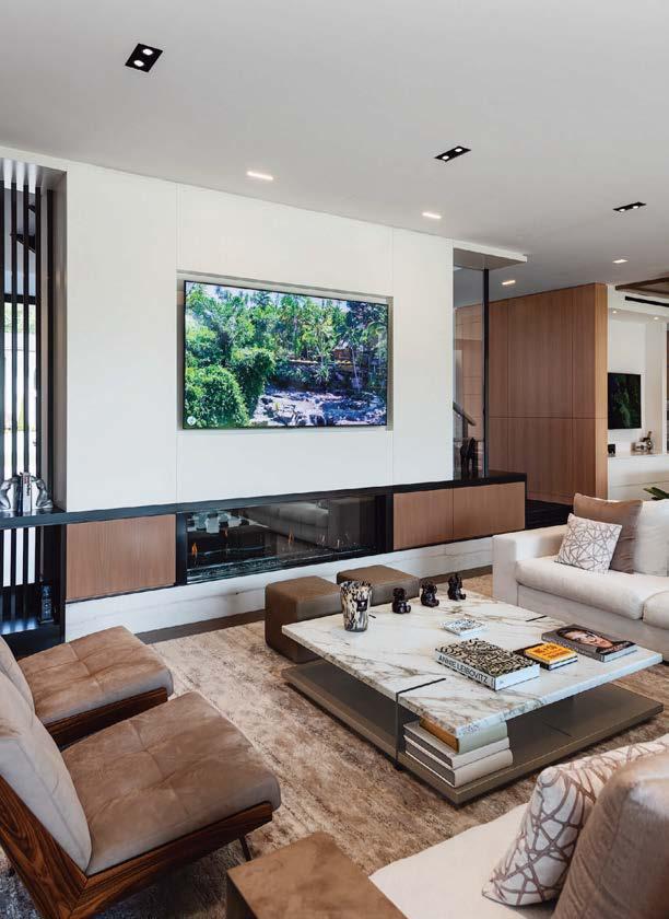

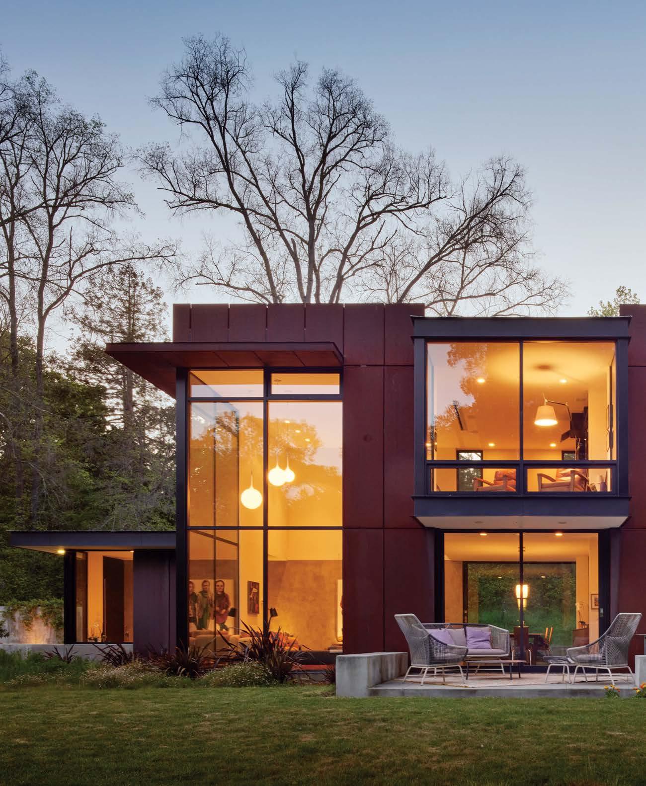
This newly constructed residence in Stanford, California, by Emily Huang and Gregory Iboshi of Huang Iboshi Architecture exemplifies the integration of an exceptional living experience with a beautiful setting. Tucked into a thicket of oak trees on a 1½-acre lot, the 3,600-square-foot home for a professor and his family is a study in the balance between organic and built forms, representing the homeowners’ love of nature and modern architecture.

The building’s simple block form and strict modular components achieve a minimalist aesthetic. By contrast, the Corten-steel siding, which has developed a rust layer with a painterly surface, provides texture and softens the hard lines of the rectilinear structure.
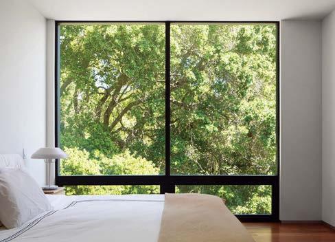
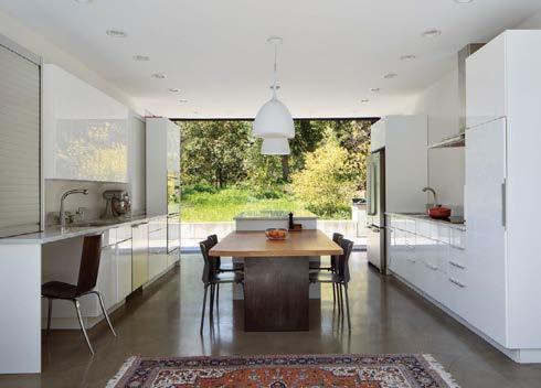
Although the volume’s exterior profile suggests a hard geometry, large window walls open up the interiors and connect them to the surrounding greenery. Additionally, four sets of pocket doors can slide away, directly linking indoors and out.
But the balance between nature and built form extends beyond aesthetics. Sustainable elements, including high-efficiency mechanical systems, passive heating and cooling strategies, and environmentally friendly materials, were used to minimize the structure’s carbon footprint and create a truly harmonious relationship with the environment.

Clockwise from above: In a northern California residence by Huang Iboshi Architecture, large window walls connect the interiors to the surrounding landscape. A wall in the kitchen opens entirely to the outdoors. Views of the property’s established oak trees fill the primary bedroom suite. The structure’s Corten-steel siding will weather and develop a protective rust layer. Twin armchairs provide an ideal place for a tête-à-tête with a view.
PHOTOGRAPHY
 PROJECT TEAM GREGORY IBOSHI; EMILY HUANG, LEED AP KEY CONSULTANTS CONIFER CONSTRUCTION; FLEETWOOD WINDOWS AND DOORS; PALO ALTO GLASS; PARAGON MECHANICAL, INC.

“When applied thoughtfully, contrast can be a tool to celebrate opposites and elevate the whole”


Habitat Workshop, an award-winning M/WBE-certified architecture and urban-design practice, recently completed a project that neatly merges two Brooklyn apartments into a single three-bedroom, threebathroom home. By removing walls between the public zones, studio founder Jieun Yang and team transformed what had been dark and subdivided into bright and uncluttered. The resulting plan, totaling 1,700 square feet, maximizes natural light.
The entry foyer segues into the open kitchen, which seamlessly connects through to the dining and living areas. In the latter, a wall treated with dark handtroweled Venetian plaster provides depth to the contrasting surrounding neutrality while also hosting built-in bookshelves and a fireplace. Overall, the project’s choices oscillate between restrained and bold colors, soft and hard materials, and sleek and handmade finishes, providing balance. The concept centers on the “play of thresholds and continuity,” Yang says. Heathered stone lines the windowsills, creating a continuous ledge around the apartment. The same stone reappears as the top for the L-shape low storage and seating against the bay windows. Within this continuous living environment suited to the entire family, Habitat created spaces tailored to individual interests: a private yoga room, a playroom, and, in the primary suite, a sybaritic bathroom with a weathered Japanese soaking tub.
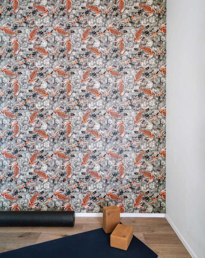
Clockwise from above: This family-friendly, 1,700-square-foot Brooklyn apartment by Habitat Workshop has an amenity unusual for the location: access to a private roof terrace. Boldy patterned wallpaper makes a striking statement in the yoga room. The project illustrates Habitat’s approach, prioritizing the flow of movement and capturing quality natural light. In the living area, built-ins flank a Venetian-plastered wall with a ventless fireplace. The light, bright kitchen is the heart of the home. A Japanese soaking tub takes pride of place in the primary bathroom.


 PROJECT TEAM JIEUN YANG; MICHAEL LU
KEY CONSULTANTS NABRU DESIGN COMPANY; CORY MANUFACTURING
Art and nature join forces in ways both intimate and broad at the Roxbury House by Desai Chia Architecture, a Connecticut home that has won multiple awards. Positioned uphill, the 4,000-square-foot residence sits on the edge of a 12-acre property to minimize site disturbance, allowing the existing meadow and forest to support local wildlife and vegetation, and take advantage of prevailing winds for natural ventilation. The clients sought flexibility to use this home as an extension of their New York City gallery, requesting that portions of the landscape be left open for site-specific outdoor installations.
Arjun Desai and Katherine Chia’s thoughtful assemblage of slanting roofs and deep overhangs frames views and draws light into the interiors while reducing glare and solar heat gain. A series of rain gardens and retention ponds mitigates erosion along the steep terrain. Indoor spaces and outdoor courtyards offer long axial views through the house, linking rooms to vistas of the wooded landscape.

The house is clad with wood that has been lightly charred in a technique known as shou sugi ban It’s a traditional Japanese method that makes the facade rot- and bug-resistant and maintenance-free.
The blackened wood is repeated inside on walls and ceilings, too, a move that further blurs perceived boundaries between indoors and out.
PROJECT TEAM KATHERINE CHIA, FAIA; ARJUN DESAI, AIA; NATALIE CHUH; MATTHEW KIWIOR KEY CONSULTANTS MURRAY ENGINEERING; A. H. HOWLAND ASSOCIATES; BERKSHIRE WILTON PARTNERS; BILL STRATTON BUILDING COMPANY; CHRISTINE SCIULLI LIGHT + DESIGN; LAGUARDIA DESIGN GROUP; ELEPHANTS CUSTOM FURNITURE PHOTOGRAPHY PAUL WARCHOL desaichia.com; @desaichiaarchitectureClockwise from right: The daylit open living, dining, and kitchen area is the most public-facing part of the Connecticut home by Desai Chia Architecture. The primary bath is tranquil, with clean lines and expressive light. Dark stone visually anchors the fireplace in the otherwise airy lounge; this balancing of heavy and light ensures the home feels both secure in its site and open to it. The courtyard is dotted with native birch trees. Above a run of built-in shelves, the roof slope on the ceiling directs views toward the meadow.


Clockwise from above: The multiple volumes of Roxbury House are seen from the downhill approach as a cohesive collection of spaces framing courtyards and critical views. The extended roof plane soars past the interior of the house with theatrical flair. Axes penetrate the home, providing visual and spatial connectedness even through multiple walls, a method of linking spaces that offers a new interpretation of the phrase “open plan.”


“Roxbury House marries art and landscape in moments both intimate and broad”
This 4,000-square-foot residence for a Brazilian man, his American wife, and their two young daughters celebrates São Paulo’s inimitable urban style. Inside a nondescript 1990’s building, the gut renovation by Pascali Semerdjian Arquitetos centered on employing sustainability-certified indigenous wood throughout the four bedrooms and spacious public zones. It’s in the latter that a deeply Brazilian and vividly cosmopolitan aesthetic shines. In the kitchen, a 9-foot-long table of South American freijo wood cantilevers from a monolithic concrete island—a defiance of physics that recalls São Paulo’s iconic buildings, which levitate heavy concrete masses above the earth. In the dining room, Bertjan Pot pendant fixtures hang from the exposed original ceiling, complemented by walls paneled in board-formed concrete. And a multitude of seating vignettes, including one anchored by an Oscar Niemeyer chaise, populates the living room, making it an extremely social space. Having spent practically their entire adult lives as renters—in Buenos Aires, Lisbon, and London—the homeowners had a checklist of desires. This included wall space for a growing art collection and avoidance of leather or synthetic fabrics.

 PROJECT TEAM DOMINGOS PASCAL; SARKIS SEMERDJIAN; ANA LUISA CUNHA
KEY CONSULTANTS RODRIGO OLIVEIRA PAISAGISMO; COMPANHIA DE ILUMINAÇÃO; DIMLUX; AVELART MÓVEIS; DIX ARTE METAL; TRESUNO; STEEL ENGENHARIA E CONSTRUÇÕES PHOTOGRAPHY FRAN PARENTE psarquitetos.com; @pascalisemerdjian


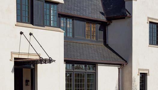
New York–based firm Anik Pearson Architect specializes in high-end residential projects, working from coast to coast across the nation. Firm founder Anik Pearson views each project as a challenge and an opportunity. “As an architect, I see my role as a problem-solver, a strategist, and an artist,” she explains. That ethos is on display for an elegant English Arts & Crafts–inspired house in Clear Creek, Arkansas, completed with interior designer Katie Ridder. The 7,000-square-foot home combines a dedication to sustainability and resilience with a drive to create a comfortable and inviting refuge that meets a variety of client needs.

Located in the heart of the Ozark Mountains, an area especially vulnerable to tornadoes, the house needed to be thoroughly weatherproof. Pearson responded by designing a solid building envelope of thick concrete masonry walls topped by a slate roof with cast-stone cornices built to withstand whatever Mother Nature brings. The house is also sensitive to environmental concerns: Materials and finishes throughout, including the exterior paint, are eco-friendly; a geothermal heat-pump system allows for efficient heating and cooling. Selected with Ridder, the material palette, including polished nickel, ribbed glass, wood, and black iron, provides both warmth and personality. Bright hues were chosen for paint, and wallpaper adds playful pattern. Resilient homes can be cheerful, too.
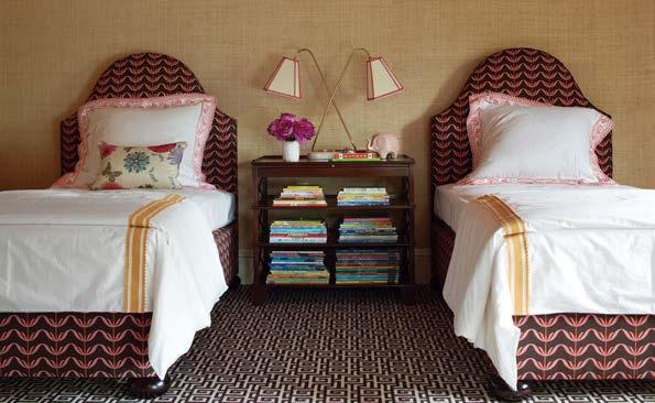 Clockwise from bottom left: Anik Pearson Architect collaborated with interior designer Katie Ridder on a colorful, pattern-filled house located in Johnson, Arkansas. The cool tones and smooth finish of the Moroccan floor tiles in the orangerie are enhanced by the texture of caning on chairs and tufting on the sofa. Low-impact, high-performance nontoxic materials were used on the exterior, including lime stucco, copper, slate, and eco-friendly paint. The dining room is painted a glossy lime green to set off the owner’s collection of lavender glassware.
PROJECT TEAM ANIK PEARSON; JAMES MALLOCH TAYLOR; MERRITT PALMINTERI
KEY CONSULTANTS KATIE RIDDER; IRA SCHWARTZMAN CONSTRUCTION; TATUM SMITH ENGINEERS; GA ENGINEERS
PHOTOGRAPHY ERIC PIASECKI aparch.net; @anikpearsonarchitect


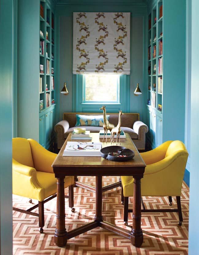
Clockwise from this page: The clients requested a comfortable home that was also environmentally responsible. As such, the residence was inspired by the hardiness and durable charm of old-world European architecture. In every room, oversized windows or walls of glazed French doors fill the interior with ample daylight. Built-in cabinetry provides copious storage. Unlacquered brass fixtures and hardware develop a natural protective patina which improves with age and use.
“Architecture should enhance the human experience —it should inspire and uplift”
WEST VILLAGE LOFT, NEW YORK
Amanda Sullivan opened her namesake firm with a splash in 2009, designing the interiors for The James hotel in Soho, New York. Her Manhattan office has since grown along with her client base, all by word of mouth. Before founding her studio, Sullivan honed her craft working on Gucci and Bottega Veneta flagships worldwide. To her, design is a “responsive” art form. “I see it as a powerful catalyst that can inspire and enrich the lives of those it touches,” she explains.
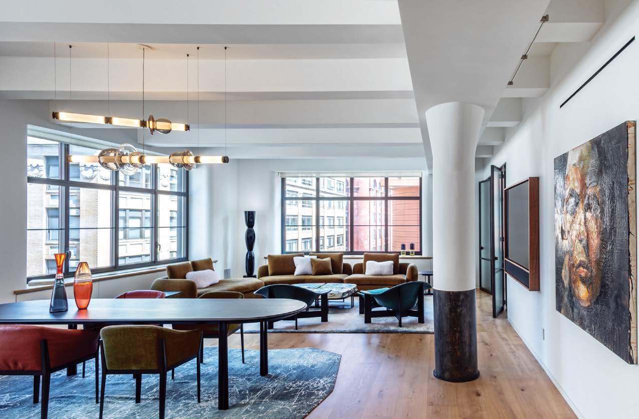
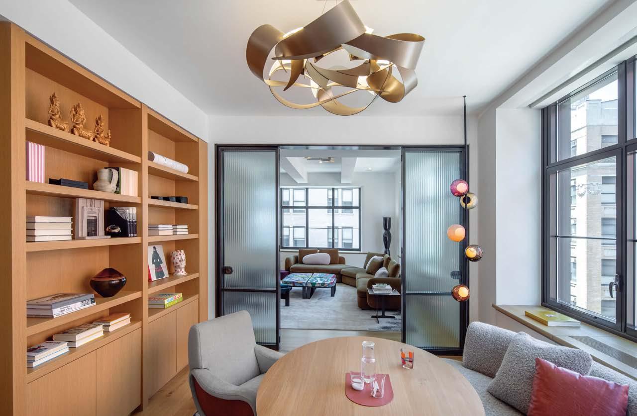
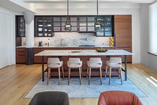
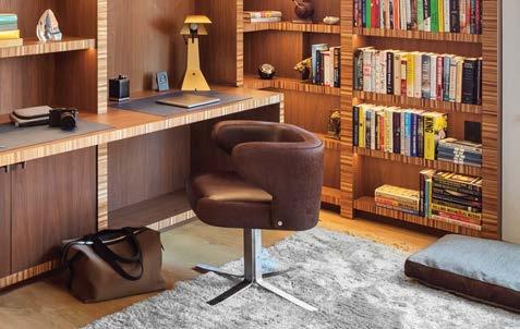
Recently, Sullivan transformed a former warehouse building in the West Village into luxury condominiums. An art-loving couple who bought one of the condos sought out Sullivan to reconfigure their new abode from four bedrooms to two. One bedroom and an adjoining bathroom became a sitting room that serves as both an intimate space for entertaining guests and a comfortable light-filled room for office tasks, with custom millwork integrating shelving and a convertible standing desk. Steel-and-glass doors between the sitting room and the living room are rooted in the building’s history and in the loft archetype of the converted industrial building. Opposite, a suede screen connects the sitting room to the study, a private chill-out zone designated for listening to records. Art is a passion for the clients and was integral to the design throughout. To that end, both lighting and seating were carefully considered to facilitate viewing of their fabulous collection.
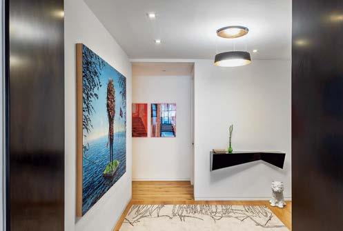
Clockwise from above: A West Village loft in New York by Amanda Sullivan boasts a primary bedroom that is a masterclass in industrial chic. The sitting room segues to the living area. The client couple’s blue-chip art decorates the foyer. Shapely custom rugs define seating areas populated with sculptural furniture and hand-blown glass lighting; beyond, the living area’s coffee table created with Reinaldo Sanguino in flamboyant glazed ceramic inspired a riot of hues across the space. In the study, Sullivan designed a dynamic zebrawood-and-walnut bookcase that integrates a standing desk. The open chef’s kitchen features white quartzite countertops and cabinetry fabricated by Amuneal from blackened steel, fluted glass, and walnut.

PROJECT TEAM AMANDA SULLIVAN, AIA; SHARONE POINTKOWSKI
PHOTOGRAPHY HAI ZHANG assanyc.com; @amanda.sullivan.architect

BEDFORD HOUSE, NEW YORK
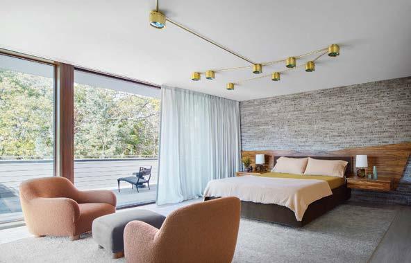
Talk about a drop-dead site. This 6,900-square-foot home perches, Fallingwater-style, on a rocky promontory overlooking a lake— actually a decommissioned early 20th–century quarry—bordered by a dense forest and a newly created waterfall. Interior Design Hall of Fame members Steven Harris and Lucien Rees-Roberts, founders of their respective eponymous firms, made the most of the location with stacked glass-box volumes that intersect perpendicularly and cantilever out over the cliff. Rooms are designed to maximize views through mahogany-framed windows, while finishes and furniture were curated to connect thematically and palette-wise to the structure’s surroundings. Note the double-height entrance hall, with Ceppo di gris limestone flooring, a custom mottled-brick accent wall, and a sculptural spiral staircase that corkscrews down to the lower level, partially embedded in the bedrock. Stone also features in more intimate spaces, like the primary bath, with a Cristallo marble–topped cerused-oak vanity and Perla Venata marble flooring. The cantilever itself is given over to the living room, where floorto-ceiling glass and an extended roof plane (planted with sedum) accentuate the floating quality.



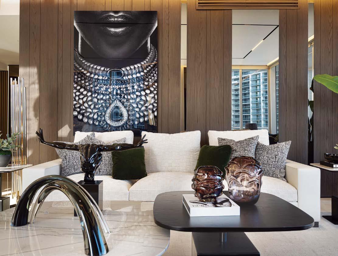
Adriana Hoyos Design Studio is a Florida-based firm of interior designers and architects with a global footprint that draws on more than 30 years of experience across the residential, hospitality, and commercial sectors. Carbonell, a 2,600-square-foot bachelor pad in which elegance and sensuality meet in studied harmony, is a key project for the firm. The concept takes inspiration from the allure of fine jewelry: gold, Colombian emeralds, sapphires, and other precious stones. “Our philosophy is applied to every room,” Adriana Hoyos states. “Attention to detail, timelessness, and personalization are our three main pillars.” Natural and raw materials take center stage. Nero Marquina marble surfaces, with delicate veining and a leathered finish, add a dose of drama to the kitchen and the powder room. Textured wood elements, whether used for furniture or custom cabinetry, bring warmth and coziness to the living and sleeping spaces. Sink-into sofas and armchairs upholstered in chenille and velvet invite the client and visitors to kick up their feet and relax, while leather accents on ottomans and side chairs lend sober refinement. Throughout, Hoyos gave careful consideration to the placement and intensity of chandeliers, sconces, and table lamps for a gentle, flattering glow that enhances the overall atmosphere. The project in a nutshell? Luxury and comfort coexisting, effortlessly.
 PROJECT TEAM ARIANA HOYOS; ANDREA PÉREZ
Clockwise from above: At a Miami residence by Adriana Hoyos Design Studio, a sculptural settee offers a place to perch in the cove-lit warmth of the primary bedroom. Edge-lit brass pendant fixtures catch the glow of the sunset over the leathered marble kitchen island. A chandelier resembling rock crystals dangles like a jeweled necklace in front of a kintsugi-style mirror in the powder room. A moody palette meets spectacular art in the living area. Another vantage of this space, with its plush seating. Custom wood cabinetry in a fluted texture brings dimension to the kitchen.


Founded in 2004, Dimit Architects is a firm devoted to the collaboration that flows from working with thoughtful clients.

Design principals Scott Dimit and Analía Nanni Dimit share two core values: preserving historic fabric and remaining environmentally responsible. All of these forces were at play in crafting a unique and lovely house in Bath, Ohio. Sited along a babbling creek, the 5,250-square-foot residence is on 20 acres originally developed as a WPA recreational zone. (Numerous stone structures were preserved on the site.) The clients asked that every room have a view of the creek, and for myriad and varied exterior spaces where they could enjoy the soothing sound of the babbling water.
The layout emphasizes public space and room for entertaining. One two-story wing includes the living, dining, and kitchen areas with a large outdoor terrace. Floor-to-ceiling glass doors open this space to the creek and the woodlands surrounding the house. Perpendicular to that is a second wing, with a four-car garage and guest bedrooms above. The primary suite, meanwhile, features wraparound windows with sweeping views of the landscape. Throughout the residence, dramatic vistas are complemented by natural materials, including black walnut, cedar, and native ledgestone. It adds up to an earthy vibe that is tranquil and inviting, yet thoroughly contemporary.
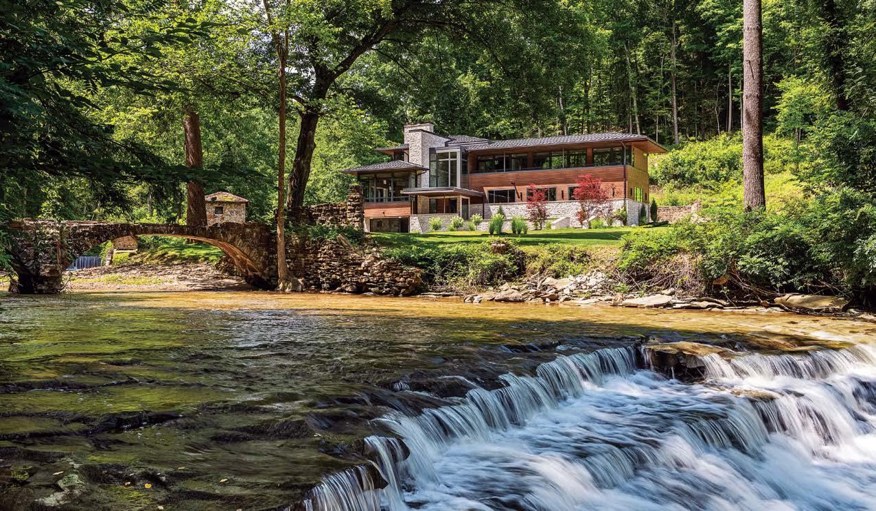
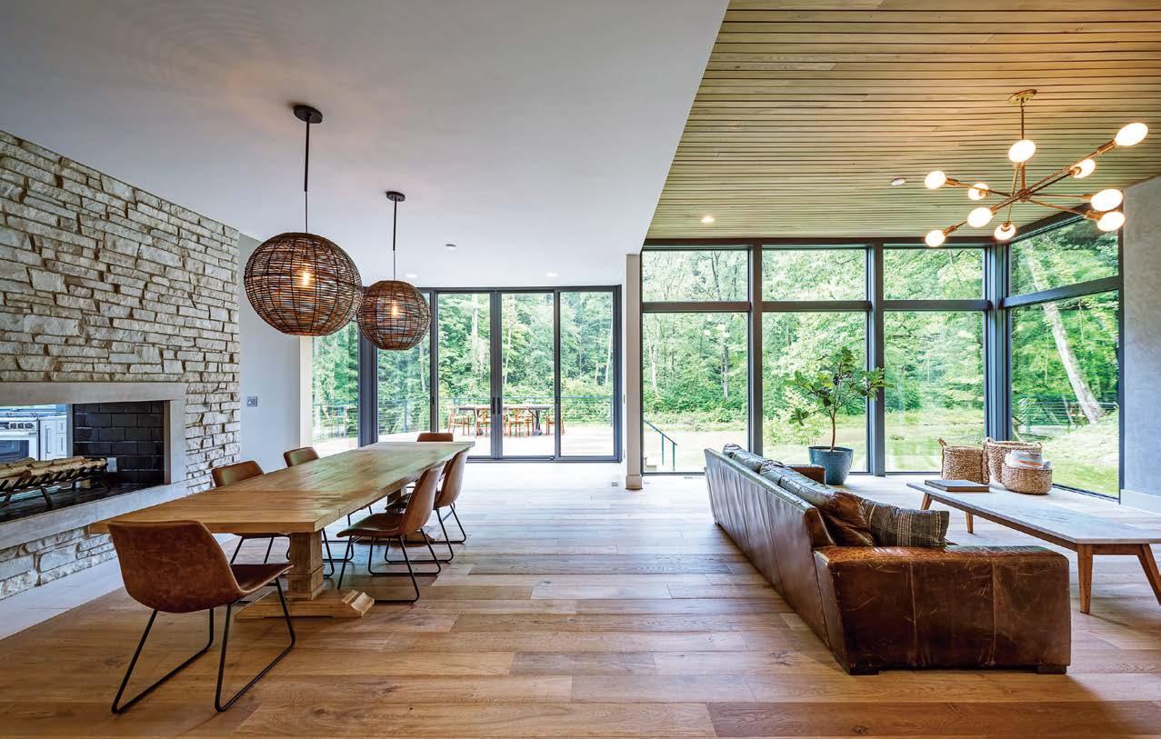

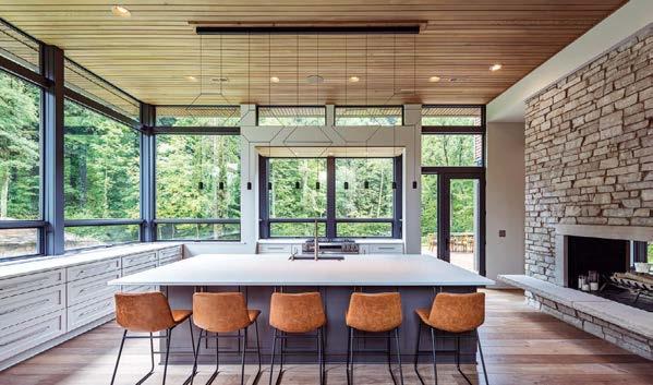 PROJECT TEAM SCOTT DIMIT; ANALÍA NANNI DIMIT; MATTHEW SOMMER; JOHN HOLTZ KEY CONSULTANT CAPUANO HOMES PHOTOGRAPHY CHRISTIAN PHILLIPS dimitarchitects.com; @dimitarchitects


“Locally sourced materials imbue a sense of tranquility and earthy character to the architecture”

From neurodiverse principles to biophilia, today’s workplaces have leveled up with research-informed, peoplecentric design and hospitality-style amenities. With flex and outdoor spaces, cafes and even bars, there’s a modality to suit every work style. The result of this rich variety of choice? Happy, healthy, and engaged employees.
When entrepreneur/philanthropist Dan Gilbert sought to relocate the headquarters of his Rock portfolio of companies to a more collaborative and flexible Detroit workplace, he didn’t have to look far to find a top-tier designer: his wife, Jennifer Gilbert, happens to be the founder of the acclaimed interiors firm Pophouse—and a fellow Motor City area native likewise dedicated to revitalizing downtown.
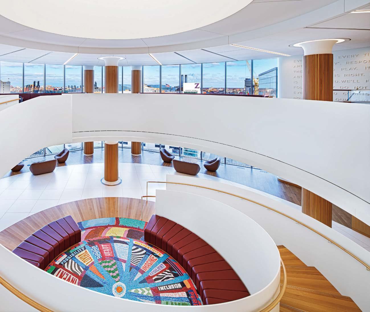
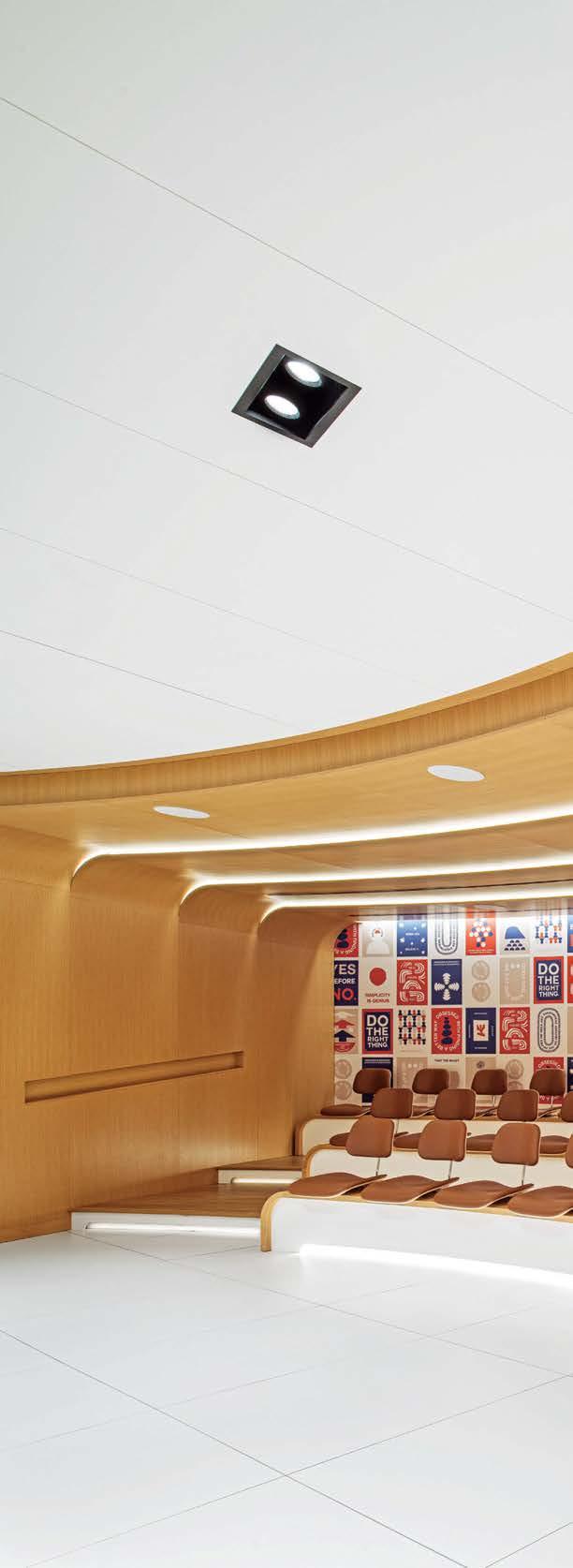
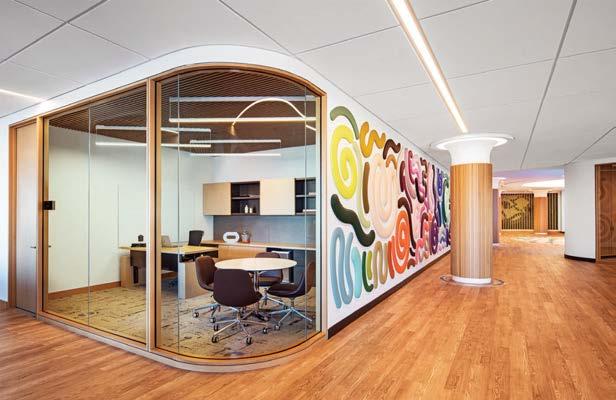
The project integrated all the pillars of Pophouse’s business: strategy, interior and industrial design, and environmental graphics. The team fleshed out a scheme for the 50,000-square-foot workplace, housing more than 90 companies, that centers on a series of circular spaces—rooted in research suggesting that rounded rooms spur creativity. In the cylindrical reception volume, capped by a backlit stretched-fabric ceiling, a terrazzo floor is modeled on Detroit’s huband-spoke street grid. The waiting-area gallery just beyond is circular, too, as is the airy atrium’s dramatic spiral stair. Where the shape wasn’t possible, Pophouse curved the corners of private offices and installed serpentine furniture.
A key feature throughout is high-concept artwork by the likes of Hank Willis Thomas and Daniel Ashram, curated in collaboration with Library Street Collective, a downtown Detroit gallery. One standout piece, by Faile, anchors the staircase, which corkscrews down to a colorful round of inlaid mosaic tile incorporating words such as “heart,” “hope,” and “dream.” There are also hoops-related installations, like a wall comprised of a grid of deflated basketballs, including some from the Gilbert-owned Cleveland Cavaliers.
Clockwise from below: In the atrium of Rock Ventures and the Rock Family of Companies in Detroit, designed by Pophouse, a spiral staircase rises from a mosaic-tile installation by Faile that incorporates words important to the ethos of the company and the city itself. Rift-cut white oak forms the stair’s handrail, treads, and risers, while leather covers the custom bench. A triptych by late local painter Charles McGee overlooks the 18-footlong Isla sectional by Koz Susani Design outside the boardroom. In chairman Dan Gilbert’s office, Tyrrell Winston’s site-specific assemblage of 168 deflated basketballs includes some from the Cleveland Cavaliers, which Gilbert owns.
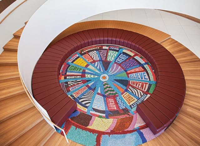
PROJECT TEAM JENNIFER GILBERT; CHRISSY FEHAN; JORDAN WILLS; SARAH DAVIS; MONICA PACE; LAUREN MINCH; BRANDON BARTEL; NICOLE PELTON; ANTHONY MORASSO KEY CONSULTANTS WHITING-TURNER; GHAFARI ASSOCIATES; MOD INTERIORS; LIBRARY STREET COLLECTIVE PHOTOGRAPHY JOHN D’ANGELO pophouse.design; @pophousedesign





“The project incorporates multiple circular spaces,based in part on research suggesting that such spaces spur creativity”


The century-old St James Power Station was Singapore’s first municipal electrical provider. Its legacy of innovation continues into a new era now that Dyson has reinvented the national monument into a dramatic global headquarters by M Moser Associates. At its heart is the stunning four-story former Turbine Hall. Inspired by the quadrangles of academic campuses, the 140,000-square-foot space serves as a circulation hub connecting all departments, an inner employee sanctum embracing nature, and a community space.
In a building originally designed for machines, the team’s focus was to help Dyson reinvent it for people. The main goal of the space is to encourage innovation in research and development; in particular, to better support the scientists and engineers hard at work on future technologies. Engineered to a Green Mark Platinum standard, M Moser’s design leverages smart building technologies, energy reduction strategies, and resource stewardship programs. Concrete flooring and blackened steel link to the past, while technical materials like polycarbonate, metal mesh, and mirrored cladding are more of the moment. The standout is a focal metal staircase that acts as a functional spine linking all four floors. In the form of a turbine and also resembling the silhouette of a drill bit, it references both the existing complex and Dyson’s own heritage.
PHOTOGRAPHY
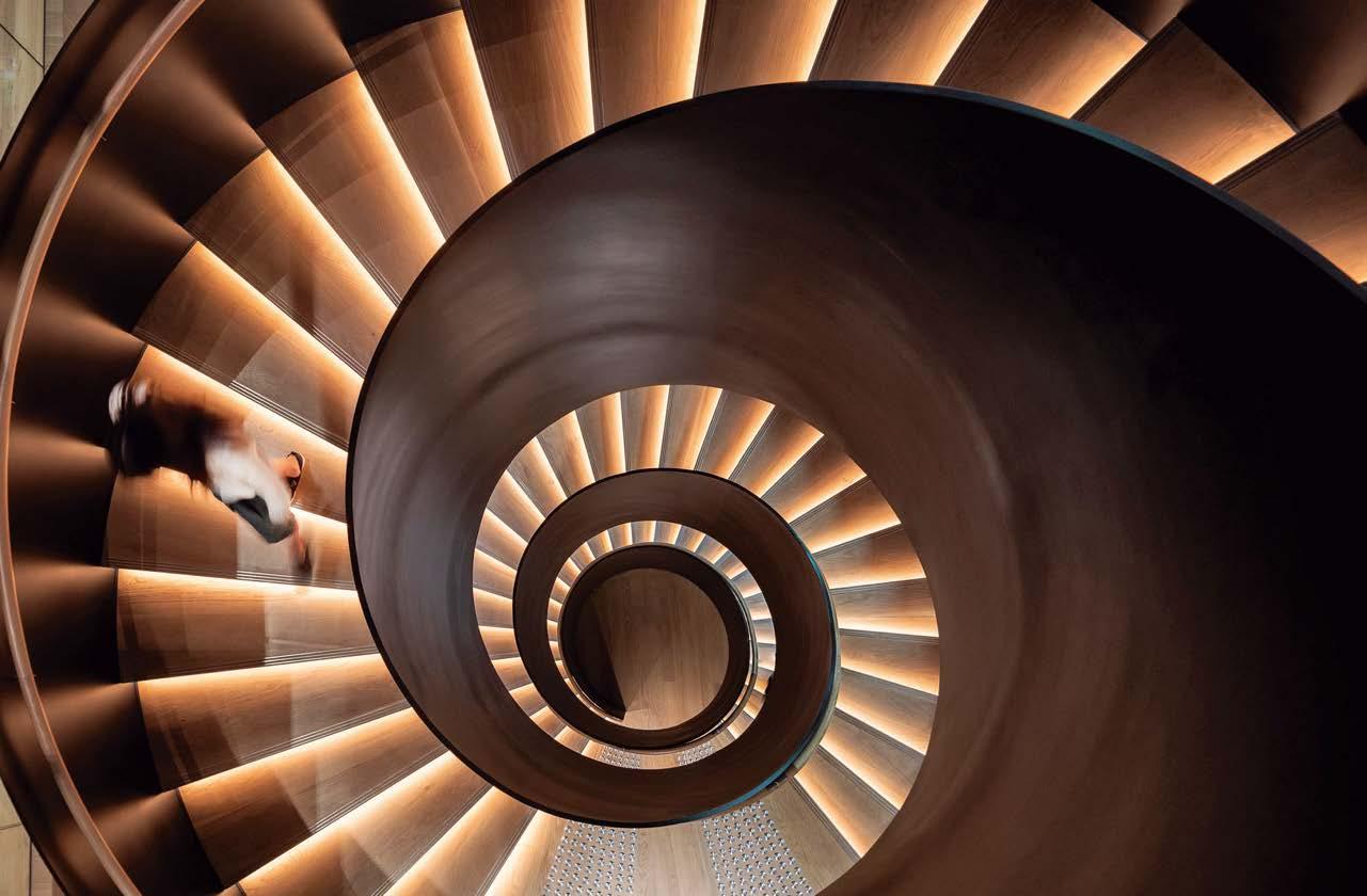

 Clockwise from below: At Dyson’s global headquarters in Singapore, by M Moser Associates, a spectacular staircase resembles a drill bit. The light-filled atrium is framed by exposed black steelwork. Employees enter through the turbine hall. The corkscrew stair links all four levels. Amphitheater-style seating encourages casual confabs.
PROJECT TEAM KAHN YOON; ADDY WALCOTT; KEVIN HUBBARD; VERONICA VIJAYANTI; BHAVNA SINGHAL; ANISHA KUMAR; SIMON PADDISON; SUNG LEE; IVAN MAK; ANDREA CARRION; JULIA TAN; AMANDA TAN; ANTHONY ONG; SAMUEL TSANG
Blazing a new trail in workplace design, this fintech regional office represents a new, post-pandemic environment that reexamines how and where we work today. “At HKS, we view design as a process of discovery. Research enables us to experiment, to improve, and to design smarter solutions,” says HKS principal and studio practice leader, commercial interiors, Jenny Hehemann. “This project showcases our workplace thought leadership. It was an opportunity to set a new course during uncertain times and provide a fully integrated solution with art and technology at the forefront of an inclusive and equitable design.”
The 50,000-square-foot space in the southern hub of Atlanta was conceived to function as a collaborative workplace that offers a novel way to host employees: in a series of social lounges for work, entertainment, and knowledge-sharing, at which in-person and Zoom-ready modalities coexist. Attracting a diverse workforce and supporting neurodiversity were key drivers. Throughout, vibrant local art is deployed to tell a contextual story about Atlanta. The main activity hub centers around a signature staircase that threads through communal areas incorporating large-scale digital-art moments and a welcoming barista counter. In a nutshell, the project shifts the emphasis from displaying a company brand to a more holistic representation of its culture, not only through the elements of the built environment but also through how that space is activated via culture.
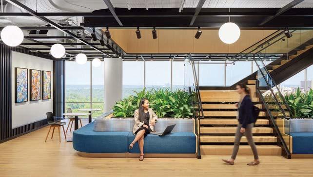
Clockwise from left: In a fintech office in Atlanta designed by HKS, biophilic elements promote wellness. Artwork throughout, like this city mural by Cory Barksdale, has been curated to boost mood, creativity, and productivity, and to authentically cultivate a connection back to the city of Atlanta and the local economy. The hive of workplace activity coalesces around a central connecting staircase and its adjacent lounges. Art by local Atlanta painter Peter Ferrari graces walls in the café. Digital art animates the entry.
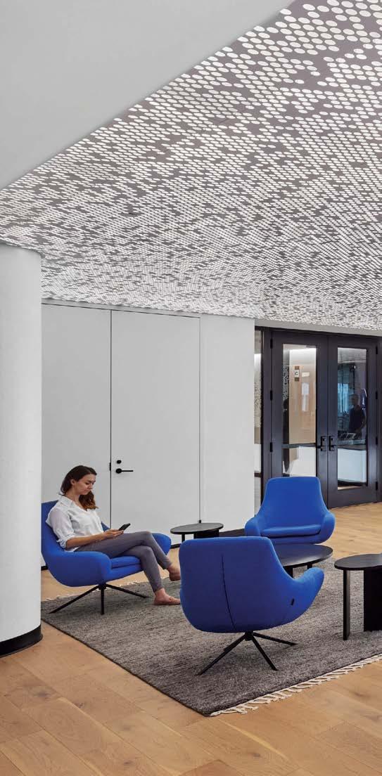


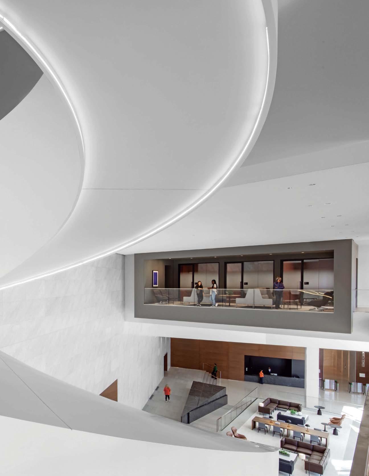
Transportation company Norfolk Southern Corporation traces its history back to 1827. For decades, the freight rail operator was based in Norfolk, Virginia, but its operations team was in Atlanta. In 2018, NS decided to bring everyone together, and HOK won the bid to design the interiors of a new 750,000-square-foot complex in Midtown Atlanta’s Tech Square. “The client didn’t want this to be treated like a train museum,” HOK firm-wide director of interiors Tom Polucci begins. “The existing buildings had beautiful models of locomotives, but NS said, ‘No, we’re more sophisticated than that.’” The client envisioned a timeless concept where track workers and administrators alike would feel at home. Robust amenities would help the company compete for talent against the likes of Google. With architecture by Pickard Chilton, the ground-up headquarters is composed of two office towers joined by a five-story podium. An enormous 32-foot-high lobby gave the design team the opportunity to create a monumental circular stair, the defining feature of the interior. Its ribbon of Corian-clad steel twists from the ground floor to the fourth, but the white-oak treads only begin on level two. In the lobby, the Corian curls to wrap the reception desk. The stair grew out of the idea of movement, the guiding theme of the project. “Norfolk Southern was looking to celebrate the idea of motion in subtle, special ways,” Polucci notes. HOK’s design is right on track.


KEY
ONSITE WOODWORK
PHOTOGRAPHY ERIC LAIGNEL hok.com; @hoknetwork
 Clockwise from bottom left: Beneath train track–inspired ceiling baffles, the employee canteen opens to a terrace at the HOK-designed Norfolk Southern Corporation headquarters in Atlanta. A three-story staircase of Corian-clad steel and white oak forms the project centerpiece. Standing on the plaza outside the building, a weathering-steel sculpture by Pennsylvania artist Dee Briggs alludes to train tracks, movement, and tunnels. The standout stair terminates in a reception desk.
PROJECT TEAM TOM POLUCCI; BETSY NURSE; DANIELLE SCHMITT; KAY SARGENT; DIANA STANISIC; VIVIEN CHEN; RICHARD SAUNDERS; WERONIKA CICHOSZ; FRANCESCA MEOLA; CRYSTAL LATHAM; VALERIE ROOSMA; IRINA SAI; ERIN EZELL; EMILY PAYNE; BETHANY FOSS; CLAIRE PELLETTIERE; MATT MCINERNEY
CONSULTANTS HKS; OJB; ONE LUX STUDIO; UZUN + CASE; INTEGRAL CONSULTING;
CORPORATION

 The stair’s Corian ribbon is highlighted by double LEDs on its underside.
“Our goal was a ‘pure’ form:the stair’s ribbon is consistent all the way up; it doesn’t flatten out at each floor”
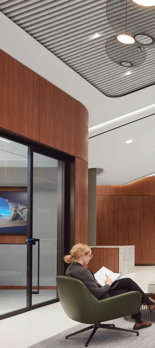
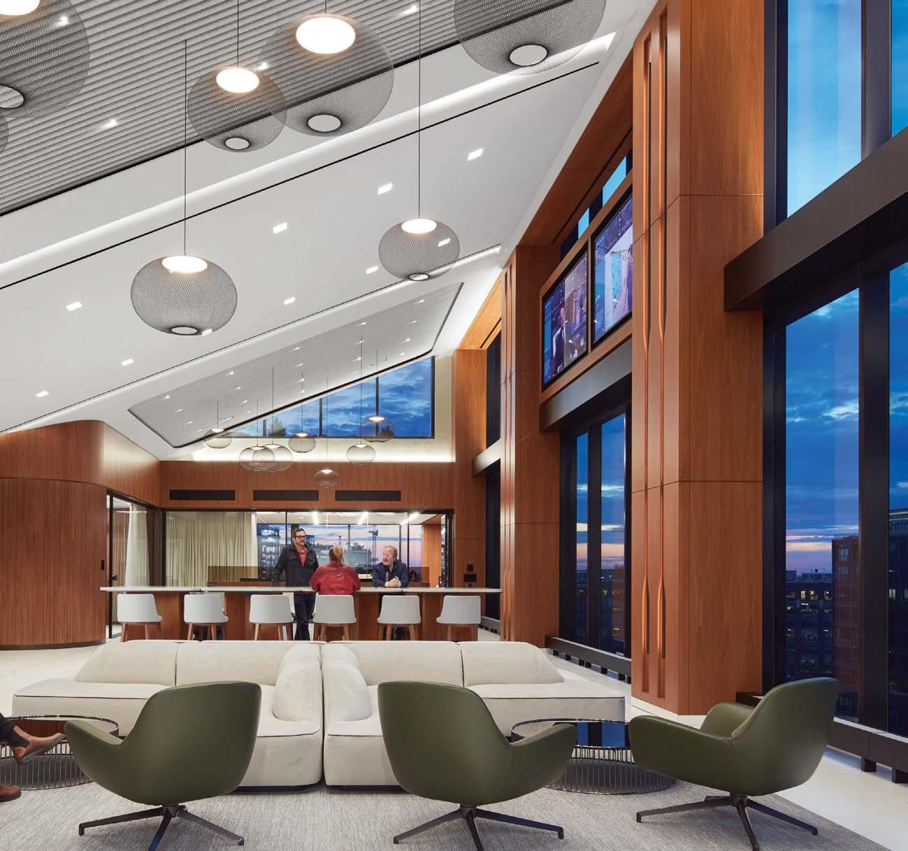
When Calamos Investments approached Lamar Johnson Collaborative (LJC) to design a new iconic workplace in downtown Chicago as an extension of its headquarters in nearby Naperville, it was with the goal of attracting top talent. The project is 31,000 square feet of luxurious space across three floors, on six, eleven, and twelve, the latter a penthouse space with a broadcast studio and flexible executive meeting spaces for hosting either small or large gatherings. The other two levels house the client’s wealth-management, trading, and equity-fund groups. All boast hospitality-inspired touches.
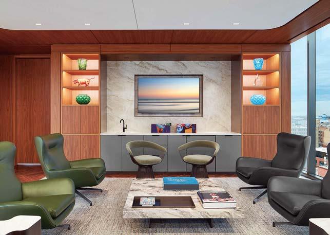
For Calamos, LJC, a full-service architecture and interior design firm that’s “youthful in outlook and seasoned in experience,” produced a refined environment of timeless materials, classical architectural references, and sculpted, modern forms. “We designed an engaging experience that relates directly to the quality and precision defining the company,” LJC associate principal Lance Yeary says. Grooved dark-wood paneling meets a sinuous ceiling with acoustic baffles that, as it undulates through the office, evolves in form, articulating the entry, circulation, and, finally, a dramatic communal lounge. In the boardroom, floor-to-ceiling windows let in natural light and showcase spectacular city views. Every detail demonstrates attention to craft, resulting in an environment that beautifully embodies the culture of Calamos.
KEY CONSULTANTS CALAMOS CONSTRUCTION GROUP; ENVIRONMENTAL SYSTEMS DESIGN; AURORA LIGHTING DESIGN; SPECTRA; SHINER ACOUSTICS; SOUND INCORPORATED; UPRIGHT INTERIORS
PHOTOGRAPHY STEVE HALL/HALL+MERRICK+M C CAUGHERTY PHOTOGRAPHERS theljc.com; @lamarjohnsoncollaborative
Clockwise from left: Hospitality-inspired details such as warm wood paneling and contemporary lounge furniture define the Chicago office of Calamos Investments by Lamar Johnson Collaborative. A galley break-out area adjoins the boardroom. The office spans 31,000 square feet and three floors. Natural light floods the precisely tailored boardroom. The ceilingscape was carefully considered and features insets that help control acoustics.
 PROJECT TEAM LANCE YEARY, IIDA, LEED AP; AL FIESEL, NCIDQ, IIDA; PAUL BRYANT AIA, LEED AP, NCARB


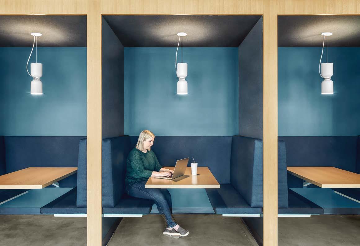
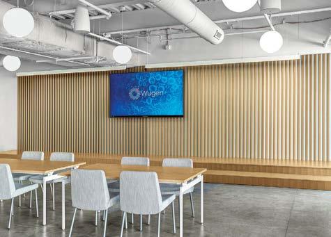
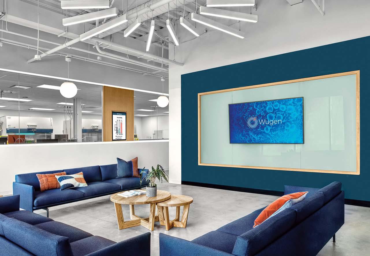
The designers at women-owned, Missouri-based firm Arcturis drew on their expertise in architecture, interior design, and branding to craft a sophisticated, contemporary office and lab for Wugen in St. Louis. The biotech company, which develops therapies to fight cancer, needed a space that was welcoming for both employees and visitors, including cancer patients. “This is a groundbreaking company with a compelling mission,” Arcturis principal Chrissy Hill Rogers says. “We’re incredibly proud to support its impact.”
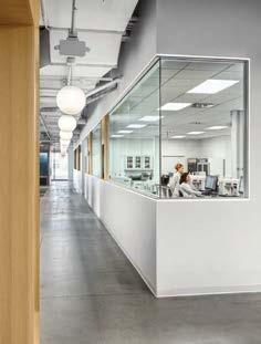
The themes for the 17,000-square-foot office (which doubles the size of the organization’s previous space) are transparency, collaboration, and comfort. The entry highlights Wugen’s history, a neat starting point for visiting patients before they embark on an immersive tour. The labs—and the very important work done within— are the focal point, naturally, and so are made thoroughly visible through a long expanse of windows. For additional impact, this glazing is lit with a recessed linear reveal. Visitors can also peek into work areas, where they will observe breakout areas, huddle rooms with writeable walls, workstations, and cushy booths in soothing tones of deep blue-green. The break room doubles as a large allhands meeting area and its warm wooden finishes are a thoughtful through line that recur elsewhere. Call it a workplace with the “Wu factor.”
 PROJECT TEAM CHRISSY HILL ROGERS; ALLISON NELKE; ANN DANG; JAMES BUTLER; BRIAN WAITE; LAURA MEYER; AMY EDWARDS
KEY CONSULTANT HERA LABORATORY PLANNERS PHOTOGRAPHY ALISE O’BRIEN arcturis.com; @arcturis
Clockwise from right: At the Arcturis-designed Wugen, a biotech office in St. Louis, the main corridor leads from the entry past a mix of workstations, collaboration areas, and environmental graphics en route to the labs, which are the centerpiece of the project. Visibility into the labs through glazing emphasizes the hands-on process and showcases the team behind the mission. Comfortable seating and light fixtures mimicking the client’s logo anchor a lounge adjacent to the lab. Custom booths in the main corridor feature acoustic treatments and individually controlled lighting. The break room doubles as an all-company meeting room.

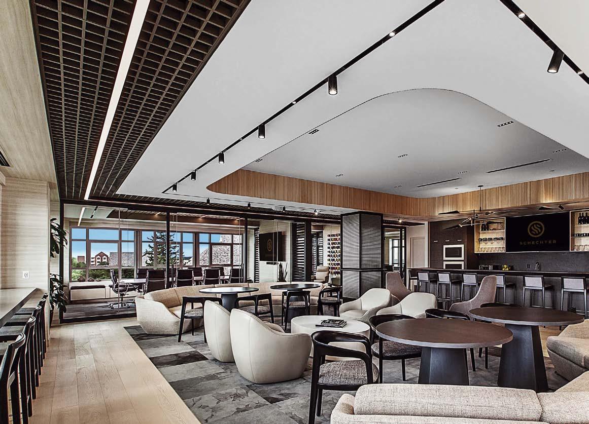
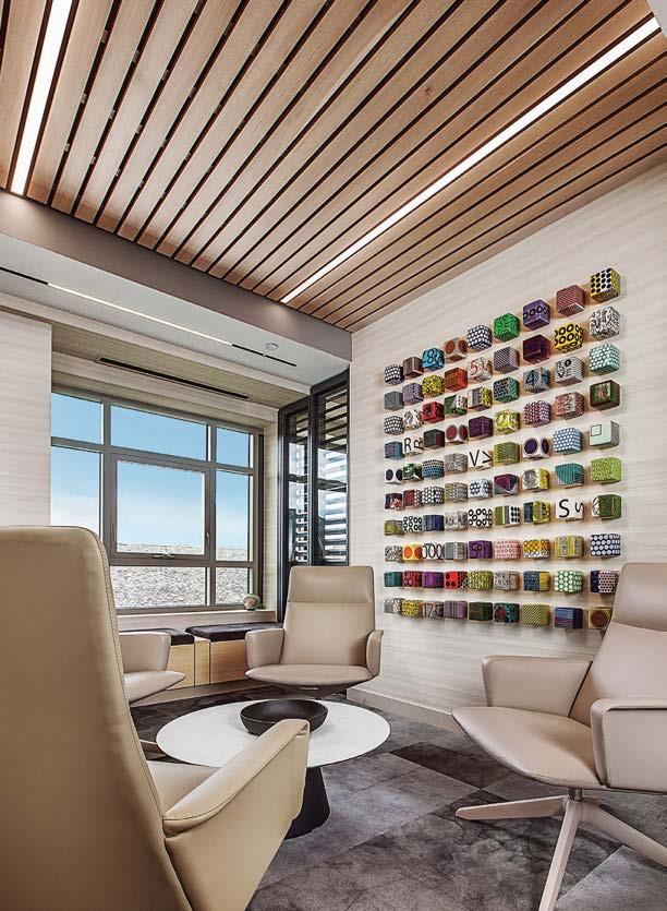
The boutique, award-winning architectural and design firm Davis & Davis, based in Michigan, prides itself on delivering timeless design solutions to meet the unique objectives of each client. D&D partner and managing director Jamie Jordan emphasized the importance of communication when working with SCHECHTER, a wealth management and private capital investment firm. “We explored what the company wanted for its new location in Birmingham, Michigan,” Jordan explains. “We established priorities and developed a deep understanding of how SCHECHTER serves its clients and employees. The result is a space that’s as modern as it is warm, as sophisticated as it is comfortable.”
Over three floors and 12,000 square feet, Jordan and her team used a restrained palette appropriate for the financial-services sector But there are also hospitality and residential influences throughout, such as notable artworks next to family heirlooms, creating a welcoming environment that encourages lingering and conversation. Workspaces are contemporary, with options for privacy or collaboration. Large windows provide abundant sunlight and views of the city. Custombuilt elements mix thoughtfully with curated furnishings from the likes of David Weeks Studio, Shaw Contract, and Andreu World. The office promotes the forward-looking conveniences of today’s workplace while honoring the stability and perpetuity of this third-generation company.
 PROJECT TEAM JAMIE JORDAN; AMER SAHOURY; HOWARD DAVIS KEY CONSULTANTS INTERIOR ENVIRONMENTS; MOD INTERIORS; SYNERGY GROUP; KOJAIAN COMPANIES PHOTOGRAPHY JEFF GARLAND davisinteriordesign.com; @davis_and_davis
Clockwise from above: Davis & Davis devised a functional and sophisticated workplace for employees at SCHECHTER, a wealth advisory firm in Birmingham, Michigan. Break-out areas are refined yet welcoming. The influence of high-end hospitality design can be seen in a restroom. An elegant, expansive lounge was conceived for casual confabs. Neutral upholstery and finishes and vibrant artwork play off each other in a meeting room.


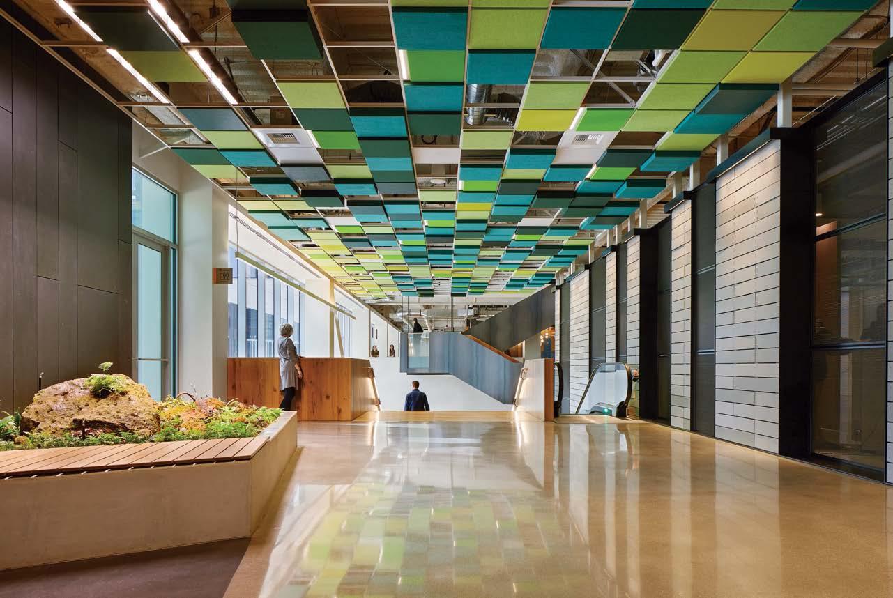
Graphite Design Group founding partner Peter Krech’s approach to architecture centers around two edicts: The most difficult problems contain elegant solutions, and if you’re going to build something, you should endow it with balance, grace, and beauty. His team’s LEED V4 Gold–certified workplace for Frontier, a global technology company, hits all these marks—and more—within a 60,000-square-foot vertical campus in a Seattle corporate high-rise.

The idea of an “urban treehouse” was the narrative through line. A treehouse is an iconic typology: a space deeply entwined with nature, which you must ascend to access. Translating this concept to an office tower, a central open stair located prominently along the facade traces the syncopated push and pull of the building exterior. From day one, the goal was to minimize the use of elevators. Against convention, the stair connects all floors and is adjacent to the glass, a move that promotes its use internally while being fully transparent for the neighborhood to see.
Like lines on a map, steel and wood elements guide the journey through the building. The facade is checkered with landscaped terraces, which spill inward creating numerous opportunities to be surrounded by greenery. Destinations such as reception or the rooftop games lounge are rich in color and texture, with their own character. Distinctive ceilings and changes in level further define these interior experiences, creating moments of prospect and refuge, compression and release, surprise and delight.

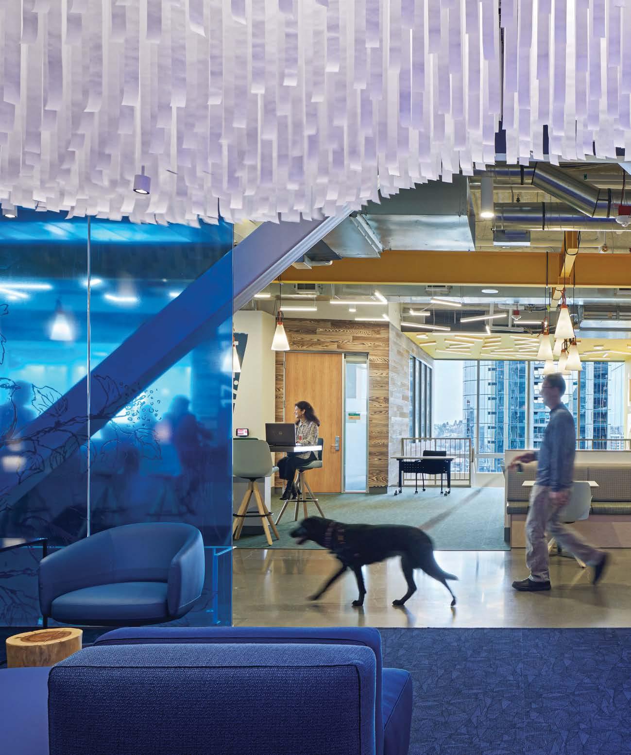
Clockwise from above: At Graphite Design Group’s Seattle office for Frontier, a horticultural installation greets staff and visitors as they ascend the lobby stair under a pixelated abstraction of a forest canopy. Level two is home to shared amenity and social spaces, including a hearth and fireplace. A view of floor 17, where an expressive light feature frames the topmost landing of the treehouse stair. Guests check in under a canopy of backlit, perforated panels that draw inspiration from oldgrowth forests common to the Pacific Northwest. An overall view of the 388,000squarefoot building, which was also designed by Graphite.

 PROJECT TEAM PETER KRECH; KATELYN BRISTOW; REBECCA CHAU; LINDA COHEN; KIM KRECH; BRIAN OCHS; PARAG SHARMA; SONIA YOUNG KEY CONSULTANTS SITE WORKSHOP; MAGNUSSON KLEMENCIC ASSOCIATES; OCULUS LIGHT STUDIO; STUDIO SC; SELLEN CONSTRUCTION; THE SENECA GROUP PHOTOGRAPHY BENJAMIN BENSCHNEIDER graphitedesigngroup.com; @graphitedesigngroup
“Designed to spark creativity, the interiors are tuned to the user, supporting varied and diverse modes with options to customize the workday”
The level 17 games lounge is a destination worthy of the journey up the treehouse stair: a space immersed in blue with a glowing, undulating, cloudinspired ceiling.

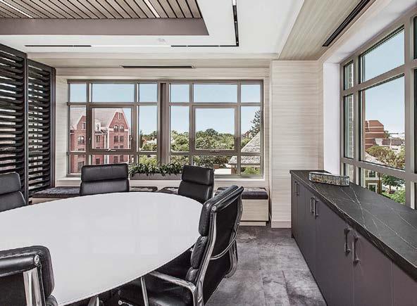
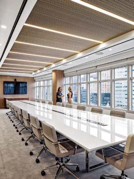
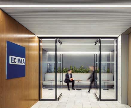
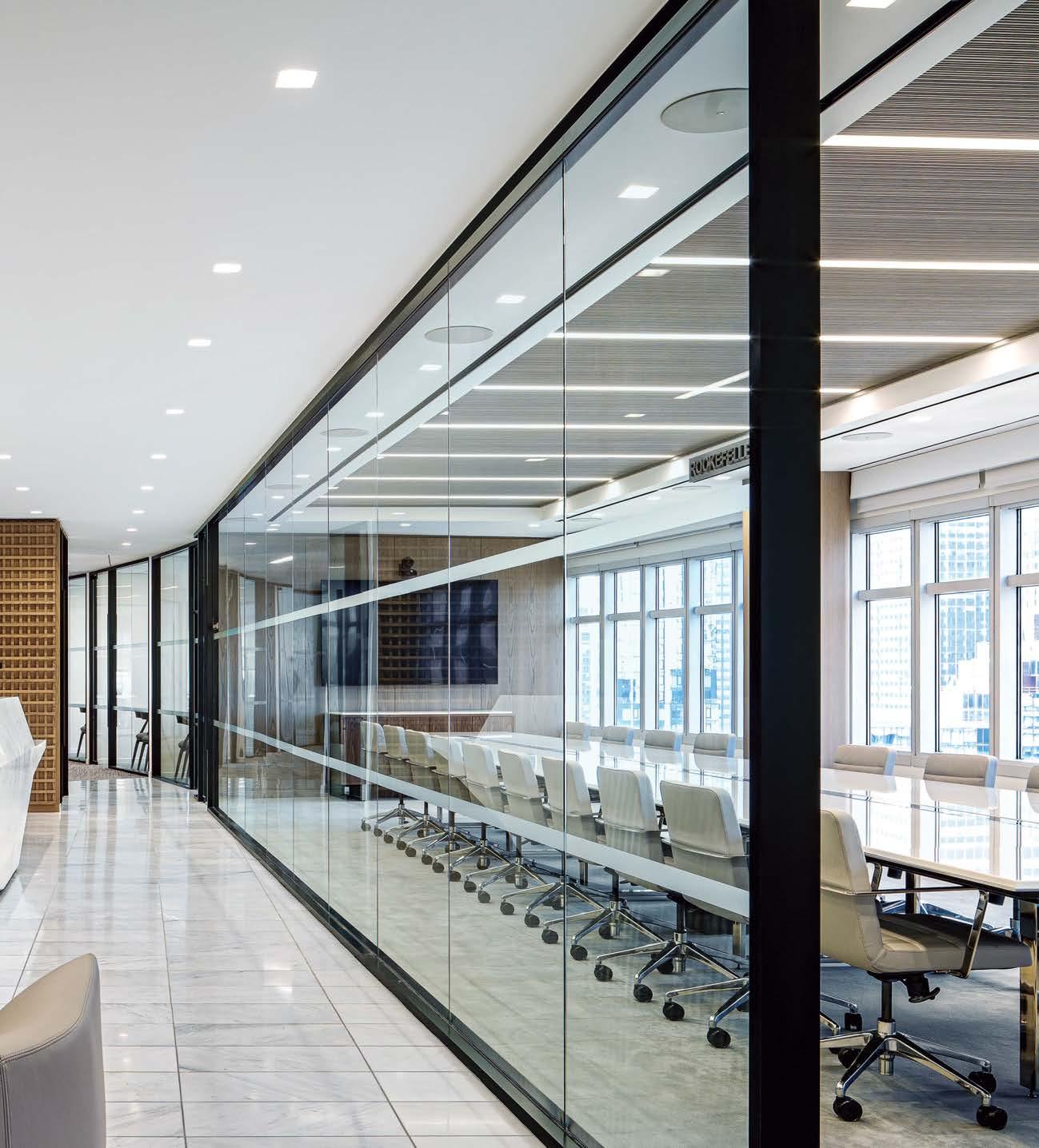
“Premier international banking firm EuroConsult International Mergers & Acquisitions came to MKDA to create a sleekly modern yet warm and inviting corporate office in New York’s iconic Lipstick Building,” says firm EVP and director of design, Daniel DeSiena. “Working closely with the client’s team, and within the parameters of the building’s unusual floor plate and 1980’s architectural details, we created a peoplecentric boutique environment that set the tone EuroConsult was seeking. Special features, like the 22-person boardroom, presented a challenge, but also provided the opportunity to highlight the unique nature of the building architecture.”
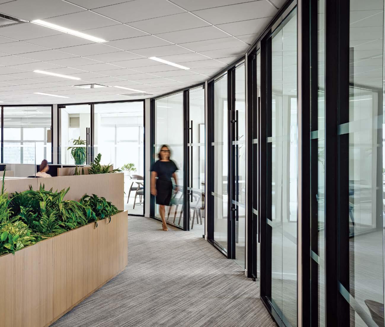
Upon arrival, white-oak paneling and a wood-slat ceiling are paired with luxurious marble tiles. Reception is defined by such custom features as wood-lattice accent walls and a geometric desk. Similarly, the pantry is outfitted with millwork and a custom trellis screen that exude warmth. Continuing the use of organic materials in the open office, MKDA selected height-adjustable, wood-veneered workstations and dispersed planters throughout. Windowed private offices and meeting rooms line the perimeter, accentuating the building’s curvature and bringing daylight deep into the interior. There is also a large touch-down area with banquette seating, encouraging informal collaboration. Much like the building’s striking shape, the main boardroom integrates an expansive table in the form of a parallelogram. The 25-foot-long angular piece, also custom, stands in stark contrast to the elliptical floor plate, stimulating visual interest.
Clockwise from left: A faceted reception desk and lattice accent wall, both custom, add visual interest to MKDA’s office for EuroConsult International Mergers & Acquisitions in New York. The workplace occupies space in the city’s renowned Lipstick Building. Biophilic design principles were employed throughout. Attention is drawn to the building’s bold elliptical floor plate with interior glass partitions that trace the curve.




“Through fusing classic and modern elements, the workplace functions as an inviting, impressive, and highly efficient setting for this leading international brand”
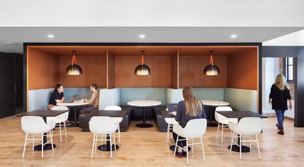
Betsy Vohs founded Studio BV in 2015 in order to dedicate her energy and creativity to clients who want transformational design solutions. One such client, OurFamilyWizard, is a technology company that created and manages an app that helps caregivers coparent effectively after navigating the confusion and tension of separation. The platform allows parents to communicate, share calendars and journals, track expenses, and transmit payments. The start-up had grown exponentially during the pandemic and was looking for a larger office, a search that led to the top two floors, spanning 25,000 square feet, of the historic Loose-Wiles Building in the North Loop of Minneapolis. This 120-year-old structure—an enormous volume flooded with daylight from large windows and clerestory glass—was once home to the Sunshine Biscuit Company, which produced Cheez-Its and Animal Crackers there. The building’s unique character (rough brick, exposed steel, recessed niches that once held commercial ovens) is enhanced by the juxtaposition of contemporary furnishings and fixtures, creating an energetic and dynamic workplace. To wit: Surveying the two-story atrium, which is ringed by an open lounge and features a communal staircase, is a constellation of glowing glass orbs reminiscent of fireflies in the dark or stars dotting the night sky.
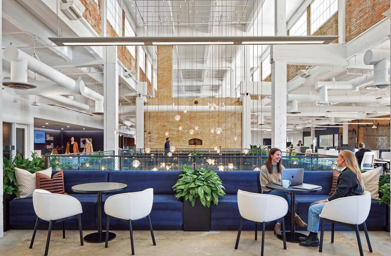


 Clockwise from above: Staggered globe pendants descend through the atrium at OurFamilyWizard’s Minneapolis office, by Studio BV. The communal stair is a space for all-hand meetings. Touches of navy and cerulean derive from the company’s branding. The exposed brick of the 120-year-old structure, once the Sunshine Biscuit Company manufacturing plant, lends ample character. “Resi-mercial” seating wrapping the atrium fosters a relaxed vibe. The cozy dining lounge, with booth and table options, suits eating or working.
This 60,000-square-foot workplace for the Rocket Mortgage marketing team was first conceived pre-pandemic, but its final form reflects the seismic shift in office design that occurred thereafter. As Covid-19 hit, accommodating a hybrid team and differing work styles became top-of-mind. Pophouse designers quickly shifted floor plans, paths of travel, and materiality to accommodate an unknown future, with safety and wellness at the project’s forefront.
Communication and connection became more important than ever, and Pophouse looked to historic marketplaces as a point of reference. Such open-air pavilions were often supported by arches that connected the structure and, inherently, the community. The curved motif is reflected in each entry point, light fixture, and custom millwork detail to visually promote togetherness.
Flexibility is the next foundational element of the scheme, applied both to how areas can be used and to welcoming a neurodiverse workforce. The result is a spectrum of multifunctional communal and individual spaces that transcend outdated office-design standards. Touches borrowed from the hospitality milieu, like a speakeasystyled meeting room hidden behind a pivoting bookcase wall, help break the corporate mold. It is such originality, alongside clever space planning, that netted the design a Best of Year Award.
Detroit
Rocket
a
seating
dubbed the conversation
is clad in ceramic tile,
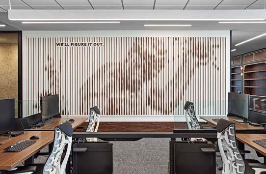
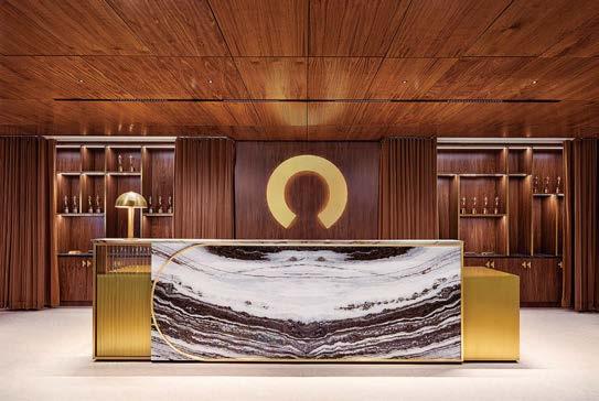
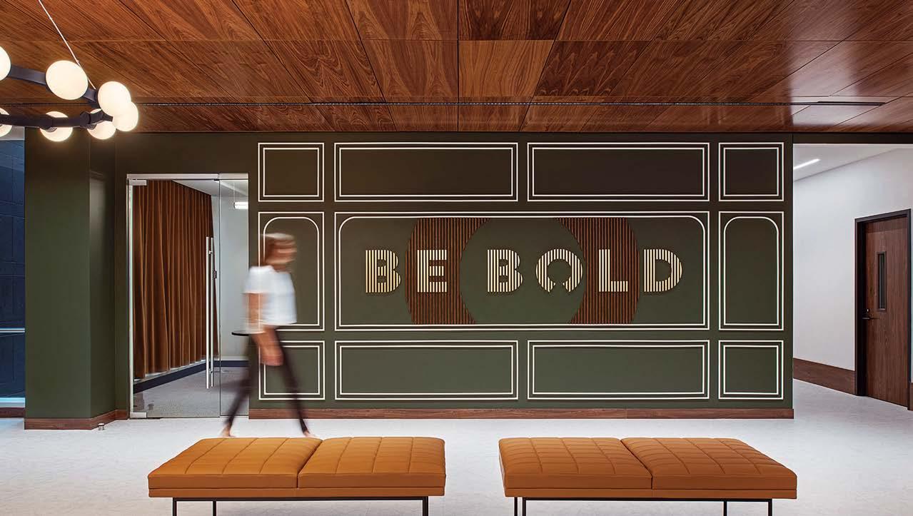
a quartz countertop and bar chairs on the outer ring and banquette seating further in. In the staff café, custom booths in faux leather and walnut veneer have a bistro feel. A custom 3D graphic installation depicts the Spirit of Detroit monument, built from wood fins on a white background, with the inspirational maxim “We’ll Figure it Out.” The encouragement to “Be Bold” is one of 14 custom graphics—six of them 3D—found throughout. A local fabricator faced the reception desk in book-matched panels of Panda White marble.

 PROJECT TEAM ANNA OKERHJELM; CHRISSY FEHAN; SOPHIA GRDINA; SAVANNAH RAUS-WUTH; BRANDON BARTEL; NICOLE PELTON; MAKYLE WELKE; ANTHONY MORASSO
KEY CONSULTANTS ROSSETTI; VOGUE FURNITURE
PHOTOGRAPHY JOHN D’ANGELO pophouse.design; @pophousedesign
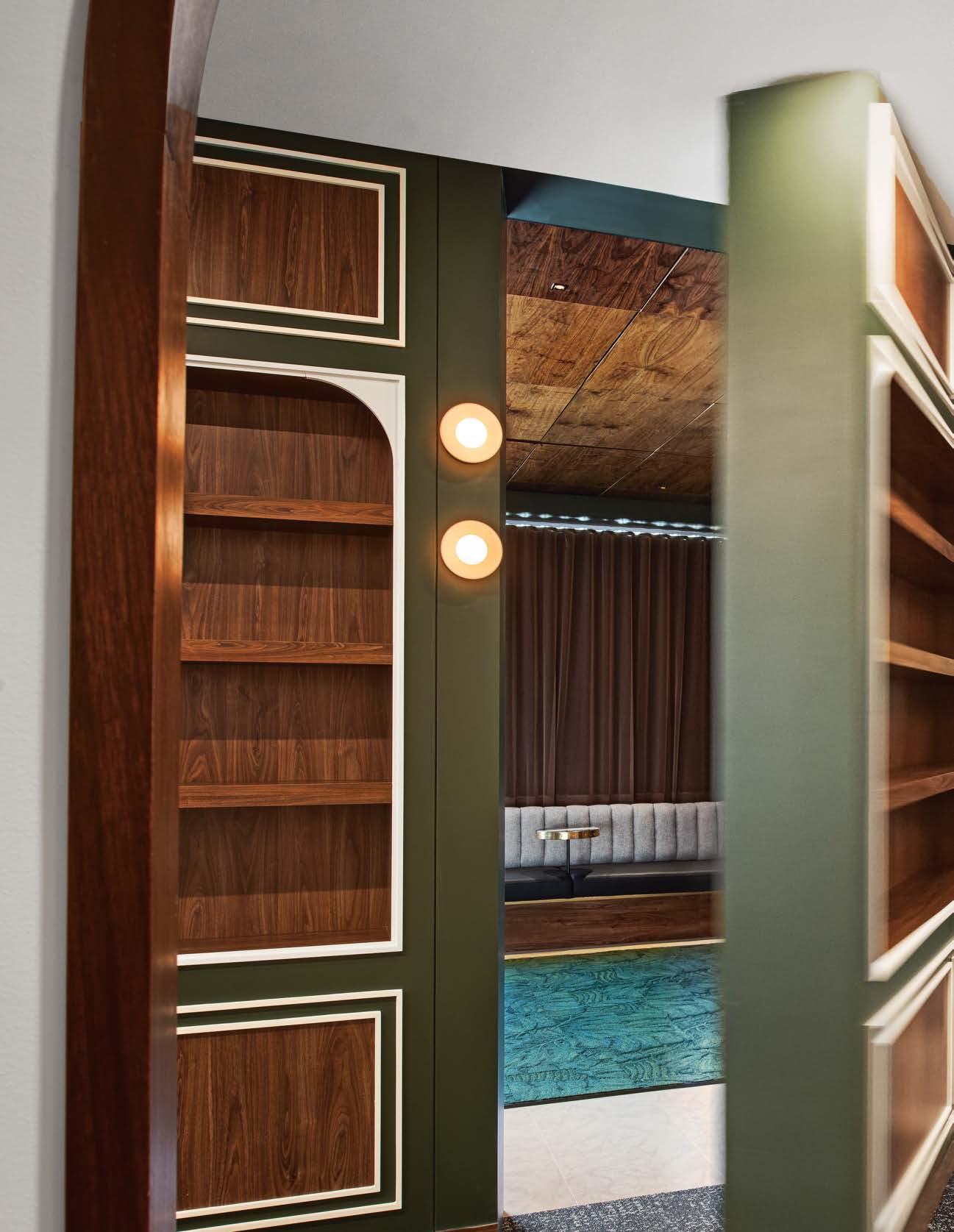
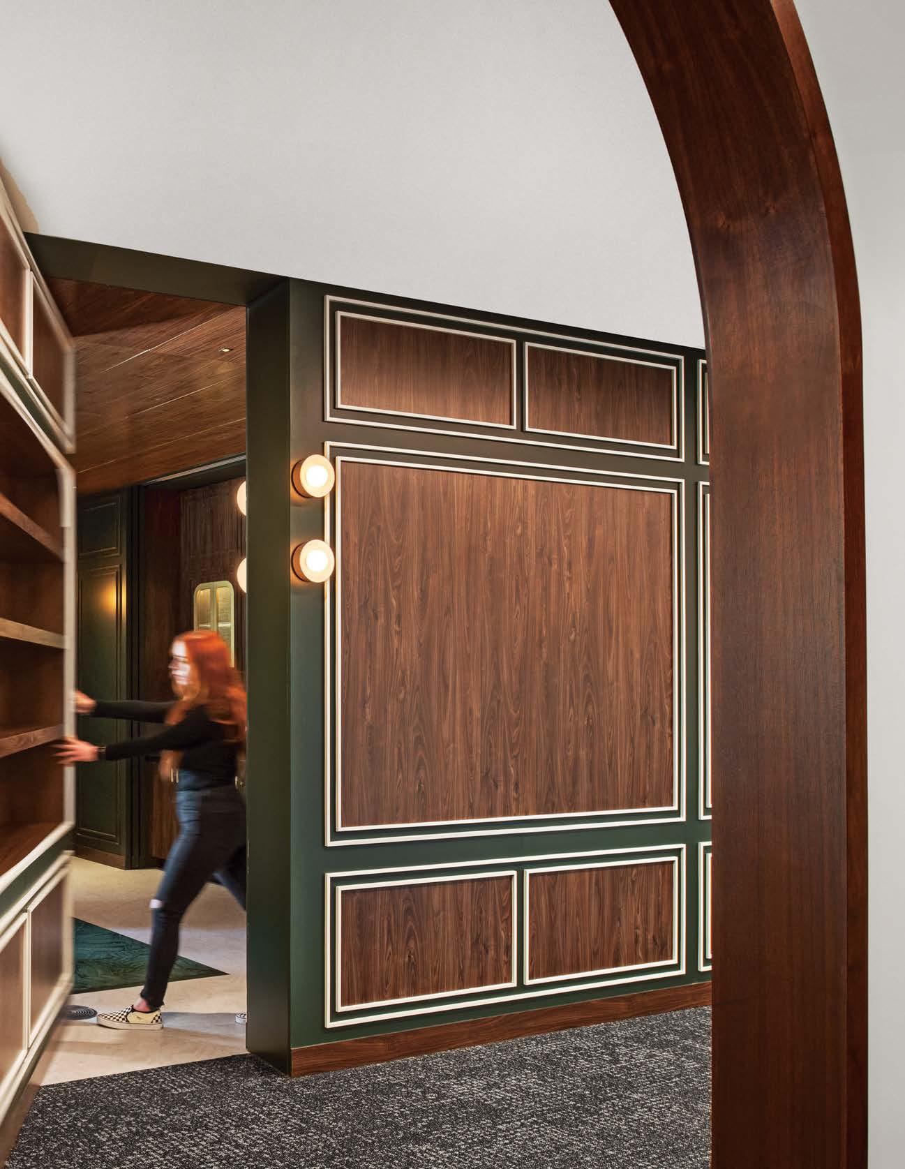 A rotating bookcase wall leads to the Speakeasy, a hospitality-driven space for hosting small gatherings and filming content.
“We believe the ideal workspace is a destination for both productivity and culture”
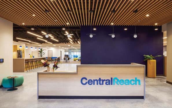
When multihyphenate creative Paola Zamudio designs her projects, she brings a mix of the personal and the professional to bear, drawing on her Colombian background, Miami roots, Italian arts education, and decade of workplace experience. Her office for CentralReach follows this pattern, and the result is a space of distinction.
“It’s a company with a beautiful mission,” Zamudio explains of CentralReach, an organization that develops software specific to autism and intellectual/developmental disabilities. Remote work at the company had been the standard, but execs wanted to change that, bringing staffers in to a bricks-and-mortar office at the mixeduse Bell Works campus in Holmdel, New Jersey. Zamudio was no stranger to the site, having worked on other award-winning projects at the Eero Saarinen–designed mega-structure previously known as Bell Labs. For this client, Zamudio ideated 25,000 square feet, “bringing in brand colors, bold wallcoverings, playful furniture, and an abundance of plants to keep the energy flowing,” she explains. Sustainable elements, including repurposed and recycled materials, are another mainstay, alongside furniture with acoustic properties, such as sound-absorbing planters that attenuate noise. It’s a futureforward design full of smart, considered details.


Founded in 1986, JPC Architects began with a single client: Microsoft These days, though, the firm has an extensive and varied list of companies on its roster that are local, national, and international. For each project, JPC emphasizes strong working relationships and a spirit of collaboration. The talented team members at JPC work together to pursue new ideas and forge distinctive solutions.
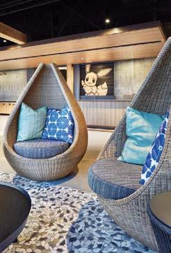
The Pokémon media and video game company’s office in Bellevue, Washington, boasts a 14,600-square-foot amenity floor that was ahead of the curve in embracing a new way of working. The design team conceived a space where employees are encouraged to linger, interact, and relax. JPC associate Susan Griffin, the senior designer on the project, elaborates, “It’s a place to get away and have quiet time, group lunches, yoga classes, informal collaboration, or all-staff meetings. Employees can define their own rules and have freedom in their working styles.”

Embracing a strong commitment to employee wellness, the project incorporates biophilia throughout the space. Pebble flooring, a green wall of preserved plants, a relaxing fireplace, and a flowing water feature work together to bring the outdoors in. Structural wood elements were incorporated to divide and define meeting spaces. There are cozy break-out spaces, a large training room, and formal meeting areas that can be divided by sliding panels for additional flexibility. Overall, it’s an inspiring, comfortable mix of rustic and industrial finishes that promotes well-being, encouraging both collaboration and community.
Clockwise from left: In Pokémon’s office in Bellevue, Washington, by JPC Architects, a lounge on the amenity floor is designed with synthetic grass flooring, a pebble-shaped coffee table, and Adirondack chairs. The design of this warm gathering space next to a fireplace is intended to ignite collaborative energy among team members. Teardrop-shaped rattan seating offers a place for repose. Copper-finished pendant fixtures add a hospitality vibe to the elevator lobby, while a thoughtfully designed Pikachu graphic greets team members. An illuminated water feature and a green wall of preserved plants and moss provide a tranquil setting surrounding movable teak bench seating.
 PROJECT TEAM SUSAN GRIFFIN; MARTIN GRUBE; PAM BOLIG; MEGHA VAIDYA; DIANA LEE; MARK PETERSON
KE Y CONSULTANTS INSIDESOURCE; PACIFIC LIGHTING SYSTEMS; IMAGE MILL; HAUSER CONSULTING


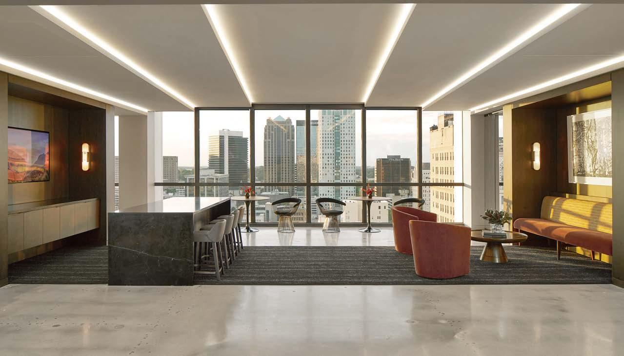
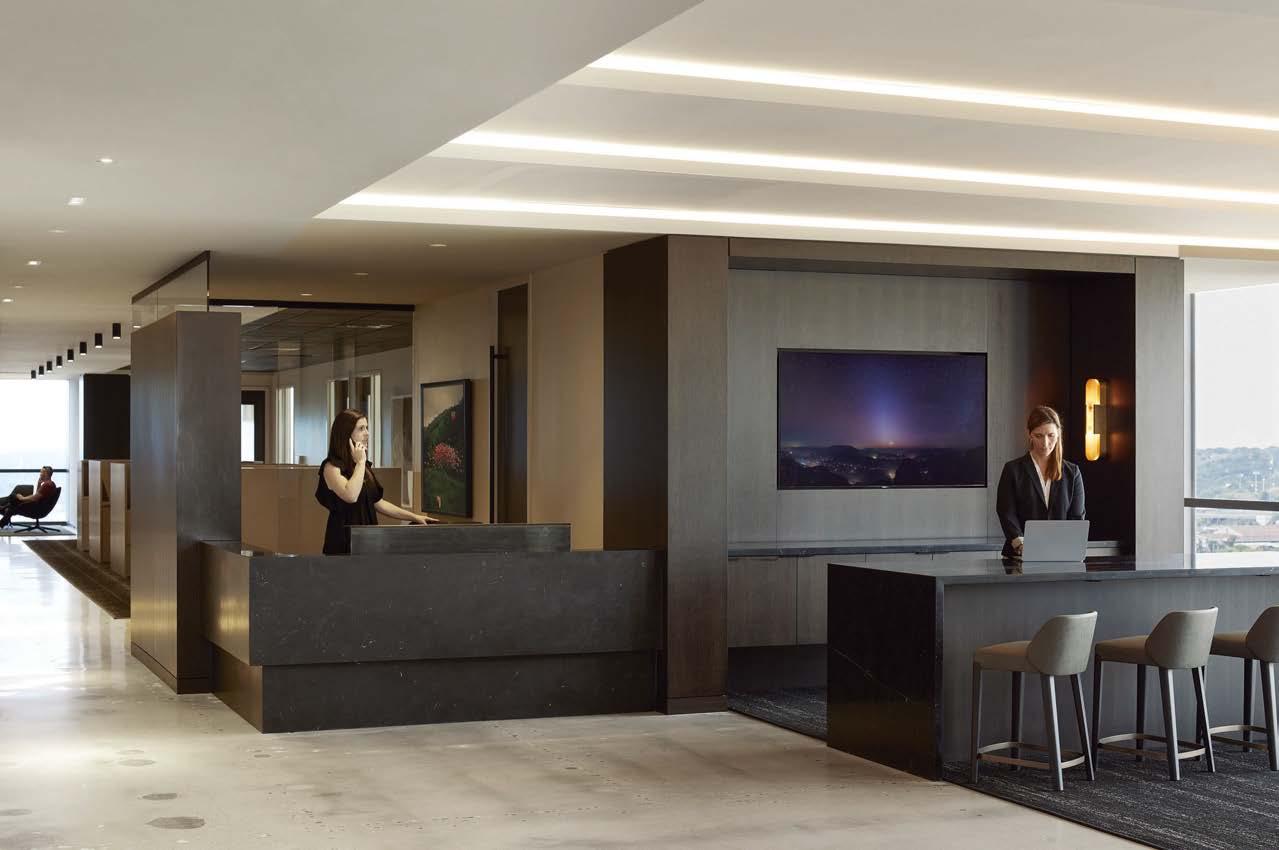
Williams Blackstock Architects was charged with designing a polished 11,000-square-foot headquarters for a real-estate investment firm on the 15th floor of a contemporary high-rise building in Birmingham, Alabama. Director of interior design John Beason prioritized key sightlines, arranged on the grid. “The success of the design lies in combining solid and transparent elements, plus dark and light materials, with unparalleled views of the skyline,” Beason explains. Those stellar vistas are on full display in common areas as well as corridors. Floor-to-ceiling windows are paired with linear cove lighting that draws eyes to the urban panorama. The material palette borrows from the world of high-end hospitality to create an enticing environment for both employees and visitors. Dark wood paneling adds a sense of comfort and tradition in reception, while computer monitors are cleverly recessed to de-emphasize technological interruptions. Soft, neutral upholstery beckons in the welcoming boardroom. Flooring throughout is exposed concrete, the imperfection of its industrial finish juxtaposed with sophisticated, finely crafted rugs. Elsewhere, there are touches of brass and bronze. Daylight floods the interior from the curtain wall, while chic pendants and surface-mounted fixtures add a warm glow. The build-out entailed both new construction and existing elements, which Williams Blackstock Architects carefully integrated to result in a space that’s both coherent and elegant.


Calling all armchair travelers: Whether near or far from home, the design-minded escapes overleaf—from theatrical city restaurants and luxury hotels to remote country lodges—are here to stir the imagination and spirit guests away from the daily grind. Bon voyage!
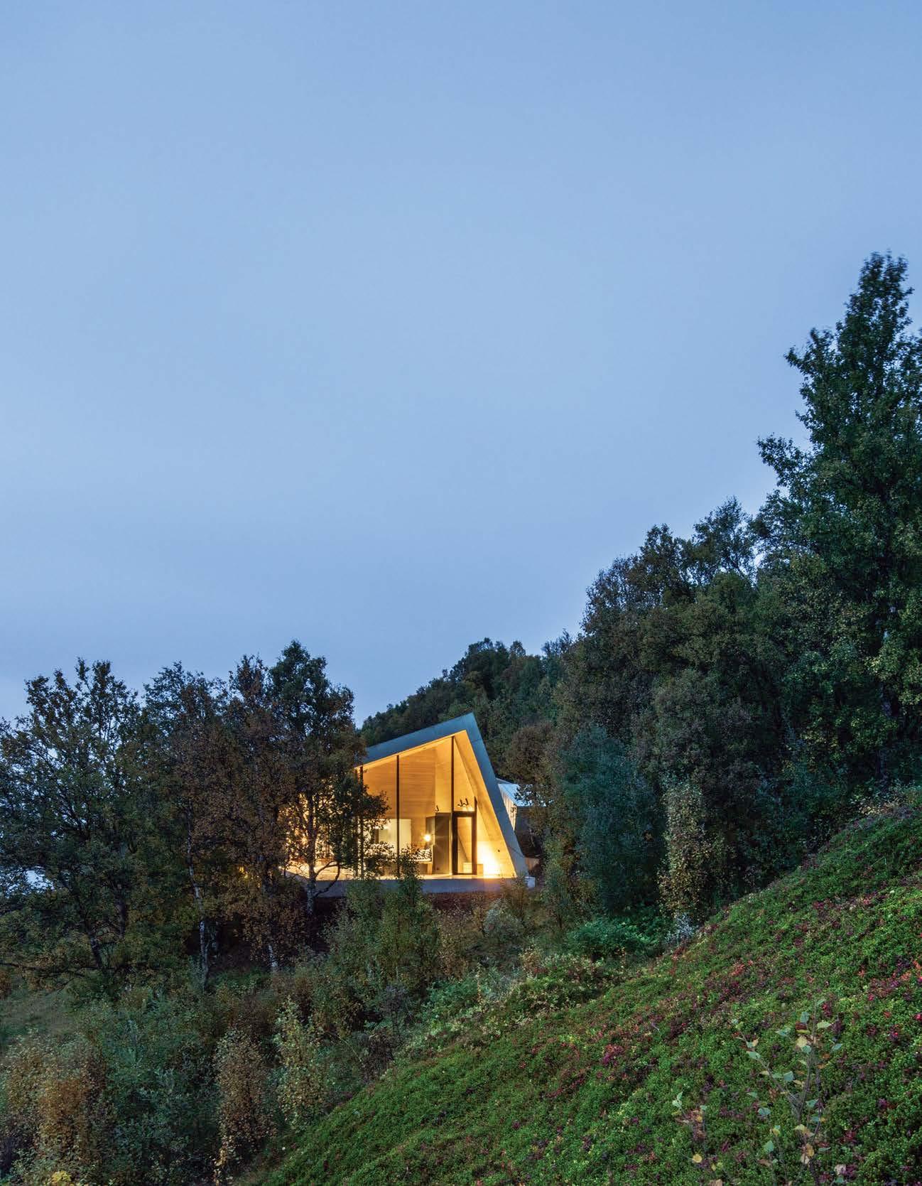
Located north of the Arctic Circle on the Norwegian Sea, the six-room Aurora Lodge is stunningly remote. From its perch in the Lyngen Alps, guests can take in the Northern Lights and the midnight sun, glimpse eagles and elk, and immerse themselves in nature.
Architect Snorre Stinessen designed the award-winning 2,000square-foot hotel to ensure privacy and enhance guests’ interaction with the outdoors. He oriented its three structures around a creek: The main building straddles the waterway, while the sauna and the annex suite flank either side. The primary building evokes a traditional shelter, with a copper-clad A-frame resting on a concrete platform. Floor-to-ceiling windows invite the sky inside, and walls of brushed Weisstanne wood lend texture and warmth.
Two volumes compose the main structure: One houses the kitchen and dining area, the other contains guest suites overlooking snowcapped mountains and birch, fir, and pine trees. Connecting the volumes is an open-sided pavilion/courtyard with a hanging fireplace, and when you sit there, Stinessen notes, you can hear the trickling of the creek below merging with the sound of the sea.

 PROJECT TEAM SNORRE STINESSEN; EMANUELA BONARDI; CAMILLA AUSTAD
KEY CONSULTANTS POLAR LIFE HAUS; LOGPRO NORWAY PHOTOGRAPHY MELISSA HEGGE
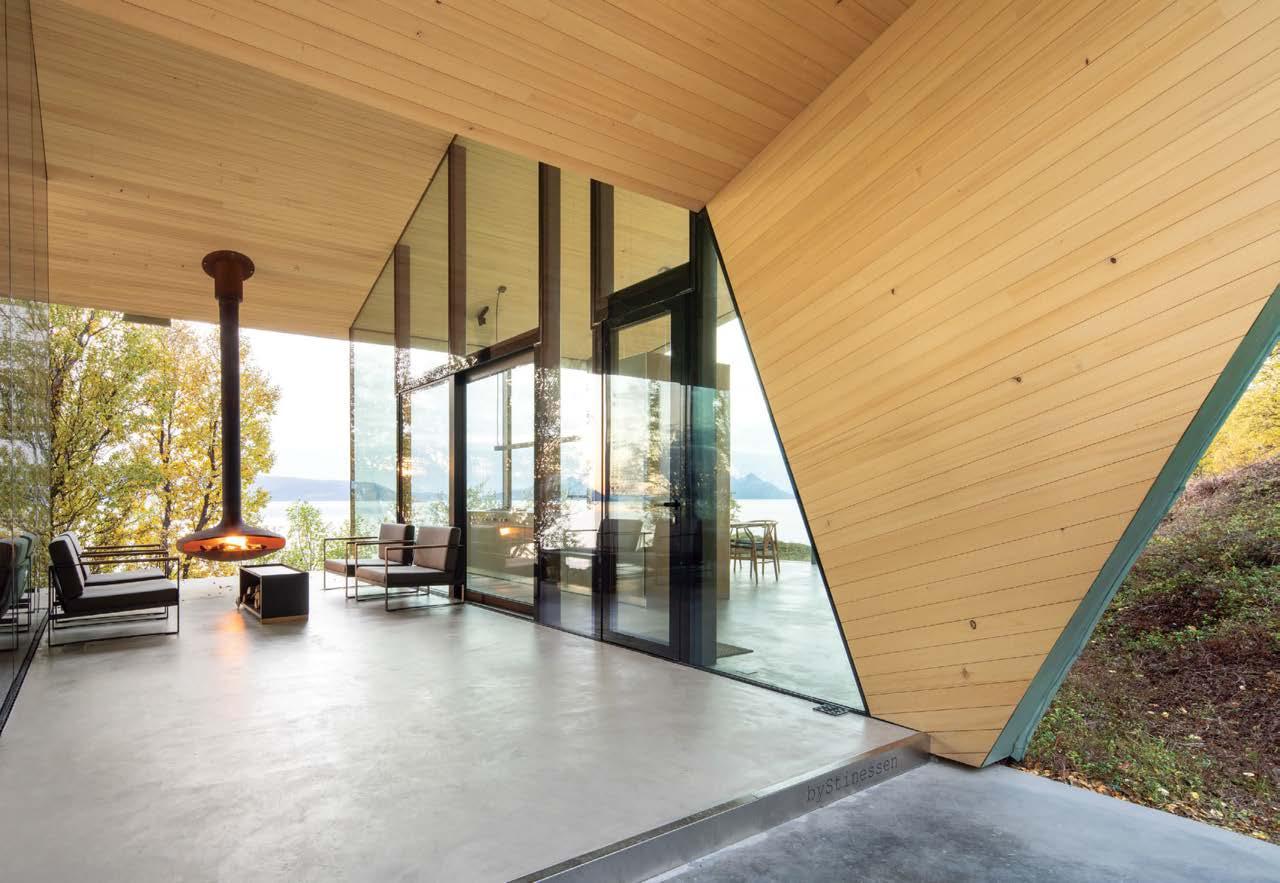


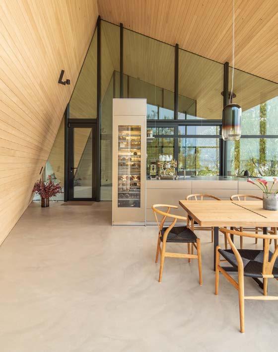

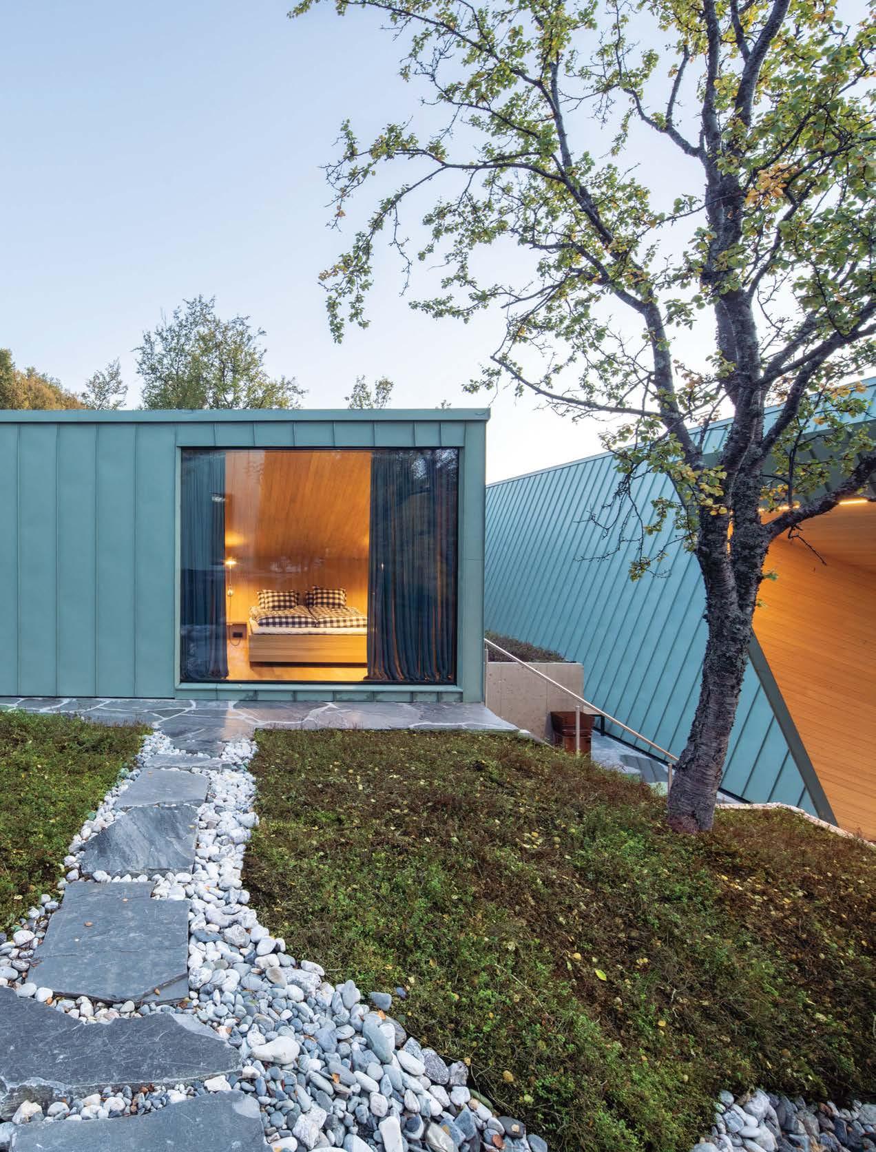 Clockwise from this page: A stone path leads to the annex suite behind the main building. Armchairs and a hanging fireplace furnish the covered courtyard. Wood slats form benches in the sauna. Carrara marble tiles by Giovanni Barbieri clad the annex suite’s bathroom. An oak table by Bulthaup anchors the kitchen and dining area, with wall and ceiling clad in Weisstanne wood.

“The ever-present elements have the effect of forcing your body and mind to live in peace with Mother Nature”
The main building sits on a plateau overlooking the Norwegian Sea.
DOWNTOWN L.A. PROPER
The fourth Proper hotel by Kelly Wearstler, in downtown Los Angeles, started out in 1926 as the Commercial Club, designed in the California Renaissance Revival style by Curlett & Beelman, and then became a YWCA in 1965. The bas-relief on the facade depicts Spanish, Mexican, and Native American references. All these influences, interpreted with poetic license, now pervade the 115,000-square-foot interior of the Downtown L.A. Proper. Both Wearstler and Omgivning director of hospitality projects Morgan Sykes Jaybush were keen to keep the historic building’s original architectural details and surround them with a multicultural visual feast of vintage finds, custom pieces, and commissioned art. An example of the latter is right at the entry: Painter Abel Macias, whose bold colors draw upon his Mexican heritage, spent months on scaffolding covering the walls and the vaulted ceiling with his fantastical mural of flora and fauna. Of the 147 guest rooms, 10 are suites, including the Proper Pool suite, a 2,800-square-foot extravaganza Wearstler and Omgivning built around the former YWCA’s indoor pool, now smack in the middle of the living room and overlooked by a ceramic mural by local sculptor Ben Medansky composed of abstracted tire treads and cacti— vernaculars of commuting in Los Angeles.
kellywearstler.com;
 PROJECT TEAM LUKE KIELION; RYDER CHANATRY: KELLY WEARSTLER. JONATHAN GIFFIN; DOMINIC SOSINSKI; BRAD MALLETTE; ALEX PRICTOE; CHRIS ASUNCION; YUKIE TAKESHI; PABLO PATIÑO; NIKKI BROWN; JOEL CHAPPO: OMGIVNING PHOTOGRAPHY THE INGALLS
@kellywearstler; omgivning.com; @omgivning_


The reinvention of the former Gran Hotel Torre de Catalunya into the 250-key Nobu Hotel Barcelona reflects Rockwell Group’s 30-year relationship with the renowned hospitality brand. A collaboration between the design firm’s New York and Madrid studios, the project takes the Nobu elements the team has been playing with for years— the Japanese-inspired materiality and textures, the drama and theatricality of communal spaces—and filters them through the lens of Barcelona, a city that has its own beloved references and culture.
Inspiration came primarily from iconic Spanish designs, such as the mosaics of Park Güell by Antoni Gaudi, and traditional Japanese crafts like kintsugi, the art of repairing broken pottery by using lacquer dusted with powdered precious metals. “The fusion of the two concepts felt natural and makes the property feel unique,” studio founder and president David Rockwell says.
Red-orange screens that riff on torii gates define the entry, before seguing into the lobby. Next in the sequence is the check-in desk, where artwork features a dramatic calligraphic brushstroke—a classic Nobu touchstone. A similarly painterly mark on corridor carpeting guides guests to their rooms, where millwork walls integrate closet, TV, bar, and desk. An outpost of the famous restaurant caps the project, quite literally: It’s situated on the roof, with 360-degree views of the Catalan capital.

PROJECT TEAM DAVID ROCKWELL, FAIA; GREG KEFFER, AIA, LEED AP; EVA LONGORIA; NANETTE MILNER; MATT NADILO; MICHAEL M C NEIL; JACLYN SCHENARDI; ANGEL WANG; HAVARD
COOPER; RACHEL ROBINSON; ANDREA LOPEZ LEON
KEY CONSULTANTS ACTIVUMSG IBERIA; JORDI MURTRA I
FERRÉ ARQUITECTE; BOVIS; SELENTA GROUP; BMLD; VOPI4

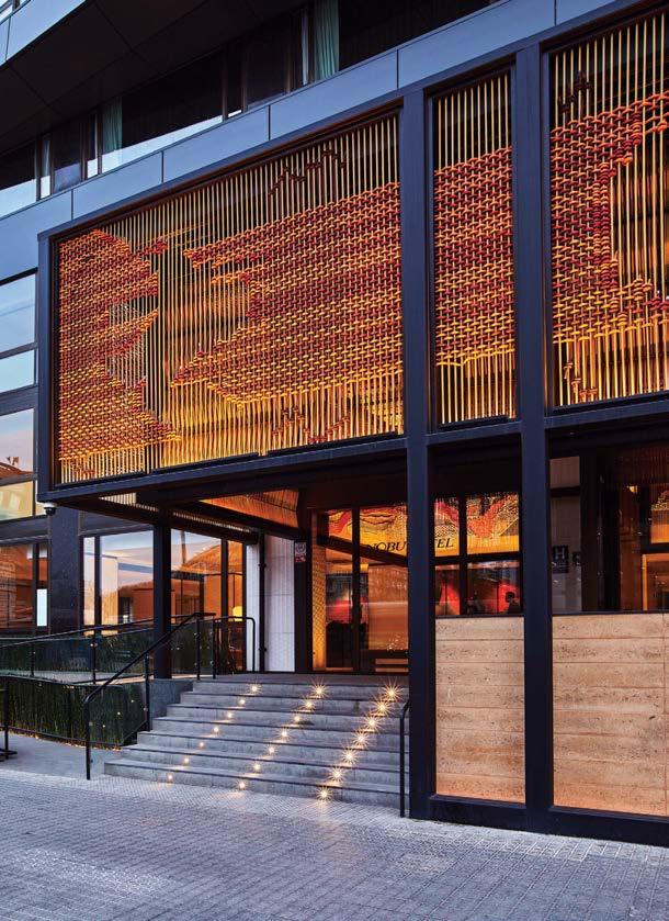
PHOTOGRAPHY RICARDO LABOUGLE/NOBU HOTEL BARCELONA rockwellgroup.com; @rockwellgroup
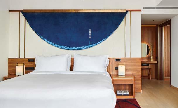
 Clockwise from above: At the entry to the Nobu Hotel Barcelona by Rockwell Group, Shinto gates are abstracted in the form of a vibrant red-orange screen. A grand stair connects all public areas, such as the lobby, ballroom, and meeting rooms. A half-moon tapestry surveys a guest bed. Dark millwork meets bronze details in a suite. A fluttering sculpture cascades through the stairwell in the lobby lounge, with textured travertine walls. The facade’s woven orange screen continues, with rich variation, into the check-in area.
 The top-floor restaurant, with 360-degree views of the Catalan capital, boasts a kintsugi-inspired suspended ceiling composed of live-edge walnut panels with edge-lit gilded “cracks.”
“We incorporated traditional Japanese crafts into the design while celebrating Barcelona’s architectural history, resulting in an unexpected blend of forms”
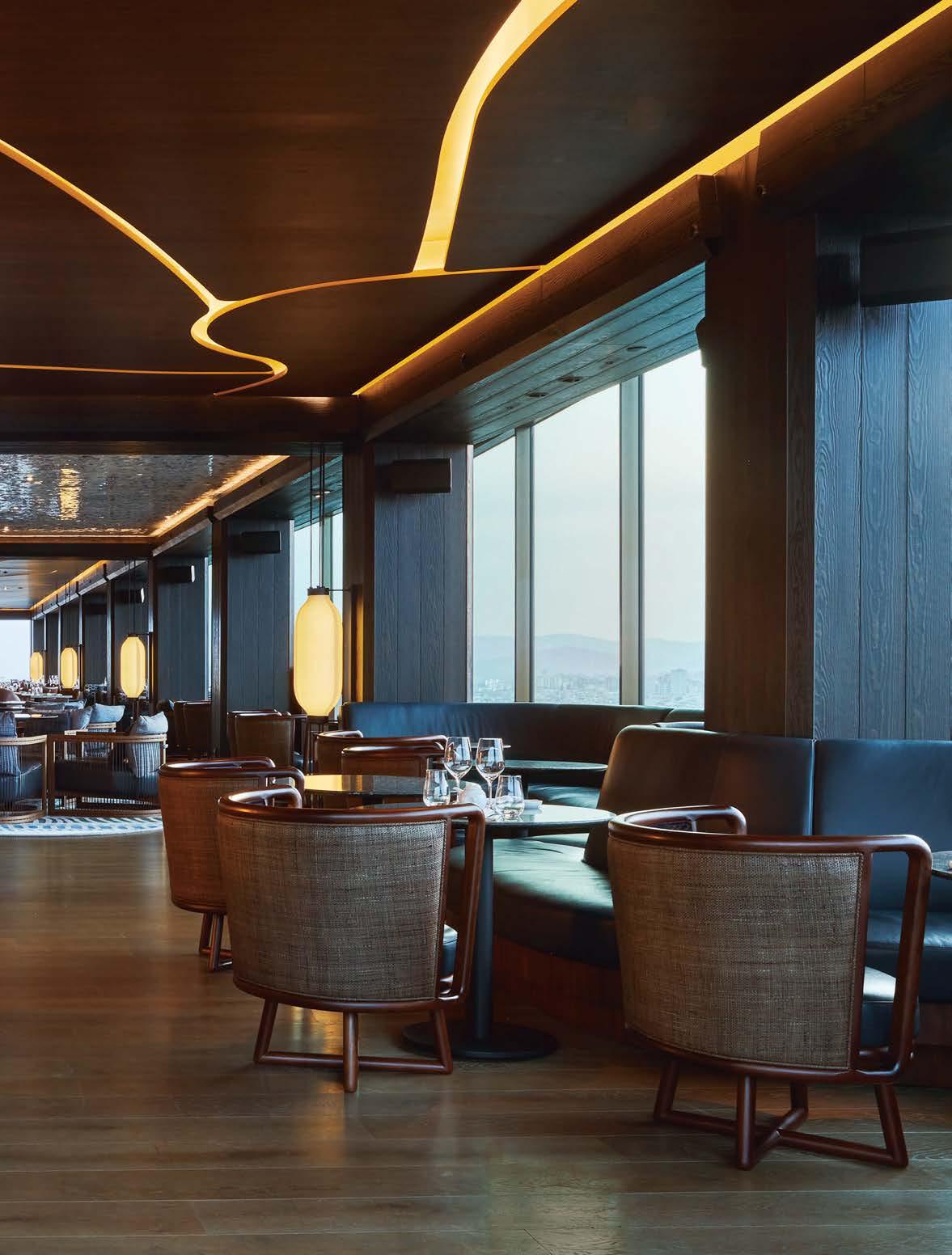

Mexico City’s Roma Norte neighborhood possesses an eclectic mix of early-1900’s buildings in styles ranging from neoclassical to art nouveau. Now a decidedly modernist structure has sailed onto the scene: Xoma, an apartment-style hotel by Belzberg Architects that calls to mind a ship with the wind at its back, thanks to perforated screens that appear to billow from the seven-story structure. The property is the latest in a series of buildings with sculptural facade treatments that the Los Angeles firm founded by Interior Design Hall of Fame member Hagy Belzberg has designed in CDMX. Elsewhere, he and his team conjured up edifices in aluminum strips or perforated carbon steel.
For Xoma, a collaboration with developer Grupo Anima, they turned to more traditional masonry. Concrete blocks, handcrafted with central openings, were fabricated on-site and connected by integrated C-shape steel plates. The permeable membranes, tapered at the street level, expand as they rise.
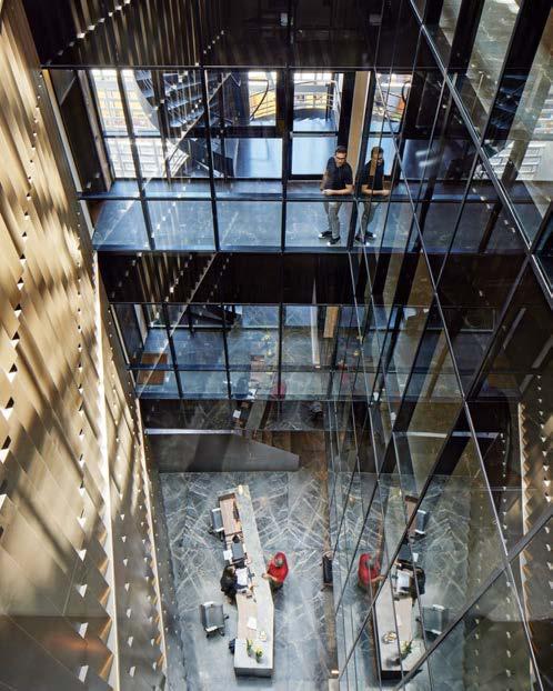
Sweeping forms appear on the interior, too. In the lobby, asymmetrical plaster ceilings arch over a brass-plated reception desk and floors of veined Tunisian marble. Arrayed around a central atrium, the 14 guest suites—one- and two-bedrooms with full kitchens—lead out to balconies partially enclosed by the facade screen, which provides privacy while allowing fresh air to circulate and natural light to filter in.
PHOTOGRAPHY
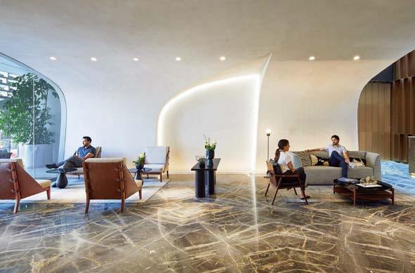 Clockwise from bottom left: For developer Grupo Anima, Belzberg Architects designed Xoma, a modernist hotel in Mexico City. The project won a Best of Year Award for boutique hotel. Flooring throughout is Tunisian marble. The unusual shape of the perforated-concrete exterior is reminiscent of a ship’s billowing sails.
PROJECT TEAM HA GY BELZBERG; BROCK DESMIT; JENNIFER WU; JESSICA HONG; JOSH HANLEY; DAVID CHEUNG; ADRIAN CORTEZ; MINGYUE HU; KRIS LEESE; AARON LESHTZ; CORIE SAXMAN; FILIPA LIMA VALENTE; KATELYN MIERSMA; MELISSA YIP
BRUCE DAMONTE bacollective.com; @hagy_belzberg
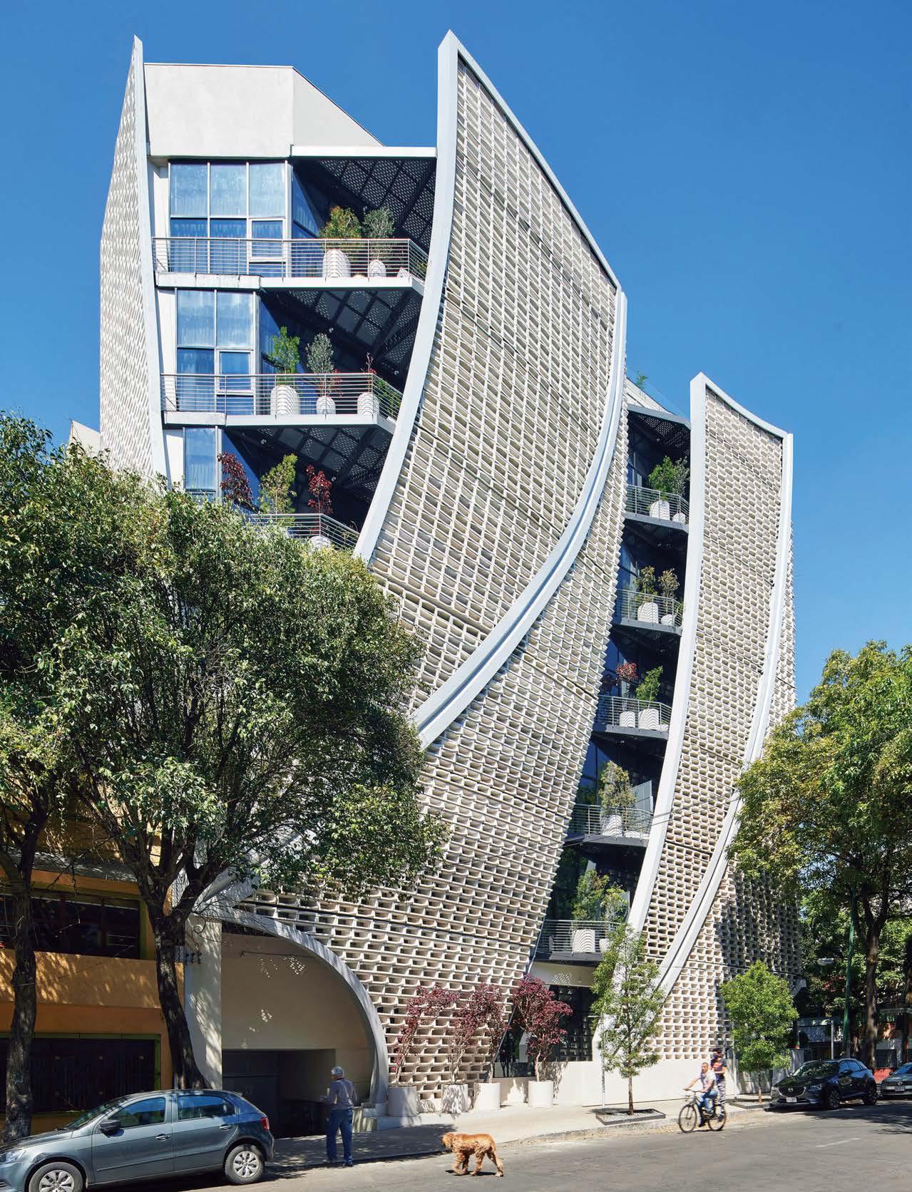
Interior Design Hall of Fame member and Otto Studio founder Paola Navone embraced both the paradisal and the infernal when she drew on Dante Alighieri’s epic poem, La Divina Commedia, as inspiration for the interiors of a hotel in the 14th-century poet’s native city. “Every project is its own scenario connected to the place where we build,” she begins. “Every story is built from scratch, every element needed.” The results—a sui generis mix of materials and products, some sourced from far-off locales—all stem from the depths of Navone’s fertile imagination.

The 171-key property is the first in Italy for 25hours, a hospitality brand based in Hamburg, Germany. The hotel’s Companion bar alludes to the Inferno, with crimson tufted-leather upholstery and dark indigo walls. In the nearby sauna lounge, Navone and her team created a fantastic garden with an effusion of green plastic watering hoses. The guest rooms that are dubbed Paradiso are sweetness and light: Floors are creamy resin, azure accents allude to the heavens, and Alexander Calder–esque mobiles suggest the solar system.
In the lobby, old suitcases sourced throughout Europe have been painted and arranged in teetering piles, suggesting the ultimate travel nightmare: a lost-luggage office in hell. The result is a hotel that provides a glimpse into the future of the Marriott International brand—as seen through Navone’s wildly creative lens.
PROJECT TEAM PAOLA NAVONE; CRISTINA PETTENUZZO; CAMILLA ESCOBAR; DOMENICO DIEGO KEY CONSULTANTS GENIUS LOCI ARCHITETTURA; STUDIO MAKIA; FULVIO BALDESCHI; MILAN INGEGNERIA; STIMP; RIABITZ AND PARTNERS; EDILTECNO RESTAURI PHOTOGRAPHY LAURA FANTACUZZI; MAXIME GALATI-FOURCADE/LIVING INSIDE otto.fish; @paola.navoneClockwise from top right: A hanging garden of plastic hoses enlivens the sauna lounge at 25hours Hotel Piazza San Paolino in Florence, Italy, an award-winning interiors project by Paola


Navone’s Otto Studio that was inspired by Dante Alighieri’s 14thcentury poem, The Divine Comedy. Moody Inferno guest rooms feature sconces bearing playing-card motifs. Piles of painted suitcases form a reception installation. A mobile ceiling fixture evokes the planets in a light and bright Paradiso guest room. A hoop-skirt frame used as a pendant fixture joins a billiard table and a display of Italian celebrity portraits in the music room.
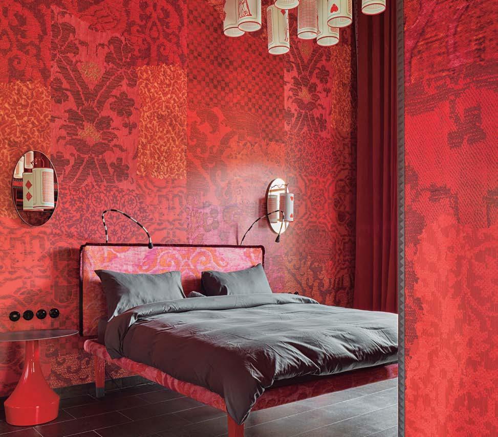
 Below the hotel restaurant’s glass cupola, chairs made from recycled plastic and metal line a custom marble-top table; sound-absorbing leaves of recycled textiles and polymers were commissioned from Linda Nieuwstad, a Dutch artist.
“The world around me is an endless source of inspiration. I collect images, colors, materials, energy, crafts—acting more like an eccentric ‘anthropologist of objects’ than a designer”

When Four Seasons Hotels opened a Chicago property in 1989, its chocolate-and-rosewood palette telegraphed luxury. But three decades later, the interiors were badly in need of a comprehensive revamp. Enter Rottet Studio, helmed by Interior Design Hall of Fame member Lauren Rottet. Having previously spearheaded Four Seasons projects in Bogotá and Houston, she, principal Richard Riveire, and team had a head start understanding the brand’s needs. Here, the firm was charged with updating 23,000 square feet of public areas across the two lowest levels and a 2,700-square-foot suite on the 46th floor. In the lobby, walls were demolished to create a welcoming open space, existing flooring was replaced with more contemporary slabs of gray and white marble, and a shimmering installation of gold-tinted aluminum was hung from the ceiling. Nearby, event spaces and a restaurant were also made over, the latter incorporating a wall-spanning screen backlit by LEDs. One floor up, more walls were removed to create an expansive ballroom accommodating more than 1,100 guests, but an adjacent lounge with plush silvery sofas is more intimate. In the spacious presidential suite high above, pale woods and neutral tones ensure the opulence remains soft-spoken. Throughout the hotel, artwork sourced by local consultant Shashi Caudill is evocative but never upstages a setting that privileges comfort, which these days is a synonym for luxury.


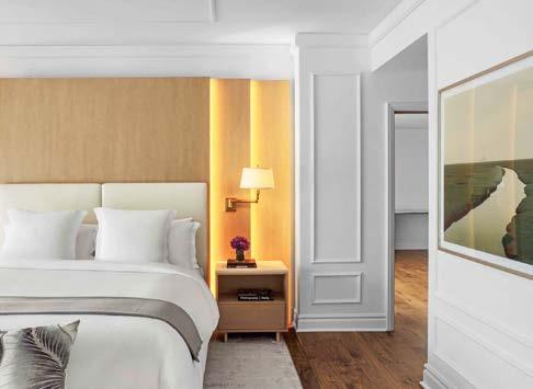 PROJECT TEAM RICHARD RIVEIRE; LAUREN ROTTET; HAROUT DEDEYAN; OMID GOLZAR; THERESA LEE
PHOTOGRAPHY ERIC LAIGNEL rottetstudio.com; @rottetstudio

At eastern China’s Tangshan Mountain, mining for ore destroyed the local ecology and resulted in a man-made chasm devoid of life that’s been abandoned for a century. But recently the quarry has been revitalized in an unexpected way: through the creation of the Banyan Tree Nanjing Garden Expo, a luxury hotel with interiors by Cheng Chung Design founder Joe Cheng and team. Although contemporary in appearance, with pale stone cladding and glass walls, the five-story building is shaped as if it has been carved out of the mountainside—the work of China Architecture Design & Research Group. Stepping down from the access road, its tiers follow the hewn contours of the quarry, with 115 guest rooms stretching out from the main public areas like roots clinging to the rock face. Topped with landscaped gardens, these accommodation bands begin a series of planted terraces that descend to the valley floor, where they connect to paths and bridges across newly restored parkland. For the more than 375,000 square feet of interiors, Cheng Chung Design drew references from nature. Rough textures, cavernous hollows, striated surfaces, and interplays of light and dark add to an atmosphere that’s both primordial and modern. A cliff of mosaiced carved-walnut blocks, for example, undulates behind the sculptural bar, like something you’d find traversing a steep canyon. Elsewhere, hints of green, Cheng notes, represent “the vitality of new life and a fusion with nature.”
 Clockwise from bottom left : Banyan Tree Nanjing Garden Expo, a luxury hotel with interiors by Cheng Chung Design, occupies a tiered building by China Architecture Design & Research Group. The earthy color palette was lifted directly from the views of the exposed rock face outside. In the spa, a cloistered subterranean center that includes a skylit pool and a geothermal wellspring, a crystal artwork represents the local Tangshan hot springs. In the bar, a doubleheight wall of textured walnut blocks resembles a giant cliff face. CCD transferred stones from the quarry into the hotel, inserting smaller chunks into gaps in the walls, or piling them into steel cages to form gabions. The project won a Best of Year Award in the category of large resort.
PROJECT TEAM JO E CHENG; KEN HU; ARRON OUYANG PHOTOGRAPHY TI NG WAN ccd.com.hk; @cheng_chung_design

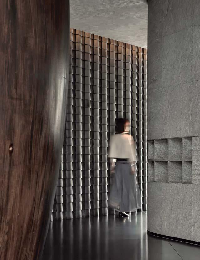

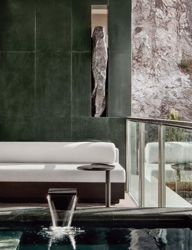
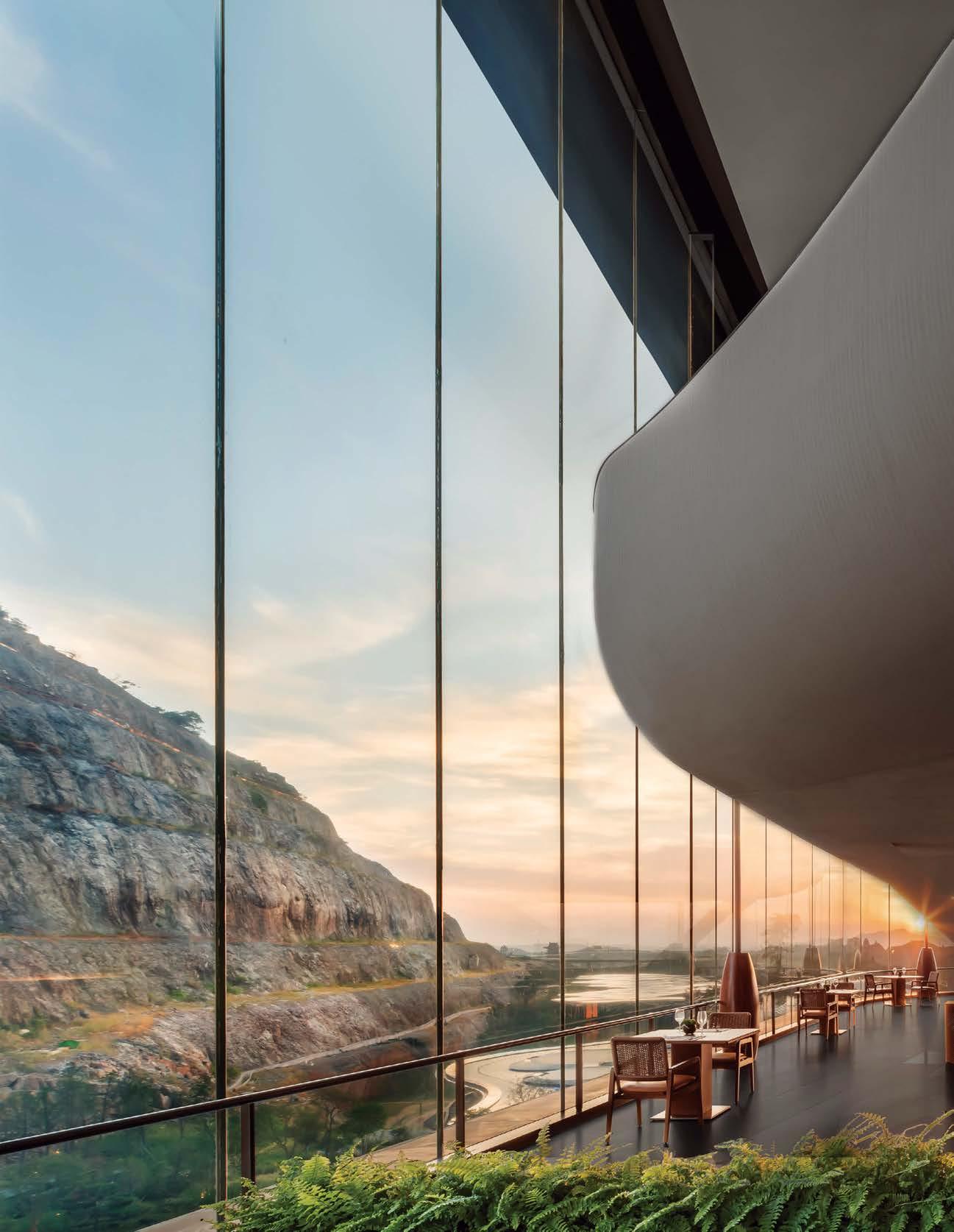
 Dusky shades of black, brown, and gray create a moody yet tranquil ambience at the CCD-designed hotel, which sits within an abandoned quarry that cuts into the side of Tangshan Mountain.
“The space is full of poetry, presenting a coexisting relationship with the outdoor environment”
A 2023 ICFF Design Award winner for adaptive reuse, the Pinch hotel evocatively blends past and present. It’s a development from Method Co. that assembles several Charleston, South Carolina, buildings from 1869, plus the Lequeux-Williams House, a private residence dating to 1843. The reinvention of these edifices by MA | Morris Adjmi Architects into a 34,000-square-foot boutique hot spot takes cues from the English traditions of craftsmanship that were brought to the city during the Victorian era.
The 22 guest rooms and suites are joined by a trio of enviable extended-stay residences. While subtle variations distinguish each, all feature residential-inflected interiors, with live plants and vintage rugs, walnut herringbone floors, full kitchens with Italian marble farmhouse sinks and unlacquered-brass sink fittings, and washer/ dryers in bathrooms. Private balconies and landscaped terraces expand select suites.

In common areas, Victorian leitmotifs and au courant touches work in easy harmony. The hotel lobby evokes a living room, with an original Lucas Reiner painting above a reclaimed concierge desk and a curated selection of vinyl records, books, and art available for guests to peruse. Framing the lived-in scene are grand architectural details—traditional large-scale trim, classic cream-gray clay plaster walls—that reinforce the site’s history.

Clockwise from above: Historically accurate windows and French doors appoint the lobby of the Pinch, a new hotel in Charleston, South Carolina, reenvisioned from centuries-old buildings by MA | Morris Adjmi Architects. Bathrooms are floored in hand-painted Moroccan tiles. Motifs from an 18th-century Palampore panel discovered at the Victoria and Albert Museum decorate guest-room wallpaper. Check-in features variegated vegetable-dyed rugs. Pattern play animates another guest room. Suite kitchens have walnut countertops and brass sink fittings by DeVol.


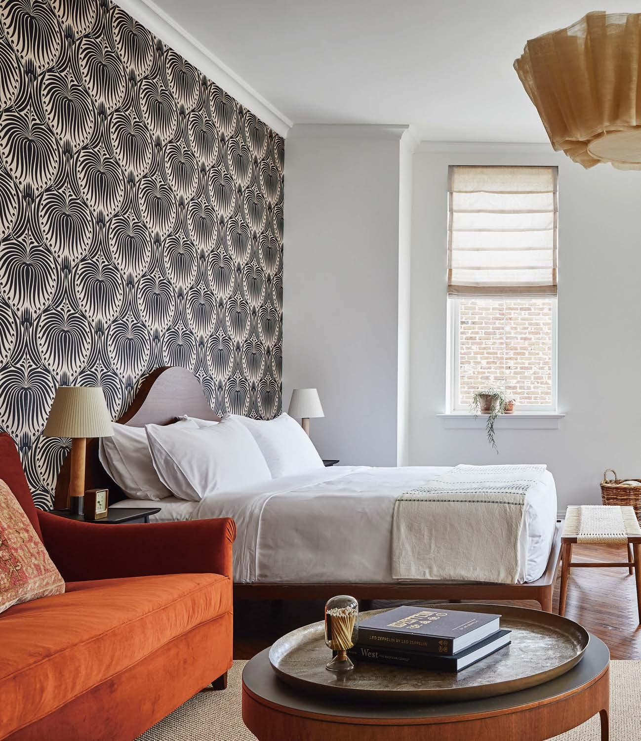
“What sets the Pinch apart is its rich and textured interiors that showcase
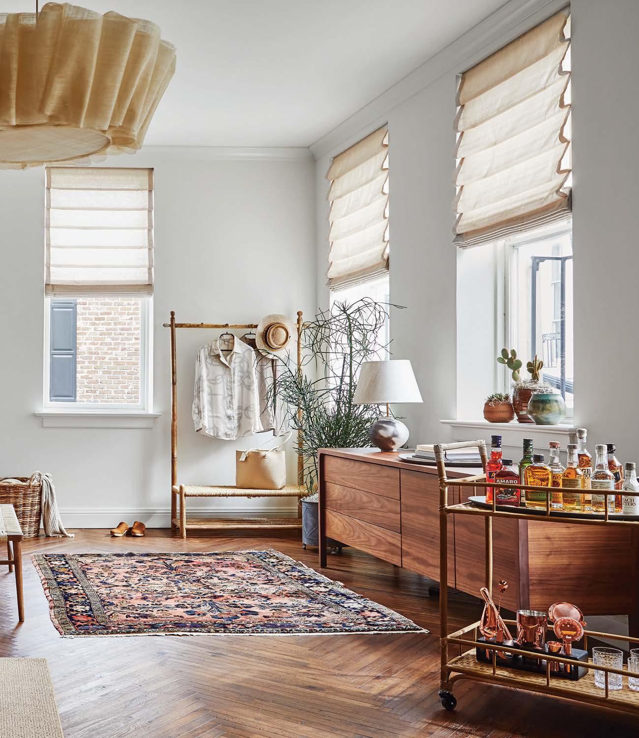 Custom furnishings and fixtures pepper the hotel’s 22 guest rooms, including a pendant sculpted from layers of banana-plant fiber and Aaron Poritz’s handmade ceramic lamps.
a deep appreciation for the history of design”
Despite the Russian invasion, Ukrainian designers continue to create unique and vibrant gathering spaces like the new Emily Hotel by Kyiv-based YOD Group. Located near Lviv, a city in the western part of the country that has been spared the worst of the war, the property greets guests with a soaring gesture of strength in the form of a dried sycamore tree—roots, trunk, branches, and all—suspended overhead in the five-story lobby. The installation is a prelude to more nature-inspired wonders in Terra, the hotel’s 12,400-squarefoot restaurant, where YOD evokes the region’s bucolic scenery, including green mountains dotted with shepherds’ fires and peaceful lakes fringed with rustling reeds. “We extracted colors, textures, and impressions from the landscape to translate them into the interior,” the designers explain. “It’s like being on a tour around Western Ukraine.” Throughout, internally lit columns wrapped in bricks of bottle-green glass echo the hue of nearby hills. The largest column encloses bottles of wine on shelves accessed by a spiral staircase, while waiter stations encircle other columns sheathed in terra-cotta tile, a nod to traditional ceramic-clad stoves. One wall is covered with copper-tinted glass shingles, each of which is swivel-mounted so diners can adjust its angle, creating new, shifting patterns—an interactive dynamic that recalls the movement of waves on the water or grasses in the wind.


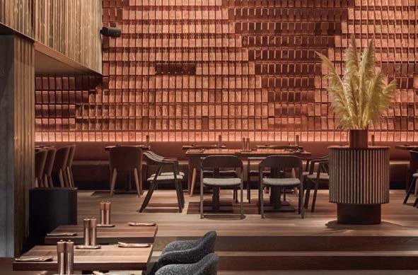 Clockwise from bottom left: At Emily Hotel in Lviv, Ukraine, custom bottlegreen glass bricks and terra-cotta tiles clad columns in Terra, a restaurant designed by YOD Group. A wall in the eatery is covered with 2,000 coppertinted glass shingles, each swivel-mounted so diners can adjust them to create new patterns. A preserved sycamore tree is suspended in the hotel’s five-story lobby. The project won YOD a Best of Year Award in the category of hotel dining.
PHOTOGRAPHY YE VHENII AVRAMENKO yod.group; @yod.group
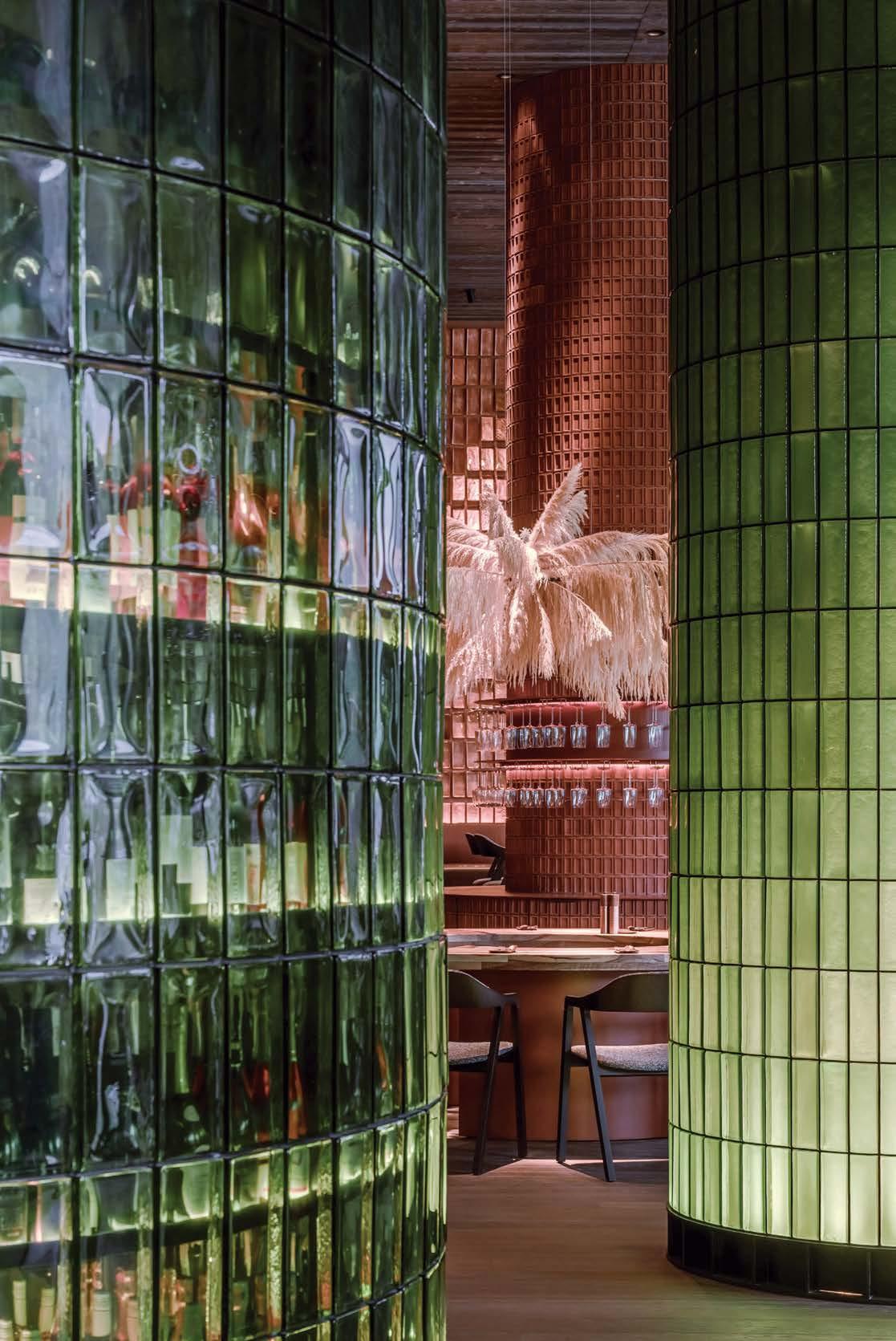
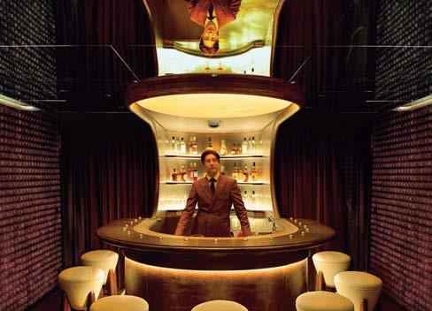
The Artifact Bar is the new hot-spot cocktail haven in Hong Kong, designed by Nelson Chow with futuristic interiors inspired by the serpentine architecture of underground cisterns. Hong Kong might not have suffered through Prohibition, but that hasn’t stopped it from embracing the speakeasy with open arms, not least because the concept is a perfect match for the city’s myriad small spaces.
Chow, an active force in Hong Kong’s creative scene since founding NC Design & Architecture in 2011, has masterminded many of these captivating destinations, including Foxglove, Mrs Pound, Please Don’t Tell, and Dr. Fern’s Gin Parlor, to great acclaim.

The entry, tucked behind a food court, is highlighted by a circular interior window suggestive of an industrial pipe and marked by a light fixture constructed to look like a rotating surveillance camera. Guests continue through a secret passage, its walls clad in what look like miniature speakers but are actually perforated tiles that provide acoustic protection from the clamor of the food hall outside.
Voluminous curves are everywhere in the 1,400-square-foot space, from the sculptural bar inspired by those on vintage airplanes to the riblike arches that stretch from side to side. The low mirrored ceiling is an architectural device that creates the illusion of more generous headroom and reflects the arches to echo the look of cavernous underground water reservoirs. Lighting adds to the fantasy, especially a faux skylight that recreates the glow of the setting sun.
Clockwise from above: NC Design & Architecture founder Nelson Chow custom-designed every detail in Hong Kong’s Artifact Bar, down to the U-shape aircraft-inspired bartop. Intimate booths are upholstered in ivory leather. A custom “surveillance camera” light fixture glows in the moody, atmospheric space. The entry, tucked behind a food court, features a circular internal window suggestive of industrial piping. A faux skylight ceiling fixture over the bar resembles the setting sun.
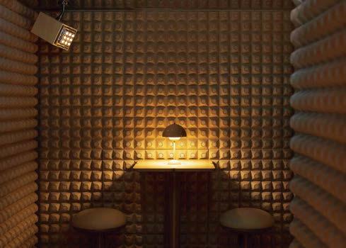


PROJECT TEAM NELSON CHOW; RAIN HO; BRANDON FONG; RAFAEL PARDO; CANDICE KWOK; JASMINE KONG; IRENE NOH; EDDIE WONG; ALLY SO; KELVIN LU; AARON TSE; MICHAEL LARKIN; BECKALY FRANKS; EZRA STAR; J FRANKS; STANLEY NG; ANTHONY LAI; JESSICA SIU; ALICE STEVENSON; VIVIAN ZHAO; PAUL ONSLOW; ANTHONY LAU
KEY CONSULTANTS B FELIX LIMITED; DECCA LIMITED; AVANT GARDE LIMITED; LIGHT ORIGIN STUDIO; HING FAT LIGHTING INTERNATIONAL LIMITED; BSC CONSTRUCTION LIMITED
PHOTOGRAPHY COMMON STUDIO ncda.biz; @ncdesignandarchitecture
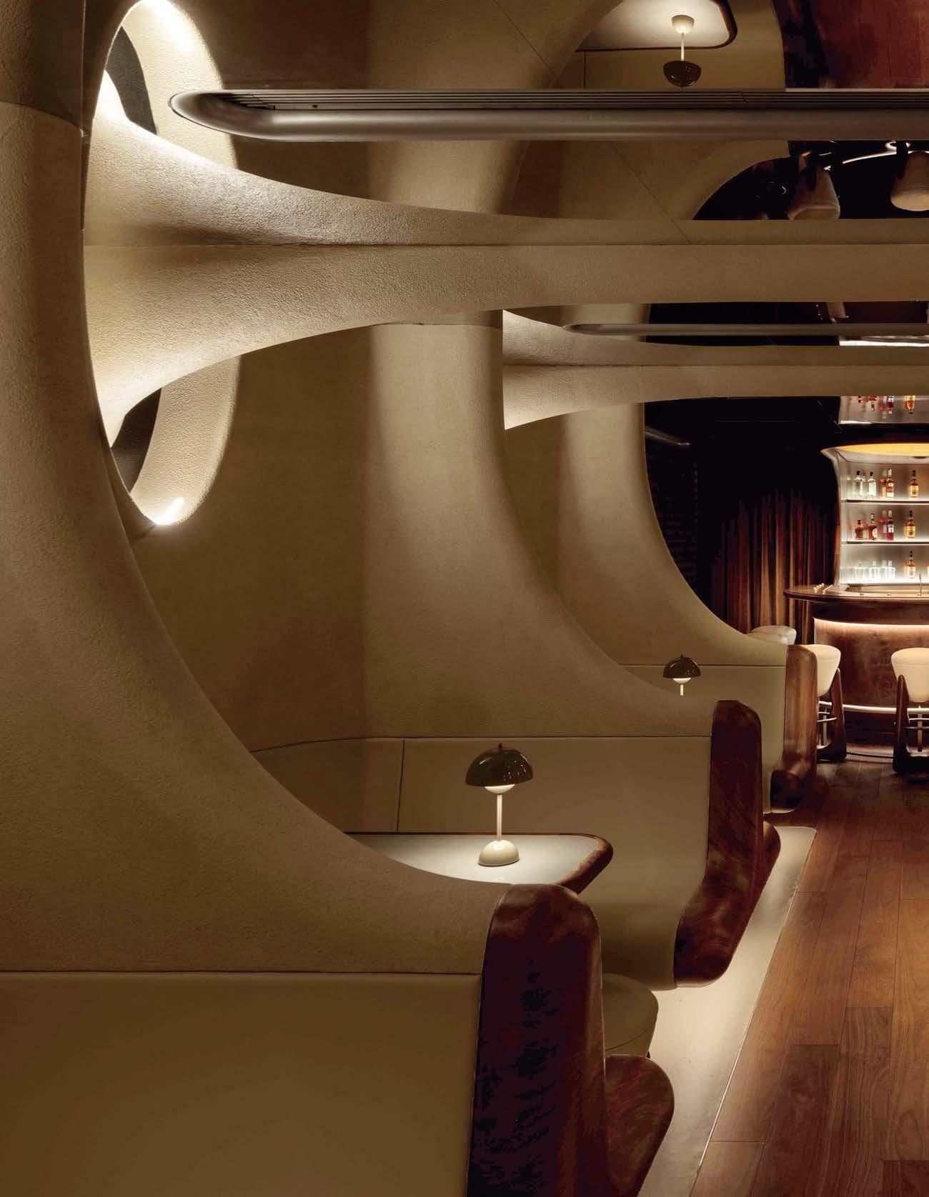
“The otherworldly interiors are an innovative combination of imagination and functionality”
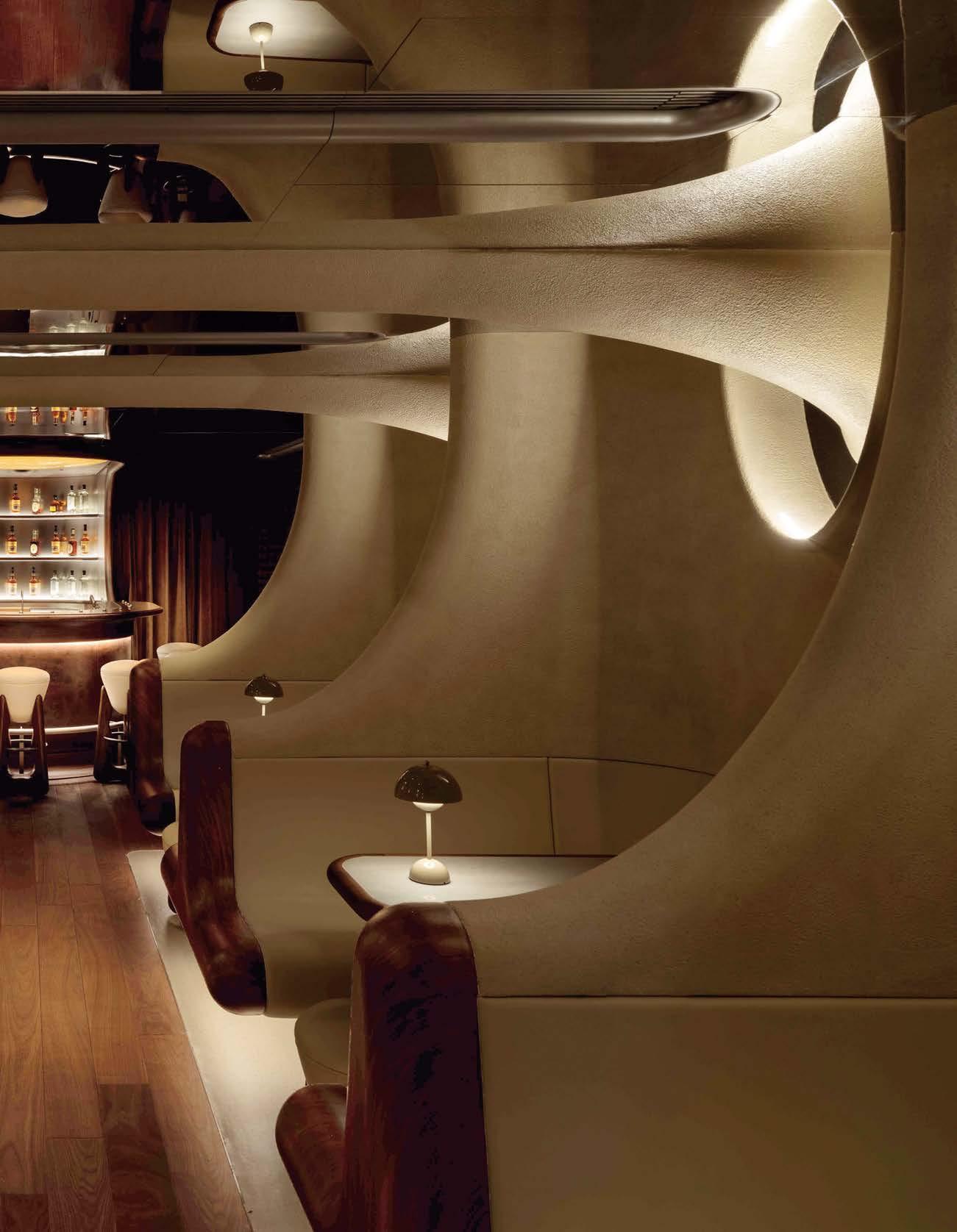
KEY CONSULTANTS HOWELL BELANGER
ARCHITECTS; ISOMETRIX; ICOR ASSOCIATES; MED_TEK CONTRACTING; THE PARKER COMPANY
PHOTOGRAPHY BJÖRN WALLANDER/COURTESY OF THE RITZ-CARLTON; JASON VARNEY rockwellgroup.com; @rockwellgroup
Zaytinya, located at The Ritz-Carlton New York, NoMad, is the brand’s first Manhattan outpost—and Rockwell Group’s third restaurant design for chef José Andrés. The zeitgeisty 3,000-square-foot eatery offers an innovative mezze menu inspired by Turkish, Greek, Lebanese, and Italian cuisines served in a thoroughly modern setting. “Zaytinya is a restaurant designed to make guests feel connected and energized. We created a new destination in the Flatiron District that has a welcoming presence,” says hospitality guru David Rockwell, founder and president of Rockwell Group. The interior design represents the vibrancy of New York while simultaneously transporting diners to the Mediterranean coast. A palette of white oak and bronze creates a warm, ambient base for touches of cobalt blue that reference the pristine waters of the Med. Nods to the region’s customs and terrain include a custom Gio Ponti–inspired tile floor depicting an abstracted olive leaf at the bar and a Greek evil eye motif on the wall behind. Constellations of fabric pendant lamps feature illustrations of harvests and ancient crafts hand-painted by Alpha Workshops, adding atmosphere and a flattering sepia glow to the main dining area. Overhead, exposed timber beams interspersed with noise-absorbing ceiling panels correspond to the spacing of blue-tile bands inset into the chevron wood floor, lending a sense of rhythm to the entire space.
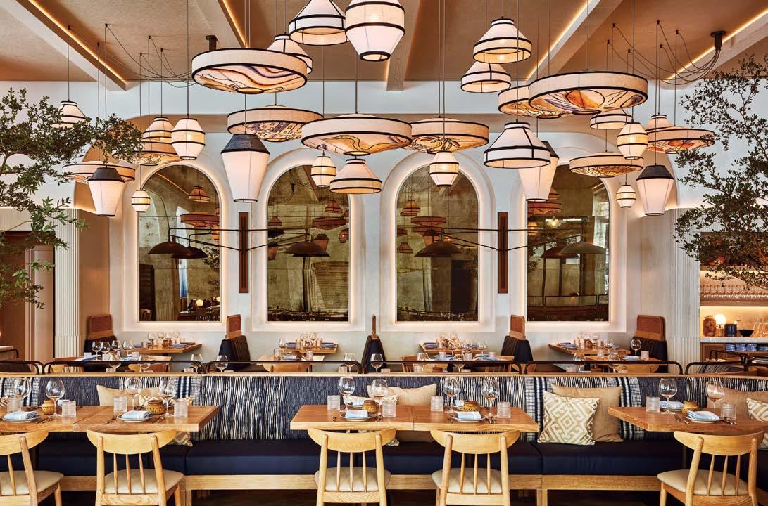 PROJECT TEAM DAVID ROCKWELL, FAIA; MATTHEW WINTER, RA, LEED; DIONYSIOS KALTIS; ANGELINE YANG
CASTELLI
Clockwise from above: At Zaytinya, a restaurant inside the Ritz-Carlton in New York, Rockwell Group clad a bathroom wall in half-round bronze lengths that catch the glow of a nearby pendant. Subtly lit arches separate the bar and dining areas. Behind the bar, backlit two-tone glass discs represent the evil eye, a protective talisman. Pale wood, cane, and pops of cobalt transport guests to a modern abstraction of the Mediterranean coast. A graceful arch frames a view into the main dining area. Clusters of hand-painted linen pendants—designed by Rockwell Group’s graphics studio and painted by Alpha Workshops—hang at varying heights above the dining scene.


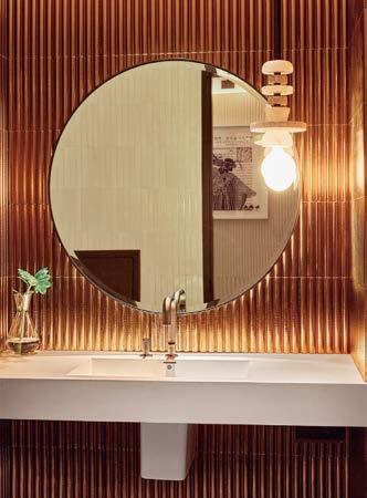

The W Rome is like nothing we’ve ever seen. Nor is the hotel like anything in the vast and far-reaching hospitality portfolio of Meyer Davis coprincipals Will Meyer and Gray Davis, recent inductees into the Interior Design Hall of Fame. “We’re known as masters of editing,” Meyer begins. “But this project turns the speakers up to 11.” He, Davis, and Zoe Pinfold, senior associate and codirector of the firm’s Los Angeles studio, nixed any trace of minimalism in favor of flat-out cinematic glamour. “By peeling back we discovered the reason Rome is so special: It’s where civilizations and cultures are layered on top of each other,” Meyer continues. “That amazing collage drove our narrative.” Jumping in, Davis adds, “We used the phrase: We got lost in the city.”
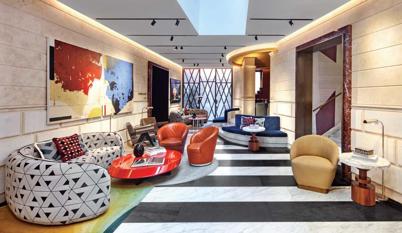
Meyer Davis created the entry experience as a procession of see-through spaces, starting with reception. It’s a fantastical Roman garden, simultaneously classical and irreverent, composed of a verdant mural by Constanza Alvarez de Castro surrounding a trio of shiny stainless-steel check-in kiosks. Next comes the lobby, its carved stone walls surrounding a sweep of black-and-white marble flooring, the stonework nodding to that of nearby churches. The standout here, however, is what really ties site to city: an oval enclave, a lounge within a lounge with luxe rosewood paneling and a gilt ceiling, that’s an undisputed homage to the Pantheon. It all anchors a lively mishmash of furnishings, more than 200 custom pieces, all made by Italian companies.
 PROJECT TEAM WILL MEYER; GRAY DAVIS; ZOE PINFOLD; STEPHANIE SCHREIBER KEY CONSULTANTS LOMBARDINI22; EXTRA ORDINARIO; MOBIL PROJECT PHOTOGRAPHY ERIC LAIGNEL meyerdavis.com; @meyerdavis
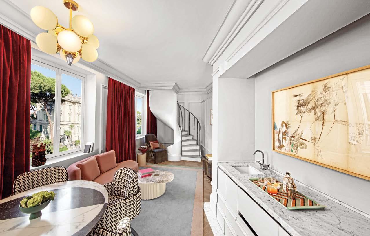


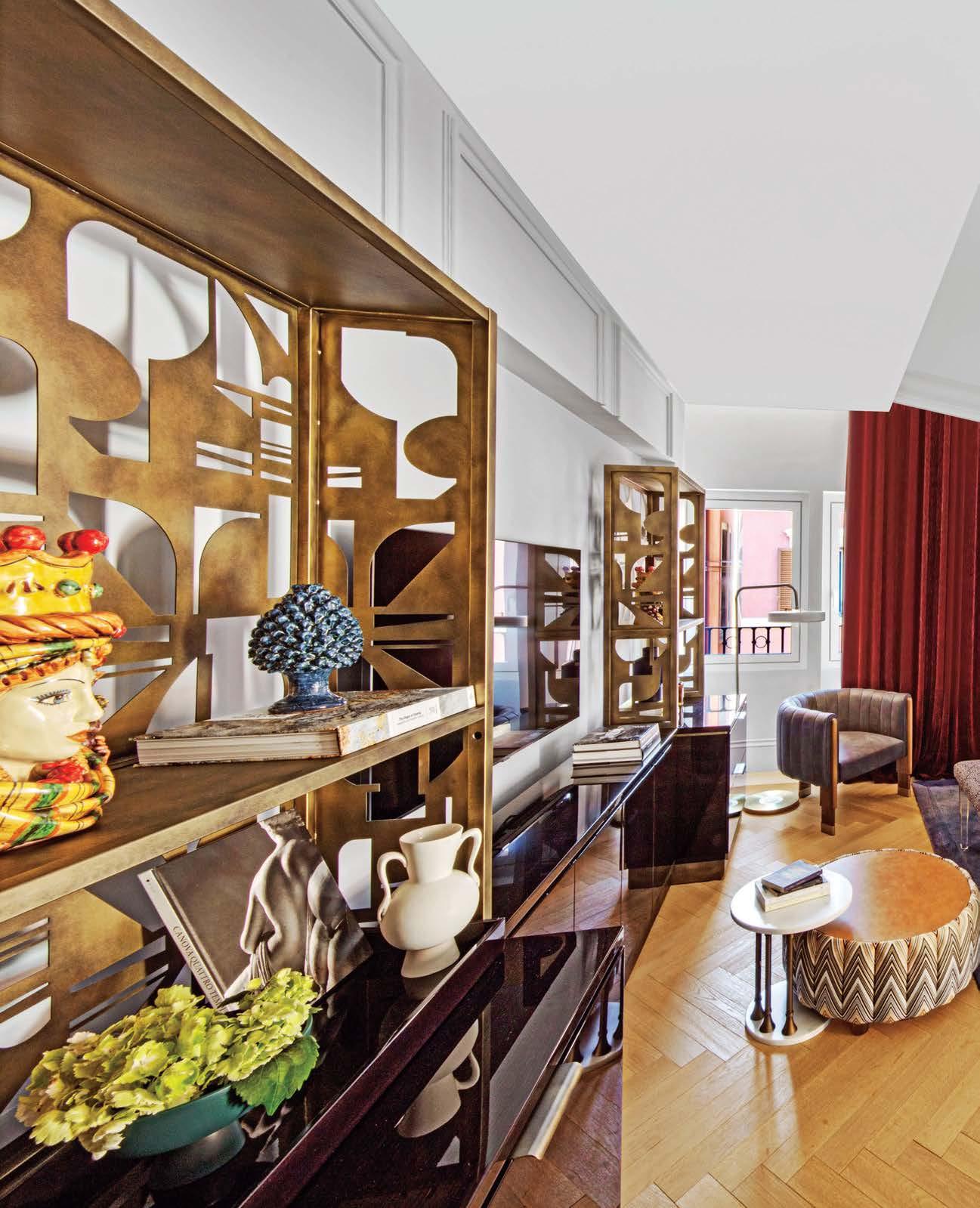
 In a junior suite, the channeled leather headboard inspired by Carlo Scarpa and brass-finished shelving units, the near one containing a cobalt Pumo bud symbolic of good luck, are all custom.
“We’re known as masters of editing, but this project turns the speakers up to 11”
For 53, a two-level, 11,000-square-foot restaurant adjoining the MoMA in New York, ICrave tastefully blends Asian, custom, and contemporary sensibilities. Given 53’s proximity to a world-famous museum, the firm approached the project not as interior design, but as sculpture, which resulted in dozens of large Masonite fins that cascade from the street-level bistro to the subterranean dining room, where they wrap around the ceiling plane. The fins, which have a lenticular quality when viewed while you’re moving through the restaurant or walking by on the sidewalk, are edged in powder-coated aluminum, the nine nearly neon colors lifted from the Nine-Dragon Wall reliefs found in Chinese imperial palaces.

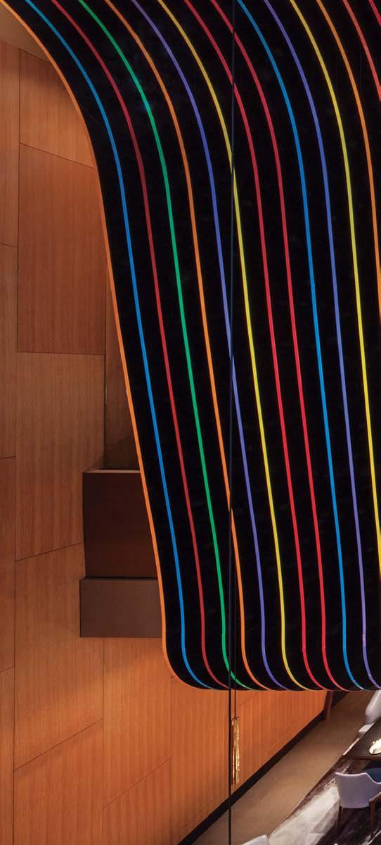
The idea for the sculptural architectural gesture stemmed from the Chinese artistic principle of xieyi, which refers to works created with broad, expressive strokes, and it represents the chi, or energy, that flows through 53. In contrast, the principle of gongbi, that’s all about realism and fine detail, guided choices for the decor that ties the environment together. A keen eye will notice the colors from the fin edges replicated in the precious stones used as chopstick rests, for example.
Clockwise from below: Passersby have a view from the sidewalk into the subterranean dining room of 53, an Asian-fusion restaurant in New York by ICrave that’s accented by dozens of powder-coated aluminum-edge fins. The restaurant is nestled at the base of Jean Nouvel’s 53 West 53 tower. “In general, there has been a Brooklyn-ification of Manhattan. Everything looks like fabricated history. It’s beautiful, but not what we were looking for here, which needed to be an expression of its location next to the MoMA,” says ICrave founder Lionel Ohayon of the project. The restaurant design won his studio a Best of Year Award in the domestic fine dining category. An arched walnut portal leads guests from the stairway down to the main dining room.
PHOTOGRAPHY
PROJECT TEAM LIONEL OHAYON; MICHELLE SCHRANK; RENEE JOOSTEN; GREG MERKEL; JANE YI; AMIT DISHON HOFFMAN; BINGJIE DUAN; RUDI PHAM; GISBEL VIDELA KEY CONSULTANTS ANTHONY MRKIC ARCHITECT; PENTAGRAM; ROSINI ENGINEERING; FERRANTE MANUFACTURING COMPANY; MUNNWORKS; CERTIFIED CONSTRUCTION


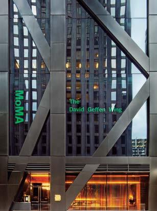

A formerly underutilized rooftop at Bell Labs, the iconic 1960’s tech hub recently reimagined as the mixed-use campus Bell Works, has become an “office al fresco” for the post-pandemic world: a safe, comfortable plein-air space that is now a destination for all sorts of connectivity. A recently added hospitality element, Bar Bella, ramps up the enjoyment factor a notch further. It’s a place where tenants and members of the community can let down their hair.
Bell Works’ developer, Ralph Zucker, and lead designer/creative director, Paola Zamudio of npz studio+, are the brains behind the roof deck reinvention. The concept was to use “resi-mercial” design to ease employees who’d grown accustomed to working at home back into a healthy office environment. The backyard vibe at Bar Bella is casual and playful but still chic, with striped parasols and tropical plants. Laid-back furnishings with modernist lines complement the look and feel of the iconic building, a midcentury masterpiece known for its mirrored-glass exterior designed by Eero Saarinen. At Bar Bella, every detail is considered—even the music matches the chilled-out vibe, a curation of Latin tracks and LoFi beats. As for libations, the drinks menu is updated regularly to highlight local beers, organic wines, and seasonal craft cocktails. Cin-cin!
KEY CONSULTANTS INSPIRED BY SOMERSET DEVELOPMENT; ALEXANDER GORLIN ARCHITECTS; BELL WORKS PROPERTY MANAGEMENT; MELILLO | BAUER | CARMAN LANDSCAPE ARCHITECTURE npzdesign.com; @npz_studio; @barbella_bw; @bellworks
Clockwise from left: Bar Bella is a hidden indoor/ outdoor oasis by npz studio+ at Bell Works, a mixeduse campus in suburban New Jersey that occupies the former Bell Labs building, an iconic midcentury structure by Eero Saarinen. The roof deck, situated atop the former ballroom, is a colorful beacon in the night sky. Acapulco chairs bring a laid-back vibe to the space. Lush tropical plants, striped umbrellas, and teak furniture contrast with Saarinen’s mirrored-glass facade.
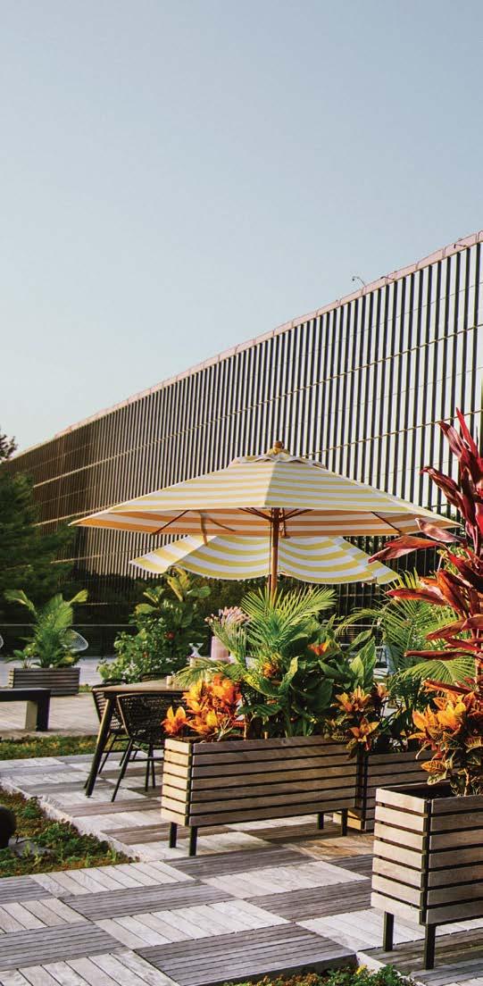 PROJECT TEAM PAOLA ZAMUDIO; BROOKE PETRANY; CHARLOTTE SUNNEN

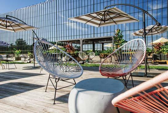
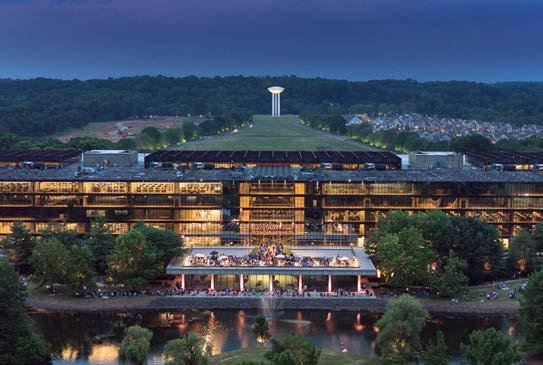

Mount Emei, one of the sacred Buddhist mountains of China, is home to the country’s oldest temple. The area was placed on the UNESCO World Heritage List in 1996. So when the French beverage company Pernod Ricard tapped Shanghai-based Neri&Hu to design a whisky distillery in a foothill there, Interior Design Hall of Fame members Lyndon Neri and Rossana Hu and their colleagues had to figure out how to build on hallowed ground. Their response was not a single, hulking structure but rather a series of smaller buildings totaling nearly 80,000 square feet tucked respectfully into the Sichuan Province landscape.
The two buildings of the Chuan Malt Whisky Distillery are based on the concept of the circle and the square, which represent heaven and earth in Chinese philosophy. The cylindrical tasting building—a domed rotunda clad in concrete bricks—is partially submerged in the ground. Its upper portion is encircled by three concentric rings echoing the silhouette of Mount Emei, seen in the distance. Inside, tasting rooms filled with oak barrels ring the rotunda and water flows from a skylight onto a copper vessel, creating a soothing sound. The structure encompassing a restaurant and bar has a squared footprint and an open-air courtyard, where an angular reflecting pool fills with water cascading down a wide staircase.
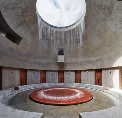
PHOTOGRAPHY
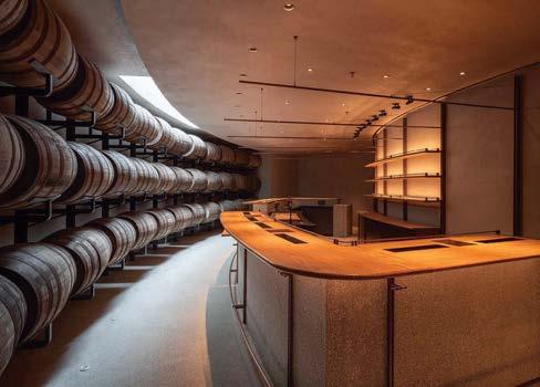

 Clockwise from above: At Chuan Malt Whisky Distillery in Emeishan, China, by Neri&Hu Design and Research Office, reception’s conversation pit features custom upholstered benches for relaxing and taking in the view. The distillery is located on a UNESCO World Heritage Site. The project won a Best of Year Award in the bar/lounge category. An open-air courtyard is located off the structure that houses the restaurant and bar. The tasting room has a serene water feature that pours through a ceiling portal.
PROJECT TEAM LYNDON NERI; ROSSANA HU; NELLIE YANG; UTSAV JAIN; SIYU CHEN; FENG WANG; GUO PENG; JOSH MURPHY; FERGUS DAVIS; ALEXANDRA HEIJINK; VIVIAN BAO; YOTA TAKAIRA; ROSIE TSENG; NICOLAS FARDET; YIN SHENG; LILI CHENG; JULY HUANG; LUNA HONG; HAIOU XIN


“The buildings are based on the concept of the circle and the square, which represent heaven and earth in Chinese philosophy”

Sparked by the nearby Colorado River and the famous red rocks of Arches National Park, the HooDoo Moab hotel is all about exploration, discovery, and the inherent drama of nature. Stina Funch, founder and creative director of California firm Atwater, describes the project as a “labor of love,” and indeed it took seven years to complete. Throughout, a warm and inviting palette with accents of terracotta sets the tone, layered with petrified wood and gritty metals such as Corten steel. Sandstone walls and columns riffing on hoodoo rock spires provide the backdrop for rustic elegance. Even the arrival area is an evocative combination of stonework in earthmineral tones.
Common areas survey the enviable surroundings through huge windows, offering many an opportunity to take in the almost 4acre property. Private areas such as the 117 guest rooms are serene and comfortable, a further exploration of hue, texture, and the views. Moab’s breathtaking nature can almost overwhelm the eye; it’s Mother Nature at her fullon best. The designers understood they could—and should—not compete with the aweinspiring rock formations, the river, or the snowcapped La Sal Mountains, opting instead to complement the surroundings, forging an intelligent dialogue between the landscape and the hotel.
PROJECT TEAM STINA FUNCH; OHLISA GUTIERREZ; JUN ANN; IVENA CHAN KEY CONSULTANTS MITTMAN HOSPITALITY; ASPECTS FURNITURE; KOROSEAL; LOLOEY; PRECIOSA LIGHTING; DM ART BART HALPERN; MUNNWORKS PHOTOGRAPHY ROBERT MILLER atwaterinc.com; @atwaterincstudio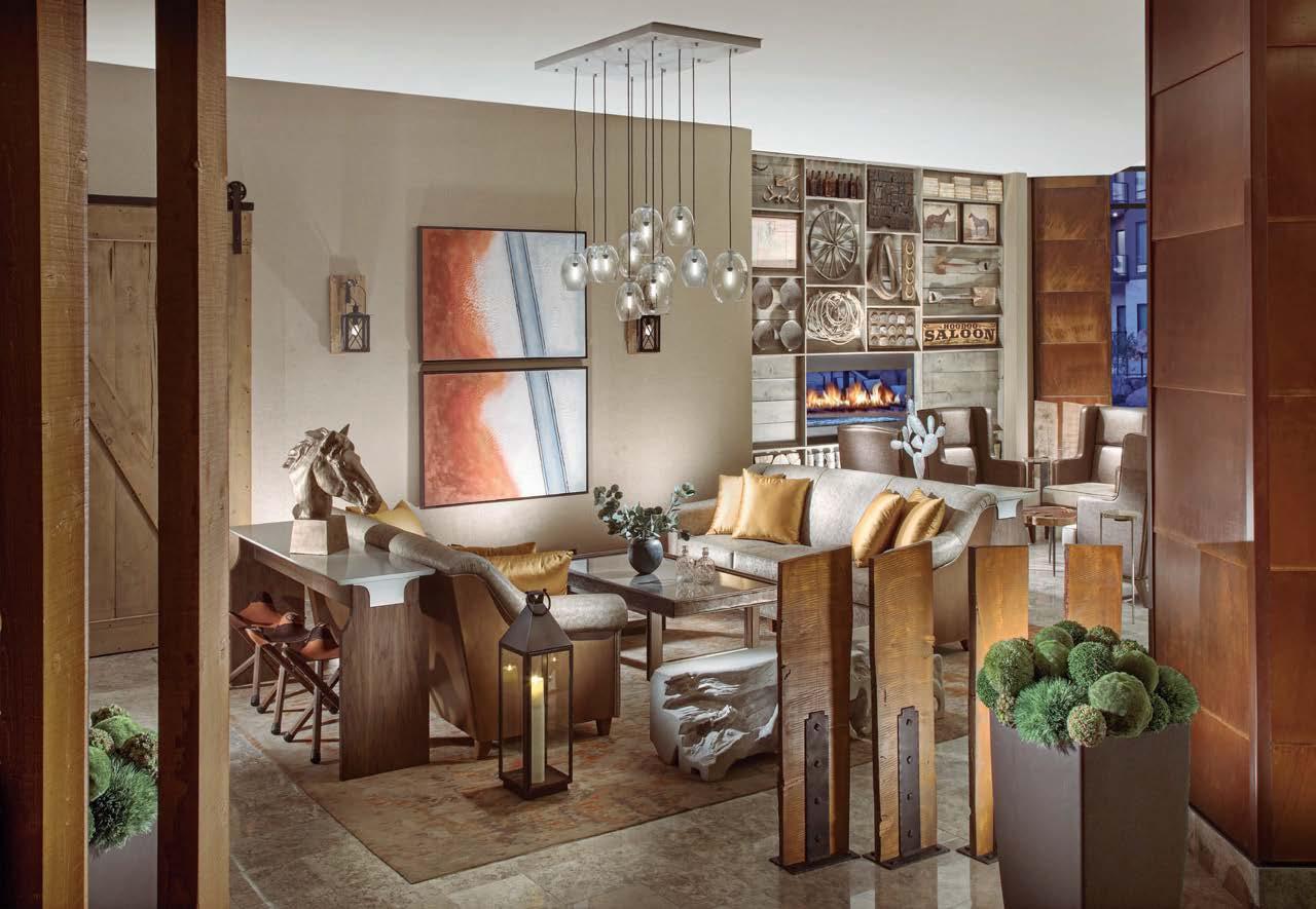


 Clockwise from right: In Utah, at the HooDoo Moab—A Curio Collection by Hilton hotel by Atwater Inc., guest rooms feature earth tones that reflect the location. Bathrooms are luxurious and filled wth natural light. Rustic wood, orb pendants, and abstract art gather in a lounge. Surrounded by rock formations, the hotel is arrayed around the pool area. Guest rooms have patios overlooking the majestic landscape.
Clockwise from bottom left: Inspired by flowing water from nearby springs, biomorphic curves in reinforced concrete and steel netted Ippolito Fleitz Group’s Spring Feast Chaohu eatery a Best of Year Award in the casual dining category. Tropical plants add color and life to the otherwise stark-white scheme. The undulating building—with a planted green roof—is 15,000 square feet. Playing off surrounding real foliage, floor lamps resemble trees. IFG’s client was OCT Group. Entering the building on the top floor, guests can take one of two paths that branch off and then converge at the dining room on the lower level. Walls up to 46 feet high echo the caves that are the source of local spring water.
A 15th-century description of the nearby Bantang hot springs inspired the fluid shapes of Spring Feast Chaohu, a 95-seat restaurant in eastern China by Interior Design Hall of Fame members and Ippolito Fleitz comanaging partners Peter Ippolito and Gunter Fleitz. The historical text noted that there were two separate springs, one hot and one cold, whose waters merged as they flowed down a mountain. The team conceived a three-story plan that takes visitors on a similar route.

Entering the wavy 15,000-square-foot building on the top floor, guests can take one of two paths that branch off and then converge at the dining room on the lower level. There, bands of gray or white concrete course across the floor, separating walkways and seating areas surrounded by tropical foliage. Curved niches and undulating ceilings up to 46 feet high echo the caves that are the source of the spring water, which is used for cooking at the restaurant. The organic forms—constructed of reinforced concrete and steel—make it an otherworldly place to dine on dishes like spring-water eggs with truffles. (Those who only have time for a brief sojourn can grab a coffee at the bar—prepared with skill by a small robot.) “The space arises from the interplay of nature and culture,” Ippolito says. A window wall with views of the lush surroundings reinforces the restaurant’s connection to the outdoors.

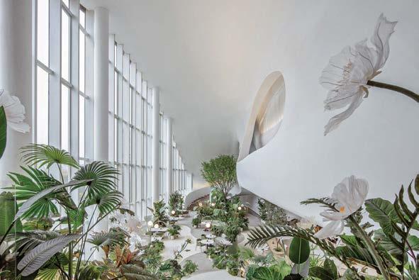 PROJECT TEAM RUTH CALIMLIM; KENNY CHOU; HALIL DOGAN; PETER IPPOLITO; GUNTER FL EITZ; DORA LATKOCZY; FRANK WANG; YU YAN; DIRK ZSCHUNKE PHOTOGRAPHY ONE THOUSAND DEGREES IMAGE ifgroup.org; @ifgroup

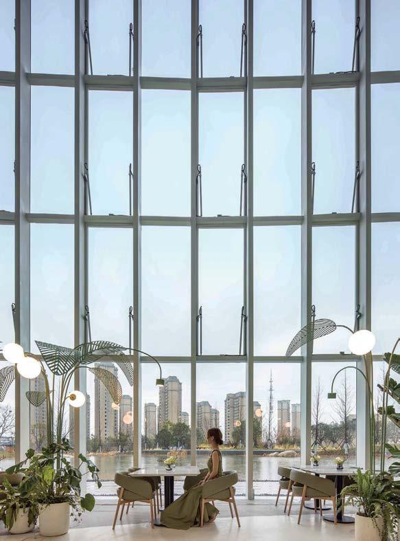

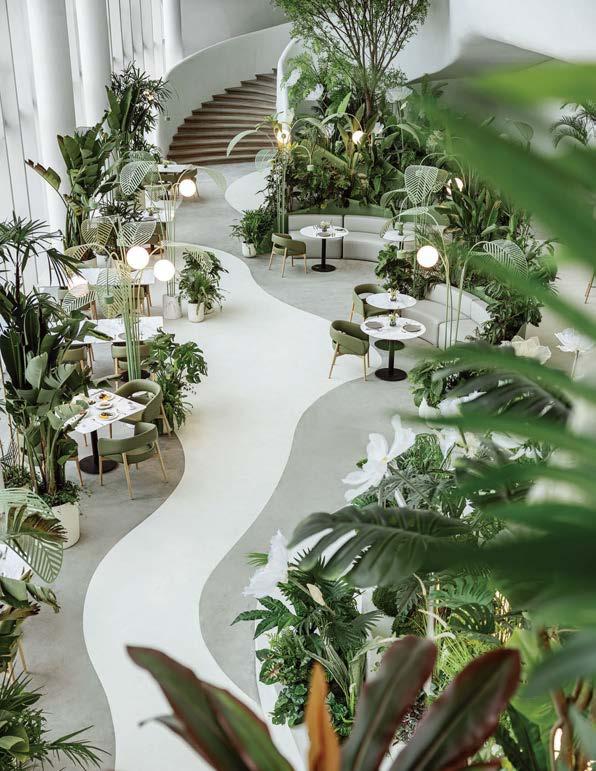

From a high-tech church to a rural school for girls, a zeitgeisty contemporary photography museum to a surprisingly sybaritic government office, this compendium of global projects is as eclectic as it is intriguing. It’s all in the mix.
Last year, many girls from rural areas around Jaisalmer, a city in the northern Indian state of Rajasthan, attended school for the first time. A 10-classroom oval sandstone building in the Thar Desert designed by the namesake founder of Diana Kellogg Architects and her team brought not only education to the region’s daughters but also sustainable design and jobs for local craftsmen. A small army of artisans and day laborers constructed the 8,900-square-foot school in just 10 months. Working without electricity or heavy machinery, they carved solid sandstone blocks and aligned them using only a simple water level. Inside, sandstone washbasins, teak desks, and woven charpai seating were made locally by hand; nearly all the materials come from Jaisalmer. Kellogg’s design factors in the extreme weather conditions of the desert, where temperatures range from 40 to 120 degrees. It centers around a courtyard, which she plans to shade with large sail-like canvas awnings. Though there is no air-conditioning, passive solar techniques and lime-plaster coating on interior walls help keep classrooms cool. The mosaictiled roof, screened by traditional jali-style latticework parapets that provide cross ventilation and protection from sandstorms, serves multiple purposes: It can be an outdoor learning space on a breezy day, a stage for performances, or a play area. The school serves more than 400 Hindu and Muslim girls in kindergarten through the 10th grade who would otherwise receive little education.

 Clockwise from left: The Rajkumari Ratnavati Girls’ School in Jaisalmer, India, designed by Diana Kellogg Architects, addresses the need to educate girls and empower local women. There are 10 classrooms in the 8,900-square-foot complex, outfitted with simple teak desks. The school is constructed from hand-carved sandstone blocks. The oval shape of the edifice, which centers around a courtyard, reflects the curvilinear forms of local forts.

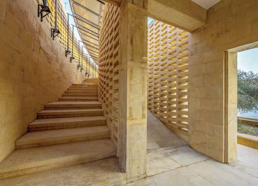

The school serves more than 400 Hindu and Muslim girls in kindergarten through 10th grade who would otherwise receive little education.
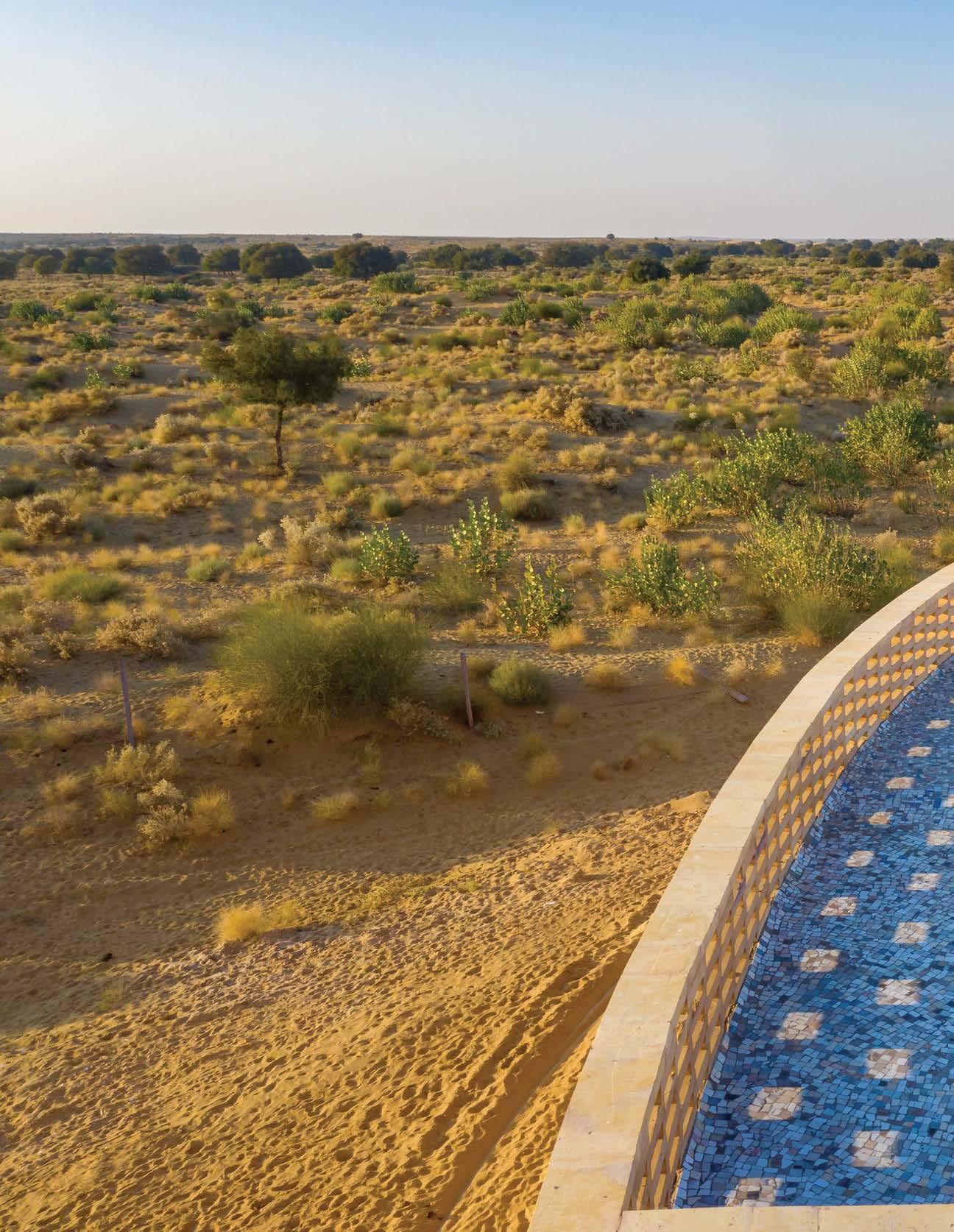
“The school brought education to the region’s daughters as well as sustainable design and jobs for local craftsmen”
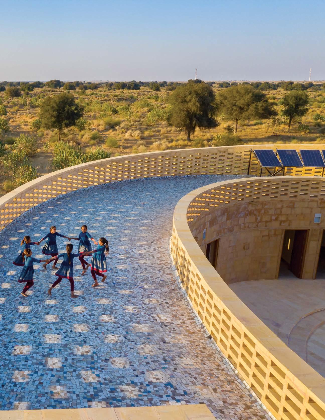

It was 2017 when Olson Kundig won the competition to design the facility that would house the 100,000-item archive for and interactive exhibits related to the enigmatic Bob Dylan. For principal Alan Maskin, the musician’s mystique presented an opportunity to take an unconventional narrative approach—one inspired by Rashomon, the Akira Kurosawa film—to the $10 million project. Maskin, a lifelong Dylan fan, was relieved to learn that the musician was not involved. “I didn’t want to worry about pleasing Bob Dylan,” he recalls. “I wanted to make a portrait of him.” The Bob Dylan Center occupies an 11,000-square-foot, two-story former paper warehouse— and it’s far from a traditional museum presenting a static history of its subject’s life. The narrative starts on the street, where a mural of the musician stares out from the brick facade. The graffiti artist Eric T. Burke painted it based on a rare Jerry Schatzberg photograph and layered it onto existing ghost signage. In the lobby, a lenticular wall displays names of donors on one side and, on the other, a 1986 image of Dylan by filmmaker Lisa Law. A Dylan quote completes the scene: “Life isn’t about finding yourself or finding anything. Life is about creating yourself and creating things.” For the galleries, Maskin formulated the environment through a storytelling lens. The exhibits are diverse, appealing to Dylanologists and casual listeners alike.

PROJECT TEAM ALAN MASKIN; STEPHEN YAMADA-HEIDNER; MARLENE CHEN; HOLLY SIMON; RYAN BOTTS; BRIAN HAVENER; KAREN DUAN; AIYM ZHUMASHEVA
KEY CONSULTANTS LILLY ARCHITECTS; TILLOTSON DESIGN ASSOCIATES; WALLACE DESIGN COLLECTIVE; PHILLIPS + GOMEZ; 59 PRODUCTIONS; BBI ENGINEERS; CREO EXHIBITS PHOTOGRAPHY MATTHEW MILLMAN olsonkundig.com; @olsonkundig

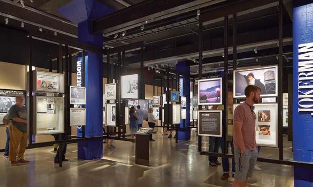
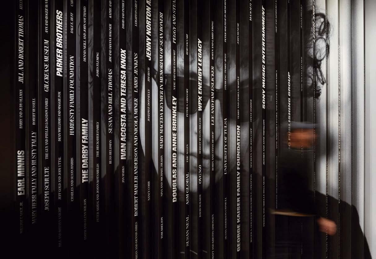 Clockwise from above: In the lobby of the Bob Dylan Center in Tulsa, Oklahoma, by Olson Kundig, a lenticular wall displays names of donors on one side and, on the other, a 1986 portrait of the musician by Lisa Law. A grid of 50 photographs taken by Law in 1966 have been enlarged and printed on magnetic sheets to fill the stairwell. Six Dylan songs are showcased in a gallery defined by existing concrete columns that have been painted. An immersive gallery plays a film of archival Dylan footage, while heat-formed acrylic sheets mimic reams of paper flying out of typewriters set on plywood plinths. Graffiti artist Eric T. Burke painted the brick facade with a mural based on a portrait by Jerry Schatzberg, who shot the cover of Dylan’s 1966 album Blonde on Blonde.
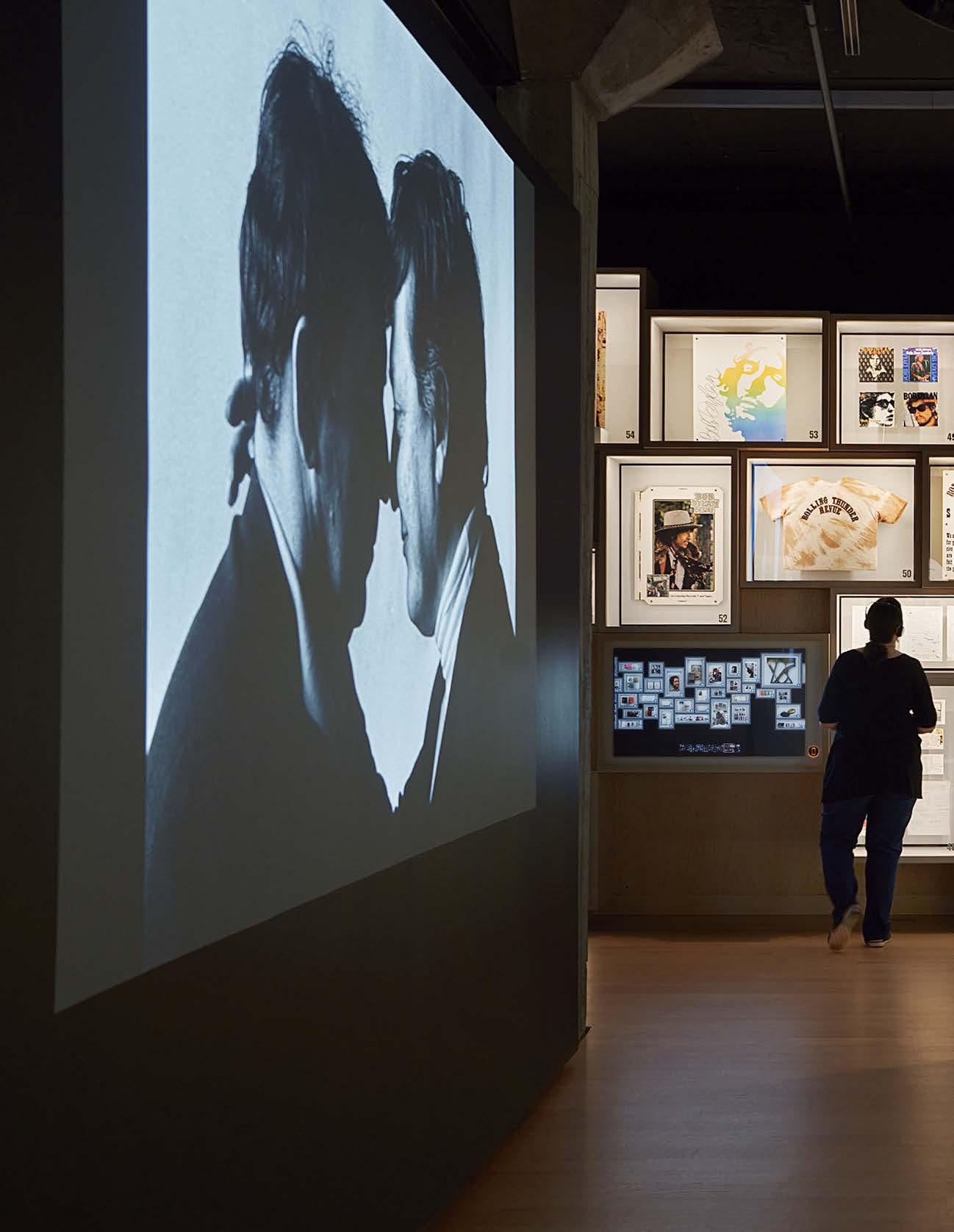
“I created a storyboard of the visitor experience, informed by imagery and objects, and formulated the environment through a storytelling lens”

Rose Hill, a ground-up, 45-story residential building on East 29th Street in Manhattan, takes its cues from great New York skyscrapers of the early 20th-century. The building pays homage to its developer, Rockefeller Group, whose urban spaces have transformed the city. Rose Hill is the group’s first residential building in over 40 years. The architecture and interior design, both by CetraRuddy Architecture, features a bronze-detailed facade accented with chevron patterns and expansive windows—classic Gotham aesthetics interpreted in a modern vocabulary. “We studied the NoMad context of buildings of varying ages and multiple shades of earth-tone masonry,” says John Cetra, who, with partner Nancy J. Ruddy, is the firm cofounder and an Interior Design Hall of Fame member. “Instead of full glass walls, or using blue or gray glass, we created a palette of browns and metallic bronze that are similar colors to the context. The building is of the neighborhood.” Inside the 223,000-square-foot tower, curated amenity spaces begin in the lobby. Celebrating the locale’s cultural history, art is integrated throughout, including murals and custom mosaics. The lobby provides warmth and welcome with two fireplaces lit year-round, and the design team interpreted historic precedents with a contemporary twist, like the lobby floor mosaic composed of six stones quarried specifically for Rose Hill (Yellowstone marble and a rare onyx among them). Residences in the tower, meanwhile, boast the sensibility of a sophisticated downtown loft.

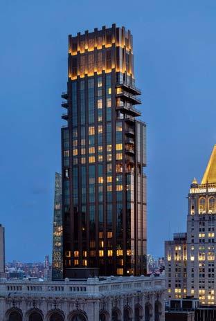
Clockwise from below: At CetraRuddy Architecture’s Rose Hill, a 45-story residential tower in New York, the Blue Room, a resident lounge separated from the lobby by a metal art screen, looks out on a landscaped garden. The building’s sculpted crown engages the skyline. Walls in the lobby are paneled with hand-rubbed American walnut, and flooring juxtaposes six stones in a large-scale geometric pattern. The building’s grand windows that celebrate city views are trimmed in artfully detailed bronze frames. An attractive amenity space boasts a pool table and a mini library.


PROJECT TEAM JOHN CETRA; NANCY J. RUDDY; XIMENA RODRIGUEZ; EUGENE FLOTTERON; CHARLES THOMSON; LINDSEY DOREN; KANA AHN; ERICA LIBRITZ; ANGELA LEE KEY CONSULTANTS COSENTINI ASSOCIATES; DESIMONE CONSULTING ENGINEERS; VENTRESCA DESIGN, LLC; VIDARIS; HMWHITE; LANGAN; LENDLEASE CONSTRUCTION
PHOTOGRAPHY DAVID SUNDBERG/ESTO; EVAN JOSEPH cetraruddy.com; @cetraruddy


“It was essential that we design residences for how people really live: It is not about trends or fashion, it is about authenticity and substantive content, creating the next chapter for urban living”

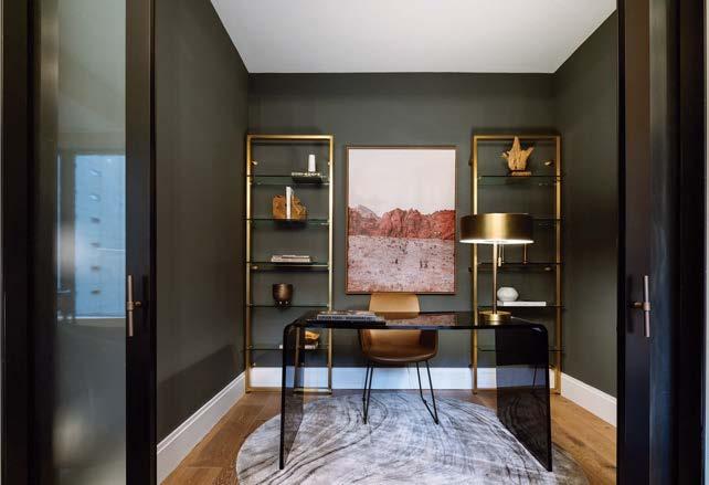
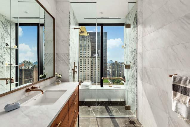

Shenzhen is China’s version of the Wild West. Five decades ago, it was a sleepy backwater in south Guangdong province; now, it’s the fourth most populous city in China. Architect Xiang Li is fascinated by Shenzhen’s meteoric ascent to the summit of global economic prowess. The founder and chief designer of X+Living sought to capture its tension between familiarity and strangeness in her concept for bookstore chain Zhongshuge’s first shop in the city. Visitors enter through tall glass doors etched with inspirational messages in Chinese, Korean, and English. But even before coming in, the project’s main intervention is clearly visible: a massive spiral staircase that is actually a bookshelf lying on its side. Like a sci-fi serpent snaking toward the main reading room, it’s formed by two red metallic ribbons sandwiching LED-lit slots for books, complete with balusters and handrails. As the 122-foot-long structure corkscrews, its shelves twist and turn to surround visitors with books from all directions. The shelves within easy reach are filled with real books, approximately 5,000 of them, that can be pulled out, browsed, and purchased. The spines that appear upside down are images printed on peel-and-stick paper. “The spiral’s cut-out looks like a clock dial, alluding to the ladder of history that has been built over time while also conveying the sense that its progress has been pushed rapidly,” Li says. “And just as we used the spiral bookshelf as a metaphor for the rapid development of Shenzhen and the flow of time, it also represents the accumulation of literature through the ages.”
Clockwise from below: At Zhongshuge bookstore in Shenzhen, China, by X+Living, actual volumes along with peel-and-stick representations line a 122-footlong spiral resembling a staircase on its side. For the spiral’s backside, X+Living chose red, the color with the longest wavelength in the visible spectrum of light. Custom floor lamps flank the reading pit, which has stepped seating for visitors during events. The “balustrade” consists of powder-coated rails anchored by iron “balusters.”
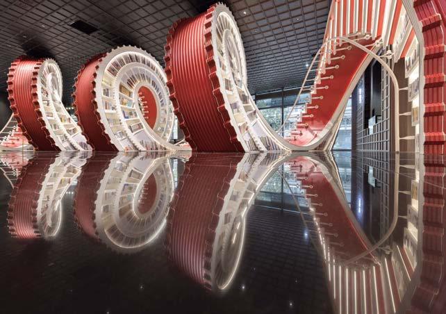

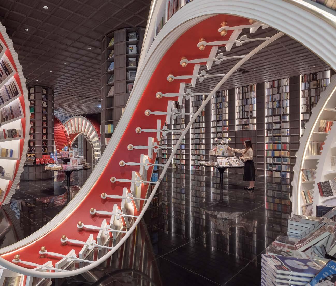

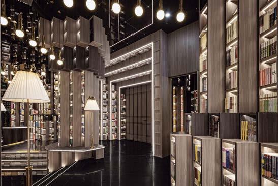
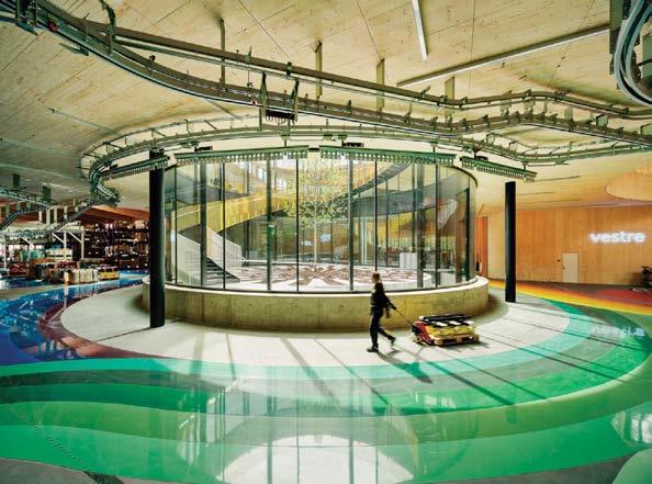
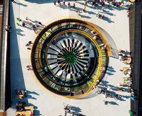
Furniture manufacturer Vestre is committed to sustainability. The 70-year-old Norwegian company makes outdoor seating and tables from local materials like FSC-certified pine and produces them with 100 percent renewable energy. The Plus, Vestre’s 75,000-squarefoot factory and visitor center—designed by BIG and constructed of recycled steel, low-carbon concrete, and charred larch cladding— demonstrates what environmentally friendly fabrication looks like. Built to Passivhaus Institute standards, the Plus generates 50 percent less greenhouse gases than a conventional factory. “This project proves that production can be sustainable and profitable,” partner-in-charge Bjarke Ingels says.
Located in a 300-acre forest near the Swedish border, the building is made up of four production wings that intersect at a circular public courtyard with glass walls, spiral soil-and-concrete flooring, and a single maple tree. A painted steel stair curves up to the second-floor visitor center and a rooftop terrace with views of the structure’s solar-array and rainwater collection systems. Large windows give employees views of the woods from the factory floor, and visitors outside can watch furniture being assembled. “The radical transparency invites them to enjoy the whole creation process,” Ingels adds. They’re also free to hike around the park, camp overnight, and enjoy the outdoors the Plus strives to protect.
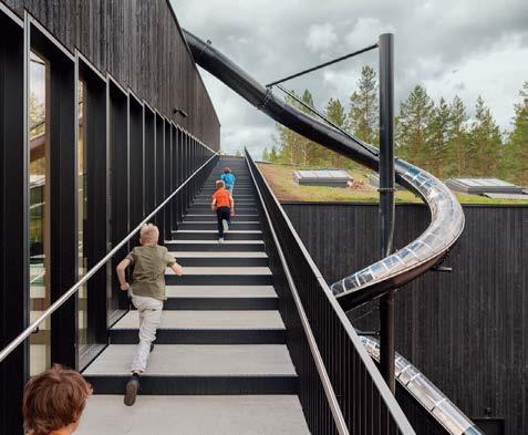

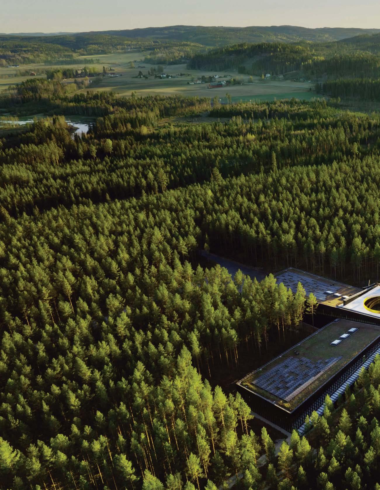
 An aerial view of Vestre’s four production wings, which intersect at a courtyard.
“This project proves that production can be sustainable and profitable”
Clockwise from right: From a distance, a large Armenian cross can be glimpsed on the printed porcelain facade of David Hotson Architect’s Saint Sarkis Church in Carrollton, Texas. Drawing nearer, the cross is revealed to be composed of botanical motifs. The project won a Best of Year Award for its unique facade. Viewed closer still, the exterior image dissolves into a grid of circular icons, each unique and representing one of the 1.5 million individuals killed in the Armenian genocide of 1915.


The victims of the 1915 Armenian genocide are remembered in the highly detailed, printed porcelain rain screen panels by Fiandre that clad the entry to this new church in Carrollton, Texas. Perspective unfolds the story. From a distance, a large Armenian cross can be glimpsed; drawing nearer, the cross is revealed to be composed of smaller traditional botanical motifs. Viewed closer still, the image dissolves into a grid of circular icons, 1 centimeter in diameter, each unique and representing one of the 1.5 million individuals killed over a century ago. David Hotson and team wrote a computer script to generate the differing icon patterns and distribute them by density to form the multilayered design, which powerfully conveys the scale of loss.
Inside, surfaces fabricated in glass-fiber-reinforced gypsum are smooth and scaleless, with no contemporary technical details to interrupt the architectural space filled with ethereal light. A remotely located mechanical plant introduces cool air at slow velocity through floor registers located under the pews. The result is a silent interior, free of the vibration or ambient noise of a conventional highvelocity air-conditioning system, offering a silent backdrop for the reverberant acoustics of traditional Armenian choral music.
PROJECT TEAM DAVID HOTSON; STEPAN TERZYAN; MIKE KONOW; ANI SAHAKYAN; BENJAMIN ELMER; CESAR ELIAS QUINTERO; CHEUK KEI HUI; ROME CAO PHOTOGRAPHY DROR BALDINGER hotson.net; @davidhotson_architect
An abandoned shipbuilding facility in the Brooklyn Navy Yard is now the headquarters of Crye Precision, a maker of military gear. Two floors of offices and sewing rooms line the sides of the 87,000-square-foot building, and a 470-foot-long hall is used for storage. Camber Studio principal Wes Rozen was hired to design the workplace’s fitness center for the company’s 240 employees. The only available space was on top of two rooms in the center of the hall, which is where Rozen installed a sculptural, origamilike structure of black prefinished plywood. The intervention also serves as the programmatic element for the gym: There’s a yoga studio on one side, a fitness center with a climbing wall on the other, and, in between, a tunnel over the bridge that connects to the site’s mezzanine. The black wood panels reference the garment manufacturing happening at Crye; a repeating diamond motif, engraved with a CNC router, gestures to stitches, measurements, and sewing patterns. “People actually make things here, so it speaks to that craftsmanship,” Rozen says. The walls, bolted to a steel parapet, are about 1 foot off the main gym structure and hang like clothes on a body. “We considered how to make plywood as fabriclike as possible,” he explains. For the tunnel, Camber added hinges so the material can fold and drape over a steel-and-aluminum armature as well as, on one side, myriad colorful holds for the climbing wall.
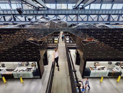

PROJECT TEAM WES ROZEN; ZACH MULITAUAOPELE; SEAN MILLER; JULIA DIPIETRO; JAMES COLEMAN; BEN MOSCA; CHRISTOPHER WHITE
KEY CONSULTANTS LAUFS ENGINEERING DESIGN; KAMMETAL; SITU FABRICATION; TRI-LOX; VERDANT PHOTOGRAPHY JOHN MUGGENBORG camber.studio; @camber.studio

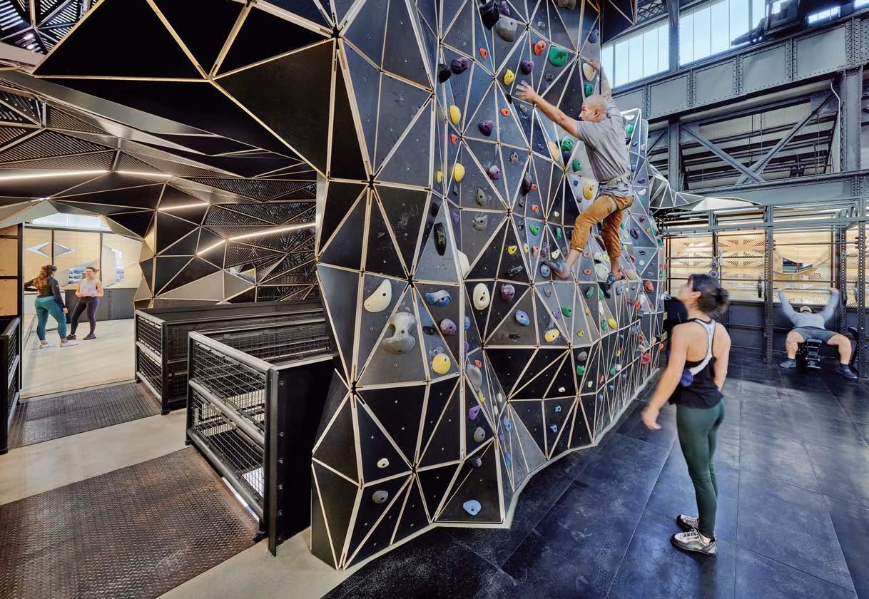 Clockwise from above: At the Brooklyn, New York, headquarters of Crye Precision, a military-gear maker, panels of prefinished plywood embedded with LED strips form a tunnel connecting two sides of an employee exercise center—an addition by Camber Studio. The commission also entailed transforming five empty balconies into semienclosed flex spaces for small meetings or lunch. The excercise center volume is situated in the middle of a former shipbuilding facility in the Brooklyn Navy Yard. Cutouts in the plywood bring light inside the tunnel.
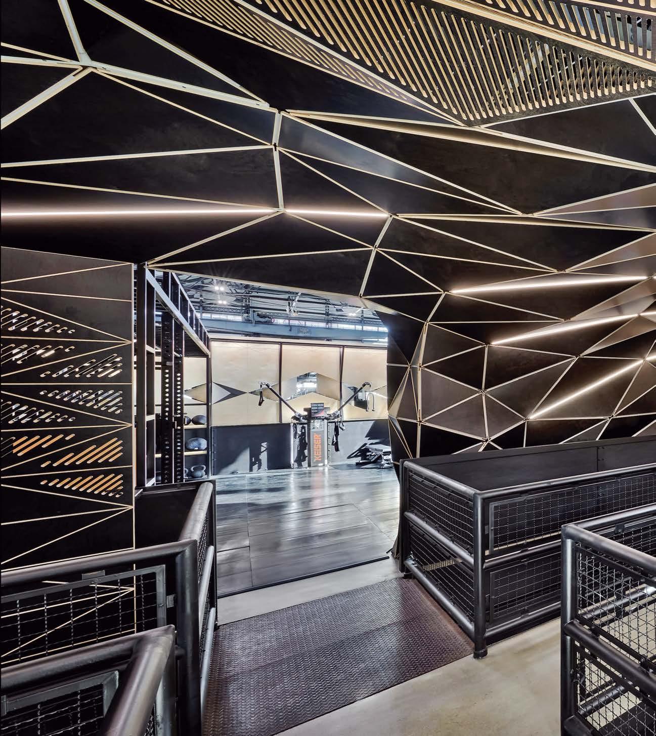
“It’s unusual to have a gym in the middle of an industrial space the challenge was making it private, while designing something with scale that would hold the spotlight”
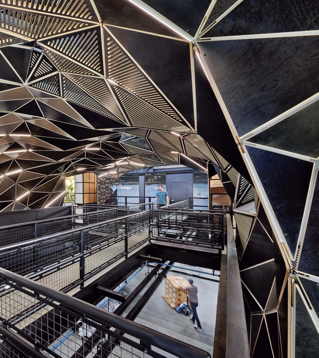
Located at the electric vehicle maker’s manufacturing plant—an erstwhile Mitsubishi factory—is a playful 4,900-square-foot delivery center where customers go to receive their new cars. In keeping with the brand’s adventurous spirit, Rivian’s in-house team, spearheaded by former Studio O+A design director Denise Cherry, converted a repair workshop and its gravel yard into a skylit indoor-outdoor social hub and experiential center vivified by a colorful 50-foot-long exterior mural by Joe Swec. Outside, garden beds planted with native wildflowers meet custom communal tables made of hickory that invite employees and customers to relax. There, they can indulge in complimentary vegan chili served from the pull-out camp kitchen of the company’s R1T truck.
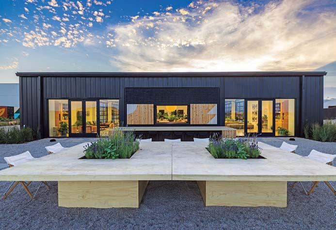

Inside, another bespoke hickory table is composed of three pieces to enable maximum modularity for various functions: training seminars, media interviews, dinners, and customer events. Vintage furnishings and found objects snagged from the old Mitsubishi plant embrace the site’s industrial history, along with antiques sourced from South Loop Loft, Scout, and other local Chicago shops. Approaching the project from an environmentally and fiscally sustainable perspective, the in-house designers conceived a dynamic intervention with little more than teamwork and ingenuity.
 Clockwise from bottom left: Electric vehicle manufacturer Rivian’s inhouse designers converted a repair workshop and gravel yard into an indoor-outdoor experience center in Normal, Illinois. New skylights bathe the interior with daylight. Outside, hickory tables incorporate planters for wildflowers. A colorful 50-foot-long mural by Joe Swec animates the exterior.
PROJECT TEAM DENISE CHERRY PHOTOGRAPHY JASPER SANIDAD rivian.com; @rivianofficial

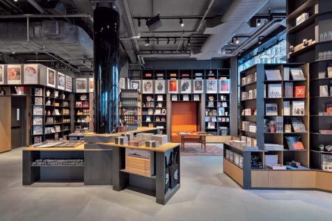

Contemporary photography museum Fotografiska New York is a unique cultural institution occupying a 1894 landmarked Flemish Renaissance Revival building in the heart of Manhattan. Grand on the outside, the former mission house for the Episcopal church next door was a hollow shell when Interior Design Hall of Fame members John Cetra and Nancy J. Ruddy plus CetraRuddy principal Theresa Genovese began the journey. Fotografiska occupies the entire 42,000-square-foot building, with exhibitions on levels three, four, and five. The design concept was to let as much of the original architecture shine through as possible. “We wanted the building’s bones to speak,” Cetra says. For the exhibition spaces, “We took cues from the Stockholm branch of Fotografiska,” Ruddy adds. “It is immersive and intimate.” To achieve this, the client mandated a ban of any natural light coming into the museum, so CetraRuddy crafted a structure within a structure, building a wall 3 feet inside the interior, which preserved the street view of the old window bays. Within the galleries, Fotografiska provides a unique environment combining the experience of art, photography, and sound. Up top, the jewel in the crown is the sixth-floor attic, where a low ceiling was removed to reveal original terra-cotta wall tiles. This penthouse space was designed to promote flexibility for a myriad of uses, including community events programming and artists in residence.
PROJECT TEAM JOHN CETRA; NANCY J. RUDDY; THERESA M. GENOVESE; MARIA CLIRONOMOS; BRANKO POTOCNIK; JARED EISENHOWER; NATHALIE GUEDES; AKIKO UCHIDA
KEY CONSULTANTS HIGGINS QUASEBARTH & PARTNERS; ROMAN AND WILLIAMS BUILDINGS AND INTERIORS; GILSANZ MURRAY STEFICEK; MGE/MG ENGINEERING; TRISTAR CONSTRUCTION; BANKERWESSEL; KUGLER NING

LIGHTING DESIGN; 6SIDES

PHOTOGRAPHY DAVID SUNDBERG/ESTO cetraruddy.com; @cetraruddy
 Clockwise from above: Adjacent to Fotografiska New York, a photography museum, a former chapel became a members’ bar restored by CetraRuddy with interior design by Roman and Williams Buildings and Interiors. The egress stair within the museum serves as a canvas for rotating exhibitions. The inaugural exhibition featured photography by Ellen von Unwerth. Custom neon numerals identify floors. The museum is housed in a six-story landmarked building—a former Episcopal mission house—that dates to 1894. In the dramatically opened-up lobby, a café, wine bar, and bookstore are all part of the inviting open plan.
Clockwise from below: In reception of the Supreme Council for Motherhood & Childhood, a government-agency office project by Roar in Abu Dhabi, U.A.E., a womblike concept is introduced via rounded forms. The nursery’s custom teddy-bear ottoman is upholstered in a commercial fabric, except for its two “paws,” which are covered in a traditional Emirati weaving by Bedouin women. Patricia Urquiola’s Rift sofa

A huge custom ottoman in the shape of a teddy bear is not the sort of thing often found in a government agency office. But it is at this 38,000-square-foot Abu Dhabi workplace by Roar founder and creative director Pallavi Dean that sets policy in matters concerning the welfare of women and children in the U.A.E. Dean threw feminine curves into the layout—notably seen in the lounge’s ceiling cutout and the furniture throughout, such as reception’s womblike amber Morph loveseat by Tanju Özelgin. “The furniture has a lot of rounded, rotund forms. That’s intentional,” she says. “A lot of it feels like a hug, like it’s cocooning you.”
The project, which includes a reception area, an auditorium, and a nursery for the children of staff and visitors on the ground level, and executive offices, a training room, and a boardroom on the upper floors, would not occupy one of the jazzy new towers for which this city is known—and which often provide design firms with a blank slate, along with impressive views—but rather an existing building tucked in a residential neighborhood. The concept is very much rooted in tradition. Reception evokes a traditional Emirati courtyard, with contemporary renditions of the breezeblock patterns used in local homes. Its sculpted arches and seating niches evoke vernacular architecture. And the “paws” of the aforementioned teddy bear, located in the nursery? They are upholstered in traditional Emirati weaving done by Bedouin women.
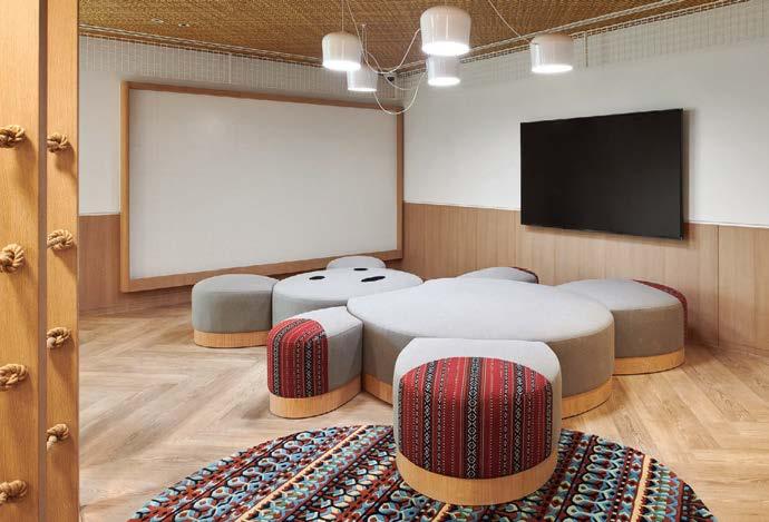
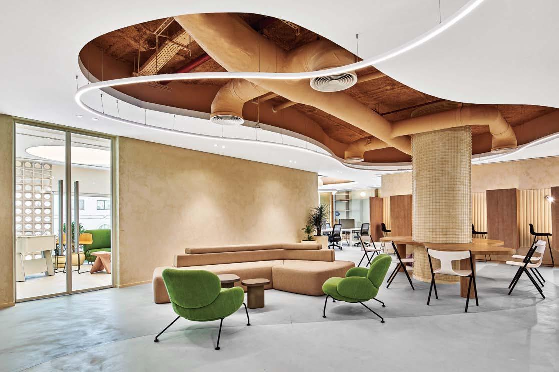
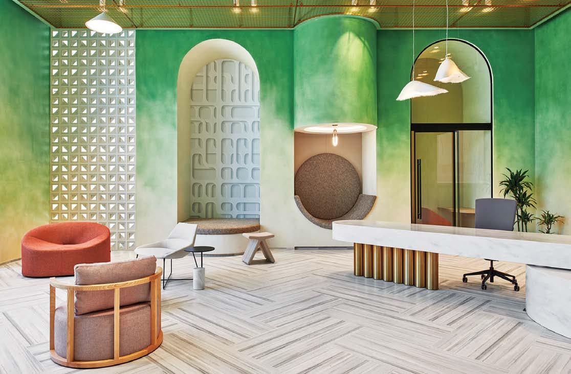
A flood-prone creek that runs through Westfield, Indiana, was given a climate-conscious upgrade by Philadelphia’s David Rubin Land Collective, which restored the waterway and added a park, Grand Junction Plaza, with such new community facilities as a winter ice rink. The ambitious project also includes three pavilions by HWKN. The New York studio conceived the concrete-floored volumes—a collaboration with Ratio Architects and Bruce Mau Design, which spearheaded signage—as a stone block that had been “split” apart into chunks, the resulting jaggedy extrusions crafted of limestone from the same quarry that clads the Empire State Building. The first pavilion to come to fruition is a skate-rental counter with a locker room and café, boasting full-height glass walls that draw in the revitalized environs.
Prior to its recent rehabilitation, Cool Creek was, on most days, a low-key waterway confined to a V-shape concrete channel. But during torrential downpours, which are becoming increasingly common due to climate change, the rivulet swelled to dangerous proportions, often flooding the surrounding area. David Rubin’s team stabilized the creek banks, built footbridges, planted native species, and landscaped the terrain with stone elements that slow down rushing stormwater and create delightful opportunities for sitting, climbing, playing, and stepping right down into the creek itself. Cool, indeed.

PROJECT TEAM DAVID A. RUBIN; DAVID ELLIOT; BRIAN STARESNICK; LINDSEY TABOR: DAVID RUBIN LAND COLLECTIVE. MATTHIAS HOLLWICH; ROBERT MAY; CAITLIN SWAIM; NICKIE HUANG; DANIEL SELENSKY; KATE SCOTT; VALENTINA MELE; IGNAS KALINAUSKAS; AMY KESSLER; AXELLE ZEMOULI; BRIAN RICHTER: HWKN PHOTOGRAPHY ALAN KARCHMER land-collective.com; @landcollective; hwkn.com; @hwkn_architecture
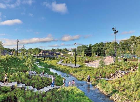

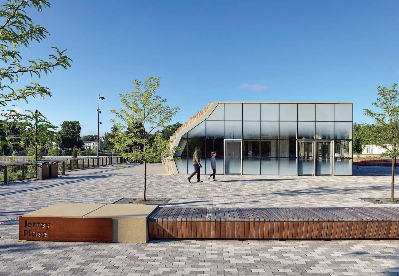 Clockwise from above: A limestone-and-glass volume by HWKN houses a café and skate-rental counter at Grand Junction Plaza and Park in Westfield, Indiana. The pavilion was a collaboration with Indianapolis firm Ratio Architects and Toronto-based Bruce Mau Design. Located at the nexus of five biking and hiking trails, the 8-acre park project was spearheaded by David Rubin Land Collective. Flooding prompted an infrastructure upgrade that restored the creek to its original free-form path, with newly stabilized banks. The park’s abundant community amenities include a meadow, a playground, and an outdoor amphitheater.
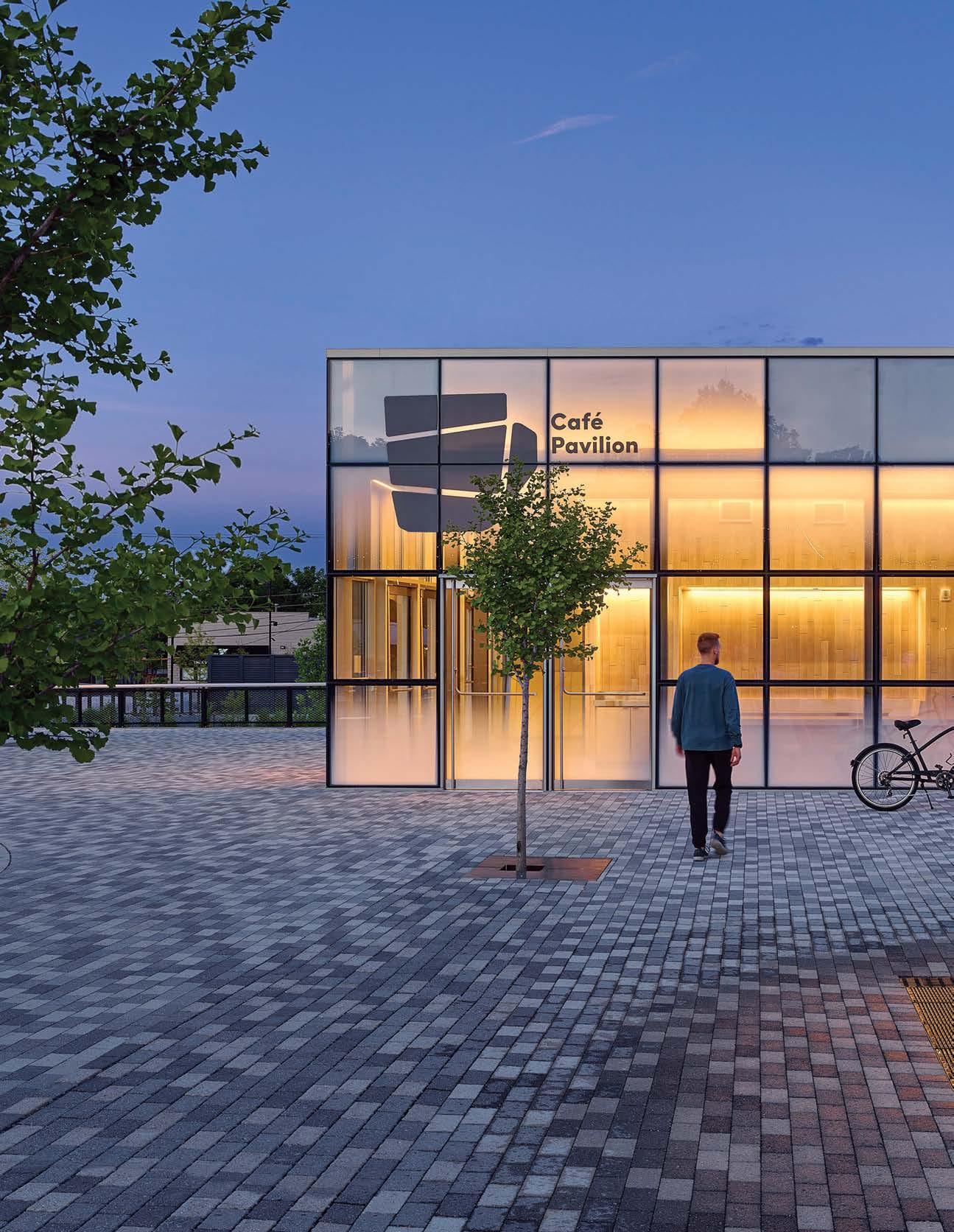

“The pavilion resembles a stone block that has been ‘split’ apart into chunks”
For their latest eye-popping multiplex, and their third Interior Design Best of Year Award in the entertainment category, cinema-design mavens Ajax Law and Virginia Lung riffed on the theater’s name, Cinesky, filling the lobby of the Shenzhen, China, theater with an abstract interpretation of the sky. Custom aluminum-alloy arcs evoke clouds floating overhead, some touching the floor or curving into a bench. The One Plus design directors worked with the client to adjust the location of HVAC units and raise the ceiling to the concrete slab, up to 16 feet high. This allowed them to layer the arcs without making the site feel cramped. “It’s for visitors to experience a weightless feeling, as if they’re walking inside clouds,” Lung says. The theme extends throughout the 60,000-square-foot complex. Arcs appear in the shape of the terrazzo ticket and coffee counters and the LED strips bending above the seats in the 10 theaters, which include an IMAX. The women’s restroom is an airy, all-white cocoon of solid surfacing and terrazzo, with a backlit banquette that curves behind a pair of freestanding cylindrical sinks. The cohesive visual identity is typical of One Plus, whose projects are inventive and distinct yet recognizably its own. Here, Law and Lung have created a surprising new experience in the predictable confines of a mall.
Clockwise from left: At Cinesky cinema in Shenzhen, China, One Plus Partnership Limited orchestrated a women’s restroom that feels like sitting in a cloud. Custom-fabricated arcs of aluminum alloy suspended weightlessly from the ceiling curve back down to earth in several places to become part of the ticket counter or a bench for waiting. In one screening room, decorative acoustic panels are illuminated with arcing LED strips. Flooring is terrazzo. The project won a Best of Year Award in the entertainment category. The goal was a high-concept space with a strong visual identity.

 PROJECT TEAM AJAX LAW; VIRGINIA LUNG PHOTOGRAPHY JONATHAN LEIJONHUFVUD onepluspartnership.com; @onepluspartnership
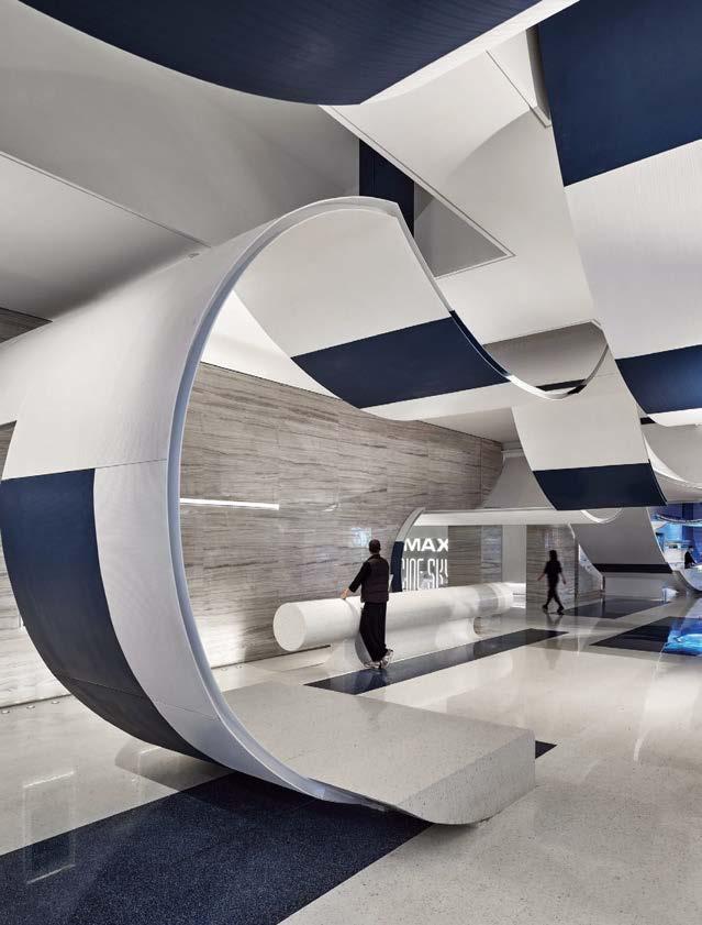
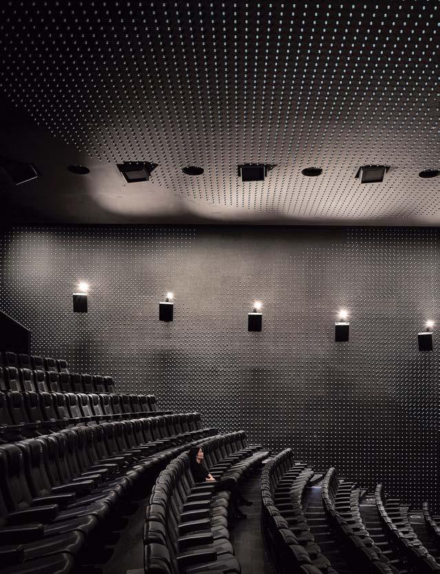


In the heart of San Francisco’s East Cut neighborhood, The Avery’s impressive 56-story architecture is by OMA, while acclaimed New York firm Clodagh Design masterminded the interiors, which include 350 rental apartments, 118 condominium residences, and 30,000 square feet of amenities. Clodagh’s wellness tenets of biophilia, feng shui, and chakra pervade. “Design is a healing art and that’s what we strive for, incorporating feng shui elements and addressing all the senses,” says Clodagh, an Interior Design Hall of Fame member. “There’s a universality of desire for comfort—this is the base from which we always start. Our goal is balanced spaces where people feel at home.” The material palette is rich and grounded in the condos because they are higher up, starting on the 33rd floor. In contrast, the rentals, on levels two through 32, have a different, lighter and brighter palette. The Avery’s two lobbies both have massive fireplaces that offer a warm primeval welcome. Art also heals and intrigues the eye, as in the condominium lobby, where a painting by Louise Crandell evokes the power of water. That’s not to say there’s no whimsy. “Of importance to me always, being Irish, is to bring some humor to each of our projects,” Clodagh states. A giant concrete bear for lounging created by Terence Main and inspired by the California State mascot fits the bill nicely.

Clockwise from above: At The Avery, a residential tower in San Francisco with interiors by Clodagh Design, colors are rich, neutral, and grounding. Working with feng shui expert Alberto Amura to cultivate balance and vibrant energy throughout the property, Clodagh’s scope included the building’s 118 condominiums, 350 rental apartments, and 30,000 square feet of amenities. Among the latter is this screening room with a rug by Tufenkian (who also provided rugs for guest rooms and public areas). Behind the reception desk, curved ceramic artifacts by Kathy Erteman are remniscent of the Bronze Age; sconces are by Pagani. The architecture of the 56-story tower is by OMA.


PROJECT TEAM CLODAGH; OMA
KEY CONSULTANTS THE RELATED COMPANIES; ALBERTO AMURA PHOTOGRAPHY BRUCE DAMONTE; SCOTT FRANCES, SARA COX clodagh.com; @clodaghdesign

“We involved the chakras of the human body, using color, fire, and light to deliver a sense of home and groundedness”

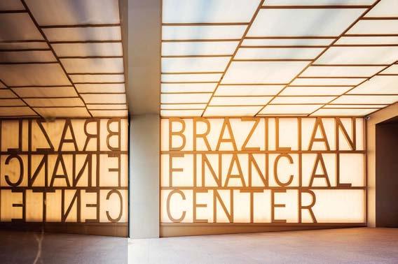
Following Perkin&Will’s 2017 redevelopment of this iconic 1970’s building on Avenida Paulista, the city’s main commercial thoroughfare, Fernanda Marques’s firm won a competition to redesign its lobby. Inspired by the geometries and dynamism of the surrounding business district, she and her team created a vast, 18,400-square-foot, triple-height volume that brings the street’s order and energy indoors. The ceiling and upper levels are screened behind a bronzed metal framework that evokes the urban grid, while lushly planted hanging gardens on each side of the space nod to São Paulo’s subtropical climate. Materials are quietly luxurious—white granite flooring, marble-look porcelain slab wallcovering, matte gold–finished metal detailing—without being showy. Linking the three levels, a pair of cantilevered steel staircases with oak-lined balustrades are curvy, sculptural presences that create a powerful sense of movement. But the city’s flowing rhythms are most fully expressed in the custom installation that floats overhead—an ethereal tracery of glowing LED tubing that channels a neon-light sculpture Lucio Fontana made for the Ninth Milan Triennial in 1951.
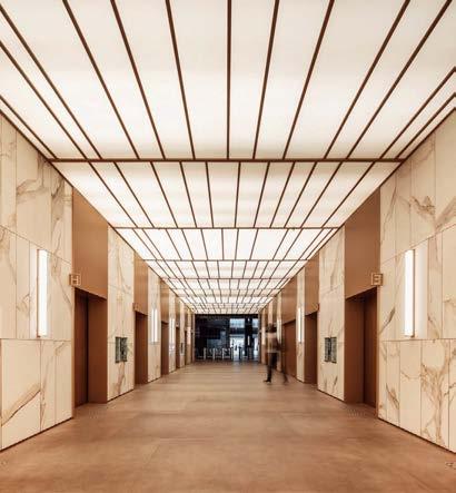
Clockwise from right: In the lobby of the Brazilian Financial Center, São Paulo, Fernanda Marques installed glowing LED tubing that channels a neon-light sculpture Lucio Fontana made for the Ninth Milan Triennial in 1951. Materials are quietly luxurious. The ceiling and upper levels are screened behind a bronzed metal framework that evokes the urban grid. The project won a Best of Year Award in the category of commercial lobby.
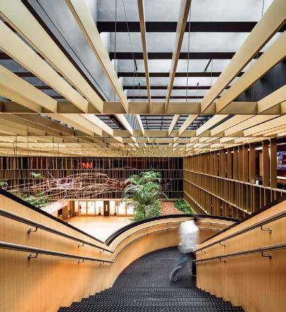


INTERIOR
EDITOR IN CHIEF, HON. IIDA
Cindy Allen
BOOK EDITORS
Georgina McWhirter
Jen Renzi
Annie Block
DESIGN DIRECTOR
Karla Lima
BOOK CONTRIBUTORS
Stephen Treffinger
Athena Waligore
Rebecca Dalzell
Wilson Barlow
Lisa Di Venuta
CREATIVE SERVICES
Marino Zullich
SENIOR PREPRESS IMAGING SPECIALIST
Igor Tsiperson
PARTNER SUCCESS MANAGER
Olivia Couture
EXECUTIVE VP + DESIGN FUTURIST
AJ Paron
EXECUTIVE VP, STRATEGY
Bobby Bonett
VP, PUBLISHER
Carol Cisco
VP, BUSINESS DEVELOPMENT
Laura Steele
BUSINESS DEVELOPMENT MANAGERS
Laury Kissane, 773-791-1976
Michael Croft
SENIOR VP, PARTNER + PROGRAM SUCCESS
Tanya Suber
EXECUTIVE DIRECTOR, FINANCE + OPERATIONS
Lorri D’Amico
VP, HUMAN RESOURCES
Lisa Silver Faber
SENIOR DIRECTOR, STRATEGIC OPERATIONS
Keith Clements
DIRECTOR, VIDEO
CHAIRMAN
Adam I. Sandow
CHIEF EXECUTIVE OFFICER
Erica Holborn
CHIEF OPERATING OFFICER
Michael Shavalier
CHIEF DESIGN OFFICER
Cindy Allen
CHIEF SALES OFFICER
Kate Kelly Smith
Steven Wilsey
SANDOW DESIGN GROUP
Corporate Headquarters 3651 Fau Blvd, Boca Raton, FL 33431 sandow.com
Copyright © 2023 by Interior Design magazine
Published by Sandow LLC, Boca Raton, Florida
All rights reserved. No portion of this book may be reproduced, distributed, or transmitted in any form or by any means, or stored in a database or retrieval system, without the prior written permission of the publisher. All images in this book have been reproduced with the knowledge and prior consent of the artists concerned and no responsibility is accepted by the producer, publisher, or printer for any infringements of copyright or otherwise, arising from the contents of the publication. Every effort has been made to ensure that credits accurately comply with information supplied.
Printed in the United States of America
ON THE COVER
Rocket Mortgage, Detroit, by Pophouse.
Photography: John D’Angelo.


