APR/23 V.68 N.02 $8.95
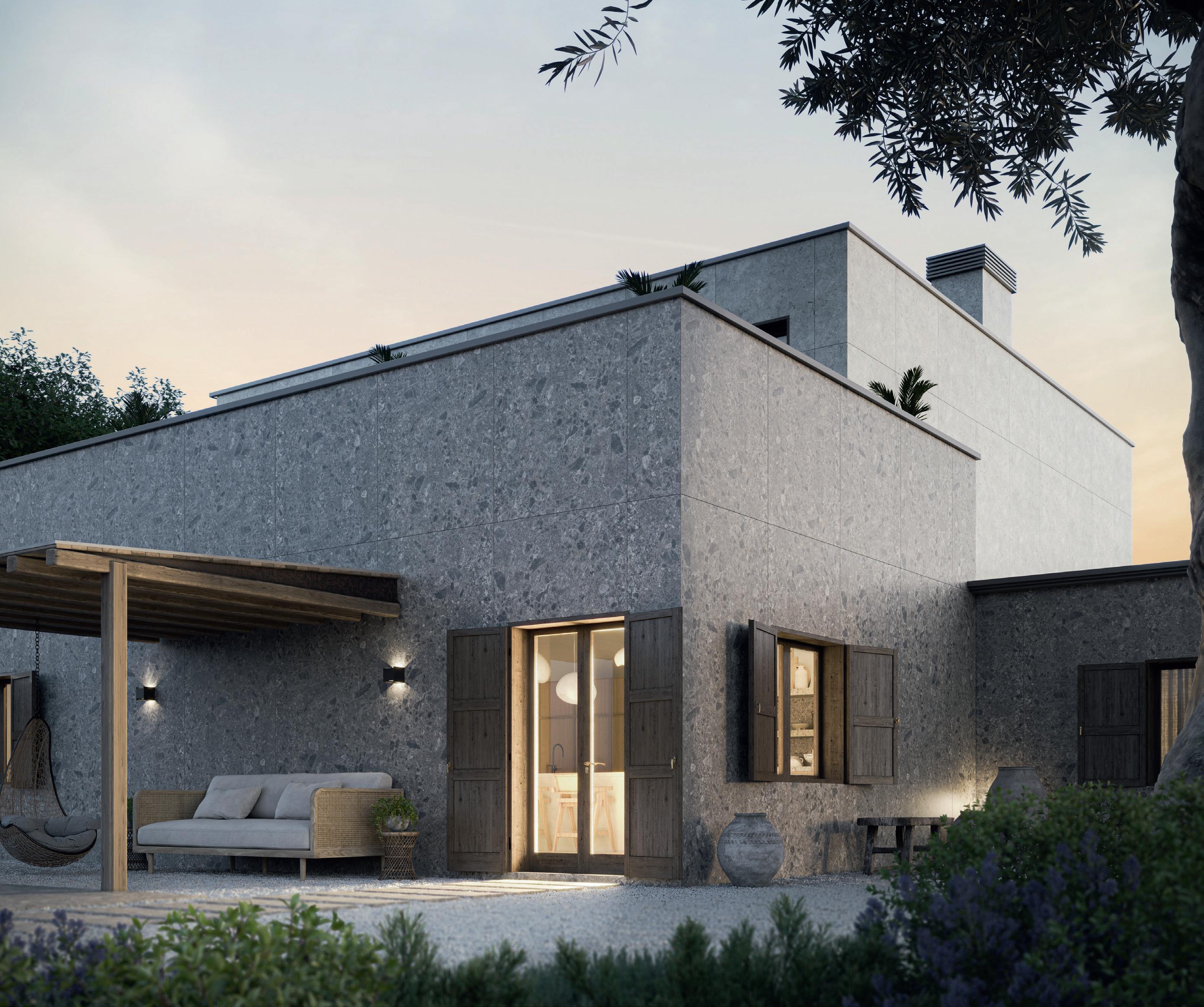
Introducing Pietra Kode: the Italian stones of yesteryear recoded by DEKTON for contemporary architecture and design.


A CARBON NEUTRAL PRODUCT BY COSENTINO TK05 TK06 GK07 SABBIA MARMORIO CEPPO TRAVERTINO KODE CEPPO KODE NEBBIA AVORIO GRIGIO VK03 VK04 VK02 VK01 GRAFITE VICENZA KODE
Find inspiration at cosentino.com F T ò @CosentinoCanada COSENTINO CENTRE VANCOUVER 8603 Glenlyon Parkway, Burnaby, BC V5J 0H6 I Phone: 778.508.9867 CENTRE CALGARY 10301 19th Street N.E. Unit 101, Calgary, AB T3J 0R1 I Phone: 587.538.8301 CENTRE QUEBEC 240 Chemin des Ursulines, Stan stead, QC JOB 3EO I Phone: 819.876.2123 CENTRE WINNIPEG 3020 Red Fife Rd, Rosser ROH 1EO, MB I Phone: 204.515.7060 CENTRE OTTAWA 903 Ages Dr, Ottawa K1G 6L3, ON I Phone: 343.804.0551 CENTRE TORONTO NORTH 8905 Highway 50, Units 3-4, Vaughan L4H5A1, ON I Phone: 647.350.6009 CENTRE TORONTO SOUTH 3455 N Service Rd, Burlington, ON L7N 3G2 CITY TORONTO 665 Caledonia Road ,Toronto, ON M6E 4V8 I Phone: 416.247.9090 CITY MONTREAL 240 Rue Saint-Jacques Ouest, Suite 110, Montreal, QC H2Y1L9 I Phone: 514.335.8669
20 HOLLYWOOD THEATRE AND RESIDENCES


Vancouver firm MA+HG restores a beloved local landmark and creates a companion mixed-use building alongside it. TEXT Benny Kwok
26 QUEEN’S MARQUE
A landmark development, designed by MacKay-Lyons Sweetapple and FBM Architects, opens on Halifax’s waterfront. TEXT T. E. Smith-Lamothe
32 TELUS SKY
Bjarke Ingels Group and DIALOG add a sinuously curved tower to Calgary’s downtown skyline. TEXT Trevor Boddy
40 MAISON DE LAUBERIVIÈRE
Lafond Côté Architectes co-designs a multi-service facility for people experiencing homelessness in Quebec City. TEXT Olivier Vallerand
04 VIEWPOINT
A TMU symposium on Toronto’s density challenge.
06 NEWS
Ontario Court of Justice opens; AGO reveals new expansion; on the value of awards; remembering Essy Baniassad, 1936-2023.
13 AIA CANADA SOCIETY JOURNAL
The winners of this year’s AIA Canada Society design awards.
18 LONG VIEW
An exhibition at the University of Toronto’s John H. Daniels Faculty of Architecture, Landscape, and Design considers the hidden potential of the suburbs.
43 BOOKS
Moshe Safdie’s new memoir, a book of photographs by Phyllis Lambert, a monograph on D’Arcy Jones Architects, and other new books for your shelves.
50 BACKPAGE
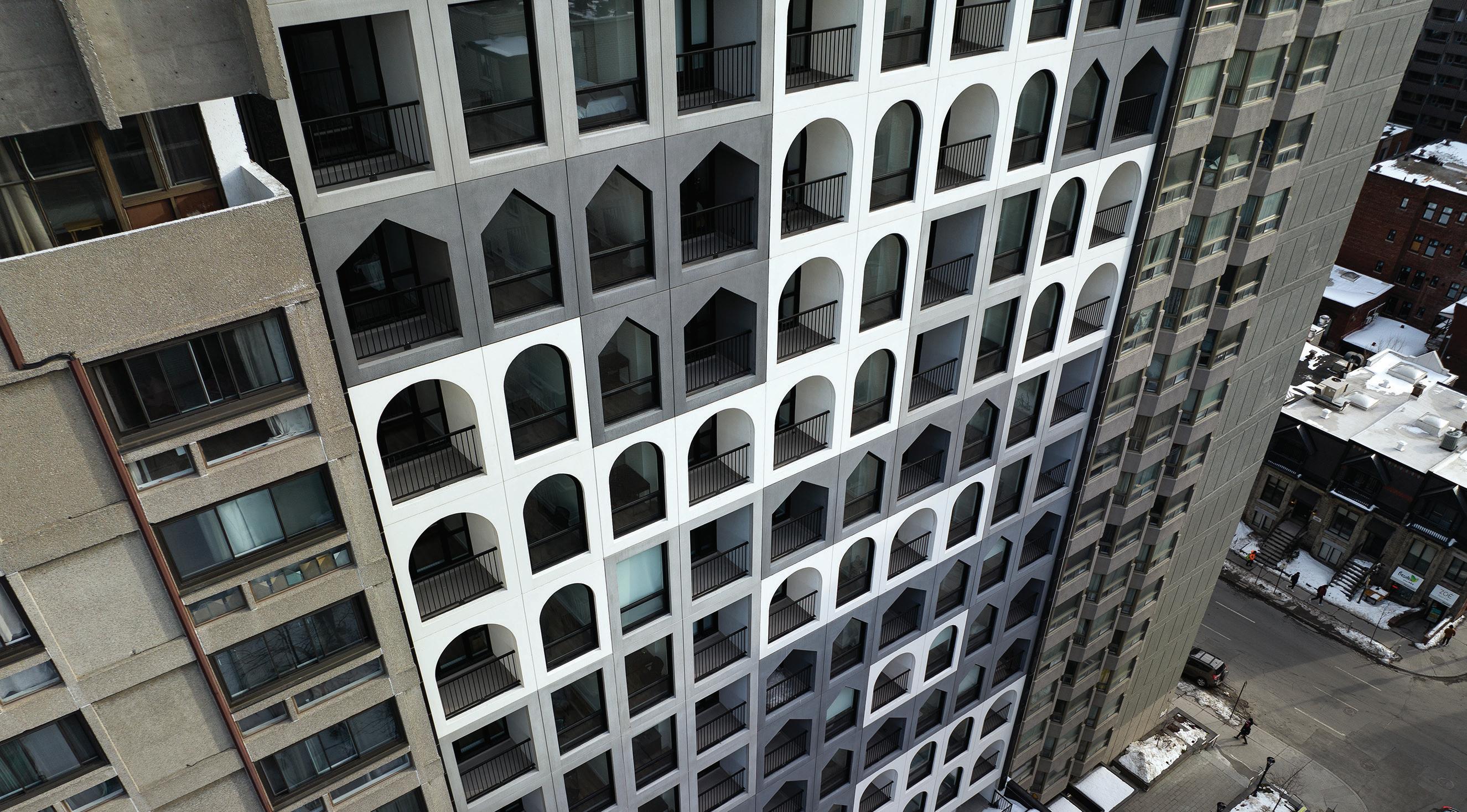
In Montreal, ACDF crafts a refreshingly contemporary take on the age-old apartment tower.

APRIL 2023 CANADIAN ARCHITECT 03
COVER Telus Sky, Calgary, by Bjarke Ingels Group (Design Architect) with DIALOG (Architect of Record). Photo by Laurian Ghinitoiu.
LAURIAN
EMA PETER NIC LEHOUX
GHINITOIU
V.68 N.02 32 20 26 URBAN HOUSING THE NATIONAL REVIEW OF DESIGN AND PRACTICE / THE OFFICIAL MAGAZINE OF THE RAIC / THE OFFICIAL MAGAZINE OF THE AIA CANADA SOCIETY
GROWING UP FAST
Toronto is the fastest-growing city in the developed world—a fact evidenced by real estate prices that remain well beyond affordability thresholds despite interest rate hikes, and towers that continue to crop up across the city. In late 2022, the city had 252 cranes operating on construction sites, by far the largest number in any North American city. (The runner up, Los Angeles, had 51).
This rapid growth is a prime concern for architects, as well as for students of architecture in the city. A recent exhibition at the John H. Daniels Faculty of Architecture, Landscape, and Design asked: how can the suburbs absorb more density? (See page 18.) Meanwhile, a symposium convened by the Master of Architecture students at Toronto Metropolitan University’s Department of Architectural Science asked: how can urban design and architecture in development hubs better address this growth?
For urban affairs journalist John Lorinc, one of the panellists at the TMU symposium, Toronto’s anti-density mindset dates back to the city’s roots as a colonial city which placed a high premium on homeownership and private property. “Vestiges of this are baked into how the city thinks about things,” he says, citing Toronto’s lack of major public places, and a suspicion of apartment buildings as housing lower-income folks and others who would make for undesirable neighbours. NIMBY-ism among homeowners, who dominate the tax and voter base, is rampant, and “the political system rewards politicians who defend the status quo,” he adds.
Architect Peter Clewes, principal at architectsAlliance, further explains that in 2006, the Ontario government directed a large amount of the province’s growth in the coming 25 years towards the GTA , but that the City of Toronto did not enact wholesale zoning changes to accommodate this growth. “So effectively, there is no zoning regime,” he says, explaining that developers must undergo a lengthy zoning application and negotiation for virtually every individual mid-rise and high-rise building in the city.
Graig Uens, who worked as an urban planner with the City of Toronto for 12 years before recently moving to the private sector, says that part of the solution is a need to reframe planning practice. “Politics has grown to be too great an influence in our work,” he says, describing how difficult—yet crucial—it is for city planners to provide their best professional advice to City Council, rather than defaulting to the responses
that councillors would like to hear. “How can we think of housing as infrastructure, and how can we be more flexible in where we grow?” he asks, suggesting that more nodes of density would enable interesting things to happen in a greater number of places.
Urbanist and former mayoral candidate Gil Penalosa calls for a “renovation revolution” that would allow houseowners to subdivide their properties into four units as an as-of-right, ending exclusionary zoning. He also suggests imitating the example of Melbourne, where all transportation corridors into the suburbs were densified, allowing for buildings six to 12 storeys in height. In Toronto, this would open space for 1.2 million units, he says, and making it an asof-right would save developers two to three years of “expensive negotiations, lawyers, and banks.”
The need to increase density in a systematic way is urgent, all of the panellists agree. Architect Naama Blonder, principal of Smart Density, says that “grey is green,” explaining that the greatest single thing that Toronto can do, from a sustainability perspective, is to densify. Clewes says that even with their heavily glazed façades, the typical condo unit only experiences 12 percent of the heat loss of a single-family detached home—let alone the emissions benefits that come from expending less embodied energy on construction, and less fuel on personal transportation. Blonder is living the urban lifestyle herself, raising her family, including two kids, in a 92-square-metre condo, with no car— an arrangement she notes would be very common in many of the world’s major cities.
The City has made some strides in the past few years: the removal of parking minimums is notable for several of the panellists. But the wholesale removal of swaths of regulations brought about by the recently passed Bill 23 may not be the ideal way to proceed, either; one of the effects of that legislation is to encourage growing sprawl by removing important environmental protections.
Ultimately, the fast-growing population of Toronto may be part of the solution: 47 percent of the city’s population was born abroad, and on the whole, the city’s population is younger than the rest of Canada. The city’s new residents, like its architecture students, come with the expectation—and, indeed, the demand—that the city does better, for the environment, as well as for all those who live here.
MAA, AIA, FRAIC
VANCOUVER ADELE WEDER, HON. MRAIC
SUSTAINABILITY ADVISOR


ANNE LISSETT, ARCHITECT AIBC, LEED BD+C
VICE PRESIDENT & SENIOR PUBLISHER
STEVE WILSON 416-441-2085 x3
ASSOCIATE PUBLISHER
FARIA AHMED 416-441-2085 x5
CUSTOMER SERVICE / PRODUCTION
LAURA MOFFATT 416-441-2085 x2
CIRCULATION CIRCULATION@CANADIANARCHITECT.COM
PRESIDENT OF IQ BUSINESS MEDIA INC.
ALEX PAPANOU
HEAD OFFICE 126 OLD SHEPPARD AVE, TORONTO, ON M2J 3L9
TELEPHONE 416-441-2085
E-MAIL info@canadianarchitect.com
WEBSITE www.canadianarchitect.com
Canadian Architect is published 9 times per year by iQ Business Media Inc.
The editors have made every reasonable effort to provide accurate and authoritative information, but they assume no liability for the accuracy or completeness of the text, or its fitness for any particular purpose.
Subscription Rates Canada: $54.95 plus applicable taxes for one year; $87.95 plus applicable taxes for two years (HST – #80456 2965 RT0001).

Price per single copy: $15.00. USA: $135.95 USD for one year. International: $205.95 USD per year. Single copy for USA: $20.00 USD; International: $30.00 USD.
Printed in Canada. All rights reserved. The contents of this publication may not be reproduced either in part or in full without the consent of the copyright owner.
From time to time we make our subscription list available to select companies and organizations whose product or service may interest you. If you do not wish your contact information to be made available, please contact us via one of the following methods:
Telephone 416-441-2085 x2
E-mail circulation@canadianarchitect.com
Mail Circulation, 126 Old Sheppard Ave, Toronto ON M2J 3L9
MEMBER OF THE CANADIAN BUSINESS PRESS
MEMBER OF THE ALLIANCE FOR AUDITED MEDIA PUBLICATIONS MAIL AGREEMENT #43096012
ISSN 1923-3353 (ONLINE) ISSN 0008-2872 (PRINT)
VIEWPOINT CANADIAN ARCHITECT 04/23 04 Elsa Lam ELAM@CANADIANARCHITECT.COM
EDITOR ELSA LAM, FRAIC ART DIRECTOR ROY GAIOT CONTRIBUTING EDITORS ANNMARIE ADAMS, FRAIC ODILE HÉNAULT DOUGLAS MACLEOD, NCARB FRAIC ONLINE EDITOR CHRISTIANE BEYA REGIONAL CORRESPONDENTS WINNIPEG LISA LANDRUM,
Canada


A Vision for The Future Architecture in


We Imagine a future where all Canadians are empowered to guide the design of their communities; where social and environmental justice shape every design decision; and where architecture is leveraged to celebrate diverse cultures and contribute to a prosperous future.
Download the national consultation findings and recommended actions towards an Architecture Policy for Canada, available in English and French.


roac.ca/future-of-architecture/

PROJECTS
New courthouse opens in Toronto

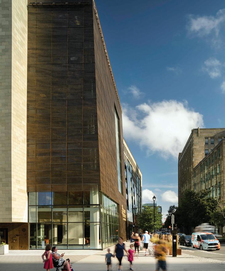
The Ontario Court of Justice, designed by NORR in partnership with Renzo Piano Building Workshop as part of the EllisDon Infrastructure Team, has opened in downtown Toronto.


The new 17-storey courthouse includes 63 courtrooms, 10 conference settlement rooms, and associated support facilities. The project is the largest courthouse in Ontario and the most accessible courthouse in the province, according to the provincial government. The building incorporates elements that include barrier-free prisoner boxes and witness boxes, and signage in Braille.
The design features an exterior of layered embossed metal panels, wood frames and low iron glass, a 20-metre-tall transparent atrium surrounded by a minimalist cable-supported façade, and a 90-metre architectural mast that marks the judicial precinct, aligning to the east portico of Osgoode Hall and the northern terminus of York Street.
“The design concept is defined by a desire to reimagine the institutional building and the courthouse in particular as an integral civic component within the city that is accessible, dignified and independent,” says NORR. “As a team, we have been able to create a facility that acknowledges the significant history of the site, while also looking to the future.” norr.com
AGO reveals new expansion
The Art Gallery of Ontario (AGO) and its architectural partners Diamond Schmitt, Selldorf Architects and Two Row Architect, have re-


vealed designs for the Dani Reiss Modern and Contemporary Gallery, the museum’s expansion project.

The 3,716-square-metre expansion will sit one story above the AGO’s existing loading dock, and connect to its current galleries from four locations. The development will include at least 13 new galleries across five floors, increasing the AGO’s total space available to display art by 30 percent.


Neil Campbell Rowing Centre, Port Dalhousie, Ontario
Neil Campbell Rowing Centre, Port Dalhousie, Ontario



Architect: MJMA + RAAI
Architect: MJMA + RAAI




Structural: Blackwell
Structural: Blackwell
Contractor: Aquicon
Contractor: Aquicon




Photographer: Scott Norsworthy
Photographer: Scott Norsworthy

NEWS CANADIAN ARCHITECT 04/23 06
ABOVE The newly opened Ontario Court of Justice was designed by NORR in partnership with Renzo Piano Building Workshop.
COURTESY NORR AND RPBW
The AGO describes these new column-free galleries as “highly functional” and “very flexible to display the works of today’s great modern and contemporary artists, and adaptable to the needs of future generations of artists working across all media.”
Dani Reiss, Chairman and CEO of Canada Goose, member of the Order of Canada and an art collector, gifted the AGO $35 million one of the largest gifts in the museum’s history to launch the $100-million project.
The all-electric building will seek CAGBC Zero Carbon Operating Building certification, making it one of a very small number of museum spaces to accomplish this, and will be built to Passive House standards. Construction is expected to begin in 2024. ago.net


AWARDS
Brian MacKay-Lyons appointed to the Order of Canada
MacKay-Lyons Sweetapple Architects Principal Brian MacKay-Lyons has been appointed to the Order of Canada. He is cited for “his contributions to architecture, notably through his vernacular designs that celebrate Nova Scotia culture.”
MacKay-Lyons is the 40th architect to have been honoured with this investiture in Canadian history.
The 85 newest members of the Order of Canada were announced by Canada’s Governor General, Mary Simon, on December 29, 2022. The Order of Canada, created in 1967 by Her Majesty Queen Elizabeth II, was made “to honour people whose service shapes our society, whose innovations ignite our imaginations, and whose compassion unites our communities.”
MacKay-Lyons will be presented with his insignia at a future investiture ceremony, with the date to be determined.
www.gg.ca


Phyllis Lambert awarded Ada Louise Huxtable Prize

Phyllis Lambert, architect and founder of the Canadian Centre for Architecture, has been named this year’s recipient of the Ada Louise Huxtable Prize, presented by The Architectural Review and The Architects’ Journal.
The Ada Louise Huxtable Prize for Contribution to Architecture “recognizes individuals working in the wider architectural industry who have made a significant contribution to architecture and the built environment.”


In the 1950s, Lambert commissioned and worked with Mies van der Rohe to design the Seagram Building; she founded the Canadian Centre for Architecture (CCA) in 1979.
Lambert’s latest book, Observation Is a Constant That Underlies All Approaches, launched in January, and she is currently working on her next book, How Does Your City Grow, which will be published later this year. w-programme.architectural-review.com
Polygon Gallery selected among MCHAP finalists


Mies Crown Hall Americas Prize (MCHAP) has announced the Polygon Gallery by Patkau Architects among the six finalists for the 2023 Americas Prize.
The 2023 Americas Prize recognizes the best built work in the Americas completed between December 2018 and June 2021. The selection
Blackwell’s Board of Directors is excited to announce the appointment of Brooke Guzar as the company’s inaugural CEO. Brooke comes into this pivotal position at an exciting time for Blackwell as we implement our current Governance Policy and invite new Principals into the leadership team.
Blackwell’s Board of Directors is excited to announce the appointment of Brooke Guzar as the company’s inaugural CEO. Brooke comes into this pivotal position at an exciting time for Blackwell as we implement our current Governance Policy and invite new Principals into the leadership team.

Brooke Guzar is a highly experienced structural engineer with over 15 years of practice in various areas including bridges, institutional buildings, sculptures, and custom residential work. She has experience leading multidisciplinary teams and is passionate about strategic planning, employee engagement, and effective project delivery.
Brooke Guzar is a highly experienced structural engineer with over 15 years of practice in various areas including bridges, institutional buildings, sculptures, and custom residential work. She has experience leading multidisciplinary teams and is passionate about strategic planning, employee engagement, and effective project delivery.
“It’s a privilege to step up and serve a company I care deeply about.” Guzar says. “Blackwell is a community of incredibly creative professionals who are inspired by the projects we work on and teams we get to work with. We have a unique ability to shape the built world and we do that with consistent care for our people, planet, and profession. As CEO, I will strive to enable Blackwell to achieve even greater success in fulfilling our passion for structural engineering and to support our collective drive towards excellence, learning, and belonging in all that we do.”
“It’s a privilege to step up and serve a company I care deeply about.” Guzar says. “Blackwell is a community of incredibly creative professionals who are inspired by the projects we work on and teams we get to work with. We have a unique ability to shape the built world and we do that with consistent care for our people, planet, and profession. As CEO, I will strive to enable Blackwell to achieve even greater success in fulfilling our passion for structural engineering and to support our collective drive towards excellence, learning, and belonging in all that we do.”
www.blackwell.ca
www.blackwell.ca


CANADIAN ARCHITECT 04/23 07
and announcement of the six finalists concludes the jury’s tour of the project sites. The visits included interviews with the architects, their teams, and the project clients.
Located in North Vancouver, the Polygon Gallery is home to an independent photography and media institution that has served its creative community for nearly 40 years.
The authors of the winning project will be recognized with the MCHAP Award, the MCHAP Chair in IIT ’s College of Architecture, and $50,000 to fund research and a publication. www.mchap.co
WHAT’S NEW
AIBC transitions to Professional Governance Act
The Architectural Institute of British Columbia (AIBC) has officially transitioned to the Professional Governance Act (PGA). The Architects Act was repealed on February 10 and superseded by the Professional Governance Act and its regulations.
The transition will not bring any substantive changes to professional standards or how firms and individual registrants are regulated. The AIBC will continue to exist as a statutory corporation, and regulate the profession of architecture in the interest of the public. All applications, complaints and ongoing matters submitted prior to February 10 will follow the current processes under the Architects Act, until they are completed. The major component of the AIBC ’s transition to the PGA has been the development of new bylaws which meet the requirements of the PGA , and several draft suites of bylaws are currently available on the AIBC website for review.
One of the largest transition activities has been updating the AIBC ’s suite of documents and resources. Over the coming months, the AIBC will continue to update key regulatory documents and the website, and in the meantime, registrants should look to the Professional Governance Act and its Regulations, as well as the new AIBC Bylaw document. www.aibc.ca
LETTERS TO THE EDITOR
On the Value of Awards
Our editorial in December 2022 generated an ongoing discussion on the RAIC Connects (raicconnects.raic.org) forum. Here is a selection of the responses.
Award programs in architecture appear to exist, like design competitions, as a self-evidently precious and essential feature of the professional architectural ethos and “mind-scape.” Given how much effort is invested in awards programs, I am curious about their value and meaning to the community.
In principle, whatever “value” is to be claimed and/or attributed to architectural awards would have to be predicated on what meaning(s) they are specifically intended (and specifically not intended) to convey, as well as on due consideration given to whether or not they are effective enough as means towards an end acknowledged to be worthy of pursuit.
Architectural awards programs all claim to produce eminent indicators of “excellence” being achieved in building projects. Remarkably though, the set of criteria and metrics for excellence is at best remarkably fuzzy and variable, and rarely (if at all) anchored to a reliable
Great exteriors start here
Exceptional designs begin with high performance, beautiful masonry products. Our premium Architectural Series brick provides an incredible palette of colours and finishes that pair beautifully with Arriscraft’s natural Adair® limestone and diverse Building Stone styles. Be free to create unique designs with lifetime performance from our broad selection of brick.
Download our new Architectural Series Brochure: canadabrick.com/resources
CANADIAN ARCHITECT 04/23 08 NEWS
CANADA
ARRISCRAFT ADAIR LIMESTONE
ARCHITECTURAL SERIES BALLYCROY &
Bridgewater Residences on the Lake and The Pearle Hotel & Spa Architect: IBI Group | Photo: ARC Creative
framework for the evaluation of post-occupancy/use performance (functional, environmental, societal) levels and impact.


Most awards programs are conducted as a yearly competitive process where “winners” get designated. Is the purpose of highlighting “excellence” in architecture best being served by an annual tournament? Aren’t there perverse effects of that approach, that might cause one to wonder if those competitions turn out producing more harm than good to the pursuit of excellence in building projects, by creating hordes of “losers” for every “winner”?
By recent and not-so-recent experience, I believe Lam is correct in pointing out that awards received do carry significant weight in the evaluation by clients of architects’ qualifications, both in reference to a firm’s general profile and to project experience quoted as specifically relevant to RFPs against the requirements of the specific clients’ project undertaken. The practice is also common in the process of pre-qualification of service providers for open agreement type services arrangements and, also remarkably, for the shortlisting of architects invited to prepare a submission in architectural design competitions.


Do awards inform clients on qualifications specifically relevant to the nature of projects undertaken? Do they dependably inform clients on the nature, scope and depth of the set of professional skills, competencies, proficiencies and reliable availability thereof against the level of quality reasonably expected, if not critically required, in both performing services to be provided and of the output(s) of the work foreseeably to be delivered? Or are they simply presumed to be reliable evidence about the foregoing?
I don’t think anyone can argue without reservation the proposition that such expectations from the public are actually being met, and can be demonstrated in the basis of intelligibly lucid, clear, unambiguous criteria and metrics.


—Author’s name withheld by request
Architecture awards are a kind of coin that some of us trade in. We collect them and our reputation is to some degree dependent on them. However, although there may be some awards that do not depend on submissions by the architect who wants to be awarded or on a kind of club or acquaintance circle to facilitate trust and recognition that the award’s merit will be supported by the receiver I do not know of such awards in architecture.
My own experience is that most juries or selection committees are sincere, but that the ability to truly understand whatever is looked for within architecture for the specific award is not given to many people. The lack of real confirmed merit is pushed upstream, with the awarding institution or function preloading requirements and expectations such that need for such understanding is preempted by narrow given requirements. These tend to circle back to expectations based in the past, and forward-looking enquiry is very much reduced.
Once in a while, the quality and merit of a winner or awardee makes awards seem worthy.
—Michael Karassowitsch


Our new collective book The Rise of Awards in Architecture (Vernon Press, 2022) offers some possible answers to this current riddle.
The book is the first scientific study to focus on awards in architecture and the built environment, investigating their exponential growth since the 1980s. The celebration of excellence in architecture and related fields remains a phenomenon on which there is strangely little scientific scrutiny. What is to be understood from the plethora of award-winning projects, award-winning buildings and awarded professional practices in the built environment, year after year? Glossy images partake in an intense ballet at every local, regional, national or international award ceremony
CANADIAN ARCHITECT 04/23 09
Photo: Mendoza Photography
Aluflam has a complete offering of true extruded aluminum fire-rated vision doors, windows and glazed wall systems, fire-rated for up to 120 minutes. Available in all architectural finishes, our products are almost indistinguishable from non-fire-rated doors and windows. You won’t have to compromise aesthetics to satisfy safety regulations.
Fire Resistant. Design Consistent. Aluflam North America 562-926-9520 aluflam-usa.com
Fire-Rated Aluminum Window And Door Systems
and they are meant to embody proofs of architectural excellence. However, it is necessary to take a critical distance to question what awards are meant to embody, symbolize, and perhaps measure.
Each of the 10 chapters in our volume is centered on one question related to themes as varied as the comparison of Pritzker and Nobel Prizes, the Prix de Rome, the redefinition of quality through awards, green awards and sustainability, the multiplication of sustainable awards, heritage awards, architecture book awards, the awarding of school architecture, awards as mediations, and awards as pedagogical devices. Many fields, once consolidated, have featured a sharp increase in related prizes. The original data, compiled and summarized in four appendices, cover more than 150 award-granting organizations in some 30 countries. Our inventory includes upwards of 24,000 prizes awarded at more than 3,100 events, the earliest of which is the first instance of Western architecture’s seminal Grand Prix de Rome in France in 1720.
A history of contemporary architecture is thus written through press releases that praise the merits of the heroes as much as their works and achievements. And while awards can be vehicles that propel architecture forward, they can also be Trojan horses in an era that is constantly on the lookout for event-driven products, small and big news, and brand imaging.
—Jean-Pierre Chupin, Université de Montréal
An alien coming to earth, if they only had access to award-winning buildings as exemplars of human shelter, would conclude we mostly inhabit museums, concert halls and country houses.
Let’s acknowledge, truthfully, that for the most part, architecture awards are for staged photos of expensive buildings made for ambitious
clients by architects from big cites that specialize in that sort of thing. Most architects don’t specialize in that sort of thing.
The logic of awards means that they are incapable of recognizing the fact that, for most clients and situations, buildings involve a myriad of important concerns outside of those that the awards program concerns itself with. Awards are for best-looking flowers, and most of us are growing the potatoes that feed people.

To be clear, I freely acknowledge that the buildings that get awards are often truly extraordinary, in their way. Like the way ballet is extraordinary. Precise, demanding, beautiful, graceful an amazing accomplishment. But most buildings are incapable of being like that like most people are incapable of being ballet dancers as it is, and as it should be.
As a consequence of the logic of design awards programs, which are capable of only recognizing certain kinds of buildings, there are entire other classes of buildings (warehouses, supermarkets, tract housing) and classes of types of valuable work in architecture (programming, advising, technological research) that are pretty much excluded from our collective, critical understanding of contemporary architecture.
—Martin Tite
IN MEMORIAM
Essy Baniassad, 1936-2023
“All culture derives from the poor.” Dr. Esmail Baniassad
It is an honour to offer this tribute to Dr. Essy Baniassad, an inspirational teacher and dear friend of mine from 1977 to 2023. I often think of the many lessons that he taught me about a life in architecture. I am certain that he similarly touched so many of us.

Essy Baniassad grew up in Tehran, the son of a brick mason. As a young man, he left Iran after nearly being killed by the Shah’s police. He went to the US and studied architecture at The University of Illinois, UrbanaChampaign, as a way of learning the English language. He received his Ph.D. in architecture at the University of Manchester. After teaching architecture in Manchester, England, Essy served as a visiting professor at The Nova Scotia Technical College (TUNS) Faculty of Architecture.
I first met Essy as my thesis advisor at TUNS in 1977. Just after graduation in 1978, while wandering aimlessly in a park, I came across Essy, who immediately challenged me to an impromptu running race
CANADIAN ARCHITECT 04/23 10 519.787.2910 • Wind • Snow • Exhaust • Odour • Noise • Particulate • Ministry Approvals • CFD A nalysis spollock@theakston.com www.theakston.com NEWS
DALHOUSIE UNIVERSITY
in his socks: “Let’s race around that apple tree and back.” He was always a free spirit, with both a childlike quality and a remarkable intellectual rigour. One might see Essy alone on a Sunday morning, walking down the street, playing with a piece of string, or emerging from the fog on his windsurfer. From 1980-1994, as Dean of Architecture and Planning at what is now Dalhousie University, Essy designed an architecture curriculum, built upon his doctoral dissertation, which encompasses the complete discipline of architecture. Today, that curriculum remains intact and vital at Dalhousie. In 1982, while I was completing my graduate studies at UCLA , Essy offered me a teaching position, and the opportunity to return to my native Nova Scotia. When I said that I must first go to Italy and work with Giancarlo DeCarlo, he said “Go what is good for you is good for the school.”
Essy inspired many through his wisdom and insight. Each September, Dean Essy would say to the incoming first-year architecture students, “Don’t let the school stand in the way of your education.”

To the faculty, he would say, “In architecture, there is much to learn and little to teach, but what can be taught can be taught clearly.”
To me as a young practitioner, he would say, “I suggest that you fashion your practice after that of Frank Lloyd Wright.” When I was con-
man of the Department of Architecture from 2000 to 2005 and then Chair Professor from 2006 to 2007 at the Chinese University of Hong Kong (CUHK).


Essy traveled the world with his sketchbook, using his fine drawing hand as a way of reading cultures. He taught me strategic observation by drawing landscapes from a fast-moving automobile. His life’s research in community development took him to South America, where he was kidnapped by the Shining Path guerrilla group, and was later shot and almost died in Lima, Peru. Undaunted, he also ventured to Africa, where he started an architecture program in Botswana. While speaking with the university president in Botswana, he was told that there could be no new architecture school there due to the lack of funds. In response, Essy said, “Do you have dirt? Do you have a shovel? If you give each student nine square metres of dirt and a shovel, you can have the best school of architecture in the world.” It was Essy’s view that an institution needs to grow its own leaders. From this emerged an exchange program between the University of Botswana and Dalhousie University. At a personal level, his irreverent attitude toward architectural education inspired me to develop the Ghost design/build laboratory at our farm (1994-2011).
Two months ago, I spoke with Essy by telephone, from his hospital

SURFACES FOR life
CANADIAN ARCHITECT 04/23 11

Canada Journal
AIA Canada Awards Winners President’s Letter
Lara Presber Architect, AAA, AIA, CPHD, WELL AP™

Before there were formal architecture schools, one learned the profession via apprenticeship. I consider myself fortunate to have unknowingly chosen a program that was built on this foundation. At my alma mater, The Boston Architectural College, students were expected to work fulltime for a firm while completing studies and coursework in the evenings and on weekends. It was an intense path toward education—and eventually licensure—with the greatest reward being access to daily mentorship.
With today’s pathway to licensure, we have compulsory mentorship built into the internship process, but little in place that helps to meaningfully connect students with working professionals. Guest critiques at universities are invaluable, but fleeting. In contrast, some of my greatest learning experiences were the informal interactions that happened from day-to-day. Watching my mentor present and direct a client meeting to his desired outcome was vital learning that I could put into practice at my next studio review. I took for granted the access I had to an immediate army of support when I was faced with a seemingly impossible design problem. The desire for mentorship gave me the confidence to start conversations with individuals who had senior roles in the firm, often leading to additional learning and growth.
Each year, the AIA Canada Society looks at ways to facilitate connecting emerging professionals (students, recent graduates, and those pursuing licensure) to seasoned architects, and to each other. This year, for the first time, we are publishing the winners of the student awards category of our annual awards program. The intention is to celebrate the achievement of these individuals, and also to inspire other students and professionals with the level of thinking that’s occurring in our schools. April is also the annual kick-off of the 10-month-long AIA International Mentorship Program, connecting emerging professionals with experienced ones across the globe. I invite you to join this mentoring initiative; details to register can be found under the News tab of our website. Let it be the opportunity to start a conversation with someone that you may not have had occasion to speak with before.
The AIA Canada Awards program runs annually each fall to recognize best practices, innovative thinking, and design excellence in the work of AIA Canada members and future design professionals.
The awards program includes the AIA Canada Student Architecture Awards, whose top prize is a scholarship of $2,000 USD. These awards celebrate exceptional work by students and recent graduates in the fields of Architecture, Interiors, Planning, Landscape and Urban Design.

Two winners from the professional awards are selected to participate in the 2023 AIA International (AIAI) Awards Program.
The 2022 awards invited entries in the categories of Architecture, Interior Architecture, Special Projects, Urban Design, Community Engaged Design, Open International, Unbuilt Works, and Student Projects.
The AIA Canada Society announced the winners at its 4th Annual General Meeting on November 23, 2022.
Turn the page to meet this this cycle’s two jurors and to see the winning projects.
Open Call for Mentors and Mentees to participate in the AIA International Mentorship Program
Register for the global mentorship program matching emerging professionals with seasoned AIA members:
• 10-month-long program
• Quarterly and monthly large and small group settings
• Open to students, recent graduates, those pursuing licensure and architects
• Cross-continental networking opportunities
• Gain professional development, learn leadership strategies, and learn how to enhance workplace culture in this global profession
Call for Volunteer Treasurer
AIA Canada is seeking a treasurer to be part of the Board of Directors. The term of the position runs until December 2024.
Please contact info@aiacanadasociety.org with expressions of interest.

13
NEWS
Canadian-born and -trained architect Jennifer Luce, FAIA, has developed her multi-disciplinary architectural practice, LUCE et studio in Southern California over three decades. The firm’s recent work includes civic and arts institutions, creative workspaces, and residential design in urban and rural contexts. Jennifer began her career winning an international design competition for the Center for Innovative Technology, Washington DC. It became the first smart building in the US, executed as a partnership between Virginia Academic Institutions and the Virginia State Government.

AIA Canada Awards Winners
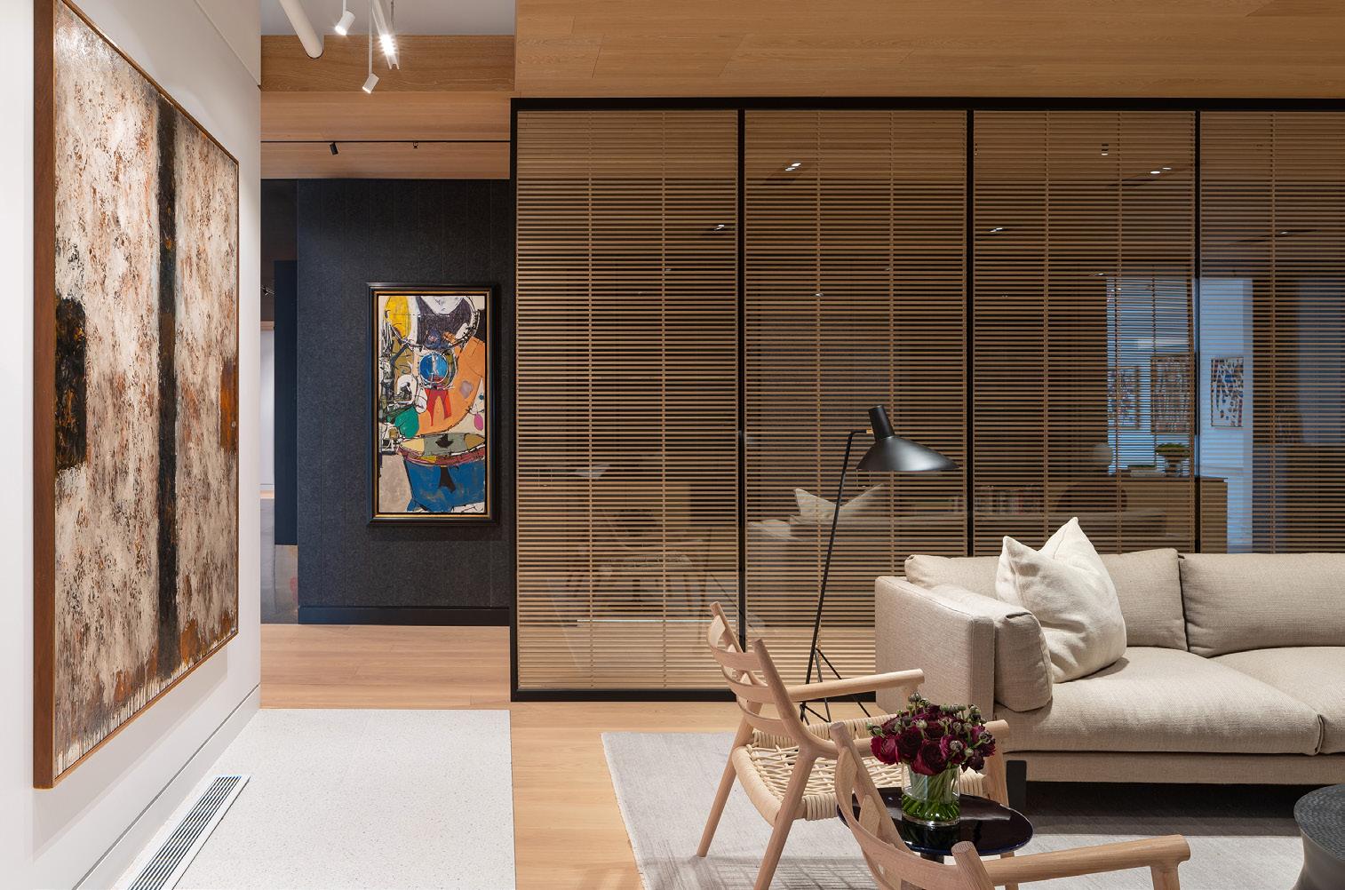
Pierre Baillargeon is an internationally renowned architect with over thirty years of experience in the design and delivery of major developments worldwide. As an industry leader in architecture, city regeneration and real estate, he has a reputation for innovation and delivering excellence in terms of design and value for commercial, institutional and government clients. In 2007, Pierre established Mixity in London, UK, on the belief that true innovation grows from a focus on the global experience, sustainability and working in collaboration.

AIA Canada Journal 14
Jennifer Luce FAIA Principal Architect, Luce et studio
Pierre Baillargeon AIA Managing Director, Mixity Studio
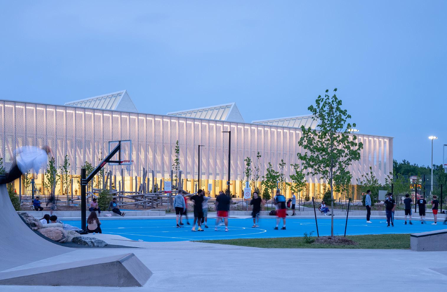
Churchill Meadows Community Centre and Sports Park, Mississauga, Ontario MJMA Architecture & Design
Polar Capital Asset Management Partners, Toronto, Ontario MJMA Architecture & Design
EXCELLENCE - Architecture
EXCELLENCE - Interior Architecture
SCOTT NORSWORTHY SCOTT NORSWORTHY
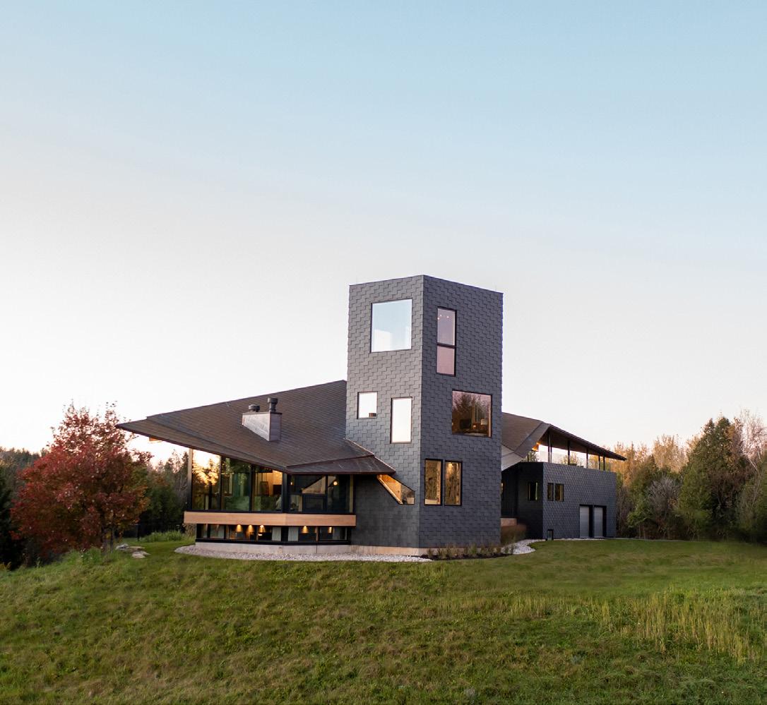
MERIT - Architecture
HONOURABLE MENTION - Architecture
m.o.r.e. CLT Cabin, Wakefield, Quebec
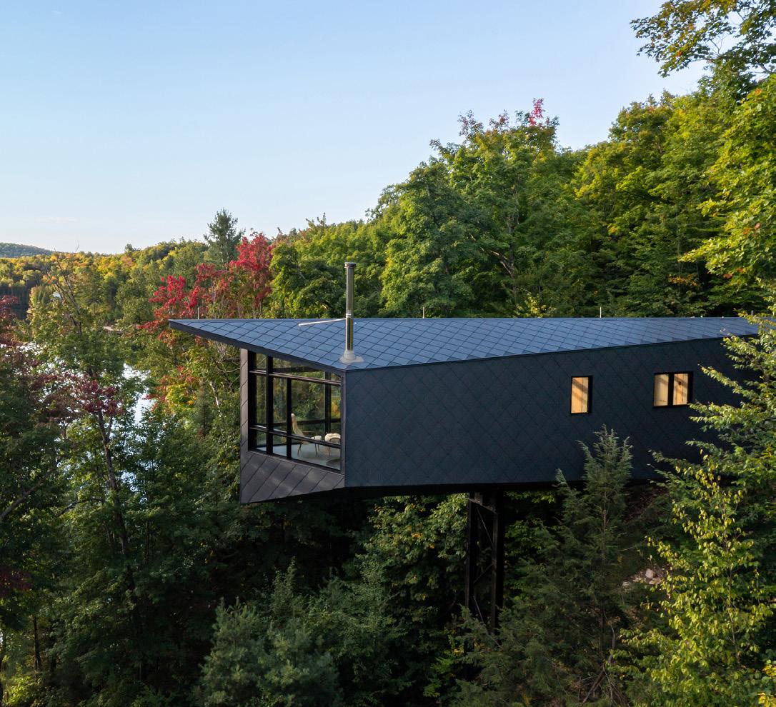
CITATION - Architecture
Forest Retreat, Caledon, Ontario
HONOURABLE MENTION - Unbuilt
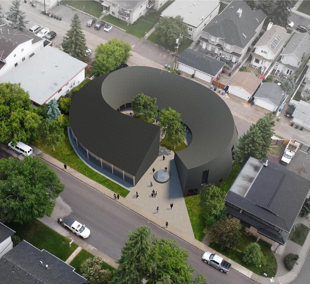
AIA Canada Journal 15
Kariouk Architects
Kariouk Architects
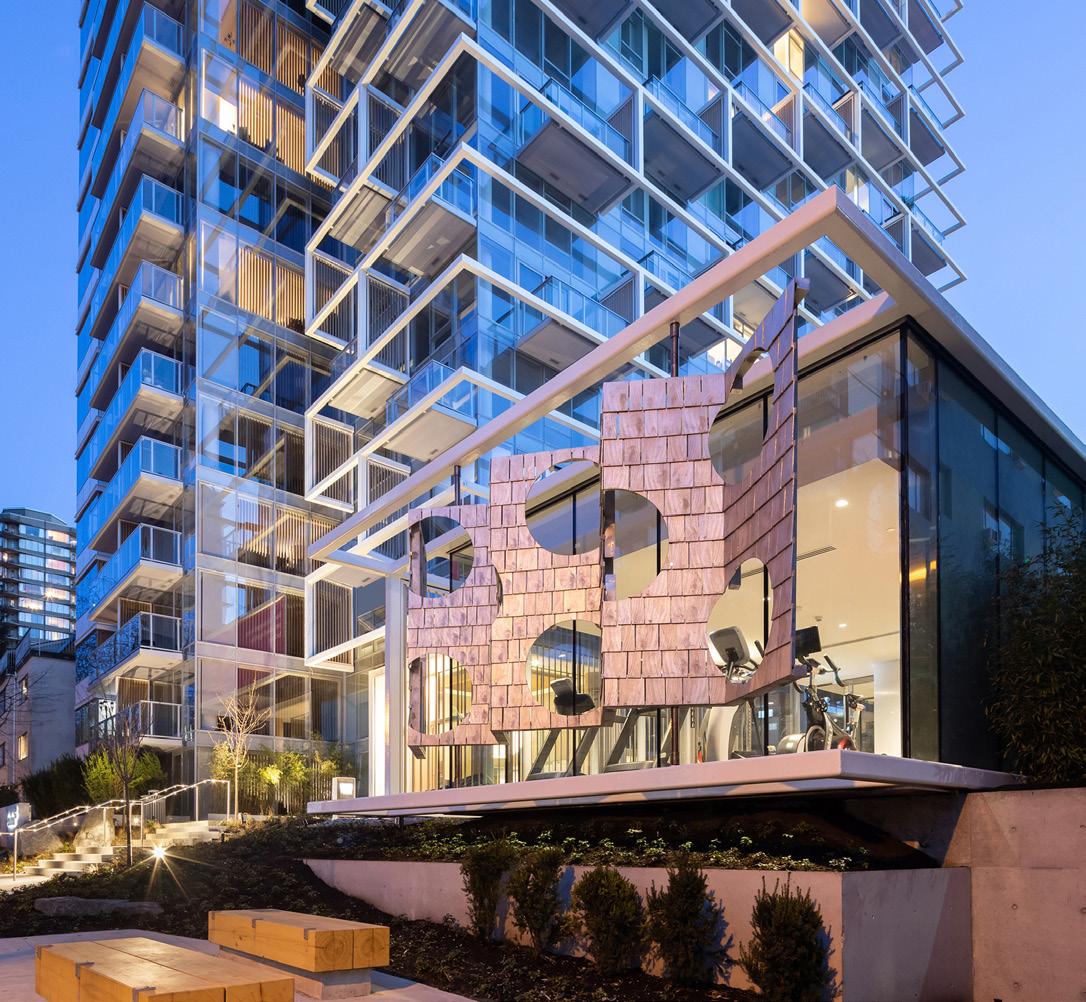
1770 Pendrell, Vancouver, British Columbia Henriquez Partners Architects and Leckie Studio (Interior)
SCOTT NORSWORTHY
SCOTT NORSWORTHY EMA PETER PHOTOGRAPHY
Calgary Japanese Community Centre, Calgary, Alberta Modern Office of Design + Architecture and Henry Tsang Architect
MODA + HENRY TSANG ARCHITECT
STUDENT - FIRST PLACE AND SCHOLARSHIP RECIPIENT
STUDENT - SECOND PLACE
STUDENT - THIRD PLACE
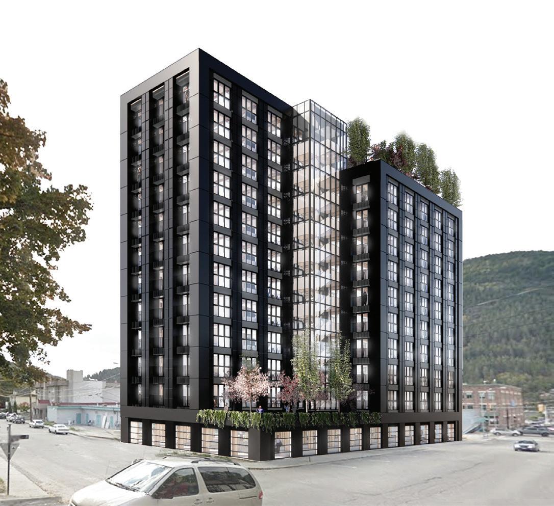

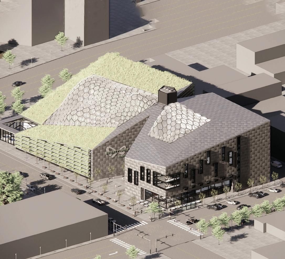

16 AIA Canada Journal
Infinity Farms Alexander Romanov - Lawrence Technological University
Student Affordable Housing Fangying Liu - University of British Columbia
The Impetus Jesse Martyn - Dalhousie University


HOUSING MULTITUDES
A RECENT EXHIBITION AND RESEARCH PROJECT REVISITS THE SUBURBS AS A PLACE TO ACCOMMODATE TORONTO’S GROWING POPULACE.
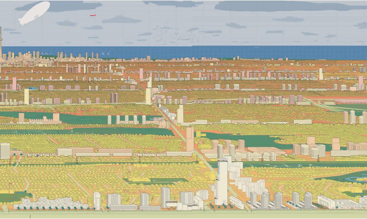
At a recent exhibition, a pastel-toned panorama filled the long front wall of the gallery at the University of Toronto’s John H. Daniels Faculty of Architecture, Landscape, and Design. The 23-metre-long rendering showed the city of Toronto’s skyline, set against Lake Ontario.
But instead of the regular from-the-lake vantage point, which highlights the soaring CN Tower accompanied by a host of skyscrapers, the viewer is placed north of the downtown core, past Highway 401. The forest of downtown towers is a speck in the distance: occupying the bulk of the image is a carpet of small houses.
The perspective serves to highlight the enormous footprint taken up by low-rise housing in the city the so-called “yellowbelt” of land zoned that way, which makes up half of Toronto’s buildable land. In the image, each of those parcels is marked by a monopoly-house-like yellow block. The city’s current and prospective towers, along corridors and at growth centres such as at Yonge and Eglinton, are coded in pink and cream.
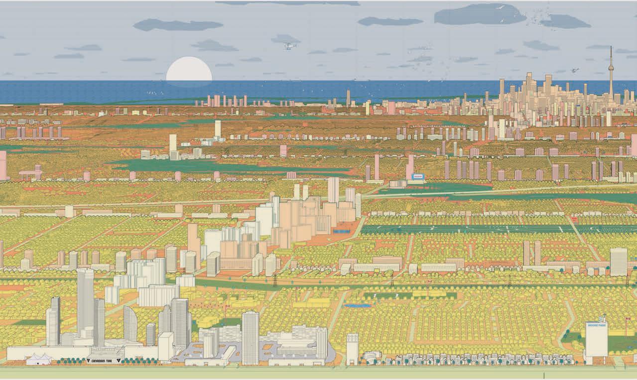
The graphic manifests the city’s “tall and sprawl” planning policy which encourages high-density towers downtown and along major arterial roads, set within a sea of individual houses. The accompanying exhibition and ongoing research project, Housing Multitudes, sets this model against the reality of a rapidly growing population: last year, almost 160,000 newcomers arrived in the GTA, and the city’s populace is set to grow by 50 percent in the next 25 years. How can the needs of both current and new Torontonians be better met by architecture and planning policy?
Curators Richard Sommer and Michael Piper, in collaboration with faculty colleagues and students, have offered an array of possible answers that build on existing tendencies in the yellowbelt, where intergenerational households and informal economies are evident. A set of animated videos imagines how a suburban house might change over time to accommodate multi-generational living; a series of graphic-novel-like renderings suggests transforming malls into public transit and micro-economic nodes; a planning map proposes the gradual transformation of existing neighbourhood blocks.
CANADIAN ARCHITECT 04/23 18
TEXT Elsa Lam
DRAWING Richard Sommer and Michael Piper
LONG VIEW
“A lot of contemporary research and practice about retrofitting the suburbs critiques this landscape for not being ‘urban’ enough, with not enough density nor active social space,” says Michael Piper. In contrast, he comments, “Our projects explore emergent forms of urbanity in the suburbs for example, how immigrant communities have reappropriated this landscape and produced new kinds of social space, or how retired citizens produce community by gathering in shopping mall food courts to play board games.”
A section developed by Piper and his students in partnership with LGA Architectural Partners explores the nuts and bolts of how to convert single-family homes, whether in downtown or suburban neighbourhoods, into multi-unit housing. Funded by the Neptis Foundation and also designed to continue after the exhibition, the display and an accompanying website, ReHousing.ca, offer a catalogue of typical Toronto housing types, along with blueprints for how they can be modified to add housing units. An inter-war semi, for instance, can be converted into
separate upper and lower units with interior renovations only, gain a third unit with a top addition, and add a fourth unit with a laneway house.
To further empower “citizen developers,” as Janna Levitt of LGA Architectural Partners calls them, the researchers are currently working with the major banks to enable the purchase and renovation of homes into multi-unit dwellings. This would open homeownership to prospective buyers who may need a rental unit to make their purchase viable, or who may wish to partner with a friend for a house purchase.
While it’s not the first (or last) exhibition on suburbia, Piper says that Housing Multitudes is different in aiming to meet Toronto where it’s at rather than proposing to tear it all down and replace it. “We hope the work will encourage policy makers and design practitioners to imagine suburban retrofits that learn from the existing landscape, amplifying its nascent urban qualities,” says Piper. This would result, he adds, “in what we think will yield a truly new kind of urbanism.”
CANADIAN ARCHITECT 04/23 19
FINDING COMMON GROUND
IN VANCOUVER’S KITSILANO NEIGHBOURHOOD, A DECO-ERA THEATRE’S RESTORATION IS ENABLED BY THE SENSITIVE DEVELOPMENT OF AN ADJACENT PARCEL.
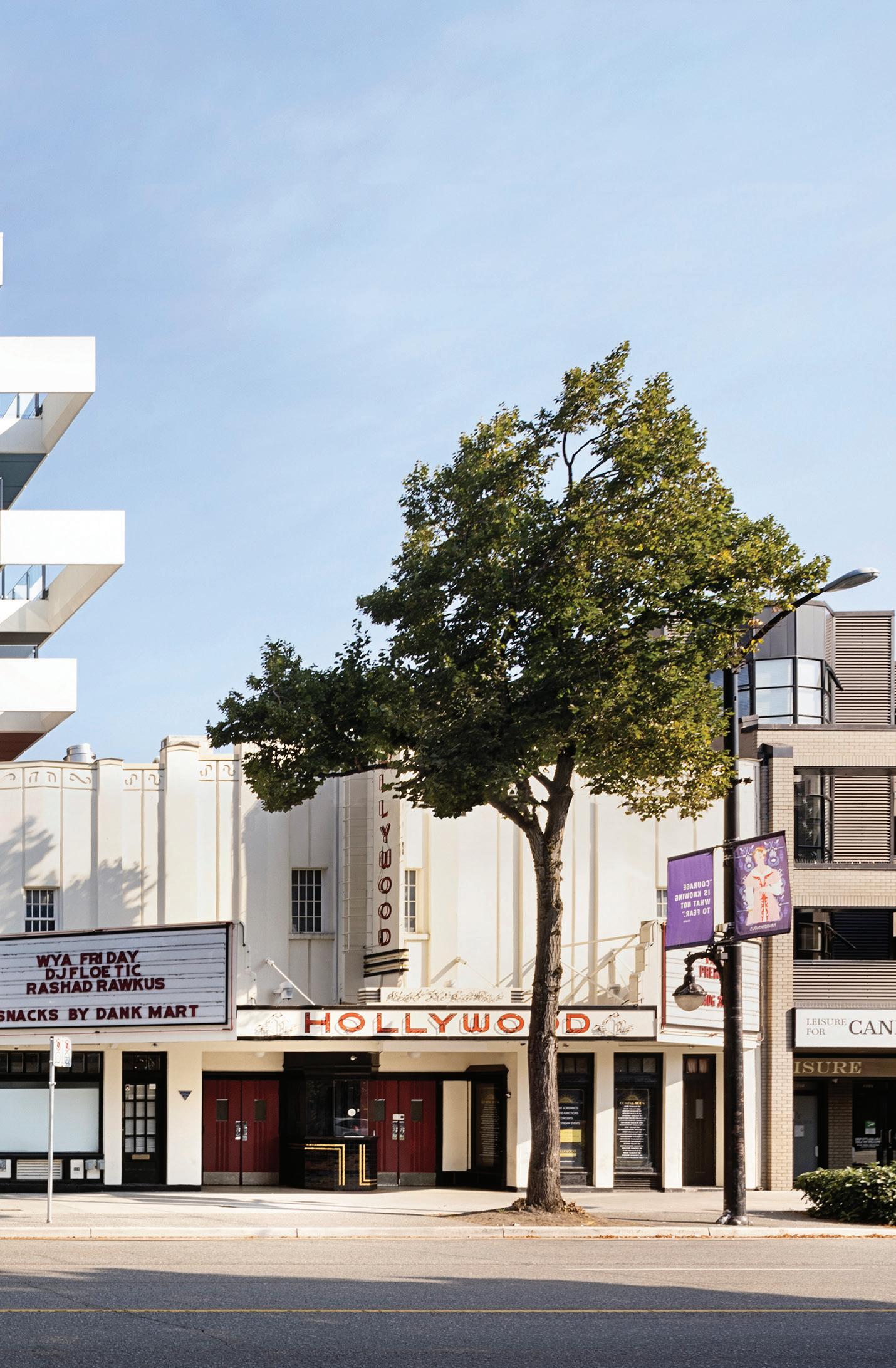
Down the street from where I recently lived in Vancouver, there’s a building that has long been a treasured local oddity. Designed by Harold Cullerne, the streamlined Art Deco Hollywood Theatre was built in 1935, boasting roofline hieroglyphic decorations, a black-andgold tiled ticket booth, and vibrant neon signage. It was a source of escapism for patrons during the Great Depression and remained a beloved family-run cinema for 76 years. After its closure in 2011, the theatre was leased to a church group and was then proposed to be turned into a fitness facility. But communities around the city came together in opposition, and plans for redevelopment were eventually scrapped. Recently, MA+HG Architects have stepped in to restore the theatre to its former glory, while adding rental housing to ensure the long-term viability of the site.
CANADIAN ARCHITECT 04/23 20
ARCHITECT MA+HG Architects TEXT
PROJECT Hollywood Theatre & Residences, Vancouver, British Columbia
Benny Kwok
The process of saving this beloved icon of the Kitsilano community was a collaborative effort between the city, the local heritage community, the arts and culture community, and the public at large. Through a series of workshops and ‘curiosity sessions’, everyone found common ground in their goal to preserve the building, including its original use and unique identity.
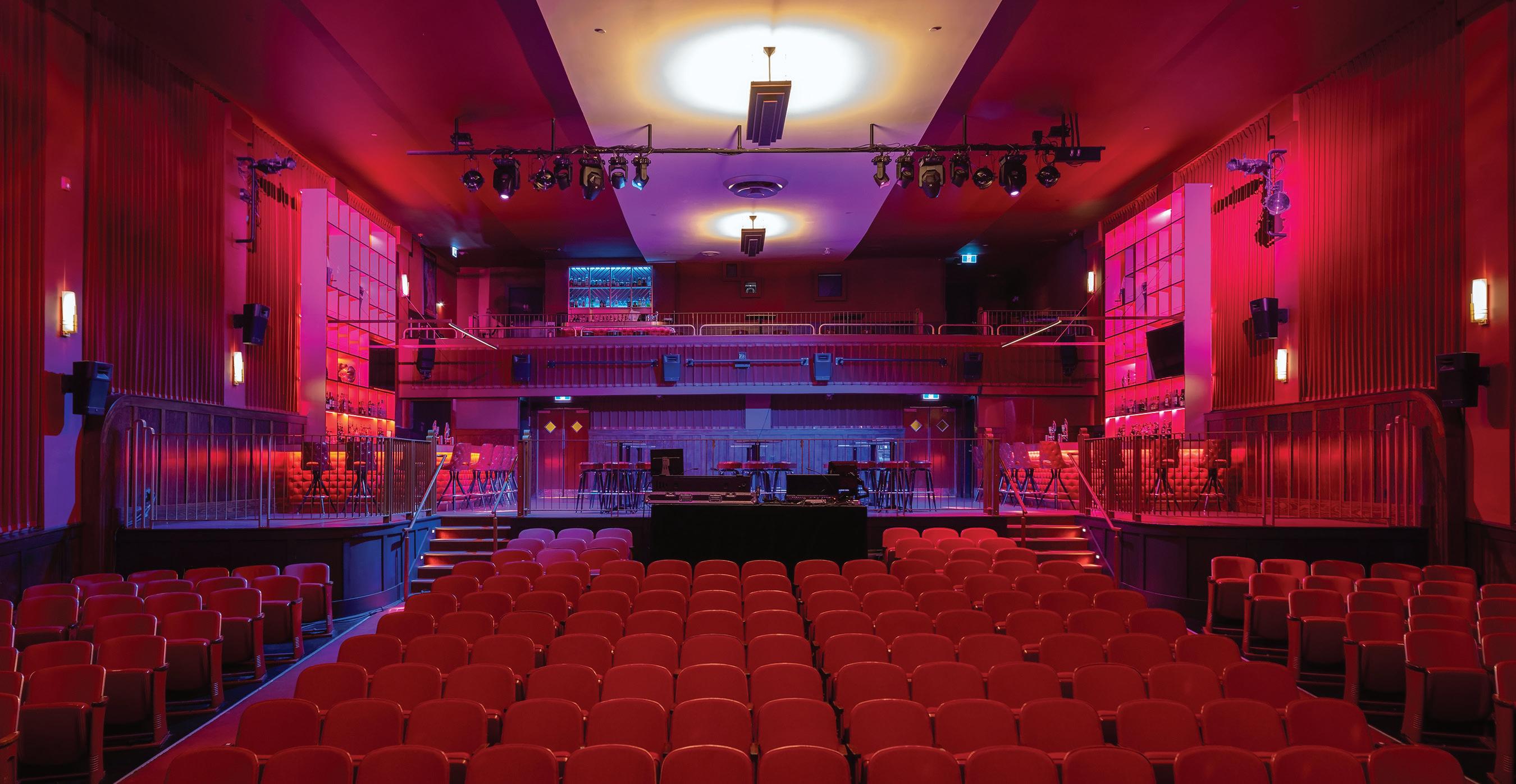
To achieve this, the theatre underwent significant upgrades, including the addition of adequate restroom facilities to maintain its status as a 650-seat venue. The Hollywood’s versatility was also emphasized, opening the possibility of hosting not just films and live acts, but also community gatherings. The renovations were executed with care to respect character-defining elements, such as through maintaining the original light troughs and restoring the building’s wooden wainscotting.
In the spirit of the Art Deco period, the new bars have a stylish yet understated design; red highlights appear throughout, a colour prominent in the original theatre. Behind the bar, film reels and curtains pay homage to the rich history of the building.
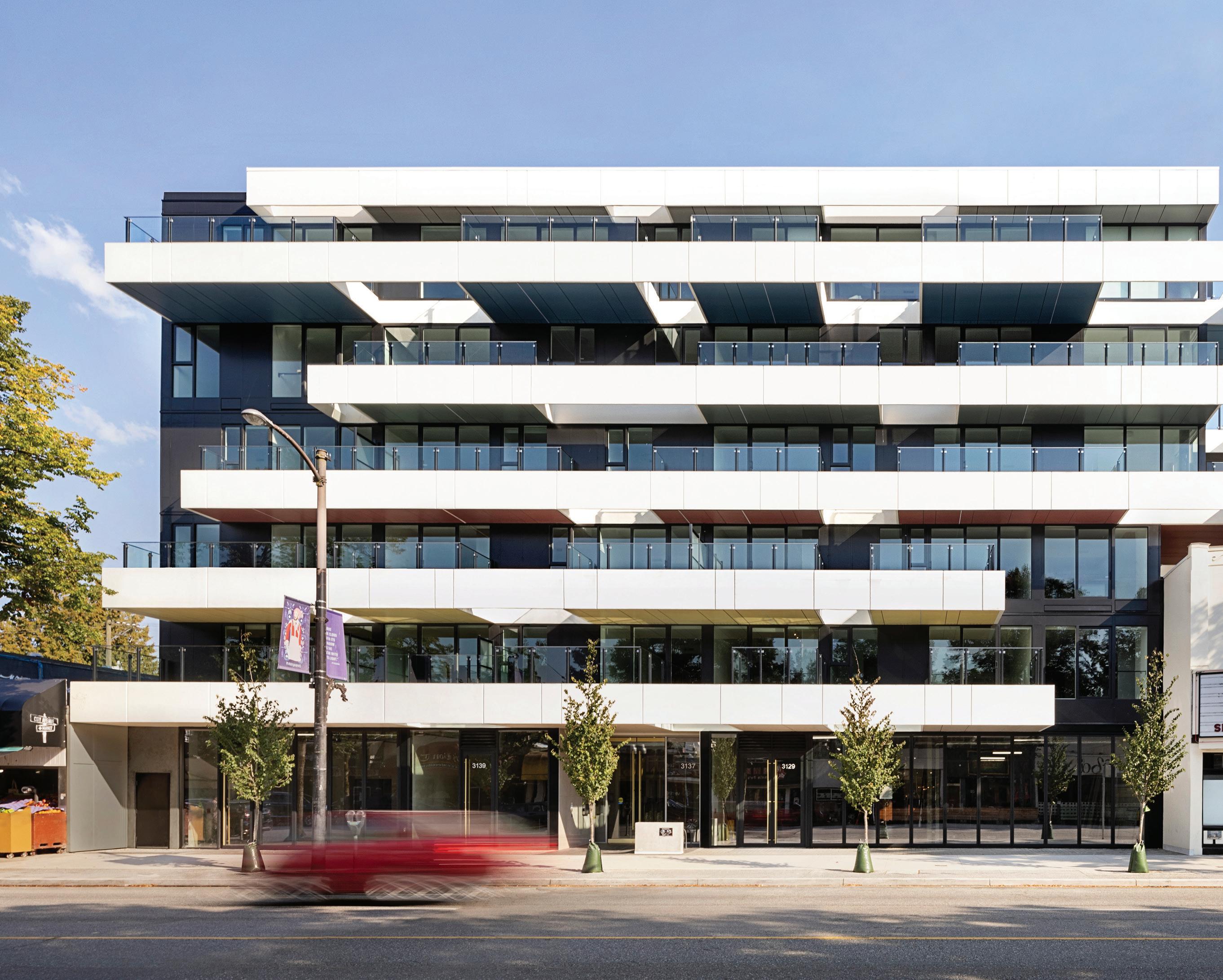
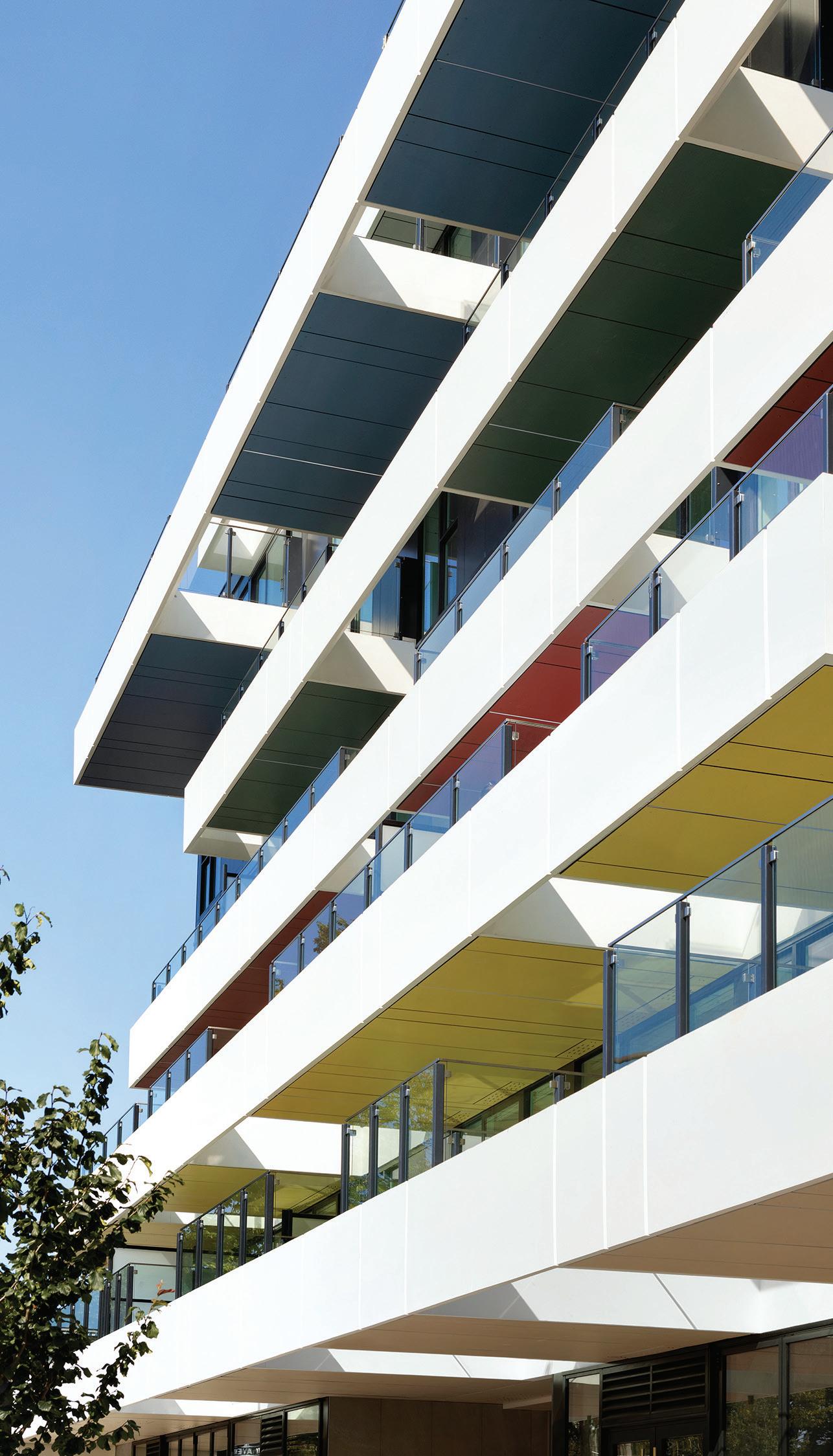
MA+HG also designed a six-storey mixed-use residential development on the neighbouring lot. Under a heritage revitalization agreement, the Hollywood property’s development potential was transferred to the adjacent property, together with additional bonus density that rewarded the restoration of the theatre. To showcase and use this relationship to full advantage, the condo block extends over the theatre, effectively gaining a third façade. This is an unusual opportunity on a commercial strip, where buildings normally only open to the front and back, and the added exposure allows for the inclusion of east-facing
CANADIAN ARCHITECT 04/23 21
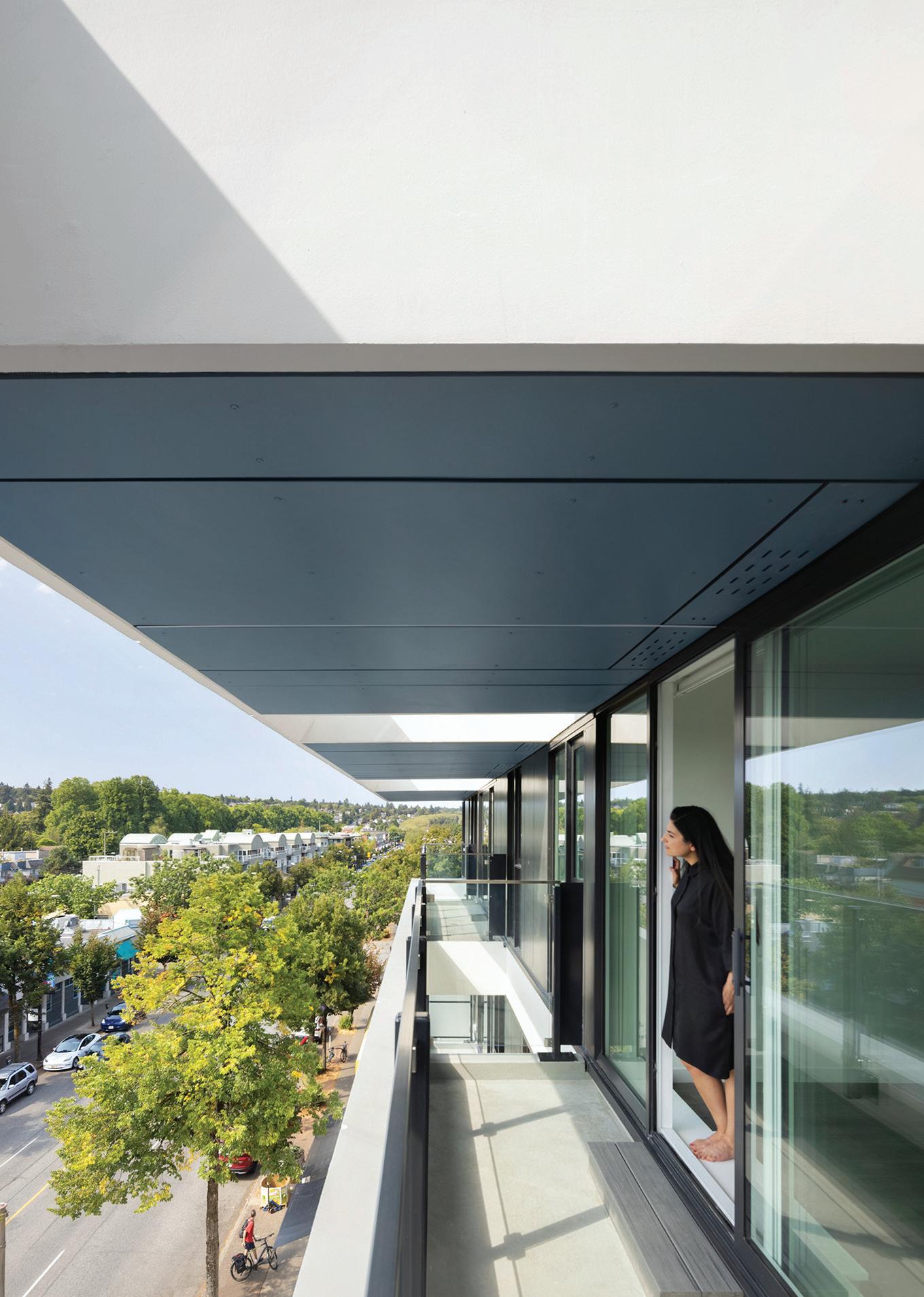
ABOVE LEFT The residential project reaches out over the theatre, expressing the synergistic relationship between the two parcels, as well as producing extra room for east-facing units—a rarity on a commercial street where most residences face either north or south. ABOVE RIGHT Colourful balcony ceilings give the building a refreshing presence for both residents and passersby.
EMA PETER
EMA PETER
units. The city emphasized the importance of lightness in the building’s corners, and this was achieved by staggering the condo’s balconies to visually open up its edges. The building has been constructed above the street in such a way that the shadow it casts falls primarily on Broadway, rather than the single-family residences behind it, minimizing its impact on the low-slung neighbourhood.
The two buildings were further stitched together by setting the residential block back 2.7 metres from the street, creating a prominent canopy that echoes the theatre’s marquee and draws attention to the sixmetre-tall Hollywood sign. In contrast to the vertical banding of the theatre, the residential portion of the project adopts a horizontal orientation, playfully accentuating the length of the site. The envelope of the new building was kept simple and box-like, with emphasis placed on height through tall front entry doors and a high-quality material palette. The balconies were allowed to have a slight dance-like effect, adding interest to the otherwise straightforward form. Its long horizontal bands are reminiscent of the fluidity “found in yachts,” according to design principal Marianne Amodio, or “a scarf blowing on a motorcycle,” with “a touch of Frank Lloyd Wright’s Fallingwater” as an inspiration.

The building is designed to be slightly deeper than usual because of its greater width, allowing for slightly atypical apartment layouts,
including studios that interlock with one-bedroom units, as well as over a dozen two-bedroom units and five three-bedroom units.
The Hollywood Theatre is a symbol of the community’s memories and heritage, and its restoration became a win-win: preserving the institution for future generations to enjoy, as well as enabling a more flexible approach to the adjoining residential development. The outcome is a unique and visually appealing pair of buildings that showcases the potential of imagination and innovation in design. While the theatre will always stand out as the “weirdo on the block,” it is also a testament to what can be achieved with community, creativity and conversation.
CANADIAN ARCHITECT 04/23 22
SEY
GRAL
ADVANCO ELECTRIC
HERITAGE
LUXTON & ASSOCIATES CODE JENSEN HUGHES CONTRACTOR BONNIS PROPERTIES | AREA 5,852 M2 | BUDGET WITHHELD COMPLETION AUGUST 2022
Benny Kwok is a project manager with Herzog & de Meuron, and is co-founder of Vancouver- and London-based Smll Studio. CLIENT BONNIS PROPERTIES ARCHITECT TEAM HARLEY GRUSKO, MARIANNE AMODIO (RAIC), LIND -
NETTE STRUCTURAL KOR STRUCTURAL | MECHANICAL INTEGRAL GROUP ELECTRICAL
INTE -
GROUP &
|
LANDSCAPE
PROSPECT & REFUGE |
DONALD
EMA PETER
ABOVE LEFT The horizontal line of the theatre marquee is echoed by the composition of the condo balconies. ABOVE RIGHT Staggered openings in the balconies create privacy for the individual units, while bringing additional light into the outdoor spaces. OPPOSITE TOP Stage curtains form a backdrop behind the theatre’s reimagined bar. OPPOSITE BELOW The restored theatre has been configured to allow for film screenings, as well as for other kinds of performances and community events.
EMA PETER

CANADIAN ARCHITECT 04/23 23 JANIS NICOLAY JANIS NICOLAY
20 YEARS FROM NOW, YOUR MIELE WILL STILL IMPRESS YOU.* QUALITY AHEAD OF ITS TIME


DISCOVER MORE AT MIELE.CA


* The final product and product life may vary based on level of use. For more information, visit Miele.ca
CANADIAN ARCHITECT 04/23 26
MARQUE
A NEW MIXED-USE DEVELOPMENT ON HALIFAX’S WATERFRONT DRAWS INSPIRATION FROM ITS MARITIME SITE.
QUEEN’S
RISING
PROJECT Queen’s Marque, Halifax, Nova Scotia ARCHITECTS MacKay-Lyons Sweetapple Architects (Design Architect and Urban Design) with FBM Architects (Prime Consultant)
TEXT T. E. Smith-Lamothe
In the 1970s, Halifax developer Ben McCrea transformed seven rundown waterfront warehouses into Historic Properties, a series of shops, restaurants and office spaces that reused the existing buildings. The project was part of a larger proposal to preserve the waterfront as a pedestrian district, developed by architectural firm Duffus Romans Kundzins Rounsefell, and set a precedent for the city’s valuation of its heritage fabric as well as of its harbourfront.
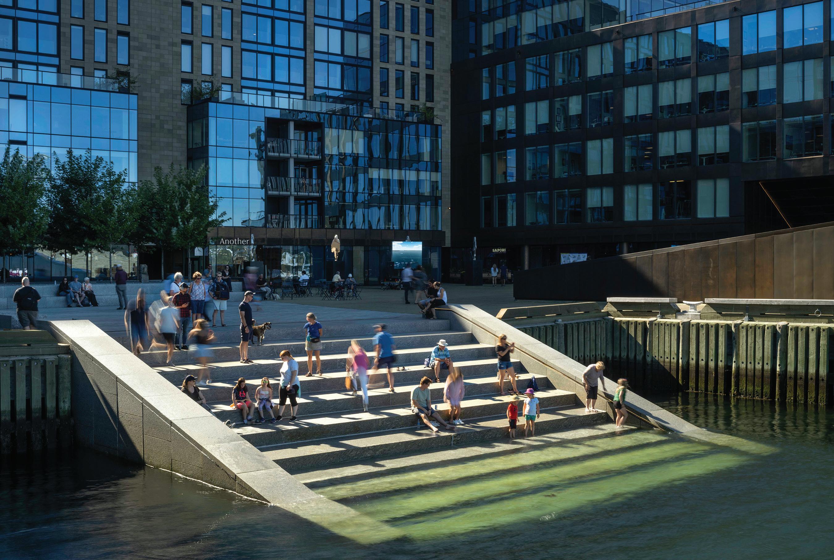
McCrea’s son, Scott Armour McCrea, has since become head of the family business, Armour Group. With Queen’s Marque, just steps down the shoreline from Historic Properties, he has aimed to create a new legacy a place that he hopes, in 30 years, Haligonians will regard with the same civic affection and pride.
“The goal was to create a quintessentially modern Nova Scotian place,” says McCrea, who engaged Halifax firms MacKay-Lyons Sweetapple Architects (MLSA) as design architect and Fowler Bauld and Mitchell (FBM) as Prime Consultant for the 41,800-square-metre project.
The development includes high-end shops, gourmet dining, luxe apartments, professional offices, a five-star hotel, and a large plaza. Fully twothirds of the development’s ground plane is open to the public. Multiple
street entrances, generous gateways, an amphitheatre, steps down to the water, and numerous artworks draw in passersby. As MacKay-Lyons remarks, “Urbanity has to do with diversity.” Durable materials sandstone, granite and bronzed metal cladding convey elegant permanency, and are sympathetic to other stone masonry buildings downtown, including the hilltop Citadel fortification. Using the best local talent and materials, McCrea wanted to infuse the project with, as he puts it, “the power of place.”
This was no easy task. The lot was leased for a 99-year term to Armour Group after it won a 2004 public call for concepts by the provincially owned Waterfront Development Corporation (now known as Build Nova Scotia). The long duration of the project meant that the developer
CANADIAN ARCHITECT 04/23 27
PHOTOS Nic Lehoux
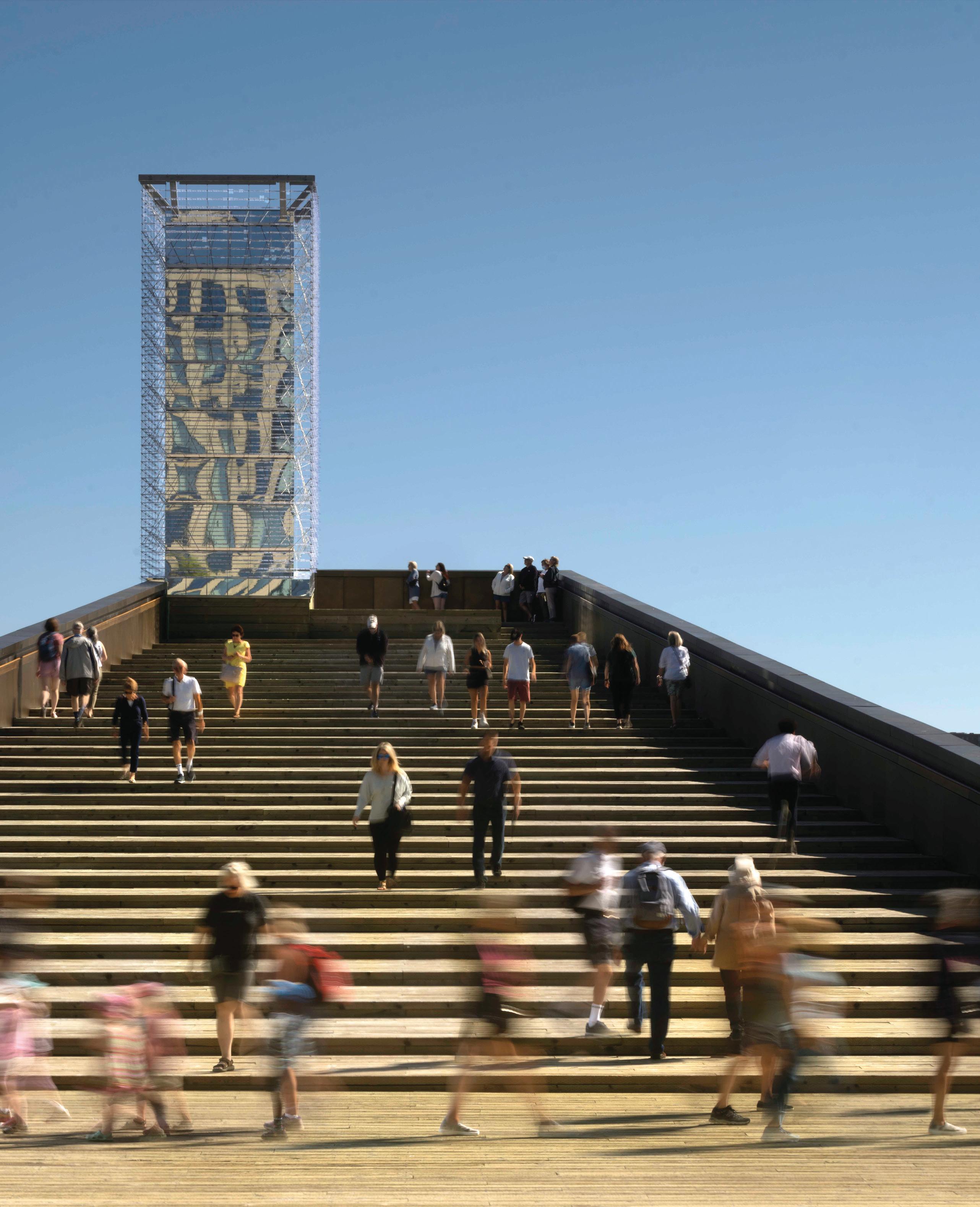
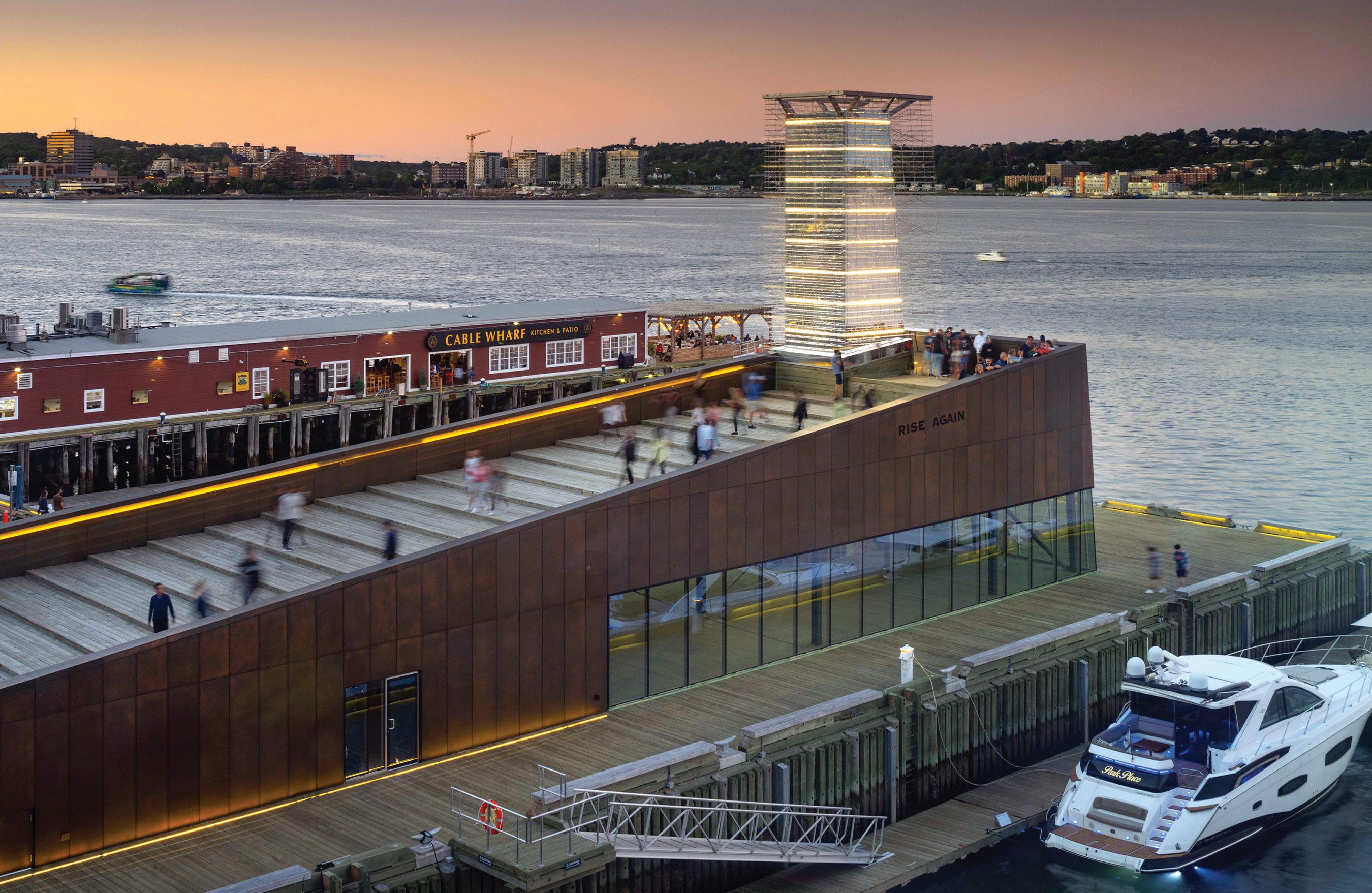
OPPOSITE Steps on the rooftop of the wedge-like Rise Again building, lead up to Ned Kahn’s Tidal Beacon and to panoramic views of the harbour. ABOVE From the central plaza of the new development, a companion set of shallow steps descends into the water, inviting visitors to dip their toes into the ocean.
and designers were challenged by building code iterations, evolving downtown planning bylaws, and supply-related snags.

George Cotaras of FBM declares, “In my almost 40 years as an architect, this was, by far, the most complicated project I’ve worked on.” A dense matrix of differing floor elevations, code classifications, elevator lobbies, exiting regulations and diverse materials called for hundreds of intricate, atypical drawings and intense administrative diligence over the ten-year span from design to opening. Additionally, the project was phased: with occupancy of the offices first, then residences, and then hotel, which mandated convoluted hoarding and exit access to maintain site safety. The result was worth the effort though, delivering a vibrant mix of commercial, hospitality, residential, office and public uses.
Architecture, a Team Sport


The complexity of Queen’s Marque entailed intense collaboration and innovation from all disciplines, including specialists in harbourside construction. This integrated team formed bonds of mutual respect: “Architecture is a team sport. We [at MLSA] are relationship people you have to be decent to develop good will,” says MacKay-Lyons. It also helped to have a savvy and enthusiastic client: McCrea met every Friday in a “creative bubble” with MacKay-Lyons and MLSA Project Architect Shane Andrews for brainstorming and exchanging ideas.
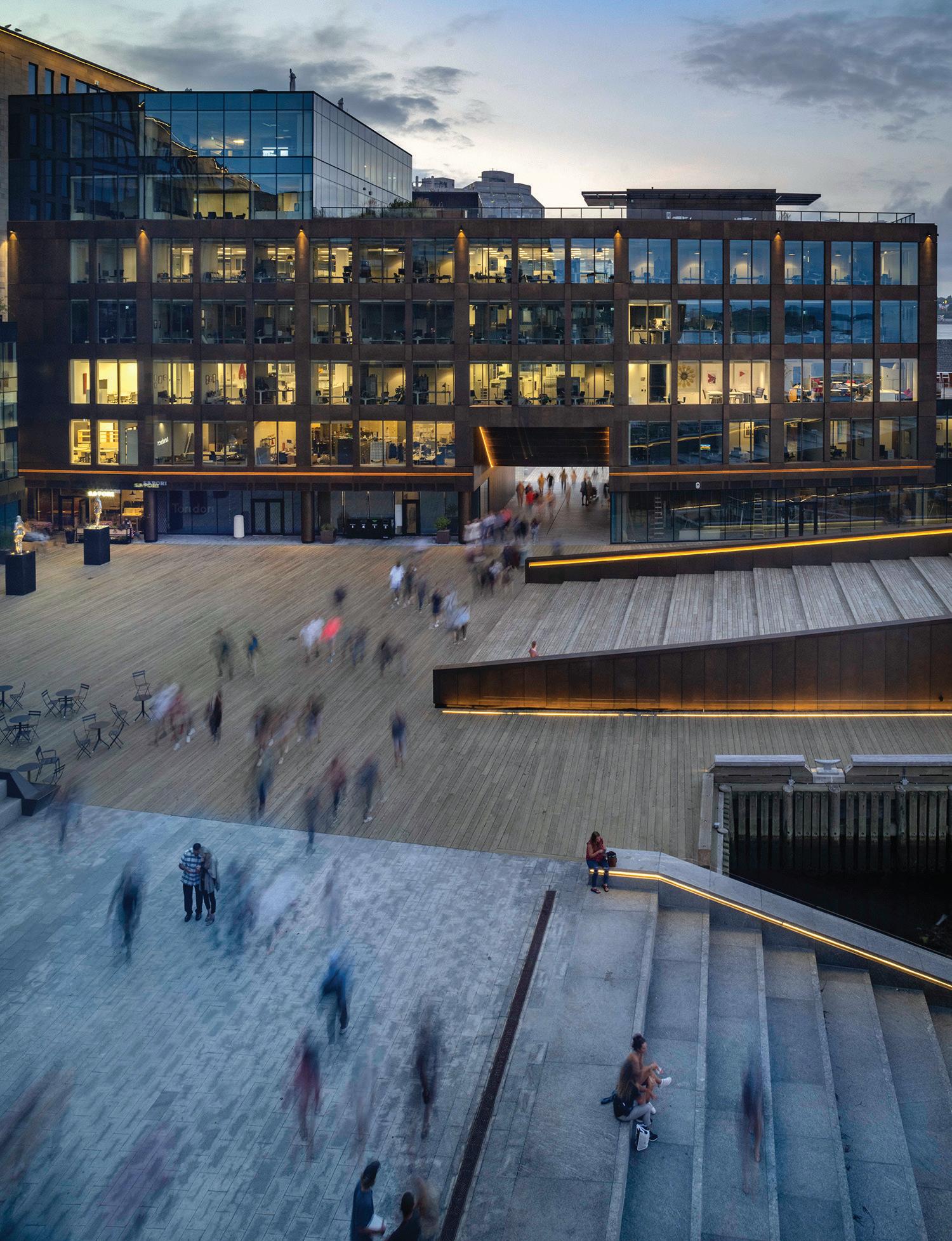
“I can’t overestimate the creative reach of Scott on this project,” says MacKay-Lyons. “It’s impressive. We think we’re actually pretty good,


CANADIAN ARCHITECT 04/23 28
0 20M
then we realize he’s pretty good, too!” If MacKay-Lyons suggested a more frugal material choice, McCrea’s usual reaction was, “I can handle the money, just design what you think is right architecturally and we’ll work backwards from there to make it happen, if we can.”
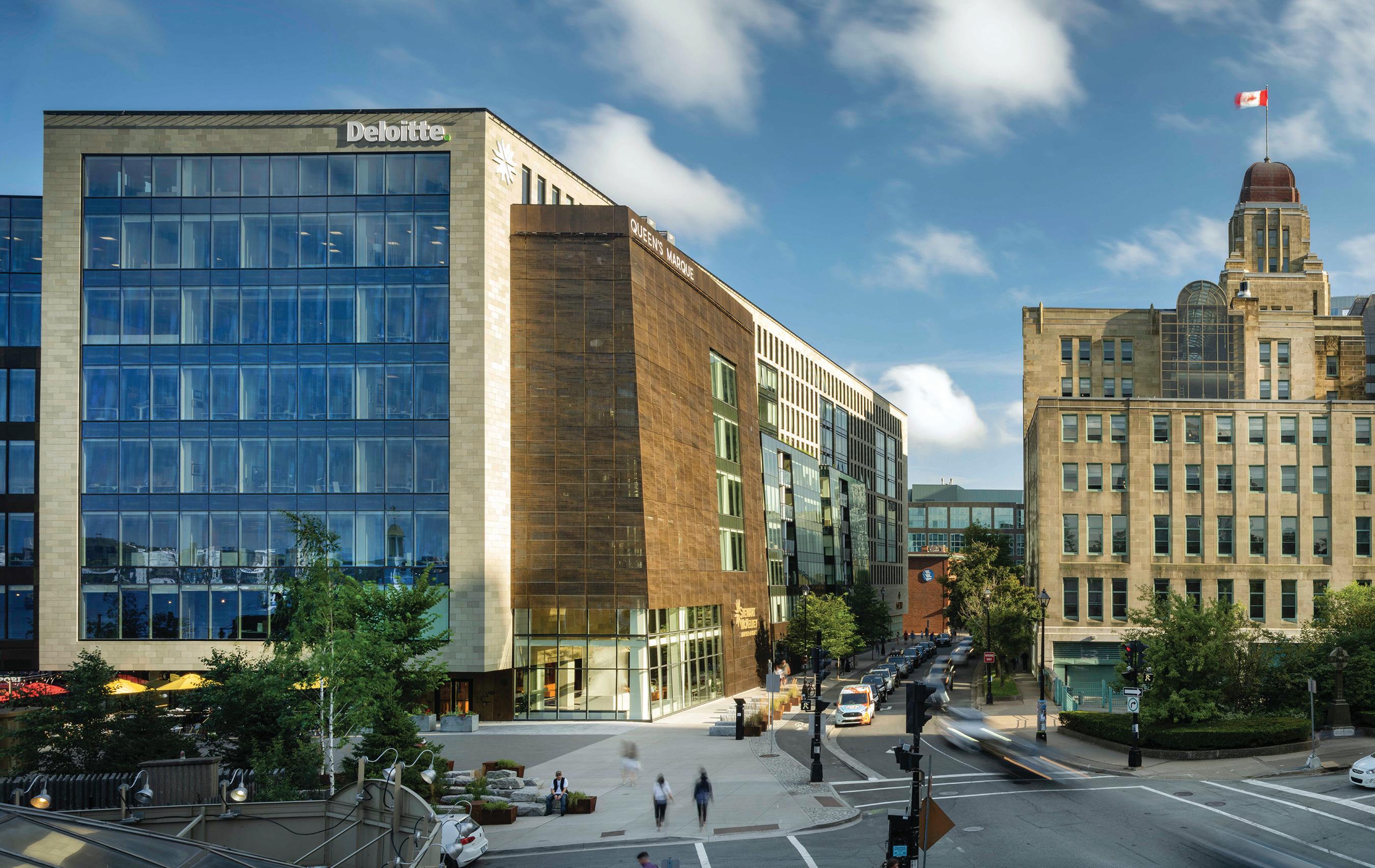
Between Sea and Sky
The main building’s ten-storey height responded to two site-specific parameters: a municipal view planes bylaw preventing developments from blocking views to the harbour from the Citadel, and calculations of rising sea levels which determined that Queen’s Marque be situated over one metre above the existing boardwalk to withstand predicted surges. Thus, the building height was compressed between sea and sky. To accommodate practical floor-to-ceiling heights and to reduce large ceiling ducts, Denis Morris of M&R Engineering designed chilledbeams charged thermally by submerged coils in the harbour, to sustainably heat and cool the facility. (Historic Properties, developed by McCrea’s father, was the first development in Atlantic Canada to use seawater for heating and cooling.)
Both the building site and water lot were compromised by twoand-a-half centuries of fill, some of which was contaminated, necessitating remediation. Building three new wharf foundations required a temporary coffer dam to seal off the harbour, pounding myriad piles, and skilful structural gymnastics. To create two levels of parking below sea level, the project entailed infallible waterproofing and over 200
bedrock anchors to restrain those levels from floating upward. The site’s warped topography, with four different corner elevations, created a onemetre height difference with its southern neighbours, mitigated by new ramps and steps to maintain the continuity of the harbourfront boardwalk.
History, too, cried out for attention. Known as “Queen’s Landing,” the site is remembered as the point of British landfall in 1749, and where the settlers constructed a defensive battery and the port’s earliest seawall. During excavation, a team of archaeologists uncovered huge engraved granite survey markers placed by the Board of Ordinance, along with numerous artifacts from the colonial era. Steamer trunk-sized granite blocks were salvaged from the obsolete seawall, for reuse as benches on the new plaza.
Art and History Lessons
As an art piece itself, Queen’s Marque has many references to anchor it in Halifax. MacKay-Lyons’ initial concept sketch abstracted boats
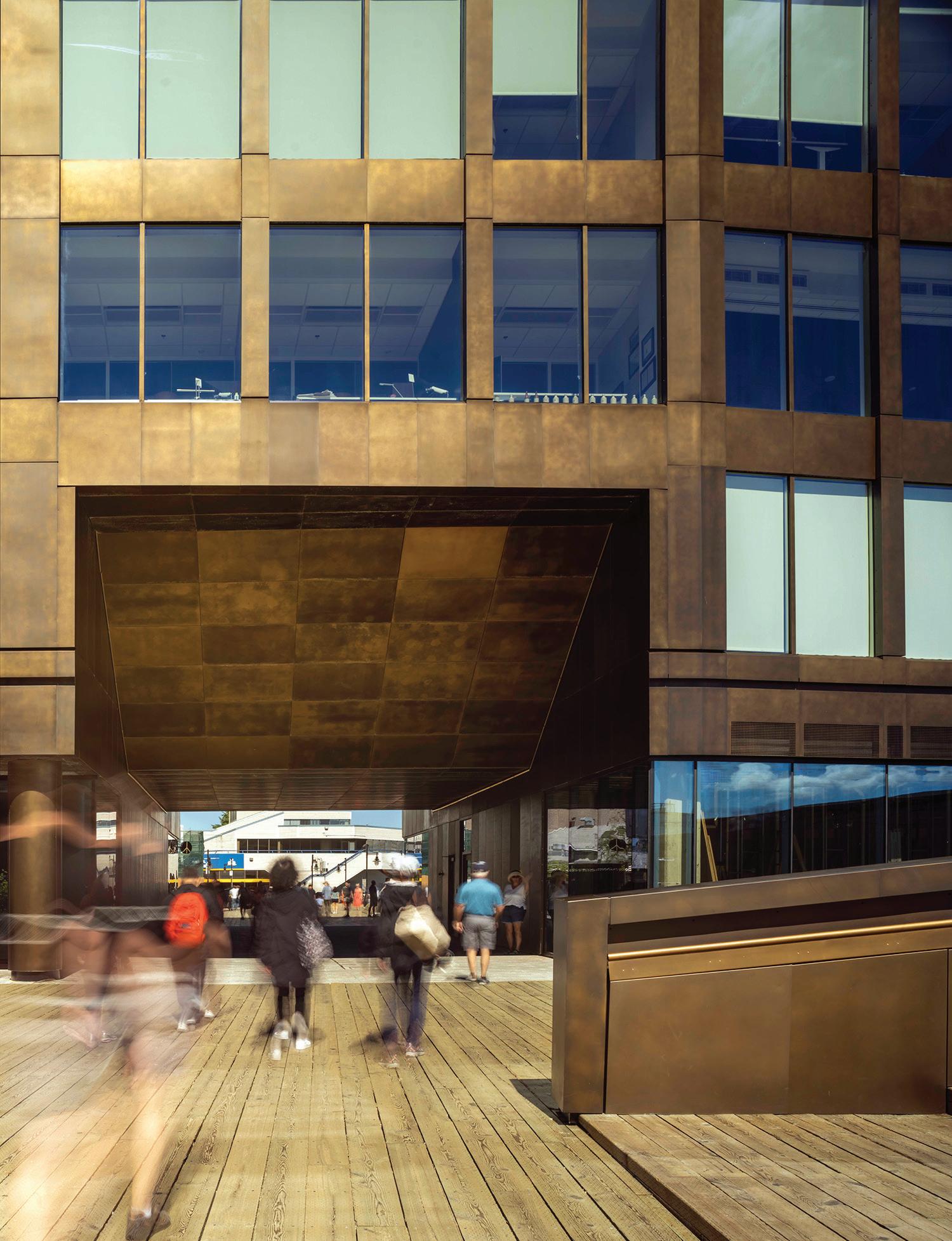
OPPOSITE LEFT The waterside components of the development were conceived as boats partially pulled up on shore for the winter, a theme underscored by the plaza’s paving patterns. OPPOSITE RIGHT Generous portals connect to the city’s seaside promenade. ABOVE Inspired by the wooden chocks used to support boats in winter yards, the central sandstone box is buttressed by perforated, slanted metal panels.
CANADIAN ARCHITECT 04/23 29
in winter yards, with their bulks braced by slender chocks that support their massive hulls. This concept is mostly realized in plan the wings jut towards the water like anchored ships, and a boat-like outline in the paving connects the harbour steps and planted terrace to the sea. But subtle nods to maritime culture appear elsewhere, too. Alluding to the wooden chocks, the central sandstone box is buttressed by halftone-perforated, slanted metal panels on the northwest corner and by repeated Fresnel lenses used in lighthouses at the southwest corner. Generous portals connecting the plaza to the existing boardwalk have pendulous hull-like shapes overhead. A similar scale of opening would have been appreciated in the two passages from Lower Water Street, which feel more tunnel-like, but that sense of compression dissipates with the surprising openness of the piazza. In the plaza itself, the wedge-like Rise Again building, with restaurant below and beacon above, floats upwards on one end, as if bobbing on the waves. Material selection enhanced connections to Halifax’s maritime heritage. Muntz metal panels a bronze-toned alloy of copper and zinc, used to coat wooden ship hulls to ward off ship-worms and barnacles clad the lower floors. At eye-level, these are engraved with maritime stories, charts and symbols designed by Adam MacKenszie and Sherry Design, a gesture MacKay-Lyons likens, wryly, to “tattooing the building.” The archetypical steps-to-the-water, made of slip-resistant granite, have become an attraction for Haligonians and tourists alike.
Millions were spent on art to enhance the project. The most notable of these contributions is Ned Kahn’s Tidal Beacon , which stands 12 meters tall above Rise Again. The lighthouse-like form ignites in a programmed 12-minute light event at the moment of high or low tide. At night, the reflections on the water from the city lights of Dartmouth, passing ferries and ships create a magical atmosphere augmented by Tidal Beacon ’s intermittent performance.
At Play in the Plaza
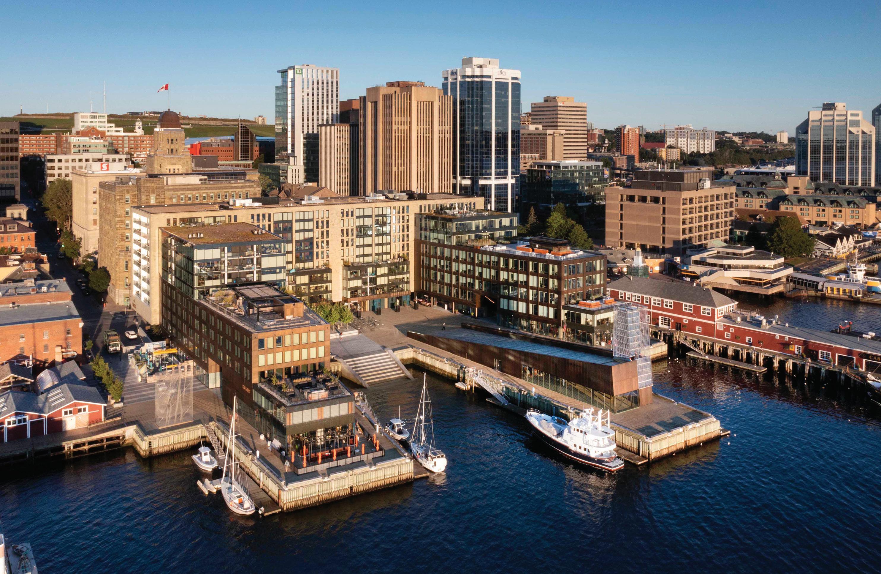
The north end of the plaza was designed to double as an amphitheatre, with the surrounding buildings providing acoustic amplification for events, while overlooking windows and terraces act as choice box seats. So far, string quartets, aerobic classes, buskers and even the local scuba diving club have used the plaza, amphitheatre, and harbour steps. In summer, the Port Authority welcomes recreational boats to moor next to floating docks between the arms of the buildings, recalling the busy finger-wharves which once traded with the world from this exact location.
The east-facing square embraces the morning sun and the other three sides protect it from the intense western sun and cold north winds. In order to provide summer shade and buffer city noises, Devin Segal, landscape architect with Fathom Studio, specified a grove of a dozen maples to grace the plaza’s raised terrace. “The courtyard creates
CANADIAN ARCHITECT 04/23 30
a micro-climate the Autumn Blaze Maple trees there were the last ones downtown to lose their leaves,” he notes. Segal also designed the lighting scheme: at the sides of the harbour steps, light strings dive whimsically into the water, an invitation to touch the ocean.
Queen’s Marque
In olden days, when a Letter of Marque came from the Crown, it was an invitation to privateering adventure, glory and riches which naturally appealed to the sea-faring folk of Halifax. Overnight, ambitious merchants became patriotic pirates and the port, already busy with trade, became wealthy with plunder. At the time of Confederation, Nova Scotia was arguably the richest of the colonies to unite. Queen’s Marque has, as Cotaras asserts, “created a special place in the city,” and it aspires, as McCrea says, to kindle a new attitude that “this can be a place to reach out to the world.” The built form makes this optimism tangible. Standing atop Rise Again, one is reminded of Leon Dubinsky’s upbeat song We Rise Again, an unofficial anthem for the region and an expression of intergenerational aspiration and perseverance concepts which MacKay-Lyons has placed, by design, at the centre of the project.
OPPOSITE Ned Kahn’s artwork Tidal Beacon is ringed with a mirrored filigree that responds to complex wind patterns. The core of the sculpture illuminates in a 12-minute light event that marks high tide and low tide. ABOVE Queen’s Marque brings a vibrant mix of uses and a large, European-style plaza to Halifax’s waterfront.
DEVELOPER AND MASTER BUILDER ARMOUR GROUP LIMITED (SCOTT MCCREA) | ARCHITECT TEAM
MACKAY-LYONS SWEETAPPLE—BRIAN MACKAY LYONS, SHANE ANDREWS, WILL PERKINS, RIMON SOLIMAN, SAWA ROSTKOWSKA, TALBOT SWEETAPPLE. FBM ARCHITECTS—GEORGE COTARAS, WAYNE DUNCAN, CARL HICKS, CALEY SCHOLER, BEN GRIFFITHS, JEFF DECOSTE, DAN WRAGGETT STRUCTURAL CAMPBELL COMEAU ENGINEERING MECHANICAL/ELECTRICAL M + R ENGINEERING | CIVIL STANTEC, EASTPOINT LANDSCAPE FATHOM STUDIO AND BRACKISH DESIGN STUDIO; QUEEN’S LANDING STAIRCASE—MACKAY-LYONS SWEETAPPLE ARCHITECTS URBAN DESIGN
MACKAY-LYONS SWEETAPPLE ARCHITECTS INTERIORS THE MUIR HOTEL—STUDIO MUNGE; LOBBIES, CORES, RESIDENCES—MACKAY-LYONS SWEETAPPLE ARCHITECTS CONTRACTOR ARMOUR CONSTRUCTION IN JOINT VENTURE WITH BIRD CONSTRUCTION PUBLIC ART TIDAL BEACON—NED KAHN WITH HEAVY INDUSTRIES; THE SIRENS’ CALLING—JOHN GREER; WATER—THADDEUS HOLOWNIA; ZENITH—DAVID SPRIGGS; EMBARKMENT STEPS AND INHABITANTS—CHRIS DOROSZ; CONVERGENCES—PETER POWNING; LANDSCAPE TAPESTRY—ALLISSON PINSENT BAKER; A MOMENT IN NATURE—LAURA JEAN FORRESTER; FIELD 2-34—JOHN MCNAB; SAIL—TRESOLDI STUDIO; LIGHT CHOCKS—MACKAY-LYONS SWEETAPPLE ARCHITECTS WITH HEAVY INDUSTRIES | AREA 41,800 M2 | BUDGET WITHHELD COMPLETION SPRING 2023
CANADIAN ARCHITECT 04/23 31
T. E. Smith-Lamothe is an architect-artist who lives in Halifax and is the principal of Architech, Ltd. He is a past Chair of the Halifax Regional Municipality Design Review Committee.
CANADIAN ARCHITECT 04/23 32 EMA PETER
SINUOUS SILHOUETTE
BIG’S TELUS SKY ENERGIZES DOWNTOWN CALGARY.
PROJECT Telus Sky, Calgary, Alberta
ARCHITECTS Bjarke Ingels Group (Design Architect) with DIALOG (Architect of Record)
TEXT Trevor Boddy
PHOTOS Laurian Ghinitoiu, unless otherwise noted
Books write books, and just as surely, buildings design buildings. This has seldom been as apparent as for the relationship between Bjarke Ingels Group’s Vancouver House and the Telus Sky tower that has now followed it in Calgary. There is more at play here than the two buildings having the same design team (BIG ’s Bjarke Ingels and Thomas Christofferson), the same associate architect (DIALOG), the same developer (Westbank), and even the same structural engineers (Glotman Simpson of Vancouver). What is remarkable is the steep learning curve between the two designs, with refinements, clarifications, simplifications and rising confidence that coalesced
into this hybrid office/rental housing tower in the very heart of Calgary’s oil patch. Vancouver House was a fine idea, but Telus Sky is a much better building.
To explain why I arrive at this critical judgment, I need to say something first about Vancouver House. I may know more about this tower than any other contemporary Canadian building. The developer commissioned me to curate an exhibition installed on the building site when Vancouver House was still in design development, even assigning to me the name for this elaborate show: “Gesamtkunstwerk,” a Germanic neologism of the mid-nineteenth century meaning “Total Design,” popu-
CANADIAN ARCHITECT 04/23 33
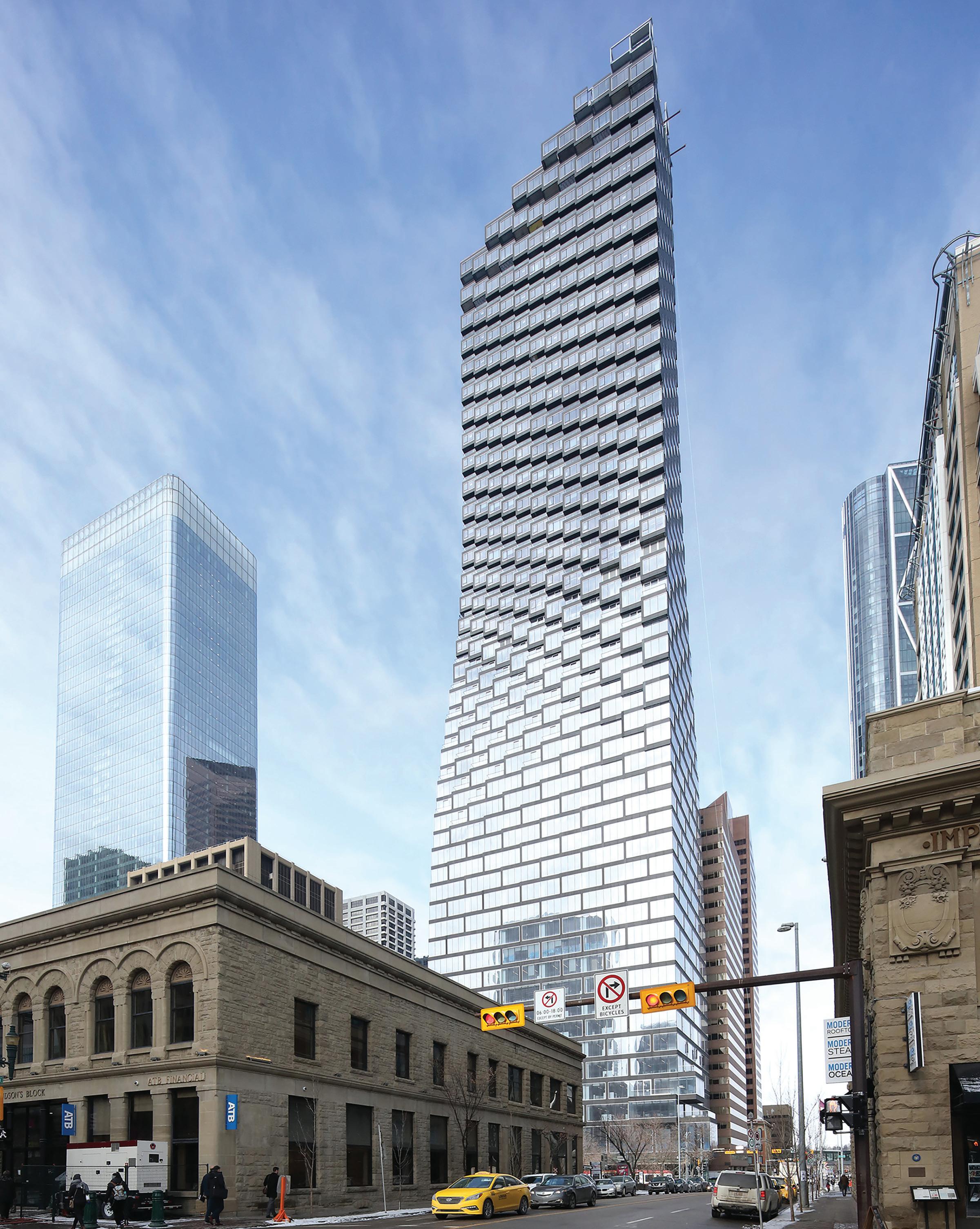
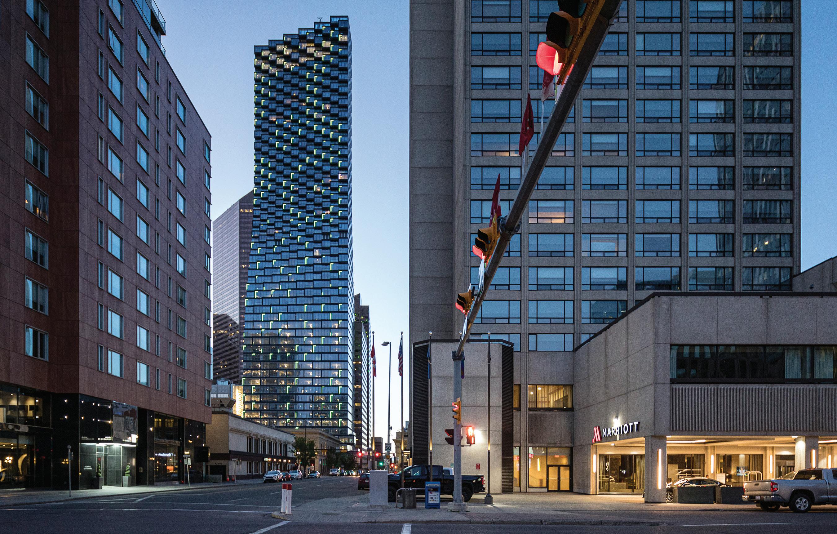
OPPOSITE Telus Sky occupies a rectangular base, tapering above its office floors to residential floors with half the floor area. This geometry offers increased light and views to residents. ABOVE At night, the tower is illuminated by Douglas Coupland’s Northern Lights, an dynamic LED-based work that is the city’s largest public art piece.
larized by Richard Wagner and thereafter becoming a bedrock principle of the Bauhaus and most of the other modernisms that followed.
The tower’s pro-forma, or economic equation, is brilliant. Rising up from a low-priced, orphaned triangle of land adjacent an on-ramp to the Granville Bridge, Vancouver House steps out, floor-by-floor, to transform from a triangular plan to a rectangular one. This creates up to double the area of suites on higher floors, which in view-obsessive Vancouver net up to five times the purchase price per square metre of condo than those closer the ground. Achieving this required substantial structural gymnastics: a rare combo of horizontal and vertical post-tensioning.
But this massing and structure exacted a price. The distance varies from a fixed core to each perimeter glass line as it incrementally cantilevers out, yielding some very tough resulting dimensions. In a small minority of unit plans, this led to dull strings of small rooms, doglegs, and other awkward layouts. DIALOG was assigned the difficult task of unit planning, made even more complex by changing marketing decisions, timed to tap a huge demand from the Mainland China market, driven by both investors and recent arrivals here. Things were so in flux that our Gesamtkunstwerk exhibition included no floor plans whatsoever a rare absence in an architectural exhibition. But thanks
to clever improvisations by both teams of architects, the developer, and their marketers, Vancouver House opened as the most valuable residential tower in Canadian history a stunning real estate success story.

Linking Vancouver House with Telus Sky is an approach to accreting residential units in façades that Bjarke Ingels has labelled “pixelation,” which treats individual apartments, not entire floors, as the key datum of massing. Both towers are often mistakenly described as “torquing,” when an examination of their plans reveals no such twisting. The illusion comes from seeing the receding lines of the variegated surfaces of each unit pixelation in action. For Telus Sky, each floor is slightly rotated in plan and cantilevered from the one below, giving individual apartments their own volumetric expression on the exterior. The pixelation of units requires lots of corners (and their added expense), so one might say that these two towers have quite literally “cornered” the market. Both BIG towers use curtain walls (from German supplier SHUCO, manufactured in Korea), welcome relief from the window walls that make most Canadian residential towers look sheepishly the same, whether fat slabs backing onto the Gardiner Expressway or point towers in Yaletown.
Telus Sky does not require double post-tensioning, but the designers were forced to accommodate the reality of office floors being 1,670
CANADIAN ARCHITECT 04/23 34
SECTIONS
ABOVE LEFT An approach that Bjarke Ingels calls ‘pixelation’ treats individual apartments as units of massing, resulting in a fine-grained volumetric expression. OPPOSITE TOP A light-filled atrium accented by ferns and vines in white fibreglass planters contrasts with the public lobby space’s darktoned finishes. OPPOSITE BOTTOM The atrium is criss-crossed by stairways that connect the floors of Telus’s offices, while below, a public stair leads to the Plus Fifteen walkway system that joins downtown buildings throughout downtown Calgary.


CANADIAN ARCHITECT 04/23 35
CANADIAN ARCHITECT 04/23 36
square metres each, while the residential floors stacked on top of them are optimized to maximize light and views, with a floorplate just as long but much narrower, and crucially, each having just half the floor area of the office floors. The regional offices of telecom giant Telus occupy a minority of the floors in the rectangular office block. A grand urban plinth, they ground a 29-storey base that supports the small but efficient high-end rental units on the 28 upper floors, whose long faces rotate a bit towards the west with each step.
Explaining the visual effects of Telus Sky, observers turn to metaphors, such as the pixelated seeded head of a sunflower turning to gain the light. A Telus executive describes the tower as “a cowgirl in a cowboy town,” and many locals note the “hips” where offices shift to residential. According to DIALOG ’s senior architect on the project, Douglas Cinnamon, “Ours is the only tower in this part of downtown with balconies. It’s welcome relief, a more sensuous and sinuous form.” Certainly, this rotation and balconied pixelation dramatically punctuate a downtown dominated by hunky boxes adhering to the plains gridiron. Bjarke Ingels sums up the effect this way: “The texture of the façade evolves from smooth glass at the base to a three-dimensional composition of protrusions and recesses. The resultant form expresses the unification of the two programs in a single gesture rational straight lines composed to form a feminine silhouette.”
This is especially true because Fosters Architects’ The Bow, just a half block away, is also rotated to the west instead of adhering to the prevailing north-south orientation. Last fall, I walked with a group of my University of Calgary architecture students to see the visual dance
between the two towers. None of the students figured out the actual reason why both buildings turn to the southwest: it is because of valuable-to-tenant direct vistas to the Rocky Mountains in this direction, Calgary’s equivalent to the North Shore and Georgia Strait views that drive Vancouver designs. Whether by feminizing downtown or just providing relief from the tyranny of dumb boxes on a grid, the pairing of these towers is spectacular. For high tech buffs (this is an engineers’ town), the views to the Bow from the north face of Telus Sky may even be more breathtaking than those to the foothills and snowcaps on the other side.
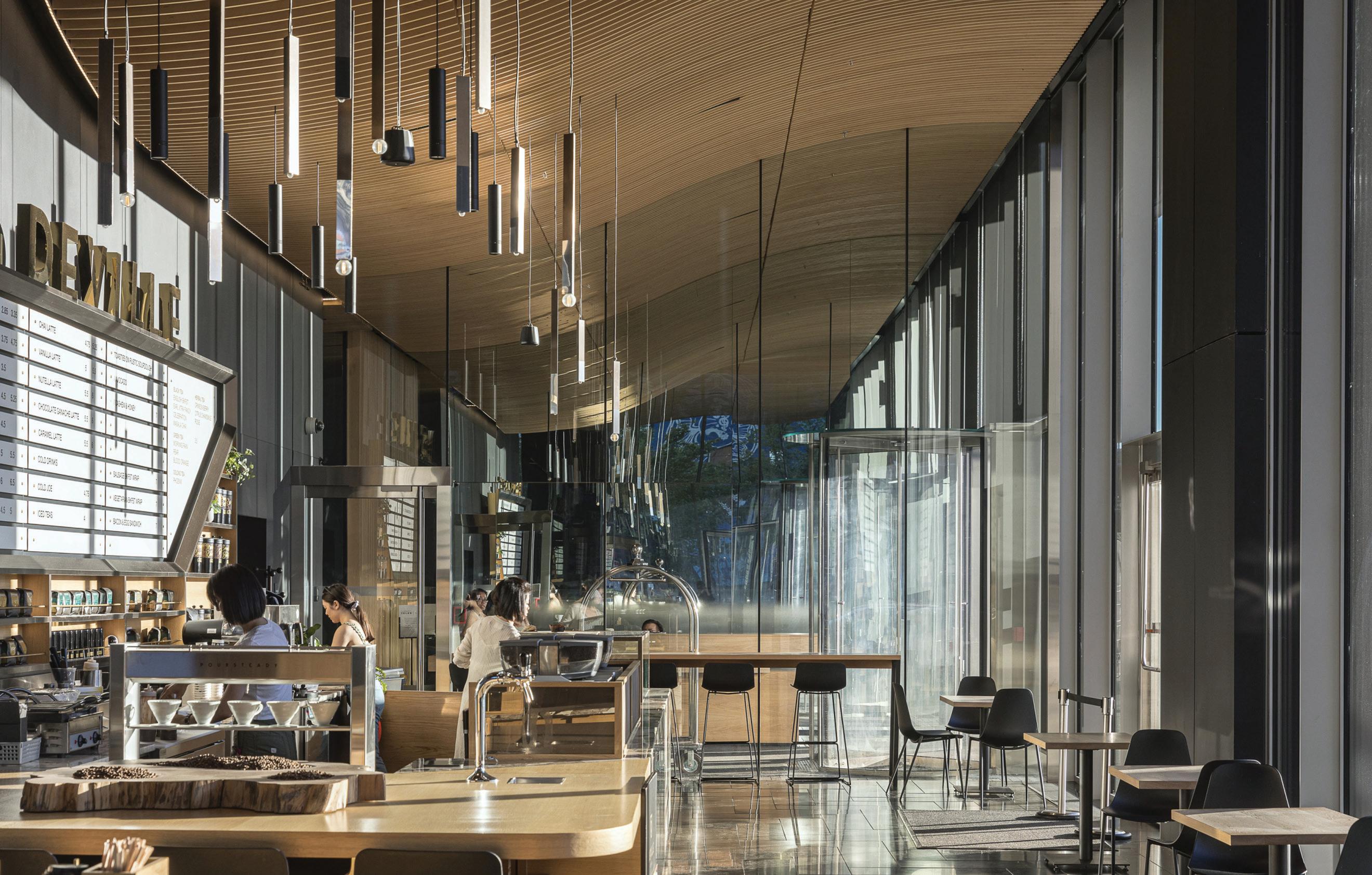
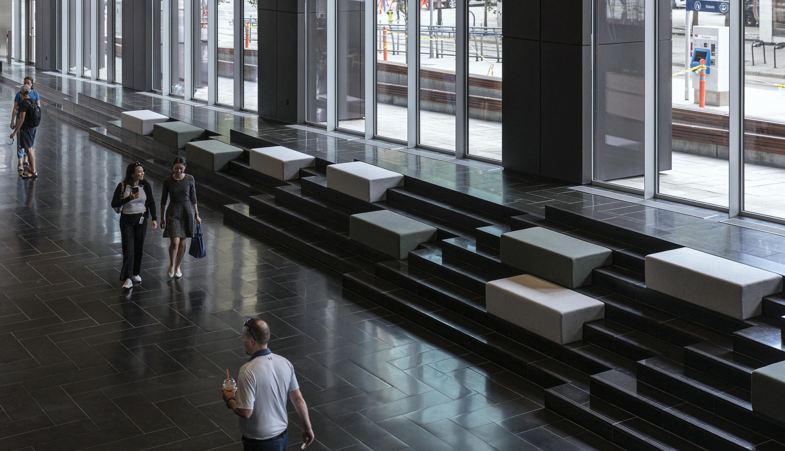
The very public lobby of Telus Sky sets a new design standard for entrances to Calgary’s downtown-wide Plus Fifteen pedestrian system. Other office tower lobbies and bridges tend to a safe corporate palette of blanched stone or panels, chrome and endless glass, having the now-eclipsed magazine aesthetic of two stops of over-exposure popular ten and twenty years ago. By contrast, Telus Sky boasts the darkest but friendliest lobby in town, with continuous benches along its entire length, both inside and outside, the latter lining a 7th Avenue C-Train platform. With its refined but simple Nordic detailing and dark colours, the Telus Sky lobby makes the people walking through it more prominent, via visual contrast. It reminds me of Arne Jacobsen’s 1961 SAS Hotel in Copenhagen a pioneering tower-and-podium construction that Ingels shows off to all his architectural guests.
After one passes through this darkened space, the six-storey atrium beckons at its end, exploding with a torrent of Prairie light from above. Plantings set into curving fibreglass panels climb all the way up one
CANADIAN ARCHITECT 04/23 37
1 OFFICE LOBBY 2 CAFÉ 3 RESIDENTIAL LOBBY 4 LOADING 5 RETAIL FLOORS 1-3 0 10M 0 5M 1 2 3 4 5 6 7 8 9 CENTRE STREET 7TH AVENUE 6 ATRIUM/VERTICAL GARDEN 7 TRAIN PLATFORM 8 LANEWAY 9 TO BRIDGE SYSTEM TYPICAL RESIDENTIAL FLOOR
OPPOSITE TOP At one end of the lobby, an upscale café includes a curved wood ceiling and Scandinavian-inspired finishes and furnishings. OPPOSITE BOTTOM The triple-height, dark-toned lobby includes continuous benches inside and outside, providing amenity to riders of the light rail transit system which stops adjacent to the building.
wall. This is considered architectural choreography, with changing light and directions of view enriching the passage of every visitor. Looking up through the atrium, projecting angled stairs encourage Telus employees to avoid elevators when trekking to other departments. The stairs add further visual dynamism to this vertical white room, which the architects have dubbed “The Canyon.” The designers wanted the cantilevered stairs to be rounded, rather than angular, but the spatial concept is so strong it does not matter. Below them, a public stair leads to the all-hours Plus Fifteen system, and a set of amenity floors are shared by employees and rental residents alike.
Jeremy Sturgess and I founded the Calgary architectural advocacy and lectures organization CAUSA in 1979, and many of our invited speakers were appalled by what they saw downtown then (Robert Stern, upon being driven down Centre Street past the river exclaimed, “Take me back to the airport!”) Not so Rem Koolhaas, who would become Bjarke Ingels’ early employer at OMA and had been my teacher in a term spent at London’s Architectural Association: when he accepted my invitation, he was totally exhilarated by the frenzy of construction, astonished by viewing the ballet méchanique of 28 construction cranes all moving at once. As his host and driver, he had me do a complete grid survey for him west on 4th Avenue, east on 5th, and so on while he took photos. In the 1970s, Koolhaas glimpsed Calgary’s boisterous,
ABOVE Telus Sky’s elegant form lends a distinctive presence to the Calgary skyline.

ambitious character, and his protégé Bjarke Ingels has now done the same a near half century later with Telus Sky.
Alberta-born and -educated, Vancouver-based Trevor Boddy curated the 2014 Gesamtkunstwerk exhibition on BIG’s Vancouver House, the 2017 Rethink Downtown San Diego for Bosa Developments, and Telling Details: The Architecture of Clifford Wiens for public galleries across Canada.
ALEX WU, BARBORA SRPKOVA, BEAT SCHENK, BENJAMIN CALDWELL, BENJAMIN JOHNSON, BRIAN ROME, BRYAN HARDIN, CAROLIEN SCHIPPERS, CHOONGHYO LEE, CHRIS GOTFREDSEN, DAISY ZHONG, DAVID SPITTLER, DAVIDE MAGGIO, DEBORAH CAMPBELL, DENNIS HARVEY, DOUGLAS ALLIGOOD, ELENA BRESCIANI, FLORENCIA KRATSMAN, GAURAV JANEY, HAOYUE WANG, HO KYUNG LEE, IRIS VAN DER HEIDE, ISSHIN MORIMOTO, IVY HUME, JAKOB LANGE, JAN LEENKNEGT, JENNIFER PHAN, JULIE KAUFMAN, JUSTYNA MYDLAK, KU HUN CHUNG, MANON GICQUEL, MATEUSZ REK, MAYA SHOPOVA, MEGAN VAN ARTSDALEN, MICHAEL ZHANG, MIKE EVOLA, PETER LEE, QUENTIN STANTON, SUN YIFU, TARA HAGAN, TERRY LALLAK, TIANQI ZHANG, YAZIEL JUARBE, YOANNA SHIVAROVA, AGNE RAPKEVICIUTE, CHRISTOPHER WHITE, CRISTIAN LERA, JACK LIPSON, JOHN KIM, LINA BONDARENKO, NICHOLAS COFFEE. DIALOG—DOUG CINNAMON, ROBERT JIM, BRUCE HADEN, JACQUELINE CHE, NATHAN ERICKSON, KEN JOHNSON, CHRIS LAVALLEE, SARA REMOCKER, STEPHANIE YEUNG, WELLINGTON HAU, REY TADIFA, IVY USI, LISA DER, ALEN NIZNIK, KENTON WICKERSHAM, BRENDA SKAPPAK, DOUG CARLYLE, STEPHEN HEWS | STRUCTURAL GLOTMAN SIMPSON CONSULTING ENGINEERS (ANTHONY EL-ARAJ) | MECHANICAL REINBOLD ENGINEERING (DOUG REINBOLD, JASON EDEY, BERT TIMMER) ELECTRICAL INTEGRAL ENGINEERING (JUBIN JALILI, ALI NAZARI, GARY RHODE, COLIN VAN BESOUW) SUSTAINABILITY INTEGRAL ENGINEERING (KEVIN WELSH) | ARCHITECTURE/ INTERIORS COLLABORATOR BIG IDEAS CODE LDMG BUILDING CODE CONSULTANTS, GUNN CONSULTANTS | TRANSPORTATION PLANNING BUNT & ASSOCIATES CONSULTING ENGINEERS FAÇADES BVDA FAÇADE ENGINEERING LTD | ENVELOPE MORRISON HERSHFIELD AREA 70,725 M2 | BUDGET WITHHELD | COMPLETION AUGUST 2021
CANADIAN ARCHITECT 04/23 38
CLIENT 7TH AVENUE SKY PARTNERSHIP (WESTBANK CORP., TELUS CORPORATION, ALLIED PROPERTIES REIT) | ARCHITECT TEAM BIG—BJARKE INGELS, THOMAS CHRISTOFFERSEN, CHRISTOPHER WHITE, CARL MACDONALD, STEPHANIE CHOI, MICHAEL ZHANG, IANNIS KANDYLIARIS, FRANCESCA PORTESINE,


Connecting Visionaries Your project is more than just products. When you partner with us, we’ll provide the manufacturers you need to bring your vision to life. Visit cetecgroup.ca to browse our portfolio, meet our team of manufacturers’ representatives, or inquire about your next project. Find the perfect fit for your next project.
GOOD WORKS
A LARGE SHELTER ADJACENT TO DOWNTOWN QUEBEC CITY RESULTED FROM A DECADE-LONG CO-DESIGN PROCESS.
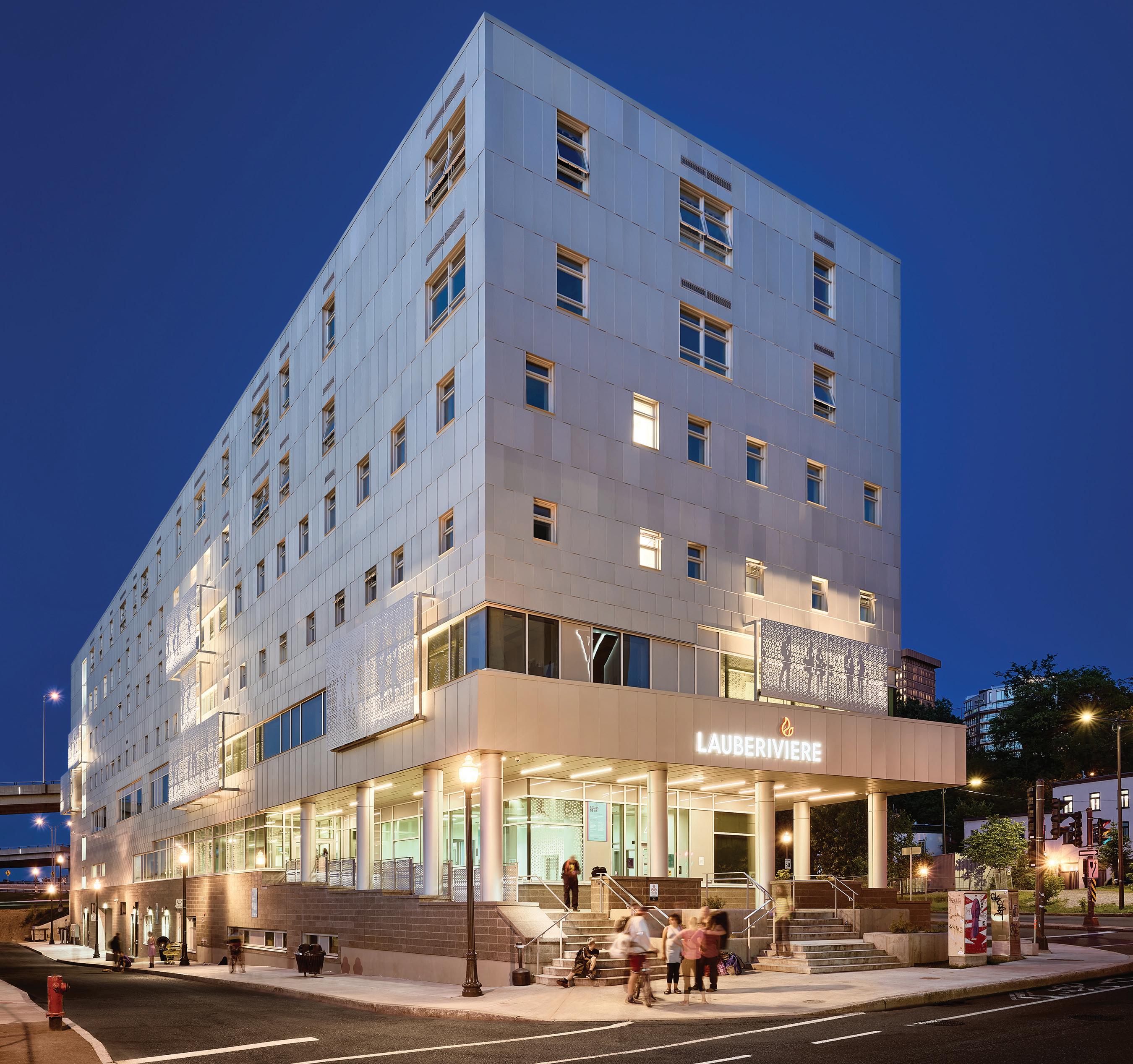
When talking about Lafond Côté’s design for Lauberivière, a large shelter for unhoused people in downtown Quebec City, founder Anne Côté notes that visible homelessness seems like a recent fact in the provincial capital. Her observation points to changing patterns of homelessness, but also to evolving understandings of how to support unhoused people including rethinking how architects can be involved.
As the Canadian Centre for Architecture’s 2019 documentary What It Takes to Make a Home discusses, in recent years architects such as Michael Maltzan have explored designs that move away from trying to blend shelters into their surroundings. Instead, they are looking to formally express the importance of providing well-designed spaces for people transitioning back into traditional housing. In that spirit, the new Lauberivière towers over an elevated highway accessing Quebec
CANADIAN ARCHITECT 04/23 40
PROJECT Maison de Lauberivière, Quebec City, Quebec
ARCHITECT Lafond Côté Architectes
TEXT Olivier Vallerand
PHOTOS Charles O’Hara, unless otherwise noted
City’s historic and legislative cores, unapologetically claiming space in the city for marginalized people.
Lafond Côté was involved in an earlier project to renovate Lauberivière’s original space. The new building, which followed from that work, was designed over a decade. During that time, Côté and her team volunteered in all of the organization’s different services to fully understand the needs of both the people it served, and the volunteers and employees who help them. To rationalize internal operations, the site’s topography was used to create independent access to each service, from a new 24-hour sobering centre opening to the lower street, to transitional housing apartments at the top, with a day centre, food services, legal and financial services, and night shelter rooms in between. This allows clients to directly reach the area most relevant to their cur-
rent needs while avoiding interaction with people they may feel they share little with at the present point in their lives. Stacked vertically, the services also shape the elevations, with window sizes expanding towards the top of the building.

The building envelope also reflects financial, technical, and environmental innovations developed by the client, the not-for-profit housing resource group that advised it, and the architects. To limit long-time maintenance costs, the team decided to aim for a high-performance, energy-efficient building. As part of this effort, they developed a new type of aluminum-cladding system, with research funded by an AluQuébec/Société d’habitation du Québec grant that also helped subsidize construction costs. The new panels are inspired by the traditional tôle à la canadienne construction technique, in which small metal roofing
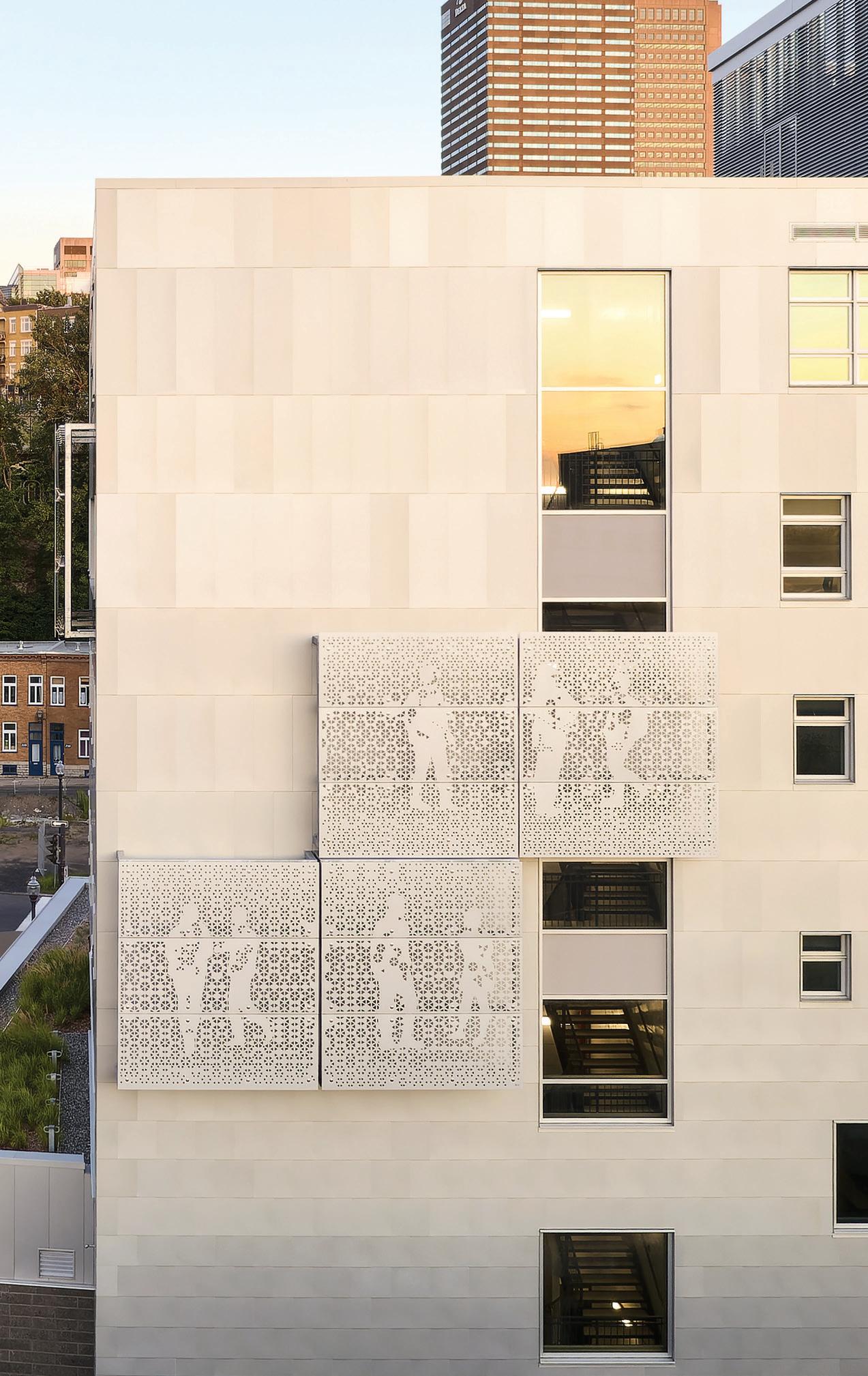
CANADIAN ARCHITECT 04/23 41
OPPOSITE The new building offers a full range of services, including a day centre, food services, night shelter rooms, and transitional housing apartments. ABOVE LEFT The building makes use of its sloped site to create entrances for different client groups, while an offset volume creates a terrace for use by employees. ABOVE RIGHT Metal screens with silhouettes adorn the building, and are set atop a façade of high-performance, low-cost aluminum façade panels developed for the project.
ABOVE On the ground floor, the dining room and kitchen are lined with windows to provide natural light to clients, staff, and volunteers participating in Lauberivière’s meal programs.
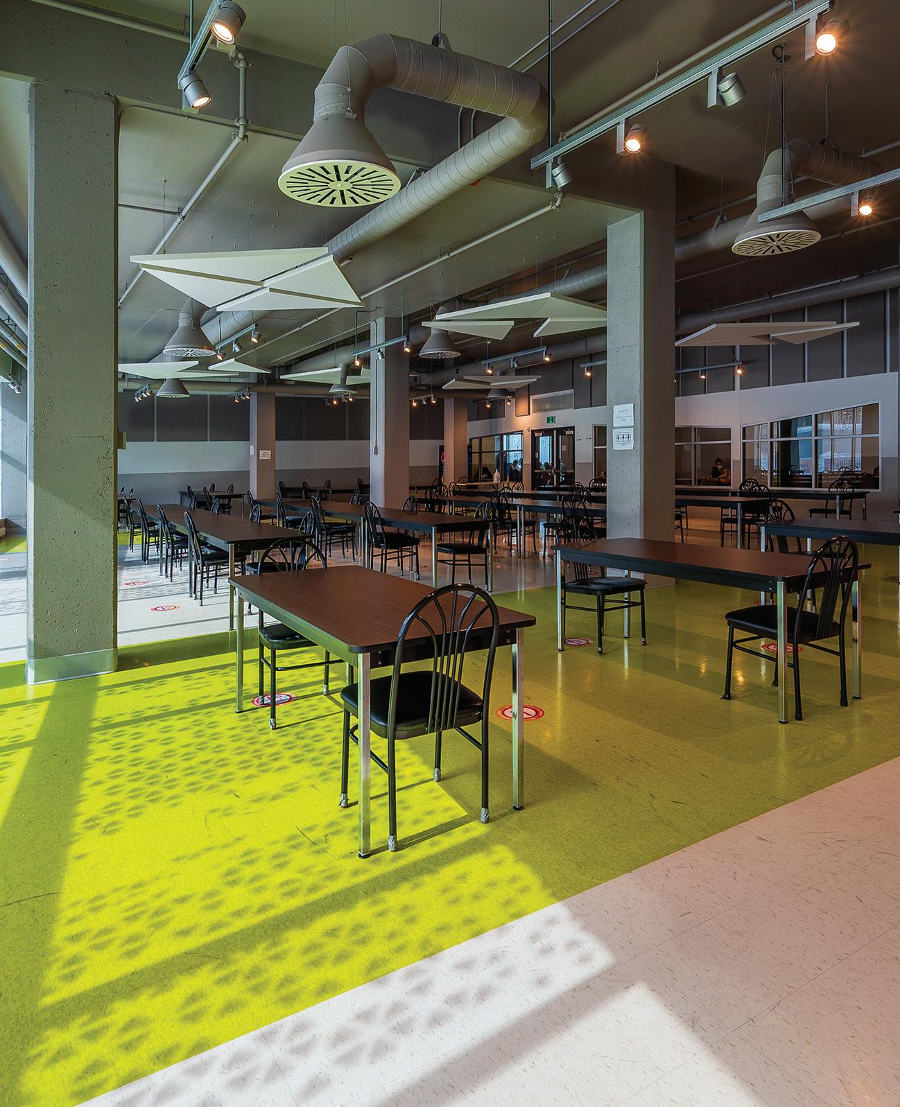
shingles are interlocked to resist heat expansion and contraction. Compared to the traditional material, the new panels, intended for walls, are larger and thinner, reducing structural loads and installation time.
The material innovations continued with the choice of an economical alloy, rarely used for anodized aluminum because of its unreliable colour. However, for Lafond Côté, that diversity of shades was appropriate to this project, as it offers subtle visual texture and conceptually reflects the diversity of users. Metal screens adorned with silhouettes of human figures further add to the composition of the façades, while lending shade and privacy to the common rooms.
Inside the building, the team focused on providing dignity and safety for the clients, volunteers, and employees. Instead of large dorms, quieter individual single-night rooms ring the middle floors, surrounding a core of community rooms and services. In collaboration with the client, the architects designed a door handle that safely keeps doors open at night to facilitate interventions, and shuts them during the day, indicating when rooms are ready to be cleaned. The rooms have angled windowsills to prevent guests from climbing outside, and are designed using temperatureresistant materials to facilitate heat treatment when bed bugs are detected.
Another major improvement from the previous location is the lightfilled dining room served by a full commercial kitchen. The latter is equipped with biomethanization systems that recover energy from food waste. Volunteers who help prepare the 350 meals served each day including some who previously used Lauberivière’s services now enjoy a daylit space with views to the outside.
Last November, Côté and Élodie Simard, who coordinated the energy performance aspects of the project, presented Lauberivière at Architecture sans frontières Québec (ASFQ)’s first symposium on homelessness and architecture. Building on initiatives like Jill Pable’s Design Resources for Homelessness website, the symposium was organized to launch a new catalogue of promising design strategies compiled by ASFQ , in which Lauberivière features as an example of a building where intimacy gradients are used to help clients feel at home.
In its publication, the ASFQ is careful to underline that talking about “good practices” around homelessness can be misleading, as it implies that tested solutions can be applied everywhere. Instead, as Lauberivière and Lafond Côté’s larger portfolio of community projects highlights, to be successful, such spaces must aim for co-design processes that recognize the diversity of unhoused people and the necessity of unique solutions adapted to their needs.
CANADIAN ARCHITECT 04/23 42
CLIENT LA MAISON LAUBERIVIÈRE TECHNICAL RESOURCE GROUP ACTION-HABITATION DE QUÉBEC ARCHITECT TEAM PRELIMINARY STUDIES—MARIO LAFOND, ANNE CÔTÉ; CONCEPTION— ÉLODIE SIMARD, FRANCIS FORTIN; EXECUTION—ÉLODIE SIMARD, FRANCIS FORTIN | STRUCTURAL CIME | MECHANICAL/ELECTRICAL
LAFOND
RICHARD ARSENAULT| ENERGY EFFICIENCY ÉCOHABITATION | AREA 10,551 M2 | BUDGET $23.5 M | COMPLETION JUNE 2021 THERMAL ENERGY DEMAND INTENSITY (ACTUAL) 17 KWH/M2/YEAR N2 1 300 N N4 1 : 300 N N7 1 : 300 N 1 ONE BEDROOM
HOUSING
2 STUDIO TRANSITIONAL HOUSING APARTMENT 3 COMMON ROOM 4 SHELTER BEDROOMS 5 RECEPTION 6 KITCHENETTE 7 LOCKERS GROUND FLOOR SECOND FLOOR FIFTH FLOOR 8 LAUNDRY 9 WASHROOMS 10 SHOWERS 11 OFFICES 12 DAY CENTRE 13 DINING ROOM 14 KITCHEN 15 VEGETABLE PREP 16 PANTRY 0 10M
Olivier Vallerand is an Assistant Professor at l’École de design, Université de Montréal.
GÉNÉCOR, POLY-ÉNERGIE | LANDSCAPE DUO DESIGN | INTERIORS
CÔTÉ ARCHITECTES CONTRACTOR CONSTRUCTION
TRANSITIONAL
APARTMENTS
9 10 12 11 13 14 15 16 1 2 1 4 5 5 6 7 8 3 3
LAUBERIVIÈRE
Observation is a Constant that Underlies All Approaches
By Phyllis Lambert (Lars Müller Publishers, 2023)
REVIEW Elsa Lam
Architect and philanthropist Phyllis Lambert has long been a collector and commissioner of photographs. Photographs undertaken with Richard Pare were a key tool in mapping out Montreal’s greystone neighbourhoods, which Lambert became instrumental in preserving. In 1974, long before architectural photography became a popular specialty, she purchased the first photograph for a collection and an institution she had not yet created the Canadian Centre for Architecture.
In the background of this work, Lambert has continuously honed her own photography, which is presented for the first time in this book. In the fifties, she documented the Seagram Building and Plaza, for which she served as director of planning. In the mid-sixties, she photographed ancient theatres while designing the Saidye Bronfman Centre in Montreal. Upon returning to Montreal in the early 70s, she created cinematographic slide shows (complete with recorded soundtracks) of threatened buildings for the preservation organization Save Montreal.


Her photography continued in later travel and on architectural study tours around the world: alternating between black-and-white and colour, analogue and digital. She even reached for a Hasselblad or a Polaroid when the subject called for it, but since 1993, has stuck mainly to pocket-sized cameras: first a point-and-shoot Olympus, then a Canon PowerShot, and lately, a succession of iPhones.
During the pandemic, like many of us, Lambert observed daily life repeatedly at close range. She took advantage of the time to photograph, over and over, the views from her windows, and vistas through the rooms and doorways of her home in Old Montreal. Why has this interest in photography persisted over the decades? “Surely,” she writes, “observation is the constant that underlies all approaches, all levels of interest, and all fascination with the medium.” She adds, “Observation grows with what it feeds on, driven by focused inquiries that deepen exponentially over time.”
CANADIAN ARCHITECT 04/23 43 BOOKS
GOING BIG
If Walls Could Speak: My Life in Architecture
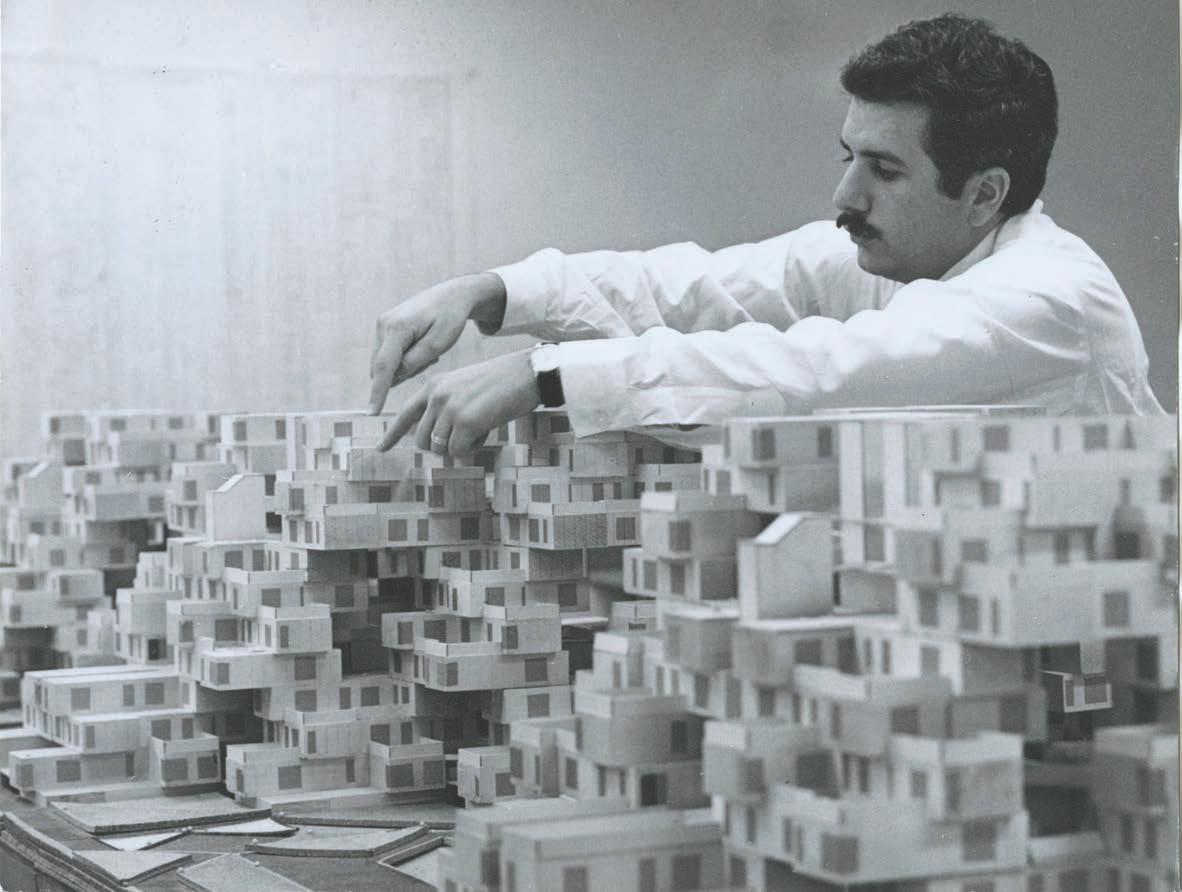 By Moshe Safdie (Atlantic Monthly Press, 2022)
REVIEW Annmarie Adams
Architects
Architect Moshe Safdie listens to Yo-Yo Ma play the prelude to Bach’s Cello Suite No. 1 in G Major on an open deck by the sea, seated alongside King Hussein and Queen Noor. He attends dinner parties for the Clintons at Yitzhak Rabin’s home. Alice Walton, the Walmart heiress, sends her private plane to fetch him for a meeting. He calls art historian Oleg Grabar when he needs to design a mosque. These are just a few of the celebrity-studded scenes that shape Safdie’s new autobiography, If Walls Could Speak, a look back at the well-known architect’s prolific life.
The story goes beyond his famous friends. We learn of Safdie’s parents, childhood, his two marriages and four children, his recent home renovations, his penchant for white collarless shirts, and even of the raccoon who lives outside his office window all alongside his lifelong dreams, sporadic disappointments, and ongoing aspirations. Little sketches and photos, sometimes in the margins, give the book the feeling of an intimate photo album. It’s a very human story.
For all these reasons plus two more, If Walls Could Speak is a great pleasure to read. First, I have worked at the McGill University School of Architecture since 1990 and Safdie is arguably our school’s most famous living graduate. He recently made headlines by donating his archives and Habitat ’67 condo to McGill. So I thought I sort of knew
his story. But the book answers many of the questions that I simply had never considered: why exactly did he leave Montreal? How does he look back on Habitat ’67 after all these years? Where does he most feel at home?
Second, If Walls Could Speak gives real insight into a worldwide architectural practice since the 1960s. Twice in the book he offers a glimpse of his daily life a mix of exhausting global travel, leading four or five design teams at once, and spending time with his beloved wife, the photographer Michal Ronnen. “Our lives and our work,” he divulges in the Prologue, “are totally intertwined.” Especially good for students is Chapter 9, Megascale, where he explains the ways that big architectural projects typically evolve, starting from a sketch (sometimes done on an airplane) through concept stage and design development.
The megaproject in Megascale is Marina Bay Sands in Singapore, commissioned in 2005. It is a massive, mixed-use development with three towers, linked by a sky park, which Safdie says, somewhat implausibly to this reader, harkens back to Habitat ’67. Even more strange, though, is his suggestion that the shopping spine was inspired by the cardo maximus of ancient Roman cities. It’s not an obvious association Marina Bay Sands was a filmset for Crazy Rich Asians , not Spartacus but
BOOKS CANADIAN ARCHITECT 04/23 44
PHOTOS Courtesy of Safdie
it is a window into how this guy thinks big. The story of Marina Bay Sands actually reads like a Hollywood screenplay, complete with men’s room deals, angry emails, gilded airplane interiors, a contentious lawsuit that accused Safdie of replicating the SkyPark design in a subsequent project, and spoiler alert an eventual reconciliation.

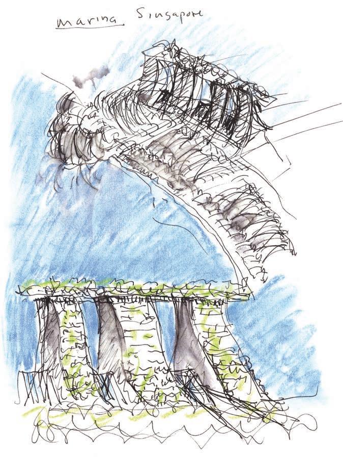
Such snapshots of the joys and risks of contemporary practice and an urge to explain projects in one’s own words overlap nicely with other autobiographies recently written by famous architects born in the interwar period. I think of Safdie’s friend (the families met up regularly in Mexico) Richard Rogers, who wrote A Place for All People: Life, Architecture and the Fair Society in 2017. Canadian examples of this genre would include Eb Zeidler’s two-volume Buildings Cities Life: An Autobiography in Architecture, which came out in 2013, and Jack Diamond’s Context and Content: The Memoir of a Fortunate Architect, published last year. In these books, and Safdie’s, you get a real sense that the authors want to give something back for all their successes.
A memoir is also an opportunity to say what one thinks might define good architecture. Safdie believes deeply in what he calls “the power of place.” He devotes an entire chapter to this idea about how to unlock the secrets of a site, citing examples including Machu Picchu and medieval
OPPOSITE Safdie at work on a model of Habitat ’67. The design was based on Safdie’s thesis project as an architecture student at McGill University. ABOVE LEFT Conceptual sketches for Singapore’s Marina Bay Sands hotel. ABOVE RIGHT, TOP TO BOTTOM Safdie in King Hussein’s helicopter with cellist Yo-Yo Ma, Jordan, 1994; Safdie on the dance floor with Alice Walton, the creator and visionary client for his Crystal Bridges Museum of American Art in Arkansas.
Italian hill towns. He insists that good buildings have a magical quality, beyond simply satisfying the program. “We need to insist on magic,” he reminds readers, alongside numerous references to the transformative power of music. His favourite buildings include Frank Lloyd Wright’s Guggenheim Museum, and Henri Labrouste’s Bibliothèque nationale de France.
Safdie still loves to sketch, and the model shop in his office seems to be the octogenarian’s most magical place. “Architects who forgo the painstaking supervision and review of shop drawings never get the building they think they’re getting,” he warns.
CANADIAN ARCHITECT 04/23 45
MOSHE SAFDIE
How does Canada figure in Safdie’s story? We are big. In 1953, Safdie’s family emigrated from Haifa, where he was born, to Montreal. He studied architecture at McGill University, where his thesis became Habitat ’67, the iconic housing project whose impact ripples throughout the decades and the book. Additionally, many Montrealers appear in the narrative as significant allies. Stuart Wilson and Sandy van Ginkel stand out as teachers. From Wilson, Safdie learned “the idea that architecture needs to be built, not just drawn .” Dutch-born van Ginkel was Safdie’s first employer and a huge influence. “To know Sandy van Ginkel was to become more sophisticated,” remembers Safdie. A letter from Blanche Lemco van Ginkel, Sandy’s partner, introduced the 22-year-old to Louis Kahn, who would soon after employ him.
The Canadian architecture scene is simultaneously something of an enigma in Safie’s memoir. “Ever since Habitat ’67, Canada had for some reason been tough to crack. To this day, I can’t quite explain why this should have been so,” he writes. Even so, Safdie designed landmark Canadian buildings such as the National Gallery of Canada and Vancouver’s Library Square. He blames the rise of Quebec nationalism and his own criticism of postmodernism for a hiatus of Canadian projects just after Expo. A handy list of Safdie’s projects appears at the end of the book, listing the names, dates, and locations of 53 projects he considers significant since 1967: nine are in Canada.
When I teach students about Safdie in undergraduate architectural history courses, I often use the analogy of a chameleon. Holding Canadian, American, and Israeli passports, and with homes and work around the world, he seems to fit everywhere. What the book reveals, however, is that he has often felt out of sync. He resigned an endowed
chair at Harvard’s GSD, for example, because he felt isolated from other faculty members. The multiple references to not getting jobs in Quebec and Canada, too, suggest that Safdie’s extraordinary mobility may have come at some professional cost.
Safdie clearly sees himself not as a chameleon, but as a mediator. He views architecture as a way to bridge differences. Like me, however, some Canadian readers may be slightly annoyed by the ways in which If Walls Could Speak is so clearly pitched at American readers. Safdie calls Douglas Cardinal, for example, a native Canadian (rather than Indigenous) architect, and there are other more subtle but equally jarring Americanisms throughout the book. Another minor disappointment is that one of my favourite Safdie moments gets no mention whatsoever. In 2007, he made headlines by walking away from the billion-dollar McGill University Health Centre project because it was slated to be built as a P3. That is chutzpah that deserves loud applause.
Speaking of health care, If Walls Could Speak might even be counted among the silver linings of Covid-19. It took a global pandemic to slow down Safdie’s schedule enough to focus on this long-running memoir. For that, we can be grateful.
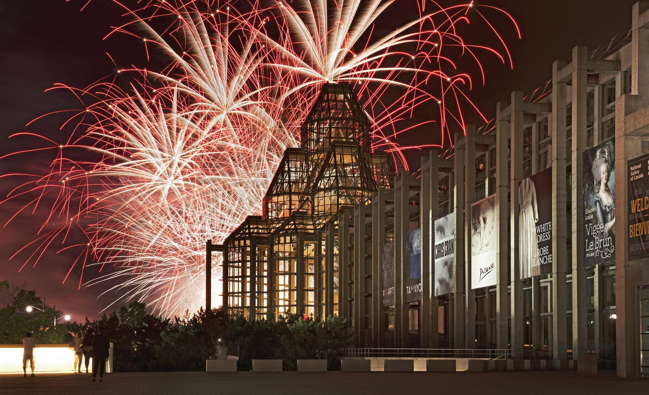
BOOKS CANADIAN ARCHITECT 04/23 46
Annmarie Adams is Professor and former Director of the Peter Guo-hua Fu School of Architecture, McGill University.
ABOVE Fireworks over the Ottawa River marked the opening of the National Gallery of Art in 1988. Designed by Safdie in joint venture with Parkin Architects, the design includes two concourses that meet in the glazed Great Hall.
METROPOLIS STUDIO, COURTESY SAFDIE ARCHITECTS
D’Arcy Jones Architects, 2009-2020
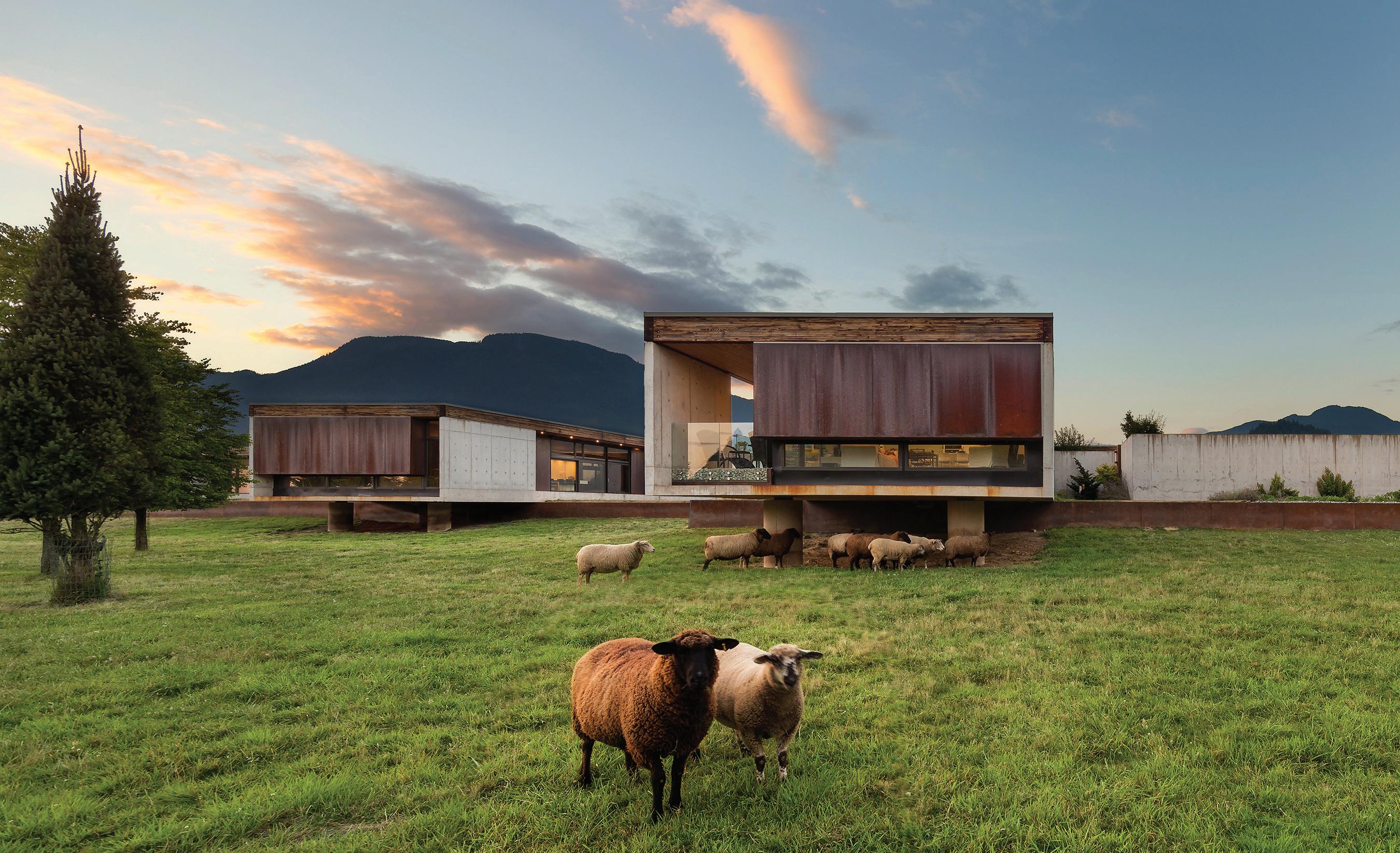
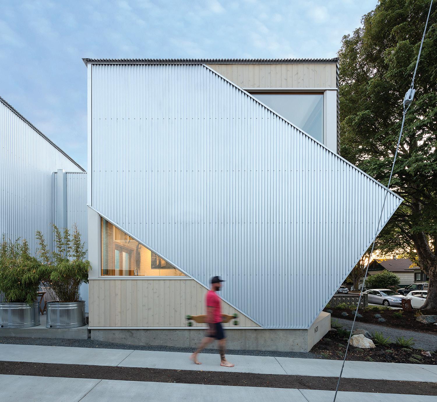 By D’Arcy Jones (Dalhousie Architectural Press, 2022)
EXCERPT
FROM INTRODUCTION
BY Trevor Boddy
Barely at the mid-point of his career, D’Arcy Jones is already established as one of Canada’s most inventive designers of houses. As this book demonstrates, Jones is constantly searching for new forms, through reconsiderations of construction and space-making. The re-invention of the idea of the house is, for him, almost an obsession.
How is it that D’Arcy Jones has devised so inventive a series of houses as the 14 shown in this book, so variable in their design? All are different in detail and construction, yet each of them advances the notion of the enclave. One answer might be found in the architect’s biography. It is rare for an architect of his generation to have spent hardly any time working for other firms in Jones’s case, this included brief periods working with Vancouver’s Nigel Baldwin and Acton Johnson Ostry while he was a student. Many architects, by contrast, spend their careers working out the “anxiety of influence” from former employers or a validated canon of prominent precedents, from which they borrow, too often simplistically.
It is also worth noting that currently many students do not graduate from Canadian architecture schools until they are over the age of 30, and are often over 40 before achieving professional registration. At this point, most have the responsibilities of families, property, and student debt; these factors can easily combine to make design careers short and conservative. D’Arcy Jones, on the other hand, founded his own firm in his 20s and fulfilled his professional regis -
CANADIAN ARCHITECT 04/23 47
TOP Ha-Ha House in Agassiz, BC (2012) was designed with large overhangs to shelter resting sheep. ABOVE Located in the Victoria, BC neighbourhood of Fernwood, Double Header House (2018) accommodates two related households in linked units. NEXT PAGE, LEFT AND RIGHT Lampa House in Victoria, BC (2016) turns inward to enclose a lushly planted courtyard. The iron-oxide stucco exterior references the brick and stucco of historic Victoria.
SAMA JIM CANZIAN
SAMA JIM CANZIAN
tration while executing his own designs. When designers are not socialized into the habits of others, opportunities for individual invention increase.
This pattern also applies to Jones’s education. After a year in general arts at the University of Manitoba in Winnipeg, he went on to receive a degree in Environmental Design from that institution in 1995. He then moved to Halifax, where he earned a second bachelor’s degree in Environmental Design Studies from TUNS (now Dalhousie University). Returning to Winnipeg, he completed a professional Master’s in 1999. In that same year, he opened his own design practice, and it has been in operation ever since. His built work was being published in Europe and the United States a mere six years after he founded his firm, extremely early for a Canadian designer. All through his career Jones has immersed himself in unusually wide and deep reading he is much more likely to cite inspiration from something he has read in the New York Review of Books than that online bible for his generation, dezeen.com.
Before Jones graduated from the University of Manitoba his parents relocated to Kamloops; they and their new neighbours became his first clients. Subsequently Jones established a partnership in Vancouver with Caralyn Jeffs, an architecture graduate who now works as the primary caregiver for the couple’s three children, including twins; the architect’s empathy for the needs of couples with children is grounded in his own experience, and many of his clients are at the same stage in the family cycle. A sense of community is crucial to Jones. His early practice was boosted by the modest house he designed for his own young family in 2007. Its completion prompted a string of requests for renovations and rebuilds in the same neighbourhood one of them breathing new air into the tired formula of the split-level rancher, another finding privacy while wedged between larger neighbours,
a third raising up a small house to capture light and increase space for a photo-based artist, a landscape architect, and their children. Noting this pattern in his work, Jones explains, “I take families seriously we listen to them, observe them.”
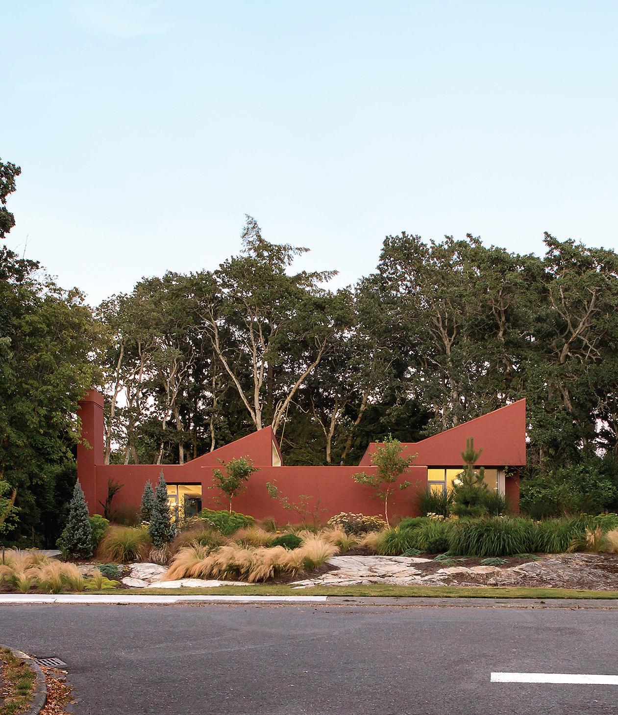
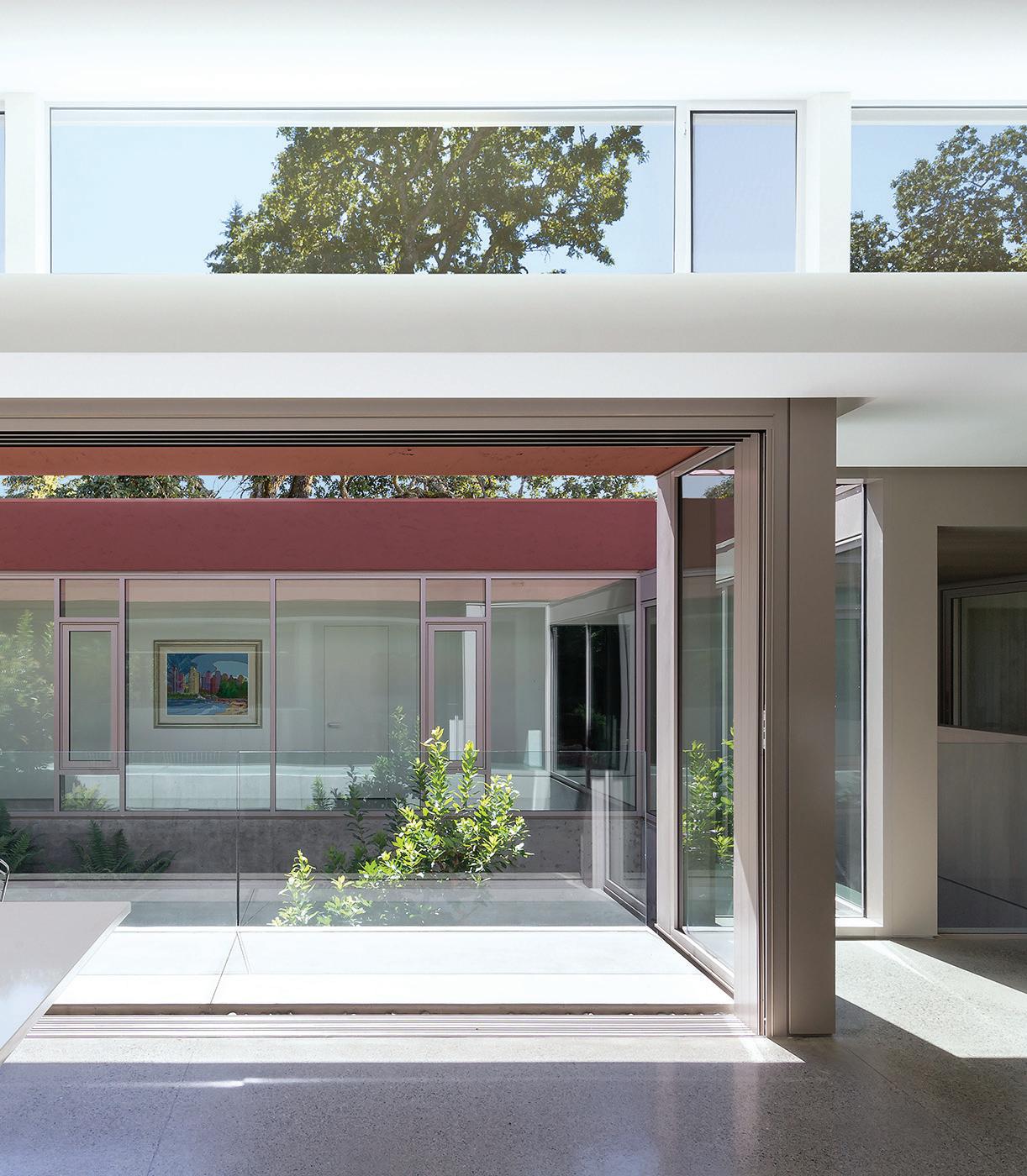
A house is one of the most complex human inventions. There is no more practical or essential a structure, yet dwellings represent some of the highest cultural and spiritual aspirations. A well-conceived design for a house demands deep understandings of the lives it envelops. As Le Corbusier suggested, houses are “machines for living.” They are also exemplars of sociality, live-in artworks, membranes against the forces of nature, and shelters that nurture personalities. They represent one of the biggest investments that people make. Houses are our castles though also our prisons, playthings, and our psychoanalysts.
Videogame Atlas: Mapping Interactive Worlds
By Luke Casper Pearson and Sandra Youkhana (Thames and Hudson, 2022) REVIEW Ksenia Eic
Video games are usually seen as mindless entertainment. But for those of us who grew up playing video games and continue to be inspired by these rich, virtual environments, we know that they offer much more.
In this book, authors Luke Casper Pearson, an associate professor at Bartlett School of Architecture in London, and Sandra Youkhana, a registered architect and lecturer at Bartlett School of Architecture, bring their professional training to bear by focusing on the spatial design of video games, highlighting some of the many layers of design thinking that go into game development.
Opening the book and seeing the beautiful diagrams all in a decidedly architectural style, using only linework and hatches made me
BOOKS CANADIAN ARCHITECT 04/23 48
SAMA JIM CANZIAN
SAMA JIM CANZIAN
thrilled to start reading it. But although many interesting design ideas are covered in its chapters, I was left unsatisfied and several questions persisted. Why did the authors choose this particular set of analyses, which in my view often did not offer much in the way of transferable or insightful design ideas? Why create so many diagrams on relatively simple ideas (such as the climbability of buildings and the scale of realworld buildings relative to their virtual counterparts) rather than dive deeper on more complex design strategies?
Ultimately, the goal of this book to investigate game design to inform architecture and other forms of design is admirable, but the execution left something to be desired. I kept wondering to myself: who is this book for? Experienced gamers are likely to already be aware of many of the insights illustrated here, while for readers new to video games, the book perhaps relies too much on familiarity with the games that form the basis of the case studies for them to garner much from the studies. I am glad that the book exists, as it lends credibility to an emergent field, but I hope that future work on the subject of design thinking in video games goes into more depth, and focuses on more worthwhile aspects of this fascinating topic.
Architecture + Itinérance: Pratiques inclusives pour une ville solidaire
 By Sarahlou Wagner-Lapierre, Élizabeth Prince, Véronic Lapalme, and Sonia Blank; edited by Carolyne Grimard and Élène Levasseur (Architecture sans frontières Québec, 2023)
 REVIEW Elsa Lam
How can architecture help the unhoused? Working with Architects without Borders’ Quebec chapter, a group of researchers have set out to docu-
ment examples of best practices, collating them into a catalogue of techniques intended for designers, organizations, and policy-makers working with people experiencing homelessness.
The well-being of the unhoused is at the heart of the strategies presented, which address a range of spaces used by this client group, from warming shelters to social housing. The focus of the publication is on positive examples of places that both enhance cities and provide valuable essential services for the unhoused.
Bridgman Collaborative’s Pop-Up Washroom in Winnipeg, and Sustainable | Architecture for a Healthy Planet’s Friends of Ruby Home in Toronto are among a half dozen Canadian examples, pointing to the need for amenities in public spaces and the value of collaborative design processes, respectively.
The majority of the examples are projects from the United States and Europe. These include La Ferme du Rail by Grand Huit Architects, a mixed-use project in Paris that includes housing for vulnerable people, a restaurant, and a student residence adjacent to a railway station. Shelter from the Storm, by Holland Harvey Architects, is a London, UK project that adaptively reuses a grocery store as a shelter and exemplifies how such an environment can be warm, welcoming, and secure.
As it concludes, the book offers several avenues for further research. Can prefabrication and modular design aid in reducing the costs of building for the unhoused? How can we better understand the needs of groups such as Indigenous and LGBTQIA2S+ communities, who are overrepresented amongst Montreal’s unhoused? Can zoning bylaws be made more inclusive for people experiencing homelessness? The present publication offers a solid foundation for continuing to explore these questions.
www.asf-quebec.org
CANADIAN ARCHITECT 04/23 49
LINKING UP
TEXT Elsa Lam
A NEW MONTREAL APARTMENT OFFERS A FRESH TAKE ON THE AGE-OLD APARTMENT BLOCK.
In the west end of downtown Montreal, an area densely packed with residential highrises, the appearance of a new apartment tower is not usually a cause for fanfare. But Link, a building designed by ACDF Architecture for developer Brivia Group, sets itself apart with a playful design that is carefully calibrated to stand out, while fitting in.
“It’s an awkward context,” says ACDF principal Maxime-Alexis Frappier, noting how the street is relatively narrow for the height of its buildings, and buried in the middle of a densely packed downtown neighbourhood. Two Victorian townhouses, at the base of the building, were remnant from a century ago, when the neighbourhood was named the Quartier des Grands Jardins for its villas and many religious institutions with large, verdant grounds. In the 1950s and 60s, swaths of the area’s fabric of Victorian homes were demolished to make way for brutalist office and apartment towers. Now, it’s one of the city’s most densely populated areas, including
a substantial number of students who attend nearby colleges and universities.

ACDF ’s client had originally planned to demolish the debilitated rowhouses on their site, too they had no heritage designation, and constructing from a tabula rasa is much easier but Frappier and his team argued for saving them. “The street has nothing else, we needed to find a way to keep it,” says Frappier. He knew that retaining only the front elevations to form the building’s entrance, as his design proposed, would mean facing accusations of facadism but, he reasoned, “for most citizens, they are really glad if you can keep a portion [of the historic fabric], and it contributes to the street life.”
Above the rehabilitated façades, ACDF ’s design continues to pay homage to the area’s rich history. The tower is a quilt of openings, shaped as archways, gables, and rectangular dormers to reference the shapes that characterized the area’s historic homes. Some of these are windows, while others are enclosed

balconies for the building’s 122 dwellings. The composition is presented as a work of art, framed by a dark granite surround.
A variety of grey tones are chosen for the precast concrete façade a dark grey that matches the heritage slate roofs, a lighter grey to tie the building in with the neighbouring concrete towers, and a white that reflects light back into the narrow street. From the sidewalk, the patterned façade lends a whimsical touch to the neighbourhood. The shaped openings screen the clutter that often accumulates on balconies, while also affording additional privacy to residents.
The name of the development Link is a riff on Rue Lincoln, where the development is located. It also refers to the developer’s plan for the rental units, which includes the option to rent a single room in a threebedroom apartment as an affordability measure for the area’s students. The architecture adds to the analogy, linking between the area’s past and present.
ADRIEN WILLIAMS
BACKPAGE CANADIAN ARCHITECT 04/23 50
ABOVE The façade design of Link references the window shapes of the area’s historic Victorian homes.
Massachusetts Residence
Many people in the United States covet coastal homes for the precious views of the Atlantic, Pacific or other nearby scenic water vistas. Sometimes, however, it requires ingenuity on the part of the builder to establish those highly sought water views.

PJ Antonik, founder and CEO of Oak Development & Design, constructed a 3.5 story home that includes a 500 square foot rooftop terrace. The ridgeline of the house sits 40 feet in the air, allowing homeowners and their guests unparalleled ocean views. They will access the terrace with a custom-built ladder, passing through a thermally broken roof hatch manufactured by BILCO. Besides rooftop access, the thermally broken roof hatch will also help the home’s occupants to maximize energy efficiency.
“Every bit of view you can get is really worth it aesthetically,’’ Antonik said. “We wanted to capitalize on the beach and the views it can provide and the BILCO unit made that possible.”
“Roof hatches are hard to find. This one was easy to install and easy to work with, which is why we chose BILCO. The thermally broken aspect to it made it a great choice to help reduce energy consumption.” –
PJ Antonik, Founder and CEO of Oak Development & Design
Project Snapshot
• Owners of a single-family home access a 500-foot rooftop terrace through a thermally broken roof hatch manufactured by BILCO.

• Residents access the terrace through an internal custom ladder designed by the builder.
Thermally Broken Roof Hatches
• Thermally broken roof hatches provide superior performance in energy efficiency.
• The hatches feature a frame and cover design that minimizes heat transfer between interior and exterior metal surfaces. The hatch also resists condensation.
BILCO.COM
ADVERTISEMENT
Experience. Innovation.


 By Moshe Safdie (Atlantic Monthly Press, 2022)
REVIEW Annmarie Adams
Architects


 By D’Arcy Jones (Dalhousie Architectural Press, 2022)
EXCERPT


 By Sarahlou Wagner-Lapierre, Élizabeth Prince, Véronic Lapalme, and Sonia Blank; edited by Carolyne Grimard and Élène Levasseur (Architecture sans frontières Québec, 2023)
 REVIEW Elsa Lam
