Visionary residential and retail projects show how craftsmanship, restraint, and storytelling elevate the luxury experience beyond extravagance.
Minimalism and timeless design reign supreme at Audi Haus.
CANADIAN INTERIORS
LE CHIC BOHÈME COLLECTION
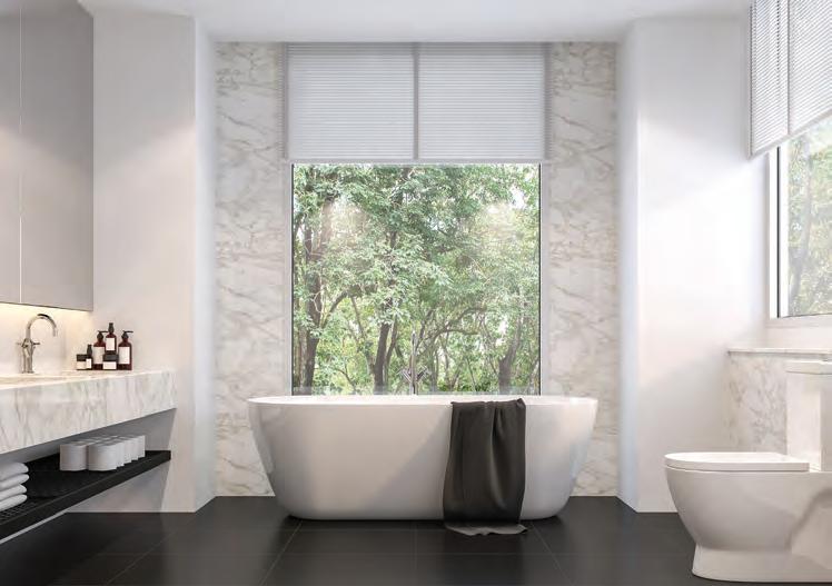
BATHROOM - BLANC ÉLYSÉE
HOME IS WHERE THE HEART HIDES
Two intimate retreats that offer luxury of a particular kind: that is, the luxury of complete privacy, and a design perfectly tailored for the needs and preferences of those who live there. By Martha Uniacke Breen
EVERYDAY LUXURIES
Demonstrating again that luxury means different things to different people, II x IV Design creates common spaces for two Toronto condo projects, each with its own unique point of view. By Martha Uniacke Breen
A LITTLE BIT OF RICHNESS
How two retail brands are mixing high- and low-end design concepts to appeal to today’s shoppers.
By Matthew Hague
CLASS ACTS
From limestone fortresses to all-white bridal dreams, these retail designs balance grandeur with precision for a new era of elegance.
By David Lasker
14 20 26 14 20 32
COVER – The wood-and-concrete structure of a private residence near Mont Tremblant both embraces and displays the natural shape of the land. Photo by Welldone.archi
03/04 2025
10 CAUGHT OUR EYE
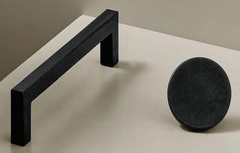
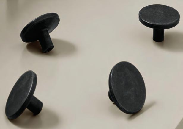
11 THE GOODS Disrupt your materials library with handles made from recycled ocean plastic.
12 SEEN Domestic and international influences peppered the show floor and programming of IDS Toronto.
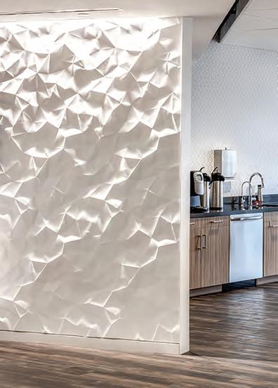
36 OVER & OUT A subterranean spectacle of structure and shadow, Omar Gandhi turned automotive exhibition into architectural experience with Audi Haus.
CANADIAN INTERIORS
Editor in Chief
Peter Sobchak
Art Director Roy Gaiot
Contributors
Martha Uniacke Breen, Matthew Hague, David Lasker
Online Editor Lucy Mazzucco
Publisher Faria Ahmed 416-441-2085 x. 5 fahmed@canadianinteriors.com
Canadian Interiors magazine is published by iQ Business Media Inc.
126 Old Sheppard Ave, Toronto, ON M2J 3L9
Telephone 416-441-2085
e-mail: info@canadianinteriors.com
website: www.canadianinteriors.com
Canadian Interiors publishes six issues, per year. Printed in Canada. The content of this publication is the property of Canadian Interiors and cannot be reproduced without permission from the publisher. Subscription rates > Canada $38.95 per year (plus taxes) U.S.A. $71.95 USD per year, Overseas $98.95 USD per year.
Back issues > Back copies are available for $15 for delivery in Canada, $20 USD for delivery in U.S.A. and $30 USD overseas.
Please send payment to:
Canadian Interiors, 126 Old Sheppard Ave, Toronto, ON M2J 3L9 or order online www.canadianinteriors.com
For subscription and back issues inquiries please call 416-441-2085 x2
e-mail: circulation@canadianinteriors.com, or go to our website at: www.canadianinteriors.com
Trying to zero in on “luxury” — as an aspiration, as a market share, as a trend, as any way of categorizing people and their spending and living habits — has always been slippery at best. But as the economic landscape evolves to such a degree where both growth and disparity are shaping the future, using the concept of “luxury” as a shared metric will slide away as it yields to more individualistic impressions of the term.
In the past, the equation was simple: luxury equals wealth. While still true, the expression of that equation is far more delicate, as more of the newer generations are questioning whether avenues to traditional forms of wealth accumulation are still open to them. After all, according to Pew Research Americans are more apart than before financially. From 1971 to 2023, the share of those who live in lower-income households increased from 27 per cent to 30 per cent, and the share in upper-income households increased from 11 per cent to 19 per cent. Since 1970 the growth in income for the middle class has not kept pace with the growth in income for the upper-income tier. Outcomes of these widening wealth disparities will take unusual forms: we’ll see women without children accumulating more wealth than their male counterparts, while single mothers face financial hardships.
That said, Generations X and Y are in their peak income years, representing the bulk of luxury purchases and soon the key pool of income growth. However, “Generation Z is positioned at the forefront of social and cultural change, inspiring other generations’ value systems, with a strong desire for lived experiences and a quest for meaning,” says market research firm Bain & Company. By 2030, Gen Z will account for 25 per cent of luxury market purchases, with millennials claiming 50 per cent. Together, they are set to “redefine luxury consumption, prioritizing authenticity and accessibility over traditional opulence,” according to the American Society of Interior Designers (ASID) 2025 Trends Outlook report. “The rise of the second-hand luxury market, driven by Gen Z’s focus on sustainability and exclusivity, signals a fundamental change in how luxury goods are valued. As this new
By Peter Sobchak
generation of consumers reshapes the landscape, sustainability, personal alignment with brands, and accessible luxury are becoming essential to staying relevant in the market.”
The ASID spoke very little about luxury in their 2025 Trends Outlook report. But perhaps that isn’t a bad thing: “luxury” is an overused word I hear all too often in interior design, typically followed by exploitative misuse, contradictions and confusion. “For some, luxury is opulence and grandeur. For others, it is sophistication and sustainability,” says Daniela Furtado, a consultant, speaker and head of Toronto-based Findable Digital Marketing. “Luxury is hard to define because it constantly evolves with consumer values. As the affluent consumer changes, so do their values and desires. I call this the ‘flavour of luxury.’”
And the flavour now is discretion. “Quiet luxury” has emerged as a prominent trend reshaping the design landscape, where the art of understatement reigns supreme. No longer a parade of excess, luxury now resides in the hushed elegance of natural materials, impeccable craftsmanship, and spaces that breathe. This cultivated restraint has permeated real estate, with discerning buyers gravitating toward homes that whisper rather than shout their affluence. The new paradigm favours sculptural silhouettes, tactility over trend, and interiors harmonized with their surroundings while imbued with a sense of sanctuary. The term “quiet luxury” may not be a new phenomenon, but it has become the new way to do minimalism: soft and warm where core values like creativity, artistry and distinctiveness are not declared but deeply felt.
ERRATUM
In the January-February 2025 issue of Canadian Interiors, the byline for the story “You’ve Got Mail” was erroneously credited to Evan Pavka. The correct author of the story is Dave LeBlanc. Additionally, in the story “Teeing Up for All Seasons” Longridge chairman and co-founder John Clark was erroneously identified as John Crawford. We regret the errors.
CanadianInteriors.com
IDS 2025: All Are Welcome
A mixed bag of domestic and international influences peppered both the show floor and programming of the Interior Design Show in Toronto.
The Revival of Architect as Master Builder
A historic model for contemporary practice may lead to a more holistic approach to the creation of buildings and interiors.
Study Break: Le Within
Sid Lee Architecture and CANORA redefine student housing in Montréal.
Fou Fou
LemayMichaud combines elements from European cafés to create a unique restaurant experience in Montréal.
28th Best of Canada Awards, the only national design competition in Canada to focus on interior design projects and products without regard to size, budget or location!
All winners will be published in the July/August 2025 issue of Canadian Interiors
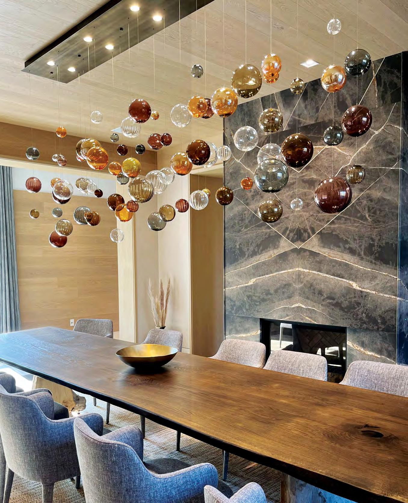
Orbit Bubbles Chandelier Glass Artist: Karli Sears
Project Designer: Drawing Room Architect
CAUGHT OUR EYE Design TO Edition
Smoke on the Water Kudos to DesignTO for getting to 15 years. But as with any festival of over 100 events and exhibitions, not all of them will be standouts. Which is why it is great to have a stable of stalwarts you know are going to bring their A-game, such as Mason Studio, which participated for the sixth time and presented The Invisible Tide: Awakening Unseen Forces in their Cultural Hub. Using collaborations, the team invited us to surrender to the moment in a reflective pool and contemplate light (by Mulvey and Banani), sound (cymatic art by Seeing into the Unknown), scent (by CBCB Fragrances) and touch (by Othership), all to reveal the subtle forces shaping our emotions and thoughts.
Glassed In Another regular in the fest, for their ninth year The Goodman Studio showcased two new collections in Keilhauer’s King Street East showroom window: Sylvia Lee’s evocative Lantern Collection inspired by traditional Chinese lanterns; and Radia Linea (shown), an intricate lighting installation by Brad Turner (veteran of the Netflix show Blown Away) created from an array of borosilicate glass rods.
By Lucy Mazzucco
Catch of the Day
Handles
and knobs
may
be some of
the most
overlooked
items in a house, but this new collection is trying to pull us into an awareness of our oceans’ perils.
The planet’s oceans are choking on fishing nets, trawls and other plastic material waste: conservative estimates say 11 to 23 million metric tonnes of plastic enter the ocean every year, the equivalent of a garbage truck full of plastic every minute. This mind-boggling crisis, overwhelming to many, has also prompted certain rightminded companies into action.
This includes furnipart, a Danish design company specializing in handles and furniture knobs, and whose new OceanIX collection includes the Plato knob and Square handle made from plastic pulled from our oceans. This is thanks to another Danish company, Plastix, who have created a process that involves collecting maritime material such as abandoned fishing nets and rope, passing it through a cleaning process and then converting it into a granular material called “OceanIX,” which can be used to manufacture new products.
According to an independent lifecycle assessment report, OceanIX material has a carbon footprint that is 94.3 per cent lower than virgin plastics such as PP and HDPE. Once furnipart’s handles have been molded and quality assured, they are packed in biologically degradable plastic bags and prepared for shipping.
“With OceanIX, we’re turning what was once waste into something beautiful and meaningful,” says Louise Berg Christensen of furnipart. “We know that our handles cannot save the world on their own, but they do enable you to make a decision that helps save our planet’s precious resources. This collection reflects our commitment to designing for a better tomorrow, because great design shouldn’t just look good, it should do good.”
Furnipart is being carried in Canada by Casson Hardware, one of the only retailers in North America to do so, with the OceanIX collection expected to be available this spring.
By Peter Sobchak
IDS 2025: All Are Welcome
A mixed bag of domestic and international influences peppered both the show floor and the programming of the Interior Design Show in Toronto.
The 26th edition of the Interior Design Show (IDS) Toronto returned to the Metro Toronto Convention Centre’s North Building with a healthy combination of programming and 258 exhibitors. Within this interesting mix of new and returning participants were such perennial favourites as Studio North and Prototype showcasing the latest creations from up-and-coming Canadian designers, and a stage dedicated to IDC and ARIDO’s efforts.
There were also some head-scratchers, like auto-manufacturer Volvo; and an extreme amount of Italian design in the form of an Italian Trade Commission pavilion showcasing 10 companies, and keynote lectures about Salone del Mobile Milano. There’s nothing wrong with head-scratching: good design can be seen anywhere, and this is, after all, a trade show, where products are shown and, hopefully, business is done.
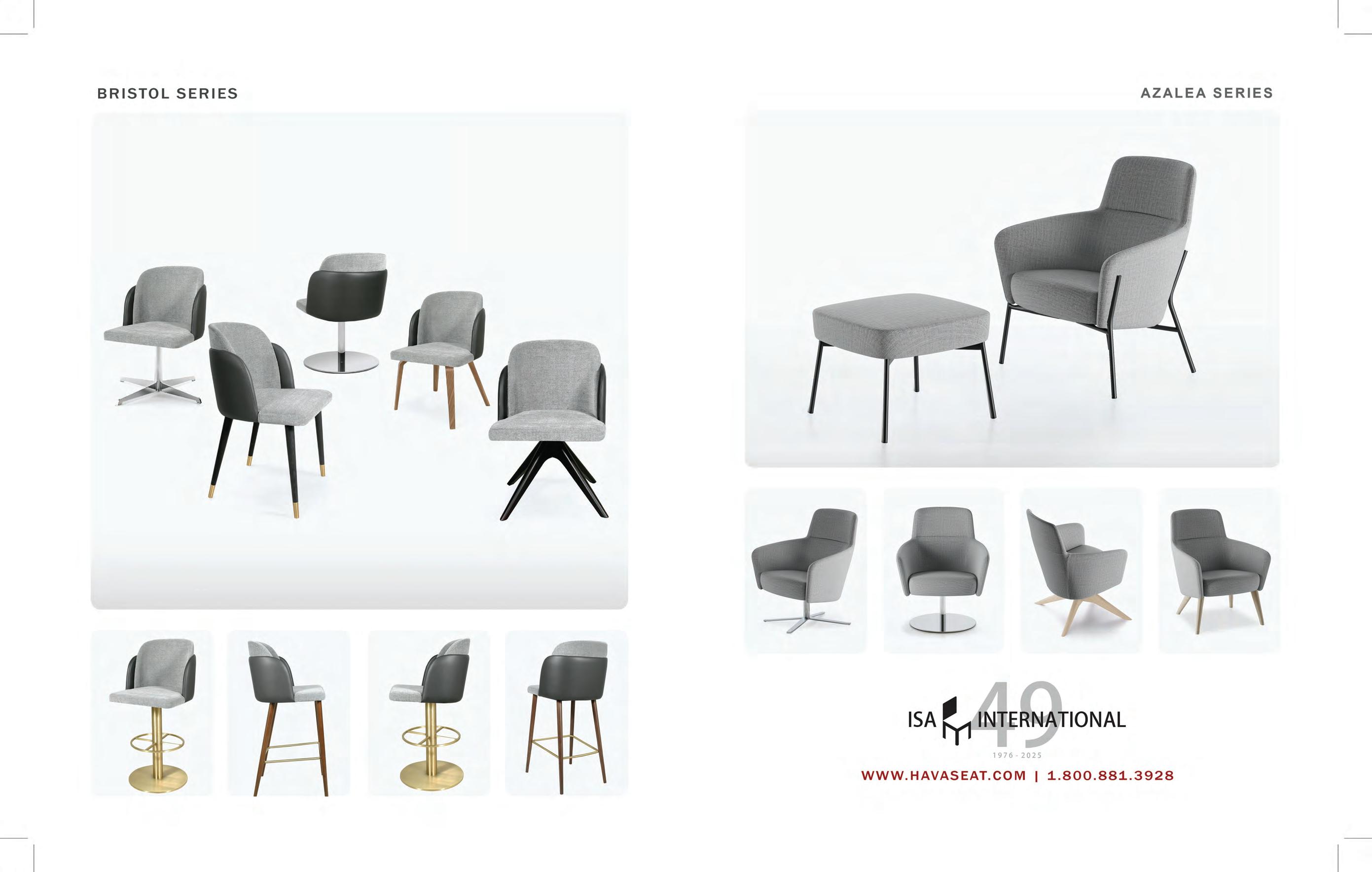
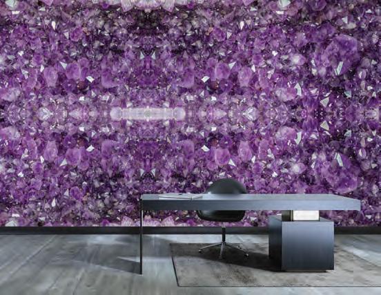
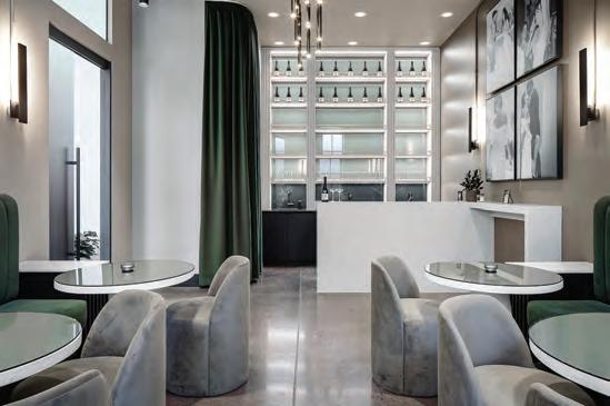
1/ Everything Hz | Rollout For 20 years, Rollout has reimagined wallpaper as an artful expression of energy and space. Rooted in the vibrational harmony of hertz (Hz), their latest collection soft-launched at IDS as part of the Night & Day concept space, representing a reconsidered spa. Channeling the serene essence of amethyst, a sacred stone linked to the crown chakra and inviting calm and clarity, this new pattern can transform interiors into sanctuaries where frequency and intention merge, nurturing presence, balance, and inner peace.
2/ VOLA KV1 | Hastings Bath Collection As the exclusive U.S. and Canadian importer and distributor of the iconic Arne Jacobsen-designed, multiple award-winning VOLA line, Hastings showcased the greatest hits of the Danish brand’s comprehensive kitchen and bath collections, including the striking FS3 floor-mounted, freestanding shower, and the KV1 deck mounted kitchen faucet (shown).
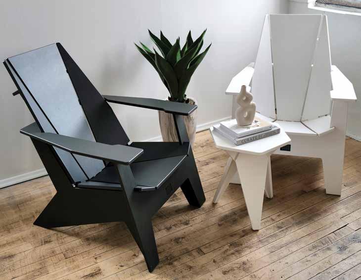
3/ ORI Muskoka | Komi Creation Easily missed in the Studio North corner of the show, this next-generation Muskoka (or Adirondack to Americans) chair reimagines a classic with a sleek, modern twist. Designed and crafted in Ontario with sustainable
materials, it blends Japanese artistry with Canadian innovation. Durable, weatherresistant, and precision-built by Mennonite artisans, it’s perfect for patios, rooftops, and resorts. Available in minimalist colours, it arrives flat-packed for easy shipping.
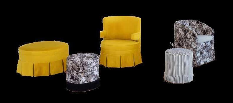
4/ Modern Heritage Collection | Silva Custom Furniture This collaboration between designer Alykhan Velji and Toronto-based Silva Custom Furniture includes 10 customizable furniture pieces, including chesterfield sofas, swivel chairs, ottomans, footstools, and beds. “Over the past decade, design trends have skewed to a minimalist aesthetic, and as designers, we are ready to bring richness back to our interiors,” explains Velji. “By blending heritage forms with bold patterns, and adding luxurious finishes, we’ve created a collection that will bring that sophistication and detail back to design.”
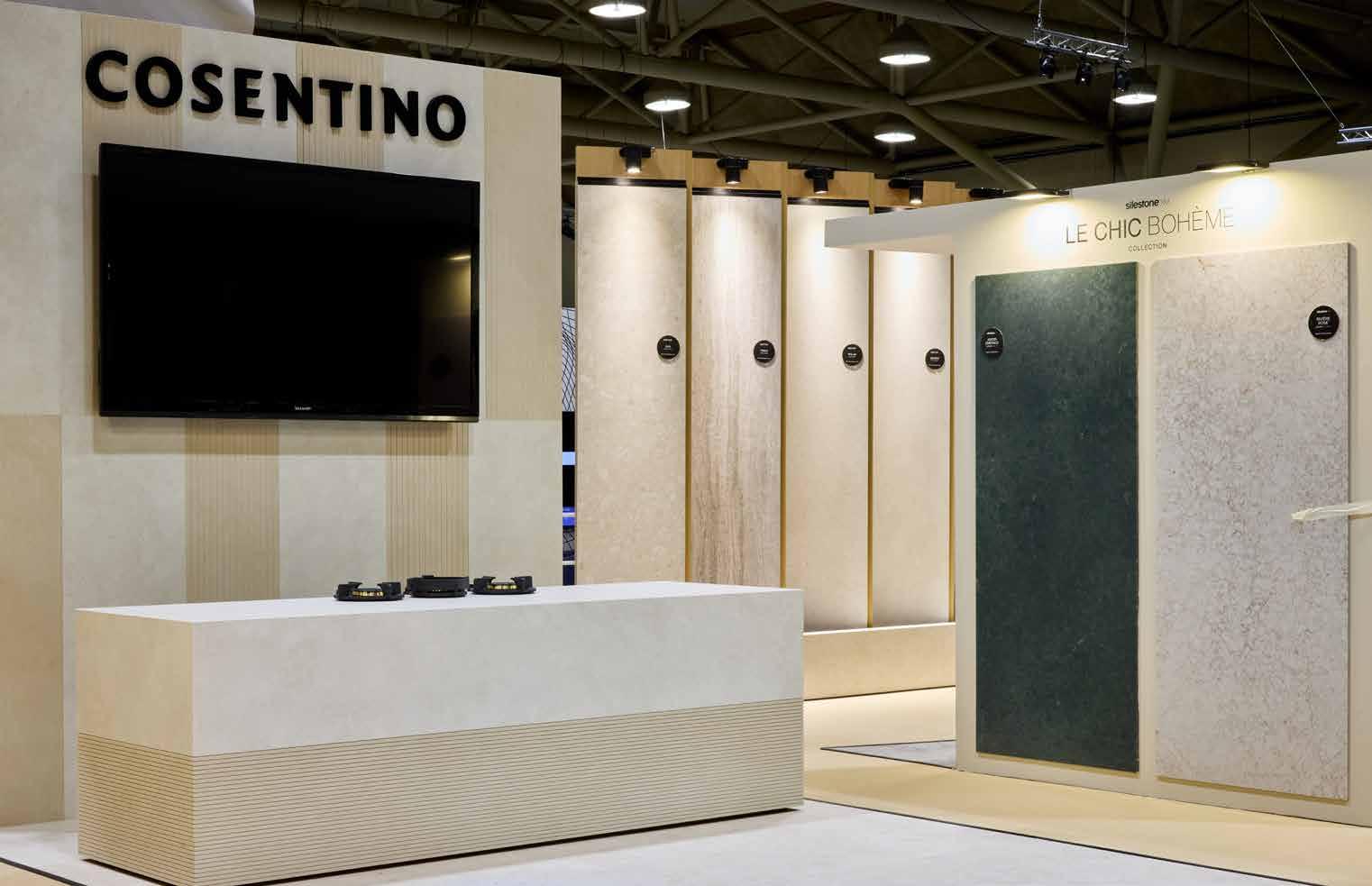
5/ FreePower Wireless Charging Integration | Cosentino In an eyecatching booth bedecked in slabs of Le Chic Bohème and Ukiyo was a new technological offering and a first in Canada: wireless charging embedded within Silestone and Dekton surfaces through a partnership with FreePower. This technology allows free-placement charging, blending utility with cutting-edge design for modern spaces.
By Martha Uniacke Breen
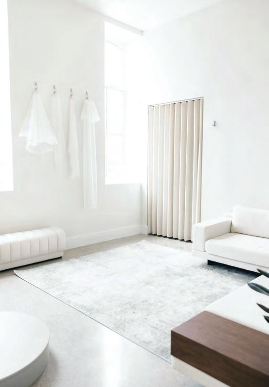
Home is Where the Heart Hides
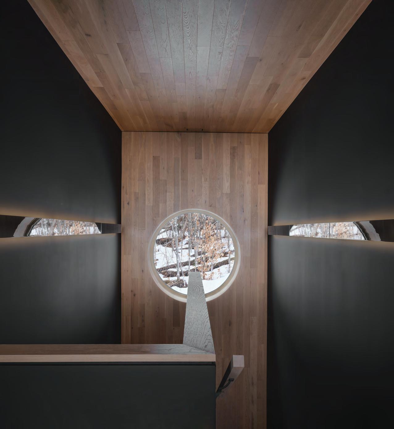
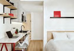
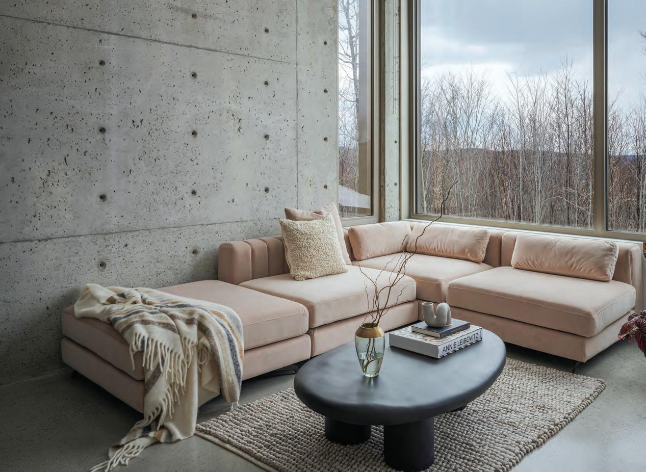
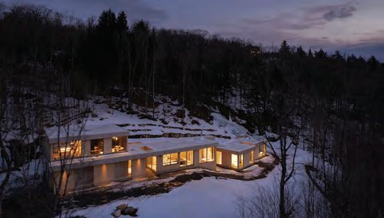
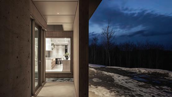
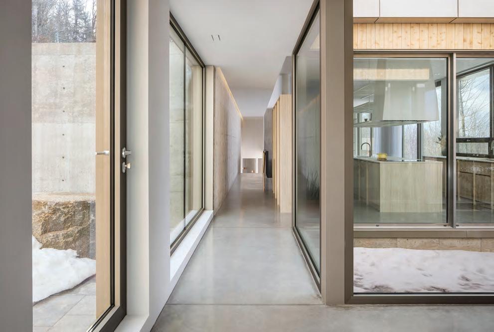
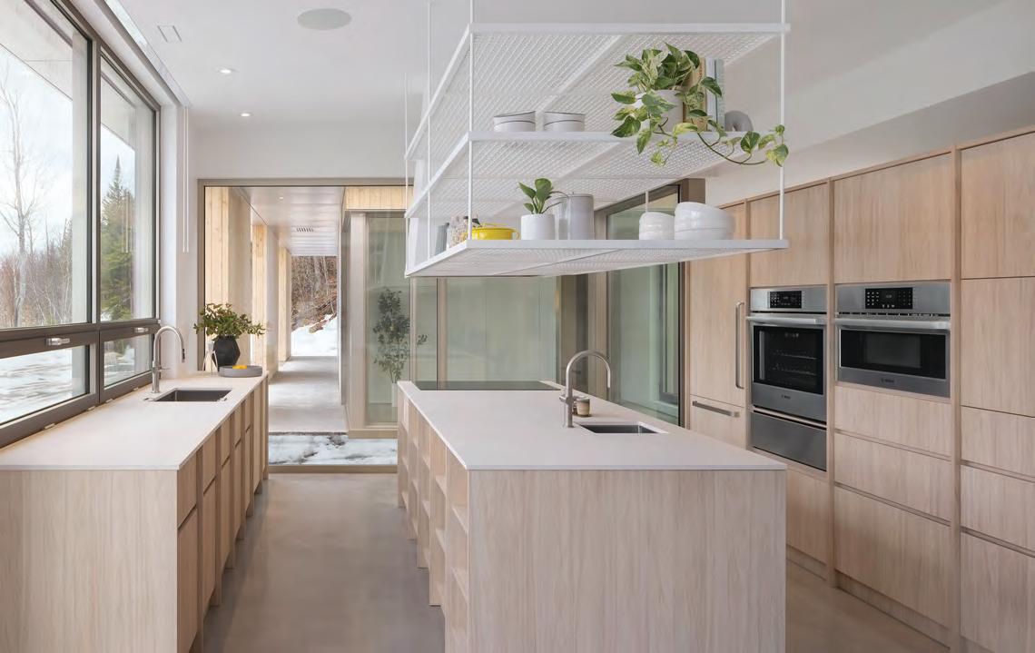
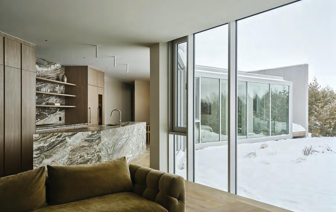
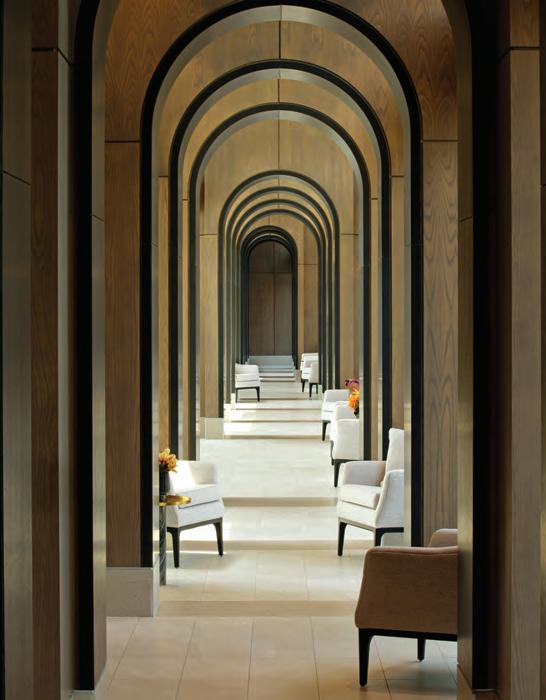
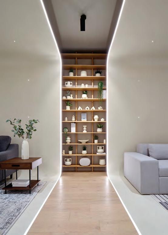
This page, top: Custom furnishings (previous Best Of Canada Award winners) were designed to harmonize in shape, tone and texture with the expansive views. Above: With its descending volumes, the house seems to flow like water down the slope and is sheltered, but not separated, from its surroundings. Opposite: A single flowing hallway runs the full length of the house, providing convenient access to rooms and a connection to the ever-present landscape.
HTwo intimate retreats that offer luxury of a particular kind: that is, the luxury of complete privacy, and a design perfectly tailored for the needs and preferences of those who live there.
ow, exactly, do you define luxury? You might be pretty confident you know what the word means; but when you get down to specifics, it’s actually a fairly elusive concept. To one person, it means the finest hotels, clothes, automobiles, jewellery, cuisine. But to another, it might simply be the security of a safe place to stay, a warm bed and clean sheets.
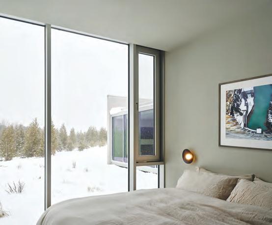
For the two elegant retreats here, luxury is being able to realize the dream of a home perfectly tailored to their owners’ own very specific needs. In the first case, it was a disarmingly simple design that used the principles of Feng Shui to not only harmonize perfectly with its surroundings, but with the priorities of its inhabitants as well. In the other, it was blending the seemingly contradictory priorities of cloistered coziness with wide-open landscape views; of complete privacy but accommodating to frequent guests.
A Retreat in Mont Tremblant
Patrick Blanchette, a Québec architect who previously worked in real estate development, has often worked with clients from the Asian
community and has developed a personal interest in the principles of Feng Shui. So, it seemed provident when two clients approached him to build a highly personalized home in the Mont Tremblant hills of Québec to be designed in harmony with Feng Shui principles.
Feng Shui, which literally translates as “wind/water,” is an ancient Chinese philosophy consisting of a series of design rules that, its proponents believe, optimize the flow of positive energy through a space. Feng Shui principles include a balance between opposing components; harmony with nature and the environment; the five basic elements of water, earth, wood, fire and metal; and the open and unfettered flow of air (and therefore, energy) through a space.
The secluded hillside that the clients chose for their new home presented an interesting challenge, in that it was tilted both laterally and top to bottom. From the driveway at the top left-hand corner, the house had to flow smoothly downhill in harmony with the slant of both planes. To achieve this interesting architectural feat, Blanchette and team conceived a single-storey structure divided into two
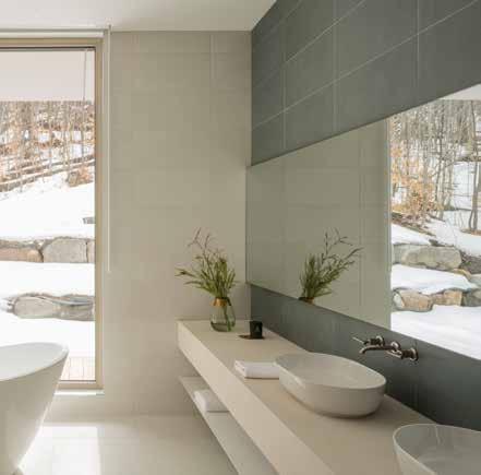
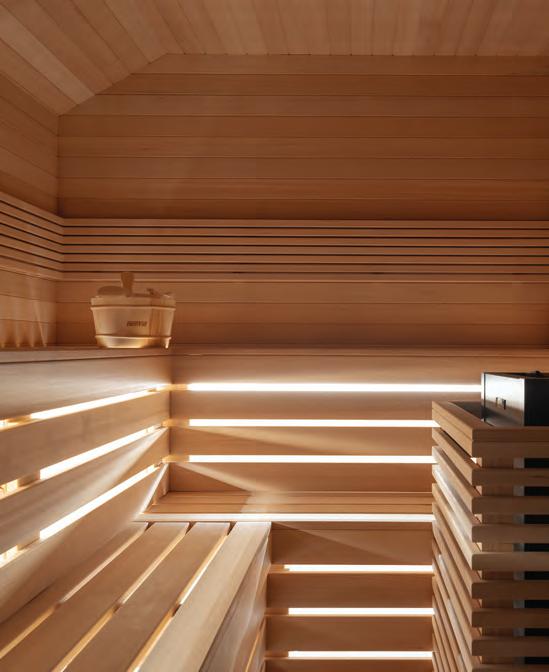
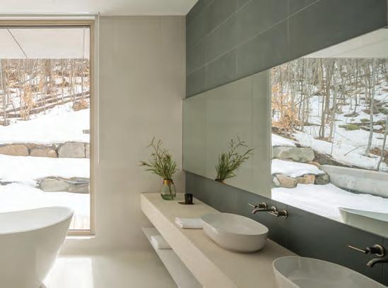
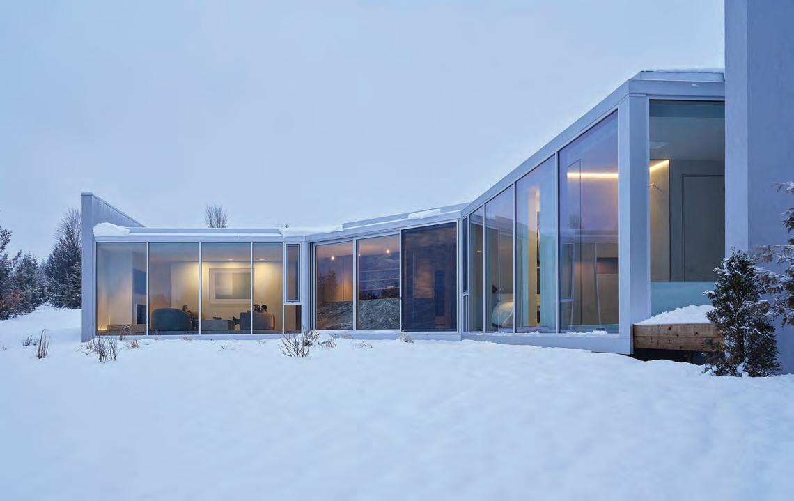
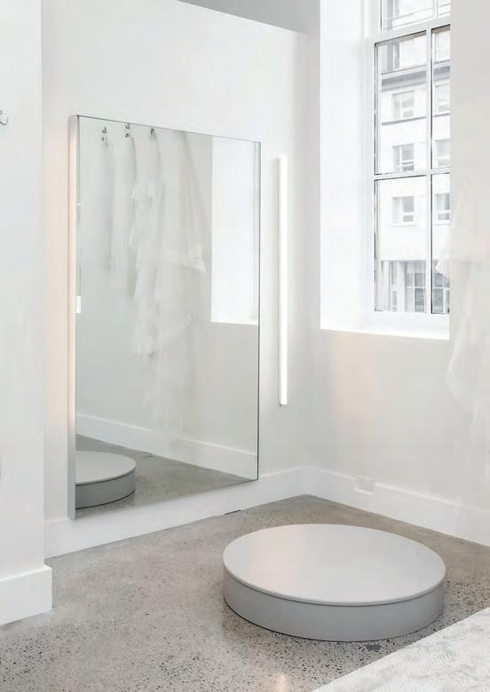
This page, top: Several outdoor courtyards pierce the overall volume of the home, as seen here at one side of the kitchen, making the outdoors a constant part of experiencing the space. Left: Even in the sauna, natural light is close by. Above: The ensuite offers another clear example of how the landscape dictated the choice of design and materials, to evocative effect. Opposite: The three separate but conjoined volumes of this Caledon, Ont., home are simultaneously oriented to the wide-open landscape and turned cozily inwards towards each other.
semi-conjoined volumes, with the bedroom wing about half-a-storey below the rest of the house. (The owners also wanted a semi-private space for guests and short-term rentals, so a second-storey studio was placed on top of the house at its highest corner.)
Inside and out, materials were selected with the objective of complementing the landscape so synchronously that, over time, it would virtually disappear. The exterior is a disarmingly simple composition of concrete, glass, steel, and cedar strip, in a narrow palette of warm greys; it blends remarkably well with the rocks, sky, earth and trees that surround the house. As the cedar boards weather naturally to silver over time, the effect will be even more striking.
Inside, the design is guided by the same simple principles of flow and harmony with the environment. Concrete walls and floors — a material favoured by both architect and client — present a smooth uniform backdrop, against which the landscape and more tailored views play out through large windows.
Elsewhere, the yin-yang (or balance between opposites, another key Feng Shui principle) between indoors and out is even more deliberately blurred. Each of the home’s two main volumes is punctured by glassed-in mini courtyards (a third, slightly larger one occupies the space between the two volumes); each is planted with
a single young tree that will one day grow to full size. The effect is to literally inject nature within the volume of the house.
One of the most dramatic events in the journey from concept to reality happened purely by accident. “One of the most important elements in Feng Shui is water,” explains Blanchette, adding that while the site had a beautiful view, it lacked any kind of natural water source such as a lake or river. But, as he relates, while the builders were blasting to create the level site that the house would sit on, suddenly a natural waterfall burst out of the ground, perfectly placed at the high side of the house-to-be. It would go on to become one of the central features of the landscaping.
“The architecture will change a lot,” Blanchette notes. “The cedar will turn grey; the trees will change; the landscape is like a textile. But it’s not just the beauty of the landscape all around the house. It’s the way that, over time, the house will disappear and become a natural part of it.”
A Den in Caledon
In the intriguing, bent-inwards design for a house near Caledon, Ont., the objective for Toronto-based Reflect Architecture was to create a serene, cozy home that celebrated the quiet beauty of
its surroundings, while also being private for its owners, whether on their own or while welcoming friends up for the weekend.
As Reflect principal architect Trevor Wallace explains, the clients had been living in a downtown condo. He travels a lot for his work; she works at home. “They looked at each other one day and realized there was no reason to be living in a 900-sq.-ft. box in the city; he just needed to be near an airport, and she could work anywhere,” says Wallace. “They loved the landscape of Caledon, so they decided to buy some land and build a house.”
Though the site they chose was set back a comfortable distance from the road, they wanted the design to balance maximum views of the landscape with an equally important need for coziness and privacy. The architects conceived a novel C-shape that, in effect, bends the home into three separate but conjoined volumes, creating a space that is a cloistered and private space for the owners, convivial for friends who regularly come to visit, and a wideopen celebration of the landscape outside, through floor-to-ceiling, wall-to-wall glazing that curves along the entire inside elevation.
On first approach along the driveway, you only see brief glimpses through the trees. But once you alight and enter through a sheltered stoop to the front door, the mood changes: it’s as if the house opens its arms wide, in a gesture to the landscape ahead.
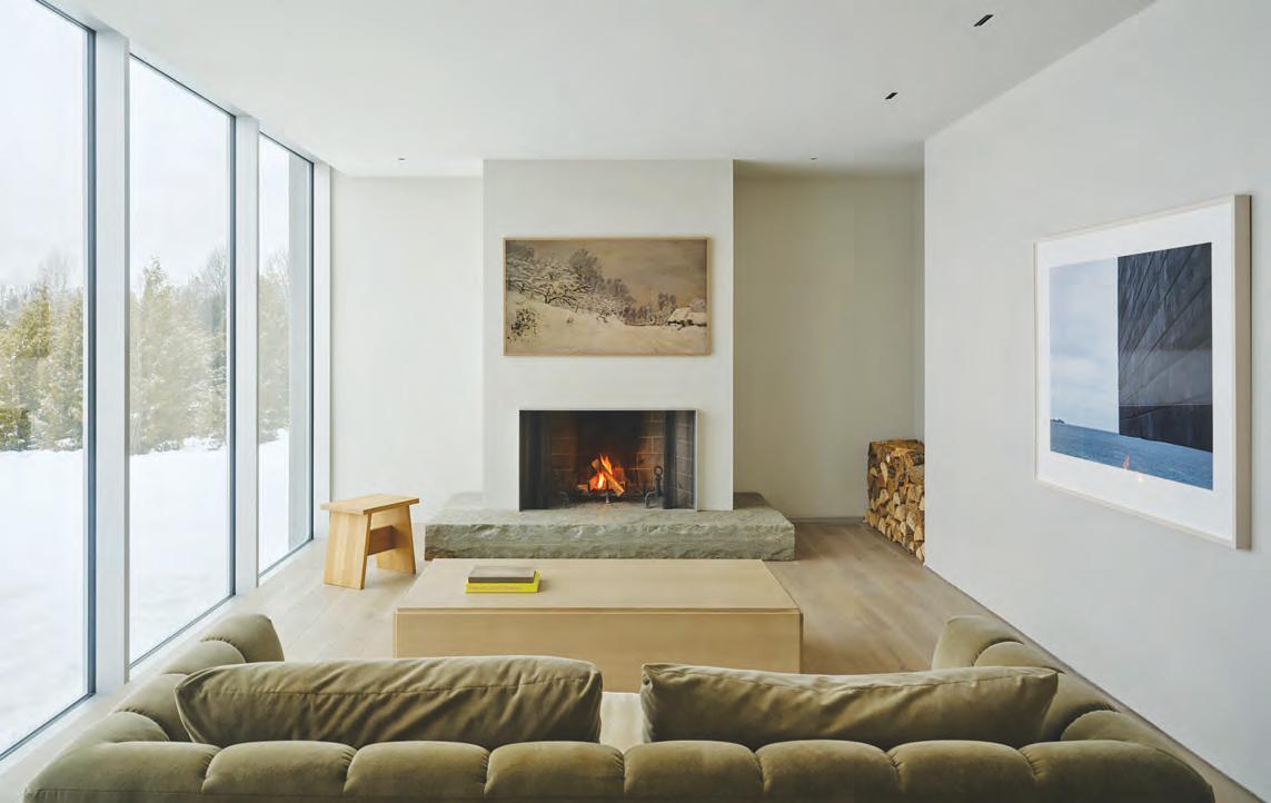
Breaking the north-facing house into three slightly inwardoriented sections was more than just a neat architectural trick: it orients each room for the best views and sun exposures at different times of day. The east-facing bedroom wing at one end is bathed in gentle morning sun, while the kitchen in the centre volume receives even light through the day and a panoramic view of woods and changing skies. The living room at the far end tilts to the northwest, perfect for enjoying a cocktail as the afternoon sun sinks below the trees.
The architects used material and form to play up the unusual footprint, and to blend the exterior with the unique colours and materials of its surroundings. For example, the kitchen island, clad in locally sourced granite, is shaped in a rhombus, following the angle of the C (as does the layment of the hardwood floorboards). Outer walls, where they aren’t glazed, are stucco painted in a shade of grey that blends softly with the landscape. Inside, the tracks and frames of the
windows are recessed in the floor and ceiling so their edges effectively disappear, further blurring the line between indoors and out.
One of the small fascinations of the design is how it balances the wide-open reality of those big views with human-scale comfort. The living room furnishings are oriented towards the fireplace and TV across the room, so the view from the sofa is over your shoulder rather than straight ahead, which could easily become overwhelming. This way it’s there, but not in-your-face about it. And while the fan shape means the bedroom windows are visible to the rest of the house, the strategic location of bed and bath furniture allows for sufficient privacy.
At the end of the bedroom wing hallway, there’s a private hideaway for the owners, even when the house is full of guests: a tiny courtyard in the lee of a high wall, accessible only from the bedroom. It’s perfect for morning yoga, or a quiet place to decompress with a book.
“The design was a very careful balance between the intimacy of the house and the landscape outside,” says Wallace. “It’s very much ‘of the landscape,’ without going too far the other way and being overwhelmed by it.”
Opposite: Each section of the house has its own character, its own unique orientation to the slant of the sun, and a sense of connection to other parts of the house. This page, top: a comfy sofa, turned to face the TV and fireplace, make the landscape a reassuring but not overwhelming presence. Above: While the bedroom wing has a sense of connection to the rest of the house, it’s still comfortably private when friends are visiting, thanks to discreetly positioning built-ins like the bed out of the line of sight.
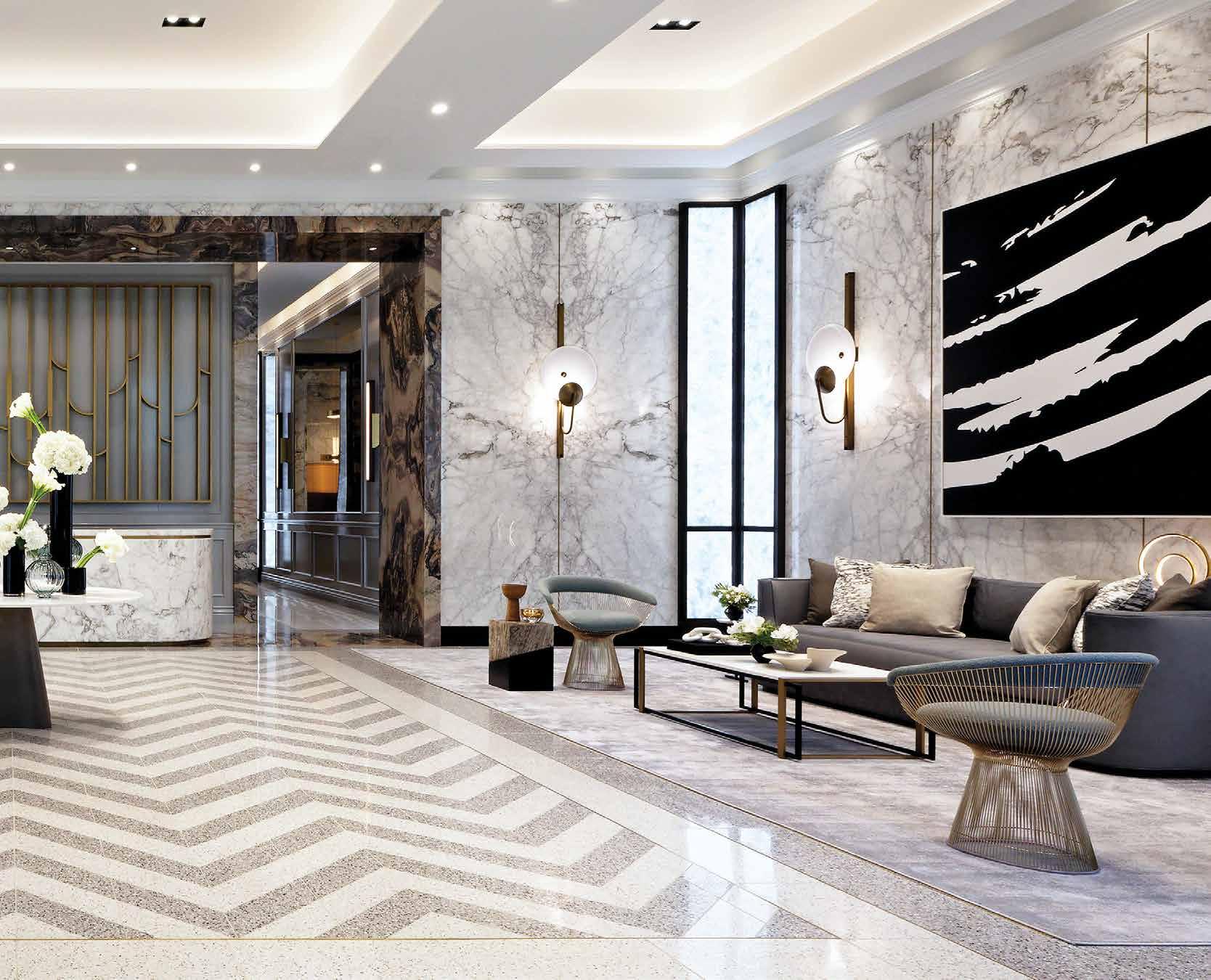
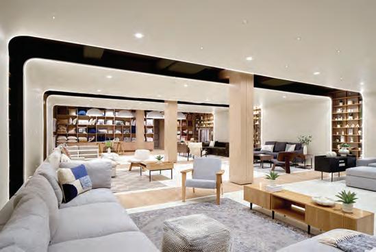
Everyday Luxuries
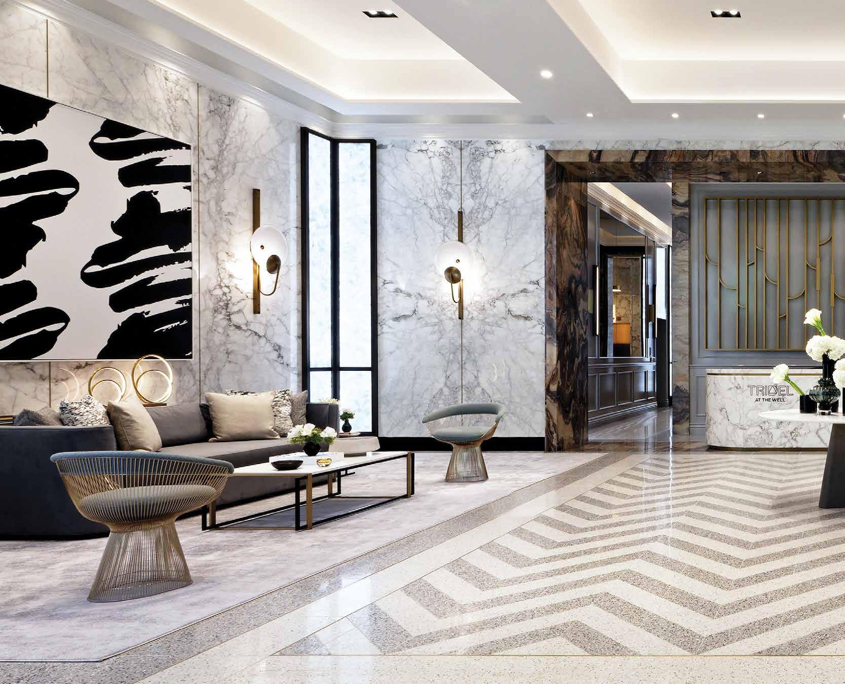
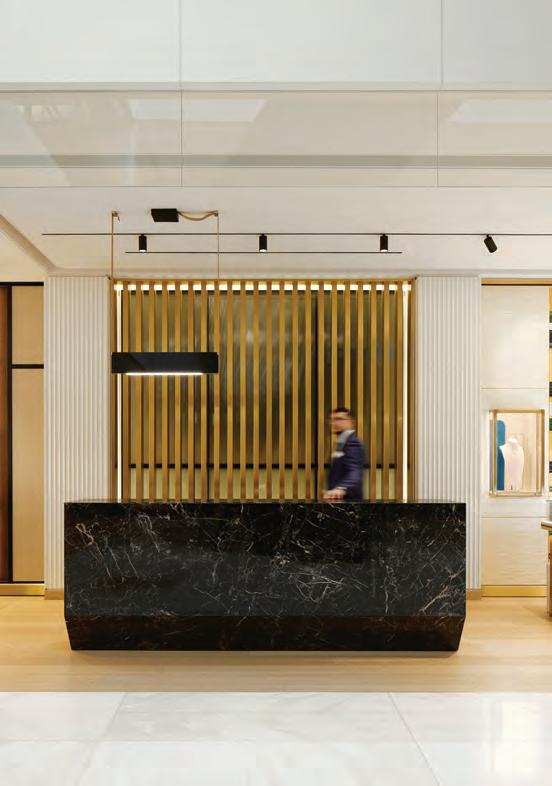
This spread: Tridel at the Well’s lobby is modern but timeless, with classic touches that ensure it won’t look dated in less than a decade. A calm, symmetrical design and a limited palette of beautiful but understated materials such as bronze, marble, and inlaid terrazzo all create a sense of quiet elegance. But it’s not without a certain subtle, cool urbanity as well: note the Art-Deco-inspired screen behind the concierge desk, vibrant black-and-white abstract paintings, and signature Platner chairs.
Whittaker
By Martha Uniacke Breen
Demonstrating again that luxury means different things to different people, II BY IV Design creates common spaces for two Toronto condo projects, each with its own unique point of view.
Nowhere is the idea of luxury more mutable than in the communal spaces of condo projects. The raison d’être of these spaces is not just to provide additional square footage facilities for the building’s inhabitants, but increasingly these days, to impart an air of elegance and aspiration. This is true whether it’s an entry-level tower near the waterfront, or a luxury building in the city’s most exclusive neighbourhoods.
Toronto-based II BY IV Design has built an enviable reputation for its handsome yet functional lobbies and amenity spaces for projects of every stripe, in the city and beyond. Co-founder Dan Menchions chatted about two recent projects, both for developer Tridel, and how they present the idea of luxury to two quite distinct audiences.
Photography by David
Tridel at The Well – Signature Series
Rising out of one of Toronto’s most ambitious and buzzworthy mixed-use projects to come along in years to the city’s deep downtown, Tridel at The Well combines both a hip urban vibe with a sense of community and family. The project is designed to capitalize on a rapidly growing neighbourhood, where residents can live, work, play, shop and dine, all within a fairly tight radius.
The prospective Well buyer is well-educated and well-travelled, with cosmopolitan, sophisticated tastes. “It’s a larger demographic than people might think, because it includes many different types of people,” observes Menchions. “Families, singles, retirees both young and older. Also, it’s end-user-oriented,” as opposed to some other downtown projects, which tend to attract rental investors.
The lobby design program leans towards a classic contemporary style, with a rich, neutral colour and material palette, and the occasional dash of conspicuous luxury: inlaid terrazzo floor, an ArtDeco-esque bronze screen above the concierge station, and mid-century modern classics like Platner chairs, which Menchions says prospective residents will recognize and appreciate.
Because the buildings are set within a forest of downtown skyscrapers, long views and natural light are at a premium, but the designers saw this as an inspiration, rather than a drawback. In the lobby, the fifth-floor fitness centre and elsewhere, translucent backlit panels give an impression of daylight, while elsewhere, strategically located windows and views celebrate the Cubist beauty of the surrounding buildings. And in the dining room, one corner window frames the canopy in the centre of The Well concourse, converting it into a kind of kinetic modern sculpture.
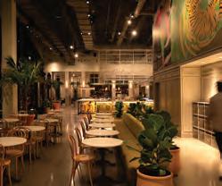
Guided by the overarching principle that shared amenities are an extension of residents’ homes (a concept that, surprisingly, is fairly recent in condo design), the communal dining rooms and other spaces could pass for their counterparts in a neighbourhood family home. There’s a TV room with a super-comfy sectional; a variety of seating areas that could be used as anterooms before going into dinner, or as places to meet and socialize on their own; and a fully equipped kitchenette that, with its elegant marble island and wall panels, herringbone-laid hardwood floor and attractive artwork, is equally suited to caterers, reheating trays or actually cooking a full meal.
So what is The Well’s definition of luxury, as II BY IV sees it? Classic contemporary design, with a sense of the buzz of urban life. A subtle but recognizable hotel-like feeling, since buyers are welltravelled and used to a certain level of quality and detail. “The target buyer is someone who wants to live in a space that reflects who they are and that is equivalent to or better than where they are coming from; it’s not just aspirational, but inspirational.”
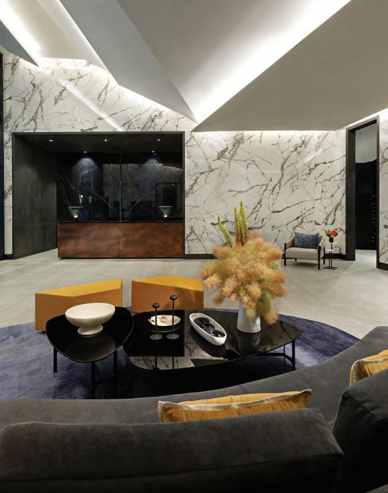
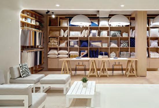
The variety of seating areas in Tridel at the Well’s lobby are designed to encourage patrons to linger rather than just pass through. This page, top: Extravagant-feeling design touches such as reeded walls, sumptuous finishes, super comfy armchairs and a pure-wool area rug evoke a homey feeling. Left: Another seating area feels younger and edgier, with its ochre seating cubes and moody colour scheme. Opposite: Auberge by the Park’s lobby is just as elegant but draws its inspiration from the open vistas and park-like scenery that surrounds the buildings.
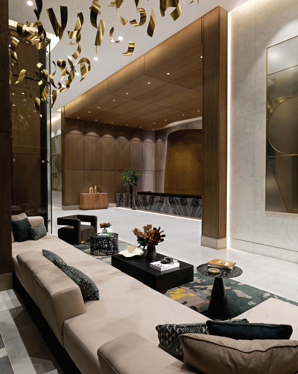
This page: In contrast to Tridel at the Well’s sleek black-and-white lobby, Auberge on the Park’s shared spaces feature warm, organic materials and European-inspired accents, for a markedly different take on luxury, such as tall arched vistas that add grandeur or an intimate spot for a tête-à-tête, under a backlit onyx screen. Opposite: Between the kitchen/ dining area and a comfortable spot for entertaining is a central area featuring a strikingly designed loveseat, ideal for relaxing before dinner under peony-shaped chandeliers.
Auberge on the Park
Though at first glance, Auberge on the Park’s public spaces exude a similar level of elegance and poise as The Well, the approach is notably different. Where The Well’s lobby and shared spaces are clean and contemporary, Auberge is lush and traditional. And while the former has a distinct urban vibe, the latter is sunny and expansive.
Auberge on the Park comprises a pair of conjoined towers (a third has just completed occupancy, with interiors of all three by II BY IV Design) arising on the former site of the storied Inn on the Park, the 1960s landmark hotel and hotspot known for housing Canada’s first disco, its first fitness centre and Olympic-sized pool, and a great location (for commuters of the time) close to the Don Valley Parkway. Nestled in some 600 acres of parkland, it features a view over acres of treetops to the skyline (and on clear days, the lake) far to the south.
As with The Well, II BY IV Design started their design brief by analyzing who would be living in the new development and foresaw a very different buyer. “It’s a magnificent home for someone who may have lived in the nearby neighbourhoods” — not unlike Menchions, who grew up not far from here himself — who appreciate nature, the forest canopy, parks and walking trails that snake through the area.
Also like The Well, suites here tend to be larger and geared to families as well as empty nesters and established buyers, but the design is more classic, with a definite European accent. “It’s like walking into
a grand hotel,” he says of the lobby, with its 22-foot ceilings, warm palette of dark woods, light-coloured furnishings and touches of green, and luxe materials like marble and bronze, which sparkle in the abundant sunlight that pours in from huge floor-to-ceiling windows.
Consistent with the idea that lobbies are becoming active spaces, rather than just a place to wait for your Uber, as Menchions explains, there’s an interesting variety of different types of seating spaces in the Auberge lobby, where you might socialize with guests, work or even stretch out in the sunshine with a book.
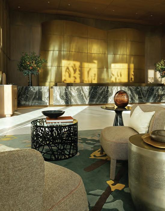
Pathways leading to the main floor amenity spaces feature rhythmic curved archways that create instant vistas. In fact, curves repeat all through the lobby, from the wave-like bronze screen that rises above the concierge station, a nature-inspired silhouette in contrast to The Well’s modern city-skyline-like counterpart. Over a sunny seating area overlooking the courtyard, a forest of curving bronze strips suspended from the ceiling (an installation by local artisans Fly Freeman and Francis Muscat) flutter like birds in flight.
The main-floor communal spaces have a richness in design, with home-like details such as walls panelled in wood and marble, hand-tufted wool carpeting, and luxe, European-inspired furnishings. In the dining room and kitchen, details like fluted panelling and radius corners add an important element in the home-like feel: these are details that might be already familiar to buyers coming from Don Mills or other nearby enclaves.
Menchions notes another important detail for users of these spaces. “The lighting has been very carefully curated,” he says. “It’s multilayered and designed to give the user plenty of options for creating a mood.” In ways like this, what might otherwise feel like anonymous, borrowed spaces outside the privacy of a resident’s individual suite, can be made to feel like home.
But it’s the fifth-floor terrace, Menchions says, where the development feels not just like a suburban backyard, but also a five-star resort. The whirlpool spa with its artistic blue mosaic backdrop, yoga spin studios and fitness centre — all oriented to look out over the treetops to the east and south — along with private barbecue and lounge areas and other features, make it feel like your own backyard. But the views, the landscaping and other perks take it one better.
In the world of condo interior design, the prime directive is to provide environments that telegraph a sense of luxury to their audience, while working under specific parameters like budget, location, and of course, what will appeal to the target consumer.
“In our work, there are always budgets, but the creativity comes in working within those budgets and still coming up with creative and special environments,” he says. “And today there is a lot you can do, for example with materials that offer a luxury look but at lower cost and often better durability than the real thing. And there are really wonderful materials out there; value engineering does not mean cheap! But really, there’s a pressing need today for housing at all levels, from more affordable to luxury projects. Our job is to accommodate all those needs.”
By David Lasker
Class Acts
From limestone fortresses to all-white bridal dreams, these retail designs balance grandeur with precision for a new era of elegance.
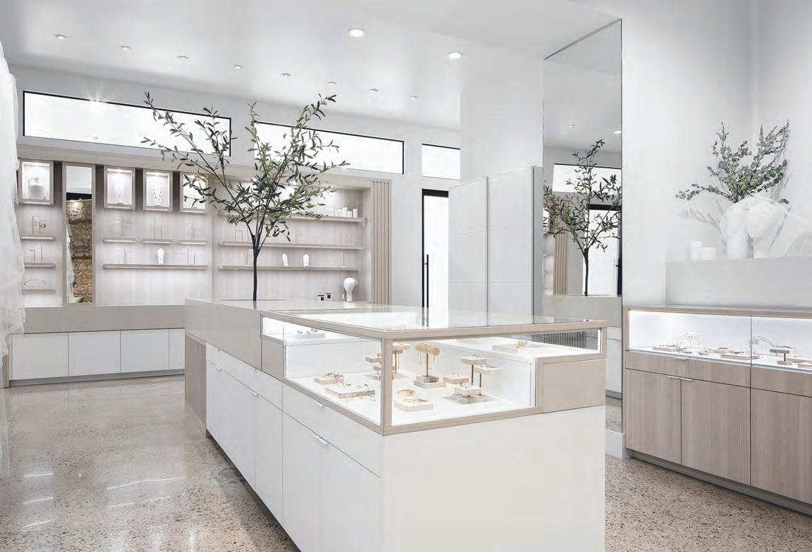
With affordability such a hot topic these days, how are designers navigating their clients’ desires for luxury retail? A look at two recent projects — Château d’Ivoire in Montréal by Archi-; and The Modern Bride in Guelph, Ont. by Urbanus Interiors — demonstrates that the eternal rules of retail merchandising still apply.
The first rule is counterintuitive: a high construction budget is not a prerequisite for luxury retail design. Extravagant materials per se don’t convey luxury. Rather, a store’s perceived market niche is inversely proportional to the quantity of goods on display. Junked-up racks, stuffed to the gills, scream “bargain bin.” Now picture an Issey Miyake boutique, where we’d expect to see calm expanses of negative space surround the scant garment displays to help fashionistas contemplate the subtle interplay of fabrics and textures. The second rule: the colour and materials palettes must be minimal, if not monochrome, to serve as a serene, non-distracting backdrop to the merchandise.
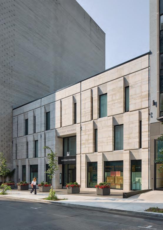
The Bling As replacement for the pre-existing hodgepodge of banal triplexes, jewelry mega-store Château d’Ivoire has vastly improved the stock of prime commercial real estate along Rue de la Montagne. “Demolishing buildings in downtown Montréal is very difficult,” says Cédric Boulet, architect and partner at Montréal-based Archi-. “We were able to convince the city that by demolishing these lesser-quality buildings we could build something that would bring back prestige to the street.”
The client literally wanted a castle: no surprise, given the store’s name. Boulet pondered how to create a castle that looked “contemporary, solid, timeless and oozing luxury.” The result is an imposing façade that looks massive yet refined, with 4½-inchthick blocks of Adair limestone, their off-white tint evoking “ivoire,” laid like masonry in the traditional method with mortar. A 3x3 grid of vertical and horizontal reveals subdivides the façade, bestowing a tailored, elegant look to the limestone’s avoirdupois while commemorating the demolished buildings’ envelope.
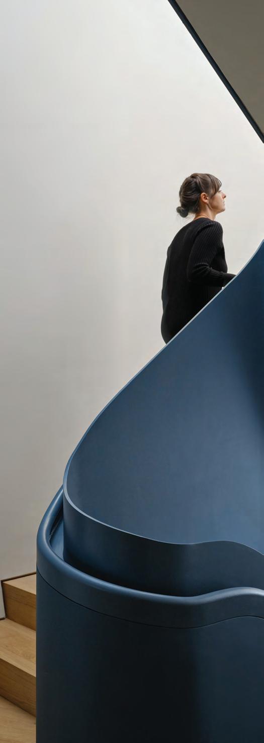
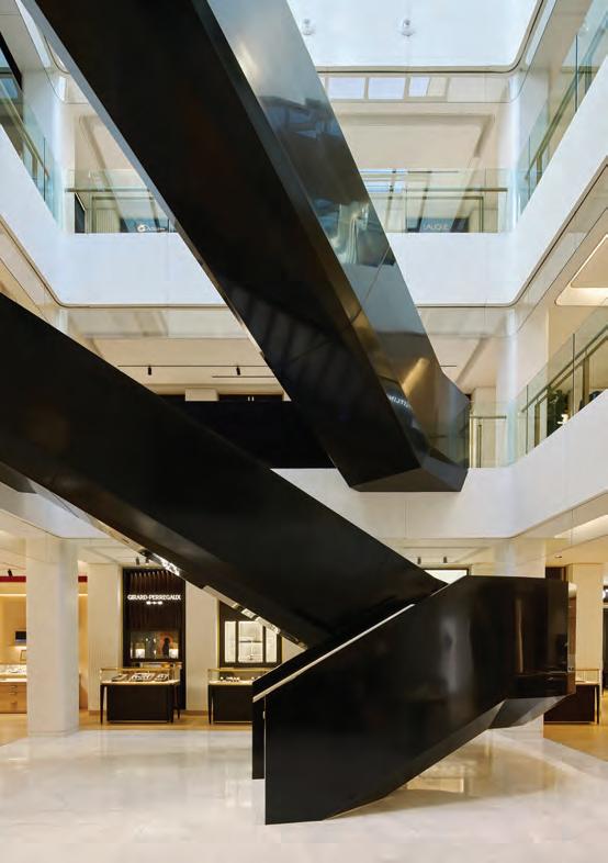
This spread Nestled in the heart of the Mille Carré Doré commercial district in Montréal and at the foot of Mount Royal, Château d’Ivoire spans three interconnected triplexes, crowned by a masterfully designed four-story building. At its core, a soaring atrium floods the space with natural light, illuminating a jewel-like Corian staircase. This sculpted centrepiece leads visitors from independent brand collections to an exclusive service centre and beyond.
James Brittain
Wide windows alternate with narrow slits inspired by meurtrieres or arrow loops in medieval castles that allowed archers to fire arrows from inside the wall. The beveled edge of the limestone lintel above each window recurs thematically inside. The motif reappears as the tapering bottom of the monumental atrium stairway and as a kick space in the hulking black-marble reception desk on the main floor and in the bar front on the third floor.
Like the façade, the aim for the interior, Boulet says, was “timelessness. We hope our sober architectural gestures will still look good in 20, 40, 60 years.” The biggest such gesture, serving as focal point and wayfinding device, is the abstracted Platonic essence of a staircase inserted in the centre of the skylight-lit atrium. Its black Corian cladding plays off against the cedar handrail and the white marble of the stair treads and atrium floor. The stair’s shape uses the Japanese doctrine of yin-yang or paired opposites, with the feminine softness and fluidity of the stairs’ curving main-floor landing contrasting against the severe, hard-edged masculine backdrop of the rectilinear atrium.
Archi- was interior designer as well as architect. “We designed absolutely everything in the store, right down to every single piece of furniture, including their displays,” Boulet says. While researching the store’s stable of luxury brands, such as Bulgari, Cartier and Rolex, Boulet’s team observed that they all had very strong graphic images. These images changed frequently to ensure that they were, he says, “flavour of the month, what’s hip right now. The challenge was: How do we make Chateau d’Ivoire stand out as a brand when it is surrounded by such powerful brands? And because there was so much information and different palettes, the question was, ‘How do we reduce the number of visual stimuli and make the project not feel like a mall?’”
The answer was to impose standardized white-on-black signage for each shop-in-shop. A fluted pilaster instead of standard flat gypsum board divides adjoining shops. “This fluted panel is the language of the store. It allows us to separate the brands with the Chateau d’Ivoire identity.” The fluted panel motif echoes in vertical screens made of steel bars dipped in brass. The screens delineate
James
Brittain
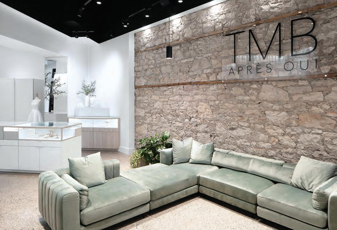
Left page Beyond the second level of Château d’Ivoire reveals a different world, including a café-lounge, meeting spaces, administrative offices, and laboratories that put on display the unique work of the jewellers. This page The Modern Bride’s new location in
Guelph, Ont., merges minimalist aesthetics with touches of extravagance, while always making the bride-to-be the focal point. A champagne lounge provides a luxurious space for celebration, featuring custom seating and exquisite details such as gold engraving at the entrance.
small spaces such as the service area behind the reception desk and the cozy semiprivate circular meeting/sales rooms upstairs.
Another of the principal materials, black marble, signifies customer service and makes up the reception desk and the VIP bar upstairs. Cedar flooring wraps the atrium. On the third floor, a long Miesian interior curtain wall divides the workshop from the VIP-customer area. The wall is translucent except for a mid-height transparent slit enabling staff to benefit from the atrium’s daylight while allowing customers to rubberneck and appreciate the employees’ work.
The Dress As the popularity of TLC’s Say Yes to the Dress reality TV series proved, bridal gowns are big business. And as the English lyrics to the Wedding March in Wagner’s Lohengrin proclaim, the bride, virgin or otherwise, must be “all dressed in white.” So too, by association, are bridal boutiques.
At The Modern Bride, Rolanda Simone, principal designer at Brantford, Ont.-based Urbanus Interiors, slathered walls and ceilings with Benjamin Moore Decorator’s White. “This brought down the ceiling and changed the volume of a room, making it feel more intimate. We psychologically and esthetically changed the space at a low cost.”
The monochrome interior jibes with the clean, simple design scheme she had envisioned. “Minimalism helps make the space more approachable,” she says. “The Modern Bride offers product at a variety of price points. The client wanted a space bordering on luxury that would feel accessible to all their brides.” The understated palette directs attention to the dresses and veils arrayed along the walls, and jewelry and other accessories displayed in the extensive, internally lit custom cabinetry: “We wanted the jewelry to pop when you look down at it.”
From the front door, the store looks inviting and approachable. In the lobby, lighting is of a warmer colour temperature than elsewhere and set at a low, relaxing brightness level. A large sectional sofa beckons visitors to sink in. Sightlines extend to the light, bright boutique in the rear. Midway lays the project’s wow-factor component, an olive tree growing in the central display cabinet. The view culminates in the base building’s charming, restored period windows.
Historically, Guelph was known as the Limestone City thanks to its nearby quarries and skilled quarrymen. This project is a partial gut and renovation of the Wellington Hotel, a four-storey Second
Empire-style limestone structure dating from 1877. Simone exposed its “beautiful bones,” she says, by removing the dropped ceiling to exploit the generous (up to 16 feet) height and scraping the existing floor to reveal concrete. She retained its surface imperfections, respecting them as the patina of age. Now a stylish polished-concrete floor, its large aggregate complements the subtle veining in the Caesarstone worksurface tops.
The dress arrival room is where brides-to-be try on their dress and accessories one last time. Large enough to host the bride, her bridesmaids, mother and mother-in-law, the room boasts plentiful seating, giant mirrors and a plinth for the bride to stand on so she can inspect her shoes and train.
Then the party moves to the adjoining Apres Oui bar, a venue for wedding receptions “with a moody speakeasy vibe,” as Simone says. There, guests can sit on the romantic-looking, channel-tufted ladyfinger-upholstered seating banquettes while sipping the store’s signature champagne. Or they can part the circular heavy velvet curtains wrapping the photo booth to capture those silly-but-demanded Instagram moments.
This spread The Modern Bride features custom millwork to display a curated selection of bridal accessories. At the centre is an island designed to house an olive tree, symbolizing peace, wisdom, and longevity. This central feature not only adds a touch of natural beauty to the space but also creates a focal point that draws the eye. Each dress arrival room is furnished with minimalist decor and large windows that flood the space with natural light, accentuating the clean lines and creating a perfect backdrop for brides to see themselves in their dress one last time before the big day.
By Matthew Hague
A Little Bit of Richness
How two retail brands are mixing high- and low-end design concepts to appeal to today’s shoppers.
These days, retailers face a tough challenge: how to convince consumers to part with their hard-earned money. Tariff threats, inflation, and an uncertain economy have everyone safeguarding their credit cards.
But in this landscape, some brands are meeting the moment by offering affordable alternatives to luxury: high-quality products at reasonable prices. It’s the kind of value that shoppers are increasingly seeking. Consumers are no longer just looking for a deal; they want to feel as though they have purchased something special, something more valuable than the sticker value.
In turn, this is reshaping the retail experience and is reflected in the design of new stores. Crafty retailers are building spaces that break away from monotony, offering a much-needed escape from the bad vibes that are defining our current climate. While the world may feel heavy, these innovative new stores provide a refreshing respite, even something to smile about.
From digital presence to physical resonance
This is the case with the Cozey Flagship store in downtown Toronto. Cozey, a Montréal-based online furniture brand founded during the pandemic, is all about offering modern, clean-lined, customizable furniture at reasonable prices. A three-seat sofa, for example, can cost $1,800 or less. Buyers can select their preferred colours, configurations, and textiles. Then, IKEA-style, they receive their item flat-packed, ready for DIY assembly.
“It’s not super high-end like Prada,” says Michel Lauzon, founder of the Montréal-based LAAB Architecture studio that designed the Cozey flagship. “But it gives customers a lot of control over what they are buying, which makes the brand special.”
Cozey opened its first brick-and-mortar location, at a cost of $1.4 million, to give customers the chance to experience the furniture firsthand. It’s a place to sit on, touch, and truly get a feel for the
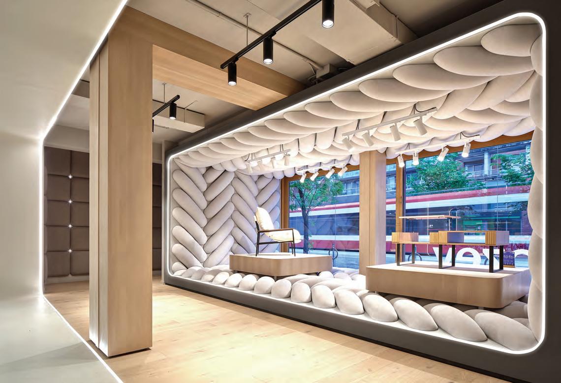
This spread Cozey’s
store uses a striking design palette to transform a digital native into a physical space. The showroom eliminates traditional retail elements like cash registers and storage, focusing the tight footprint instead on things like a striking window installation that mimics a giant fabric weave, drawing visitors inward. Custom furniture, integrated shelving, and a thoughtful layout flows through curved, edge-lit “rings,” reminiscent of a photography cyclorama, subtly shaping an intimate, home-like ambiance.
new flagship
brand’s quality. But the store design, with input from advertising agency Cossette, offers much more than just a tactile experience. “We wanted to provide something unique,” Lauzon explains.
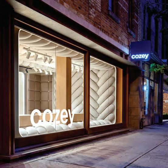
The uniqueness begins at the street with a whimsical front elevation. As soon as customers see the store, the concept of coziness is on full display. Giant windows reveal a soft, plush scene, with oversized foam beads that are wrapped in upholstery, arranged to look like a giant piece of fabric, and form a comforting cocoon around a display of furniture.
The whole thing is surreal and playful, as though customers have been miniaturized, Honey, I Shrunk the Kids-style and placed atop a giant soft sofa cushion. (Although visitors are officially discouraged from walking on the oversized fabric, if you look closely, you might notice a few small footprints left behind by children who broke away from their parents and couldn’t resist the temptation.)
Beyond the front entrance, Cozey’s design departs from the merchandising techniques employed by many mass-market furniture stores. Instead, they are pushing for something more personal and interesting. While larger retailers often rely on vast warehouses and staged vignettes that replicate living rooms or dining rooms, at just over 3,000 square feet, Cozey is more intimate and its displays are far more artistic.
Chairs, sofas, and coffee tables are presented against clean, bright white backdrops, illuminated by pinpoint lights that make the walls glow. These backdrops are what Lauzon calls “cycloramas,” a term borrowed from photography that refers to fabric stretched tightly around a backdrop frame. “We wanted to do something more abstract. It’s really meant to highlight the quality of the furniture design,” explains Lauzon. “In a way, it also replicates the digital shopping experience, where products are often showcased against a simple white background.”
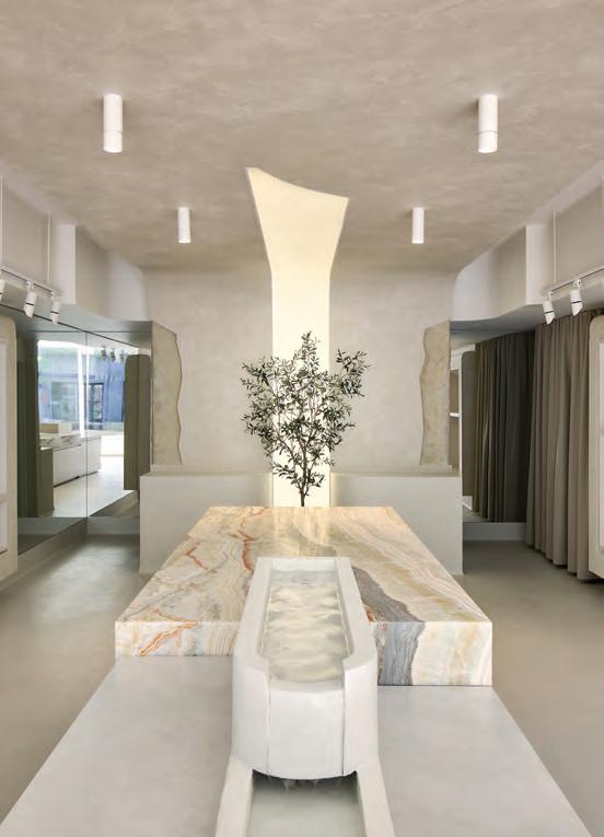
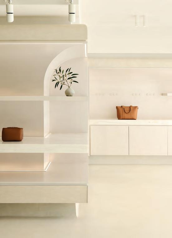
This spread Monos is a dreamlike space in Toronto’s Little Portugal neighbourhood influenced by gentle surrealism and the cultural hospitality of Portugal’s Pousadas. Plinths formed of honed Turkish Rainbow Onyx give way to a delicate water flow; softly encased wall niches adorned with subtle Italian Onice Striato Avorio stone; and an olive tree in the heart of the room, rising against a feature light installation that seemingly bursts forth from a narrow parting of waxed plaster and monoliths of split-faced cottonwood limestone.
Unlike a photographer’s studio, though, these cycloramas are crafted from taut vinyl, giving them a slight give to touch while maintaining a hard, shiny appearance. The sheen softens the look of everything around it, including the upholstered furniture on display. To prevent the cycloramas from feeling too stark, they are separated by wooden bookcases (another Cozey product) which hold decorative objects like vases and bowls.
Lauzon admits that designing the cycloramas was challenging. “It was hard to find the right colour and product,” he says. “It was also difficult to meet the fire rating requirements.” However, the cycloramas serve a practical purpose beyond aesthetics, as they help conceal ductwork and other mechanical elements that would otherwise be visible in the ceiling. In total, there are four cycloramas, which guide customers to the back of the store where the design centre allows visitors to choose their preferred fabrics and configurations for ordering. There are no actual furniture pieces available for immediate purchase, no storage in the store at all. Everything on display is a physical avatar, “examples of what people can customize,” says Lauzon.
A sensitivity to ephemera
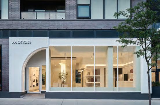
Much like Cozey, Monos, a Vancouver-based luggage brand, applies a luxury-inspired approach to offer reasonably affordable products.
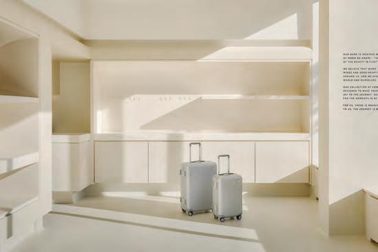
A Monos suitcase typically costs less than $500 (even with customizable embossing), which is far more accessible than many high-end luggage brands adorned with linked Gs and L and V patterns. Their new store, located just around the corner from Cozey in downtown Toronto, elevates its streamlined, minimalist cases into gallery-worthy objects. Thanks to clever lighting and displays, it can be difficult to distinguish between a hard-sided suitcase and a piece of minimalist sculpture.
The space, designed by Toronto- and Vancouver-based studio Ste Marie, was inspired by the Japanese concept of mono no aware, which celebrates the beauty of fleeting moments. This philosophy is reflected in the store’s design in various ways, including the walls and ceilings. Rendered in Venetian plaster by Montréal artisan Joey Di Venosa, these surfaces catch the light as it changes throughout the day. The store’s east-facing orientation results in a soft morning glow, while the evening twilight gives the space a more diffused ambiance.
When asked whether the store channels modern luxury, designer Craig Stanghetta, founder of Ste Marie, explained, “It isn’t luxury head-to-toe in the traditional sense. It’s not all draped in highend, super-refined materials. But there are touches of luxury. The plaster is a touch of luxury, especially because it introduces this beautiful, hand-crafted element.”
Stanghetta is currently designing more stores for Monos, including outposts in Boston and Chicago. He notes that while the locations will share some design elements, each new store will be uniquely tailored to its specific locale, a feature of luxury brands. “There might be unifying elements, such as curved shapes,” he says. “But each will feel rooted where it is. Each will feel special.” The Toronto store, for example, incorporates a distinctive Portuguese influence, reflecting the store’s location in Little Portugal. Stanghetta, who once lived nearby, was inspired by the area’s cultural heritage, which echoes an aesthetic found in Porto or Lisbon. As a result, the space features an olive tree at its centre, facing a sculptural water feature reminiscent of a luxurious resort. This unique design will not be repeated in Monos’ upcoming locations, such as Boston, which will incorporate a more coastal aesthetic with a sandy colour palette.
Like Cozey, Monos also offers a spacious and uncluttered environment. Despite the compact nature of the store, at just over 1,800 square feet, the layout never feels cramped. The luggage is individually placed on plinths made from honed Turkish Rainbow Onyx or displayed in niches adorned with shimmering Italian Onice Striato Avorio stone.
Both Cozey and Monos share another commonality: the absence of bulky cash registers. Instead, payment can be made anywhere within the store using an iPad. “It’s much more about a deftness of service,” says Stanghetta. “Things are fluid. Who wants to stand in line at a cash register? What could be more luxurious than meeting people exactly where they are?” Such thoughtfulness underscores a key feature of Cozey and Monos: luxury doesn’t always mean excess. It’s more about the art of creating spaces that feel like home, and the joy of owning something that elevates the everyday.
By Peter Sobchak
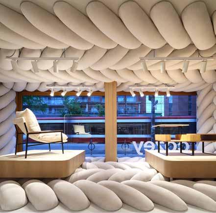
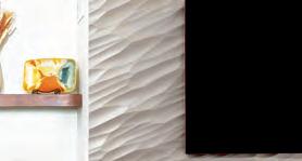
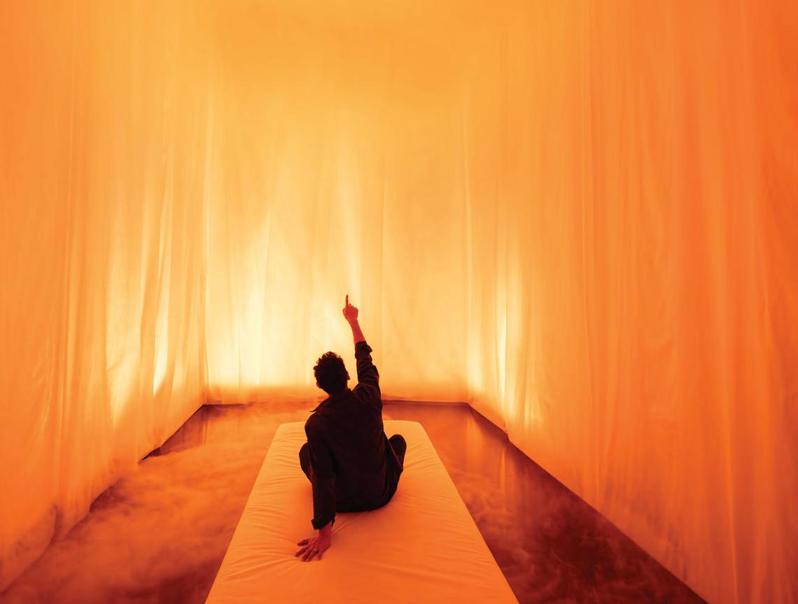
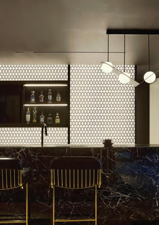
OVER & OUT
A Future Framed
A subterranean spectacle of structure and shadow, Audi Haus turns automotive exhibition into architectural experience.
Automobile manufacturers are experiencing something of a zeitenwende — a German phrase for “turning point” — as they pivot into the electric sphere. Most automakers are doing it, but how they present their new products to the buying public is playing out differently across brands. Take the Super Bowl, for example. Often called “The Parking Lot” by media analysts given how much airtime during the Big Game is dominated by lavish and incredibly pricey vehicle commercials, this year only saw two automakers during Super Bowl LIX: Jeep and Ram trucks. Some speculate this is in part because aggressively pushing new electric vehicle offerings to a primarily beer-guzzling blue-collar crowd may not fit well.
But a premier auto show in a high-earning market, on the other hand, may be the right fit. German automaker Audi decided the time was right to showcase their new vision of the future with a bold statement at the Canadian International AutoShow in Toronto, an event they haven’t been back at in five years. The company unveiled “the largest product offensive in Audi’s history,” says Joseph Ottori-
no, Director of Marketing at Audi Canada, with five all-new vehicles including the Audi SQ5, A5, S6 e-tron, Q6 e-tron, and SQ6 e-tron.
And they did it in Audi Haus, “a theatre of innovation for the brand” designed by Halifax-based Omar Gandhi. Here homage is paid to Brutalism architecture (a nod to Audi’s German heritage) along with other iconic structures like Berlin’s Mausbunker, using materials that evoke strength and modernity such as concrete textures, reflective metal surfaces, high-gloss flooring, and dynamic lighting.
Anyone who knows the AutoShow is familiar with descending deep into the Metro Toronto Convention Centre where it is housed. This trip underground is nicely referenced by how Audi Haus emphasizes compression with overhead structural elements and focused downlighting, casting the ceiling into shadow and creating a bunker-like atmosphere. References to the vehicles can be seen in infotainment screens (a part of every modern car now) and even the capsules and stages with gentle curves suggestive of the four-circle logo.
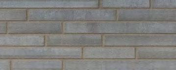
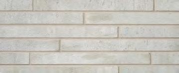
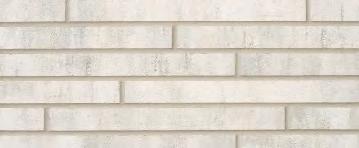
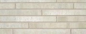
Thin Brick
Elevation
Level up.
Elevation thin brick surpasses faux finishes in looks and durability. At only 2-1/4” high, Elevation is an elegant, linear brick in a unique weathered finish. This stylish thin brick comes in lengths up to 23-5/8” and two thicknesses, which can be installed together to create depth and shadows.
Like all Arriscraft calcium silicate products, Elevation boasts the durability of quarried stone. Elevate your designs with walls that stand up for a lifetime.
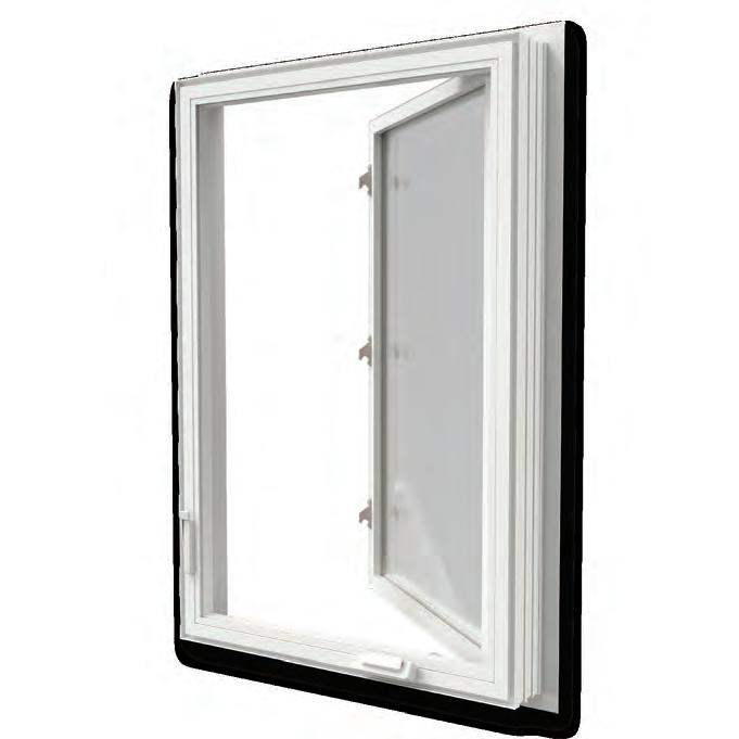
TIME TO SHINE
26% LOWER PROFILE FRAME FOR EXPANDED VIEWS
UP TO 22% BETTER ENERGY EFFICIENCY
DURABLE VINYL AND HYBRID RESISTS WEATHER AND DAMAGE
AVAILABLE IN PREMIUM FINISHIELD TM LAMINATE COLOURS
Welcome in the beauty and brightness of spring with JELD-WEN®’s JWC8500 series window. This innovative window offers exceptional energy efficiency, a low-profile design and remarkably robust frame. This intentional engineering gives you cool, comfortable, and quiet interior spaces, expansive views and long-lasting performance.
Experience the world in a whole new way this spring with JELD-WEN ®’s JWC8500 series window