

Creative
RUIQI SUN designer JaamZIN

Ruiqi Sun is a creative designer whose work explores the intersection of sociology, psychology, and visual storytelling to create meaningful and human-centered experiences. With a background in UX/UI design, graphic design, and branding, her designs have garnered international acclaim for their innovative fusion of tradition and modernity. Influenced by her multicultural upbringing, Ruiqi reinterprets historical and cultural elements through contemporary design, fostering emotional connections and cultural dialogue on a global scale. Her projects span industries from fintech to the arts, shaping brand identities, digital experiences, and packaging that resonate with diverse audiences.
UXScoops Pte Ltd Singapore
Registration No : 201601782G
JaamZIN Creative
YRuiqi Sun: A Visionary Designer Reinterpreting Ancient Scripts Through Contemporary Innovation
In the ever-evolving landscape of contemporary design, few artists navigate the intersection of cultural heritage and modern aesthetics as masterfully as Ruiqi Sun. A distinguished designer known for her innovative approach to visual storytelling, Sun brings historical narratives into the present with Nature in Scents, Time in Scripts—a groundbreaking project that reimagines China’s earliest form of writing, oracle bone script, through modern graphic design and sensory experiences.
For Sun, calligraphy has been more than an artistic practice; it has been a lifelong discipline, shaping her understanding of balance, form, and rhythm. Her deep-rooted appreciation for Chinese script, cultivated through years of meticulous study, extends beyond tradition into a realm where historical elegance meets contemporary function. Nature in Scents, Time in Scripts is a testament to her ability to bridge these worlds, transforming an ancient writing system into a design language that is both visually compelling and emotionally resonant.
Sun’s work is not merely about preservation—it is about transformation. Oracle bone script, one of the oldest known writing systems, is typically seen as an artifact of the past. However, under Sun’s vision, it becomes a living, evolving medium. Her approach carefully selects characters with poetic associations to nature—such as “wood” for earthy fragrances or “tranquility” for floral notes—allowing these scripts to evoke the same sense of memory and emotion that scent inherently carries.
The project’s execution posed significant design challenges. Oracle bone characters, being pictographic and irregular, defy conventional typography rules. Yet, Sun masterfully refines these characters into a clean, sophisticated visual system that remains faithful to its historical origins while embracing contemporary aesthetics. The result is a harmonious fusion of tradition and modernity, where each detail—embossed textures, minimalist layouts, and refined typography—works together to create an immersive experience that resonates across cultural boundaries.
Sun’s multicultural background and global collaborations have played a crucial role in shaping her design philosophy. With an analytical mindset developed from a science- and math-focused upbringing and extensive experience working across different industries, she approaches design with a rare combination of precision and intuition. Her ability to craft narratives that transcend linguistic and cultural barriers is what sets her apart.
Rather than confining her work within the framework of tradition, Sun repositions cultural heritage within a globalized design landscape, ensuring that the beauty and significance of oracle bone script are accessible to audiences beyond China. She understands that design is a language of its own—one that, when executed with intelligence and sensitivity, can bridge past and present, East and West, history and innovation.
Sun’s contributions extend beyond aesthetics; she is actively redefining how cultural heritage is engaged with in contemporary society. Through projects like Nature in Scents, Time in Scripts, she challenges the notion that tradition is static, proving instead that it can evolve and find new relevance in modern contexts. By embedding historical narratives into everyday objects, she transforms cultural appreciation from passive observation into tangible, interactive experiences.
In an era marked by rapid modernization and the potential erosion of cultural identity, designers such as Ruiqi Sun are essential in ensuring that heritage is not only safeguarded but also reimagined, reinvigorated, and empowered to contribute meaningfully to contemporary dialogue. Through her visionary work, she not only honors the past but also paves the way for future generations to experience, engage with, and be inspired by the richness of cultural history.
Author: Zin
NATURE IN SCENTS, TIME IN SCRIPTS
Nature in Scents, Time in Scripts reinterprets the ancient oracle bone script through modern graphic design, creating a unique candle packaging series that blends cultural heritage with contemporary aesthetics. The design incorporates calligraphy, earth-toned palettes, and textured materials to evoke nostalgia and authenticity. Through extensive research and thoughtful experimentation, the project bridges tradition and innovation, offering a sensory and visual storytelling experience that honors history while remaining accessible to modern audiences.

Candle Label Design
NATURE IN SCENTS, TIME IN SCRIPTS

Label Concept Booklet
NATURE IN SCENTS, TIME IN SCRIPTS

Label Design
NATURE IN SCENTS, TIME IN SCRIPTS

Candle Packaging - Ocean & Eucalyptus
NATURE IN SCENTS, TIME IN SCRIPTS
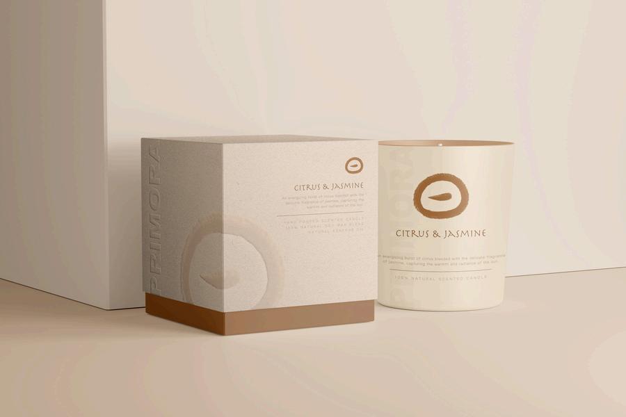
Candle Packaging - Citrus & Jasmine
NATURE IN SCENTS, TIME IN SCRIPTS

Candle Packaging - Lavender & Chamomile
NATURE IN SCENTS, TIME IN SCRIPTS

Label Details
NATURE IN SCENTS, TIME IN SCRIPTS
Label Design Color Palette
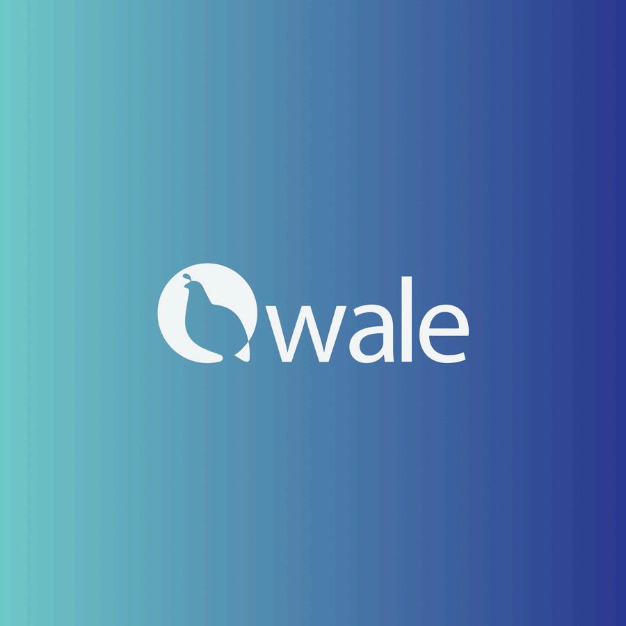
NEW VISUAL DIRECTION OF QWALE BRAND IDENTITY
New Visual Direction of Qwale Brand Identity is an award-winning branding project that redefines the visual identity of Qwale, a fintech startup. This design focuses on creating a cohesive and modern brand image that reflects Qwale's innovative approach to financial solutions. Through a strategic blend of clean typography, vibrant colors, and dynamic geometric patterns, the identity communicates trust, sophistication, and forward-thinking values. The project, which encompasses logo design, brand guidelines, and a mobile app interface, earned international recognitions, highlighting its impactful contribution to the branding of emerging tech-driven businesses.

Award-Winning Logo Design
NEW VISUAL DIRECTION OF QWALE BRAND IDENTITY
Logo Design - Light
NEW VISUAL DIRECTION OF QWALE BRAND IDENTITY

Logo Design - Dark
NEW VISUAL DIRECTION OF QWALE BRAND IDENTITY

Big Logo Vector
NEW VISUAL DIRECTION OF QWALE BRAND IDENTITY

Logo Variant
NEW VISUAL DIRECTION OF QWALE BRAND IDENTITY

LightBox Mockup
NEW VISUAL DIRECTION OF QWALE BRAND IDENTITY

App Mockup
NEW VISUAL DIRECTION OF QWALE BRAND IDENTITY

Web Mockup
REALITY BAR: DESIGNING A MULTI-SENSORY ESCAPE
Reality Bar is a uniquely immersive cocktail experience, blending innovative mixology with a captivating ambiance. This project focuses on crafting a distinctive brand identity through logo design and interior aesthetics, ensuring a seamless fusion of visual storytelling and atmosphere. The design concept enhances the sensory journey, making Reality Bar a destination where branding and environment come together to create an unforgettable experience.

Reality Logo
REALITY BAR: DESIGNING A MULTI-SENSORY ESCAPE

Reality Entrance
REALITY BAR: DESIGNING A MULTI-SENSORY ESCAPE

Reality Menu
REALITY BAR: DESIGNING A MULTI-SENSORY ESCAPE

Reality Bar
REALITY BAR: DESIGNING A MULTI-SENSORY ESCAPE

Reality Photobooth
REALITY BAR: DESIGNING A MULTI-SENSORY ESCAPE

Reality Signage