
1 minute read
What’s wrong with this picture?


Ifind roses to be difficult subjects to photograph. I’m rarely happy with the results. This particular blossom, for example, is very pretty to look at, but it doesn’t make a great image. It has complete depth of field, the exposure is good, the color is great, and there is nothing ostensibly wrong with the subject or the picture. But I’d never frame it and hang it in my house.
In analyzing the reason why it’s not a great shot, the only thing I can come up with is the graphic design, i.e., the shape its petals, isn’t as artistic as I’d like. I would say the design is pretty good, but by no means worthy of framing and enjoying on a daily basis.
The rose on the next page is, in my opinion, the best picture of a rose I’ve taken. It was, of all places, in a flower arrangement in the lobby of a hotel I was check-
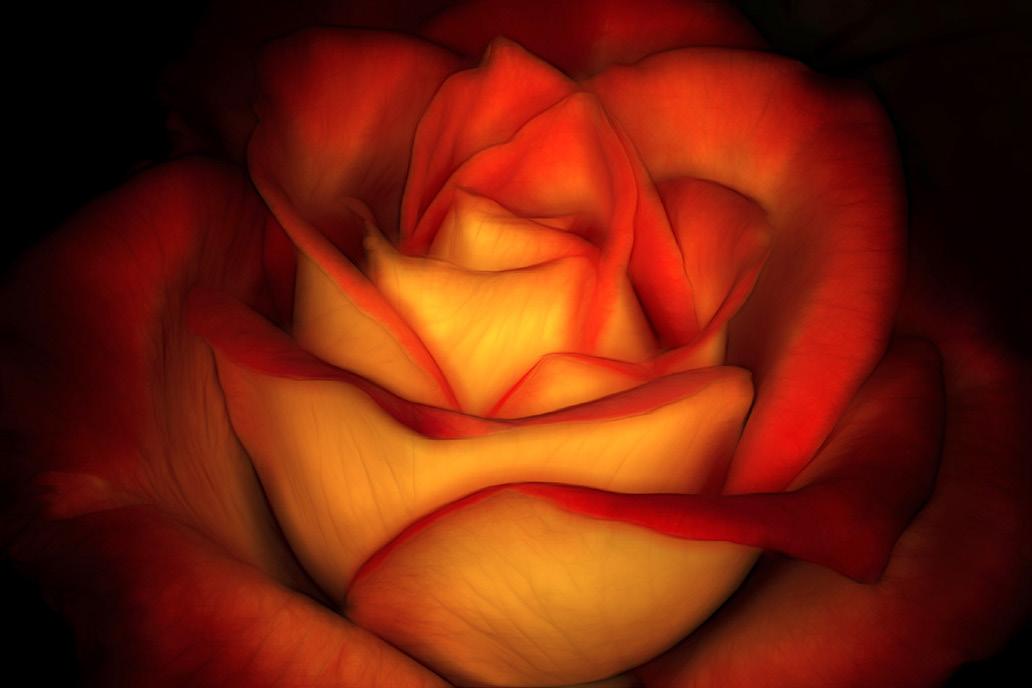
ing into in Costa Rica. I happened to have a ring flash with me, and this proved to be the ideal type of light. It simulates diffused daylight. This particular flower has exquisite contours and a lovely juxtaposition of color that makes it an exceptional flower.
So, what sets this picture apart from the one on the previous page is the graphic shapes of the petals. Both images have darkened edges and corners, both were illuminated by soft light, and both fill the frame nicely with the subject. But it’s the graphics of this shot that makes it, in my opinion, worthy of being framed.
Beautiful graphic shapes are the basis for all really successful and artistic images. And shape comes down to nothing more than attractive lines: S-curves, C-curves, sprials, diagonals, etc. §


