Style Guide


Who is Beaver Brook Golf Country Club?
18 Hole Golf Course & Pro Shop
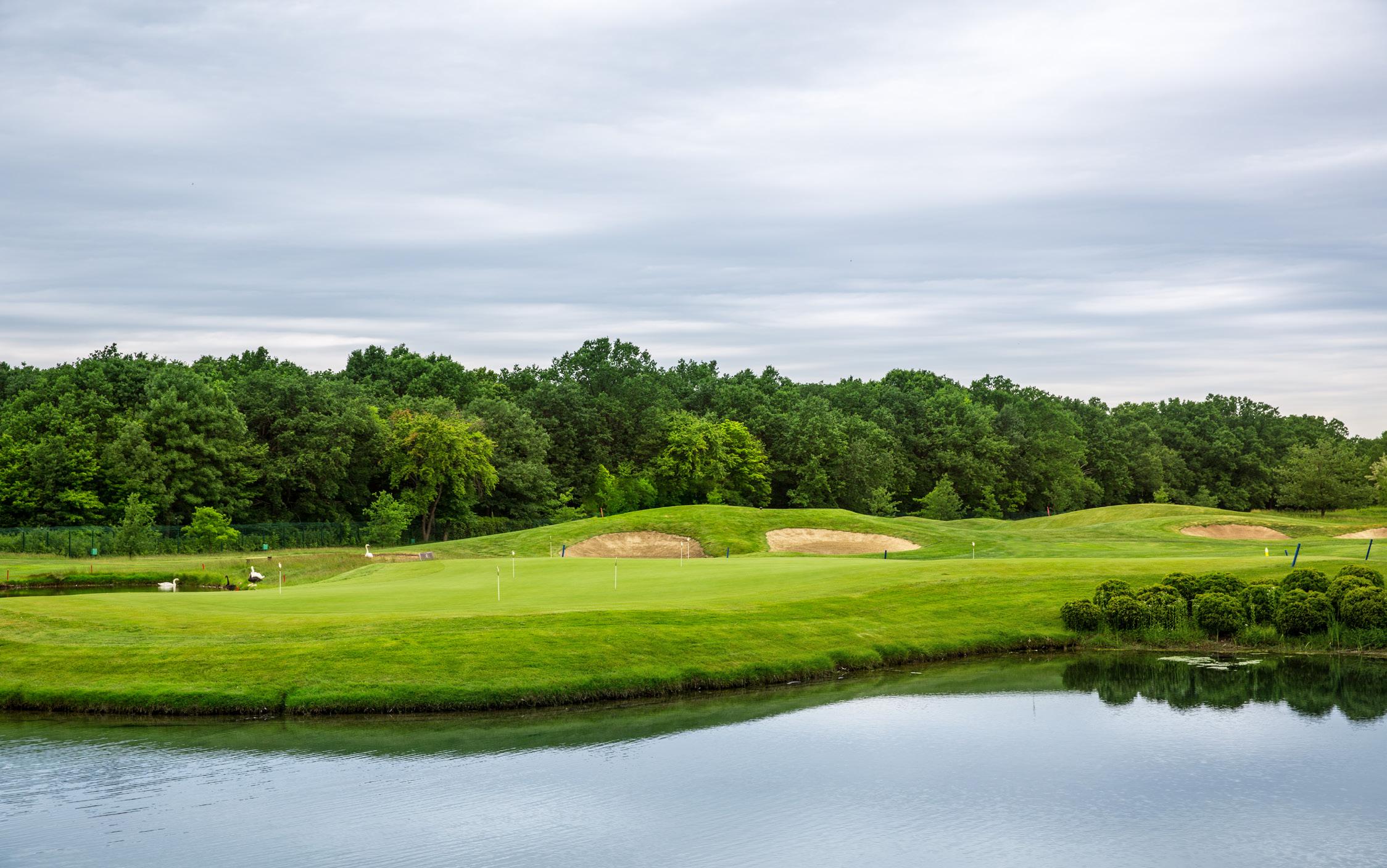
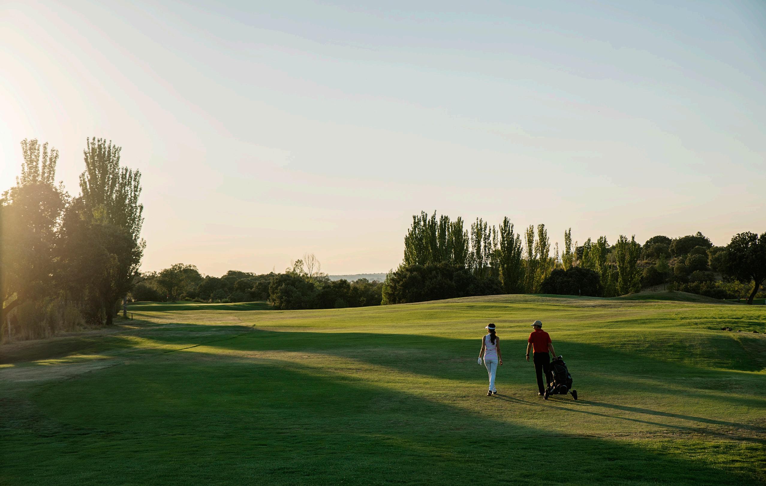
Designed in 1958 by Lon Mills and Dick Reedy, Beaver Brook’s golf course is as challenging to the golfer’s skill as it is beautiful to the eye. Scenic mountain views and lush green rolling hills make for a rewarding round of golf.
Pool
The beautiful pool at Beaver Brook is an oasis as it boasts 200,000 gallons of crystal clear water for your summer enjoyment. The shallow end of the pool is 3 feet and the deep end dips to 12 feet. We are always fully staffed with certified lifeguards.
Tennis
Beaver Brook Golf & Country Club offers a complete tennis experience featuring 5 hard courts (4 lighted) with a breathtaking view of the surrounding valley.
Events & Catering
At Beaver Brook Golf & Country Club offers fine dining. The banquet room is available for events.
What is the Purpose of a new Logo and branding?
The current oak tree logo has been in use for many years and is primarily serves as the icon for profiles on the website and social media apps. The oak tree looks outdated and is also a theme by a local competing club.
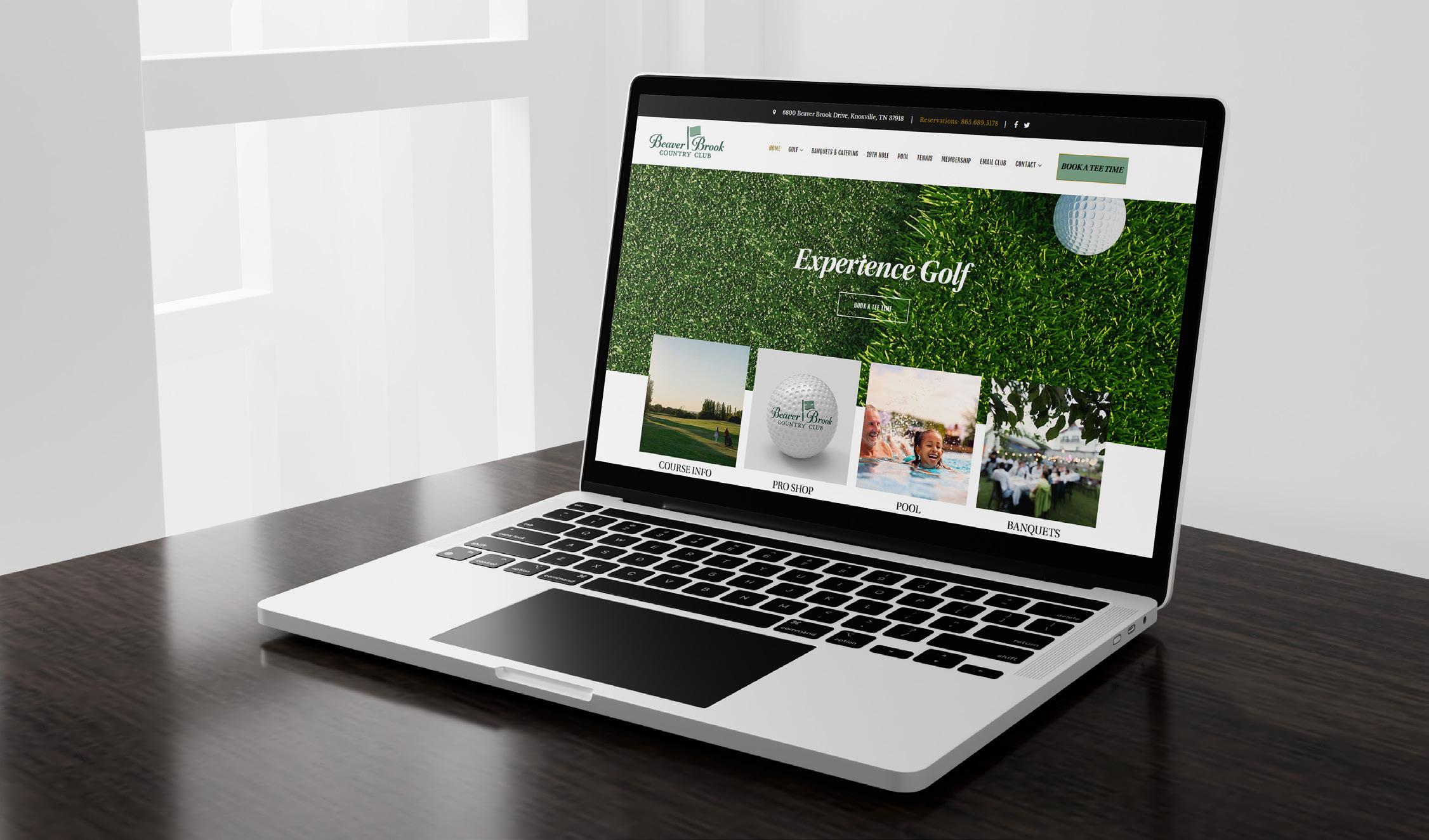
The purpose of a new logo and branding suite is to update the look to reach younger and modern clients and to expand the brand message to other products and areas within the facility as well as expanding digital branding opportunities. The visual message is consistent with company mission to serve families with an excellent dining experience in a fun, friendly atmosphere.
The new branding suite focuses soley on the primary service of the club which is golf recreation. The suite can be expanded to include the other services and perks of membership to further the reach of the brand’s target audience.
2 brand guideline
Introduction
original logo

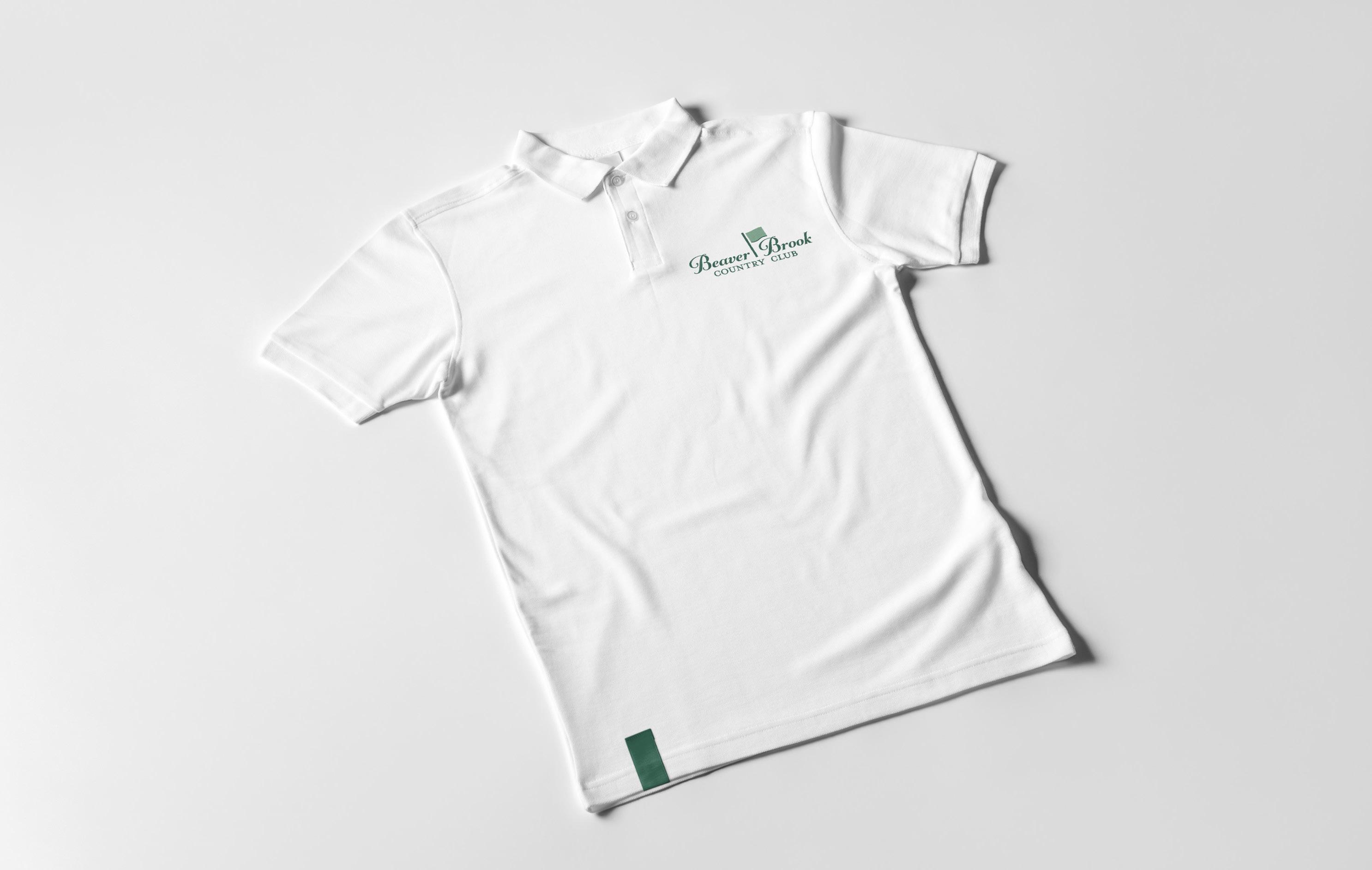
new logo

3 brand guideline
Logo Reveal
Alternative Logos


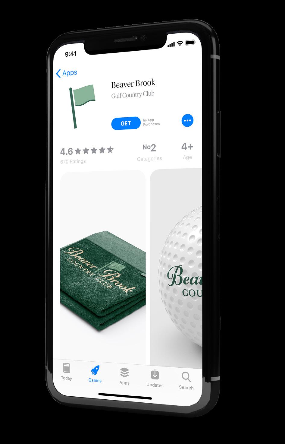
Logos intended for very small applications such as favicons and app icons.


Logos intended for small applications such as social media profile imagery.


6 brand guideline
Photography Application
All imagery should depict a positive overall message. The solid color logo will be most often the easiest to apply on photos. To ensure the best possible placement look for the most contrast between an area of light or darkness

and chose the opposite for the logo. For example, the light sky is good contrast for the black logo. Avoid placing the logo in cluttered areas of the image, or over a person - especially the face.


7 brand guideline
How to Use
THUMBNAILS
These smaller graphics are normally used for web. Smaller in size than the full image counterpart, thumbnails will load faster and increase download speeds. Improper logo size will prohibit readibility of text. Sizes smaller than 1.5 x 1 in will result in illegibility.

Below are examples of what not to do with the logo.


DO NOT vertically distort DO NOT horizontally distort DO NOT crop
DO NOT reflect or mirror
DO NOT ReColor
8 brand guideline
position
PMS: P 39 -20 4
CMYK: 78 - 40 - 68 - 27
RGB: 56 - 102 - 85
HEX: #366554
PMS: P 67 -18 7
CMYK: 51 - 20 - 47 - 0
RGB: 133 - 171 - 148
HEX: #85ab94
PMS: P 86 -5 -17
CMYK: 6 - 16 - 27 - 0
RGB: 237 - 212 - 184
HEX: #edd4b8
What are the Color Types?
What is CMYK (process color)?
CMYK Colors are most commonly used and appropriate for printed projects.
What is RGB (digital color)?
RGB color is for use with any digital device and used for website content, social media posts, or mobile apps.
What is Pantone (PMS or spot color)?
PMS colors are more precise and best for documents containing 3 colors or less and for large (over 1,000 quantity) print jobs.
Mrs Eaves - Roman All Petite Caps.
9 brand guideline
Color Palette & Typography
Utopia Std. AaBbCcDd EeFfGgHhIiJjKkLlMm NnOoPpQqRrSsTtUuVvWwXxYyZz
AaBbCcDdEeFfGgHhIiJjKkLlMmNnOoPpQqRrSsTtUuVvWwXxYyZz TYPOGRAPHY
