The Global Mean Temperature Anomaly Record
How it works and why it is misleading
by Richard S. Lindzen, Alfred P. Sloan Professor of Meteorology, Emeritus, Massachuse s Ins tute of Technology, and John R. Christy, Dis nguished Professor of Atmospheric and Earth Science, University of Alabama in Huntsville
Climate Issues in Depth
Editor’s Note, Caleb Stewart Rossiter, Execu ve Director
The CO2 Coalition is honored to present this Climate Issues in Depth paper by two of America’s most respected and prolific atmospheric physicists, MIT professor emeritus Richard Lindzen, who is a longtime member of the Coalition, and University of Alabama in Huntsville professor John Christy.
Professor Lindzen has published over 200 scientific articles and books over a five-decade career. He has held professorships at the University of Chicago, Harvard University and MIT. He is a fellow and award recipient of the American Meteorological Society and the American Geophysical Union. He is also a member of the National Academy of Science and was a lead author of the UN IPCC’s third assessment report’s scientific volume. His research has highlighted the scientific uncertainties about the impact of carbon dioxide emissions on temperature and climate more generally.
Professor Christy, the director of the Earth System Science Center at The University of Alabama in Huntsville, began studying global climate issues in 1987. He has been Alabama’s State Climatologist since 2000 and a fellow of the American Meteorological Society since 2002. He and CO2 Coalition member Dr. Roy W. Spencer developed and have maintained one of the key global temperature data sets relied on by scientists and government bodies, using microwave data observed in the troposphere from satellites since 1979. For this achievement, they were awarded NASA’s Medal for Exceptional Scientific Achievement.
When I became executive director of the Coalition two years ago, I never imagined that we would be chosen by the authors of such a paper as their publisher. Instead, I would have thought that this type of detailed piece, while written in an accessible style, would have appeared in a scholarly journal.
However, the CO2 Coalition seems to have become a “publisher of last resort” for scholarly work that falls outside an enforced, dual narrative: that there is an existential climate crisis from emissions of industrial warming gases, and that society can replace the fossil fuels that are the source of those emissions with wind and solar power, at no cost to our economy or health.
As with recent papers by economist Dr. Bruce Everett (The Social Cost of Carbon: Pick a Number, Any Number; and Do Government Policies Favoring Fossil Fuels Hamper the Development of Wind and Solar Power?) and physicists Dr. William Happer and Dr. W.A. van Wijngaarden (Methane and Climate), the authors of this paper decided that finding a home in the standard journals of their profession, in which they have published for decades, might take too much time and in fact not prove successful at all.
Why? I regret to report that there has been a steady, silent takeover of academic publishing in science and economics by the “climate crisis” and “easy to change sources” narrative. So, this paper, which in earlier days would have, as a matter of course, been published by a scholarly journal, now finds a home with our advocacy group.
Fortunately for our readers, both among experts and in the general public, we also rely on peer review, with rigor and expertise equal to that of the professional journals. And I believe that our process provides far better expertise than that of UN and U.S. governmental reports on climate science and energy economics, which are ultimately edited by a non-specialist bureaucracy and approved by governments. Our reviewers are the full board and selected members of the Coalition, a number of whom have been peer reviewers for the scholarly journals, the UN IPCC and agencies of the U.S. Government.
2
3 Table of Contents Preface.............................................................................................................................................4 Executive Summary ........................................................................................................................4 1. The Global Temperature Record and its Role .............................................................................5 2. Presentations of the Global Mean Temperature Anomaly Record ..............................................6 Some Concluding Remarks...........................................................................................................12 References .................................................... ..................13
Preface
The purpose of this paper is to explain how the data set that is referred to by policy-makers and the media as the global surface temperature record is actually obtained, and where it fits into the popular narrative associated with climate alarm.
Execu ve Summary
At the center of most discussions of global warming is the record of the global mean surface temperature anomaly—often somewhat misleadingly referred to as the global mean temperature record. This paper addresses two aspects of this record. First, we note that this record is only one link in a fairly long chain of inference leading to the claimed need for worldwide reduction in CO2 emissions. Second, we explore the implications of the way the record is constructed and presented, and show why the record is misleading.
This is because the record is often treated as a kind of single, direct instrumental measurement. However, as the late Stan Grotch of the Laurence Livermore Laboratory pointed out 30 years ago, it is really the average of widely scattered station data, where the actual data points are almost evenly spread between large positive and negative values.
The average is simply the small difference of these positive and negative excursions, with the usual problem associated with small differences of large numbers: at least thus far, the approximately one degree Celsius increase in the global mean since 1900 is swamped by the normal variations at individual stations, and so bears little relation to what is actually going on at a particular one.
The changes at the stations are distributed around the one-degree global average increase. Even if a single station had recorded this increase itself, this would take a typical annual range of temperature there, for example, from -10 to 40 degrees in 1900, and replace it with a range today from -9 to 41. People, crops, and weather at that station would find it hard to tell this difference. However, the increase looks significant on the charts used in almost all presentations, because they omit the range of the original data points and expand the scale in order to make the mean change look large.
The record does display certain consistent trends, but it is also quite noisy, and fluctuations of a tenth or two of a degree are unlikely to be significant. In the public discourse, little attention is paid to magnitudes; the focus is rather on whether this anomaly is increasing or decreasing. Given the noise and sampling errors, it is rather easy to “adjust” such averaging, and even change the sign of a trend from positive to negative.
The common presentations often suppress the noise by using running averages over periods from 5 to 11 years. However, such processing can also suppress meaningful features such as the wide variations that are always being experienced at individual stations. Finally, we show the large
4
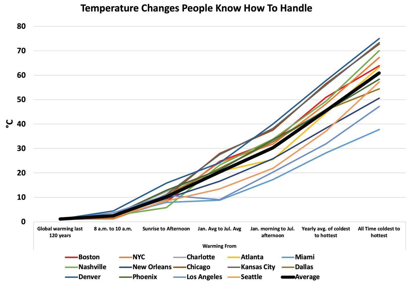
natural temperature changes that Americans in 14 major cities must cope with every year. For example, the average difference between the coldest and warmest moments each year ranges from about 25 degrees Celsius in Miami (a 45 degree Fahrenheit change) to 55 degrees in Denver (a 99 degree Fahrenheit change). We contrast this with the easily manageable 1.2 degree Celsius increase in the global mean temperature anomaly in the past 120 years, which has caused so much alarm in the media and in policy circles.
1. The Global Temperature Record and its Role
The earth’s climate system is notoriously complex. We know, for example, that this system undergoes multiyear variations without any external forcing at all other than the steady component of the sun’s radiation (for example, the El Niño Southern Oscillation and the Quasibiennial Oscillation of the tropical stratosphere). We know, moreover, that these changes are hardly describable simply by some global measure of temperature. Indeed, what is presented is actually something else. You may have noticed that it is referred to as the global mean temperature anomaly.
What is being averaged is the deviation of the surface temperature from some 30-year mean at stations non-randomly scattered around the globe. As we will soon see, this average bears rather little relation to the changes at the individual stations. Moreover, as noted by Christy and McNider (2017), the temperature anomaly of the lower troposphere (measured by satellites) relative to the surface temperature is much better sampled and represents the “more climate-relevant quantity of heat content, a change in which is a [theorized] consequence of enhanced GHG forcing.”
However imprecise and lightly-relevant the surface temperature is to the physics of the issue, the narrative of a global warming disaster uses the record as the first in a sequence of often comparably questionable assumptions. The narrative first claims that changes in this dubious metric are almost entirely due to variations in CO2, even though there are quite a few other factors whose common variations are as large as or larger than the impact of changes in CO2 (for example, modest changes in the area of upper and lower level clouds or changes in the height of upper level clouds).
Then the narrative asserts that changes in CO2 were primarily due to man’s activities. There is indeed evidence that this link is likely true for changes over the past two hundred years. However, over Earth’s history, there were radical changes in CO2 levels, and these changes were largely uncorrelated with changes in temperature.1 The narrative further assumes that we know precisely how to control the level of CO2, and that we know exactly how this will influence the globally averaged temperature anomaly. Finally, perhaps the most questionable claim is that all of this implies the likelihood of existential disaster unless the assumed control measures are implemented.
1h p://jeremyshiers.com/blog/global-temperature-and-co2-levels-for-last-600-million-years/
5
In a logical world, it would be understood that the probability of the whole chain will be the product of the probability of each link, and so generally very small. And, of course, if any link is broken (i.e., probability zero), the whole chain is broken. This is even part of folk wisdom: a chain is only as strong as its weakest link. Why then, amongst all these mostly very weak links, should we focus on the record of surface temperature anomalies?
Part of the reason is that it is simply interesting to see how this record is assembled. However, there is also the fact that in the world of environmental alarm, the above logic is turned upside down, and the existence of any link is held to imply the likelihood of the whole chain of inference —including the promotion of catastrophism. This step specifically ignores that this is not an issue that depends simply on whether temperature is increasing or not, but rather on “how much.” As noted by Lindzen and Spencer (2019), presently estimated changes in the temperature record are most consistent with low sensitivity to increases in CO2, and the related warming is likely to be beneficial. The notion that society is willing to waste trillions of dollars to avoid benefits is sobering.
2. Presenta ons of the Global Mean Temperature Anomaly Record
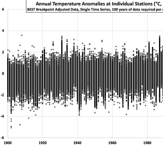
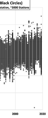
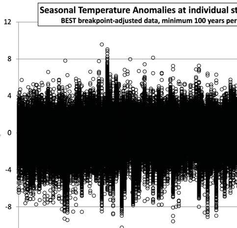
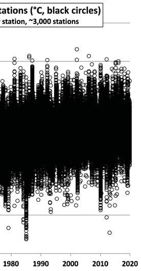
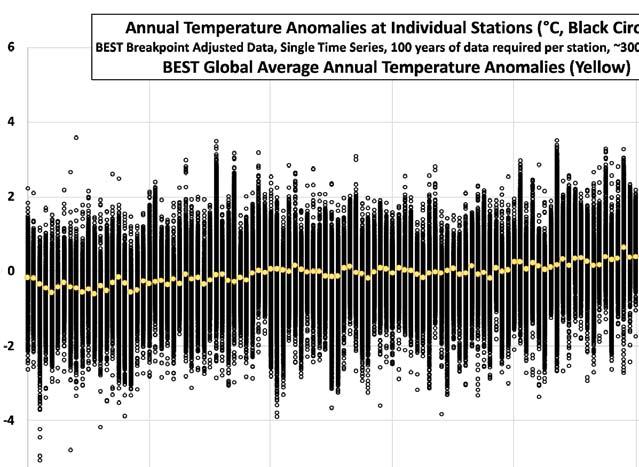
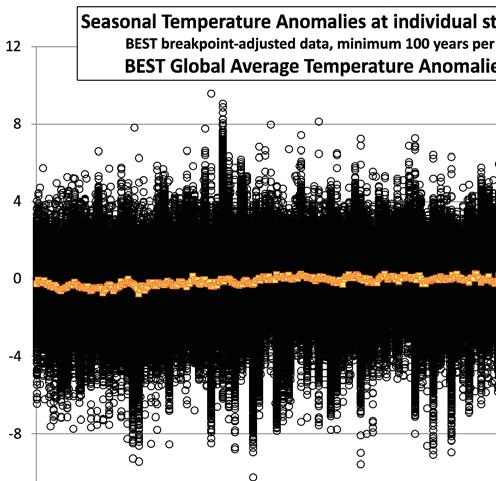
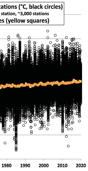
As we have noted, the globally averaged temperature anomaly is the average of changes from a thirty-year mean at each measuring station. Depending on the time resolution one wants, one may use seasonally or annually averaged anomalies.2 The latter is shown in Figure 1; the former in Figure 2. In each we see a dense scatter of points. In Figure 1, these points cover a range of about 8 degrees; in Figure 2, this range is larger (about 18 degrees). In Figures 3 and 4 we show the areaweighted global averages of the station and ocean data superposed on the scatter plots. Clearly, the global means are the small residues of the almost equal number of stations with cooling and warming. Hence, the mean is a pretty useless indicator of what is going on locally.3, 4
2We use the BEST (Berkeley Earth Surface Temperature) dataset because it agrees very closely with other global compila ons and is thus an appropriate representa ve. Addi onally, BEST supplies considerable resources (h p:// berkeleyearth.org/data/) to access the basic data in a variety of ways so that we may calculate the individual sta on anomalies (Figs. 1-4) and that of a single na on (Fig. 9).
3The local changes are mostly due to wave-like mo on systems, many of which are forced by surface differences in orography and temperature and persist through the season. These waves are referred to as sta onary waves. In principle, these waves might be the same from year to year and contribute nothing to the anomalies. However, these waves are sensi ve to features of the mean flow and the regional fluctua ons in surface temperature. Other waves are due to the more rapidly travelling hydrodynamic instabili es known as baroclinic instabili es. The la er account for local weather and are forced by the temperature difference between the tropics and high la tudes. These moon systems carry air from regions of o en radically different temperature. However, these changes average out over a la tude circle, leaving the much smaller mean changes as a residue. Although the periods associated with the baroclinic instabili es are on the order of a week or two, they can have a significant impact on seasonal means. This probably accounts for the greater variance in the seasonal mean anomalies.
4To the best of the authors’ knowledge, the fact that the global average is the small residue of the broadly sca ered sta on data was first noted by the late Stan Grotch at Lawrence Livermore Laboratory in 1990.
6


7
Figure 1. Annual temperature anomalies of approximately 3000 stations from BEST with at least 100 years of observations. Shifts due to instrumental and location changes have been removed.
Figure 2. As in Fig. 1 except for seasonal anomalies of station temperatures.


Figure 3. As in Fig.1 except annual global average temperatures are included.


Figure 4. As in Fig. 3 except for seasonal station and global anomalies.As noted in the text, the inhabitants of the Earth experience the anomalies as noted by the black circles, not the yellow squares.
8
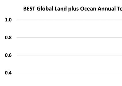
In order to obscure the fact that the global means are small residues of large numbers whose precision is questionable, the common presentations plot the global mean anomalies without the scattered points and expand the scale so as to make the changes look large. These expanded graphs of global means are shown in Figures 5 and 6.
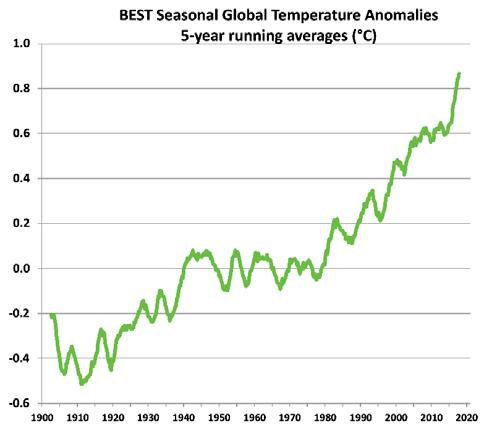
The frequently cited trends are evident in these graphs–most notably, the pre-CO2 warming from 1920-1940 and the warming that has been attributed to man from 1978-1998. We also see a reduced rate from 1998 (best seen in Fig. 6) until the major El Niño of 2016 occurred. Even if one could attribute all the 1978-1998 warming to the increases in CO2, the slowdown clearly shows that there is something going on that is at least as large as the response to CO2. This contradicts the IPCC attribution studies that assume, based on model results, that other sources of variability since 1950 are negligible.


9
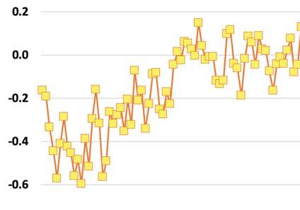
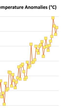
Figure 5. Global annual anomalies of temperature from Fig. 3 without the station anomalies. Note the range here is -0.6 to +1.0 °C, over five times less than Figs. 1 and 3.

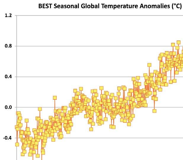
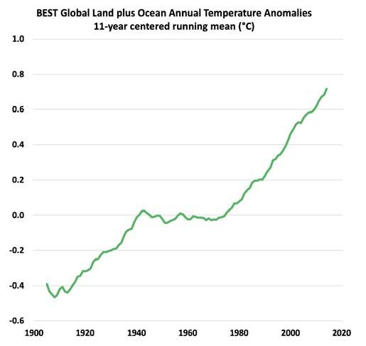
Note that the results in Figures 5 and 6 are quite noisy, with large interseasonal and interannual fluctuations. This noise contributes to the uncertainty of the values, in addition to the usual sampling errors. The graphs one usually sees are a lot smoother looking than what we see in Figures 5 and 6; these have resulted from taking running means over 5 or more years. The results of such smoothing are shown in Figure 7 (smoothed over 11 years) and 8 (smoothed over 21 seasons, or about 5 years). They look much cleaner and presumably more authoritative than the unsmoothed results or the scatter diagrams, but this tends to disguise the uncertainty, which is likely on the order of 0.1-0.2 degrees. (For example, Figure 7 substantially disguises the pause following 1998; Figure 8 does this less because it is averaged over only about 5 years.)
Obviously, warmings or coolings of a tenth or two of a degree are without significance since possible adjustments can easily lead to changes of sign from positive to negative, yet in the popular literature much is made of such small changes. Like with sausage, you might not want to know what went into these graphs, but, in this case, it is important that you do.
10
Figure 6. Global seasonal anomalies of temperature from Fig. 4 without station anomalies. Note the range here is -0.8 to +1.2 °C, or 9 times less than Figs. 2 and 4.

Figure 7. As in Fig. 5 except the values have been averaged into 11-year, running mean values.

Figure 8. As in Fig. 6 except the values have been averaged into 21-season (roughly five-year) running mean values.
11
Some Concluding Remarks
An examination of the data that goes into calculating the global mean temperature anomaly clearly shows that any place on earth is almost as likely, at any given time, to be warmer or cooler than average. The anomaly is the small residue of the generally larger excursions we saw in Figures 1 and 2. This residue (which is popularly held to represent “climate”) is also much smaller than the temperature variations that all life on Earth regularly experiences. Figure 9 illustrates this for 14 major cities in the United States.
Indeed, the 1.2 degree Celsius global temperature change in the past 120 years, depicted as alarming in Figure 7, is only equivalent to the thickness of the “Average” line in Figure 9. As the figure shows, the difference in average temperature from January to July in these major cities ranges from just under ten degrees in Los Angeles to nearly 30 degrees in Chicago. And the average difference between the coldest and warmest moments each year ranges from about 25 degrees in Miami (a 45 degree Fahrenheit change) to 55 degrees in Denver (a 99 degree Fahrenheit change).

12
Figure 9. Temperature Changes People Know How to Handle
At the very least, we should keep the large natural changes in Figure 9 in mind, and not attribute them to the small residue, the global mean temperature anomaly, or obsess over its small changes.
References
[1] Christy, J.R., 2013: Monthly temperature observations for Uganda. J. Appl. Meteor. Climatolog., 52, 2362-2372. DOI:10.1175/JAMC-D-13-012.1.
[2] Christy, J.R. and R. T. McNider, 2017: Satellite bulk atmospheric temperatures as a metric for climate sensitivity. Asia-Pac., J. Atmos. Sci., 53(4), 511-518, DOI:10.1007/s13143-0170070-z.
[3] Gill, A.E. (1982) Atmosphere-Ocean Dynamics, Academic Press, 661 pp.
[4] Holton, J.R. and G.J. Hakim (2013) An Introduction to Dynamic Meteorology, Academic Press, 532 pp.
[5] Lindzen, R.S. (1990) Dynamics in Atmospheric Physics, Cambridge University Press, New York, 310 pp.
[6] Lindzen, R.S. and S. Nigam (1987). On the role of sea surface temperature gradients in forcing low level winds and convergence in the tropics. J. Atmos. Sci., 44, 2418-2436.
[7] Lindzen and Spencer, 2019, CO2 Coalition, On Climate Sensitivity, http://co2coalition.org/ wp-content/uploads/2019/12/Lindzen_On-Climate-Sensitivity.pdf
[8] Rhode, R., R. Muller, R. Jacobson, S. Perlmutter, A. Rosenfield, J. Wurtele, J. Curry, C Wickham and S. Mosher, 2013: Berkeley Earth temperature averaging process. GeoinforGeostat: An Overview 2013, 1:2, doi.org/10.4172/gigs.1000103.
13
CO2 Coalition Board of Directors
Patrick Moore, PhD, Chair: Co-founder and 15-year leader of Greenpeace (1971-1986); Chairman and Chief Scientist, Ecosense Environmental; Leader, Campaign to Allow Golden Rice Now.
Jeffrey Salmon, PhD, Vice-Chair: former Senior Policy Advisor to the Secretary, Chief of Staff in the Office of Science, Associate Under Secretary for Science, and Director of Resource Management in the Office of Science, U.S. Department of Energy.
Jan Breslow, MD: Fredrick Henry Leonhardt Professor, Rockefeller University; Head, Laboratory of Biochemical Genetics and Metabolism; Senior Physician, Rockefeller Hospital.
Bruce Everett, PhD: Adjunct Professor of International Business at the Georgetown School of Foreign Service; Adjunct Associate Professor of International Business at the Fletcher School, Tufts University.
Gordon Fulks, PhD: University of Chicago Laboratory for Astrophysics; Mission Research Corporation, Corbett, Oregon.
Will Happer, PhD: Cyrus Fogg Brackett Professor of Physics (emeritus), Princeton University; former Director of Research, U.S. Department of Energy, and Senior Director of Emerging Technologies, National Security Council.
Norman Rogers: Founder of Rabbit Semiconductor company; policy advisor to The Heartland Institute; member of the American Geophysical Union and the American Meteorological Society.
Leighton Steward: Geologist, author, member of the Right Climate Stuff (Ex-NASA Climate Research Team).
Executive Director
Caleb Rossiter, PhD: Climate statistician, former professor, American University School of International Service and Department of Mathematics and Statistics.
14
December 2020

