The Early Temperature Stripe Charts
In the CAGW alarmist community, you will see this image used often, the Ed Hawkins temperature stripe chart (below), or some variation thereof, to promote the ‘Climate Change” fear agenda. What better place to start the temperature chart than the last significant cold period of the Little Ice Age (LIA, the Dalton Minimum)? One could almost think the starting point was intentionally cherry-picked? Has the temperature increased since 1850? Yes, but the temperature rise has been a meagre/beneficial (my adjectives)
1.07 °C (according to the IPCC) based on homogenized (i.e.: manipulated) surface temperatures. And not all that 1.07 °C can be attributed to human emissions since 86%+ of
human emissions have occurred post-1950. Probably just a coincidence that the LIA correlates with the lowest solar activity levels in the last 7,000 years and the Modern Warm Period correlates to the highest solar activity in the last 7,000 years? History did not begin in 1850. The chart at the bottom puts the 1.07 °C rise over the last 170+ years in perspective (neither unprecedented nor unusual). Temperatures have cycled up and down for the last 10,000 years with no help/influence from CO2 and will continue to do so. The next cycle is down (GSM/AMO)!


The chart above is a variation from the IPCC’s recent 2023 AR6 Synthesis report. They have added in their model projections (those models they admit run too hot and use emission scenarios they consider implausible). Fear Propaganda on steroids! You will find more discussion on these topics in my CSS-30 – CMIP6 Climate Models and OPS-55 – The State of Climate Science posts.
Chart
The natural forcings active over the last 10,000 years have not shutdown over the last 170 years just because the IPCC climate scientists have decreed it so. They were still active over the last 170 years and will continue to be active in the future. A


I wonder why they call it a Climate Optimum?

Holocene Temperature Stripe Chart
Society thrived through the Holocene Climate Optimum (a welcome break from the vagaries of the deep ice ages). Modern Society would also survive and thrive at those temperatures (assuming we can ever get there). The natural forcings that the CAGW alarmist community loves to ignore (i.e.: the Holocene temperatures fluctuate despite a virtually flat CO2 profile) were active over the last 170 years and will continue to be active in the future. The near term natural forcings (AMO, GSM, weakening magnetic field, etc.) are pushing us towards another Little Ice Age over the next few decades. The longer term natural forcings (primarily the Milankovitch Cycles) will take us down into a deep ice age over the next few centuries to millennia. Any warmth CO2 might provide will be gratefully appreciated. As an example a temperature drop of 1.0 °C over the next few decades is better than a 1.5 °C drop and any delay to the next Ice Age will be appreciated by our descendants. The only place that temperatures reach Holocene Climate Optimum temperatures is in the self acknowledged, running too hot IPCC computer models. I choose the average of the Arctic Vinther et al and Antarctic Dome C temperature profiles. That choice mutes the effects shown in the Stripe Chart. Using the other curves would provide even more contrast. Warming is not dangerous!
Holocene Temperature Stripe Chart
This variation of the Temperature Stripe Chart extends the exercise over the Holocene Interglacial Warm Period and puts the 170 year 1.07 °C temperature rise out of the LIA in perspective. Modern humanity developed from hunter gatherers and small agricultural societies to the modern society that we live in today. That development would not have been possible without the warmth of the Holocene Climate Optimum and the other significant warm periods (Minoan, Roman, Medieval and Current). Most civilization advances occurred during the warm periods and were compromised during the cold periods (the LIA, Dark Ages, Greek Dark Ages, etc.). Cold is the enemy!

The Arctic/Antarctic average was used in the Stripe Chart, but most of humanity lives and grows our food supply in the Northern Hemisphere. Those temperatures would better reflect the situation. The other temperature profiles will give similar results. CO2 is flat but temperatures still fluctuate? Hmmm…
Cenozoic Temperature
Stripe Chart
Cenozoic Temperature
Stripe Chart
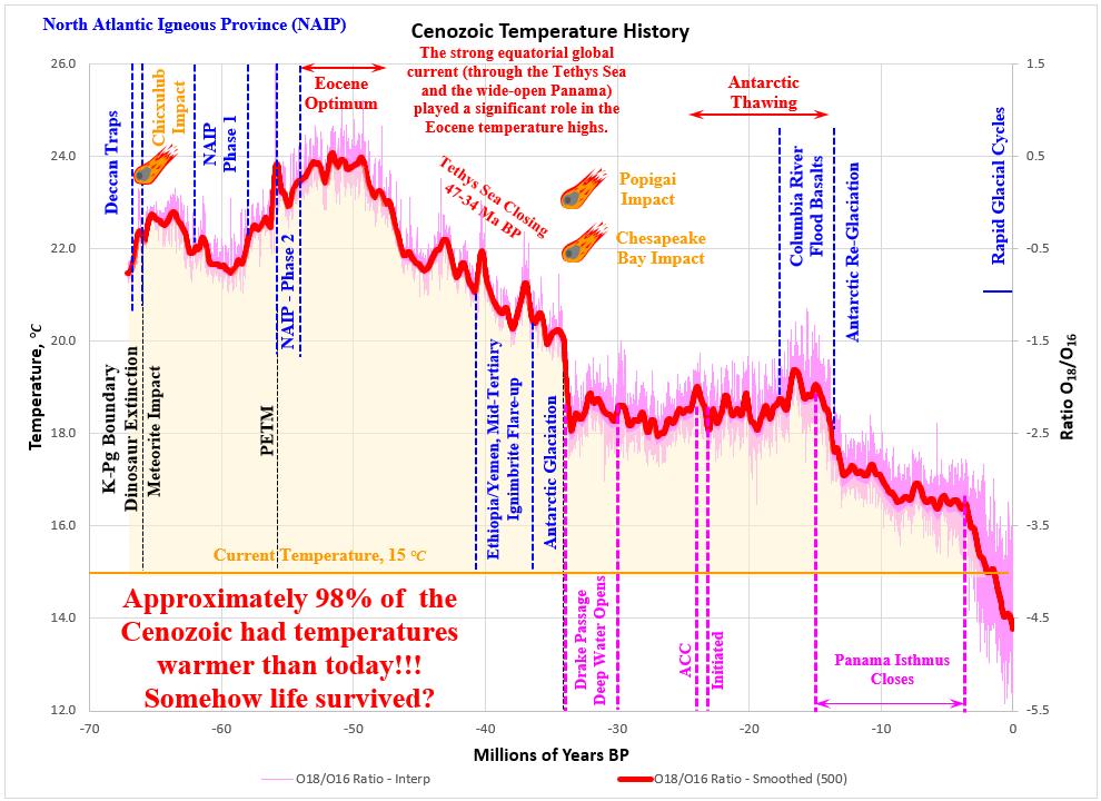
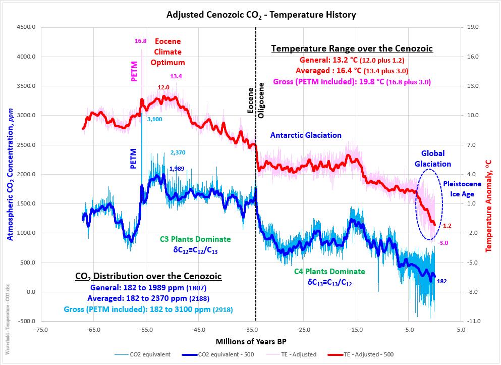
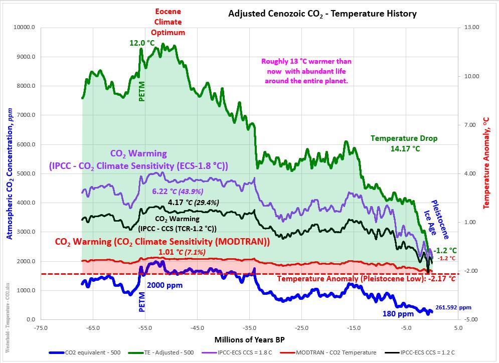
The hysteria around the 1.07 °C temperature rise out of the Little Ice Age (LIA) is hard to rationalize for anyone with a scientific mind. Temperatures over the Cenozoic were warmer than today 98% of the time (and significantly warmer most of that 98%). 1.07 °C does not even show up in the noise (the natural fluctuations). Life was more abundant and vibrant during the Eocene Climate Optimum than today. I am pretty sure that we could find a way to survive the global tropical temperatures life experienced over that period. CO2 levels were in the 2,000 ppm range, acting as fertilizer for the lush plant growth and abundant sea life of the period. We are living through the Pleistocene Ice Age (luckily in one of the relatively brief interglacial warm periods). 1.07 °C should be welcomed and celebrated. But, we are headed colder, not warmer (AMO/GSM).

Life has struggled through this period of cyclic global glaciation and solar outbursts!


