4 minute read
A paint color by any other name…
It can be agonizing, picking the right paint colors for the rooms of your home. However, what is often overlooked in the process, and what is critical to understand in choosing your paint, is the very essence of color. What it is and how it is created. It directly impacts how the paint will – quite literally – be seen. Understanding color will make it a whole lot easier when the time comes to purchase your paint, regardless of the color you choose.
Understanding the hues.
Understanding colors does not require you to be an expert in color theory. But understanding the nature of color and the following terms will make life a whole lot easier as you pick your paints.
We probably all remember this from first grade art class, but it does bear repeating. Colors are broken down into two main categories – primary and secondary. The primary colors are red, yellow, and blue. Secondary colors are those obtained from mixing primary colors together. Green, orange and purple. From these sets all other colors emerge. As do their hues.
And what is a hue? Simply put, it is the variety of a specific color. Aqua is a hue of blue. Forest is a hue of green. It is what is used to describe a color. As are the terms tone and tint. The difference? A tone is created by adding gray pigment to a primary or secondary color. It’s what is described as a soft or bright tone. Soft tones have more gray mixed in while bright tones are closer to the pure color. Tints are similar to tones, but with tints, white pigment is added to the primary or secondary color. Paint colors are described as having a lighter or darker tint. Lighter tints have more white than darker tints.
And we can’t forget the shades, paint shades that is. A shade is a hue that is produced by adding black pigment to a primary or secondary pigment. Normally speaking, shade and tint are used interchangeably to describe how light or dark a color appears.
There are two colors that have yet to be mentioned. They are, of course, white and black. Pure white is the absence of all color. You can’t ever mix a color – or for that matter add a color – to create it. While black is the formulation of all the primary colors mixed together. Like white, it is pure. True black is true black. (Of course, paint colors can be tinted to produce various hues of both black and white.)
So that’s a quick primer (pardon the pun) on colors and how they are created. Then, the hues and tints and tones and shades are all categorized and distilled into three separate categories.
What group are you in?
All formed colors are grouped into three separate categories – warm, cool, and neutral. You can pretty much guess where a color stands given its hue. Normally, the paints in each category are used in conjunction with each other. Warms pair well with other warms. Cools the same. Neutrals, however, can be added to either in a color scheme.
Warm colors evoke, well, warmth and heat. Think of oranges and reds, yellows and pinks. They are also called active colors as they stimulate and excite the mind. Vibrant and eyecatching, they are bright toned and often used in kitchens, offices and for accent walls. They can be used in any room to promote stimulation.
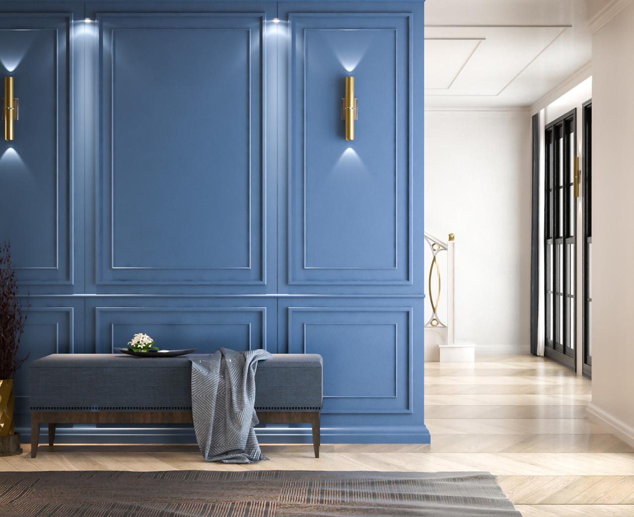
Cool colors on the other hand have a colder feel to them. Blue and purple and green. Often, cool colors are used to invoke a sense of nature and are used to produce a feeling of calmness. These colors are also known as passive colors because they are known to promote relaxation. Generally, passive colors are cool and soft toned. They are always good choices for bedrooms. They can also make small spaces seem more spacious.
The third group is quite possibly one of the most used in interior paint. That is the neutral
color group. These are color hues that do not comfortably fit within one of the primary or secondary color families. Neutral colors include black, white, brown, gray and cream. They are used for different reasons in a home.
Quite often, rooms are painted white to invoke the feeling of a larger space. Brown is used in similar fashion to cool colors – to create a feeling of relaxation – but the difference is the brown palette is earthy and invokes a sense of warmth. Unlike the cool colors in its paint family, gray is a great color to use to keep things crisp and clean. While cream is the neutral color that cooperates well with all furniture, accessories and art. However, all the neutral colors compliment different color schemes and items within a room. That is why they are so often used in interior design.
And that’s a quick summary of how color is created and categorized. Now, imagine your rooms in different colors of the rainbow (or perhaps a neutral) and head to the hardware store to give them a lift!


