WHERE ARCHITECTURE AND DESIGN MERGE


78 |
What is one of the most famous constructed dishes? Nachos of course! We present three fantastic and different takes on one of America’s favorite foods.
84 |
Our mixologist is the architect that builds new twists on classic traditions.

90 | The beauty and
old home.
96 |
The architectural magnificence of Chicago.
110 | Transform your home into

luxury hotel.

 122 | Health & Wellness Keeping track! 125 | Money & Finance
It’s tax time again! Time to do things this year to minimize taxes for next.
126 | Stylist Architecture meets design in statement pieces.
128 | Buzz
The news that all of Washington is talking about.
129 | Culture
An 11th street walking tour and a dynamic photographer of architecture.
132 | Diplomacy News and events from around Embassy Row.
JOHN ERIC + TREVOR MOORE
CHARLES M. TAPPAN, JR. One day, looking to find the fountain of youth,Charles Tappan decided to become a bartender. He attended bartending school and now, with over a decade in the beverage industry, he has gone from working at multiple Michelin-starred restaurants to competing in national cocktail competitions to working with some of the largest brands, eventually becoming a teacher and spirits educator. He has achieved a Bar Ready from the Beverage Alcohol Resource, a Certified Spirits Specialist from the Society of Wine Educators, and is a Level 3 plus Level 2 Spirits Certified Educator from the Wine and Spirits Educational Trust. The “Mixology”section is planned with the utmost honest knowledge he has regarding brands and ingredients in an effort to help you make the best possible drinks in your very own home.
MARC SCHLIEFER has been in the financial planning business since 1978, when he joined Equity Planning Institute, Inc. He became President of Equity Planning Institute, Inc. in 1996. With over 33 years of practicing financial planning, Marc has worked mainly on individual financial planning and counsels clients on all aspects of their financial life.
SHERRY MOELLER co-founder and principal of MoKi Media, was a previous editor in chief of Capitol File magazine/Niche Media covering politicians, celebrities, fashion, travel, hospitality and lifestyle in Washington, DC and around the country. She now specializes in public relations for interior design, architecture and hospitality clients, among other luxury brands.
HANNAH JENNER For fifteen years,Hannah Jenner was a professional sailor, racing across oceans, leading teams in the most extreme environments,and setting records along the way. In 2007 Hannah led a team of amateur sailors in the Clipper Round the World Yacht Race and in doing so became the first female captain to successfully circumnavigate the globe in that race. Retiring from sailing in 2017, Hannah wasted no time in continuing to pursue her passion of helping others to realize their potential. One year later she founded Achieving Awesome Nutrition & Lifestyle coaching and is qualified as a Master Health Coach specializing in sports performance nutrition and behavioral change. Hannah also coaches Crossfit, designs and manages Crossfit competitions, hosts the Before& After podcast, and works in project management.
FOUNDER | PUBLISHER
John Eric
MANAGING EDITOR
Angela Casey
SENIOR EDITOR-AT-LARGE
Louis Kwasniewski
CREATIVE DIRECTOR
Hillary Broadwater EDITORIAL
e-mail | angela@johnandtrevor.com
ADVERTISING
phone | 703.798.0097
ONLINE
Facebook | @johnandtrevorteam
Instagram | @johnandtrevor
LinkedIn | johneric YouTube | johneric
Join me in celebrating the sights, sounds, and smells of spring. After an incredibly mild winter, spring arrived early in Washington. The blooming Magnolia and Bradford pear trees peaked in early March, and those amazing cherry trees that ring the Tidal Basin came to full glory in Mid-March, timing themselves perfectly for the start of The National Cherry Blossom Festival. Spring is, in my opinion, the most special time of year in Washington, DC. Our region welcomes hundreds of thousands of tourists, school kids, and locals who take part in the annual ritual in the nation’s capital. From the numerous festivals, outdoor concerts, and events taking place throughout Metropolitan Washington, DC, there is no better time to visit or live here.
I love the sights and sounds of people milling about on the National Mall, the Wharf, and the Georgetown waterfront; the streets of Arlington and Bethesda are packed with people grabbing a coffee, getting lunch, and sitting outside. The Potomac comes alive with boaters, kayakers, and crew teams returning to the water.
You appreciate and notice the beauty of DC, its architecture, and the genius of L’Enfant and his design of the city during this season. In that spirit, this edition of John Eric Home is all about architecture and design. Special features spring forth covering the life and works of Frank Lloyd Wright, Tiffany glass reborn in fabrics, an architect’s take on the beauty of old homes, and the Magna Grecia. We have interviews with prominent DC architects and tips on how to turn your home living into a luxury hotel experience. Of course, all our regular features are here too – all with an architecture or design twist!
So, find a comfy place to sit, relax, read, enjoy John Eric Home Magazine, and join us on this journey.
John Eric Publisher
“Architecture should speak of its time and place, but yearn for timelessness.”
— Frank Gehry

Based in Ottawa, Canada Derek Nzeribe is President and Broker of Record of the boutique real estate firm Haus Collection Realty Limited.Haus Collection

Realty offers a broad range of brokerage services to residential buyers and sellers alike, and the firm’s New Home division, along with its partners, also actively work with residential real estate developers, contribute to the implementation of strategic plans and review, and engage in developer, sales, marketing and vendor collaboration.

Born and raised by the New Jersey Shore, Albert enrolled in Rutgers University to study economics. Feeling like his artistic sensibility was being left unfulfilled and curious about architecture, Albert pursued a college internship with famed architect, Frederic Schwartz, whose plan to rebuild the World Trade Center site finished second among hundreds of entries. It was there that he discovered his calling to the world of architecture and a career path ensued.
Albert joined Cicognani Kalla Architects after graduation and worked on as many projects while waiting to begin his Master’s Degree in Architecture at New Jersey Institute of Technology. After a few months, the firm’s principals, Pietro Cicognani & Ann Kalla, recognized his potential and convinced Albert to stay on full time. This apprenticeship lasted nearly three years before Albert decided it was time to complement training in the field with a completed Master’s Degree. After graduating from NJIT, Albert returned to Cicognani Kalla Architects. Not long after, Albert decided moved on to other pursuits, but Pietro called and invited him back as a partner. And that’s where he has happily been for the last seven years.
Nadia Watts has been in the interior design industry for over 15 years. Her portfolio includes custom residential homes, historic renovations, bespoke professional offices, and spaces showcasing internationally recognized art and furniture collections. She began her professional design career with Elaine Stephenson Interiors in Roanoke, Virginia and has worked in the American Decorative Arts Department at the Metropolitan Museum of Art and with Douglas Associates, Interior Designers in Denver. Nadia Watts Interior Design, founded in 2009, has provided Nadia the creative venue to demonstrate and explore her design skills.

The work of Nadia Watts Interior Design has been featured in Gallerie Magazine, Architecturaldigest.com, Luxe Interiors + Design, ElleDecor. com, MansionGlobal.com, Home & Gardens UK, The Washington Post, DesignTV, among others. The firm has received numerous awards, including The Robert & Judi Newman Award for Excellence in Classical and Traditional Design with The Institute of Classical Architecture and Art, Luxe Interiors + Design Eye on Design, 5280 Home Top Denver Design , and Luxe Interiors + Design Gold List, Colorado Homes and Lifestyles Fabulous list. Nadia participated in the Denver Designer Show House.
Jim Rill, AIA, principal of Rill Architects, www.rillarchitects. com, has an undergraduate degree in visual studies from Dartmouth College and a Master’s in Architecture from The Catholic University of America. Rill, a fifthgeneration Marylander, has been designing custom homes, additions and renovations since 1987. He works closely with clients to create spaces that are innovative and tasteful, responding to homeowners’ unique personalities, lifestyles and needs. Rill Architects’ award-winning homes have been featured in hundreds of publications locally and nationally.













1. PSO-RITE - One of my favorite at-home mobility tools. This should be part of your arsenal along with your foam roller. Another of many ways to help keep you loose. 2. The Wim Hof Method - I can’t recommend this book enough. The human body is amazing and we have the ability to heal ourselves in unbelievable ways. A cold shower a day keeps the doctor away. 3. Trader Joe’s — Dark Chocolate Peanut Butter Cups - Do I need to say more? 4. 14 Peaks - Nothing is Impossible - What am I watching? Netflix Documentary with Nepali mountaineer, Nimsdai Purja. One of the most jaw-dropping documentaries you will ever see.


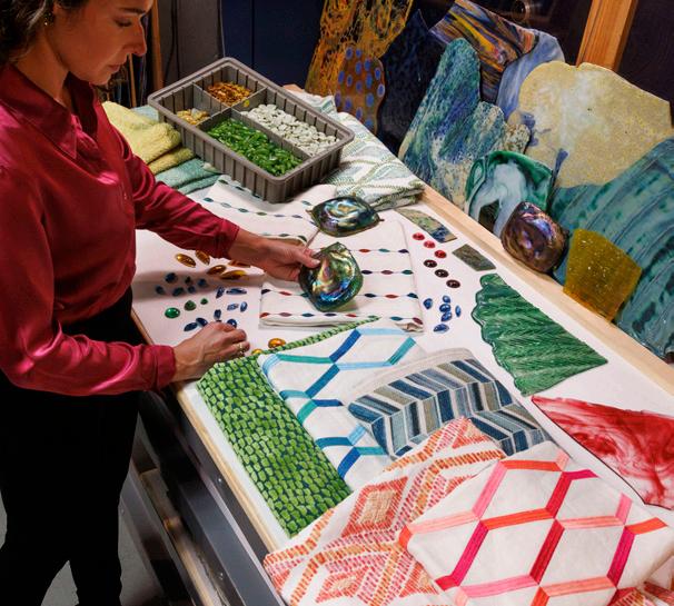
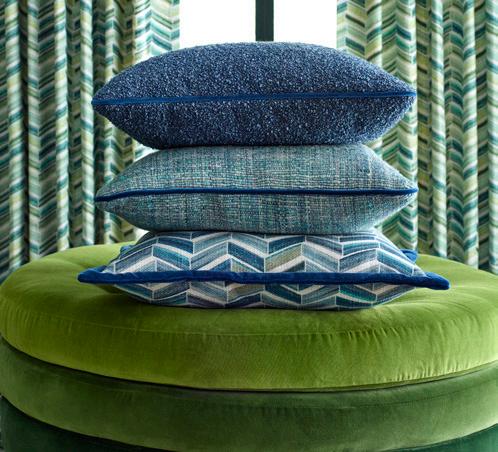
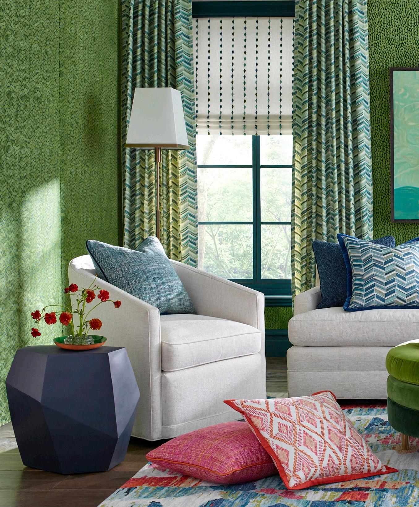
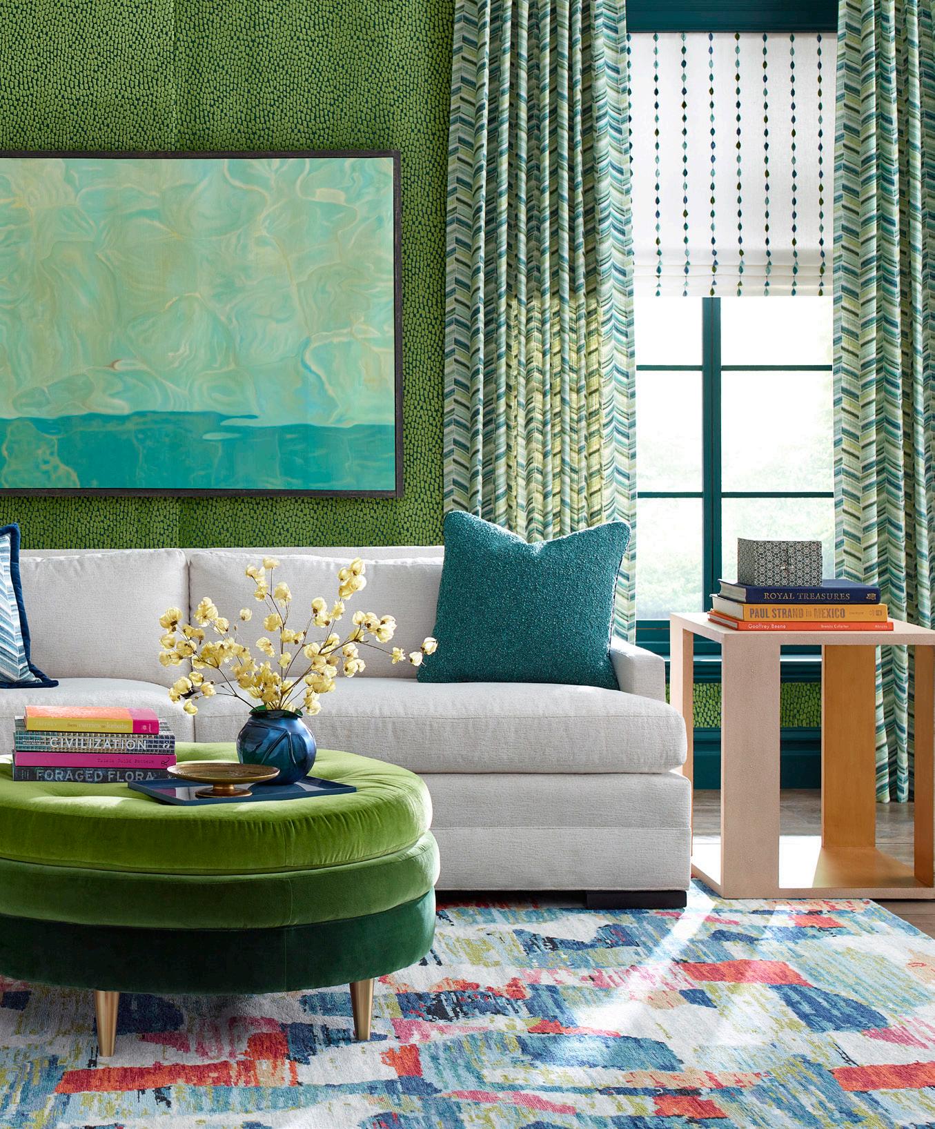
Recently, John Eric Home sat down with Nadia Watts of the iconic American Tiffany family to discuss her new collection, her family, and life. Nadia has seamlessly captured the ethereal essence of Tiffany glass in a tangible fabric line.

JEH: What is your professional background?
NW: My design career began with Elaine Stephenson Interiors and Julie Lawrence Interiors in Roanoke, Virginia, where I fell in love with the business while finishing my BA at Hollins University. Within days of working with Elaine and Julie, I knew design would be the rest of my life.
I had the opportunity and moved to New York to work in the American Decorative Arts Department at the Metropolitan Museum of Art. Furthering my design education, I enrolled in a program at the New York School of Interior Design. I supplemented NYSID with courses at NYU in the Business of Design, knowing I would start my own business one day. New York was an amazing experience for me. Throughout my curiosity and education of design, I was dating my future husband born and bred in Colorado. When moving to Denver in 2007, I worked with Douglas Associates, Interior Designers before starting my own business in 2009.
JEH: What was the inspiration for your new fabric line?

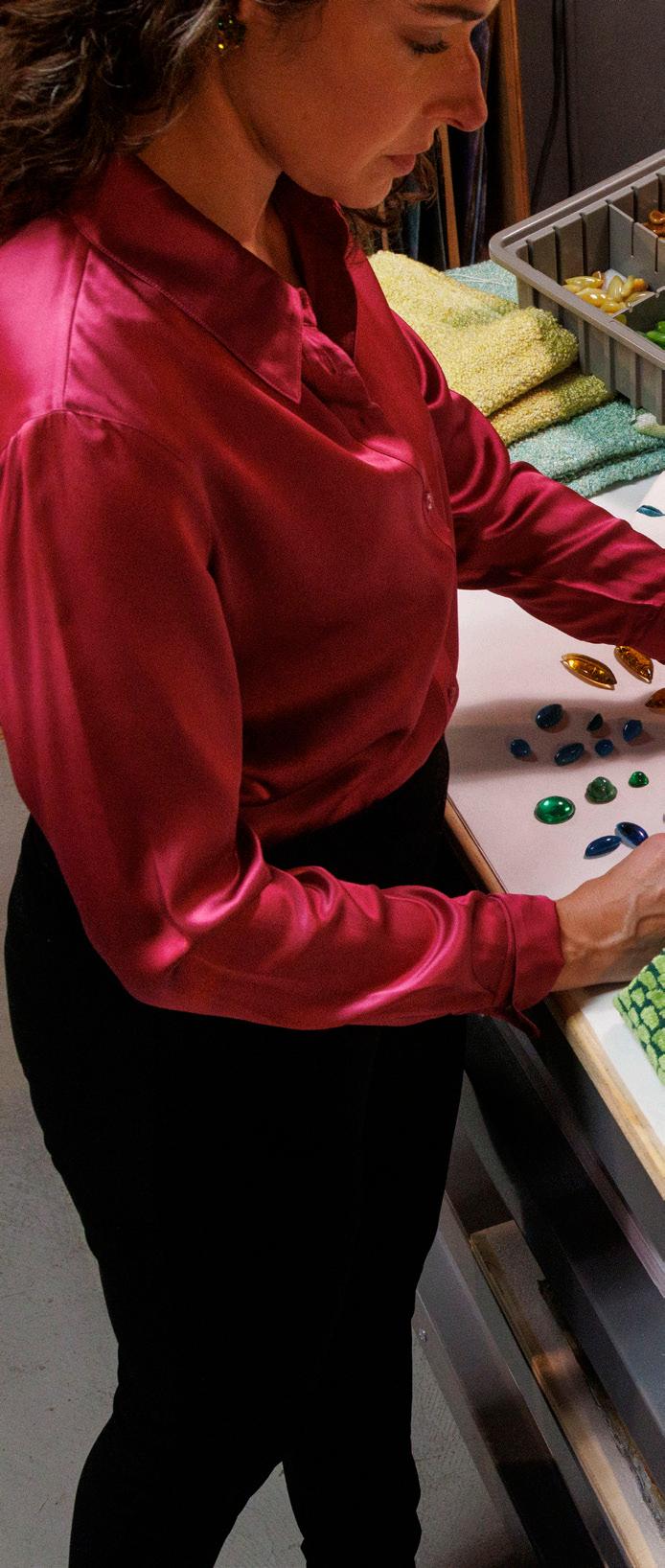
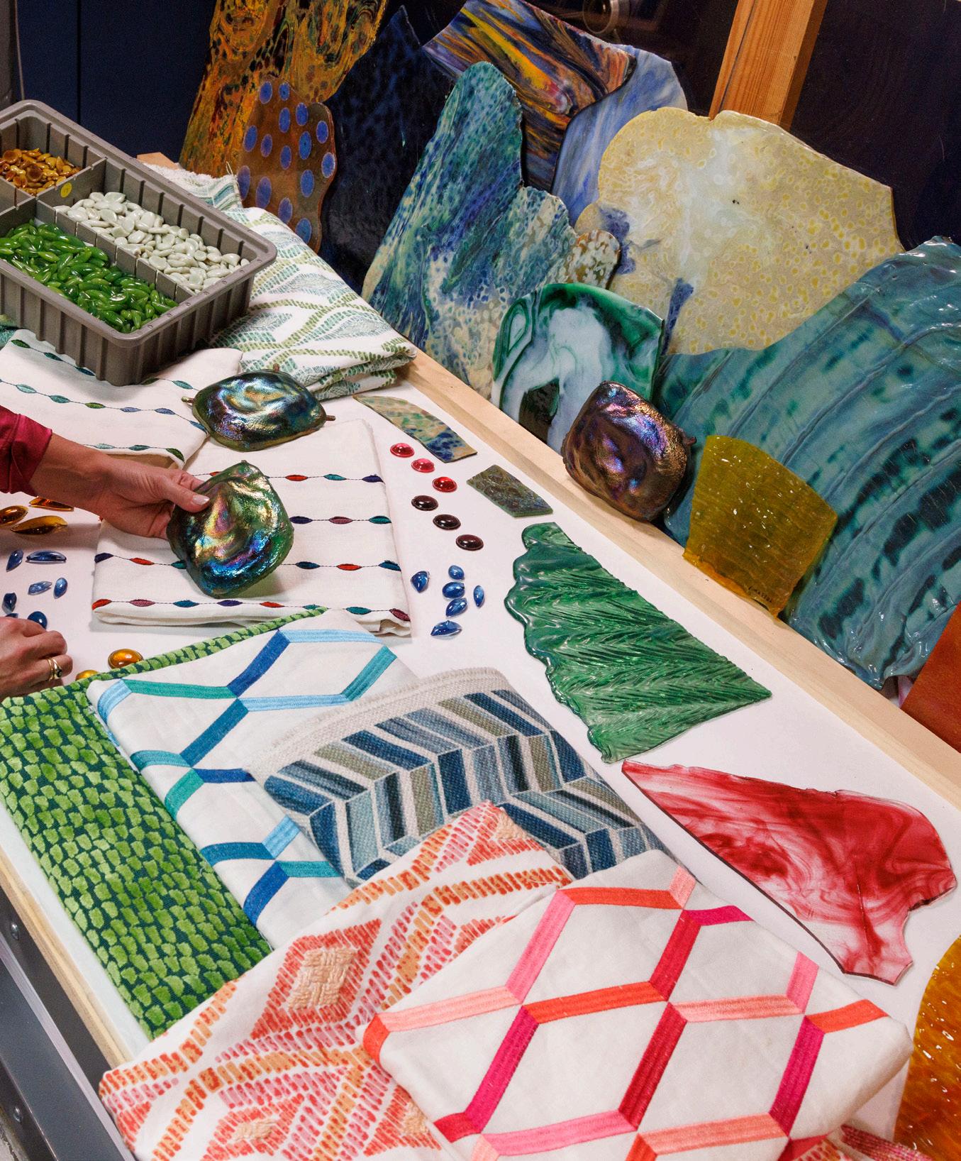
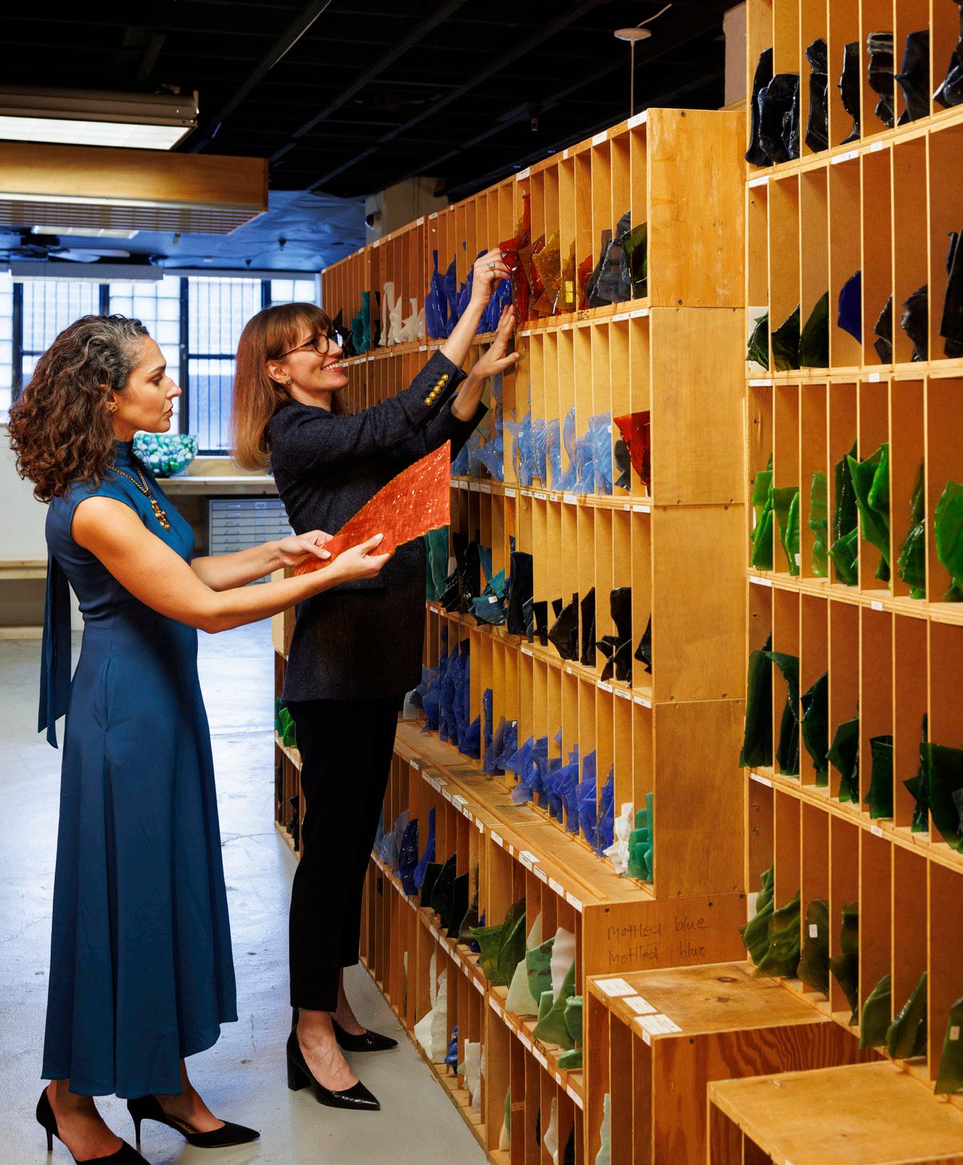
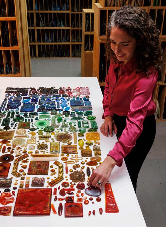
NW: In 2017, Ellen Kravet invited me to spend the day at the Neustadt Collection of Tiffany Glass in Queens New York. The Collection houses a quarter of a million pieces of the Tiffany Studios archival glass. The glass is catalogued by color, size, and technique, ranging from pieces that are 24”x24” to small 1” jewels. I was speechless, I couldn’t believe what I was seeing. A feeling of inspiration overwhelmed me. In that moment I knew there was something I had to create. This beautiful glass belonged on fabric. To take one medium- glass and interpret it into another- fabric, connects this work to Tiffany.
JEH: What was the process of taking your inspiration and making it into a physical product?
NW: I think in color and scale. As a designer, I know what we are in search of when looking for products: color combinations, repeats, and textures. While working through this entire process, I was constantly thinking of the end user and how it would be applied in a room. I am excited to see how people will use this fabric in their own ways.
JEH: What was your creative process in design?
NW: I began drawing with pencils, working through my ideas as they came, and referring to inspirational moments that had stood out for me. For color, I started painting with watercolors and then went on to markers to create color combinations adding to the design patterns. After this, I had fabric made by creating digital files of the designs and having the patterns printed on a variety of textured fabrics: velvet, silk, cotton, and linen.
JEH: Is there any habit that you adopt or outside source that you use to trigger your creativity?
NW: I was taught to look at the world with an open mind, in an objective way, to be curious. I am constantly taking in visual cues from my surroundings – colors, patterns, textures, light, and shadows. I love architecture, and I love nature.
JEH: Aside from the fabric line, what else can we expect from your vision?
NW: I am currently working on new designs that I want to create for wallpaper, large scale and abstract. I am creating new textile concepts with inspirations based on organic forms.
JEH: What is your personal background?
NW: I grew up in Alexandria, Virginia, and spent holidays and summers in and around New York and the Berkshires, with my grandmother and extended family. We would spend our weekends in museums, going to the opera or symphony, or house and garden tours.
As I share this with you, I realize how much my personal and business lives have always been enmeshed, weaving between the love of the arts and sharing that love with family. I am lucky to be in a creative field. I have been surrounded by the arts my entire life. It is my soul. I live in Denver with my wonderful husband, two amazing children, and two beautiful golden retrievers. I love to be able to see the horizon and mountain landscape in Colorado. And now I enjoy taking my children to museums and gardens on the weekends.
JEH: How has your family impacted your work?
NW: Art is a conversation in my family. I feel it is very important for me to continue that language with my children. When I am working on new designs, we will discuss them around the dinner table; it is amazing to hear their point of view on colors and patterns.
JEH: As a child, what was it like to be a member of an iconic American family and brand?
NW: A child cannot comprehend the vastness of this iconic American family and brand. I felt it was important by the way it was spoken about around me. At times I feel as if I am still discovering what it means to be a part of American history. It is truly amazing.
My first memory of Tiffany was in 1989, during the Masterworks of Louis Comfort Tiffany at the Renwick Museum in Washington, DC. My grandmother, aunts, and cousins came to town and got dressed up for the opening gala of the exhibition with my parents and older sister. I remember feeling the excitement and energy that night and that this was something important. I was too young to attend, six at the time. My mother promised to take me on the weekend to walk with her through the exhibit. I remember the beautiful colors in the stained-glass windows and objects; the colors and textures in the glass were unforgettable.
As a teenager, I remember receiving my first Tiffany & CO blue box, a necklace from my parents for my birthday, the silver Elsa Peretti open heart. I have always loved Elsa’s designs.
JEH: As an adult, what does it mean to you to be part of the Tiffany legacy?
NW: Profound. The Tiffany legacy is profoundly important to me, to be able to share with others the deep connection that I have for art and design through color, scale, and texture is very special. These are the design elements that I have been surrounded by my entire life and am now sharing
them with the next generation. Tiffany was a prolific artist; he touched every type of art medium.
JEH: How do you incorporate this legacy into your creativity?
NW: I stay curious and open-minded. I am constantly asking myself - What if? Let’s try it! Art was my first language.
JEH: At times you act as an ambassador for your family –can you speak on one or two projects or events that you have been a part of in this regard?
NW: I recently had the most wonderful experience at the Marie Selby Botanical Gardens in Sarasota, Florida, for the annual Jean & Alfred Goldstein Exhibition, Tiffany: The Pursuit of Beauty in Nature. I was the keynote speaker and shared the family’s artistic legacy and how it has inspired my designs and led me to create The Gem Collection with Kravet.
JEH: If you had to choose one, what would be your favorite Tiffany piece? Why?
NW: Oh, my goodness, I don’t know if I can. I would say the architectural objects at the Morse Museum in Winter Park, Florida, from Laurelton Hall, the country estate that Louis designed and built in Oyster Bay, Long Island. The Loggia from Laurelton Hall is in the courtyard of the American Wing at the Met. I love to stand under the lanterns and look up…to think my grandmother and family were surrounded by these beautiful elements and objects.
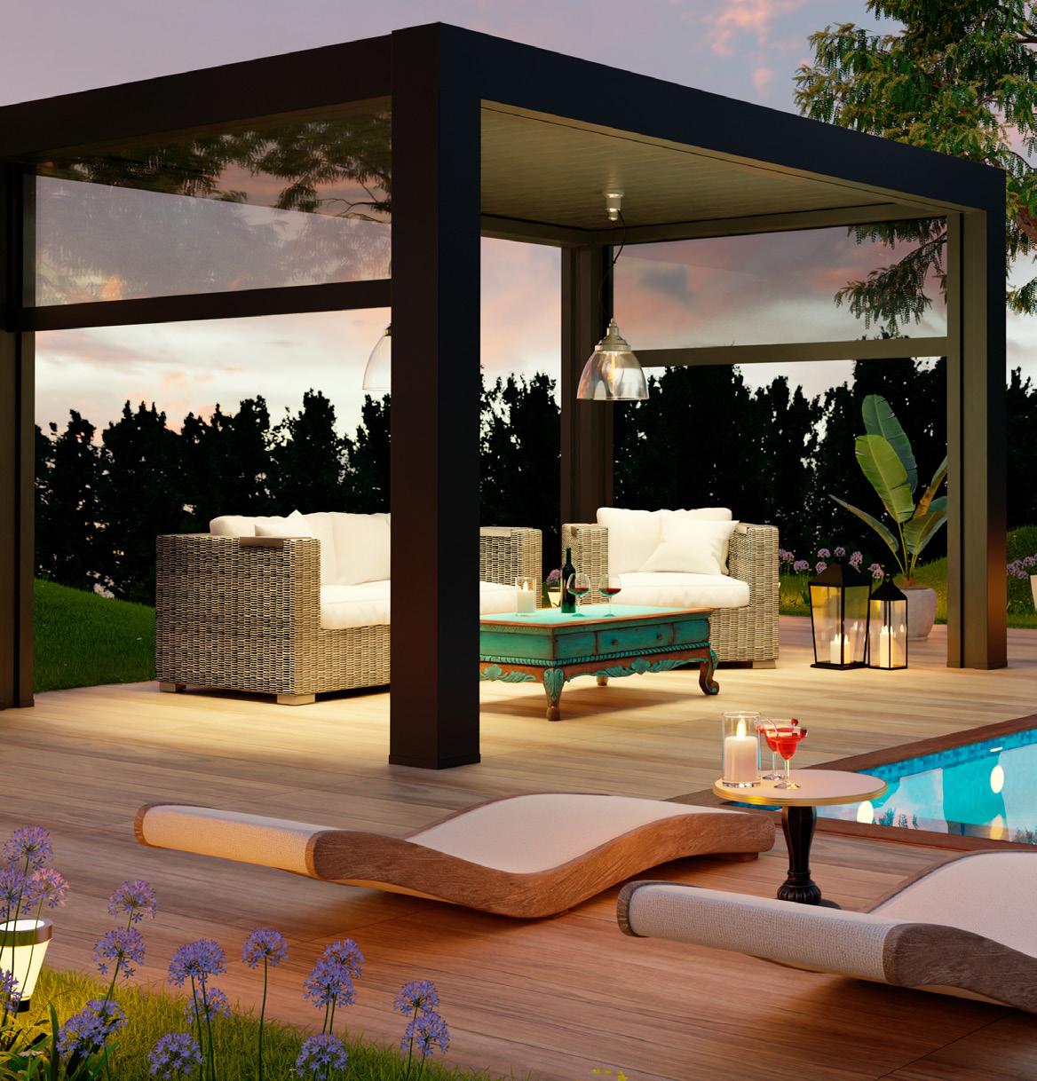
How do you create a back yard that’s light years ahead of others? One way is to illuminate the space. Since many people work or play till long after the sun goes down, they often don’t have time to enjoy their backyard until the evening hours. Add outdoor lighting, and your garden is immediately transformed into usable space.
Everyone wants a gorgeous outdoor space. We dream of comfortable spaces that invite you to sit for a while, have another glass of wine and linger in the warm, flowerscented air of evening. Being able to enhance a lovely outdoor design is, of course, just one reason why we light outdoor spaces.
Layering light in your outdoor space creates beautiful highlights and shadows among architectural elements and landscaping. In a space with many different textures and finishes like wood, concrete, and tile, lighting can subtly highlight each of these surfaces to create a dynamic look throughout your yard.
Think about how the space is to be used and plan the outdoor lighting around that. Plotting out your lighting—and remembering the importance of light layering—is critical to getting the right effect and being able to create spaces for different uses.
The trick to getting a well-lit outdoor patio is directing the light just where you need it. When it comes to ambient lighting, overhead lighting is a great option, be it outdoor pendants or even string lights. Blessed with a large garden and a tall canopy? Make the most of your garden’s spaciousness by hanging not just one string of lights, but lots of them, for a shimmering, cascading effect. A beautiful string light zig-zagged over a dining or entertaining space lays down a great soft, overall light and creates an atmosphere like a French café or Italian piazza.
Hang beautiful string lights with auto sensors around your trees and shrubs to add more depth to your landscaping. Your guests will be pleasantly surprised to see the twinkling effect whenever they brush past them, or the breeze blows. You can also find solar-powered variety in these pretty lights.
Smaller bulbs provide a gentler, more decorative background twinkle, while larger ones can provide a fair amount of direct illumination. Remember that once they’re installed, you can always add other types of lighting for extra brightness. Consider where your lights are going and don’t overwhelm. White lights are the most versatile; colorful strands or fun bulb covers can be vibrant options for special occasions.
The ultimate in atmospheric lighting, lanterns and hurricane lamps provide a chic glow and a nautical touch wherever you place them. Because most hurricanes can easily be moved, you can bring them with you as you progress from table to pool to seating area. Electric lanterns, of course, will work well in fixed locations.
Lanterns never really disappeared from the lighting industry. Traditional and dreamy lantern lights will continue to be among the top outdoor lighting trends in 2021. Lantern lights are perfect for lighting unique areas of your patio and deck. You can also opt for beautiful globe-like pendant lights for illuminating your garden trees or plants.
Traditional lanterns are another attractive option for your outdoor lighting. While you can commonly string lights stuffed in glass containers and mason jars, nothing grabs attention like a traditional glass lantern. Many outdoor lanterns feature bulbs that mimic classic gaslight lights from the 1800s. Remember to install these lanterns in sheltered areas to protect them from rain or snow.
When trying to create a real “room” feeling for your outdoor space, nothing creates a more sense of place than pendants or chandeliers. By selecting the perfect minimalistic chandelier or pendant you can easily light and create and enhance the open-air feel of your patio. A chandelier suspended over a dining table can anchor the area; a strategically placed pendant can illuminate a dark corner. Make sure you select fixtures rated for the outdoors and, of course, put them on a dimmer so you can control the light output.
Candles are another great way to create a sense of enchantment in your garden. The candles can be placed around the garden with a naked flame, or they can be placed inside a lantern to emit a glowing effect.

The right pendant lighting can also set your space for the greatest of outdoor parties. Outdoor pendant lights suspended from an overhanging roof line will direct concentrated light above outdoor dining or seating areas. Consider finishes that will mesh well with the surroundings, such as a galvanized metal finish that contrasts beautifully against dark wood. Arrange potted plants and succulents around your patio to add to the cozy ambiance, which will look radiant under the glow of dimmed light at night.
If you want overall illumination, such as in an outdoor dining room, opt for sconces with exposed bulbs. These versatile fixtures can enhance a nook, add ambiance to a dining area, or guide you along a path, and they come in a vast range of styles for mixing and matching. How many sconces you’ll need depends on where they can be mounted. Matching your outdoor wall lights will add to the atmosphere and help layer the lighting with additional ambient or concentrated illumination. Outdoor lights with glass cylinders can give off the impression of an intimate candlelit setting.
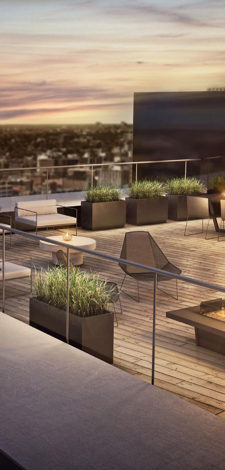
Create visual symmetry in an outdoor space with sets of lamps that can be used in different settings. Select floor lamps with a striking shape that puts out bright light to add form and functionality to the space without overdoing it. This is especially useful for rooftop gardens or urban balconies where you may want to section off spaces without adding more architectural elements. If your patio features stonework, look for a complementary finish in your light fixtures. For lighter stone finishes, look to stainless steel or lighter metal finishes. For darker stone, a bronze or black fixture will subtly blend in and allow the light to play off the textured areas.
If you’re into all things high-tech, look for table lamps that have been brought into the 21st century. This may look like an ordinary lantern, but it’s an LED lamp with Bluetooth capabilities, working as both a light and a speaker. Cordless lamps are perfect for outdoor spaces since they can travel with you inside and outside.
Spotlighting or up-lighting is best for illuminating narrow and unique areas of your outdoor spaces. It sounds simple, but it is effective. Reflective light on your trees and walls is an amazing way to light up your garden’s exterior.
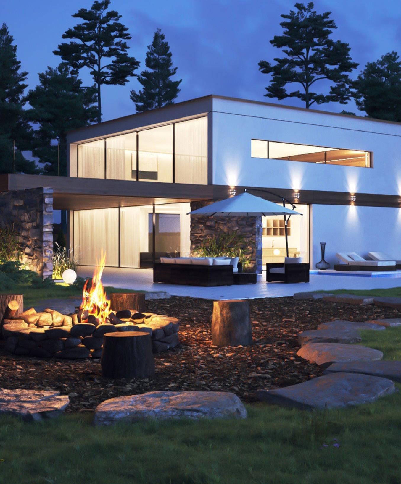
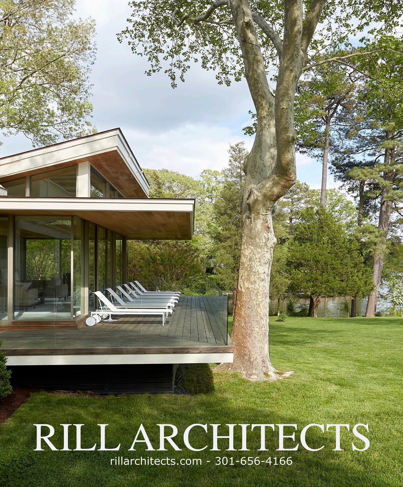
Consider investing in outdoor LED lights for the garden that are powerful enough to illuminate a bright light - ideally, as close as possible to sunlight - off the garden’s walls, trees or garden beds. The lighting ambiance should be bright enough to provide an inviting social setting. Choose from various moderate to high-intensity beams for highlighting an ornamental feature or beautiful flowers in your garden. Some homeowners install spotlights above or at ground level and below tall trees to make them appear more luminous.
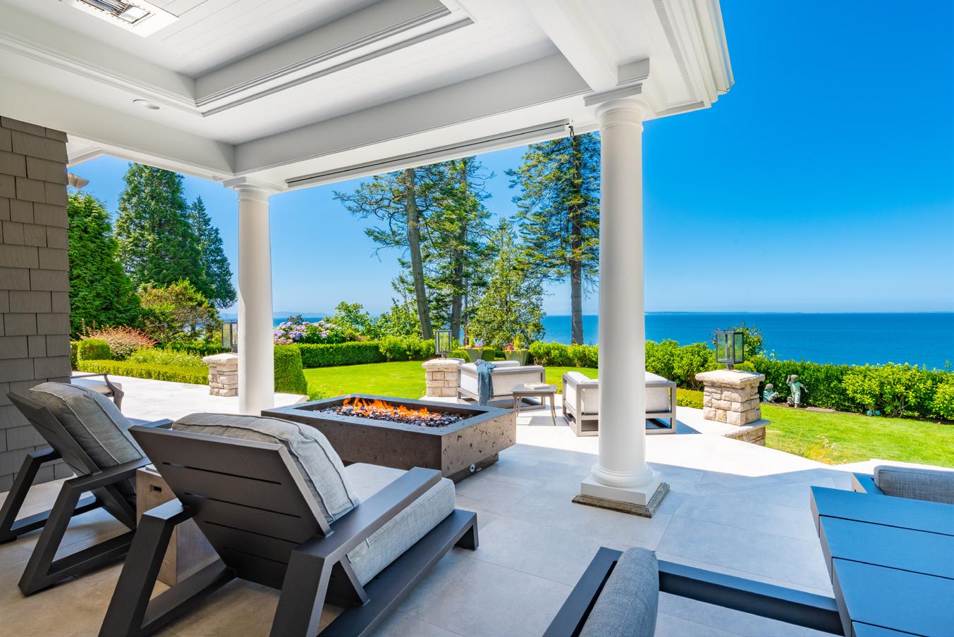
Lastly, consider installing a fire pit. There’s something about the light from a fire that attracts companionship. The soft light and warmth that is emitted from the fire is a great option to add to your garden. Expect stories to be shared, jokes to be told and friendships to be bonded. There are several fire pit designs that you can opt for. After installing the fire pit, be sure to add seating arrangements around the exterior. The colors and shadows from the fire pit should create a warm, inviting ambiance.
Remember to use different types of light to make your exterior appear more Interesting. Good light design uses
a mixture of shadows and different levels of lighting. It’s important that there is a good level of contrast in the area. Good lighting can bring Zen-like qualities to any setting. You can rediscover the perimeter of your property, make it fun to entertain and highlight points of interest, such as sculptures or fountains.
Recently, our backyards, patios and gardens have dutifully served greater purposes more than ever before. Over the last two years they have become our happy hour spots, office spaces, escapes for much-needed “me time” and refuges to enjoy the beauty of nature. Adding beautifully layered lighting this summer is the highlight needed to make the outdoor space that much more livable after the sun goes down. As we continue to pursue more sustainable lifestyles, we all find ourselves seeking better mental and physical health. Our home outdoor space will play an integral role going forward into the future.
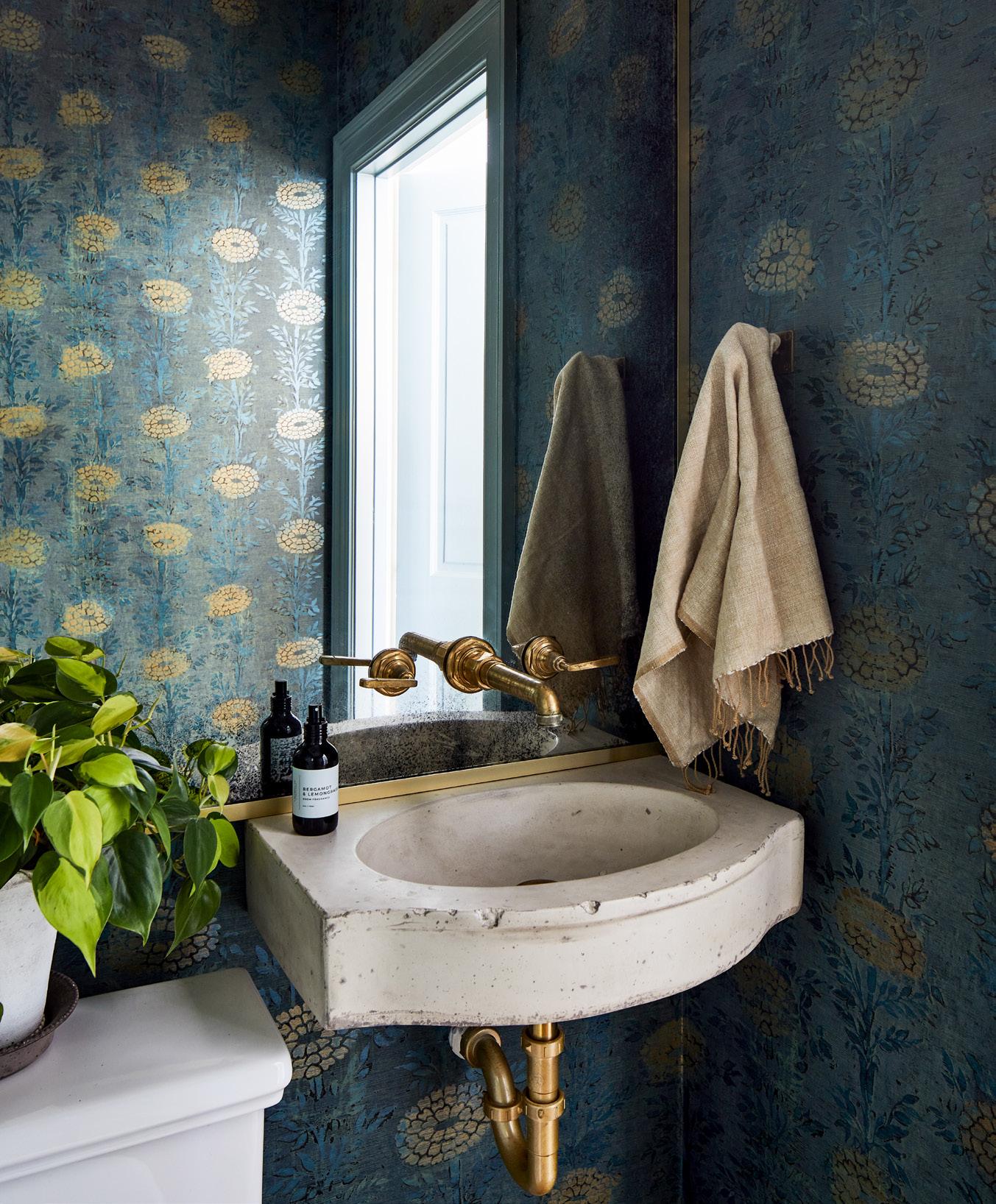 Design by Sara Swabb, Storie Collective.
Photo by Stacy Zarin Goldberg.
Wallpaper, wood grains, and high gloss finishes are among their favorite features
 By Sherry Moeller
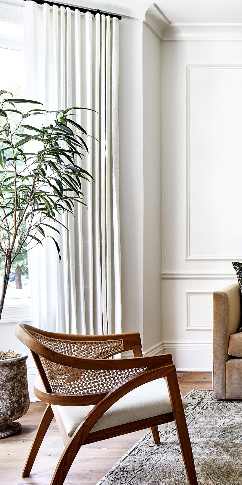
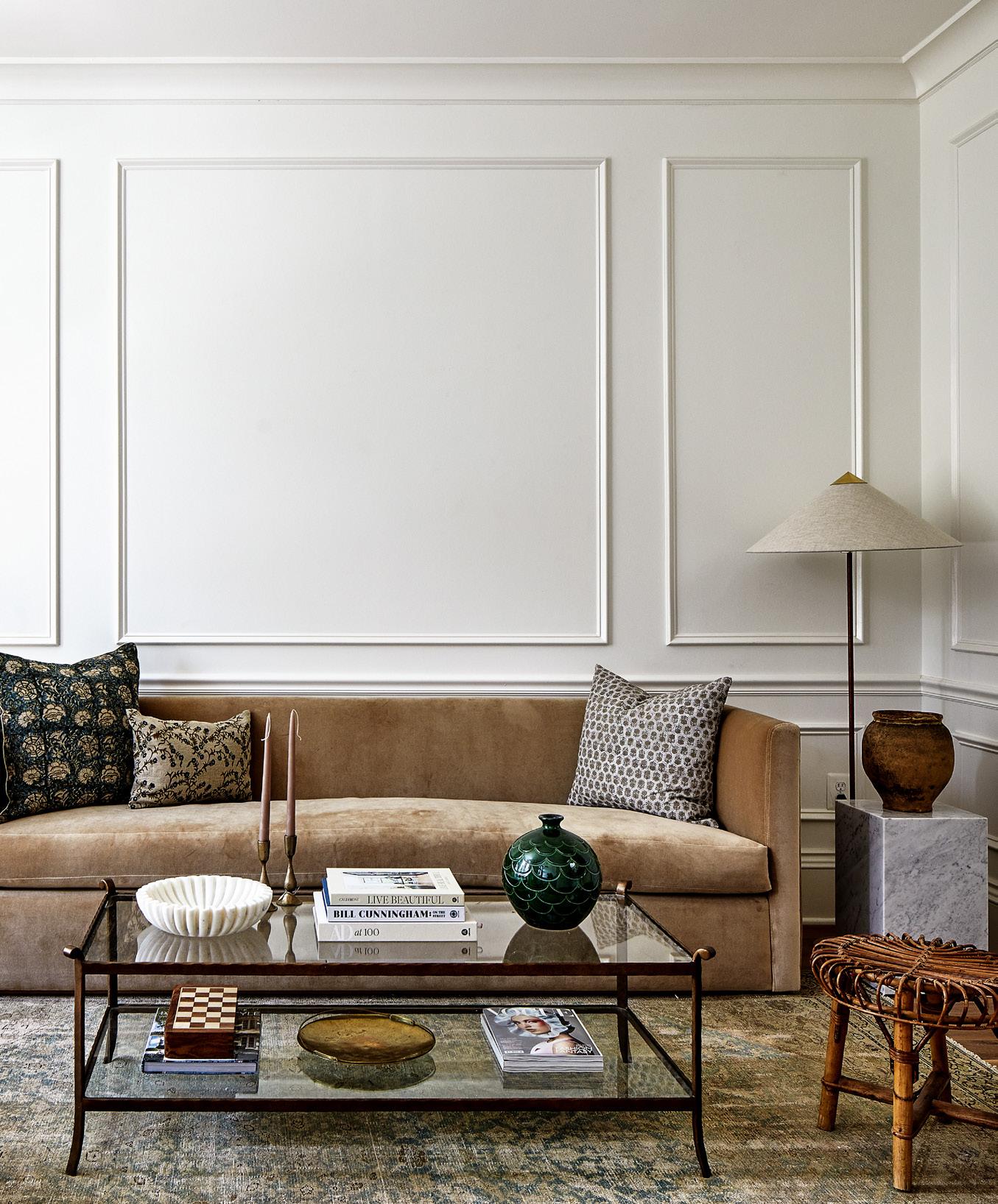
Think moody hues, mixing old and new, and saturated colors, as well as lifestyledriven designs. “While it would be great for a home to look as clean and tidy as possible, we have clients requesting spaces that accommodate their day-to-day needs -- in a beautiful way, of course,” says Sara Swabb of Storie Collective. Swabb, along with Annie Elliott of Annie Elliott Design and Sydney Markus of Anthony Wilder Design/Build, share what they are seeing, and loving, among this year’s design trends.
SARA SWABB, FOUNDER AND CREATIVE DIRECTOR, STORIE COLLECTIVE, WWW.STORIECOLLECTIVE.COM
1. LIFESTYLE AND PERSONALITY DRIVEN DESIGN
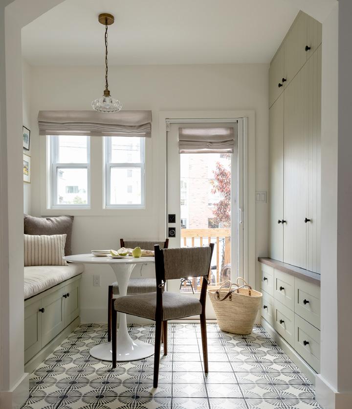
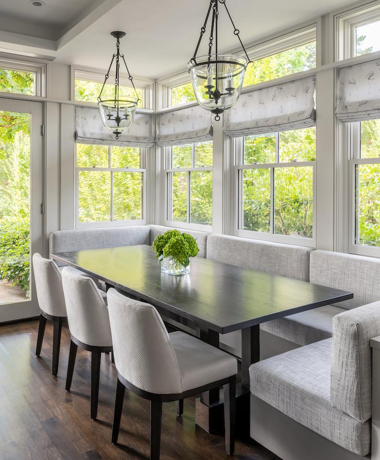
Our clients tend to be busy professionals with young kids or playful animals. In a recent project, we created an eat-in kitchen plus mudroom addition for a busy family of five plus a furry friend. The locker style cabinetry is just stunning, but highly functional and supports this family as they rush out of the home each morning.
We love this “trend” and we see it becoming more and more popular in 2023. The difference this year is that we are seeing cabinetry fabricated from actual wood, not particle board and veneer. Using actual wood is a little bit more of an investment, but worth the cost in terms of form and function. Natural wood grain can be a statement without looking like something straight from the 70s.
With supply chain issues of 2021 and 2022, we are seeing the comfort levels for vintage and antique on the rise. We absolutely love this trend and have mixed old with new in every project we touch. The easiest way to incorporate “old” is through antique rugs of any kind; the quality and durability outlast new rugs on the market and they have so much depth and texture. Vases, planters, pots, trays, side tables, and lighting are also easy ways to incorporate vintage.
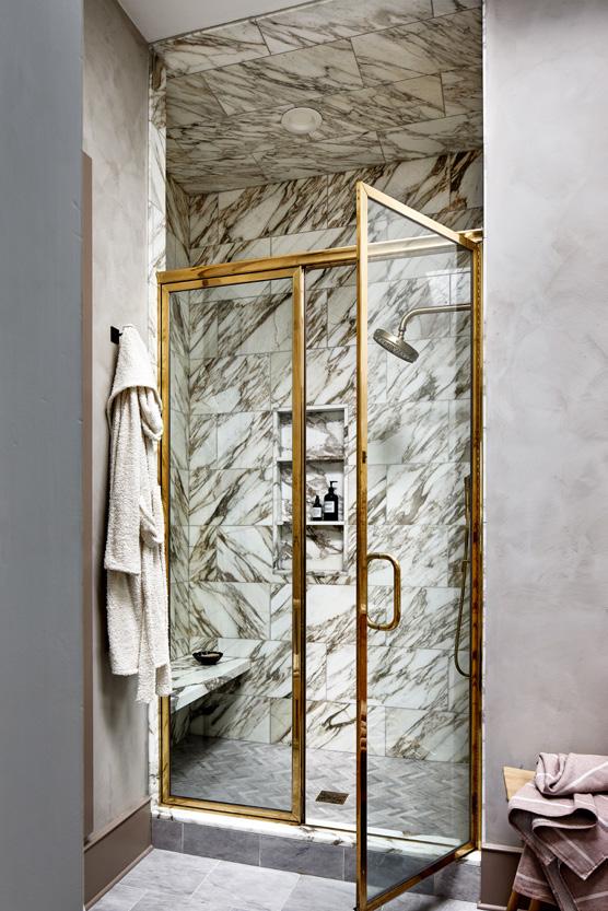
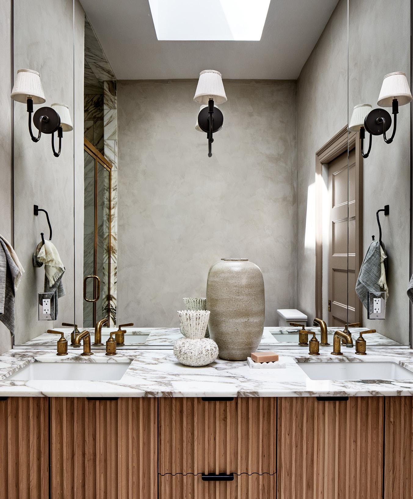
Old world materials like plaster and limewashes are now available on the retail market and social media has made them more popular than ever. We love plaster and limewash and use them paired with natural materials like striking marbles and fluted woods. To start small, we see these used in bathrooms and bedrooms, your private spaces.
Our clients have recently come to us to incorporate architectural details in their homes that have been gut renovated, and we see this trend continuing! In a classical Victorian home on Capitol Hill, we elevated the home’s architectural details to include a new stair rail, back to what could have been original millwork while creating a feminine, sophisticated space for the family and pet.
After years of minimalism, clients are becoming more and more ready to use color. Deep and saturated tones, not necessarily vibrant, are coming through in 2023. We are ready for it!

ANNIE
1.
WWW.ANNIEELLIOTTDESIGN.COMI predict that light gray finally is on its way out. We’re into warmth these days, and gray just doesn’t have it. If a neutral space is what you’re after, warm whites, ivories, and camels will be your go-to tones.
2. MOODY HUES
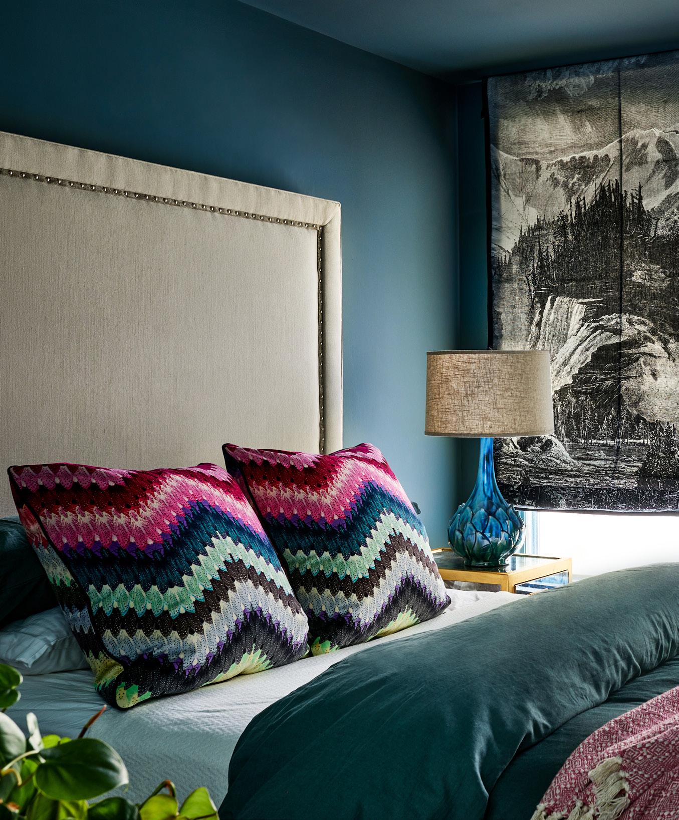
I’m so excited for this trend: dark, moody rooms, including richly colored ceilings and woodwork. Dark Academia may be an influence here: think richly stained wooden bookcases; lush navy, green, and aubergine walls; and traditional patterns such as plaid.
3. WALLPAPER
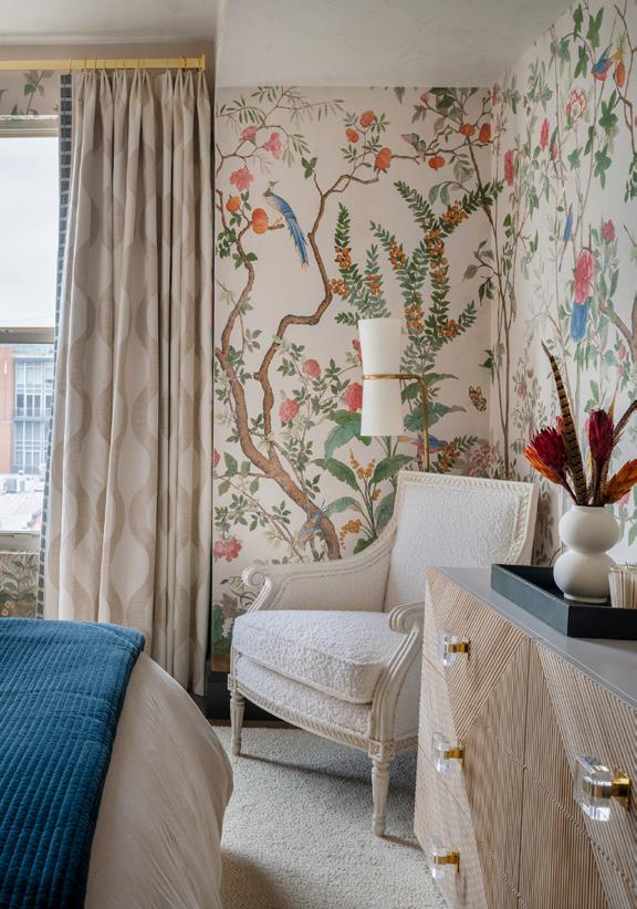
We’re beginning to see wallpaper used in public rooms - it’s not just for powder rooms and bedrooms anymore. Living rooms are the final frontier when it comes to wallpaper because people are concerned it will dominate the space. Not necessarily! We recently finished a double-height living area in a graphic black and white wallpaper, and it’s perfect. It provides just enough interest that the walls don’t feel empty...and there’s a lot of wall. Now we have to make sure that we don’t rely on wallpaper accent walls too heavily...just do the whole room.


 Design by Sydney Markus, Anthony Wilder Design/Build.
Photo by John Cole.
SYDNEY MARKUS, DESIGNER, ANTHONY WILDER DESIGN/BUILD, WWW.ANTHONYWILDER.COM
1.
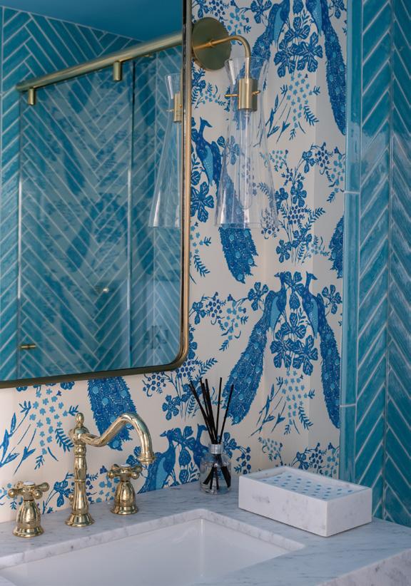
We have recently been getting requests for nature-inspired wallpaper in powder rooms, including patterns with vines, leaves, flowers, and in particular birds. Nature-inspired wallpaper, which also works well in bedrooms and offices, is soothing and makes a space feel like an oasis. We’re seeing nature-themed murals, too, that give a Zen-like feel to a room.
Use boucle on accent pieces, such as throw pillows, and on upholstered chairs; the fabric doesn’t wear well, so use it in low-traffic spaces. The soft, fun fabric adds diversity and dimension to the textures in a space.
Large, airy coffee tables that are multi-purpose and highly functional are in demand. Some are two-tiered with space for ottomans underneath, as well as trays, all of which are customizable.
This can be on cabinets, bookshelves, bars, ceilings, and walls. We are currently designing a library with high-gloss paint on all the built-ins. High gloss finishes, such as on a dining room bar or a library bookshelf, dress up a space, and add warmth and a moody vibe. Jewel-toned hardware adds more dimension.
Versatile in application, Marika Meyer Textiles for the home are now available on a luxury sleepwear line
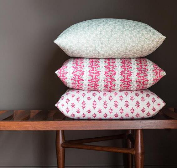
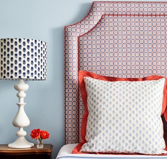
by Sherry MoellerAlmost ten years after Marika Meyer started Marika Meyer Interiors in 2007, she launched Marika Meyer Textiles, which is a combination of her passion for painting and her desire to create fabrics that can serve as the foundation for a room. Now, Meyer has partnered with The Sleep Shirt for an exclusive luxury sleepwear collection - a collaboration between two women-owned small businesses. The Sleep Shirt’s timeless styles pair perfectly with Meyer’s classic textiles to form ethically made sleep and lounge garments that are ready for everyday wear, as well as winter getaways. Versatile in application, Marika Meyer Textiles, which are used in home decor applications, such as draperies and pillows, are now offered on this limited run resort line.
Launched in December 2022, the collection includes two patterns, Laurel Leaf and Roman Fig, from Meyer’s first collection, the Sterrett Collection. It was named after her
great-great grandfather, JR Sitlington Sterrett, a professor at Cornell University and an expert on all things Greek. He has influenced her family through the years; in fact, his wife Marika is Meyer’s namesake. Especially rewarding to the designer is the chance to revisit the two patterns from the early days of her brand and see them on classic shapes by The Sleep Shirt.
Laurel Leaf, which is her most recognizable pattern from the first collection, features delicate, coral-toned leaves inspired by the decoration on a 19th century side chair. She calls this color Blush, which is only available on the sleepwear. As a perfect complement to Laurel Leaf, Meyer selected Roman Fig in Iceberg for the second option. This all-over pattern is denser and a lovely alternative for women who prefer a piece that is more saturated with color. Roman Fig resembles the intricately carved detail of a Roman temple pediment.

The shift from designing textiles for home items to sleepwear was exciting for Meyer. “It was fun to shift our thought process from patterns that suit your home to understanding what women want to wear,” she says. “We aimed for classic colors and patterns in shades of blush and blue, as well as ones that are flattering for women.”
The two patterns in two colors are on The Sleep Shirt’s iconic styles, including the Classic Shirt, Long Sleep Shirt, Sleeveless Nightie, Classic Kaftan, Robe, and Lounge Pant. Made from 55% linen and 45% cotton, the sleepwear’s prices range from $130 to $340 and the inclusive sizing ranges from XS to XXXL. The items are sold online at https://www.intothebedroom.com/pages/marika-meyerx-the-sleep-shirt. A few pieces will be on display at Evars Collective to-the-trade showroom in San Carlos, California, as well as Meyer’s Bethesda, Maryland studio. Meyer is especially smitten with the kaftan, which she plans to wear on an upcoming trip to Hawaii. She’s also ordered the robe, which will come in handy for late night checks on her two young sons.

Meyer’s newest textile collection will launch early this year and will include a variety of scaled patterns including one that she has been working on for years. “This upcoming collection is fun and fresh,” says Meyer. To create her
textiles, she draws on a lifelong love of classical architecture and antiquities and her study of cultural anthropology. “I was inspired by my family’s appreciation of the classics and iconic elements of design, so Marika Meyer Textiles is an opportunity to turn years of collected imagery into prints in bold, classic colors,” Meyer adds.
Marika Meyer Textiles are on display at to-the-trade showrooms across the US, including: RUE IV in Washington, DC; CLK Collective in New England; Temple Studio in New York, New York; Kilkenny Collections in Wayne, Pennsylvania; Fritz Porter in Charleston, South Carolina; Hive Trade Showroom in West Palm Beach, Florida; The Lot Showroom in Nashville, Tennessee; Sarah BoardmanMiller in Milwaukee, Wisconsin; and Evars Collective in San Carlos, California. The textiles are also at Meyer’s Bethesda, Maryland studio.
The interior and textile designer also recently launched a new website, www.marikameyer.com, which brings all her products and services together under one brand. Her interior design team works on projects across the country, with current projects in New York, Florida, Wisconsin, and Hawaii. Because her textiles and rugs are also sold nationally, Meyer wanted to have the various arms of her business on one cohesive website.


Murano Glass is so very special because it is an art form that has existed on Murano Island in Venice, Italy, for almost a thousand years. It is handmade by highly skilled master artisans. Each item created is a work of art. Displaying an object of Murano Glass in one’s home signifies not only good taste but something bigger. It is being part of a long Venetian tradition.
Although glassmaking had been practiced in Venice from at least the 8th century, it was during the 1200s that Murano Glass became one of the Venetian Republic’s key industries when all glassmaking factories were moved from Venice to Murano in 1291. Shortly afterward, the glass became famous and popular far beyond the shores of the Venetian Republic. It was favored by monarchs, nobility, and merchants for its radiance, translucency, and feather-light weight.
In the beginning, Murano Glass was simply a craft that required skilled hands and involved a repeatable process. The glass was utilitarian and made for regular use. Today Murano Glass is a recognized art form. Many Murano master glassmakers have made names for themselves in the art world by being bold and daring. They understand emerging art trends in glass form and sometimes collaborate with other artists across the art spectrum. World-famous last names such as Salviati, Toso, Barovier, Zecchin, Capellin, Seguso, Scarpa, Bianconi, Martinuzzi, Barbini, Zanetti, and Rosin, are wellknown and well-respected in the art world.
UNESCO has recognized that this art form is a vanishing craft. As such, the agency granted Murano a special protection, deeming that the glass is an important part of the development of humanity and an important part of the world’s heritage. Objects of Murano Glass are made in small factories and workshops on Murano Island entirely by hand. The glassmaking process has changed little over the centuries and the master glassmaker uses only very basic tools to create Venetian glassware.
A piece of Murano Glass elevates design in any home.



In Orlando, Florida, the Golden Oak residential community at Walt Disney Resort has proven to be a remarkable success, which is not surprising given the reputation of the sponsors behind it. What is astonishing is that several owners have purchased multiple residences there. This catapults Golden Oak into the unique category of “collectible real estate” and showcases the power of exquisite design.
At first glance, these family homes can be mistaken for traditional Old Florida villa-style residences. On more careful examination, their detail and adherence to strict architectural guidelines shine, making them leaps and bounds ahead of builder tract-home communities. It gives them what I call the “cachet of uniqueness.”
Design and architecture play a vital role in creating iconic real estate. Developers and architects, along with other consultants, come together to design buildings and homes that speak to the environment in which they are built and also tell a story beyond the bricks and mortar. This connection goes beyond the physical basics of the real estate, enabling the purchaser to see its lasting and ever-growing value. We can equate it to a piece of art one would collect.
The Four Seasons has amassed an incredible following of collectors who acquire residences in their projects all over the world. They consider those residences art pieces because of their level of design and detail. Beyond that, collectors buy into Four Seasons residences because of the outstanding amenities, service, and resident comfort for which the brand is known.
Sometimes the simplicity of the design is the ultimate attraction. For example, 432 Park Avenue is beautifully simplistic and complimented by its busy New York City surroundings. One of the tallest residential buildings in the world, the point tower sits in Midtown Manhattan overlooking Central Park. The art in the beauty of this real estate is that no two suites have the same views, and the window walls offer ever-changing vistas of the city. This building has garnered the attention of collectors around the globe.
In Canada, ArtHaus is one of Ottawa’s most successful mixed-use condominium buildings. The project design incorporated the rich history of the location and the modern art scene it would soon host and elegantly included residential suites along with a hotel and public art gallery. The master planning behind this resulted in something so rare that anyone given the opportunity to purchase one of the limited number of suites did so.
Of course, architecture changes with the times, but adding or preserving elements of past styles can enhance timeless design. It might be the minimalism of Brutalist architecture from the 1950s, which was classically contemporary without being refined. A similar example is mid-century modern, which stripped away ornament and focused on design essence. I think of our current style as the “era of the detail” with stress on workmanship and adding some of the best features of past eras.
Renowned architect Robert A.M. Stern has added a modern-day take on the classic 1920’s style art deco building showcased in Toronto’s One St. Thomas, and famously in New York’s iconic 30 Park Place, which houses the Four Seasons Private Residences New York. The 265m-tall building is wrapped in classic building materials such as limestone and precast concrete, which make the new building appear to stand still in time.




Creating design that evokes the desire of purchasers can be challenging in markets where the product type may not be the first choice for most. In Los Angeles, typically a low-rise market, 8899 Beverly became one of the most desirable new projects the city has seen in decades. The iconic 1960s midcentury modern building was redesigned to incorporate usability and amenities purchasers were looking for. The architects dazzled beyond belief and created concepts with a unique LA appeal. One such feature is the Private Auto Stable positioned in addition to the parking garage. It features 16 showroom-quality private garages designed with custom gunmetal herringbone brick flooring, operable wood sliding private garage doors, black metal-clad columns, and white oak wood wall paneling – perfect for showcasing owners’ classic cars.
Finally, design and architecture sometimes take an unexpected form by layering natural elements to create a substantially different appearance from what one would expect in the given environment. The town of Scottsdale, Arizona, is not known for its vastly green surroundings, as rock, sand and an assortment of desert foliage make up most of the landscape. In the center of it all stands a new construction building draped with greenery, suggesting an oasis in the desert. Optima Kierland brings a unique concept with this design. The building material itself is commonplace for the area, but the layered-on foliage transforms the exterior. The real magic, however, happens inside the building, as the view from each home transforms it into a picturesque garden suite giving the appearance of ground-floor living. The King project in Toronto provides this same effect with greenery to soften the urban high-rise setting in which it is located.
For developers, bringing a new real estate offering to the marketplace is challenging. Architecture and design have major influences on perceived value. In creating real estate that has the “cachet of uniqueness,” many aspects need to be considered. In general, they embrace the overall experience the purchaser will have and how the physical real estate enhances the story the property tells in its environment. The details speak for themselves. Tell the correct story, and you will find its perceived value is more than you can imagine.
DEREK NZERIBE is the President & Broker of Record at Haus Collection Realty Limited (https://www.hauscollectionrealty.ca/), a full-service consulting and brokerage entity, which engages with developers in the pre-development planning and implementation of residential and mixed-use developments.
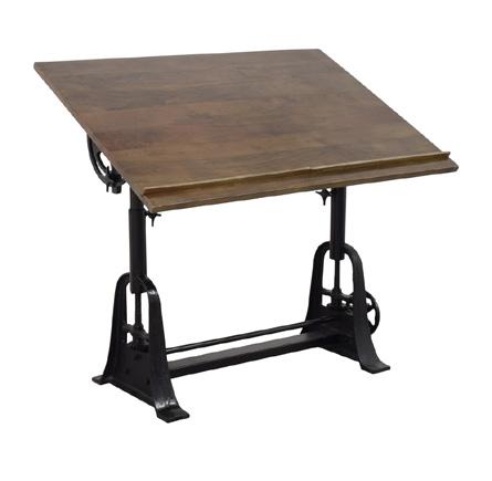
You don’t need to be an architect to use a drafting table in your home. They can be used as an interesting piece in design or as a functional piece for remote work (standing desks are currently all the rage).


Like those of the
include three
wide frame and
this industrial-style drafting table is perfectly proportioned for larger spaces. Its wood tilt-top in weathered oak reclaims a rustic look against the durable, antique brass finish metal frame and accents. 4. HEIGHTADJUSTABLE DRAWING AND DRAFTING TABLE | STAND UP The Height-Adjustable Drawing and Drafting Table is a highly versatile and functional product that can serve as an art and craft station, creative table, stand up desk, or standard desk. It offers a full range of adjustability, including up to 45 degrees of angle adjustment and 12 inches of height adjustment.

work
THE BEST OF THE BEST
Jim Rill of Rill Architects, www.rillarchitects.com, has been designing new custom homes as well as renovations and additions to existing homes since 1987. Whether traditional or modern or something in between, Rill Architects works closely with clients to create spaces that respond to their unique personalities, lifestyles, and values. Rill and his team are dedicated to creating “naturesque” designs that bring nature into the house and the house into nature. “Taking your cues from the outdoor elements allows you to live within your surroundings without having an adverse effect on the environment,” says Rill.

Discuss a few of your recent projects. Are you designing more new custom homes or renovations?
We are designing a mix of new custom homes and renovations. For instance, we’re working on projects in the Washington, DC region including Leesburg and Mount Vernon, Virginia and Cabin John, Maryland, as well as in Tennessee, Alaska, and Montana. It’s always rewarding to work on projects locally and across the country.
For custom homes and renovations, name a few of the must-haves that owners are asking for.
Homeowners are really looking at the way a house flows to the outside to create an extension of living space. Porches and terraces with fireplaces and firepits continue to be in demand.
One of the largest custom homes we have designed recently is a 16,000-square-foot, four-story mansion built on part of George Washington’s Mount Vernon estate that took five years to complete. The 16.5-acre property has many vantage points to take in the outdoor setting, including

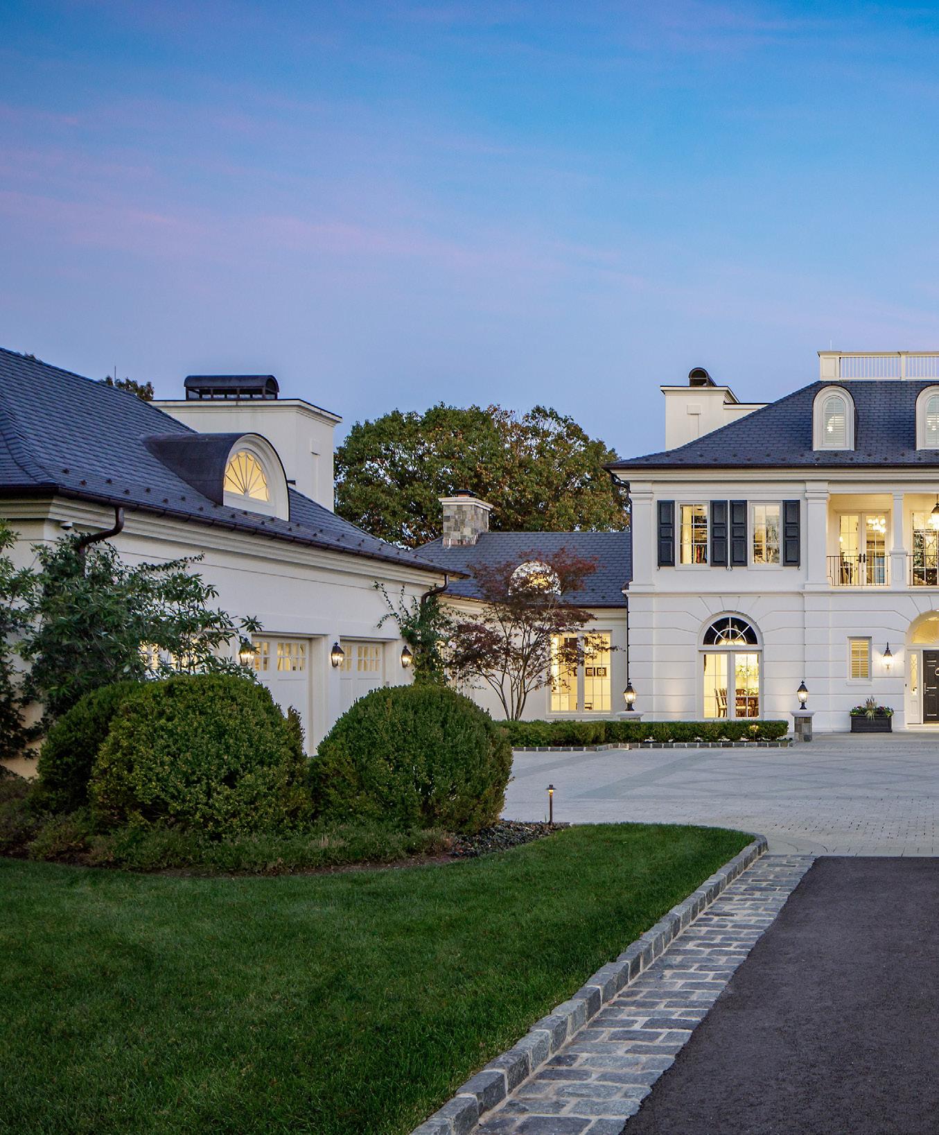
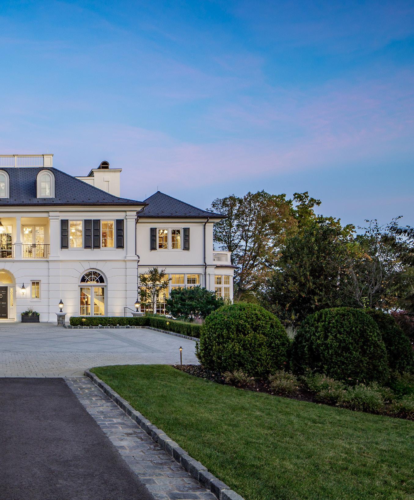
multiple covered porches overlooking the Potomac River and landscaped gardens with gazebos along the base of the property.
Homes we renovate range from a whole house renovation and addition to updates to main spaces, such as kitchens and baths. A recent renovation we completed on Gibson Island, Maryland embraced the home’s mid-century modern style. We expanded and rearranged the footprint to create a more functional floor plan, as well as one that also provided extensive views of the environment.
Of your recent projects, what is a favorite, a dream project?
I love all the projects we work on for various reasons, especially because we meet incredible homeowners. A recent favorite is a new custom home we’re designing in Montana. It’s very much about open living and connecting to the surroundings. Its simple, strong connection to the outside and its single-floor living are very appealing. There are a series of masses linked by glass walkways, providing support and living spaces that are open to one another for a compound feel.
Have you had to adjust home designs due to chain supply issues?

We do make adjustments, but not ones that affect the design. We continue working while waiting on certain items and adjust our schedules accordingly. If needed, we provide temporary refrigerators, for instance, using existing ones or find an alternate new one until the one the owners selected is delivered.
What style of homes are you getting the most requests for?
Or do you still design a variety of homes?
We are designing a mix of home styles from traditional to modern and everything in between. We customize designs to meet the needs of homeowners. If renovating and requested, we stay true to the home’s existing style. For new, we listen to what the homeowners are drawn to. It’s an exciting time to be an architect in the nation’s capital and to work around the country bringing owners’ visions and dreams to life.
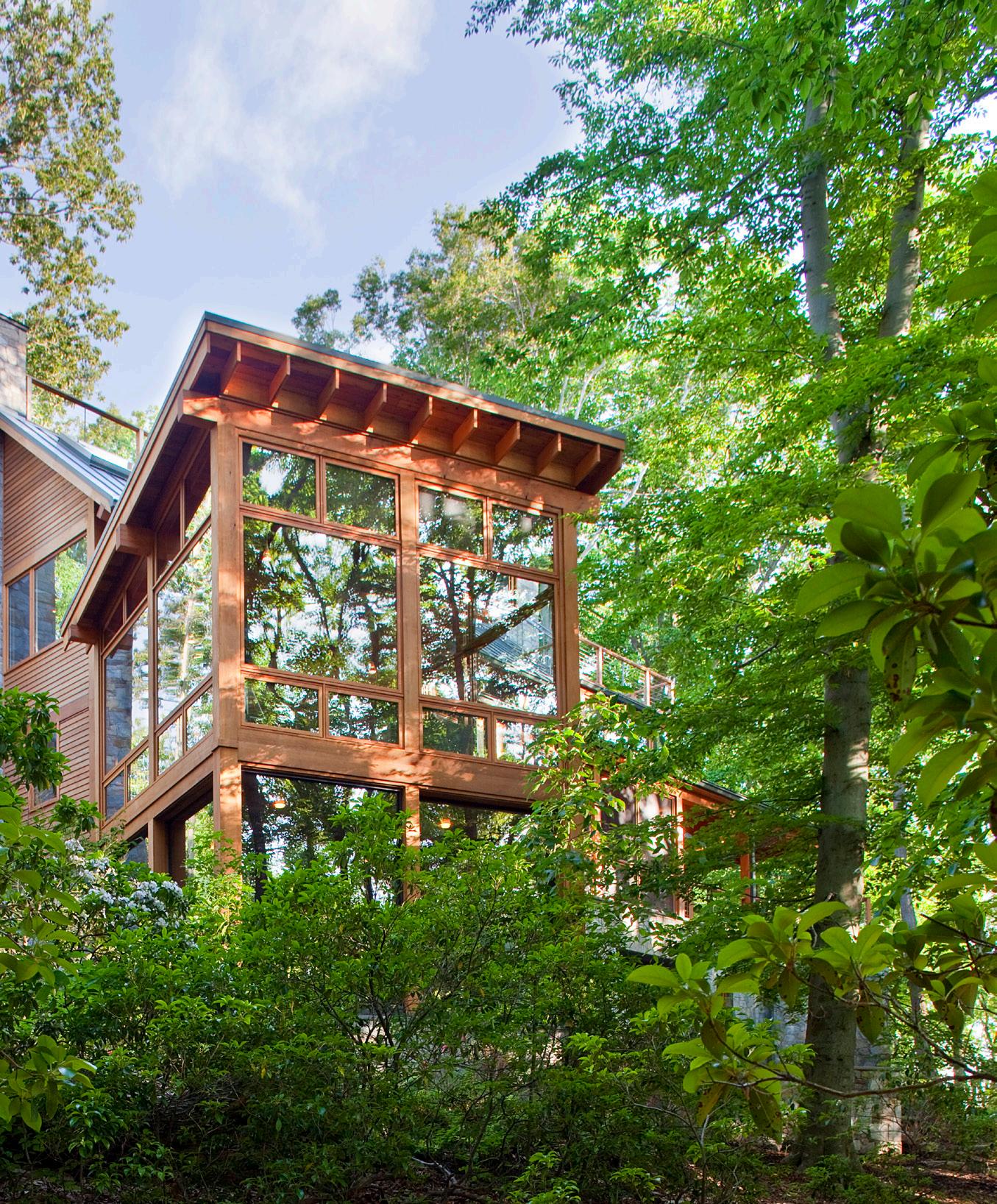
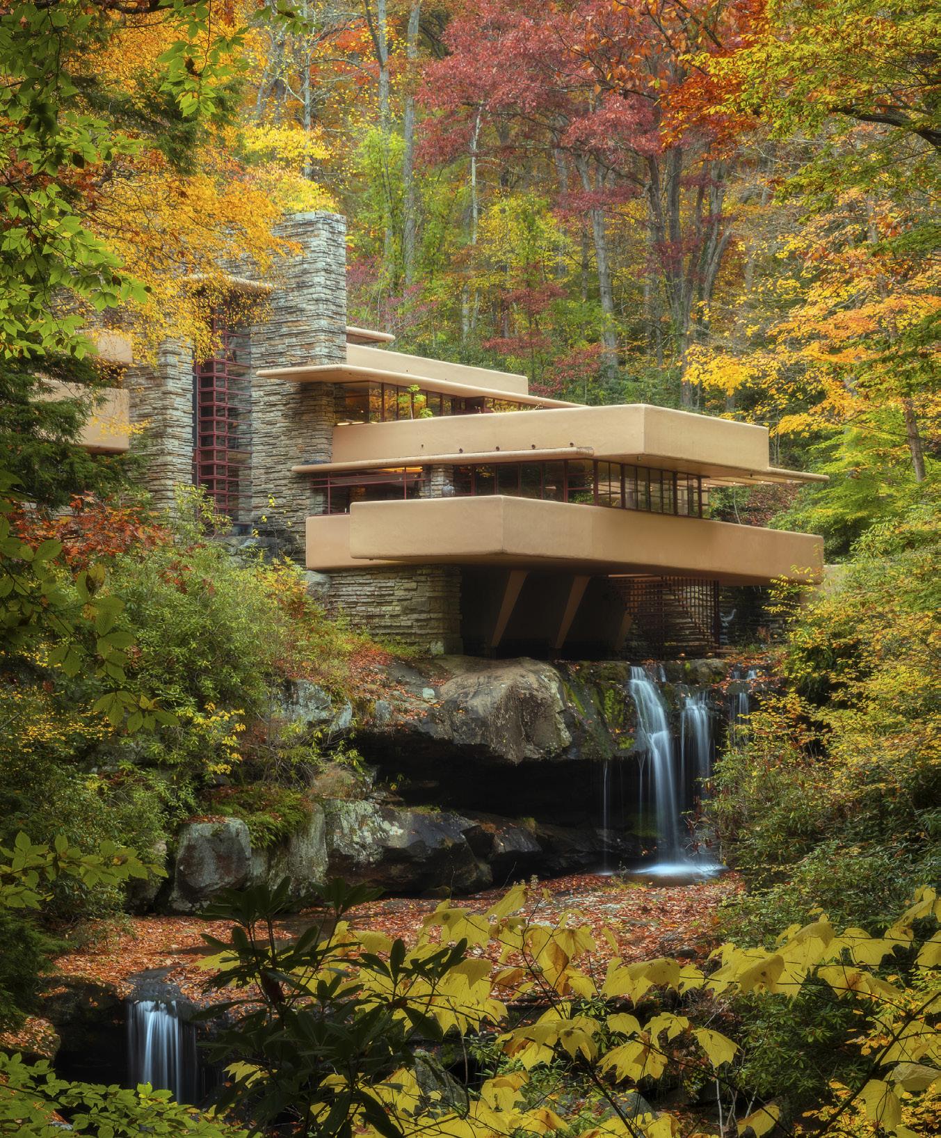
If you ask an American – or an architecture aficionado from elsewhere in the world – who is the most iconic American architect? The answer will nearly always be Frank Lloyd Wright. And his fame is warranted. Not only did he design some of the most beautiful and innovative buildings and homes in the world, but he also changed the way we build and live. But how much do those asked the question know about Wright? How much do you?
Wright, born in Richland Center, Wisconsin in 1867, lived in many different parts of the United States. Growing up as the son of a nomadic minister, the family traveled from one ministry position to another and young Frank lived in Rhode Island, Iowa, and Massachusetts. The different architectural styles and spaces surely impacted his young mind. Impacting Wright’s future career was the divorce of his parents in 1885. To help the family’s financial circumstances, the 18-year-old Frank Lloyd Wright worked for the dean of the University of Wisconsin’s department of engineering. Although he began studying engineering, he decided early on that his interest was in architecture. In 1887, he left Madison for Chicago, where he found work with two different firms before being hired by the prestigious partnership of Adler and Sullivan, working directly under Louis Sullivan for six years. He was able to pair his life experiences with his academic engineering experience and, as they say, the rest is history.

In 1889, at age 22, Wright married Catherine Tobin. Eager to build his own home, he negotiated a five-year contract with Sullivan in exchange for a loan to purchase land. Which he did – a wooded corner lot in the Chicago suburb of Oak Park. It is here that Frank Lloyd Wright built his first house. The home was small and reminiscent of the East Coast shingle style with its prominent roof gable. It reflected Wright’s ingenuity as he experimented with geometric shapes in the later added studio and playroom. (He had six children.)

Wright’s home was filled with beautiful things and exquisite interior design and before long, Wright’s escalating expenses required him to accept independent residential commissions. Although he did these on his own time, when Sullivan became aware of them in 1893, he charged Wright with breach of contract. It is not clear whether Wright quit or was fired, but his departure was acrimonious, creating a rift between the two men that was not repaired for nearly two decades. The split, however, presented the opportunity Wright needed to go out on his own. He opened an office and began his quest to design homes that he believed would truly belong on the American prairie.
THE FIRST OF MANY
Wright went to work and received his first independent commission, which was to build the William H. Winslow House. While conservative in comparison to work of a few years later, with its broad sheltering roof and simple elegance, it nonetheless attracted local attention.
Determined to create indigenous American architecture, over the next sixteen years, Wright set the standards for what became known as the Prairie Style. These houses reflected the long, low horizontal prairie on which they sat with low-pitched roofs, deep overhangs, no attics or basements, and generally long rows of casement windows that further emphasized the horizontal theme. Some of Wright’s most important residential works of the time are the Darwin D. Martin House in Buffalo, New York (1903), the Avery Coonley House in Riverside, Illinois (1907), and the Frederick C. Robie House in Chicago (1908). Important public commissions included the Larkin Company Administration Building in Buffalo (1903, demolished 1950) and Unity Temple in Oak Park (1905).
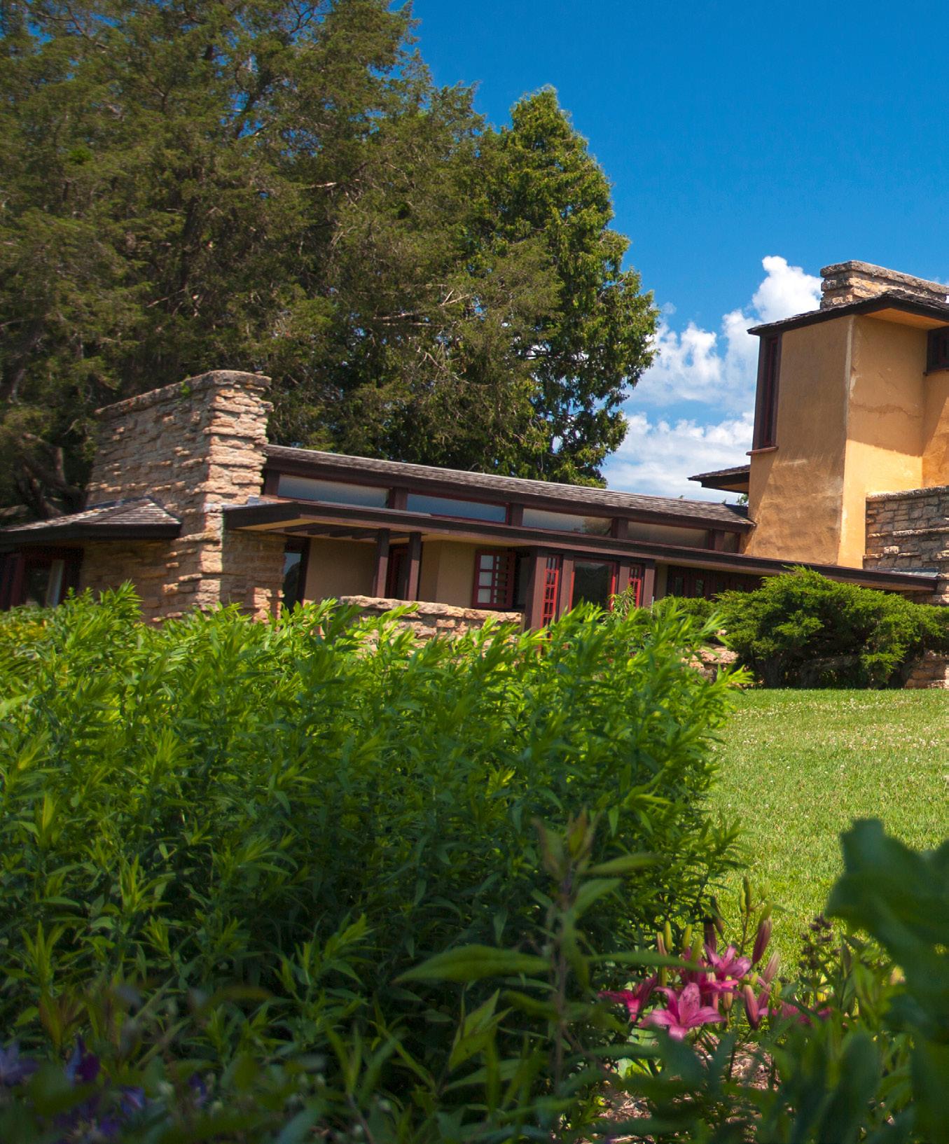
In 1909, Wright left his family for an extended stay in Europe with Mamah Borthwick (a client with whom he was in love and would subsequently have an affair) hoping that he could release the discontent he felt in both his professional and domestic lives. During this time, Wright worked on two publications of his work. But while in Europe, Wright’s drawings and photographs were published which brought him international recognition.
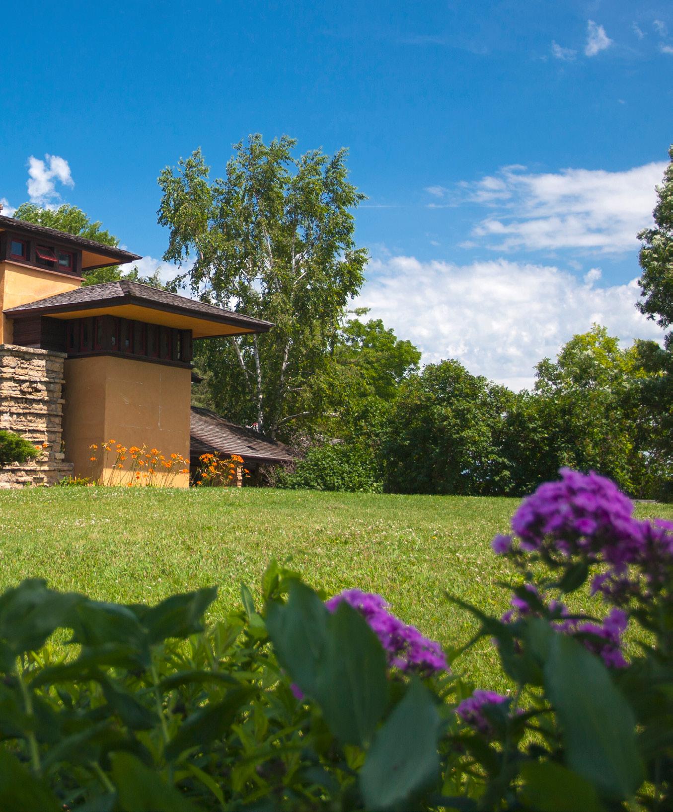
Wright and Borthwick returned to the United States. Unwelcome in Chicago social circles, they moved to Taliesin near Spring Green, and Wright began construction on a new home that would become their refuge. There he also resumed his architectural practice and over the next several years received two important public commissions: the first in 1913 for an entertainment center called Midway Gardens in Chicago; the second, in 1916, for the new Imperial Hotel in Tokyo, Japan.
In August 1914, Wright’s life with Mamah was tragically closed as she, her two children and four others were killed in a brutal attack and fire, intentionally started by an angry domestic employee. Devastated, Wright was only able to find solace in work as he began to rebuild Taliesin in Mamah’s memory. Once completed, he then effectively abandoned it for nearly a decade as he pursued major work in Tokyo with the Imperial Hotel and Los Angeles with the Hollyhock House and Olive Hill for oil heiress Aline Barnsdall.
Although the years between 1922 and 1934 were architecturally creative, they were also financially disastrous. (Wright’s first wife granted him a divorce in 1922. He then married Miriam Noel in 1923. Their divorce was finalized in 1927.) Wright had established an office in Los Angeles, but following his return from Japan in 1922 commissions were scarce. The only exception was that of four textile block houses of 1923–1924 (Millard, Storer, Freeman and Ennis). He abandoned the West Coast and returned to Taliesin.
Only a few projects went into construction, and it was a decade of unfinished works. Among the unbuilt commissions were the National Life Insurance Building (Chicago, 1924), the Gordon Strong Automobile Objective (Sugarloaf Mountain, Maryland, 1925), San Marcos-in-the-Desert resort (Chandler, Arizona, 1928), and St. Mark’s-in-the-Bouwerie apartment towers (New York City, 1928).
Near the end of the Roaring Twenties – in 1928 -- Wright married Olga Lazovich, daughter of a Chief Justice of Montenegro, whom he had met a few years earlier in Chicago. She proved to be the partner and stabilizing influence he needed to refocus on “the cause of architecture” he had begun decades earlier.
With few architectural commissions coming his way, Wright turned to writing and lecturing which introduced him to a larger national audience. Two important publications came out in 1932: An Autobiography and The Disappearing City. The first received widespread critical acclaim and would continue to inspire generations of young architects. The second introduced Wright’s scheme for Broadacre City, a utopian vision for decentralization that moved the city into the country. Although it received little serious consideration at the time, it would influence community development in unforeseen ways in the decades to come. At about this same time, Wright and Olga founded an architectural school at Taliesin, the “Taliesin Fellowship,” an apprenticeship program to provide a total learning environment, integrating not only architecture and construction, but also farming, gardening, and cooking, and the study of nature, music, art, and dance.
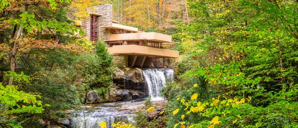
During the winter of 1934, Wright rented a property in the warmer air of Arizona and worked on the Broadacre City model, which would debut in Rockefeller Center in 1935. By this time, Wright was still considered a great architect, but one whose time had come and gone. In 1936, Wright proved this sentiment wrong as he staged a remarkable comeback with several important commissions including the S.C. Johnson and Son Company Administration Building in Racine, Wisconsin; Fallingwater, the country house for Edgar Kaufmann in rural Pennsylvania; and the Herbert Jacobs House (the first executed “Usonian” house) in Madison.
At this same time, Wright decided he wanted a more permanent winter residence in Arizona, and he acquired some acreage of raw, rugged desert in the foothills of the McDowell Mountains in Scottsdale. Here he and the Taliesin Fellowship began the construction of Taliesin West as a winter camp, a bold new endeavor for desert living where he tested design innovations, structural ideas, and building details that responded to the dramatic desert setting. Wright and the fellowship established migration patterns between Wisconsin and Arizona, which the Frank Lloyd Wright School of Architecture continues to this day.
Acknowledging Wright’s stunning reentry into the architectural spotlight, the Museum of Modern Art in New York staged a comprehensive retrospective exhibition that opened in 1940. In June 1943, undeterred by a world at war, Wright received a letter that initiated the most important, and most challenging, commission of his late career. Baroness Hilla von Rebay wrote asking him to design a building to house the Solomon R. Guggenheim collection of non-objective paintings. Wright responded enthusiastically, never anticipating the tremendous amount of time and energy this project would consume before its completion sixteen years later.


With the end of World War II, apprentices returned and work again flowed into Wright’s studio. Completed public projects over the next decade included the Research Tower for the SC Johnson Company, a Unitarian meeting house in Madison, a skyscraper in Oklahoma, and several buildings for Florida Southern College.
Wright opened his last decade with work on a large exhibition, Frank Lloyd Wright: Sixty Years of Living Architecture, which was soon on an international tour traveling to Florence, Paris, Zurich, Munich, Rotterdam, and Mexico City, before returning to the United States for additional venues. Impressively energetic for a man in his eighties, he continued to travel extensively, lecture widely, and write prolifically. He was still actively involved with all aspects of work including frequent trips to New York to oversee the construction of the Guggenheim Museum when, in April of 1959, he was suddenly stricken by an illness that forced his hospitalization. He died on April 9, two months shy of his ninety-second birthday.
Frank Lloyd Wright developed two styles that changed the course of architectural history and to this day impact the architectural world.
The “Prairie Style” (1899-1910 development) showcases a long, low, open-plan structure that eschewed the typical high, straight-sided box. It emphasizes the horizontal line of the prairie and domesticity and was established as the first truly American architecture. In a Prairie house, “the essential nature of the box could be eliminated,” Wright explained. Interior walls were minimized to emphasize openness and community.
Responding to the financial crisis of 1929 and the ensuing Great Depression that gripped the United States and the rest of the world, Wright began working on affordable housing, which developed into the Usonian house. Wright’s Usonians were a simplified approach to residential construction that reflected both economic realities and changing social trends. In the Usonian houses, Wright was offering a simplified, but beautiful environment for living that Americans could both afford and enjoy. Wright would continue to design Usonian houses for the rest of his career, with variations reflecting diverse client budgets.
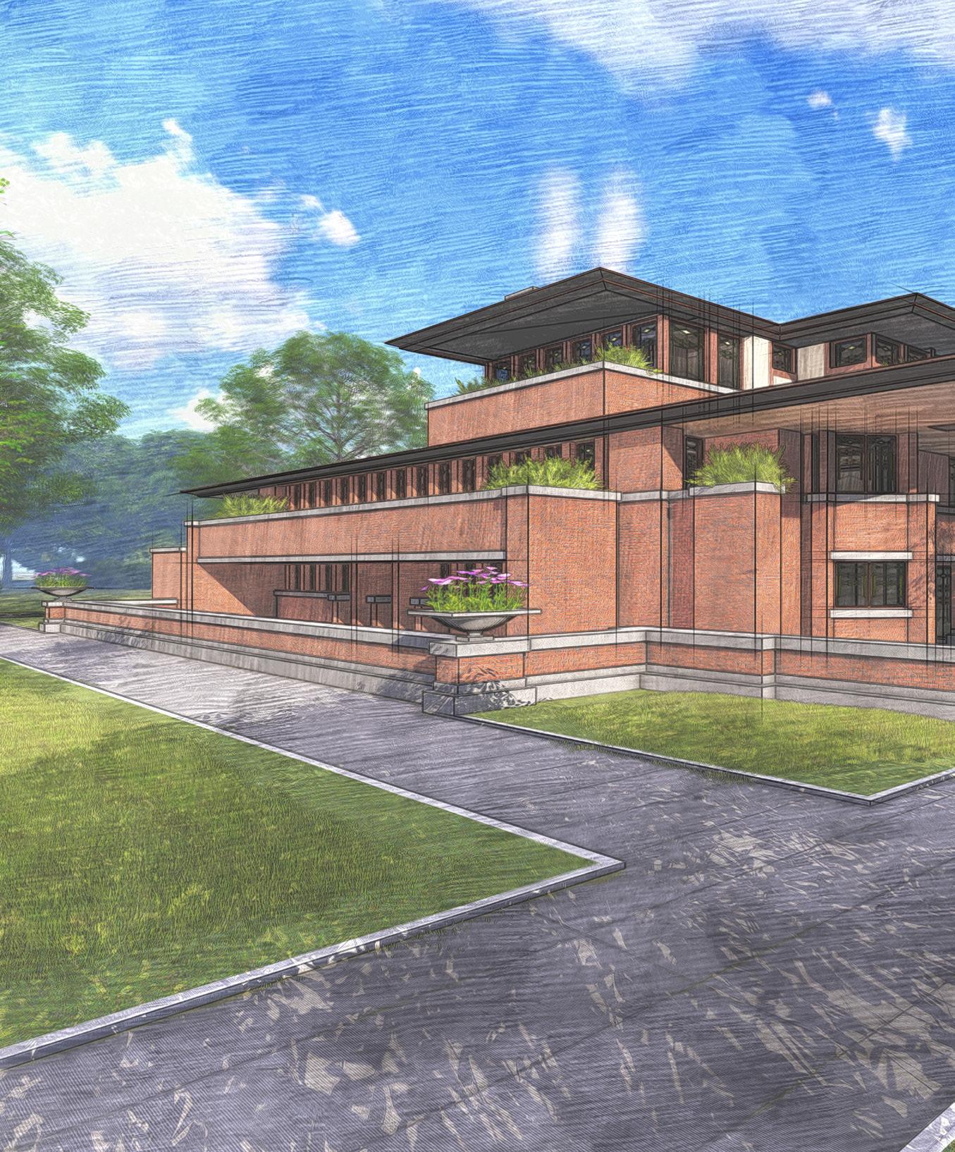
Wright aspired to provide his client with environments that were not only functional but also “eloquent and humane.” Perhaps uniquely among the great architects, Wright pursued architecture for every man rather than every man for one architecture through the careful use of standardization to achieve accessible tailoring options for his clients.
Believing that architecture could be genuinely transformative, he devoted his life to creating a total aesthetic that would enhance society’s well-being. “Above all integrity,” he would say, “buildings like people must first be sincere, must be true.” Architecture was not just about buildings, but about nourishing the lives of those within them.
For Wright, a truly organic building developed from within outwards and was thus in harmony with its time, place, and inhabitants. “In organic architecture then, it is quite impossible to consider the building as one thing, its furnishings another, and its setting and environment still another,” he concluded. “The spirit in which these buildings are conceived sees all these together at work as one thing.” To that end, Wright designed furniture, rugs, fabrics, art glass, lighting, dinnerware, and graphic arts.
Frank Lloyd Wright embraced new technologies and tactics, constantly pushing the boundaries of his field. His fascination for the new and his desire to be a pioneer help explain Wright’s tendency to test his materials—sometimes even to the brink of failure—in an effort to achieve effects he could claim as uniquely his own.

Wright devoted his life to promoting architecture as “the great mother art, behind which all others are definitely, distinctly and inevitably related.” Seeking a consistent expression of underlying unity, he drew inspiration from the Japanese idea of a culture in which every object, every human, and every action were integrated so as to make an entire civilization a work of art. Above all else, Wright’s vision served beauty. He believed that every man, woman and child had the right to live a beautiful life in beautiful circumstances and he sought to create an affordable architecture that served that aspiration.
Designing 1,114 architectural works of all types — 532 of which were realized — he created some of the most innovative spaces in the world. With a career that spanned seven decades before his death in 1959, Wright’s visionary work cemented his place as the American Institute of Architects’ “greatest American architect of all time.”


In this issue of John Eric Home, we are taking a step back in time to rediscover some of the masterpieces painted by Claude Monet. Monet was one of the dominant landscape and architectural artists of the 19th century.
Claude Monet was born in 1840 in France and enrolled in the Academie Suisse. After an art exhibition in 1874, a critic insultingly dubbed Monet’s painting style “Impression,” since it was more concerned with form and light than realism, and the term stuck.
Monet struggled with depression, poverty and illness throughout his life. He died in 1926.


Many of Monet’s famous works focus on the city architecture of Rouen, Le Havre and Venice among others…


Calabrian designer Antonio Aricò unveiled Magna Graecia at Maison&Objet 2023 in Paris. Magna Graecia is a collection of terracotta objects designed for Seletti. Taking stylistic cues from the ancient Greek colonies of southern Italy, the collection includes familiar motifs from Doric and Ionic columns, wave-patterning, and whimsical busts sculpted with reference to antiquity.

Aricò designed the objects as a family for both outdoors and indoors. The designer hopes that the objects will invade terraces, gardens and verandas but also lounges, living rooms and entrance halls. The collection ranges from functional to decorative objects. Functional pieces include vases with Doric, Greek, or wave ornamentation, crafted in both standing and wall-mounted editions. A jug is sculpted to evoke the familiar stereotype of Grecian pottery, while an Ionic column serves as either a pedestal or an ashtray.
Decorative objects include the busts Man and Poppea, along with two large and sensual ‘bronzes’ inspired by the famous sculptures of Riace. Vases take the shape of male and female heads inspired by the ceramics of Caltagirone, while a cup and an ‘amphora’ jar show battle decorations and love scenes.
(Source: designboom)

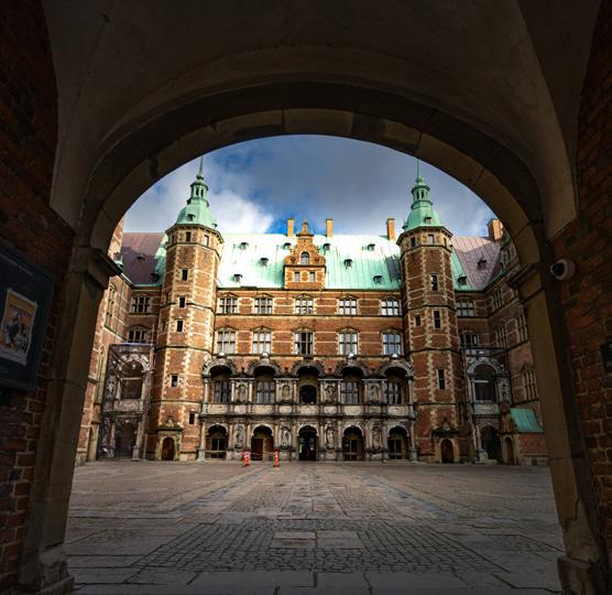

As one can imagine, castles show off incredible interior design. The opulence and grandeur are ever-present. If you happen to be near one of these architectural feats, be sure to drop in and view their incredible interiors too. They are jaw-dropping…
Found just south of Düsseldorf, this castle was home to Elector Palatine Charles Theodore, who ruled over Bavaria during the 18th century. French architect Nicolas de Pigage spent almost 20 years perfecting the three-winged manor and its bountiful flowerbeds, soaring trees, and extravagant canal across the property’s 148 acres.
Inside, the Baroque-style rooms are dripping in grandeur with sparkling chandeliers, one-of-a-kind frescoes, and gilded furnishings. A number of the original furnishings—such as carved console tables and delicate writing desks— remain within the central halls.
Celebrated as one of the finest fortresses in all of India, the red-sandstone and marble marvel served as the main residence of the Mughal Dynasty emperors. Emperor Akbar commissioned the construction of the imposing military structure nestled on the bank of the Yamuna River in 1565. Shah Jahan, Akbar’s grandson, later transformed the fort into a lavish palace that would ultimately become his upscale prison after Aurangzeb overthrew the ruler in 1658.
The ear-shaped complex includes a labyrinth of marble buildings, lush courtyards, and a network of underground rooms. The Musamman Burj, an octagonal tower made of marble lattices, was built for Shan Jahan’s wife Mumtaz, offering the maiden views of the nearby Taj Mahal and river.
Houghton Hall was built for Sir Robert Walpole between 1722 and 1735. Walpole was Britain’s first Prime Minister, and this palatial house was intended to celebrate his rising political fortunes. The staterooms have always been a showpiece. They still retain their original decoration, designed by the architect William Kent, and their original furnishings. Walpole employed the architects James Gibbs and Colen Campbell to draw up plans for the house.
North of Copenhagen lies a masterful display of Renaissance-style architecture and horticulture at what remains the largest castle in Scandinavia. Frederiksborg Castle was built in the early 17th century for King Christian IV, who demolished the original residence acquired by his father Frederik II to establish a magnificent fortress. However, in 1859, a major fire destroyed much of the castle, and a national collection and lottery were held to rebuild the structure.

2 tablespoons extra virgin olive oil
1 pound frozen corn (about 3 cups), still frozen
2 tablespoons mayonnaise
1 (14-ounce) bag low salt tortilla chips
1 pound Monterey Jack cheese
1 tablespoon cornstarch
1/2 cup cream
1/2 cup milk
1 clove garlic, minced
1/4 cup crumbled cotija cheese (can sub crumbled feta)
1/8 teaspoon chipotle chili powder (can use regular chili powder or smoked paprika)
2 tablespoons Mexican crema or 2 tablespoons sour cream that has been slightly diluted with water
1/2 lime
2 tablespoons chopped cilantro
Grate the Monterey Jack cheese.
Heat the oil on high heat. When the oil is almost smoking hot, add half of the frozen corn (not defrosted) to the pan. Spread it out in the pan and let it sear.
Stir occasionally, until most of the corn kernels have browned a little on at least one side. Remove the corn from the pan to a bowl and repeat with the remaining frozen corn kernels. Mix the corn with the mayonnaise and set aside.
Preheat oven to 350°F. Spread the tortilla chips out on a large sheet pan and place in the oven for 10 minutes, until lightly browned.
While the tortilla chips are toasting, make the cheese sauce. Set up a double boiler with an inch of water in the lower pan. If you don't have a double boiler, place an inch of water in a small saucepan and place a metal bowl over it so that steam from the boiling water below heats the bottom of the bowl. Do not let the bowl touch the water.
Place the grated Monterey jack cheese in the top pan or bowl of the double boiler. Mix with the cornstarch. Pour in the cream and milk. Add the minced garlic.
Heat the water in the double boiler to a boil. Let the cheese gently melt, stirring occasionally, until the sauce is smooth.
Once the tortilla chips are lightly browned, remove them from the oven. Transfer to a large serving platter.
Pour the cheese sauce over the chips. Sprinkle the top with the toasted corn. Sprinkle with cotija cheese crumbles. Sprinkle with chipotle chili powder. Drizzle with the crema or diluted sour cream. Sprinkle with cilantro.
Sprinkle with squeezed fresh lime juice.

INGREDIENT
8 ounces of pulled pork
2 teaspoons olive oil
Salt and freshly ground black pepper
8 ounces thick tortilla chips
8 ounces shredded Monterey Jack cheese or a mix of Jack and cheddar
Thinly sliced jalapeño, fresh or pickled
Chopped fresh cilantro
Pico de Gallo
Guacamole
Sour cream
Lime wedges for serving, optional
Preheat oven to 375˚F.
Shred or cut pulled pork into bite-size pieces.
Heat olive oil in a skillet over medium heat until hot. Add pork; cook and stir until heated through and slightly crisped, 3 to 5 minutes. Season to taste with salt and pepper. Remove from heat and set aside.
Spread chips onto a quarter sheet pan in a single layer with them overlapping, but not stacked. Bake for 5 minutes until lightly crisp and fragrant.
Top hot chips evenly in 3 layers: ½ of the cheese, followed by pulled pork pieces, finishing with the remaining cheese. Bake for 5 to 7 minutes until the cheese has melted.
Serve hot, topped with jalapeño slices, lime wedges, cilantro (optional), and Pico de Gallo, guacamole, and sour cream on the side.

1 tablespoon extra-virgin olive oil
1 large onion, chopped
1 pound ground beef
2 garlic cloves, minced
1 tablespoon taco seasoning
kosher salt
1/4 cup water
1 large bag tortilla chips
2 cups shredded cheddar
2 cups shredded Monterey jack
1 (15-oz.) can black beans, drained
1/2 cup pickled jalapeños
1 large tomato, diced
1 avocado, diced
1/4 cup thinly sliced green onions
1/4 corn
1/4 cup fresh cilantro leaves (optional)
Sour cream, for drizzling
Hot sauce, for drizzling
Preheat oven to 425º and line a large baking sheet with foil. In a large skillet over medium heat, heat oil. Add onion and cook until soft, 5 minutes, then add ground beef and cook until no longer pink, 6 minutes more. Drain fat.
Add garlic and taco seasoning and season with salt. Cook until meat is well browned and slightly crispy, 5 minutes more. Add water to the skillet and stir until combined.
Add half the tortilla chips and top with beef-bean mixture, half the cheese, half the black beans, and half the pickled jalapeños. Repeat one more layer.
Bake until cheese is melty, 15 minutes.
Scatter with tomato, avocado, green onions, and cilantro. Drizzle with sour cream and hot sauce and serve immediately.
 by Charles M. Tappan, Jr.
Architecture and design are integral aspects of culture and society. In that time, they have evolved and developed, rebranded traditions, and created new marvels. Both require knowledge, a foundation of basics, practice, the ability to create, and balance. In this issue, I take you through some themed libations, that like architecture and design, rely on classic foundations to create something new.
Glassware:
Chilled Cocktail Glass
Ingredients:
1.5 oz. Probitas Rum
.5 oz. Pierre Ferrand Dry Curacao
1 oz. Lime Juice
.75 oz. Strawberry Syrup
Garnish: Strawberry Slices
Directions:
Combine ingredients into a cocktail shaker, add ice, and shake to a chill. Strain into a chilled cocktail glass, then garnish, serve, and enjoy!
Strawberry Syrup: Reduce 1.5 cups of simple syrup (equal parts sugar and water) with 1.5 cups of medium to large strawberries that are cut in half. Reduce on medium heat for 20 minutes (or longer until desired taste) and strain into a glass jar or bottle – keep refrigerated.
All design starts with a concept. Thoughts on why something will be created, what is it going to look like in final form, and what will it be used for are just as important when designing a building as when creating a cocktail. The concept for this cocktail is the same. Who will use it? Anyone over 21 who is not driving. For what will it be used? To taste great and help people put down their technology and talk to one another.
To bring this concept to life, it starts with a simple sour, using the materials of sweet (sugar), sour (citrus), and spirits. Simple syrup is turned into a strawberry syrup, through cooking and a secondary liqueur, orange curacao is added for depth of flavor and increased body. The trick here to effectively deliver this tipple isn’t anything overly complex: use great ingredients (fresh juices, syrups, and quality spirits), measure correctly, and execute with intent (shaking properly, using enough ice, straining into a chilled glass). At the end of the day, just like a building that has stood the test of time, this beverage will too.

Glassware:
Rocks Glass
Ingredients:
2 oz. Howitzer Whiskey
.25 oz. Combier Crème de Mure
.25 oz. Honey Syrup
2 Dashes Orange Bitters
Garnish: Orange Peel
Directions:
Add ice to a rocks glass, then express the orange peel over the glass and drop it on top of the ice. Build the drink by pouring the ingredients from smallest to largest over the ice. Stir steadily to a count of 45-50, then serve, and enjoy. If the glass is not round, then add ingredients (except for garnish) into a mixing glass with ice, stir, chill, and strain over fresh ice into the rocks glass.
Honey Syrup: Equal parts honey and water, mixed till integrated. Almost no other drink has a stronger foundation than the Old Fashioned. Claimed by many to be the original cocktail, the concoction is said to have become so popular that people eventually began to order their favorite spirits in the “old-fashioned way.” With a form so simple (whiskey, sugar, water, and bitters) and a function so complete, it has been adapted through the ages. Originally it was a morning beverage, the bitters settled the stomach. Thankfully function, just like form, evolves. Now, no longer a morning drink, it invokes rich spring flavors of berries and citrus to brighten up an after-work evening or a weekend afternoon.
Still utilizing the classical building materials of the Old Fashioned, this drink elevates it through the addition of Crème de Mure (Blackberry Liqueur) and honey syrup (to add a natural, enriching sweetness) instead of traditional sugar and water. Of course, all buildings must consider their base material, and in this case, the brightness of Howitzer whiskey makes for an incredible drinking foundation. Utilizing the most classic of techniques, build and stir, this is a beverage that is easy to make but delivers a howitzer-sized batch of flavors. Simple, fun, and full of flavor, this is a Form and Function that is a true crowd-pleaser.

Glassware: Collins Glass
Ingredients:
1.5 oz. Laird’s Apple Brandy
.75 oz. Raspberry Syrup
.75 oz. Lemon Juice
2 Dashes Cherry Bitters
2 oz. Club Soda
Garnish: Lemon Twist
Directions:
Combine ingredients, except for club soda, into a cocktail shaker and shake with ice. Strain over fresh ice into a Collins glass. Add club soda while using a bar spoon to mix and integrate ingredients. Garnish, serve and enjoy.
Syrup: Reduce 1.5 cups of simple syrup (equal parts sugar and water) with 1 cup of raspberries. Reduce on medium heat for 20 minutes (or longer until desired taste) and strain into a glass jar or bottle – keep refrigerated.
No study on architecture and design would be complete without the mention of columns. In parallel, no study on cocktails would be complete without the mention of the Collins-style cocktail, a true “pillar” of the cocktail world. At its purest, the Collins cocktail family is one that consists of spirits, sugar, citrus, and carbonated water. Served in a tall glass, this basic idea of spirits and lemonade has been popular for generations. Like the design of ancient columns, the Collins style of cocktails is one that has evolved over and over through the years, sometimes through simple elevated forms and sometimes through ornate garnishes and exotic ingredients.
To make this drink, make sure to use fresh sugar, fruit and citrus to make it the cleanest and of the highest quality. Laird’s Apple Brandy is the best in quality on the market. The apple flavor is a great starting point for the other flavors to build off. Fresh fruit is abundant through the raspberry syrup and cherry bitters, all layered for springtime and a refreshing afternoon. The citrus helps to create balance, and the carbonation highlights the rich fruit-forward tones of the drink. To garnish, a long and exotic lemon twist showcases the elegance of this beverage’s design. Exotic and whimsical, this is a Collins drink inspired by the Corinthian Column of old.
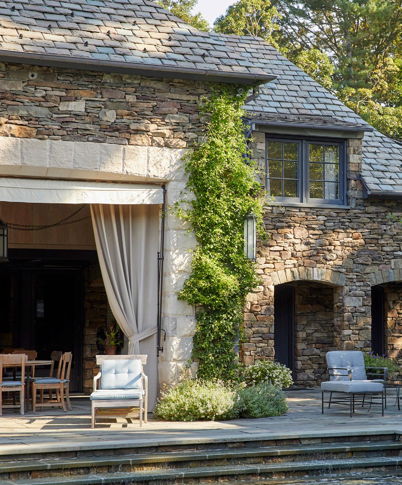
Cover image project by Cicognani
Kalla Architects PLLCWhen my wife and I decided to move our growing family from our Manhattan apartment to a new home, we were immediately drawn to Westchester County, New York, not only for the proximity and easy commute to the city, but also for the vintage of the housing stock. Westchester boasts a plethora of beautiful centennial homes, and we knew immediately that this was what we wanted- we wanted to live in a century-old house.
For some, just the word “old” immediately conjures thoughts of a money pit or getting in over your head. Be that as it may, all we knew was that every post-war house we visited felt like it had no soul. This sentiment is nothing new. As a home buyer, as well as an architect specializing in residential architecture, I was curious as to why we were so attracted to older homes or were we alone in our feelings?

The experience of looking for a historical New Englandstyle house exposed a bit of a professional paradox. If society favors the old, what does that mean for an architect designing a brand-new house? Surely, any attempt to replicate an old house feels contrived. What, then, are the lessons, if any, to be learned from old houses?
Old houses have both tangible and intangible characteristics. Let’s start by analyzing the physical characteristics of a turn-of-the-century house.
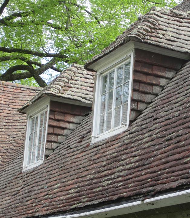
Old houses were most likely built from local stone or lumber, and in many cases, sourced on the same grounds on which the house was built. Such materials carry the mark of geological eras: the unique veining of a marble slab, the warmth color of handmade bricks, the iridescence of slate shingles. The lumber was almost uniquely sourced from old-growth trees, hundreds of years old, which have a character and richness in texture unmatched by any younger specimen, which are industry standard today. The natural materials employed at the time would be able, with the correct maintenance, to weather and grow old while retaining function.

New synthetic materials, while cheaper and highly performative, do not have the same capacity to age. That is because most natural materials over the course of their lifetime develop a patina. It is the degradation of matter, the oxidation of a noble metal in the brass knob, the worn
used surface of a marble counter, the silvery finish of wood exposed to the weather. The patina protects the elements but modifies their appearance over time, in ever-changing patterns and tones, giving them new life as they age. Commercial construction materials now do not degrade or are equipped with factors and chemicals that inhibit the development of patina, so apparently, they never age, until they are irremediably damaged and need to be replaced. In nature all things slowly degrade, nothing lasts forever in its current form. Perhaps we recognize something human in the way old buildings age.
Aside from the rich quality of the building materials, the techniques employed at the time would add distinctive flavors to the assembly. When all elements were installed and came together, it was all done by hand. Handmade things are imperfect by nature, but that is what makes them unique and gives them character. The artisan’s touch is always perceivable, rather than the fidelity of machinelike precision which creates perfect countless replicas indistinguishable from one another.
In addition, the design of the spaces in prewar houses is usually characterized by smaller rooms, each with specific functions and traits, which speak of a different time, where social life was more formal, yet the time spent in the house was slower and more plentiful. Often more generations lived in a house, gathering around a fireplace
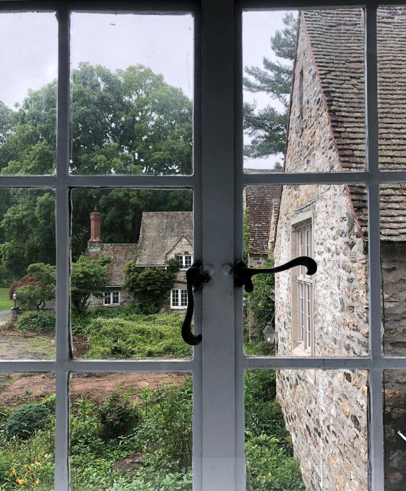
or a kitchen table for different activities. The spaces are at times modest but at the same time rich with architectural details, showcasing moldings, trims, paneling and sometimes wallpaper and fabric, which would confer stature but also warmth to the different rooms.
The exterior, often articulated in vernacular style, is never flat: windows with stained glass, bay windows with copper roofing, columns, eaves, and dormers of all types reveal a profound attention to detail and quality of execution. It was a time when the building trade was considered an art form, when everything was custom built, and each trade would leave its own signature mark.
As far as the intangible qualities, there is certainly something poetic about the history of a place or the notion that buildings have a life of their own that predates their current owners. When one thinks about a house in that sense, we become more stewards, rather than masters, and a symbiotic relationship begins to develop whereby we maintain our home and in exchange, our home provides protection, shelter, and the stage upon which we live our lives, to then be passed on to the next generation. Very few buildings can stand the physical test of time, so it stands to reason that houses that are a century old or more are both very well built and very well cared for, which makes them very special places.
More specifically, when one enters an old house, one can feel how the spaces were lived in for generations before us, how each room evolved through time and each inhabitant made their own distinctive mark, modifying the original structure to accommodate new needs and changing tastes. In an old house, history manifests itself in an organic layering of mutations, additions and juxtapositions. Over time, each steward adds their own touch, their own flourishes, and the overall effect is eclectic, sometimes eccentric, but always rich and unique.
Just like a century-old tree, a prewar house becomes more precious with the slow passage of time, which is a process that is impossible to replicate.
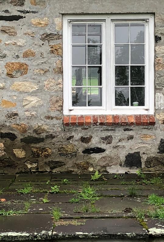
So as an architect, how do I approach building a new house that can compare to these rare beauties?
Based on the lessons drawn from century-old houses, new construction should favor high-quality local materials that can develop a beautiful patina over time. We should not only think about what things will look like when they are built, but also decades down the line. We should favor things that are made by hand, by skilled artisans and craftsmen. We should strive to design spaces on a more intimate scale, proportioned on the human body and we should imbue those spaces with a richness in architectural detail and materiality. Above all, new construction should be well-executed and well-built which will at least give the possibility of longevity.
Possibly the premise is that no new house will possess the charm of a century-old house. However, if we employ a few of the above lessons we may be able to ensure that these new houses will at least last until they themselves become old houses and perhaps earn that sought-after moniker of being timeless.
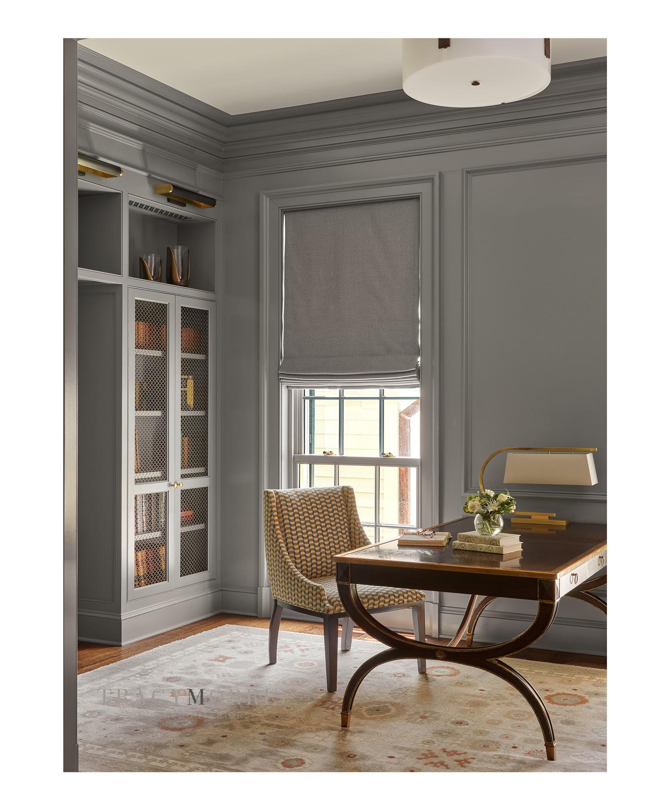

American cities are full of amazing and diverse architecture. The landscape of Los Angeles differs greatly from that of Las Vegas which differs greatly from that of New Orleans which differs greatly from that of New York… You get the picture. But there is one city that packs such a tour de resistance, and that, of course, is Chicago. And in this issue, “Destinations” blows into the Windy City to explore.


Chicago has long been a laboratory for architectural innovation and experimentation. Its skyscrapers, museums, theaters, bridges, homes, schools, houses of worship, and parks are spectacular. And unique. A great example of this is the Monadnock Building. Built in two phases, it demonstrates a visible shift from load-bearing construction to skeleton frame construction—a change that happened throughout the city in the late 19th Century. Traditional ornamentation adorns the south half of the building, but the north half is boldly stripped-down, bucking trends of the time and previewing the Modern style to come.
But Monadnock is only one example of great architecture in the city. There are, literally, dozens of examples – all different in form and function– that make Chicago stand out and earn the distinction of being one of the best architectural cities. Here are just a few…
Gravity-defying 150 North Riverside has already taken its rightful place among Chicago’s architectural and engineering wonders. Architects from Goettsch Partners and engineers from Magnusson Klemencic Associates (MKA) took on the challenge to squeeze what would become a nearly 1.5 million square foot building onto a two-acre compact site.
With such a small footprint of buildable space at street level, the architects and engineers needed to develop an innovative solution that still allowed for large rentable office floors to generate income. The result is a 54-story skyscraper that defies typical structural logic. It’s common for tall buildings to have a wide base that gives stability to the foundation and then narrows at the top—think of the John Hancock Tower, for example. But it’s quite unusual for a tall building to be narrower at the bottom and widen at the upper floors. Yet, that is exactly the type of structural gymnastics Goettsch and MKA pulled off.
The building rises on a very small base, which slopes outward at an angle for the first eight stories, then widens to nearly the full width of the site. To accomplish this feat, the designers chose a core-supported structure, a massive central concrete “spine” that holds the elevator core and also transfers the load of the upper floors down to the foundations. Caissons were drilled more than 110 feet below grade level and sunk 5 feet into Chicago’s bedrock to provide a stable foundation in Chicago’s swampy soil. During construction, the building’s location along the river was considered an asset, rather than a liability, when 81 floating barges were tied together to hold a 2-million-pound crane that lifted the giant steel trusses. In addition, the largest and longest hot-rolled steel beams ever used in the U.S. allowed the building’s width to splay out from 39 feet to 120 feet.


When faced with a complicated site and structural challenges, architect Jim Goettsch and his team developed a smart and creative solution. The result at 111 South Wacker is an award-winning Gold LEED (Leadership in Energy & Environmental Design) certified building.

The original site of 111 South Wacker once hosted the magnificent US Gypsum (USG) building. The structure was turned at a 45-degree angle toward the corner of Wacker and Monroe. When it was demolished in 2003 to make way for the John Buck Building, it left behind a problem to be solved. The original caissons were angled irregularly and therefore could not have supported the proposed structure. Not only that, next door, a 15-story building blocked precious views, which meant the occupiable structure needed to be 120 feet from the ground. To solve the problem, Goettsch put a parking garage on the first seven floors, however, this is no ordinary parking garage. Its dramatically lit, spiraling ramp reflects down into the 44-foot lobby space beneath it.
The lobby’s stepped ceiling and marble and granite floors, laid in radial patterns, extend the spiral motif and it doesn’t end there. The spiral pattern continues onto the pavement outside the building, and non-reflective glass creates an almost invisible barrier between its interior and exterior space. As you walk through the lobby, it feels as though the building is radiating both upward and outward.

This building’s austere masonry facade blends in well with its similarly clad neighbors. The coordinated exteriors make the street both grand and a little intimidating to behold. But while 190 South LaSalle intentionally blends in at street level, it makes quite a statement along the skyline. Its green gabled roof is distinctive. This building does a brilliant job of optimizing both ways it is viewed: as an unassuming structure from the street and as an eye-catching tower in the distance.
Designed by architects Philip Johnson and John Burgee, a Chicagoan, 190 South LaSalle adopts the visual language of earlier Chicago buildings but supersizes its decorative elements to add a touch of drama and fun. This is a common characteristic of Postmodern buildings—oversized scale combined with over-the-top symbolism and in-your-face colors—and depicts the architectural freedom that flourished in the 1980s and ‘90s. This style was an explicit response to the strict precepts of the International Style, epitomized in Mies van der Rohe’s steel and glass structures.
Philip Johnson himself had been a champion of the International Style but famously “changed his mind.” In the 1980s he began designing buildings that used traditional materials and made explicit contextual references both to the past and to neighboring buildings. For 190 South LaSalle, Johnson chose to reinterpret the gabled roof of Burnham & Root’s 1892 Masonic Temple. The Masonic Temple originally sat a few blocks away at the corner of Randolph and State but was demolished in 1939.
From the moment it appeared on the Chicago skyline, the Aqua Tower has earned numerous awards for design excellence. However, it hasn’t kept all the glory for itself. It’s fair to say Aqua is a star-maker, with its 2009 completion putting the city’s newest neighborhood, Lakeshore East, on the tip of everyone’s tongue.
The Tower’s design is a brilliant new approach to the problem long ago identified by Louis Sullivan—how to create an aesthetic for a functional tall building. The basic structure is a standard, modern box. But Jeanne Gang and her firm, Studio Gang, surrounded this box with slow-rippling, white concrete balconies, giving the skyscraper a sculptural quality.
Each individual balcony is unique in size, shape and protrusion, allowing residents to chat with neighbors above or below. The balconies also help to break up wind vortices, minimize wind shear, shade neighboring apartments, and prevent birds from colliding with windows. Each balcony is part of a greater floor slab. Contractors used GPS coordinates to precisely pour each of the 82 designs. Building Aqua was a feat of engineering.
Situated next to Lake Michigan in Lakeshore East, the building’s water motif connects residents and visitors to the city’s most remarkable natural landform. Also paying homage to the Midwest’s natural beauty is Gang’s decision to make the Aqua Tower planet-friendly, through rainwater collection systems, heat-resistant and fritted glass, and energy-efficient lighting.


Of course, 875 North Michigan Avenue is the granddaddy of all. No list of Chicago architectural wonders would be complete without it. This 1,499-foot skyscraper’s groundbreaking engineering helped to make buildings taller than 100 stories—a new possibility—and freed skyscrapers to come from their traditional rectilinear shapes.
Skidmore, Owings & Merrill chose a bold form for the building. The tapered rectangular tube—with giant trusses on each of the four sides—doesn’t hide how the building stands up. The X-bracing on the building’s exterior enables it to resist wind loads. The lateral load-resisting system also reduces the need for internal columns, opening the building’s interior and increasing available floor space. Engineer Fazlur Khan’s idea of the “trussed tube system” was an important stage in the development of the skyscraper. This design made it possible to build to unprecedented heights.
The original plan called for two buildings to be built on the site. But the private Casino Club just east of the site refused to sell its lot to the developers. A smaller site meant a tight squeeze, and architect Bruce Graham recognized that it wasn’t going to be big enough for the two planned towers. Upon further economic analysis, the team determined that a trussed, single tower was more cost-effective. Plans were changed.
Despite a financial crunch that prompted the building to change ownership from Jerry Wolman to John Hancock in the midst of construction, it was completed in 1968. Today, the building’s tenants include a mix of residential apartments, retail and office spaces, and a 94th-floor café and observatory where visitors enjoy a 360-degree view of the city. On hot summer days, the building’s street-level plaza serves as an oasis in the middle of the city, complete with a lush garden and a waterfall.
(Source: Chicago Architecture Center)



The concept of hotels and accommodations has a very long tradition. In the Middle East, caravanserais (roadside inns) were raised along caravan routes. During the Middle Ages, monasteries provided refuge for travelers. But the starting point from which all hotels can be traced is ancient Rome. Mansions were built to offer visiting politicians and business travelers places to stay for the duration of their trips. These were the first “luxury” accommodations. Much has changed since these early times. Not only in construction but in diversity, amenities, and availabilities. While Roman “luxury” was opulent, today’s luxury hotels are in a complete class of their own.
Luxury hotels are, of course, amazing. It doesn’t matter how often you stay on a 5-star property, there is always something new and unique or appreciated and discovered during your stay - the pleasures and service, the efficiency and design. Who doesn’t have a tinge of regret when checking out and leaving the property? The good news is that with a few design changes and additions, you can create your own luxurious spaces in your own home.
The focus on creating this space is to magnify and improve your sense of well-being and to elevate your daily living standards – just as in the luxury branded hotel. And we start right at the beginning – the entrance…
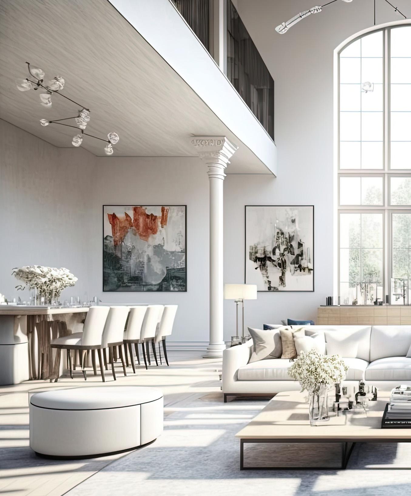
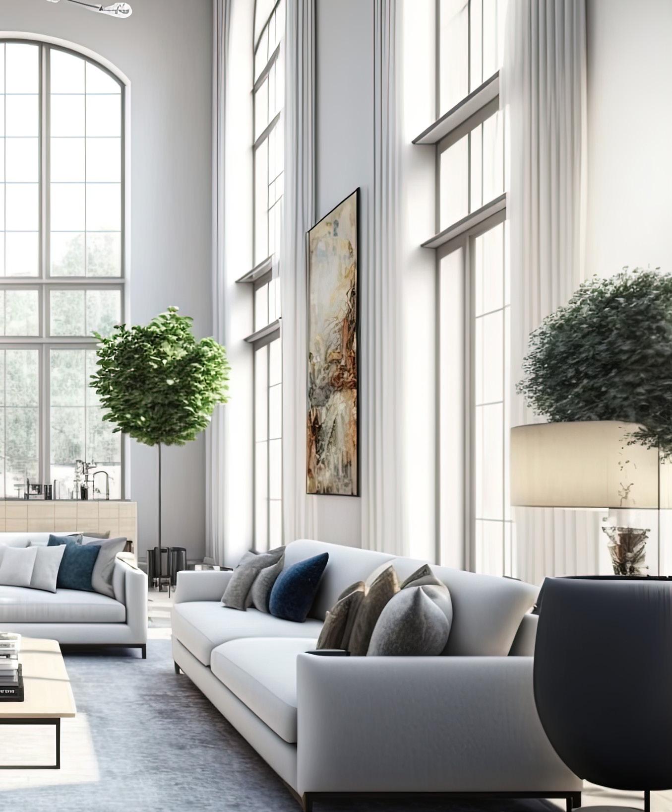
The hotel lobby/lounge is the place that not only welcomes visitors but is the ultimate brand statement. This too can be said for your foyer. It is the visitor’s first impression and expectations of the rest of your home. The question to ask yourself is: Do you enjoy crossing the threshold of your entryway or do you experience displeasure?
If the answer is displeasure, then it’s time for a change. Retrieve from your memories the hotel lobbies and lounges that most brought you the feeling of enjoyment. What is it that you liked about them? What in these lobbies welcomed you? What in the lounge made you hang out there? Use your memories to update your space.
It could be adding plush carpets to hardwood floors, bringing in a large comfy chair to provide warmth, or adding a small table for scented candles or flowers. If your home has an industrial feel – instead of large and comfy, go with sleek and sexy. And artwork matters. Whether it is an original painting or print, a beautiful piece of pottery or glass, make sure to line up your taste with that of your entryway furnishings. Make your foyer a place that you, yourself, would want to enter and maybe even rest a while.
Likewise, your living room (and family room) should reflect what is in the foyer. Most hotel rooms do not have a living room or family room area, with the exception of suites, so the lobby is this space. Seamlessly bring the vibe of the foyer into your home’s living room with additional touches. Big throw pillows, ornamental clocks, and gorgeous pottery. Or, if minimalism is your style, keep it clean and simple.
Hotel kitchens are a hub of activity. Chances are that your kitchen is a hive of activity too. Wouldn’t it be nice to heighten your everyday kitchen experience? Granted, this part of converting your home into bliss isn’t sexy or beautiful, but it is necessary to enjoy the full experience while reducing stress.
Alignment and function are the key factors to accomplishing this. Home kitchens and hotel kitchens are both designed for functionality. But unlike hotel kitchens which are run tightly and highly organized, home kitchens are more in the grey zone. Your kitchen is not for a chef running around the space retrieving ingredients and pots and pans. Therefore, you need to utilize the space for your specific purposes. Think of who will be in your kitchen. Is it a social space? A cooking space? And prioritize from there.
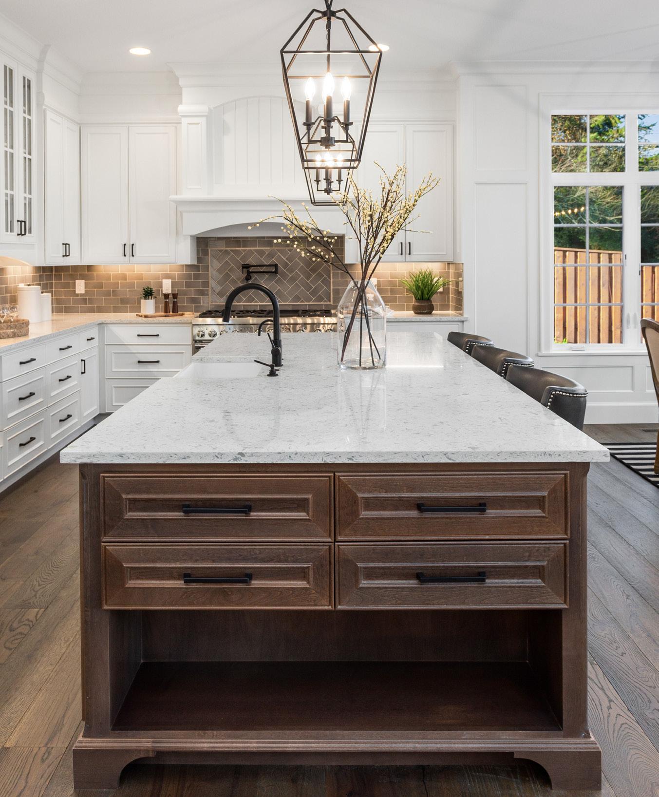
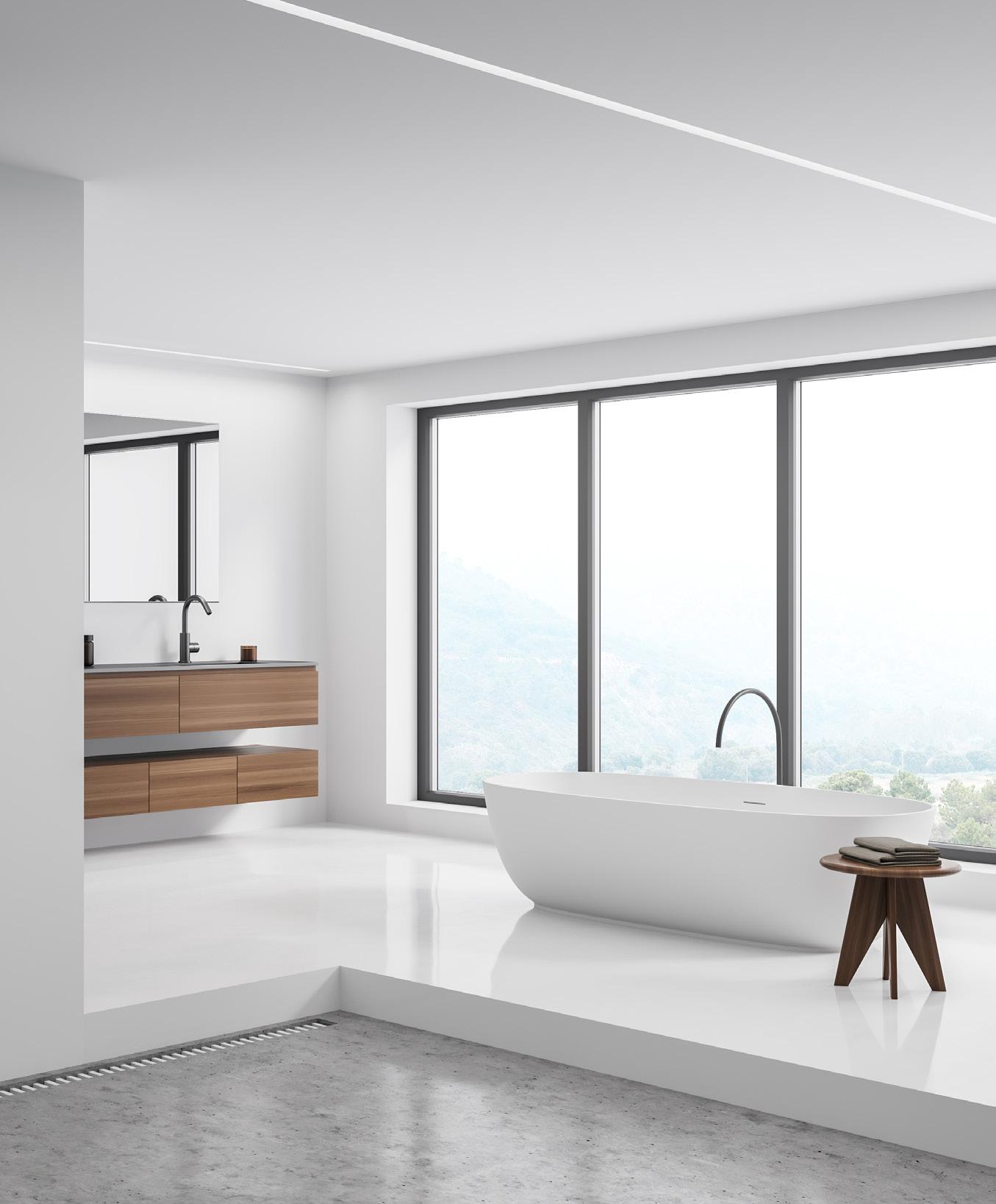
However, just like a hotel kitchen would not have a pasta roller taking up space if pasta wasn’t on the menu, your kitchen should be home to those items, appliances, and gadgets that you actually use. Toss out what you haven’t used in years. If you can’t toss, find a box, and put those items in storage. For those items that are used enough to stay but not enough to be a priority, rearrange the cabinets and shelves. You will be amazed how less stressed you become when you no longer need to dig behind the pasta maker to grab the strainer or become entangled in apron strings when you haven’t ever even worn the apron. Add or remove appliances as needed to make your hive run smoothly. Perhaps you do not frequently visit the grocery store. When you do, would you like to buy more but can’t because condiments and jams and water bottles and packages of butter are taking up too much space in your refrigerator? Put in an additional small freezer or refrigerator. Or, you have a big family, and it takes more than one dishwasher to clear dinner’s dishes? Add a small dishwasher. Of course, the configuration of the kitchen looms large in decisions such as these but, more often than not, space can be made. Think of the efficiency of a hotel’s kitchen and recreate that in your own.
The first bathroom in hotel history was found at Boston’s Tremont Hotel which installed indoor plumbing. Since then, bathrooms have grown more luxurious in hotel accommodations. They have become retreats laden with enhancements. It is easy to transform your bathroom into 5-star luxury. Though it can be expensive. Imagine brushing your teeth while your feet are warmed by heated slate floors. Or gazing out floor-to-ceiling windows while applying a face mask. Although these do require renovations, the feel of the five-star will be duly noted. Of course, you can make small additions and leave the grand overtures by installing things like plush towels and towel warmers, dual showerheads, floorto-ceiling mirrors, and customized bath products. In-mirror televisions are more and more common allowing you to enjoy a show or continue a binge while in the bathtub.
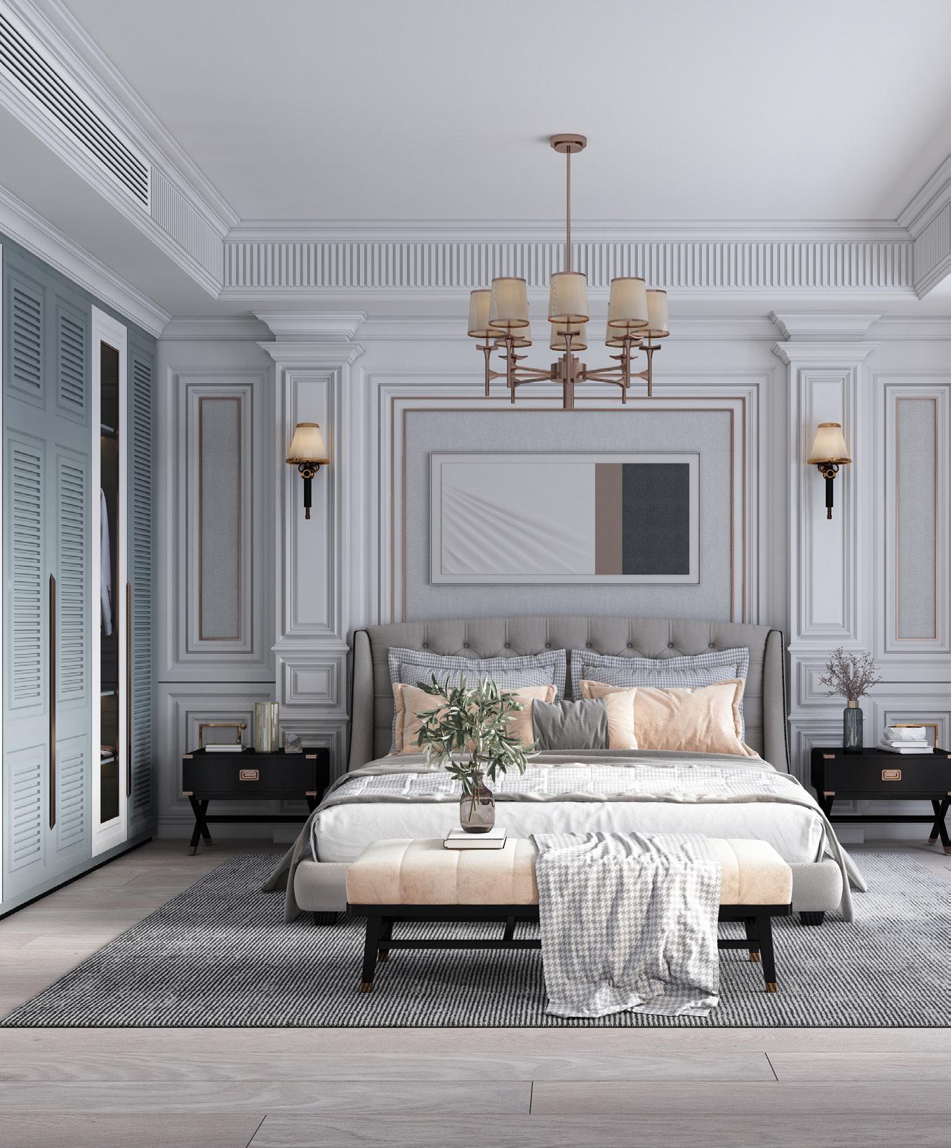
The bedroom – where it all began for hotels with the need to have someplace to rest a weary head. The bedroom is probably the easiest of all the rooms to convert into a space that oozes luxurious living. Nothing needs to be remodeled. Appliances don’t need to be added or removed (apart from a small refrigerator and shelf). Small modifications will turn it into a luxury oasis.
Bedding is very important when creating a luxurious feel. Sheets with a higher thread count that are crisp. Cotton duvet covers that are beautiful and exude style. Pillowcases that are thick and comfortable to the touch. And multiple pillows – not throw pillows –actual pillows will provide that extra touch.
Add a shelf and refrigerator to create a snack space. Furnish it with a Nespresso machine or kettle, coffee pods, packets of tea, sugar, and small jars of nuts and dried fruits. Tuck milk into the refrigerator along with bottled water. When waking in the morning, it’s a few quick steps to your first cup of coffee. And when settling in at night, cozy and with a good book in hand, a cup of chamomile is at arms’ length.
While we are at it, add a chaise lounge and ditch the chair. Burn a richly scented candle on the dresser and toss the infuser into the garbage can. Invest in an expensive bathrobe. And slippers! Yes, slippers. Sometimes, it’s the small things in life and when converting your home into an oasis, don’t leave these out. They are comfortable and functional and if you aren’t a slipper-wearer, you will be surprised at how this simple footwear matters.
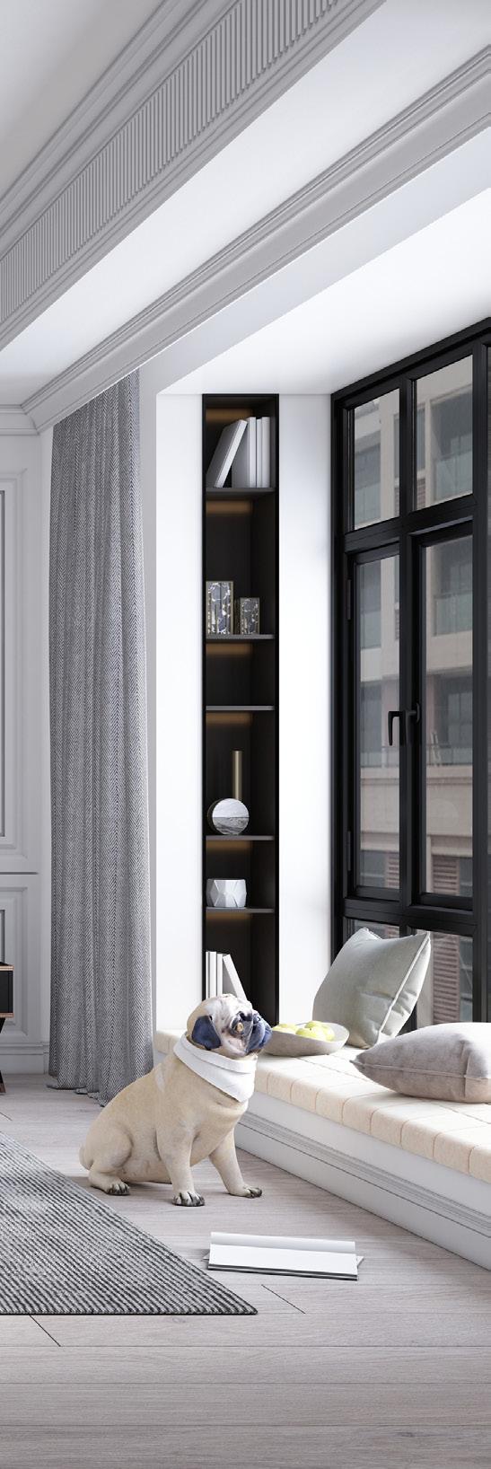
While the living spaces in hotels are the draw, what keeps travelers coming back are the amenities and the special touches. Hotels entice guests by appealing to sensory pleasures. Sound is very important. It can be utilized to foster intimate dining conversations, fuel energizing workouts, or set a relaxed tone in the spa or lounge area. Music powerfully sets the mood. Do you have a household track for your living?
If not, create one. It can be a “mixed tape” variety of the ‘80s with different tunes to appeal to each family member or those that invoke memories. Or, like a hotel, it can be thematic. Classical or opera or country or pop. Whichever represents you and your family the best.
Many people claim a “signature scent” – well, guess what? Hotels do too. They lean on the olfactory sense so that guests will linger, have positive impressions of their spaces, and add another level to their hospitality. Scents bond to people and when outside of the property and smelled, invoke memories of the stay.
If your home doesn’t already have a signature scent, incorporate one. Aside from adding a luxe feel, the scent will create a subtle bond between you, your family, and your guests. Whether it is woodsy or citrus, floral or spicy, the scent you choose will brand you.

Who doesn’t love room service? It’s one of the best perks of staying in a hotel. Room service is all about three things – food, delivery, and service. But how do you prepare room service for yourself? After all, you will be the one cooking, delivering, and setting the cutlery…
Well, the simple answer is that you can’t. Not for yourself. But you can for other members of your family. Especially on special days – birthdays, anniversaries, holidays, and the like. It’s easy and fun.
First, decide what will be presented on the menu. For example, breakfast may have choices like oatmeal and fruit, toast with honey, bacon and eggs, an omelet, coffee, tea, juice, and milk. Then, ensure that you have the ingredients in your kitchen. On hard stock paper, write out in script the choices with the requisite time of delivery. Voila – very simple. And the next morning, when you deliver the tray to your “guest” you will be sure to see a big smile on their face.
Tea rituals date back centuries to Buddhist monks in China and Japan who performed tea ceremonies but became mainstream when Anna, the seventh Duchess of Bedford (England) invited friends to share tea with her in the afternoon. This is a wonderful tradition – and quite 5-star – to initiate in your home. Perhaps a monthly treat for you and your closest friends. Or, a special bonding experience for your family. Like room service, you will not have hotel staff to prepare and lay it out for you and your guests. But making time for this tradition is wonderful and restorative.
Here, customization is the key. Thick napkins and tablecloths, porcelain cups and dishes along with small pots, a crystal bud vase with dainty bloom, shiny silverware, and a beautiful tray are all that is needed. Once you have these necessities, choose your tea. Earl Gray or Darjeeling. Irish Breakfast or Pu’er. There are so many choices. And each month, you can experience a host of new flavors. If instead of tea tray service, you decide on high tea, finger sandwiches are easy to make to accompany the tea. But it’s not necessary. The tea tray itself is a luxe and bonding experience and is just fine on its own.


 by Hannah Jenner
Whether you’re working toward an athletic endeavor, improving overall health, or looking to lose some body fat, tracking progress in some manner is an important part of helping you achieve your goal. But what should you track? How often should you track it? And what happens if the results show that progress has stalled or maybe even slipped a little?
Without tracking, it can be hard to tell if you are indeed making any progress, especially when it comes to something like losing body fat. When you see yourself every day and the process of change is gradual, you likely won’t see much of a difference from one day to the next. Others may be able to see it, but how many times have you felt that sinking feeling as if nothing is happening and all those positive comments you’re receiving are people just trying to be nice?
Choosing the right metric or metrics to track is the key. For example, we all know that the scale is a fickle beast and weight can fluctuate from day to day influenced by an entire host of factors that have nothing to do with actual body fat gain. So rather than getting hung up on a number, try thinking about how much energy you have, how clothes feel, or take measurements or pictures once or twice per month. If you’re working towards an athletic endeavor such as a 5K run, rather than just focusing on the time it took you (which could be influenced by the weather, your sleep quality, current stress levels, or nutrition), consider tracking your rate of perceived exertion or how quickly you recovered after the run.
Tracking metrics should provide you with helpful feedback that you can use to assess any adjustments that may need to be made. There will always be days when you feel like you’re crushing your goals and days when those same goals feel like an impossible task. So before making any adjustments to your training or nutrition plan, consider the bigger picture first.
- On a scale of 1-10 how stressed am I? (Anything 8 or higher and cut yourself some slack.) - How well have I been sleeping recently? - Have I been eating healthy meals consistently? - Am I properly hydrated?
If you find that the data you’re tracking is causing you any degree of anxiety, then it is time to change things up. There is no such thing as failure - just feedback! If you want to step on the scale each day, then take an average for the week rather than focusing on each day. Any wild swing in the number is a fluke and not representative of wild body fat gains or losses. If you’re working toward a run distance time or are looking to lift heavier weights for a personal record, consider your starting point. An experienced and highly trained athlete will only see very slight increases in times or top-end strength numbers, whereas a beginner will likely see fast progress. If you’ve been on the upward trajectory and suddenly it slows, then remember to consider
that bigger picture. Perhaps you’re reaching your strength potential and from here on out gains will be much smaller.
Whatever you decide to track needs to be data that you understand, something that you find helpful, and always taken in context of the bigger picture. There are so many wearable devices and smart scales that it is easy to become overwhelmed in a sea of numbers which in itself can be stressful! If in doubt, keep it simple. You don’t actually need a smart device to tell you how you feel. If you’re not sure of what to track, what is useful, or what is superfluous, then try reaching out to a coach or personal trainer that specializes in helping people reach their goals.
So, pay attention to how you feel about what you’re tracking. Does it provide you with useful information or does it stress you out? What else might be better to track? And always consider the bigger picture and the contributing factors that play a role in what affects the data.


It’s hard to believe that we’re at tax time. Every year clients say that “I wish I did this…” or “I wish I did that…” to reduce their tax bill. Last year was a little bit better, tax-wise, since the stock market wasn’t so good and did not produce as many gains as in 2021 for a lot of people. Frankly, I would rather have the better stock market and deal with the taxes than have a dropping stock market. Both situations are not good, but it’s a better problem when your portfolio is increasing.
Here are some things that you can do this year so next year is not too bad from a tax standpoint.
For 2023, there have been some increases in how much can be put away pre-tax and in Roth accounts. For 401K plans, you can contribute $22,500 per year if under the age of 50 and $30,000 if you’re over 50. This is nice because you’re contributing to your retirement pre-tax. This reduces your taxable income and helps by reducing the amount of taxes you owe. You can also do a Roth 401K if your company has that option. The Roth option is not pre-tax going in, but when you withdraw funds, the funds will be tax-free. For some people, it’s good to have a combination of pre-tax funds and Roth funds in their 401K plan.
In addition to the 401K plans there are IRA plans, where depending on your income, marital status, and if you or your spouse is covered under a retirement plan, your contribution may be tax deductible. You can contribute up to $6,500 for an IRA for this year if you are under the age of 50 and $7,500 if you are over 50. This is the maximum for the Roth and the regular IRA plans. If you’re single, and your income Is over $153,000 per year your ability to contribute to the Roth IRA will be reduced. There are no reductions based on income for Roth 401K plans. If you are married and your combined income is over $228,000 for 2023, your ability to contribute to a Roth IRA will go away.
Roth IRAs and 401Ks are nice because as long as you have had a Roth for at least 5 years, and you are over the age of 59 and a half, all your withdrawals from the Roth are income tax free. Another benefit is that you will not be required to take out required minimum distributions from any Roth except for inherited Roth IRA accounts. Inherited Roth IRA and 401K plans require distributions each year for the beneficiaries.
These are some of the more common deductions that people may take on their taxes. Please check with your tax professional to see if there are other strategies they would recommend to get the best outcome on your taxes. If you want to run any options by me or if you need a recommendation from a tax advisor, please feel free to email me at marcs@equityplanning.com and I would be happy to help you in any way possible.
Securities offered through Cetera Advisor Networks LLC, Member FINRA/SIPC. Investment advisory services offered through CWM, LLC, an SEC Registered Investment Advisor. Cetera Advisor Networks LLC is under separate ownership from any other named entity.
This piece is not intended to provide specific legal, tax, or other professional advice. For a comprehensive review of your personal situation, always consult with a tax or legal advisor. Neither Cetera Advisor Networks LLC nor any of its representatives may give legal or tax advice.
Although architecture, like fashion, is affected by mass production, the former, as an inhabitable art form, is still more permanent than the latter, which is a wearable art form. In truth, both are art applications; both use geometry, design principles, material trends, color theories, and structure techniques to create forms.
Several prominent fashion designers have been inspired by sophisticated structures. Architectural Fashion, also known as Wearable Architecture, is a term used to describe the merging of architecture and fashion. Since architecture became an open material for criticism and appreciation, architectural fashion has been a trend for many to experiment with.
Designers like Balmain, Zaha Hadid, and Gianfranco Ferré are known for their architectural-styled fashion pieces. Akris, Balenciaga, Chloe, Dolce & Gabbana, and Gareth Pugh have also joined the club. Although the style is mainly composed of statement pieces and haute couture clothing, the designs are inspirational.

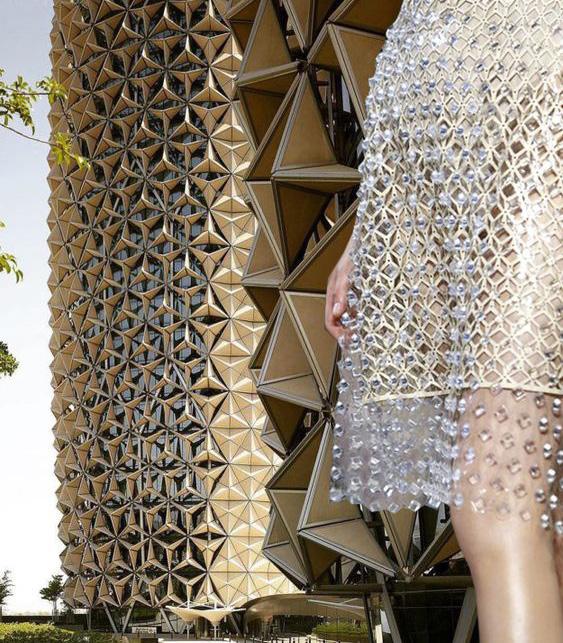
Earlier this year, 1001 Penn underwent a transformation, becoming a modern office experience that exceeds the needs of Washington, D.C., employers in a post-pandemic environment. The renovation team repositioned the building by modernizing the atrium and lobbies at all four entrances and by adding amenities including a 100-plus person conference facility, breakout conference rooms and lounge area, a wine bar, a state-of-the-art, 8,000-square-foot fitness facility, and bike room, as well as the latest fullservice and fast-casual restaurants. These efforts were spearheaded by a collaboration among global investment manager Nuveen Real Estate; local architecture firms FOX Architects, Hickok Cole and HYL Architecture; global design and architecture firm Gensler; global commercial real estate services company Cushman & Wakefield; general contractor Rand Construction; and the property/ construction management services of Hines. As a result of these renovations, 1001 Penn recently achieved over 95% occupancy, solidifying the building’s trophy status among the tenant community. (WBJ)
The priciest home on the market in DC has sold. The 12,200 square-foot former ambassadorial residence for the Swedish government at 3900 Nebraska Avenue NW closed on Tuesday for $17.3 million. The home, listed with T.J. Morton and Cara Pearlman of Compass, hit the market back in November for $19.5 million. When the listing went under contract in December, Pearlman told UrbanTurf that the listing received nearly a dozen offers. (UrbanTurf)

Colleen Healey Architecture has revamped a home on a radial lot facing Washington, D.C.’s Logan Circle, retaining historic details while updating the spaces for contemporary living. The renovated eight-bedroom house fronts Logan Circle, one of the city’s grand rotaries that connects several major avenues, created as part of engineer Pierre L’Enfant’s original masterplan.
Due to its location, the lines of the building’s plan are subtly radial and therefore none of its walls are parallel to one another. This proved a challenge for local architect Colleen Healey, who had no choice but to embrace this and incorporate the unusual parameters into the design.
Built in 1883, the home’s three-story front section once comprised an entry hall, living and dining room on the ground floor, an owner’s suite and two spare bedrooms on the first floor, and two further bedrooms on the second. (dezeen)
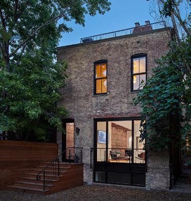
MAY 11
12:00 PM - 1:30 PM
1203 GOOD HOPE RD SE
The 11th Street Bridge Park, a partnership between the Ward 8-based nonprofit Building Bridges Across the River and the District Department of Transportation, will be Washington, D.C.’s first elevated public park. Located on the piers of the old 11th Street Bridge spanning the Anacostia River, the Bridge Park will be a new venue for healthy recreation, environmental education, and the arts. After a sevenmonth design competition, the design team of OMA+OLIN was selected in October 2014.

Join the Washington Architectural Foundation for an informative walking tour and discussion to learn about the extensive community outreach and consultative process and how the Bridge Park goes beyond supporting the community’s cultural, physical, and environmental health.
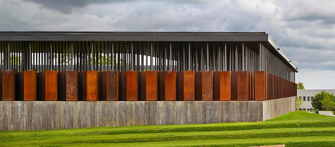
Photographer Alan Karchmer has risen to prominence in his field thanks to his skill in conveying architects’ ideas and intentions. Having earned a Master of Architecture himself, Karchmer uses his knowledge of the design process, coupled with his own artistic vision, to express the essence of a building. He is, quintessentially, “The Architects’ Photographer.”
This exhibition presents a cross-section of Karchmer’s professional photographs, coupled with personal photos and artifacts that shed light on his work. While the exhibition features numerous largeformat images of remarkable beauty, it also includes didactic displays examining the technical and creative processes underlying such images. It thus illuminates why certain images are so successful in expressing both the physical and emotional aspects of architecture.
By displaying multiple images of specific buildings, the exhibition also examines how a series of photographs can be used to create a visual narrative conveying a cohesive sense of design, place, and experience. The exhibition sheds light on the important but sometimes elusive role of artistic interpretation, tracing how the photographer’s own vision complements that of the architect, yielding final images that ultimately reflect a blend of the two. It also explores how changing technologies—especially the transition from analog to digital cameras— have influenced architectural photography.


Bili is a graduate of the French National School of Public Administration (ENA) and joined the French Foreign Ministry’s Strategic Affairs and Disarmament Directorate (1991-93). Seconded to the Defense Ministry as Deputy Diplomatic Adviser (1993-95), he then held several positions at the Quai d’Orsay.
In 2002, he was Director of the Private Office of the Minister Delegate for European Affairs and became technical adviser at the Diplomatic Unit of the Presidency of the French Republic (2002-07). Bili has successively held the positions of Ambassador to Thailand (2007-09), Director of the Defense Minister’s Civilian and Military Office (2009-10), Ambassador to Turkey (2011-15), and then to Brazil (2015-17).
Prior to his appointment in Washington, Laurent Bili was Ambassador to China since September 2019.
Cayman Islands Opens DC Office to Counter Territory’s Lax Tax Reputation
Chris Duggan, 45, is the new Cayman Islands’ official Washington-based representative to North America, overseeing his territory’s relationship with both the United States and Canada.
On January 26, Duggan formally opened his new mission on the 12th floor of the National Press Building. About 60 people, including the ambassadors of Jamaica and St. Lucia, celebrated the milestone at DC’s City Tavern Club in Georgetown—which happens to be remarkably similar to the name of the territory’s capital city, George Town.
“Broadly speaking, this new Washington office is a logical extension of the Cayman Islands’ commitment to openness and transparency,” Duggan told us by phone last week. “We want to make people more aware that the Caymans as a jurisdiction is fully committed to meeting standards of financial transparency and the international fight against financial crime.”
In fact, he added, “some people say the Caymans has a really good story to tell, it just hasn’t been told. We certainly have nothing to hide, so
what better way of being upfront than opening this office in Washington, where I can communicate a very clear, concise constant message.”
Afghanistan’s Roya Rahmani Now a Fighter for Global Women’s Rights
A well-known figure on Embassy Row, Rahmani, 44, served from December 2018 until July 2021 as the first female ambassador ever to represent Afghanistan in the United States.
“Afghan women wish they had unanimous public support, as well as support from their male counterparts,” she has said. “In Iran, even with all its difficulties, there’s still some system of checks and balances. It’s probably harder for the Iranians to punish and torture their women than it is in Afghanistan, where women protesting are out there alone. Anything can happen to them.”
Notably, Rahmani no longer wears her headscarf as she did while serving as ambassador. It’s a deliberate act of defiance, she says, “in solidarity with all my sisters (in Iran) who are forced not only to wear it, but also told what colors they may wear. It’s a choice, and my choice is very important because it’s the basis of democracy—and my hair is not part of the equation.”


Luxury Isn’t Just a Price Point, It’s a State of Mind! John Eric Home is pleased to bring to our readers exceptional luxury homes and properties available throughout the United States and the world.
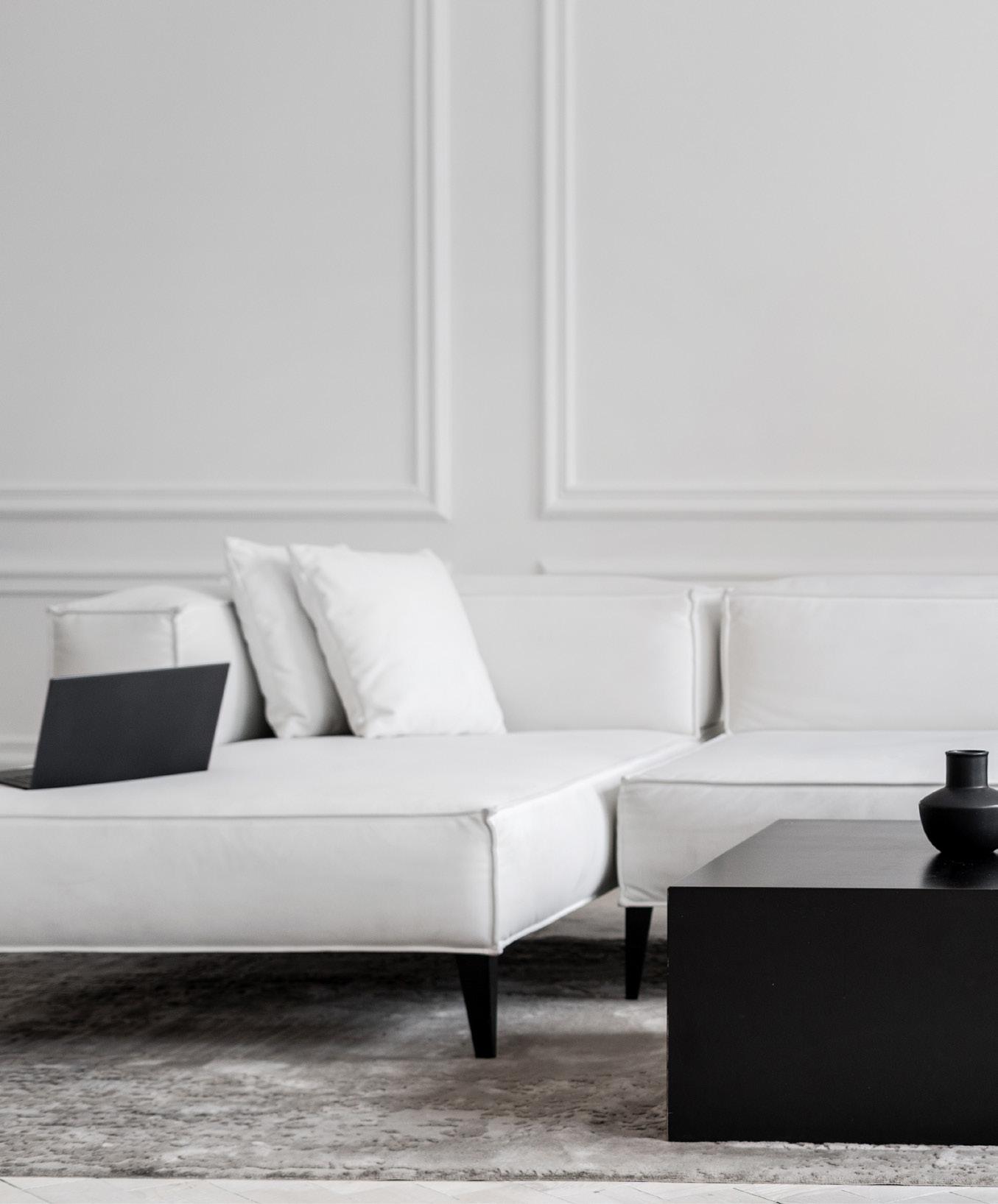
These properties are presented by our luxury partners who are the most sought-after experts and advisors in luxury real estate.
johnerichome.com
johnandtrevor.com
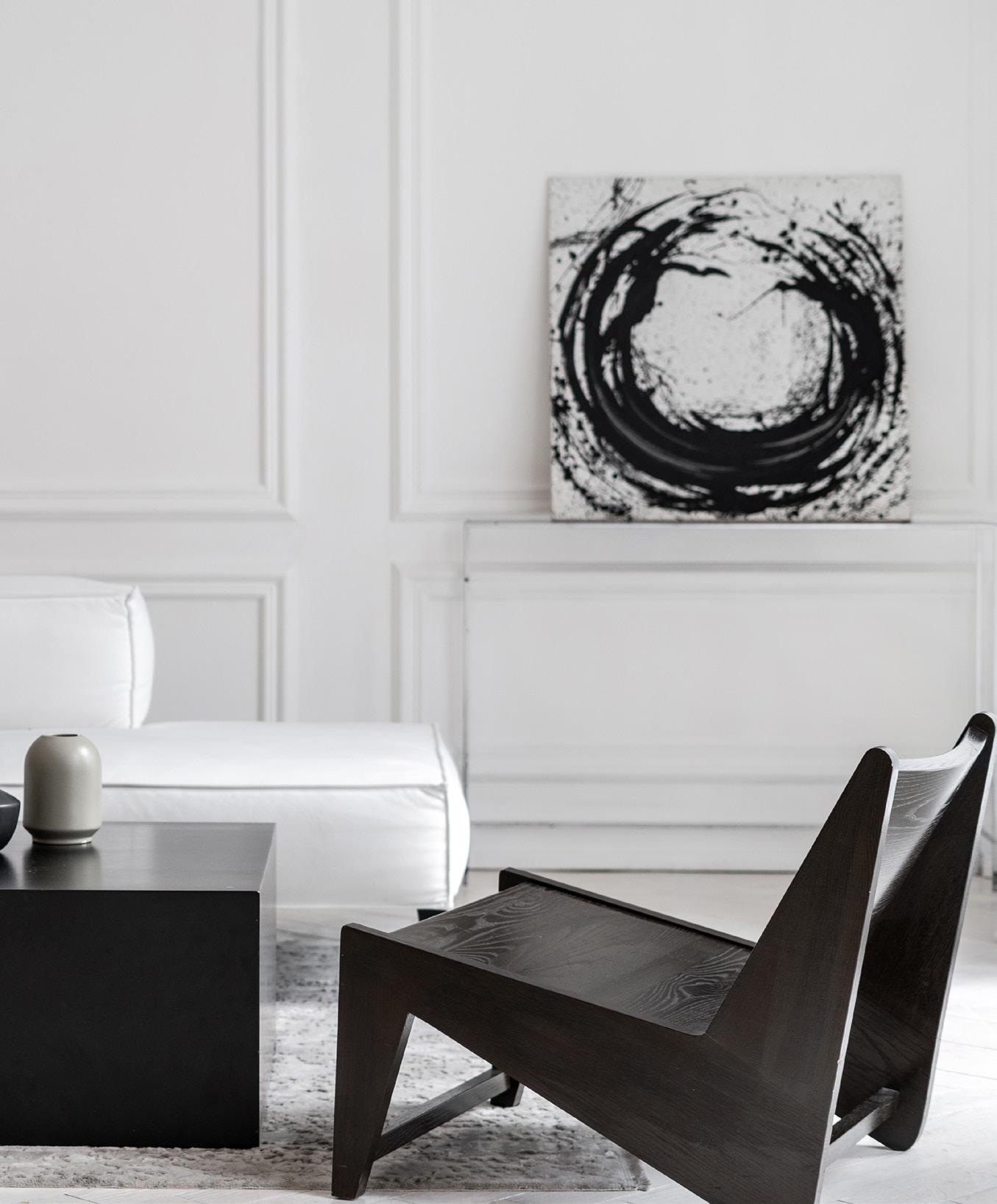


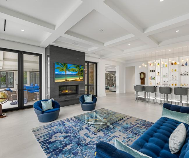

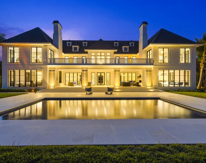


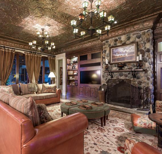

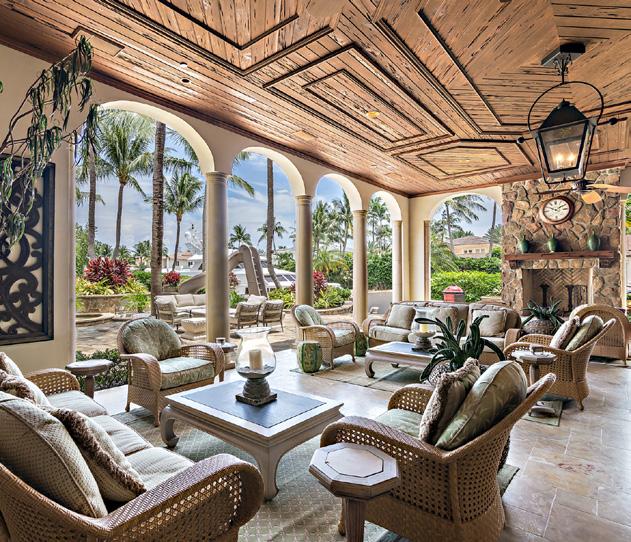

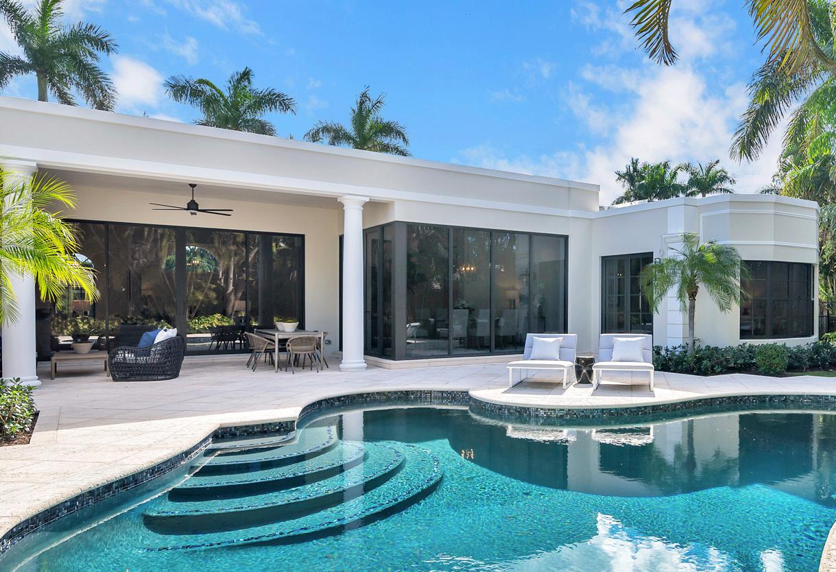

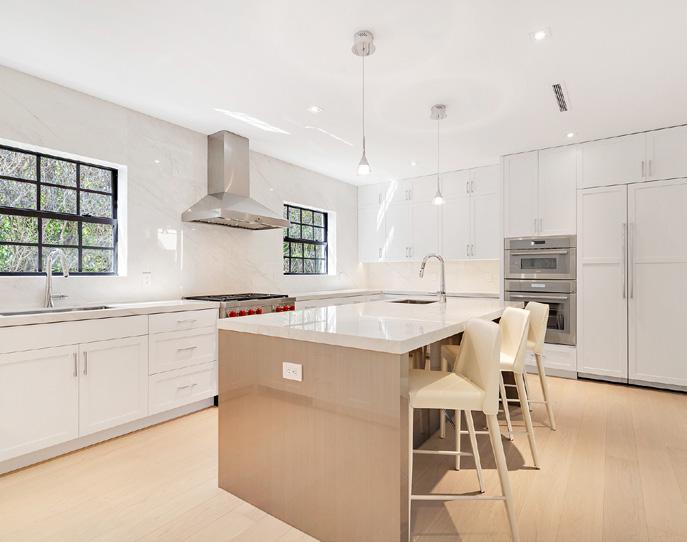
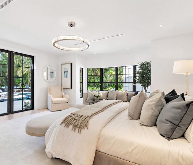


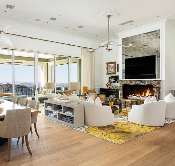
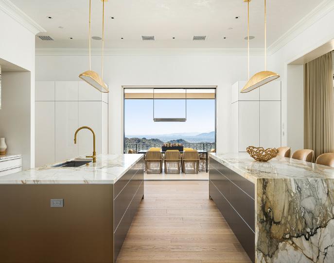


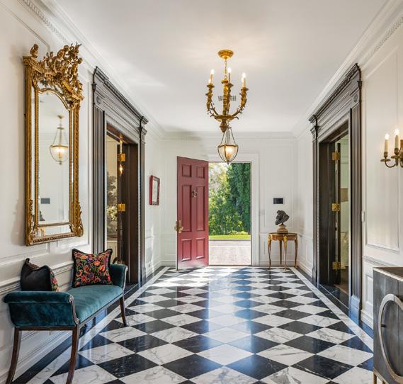
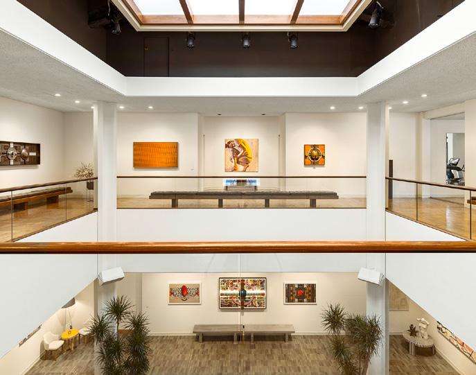


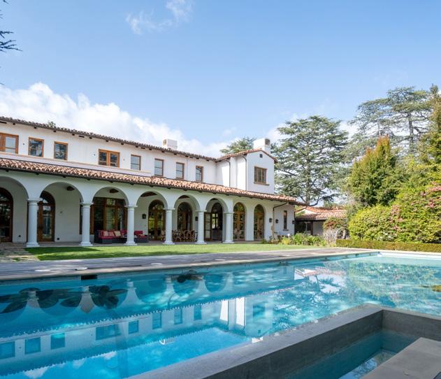

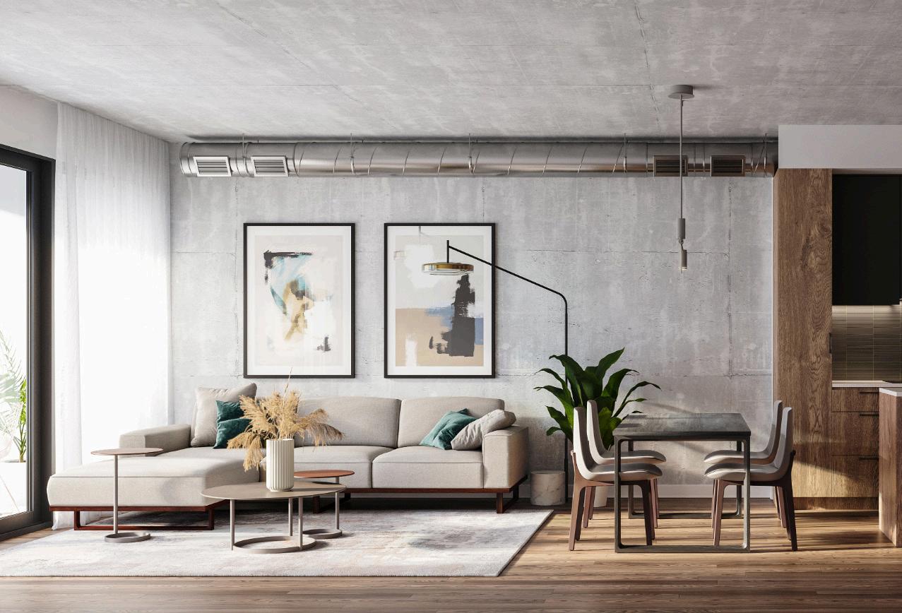
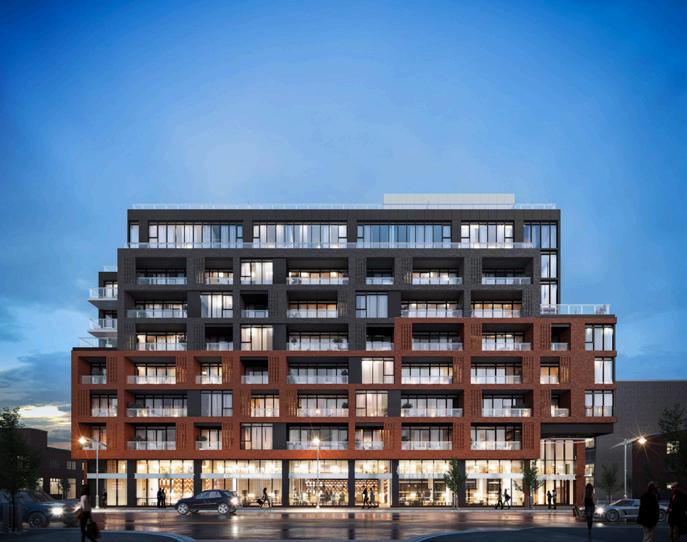
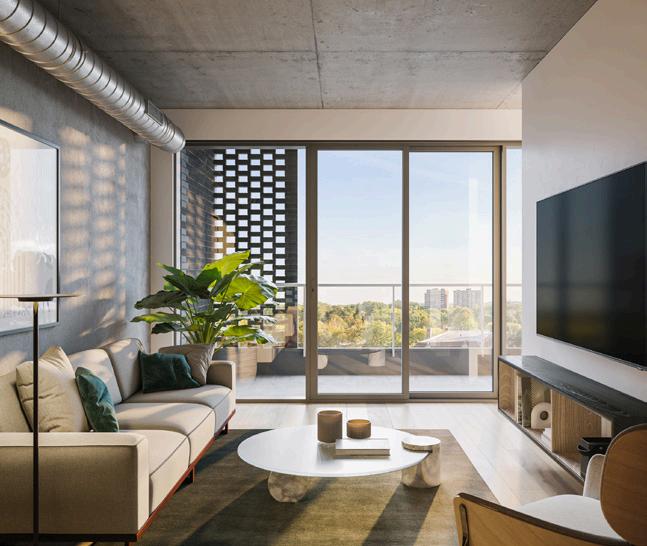


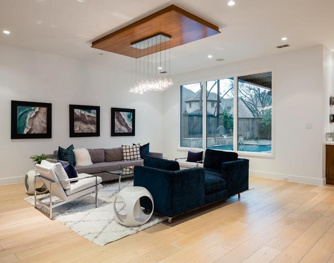
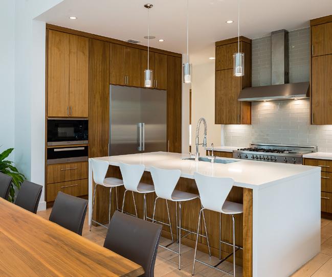
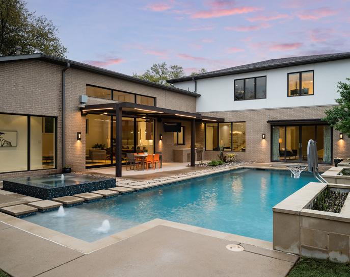


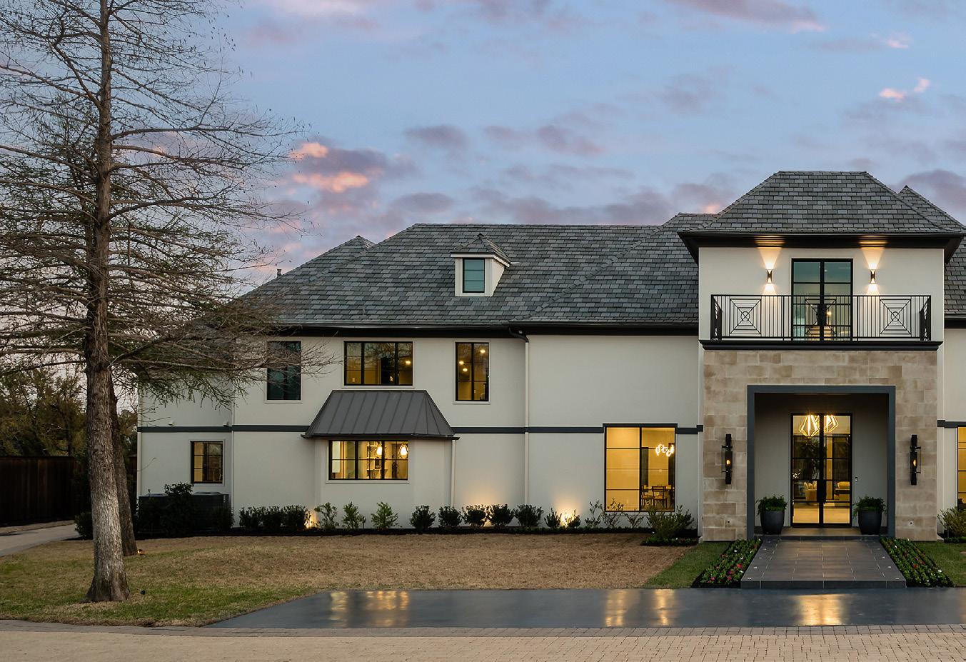
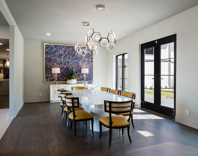
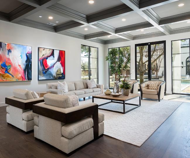
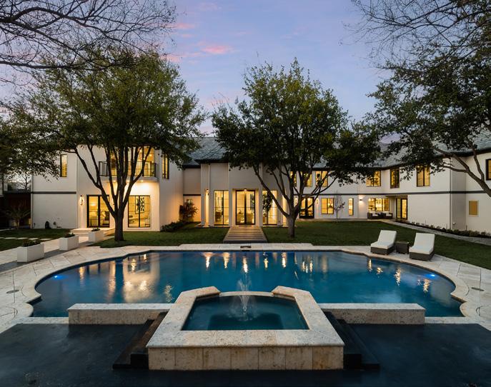


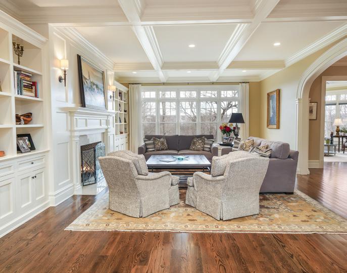
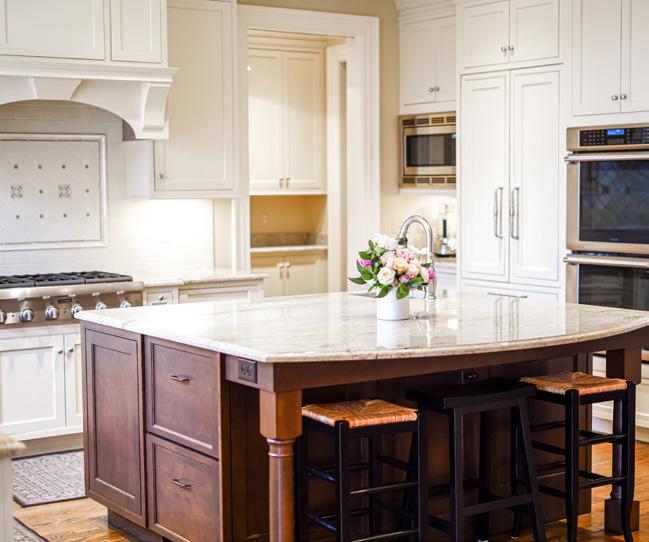
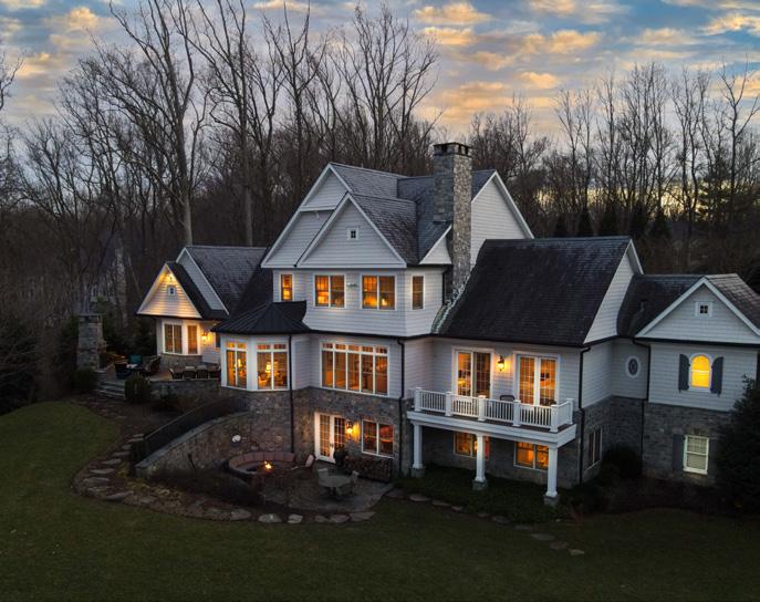

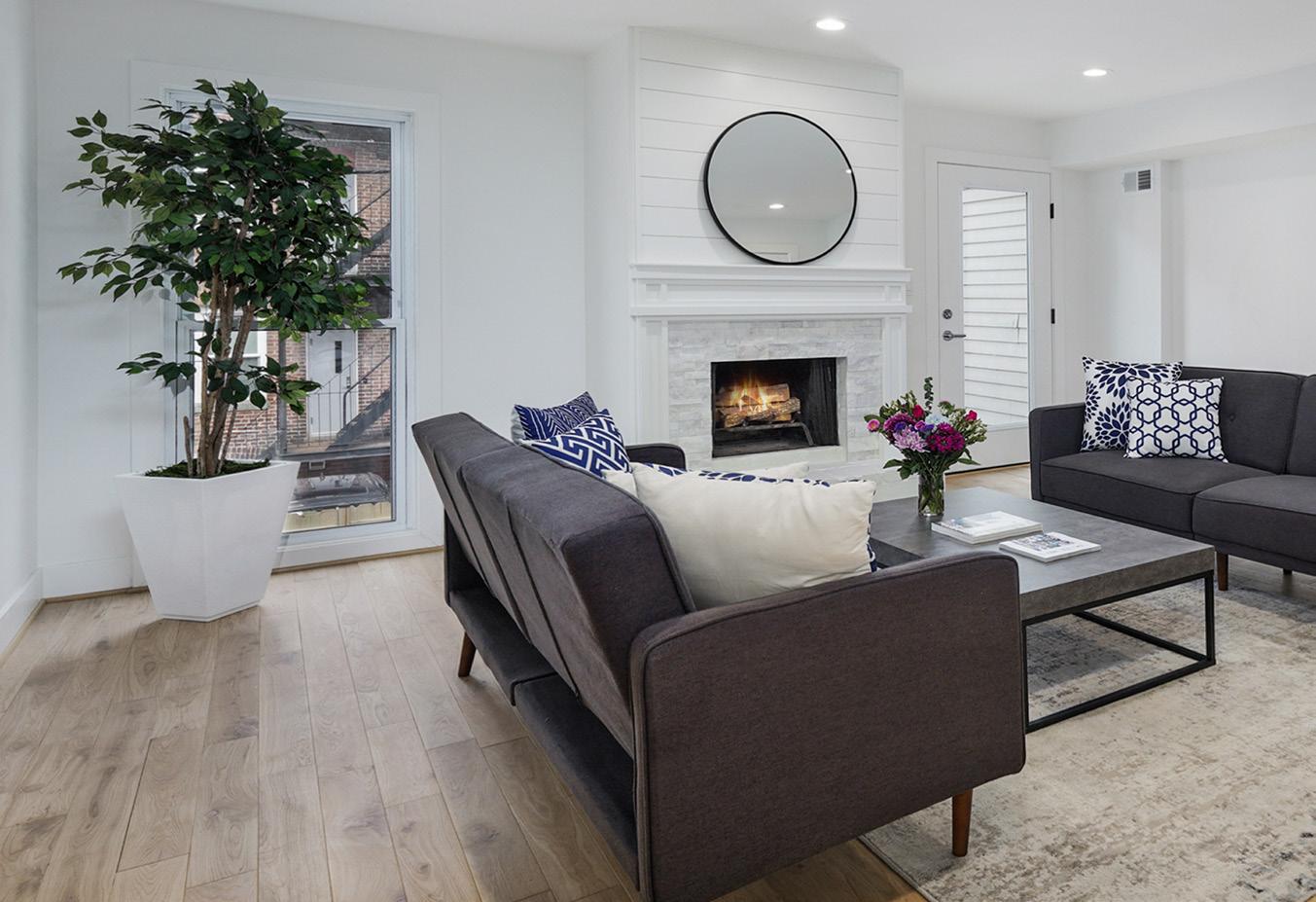

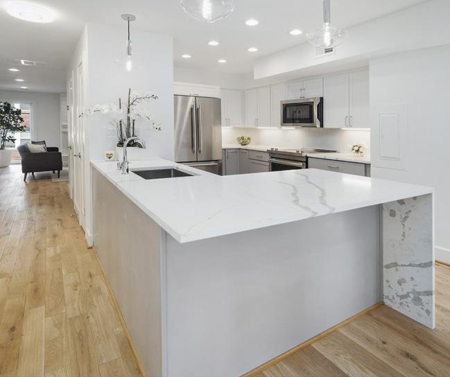
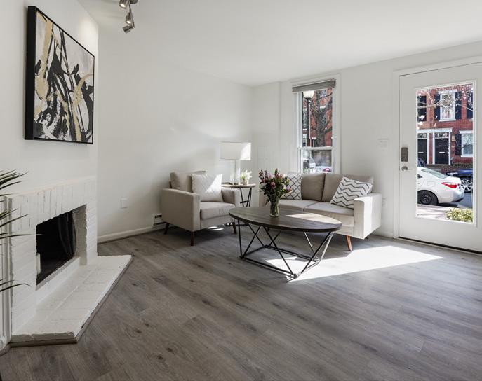

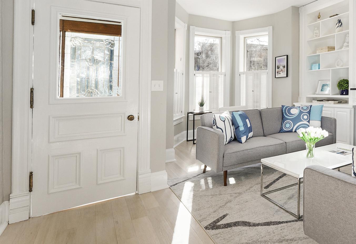
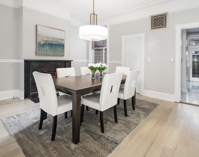
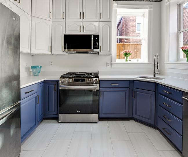
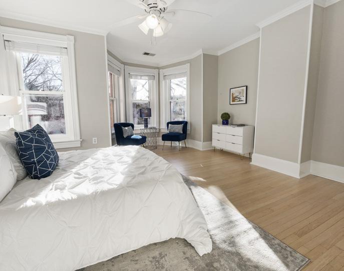
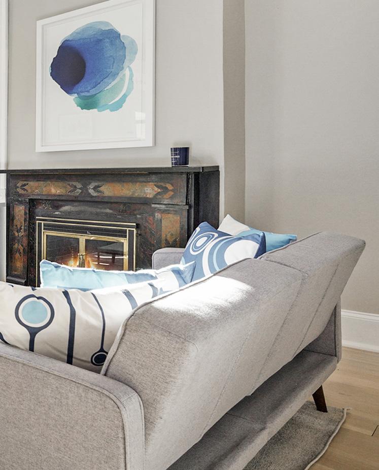
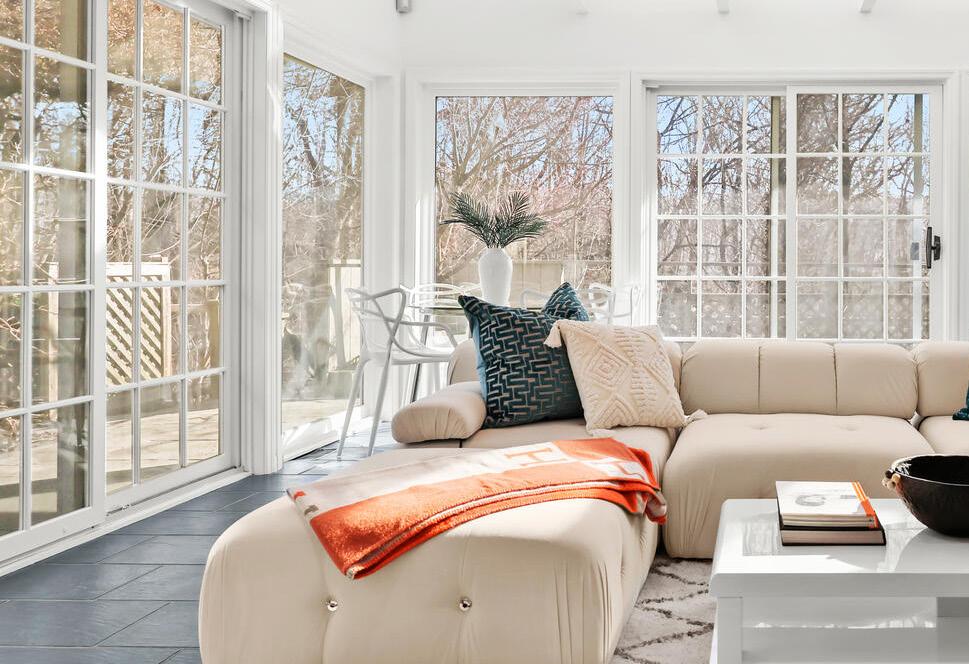
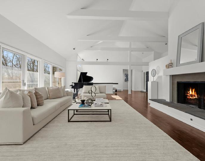
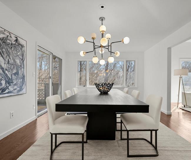
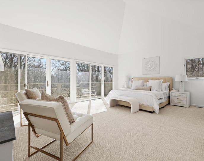
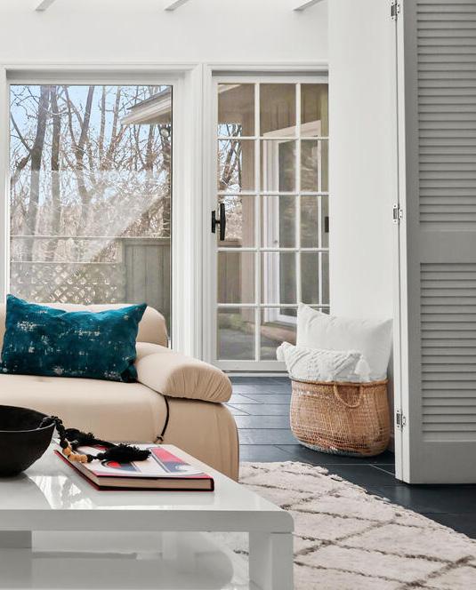


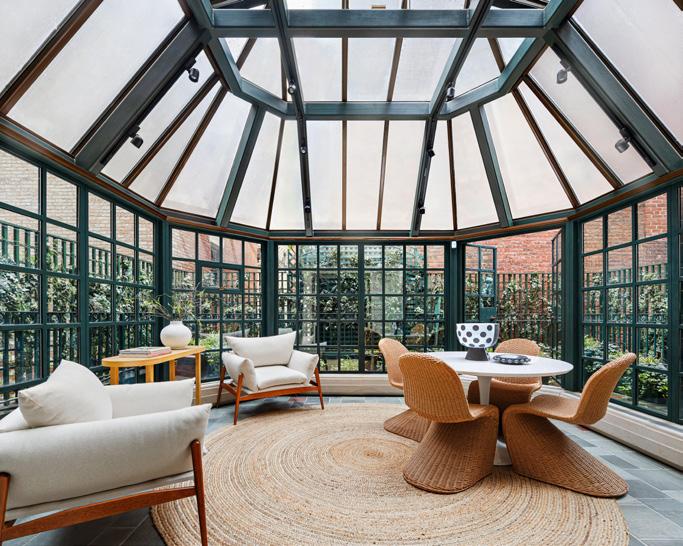
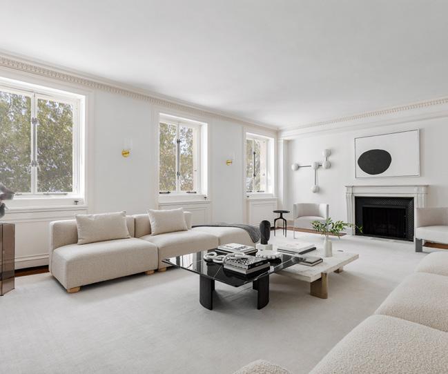

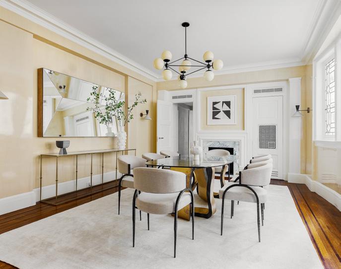
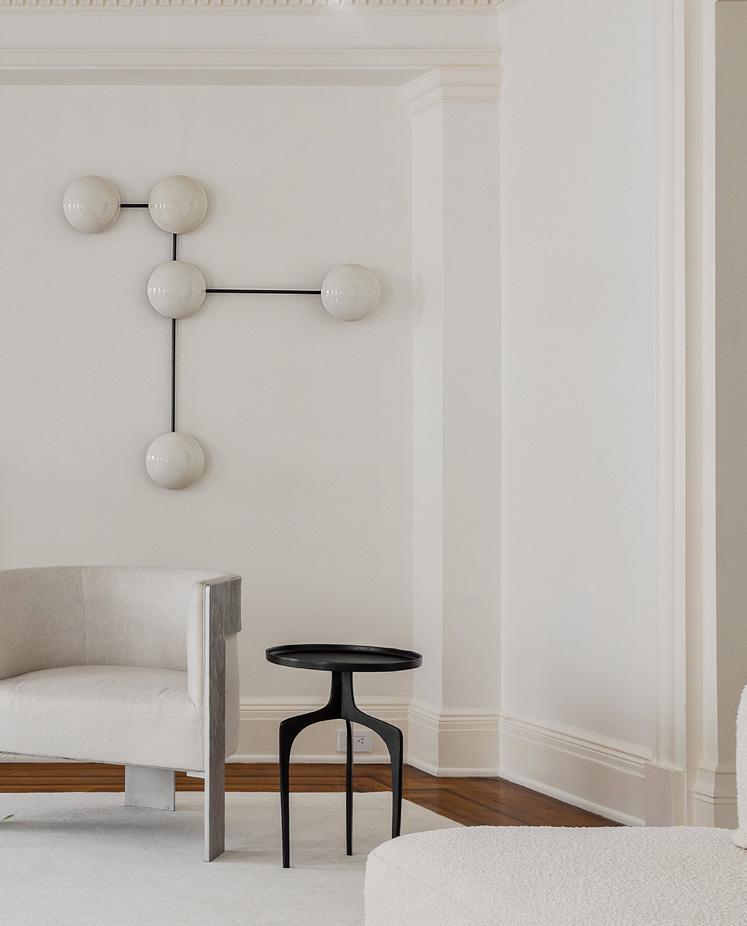
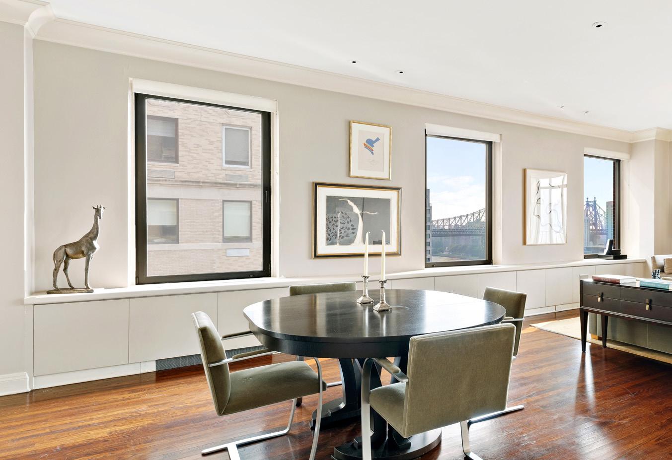
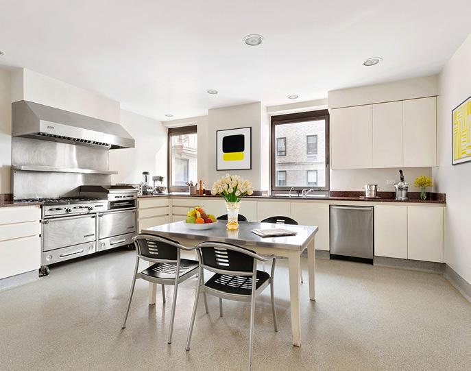
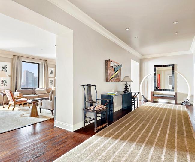

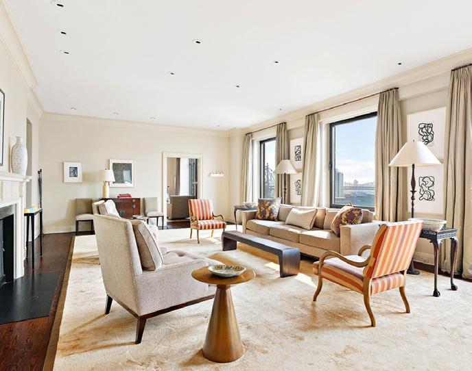

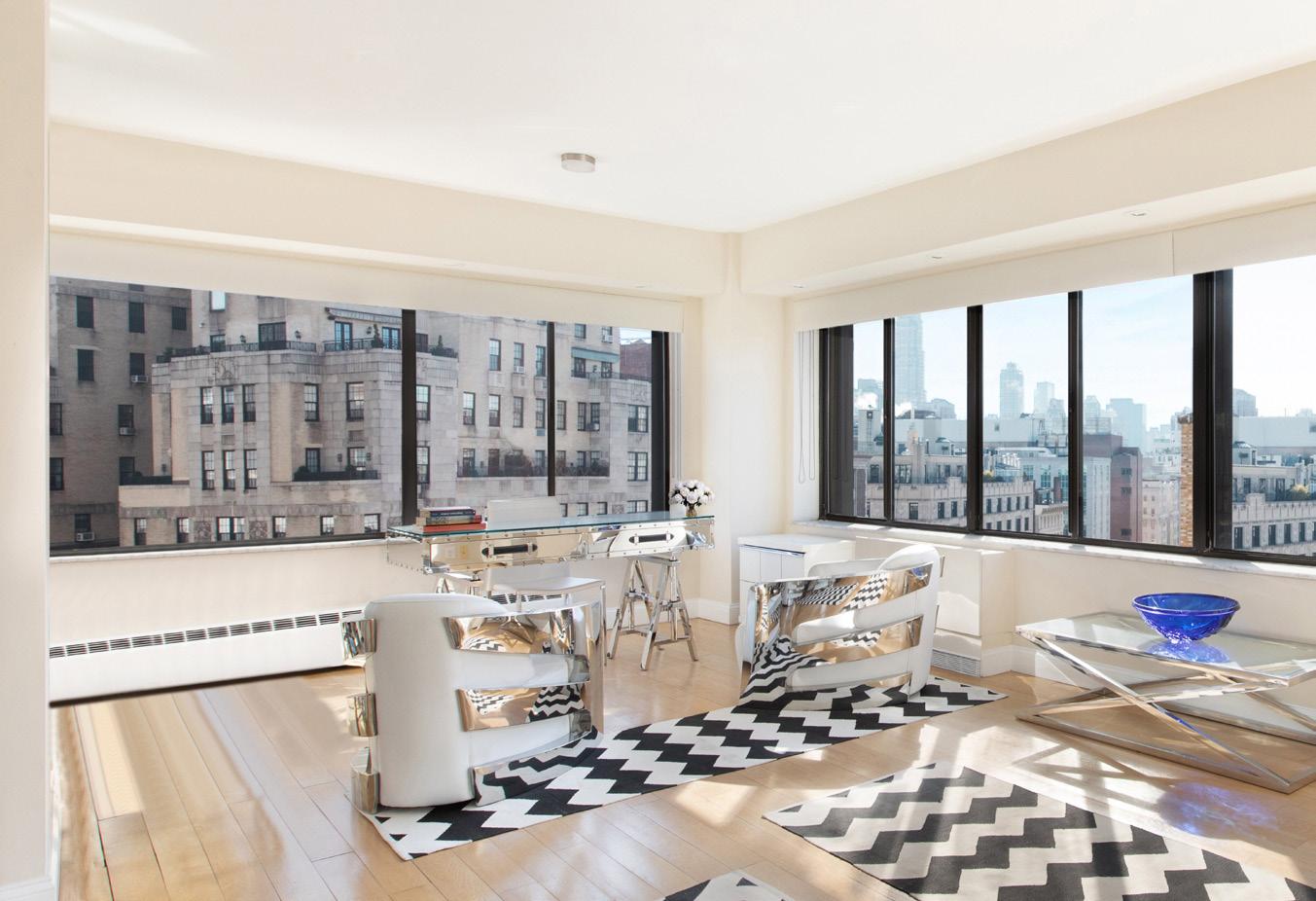
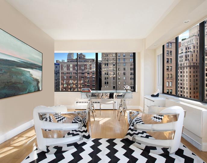
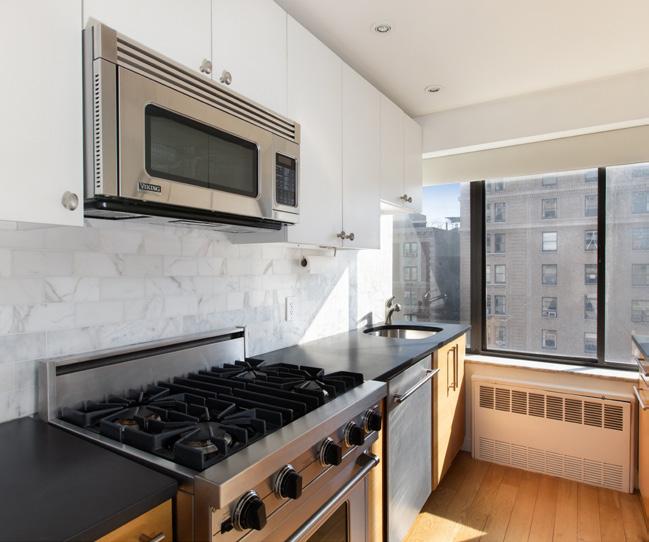

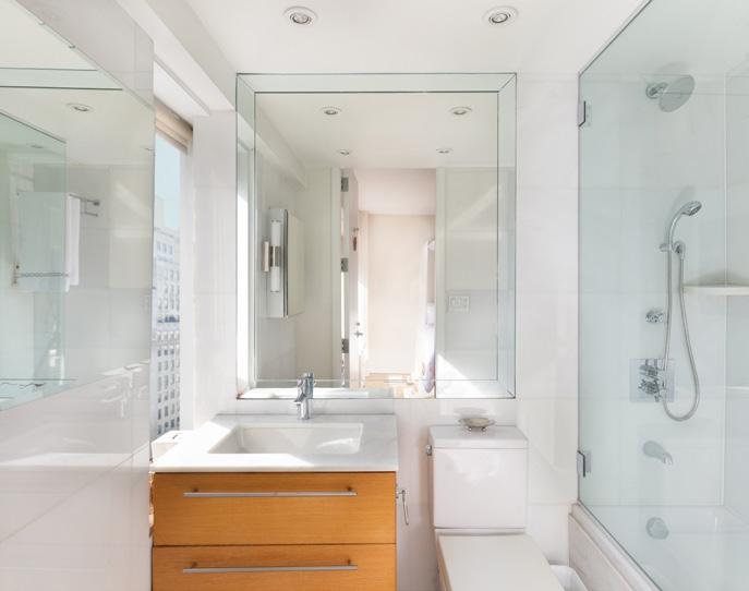
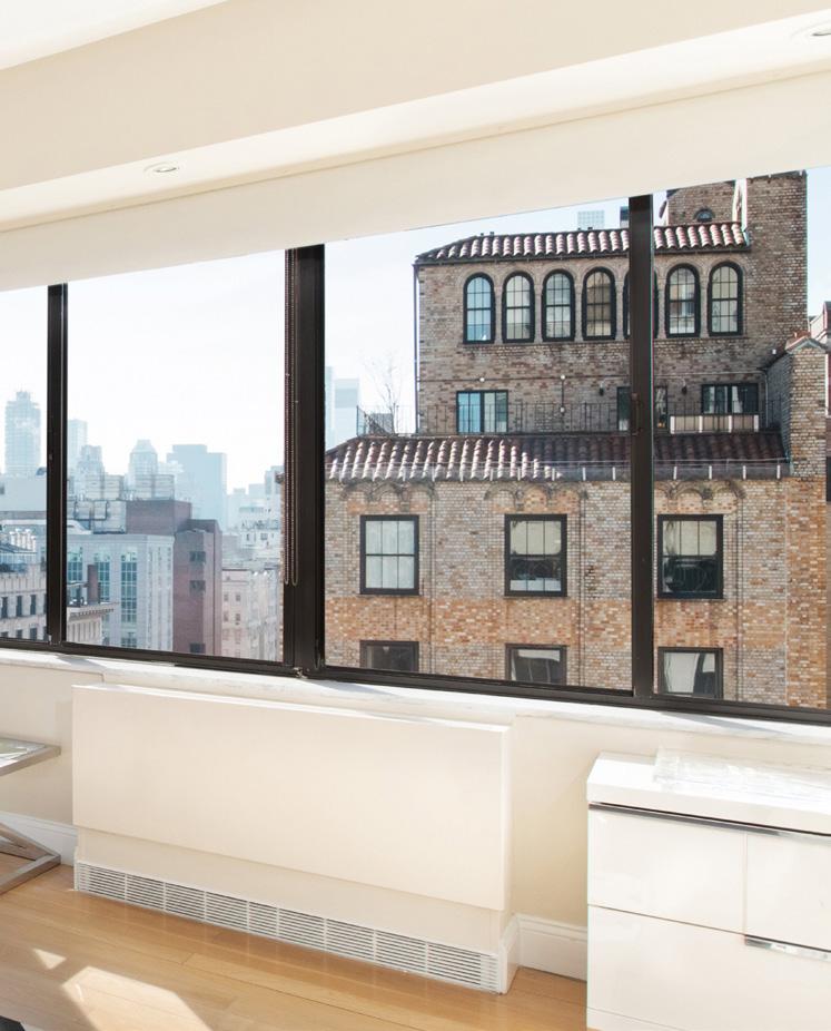
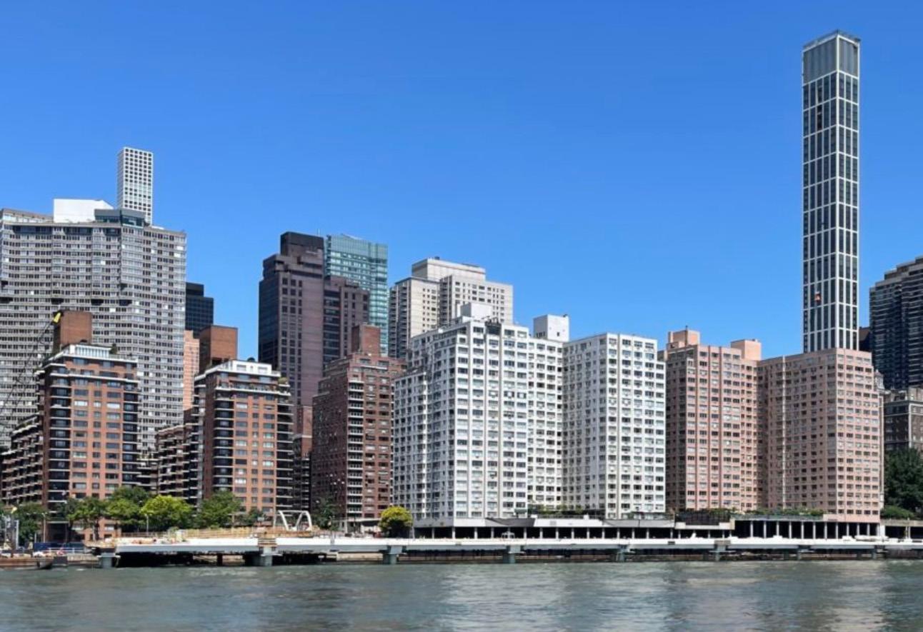
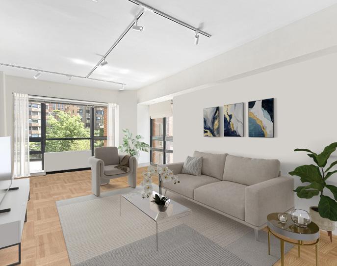
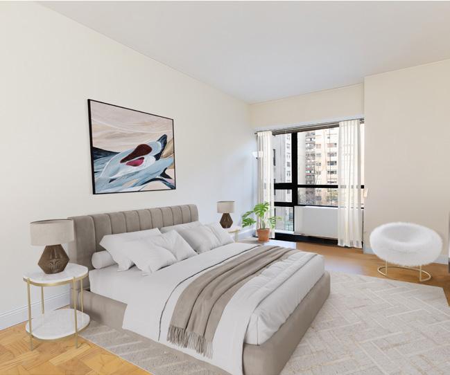

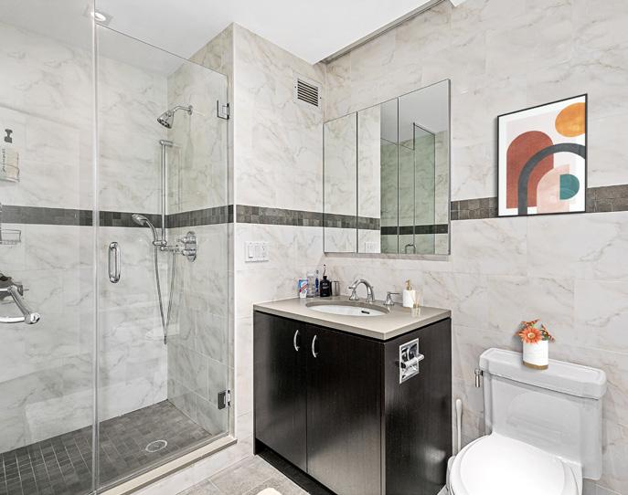


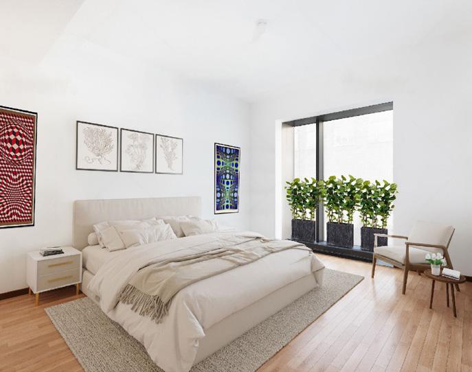
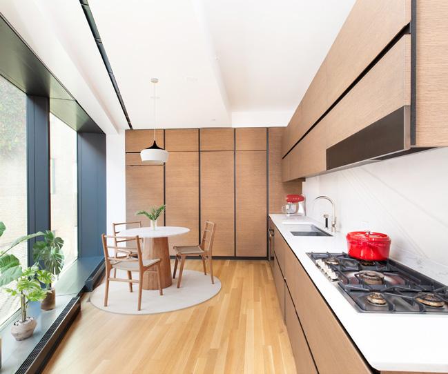

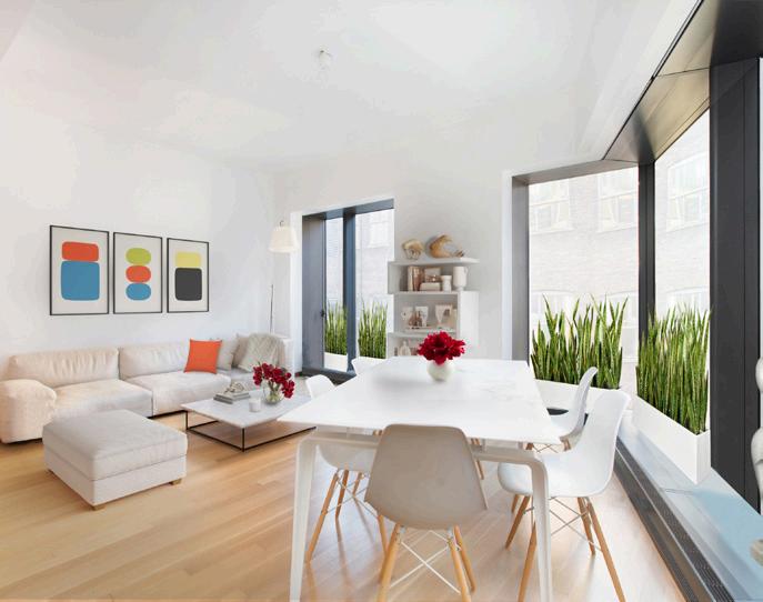
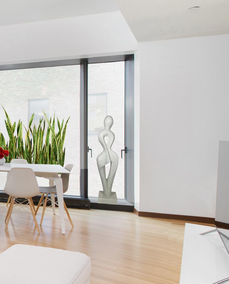
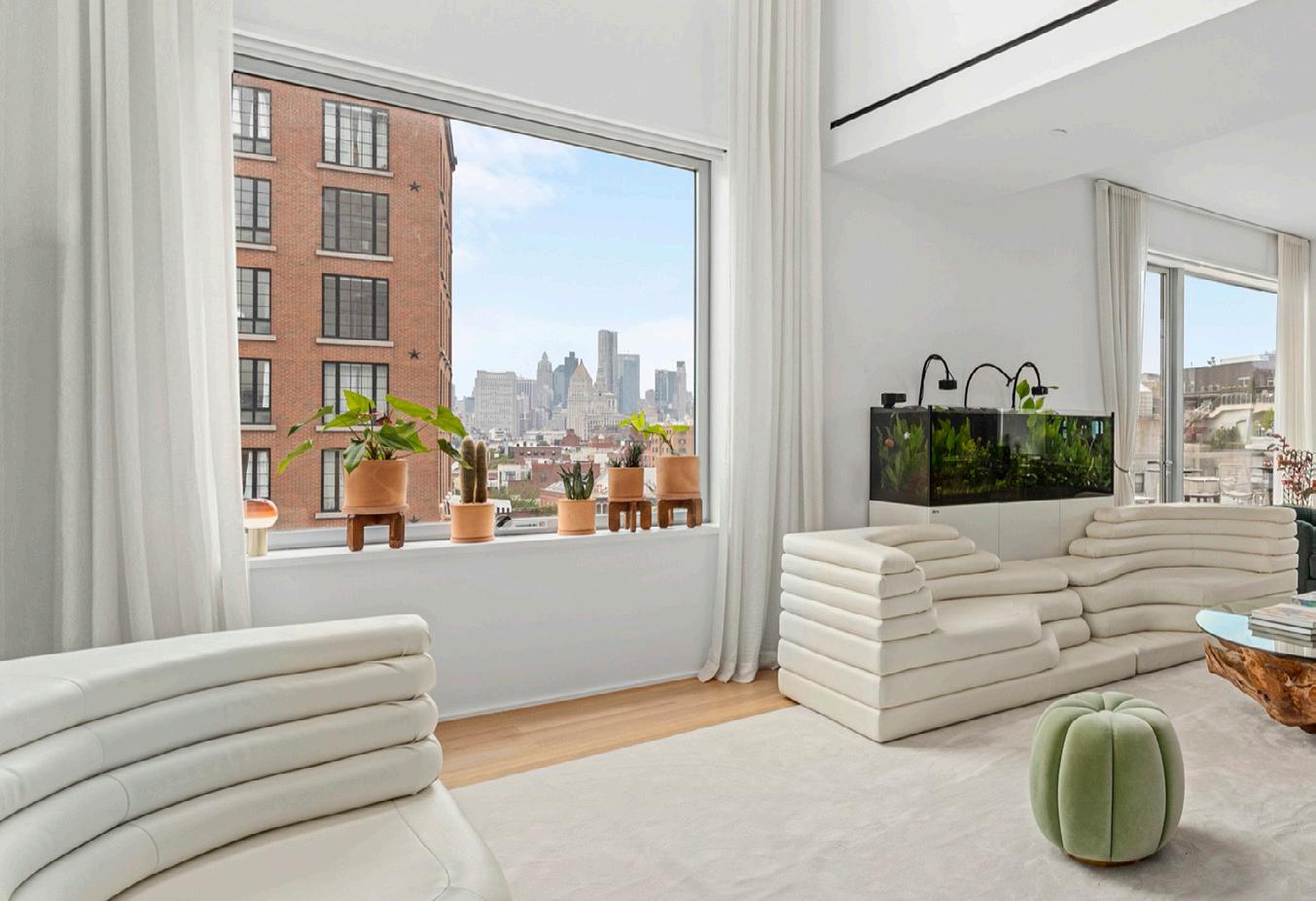
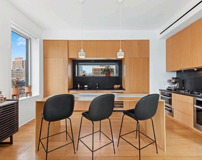
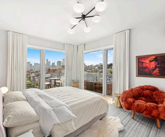


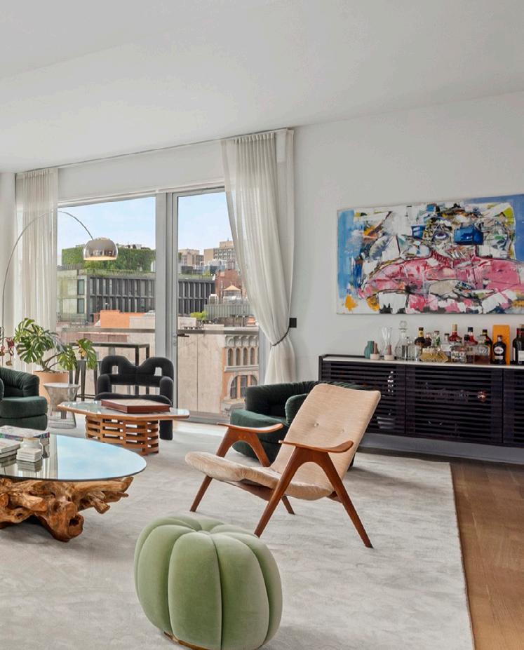


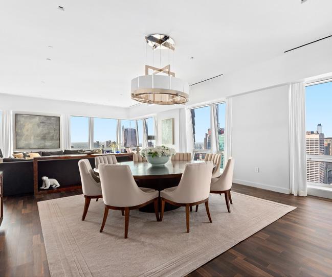

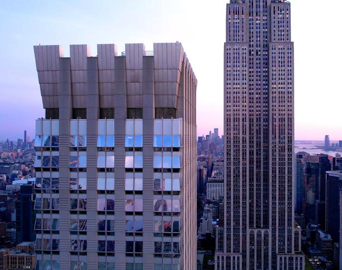
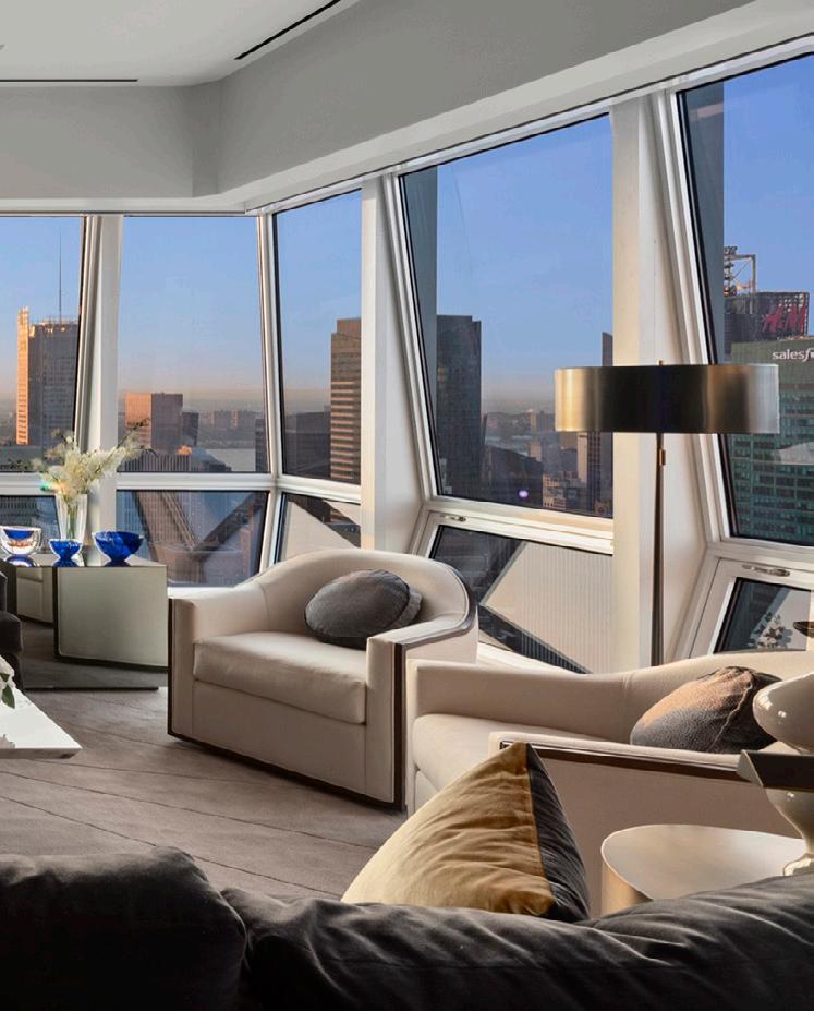
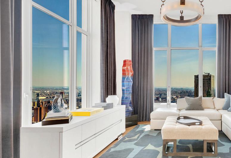

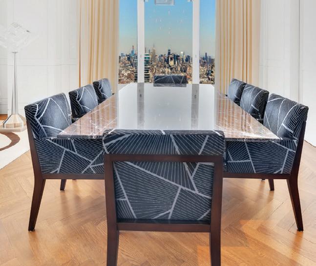

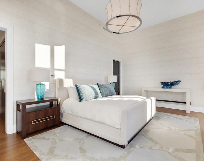

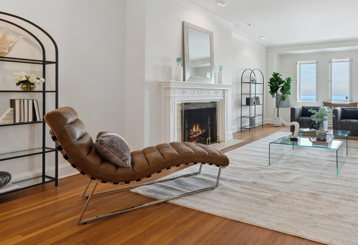

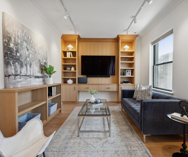
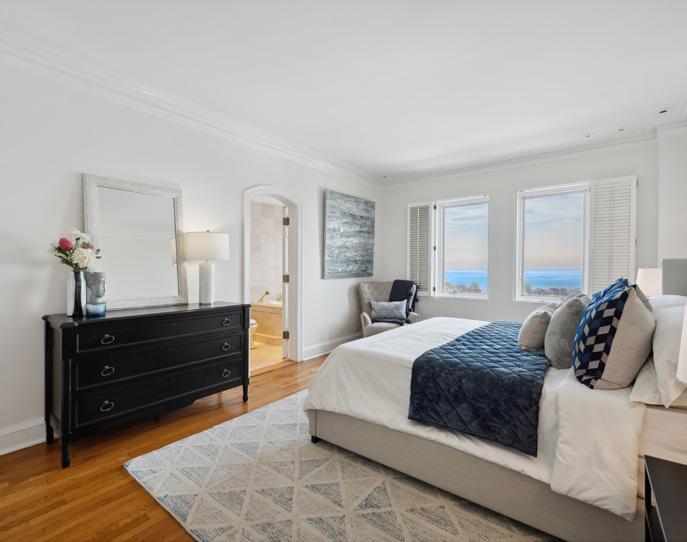
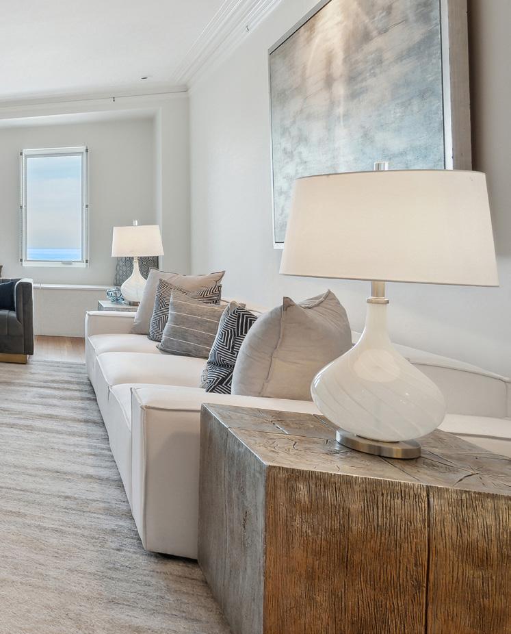


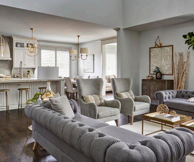

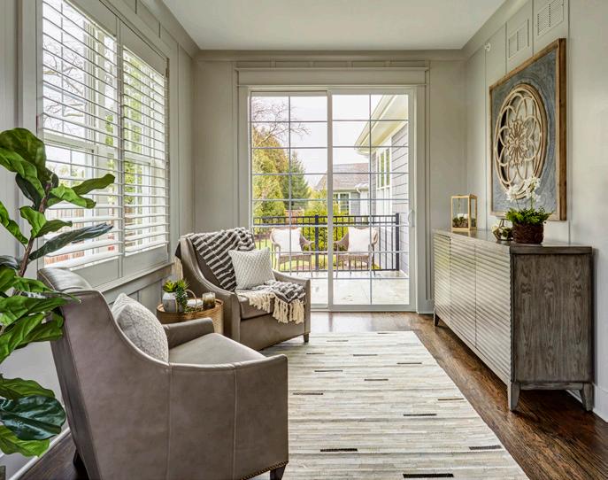
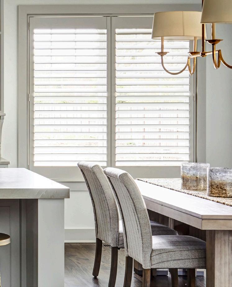

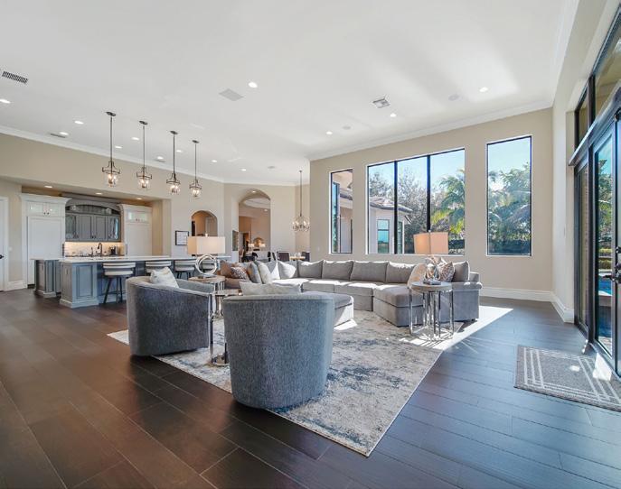


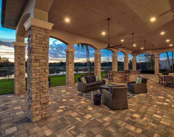

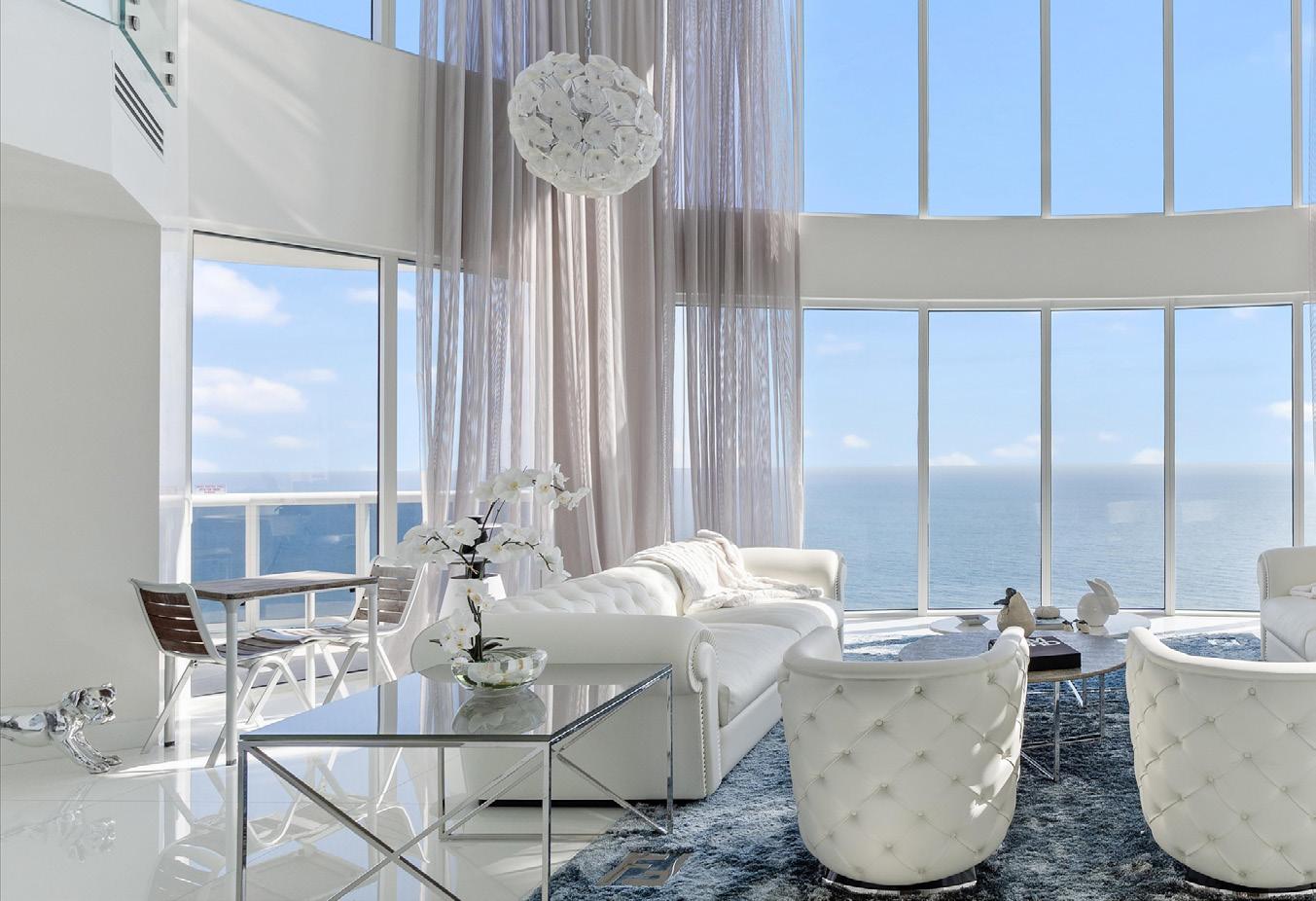
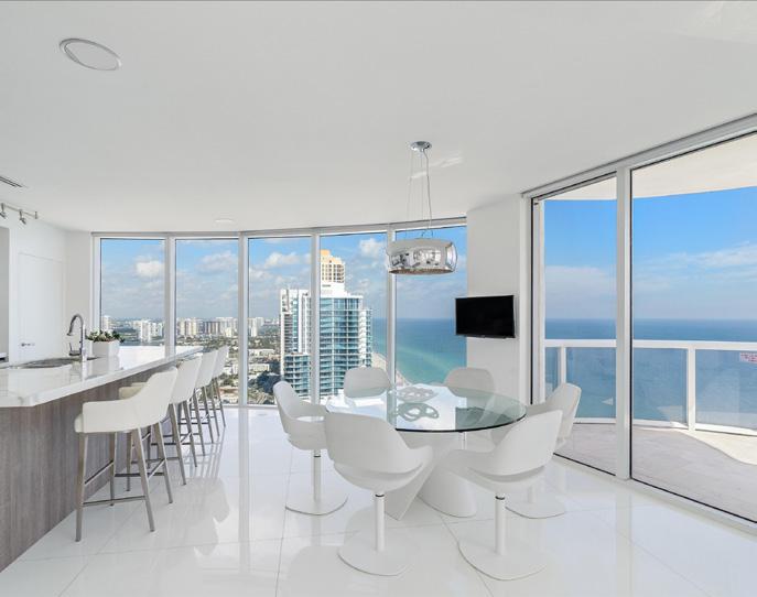
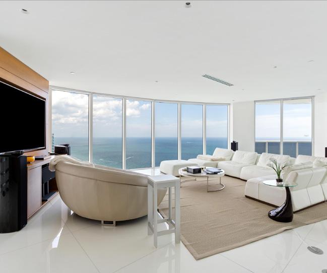

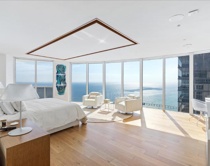
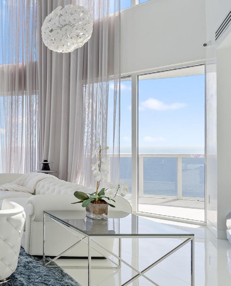

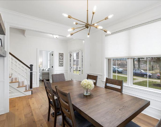
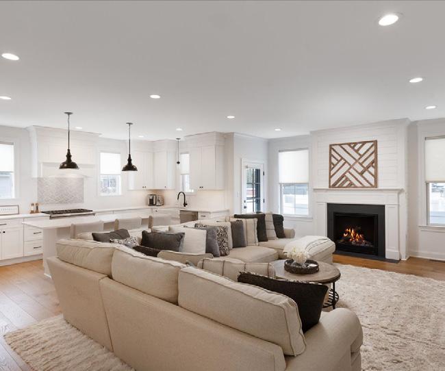


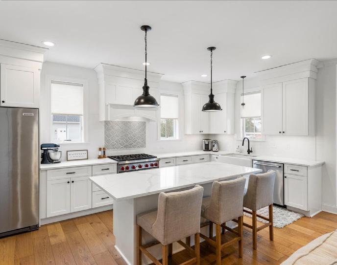

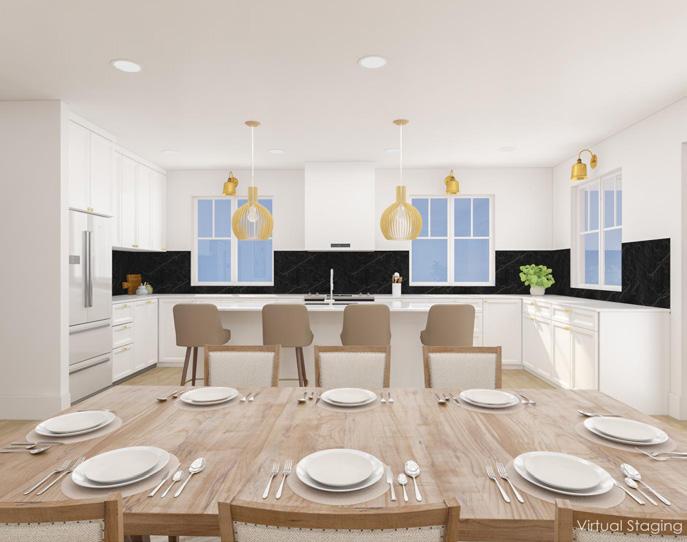
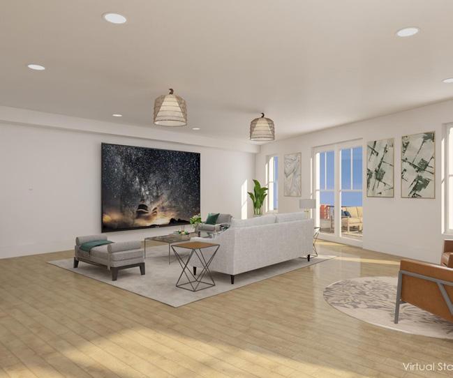

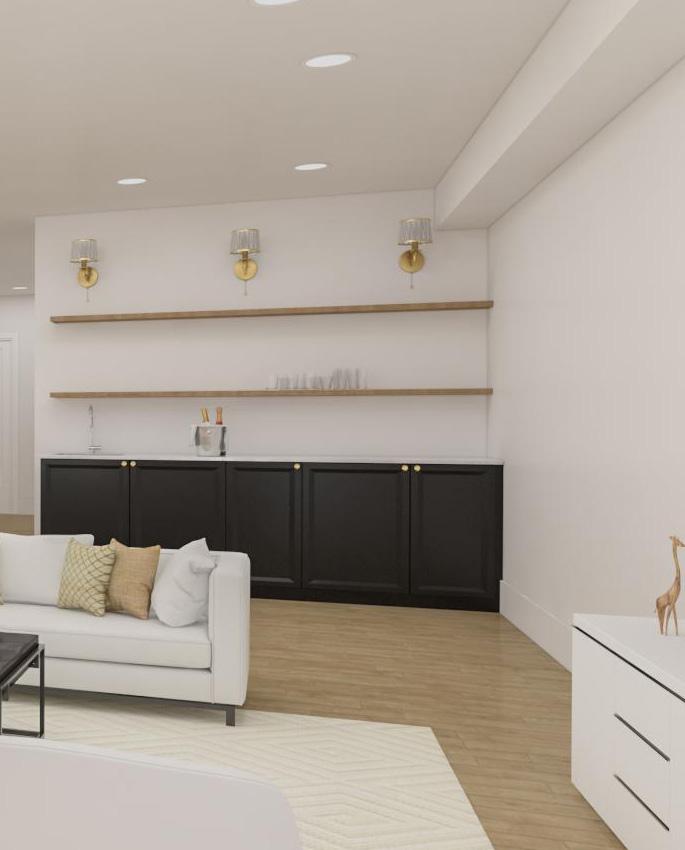
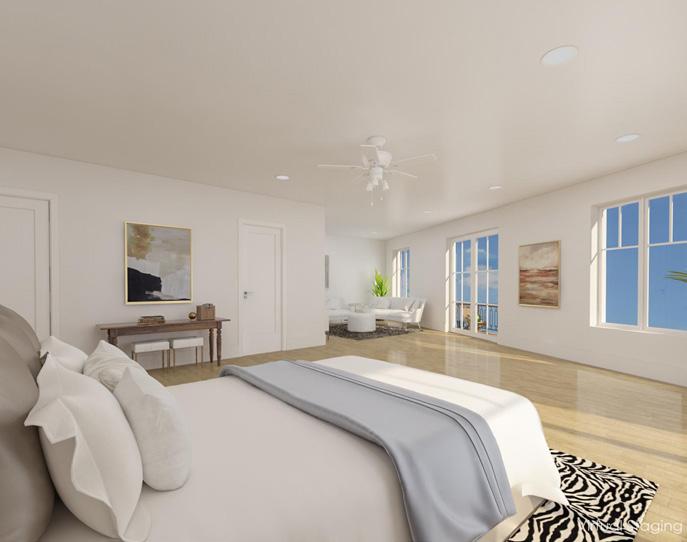
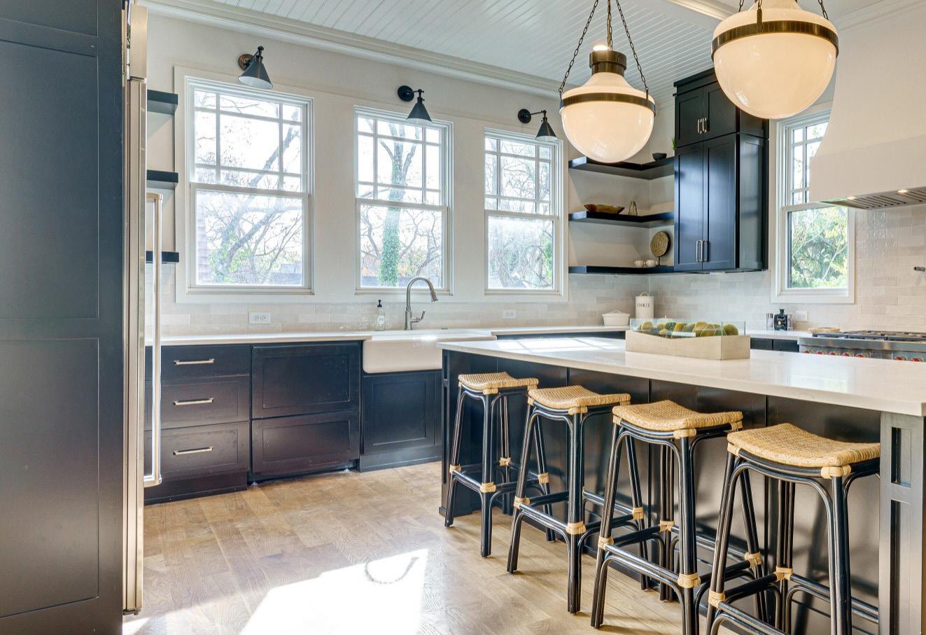
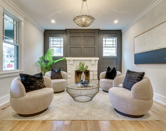
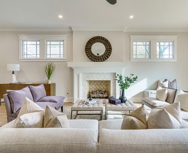

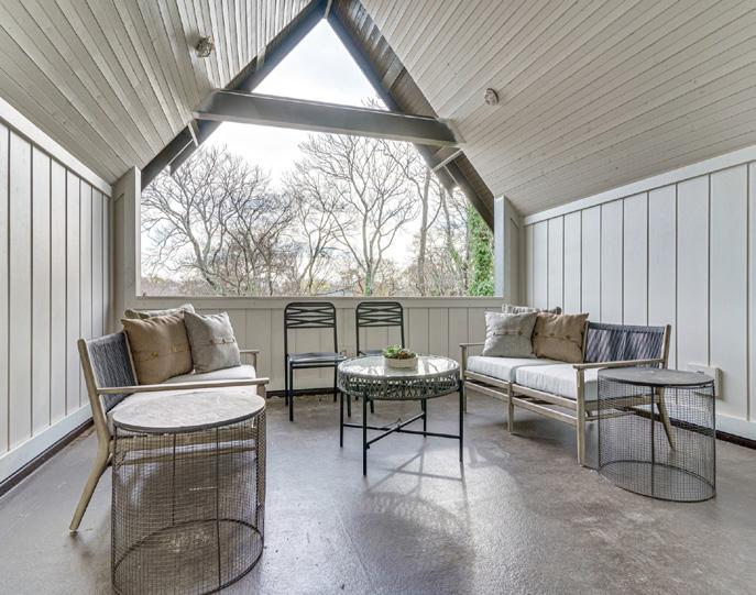
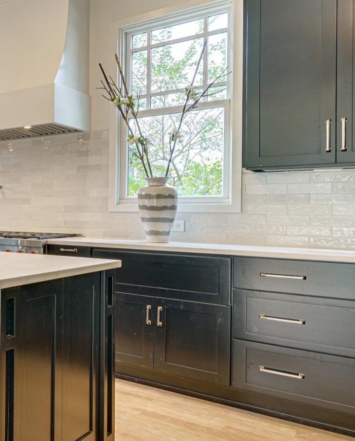
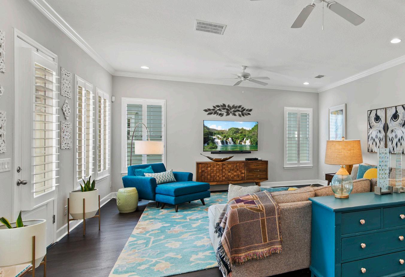
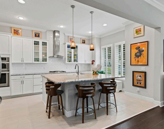
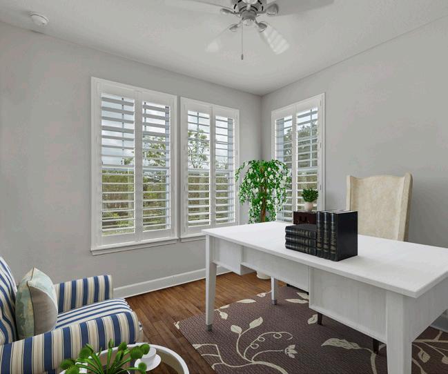


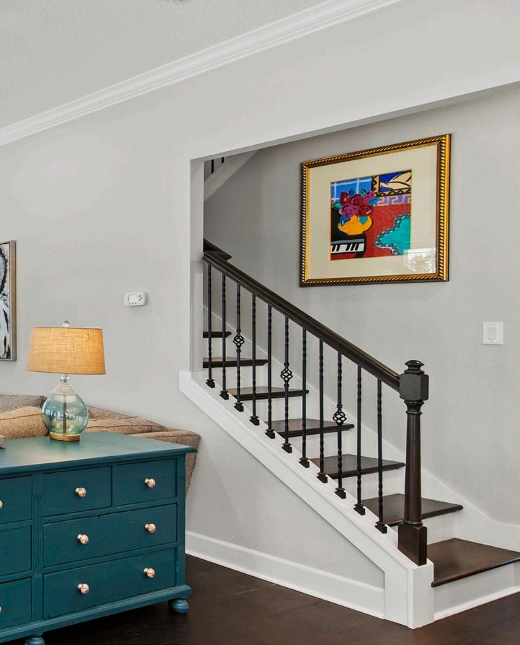

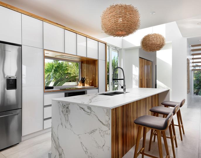
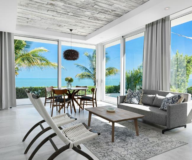

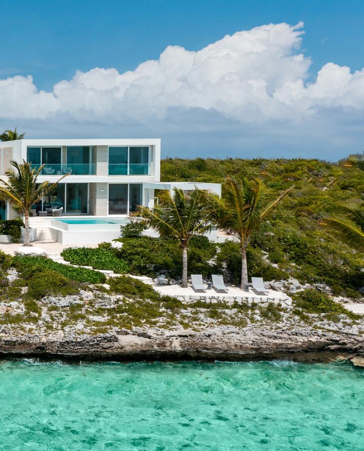

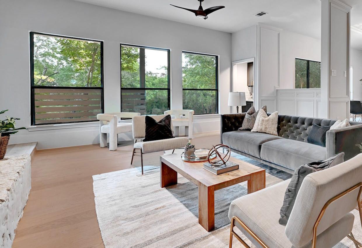
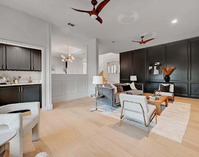
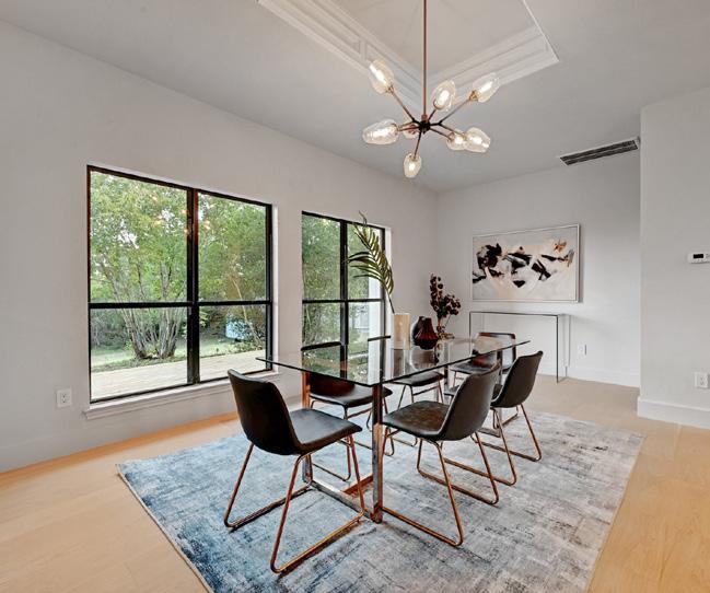
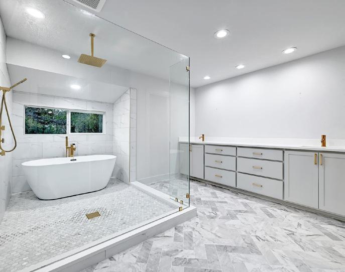
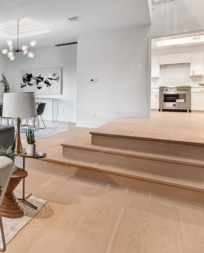


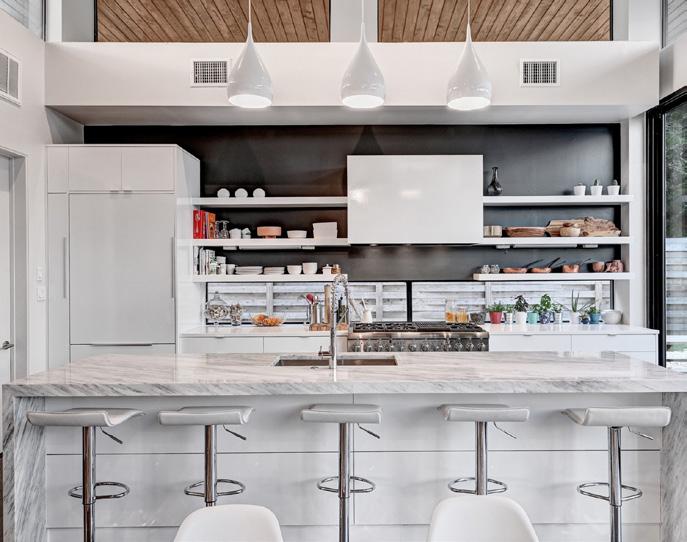
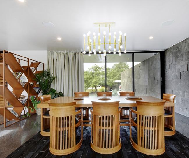
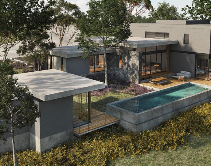



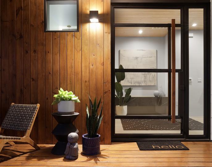
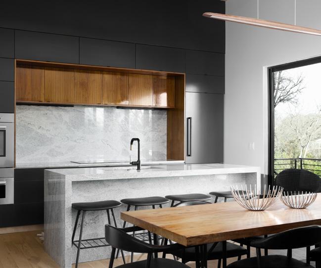
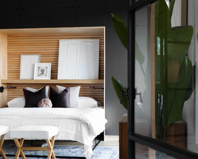
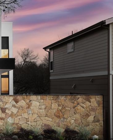

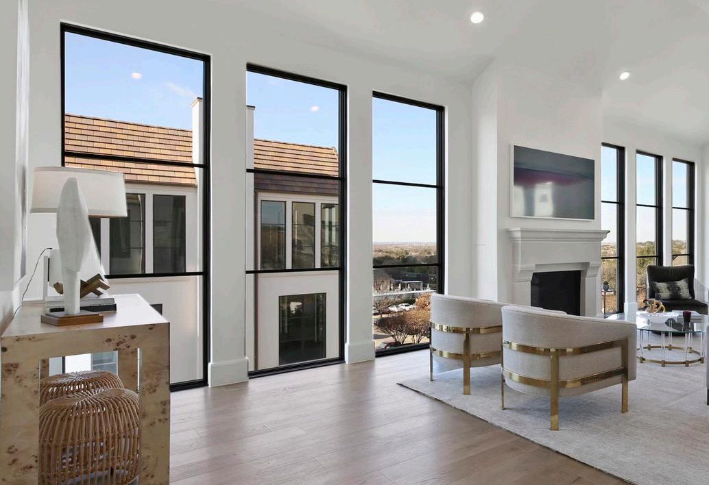

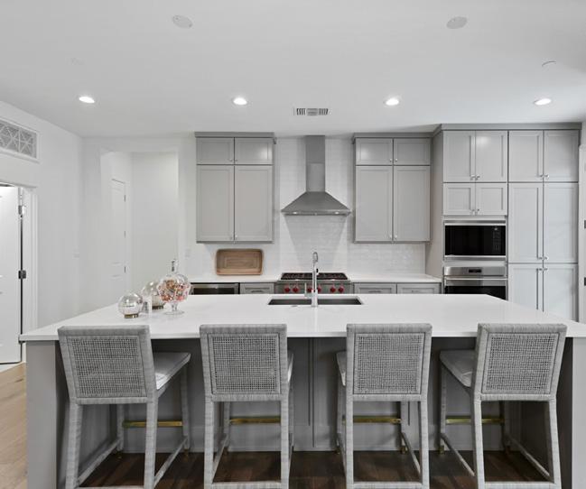
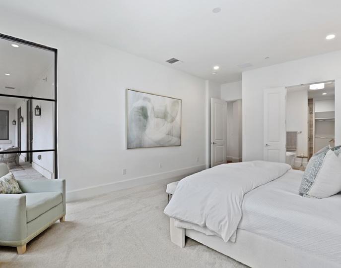
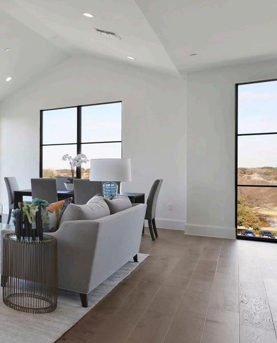

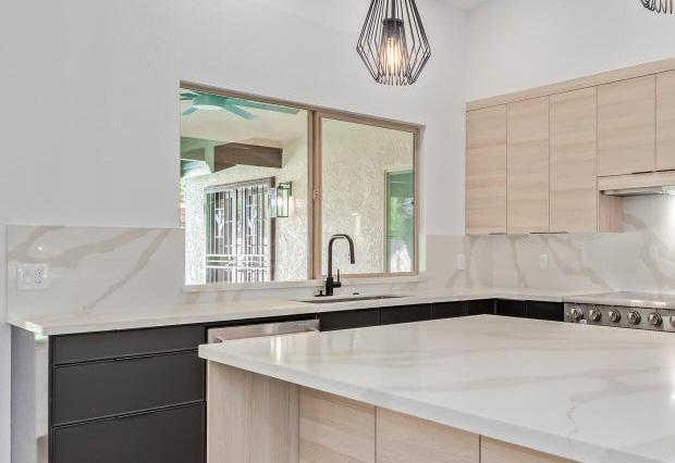
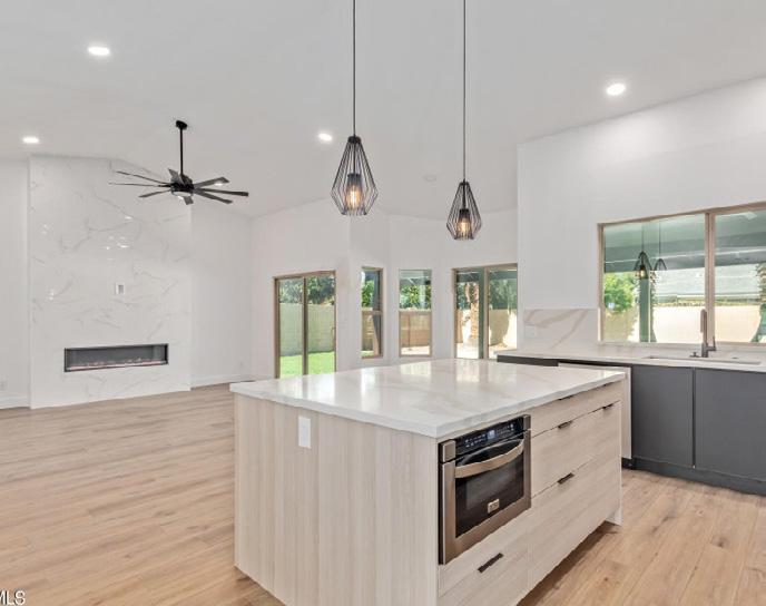

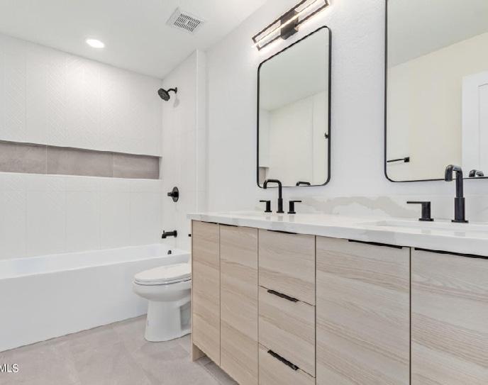


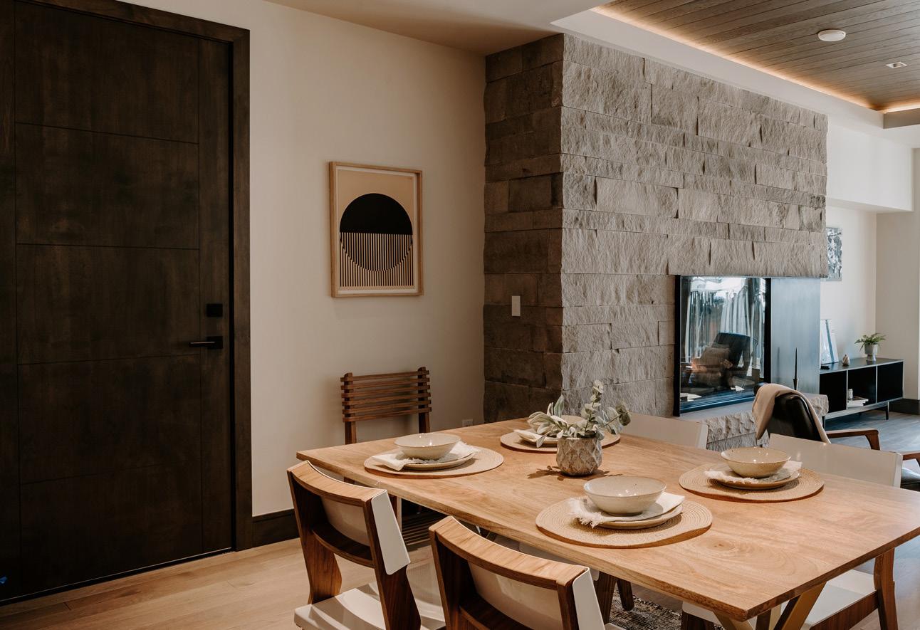
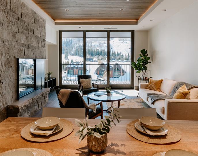
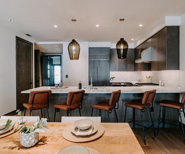
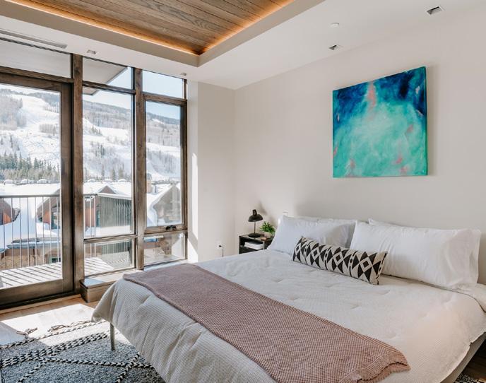
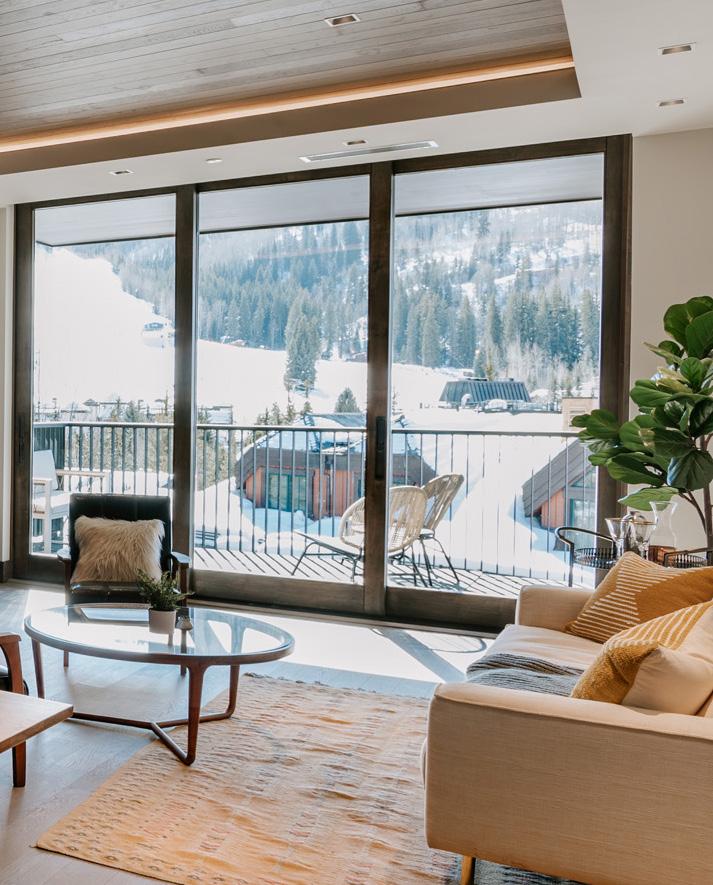

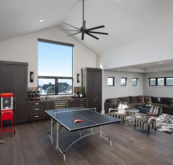
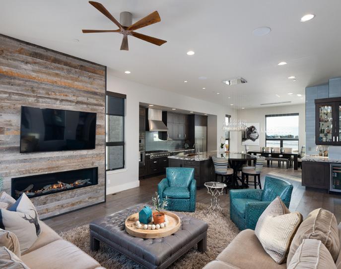
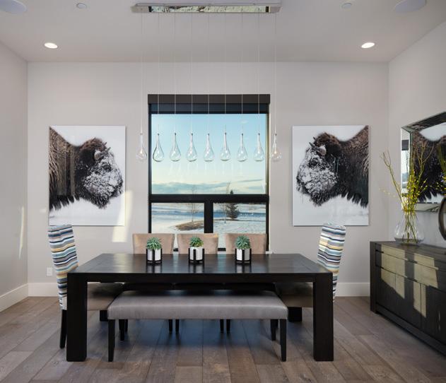
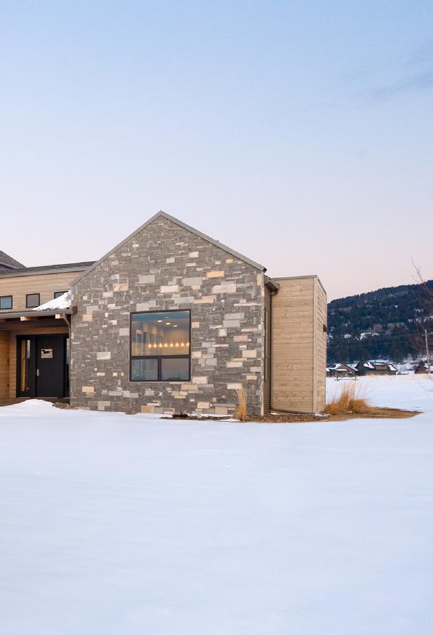

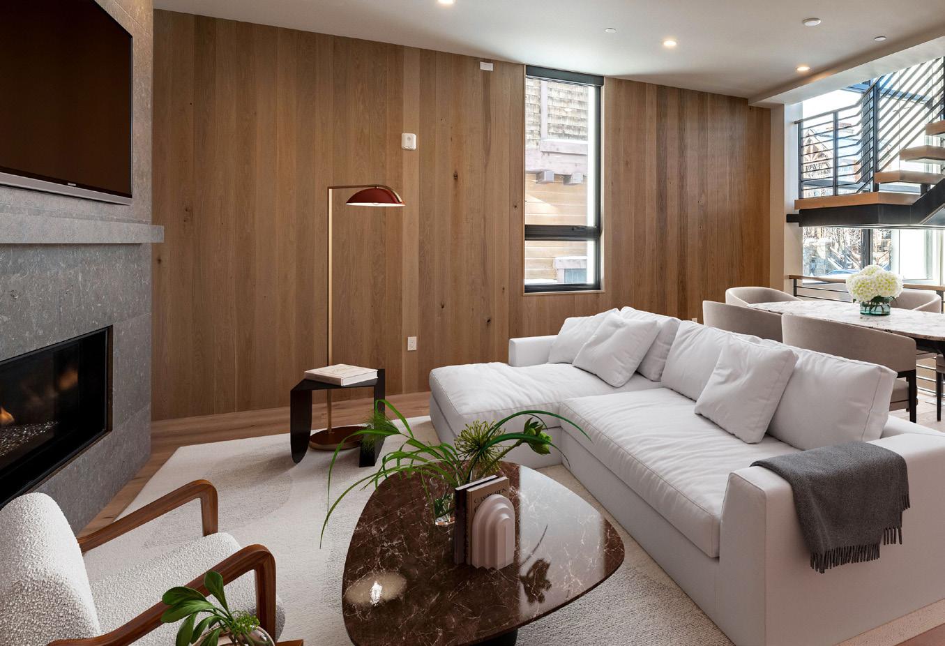

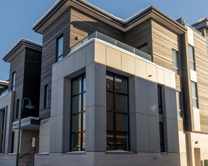
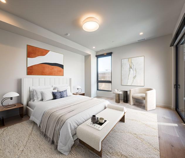
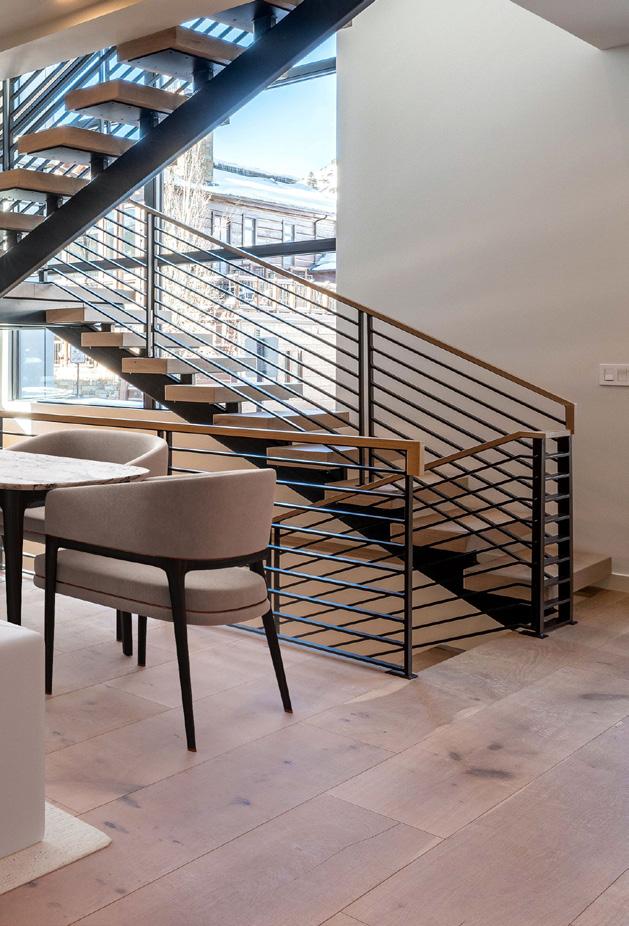


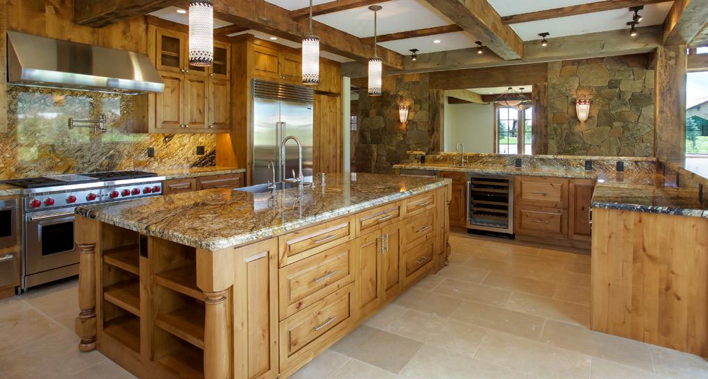

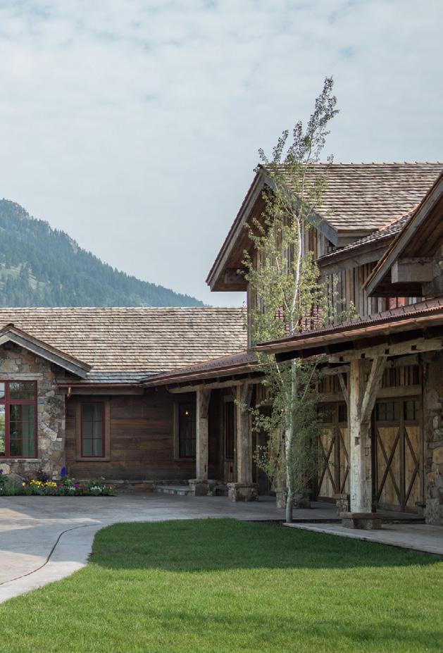

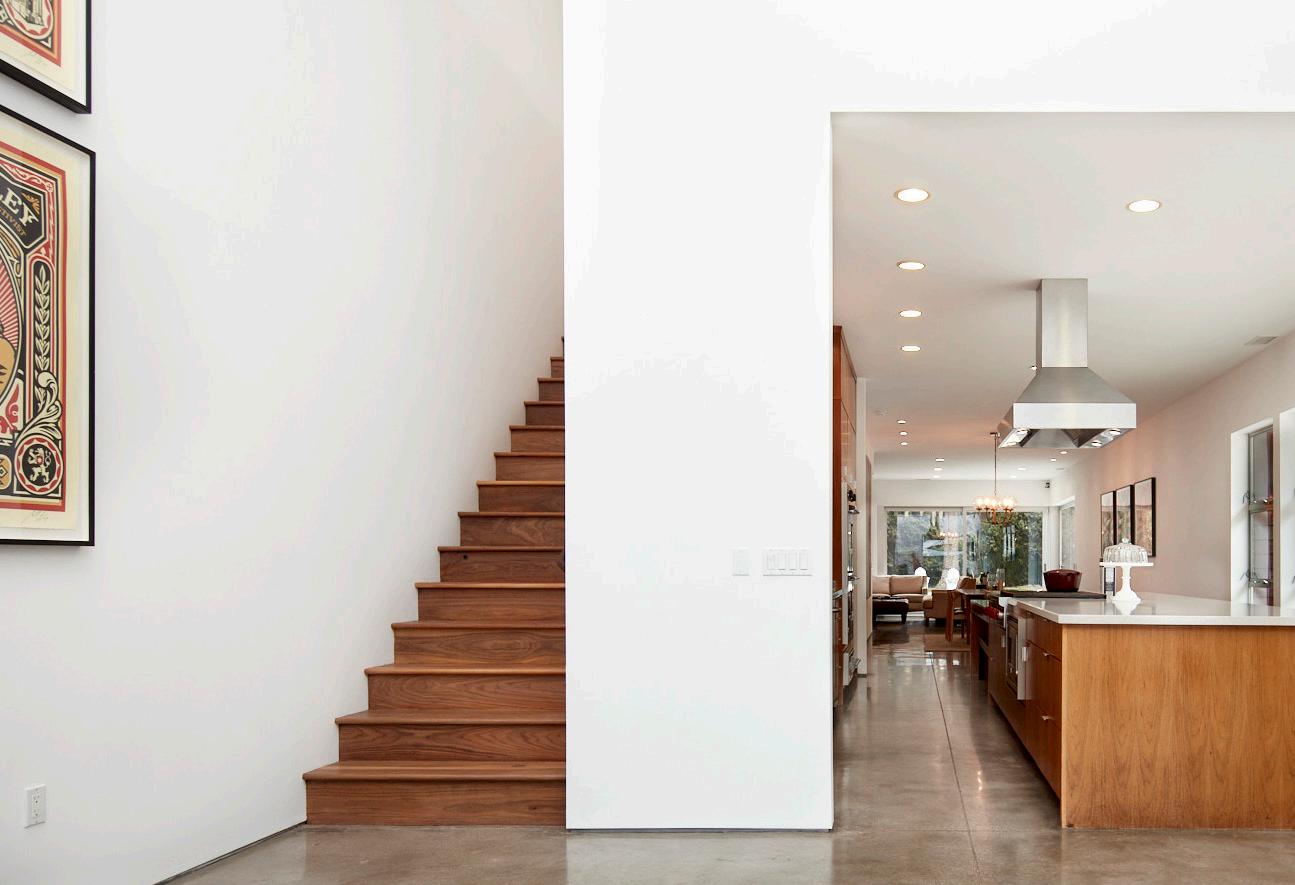
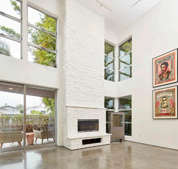
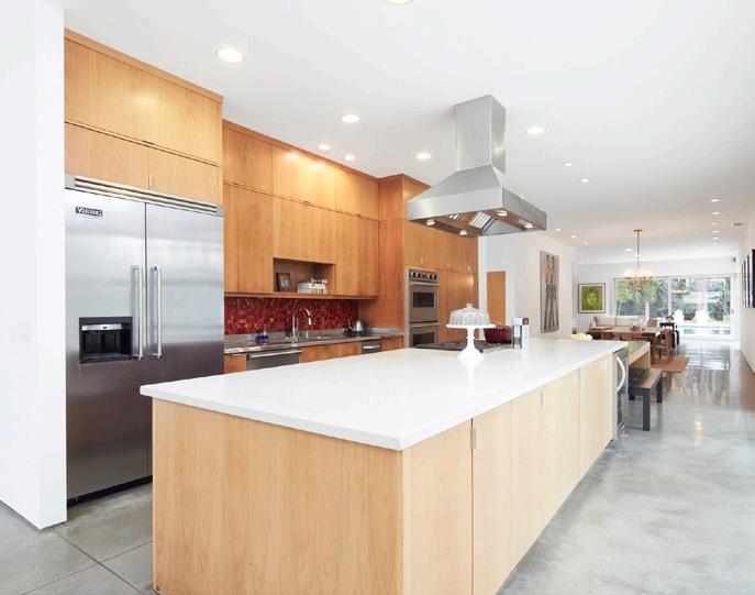

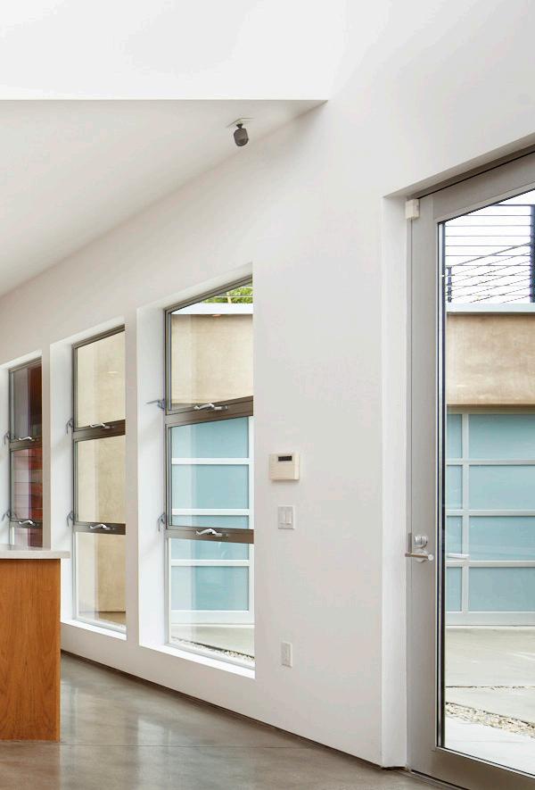


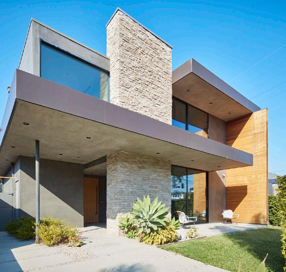
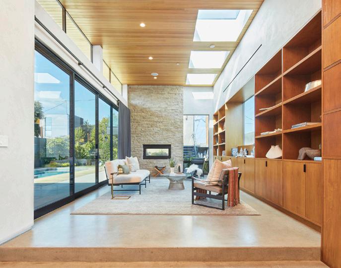
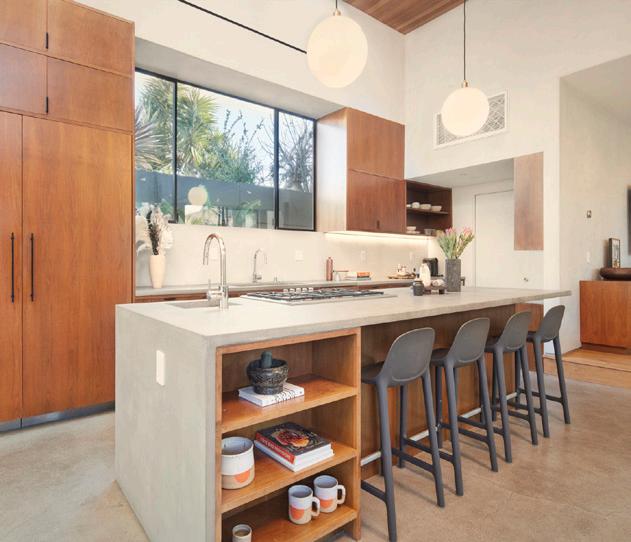
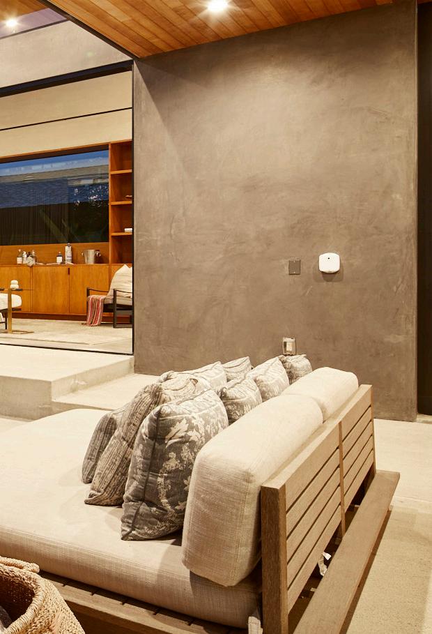


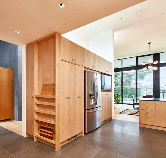
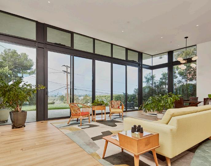
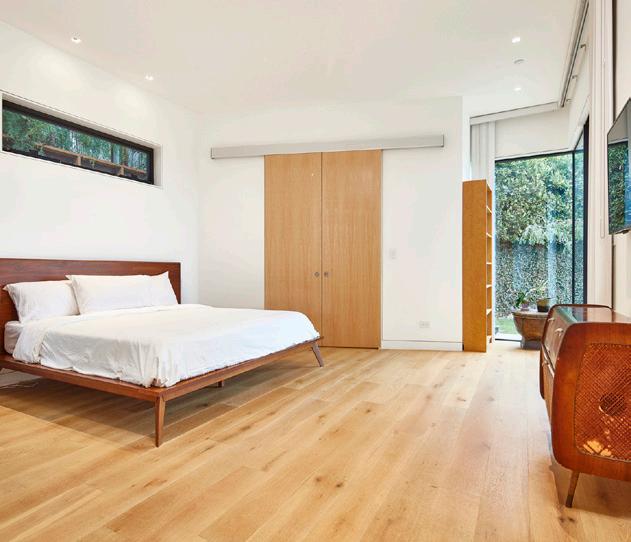

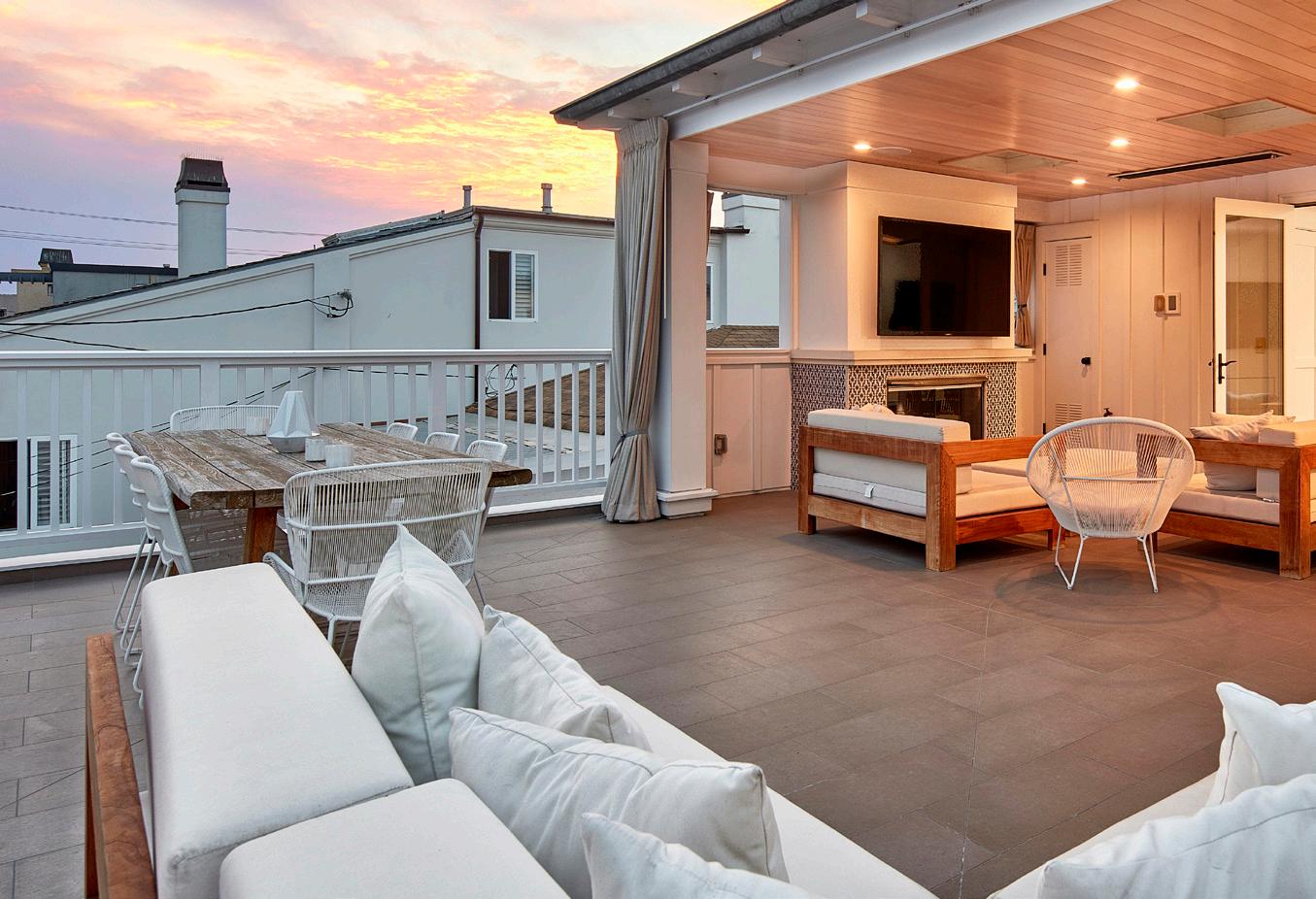
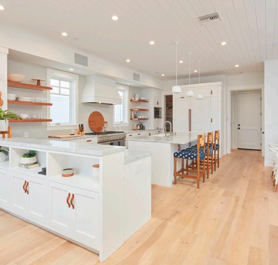
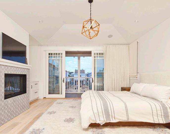

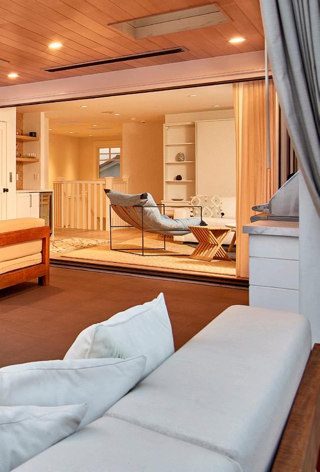


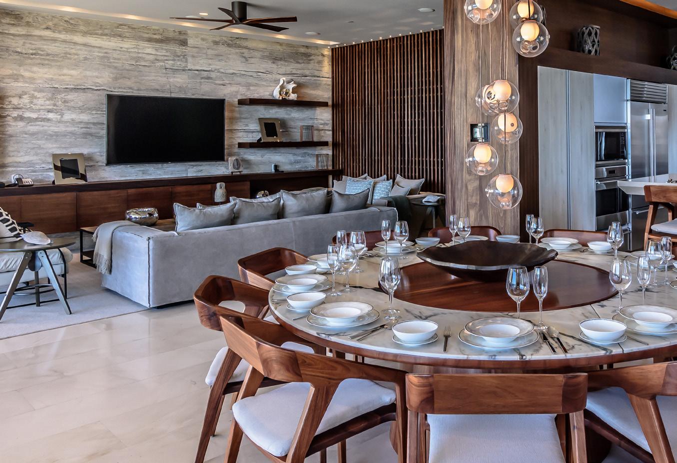
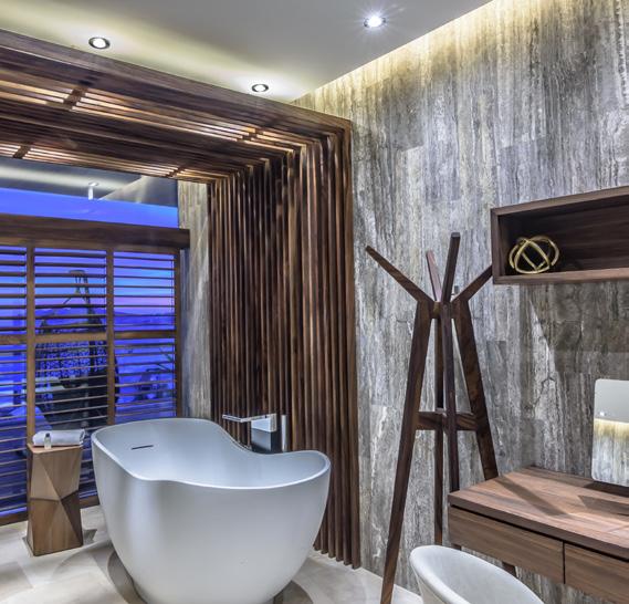
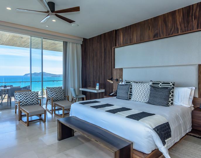
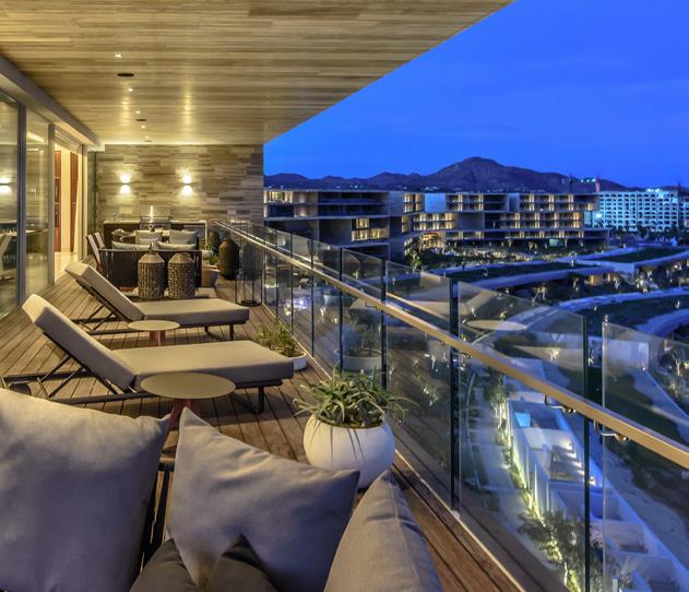
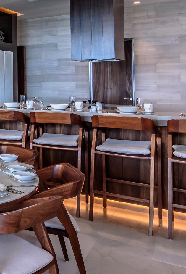

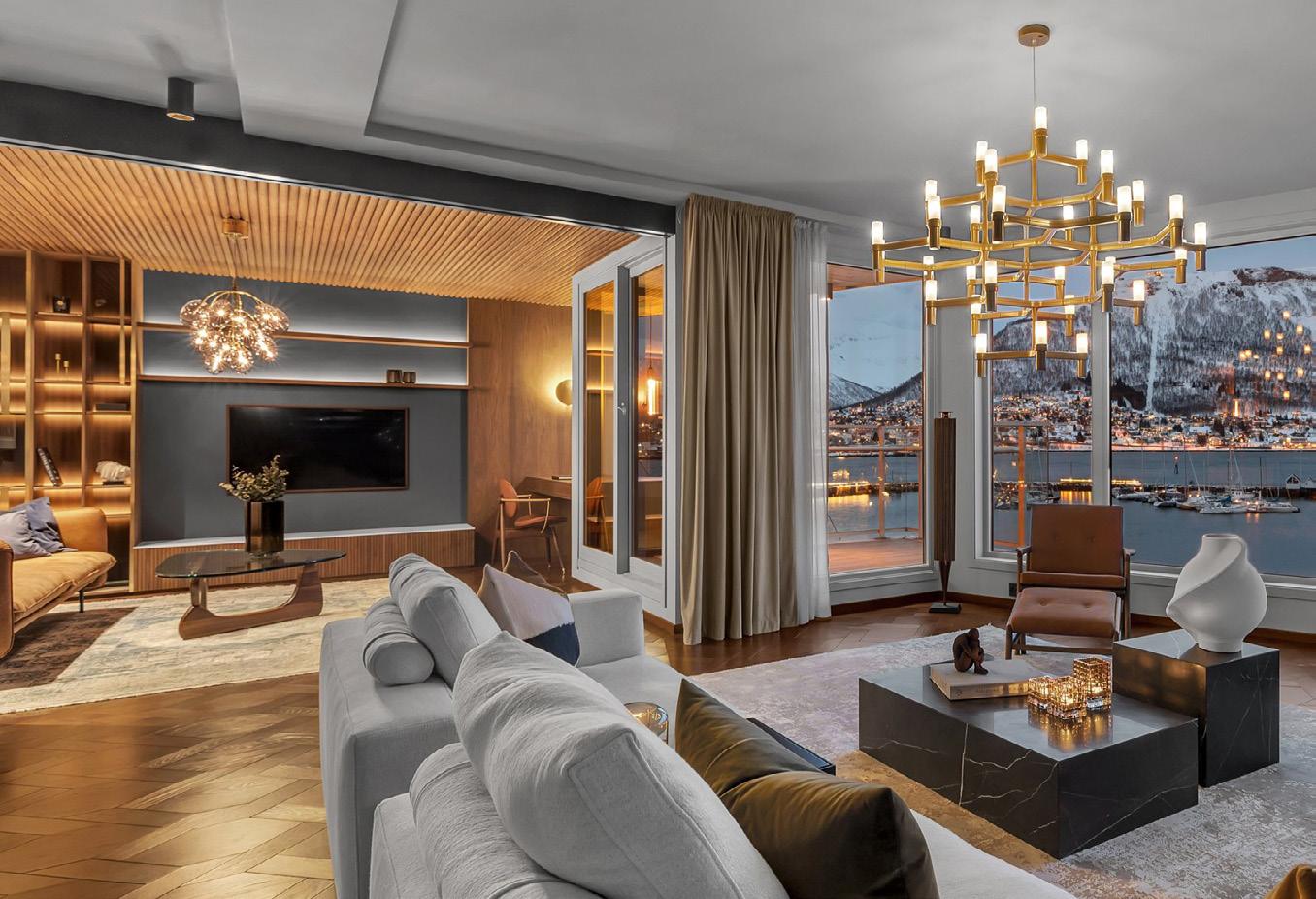
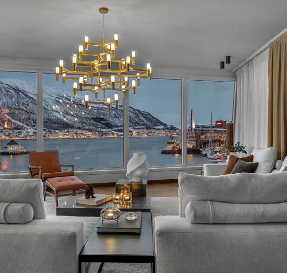
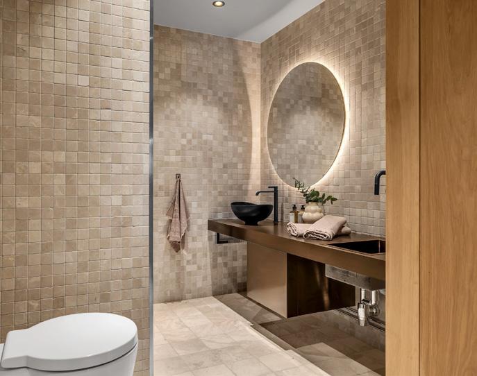
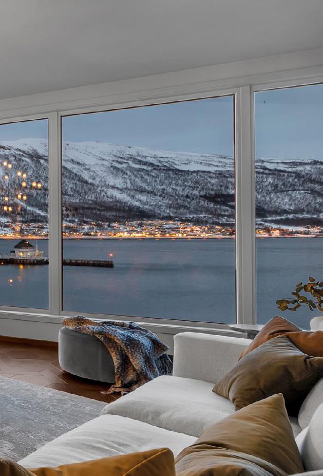

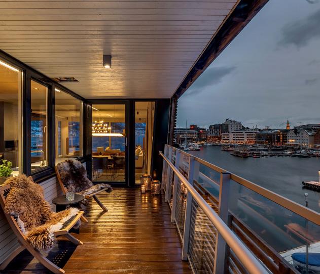


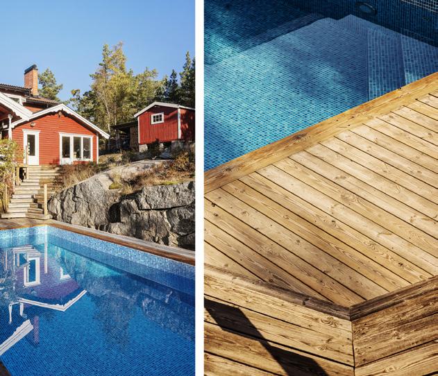




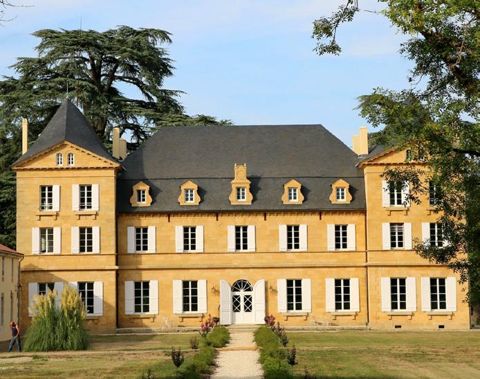
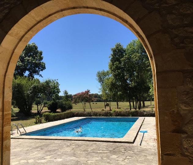


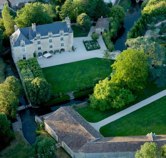
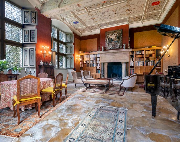
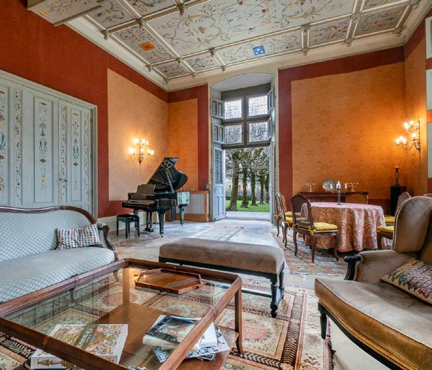


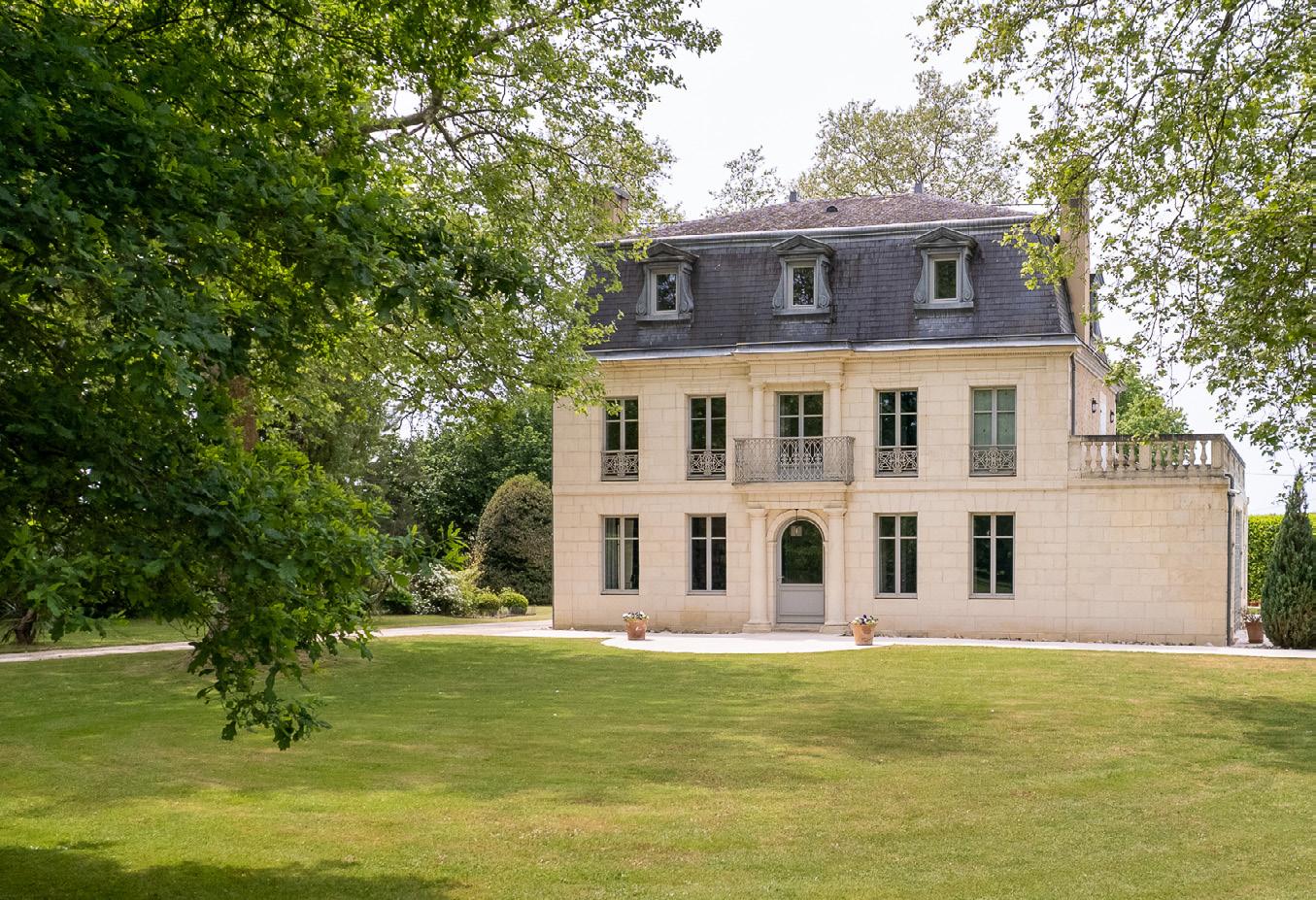
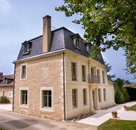

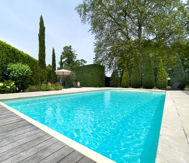


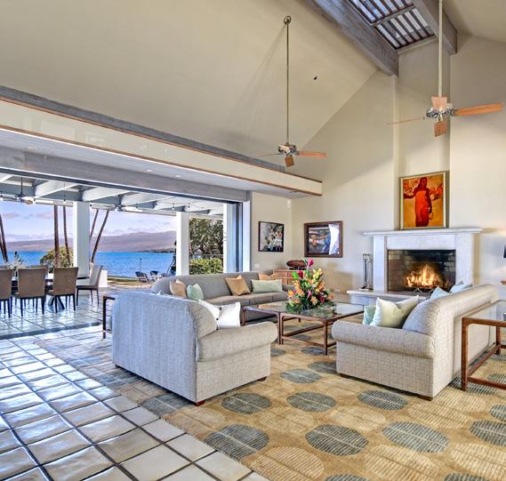


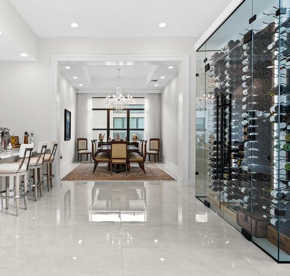
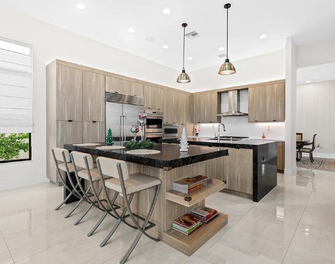


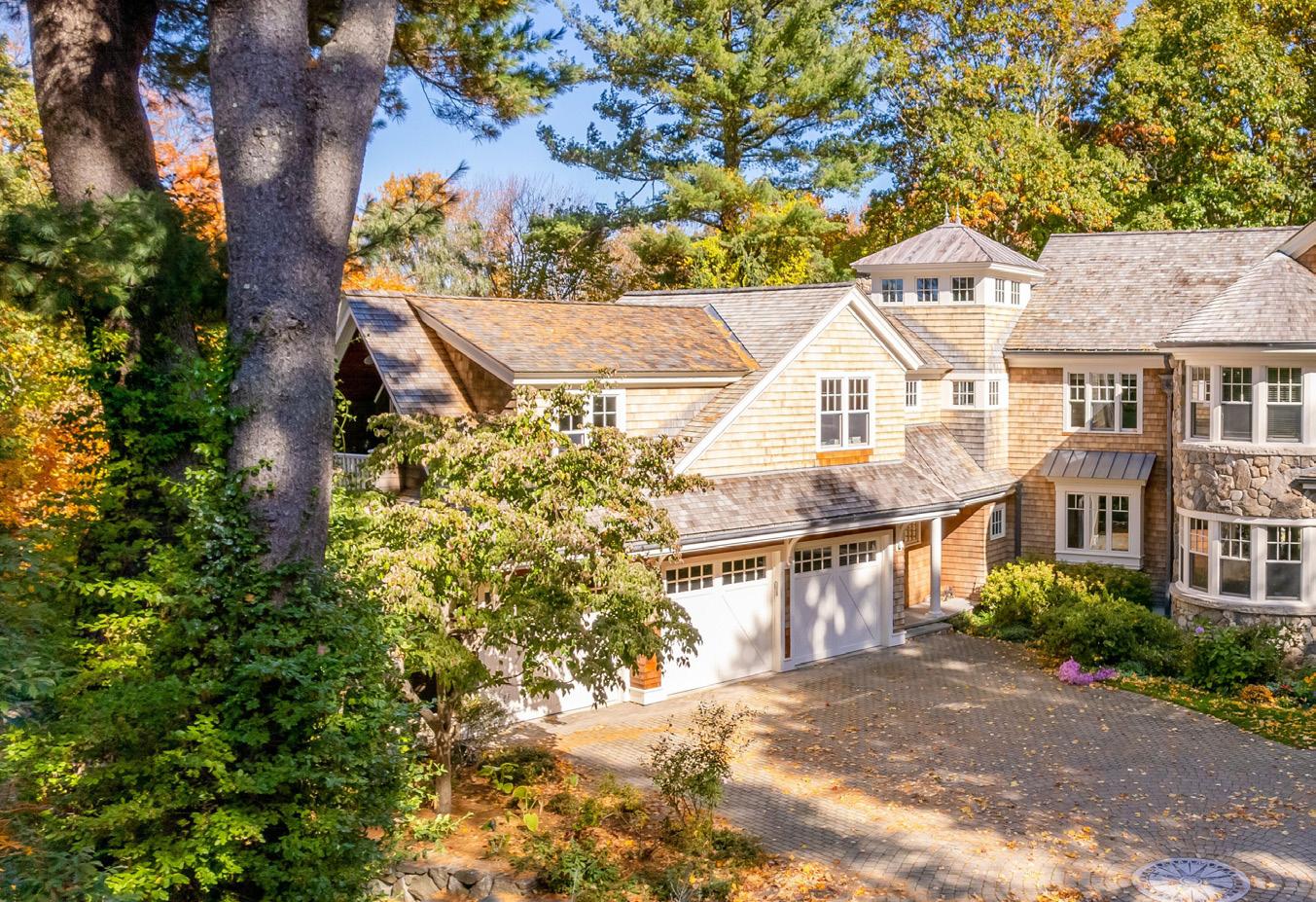
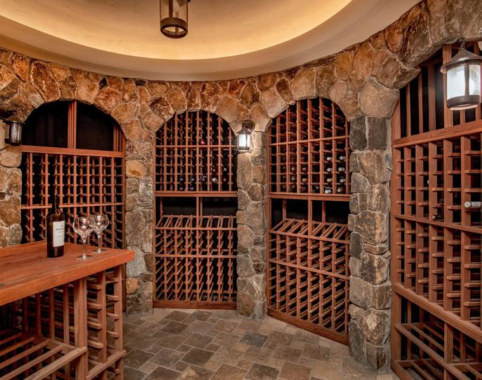
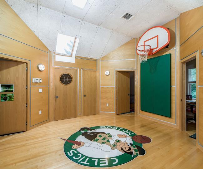

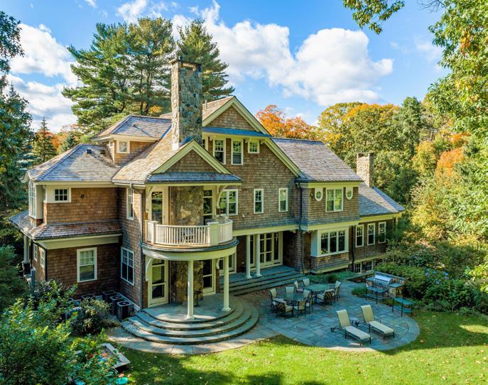
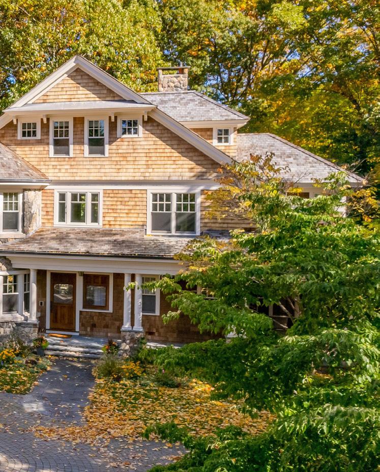
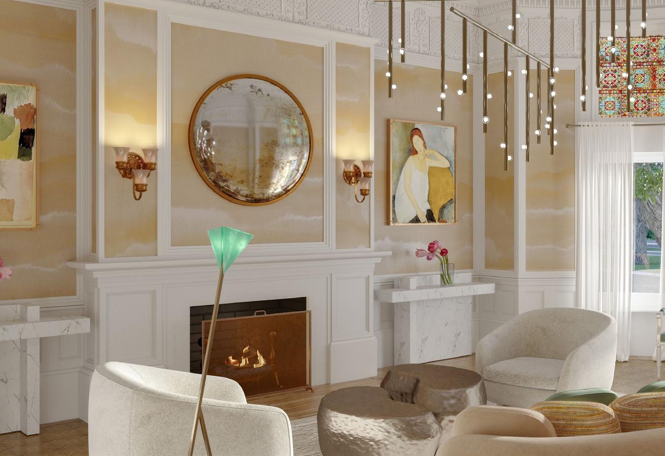
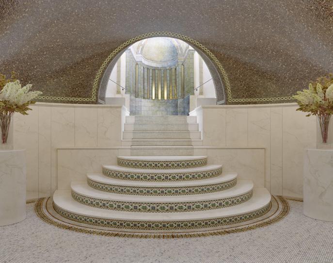


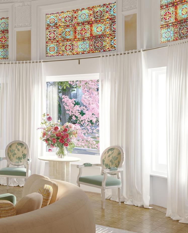
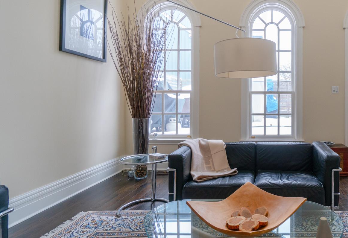

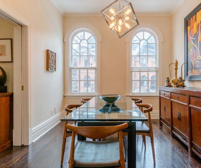

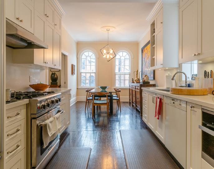
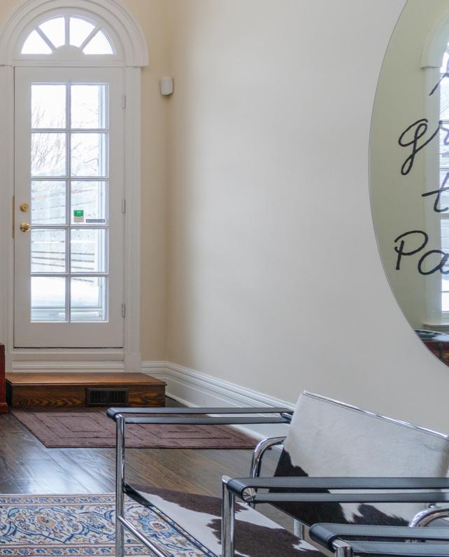




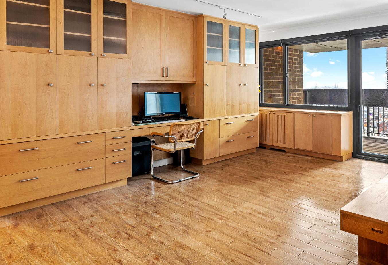
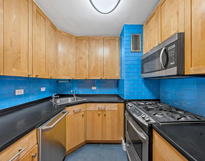


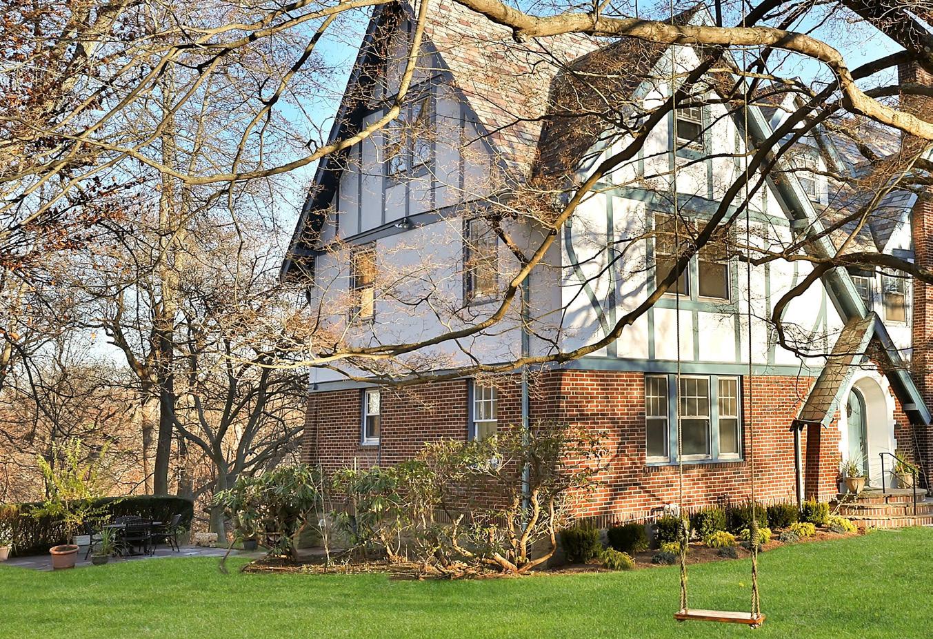
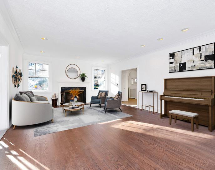
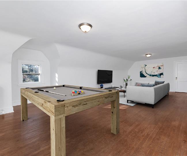

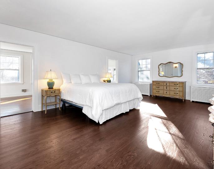


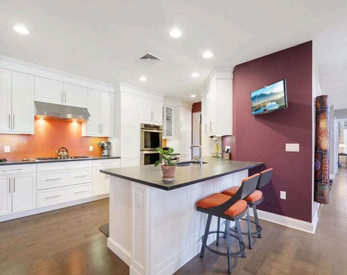
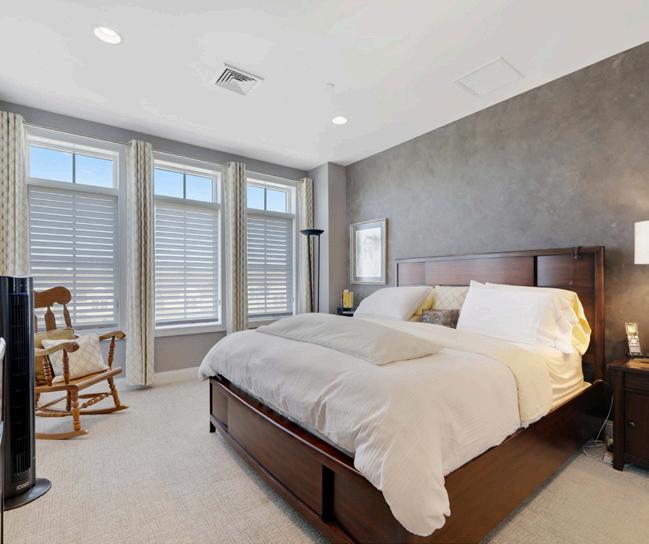

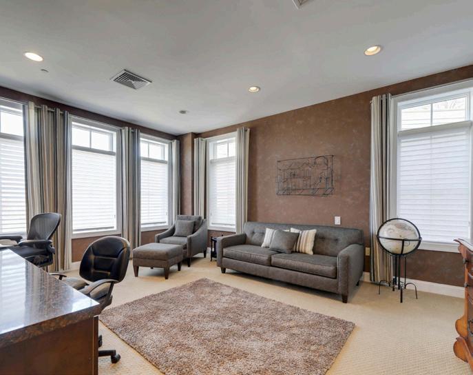

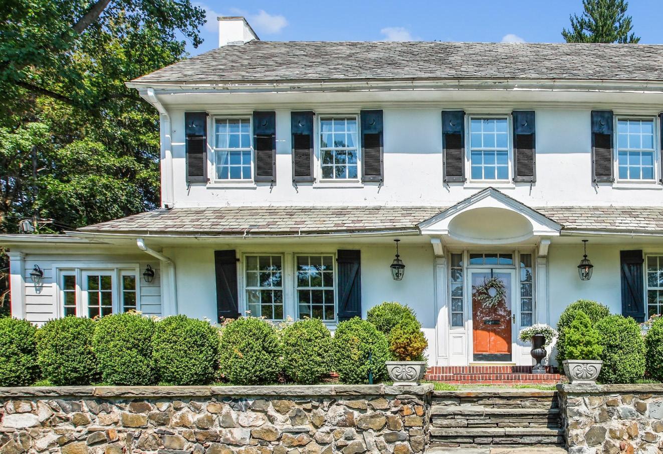
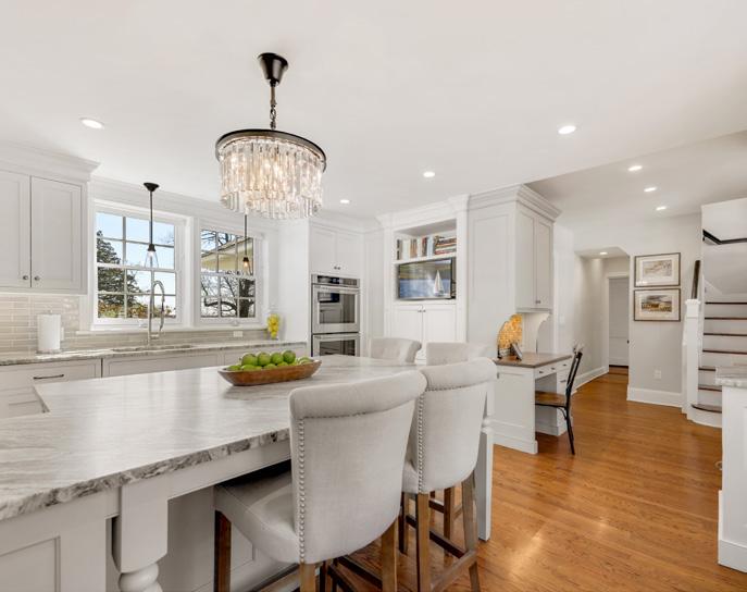
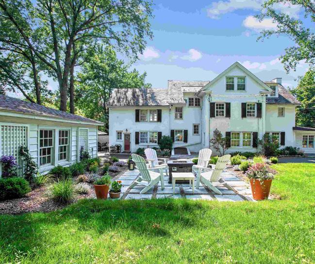

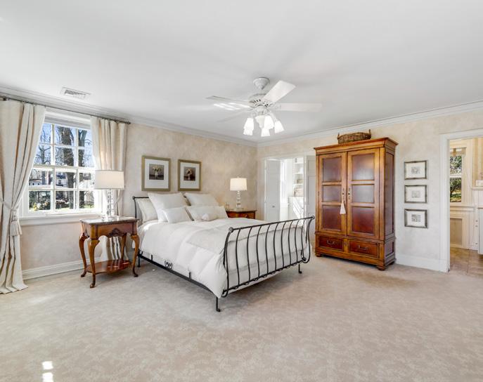


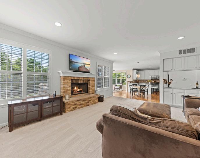
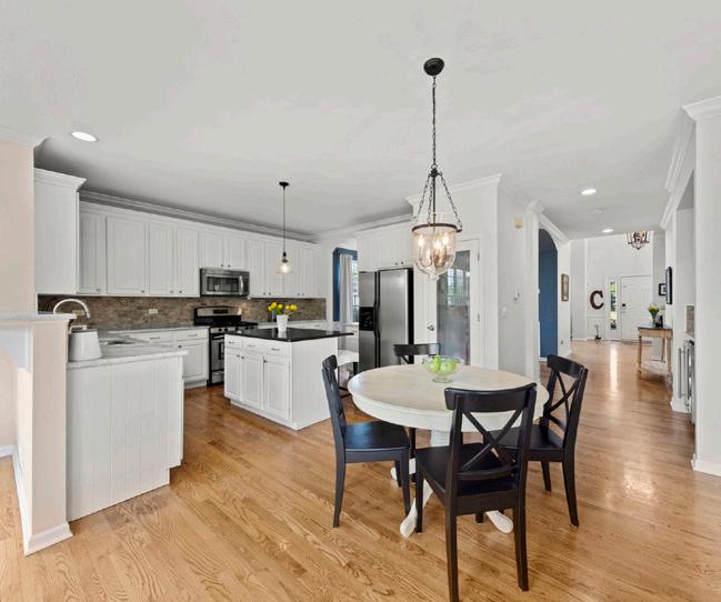

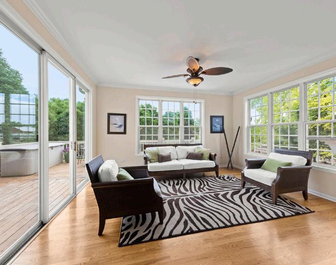


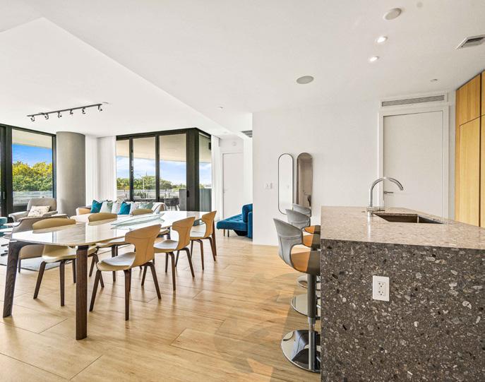
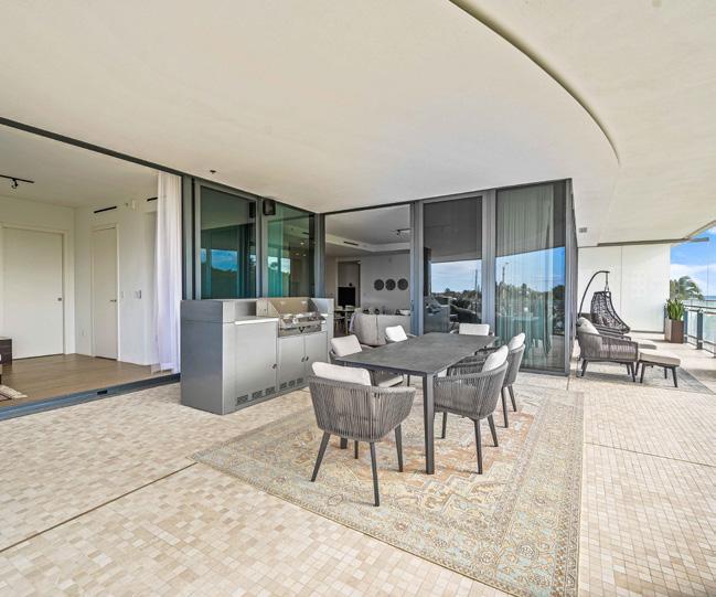


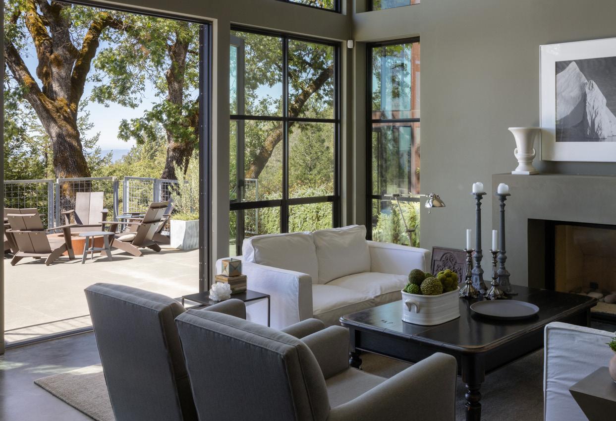
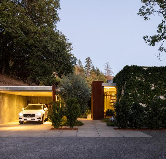
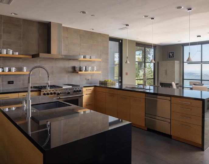
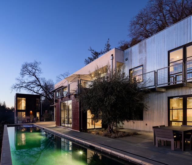
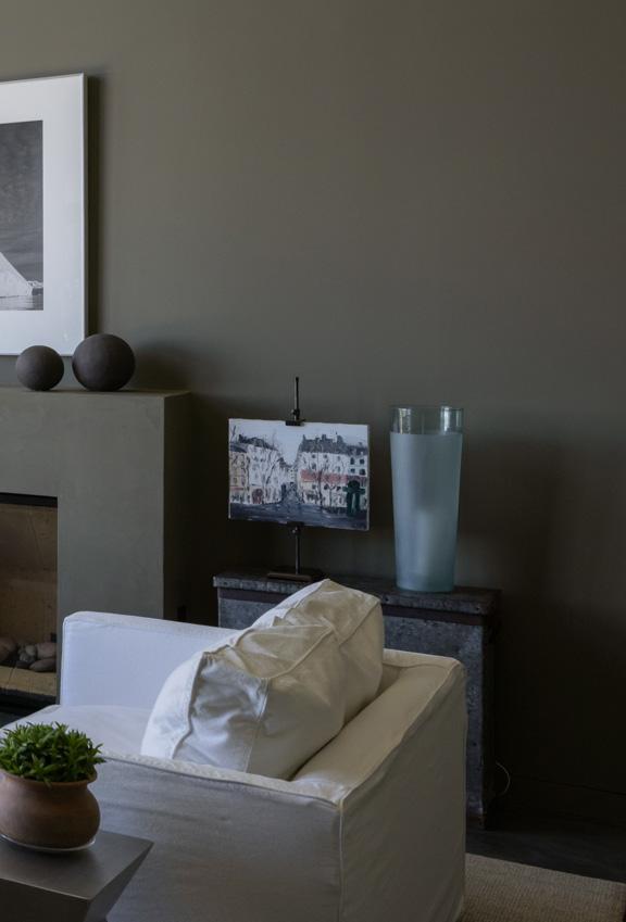





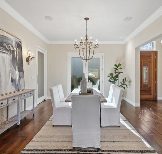
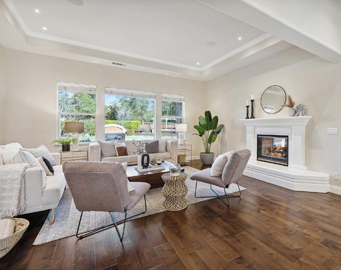


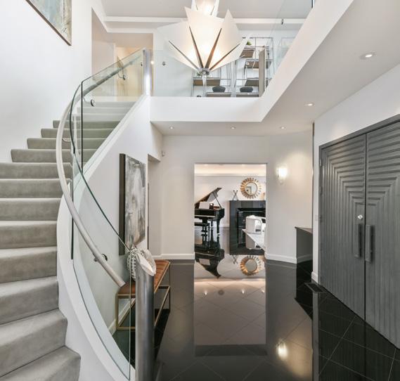
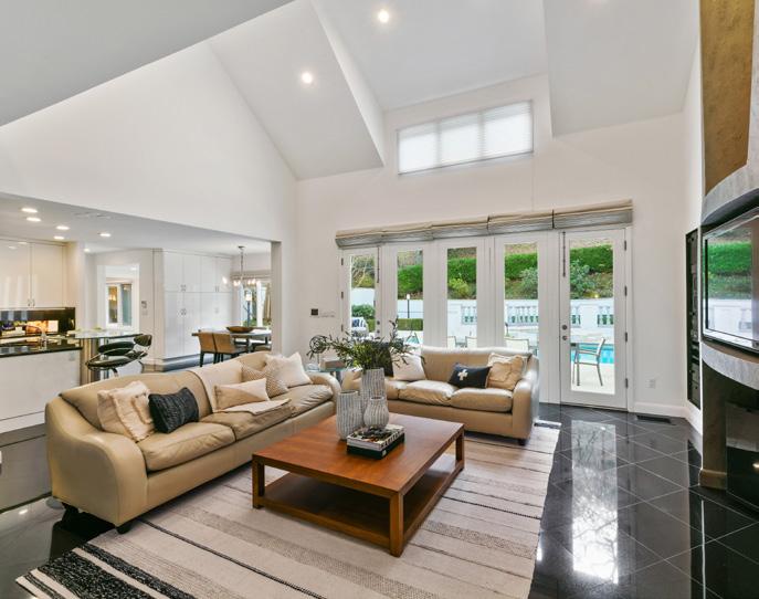
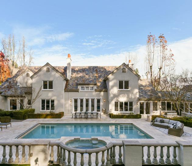


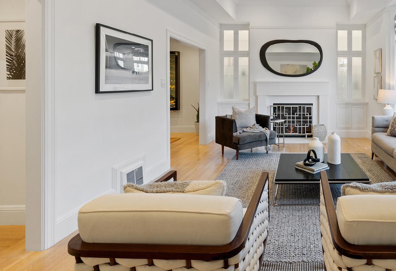

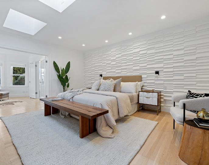

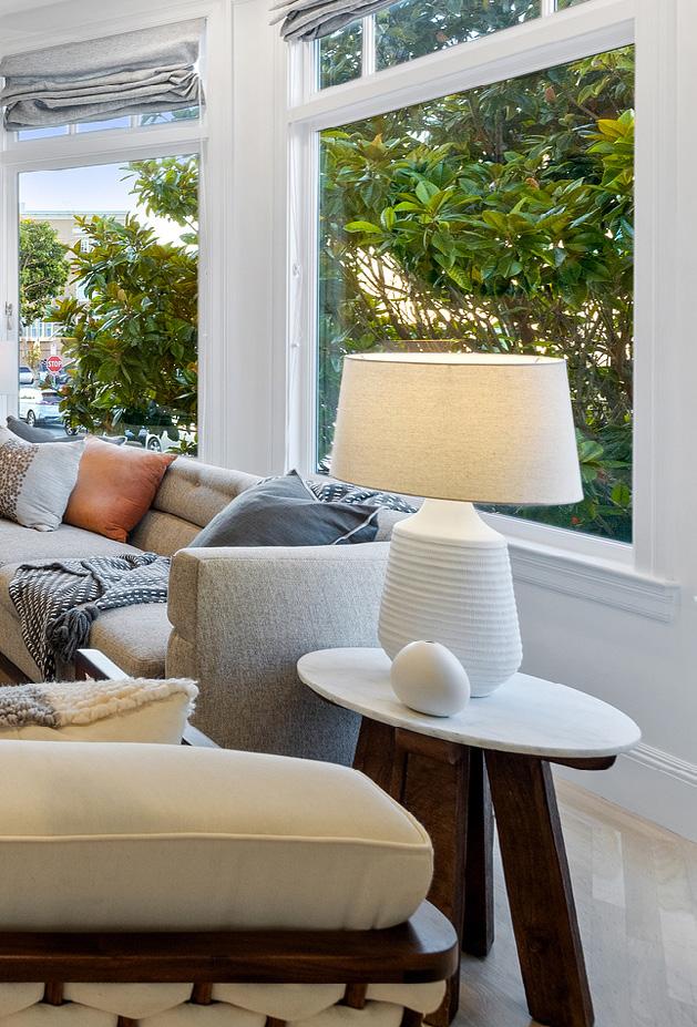


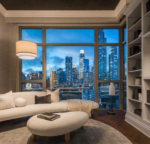
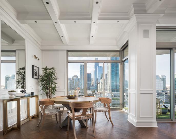
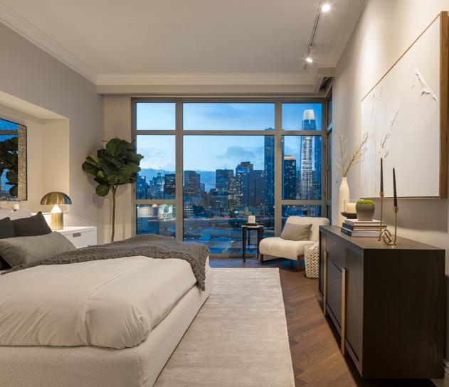
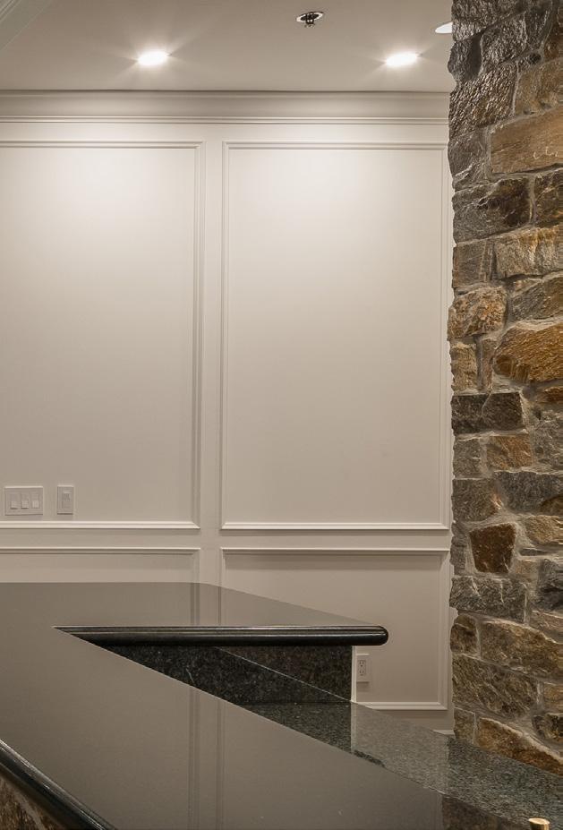


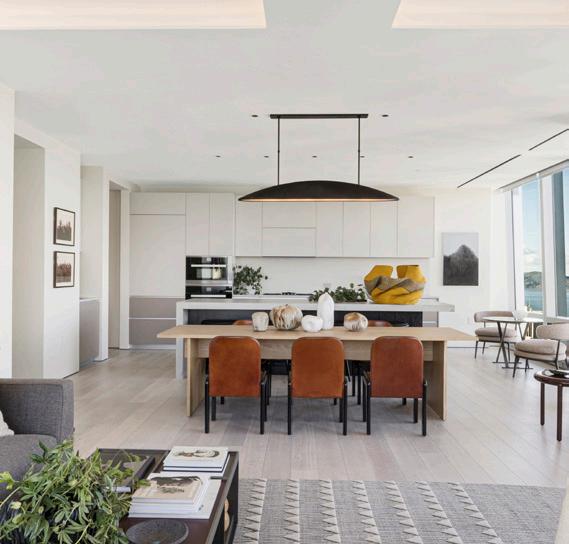

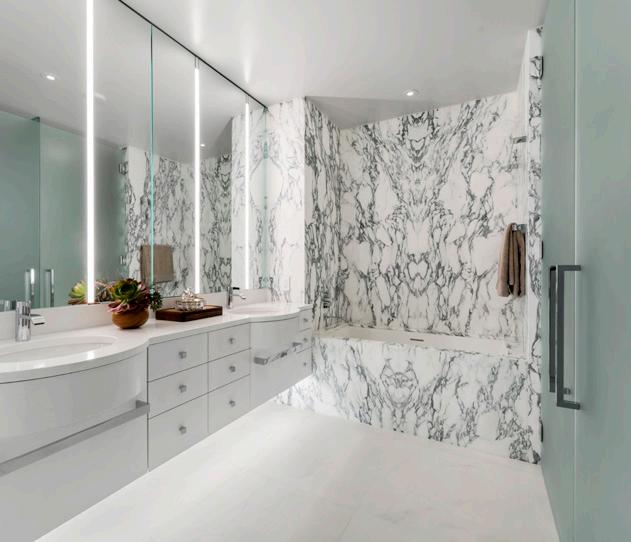
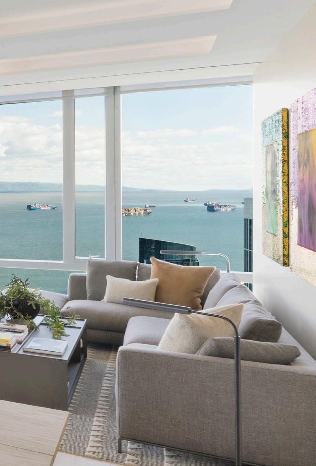


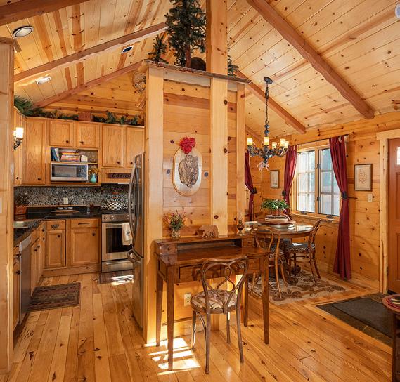
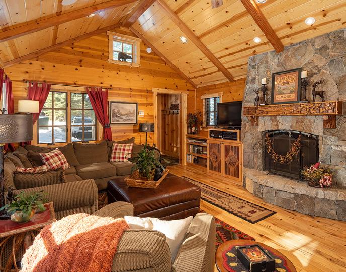
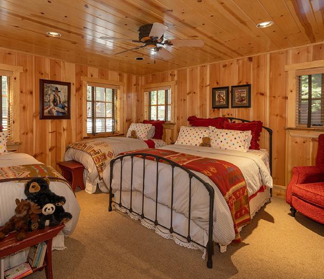


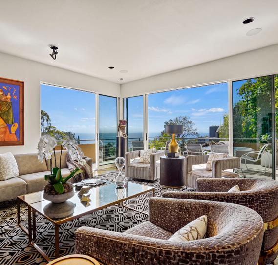

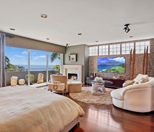

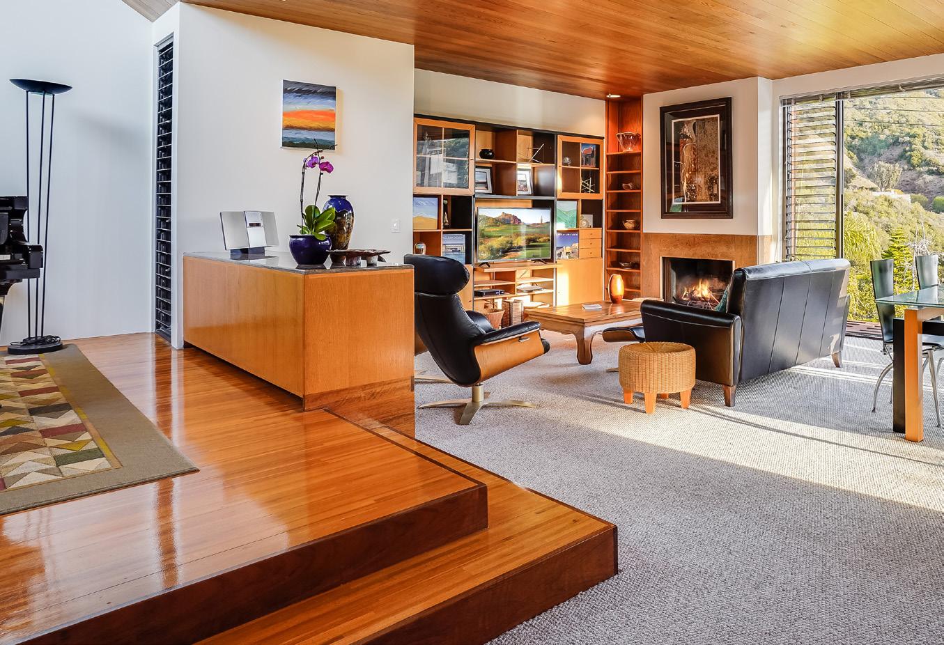

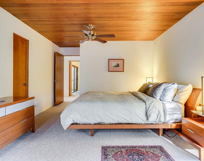

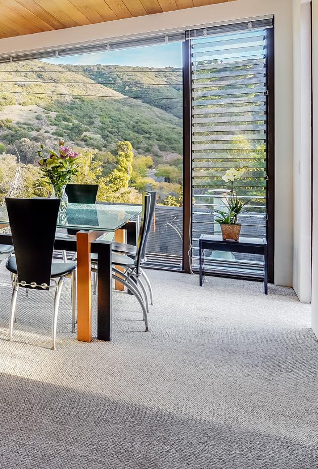


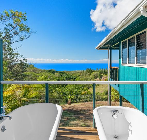
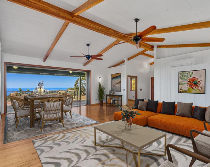
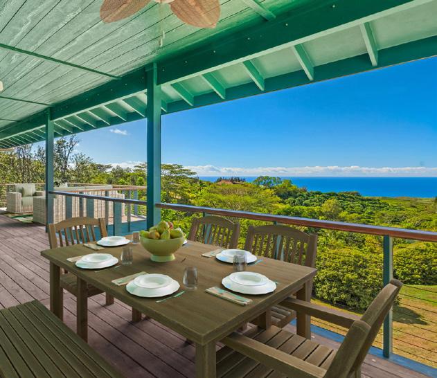


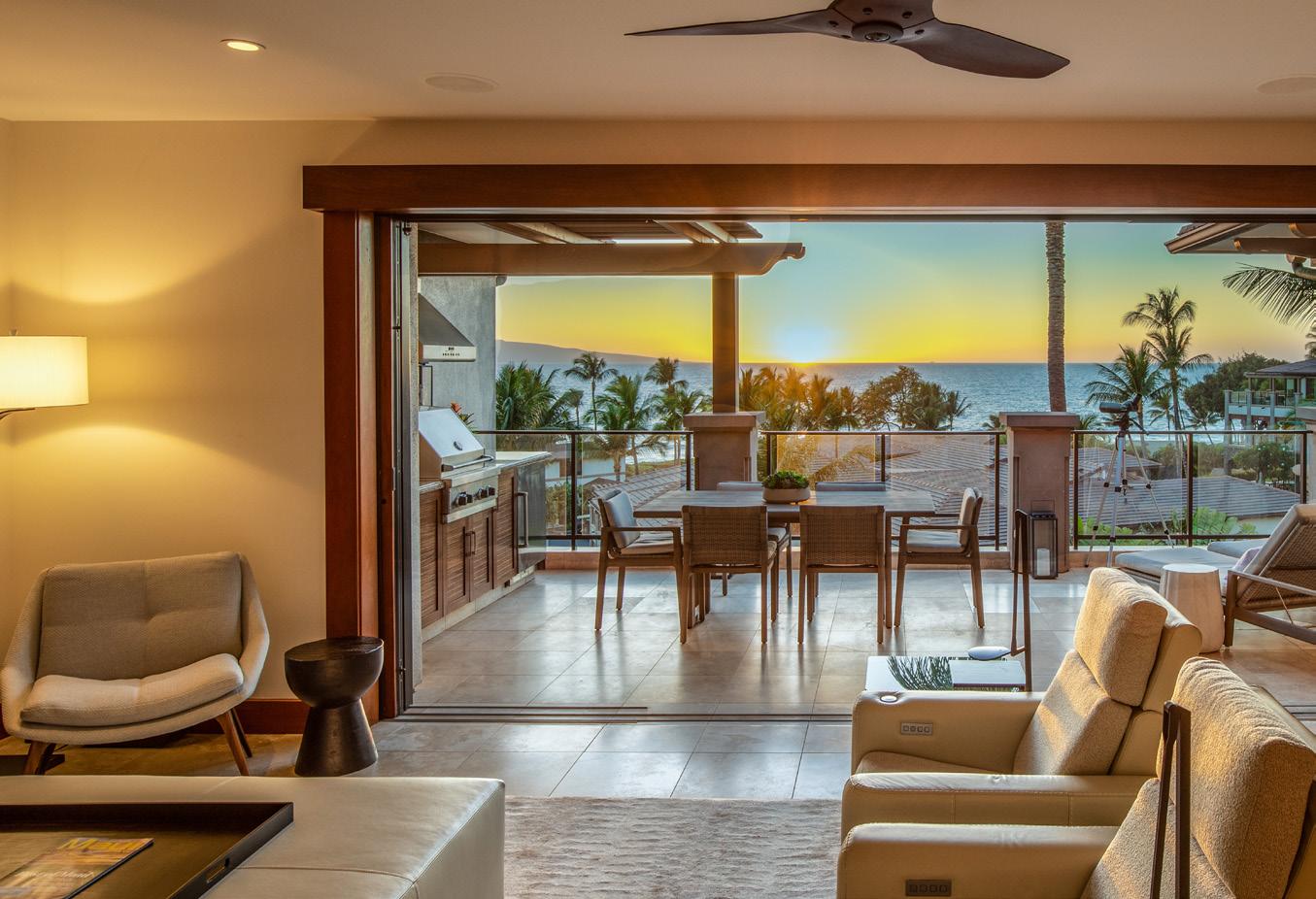
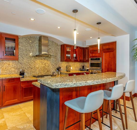
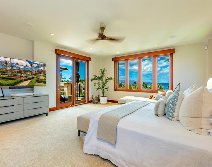



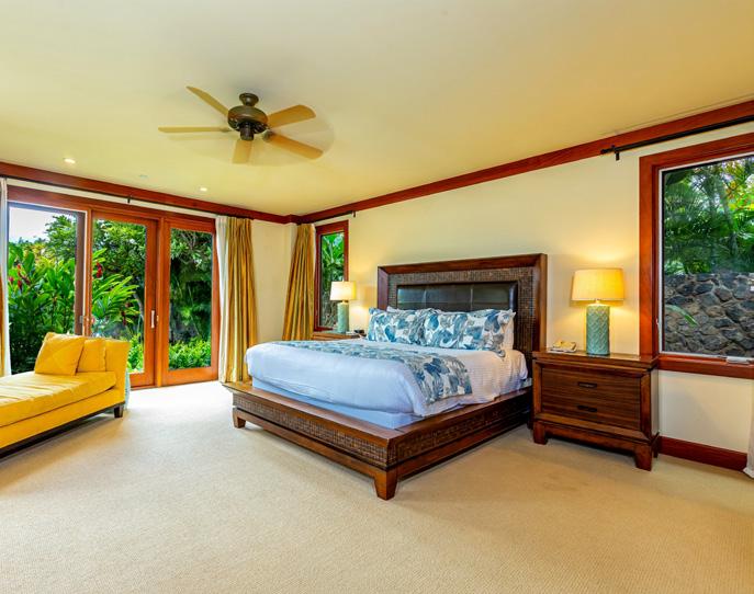

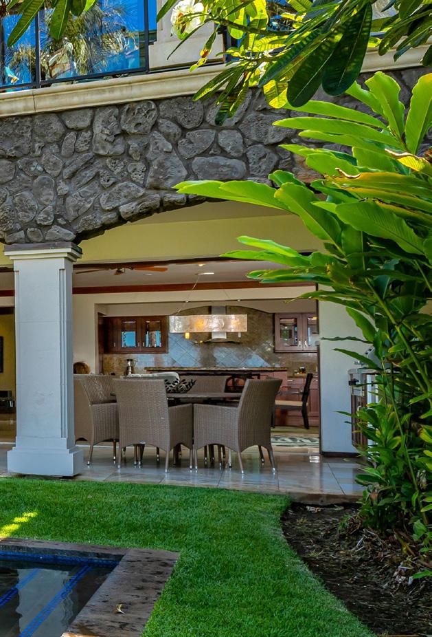


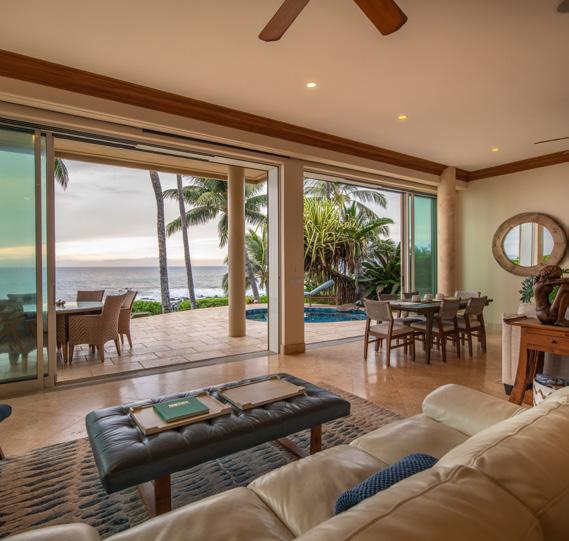
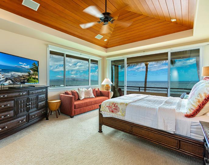
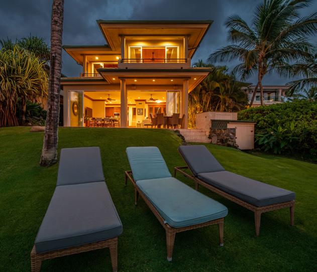


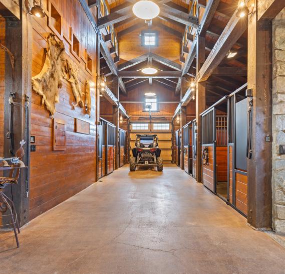




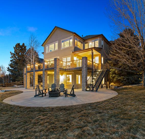
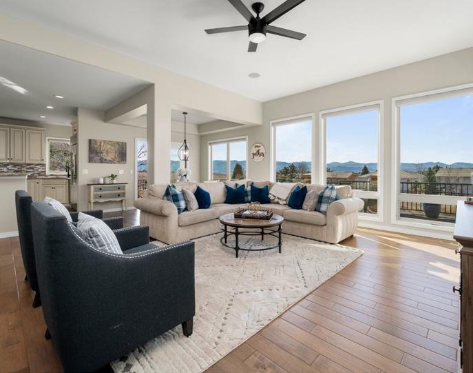
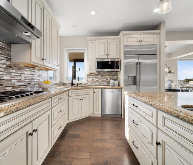


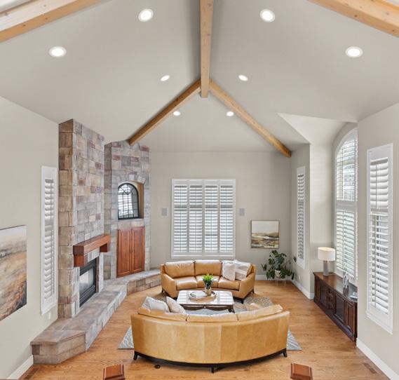
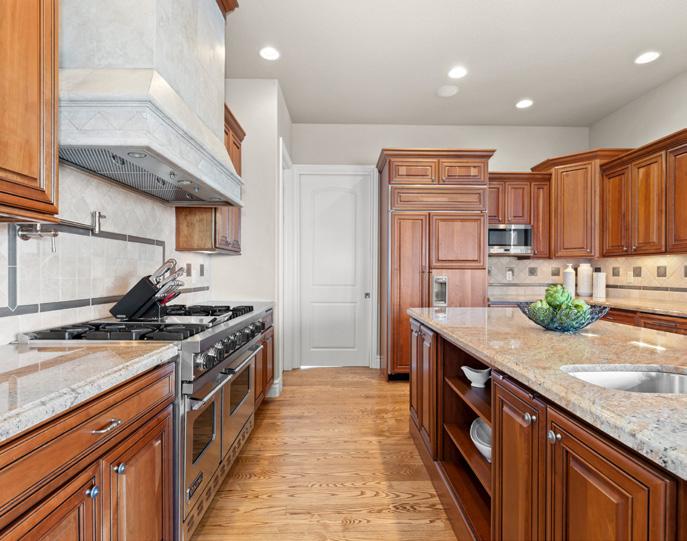
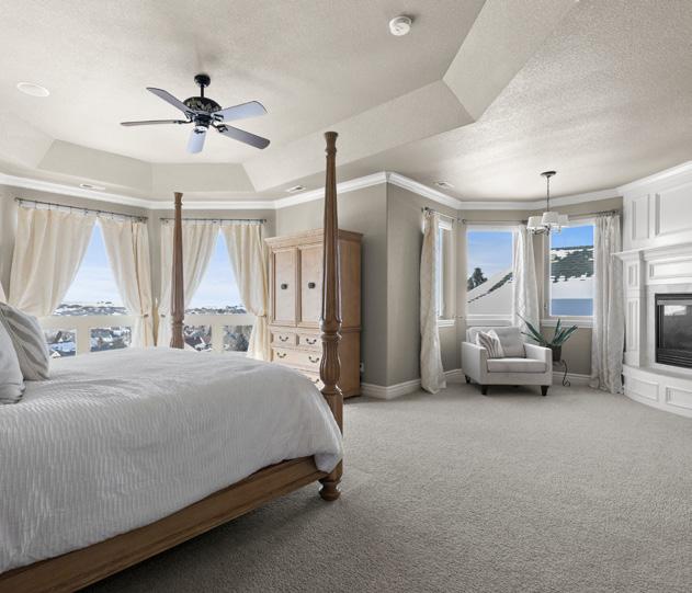


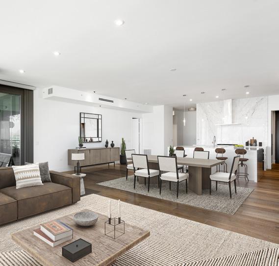
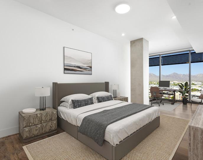
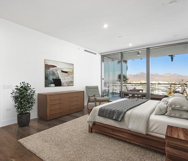
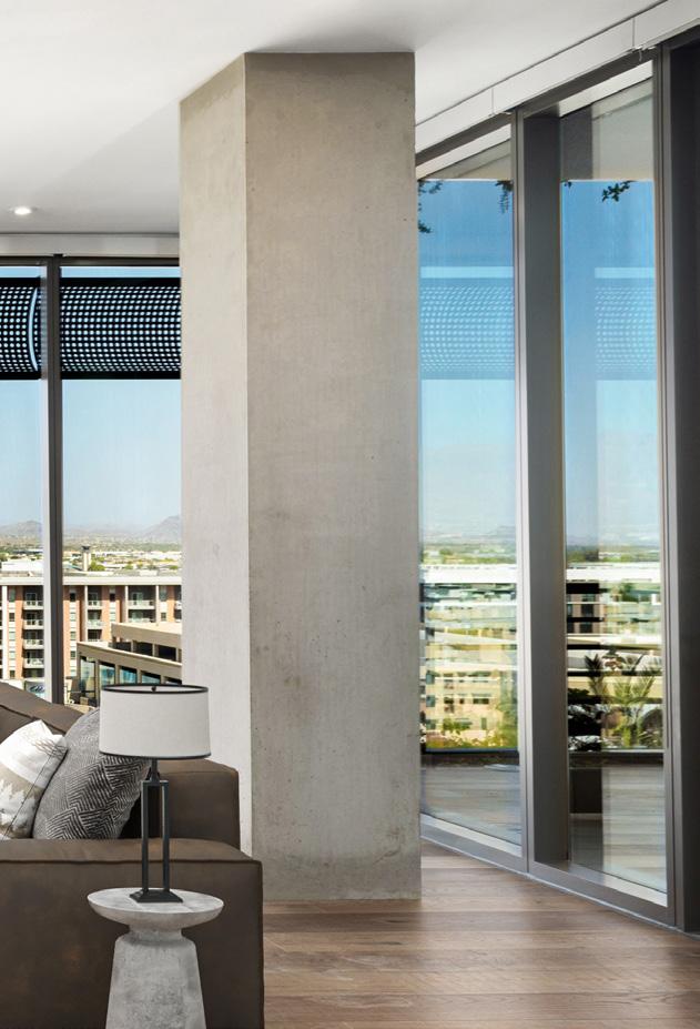
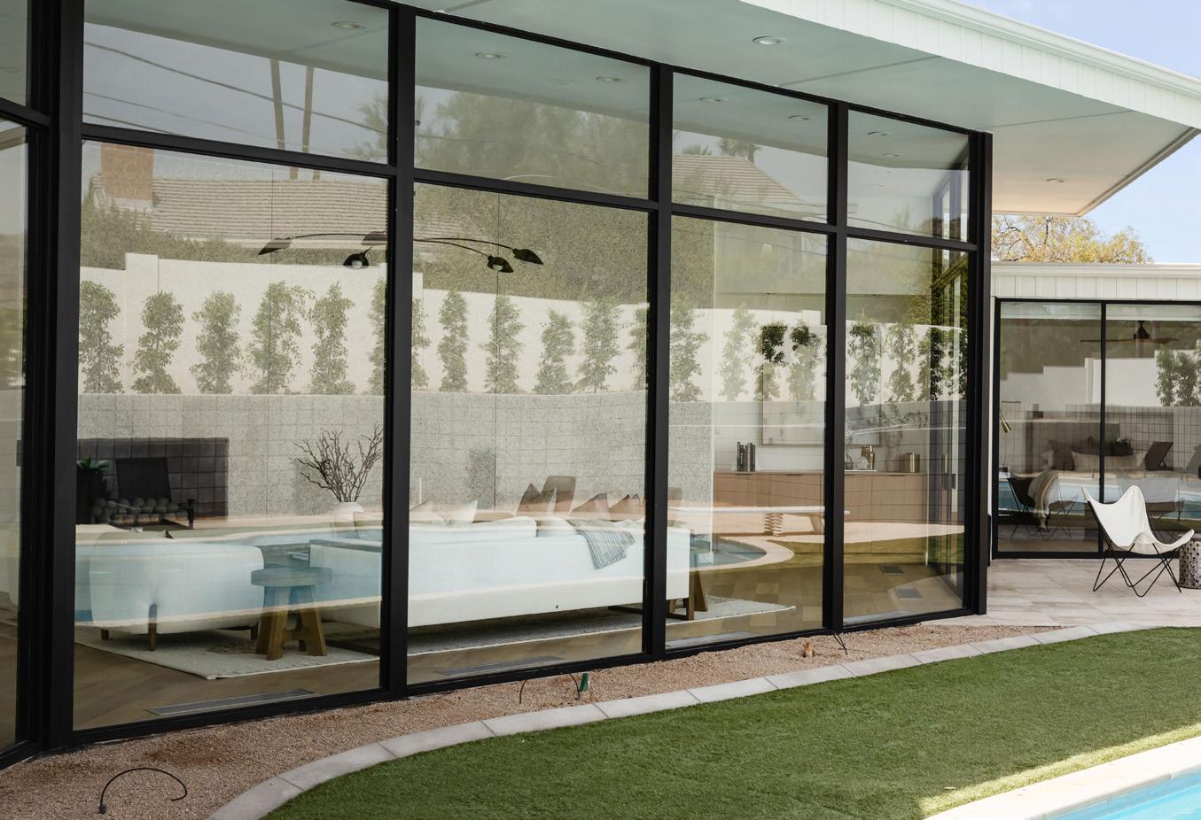
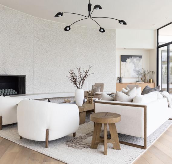
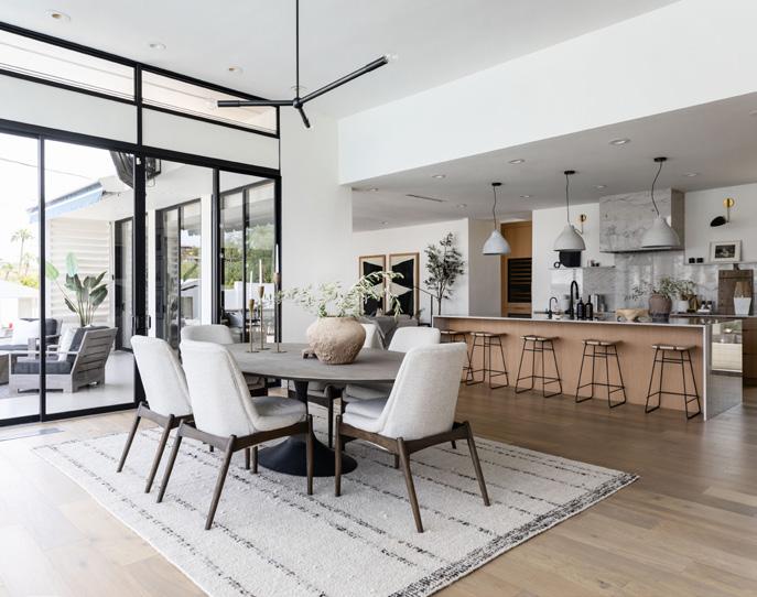
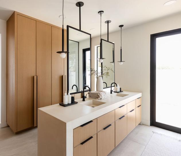

THE MOST COVETED MEMBERSHIP IN LUXURY REAL ESTATE

500+ members
325,000+ clients
40+ states
110+ brands
12 countries
And we're just getting started
