COLOR INNOVATION GUIDE 25/26
In collaboration with

COLOR INNOVATION GUIDE 25/26
In collaboration with
In collaboration with
For over four decades of dedication, leadership, and innovation, we at Jazeera Paints have achieved remarkable performance and made a lasting impact. We have provided the highest quality paints according to top standards of quality and environmental safety and with the most beautiful and innovative colors. These paints seamlessly blend with our clients' chosen spaces and perfectly match their tastes and lifestyles.
As we step into a new year, and as you expect from us to launch Color Trends annually, the Color Trends for 2025-2026 comes with a new story and carefully selected color collections curated by Jazeera Paints experts in collaboration with Pantone. Together, we present you with exceptional Color Trends based on the concept of "Connection" and its significance in our lives. This will inspire you and assist you in making informed decisions while designing your personal spaces, allowing you to express yourselves more freely and enhancing your sense of connection and integration with your surroundings.
Each page of the Color Innovation Guide will take you through a captivating exploration of color collections that will strengthen your bond with your environment and the people around you and increase your sense of identity and belonging. These colors will harmonize with your homes and personal spaces, adding feelings of closeness, warmth, security, and comfort, along with more happiness and harmony.
We wish you an inspiring journey with harmonious color collections that will infuse your spaces with a unique touch!
Abdullah Bin Saud Al-Romaih CEO of Jazeera Paints


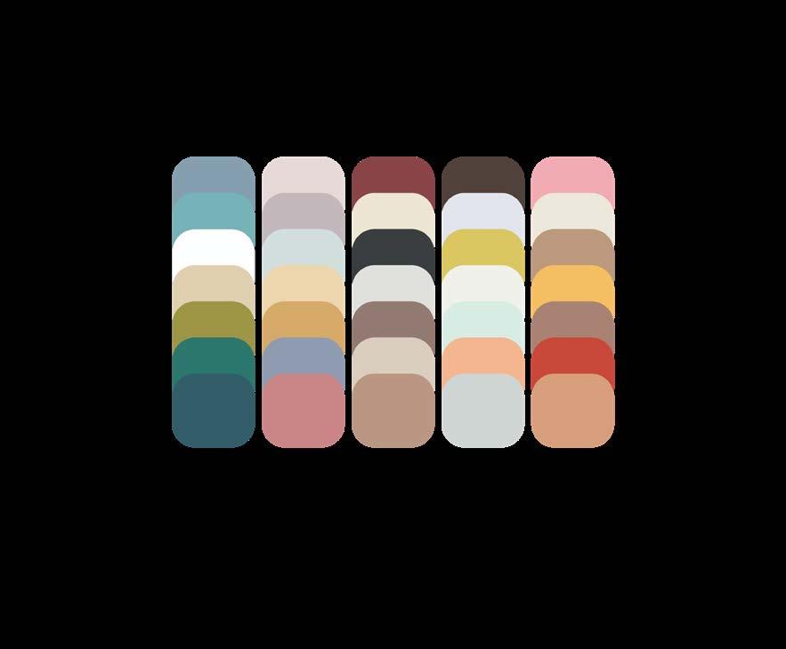
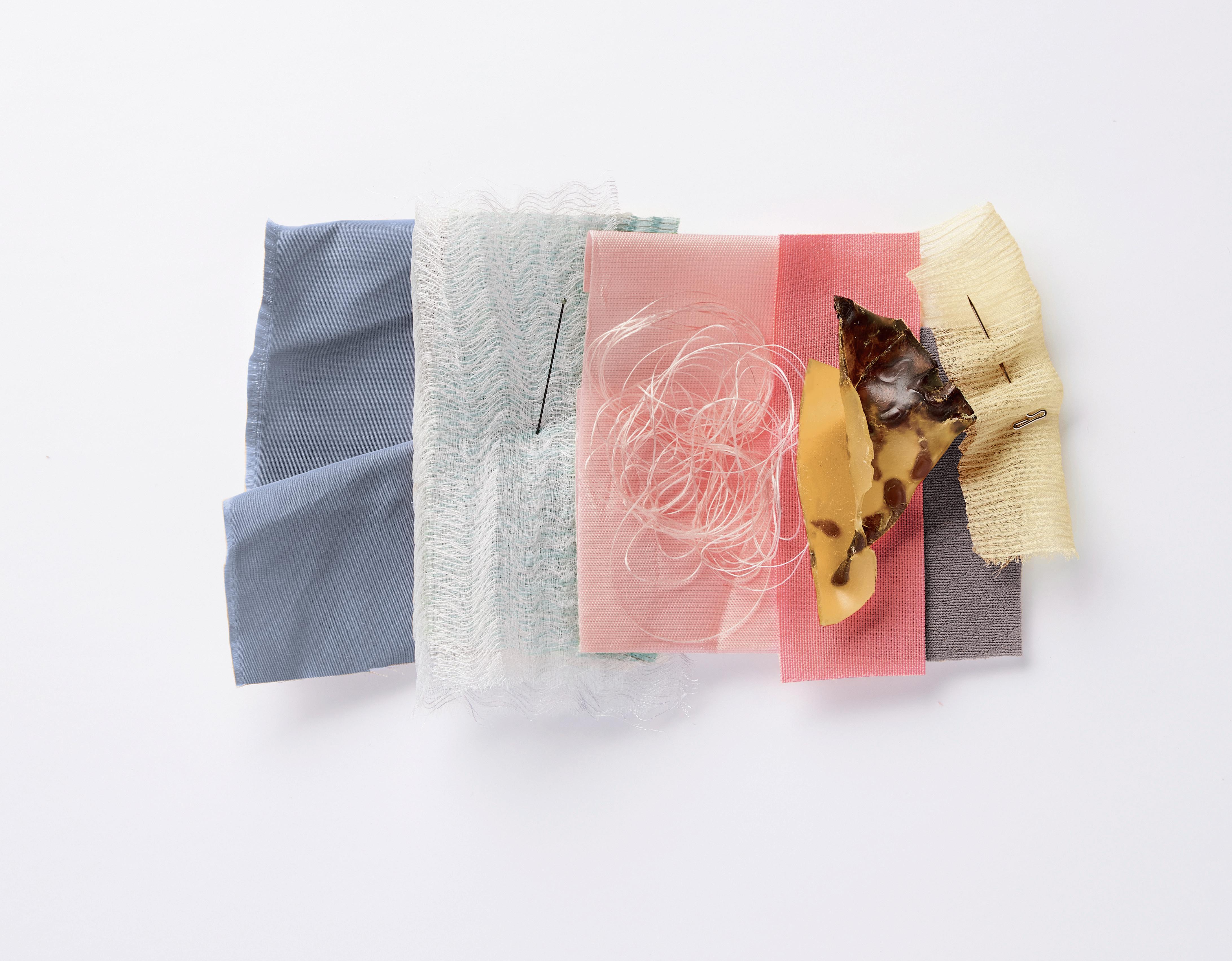
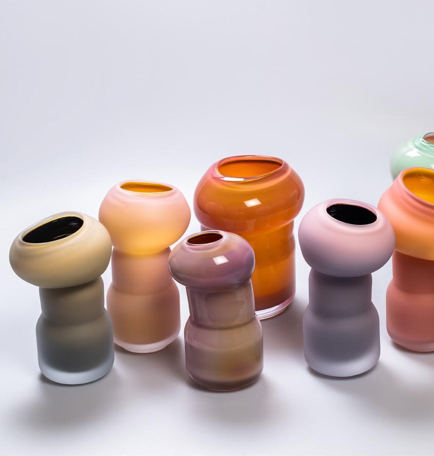
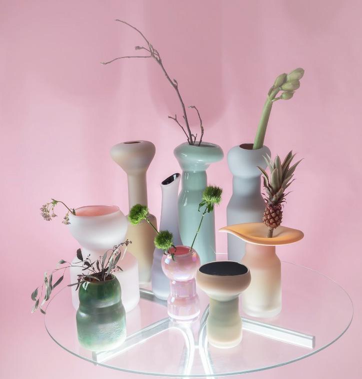
We introduce each palette with five key colors. These colors form your base. In combination with the supplementary colors found on subsequent pages, the key colors can be worked into various exciting stories.
This is where we add two supplementary colors to the key colors shown at the beginning of the chapter. These supplementary colors will allow you to develop, transform and individualize the core. We show these supplementary colors as additives to the color bar in thought provoking inspiration pages. Sometimes, different supplementary colors can take us in completely different inspirational directions.
We enhance our palette with harmony pages, where the key colors are presented in different combinations, transformed not only by those supplementary hues but by occasional colors chosen from other parts of the general color palette. Creating color mixes and harmonies is one of the great strengths of the Color Innovation Guide.
This is where we show you how product ranges can now be colored up using the various palettes to have a point of difference, but still work within a cohesive whole.
To complete our product we offer a poster as both a tool and decorations. This poster gives you a total overview of the 2025/2026 colors plus the idea behind them.

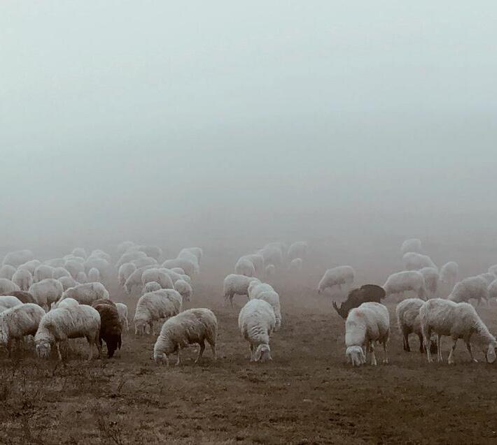
Before presenting our five palettes for 2025/2026, we look back to the Jazeera Paints stories of 2024 so we can see how colors have changed and evolved in the last year.
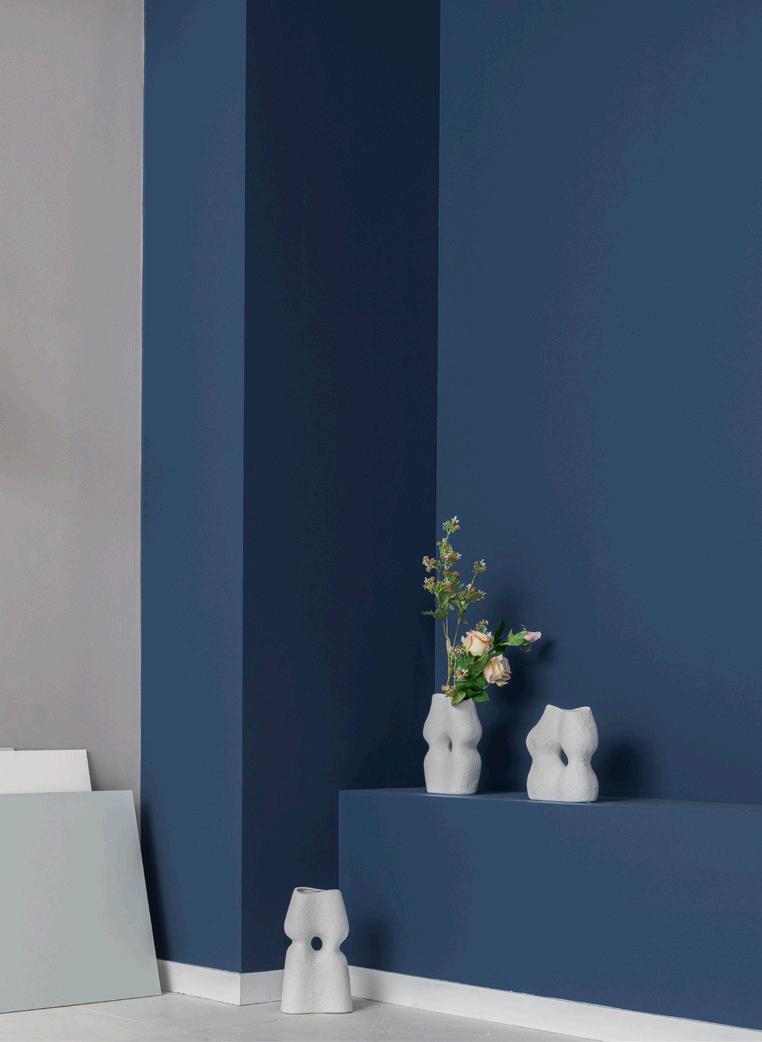
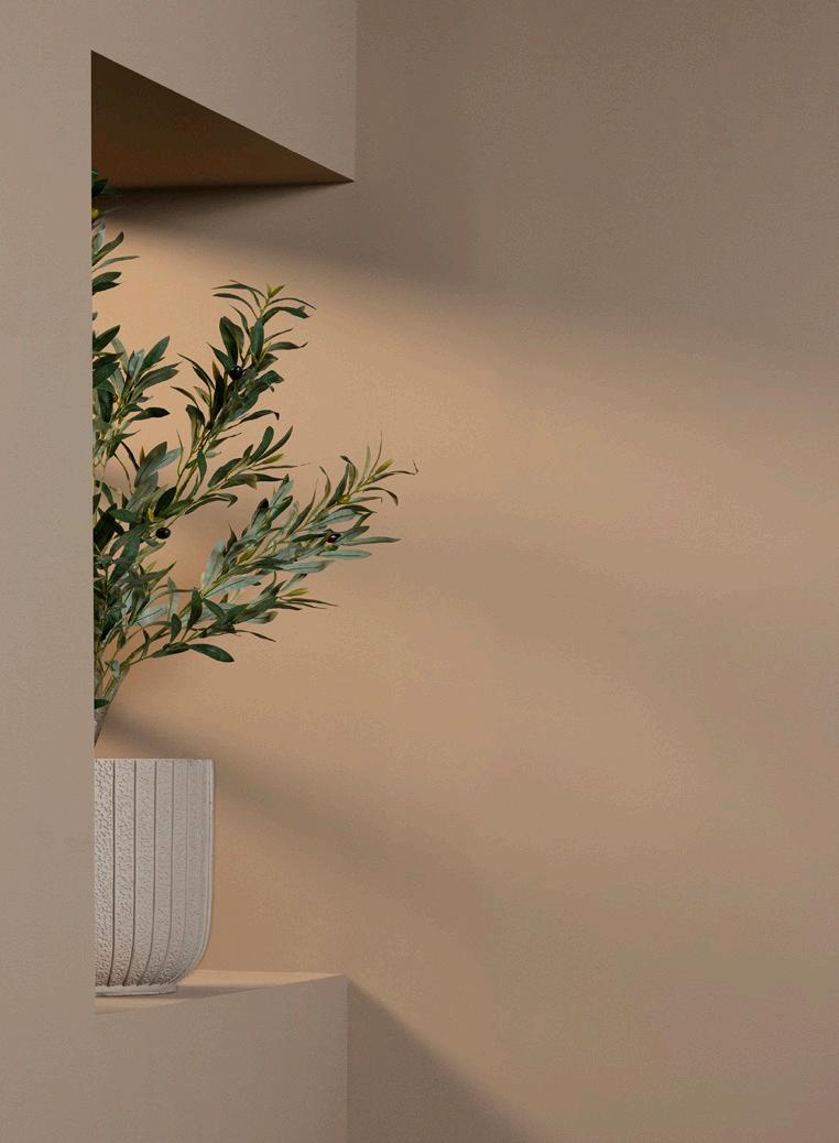
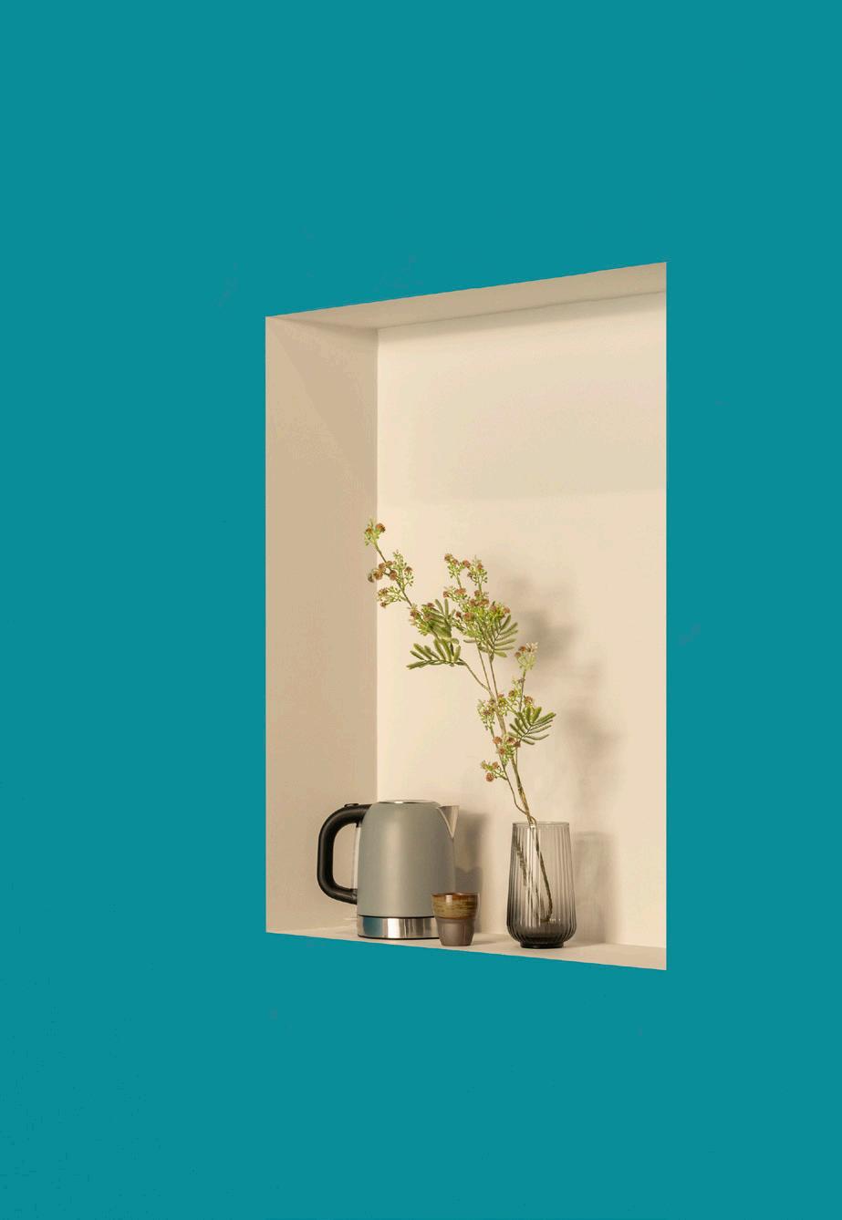
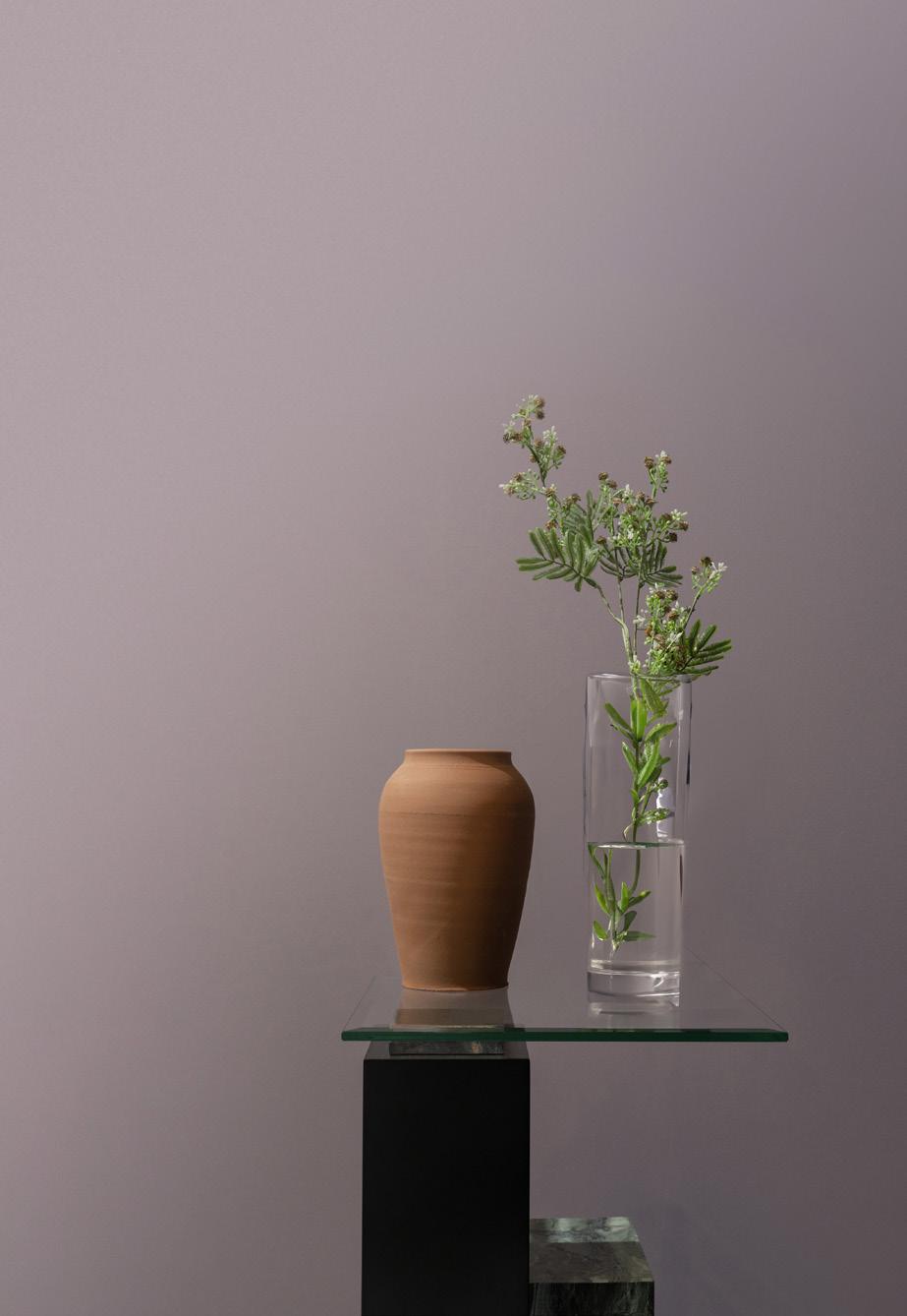
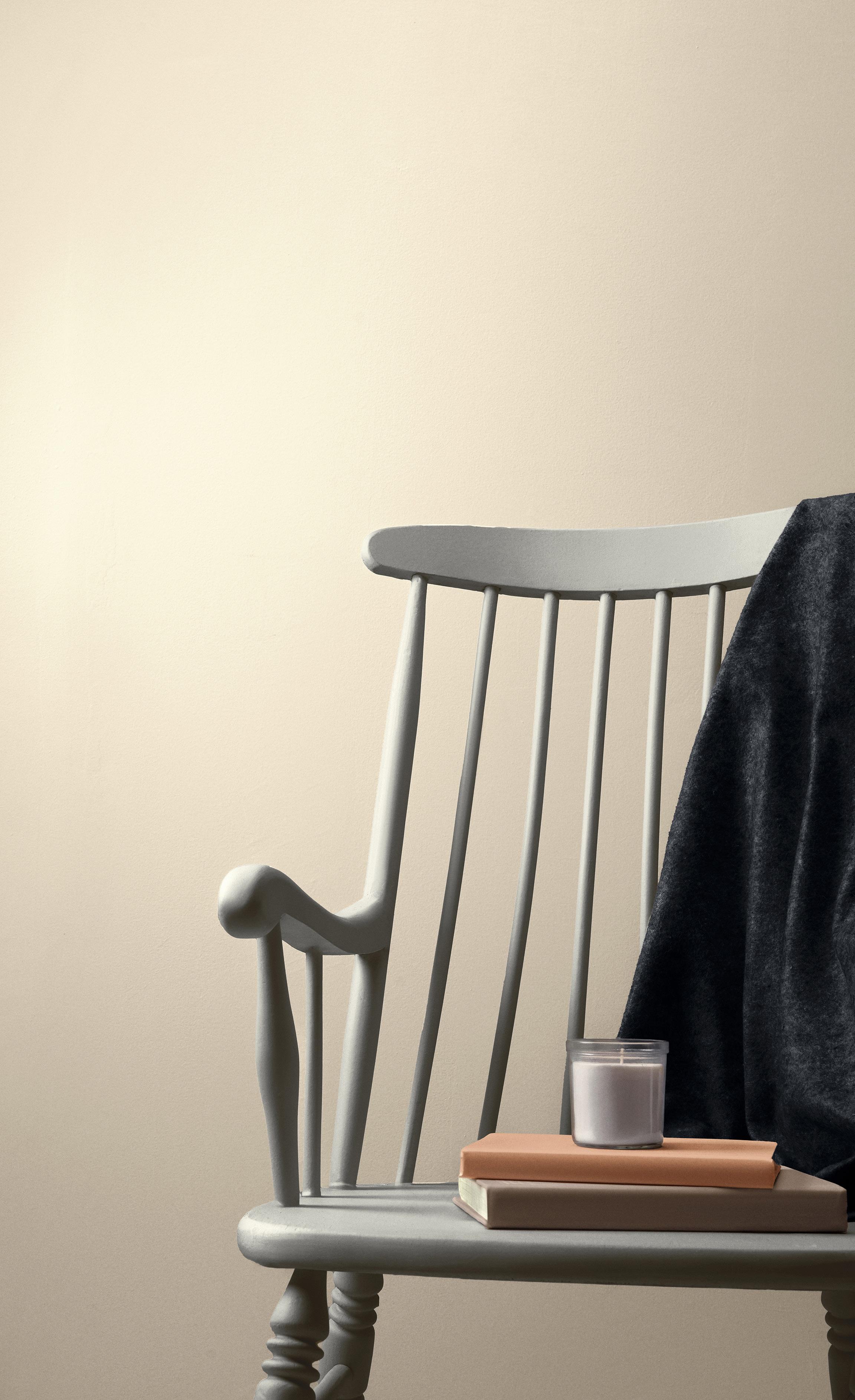
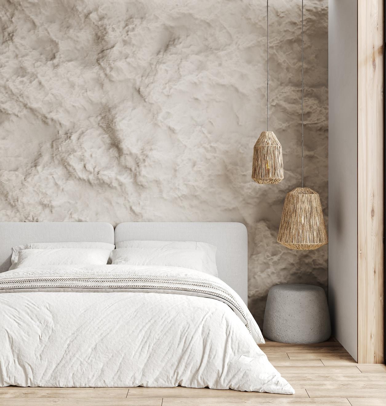
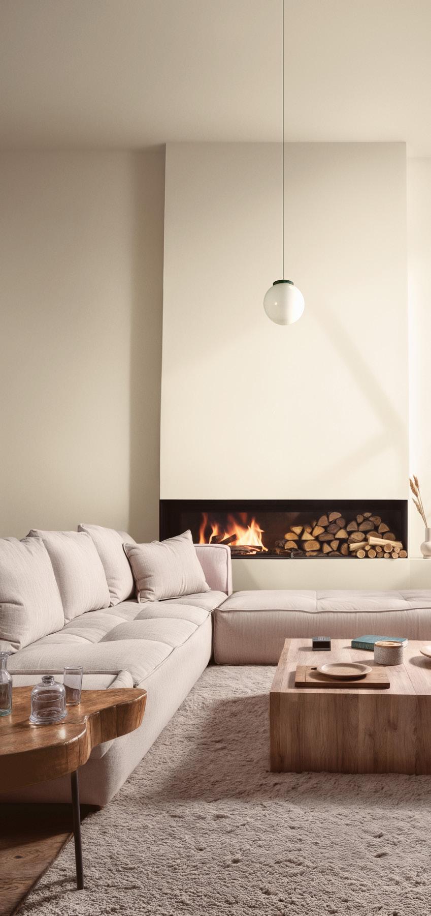
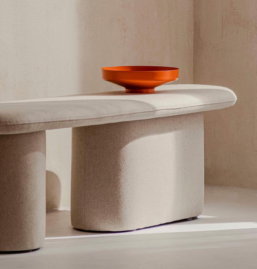
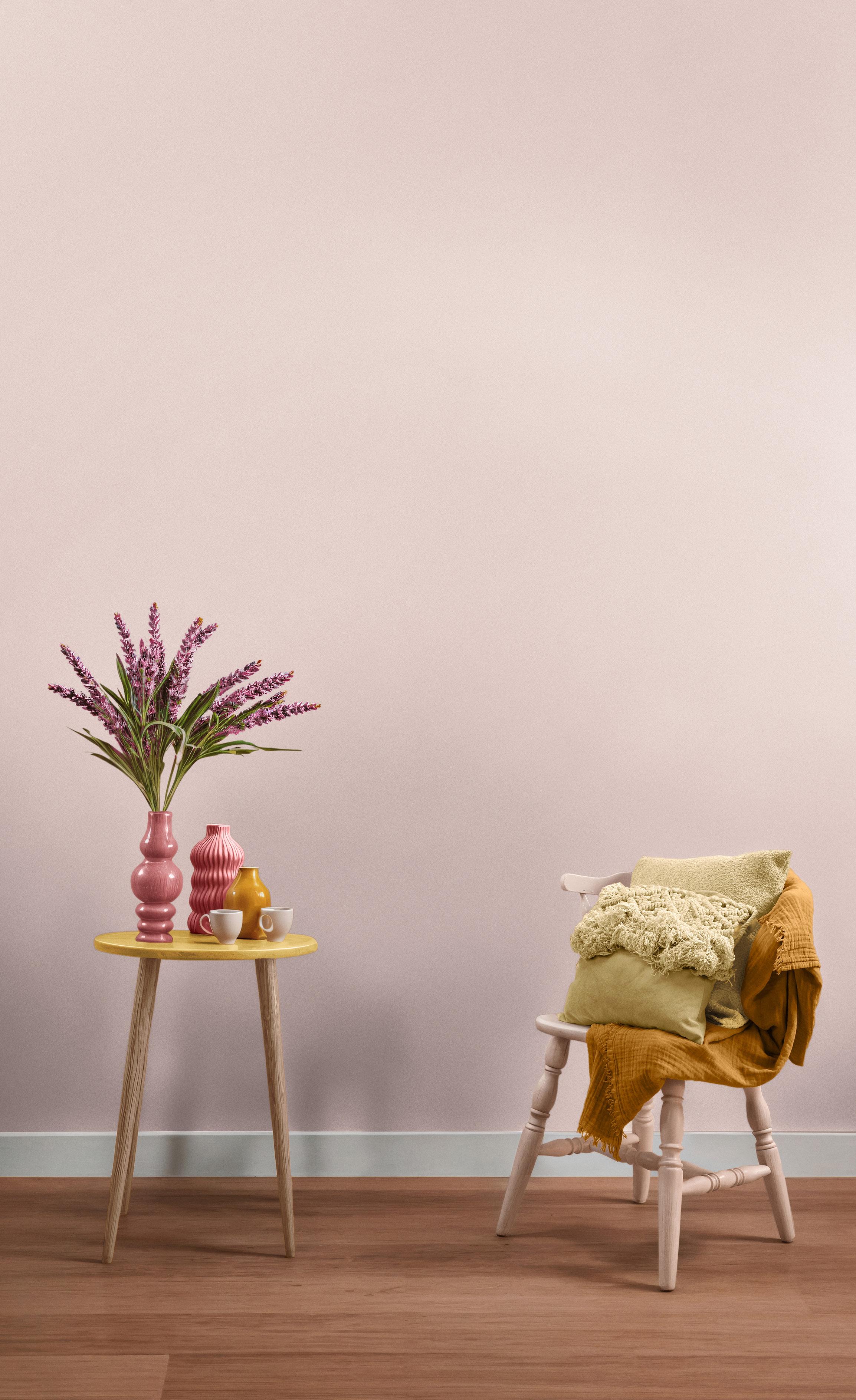
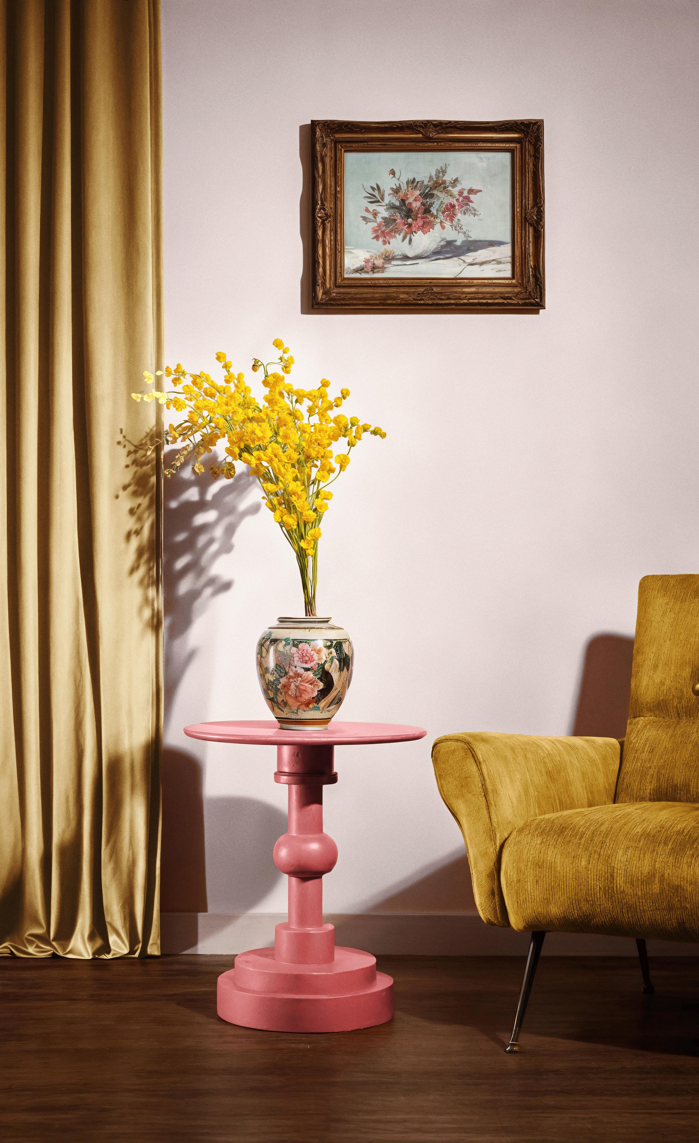
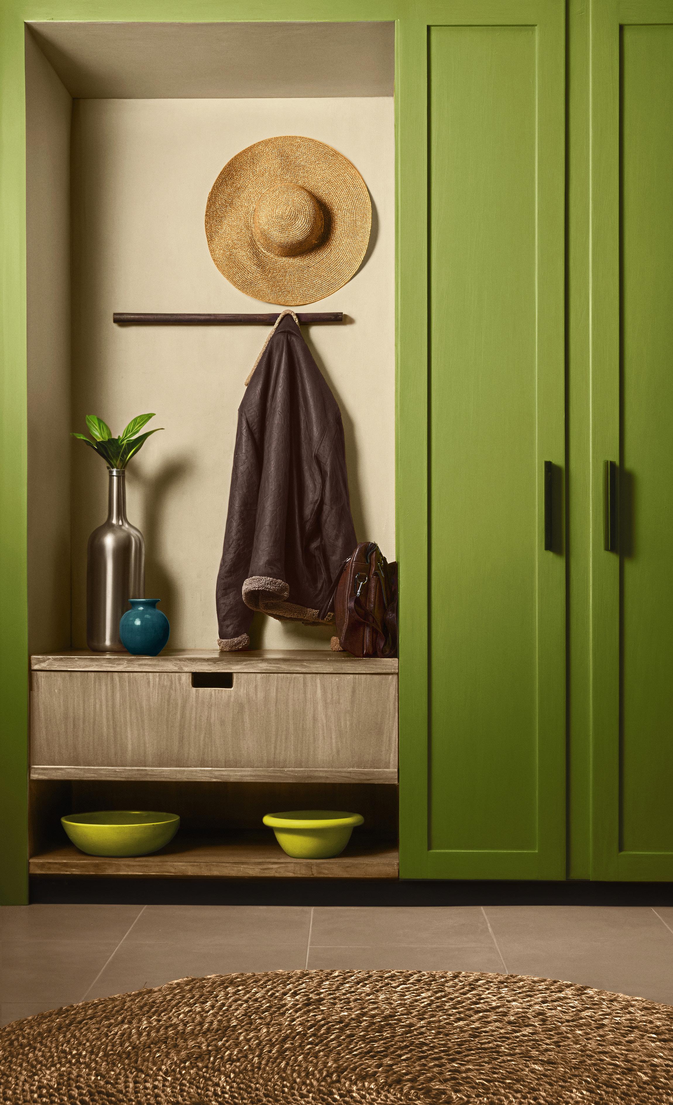
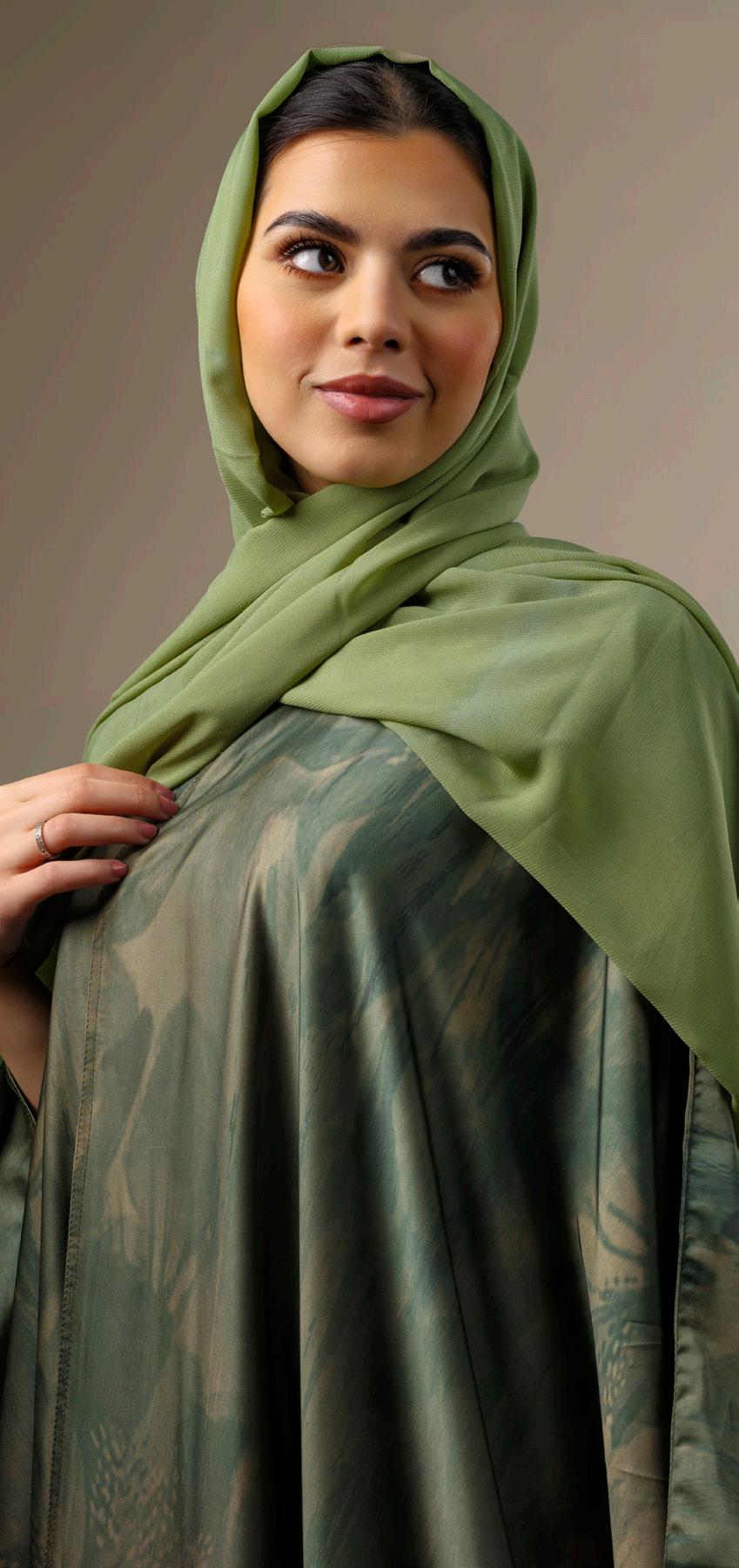
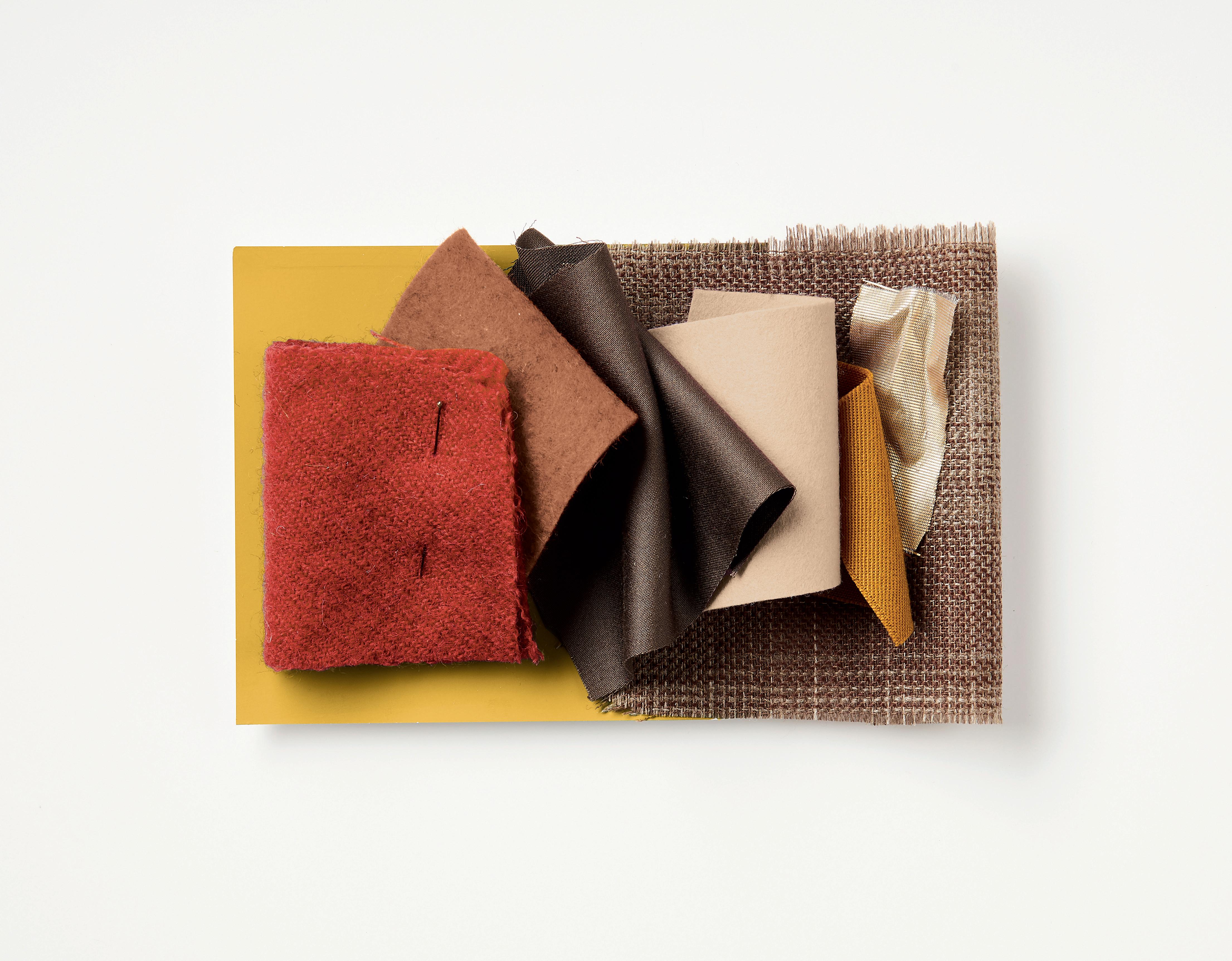
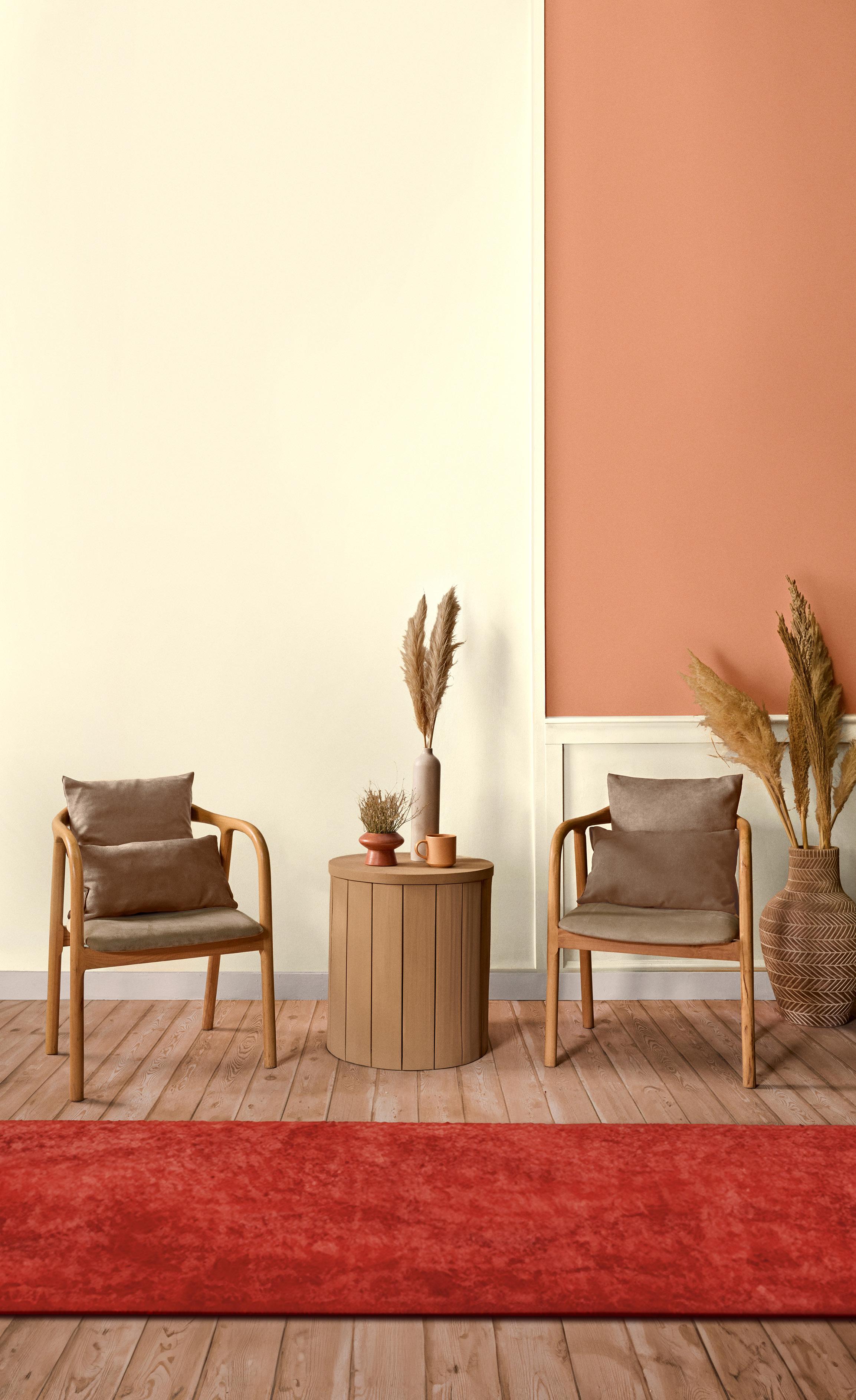
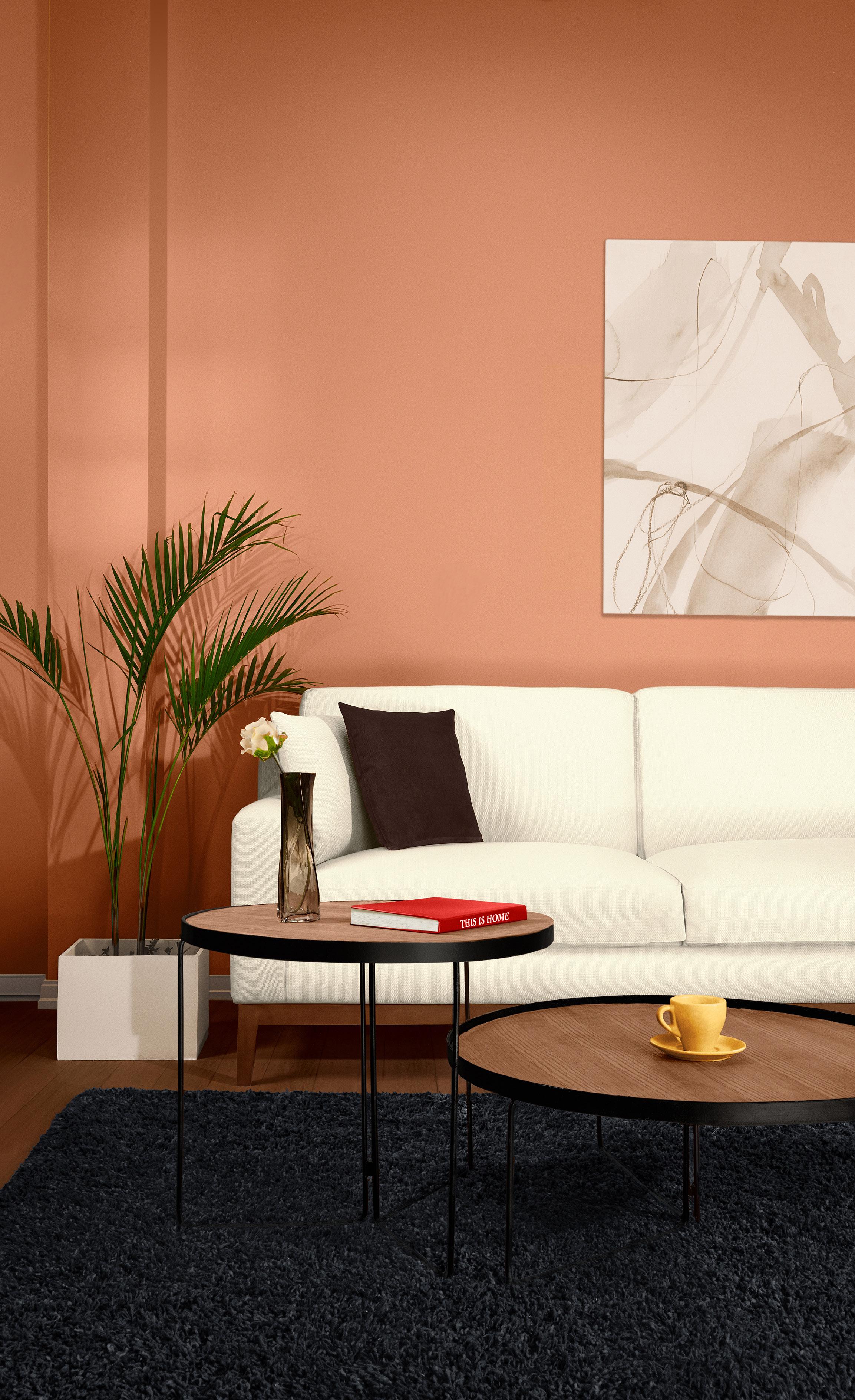
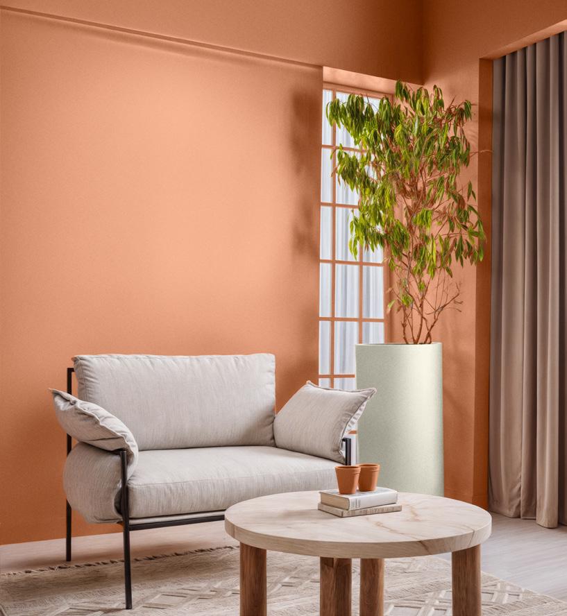
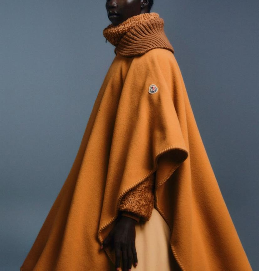
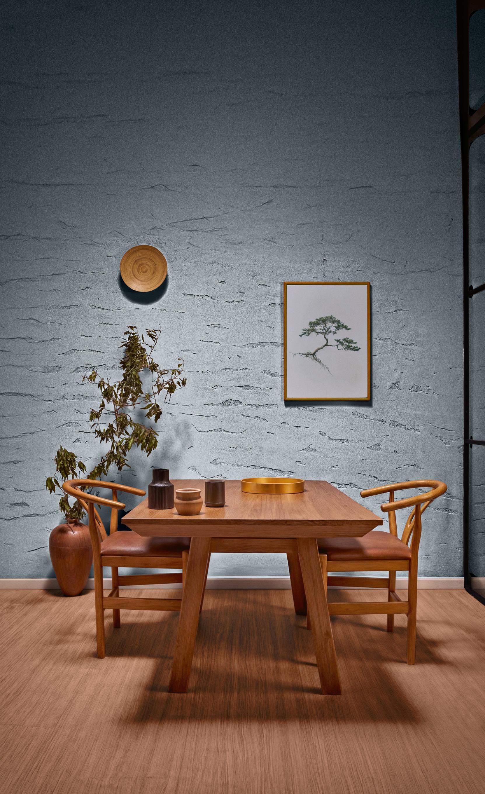
Playing into our desire for colors whose recognition brings us comfort, Kinship is a palette of natural and honest hues.
6 Look Back 2024 26 Intimacy 74 Color Families 62 Unwind
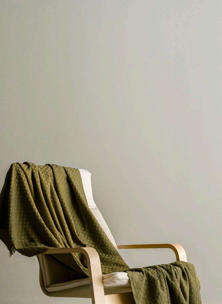
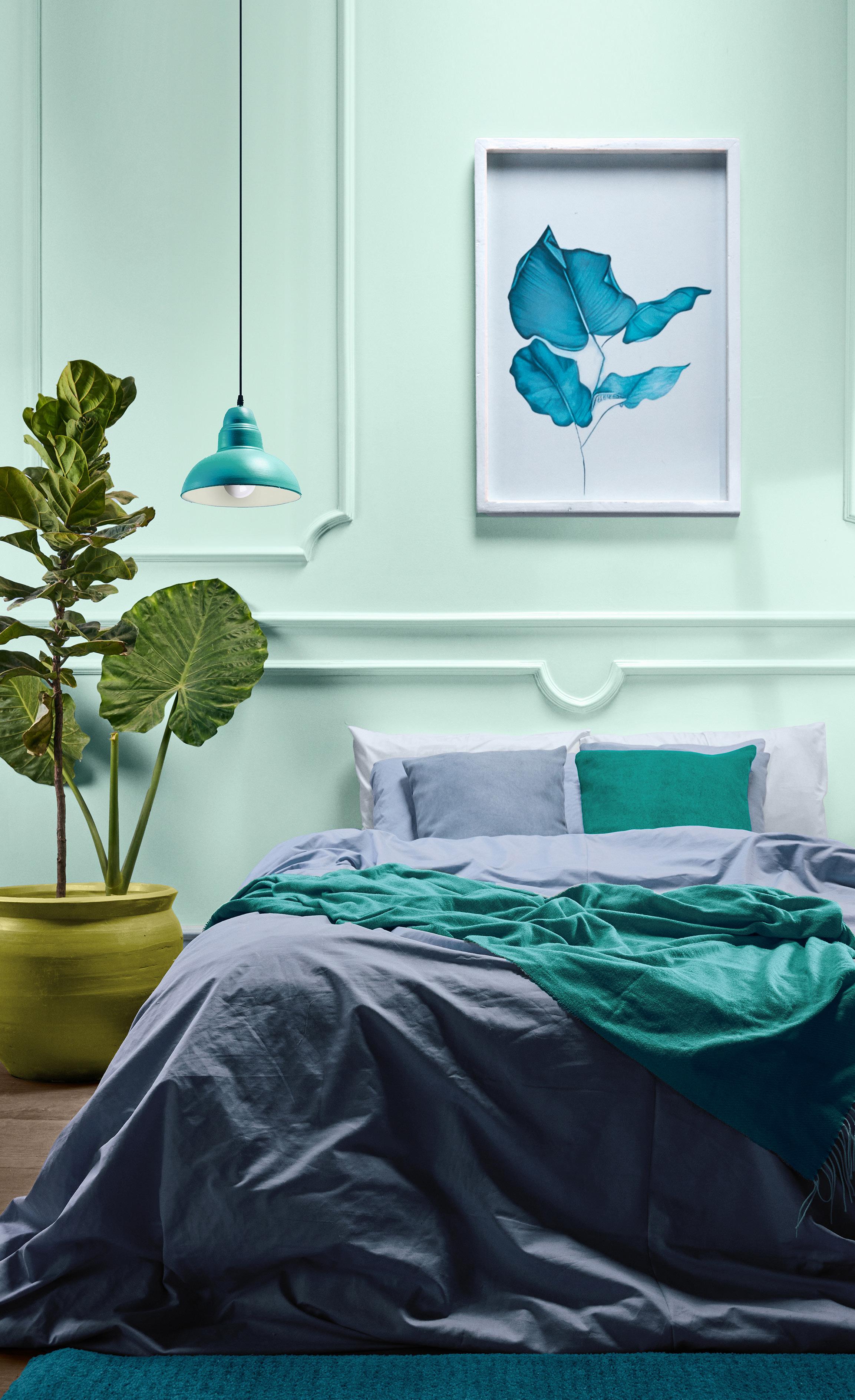
Intimacy is a color story that reminds us of the comfort of home and the importance of human contact and the familiar.
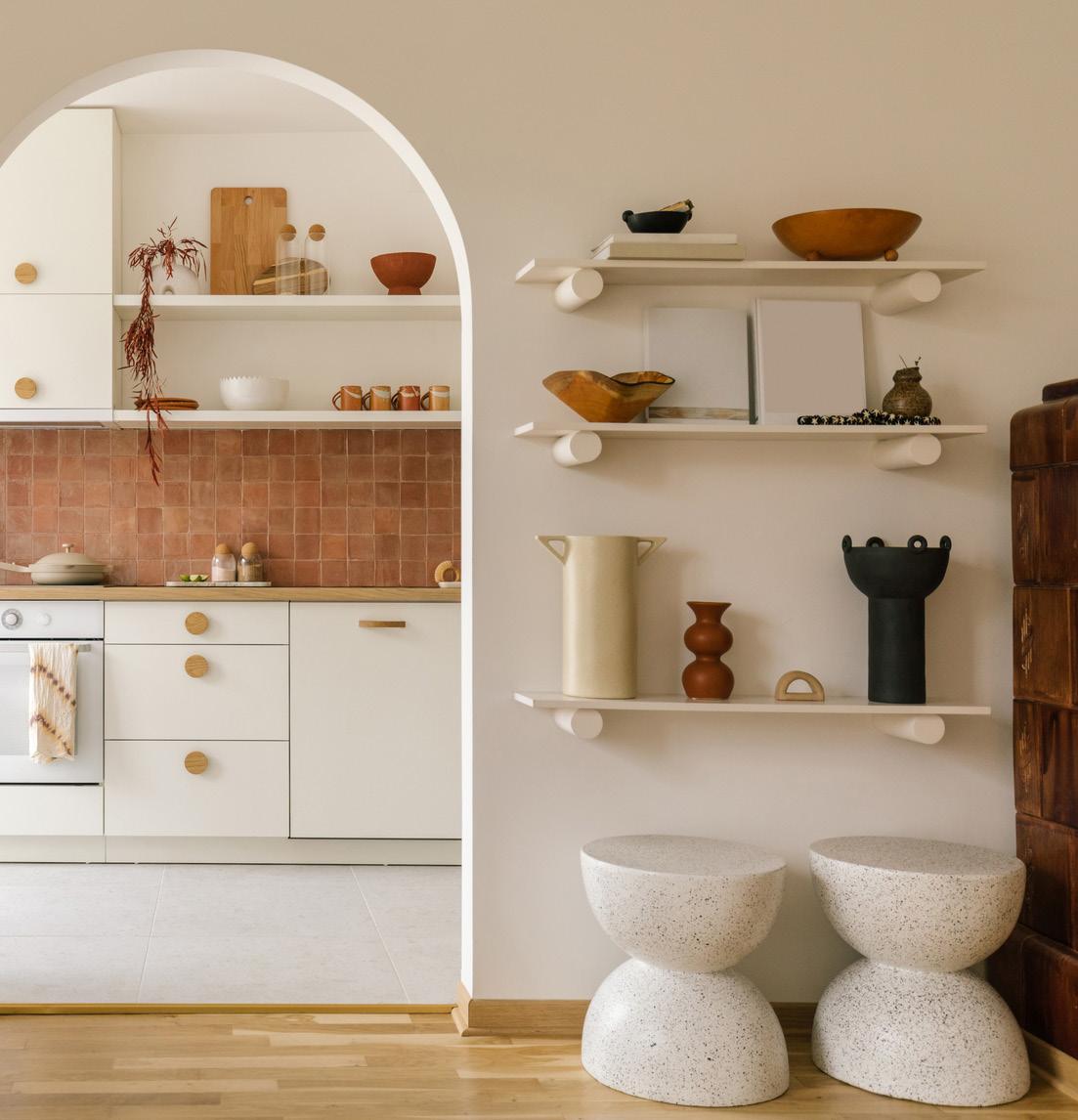
50 Community
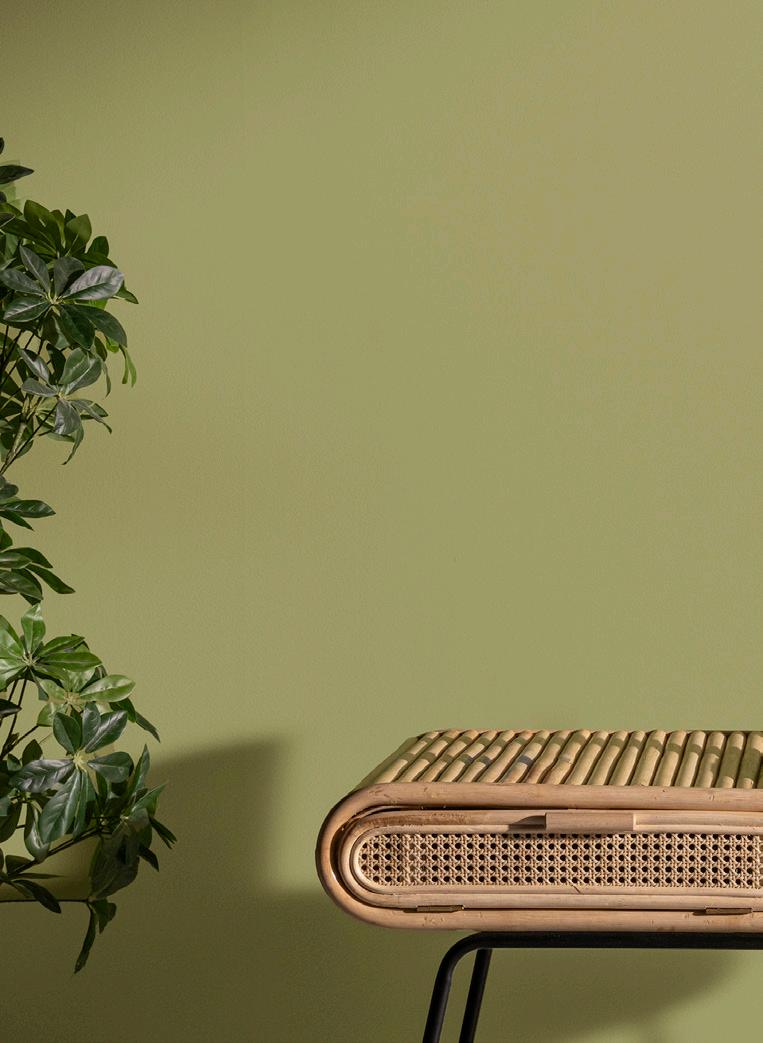
The understated yet refined hues of ‘Community” combine functionality with beauty in a contemporary approach to simplicity.
38 Haven
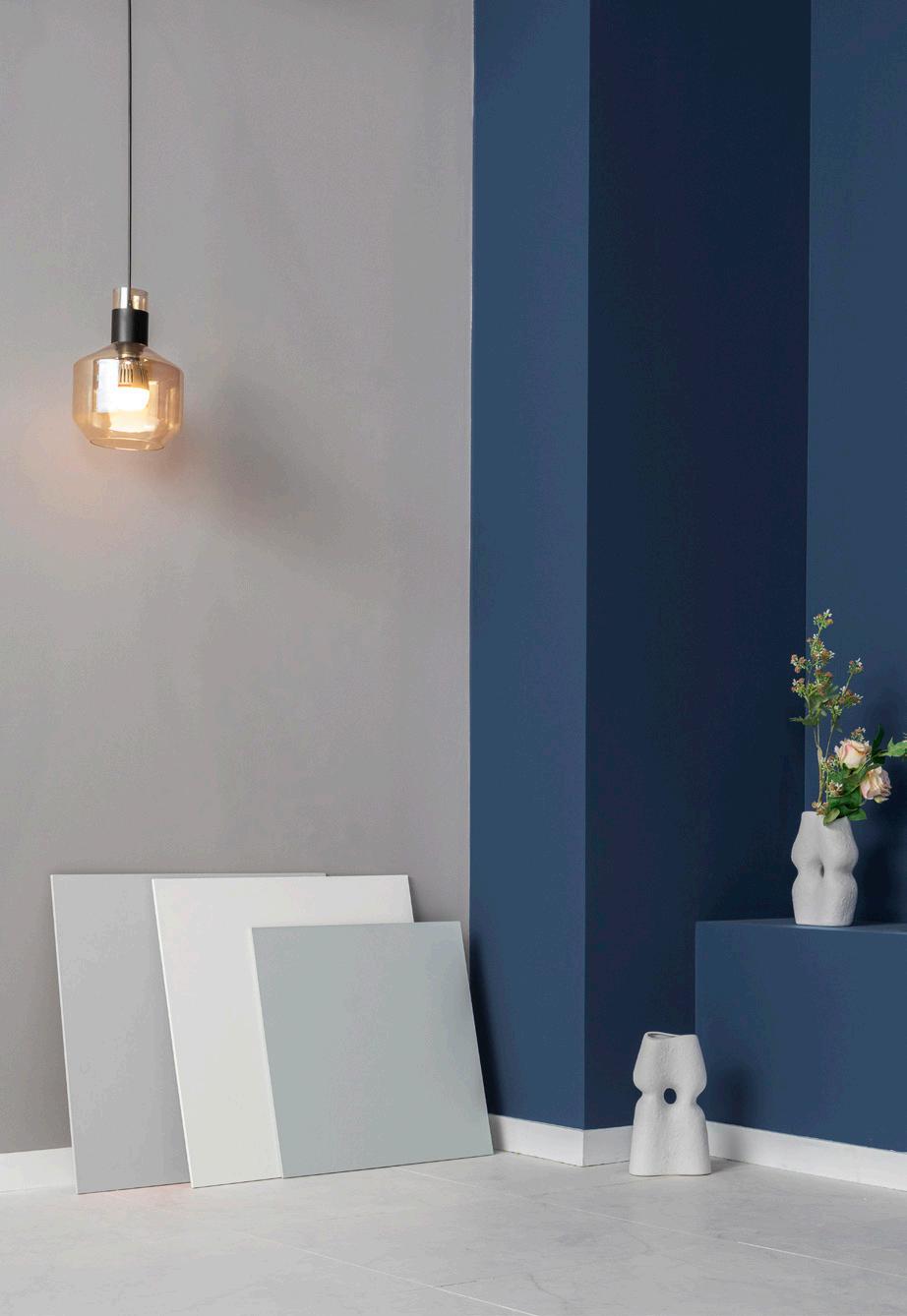
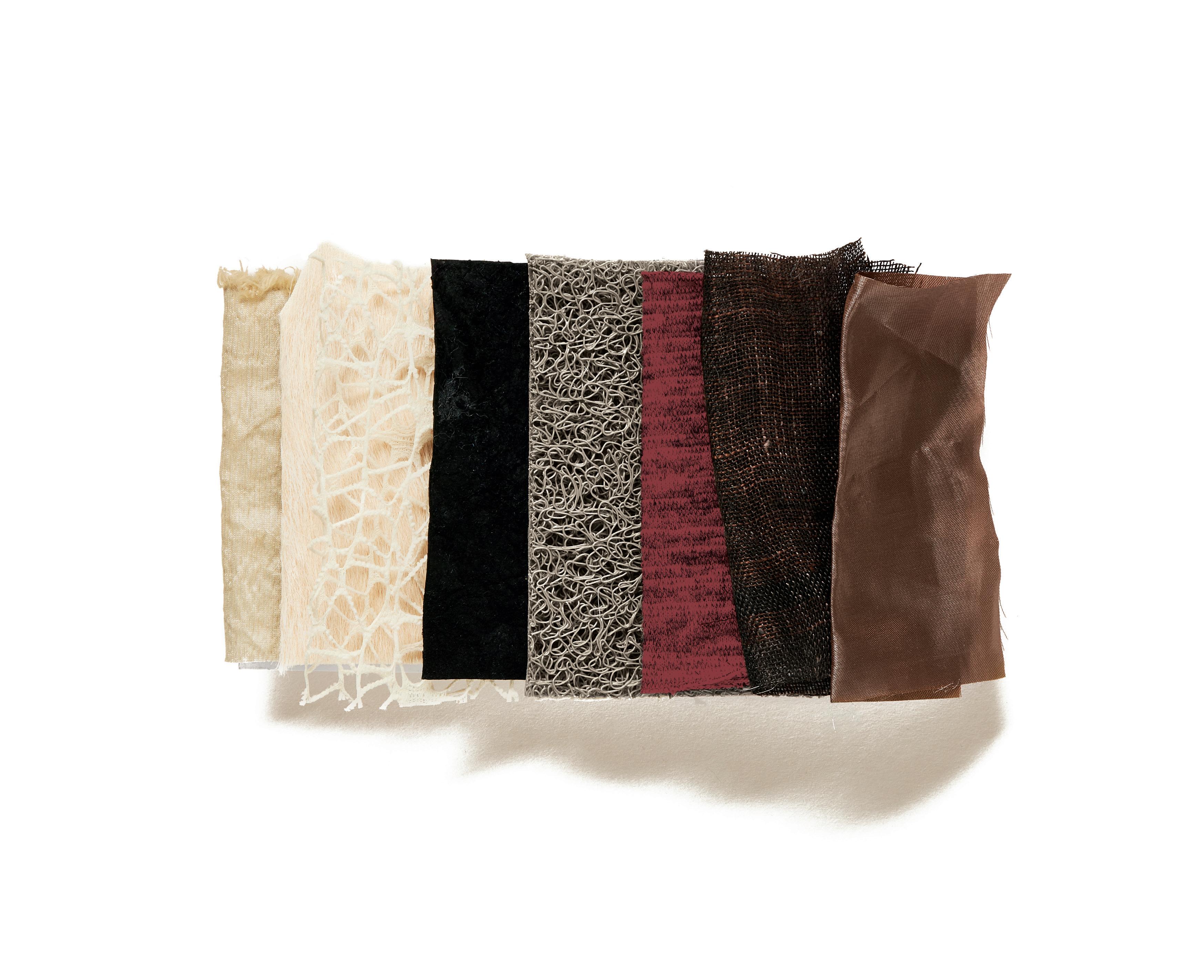
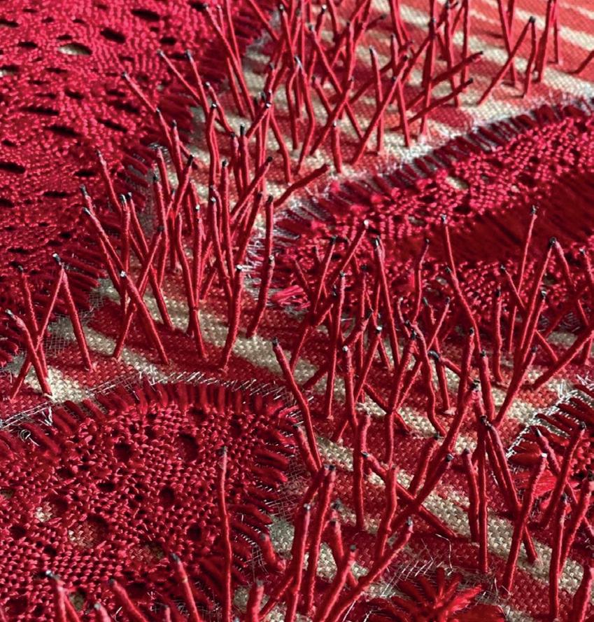
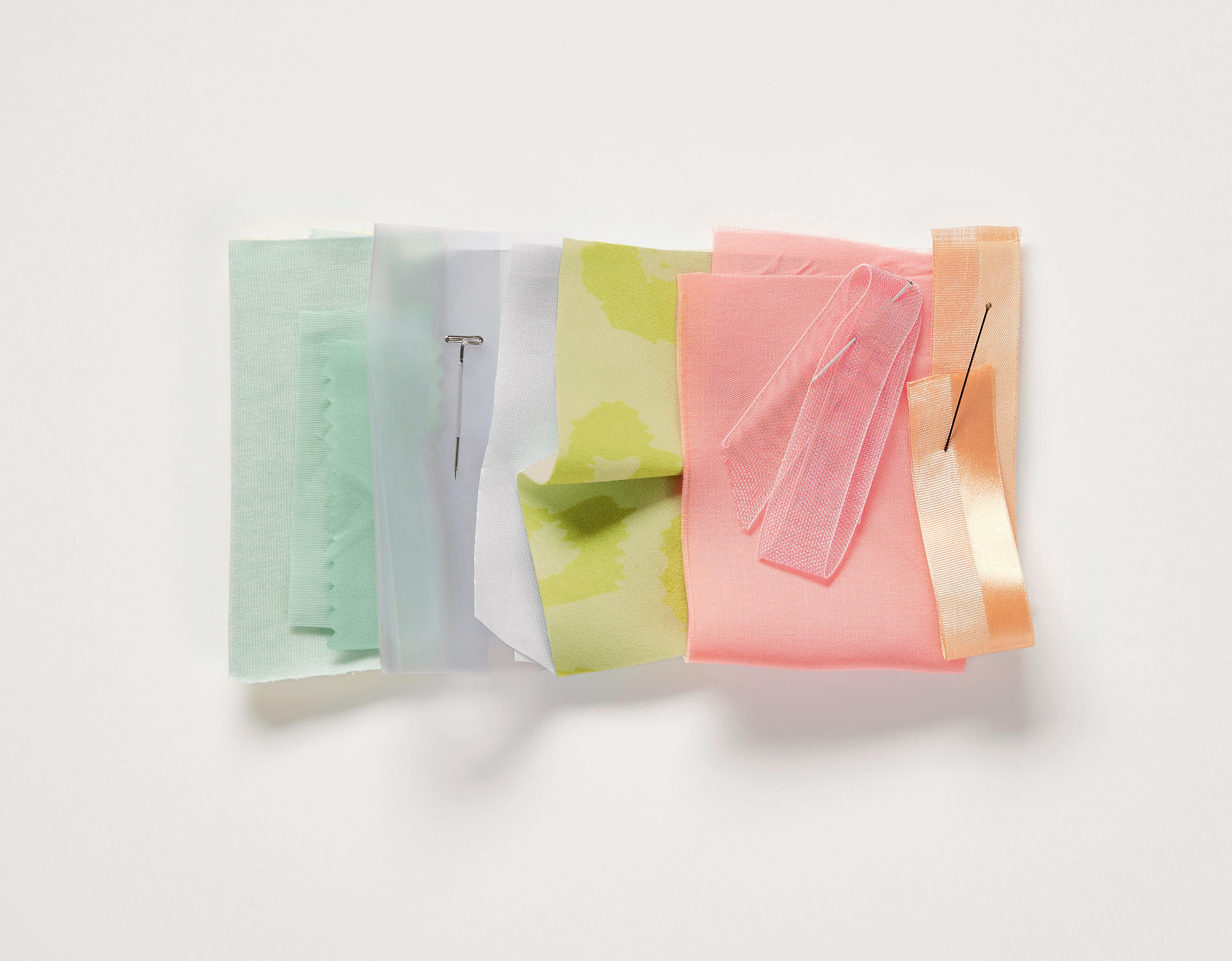
Alongside our palettes we suggest important textures and finishes to accompany and enhance the colors of 2025/2026. 14 Kinship
An optimistic and upbeat palette of aerated hues that awakens the senses and displays a carefree style that encourages us to relax and unwind.
We take the colors from our five concepts and regroup them by families: neutrals, browns, blues, greens, yellows, reds and pinks.
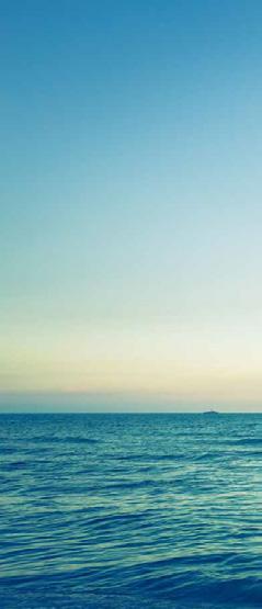
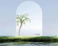
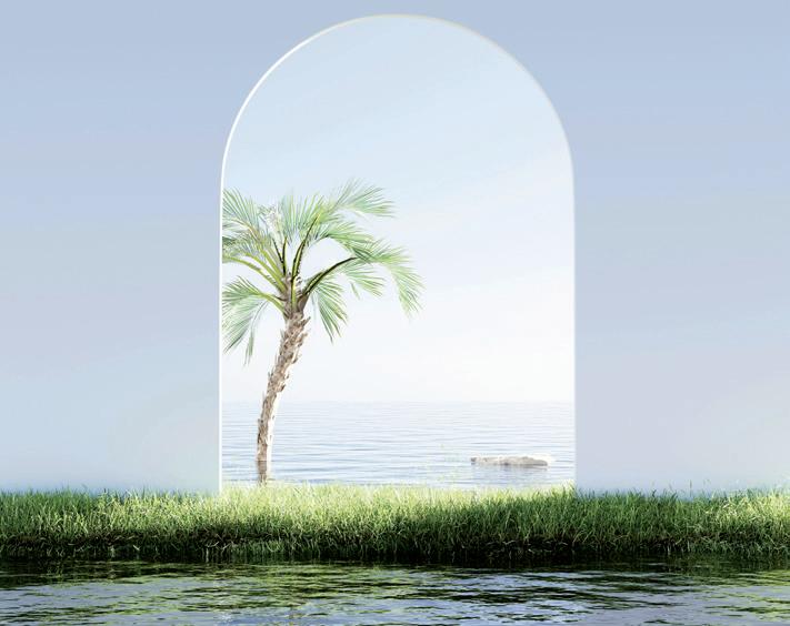
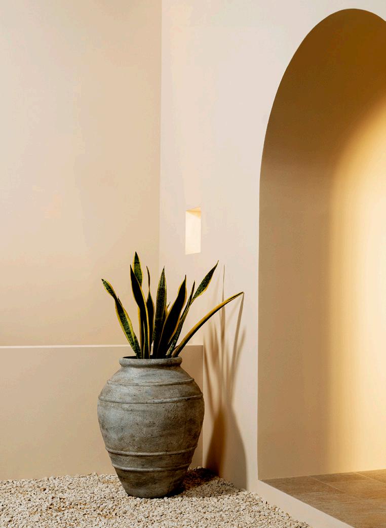
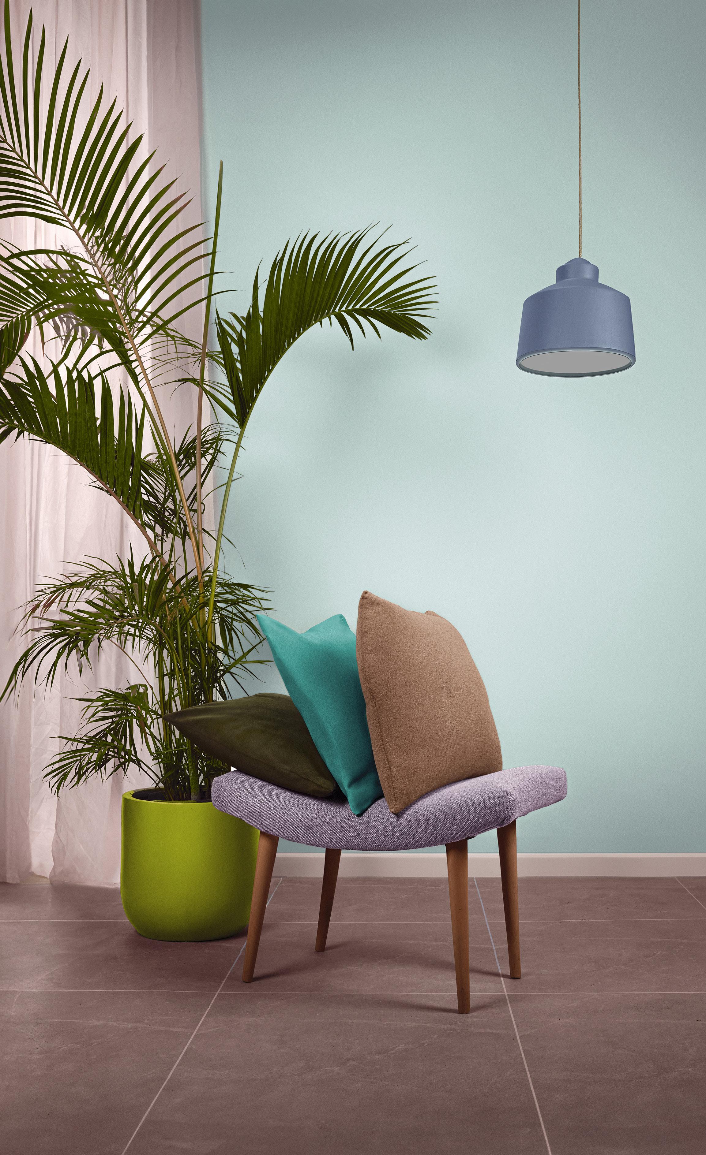
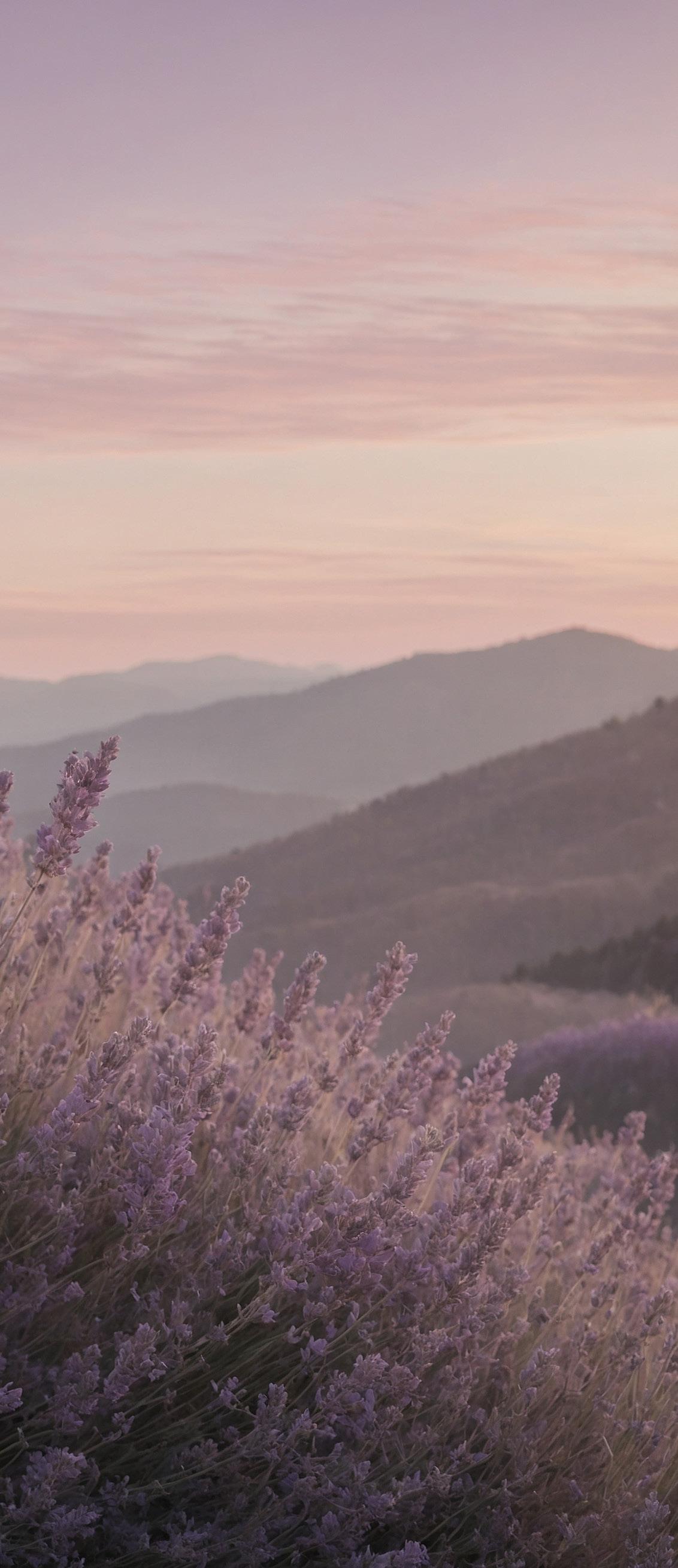
Haven reminds us how the colors of nature offers us a place of respite, an oasis and sanctuary from the cares of the world.
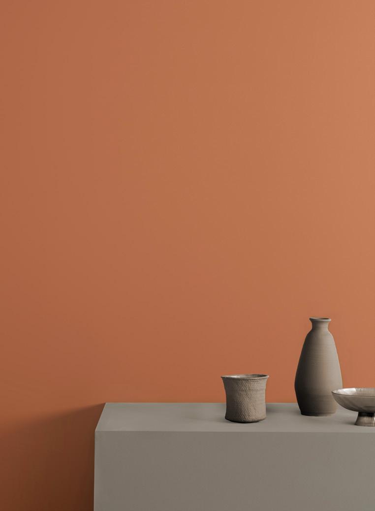


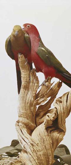
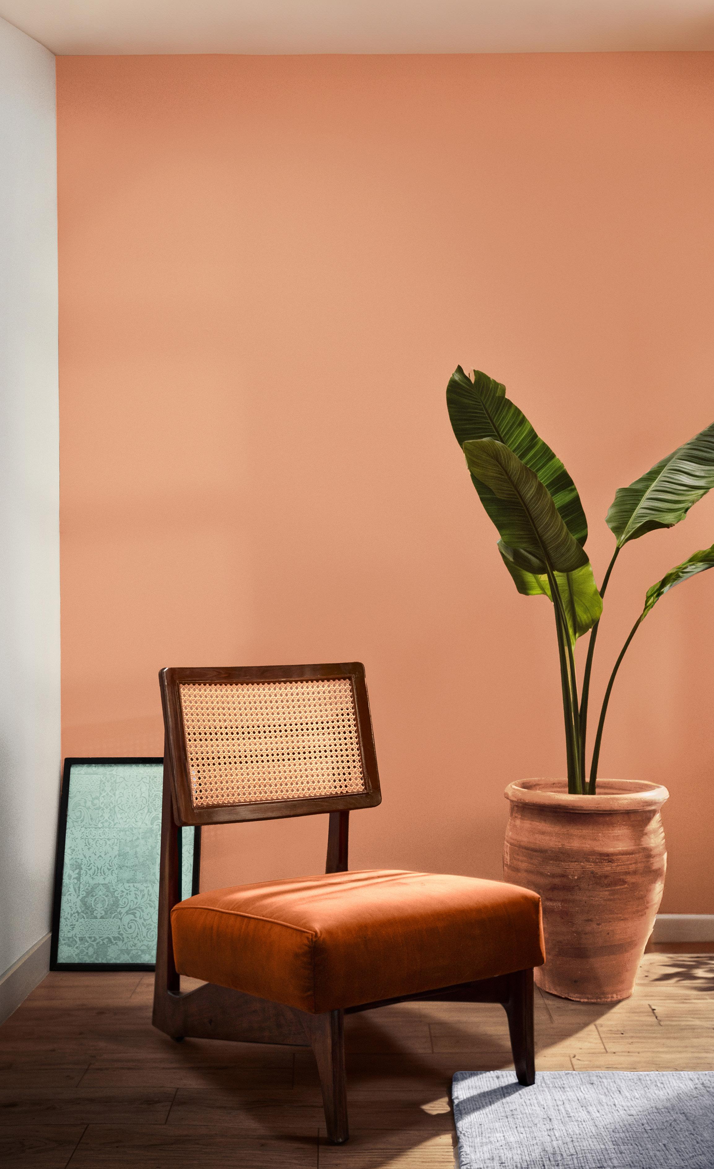
Inspired by our antique history, we created a palette of vibrant colors laden with contemporary civilization meanings, each color shade narrates the story of heritage and spirit derived from our authentic culture.


A beautiful blend of brilliant colors imbued with openness and renewal, creates a safe space and paves the way for living moments that drive us forward in a reassuring spirit.


We derive from nature colors that inspire us with a sense of sustainable health, nurturing our souls, minds, and bodies with an essence grounded in comfort and gratitude.


We select from the meanings of healing and renewal a palette of colors that solidify our connection to our spirits, implanting within us a sense of refreshment and balance.


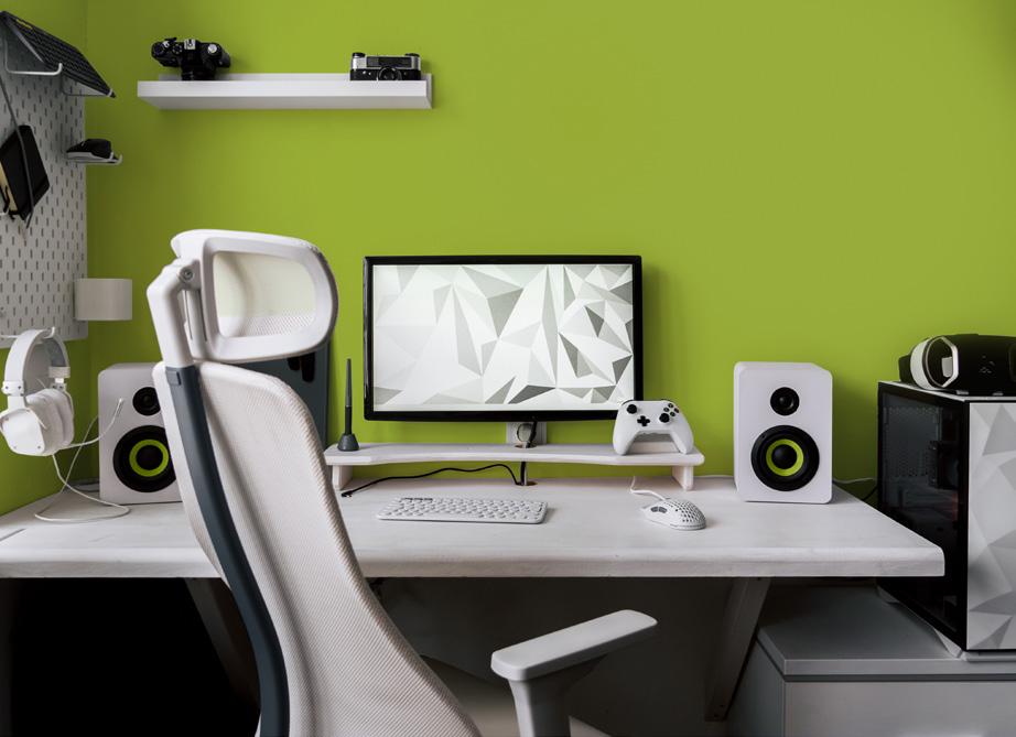
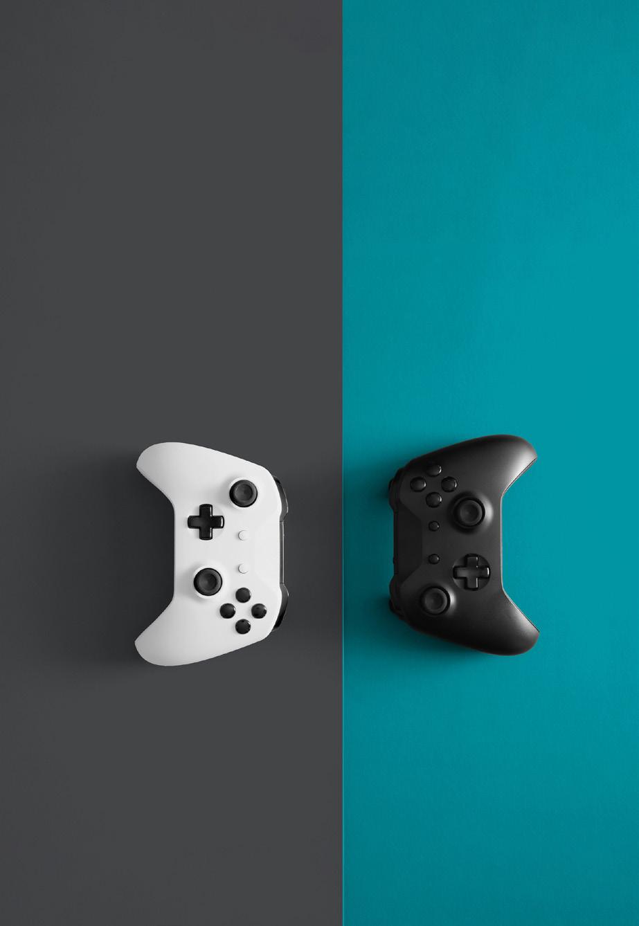
From the realm of gaming and modern technology, we have crafted a palette of inspiring colors that transport us to inventive worlds, never cease to amaze us.

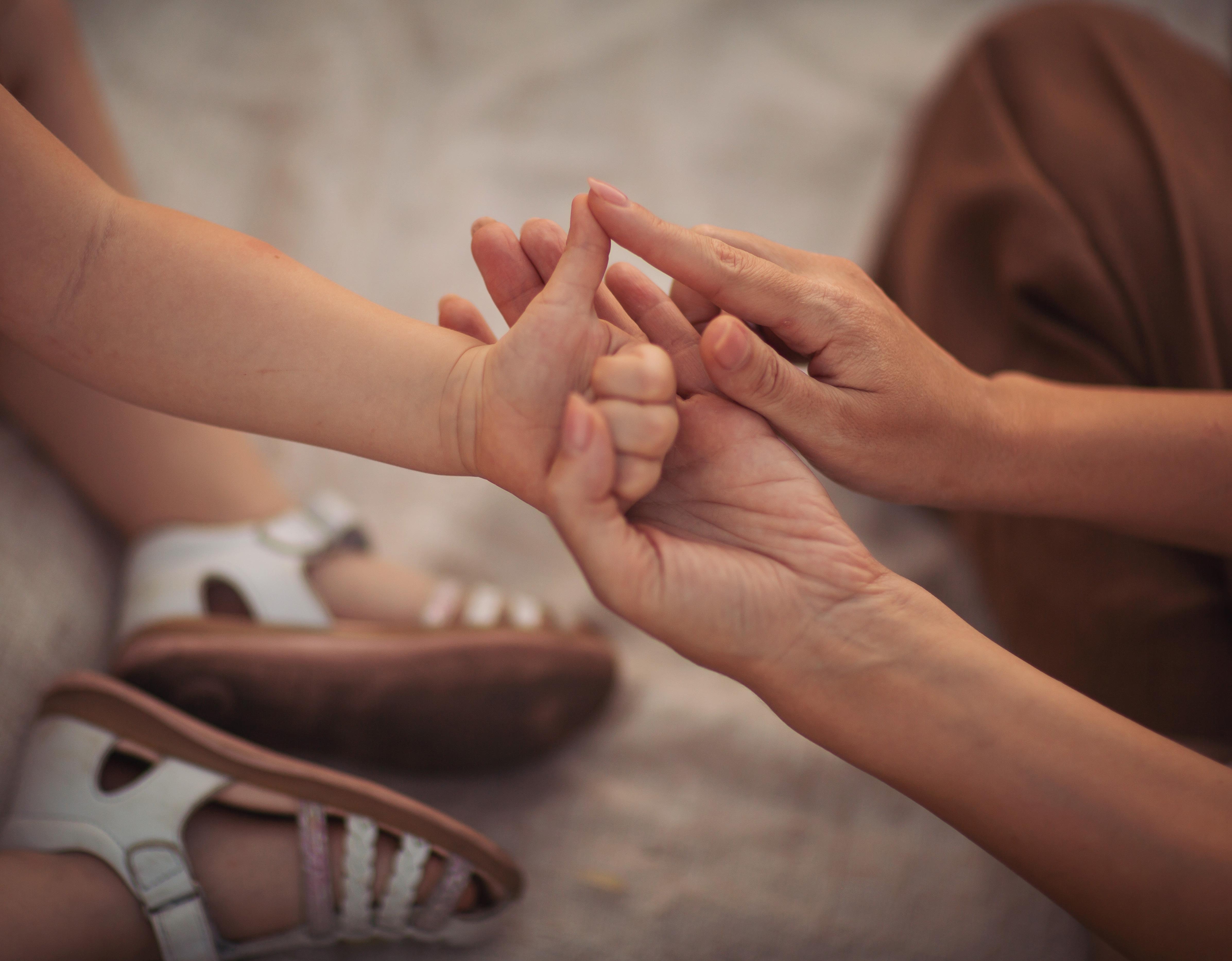
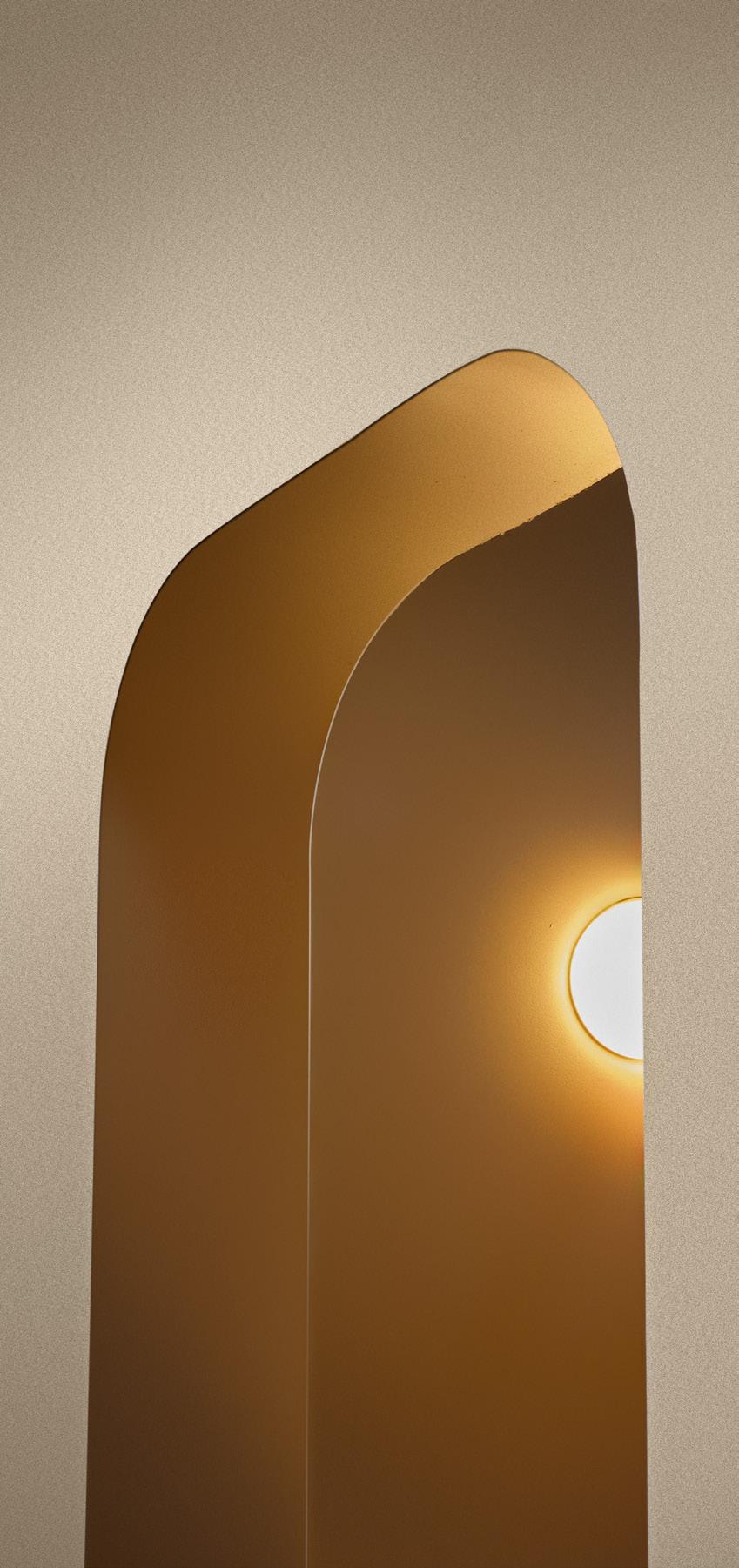
The concept of connection taps into our most basic primitive instincts. It speaks of communities and teams. It also implies a space or relationship where something is shared, a place where there is a link that harmoniously brings together different elements of a group. The idea that we are all part of something larger is one of the most needed and appreciated feelings we have at this moment. Connection provides us with a state of balance and belonging. There is harmony in connection. Flowing at both an individual and collective level, the harmony we feel through connection is critical to maintaining equilibrium. Harmony and connection in color unifies all the disparate elements of a design helping to ensure the right mood is being set. While the paths to connection are many, they all center around our desire for balance and unity in our surroundings and the feeling of peace and cohesiveness it engenders. As we continue to redefine our style of living, connection and harmony have taken on greater importance for our spiritual and physical well-being.

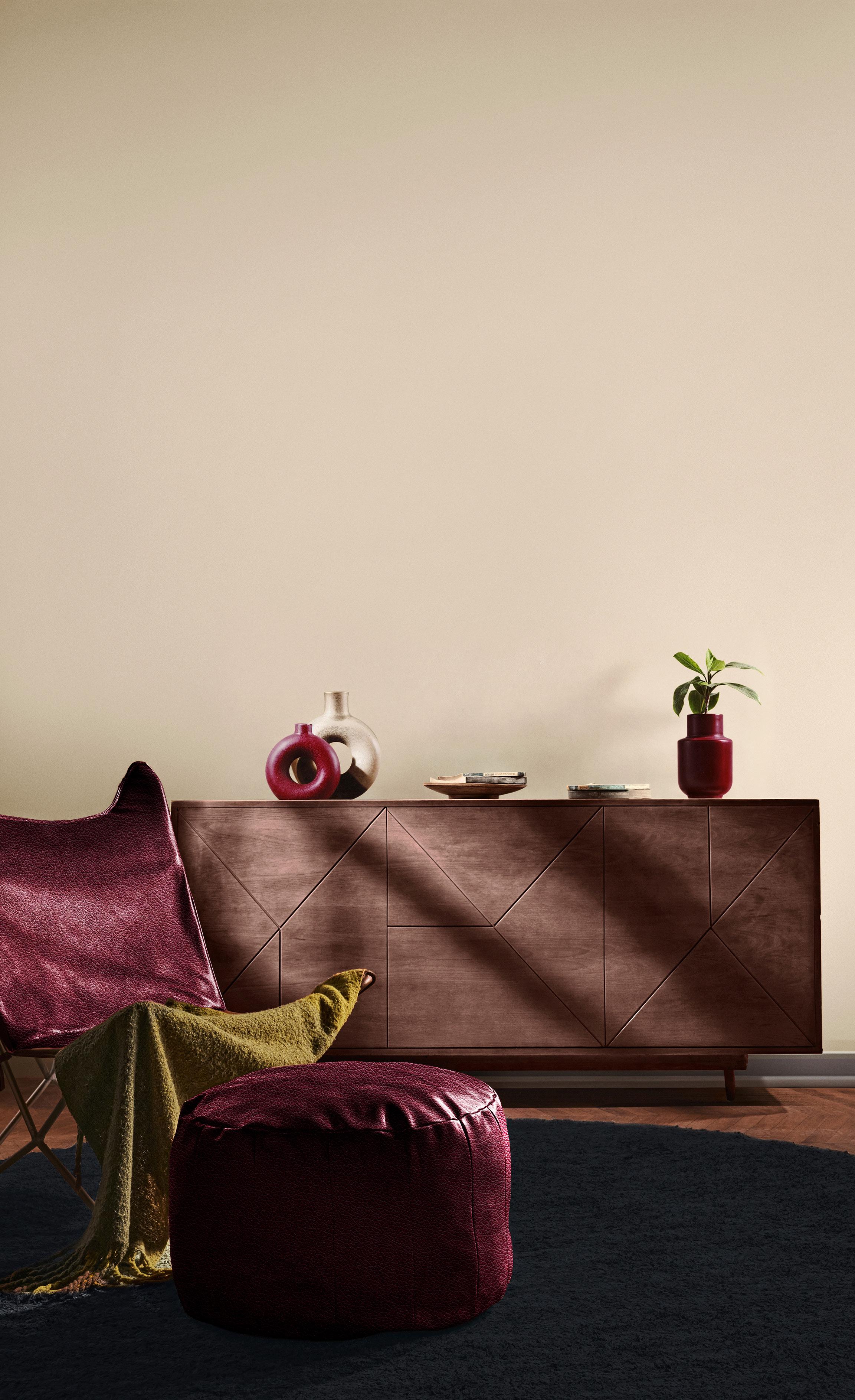
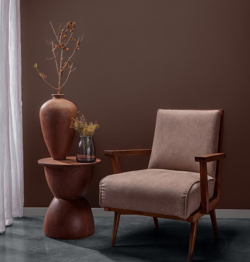
Setting a pace of simplicity without compromising personality, Kinship is a new way of looking at neutrals in the home. Bound by memory, lineage, and love Kinship means being part of a tribe and family that offers safety and time-honored traditions.
Tones of beige, cream and coffee browns provide a strong and versatile base layer. Extending our vision of neutrality, these essential elements of design operate within a core color range as well as become an elevated centerpiece.
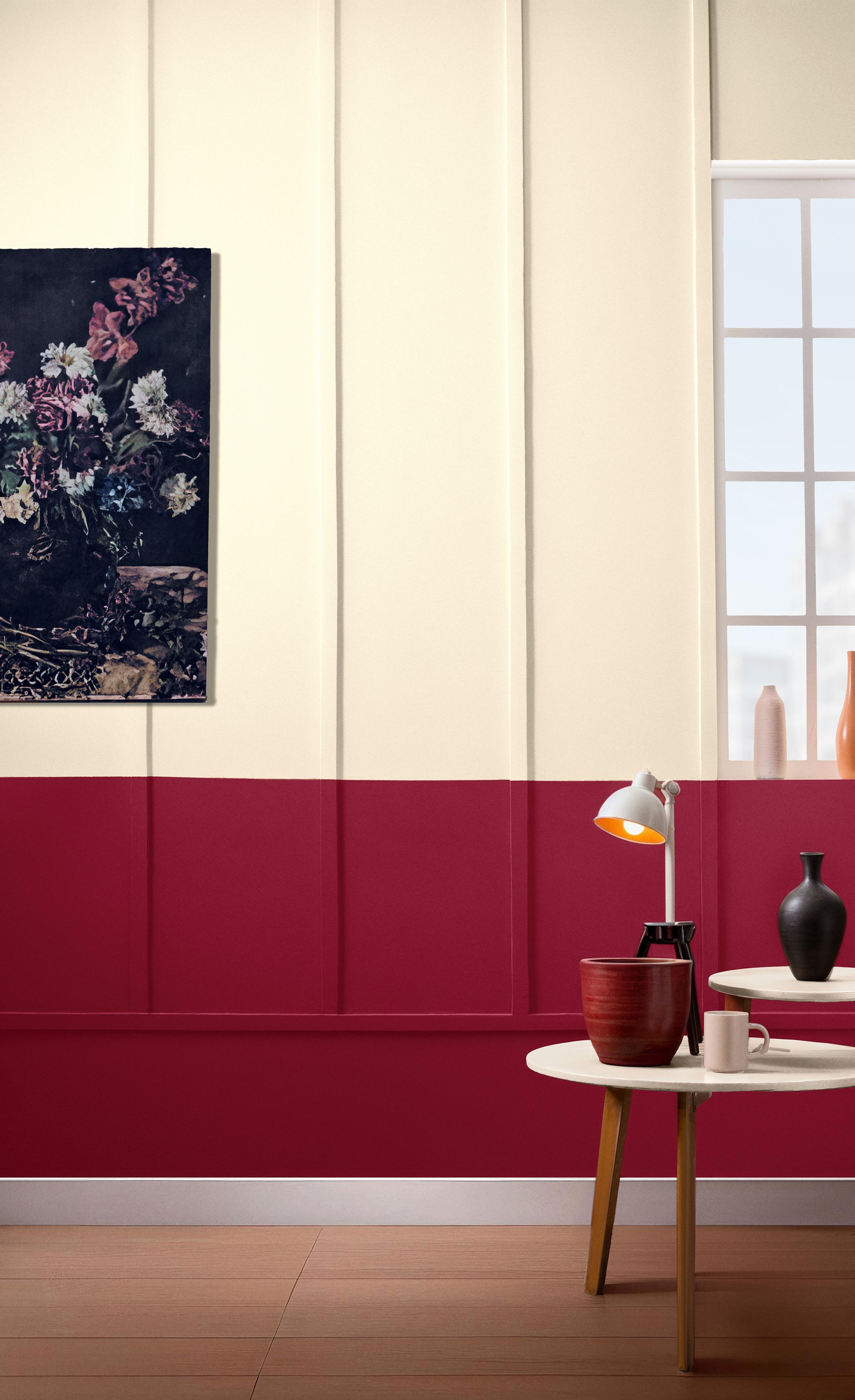
Playing into our desire for colors whose recognition brings us comfort, Kinship is a palette of natural and honest hues whose elevated style and cocooning quality opens a wide array of design and decorative possibilities. The introduction of a strong and sturdy Maroon into our core palette enhances the feelings of warmth while a deep Ink injects a touch of elegance.
A blend of soft organic hues drawn from the natural world are uplifted by supremely confident chic shades expressing a story of contemporary glamour.
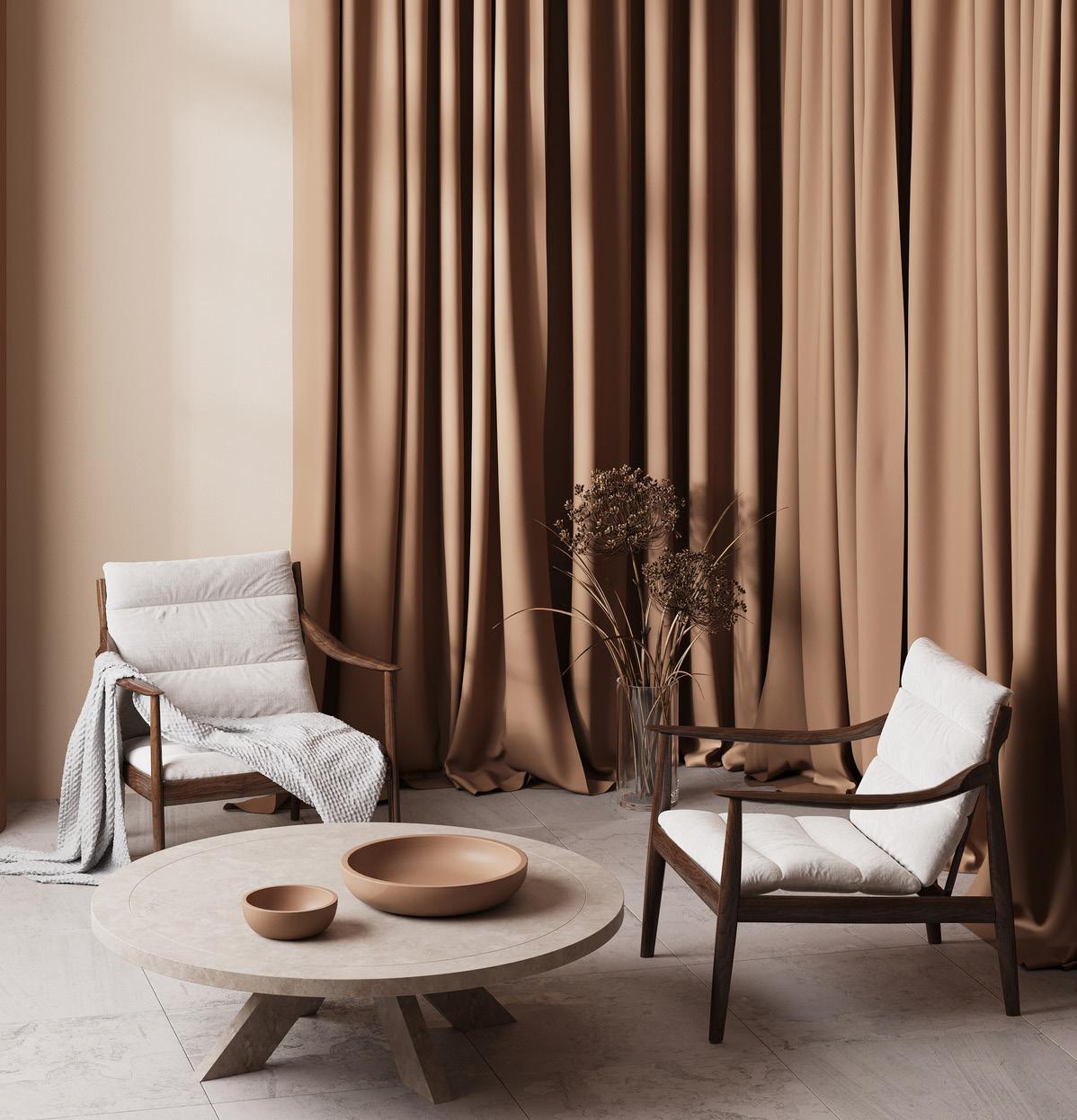
Soft neutrals focusing on the fundamentals combine with potent and powerful luxury classics highlighting the quest for timeless quality with the fascination for opulent beauty.
A compilation of contrasting shades each with a timeless allure come together in a powerful statement to create a less expected aesthetic and deliver a new elegance.
A grounded and sincere palette based in the strength and safety of neutrality outlines a dramatic effect that goes far beyond the simplicity of the colors.

Blend of Old and New Earthy and Eclectic
Mixing
Timeless Allur
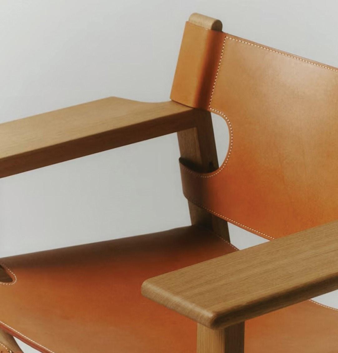
Leather Inspired Tones
Grounded and Sincere
Harmony with Natural Environment
Eco Material
Organic
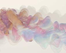
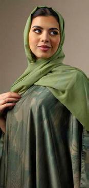
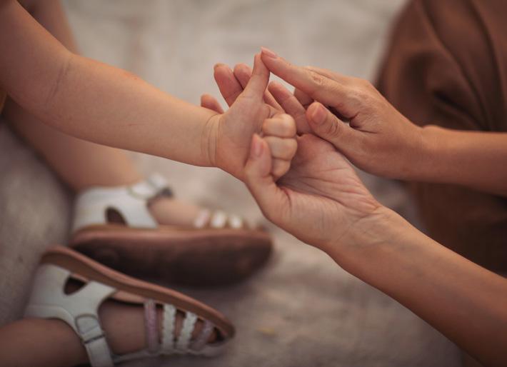
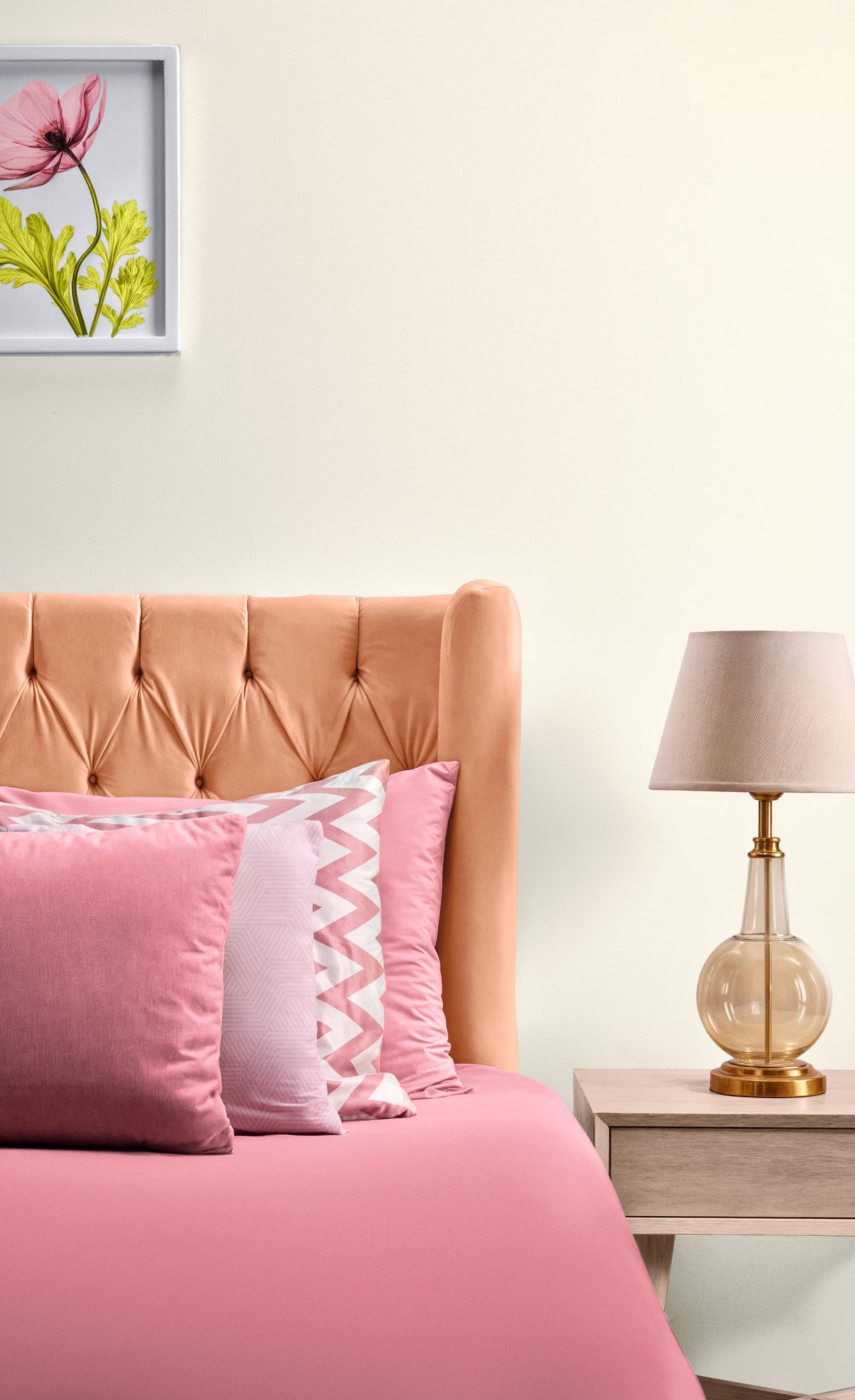
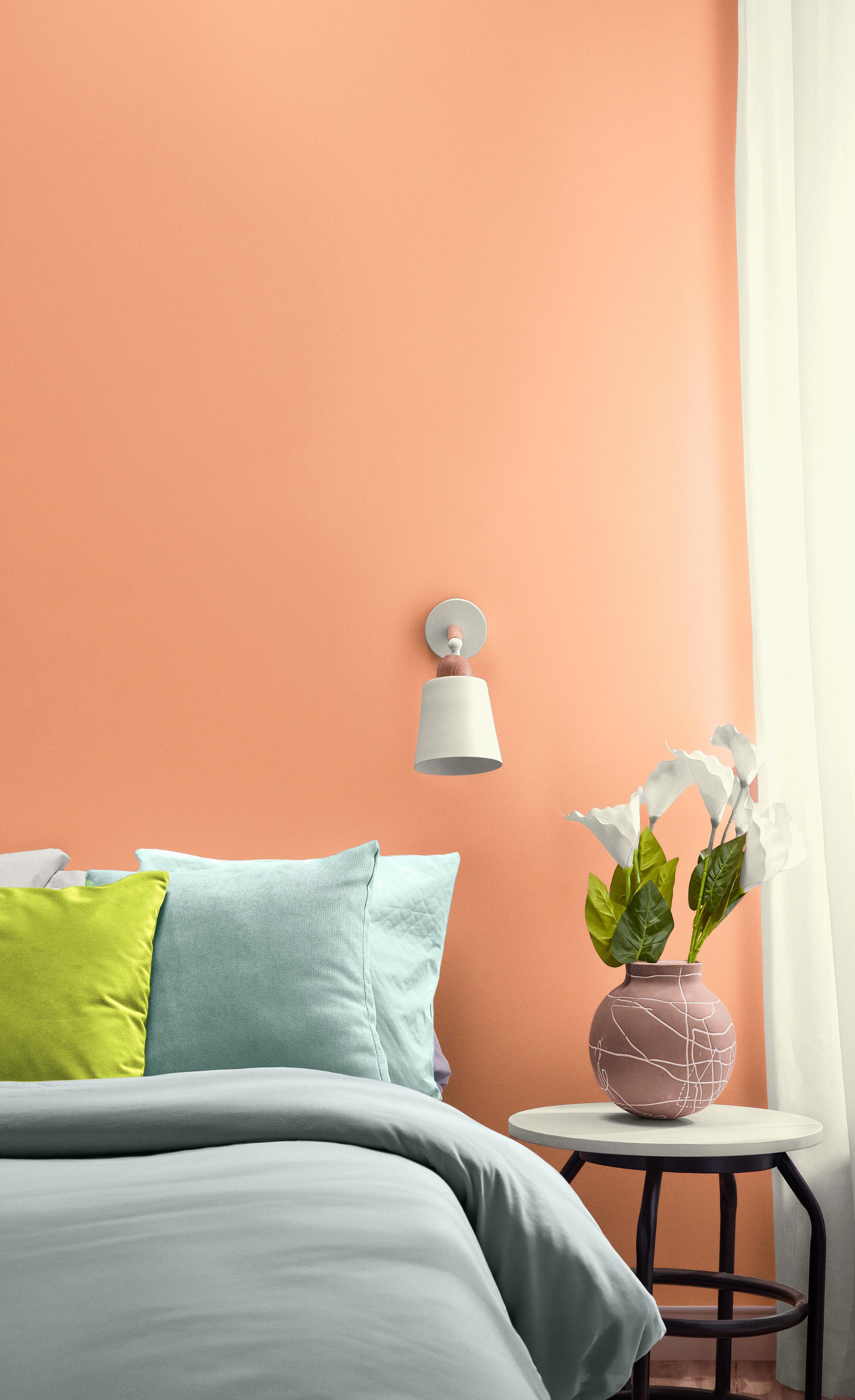
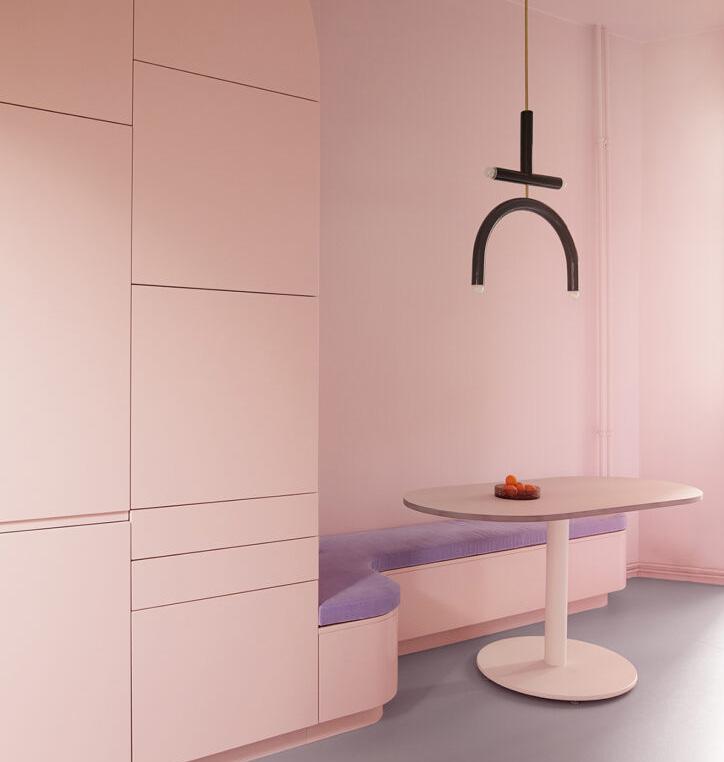
In a world where digital realities can feel overwhelming, the longing for real human connection is growing. Speaking to our deepest desire for human connection and the familiar, not just in touch but also in smell, music, and color, Intimacy is a color story that reminds us of the comfort of home and the importance of human contact and the familiar.
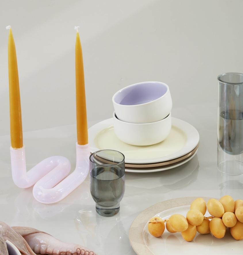
A palette of soft and muted colors creates a serene atmosphere where worries fade away. Expressing a messaging of gentleness, the comforting embrace of these cozy shades reinforce our desire for a soothing setting. Smokey and hazy, a compilation of pastel inspired tones that highlight the emotions of physical connectivity and the pure comfort of being at home.
Intimacy offers a palette of colors that support each other, inviting us to escape into a world infused with reassuring warmth. In this setting the concept of intimacy takes on new meaning, reminding us of the power of emotional ties and our bonds with friends and family. A Salmon pink and Steel Blue further envelopes adding to the overall mellow feeling of our core palette.

A blend of nourishing tones bringing a tender touch creates a harmonious atmosphere soothing to the soul.
RIVER MIST
GR-0762
YL-0250
RD-0110
OR-0306
Colors whose message of warmth and kindness encourage thoughts of cozying up in the familiar company of friends and family.
Trusted tones whose familiar and friendly presence evokes our desire for warm embraces and soft cocooning.
BLUSH
RD-0102
LAVENDER GRAY
MG-0148
RIVER MIST
GR-0762
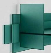
STEEL BLUE
BL-0250
LAGOON
GR-0006
AVOCADO GREEN
YG-0189
A colorful mélange with a cool touch introduces an understated feeling of tranquility and an environment of calm into an intimate family setting.
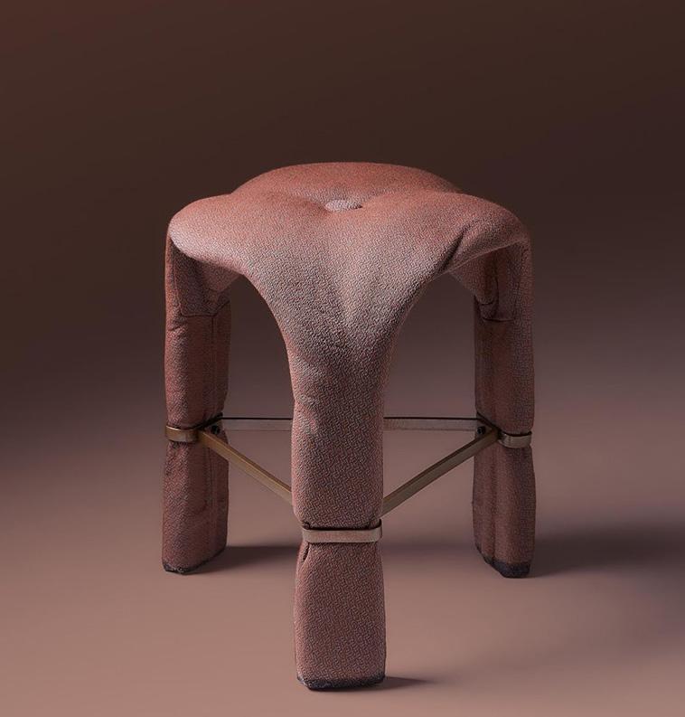
Plush Velvets
Lush Suedes
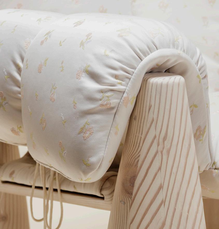
Cozy
Soft
Emotional
Fluffy
Cocooning
Gentle Tactility
Fuzzy Frames
Knitted Warmth

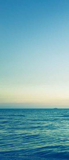
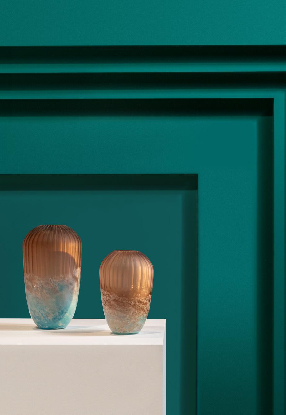
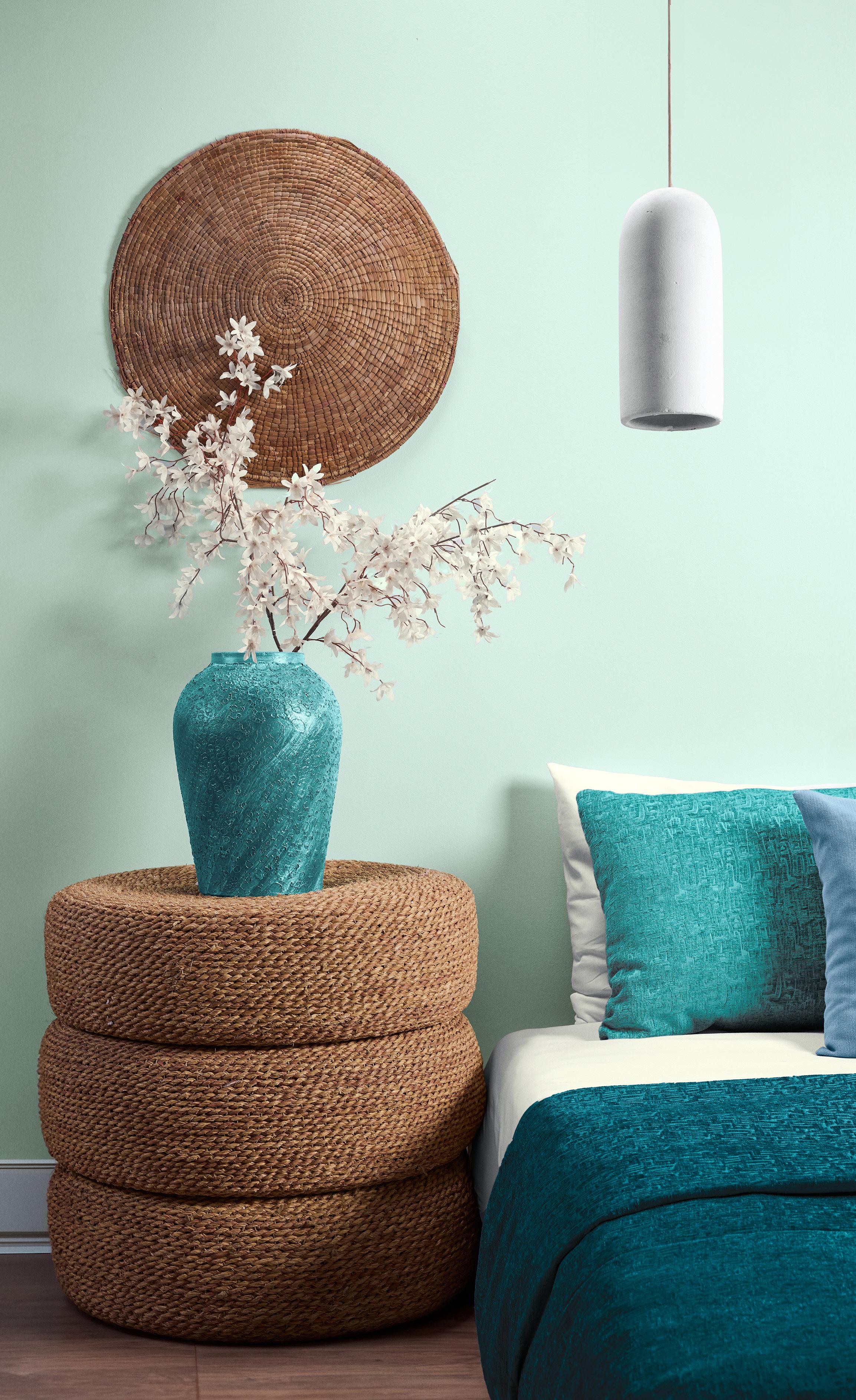
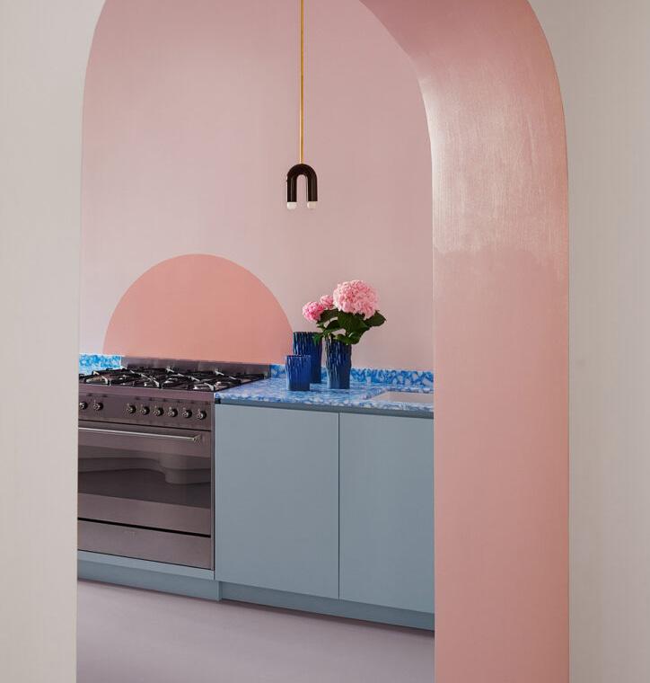
Our continued planetary focus articulates our desire for low impact living that is both holistic and harmonious. Facilitating a sense of respite from the hyper-accelerated pace of our modern lifestyle, Haven reminds us of how the elements of nature offer us a place of respite, an oasis, and a sanctuary from the cares of the world.
Nature is enhanced and infused with color. An intuitive mélange of eco-inspired greens and expansive blues gently combine with a sandy beige and cool white to paint a picture of serenity. The blending of these refreshing natural hues is gently stimulating, providing us with a breath of fresh air and feelings of sanctuary.
Haven seamlessly intertwines the elements of nature to create a calming and cooling landscape that slows our pace and allows us to mindfully power down. Finding its attitude in the connection between soothing and invigorating Haven cleanses the mind and uplifts the spirit. Clarity is found in the joining of the tasteful and serene Majestic Teal and meditative Galaxy with our core palette.
BL-0306
AVOCADO
YG-0189
YL-0262
The life-affirming connection of these nature-based shades creates an environment emblematic of outdoor living ideally suited for a comfortable retreat.
LIME CHIFFON
YG-0093
AVOCADO GREEN
YG-0189
BISCUIT
YL-0262
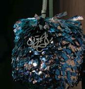
MAJESTIC TEAL
GR-0118
GALAXY
BL-0378
A captivating collection of nature’s green and warm naturals finds its balance in the delicate equilibrium between soothing and invigorating and sharp and soft.
Recharge and Refresh
Healthful and tranquil tones creating a zen space and place for quiet contemplation promote rejuvenation and vibrancy.
LAGOON
GR-0006
SEA
BL-0306
AVOCADO
YG-0189
The blending of gently stimulating cool naturals with distilled and refined hues brings clarity and lucidity to these harmonies.
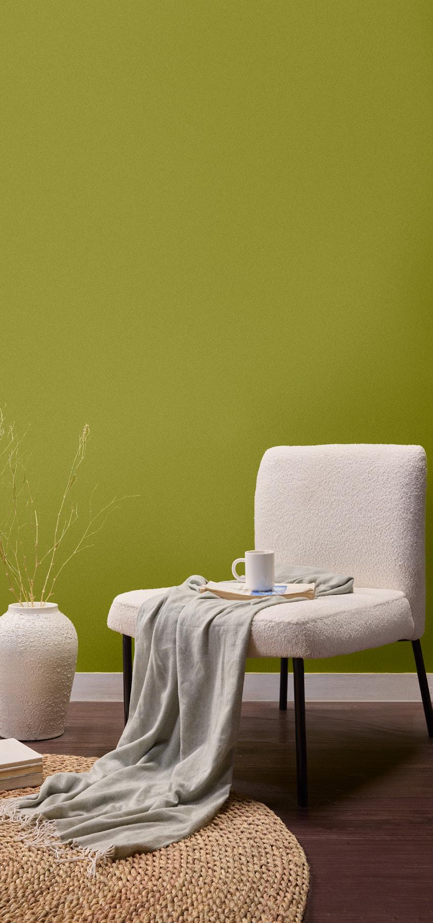

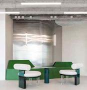
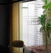
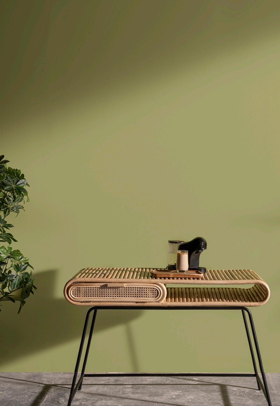
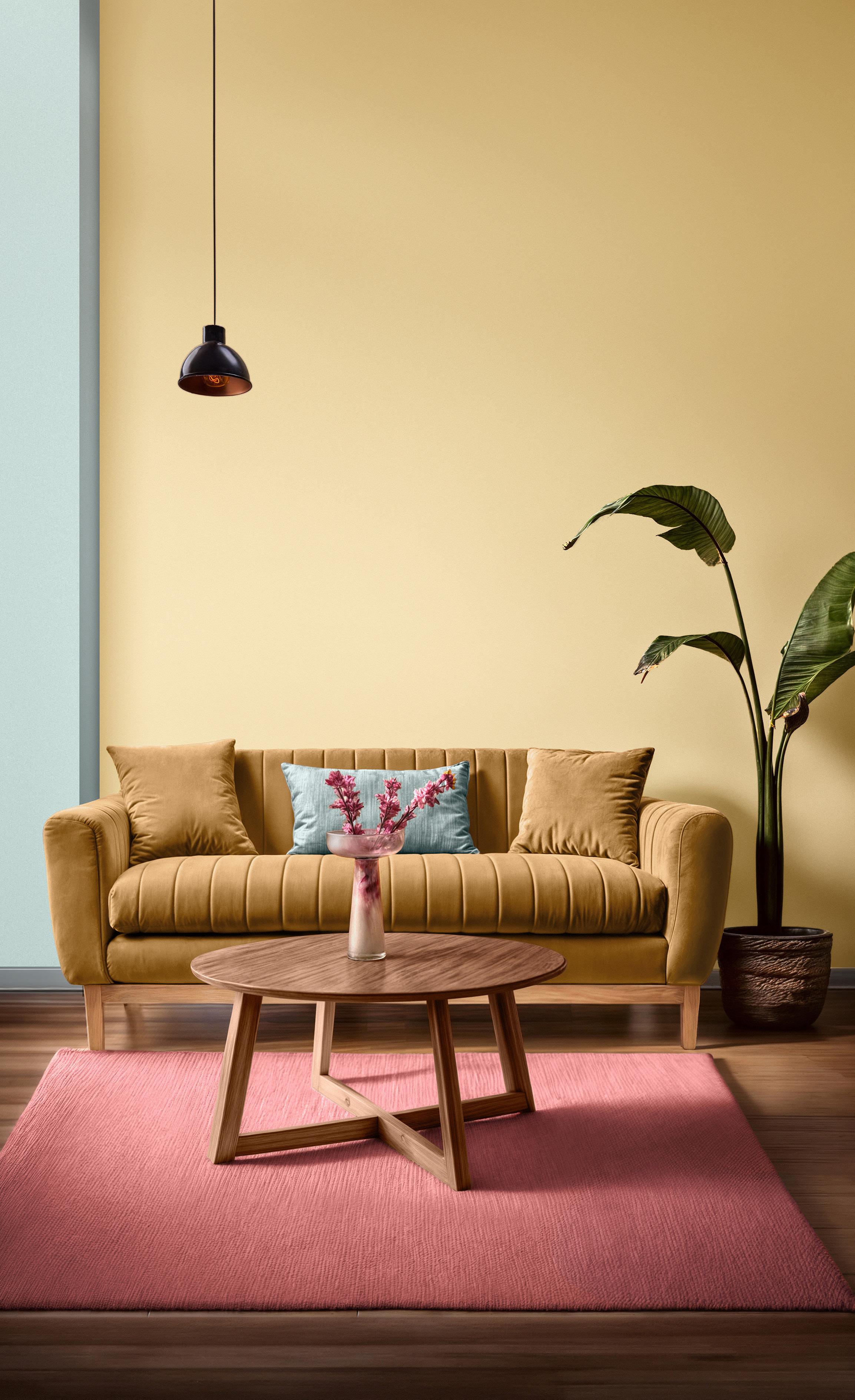
Community exhibits a new sensory minimalism whose goal is to create effortless spaces that are comfortable and conducive to promoting a healthful style of living. Infused with grace and a feeling of physicality, Community is a team dynamic and stylish tableau resonating with kinetic energy and elegance

In Community, rooted earthy hues bring stability to blend of a spirited golden yellow powered by the energy and warmth of the sun and the refinement of a creamy off-white. These spirited yet polished shades balance functionality with beauty. Understated yet refined, they speak to a contemporary feeling of simplicity.
Expressive of a neutral natural color movement, Community invites us into the family fold where simplicity and honesty bond us together in declarations of unquestioned feelings of welcome and well-being.
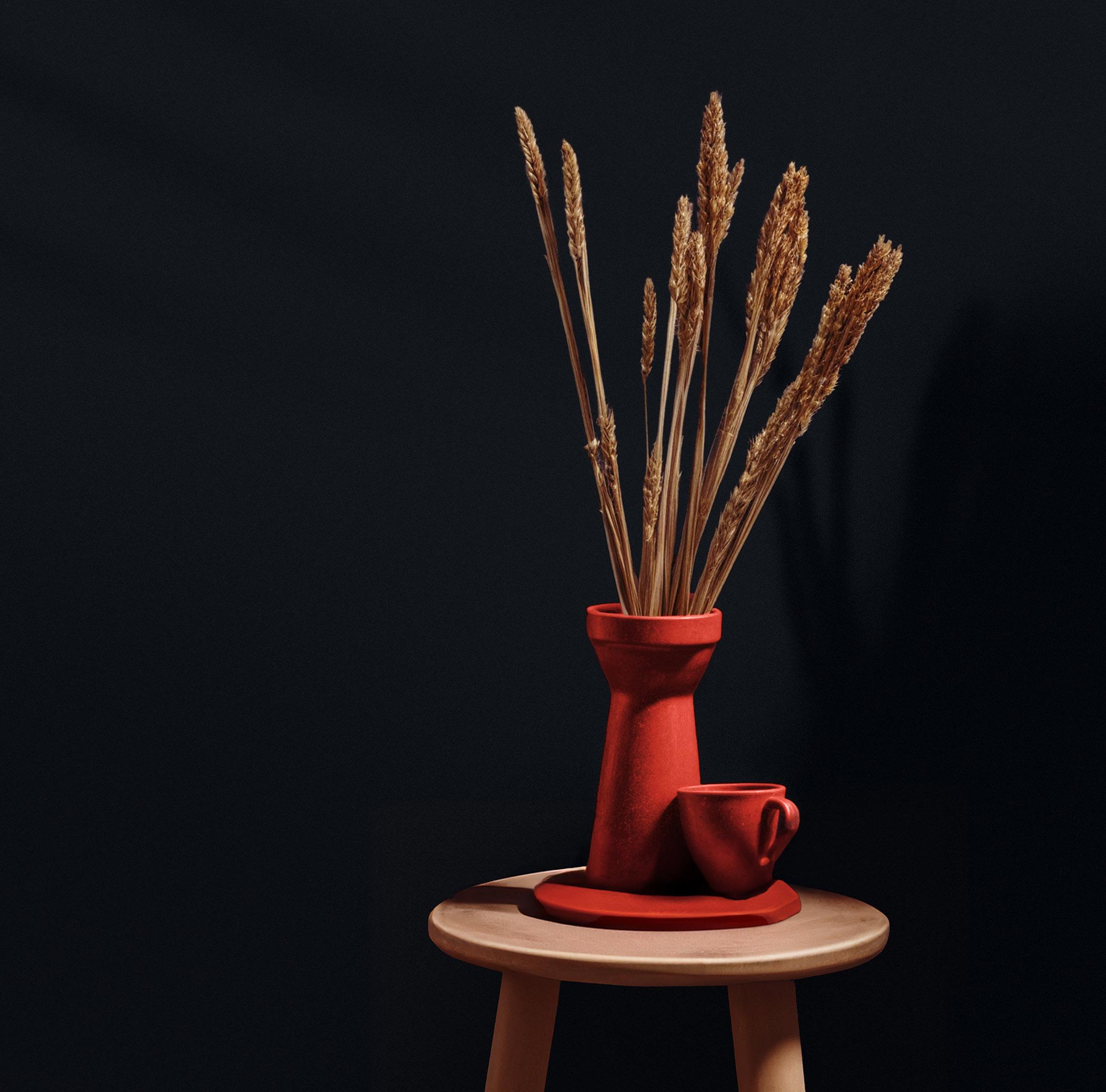
Fascinating Red and Hot Chocolate enrich our core palette with a natural warmth and a touch of opulence.
OR-0368

Caretaker
Flowing, well integrated colors whose loving and nourishing presence express a message of comfort and care.
This palette of richly colored shades with natural warmth is both visually appealing and therapeutic in nature.
A compendium of unconventional tones with a hint of the unexpected promotes our yearning for authentic and artistic expression.
An array of rooted natural hues and energizing brights is sophisticated yet accessible and approachable.
Natural Materials
Organically Sculpted Shapes
Rooted Yet Dynamic
Spirited Yet Sophisticated
Neutrals Infused With Vitality
Understated and Refined
Warm Simplicity
Smooth Lines
Graceful Forms
Crafted With a Polished Touch

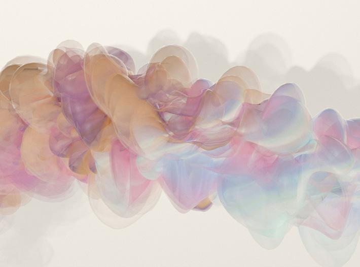
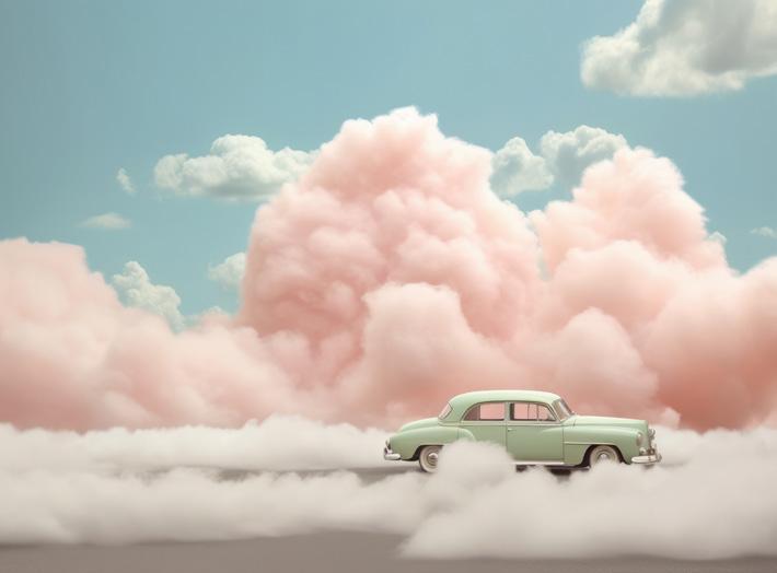
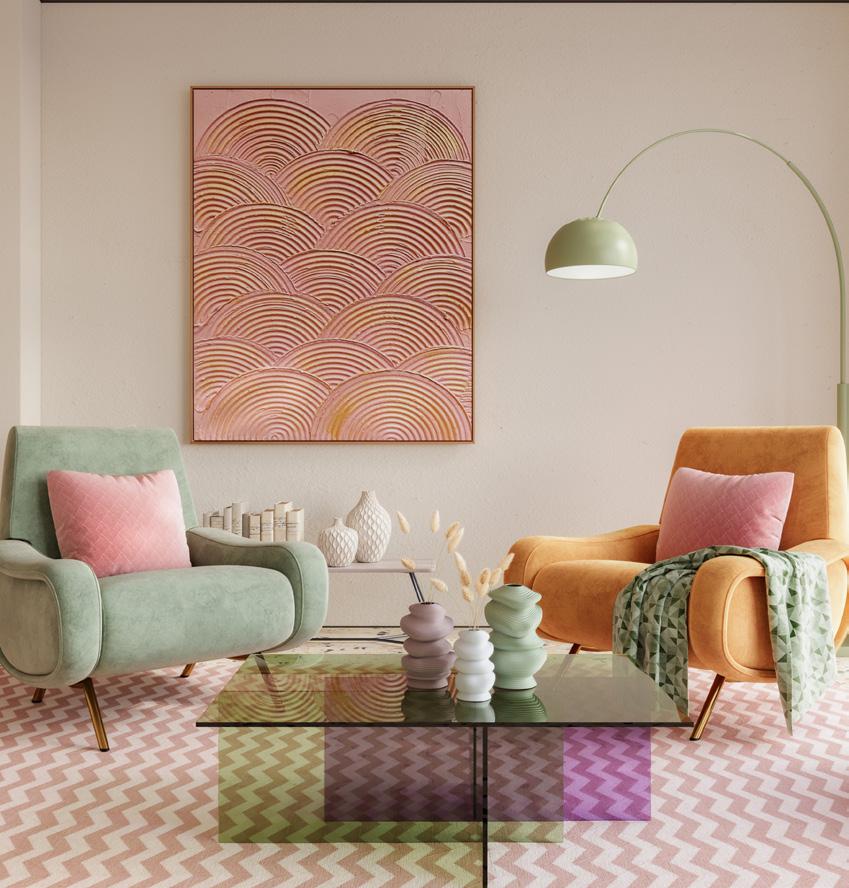
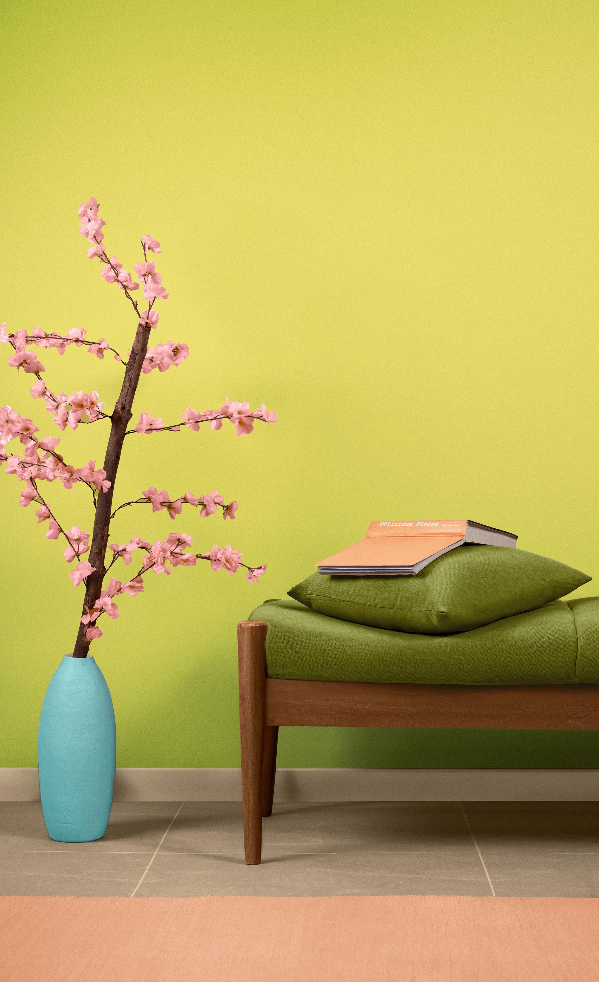
In an increasingly complex world, we dream and romanticize about a peaceful escape and optimistic future. So, we have created a palette of playful, fresh tones that speak of a fun-loving, exuberant approach to life to raise our spirits and counter the problems we sometimes must face.
Unwind is a palette of color imbued with a delightful blend of sweetness. An optimistic and upbeat palette of aerated hues, Unwind gently awakens the senses. Soft shades with a gentle fizz, Unwind displays a carefree style that encourages us to relax and unwind.
G-0004
VT-0122
GR-0242
Creatively abstract yet softly expressive, Unwind displays a delicate fresh vibe and lighthearted approach to living. Beckoning you into its dreamy atmospheric realm, Unwind evokes a sense of comfort and ease. Joyful Iced Strawberry and tangy Lime Chiffon add a playful buzz and inject vitality to our core palette.
OR-0150
AQUA
BL-0386
ICED STRAWBERRY
RD-0168
LIME
YG-0093

Diluted sweet hues with a discreet potency exert an irresistible allure shaping interior spaces to be undeniably fresh and modern.
MILKY
G-0004
LILY WHITE
VT-0122
MARMALADE
OR-0150
ICED STRAWBERRY
RD-0168
LIME CHIFFON
YG-0093
Optimistic and upbeat, a melding of color imbued with playful charm and an underpinning of refinement shines a light for a hopeful future.
An atmospheric array of creatively abstract and expressive colors conjures up dreamlike even surreal surroundings.
YG-0093
LAGOON
GR-0006
AVOCADO GREEN
YG-0189
MARMALADE
OR-0150
ICED STRAWBERRY
RD-0168
LIME CHIFFON
YG-0093
Imagination takes the lead in this whimsical color statement that is bold and adventurous, yet invitingly approachable.
Quiet strength
Low impact living
Refined, confident and elegant, our neutrals are forever relevant bringing quiet strength while encouraging low impact living.
Earthy, wholesome and rooted, our browns invite thoughtful curation while embracing contemporary design.
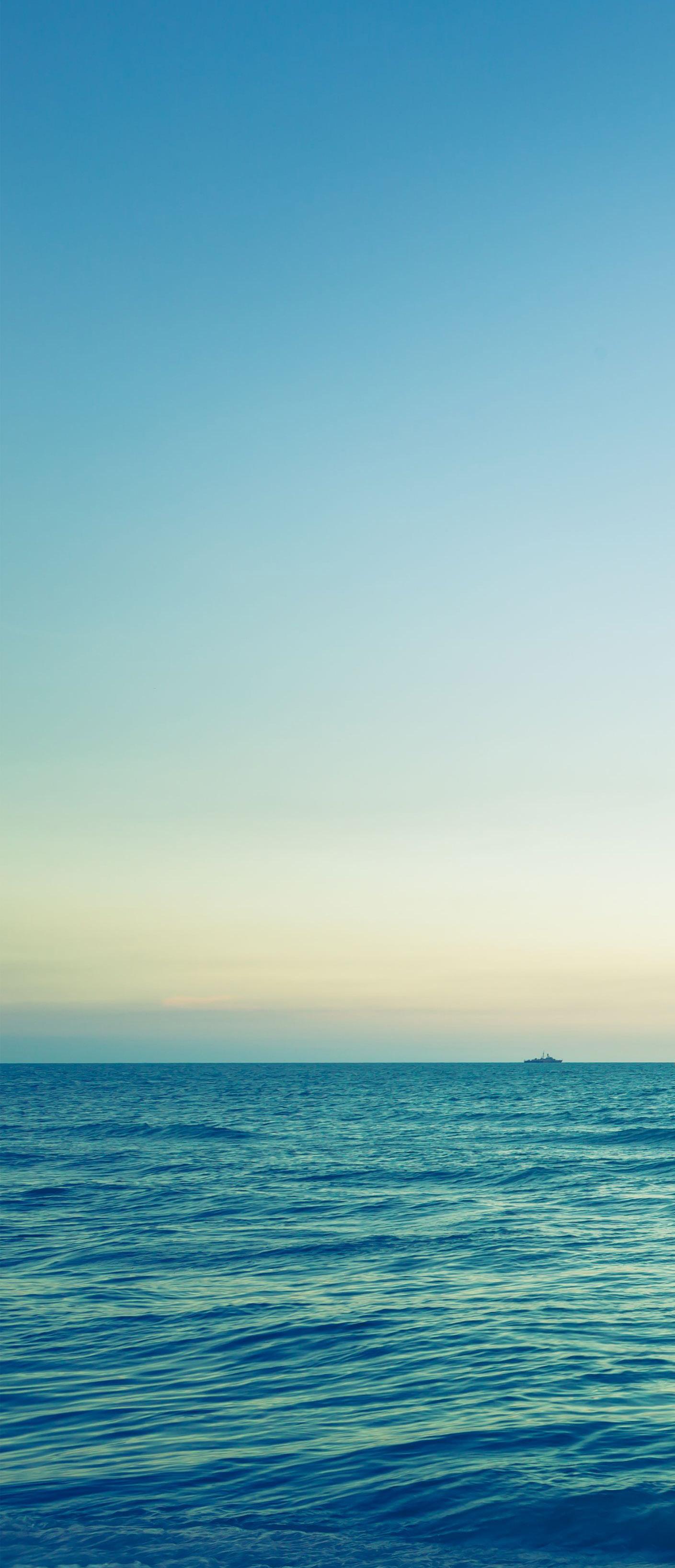
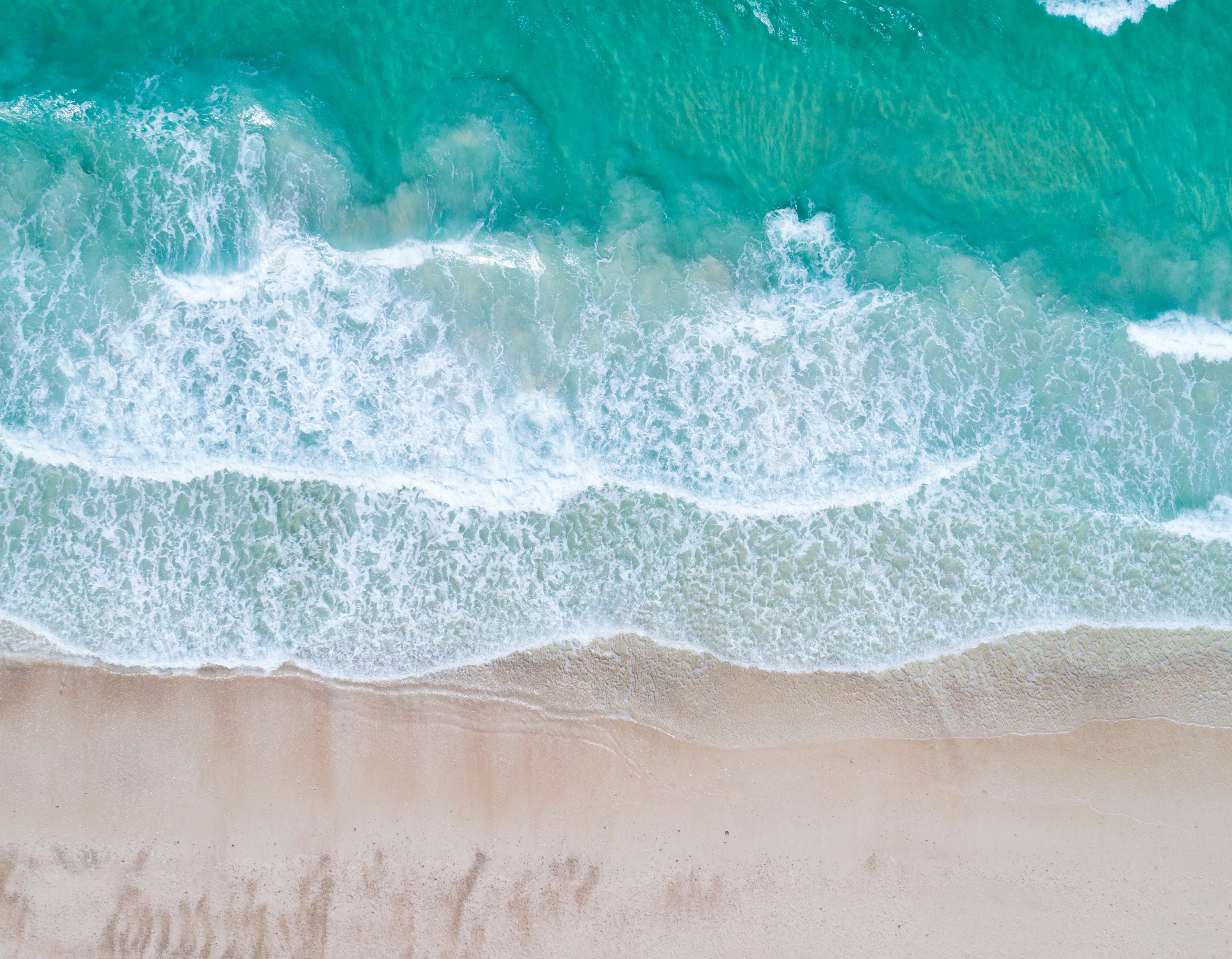
Our expansive and exhilarating blues are all water inspired from the Red Sea and to the deeply dark and transcendent of the ocean depths.
Cooling
Eco-inspired Restorative
Restful, soothing, cooling, our ecoinspired foliage and indoor greens restore, revitalize and invigorate.
Soothing and invigorating, sharp and soft, our yellows put the focus on both atmosphere and aesthetics.
Nurturing, warming and tactile or joy, playful and theatrical, our reds invite you to experience luxury in a thoughtful blend of ancient and modern.
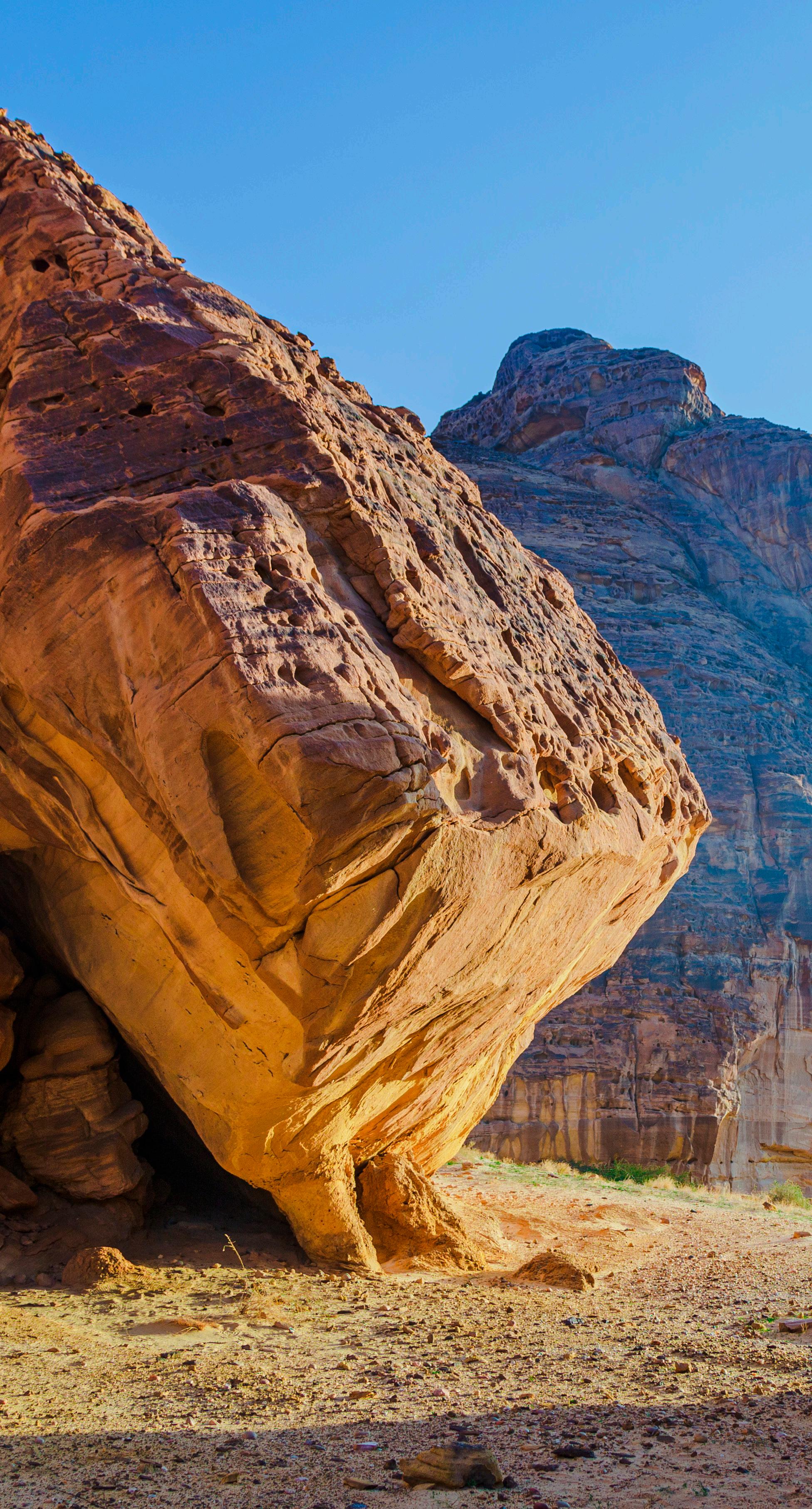
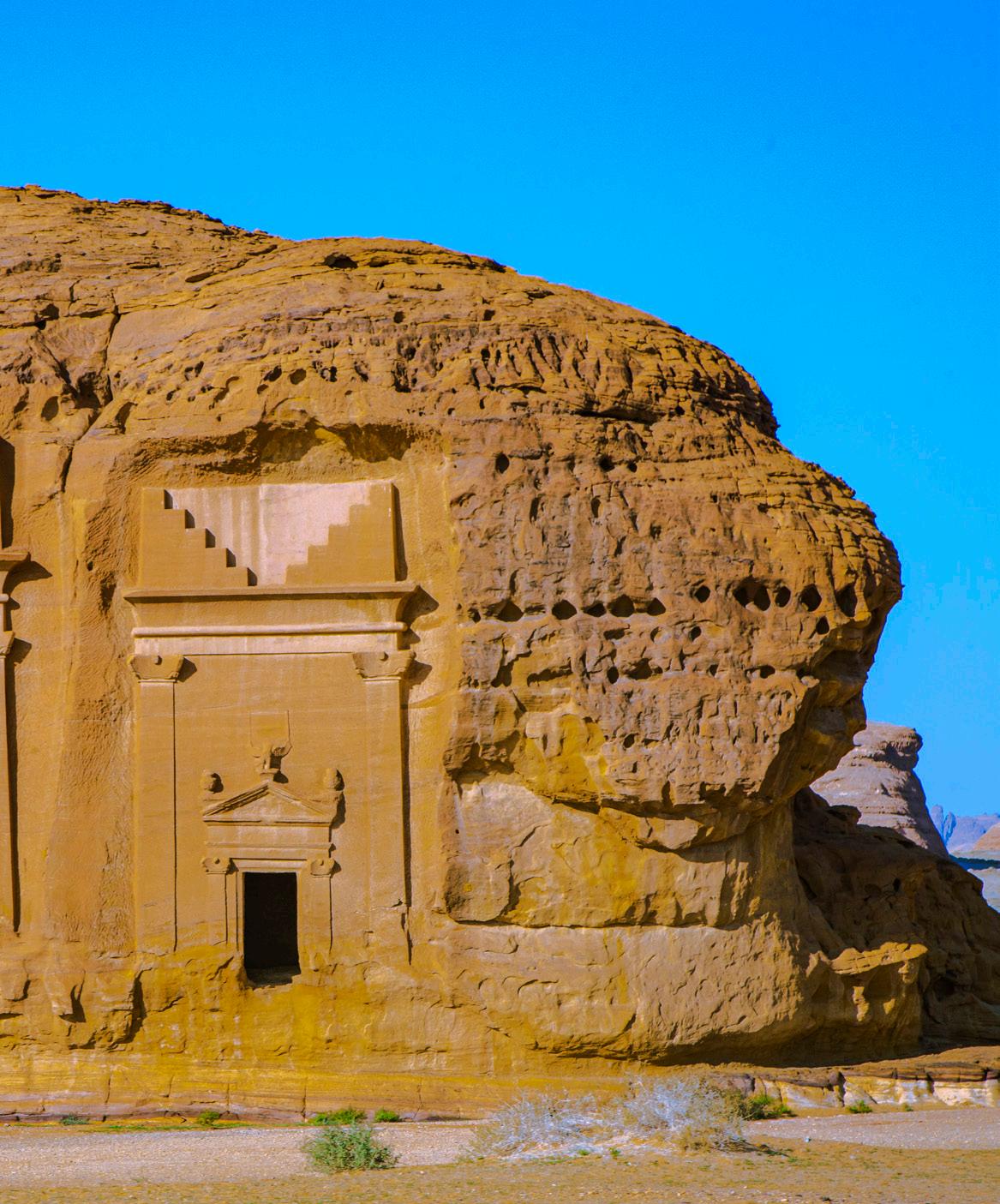
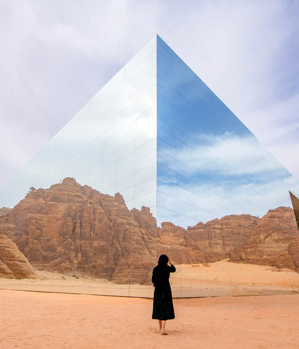


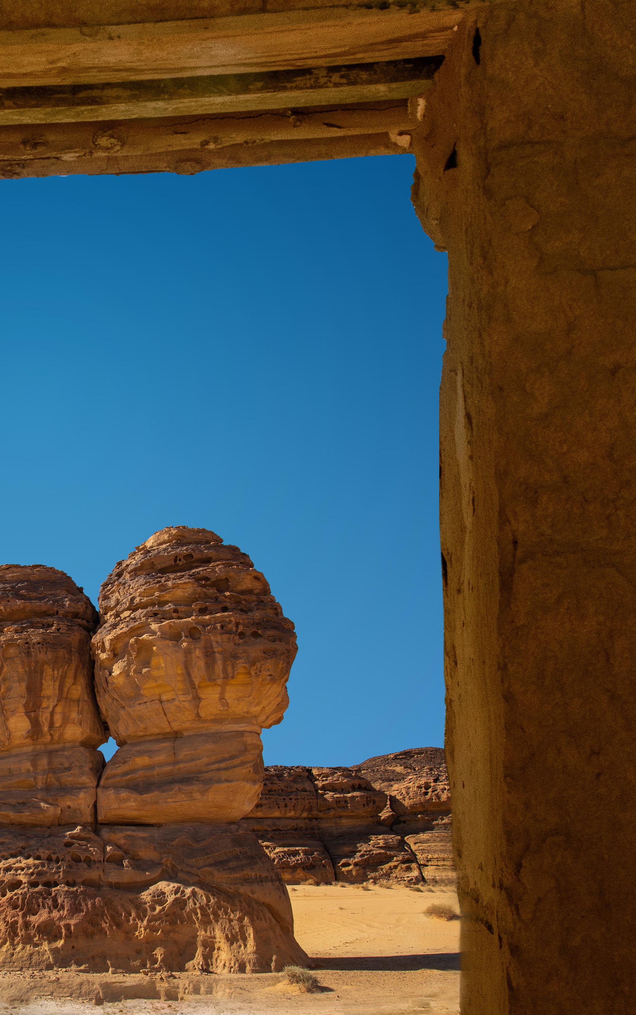
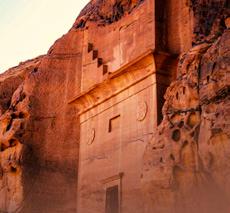
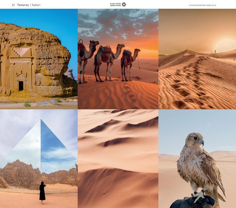
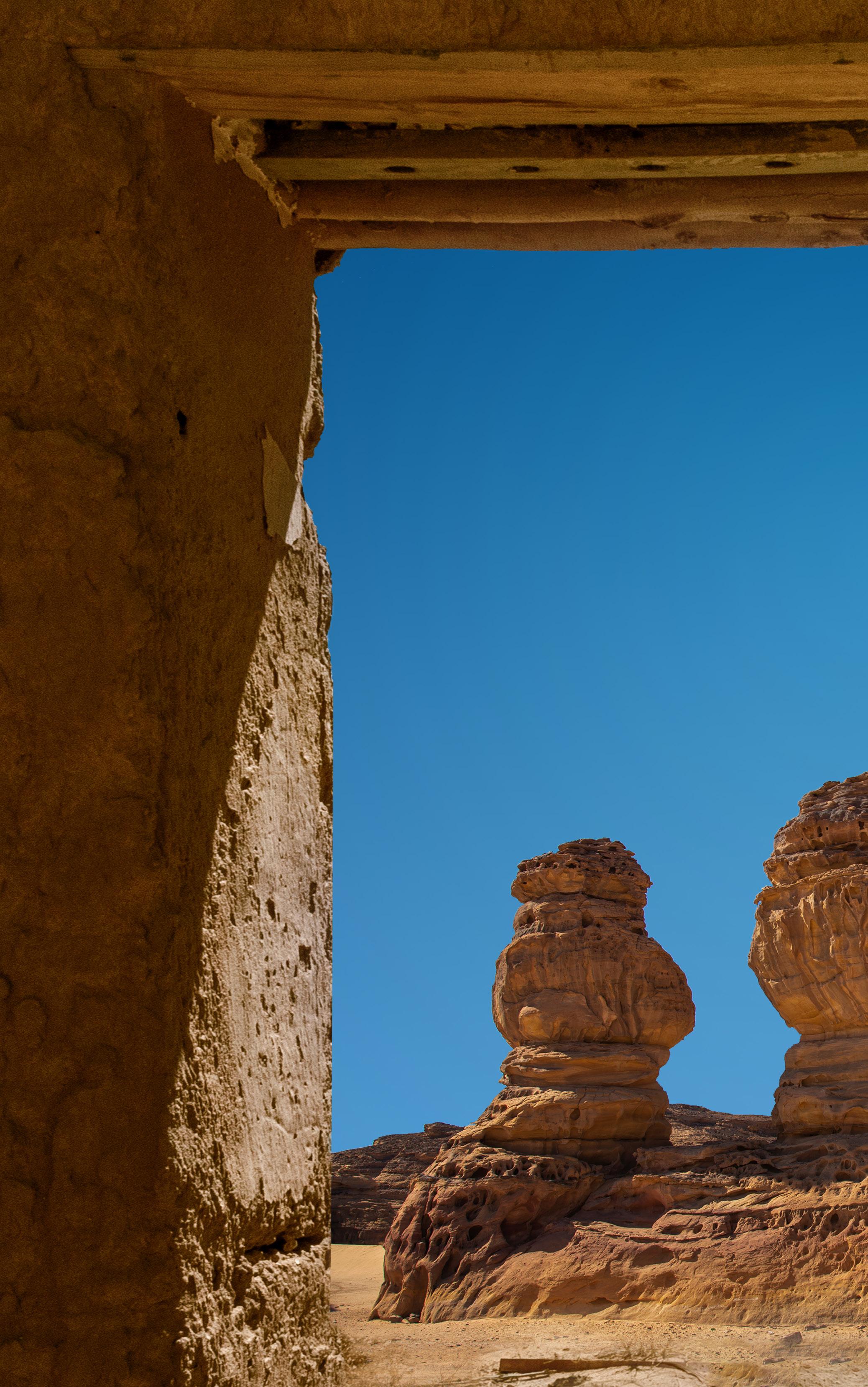
Sahari
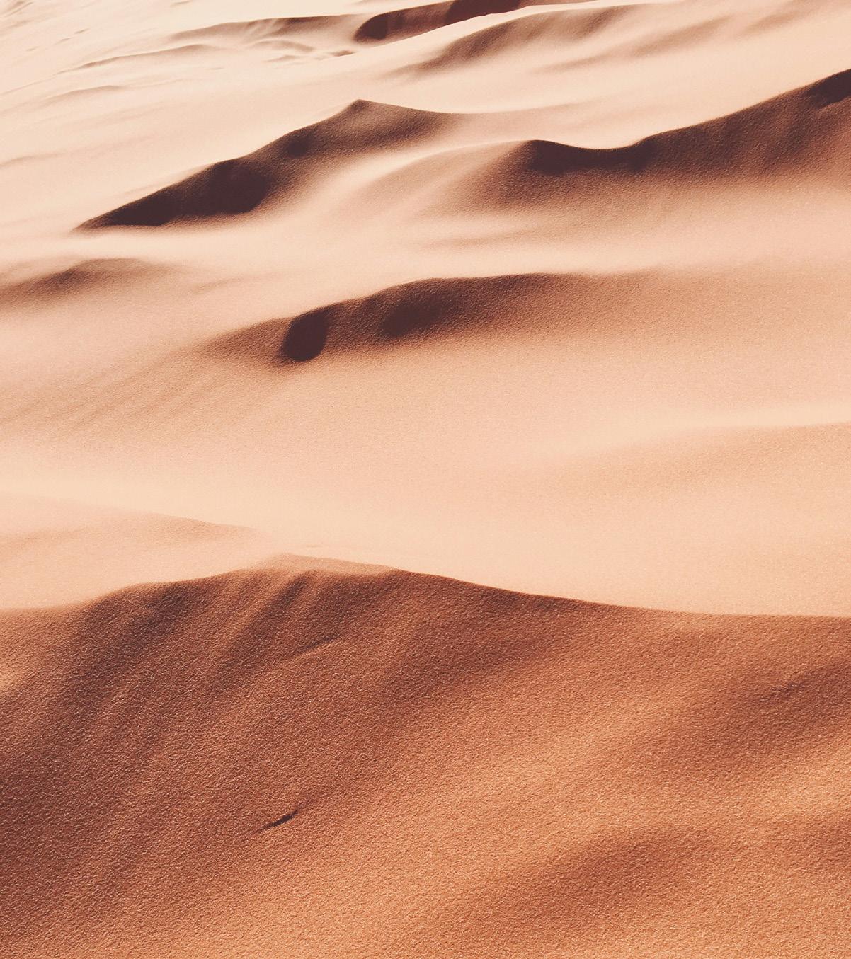
Sahari is a conceptual embodiment reflecting the diverse, resource-rich deserts in Saudi Arabia. From the undulating sand dunes to the winding wadis, salty sebkhas, and lush oases, the varied landscapes of Saudi deserts have always been part of our consciousness and inner self.
As the concept of "Textures" is a part and parcel of our life, this year we decided to take it to the next level of innovation and sophistication.
In this "Textures" sections of Color Trends 2025-2026, we offer you wall textures inspired by the earth, sky and water of the deserts of Saudi Arabia, aiming to create the most splendid natural harmony that mesmerizes the mind and evokes peace and tranquility in your spaces.
Inspired by the golden sand of the Arabian deserts comes this texture inspiration with its earthy shades that seamlessly blend with any space, creating an atmosphere of warmth, relaxation, and gentleness.
From the shimmer of the water to the allusion of the mirage of the Arabian deserts comes the inspiration of this texture. This texture with its blue shades transforms any space into something ethereal and inviting, filling it with a sense of tranquility and mystery.
Imagine the veined shape of the Arabian desert mountains as nature's calligraphy etched upon the earth's canvas. Carved by time and weathered by the relentless sun, each vein tells a tale of resilience and endurance. From this inspiration, we have created a texture with hues of gray that can evoke feelings of charm and stability.
When the beautiful and clear sky of the desert is interrupted with some clouds, we can see a celestial artwork that provide visual comfort and a sense of relief whenever we gaze. With shades of white leaning towards sky blue, this texture stimulates feelings of peace and serenity.
"Connection is why we’re here; it is what gives purpose and meaning to our lives "
brené brown – research profess or , university of houston , and best - selling author of “ daring greatly ”, “ rising strong ”, and “ braving the wilderness ”. brown ’ s work focuses on the power of vulnerability and the importance of co nnection in human relationships

jazeera paints ’ color innovation guide 25/26 has been designed and produced in collaboration with metropolitan publishing bv , amsterdam , the netherlands ( www . view - publications . com ), creators and publishers of pantoneview colour planner on which this product is based
printed by kunst - und werbedruck , bad oeynhausen , germany