WORK SAMPLES 2024
Contents
Furnishing and lighting projects
Brick Lamp (Produced)
Split lamp (Produced)
Note chair, stool, side table (produced)
Bent bench (Produced)
AA furniture (Prototyped)
Time tile (Produced)
Y rack (Produced)
Tilde rack (Produced)
C Lamp (Prototyped)
Clover bottle opener (Produced)
HEX mirror (Produced)
Eye toy (Produced)
Mooncake paper weight (Produced)
Looop coat hanger - co-designed with Yating Qiu (Produced)
Quarter bench (Prototyped)
Lamina sofa (Prototyped)
Loft (Concept)
Space projects
mini bite store (Completed)
Spa & wellness center of port imperial south condominium (Unbuilt)
NYC Downtown FF&E (Completed)
NYC Riverside condo (Completed)
Lòngtántg Loft in Old French Concession (Completed)
Wang residence (Completed)
Harvest pavilion (Completed)
Solar panel (Completed)
Consumer product projects
Avita infrared thermometer (Produced)
Wood headphone (Pre production)
Valet speaker (Produced)
Sandio 3D mouse (Pre production)
EX Spider backpack (Produced)
hyfen collection
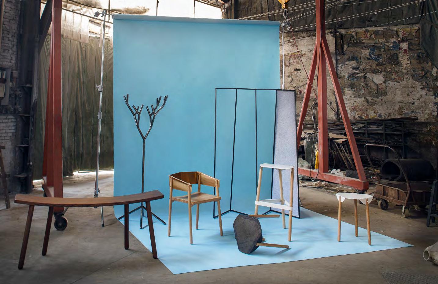
Hyfen is a design collection of home goods and furniture, created and curated by HCWD Studio and the collaborated designers, who focus on bridging human sense, physics, material and geometry, look into the essence of routine subjects, extract the critical elements from others, and link them together to create strange-familiar new objects that recompose how we interact with environment and daily life. From 2017 to 2020, we launched products that would fit in homes and commercial spaces that seek to be unique and custimezed with their furniture selection. We work closely with FF&E teams from clients to custom build special editions for different projects such as gallery, hotel, high-end residential and offices.


 hyfen shop and team


The 50 Young Professionals
The 50 Young Professionals
Excellent Product Design Nominee
Excellent Product Design Nominee
Best Furnishing Design
Best Furnishing Design
Best Design 2017 Golden Pin Design Awards
Best Design
Short-listed 2016 IFFS, Singapore
2017 Golden Pin Design Awards
Short-listed 2016 IFFS, Singapore

BRICK LAMP
A minimal and portable interior LED lamp, is activated when raised(on) or laid flat(off). It is designed to mimic the moment when one reveals light and conseals light as the mechanism of switching light on and off. The side facets a natural handle which also directs the light when the brick sits on it’s side. The Brick Lamp is powered by LED panel lights and a rechargeable built-in lithiumion battery with a USB charging port. It can be easily connected to almost any power source.
Brick Lamp as a bedside night lamp, provide a solution for people to access lighting easily and intuitively even in complete dark without any glowing part. All buttom or switch are eliminated, and the light simply react to the movement of the object itself. A product that disolve user’s hand gesture into the mechanism of tunning light on and off.
In 2015, we finalized the design and put it on Kickstarter to raising fund and to test the market. We’ve succussfully raised two times the fund we asked and deliver the products in six months. Since then, HCWD Studio has been selling this product in MoMA Store, Toch of Modern, Desgiboom store and many other online and offline channels world wide.
In 2016, Brick Lamp has granted the US Design patent # D774683S.
Materials : walnut wood, concrete, aluminum


Concept development
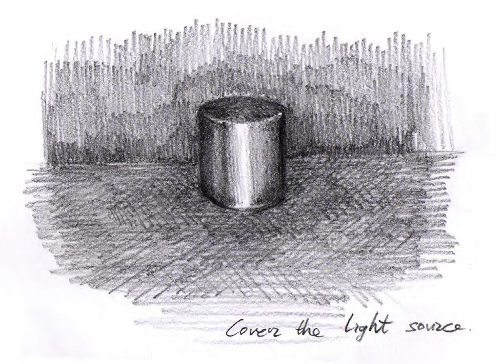
This project was originally an extended study of my earlier project “Shift Light”. After the group show “Innate Gestures” in ICFF with Shift Light. We kept digesting the concept and researching how humans interact with light through other objects. In the past, light was manipulated by covering it or being revealed like we use a curtain to block sunlight or a cap to distinguish candle fire. I want to recreate the experience of people pulling up the curtains on the windows in the morning to slowly light up the room.
Integrated design template
We develop and use the integrated design template to design/innovate ideas and evaluate those ideas under different scopes. As modern product design goes beyond its function and form, we would like to involve different aspects such as market communication, consuming ecosystem, and future forecast as early as possible to make the design stand out and sustainable.


Crowdfunding
We decided to try out the market with the crowdfunding platform Kickstarter in 2014 and eventually raised up to 40k funding with 253 backers. Half a year after the campaign, the brick lamp was picked up by MoMA Design store to be one of their featured lighting products in 2015 fall catalog online and in store. Our marketing strategy has been focusing on young professionals who are willing to spend for better life quality which led us to focus on online retailing. Working with online retailers such as Touch of Modern, WorkOf, Gessato, and more. We managed to sell out all our first batch in six months.
Dezeen report


Engineering
This engineering process of brick lamp was much more complicated than it’s look. The biggest challenge is the on/off mechanism which cost us four years to find the best solution. We tried tilt switch, acceleration sensor, pressure sensor and eventually found the best solution with micro switches. With the help of CAD tool, we designed a mechanism core housing with bent sheet metal to optimize LED heat distribution and to minimize production cost.
Material
Material study is another major mission that we spent countless hours on this project. We propotyped more than 20 different wood cases just to find out the best, most stable one to fit the mechanism core in different humidity and temperature situations, and 20 more tryouts for the best concrete formula. For the limited edition bricklamp for kickstarter campaign, we worked with a supplier to do small quantity CNC with anodized aluminum.


SPLIT LAMP
The double-sided disc mirror, made of stainless steel, intersects with the hand-blown glass shade in the middle, splits the lights and creates the unique visual perception through the reflections of the lamp and the space around it. The floating mirror that is unparalleled to the interior brings a special and fresh angle/view of the environment around the observer.
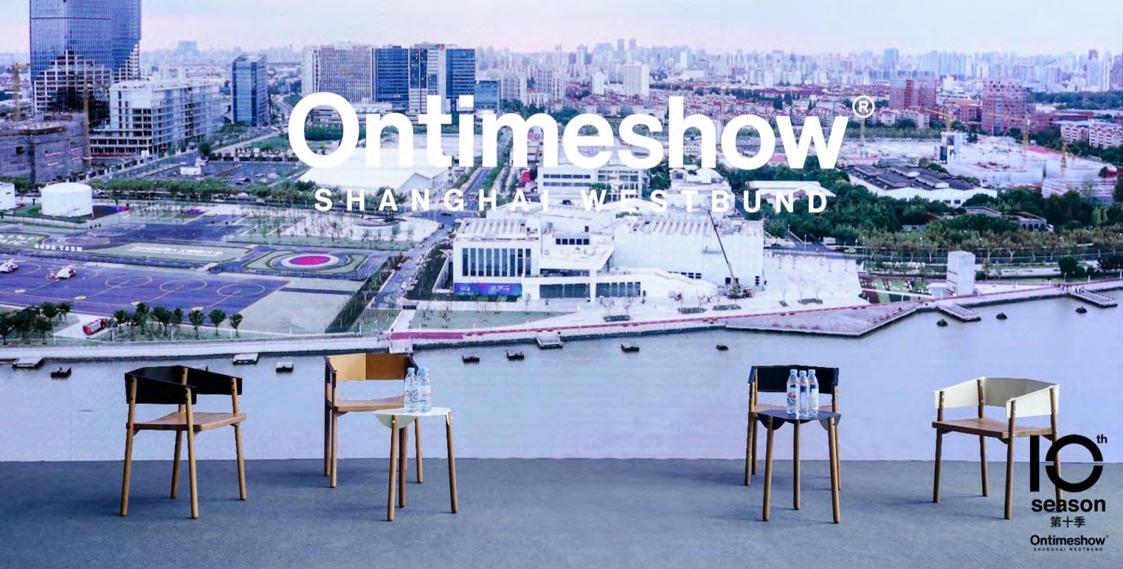
The desgin was finalized in late 2015 and first invited to exhibit in “Fusion Power” in West Bund Art Center in Shanghai. The produced product was debute in ICFF 2016 in New York in 2016, May. As a pendant light for interior space, this item is highly customizable with differemt types of glass, wood, and mirror sizes. Since 2016, we have installed Split lamp in luxury apartments and commercial spaces.
Materials : 316 polished stainless steel, glass
Measurements :
Big disk : Ø 23.6 ” / Ø 60 cm
Small disk : Ø 11.8 ” / Ø 30 cm
Glass shade : 7.5 ”(l) x 5.3 ”(w) x 1.65 ”(h) / 19 (l) x 13.5 (w) x 4 (h)cm
Socket : max 75W E26 bulb socket


Concept development
We tend to combine objects that share similar philosophies together. In the project SPLIT, they are mirrors and lamps which are both functional with light involved, either reflect or create light. A real life example of the combination of mirror and lamp is vanity mirror for putting makeup, and our research is to explore more potential with these two objects bonded together.
Engineering
To test the concept, we started with card stock and 3D printed mockups. We work with the local glass blower for the initial fabrication in New York. Unlike machine blown glass, hand blown glass has variable thickness, bubbles and texture that we need to work closely with the artist.


NOTE SERIES
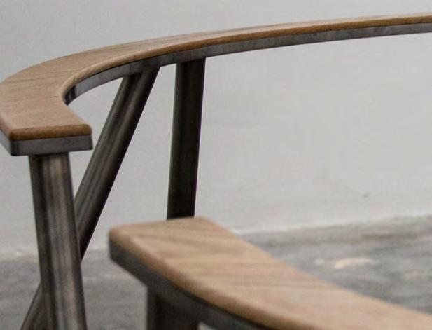
The aesthetics of Note series is to integrates forms with distinctive materials. The minimal white oak legs interlock with the folded-cutout-sheet-metal arms/seatback visually and structurally. The fold-out metal notes cover the rough end-grains of the wood legs and support the chair’s structure. All components are made durable and easy to assemble. Metal arms/seatbacks comes in different colors and finishing that can be customized.
Material : White oak, steel with electroplated or powder coating
Dimensions: 19.37”(l) x 17.4”(w) x 24.8”(h) / 49(l) x 44(w) x 63(h)cm
Weight : 18.5lbs / 8.5kg


Concept development
The idea of creating the note series was to produce a product line that’s highly customizable and flexible. One of the references is the real good chair from BlueDot. Through market research, we also found that there were very few good designer’s products that had great material combinations of high quality hard wood and sheet metal. We decided to develop a series of products that use sheet metal as focul material which are easy to change texture and finishing, and partner with hard wood as the supporting material. The result was the highly customizable note series.
Engineering
The major challenge was the structure which was also its look. The engineering process was focusing on finding a good balance between the visual pleasantness and its physical strength using CAD tools, 3D printing, cardboard, PVC pipes, and other hands-on materials to build mockups and prototypes. for testing. The other challenge was to be able to pack the product in a flat box for better shipping.




BENT BENCH
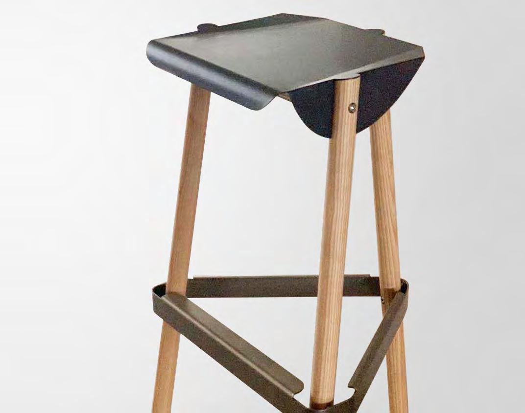
A bench design initially came from the observation of handrail.People sit on the handrail subconsciously, sometimes an often-sat spot starts bending by human weight. Eventually, a curved handrail will encourage more people to sit on which leads to more bending. The height of BENT BENCH is designed for comfortable chatting with some people leaning/sitting and some people standing. The curvature also encourages people to sit closer. Inspired by handrail, Bent Bench mimics the scenario of people sitting on iron/steel handrail which is eventually bent by human weight cumulatively and this encourages more leaning and sitting activities closely. This natural field is recreated carefully, engineered with elegant structure and intuitively triggers interaction and intimacy by bringing in warm solid wood.
Material : Ash Wood or Walnut
 JNBY tea house


 Play Design Hotel
0+23 Galleery
AA-Furniture
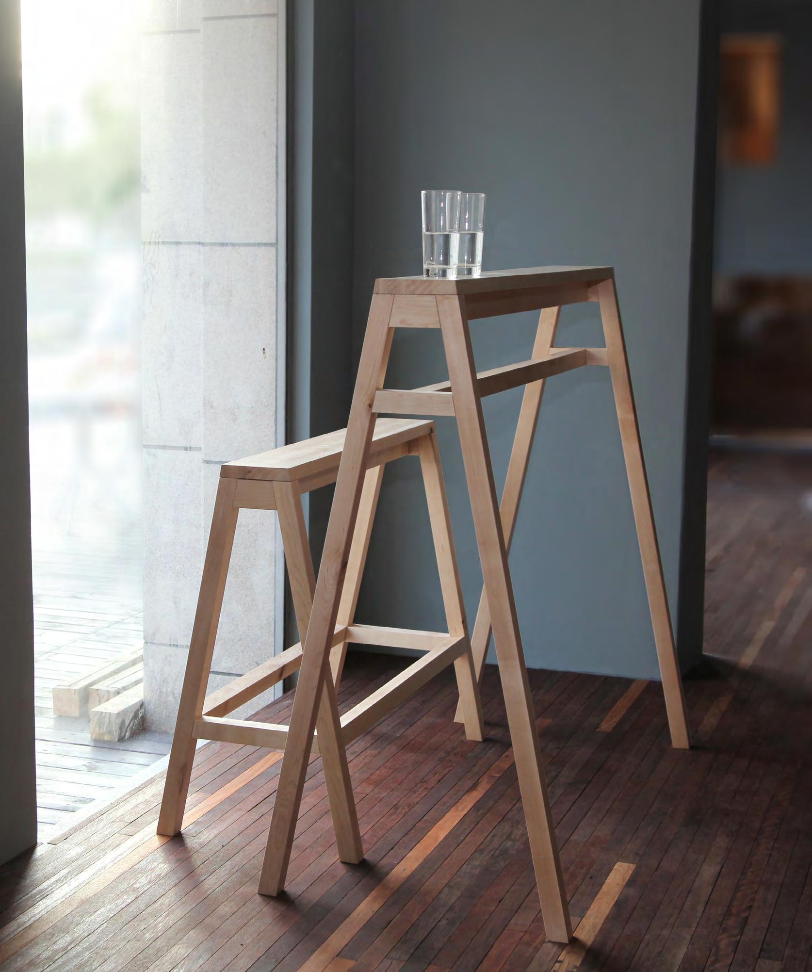
The objective of the “A” series is to apply utility and to simplify the user experience by refining the ordinary experience of people. A-table is a narrow barheight table for arm rest that can be engaged from either direction. A-bench is a bar stool-height long bench that keeps those seated at the same eye level as those standing. They can be used together or separate to create a “field” of social activity in public spaces.
The prototype was first created in 2009 during the first year in Cranbrook. and then was invited to attend “Talented” program in Ambiente, Frankfurt in Germany in 2010. In 2013, I was invited again to attend “10+1 Talents”, ten years review of the “Talents“. This item was the choosen item to represent 2010. Only one designer from each year’s “Talents” was selected to for the 10 year review.
In 2015, HCWD Studio reproduce this item with minor changes under the brand “Hyfen” and debuted in Shanghai.The buyer of this item are architecture firms, cafes, and galleries.
Materials: Hard maple


TIME TILE
Time Tile is a highly customizable timepiece and wall tile system that is able to translate its structure into unique patterns for different spaces and environments. Two major modules, triangle and fan-shaped tiles, offer people to use them as wall clocks or to create a wide range of different figures and patterns on vertical surface as backdrops of terminal clocks.
This project was awarded 2019 NYCXDESIGN “Honoree” award. In 2020, we designed and installed a special version of Time Tile for Delta Airline Shagnhai office using abstract map of the US.
Materials: Anodized aluminum




Concept development
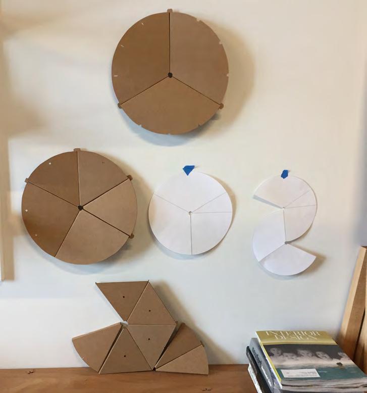
The concept originally came from dividing pizza. By breaking down a full circle clock into 30, 60, and 90 degree sectors with cardboard mockups, we quickly realized that it became a tile system that could do much more than a clock. It went beyond the circle form of a clock and could be figured into small or big panels that have clocks on. The freedom of the form gave it the opportunity to be customized for interior projects or to be pre-figured in alphabet letters.
Engineering
The modules have to be easy for production and less expensive. We decided to produce it with anodized bent aluminum sheet. To make it self balanced, easy to assemble, and to be hung on any angle. We tested different mechanisms and eventually went with a special reverse folded tag that can form hanging holes when two “slices” were snapped together.

Delta Airline Shanghai office commission
The project for Delta Airline Shanghai office was a custom designed piece that looks like an abstract map of the US with three built-in clocks in Eastern, Central and Western time. The Time-tile installation was delivered along with other custom made products designed and produced by hyfen including tilde-rack screen and Y-rack in 2020.




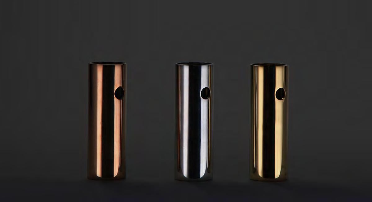
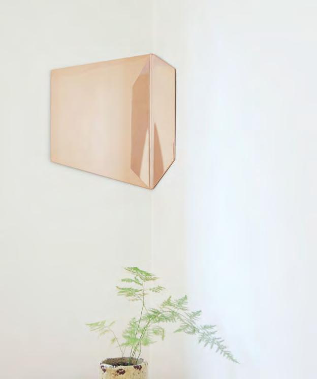


 Mooncake paper weight
Looop coat hanger (co-designed with Yating Qiu )


QUARTER BENCH
The project was to create a felxible field of social interaction and event. In the basic standard layout, a field is formed with four quarter-circle bench and handrail hybrid which has four entrances/exits. The height of the quarter bench is designed for people to leaning on or for temporary sittng. This concept is designed to stimulate social communicate face-toface. The quarter-circle shaped a sitting that makes two people sit toward each other in the most stressless angle (90 degrees) for good conversations. The quarter benches can also be oriented to fit in a specific interior space or in public architecture.
Materials: Red oak, stainless steel
Measurements:
32”(l) x 32”(w) x 30”(h) / 81.3(l) x 81.3(w) x 76(h) cm
Support weight: 2 people, 350 lbs
Conversation trigger
The study is based on an experiment which recorded the behaviors of people who were sitting at a rectangular meeting table. It’s interesting that most of the conversations happened across the corners. However, only a few people benefited from these spots in a traditional conference table even though those tables were designed for conversations. The study inspired me to design a field offering spots for talking.


Concept develpment
Take away desire and emotion from human, we are simple machine motivated by our intuition for surviving. It’s amazing no matter it is people queuing up to wait for food and supply in economy depression, or people gathering around a bonfire at night. This project dig into human’s very nature and strike to build an essential object can utilize human’s deep intuition to queue people. An object can not only come up with a new way to queue people, but also a system can generate queue combinations in curve, circle, and organic shape.


 Queue for toilet paper in Portland in 1980s


LAMINA SOFA
The lamina sofa is a customized piece which its structure constructed with bent sheet material. The materials and the design of the sofa plays between two opposite qualities such as soft and rigid, warm and cool, and heavy and light, adding a layer of lining to set the boundary between furniture and space around it.


LOFT
The loft is a semi-modular sofa with a detachable back that can be set in different positions for different purposes. Depends on the configurations of the set, loft sofa can be used as regular sofa, bench, and double-sided bench. The outlines of the sofa are inspired by the forming method call loft which sections flow curves to form surfaces which provides the clean and neat presence of the furniture piece.


MINI BITE
Mini Bite is a desert brand project that includes identity design, graphic design, store design and FF&E from 2017 to 2018 in Kunming City, China. Collaborated between graphic tream, marketing team, and operation team, we were involved in the lean start-up process with this new brand in the food industry that focused on the emerging agile and experiential consuming culture in China from the very beginning. The final proposal of Mini Bite brand focuses on these small, fit-in-your-month one bite size cakes that are meant to surprise consumers and maximize eating experience like a box of chocolates. The logo and identity guide was also designed to follow the same impression that people can enjoy a box of small cakes without burden. The store design utilized the grid system that we built with food that became the standard for other franchise stores that opened after the first flagship store we desgned..


MINI BITE flagship store
The MINI BITE flagship store we designed became the standard for other franchise stores. We use brass as highlight color, perforated sheet metal and grid tile as foundation to celebrate the colorful and cheerful product - one bite cake.The original concept was to create a multi-purpose co-working space and later adapted to become a public living room with an attached study space.

SPA & WELLNESS CENTER OF PORT IMPERIAL SOUTH CONDOMINIUM
Scope of work includes the design of the interior fit-out for amenity spa and pool area (interior approx. 5800 sqft). Initial consultation, Concept/Schematic Design Phase, Pre-Design Development Phase with typical details. The Amenity Pool & Spa Project (including Indoor Pool & Spa, Outdoor Infinity Pool, Deck Bar & Seating.)is part of Weehawken 1800 Condominium Project and located on the west bank of Hudson River in Weehawken, NJ. It occupies two levels and mainly faces east to unobstructed view to midtown Manhattan. The entrance is located at the street level in the podium below condominium units and it is adjacent to residential parking and retails one ground floor and next to exterior roof garden and terrace on the upper level. What will we do to the project We maximize programs and interior circulations, focus on welcoming, loungy, relaxing, socializing, highend, functional and practical amenity spa area, enhance all programs of all pool & spa, rearrange circulation and maximize uses of interior space, amplify gorgeous view, channel in/bring in natural lights and effectively utilize artificial lighting.


HARVEST PAVILION
Harvest pavilion is an architectural design progject for Zhenze county, Jiangesu city in China. The overall structure was designed to face the five boundry lines of the field and an inward faceing sitting area at the center. The construction was completed in 2020.
Materials: Wood, Stainless steel
Year: 2020


There are many ways to preserve and protect wood. But this is the best and cheapest one: charring it.
The surfaces of the lumber frameworks to be placed in the ground have been torched, which makes them very durable.

Solar Panel
This is a collaborative project with the architect Ye, Liu. By peeling up the original turf from the ground, we created a cozy platform on which people could step, sit, and lie down. The turf surface does not only direct the ground towards the sunlight, but it also shifts the natural material, grass, to become furniture, sculpture and landscape.

Also to minimize the damage to the nature, instead of using modern chemical treatment, we char a thin layer of charcoal which is a traditional way to isolate the wood core form moisture, sun burn, and bugs. We also choose to use the origional grass instead replace it with new turf to keep the natural ecosystyem in soil.
Material: 2 x 10, 4 x 4 poplar wood plank, steel mesh
Mersurement: 16(l) x 8(w) x 2.5(h) feet
Year: 2009~2011
We tilted up the turf. A cosy platform for people to step on, sit on and lie down was created. The gentle slope does not only directs the ground towards sunlight, but also shifts the lawn to a big outdoor “chair.” It is growing and aging simultaneously everyday.

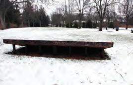


This is a selected piece for the 2010 Cranbrook Academy of Art Chair Show
Creators: Ye Liu & Hsin Chun Wang
Location:
On the lawn of Eliel Saarinen’s Cranbrook Art Museum and Rafael Moneo’s new building.
Floor Area: 16’*7’
Materials: 2*4, 2*8, 4*4 framing lumbers, 4’*8’plywood sheets, turf spots, soil, plastic garden fence, steel joist hangers, 2*4’*8’ pink foam
Cost: approx $450.00
Construction Phase: March 11 - 24, 2010
Winter 2010
AVITA INFRARED THERMOMETER
The product was designed for small size organizations and for home usage. An elegant and ergonomic shape to adopt hand gestures for long-term and short term operations are the first priorities for this project. We came out of the concept with the body housing blended in with a handle, it is leaning forward with the enlarged scan button for one or two fingers to press/operate. Rubberized coatings were applied to the buttons and the middle strap for better grabbing.
The project was completed and eventually went into production in 2009 and has been sold in Asia, Europe and North America with different brands at the price around 60 US dollars.
Material: ABS, rubber, acrylic, led screen
Specifications:
Specialized LED screen display
Non-contact infrared sensor
Human mode / object mode
2 AAA batteries


Engineering and ergonomic design

The forwarding 15 to 30 degree angle is designed to prevent Ulnar deviation and Radial deviation when holding the handle which offer the most comfort grabbing gesture. We worked very closely with Avita’s mechanism design team to make sure all parts, parting lines, and the assembly of the product were exactly what we pictured and modeled. The scale and proportion of the product were designed for one hand operation. We went from T0 test injection all the way to the final production with suppliers in Taiwan and mainland China.


WOOD HEADPHONE
The wood headphone project was to build a headphone with retro sound quality use real natual hardwood as earcups. The form of the design paid more attention to create visual elegance to human eyes as well as physical comfortness for wearing it.


VALET
Valet is an all-in-one bluetooth speaker with iPhone docking/charging station. We designed the device after the key vibes we selected such as lounge theater, winery, and coffee store, and the final proposal was this compact size table top speaker that targeted young professionals who don’t necessarily work in a traditional office space.


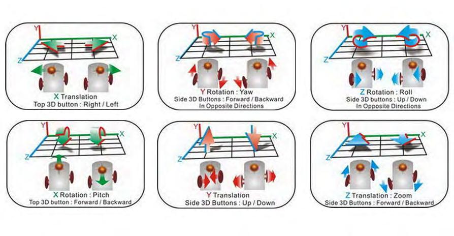
SANDIO 3D GAMING MOUSE
This project was to build the new generation of mouse that can control all six axes (x, y, z movement and rotation) for the emerging needs for three dimensional control in virtual worlds such as MindCraft. The traditional mouse which can only move at x and y axis has a limit which can’t move in a 3d space freely. Working with Sandio engineers who built the 3-joystick-system, we designed the mouse that was comfortable to operate with the system for possible long-term use with games or 3D softwares.

EXSPIDER BACKPACKS
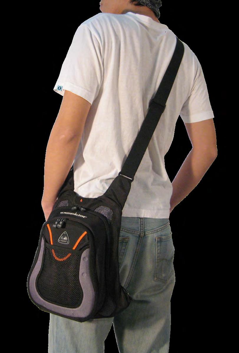
The soft goods products were developed for EXSPIDER, a raising bike and accessay brand at the time who targeted at the US and Europe markets. We use EVA forming shell and micro injection parts as baseline to create the male focused product line. The products were produced and debuted at the Taipei Cycle Show. The utility bag design above was developed for bike commuter who can easily change the way to wear depends on the type of transportation methods. The backpack design at right was for urban moving. The spine feature can hook up small accessories and the triangle label has LED backlight for night safety.
