Translucent Phantom 01
2020 Fall
Degree Project
Individual Work
Program: Bicycle Visitor Center
Instructor: Philip Holden
Site Location: Saint Louis, USA
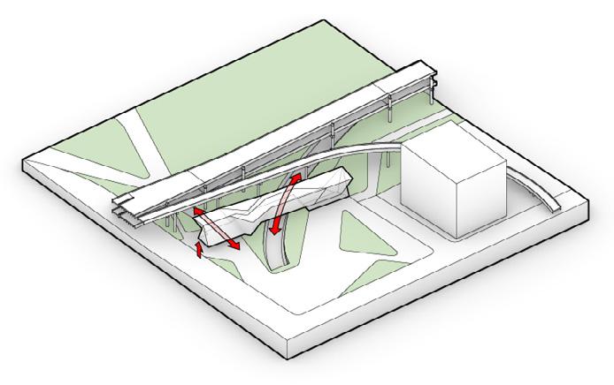
This project is a bicycle visitor center. The site is located adjacent to the Busch Stadium, crossing by the I-64 Highway Overpass and Metrolink. For now, the I-64 Highway overpass seems like a border to separate the downtown into two parts. In the future, the Chouteau Greenway would be constructed on the south side, the site would be a border between the urban space and landscape. The intention of this project is to reform the original negative border space, as a vertical screen to maintain the urban interface, and a landscape stops point to extend the greenway bicycle activities. The intervention strategy is to twist the translucent surface to increase the spatial perception, reactivate the interaction of the border’s both sides, and making a comparison to the original heavy border – I-64 Highway Overpass.
Site


Condition


Metal Fabric Polycarbonate
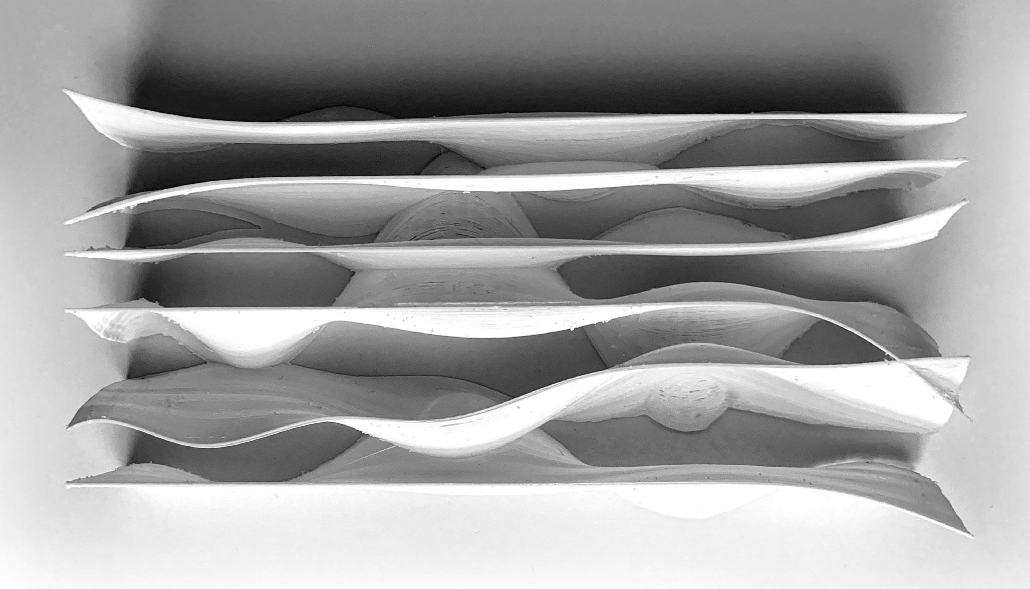
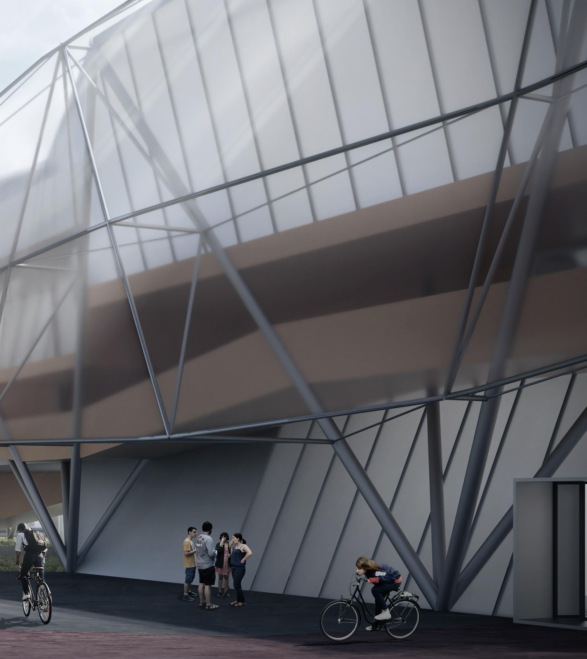
Twisting surfaces to create spatial interaction. After the twisted, it could form the independent interior space, strip interior space and exterior space. For the surface covering the space, it could be separated into three materials. The interior using the metal fabric, the enclosure using the polycarbonate panel and the exterior facade using the single-layer ETFE.



Massing Generation
Maintain the urban interface continuity as an urban screen.
Lifting the massing above the ground to let pedestrians and Metrolink get through.
Extending the massing to connect the bicycle path under the highway
Spatial Study Model - Twisted Surface Roof Edge Slab Edge ETFETemporary Exhibition Area

Pedestrian Atrium
 The view looks from bicycle rent space to the atrium.
Skylight Baffle
Facade Frame

Secondary Cable
Single Layer ETFE Surface
Roof with Skylight Facade Structure
Polycarbonate Panel
Clear Glass
Tension Cable
Compression Column
Circulation
Bicycle
Pedestrian
Translucet Enclosure
Tensegrity Column System Bicycle Tube
Observation Platform

Facade Structure
 A landscape platform overlooking the city from the height of highway bridge.



Cafeteria

Bicycle Terminal
 The transition level to connect pedestrian between the second floor and third floor.

Secrete Land: Rigid vs Freedom 02
Solid and Void
2019 Spring
Individual Work
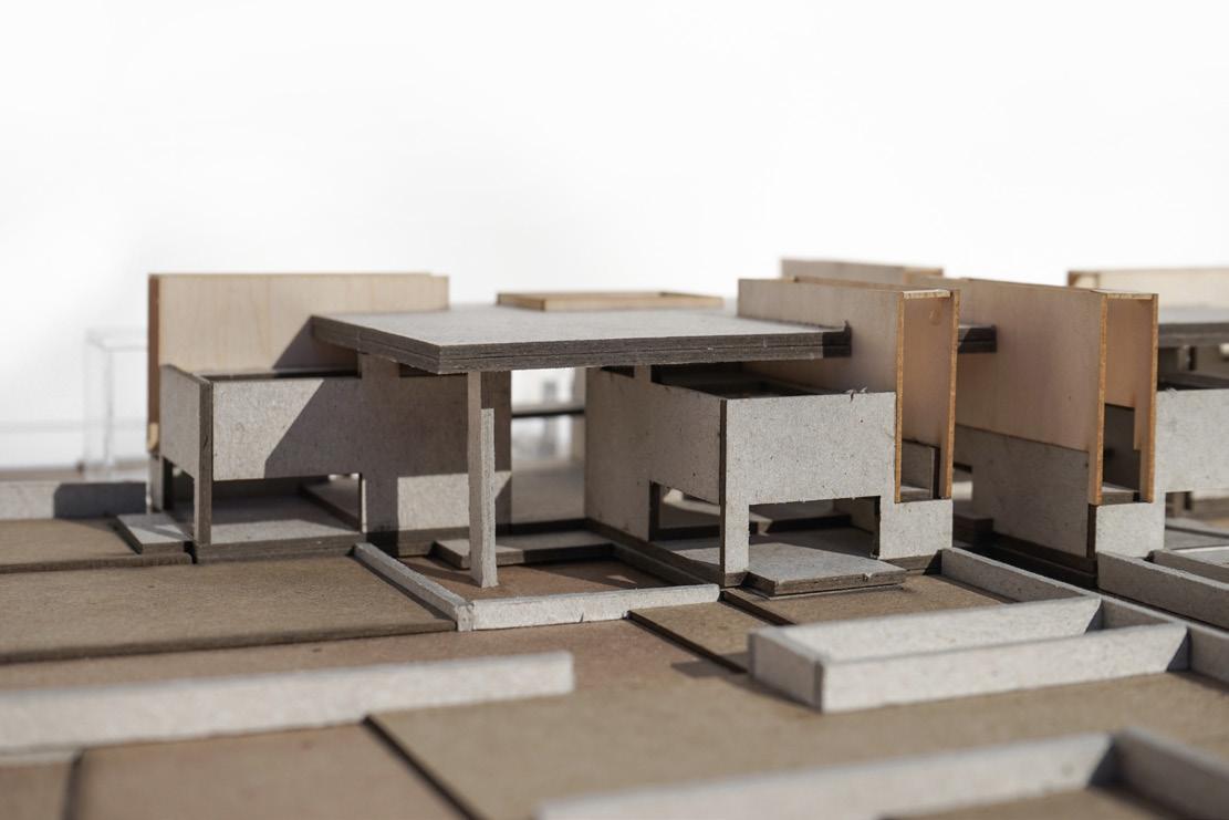
Selected for Exhibition: Seeing Double - Decoys and Depictions
Program: Night Club + Living Commune
Architecture Studio Work Instructor: Ginés Garrido
Site Location: Stockholm, Sweden
This project is a renovation project of a historic building. The site is Mariahessen, a historic building in Stockholm. Since the building is adjacent to a historical neighborhood, the renovation strategy is to maintain the original historical building facade and generate a new structure inside. The generation core concept is solid and void. Carving out by the solid massing, the building is divided into two different parts with dramatic atmosphere contrast, one corresponding to rigid and one corresponding to freedom. The program of the building is a raving club and a temporary living commune, which can accommodate the frequent electronic music raving parties in Stockholm.
Mriahessen is located at the northern end of Södermalm Island, adjacent to the Mariaberget high historical conservation value neighborhood. Mariahissen’s task is to connect the upper part of Mariaberget to the SöderMälarstrand riverfront, with a height difference of 20 meters between the two layers. Under such drastic topography, Mariahessen mainly faces the north river view. Due to the height difference on the south side, many spaces on the south side are blocked by the rocks, which greatly affects the lighting condition.

 Steet Elevation of SöderMälarstrand Riverfront
Renovation Strategy
Mariahissen is an important historical building, which is also located in a historic district with high conservation value. The renovation strategy is to maintain the original historic facade, open the roof to import skylight, and generate a new structure within the original historic enclosure.
Solid & Void
The generation concept is solid and void. The solid part and the void part have a dramatic contrast in spatial atmosphere and activities. The solid massing carved out the entire building volume to form a rigid space, remaining the void part of free and flexible space.
Site Layer Connection
Mariahessen was originally built to connect the height difference of the site. The building connects the site in three levels with different height differences, correspondingly to the ground level riverfront, the sixth level back street and the tenth level bridge.
Program Divide
The topography and the orientation on the north affect the lighting condition of the building. The solid part corresponds to a more closed orientation and is used as a club. The void part corresponds to a more open facade, used as a public space and living.


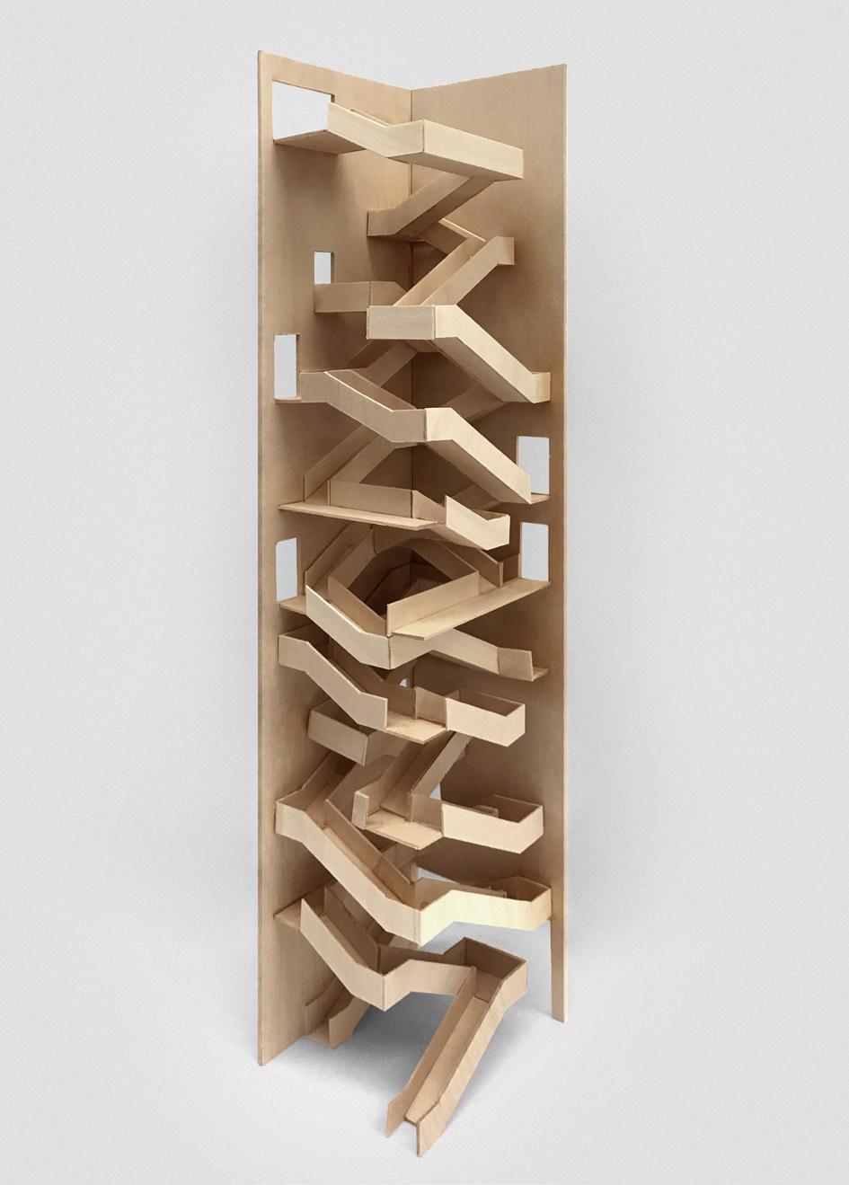
Circulation Core: Double Spiral Staircase


The building’s main vertical traffic is the central circulation core, which shared by the living and club circulation. The prototype of the core is a double spiral structure of DNA, which completely separates the circulation of living and club in the same space. Within the core space, they can perceive each other visually, but no physical contact at all.


03
Space of Learning
2019 Fall
Architecture Studio Work | Comprehensive
Individual Work
Selected for Approach 2019 GSAUD WashU Publication
Program: Montessori School
Instructor: Robert McCarter
Site Location: Saint Louis, USA
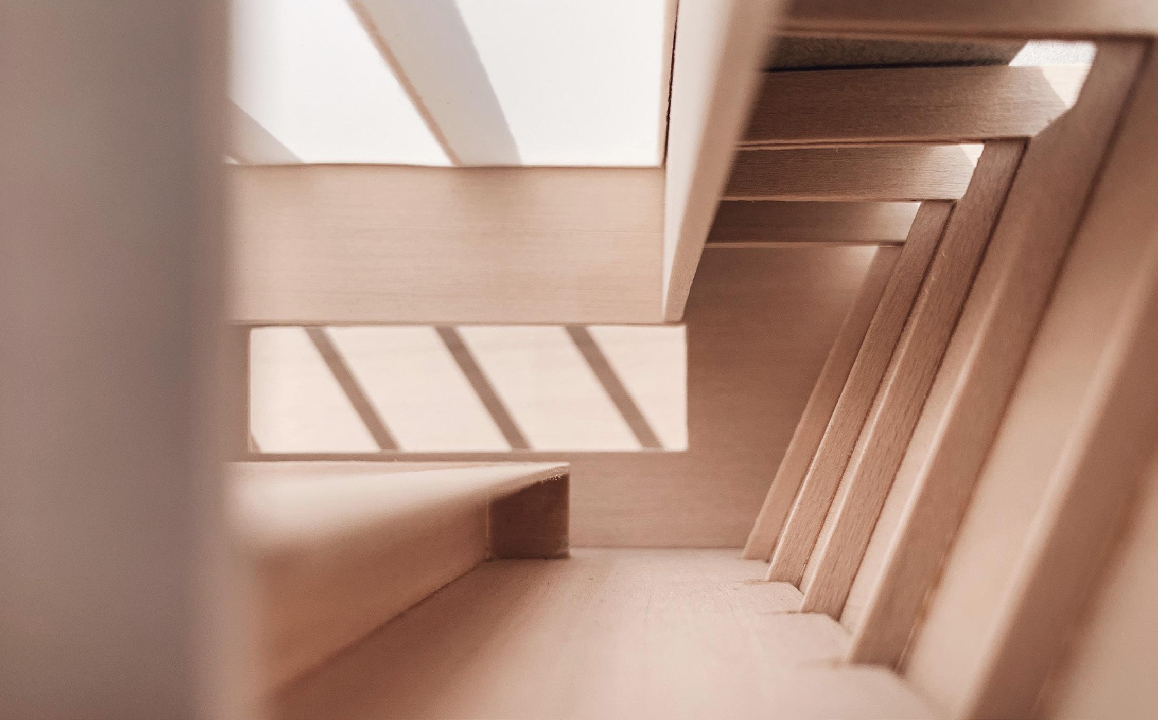
Montessori school is a space for kids to learn things by themselves spontaneously. For the space atmosphere, it should mostly like a family. The piazza, “living room” of the “family”, containing most activities of kids beyond the classroom. It combines with the classroom interior porch, to build a connection between each classroom unit. Also, in this project, the connection is extended by the hanging stair and the skinny table space which are all facing to the piazza, making kids have a view contact when they engage in some activities. Besides, each “family” needs some independent space to stay alone. There are several sunken corner spaces allow kids to sit alone between each classroom unit. In this project, the grid system is the control element to integrate the geometry, structure, landscape and program layout.
Prototype Axonometric


Library
Mat Space


Skinny Table Space
Regular Table Space


Piazza Relationship

 Each classroom unit has a major facade facing directly to piazza space. The facade integrates the front porch and the hanging stair. The front porch combines with build-in furniture, which could increase the interaction between different kids. The stairs are divided into the inner half and the outer half, which gives children a better experience of exploring the space.
Grid & Geometry
Stair Inside & Ouside
Structural System
 4.Classroom


 Piazza View


 Aerial View


