
About
Me
I am a junior at University at Buffalo pursuing my BFA in graphic design and minoring in business management. I have lived in Japan for most of my life and moved to the US when I was 18. My interest in design is to create visuals that inspires, moves, and connects the viewer. I have always been a creative individual since a young age and have had great influence from Japanese culture of anime, calligraphy, and my Fathers busines which is manufacturing of tatami boarders. I have experience in creating logos, newspaper graphics, t-shirt designs, and advertisements. Besides design I enjoy playing competitive tennis, running in nature, traveling, and listening to rap music. In the future I would like to start my own business.

Social Media
Instagram: @kailo.jpg
Tiktok: @kailo.jpg Contact
Email: kailomor@buffalo.edu
1.Galaxia Technologies Inc

Inspiration
Galaxia Technologies Inc is a company that advises the US Government on Agile Software Development in Space Programs. Mainly focusing on military contracts with satellite and space monitoring.


Galaxia Technologies Inc

Here are some of the initial logos that I curated from the original inspirations. I focused on using futuristic and space as a theme but still perusing a clean and simple design.
Here is a version of the logo that has an emphasis on the ac-tual depiction of a galaxy in a simple form with a font that effectively communicates the futuristic aesthetic to the viewer.
Technologies Inc.
Galaxia
Technologies Inc.
Your name
Galaxia
Galaxia
Galaxia
Galaxia
G Color RGB #00080
This version of the logo is to demonstrate space and brand identity with two planet rings wrapping around the letter G. I focused on giving the logo a complexity without making it too messy.
Your name
Galaxia Technologies Inc.

In this version of the logo, I focused on making it as simple as possible but still showing meaning. I did this by representing a shooting star which could also be a ring that goes around a planet.

name G
Galaxia
G
Your
Galaxia
Galaxia
G G GG Galaxia
Galaxia Technologies Inc. Galaxia
Galaxia
Galaxia
Galaxia
2. Athlete Poster


Inspiration
I had an oppurtunity to design a sequence of posters of my favorite athletes of all time as a project.


I wanted the posters to be simple as possible and communicate the important information to the viewer, but still adding a creative touch to it. To do this I utilized the combination of horizontal and vertical aspects of font and photos to achieve this.


3. Drag Show Flyer


Inspiration

 The Real Housewives of Buffalo is a drag show organized by Daphne York and DJ Lil Gab that I had the opportunity to design a flyer for social media.
I used hot pink and neon light pink aesthetic color theme to design this event flyer with the original photo provided. I focused on effectively communicating the information using different effects, font sizes and fonts to the viewer.

4. @Sidetalknyc Poster

Inspiration
@sidetalknyc is a talk show famous for there short clip interviews of people in nyc.


I focused on using a colorful palette with inspiration from the use of color with Andy Warhol’s work. I also showed emphasis on the phrase “Bing bong” which went viral on social media to target the younger generation who are the main audience of this channel.

5.Beat The Stampede 1 Mile Race

Inspiration

 Beat the stampede is a 1-mile race organized by University at Buffalo that started in 2022. I had the opportunity to design the first logo and medal for the race that had a participation of 100 people.
For the two medal designs I focused on achieveing a unique medal that can’t be found anywhere and communicating the UB brand. For the logo I tried to create a logo that matched the vision of the client that was easy to identify and could be used in different formats.


 2022 Design 2023 Design
6. Cover Art a Day Project


Of the month of June, I designed cover art every day to challenge myself by creating designs that have meaning and visual identity.


New Single Most Played Fresh Thrones Holy Grail Toned Jay Traum Audio Son Unlikely Ways Playlist Mood Music Player Work Out Rainy Day Midnight Drive Shuffle Lorem ipsum Lorem ipsum 01 Show time Pence Discover End 01 Golden Spray Mysterious Lines 01 Viral Friday Temptations 01 Dusty Mr Madness 01 Lorem ipsum Mirror
7. Class, Poster Projects
Essentials
 Kailo Mori
Kailo Mori
Kailo Mori
Kailos’
361
ART
Poster project for typographic forms. I focused on creating a graphic that is unique but also can easily communicate the information.
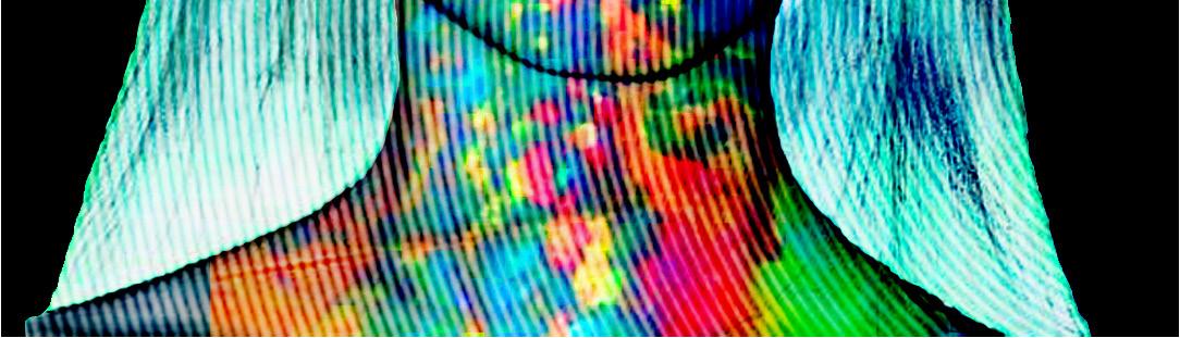
Type exercise for typographic forms. Focused on expressing the futuristic vibe of the type in a 45-minute exercise.
Monogram project for typographic forms. I focused on creating a monogram that represents me and using negative space effectively.
Poster project for intro to graphic design. I created a poster using all the items in my room and using negative space to represent myself.


 Poster project of Frank Ocean. Focusing on layout balance and distance between each subject.
Poster project of Mac Demarco. Creating a poster that stands out and expresses the aesthetic of the artist.
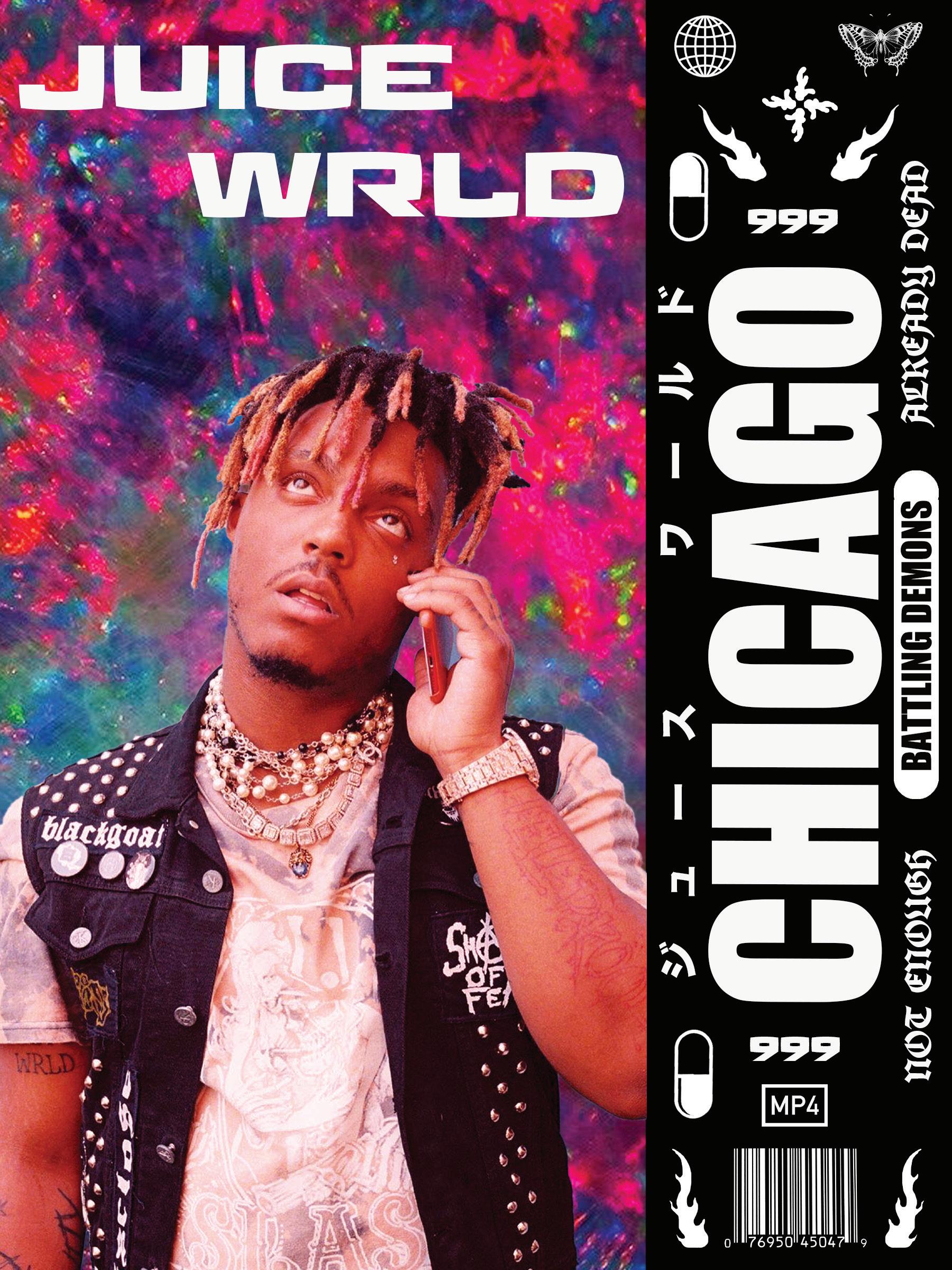
Poster project of Juice Wrld. Using photo editing and multiple types to express the artists vibe.
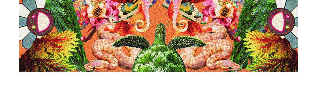
Poster project of Trippie Redd. using symmetry and balance to create a visually appealing poster.
Poster project of Frank Ocean. Focusing on layout balance and distance between each subject.
Poster project of Mac Demarco. Creating a poster that stands out and expresses the aesthetic of the artist.
Poster project of Juice Wrld. Using photo editing and multiple types to express the artists vibe.
Poster project of Trippie Redd. using symmetry and balance to create a visually appealing poster.
海朗