
ISSUU'S TASTY BITS & BYTES NOVEMBER 2016 VOLUME 1 ISSUE 1 THE #NEWISSUU ISSUE
Beautifully Brainy
Meet the #newissuu reading experience.

Writer Joel Barnard
Creative Director Nicole Chiala
Guest Illustrator
Maya Gürtler Lorentzen


Alexander Grosse, Amalie Rosenstand, Anders Hellerup Madsen, Anders Fugmann, Andreas Dahl, Andrei Ungureanu, Cameron Gallacher, Christian Kastbjerg, Denise Twum, Elise Sabbag, Fabio Stabel, Fernando Romero, Francesco Zanitti, Frej Soya, Grace Cheung, Greta Baranauskaité, Jesper Torp Kristensen, Jesper Holm Olsen, Joe Hyrkin, John Sturino, Jonas Nielsen, Joshua Davis, Karen Mørkholt, Kenneth Skovhus, Lasse Bach, Laurits Langberg, Louise Gonzalez Lauridsen, Maciej Pekala, Mads Sejersen, Marie Bjerregaard, Martin Koch, Matt B., Michael England, Michelle Yang, Mie Tandrup, Mikkel Jensen, Musharrif Hussain, Nicolai Gylling, Paul Kim, Peter Assentorp, Rachel Torres, Rob Siwek, Rolf Ussing, Simon Ellefsen, Slavko Krucaj, Slawomir Smiechura, Søren Thomsen and Yan Hong.
The issuu Interns: Anisa Tavangar, Ashley Zhang, Jessica Wong, Joseph Kind, Kaija Hsiao and Maya Kandell.
The issuu Production Babies: Frode, Issac, Lea, Lucjia and Naja. Special Thanks: Fredrik Linåker, Juan Jose Romano, Jiyu Zhang, Jonas B. Jensen, Mads Hartmann, Raghav Karol, Sorin Dimofte and Søren Vind.
This publication was created using Adobe InDesign. The project workflow was managed seamlessly using issuu Collaborate, the easiest way to plan and produce publications in one place.
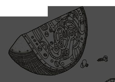
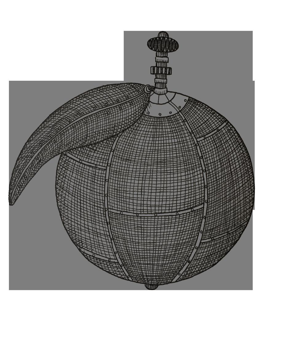
When Life Gives You Oranges...
 Words by Joel Barnard
Illustrations by Maya Gürtler Lorentzen
With the world changing around us, the issuu team saw an opportunity to reimagine the reading experience from the inside out while keeping true to the original issuu vision. Time wasn’t on our side, but our aim to deliver a stellar reading experience everywhere and our commitment to quality was.

If there’s one constant in the technology game, it’s change. The better, faster, smarter version is always just around the corner. Sometimes no one sees it coming. Sometimes its arrival date is plastered on every blog, bus and billboard. And in the case of the imminent demise of browser and mobile support for Flash (the core technology issuu’s reading experience was
I was really excited to work on this project because we had a chance to rethink all the past established practices. We didn’t do things the same way, just because that’s how they were always done. Instead, we searched for the absolute best way to deal with each task.
— Maciej Pękala, Engineer
built on), it has been a long time coming. Smartphones never had (real) Flash support, and the desktop browsers announced they would finally be pulling the plug “sometime” in 2016.
had faced before — could we change the experience millions of people already love in ways that would make them love it even more? Would it be possible to rebuild such a large plane mid-flight? And how much time would we have to do it? One thing we knew for certain is we would stay true to our philosophy of not rushing products to market that we couldn’t be proud of. Of course, this time the stakes were much higher. It was a race we couldn’t lose. And yet, no one knew if doing things the right way would allow us to reach the finish line in time.
All or Nothing
Staring down the barrel of this unknown deadline, we faced the dilemma other companies
By mid-2015, we began by putting together a rock-solid engineering team tasked with finding a solution. This included several long-standing issuu engineers, plus some newer brains, like the project’s Senior Product Owner, Alette Holmberg-Nielsen. In the very early days of the project, our end goal wasn’t completely clear and a vision had yet to be formed. We were driven by the slow death of Flash in the browsers, but according to Alette, “It quickly turned out this could not — and should not — be only about a technology change. Really, it had to be about


Setting Up the Team
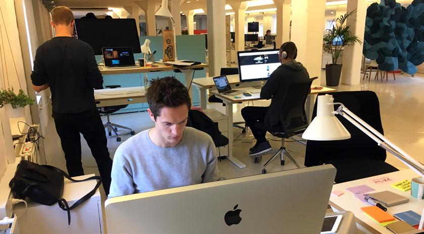
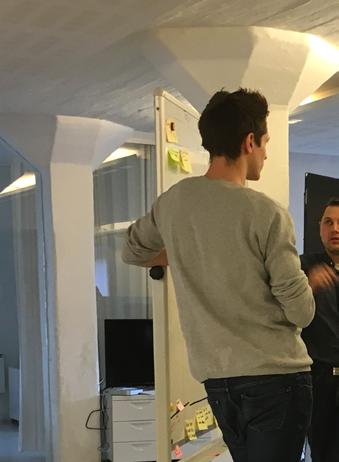
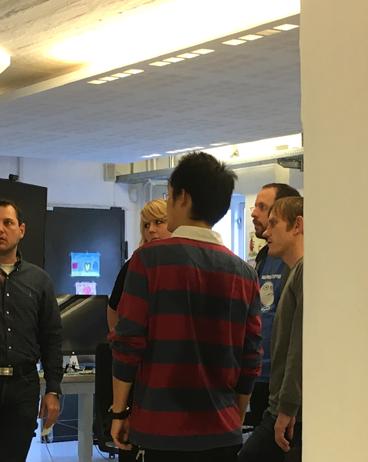
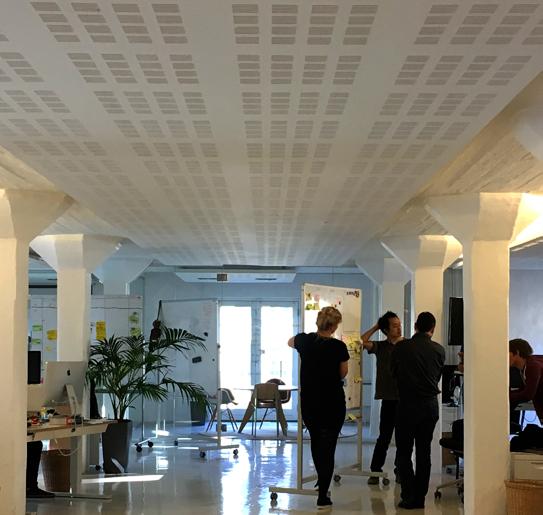
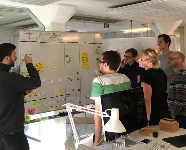
The team was set up with people having different experience, skill sets and personalities. Four developers had worked on various aspects of our previous reading experiences. Three developers, the product owner and the designer were new. Team members had a mix of artisan, science and philosophical backgrounds, and everyone was highly motivated. One key to our success was our ability to listen to each other (even during heated discussions) and treat each other with respect. We also had a good balance of agitators and moderators. All meetings were open to everyone on the team and those in attendance understood their roles. We almost always pair programmed. And rather than having only experienced people making decisions, we gave newer members a bigger voice, which worked out surprisingly well.
Søren D. Thomsen Director of Engineering
 Yan Front-end
Mads Full-Stack
Peter UX
Rachel Marketing
Soren Director
Anders Front-end
Alette Product Owner
Mie Support
Frej Back-end
Anders Lead / Back-end
Greta Support
making sure issuu remained the best reading experience on every device and browser everywhere.”
Not a group content doing things halfway, we set off on a quest to redesign, re-engineer and reimagine what has always been issuu’s core product — the reading experience. And
As a company, we never stand still (or go backwards). We create, respond to our customers problems and work hard to make issuu a better place for everyone.
— Greta Baranauskaité, Customer Support Associate
we would do it using HTML5, the new gold standard in technology. It wasn’t the first time we had attempted to build an HTML5 reading experience, but our previous attempts never exceeded what Flash could deliver. This time things had to be different. But would there be enough time?
Less, but Better
When we started digging deep into the core of the Flash reading experience, we quickly
Responsive, instantaneous, discoverable goodness.
Same Embed, Everywhere
With a newly redesigned embed, your publications are a lot more responsive, interactive, branded and incredibly consistent no matter where they are on the web.
No-Wait Loading
In addition to a more user-friendly layout, the new issuu reading experience is much more snappy and responsive. Opening any publication on the page is nearly instantaneous.
Discovery Made Easy
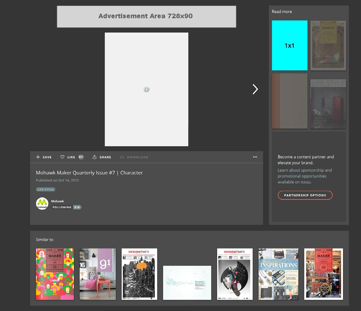
Redesigned shelves below the publication and added “Read More” section so it’s easier than ever to discover something new, including similar publications, recommendations and the publisher’s back catalog.


Beautifully Brainy


While having a beautiful browsing experience when you flip through pages, we now make it much more natural to start reading and dive into the content. —Anders Fugmann, Team Lead

Obvious Always Wins
Improved navigational elements, like page arrows moved off the publication, which has increased the number of pages people are reading.
Easy on the Eyes
Uploaded files are split into layers of high-res JPEGs and text layers to enable crisp, clean text that’s easy to read at all zoom levels.
Even the 5pt. disclaimer type that your insurance company doesn’t want you to read.

Page Flip Heaven
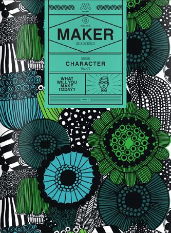
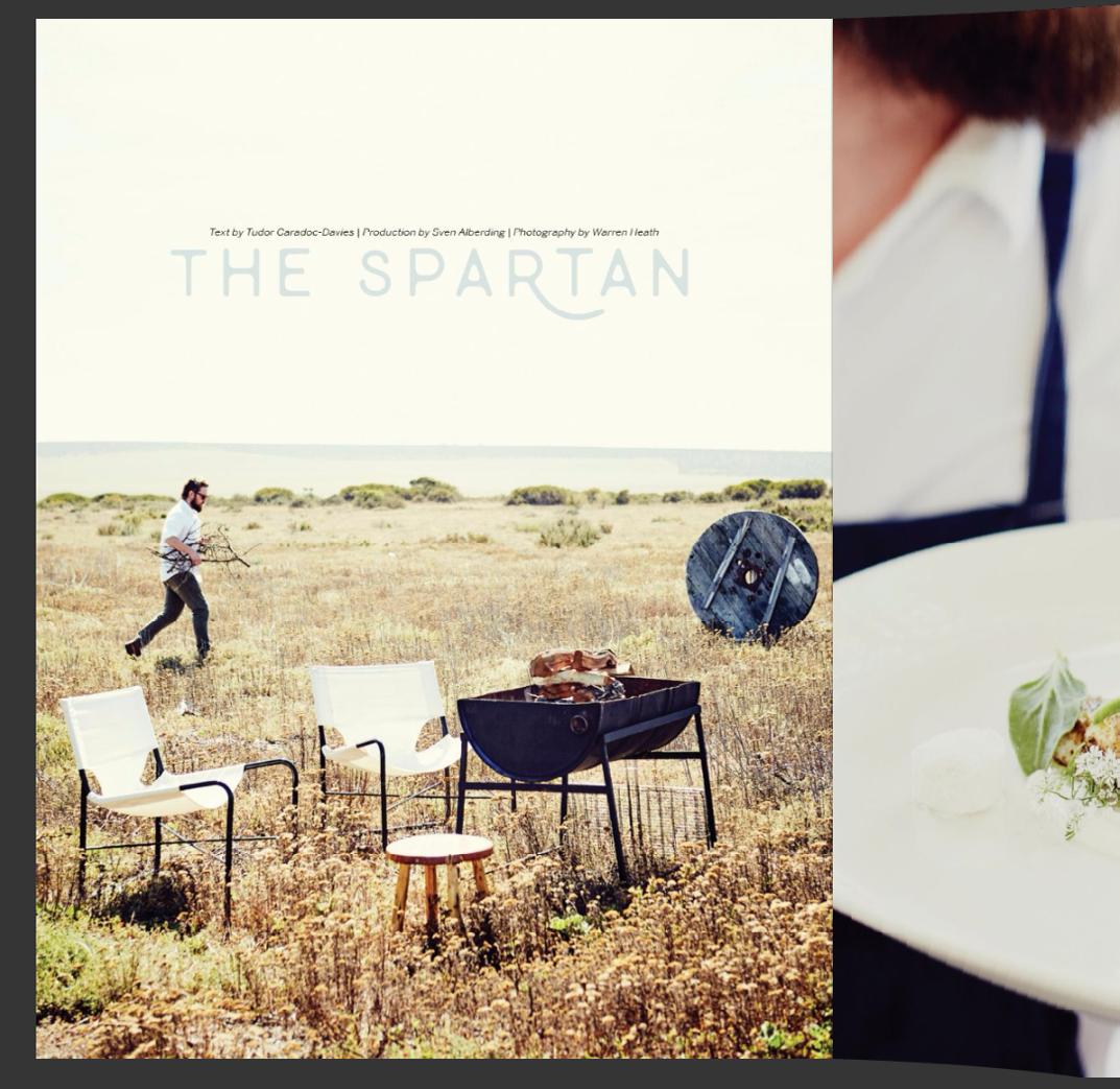
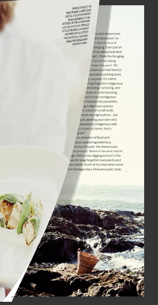
If you haven’t noticed by now, a completely new page flip animation, which is better than anything else out there. Slowly lift a corner to see what we mean.
realized this seemingly simple product was a big beast filled with many features added over the years. Getting a complete overview felt almost like an archeological dig. In total, we were faced with 70 or so different features to implement. Even if we could throw together a
So we asked ourselves what is absolutely essential to the issuu reading experience.
feature per week (which would be impossible), it would take over a year to get to the first release. Not exactly within our timeframe.
So we asked ourselves what is absolutely essential to the issuu reading experience. To answer that question, we trawled through all the comments from our publishers and we studied the behavior of our readers. We focused our efforts on a simple and intuitive interface for reading, crystal-clear text and a beautiful home-brewed page flip animation. And without question, all features needed to work everywhere — on small and


of people who enjoy independent publications.
— Alette Holmberg-Nielsen, Senior Product Owner
large screens, as well as on all touch, mouse and trackpad devices. Trying to get everything to work flawlessly everywhere ate up a lot more of our time than expected. Needless to say, the calendar pages kept on turning
Truth Is a Compass
Knowing we had to get things absolutely right, continuous feedback from users became an indispensable development tool. Every week we set up tests asking users to complete a series of tasks and then speak about their pain points while being recorded. And every week, we refined and released a new and improved version.
We tested the version currently in wide use, as well as our latest build of the new reading experience. Watching people struggle is painful enough, but when it’s with something millions of people are already using, it’s absolutely heartwrenching. For example, nearly every single test subject tried using our current looking glass icon to zoom in instead of its actual purpose — in-publication search.
Could a handful of users possibly be representative of the millions of people using issuu? When we started talking about these user tests, it was one of the most asked questions. Well, some things you only need to see a few times to know it’s dreadfully broken. Like
Building the Right Thing
The biggest challenge we faced during the development of the new experience was creating a modern, responsive, beautiful and functional UI. With the new version we revisited all the decisions that had been made in the past, and made a new interface based on user tests, A/B testing and of course the considerable experience of our excellent UI and UX designers.
Anders Hellerup Madsen Frontend Developer
Making It All Hum
To me, the biggest challenge has been performance analysis and improvement, since one of our goals was to provide a smooth experience while zooming, panning or page-flipping. The performance is measured by monitoring the frame rates during animations, based on all of the new version’s traffic. Our dashboard displays the numbers on a timeline, grouped by browsers and devices, labeled with each release. Every time that chart changes dramatically, we try to understand what our code is doing and fix the problems.
Yan Hong Frontend Developer


when we discovered how our testers on mobile devices kept unintentionally bringing up the drawer with related publications and weren’t able to close it again.
As painful as it is to see someone on the other side of the screen struggle, it’s equally rewarding to see when person
experience was building within the company as well. Customer Support Associate Greta Baranauskaité may have summed it up best when she said, “As a company, we aren’t ever standing still. We create, respond to our customers problems and work hard to make issuu a better place for everyone.”
The team was set up with people having different experience, skill sets and personalities. Some had an artisan mindset, others had a science mindset and still others had a philosophical mindset. The one similarity was that everyone who joined was highly motivated.
—Søren D. Thomsen, Director of Engineering
after person successfully uses your product without friction. When users don’t even notice the thing you worked so hard on and only see the content they came to read, you know you’ve succeeded. For every gutpunching blow we experienced, we were rewarded with new insights that for every iteration led to a much better user experience.
The Final Push
With the rush to the finish line, excitement for the new
Leading up to our November launch, we continued to release to new sets of audiences and talked to a wide range of publishers and readers. Their positive reaction to the new reading experience was even greater than we could have imagined. Not only did we manage to solve all the usability issues we wanted, readers were now able to view publications on issuu with crystal-clear text, more vibrant colors and twice as fast as before. We were finally ready to go live.
Hello World!
We are thrilled to announce the newly redesigned, re-engineered issuu reading experience is here. Reading is faster, smoother and more pleasing to the eye. Discovering new publications couldn’t be easier. And the new experience is much more consistent across every platform, device and web browser.
So far readers and publishers are loving the new and improved reading experience, which gives us great pride. All the work we’ve done to date is the foundation we will use to introduce exciting new products and features for readers and publishers everywhere very soon. Until then, happy reading!
Achieving Crystal-Clear Text
We chose a seemingly simple solution to display crystal-clear text that’s easier to read — even when zoomed in close. The process involves separating text and graphics into several layers, then drawing them on top of one another. Unfortunately, extracting text isn't as straightforward as it might seem. That’s because instead of containing text, PDFs typically only reference letters in the embedded font. If those letters aren’t at their expected positions, the wrong text is likely to be extracted.

Getting it right across millions of publications is a huge and important task, and we left nothing to chance. In addition to dialing in our proprietary extraction software, countless hours have been spent looking through publication after publication to make sure all text was


that we always break larger projects into multiple releases and ship them one at a time. With this project we’ve already rolled out the majority of the biggest changes to the issuu reading experience. Hopefully you’ve already noticed the performance improvements and the experience’s new look and feel. But wait, there’s more!
In the coming months we’ll continue to optimize for speed and release other features that will make the reading experience even better on all devices, browsers and screen sizes. This new and improved issuu is the foundation for our future. We’re thrilled you’re along for the ride, and we can’t wait to share what else we have in store.

Meet Peter Assentorp
Peter Assentorp has been the designer of issuu’s new reading experience from the very beginning. His experience in designing for mobile and his rapid prototyping skills have been crucial to the success of the project.
What was your path to issuu?
I started my professional career as a junior designer/developer at a digital communications agency before pursuing my degree in marketing management. Shortly after graduation I landed a job as a Digital Designer and Frontend
Developer at an advertising agency called Gottlieb & Co. After three years there, I stumbled upon an issuu job opening while searching for something else online. It turns out they were close to removing the job posting because they already had several strong candidates in the queue. I feel very lucky to have landed the job.
What is your favorite thing about working at issuu?
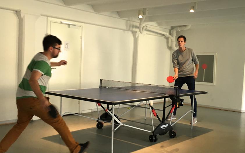
I really like the culture, the people and the freedom you have here. There is always room to grab a coffee or play ping pong to get the
Title: Designer
Office: Copenhagen
Since: July 2014

Favorite issuu publishers: Sport Magazine


blood flowing again and it also feels great to be surrounded by so many smart brains every day. I feel human here. If I had to choose my favorite thing about working here I’d probably say being able to touch so many people's lives around the world feels pretty good. It’s sometimes crazy to think that what I’m designing is going to be seen and used by millions of people every month.

What is your favorite issuu core value and how do you live it?
I’d say ownership is probably my favorite. It’s so important for a company of our size. Ownership to me means taking responsibility and never assuming it’s someone else’s problem. If I see something that doesn’t work or doesn’t look right, I’ll try fixing it myself first. If I can’t, then I’ll find a person who has the skills to help me get it done.
What has been your biggest challenge this past year?
Without a doubt designing the new issuu from the bottom up. It definitely wasn’t an easy task to redesign the core product that has served us well for almost a decade — and is the reason why we still exists today. It was especially tough to think many steps ahead while designing to ensure that all the pieces would fit together in the future since we couldn’t build everything at once.
What part of the new reading experience are you most proud of?
I’m mostly proud of how we’ve unified our reading experience. In the past we’ve had different interfaces for different browsers — meaning the interface would change depending on whether or not your browser has Flash. Even though it's being used by more people all the time, it's
Favorite issuu publishers: frrresh Magazine
SOFFA Magazine


been a technical challenge to maintain. It’s been our goal for more than a year to have one codebase and one interface. I’m really amazed at how the entire company has rallied together to finally reach that milestone.
How do you think readers and publishers are going to react to the new reading experience?
It’s a pretty big change we’ve made to the whole reading experience. Not only have the publisher embeds changed but also the reading experience on issuu.com. Everything has a brand new look and feel, which I think both publishers and readers will love once they start playing around with it. We’ve really spent a lot of time ensuring that they're getting the best possible reading experience.
It’s always fun to look back at the designs and prototypes I had in the beginning and see how it has evolved over time into something much simpler and better.
—Peter Assentorp, UX Designer

Be beautifully brainy with us.
We’re looking for new issuuees to be part of our next big idea. Join us and help change the future of publishing today.
OPEN POSITIONS


 Words by Joel Barnard
Illustrations by Maya Gürtler Lorentzen


 Yan Front-end
Mads Full-Stack
Peter UX
Rachel Marketing
Soren Director
Anders Front-end
Alette Product Owner
Mie Support
Frej Back-end
Anders Lead / Back-end
Greta Support
