
JUNE/JULY 2024
MAGALOGUE 5
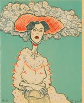
COVER IMAGE
Guardian of Secrets
CAROLYNDA MACDONALD
oil on linen | 60cm x 56cm
+44 (0) 1463 783 230
art@kilmorackgallery.co.uk Kilmorack Gallery, Inverness-shire iv4 7al SCOTLAND
Selected Images
A Colourful Moment | Tony Davidson visits Maggie New’s studio
PINKIE MACLURE | The
Cailleach
In Conversation with Beth Robertson Fiddes
Pink Moon studies by Iona
Tansy Lee Moir | Ghosts
Winter Table | Christine Woodside
In Conversation with Rory Macdonald
Images from the Vault
1 - 2 3 - 6 7 - 10 11 - 16 17 - 18 19 - 22 23 - 24 25 - 30 31
contents


Here are a few works which will be in Kilmorack Gallery over June 2024
You can view more on-line and be kept up-to-date by joining our mailing list.
Fish Pond | CHRISTINE WOODSIDE RSW RGI Beauly Elm | IAN WESTACOTT
The Hat | ROBERT POWELL Storm RIder | ALAN MACDONALD


First to Arrive | MARK


2
Autumn Tides | BETH ROBERTSON FIDDES
EDWARDS
Strata Jar | PATRICIA SHONE 70°N, The Dancers | BECS BOYD
A Colourful Moment

PaleTrace MAGGIE NEW
oil on boad | 27cm x 36cm
TONY DAVIDSON visits Maggie New.

I would like to holiday in an artistic quantum reality where beauty and truth are visible. I’ve almost been there before. It sits close-by and offers only the quickest glimpse, before it disappears. I see and then forget – light, colour, wind, moon – arranged with purity. Part of me would like to return to these moments but words are too crude to remember such things. Paint, however, can retingle these parts of the brain. Colour has intense emotive power, and more so when it is next to another. The possibilities of painting are endless when shape is introduced too. I drive past trees leafed with the first green flush of spring to see Maggie New, and I am greeted with a cup of tea and my first sight of her latest work.
We head upstairs to her studio, past four paintings with deliberately muted palettes. The effect, without the mix of warm and cool colours to recede and bring forward the eye, and with a focus on shape rather than perspective, makes me concentrate on one plane, and this moves the painting somehow onwards to another. The artist has scraped into the surface in some places. Focusing on two dimensions has brought these paintings into an entirely new one.
At the top of the stairs are paintings with moons in them. I jest that other artists claim ownership over the moon. They can be possessive of it. It brings an otherworldly quality to a painting. Maybe, the moon helps restrict the palette too.
Spring, autumn, winter, night or day – we live in a world that rarely stays still and these diurnal and seasonal movements are another artistic obsession with many artists. Maggie New brings me back to earth and reminds me sometimes it’s just the shape, the circle, that is needed. A sphere introduced into a rectangular canvas is potent. It brings another dimension to the painting – geometrically as well as emotionally.
Some paintings Maggie tells me are her safe place. When colours and symbols become familiar to an artist, they can be placed around a painting to create the sought-after effect. Maggie New has been in this studio, or walking and looking at the seas and mountains of the north for over twentyfive years. She takes no photographs or notes, and studio-time is spent looking for the essence of her subject without being tied to the specifics. A story must be told in one rectangular space and she is very very good at this. I look at more work and feel a moment of awe in Night Light and the balmy heat of summer in Ochre Light. It is the combination of shape and colour that create Maggie New’s painted poetics, and it takes many years’ practice to achieve this, so long that New’s tubes of paints are familiars, part of the way she sees the world. She introduces me to her colours. Lemon yellow is subtly different to spectrum yellow and there is Indian yellow too. She shows me how these work in a painting. The effect is magical. They don’t merely represent an object, but lead the eye in-and-
5
out and from left to right. The tubes of ultramarine blue and cerulean blue are similarly squeezed and near the top of Maggie New’s paintbox.
There are always works in Maggie’s studio that are more experimental. They take her out of the comfortable landscape zone and into worlds of compositional exploration. They keep everything fresh. Outside, the first warm sun of spring is transforming the world, and inside, this is evident in New’s excited green paintings. A twisting and surging of painted growth pulls my eye in, and I know how hard it is to achieve this. Very few artists can paint green paintings without them looking somehow false. There are no horizons in these works. Almost to reset the ocular palette, Maggie New works on warm paintings at the same time and ones that, like on her staircase of are more two dimensional (but somehow opening a third one.) I love these works.
There is nothing complacent in this studio. The energy here is one of play and exploration, and this is a serious game. Maggie New has mastered the nuances of paint so well that she can hold that moment in her mind’s eye, the seen glimpse, without distraction. This is what all artists seek to achieve. It takes a meditative state - practice, time and understanding, but if achieved, as Maggie New does, we too can holiday there.
6
PINKIE MACLURE
This Cailleach is striding across the Paps of Jura, with the Corryvreckan Whirlpool below her and under that, two rusty, abandoned cars are being pushed apart by a giant flowerbud.
I've called this one 'Cailleach - The Breaker' because the Cailleach is associated with the creation of the landscape and the weather. She carries a hammer for shaping the hills and glens. I was inspired by the sight of a hydraulic grab at the breaker's yard pulling apart old cars, so I've cast her as a car breaker, but 'breaker' could also refer to the giant wave in the image. The Cailleachan are also known as the Storm Hags, and seen as personifications of the elemental powers of nature.
Pinkie Maclure
The Cailleach -The Breaker PINKIE MACLURE stained glass lightbox | 70cm x 45cm
7
The Cailleach

9
The Cailleach i PINKIE MACLURE
stained glass lightbox | 70cm x 45cm

IN CONVERSATION

Beth
Robertsnon
Fiddes speaks with Georgina Coburn about the forces at work in her latest paintings. with
BETH ROBERTSON FIDDES
GC: Your latest solo exhibition Water and Light draws on your experience of the Northwest and the Isle of Lewis. Can you tell us about your time in the field leading into this series of paintings? What were some of the discoveries?
BRF: I’ve been spending a lot of time at the coast near home and also had the opportuntity to revisit the northwest coast of Lewis. It’s important just to go and see what happens. I’ve learned over time that making too many plans to find or see particular things means there a chance I’d miss what’s actually worth seeing. I’ve discovered new pools in places close to home that I must have passed a hundred times. Treasures hidden only by my haste to reach a specific destination in the past.
I’d been to Ness before, and my intention was to return to see some hopefully wild water but I decided to explore the rocks around Eoropie at the last minute. It was quite something. Perfect light coming from the west, low in the sky, huge breakers without too much wind. I will return as I feel there is so much more to see there.
11
GC: Last Snow achieves a palpable, fluid sense of time, from the monumental, layered patterns of ice and snow in the background to the sublime, gestural brushwork of the foreground. There’s an ethereal quality, almost a dream state, communicated in the convergence of realism and abstraction, a shimmering path at the centre of the composition. How has your direct experience of land and seascape pushed the boundaries of your paint handling in this latest body of work?
BRF: Last Snow is based on walks further inland. Not based on any particular day but a collection of memories over the years. There’s a time every year where signs of winter are still everywhere but a change in the air lets you know the snow days have passed and spring is near. It’s not a fixed date on the calendar and it doesn’t necessarily coincide with any festival or celebration. This painting is a visual note of that time. Not a dramatic scene but an important moment to be marked.
In this painting and in others in this collection, the layers of paint are applied in different ways, brush, rags, paper, and wash, often elements are removed by sanding, scraping back or over painting either completely or partially with a wash of semi opaque paint. These ways of handling materials mirror the way I collect memories of individual visual elements, the shimmering path, the familiar patterns made by thawing snow, the dark silhouettes emerging from frozen ground. These memories are stashed away ready for future use but some are lost, overshadowed and set aside for a different piece. I have to make choices about which elements I want to bring to the surface each time.
I could maybe paint the same location several times with the emphasis changing in each piece. It’s important to me to edit the contents of the painting. The original idea is not always the focus of the final work.
GC: One of the largest paintings in the show, Water and Light, is a very powerful melding of natural forces and painterly elements. Can you describe the energies at work in this painting and how you felt bringing them together in such a beautifully balanced and unbridled way?
BRF: Sometimes, very rarely, it feels that everything has just been waiting for me to arrive. This painting is based on the tides at Eoropaidh. The conditions were everything I could hope for. Perfect low light. Huge swell and waves crashing almost over my head. The lack of wind made the water almost hover in the air as it dispersed over the rocks, creating arches and curls and a real sense of structure albeit a very temporary one. I always think of these kinds of waves as “Cathedral Waves”. They create a sense of space and awe even if only for the blink of an eye. It’s a rare thing to have everything line up this way.
In creating the exhibition Water and Light I had to battle to keep the sense of space
12
which was my initial point of interest balanced with the sense of power in the crashing wave. Either one could have been lost to the other.
GC: There is an intense, tactile quality in Limestone i and ii, with the extraordinary texture of stone framing an inner body of water. This combination, of sheer physicality and deep contemplation, heightens the viewer’s sense of a living, imaginative ground, a multi-layered landscape steeped in lore and memory. How would you describe the depth and stillness at the heart of these works, and do you see your work as part of a wider Northern tradition?
BRF: I seek out little oases of calm and still water everywhere I go. These ones at Balnakeil seem particularly protected from the elements. These rock formations appear soft with their bubbly puff candy texture and gentle curves. In reality they are solid, rough and difficult to scramble over without scratches and scrapes. They almost cup the pools in their hands, fending off the world, saving them from the wind and tides and me. They do invoke a sense of sanctuary but also questions. What might they hide in their kelpy depths? There is also a feeling of uncertainty even here. I don’t consciously try to create work which relates to a wider Northern tradition but I’m sure it has parallels.
GC: In Autumn Tides and Breaking Wave, Lewis, you capture moments of extreme turbulence and profound clarity in the light shining through water. It is more than being mesmerised by the sea or being held in that movement, it reaches for something beyond what we can see with our eyes. Can you describe what draws you to those thinly veiled spaces and why it is important to reach for them in your practice?
BRF: In these works, I have tried to create a balance of contrasts. The water catches the light. You wouldn’t see the light in exactly that place if the water wasn’t holding it. The water is both a barrier between the viewer and the light and
13
a way of bringing that light forward, creating other focal points in the piece. I’m always looking for situations where this is happening or might happen. Places which allow me to experience the power and threat the sea holds while also offering illuminated windows of light and optimism. Places where this can happen are treasures to me.
GC: As a solo exhibition, Water and Light brings a different level of awareness into play in terms of painterly craft and appreciation of landscape. How would you describe your relationship to place? What do you hope audiences will take away from the experience?
BRF: I think this collection of work is a continuation of my relationship with this corner of Northwest Scotland with water, wind and light taking over the reins. I feel these works are a result of simply being in a place and experiencing everything that has to offer rather than a quest to find particular set of circumstances.They are more a result of wanderings in special places. Where there are no dramatic tides and perfect light I can find quiet backwaters and kelp filled rockpools with hidden depths and reflections containing all sorts of mysteries.

14
Beth Robertson Fiddes in her studio


Eoropaidh BETH ROBERTSON FIDDES mixed media | 122cm x 152cm

PINK MOON flower studies
IONA ROBERTS
I collected weeds from the garden and biking commutes during this pink moon cycle. The challenge was to paint them quickly from life before the flowers died. I used single pigments and focused on colour relationships, placement and mark making. The variation of marks while I orchestrated the compositions connects me to the feeling of playing the violin. Painting flowers is a cathartic meditation that brings energy to my other studio work.
Iona Roberts
Motorway Wild Flower study, 4th May
IONA ROBERTS oil on board | 25cm x 20cm
18

19
Motorway Wild Flower study, 4th May
IONA ROBERTS
oil on board | 25cm x 20cm

20
Linn Park Weed study, 2nd May
IONA ROBERTS
oil on board | 25cm x 20cm

TANSY LEE MOIR | Ghosts
June 2024

‘Ghosts’ features dynamic, sculptural drawings inspired by the figure and the tree, reflecting my fascination with the humanarboreal relationship. They capture the way light catches a tree’s trunk to reveal the intricacies of its scarred surface in relief.
Subtle layered marks and shifts of tone suggest corporeal forms emerging from the velvety blackness of charcoal.
Tansy Lee Moir

Winter Table, Auchtermuchty
CHRISTINE WOODSIDE RSW RGI
mixed media | 62cm x 81cm

IN CONVERSATION

Georgina Coburn poses questions to Rory Macdonald.
with RORY MACDONALD
You’ve said that ‘painting is learnt on the canvas, making mistakes.’ How has your focus been honed over the last few years and what do you feel are the defining characteristics in your latest body of work?
On a practical level, the last few years I have continued to work on the detailed and miniature aspects of my work. A meticulous approach is still something I view as integral to my practice, although I have also been looking to work on larger scales which brings about a different kind of challenge, as seen with This Charming Man which is one of the largest paintings I have done to date.
In the latest body of work I have tried to use these practical elements to draw out the subtlety of human expression, the richness of fabric and the charm that comes with a miniaturised figure. There is also a clear theme of saints in my recent work, and I tried to play with that imagery in the House of Macdonald exhibition
Playing with titles, scale, and elevation of the secular to the sacred are intriguing elements explored in your recent paintings. These shifts of perception bring new life to the Western tradition of painting in a contemporary context. How does playing with this language bring fresh perspectives in the studio?
When I studied art history at university, I was drawn to the beauty and craft of renaissance and baroque art, yet ultimately felt disconnected with it. This led me to write about contemporary art in most of my studies, as I felt I had more to say on the topic. When I came to paint myself, I found a new appreciation for the traditional mode of painting through a study of the craft. It is through changes of scale, context, theme and so on, that has enabled me to connect with the visual language I use on a deeper level. I want my paintings to speak to a contemporary viewer and I hope that my work translates both the excitement of the craft and contemporary content to them.
The Voyager RORY MACDONALD oil on board | 40cm x 35cm
26
You spoke about wanting your work to be well crafted and playful, and the importance of what the paintings are, rather than how they are done. Can you tell us a bit more about the meticulous energy and empathy at the heart of your practice and how this shapes your approach to the figure or portrait?
I think that this is something that is largely subconscious, the way you feel towards the figure being portrayed is imbued into the resulting painting, but it’s not something you can actively look to put into your work. I feel you have to be open and empathetic, and while you work there is a connection formed with the portrait.
Following my feelings within paintings also applies to my subject in general. What I choose to paint has to be something I want to paint. It might sound simple, but I think it can be easy to fall into the trap of painting for your audience and not yourself. For me this weakens the work. It is paramount that I follow what I feel, paint what I enjoy and therefore connect with the painting or portrait on a deeper level.
Saint Christina and Saint Florian are an exquisite pair of paintings and part of an exploration of inky water, mirror-like grounds. Can you tell us more about the evolution of these paintings and their semi-submerged protagonists?
I have been playing with reflections in my work for a number of years now. For me this inky-black waterscape is a void in which I can repurpose and alter my subjects. In Saint Christina and Saint Florian, I wanted to elevate the secular to the sacred through the use of motifs, titling and presentation. They were envisaged as a pair, as both are taken from secular portraiture and elevated to the position of third century Christian Saints. Christina of Bolsona was an early Christian martyr who was said to have survived numerous methods of torture. One popular account dictates that Christina was thrown into a lake with millstone tied around her neck, only for the millstone to float. Florian was a said to have been a third century Roman soldier who was executed for his refusal to halt the spread of Christianity in his territory. Florian was in turn also thrown into a lake with a millstone tied around his neck, from where he did not remerge. Through titling and symbolism this pair have been taken from a position of seventeenth century nobility and found themselves venerated as Saints.
27
The lone protagonist has a psychological edge in your work, and you capture nuanced human expressions, as in your Patron Saints of Deadly Sins series. You are almost absolving the ‘sinner’, rendering them as human rather than a caricature. What was the process or dialogue with these figures like and what questions did they raise for you?
I wanted the Seven Saints of Sin series to reflect my own flawed, subconscious physiognomic stereotyping. For this series I wanted to pick subjects who I instantly felt connected with the seven sins, and in so doing, reveal something about my own understanding of character and expression.Yes, and as you say, I like to think that by making these sinners into saints, that their diminished status has been undermined. I hope that people viewing this series are encouraged to probe their understanding of sin and consider its role within contemporary society, perhaps wondering if these truly are sins or perhaps just an aspect to everyone’s own character and what makes us inherently human. After all, to err is human and to forgive is divine.
You possess Old Master craft and the freedom to paint whatever you want as a contemporary artist. Are there aspects of your practice that you would like to distil or expand going forward?
I am relatively open to possible avenues going forward, however I am currently looking to further explore the details idea that was part of the House of Macdonald exhibition, namely the four cloth saints. This is something I’ve been thinking of as ‘focal points,’ and I am intrigued to see where that takes me in the near future and intend to play with shape as well as scale, with a circular series of paintings in the offing.

28
Rory Macdonald in his Edinburgh studio

oil on linen | 113cm x 91cm
Saint Florian
RORY MACDONALD
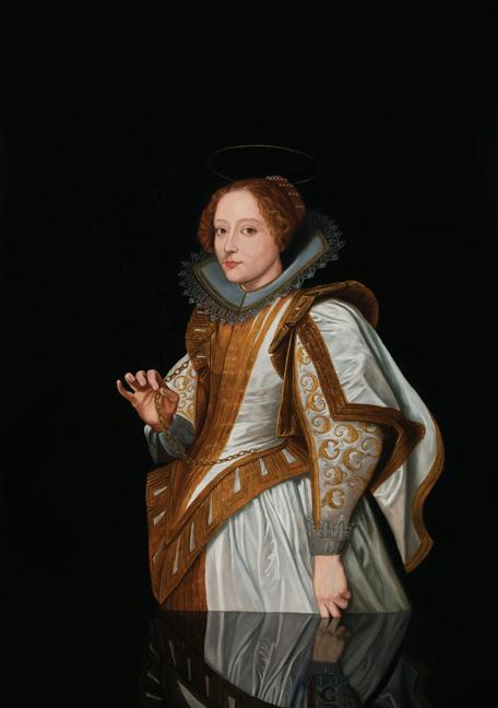
oil on linen | 113cm x 91cm
Saint Christina RORY MACDONALD
Images from the vault
This image is from Kilmorack Gallery’s first open day in June 1997. My Grandmother who never drove made it up for support. The desk is made from old doors, plywood and hessian picked up from Scotland’s last jute factory (now closed.) Some of the lights were taken from a skip and the little silver bronze of a baby’s head is by Gerald Laing. It’s of his forth son who is now much bigger.

+44 (0) 1463 783 230 art@kilmorackgallery.co.uk by beauly, inverness-shire iv4 7al
