KONSHUU
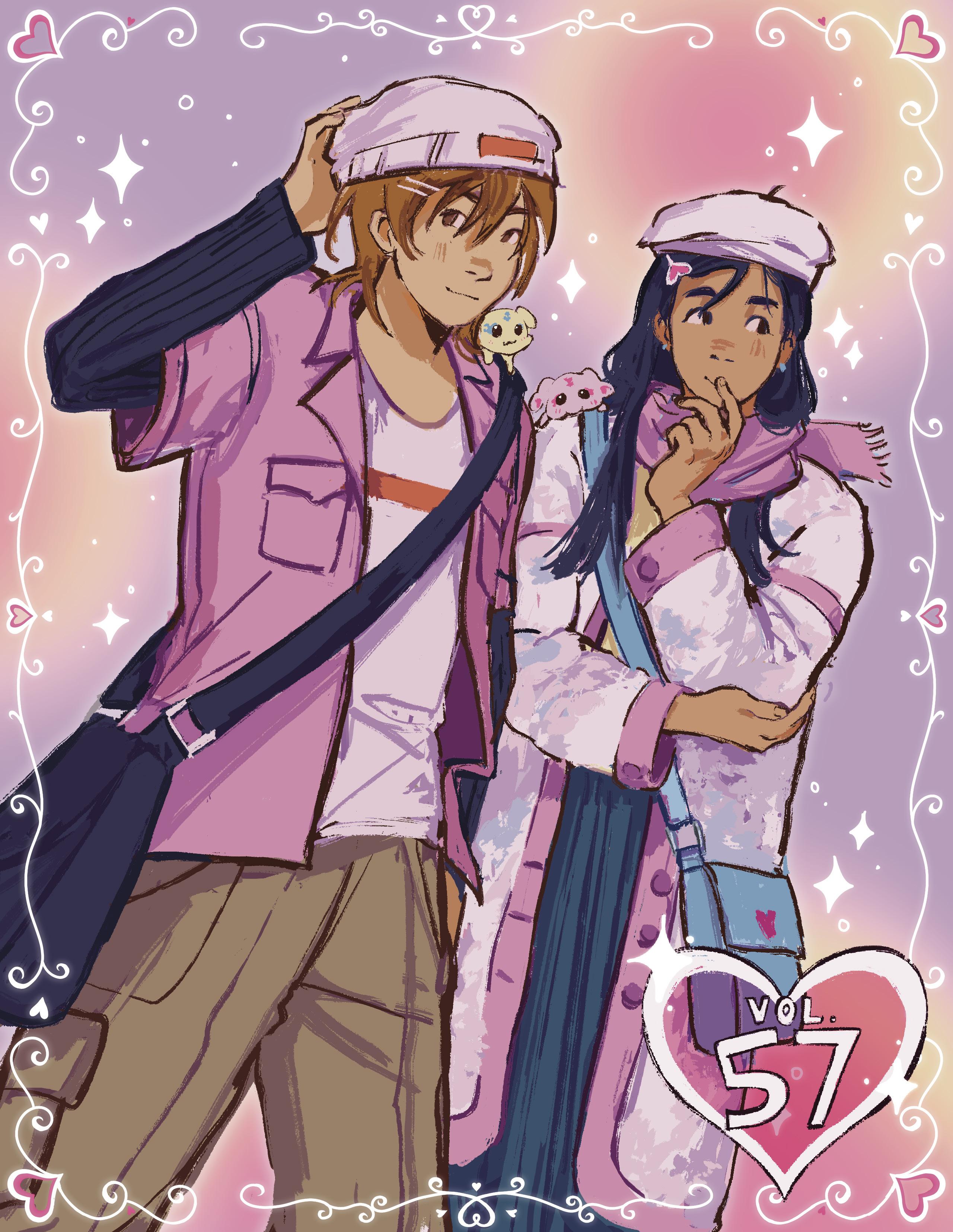
vol. 57 #2 Nagisa Misumi Honoka Yukishiro
Cure
Pretty
Art
By Ellya Kim Drip

Visual novels are a strange mediatic chimera that blends artistic elements from different formats into a whole that, when handled effectively stylistically, brings the sum of its parts to a whole new level when it comes to crafting a certain ambiance that is capable of enhancing its narrative qualities. Its storytelling is purely textual, as the story is told solely through that aspect of its construction, while the aesthetic, from visuals to music, exists purely as a tool to uplift what is being told in writing. Therefore, the value of these elements is dependent mainly on the extent to which it supplements the tone and narration that the text is going for. That is true of backgrounds, but most importantly the sprites of the characters. While visual novels retain mediatic aspects from the novel format which makes up half of its name, the style that it uses as far as storytelling is concerned is usually dependent on dialogue. Information is given through the lens of the characters, and it is their interactions that set a scene’s tone and lead to story progression. And that is where sprites truly matter. Sprites that effectively reflect a character’s identity, personality, and behavior at all times, and for all types of events, can be considered successful.
This is a point I wish to tackle in the scope of the works of Ryukishi07, perhaps the most notorious visual novel writer, though he may mostly be considered infamous as far as his drawing style is concerned. His main stories, namely Umineko and Higurashi within the When They Cry franchise, have gotten several different visual remasters when they were ported to different platforms, and with many ways to modify your game now, the style that the audience wishes to use to experience these stories is entirely up to them. In this context, people generally strive away
from the original sprites for those works, viewing their existence as something that can only hinder their reading experience. When it comes to those who do appreciate them, one might be tempted to define this love as an acquired taste, that stems either from nostalgia or simply from experiencing those stories with those designs and therefore associating the characters and their writing with this unique art style, with later ones clashing with their view of those characters. But there are merits to these sprites that outshine many of their alternatives as an artistic tool for storytelling.
Their wide array of expressions is what comes to mind first and foremost. The exaggerated features of the sprites come to life in many different types of scenes, and in Higurashi for instance, are capable of showcasing emotions far more effectively than their updated versions, whose expressions don’t stray away enough from their basic design to fit the tone of the work at different points. This is true particularly for the steam Umineko sprites, or for most of Higurashi’s remasters.
This makes them a great storytelling tool for that specific VN in a way that in my opinion outshines alternatives. And the lack of technical proficiency in their structure and anatomy hardly matters within the scope of this role, as visual novels work as a literary medium, meaning that the audience’s perception of the characters is executed through many different means, with the visual aspect not needing the same level of technical quality or realistic anatomy for the characters to work.
And with the direction that Ciconia is showing, with Ryukishi using his designs while working with other artists for the coloring, the aesthetic appeal of his style is starting to show, and there is a point at which the gap between original and new sprites starts to disappear in terms of sheer artistic quality.

It should be said however that this is a matter that I find most important in Higurashi, but in Umineko’s case, the PS3 sprites have attained a level of expressiveness fitting of the characters and the tonal shifts of the story that makes them a great alternative to Ryukishi’s sprites, even on the fronts where I value Ryukishi more.
At the end of the day however, tolerance for the technical aspects of art is still something that matters in one’s experience, and personal preference should be prioritized for someone to enjoy these works (that are certainly worth reading) as much as possible. But I do believe that Ryukishi’s sprites hold a lot of value that is overlooked a lot in the medium of Visual Novels as a whole, and it leads us to question the role of aesthetic elements in VNs in an interesting way.

Bishonen are the most beautiful beings in existential potentiality. There are many reasons I believe this statement is true, but I will take it as axiomatic as I will mostly be discussing aesthetics. Aesthetics is philosophical inquiry into the nature and meaning of beauty, and especially how it relates to truth, the transcendental, and other metaphysical concepts.
Bishonen represent the civilizationally, intellectually, and transcendentally oriented aspects of the masculine. They are often associated with culture: poetry, music, art, etc. Many highly intelligent characters such as Lelouch are portrayed as bishonen. Additionally, divine beings are often portrayed as bishonen: Tolkien elves, fairies, kami, etc. They are contrasted by hypermasculine “chads” who embody the more physical aspects of masculinity, those closer to humanity’s animalistic nature.
However, bishonen can and often do have masculine personality traits. Most shonen anime protagonists are bishonen but embody the shounen philosophy of getting stronger and never giving up. Tanjiro from Kimetsu no Yaiba is debatably a bishonen, at least he is pretty cute >_<, and indisputably an archetypal shonen protagonist. In any case, his soul is portrayed as completely pure and warm. He is both spiritually and physically pure and beautiful. Many bishonen are similar, portrayed as youthfully innocent and pure of heart. I find this beautiful and inspiring. Not all bishonen are like that. Some are (debatably) evil, such as Makishima Shogo or Griffith. I don’t have much to say about

them except that they are an inversion of the pure hearted bishonen archetype. There are other types of bishonen as well. Historically in East Asian literature young warriors, strategists, and generals have been portrayed as bishonen. In Japan the most popular male in high school is most likely a bishonen who is good looking, good at academics, and maybe even sports, as opposed to the stereotypical western ideal of the football captain chad who is bad at academics.
In a society dominated by tiresome western ideas of masculinity, bishonen are a welcome break. Seeing cute boys who are able to be strong, fight and have wills of steel is amazing and blows the entire western worldview out of the water. In the west any appreciation of male beauty beyond “chad have big muscle and beard” is seen as gay (Yes.), but in East Asian countries, beauty standards revolve around actual beauty, as in aesthetics: skincare, cleanliness, fashion, etc. This is the norm for straight men there (and that’s a good thing).
This brings us to Kpop and idols in general. I don’t like Kpop, but Jpop idols can be good sometimes. I like the cute aesthetic of Jpop more than Kpop aesthetics because it seems like Kpop is still trying to appeal to western standards (Kpop was designed to sell overseas, unlike Jpop). Jpop boys like Michieda Shunsuke or Mafumafu usually have a cute and innocent presentation as opposed to the more sexually provocative nature of Kpop. While anime and real life bishonen are different, they share a fundamentally similar nature.
As society becomes more and more disconnected from the physical (as a result of technology and the promethean nature of humanity), I think the bishonen archetype will guide the men of tomorrow into a more beautiful future.

 Guest
EWIK NELSON
CAA Alumni, Music
Guest
EWIK NELSON
CAA Alumni, Music
 Nana Osaki
Nana
Nana Osaki
Nana

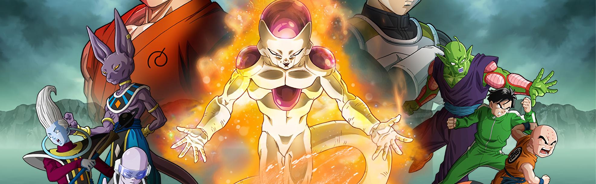
For me, the Dragon Ball revival project starting from 2013’s Battle of Gods has been an assortment of highs and lows, though leaning more towards the latter. While certain aspects have been fun, such as a greater emphasis on character interactions by way of slice of life episodes, as well as certain interesting new cast additions like Goku Black and Zamasu. Even then, I find that those slice of life episodes pale in comparison to the well scripted episodes of the franchise’s original run from 1986 to 1997. Additionally, the new cast additions were almost entirely never properly integrated into a functional story, with the promising Zamasu story arc dissolving into a convoluted mess that actively tripped on both its own themes and those of the original Cell arc, particularly in how the character of Future Trunks was treated. Beyond all that, newer Dragon Ball media seems entirely content on reusing old material with a differently colored coat of paint. Even when it seems illogical, new Dragon Ball will bring back elements that worked for the original series in new contexts that generally ruin the impact that they once had. Perhaps there’s some irony in making these assertions in my eighth article on this franchise, but I’m probably not witty enough to actively capitalize on that with any sort of punchline. Well, other than the subject of this article.
Resurrection F kind of encapsulates everything wrong with Super-era Dragon Ball in its title itself. To be blunt, the resurrection of Frieza is an entirely idiotic concept that is quite transparently a cynical move to bring back the franchise’s most iconic antagonist. The issue comes with how Dragon Ball shifted as a story after Frieza’s arc, with the subsequent Cell arc focusing far more on longer term character arcs particularly with Son Gohan, and the following Buu arc having a plethora of random plot threads, some of which were followed up fulfillingly. Frieza simply has no proper role in post Buu arc Dragon Ball, given his prior place as a cunning genocidal maniac running throughout the galaxy, which the series generally stopped caring about once threats started following the characters back to Earth without the need to explore the cosmos. Dragon Ball GT explored that different setting, but that series generally was not as tonally serious so as to warrant a character like Frieza returning, especially because it had more unique antagonists like Baby and the Evil Dragons which played on themes pervasive to the entire franchise in clever ways. There is absolutely no justification for Frieza’s return that is not based on cynical capitalism.
But don’t get me wrong: I love capitalism. I’m literally an Econom-
ics major. The very franchise this film belongs to is a direct result of capitalism. Not only is it sustained by capitalism, but one could argue Dragon Ball as a whole is an example of a property utterly consumed by that economic system. I like Dragon Ball GT, itself a product derived likely from cynical capitalistic attempts to continue the franchise in attempts to sell more crap. This is obviously my personal perspective, seeing as many don’t enjoy GT, but the difference between a GT and a Resurrection F comes mostly from how much effort was placed into writing. GT is obviously flawed, but it still contains a wacky story unlike any other in the franchise, placing its characters in unique settings against novel antagonists, culminating in a truly grand finale.
In spite of its rather dull premise, Resurrection F could have perhaps done something interesting with Frieza’s return. After all, Dragon Ball Super managed to make the ages-old fanfiction concept of “Evil Goku'' actually work for a bit. For that matter, that same series did make yet another Frieza return rather engaging during its Universal Survival story arc. I don’t attempt to appear as if I know something that your average viewer doesn’t, but I cannot rationalize Resurrection F’s existence as anything other than the product of lazy corporate writing. As it follows Battle of Gods, Resurrection F admittedly has a dubious task of lining up a more modern Dragon Ball, with inconceivably strong char-


 TONY T.
3rd Year, Economics and Data Science
TONY T.
3rd Year, Economics and Data Science
acters and all, with the character of Frieza. However, this task only exists because of the bizarre need to bring back Frieza to begin with.
With that context aside, Resurrection F is also rather hard to judge as a film. Most of the first thirteen Dragon Ball Z films are generally derided as nothing more than action spectacles that exist to perpetuate merchandise with vaguely defined characters and storylines. They almost always follow the exact same structure wherein a never-before-seen character interrupts the main cast whilst they attend to some miscellaneous mundane task, thus necessitating roughly forty minutes of nonstop fighting before an arbitrary power increase in the main characters allows them to stop said antagonist. Resurrection F follows this structure, yet is somehow far more arduous. The main culprit is the film’s runtime, which goes for 94 minutes, almost double most of the franchise’s cinematic releases. What this entails, given how the film uses the same structure as the other films, is a ridiculous slog of fighting that takes up almost the entirety of its length which has little to no consequence for the actual plot. Frankly, the film’s narrative is something that I don’t even need to explain in great depth as it’s exactly as advertised - following Frieza’s revival at the hands of his army’s remnants (via the Dragon Balls), he invades Earth, prompting the main characters to fight him.
Resurrection F, I find this is lacking, with the particular character designs as the likely reason why. The designs give off a very plastic and shiny feel which simply does not mesh well with the way the battle scenes are directed. It also results in rather stilted character movement as the designs do not lend themselves well to fluid movement.
Comparing this film to, say, Dragon Ball Super: Broly, it’s apparent how that film’s reworked designs offer its animators far more freedom in how they choose to depict movement, resulting in far better action scenes. For that matter, I believe this comparison is apt in explaining the issues with Resurrection F. Neither Resurrection F nor Broly are particularly excellent narratively, but the latter film manages to at least inject some engaging character drama that makes the audience actually care about what is happening on screen. Beyond that, Broly is an actual spectacle. The animation cuts in that film are truly spectacular and give off the impression of a truly legendary fight between three beings of godly abilities. Goku and Vegeta’s Super Saiyan God Super Saiyan forms have a truly divine feel to them emphasized by the film’s use of colors and character auras. Similarly, Broly’s final form has a raw and ferocious feel. It’s extremely stupid, but under this low standard, Broly succeeds. On the other hand, Resurrection F lacks even the elements for a dumb popcorn film as its three main focuses in Goku, Vegeta, and Frieza are rather poorly drawn, animated, and colored. The protagonists’ Super Saiyan God Super Saiyan forms, beyond being an idiotic concept, are not portrayed in a manner that gives them any sort of weight. Even in this superficial level, then, Resurrection F is kind of a complete failure in every aspect possible.
While Dragon Ball has never been a series I consider to have much (intentional) depth, Resurrection F kind of hits a new low in terms of literally being an hour and a half of fighting with no particularly good narrative justification or rationale. Action series, while obviously drawing audiences for segments featuring physical conflict, necessitate proper plots to actually feel impactful, which simply doesn’t exist for this film.
Hence, any further discussion of Resurrection F relies on surface level elements, which it fails at as well. Going by the low, low bar that this film’s premise inherently sets, it still fails to have interesting fights as the animation quality suffers with many scenes feeling extremely flat. Scenes do not feature particularly engaging movement, with much of the film’s production feeling like that of a television series, not a feature length picture. The CGI character models used in certain large scale battles do not mesh well at all with the film’s flatter digital art style resulting in even the fight scenes feeling clunky and uncompelling. For that matter, most of the film’s fights lack a certain level of weight given the ridiculously inhuman feats the characters are capable of, coupled with the fact that the characters are drawn with very little detail. In some of the series’ most important fights, like, say, the main fight in its Saiyan arc, an important aspect is how much damage the characters show physically, as it properly indicates the level of tension each segment is supposed to convey. With
By writing this article, I don’t necessarily mean to disparage Toei Animation’s intentions in making a dumb popcorn action film full of fights in order to wow their target demographic of children into buying toys. I can rant on and on regarding why I enjoy Dragon Ball GT and how it brilliantly concludes the entire Dragon Ball universe, but the reality of the situation is the Dragon Ball is a marketable intellectual property that, in a capitalistic society, should be used to generate profits. The fiscal success of Dragon Ball should have no impact on my assessment of the franchise’s actual films and television series, but it does give a solid explanation for why something like Resurrection F exists. Despite this, something like the later Broly film illustrates to me that, even if we take this more cynical perspective towards the impetus for media creation, Toei Animation has the capacity to do better with more engaging action scenes and direction. While it was a given that I would find it to be an artistic failure, Resurrection F equally fails at being cynical mass entertainment. It succeeds at next to nothing beyond perpetuating the Dragon Ball brand for later entries to actually properly follow up on and therefore I consider it to be one of the most off putting things I’ve ever watched.


What do you think constitutes good fashion? How do you think this may apply to animation?

I think that good fashion challenges our society's notions of art. This definition thus transfers fairly smoothly into the discussion of fashion in anime!
What's one artpiece from Konshuu you enjoyed recently?
I love sharrel's genshin art for the gacha issue it's so cute omg
Fashion is largely about how it reflects one's individuality. That is true for real life, and for characters, and a good character design is one that is not only recognisable, but associated in many ways to the character's personality or writing. A skilled character designer is one that is capable of making a character's appearance striking, and through this process, make his arc or thematic strengths more memorable for the audience
Lol not sure. I think if the clothes look expensive while seeming comfortable to wear, I would dig the design. I do think it’s funny though how clothes in anime tend to be very durable as I’d imagine it’d be hard to keep consistent tears and rips.
I found the Ren Yamashiro artpiece in the Tropes issue by Catherine Rha beautiful, and the way the character's pose is directed towards the reader was great
Felix L. WriterOff the top of my head, I really liked Skylar’s art of Paprika (Volume 56 Issue 5)! I’m always amazed by the “glitch” effects that encapsulates the aesthetics of the movie.
Fashion should be an expression of self! Whether it’s cute, cool, pretty, or anything in-between is up to the individual. I believe that the same goes for character design within animation. When choosing “drip” for a character to wear, it usually looks best if it’s something that character resonates with! For example, I love how Hololive’s Kanata has oversized sleeves and a lopsided bow. it really sells the energy of a messy, carefree, but innocent angel! I love stuff along those lines that give strong vibes I suppose :)
Good fashion is aesthetic to match the atmosphere. I really like the anime with the fashion design that are in harmony with their background or the overall artistic style.
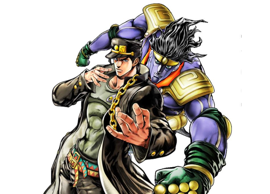
Sophia Xue Artist/Graphic DesignerThere’s way way WAY too many choices, but off the top of my head, I fricking LOVE the Winter Wonderland piece of Candice from Pokemon by Jasmine Zhang. The color choice of the whites, faded reds, and blues give a very dreamlike interpretation of “winter”. I love it a lot… Another one I like is the OVA/ONA cover of Jojos Bizzare Adventure by Jen Zhao! The hair shading and glitch rainbow particle effects are just chef’s kiss. Please support the artists ! ヽ(*・ω・)ノ <3
I like Cas's front cover for last issue! The vibe really goes along.
Lately, I finally resolved to my demise of plummeting deeper down the Idolm@ster rabbit hole. Seeing as this is the ‘drip’ issue, make no mistake, as by no means do I claim to be a fashion connoisseur, but considering how this is a massive idol franchise with characters who shuffle through multitudes of different outfits in accordance with their daily endeavors, I’m granted a suitable excuse to speak on it. The Idolm@ster has had an enduring history of myriad installments as Bandai Namco’s flagship idol franchise, spanning various mediums among video games (mostly rhythm games and raising simulators), anime, manga, live performances, television dramas, you name it, to spawn such an abundance of content that it’s virtually impossible to keep up with it all, let alone consume everything that has ever existed, especially these days considering that older arcade machines and obsolete hardware systems that once hosted many of the series’ games are nearly nonexistent. It doesn’t help either that plenty of material is region-locked to Japan without any plans of going global in the foreseeable future, creating further barriers of entry for potential new fans. I enjoyed the 2011 A-1 Pictures adaptation, which may honestly be the only legitimately great-looking show in the studio’s entire repertoire; as for even their more palatable works, being visually unremarkable is an understatement. Barring said adaptation however, I’m still but a fledgling Idolm@ster enjoyer myself as I had, until recently, barely skimmed the surface of the franchise at large. Nevertheless, I’ll go about unscrambling some of my thoughts surrounding this behemoth.
Twelve protagonists, even divided up across a two-cour, is a tight fit in terms of screen time being divided up effectively. Regardless, 765 Production’s idols in the 2011 anime, who from hereon I will simply refer to as the 765Pro AllStars, demonstrate cohesiveness and end up blossoming into somewhat of a family of sorts, everyone sharing mutual struggles, fighting amongst one another, and expressing genuine compassion as opportunities to convene grow sparse, a metaphorical ‘leaving the nest’ upon gradually acquiring more work if you will. Granted, I don’t care about the entire cast as Ami and Mami are annoying gremlins whose very presence make the show worse, as is the laughable antagonist who is amongst the most comically evil in recollection, acting as an impediment because ‘bad people do bad thing.’ Cast dynamics aside, where the show really excels is its character animation, which perfectly sells the perpetual shenanigans that fuel the office’s chaotic atmosphere. In certain respects, the series is very impressive, presenting choreographed group dance sequences without reliance on CG, and palpable emotional climaxes Idolm@ster 2011 also notably focuses on its characters’ work in their given industry and all the challenges that arise, snuggly fitting alongside titles like Planetes, Shirobako, and Patlabor: On Television, indulging matters with a degree of seriousness without wholly abandoning the fun factor. While nothing groundbreakingly original, the 765Pro AllStars are iconic and firmly help establish the franchise’s strengths. I can’t really say anything regarding Xenoglossia, which is somehow a mecha show and seems to alter the cast, to many fans’ dismay, but I suppose this is just the natural conclusion when you hurl an IP Sunrise’s way. Sasuga Sunrise.
On the other hand, the Cinderella Girls anime is a major disappointment. Visual quality drops off a cliff, adding insult to injury. However, the biggest nail in the coffin has to be the cast. As much as I love Kaede Takagaki, who
I deeply relate to in delivering the dumbest puns imaginable, she doesn’t receive much screen time, and the cast outside of her isn’t particularly memorable, at least for viewers of whom the adaptation serves as an introduction. Juxtaposing 765’s producer, a likable, generally competent, and proactive individual, the Cinderella Girls anime producer is an utterly inept doormat who nearly has his division terminated due to mediocre performance and allows himself to be arrested by mistake, twice. The cast lacks group chemistry, to which a quantity-over-quality approach quickly becomes apparent. Vague attempts to explore each character faceplant as I’m unable to shake the impression that they feel significantly more ‘mass-produced’ compared to other entries, which in turn inhibits my ability to grow as invested in the bulk of them, Kaede being the exception again of course. No disdain to those not prominently featured in the anime though, as it stands that Cinderella Girls is truly composed of 180+ idols, so perhaps other titles under the same umbrella, such as its games or the upcoming U149 adaptation, would work in favor of dispelling this notion.
I unfortunately have to largely skip over Million Live and SideM for now due to my more limited exposure to them, but do keep in mind that they exist and have potential from the little I’ve seen. Million Live jumps back to 765 Pro, having grown to feature over thirty new idols alongside the original 765Pro AllStars, who I am eager to witness in new mentor roles, and is slated to finally receive an anime adaptation later this year. Meanwhile, SideM features an all-male cast and supposedly handles its characters well, remaining interesting in its own right. This segways right into Shiny Colors, which currently also sorely lacks anime adaptation. Even so, it bears my unequivocal favorite cast in the entire franchise. There’s just something immediately captivating about the 283 Pro idols, given how I had previously liked some even long before knowing where they originated from. They not only exhibit the most polished designs, but phenomenal fashion, with deliberate, distinct styles of dress that subtly reflect their respective personalities and unique traits. Unit dynamics are handled with utmost care and finesse. Taking Illumination Stars as an example, the trinity of Mano as a soft-spoken, empathetic, binding agent for her companions, Hiori as a rational, diligent, motivating force, and Meguru as a bundle of positivity and enthusiasm, strike a delicate balance, contrasting former protagonist-esque units among the likes of New Generations in terms of having both genuine chemistry and charm. They aren’t solely defined by these blanket characteristics either though, with each displaying more vulnerable sides that showcase their insecurities and constant contemplation regarding how to tackle new problems that emerge. This goes for the rest of the units as well and communications really emphasize learning to understand absolutely everyone. Perhaps these haven’t been the fairest comparisons as I’ve been pitting the more constrained format of anime up against a browser game that has the luxury of time to delve into each character, but even just considering the manga adaptation, I still feel that it’s safe to say that I’ve grown attached to 283 Pro more than any other as the majority of my favorite Idolm@ster characters are derived from Shiny Colors
I write this having just come fresh off of watching the final day of The Idolm@ ster M@sters of Idol World 2023 concert at the Tokyo Dome, which was splendid to behold and reinvigorates me while ruminating the various facets of the franchise I’ve yet to explore. I’ve been going through the multitude of manga adaptations one by one and dipped my toes into Starlit Season (some of the stages are gorgeous), to which each have proven themselves intriguing in their own ways. I’m sure that my impressions of the franchise will oscillate over the coming years, but this serves as a good-as-ever milestone to put my thoughts to the page.

Staff Picks:
Happiness of Marionette plays in the background
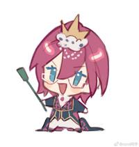
Botan was a close second…
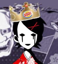
Will drown in water, but is full of drip.
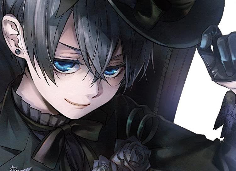
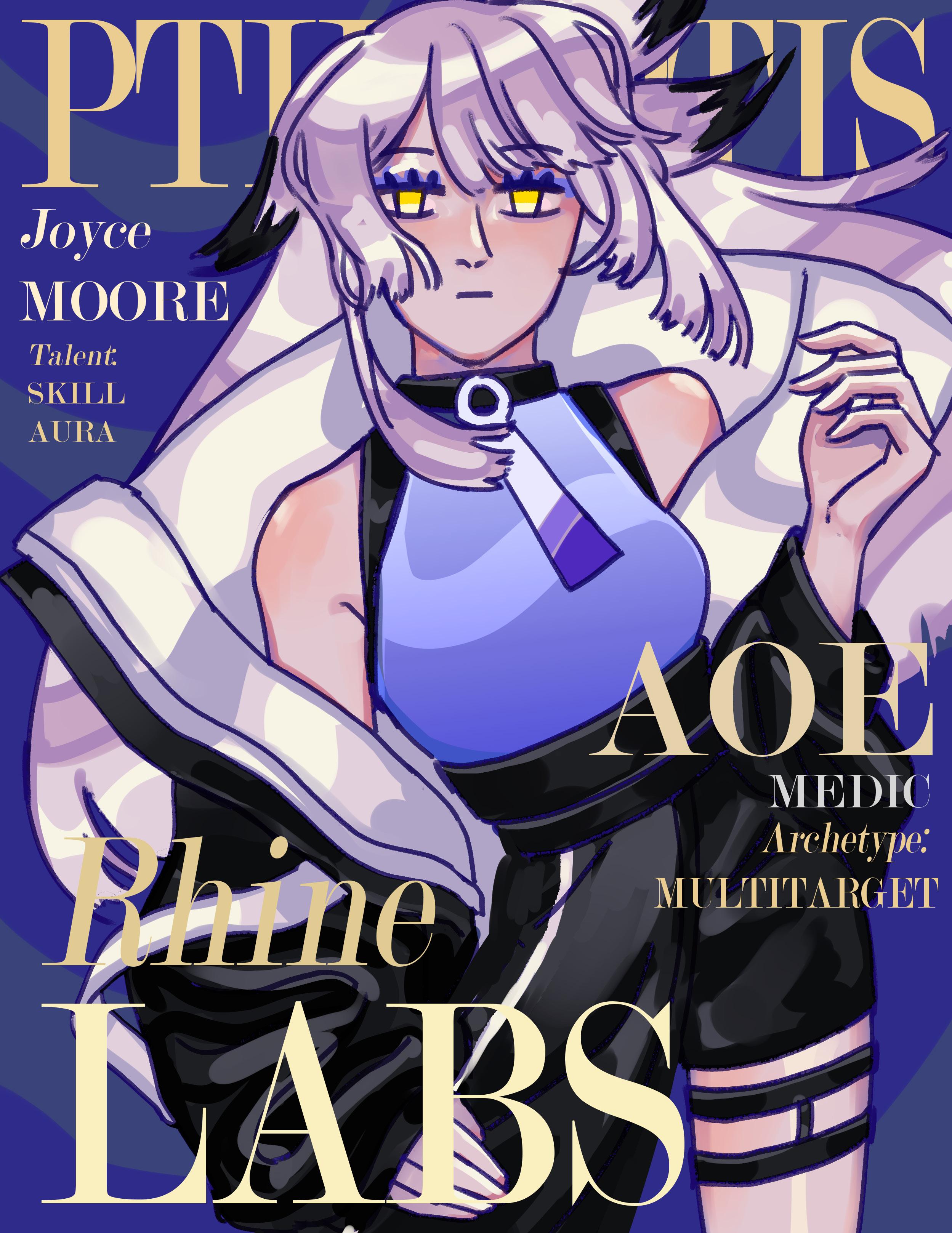
Where does the hat end and the hair begin??